1
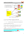
Vampir 7
User Manual
Copyright
c 2011 GWT-TUD GmbH
Blasewitzer Str. 43
01307 Dresden, Germany
http://gwtonline.de
Support / Feedback / Bugreports
Please provide us feedback! We are very interested to hear what people like,
dislike, or what features they are interested in.
If you experience problems or have suggestions about this application or manual,
please contact [email protected].
When reporting a bug, please include as much detail as possible, in order to
reproduce it. Please send the version number of your copy of Vampir along with
the bugreport. The version is stated in the “About Vampir” dialog accessible from
the main menu under “Help → About Vampir”.
Please visit http://vampir.eu for updates and new versions.
[email protected]
http://vampir.eu
Manual Version
2011-06-18 / Vampir 7.4
ii
Contents
Contents
1 Introduction
1.1 Event-based Performance Tracing and Profiling . . . . . . . . . . .
1.2 The Open Trace Format (OTF) . . . . . . . . . . . . . . . . . . . .
1.3 Vampir and Windows HPC Server 2008 . . . . . . . . . . . . . . .
2 Getting Started
2.1 Installation of Vampir . . . . . . . . . . . . . . .
2.2 Generation of Trace Data on Windows Systems
2.2.1 Enabling Performance Tracing . . . . .
2.2.2 Tracing an MPI Application . . . . . . .
2.3 Generation of Trace Data on Linux Systems . .
2.3.1 Enabling Performance Tracing . . . . .
2.3.2 Tracing an Application . . . . . . . . . .
2.4 Starting Vampir and Loading a Trace File . . .
3 Basics
3.1 Chart Arrangement . . . . .
3.2 Context Menus . . . . . . .
3.3 Zooming . . . . . . . . . .
3.4 The Zoom Toolbar . . . . .
3.5 The Charts Toolbar . . . .
3.6 Properties of the Trace File
.
.
.
.
.
.
.
.
.
.
.
.
.
.
.
.
.
.
.
.
.
.
.
.
.
.
.
.
.
.
.
.
.
.
.
.
.
.
.
.
.
.
.
.
.
.
.
.
.
.
.
.
.
.
.
.
.
.
.
.
4 Performance Data Visualization
4.1 Timeline Charts . . . . . . . . . . . . . . . . .
4.1.1 Master Timeline and Process Timeline
4.1.2 Counter Data Timeline . . . . . . . . .
4.1.3 Performance Radar . . . . . . . . . .
4.2 Statistical Charts . . . . . . . . . . . . . . . .
4.2.1 Call Tree . . . . . . . . . . . . . . . .
4.2.2 Function Summary . . . . . . . . . .
4.2.3 Process Summary . . . . . . . . . . .
4.2.4 Message Summary . . . . . . . . . .
4.2.5 Communication Matrix View . . . . .
4.2.6 I/O Summary . . . . . . . . . . . . . .
.
.
.
.
.
.
.
.
.
.
.
.
.
.
.
.
.
.
.
.
.
.
.
.
.
.
.
.
.
.
.
.
.
.
.
.
.
.
.
.
.
.
.
.
.
.
.
.
.
.
.
.
.
.
.
.
.
.
.
.
.
.
.
.
.
.
.
.
.
.
.
.
.
.
.
.
.
.
.
.
1
1
2
3
.
.
.
.
.
.
.
.
5
5
5
5
6
8
8
9
10
.
.
.
.
.
.
.
.
.
.
.
.
.
.
.
.
.
.
.
.
.
.
.
.
.
.
.
.
.
.
.
.
.
.
.
.
.
.
.
.
.
.
.
.
.
.
.
.
.
.
.
.
.
.
.
.
.
.
.
.
.
.
.
.
.
.
13
14
17
18
20
20
21
. .
.
. .
. .
. .
. .
. .
. .
. .
. .
. .
.
.
.
.
.
.
.
.
.
.
.
.
.
.
.
.
.
.
.
.
.
.
.
.
.
.
.
.
.
.
.
.
.
.
.
.
.
.
.
.
.
.
.
.
.
.
.
.
.
.
.
.
.
.
.
.
.
.
.
.
.
.
.
.
.
.
.
.
.
.
.
.
.
.
.
.
.
.
.
.
.
.
.
.
.
.
.
.
.
.
.
.
.
.
.
.
.
.
.
.
.
.
.
.
.
.
.
.
.
.
23
23
23
27
28
28
28
30
32
33
34
35
.
.
.
.
.
.
iii
Contents
4.3 Informational Charts . . . . . . . .
4.3.1 Function Legend . . . . . .
4.3.2 Marker View . . . . . . . .
4.3.3 Context View . . . . . . . .
4.4 Information Filtering and Reduction
.
.
.
.
.
.
.
.
.
.
.
.
.
.
.
.
.
.
.
.
.
.
.
.
.
.
.
.
.
.
.
.
.
.
.
.
.
.
.
.
.
.
.
.
.
.
.
.
.
.
.
.
.
.
.
.
.
.
.
.
.
.
.
.
.
.
.
.
.
.
.
.
.
.
.
.
.
.
.
.
.
.
.
.
.
.
.
.
.
36
36
36
37
40
5 Customization
43
5.1 General Preferences . . . . . . . . . . . . . . . . . . . . . . . . . . 43
5.2 Appearance . . . . . . . . . . . . . . . . . . . . . . . . . . . . . . . 44
5.3 Saving Policy . . . . . . . . . . . . . . . . . . . . . . . . . . . . . . 45
6 A Use Case
6.1 Introduction . . . . . . . . . . . . .
6.2 Identified Problems and Solutions
6.2.1 Computational Imbalance .
6.2.2 Serial Optimization . . . . .
6.2.3 The High Cache Miss Rate
6.3 Conclusion . . . . . . . . . . . . .
iv
.
.
.
.
.
.
.
.
.
.
.
.
.
.
.
.
.
.
.
.
.
.
.
.
.
.
.
.
.
.
.
.
.
.
.
.
.
.
.
.
.
.
.
.
.
.
.
.
.
.
.
.
.
.
.
.
.
.
.
.
.
.
.
.
.
.
.
.
.
.
.
.
.
.
.
.
.
.
.
.
.
.
.
.
.
.
.
.
.
.
.
.
.
.
.
.
.
.
.
.
.
.
.
.
.
.
.
.
47
47
48
48
50
51
52
CHAPTER 1. INTRODUCTION
1 Introduction
Performance optimization is a key issue for the development of efficient parallel
software applications. Vampir provides a manageable framework for analysis,
which enables developers to quickly display program behavior at any level of detail. Detailed performance data obtained from a parallel program execution can
be analyzed with a collection of different performance views. Intuitive navigation
and zooming are the key features of the tool, which help to quickly identify inefficient or faulty parts of a program code. Vampir implements optimized event
analysis algorithms and customizable displays which enable a fast and interactive rendering of very complex performance monitoring data. Ultra large data
volumes can be analyzed with a parallel version of Vampir, which is available on
request.
Vampir has a product history of more than 15 years and is well established
on Unix based HPC systems. This tool experience is now available for HPC
systems that are based on Microsoft Windows HPC Server 2008. This new Windows edition of Vampir combines modern scalable event processing techniques
with a fully redesigned graphical user interface.
1.1 Event-based Performance Tracing and Profiling
In software analysis, the term profiling refers to the creation of tables, which summarize the runtime behavior of programs by means of accumulated performance
measurements. Its simplest variant lists all program functions in combination
with the number of invocations and the time that was consumed. This type of
profiling is also called inclusive profiling, as the time spent in subroutines is included in the statistics computation.
A commonly applied method for analyzing details of parallel program runs is to
record so-called trace log files during runtime. The data collection process itself
is also referred to as tracing a program. Unlike profiling, the tracing approach
records timed application events like function calls and message communication as a combination of timestamp, event type, and event specific data. This
creates a stream of events, which allows very detailed observations of parallel
programs. With this technology, synchronization and communication patterns of
parallel program runs can be traced and analyzed in terms of performance and
correctness. The analysis is usually carried out in a postmortem step, i. e., after
1
1.2. THE OPEN TRACE FORMAT (OTF)
completion of the program. It is needless to say that program traces can also be
used to calculate the profiles mentioned above. Computing profiles from trace
data allows arbitrary time intervals and process groups to be specified. This is in
contrast to “fixed” profiles accumulated during runtime.
1.2 The Open Trace Format (OTF)
The Open Trace Format (OTF) was designed as a well-defined trace format with
open, public domain libraries for writing and reading. This open specification of
the trace information provides analysis and visualization tools like Vampir to operate efficiently at large scale. The format addresses large applications written
in an arbitrary combination of Fortran77, Fortran (90/95/etc.), C, and C++.
Figure 1.1: Representation of Streams by Multiple Files
OTF uses a special ASCII data representation to encode its data items with numbers and tokens in hexadecimal code without special prefixes. That enables a
very powerful format with respect to storage size, human readability, and search
capabilities on timed event records.
In order to support fast and selective access to large amounts of performance
trace data, OTF is based on a stream-model, i. e. single separate units representing segments of the overall data. OTF streams may contain multiple independent processes whereas a process belongs to a single stream exclusively.
As shown in Figure 1.1, each stream is represented by multiple files which store
2
CHAPTER 1. INTRODUCTION
definition records, performance events, status information, and event summaries
separately. A single global master file holds the necessary information for the
process to stream mappings.
Each file name starts with an arbitrary common prefix defined by the user. The
master file is always named {name}.otf. The global definition file is named
{name}.0.def. Events and local definitions are placed in files {name}.x.events
and {name}.x.defs where the latter files are optional. Snapshots and statistics
are placed in files named {name}.x.snaps and {name}.x.stats which are optional, too.
Note: Open the master file (*.otf ) to load a trace. When copying, moving or
deleting traces it is important to take all according files into account otherwise
Vampir will render the whole trace invalid! Good practice is to hold all files belonging to one trace in a dedicated directory.
Detailed information about the Open Trace Format can be found in the ‘‘Open
Trace Format (OTF)’’1 documentation.
1.3 Vampir and Windows HPC Server 2008
The Vampir performance visualization tool usually consists of a performance
monitor (VampirTrace) that records performance data and a performance GUI,
which is responsible for the graphical representation of the data. In Windows
HPC Server 2008, the performance monitor is fully integrated into the operating
system, which simplifies its employment and provides access to a wide range of
system metrics. A simple execution flag controls the generation of performance
data. This is very convenient and an important difference to solutions based
on explicit source, object, or binary modifications. Windows HPC Server 2008
is shipped with a translator, which produces trace log files in Vampir ’s Open
Trace Format (OTF). The resulting files can be visualized very efficiently with the
Vampir 7 performance data browser.
1
http://www.tu-dresden.de/zih/otf
3
CHAPTER 2. GETTING STARTED
2 Getting Started
2.1 Installation of Vampir
Vampir is available on all major platforms but naturally its installation depends
on the operation system.
To install Vampir on a Unix machine the tarball has to be unpacked after having
placed it in an arbitrary directory.
On Windows platforms Vampir comes with an installer what makes the installation very simple and straightforward. Just run the installer and follow the installation wizard. Install Vampir in a directory of your choice, we recommend:
C:\Program Files.
In order to run the installer in silent (unattended) mode use the /S option. It is
also possible to specify the output directory of the installation with /D=dir. An
example of running a silent installation is as follows:
Vampir-7.3.0-Standard-setup-x86.exe /S /D=C:\Program Files
If you want to, you can associate Vampir with OTF trace files (*.otf ) during the
installation process. The Open Trace Format (OTF) is described in Chapter 1.2.
This allows you to load a trace file quickly by double-clicking it. Subsequently,
Vampir can be launched by double-clicking its icon or by using the command line
interface (see Chapter 2.4).
2.2 Generation of Trace Data on Windows Systems
2.2.1 Enabling Performance Tracing
The generation of trace log files for the Vampir performance visualization tool
requires a working monitoring system to be attached to your parallel program.
The Event Tracing for Windows (ETW) infrastructure of the Windows client and
server OS’s is such a monitor. The Windows HPC Server 2008 version of MSMPI has built-in support for this monitor. It enables application developers to
quickly produce traces in production environments by simply adding an extra
mpiexec flag (-trace). In order to trace an application the user account is re-
5
2.2. GENERATION OF TRACE DATA ON WINDOWS SYSTEMS
quired to be a member of the “Administrator” or “Performance Log Users” groups.
No special builds or administrative privileges are necessary. The cluster administrator will only have to add the “Performance Log Users” group to the head
node’s “Users” group, if you want to use this group for tracing. Trace files will be
generated during the execution of your application. The recorded trace log files
include the following events: Any MS-MPI application call and low-level communication within sockets, shared memory, and NetworkDirect implementations.
Each event includes a high-precision CPU clock timer for precise visualization
and analysis.
2.2.2 Tracing an MPI Application
The steps necessary for monitoring the MPI performance of an MS-MPI application are depicted in Figure 2.1. First the application needs to be available
throughout all compute nodes in the cluster and has to be started with tracing
enabled. The Event Tracing for Windows (ETW) infrastructure writes eventlogs
(.etl files) containing the respective MPI events of the application on each compute node. In order to achieve consistent event data across all compute nodes
clock corrections need to be applied. This step is performed after the successful
run of the application using the Microsoft tool mpicsync. Now the eventlog files
can be converted into OTF files with help of the tool etl2otf. The last necessary step is to copy the generated OTF files from the compute nodes into one
shared directory. Then this directory includes all files needed by the Vampir performance GUI. The application performance can be analyzed now.
The following commands illustrate the procedure described above and show, as
a practical example, how to trace an application on the Windows HPC Server
2008. For proper utilization and thus successful tracing, the file system of the
cluster needs to meet the following prerequisites:
• “\\share\userHome” is the shared user directory throughout the cluster
• MS-MPI executable myApp.exe is available in the shared directory
• “\\share\userHome\Trace” is the directory where the OTF files are collected
1. Launch application with tracing enabled (use of -tracefile option):
mpiexec -wdir \\share\userHome\
-tracefile %USERPROFILE%\trace.etl myApp.exe
• -wdir sets the working directory; myApp.exe has to be there
• %USERPROFILE% translates to the local home directory, e.g.
‘‘C:\Users\userHome’’; on each compute node the eventlog file (.etl)
is stored locally in this directory
6
CHAPTER 2. GETTING STARTED
Rank 0 node
1.
2.
3.
4.
myApp.exe
MS-MPI
Run myApp with tracing enabled
Time-Sync the ETL logs
Convert the ETL logs to OTF
Copy OTF files to head node
MS-MPI
mpicsync
ETW
Trace
(.etl)
MS-MPI
etl2otf
MS-MPI
copy
Formatted
Trace (.otf)
HEAD NODE
Rank 1 node
\\share\
…
userHome\
myApp.exe
Trace\
trace.etl_otf.otf
trace.etl_otf.0.def
trace.etl_otf.1.events
trace.etl_oft.2.events
…
Rank N node
Figure 2.1: MS-MPI Tracing Overview
2. Time-sync the eventlog files throughout all compute nodes:
mpiexec -cores 1 -wdir %USERPROFILE% mpicsync trace.etl
• -cores 1: run only one instance of mpicsync on each compute node
3. Format the eventlog files to OTF files:
mpiexec -cores 1 -wdir %USERPROFILE% etl2otf trace.etl
4. Copy all OTF files from compute nodes to trace directory on share:
mpiexec -cores 1 -wdir %USERPROFILE% cmd /c copy /y
‘‘* otf*’’ ‘‘\\share\userHome\Trace’’
More information about performance tracing of MPI applications can be found in
the Microsoft HPC SDK tutorial ‘‘Tracing the Execution of MPI Applications with Windows HPC Server 2008’’1 .
1
http://resourcekit.windowshpc.net/MORE INFO/TracingMPIApplications.html
7
2.3. GENERATION OF TRACE DATA ON LINUX SYSTEMS
2.3 Generation of Trace Data on Linux Systems
The generation of trace files for the (Vampir ) performance visualization tool requires a working monitoring system to be attached to your parallel program.
Contrary to Windows HPC Server 2008 - whereby the performance monitor is integrated into the operating system - recording performance under Linux is done
by a separate performance monitor. We recommend our VampirTrace monitoring facility which is available as Open Source software.
During a program run of an application, VampirTrace generates an OTF trace file,
which can be analyzed and visualized by Vampir. The VampirTrace library allows
MPI communication events of a parallel program to be recorded in a trace file.
Additionally, certain program-specific events can also be included. To record MPI
communication events, simply relink the program with the VampirTrace library.
A new compilation of the program source code is only necessary if programspecific events should be added.
Detailed information of the installation and usage of VampirTrace can be found
in the ‘‘VampirTrace User Manual’’ 2 .
2.3.1 Enabling Performance Tracing
To perform measurements with VampirTrace, the application program needs to
be instrumented. Also VampirTrace handles this automatically by default, manual instrumentation is also possible.
All the necessary instrumentation of user functions, MPI, and OpenMP events is
handled by the compiler wrappers of VampirTrace (vtcc, vtcxx, vtf77, vtf90 and
the additional wrappers mpicc-vt, mpicxx-vt, mpif77-vt, and mpif90-vt in Open
MPI 1.3).
All compile and link commands in the used makefile should be replaced by the
VampirTrace compiler wrapper, which performs the necessary instrumentation of
the program and links the suitable VampirTrace library.
Automatic instrumentation is the most convenient method to instrument your program. Therefore, simply use the compiler wrappers without any parameters, e.g.:
% vtf90 hello.f90 -o hello
For manual instrumentation with the VampirTrace API simply include ‘‘vt user.inc’’
(Fortran) or ‘‘vt user.h’’ (C, C++) and label any user defined sequence of
statements for instrumentation as follows:
2
8
http://www.tu-dresden.de/zih/vampirtrace
CHAPTER 2. GETTING STARTED
VT USER START(name) ...
VT USER END(name)
in Fortran and C, respectively in C++ as follows:
VT TRACER(‘‘name’’);
Afterwards, use
% vtcc -DVTRACE hello.c -o hello
to combine the manual instrumentation with automatic compiler instrumentation
or
% vtcc -vt:inst manual -DVTRACE hello.c -o hello
to prevent an additional compiler instrumentation.
For a detailed description of manual instrumentation, please consider the ‘‘VampirTrace
User Manual’’ 3 .
2.3.2 Tracing an Application
Running a VampirTrace instrumented application should normally result in an
OTF trace file in the current working directory where the application was executed. On Linux, Mac OS and Sun Solaris, the default name of the trace file will
be equal to the application name. For other systems, the default name is a.otf
but can be defined manually by setting the environment variable VT FILE PREFIX
to the desired name.
After a run of an instrumented application the traces of the single processes need
to be unified in terms of timestamps and event IDs. In most cases, this happens
automatically. If it is necessary to perform unification of local traces manually,
use the following command:
% vtunify <nproc> <prefix>
If VampirTrace was built with support for OpenMP and/or MPI, it is possible to
speedup the unification of local traces significantly. To distribute the unification
on multiple processes the MPI parallel version vtunify-mpi can be used as follows:
% mpirun -np <nranks> vtunify-mpi <nproc> <prefix>
3
http://www.tu-dresden.de/zih/vampirtrace
9
2.4. STARTING VAMPIR AND LOADING A TRACE FILE
2.4 Starting Vampir and Loading a Trace File
Viewing performance data with the Vampir GUI is very easy. On Windows the
tool can be started by double clicking its desktop icon (if installed) or by using
the Start Menu. On a Unix-based machine run “./vampir” in the directory where
Vampir is installed.
To open a trace file, select “Open. . . ” in the “File” menu, which provides the file
open dialog depicted in Figure 2.2. It is possible to filter the files in the list. The
file type input selector determines the visible files. The default “OTF Trace Files
(*.otf )” shows only files that can be processed by the tool. All file types can be
displayed by using “All Files (*)”.
Alternatively on Windows, a command line invocation is possible:
C:\Program Files\Vampir\Vampir.exe [trace file]
To open multiple trace files at once you can take them one after another as command line arguments:
C:\Program Files\Vampir\Vampir.exe [file 1]...[file n]
It is also possible to start the application by double-clicking on a *.otf file (If Vampir was associated with *.otf files during the installation process).
The trace files to be loaded have to be compliant with the Open Trace Format (OTF) standard (described in Chapter 1.2). Microsoft HPC Server 2008
is shipped with the translator program etl2otf.exe, which produces appropriate
input files.
While Vampir is loading the trace file, an empty “Trace View” window with a
progress bar at the bottom opens. After Vampir loaded the trace data completely, a default set of charts will appear. The illustrated loading process can be
interrupted at any point of time by clicking on the cancel button in the lower right
corner as shown in Figure 2.3. Because events in the trace file are traversed one
after another the GUI will also open, but shows only the ealiest information from
the trace file. For huge trace files with performance problems assumed to be at
the beginning this proceeding is a suitable strategy to save time.
Basic functionality and navigation elements are described in Chapter 3. The
available charts and the information provided by them are explained in Chapter 4.
10
CHAPTER 2. GETTING STARTED
Figure 2.2: Loading a Trace Log File in Vampir
Figure 2.3: Progress Bar and Cancel Loading Button
11
CHAPTER 3. BASICS
3 Basics
After loading has been completed, the “Trace View” window title displays the
trace file’s name as depicted in Figure 3.1. By default, the “Charts” toolbar
and the “Zoom Toolbar” are available. Furthermore, the default set of charts
Figure 3.1: Trace View Window with Charts Toolbar (A) and Zoom Toolbar (B)
is opened automatically after loading has been finished. The charts can be divided into three groups: timeline-, statistical-, and informational charts. Timeline
charts show detailed event based information for arbitrary time intervals while
statistical charts reveal accumulated measures which were computed from the
corresponding event data. Informational charts provide additional or explanatory
information regarding timeline- and statistical charts. All available charts can be
opened with use of the “Charts” toolbar which is explained in Chapter 3.5.
In the following section we will explain the basic functions of the Vampir GUI
which are generic to all charts. Feel free to go to Chapter 4 to skip the fundamentals and directly start with the details about the different charts.
13
3.1. CHART ARRANGEMENT
3.1 Chart Arrangement
The utility of charts can be increased by correlating them and their provided information. Vampir supports this mode of operation by allowing to display multiple
charts at the same time. Charts that display a sequence of events such as the
“Master Timeline” and the “Process Timeline” chart are aligned vertically. This
alignment ensures that the temporal relationship of events is preserved across
chart boundaries.
The user can arrange the placement of the charts according to his preferences by
dragging them into the desired position. When the left mouse button is pressed
while the mouse pointer is located above a placement decoration then the layout
engine will give visual clues as to where the chart may be moved. As soon as
the user releases the left mouse button the chart arrangement will be changed
according to his intentions. The entire procedure is depicted in Figures 3.2 and
3.3.
The flexible display architecture furthermore allows increasing or decreasing the
screen space that is used by a chart. Charts of particular interest may get more
space in order to render information in more detail.
Figure 3.2: Moving and Arranging Charts in the Trace View Window (1)
The “Trace View” window can host an arbitrary number of charts. Charts can be
14
CHAPTER 3. BASICS
Figure 3.3: Moving and Arranging Charts in the Trace View Window (2)
Figure 3.4: A Custom Chart Arrangement in the Trace View Window
15
3.1. CHART ARRANGEMENT
Figure 3.5: Closing (right) and Undocking (left) of a Chart
added by clicking on the respective “Charts” toolbar icon or the corresponding
“Chart” menu entry. With a few more clicks, charts can be combined to a custom
chart arrangement as depicted in Figure 3.4. Customized layouts can be saved
as described in Chapter 5.3.
Every chart can be undocked or closed by clicking the dedicated icon in its upper
right corner as shown in Figure 3.5. Undocking a chart means to free the chart
from the current arrangement and present it in an own window. To dock/undock
a chart follow Figure 3.6, respectively Figure 3.7.
Figure 3.6: Undocking of a Chart
Considering that labels, e.g. those showing names or values of functions, often need more space to show its whole text, there is a further form of resizing/arranging. In order to read labels completely, it is possible to resize the distribution of space owned by the labels and the graphical representation in a chart.
16
CHAPTER 3. BASICS
Figure 3.7: Docking of a Chart
When hover the blank space between labels and graphical representation, a
moveable seperator appears. After clicking a separator decoration, moving the
mouse while leaving the left mouse button pressed causes resizing. The whole
process is illustrated in Figure 3.8.
3.2 Context Menus
All of the chart displays have their own context menu with common entries as
well as display specific ones. In the following section, only the most common
entries will be discussed. A context menu can be accessed by right clicking in
the display window.
Common entries are:
• Reset Zoom: Go back to the initial state in horizontal zooming.
• Reset Vertical Zoom: Go back to the initial state in vertical zooming.
• Set Metric: Change values which should be represented in the chart, e.g.
“Exclusive Time” to “Inclusive Time”.
• Sort By: Rearrange values or bars by a certain characteristic.
17
3.3. ZOOMING
Figure 3.8: Resizing Labels: (A) Hover a Seperator Decoration; (B) Drag and
Drop the Seperator
3.3 Zooming
Zooming is a key feature of Vampir. In most charts it is possible to zoom in
and out to get abstract and detailed views of the visualized data. In the timeline
charts, zooming produces a more detailed view of a special time interval and
therefore reveals new information that could not be seen in the larger section.
Short function calls in the “Master Timeline” may not be visible unless an appropriate zooming level has been reached. If the execution time of these short
functions is too short regarding the pixel resolution of your computer display, the
selection of a shorter time interval is required.
Note: Other charts can be affected when zooming in timeline displays. Meaning
the interval chosen in a timeline chart such as “Master Timeline” or “Process
Timeline” also defines the time interval for the calculation of accumulated measurements in the statistical charts.
Statistical charts like the “Function Summary” provide zooming of statistic values.
In these cases zooming does not affect any other chart. Zooming is disabled in
the “Pie Chart” mode of the “Function Summary” reachable via context menu
18
CHAPTER 3. BASICS
under “Set Chart Mode → Pie Chart”.
To zoom into an area, click and hold the left mouse button and select the area, as
Figure 3.9: Zooming within a Chart
shown in Figure 3.9. It is possible to zoom horizontally and in some charts also
vertically. Horizontal zooming in the “Master Timeline” defines the time interval
to be visualized whereas vertical zooming selects a group of processes to be
displayed. To scroll horizontally move the slider at the bottom or use the mouse
wheel.
Additionally the zoom can be accessed with help of the “Zoom Toolbar” by dragging the borders of the selection rectangle or scrolling down the mouse wheel as
described in Chapter 3.4.
To return to the previous zooming state the global ”Undo” is provided that can
be found in the ”Edit” menu. Alternatively, press ”Ctrl+Z” to revert the last zoom.
Accordingly, a zooming action can be repeated by selecting ”Redo” in the ”Edit”
menu or pressing ”Ctrl+Shift+Z”. Both functions work independently of the current mouse position. Next to ”Undo” and ”Redo” it is shown which kind of action
in which display could be undone and redone, respectively. To get back to the
initial state of zooming in a fast way select “Reset Horizontal Zoom” or “Reset
19
3.4. THE ZOOM TOOLBAR
Vertical Zoom” (see Section 3.2) in the context menu of the desired timeline display. To reset zoom is also an action that can be reverted by ”Undo”.
3.4 The Zoom Toolbar
Vampir provides a “Zoom Toolbar”, that can be used for zooming and navigation in the trace data. It is situated in the upper right corner of the “Trace View”
window as shown in Figure 3.1. Of course it is possible to drag and drop it as
desired. The “Zoom Toolbar” offers an overview of the data displayed in the
corresponding charts. The current zoomed area can be seen highlighted as a
rectangle within the “Zoom Toolbar”. Clicking on one of the two boundaries and
moving it (with left mouse button held) the intended position executes horizontal
zooming in all charts.
Note: Instead of dragging boundaries it is also possible to use the mouse wheel
for zooming. Hover the “Zoom Toolbar” and scroll up to zoom in and scroll down
to zoom out.
Dragging the zoom area changes the section that is displayed without changing
the zoom factor. For dragging, click into the highlighted zoom area and drag and
drop it to the desired region. Zooming and dragging within the “Zoom Toolbar” is
shown in Figure 3.10. If the user double clicks in the “Zoom Toolbar”, the initial
zooming state is reverted.
The colors represent user-defined groups of functions or activities. Please note
that all charts added to the “Trace View” window will adapt their statistics information according to this time interval selection. The “Zoom Toolbar” can be
disabled and enabled with the toolbar’s context menu entry “Zoom Toolbar”.
3.5 The Charts Toolbar
Use the “Charts” toolbar to open instances of the different charts. It is situated
in the upper left corner of the main window by default as shown in Figure 3.1. Of
course it is possible to drag and drop it as desired. The “Charts” toolbar can be
disabled with the toolbar’s context menu entry “Charts”.
Table 3.1 shows the different icons representing the charts in “Charts” toolbar.
The icons are arranged in three groups, divided by a small separator. The first
group represents timeline charts, whose zooming states affect all other charts.
The second group consists of statistical charts, providing special information
20
CHAPTER 3. BASICS
Figure 3.10: Zooming and Navigation within the Zoom Toolbar: (A+B) Zooming
in/out with Mouse Wheel; (C) Scrolling by Moving the Highlighted
Zoom Area; (D) Zooming by Selecting and Moving a Boundary of
the Highlighted Zoom Area
and statistics for a chosen interval. Vampir allows multiple instances for charts
of these categories. The last group comprises informational charts, providing
specific textual information or legends. Only one instance of an informational
chart can be opened at a time.
3.6 Properties of the Trace File
Vampir provides an info dialog containing the most important characteristics of
the opened trace file. This dialog is called “Trace Properties” and can be accessed by “File → Get Info”. The information originates from the trace file and
includes details such as the filename, the creator, and the OTF version.
21
3.6. PROPERTIES OF THE TRACE FILE
Icon
Name
Description
Master Timeline
Section 4.1.1
Process Timeline
Section 4.1.1
Counter Data Timeline
Section 4.1.2
Performance Radar
Section 4.1.3
Function Summary
Section 4.2.2
Message Summary
Section 4.2.4
Process Summary
Section 4.2.3
Communication Matrix View
Section 4.2.5
I/O Summary
Section 4.2.6
Call Tree
Section 4.2.1
Function Legend
Section 4.3.1
Context View
Section 4.3.3
Marker View
Section 4.3.2
Table 3.1: Icons of the Toolbar
22
CHAPTER 4. PERFORMANCE DATA VISUALIZATION
4 Performance Data Visualization
This chapter deals with the different charts that can be used to analyze the behavior of a program and the comparison between different function groups, e.g.
MPI and Calculation. Even communication performance issues are regarded in
this chapter. Various charts address the visualization of data transfers between
processes. The following sections describe them in detail.
4.1 Timeline Charts
A very common chart type used in event-based performance analysis is the socalled timeline chart. This chart type graphically presents the chain of events
of monitored processes or counters on a horizontal time axis. Multiple timeline
chart instances can be added to the “Trace View” window via the “Chart” menu
or the “Charts” toolbar.
Note:
To measure the duration between two events in a timeline chart Vampir provides
a tool called Ruler. In order to use the Ruler click on any point of interest in a
timeline display and move the mouse while holding the left mouse button and
“Shift” key pressed. A ruler like pattern appears in the current timeline chart,
which provides rough measurement directly. The exact time between the start
point and the current mouse position is given in the status bar. If the “Shift” key
is released before the left mouse button, Vampir will proceed with zooming.
4.1.1 Master Timeline and Process Timeline
In the Master and the Process Timeline detailed information about functions,
communication, and synchronization events is shown. Timeline charts are available for individual processes (“Process Timeline”) as well as for a collection of
processes (“Master Timeline”). The “Master Timeline” consists of a collection of
rows. Each row represents a single process, as shown in Figure 4.1. A “Process
Timeline” shows the different levels of function calls in a stacked bar chart for a
single process as depicted in Figure 4.2.
Every timeline row consists of a process name on the left and a colored sequence of function calls or program phases on the right. The color of a function
23
4.1. TIMELINE CHARTS
Figure 4.1: Master Timeline
is defined by its group membership, e.g., MPI Send() belonging to the function
group MPI has the same color, presumably red, as MPI Recv(), which also belongs to the function group MPI. Clicking on a function highlights it and causes
the “Context View” display to show detailed information about that particular function, e. g. its corresponding function group name, time interval, and the complete
name. The “Context View” display is explained in Chapter 4.3.3.
Some function invocations are very short thus these are not show up in the overall view due to a lack of display pixels. A zooming mechanism is provided to
inspect a specific time interval in more detail. For further information see Section 3.3. If zooming is performed, panning in horizontal direction is possible with
the scroll bar at the bottom.
The “Process Timeline” resembles the “Master Timeline” with slight differences.
The chart’s timeline is divided into levels, which represent the different call stack
levels of function calls. The initial function begins at the first level, a sub-function
24
CHAPTER 4. PERFORMANCE DATA VISUALIZATION
Figure 4.2: Process Timeline
called by that function is located a level beneath and so forth. If a sub-function
returns to its caller, the graphical representation also returns to the level above.
In addition to the display of categorized function invocations, Vampir ’s “Master”
and “Process Timeline” also provide information about communication events.
Messages exchanged between two different processes are depicted as black
lines. In timeline charts, the progress in time is reproduced from left to right.
The leftmost starting point of a message line and its underlying process bar
therefore identify the sender of the message whereas the rightmost position
of the same line represents the receiver of the message. The corresponding function calls normally reflect a pair of MPI communication directives like
MPI Send() and MPI Recv(). It is also possible to show a collective communication like MPI Allreduce() by selecting one corresponding message as shown
in Figure 4.3. Furthermore additional information like message bursts, markers
and I/O events is available. Table 4.1 shows the symbols and descriptions of
these objects.
25
4.1. TIMELINE CHARTS
Figure 4.3: Selected MPI Collective in Master Timeline
Symbol
Description
Message Burst
Due to a lack of pixels it is not possible to display
a large amount of messages in a very short time
interval. Therefore outgoing messages are summarized
as so-called message bursts. In this representation
you cannot determine which processes receive these
messages.
Zooming into this interval reveals the
corresponding single messages.
Markers
multiple
single
To indicate particular points of interest during the
runtime of an application, like errors or warnings markers can be placed in a trace file. They are drawn as
triangles, which are colored according to their types. To
illustrate that two or more markers are located at the
same pixel, a tricolored triangle is drawn.
I/O Events
Vampir shows detailed information about I/O operations, if they are included in the trace file. I/O events
are depicted as triangles at the beginning of an I/O
interval. Multiple I/O events are tricolored and occupy a
line to the end of the interval. To see the whole interval
of a single I/O event the triangle has to be selected. In
that case a second triangle at the end of the interval
appears.
Table 4.1: Additional Information in Master and Process Timeline
Since the “Process Timeline” reveals information of one process only, short black
arrows are used to indicate outgoing communication. Clicking on message lines
or arrows shows message details like sender process, receiver process, message length, message duration, and message tag in the “Context View” display.
26
CHAPTER 4. PERFORMANCE DATA VISUALIZATION
4.1.2 Counter Data Timeline
Counters are values collected over time to count certain events like floating point
operations or cache misses. Counter values can be used to store not just hardware performance counters but arbitrary sample values. There can be counters
for different statistical information as well, for instance counting the number of
function calls or a value in an iterative approximation of the final result. Counters
are defined during the instrumentation of the application and can be individually
assigned to processes.
Figure 4.4: Counter Data Timeline
An example “Counter Data Timeline” chart is shown in Figure 4.4. The chart is
restricted to one counter at a time. It shows the selected counter for one process.
Using multiple instances of the “Counter Data Timeline” counters or processes
can be compared easily.
The context menu entry “Set Counter” allows to choose the displayed counter
directly from a drop-down list. The entry “Set Process” selects the particular
process for which the counter is shown.
27
4.2. STATISTICAL CHARTS
4.1.3 Performance Radar
The Performance Radar chart provides the search of function occurrences in the
trace file and the extended visualization of counter data.
It can happen that a function is not shown in “Master” and “Process Timeline”
due to a short runtime. An alternative to zooming is the option “Find Function...”.
A color coded timeline indicates the intervals in which the function is executed.
Figure 4.5: Performance Radar Timeline - Search of Functions
By default the Performance Radar shows the values of one counter for each
process as shown in Figure 4.6. In this mode the user can choose between
“Line Plot” and “Color Coded” drawing. In the latter case a color scale on the
bottom informs about the range of values. Clicking on “Set Counter...” leads
to a dialog which offers to choose another counter and to calculate the sum or
average values. Summarizing means that the values of the selected counter of
all processes are summed up. The average is this sum divided by the number of
processes. Both options provide a single graph.
4.2 Statistical Charts
4.2.1 Call Tree
The “Call Tree”, depicted in Figure 4.7, illustrates the invocation hierarchy of all
monitored functions in a tree representation. The display reveals information
28
CHAPTER 4. PERFORMANCE DATA VISUALIZATION
Figure 4.6: Performance Radar Timeline - Visualization of Counters
about the number of invocations of a given function, the time spent in the different calls and the caller-callee relationship.
The entries of the “Call Tree” can be sorted in various ways. Simply click on
one header of the tree representation to use its characteristic to re-sort the “Call
Tree”. Please note that not all available characteristics are enabled by default.
To add or remove characteristics a context menu is provided accessible by rightclick on any of the tree headers.
To leaf through the different function calls, it is possible to fold and unfold the
levels of the tree. This can be achieved by double clicking a level, or by using the
fold level buttons next to the function name.
Functions can be called by many different caller functions, what is hardly obvious in the tree representation. Therefore, a relation view shows all callers and
callees of the currently selected function in two separated lists, as shown in the
lower area in Figure 4.7.
To find a certain function by its name, Vampir provides a search option accessible with the context menu entry “Show Find View”. The entered keyword has to
be confirm by pressing the Return key. The “Previous” and “Next” buttons can
be used to flip through the results afterwards.
29
4.2. STATISTICAL CHARTS
Figure 4.7: Call Tree
4.2.2 Function Summary
The “Function Summary” chart, Figure 4.8, gives an overview of the accumulated time consumption across all function groups, and functions. For example
every time a process calls the MPI Send() function the elapsed time of that function is added to the MPI function group time. The chart gives a condensed view
on the execution of the application and a comparison between the different function groups can be made so that dominant function groups can be distinguished
easily.
It is possible to change the information displayed via the context menu entry “Set
Metric” that offers values like “Average Exclusive Time”, “Number of Invocations”,
“Accumulated Inclusive Time” and others.
Note: “Inclusive” means the amount of time spent in a function and all of its subroutines. “Exclusive” means the amount of time just spent in this function.
The context menu entry “Set Event Category” specifies whether either function
groups or functions should be displayed in the chart. The functions own the color
of their function group.
30
CHAPTER 4. PERFORMANCE DATA VISUALIZATION
Figure 4.8: Function Summary
It is possible to hide functions and function groups from the displayed information
with the context menu entry “Filter”. To mark the function or function group to be
filtered just click on the associated label or color representation in the chart. Using the “Process Filter” (see Section 4.4) allows you to restrict this view to a set of
processes. As a result, only the consumed time of these processes is displayed
for each function group or function. Instead of using the filter which effects all
other displays by hiding processes it is possible to select a single process via
“Set Process” in the context menu of the “Function Summary”. This does not
have any effect on other timeline displays.
The “Function Summary” can be shown as a “Histogram” (a bar chart like in
timeline charts) or as a “Pie Chart”. To switch between these representations
use the “Set Chart Mode” entry of the context menu.
The shown functions or function groups can be sorted by name or value via the
context menu option “Sort By”.
31
4.2. STATISTICAL CHARTS
4.2.3 Process Summary
The “Process Summary”, shown in Figure 4.9, is similar to the “Function Summary” but shows the information for every process independently. This is useful
for analyzing the balance between processes to reveal bottlenecks. For instance
finding that one process spends a significantly high time performing the calculations could indicate an unbalanced distribution of work and therefore can slow
down the whole application.
Figure 4.9: Process Summary
The context menu entry “Set Event Category” specifies whether either function
groups or functions should be displayed in the chart. The functions own the color
of their function group.
The chart can calculate the analysis based on “Number of Invocations”, “Accumulated Inclusive Time” or “Accumulated Exclusive Time”. To change between
these three modes use the context menu entry “Set Metric”.
The number of clustered profile bars is based upon the window height by default. You can also disable the clustering or set a fixed number of clusters via the
context menu entry “Clustering” by selecting the corresponding value in the spin
box. To the left of the clustered profile bars there is an overview of the cluster
associated processes. Moving the cursor over the blue places of the rectangle
shows you the process name as a tooltip.
32
CHAPTER 4. PERFORMANCE DATA VISUALIZATION
It is possible to profile only one function or function group or to hide functions and
function groups from the displayed information. To mark the function or function
group to be profiled or filtered just click on the associated color representation in
the chart and the context menu will contain the possibilty to profile or filter via the
context menu entry “Profile of Selected Function/(Group)” or ‘Filter of Selected
Function/(Group)”. Using the “Process Filter” (see Section 4.4) allows you to restrict this view to a set of processes.
The context menu entry “Sort by” allows you to order function profiles by “Number of Clusters”. This option is only accessible if the chart is clustered otherwise
function profiles are sorted by process automatically. Profiling one function allows you to order functions by length in addition via context entry “Sort by Value”.
4.2.4 Message Summary
The “Message Summary” is a statistical chart showing an overview of the different messages grouped by certain characteristics as shown in Figure 4.10.
Figure 4.10: Message Summary Chart with metric set to “Message Transfer Rate” showing the average transfer rate (A), and the minimal/maximal transfer rate (B)
33
4.2. STATISTICAL CHARTS
All values are represented in a bar chart fashion. The number next to each
bar is the group base while the number inside a bar depicts the different values
depending on the chosen metric. Therefore, the “Set Metric” sub-menu of the
context menu can be used to switch between “Aggregated Message Volume”,
“Message Size”, “Number of Messages”, and “Message Transfer Rate”.
The group base can be changed via the context menu entry “Group By”. It is
possible to choose between “Message Size”, “Message Tag”, and “Communicator (MPI)”.
Note: There will be one bar for every occurring group. However, if metric is set
to “Message Transfer Rate”, the minimal and the maximal transfer rate is given
in an additional bar beneath the one showing the average transfer rate. The additional bar starts at the minimal rate and ends at the maximal one.
To filter out messages click on the associated label or color representation in the
chart and choose “Filter” from the context menu afterwards.
4.2.5 Communication Matrix View
The “Communication Matrix View” is another way of analyzing communication
imbalances. It shows information about messages sent between processes. The
chart, as shown in Figure 4.11, is figured as a table. Its rows represent the sending processes whereas the columns represent the receivers. The color legend
on the right indicates the displayed values. Depending on the displayed information the color legend changes.
It is possible to change the type of displayed values. Different metrics like the
average duration of messages passed from sender to recipient or minimum and
maximum bandwidth are offered. To change the type of value that is displayed
use the context menu option “Set Metric”.
Use the “Process Filter” to define which processes/groups should be displayed.
(see Section 4.4).
Note: A high duration is not automatically caused by a slow communication path
between two processes, but can also be due to the fact that the time between
starting transmission and successful reception of the message can be increased
by a recipient that delays reception for some reason. This will cause the duration to increase (by this delay) and the message rate, which is the size of the
34
CHAPTER 4. PERFORMANCE DATA VISUALIZATION
Figure 4.11: Communication Matrix View
message divided by the duration, to decrease accordingly.
4.2.6 I/O Summary
The “I/O Summary”, shown in Figure 4.12, is a statistical chart giving an overview
of the input-/output operations recorded in the trace file.
Figure 4.12: I/O Summary
All values are represented in a histogram fashion. The text label indicates the
group base while the number inside each bar represents the value of the chosen
35
4.3. INFORMATIONAL CHARTS
metric. The “Set Metric” sub-menu of the context menu can be used to access
the available metrics “Number of I/O Operations”, “Accumulated I/O Transaction
Sizes”, and all ranges of “I/O Operation Size”, “I/O Transaction Time”, or “I/O
Bandwidth”.
The I/O operations can be grouped by the characteristics “Transaction Size”, “File
Name”, and “Operation Type”. The group base can be changed via the context
menu entry “Group I/O Operations by”.
Note: There will be one bar for every occurring metric. For a quick and convenient overview it is also possible to show minimum, maximum, and average
values for the metrics “Transaction Size Range of I/O Operations”, “Time Range
of I/O Operations”, and “Bandwidth Range of I/O Operations” all at once. The
minimum and maximum values are shown in an additional, smaller bar beneath
the bar indicating the average value. The additional bar starts at the minimum
and ends at the maximum value of the metric.
To select what I/O operation types should be considered for the statistic calculation the “Set I/O Operations” sub-menu of the context menu can be used.
Possible options are “Read”, “Write”, “Read, Write”, and “Apply Global I/O Operations Filter” including all selected operation types from the “I/O Events” filter
dialog (see Chapter 4.4).
4.3 Informational Charts
4.3.1 Function Legend
The “Function Legend” lists all visible function groups of the loaded trace file
along with its corresponding color.
If colors of functions are changed, they appear in a tree like fashion under their
respective function group as well, see Figure 4.13.
4.3.2 Marker View
The “Marker View” lists all marker events included in the trace file.
The display is made up in a tree like fashion and organizes the marker events in
their respective groups and types. Additional information, like the time of occurrence in the trace file and its description is provided for each marker.
36
CHAPTER 4. PERFORMANCE DATA VISUALIZATION
Figure 4.13: Function Legend
By clicking on a marker event in the “Marker View”, this event gets selected in
the timeline displays that are currently open and vice versa. If this marker event
is not visible, the zooming area jumps to this event automatically. It is possible to
select markers and types. Then all events belonging to that marker or type gets
selected in the “Master Timeline” and the “Process Timeline”. If “Ctrl” or “Shift”
is pressed the user can highlight several events. In this case the user can fit the
borders of the zooming area in the timeline charts to the timestamps of the two
marker events that were chosen at last.
4.3.3 Context View
As implied by its name, the “Context View” provides more detailed information of
a selected object compared to its graphical representation.
An object, e.g. a function, function group, message, or message burst can be
selected directly in a chart by clicking its graphical representation. For different
types of objects different context information is provided by the “Context View”.
For example the object specific information for functions holds properties like
“Interval Begin”, “Interval End”, and “Duration” as shown in Figure 4.15. The
37
4.3. INFORMATIONAL CHARTS
Figure 4.14: A chosen marker (A) and its representation in the Marker View (B)
“Context View” may contain several tabs, a new empty one can be added by
clicking on the “add”-symbol on the right hand side. If an object in another chart
is selected its information is displayed in the current tab. If the “Context View” is
closed it opens automatically in that moment.
The “Context View” offers a comparison between the information that is displayed
in different tabs. Just use the “=” on the left hand side and choose two objects
in the emerged dialog. It is possible to compare different elements from different
charts, this can be useful in some cases. The comparison shows a list of common properties. The corresponding values are displayed and their difference if
the values are numbers. The first line always shows the names of the displays.
38
CHAPTER 4. PERFORMANCE DATA VISUALIZATION
Figure 4.15: Context View, showing context information (B) of a selected function
(A)
Figure 4.16: Comparison between Context Information
39
4.4. INFORMATION FILTERING AND REDUCTION
4.4 Information Filtering and Reduction
Due to the large amount of information that can be stored in trace files, it is
usually necessary to reduce the displayed information according to some filter
criteria. In Vampir, there are different ways of filtering. It is possible to limit
the displayed information to a certain choice of processes or to specific types
of communication events, e.g. to certain types of messages or collective operations. Deselecting an item in a filter means that this item is fully masked. In
Vampir, filters are global. Therefore, masked items will no longer show up in any
chart. Filtering not only affects the different charts, but also the ‘Zoom Toolbar”.
The different filters can be reached via the “Filter” entry in the main menu.
Example: Figure 4.17 shows a typical process representation in the “Process
Filter” window. This kind of representation is equal to all other filters. Processes
can be filtered by their “Process Group”, “Communicators” and “Process Hierarchy”. Items to be filtered are arranged in a spreadsheet representation. In
addition to selecting or deselecting an entire group of processes, it is certainly
possible to filter single processes.
Figure 4.17: Process Filter
Different selection methods can be used in a filter. The check box “Include/Exclude
All” either selects or deselects every item. Specific items can be selected/deselected
by clicking into the check box next to it. Furthermore, it is possible to select/deselect multiple items at once. Therefore, mark the desired entries by
40
CHAPTER 4. PERFORMANCE DATA VISUALIZATION
clicking their names while holding either the “Shift” or the “Ctrl” key. By holding the “Shift” key every item in between the two clicked items will be marked.
Holding the “Ctrl” key, on the other hand, enables you to add or remove specific
items from/to the marked ones. Clicking into the check box of one of the marked
entries will cause selection/deselection for all of them.
Filter Object
Processes
Collective Operations
Messages
I/O Events
Filter Criteria
Process Groups
Communicators
Process Hierarchy
Communicators
Collective Operations
Message Communicators
Message Tags
I/O Groups
File Names
Operation Types
Table 4.2: Options of Filtering
41
CHAPTER 5. CUSTOMIZATION
5 Customization
The appearance of the trace file and various other application settings can be
altered in the preferences accessible via the main menu entry “File → Preferences”. Settings concerning the trace file itself, e.g. layout or function group
colors are saved individually next to the trace file in a file with the ending “.vsettings”. This way it is possible to adjust the colors for individual trace files without
interfering with others.
The options “Import Preferences” and “Export Preferences” provide the loading
and saving of preferences of arbitrary trace files.
5.1 General Preferences
The “General” settings allow to change application and trace specific values.
Figure 5.1: General Settings
“Show time as” decides whether the time format for the trace analysis is based
43
5.2. APPEARANCE
on seconds or ticks.
With the “Automatically open context view” option disabled Vampir does not open
the context view after the selection of an item, like a message or function.
“Use color gradient in charts” allows to switch off the color gradient used in the
performance charts.
The next option is to change the style and size of the font.
“Show source code” enables the possibility to open an editor show the respective
source file. In order to open a source file first click on the intended function in the
“Master Timeline” and then on the source code path in the “Context View”. For
the source code location to work properly you need a trace file with source code
location support. The path to the source file can be adjusted in “Preferences”
dialog. A limit for the size of the source file can be set, too.
In the “Analysis” section the number of analysis threads can be chosen. If this
option is disabled Vampir determines the number automatically by the number
of cores, e.g. two analysis threads on a dual-core machine.
In the “Updates” section the user can decide if Vampir should check automatically for new versions.
It is also possible to use Vampir with support for color blindness.
5.2 Appearance
In the “Appearance” settings of the “Preferences” dialog there are six different objects for which the color options can be changed, the functions/function groups,
markers, counters, collectives, messages and I/O events. Choose an entry and
click on its color to make a modification. A color picker dialog opens where it is
possible to adjust the color. For messages and collectives a change of the line
width is also available.
In order to quickly find the desired item a search box is provided at the bottom of
the dialog.
44
CHAPTER 5. CUSTOMIZATION
Figure 5.2: Appearance Settings
5.3 Saving Policy
Vampir detects whenever changes to the various settings are made. In the “Saving Policy” dialog it is possible to adjust the saving behavior of the different components to the own needs.
Figure 5.3: Saving Policy Settings
In the dialog “Saving Behavior” you tell Vampir what to do in the case of changed
preferences. The user can choose the categories of settings, e.g. layout, that
45
5.3. SAVING POLICY
should be treated. Possible options are that the application automatically “Always” or “Never” saves changes. The default option is to have Vampir asking
you whether to save or discard changes.
Usually the settings are stored in the folder of the trace file. If the user has no
write access to it, it is possible to place them alternatively in the “Application Data
Folder”. All such stored settings are listed in the tab “Locally Stored Preferences”
with creation and modification date.
Note: On loading Vampir always favors settings in the “Application Data Folder”.
“Default Preferences” offers to save preferences of the current trace file as default settings. Then they are used for trace files without settings. Another option
is to restore the default settings. Then the current preferences of the trace file
are reverted.
46
CHAPTER 6. A USE CASE
6 A Use Case
6.1 Introduction
In many cases the Vampir suite has been successfully applied to identify performance bottlenecks and assist their correction. To show in which ways the
provided toolset can be used to find performance problems in program code,
one optimization process is illustrated in this chapter. The following example is a
three-part optimization of a weather forecast model including simulation of cloud
microphysics. Every run of the code has been performed on 100 cores with manual function instrumentation, MPI communication instrumentation and recording
the number of L2 cache misses.
In Figure 6.1 Vampir has been set up to show a high-level overview of the model’s
code. This layout can be achieved through two simple manipulations. Set up the
Master Timeline to adjust the process bar height to fit the chart height. All 100
processes are now arranged into one view. Likewise change the event category
in the Function Summary to show function groups. This way the many functions
have been condensed into fewer function groups.
One run of the instrumented program took 290 seconds to finish. The first half
of the trace (Figure 6.1 A) is the initialization part. Processes get started and
synced, input is read and distributed among these processes, and the preparation of the cloud microphysics (function group: MP) is done here.
The second half is the iteration part, where the actual weather forecasting takes
place. In a normal weather simulation this part would be much larger. But in
order to keep the recorded trace data and the overhead introduced by tracing
as small as possible only a few iterations have been recorded. This is sufficient
since they are all doing the same work anyway. Therefore the simulation has
been configured to only forecast the weather 20 seconds into the future. The
iteration part consists of two ”large” iterations (Figure 6.1 B and C), each calculating 10 seconds of forecast. Each of these in turn is partitioned into several
”smaller” iterations.
For our observations we focus on only two of these small, inner iterations, since
47
6.2. IDENTIFIED PROBLEMS AND SOLUTIONS
this is the part of the program where most of the time is spent. The initialization
work does not increase with increasing forecast duration and in a real world run
takes a relatively small amount of time. The constant part at the beginning of
each large iteration takes less than a tenth of the whole iteration time. Therefore
by far the most time is spent in the small iterations. Thus they are the best place
to look at for improvement.
All screenshots starting with Figure 6.2 have been done in a before-and-after
fashion to point out what changed by applying the specific improvements.
Figure 6.1: Master Timeline and Function Summary showing an overview of the
program run
6.2 Identified Problems and Solutions
6.2.1 Computational Imbalance
Problem
As can be seen in Figure 6.2 each occurrence of the MICROPHYSICS-routine
(purple color) starts at the same time on all processes inside one iteration, but
takes between 1.7 and 1.3 seconds to finish. This imbalance leads to idle time in
subsequent synchronization calls on the processes 1 to 4, because they have to
wait for process 0 to finish its work (marked parts in Figure 6.2). This is wasted
time, which could be used for computational work, if all MICROPHYSICS-calls
would have the same duration. Another hint at this overhead in synchronization
is the fact that the MPI receive routine uses 17.6% of the time of one iteration
(Function Summary in Figure 6.2).
48
CHAPTER 6. A USE CASE
Figure 6.2: Before Tuning: Master Timeline and Function Summary identifying
MICROPHYSICS (purple color) as predominant and unbalanced
Figure 6.3: After Tuning: Timeline and Function Summary showing an improvement in communication behavior
49
6.2. IDENTIFIED PROBLEMS AND SOLUTIONS
Solution
To even this asymmetry out the code which determines the size of the work
packages for each process had to be thought over. To achieve the desired effect
an improved version of the domain decomposition has been implemented. Figure 6.3 shows that all occurrences of the MICROPHYSICS-routine are vertically
aligned, thus balanced. Additionally the MPI receive routine calls are now clearly
smaller than before. Comparing the Function Summary of Figure 6.2 and Figure 6.3 shows that the relative time spent in MPI receive has been decreased,
and in turn the time spent inside MICROPHYSICS has been increased greatly.
This means that now we spent more time computing and less time communicating, which is exactly what we want.
6.2.2 Serial Optimization
Problem
All the displays in Vampir show information only of the time span visible in the
Timeline. Thus the most time-intensive routine of one iteration can be determined by zooming into one or more iterations and having a look at the Function
Summary. The function with the largest bar takes up the most time. In this example (Figure 6.2) the MICROPHYSICS-routine can be identified as the most
costly part of an iteration. Therefore it is a good candidate for gaining speedup
through serial optimization techniques.
Solution
In order to get a fine-grained view of the MICROPHYSICS-routine’s inner workings we had to trace the program using full function instrumentation. Only then it
was possible to inspect and measure subroutines and subsubroutines of MICROPHYSICS. This way the most time consuming subroutines have been spotted,
and could be analyzed for optimization potential.
The review showed that there were a couple of small functions which were called
a lot. So we simply inlined them. With Vampir you can determine how often a
functions is called by changing the metric of the Function Summary to the number of invocations.
The second inefficiency we discovered were invariant calculations being done
inside loops. So we just moved them in front of their loops.
Figure 6.3 sums up the tuning of the computational imbalance and the serial optimization. In the Timeline you can see that the duration of the MICROPHYSICS-
50
CHAPTER 6. A USE CASE
routine is now equal among all processes. Through serial optimization its duration has been decreased from about 1.5 to 1.0 second. A decrease in duration
of about 33% is quite good given the simplicity of the changes done.
6.2.3 The High Cache Miss Rate
Figure 6.4: Before Tuning: Counter Data Timeline revealing a high amount of L2
cache misses inside the CLIPPING-routine (light blue)
Figure 6.5: After Tuning: Visible improvement of the cache usage
51
6.3. CONCLUSION
Problem
As can be seen in the Counter Data Timeline (Figure 6.4) the CLIPPING-routine
(light blue) causes a high amount of L2 cache misses. Also its duration is long
enough to make it a candidate for inspection. What caused these inefficiencies in cache usage were nested loops, which accessed data in a very random,
non-linear fashion. Data access can only profit from cache if subsequent reads
access data that are in the vicinity of the previously accessed data.
Solution
After reordering the nested loops to match the memory order, the tuned version
of the CLIPPING-routine now needs a fraction of the original time. (Figure 6.5)
6.3 Conclusion
Figure 6.6: Overview showing a significant overall improvement
By using the Vampir toolkit, three problems have been identified. As a consequence of addressing each problem, the duration of one iteration has been
decreased from 3.5 seconds to 2.0 seconds.
As is shown by the Ruler (Chapter 4.1) in Figure 6.6 two large iterations now take
84 seconds to finish. Whereas at first (Figure 6.1) it took roughly 140 seconds,
making a total speed gain of 40%.
This huge improvement has been achieved easily by using the insight into the
program’s runtime behavior, provided by the Vampir toolkit, to ultimately optimize
the inefficient parts of the code.
52