1
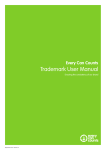
Guidelines for
use of the
OM logo
�������������
Table of contents
Introduction ...........................................................3
Changes ...................................................................4
Typography ............................................................5
Strapline...................................................................6
Restrictions .............................................................8
Colour Scheme ................................................... 10
File Formats ......................................................... 12
Logo Packages on Caleb ................................. 13
Sample Letterhead ........................................... 14
Sample Envelope & Business Card .............. 15
Introduction
3
As OM continues to grow and diversify worldwide, it is
increasingly important to strengthen our shared values
and identity. Central to this aim is a commitment to
faithful use of our branding and, in particular, our logo
with its elements.
This User Guide is designed to explain the changes to our
logo, some of the technical issues involved, accepted best
treatments of the logo, restrictions on how it may not be
used and, above all, the necessity of universal adherence
to these parameters throughout our organisation.
OM is a fluid, adaptive organisation. The present logo
follows others in our history and itself will likely be
superceded in the future. However, working together
today to achieve uniformity with this fresh identity will
ensure that inevitable changes tomorrow will be met
with confidence and success.
Changes
4
After wide and lengthy discussion, the OM logo has
been refreshed to reflect a new emphasis within our
organisation. There are several changes:
old bitmap
• the original design was distributed as a scanned TIFF
(bitmap) file—suitable for photos but inefficient for
artwork. Rasterized files are large, scale poorly with
distortion, and have transparency problems. Over
time, individuals addressed this problem for their own
purposes resulting in a wide variety of logos across the
OM world.
new vector
The letterform itself has been slightly simplified: the ‘tail’
at the top of the ‘O’ has been removed and the closing
top half of the ‘O’ is more proportionate to highlight
the handwritten effect of the letterform. Simplified
paths were created in a vector program, resulting in a
significantly smaller file and a smoother shape that is
scalable without distortion
• the colour has been changed from magenta to a deep
red (see examples above), excluding the use of any
other colour except black, grey or white (specifications
are given elsewhere in this guide). CMYK percentages
[C=0, M=95, Y=75, K=5] and/or the PANTONE (PMS)
186C must be followed. See page 10 for details.
• the name ‘Operation Mobilisation’ shall no longer be
used in conjunction with the logo
�����������
• each field’s name is allotted a defined space, and
there may be different versions depending on national
language
Typography
5
All artwork components containing type are provided
as line art. This means that no font is required to print
the logo with a field name.
�����������
However, if a design benefits from using the font elsewhere, it should be: URW Grotesk E Light Condensed.
OM does not provide this font but it can be purchased
(http://www.urwpp.de/cgi-bin1/dalcgi/source/
schnellsuche.htd?searchchar=grotesk) from the foundry
for €29. It may also be part of a commercial font
collection, or a freeware/shareware font may be an
excellent match.
A sample is given below:
ABCDEFGHIJKLMNOPQRSTUVWXYZ
abcdefghijklmnopqrstuvwxyz
1234567890
A comprehensive style guide for typography used in
OM publications will be developed in the near future.
Strapline
6
A strapline (or tagline) encapsulates the current vision
or mission of an organisation and, as such, can bring
focus to its activities. It defines (ideally) what the
organisation does—and does not do. By definition,
these emphases change over time, which is why it is
essential to understand that, although a strapline may
be used in conjunction with a logo, it can never be
considered as part of a logo.
The logo is a bedrock image statement that achieves
recognition value over time. Thus, it should not undergo change as easily as straplines.
The OM strapline of the 1990s (Bringing hope to the
peoples of the world) has been replaced to reflect the
new directions in ministry within OM. Our new international strapline is “transforming lives and communities”.
Issues
1. Language. Translating the new strapline into some
languages is problematic: either it becomes unwieldy in
length, or concepts like transformation or communities
miscommunicate. Using the English strapline with a
native-language country name also looks awkward.
2. Localised emphasis in ministry. Some fields already
employ a different strapline that serves them well and
are in keeping with OM’s overall values. Forcing these to
be dropped in favour of a single solution may be counterproductive.
Recommendations
1. Freedom to choose. Using a strapline is encouraged
and, wherever possible, ‘transforming lives and communities’ or a translation thereof is desirable. Otherwise, a
more suitable phrase may be used.
2. Uniformity in design. When a strapline is used in
proximity to the logo, it should adhere to the following
typography, space and sizing requirements (next page).
Strapline
7
Typography
Recognizing that the use of a strapline will vary, a
common font was chosen that would complement but
not compete with the country name. The strapline font
is Arial Bold Italic. Its size will depend on the size of the
logo in any given document and the length of the
strapline wording itself.
letterform
height
gap
x-height
��������������
transforming lives and communities
Spacing
Using the example on this page to establish vertical
spacing with the strapline, consider the three measurements involved: the height of the “O” in the letterform,
the gap between it and the strapline, and the x-height
(letter height not including ascenders or descenders) of
the strapline itself.
If, for example, in real terms the “O” is 37.5 mm, the gap
is 5.35 mm and the x-height is 2.5 mm, then the gap is
1/7 of the “O” height and the x-height of the strapline
text is 1/15 of the “O” height. (Whether picas, millimetres or inches, the ratio is the same). In practice, it is
simple to achieve positioning visually using the
example as a guide.
Horizontally, the strapline should fill the width of the
logo and country name but never exceed this width.
If it is slightly less than the full width, it should be rightaligned with the right edge of the country name.
Countries with short names (e.g. Canada or USA) may
find it awkward to use the strapline as a single line since
it will extend far beyond the country name.
��������������
transforming lives and communities
�����������
Minimum sizing
The weakness of linking a strapline of small text to a
logo becomes apparent when reducing the size of the
logo: it quickly becomes illegible. Therefore, minimum
height when using the strapline in proximity to the logo
should not be less than 1” (2.5 cm). Without the
strapline (or county name), it can be reduced to .5” (1.25
cm) although this will depend on background colour
and overall design; often these will increase the
minimum size for the sake of legibility.
Restrictions
8
Clear Space
Y
In general, the minimum distance between the logo
elements, other page content and the edge of a page
should be one-half of the height of the logo. The
preferred horizontal distance between the logo and any
other page element is the width of the ‘O’ letterform.
X
½Y
½Y
½X
�����������
½X
Unacceptable Treatments
unofficial colour
second colour stroke
tint of official colour
extrusion; tilt
In order to assure uniformity in the use of the logo
worldwide, a complete set of logo options will be
provided to each OM field, providing the widest range
of application for any scenario. While each field may
select different options depending on context, the logo
file itself may not be altered in any way. Such alterations
would include, but not be limited to:
• use of any other colour, tint or gradient
• embossing, drop shadows or other visual effects
(continued…)
gradient
drop shadow
Restrictions
9
• re-sizing of the logo as a whole that is not proportionate (i.e. flattening or stretching)
�����������
�����������
• use of the words “Operation Mobilisation”
• use of another font for wording. The font used has
been converted to outlines to avoid potential printing
issues and to ‘lock’ the logo, preventing alterations. See
Typography (page 5) for instructions on using the same
font elsewhere in a design.
�����������
• putting the logo (with or without wording) in a box,
either with a stroke (outline) or as a white box on
another colour background
• cropping any part of the logo
• tilting the logo in any direction
�����
�
�
�
�
�
�
• mismatching the logo colour model
with an inappropriate background
�����������
�����������
Colour Scheme
10
There are six colour models offered for each logo, as
explained below:
Cyan
0
Magenta Yellow BlacK
95
75
5
80
1) CMYK (Cyan Magenta Yellow Black [K]). This is the
standard for four-colour printing whether offset, digital
or laser. This model should be used in all publications
where full colour is employed. [C=0, M=95, Y=75, K=5].
Black for the country name is set at 80%.
�����������
2) Spot Colour: PANTONE 186C. This model can be used
when two-colour printing is desired. Use of the CMYK
model in this case will result in four colour plates being
made, negating any savings in production costs.
�����������
3) Greyscale (50%). This is to be used when printing in
black & white. Colour models should not be imported
into a black & white document, as the conversion to
greyscale will be inconsistent.
4) Black only. Possible uses include fax transmissions,
one-colour work and deliberately stark ‘poster’ designs.
�����������
Overprints & combines with other inks
(default)
�����������
Black knocks out underlying colour;
only black ink prints in space of logo
Note: Black ink used in printing has unique characteristics when used with other colours. It can be set to
overprint lighter colours, which is the default choice
and produces a richer black. However, when printed
on top of darker colours, or when a coloured area is
split between light and dark colours, the result can look
banded and negatively highlight the transition. For this
reason, the file can be set to ‘knockout’ areas of colour
underneath the black (allowing it to print directly onto
the paper colour).
Two versions of the black logo are provided—overprint
and knockout—allowing the designer to make the
appropriate choice.
Colour Scheme
11
5) Reversed (white). This is the only other acceptable
colour—suitable for very dark backgrounds where the
red would be indistinct.
�����������
�����������
Note: Approximate RGB values are R=202, G=3, B= 46;
approximate hexadecimal values are CA032E. Bear in
mind that, even with colour management software
profiles, no two monitors will display the exact same
hue, saturation or brightness. The .png and .jpg files use
an RGB colour model. In these instances only, freedom
is given to adjust colour with the intent of matching the
CMYK profile.
Technical notes:
‘White’ and ‘black’ are colours that can be misrepresented by software; in some cases white can become semitransparent and black can be treated as an extra colour
(and thus plate). To avoid this, White in the Inverted
logo is actually C=1, M=1, Y=1, K=1; in one- or twocolour printing, only the ‘K’ (black) plate will be used.
Similarly, Black is actually C=0, M=0, Y=0, K=100.
File Formats
12
The logo variations are issued in three universal
formats, depending on intended use.
1) Encapsulated PostScript (.eps)—a PostScript vector
format widely used by many programs, especially
professional page layout and illustration applications.
EPS files achieve the best results for printing, colour
fidelity and scalability. Transparent background.
2) Portable Network graphics (.png)—the ‘insert from
file’ choice of Microsoft Office applications, especially
PowerPoint. Transparent background. Please note that
Microsoft products should never be used as final
documents for professional printing due to numerous
technical issues.
3) Joint Photographic Experts Group (.jpeg/.jpg)—
a bitmap, rasterized file used in image editors.
Not scalable; gross enlarging will result in jagged edges
and general degradation of the image.
Re-saving will result in further, permanent data loss.
Saving will ‘flatten’ the image and create a white background. However, it is usable in almost any software.
Screen display issues with PC and Macintosh
There can be technical difficulties in viewing a file onscreen if the file is created on one operating system and
then used on the other. Written in PostScript, an EPS file
will still print correctly but the preview may be distorted
or missing. Thus two sets of logos are provided for each
country (plus ‘OM only) which are identical except for
the previews.
If the end use of a document is on a PC (Wintel), files
with ‘pc’ in the filename should be used; if the end use
is on a Macintosh, files with ‘Mac’ in the filename should
be used. If a file is created on a PC but will be sent to a
pre-press bureau for preparation and printing, the
Macintosh files should accompany the document.
An example listing of files available follows.
Logo Packages on Caleb
13
Our goal in providing your package is that you can
select the appropriate logo variation and import/place/
drag & drop with no further corrections, apart from
(proportionate) resizing. There are two types of packages. One is the OM letterform only; the other is the
letterform plus each individual field’s name.
Each package contains six .eps files, a .png file (RGB
colour mode) and a .jpg file (RGB colour mode).
There will be one set with a PC preview and one set
with a Macintosh preview. Explanations of these files
are found on pages 10–12.
Therefore there will be 12 files in total for the
‘OM’ letterform only, and 12 files for each field.
The files for a country (e.g. Singapore) will be as follows.
These will be compressed as a single .zip archive.
For the PC:
SingaporeCMYKpc.eps
SingaporePMS186Cpc.eps
SingaporeGreypc.eps
SingaporeBlackOverprintpc.eps
SingaporeBlackKnockoutpc.eps
SingaporeWhitepc.eps
Singaporepc.png
Singaporepc.jpg
and, for Macintosh:
SingaporeCMYKMac.eps
SingaporePMS186CMac.eps
SingaporeGreyMac.eps
SingaporeBlackOverprintMac.eps
SingaporeBlackKnockoutMac.eps
SingaporeWhiteMac.eps
SingaporeMac.png
SingaporeMac.jpg
Sample Letterhead
14
��������������
transforming lives and communities
Marketing & Communications
The Quinta, Weston Rhyn
Oswestry, Shropshire SY10 7LT
United Kingdom
+44 (0)1691 773388
www.uk.om.org
[email protected]
There is no global OM style at present; each country should determine
acceptable local formats. This is merely one example that includes vital
information in a crisp structure. The font used for contact data is Myriad Pro
Semibold Condensed 9 pt.
Sample Envelope and Business Card
15
��������������
The Quinta, Weston Rhyn
Oswestry, Shropshire SY10 7LT
United Kingdom
������
212 West Street
Port Colborne, ON
L3K 4E3 • CANADA
tel 1-905-835-2546
1–877–487–7777
harvey
thiessen
Executive Director
[email protected] • www.omcanada.org
transforming lives and communities
OM Canada has found the use of
portraits on business cards to be
effective: slightly ‘different’ and a
definite aid in being remembered!
The strapline is too long for the
OM Canada logo but can still be
used to communicate. This uses the
PMS186C (spot colour) model for
more economical printing.
The font is the Myriad Pro
(Open Type) family:
• Person’s name: Black
• Title: Semibold Condensed
• Addresses: Condensed
• Strapline: Bold Condensed Italic
—four fonts yet unified.
The updated logo package and User Guide were created by Greg Kernaghan ([email protected])
at the request of the Marketing Working Group and on behalf of the Communications Working Group. ©2006