1
Archi - ArchiMate Modelling
User Guide
Version 2.4
Introduction
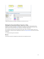
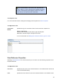
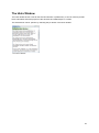
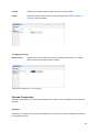
Archi is a free, open source, cross-platform tool to create ArchiMate models.
1
ArchiMate is an open and independent Enterprise Architecture modelling language that supports the
description, analysis and visualization of architecture within and across business domains. ArchiMate
1
1
is one of the open standards hosted by The Open Group and is fully aligned with TOGAF .
Archi is targeted toward all levels of Enterprise Architects and Enterprise Modellers. It is intended to
provide a low cost to entry (i.e. free) solution to users who may be making their first steps in the
ArchiMate language or who are looking for a cross-platform ArchiMate modelling tool for their
company or institution. Archi fulfils the needs of most Enterprise Architects and associated
stakeholders, but it can also be regarded as an introductory ArchiMate tool for those wishing to
engage with the language before committing to a commercial solution.
Since its introduction, Archi has been widely adopted for real-world use in the commercial and
educational sectors and is used in-house by major global companies and consultants. It is rapidly
becoming the de facto open source ArchiMate modelling tool.
The development of Archi has been funded by JISC and has been developed by Phillip Beauvoir for
JISC CETIS.
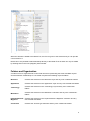
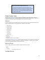
Credits and thanks
To all the users and developers who have contributed ideas and suggestions on the Archi
User Forum, too many to mention.
Jean-Baptiste Sarrodie (Jaiguru) contributed the code for the Orthogonal Anchor connection.
And to all the many Archi users for their support and encouragement over the years!
1
Installing and Launching Archi
Download the required version from http://archi.cetis.ac.uk/download.html
The Windows version is installed by means of an executable installer. Run the installer wizard to
install Archi to your system. Windows XP, Windows Vista and Windows 7/8 32-bit and 64-bit versions
are supported.
The Mac and Linux versions are packaged in zip and tar.gz files respectively. Simply un-archive the
downloaded archive file and double-click the "Archi" application file to launch the program.
Example models
Alongside the Archi installation is an "examples" folder containing a few simple ArchiMate example
models. You can open these in Archi from the "Open" menu.
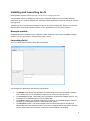
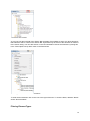
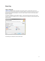
Launching Archi
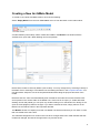
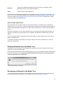
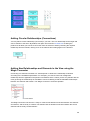
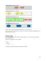
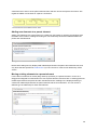
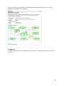
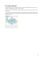
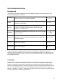
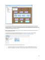
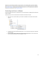
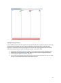
The new, blank Archi workspace looks like the following:
The Default Archi Workspace
The workspace is divided into the following sub-windows:
The Models Tree window. By default this is positioned at the top left and labelled "Models".
This is where one or more ArchiMate models can be viewed as a tree structure.
The Properties window. This displays the properties for a selected ArchiMate element. The
properties for the selected element can be edited here.
The Outline window. This window displays the contents of an ArchiMate diagram (View) in
miniature as a navigation tool for the selected diagram (View).
The Navigator window. This window displays the selected model element and all of its
relationships with other model elements. It is used to navigate between connected elements
via their relationships and is used in conjunction with the Models Tree window.
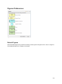
2
The Palette window. When opened will display a single window for the drawing Palette used
in Views.
The Visualiser window. This window displays the selected model element and all of its
relationships with other model elements in a graphical way. It is the graphical equivalent of
the Navigator.
The Hints window. This displays short textual hints for the selected object. For example,
selecting an ArchiMate "Business Actor" diagram element displays a short summary of that
object's meaning and purpose. Selecting an item or hovering over an item, in the diagram's
palette also displays a hint in the window.
These sub-windows can be re-arranged by dragging them into new positions, or by dragging them out
of the main application window to become detached from the main window.
The various windows may be shown or hidden by selecting the appropriate menu items from the
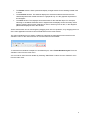
"Window" menu on the main menu bar or from the buttons on the toolbar:
The Windows Toolbar
To reset the Archi window workspace to its default layout, select "Reset Window Layout" from the
"Window" menu from the main menu.
You can hide or show the main toolbar by selecting "Hide/Show Toolbar" from the "Window" menu
from the main menu.
3
Working in Archi
As you work in the application, you may wish to be aware of how things work generally.
Windows and Tabs
The main editing area for Views is in the central-right portion of the application. Windows and tabs
can be dragged and dropped to be re-arranged as you wish. You can even detach some windows so
that they "float". If ever you wish to reset the arrangement of windows back to their default positions,
choose "Reset Window Layout" from the main "Window" menu.
Undo/Redo (contextual per model)
Full Undo and Redo commands are available for every action that is performed by the user in Archi.
Undo and Redo commands are contextual depending on
the selected model in the Model Tree or a View. Clicking onto
a View or the Model Tree will enable the command if an
action has been performed for that model.
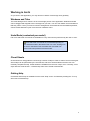
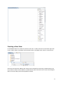
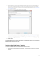
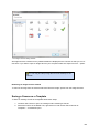
Cheat Sheets
Cheat sheets can help guide the user through a series of steps in order to achieve some overall goal.
Some steps can be performed by the cheat sheet, and some are described so that the user can
manually complete the step. Cheat sheets are available from the main "Help" menu. Currently, Archi
ships with two Cheat sheets - "Create a Map View" and "Create a New Model".
Getting Help
Contextual and full help is available from the main "Help" menu. On Windows pressing the "F1" key
will invoke contextual help.
4
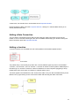
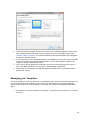
Creating a New ArchiMate Model
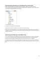
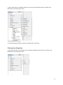
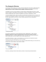
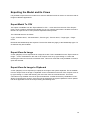
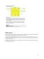
To create a new, blank ArchiMate model in Archi do the following:
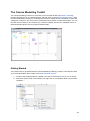
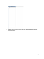
Select "Empty Model" from the main "File->New" menu or from the button on the main toolbar:
The "New" button
A model entitled "(new model)" will be created and visible in the Models Tree window with the
"Default View" open with a blank drawing canvas and palette:
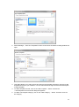
The default Archi workspace with a new model created
Note that the model is named by default "(new model)". You may change this by renaming it directly in
the Model Tree or selecting it in the Model Tree and editing the name in the Properties Window. You
may also add a "Purpose" here in the Properties Window describing the purpose and aims of the
model.
Note also that one "View" has automatically been created for the model and named "Default View"
and is placed in the "Views" folder in the Model Tree. If the View is not open (i.e. visible with blank
drawing canvas and palette) you can open it by double-clicking on it in the Model Tree. Doing so will
open the View (diagram) editor to the right. If you wish to rename the View, simply select it on the
Model Tree and edit the name in the Properties Window.
The Models window can display more than one Model Tree which means that you can work on more
than one model at the same time.
The asterisk that appears on a model in the Tree when changes have been made indicates that this
model was changed, but that the changes have not yet been saved.
5
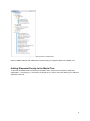
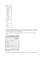
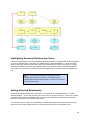
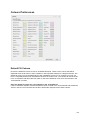
The Model Tree
An ArchiMate 2.0 model consists of a number of ArchiMate elements belonging to three "layers" - the
"Business" layer, the "Application" layer and the "Technology" layer. Each ArchiMate element belongs
to one of these layers. For example, a "Business Object" belongs to the "Business" layer and an
"Application Component" belongs to the Application layer. The following is a list of all the ArchiMate
elements grouped by their layers:
Business Layer
Business actor
Business role
Business collaboration
Business interface
Business object
Business process
Business function
Business interaction
Business event
Business service
Representation
Meaning
Value
Product
Contract
Location
Application Layer
Application component
Application collaboration
Application interface
Data object
Application function
Application interaction
Application service
Technology Layer
Node
Device
Network
Communication path
Infrastructure interface
Infrastructure function
System software
Infrastructure service
Artifact
The ArchiMate 2.0 specification introduces the additional following extensions and concepts:
Motivation
Stakeholder
Driver
Assessment
Goal
6
Principle
Requirement
Constraint
Implementation & Migration
Work package
Deliverable
Plateau
Gap
Each element in the model can connect to one or more other elements via one or more relationships
(connections). These are as follows:
Relationships
Association
Access
Used by
Realization
Assignment
Aggregation
Composition
Flow
Triggering
Grouping
Junction
Specialization
Influence
It is beyond the scope of this guide to explain these elements and their relationships. For more
information refer to the ArchiMate Specification Guide (available from http://www.archimate.org/)
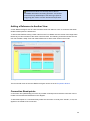
An ArchiMate model consists of configurations of these elements connected to each other via the
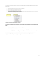
various relationships. The normative model is represented in Archi in the "Models" window as a tree
structure organised into folders:
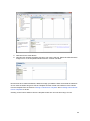
7
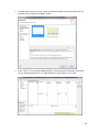
The Model Tree window showing an example model for "Archisurance"
Each ArchiMate element and relationship is placed under its respective folder in the Model Tree.
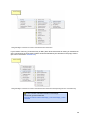
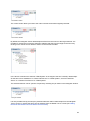
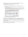
Adding Elements Directly to the Model Tree
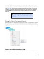
To add new ArchiMate elements directly to the Model Tree, select one of the folders, "Business",
"Application", "Technology" or "Connectors" and right-click. A "New" menu item allows you to add new
elements to the tree:
8
Adding a new element directly to the Model Tree
When the element is added to the Model Tree, the focus is given to the element and you can provide
a new name for it.
Note that it is not possible to add relationships directly to the Model Tree as these can only be added
by drawing them in the View (diagram) editor window.
Folders and Organisation
A model in Archi is organised into a basic folder structure representing the three ArchiMate "layers"
and the elements' relationships. A new model comprises the following top level folders:
Business
Contains the elements in the "Business" layer and any user-created sub-folders
Application
Contains the elements in the "Application" layer and any user-created sub-folders
Technology
Contains the elements in the "Technology" layer and any user-created subfolders
Motivation
Contains the elements in the "Motivation" extension and any user-created subfolders
Implementation & Contains the elements in the "Implementation & Migration" extension and any
Migration
user-created sub-folders
Connectors
Contains the Junction type elements and any user-created sub-folders
9
Relations
Contains the relationships between elements as they are created in Views
(diagrams) and any user-created sub-folders
Views
Contains links to Views (diagrams)
Elements can be created and deleted directly in the Model Tree (see Adding Elements Directly to the
Model Tree) or are automatically added to the appropriate type folder as objects are drawn onto the
canvas of a View (see Adding New Elements to the View from the Palette). All elements in a folder
are automatically sorted alphabetically.
User-Created Sub-Folders
User sub-folders can be created under the main top-level folders. This allows you to organise the
elements in any way you wish. To add a new sub-folder to the Model Tree, select a top-level folder (or
a user-created sub-folder), and right-click. A "New" menu item allows you to add a new sub-folder to
the tree.
Note that a sub-folder can only contain elements of the same type as the topmost parent folder. For
example, only "Business" type elements can be created in the "Business" folder and any of its subfolders.
You can also drag and drop elements and sub-folders within the same folder branch, but not across
folders of different types.
To rename a sub-folder in the Model Tree choose "Rename" from the main Edit menu or from the
right-click context menu.
Deleting Elements from the Model Tree
To delete one or more elements in the Model Tree select them and choose "Delete" from the main
"Edit" menu or from the main toolbar.
Note that if an element that you wish to delete appears in one or more Views you will be warned that it
is referenced in those Views. If you then delete the element from the tree you will also delete it
from any Views where it is referenced.
Warning about deleting an element
Renaming an Element in the Model Tree
To rename an element or relationship in the Model Tree choose "Rename" from the main Edit menu
or from the right-click context menu. You can also rename it in the Properties Window.
10
Duplicating an Element or View in the Model Tree
To duplicate Elements or Views in the Model Tree select "Duplicate" from the main "Edit" menu or
from the right-click context menu. Note that Duplicate Views contain references to the original
elements copied.
Editing Properties for an Element in the Model Tree
To edit the Properties for a selected element or relationship in the Model Tree, select the tree node
and open the Properties Window either by double-clicking the tree node or from the main “Window”
menu or main toolbar.
Each element in the Model Tree has different properties that can be set or viewed in the Properties
Window. For more information see the section, The Properties Window.
Note - some properties can only be edited when the element is selected in a View (for example, the fill
colour, font or line width).
Elements in the Model Tree and Views
Elements in the Model Tree can be added to any number of diagram Views in the model by dragging
them onto the View's canvas (see the section, "Views"). When an element has been added or used in
a View the font used in the Model Tree for that element is normal. However, if the element only exists
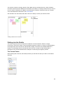
in the Model Tree and is not used in any View it is shown with an italic font:
Italic font shows elements not used in Views
This makes it convenient to see those elements that may have become redundant and can be
deleted.
11
Synchronising Selections in the Model Tree and a View
When selecting elements in the Model Tree and in diagram Views it is sometimes useful to
synchronise the selection between the elements in both windows. Pressing the "Link to View" button
in the Model Tree window allows this to happen:
The "Link to View" button
This button is a toggle and can be turned off.
Synchronised selection is possible on more than one selected element.
Note that synchronised selection is only possible if a relevant View is open. Selecting an element in
the Model Tree will not synchronise a selection in a View if that View does not contain that particular
element or elements.
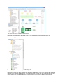
Searching and Filtering in the Model Tree
The number of elements in the Model Tree can grow quite considerably as you work on your model.
Of course, you may wish to add sub-folders within the main folder structure to help organise your
elements. However, finding a particular element in the tree may still prove to be difficult.
In order to search the Model Tree a Search Bar is included in Archi. This is accessed by clicking on
the "Search" button on the toolbar of the Model Tree window. Clicking this button reveals the Search
Bar:
12
The Search Bar revealed
As you type into the text field of the Search Bar the Model Tree updates to show only those elements
that match the search criteria in the Search Bar. By default only the name of the elements is matched
to the search string. You can also search on the "Documentation" field of the elements by ticking this
in the "Filter Options" drop-down menu in the Search Bar:
Searching on both "Name" and "Documentation"
To clear the text selection click on the icon to the right of the text. To clear the filters, deselect "Name"
and/or "Documentation".
Filtering Element Types
13
To filter certain types of ArchiMate element you can select the different types to include in the
filter/search in the drop-down menu:
Filtering certain element types
To reset the element-type filter, select the "Reset Filters" menu item.
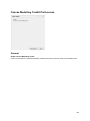
Filtering User Properties
To filter User Properties of elements you can select the different Property keys to include in the
filter/search in the drop-down menu:
Filtering on User Properties
14
Showing All Folders
As you refine your search the Model Tree will only show those elements that match your search/filter
criteria (or none at all if no elements match). Thus, folders with no matching child elements are not
shown. If however you wish to show these empty folders as you search for elements (you may wish to
drag and drop elements to other folders, for example) then you can set this as an option in the filter
menu by selecting "Show All Folders".
To close the Search Bar and reset the search filter press the "Search" button one more time.
15
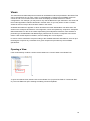
Views
The elements and relationships that constitute an ArchiMate model as represented in the Model Tree
can be arranged into one or more "Views" or visual diagrams. Therefore an ArchiMate model can
consist of one or more Views where each View can display the model elements in various
configurations. For example, you may wish to only see the Business Layer elements in one View and
the model's Application Interface elements in another View. Or you may wish to create a "master"
View that acts as a map to all of the other Views in the model.
ArchiMate advocates an approach in which architects and other stakeholders can define their own
Views on the enterprise architecture. In this approach, Views are specified by viewpoints. Viewpoints
define abstractions on the set of models representing the enterprise architecture, each aimed at a
particular type of stakeholder and addressing a particular set of concerns. Viewpoints can both be
used to view certain aspects in isolation, and for relating two or more aspects.
In Archi a View is unlimited in scope according to the available elements and relations, and it is up to
the designer to impose any constraints for a given viewpoint as prescribed by the ArchiMate
specification.
Opening a View
If the model already contains a View it will be visible in the "Views" folder in the Model Tree:
The Default View in the Model Tree
To open and edit the View, double-click it in the Model Tree (or press Ctrl-Shift-O / Command-ShiftO). The View Editor will open showing the editing canvas and palette:
16
The View Editor showing a blank drawing canvas and palette
Creating a New View
An ArchiMate model can consist of more than one View. To add a new View to the model, right-click
on the "Views" folder in the Model Tree and select "New->ArchiMate View" from the context menu:
Adding a new View to a Model
Once the View has been added to the model it can be opened from the tree by double-clicking on it.
Any number of Views can be added to a model and be open at the same time. Views are arranged in
tabs in the main editing area of the application window.
17
Working with Views
Once a View has been opened you may now "draw" on the canvas, adding and creating new
ArchiMate elements, connections (relationships) and annotations (notes). As you add figures to the
canvas from the palette, the corresponding ArchiMate elements and relationships are added to the
ArchiMate model and are visible in the Model Tree.
You also add existing elements to the View by dragging and dropping them from the Model Tree into
the View. You can add new elements to the Model Tree (see Adding Elements Directly to the Model
Tree) and then drag them to any number of Views in the model. Thus, elements and relations can
appear in more than one View, each occurrence referencing the same element in the Model. Thus, if
you change the name of the model element it will change for all occurrences in all Views.
Navigating a View
Panning
If you select the first selection tool from the Palette, click somewhere on the View to give it the focus
and then hold the Space bar down the cursor will change to a hand and you can pan the View. You
can also pan around the View by holding down the middle mouse button.
Using the Keyboard Instead of the Mouse in a View
It is possible to move and resize selected objects in a View by using the computer keyboard instead
of a mouse. To move an object, press the period key (".") once to reveal the MOVE cursor. Then use
the Arrow keys, followed by the ENTER key to commit the move. To resize the object, press the
period key (".") until the RESIZE cursor appears at the desired resize handle. Press the ENTER key to
commit the resize.
Automatic Scrolling in a View
Sometimes you may find that an element is outside the area of the View area and you wish to draw a
new connection between one element and another element outside of the View area (the scrollbars
would normally need to be used). To do so, simply click on the source element after selecting the
connection tool and then hover the mouse at the edge of the Viewport. After a short pause, the View
will automatically scroll.
Zooming a View
You can zoom in and out of a View in a number of different ways:
From the main "View" menu
By using the shortcut keys Ctrl+ and Ctrl= ("Command" key on Mac)
By using the Zoom combo box on the main toolbar.
By holding the Ctrl key down ("Command" key on Mac) and using the mouse scroll wheel
Used in combination with the Outline View you can easily navigate around large diagrams.
The Palette
The palette contains the drawing tools, and elements and relationships that can be added to a View. It
is an area that is attached to a View.
18
The Palette in a View
To create new elements and relationships in a View select the required element tool on the palette
and either click or drag it onto the canvas area. Once the figure has been added to the canvas you
can resize and re-position it by the usual drag actions.
You can configure how the Palette displays items by right-clicking on the Palette and choosing
"Settings...":
Palette Settings
A useful setting is to display the Palette with "Icons only" in order to see all available Palette tools:
19
The Palette displaying as "Icons only"
If you cannot see the palette in a View it may be closed. If this is the case, open it by clicking the
"Show Palette" triangle button at the top-right of the View window.
The Detached Palette
By default, each View has its own attached Palette. It is also possible to have a single, detachable
Palette that you can drag and dock to any position in the application window. To do this, click on the
"Palette" button on the main toolbar:
The "Palette" button on the main toolbar
Pressing this button detaches the Palette from the View and creates a Palette window. You can drag
and dock this to anywhere in the application space. The following example has the Palette docked in
the lower left corner:
20
The Palette window docked in the lower left corner
Closing the Palette window re-attaches it to any open Views.
Palette Selection Tools
There are two selection tools available in the Palette. These are used to select the elements in a
diagram in various ways.
The selection tools in the Palette
The first tool (selection tool) is used to select elements (boxes) only. When dragging a marquee area
around elements and connections, only the elements (boxes) will be selected.
The second tool (marquee tool) is a drop-down button and is used to select both elements and
connections in various ways:
The selection tool options
21
Tip: Pan the View using the selection tool
If you select the first selection tool from the Palette, click
somewhere on the View to give it the focus and then hold the
Space bar down the cursor will change to a hand and you
can pan the View. You can also pan around the View using
the middle mouse button.
Palette Creation Tools
Apart from the Selection Tools there are other tools available on the Palette used to create new
ArchiMate elements, Notes, Groups and Relations between elements (connections). To add a new
element or to the canvas select one and drag it onto or click onto the canvas.
Relations
There are eleven types of ArchiMate relation and three types of junction elements (the latter are not
strictly connections but they are grouped with the relations on the Palette).
The Relations Creation Tools in the Palette
The first tool is the Magic Connector, used for drawing connections. This is followed by creation tools
for Specialisation, Composition, Aggregation, Assignment, Realisation, Triggering, Flow, Used By,
Access and Association relations. Junctions follow these.
Notes and Groups
Used for adding a Note, Group Container, or Note Connection to a View.
Note, Group and Note Connection Creation Tools
ArchiMate Elements
22
These are divided into 5 areas corresponding to the "Business", Application and "Technology"
ArchiMate layers and the extensions "Motivation" and "Implementation & Migration":
The Creation tools
Note that a sub-set of these elements will only be available if the current View is restricted to a given
Viewpoint.
Tip: Press the shift key when selecting a palette tool to
keep it selected
By default, once an element or connection has been drawn
on the canvas the default selection tool (arrow) is re-selected
on the palette. If you wish to keep the current palette tool
selected hold the “Shift” key down when you select it.
The Format Painter
The Format Painter is a tool on the Palette toolbar that allows you to quickly copy the visual formatting
of one element or connection and paste it to others in a View. Instead of having to manually apply the
23
font, font colour, text alignment, and other formatting to each new element or connection in a View,
you can quickly copy all of the formatting attributes by using one toolbar button.
The Format Painter tool is at the top of the Palette:
The Format Painter tool
To copy and paste formatting in View:
1. Select the Format Painter tool from the Palette. Initially it will appear grey, indicating that it is
"empty" and ready to copy.
2. Click on the source element or connection from which you wish to copy the formatting. The
Format Painter tool cursor will change to a darker outline and to the colour of the fill element
or connection that is copied. Also, the tool entry on the Palette will appear darker and the
tooltip will update to explain this.
3. Now click on the target elements or connections to paste the formatting.
4. To clear the Format Painter so it is ready to copy some more formatting, either double-click
on the tool in the Palette or double-click on an empty space on the canvas.
Note that copied formatting from an element cannot be pasted to a connection, and vice-versa. You
can use the Format Painter tool between different Views. If it is "primed", simply select it from the
Palette in another View and paste the formatting to target elements or connections.
To see a screen-cast demonstration of the Format Painter
go to this web-site: http://archi.cetis.ac.uk/movies/formatpainter/format-painter.html
Adding New Elements to the View from the Palette
To create and add new elements to the View select the required element on the Palette and either
click or drag the new figure onto the canvas area. Once the figure has been added to the canvas you
can resize and re-position it by the usual drag actions.
Adding Elements to the View Automatically Adds them to the Model Tree
It is important to understand that adding elements (and relationships) to a View from the palette
automatically adds those elements to the Model Tree as well. For example, dragging a "Business
Actor" element onto the canvas creates both a figure on the View called "Business Actor" and also a
node on the Model Tree with the same name.
Furthermore, if you delete an element in a View the corresponding element in the Model Tree is not
deleted. This is because the element may be referenced in another View in the model. To delete the
element completely you have to delete it in the Model Tree or choose the right-click menu item,
"Delete from Model".
You can edit the element's name directly by clicking the text area on a figure. Double-clicking on the
figure opens the Properties Window where you may edit the properties of the selected element.
24
Editing the View's Elements' Properties
The properties for a selected element in a View can be edited in the Properties Window. To open the
Properties Window, either double-click the figure or select the figure and open the window from the
toolbar or main menu. Each element in the View has different properties that can be set or viewed in
the Properties Window. For more information see the section, The Properties Window.
Double-clicking an Element in a View opens the Properties Window, single-clicking on an already
selected Element's text field allows you to directly edit the Element's text.
Adding New Relationships (Connections) to the View from the
Palette
To add new relationships (connections) to the View select the required connection tool on the Palette
and drag from one element on the View to another on the same View.
As with adding elements from the palette, adding a relationship to a View automatically adds it to the
Model Tree as well, in the "Relations" folder.
When adding a new connection in a View, if the same type of model relationship already exists
between the source and target elements, a dialog box will appear giving you the option to reference
that model relationship from the connection, or create a new connection and model relationship:
A dialog providing the option of re-using a model relationship.
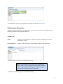
Relationships, Rules and Regulations
ArchiMate elements can connect to other elements by a
given set of relationships (connections). Some relationships
are allowed, others are not. If a relationship is not allowed the
cursor will show as a "Not Allowed" symbol, a circle with a
diagonal line. If a relationship is allowed, it will show as a
"plug" symbol.
Information about Connections
Once a relationship (connection) has been created between elements, some useful information can
be revealed when the mouse cursor hovers over the connection to reveal a tooltip. The tooltip
displays the relationship's name, its type, and some text that describes the nature of the relationship
between the source and target elements.
25
A tooltip shows useful information when hovering over a connection
Adding Circular Relationships (Connections)
You may add a circular relationship (connection) if you wish. This is a relationship whose target and
source element is the same. By default, this option is turned off in Preferences. Enabling the
preference will allow you to draw a connection from an element to itself by selecting the required
relationship from the Palette, clicking once on the element and clicking again on the element:
A circular relationship
Adding New Relationships and Elements to the View using the
Magic Connector
Connecting one element to another in a View depends on whether the relationship is allowed
according to the ArchiMate specification. For example, you cannot connect an Assignment
relationship from an Application Component to a Business Actor. Unless you are very familiar with the
rules governing the relationships in ArchiMate it can be frustrating to find the allowable relationships
between one element and another. The "Magic Connector" solves this problem.
The Magic Connector in the Palette
The Magic Connector has two uses - firstly to create a new allowed connection between one element
and another, and secondly to create a new element and an allowed connection between the source
element and the newly created element.
26
To create a connection between a source and a target element using the Magic Connector follow
these steps:
1.
2.
3.
4.
Select the Magic Connector tool from the palette
Click on the source element in the View
Click on the target element in the View
A popup menu will appear showing the allowable relationships between the two elements.
Choose the required type from the menu
Drawing a connection using the Magic Connector
To create a new element and connection in one operation using the Magic Connector follow these
steps:
1.
2.
3.
4.
Select the Magic Connector tool from the palette
Click on the source element
Click on a blank area of the View's canvas, or on a Group figure
A cascading popup menu will appear showing all allowable elements and relationships
between the two. Choose the required element and connection from the menu
In the following example a new Business Role element will be created together with a new
Assignment relationship connecting to the original selected Business Actor element.
27
Using the Magic Connector to create a new element and connection
If you hold the "Ctrl" key ("Command" key on Mac) down at the same time as clicking on a blank area
of the canvas then the Connections will be shown first followed by the elements in the popup menus
(this can be reversed in Preferences):
Using the Magic Connector to create a new element and connection while pressing the Ctrl / Command key
To see a screen-cast demonstration of the Magic
Connector go to this web-site:
http://archi.cetis.ac.uk/movies/magic_connector/magic_conne
ctor.html
28
Adding Elements and Relations from the Model Tree to a View
Existing elements and relationships can be added to a View by dragging and dropping them from the
Model Tree to a View.
Dragging and dropping a relationship into a View also adds its source and target elements to the View
if they are not already present on the View. Any existing elements on the View automatically have all
their connections to the dropped element(s) added as well.
When you drag and drop elements from the Model Tree to
a View any associated relationships are also added to the
view as connections. There may be times when you do not
want this to happen, you may simply wish to drag another
instance of an element onto the View, for example. In order
to do this, on Windows and Linux hold the Ctrl key down, or
on Mac hold the Alt key down when dragging and dropping.
Working this way means that you can regard the Model Tree as a repository of elements and relations
for the model that can be added to any View within the same model. The same element can be added
more than once to a View.
Important! - A model element or relationship can appear
multiple times in the same or different Views. You can set its
visual appearance individually for each occurrence.
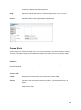
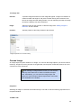
Adding a Group
Elements can be grouped together in a View using a Group element container type. The Group
relationship indicates that objects, of the same type or different types, belong together based on some
common characteristic.
A Group can be added from the View's Palette:
The Group Palette Entry
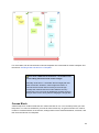
The following example shows elements grouped together using the Group element to indicate the
various layers in the model:
29
Example of Groups
A Group's name, font and fill colour can be edited in the Properties Window.
Double-clicking a Group opens the Properties Window, clicking on the Group's text field allows you to
directly edit the Group's text.
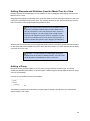
Adding a Note
Notes can be added to the View to allow for visual annotations. A note has no semantic meaning in
the ArchiMate language.
A Note can be added from the View's Palette:
The Note Palette entry
The following example shows elements annotated with a Note:
30
Using a Note in a View
A Note's text, font and fill colour can be edited in the Properties Window.
Double-clicking the Note opens the Properties Window, clicking on a selected Note allows you to
directly edit the Note's text.
Adding a Note Connection
You can draw a connecting line from and to a Note using the "Note Connection" line tool in the
Palette. It has no semantic meaning like the other ArchiMate relationship types. Double-clicking the
Note Connection opens the Properties Window.
Adding a Junction
A Junction element can be added from the View's palette in the Relations palette section:
The Junction entry in the Palette
The palette entry is a three-way drop-down box, so three different types of junction can be added "Junction", "And Junction", and "Or Junction". A Junction is used to connect dynamic relationships of
the same type. A Junction is used in a number of situations to connect dynamic (triggering or flow)
relationships of the same type; for example, to indicate splits or joins.
Junctions appear in the Model tree in the "Connectors" folder. They can also be added directly to the
Model Tree by right-clicking on the "Connectors" folder and selecting the "New" menu item.
Example of an "Or" type Junction
31
Note that Archi does not currently enforce the full
ArchiMate rules when connecting junctions. You should
ensure that only relationships of the same type (Flow or
Triggering) are used to connect elements and junctions.
Adding a Reference to Another View
A View Reference figure acts as a link to another View from within a View. It's a shortcut that when
double-clicked opens the linked View.
To add a View Reference drag a View node from the Tree Model onto the canvas of the target View.
Note that you cannot reference the same View from itself. The following screenshot shows how the
user has created a "Map" View with View References to all the other Views in the model:
Adding View References to create a "Map" View
The font and fill colour of the View Reference figure can be set in the Properties Window.
Connection Bend-points
A connection line (relationship) can have any number of bend-points so that the connection can be
routed to form bends and deviations in the diagram.
To add a bend-point to a connection firstly select the connection. A bend-point "handle", or dot, will
appear in the middle of the connection:
32
A connection bend-point "handle"
Drag the bend-point handle in the desired direction. Notice that as you drag the handle two new bendpoint handles are added to the connection:
Connection bend-point "handles" appear
You can continue to select and drag these handles to create new bend-points. As each new bendpoint is created, two new handles will appear either side of the selected handle.
To delete a bend-point, select the bend-point's handle and drag it so that the connection line becomes
straight. Once the connection line is straightened the bend-point will disappear.
Note - bend-points cannot be added to connections if the Connection Router Type for the View is set
to "Manhattan". See here for more details.
Setting the Properties of a Connection
A Connection's (Relationship's) properties can be edited by selecting the connection on the View and
opening the Properties Window. See the section, Relationship Connection Appearance Properties, for
more information.
Text can be added to a connection (on the "Main" tab) and displayed in one of three positions, and the
thickness of the line itself can be set as can the text's font and colour. The following screenshot shows
a connection with a medium line width and text showing in the “Target” position with a blue italic font
and purple line colour:
33
Setting a Connection's Text, Position, Line Width, Font, Font and Line Colour
Setting the Connection Router Type for a View
By default, connections are drawn as straight lines from element to element. Bend-points can be
added to a connection as detailed here. However, it is possible to set the overall connection router
type so that the connections route around elements or are drawn orthogonally.
The connection router type can be set either from the main "View->Connection Router" menu or by
right-clicking on a View or from the "Appearance" tab in the Properties Window when the View canvas
is selected.
The available router types are as follows:
Manual
Connections are drawn in straight lines. Bend-points can be added by the user.
34
Manual Router
Shortest Path
Connections are drawn to avoid elements and route around them. Bend-points can be added by the
user.
Shortest Path Router
Manhattan
Connections are routed orthogonally. Bend-points cannot be added by the user.
35
Manhattan Router
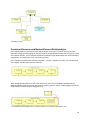
Container Elements and Nested Element Relationships
Each graphical element (except for notes and junctions) can act as a container element for other
elements. Dragging and dropping an element inside of another element means that it becomes a child
of the parent element. This is useful to represent containment type relationships such as Composition,
Aggregation, and Association or for convenient grouping.
In the following screenshot the elements "Register", "Accept", "Valuate" and "Pay" are child elements
of the parent "Handle Claim Process" element:
Child elements contained by a parent element
While dragging elements into or over other elements a visual cue is provided to indicate that the
dragged element will be moved into the parent (container) element. This is a blue highlight around the
target element as the element is dragged over it:
A Child Element being Dragged into a Container Element. The Container highlighted in blue
36
Creating, Showing and Hiding Relationships between Nested
Parent/Child Elements
The ArchiMate specification states that the relationships Composition, Aggregation and Association
may also be expressed by nesting the model elements. That is to say, an explicit connection need not
be drawn between the parent and child elements but that they may be drawn as a container nested
type instead.
Archi supports this convention with Automatic Relationship Management (ARM). This system
ensures that relationships are automatically created and hidden between qualifying parent/child
elements. The system can be configured to suit the user's needs. See Preferences to configure the
ARM.
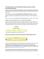
The best way to explain the Automatic Relationship Management system (ARM) is by an example.
Example - Nested sub-processes in a Composite relationship
Suppose the user has a Business Process element named "Handle Claim Process" that will act as a
container element ("parent") for four sub-processes, "Register", "Accept", "Valuate" and "Pay". The
relationship between the parent process and the sub-processes would normally be expressed as four
Composition relationships. These can be drawn conventionally using connecting lines as follows:
Composition relationship between parent and child processes
However, this is visually not as clear as if the sub-processes were placed inside of the container
parent process. Unfortunately, simply moving the elements into the parent results in a mess:
Messy arrangement of explicit connections
In order to tidy up this arrangement we need to delete the four Composition connections. We cannot
delete the Composition relationships from the actual model as this would mean that it is not
semantically correct. We could delete the connections from the View (the "Delete from View"
command) which would leave the relationships in the model, but then the "Analysis" Properties table
would not show that the relationships were used in this View (they would display in an italic font in the
Model Tree, see "Elements in the Model Tree and Views")
We can solve this problem by enabling the ARM system in Preferences. This ensures that when the
sub-processes are placed in the parent element the connections are hidden in the View, but are still
regarded as present in the View in the "Analysis" table of the relationship's properties. Dragging the
37
child elements in and out of the parent element hides and then shows the explicit connections. We
regard the hidden connections as "implicit" connections.
The Connections now hidden from the View
Adding new elements to a parent element
Adding new elements to a parent element in a View from the Palette or dragging and dropping from
the Model Tree results in a dialog box asking if a new relationship should be created between the
parent and child elements:
Dialog to create a new nested relationship
Note that the dialog will only display valid relationships between the parent and child elements, and
only those that are specified in Preferences. If you do not wish to create a new relationship, select
"None".
Moving existing elements to a parent element
If more than one element is moved (drag and drop operation) to a parent element in a View or is
dragged and dropped from the Model Tree onto a parent element, and there are no existing preferred
relationships between the parent and the child elements then a dialog box is displayed offering to
create new relationships between the parent element and the child elements. You can choose a
different type of relationship for each child element:
Dialog for creating more than one relationship
38
If you do not wish to create a new relationship for an element, select "(none)" from the drop-down
combo box. To select the same type of relationship in the drop-down combo-box, hold down the Ctrl /
Command key and select.
If the "Link to View" button is enabled in the Model Tree and you select a relation in the Tree then
normally the corresponding connection is selected in the View, but in the case of an implicit type
connection (hidden) then the parent and child elements are selected in the View to show that
relationship.
To see a screen-cast demonstration of the Automatic
Relationship Management (ARM) system go to this website: http://archi.cetis.ac.uk/movies/nested-relations/nestedrelations.html
Setting the Order of Overlapping Elements
Overlapping elements in a View can be brought to the front or back, or brought forward or sent back.
This is also known as the "Z" order. This is achieved by selecting the element in a View and rightclicking to invoke the "Order" menu items. These same menu items are also available from the main
"View" menu.
Changing the order of overlapping elements
Copying and Pasting Elements in a View
Elements may be cut, copied and pasted in Views. There are, however, certain constraints on how
this works:
39
If an element is pasted into a View from the same model where the element already exists in
that View then a new model element and a new diagram element are created for the View.
The new element is a copy of the original. Any connections are also created anew as copies.
If an element is pasted in a View from the same model where the element does not already
exist then a new diagram element is created for the View and the original model element is
referenced. This is equivalent to dragging the element from the Model Tree into the View. Any
connections are also referenced.
If an element is pasted into a View from a different model then a new model element and a new
diagram element are created for the View. The new element is a copy of the original. Any connections
are also created anew as copies.
Deleting Elements and Relationships (Connections) in a View
Selected elements and/or connections in a View can be deleted from the View by choosing the
"Delete from View" menu item from the main "Edit" menu, from the main toolbar or from the right-click
menu. Note - this action deletes those elements from the View not from the model. To delete the
element completely you have to delete it in the Model Tree or select "Delete from Model".
Select in Model Tree
This menu item is available when right-clicking an element or relationship in a View. It will select the
corresponding model element in the Model Tree.
Delete from Model
This menu item is available when right-clicking an element or relationship in a View. The selected
elements and/or relationships are then deleted from the model itself and any Views that reference
those elements. This is the equivalent of selecting the elements in the Model Tree and choosing
"Delete".
Alignment Tools, Guides and the Grid
In order to facilitate the drawing of pleasing diagrams, various alignment tools are provided. These
are available from the main "View->Position" menu item, from the main toolbar or by right-clicking on
the diagram's canvas area to select the "Position" menu items. These are as follows:
Zoom in / Zoom out:
Zoom in and out of the diagram. This is also available on the toolbar as
a combo box. You can also Zoom in and out by holding the Ctrl key
and scrolling the mouse wheel.
Snap to Grid:
Snaps elements to the Grid whether it is visible or not. (Grid spacing
can be set in Preferences.)
Grid Visible:
Toggles the visibility of the Grid. (Grid spacing can be set in
Preferences.)
40
Snap to Alignment Guides: These are blue alignment guides (lines) that appear when elements
are dragged in a diagram. They assist in lining the edges and centres
of elements.
Align Left:
When two or more elements are selected align on the left edge.
Align Center:
When two or more elements are selected align centrally horizontally.
Align Right:
When two or more elements are selected align on the right edge.
Align Top:
When two or more elements are selected align on the top edge.
Align Middle:
When two or more elements are selected align centrally vertically.
Align Bottom:
When two or more elements are selected align on the bottom edge.
Match Width:
When two or more elements are selected match the width of the
elements to the primary selection.
Match Height:
When two or more elements are selected match the height of the
elements to the primary selection.
Default Size:
Set the selected element to its default size. If disabled then the
element is already set to its default size.
Showing a View in Full Screen Mode
On Windows and Linux, a View can be displayed and edited in Full Screen mode (this is not available
on the Mac OS X version of Archi since OS X has its own full screen support). This can be useful to
maximise the View for presentation purposes. To do so select a View and press the F11 key, or
choose the "Full Screen" menu item from the main "View" menu. The View will be maximised:
41
A View in Full Screen mode
The Floating Palette window can be closed with the Escape key or the window's close button. Rightclicking on the View in Full Screen mode invokes a context menu where the Palette may be shown if it
is not currently visible.
42
Viewpoints
The ArchiMate Specification states that "...architects and other stakeholders can define their own
views on the enterprise architecture. Viewpoints define abstractions on the set of models representing
the enterprise architecture, each aimed at a particular type of stakeholder and addressing a particular
set of concerns. Viewpoints can both be used to view certain aspects in isolation, and for relating two
or more aspects."
In practice, a Viewpoint is a sub-set of elements and relationships. Archi allows you to specify the
following Viewpoints:
Actor Co-operation
Application Behaviour
Application Co-operation
Application Structure
Application Usage
Business Function
Business Process
Business Process Co-operation
Business Product
Goal Contribution
Goal Realisation
Implementation and Deployment
Implementation and Migration
Information Structure
Infrastructure
Infrastructure Usage
Layered
Migration
Motivation
Organisation
Principles
Project
Requirements Realisation
Service Realisation
Stakeholder
Total
When creating a new View in Archi, the default Viewpoint is set to "Total", meaning that all elements
from all layers can be added to the View. Setting a Viewpoint on a View means that a sub-set of
elements is available to place on the View. Some other ArchiMate authoring tools require you to
specify the Viewpoint in advance when creating the View. Unfortunately, this means that you cannot
change your mind should you wish to later change the Viewpoint in the View. Archi, however,
implements Dynamic Viewpoints so that you can change the Viewpoint at any time and those
elements that are not permitted for that Viewpoint are either "ghosted" out or hidden. Dynamic
Viewpoints allow you to change your mind. You don't have to decide up-front what the Viewpoint will
be. You can experiment with different Viewpoints for the same View. And if you decide to keep the
Viewpoint, you can simply remove any disallowed elements from the View. You could even set up one
master View and apply different Viewpoints in a "what if" scenario.
43
Setting the Viewpoint
To set the Viewpoint for a View, open the View in the View editor and select the required Viewpoint
from the main "View->Viewpoint" menu, or by right-clicking on the View's drawing area and selecting it
from the context menu. You can also change the Viewpoint from the View's Properties window.
In the following example we start with a View that has the default "Total" Viewpoint:
A View with the "Total" Viewpoint
Notice that all elements from all the ArchiMate layers (Business, Application, and Technology) are
displayed. Also, the Palette has all elements available.
If we now change the Viewpoint to "Infrastructure" then any elements that do not belong in this
Viewpoint are "ghosted" out in the View. Notice, also, that only the elements permitted for the current
Viewpoint are available in the Palette, whilst the others are not available:
44
The same View with the "Infrastructure" Viewpoint
If we look at the elements in the Model Tree we can see that non-permitted elements for the
Viewpoint are greyed out:
Elements not permitted for the Viewpoint are greyed out
If we choose to, we can drag and drop any element from the Model Tree to the View but the resulting
element in the View will be greyed out. This means that we can work with the Viewpoint any way we
want to but we are reminded at all times of what should and shouldn't be added to the Viewpoint.
45
If you are unsure of the constraints for a Viewpoint select it then open the Hints Window. A full
explanation is available for the Viewpoint:
A Hint for a Viewpoint
Preferences
If instead of "ghosting" the non-permitted elements we wish to completely hide them we can do so in
Preferences.
46
The Properties Window
The Properties Window allows you to edit the properties for a selected element in the Model Tree or a
selected figure or connection in a View. Some properties (for example, the name) are shared between
an element in the Model Tree and its counterpart in a View. Some properties are only relevant for an
element in a View (fill colour and font, for example).
To edit the Properties for a selected element or relationship in the Model Tree or in a View, select the
tree node or element in the View and open the Properties Window either by double-clicking the tree
node or View element, or from the main "Window" menu or main toolbar.
Note - some properties are only available when the
element is selected in a View (for example, fill colour or line
width).
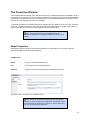
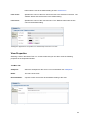
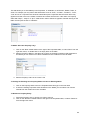
Model Properties
Selecting the top level node for a model in the Model Tree means that you can edit or view the
following properties in the Properties Window.
The Main Tab
Name:
The name of the ArchiMate model
File:
The file name of the model (read-only)
Purpose:
A space to enter a description of the purpose of the model
Editing the "Main" Properties for an ArchiMate model
In the "Purpose" text control, URLs that start with "http://"
"https://" or "ftp://" will show as a hyperlink. Pressing the Ctrl /
Command key will change the cursor to a "hand" cursor and
you can open the link in a Browser.
47
The Properties Tab
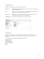
For more information about creating and managing User Properties see User Properties.
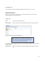
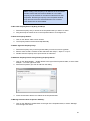
Element Properties
Selecting a model element in the Model Tree or in a View means that you can edit or view the
following properties in the Properties Window.
The Main Tab
Name:
The name of the ArchiMate element
Documentation:
A space to enter some user documentation relating to the ArchiMate element
Editing the "Main" Properties for an ArchiMate Element
In the "Documentation" text control, URLs that start with
"http://" "https://" or "ftp://" will show as a hyperlink. Pressing
the Ctrl / Command key will change the cursor to a "hand"
cursor and you can open the link in a Browser.
The Business Interface, Application Interface and Infrastructure Interface element types have an
additional property:
Interface Type:
Can be set to "Provided" or "Required". Setting this also changes the element's
icon.
48
The "Interface Type" property
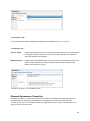
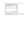
The Properties Tab
For more information about creating and managing User Properties see User Properties.
The Analysis Tab
Used in Views:
A table showing the Views (if any) where the selected element is used (displayed
in a diagram). Double-clicking on an entry in the table will open the View and
select the element in the diagram.
Model Relations:
A table showing the Relationships (if any) to and from the selected element in the
model. Double-clicking on an entry in the table will select the element in the
Model Tree window if it is open.
Viewing the "Analysis" for an ArchiMate Element
Element Appearance Properties
Selecting an element in a View means that you can edit or view additional visual properties in the
Properties Window. Different visual settings can be applied to an element for each separate
occurrence in a View. For example, the element "Application Service" may be coloured blue in one
View, and grey in another View.
49
The Appearance Tab
This tab is only available when an element is selected in a View.
Fill colour:
Specifies the fill colour for the selected element. The "Default" button sets the fill
colour to the default setting.
Font:
Specifies the font used for the text in the selected element. The "Default" button
sets the font to the default setting as set in Preferences.
Font colour:
Specifies the colour of the font used for the text in the selected element. The
"Default" button sets the fill colour to the default setting.
Text Alignment:
Align text in the selected element to Left, Centred or Right.
Editing the "Appearance" Properties for an ArchiMate Element in a View
The Figure Tab
This tab is only available when an element is selected in a View and only for certain figures Business Interface, Application Interface, Infrastructure Interface, Application Component, Device,
and Node.
Some elements can be represented by different figures. These are:
Application Interface
Business Interface
Infrastructure Interface
Application Component
Node
Device
50
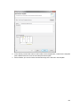
Setting the "Figure" Properties for a Device
The default figure to use when creating new elements can be set in Preferences.
Relationship Properties
Selecting a model relationship in the Model Tree or in a View means that you can edit or view the
following properties in the Properties Window.
The Main Tab
Name:
The name of the relationship. If provided, this will be displayed next to the
connection in a View.
Documentation:
A space to enter some user documentation relating to the relationship.
Editing the "Main" Properties for an ArchiMate Relationship
In the "Documentation" text control, URLs that start with
"http://" "https://" or "ftp://" will show as a hyperlink. Pressing
the Ctrl / Command key will change the cursor to a "hand"
cursor and you can open the link in a Browser.
The Access relationship type has an additional property:
51
Access Type:
Can be set to "Access", "Read", "Write" or "Read/Write". Setting this also
changes the connection's arrow-heads.
The Properties Tab
For more information about creating and managing User Properties see User Properties.
The Analysis Tab
Used in Views:
A table showing the Views (if any) where the selected relationship is used
(displayed in a diagram). Double-clicking on an entry in the table will open the
View and select the relationship (connection) in the diagram.
Viewing the "Analysis" Properties for an ArchiMate Relationship
Relationship Connection Appearance Properties
Selecting a relationship connection in a View means that you can edit or view additional visual
properties in the Properties Window. Different visual settings can be applied to a connection for each
separate occurrence in a View. For example, the connection line "Used By" may be coloured black in
one View, and blue in another View.
The Appearance Tab
This tab is only available when a relationship is selected in a View.
Text Position:
Specifies the position of the text that will appear next to the line on the View.
Options are "Source", "Middle" and "Target".
Line Width:
Specifies the width of the connection line. Options are "Normal", "Medium" and
"Heavy".
Font:
Specifies the font used for the text in the selected connection. The "Default"
52
button sets the font to the default setting as set in Preferences.
Font colour:
Specifies the colour of the font used for the text in the selected connection. The
"Default" button sets the fill colour to the default setting.
Line colour:
Specifies the colour of the connection line. The "Default" button sets the line
colour to the default setting.
Editing the "Appearance" Properties for a Relationship Connection in a View
View Properties
Selecting a View in the Model Tree or in a View means that you can edit or view the following
properties in the Properties Window.
The Main Tab
Viewpoint:
Select the Viewpoint for the View. For more information see Viewpoints
Name:
The name of the View
Documentation:
A space to enter some user documentation relating to the View
Editing the "Main" Properties for a View
53
In the "Documentation" text control, URLs that start with
"http://" "https://" or "ftp://" will show as a hyperlink. Pressing
the Ctrl / Command key will change the cursor to a "hand"
cursor and you can open the link in a Browser.
The Properties Tab
For more information about creating and managing User Properties see User Properties.
The Appearance Tab
Connection
Router:
Specifies the type of connection router for the whole View. Options are:
Manual - Straight line
Shortest Path - Routes around nodes to gain shortest path
Manhattan - Routes using an orthogonal connector.
For more information see Setting the Connection Router Type for a View
Editing the "Appearance" Properties for a View
View Reference Properties
Selecting a View Reference in a View means that you can edit or view the following properties in the
Properties Window.
The Appearance Tab
Fill colour:
Specifies the fill colour for the selected element. The "Default" button sets the fill
colour to the default setting.
Font:
Specifies the font used for the text in the selected element. The "Default" button
54
sets the font to the default setting as set in Preferences.
Font colour:
Specifies the colour of the font used for the text in the selected element. The
"Default" button sets the fill colour to the default setting.
Text Alignment:
Align text in the selected element to Left, Centred or Right.
Editing the "Appearance" Properties for a View Reference
Folder Properties
Selecting a user-created folder in the Model Tree means that you can edit or view the following
properties in the Properties Window.
The Main Tab
Name:
The name of the Folder - this can only be edited for user-created sub-folders.
Documentation:
A space to enter some user documentation relating to the folder
Editing the "Main" Properties for a Folder
55
In the "Documentation" text control, URLs that start with
"http://" "https://" or "ftp://" will show as a hyperlink. Pressing
the Ctrl / Command key will change the cursor to a "hand"
cursor and you can open the link in a Browser.
The Properties Tab
For more information about creating and managing User Properties see User Properties.
Note Properties
Selecting a Note in a View means that you can edit or view the following properties in the Properties
Window.
The Main Tab
Content:
The textual content for the Note
Editing the "Main" Properties for a Note
The Appearance Tab
Fill colour:
Specifies the fill colour for the selected element. The "Default" button sets the fill
colour to the default setting.
Font:
Specifies the font used for the text in the selected element. The "Default" button
sets the font to the default setting as set in Preferences.
Font colour:
Specifies the colour of the font used for the text in the selected element. The
"Default" button sets the fill colour to the default setting.
56
Text Alignment:
Align text in the selected element to Left, Centred or Right.
Editing the "Appearance" Properties for a Note
Note Connection Properties
Selecting a Note Connection in a View means that you can edit or view its properties in the Properties
Window.
The Main Tab
Name:
The name of the Connection. If supplied this will appear next to the Connection
on the View.
Documentation:
A space to enter some user documentation relating to the Connection
Editing the "Main" Properties for a Connection
The Properties Tab
For more information about creating and managing User Properties see User Properties.
The Appearance Tab
57
Text Position:
Specifies the position of the text that will appear next to the line on the View.
Options are "Source", "Middle" and "Target".
Line Width:
Specifies the width of the connection line. Options are "Normal", "Medium" and
"Heavy".
Line Style:
Specifies the the connection line's source and target head types, and main line
style.
Font:
Specifies the font used for the text in the selected connection. The "Default"
button sets the font to the default setting as set in Preferences.
Font colour:
Specifies the colour of the font used for the text in the selected connection. The
"Default" button sets the fill colour to the default setting.
Line colour:
Specifies the colour of the connection line. The "Default" button sets the line
colour to the default setting.
Editing the "Appearance" Properties for a Connection in a View
Group Properties
Selecting a Group in a View means that you can edit or view the following properties in the Properties
Window.
The Main Tab
Name:
The name of the Group
Documentation:
A space to enter some user documentation relating to the Group
58
Editing the "Main" Properties for a Group
The Properties Tab
For more information about creating and managing User Properties see User Properties.
The Appearance Tab
Fill colour:
Specifies the fill colour for the Group. The "Default" button sets the fill colour to
the default setting.
Font:
Specifies the font used for the text in the Group. The "Default" button sets the
font to the default setting as set in Preferences.
Font colour:
Specifies the colour of the font used for the text in the Group. The "Default"
button sets the fill colour to the default setting.
Editing the "Appearance" Properties for a Group
User Properties
User Properties can be created and managed from the "Properties" tab in the Properties Window.
The Properties Tab
59
This tab allows you to add arbitrary User Properties, or attributes, to an Element, Model, Folder, or
View. For example you may wish to add information such as "Cost", "Location", "Duration", "Time",
"Link" and so on. Properties are stored as name/value pairs. Properties with the same name may
appear more than once in the model or element and values are free text. If the value of a Property
starts with "http://", "https://" or "ftp://" it will show in blue to denote a hyperlink. Double-clicking on the
table row will open the link in a Browser.
User Properties
To Add a New User Property entry:
1. Click on the "New" toolbar button to the right of the Properties table, or select "New" from the
right-click menu, or double-click in an empty area on the table
2. Edit the Property's Name in the table cell. If there are existing Properties used elsewhere in
the Model you can select one of these instead from the combo box in the cell editor
3. Edit the Property's value in the "Value" Cell
To Change an Existing User Property Name to a New or Existing Name:
1. Click on the Property Name cell in the Properties table and type in the new name
2. If there are existing Properties used elsewhere in the Model you can select one of these
instead from the combo box in the cell editor
To Remove a Property Entry:
1. Select the Property entry or entries you wish to remove
2. Click on the "Remove" toolbar button to the right of the Properties table, or select "Remove"
from the right-click menu
60
Note: Adding a new Property to an Element in the Properties
window means that it becomes available as a re-usable
Property for all elements in the same model that have User
Properties. Removing a Property in the Properties window
only removes it from the selected Element. If it is used in
other Elements it is still available.
To Re-order Property Entries by Drag and Drop:
1. Select the Property entry or entries in the Properties table you wish to re-order
2. Drag and Drop the entries in the in the Properties table to re-arrange them
To Sort the Property Names:
1. Click on the "Name" table column header
2. The Property Names will be sorted alphabetically
To Add a Hyperlink Property Entry:
1. Select the Property entry in the Properties table you wish to use as a hyperlink
2. Edit the value so that it contains a URL that starts with "http://", "https://" or "ftp://"
3. Double-click the Property row to open the link in a Browser
To Add New Property Entries using Existing Property Names:
1. Click on the "New Multiple..." toolbar button to the right of the Properties table, or select "New
Multiple..." from the right-click menu
2. Select the Properties you wish to add from the dialog
3. Press OK and then edit the new Values in the Properties table
To Manage and View User Properties Globally:
1. Click on the "Manage" toolbar button to the right of the Properties table, or select "Manage"
from the right-click menu
61
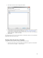
2. The "Properties Manager" dialog appears showing all used Property keys in the Model
globally and the number of times they have been used:
3. You can Delete Properties here. All occurrences of the Property and its declared Values will
be deleted from all Elements that use it
4. You can Rename Properties by editing the name in the "New Name" column. All occurrences
of the Property Name will be renamed in all Elements that use it
62
The Navigator Window
The Navigator window displays the currently selected model element and all of its relationships with
other elements. It is used to display and allow navigation between connected elements via their
relationships and is used in conjunction with the Model Tree window and Views.
The Model Tree acts as a "flat" repository for all the elements, relationships and Views in a model.
Views are graphical configurations of those elements. However, the Navigator is able to show all of an
element's relationships at the model level regardless of how they are presented in a View.
To use the Navigator window, select any element or relationship in the Model Tree or in a View. The
Navigator tree will update to reflect the current selection. The tree shows the "root" selected element
and any relationships that stem from it and any "target" elements from those relationships:
The Navigator Window
In the above screenshot the user has selected the element "CRM System". There are three
Realisation relationships between the selected element and the three elements "Customer
Administration Service", "Insurance Application Service", and "CIS". From these three elements
further relationships are shown between them and their target elements.
It is possible, therefore, to "dig in" to the Navigator tree and traverse from element to element
following it and its child relationships from source to target.
A selected sub-element can become the "root" element by either double-clicking on it in the tree or by
clicking on the "Go Into" button on the window's toolbar:
The "Go Into" Button
Conversely, pressing the "Back" button takes you back to the previously selected element:
63
The "Back" button
The "Home" button takes you back to the main root element that was originally selected:
The "Home" button
By default, the Navigator shows relationships that flow from the source to the target element. It is
possible to reverse this to show the element's relations that flow from the target to the source by
clicking on the "Show source relations" button on the window's toolbar:
Show source relations mode
In the above screenshot the element "CRM System" is the target of the two "Used By" relationships.
So the flow is from "Mainframe" to "Claim Files Service" to "CRM System", and from "NAS File
Server" to "Customer File Service" to "CRM System".
The selected element can be "pinned" if required by selecting the pin button in the Navigator window:
The "pin" button
It is also possible to drag and drop any selected elements and/or relationships from the Navigator
Tree to a View, in exactly the same way as dragging from the Model Tree to a View (see Adding
Elements and Relations from the Model Tree to a View)
64
To see a screen-cast demonstration of the Navigator go to
this web-site:
http://archi.cetis.ac.uk/movies/navigator/navigator.html
65
The Visualiser Window
The Visualiser window displays the selected model element and all of its relationships with other
model elements in a graphical way. It is the graphical equivalent of the Navigator. Selecting an
element or relationship in the Model Tree, the Navigator or in a Diagram View will update the
selection in the Visualiser.
The Visualiser Window
To use the Visualiser, select any element or relationship in the Model Tree, the Navigator, or in a
View. The Visualiser will update to reflect the current selection. The Visualiser highlights the selected
element and shows all relationships and any connected elements. Double-clicking on one of the
connected elements allows you to "Go Into" to the element so that it is the focal central element, and
all of its relationships and connected elements are displayed. You can also "Go Into" an element from
the toolbar in the Visualiser window, and also select "Back" to return to the previous element. Select
"Home" on the toolbar to return to the first selected element.
The Visualiser will display the selected element's connected elements to a default depth of one level
(immediate connections). To change the depth level of how far the connections are calculated, select
the Depth level from the drop-down menu in the Visualiser window:
The Visualiser Menu for Depth
Selecting an element or relationship in the Model Tree, the Navigator, or in a View will update the
focussed selection in the Visualiser window. To stop this from updating, you can press the "Pins the
current view" button on the toolbar in the Visualiser window.
The first time a focussed element is displayed in the Visualiser window it is laid out with an animation.
This animation can be turned off in Preferences. If you wish to re-layout, you can press the "Layout"
button on the toolbar in the Visualiser window.
66
The Hints Window
The Hints window shows a hint for the selected element or palette entry. It can be useful to provide
basic information about the purpose of the elements and relationships in a model.
The selected hint can be "pinned" by selecting the pin button in the Hints window.
The "Hints" Window
67
The Outline Window
The Outline window acts as a miniature viewport onto the selected diagram View in order to aid in
navigation if the diagram is too large to fit in the window.
To open or close the Outline window, choose the option from the main “Window” menu or from the
main toolbar.
If the View that is being edited is too large to fit into the application’s window then a navigation pane
will appear in the Outline window. Dragging this navigation pane will scroll the elements into view in
the drawing canvas.
The "Outline" Window
68
Opening, Saving and Printing
Opening an Existing Model
To open an existing ArchiMate model that has been created in Archi, choose the "Open..." menu item
from the main “File” menu or from the main toolbar. If the model is already open in Archi, this
command has no effect.
You can also drag an ".archimate" file from the desktop onto the Model Tree window to open it.
The Windows version of Archi supports opening the application from the desktop by opening files with
the ".archimate" file extension.
Saving a Model
A model can be saved to disk from the "Save" menu item available from the main "File" menu or from
the main toolbar. If the model has not been previously saved you will be prompted for a file name.
The "Save As..." menu command allow you to save the model with a different name.
Closing a Model in the Model Tree
It is possible to have more than one ArchiMate model open at the same time in the Model Tree. You
may wish to close one or model so that it does not appear in the Model Tree. This is achieved by
right-clicking the model in the Model tree and selecting the “Close Model” menu item or selecting the
“Close Model” menu item from the main “File” menu. Closing a model does not delete the model and
it may be re-opened in Archi at any time from the “Open” command. If the model has been modified
you may be prompted to save it before closing it.
Printing A View (Diagram)
A View (diagram) can be printed to a connected printer. This is available from the "Print..." menu
command in the main "File" menu. This menu command is only available if a View is open.
69
Exporting the Model and its Views
It is possible to export the Archi model or its Views to different formats in order to re-use the model or
images in different applications.
Export Model To CSV
This option is available from the "Export Model To CSV..." menu item from the main "File->Export"
menu. Once a model is selected in the Model Tree or in a View this menu item is enabled. Provide a
filename to export the file in CSV (Comma Separated Values) format.
The CSV field format is as follows:
"Type", "Element name", "Documentation", "Source type", "Source name", "Target type", "Target
name"
Elements and Relationships are exported. The last four fields only apply to the Relationship type. For
an element they are left blank.
Export View As Image
A View (diagram) can be exported as an image file to disk. This is available from the "Export View As
Image..." menu command from the main "File->Export" menu or by right-clicking on a View and
selecting the menu item from the contextual menu. This menu command is only available if a View is
open and selected.
Export View As Image to Clipboard
A View (diagram) can be exported (or copied) as an image to the system clipboard. This is available
from the "Export View As Image To Clipboard" menu command from the main "File->Export" menu or
by right-clicking on a View and selecting the menu item from the contextual menu. This menu
command is only available if a View is open and selected. A useful shortcut key combination is CtrlShift-C (Command key on Mac). Once the View is exported to the system clipboard it can be pasted
into other applications such as word processing and drawing tools.
70
Reporting
Jasper Reports
Jasper Reports is the world's most popular Java reporting engine. Combine data sources and
produce pixel-perfect documents that can be viewed, printed, or exported into a variety of document
formats with this powerful reporting tool. Archi can export models in various formats using Jasper
Reports Templates.
This option is available from the "Report->Jasper..." menu item from the main "File" menu. Once a
model is selected in the Model Tree or in a View this menu item is enabled. Provide the details in the
following wizard:
Jasper Reports wizard
The following is an example of a PDF format report:
71
Part of a Generated Jasper Report in PDF format
HTML Reports
Archi supports a basic reporting functionality by means of generating a single HTML page containing
summary tables of the model elements and the Views in a model.
This option is available from the "Report->HTML..." menu item from the main "File" menu. Once a
model is selected in the Model Tree or in a View this menu item is enabled. Select a folder to export
the model and its Views.
A single HTML page, "report.html" is generated in the chosen output folder together with image files
for the Views in the model.
72
Part of a Generated HTML Report
73
Templates
Archi supports the use of re-usable ArchiMate models, or templates. A template is a model that has
been saved in an archive file with the extension "*.architemplate". Further information describing the
template and optional thumb-nail images of the model’s Views is also contained in the template file.
Templates are convenient starting points for creating new models.
To see a screen-cast demonstration of Templates go to this
web-site:
http://archi.cetis.ac.uk/movies/templates/templates.html
Creating a New Template
To create a new template follow these steps:
1. Create a new Archi model or open an existing model that you have created and edit it so that
it as you want the template to be.
2. Make sure the model you wish to save as a template is open and selected in the Model Tree.
3. Choose the "File->Save As Template..." menu item from the main menu. A wizard will open:
4. In the wizard, provide a file name for the location for the template file, a name for the template
(this is different than the name of the model) and a description.
74
5. Select whether you want to include thumbnail images of the Views in the model template. If
you choose to include thumbnails of the Views in the template choose which of the images
will be the "key" thumbnail. This will be the first thumbnail image displayed in the "New Model
from Template" wizard.
6. Click "Next" to move on to the next page of the wizard:
7. Choose whether you wish to add the template to your collection. Your collection of templates
is a list sorted into categories that will be displayed in the "New Model from Template" wizard.
If there are no categories available to choose from you can create a new category by clicking
on the "New..." button in the wizard.
8. Press "Finish".
The template will be saved on your file system with an "*.architemplate" extension. You can share this
template with other Archi users if you like.
Creating a New Model from a Template
To create a new Model based on an existing template follow these steps:
1. Choose the "File->New->Model From Template..." menu item from the main menu. A wizard
will open:
75
2. Choose the desired template. Some are provided in the "Installed Templates" section while
user-created templates are listed in their categories in the "My Templates" section (see
"Creating a New Template"). The selected template's name and description are displayed in
the Gallery's preview window.
3. You can preview all of the thumbnail images for a template by moving your mouse from side
to side across the thumbnail image in the Gallery. You can also resize the images in the
Gallery by using the resize slider control.
4. If you wish to open a template from file that is not shown in the wizard select the "Open..."
item. A file dialog will allow you to choose a "*.architemplate" template file.
5. Press Finish. A new model is created and added to the Model Tree. The Model's name is
prefixed with "(new)".
Managing your Templates
You store templates on your file system as "*.architemplate" files. These can be stored anywhere on
your local filing system. Archi allows you to create user collections that point to these templates.
These are shortcuts to the actual templates. To manage your collection of templates follow these
steps:
1. Choose the "File->New->Model From Template..." menu item from the main menu. A wizard
will open:
76
2. Select "Manage..." from the "Templates" section on the left of the wizard. A dialog window will
open:
3. This dialog allows you to add, rename and remove new template categories, and also to add
templates from file to your collection. You can also edit and change the name and description
of each template.
4. To add a template from file, click on the "Add Template..." button. Choose the
"*.architemplate" file from the file dialog that appears.
5. To add a new template category, click on the "New Category..." button. Provide a name for
the category.
77
6. To add templates to a category, drag and drop a template entry from the "Templates" table to
a category folder in the "Categories" tree. Note that a template can appear in more than one
category folder.
78
Derived Relationships
Background
There are two main types of relationship in the ArchiMate language, structural and dynamic. The
structural relationships are as follows:
Association
Association models a relationship between objects that is not
covered by another, more specific relationship.
Access
The access relationship models the access of behavioural concepts
to business or data objects.
Used By
The used by relationship models the use of services by processes,
functions, or interactions and the access to interfaces by roles,
components, or collaborations.
Realisation
The realisation relationship links a logical entity with a more concrete
entity that realizes it.
The assignment relationship links units of behaviour with active
Assignment elements (e.g., roles, components) that perform them, or roles with
actors that fulfil them.
Aggregation
The aggregation relationship indicates that an object groups a
number of other objects.
Composition
The composition relationship indicates that an object consists of a
number of other objects.
These structural relationships form an important category of relationships to describe coherence.
They are listed here in ascending order by "strength": "Association" is the weakest structural
relationship and "Composition" is the strongest. Part of the language definition is an abstraction rule
that states that two relationships that join at an intermediate element can be combined and replaced
by the weaker of the two.
In Practice
With this rule, it is possible to determine the indirect, or "derived" relationships that exist between
model elements without a direct relationship, which may be useful for, among other things, impact
analysis. An example is shown below. Assume that we would like to know what the impact on the
Client is if the CRM system fails. In this case, an indirect "used by" relationship (the thick arrow on the
left) can be derived from this system to the Claim Registration Service (from the chain assignment ->
used by -> realization -> used by -> realisation). No indirect (structural) relationship is drawn between
the CRM system and the Claims Payment Service.
79
Example of a Derived Relationship
Highlighting Structural Relationship Chains
If structural relationships exist in the ArchiMate model these chains of relationships can be highlighted
in red in the selected View. This option is available from the "Derived Relations -> Show Structural
Chains" menu item from the main "View" menu or by right-clicking in a View. This option is a toggle
and can be turned on and off for each separate View. If no structural chains of relationships exist in
the model or if no structural connections have been added to the View then nothing is highlighted in
red.
Note - the structural chains are calculated from the
relationships in the model. Thus, it is possible that the
relationships that are actually shown in a View are a sub-set
of those in the model.
Adding a Derived Relationship
To add a derived relationship to two elements in a View select the "Derived Relations -> Create
Derived Relation..." menu item from the main "View" menu or by right-clicking in a View. The "Create
Derived Relation" option is available when two and only two elements are selected in a View that
have such a structural chain present in the model.
The presence of such a chain is not dependent on what relationships (connections) are showing in
that View, but on what actually exists in the underlying model (as seen in the Model Tree).
80
It is possible that there exists more than one path (structural relationship chain) from the source
element to the target element. This is shown in the ensuing dialog window.
To add a derived relationship, follow these steps:
1. Select two, and only two elements in a View. (Ctrl / Command click to select the two
elements.)
2. Select the "Derived Relations -> Create Derived Relation..." menu item from the main "View"
menu or by right-clicking in a View.
3. If a derived relationship can be created a dialog window appears. It is possible that there
exists more than one path (structural relationship chain) from the source element to the target
element (or in reverse, from the target element to the source element):
4. Choose the required relationship and click "OK".
If this is the first time a derived relationship has been created for that model then a new folder is
created in the Model Tree, labelled "Derived Relations". The newly created derived relationship is
placed in that folder as are any new ones henceforth. If you wish to delete this folder you can do so.
If a structural relationship already exists directly between element1 and element2 no further derived
relationship is allowed.
If there are too many possible paths to calculate between element1 and element2 then a warning
message is displayed and the calculation is aborted.
81
The Sketch View
The Sketch View is an experimental feature of Archi. The idea behind the Sketch View is inspired by
the ArchiMate specification document defining an “Introductory viewpoint”:
"The Introductory viewpoint forms a subset of the full ArchiMate language using a
simplified notation. It is typically used at the start of a design trajectory, when not
everything needs to be detailed yet, or to explain the essence of an architecture
model to non-architects that require a simpler notation. Another use of this basic, less
formal viewpoint is that it tries to avoid the impression that the architectural design is
already fixed, an idea that may easily arise when using a more formal, highly
structured or detailed visualization. We use a simplified notation for the concepts, and
for the relations. All relations except "triggering" and "realization" are denoted by
simple lines; "realization" has an arrow in the direction of the realized service;
"triggering" is also represented by an arrow." - ArchiMate Specification 1.0 p.72
This is in some ways similar to Marc Lankhorst's description of modelling processes using
conversation techniques whose aim is to capture the essence of the model:
"In architecture development, we find a number of common conversation techniques
where it concerns the communication of architectural models:
- Brown-paper session: Structured brainstorm-like group session (up to about 15
people) in which items (keywords or short phrases) are elicited from the individuals in
the group in answer to a question such as: 'What are the key functionality issues in
our current IT architecture?' Typically, every individual item is written on a small
adhesive note ('Post-It'). The items are then collected on a sheet of paper
(traditionally of the cheap brown kind) and, by means of an open and creative group
process, structured and categorised. This may involve adding, deleting, merging, or
changing items. Usually, a mediator or facilitator is involved." - Marc Lankhorst et al.
"Enterprise Architecture at Work", Second Edition, p.82
In Archi it is possible to create a "Sketch View". To add a new Sketch View to the model, right-click on
the "Views" folder in the Model Tree and select "New->Sketch View" from the context menu:
Adding a new "Sketch" View
Once the Sketch View has been added to the model it can be opened from the tree by double-clicking
on it. Any number of Views can be added to a model and be open at the same time. Views are
arranged in tabs in the main area of the application window.
82
An example Sketch View
You can add new "Stickies" (Post-Its) to the View, an "Actor" figure and three types of connection.
There are no rules as to what the relationships or stickies mean. All elements can be edited in the
Properties Window. You are free to capture a sketch of your model and then later convert it into a fully
constrained ArchiMate model and View.
Double-clicking a Sticky opens the Properties Window, clicking on a selected Sticky allows you to
directly edit the Sticky's text.
It is possible to set the default background image in Preferences if you wish, and to set the
background for each Sketch view in the "Appearance" tab of the Properties Window:
Sketch View background options
Later versions of this feature would hopefully allow you to:
Transform the Sketch into a full ArchiMate View by means of parameters and queries
Record the modelling conversation in Archi to better capture the purpose of the Sketch
83
The Canvas Modelling Toolkit
The Canvas Modelling Toolkit is an extension to Archi somewhat akin to the Sketch View that
2
provides the tools for you to create and edit a "Canvas" such as the Business Model Canvas . With
the Canvas Modelling Toolkit you can design and create re-usable Canvas Templates to share with
colleagues or simply or you can use it as a pre-design tool to sketch out ideas and models. You can
also link to other Views in your model so you could, for example, link from an ArchiMate View to a
Business Model Canvas View to provide a Business Plan.
The Business Model Canvas in Archi
Getting Started
The quickest way to get started with the Canvas Modelling Toolkit is to create a new Canvas based
2
on an existing template. We'll create a new Business Model Canvas .
1. Create a new Empty Model in the Model Tree. See the instructions here for how to do this.
2. Select the "Views" folder on the Model Tree, right-click on it and select "New->Canvas from
Template..."
84
3. A wizard dialog window will open. Select the "Business Model Canvas" template from the
templates in the "Installed Templates" section:
4. Press "Finish". A new "Business Model Canvas" View will appear in the Model Tree where
you can edit the default name. The View itself will be open ready for you to edit:
85
The Canvas consists of 9 empty "Blocks". Each Block acts as container that can contain "Stickies"
and other elements that are added from the Palette. Each Block is currently locked so that you cannot
move or resize it. Effectively, the Blocks act as backdrop containers. Each Block also has a textual
"hint" associated with it that show in the Hints Window.
Add "Stickies" from the Palette and edit the text in the Sticky to create your Canvas model:
Adding "Stickies" to the Canvas
Getting into the Details
The main components and concepts that constitute a Canvas are Blocks, Stickies, Images,
Connections, Hints and Locking. A Canvas template typically consists of a number of (locked) Blocks
and Images onto which the user can add Stickies, Images, Connections and additional Blocks if
required. The following sections will describe each of these concepts in detail starting with a
description of the Canvas Palette and an example of constructing an imaginary Canvas.
The Canvas Palette
When working with a Canvas, the Palette presents you with the tools that you need to create these
elements.
The Canvas Palette
86
Select a tool in the Palette and draw it onto the Canvas. The coloured squares represent "Stickies".
Note that you are not restricted to the provided colours as you can change the colour of the Sticky in
the Properties Window. Similarly with the provided Connections, you can change the line and arrow
head style of a Connection in its Properties Window.
Constructing a new Canvas - an Example
Let's work through the process of constructing our own Canvas based on mapping Past, Present and
Future concepts.
Assuming that you have a model selected in the Model Tree follow these steps:
1. Right click on the "Views" folder of your model on the Model Tree and select "New->Blank
Canvas":
2. The Blank Canvas View will automatically open. You can rename it at this point in the Model
Tree if you wish.
3. From the Palette select the Block tool and draw a tall rectangular Block on the Canvas. Edit
its text content by clicking on it and changing it to "Past":
87
4. Create two more Blocks named "Present" and "Future" adding them to the Canvas so that
they line up as follows:
88
5. Now let's add some icons to these Blocks to make them visually more appealing. Double-click
on the first Block to open the Properties Window. In the Properties Window select the "Image"
tab. Then select the "Choose..." drop-down box and the "Set Image..." item:
When the "My Images" Image Manager dialog window opens, select the "Open from File..."
option and choose an appropriate image from your computer's file system. Do the same for
the other Blocks.
89
6. Here's how it looks so far with the images that we have selected for the three Blocks:
7. Now that we have constructed our three main Blocks we could take this opportunity to change
their background colour, their text fonts and positions in the Properties Window. But for now
let's add an Image underneath the Blocks. From the Palette select the Image tool and draw a
rectangular Image place-holder on the Canvas right underneath the Blocks. Double-click on
the Image place-holder to open the Properties Window. In the Properties Window on the
"Main" tab select the "Choose..." drop-down box and the "Set Image..." item, as you did
before for a Block, and select an appropriate image from your computer's file system. Then
from the "Appearance" tab set the border to "None". The Canvas now looks like the following:
90
Adding Hints and Locking
For the finishing touches let's add some Hints to the Blocks and then lock them so that we can re-use
the Canvas as a Template. Why do we want to add Hints to the Blocks? Well, as with the other
elements in Archi models it's extremely helpful to provide a rubric that suggests to the end user the
intent of the element and how it can be used in the model. Let's add the hints:
1.
2.
3.
4.
First ensure that the Hints Window is open. You can open it from the main "Window" menu.
Double-click on the first Block (the "Past" Block) in order to open the Properties Window.
In the Properties Window select the "Hint" tab.
Type "Past" for the Hint title, and some text for the Hint Content. Note that you can use HTML
to mark up your content text. Here's what it looks like now:
91
5. Add Hints for the other Blocks.
6. Now let's lock all these elements so that we can use the Canvas. Select each Block and the
Image in turn. In the Properties Window tick the "Locked" checkbox:
Now that we have created the Blocks, added an Image, provided the Hints and locked the elements
we can save the whole thing as a Canvas Template and then create new instances of the Canvas
from the template. See the sections "Saving a Canvas as a Template" and "Creating a New Canvas
from a Template" to do this.
Creating a new Canvas instance from the template means we can now start using it for real:
92
Our imaginary Canvas
For more ideas, look at how the built-in Canvas templates are constructed for further examples. See
the section "Creating a New Canvas from a Template".
Archi uses a different file format for "*.archimate" files
when adding Canvasses that contain images.
Normally Archi saves "*.archimate" files as single plain text
XML format files. However, when images are used in a
Canvas the file format used is a binary archive file (zip
format) that contains both the model's XML file and any
image files. This is to keep all related files together ensuring
that you don't have to worry about managing the image files.
Canvas Block
A Block object is a container area that can contain text and an icon. You can also provide your own
Help Hints. You can lock the Block if you want to make it read-only. A typical scenario is to create a
number of container Blocks on the Canvas, arrange them into the desired framework, lock them, and
then save the Canvas as a template.
93
Properties
Selecting a Block in a Canvas View means that you can edit or view the following properties in the
Properties window.
The Main Tab
Locked:
Ticking this ensures that the Block cannot be moved or edited.
Content:
A space to enter some text content for the Block. The text will show up in the
Block.
Main Properties for a Canvas Block
The Properties Tab
For more information about creating and managing User Properties see User Properties.
The Hint Tab
Hint Title:
The title of the Hint to be displayed in the Hints window when the Block is
selected.
Hint Content:
A space to enter some text content for the Hint to be displayed in the Hints
window when the Block is selected.. HTML tags are permitted.
94
Hint Properties for a Canvas Block
The Appearance Tab
Fill colour:
Specifies the fill colour for the selected element. The "Default" button sets the fill
colour to the default setting.
Font:
Specifies the font used for the text in the selected element. The "Default" button
sets the font to the default setting as set in Preferences.
Font colour:
Specifies the colour of the font used for the text in the selected element. The
"Default" button sets the fill colour to the default setting.
Border colour:
Specifies the colour of the border used for the selected element. The "None"
button removes the border from the element.
Text Alignment:
Aligns text in the selected element to Left, Centred or Right relative to the
paragraph.
Text Position:
Positions text in the selected element to relative to the element.
Appearance Properties for a Canvas Block
The Image Tab
Preview:
A preview image that shows how the image will appear. Images are resized to a
maximum width and height of 100 pixels. Double-clicking the Preview box will
launch the Image Chooser dialog window. You can also drag and drop an image
95
file from the desktop onto the Preview box.
Image:
Select an image for the element or clear the image. See "Adding Images to
Elements" for more details
Position:
Sets the position of the image relative to the element.
Image Properties for a Canvas Block
Canvas Sticky
A Sticky object can contain text and an icon. You can lock the Sticky if you want to make it read-only.
There are a number of ready-coloured Stickies available in the Palette, but you can always change
the colour in the Properties window.
Properties
Selecting a Sticky in a Canvas View means that you can edit or view the following properties in the
Properties window.
The Main Tab
Locked:
Ticking this ensures that the Sticky cannot be moved or edited.
Content:
A space to enter some text content for the Sticky. The text will show up in the
Sticky.
Notes:
A space to enter some text notes for the Sticky. Any notes will appear in the
tooltip for the Sticky.
96
Main Properties for a Canvas Sticky
The Properties Tab
For more information about creating and managing User Properties see User Properties.
The Appearance Tab
Fill colour:
Specifies the fill colour for the selected element. The "Default" button sets the fill
colour to the default setting.
Font:
Specifies the font used for the text in the selected element. The "Default" button
sets the font to the default setting as set in Preferences.
Font colour:
Specifies the colour of the font used for the text in the selected element. The
"Default" button sets the fill colour to the default setting.
Border colour:
Specifies the colour of the border used for the selected element. The "None"
button removes the border from the element.
Text Alignment:
Aligns text in the selected element to Left, Centred or Right relative to the
paragraph.
Text Position:
Positions text in the selected element to relative to the element.
Appearance Properties for a Canvas Sticky
97
The Image Tab
Preview:
A preview image that shows how the image will appear. Images are resized to a
maximum width and height of 100 pixels. Double-clicking the Preview box will
launch the Image Chooser dialog window. You can also drag and drop an image
file from the desktop onto the Preview box.
Image:
Select an image for the element or clear the image. See "Adding Images to
Elements" for more details
Position:
Sets the position of the image relative to the element.
Image Properties for a Canvas Sticky
Canvas Image
An Image object is a place-holder for an image. You can lock the Image object if you want to make it
read-only. Images can be any size but we suggest that you keep them reasonably small so as not to
consume too many resources.
When resizing an image with the mouse you can hold the
Shift key at the same time in order to maintain its aspect
ratio. Alternatively, you can select the image object and
select the "View->Position->Reset Aspect Ratio" menu item
(also available on the toolbar).
Properties
Selecting an Image in a Canvas View means that you can edit or view the following properties in the
Properties window.
The Main Tab
98
Locked:
Ticking this ensures that the Image cannot be moved or edited.
Image:
Select an image for the element or clear the image. See "Adding Images to
Elements" for more details
Main Properties for a Canvas Image
The Appearance Tab
Border colour:
Specifies the colour of the border used for the selected element. The "None"
button removes the border from the element.
Appearance Properties for a Canvas Image
Canvas Connection
Selecting a Connection in a Canvas means that you can edit or view its properties in the Properties
Window.
Properties
Selecting a Connection in a Canvas View means that you can edit or view the following properties in
the Properties window.
99
The Main Tab
Locked:
Ticking this ensures that the Connection cannot be moved or edited.
Name:
The name of the Connection. If supplied this will appear next to the Connection
on the View.
Documentation:
A space to enter some user documentation relating to the Connection
Editing the "Main" Properties for a Connection
The Properties Tab
For more information about creating and managing User Properties see User Properties.
The Appearance Tab
Text Position:
Specifies the position of the text that will appear next to the line on the View.
Options are "Source", "Middle" and "Target".
Line Width:
Specifies the width of the connection line. Options are "Normal", "Medium" and
"Heavy".
Line Style:
Specifies the the connection line's source and target head types, and main line
style.
Font:
Specifies the font used for the text in the selected connection. The "Default"
button sets the font to the default setting as set in Preferences.
Font colour:
Specifies the colour of the font used for the text in the selected connection. The
"Default" button sets the fill colour to the default setting.
Line colour:
Specifies the colour of the connection line. The "Default" button sets the line
colour to the default setting.
100
Editing the "Appearance" Properties for a Connection in a Canvas
Adding Images to Elements
Canvas Blocks, Image place-holders and Stickies can contain images. The images in Blocks and
Stickies are icons and are resized to a maximum width and height of 100 pixels. Images can be any
size but we suggest that you keep them reasonably small so as not to consume too many resources.
To add an image to one of these elements, open the Properties window and select the element.
Double-clicking the element on the Canvas will also open the Properties window. Find the Image tab
in the Properties window and select the Image Chooser with the "Set Image..." option:
Selecting the Image Chooser from the Properties window
This will open the "My Images" Image Chooser dialog window:
101
The Image Chooser dialog window
All images that are contained in any loaded models are displayed in the Chooser so that you can reuse them. If you wish to open an image file from your computer select the "Open from File..." option.
You can drag and drop Image files from the desktop to the
Canvas.
Removing an image from an element
To remove an image from an element select the "Remove Image" option from the Image Chooser.
Saving a Canvas as a Template
To Save an existing Canvas as a template follow these steps:
1. Create a new Canvas or open an existing model containing a Canvas.
2. Select the Canvas in the Model Tree, right-click on it and choose "Save Canvas as
Template...". A wizard will open:
102
3. In the wizard, provide a file name for the location for the template file, a name for the template
(this is different than the name of the model) and a description.
4. Select whether you want to include a thumbnail image of the Canvas in the template.
103
5. Click "Next" to move on to the next page of the wizard:
6. Choose whether you wish to add the template to your collection. Your collection of templates
is a list sorted into categories that will be displayed in the "New Canvas from Template"
wizard. If there are no categories available to choose from you can create a new category by
clicking on the "New..." button in the wizard.
7. Press "Finish".
The template will be saved on your file system with an "*.archicanvas" extension. You can share this
template with other Archi users if you like.
Creating a New Canvas from a Template
To create a new Canvas based on an existing template follow these steps:
1. Select the "Views" folder for the chosen Model in the Model Tree, right-click on it and select
"New->Canvas from Template..." A wizard will open:
104
2. Choose the desired template. Some are provided in the "Installed Templates" section while
user-created templates are listed in their categories in the "My Templates" section (see
"Saving a Canvas as a Template"). The selected template's name and description are
displayed in the Gallery's preview window.
3. You can resize the thumbnail images in the Gallery by using the resize slider control.
4. If you wish to open a template from file that is not shown in the wizard select the "Open..."
item. A file dialog will allow you to choose a "*.archicanvas" template file.
5. Press Finish. A new Canvas is created and added to the "Views" folder in the Model Tree
where you can edit the default name. The View itself will be open ready for you to edit.
Managing your Canvas Templates
You store Canvas templates on your file system as "*.archicanvas" files. These can be stored
anywhere on your local filing system. Archi allows you to create user collections that point to these
templates. These are shortcuts to the actual templates. To manage your collection of templates follow
these steps:
1. Select the "Views" folder for the chosen Model in the Model Tree, right-click on it and select
"New->Canvas from Template..." A wizard will open:
105
2. Select "Manage..." from the "Templates" section on the left of the wizard. A dialog window will
open:
106
3. This dialog allows you to add, rename and remove new template categories, and also to add
templates from file to your collection. You can also edit and change the name and description
of each template.
4. To add a template from file, click on the "Add Template..." button. Choose the "*.archicanvas"
file from the file dialog that appears.
5. To add a new template category, click on the "New Category..." button. Provide a name for
the category.
6. To add templates to a category, drag and drop a template entry from the "Templates" table to
a category folder in the "Categories" tree. Note that a template can appear in more than one
category folder.
107
Preferences
The Preferences for Archi are available from the “Preferences” menu item under the main “Edit”
menu. Preferences are as follows.
108
Canvas Modelling Toolkit Preferences
Preferences for the Canvas Modelling Toolkit
General
Enable Canvas Modelling Toolkit
If this is unchecked, the Canvas Modelling Toolkit menu items will not be present in the Model Tree.
109
Colours Preferences
Colours Preferences
Default Fill Colours
Choose the default fill colours to use for ArchiMate elements. These are the colours that will be
displayed when the fill colour is set to "Default" in the Properties window for a diagram element. The
default fill colours can be set differently for each installation of Archi so, for example, one user can
have a completely different set of default fill colours than another user. The colours will not be saved
in the .archimate model file unless the option to "Save the default fill colour for a new element in the
.archimate file" is ticked.
Save the default fill colour for a new element in the .archimate file
If this is checked a diagram element's default fill colour is saved in the .archimate file and will then be
"fixed" in the file. This ensures that if the file is shared the recipient will see these colours.
110
Connections Preferences
Connections Preferences
Magic Connector
Show Animation on Undo/Redo
Choose to show the "puff" animation when undo/redo is performed for an element drawn with the
Magic Connector.
Show Elements first (Use the Ctrl key to swap)
When clicking from the Magic Connector onto the empty View canvas show Elements first then
Connections in the popup menus. Holding the Ctrl / Command key at the same time will reverse this.
Show Connections first (Use the Ctrl key to swap)
When clicking from the Magic Connector onto the empty View canvas show Connections first then
Elements in the popup menus. Holding the Ctrl/Command key at the same time will reverse this.
Connections
Allow circular connections
Choose to allow connections that start and end with the same element. See here for more
information.
Use orthogonal connection anchors
If this is ticked then a new method to calculate the anchor point for a connection is used (the position
111
where a connection connects to a figure). By default (option not ticked), the anchor point is computed
as the intersection of the figure's border and the connection targeting the figure's centre. With this
option, the anchor point is computed to make the connection either a vertical or horizontal line (if this
not possible, it connects to one of the figure's corners). It is possible to move this anchor point just by
moving the figure or by creating a bend point in the connection and moving that.
For example if not ticked (default) the connections appear as follows:
If ticked the connections appear as follows:
Automatic Relationship Management (ARM)
For more information see Container Elements and Nested Element Relationships.
Enable implicit connections in Views for nested elements
If this is enabled then nested parent/child elements are considered to have an implicit connection in a
View representing a relationship between the elements in the model.
Offer to create new relation when creating new element from Palette
If this is enabled then when a new element is added from the Palette onto a parent element in the
View a dialog appears offering to create a new relationship between the parent and child elements.
Offer to create new relation when adding element from Model Tree
If this is enabled then when a new element is added from the Model Tree onto a parent element in the
View a dialog appears offering to create a new relationship between the parent and child elements if
one does not already exist.
112
Offer to create new relation when moving an element to a new parent element
If this is enabled then when an element in a View is dragged onto a parent element in the View a
dialog appears offering to create a new relationship between the parent and child elements if one
does not already exist.
Relation types offered when creating new relations
Select the types of relationship that will be offered when new implicit connections are created
between parent and child elements in a View. The default is Composition, Aggregation and
Assignment types.
Relation types to hide when elements are nested
Select the types of relationship connection that will be hidden in a View when there are nested parent
and child elements. The default is Composition, Aggregation and Assignment types.
113
Diagram Preferences
Diagram Preferences
Layout
Grid Size
Sets the grid spacing used in diagram Views.
Animate Layout
Sets whether animation is used in diagram Views for some Undo/Redo commands and when
changing the View's Connection Router.
Animation Speed (mS)
Sets the animation speed in milliseconds.
View
Use anti-aliasing on connections
On Windows and Linux operating systems ensures that connections are drawn more smoothly.
Palette is open when opening Views
If enabled the palette in a View will be open when the View is opened.
Show tooltips in Views
If enabled tooltips in Views will be shown.
114
Edit name after creating new object from Palette
If enabled when a new element is added from the Palette you can immediately edit its name.
Font
Default Font
Sets the default font to use for text in elements and connections.
Preview
Previews the selected default font.
Viewpoints
Grey out disallowed elements in the Model Tree
When this option is set any elements that are disallowed in a Viewpoint are greyed out. For more
information see Viewpoints.
Hide disallowed elements from the Palette
When this option is set any elements that are disallowed in a Viewpoint are not shown in the Palette.
For more information see Viewpoints.
Hide disallowed elements from the Magic Connector
When this option is set any elements that are disallowed in a Viewpoint are not shown in the Magic
Connector. For more information see Viewpoints.
Ghost disallowed elements in a View / Hide disallowed elements in a View
Toggling these options either ghosts or hides disallowed elements in a Viewpoint. For more
information see Viewpoints.
Sketch
Default Background
Set the default background for newly created Sketch Views.
115
Figures Preferences
Figures Preferences
Default Figures
Alternate default figures are provided for drawing certain figures in diagram Views. Click on a figure to
set its default shape when creating a new Figure.
116
General Preferences
General Preferences
Files
Automatically open Views in a Model when opening from file
When opening a Model from a file, choose whether to automatically open all the Views in the model.
Automatically create a backup file (*.bak) when saving
If this is ticked, whenever an .archimate file is saved, a backup copy with file extension .bak will be
created first.
Size of recently opened file list
Set the cached sized of the recently opened file list in the "File->Open Recent" menu. Can be set from
3 - 15.
Appearance
Use curved tabs
When this is ticked, curved tabs are used in windows.
Visualiser
Animate nodes when laying out
When this is ticked, nodes in the Visualiser window are animated when laid out for the first time and
when the "Layout" button is clicked.
117
Help Preferences
Sets various preferences for displaying Help contents depending on Operating System platform.
118
Relationships Preferences
Relationships matrix
Relationships
The legal relationships between entities are displayed. These are read-only and for informational
purposes only.
119
Appendix
1 ArchiMate®, The Open Group® and TOGAF® are registered trademarks of The Open Group.
2 The Business Model Canvas is a strategic management and entrepreneurial tool. It allows you to
describe, design, challenge, invent, and pivot your business model. It is is licensed under the Creative
Commons Attribution-Share Alike 3.0 Unported License.
120