1
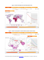
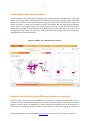
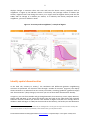
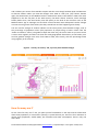
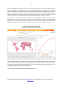
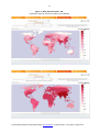
1
Interactive maps of the world’s population
on the website of the
French National Institute for Demographic Studies
http://www.ined.fr/en/everything_about_population/interactive_maps/
User's guide and documentation
Contents
Part 1: User's guide ................................................................................................................. 2
Five tabs, five ways of seeing things ............................................................................................... 2
Main options ................................................................................................................................... 2
Options for particular tabs .............................................................................................................. 2
Other options and parameters ........................................................................................................ 3
Part 2: Documentation with examples of use ......................................................................... 5
Explore world demography on line ................................................................................................. 5
Show highest and lowest countries................................................................................................. 7
Examine the similarities and differences between countries ......................................................... 7
Identify spatial discontinuities ........................................................................................................ 8
How far away am I? ......................................................................................................................... 9
Map without borders .................................................................................................................... 11
Appendix 1 – Indicators with definitions ............................................................................. 13
Appendix 2 – Maps “without borders”: definition and method of calculation .................... 15
________________________________________________________________________
French National Institute for Demographic Studies (www.ined.fr/en/) – Population maps – User's guide – January 2012
2
Part 1: User's guide
The website of the French National Institute for Demographic Studies (INED) features a set of freeaccess interactive population maps (http://www.ined.fr/en/). They include world maps for thirty or
so demographic indicators that enable users to watch moving images of how each map has changed
since 1950. This application will be particularly useful for teachers and students, but is also intended
for the general public. It provides a visual tool to view and understand global trends in population.
Five tabs, five ways of seeing things
The app provides five ways of seeing things in the five tabs at the top:
-
“The world”: Display the world map of an indicator and watch it change over time,
“A country and its neighbours”: Select a country and compare it with its neighbours,
“Country to country”: Travel through countries and see how the indicator changes from
one country to the next,
“Map without borders”: Observe the geographical variations of an indicator across the
continents,
“How far away am I?”: Select a point on the map and see how the population, or some
other quantity, is distributed around that point.
Main options
-
“Select an indicator”: Select one of the 30 listed indicators (see Appendix 1).
-
“Select a country”: We begin with a map of the world. To focus on one or more
countries, select them from the dropdown menu or click on the map. To deselect a
country, click on it again.
-
Select a year: The timescale is at the bottom. We begin with the map of the current year.
Click on
to move backwards in time and on
the cursor to change the year.
-
to move forwards. You can also move
Show the film: Click on this button to see how the situation changes over time.
Options for particular tabs
________________________________________________________________________
French National Institute for Demographic Studies (www.ined.fr/en/) – Population maps – User's guide – January 2012
3
Tab 1 - “The world ”
-
-
-
-
“All countries” or “Extremes only”. This option only displays if you have selected a rate
indicator, such as “birth rate”. We start with all countries. Click on “Extremes only” to
show only countries with the highest or lowest level of the indicator.
“Lowest” or “Highest”. This option only displays if you have selected “Extremes only”.
Click on “Lowest” to display countries with the lowest level of the indicator, and on
“highest” to display countries with the highest level.
“ Select a percentage”. This option only displays if you have selected “ Extremes only”.
Move the cursor up or down to increase or decrease the proportion of countries with the
“ lowest” or “ highest” values.
“Number” or “Proportion”. This option only displays if you have selected a number
indicator such as “Population” or “Number of births”. Click on “Proportion” to view the
curve of the indicator as a proportion of the world total. Click on “Number” to view the
curve of absolute numbers.
Tab 2 - “A country and its neighbours”
-
“Select neighbouring countries”. Move the cursor to increase or reduce the radius of the
circle for the selection of neighbouring countries.
Tab 4 - “Map without borders”
-
“ Select the scale of smoothing 1”. Move the cursor to the right or left to increase or
reduce the scale of smoothing. To the right, you increase the scale and the map is more
smoothed. To the left, you reduce the scale and the map shows more detail.
Other options and parameters
-
1
Print. Click on this button to print the screen.
-
Full screen. Click on this button to enlarge the image. Press Esc to exit full screen
mode.
-
Help. Click on this button to open or close the help function. A user's guide (pdf) and
a demonstration video are accessible from the welcome page (click on “User's guide” in
the “Download(s)” box and on “Demonstration video” in the “Find out more” box). Je ne
trouve pas ces boîtes sur la page du site !!
This smoothes out local variations and shows only broad variations.
________________________________________________________________________
French National Institute for Demographic Studies (www.ined.fr/en/) – Population maps – User's guide – January 2012
4
-
-
Zoom. Click on the buttons to enlarge (+) or shrink (-) the map. You can also
use the mouse wheel.
Deselect countries. Click on the button to deselect all countries.
Contrast. Click on the button to increase the colour contrast. Click again to return
to standard contrast.
Contact : [email protected]
Credits :
-
Design: Gilles Pison, Hélène Mathian, Christine Plumejeaud, Jérôme Gensel
Development: Opixido
Statistical sources: United Nations, World Population Projections
(http://esa.un.org/unpd/wpp/)
Reference :
Gilles Pison, Hélène Mathian, Christine Plumejeaud, Jérôme Gensel , and the INED web
team – “ Exploring World Demography on Line”, Paper given to the 25th International
Cartographic Conference, Paris, Palais des Congrès, 3-8 July 2011.
The interactive population maps are an animation by INED, designed in partnership with Groupe
Hypercarte (Laboratoire Géographie-Cités of the CNRS and Universities Paris 1 and Paris 7 and
Grenoble Laboratory of Computer Science - Université Joseph Fourier).
________________________________________________________________________
French National Institute for Demographic Studies (www.ined.fr/en/) – Population maps – User's guide – January 2012
5
Part 2: Documentation with examples of use
Explore world demography on line
The first tab, “The World”, is the application home page. It opens with the indicator “birth rate”. You
can select another with the “Select an indicator” button. This gives you a global map of variations in
that indicator for the current year. The right-hand side of the screen displays a graph of that indicator
from 1950 to 2050. The curve contains two parts: from 1950 to now, based on historical evidence,
and from now to 2100, based on projections taken from the United Nations medium scenario2. You
can choose another year from a timescale from 1950 to 2100 and the map adapts to that year 3. You
can also run an animated display of the changes between these dates, with the maps and graphs
moving together automatically.
You have a choice of 30 demographic indicators (see list in Appendix 1).
Variations in a rate (such as the birth rate) are shown on the map by a lighter or darker colour over
the entire area of each country (Figure 1).
Variations in absolute numbers (such as the number of infant deaths per year—children under 1) are
shown by circles whose area is proportional to the value of the indicator, positioned in the centre of
each country (Figure 2).
You can select one or more countries by clicking on the map or the “Choose a country” list. The graph
shows the indicators for each country as curves (Figure 2).
2
United Nations, World Population Projections (http://esa.un.org/unpd/wpp/).
The results are shown on a harmonised map underlay with countries existing in 2010. The display for 1950 does not
correspond to the borders of the period; some countries did not exist or had disappeared or had different borders.
However, the harmonised underlay makes it possible to keep track of places and more easily compare today’s figures with
those of the past.
3
________________________________________________________________________
French National Institute for Demographic Studies (www.ined.fr/en/) – Population maps – User's guide – January 2012
6
Figure 1. “World” tab. Map with a rate indicator (birth rate)
Figure 2. “World” tab. Map with a number indicator (number of infant deaths)
________________________________________________________________________
French National Institute for Demographic Studies (www.ined.fr/en/) – Population maps – User's guide – January 2012
7
Show highest and lowest countries
For rate indicators, such as the infant mortality rate (number of deaths of children under 1 for 1,000
births), you have the choice of displaying all the countries in the world or only the highest and lowest
(Figure 3). In the latter case only the chosen percent of countries where the indicator is highest (or
lowest) are shown: in Figure 3, for example, the 20% of countries with the highest infant mortality
rate in 1950. In the graphic section, you can move the cursor up or down the left-hand scale to
choose the percentage of countries at the top or bottom of the world rankings that you wish to view.
The right-hand scale, which you cannot set, moves to show the percentage of the world’s population
represented by the selected countries.
Figure 3. “World” tab, “Extremes only” function
Examine the similarities and differences between countries
The second tab, “A country and its neighbours”, can be used to examine local similarities. You can
see how a country changes together with those around it. After selecting a country, you can choose a
larger or smaller number of neighbours by setting a distance in kilometres on the scale (Figure 4).
The graph on the right shows the variations of the indicator in the chosen group of countries: it
________________________________________________________________________
French National Institute for Demographic Studies (www.ined.fr/en/) – Population maps – User's guide – January 2012
8
displays changes in extreme values over time and how the chosen country compares with its
neighbours. In Figure 4, the indicator chosen is the fertility rate (average number of children per
woman). Algeria moves from being the country in its region with the highest fertility until the late
1960s, with an average of 7 children per woman, to a relatively low fertility compared with its
neighbours, just over 2 children in 2010.
Figure 4. “A country and its neighbours”, example of Algeria
Identify spatial discontinuities
In the third tab, “Country to country”, the similarities and differences between neighbouring
countries are presented. You choose a route through a number of countries 4 (Figure 5). The display
shows variations in an indicator from one country to another, revealing “gradients” (gradual changes)
and “discontinuities” (sharp changes). Over time you can see how these discontinuities develop.
In Figure 5, you start from Sweden and go through Denmark, then Germany, France, Spain, Morocco,
Algeria, Mali and Niger. If you choose the fertility rate, the graph on the right shows that in 2010 it
fluctuates around 2 children per woman from Sweden to Algeria and then rises sharply above 5
children in Mali and Niger. In 1950 (use the timescale at the bottom), the fertility rate was between 2
4
The route must be over land, with no sections by air. Starting from a country you can only move to another country that
has a common border. If they are separated by a short stretch of sea, you may take the boat.
________________________________________________________________________
French National Institute for Demographic Studies (www.ined.fr/en/) – Population maps – User's guide – January 2012
9
and 3 children per woman from Sweden to Spain and then rose sharply between Spain and Morocco
to above 6 children. When you view the changes since 1950 as a film (use “play” button, bottom
right), the discontinuity on the Mediterranean in 1950 moves south to the Sahara in 2010. This move
happened in the last 30 years of the 20th century: the North African countries, which had high
fertility before then, saw their fertility rates fall quickly to the level of the countries north of the
Mediterranean. Age at marriage rose and birth control became more widespread. Similar changes
are now occurring south of the Sahara, but they started later and are happening more slowly.
You can view the changes in another indicator on the same journey from Sweden to Niger, such as
the percentage of population urban (the proportion of people living in towns—select from the
“Select an indicator” menu). The gradient slopes the other way; the rate is lower as you move south.
It varies more regularly and does not show the same geographical discontinuity as the fertility rate.
And the gradient changes over time, from 1950 to 2010, more evenly, with the percentage urban
rising regularly in all countries.
Figure 5. “Country to country” tab, a journey from Sweden to Niger
How far away am I?
On the “How far away am I?” tab, you place yourself somewhere on the map and see information
about how population (or some other quantity) is spread around you. There are four indicators to
choose from: population, wealth (GDP), CO2 emissions and water consumption. There is only one
date: 2010.
________________________________________________________________________
French National Institute for Demographic Studies (www.ined.fr/en/) – Population maps – User's guide – January 2012
10
Take the “Population” indicator and click on Paris in France (Figure 6). The curve shows along the
horizontal kilometre axis what proportion of the world’s population (vertical axis) lives within x km of
Paris. For example, just over 50% of the world’s population lives less than 7,500 km away. In the box
under the curve there are a few typical results: within 1,000 km there were 292 million people in
2010, within 2,000 km 578 million and within 4,000 km 1,022 million. The box also shows the average
distance between you (in Paris) and the world’s population of 7 billion in 2010: 5,724 km.
For population, the average distance is shorter in densely populated regions than less densely
populated ones, where you have to go a long way to reach populated areas. The curve and typical
figures give you a rapid idea of how far away you are from the areas with a high concentration of the
indicator chosen (in the case of population, your distance from the main “population centres”).
Figure 6. “How far away am I?” tab
results for chosen point Paris (black dot)
Practice example: where on the planet are you closest to most human beings? Answer: near Lhasa in
Tibet, an almost desert region, but at average distance of only 3,850 km from the world’s population
of 7 billion. And where are you farthest away? Answer: south of Santiago in Chile, where you are on
average more than 13,000 km from other people.
You can repeat this exercise with the other three indicators.
________________________________________________________________________
French National Institute for Demographic Studies (www.ined.fr/en/) – Population maps – User's guide – January 2012
11
Map without borders
The “Map without borders” tab provides smoothed maps like those on the “How far away am I?” tab
(see detailed explanations in Appendix 2). The colour at each point on the map indicates the quantity
of the global stock (global population if population is the chosen indicator) to be found within x km of
that point (the “potential”). The maps are pre-calculated and not drawn on demand, unlike those in
the first three tabs. The date is pre-set: 2010. You can choose the indicator (from a list of 10) and the
radius of the area covered (from four figures: 250 km, 500 km, 1,000 km, 2,000 km). Move the cursor
right or left to increase or reduce the smoothing scale. Towards the right, the scale is larger and the
map is more smoothed. Towards the left, the scale is smaller and the map shows more details. Figure
7 shows the maps obtained for the “Population” indicator with successive scales of 250 km and 2,000
km.
________________________________________________________________________
French National Institute for Demographic Studies (www.ined.fr/en/) – Population maps – User's guide – January 2012
12
Figure 7. “Map without borders” tab,
population maps for radiuses of 250 km and 2,000 km
________________________________________________________________________
French National Institute for Demographic Studies (www.ined.fr/en/) – Population maps – User's guide – January 2012
13
Appendix 1 – Indicators with definitions
Indicators for Tabs 1, 2 and 3
Type
(R=rate,
Name
N=number
)
Definition
N
Net number of migrants
difference between annual number of entries and exits of migrants (also known as
net migration)
N
Total population natural
change
difference between annual number of births and deaths
N
Population change
increased, or reduced, number of residents (sum of migratory growth and natural
increase)
R
Median age of population
age that divides the population into two equal halves, one younger and one older
R
Population density
number of persons per square kilometre
R
Life expectancy at birth
average length of life in years
N
Deaths per year
number of deaths per year
N
Infant deaths, under age 1
annual number of deaths of children under the age of 1
N
Births per year
number of births per year
N
Total population
number of residents
N
Population aged 65 or over
number of persons aged 65 years or more in the population
N
Population aged 85 or over
number of persons aged 85 years or more in the population
N
Population under 20
number of persons aged under 20 years in the population
N
Population aged 20-64
number of persons aged between 20 and 64 years in the population
R
Percentage aged 65 or over
proportion of persons aged 65 years or more in the population
R
Percentage aged 85 or over
proportion of persons aged 85 years or more in the population
R
Percentage under 20
proportion of persons aged under 20 years in the population
R
Percentage aged 20-64
proportion of persons aged between 20 and 64 years in the population
R
Net migration rate
difference between annual number of entries and exits of migrants per 1,000
residents (also known as net migration rate)
________________________________________________________________________
French National Institute for Demographic Studies (www.ined.fr/en/) – Population maps – User's guide – January 2012
14
R
Rate of natural increase
difference between birth rate and death rate
R
Annual rate of population
change
annual increase, or decrease in number of residents, per 1,000 population (sum of
migratory growth and natural increase)
R
Fertility rate
average number of children per woman (also called total fertility rate)
R
Mortality rate
number of deaths per year per 1,000 population
R
Infant mortality rate
number of deaths of children aged under 1 per 1,000 births
R
Birth rate
number of births per 1,000 population
R
Percentage of population
urban
proportion of the population living in urban areas
Indicators for Tab 4
Water consumption
quantity of water
CO2 emissions
carbon dioxide emissions
Deaths per year
number of deaths per year
Infant deaths, under age 1
annual number of deaths of children aged under 1
Births per year
number of births per year
Total population
number of residents
Population aged 65 or over
number of persons aged 65 years or more in the population
Population aged 85 or over
number of persons aged 85 years or more in the population
Population under 20
number of persons aged under 20 years in the population
Gross Domestic Product
(GDP)
gross domestic product
Indicators for Tab 5
Water consumption
quantity of water
CO2 emissions
carbon dioxide emissions
Total population
number of residents
Gross Domestic Product
(GDP)
gross domestic product
________________________________________________________________________
French National Institute for Demographic Studies (www.ined.fr/en/) – Population maps – User's guide – January 2012
15
Appendix 2 – Maps “without borders”: definition and method of
calculation
The maps “without borders” provide a continuous representation of a phenomenon for a given year.
This is the result of a calculation for all points in space based on the distribution of a given indicator
known for a particular grid size. The representations on this tab are based on the potential method
which evaluates the intensity of a phenomenon by accumulating “what is happening round about”,
weighted by an inverse distance function (applied here with a Gaussian kernel). In this way the
spatial continuity of economic or population phenomena can be viewed without the bias of maps
with borders. The smoothing given here acts as a filter to show the structure of the spatial
distribution of the indicator. Suppose you want to focus on the general structure of global
organisation. One of the parameters associated with the distance function, the scale, expresses the
geographical scale of analysis. The scale is associated with the intensity with which the function
decreases with distance: the smaller the scale, the more finely-grained the scale of analysis. As the
scale increases, so the broader structures of distribution are revealed and the phenomenon is
presented in more general terms. For ease of interpretation, the map is vectorised and the borders
of important variations in potential are shown as contour lines. You can see at a glance the areas of
high and low values for the chosen indicator. By varying the scale (between 250, 500, 1,000 and
2,000 km) you refine your analysis or broaden it to summarise more data.
Technical information. The maps are pre-calculated at the Grenoble Laboratory of Computer
Science 5 using the potential method published by Claude Grasland et al. (2000) 6 in which the opensource Hyantes calculation kernel 7 was developed by the HyperCarte research group (C. Plumejeaud
et al., 2006) 8. The calculations are based on a regular grid containing all the variables in proportion to
the known quantity of population in 2000 per one-degree pixel (the population grid is available on
the UNEP-GRID website 9). The method is similar to that used to produce the interactive CD-ROM “6
milliards d’hommes… et moi” [Six billion people and me] (Pison, 1999) 10.
5
http://www.liglab.fr/
Grasland C., Mathian H., Vincent J.M., 2000, «Multiscalar analysis and map generalisation of discrete social phenomena:
Statistical problems and political consequences», Statistical Journal of the United Nations Economic Commission for Europe,
IOS Press, 17, 2, pp. 157-188.
7
http://hyantes.gforge.inria.fr/
8
Plumejeaud C., Vincent J-M., Grasland C., Gensel J., Mathian H., Guelton S., Boulier J., 2007, «HyperSmooth: calcul et
visualisation de cartes de potentiel interactives», International Conference on Spatial Analysis and Geomatics (SAGEO
2007), Clermont-Ferrand, France, 18-20 June 2007.
9
http://geodata.grid.unep.ch/results.php
10
Pison G., 1999, 6 milliards d’hommes… et moi, CD-ROM, published jointly by Syrinx/Muséum national d’histoire naturelle.
6
________________________________________________________________________
French National Institute for Demographic Studies (www.ined.fr/en/) – Population maps – User's guide – January 2012