1
BioPlot user’s guide
by Serguei Sokol (sokol(a)insa-toulouse.fr)
First release 14/05/2004
Last updated 06/09/2007
platform “Biopuce” INSA/DGBA
135, av. de Rangueil,
31077 Toulouse cedex
France
https://biopuce.insa-toulouse.fr
Copyright (C) 2004-2007, platform “Biopuce”, Toulouse Genopole. Permission
is granted to freely print, copy, translate or distribute this document for educational
purposes, provided this copyright notice is preserved.
The original and most upto date copy of this document can be found on the web
page http://biopuce.insa-toulouse.fr/ExperimentExplorer/doc/
1
Contents
1
.
.
.
.
.
.
.
.
.
.
.
5
5
7
7
7
7
7
8
8
8
10
11
2
Image Analysis.
2.1 Signal vs background. . . . . . . . . . . . . . . . . . . . . . . . . . .
2.2 Fixed or adaptive radius. . . . . . . . . . . . . . . . . . . . . . . . .
2.3 Output format. . . . . . . . . . . . . . . . . . . . . . . . . . . . . . .
12
12
14
14
3
Normalization.
3.1 Normalization types. . . . . . . . .
3.2 Data treatment. . . . . . . . . . . .
3.2.1 Spot quantification. . . . . .
3.2.2 Background correction. . . .
3.2.3 Log transformation. . . . . .
3.2.4 Normalization coefficient. .
3.2.5 Normalization. . . . . . . .
3.2.6 Average on spot duplicates.
3.2.7 Average on arrays. . . . . .
.
.
.
.
.
.
.
.
.
.
.
.
.
.
.
.
.
.
.
.
.
.
.
.
.
.
.
.
.
.
.
.
.
.
.
.
.
.
.
.
.
.
.
.
.
.
.
.
.
.
.
.
.
.
.
.
.
.
.
.
.
.
.
.
.
.
.
.
.
.
.
.
.
.
.
.
.
.
.
.
.
.
.
.
.
.
.
.
.
.
.
.
.
.
.
.
.
.
.
.
.
.
.
.
.
.
.
.
.
.
.
.
.
.
.
.
.
.
.
.
.
.
.
.
.
.
.
.
.
.
.
.
.
.
.
.
.
.
.
.
.
.
.
.
.
.
.
.
.
.
.
.
.
.
.
.
.
.
.
.
.
.
15
15
17
17
17
18
18
18
19
19
Statistical Tests.
4.1 Test errors. . . . . . . .
4.2 Student’s test. . . . . . .
4.3 Other tests. . . . . . . .
4.3.1 Wilcoxon’s test. .
.
.
.
.
.
.
.
.
.
.
.
.
.
.
.
.
.
.
.
.
.
.
.
.
.
.
.
.
.
.
.
.
.
.
.
.
.
.
.
.
.
.
.
.
.
.
.
.
.
.
.
.
.
.
.
.
.
.
.
.
.
.
.
.
.
.
.
.
.
.
.
.
20
20
21
22
22
4
Methods
1.1 Experiment model. . . . . . . . .
1.2 Broken linearity. . . . . . . . . .
1.2.1 Scanner saturation. . . . .
1.2.2 Screen saturation. . . . . .
1.2.3 Array saturation. . . . . .
1.2.4 Quenching. . . . . . . . .
1.2.5 Nonlinear signal coding. .
1.3 Variability. . . . . . . . . . . . . .
1.4 Reliability and validity. . . . . . .
1.5 Experiment plan. . . . . . . . . .
1.5.1 Dye swap and dye switch .
.
.
.
.
.
.
.
.
.
.
.
.
.
.
.
.
.
.
.
.
2
.
.
.
.
.
.
.
.
.
.
.
.
.
.
.
.
.
.
.
.
.
.
.
.
.
.
.
.
.
.
.
.
.
.
.
.
.
.
.
.
.
.
.
.
.
.
.
.
.
.
.
.
.
.
.
.
.
.
.
.
.
.
.
.
.
.
.
.
.
.
.
.
.
.
.
.
.
.
.
.
.
.
.
.
.
.
.
.
.
.
.
.
.
.
.
.
.
.
.
.
.
.
.
.
.
.
.
.
.
.
.
.
.
.
.
.
.
.
.
.
.
.
.
.
.
.
.
.
.
.
.
.
.
.
.
.
.
.
.
.
.
.
.
.
.
.
.
.
.
.
.
.
.
.
.
.
.
.
.
.
.
.
.
.
.
.
.
.
.
.
.
.
.
.
.
.
.
.
.
.
.
.
.
.
.
.
.
.
.
.
.
.
.
.
.
.
.
.
.
.
.
.
4.4
5
6
4.3.2 Fisher’s test. . . . . . . . . . . . . . . . . . . . . . . . . . .
4.3.3 Permutation test. . . . . . . . . . . . . . . . . . . . . . . . .
Multiple tests problem. . . . . . . . . . . . . . . . . . . . . . . . . .
BioPlot Form Items.
5.1 Analysis tab. . . . .
5.2 Variable/Norm. tab.
5.3 Spot Selection tab .
5.4 Stats tab . . . . . .
5.5 Plot tab. . . . . . .
5.6 An. profiles tab. . .
22
23
23
.
.
.
.
.
.
.
.
.
.
.
.
.
.
.
.
.
.
.
.
.
.
.
.
.
.
.
.
.
.
.
.
.
.
.
.
.
.
.
.
.
.
.
.
.
.
.
.
.
.
.
.
.
.
.
.
.
.
.
.
.
.
.
.
.
.
.
.
.
.
.
.
.
.
.
.
.
.
.
.
.
.
.
.
.
.
.
.
.
.
.
.
.
.
.
.
.
.
.
.
.
.
.
.
.
.
.
.
.
.
.
.
.
.
24
24
26
29
31
33
33
Result presentation.
6.1 Scatterplot description. . . . . . . .
6.1.1 Recall table. . . . . . . . . .
6.1.2 Scatterplot. . . . . . . . . .
6.1.3 Form link. . . . . . . . . . .
6.2 TabView description. . . . . . . . .
6.2.1 Actions on gene or spot lists.
6.2.2 Store a gene list. . . . . . .
.
.
.
.
.
.
.
.
.
.
.
.
.
.
.
.
.
.
.
.
.
.
.
.
.
.
.
.
.
.
.
.
.
.
.
.
.
.
.
.
.
.
.
.
.
.
.
.
.
.
.
.
.
.
.
.
.
.
.
.
.
.
.
.
.
.
.
.
.
.
.
.
.
.
.
.
.
.
.
.
.
.
.
.
.
.
.
.
.
.
.
.
.
.
.
.
.
.
.
.
.
.
.
.
.
.
.
.
.
.
.
.
.
.
.
.
.
.
.
.
.
.
.
.
.
.
35
35
35
36
37
37
39
39
.
.
.
.
.
.
.
.
.
.
.
.
.
.
.
.
.
.
.
.
.
.
.
.
.
.
.
.
.
.
.
.
.
.
.
.
.
.
.
.
.
.
.
.
.
.
.
.
Bibliography
42
3
Introduction
BioPlot is a web service hosted by platform “Biopuce” which is a part of Toulouse
Genopole and is hosted in INSA/DGBA. This service is aimed to help platform users
to compare transcriptome data from two biological conditions and select significantly
changed genes. Usually data are collected by scanning micro or macroarrays on appropriate scanner followed by an image analysis. The purpose of image analysis is to
detect and to quantify spot’s intensities representing gene transcription activity. Image
analysis is not detailed here and supposed to be done. BioPlot works on data obtained
from image analysis applications.
One of particularities of transcriptome analysis is the presence of important statistical noise in the data. This aspect is responsible for weak reproducibility of results
in transcriptome experiments. To obtain more or less reliable data, researcher has to
replicate his micro- or macroarrays with statistically independent samples. In such a
scenario, BioPlot may be useful to easily make average of these replicates, perform
statistical tests and to present in graphical/tabular form all of the data or a selected part
of them.
The rest of this guide is organized as follows. In chapter 1, we shall describe an
experiment model which is the basis for statistical treatment performed in BioPlot. In
chapter 2, a brief description of image analysis and spot quantification is described.
Chapter 3 treats about several kind of normalizations. Statistical tests are the subject
of chapter 4. Chapter 5 proposes a detailed description of form fields which may be
found in BioPlot.
The reader is supposed to be familiar with theories and techniques employed in
transcriptome experiments as well as with basic probabilistic and statistic notions like
distribution, variance and so on. No advanced knowledge of mathematics or statistics
is required.
4
Chapter 1
Methods
1.1
Experiment model.
An experiment model reflect our understanding of experiment, formalizes essential
processes undergone in an experiment and puts in adequate equations visible and hidden values. Hidden values are what researchers usually try to guess from visible values
(or measures). In transcriptome analysis, hidden values are the mRNA concentrations
or more frequently the ratio of mRNA concentrations for each gene in two different biological conditions. Visible values or measures are the pixel intensities at the output of
scanners. Let consider all the chain of signal transformation in microarray experiment
from mRNA concentration to pixel intensity. This chain is analogue for macroarray
experiment using radioactive markers instead of fluorescence considered here.
We start with the stage closest to visible values, the scanning stage:
I pixel = Kscan · F · P ·C f luo + escan ,
here I pixel is intensity of a given pixel, Kscan scaling coefficient of transition from superficial fluorochrome concentration C f luo to measured signal I pixel , F is a fluorescent
capacity of a used marker, P is a scanner detection power (coupling the laser power
and photo-multiplier sensitivity) and escan represents statistical noise introduced during scan. Hypothesis admitted at this stage is that Kscan , F, P remain constant in a given
scan for all genes independently of their expression level. There are known exceptions
to this hypothesis discussed in the section 1.2
The second considered stage is those of hybridization linking the superficial fluorochrome concentration C f luo to the concentration of labeled cDNA CcDNA :
C f luo = Khybr ·CcDNA + ehybr ,
where Khybr is scaling coefficient and ehybr is the noise introduced at this stage. As
before, we suppose that Khybr is constant during a given hybridization for all genes. It
is important to note here that C f luo is supposed independent of the concentration of
spotted material. It is a reasonable assumption if the spotted material is in large excess
compared to labeled cDNA.
5
The third stage is reverse transcription and labeling:
CcDNA = KRT labCmRNA + eRT lab ,
here CmRNA is the concentration of mRNA put in enzymatic reaction of reverse transcription coupled with labeling, KRT lab and eRT lab are scaling coefficient and statistical
noise respectively.
Sometimes, mRNA considered in the previous equation is obtained from a purification stage :
CmRNA = K puri f CtotRNA + e puri f ,
where CtotRNA is the concentration of a purified total RNA. K puri f and e puri f , usual
scaling coefficient and a noise are subject to the same hypothesis being constant during
a given purification for all genes.
Finally, the extraction stage introducing the variable of interest, concentration of
mRNA in the studied cell CellmRNA , is modeled by:
CtotRNA = KextrCellmRNA + eextr .
Scaling coefficient Kextr and noise term eextr are supposed, as before, do not change
from one gene to another but may be changing from one extraction to another.
The main feature of this model is supposed linearity between useful signals. Thus
we can collapse this stages in one step modeled by:
I pixel = Ktotal CellmRNA + etotal .
We have introduced here a total scaling coefficient Ktotal and a total noise term etotal .
As strengthened before, we suppose that scaling coefficients are the same for all genes
but may change from one experiment realization to another. This changing nature of
scaling coefficient, often observed in real experiments, reflects the fact that we can not
reproduce exactly a given reaction. For example, the efficiency of labeling, being an
enzymatic reaction, varies from one try to another, despite all protocols are thoroughly
respected. An immediate consequence of such variability of scaling coefficients, is
that we cannot directly compare pixel intensities corresponding to different biological
conditions. Neither we can do an average of intensities for replicate experiments. If we
do, we shall take into account the variability of Ktotal , which does not reflect biological
changes.
So, to eliminate this dependency of technical variations, one can consider normalized intensities:
I pixel
Ktotal CellmRNA + etotal
CellmRNA
=
≈
,
Ire f
Ktotal CellmRNA(re f ) + etotal(re f ) CellmRNA(re f )
where index re f is relative to some genes which are known a priori to do not change
their expression (evidently not null) in considered conditions. We will discuss several
kinds of normalization in the chapter 3.
6
1.2
Broken linearity.
The hypothesis of linear signal transformation is underlying all the consequent data
treatment in transcriptome experiments. Unfortunately, this hypothesis can be broken
in reality thus making all analysis inaccurate and even meaningless. In this section we
shall provide a list of some common situations leading to the loss of linearity and give
advises how to avoid such situations.
1.2.1
Scanner saturation.
Scanners used to gather the numerical data from micro- and macroarrays code the
image points (pixels) in integers of 16 bits. Thus a pixel can take their values in an
interval running from 0 to 65535 (=216 -1). If the signal strength is so high that a pixel
should represent a value higher than the upper limit of 65535, a saturation takes place
and a saturated pixel is affected with a value of 65535. To avoid such situation, the
PMT (Photo Multiplier Tension) parameter should be diminished.
1.2.2
Screen saturation.
In transcriptome experiments using radioactivity for labeling, the signal is gathered
not directly from an array chip but from a special screen transforming the radioactivity strength to a superficial concentration of meta stable atoms. Under the laser beam
effect, these meta stable (excited) screen atoms return to stable state with a photon
emission during scan. Too high radioactivity strength can lead to a situation when
there is no more atom on the screen able to become excited. This is a screen saturation. For the screens used on the platform (Molecular Dynamics) such saturation takes
place when corresponding pixels are about 46000. This saturation can be avoided by
shortening exposition time or by lowing radioactivity concentration.
1.2.3
Array saturation.
A hybridization of an array with labeled cDNA or oligonucleotides may run to the
situation when almost all sites on the array are bound to corresponding cDNA thus not
leaving a chance to others molecules to hybridize. Such chemical saturation can be
avoided if spotted concentrations are much higher than labeled one. In such a case, the
spotted sequences are always in excess compared to labeled molecules. The researchers
have to consult technical parameters and protocols of array production to know what
are concentrations to use on their arrays.
1.2.4
Quenching.
As described in [6] a phenomenon called quenching may lead to significant loss in
linearity. Quenching happens when there is so high concentration of fluorochrome
molecules that an emitted fluorescence is recaptured by neighbors molecules thus lowing the total emitted signal. Lowing a superficial fluorochrome concentration should
limit the annoyance of this phenomenon.
7
1.2.5
Nonlinear signal coding.
The paper cited in precedent subsection [6] reports on a situation when a gathered
signal is stored in some transformed form. For example, instead of storing pixel values,
the software driving a scanner can store square roots of pixel values. It is up to an image
treatment software to do the backward transformation to recover the original values.
Researchers have to check what is a storing scheme used by a scanner that they plan to
use and if the used image analysis software can appropriately handle this scheme.
1.3
Variability.
According to what was considered is section 1.1, we can distinguish two kind of random variabilities in transcriptome experiment. The first one, that we call systematic,
affects all genes of a given array at the same way. Examples of factors inducing systematic variability are the variation of the whole mRNA concentration, label and labeling
quality, PMT of scanner and others.
The second type of variability, called random, affects each gene/spot individually.
It is this kind of variability that statistics deal with. Hereafter we will refer it simply
variability if no confusion is possible. The effect of systematic variability can be mitigated by normalization (cf. chapter 3). Unfortunately the individual noise (or error)
of each gene can not assessed and therefore corrected. The only way to decrease this
kind of dispersion is to repeat experiments. At the site of our platform there is a page
allowing to estimate the number of experiment replicates to achieve a reliable detection of expression change, given estimated variability and desired detection threshold,
cf. http://biopuce.insa-toulouse.fr, page “Experiment number”. For example,
to detect 2 fold changes in expression of a given gene with CV=50%1 having a 95%
confidence, we need 4 repetitions of bi-chromatic arrays.
1.4
Reliability and validity.
The purpose of most researches is to prove (or to detect) an existence of relationship
between some outcome “result” and some measurable characteristics. These characteristics can be manipulated (like treatments) or just observed or/and measured. Regardless of whether the study involves human subjects, animal subjects, or basic laboratory
model systems, our ability to identify and measure the relationships of interest depends on our ability to accurately measure both the outcome variable of interest and
those variables tentatively believed to affect outcome.
The term reliability (or reproducibility) refers to the degree with which repeated
measurements, or measurements taken under identical circumstances, will yield the
same results. When the variability of measures is not negligible, the “same result” often
meant as a high probability to get a result in a given confidence interval. Anyway, the
quality of measures is defined relatively to itself at another time rather than to a well
established standard.
1 Coefficient of variation (CV) used here is somewhat different from a classical definition and is defined
on page 10.
8
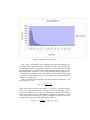
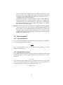
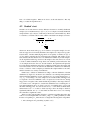
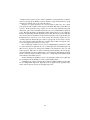
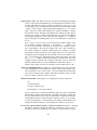
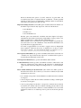
Figure 1.1: Histogram of var(log-ratio)
The validity of measurements can be defined as the degree with which the measured value reflects the characteristic it is intended to measure. The valid measures
are necessarily reliable (or reproductive) but the converse is not necessary true. The
measurements can be reproductive but not valid. In this cases they are called biased.
The validity implies an existence of some external standards which is hardly the case
of transcriptome experiments. So we can do our best to achieve reliable results waiting
for validation by future techniques. For a review of methods for assessing reliability or
validity cf., for example [5].
The key parameter for the reliability is the random variations quantified by a well
known statistics variation:
var({xi }) =
Σni=1 (xi − x)
¯2
,
n
here x¯ denotes the mean value of the sample {xi } of the size n. On platform “Biopuce”, we have measured the variation of log-ratios on four repeated arrays. Thus xi
in the above definition was a log-ratio of a particular gene measured on the array i.
The histogram calculated on more than 6000 genes is presented on the figure 1.1. The
values of the variation calculated on log-ratios are difficult to interpret. To better understand these values we can do the following approximation :
p
ˆ − log(¯r).
σl (log.r) = var(log.r) = log(¯r + σ)
9
ˆ kind of standard deviation for not transformed ratios. TakThis relationship defines σ,
ing the power of 10 gives
10σl =
r¯ + σˆ
σˆ
ˆ
= 1 + = 1 + CV/100,
r¯
r¯
where CV stands for coefficient of variation expressed in percents. It follows that
ˆ = (10σl − 1) ∗ 100.
CV
Thus the interpretation of data is easier. For example, the median value of var(log.r)
sample corresponds to thus defined coefficient of variation 49%. The low and upper
bounds of 95% centiles are respectively 12% and 331%. That means that there are
genes that had been very stable with CV only 12% and some others had CV as bad as
near 300%.
1.5
Experiment plan.
Experiment plan establishes what levels of what factors have to be confound on a given
experimental unit. The goal of experiment plan is to optimize a number of experimental
units and/or expected measurement errors. It is also important to obtain measurements
not biased by some unavoidable factor. If a full experiment plan is not conceivable,
a randomization of undesired factor levels is used. In our practice, we have not seen
factors requiring a randomization so we won’t consider it here.
Many researches were surprised by highly noised nature of transcriptome experiment. Even now (in 2004), it is still possible to see advertisements promising that
on a single array one can have reliable results. Generally, the number of repetition is
constrained by the experiment cost taken in large sense. Nevertheless, it’s somewhat
fundamental for reliability and a possibility to have a reliable result from a single array
seems to be dubious.
Let examine the factors typically involved in transcriptome analysis. Here we adopt
the following notation for a factor F and its levels l1, l2, ... : {F: l1, l2, ...}.
A transcriptome experiment is generally done to compare gene expression in different biological conditions. Let take the simplest case - only two conditions to compare:
{Bio:A,B}.
These conditions are studied by the expression of genes: {Gene:g1,...,gn}. It is
important to decide what kind of normalization will be used. Depending on it, it can
be useful to add control genes besides the genes of interest.
We consider to do replicates of each gene on array: {Spot:s1,s2}. These replicates
don’t have a major role to play in reducing the error. They are, nevertheless, practical.
As array images may be partially degraded by various kind of artifacts (dust, array
irregularity, finger print and so on), there are more chances to have at least one of spot
duplicates not degraded.
It is a good idea to do array replicates too: {Array:a1,a2,...,ar}. This factor is
essential to reduce the random error. Here, the samples used on different arrays are
supposed to be statistically independent.
10
Array
g
r
a1
A
B
a2
A
B
a3
B
A
a4
B
A
Table 1.1: Dye switch experiment design with 4 repetitions.
In bi-chromatic experiment two fluorochrome are used, Cy3 (green) and Cy5 (red):
{Label:g,r}.
These sets of factors Bio, Gene, Spot, Array and Label is minimal to consider
in real experiments. One can easily extend this list by, for example Sample, Block on
array, RNA extraction, labeling and so on. Extension of factor list has a direct impact
of required experimental units. If we don’t considered all these candidates to factors it
is because they are confounded with others factors combinations. For example, if we
have four tissue samples for each biological conditions, they can be mapped on Array
factor: a1, a2, a3, a4.
1.5.1
Dye swap and dye switch
In many publications, it was related that it exists a relationship between a Gene and
Label factors, cf. for example [4]. The effect of label factor is obviously not desired.
To avoid a bias due to this factor in results, techniques called dye swap and dye switch
are used. From experimental design point of view, dye-switch corresponds to a full
experiment plan when two factors of two levels each are involved in an experiment:
{Bio:A,B}⊗{Label:g,r}=Ag,Bg,Ar,Br. Each biological condition is labeled once by
Cy3 and once by Cy5. Taking the average of two arrays thus labeled, cancel the dye
effect on any particular gene. Obviously, more than two arrays can be used in real
situation with two biological levels. Nevertheless, the array number will be even. In
example cited before, four samples labeled by Cy3 and Cy5 can be mapped on four
arrays using dye switch as shown in table 1.1.
Dye-swap was used essentially at the beginning of microarray experiments. This
technique implies a separation of a given RNA sample in two equal parts. For example, an RNA sample for biological condition A1 gives two sub-samples A1.1 and A1.2
. These parts are labeled by Cy3 and Cy5 dyes and hybridized with B1.1 and B1.2
labeled in complement color. Thus a couple of samples A1 and B1 are used on two
slides which become statistically dependent. If a gene is, for instance, randomly degraded in A1 but not in B1, it will appear as over-expressed in B over A on both slides.
That’s why, dye-swap needs a preliminary slide couples averaging before proceeding
with statistically independent data. This complication and the fact that each couple of
samples A-B needs two slides in stead of only one in case of dye-switch, makes us to
prefer dye-switch also known as biological dye-swap.
11
Chapter 2
Image Analysis.
Image analysis software is used to detect spots on image, to quantify them and to export
data in some format for further treatment. Applications available at our platform are
• GenePix (v. 3 and v. 6) running on Windows NT4 (v.3) and XP Pro (v. 6) are
used to analyze .tif files coming from Axon scanners;
• XDotsReader (v. 1.8) running on Linux and used to analyze .gel files coming
from Storm scanner,
• ImageMaster Array (v. 2) running on Windows NT4, 98 and used to analyze .gel
files coming from Storm scanner.
This chapter is not about to make an introduction to these software. We shall only
discuss some concepts used during image analysis which may be helpful for further
treatment.
2.1
Signal vs background.
A photo-multiplier of a laser scanner digitizes a captured fluorescence for a given
“point” of a slide (or screen) and stores a numerical value in a pixel corresponding
to that point. A picture composed of such pixels is analyzed during image analysis.
First task for image analysis is to detect the spot position and limits. This stage is
often called segmentation. Usually spots are segmented by circles of adaptable or fixed
radius. To be reliably segmented and quantified, the spot diameter should be more
than 5-6 pixels. Usually, before segmentation user provides an indexing grid giving
approximate positions of spots. The segmentation itself detects the limits of spots near
the grid nodes. The segmentation must be conducted in rather flexible way because of
spotting imperfection or support deformation. Put in other way, the spots lye almost
never on perfect rectangular grid.
Pixels inside a spot are supposed to be brighter (to have greater numerical values)
than those outside. Ideally, the outside pixels should equal to zero. Unfortunately, this
12
does not happen in reality mainly because of two factors: photo-multiplier or electronic
noise and background fluorescence. The last factor is due to support himself and to
some materials (salts, oils, dust) fixed on a support during its manipulation. Obviously,
experiment protocols tend to limit such undesired materials to fix on a chip or on a
screen but it is not always easy to do.
Background signal or image noise make the spot detection and quantification less
reliable and more difficult to carry out. One of difficulties is that not expressed genes,
i.e. void spots, have not their values at zero level but at the level of background. To correct this situation, the background intensity is most often subtracted from spot intensity
thus putting void spots to a near zero level. Unfortunately, there are some drawbacks
of this method. One of them is a possibility to make appear negative values which are
meaningless in considered experiment. Another one is that background intensity may
vary considerably from one image part to another thus more penalizing spots in areas
with strong background pixels. Nevertheless, a possibility to have more realistic intensities for weak spots outweighs these drawbacks and background correction is very
often adopted.
The second task of image analysis is to quantify spots and export data in a result
file. This is relatively easy and well defined task once the spots were determined on the
image. Statistics most frequently used to quantify spot intensity are the mean or median
of pixels belonging to a spot. Median1 is more robust than mean value in presence of
outlier pixels. On the other side, the variance of median estimator is higher than the
variance of a mean. In practice, however, there are little differences in results obtained
using mean or median.
Software used for image analysis often provides others statistics for the spots such
that pixel sum (volume), maximal pixel value, mode pixel (e.i. pixel most frequently
presented), percentage of pixel over background level and many others. These measures can be used to explore the micro- or macroarray properties but the results are
most often presented with mean or median.
We have mentioned background level which play an important role in correction of
raw data. When a raw array image is taken by a scanner, one can see that the intensity
level if far from to be zero outside of spots. Beside a sporadic non specific hybridization
outside of spots, the background noise can be produced by a residual fluorescence of
screen, slide, salts, oils or other materials being in contact with array. There is also a
contribution of an electronic noise of photo-multiplier. All this makes that background
level is not negligible and vary from one part of array to other. That’s why a background
level is often measured locally around each spot. One way to measure background is
to define a ring at some distance of spot boundary and to take a mean or median value
of pixels on this ring which are not a part of other spots. Thus measured, background
takes into account non homogeneity of the noise on the array.
1 Median of a set of scalar values X = {x }
n
i i=1,n is a value xmed such that there are the same number of
value from the set Xn lower or equal to xmed than upper or equal values. Practically, it means that if you sort
the sample Xn then a value in the middle of the list is the median. If the sample number n is even than the
average of two middle values is taken as sample median.
13
2.2
Fixed or adaptive radius.
One of choices imposed during image analysis is what radius to use for spot detection:
fixed or adaptive? The question arises due to the fact that visual size of spots varies on
the same array. So one spot may be little but bright and another great in size but low in
signal thus giving the same mean if a fixed radius is used.
Sometimes, there is no choice at all. Some software are not offering adaptive radii
or don’t have a reliable algorithm to detect spot limits when adaptive spot are used.
In this case fixed radius is imposed. But what option is most suitable when there is a
choice?
Let consider what happens on an array surface during a hybridization. Our assumption is that the signal strength is proportional to superficial concentration of labeled
material fixed on the spot. If the signal by itself is important to use, the mean value of
pixel on correctly delimited spot is most appropriate. Thus, to have correctly delimited
spots, adaptive radii have to be used. If all that will be taken into account is a ratio of
signals than a fixed radius may be sufficient. On spots that are much less in size than
imposed radius, the mean of signal will be underestimated. But if the spot size doesn’t
vary from one array to another than the ratio will not be affected by this problem.
If a constant radius is imposed but we still need to use a signal strength in further
analysis than it is recommended to use a sum of pixel (volume) as a quantification
statistics. This measure is less affected by taking background pixels in the spot than
mean value. After the correction by background the contribution of background pixels
to the volume will not be significant. In opposite, the mean value will be decreased if
more background pixels will be in the spot.
In conclusion, if adaptive radii are an option in image analysis software, they should
be used. The mean or median of pixels is in this case is most suitable for spot quantification. If fixed radius is imposed, use the volume as spot quantifier.
2.3
Output format.
All software used to analyze images are supposed to be able to export data measured
on an array for further treatment and analysis. Most usual format used for export is
plain ASCII text file with values separated by tabulation. Normally, one spot takes one
row in such file and measures are put in columns. There are obviously columns having
spot coords which used to establish a gene identity represented by a given spot. These
output file can be easily imported in a spreadsheet, database or statistical software.
14
Chapter 3
Normalization.
3.1
Normalization types.
As we have seen in experiment model in chapter 1, raw signal intensity is not depending only on mRNA concentration but also on many technical factors. To reduce this
undesirable technical influence we have to use a technique called normalization. What
may happen if we don’t take any particular measure against systematic technical factor
variations? Let assume that a cumulative systematic factor was twice higher for one
biological condition than for another. If we use raw data, we shall interpret this two
fold signal change as a change in gene expression which is obviously erroneous.
The basic idea of normalization is to use a mean expression of a group of reference
genes as a unit of intensity measure, i.e. intensities of all genes are divided by the mean
intensity of reference genes. This technique is based on an assumption that reference
genes have undergone the same systematic transformation that the rest of genes present
in array. After normalization, the mean of reference genes will be equal to 1 by definition. So, if we have chosen as reference some genes that changed their expression
between compared biological condition, we won’t be able to detect this change in normalized data. Therefore, we must be sure a priori that reference genes don’t change in
expression.
Sometimes in data treatment descriptions, it is mentioned of chained normalizations. It is meaningless operation as the last applied normalization cancel the effect
of all previous normalizations (except lowess and quantiles) and puts to 1 the mean
intensity of last reference genes.
Various types of normalization are defined by the choice of reference genes. Let us
review possible options.
Total mean When pan genomic arrays are used, than the mean expression value of a
whole genome may be considered as a reference not changing between studied
biological conditions. This hypothesis is based on an observation that a relatively
little fraction of genes changes theirs expression between different biological
conditions.
(+) Advantage of this normalization is its facility and low statistical error of
15
resulting normalization coefficient.
(-) Main drawback of this normalization method is that it can not be applied for
array having little number of genes which are often selected as they change the
expression in studied conditions. As the mean intensity is no more supposed to
remain constant, it can not be used as reference.
Genomic DNA One can deposit on array genomic DNA that will react with all labeled
cDNA thus giving the mean intensity for a given biological sample. The underlying hypothesis is the same as for “Total mean”. The only difference is that the
mean value is calculated in chemical way.
(+) This normalization can be used on arrays with little number of selected genes.
(-) There is not a lot of experience in practical use of this normalization.
Internal control If some genes are known not to change their expression between conditions these specific genes can be used as internal reference.
(+) Genes undergo the same systematic influence than the rest of genes. This
method can be used on selective arrays.
(-) Low number of internal control can result in relatively great error of normalization coefficient.
External control One can put on array gene sequences of an organism other than studied in transcriptome experiment. These genes are called as spikes. They should
be chosen in such manner that they don’t interfere with genes of studied organism. Adding mRNA of external organism of known quantity (or cDNA of known
quantity) should result in the spike signal of the same strength (up to systematic
variations).
(+) Can be used on arrays with selected genes.
(-) External labeled cDNA don’t follow the same chemical transformation chain
therefore the spike systematic variations may be different from those of studied
organism. Additionally, as in “Internal control” case, low number of spikes can
give consequent error of normalization coefficient.
Stable majority When biologist is sure that a great part of genes on array don’t alter the expression but don’t know what are these genes, this technique may be
helpful to identify such genes and to calculate the normalization coefficient. The
method of “Stable majority” is based of assessing of the main mode in log-ratio
histogram. Genes in this mode are declared “stable majority” and used as reference genes.
(+) Can be used on arrays between selective and pan-genomic. Low error of normalization coefficient.
(-) Can hardly be applied to arrays having low gene number. May be biased by
spots near background.
Lowess Broken linearity discussed in section 1.2 can lead to a distortion of scatterplot, giving him a typical “banana” form. To palliate this distortion, a smoothing
technique called lowess can be used. Resulting normalization will be different
from all others, previously considered. The normalization coefficient is depending here on average log-intensities in compared conditions. This techno can be
16
viewed as if there were a sliding window in a average log-intensities axis and
the mean log-ratio of genes falling in this window is used as the normalization
coefficient for genes in the middle of this window. For more details see [2, 3].
(+) Efficiently correct scatterplot distortion.
(-) Hypothesis that there is a sufficient number of genes in sliding window to
declare their mean expression stable, is hardly assessable. As consequence, this
normalization can correct some cloud distortion which is due to really changed
genes thus underestimating log-ratios. In addition, this technique is not applicable on selective arrays with few genes.
Quantiles Normalization based on quantiles aims to equilibrate intensity distribution
on all arrays involved in a given analysis [1]. The underlying hypothesis are
the same that for lowess which implies that the drawbacks are essentially the
same. But quantile normalization has an advantage on lowess. It can be used on
membrane arrays while lowess is applicable only for slides, at least in its current
formulation and implementation.
3.2
3.2.1
Data treatment.
Spot quantification.
Let’s see how the normalization is performed with real data. First stage, spot quantification, is done in image analysis software :
Is =
Σ p∈s Isp
,
n pix
here Is is mean intensity of a spot s, Isp is p-th pixel of this spot and n pix is a total
number of pixels in the spot s.
3.2.2
Background correction.
If it is explicitly requested, mean intensity Is for each spot s is subtracted by background
value Bs .This value is assessed by image analysis software. This gives us a corrected
intensity Ics :
Ics = Is − Bs .
This operation is needed to make void spots or negative control be as close as possible
to zero. Some time this step may lead to negatives values. To avoid such situation, one
can limit Ics from the low end by some small positive value ε > 0:
Ics = max(Is − Bs , ε)
17
3.2.3
Log transformation.
Log transformation is often used in transcriptome data analysis:
Ms = log10 (Ics ).
Here, Ms is log-intensity of a spot s. The main advantage of such transform is to
make a distribution of non changed log-ratios much more similar to classical Gaussian distribution than the distribution of raw ratios. This normal distribution is necessary assumption in further statistical treatment. Another advantage of log-transform
is a symmetrical treatment of over- and under-expressed genes. For example, without log-transform, if the expression has changed twice we will have 2, 1 and 1/2 as
over-, normally- and under-expressed genes ratios respectively. The distance between
changed and non changed ratios is not the same: 1 and 1/2. While for log-transformed
data we will have log(2), 0 and − log(2) for the same ratio set. The distance for overand under-expressed genes to normally expressed gene is the same: log(2).
You have noted that, for the sake of simplicity, we have dropped in our notations
the base of logarithm. In fact, the base of logarithm does not matter. One can use log2
or natural logarithm ln instead of log10 . The resulting log-intensities and log-ratios will
be different by a constant factor which can not change the results of further statistical
treatments. In fact, for any positive log bases a, b and some positive number c we have
the following relations:
loga (c) =
3.2.4
logb (c)
= logb (c) loga (b).
logb (a)
Normalization coefficient.
The mean value of Ms for reference spots gives us a normalization coefficient:
Knorm =
Σs∈re f Ms
,
nre f
where Knorm is calculated for each array and every channel (red or green). This formula is used for all normalizations but lowess. The lowess normalization curve is
calculated using the software from netlib http://netlib.bell-labs.com/netlib/
go/lowess.f.gz [3].
3.2.5
Normalization.
Using known relation log(a/b) = log(a) − log(b), we do the normalization step like
following:
Ns = Ms − Knorm ,
where Ns is normalized log-intensity of spot s. These values are supposed to be free
from systematic variations and therefore can be compared, averaged and so on.
Having normalized log-intensities makes us ready for doing some statistical operations presented in the next chapter.
18
3.2.6
Average on spot duplicates.
From now on, the treatment for membrane and slide arrays differs.
For membranes, we continue to work with log-intensities while for slides, we use
log-ratios. First step in averaging is to calculate the mean value over spot duplicates
for given gene g on the same array:
Gag =
Σs∈g Nsa
,
ng
for log-intensity G of gene g on membrane a and
Rlg =
Σ(NsB − NsA )
ng
for log-ratio R of gene g on slide l.
3.2.7
Average on arrays.
From previous step we have samples of values for each gene. The sample size is equal
to array number, not to (array number ×spot replicate number) as spot replicates on
the same array are statistically dependent. This samples can be submitted to statistical
tests discussed next chapter. The mean values are calculated in usual way:
GAg =
Σa∈A Gag
nA
for nA membranes corresponding to condition A.
Rg =
Σl∈L Rlg
n
gives the mean of log-ratios over n slides.
19
Chapter 4
Statistical Tests.
In BioPlot and BioClust user can benefit from Student’s test to filter not significantly
changed genes. Though the manipulation is simple, it is important to understand the
concepts underlying statistical tests to interpret its results and to anticipate the influence
of our experimental design.
4.1
Test errors.
Usually, statistical tests are used for testing hypothesis. Most currently used are :
H0 : there is no differences in compared parameters;
H1 : alternative hypothesis - there is a difference in compared samples.
Test
There is a widely accepted classification of test errors resumed in the following table:
When in reality there is no difference (H0 is true) but we declare that there is one
(we declare H1 true), we commit a Type I error, we have found a false positive. An
error committed when a false negative is found, is called Type II error. There is a
frequently cited notion of power of experiment defined as 1-Type II error.
The probabilities to commit Type I and II errors are noted α and β. These probabilities are tied. If we try to reduce one type of errors, the other one is increased. In
practice, it is the Type I that researchers try to control. However, if α is so low that
β becomes important, one can fall in situation when there is no declared positive (and
therefore there is no neither false positive) and all true differences are unseen, i.e. we
Reality
H0
H0 OK
H1
α
H1
β
OK
Table 4.1: Type I and type II test errors.
20
have a lot off false negatives. What can be done to avoid such situation ? The only
thing - to reduce the experiment error.
4.2
Student’s test.
Student’s test is used when we search a difference between two normally distributed
samples (case of membrane arrays) {X} vs {Y } or we compare a normally distributed
sample with zero {R} vs 0 (case of slide arrays). Both cases work in similar way. There
is a statistics t, sometimes called t-value, which is calculated from samples as follows:
p
nx + ny − 2
Y¯ − X¯
·q
, or
t= q
1
1
2 + n S2
+
n
S
x
y
x
y
nx
ny
R¯
t=q
S2
n−1
,
¯ Y¯ , R¯ are means and Sx2 , Sy2 , S2 are variances of respective samples. As variwhere X,
ables are supposed to be normally distributed, the samples are composed of log transformed values. Another underlying hypothesis is an equality of variances in {X} vs
{Y }case. This is generally the case in transcriptome experiment. The equality of variance translates the fact that the errors are distributed in similar way in both samples.
As the experiment technology used for both samples is the same, there is no reason
to doubt of similar distribution except when some technical problem affects the data
of one sample and not the other one. In such situation, the experiment will probably
be redone and the membranes affected by a technical problem will be discarded. And
even if the variances are not the same in both distributions, Student test is sufficiently
robust to violations of this assumption provided that the sample number be the same,
which is often the case of arrays on membranes.
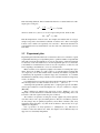
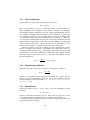
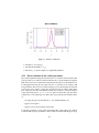
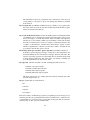
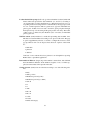
If H0 is true, t statistics is distributed according to a known distribution - Student
distribution (cf. figure 4.1). Its mean is zero and there is an other important parameter
characterizing this distribution - degree of freedom (d f ). d f is easily calculated as n−1
or nx + ny − 2 according to one or two sample case is considered. Thus, when H0 holds,
t is expected to be near 0. While H1 is true, t is expected to be far from zero, having
large positive or negative values. Under the H0 , the probability to have large values for
t is low but not zero. On figure 4.1, vertical lines delimit the zones containing 95% of
area under distribution curves. So there is only 5% of probability that t goes beyond
this limits when H0 holds. You can note that for d f = 1, this limits are much wider
which means for d f = 1, we have to obtain very large t from our sample to declare it
significantly different. For d f = 3, these limits are much more close to zero relaxing
the constraint for significant t-values.
There are tables and algorithms allowing to calculate probability that an absolute
value of t becomes higher than some value tg : Pr[|t| > tg ]. This probability is called
P-value corresponding to tg . This allows us to design the following decision algorithm:
1. Fix α, the Type I error probability (say 0.05 or 5%).
21
Figure 4.1: Student’s distribution
2. Calculate tg (for a gene g).
3. Calculate P-value=Pr[|t| > |tg |].
4. If P-value ≤ α, declare sample(s) as significantly different.
4.2.1
Error estimation in dye-switch experiment.
Dye-switch experiment design, discussed in section ??, can have an inconvenience that
gene-dye effect is accounted for random variations if no special treatment is applied.
This increases the error estimate thus lowing the statistical power of the Student’s test.
It can happen when the gene-dye effect becomes so great that it can compete with
biological effect. The reasons for such increasing are not yet known but from statistical
point of view, it is possible to cancel gene-dye effect from error estimate. The counter
part of this gene-dye effect cancellation from the error estimate is a decreased degree
of freedom lowing from n − 1 to n − 2. So, for genes not affected by gene-dye effect,
it will lead to lower statistical power. That’s why we provide the users with the choice
of :
• not apply the gene-dye cancellation, i.e. use standard Student’s test;
• apply it for all genes;
• apply it only for genes giving lower P-value.
Let us take an example of a dye-switch experiment with nr slides where test condition
is labeled with red (Cy5) dye and the control condition is labeled with the green (Cy3)
22
dye. Respectively, let note ng the number of slides with inverted labeling: the test is
labeled with the green dye and the control - with the red. The total slide number is
n = nr + ng . If we note r¯ and g¯ the mean of normalized log-ratios of these two slide
groups then the overall mean log −ratio having the lowest variance is calculated just as
the plain mean value of the whole sample:
nr r¯ + ng g¯
R¯ =
.
n
¯ or squared error can be estimated as
The variance of R,
ε2R¯ =
nr Sr2 + ng Sg2
,
n(n − 2)
Sr2 and Sg2 are variance estimates for both groups. This gives us a Student’s statistics
estimation
R¯
t = , with d f = n − 2.
εR¯
A necessary condition to be able to apply this kind of treatment in dye-switch experiment is that the slide number in every labeling group should be at least 2. So the
total slide number should be at least 4 which is rather common situation in dye-switch
experiment.
4.3
Other tests.
There is a number of other statistical tests that are used to analyze transcriptome data.
Here, we briefly characterize some of them even if they are not implemented in BioPlot.
4.3.1
Wilcoxon’s test.
Wilcoxon statistics is a sum of rang values for each measure in sample(s). As Student’s
test, it can be used to search differences between two samples or to compare one sample to zero. Samples without differences have known discrete distribution that allows
to calculate P-value. The strength of this test rely on the fact that it is non parametric,
i.e. no assumption is made about any particular kind of distribution of samples. Unfortunately, the price for this generality is that a relatively high sample size is required.
One can start using this test for samples having more than 5-6 values.
4.3.2
Fisher’s test.
Statistics used in this test is the ratio of inter-group variance over intra-group variance,
each group corresponding to a particular condition. Thus, this test allows to test for
differences among more than two conditions. This feature is used in ANOVA analysis. In absence of differences among groups, the Fisher’s statistics obeys to Fisher’s
distribution law which gives us a method to calculate P-value for any given value of
statistics. A drawback of this test, is that it don’t give any indication on what group
differs from what other.
23
4.3.3
Permutation test.
Permutation test is as universal as Wilcoxon test. Indeed, it does not require any particular assumption about statistical properties of samples. One makes a high number of
permutations assigning randomly real measures to various groups. Permuted measures
are used to simulate a null hypothesis distribution for any particular statistics. Thus obtained empirical distribution is used to assess P-value for non permuted, real measures.
While being non parametric, this test suffers from high requirements on computational
resources. As Wilcoxon’s test it is not much of use on samples of low size.
4.4
Multiple tests problem.
With the density of microarrays always increasing, the number of genes submitted to
statistical tests can be very high. For example, if, on an array, we have 1000 genes
that haven’t change their expression and we fixed α to 0.05, than we can expect a
consequent number of false positives 1000×0.05=50. If there are, for instance, 10
truly positives genes than we have 5 times more false positives than true positives.
This can really happen in transcriptome experiments. This situation is due to a high
number of statistical tests and can happen in all tests, not just in Student’s test. One
way to mitigate this problem is to apply some filter to data thus diminishing the number
of negative genes submitted to statistical tests. A candidate to such filter can be some
loosely defined ratio thresholds.
To have an idea about a proportion of false positives among genes declared positives, one can assess and use the following parameter called False Discovery Rate
(FDR), cf. e.g. [7]:
# false positives
FDR =
.
# declared positives
Obviously, FDR is a positive number not greater than 1. Technically, an estimation
of number of false positives can be based on study of P-value histogram. For negative
features, this histogram should be near uniformly constant distribution (by definition of
P-value). So the “flat” part of P-value histogram helps to assess the number of negative
features m0 while the number of false positives is approximated by αm0 . The number
of declared positives is a result of Student’s test at level α.
FDR may be helpful to decide at what level α we would like to tune our test and
what is the proportion of false positives among genes declared significantly differently
expressed.
4.5
Group test
Statistical tests mentionned above are used to test genes individually. There exist another aproach to explorer transcriptome data, so called global testing. This approach
tests predefined groups for changing their expression (up or down) as a whole. One
method consists to use the results of individual tests to compare a group representation
on the slide and among differentially expressed genes. For example, Hypergeometric
24
or Fisher’s exact test can be used to detect a significant over-representation or enrichement of a given group. In BioPlot, we have decided to adopt another method of group
testing based on Wilcoxon test. It works like follows.
All genes of a given experience are sorted according to their ratios. For a given
gene group, the sum of ranks for these genes is calculated. This sum is called Wilcoxon
statistics. If this particular group of genes does not show any significant biological
effect their genes will be distributed randomly all over non differentially expressed
genes. Knowing the Wilcoxon distribution under null hypothesis, we can estimate a
P-value, the probability that null distribution shows that same result or better than that
those observed in our experiment. For the described situation of no biolgical effect, the
P-value will not be very close to zero. If, in contrary, all or majority of genes are overor under-expressed, than all this genes will be regrouped in one end of the sorted by
ratio gene collection. This will will lead to extreme value of Wilcoxon statistics (very
low or very high) and a P-value very close to zero.
One of advantages of Wilcoxon test over, for example Hyper geometric test, is that
no a priori decision is required about over- or under-expression of individual genes. In
Wilcoxon test, all genes of a given group contribute to the statistics not only over- and
under-expressed. This allow to detect a small but general tendencies in some groups
when no individual gene show sufficient ratio to be classified as differentially expressed
but all or majority of genes can have a small over- or under-expressed tendency which
will result in positive Wilcoxon test.
Another advantage is that Wilcoxon test is not parametric and does not require any
prior assumption about distribution of ratios under null hypothesis.
A limiting point of global testing is that it requires a sufficient number of genes that
has not changed their expression. Typically, it can be applied on pan genomic arrays
where only few percent of genes are changing expression.
25
Chapter 5
BioPlot Form Items.
In this chapter, we describe the parameters that user can tune in BioPlot to analyze
transcriptome data corresponding to no more than two conditions referred as X and Y.
To analyze multiple biological condition, BioClust may be helpful.
BioPlot is a web service on https://biopuce.insa-toulouse.fr. Users have
personal accounts and protected access to their data. When user connects and chooses
BioPlot in tool frame at left hand side, a BioPlot form is opened. The names and
comments in the form are intended to be self explanatory provided that user is familiar
with transcriptome data treatment methods. The form is organized in following tabs :
Analysis where arrays to treat can be selected.
Variable/Norm. where user chooses a quantification variable and selects options on
background correction, normalization and log transformation.
Spot Selection regroups options relative to filtering data.
Cat. Selection provides options for filtering genes by functional category or Gene Ontology (GO) selection
Stats has fields concerning statistical data treatment.
Plot gives some control on the plot size and title / axis labels.
An. profiles here a user can save a set of analysis parameters called “analysis profile”
in a file stored on the server and then reuse this set on various arrays. Please
note that array selection itself is not stored in analysis profile. We store just the
analysis parameters like thresholds, selection options and so on.
BioPlot has not extended graphical possibilities. If you need an elaborated graph, you
have to export data from BioPlot to your favorite graphics software.
In following sections we review all form fields.
26
5.1
Analysis tab.
Average mode (menu) Choices are
• membrane
• slide
This menu tells what mode of data treatment is used. For arrays on slides (bichromatic arrays), it is more advantageous to use slide mode as ratio has less
variance than intensities. In fact, the difference between these two modes is in
order of operations: ratio and average. For membranes, we calculate ratio of
average intensities while for slides, we use average of ratios.
X (multiselect menu) In this menu users chooses the control biological conditions (the
ratio is calculated as Y/X). This menu is active only in membrane mode (cf.
previous item).
Y (multiselect menu) This menu has the same analysis list as in X (if “matching” fields
are void). Here, user chooses one or more test analysis. “Matching” fields can
be used to facilitate the search of needed analysis. When some text is entered in
the fields corresponding to X or Y matching fields, only analysis having this text
in their names are preserved in menus. To go back to the full analysis list, cancel
the content of “matching” field.
Gene ID (menu) Historically, the gene naming is not something unique and standard.
So various choices are possible. In this description we use the following terms for
gene names : short name (like ACT1 for actine), systematic name (like YFL039c
for yeast actine1 ), full name (like actine), user’s code (whatever that user has
used to identify his spotted material). The options of this menu are:
Default short name if exists, systematic name otherwise.
Short name only short name is used. If it is void than gene ID will be void in
resulting list.
Systematic name only systematic name is used as gene ID.
Sys. name; short name both names are used and they are separated by semicolumn and a space.
Full gene name is self explanatory.
User’s code idem.
Two check boxes options can modify any choice made in menu:
append well will append the plate coords of well containing the gene, e.g. ACT1;
1A12
append user’s code idem for user’s code.
1 For
other organisms, GeneBank entries are often used as systematic names.
27
append fullname idem for full gene name.
Selected in X: #
Selected in Y: # are not form fields. This is just for information about how many
analysis are already selected in corresponding X and Y menus.
OK this button is visible in all tabs. You should not click on it before making your
choice in other tabs. To passe to the following tab, click on the tab name.
5.2
Variable/Norm. tab.
Variable to draw in X (menu) This menu gives the list of variable to quantify spots.
Most used variables are “Mean Intensity” and “Median intensity”. Mean and
median are calculated over pixels of a spot by image analysis software. These
and others spot measures are imported in data base from text files generated after
image analysis. As various applications are used for spot detection and quantification and they measures their own statistics not all choices are meaningful for
all analysis. The full list of options in this menu is :
• Variable Selected during Image Analysis
• Mean Intensity
• Median Intensity
• Weighted Mean Intensity
• Mean Gaussian Intensity
• Median Gaussian Intensity
• Mean Statistical Intensity
• Median Statistical Intensity
• Most frequent pixel intensity
• Central Intensity
• Maximal Intensity
• Minimal Intensity
• Sum Intensity
• Background level
• Background Median
• Background Mean
• Spot Standart Deviation
• Spot Variance
• Background Standart Deviation
• Total Background
28
• % pixels superior to background
• % pixels superior to 1.5*background
• % pixels superior to 2*background
• % gaussian pixels superior to background
• % gaussian pixels superior to background
• % gaussian pixels superior to background
• % statistical pixels superior to background
• % statistical pixels superior to 1.5*background
• % statistical pixels superior to 2*background
• % pixels superior to Bg+SD
• % pixels superior to Bg+2*SD
• % pixels saturated
“Variable Selected during Image Analysis” is particular. Some image analysis
applications offer normalization features or other data treatments. For this reason, this variable can not be corrected by background. This option is deprecated
and will be removed in the future.
Variable to draw in Y (menu) The same menu as precedent one. Normally, the variables chosen in these menus should be the same but in some case it may be
interesting to see the relationship between different statistics in the same analysis. In this case, you can choose the same analysis in X and Y menu on the
“Analysis” tab and select different variables in these two menus.
Normalization type (menu) Choices are (cf. chapter 3):
• no normalization
• housekeeping genes/spike control
• stable majority (by histogram)
• all spot’s mean
• all non negative mean
• lowess
• quantile
Use spots marked “Reference” as control genes (check-box: Yes) This option used
only when “housekeeping genes/spike control” is selected in previous menu. If
checked, the spots having attribute “Reference” set, are used to calculate normalization coefficient. To mark spots as references, see subsection 6.2.1 in TabView description on page 39. Checking this box puts the option “housekeeping
genes/spike control” as selected in previous menu.
29
Control genes coords (text) This option used only when “housekeeping genes/spike
control” is selected in “Normalization type” menu and previous check-box is not
checked. This field can contain a comma separated list of well or spot coords
corresponding to genes that should be used as references in normalization. Well
or plate coords are given as <plate nb>[<letter>[<number>]], e.g. 1A14 means
plate 1, well A14. <letter> and <number> are optional. If number is omitted,
the whole line is used. If <letter> and <number> are omitted, the whole plate is
selected. It is possible to define a rectangular region on a plate by introducing
the left upper and right low corner well coords. For example, 2C3:D12 defines a
region on the plate 2 containing wells in rows C to D and between columns from
3 to 12.
Spot or array coords are of the form <row><space><column>, where <row>
and <column> are integers starting at 1. For instance, 11 23 defines a spot
at row 11 and column 23. All arrays in our data base are oriented to have a
spot corresponding to the well 1A1 in upper left corner. This orientation is
90◦ rotated compared to vertically oriented slide scans. Usually, on vertical
slide images, the well 1A1 has its spot in upper right coin. You can define a
rectangular region by defining the starts and ends for rows and columns as follows : [<row start>]:[<row end>]<space>[<col start>]:[<col end>]. For example, 12:15 23:40 defines an array region having rows between 12 and 15 and
columns between 23 and 40. Any of region border (start or end) is optional in
which case the limit value (1 for start, maximum for end) is taken. Thus 12: :40
defines a region with rows from 12 to the max row and columns from 1 to 40.
Apply post normalization factor (check-box: Yes) If checked, all spots in every analysis are multiplied by a user defined factor. This is used in very particular cases.
Don’t check this box, if you don’t need to correct normalized data by hand. This
factor (one per analysis) can be defined on the “Browse analysis” page accessible
from a tool frame on the left of user’s web space.
Subtract background (menu) Apply or not background correction. Options are
• no
• local background
• average of negative spots
• local+negatives corrected by their bg
Last two options may be useful for membranes with clones grown on them and
having DNA sequences inserted in their own DNA. Such array technique can
lead to a situation where clones with a void insert have a signal above the background. These negatives control should have signal as close to zero as possible,
so it is more appropriate to correct by the mean of negative controls than by local
background. In other situations, “local background” should be a good choice.
Use average of spots marked “Negative” as bg level to subtract (check-box: Yes) This
check-box is taken into account only when one of the last two options of precedent menu is chosen. For marking spots as negative, see subsection 6.2.1 on page
30
39. When this option is checked, it puts “average of negative spots” as selected
in precedent menu.
Negative gene coords (text) If “average of negative spots” or “local+negatives corrected by their bg” options of “Subtract background” menu are selected, this
field can define the spots that should be used as negative controls. User can
enter a comma separated list of well or array coords following the same coord
conventions as in “Control gene coords” field on this tab.
Take log10 (check-box: Yes) If checked, the log transformation is applied. It is highly
recommended to apply this transformation to bring better statistical properties to
data passed through statistical tests.
Lowest value limit (real number) It may happen after the background subtraction that
a spot intensity become zero or negative. This is not desirable, if we want to
apply log transformation. So to prevent too low values, they remain at lowest
allowed value defined in this field. Don’t confound this feature with cut off by
intensity. No spot is cut here. Conversely, due to this feature, low spots are
preserved in final list. To disable such preserving, cancel any content of this field
(don’t leave “0”).
5.3
Spot Selection tab
Filters defined in different fields of this tab work like intersections, i.e. if you select
spots coming from first plate and the genes whose name start by “a”, you obtain genes
starting by “a” coming only from the first plate. Conversely, in the same field, your
selection is considered like union, i.e. if you select first and second plate to put on the
scatter plot and on TabView, than genes coming from these plates will be shown. An
intersection in this case would be meaningless as the intersection of first and second
plate is void.
When applicable, any selection may become exclusion if preceded by tilde “~”.
By plate region (text) You can enter a comma separated list of plate coords using the
same coord convention that for the field “Variable/Norm. > Control gene coords”.
By membrane/slide region (text) Use a comma separated list to define regions of interest on your arrays. The coord conventions are the same as for the field “Variable/Norm. > Control gene coords”.
By name (text) You can select one or more genes by their names. The names entered
in this field should be in accordance with the choice in “Analysis > Gene ID”
menu. The names can be separated by comma, by tabulation or by new line
character. It is perfectly possible to copy and past a gene list from an other
application such as a spreadsheet.
The gene name can have a wild character “*” which replaces any sequence of
characters. Gene names are not case sensitive. For example, y* selects all genes
starting by “y” or “Y”.
31
The wild character alone has a particular sense. If entered, it selects all spots
corresponding to some gene id. Spots don’t having gene identity are excluded
from selection.
By stored gene list (text) BioPlot and BioClust let a possibility to save a gene list in a
file stored on the server side. If user enters the file name in this field, those genes
will be selected in current analysis.
By (x+y)/2 cutoff when (X+Y)/2 is (menu and number) This is excluding field. Here
you define the spots to exclude from scatterplot and from results. Very low spots
may be annoying to see in the final results. They can exhibit very high ratios
but they are not very reliable. When some real number is entered in text field,
the result of exclusion can be read as, for example, “cutoff when (X+Y)/2 is less
or equal to <some number>”. Another choice in the menu is “greater or equal”
which is complementary of the first one and can be useful to visualize the low
spots that are cut if the first option is chosen.
By intensity. Draw spots only if #% pixels > bground (real number, check-box)
If checked, spots having the percentage of pixels above the background lower
than defined threshold, are excluded from scatterplot and from result table. The
statistics “percentage of pixels above the background” is measured and provided
by image analysis application. This option is not very reliable to eliminate low
spots. It is preferable to use “By (x+y)/2” field.
By expression (check-boxes) This is another excluding field. The choices are
• Exclude over-expressed genes
• Exclude normally expressed genes
• Exclude under-expressed genes
• Exclude unknownly-expressed genes
The decision if a gene is over or under expressed is related to the field “Stats > Expression changes based on”
By type (menu) Options of this menu are
• all
• reference
• negative
• not negative
This can be useful to visualize the spots/genes corresponding to any chosen type. To see
reference genes may be of particular interest if the normalization by “stable majority”
is used. In this case, a users don’t know a priori what are the genes that are selected as
stable majority. So this option lets visualize them.
32
5.4
Category selection tab
Category selection or for sake of brevity cat.selection, is composed of four fields - one
for gene filtering by ad hoc functional categories and three others for filtering by Gene
Ontologies (GO). To use these options, user has to provide an annotation information
for his organism of interest. The platform data base administrator has to treat and add
this information prior to data analysis.
By functional category (text and select button) user can provide a list of category
names separated by “;” or at his convenience he can use a select window which
opens after clicking on “...” button. User has to use “;” and not a coma “,” to
separate categories because some categories have a coma in their names.
Categories are organized in a hierarchical tree-like structure. The tree branches
are rolled or unrolled by clicking on a blue triangle. By checking a box corresponding to a functional category, user select all genes of this category and its
subcategories. The name of the selected category is automatically added to the
text field. Unchecking a category removes its name from the text field. User
is allowed to use a meta-character “*” to replace any portion of category name
when entering the name in the text field.
By GO biological process (text and select button)
By GO cellular component (text and select button)
By GO molecular function (text and select button) All three fields are functioning in
similar way to functional categories. The main difference is that gene ontologies
are defined by GO consortium in the same way for all organisms. So, there is
no need to select an organism before selecting a category as it is the case for
ad hoc functional categories. See also the section ?? in next chapter for result
description in TabView window when an ordering by functional category or by
one of gene ontologies is applied.
Maximum hierarchical level to show (menu) As its name indicates, this menu controls the level of tree expanding when showing the category hierarchy both in
select window and in TabView when ordering by a functional category or a gene
ontology.
5.5
Stats tab
Spot average (menu) You have to choose any type of average to benefit from statistical
tests. Options of this menu are:
• no
• by well
• by gene name
33
The most currently used option is “by well”. However, “by gene name” can
be useful if plate plan of compared analysis are different. Another potential
application of this option is for eliminating of multiple entries in result table if
some genes are present in more than one well.
Expression changes based on (menu) This option is without effect if no check-box is
checked in “Spot Selection > By expression”. Choices in the menu are
• ratio thresholds
• Student’s test
• ratio and Student’s test
The first option “ratio thresholds” is intuitive and seems simple for biologists.
Unfortunately, this method can result in a high number of false positives. It is
highly recommended to combine this filter with Student’s test.
When “Student’s test” is selected, user is exposed to multiple tests problem discussed in section 4.4. So the combination of ratio thresholds and Student’s test
is probably the most appropriate choice.
To be able to apply Student’s test, user has to supply at least two independent
array repetitions. However, the power of statistical test on only two repetitions may be deceptive. You can estimate the number of repetitions on http:
//biopuce.insa-toulouse.fr/microarray/exp_numb.php .
Over-expression threshold (> 0) (positive real number) This field is used when one
of check-boxes “Spot Selection > By expression” is checked and an option selected in the precedent menu concerns ratio.
Uderexpression threshold (> 0) (positive real number) Same remarks.
P-value threshold (0 < P < 1) (positive real number less than 1) This field is used
when one of check-boxes “Spot Selection > By expression” is checked and an
option selected in the menu “Expression changes based on” concerns Student’s
test.
Error estimate without gene-dye interaction (radio check boxes) Three options of
this field can be used to choose the way to treat an error estimate in dye-switch
experiment (cf. section ??):
• “No” (default) corresponds to classical Student’s test with classical error estimate
for all genes.
• “Yes for all genes” means that error will be estimated according to formula given
in section ?? for all genes.
• “Yes for genes giving lower P-value” corresponds to automatic choice between
two kind of error estimate. The error estimate canceling gene-dye effect is used
only if it gives better P-value, otherwise a classical Student’s test is used. This
treatment avoid the loss of statistical power for genes not involved in gene-dye
effect.
34
P-value threshold for groups (0 < P < 1) (positive real number less than 1) This field
matters when users presents the data in TabView (cf. section ??) according to
one of Gene Ontology (GO) classifications or to Functional categories (see corresponding entries in “Sorting Criterion” menu hereafter). Every group is tested
for over- or under-expression. This is a global test as opposed to individual tests
gene by gene. A Wilcoxon test is used to decide if a given group have changed
their expression up or down among all the genes present on an array. The results
of this test are not affected by the thresholds (ratio or P-value) for individual
gene-by-gene tests.
TabView content (menu) TabView is a result table presenting data in tabular form.
The data are treated and filtered according to user options of this form. The page
is open is supplementary window, so user has to configure his browser to allow
pop-up windows from our site biopuce.insa-toulouse.fr. Options of this menu
are:
• html table
• plain text
• disabled
“html text” is most current choice but “plain text” can be helpful for exporting
BioPlot data to spreadsheet applications.
Item number in Tabview (integer) If positive number is entered here, this will limit
the item number in TabView. If the number is negative or zero, no limit is applied, all selected data will be present in the table.
Sorting criterion (menu) User can order data according to one of the following criterion:
• Ratio
• Well’s position
• Membrane position (by line)
• Membrane position (by column)
• Gene id
• X
• Y
• |Y-X|
• Error X
• Error Y
• t-value
• P-value
• Functional category
35
• GO biological process
• GO cellular component
• GO molecular function
Ordering (menu) Options are:
• ascending
• descending
Combination of “Sorting criterion” and “Ordering” can help to retrieve the most
interesting genes like the “n greatest ratios” or “n most significantly changed
genes”.
5.6
Plot tab.
Image height (in pixels) (positive integer)
Image width (in pixels) (positive integer) By default, these values are 500x500. User
can change the plot size to have better resolution.
Plot title (text) By default, plot title recalls some key points of data treatment: chosen
variable, type of normalization, correction or not by background. Here, user can
customize the plot title.
X axis label (text) Normally, in membrane mode, the X label lists the analysis that
were selected in X and in slide mode (see “Analysis > average mode”) it is “Intensity average”. User can change these default label.
Y axis label (text) Default label is the list of analysis chosen for Y both in membrane
and in slide modes. User can enter custom label in this field.
Colors of scatterplots (a separate window) User can customize the colors of over-,
under- and normally expressed genes as well as some other colors of scatter plot.
Hide error bars (check-box) In case of huge number of data points, to hide error bars
may be useful to clear the picture a little bit.
5.7
An. profiles tab.
Save current analysis parameters as (text) file name in which it will be stored the
current set of analysis parameters such like type of normalization, filtering rules
and so on. A set of analysis parameters is called analysis profile and storing it
in a file can be useful to gain an effort when a user has to analyze an experiment
series in same conditions. It diminishes also an error risk in choosing parameters. Analysis profile files are stored in anprof.bioplot sub-directory of user’s
space. To choose an existent file or a sub-directory, user can click on a button
36
with ellipsis . . . . All files have .kvh extension. If user omits this extension in
file name, it will be added automatically.
There are two predefined profiles predefined/mbr_normtot_log_pval.kvh
and predefined/slide_normtot_log_pval.kvh for membrane and slide mode
of averaging respectively. These profiles enable
• use of pixel mean as spot intensity
• local background correction
• log-transformation of intensities
• normalization by total mean of all spots
• averaging of spot replicates by well
• expression decision based on Student’s test and ratio thresholds
• no filtering rules
• sorting by P-value in ascending order (most significant genes first).
Predefined parameters can be a start point for defining user’s own profiles. They
cannot be rewritten.
When a file name is chosen, user has to click on “Save” button to actually write
the file.
Read analysis parameters from (text) file name from which an analysis profile will
be read.
Delete analysis parameters (text) file name or a void sub-directory to be deleted.
37
Chapter 6
Result presentation.
6.1
Scatterplot description.
Scatter plot is a powerful tool to make a visual analysis of gene expression experiment.
In a glance, one can tell which genes are over- or under-expressed or detect a hidden
problems due to normalization or spot detection.
6.1.1
Recall table.
The main page containing the scatterplot has at its beginning a table “Your selection”
resuming essential choices made about data treatment:
• Average mode
• X analysis
• Y analysis
• Variable X
• Y
• Background subtraction
• Apply low limit
• Plate selection
• Membrane region selection
• Name selection
• Functional cat. selection
• Intensity selection
38
• (x+y)/2 cutoff
• Expression selection
• Spot type selection
• Spot average
• Overexpr. threshold
• Underexpr. threshold
• P-value threshold
• Expression decision based on
It can be useful for archiving results.
If a normalization is requested, a table resuming normalization coefficients and
numbers of reference spots follows table “Your selection”.
6.1.2
Scatterplot.
On the scatterplot, in membrane averaging mode, the intensity measures (mean or median or any other variable) selected in “Variable/Norm. > Variable to draw in X” menu
(controls) are reported in X axis while those selected in “Variable/Norm. > Variable
to draw in Y” (tests) are reported in Y axis. If a gene has the same level of expression in both control and test conditions, its dot (green diamond in default colors) will
be near the strait line y=x (the line is drawn in gray). If a gene is more expressed in
test condition (according to criterion chosen in “Stats > expression changes based on”)
than it will be presented by a blue interactive diamond. Yellow diamonds represents
under-expressed genes. Lines representing over- and under-expression ratio thresholds
are drawn in gray under and over the line y=x easily detectable by its position.
Diamonds represents mean values if the option of “Stats > Spot average” is other
than “no”. In this case vertical and horizontal error bars are drawn around each dot and
error values are reported in status bar when pointing on interactive dot.
In slide mode, the ratio y/x is reported on Y axis while the mean intensity (x+y)/2
is reported on X. The error bars are reported only in Y direction. The default colors
are the same as in membrane mode: blue, green and yellow for over-, normally and
under-expressed genes. The blue and green dots are still interactive.
Dot’s interactivity is an important feature. If you move your mouse over an interactive dot, you can see an information relative to the dot in a status bar of your navigator.
When you click on it first time, a new window pops-up.
This pop-up window contains two zoom images with the spots relative to the interactive dot. All successive clicks on other dots will open zoom images in the same
window. Those zooms may be useful to control spot detection.
The list of analysis selected in X are reported in X axis label (in membrane mode).
The same is true for Y label in both membrane and slide mode.
If scales of selected variable is too high or too low, you may see to appear a factor in
axis labels, for example, (x0.1) means that values reported in X axis must be multiplied
by 0.1.
39
6.1.3
Form link.
Under the scatterplot, there is a link telling “# dots are plotted”. This link point to
the BioPlot form filled with selected parameters and options. It can be helpful if your
navigator puts the form to its default value when you hit “Back” button. So rather
than use “Back” button, user can click on this link to preserve his selections. Another
potential application of this link is to add this link to bookmarks (or favorites). Later,
user can retrieve its selection from his bookmarks. Be aware that there can be a size
limit imposed by your navigator on the length of the link. So, if you have entered, for
example, a very long list of genes, this feature can become broken.
6.2
TabView description.
Tabview is a simple but useful way for transcriptome data mining. You can sort your
data according to various criteria chosen from “Stats > Sorting criterion”. The column
number in TabView depends on:
1. whether “Stats > Spot average” is set to “no” or to any other value.
2. whether “Analysis > Average mode” is set to membrane or slide.
If “Spot average” is set to “by well” or “by name” you will see additional columns
Error X, Error Y, t-value and P-value in membrane mode. The column “Error X” does
not appear in slide mode.
Tabview page starts with the same table “Your selection” that starts scatterplot page.
It is followed by a table where data are arranged in the columns described here after:
Rang Ordering number in a given sort.
Well Well’s identity of the form 1A10, which denotes well A10 of a plate number 1.
Gene id If user has provided a plate description file (.plt) before image analysis, a
gene name will be printed in this column.
Row Col Array coords of a spot. If an averaging is requested, only one spot coords
per replicate group is reported. The content of this column is a link if “Stats >
TabView content” set to “html table”. When user rolls his mouse pointer over a
link, a floating menu having four items appears.
The items are following:
Zoom This menu entry opens a zoom window having two image fragments containing spots from one X and one Y analysis. If you need to see all spot
zooms corresponding to a given gene, you can use “details” menu entry
described here after.
Edit Use this link to mark corresponding spots as “Excluded” or put their type
to “Reference” or “Negative”.
40
Details This link opens a pop-up window presenting raw data relative to spots
in X and Y analysis corresponding to the entry in TabView table. From this
window, user has a possibility to zoom on all spots involved in averaging
for a given gene both in X and in Y analysis.
Web This item pops-up a windows with gene links to other site like GeneBank,
SwissProt and so on. To benefit from this feature, user has to provide the
key entries for corresponding sites in plate description file (.plt).
Ratio Ratio y/x. It is always reported in natural scale whether log-transformation is
activated or not.
[log10] (X|Avg. Int) Value reported in X axis. If log-transformation is requested,
“log10” appears in column header and values are actually the logs. In slide
mode, when “Spot aggregation” is set to “by well” or to “by gene name”, the
name of this column change to “Avg. Int” as average intensity between red and
green channels is reported in abscissa axis.
[log10] (Y|Ratio) Value reported in Y axis. If log-transformation is requested, “log10”
appears in column header and values are actually the logs. Be careful in interpretation of this column. Depending on the chosen mode: slide or membrane, “Spot
aggregation” applied or not, this column contains ratios (in this case the column
name become “Ratio”) or intensities (the corresponding name is “Y”) exactly in
the same manner as scatterplot Y axis.
[log10] Error X (may disappear) Standard non biased error deviation for replicates in
X is reported in this column. If log transform is activated, the error is calculated
on log intensities and “log10” appears in column header. This column is not
reported in slide mode.
[log10] Error (Y|Ratio) (may disappear) Standard non biased error deviation for values reported on Y axis (intensities or ratios). If log transform is activated, the
error is calculated on log intensities or ratios and “log10” appears in column
header.
t-value (may disappear) Here is reported non biased Student’s statistics calculated
according to the formula in section 4.2. This column is reported if averaging
is requested and there are sufficiently analysis selected in “Analysis > X” and
“Analysis > Y” menus.
P-value (may disappear) This column contains the P-values corresponding to t statistics. If there is no sufficient data to estimate t (because of spots flagged “Excluded”, for example), the corresponding cell will be void.
FDR [0;1] (between 0 and 1, may disappear) a false discovery rate. It is based on
estimation of genes non changing their expression (m0 ) and on a given threshold for P-value. For each gene, FDR indicates what is an estimated proportion
of false positives among genes having P-value lower than the given one. FDR
estimation can be not reliable if a filtering rule other than by P-value is applied.
41
This column may be void if no more or less reliable estimation of m0 could be
achieved.
est. FP (m0=#) estimated number of false positives among genes having P-value lower
than a given one. In the header of this column, an estimated number of negative
genes m0 is reported. As for FDR, this column may also be void if no m0 estimation is available.
6.2.1
Actions on gene or spot lists.
Below the data table, there is a proposition “Mark all shown spots in <menu: X, Y,
both> analysis as <menu: negative, reference, no type, definitely excluded>” followed
by a button “Mark”. This feature can be very helpful for easily editing attributes of a
gene group. For example, to mark some genes as “Reference”, user can select them
by means of “Spot selection” tab in BioPlot form then choosing corresponding feature
“Reference” in the above proposition and by one click on “Mark” he can put all the
spots in the table as “Reference”.
6.2.2
Store a gene list.
Under the action form, a gene list storing facility is proposed. User can save gene
names currently shown in TabView in a file which will be stored on server side (thus accessible from any Internet connected computer). There is an optional “gene list name”
field. Text entered in this field will be stored in the file, in the “list name” field. The
file structure is hierarchical with tabulation delimited named fields. The general hierarchical structure is described at kvh http://serguei.sokol.free.fr/kvh-format/.
Stored gene lists can be viewed and used in Venn diagram tool accessible from user’s
web space, frame “Actions”, folder “Stored Gene Lists”.
6.2.3
Sorting by functional categories.
When user selects one of “Stats > Sorting criterion > Functional category”, “GO Biological process”, “GO Cellular component” or “GO molecular function”, the data in
TabView are organized in hierarchical tree-like structure and the result of Wilcoxon
global test is reported for every group. If user filters his data, for example, by expression then the ordering by any functional category will put in evidence categories
containing genes which have changed their expression. It can be considered as a first
step to resuming and the understanding transcriptome situation.
The genes which are not attributed to any functional category will appear in “Not
revised entries” section. All other genes will be preceded by a header showing the
hierarchy of their functional category. For example, a TabView window fragment could
look like:
42
Here “L0” corresponds to the hierarchical level of the chosen ontology, “biological
process” in this example. GO:008150 is the GO identity number for this ontology.
Such unique identity is attributed to every category of genes. GO:0008150 is also
a link to a GO category browser on www.geneontology.org. Numbers 54 and 5726
indicate respectively the genes from this category shown in TabView and total number
number of genes from this category on the array. These numbers can evolve if you redo
your experiments later in time, due to evolving GO classification.
More deeply nested categories could look like:
“L#” indicates the hierarchical level of given category in the ontology. The numbers between parenthesis have the same meaning as explained in the above paragraph.
The maximum shown hierarchical level is set to 3. User can change this value in
“Cat.Selection > Maximum hierarchical level to show” menu. “pwilcox” is the P-value
of global Wilcoxon test on the group. If P-value is under the threshold defined in “Stats
> P-value threshold for groups (0 < P < 1)” field, terms “(up)” or “(down)” are reported
according to ratio of gene majority in the group.
The groups shown in TabView are those that have at least one selected gene in
them. So, if user selects only differentially expressed genes, the groups having at least
one of these genes will be shown and tested. This can lead to a seemingly paradoxical
situation when shown genes of a given group are, say, over-expressed but the group
is classified in opposite sense, as "down" (under-expressed). This can happen when
excluded from the final table genes have stronger inverse tendency that shown ones.
43
Troubleshooting.
Warning messages.
When user makes some inconsistent choice, the scatterplot can be followed by one or
more warning message which explicates the inconsistency. User is prevented about existence of a warning by an alert window. Normally, after reading the warning message
in a particular context, it becomes clear what selection should be changed to remove
inconsistency.
Other problems.
In case of:
• the warning message is not sufficiently explicit;
• there is problem with BioPlot that you cannot resolve by yourself;
• you would like to request a particular feature to be added to BioPlot;
• you want to report a bug in BioPlot;
• there is a correction to do on this documentation;
you can contact Serguei Sokol by email sokol(a)insa-toulouse.fr or by phone
+33 (0) 561.55.96.87
In case of a problem with your analysis, it can be helpful to include in your email
a copy of a link under BioPlot. You can click with right button on this link a choose
“Copy link location” from contextual menu and past it in email composing window.
44
Credits
The work on BioPlot and its documentation has benefited from various financial supports from INRA and CRITT-Bioindustrie. Platform director Jean Marie François and
platform technical director Véronique Le Berre helped the author to understand transcriptome experiments and by fruitful discussions contributed to this documentation.
45
Bibliography
[1] B. M. Bolstad, R. A. Irizarry, M. Astrand, and T. P. Speed. A comparison of normalization methods for high density oligonucleotide array data based on variance
and bias. Bioinformatics, 19(2):185–193, Jan 2003.
[2] W. S. Clevel and S. J. Devlin. Locally-weighted regression: An approach to regression analysis by local fitting. Journal of the American Statistical Association,
83:596–610, 1988.
[3] W. S. Cleveland. Lowess: A program for smoothing scatterplots by robust locally
weighted regression. The American Statistician, 35:54, 1981.
[4] Wei Jin, Rebecca M. Riley, Russell D. Wolfinger, Kevin P. White, Gisele PassadorGurgel, and Greg Gibson. The contributions of sex, genotype and age to transcriptional variance in drosophila melanogaster. Nature Genetics, 29(01):389 – 395,
Dec 2001.
[5] R. J. Lewis. Reliability and validity: Meaning and measurement. In Annual Meeting Of the Society for Academic Emergency Medicine, 1999.
[6] Latha Ramdas, Kevin R Coombes, Keith Baggerly, Lynne Abruzzo, W Edward
Highsmith, Tammy Krogmann, Stanley R Hamilton, and Wei Zhang. Sources
of nonlinearity in cdna microarray expression measurements. Genome Biology,
2(11):research0047.1 0047.7, 2001.
[7] J.D. Storey. A direct approach to false discovery rates. J. R. Statist., 64(B):Part3,
pp. 479–498., 2002.
46