1
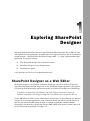
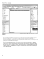
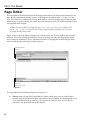
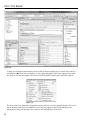
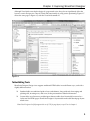
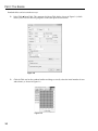
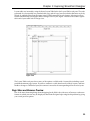
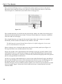
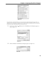
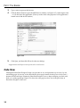
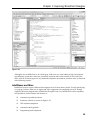
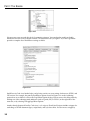
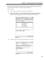
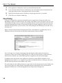
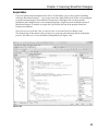
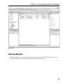
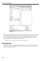
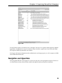
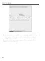
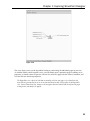
AL
Part I
MA
TE
RI
The Basics
Chapter 1: Exploring SharePoint Designer
TE
D
Chapter 2: SharePoint from the User’s Perspective
GH
Chapter 3: SharePoint from the Administrator’s Perspective
CO
PY
RI
Chapter 4: SharePoint from a SharePoint Designer’s
Perspective
Exploring SharePoint
Designer
Microsoft Windows SharePoint Services 3.0 and Microsoft Office SharePoint Server 2007 are large
and sophisticated web applications. It should come as no surprise, therefore, that the tool meant to
customize them — Microsoft Office SharePoint Designer 2007 — is a large, sophisticated desktop
application. This chapter explores:
❑
How SharePoint Designer fits in Microsoft’s toolset.
❑
SharePoint Designer ’s basic editing features.
❑
SharePoint navigation.
It also provides an overview of site administration tools.
SharePoint Designer as a Web Editor
SharePoint Designer is a descendant of Microsoft FrontPage, and a close relative of Expression
Web, Microsoft’s dedicated Web design tool. In fact, SharePoint Designer provides a true superset
of Expression Web functionality, and therefore makes an excellent all-around tool for Web design.
In addition to the SharePoint-related features, SharePoint Designer includes more features for
backward compatibility with existing FrontPage-based sites than are a part of Expression Web 1.0.
For the 2007 Microsoft Office System, Microsoft has replaced many of the traditional user interface
elements in several client applications, such as Microsoft Word, with what it calls the fluent user
interface, the most noticeable feature of which is a tabbed mega-toolbar called the Ribbon.
Microsoft has not done this in SharePoint Designer 2007, which sports menus, toolbars, and so on
in all of their historical profusion. See Figure 1-1.
Part I: The Basics
Figure 1-1
The overall interface in SharePoint Designer is very much in the mold of an Integrated Development
Environment (IDE) such as Visual Studio, or web design and development tools like Adobe
Dreamweaver (formerly of Macromedia). As you learn about the various tools at your disposal, you will
quickly feel at home in SharePoint Designer.
If you are new to the IDE experience, you want to be aware of the need for development and design
tools to manage projects consisting of many interrelated files. Some commands operate on individual
files, and others work on a project as a whole. This need will surface in a number of different ways. For
example, examine the File menu shown in Figure 1-2. Notice that there are two options each for Open,
Close, and Recent items.
4
Chapter 1: Exploring SharePoint Designer
Figure 1-2
The collection of files that is treated as a project unit in SharePoint Designer is called a site or web. (This
nomenclature is independent of what the corresponding structures may be called on the target server.
SharePoint sites have a similar naming structure, which is detailed in chapter 3.) The Open Site, Close
Site, and Recent Sites menu items are for working with an entire site. The plain Open and Close items,
as well as Recent Files, Save, and Save As, are for working with individual component files within a site.
When you open an existing file-type item, the containing site (if any) also opens.
With SharePoint Designer, you are usually working against a live (though not necessarily production)
environment. When combined with the duality described above, this has the result that certain changes
have immediate effect, while others aren’t visible unless or until you save the component you are
working on. In general, changes to overall site structure (such as renaming, deleting, or moving a file)
are immediate, while you need to save changes within a page or graphic file to see them on the site.
In a source-controlled or content-managed environment, your file(s) may need to go through a check-in
and approval process before certain changes become visible.
The major elements of the SharePoint Designer workspace include the menu, various toolbars, the
design surface (usually containing the Page Editor), the status bar, and a wide array of task panes. The
workspace is quite customizable. Other than the design surface, which will resize itself based upon
the remaining available space, virtually every workspace component can be resized, shown, hidden, set
to float, or docked. Menu and toolbar items can be added or removed.
The menu bar cannot be hidden, but it can float and be dragged offstage, like toolbars and task panes.
The rest of this chapter describes these workspace elements in detail.
5
Part I: The Basics
Page Editor
The Page Editor in SharePoint Designer is the design surface where you compose the elements of your
page. It offers three primary modes, or views, of the page that is currently open — Design, Code, and
Split. These modes are selected with the Page Mode toolbar, at the left along the lower window margin.
When no page is open for editing, the central area of the workspace shows the Web Site structural views
(covered later in this chapter).
All three views are available for web page file types (.htm, .aspx, and .master, for example). Files
such as .css, .js, and .txt that do not have a direct visual component only have Code view and do
not display the Page Mode toolbar.
Figure 1-3 shows the Page Editor in Design view, with the menu and all of the toolbars and task panes
removed. This can be accomplished either by closing or floating each item, and dragging the floated
items someplace unobtrusive. (This is sometimes referred to as dragging the element offstage.) What
remain are the design surface itself and the status bar.
Quick Tag Selector
Tab bar
Status bar
Page Mode toolbar
Figure 1-3
The Page Editor has the following elements (see Figure 1-3):
❑
6
Tab bar: Across the top of the Page Editor is a tab bar, which gives access to each file that is
currently open in SharePoint Designer. Files that have been modified since being opened or last
saved are indicated with an asterisk (*). The leftmost tab, Web Site, gives access to the site
structural views (described later in this chapter).
Chapter 1: Exploring SharePoint Designer
❑
Quick Tag Selector: Below the tab bar is the Quick Tag Selector, which superficially appears to
be a simple HTML breadcrumb, displaying the hierarchy of tags nesting down to the currently
selected element; it is much more than that. Clicking a tag in the Selector immediately selects
that element in the current view (hence the name). In addition, each tag in the Selector provides
a context menu (as shown in Figure 1-4), allowing you to quickly adjust the parameters of the
tag, create a containing tag, or even remove the tag without removing any child controls.
❑
Status bar: The status bar tells you all about your page design experience, but like the Quick Tag
Selector, the status bar is also your active partner in the editing process. In addition to being
context sensitive (the set of elements displayed on the status bar is dependent upon the current
selection), many status segments also provide the option to edit the setting they are reporting.
❑
Page Mode toolbar: Selects which of the three editing modes to display.
Figure 1-4
Design View
The Design view offers a what-you-see-is-what-you-get (WYSIWYG) editing experience. It supports
many traditional GUI document-editing functions:
❑
Fonts, styles, and item placements in the Design view map very closely to the final page
rendering.
❑
It allows you to drag and drop.
❑
You can copy, cut, and paste.
Design view also supports the use of the Ruler and Grid (with and without snap-to) options typically
found in graphics and page layout programs. In addition, there is a wide array of specialty tools
provided to improve your design experience. Some of them, such as Visual Aids and Table Tools, are
described in this chapter, while others are covered later in the book (for instance, the CSS editing features
are discussed in chapter 6).
The following sections discuss some of the features of the Design view.
Visual Aids
To assist you with your page designs, SharePoint Designer provides a number of Visual Aids. Visual
Aids provide a way for you to see and access page elements that may not normally be visible, such as
ActiveX controls, content placeholders, or items with a hidden attribute. Figure 1-5 shows a page with all
Visual Aids enabled.
7
Part I: The Basics
Figure 1-5
To keep your workspace uncluttered, you can enable or disable specific types of Visual Aids, either by
selecting View Visual Aids (see Figure 1-6) or by right-clicking the Visual Aids segment in the status
bar. You can also turn the current set of aids on and off by double-clicking the Visual Aids segment.
Figure 1-6
The Visual Aids view submenu is designed to remain visible as you select multiple options. This is also
true of the Ruler and Grid view submenu. Visual Aids only appear in the Design and Split views,
although the setting is displayed in the status bar and configurable in Code view.
8
Chapter 1: Exploring SharePoint Designer
Although Visual Aids can make the design of a page much easier, they also can significantly affect the
layout as seen in Design view. Turn off Visual Aids occasionally to verify precise positioning. Figure 1-7
shows the same page as Figure 1-5, with the Visual Aids turned off.
Figure 1-7
Table-Editing Tools
SharePoint Designer Design view supports traditional HTML tables in two different ways, each with a
slightly different toolset:
❑
Standard tables are traditional grids of rows and columns, along with tools for merging and
splitting cells, inserting rows, and so on, for the presentation of tabular information.
❑
Layout tables are of interest to web designers because tables have historically been used as a
layout tool for HTML pages. SharePoint Designer ’s layout tables make table-based page layout
much easier.
SharePoint Designer also fully supports the use of CSS for page layout, as you’ll see in chapter 6.
9
Part I: The Basics
Standard tables can be inserted two ways:
❑
Select Table Insert Table. This summons the Insert Table dialog, shown in Figure 1-8, which
allows you to set all of the core properties of the table prior to its insertion.
Figure 1-8
❑
Click the Table tool on the standard toolbar and drag to visually select the initial number of rows
and columns, as shown in Figure 1-9.
Figure 1-9
10
Chapter 1: Exploring SharePoint Designer
Layout tables are inserted by using the Insert Layout Table link in the Layout Tables task pane. The code
generated for a layout table uses standard table, row, and cell tags, but also includes dimension styles by
default. In addition, SharePoint Designer inserts HTML comments in each element, allowing it to have
content automatically rearranged to follow changes to the layout. Figure 1-10 shows how both a regular
table and a layout table look in Design view.
Figure 1-10
The Layout Tables task pane shows many of the options available with a layout table, including several
predefined common page layouts. If you have content in a table based on one of these layouts, and later
decide to change to a different layout, the content is moved to the corresponding cell in the new layout.
Page Sizes and Browser Preview
One of the most frustrating things about designing for the Web is the wide array of browsers and screen
formats in which your site may be displayed. SharePoint Designer helps mitigate this problem by giving
you several preview options.
11
Part I: The Basics
First, you can fix the Design view to a set of dimensions. In the status bar, you can see the current
dimensions of the window the Design view represents. Click the dimensions entry to see the menu
shown in Figure 1-11, which allows you to choose from several page sizes.
Dimension status
Page Size menu
Current dimensions
Figure 1-11
If the selected dimensions are smaller than the current design window, the width of the working area is
reduced to the horizontal dimension selected. The chosen vertical dimension is shown by a dotted line
across the visible area of the page.
If the selected dimensions are larger than the current design window, the workspace is expanded
horizontally, and the scroll bar at the bottom of the window is activated.
The default page sizes represent Microsoft Internet Explorer in its default configuration. You can create
your own set of dimensions to choose from.
When a fixed page size is selected, the dimension status shows the hash symbol seen in Figure 1-11.
The Page Size menu is also available under the View menu.
Design view provides a close approximation of the rendering of your page, especially with the Visual
Aids turned off. However, even with the fixed page size option, SharePoint Designer cannot perfectly
reproduce the environment of a web browser. To resolve this, SharePoint Designer provides the option to
preview your page directly in web browsers.
Not only can a page be rendered differently in a browser than within SharePoint Designer, but different
browsers and even different versions of the same browser have their own ways of rendering pages. It is
best practice, therefore, to test your pages in each of the browsers you expect to view your site.
SharePoint Designer ’s Preview in Browser function enables you to select an exact environment in which
to test your pages. Figure 1-12 shows the Preview in Browser menu as selected from the icon in the
Common toolbar.
12
Chapter 1: Exploring SharePoint Designer
Figure 1-12
Internet Explorer and Mozilla Firefox are automatically detected by SharePoint Designer if they are
installed on your workstation. In addition, you can select any other installed browser for live preview.
Follow these steps to add another browser to the preview list:
1.
Select Preview in Browser
shown in Figure 1-13.
Edit Browser List. The Edit Browser List dialog box appears, as
Figure 1-13
2.
Click the Add button. The Add Browser dialog box appears (see Figure 1-14).
Figure 1-14
13
Part I: The Basics
3.
4.
Type a name to represent the browser.
Click the Browse button to open the Add Browser window (see Figure 1-15), and navigate to the
.exe file that starts the application. (You may need to look at the properties of the application’s
launch icon to find the file location.)
Figure 1-15
5.
Click Open, and then click OK on the other two dialogs.
A page must be saved before it can be previewed in a web browser.
Code View
Although the SharePoint Designer Design view provides an easy and powerful way to create, lay out,
and edit the pages of your site, at the end of the day these pages remain what they have always been —
plaintext HTML and script. Fortunately, SharePoint Designer is just as adept at helping you work with
code as it is with page design. Figure 1-16 shows the same page you have seen in the prior shots in
SharePoint Designer ’s Code view.
14
Chapter 1: Exploring SharePoint Designer
Figure 1-16
Although it may be difficult to see on a book page, Code view uses color coding to help you recognize
tags delimiters, parameters, inline text, comments, and many other code elements. In fact, Code view
offers all of the assistance typical of any modern development environment, and then some, as discussed
in the following sections.
IntelliSense and More
IntelliSense has been a part of Microsoft development tools for more than a decade. Usually manifesting
as a pop-up, it detects what you are typing and offers suggestions for completing your task. Though
originally limited to program code, in SharePoint Designer Code view, IntelliSense has been expanded
far beyond that. It now includes such features as:
❑
Automatic tag and brace closure.
❑
Parameter selection (as shown in Figure 1-17).
❑
CSS statement completion.
❑
Automatic code hyperlinks.
❑
Programming code completion.
15
Part I: The Basics
Figure 1-17
Not everyone wants or needs this level of automatic assistance. You can therefore enable or disable
IntelliSense for each of the available elements. The IntelliSense tab (see Figure 1-18) of the Page Editor
provides a complete list of IntelliSense settings available.
Figure 1-18
IntelliSense in Code view further helps you by being sensitive to your settings for browsers, HTML, and
CSS version. For example, the primary IntelliSense options shown in Figure 1-18 are the Authoring
options that are available in a tab on the Page Editor Options dialog. You can access this dialog either by
clicking one of the authoring mode indicators (such as Quirks, IE6, or CSS 2.1) on the right side of the
status bar, or by selecting Tools Page Editor Options.
Another handy shortcut offered by Code view is code snippets. SharePoint Designer includes snippets for
such things as HTML document types, script blocks, and style sheet links. You can insert a snippet by
16
Chapter 1: Exploring SharePoint Designer
pressing Ctrl+Enter and typing the snippet name/keyword, or by selecting the one you want from a list
just like an IntelliSense parameter. If you find yourself frequently typing the same thing, maybe with
minor variations, you can define your own code snippets to help you.
To define a snippet:
1.
2.
Copy the code you want to include in the snippet to the Clipboard.
Press Ctrl+Enter. Select the first item on the list (Customize List), which opens the Code
Snippets tab (see Figure 1-19) of the Page Editor Options dialog. (You can also summon this
dialog by selecting Tools Page Editor Options, and picking the Code Snippets tab.)
Figure 1-19
3.
Click Add to summon the Add Code Snippet dialog (see Figure 1-20).
Figure 1-20
17
Part I: The Basics
4.
5.
Enter appropriate information in the Keyword and Description fields.
6.
7.
Specify insertion points and/or selection by using the pipe character (|) if needed.
Paste your code into the Text box. (Alternatively, you can manually enter any desired text, but
using copy and paste from a known-good source is more reliable.)
Click OK to save and close each dialog.
Visual Coding
In the past, you might have gone back and forth between an application’s Design and Code views,
depending on what you needed to change. For example, after editing a piece of script in Code view, you
would return to Design view to set some text formatting. Otherwise, you would need to manually enter
or edit the formatting tags in code. In SharePoint Designer, that kind of toggling is much less necessary.
SharePoint Designer allows you to use many of the same techniques for formatting text in Code view as
in Design view.
Figure 1-21 shows that the toolbar formatting (bold, italic, and underline) is available while you are
editing in Code view. In fact, they are fully active and interactive with your HTML.
Figure 1-21
Just as in Design view, selecting a formatting command from the toolbar applies that format to
(or removes it from) your selection. Unlike Design view, Code view does not show you the item in its
formatted state. Instead, you see the HTML tags that are applied to make that format happen.
In addition, notice that the state of the toolbar icons follows the current HTML. In Figure1-21, the
highlighted text is inside an <em> (emphasis) tag, which is rendered in italic on a web page. Also notice
that the Quick Tag Selector for the emphasis tag is active.
The same holds true when adding elements to a page. You can easily drag an item from the Toolbox task
pane into the Code view editing window. SharePoint Designer automatically creates and inserts the
appropriate HTML, just as if you had dropped the item into position in Design view.
18
Chapter 1: Exploring SharePoint Designer
Script Editor
If you are familiar with development tools such as Visual Studio, you may have noticed something
missing in SharePoint Designer — a way to test your code. (Many IDEs use the F5 key as the command
to run the current program, often called the F5 experience.) Although Code view does provide
IntelliSense code completion for several scripting languages, scripts do not run within the context of
SharePoint Designer. To actually see scripts run, you need to shell out of the primary SharePoint
Designer environment.
There are two ways to do this. One, as you have seen, is to use the Preview in Browser tool.
The disadvantage of this option is that you must save your page and all changes before invoking the
preview. The other way is to use the Microsoft Script Editor (see Figure 1-22).
Figure 1-22
19
Part I: The Basics
Microsoft Script Editor is essentially a lightweight IDE based on an older version of the Microsoft Visual
Studio development environment. It was included and integrated with FrontPage for many versions,
and is now carried through to SharePoint Designer.
Access the Script Editor by selecting Tools Macro Microsoft Script Editor or via the icon on the Code
view toolbar. It is considered an optional component of SharePoint Designer, so upon first invocation
you may see Setup run to install it.
The Script Editor starts with the current page from SharePoint Designer open in its HTML (code) view.
A link is maintained between the two environments, so any change you make in the Script Editor is
transferred to SharePoint Designer, and vice versa.
In the Script Editor, press F5 to launch Internet Explorer with the current state of your page, without first
saving it. You can set breakpoints, debug variables, and do many of the other things you can do in other
development environments.
Selecting which browser to use for preview in the Script Editor is independent of the configuration of the
main SharePoint Designer application. To make multiple browsers available, you need to configure each
via File Browse With. The browser you set as the default is the one that F5 launches.
About the Script Editor
One reason the Script Editor is an optional component is that SharePoint Designer is
focused toward editing SharePoint sites, and the editor does not work effectively on
live SharePoint Web Part Pages. It remains extremely useful, however, for debugging
client-side scripts before inserting them into a SharePoint page (chapter 13 provides
some tips to this effect, as well as workarounds for Web Part Pages), and for working
on non-SharePoint sites.
The online help for the Script Editor contains very useful references for JavaScript and
VBScript languages.
Finally, the script editor can be used as the editing environment for InfoPath forms.
Split View
The Split view of the Page Editor provides all of the advantages of both Design and Code view. Each half
of the view behaves exactly like its dedicated view. Code view, for example, gives you IntelliSense, while
Design view maintains rulers and any page sizes you have set. In Figure 1-23 a table row has been
selected from the Quick Tag Selector. Notice the highlighting in both the Code and Design panes of the
Split view.
20
Chapter 1: Exploring SharePoint Designer
Figure 1-23
As you make changes in the Design pane, you can immediately see the effect on your code. The reverse
is not true. Changes you make as you are editing code are not visible in the Design pane right away. You
must act to indicate to SharePoint Designer that you are done with your edits, such as by clicking in the
Design pane or saving your file, before the edits are reflected, because while you are editing in the Code
pane, much of the time your markup may be in a transitional state that does not have a valid rendering.
By waiting until you explicitly select the Design view, SharePoint Designer helps avoid the confusion
that can result from page elements jumping all over the place as the rendering engine tries to make sense
of the invalid markup.
Toolbars and Task Panes
SharePoint Designer is a versatile, powerful application. Helping you control that power and versatility
is the province of the toolbars and task panes. SharePoint Designer proffers 11 toolbars (not counting the
menu and any custom toolbars you may create), and no fewer than 24 task panes! Each toolbar or task
pane controls a related set of functions. Earlier in the chapter, you were introduced to the Layout Tables
task pane and the Common toolbar. The following sections briefly discuss these, as well as the other
various toolbars and task panes, and how to manage them.
21
Part I: The Basics
Managing Toolbars and Task Panes
With that many possible control elements in the application, showing them all at once is totally
impractical. Assuming they fit at all, you’d have no room left on the screen for the Page Editor to
perform any work. Fortunately, SharePoint Designer provides a great deal of flexibility in their display.
In many respects, toolbars and task panes behave similarly. They can be individually shown or hidden,
docked or floating. The possible docking positions are the four edges of the SharePoint Designer
window — above, below, right, and left of the design surface (which is always visible). Figure 1-24
shows toolbars and task panes in many of their possible visible states.
Menu bar and toolbars docked at top of window
Formatting toolbar’s fly-out menu
Floating toolbar
Cohabiting task
panes
Figure 1-24
22
Task pane docked
between sides
Chapter 1: Exploring SharePoint Designer
When both toolbars and task panes are docked to the same region, toolbars are always placed closest to the
edge of the window. When docked to the top or bottom, toolbars fill the entire width of the window, while
task panes — like the Behaviors task pane in Figure 1-24 — sit between anything docked at the sides.
Toolbars can be placed on multiple levels within a docking region, each level farther away from the
docking edge. Multiple toolbars can occupy the same level. If a toolbar docked on a given level cannot fit
in its allocated area, the items in the bar are hidden and added to a fly-out menu, as shown in the upperright corner of Figure 1-24. Floating toolbars, such as the Pictures toolbar in the figure, always show all
of their available items, but will rearrange them as needed to fit a resized window.
All task panes in a docking region are arrayed along the edge of the region, inside any toolbars.
In addition, you can place multiple task panes in the same space. These cohabiting task panes are
selectable via tabs in that space, as are the Tag Properties and CSS Properties task panes in the figure.
You can maximize a task pane to take up its entire docking zone, and restore it to its former size.
After showing, hiding, and moving task panes around extensively, you may find it difficult to locate a
particular item. SharePoint Designer offers a quick way to reset the task panes to a known state: Select
Task Panes Reset Workspace Layout. The task panes return to the state shown in Figure 1-25.
Figure 1-25
23
Part I: The Basics
Notice that the Pictures toolbar remains floating as it was in Figure 1-24. The reset function only impacts
task panes. You can show and hide individual toolbars either by right-clicking an existing toolbar, or by
selecting from View Toolbars. You can also show and hide individual task panes by selecting them
from the Task Panes menu.
Toolbars
In general, toolbars provide quick access to functions that are also available in other places in SharePoint
Designer, but may be buried deep in a menu tree or dialog box. By default, SharePoint Designer shows
the Menu (which itself is a special toolbar) and the Common toolbar.
The following table briefly describes each of the toolbars that come with SharePoint Designer. The actual
functions contained therein are described in detail, as appropriate, throughout the book.
Toolbar
Description
Standard
A basic toolbar containing an array of features, except formatting.
Formatting
Contains selectors for fonts, sizes, styles, and so on.
Code View
Assists with formatting items in SharePoint Designer ’s Code view.
Common
A single toolbar containing the most frequently used elements from
both the Standard and Formatting toolbars; shown by default in
SharePoint Designer.
Dynamic Web Template
For managing the editable regions of Dynamic Web Templates
(DWT files).
Master Page
For managing the content regions of .NET Master Pages.
Pictures
For manipulating the properties of images included on a web page.
Positioning
For adjusting the positions of items with the absolute position style,
such as layers.
Style
For managing the style of a selected item, or attaching a style sheet to
a page.
Style Application
For controlling how styles are applied by SharePoint Designer.
Tables
Assists with table manipulation.
General-Purpose Task Panes
Most task panes in SharePoint Designer are useful in web editing, regardless of whether you are editing
a SharePoint site. The following table briefly describes these general-purpose task panes.
24
Chapter 1: Exploring SharePoint Designer
Task Pane
Description
Folder List
A tree view of the files and folders in your site (shown by default).
Navigation *
Management of menu hierarchies.
Tag Properties
All parameters and properties available for the current HTML tag
(shown by default).
CSS Properties
All the available CSS Properties for the current item (shown by default).
Layout Tables
Controls for configuring tables specially designed to help lay out web
pages.
Apply Styles
The style classes currently defined and available — and tools to add
more (shown by default).
Manage Styles
Defines new styles and arranges where they are stored (.css, which
file, in page, and so on) (shown by default).
Behaviors
Sets actions to perform on events for various page elements.
Layers
Creates and manages layers.
Toolbox
Quick access to the elements that you can place on a page (shown by
default).
Data Source Library *
Data sources available for use on pages.
Data Source Details
Shows the schema and data from a data source; allows drag and drop
onto a page.
Conditional Formatting *
Changes the way data is presented based on conditions set by the page
designer.
Find 1
Results from a find operation.
Find 2
Results from a find operation.
Accessibility
Reports on design issues that may cause problems for people with
limited vision.
Compatibility
Reports on design issues that may cause problems with particular
browsers and standards.
Hyperlinks
Reports on the status of hyperlinks used on the site.
CSS Reports
Shows styles in use, style sheet files, and references to styles that do not
exist.
Clip Art **
Allows search and selection of images from various sources.
Clipboard **
Shows a history of items clipped in various Office applications.
*Although these task panes are available on non-SharePoint sites, on those sites they manipulate different objects
behind the scenes than they would on a SharePoint site.
**The Clip Art and Clipboard task panes behave like toolbars in the way they dock. Only one of them may be visible
at a time, and you can toggle between them with a menu in the task pane title bar.
25
Part I: The Basics
SharePoint-Specific Task Panes
In addition to the general-purpose task panes, SharePoint Designer has some task panes that are used
only when working on a SharePoint site. The following table briefly describes these panes:
Task Pane
Description
Find Data Source
Searches among the data sources defined in the
current SharePoint site.
Web Parts
A gallery of the Web Parts available on the site.
Contributor *
For controlling access to SharePoint Designer
functionality.
*This task pane is shared with the Clip Art and Clipboard panes, and behaves in the same
fashion.
Web Site (Structural) Views
When you don’t have a file open in the Page Editor, the design surface shows a variety of structural
views of your web site. These are also available by clicking the Web Site tab in the design surface when
you have files open.
Files and Folders
Like the Folder List task pane, the Folders web site view shows the files and folders currently in the web
site. If the Folder List task pane is shown, the Folders view shows the contents of the currently selected
folder in the task pane, as shown in Figure 1-26.
26
Chapter 1: Exploring SharePoint Designer
Figure 1-26
Remote Web Site
SharePoint Designer can be used to transfer files from one site to another. The Remote Web Site view,
as shown in Figure 1-27, is used to control synchronization of the two sites.
27
Part I: The Basics
Figure 1-27
The site you are editing, regardless of whether it is on your current machine, is considered the local web
site. The Remote Web Site is usually considered the target of the synchronization. However, you have the
option of pulling information back from the remote site (essentially taking a snapshot of its current
state), or performing a two-way synchronization. When there are conflicting changes, SharePoint
Designer prompts you to decide which change takes precedence.
This function does not work for data stored in SharePoint Lists and Libraries.
Reporting Tools
In addition to the Accessibility, Compatibility, and CSS report task panes, SharePoint Designer offers a
wide array of Web Site reports. Figure 1-28 Shows the Site Summary report, which itself offers links into
many of the other reports available.
28
Chapter 1: Exploring SharePoint Designer
Figure 1-28
Several of these reports are useful to you as a designer. You can see at a glance which pages have broken
hyperlinks, or might take an excessive amount of time to load for a typical user. You can use the Older
Files report to check for potentially stale content.
See chapter 18 for more information on the administrative and usage reports, as well as reports available
from within SharePoint itself.
Navigation and Hyperlinks
The Navigation Web Site view, Figure 1-29, shows the same tree as the Navigation task pane. In the case
of a SharePoint site, they show the links used for the Quick Launch and Top-level tab menus.
29
Part I: The Basics
Figure 1-29
You can also create your own menu hierarchies, and insert them on pages using SharePoint Designer.
Generally speaking, on SharePoint sites, you should allow the standard SharePoint web interface tools
to manage the navigation (see chapter 3).
Another way to look at how your users might navigate around your site is through the Web Site
Hyperlinks view, as shown in Figure 1-30.
30
Chapter 1: Exploring SharePoint Designer
Figure 1-30
This view allows you to see the hyperlinks leading to, and exiting, the individual pages in your site.
As with the Folders and Navigation views, you can directly open a particular page for editing, set its
properties, or launch a browser preview. You can also select any page to be the center of attention, and
view the link tree from that perspective.
The Hyperlinks view is based on links that are actually coded into your pages. On a SharePoint site,
most links are generated by the server at run time and therefore they will not reflect in the Hyperlinks
view. On non-SharePoint sites, changes to the navigation structure embed links directly into the pages
at design time, and therefore do appear.
31
Part I: The Basics
Summar y
This chapter gave you an overview of Microsoft Office SharePoint Designer 2007. You learned about the
Page Editor, and how to get around its various views. You discovered:
❑
SharePoint Designer is not just for SharePoint. It incorporates a wide variety of features that
make it an ideal all-around web design tool.
❑
SharePoint Designer ’s user interface is very flexible, and can be adapted to almost anyone’s
work style.
❑
How to access the Microsoft Script Editor, a powerful code-debugging environment.
The next few chapters take you on a walk through a SharePoint site as seen from several different
perspectives: by a user through the web; by a site owner/administrator, both on the web and on the file
server; and by you via SharePoint Designer. Along the way, you will pick up valuable insight and tips on
what to change for your customizations (and how), as well as a few things that might be better left alone.
32