1
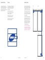
Brand guide
Version 1.0
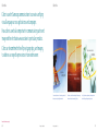
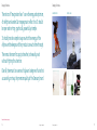
This book presents a new brand strategy for Samsung:
— who we serve,
— what we stand for, and
— how we communicate our value.
It begins by painting a clearer picture of our core consumer,
then defines a new brand platform that will help us build
a more powerful emotional connection with this target.
Finally, it provides the visual and verbal elements we need
to bring our brand story to life.
Think of this book as a user’s manual for our brand. It will
help all of us make Samsung a more powerful global icon.
This document is intended for Samsung internal purposes only. The information contained
herein is proprietary and confidential. Any use, copying, retention or disclosure by any person
other than the intended recipient or the intended recipient’s designees is strictly prohibited.
© 2008, Samsung Electronics Co.
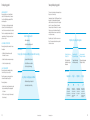
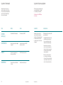
Table of contents
1
New brand platform
19 Bringing the brand to life
93 Applications
121 Appendix
New brand platform
2
Global brand objective
3
Brand target
4
Target profiles
10 Brand equity pyramid
12 Brand equity
14 Interpretation of
brand personalities
Global brand objective
The Samsung brand has come a long way in a short
time. Our first focus was to build brand awareness
worldwide. We succeeded by making Samsung one
of the best known brands in any category.
In the following years, our task was to build our
premium quality, to help drive preference against
competing brands.
Brand target
To drive and accelerate our growth in Brand Preference, we needed a redefined
Brand Target on which to focus our future marketing efforts.
that we will continue to build upon as we enter our
next and most exciting phase: going from well-known
to well-respected and, soon, to well-loved.
Our global brand objective: A world-class, premium
brand that connects emotionally with our consumers.
Through global segmentation studies across key business categories and
regions, a clear new global brand target emerged:
The brand today enjoys a growing premium image
Build global
awareness
Establish
premium image
Become loved
An iconic brand
“Young-Minded Consumer”
Young-Minded Consumers are:
– Early adopters of technology, socially active, and
influential in their peer’s brand choices,
Create meaning to strengthen
brand equity and category
equity, while accelerating
product sales.
Make an emotional connection
with Youth-Minded Consumers.
– Willing to pay premium prices given the central role
technology products play in their lives,
– A strong revenue potential for our core categories
across all regions, and
– More likely to consider, prefer and recommend
Samsung due to their high affinity to the brand.
Young-Minded Consumers are not defined by
a specific age group or demographic statistic
but, rather, a new global mindset and attitude.
They are early adopters who form a strong emotional
connection with their favorite brands.
From the TV at the center of their digital world to the
mobile phone organizing and extending their active
business and social lifestyle, it is the job of our
products — and our communications — to find
newer and better ways to inspire their imagination.
They are youthful in spirit, if not always in age.
They are successful but always striving. They view
brands as partners that can help them on their way.
They are always looking for new sources of inspiration,
and our products can play a key role in their lives.
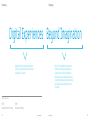
Globally consistent brand message that will
create unique and sustainable brand image
2
New brand platform
New brand platform
3
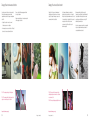
Target profile
Target profile
CHRISTINE / 22 / PR associate in Paris
DANNY / 34 / Entrepreneur in Shanghai
“I am inspired by the rants and raves on
designspongeonline.com, the crazy visions
of avant-garde fashion designers, and
the steady stream of txts, twitters,
pix, and sounds that I constantly
share with my friends.”
“I am inspired by Kanye’s sample of
Daft Punk, Beckham’s free kicks, Diplo’s
nutty remixes, and the ages of the
guys who are running Google.”
I AM
I AM
Someone with one foot in the “real world,” one foot still
in the world of my school friends, but always on the way
to my next adventure!
A serial entrepreneur, a semi-retired amateur dj,
a bit of a workaholic, and a huge football fan.
my MP3 PLAYER is
my hhp is
The connection between my brain, my heart,
and everything that is new in the world of music.
A way for me to scream, strut, or whisper whatever
is on my mind or in my imagination.
IN MY IMAGINATION
IN MY IMAGINATION
A hit single...produced by me.
A kaleidoscope of ideas of what to do this weekend.
BRANDS ARE
BRANDS ARE
My co-producer.
My canvas.
4
New brand platform
New brand platform
5
Target profile
Target profile
ELIZABETH / 61 / Publisher in New York
MIKE / 45 / Architect in London
“I am inspired by the pure wonder in the eyes
of my grandkids, the prose of Dave Eggers, and
the poetry of Jay-Z (yes, you heard me correctly).”
“I am inspired by Calatrava’s skyscraping
sculpture, the next 45 seconds of fame
to appear on YouTube, anyone who can
understand my 13-year-old daughter.”
I AM
I AM
Proud of what I’ve accomplished in my career, completely
shocked that I’m a grandmother, determined to run that
marathon, and ever curious about just about everything.
A professional architect, an aspiring semi-professional
photographer, a proud dad, and an admitted gadget junkie.
my DSC is
my FPTV is
A bridge between my career and my favorite hobby.
One day a connection to the news, the next day a home
theater showing a new documentary, the next day a home
theater for movies of my grandkids.
IN MY IMAGINATION
The detailed blueprints of my house that one day
I am going to build for my family.
IN MY IMAGINATION
A pretty darned good idea for my next career.
BRANDS ARE
A muse.
BRANDS ARE
My connection to what’s new.
6
New brand platform
New brand platform
7
Target profile
Target profile
MARIA / 30 / Gallery owner in Moscow
ARAVIND / 36 / Sound engineer in Mumbai
“I am inspired by any and every way that
people express themselves: a painstakingly
crafted painting, a dash of street graffiti,
a visionary video installation, or just an
outfit put together with a particular verve.”
“I am inspired by figuring
out how products (and
people) work. I have
better luck figuring out
the products, but I’m
fascinated by both.”
I AM
I AM
A proud owner of my own small business, a sometimes
nervous owner of my own small business, and an aspiring
owner of a much larger business!
An ex-geek turned bass guitarist with a dual degree
in physics and management but a passion to do music
full-time. Born in Chennai but recently moved to Mumbai
to be where the action is.
my HHP is
my FPTV is
A way for me to capture those magical little moments that
are always happening quickly and unexpectedly in this
city of change.
My newest centerpiece, my favorite fascination, and
something I manage to work into more than a few
conversations with my friends.
IN MY IMAGINATION
A collage of my paintings and my cash flow statements.
Odd, I know.
IN MY IMAGINATION
BRANDS ARE
BRANDS ARE
A sonic blueprint for my next composition.
Another place to look for inspiration.
8
Often playing catch-up to where I already am.
New brand platform
New brand platform
9
Brand equity pyramid
Samsung brand equity pyramid
What is brand equity?
To become a truly iconic brand, Samsung must inspire
the passions of our new target.
Brand equity is the essence of what the brand
stands for in the hearts and minds of consumers.
Some think of Brand Equity as a brand’s DNA or
a brand’s reputation.
Summarized in the phrase “Digital Experiences Beyond
Imagination,” our Samsung brand equity pyramid
defines the value that we strive to deliver in everything
we do. It also represents the image that we want
Samsung to represent in the minds of our consumers.
And it serves as an internal framework to guide the
marketing activities and consumer experiences that
we create as a company.
The central purpose of developing a brand equity
statement is to define internal strategic choices
in order to drive consumer preference for our brand.
Therefore, understanding the market and the most
important drivers of the target consumer’s brand
preference is critical.
BRAND EQUITY
What the brand stands for
By adhering closely to this platform, we can ensure
that all of our communications build more powerful
emotional connections.
– Defines the business
Why is brand equity important?
– Inspirational, competitive, ownable
Brand equity is important for a number of reasons.
BRAND EQUITY
Digital Experiences Beyond Imagination
Among them:
BRAND BUILDING BLOCKS
BRAND BUILDING BLOCKS
– It differentiates the brand from competitors
in the minds of consumers.
Strategic pillars that serve as building blocks toward the brand equity
[Innovation] that pushes
the limits of life
+ captivates and intrigues
The first to market with
innovation that surprises
the consumer
Design that understands
and enhances your style
– It allows the brand to command premium prices.
– Key aspects that drive preference
– Over time, it develops brand loyalty.
– Points of difference vs. competition
Everything consumers see and experience from
our brand should bring the equity to life.
Multi-sensational experience
that fits your lifestyle
BRAND PERSONALITIES
BRAND PERSONALITIES
Imaginative --
Long-term personality, image, and attitude
Brand equity works as…
– Distinctive, defining, and inspirational
– A guide as to which product development, product
design, and marketing activities are appropriate
for the brand.
– Consistent look, feel, and tonality
Samsung is always
looking and thinking
beyond. We speak in a
language that is always
thoughtful and creative.
– A filter to screen out any types of actions against
the desired equity.
10
[Consumer experience]
+ that delights and rewards
– Points of parity for the category
How to use brand equity
Brand equity provides a roadmap that enables
the work of everyone to be consistent.
[Sensual design] that
New brand platform
New brand platform
Stylish
--
Samsung has a clean,
simple, contemporary
style that is a cut above.
We speak in a language
that is always elegant
and refined.
Optimistic -- Inviting
Samsung always sees
possibilities. We speak
in a language that is
always positive and
upbeat.
Samsung is magnetic
and captivating, with
an inclusive attitude.
We speak in a language
that is always engaging
and charismatic.
11
Brand equity
Brand equity
Digital Experiences Beyond Imagination
Identifies the industry in which Samsung competes
and “what” — the nature of the products and services —
Samsung offers to consumers.
This is “how” Samsung delivers these experiences.
It is what sets Samsung apart. Samsung pushes
the limits of what’s possible in everything we do.
This boundless sense of wonderment and discovery
permeates throughout every last person at Samsung
and collectively sets Samsung apart in the minds
of consumers.
Examples of brand equity
NIKE —
Authentic Athletic Performance
12
BMW —
Ultimate Driving Machine
New brand platform
New brand platform
13
Interpretation of brand personalities
Interpretation of brand personalities
Imaginative
Stylish
Samsung is inspired by always
looking and thinking beyond.
Samsung has a clean, simple,
modern style that is a cut above.
IT is …
IT is not …
IT is …
IT is not …
Visionary
Intelligent
Fresh
Engaging
Unexpected
Too abstract
Overly clever
Superficial
Relevant
Contemporary
Chic
Elegant
Simple
Clean
Just a fad
Too bold
14
New brand platform
New brand platform
15
Interpretation of brand personalities
Interpretation of brand personalities
Optimistic
Inviting
Samsung always sees possibilities.
Samsung is magnetic; it captivates
with an inclusive attitude.
IT is …
IT is not …
IT is …
IT is not …
Inspiring
Bright
Upbeat
Too far-fetched
Unrealistic
Engaging
Charismatic
Forward-thinking
Pretentious
Exclusionary
Aloof
Ordinary
16
New brand platform
New brand platform
17
Bringing the brand to life
20 Brand story
51 Ellipse
25 Campaign idea
73 Imagery
26 Look, tone, and manner
of the campaign
83 Copy elements
27 Campaign do’s and don’ts
28 Visual elements
31 Wordmark
35 Typography
45 Color
Building our brand story
Building an authentic Samsung brand story
In order to deliver the Samsung brand equity to
consumers in an ownable, differentiated way, we
need to translate that brand equity into a brand story
for communication to Young-Minded Consumers.
Creating a powerful, big idea — Imagination
Global brands need big ideas that tap into universal
human emotions and link consumer mindsets
across markets.
Imagination is one such universal and aspirational
consumer truth, particularly attractive to Young-Minded
Consumers.
BRAND EQUITY
Internal framework to guide all our marketing
activities and add value to the consumer
experience that we create as a company.
BRAND STORY
The consistent “story” of our brand.
It brings the brand equity to life in memorable,
ownable consumer language across every
communication, product, and channel.
– I t is authentic, rooted in a company’s origins, in brand
equity that the consumer understands, and in the truths
a consumer feels.
“Imagination” is a powerful,
global consumer truth.
– I t comes from what the brand is — its strategic framework
and executional elements — and influences everything that
the brand does, both internally and externally.
– I t is constant over time — communication campaigns may
change to tell the story differently, but the authenticity
of the brand story never changes.
20
Bringing the brand to life
Bringing the brand to life
21
Getting to the Samsung brand story
The truth of Samsung lies in a company that is made
up of relentless, striving people…people who believe
in the power of imagination, people who see
technological innovation and sensual design as
offspring of their imagination, people who believe
that, with imagination, anything is possible.
It is a truth that resonates with Young-Minded
Consumers, people who are passionate by nature,
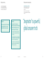
The Samsung brand story
It is the story of wonder, of delight, of that little piece of
magic in everything that we make and how it inspires and
ignites the passions of people everywhere, everyday.
and thirsting for inspiration, new ways, new discoveries,
new creations, and new experiences.
This is where the Samsung brand story derives.
At the intersection of these truths, a company and
a consumer share a belief, share an attitude, share
a unique connection:
Where passion meets imagination
22
Bringing the brand to life
It is about a company and its customers sharing a common
belief that anything is possible, that dreams can be made real,
that imagination is more than just a wish. It is a way of life.
This is Samsung, and this is where: > imagination lives
Bringing the brand to life
23
Holistic framework
Campaign idea
Imagination lives in everything that we make,
everything that we communicate, and everywhere that
our brand appears. Every product, communication, or
channel experience must reaffirm our new brand story.
The spirit of ‘Imagination Lives’ defines the campaign
and separates it from the previous campaign.
!
By “re-telling” our brand story at every opportunity, we
will bring our brand equity to life and help Samsung
become an icon for Young-Minded Consumers.
These guidelines focus on the tools to use to create
the “Communication experience” in a consistent and
distinctive manner.
This campaign:
– Dramatizes the spirit of imagination — how it can provide
benefits and fuel people’s passions.
Communication experience
– Leverage cultural passion points
– Apply consistent visual identity
– Exudes charismatic humanity, positive energy, and
a sense of style.
Brand story
Product experience
– Product function and design
that are centered around
brand story
24
– Contains the ellipse, Samsung’s ownable icon, to symbolize
‘Imagination Lives.’
Channel experience
– Develop in-story/POS activities
in alignment with brand story
– Apply consistent visual identity
Bringing the brand to life
Bringing the brand to life
25
Look, tone, and manner of the campaign
Campaign do’s and don’ts
“Imagination Lives” defines Samsung and is the
emotional bond the brand shares with Young-Minded
Consumers. Thus, every consumer contact in every
situation is an opportunity to reaffirm and celebrate
this shared bond.
“Imagination Lives” is an idea that is built on energy
and optimism and an emotional connection to today’s
vibrant Young-Minded Consumer.
This also means that every consumer contact
is not only a representation of Samsung but also
a representation of our Young-Minded Consumers…
who they are, what they do, what they aspire to.
It is important that we paint the right portrait through
the campaign look, tone, and manner.
The guidelines in this book will help you understand
key elements of the campaign and provide you with
the framework for consistent, high-quality campaign
execution all around the world, while allowing you the
freedom to execute to your specific market needs.
OUR LOOK
Simple, youthful, and premium, with a strong sense of style and design, very graphic,
and colorful. The look depicts real life, grounded in an actual place and time —
not ordinary life, but imaginative life, life on your best day, life as it should be!
Much consideration and detail have gone into the
specifics of the campaign and its many applications.
Those will be addressed thoroughly throughout
these pages. But to help you get a clear grasp of the
campaign basics, here are some key “do’s” and “don’ts”
to help make “Imagination Lives” come to life:
DO…
DON’t…
Find the wonder in each product.
Simply list a product feature.
Portray its use in an imaginative way.
Just show a big product.
Create communications of dynamism, energy, and optimism.
Create quiet, staid, passive, or uninviting communications.
Cast people who reflect the brand personality,
who are inviting, energetic, optimistic.
Cast models who present an aloof, exclusionary feeling.
Utilize the ellipse as a strong icon to proclaim
Imagination Lives in this moment and with this product.
Use the ellipse as a minor element or as a specific
highlight.
Create strong, simple, graphic ads that allow the page to
breathe and let the eye quickly find the key point of focus.
Cram everything possible onto one page, trying to make
everything big and resulting in a cluttered ad where nothing
stands out.
Show products in simple, artful, imaginative ways.
Just show a catalog image.
It is NOT staged, faddish, static, stark, complex, or dark.
OUR TONE AND MANNER
Charismatic humanity, optimistic, and energetic.
It is NOT cerebral, pretentious, lifeless, cold, distant.
26
Bringing the brand to life
Bringing the brand to life
27
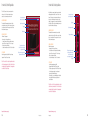
Visual elements
Visual elements
Our visual elements are a set of consistent graphic tools
that appear across our communications.
WORDMARK
They have been developed to create a deeper, more emotional
connection with our consumers wherever they experience
our brand.
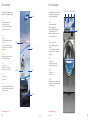
THE ELLIPSE
TYPOGRAPHY
Samsung Imagination —
Typography
A phone that
Samsung
visual
elements
adapts to you
COPY ELEMENTS
COLOR PALETTE
IMAGERY
28
Bringing the brand to life
Bringing the brand to life
29
Wordmark
32 Introduction
32 Clear space
33 Placement
Wordmark / Introduction
Clear space
Wordmark / Placement
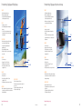
Our Samsung wordmark is the simplest, most
immediate, and most recognizable representation
of our brand. Its consistent and prominent use
builds upon our heritage while projecting confidence
and energy as we move forward.
The Samsung wordmark is one of the company’s most
precious assets. Always position it for maximum impact
and give it plenty of room to “breathe” to ensure its
impact and legibility.
Always position the Samsung wordmark within the
layout to the corner margin of any given application.
The approved placements are top left, top right,
or bottom right. No other placement is acceptable.
Clear space separates the wordmark from other
elements such as headlines, text, imagery, and the
outside edges of printed materials.
Select the approved placement area that has the
least complex imagery background and the greatest
amount of contrast to ensure maximum visibility for
the Samsung wordmark.
A minimum amount of clear space — equal to 2X
— must surround the wordmark at all times.
TOP LEFT
TOP RIGHT
2X MIN.
2X MIN.
2X MIN.
The minimum space for margins must always be
observed when placing the wordmark. “2X” is the
minimum amount of space required left and right
of the wordmark., “X” is equal to cap-height of
the Samsung logotype (e.g., the “N” in Samsung).
Place a larger amount of space at the bottom
of the wordmark whenever possible.
Whenever possible, use a larger amount of visually
uninterrupted space for optimal visibility.
Note: Scale the size of the Samsung wordmark
to meet specific application needs. For example, the
size of the wordmark on OOH is proportionally larger,
compared to other elements, for greater visibility.
2X
BOTTOM RIGHT
X
2X
2X MIN.
32
Bringing the brand to life
Bringing the brand to life
33
Typography
36 Introduction
37 Primary typeface
38 Alternate typefaces
39 Non-Roman languages
40 Overview
42Use
43 Do nots
Typography / Introduction
Typography / Primary typeface
New, distinctive typography helps us tell consumers that
Samsung has something new to say.
Samsung has developed a proprietary typeface called
Samsung Imagination. It is strong, yet modern, and will
help reinforce our unique brand personality.
Samsung Imagination should be used across
all communications.
Designed exclusively for Samsung, this font reflects the
fresh, contemporary nature of the new campaign. At the
same time, it holds true to core brand personality traits:
imaginative, stylish, optimistic, and inviting.
Known as Samsung Imagination, this proprietary font is
easily readable and can be used in varying size contrasts
to help emphasize key message points. As the primary
typeface, it sets an identifiable and consistent tone across
all communications points.
For HIGHLIGHTING AND LEGIBILITY
Use Samsung Imagination Bold to highlight
important information in body copy,
for subheads, and for applications with
legibility considerations (e.g., OOH).
36
Bringing the brand to life
Bringing the brand to life
Samsung Imagination
abcdefghijklmnopqrstuvwxyz123
4567890ABCDEFGHIJKLMNOPQRS
TUVWXYZ!—#$%&()*+,./:;<=>@?[\]
^`{|}~ÄÅÇÉÑÖÜÂÊÁËÈÍÎÏÌÓÒÔÚÙÛ
ÀÃÕáàâäãåçéèêëí ì î ïñóòôöõúùû
ü†°¢£ß•®©™´¨ÆØ¥ªºæø¿¡«»…“ ” ‘ ’
ÿŸ⁄€‹›ƒfifl‡·‚„‰
Make it bold.
37
Typography / Alternate typefaces
For Body Copy and functional requirements
Helvetica Neue is Samsung’s secondary typeface
and may be used where readability is a concern,
such as for large amounts of body copy
(e.g., more than two paragraphs) and small
type sizes (e.g., legal copy).
Typography / Non-Roman languages
Helvetica Neue —
abcdefghijklmnopqrstuvwxyz
When creating Samsung communications in
non-Roman languages that are not supported
by Samsung Imagination or Helvetica Neue —
such as Cyrillic, Arabic, Chinese, Hindi, and Thai —
use the counterpart fonts specified in the list
on this page. You may purchase these fonts online
at the type foundries listed below or through
foundries in your own country. Contact your IT
department for details on installation.
When cold water cleans like hot ,
imagination lives
ABCDEFGHIJKLMNOPQRST
UVWXYZ1234567890
Linotype
www.linotype.com
Phone: +49 (0) 6172 484-418
Fax:
+49 (0) 6172 484-429
e-mail: [email protected]
Legal disclaimer goes here.
The Silver Care washer with VTR steam clean technology.
Available at:
The Samsung Silver Care dolor in hendrerit in vulputate velit esse molestie
consequat, vel illum dolore eu feugiat nulla facilisis at vero eros et accumsan et iusto
odio dignissim qui blandit praesent luptatum zzril delenit augue duis dolore te
feugaith euismod tincidunt ut.
© Samsung Electronics Co. Dolor in hendrerit in vulputate velit esse molestie consequat, vel illum dolore eu feugiat nulla facilisis at vero eros et accumsan et
iusto odio dignissim qui blandit praesent luptatum zzril delenit augue duis dolore te feugaith euismod tincidunt ut laoreet dolore magna aliquam erat volutpat.
Dolor in hendrerit in vulputate velit esse molestie consequat, vel illum dolore eu feugiat nulla facilisis at vero eros et accumsan et.
For Desktop
Arial should be used for desktop applications
in a nongraphic artwork environment such as
live text in Web sites, and Microsoft Word® and
PowerPoint® documents. Samsung Imagination
and Helvetica Neue should be used for graphics
and banners in Web portals, microsites, and
other desktop-based environments.
Arial —
abcdefghijklmnopqrstuvwxyz
PRIMARY (TO ALIGN WITH SAMSUNG IMAGINATION)
ALTERNATE (TO ALIGN WITH HELVETICA NEUE)
Cyrillic
Neue Helvetica Roman (from Linotype, $26)
No secondary typeface
Arabic
Isra Regular (from Linotype, $135)
AXT Manal Black, AXT Advertising Medium,
AXT Gihan Light
Ascender
www.ascenderfonts.com
Phone: +1 (847) 357-0730
25 Northwest Point Blvd., Suite 225
Elk Grove Village, IL 60007 USA
Chinese
Heiti
No secondary typeface
ABCDEFGHIJKLMNOPQRST
UVWXYZ1234567890
Hindi
Kruit Dev
No secondary typeface
Thai
PSL Kitthitada
No secondary typeface
Note: Do not substitute any other typefaces
for the approved Samsung typography.
Examples for illustrative purposes only.
38
Bringing the brand to life
Bringing the brand to life
39
Typography / Overview
Typography / Overview
How you use typography is just as important
to expressing Samsung’s unique personality
as selecting the right typeface.
SUBHEADS ARE SET IN ALL CAPS
All copy, including headlines, product names and
features, and body copy, is set in Samsung Imagination
using “sentence case.”
Headlines should always be the most prominent
element, followed by the product name or feature,
and then descriptive copy.
The correct size of typographic elements will be
determined by the size of each application.
Headlines can be contrasted in
size and staggered.
Headlines can be
contrasted in size and staggered.
As a general rule, headlines should be staggered
in two lines with a 2:3 ratio. Choose type sizes per
application to work with image and layout constraints.
Center-align the second line
with the end of the first line.
Center-align the second line
with the end of the first line.
Headlines can be one line when using
Headlines can be contrasted in
imagination lives
size and staggered.
Center-align the second line
with the end of the first line.
Headlines can be
contrasted in size and staggered.
Center-align the second line
with the end of the first line.
Headlines can be one line when using
imagination lives
Note: All legal copy and other small type sizes are set
in our secondary typeface, Helvetica Neue, to ensure
maximum readability.
40
Bringing the brand to life
Bringing the brand to life
41
Typography / Use
The examples below illustrate the Samsung typography
style as it is applied to content ranging from evocative
and promotional to more functional in purpose.
For headlines, use Samsung Imagination in a
staggered arrangement to create an engaging and
proprietary tone that supports our brand personality
and creates immediate recognition
for Samsung communications.
Typography / Do nots
For all subheads, call outs, and other copy up to a
maximum of 2 paragraphs in length, use Samsung
Imagination set flush left in sentence case. Short
subheads may use all uppercase to add distinction,
where necessary.
DO NOT use fonts other than Samsung Imagination
for headlines, subheads, and callouts.
DO NOT align set paragraphs other than flush left.
DO NOT use upper case for large amounts of copy.
Use Helvetica Neue for large amounts of copy or
copy that is under 7 pt. in size to emphasize legibility
and readability.
DO NOT use Samsung Imagination for copy under
7 pt in size; e.g., legal copy, forms.
Utilizing scale and contrast between typographic
elements establishes a clear hierarchy.
HEADLINES
SUBHEADS & BODY COPY
FUNCTIONAL REQUIREMENTS
Introducing the Samsung
Series 6 Full HDTV with the touch
of color finish
Introducing the Samsung Series 6
Full HDTV with the touch of color finish
A phone that
adapts to you
DESIGN LANGUAGE
Duis autem vel eum iriure dolor in hendrerit
in vulputate velit esse molestie consequat,
vel illum dolore eu feugiat facilisis. Vero eros
accuman et usto odo dignissim qui blandit
luptatum zzril delenit augue duis dolore ten
feugait nulla facilisi.
Lorem ipsum dolor sit amet, consectetuer
euismod tincidunt ut laoreet dolore magna
aliquam erat volutpat.
– Samsung Imagination
– Sentence case
– Staggered arrangement
– As few words as possible
– Samsung Imagination for product names/features and small
amounts of copy
– Samsung Imagination Bold for subheads
– Sentence case
– All uppercase for short subheads
– Flush left
a phone that adapts to you
Duis autem vel eum iriure dolor in hendrerit in vulputate velit esse molestie
consequat, vel illum dolore eu feugiat nulla facilisis at. Vero eros et
accumsan et iusto odio dignissim qui blandit praesent luptatum zzril
delenit augue duis dolore te feugait nulla facilisi.
Lorem ipsum dolor sit amet, consectetuer adipiscing elit, sed diam
nonummy nibh euismod tincidunt ut laoreet dolore magna aliquam erat
volutpat.
DUIS AUTEM VEL EUM IRIURE DOLOR IN HENDRERIT
IN VULPUTATE VELIT ESSE MOLESTIE CONSEQUAT,
VEL ILLUM DOLORE EU FEUGIAT NULLA FACILISIS
AT. VERO EROS ET ACCUMSAN ET IUSTO ODIO
DIGNISSIM QUI BLANDIT PRAESENT LUPTATUM
ZZRIL DELENIT AUGUE DUIS DOLORE TE FEUGAIT
NULLA FACILISI.
Ut wisi enim ad minim veniam, quis nostrud exerci tation ullamcorper ste velit
esse molestie consequat, vel illum dolore eu feugiat nulla facilisis at vero eros et
accumsan et iusto odio dignissim qui blandit praesent luptatum zzril delenit
augue duis dolore te feugait nulla facilisi.
– Helvetica Neue
– Sentence case
– Flush left
– Large amounts of copy or under 7 pt type size
Examples for illustrative purposes only.
42
Bringing the brand to life
Bringing the brand to life
43
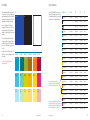
Color
46 Palette
47 Specifications
48Use
Color / Palette
The new Samsung brand platform introduces a wide
color palette in order to convey a more optimistic and
dynamic brand image. This palette has the flexibility to
work across all our audiences and areas of business,
while maintaining a consistent brand personality.
Color / Specifications
Pantone®, CMYK, and RGB conversions have been
developed for the Samsung color palette. Please use
only the equivalents specified here in order to maintain
consistency across all Samsung communications.
CORE
Samsung Blue
Black
White
There is no single preferred color. Rather, we are
allowing greater freedom in the use of color in order
to express our imagination. By using color liberally
throughout our communications, we will convey energy
and surprise.
The colors selected should reflect the desired tone,
such as more youthful or more premium. They should
also match the imagery used in the communications
piece. Use colors within a family to create a tone-ontone effect.
Use black only when it is neither practical nor cost
effective to use color, such as newspaper advertising
or laser printing.
AQUA FAMILY
Samsung Aqua
TEAL FAMILY
Samsung Teal
GREEN FAMILY
Samsung Green
BROWN FAMILY
Samsung Brown
ORANGE FAMILY
Samsung Orange
RED FAMILY
Samsung Red
DO NOT use colors other than the approved
Samsung color palette .
Samsung
Bright Aqua
Samsung
Bright Teal
Samsung
Bright Green
Samsung
Bright Tan
Samsung
Bright Yellow
Samsung
Bright Red
In order to maintain accurate color alignment,
Pantone Coated and Uncoated numbers are different
for both Samsung Bright Tan and Bright Yellow.
Samsung
Light Aqua
Samsung
Light Teal
Samsung
Light Green
Samsung
Light Tan
Samsung
Light Yellow
Samsung
Light Red
The colors shown on this page and throughout these guidelines have
not been evaluated by Pantone, Inc. for accuracy and may not match
the PANTONE Color Standards. Consult current PANTONE Publications
for accurate color. PANTONE® is the property of Pantone, Inc.
46
Bringing the brand to life
Bringing the brand to life
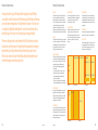
SAMSUNG COLOR
PANTONE®
CMYK
RGB
WEB
Pantone 286 C / U
C100, M80, Y0, K0
R20, G40, B160
#1428A0
Black
C0, M0, Y0, K100
R0, G0, B0
#000000
White
C0, M0, Y0, K0
R255, G255, B255
#FFFFFF
Samsung Blue
Samsung Aqua
Pantone 7460 C / U
C100, M0, Y0, K10
R1, G125, B178
#0087C6
Samsung Bright Aqua
Pantone 306 C / U
C75, M0, Y7, K0
R0, G184, B230
#00B8E6
Samsung Light Aqua
Pantone 2975 C / U
C30, M0, Y0, K0
R155, G214, B230
#9BD6E6
Samsung Teal
Pantone 322 C / U
C100, M0, Y33, K35
R13, G124, B97
#0D7C61
Samsung Bright Teal
Pantone 7465 C / U
C56, M0, Y30, K0
R48, G185, B138
#30B98A
Samsung Light Teal
Pantone 572 C / U
C26, M0, Y17, K0
R151, G223, B172
#97DFAC
Samsung Green
Pantone 7495 C / U
C20, M0, Y80, K30
R121, G140, B40
#798C2B
Samsung Bright Green
Pantone 397 C / U
C10, M0, Y100, K11
R191, G184, B10
#BFB80A
Samsung Light Green
Pantone 610 C / U
C0, M0, Y58, K6
R212, G214, B77
#D4D84D
Samsung Brown
Pantone 146 C / U
C0, M43, Y100, K33
R160, G99, B10
#A0630A
Samsung Bright Tan
Pantone 124 C / 7406 U
C0, M22, Y100, K5
R255, G187, B8
#FFBB08
Samsung Light Tan
Pantone 7403 C / U
C0, M12, Y50, K0
R250, G205, B82
#FACD52
Samsung Orange
Pantone 716 C / U
C0, M55, Y100, K0
R245, G113, B1
#F67101
Samsung Bright Yellow
Pantone 116 C / 108 U
C0, M12, Y100, K0
R255, G209, B35
#FFD123
Samsung Light Yellow
Pantone 127 C / U
C0, M5, Y57, K0
R255, G232, B101
#FFE865
Samsung Red
Pantone 7426 C / U
C0, M100, Y45, K26
R175, G13, B40
#AF0D28
Samsung Bright Red
Pantone 7424 C / U
C0, M87, Y12, K0
R206, G57, B101
#E03E7D
Samsung Light Red
Pantone 692 C / U
C0, M25, Y12, K5
R252, G205, B198
#FCCDC6
47
Color / Use
Color / Use
Color is used in Samsung communications to create a unifying
visual language across applications and campaigns.
How color is used is also important in communicating our brand
image and the attributes we associate to particular products.
Color can be combined in the ellipse, typography, and imagery
to address a range of expressions in tone and manner.
Color can be subtle and
premium.
Color can be
energetic.
Sometimes color can be used to create sharp contrast with
the image in a way that visually grabs attention.
Color can be evocative and match
tone on tone.
Other times, color can blend seamlessly with the image using
shades and tones from the same family of colors.
Lastly, color can be complementary to the image and create
elevated feelings of harmony and sophistication.
Examples for illustrative purposes only.
48
Bringing the brand to life
Bringing the brand to life
49
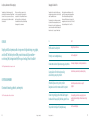
Ellipse
52 Samsung’s ownable icon
62 Partial crops
53 Color use
63 No use
54 Gradient lighting
effect artwork
64 Vertical crop
specifications
55 Two-color artwork
56 Size relationship
65Horizontal crop
specifications
57 Full use — animation
66 Partial crop specifications
58 Crop overview
67 Alternate thin-weight
60 Vertical crops
68How to create a gradient
lighting effect
61Horizontal crops
72 Do nots
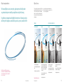
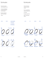
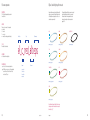
Ellipse / Samsung’s ownable icon
Ellipse / Color use
The Samsung Ellipse is an iconic, energetic, graphic expression that helps make
any communication pieces instantly recognizable as coming from Samsung.
There are two styles of ellipse coloration. The first uses
a gradient lighting effect, and the second is two color.
One is not preferred over the other. In determining
which to use, select the coloration that works best
with your image. Other technical considerations are
detailed below.
It symbolizes our imagination and highlights the intersection of Samsung’s products
with the spirit of imagination…as embodied in a product, a person, in a moment of life.
One-color ellipses should be used when there are
limitations in print production (e.g., newsprint, or other
one- or two-color applications).
Preferred
for functional requirements only
Gradient lighting effect
Two-color
Capture every
One-color
Capture every
detail
– Use for full-color applications.
– Create in Photoshop with a lighting effect
filter.
Note: The ellipse should NOT be used merely as a
decorative element or to highlight functional information,
such as a product name, descriptor, or simple call-toaction (e.g., “sold here”).
– Guidelines for creation and use follow.
Bringing the brand to life
Bringing the brand to life
Capture every
detail
The New Samsung NV20
with HD still and video capture
– Use for full-color applications, including
those where functional limitations do not
allow for the use of the gradient lighting
effect (e.g., size, color, or application
restrictions).
– Created using two different colors for
a dynamic, layered effect.
Examples for illustrative purposes only.
52
Capture every
detail
The New Samsung NV20
with HD still and video capture
One-color (black and white)
detail
The New Samsung NV20
with HD still and video capture
The New Samsung NV20
with HD still and video capture
–Use for limited cost in printing
(2- or 3-color applications).
– Use for newsprint and other one-color
applications.
– Created using 100% and 45% tint of only
one color (to simulate two-color ellipses).
– Created using 100% and 45% tint of black
(to simulate two-color ellipses).
– Use only approved artwork.
– Use only approved artwork.
– Use only approved artwork.
53
Ellipse / Gradient lighting effect artwork
Ellipse / Two-color artwork
Artwork and file names for gradient lighting effect
ellipses are shown below. Though the placement
of the highlight may be adjusted, no other color
combinations are permitted.
Artwork and file names for all two-color ellipses
are shown below. No other color combinations
are permitted. See appendix for more detailed
information.
The gradient lighting effect ellipses may be recreated
when utilized at larger sizes than those provided.
Because the artwork is image based, they must
be recreated using the instructions provided on
pages 66. See appendix for more detailed information.
AQUA
bROWN
AQUA
bROWN
Light AQUA
Light TAN
TEAL
ORANGE
TEAL
ORANGE
Light TEAL
Light YELLOW
TEAL & GREEN
RED
TEAL & GREEN
RED
Light GREEN
Light RED
GREEN
GREEN
RED & ORANGE
Note: Alternate thin-weight ellipses follow the same
naming conventions as those shown here, except for
the addition of “_alt.”
Note: Alternate thin-weight ellipses follow the same
naming conventions as those shown here, except for
the addition of “_alt.”
54
Bringing the brand to life
Bringing the brand to life
55
Ellipse / Size relationship
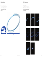
Ellipse / Full use — animation
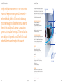
The minimum size of the ellipse relationship to
the wordmark is “3X,” where “X” is equal to the width
of the wordmark. The ellipse may be scaled larger
in size and moved up, down, left, or right within
an application.
TVCs (both :30 and :15) will end with an ellipse
animation. The animation enters the last scene of the
TVC live action, encircling the moment of visual interest,
transitioning to a black background, and ending with
the Samsung wordmark.
X
56
3X MIN.
Bringing the brand to life
57
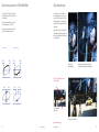
Ellipse / Crop overview
Ellipse / Crop overview
The spectrum below demonstrates the flexibility of
approved ellipse usage based on the focus of each
application. Additional examples and specifications are
shown on the following pages.
Brand-dominant message
Vertical crop
function-dominant message
Horizontal crop
Extreme vertical crop
Partial crop — NOT FOR USE IN ADVERTISING
No use
Dolor in hendrerit in vulputate velit,ore
At vero eros et accumsan et iusto odio
dignissim qui blandit praesent luptatum zzril
uis dolore te feugaith
delenit augue duis
euismod tincidunt
unt ut laoreet dolore magna
aliquam erat volutpat.
utpat.
When cold water cleans like hot water,
The new Samsung Series 6 Full HD LCD TV with Touch of Color
finish eu feugiat nulla facilisis at vero eros et accumsan et
iusto odio dignissim qui blandit.
Samsung NV20
imagination lives
Art inspires
Dolor in hendrerit in vulputate velit
At vero eros et accumsan et iusto odio
dignissim qui blandit praesent luptatum zzril
uis dolore te feugaith
delenit augue duis
unt ut laoreet dolore magna
euismod tincidunt
utpat.
aliquam erat volutpat.
television
The new Samsung Series 6 Full HD LCD TV with Touch of Color
finish eu feugiat nulla facilisis at vero eros et accumsan et
iusto odio dignissim qui blandit.
Samsung 650
Dolor in hendrerit in vulputate velit
40” 1080P LCD TV
At vero eros et accumsan et iusto odio
dignissim qui blandit praesent luptatum zzril
(39.9
inches
uismeasured
dolore tediagonally)
feugaith
delenit
augue
duis
unt ut laoreet dolore magna
euismod tincidunt
utpat.
aliquam erat volutpat.
The new Samsung Series 6 Full HD LCD TV with Touch of Color
finish eu feugiat nulla facilisis at vero eros et accumsan et
iusto odio dignissim qui blandit.
Dolor in hendrerit in vulputate velit esse molestie consequat, vel illum dolore
eu feugiat nulla facilisis at vero eros et accumsan et iusto odio dignissim qui
blandit praesent luptatum zzril delenit augue duis dolore te feugaith
CONTENTS LIBRARY
Enjoy preloaded content designed for entertainment, education
and lifestyle – No external source required
Outdoor ad
The new Series 6 Full HD LCD TV
with Touch of Color Finish.
with HD still
and video capture
ULTRA CLEAR PANEL
More vivid colors and deeper, richer
black levels
AUTO MOTION PLUS 120HZ
Twice the frames, twice the clarity
The new SilverCare washer with silver ion technology.
Dolor in hendrerit in vulputate velit esse molestie consequat, vel illum dolore eu feugiat
nulla facilisis at vero eros et accumsan et iusto odio dignissim qui blandit praesent
luptatum zzril delenit augue duis dolore feugaith euismod tincidunt ut laoreet aliquam
erat vero eros et accumsan et luptatum zzril delenit augue volutpat.
$1,598.00
www.samsung .com
Print ad single page
Product banner
Brochure interior
Product specification card
POP
Applications include:
Applications include:
Extreme vertical applications include:
Applications include:
Applications include:
– TV advertising
– OOH advertising
– Small brochure covers
– Product banners or posters
– Retail specification cards
– Print advertising
– Web banners
– Small vertical promotional pamphlets
– Signage and identification
– Home page
– POP
– POP
– Brochure covers
– Horizontal bar/ banner type print advertising
– Interior pages of multi-page document,
or store/trade show environmental design
– POP stickers, toppers or mats
– Promotional posters
58
Bringing the brand to life
Bringing the brand to life
59
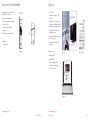
Ellipse / Vertical crops
Place the ellipse at the focal point of an image,
providing that the clear space of the wordmark is
not interrupted. The visible edge of the ellipse should
not cross the margin of the application (shown in red).
Ellipse / Horizontal crops
Left crop
Place the ellipse at the focal point of an image,
providing that the clear space of the wordmark
is not interrupted. The visible edge of the ellipse should
not cross the margin of the application (shown in red).
When cold water cleans like hot water,
imagination lives
The ellipse should be used in a way that:
The ellipse should be used in a way that:
– Highlights Samsung product’s interaction with
the point of imagination as embodied in the key
visual (i.e., product, person or moment in life).
– Highlights Samsung product’s interaction with
the point of imagination as embodied in the key visual
(i.e., product, person or moment in life).
– Links and unifies the key visual elements, such
as area of focus in imagery, headline, product copy
and product image.
– Does not hinder functionality of the
communication piece.
– Links and unifies the key visual elements, such as
area of focus in imagery, headline, product copy and
product image.
The new SilverCare washer with silver ion technology.
Print ad single page
Print ad spread
– Does not hinder functionality of the
communication piece.
Right crop
– Does not compromise readability of
important content.
The ellipse can be center-cropped when vertical
space is limited.
When one camera acts like two,
imagination lives
TThe new SilverCare
SilverCar washe with Silver Ion technology.
The new Series 6 Full HD LCD TV
with Touch of Color Finish.
Outdoor ad
bottom crop
Small sounds
ounds big.
The ellipse can be corner-cropped when functional
limitations exist.
top-right corner crop
Applications include:
Applications include:
– OOH advertising
Print ad spread
– Print advertising
– Home page
television
Outdoor ad
Follow the horizontal crop specifications on page 63.
Print ad single page
Art inspires
– Does not compromise readability of
important content.
Follow the vertical crop specifications on page 62.
– TV advertising
Top crop
– Web banners
CENTER crop FOR EXTREME VERTICAL APPLICATIONS — not for use in advertising
– POP
– Brochure covers
Outdoor ad
– Horizontal bar/ banner type print advertising
bottom-left corner crop
– Promotional posters
Every
Extreme vertical applications include:
detail
The official phone of your
Olympic spirit.
– Small brochure covers
– Small vertical promotional pamphlets
www.samsung .com
Examples for illustrative purposes only.
60
Outdoor ad
Promotional banner
Examples for illustrative purposes only.
Bringing the brand to life
Bringing the brand to life
61
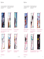
Ellipse / Partial crops — NOT FOR USE IN ADVERTISING
Ellipse / No use
Dolor in hendrerit in vulputate velit,ore
The partial crop may not be used in advertising.
Use the partial crop of the ellipse only:
partial top crop
– For applications with product-only imagery
– When there is no supporting imagery or messaging
to reinforce the brand story
At vero eros et accumsan et iusto odio
dignissim qui blandit praesent luptatum zzril
uis dolore te feugaith
delenit augue duis
unt ut laoreet dolore magna
euismod tincidunt
utpat.
aliquam erat volutpat.
Do not use an ellipse:
The new Samsung Series 6 Full HD LCD TV with Touch of Color
finish eu feugiat nulla facilisis at vero eros et accumsan et
iusto odio dignissim qui blandit.
– For applications where descriptive content
is dominant
– For multi-page documents or store or trade show
design, where its use has already been established
and it would become redundant and overly used
Samsung NV20
– When legibility of important content would
be compromised
Dolor in hendrerit in vulputate velit
The new Samsung Series 6 Full HD LCD TV with Touch of Color
finish eu feugiat nulla facilisis at vero eros et accumsan et
iusto odio dignissim qui blandit.
At vero eros et accumsan et iusto odio
dignissim qui blandit praesent luptatum zzril
uis dolore te feugaith
delenit augue duis
unt ut laoreet dolore magna
euismod tincidunt
utpat.
aliquam erat volutpat.
Dolor in hendrerit in vulputate velit
Samsung 650
40” 1080P LCD TV
(39.9 inches measured diagonally)
– When identification of the Samsung name
and wordmark is most critical
Follow the partial crop specifications on page 64.
The new Samsung Se
finish eu feugiat nul
iusto odio dignissim
At vero eros et accumsan et iusto odio
dignissim qui blandit praesent luptatum zzril
uis dolore te feugaith
delenit augue duis
unt ut laoreet dolore magna
euismod tincidunt
utpat.
aliquam erat volutpat.
Dolor in hendrerit in vulputate velit esse molestie consequat, vel illum dolore
eu feugiat nulla facilisis at vero eros et accumsan et iusto odio dignissim qui
blandit praesent luptatum zzril delenit augue duis dolore te feugaith
CONTENTS LIBRARY
Enjoy preloaded content designed for entertainment, education
and lifestyle – No external source required
– When there is no supporting imagery or messaging
to reinforce the brand story
with HD still
and video capture
Applications include:
ULTRA CLEAR PANEL
More vivid colors and deeper, richer
black levels
AUTO MOTION PLUS 120HZ
– When legibility of important content would
be compromised
– Product banners or posters
Twice the frames, twice the clarity
Dolor in hendrerit in vulputate velit esse molestie consequat, vel illum dolore eu feugiat
nulla facilisis at vero eros et accumsan et iusto odio dignissim qui blandit praesent
luptatum zzril delenit augue duis dolore feugaith euismod tincidunt ut laoreet aliquam
erat vero eros et accumsan et luptatum zzril delenit augue volutpat.
www.samsung .com
Product banner
Applications include:
Brochure interior
Dolor in hendrerit in vu
nulla facilisis at vero er
luptatum zzril delenit a
erat vero eros et accum
$1,598.00
Product specification card
– Retail specification cards
– Signage and identification
– Interior pages of multi-page document,
or store/trade show environmental design
www.samsung.com
Consumer
– POP stickers, toppers or mats
Business
Support
Experience
News
About Samsung
USA / English
Search
Samsung Ultra Edition II
Goes where you go.
Secondary pages
Examples for illustrative purposes only.
62
Examples for illustrative purposes only.
Bringing the brand to life
Bringing the brand to life
63
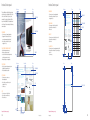
Ellipse / Vertical crop specifications
Ellipse / Horizontal crop specifications
The preferred use of the vertical crop is when it is
cropped on only one edge of an application (i.e., left, right).
The preferred use of the horizontal crop is when
it is cropped on only one edge of an application
(i.e., top, bottom).
Use the center crop only when functional limitations exist,
and crop equally on both edges of an application. The
center crop is not for use in advertising.
Use the corner crop only when functional limitations
exist, and place only on the top-right corner or bottomleft corner of an application.
Below are the approved crop methods for vertical
applications. Do not exceed either the maximum
or minimum crop.
LEFT-SIDE CROP
Below are the approved crop methods for horizontal
applications. Do not exceed either the maximum
or minimum crop.
MIN .15X
BOTTOM CROP
CENTER CROP — NOT FOR USE IN ADVERTISING
For limited applications, the ellipse
may be cropped equally on both sides.
Not for use in advertising applications.
RIGHT-SIDE CROP
MIN .15X
MIN .15X
TOP CROP
LEFT & BOTTOM CROP
MIN .15X
MIN .15X
MIN .15X
MIN .06X
MIN .06X
MIN .06X
MIN .06X
X = width of the ellipse
X
X = width of the ellipse
X
MAX .4X
MAX .4X
MAX .4X
X = width of the ellipse
X
MAX .4X
MAX.22X
MAX.22X
64
X
X
MAX .4X
MAX .4X
MAX.22X
X
RIGHT & TOP CROP
MAX.22X
X
X
Bringing the brand to life
Bringing the brand to life
X
X
X
65
Ellipse / Partial crops specifications — NOT FOR USE IN ADVERTISING
Ellipse / Alternate thin-weight
Use the partial crop of the ellipse only for applications
with product-only imagery. The partial crop may not be
used in advertising.
In certain circumstances, the line weights of the
primary ellipse may appear too heavy when scaled,
and may not match the appearance of the ellipse on
standard-size applications. To compensate for these
situations, an alternate thin-weight ellipse artwork has
been designed.
Crop the ellipse equally on both sides, using only one
of the remaining segments (i.e., top, bottom).
Below are the approved partial crop methods. Do not
exceed either the maximum or minimum crop.
SPECIAL CROP - TOP
MIN .15X
Applications that may use the alternate thin weight
ellipse include extreme horizontal applications, web
banners, double-page spreads or larger formats such
as outdoor advertising.
When a phone adapts to you
imagination lives
When a phone adapts to you
The new Samsung Soul
with touch window
The new Samsung
msung Soul
with touch window
SPECIAL CROP - BOTTOM
MIN .15X
MIN .15X
MIN .15X
Single-page print ad
using the primary ellipse
X
MAX .4X
MAX .4X
X
O NOT use the primary ellipse on extreme
D
horizontal applications.
X
MAX .4X
Double-page print ad using the alternate thin-weight ellipse
(to visually match the primary ellipse on the single page print ad)
Small sounds big.
MAX .4X
X
OOH using the primary ellipse
appears too heavy.
OOH using alternate thin-weight ellipse
Examples for illustrative purposes only.
66
Bringing the brand to life
Bringing the brand to life
67
Ellipse / How to create a gradient lighting effect — EXAMPLE 1
Ellipse / How to create a gradient lighting effect — EXAMPLE 1
Follow the steps on this page to scale and position the
ellipse in Photoshop.
After scaling and positioning the ellipse in Photoshop
(STEPS 1 – 5), follow the steps on this page to add
a lighting effect to the ellipse.
IMPORTANT: Your file must be converted to RGB
to create this effect. You can reconvert to CMYK after
the desired effect has been achieved.
step 6.
step 7.
step 1.
Open your working image in Photoshop.
step 2.
Open the provided ellipse path from the asset folder
(el_path.eps). Copy the path and paste it into the path palette of
your working image.
step 3.
Select path, and choose Edit > Transform from the main
menu. Scale and move the path into desired position.
With your ellipse layer selected, choose Edit Fill from the
draw-down menu and fill the ellipse with your base color from
the Samsung color palette. (This example uses Samsung Aqua.)
With the ellipse layer selected, choose Filter/Render/
Lighting Effects from the main menu bar. Use the settings
shown below.
Grab the center point of the light
source and position it appropriately
in relation to your main image.
step 4.
Select the Master Ellipse path and make a selection
of the path using the settings shown below (right).
step 8.
Your final ellipse should look like this.
Set light to Omni.
step 5.
Make a new layer in your psd file.
Insert the tint color values HERE* and click OK.
(This example uses Samsung Bright Aqua.)
Note: If you do not achieve your desired effect,
simply undo and try again.
Grab any one of the four outer points
to change the size of the light source.
Examples for illustrative purposes only.
68
* USE ONLY APPROVED COLORS LOCATED ON
PAGES 46–47 OF THE BRAND GUIDELINES.
Examples for illustrative purposes only.
Bringing the brand to life
Bringing the brand to life
69
Ellipse / How to create a gradient lighting effect — EXAMPLE 2
Ellipse / How to create a gradient lighting effect — EXAMPLE 3
After scaling and positioning the ellipse in Photoshop
(STEPS 1 – 5), follow the steps on this page to add
a lighting effect to the ellipse.
IMPORTANT: Your file must be converted to RGB
to create this effect. You can reconvert to CMYK after
the desired effect has been achieved.
After scaling and positioning the ellipse in Photoshop
(STEPS 1 – 5), follow the steps on this page to add an
additional lighting source to the ellipse.
IMPORTANT: Your file must be converted to RGB
to create this effect. You can reconvert to CMYK after
the desired effect has been achieved.
Note: This additional effect is only necessary
when using the Samsung Red color family.
step 6.
step 7.
step 6.
step 7.
step 8.
With your ellipse layer selected, choose Edit Fill from the
draw-down menu and fill the ellipse with your base color
from the Samsung color palette. (This example uses
Samsung Bright Yellow.)
With the ellipse layer selected, choose Filter/Render/
Lighting Effects from the main menu bar. Use the settings
shown below.
Set light to Omni.
step 8.
Your final ellipse should look like this.
With your ellipse layer selected, choose Edit Fill from the
draw-down menu and fill the ellipse with your base color
from the Samsung color palette. (This example uses
Samsung Red.)
A — Select tint light source as in previous examples.
(This example uses Samsung Bright Red.)
Your final ellipse should look like this.
Move intensity slider bar until
you achieve the desired intensity.
B — Select additional light source by grabbing the bulb icon
and dragging it into the preview window. This will automatically
shift the light type from Omni to Spotlight and revert the tint
color to white.
Omni light type
shifts to Spotlight.
Fill color white.
Fill color reverts to white.
Size and position of the light source
may be adjusted to achieve your
desired effect.
Examples for illustrative purposes only.
70
Examples for illustrative purposes only.
Bringing the brand to life
Bringing the brand to life
Grab the bulb icon and drag into the preview window.
Drag the new light source to the desired position
and click OK.
71
Ellipse / Do nots
We encourage you to become familiar with the correct
use of the ellipse, and please be sure to use the
provided ellipse artwork.
Ellipse / Do nots
We encourage you to become familiar with the correct
use of the ellipse and please be sure to use the
provided ellipse artwork.
The integrity of the Samsung ellipse must be respected
at all times. Do not recreate, modify, or otherwise alter
the provided ellipse artwork.
The integrity of the Samsung ellipse must be respected
at all times. Do not recreate, modify, or otherwise alter
the provided ellipse artwork.
When a phone
The new Samsung Soul
with touch window
The New Samsung NV20
with HD still and video capture
adapts to you
Capture every detail
Small
sounds big
The new Samsung Soul
with touch window
The New Samsung NV20
with HD still and video capture
adapts to you
Every
detail
Samsung NV20
every detail
adapts to you
When a phone
DO NOT crop on two sides unless there is a functional
requirement, such as limited horizontal space. Do not
use center crop in advertising.
Capture
The new Samsung Soul
with touch window
When a phone
The New Samsung
Sgh I550w
DO NOT use an ellipse that is smaller
than specified.
DO NOT violate the Samsung wordmark
clear space with the ellipse.
O NOT use effects in combination with
D
the ellipse; e.g., drop shadow.
DO NOT place the product image over more
than one segment of the ellipse; i.e., place on
top or bottom portion only.
DO NOT place the ellipse in front of the product
or obstruct human features in an image.
Small
sounds big
Goes where
Samsung NV20
you go
NEW
Samsung T300
The new Samsung
SGH I550W
2 Megapixel Camera Phone
Samsung Soul
with Touch Window
Samsung Ultra Edition II
with HD still and
video capture
- 4x Digital Zoom
- Video Recording (Mpeg)
- Mp3 Player
$350.00
Music, messaging, pictures, video…
all in a magical touch.
DO NOT use an ellipse in place of the
Samsung wordmark.
DO NOT use more than one ellipse
in a single application.
DO NOT rotate, skew, or in any way modify
the provided ellipse artwork.
Examples for illustrative purposes only.
72
DO NOT use the preferred ellipse crop
in a product-only application.
DO NOT use the ellipse to highlight functional content,
such as product names, features, or calls to action.
DO NOT obscure content, such as headlines,
with the ellipse.
Examples for illustrative purposes only.
Bringing the brand to life
Bringing the brand to life
73
Imagery
76 Overview
78 Lifestyle
79 Product as hero
80 Product only
81How to select people
82How to create a sense
of motion
83How to use color
and context
Imagery / Overview
Imagery / Overview
The notion of “imagination lives” is one of energy and optimism,
of delight and wonder. Our imagery must reflect that. It should
be open and inviting, graphically powerful yet simple.
BENEFIT/LIFESTYLE
PRODUCT AS HERO
It should provide a simple stage on which the energy of the
ellipse and the elegance of the product can each shine through.
There must be room for copy to breathe, to be easily read
without fighting for attention.
Overall, there must be a sense of style and a degree of taste that
accurately portrays the premium quality of the Samsung brand.
Examples for illustrative purposes only.
76
Bringing the brand to life
Bringing the brand to life
77
Imagery / Lifestyle
Imagery / Product as hero
“Imagination lives” is about what happens when the
imagination in our products meets the passion in our
consumers. All lifestyle imagery should capture that
spirit. It must be spontaneous and real, not posed
or contrived. It must have a sense of joy and invitation,
not one of coolness or exclusion.
When shooting products without the context
of lifestyle, we must highlight their beauty, quality
of design, and unique functionality where possible.
While always simple and graphically elegant, these
images need a degree of imagination to elevate
them beyond simple catalog shots.
It reflects life as it should be, with the surprise and
delight that Young-Minded Consumers seek. It is
never cynical or staid, but neither is it overly glossy
or showy.
Imagination should come through in the choice
of dramatic cropping, or surprising background,
or even an unexpected angle.
It should faithfully portray the diversity of our
consumers, their cultures, their passions. And it
should complement the diversity of our products
in their many uses and applications.
One option is to feature the product against
a backdrop that is an abstraction of a product
feature or aspect; for example, extreme cold for
a washer that cleans in cold water or great space
or a refrigerator that offers extra space.
Note: A product image is required on all applicatioins.
When using lifestyle imagery, it must be used in
combination with a product-only image as defined
on page 78.
DO NOT use images that are static in idea and
execution, or ordinary.
DO NOT use images with artificial settings, staged
environments, or of fantasy situations.
DO NOT use images that are too dark or cluttered,
or with highly styled, complex, irrelevant, or confusing
metaphors.
Examples for illustrative purposes only.
Examples for illustrative purposes only.
78
Bringing the brand to life
Bringing the brand to life
79
Imagery / Product only
Imagery / How to select people
Product-only photography presents Samsung products in
their most essential and purest form. The products should
be shot in such a way that their most important features
are clearly visible. Through a combination of soft lighting
and directional spotlights, product surfaces should
produce smooth, elegant reflections and product edges
and details should clearly stand out.
Use imagery that forms a high-level, emotional
connection with Young-Minded Consumers and their
passions. Young-minded does not translate to young;
rather, it means that no matter the age, the person has
a sense of passion, imagination, and a youthful style.
People’s expressions should appear spontaneous
and candid, with a sense of energy, passion, optimism,
and discovery — not posed or contrived. Look for
imagery that captures interesting personalities and their
interaction with the environment and with others.
–Shot on white in a studio setting, product photography
displays the product and just a hint of shadow to allow
the product to stand out from the page.
–Interesting personality
–Natural, authentic expression
–Young, with a sense of passion
–Older, with youthful style
–Use interesting camera angles to create a dynamic
presentation for all handheld products, reinforcing
our imaginative brand image.
–Present all large (e.g., non-handheld) products
in flat front view to align with the way they are typically
viewed in real-life situations.
Note: When used in combination with lifestyle imagery
(e.g., in an advertisement), product-only images should
be silhouetted to remove the drop shadow.
DO NOT use images of products with overly dramatic
lighting, that are too severely angled or distorted, or with
a harsh drop shadow or reflection.
DO NOT present handheld products in flat front view
or large products in angled views.
DO NOT use images with models that are too highly
styled, too pretentious or cold, or too posed
(e.g., looking at the camera).
DO NOT use models who appear boring or plain
or too pretty. They should not be bald or have tattoos.
Examples for illustrative purposes only.
80
Examples for illustrative purposes only.
Bringing the brand to life
Bringing the brand to life
81
Imagery / How to create a sense of motion
Imagery / How to use color and context
Creating a sense of motion, scale, and spontaneity
further reinforces capturing a moment where
imagination lives as well as the passion and optimism
of real life.
Simplicity is of the essence. A minimal amount
of background context places focus on the main
subject of the image. If an image is complex, the
communication will be less effective.
–Capture the customer in an act or moment
of discovery, expression, or dialogue.
–Focus on activities that are engaging and relevant
to our target customer.
–Capture a singular action, not a complex composition
of various people or activities.
–An image may have a sense of motion or of thought;
action does not necessarily mean fast motion.
DO NOT use images portraying clichéd gestures.
– Backgrounds with color that is based on the
Samsung color palette help to simplify and beautify
the presentation, while creating focus and a more
proprietary presentation. However, do not just fill
a blank background with color.
– Use scale, cropping, and perspective in a compelling
way to create dynamism and unexpectedness for
everyday situations and products.
DO NOT use images that have complicated or
distracting background environments or that have
no environment at all.
DO NOT use images with action that appears either
staged or in unrealistic angles or situations.
DO NOT use images that appear digitally enhanced.
Examples for illustrative purposes only.
82
– Select imagery with simple, uncomplicated
backgrounds, such as a blue sky or colored wall.
Always include at least a minimum amount of context
to avoid a stark, cold or isolated effect (i.e., products
and people should look like they are in an
environment, not just silhouetted on top of a
blank background).
Examples for illustrative purposes only.
Bringing the brand to life
Bringing the brand to life
83
Copy elements
86 Introduction
87 Directives
89 Key copy elements
91Headline configurations
92 Subhead examples
93 Descriptive copy
development
Copy elements / Introduction
Copy elements / Directives
Copy needs to be as simple, open, and inviting as the visual
tone that we are setting.
At the core of “Imagination Lives” is that moment when the imagination
in our products meets the passion in our consumers.
The optimism, joy, and energy of the campaign idea must
not be dragged down by ponderous, overly serious headlines
and volumes of detailed manufacturer’s copy.
Our Young-Minded Consumer leads a time-crunched life and
looks to Samsung products as sources of help, entertainment,
sociability, efficiency, and fun.
Our copy should do the same thing: be helpful, entertaining,
social, efficient — and even, sometimes, fun.
The task in writing copy is to highlight the imaginative aspect of our
product and how it relates to our consumers’ lives.
“Now a phone that answers to you” is a much more human, much more imaginative,
much more uniquely Samsung approach than “A phone with an adaptive touchscreen interface.”
“Clean made cleaner,” “More space in the same space,” “Is it art or is it television?”
and “So small sounds so big,” are all more human, more inviting, more imaginative,
more Samsung than “A washing machine that cleans with silver-ion technology,”
“A refrigerator with thinner insulation,” “A beautifully designed television,”
or “A compact MP3 player.”
We should speak as though talking to an interested friend,
not preaching to a disinterested stranger. No lengthy, formal
prose; instead, use familiar language and inviting structure.
86
Bringing the brand to life
Bringing the brand to life
87
Copy elements / Key copy elements
Copy elements / Directives
HEADLINE
IT is …
IT is not …
“Now a phone that answers to you.”
“A phone with an adaptive touch-screen
interface.”
Create simple distillation of the imaginative aspect of our product and how it relates
to our consumers’ lives.
SUBHEAD
“Clean made cleaner.”
“A washing machine that cleans with silver
ion technology.”
“More space in the same space.”
“A refrigerator with thinner insulation.”
“Is it art or is it television?”
“A beautifully designed television.”
“So small sounds so big.”
“A compact MP3 player.”
88
Identify the specific product name and the feature or features that deliver the
imaginative aspect and consumer benefit referenced in the headline.
DESCRIPTIVE CONTENT
In brochures, on-line, and in other information-rich media opportunities, explain
fully but succinctly the details that are important to the message or offer of the
communication piece.
All content must be written in the simple, inviting tone referenced on page 85.
Bringing the brand to life
Bringing the brand to life
89
Copy elements / Key copy elements example
Copy elements / Headline configurations
HEADLINE
Because there are many different communication
formats and sizes, there are a number of
recommended configurations for headlines.
“Now cold water cleans like hot”
-or-
When cold water cleans like hot ,
“When cold water cleans like hot, imagination lives.”
In all cases, communicate headlines in as few words
as possible. In all media — especially in advertising
— fewer words have greater impact, project a more
sophisticated image, and require less effort for our
consumers to understand our message.
Headline
imagination lives
Create a simple distillation of the imaginative aspect of
our product and how it relates to our consumers lives.
subhead
“The new SilverCare washer with VRT ion-clean
technology.”
Identify the specific product name and the feature
or features that deliver the imaginative aspect and
consumer benefit referenced in the headline.
All must be written in the simple, inviting, tone
referenced on page 84.
Rule of thumb:
Example:
INTRODUCTORY PHRASE
(advertising only)
A phrase that begins with “When” and introduces
a moment of magic that is paid off by the
“imagination lives” brand line
When something so small sounds so big...
imagination lives (brand line).
FULL-LENGTH
A stand-alone phrase or sentence that does
NOT begin with “When”
Something so small never sounded so big.
SHORTHAND
A compact form of no more than 5 words and
not necessarily a single phrase
Big sound. Small package.
SOUND BITE
1 or 2 short, bold words
Sounds big.
subhead
Legal disclaimer goes here.
The Silver Care washer with VTR steam clean technology.
Configuration:
Examples for illustrative purposes only.
90
Bringing the brand to life
Bringing the brand to life
91
Copy elements / Subhead examples
Copy elements / Descriptive copy development
Subheads should be as short as possible – no
longer than a single phrase or sentence. They may
serve a range of purposes but should always directly
support the message of the headline. Below are
some common uses and examples.
While body copy may serve a wide range of purposes,
some general guidelines will help to communicate
in a clear, compelling, and consistent manner.
Note: “Imagination lives” should NEVER appear
in descriptive copy.
PURPOSE:
DEFINITION:
EXAMPLE:
SHORTER IS BETTER
CLEAR PARAGRAPH FLOW
PRODUCT NAME
(advertising only)
Simple identification of the featured product
The Samsung Series 6 Full HDTV
Within each paragraph of copy, a similar content flow
ensures clarity and impact:
PRODUCT INTRODUCTION
Introduction of a new product, often highlighting
it’s primary USP
Introducing the Samsung Series 6 Full HDTV
with the touch-of-color finish
Smaller amounts of copy make it easier for
consumers to understand our message and
contribute to a sophisticated and appealing visual
look. Always communicate the key message
in as few words as possible — ideally, in a single,
short paragraph.
Communication of a key feature, benefit,
technology, or point of difference
The HDTV with the touch-of-color finish
Communication of news or useful information
for the reader
Available this summer at Samsung.com
PRIMARY USP
MARKETING MESSAGE
92
Bringing the brand to life
1. Open paragraphs with a high-level sentence that
states the main point or defines the context of
the piece in a way that reinforces the spark of
imagination found in the headline and imagery.
2. A subsequent sentence or two provides the
evidence — features, benefits, design touches,
technology, and/or solutions to consumer needs.
In all consumer marketing, the USP should be
clearly communicated here.
3. Where needed — and where space allows —
use a closing sentence to provide a summary
of the main point. This may be useful to highlight
a product or feature in a more human or lifestyle
context or to reinforce an emotional connection.
Bringing the brand to life
93
Applications
96 Overview
99 Bringing it together
100 Print advertising
106 OOH
109 Brochure
118 POP
122 Online/Interactive media
The new Samsung Series 6 Full HD LCD TV with Touch of Color
finish eu feugiat nulla facilisis at vero eros et accumsan et
iusto odio dignissim qui blandit.
Dolor in hendrerit in vulputate velit
Overview
Every interaction and every communication directly
enhances the power and meaning of our brand.
Our goal is to create across all of our communications
a seamless and consistent experience that engages
customers in an imaginative way. The overall visual
style of the Samsung brand is imaginative, stylish,
optimistic, and inviting, as exemplified by our
image attributes.
At vero eros et accumsan et iusto odio
dignissim qui blandit praesent luptatum zzril
uis dolore te feugaith
delenit augue duis
unt ut laoreet dolore magna
euismod tincidunt
utpat.
aliquam erat volutpat.
The new Samsung Series 6 Full HD LCD TV with Touch of Color
finish eu feugiat nulla facilisis at vero eros et accumsan et
iusto odio dignissim qui blandit.
Dolor in hendrerit in vulputate velit
At vero eros et accumsan et iusto odio
dignissim qui blandit praesent luptatum zzril
uis dolore te feugaith
delenit augue duis
unt ut laoreet dolore magna
euismod tincidunt
utpat.
aliquam erat volutpat.
Art inspires
television
The new Samsung Series 6 Full HD LCD TV with Touch of Color
finish eu feugiat nulla facilisis at vero eros et accumsan et
iusto odio dignissim qui blandit.
The new Series 6 Full HD LCD TV
with Touch of Color Finish.
Dolor in hendrerit in vulputate velit esse molestie consequat, vel illum dolore eu feugiat
nulla facilisis at vero eros et accumsan et iusto odio dignissim qui blandit praesent
luptatum zzril delenit augue duis dolore feugaith euismod tincidunt ut laoreet aliquam
erat vero eros et accumsan et luptatum zzril delenit augue volutpat.
Legal disclaimer goes here.
Overview
At vero eros et accumsan et iusto odio
dignissim qui blandit praesent luptatum zzril
uis dolore te feugaith
delenit augue duis
unt ut laoreet dolore magna
euismod tincidunt
utpat.
aliquam erat volutpat.
Brochures
The new Series 6 Full HD LCD TV
with Touch of Color Finish.
Art inspires
television
Samsung 650
40” 1080P LCD TV
(39.9 inches measured diagonally)
Dolor in hendrerit in vulputate velit esse molestie consequat, vel illum dolore
eu feugiat nulla facilisis at vero eros et accumsan et iusto odio dignissim qui
blandit praesent luptatum zzril delenit augue duis dolore te feugaith
CONTENTS LIBRARY
Enjoy preloaded content designed for entertainment, education
and lifestyle – No external source required
ULTRA CLEAR PANEL
More vivid colors and deeper, richer
black levels
AUTO MOTION PLUS 120HZ
Twice the frames, twice the clarity
Web
$1,598.00
POP
Samsung 650 LCD TV
When art inspires television,
imagination lives
The new Series 6
with Touch of Color Finish
Advertising
Examples for illustrative purposes only.
96
Applications
Applications
97
Bringing it together
Bringing it together
EXAMPLE 1.
EXAMPLE 2.
When one camera acts like two,
imagination lives
Step 1. Imagery
Step 2. Ellipse
Step 3. Product
Place product over ellipse.
Headline and subhead should be
close to the product.
Step 4. Headline
and subhead
The new NV24HD digital camera with
still and high definition video.
Headline and subhead should be
close to the product.
Legal disclaimer goes here.
Place product over ellipse.
Step 4. Headline
and subhead
Legal disclaimer goes here.
Step 3. Product
Legal disclaimer goes here.
Step 2. Ellipse
Legal disclaimer goes here.
Step 1. Imagery
When one camera acts like two,
imagination lives
When cold water cleans like hot,
imagination lives
The Silver Care washer with VTR steam clean technology.
Legal disclaimer goes here.
Legal disclaimer goes here.
Legal disclaimer goes here.
Legal disclaimer goes here.
Legal disclaimer goes here.
Legal disclaimer goes here.
Legal disclaimer goes here.
Legal disclaimer goes here.
The new NV24HD digital camera with
still and high definition video.
When cold water cleans like hot,
imagination lives
Legal disclaimer goes here.
Legal disclaimer goes here.
Legal disclaimer goes here.
Legal disclaimer goes here.
The Silver Care washer with VTR steam clean technology.
Examples for illustrative purposes only.
98
Examples for illustrative purposes only.
Applications
Applications
99
Print advertising / Spread with product as hero image
IMAGERY
IMAGERY
– Straight-forward, singular message
– Always use a background context
– Use depth-of-field and subtle background color
to silhouette singular action or object
– Straight-forward, singular message
– Always use a background context
– Use depth-of-field and subtle background color
to silhouette singular action or object
– Always show a product image, either in context
or in combination with a lifestyle image
ELLIPSE
– Cropped on one side only
– Used to highlight singular point of imagination
in imagery
– Color selection is based on imagery: match tone
for a premium, refined look, or contrast to make a
bold statement
ELLIPSE
imagination lives
– Always show a product image, either in context
or in combination with a lifestyle image
– Front facing for large products/angled for
handheld products
– Silhouetted without drop shadow
– Placed in front of ellipse on top or bottom portion
(not over both)
– Set in sentence case
– Black or white color
– Size should be no smaller than 11pt. and
no bigger than 12.5pt.
WORDMARK
– May be positioned in top-left, top-right or bottom-right
corner, wherever there is the sufficient contrast with the
background and image
The new Series 6
with Touch of Color Finish
– Set in sentence case
– Staggered on 2 lines with 2:3 size ratio
– Positioned along the curve of the ellipse
– Size should be no smaller than 16pt. and
no bigger than 24pt.
The new Samsung Roxy.
With 5 megapixel camera.
SUBHEAD
Legal disclaimer goes here.
– Set in sentence case
– Black or white color
– Size should be no smaller than 11pt. and
no bigger than 12.5pt.
WORDMARK
LEGAL DISCLAIMER
PRODUCT IMAGE SUBHEAD
HEADLINE
IMAGERY
ELLIPSE
WORDMARK
LEGAL DISCLAIMER
– May be positioned in top-left, top-right or bottom-right
corner, wherever there is the sufficient contrast with the
background and image
ELLIPSE
HEADLINE
SUBHEAD
IMAGERY
WORDMARK
LEGAL DISCLAIMER
LEGAL DISCLAIMER
– Should not be larger then 5pt. in size
– The disclaimer must run vertically on the right or left side
of the ad
– The disclaimer should be either white or black
– The disclaimer should be legible
– Should not be larger then 5pt. in size.
– The disclaimer must run vertically on the right or left
side of the ad
– The disclaimer should be either white or black
– The disclaimer should be legible
Examples for illustrative purposes only.
100
imagination lives
HEADLINE
HEADLINE
SUBHEAD
When art inspires television,
– Cropped on one side only
– Used to highlight singular point of imagination
in imagery
– Color selection is based on imagery: match tone
for a premium, refined look, or contrast to make a
bold statement
When your phone touches your Olympic spirit,
PRODUCT IMAGE
– Set in sentence case
– Staggered on 2 lines with 2:3 size ratio
– Positioned along the curve of the ellipse
– Size should be no smaller than 16pt. and
no bigger than 24pt.
Legal disclaimer goes here.
Print advertising / Spread with lifestyle image
Examples for illustrative purposes only.
Applications
Applications
101
Print advertising / Single page with lifestyle image
Print advertising / Single page with product as hero image
IMAGERY
IMAGERY
– Straight-forward, singular message
– Always use a background context
– Use depth-of-field and subtle background color
to silhouette singular action or object
– Straight-forward, singular message
– Always use a background context
– Use depth-of-field and subtle background color
to silhouette singular action or object
– Always show a product image, either in context
or in combination with a lifestyle image
ELLIPSE
– Cropped on one side only
– Used to highlight singular point of imagination
in imagery
– Color selection is based on imagery: match tone
for a premium, refined look, or contrast to make
a bold statement
– Cropped on one side only
– Used to highlight singular point of imagination
in imagery
– Color selection is based on imagery: match tone
for a premium, refined look, or contrast to make a
bold statement
ELLIPSE
– Set in sentence case
– Staggered on 2 lines with 2:3 size ratio
– Positioned along the curve of the ellipse
– Size should be no smaller than 16pt. and
no bigger than 24pt.
PRODUCT IMAGE
LEGAL DISCLAIMER
Legal disclaimer goes here.
– Set in sentence case
– Black or white color
– Size should be no smaller than 11pt. and
no bigger than 12.5pt.
– Product taglines may be used as a sign-off element
WORDMARK
SUBHEAD
SUBHEAD
WORDMARK
LEGAL DISCLAIMER
WORDMARK
– May be positioned in top-left, top-right or bottom-right
corner, wherever there is the sufficient contrast with the
background and image
LEGAL DISCLAIMER
– Should not be larger then 5pt. in size
– The disclaimer must run vertically on the right or left
side of the ad
– The disclaimer should be either white or black
– The disclaimer should be legible
LEGAL DISCLAIMER
– Should not be larger then 5pt. in size
– The disclaimer must run vertically on the right or left
side of the ad
– The disclaimer should be either white or black
– The disclaimer should be legible
Examples for illustrative purposes only.
102
The new Series 6 with
Touch of Color Finish.
SUBHEAD
– Set in sentence case
– Staggered on 2 lines with 2:3 size ratio
– Positioned along the curve of the ellipse
– Size should be no smaller than 16pt. and
no bigger than 24pt.
– May be positioned in top-left, top-right or bottom-right
corner, wherever there is the sufficient contrast with the
background and image
IMAGERY
HEADLINE
HEADLINE
WORDMARK
ELLIPSE
IMAGERY
– Always show a product image, either in context
or in combination with a lifestyle image
– Front facing for large products/angled for
handheld products
– Silhouetted without drop shadow
– Placed in front of ellipse on top or bottom portion
(not over both)
– Set in sentence case
– Black or white color
– Size should be no smaller than 11pt. and
no bigger than 12.5pt.
– Product taglines may be used as a sign-off element
imagination lives
ELLIPSE
HEADLINE
PRODUCT IMAGE
HEADLINE
When art inspires television,
Examples for illustrative purposes only.
Applications
Applications
103
Print advertising / Second product shot and series logo usage
Print advertising / Bar treatment
There may be times when a secondary product
shot will be necessary to feature an additional USP.
In this case, the second product shot needs to be
placed in the bottom left corner of the page. The
second product shot should not be more than 1/2”
from the left and bottom of the page.
IMAGERY
WORDMARK
– Straight-forward, singular message
– Always use a background context
– Use depth-of-field and subtle background color
to silhouette singular action or object
– Always show a product image, either in context
or in combination with a lifestyle image
When art inspires television,
imagination lives
Use a series logo only when a second product
shot is necessary. Place series logo under the
second product shot.
When cold water cleans like hot ,
imagination lives
HEADLINE
ELLIPSE
ELLIPSE
– Cropped on one side only
– Used to highlight singular point of imagination in imagery
– Color selection is based on imagery: match tone
for a premium, refined look, or contrast to make a
bold statement
IMAGERY
HEADLINE
The new Series 6 with
Touch of Color Finish
SUBHEAD
SECONDARY PRODUCT SHOT
– Set in sentence case
– Black or white color
– Size should be no smaller than 11pt. and
no bigger than 12.5pt.
– Product taglines may be used as a sign-off element
SERIES LOGO
The Silver Care washer with VTR steam clean technology.
ZONE 1
ZONE 2
BAR TREATMENT
– 1/6th the height of the page
– Use for third party, technology logos and additional
product specification when needed
LEGAL DISCLAIMER
– Should not be larger then 5pt. in size
– The disclaimer must run vertically on the right or
left side of the ad
– The disclaimer should be either white or black
– The disclaimer should be legible
Examples for illustrative purposes only.
104
Applications
Applications
BAR TREATMENT
© Samsung Electronics Co. Dolor in hendrerit in vulputate velit esse molestie consequat, vel illum dolore eu feugiat
nulla facilisis at vero eros et accumsan et iusto odio dignissim qui blandit praesent luptatum zzril delenit augue duis
dolore te feugaith euismod tincidunt ut laoreet dolore magna aliquam erat volutpat.
ZONE 3
WORDMARK
– May be positioned in top-left,
top-right or bottom-right corner, wherever there is the
sufficient contrast with the background and image
SUBHEAD
Legal disclaimer goes here.
– Set in sentence case
– Staggered on 2 lines with 2:3 size ratio
– Positioned along the curve of the ellipse
– Size should be no smaller than 16pt. and
no bigger than 24pt.
ZONE 1 (Partner/award logos)
– Reserved for Partner/Award logos
– Located in lower left corner of copy area, .5” from
left border
– Not to exceed 2” in length not including text, and 3”
including text
– If partner logo or award logo are featured individually,
logo to be scaled to approximately 75% of
Samsung wordmark
– If partner logo and award logo to be displayed together,
award logo to be scaled to 70% of height of partner logo
ZONE 2 (internal technology graphics)
– Reserved for internal technology logos (i.e., Dolby, HDTV,
etc.), service hotline/promotional info
– Align justification to left margin of copy box (ZONE 2)
– Relative size of internal technology graphics to be scaled
to approximately 50% of Samsung wordmark
ZONE 3 (disclaimer)
– Not larger than 7pt. in size
Examples for illustrative purposes only.
105
OOH / Horizontal
OOH / Vertical
IMAGERY
IMAGERY
– Straight-forward, singular message
– Always use a background context
– Use depth-of-field and subtle background color
to silhouette singular action or object
– Straight-forward, singular message
– Always use a background context
– Use depth-of-field and subtle background color
to silhouette singular action or object
ELLIPSE
ELLIPSE
– Horizontal or corner crop
– Used to highlight singular point of imagination in imagery
– Color selection is based on imagery: match tone
for a premium, refined look, or contrast to make a
bold statement
PRODUCT IMAGE
– Always show a product image, either in context
or in combination with a lifestyle image
– Front facing for large products/angled for
handheld products
– Silhouetted without drop shadow
– Placed in front of ellipse on top or bottom portion
(not over both)
HEADLINE
– Set in sentence case
– 1 line or staggered on 2 lines with 2:3 size ratio
– Positioned along the curve of the ellipse
– Cropped on one side only
– Used to highlight singular point of imagination in imagery
– Color selection is based on imagery: match tone
for a premium, refined look, or contrast to make a
bold statement
PRODUCT IMAGE
Small sounds
ounds big.
HEADLINE
PRODUCT IMAGE
ELLIPSE
IMAGERY
WORDMARK
– Always show a product image, either in context
or in combination with a lifestyle image
– Front facing for large products/angled for
handheld products
– Silhouetted without drop shadow
– Placed above ellipse on top or bottom portion
(not over both)
IMAGERY
HEADLINE
PRODUCT IMAGE
SUBHEAD
WORDMARK
WORDMARK
LEGAL DISCLAIMER
LEGAL DISCLAIMER
Examples for illustrative purposes only.
Examples for illustrative purposes only.
– Set in sentence case
– Black or white color
– Product taglines may be used as a sign-off element
ELLIPSE
– Set in sentence case
– Staggered on 2 lines with 2:3 size ratio
– Positioned along the curve of the ellipse
SUBHEAD
– Set in sentence case
– Black or white color
– Product taglines may be used as a sign-off element
– May be positioned in top-left, top-right or bottom-right
corner, wherever there is the sufficient contrast with the
background and image
WORDMARK
– May be positioned in top-left, top-right or bottom-right
corner, wherever there is the sufficient contrast with the
background and image
– Should not be larger then 5pt. in size
– The disclaimer must run vertically on the right or left side
of the ad
– The disclaimer should be either white or black
– The disclaimer should be legible
106
HEADLINE
– Should not be larger then 5pt. in size
– The disclaimer must run vertically on the right or
left side of the ad
– The disclaimer should be either white or black
– The disclaimer should be legible
Applications
Applications
107
Brochure
110 Introduction
111 Cover
112 Interior spread
114 Content structure
116 Sample content
Brochure / Introduction
Brochure / Cover
To help simplify design and production — and to ensure that
the spark of imagination is conveyed in all our materials —
we have developed guidelines for the creation of Samsung
brochures. The pages that follow define the visual and verbal
elements that should be used to give our communications
greater consistency, clarity and impact. These specifications
are in addition to the general rules and flexibility for visual
and verbal elements found throughout this document.
The exhibit shown here demonstrates the Samsung
brand elements and copy content applied to the cover
of a brochure. However, it is only one example of how
to apply the elements. Please see the examples found
throughout this document to familiarize yourself with
the flexibility of Samsung communications.
IMAGERY (GUIDELINES BEGIN ON PAGE 73)
– Straight-forward, singular message
– Always use a background context
– Use depth-of-field and subtle background color to
silhouette singular action or object
– Always full bleed
– Always show a product image, either in context or in
combination with a lifestyle image
15mm minimum margin
7.5mm
15mm
Art inspires
HEADLINE
television
ELLIPSE
IMAGERY
ELLIPSE (GUIDELINES BEGIN ON PAGE 51)
– Cropped on one side only per application (all crops defined
in the ellipse section are permitted for brochures)
– Used to highlight singular point of imagination in imagery
– Color selection is based on imagery: match tone for a
premium, refined look, or contrast to make a bold statement
HEADLINE
SUBHEAD
The new Series 6 Full HD LCD TV
with Touch of Color Finish.
– Set in sentence case Samsung Imagination
– Staggered on 2 lines with 2:3 size ratio
– Flexible position along the curve of the ellipse
– Size should be no smaller than 16pt. and no bigger
than 32pt.
WORDMARK
32mm
SUBHEAD
– Set in sentence case Samsung Imagination
– Size should be no smaller than 11pt. and no bigger
than 14pt.
– Black or white color
– Position near the product image
42.3mm 15mm
WORDMARK
– May be positioned in top-left, top-right or bottom-right
corner, wherever there is the sufficient contrast with the
background and image
Examples for illustrative purposes only.
110
Applications
Applications
111
Brochure / Interior spread
Brochure / Interior spread
15mm 30mm
These exhibits demonstrate the Samsung brand
elements and copy content applied to the interior
of a brochure. However, they are only a few
examples of how to apply the elements. Please
keep in mind that flexibility for the placement and
size of elements has been developed for Samsung
communications.
15mm 15mm
15mm 30mm
15mm
COLUMN HEADS
15mm
Dolor in hendrerit in vulputate velit
– Set in sentence case Samsung Imagination
– Size should be no smaller than 16pt. and
no bigger than 32pt.
INTRODUCTION
The new Samsung Series 6 Full HD LCD TV with Touch of Color
finish eu feugiat nulla facilisis at vero eros et accumsan et
iusto odio dignissim qui blandit.
At vero eros et accumsan et iusto odio
dignissim qui blandit praesent luptatum zzril
uis dolore te feugaith
delenit augue duis
unt ut laoreet dolore magna
euismod tincidunt
utpat.
aliquam erat volutpat.
PRODUCT IMAGE
15mm
15mm 30mm
15mm
COPY SUBHEADS
15mm 15mm
In addition to its beautiful form,
the 650 LCD TV delivers a wide range
amazing features
The 650 utilizes the latest industry technologies and
proprietary features to create the most detailed picture,
exciting sound and user-friendly interface.
– Set in uppercase or sentence case
Samsung Imagination
– Size should be no smaller than 9pt. and
no bigger than 14pt.
– Color may vary
EXPERIENCE THE MOST PRECISE
PICTURE AVAILABLE
The R8’s high contrast ratio produces blacks that
are darker and richer and whites that are brighter
and clearer. Gradations appear smoother with
less banding. As a result, pictures appear more
detailed, sharper and more lifelike.
COPY
Movie Plus
Discover motions as smooth as silk. The R8 renders every motion
more fluid and every shape more pronounced – no more blurred
lines or ghosted images. Its Movie Plus technology actually predicts
what the next frame will be and adds a before/after blend between
images to smooth fast moving transitions. The result is a richer,
more continuous viewing experience.
From easy positioning and mobility to special
picture modes, the R8 is augmented by a range
of features that also makes the TV incredibly
convenient.
Anynet+ (HDMI-CEC)
You’re in full command with the R8. Anynet+ delivers streamlined,
one-touch control over all your connected devices such as the BD
Player, AV Receiver, and Home Theater. You can operate all of them
with a single remote control that enables commands to be passed
among devices within the system.
Auto Wall Mount System
You’ll enjoy perfect viewing angles with a remote-controlled wall
mount system that extends, swivels and tilts the screen. The screen
can be positioned for maximum visibility, even allowing for viewing
from multiple rooms. The system automatically reverts to its flush
position when the TV is turned off. Auto wall mount is optional for
units over 40" in size.
AUTO CENTER
8000:1 Dynamic Contrast Ratio
Experience the visual delights of high contrast. Samsung’s R8 LCD
TV offers you a close-to-perfect reproduction of light and shadow
through a high dynamic contrast ratio of 8,000:1. This means you
view a crisper image than ever before.
3 High Definition Multimedia Interface Ports
There’s no more searching for hard-to-find connections. The R8 is
equipped with three HDMI™ ports, one of which is located on the
side for ready access. That means it’s simple to connect with a digital
camera, game console or other digital devices. With three ports in
total, you can stay connected to a range of devices simultaneously.
1 SIDE & 2 REAR PORTS
LEFT & RIGHT
LE46M81B
LE52M81B
•
•
46"
•
52"
COLUMN HEADS
•
•
•
•
Resolution
1920 x 1080
1920 x 1080
1920 x 1080
1920 x 1080
Brightness
550 nit
550 nit
550 nit
550 nit
Dynamic Contrast Ratio
8000:01:00
12000:1
12000:1
12000:1
8ms
8ms
8ms
8ms
178
Viewing Angle (H/V)
178
178
178
Backlight
CCFL
CCFL
CCFL
DNIeTM
•
•
•
•
Sound Output (RMS)
10W x 2
10W x 2
10W x 2
10W x 2
Stereo Type
A2/NiCAM
A2/NiCAM
A2/NiCAM
A2/NiCAM
Sound Effect System
SRS TruSurround XT
SRS TruSurround XT
SRS TruSurround XT
SRS TruSurround XT
Sleep Timer
•
•
•
•
Clock & On/Off Timer
•
•
•
•
CCFL
CHART SUBHEADS
3 High Definition Multimedia Interface Ports
There’s no more searching for hard-to-find connections. The M8
is equipped with three HDMI™ ports, one of which is located on the
side for ready access. That means it’s simple to connect with a digital
camera, game console or other digital devices. With three ports in
total, you can stay connected to a range of devices simultaneously.
Auto Wall Mount System
You’ll enjoy perfect viewing angles with a remote-controlled wall
mount system that extends, swivels and tilts the screen. The screen
can be positioned for maximum visibility, allowing for viewing every
where in your home. The system automatically reverts to its flush
position when the TV is turned off. This optional feature may be selected for screen sizes of 40" to 52".
AUTO CENTER
LEFT & RIGHT
UP & DOWN
Still Picture
•
•
•
Teletext (TTXT)
MEGA TTX
MEGA TTX
MEGA TTX
MEGA TTX
Auto Channel Search
•
•
•
•
Picture-in-Picture
1 Tuner
1 Tuner
1 Tuner
1 Tuner
Auto Power Off
•
•
•
•
Auto Volume Leveler
•
•
•
•
Anynet+ (HDMI-CEC)
•
Movie Plus
•
Game Mode
•
•
•
•
•
•
•
•
•
•
•
Color System
PAL
PAL
PAL
Power
Free
Free
Free
CHART COPY
SYSTEM
PAL
Free
INPUT & OUTPUT (SIDE)
Headphone
1
1
1
1
S-Video
1
1
1
1
HDMI
1
Composite, L/R
1
1
1
1
1
1
1
RF Input
1
1
1
1
Component (Y/Pb/Pr)
1
1
1
1
Euro Scart
2
2
2
2
HDMI
2
2
2
2
PC Input (D-sub)
1
1
1
1
(Analog) Audio Out, L/R
1
1
1
1
Optical Sound Out
1
1
1
1
INPUT & OUTPUT (REAR)
1
2
2
Swivel (Left/Right)
•
•
•
Color
Black
Black
Black
Black
Operation Power Consumption
TBD
TBD
TBD
TBD
2
Stand-By Power Consumption
<1W
<1W
CABINET
Swivel Stand
Watch TV in comfort. The M8’s swivel stand allows you to position
the screen in a range of angles. Pick your favorite chair or couch.
The M8 follows your lead.
•
POWER
<1W
<1W
DIMENSION (MM)
Set Size (WxHxD) With Stand
916 x 300 x 654
971 x 300 x 687
Set Size (WxHxD) Without Stand
916 x 87.2 x 595
971 x 87.2 x 828
1106 x 104.2 x 706
1257 x 111 x 800
Package (WxHxD)
1025 x 385 x 768
1080 x 385 x 802
1226 x 430 x 883
1106 x 326 x 768
1375 x 435 x 975
1257 x 326 x 860
WEIGHT (KG)
Game Mode
Feel the thrill of being right in the game. The M8 offers unparalleled
picture quality that can be optimized for gaming with Game Mode.
It allows for H-sharpness and faster response times to better match
your level of play. In addition, its powerful surround-sound effects
create a rich, immersive experience that will maximize the thrill of
the game.
Set Weight With Stand
20.8
20.9
34.5
40.5
Set Weight Without Stand
17.4
17.5
29.2
35.2
Package Weight
26.6
27.6
43
50.9
Wall Mount (Auto Wall Mount Support)
Optional
Optional
Optional
Optional
Power Cable
•
•
•
•
ACCESSORY
15mm
86.25mm
15mm
15mm
INTRODUCTION
117.5mm
UP & DOWN
Game Mode
Feel the thrill of being right in the game. The R8 offers unparalleled
picture quality that can be optimized for gaming at the touch of a
button. It allows for H-sharpness and faster response times to better
match your level of play. In addition, its powerful surround-sound
effects create a rich, immersive experience that will maximize the
thrill of the game.
COPY
To learn more about the Samsung 650 LCD TV,
or to find your nearest retailer, please visit:
samsung.com
Swivel Stand
Watch TV in comfort. The R8’s swivel stand allows you to position
the screen in a range of angles. Pick your favorite chair or couch.
The R8 follows your lead.
CALL-TO-ACTION
SAMSUNG R8 LCD TV
MOVIE
PLUS
32.5mm
CONVENTIONAL FRAMES
Wide Color Enhancer
See colors the way they were meant to be seen. In sunshine or
strong light, greens and blues can look blurry. But, thanks to the Wide
Color Enhancer, grass is greener and the sky is bluer. Every color is
as it should be.
INTERPOLATED FRAMES
CONVENTIONAL TV
SAMSUNG R8 LCD TV
12mm
Samsung Electronics Co., LTD.
Samsung Main Building
250, 2-Ka, Taepyung-Ro, Chung-Ku,
Seoul, Korea 100-742
32mm
15mm
Examples for illustrative purposes only.
112
LE40M81B
Response Time
RS232C (For Service Only)
8000:1
CONVENTIONAL TV
40"
LE37M81B
AUDIO
From easy positioning and mobility to special
picture modes, the 650 is augmented by a range
of features that also makes the TV incredibly
convenient.
15mm
COPY SUBHEADS
ENJOY THE FREEDOM TO CUSTOMIZE
The R8 enables you to enjoy the highest quality
image and sound reproduction and connects
seamlessly to all your portable devices, such
as PC, STB, DVD and digital camera.
IDTV
The 650 enables you to enjoy the highest quality
image and sound reproduction and connects
seamlessly to all your portable devices, such as
PC, STB, DVD and digital camera.
Anynet+ (HDMI-CEC)
You’re in full command with the M8. Anynet+ delivers streamlined,
one-touch control over all your connected devices such as the BD
Player AV Receiver, and Home Theater. You can operate all of them
with a single remote control that enables commands to be passed
among devices within the system.
15mm
TAKE ADVANTAGE OF EASY CONNECTIONS
HD Ready
ENJOY THE FREEDOM TO CUSTOMIZE
7.5mm
PRODUCT IMAGE
– Set in sentence case Helvetica Neue
– Size should be no smaller than 9pt.
– Black or white color
IMAGERY
37"
•
VIDEO
TAKE ADVANTAGE OF EASY CONNECTIONS
1 SIDE & 2 REAR PORTS
CALL-TO-ACTION
Dolor in hendrerit in vulputate velit esse molestie consequat, vel illum dolore eu feugiat
nulla facilisis at vero eros et accumsan et iusto odio dignissim qui blandit praesent
luptatum zzril delenit augue duis dolore feugaith euismod tincidunt ut laoreet aliquam
erat vero eros et accumsan et luptatum zzril delenit augue volutpat.
• Available
Differences
■
7.5mm
FEATURE
– Set in sentence case Helvetica Neue, flush left
– Size should be no smaller than 7pt.
– Black in color
– Set in sentence case Samsung Imagination, flush left
– Size should be no smaller than 16pt. and no bigger
than 32pt.
– Color may vary
MODEL COMPARISON
Buttons, speakers and connecting ports are
all ingeniously hidden from view.
CHART COPY
IMAGERY (GUIDELINES BEGIN ON PAGE 73)
– Select the best product image and angle view
to highlight the primary selling point
– Silhouetted without drop shadow
Any room is enhanced by the
650’s clean rear-flush mounted
modern design.
– Set in uppercase Helvetica Neue, flush left
– Size should be no smaller than 7pt.
– White in color
– Set in sentence case Samsung Imagination
– Staggered with 2:3 size ratio (either the first
or secondary paragraphs may be indented)
– Size should be no smaller than 16pt. and
no bigger than 32pt.
– Straight-forward, singular message
– Always use a background context
– Use depth-of-field and subtle background color
to silhouette singular action or object
– Always bleed edges, when appropriate
15mm
CHART SUBHEADS
INTRODUCTION
7.5mm
Examples for illustrative purposes only.
7.5mm
86.25mm
Applications
Applications
42.3mm
113
Brochure / Content structure
Brochure / Content structure
Samsung brochure copy should always tell an engaging story that follows
a consistent content structure and illustrates a way that the featured Samsung
product inspires the imagination of Young-Minded Consumers. This structure
is designed to simplify the development of our brochures and ensure all our
materials support our new, iconic brand equity and campaign tonality.
HEADLINE
There are a few important content elements that all brochures must contain.
Each serves a specific purpose, from inspiring the imagination and conveying
key benefits to providing relevant technical details and product choices.
The brochure content structure that follows outlines the key elements and
describes the purpose and hierarchy of each.
The subhead should clearly describe the product featured
in the brochure in a simple sentence. The official product
name and number should be used, and if relevant, it may
be preceded with a descriptor such as “new” and/or
followed by an important feature or benefit.
The headline should provoke consumers to imagine how
the product could inspire their own life and their own
passions in believable, human terms. The headline does
NOT need to include the word “imagine” or “imagination”
– but rather should convey the spark of Samsung
imagination. The headline should consist of a short
phrase and, where possible, should emphasize emotional
benefits instead of product features or technical attributes.
SUBHEAD
BENEFIT HIGHLIGHTS
Where necessary, product features may be grouped
by overarching benefit. In this case, a brief paragraph
of copy should be used to describe how the set
of features enriches the user’s life.
FEATURE DESCRIPTION
Product features should be described in very simple
terms that are as easy as possible for consumers
to understand. Each feature is described in a succinct
sentence or two. While benefits may be communicated
as well, the focus should be on clear description
of features.
OPTIONS OVERVIEW
A bold, simple question asks consumers which product
configuration best meets their needs and desires. Below,
a brief paragraph helps consumers answer the question
by summarizing the features and benefits of each major
product option.
SPECIFICATIONS
A summary of the most important technical specifications
is presented in a consistent, easy-to-read table format.
CALL-TO-ACTION
Brochures end with a simple, direct call-to-action. A short
sentence beginning with “To learn more about [product
name]” is followed by the appropriate source for more
information, such as a product website.
PRIMARY SELLING POINT
The primary USP (unique selling point) is communicated
in a succinct, high-level paragraph. A headline may also
be used to call out the lead message. The USP should
communicate how the product fulfills the promise
of the brochure title in friendly and engaging terms.
The copy should:
– focus on what the product does for the consumer,
rather than just features or technological details.
– convey imaginative product design and a shared
spirit of fun and possibilities.
– be as brief as possible, to maximize visual impact and
to allow the reader’s imagination to complete the picture.
PRIMARY SELLING POINT
PRODUCT HIGHLIGHTS
FEATURE SUMMARY
BENEFIT HIGHLIGHTS
BENEFIT HIGHLIGHTS
FEATURE DESCRIPTION
FEATURE DESCRIPTION
HEADLINE
SUBHEAD
Front cover
Interior spread 1
Interior spread 2
PRODUCT HIGHLIGHTS
In support of the images highlighted on the page, brief
paragraphs of copy detail the product’s most unique
features, design styling or technology. This copy should
clearly capture how the highlighted qualities make the
Samsung product a superior choice.
OPTI0NS
OVERVIEW
SPECIFICATIONS
CALL-TO-ACTION
FEATURE SUMMARY
In support of each product’s primary selling point, a more
specific paragraph of copy summarizes the key features
and their consumer benefits. This copy should succinctly
capture how the product enriches the way people live,
work and pursue their passions.
Interior spread 3
114
Applications
Applications
Back cover
115
Brochure / Sample content
Brochure / Sample content
Within each paragraph of copy, a similar content flow will ensure clarity and impact:
The following sample illustrates effective paragraph
composition.
1. Open paragraphs with a high-level sentence that clearly states the main point
in a way that reinforces the spark of imagination found in the headline and
visual imagery.
EXAMPLE:
The opening sentence defines a high-level benefit:
the beautifully designed Touch of Color frame.
2. A subsequent sentence or two provides the evidence – features, benefits,
design touches, technology and/or solutions to consumer needs.
The next pair of sentences provide supporting
evidence: the dramatic color, curves and style
of the product.
3. Where needed – and where space allows – use a closing sentence to provide
a summary of the main point. This may be useful to highlight a product or feature
within a more human, lifestyle context or to reinforce an emotional connection.
A final brief sentence summarizes the main point and
reinforces the promise of the brochure title.
“Technology that transforms your space.”
“With Touch of Color™, Samsung has completely
reinvented the standard black box. With a hint
of amber, a reflective sheen and stunning curves,
the Series 6 adds a splash of style everywhere
it goes.”
Technology
y that
h transforms
r nsforms
your space.
e.
With Touch of Color™, Samsung
ung has completely
reinvented the standard black
ck box. With a hint
of amber, a reflective sheen and stunning
curves, the Series 6 adds a splash of style
everywhere it goes.
HDTV never looked
oked so good.
“HDTV never looked so good.”
LOCAL MARKET ADAPTATION
Where appropriate, copy may be adjusted to reflect
the preferences of the local market. For example, in
certain countries, consumers respond more favorably
to a greater use of headlines and fewer paragraphs
of detailed copy. In such markets, please consider
the following general tips:
Be clear: Communicate in simple terms that are
easy for consumers to understand.
Be informative: Emphasize product features and
uses slightly more than emotional benefits.
Be down-to-earth: Develop straightforward copy
that is warm and less abstract in tone.
Examples for illustrative purposes only.
116
Applications
Applications
117
POP / Vertical Example 1
POP / Horizontal Examples 1
This exhibit demonstrates the Samsung brand
elements and copy content applied to a banner.
The following exhibit demonstrates the Samsung
brand elements and copy content are applied
across a point-of-purchase simulation.
WORDMARK
ELLIPSE
SUBHEAD
IMAGERY
HEADLINE WORDMARK
IMAGERY
– Straight-forward, singular message
– Always use a background context
– Use depth-of-field and subtle background color
to silhouette singular action or object
IMAGERY
Art inspires
television
ELLIPSE
– Center crop
– Used to highlight singular point of imagination
in imagery
– Color selection is based on imagery: match tone
for a premium, refined look, or contrast to make a
bold statement
– Straight-forward, singular message
– Always use a background context
– Use depth-of-field and subtle background color
to silhouette singular action or object
– Always show a product image, either in context
or in combination with a lifestyle image
HEADLINE
HEADLINE
television
– Cropped on top, bottom, or corner
– Used to highlight singular point of imagination
in imagery
– Color selection is based on imagery: match tone
for a premium, refined look, or contrast to make a
bold statement
ELLIPSE
PRODUCT IMAGE
SUBHEAD
HEADLINE
The new Series 6 Full HD LCD TV
with Touch of Color Finish.
– Set in sentence case
– Staggered on 2 lines with 2:3 size ratio
– Positioned along the curve of the ellipse
– Set in sentence case
– Staggered on 2 lines with 2:3 size ratio
– Positioned along the curve of the ellipse
SUBHEAD
Samsung 650
– Set in sentence case
– Black or white color
SUBHEAD
– Set in sentence case
– Black or white color
40” 1080P LCD TV
(39.9 inches measured diagonally)
Dolor in hendrerit in vulputate velit esse molestie consequat, vel illum dolore
eu feugiat nulla facilisis at vero eros et accumsan et iusto odio dignissim qui
blandit praesent luptatum zzril delenit augue duis dolore te feugaith
WORDMARK
CONTENTS LIBRARY
– May be positioned in top-left, top-right or bottom-right
corner, wherever there is the sufficient contrast with
the background and image
WORDMARK
– May be positioned in top-left, top-right or bottom-right
corner, wherever there is the sufficient contrast with
the background and image
Art inspires
ELLIPSE
PRODUCT IMAGE
– Always show a product image, either in context
or in combination with a lifestyle image
The new Series 6 Full HD LCD TV
with Touch of Color Finish.
Enjoy preloaded content designed for entertainment, education
and lifestyle – No external source required
ULTRA CLEAR PANEL
More vivid colors and deeper, richer
black levels
AUTO MOTION PLUS 120HZ
Twice the frames, twice the clarity
$1,598.00
IMAGERY
Samsung 650 LCD TV
Examples for illustrative purposes only.
118
Examples for illustrative purposes only.
Applications
Applications
119
POP / Vertical Example 2
POP / Horizontal Examples 2
This exhibit demonstrates the Samsung brand
elements and copy content applied to a banner.
The following exhibit demonstrates the Samsung
brand elements and copy content are applied
across a point-of-purchase simulation.
WORDMARK
– Straight-forward, singular message
– Always use a background context
– Use depth-of-field and subtle background color
to silhouette singular action or object
SUBHEAD
The Silver Care washer with
VTR steam clean technology.
SUBHEAD
ELLIPSE
– Cropped on top, bottom, or corner
– Used to highlight singular point of imagination
in imagery
– Color selection is based on imagery: match tone
for a premium, refined look, or contrast to make a
bold statement
ELLIPSE
– Always show a product image, either in context
or in combination with a lifestyle image
HEADLINE
– Set in sentence case
– Staggered on 2 lines with 2:3 size ratio
– Positioned along the curve of the ellipse
HEADLINE
SUBHEAD
IMAGERY
PRODUCT IMAGE
More space
in tthe
in
he ssam
he
am
me ssp
pacce.
– Set in sentence case
– Black or white color
SUBHEAD
– Set in sentence case
– Black or white color
WORDMARK
– May be positioned in top-left, top-right or bottom-right
corner, wherever there is the sufficient contrast with
the background and image
WORDMARK
Cold water that
cleans like hot
HEADLINE
Examples for illustrative purposes only.
120
WORDMARK
Cold water that
– Straight-forward, singular message
– Always use a background context
– Use depth-of-field and subtle background color
to silhouette singular action or object
– Always show a product image, either in context
or in combination with a lifestyle image
PRODUCT IMAGE
– May be positioned in top-left, top-right or bottom-right
corner, wherever there is the sufficient contrast with
the background and image
HEADLINE
IMAGERY
ELLIPSE
– Set in sentence case
– Staggered on 2 lines with 2:3 size ratio
– Positioned along the curve of the ellipse
IMAGERY
cleans like hot
IMAGERY
– Center crop
– Used to highlight singular point of imagination
in imagery
– Color selection is based on imagery: match tone
for a premium, refined look, or contrast to make a
bold statement
ELLIPSE
Examples for illustrative purposes only.
Applications
Applications
121
RGB
00727d
RGB
899639
Product microsites / Home page guidelines
Product microsites / Interior page guidelines
ELLIPSE
Bottom crop ellipse is illustrated here. Please reference pages
62-65 of the guidelines for additional cropping alternatives.
If the ellipse is scaled beyond 800pixels wide from end-toend, the alternate ellipse is used.
ELLIPSE
RGB
899639
RGB
c2ae00
RGB
a0630b
RGB
edab00
RGB
f17b05
“IMAGINATION LIVES”
The brand line is always positioned in the upper right corner
Typography
Use alternate ellipse when
ellipse has been scaled to more
than 800pixels wide.
RGB
b01a48
RGB
eb3179
RGB
f17b05
“Imagination Lives”
> 800pixels wide
RGB
ffcb00
RGB
b01a48
In this interior page example we see that the ellipse has been
toned back, but does not disappear from the page entirely.
This allows users focus on the detailed product information .
Samsung.com header
Product imagery
LIFESTYLE IMAGERY
Lifestyle imagery takes a secondary role and is overlayed
with product detail information.
“IMAGINATION LIVES”
The brand line is always positioned in the upper right corner.
LIFESTYLE IMAGERY
Please refer to pages 78-83 of the guidelines for further
direction on imagery selection.
Lifestyle imagery does not always need to be used. In the
examples that follow, we illustrate how product microsites
can utilize a color background.
Product details and content
Product Imagery
PRODUCT IMAGERY
The right side of the interior page is used to display a variety
of product imagery. These can be navigated via thumbnails or
by a dynamic display.
The ellipse
TYPOGRAPHY
Microsite navigation
Specifically for the interior page designs, type for top headline
is 18 pixels, while type for bottom headline is 29 pixels.
Please refer to pages 36-43 of the guidelines for further
direction on typography.
Samsung.com footer
PRODUCT IMAGERY
Use interesting camera angles to create a dynamic
presentation for all handheld products.
Present all large (e.g., non-handheld) products in flat front
view, to align with the way they are typically viewed in
real-life situations.
TYPOGRAPHY
Generally, the headline sizing is as follows:
Headline is staggered on 2 lines with 2:3 size ratio
Specifically for the home page designs, type for top headline
is 22 pixels while type for bottom headline is 34 pixels.
Please refer to pages 36-43 of the guidelines for further
direction on typography.
Stage area
NAVIGATION
Navigation remains consistent with the home page and
allows users to easily browse product information.
NOTE
Hot spots may be used to call out product details.
Note: Please refer to the interactive guidelines included
on the Samsung brand asset disc for further instruction
on implementing the “imagination lives” campaign idea
successfully in the digital space.
Note: Please refer to the interactive guidelines included
on the Samsung brand asset disc for further instruction
on implementing the “imagination lives” campaign idea
successfully in the digital space.
NAVIGATION
Generally, microsite navigation is always positioned along the
bottom of the page. This positioning assures that microsite
navigation does not compete with the Samsung.com
navigation.
Examples for illustrative purposes only.
122
Examples for illustrative purposes only.
Applications
Applications
123
Product OLA / 300x250 guidelines
Product OLA / 160x600 guidelines
The 300x250 banner is the most commonly used in the
online space. A list of the elements and how they are
employed to create examples are shown below.
In this limited space example, product imagery is combined
with typography and the ellipse to create the focus for each
banner. To help create visual consistency, headlines are set
in a single size. Limited horizontal space does not allow
headlines to be staggered. We recommend that all headlines
be left justified. Please notice how the branding elements can
be used with or without a lifestyle image.
ANIMATION SEQUENCE
The standard 30K banner animation features the ellipse
entering from the bottom left. As the ellipse enters the frame
the other elements fade in. The message and call To action
finish the animation sequence.
Samsung logo always positioned in upper right corner
10pixels margin on all sides
Typography
The standard 30k banner animation features the ellipse
entering from the bottom left. As the ellipse enters the frame,
the other elements fade in. The message and call to action
finish the animation sequence.
GENERAL GUIDELINES
SPECIAL NOTES
Headline typography is left justified. Sizing is Samsung
imagination 21 pixels / 24 pixel leading.
Typography
10pixels margin on all sides
ANIMATION SEQUENCE
Product imagery
- Minimum 10 pixel margin.
- Samsung logo in the upper right corner.
-Consistent placement of the approved ellipse branding
element. Please refer to pages 46-47 for color usage.
- Product shot interacts with ellipse.
- Consistent size and placement of the Call to Action button.
Samsung logo always positioned in upper right corner
Dynamic product imagery
GENERAL GUIDELINES
Due to the size restrictions of
300x250 OLA, a special cropping is
suggested for the ellipse
Minimum 10 pixel margin.
- Samsung logo in the upper right corner.
-Consistent placement of the approved ellipse branding
element. Please refer to pages 46-47 for color usage.
- Product shot interacts with ellipse.
- Consistent visual design of the call to action button.
Call to action button has consistent size
and placement in all OLA executions
Note: Please refer to the interactive guidelines included
on the Samsung brand asset disc for further instruction
on implementing the “imagination lives” campaign idea
successfully in the digital space.
Call to action button has consistent
visual design in all OLA executions
Due to the size restrictions, a
special cropping is suggested for
the ellipse
SPECIAL NOTES
- Headline typography appears justified
- Samsung imagination 18 pixel /21 pixel leading.
- The body copy appears regular 11 pixel /14 pixel leading.
-Use interesting camera angles to create a dynamic
presentation for all handheld products.
-Present all large (e.g., non-handheld) products in flatfront
view to align with the way they are typically seen in
real-life situations.
Note: Please refer to the interactive guidelines included
on the Samsung brand asset disc for further instruction
on implementing the “imagination lives” campaign idea
successfully in the digital space.
Examples for illustrative purposes only.
124
Examples for illustrative purposes only.
Applications
Applications
125
Product OLA / 728x90 guidelines
Product imagery selection and a simplified headline are
crucial to a successful execution within this restricted space.
Use a single headline layout instead of a stacked layout for
increased legibility.
ANIMATION SEQUENCE
The standard 30k banner animation features the ellipse
entering from the left. As the ellipse enters the frame the other
elements fade in. The message and call to action finish the
animation sequence.
5pixels margin on all sides
Do not stack headlines due to
limited vertical space
Call to action button has consistent visual design in all OLA
executions
Samsung logo always
positioned in upper right
corner
GENERAL GUIDELINES
- Minimum 5 pixel margin.
- Samsung logo in the upper right corner.
-Consistent placement of the approved ellipse branding
element. Please refer to pages 46-47 for color usage.
- Product shot interacts with ellipse.
- Consistent visual design of the call to action button.
Note: Please refer to the interactive guidelines included
on the Samsung brand asset disc for further instruction
on implementing the “imagination lives” campaign idea
successfully in the digital space.
Applications
Dynamic product imagery
Two croppings of the ellipse are recommended. One for
use with product and lifestyle imagery, one for product
imagery only
127
Appendix
120 File name components
121 Gradient lighting effect
ellipse artwork
122 Two-color ellipse artwork
123 One-color ellipse artwork
File name components
Ellipse / Gradient lighting effect artwork
Identifier
Artwork and file names for gradient lighting effect
ellipses are shown below. Though the placement
of the highlight may be adjusted, no other color
combinations are permitted.
The "el" prefix distinguishes ellipse artwork
from other files.
The gradient lighting effect ellipses may be recreated
when utilized at larger sizes than those provided.
Because the artwork is image based, they must
be recreated using the instructions provided on
pages 58–61.
Variant
There are four versions of the signature:
g = gradient
c = two-color
1c = one-color
m = master (for creating gradient ellipses)
Color
Permitted color treatments
Alternate
alt = alternate thin weight ellipse
File extension
.eps = Vector file, for use in print applications.
.jpg = R
GB, for use on screen or in office applications
such as Microsoft® Word or PowerPoint®;
small size at 150 dpi.
Identifier
Color
bROWN
Master Ellipse
File name:el_c_aqua.psd
File name:el_c_brown.psd
File name:el_master.eps
TEAL
ORANGE
File name:el_c_teal.psd
File name:el_c_orange.psd
TEAL & GREEN
RED
File name:el_c_teal_green.psd
File name:el_c_red.psd
File extension
el_c_red_alt.eps
Variant
AQUA
Alternate
g = gradient
c = two-color
1c = one-blue
m = master
GREEN
File name:el_c_green.psd
Note: Alternate thin weight ellipses follow the same
naming conventions as those shown here, except for
the addition of “_alt.”
130
Appendix
Appendix
131
Ellipse / Two-color artwork
Ellipse / One-color artwork
Artwork and file names for all two-color ellipses
are shown below. No other color combinations
are permitted.
Artwork and file names for all one-color ellipses
are shown below. No other color variants
are permitted.
AQUA
bROWN
Light AQUA
File name:el_c_aqua.eps
File name:el_c_brown.eps
el_c_brown_u.eps
File name:el_c_lt_aqua.eps
TEAL
ORANGE
Light TEAL
File name:el_c_teal.eps
File name:el_c_orange.eps
el_c_orange_u.eps
File name:el_c_lt_teal.eps
TEAL & GREEN
RED
Light GREEN
File name:el_c_teal_green.eps
File name:el_c_red.eps
File name:el_c_teal_lt_green.eps
GREEN
RED & ORANGE
Brown
File name:el_c_green.eps
File name:el_c_red_orange.eps
File name:el_1c_brown.eps
Light TAN
File name:el_c_lt_tan.eps
el_c_lt_tan_u.eps
Light YELLOW
File name:el_c_lt_yellow.eps
el_c_lt_yellow_u.eps
Light RED
File name:el_c_lt_red.eps
Note: Alternate thin weight ellipses follow the same
naming conventions as those shown here, except for
the addition of “_alt.”
132
AQUA
Orange
File name:el_1c_aqua.eps
File name:el_1c_orange.eps
TEAL
Red
File name:el_1c_teal.eps
File name:el_1c_red.eps
Green
Black
File name:el_1c_green.eps
File name:el_1c_black.eps
Note: Alternate thin weight ellipses follow the same
naming conventions as those shown here, except for
the addition of “_alt.”
Appendix
Appendix
133
Does not print
Indication for page trim
Does not print
Indication for die cut
to reveal CD
Does not print
Indication for white CD holder
134
Visual Identity Elements