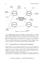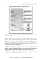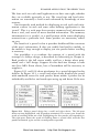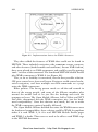
1
www.allitebooks.com
Designing the Mobile
User Experience
Barbara Ballard, Little Springs Design, Inc., USA
More free downloads : http://fast-file.blogspot.com
www.allitebooks.com
More free downloads : http://fast-file.blogspot.com
www.allitebooks.com
Designing the Mobile
User Experience
More free downloads : http://fast-file.blogspot.com
www.allitebooks.com
More free downloads : http://fast-file.blogspot.com
www.allitebooks.com
Designing the Mobile
User Experience
Barbara Ballard, Little Springs Design, Inc., USA
More free downloads : http://fast-file.blogspot.com
www.allitebooks.com
Copyright © 2007
John Wiley & Sons Ltd, The Atrium, Southern Gate, Chichester,
West Sussex PO19 8SQ, England
Telephone +44 1243 779777
Email (for orders and customer service enquiries): [email protected]
Visit our Home Page on www.wiley.com
All Rights Reserved. No part of this publication may be reproduced, stored in a retrieval
system or transmitted in any form or by any means, electronic, mechanical, photocopying,
recording, scanning or otherwise, except under the terms of the Copyright, Designs and
Patents Act 1988 or under the terms of a licence issued by the Copyright Licensing Agency
Ltd, 90 Tottenham Court Road, London W1T 4LP, UK, without the permission in writing
of the Publisher. Requests to the Publisher should be addressed to the Permissions
Department, John Wiley & Sons Ltd, The Atrium, Southern Gate, Chichester, West Sussex
PO19 8SQ, England, or emailed to [email protected], or faxed to (+44) 1243 770571.
Designations used by companies to distinguish their products are often claimed as
trademarks. All brand names and product names used in this book are trade names, service
marks, trademarks or registered trademarks of their respective owners. The Publisher is not
associated with any product or vendor mentioned in this book.
This publication is designed to provide accurate and authoritative information in regard to
the subject matter covered. It is sold on the understanding that the Publisher is not engaged
in rendering professional services. If professional advice or other expert assistance is
required, the services of a competent professional should be sought.
Other Wiley Editorial Offices
John Wiley & Sons Inc., 111 River Street, Hoboken, NJ 07030, USA
Jossey-Bass, 989 Market Street, San Francisco, CA 94103-1741, USA
Wiley-VCH Verlag GmbH, Boschstr. 12, D-69469 Weinheim, Germany
John Wiley & Sons Australia Ltd, 42 McDougall Street, Milton, Queensland 4064,
Australia
John Wiley & Sons (Asia) Pte Ltd, 2 Clementi Loop #02-01, Jin Xing Distripark, Singapore
129809
John Wiley & Sons Canada Ltd, 6045 Freemont Blvd, Mississauga, ONT, L5R 4J3 Canada
Anniversary Logo Design: Richard J. Pacifico
British Library Cataloguing in Publication Data
A catalogue record for this book is available from the British Library
ISBN 978-0-470-03361-6
Typeset in 10/12pt Sabon by Integra Software Services Pvt. Ltd, Pondicherry, India
Printed and bound in Great Britain by TJ International Ltd, Padstow, Cornwall
This book is printed on acid-free paper responsibly manufactured from sustainable
forestry in which at least two trees are planted for each one used for paper production.
More free downloads : http://fast-file.blogspot.com
www.allitebooks.com
Contents
Preface
xi
About the Author
xiii
1 Introduction: Mobility is Different
1.1 Mobilizing Applications
1.2 What is ‘Mobile’ Anyhow?
1.3 The Carry Principle
1.4 Components of a Mobile Application
1.5 About This Book
1
2
3
4
5
7
2 Mobile Users in the Wild
2.1 Mobile User Characteristics
2.1.1 Mobile
2.1.2 Interruptible and Easily Distracted
2.1.3 Available
2.1.4 Sociable
2.1.5 Contextual
2.1.6 Identifiable
2.2 Groups and Tribes
2.2.1 Voice and Texting
2.2.2 Extending Online Communities
2.2.3 Physical and Mobile Hybrids
2.2.4 Mobiles as Status
2.3 International Differences
2.3.1 Europe
2.3.2 Japan
2.3.3 United States
2.3.4 Other Regions
9
10
10
12
12
14
15
16
17
17
18
18
19
20
21
24
26
28
3 Mobile Devices
3.1 A Device Taxonomy
3.1.1 General-Purpose Devices
3.1.2 Targeted Devices: the Information Appliance
3.1.3 Ubiquitous Computing
31
31
33
36
40
More free downloads : http://fast-file.blogspot.com
www.allitebooks.com
vi
CONTENTS
3.2 Anatomy of the PCD
3.2.1 The Carry Principle
3.2.2 Input Mechanisms
3.2.3 Output Mechanisms
3.2.4 Technologies
3.2.5 Connection Characteristics
3.2.6 Standby Screen
44
44
45
49
51
54
54
4 Selecting Application Technologies
4.1 Input Modalities
4.1.1 Buttons
4.1.2 Speech
4.1.3 Speech + Buttons
4.1.4 Visual + Buttons
4.2 Interaction Responsiveness
4.3 Data Storage Locations
4.4 Display Modality
4.5 Supplemental Technologies
4.6 Distribution Methods
4.6.1 Cost of Deployment
4.6.2 Sales Channels
4.7 Other Concerns
4.8 Platforms
55
56
56
57
57
58
58
59
60
60
62
62
63
65
66
5 Mobile Design Principles
5.1 Mobilize, Don’t Miniaturize
5.1.1 The Carry Principle
5.1.2 Small Device
5.1.3 Specialized Multi-Purpose
5.1.4 Personal Device
5.1.5 Customized Device
5.1.6 Always On, Always Connected
5.1.7 Battery-Powered
5.1.8 Inconsistent Connectivity
5.2 User Context
5.3 Handling Device Proliferation
5.3.1 Targeted Design
5.3.2 Least Common Denominator
5.3.3 Automatic Translation
5.3.4 Class-based Design
5.4 Emulators and Simulators
5.5 Detailed Design Recommendations
5.5.1 Platform Providers
5.5.2 Standards Organizations
69
70
71
72
75
79
79
80
80
81
82
83
84
85
86
88
90
91
91
92
More free downloads : http://fast-file.blogspot.com
www.allitebooks.com
CONTENTS
vii
5.5.3 Carriers and Device Manufacturers
5.5.4 Third-Party Guidelines
92
93
6 Mobile User Interface Design Patterns
6.1 About User Interface Patterns
6.1.1 Mobilization
6.1.2 Universal Patterns
6.1.3 Corporate Patterns (Library)
6.2 Screen Design
6.2.1 List-based Layout
6.2.2 Table-based Layout
6.2.3 Location Selection
6.2.4 Returned Results
6.2.5 Menus
6.2.6 Tab Navigation
6.2.7 Breadcrumbs
6.3 Application Navigation
6.3.1 List Navigation
6.3.2 Game Navigation
6.3.3 Alphabetic Listings – Short
6.3.4 Alphabetic Listings – Long
6.3.5 Softkey and Button Management
6.4 Application Management
6.4.1 Application Download
6.4.2 Application State Management
6.4.3 Launch Process
6.4.4 Cookies
6.5 Advertising
6.5.1 Interstitials
6.5.2 Fisheye Ads
6.5.3 Banners
95
95
96
100
100
101
101
102
104
105
107
109
110
112
112
114
116
117
118
121
121
122
123
124
126
126
128
131
7 Graphic and Media Design
7.1 Composition for the Small Screen
7.1.1 Learning from Portrait Miniatures
7.1.2 Distinguishing from User-generated
Content
7.1.3 Style and Technique
7.1.4 Context of Use
7.2 Video and Animation
7.2.1 Content
7.2.2 Production and Preprocessing
7.2.3 Post-production
133
133
135
More free downloads : http://fast-file.blogspot.com
www.allitebooks.com
136
137
139
140
141
142
143
viii
CONTENTS
7.3 Sound
7.3.1 Content
7.3.2 Post-production
7.4 Streaming versus Downloaded Content
7.5 Managing Media: Meta Data
144
145
145
146
147
8 Industry Players
8.1 Carriers (Operators)
8.1.1 Carriers and Devices
8.1.2 Walled Gardens and Decks
8.1.3 Mobile Virtual Network Operators
8.1.4 Network Types
8.2 Device Manufacturers
8.3 Technology and Platform Providers
8.3.1 Browsers
8.3.2 Application Environments
8.3.3 Operating Systems
8.3.4 Hardware and Other Software
8.4 Application and Content Developers
8.5 Content Distributors
8.6 Industry Associations
8.7 Government
149
150
150
152
153
154
154
155
156
156
157
158
158
159
160
161
9 Research and Design Process
9.1 Mobile Research Challenges
9.1.1 Device Proliferation
9.1.2 Multimodal Applications
9.1.3 Field versus Laboratory Testing
9.2 User Research
9.3 Design Phase Testing
9.3.1 Card Sorting
9.3.2 Wizard of Oz Testing
9.4 Application Usability Testing
9.4.1 Emulator Usability Testing
9.4.2 Laboratory Usability Testing
9.4.3 Field Usability Testing
9.5 Market Acceptance (beta) Testing
163
165
166
167
167
168
169
169
170
171
172
173
173
175
10 Example Application: Traveler Tool
10.1 User Requirements
10.1.1 User Types
10.1.2 User Goals
10.1.3 Devices
10.1.4 Key User Needs
More free downloads : http://fast-file.blogspot.com
177
177
178
179
179
179
CONTENTS
10.2 Product Requirements
10.2.1 Features
10.2.2 Technologies and Platform
10.2.3 Device Classes
10.2.4 Development Strategy
10.3 High-level Design Concepts
10.3.1 Task List
10.3.2 Communications Center
10.3.3 Maps, Directions, and Transportation
10.3.4 Journaling
10.3.5 Local Information
10.3.6 Main Screen
10.3.7 Softkey Strategy
10.4 Detailed Design Plan
10.4.1 Process
10.4.2 Tasks
10.4.3 Data Sources
10.4.4 Testing Plan
ix
182
183
186
187
187
188
189
189
190
191
192
193
195
196
196
197
197
198
Appendices
A: Mobile Markup Languages
B: Domain Names
C: Minimum Object Resolution
D: Opt-In and Opt-Out
E: Mobile Companies
199
199
204
206
209
212
Glossary
221
Index
235
More free downloads : http://fast-file.blogspot.com
More free downloads : http://fast-file.blogspot.com
Preface
Hundreds of devices. Dozens of browsers. Hundreds of implementation environments. Myriad technology choices text messaging,
voice-over-IP, Java, GPS, MMS, cameras, and more. Does the connectivity matter? CDMA, GSM, 1xRTT, CDMA-EDGE, GPRS, Wi-Fi,
WiMAX, Bluetooth And let’s not forget the users. At a desk, hiding from teachers, at a
cafe, at a club. Mobile phones are used instead of lighters at concerts.
People use the mobile in the bathroom.
Mobile phones are not miniature personal computers, and mobile
applications should not be miniature computer applications. While
product design for mobile devices is not a separate discipline from
desktop computer software and web site design, it does have many
differences in users, user context, technologies, distribution, and
research.
The mobile space is complex, but navigable. While technologies
come and go, certain key principles remain the same. ‘The Carry Principle’ is the observation that the mobile phone, and any related or
future personal communications devices, are always with the user. This
simple principle strongly influences the shape of the personal communications device market, limitations users will be experiencing, context
of use, and nature of the device itself. Learn how The Carry Principle
affects application design throughout this book.
Designing the Mobile User Experience is intended to provide experienced product development professionals with the knowledge and
tools to be able to deliver compelling mobile and wireless applications.
The text could also be used in undergraduate and graduate courses as
well as any other education venue that focuses on mobile design and
the mobile experience.
While many of the principles in the book will be useful to device
manufacturers and mobile platform creators, it is largely targeted at the
vastly larger number of people designing and developing applications
to run on those devices using those platforms.
The book covers the obvious – devices, technologies, and users in
the mobile environment – but goes further. Included is a discussion
More free downloads : http://fast-file.blogspot.com
xii
PREFACE
of design patterns in the mobile space, including handling rendering
differences, in Chapter 6. Chapter 5 covers general mobile design principles and sources of more specific design recommendations. Media
generation for mobile is covered in Chapter 7. Research variations for
mobile users are covered in Chapter 9.
Chapter 8 covers the various players in the mobile value chain, and
their history, different goals, and typical decisions. Your organization will likely be in or closely related to one of these categories, and
understanding what players in the other categories are doing will help
decision making. Several application developers enter the mobile space
thinking that a web site and some viral marketing will get their application on devices, but historically this has failed. Learn who needs to
be part of your consideration.
Finally, Chapter 10 discusses an example application, from concept
to design and project management. A few appendices help navigate
topics like mobile markup languages, mobile domain names, capturing
images for mobile display, and SMS campaign best practices. Also
find a list of companies important in the mobile field and their web
addresses, and an extensive glossary of mobile terms.
I owe gratitude to my entire family and network of friends for the
ongoing support I have received in the creation of this book, especially
with a new baby in the house. My husband in particular has had his
patience sorely tested, and he has continued to support me.
Mark Wickersham and especially Elizabeth Leggett have helped with
editing throughout the book. Mark is my technology go-to man, and
Elizabeth understands users and art in a way that I simply don’t.
The two made the chapter on media possible and as good as it is.
Additionally, Elizabeth patiently reviewed every chapter, usually more
than once, and put together many of the graphics for me.
James Nyce spent several hours helping with the chapter on design
principles as well as reviewing the first chapter. C. Enrique Ortiz
graciously review some chapters near the project completion, while on
vacation. This book is the richer for their input.
More free downloads : http://fast-file.blogspot.com
About the Author
Barbara Ballard is founder and principal of Little Springs Design,
a mobile user experience consultancy founded in 2001. Clients
have included carriers, device manufacturers, content companies, and
industry associations, with projects including platform user experience,
device UI design, style guides, and application design. Prior to 2001,
she worked at the US carrier Sprint PCS on the user experience of
devices, platforms, style guides, and data services.
Barbara has an MBA from the University of Kansas and a BS in
industrial engineering from the University of California at Berkeley. She
additionally has completed all coursework necessary for a doctorate in
human factors and ergonomics from North Carolina State University,
with significant work in engineering, psychology, and industrial design.
More free downloads : http://fast-file.blogspot.com
More free downloads : http://fast-file.blogspot.com
1
Introduction: Mobility is
Different
A mobile phone is a Swiss Army knife. It is not a chef’s knife or a buck
knife. We keep wanting new features on the phone, like texting, voice
memos, browsing, a camera, music, and television, because we would
like these things in our pocket and the phone is already there.
And like a Swiss Army knife, the user experience of each of the
features leaves quite a bit to be desired. A Swiss Army knife will not
deliver the quality of cut a chef’s knife will, nor will it fit in the hand
quite as well as a good pocket knife.
Designing applications or web sites for mobile phones is in many
ways the same as designing the best possible screwdriver or fishing rod
for a Swiss Army knife. There is much that needs to be done before
people will actually use the application – and people will not use the
Swiss Army screwdriver in the same situations that they would use a
full-sized screwdriver.
While the platform, user context, business context, device, and technologies involved in a particular mobile application may be different
from similar desktop applications, the fundamental product design
and development practices remain the same. The purpose of this book
is to give product designers, software developers, marketers, project
managers, usability professionals, graphic designers, and other product
development professionals the tools they need to make the transition
into the mobile arena.
This is not a book about technology or specific design recommendations. Instead, it focuses on the mobile users and their context.
Designing the Mobile User Experience
© 2007 John Wiley & Sons, Ltd
Barbara Ballard
More free downloads : http://fast-file.blogspot.com
2
INTRODUCTION: MOBILITY IS DIFFERENT
It leans heavily on principles of human–computer interaction, usability,
product development, business, and graphic design.
1.1 MOBILIZING APPLICATIONS
‘I don’t have a need for data services on my phone. Just give me
a simple phone that has good reception and battery.’
I hear some variant of this from almost everybody to whom I talk
about my work who is not actually in the mobile industry – although
I grant that I do not talk to many teenagers about my work.
Focus groups show that real consumers are painfully aware that the
web sites that they use not only would not work well on a mobile
phone, but also would have little functionality or purpose. Most people
are barely willing to read a long document or news story on a relatively
comfortable full-sized monitor; it is difficult to know when or why
a person would be willing to read the same story on a tiny screen.
And willingness to pay for a service that provides text freely available
elsewhere is even more rare.
This state of affairs, which is present in some degree in most of
the world, is a result of some fundamental misunderstandings about
what mobility means for customers and users. These misunderstandings cause the frequent failure of companies to create useful, relevant,
enjoyable experiences.
Most mobile applications have been created as a miniaturized version
of similar desktop applications. They have all the limitations of the
desktop applications, all the limitations of the mobile devices, and
typically some extra limitations due to the ‘sacrifices’ designers and
developers make as they move applications from desktop to mobile
device.
Some mobile applications have broken the ‘miniaturize’ trend and
have enjoyed considerable success. While sound customization in the
desktop environment is something done only by highly motivated users,
phone ring tones have become a key component of the mobile user
experience. FOX Network’s ‘American Idol’ television show allowed
the audience to vote via text messaging, and text messaging even in the
United States has become extremely profitable.
Text messaging is very popular (and profitable), especially in Europe,
and most of Japan’s iMode traffic is actually similar short communications services. Sprint PCS did not have two-way text messaging in
More free downloads : http://fast-file.blogspot.com
WHAT IS ‘MOBILE’ ANYHOW?
3
its earlier offerings but developed a web-based similar product which
fast became extremely profitable despite having never been advertised.
While there are several factors that these successful examples share,
the most notable thing is something they do not share: they are not
simply desktop applications ported to the mobile environment. A welldesigned mobile application, to be successful, cannot simply be some
subset of the corresponding personal computer (PC) application, but
rather an application whose features partially overlap and complement
the corresponding PC application’s features.
1.2 WHAT IS ‘MOBILE’ ANYHOW?
The definition of ‘mobile’ is slippery. Visit the Consumer Electronics
Show’s ‘Mobile’ section and you will see a plethora of in-automobile
media players, both audio and video. A laptop computer is certainly
‘mobile’ but is used more like a desktop computer.
Other attempts to apply a name to the field have used ‘wireless’, describing how the device communicates digitally. This again is
problematic as more and more desktop computers are using wireless
communications, as are automobiles, thermometers, and likely refrigerators in the future.
One of the earliest books on user-centered design in the mobile
environment has used the term ‘handheld’, which wonderfully captures
the essence of the size of the devices in question, but allows television
remote controls into the definition.
Mobile phones epitomize mobile devices, but the category also
includes personal data assistants like Palm, delivery driver data pads,
iPods, other music players, personal game players like GameBoy, book
readers, video players, and so forth. Fundamentally, ‘mobile’ refers to
the user, and not the device or the application.
Further, this book is about the business and practice of mobile user
experience management, not design for specific platforms. If you are
designing a Palm application, go see a developer guide for PalmOS. If
you are designing an iPod application, go see a developer guide for that
platform. There are a number of mobile web and Java development
guides available. These resources are invaluable.
To get entertainment and information services to the mobile user,
some sort of communications device is necessary. Most target users of
applications already have a mobile phone or other mobile communications device, which they carry with them most or all of the time.
More free downloads : http://fast-file.blogspot.com
www.allitebooks.com
4
INTRODUCTION: MOBILITY IS DIFFERENT
1.3 THE CARRY PRINCIPLE
Of particular importance to mobile users are a special category of
devices, namely personal communications devices, or PCDs. These are
epitomized by mobile phones and text communications devices like
the BlackBerry and Sidekick. The principles of design and management
found in this volume apply to PCDs. In this book, the terms ‘mobile
device’ and ‘personal communications device’ are used interchangeably.
A PCD is:
• Personal. The device generally belongs to only one person, is personally identifiable, and has a messaging address and ongoing service.
• Communicative. The device can send and receive messages of various
forms and connect with the network in various ways.
• Handheld. The device is portable. It can be operated with a single
hand, even if two hands or a hand and a surface are more convenient.
• Wakable. The device can be awakened quickly by either the user or
the network.
For example, a mobile phone will receive a text message even when
in its ‘sleep’, or standby state. Note that most computers, if they are
asleep, can not communicate with the network.
This combination of features makes the service indispensable and
the PCD an ever present part of the user’s life. The service represents
safety and social connection. Because the service is indispensable, users
tend to carry the device with them all the time. This fact forms the
core of understanding the mobile user experience.
The fundamental distinction between mobile-targeted design and
design targeted for other platforms is The Carry Principle: the user
typically carries the device, all the time. The Carry Principle has several
implications on the device:
• Form. Devices are small, battery-powered, have some type of wireless connectivity, and have small keyboards and screens (if present).
• Features. Any information or entertainment features that might be
desirable to have away from a computer or television, including
television itself, will eventually get wedged onto the PCD. Devices
evolve towards the Swiss Army knife model.
• Capabilities. The wireless connection, small size, and power
constraints have made devices have slower connection speeds, slower
processors, and significantly less memory than desktop computers.
More free downloads : http://fast-file.blogspot.com
COMPONENTS OF A MOBILE APPLICATION
5
• User interface. The small screen drives the device to a single-window
user interface, so sharing information between applications is problematic.
• Proliferation. A personal, always-present device needs to match a
user’s needs, desires, and personality reasonably well. One form,
one feature set, one user interface will not fit all.
The Carry Principle also has implications for the PCD users:
• User availability. The mobile user is more available for communications and application interaction than a computer user simply
because the device is always present.
• Sustained focus. Because the user is doing so many things, there may
not be sustainable time available for the device.
• Social behavior. Always-available connections has made attending
meetings and dinner with friends a modified experience. Coordination across space allows both more and less social behavior.
Each of the above has implications for application design.
1.4 COMPONENTS OF A MOBILE APPLICATION
Any serious consideration of the design of software starts with a consideration of where the software will be used. Designers of web sites or
applications intended for use on desktop or laptop computers tend
to ask ‘which operating system shall we target?’, as computers are so
standardized.
In reality, the desktop environment comprises a number of agreedupon characteristics. All have a largish color computer screen of at least
800 × 600 pixels, a full keyboard, a mouse, speakers, and applications
residing in windows. Connectivity may be slow (30 Kb/s) or fast (500
Mb/s or more), but it is generally there. In the US, landline network
access is generally unlimited.
Further, the user of a desktop application is sitting at a desk or at
least with a computer in the lap. There is a working surface, and both
hands and attention are focused on the computer. Interaction with
other people takes place only through the computer, not generally in
person around the computer.
Devices in the mobile environment do not play by the same rules.
This is not due to the lack of standards, but due to the highly varying
More free downloads : http://fast-file.blogspot.com
6
INTRODUCTION: MOBILITY IS DIFFERENT
needs of mobile users. The differing capabilities of low-end mobile
phones, high-end smart phones, and alternative devices lead to a variable environment. Expect this situation to continue for a long time.
A mobile application consists of:
• a PCD, with its own use metaphor, browser, application environment, and capabilities
• a user, using any of a set of mobile devices, who could be riding
a train, sitting in a meeting, sitting in a restaurant, walking down
the street, focused on other tasks, or engrossed in the device and
application
• one or more application platforms, which can include web
browsers, application environments (such as BREW, Palm, Windows
Mobile, Symbian, or Java 2 Micro Edition), messaging technologies
(including email, SMS, MMS, and instant messaging), media environments (types of music and video players), and so forth, with new
capabilities becoming available regularly
• one or more output interfaces with the world outside the mobile
device, including screen, speaker, infrared, Bluetooth, local wireless
(Wi-Fi), cellular wireless, unique terminal identification
• one or more input interfaces with the world outside the
mobile device, including (limited) keypad, touchscreen, microphone,
camera, RFID chip reader, global position, infrared, Bluetooth, local
wireless (Wi-Fi), cellular wireless
• optionally a server infrastructure that complements the mobile application and adds information or functionality to the above
• interfaces between the application’s servers and other information
sources
• a network and the corresponding wireless carrier (operator), who
enables some of the above technologies, connects the user to the
Internet and other users, sells applications and other services, may
specify permitted devices, and frequently defines what may and may
not be accomplished on the network
In contrast, an application delivered to a personal computer operates
in a more predictable environment. Operating systems are limited to
approximately three, rather than dozens. There is one browser markup
language, and though there are rendering differences between browsers,
they are trivial and readily handled compared with mobile browsing.
Influence of any sort of the end user’s ISP is unheard of. There are
More free downloads : http://fast-file.blogspot.com
ABOUT THIS BOOK
7
definitely complexities associated with developing for the personal
computer, but mobile is more complex in almost every dimension.
1.5 ABOUT THIS BOOK
This book is intended to help product design and development professionals make the transition from desktop to mobile with sophistication
and understanding. It covers the obvious – devices, technologies, and
users in the mobile environment – but goes further. Chapter 2 discusses
the characteristics of mobile users and how they differ from desktop
users. Chapter 3 presents a framework for understanding the range
of mobile devices and how they fit into users’ lives, then discusses
the anatomy of the personal communications device. In Chapter 4,
learn about various application presentation technologies and how to
choose the best one for a project. Chapter 5 covers general mobile
design principles and sources of more specific design recommendations.
Find sample mobile user interface design patterns in Chapter 6. Media
generation for mobile is covered in Chapter 7. Chapter 8 covers the
various players in the mobile value chain, and their history, different
goals, and typical decisions. Chapter 9 discusses modifications of a
user-centered design process for mobile applications, including modifications of user research techniques. Chapter 10 discusses an example
application, from concept to design and project management.
More free downloads : http://fast-file.blogspot.com
More free downloads : http://fast-file.blogspot.com
2
Mobile Users in the Wild
Consider a typical desktop – or even laptop – computer user. He is
sitting quietly, perhaps with music in the background, looking only at
the computer. Maybe he is in an airport lounge, with people swirling
all around him, but he is still focusing on the computer. When he steps
away from the machine, he is no longer connected to the network.
If a desktop user is in a busy office, interruptions likely abound.
Telephones, personal visits, and general noise could be present. Email
and instant messaging are major sources of interruption. Personal
computers and their software should be designed to work with this
social state of affairs, rather than assuming users will focus on a task
until completion. Some software is.
Mobile users may hold some surprises:
• Adult women make up more of the mobile phone gaming market
than do any other market segment,1 breaking the precedent of years
of teenage boy gaming dominance.
• The formula for a successful mobile phone game usually involves
short attention, rather than a fully absorbing experience.
• Mobile users are quite skeptical about web sites on their phone,
as anybody can clearly see that it is not the same experience as a
desktop computer.
1
Several sources, including the Telephia Mobile Game Report for Q1:2006 and Parks Associates’ Electronic Gaming in the Digital Home (Q2:2006).
Designing the Mobile User Experience
© 2007 John Wiley & Sons, Ltd
Barbara Ballard
More free downloads : http://fast-file.blogspot.com
10
MOBILE USERS IN THE WILD
Despite the previous, an increasing number of users are interested in
television on their phones. In 2006, use is quite low, but interest was
variously reported between 11% and 30%, depending on the survey.
2.1 MOBILE USER CHARACTERISTICS
To some degree, there is no particular difference between mobile
users and the users of other devices. In fact, the low cost of mobile
devices relative to computers, particularly combined with the high cost
of laying telephone cables to remote villages, means that the mobile
phone is becoming the predominant mechanism to access information
services. Thus desktop users will soon be a subset of mobile users.
All this is true, but it misses the key point of mobility: most of the
mobile users are not sitting attentively at a desk or passively on a
sofa. They are out and about, they are social, they are moving. They
use the device for more personal purposes than a television or even a
computer: it is more likely to be used by just one person.
Figure 2.1 illustrates many of the issues of mobile users. Fashion is a
consideration. Size is important. The device is always present, always
carried. The user is interruptible.
2.1.1 Mobile
Mobile users are mobile. They may be mobile while actually using an
application, or they may move between instances of using the application. Being mobile means that user location, physical, and social
context may change, that physical resources cannot be relied upon,
and that physical world navigation may have to be accomplished.
The user may be in rush-hour traffic, in a meeting, in class, on a train,
walking down the street, at a café, at the library, or in a restroom in
unlimited, ever-shifting environments. Except for highly task-focused
applications, like discovering when the 56 bus will arrive at stop 70,
the user’s context will not be predictable. The user’s context may be
discoverable using current and future technologies.
Generally mobile users can be expected to have their wallet, keys,
and phone, and companies are working hard at making the wallet and
perhaps the keys unnecessary. What is not present is a pencil to jot
down information, a user’s files, reference books, or anything on the
desk. Information or content stored on the computer may or may not
be remotely available (typically not).
More free downloads : http://fast-file.blogspot.com
MOBILE USER CHARACTERISTICS
11
Figure 2.1 Mobile users have different availability, context and interruptibility
than do desktop users
Navigating through the physical world, managing obstacles and
picking routes, is a task that uses a majority of a person’s attention
resources. Similarly, navigating through the virtual world, performing
text entry, and reading text, consumes cognitive resources. Because
these tasks are similar – both navigation – they clash with each
other. Typically, a user attempting both simultaneously will end up
performing the tasks in sequence, or alternating. Even when alternating
virtual and physical tasks quickly, either or both can suffer.
Shifting context and navigation conspire with other factors to make
the mobile user more interruptible and easily distracted than desktop
users.
More free downloads : http://fast-file.blogspot.com
12
MOBILE USERS IN THE WILD
2.1.2 Interruptible and Easily Distracted
The mobile user has all the sources of interruption from the physical
world that the desktop user has, without some of the social cues that
suggest he is unavailable for interruption. He is not sitting in an office,
he is not facing a computer obviously focused on a task. He is instead
at a client’s office, at dinner, waiting for a train, in a meeting, on a date
or at a desk, among many possibilities. In many of these cases, his mere
presence in a public, social space could indicate he is interruptible. The
smaller screen size seems to block fewer people, it is easier to meet
his eyes.
He is using a device that can likely display only one thing at once, so
using open windows as reminders does not come easily. Further, even
the device can interrupt itself, with incoming calls or text messages.
Many of his distractions cannot be stalled by social cues: the train will
not wait for him to finish a task or conversation. The user therefore
has no opportunity to ‘just finish this sentence’ when interrupted. The
transition between virtual and physical tasks can be jarring and can
reduce effectiveness at both tasks.
These user characteristics have a number of immediate implications
for application architecture, especially in the area of state management. Most applications should, if not explicitly exited by the user,
return to the same view with the same data as when the user last
departed. Data should be saved without user action, possibly in a
temporary store before committing changes to the official document.
Because the user may not have an opportunity to save data, the
application must save any critical or difficult to enter data for later
reuse.
2.1.3 Available
The converse side to interruptibility is that mobile phone users are
quickly available to remote friends, family, colleagues, and clients. This
fact has led to higher job stress and less quiet time, but it also enables
people to feel more connected.
Most personal communications devices (PCDs) are with the user
constantly, either throughout the day, or throughout relevant portions
of the day. These devices are likely to go with the user even to the
restroom, particularly as they tend to be either worn or in pockets.
Many people even feel uncomfortable when uncoupled from their
More free downloads : http://fast-file.blogspot.com
MOBILE USER CHARACTERISTICS
13
devices. Thus a characteristic of mobile users is that they are present
and immediately available. They are likely to look at their PCD even
when they are with others.
At colleges, a large percentage of pedestrians stroll through the
campus with a phone stuck to their ear, or perhaps stopping occasionally to text. No one need ever be alone. While this fosters the
sense of connection to remote friends, it is also making it more difficult for people to communicate in person. A post-class conversation
while walking to lunch is less likely to occur if all the students immediately dial to coordinate lunch with somebody else. Mobile phones are
changing the college experience.
Culture, generation, context, and personality combine to maintain
an ‘importance hierarchy’ for various interaction sources around the
user. An in-person conversation with a respected elder is likely to
trump an incoming call, but the incoming call might take precedence
over a conversation with a clerk. A call from a wife or daughter nine
months pregnant is likely to trump almost anything including lecturing
a classroom.
Being readily available means that people answer their phones, either
with voice or text, in what used to be considered inappropriate places.
Texting and even voice calls in public restrooms are becoming more
common. Accepting a phone call during a personal conversation has
become very common, and is frequently a source of tension between
different generations.
While turning off the phone, or simply not answering it, is one
popular method for dealing with the phone’s prolonged intrusion into
life, many users do not turn it off. Ethnographic research has revealed
that mobile users in Madrid think that it is rude to let a call go
unanswered, and will answer it in class, when out with friends, or
at the cinema.2 Behavior differs from country to country and user
to user, but even a person who does not answer the phone remains
readily available. She may return the call quickly or text back, and she
immediately knows the call was made.
Availability allows applications to communicate with instant
messaging-like technologies with confidence that the user is present and
will receive the information immediately. An application that required
a return receipt from the device could ensure that a message actually
made it to the device.
2
Lasen, Amparo, 2002. A comparative study of mobile phone use in public places in London,
Madrid, and Paris. University of Surrey Digital World Research Centre.
More free downloads : http://fast-file.blogspot.com
www.allitebooks.com
14
MOBILE USERS IN THE WILD
2.1.4 Sociable
While mobile users are available to connection from people using the
phone, they are also sociable with the people around them. The other
people in the restaurant are likely aware of any voice conversation, and
friends at the table may be excluded from an incoming connection, or
could as easily be included. A group of Japanese youth may pull out
their phones to decide where to meet for dinner.
Social behaviors will vary based on who is physically present, where
the presence is, the current mood, the type of incoming communication,
and the source of incoming communication. An application also could
be launched as part of a group activity. Consider a story:
A small group of friends sit around a dinner table, talking about
the events of the day and their friends. A phone rings. Two people
reach for their pockets, and it’s Larry’s phone. He answers the
phone, and is immediately merely ‘near’ people – he is ‘with’ the
person on the phone. The conversation at the table slows to a halt,
with some people starting to look uncomfortable. Conversation
slowly returns once Larry is off the phone.
And a variant:
A small group of friends sit around a dinner table, talking about
the events of the day and their friends. A phone rings. Two people
reach for their pockets, and it’s Larry’s phone. He discovers a text
message from his girlfriend, and he quietly chuckles. He dashes
off a response, during which time he is ‘near’ people. He re-enters
the conversation as soon as he hits send.
And finally:
A small group of friends sit around a dinner table, talking about
the events of the day and their friends. A phone rings. Two people
reach for their pockets, and it’s Larry’s phone. He discovers the
latest installment in the mobile trivia game is available and he
immediately starts the game. He reads the questions out to his
table mates, soliciting opinions and gaining laughter. They decide
to finish dinner and go discover the answer to the third question:
‘What is the title of the book being read by the statue on the West
side of the Plaza near the theater?’
More free downloads : http://fast-file.blogspot.com
MOBILE USER CHARACTERISTICS
15
In each case Larry interacts with his phone, but he interacts differently
due to application technology (voice call, text message, interactive
game via messaging or Java), social context, and personal and cultural
proclivities.
The application type provides part of the context. A voice call
is socially and technologically assumed to be between two people;
adding extra parties is enough of a violation of normal behavior that
announcing the presence of others in the conversation is considered a
minimal requirement for politeness. Text messaging connotes a variable amount of privacy, and games have no privacy requirements.
Personal and cultural practices also provide some of the context. Larry
could have deferred the call until later. He could have had his phone
on silent, and made the choice based on incoming caller. He might have
deferred a social call if at lunch with his boss, and accepted a call from
the boss if at lunch with friends. He would have deferred the call if in a
Japanese train, but might have taken the call if in a Spanish theater.
Larry is managing several ‘microcontexts’ simultaneously. First, his
dinner companions provide a social context, both long-term and immediate. Their current topic of conversation might encourage acceptance
or deferral of a call. The composition of companions and the group’s
history and personalities also influence call acceptance. Second, the
larger physical environment – home, café, diner, or upscale restaurant –
guides expectations and provides another microcontext. Third, each
application – voice, text, or content – provides its own microcontext.
Finally, the personalities on the other side of the mobile connection –
girlfriend, boss, impersonal application – provide another set of microcontexts.
A social mobile user can manage several microcontexts simultaneously; other mobile users remove themselves from as many microcontexts as possible to focus on just one or two. Nevertheless all mobile
users are exposed to one or more microcontexts. Most microcontexts,
as noted above, are social microcontexts. Applications can be designed
to encourage sociability in person as well as online sociability. Sociability is a key metaphor in mobile applications, and the better it is
understood, the better the change of increasing application exposure
and driving revenue.
2.1.5 Contextual
The mobile user’s environment affects how the device is used. Ideally,
the device would know whether the user is in a meeting, on a business
More free downloads : http://fast-file.blogspot.com
16
MOBILE USERS IN THE WILD
trip, snow skiing, asleep, driving, or any other activity, and would give
this information to the applications so they could behave appropriately
for the user in that environment. Devices don’t really do this yet, but
there is a lot of information potentially available to applications that
goes unused. Consider:
• A calendar application could switch the phone’s ringer to vibrate
and intelligently communicate to the caller that the recipient is in a
meeting right now. The caller could indicate message urgency – or
leave a message or call later – and the recipient could decide whether
to accept the call.
• A travel companion application can use the user’s location, the
flight number, current flight status, and current traffic conditions
to alert the user fifteen minutes before she needs to depart for the
airport. The same application could alert meeting attendees when
the application owner is going to be later.
• A restaurant coupon application could send coupons at lunchtime
when the user is away from home and near restaurants.
Future devices may have acceleration sensors, temperature sensors,
fingerprint readers, and any number of other information sources we
do not currently imagine.
2.1.6 Identifiable
Because devices are personal, they are usually unique to a single user.
Exceptions to this rule are rare. This identification includes both the
unique messaging address (phone number or email address or similar)
as well as the device.
Further, in some ways the user’s messaging address is more valuable
to the user than the device itself, since it is a persistent method of
contacting the user. Not only is the user associated with the address,
but the use of the address is directly connected to how much the
user’s charges will be for the month. This value is so high that special
regulations in the United States mandate number portability between
carriers.
In theory, subscriber identification provided by the device can be
used to identify a returning user to a web site without user input. In
practice, some carriers have hidden this information to all but business partners. Web applications must use cookies to identify users.
However, even more than in the desktop world, there is a reliable
More free downloads : http://fast-file.blogspot.com
GROUPS AND TRIBES
17
user identification for application security: phone sharing is rare, and
a missing phone is likely to be disabled so it cannot connect.
2.2 GROUPS AND TRIBES
Mobiles play a complex and evolving social role, from status symbol
to facilitator of gossip.
2.2.1 Voice and Texting
Fundamentally, the mobile makes immediate long-distance relationships, to the point that long-distance relationships can become more
relevant than the relationships with people nearby. The mobile
combines the advantages of the landline phone, with the advantages
of email, and improves upon them by being always with the user.
The idea that mobiles foster community is supported by certain
research. A study by the Social Issues Research Centre, for example,
looked at the role of mobiles as they facilitate gossip.3 Gossip is used
both as a connection method and as a mechanism of ‘social grooming’,
reinforcing what is and is not acceptable behavior and hence strengthening what is and is not part of the social group. The mobile provides
a constantly available mechanism to engage in immediate gossip about
news, public figures, or Joe in the next office over. The mobiles enable
significant social bonding: more than landline phones.
Texting adds to the social connections, but through different mechanisms and with different benefits. Teenagers can use the act of writing
to be a bit less awkward in social interactions. People can send a little
‘I’m thinking of you’ type message to others, building the community
and without the risk of a prolonged discussion or interruption. This
type of interaction is beginning to replace similar practices of interaction with the neighbors to build social bonds.
While mobiles are making at least some people less interactive
with their immediate surroundings and less social with people nearby,
they simultaneously are having a second effect. The always-available
communications reduces the risk of going somewhere alone, either
through safety concerns or through group coordination challenges.
3
Fox, Kate, 2001. Evolution, Alienation and Gossip: The role of mobile telecommunications in the 21st century. Oxford: Social Issues Research Centre. http://www.sirc.org/publik/
gossip.shtml
More free downloads : http://fast-file.blogspot.com
18
MOBILE USERS IN THE WILD
This added freedom is allowing at least some people more interaction
with a wider variety of environments and people than they otherwise
would have experienced.
2.2.2 Extending Online Communities
Add to the simple communications properties of phones a variety of
web-enabled applications that foster online communities. Myspace.com,
Flickr, and various blogging sites, for example, are becoming mobile
enabled. Users can get constant access to the communities, which frees
them from their computers a bit as well as extends the time and degree
of interaction with the services.
The process of extending an online community to mobile typically
starts with adding mobile viewing capability. This step is not particularly exciting, but can serve to draw users into extended use. Use can
be extended further by adding the ability to post text from the mobile,
especially for sites targeted at already-texting youth.
The application can get more interesting, and more integrated into
users’ lives, when the camera and microphone are integrated into
the application. Now users can make podcasts, provide pictures, and
provide back to the community not just summaries of events, but
records of events as they happen. A video clip captured at a concert,
child’s soccer game, or in the schoolyard can be shared on YouTube
for the world – or just friends – to view. The tapestry of services available extend current online-only communities into more immediate and
richer interaction, increasing the addictiveness of the services.
2.2.3 Physical and Mobile Hybrids
A new type of community-building service is developing: hybrid
mobile–physical. Technologies such as near-field communications
(Bluetooth, Wi-Fi) and location enable physical interaction, mediated
by the mobile. The types of service provided by these communities
usually have desktop access almost as an afterthought, perhaps just for
signing up and configuring the service.
Geotagging, for example, is the focus of several start-up companies.
The idea is that people can tag, and comment upon, a physical location in much the same way a service like Digg allows users to tag
and comment upon arbitrary Internet stories. Similarly, physical world
More free downloads : http://fast-file.blogspot.com
GROUPS AND TRIBES
19
games using location tracking of other users in the game make a giant
playground out of a city.
Some services enable connections to be made with people in the
users’ social or business networks. Some match-making services alert
the user when a person with a compatible profile is nearby; other
models exist. Business networking services are also available. The idea
behind the business networking is simple: enable the ability to obey
the oft-repeated advice, ‘never eat alone’. The user consults with the
service to see who in the network, perhaps a second- or third-degree
connection, is nearby; a quick text message helps decide whether doing
lunch is plausible and desirable. Many social dating services work
similarly, but are more likely to be used in a bar than a conference hall.
2.2.4 Mobiles as Status
For most of their existence, mobile phones have provided some sort
of presumed and visible status to their bearers. They started as indications of the bearer’s importance or perhaps wealth. As they became
smaller and less expensive, the presumption of wealth declined, but the
presumption of importance remained.
Ring tones can also provide status. The default Nokia ringer is
perhaps as well recognized as AOL’s ‘You’ve got mail’ sound. Downloaded ringers provide enormous customization but also an indication
of the user’s personality. The ‘mosquito’ ringer, inaudible to most
adults, provides teenagers the ability to differentiate themselves from
adults – especially teachers.
Mobiles have had impact on the physical appearance and capacity of
heavy users. Some users experience repetitive stress injuries from large
amounts of texting. Many users, particularly youth, have experienced
a shift in dominance of hand muscles, and their thumbs become more
perpendicular to the body of the hand than their parents’ thumbs.
This physical shift in thumbs, and indeed the use of thumbs as the
primary input method, has spawned the term ‘thumb tribe’ or ‘thumb
generation’: perhaps the ultimate status symbol.
As mobiles have become smaller, they have also become fashion
statements. Japanese and Korean youth wear phones on necklaces.
Nokia has long provided decorated face plates. Motorola, with its
RAZR and StarTAC, is good at creating fashionable devices for the
tech and business crowds. Some high-end carriers promise a new phone
every two months. Nokia has created the solid gold phone, for tens of
More free downloads : http://fast-file.blogspot.com
20
MOBILE USERS IN THE WILD
thousands of dollars; they will indeed replace the innards of the phone
as technology demands.
2.3 INTERNATIONAL DIFFERENCES
A common mistake is to assume that the mobile environment in one’s
home country is replicated internationally. This assumption is not only
wrong, but it can lead to very costly mistakes. Differences include
mobile industry structure, pre-existing telecommunications environment, and cultural differences. These combine to create different expectations and success conditions for applications and services.
Japan’s iMode has been a major success for NTT DoCoMo, the
Japanese carrier, while the competing Wireless Markup Language4
(WML) has largely been a failure.5 American carrier executives visited
Japan to understand the business and technology and proceeded to
implement similar business models on their home turf. Perhaps the
biggest error was marketing these Internet-based mobile sites as ‘The
Internet in the palm of your hand!’. Americans, who have prolific access
to computers, phones, and Internet access, did not believe that they
would have a good experience on a text-only 10–20 Kb/s connection
with a text-only phone. Europeans felt the same, especially since they
had a successful text messaging6 environment. This marketing error
still affects how people view the mobile Internet.
On a lighter note, European bloggers have written ‘how to’ lists
targeted at US consumers intended to encourage Americans to rely on
their mobile phones more. The key recommendations include leaving
the phones on all the time, carrying the phones all the time, and
giving out the mobile phone number as the primary phone number –
all things European mobile users do as a matter of course. These
recommendations were written assuming that the calling party pays for
the call – but in the US mobile phone calls are charged to the mobile
phone owner regardless of whether they are incoming or outgoing. The
recommendations were useless in the US environment since American
4
This is commonly referred to as WAP, or Wireless Application Protocol. In this book we
will refer to the markup language rather than the access protocol, to maintain consistency
with the desktop Internet. After all, web sites are HTML sites, not HTTP sites.
5
Both WML and iMode’s cHTML (Compact HTML) have been superseded by XHTML
Basic. Some devices have WML and cHTML extensions that thereby constitute XHTML
Mobile Profile.
6
Technically known as SMS, or Short Message Service. This is a store-and-forward text
messaging service for short (usually up to 160 characters) messages.
More free downloads : http://fast-file.blogspot.com
INTERNATIONAL DIFFERENCES
21
users would not want to pay for the experience of having a telemarketer
or stranger call their mobile.
Not only are the users and their contexts different, the industry
itself varies significantly between regions, particularly in the relationships between carriers, device manufacturers, and content providers.
In Europe, expect the device manufacturers to have the majority of the
power.
2.3.1 Europe
Perhaps due to Europe’s recent history developing a cross-national,
consensus-based government, European industry tends to avoid
jumping to market with the latest technology. Companies instead
collaborate and develop standardized technologies that all companies
can share. The manner in which telecommunication standards and
policy are created and implemented supports this. The development
of digital GSM (Global System for Mobile) in the 1980s in Northern
Europe, rather than adopting analogue mobile technologies, was due
to this consensus building process.
A key feature of the GSM system is the Subscriber Identity Module
on the inserted smartcard, or SIM card. It stores user and billing information, including mobile operator and phone number, so that a user
can theoretically use any GSM phone with a single account. Mobile
operators do not have to manage phones as much as they have to
manage SIM cards. Without such a card in the phone, the phone will
not work.
The uniform GSM system allowed mobile phone manufacturers to
create a single phone that would work for all European and other
GSM carriers, instead of having to target phones at different carriers.
Further, users could take a phone designed for one carrier and use it
with another carrier. This meant that consumers could freely choose
between devices, independent of their decision in choice of wireless
operator. Further, phone manufacturers could spend engineering and
design effort focusing on features rather than on carrier requirement
compliance.
It also meant that the carriers were able to create near-universal,
redundant, cell coverage, especially compared to American digital
coverage. Thus they could compete neither on coverage nor handset
selection. This advantageous environment for device manufacturers is
likely what has given them most of the control in deciding what devices
get designed and shipped in Europe.
More free downloads : http://fast-file.blogspot.com
22
MOBILE USERS IN THE WILD
Social Factors
The key factor to remember about Europe is that it is not one culture
but many. Expecting a Swede to behave as a Greek will leave you with
an application one group or the other may not use. British passersby will probably pretend to not see or hear a person chatting on the
phone, but the French are less likely to feign ignorance. Be sure to
design for all the markets you are targeting, not just the one sharing
your corporate language.
The major social factor in the development of the current mobile
telecommunications environment was the existing landline telecommunications environment.
Telecommunications Environment
Much of Europe has had expensive landline phone access. Phone calls
can be costly. Internet access, even in 2003, was typically found only
in work environments. Phone bills might not be itemized and thus
not predictable, leading some people to avoid using the phone at all.
Protected monopolies eliminated any need for incumbents to change.
European operators made a pair of decisions different from US operators that have had far-reaching effects – calling party pays and cheap
SMS. Whereas US operators charged the mobile users for receiving a
call, European operators put the cost of mobile termination on the
shoulders of the calling party. This required a separate numbering
scheme for mobiles to ensure the calling party knows of the incremental charges, but encouraged users to leave the phone on and take
calls.
Since the European operators were not expecting SMS to make
money, they priced the service inexpensively. SMS was the cheapest
way to send a message of any flavor to another person, and it was
always available from the phone. Its convenience and price made
the service very popular. It was powerful due to the standardization of mobile services: SMS worked across carriers. When American operators saw how popular the service was – despite the cheap
American access to the Internet and email – they priced SMS at five
to ten cents per message for something the user could get for free
elsewhere.
Mobile telecommunications provided other advantages compared
with landline telecommunications companies (telcos). Some opera-
More free downloads : http://fast-file.blogspot.com
INTERNATIONAL DIFFERENCES
23
tors itemized bills, introducing some competition. Equipment was
generally less regulated. And, of course, the mobile was carried with
the user.
All this has combined to make mobile penetration quite high –
over 100% in Italy, Sweden, and the UK in 2004. Analysys Research
expects mobile penetration for all of Western Europe to reach
100% in 2007.
Mobile Data Usage
While mobile penetration is high, data usage varies. SMS, though sometimes not considered as part of data, enjoys significant success. Web
browsing and MMS has not been as popular. SMS popularity has
derived from several factors:
• low cost of sending a text message compared with making a voice
call or accessing the Internet via landline
• sending party pays encourages people to subscribe, since they can
easily control their costs
• carrier interoperability means that users can send messages to people
on any network (US carriers did not have interoperability until 2000
or so).
Web browsing, multimedia messaging services, mobile video, and
similar services have not had similar success. This has been due to:
• marketing missteps – asserting that it is ‘The Internet in the palm of
your hand’ or, more recently, ‘Television on your mobile’ is patently
absurd because both services had significantly less choice than their
full-sized counterparts and a much worse user experience with both
screen size and quality
• lack of usability – difficulty in setting up a mobile for Internet access,
browsers that automatically exited when connectivity dropped,
browsers that then returned the user to the home page when
restarting, and very difficult to use applications
• lack of consideration for mobile as having different needs – for
example, replicating desktop browser behavior on mobiles such as
returning to the home page upon starting the browser causing any
interruption to abort the user’s task
More free downloads : http://fast-file.blogspot.com
www.allitebooks.com
24
MOBILE USERS IN THE WILD
• lack of interoperability – while SMS works largely the same across
devices, MMS, video, and web all have cross-device rendering issues,
making it more difficult to provide content to everybody
• operator push for a ‘walled garden’, providing access solely to the
applications approved by the operator
• lack of a compelling business model to make the creation of
compelling services worthwhile.
2.3.2 Japan
After World War II, Japanese business has been dominated by clusters
of trans-industry corporations with close working relationships. Each
cluster is called a ‘keiretsu’ and typically includes at least one bank.
Corporations in a keiretsu have preferential or even exclusive rights to
provide services to one another.
The Japanese mobile phone is the ‘ketai’, and the best way to
research devices, carriers, platforms, and the industry is to use that
word. Mailing lists discuss ketai to the exclusion of mobile phones in
other parts of the world, and the Japanese are proud of their global
technology and industry leadership.
Social Factors
Japanese living conditions, especially for youth, are crowded and
expensive. Landline phones are shared. Computers are shared. Youth
often stay with their parents for years. Thus the ketai is the first
personal (individual) method of communications a young person has.
Relationships are very important in Japanese culture, so tools
that facilitate communication have a receptive market. Some iMode
applications created virtual girlfriends, which would be happy, sad,
demanding, or needy based on whether the user communicated with
her, sent her virtual flowers, or performed other virtual relationship
maintenance tasks. Thus it is no surprise that iMode’s email offerings
constitute the vast majority of iMode use, especially since the company
does not have SMS.
The Japanese tend to have the most features on their handsets, and
they tend to use them. An infoPLANT survey7 in late 2005 found
7
Translated and summarized by What Japan Thinks, at http://whatjapanthinks.com/2006/
01/19/mobiles-are-alarm-clocks-cameras-and-calculators/
More free downloads : http://fast-file.blogspot.com
INTERNATIONAL DIFFERENCES
25
that, in addition to voice calls and mail, at least half of users also
regularly use:
• alarm (85%) – a later survey found that 43% of Japanese users
actually use this to wake up every morning
• still camera (83%)
• MIDI ring tones (82%)
• calculator (80%)
• games (66%)
• optical code reader (54%)
• high-fidelity ring tones (MP3 and similar) and videos (51%)
• calendar (51%).
Other items in the list included video cameras, remote control, music,
and electronic wallet. Perhaps more interesting was the last item: ‘None
of the above’, as only 0.3% of users selected this. That means that
99.7% of users used features beyond mail and voice, even if the services
did not require connectivity.
Telecommunications Environment
The Japanese mobile industry functions as a keiretsu, to the point that
Richard Meyer, in his J@pan Inc article, called it a ‘keitairetsu’. Although
not as formal as earlier keiretsu, it is dominated by the operator NTT
DoCoMo but also includes such industry giants as NEC, Sony, and
Matsushita (which includes Panasonic). The result is that DoCoMo sets
the technological and service trend for the entire ketai industry.
In contrast with the European industry, the top tier ketairetsu players
provide detailed device specifications and have historically developed
their own standards. Lower tier players, which include foreign companies, may see the specifications after the first devices have gone to
market. DoCoMo introduced iMode, for example, in 1999 using a
proprietary version of HTML targeted at mobile devices.
This has started to change, with ketairetsu involvement in standards bodies such as the Open Mobile Alliance. However, the
Japanese are likely to implement proposed standards long before
they are formalized, making the ketai implementation vary from the
standard.
This industry structure allows NTT DoCoMo, in particular, to create
services that require deep handset integration. Japanese companies
were the first to launch services like mobile wallet and video phone.
More free downloads : http://fast-file.blogspot.com
26
MOBILE USERS IN THE WILD
Mobile Data Usage
Wireless industry executives have made pilgrimages to Japan to understand why iMode and ketai in general is so popular. They have focused
on the technology and on the services, a few have looked at the price.
They have missed the social factors listed above, the integrated design
of the handsets, and the fact that the majority of Japanese wireless data
usage is messaging. The executives failed to notice the entire iMode
ecosystem and have thus failed to replicate the success elsewhere.
Japanese mobile data usage is high, but only 20% of customers used
their phone for more than just voice and text messaging in DoCoMo’s
fiscal year 2004.8 The iMode ecosystem, with its many services, do
not lure everybody into using horoscopes, shopping lists, and dating
services. Mobile wallet use sits below 10% as of 2006.
As 3G handsets became more stable and less expensive, adoption
is increasing. NTT DoCoMo is not making great conversion to the
new services, but KDDI has a very high conversion rate. The Japanese
handsets are more advanced than their European and American counterparts, and advanced features are starting to be used.
2.3.3 United States
The United States is generally considered to lag Europe, Japan, and
Korea. This lagging is ascribed to a combination of ineffective companies and a less educated market. Certainly mobile phone penetration
is lower, text messaging is less popular and lags European use, but
this is changing. Regardless, the size and affluence of the market as
well as the entrepreneurial environment mean that the country must
be considered.
Social Factors
American teenagers are accustomed to having their own room, perhaps
their own car, and frequently their own phone line and phone number.
Computers and cheap Internet access are common, particularly among
those who might use a mobile phone for data access. Local phone
calls are free. Email is not quite ubiquitous, but certainly normal.
8
Note that the services listed earlier were from a survey accessed by a link on the iMode
home page that was present for two days, so the results are skewed towards frequent users.
More free downloads : http://fast-file.blogspot.com
INTERNATIONAL DIFFERENCES
27
GameBoys, televisions, and a constant barrage of media are typical for
the American teenager.
In the 1980s and early 1990s, workers who needed always-available
access, including doctors and repair technicians, generally used pagers.
An entire pager shorthand evolved, with people able to send sophisticated short messages using only digits. Text pagers made this communication more robust but did not take over the market, coming late to
the game. Pagers were so popular that, even when mobile phones had
both text and numeric paging available, pagers remained a typical part
of the worker’s belt load.
The mobile phone represents yet another way to connect to others,
and more expensive than either landline voice calls or email. The need
just wasn’t as high as it was in Japan and Europe.
Telecommunications Environment
In the 1990s, Americans enjoyed unlimited local phone calls, including
dial-up access for the Internet, for a flat rate. Local access might cost
around $25 per month; Internet might cost another $20. Even longdistance calls had dropped to pennies per minute. The calling party
paid for calls. Teenagers spent hours chatting on the phone; computers
were set to automatically redial to the Internet provider whenever the
connection was dropped.
American wireless carriers selected different technologies, including
analogue (AMPS), CDMA, GSM, and TDMA. They created systems
that could make voice calls to each other, but that was the limit of the
interoperability. Text messaging was not interoperable: in fact, many
US carriers supported mobile termination only. Users could not send
a text message from their phone, or if they could, it could only go to
phones using the same carrier.
Paging networks had become popular. Inexpensive paging service
sent a phone number only, and advanced services sent text messages.
Some pages could even reply to messages, although most presumed
the message would be returned by a voice call. Pagers had become
integrated into many types of professions, including technical support
and doctors.
Within this environment, paying an additional $40 per month for
a mobile was expensive. Paying for incoming calls required a shift in
mindset, and made people unwilling to give out their mobile number.
More free downloads : http://fast-file.blogspot.com
28
MOBILE USERS IN THE WILD
Mobile numbers are considered quite private, and many people will
refuse to call a mobile if the landline number is available.
Compared with unlimited free email, ten cents for a text message is
expensive, especially when many people cannot receive text messages.
It took some time even after the carriers achieved SMS interoperability
and mobile origination before a lot of people signed on. Messaging
plans start at around $3 per month but can run up to $20.
Mobile Data Usage
US data use, like Japan’s, should be separated into messaging and
other use. The success of messaging-focused devices like the BlackBerry
and the Danger’s Sidekick suggest that there is a robust market for
messaging services, but they should integrate into the well entrenched
email and instant messaging ecosystem.
Americans, like Europeans and Japanese, like ring tones and other
methods of customization. All also like games. The top mobile games
in the US tend to match the top mobile games in the UK. The US
market lags a little in penetration rates, likely due to:
• all the issues described in the earlier European section
• inexpensive Internet access on computers reducing the differential
value of mobile access
• the computer-based advertising market, both email and Internet,
being effective enough that mobile investment was not worthwhile
• service interoperability being harder than in Europe due to different
standards.
Of course, these reasons feed each other: people were on the desktopbased Internet so content providers focused there; because content was
on the desktop-based Internet people didn’t move elsewhere.
2.3.4 Other Regions
Other parts of the world share characteristics with one of the three big
markets listed above. Large parts of Latin America use GSM; China
and India have adopted more of an American model of part CDMA
and part GSM. Indian mobile phones are expected to have a Nokialike user interface, whereas Chinese phones vary as much as Japanese
More free downloads : http://fast-file.blogspot.com
INTERNATIONAL DIFFERENCES
29
phones do. The Korean market and users have as much sophistication
as the Japanese market, with a similar industry structure.
If targeting one of these regions, you’ll want to research your user
base carefully. Different cultures have different behaviors and expectations of their mobile devices, and can interact with their technology
very differently.
One dimension of variability is simply the degree to which users
are likely to read the user guide. User research performed by many
transnational product companies has indicated that many Americans
never open the user manual, Italians are likely to toss it out with the
packaging, and Germans are likely to read the entire thing before using
the product. Similarly, Indian users are likely to read everything in the
box, including the manual. A Chinese user, on the other hand, may lose
face if caught reading the manual. Behavior varies across the world as
well as from person to person.
These cultural differences are made clear by two differences of
opinion I had with developers. One set of Korean developers thought I
must surely be mistaken by insisting that names should be arranged by
last name, and last name should be listed first by default for an American audience – they thought that certainly the ‘first name’ would be
first. Another set of Indian developers argued that a particular button
could readily control three modes of text input. After all, it was clear
enough when you read about it in the manual. They were completely
floored when I told them that just a small faction of their American
users would even open the manual, and we adopted the simpler design.
In short, a bit of background research will give you a lot of information about historical factors affecting your target markets, and can
suggest where user research will be most needed.
More free downloads : http://fast-file.blogspot.com
More free downloads : http://fast-file.blogspot.com
3
Mobile Devices
The current mobile device market has ill-defined and irrelevant market
segments. There is an artificial distinction between ‘phone’, ‘smart
phone’, and ‘PDA’. This distinction appears to be based on the evolution of the device types rather than actual market segmentation.
Most industry analysts define ‘PDA’ as ‘a handheld device with
downloadable programs operated with a stylus but with no voice
communications abilities’, and a ‘smart phone’ as ‘a mobile phone with
advanced capabilities’. In standard industry practice, a PDA is a smart
phone without voice capabilities. It’s no wonder that PDA numbers
are plummeting. Then again, a ‘smart phone’ is distinguished from a
‘phone’ by having advanced capabilities; this definition results in an
unstable set of features.
The problem is exacerbated by Microsoft’s branding of devices using
their phone operating system as ‘Smartphone’. I have seen reports
that Microsoft coined the term, but the term actually long predates
Microsoft’s entry into the market. Many companies have defined
‘feature phone’ to mean a phone with data capabilities (as compared
to a voice- and text-only phone) – the industry as a whole is likely to
define feature phones as smart phones.
Clearly a better understanding of the mobile market is necessary.
3.1 A DEVICE TAXONOMY
Previously, we discussed characteristics of mobile users: interruptible, easily distracted, sociable, available, identifiable, and immersed in
Designing the Mobile User Experience
© 2007 John Wiley & Sons, Ltd
Barbara Ballard
More free downloads : http://fast-file.blogspot.com
32
MOBILE DEVICES
their environment. Regardless of these commonalities, their needs and
interests vary immensely.
These interests and needs affect users’ choices in devices. An emailcentric user might want a RIM BlackBerry or a Palm Treo, devices
that have rich information services and interface but a less than ideal
voice experience. An outside sales representative might live and die by
a voice phone, and would prefer to relegate data services to a less than
ideal experience. A medical doctor might need to see large amounts
of information simultaneously, and could consider that large screen
worth the cost of not being able to fit the device in a shirt pocket. A
student immersed in social networking software would like a device
focused on messaging and the web.
The mobile computing device market will not converge on a single
physical form any more than the automobile market has converged on
a single form. Devices will instead converge on a set of form factors
based on market needs. The devices will fall into four classes:
• general-purpose work: multi-purpose devices, likely to be near the
user while at work only
• general-purpose entertainment: multi-purpose devices with an entertainment focus, likely to be near the user when entertainment is
acceptable
• general-purpose communications and control: multi-purpose, personal devices, used to communicate using voice and text as well as
control things like home automation or finances
• targeted: devices intended for one or a very small number of tasks,
with forms varying with their purpose.
Targeted devices are intended to do a very small number of tasks
very well, and are available to the user in correspondingly more limited
contexts. Such devices might be always present if they can become
largely environmental: a wrist watch or an iPod can essentially be worn
and forgotten; a clock is hung on the wall and does not require any
sort of attention except when somebody needs to know the time.
User needs drive more than just feature sets, they also drive design
decisions such as input method. A low-end phone works well with
a scroll-and-select interface whereas a high-end phone might have a
stylus interface. A device’s primary purpose will affect its form; a game
device, for example, is likely to be wider than tall and have several
specialized game buttons. Different characteristics drive how the device
is used and how best to design for a particular device.
More free downloads : http://fast-file.blogspot.com
A DEVICE TAXONOMY
33
3.1.1 General-Purpose Devices
General-purpose devices are intended to take full care of a specific
market’s needs. These devices are likely to be used frequently within
their domain: work, entertainment, communications.
Since they have to support several functions, these devices will tend
to coalesce into predictable computer-like forms: text input, cursor
control, and a screen. The exact mix varies with device type. In
contrast, targeted devices have fewer form restrictions and can instead
be designed to perfectly match the tasks they support.
Work
Many, if not most, modern workers use some sort of computing device
while working. While targeted devices include cash registers, inventory scanners, and ticket takers, the most common general-purpose
computing device for work is likely the personal computer. However,
the PC may not remain as ubiquitous as new mobile forms become
available.
Computer manufacturers will continue to dominate the generalpurpose work device market, with devices running operating systems
similar to those on modern PCs. A more mobile device might have a
tablet form, with a keyboard available but not required and multi-point
touch or gestural input. It might have multiple screens, detachable from
the device. It might readily connect with various environmental displays,
ranging from projections and wall displays to private desk displays.
Because these are general-purpose work devices, they need to support
screens large enough to view documents, forms, and the like. As
a result, these devices will remain fairly large, with the size of the
keyboard and screen limiting miniaturization. Even a foldable display
will require space to use. For now, these devices are basically laptops
or tablet computers with available operating systems.
While the decades-old promise of useful speech recognition has not
yet been realized, its realization will not render keyboards obsolete.
Speech recognition is useful for predictable text entry and commands.
It will be best used in word processing situations and limited command
set situations. It will not be particularly useful for changing labels for
layers in Adobe PhotoShop, typing math functions, or precise character
entry. It could potentially be useful for spreadsheet use, as long as
there is a good method for error catching and correction. There may
More free downloads : http://fast-file.blogspot.com
www.allitebooks.com
34
MOBILE DEVICES
therefore be some sets of information workers who do not need a
keyboard, but they will be in the minority.
Truly mobile workers have many of the same characteristics and
challenges as the users described in this book. A delivery driver or
meter reader might be interrupted by a person on the street. A sales
person charged with tracking her company’s inventory at stores will use
her work device in a very sociable and readily distracted environment.
General-purpose work devices, however, will tend to have operating
systems based on full desktop operating systems; many of the deviceimposed limitations will not apply.
Entertainment
General-purpose entertainment devices will have a cluster of entertainment features, based on market segment. One device might be mediabased, with video and music prominently displayed. Another device
might be game-based, with music and video as a secondary feature. A
third device might be based on the written word, allowing the user to
work pencil puzzles, read e-books, and browse the Internet.
While an entertainment device might be focused, it will still have
add-on features. A multimedia device, focused on music and video,
may have a book reader as an add-on feature. The written word device,
focusing on ebooks, may have a music player and messaging, but likely
not video.
The difference between a ‘primary’ and an ‘add-on’ feature is
evidenced in the primary user interface of a device as well as the industrial design. Devices focused on voice communications have an obvious
speaker, a numeric keypad, and a microphone; when numbers are
typed at the standby screen, it assumes you are attempting a voice call.
Devices focused on games will have game controllers as their physical
inputs. On either of these devices, access to a web browser might be on
a special button, but is more likely accessed through a menu system.
Add-on features are less easy to use due to the need to make the
primary features easier. Any device that attempts to make all features
equally easy to use will discover that the entire device is difficult to use.
Communications and Control: the PCD
When considering various communications technologies, it becomes
clear that in industrialized societies, everybody has access to a
More free downloads : http://fast-file.blogspot.com
A DEVICE TAXONOMY
35
communications device. Some people have a simple telephone, either
landline or wireless. Others have communications access using voice
over Internet protocol (VoIP) from a computer, specialized phone, or
even mobile phone. Regardless of the form, communications devices
are an increasingly important part of the lives of most people.
A communications device is a device whose primary purpose is
communications. Certainly a personal computer is used to communicate, but communications can be considered a secondary purpose
to general computing. Given that many people use their computers
primarily for web surfing, email, and instant messaging, it becomes
clear that some full-sized computers are communications devices.
The mobile communications device has a special role. It represents
a person’s always-available connection to the virtual world, both to
information and to people. The importance of this connection was
represented in the past by the prevalence of public telephones, which
allowed connection to others while away from home.
The mobile communications device is so important, both to users
and to mobile industry professionals, that we have given it a specific
name: personal communications device, or PCD (see Figure 3.1).
A PCD is a mobile communications and control device. It is distinguished from other devices, particularly from full-sized computers, by
being:
• Personal. The device generally belongs to one person, who will carry
it either full-time or for a significant portion of time. This provides an
‘always with you’ experience that personal computers cannot match.
• Communicative. The device sends and receives messages. Currently,
most PCDs use text messaging (Short Message Service, or SMS) and
perhaps other messaging standards (such as Multimedia Messaging
Service, or MMS) layered on top. This may not always be the case.
• Handheld. The device can readily be put in a pocket, worn on a
waistband, or in rare cases strapped around the neck. Note that
nestling a device such as a Tablet PC in the crook of one arm and
then operating it with the other arm is not ‘handheld’, it is instead
arm held and requires both hands.
• Wakable. The device can be awakened at a single touch by either the
user or the network. A mobile phone will receive a text message even
when it is ‘asleep’, or in standby state. Note that most computers,
if they are asleep, cannot communicate with the network. This
allows an ‘always on’ experience that personal computers cannot
match.
More free downloads : http://fast-file.blogspot.com
36
MOBILE DEVICES
Figure 3.1 PCD characteristics
A communications and control device is almost always a mobile
device. While desktop phones certainly could perform many of the
activities mobile phones do, the user experience cost of doing so is too
high compared to the value obtained. It is far easier to use desktop
phones as targeted devices and move the remainder of the communications and control functions to the computer, which is likely sitting
next to the phone and has better display and input capabilities.
3.1.2 Targeted Devices: the Information Appliance
Targeted devices are designed to help the user do a small number of
tasks, and to do them well. Their form is thus highly variable and
targeted at the exact device purpose. These devices include cameras,
watches, televisions, radios, music players, credit card machines, automatic teller machines, and bar code scanners.
The functions targeted by these devices are frequently included in
other devices. For example, most people have several clocks, and
More free downloads : http://fast-file.blogspot.com
A DEVICE TAXONOMY
37
several more devices that include a clock as part of the function. Clocks
are included in most computers, kitchen appliances, and car stereos, as
well as being their own separate devices. Cameras are found in security
systems, computers, and mobile phones, as well as in the hands of
photographers and tourists worldwide. Users will tend to have multiple
instances of the functions supported by a targeted device.
A targeted device is also known as an ‘information appliance’, a
term coined by Jef Raskin1 to mean a device designed to do a small
set of information-focused tasks very well and be closely matched to
the needs of the people using them. Raskin notes that these devices
tend to be simple, always deal with information, and tend to share
information.
Because the targeted device’s simplicity of function, it cannot by itself
provide the necessary ecosystem to support non-trivial data. A music
device needs data to play. A camera is useless without a way to share
or print pictures. An ATM is a sure route to bankruptcy without its
connection to the bank’s network. Thus all but the most trivial devices
are part of an information ecosystem, and their data is shared with
other devices and systems. Thus a typical characteristic of a targeted
device is the need for reliable methods of data transfer. If it uses only
proprietary data transfer methods it ties the user into a very small
network, which could reduce the marketability or the usefulness of the
device.
Given the likelihood that the user is already carrying a multipurpose
device, there is little benefit to making a targeted device have lots of
features. Any features that are not in the target set are going to be more
difficult to use, or could possibly worsen the overall user experience.
Features must be added to a targeted device with caution. Leave the
job of a multi-function device to a device designed from the beginning
to be a multi-function device. In other words, don’t ask your watch to
manage your investments.
One issue with targeted devices is the fact that developers frequently
want to add on features. These add-on features can inhibit the overall
user experience if not done carefully. For example, Apple added on a
calendar view in its iPod. The existence of this feature simply uses the
existing data connection with a computer and screen. This addition
1
Donald Norman popularized the term in The Invisible Computer: Why Good Products Can
Fail, the Personal Computer Is So Complex and Information Appliances Are the Solution,
1998, MIT Press (Cambridge, MA).
More free downloads : http://fast-file.blogspot.com
38
MOBILE DEVICES
does not inhibit the use of the main function of the device: listening to
music and other audio content.
Had Apple instead tried to add event entry into the calendar, at
best event entry would not have been used much. The worst scenario
would have been if Apple had decided to build a text input function
to support add-on functions, which would have adversely affected the
user experience for music.
Third-party developers are perhaps most notorious for demanding
and building these add-on features, making the device into something
it was not intended to be. These developers can have a disparately
strong voice in product design, since device manufacturers understand
that developers build device sales.
Targeted devices have fewer size issues than general-purpose mobile
devices. The screen, if present, needs to be only as large as its data
demands. Input mechanisms can be limited to only that which the target
device demands, and need not be sized to support general-purpose text
input. The shrinking size of music-only iPods, progressing to the size
of a stick of gum, illustrates that screen size need not dominate the
design.
Applications written for information appliances need to be written
for the specific device or device family being targeted. This does not
mean that some devices will not have general-purpose platforms such as
Java ME or Linux, but instead that there may be significant customization of the platform. For example, MIDP 1 applications ran on BlackBerry devices, but could not use the device’s navigation mechanism.
To make a good MIDP application for BlackBerry, RIM’s extensions
must be used.
Historical
Abacuses and clocks are perhaps the earliest information appliances,
storing changing information outside the brain. More recent examples
include calculators, standalone word processors, cameras, and audio
equipment. Most of these have evolved without the ability to share
data with other devices, requiring paper or human to shift about data.
They are therefore not stellar examples of information appliances, but
are indeed targeted devices.
What we should learn from these devices is the enduring value
some of them provided to society. Information tools changed navigation techniques, facilitated commerce, helped record history. All but
More free downloads : http://fast-file.blogspot.com
A DEVICE TAXONOMY
39
one of the examples listed above remain in widespread use; even the
mechanical abacus is still used in markets across parts of Asia. In
contrast, the standalone word processor is not used much today, but a
computer running a word processor looks so much like a standalone
word processor that perhaps there is little need for a separate device.
Current
There is a broad array of targeted devices currently in the market.
Targeted work devices, for example, are designed to support a set
of similar job. Symbol Technologies designs devices surrounding
inventory control, with extreme ruggedness and built-in scanners.
Manufacturing processes are becoming more accessible to smaller
organizations, with contract manufacturers willing to do an entire run
of less than 10 000 units. This fact is leading to smaller and smaller
companies being able to create truly custom devices. An early example
of this phenomenon is the UPS Diad computer for UPS package delivery
drivers, shown in Figures 3.2 and 3.3 and designed and built by Symbol
Technologies.
This device has been so successful that UPS continually updates the
design. The company has a separate device for warehouse package
handlers, the ring scan. Note that the warehouse device apparently has
less need for text entry, as there is a phone dial pad type of letter-tonumber mapping on the warehouse device where the driver device has
extra keys to support easier letter entry.
A more common information appliance is the iPod music player.
Audio-only iPods do one thing well, and have a small number of extra
features available. Video iPods, on the other hand, are more properly
general-purpose entertainment devices.
Digital cameras are becoming pervasive as well. Like music players,
cameras represent a function that could be, and often is, integrated
into a multipurpose device. Nevertheless, the standalone devices still
sell well. This is because the targeted devices provide a quality of
experience and ease of use that cannot be matched by the necessary
subsumption of feature access and use when it is included in a generalpurpose device. A camera might need to be turned on, but once it is on
pictures can be taken with a single key press. On a phone, the camera is
accessible at best with a camera button, then the application is loaded,
a picture can be taken, then menus are used to decide what to do with
the picture.
More free downloads : http://fast-file.blogspot.com
40
MOBILE DEVICES
Figure 3.2 UPS Diad IV targeted work device for drivers. Image downloaded
from http://pressroom.ups.com
3.1.3 Ubiquitous Computing
Computing has expanded well beyond the terminal and mainframe
model of the 1970s. The personal computer started the revolution of
decentralizing data and some large portion of application functionality.
Mobile devices extend this further, with connections both to personal
computers and to servers. A complement to mobile computing is ubiquitous computing.
Ubiquitous computing is computing embedded in the user’s environment. It is distinguished from ‘computers’ in that the devices
are not personal computers, regardless of the hardware. Computing
devices and displays recede into the environment, becoming invisible.
Proponents sometimes call ubiquitous computing ‘calm computing’, as
More free downloads : http://fast-file.blogspot.com
A DEVICE TAXONOMY
41
contrasted with desktop computers which actively demand the user’s
attention.
Ambient Devices makes devices geared towards information ‘glanceability’, much like wall clocks. Their devices display information such
as weather, stock prices, and so forth in an abstracted manner using
physical devices. For example, the Ambient Umbrella pulses blue if rain
is forecast for the day. Users of the ‘dashboard’, as seen in Figure 3.4,
can subscribe to a large number of information feeds, including corporate data, and get information based on three analogue meters. The
angle capitalizes on the eye’s ability to quickly distinguish angles,
particularly distinguishing vertical from other angles.
Various public information points can be considered to be early-stage
ubiquitous computing, although the screen paradigm is still heavily
embedded. These include ATMs, flight status displays, and kiosks.
Note the similarity in scope of the targeted devices described above.
The chief difference is that they are built from computers rather than
from custom hardware.
Public information points are evolving to include services that
directly interact with mobile devices via near-field communications
or the Internet. Phone-pay vending machines and mobile-initiated
printing have seen commercial deployment, certain applications can
Figure 3.3 UPS Diad targeted work device for warehouse workers. Image downloaded from http://pressroom.ups.com
More free downloads : http://fast-file.blogspot.com
42
MOBILE DEVICES
Figure 3.4 Ambient Devices’ dashboard provides glanceable information
in the environment without a computer. Image downloaded from http://
www.ambientdevices.com/cat/gallery.html
be environmentally downloaded to mobile, and more general-purpose
services are being developed in academic research laboratories.
Four major types of ubiquitous computing likely will be highly relevant to the mobile device ecosystem: pico nets, home servers, shared
displays, and public interaction and download points.
Pico Nets
As users have more and more devices on their person, the need for
sharing information amongst them becomes more important. The
Bluetooth wireless technology was created to address this need, and
infrared ‘beaming’ has been used in Palm and Windows CE devices for
years.
The concept of a pico net, sometimes known as a personal area
network, is the idea that all of a person’s devices can share data with
each other, automatically and wirelessly. Bluetooth was designed, for
example, to support both wireless headsets and wider area network
connection sharing. This vision has been slow to come to fruition
More free downloads : http://fast-file.blogspot.com
A DEVICE TAXONOMY
43
largely due to carriers’ hesitancy to open their networks to the
resulting increase in use, which is a risk both to network integrity
and profit.
However, pico nets of the future will share all sorts of data seamlessly, not just connectivity. One device that has only marginal use of a
data store, such as an address book, might add access to that data store
when it is available on the pico net. Thus a GPS device could quickly
give directions to way points entered on the PCD, without major user
input.
Home Servers
Home servers, such as Apple’s Mac Mini and Microsoft’s Media Center
PC, will become more important. Home servers store videos, music,
pictures, and data backups, serve content to various parts of the house,
coordinate data between different users, and run home automation
systems such as security cameras. Mobile devices can store subsets of
this content, and can also manage the servers – and hence the home –
remotely.
Future applications include answering the door from the mobile
phone, regardless of whether the user is at home. A delivery driver
knocks on the door, triggering an MMS with a picture of the driver
and perhaps a second picture of the driveway or street sent to the
homeowner’s phone. The homeowner can then initiate a voice over IP
connection to the front door and tell the driver to leave the package.
Shared Displays
A solution to the too-small screen problem is to simply connect the
device to a larger screen. To some extent this is done in conference
rooms with projector displays, but a variety of implementations are
possible. A conference room table or wall could display content directly
from the mobile device. Add a bit of interactivity and group access,
and a sophisticated collaborative application could result.
Phone booths of the future could provide a degree of visual privacy
for a display, allowing users to interact either via voice or keyboard.
Similarly, walls in private homes could display aesthetically pleasing
content until somebody wanted to interact with their device with a
large screen.
More free downloads : http://fast-file.blogspot.com
www.allitebooks.com
44
MOBILE DEVICES
Public Interaction Points
An extension of public displays is more fully featured interaction
points. These could allow the user’s device to pull down data and also
push information back.
One student project suggested using near-field communications to
intelligently display airport location information: as a user approached
a gate information display, a ‘you are here’ indicator unique to the
user is displayed. As the user gets closer, the icon grows larger; as
the user moves right or left the icon follows. The icon contains gate
information and number of minutes until boarding, or some similar
information. This information could simultaneously be pushed to the
mobile device.
3.2 ANATOMY OF THE PCD
Of all the general-purpose devices, the personal communications device
is the most ubiquitous. It is always carried by its owner, which has
several important implications in its design. To make an application
available to as many people as possible, it will need to be delivered on
a personal communications device.
The PCD is personal, communicative, handheld, and wakable. As a
personal device, it is not likely to be shared with others. As a handheld
device, it is small, battery powered, and wireless. As a communications
device, it is usually on and connected. It is turned off only in rare
situations, and connectivity disappears only temporarily.
The PCD is also a general purpose device. It therefore has the four
main components of any general-purpose device: display mechanism,
focus control, text input, and development platform. It has several
other characteristics as well.
3.2.1 The Carry Principle
While users will frequently have their general-purpose work device,
they will not when not at work. In contrast, a PCD is always with the
user. This fact has profound implications on device and service design,
and will be explored further in the Principles chapter.
The fact that a PCD is carried with the user all the time means it
is multi-functional. Users will allow for a certain difficulty of use for
the privilege of having the device readily portable. This is akin to a
More free downloads : http://fast-file.blogspot.com
ANATOMY OF THE PCD
45
Swiss Army knife: its blades and tools are serviceable, but they are
not appropriate for heavy use. People carry a Swiss Army knife sooner
than a set of knives for its convenience and portability. Similarly, the
PCD provides an array of voice communications, text communications,
house control, applications, etc. It is the most personalized device.
The Carry Principle dictates the characteristics in a successful PCD.
3.2.2 Input Mechanisms
Input mechanisms include a variety of methods for getting data onto
a device. Mechanisms can be categorized into focus (cursor) control,
commands, text or character entry, environmental data entry, and
other-computer data entry or access.
Focus Control
Perhaps the category with the most fundamental impact on application
design is focus control. This is the method that the device uses to decide the
object to which to direct any user input, and the most common methods
are stylus and scroll-and-select. A stylus is similar to a mouse, but has no
cursor and does not have the ability to access multiple commands without
complex actions like press-and-hold or the very difficult double-tap.
A scroll-and-select mechanism has up and down and usually left
and right controls and a select button. While many devices use a ‘fiveway rocker’ with each of the above controls, others use a ‘jog dial’ or
other physical mechanisms. Scroll-and-select works rather like tab and
shift-tab on a computer, with some acceleration of navigation available
in certain situations. Some phones also support a scroll control for
screen-by-screen movement, usually via the volume keys.
Other focus controls are possible. Accelerometers can navigate
through a series of pictures with a wrist gesture or perform other
actions. Speech can select an object on the screen, although this is
fraught with user experience and technical problems. Focus can also
be controlled using keyboard shortcuts, such as numbered list items.
Commands
A more subtle mechanism category is commands, the various methods
beyond select and activate the device uses to perform actions. Hardware
More free downloads : http://fast-file.blogspot.com
46
MOBILE DEVICES
buttons to activate programs, such as a camera button, are the key
example. Some phones also have a Back or CLR key, which is used for
both aiding character entry and navigation between pages.
Softkeys are on-screen buttons that can be quickly accessed by
unlabeled hardware buttons. They provide context-sensitive commands
in a hybrid of software and hardware button. Devices vary in how
they implement softkeys, and different platforms have varying access
to softkeys. Devices may use, among many options:
• Nokia-style Options/Back softkeys. Any contextual controls are in
a menu launched by the Options button. Back becomes Cancel in
certain contexts. These phones do not have separate back buttons.
• Simple softkeys, with two or three virtual buttons and the corresponding number of hardware buttons. The virtual buttons have
labels indicating what actions the hardware button will initiate.
Some phones have separate select buttons, others do not. Either type
of phone may have parts of the user interface in which a softkey is
used as a select button.
• Samsung-style OK/Menu softkeys. Samsung has used its OK and
Menu hardware buttons to access softkeys. The OK button is also
the device’s select button, so this is essentially a one-softkey design.
• Scrolling softkeys do not have physical softkey buttons, but instead
have left and right scrolling through a list of actions available for the
currently selected screen or object. The select button always operates
on the action list, never on the object directly.
Third-party software that is burned into the device’s memory may
not follow the conventions found in the remainder of the device.
Browsers in particular are likely to break with the conventions, particularly in their use of softkeys, because the standards have evolved to
drop softkey support.
Speech commands have been present in mobile phones for years, but
they are infrequently used by end users. People consider the feature
when making a purchase but find themselves rarely if ever using it. As
processor capability and amount of content increases, speech recognition will become an increasingly important mechanism for navigating
and acting on content.
Mobile search, both of device content and Internet content, is likely
to be best achieved via speech input, with a combination of natural
language search and robust search results based on all likely uttered
words, not just the most likely. The natural language search increases
More free downloads : http://fast-file.blogspot.com
ANATOMY OF THE PCD
47
accuracy by giving the recognition engine a predictable grammar, and
the use of multiple possible words for an utterance significantly reduces
the negative impact of misrecognitions.
Text and Character Entry
The input mechanism that has garnered the most attention is text and
character entry. Mobile phones are notorious for having difficult text
entry, although some users gain significant speed. The type of text
entry is partially dependent on the intended use of the device. For
most devices, voice calls need to be dialed using one hand only. This
has limited voice-targeted devices to a standard 12-button keypad,
and its variations. Devices more targeted at messaging can support a
two-handed text entry mechanism.
A one-handed text entry mechanism will not be a keyboard-based
device simply because if the keyboard is shrunk far enough to have all
its keys reachable by a hand holding the device, then the keys become
too small to be operable by a thumb.
The normal one-handed input mechanism is some variant of the
standard 12-button keypad, including ∗ and #. Normally, triple tap
is used to access letters on each key: a ‘r’ requires three presses of
the 7 button. A two-tap mechanism is also possible: a ‘r’ requires a
press of the 7 button, then a press of the 3 button for which letter
it is on the key. This mechanism is slightly faster, but is not widely
adopted.
Recent years have seen a variety of one-handed keyboard alternatives become available. The Fastap keyboard has letters nestled in
between the letters. Accidental activations are avoided by not having
the numbers be buttons at all; instead numbers are activated by
chording the surrounding letter buttons. This chording is invisible to
the user and does not require precision from the user.
Other one-handed text input mechanisms have come on the market.
Some are doomed because they don’t solve the fat-finger problem.
Others use some version of simultaneous button press (chording) to
activate single characters. Gestures of various sorts, such as using a
force stick to ‘write’ letters, are also available. These mechanisms are
likely to stay in niche markets, such as PCDs with very little emphasis
on text input.
Two-handed text input solutions fall into the categories of thumb
keyboards, handwriting recognition, and virtual keyboards. Thumb
More free downloads : http://fast-file.blogspot.com
48
MOBILE DEVICES
keyboards are found on the BlackBerry and Palm Treo devices, amongst
others, and have buttons operable by people with medium or small
sized fingers. Fingernails can also get in the way.
Handwriting recognition is provided by a number of companies with
varying success. Some users can get very high recognition rates; other
users have a harder time.
Virtual keyboards operated by stylus vary widely. Some are merely
QWERTY layouts, whereas others build in letter and word prediction
with a variable display, but WordLogic uses an intelligent combination
of the two. Users start typing with a standard QWERTY keyboard,
have the most likely next letters highlighted, and have complete words
displayed to the left. Further, a simple gesture function allows users to
build parts of words. A long word frequently is written with two to five
taps. These may be built in to a device, or may have been downloaded
as an additional tool.
Some solutions require not only two hands, but a surface. These
include any full-sized keyboard, whether rigid, rolled, or virtual, as
both hands are used for input and not able to hold the device while
doing so.
Complementing the hardware for many devices are letter or word
prediction programs. A character prediction method is very useful on a
12-button keypad, as it reduces keystrokes by more than half; a version
of the same program can be used to increase accuracy in handwriting
recognition. A word completion program, which is separate from character prediction, suggests words that match the currently entered first
characters. Such programs are useful for even the easiest of mobile text
entry mechanisms.
Some platforms, particularly browsers, do not have access to the
device’s prediction programs. Other platforms have only rudimentary
access: the user turns prediction on or off for the entire platform
at once. For devices in which the application platform has careful
management of prediction programs is necessary, as some fields do
not lend themselves to dictionaries whereas others do. When using the
platform, you may not have access to the prediction programs.
Environmental Data
Access to information beyond the confines of the device is one of
the places where mobile devices are actually more capable than their
desktop counterparts. Cameras, RFID readers, various location tech-
More free downloads : http://fast-file.blogspot.com
ANATOMY OF THE PCD
49
nologies, thermometers, and any number of other potential input mechanisms gather information from the environment and help understand
user context.
The camera is the most prevalent such input mechanism. Its use
goes beyond taking and sharing photos with friends, and progresses to
bar code recognition and generic image recognition of products, movie
posters, and people. Taking a picture of a menu could add ideas to
your recipe box. A picture of a meal could help you record calorie, fat,
sugar, and carbohydrate consumption.
Expect the camera to be very important in mobile search, with
comparison shopping becoming useful as products similar to the item
pictured are found. Previous versions of comparison shopping looked
only at items with the same model number, and major retailers secured
models with different numbers but the same characteristics. Current
versions, accessible by voice, SMS, on-device application, and web, can
suggest similar products.
Other Computers
Other computers also provide critical data. Servers are obvious, but
ubiquitous computing systems and other devices of the user’s personal
network also provide useful information. A future version of the iPod,
for example, might be connected via Bluetooth to a phone. When the
phone rings, the iPod would pause the music, switch to phone headset
mode, and allow the user to answer the call without changing earpieces.
Such a feature would replicate similar features in an integrated device.
Synchronization, either with the user’s own computers or with a
commercial server, also provides input. There is a growing trend
towards accessing media content, including both music and television,
from the user’s home content library rather than accessing content
directly. This type of input is sometimes known as ‘place-shifting’
when live television from the home is viewed on a mobile device, and
‘time-shifting’ if home-stored content is viewed at different times.
3.2.3 Output Mechanisms
Screens are the most obvious of output mechanisms, with the LCD
as the most common and other technologies in various stages of
productization. While these are the most obvious, the technology actually impacts design of applications.
More free downloads : http://fast-file.blogspot.com
50
MOBILE DEVICES
The LCD screen will become less and less popular due to power and
cost issues. These screens are rigid, have significant polarization issues,
and require significant backlighting to become visible in sunlight. With
an LCD screen intended to be used outside, all information-laden
graphics need to be high-contrast, with thick lines. Text color must be
high contrast with its background. On the other hand, the polarization
means that the screen is more difficult to see from the side, making
information more secure from casual observers.
The LCD backlighting introduces challenges for the user for applications with low interactivity. The screen will fade after a few seconds
of lack of user inputs. While this is generally a setting that can be
changed by the user, it falls into the category of things rarely found
by the majority of the users. This leaves the user introducing spurious
inputs to keep the screen lit while reading or studying the screen.
OLEDs2 are made with a radically different manufacturing process.
The OLED pixels emit light directly, giving them better visibility
in sunlight, reduced power consumption, and no polarization issues.
OLEDs have not taken over from LCDs because they have a shorter
life; researchers are addressing the issue. These screens give the designer
a broader range of color choices and allow for more subtlety in design.
Electronic paper3 displays have a set of balls as pixels. Each ball
contains a smaller ball4 with two colors; the electric charge tells the
inside ball which color side to display. These displays require low
power to change, and no power to maintain the display. They can only
change approximately four times a second, making them inappropriate
for highly interactive displays. They have almost as good readability as
newspaper. If designing for this type of display, eliminate animations
and reduce screen changes. A clock on the outside of a phone, for
example, should update once a minute.
Electrowetting5 displays use an electric field to decide whether a
colored oil covers or doesn’t cover the substrate. These displays have
excellent color and low power consumption. Most of the manufacturing process is the same as LCDs, which should allow it to quickly
enjoy economies of scale and have similar costs, but the technology
remains very new. Unlike electronic paper displays, they can also be
changed at video speeds.
2
Universal Displays is a major manufacturer.
E-Ink is the primary technology owner.
4
An alternative version of the technology has several balls inside a colored liquid in the
larger ball. The colored liquid provides the color, obscured by the balls at need.
5
Liquavista is the technology owner.
3
More free downloads : http://fast-file.blogspot.com
ANATOMY OF THE PCD
51
OLEDs, electrowetting, and electronic paper can be made on
flexible displays and require less backlighting, making them use
less power.
For devices with multiple displays, we expect status displays to be
electronic paper, and video displays to be OLED or electrowetting.
Thus many issues associated with graphic design for mobile phones
will be abated. Glare issues are reduced with electronic paper. Electrowetting and OLED allows for beautiful color with broad angles of
view. All these technologies enjoy lower power consumption, which
will allow for longer use between battery charges.
Various connection technologies such as Bluetooth, Wi-Fi, WiMAX,
and infrared can be considered output methods, but are instead
described under connection characteristics. These connections can send
data to other computers, including the environment, servers, nearby
devices, or other devices within the pico net.
Various speakers can also display data. These include the builtin phone speaker, a speaker phone, and an earpiece. The vibrator,
if present, is also an output mechanism and is accessible by some
application technologies.
3.2.4 Technologies
PCDs support a variety of application technologies, each with different
strengths and weaknesses.
Browsers
Most devices have a browser of some type, provided by Openwave,
Nokia, Access, AU Systems, Opera, or some other provider. This
browser, if found outside of Japan, is likely to support XHTML Basic
or XHTML MP as its primary markup language; a Japanese browser
may support cHTML (compact HTML) instead. All are restricted
versions of standard HTML/XHTML. XHTML browsers will support
CSS whereas cHTML browsers will need styling defined inline.
Some newer browsers also support scripting and even AJAX (Asynchronous Javascript And XML). In general, any prefetching that a web
application can do will improve the application responsiveness and
hence the overall user experience, so these technologies will become
important as they spread.
More free downloads : http://fast-file.blogspot.com
52
MOBILE DEVICES
Messaging
Devices also have a variety of messaging capabilities. SMS text
messaging is nearly ubiquitous, although it took a few years for US
providers to make it interoperable and two-way. MMS (Multimedia
Messaging Service) allows for the transfer of pictures, text, and sound.
It is hampered by cost and interoperability issues. Mobile blogging
applications may reduce the attractiveness of MMS, but that remains
to be seen.
Voice SMS allows the user to record a voice message and send it
to another mobile user. It is essentially a voicemail message that does
not attempt to reach the user directly first, with the capability to send
messages to groups.
Application Platforms
A device is also likely to have one or more application platforms that
allow development of a local application. These can be divided into
native or targeted platforms, broad availability platforms, and limited
availability platforms.
Java ME is perhaps the most widely deployed of the broad availability platforms. Its creator, Sun, worked towards a ‘write once,
run anywhere’ solution and designed Java ME to be able to run the
same program on devices with different capabilities. As so frequently
happens, the reality did not meet the promise due to poor implementation of the application environment user interface and varying
technology implementation.
Flash Lite will have broader and broader availability, although it
is currently limited. It combines scalable vector graphics (SVG) with
ActionScript, which is based on ECMAScript. Flash Lite allows rapid
development of applications for specific devices, but does not provide
any method of automatically changing application appearance based on
device capability at the device: all optimization must be done by the developer at design time. Adobe’s promise of fast application development
across all devices should be tempered by the reality of device variances,
but the problems will not be as profound as they are with Java ME.
BREW was designed for broad deployment, but is on the Qualcomm
CDMA chipset so is not natively available on GSM devices. There
do exist a few GSM deployments. It is, to the user, similar to Java
More free downloads : http://fast-file.blogspot.com
ANATOMY OF THE PCD
53
ME except the applications run faster. Deploying a BREW application
requires the carrier to sell it.
uiOne (formerly Trigenix) was designed to allow users to customize
their device’s native user interface. Theoretically this customization
could remove feature access from the device; in practice only the first
level or two of the phone is customized with graphics, animation,
ordering, and sounds. Clearly the operator allowing a uiOne application will want to ensure that all the operator’s money-making ventures
(messaging, voice, browser, etc.) and support needs (settings) are as
usable as they were before the customization.
uiOne now is part of BREW. As BREW is actually a productization
of Qualcomm’s internal development platform for device user interface, this opens up the possibility of some very sophisticated services.
Expect access to such services solely through the operators, so only
organizations with strong carrier ties will be able to take advantage.
Python and OPL (Open Programming Language, formerly Organizer Programming Language) are languages for developing for the
Symbian platform. They are each interpreted, making them slower than
compiled languages such as BREW and C++.
Linux applications can run on an array of devices, but may require
significant recoding for different versions of Linux.
Purely native application environments include Symbian C++,
PalmOS, Linux, and MS eMbedded Visual C++. These are compiled
applications. They have deep access to a device’s capabilities, but
limited cross-device applicability.
Media Players
Media is becoming ever more important. Video distribution has traditionally occurred on mobile devices point-to-point, with a unique
connection between the operator and the individual user. While this
allows for highly customized experiences, it is not bandwidth friendly
and is limited in its scalability. Broadcast solutions will be available
soon, and devices may be able to record segments for local playback
and forwarding.
Person-to-person forwarding of video clips, like pictures, will become
more prevalent. Some mobile marketing firms are in fact counting on
this, and profess expertise in viral marketing. They believe that they can
create advertising content, perhaps embedded in something popular,
More free downloads : http://fast-file.blogspot.com
www.allitebooks.com
54
MOBILE DEVICES
that will be forwarded from person to person without sustained investment from the advertising firm.
The central standards for media is 3GPP (Third Generation Partnership
Project) and 3GPP2 (for CDMA), which define a mobile platform for
MPEG-4 formats. Specific formats include AAC and AMR audio (plus
QCELP for 3GPP2) and MPEG-4 and H.263 video. Content production
tools such as QuickTime Pro readily provide the correct formats.
3.2.5 Connection Characteristics
The PCD is a wireless device. As such, it has:
•
•
•
•
•
power consumption concerns
inconsistent coverage
speeds slower than prevalent land line speeds
limited coverage area and hence potential roaming charges
latency in connection, particularly for establishing the connection.
These characteristics impact application design. For example, an application whose data must be present on the device, such as a calendar
or contacts, should not be a pure browser application. For that and
similar needs, a local application with network access is preferred.
3.2.6 Standby Screen
The standby screen is the main device screen, before the user has interacted with it. It provides valuable real estate for branding, advertising,
and personalization.
User interfaces can be defined to have applications or actions available on the main screen, or applications only available with the press of
a hardware button. Most devices assume that if the user starts typing
numbers, that a voice call is to be made; this leaves the main screen free.
Currently, wallpapers for screen customization are popular and
lucrative. In the future, users may be allowed to have reduced cost of
using the phone in exchange for branding on their main screen.
Application platforms such as uiOne allow for significant customization of the standby screen. Sprint users, for example, can download
themes that have four links on the main page in addition to softkey
links to Contacts and Favorites.
More free downloads : http://fast-file.blogspot.com
4
Selecting Application
Technologies
Most business goals can be accomplished by building an application
using a variety of technology combinations. A search application can
be accessed using voice, SMS, MMS (camera and visual search), web,
or an on-device local application. Each of these has different user
experiences, device portability, user coverage, and in general overall
user experience.
While most designers do not get an opportunity to select the technologies that will be used, marketers do, and this is the first decision
that affects the user experience. The ideal scenario, of course, is to get
the content to as many people as possible, with as good a user experience as possible, with as little development as possible. This chapter
provides a framework for making these decisions.
Many of the identified technologies could quite reasonably be on
devices beyond personal communications devices. A digital camera,
for example, could have network connectivity via Bluetooth, Wi-Fi,
or cellular, and a development environment like Java ME MIDP. This
combination would allow direct access to various photo-sharing applications, such as a newspaper photojournalist image submission site,
a photo sharing site like Flickr, or a blogging application. This array
of applications would not be supportable by the camera manufacturer
directly in the software, but an API could make the camera more
attractive to customers once software is available.
Selecting a platform, or combination of platforms, clearly needs to
be done with the full collaboration of your technical staff, who will be
Designing the Mobile User Experience
© 2007 John Wiley & Sons, Ltd
Barbara Ballard
More free downloads : http://fast-file.blogspot.com
56
SELECTING APPLICATION TECHNOLOGIES
considering a number of factors not mentioned here. This may include
application size limitations (which will vary over time, and thus are not
described here), in-house expertise, technical capabilities, and so forth.
The business members of your team will also consider what platforms
are supported by the desired partner device manufacturers or carriers.
Platforms, and their capabilities, will continue to change. These
changes are usually improvements, but occasionally capabilities are
removed in the name of compatibility. This constant state of change
implies that by the time this book is printed, specific platform data is
likely to have changed; the analysis points raised in this chapter will
remain the same.
4.1 INPUT MODALITIES
The method of input – the phone keypad and focus control – may
seem obvious. There are, however, other options. Most PCDs are
optimized for voice, and voice-over-IP (VoIP) allows the device to
connect to a server using voice, without establishing a separate voice
call. This fact will end up impacting mobile applications profoundly
by allowing voice and sound as data to be transferred over the same
connection as all other data, eliminating the need for a separate voice
call. Cameras are also excellent input devices, allowing for a number
of visual-based applications. Few, if any, applications will be operated
purely by camera.
With the continuing evolution of device capabilities in mind, we
observe that a device can use as input visual, auditory (speech or other
sound), or touch from the environment, much like humans. While
other inputs, such as location and temperature are possible, for most
applications they will not be the primary method of controlling the
application. We thus relegate these to ‘Supplemental Technologies’,
below.
4.1.1 Buttons
Most applications discussed in this book are operated by pressing the
physical buttons on the device, or operating a stylus to press virtual
buttons and capture handwriting. This type of input is extremely
familiar from personal computer applications. While most applications
use buttons for input and control, the phone is designed to be first
More free downloads : http://fast-file.blogspot.com
INPUT MODALITIES
57
and foremost a voice device, with buttons only to perform necessary
supplemental tasks.
4.1.2 Speech
Speech can be a natural input mechanism for a number of types
of applications. Natural does not, however, mean easy to implement, design, or use. Decades of research and failed products have
proven this.
Challenges associated with speech input include input inaccuracies due to difficult accents, mismatches between spoken speech and
sampling frequencies, and grammar design difficulties. Speech systems
can also leave a user feeling powerless if her utterances are rarely recognized, which can readily happen in mobile phone use environments
due to environmental noise.
Speech also introduces further privacy and politeness issues. Mobile
phone conversations with humans tend to involve a more projected
voice than do in-person conversations with a human in the same environment; this fact has created ongoing resentment against others using
mobile phones in public places. When a user talks with a machine,
they are likely to project their voice even further, suggesting that the
entire train station or coffee shop will know exactly which application
is being used.
4.1.3 Speech + Buttons
We have speech combined with buttons as a separate input modality
due to both the difference in user behavior if using both speech
and buttons, and the differences in application platforms possible.
Examples of applications using both speech and buttons include voice
response systems like voicemail that ask the user to press a button to
perform an action, and multimodal applications that allow voice to
supplement a mostly visual application.
Voice-over-IP (VoIP) is going to increase the possibility of designing
applications with both speech and buttons. Earlier technologies
required separate connections for voice and data, and one session had
to be ended before another began. As VoIP spreads, speech and data
can be accomplished simultaneously, creating the capability for fully
integrated multimodal applications. Companies such as V-Enable have
been working towards this vision, creating a server environment that
More free downloads : http://fast-file.blogspot.com
58
SELECTING APPLICATION TECHNOLOGIES
can recognize speech commands given to an otherwise button-driven
interface.
Using speech as an alternative interface allows users to decide which
input mechanism is right in their current context. If recognition fails,
they can revert to buttons for input.
4.1.4 Visual + Buttons
The camera is an input device whose importance will increase over
time. It is one of the key methods of inputting environmental data into
the phone. A well-designed application could use the camera to input:
• a bar code or other visual identifying symbol displayed anywhere in
the environment, allowing for a quick retrieval of specific product
information or marketing interaction
• an advertisement as a whole, such as a movie poster, for quick
retrieval of product information or marketing interaction
• a face, both for addition to the user’s phone book but also as a
source for tagging for photo classification
• a car or even its VIN, to get history of the vehicle before purchasing it
• a face, to see whether it is in a list such as the sexual predator list,
missing children registry, or simply within one’s social network.
There are numerous uses of a camera. Cameras will not be put in
widespread use as input devices until the devices support the taking of
a picture and then choosing what to do with it, as the amount of time
it takes an application to load is likely going to inhibit any rapid use.1
4.2 INTERACTION RESPONSIVENESS
The responsiveness demanded by your users and application should
match what the platform can provide. The fastest response is found in
well-designed compiled applications with memory management being
run directly on the processor rather than in a virtual environment.
1
A simple extension to a platform such as Java ME could be a ‘picture action’, which is a
label and command to be added to the device’s menu of things to do with a picture. This
menu already includes the ability to send the picture to contacts, but could easily include a
command like ‘Find Product’ or ‘Comparison Shop’ or ‘Missing Child?’, each attached to
different applications. Selecting the command would launch the application on the device.
More free downloads : http://fast-file.blogspot.com
DATA STORAGE LOCATIONS
59
The slowest response is found in messaging applications, which can
best be described as asynchronous. As always, the quality of code
implementation has much to do with responsiveness.
• Asynchronous applications do sometimes have inherent advantages
over their more interactive counterparts. Their asynchronous nature
allows for user and device interruptibility, as the application itself
is interruptible. Further, the results are stored and displayed locally,
in a predictable location, and the application need not be ‘running’
to get the results. This makes it particularly good for temporary
content that will be accessed a few times, such as static directions.
• Fast applications are run locally, are directly compiled, and run
directly on the device’s native instruction set.
• Medium-speed applications are run locally, but may be interpreted
or may run in a virtual player or environment. Application loading is
likely to be slow, and interaction will not be as responsive as might
be desirable in many action game applications. Online resources
about the platform will extensively discuss methods for speeding up
applications.
• Slow-speed applications generally have significant network delays
as the application waits for information. While any application
with network access may experience network delays unless the need
for the information is accurately forecasted, browser applications
without AJAX technologies will experience these delays with every
interaction.
4.3 DATA STORAGE LOCATIONS
Many applications store user data beyond temporary interactions,
whereas others do not. The user’s need for persistent storage, either
locally or on a server, varies based on the nature of the data and the
application’s requirements. A calendar needs to be available even when
the network is gone.
The location of data storage is more important for users in areas
with inconsistent coverage, such as US users,2 but it is relevant for
2
Data coverage outside of metropolitan and other highly traveled areas is quite spotty, with
miles of Interstate highways in the West with voice coverage only. While the majority of
the population lives in an area with good coverage, much of the land mass and many travel
destinations do not have good coverage. Additionally even in metropolitan areas there are
coverage holes.
More free downloads : http://fast-file.blogspot.com
60
SELECTING APPLICATION TECHNOLOGIES
many other users. If the application needs to be available while out of
coverage, such as on an airplane or in a tunnel, it should be stored
locally. For these reasons, there will continue to be a need for both
browser-based and locally based applications.
Messaging applications are transient in nature, although the user
can choose to store the results locally. These are good for situations in
which the user’s past input, behavior, or results need not be considered.
However, a messaging connection to a server-based application, such
as messaging access to a PayPal account, can be used to overcome the
transient nature and instead have remote data storage.
Local data storage can have its own issues. Since PCDs can be readily
lost or swapped, any local data needs to have a backup stored on the
user’s desktop computer or a server. This process needs to be carefully
managed.
Remote data storage has high reliability and addresses the issues
associated with loss of device. It has challenges associated with network
access, as discussed above.
4.4 DISPLAY MODALITY
Devices can display information using aural and visual displays. Some
platforms and devices also allow access to the vibration function.
Aural displays can be played via the ear piece or the speaker. In
many situations, sound played via the speaker during an application
will be disabled due to privacy or politeness issues. Sound played via
the earpiece of course makes the user’s ability to see and hear the
display simultaneously more challenging.
Applications thus tend to segregate themselves into those with
sounds playing key roles, and those with sounds playing supplemental
roles. Expect use of the former to be somewhat limited by user situation.
Visual displays are common, and expected for all but speech applications. Tactile displays, such as the vibrator, are accessible by some
platforms. This is notorious for using battery life quickly, but is important for getting the user’s attention in noisy environments.
4.5 SUPPLEMENTAL TECHNOLOGIES
Some platforms provide access to a device’s capabilities beyond button
presses, display, and perhaps the speaker. Of course, device support for
More free downloads : http://fast-file.blogspot.com
SUPPLEMENTAL TECHNOLOGIES
61
such technologies is highly variable, but these technologies can greatly
enhance the user experience.
Location, as measured by global positioning system (GPS) or other
technologies, is fraught with privacy issues, enough that many users
will not have it turned on. Java ME, BREW, and native platforms
have varying degrees of access to the information, depending on what
portions of the platform’s capabilities the device has enabled. Java
in particular has varying implementation of JSR3 179, the location
interface module.
Carriers (or devices) may allow access to location, but only for registered applications. They may allow access, but not at a precise level.
They may even charge for access to the user’s location. Creation of
location-based services (LBS) requires an in-depth analysis of market,
carrier, and device capabilities; you will likely find that only one platform is even an option.
Wireless connections to other devices are also sporadically
supported. Java and BREW applications can access Bluetooth local
networking if the device supports it. Some native platforms also allow
access. Palm and PocketPC allow prolific access to the infrared port
but cross-device platforms have no access.
User data on the device, such as the calendar and contacts, is accessible by native platforms, BREW, and the Java ME PDA profile specified in JSR 75. This data can reduce the need for text entry, provide
a local display for online data, and in several other ways enhance the
user experience for certain applications. For a messaging application,
such access is very important.
Some platforms allow the storage of small bits of data by applications; cookies are the prime example, bookmarks could be considered a
specialized version. Flash and Flash Lite both allow such storage. More
capable platforms have this capability with the standard file system.
Devices will have an increasing number of methods of display. Vibration is often available on current devices; many ‘clamshell’ phones
have a secondary display that can be used by some platforms. Future
devices may have projected displays or even odor-generating displays.
As always, native applications have the greatest access to such features.
BREW has vibrator and secondary screen access; Java ME, in MIDP 1
and 2, has only vibrator access and then only for some devices.
3
Java Specification Request, the specification for different aspects of Java. The Mobile
Information Device Profile, for example, is JSR 37. MIDP 2.0 is JSR 118. Theoretically,
the JSRs that a device supports lets the developer know what is and is not possible on that
device; in practice different devices implement a given JSR differently.
More free downloads : http://fast-file.blogspot.com
62
SELECTING APPLICATION TECHNOLOGIES
Devices will also have an increasing number of data sources locally
available. A thermometer or glucose meter might provide information about health issues. Device manufacturers are experimenting with
accelerometers to allow users to gesture to control the devices. Watch
platform capabilities to see what access is available; expect it in native
platforms first.
4.6 DISTRIBUTION METHODS
Distribution methods include both broadcast and point-to-point
models. The former will distribute content at low costs, the latter
allows for on-demand media but suffers from scalability problems.
The future is likely to see a mix of the two, based on media type and
user behavior. See Chapter 8 for more information about distributing
applications.
4.6.1 Cost of Deployment
A platform’s cost to deploy applications is a function of programming
complexity, rendering differences among targeted devices, the carrier,
and cost of getting the application into sales channels.
Programming complexity is inversely related to the platform’s access
to device capabilities. In general, the same things that make a platform
powerful will make it more complex to code. Further, greater access
to device capabilities by a specific application seriously increases the
impact of varying device capabilities and rendering algorithms.
The same technology displayed on different devices will frequently
render very differently. This problem will continue to exist due
to varying user needs across market segments. The problem is
compounded further when an application needs to render in different
(but equivalent) technologies, such as Palm and Windows Mobile.
For some platforms, rendering engines are available. These engines
optimize generic mobile content for display on devices with different
capabilities. A voice SMS engine, for example, would send voice SMS
to devices that support it, and a SMS with a callback number for
devices that do not support voice SMS.
Rendering engines are limited in capability, and are best used for
platforms with limited interactivity on the device or limited rendering
differences. All such engines successfully capture display size; most also
More free downloads : http://fast-file.blogspot.com
DISTRIBUTION METHODS
63
capture device capabilities. Few capture device user interface differences or differences in how certain commands are interpreted. Avoid
engines that purport to render to mobile or desktop environments with
the same base code; see ‘Class-based Design’ in Chapter 5 for more
details. Definitely use caution when selecting a rendering engine that
purports to create applications on different platforms based on the
same code: always expect human intervention in translating applications between platforms.
Good rendering engines are available for web sites, SMS, and MMS.
Flash Lite allows rapid recompiling of designs for different device
capabilities, although it is limited in what capabilities it can access. Java
ME rendering differences can be partially addressed using WURFL and
other technologies; again see ‘Class-based Design’ in Chapter 5 for
details.
4.6.2 Sales Channels
Different platforms have different advantages and challenges with
regard to sales channels. These differences are largely due to the
carriers’ business models and users’ willingness to pay for services.
In the United States, for example, SMS has seen slow adoption,
particularly among adults.4 The country relies far more on email and
instant messaging and suffered from carriers creating barriers to interoperability. Thus reliance on SMS for delivery, except for various
youth markets, will limit penetration compared to voice. However,
SMS is perhaps the most commonly used platform as it has the greatest
coverage and its use is growing.
Web browsers are very commonly available on devices, but the user
has to be able to both find the browser on the phone (difficult on
devices including a Motorola RAZR from Verizon) and have a data
plan that supports browser use in a reasonable fashion. Cingular’s data
plans as of March 2006 had 1 megabyte transfer per month charged
4
US adoption has lagged behind European adoption for a variety of reasons. First, European
operators originally did not expect SMS to be popular, so they priced it for rapid adoption.
Second, high telecommunications costs in Europe meant that computer and Internet penetration, particularly at home, lagged the US. These two facts made SMS a spectacular deal. US
carriers, seeing European SMS success, priced SMS at more of a premium, while email and
instant messaging penetration was quite high among teens and the population in general.
Couple this with different pricing models in the US, such as the recipient must pay to receive
a message, and cross-carrier incompatibility, and the recipe for slow US adoption becomes
obvious.
More free downloads : http://fast-file.blogspot.com
64
SELECTING APPLICATION TECHNOLOGIES
at a US$5 monthly fee; larger amounts of data cost $15; unlimited
browser use was $20. Delivering a service using browsing technologies
would be limited only to users who were willing to pay an additional
$20 per month, all going to the carrier. Any content charges would
raise the user bill even further.
The ‘walled garden’ refers to a carrier’s prohibition of content
beyond what the carrier has authorized and contracted for. This practice was predominant in 1999, and still exists with many carriers in
2006. The original intent, at least at Sprint, was to protect business
relationships and maintain a minimally usable user experience. As the
mobile web has grown and more content has become available, the
original intent is no longer valid.
Verizon and Cingular both maintain their walled gardens in 2006.
Thus Verizon does not allow URLs in text messages to be clickable: the
user would have to manually type the URL into the browser. Cingular
has a clause in its user agreements stating that the user will not visit
sites outside Cingular’s properties. The access that Sprint Nextel gives
to their customers to sites outside the ‘garden’ varies, but the user can
always type an arbitrary URL; if it is compatible with the mobile it
will work. Regardless, many users cannot figure out how to enter a
URL, so the on-deck content is most accessed.
Thus a web service would be available to Sprint and most European customers without special relationships, but not to Verizon and
Cingular until they either open their networks or your organization
has a business relationship with them, putting you on their portal.
Check carrier policies in your market for a good understanding of the
challenges you will face.
Even assuming that the networks are open, positioning on a carrier’s
portal may be extremely useful for promoting your service. Certainly the
history of desktop portals suggests this to be the case, with deals associated with the placement of content. Entering a URL on a phone is more
challenging than entering a URL with a full-sized keyboard, so we should
expect this trend to continue. Note that only web services can be placed
on the portal, as carriers are unlikely to place a link to a downloadable
application as a main link on a space-constrained portal.
Downloaded applications are acquired, by users, from three main
locations: the carrier’s store, a third-party store such as Handango, or
the software provider’s own site. For the most part, third-party stores
appear to carry more native applications than cross-device applications
written in Java or BREW. Indeed, BREW’s business model requires
carrier involvement for the sales process.
More free downloads : http://fast-file.blogspot.com
OTHER CONCERNS
65
A SMS product does not necessarily involve the carrier, and can
be monetized directly using premium SMS and short codes. It is not
without its limitations. PayPal’s re-entrance into the mobile payment
arena is likely to inhibit the use of premium SMS in the United States
due to a greater familiarity with the PayPal brand and a relatively high
level of trust of PayPal.
The best place for an application is not on the carrier’s portal, but
rather on the device standby screen. Device user interface customization technologies such as Qualcomm’s uiOne allow such access. Some
carriers allow full device access; others have sharply defined what
developers can and cannot do. Some carriers have also recognized
the need to make applications more accessible and the user experience more manageable, and have created favorites, available from the
standby screen, allowing access to any application, web site bookmark,
or component of the device’s user interface.
If your primary marketing channel occurs via the physical rather than
virtual environment, you will not have the opportunity to display all
the carrier and device rules on a poster or magazine ad; your application platform should be selected accordingly. The greatest independence of carriers is achieved with SMS or native applications; the largest
number of devices supported is achieved with SMS, browser, or Java ME
applications.
4.7 OTHER CONCERNS
Unfortunately, the user experience of the application itself is not the only
concern in selecting a technology. Cost of deployment and access to sales
channels are key marketing measures, and an organization’s familiarity
with a specific platform’s base technology is also important. There are
times when an organization needs to step out of its familiarity, but cost
of deployment and access to sales channels are always relevant.
The Carry Principle dictates that devices are small and wireless, so they
therefore have a limited battery life. There are three major demands on
the battery beyond simple standby: screen display, network usage, and
vibration.
Different application technologies draw down the battery differently. Text messaging, for limited interactions, uses very little battery.
In contrast, multimedia messaging uses more both due to the larger
downloads and because the user will spend more time looking at the
pictures than simply reading a message.
Local applications require some processing and a lot of screen
display, so they are roughly equivalent to multimedia messaging.
More free downloads : http://fast-file.blogspot.com
66
SELECTING APPLICATION TECHNOLOGIES
Web applications require both screen and connectivity, so they have
higher power requirements than everything except applications using
vibration.
4.8 PLATFORMS
Different platforms have different strengths and capabilities for development. Table 4.1 summarizes capabilities of some standard platforms.
Keep in mind that of all the sections of the book, this is the one most sensitive to changes in technologies. Before making final technology decisions,
research the most recent capabilities of a platform and monitor how much
of the device market has the updated technology.
Messaging is a catalyst technology, enabling a more robust user
experience for myriad applications. A voice-only application can send
requested information via messaging, adding visual and local storage
components to the experience. A message to a short code can return
a link to an application or web site, bypassing complex URL entry
while providing user identification to the server. Indeed, messaging can
enhance the experience of an application built on almost any platform,
if the application is built to handle it.
Applications can certainly be written with messaging alone, and the
selection of text, voice, and multimedia messages gives an array of
possibilities. These are asynchronous in nature, with local data stores.
Note that text messaging is essentially a command-line user interface. All reports of ‘ease of use’ are largely a function of access to text
messaging on the phone and environmentally available help prompts.
Any application with extended text messaging input needs to be carefully designed with robust input processing on the server.
Mobile browser technologies started with HDML and proceeded
to the Japanese cHTML and the European and American WML.
These technologies merged, in a way, to become WML 2.0, which
is XHTML Mobile Profile plus extensions allowing the advanced
navigation features found in HDML and early WML. Unfortunately,
few browser vendors implement the navigation features, and some
implement only XHTML Basic, so the de-facto standard for new
development is XHTML Basic5 – with external style sheets using a
stripped-down CSS.
5
XHTML Mobile Profile is XHTML Basic plus the tags <b>, <big>, <fieldset>,
<optgroup>, <hr>, <i>, <small>, and <style>, the ‘style’ attribute, the ‘start’ attribute
on <ol>, and the ‘value’ attribute on <li>
More free downloads : http://fast-file.blogspot.com
More free downloads : http://fast-file.blogspot.com
c
b
a
Medium
Medium
Fast
Medium
Slow
Buttons
Buttons
Asynchronous
Buttons
Buttons
Buttons, visual,
speech
Buttons, visual
Remote, local
Local plus
Local plus
Local
Local
Remote plus
cookies
Transient
Local plus
Local plus
Remote
Remote plus
cookies
Storage
Aural, visual
Visual, aural
Visual
Visual
Visual, aural
Visual (SMS is text
only)
Visual
Visual, aural
Visual, aural
Aural
Visual
Display
There remain enough rendering differences in devices that testing on multiple devices is desirable.
Scripting capabilities are highly variable across devices.
Flash requires separate compiles for different device configurations, although the same design often can be used.
Flash/Flash Lite/SVG
uiOne
Native (Palm, MS
eMbedded C++,
Symbian C++,
Linux)
Abstract Native
(Python, OPL)
3GPP, 3GPP2, media
Scripted browser (web
2.0, AJAX)
SMS, MMS
Buttons
Buttons (visual,
speech
sometimes
possible)
Buttons, visual
Fast (native
level)
Medium
Medium (varies
with device)
Speech only
Buttons
VoiceXML
Standard browser
(XHTML, cHTML,
WML, CSS)
Java ME
BREW
Fast
Slow
Input
Platform
Interaction
responsiveness
Table 4.1 Platform characteristics
None
Medium
Low
High
Very high
Medium
(varies)
None
High
Medium
(varies)
None
Low
Supplemental
Medium
High
Medium
(MMS); low
(SMS)
Mediumc
Medium
High
Mediumb
Medium
Medium
Low
Lowa
Multi-device
deployment
cost
68
SELECTING APPLICATION TECHNOLOGIES
Some browsers also support scripting, although this requires more
processing abilities. Opera Mobile supports full AJAX, but only for a
limited number of devices. Expect AJAX access to local data stores to
vary almost as much as Java ME’s access to local data stores. Other
browsers support ECMAScript only; again, support is highly variable.
Java ME, BREW, SVG, and Flash Lite were all designed as application platforms with cross-device porting. Similarly, OPL was designed
for rapid development of applications to run on myriad Symbian
devices. As such these platforms abstract the capabilities of individual
devices to a (mostly) common set of capabilities, and do not have access
to other device capabilities. Flash Lite, for example, cannot access the
volume buttons on a phone; many Java ME MIDP 1 and 2 phones
have no access to volume control.
Cross-device application platforms have several implementation
issues, particularly when different vendors write the application environment. Applications are supposed to work across devices, but this
fact needs to be tested. It is not uncommon for the quality assurance
team to be twice the size of the development team for a Java ME
development organization.
Native application environments, such as Symbian C++, PalmOS,
Linux, and MS eMbedded Visual C++, allow deeper access to the
device capabilities than do the cross-device platforms. They run in the
native operating system, rather than in an interpreted environment or
virtual machine. They are faster, with greater access, but with very
limited cross-device portability.
uiOne and similar technologies allow the transformation of the
device’s user interface, particularly the standby screen. Most such
technologies merely change the graphics, font, colors, and layouts of
existing functions on the phone; uiOne has been combined with BREW
to give it native-level access to device development. These technologies will have limited control over the phone, either from the inherent
technology or from carrier limitations.
There are a number of media play technologies, including those
based on MPEG 4 and MPEG 2, Windows media, and so forth. Device
support varies wildly, but translating content is relatively painless so
all formats can be distributed.
More free downloads : http://fast-file.blogspot.com
5
Mobile Design Principles
There are fundamental concepts of design that apply across all design
domains, but each domain interprets how these design principles apply.
For example, one fundamental design concept is Fitt’s Law, which
states that the time to acquire a target is a function of the distance to
the target and the size of the target. The further the target is away from
the user’s current position, the longer it takes to move to the target.
The smaller the target, the more the user has to use fine muscle control
and hence take more time to move.
While Fitt originally worked on control panels and studied muscle
and limb movement, the basic concept has been extended to cursor
movement on computer screens.
The implications of Fitt’s law varies design by design, domain by
domain. The size of a target is affected by input mechanism, such
as direct manipulation, cursor manipulation, or scroll and select. The
distance to a target is affected by display and input mechanism, such
as physical controls, computer screen with mouse, serial input (scroll
and select or pure keyboard input), or small screen with stylus. What
follows are some examples in different domains:
• Hardware control panels. Group controls used together or in
sequence make important controls large and centrally located.
• Mouse-driven interfaces (software). The ‘large’ controls are the edges
of the screen, as they are really infinitely large in one direction.
Corners are larger still. Thus frequently used items should go around
the edges. The existence of a cursor gives a precise definition of
‘close’, so contextual menus can be truly context driven.
Designing the Mobile User Experience
© 2007 John Wiley & Sons, Ltd
Barbara Ballard
More free downloads : http://fast-file.blogspot.com
70
MOBILE DESIGN PRINCIPLES
• Mouse-driven web sites. When a link is activated, the screen changes,
possibly completely, and the edges of the screen are not accessible
by the web page. Thus ‘where the cursor is’ is the largest target, and
cultural visual scanning practices are used to place most elements.
Consistency between pages helps the visual scanning process. Note:
modern web development techniques allow for an interaction style
more closely resembling software.
• Stylus-driven interfaces (small screens). The concept of ‘distance’ is
almost meaningless, as the entire screen is smaller than the hand and
there is no cursor. Thus size and predictability of location become
the key issues for speed of target acquisition.
• Scroll-and-select interfaces (small screens). The number of keypresses to access a target is a good measure of distance, and size is
reasonably represented by whether the target is currently displayed
or not. As more devices display several font sizes, target size will be
a combination of visibility and target size.
Note that in all but hardware control panels, the keyboard is a
known distance away (short distance) but suffers the challenge of no
visual display-control association (small size).
Some issues are present in the full-sized computer world, but are
exacerbated in the feature phone world. For example, phone users,
like personal computer users, are not power users. This can result
in features for users perceive as invisible, notifications not being
dismissed, applications installed in main memory without concern for
memory available, and even expired applications still on the device’s
main screen. Further, users do not necessarily understand memory
management, and may believe that simply by inserting a memory card
they have more memory – even if they never move anything to the
memory card.
In addition to novel interpretations of known design principles, the
mobile space has several unique principles. Each will be discussed and
implications discussed.
5.1 MOBILIZE, DON’T MINIATURIZE
First and foremost, simply transferring a full-sized computer application to the mobile environment almost always results in a suboptimal
mobile experience. Attempting to construct an application that works
the same on both platforms will reduce its quality in both places.
More free downloads : http://fast-file.blogspot.com
MOBILIZE, DON’T MINIATURIZE
71
A full-sized computer does not have integrated cameras or reliable
voice communications; a personal communications device will not have
a readily usable full-sized keyboard or large screen. Desktop users are
primarily interacting with the computer; mobile users may primarily
be interacting with the world, both through a mobile device and in
person.
Mobilizing an application means reconsidering the entire purpose of
the application, not just changing display technologies or interaction
nuances. How do your users’ needs change when they are no longer
at their desks? Does your application even have a place in the mobile
environment? Or, is your application one that doesn’t make sense in
the full-sized computer environment?
What mobile technologies best meet your mobile users’ needs? SMS?
Camera? Web? Symbian? Windows Mobile? Java ME? What devices
are your users using, what carriers are they using? What features and
services might they want in the future? Are bar codes a relevant part
of the use environment? What about bar code readers – or perhaps
the camera will be sufficient? How does the user’s location affect the
application’s understanding of the user’s context? Or is the location
merely a method of reducing text entry?
Indeed, this concept, to rethink what is desirable and possible for
the mobile environment and to build and rebuild accordingly, is the
main premise of this book.
5.1.1 The Carry Principle
Personal communication devices differ from computers in that many
if not most users always carry the device with them. This has several
important implications for the mobile device and service design:
• small device – users won’t carry large devices
• multi-purpose – users won’t carry a variety of single-purpose devices
full time
• personal device – the device is not shared, and is likely to be
customized
• always on, always connected – instead of being turned on only for
use, PCDs are turned off only to preclude interruption for various
temporary reasons
• battery-powered
• wireless – and thus inconsistent –connectivity.
More free downloads : http://fast-file.blogspot.com
72
MOBILE DESIGN PRINCIPLES
5.1.2 Small Device
The most obvious implication of The Carry Principle is that the device
must be small enough so that it can be readily carried. The device will
not always be with the user if it is bulky or heavy. This, in turn, triggers
certain design constraints.
A small device, with a small screen, can effectively display only a
single window at a time, with dialog boxes and menus. The user can
thus use exactly one application at a time. An interrupted application is
truly interrupted unless the device returns focus to the abandoned application. The handling of interruptions varies drastically across different
devices and platforms.
Most devices are good at managing incoming messages during application use but ineffective for launching other applications or calls while
maintaining application status. In particular, some browsers return the
user to the home page upon each launch; these browsers cause the user
to lose track of what was happening before the interruption.
The interruption problem also exists for Java and other platforms.
The time to launch the application can reach thirty seconds, so an
exited application reduces the likelihood of continued application use.
The single-window interaction also causes challenges in accessing
information outside the application. Just as the phone book needs to
be available during a voice call, movie information might be useful for
a chat session. Applications should provide access to any information
resources that might be needed to successfully use the application.
One-Handed Operation
Although PCDs can certainly be used with two hands, they will
frequently be used with one hand. Expert users can type one-handed
without looking at the screen.
A stylus-driven device may also be thumb-operated. If your touchscreen application will be used on the fly, you should also support
thumb operation with larger controls for certain actions. Many users
will only use the stylus when interacting with the application for
extended periods, or to enter text.
Users may be interested in using your application surreptitiously,
such as under a table at a meeting without looking. To support this
behavior, ensure that common tasks have a stable set of keystrokes to
complete the task. In particular, do not insert any controls between
More free downloads : http://fast-file.blogspot.com
MOBILIZE, DON’T MINIATURIZE
73
where the cursor is (or starts) on the screen and the main task controls
for the screen. Note that this also makes your application more accessible to the blind and vision impaired.
Difficult Text Entry
Even on devices with easy text entry, such as a thumb-sized QWERTY
keyboard or an integrated alphabetic keypad like Fastap, text entry
is more difficult than on full-sized computers. Frequent users of text
messaging may type relatively quickly, but they do not do it for any
length of time (text entries tend to be short) and they use shortcut
abbreviations wherever possible. Intrinsically, they recognize that text
entry is difficult.
Predictive text is also relatively difficult, even though it makes a hard
task easier. While expert use of QWERTY keyboards and even triple
tap involves focus on the screen, most letter prediction mechanisms
create significant cognitive dissonance if focusing on the letters. The
user can be typing one word, but the screen is displaying another
because that letter combination is more frequent. This can slow down
the text entry process.
In the future, full-sized QWERTY keyboards may be more common.
Currently available are rollable fabric keyboards and infrared keyboards
projected onto flat surfaces1 requiring no separate accessory. These solutions work well in certain use situations, such as taking notes at a meeting,
but they will not be the standard input mechanism for PCDs.
Use of any full-sized keyboard requires a surface upon which to place
the device, a surface upon which to place or project the keyboard,2
and the ability to type with both hands. The user’s mobility is thereby
limited to that of a laptop computer. If your application requires this
degree of immobility, consider a laptop or tablet computer as your
application platform.
1
Note that projected keyboards provide no tactile feedback when a key is pressed and thus
forces the user to watch the keyboard and not the screen. Still these have promise for certain
niche users, where a keyboard projection could be ‘thrown up’ for use in contexts where either
work demand (text quality or quantity) precludes other alternatives. A number of niche uses
(medicine, higher education and the military) exist for such keyboards.
2
Some inventors have created truly virtual keyboards, requiring no surface upon which to
project. These ‘keyboards’ instead track finger positions. This will remain at best a niche
solution to the text entry problem due to the requirements of touch typing and wearing
sensors on the hands. Further, they still require a surface upon which to place the device, so
there is not a significant advantage compared to the fabric or projected keyboards.
More free downloads : http://fast-file.blogspot.com
74
MOBILE DESIGN PRINCIPLES
As for mobile devices, reduce text entry as much as possible. Pick
lists (drop-down menus or full-screen lists) convert some tasks to cursor
movement. Other input sources can include:
• Global Positioning System (GPS) or other location services eliminate
the need to enter current location for services ranging from finding
a local movie to directions to a day runner.
• Cameras can take pictures of bar codes or other code systems.
• Cameras can take pictures of text, including product packaging,
business cards, and receipts.
• Address books or calendars can reduce input in certain classes of
applications.
• Auto-completion3 (built into some devices’ general text entry mechanisms) reduces keystrokes for long words; this mechanism also can
be added to individual applications.
• Image recognition of faces or objects can be very useful. Consider
a camera application, on a PCD or on a standalone camera, that
organizes pictures using similarity of faces or locations. All of the
pictures of Betty are tagged ‘person 1’, which the user can rename
as ‘Betty’. All pictures taken at a specific restaurant, if recognizable,
would be tagged as such and those in a specific time range would
be tagged as a specific meal. Image recognition could also be used
in a tourist direction-finding application.
• Date and time can be extracted from the PCD. The server time can
also be used, but may not be in the user’s current time zone. The
application context will dictate which is preferred.
• Speech, processed at the server using dictation technologies or
VoiceXML, can be used in a multimodal application. Many applications would benefit from adding a speech element, something that
is more possible with packet data networks.
Small Screen
A small device dictates, to some extent, a small screen. Many PCDs
will retain familiar LCD screens, but future devices may have a flexible
rolled display that enables a larger screen.
Small screens cannot support multiple windows; the space dictates
only smaller sizes of layered information be used such as drop-down
3
Both Tegic/AOL’s T9 text entry and Zi Corporation’s eZiText suggest words from the
dictionary that fit the current input.
More free downloads : http://fast-file.blogspot.com
MOBILIZE, DON’T MINIATURIZE
75
menus, pop-up menus, and small dialog boxes. Thus the user will
visually interact with only one application at a time, using only one
window. An ‘open in new window’ link is the same as a normal link
on a web page.
With mobile devices, users will have an even lower tolerance for
screen rendering delays than they do on full-sized devices. Pre-fetch
data whenever possible to speed information rendering, but be sure to
provide a mechanism to turn this off for users who have to pay for
each byte of data. Consider using a local application rather than a web
application for rendering intensive services.
Small screens also prevent the user from smoothly reading large
chunks of text. There are three reasons for this. First, it is easy
to lose context when scrolling, as the physical and cognitive efforts
of moving from page to page interfere with reading comprehension. Between-screen continuity is broken. Second, glare and pixel
issues make the actual font difficult to read. Third, well-practiced
text scanning behavior is not supported. Most people scan text for
nouns or phrases to comprehend text, but the frequent line and page
breaks coupled with the lack of negative space4 makes this difficult
to do, forcing users to read word by word rather than phrase by
phrase.
Mobile content must be carefully designed for the small screen and
lack of user focus. It could be argued that this one of most significant
design challenges mobile designers face. It may be that we will have to
rethink the page metaphor in much the same way we have to reject the
personal computer as a model upon which to design mobile devices.
This problem of mobile content creation will be more complex when
public-use displays become prevalent. This could create the possibility
of approaching a display at home or at work and seeing the information
and applications from the handheld device displayed on large displays.
In this case it will become necessary to switch from a single-panel
display to a multiple-window display. As of 2006 no such system exists.
5.1.3 Specialized Multi-Purpose
Users want several features; marketers, vendors and the mobile industry
will want users to have even more. Some, or most, of these features
4
In visual design, negative space, or white space, is the area the eye does not register. It is
used to show the eye what path to follow. Small screens filled with text have little or no
negative space.
More free downloads : http://fast-file.blogspot.com
76
MOBILE DESIGN PRINCIPLES
are available on focused-function devices: digital cameras, iPods,
televisions, GameBoys, calculators, and watches are all viable useful
products. Few people are willing to keep all these devices in their
pockets at all times. But the question remains how to determine which
of the many functions should be implemented device by device, market
by market. Answering this question requires further empirical research
into mobile user needs – a task many device manufacturers have
refrained from either underwriting or doing themselves.
Focused-function devices, or information appliances, are devices
built around a single purpose. Other functions may be available – the
iPod has a calendar – but the main experience is not sacrificed in any
way. The calendar does not impinge on the music experience. Information appliances are used by people who cherish the experience of
using the particular feature or service.
The Carry Principle dictates that PCDs be multi-purpose devices
somewhat like computers. The PCD will first have all the features
that are desirable but are not, in the user’s opinion, worth carrying
a separate device to experience. Further, even features that do merit
an information appliance (single devices) will be included in the PCD
simply because it is always with the user whereas an information appliance typically is not. If the experience of using a feature is important
enough to the user to justify an information appliance, this user would
likely appreciate having access to the experience at any time. There
is also of course a market logic for providing mobile users with the
features they typically associate with information devices.
This is not to say that there will in the foreseeable future be a stabilization of PCD design like there has been with personal computers.
Different features are important to different people, and for mobile
devices these features radically affect device design. A person who plays
games to fill time while commuting may be content with five steps
to start a game and generic phone controls; a dedicated gamer might
prefer a GameBoy phone. Both devices could have the same features,
but very different design.
Already popular are ‘hiptop’ and BlackBerry devices, which focus
on text messaging. Some of these are fully functional voice phones for
people who prefer text to voice communications. Form factor proliferation will continue as long as new niches are identified. In fact there
is a market opportunity for vendors and service providers who can
provide as much differentiation as possible regarding both devices and
services.
More free downloads : http://fast-file.blogspot.com
MOBILIZE, DON’T MINIATURIZE
77
Bluetooth and other local near-field wireless technologies have the
capacity to connect devices together, which is important for users who
use multiple information appliances. A separate PDA ought to be able
to cause a phone to call or text a specific contact. A GPS device ought
to be able to use addresses from the PCD. A device should be able
to access the Internet via a local wireless connection. This capability
allows an even wider array of devices to share PCD characteristics.
Thus The Carry Principle dictates that feature creep abounds, but
that there will be no stabilization of design. Users would not want the
same shaped device any more any more than they would all want the
same type of automobile.
User Interface Styles
Devices have their own particular user interface styles, with customary
use of softkeys or typical organizations and visual styles. There is
no common style, due to manufacturer differentiation, manufacturer
patents, and different needs with different capabilities.
A simple, low-feature scroll-and-select phone is best used with some
type of rocker key and activation. Nokia-style softkeys (‘Options’ and
‘Back’ as the softkey labels) are common but do not test well with
novice users; softkeys aren’t even required for good design. Some
phones have both an activation button (‘OK’) and softkeys. Regardless,
the user is accustomed to her device’s user interface.
Matching the device’s user interface style is important to usable
applications. Some markets have gravitated towards standard interface
paradigms across manufacturers. In India, for example, devices tend to
have a Nokia-like Options/Back softkey user interface because that is
expected. The Nokia interface is thus, in India, regarded as intuitive.
Scroll and select phones with a large number of features can suffer
from the default tree hierarchy paradigm breaking down. The large
number of features force users to navigate deep into a complex hierarchy unless the desired feature is one of the small set that are readily
accessible – and recognized as such. The industry is seeing the emergence of new methods for working with large amounts of features and
content using the same interface methods. Content and features can be
accessed through bookmark-like favorites. Themes allow user interface
customization, pushing preferred features higher up in the hierarchy.
Expect new paradigms, such as organization by frequency of use and
meta data, to emerge.
More free downloads : http://fast-file.blogspot.com
78
MOBILE DESIGN PRINCIPLES
Stylus driven devices have more flexibility in user interface, and use
that flexibility for market share differentiation. But some users reject
stylus use and find the hand–eye shifts between stylus and touch difficult to master. Windows Mobile was designed to support large quantities of features and content; Palm was designed with fewer capabilities
in mind.
Each user interface has its own advantages and disadvantages, but
provides the context for your application. Among other things, this
means that testing your application on an arbitrary device will provide
little useful data for users accustomed to a different device.
Some platforms, particularly Java ME, try to account for user interface differences by not specifying how certain features are rendered.
In theory this allows the application environment to match the device
user interface. In practice, device manufacturers seldom consider the
impact of the application environment implementation on the user and
simply do not specify how the environment should be displayed.5
Rendering Idiosyncrasies
Devices have different capabilities, input mechanisms, display characteristics, and user interface paradigms. Due to varying user needs, this
will remain true. Thus rendering differences, and the resulting opportunity for creating competitive advantage, are a fact of life.
Further, even standardized platforms have their implementation
problems. One browser developer may have decided that background
images were inappropriate in the mobile space. Another may have been
unable to code proper table behavior due to limited processor capabilities. One designer may have thought that both softkeys could bring
up menus; another designer may have limited menus to the second
softkey. These differences can exist even with devices with largely the
same characteristics and largely the same user interface. This of course
raises questions for users and can make devices with the same features
and standard platforms seem counterintuitive.
Rendering idiosyncrasies, combined with differences in feature
implementation, cause ‘write once, run anywhere’ to be an unfulfilled
dream. We do not expect the dream to be fulfilled. See ‘Handling
5
This statement is made based on both observation of myriad devices’ implementation of
Java ME’s KiloByte Virtual Machine (KVM) as well as experience working with carriers and
device manufacturers who did not have KVM implementation anywhere on their priority
lists.
More free downloads : http://fast-file.blogspot.com
MOBILIZE, DON’T MINIATURIZE
79
Device Proliferation’ later in this chapter for some suggestions about
how to manage this challenge.
5.1.4 Personal Device
A PCD is like a wallet or a purse: its loss will be noticed and rectified quickly. Its connectivity will be discontinued, and transferred to
another device. The carrier may be able to remotely erase the device
so the data is unavailable to anyone who acquires a lost device. These
simple facts have a number of implications for the design of security
in applications:
• Password entry need not be masked. The user can readily hide the
screen from onlookers, more easily than hiding which keys are being
pressed. Further, the difficulty of text entry makes password entry
costly to the user experience. Of course, some applications do indeed
need that extra security, but those are rare.
• Account cookies should not expire quickly. The fact that users will
disable their network access upon device loss means that any thief
cannot get to sensitive online data.
• Some sensitive data can optionally be saved on the device. If the user
is known to have access to remote erasure of device, then private
information can be stored there.
5.1.5 Customized Device
Ringers, wallpapers, stickers, and face plates are some of the ways users
customize their PCDs. Because they are personal and visible, PCDs can
become statements about the personalities and status of their bearers.
The device is an accessory as much as it is a communications tool. In
effect personalization (and the market advantage it offers vendors) is
something that makes mobile device design a different kind of technology and marketing arena than personal computers.
Newer devices can also allow customized user interfaces, sometimes
known as themes, which allow for further personalization. The increase
in popularity of this technology means that even if an application
knows what model device is being used, the exact environment, even
user interface, is not guaranteed.
The importance that customization has for mobile users needs to be
explored more. But essentially we believe the market for customization
More free downloads : http://fast-file.blogspot.com
80
MOBILE DESIGN PRINCIPLES
could in time rival the market of goods and services like data and
data delivery in the mobile industry. Certainly the current commercial
success of ring tones suggests this will be the the case.
5.1.6 Always On, Always Connected
Society is still learning how to deal with prevalent mobile phones, with
alerts to turn phones off in theaters and nasty glares when a phone
user is being discourteous. There are fewer and fewer places where one
can escape from mobile phone intrusion.
While public rest-room culture may not appreciate mobile phone
conversations in rest-room stalls, voice phone use does exist. In all
likelihood, there is significant non-voice use of PCDs happening in restroom stalls. Theaters and churches exhort people to turn their phones
off; many instead switch phones to silent or vibrate modes and they
resort to text messaging.
These examples illustrate the degree to which not only is the PCD
always with the person, but that it is always on. Many users often feel a
kind of withdrawal when disconnected from the virtual world, whether
accessed via their mobile devices or their full-sized computer. This
feeling of loss is similar to what many people feel when disconnected
with their television.
5.1.7 Battery-Powered
A carried device is not connected to a power source but is instead
powered by batteries. In places with unreliable electricity, this actually
makes carried devices more reliable than many fixed-location devices.
Battery power and wireless connectivity could go a long way to equalizing the infrastructure inequalities between industrialized and lagging
economies.
Although the mobile user is not tethered to an electrical cord during
use, she still cannot roam far without a charger in her briefcase. She will
have to reconnect at the end of the day. Batteries with large capacities
are available, but their larger size makes the device heavier.
Most people will not want to charge their devices every day.
Processor power, screen display, and connectivity all increase the
demand for power. Size limits the supply. This power restriction means
that anything the device can do to limit power use, such as dimming
the display or even using powerless displays, should be considered.
More free downloads : http://fast-file.blogspot.com
MOBILIZE, DON’T MINIATURIZE
81
Similarly, anything within reason that an application can do, such as
reducing connection time, not waking the display when unnecessary,
and reducing processor demands, it should do.
5.1.8 Inconsistent Connectivity
A carried device is by definition connected to information sources wirelessly, and from different locations. Wireless networks have service
holes or outages. Cellular networks have dead spots, especially in the
United States but also in tunnels and basements worldwide. Wi-Fi
hot spots are inherently spots (and thus spotty), and further have a
limited number of possible users. Even wide-area wireless networks
like WiMAX will have dead spots, limited coverage, and the inability
to penetrate to the middle of the mountain. Thus inconsistent connectivity is an integral part of using a PCD, especially when on the
move.
Applications need to be designed to handle inconsistent connectivity
gracefully. One reason users rejected early WAP implementations was
due to a failure to handle this problem. Nokia browsers6 required a live
connection to the Internet to run, and when the Internet connection
dropped the browser exited, even if the user was merely looking at a
page and not requesting data. To make matters worse, these browsers
always started at the home page when launched. Thus a user who
dropped coverage for even a second while trying to accomplish some
task would find all his work erased and unrecoverable.
SMS gateways handle inconsistent connectivity by resending the
messages when delivery fails. This is an excellent method of handling
the problem, but marketers should avoid using the term ‘instant’ when
describing text messaging.
If your application contains infrequently changing data to which the
user needs reliable access, a local application is better than a web application. Pre-fetching data, whether in a web application or a local application, will help ensure that the data is available when the user asks
for it – whether the network is or not. Unfortunately most browsers
today have very limited pre-fetch support.
6
Nokia’s chief browser competitor at the time, Openwave, encouraged calls to drop to
avoid costs, and started at the last visited page to avoid loss of work. Unfortunately Openwave’s feature list was not well known or understood, and Nokia’s failings affected the
entire industry. Usability guru Jakob Nielsen, in his company’s report about WAP usability,
condemned the entire WAP concept based on Nokia behaviors.
More free downloads : http://fast-file.blogspot.com
82
MOBILE DESIGN PRINCIPLES
5.2 USER CONTEXT
A desktop computer user is sitting with a computer at a desk. A laptop
user might have taken the computer to a coffee shop, library, airport,
or meeting room but largely will be sitting with two hands on the
keyboard, the device on some surface. Mobile device contexts are more
varied, and more difficult to predict and discover.
Mobile devices share with ubiquitous computing the ability to
discern user context. Where mobile devices make assumptions about
one user entering various situations, ubiquitous computing systems
make assumptions about all people who enter a space. A ubiquitous computing device can be set up to take into account facts about
the immediate environment, what information is available, and what
tasks are likely, and displays information accordingly. The mobile
device knows nothing about the environment but has the resources and
features that could enable it to learn much about its user.
Myriad sources of information are possible, some gleaned from the
environment and others intrinsic in the information on the device:
• Geographic location, such as from GPS, can determine travel status,
whether the user is likely to be late for a meeting, or what the user
is doing. For example, if the user’s location is on a train line, the
user is probably on or waiting for a train.
• Precise location, such as from a Wi-Fi network, Bluetooth, or an
RFID7 reader, can enable extremely targeted marketing or very local
information transfer.
• Motion and temperature sensors within the device can detect user
movement, air temperature, and gestures. These could possibly be
combined to intuit mood.
• Calendars can provide likely user activity. If the user is in a meeting,
sending advertising is inappropriate. However, sending industry
news may be very appropriate.
• Cameras can either capture images directly, or recognize image
contents such as bar codes, faces, traffic signs, or other environmental data.
• Local data sources, accessed by Bluetooth, RFID, Wi-Fi, or other
mechanisms, can be used to allow the local environment to talk to
7
Radio Frequency Identification tags are inexpensive chips that can have information stored
on them; they can be read by nearby readers but require no power themselves. A phone
could have a chip, a reader, or both.
More free downloads : http://fast-file.blogspot.com
HANDLING DEVICE PROLIFERATION
83
the mobile device. A store shelf transmitter could offer a coupon
for 20% off a specific product, as long as it is purchased within the
next 15 minutes.
• Other personal devices can provide a wide array of information,
limited only by designers’ imagination. Apple’s Airport Express,
which can route music from iTunes to a stereo, provide a stationary
example of device interaction.
• Other users’ mobile devices are another source.
When these and other information sources are combined intelligently, they can give the users enormous benefits which we are
beginning just to explore and exploit. Travel applications can combine
several of these sources with online information to alert the user when
she needs to leave for the airport, even in an unfamiliar city. If the
user is out of the office and near restaurants at lunch, any place with a
special or matching the user’s food interests could send information to
the user.
As time goes on, more sources of context will become available.
5.3 HANDLING DEVICE PROLIFERATION
Device proliferation is a reality of mobile application design. Many
attempts have been made to create some platform, some technology
that allows developers to write once and have the application run on
every device, but none has succeeded. Sun’s Java ME (itself a platform
targeted at a class of devices) has itself expanded into many nonstandard implementations partially driven by devices with different capabilities. Different browsers have different capabilities, and different
carriers allow different functions.
Handling device proliferation is a necessity. There are four basic
approaches to designing an application to run on multiple devices:
• Targeted – select a set of targeted devices (mobile and full-sized) and
then write an application that works on them only.
• Least common denominator – select technologies and designs that
will work on all devices (includes graceful degradation of code such
as <code><noscript></code> tags in web pages).
• Automatic translation – use a technology that converts some standard core function, perhaps written in XML, into the format needed
by each individual device for ‘optimal’ design.
More free downloads : http://fast-file.blogspot.com
84
MOBILE DESIGN PRINCIPLES
• Class-based – identify groups of devices with common use and
rendering characteristics, design the core function for each class
separately, and then use an automatic tool to make the necessary
changes for each device.
Implementing any of the above requires some mechanism of learning
device capabilities. There are technical approaches for achieving that,
including open source efforts aimed at compiling device characteristics,
the Wireless Universal Resource File (WURFL)8 and J2ME Polish. No
matter which approach you take, test your application on as many
target devices as possible.
5.3.1 Targeted Design
The simplest approach to developing a multi-device application is to
simply identify a set of devices and then develop an instance of the
application for each device. This approach works well in environments where a small set of devices dominate the market, most notably
corporate environments in which the device universe is known and
finite.
The best way to make this approach work is to design for a
platform with highly specific device characteristics, such as native
Palm, Windows Mobile, or Symbian UIQ devices. This allows the
application to work on future devices, thus reducing the need to
update the application with each new set of devices added to the
universe.
The main benefit of this approach is that the application can have
the best possible user experience on each device. The drawbacks are
obvious to any product manager, developer, marketer, or accountant:
each new device on the market means either a large new development
and support cost, or a part of the market that won’t have access to the
application.
If implementing this approach, be sure to account for unsupported
devices accessing the application. The only thing worse than being
locked out of an application is an application that acts usable long
enough for significant time to be invested and then stops working on
the current device.
8
WURFL information is available at http://wurfl.sourceforge.net/
More free downloads : http://fast-file.blogspot.com
HANDLING DEVICE PROLIFERATION
85
5.3.2 Least Common Denominator
There is much debate about whether it is theoretically possible to write
one web site that will run usably on both desktop and mobile devices.
The W3C9 is advocating the ‘ubiquitous web’, with the argument that
if mobile user agents were good enough, and site designers used appropriate design techniques, mobile devices could effectively display the
same web content as full-sized (or other) devices.
As of 2006, full-sized computers have many more capabilities than
do mobile devices. The Opera Mobile browser, for example, was the
only mobile browser to support AJAX10 technologies at the beginning
of the year. ECMAScript is beginning to become available on phones.
It is obvious that any application that wants to work on both full-sized
and mobile devices has to use a subset of the capabilities available
to each.
The least common denominator approach is built into the design
of XHTML and Javascript: design with standard features, such as
scripting, but ensure ‘graceful degradation’ for devices with fewer
capabilities. Alternately, the application can be designed using a minimalist approach, using only the set of features and capabilities that all
devices (and carriers) support, ignoring advanced and differentiating
features
The problem is, neither of these approaches will work particularly
well. The minimalist is worse for any large set of devices. In the web
world, designs would be limited to paragraphs, lists, links, simple
forms, images, and simple tables. CSS might or might not be respected;
cascading CSS would not. Links or objects in tables would be unusable,
the background of the page would have to be white. Automatic refresh
would not be supported. Bookmarks could not be relied upon, and
cookies might not be available. The user agent might not be available.
If sharing code with a full-sized computer, neither email nor SMS could
be used for asynchronous transport.
The graceful degradation approach is quite attractive, and has
encouraged many users in the desktop world to upgrade their browsers.
Mobile devices are harder, and more expensive, to upgrade, thus
offering challenges to this approach. Many things can be accomplished
9
World Wide Web Consortium, at http://www.w3.org/. Of particular interest is the Mobile
Web Initiative, at http://www.w3.org/Mobile/.
10
A collection of technologies that, when used in combination, allow for a more applicationlike web experience. Technologies include Javascript (or Java) and asynchronous XML
download.
More free downloads : http://fast-file.blogspot.com
86
MOBILE DESIGN PRINCIPLES
with hiding (preferably not downloading) components irrelevant to the
mobile environment.
The challenges lie in three facts:
• Mobile users have varying needs.
• The mobile environment has crucial features unavailable in the
desktop environment.
• The device user interface characteristics drive different architectures.
While your users may be interested in your marketing sheets, in
spending half the day on your site, or in downloading large Flash
presentations while they are sitting at their desks, they may not want
to view this information while mobile. Further, the user is going to be
in an environment where interruptions must be considered normal and
frequent.
A least common denominator (but not necessarily satisfactory)
approach will have the mobile user plowing through extensive irrelevant information to find the one service he needs, with frequent
restarts due to environmental interruptions. The information needs
to be presented in alternative forms. Similarly, desktop users have
different needs: most desktop users for example will not be interested
in downloading ring tones to their computer, although other sounds
might be customized.
Not only should the information architecture be different for many
applications, the content itself might need to be different. Further, content
style varies with the medium. For example, many good verbal presentations follow the ‘tell them what you are going to tell them, tell them, then
tell them what you told them’ formula; good journalistic writing has the
‘inverted triangle’ style with the big story first and revealing progressively
less important details. Blog writing tends to have lots of links and tends
to be written in styles like the personal essay.
The needs of full-sized and mobile device presentation are generally
different. The needs of verbal and visual presentation are also different.
What kinds of content and style work ‘best’ for mobile devices has
neither been resolved nor well researched, but this book does provide
some guidance on these issues.
5.3.3 Automatic Translation
Several companies, led by database vendors, have created systems that
allow users to design the core logic of an application, usually in some
More free downloads : http://fast-file.blogspot.com
HANDLING DEVICE PROLIFERATION
87
flavor of XML, and then have the application rendered to a wide
variety of devices. These engines do work, but the capabilities of the
XML language can usually access a common but not universal subset
of device capabilities.
This approach attacks the rendering idiosyncrasies challenge directly.
To render a page on a single device, the XML file is populated with
database information, the device’s display language and rendering
idiosyncrasies are retrieved, and the XML is then translated to the
target language in the appropriate form. This is illustrated in Figure 5.1.
For thick client applications, there are development environments
that mimic the above, creating executable files for each type of device
without extra coding.
Figure 5.1 Automatic translation from a number of sources, using a single application logic, into all formats
More free downloads : http://fast-file.blogspot.com
88
MOBILE DESIGN PRINCIPLES
There are dozens of these systems available, and some believe that
WURFL can be used to achieve the same end. One shortcoming is
that the device capabilities database rarely captures rendering idiosyncrasies, but only device capabilities. For example, two devices could
have identical capabilities but might render abstract commands in
MIDP in very different ways. Two browsers could be compliant with
all standards but render select lists differently enough to affect widget
choice. This is partially because rendering idiosyncrasies are frequently
buggy and partially because the idiosyncrasies are difficult to categorize
and may be unique.
The larger problem with automatic translation systems is one of
architecture. Application architecture intended for a screen with seven
lines of text will simply not be the same as architecture intended for a
stylus-driven screen with 15 lines of text.
Use these systems systems (as described here) only in a highly
controlled environment, preferably one in which users are trained to use
the applications. The user experience will be suboptimal but perhaps
not enough to be worth use of another approach. Continue to test on
multiple devices, and do not assume that your XML application will be
usable by voice or even on the desktop computer, despite any vendor
claims.
It is useful to note that automatic translation systems can also be
used for localization logic.
These systems can generate consistently usable designs when using
class-based design, described next. Be sure to ask for the extra abstraction level demanded by class-based design when talking with the
vendors about automatic translation.
5.3.4 Class-based Design
To enhance the user experience and functionality of applications, automatic translation can be enhanced to become class-based design. With
this approach, identify what classes of devices your application needs
to support, then write the application’s core logic for each class of
device. The rendering engine then does the detailed translation for each
device.
Identify a set of device classes suitable to your application. How
exactly to do that may depend on the needs of your application. For
example, an application with a large amount of important information on the full-size version’s screen will have navigation challenges
when trying to map a single desktop screen onto a single or group of
More free downloads : http://fast-file.blogspot.com
HANDLING DEVICE PROLIFERATION
89
Table 5.1 Potential device classes
Display modality
Device category
Relevant features
Large screen
Small screen
Large screen (voice response)
Small screen (voice response)
Voice only
PCD (stylus)
PCD (scroll or gesture)
Industrial/Corporate device
Information appliance
Voice computer
Camera with voice
Camera without voice
Voice without camera
Neither voice nor camera
small screens. These information flows are likely to be very different
for smaller screens, so device classes should be based on display
capabilities.
If the application uses voice response and visual display, a stylus
design will be significantly different from a scroll and select design, as
there is no cursor to indicate focus. Interactions need to be different,
and architecture may be different.
Classes may also be based on user interface (UI) paradigms (see
Table 5.1). Applications could have information architectures in the
Windows, Palm, UIQ, and BREW styles, although the core logic would
be the same in each. Using the automatic translation system coupled
with UI paradigms as device classes allows access to devices with
copycat user interfaces, such as some Linux devices.
I have yet to find any automatic translation system that supports
class-based design, but the change in system architecture is feasible.
Each supported device would have to be identified as belonging in
a certain category, and the device category would specify which
of a small number of core logic documents to use; the revised
system is illustrated in Figure 5.2. If your organization has a large
enough contract, your vendor should be willing to make this change
for you.
While a class-based design system does require writing and
supporting more than one version of the application, the number of
supported versions is small. Given the small cost involved, the user
interface designers and developers can use class-specific features, application architecture matches the predominant class device user interface
style, the experience feels custom to the device, and the user experience
is greatly enhanced.
More details on device class selection and management can be found
in ‘Mobilization’, in the next chapter.
More free downloads : http://fast-file.blogspot.com
90
MOBILE DESIGN PRINCIPLES
Figure 5.2 Class-based design with application logic based on group characteristics
of devices
5.4 EMULATORS AND SIMULATORS
Mobile software emulators, which use the same rendering code as
the mobile counterpart, are theoretically a cheap and easy way to
test applications. Simulators are slightly more suspect. Despite this,
developers and designers tend to rely on simulators and emulators to
test their applications. They should not be surprised, however, when
the application does not work the same on the actual devices. Use
simulators and emulators with great caution:
More free downloads : http://fast-file.blogspot.com
DETAILED DESIGN RECOMMENDATIONS
91
• Simulator code is frequently different from the real code, so your
application will behave differently.
• The underlying system architecture is not the same on mobile and
full-sized devices, so your application may behave differently even
with an emulator.
• Devices have myriad rendering and implementation idiosyncrasies,
both feature and user interface, that are not captured in the
emulator.
• Using screen buttons to operate an emulated device is very artificial,
so usability test results will be biased towards avoiding their use.
• The emulator is almost certainly not the device the usability testing
participant will use or is accustomed to using.
• User behavior sitting in front of a screen is very different from when
holding a device, whether in a quiet office or a crowded bar.
Emulators and simulators can be used by developers for interactive debugging of logic; they can be used for usability testing to
understand some components of the information architecture. Do
not use them for system testing, unit testing, or user acceptance
testing.
5.5 DETAILED DESIGN RECOMMENDATIONS
From the discussion in this chapter, it should be clear that detailed
design recommendations have to focus on a particular platform, and
perhaps also on a particular set of devices. Fortunately, there are
several good sources for design recommendations, frequently called
style guides.
This chapter cannot provide a comprehensive list of guidelines, but can give you some good suggestions on where to find
recommendations.
5.5.1 Platform Providers
Platform providers are the most obvious source of design recommendations, as they know the development environment and design intentions
intimately. In theory, if applications work well, the platform will be
more widely adopted. In practice some providers do not provide a
comprehensive set of recommendations.
More free downloads : http://fast-file.blogspot.com
92
MOBILE DESIGN PRINCIPLES
• Windows Mobile Design Guidelines, from http://www.msdn.
microsoft.com
• MIDP 2.0 Style Guide for the Java 2 Platform, Micro Edition, by
Cynthia Bloch and Annette Wagner of Sun Microsystems
• Graphical Browser Application Style Guide, and similar documents,
from http://developer.openwave.com
• UIQ Style Guide, from the developer and technology section of
http://www.symbian.com
• User Interface Design Guidelines, at http://brew.qualcomm.com
• Palm OS® User Interface Guidelines, at http://www.palmos.com
5.5.2 Standards Organizations
Standards organizations also provide design guidelines, ones that often
reflect a particular agenda. The W3C, for example, is pushing guidelines that will make applications work on both full-sized and mobile
devices, which may not be ideal. The Open Mobile Alliance, in a former
incarnation, provided a WAP style guide for designing ‘generic’ sites
to run on Ericsson, Nokia, and Openwave WML 1.x browsers despite
radical rendering differences. This was a least common denominator
approach, and sites designed with those ‘generic’ rules were at best
very simple.
• Mobile Web Banner (‘WAP’) Advertising Specifications standardizes web banners for advertising on mobile phones. These guidelines ensure consistency and adequate usability. See http://www.
mmaglobal.com.
• Mobile Web Best Practices is the W3C’s attempt at specifying how to
write once and run anywhere. The guidelines are largely reasonable.
See http://www.w3.org/Mobile.
5.5.3 Carriers and Device Manufacturers
Carriers have the most motivation to have useful and usable software
and web sites, since these drive increased usage and revenue. Device
manufacturers want users to purchase their devices a second, third,
in fact many times, so a good device and purchased-software user
experience is important to carriers. In our experience the carrier and
manufacturer style guides are the most comprehensive for developing
for the limited environment of the carrier or device type.
More free downloads : http://fast-file.blogspot.com
DETAILED DESIGN RECOMMENDATIONS
93
As devices support different platforms, each of these sources may
have several guidelines. More companies and their developer programs
are listed in the Companies appendix.
• Forum Nokia has an extensive technical, marketing, and design
library for Java ME, Series 40, Series 60, Series 80, and web applications with separate documents for games. See http://www.forum.
nokia.com
• Sprint Nextel has web, Java ME, and multimedia style guides, but
some guidelines are only available if you have a partnership with
the company. See http://developer.sprint.com
• Sony Ericsson has some limited guidelines for various platforms. See
http://developer.sonyericsson.com
• Verizon information is found at http://www.vzwdevelopers.com/aims
• Motorola provides support for specific devices. See http://developer.
motorola.com.
5.5.4 Third-Party Guidelines
Occasionally a third party, either an individual designer or a usability
consultancy, will write design guidelines. Serco Usability Services may
have been the first company to do this, but their WAP guidelines
are neither current nor currently available. Bloggers and other online
writers make design recommendations, but their recommendations
tend to be rather subjective and the rationale for design choices are
seldom clear or well defended. In short, online resources tend not to
be very strong. There are, however, at least two exceptions to this
general rule.
• Little Springs Design11 offers style guidelines intended to cover
all devices for a platform. These are available for web, Java
ME MIDP 2, and media content production. See http://www.
littlespringsdesign.com
• Serco Usability Services provides a varying source of guidelines in
their Research section. Most of these guidelines are not connected
to a specific platform. See http://www.serco.com/usability.
11
Barbara Ballard is principal of Little Springs Design, which also writes many of the Sprint
guideline documents.
More free downloads : http://fast-file.blogspot.com
More free downloads : http://fast-file.blogspot.com
6
Mobile User Interface Design
Patterns
User interface (UI) design patterns are good solutions to standard
user interface design problems. While neither standard practice nor
academic research has yet formalized what a pattern is and is not,
patterns have become a good method for a new user interface designer
to learn good, well-practiced solutions. At a minimum, UI patterns
provide a good starting point for specific parts of an application.
Clearly there is no end to the list of all possible design patterns, and
a single chapter within a book is not going to describe the majority of
them. Thus the patterns identified in this chapter provide more of a
set of examples from which a pattern library could be built. Many of
the patterns are also good examples of how mobile design is different
than desktop design, or how mobile device type and user interface style
influences design.
6.1 ABOUT USER INTERFACE PATTERNS
A design pattern documents known good solutions to frequently occurring design problems. In some cases, the solutions themselves become
encoded as user expectations: an application that violates the common
design could jar user expectations.
User interface design patterns are generally identified and articulated
by design experts. They can then be used by less experienced designers
or by designers wishing to create a consistency in user experience.
Designing the Mobile User Experience
© 2007 John Wiley & Sons, Ltd
Barbara Ballard
More free downloads : http://fast-file.blogspot.com
96
MOBILE USER INTERFACE DESIGN PATTERNS
If writing about ‘usability patterns’ is included, there are three types
of UI design pattern: patterns of practice, user interface design structures, and corporate patterns. Patterns of practice are closer to best
practices in development, such as processes for targeting multiple
markets, and are not reflected in this book.
User interface design patterns, or ‘universal patterns’, are solutions
that likely work across a wide range of applications and on different
platforms, although some patterns are platform-specific. In addition,
organizations with a complex set of offerings may also create a set of
highly specific, fully stylized, ‘corporate patterns’ in a pattern library
frequently with code associated with each pattern.
6.1.1 Mobilization
While the world of desktop design patterns all assume a consistent set
of capabilities of the computer, patterns targeted at the mobile space
must take into account the varying capabilities and user interface styles
of the native operating system.
Some UI design patterns, particularly the aforementioned ‘usability
patterns’, are identical to desktop design. Other patterns vary due
to size of screen, cost of connectivity, input mechanism, technologies
available, etc. In general, be suspicious of any desktop navigation or
screen layout pattern – it may not mobilize well.
Mobile design patterns do not follow a strict categorization by application development platform. There are some portions of the wml
namespace that, if present, enable interaction like AJAX or even Java
ME. Thus a solution for one platform might be useful for a wildly
different platform.
Using a Device Hierarchy
Desktop UI design patterns are reasonably stable regardless of platform. Tab navigation may look different in a Windows dialog box than
it does on the Apple web site, but the basic concepts are the same. Only
when multiple rows of tabs are needed does the underlying platform
have much influence over design.
In contrast, mobile patterns rely on both device user interface style
and platform. Whereas tabs are a useful mechanism on a stylus-driven
device (web or local application), they are less useful on a scroll-andselect device application, and should be implemented as horizontal
More free downloads : http://fast-file.blogspot.com
ABOUT USER INTERFACE PATTERNS
97
navigation instead. The same navigation in a web browser on a
scroll-and-select device should either avoid the problem altogether, or
use a drop-down list.
Since good design depends so frequently on device characteristics, a
device hierarchy is helpful when working with mobile UI design. The
hierarchy organizes devices into relevant device classes, with varying
degrees of specificity based on the level in the tree.
There is no one correct hierarchy. Any hierarchy design will have
its challenges. The Figure 6.1 sample hierarchy shows one possible
organization, assumed by the designs in this chapter.
The highest node in the hierarchy, as illustrated in Figure 6.1, is a mobile
device. The distinction with the most impact on UI design is scroll-andselect versus stylus devices, so that may be the second level. Within stylusdriven devices, the operating system likely has the next most impact on
design decisions. Within scroll-and-select devices, softkey management
paradigms may have the next most relevant impact.
Feeding into the hierarchy at the lowest level are devices themselves,
as reported in a device description repository. Several of these exist,
as they are included in both WURFL and J2ME Polish. The W3C
envisions myriad device description repositories available.
Figure 6.1 Device hierarchy, fed by content from a device description repository.
Each UI design pattern applies to one or more nodes in the hierarchy. Some patterns
apply to all devices. Others apply only to lower nodes in the hierarchy. Most apply
to the entire hierarchy, with different versions for different nodes. In this chapter
are patterns in all three categories. Figure 6.2 illustrates how patterns may apply
to different nodes in the hierarchy
More free downloads : http://fast-file.blogspot.com
98
MOBILE USER INTERFACE DESIGN PATTERNS
Building and maintaining this hierarchy cannot yet be done without
human editing, as available device description repositories do not have
information about user interface paradigms. The devices themselves do
not report this information. Further, the hierarchy will be different for
different platforms. Softkey management is largely irrelevant to a web
site, very important to a Java ME or Flash application, and absolutely
critical to a native application.
Each UI design pattern applies to one or more nodes in the hierarchy.
Some patterns apply to all devices. Others apply only to lower nodes
in the hierarchy. Most apply to the entire hierarchy, with different
versions for different nodes. In this chapter are patterns in all three
categories. Figure 6.2 illustrates how patterns may apply to different
nodes in the hierarchy.
When designing an application, use information about target users,
their devices, their training, and their diversity to help determine development strategy. Combine user and device information with project
needs, application complexity, and organizational capabilities to decide
what set of nodes to target.
Figure 6.2 Mobile UI patterns apply to different nodes in hierarchy. One pattern
can have different implementations for different nodes
More free downloads : http://fast-file.blogspot.com
ABOUT USER INTERFACE PATTERNS
99
A corporate intranet application might not have a large enough user
population to justify multiple designs, and a generic design might be
possible. In some companies, a generic scroll-and-select design might
be optimal if few or no employees have PDA devices. A very simple
web site is likely to work well with a generic mobile design. On
the other hand, a highly interactive application or a frequently used
application like a browser or email client will be well-served with a
stylus version and different versions for various scroll-and-select user
interface paradigms.
Designs within the hierarchy are inheritable. If targeting the Nokiastyle softkey node, a design situation with no Nokia-specific design
simply inherits the scroll-and-select pattern. Similarly if no scroll-andselect softkey design is present, the generic mobile pattern is inherited.
In this way, targeting three nodes does not mean three times the design
and coding work of targeting a single node.
The device hierarchy is an efficient, repeatable process for achieving
class-based design, as discussed in Chapter 5.
Creating a Mobile UI Design Pattern from Scratch
To mobilize a current desktop design pattern, it helps to be familiar
with a wide variety of mobile applications. There is a general process:
• Start from scratch for the design. Reuse the design situation, but
design a new user interface.
• Decide what device classes you need for this particular pattern. It
likely will be either your standard set of classes or a more generalized
set, such as ‘all scroll-and-select devices’.
• Consider user needs, device context, platform capabilities, and
device input and display mechanisms.
• Determine whether a pattern already exists for this need. Research
existing mobile UI patterns, which can be found in various places
on the web, in this chapter, and in some style guides for carriers or
platform providers. Modify it if necessary, particularly for different
device types.
• If no mobile pattern exists, use good design and usability practices
to create the pattern. Mark the pattern as untested until it has been
successfully used in a variety of situations.
• Determine whether different versions of the design are needed for
different nodes in your device hierarchy.
• Test. Use the pattern in various applications and test with users.
More free downloads : http://fast-file.blogspot.com
100
MOBILE USER INTERFACE DESIGN PATTERNS
6.1.2 Universal Patterns
Universal UI design patterns can perhaps be called simple ‘best
practices’. They are the pure version of user interface design patterns,
and apply to a wide variety of applications and across platforms. The
examples in this chapter are universal mobile UI design patterns.
Most of the mobile UI design patterns found on the Internet are
universal patterns. As of 2006, none of the large corporations who
published their desktop UI patterns had published any mobile patterns.
6.1.3 Corporate Patterns (Library)
Many organizations, such as Yahoo!, standardize their design process
using not just style guides, but a pattern library. Each pattern contains
all the same information as general patterns, with the addition of
specific style requirements, a concrete visual design, and frequently
application code snippets.
UI pattern libraries are a logical extension of companies’ icon libraries.
SAS Institute, for example, makes statistical software with dozens or
even hundreds of semi-independent modules; each module needs dozens
of icons. Before creating a searchable, manageable library, graphic
designers had to know through direct experience whether a same or
similar function had an icon in a different module. Icons might conflict
with each other between modules, or the same function might have
different icons in different modules. Learnability and the overall user
experience suffered, as many or even most users use multiple modules.
UI pattern libraries serve the same need as icon libraries, but apply
to more than just icons. They also suffer many of the same challenges.
Having a list of patterns or icons is insufficient: the library must be
navigable with search, tags, and cross-links. Keeping the information
up to date requires effort: adding and editing information must be easy
and incorporated into the job description.
Despite the challenges, pattern libraries have several key benefits.
Consistency of user experience eases learning, as users do not have to
learn a new practice. The design pattern can be well-tested in user testing,
with minor updates over time optimizing the design. The patterns help
the user interface become part of the brand along with the visual design.
Developers can assign templates, sample code, or even actual code
to each pattern. A notification system can alert them when a pattern
with code in use has been updated, so they can in turn update the live
application.
More free downloads : http://fast-file.blogspot.com
SCREEN DESIGN
101
Even if developers do not code the pattern as an object for reference,
they will become quite expert at implementing a pattern simply due
to repeated use. Either way, development time will be accelerated,
and there will be fewer bugs in the code. This will reduce testing
time.
UI pattern libraries may be even more important for mobile applications than for desktop applications. Beyond the advantages offered
by desktop patterns, hierarchy-dependent mobile patterns offer further
advantages:
• There is insulation from a rapidly increasing set of target devices.
• There is a significant reduction in number of design decisions for a
given application. Where desktop design is only one or two designs
for a given situation, mobile design can contain many more due to
number of target devices.
• There is higher compliance with device user interface paradigms,
across applications.
• There is accelerated creation of support scripts and web information.
• There is reduced testing with regards to devices. An application built
with patterns that were well-tested on devices is extremely likely to
work on those same devices without failure or trouble.
6.2 SCREEN DESIGN
The screen design patterns apply to the design of individual screens in
myriad situations. Many have implications for application architecture
or the design of other screens.
6.2.1 List-based Layout
Mobile devices vary in their screen dimension ratios as well as size.
Some have a longer horizontal dimension; others are vertical or close
to square. Unless a device is QVGA or larger, the screen orientation is
an important organizing principle.
Design
A web page or application screen should be designed vertically, using
lists or similar mechanisms. Paragraphs wrap, spilling down the screen.
More free downloads : http://fast-file.blogspot.com
102
MOBILE USER INTERFACE DESIGN PATTERNS
Each link should be on its own line. Form controls should be on their
own line. Occasionally a pair of closely related controls can go on the
same line; consider this a variant on the list theme as opposed to a
horizontal layout. Almost all the example screens in this chapter use a
list-based layout.
Applicable Devices and Platforms
This layout is suitable for any scroll-and-select device with a small
screen taller than wide and is smaller than QVGA (240 × 320 pixels).
Most stylus devices are large enough to support two columns.
When Used
It can be used for most non-game screens that do not serve as the main
screen of an application, and almost all web pages.
Rationale
Most mobile phones are oriented vertically, with screens taller than
they are wide. Horizontal layout mechanisms, like side bars, tables,
and horizontally oriented control strips at best will look squished on a
mobile phone. Additionally, navigating through these mechanisms on
a scroll-and-select device can be confusing and unpredictable and only
variably supported by devices.
6.2.2 Table-based Layout
Many devices and applications have a launch screen, with two or three
columns of icons, from which major components can be started. Stylus
devices in particular have these screens as application launchers; Palm
has used such a screen for over a decade.
Design
A table-based layout screen is simple, with little need for softkeys
or buttons. It should have a title, two or three columns of cleanly
More free downloads : http://fast-file.blogspot.com
SCREEN DESIGN
103
designed icons, and a label for each icon underneath it. This design is
often repeated across devices and platforms; it is likely that the device
currently in your possession has a launch screen with this design as
one launch screen option.
On scroll-and-select devices, place the focus in the center of the
layout, not the top. This reduces keypresses necessary to reach any
given icon. Do not use this technique if the items do not fit on a single
screen.
If at all possible, restrict the number of items to those that will fit
on a single screen. If necessary and the application users can continue
to see icon details, reduce icon size to make this possible. If this is not
possible, consider a different design – especially for scroll-and-select
devices.
Avoid using tables as layout on web sites; if a column layout is
desired, use CSS.
Applicable Devices and Platforms
The table layout is particularly effective for stylus-driven devices but
can be used in very limited amounts in local applications on scrolland-select devices. Do not use a table to lay out a web page on a
scroll-and-select device.
When Used
Use on launch screens, either for a device or for a frequently used
application. Do not use it on a screen with frequently changing options.
Consider other designs for a launch screen with more options than
can be displayed simultaneously without scrolling, especially for scrolland-select devices.
Rationale
Caution with using a table layout is a direct corollary of the reasons
behind the list-based layout, combined with the need for graceful
degradation on web pages in browsers that do not work well with
tables.
Tables, with icons, are good for presenting more options on the
screen and promoting location memory. Users know that the browser
More free downloads : http://fast-file.blogspot.com
104
MOBILE USER INTERFACE DESIGN PATTERNS
option is in the top right corner, so they can quickly tap there. Even
scroll-and-select users get some benefit from position memory, but at
the expense of complex scrolling control. If the list of options frequently
changes, this position memory benefit disappears.
For a set of items that cannot fit on a single screen, a table
layout introduces extra complexity for a scroll-and-select device. The
user has to manage decision making for each item, left and right
cursor movement, up and down cursor movement, and page scrolling.
This extra complexity can make the task of activating an item too
complex.
6.2.3 Location Selection
This is a generic interface to obtain, save, and manage the user’s
location across a variety of applications and device capabilities.
Design
When needing user location, provide a screen that enables a number
of methods to set it, not just automatic location or postal code entry.
As illustrated in Figure 6.3, the complete set includes:
• Home, which can be the user’s postal code entered during registration or can be empty until first used. Provide a ‘Change’ page for the
rare case when the user’s home region changes. May not be useful
for travel applications.
• Favorites, which should be an automatically generated list of locations, with the most frequently used locations at the top of the
list. Especially useful when use is likely to center around known
locations; may even be useful for travel applications.
• Find Me, which activates the device’s location fetching API. Do not
include if automatic location detection is not supported.
• Elsewhere, allowing the user to enter postal code, city, or address.
When necessary, take the user to a disambiguation page to
clarify input. Do not require the user to enter any more than
necessary.
• Name location, applied to any ‘Find Me’ or ‘Elsewhere’ location
specified. The screen also needs ‘Save’ and ‘Cancel’ softkeys, buttons,
or links.
More free downloads : http://fast-file.blogspot.com
SCREEN DESIGN
105
Figure 6.3 Controls to set location
Applicable Devices and Platforms
It is suitable for all mobile devices and applications.
When Used
Use when location is needed at discrete, infrequent points in time.
For applications that need frequent or continuous updates, rely on
automatic location only.
Rationale
Devices, and plans, have varying ability to use location services on the
phone. Indeed, some users may have location turned off due to privacy
concerns. This should not prevent many location-enabled applications
to be useful on all devices.
This design gives the user a variety of methods for entering location
data, and saves data for further use without getting in the user’s way.
6.2.4 Returned Results
Designers frequently ask, ‘How many items should be displayed on
the screen?’ For older browsers, the maximum page size limited things
closely. Many current browsers display entire desktop web pages on a
small screen, but the user experience is less than enjoyable for many
sites. What is the balance between scrolling for more results and
fetching them?
See also ‘Alphabetic Listings’, both short and long.
More free downloads : http://fast-file.blogspot.com
106
MOBILE USER INTERFACE DESIGN PATTERNS
Design
The optimal length for the number of items displayed from a longer
list depends especially on the time to refresh the list.
Platform or node
Implementation
Rationale
Web pages (no
scripting)
Limit the list to a maximum
of two to three screens of
results based on the current
distribution of screen sizes.
Place controls to navigate
to the next screen at the
bottom of the list.
Display exactly one screen
worth of results, so no
scrolling is necessary.
Provide navigation to the
next and previous screens
as controls at the top of the
screen.
A network request
introduces a delay.
Applications
Web pages
(scripting)
Use scripting (AJAX) to
achieve the same user
experience as applications,
above. Keep both the next
and previous set of results
in memory, displayable
with no delay.
With no delay in fetching
the next page, keeping the
display limited to just the
current screen eliminates
the need for scrolling at
all. Next and Previous
controls at the top of the
screen allow quick
navigation.
Same as applications.
If providing numbered access to pages, like Google results, provide
those numbers at the bottom of the page. They are less frequently
used and their presence at the top of the page would cause extra
scrolling.
Applicable Devices and Platforms
All devices and platforms are suitable.
When Used
Use for list display whenever an application returns a list of results,
unless the results naturally are alphabetic.
More free downloads : http://fast-file.blogspot.com
SCREEN DESIGN
107
Rationale
There are two relevant costs to the user associated with navigating
lists: scrolling through lists, and navigating between pages. The
Next/Previous method of navigating between pages is well understood
amongst Internet users, so the cognitive cost of using it is quite low. If
the Next button has focus when the screen is drawn (either by it being
the first control or by manipulating focus, depending on the platform),
then a single keypress will get the user to the next page.
If there is a fetch delay, then scrolling will have some advantages
over many fetches. The list is limited to approximately the size that
will avoid the user being lost on a very long page.
6.2.5 Menus
A menu is a list of commands. It can be the main screen of an application, or a set of commands applicable to an item or part of the
application.
Design
If the number of actions available for a given screen exceeds ten, divide
the list into frequent and infrequent commands, where the number
of frequent commands is eight or fewer. Provide numbered access to
the frequent commands, and unnumbered, or even submenu, access to
the infrequent commands. Figure 6.4 illustrates a mix of frequent and
infrequent commands.
If a command is used in multiple places across the application,
and is frequently used, keep both the label and the number the same
throughout. This policy increases learnability for the entire application.
Figure 6.5 illustrates common commands with the same numbers, even
though the numbers are not consecutive.
Limit the number of commands listed on a page to roughly fifteen.
Keep frequent commands clustered together at the top of the list.
Exception: if the device has an alphabetic keyboard and the platform supports letter input, construct the menu with appropriate alphabetic shortcuts instead. Limit the list to the number of items that can
reasonably be displayed and mapped to letters. Any additional items
should be relegated to ‘More’, ‘Other’, or the equivalent.
More free downloads : http://fast-file.blogspot.com
108
MOBILE USER INTERFACE DESIGN PATTERNS
shareholder lawsuit
settlement
Also
more (42 pages left)
Next conversation
1 Reply
2 Reply to all
3 Forward
4 Move to Inbox
5 Mark unread
6 Add star
7 Trash message
8 Compose Mail
0 Inbox
Contacts
Figure 6.4 Common commands available for a Gmail message are numbered;
less frequent items are unadorned links
Inbox
Mark Wickersham
Payroll
1 – 1 of 1
8 Compose Mail
0 Inbox
Contacts
more views
Sign out Help
©2005 Google
Figure 6.5 Gmail commands replicated in the inbox have the same number, even
though the numbers are not consecutive
Applicable Devices and Platforms
Use this design on all scroll-and-select devices with platforms that
support button input for navigation.
When Used
Use where the user may want to build expertise, navigating quickly
using numbers rather than scrolling.
More free downloads : http://fast-file.blogspot.com
SCREEN DESIGN
109
Numbered access to commands applies to any application using a
page model rather than a screen model, in which vertical scrolling is
assumed. This includes most list-based applications. Numbered access
can be used on a non-scrolling application, but the incremental value
of the numbers is lower.
Rationale
Keypresses should be kept to a minimum for common actions. Unlike
on a desktop, a keypress is not simply a mouse click, but the number
of times the cursor has to be moved to get to a command, then
the command itself. For a Gmail message, for example, getting to
‘Archive’ or ‘Next Message’ can be ten or more keypresses. Numbered
access allows that to be one keypress, although it is restricted to users
who choose to learn more about the application. On the other hand,
numbers do not harm usability by novices and indeed provide visual
cues that certain commands are somehow different.
Keeping items clustered based on frequency is a standard heuristic
for screen and control panel layout inherited from human factors.
It restricts the area users have to scan for the most common items.
Structure within the frequent commands can reduce scan time further.
6.2.6 Tab Navigation
Tabs are a common mechanism used to arrange more controls than
can fit on a single page. Common desktop examples include Windows
preferences dialog boxes and Apple.com or Amazon.com web sites.
Design
There are no changes from desktop tab navigation: what works on
the desktop works on mobile, if on appropriate devices. Restrict the
number of tabs to that which will fit in one row on the screen.
Applicable Devices and Platforms
It is suitable for stylus devices. Tabs are also acceptable when all of
the following apply:
• a scroll and select device
• with four-way navigation (including left and right)
More free downloads : http://fast-file.blogspot.com
110
MOBILE USER INTERFACE DESIGN PATTERNS
• a platform with access to left and right controls
• a platform that allows vertical scrolling to go line-to-line and not
just control-to-control
• a platform with focus control
• initial focus is placed below the tabs.
None of the major browsers support all of the above. MIDP 1 doesn’t
support it. MIDP 2 can, but will have to be designed very carefully
and tested on all devices.
When Used
Use in the same situations as desktop tab navigation.
Rationale
Same as for desktop tab navigation. The limitations on scroll-and-select
devices arises from the small width and the need to scroll past each
of the tabs individually. The experience can be replicated on many
desktop sites: try using a site with only tab, shift-tab, letters, numbers,
and Enter/Return. No mousing allowed. Tabs become quite tedious,
as do left-side navigation.
6.2.7 Breadcrumbs
Breadcrumbs are a popular mechanism for locating the user within a
site and providing supplemental navigation.
Design
Breadcrumb design for stylus devices is similar to breadcrumb design
for desktop devices. Use the same rules of thumb for font size and
color, with the caveat that some mobile devices support only one font.
Ensure that the breadcrumbs are meaningful, and enabled as links.
Consider restricting the breadcrumbs to only one line, with a link like
‘<<<’ on the left edge for access higher in the hierarchy. The right
side of Figure 6.6 illustrates breadcrumbs for a stylus device.
More free downloads : http://fast-file.blogspot.com
SCREEN DESIGN
111
Figure 6.6 Breadcrumb navigation on scroll-and-select and stylus devices
The traditional style of breadcrumbs is not appropriate for scroll
and select devices. To provide the orientation and navigation capabilities offered by breadcrumbs, use a drop-down list near the top of the
screen as illustrated on the left side of Figure 6.6. If scripting is available, simply go to the relevant page when an item in the drop-down is
selected. Otherwise, include a Go button. If at all possible, set the default
focus below the breadcrumb controls. Note that this implementation
shares much in common with computer folder navigation mechanisms.
Applicable Devices and Platforms
Breadcrumbs are most popular on web sites but can be used in applications as well. The enhanced navigation capabilities available to applications make breadcrumbs less important on non-web platforms.
When Used
Breadcrumbs are most typically used in complex, hierarchically
arranged web sites. It can be used elsewhere, but the breadcrumbs tend
to designate locations in the hierarchy.
Rationale
Breadcrumbs have a lot of text. ‘Home > Products > Printers > HP
6131 > Specs’ can have a smaller font and be unobtrusive on a desktop
More free downloads : http://fast-file.blogspot.com
112
MOBILE USER INTERFACE DESIGN PATTERNS
site; on a mobile phone with only one or two font sizes, that information will take two or three of a device’s 8 to 15 available lines of
text, and is further in the most valuable place on the page. The space
is much better used for content, not supplemental navigation.
6.3 APPLICATION NAVIGATION
Application navigation is the first place where developers from the
desktop world get in trouble. Even if connectivity, cursor navigation, and
text input were the same as for the desktop, the small screen means that
less information is displayed on each page or screen. If all the information
from the desktop screen is valuable for the mobile device, then the extra
information has to go somewhere, typically another page or perhaps the
same page accessible through large amounts of scrolling.
These patterns address some of the common navigation issues faced
by mobile applications.
6.3.1 List Navigation
Navigating between items in a list quickly causes navigation challenges.
Design
When viewing an item from a list, provide navigation both back to the
list and to the next and previous item. In this case, an ‘item’ can be an
individual story or picture, or it can be a subset of list of results.
There are three commands for each design: ‘Next’, which takes the
user to the next item or page of results; ‘Previous’, which takes the
user to the previous item or page of results; and ‘Done’ which returns
the user to the screen that called the first item.
Platform or
Node
Web page
Implementation
Rationale
Below the title but above the content,
place links labeled (in text or
graphically) ‘Next’ and ‘Done’.
Rely on the device’s back button to
achieve Previous.
With no access to the
softkeys, the best
solution involves
on-screen controls.
More free downloads : http://fast-file.blogspot.com
APPLICATION NAVIGATION
Application:
stylus
If content is less than one screen tall,
put ‘Previous’, ‘Next’, and ‘Done’
buttons below the content.
Otherwise, the buttons should be
below the title but above the
content.
Application:
Nokia-style
softkeys
‘Next’ is the first item in the Options
menu. ‘Previous’ is the second.
‘Done’ is the third.
Application:
other softkeys
Make the left softkey be ‘Next’ and
‘Done’ to the right softkey. Map
the Back button, if available, to
‘Previous’. If not, use an on-screen
command to access Previous.
113
Control buttons on stylus
devices tend to go
below the content, and
the decision regarding
whether the next page
is needed tends to
happen after scanning
the content.
This is the cleanest design
with Next within two
clicks. Keeping Next
and Previous together
helps predictability.
Softkeys and the back
button will be the
fastest method of
accessing these
high-frequency
controls.
On platforms that support it, ‘Done’ should also remove items from
the history. Thus if the user goes to a Flickr.com album from a friend’s
home page, views some pictures, returns to the album overview screen,
and then presses Back, she will return to her friend’s home page rather
than the most recently viewed image.
Applicable Devices and Platforms
It is suitable for any mobile platform, but implementation varies based
on platform and input method
When Used
Use with lists within categories, in which users may not understand
the categories as well as you do.
Rationale
Generally speaking, there are two behaviors when viewing a set of
items, whether they are news stories, pictures, email messages, or
anything that may find the user viewing more than one of the set. Users
exhibiting the first behavior pick an item from the list, view the item,
More free downloads : http://fast-file.blogspot.com
114
MOBILE USER INTERFACE DESIGN PATTERNS
and return to the list. With the other behavior, users view an item, and
navigate directly to the next or previous item from there.
Some users prefer the pick-and-view method all the time; others
almost always prefer the view-in-sequence method. Other users will
switch based on device, context, or information. In most situations,
half of the users will choose one method, and half will choose the
other.
Some of the recommended designs above recommended relegating
‘Previous’ to the Back button, even though the two commands are
not the same. This decision is a tradeoff between providing the extra
functionality of a Previous function with the extra user interface
complexity of providing a Previous function. Since most of the time
the Back function achieves the same goal, the simpler design has been
chosen.
6.3.2 Game Navigation
While games vary greatly, the navigation structure to support the game
should not.
Design
The basic navigation for games is fairly standard, but screen design
varies with device and game. Figure 6.7 illustrates key elements of the
most commonly used game architecture.
Upon launch, a splash screen identifies the application and developer.
Typically next the game displays a main menu, with a first item, already
highlighted, to play. Other actions such as Options (always including
volume on /off and vibrate on /off), High Scores, Instructions, and Exit
are in the main menu. If a game has been saved, the application displays
the in-game Paused menu.
Within the play of the game itself, there must be a quick Pause
function. This is frequently the right softkey but can be any number
of things. When the game is paused, the ‘paused menu’ is displayed,
which allows the user some context-specific functions including Exit.
The first item in this menu is Continue, allowing immediate one-click
return to the game.
When the device interrupts the user with an incoming call or message,
the game should automatically pause itself.
Other screens within the game should follow best practice design.
More free downloads : http://fast-file.blogspot.com
APPLICATION NAVIGATION
115
Figure 6.7 Architecture for the non-play portions of a game. Representations of
Options, High Scores, and Instructions have been removed from the diagram but
should remain in the actual applications
Applicable Devices and Platforms
The game pattern is suitable for downloaded applications and some
scripted browser web pages.
When Used
Even games that need not have a pause function due to a lack of time
pressure can use this structure. Be sure to not count pause time in any
game timers.
More free downloads : http://fast-file.blogspot.com
116
MOBILE USER INTERFACE DESIGN PATTERNS
Rationale
This design is strong due to extensive standardization across games, the
need for the device to do something when paused, the need for certain
navigation functions during game play, and the standard approach of
starting with the main menu of an application.
6.3.3 Alphabetic Listings – Short
Any long list can be tedious to navigate. A list of alphabetically sorted
items can be navigated more quickly using a combination of numbered
links and fetching.
See ‘Alphabetic Listings – Long’ for managing lists in excess of
approximately 200 items.
Design
If the list of items is two pages long (each at most three screens full of
items), then simply display the results immediately. If the list of items
is longer, add an intermediary level of navigation.
Platform or node
Implementation
Rationale
Scroll-and-select –
standard keypad
(platform supports
accesskey or
number access)
Group letters based on their
arrangement on the
keypad. Typically this is
2 = ABC, 3 = DEF,
4 = GHI, and so forth.
Consider adding the number
of items in each category,
in parentheses:
4 GHI (5 items)
Return all items starting
with those letters.
If desired, use accesskey 1 to
directly type all or part of
the name.
Display every letter of the
alphabet on the screen,
with two or more spaces
between them. Any letter
that begins items in the
list is a link and visually
distinguished, usually
by both bold and
underlining. If possible,
use a larger font than
usual.
Accesskey provides fast
activation of a link, and
this distribution of letters
is well-learned and readily
recognized. The user need
not carefully evaluate
each group to determine
whether the desired letter
is in it, but instead just
‘types the first letter’ of
the name.
Stylus
Standard best practices for
mouse lists. Making a
letter a link when there
are no results behind it
destroys predictability.
Visually distinguishing
link and non-link letters
enhanced predictability. A
larger font increases the
target size for the stylus,
for faster more accurate
access.
More free downloads : http://fast-file.blogspot.com
APPLICATION NAVIGATION
Scroll-and-select –
full alphabetic
keypad such as
QWERTY or
Fastap
Web page or
platform with no
number button
shortcuts
Same as ‘Alphabetic Lists –
Long’, below: a text entry
field inviting the user to
type a few letters of the
item, then display
matching results.
Same as the standard design,
without number access.
Alternately, use the
‘Alphabetic Lists – Long’
pattern.
117
Most web browsers do not
support alphabetic
accesskeys and typing
letters is very easy.
This design is largely for
simplicity: rearranging
the letters for even
distribution of results for
a small number of devices
means that each
device and list result
will vary, reducing
both within-device
and cross-device
predictability.
Applicable Devices and Platforms
It is suitable for all devices and platforms.
When Used
Use when items lend themselves to an alphabetic collection but the list
is not very long.
Rationale
Displaying a list of results, when the list is of manageable size, reduces
the need for direct text entry, reduces issues with not knowing the
spelling of an item, and also provides the user information about similar
results.
6.3.4 Alphabetic Listings – Long
Sometimes the list of results is quite long, and the previously described
design will not work.
Design
Provide a text entry box allowing the user to type a few letters in the
item’s name. Return all items starting with the typed letters, followed
More free downloads : http://fast-file.blogspot.com
118
MOBILE USER INTERFACE DESIGN PATTERNS
by all items with that string within the name. If possible, return list
results while the user is typing.
Applicable Devices and Platforms
It is suitable for all devices and platforms.
When Used
Use when there are 200 or more items in the list, or when a list has
entries clustered on a few letters. For example, there are hundreds of
cities in California, a very large portion of which start with ‘San’, like
San Jose, Santa Clara, San Ramon, and so forth. Even the list of US
states has 19 entries starting with M, N, and O, which are the letters
on the 6 button, while Kansas, Kentucky, and Louisiana are the only
states on the 5 button. In these cases, consider direct text input.
Rationale
Long lists require many button presses, many fetches, and are generally
tedious. In contrast, entering three or four letters to search within the
list is at worst twelve keypresses and likely only five or six. States in
particular can be accessed with their postal two-letter abbreviation.
This is likely faster than displaying a list of items starting with a letter.
6.3.5 Softkey and Button Management
The native behavior of softkeys varies broadly across devices. Indeed,
the second level of the sample hierarchy, just below scroll-and-select,
addresses the native treatment of softkeys.
Design
Where possible, match application softkey behavior with native
softkey behavior. For Java ME applications, consider using abstract
commands rather than direct control of softkey presentation to simultaneously better match native user interface and have fewer design
decisions.
Of course, consistency throughout the application is equally important. Use standard interaction design practices throughout.
More free downloads : http://fast-file.blogspot.com
APPLICATION NAVIGATION
119
Platform or node
Implementation
Nokia-style softkeys
Make the left softkey be ‘Options’. All actions
available to the currently highlighted item as well as
the entire screen should be items within the Options
menu.
The right softkey should be ‘Back’, ‘Cancel’, or ‘Quit,
depending on context. Assume that the use of the
right softkey will be overridden during text entry.
In certain very simple wizard-like applications, the left
softkey can be forward/select, and the right softkey
can be back/quit. These applications are rare.
If the device and platform has access to an End key,
assign the Exit action to that key. Also provide exit
functions from the application’s main menu and
major places within the application. If the device has
no End key, add Exit to the list of controls to be
allocated between the Options menu and the screen.
Assign the most common backward navigation
function to the Back button.
Assign the most common action associated with
individual items, especially ‘View’ or equivalent, to
the left softkey.
Assign all other controls either to a combination of the
right softkey (labeled ‘Menu’) and on-screen objects.
If the device and platform has access to an End key,
assign the Exit action to that key. Also provide exit
functions from the application’s main menu and
major places within the application. If the device has
no End key, add Exit to the list of controls to be
allocated between the right softkey and the screen.
Assign the most common backward navigation
function to the Back button.
Assign the most common action associated with
individual items, especially ‘View’ or equivalent, to
the Select button.
Assign the most common item for the entire screen,
such as ‘Save’, ‘Assign’, ‘Next’, or similar, to the left
(primary) softkey. If no screen item is available,
instead choose a secondary item-based action.
Assign all other controls either to a combination of the
right softkey (labeled ‘Menu’) and on-screen objects.
If the device and platform has access to an End key,
assign the Exit action to that key. Also provide exit
functions from the application’s main menu and
major places within the application. If the device has
no End key, add Exit to the list of controls to be
allocated between the right softkey and the screen.
Same as Standard, but have the primary softkey be the
right softkey.
Devices that have made the decision to put the Send
key on the right and the End key on the left
generally have all backward navigation on the left
and forward or primary navigation on the right.
Samsung-style semi-softkeys
(left button hardware
labeled ‘OK’, right
hardware labeled ‘Menu’)
‘Standard’ (undedicated)
softkeys with Select and
Back buttons
‘Standard’ (undedicated)
softkeys with Select and
Back buttons and with
Talk/Send on the right
side of the device.
More free downloads : http://fast-file.blogspot.com
120
MOBILE USER INTERFACE DESIGN PATTERNS
Applicable Devices and Platforms
Softkey management is necessary for any environment with control
over softkeys. The most notable exceptions are web browsers and text
messages.
When Used
Softkey management is a key component of the information architecture and interaction design of an application. Its strategy should be an
early decision, and exact use will be a decision made for each screen
and perhaps each selectable item.
Rationale
Certainly softkeys provide a dynamic label for an action that can be
readily viewed by the user. While it may seem that this suggests that
users can quickly learn the action of the softkeys, evidence does not
show this to be true.
A user accustomed to a Nokia device, with Back and Cancel assigned
to the right softkey, may never find the hardware Back button. Indeed,
some applications have been reviewed and criticized for having no
back function. A user of a non-Nokia device might be able to find
the Back function on the softkey, but is likely to attempt to use the
hardware Back button several times even after the application is well
learned.
A user with a device with a dedicated Select button will almost
certainly have ongoing issues with a Select function applied to a softkey.
The press–OK behavior is deeply ingrained.
The standard Nokia implementation of the left softkey being used
as ‘Options’ along with the right softkey as ‘Back’ can be mapped onto
any device with two or more softkeys. Unfortunately this interface
makes no sense to non-Nokia users. Users may think that ‘Options’
refers to application Options. The interface simply does not appear to
have any function.
User interfaces that presume separate Back and Select buttons, on
the other hand, may not work at all on Nokia devices.
While there are similar differences between Samsung and Motorola
RAZR user interfaces, more designers and developers make the Nokia
More free downloads : http://fast-file.blogspot.com
APPLICATION MANAGEMENT
121
assumption than any other. For example, J2ME Polish prior to
version 2.0 only supported a Nokia user interface or explicit softkey
management.
6.4 APPLICATION MANAGEMENT
Application management patterns do not involve direct user interface
issues, but instead involve less visible components of the user experience.
6.4.1 Application Download
Application acquisition is one of the first touchpoints the application has with the customer. If this is not handled through a
carrier or third-party aggregator, the following measures should be
implemented.
Design
From a desktop web site, the fastest method to get an application
onto a personal communications device is to send the URL to the
device using SMS. Ideally the URL will have encoded any personal
information the user entered on the web site to be pre-entered in
the application. Unfortunately, some carriers have disabled the user’s
ability to click on a URL found in a text message. For example, the
Motorola RAZR on Verizon’s network in 2005 and 2006 blocked the
capability.
WAP Push accomplishes the same goals as sending SMS with a
URL, but with some advantages and disadvantages. These messages are
designed to not be forwardable, which protects a bit from piracy. They
also may not cost the user, depending on carrier settings. Carriers that
block URLs from SMS messages likely allow them from WAP Push
messages. However, users must have WAP Push (or ‘Service messages’)
enabled with the phone user interface, which may not be true by
default.
From a mobile web site, a simple link to download the application
is sufficient.
More free downloads : http://fast-file.blogspot.com
122
MOBILE USER INTERFACE DESIGN PATTERNS
Applicable Devices and Platforms
These practices apply to downloaded applications.
When Used
These practices apply to applications available off the carrier’s deck.
Rationale
URL entry is difficult and tedious. Many users cannot find the URL
entry mechanism on their mobile browser.1
6.4.2 Application State Management
The application state includes what screen is being displayed, what
data the user has entered, and any user settings.
Design
Good state management involves four practices:
•
•
•
•
Save all user input except passwords.
Discard task-related input only after the task is complete.
Save application state, including which screen is being displayed.
When re-entering the application, return the user to that state if
appropriate. It might not be appropriate if the user was viewing
transient data or if the application has not been used for a few days.
Applicable Devices and Platforms
State management is for all devices, any application platform or web.
1
This includes the most sophisticated users. Journalists and bloggers have repeatedly accused
certain carriers of having a ‘walled garden’, with access only to approved sites, even though
free URL entry is allowed and a search engine allows access to both mobile optimized and
all sites.
More free downloads : http://fast-file.blogspot.com
APPLICATION MANAGEMENT
123
When Used
Application state management should be considered for any
application.
Rationale
The user, and hence the application, is readily interruptible. The application can be interrupted at any time, by real life people, an incoming
call, or a coverage hole. Thus an exited application does not indicate
the user’s intent to end a task.
6.4.3 Launch Process
The simple act of launching an application is often mishandled, causing
the user extra delay and sometimes launch failures.
Design
This is not one pattern but instead a set of best practices.
• Check license status only when necessary. If the application is
licensed for a month, check license status a few days before the old
license expires.
• If frequent license checking is necessary, consider allowing a
certain number of runs when no network connection is available. This allows application use in the basement and other low
signal areas.
• Avoid setup questions except the first time the application is run.
For example, if your application supports a ‘game lobby’ and the
user has declined joining it, avoid asking the same question each
time the application launches.
• When possible, break the application into modules. Load only the
base module upon launch; load other modules in the background
while the user interacts with the basic module.
• Maintain password information as long as reasonable given the
security needs of the application.
• Certify the application, so the user does not have to handle queries
about potentially unsafe content on a phone.
More free downloads : http://fast-file.blogspot.com
124
MOBILE USER INTERFACE DESIGN PATTERNS
• Intelligently save context, so the user does not have to find her
place again. Some applications need to start at a home screen; most
applications are better off starting where the user left off.
• Provide frequent task actions on the main page. For applications
with very frequent main tasks or views, the primary task or view
should be the main screen. So-called ‘main menu’ items can go in a
softkey menu or similar.
Applicable Devices and Platforms
Apply these practices to downloaded applications.
When Used
All downloaded applications need to be optimized for fast launch.
Rationale
Users tend to want to get their content, including download and
purchase if relevant, within 20 seconds; some data suggests that the
impatience limit is actually below 10 seconds.
On many devices, if the user has launched an application, she can do
nothing else with the device until the application has exited. Only one
application can be running. Thus the 30 seconds that many applications
take just to launch leaves less than no time available for fetching
information before the user’s patience has been tested.
The promise of mobile data and applications is information and
entertainment on the fly. This realization will never happen with long
launch processes.
6.4.4 Cookies
Cookies are a popular method of identifying users and storing key
data locally. Unfortunately cookie support varies across devices and
carriers.
More free downloads : http://fast-file.blogspot.com
APPLICATION MANAGEMENT
125
Design
Determine whether each cookie’s function can be fully or partially
accomplished through the techniques below, or other techniques. If
a large portion of the site has an unacceptable user experience after
reducing cookie use to its minimum, then perform a cookie test on all
possible site entry pages. If the cookie cannot be read on the next page,
advise the user of the problem. Most users can download a browser
to their phone; Opera Mini runs on all Java ME devices and supports
cookies well.
One simple technique is to add user identification data to the URL
string and then having the user bookmark the URL string with ID. If
worried about users sharing the identity-specific URL, add function to
the site for the user to share the site easily; this will prevent users from
being interested in the extra steps necessary to copy and paste URLs
into other applications.
Password information obviously should not be encoded in a URL,
but many applications only need password verification for a small
subset of their application. Delaying the demand for the password, then
allowing that user access to password-protected information for a short
time as determined by your server, can bypass much of the password
problem.
Applicable Devices and Platforms
Cookie management applies to browsers.
When Used
Use for web applications when the universe of browsers is not
controlled or otherwise unknown.
Rationale
Some users may have cookies disabled. Other users may have cookies
enabled, but their carrier or device may expunge cookies. Users who
have to enter a user name and password two to three times per session
of using email will quickly stop using the service.
More free downloads : http://fast-file.blogspot.com
126
MOBILE USER INTERFACE DESIGN PATTERNS
6.5 ADVERTISING
While some applications can be funded using payment schemes like
premium SMS, PayPal, or even simple applications, others need to
support advertising. Advertising is a sensitive topic, as users may have
to pay money for the privilege of downloading an advertisement.
Please see the appendix ‘Opt In and Opt Out’ for test message
marketing campaign concerns.
6.5.1 Interstitials
Interstitial advertisements appear between screens. They are, in essence,
a dialog box painted on top of the content of one screen before the
replacement screen is displayed. They are excellent for branding. Clickthrough rates will tend to be low, since the user is being interrupted
while attempting to achieve a goal, but studies show that retention
is high.
Design
Implementation of an interstitial ad varies with platform capabilities.
An ad usually has some sort of call to action, usually in the form of a
link to a web site. Ensure that the advertising site is as well-designed
as your application, or all advertising will fail.
Interstitials should be used sparingly. Display an ad only the first
time the user accesses a piece of content, not every time. Display an
ad between every four or five messages, photos, or news stories, not
between every pair.
Platform or
node
Implementation
Rationale
Web: no
scripting
Avoid interstitials.
Web – with
scripting
Create page with ad image
embedded, using
approximately 60 % of the
screen. Focus is on the image.
An interstitial ad must be
displayed on a separate page,
with separate HTTP/ WAP
requests and significant
rendering. This can introduce
a delay of half a minute or
more. Use a banner instead.
Mobile browsers have only one
window available, so a
pop-up window doesn’t
work. Using CSS allows
More free downloads : http://fast-file.blogspot.com
ADVERTISING
Applications:
Nokia-style
softkeys or
stylus
Application –
standard
softkeys
MMS
127
When the user clicks the
image, the associated link is
followed. When the user
scrolls off the image, set the
CSS style for the ad to
hidden using scripting.
At the bottom of all the
advertising site web pages
should be a link to return
to the original, sponsored,
site.
When the user clicks on
something that triggers an
ad, display the next screen
with the ad in a floating
window. Include a dismiss
button and a Link button
in the ad, as well as
commands within the
Options menu.
Display the ad as a dialog
box, with contrasting color
from the balance of the
screen. Include two buttons
in the dialog box: ‘Skip’
and <calltoaction>.
‘Skip’ takes the user to the
originally intended content.
<calltoaction> can vary
based on ad, with ‘Link’ a
good default.
If the user takes no action
within five seconds, dismiss
the ad and proceed to the
application content.
Save the application’s state so
the user can return to the
same point with no loss of
information or navigation.
Dismiss the ad in 5 seconds if
the user has not interacted
with the application during
that time.
The same as the Nokia
implementation, but with
no commands in the
Options menu and no
buttons.
Instead, the left softkey
should be labeled ‘Skip’
and the right ‘Link’ or
something similar.
Require user to respond with
single letter or word, or
simply send content
message five to ten seconds
later.
in line display of the ad
with the ability to dismiss it
quickly, without any
additional requests to the
network.
The image should provide
enough of the surrounding
page to ensure that users
know it is a ‘pop-up’ ad and
not visiting the wrong page.
Buttons on the screen can be
easier to access than
commands in the options
menu if the device has a
Select button.
Replicating the commands in
the Options menu
supports both mental
models and both device
implementations.
The main goal is to interfere
with the user’s task as little
as possible while ensuring
advertising content is
viewed. Prominent ‘Skip’
controls enable this.
The cost of visiting the ad
should be as low as possible
without interfering with the
main goal. Buttons provide
rapid ad link availability,
with some customization to
engage in more of a dialog.
Saving the application state
helps ensure the user is not
punished for allowing the
ad to take over the only
window on the device.
Softkeys are very quickly
accessed and require no
scrolling or cursor
manipulation.
More free downloads : http://fast-file.blogspot.com
128
MOBILE USER INTERFACE DESIGN PATTERNS
The ad content itself should follow standard best practices. It should
engage the user and be relevant to the market. The amount of information should be limited to roughly what a highway billboard would
support.
Applicable Devices and Platforms
It is suitable for the web with scripting or any application platform.
When Used
Interstitials are good for branding purposes, such as ‘Sponsored by
Coke’, as well as advertising with minor interactivity.
Avoid using interstitials when the user is paying high per-megabyte
data charges. This can be inferred based on type of application: if
the application already uses relatively high bandwidth, a few extra
images will not be relevant. On the other hand, an application that
synchronizes a few data fields but largely works offline may be used
by people with costly data plans.
Rationale
Well-designed interstitials give a good view of the advertising content,
and get out of the user’s way quickly. This is a compromise
between both.
By restricting the frequency of advertisement, the user cannot simply
take the habit of a second keypress to get to content quickly, as that
keypress will do something different depending on whether an ad or
actual content is displayed.
6.5.2 Fisheye Ads
Many applications have lists of content, including email messages, local
listings, and news stories. Scroll-and-select devices facilitate changes to
the visual presentation based on cursor position, much like rollovers.
A ‘fisheye’ ad appears with focus (highlighting) on a phone, generally
within a list. The term ‘fisheye’ comes from a type of camera lens that
works similar to the human eye, with more detail in the center of the
image and less detail in the edges. A fisheye user interface has the items
in focus grow and items out of focus shrink, possibly having the size be
an inverse function of distance from focus. Thus a true fisheye interface
More free downloads : http://fast-file.blogspot.com
ADVERTISING
129
Figure 6.8 A fisheye ad is a space-efficient method of highlighting premium
results. Premium listings get extra space when highlighted, including special formatting and optional graphics
for a list would have one item in the middle of the screen, with four
or five lines of data, a two-line item listing above and below, and all
other item listings as one line. This type of interface is best used for
situations in which the user needs to get an overview of the data as
well as focusing on specifics.
However, the technique can be used less rigorously for advertising,
allowing sponsored items to grow and provide more data.
Design
A fisheye ad, illustrated in Figure 6.8, should be based on the highlighting scheme for a list. It needs to feel like a natural extension of the
list, and the context of the list must be maintained. For these reasons,
the advertisement should be:
• twice as tall as other items in the list
• centered vertically on the middle of the list item, with half of the
preceding list item and half of the succeeding list item visible
• the same horizontal width as the highlighting for the underlying list.
The content of the ad can be text-based or graphic-based, but must
maintain key parts of the underlying list item.
In general, highlighting can cause a one-line abbreviation of content
to expand into two or more lines of text or graphics, either moving
More free downloads : http://fast-file.blogspot.com
130
MOBILE USER INTERFACE DESIGN PATTERNS
content on the screen further down, or appearing over other content.
The ‘appear over’ approach is likely better. Having parts of the screen
move outside the control of the user causes confusion (and irritation)
due to the unpredictable movement of content.
If the first item in the list has a fisheye ad, move the content
below the ad down by one line upon screen display. When the user
scrolls off of the first item, revert to normal display. Do not change
back to the shifted content even if the user scrolls back up to the
first item.
Consider whether the target of an item highlighted by a fisheye
should be different from the standard items. The answer varies with
the situation.
Applicable Devices and Platforms
It is suitable for the web with scripting and application platforms on
scroll-and-select devices.
When Used
A fisheye advertisement must somehow highlight a specific item in a
list, usually a search result. This is akin to Yellow Pages advertisements
in-line.
To make the advertisement special, no more than approximately
20% of the listed items should have an ad. In a static environment
like paper Yellow Pages, this means limiting the number of ads sold.
Listings such as movies, particularly with dynamic filters, provide a
more interesting environment in which to sell.
Rationale
A fisheye ad provides space-efficient but highly visible advertising to
premium listings, opening up streams of revenue for an application
without costing user experience.
More free downloads : http://fast-file.blogspot.com
ADVERTISING
131
6.5.3 Banners
Mobile banner ads have come, and gone, come again, left again, and
now come again. At some point they will stay in the mobile space, but
only if done well.
Design
The Mobile Marketing Association2 has industry standard best practices for banner ads. Be sure to follow those requirements carefully,
and expect the practices to evolve over time. Use the ‘less is more’
philosophy to avoid banner blindness in which the user’s eye simply
does not register banner-appearing content.
In addition to following the MMA guidelines, a banner ad system
should, where possible:
• make the ad content highly contextual, based both on content and
other information discernible about the user
• ensure that the advertising site is as well designed as the native
application
• set default focus below the banner ad, so the user does not have to
scroll past it
• provide a return pointer on the advertising site, so the user can easily
return to your application.
Note that frames are not readily available in the mobile environment.
Applicable Devices and Platforms
It is suitable for all, especially web sites.
2
http://www.mmaglobal.com
More free downloads : http://fast-file.blogspot.com
More free downloads : http://fast-file.blogspot.com
7
Graphic and Media Design
Media, including graphics, animation, video, and sound, is perceived
and consumed differently on mobile devices. The smaller screen and
environmental light conditions affect one set of differences; user
behavior and context affect another.
The visual design of a full-sized application, media stream, or graphic
image cannot simply be scaled down from its full-sized version. Not
only is there a minimum size for text to be useful, there are details
visible on a full-sized screen that become invisible on the small screen.
A wide-shot picture of a baseball outfielder catching a ball works well
on the large screen; if simple resizing is applied then the ball disappears
and the outfielder is only 4 pixels wide.
Thus the visual design of any media content has to be rethought to
ensure usability and positive affect.1 The principles of graphic design
remain the same for mobile as they do for the desktop, but their context
is changed significantly.
7.1 COMPOSITION FOR THE SMALL SCREEN
Designers and artists are accustomed to displaying their work in a
frame, whether that is the edge of paper, software and computer frame,
1
Affect: the conscious subjective aspect of an emotion. Positive affects include interest,
excitement, joy, pleasure. Neutral affect includes surprise. Here we are using ‘affect’ to
mean the emotional response to an application. Affect is influenced by a variety of factors,
including aesthetics and usability.
Designing the Mobile User Experience
© 2007 John Wiley & Sons, Ltd
Barbara Ballard
More free downloads : http://fast-file.blogspot.com
134
GRAPHIC AND MEDIA DESIGN
or a physical frame for a painting. The frame is part of the overall
design, and helps define what is part and what is not part of the
experience. Within the frame, the artist defines positive and negative
space to lead the eye.
On a mobile device with a small screen, there is not enough space for
negative space to register. It is all positive space. An effective mobile
image uses a different composition from a similar image intended for
a larger display. A graphic that would look horribly crowded on the
PC is clean on the PCD.
Similarly, the use of line and color differ for mobile devices.
Consider, for example, the mermaid illustration in Figure 7.1. It is suitable as a story image, as a web site theme, or as a background image. Its
color version has subtle shading, pencil-weight lines, and background
Figure 7.1 Art intended for computer display (Elizabeth Leggett)
More free downloads : http://fast-file.blogspot.com
COMPOSITION FOR THE SMALL SCREEN
135
Figure 7.2 Same art as in Figure 7.1, as displayed on a phone, created by scaling
and converting to lower pixel density and reducing to 16-bit color before converting
to grayscale. Note that this is likely to be viewed in glare conditions, making the
colors disappear further
interest, although only the grayscale is depicted in this book. Were it to
be simply scaled down to mobile phone size, as simulated in Figure 7.2,
most of the beauty, color, and line would be lost.
7.1.1 Learning from Portrait Miniatures
Creation of content intended for small displays is not new; there is a
long practice of painting miniatures in art. Coins can also tell us about
design for small displays.
Portrait miniatures, such as those abstracted in Figure 7.3, were the
wallet photographs of the time; many of them were smaller than mobile
More free downloads : http://fast-file.blogspot.com
136
GRAPHIC AND MEDIA DESIGN
Figure 7.3 Miniature portraits have many of the same constraints as mobile
devices
phone screens. Some were used as lids for tins; others were jewelry.
Some had frames, but many did not.
A full-sized portrait of the time would include the full or half length
of the body and typically some bit of personalization beyond clothes
like a treasured object or a symbol of the subject’s status. Miniatures
could not contain all this information. Instead, most depicted the bust
only; any adornments were worn in clothes or hair.
Full-sized portraits were distant: the viewer is distant from the
painting, and the artist adds a more formal distance in the composition.
Miniatures were intended to be held, sometimes close to the heart, so
the artists painted the subject a bit more intimately.
Miniatures artists used flat backgrounds rather than complex: their
goal was to have the face float above the painting. Background
complexities would be distracting and likely lost.
Graphic designers can learn from these earlier artists. The user experience for a given graphic or visual design needs to be more intimate
when mobile. If creating an image with a foreground subject, then keep
the background simple. Crop tightly. Keep details relevant. Play with
perspective.
7.1.2 Distinguishing from User-generated Content
American miniature portraits serve a further inspiration: the second
generation of such portraits were largely painted by amateur artists.
Contemporary professional designers, photographers, and artists may
want to take note of characteristics of amateur art.
More free downloads : http://fast-file.blogspot.com
COMPOSITION FOR THE SMALL SCREEN
137
Camera-phone pictures share much in common with the amateur
miniature portraits. The composition is nearly identical: no attention is
paid to background, close cropping is normal, and the typical image is
head and shoulders. This is in no small part because users are previewing
the content on the same screen as the content will be consumed.
With various content-sharing applications becoming increasingly
popular, professional artists and designers will find themselves
competing with amateur content. Why pay for a special wallpaper or
ring tone when there is a tool that lets me convert my favorite photo
from Flickr or my favorite song for free?
To go beyond the typical amateur content, a professional should
use advanced composition techniques, with careful attention to user
behavior. In particular, pay attention to the flow of the eye through
the piece, and use creativity in identifying the most important pieces.
If attempting to convey worry, for example, consider a picture of
wringing hands rather than a face.
For some types of media, the quality of capture and edit technologies
will make a noticeable improvement. Quality microphones, cameras,
and so forth will go a long way to improving the user experience.
Finally, some types of content delivery mechanisms will be more
readily available to professionals. Qualcomm’s uiOne, for example,
allows for control of wallpapers and other elements of the user interface. This is simultaneously more technically complex than most
amateurs can handle and more difficult to get on the device due to
carrier protections. Adobe Flash Lite requires an investment in tools
and significant expertise, particularly to get small-sized good-quality
animations.
7.1.3 Style and Technique
In general, design for the very small screen involves creating, not
removing, space. A quick list of principles includes:
•
•
•
•
•
•
crop extensively
select for high color contrast
thicken lines
limit details, bolder statement in shapes
forget subtleties
avoid processor- or memory-intensive designs.
More free downloads : http://fast-file.blogspot.com
138
GRAPHIC AND MEDIA DESIGN
You may want to design in 300 dots per inch (dpi), converting to
72 to test on a device.
Avoid alpha transparencies and gradients rendered by the device.
They take up a lot of processor power and are likely to be missed
on the small screen. If a gradient or transparency is necessary, create
it as part of a bitmap. Avoid requiring the target device to perform
unnecessary calculations.
Referring back to our mermaid of Figure 7.4, the figure is already
closely cropped. However, the colors would wash out on many mobile
devices, so we add new colors to the faces. Knowing that the pencil
lines will smudge, we use more color to define shapes. While we keep
all the details – indeed, adding some background – we understand that
the background details will be lost, that the mermaid will melt into the
water. Each of these changes is made without destroying the character
of the original illustration.
Figure 7.4 A mobilized mermaid has bolder colors, more skin tone, and a
different plot line (colors simulated in grayscale)
More free downloads : http://fast-file.blogspot.com
COMPOSITION FOR THE SMALL SCREEN
139
Figure 7.5 Cartoon pane
Oh hail the mighty coffee bean!
You offer up your grinded
goodness to perk our groggy
minds awake!
Figure 7.6 Cartoon pane with separable text
Cartoons are a good choice for transferring to mobile content. After
all, they are already drawn in small boxes, well cropped, with thick
lines and few details. Converting a three-panel comic to a sequence of
three panes is both simple and obvious. However, the text embedded
in the image will cause problems.
Consider the cartoon pane in Figure 7.5. It is already in a single pane,
so it is a good candidate for mobile. However, the text would become
unreadable on a mobile device. In general, any text at six points or less
will be illegible.
To make this cartoon pane shrink well, the text needs to be separated
from the image, and the image recropped to allow space to display the
text and keep the image as large as possible. In our example, we’ve put
the text at the top of the panel, but the bottom is also common (see
Figure 7.6).
7.1.4 Context of Use
The quality and size of a graphic also depends on its context. A splash
screen, home page, or wallpaper, for example, convey both first and
More free downloads : http://fast-file.blogspot.com
140
GRAPHIC AND MEDIA DESIGN
repeated impressions. It may be worthwhile to increase the quality, and
hence the size, of such graphics. The increased bandwidth or storage
load will be counterbalanced by the improvement in experience. Where
possible, reuse this graphic or cache the information to reduce its cost.
Supplemental graphics, particularly those seen infrequently or once,
usually should be used sparingly. Subtleties should be avoided; information should be communicated in bold strokes. Strong lines and a
cartoonish style will do well.
Content graphics, such as the map in a directions program, should
be carefully designed to convey the maximum information with the
minimum detail. Subtleties can be useful, but only where they add
value. Avoid conveying critical information in a subtle fashion, as it
may be unnoticed by users in glare conditions. High color contrast is
extremely important.
Logo graphics should be small and clean. Consider a mobile version
of your logo. The Coca Cola logo, for example, is quite legible if it
uses the full screen width. It worsens, becoming legible only due to our
long exposure to it, if it is small enough to be embedded in a page.
The Coke logo, however, shrinks nicely.
7.2 VIDEO AND ANIMATION
If graphics in general introduce problems, moving graphics causes even
more. All the principles discussed in the ‘Composition for the Small
Screen’ section apply.
As video is data-intensive, modern standards do much to compress.
Many standards, especially MPEG-4 (including QuickTime), are
moving away from the traditional frame-by-frame presentation to
instead detect parts of the screen that remain largely static and save
those as static images. They then change only the pixels containing the
action.
The object model for video transmission, as compared with the
older frame model, has many benefits for mobile presentation. Unfortunately, implementation of the model has not been universal. For this
reason, and for the sake of simplicity, much of this chapter will use
reasoning based on the frame model. Fortunately, if the exact connection in question uses the object model, the user experience will only
improve compared to the frame model.
User research has revealed that perceived quality of content is good,
as long as the frame rate exceeds five frames per second and the audio
rate is at least twelve kilobits per second. Some early services were
More free downloads : http://fast-file.blogspot.com
VIDEO AND ANIMATION
141
adequate with one or two frames per second, but only early adopters
and technophiles were using the service. Unsurprisingly, content with
high action demanded higher frame rates, around ten to fifteen frames
per second.
Video on the mobile device is not necessarily about the pictures.
Keeping the video quality constant, increasing the quality audio
enhances the perceived quality of video.
7.2.1 Content
The mobile television explosion will eventually teach us what users are
willing to watch on their mobiles, but preliminary evidence suggests
that television, when simultaneously broadcast to mobiles and public
broadcast, is generally viewed at home. Users watch their phones while
they take a trip to the bathroom or kitchen. Users aren’t necessarily
watching an entire episode on their phone, but rather short bits.
Content divorced from broadcast television is likely to have to meet
a higher standard. Users won’t have the context provided by a full
television’s audio and video capabilities to provide extra richness to
the mobile content.
Users are unlikely to want to watch a 30-minute video on their
phone, due to connection charges, changing local environment, power
consumption, and general attention span. Likely to be more popular
is content divided into smaller chunks. The popularity of the oneminute mobile episode (known as a ‘mobisode’) is still uncertain, but
the industry is still immature.
All is not lost for repurposing broadcast television or even movies,
but their organization should be changed.
Broadcast television logic, with a long history in the publishing
industry, has a hook just before a commercial break to tempt watchers
into staying with the show during the commercials. The end of episodes
of course have a cliffhanger. Show segments are of course the time
between commercials. If this organization were forced into the mobile
environment, users would likely feel compelled to experience an entire
episode in one sitting.
A mobile-friendly reorganization of television and movie content
would respect the fact that the user may take seconds, minutes, or
hours between segments. Readers of long novels may be more similar
to consumers of long video content while mobile than are television
watchers. Many novel readers stop, perhaps for the night, in the middle
of a chapter. They know from long experience that the end of the
More free downloads : http://fast-file.blogspot.com
142
GRAPHIC AND MEDIA DESIGN
chapter is likely to be a cliffhanger, and make them want to continue
reading. The mid-chapter pause also provides significant context for
when they return to the book.
One potential organization of a long television episode is thus similar
to a chapter of a novel. Chunk the episode into segments of only a few
minutes, ending at a low-action state. Put internal cliffhangers in the
middle of such segments, and put an advertisement in the middle of
the segment.
A side benefit of this organization, for some technologies, is that the
next segment can be downloaded while the user is otherwise occupied.
The response time when the user requests the next segment can be very
short, decreasing barriers to content consumption.
Of course any television or movie repurposing would ideally have
the sort of cropping, scaling, and color management described in the
previous section on composition.
When composing video content solely for mobile streaming in variable quality environments, consider the role of audio. User perception
of image quality is affected by the quality of the audio. More compelling
audio makes for better user perception of the video. Use the images to
support the audio, not the other way around.
7.2.2 Production and Preprocessing
The better quality you can obtain from your production and preprocessing steps, the better quality the final product will be, even after
compressing and reducing for the narrow bandwidth. A professionalgrade digital format will avoid quality degradation due to conversion
and capture. Like other graphic content, video should be captured at
full broadcast size and frame rates, even though it will need to be
reduced later.
The most obvious issue with mobile multimedia is the fact that the
screens are small. This obviously results in fewer pixels per screen.
An appendix discusses mathematics and practices for determining a
physical object’s resolution on the screen. In general, don’t expect much
detail. Techniques for handling this include:
• Avoid wide shots when any fine detail is important to the shot.
While wide shots are often used as establishment shots, and can
be effectively used for that purpose with mobile devices, keep them
short. Per the example resolution calculations in the appendix,
More free downloads : http://fast-file.blogspot.com
VIDEO AND ANIMATION
143
a scoreboard likely will be unreadable on a shot wide enough to
show an entire ball field.
• Shoot more closeups.
• Avoid watermarks. They won’t scale down. Text background data,
such as crawlers, box scores, etc. will have to take up a much larger
percentage of the screen to be effective.
• Better results will be obtained by using a camera and crew specializing in mobile content, rather than merely attempting to reformat
broadcasts for mobile distribution. The relative importance of this
is determined by type of content and type of audience. Look at
the storyboard for your broadcast. Identify from the storyboard the
shots that won’t work mobile, and the shots that will. This will
tell you what is needed in the way of extra resources for a broadcast/mobile combined production. It may be possible to do without
any extra cameras, or it might require one or more cameras dedicated to capturing mobile optimized shots. The two storyboards
should tell you.
The technology will get better, but these recommendations will
largely still apply. Faster, more reliable networks, better compression
and smarter pixel scaling algorithms are all in the works. Display
devices will have more pixels, memory, and processor power. However,
The Carry Principle dictates that the physical screen size has to be small.
So, except for projected displays, resolution may no longer be limited
by the number of pixels, but by the absolute size of the displayed object
on the mobile screen.
7.2.3 Post-production
The type of content you are capturing affects users’ perceived quality.
For example, a ‘talking head’ can deliver a good user experience on
relatively slow networks with lower frame rates, whereas a sports clip
requires a higher visual quality. There are several things you can do to
reduce the need for high-fidelity shots, as outlined above. However, if
you have audio content it needs to be at least 12 kb/s to support the
video. A lower quality audio actually degrades the perceived quality of
the video.
Wireless networks deliver speeds that vary from moment to moment,
depending on network conditions. A connection could start at near
broadband speeds and drop to slow dial-up speeds. Unfortunately,
More free downloads : http://fast-file.blogspot.com
144
GRAPHIC AND MEDIA DESIGN
despite the MPEG-4 standard, most networks do not yet allow you to
detect network conditions and respond accordingly.
Most networks deliver video content in individual, full-screen
refreshes. Achieving the minimally acceptable frame rate is more difficult in this environment. If the media delivery system is using the
MPEG-4 capabilities of partial-screen refreshes, you will get higher
perceived frame rates.
MPEG-4 compression of motion pictures involves reducing the
amount of information that is needed to describe a series of frames by
sending full information only once every several frames and using techniques to predict the other frames and describe only the changes from
the anchor frame (key frame). Predicted frames follow, and contain
much less information than the key frame. The ratio of predicted to
key frames should not exceed ten to one.
A variation on this technique is useful for creating animations. The
human eye will fill in details that do not actually exist, so the designer
can merely hint at those details, using less memory.
Lossless encoding will give slightly better quality than lossy encoding,
but between lost frames, low bandwidth, and limited device processor
and speaker capabilities, users are unlikely to notice. In exchange lossy
encoding gives better compression, which improves the user experience.
You may find that lossy encoding allows you to encode at a higher
frequency.
As is true with any video process, professional level practices will
improve end quality. These include using professional-grade encoding
hardware such as SDI or Firewire, and converting from analogue to
digital signal at most once. Your standard process will likely cover all
these issues.
7.3 SOUND
Customer testing indicates that low-resolution, low-frame-rate images
are perceived as better when accompanied by better quality audio.
Thus audio quality has a disproportionate effect on the overall user
experience. Fortunately, most PCDs are optimized for delivering audio
content. Keep in mind that some phones are known for bad audio
quality, so not all users will experience the same quality. The Palm
Treo line is notorious for this problem.
A further challenge for perception of audio quality is the user’s
ambient environmental noise is highly variable, both in volume and in
More free downloads : http://fast-file.blogspot.com
SOUND
145
frequencies. There is not a lot the content producer can do to overcome
ambient noise issues beyond making the content available when the
user is ready to hear it.
There exist relatively simply tricks to improve the perceived quality
of audio delivered over mobile devices, most related to device and
network capabilities. First, many devices do not support stereo playback, and may not support stereo signals. With that in mind, deliver
audio in mono unless the device is optimized for music.
Second, use QCELP encoding for speech content. This is the standard that the phones themselves use to transfer speech in voice calls,
and is well-optimized for speech in the mobile environment. It is not
optimized for music, a fact that can be experienced by listening to
music somebody else plays into their mobile phone when they call you.
Use AAC for higher-fidelity applications.
Third, user perception of multimedia quality does not directly
increase with transmission frequency. A 12 kb/s audio recording
delivers a good experience; less is not acceptable and more does not
get a significant increase for most applications.
7.3.1 Content
Images support the audio rather than the converse. This makes the
audio the primary medium. Make sure that your audience would be
satisfied with the production even if it were audio only.
The audio content in a broadcast may not translate well to mobile.
Just as you would identify places in the storyboard where you would
use alternate camera work for the mobile version, you should do the
same for audio content. If, for example, the storyboard calls for ‘letting
the picture speak for itself’, consider adding audio content to support
the image.
A large dynamic range can cause a problem. Traditional analogue
audio processing techniques to compress dynamic range may result in
less efficient digitization of the signal and hence a worse perception of
quality. Restricting the range of audio content, like limiting the color
palette for graphics, can avoid compression problems.
7.3.2 Post-production
Post-production tools generally help optimize content for mobile,
without requiring a lot of specialized knowledge. It is important to
More free downloads : http://fast-file.blogspot.com
146
GRAPHIC AND MEDIA DESIGN
note that the more automation you bring into the process, the less
control and the more unpredictable the results will be.
Keeping a degree of control over the final product usually will
increase the overall quality. Reduce the amount of compression the
tools will do by manually compressing your audio as much as possible.
Use techniques such as limiting, sample rate conversion, stereoto-mono conversion, low- and high-pass filtering, and noise reduction
to reduce required bandwidth while maintaining the experience you
want the user to have.
When using QCELP, use full-rate QCELP audio encoding. The experience is significantly better with a full-rate (13 kb/s) experience over
a half-rate (8 kb/s) experience. Users will also perceive your video as
being higher quality.
7.4 STREAMING VERSUS DOWNLOADED
CONTENT
Streaming audio and video media content can suffer from inconsistent
network connectivity, both between the PCD and the carrier, and
between the carrier and the content server. The connection speed will
vary during a single session depending on network conditions: during
peak periods, the connection could slow down to 9600 baud. Managing
the balance between network capacity and best possible media quality
is partially handled with caching and partially handled with the file
formats.
In contrast, downloaded audio and video can suffer from digital
rights management challenges, synchronization issues, and PCD
storage capacity. It has the benefit of needing to be downloaded only
once, and is thus a good solution for content that will be repeatedly
experienced.
Designing for streaming content involves all the considerations associated with downloaded content combined with an extra understanding
of frame rates in the mobile environment.
Mobile frame rates are low, and streaming mobile frame rates are
also variable. If mobile media standards were the same as broadcast television, this would make the video content start and stop as
network conditions varied – an experience that happens frequently
with streaming video content on many computers.
Fortunately, current encoding tools make good attempts at
increasing quality, and this is a case where the small screen works in
More free downloads : http://fast-file.blogspot.com
MANAGING MEDIA: META DATA
147
your favor. Refreshing part of the screen rather than all of it allows
QuickTime and some other tools to reduce the amount of data transferred, leaving the available bandwidth for content-relevant screen
updates.
You can have some control over video frames per second and audio
bandwidth. Network speeds will vary, and the user will receive only a
sampling of the frames you send.
Be sure your content will work with only five to seven frames per
second, but keep audio fixed at full rate. High-action media may
want to check for bandwidth of at least 60 kb/s before attempting
to display the content. This speed will allow for ten frames per
second.
Streaming frame rates will vary between two and twenty frames per
second. Any actions that result in large portions of the screen needing to
be refreshed are likely to result in pixelation and smearing. Techniques
to handle this issue include:
• Cut between shots instead of panning to follow action, where
possible. Cutting between the start and end points of action
sequences may lose the action in between, but only results in a single
full screen refresh, instead of causing the network to attempt to push
eight or ten full screen refreshes down for about a second’s worth
of action.
• When panning, keep the video subject (vehicle, player, ball, etc.)
tightly cropped and centered. The background will likely smear and
pixelate but a well-tracked subject may not.
• In sporting events, use replays and slow motion or stop motion to
provide a view with compelling levels of detail. Again, keep the
video tightly cropped.
• Minimize the effects of rapid motion. Where possible, use shots that
move towards or away from the camera.
7.5 MANAGING MEDIA: META DATA
The increased availability of amateur content, and content in general,
immediately leads to major issues with content management. This
problem is particularly obvious with services like Flickr, which contains
user-generated pictures and serves as a sharing service. Old, hierarchical storage and retrieval techniques are no longer adequate, particularly for mobile access.
More free downloads : http://fast-file.blogspot.com
148
GRAPHIC AND MEDIA DESIGN
If making a content access application, be sure to use all available
meta data to be able to access it. Users should be able to retrieve data
using keywords, tags, similarity measures, and other mechanisms for
organization.
Apple’s iTunes desktop application teaches us a lot about the future
of media management. Each song is primarily accessed by artist and
album, but genre, composer, year, and even beats per minute are also
stored. In theory, all of these sources are included when the user enters
a search term. Further, information like user rating, play count, when
last played, and playlist are stored. This combination of automatic
and user data provides a rich environment in which media and media
collections can be found quickly through a variety of methods.
If making a content generation application, be sure to store data with
each image or media clip. As an example, the device can potentially
provide the following information about any given picture:
• date and time when the picture was taken
• location of the device when the picture was taken, preferably with
address and city
• device owner
• user-added tags (or collections)
• color palette of picture
• the names of other people within the user’s social network whose
phones were present when the picture was taken
• the user’s calendar entry for the time when the picture was taken
• a link to any blog entries the user deems related to the picture.
Additionally, a server component of a picture application can reasonably add tags like:
• names of people in the picture, by recognizing faces within each
image and doing similarity measures
• names of any landmarks in the picture
• the person who took picture or created the art, if from a sharing
service or messaging.
Not only should this type of data be stored, but – like iTunes – it
should be combined in many ways to enable access to media in the
way the user is currently thinking.
More free downloads : http://fast-file.blogspot.com
8
Industry Players
The mobile industry structure affects both what is possible and what is
practical in application design. The technology standards might suggest
that a feature is possible and indeed standard, but somewhere between
the standards body and the device the feature doesn’t work as expected.
Business relationships, both those already in place and those to be
made, affect what is possible. In the mobile space, the carriers and
device manufacturers play varying roles across different markets, with
results and processes sometimes surprising to outsiders. This chapter
covers some of the history of decisions made by various players as a
way to understand what they might do in the future.
For example, when Sony and Ericsson joined forces, they created an
organization that could draw from Sony’s music brands and resources,
making the organization the best placed in the industry to integrate
music into their handsets. The fact that, as of early 2006, they have not
done much more than integrate Sony’s proprietary formats does not
mean that they will not develop a truly spectacular music communications device. Such a device will not replace an iPod for aficionados,
but could nicely supplement it if the companies decided to use open
formats.
The mobile application value chain includes the user, the device
in the user’s hand, the technologies on the device, the connectivity
to the web, services enhancing the connection, applications and web
sites, and distribution of applications and web sites. Making all
this happen are device manufacturers, carriers, technology platform
provides, application and content developers, and content distributors.
Designing the Mobile User Experience
© 2007 John Wiley & Sons, Ltd
Barbara Ballard
More free downloads : http://fast-file.blogspot.com
150
INDUSTRY PLAYERS
The power structure amongst these entities varies across continents
and is frequently uncomfortable.
8.1 CARRIERS (OPERATORS)
It is the carrier who builds or leases towers and who decides what
communications protocol is being used. These do not greatly affect
mobile applications. Operators also decide what network services like
voicemail and network-assisted location are used and possibly available to applications. These decisions can significantly affect application
design. Finally, operators decide what devices are allowed to connect
to their network and sometimes quite a bit about their design. This
situation may be weakening, with some carriers becoming more like
Internet service providers (ISPs), acting only as ‘pipes’, with services
like voice-over-IP reducing the relevance of traditional voicemail.
Operators also have a close connection to the user in the form of
billing. Most operators have enabled adding directly to the monthly
bill a variety of third-party services, ranging from media purchases like
ring tones, to sodas from a vending machine, to utility bills. This allows
small purchases to be aggregated into one payment, which makes users
less sensitive to the overall amount and thus more likely to purchase
more. Of course, purchasing using the device’s account reduces the
amount of data entry compared to entering credit card data for each
purchase.
The carrier’s key concerns are simple. Any device that connects to
its network must not jeopardize the network. Any service must not
jeopardize the network or the relationship with the carrier’s customers.
Churn, a term that represents the percentage of a carrier’s user base
who leave in a given month, needs to shrink (churn rates of 1.5% per
month are common). Monthly revenue is key. Beyond these key goals,
carriers are likely to have significant inertia when making decisions.
8.1.1 Carriers and Devices
Many carriers subsidize the customers’ purchases of new equipment.
This makes their customer acquisition costs quite high, and results in a
difference in carrier and manufacturer goals. Thus when a user obtains
a subsidized handset, the carrier has made a significant investment in
that user. This fact, coupled with concerns about churn, led to the
More free downloads : http://fast-file.blogspot.com
CARRIERS (OPERATORS)
151
requirement that users stay with the carrier for a certain number of
months or face a penalty.
The carrier then makes revenue based on monthly use, with greater
profits for high voice use, high text or data use, and services. Unique
services can make the carrier more ‘sticky’, and increase the end users’
switching costs. Ease of use and overall user experience have a significant effect on how often the user uses the carrier’s services. In contrast,
device manufacturers simply want repeat sales. Ease of use is less
important to them, but manufacturers like Nokia have recognized that
predictability of use increases repeat sales. The core Nokia user interface has remained the same for a decade.
This set of conflicting revenue streams, illustrated in Figure 8.1,
suggests a much greater motivation on the part of the carrier to have
better usability of the device. Indeed, more and more carriers are
starting to focus on consistency of user experience across devices –
with varying success.
The amount of power the carrier has varies across markets. In markets
such as Europe, where devices can be used with multiple carriers by a
simple card swap, the device manufacturer has a much closer relationship with the end user. In markets such as Japan, the device can be used
only with one carrier, who has a stronger relationship with the end user.
The result is that European carriers tend to have less influence over
Figure 8.1 Carriers increase profits by sustained use, while manufacturers have
to look good on the shelf
More free downloads : http://fast-file.blogspot.com
152
INDUSTRY PLAYERS
device design. Smaller carriers may have no influence beyond deciding
whether to allow a given device onto their network.
In Japan, NTT DoCoMo is the leading player in the Japanese mobile
industry keiretsu,1 the ‘ketairetsu’. The carriers in Japan are extremely
powerful: in addition to providing network service, they specify device
design, develop network services, and develop new network standards.
Device manufacturers can decide whether to make a device specified
by the carrier, but have little influence over its design.
The North American market has both models. GSM carriers tend to
get phones available in Europe, and have historically had limited influence over their design. Cingular, for example, did not have a device user
experience person at all until 2005. CDMA carriers such as Verizon,
Telus Mobility, and Sprint had the opportunity for more influence,
especially over Japanese and Korean manufacturers’ designs.2 Verizon
was extremely slow to take advantage of this, but Telus Mobility and
Sprint have a long history of working closely with manufacturers on
device design.
8.1.2 Walled Gardens and Decks
The carrier’s ‘deck’ refers to the set of web pages accessible from the
home screen in the browser on the phone. Less commonly, it can also
be used to refer to a set of content available from the device’s standby
screen. It is akin to, but more important than, the shortcuts computer
manufacturers install on computer laptops, or the content that Internet
service providers host on their home page: less experienced users may
not ever discover other content.
Many observers mistakenly call the deck a ‘walled garden’, but it is
not. It is simply a set of content purportedly valuable in the mobile
space that will work on the existing phone. Some carriers actively
block excursions off the deck, by eliminating the ability to enter a URL
from the browser, blocking search engines, and even preventing the
launching of URLs from text messages. It is these carriers who have
1
Japanese industry is organized into families of companies across industries who work
closely with each other. These ‘keiretsu’ have dominated Japan for decades, and are one of
the major reasons that foreign companies have a hard time entering the market.
2
European manufacturers like Ericsson (then Sony Ericsson), Nokia, and Siemens would
convert existing GSM phones to CDMA. They consider CDMA a niche market, and only
provide phones after fully launching the GSM version. Unsurprisingly, they are typically
uninterested in changing the design for an end-of-life product.
More free downloads : http://fast-file.blogspot.com
CARRIERS (OPERATORS)
153
walled gardens, although to inexperienced users even ‘open gardens’
may seem walled.
Competition for space on the deck is fierce, and dominated more
by money and business goals than by user needs. Regardless, any deck
designed as a set of links is limited: each page is limited to around ten
or fifteen links, and the user is unlikely to visit beyond three pages
deep. That limits the number of sites or applications to around 3000 –
an unwieldy and still small number.
As the amount of mobile content available increases, the deck model
will have to evolve. Personalization of content – beyond simple bookmarks – will be critical to maintain relevance. Content providers with
a niche but desirable brand will stop trying to get on the deck. Mobile
search results will become better based on user context, while more sites
become mobile friendly. Third-party content aggregators will be able
to serve market needs better. All this will increase the users’ comfort
with acquiring content from sources beyond the carrier.
8.1.3 Mobile Virtual Network Operators
Mobile virtual network operators, better known as MVNOs,
essentially purchase network services from traditional carriers. A
MVNO could range from the very small, simply rebranding the
carrier’s services and devices, to the very large, with customized device
hardware, separate customer support, separate distribution, and so
forth. MVNOs experience reduced barriers to entry into the carrier
space, but a full-scale MVNO will still take over a hundred million
dollars, US currency.
Companies enter the space either to develop their brand or because
they believe they can serve a market segment better than anybody else.
The most popular market segment is the youth market, with Virgin
Mobile as the success story. Amp’d Mobile is targeting teenage and
college boys, and Disney is targeting families with younger children.
Apple computer is oft speculated as being a potential MVNO, and
there is even a homosexual MVNO, GAYmobile. There are hundreds
of MVNOs in existence.
MVNOs fail almost as often as they are launched, but they provide
an enormous opportunity for applications to support the target market.
Especially promising are social networking applications, given the
similarity of people using the brand.
The larger MVNOs specify their own handsets. This is a great
opportunity for smaller handset manufacturers like HTC and Sanyo,
More free downloads : http://fast-file.blogspot.com
154
INDUSTRY PLAYERS
and makes sense because the MVNO brand is typically larger than the
device brand. Customers are attracted to MVNOs based on a promised
specialized experience, which is not going to be had as easily with
an off-the-shelf Nokia phone. The special handsets can then be used
as status symbols, as they give the person a visible membership in a
special club.
8.1.4 Network Types
While historically carriers have provided connectivity over cellular
(GSM, CDMA, etc.) systems, both new and old operators also
provide Wi-Fi hotspots for Internet access. WiMAX will look a lot
like third-generation cellular networks, such as CDMA2000 EVDO
networks. 2 G connections, 3 G connections, Wi-Fi, WiMAX all
provide connectivity, but with varying speeds, security, capacity, and
coverage. Devices are starting to support multiple connection types,
which is leading to the need for good algorithms to select which connection to use. Security-conscious users will want the most secure network
possible, whereas other users will want the cheapest or perhaps fastest
network available.
From an application design perspective, some wireless connections
have broadband speeds; others are only dial-up speeds. Thus applications with high throughput needs should detect the network type and
either adjust or block the service. Applications would ideally reduce
data needs based on cost of connection as well.
8.2 DEVICE MANUFACTURERS
Device manufacturers make phones and other mobile devices. The
market leaders are Nokia, Samsung, Motorola, LG, and Sony Ericsson,
but they have very different strategies.
Nokia takes a design leadership strategy, with varying physical
designs, a standardized user interface, and even careful control over
Java environment implementation factors. This has helped them earn
the dominant market share. They were the first company to make a
user interface that scored well on usability tests. They sometimes fail –
the N-Gage gaming console was an example – but not due to poor
design. Nokia is also the largest shareholder of the Symbian alliance,
and did significant user interface design work to make Symbian a viable
operating system.
More free downloads : http://fast-file.blogspot.com
TECHNOLOGY AND PLATFORM PROVIDERS
155
LG takes more of the attitude of a contract manufacturer, following
the leadership of the carriers. Samsung tends to make any device that
has a market niche, making largely identical phones with different
operating systems.
Motorola and Sony Ericsson attempt leadership roles as well, with
varying success. Motorola has made significant investments in user
experience for its handsets, but is much better at creating hardware
that becomes extremely popular as compared with good software.
For example, both the Motorola RAZR and StarTAC were extremely
popular and often copied industrial designs that revitalized the company –
but users had a hard time finding the web browser in either device. The
RAZR was indeed better at finding the browser: an accidental keypress of
the up rocker key would launch the browser. Of course, that could incur
data charges, so the accident could cost the user.
Unsurprisingly, manufacturers who prefer to take leadership roles
tend towards GSM carriers; manufacturers who tend towards a
contract manufacturing model tend towards CDMA and Japanese
carriers. Smaller GSM operators are faced solely with a ‘take
it or leave it’ attitude from large manufacturers like Nokia and
Sony Ericsson.
Selling a new technology to a manufacturer frequently involves
selling it to the carriers first. A new browser, text input software, or
keypad would have to be approved by the carrier and indeed specified
before the manufacturer would do more than create a test mockup to
see what the challenges would be.
Manufacturers face the challenge of margins. Carriers negotiate low
prices per unit, so unit costs become critical. This problem has driven
some manufacturers to avoid operating systems like Symbian, which
can cost five dollars per unit in license fees. Samsung attempted to write
their own browser to avoid browser licensing fees. Few manufacturers
will invest in a clock chip, or indeed any piece of hardware that will
not increase the sale price of the device.
8.3 TECHNOLOGY AND PLATFORM
PROVIDERS
Platform providers develop the technologies upon which applications
run. These providers are in the challenging position of convincing
carriers, device manufacturers, and application developers to simultaneously adopt a technology. Sun and Macromedia (now Adobe)
More free downloads : http://fast-file.blogspot.com
156
INDUSTRY PLAYERS
have done this by leveraging developers from the desktop environment. Qualcomm has done this by providing a complete ecosystem
and a development environment built directly on the chip set. Securing
adoption of a platform requires years of effort.
8.3.1 Browsers
Web browser vendors such as Opera, Openwave, AU Systems, Access,
and Nokia develop environments to run web technologies. As we
learned from the desktop browser wars, the fact that the browsers
are built upon standards does not mean that everything works the
same. Differences can be due to different technical interpretations of
published standards, design bugs, implementation bugs, or the search
for differentiation.
Creation of a great browser does not mean instant adoption, as
the decision is only occasionally made by end users. For end users to
change their mobile browser, they must first use the browser. They
really ought to be on a high-end phone as well: while browsers do exist
for application environments like Java ME, the overhead provided by
the application environment is likely to make a browser less palatable.
Next, users must have some dissatisfaction with the current browser
and believe that something might be available that is better. Finally,
users must be able to find and install the new browser – and keep
using it without the convenience of it being the built-in browser. As
the number of users who fit all these descriptions is quite small, new
browsers such as Opera Mini will have a market share limited to more
advanced users.
8.3.2 Application Environments
Operators tend to support any application environment they install on
their devices with a complex set of marketing, application acquisition,
and developer support. After all, they are looking to increase data
usage and to increase switching costs. As a result, only a strategic set
of application environments tend to be on a device.
A major complication with application environments is quite the
same as browsers: rendering is not the same between providers. In this
case, the provider is frequently invisible. Who wrote the KVM for
this Kyocera phone? What about this Samsung phone? The answer
profoundly affects user interface design, and is hard to discover. One of
More free downloads : http://fast-file.blogspot.com
TECHNOLOGY AND PLATFORM PROVIDERS
157
Nokia’s strengths is that they built their own Java environment, and if
an application runs well on one Nokia phone, it will very likely work
identically on others.
Other manufacturers rely on third-party vendors to deliver their Java
Kilobyte Virtual Machine. They may not specify at all how softkeys
are to be rendered or commands allocated. This situation resulted in
some Samsung phones mapping all commands to the Menu softkey,
including the first item command. The result to the user: the OK softkey
is labeled ‘OK’, and there is also an ‘OK’ in the menu. The first simply
manipulated form elements, such as choice lists. The second actually
does what the application developer intended.
When the KVM specifications were created, developers created a
reference implementation, which was not intended to go into production. Third-party vendors frequently implement the reference KVM
without significant thought to either code or user interface optimization. Obviously the problems experienced with browser variations will
exist with Java ME variations.
BREW enjoys a more consistent experience, at least on CDMA
devices. The application environment is built directly into the CDMA
chip set, and is managed solely by Qualcomm.
8.3.3 Operating Systems
Mobile operating systems of note include PalmOS, Microsoft Windows
Mobile (including PocketPC and SmartPhone editions), Symbian, RIM,
and Linux. All but RIM are available for licensing on third-party hardware. Thus many manufacturers use the same operating systems. This
of course eases porting between devices with the same operating system.
Some operating system providers avoid much of the rendering problems found in browsers and application environments by exerting a lot
of control over the implementation. Palm has a finite number of screen
dimensions they are willing to support, and all applications at least
support a square screen (applications designed for 160×160 generally
resize to 320×320 pixels quite well). Microsoft requires most of its
manufacturers to adhere to strict standards; manufacturers agree due
to Microsoft’s strong brand. Even Palm was able to make only a few
changes to the Windows OS.
Device manufacturers have three key reasons for avoiding operating
systems: high licensing fees, difficulty to put a given operating system
onto a specific hardware configuration, and desire for manufacturer
More free downloads : http://fast-file.blogspot.com
158
INDUSTRY PLAYERS
differentiation. Symbian addressed the differentiation question well,
but did poorly for licensing and porting.
The mobile Linux alliance is likely to address all three issues – but
may fail in the ability to port third-party applications across Linux
devices. After all, the numerous Linux implementations for computers
have user interface and implementation variations between Linux
providers. The manufacturers’ desire for differentiation may relegate
that problem to the application developers.
8.3.4 Hardware and Other Software
Hardware technology providers can have even more trouble in getting
their inventions into handsets. A demonstrably easier to use and lowcost keyboard such as Fastap by Digit Wireless was introduced to
carriers in 1999; as of 2006 only a handful of devices sported the
new keyboard. This is especially interesting since it had low impact on
the unit price for the handset, as the predictive text software license
could be removed from the unit cost. Device manufacturers deferred
to carriers; carriers and device manufacturers were concerned about
the perceived complexity of the keyboard.
There are a number of companies providing software to go directly
onto the handset, written in the language supported by the chip sets
directly. This includes predictive text software, user interface skinning
software, and ad serving software. This software has large impacts on
the user experience of the phone. The best such software developers
work with application environment developers and the manufacturer
to integrate their software to give a service available to all functions of
the phone. Predictive text in particularly is frequently unavailable to
the browser.
These companies frequently get purchased by larger companies.
Tegic, one of the original makers of text predictive software for the
phone, is now the core of AOL’s mobile unit. Trigenix, which provides
the carrier the ability to create alternative user interfaces, typically
branded, is now part of Qualcomm’s BREW group.
8.4 APPLICATION AND CONTENT
DEVELOPERS
Application and content developers tend to fall into one of two camps:
those extending their content to mobile, and those making mobile their
More free downloads : http://fast-file.blogspot.com
CONTENT DISTRIBUTORS
159
core business. The former tend to be indifferent, and the latter tend to be
small. Most content providers have little impact on the operators, manufacturers, or platform providers. Even companies like AOL and Yahoo!
are not participating in mobile standards organizations in great numbers.
Note that content can be reused in different applications. The
increased use of ‘mash-ups’ on the web, combining two different web
services to provide incremental value over each, can be replicated in
the mobile space. Directions and maps are obvious examples of readily
reusable content. This content, when integrated into other applications,
becomes compelling in a way that it is not by itself.
Application providers have a challenge in getting actual cash flow.
Carriers can take over half of the revenues of content sold through
their deck, and individual artists can receive pennies for that ring tone
or wallpaper. Directly selling content or using independent distributors can reduce sales. This situation is not terribly different from
content distribution in other arenas, except the carrier is taking an
additional cut.
8.5 CONTENT DISTRIBUTORS
Content distributors, such as Handango and Motricity, started largely
by providing storefronts for carriers, device manufacturers, and separate brands, but have grown in services. They have become the best
independent experts in device and platform capabilities and rendering
differences. Wallpaper and ringer distributors, for example, have to
know what formats each carrier allows, what screen size and format
each device supports, how to get content to the device, and how to
charge for the service.
Mobile search companies are in certain ways distributors. They
provide a list of mobile content, can rate the quality of the content
or the viability of the content and design for the mobile, and can
even establish a billing relationship. There are dozens of mobile search
startups, and it’s never wise to forget Google.
Independent content distributors will become more popular and relevant as the carriers’ role becomes less relevant. The carriers provide two
major advantages over independent distributors: payment for content
can be readily charged to the phone bill and the content can be placed
on the carrier’s ‘deck’. The content provider can provide a similar
service with charging to credit cards, and credit card companies have
fewer incidents of incorrect or unsolvable billing errors.
More free downloads : http://fast-file.blogspot.com
160
INDUSTRY PLAYERS
8.6 INDUSTRY ASSOCIATIONS
Industry associations provide the ability for related companies to define
industry standard solutions, with an eye towards such goals as interoperability or best practices. Other organizations, such as the CTIA
(formerly the Cellular Telephone Industry Association, but now selfdescribed as ‘CTIA – The Wireless Association’), do not attempt to
generate standards and are thus less important to application providers
in terms of direct benefit. Perhaps the most important wireless telecom
industry association is the GSM Association. The GSMA develops the
GSM family of network standards, but also develops platforms such
as SMS and now instant messaging.
Membership in these organizations requires significant financial
commitment from a company, and it is accessible only to large companies. Most small companies cannot afford tens of thousands of dollars
combined with significant time and travel by highly trained personnel.
If the organization is structured to allow small company involvement,
they generally allow little more than shared media access and a bit of
marketing. Voting is rarely bestowed on small companies.
Particularly important to application providers is the Open Mobile
Alliance (OMA), which grew out of the WAP Forum. Original key
players were Nokia and Openwave (formerly Unwired Planet and then
Phone.com); when WAP was merged with iMode,3 NTT DoCoMo
became a big player. The OMA targets data services and issues,
including interoperability, synchronization (via SyncML), presence for
applications like instant messaging, mobile commerce, push-to-talk,
location, messaging, and of course browser and content services.
Other relevant organizations include the Mobile Marketing Association, which creates standards for delivering advertising to mobiles, and
the Mobile Data Association. These organizations, while less influential, are open to smaller companies and listen to application providers.
They can provide best practices for specific types of content, and
are well worth investigating. Professional organizations like Mobile
Monday and Mobile Content can provide excellent learning and
networking opportunities for individuals and their companies, but have
little or no direct influence over actual practice.
Politics abound in these associations, having sometimes absurd
effects on the standards. Notably, Nokia has championed using
3
See the appendices for a history of mobile markup languages, the WAP Forum, the W3C,
and the companies listed.
More free downloads : http://fast-file.blogspot.com
GOVERNMENT
161
PC Internet technologies largely unchanged, while Openwave has
championed making an Internet experience optimized for the mobile
device. Their conflicting views have generated lasting impact in the
evolving WAP technologies. In particular, WML 2 is a combination of XHTML Basic, some formatting tags, and an ‘optional’ set
of wml extensions to aid navigation. In practice, only Openwave,
whose Handheld Device Markup Language (HDML) was the source
of the extensions, is the only browser manufacturer to support the
extensions.
8.7 GOVERNMENT
Various governing bodies, particularly the United States Federal
Communications Commission (FCC), are key industry players. Unsurprisingly, the CTIA as well as individual companies spend significant resources lobbying the government. When Sprint merged with
Nextel, one reported reason for maintaining simultaneous headquarters – one near Washington, DC – was to maintain a presence near
lawmakers.
Recent issues affect mobile telecommunications:
• Wireless number portability (US) requires carriers to allow the
transfer of phone numbers when the user changes carriers. The
implication for application design is that the user’s phone number
is no longer a reliable indicator of where she works or lives.
• Emergency location requires that the phone’s location be transmitted
to the emergency services response number (911). It was this regulation that forced the US carriers to add location services – not the
potential for enhanced applications or services.
• Prodigious patent awards, such as those for ‘wireless email’, were
awarded for reasonably obvious extensions to existing technology –
frequently to companies not working on commercialized products.
These patents make it difficult for application providers to avoid
violating patents. The effect is to inhibit entrance to the market due
to likelihood of lawsuit.
• Various indecency regulations focus on adult-themed mobile phone
content as being more hazardous to children than normal Internet
content. The result is that carriers attempt to restrict content based
on opt-in rules; such practices affect all users’ access to benign as
well as adult content.
More free downloads : http://fast-file.blogspot.com
162
INDUSTRY PLAYERS
Other regulations exist, but have not had a major impact. One such
regulation, Section 255 of the Telecommunications Act of 1996,
requires telecommunications equipment and services to be accessible
to people with vision, hearing, or touch disabilities – where they are
‘readily achievable’. Industry players are quite adept at arguing what
is and is not readily achievable.
A similar regulation may end up having broader impact, through
market forces. Section 508 of the Rehabilitation Amendment Act of
1998 requires the US government to buy telecommunications and
computer products, both hardware and software, that are accessible
to people with disabilities – if available. While this officially applies
only to the federal government, state and local governments frequently
adopt federal regulations without modification. Thus this procurement
policy can affect 25% of the working population of the United States.
Hardware and software that is more accessible, coupled with a demonstration of its relative accessibility to purchasing agents, should enjoy
a large government user base. Historically the mobile industry has
ignored this policy, but if one major device manufacturer or carrier
made a systematic effort at increasing accessibility, the remainder of
the industry could not afford to ignore the government market.
More free downloads : http://fast-file.blogspot.com
9
Research and Design Process
While different organizations have different product development
processes, most will have many of the same stages. User experience
management adds deliverables, design activities, user research, and user
interface design pattern library management.
Figure 9.1 shows a somewhat abstract product development process
with user experience design (UXD) deliverables and pattern library
information flow. Many organizations’ processes are similar.1
The chief addition that mobile adds to the process is the need to
produce designs for each device class being targeted. The market analysis phase, while learning about the devices the target users have and
how the users select phones, is the best time to identify common devices.
The requirements gathering phase (and not before) is the best time
to select both the development platform and the nodes within the
device hierarchy to target. Use information about target users, their
devices, their training, and their diversity to help determine development strategy. Combine user and device information with project
needs, application complexity, and organizational capabilities to decide
what set of nodes to target.
A corporate intranet application might not have a large enough user
population to justify multiple designs. A least common denominator
design might be possible. In some companies, a generic scroll-and-select
1
Organizations using ‘agile development’ can modify many of the techniques in this chapter
for their use. In particular, prototype testing, card sorting, and user interviews are likely to
be beneficial.
Designing the Mobile User Experience
© 2007 John Wiley & Sons, Ltd
Barbara Ballard
More free downloads : http://fast-file.blogspot.com
164
RESEARCH AND DESIGN PROCESS
Figure 9.1 A typical software development process with User Experience Design
(UXD) deliverables
design might be optimal if few or no employees have PDA devices.
A very simple web site is likely to work well with a generic mobile
design. On the other hand, a highly interactive application or a
frequently used application like a browser or email client will be wellserved with a stylus version and different versions for various scrolland-select user interface paradigms.
A good design program begins with an understanding of user goals
and behavior. This type of information is not readily elicited in focus
groups. Instead, contextual interviews and ethnographic research are
better tools for understanding detailed user behavior and goals.
Typical research activities within the product development process
are illustrated in Figure 9.2. This chapter discusses these activities
within the context of mobile application design.
More free downloads : http://fast-file.blogspot.com
MOBILE RESEARCH CHALLENGES
165
Figure 9.2 UXD research methods, each at the approximate point in time within
the product development lifecycle
9.1 MOBILE RESEARCH CHALLENGES
Any usability expert will tell you that the best and easiest method of
making your application easy to use is to test it, early and often, and
incorporate the results into the design. Various direct research techniques
together incorporate the best way to understand user behavior at every
stage during development, including storyboards, information design,
interim development stages, and beta release. However, the mobile environment introduces several challenges associated with device proliferation, application modality, data collection, and user mobility.
The context of use of mobile applications means that user testing in
a nice quiet laboratory or conference room may not extract the most
More free downloads : http://fast-file.blogspot.com
166
RESEARCH AND DESIGN PROCESS
important information regarding an application. Further, the interruption nature of many useful mobile applications (including any that rely
on sending SMS messages) renders laboratory testing almost meaningless. Mobile user research has the same challenges as normal user
research, with some extra issues associated with application modality,
user tasks, and device proliferation.
9.1.1 Device Proliferation
Device proliferation, and associated rendering differences, means that
each device displays an application slightly differently. While an application might be usable on one device, it might not be usable on others.
Consider the device hierarchy concept introduced in Chapter 6. In
an ideal situation, not only should a device within each targeted node
be tested with the design, but a device from each child node as well.
Testing with a device from each child node helps identify any places
where the design favors one type of device over another, and gives
input into improving both the device hierarchy and the incorporated
user interface design patterns. It also helps ensure that the application
is usable by all users.
Further, each user probably knows how to use their own device
and does not necessarily know how to use other devices. Testing an
application on a Nokia device by putting a Nokia device into a Samsung
user’s hands will result in poor usability; putting the same device and
same application into a Nokia user’s hands can result in excellent
usability.
There are two methods for testing on devices. The first is to ask
participants to bring their own phones and attempt to use the application on the participants’ phones. This method is fraught with risk
associated with data plans, phones misconfigured, and so forth. The
second method is to select a handful of devices from the children of
each node targeted, then recruit participants who use one of those
phones. Selecting popular phones will increase the confidence in the
results while also making recruiting easier.
Not everything has to be tested on a device. Test certain things,
such as under which heading a particular page belongs, on paper or
on a simulator. Be cautious when testing labeling this way, since a
reasonable label on one device may collide with the operating system
labeling on another device.
When doing iterative testing and matching participants to their own
device is not feasible, use different devices for each test. Remember
More free downloads : http://fast-file.blogspot.com
MOBILE RESEARCH CHALLENGES
167
that you are looking for major problems, so the differences in devices
increase the likelihood of finding problems. You’re not trying to make
a statistical statement about user behavior. You are instead saying, ‘if
some users in our test found a problem, then some users will find this
problem.’
9.1.2 Multimodal Applications
Mobile applications are quite likely to be multi-modal, and this likelihood will only get higher as network technology both increases bandwidth and allows simultaneous voice and data communications. This
makes early testing more of a challenge, because the user cannot simply
point at something on the screen and describe what to do with it; there
is a simultaneous aural experience.
Voice applications have as many subjective elements as graphical
applications, and many issues are difficult if not impossible to test
before having an actor record the script. However, it is reasonably easy
to test the information design portions of an application before even
hiring an actor or prototyping anything.
‘Wizard of Oz’ testing, described below, can be an extremely effective
method of testing a multimodal application. The ‘wizard’, in addition
to changing what the screen does, also provides voice response and can
even play recorded sounds.
9.1.3 Field versus Laboratory Testing
Mobile users are likely to be using an application while on the move or
with interruptions. The extra tasks of navigating a physical space and
interacting with surrounding objects and people presumably affects
the user’s ability to navigate the application. This fact suggests that
applications need to be tested in the field, while users perform real
world tasks.
Despite these differences, comparison of laboratory and field
usability tests have shown little difference in results (for example,
Kaikkonen et al., 20052 ) in terms of finding design flaws. This may
be due to the nature of the application or the type of design problems
2
See Kaikkonen, A., Kekäläinen, A., Cankar, M., Kallio, T., and Kankainen, A., 2005.
Usability Testing of Mobile Applications: A Comparison between Laboratory and Field
Testing. Journal of Usability Studies, 1 (1), 4–17.
More free downloads : http://fast-file.blogspot.com
168
RESEARCH AND DESIGN PROCESS
in the application, but it does suggest that field testing should be a
supplemental rather than primary testing tactic.
See ‘Field Usability Testing’, later in this chapter, for details on when
field testing can provide good results and when to skip the time and
expense.
9.2 USER RESEARCH
The object of user research is to get a sophisticated understanding
of users’ tasks, goals, and context, to make better design decisions
throughout the design process. Typical methods include ethnographic
research, user interviews, and focus groups.
Ethnography is a research discipline inherited from anthropology. A typical study involves observing potential users’ entire
context, patterns, practices, and needs associated with some type
of concept. A possible mobile ethnography project would be investigating how people interact with and share music, both at home
and away, with an eye towards creating a mobile device or application that enhances the experience and fits the needs. Ethnography is particularly good for creating brand new products, as
users cannot yet articulate their needs and context for a nonexistent
product.
User interviews, as part of the persona creation process, are a relatively inexpensive method of getting some of the same data that a full
ethnographic study would accomplish. For most mobile applications,
standard interview techniques will continue to work. Some mobile
applications, especially those with a social component, will need interviews in a variety of physical contexts and perhaps with groups of
friends as well as individuals to capture some of the subtleties of application use.
If creating personae based on user interviews, there may be more
mobile personae than there would be for the corresponding desktop
application, or the personae may be more complex. There are many
different behaviors and goals associated with mobile phones; there
are similarly many different behaviors and goals associated with the
application. These behaviors need to be combined into either more
personae or more complex personae.
Focus groups are common within market research, but do not have
good results for informing design decisions. They are even worse for
mobile applications, because there is no component of the focus group
More free downloads : http://fast-file.blogspot.com
DESIGN PHASE TESTING
169
experience that matches the experience of using a mobile device in
different places.
In general, user research is largely the same for mobile applications
as it is for desktop applications. The mobile application may need extra
information to facilitate good design decisions. Common information
includes:
• what type of devices the user has; how often they are changed
• what carrier and type of plan the user has; how often it is changed
• how the user makes decisions on which devices to buy (so future
devices can be predicted)
• what applications on the devices are used
• how many people are contacted using the device, and by which
methods
• frequency of contacting these other people (to get a measure of how
intimate the user is with the device and how strong a social network
the user accesses with the device)
• where the user uses applications, whether the user is a social activity
• how the user personalizes the device: stickers, wallpapers, ring tones,
applications.
9.3 DESIGN PHASE TESTING
During the design phase, many decisions can be tested with little development cost. Unlike user research, these techniques need some modifications for best practice mobile research.
9.3.1 Card Sorting
Card sorting is an information architecture research tool. It is used
to help designers understand how users understand and think about
organization and labels for information within the context of a large
site. In short, it helps designers put information where the users expect
the information to be.
To perform a card sorting test, all of the features of an application,
perhaps with a description, are written on separate index cards. A
potential user, the test participant, is given the shuffled set of cards and
asked to sort them into piles of related terms. There is no constraint
on how many piles the participant should generate. The researcher can
More free downloads : http://fast-file.blogspot.com
170
RESEARCH AND DESIGN PROCESS
ask the participant to group the piles into larger groups, and should
probably ask for names of the piles.
This is quick research with no technology investment that helps
organize the features of an application. It is particularly useful for
organizing a web site, but many mobile applications also have organization challenges because less information can be displayed at
one time.
When performing this research for a mobile application, be sure
to alert the participant that the application will be delivered on a
phone. For many applications this may not affect results, but the users’
understanding of how information is organized on a mobile phone will
affect how they sort the cards for some applications.
It may be worthwhile to compare sorting by users who have different
device types, particularly Palm, Windows, and Symbian devices as
compared to others. The higher end devices have larger screens which
may affect how large the piles of cards become.
Analysis of the test results is the same for mobile as it is for desktop
applications, with the addition of investigating any correlation between
screen size and card organization.
9.3.2 Wizard of Oz Testing
Wizard of Oz testing is a design concept assessment tool. It allows quick
user assessment of the structure of an application without interference
from application polish. The architecture and layout is reviewed, not
the fonts and colors.3
Wizard of Oz testing can be done with paper, pen, and sticky notes,
or it can be done with a hand-sketch rapid prototyping tool like
DENIM.4 In either case, application wireframes are drawn and rudimentary interactivity is added with electronic tools or sticky notes. As
discussed above, a multi-modal application design also can be prototyped and tested with paper prototypes.
Testing with DENIM is largely the same as other laboratorybased usability testing. Testing with paper prototypes requires two
3
The phrase ‘Wizard of Oz’ comes from the book and film of the same name. It refers to
Dorothy’s interaction with the wizard, but she learns that it is just a little man behind the
screen. Similarly, the user is interacting with the user interface, but there is no computer
system behind the UI - just a little man behind the screen.
4
Available for free from the University of Washington at http://dub.washington.edu/denim/.
More free downloads : http://fast-file.blogspot.com
APPLICATION USABILITY TESTING
171
researchers: the normal researcher, and the ‘wizard’ who acts as the
computer. The user points to a control and indicates the intended
action, and the wizard adds or removes a sticky note, or even changes
out the whole screen (full sheet of paper) in response. Very early stage
tests may even find the wizard scribbling new designs in response to
unexpected user input.
To modify this technique for the mobile design process, prepare
different mockups for different classes of device, as discussed in ‘Device
Proliferation’, above. There should be a different design for each target
node in the hierarchy. Ask users what type of device they use, then
have them use the corresponding prototype.
Consider using a cardboard phone, with the screen removed, as the
frame for each paper prototype. Encourage participants to interact
with the buttons, not the screen directly. This will increase the fidelity
of the prototype in a crucial area: amount of information displayable
at one time.
Wizard of Oz testing will not reveal problems with:
•
•
•
•
•
color
font
legibility
text input
softkey versus screen control allocation.
It will reveal issues with:
• application structure
• item labels
• navigation.
It will reveal some but not all issues associated with screen layout.
9.4 APPLICATION USABILITY TESTING
Once coding of a prototype of the final application has started, higher
fidelity usability testing can begin. High-fidelity testing is not necessarily preferred to low-fidelity testing like Wizard of Oz, since highfidelity testing can focus user responses on surface elements rather than
key structure. High- and low-fidelity testing have different roles within
the product development process.
More free downloads : http://fast-file.blogspot.com
172
RESEARCH AND DESIGN PROCESS
Usability testing is done during the design and implementation phase
to find issues with the design of the application in time to fix them. This
type of testing attempts to answer the question, ‘Is there a big problem
with the design?’. It can be done with three or four participants in each
iteration.
Usability testing is also done when the application is complete. This
type of testing attempts to answer questions like ‘How good is the
application?’, ‘How does the application compare to our competitors’
applications?’, and ‘What problems should we fix in the next release?’
This flavor of usability testing requires substantially more users, sometimes as many as 30.
Usability tests can be performed in a laboratory, with either an
emulator or an actual device. Alternately the test can be performed in
the field.
9.4.1 Emulator Usability Testing
Emulators and simulators allow coders to view their application on the
computer, reducing the number of steps necessary to do unit testing.
Emulators have an important but limited role in usability testing, but
simulators must be fully tested in their own right before they can be
used in product design.
An emulator is not a simulator. An emulator uses the same
code as what is run on the target device, but on a computer.
A simulator is a separate piece of software that makes a good
effort at running the mobile application web site or software. Do
not rely on a simulator to provide accurate impressions of your
application.
An emulator usability test is run identically to a desktop application
usability test. Use the same equipment and lab. Users will interact
with the emulator by clicking the emulator buttons with the mouse.
You can use any automation software that you normally use with an
emulator usability test, since fundamentally the application is a piece
of computer software.
As with all usability testing, it is best to match the emulator type
with the user’s existing phone. The device need not be identical, but
should have the same core user interface.
The fact that users cannot pick up the device to use it will affect
their comprehension of the application and their perception of the
user experience. Despite it being an emulator, it will be an application
More free downloads : http://fast-file.blogspot.com
APPLICATION USABILITY TESTING
173
on a computer pretending to be a phone, yet not a phone. This will
absolutely affect test results.
An emulator is likely to reveal issues with labeling, amount of information on each screen, language, core user interface, softkey management, and similar issues. It will not reveal many issues with color,
signposting, management of interruption, and especially the feel of
game play.
9.4.2 Laboratory Usability Testing
Testing on devices in a usability lab provides a closer experience to the
actual application. The use of an actual device makes the experience
closer to the actual experience. The user can gesture with the device,
hold it closer, move it away, and interact with the user interface as it
will be used in actual use. Softkeys will act exactly as they will in the
final application.
Data collection can be a challenge. Most usability tests record the
user’s body language and interaction with the product using two
cameras. These videotapes are useful for the product team to understand how users are reacting to their product. However, mobile devices
are intended to be held.
The best solution to the problem is to put the device on a sled. The
sled has two cameras, one pointing at the device face, and the other
pointing to where the user’s face is if the user is looking at the device.
This allows the device to act very much as if there were no cameras at
all, while allowing the researcher to use most of the same tools as she
would if it were a computer usability test.
As always, it is best to match the device used in the usability test
with the type of device the participant typically uses.
When done well, laboratory usability testing will capture the
majority of user experience issues. It generally will not capture issues
with navigation of physical and virtual spaces simultaneously, interruptions from other people or incoming messages, social issues, or
color in a variety of lighting conditions.
9.4.3 Field Usability Testing
Field usability testing refers to testing outside of the laboratory. While
typically this involves researchers following participants and asking
More free downloads : http://fast-file.blogspot.com
174
RESEARCH AND DESIGN PROCESS
them to do tasks, it can equally involve stopping a user at a shopping
center or in the hallways at a corporation.
Either field or laboratory tests can involve contrived distractions.
Since the device does not belong to the participant, interruptions have
to be generated by a corporal person, not a virtual one. For formal,
statistically precise usability tests, don’t try to introduce distractions
into the test. Unless you run dozens of users through the test (incurring
a large cost), you’ll lose the statistical validity of the test without a
discernible benefit.
Field testing, in the form of asking the user to perform real world and
application tasks simultaneously, can involve similar problems due to
the richness of environment and myriad distractions. Kaikkonen et al.5
compared laboratory and participant-following usability test methods
and found that both methods discovered the same design flaws, but
the latter method suggested the flaws had higher severity. The field
study took twice as much time and money with no particular benefit.
This is only one research study, which did not include social components, but it does suggest that this expensive type of testing is not
worthwhile.
For informal, problem-identifying tests, however, the mobility of the
device helps make the test more realistic than laboratory settings and
less expensive than following participants. Instead of asking a potential
participant to come into a quiet room and use an application, take
the application to a participant wherever that person may be. Many
people will welcome an interruption over lunch if it means they get
$30 for their troubles.
This flavor of field test can be faster than laboratory testing due
to differences in recruiting methods, although videotapes will not be
readily created. An entire round of testing can be completed during
a single lunch period, and the design can be updated with the results
during the afternoon. The chief drawback is the difficulty of matching
devices to what the participant has. It may be tempting to simply use
the participant’s device and compensate for data charges, but many
users will not have data services activated.
If you ask a participant to use your application over lunch and
the test gets interrupted by a visitor or waiter, that’s fine. Take the
opportunity to watch what happens when the user resumes the task,
and see what difficulties arise. If the application does not cause users
difficulties when interrupted, it will be easier to use overall.
5
Ibid.
More free downloads : http://fast-file.blogspot.com
MARKET ACCEPTANCE (BETA) TESTING
175
9.5 MARKET ACCEPTANCE (BETA) TESTING
Usability testing gets information about the ease of use in a controlled
environment, at a specific point in time. Many times some sort of field
test, user acceptance test, or simple beta test is desired. This is typically
run by the marketing group, rather than the user experience group.
Many companies give the product to test participants for a month,
then bring participants in to a research facility to answer surveys and
participate in focus groups. Mobile applications offer the ability to get
significantly more detailed information about actual use patterns and
task usability with a little extra investment.
The basic idea is to modify the application server to detect when
events of interest occur. When that happens, send the user a SMS
with a callback number for a brief VoiceXML survey to elicit usability
data. This allows for significant research into real-world task usability,
application use context, and many other contextual questions.
As this is not a common technique, this section describes it in detail.
• Determine target questions. The design professional, user research
professional, marketing professional, and application server expert
should get together to design the study. The design and research
professionals should decide the ideal set of tasks to be investigated,
and the server expert should help them understand what can be
done with the server portion of the application.
• Determine what events on the server indicate that a task has been
performed, known as trigger events.
• Generate questions about the task as well as the event, since the
user may have triggered the event without performing the presumed
task. Keep the voice survey limited to roughly one minute. If the user
knows that a long survey will be issued each time a task is performed,
it will affect if and how she decides to use the application. Unless
you have very motivated users, restrict the number of surveys to one
or two per day.
• Modify the application server to notify the test server of each trigger
event, including the phone number of the user who performed it.
The phone number is known because beta testers are registered and
have agreed to receive questionnaires.
• Make survey questions into an easy-to-use VoiceXML application.
Include a question about what task the user was attempting, with
‘that one’ type vocabulary. Likert and semantic differential scales
translate well in a VoiceXML questionnaire. Allow free response
More free downloads : http://fast-file.blogspot.com
176
•
•
•
•
•
RESEARCH AND DESIGN PROCESS
only where necessary, as each such question will require extra analysis time.
Put VoiceXML applications on the test server.
Recruit participants as for a standard market acceptance test. This
is simply an enhanced market acceptance test.
Send users a SMS when they perform a task that results in a trigger
event being recorded on the application server. Ensure that each
user is bothered no more than one or two times per day. The survey
should only be valid for a few hours, as the accuracy of response
will degrade even after one hour.
Analyze usage trends, including how frequency shifts over time. Does
the user increase use? Decrease use? While not every instance will
have usability statistics, how does the perceived usability change as
the participant gains expertise? Analyze usability trends, modeling
the formation of expertise and the learnability of the application
features.
Optionally, perform laboratory usability tests at the end of the beta
test period to get further information.
User experience professionals frequently have little input or feedback
from market acceptance or beta tests, so cross-department coordination
is necessary to implement this type of research. Fortunately the data
generated will be quite valuable to marketers as well as designers.
More free downloads : http://fast-file.blogspot.com
10
Example Application:
Traveler Tool
Because performance of a research and design program is beyond the
scope of this book, this chapter covers a hypothetical application with a
target user well familiar to most readers: the air traveler. This includes
both frequent travelers and vacation travelers. As professionals who
have participated in the planning and design process for an application know, each section in this chapter represents an abstraction of a
document tens of pages long.
This application intends to start where other travel sites stop: its
use starts once air, hotel, and car arrangements have been made, and
continues until the travel is complete and, if relevant, expense reports
have been filed. This suggests the business model of partnering with
existing travel sites as an add-on service, for a low cost, with revenue
sharing with the travel site once travel is arranged. In this off-deck
manner, operator distribution issues are bypassed. The marketing goal
for the product is to be ‘your mobile travel companion’.
10.1 USER REQUIREMENTS
What users require of such an application depends on who they
are, what their goals are, and what their context is. Normally the
requirements gathering process includes significant user and market
research, but performing such research was beyond the scope and
budget of this book.
Designing the Mobile User Experience
© 2007 John Wiley & Sons, Ltd
Barbara Ballard
More free downloads : http://fast-file.blogspot.com
178
EXAMPLE APPLICATION: TRAVELER TOOL
10.1.1 User Types
The users are air travelers of all sorts. They may have made
arrangements using a corporate travel agency, a standalone travel
agency, a travel site, or even individual air and hotel companies’
sites.
The users have mobile phones and are willing to try the application.
That does not mean that they necessarily have a working data plan or
messaging plan.
As discussed in Chapter 9, personas are a good method for representing user goals and context. In this application, interviewing
frequent and occasional travelers, both business and leisure, should
provide a good understanding of all users. This does not imply that
four personas would result from the research. More likely is two
personas.
Beyond frequency and purpose of travel, perhaps the most important distinction for travel behavior is those who heavily plan versus
those who do not. Let us thus hypothesize three personas for our
application:
• Justine jumps on an airplane a few times per month for
business travel, and only occasionally has time to do any
tourist-like activities. She travels so often that she rarely has
time to do much advanced planning or research; indeed, she
simply reserves the air, hotel, and car. This has gotten her
into trouble in places that really do not lend themselves to
auto travel.
• Juan is planning a vacation in India, traveling the Palace on Wheels
for his family. He has never before been to India and does not get
a chance to travel often. He is excitedly researching not only the
history of the Palace on Wheels, but the opportunities at each stop
and potential experiences both before and after the voyage. His
family, especially his teenage daughter, hope to keep in touch using
text messaging while they travel.
• Georges (secondary)1 lives in Chicago and visits his girlfriend in São
Paulo bimonthly. He is well familiar with São Paulo, although he
has never lived there.
1
Georges is unlikely to use the application due to the frequency with which he travels to a
single place. He is kept in the persona set, as a secondary persona, until we further evaluate
his needs and see whether they conflict with Juan’s and Justine’s needs.
More free downloads : http://fast-file.blogspot.com
USER REQUIREMENTS
179
10.1.2 User Goals
Justine, Juan, and Georges have some clear goals.
• All would like to use a mobile phone, inexpensively, at their
destination. They would like their phone number to continue
working so they can receive calls.
• All would like to minimize waiting time at airports and minimize
security hassles, but would like to avoid being late for flights or
meetings. Justine is more concerned about waiting time, whereas
Juan is more concerned about making his flight.
• All would like to negotiate the new city without getting lost or
scammed.
• Juan would like to ensure that his vacation happens without unnecessary difficulties, so his family can focus on the beauty and culture
of their destination.
• Justine would like to have as few hassles as possible, and get to her
various appointments on time.
10.1.3 Devices
All of our personas have PCDs with text messaging enabled. Perhaps
Juan’s daughter has a Sidekick. Justine may have a high-end device
like a Symbian, BlackBerry, or Palm device. Juan and Georges, and
perhaps Justine as well, are likely to have ‘mass market’ devices with a
browser, text messaging, camera, and Java environment. They do not
choose their devices based on which API or browser the device has.
If she is doing international travel, Justine probably has a device that
supports international roaming on a GSM system.
Most specifically, only a few of the devices will have the Java ME PDA
API, which allows Java applications to use the calendar data on the PCD.
10.1.4 Key User Needs
There are six stages of use of the potential product: planning, lastminute planning and packing, actual travel from house to ground
transportation, at-location travel, packing and getting to the airport
to return home, and post-travel reconciliation. In each, user needs
differ. While this product may not serve each of the needs identified, it
should nevertheless serve most of them to earn the title ‘mobile travel
companion’.
More free downloads : http://fast-file.blogspot.com
180
EXAMPLE APPLICATION: TRAVELER TOOL
When planning the trip, once hotel, air, and car arrangements have
been made, users need:
• to get pocket cash and travelers’ cheques in the destination currency
while still at home (Juan)
• to know whether their mobile will work at their destination (Justine,
Juan)
• to know the cost of operating their mobile at their destination (note
that a US phone operating in the UK can cost USD3 per minute,
with per minute billing) (Juan)
• to know whether mobile data services will work at their destination,
and the cost (Justine, Juan)
• to make any necessary plans to get mobile voice or web services (all)
• to understand any cultural differences (appropriate dress, business
card etiquette, and haggling practices, for example) (Juan)
When packing and doing other last-minute planning, users need:
• information on any updated airport security arrangements, particularly carry-on restrictions (all)
• current traffic conditions on the likely routes to the airport (all)
• current security delays (all)
• flight status (all)
• when to leave the current location, based on all of the above, to
make the flight (all)
• to know what records need to be kept for any relevant tax refund
for non-citizens (Juan, Justine)
When traveling to the main destination, users need:
• to get pocket cash in the destination currency (Justine)
• to acquire any necessary supplemental telecommunications equipment (Juan)
• gate information, name brand restaurants, stores, and bars in the
airport (Justine, all)
When at the main destination, users need:
• to get from the airport to the next destination, whether that is
attraction, hotel, or meeting, without getting lost (all)
• to be able to select ground transportation, such as taxi or shuttle,
that is reliable and appropriately priced (Justine, Juan)
More free downloads : http://fast-file.blogspot.com
USER REQUIREMENTS
181
• to pick up a rental car with as little delay as possible (Justine)
• to be able to take pictures, either to supplement a separate camera
or as the primary camera (Juan)
• to be able to post pictures to a web log or Flickr (Juan, Georges,
sometimes Justine)
• local information regarding restaurants (Justine)
• local information regarding directions and routing, either using
public transit or private car (Juan, Justine)
• local information regarding when to leave to get to the next destination on on time (Juan, Justine)
• local information regarding last-minute entertainment (Justine)
• where to get cash in the local currency, at low prices and favorable
exchange rates (all)
• the nearest location to get cash, at any price (Justine)
• where to get coffee (all)
• where to get wi-fi (Justine, Georges)
• information about points of interest, with related recommendations
or warnings (Juan)
• to make voice calls at low prices (Juan)
• to know when voicemail on the normal phone is received, and be
able to respond if necessary (Juan)
• to make voice calls at any price (Justine)
• to receive calls at the normal phone number (Justine, Georges)
• to continue to receive instant messaging (Juan’s daughter)
• to be able to use the application (all)
• to be able to handle emergency needs, such as acquiring clothes if
luggage is lost, finding a doctor, or contacting a repair service for a
broken vehicle (all)
• to avoid high data roaming charges (Juan, Georges).
When packing for the return trip and traveling, users need:
• information on any updated airport security arrangements, particularly carry-on restrictions (all)
• knowledge of typical time needed to return a rental car and get into
the airport (Justine)
• location of a gas station for less expensive refueling (Justine)
More free downloads : http://fast-file.blogspot.com
182
EXAMPLE APPLICATION: TRAVELER TOOL
• best driving route to airport and current traffic conditions on it
(Justine)
• best public transportation route to airport and expected duration
(Georges and sometimes Juan or Justine)
• how to get a taxi (Juan, Justine)
• current security delays (all)
• flight status (all)
• when to leave the current location, based on all of the above, to
make the flight (all)
When reconciling their travels, users need:
• to post any trip diary, pictures, or summary onto web log (Juan)
• to fill out expense reports (Justine)
• to track lost luggage (all)
Most marketing departments would blanch at the above lists, but most
of the data is available.
Upon review of the user needs, Georges’ needs are always either
Justine’s or Juan’s needs. Georges’ primary need that would be unmet
by a product designed for Justine and Juan is an understanding of
public transportation routes and time estimates. We are thus largely
safe ignoring Georges.
10.2 PRODUCT REQUIREMENTS
Some of the above key user needs lend themselves to push technologies,
others lend themselves to pull. Some lend themselves to desktop web
presentation, others to mobile presentation.
These product requirements make the assumption that the primary
distribution method will be by an add-on purchase using travel planning web sites like Orbitz.com. The price includes all SMS charges. It
may not be affordable for users without a data plan.
This model also addresses rights management issues. When the user
purchases the application and enters a mobile number, a WAP Push
message should be sent to the mobile. The included URL encodes
key parts of the user’s itinerary as part of the download, eliminating
significant user data entry and errors. The application is only good
for the trip for which it was purchased. Future versions, targeted at
Justine, would enable a subscription model for all of Justine’s travels
made through a specific web site.
More free downloads : http://fast-file.blogspot.com
PRODUCT REQUIREMENTS
183
10.2.1 Features
The product has four clusters of features mapping to the key user
needs: travel logistics management, travel alert push, coverage planner,
and customized travel portal.
Coverage Planner
The coverage planner module integrates with services like Orbitz and
Travelocity, and is also available for travel agents. It is a web-based
application, available from both mobile and desktop. It is a free service
and helps sell the full application.
The coverage planner extracts the information from the travel site
or, optionally, an email or other text with an itinerary. It asks about
the user’s current carrier, phone model, and services used.
• Based on the information provided, the coverage planner determines
whether the user’s current phone and plan will be usable at the
destination and whether any extra charges are likely to apply.
• If relevant, the coverage planner determines alternatives, including
phone rental, prepaid services, SIM swap, VoIP, and simple roaming,
for use during the trip. The options are presented with the assorted
relevant costs.
• The user may rent a phone, possibly using a third-party company,
from the coverage planner
If the user has data services, the coverage planner will offer the
application, with the note that it will enable the user to keep up with
instant messaging, email, voicemail, as well as providing critical travel
support. If the phone is being rented, the setup process for the rental
should include preloading the travel application, with all the user’s
data.
Travel Logistics
The travel logistics application is a mobile application with a
supplemental web configuration service. During the setup phase on the
web site (just before and after the purchase is made), the application
collects all the information gathered by the coverage finder, and:
More free downloads : http://fast-file.blogspot.com
184
EXAMPLE APPLICATION: TRAVELER TOOL
• any phone numbers, instant messaging accounts, and email
addresses that should be monitored while traveling, including passwords (temporary passwords work)
• any known events planned for the trip, including addresses and
phone numbers if relevant.
Using this information, a customized version of the travel application
gets downloaded to the device.2
Both the downloaded application and the web site during setup
should provide:
•
•
•
•
predicted wait at security
carry-on restrictions
necessary documents for travel to the destination
any relevant document retention recommendations, such as that for
VAT refund
• exchange rates and best methods of acquiring the currency.
The downloaded application also provides:
•
•
•
•
•
•
•
•
•
updated security delays
updated carry-on restrictions
ground travel options at the destination airport, with expected prices
taxi options from the airport
directions and map to the next destination on the itinerary, including
necessary departure time based on method of transport and traffic
conditions
public transportation maps, schedules, and routing assistance
gas station locations, including prices if available, both nearby and
near the airport
airport details, including which airlines are at which terminals, time
required to return cars, and a good directory of services for the
airport including all the coffee shops and bars
access to the travel portal.
Travel Alerts
While the user is traveling, push to the PCD being carried (rental,
temporary, or normal):
2
The downloaded application, with updated user input, will also be pre-loaded on any rental
device.
More free downloads : http://fast-file.blogspot.com
PRODUCT REQUIREMENTS
185
• all State Department (Foreign Office, diplomatic corps) alerts from
the user’s home country for the country being visited
• all alerts for travel through airports the user will be using on the
return flight
• all updates to security procedures for travel originating from the
relevant airport
• when the user needs to leave for the next destination included in the
itinerary, based on current traffic conditions, to be on time
• if subscribed, voicemail notifications
• within 24 hours of travel, flight status updates
Security condition updates, flight status, and departure timing alerts
are also pushed to the user’s phone during the last-minute planning stage.
Travel Portal
The travel portal is intended to provide access to all the information
the user may need during the travels. It provides information only for
the regions to which the user is traveling, and only events available
while the user is present.
The portal resides on the device as an application with as much data
as possible resident without accessing the Internet. Portal information
includes:
• emergency services: hospital, auto repair, clothing replacements, and
consulate offices
• restaurant, bank, and ATM locations, with directions and relevant
fees
• wi-fi locations, including both free and pay
• coffee locations
• instant messaging, SMS, and voicemail, sent to the user’s normal
contact data, available to be played and replied to from the application(notethat this should collect messages for all family members)
• a voice-calling widget that calculates the least expensive routing to
contact a given phone number, including voice-over-IP calls
• a widget to collect journal entries and pictures, with the ability to
post to a blog account
• an expense journal, used both for corporate expense reports and tax
issues and suggestions for local tipping
• points of interest, both nearby and within easy travel, including
directions and map
More free downloads : http://fast-file.blogspot.com
186
EXAMPLE APPLICATION: TRAVELER TOOL
• entertainment and cultural events, both nearby and within easy
travel, including directions and a map
• access to any geotags, local information, or history about the larger
area or the current location
• cultural primer, including whether and how to haggle, and other
customs
• safety tips, customized for the city being visited
• access to the travel logistics application.
While meeting all of the above user needs would be overwhelming
for a first launch of a product, most of the information is available from
a variety of third parties and can thus be included at least temporarily
while full functionality is developed.
10.2.2 Technologies and Platform
For alerts, some form of SMS should be used. This may be pure SMS,
WAP Push, or a combination of the two. Most professionally run SMS
gateways can handle either.
For the configuration and planning process, desktop (and mobile)
web access should be enabled. As this process will frequently recommend renting equipment for travel use, the web section can even be
free. This portion can serve the triple purpose of marketing equipment
rental services, marketing the application itself, and serving user needs.
The business model and user experience again interact.
The actual application, including logistics management and
customized travel portal, should be some sort of downloaded application with web access. Ideally the portal could be temporarily placed as
the standby screen of the device, but the need for broad device access is
more important. Since BREW devices can run a KVM and hence Java
ME applications, there is no reason to choose BREW with its smaller
number of covered devices.
The choice is between Flash Lite and Java ME. Java has broader
coverage; there are carriers that do not support Flash Lite. Java also
provides broader access to device capabilities such as location, which
can enhance the user experience when available. Java ME is likely the
best technology choice for the application, although Flash will also be
acceptable.
More free downloads : http://fast-file.blogspot.com
PRODUCT REQUIREMENTS
187
10.2.3 Device Classes
Users will have little training on this application, but will have some
degree of sophistication regarding mobile phones. At a minimum,
target three device classes:
• stylus-driven devices, including Palm, most Linux, Symbian UIQ,
Windows Mobile Smartphone Edition
• Nokia-style softkey devices, including all Nokia devices with softkey
as well as a number of devices that emulate Nokia
• other softkey devices.
With regard to the latter, users of these devices, if they have used
applications, are accustomed to applications that do not fully match
the native device user interface paradigm. A Nokia-style UI will take
too much power away from them, but minor mismatches on softkey
labels will not seriously detract from the user experience, particularly
if Java ME’s abstract commands are used rather than direct softkey
labeling.
The softkey devices are more common, but users of the stylus devices
are more likely to download applications and use data services.
10.2.4 Development Strategy
Only a small portion of the functionality in the application will
need a custom screen to achieve its information organization
goals. Java ME MIDP 2 high-level screens, such as Form, would
allow for quick development. Unfortunately, the branding needs of
almost any application prohibit use of the relatively ugly high-level
screens.
To get the color, font, and layout control of the low-level Canvas
while maintaining the speed of deployment of the high-level Form, use
a system like J2ME Polish. This system allows CSS styling of highlevel components, as well as easy management of device clusters. It
currently does not allow for correct allocation of abstract commands
on stylus devices and non-Nokia softkey devices, but this application does not target different user interfaces for non-Nokia softkeys.3
3
J2ME Polish 2.0 should fix these shortcomings, allowing for native placement of commands.
As this is an open source project in beta in the second half of 2006, I would advise clients to
continue to use the older 1.3 or 1.4 until 2.0 has been well tested.
More free downloads : http://fast-file.blogspot.com
188
EXAMPLE APPLICATION: TRAVELER TOOL
The cost of having a pretty and rapidly developed application will be
manual control of softkeys for non-Nokia devices.
Where possible, the MIDP 2 CustomItem will be used before a
Canvas screen is used. This should help code and design consistency
as well as development speed.
10.3 HIGH-LEVEL DESIGN CONCEPTS
During the high-level design phase, core organization and user
interface paradigm issues are resolved. Sample screen shots can
be created, but hundreds of detailed decisions are left for the
next phase. This section is shorter still than a normal high-level
design document: no research has been done, many details that
would normally be specified are not, and few wireframes have
been created. Thus this is about high-level design concepts, not
high level design.
For the sake of simplicity in the remainder of this chapter, we will
ignore the complexities associated with dual handsets.4 Alerts during
travel itself should go to the normal phone until that phone will not
work, as calculated by when the airplane that takes the user to the new
environment takes off – but not while the user is still traveling between
airports in the home country.
This application has a large amount of information, with varying
degrees of applicability based on time. If the user’s return flight is not
for three more days, flight status is not relevant. If the user just got
money, she does not need to know where the nearest ATM is. The
quantity of information combined with the amount of control of the
information has the following design implications:
• The need for just-in-time information is balanced by the need
for access to all the features at all times, in a predictable
manner. This combination suggests the need for a well-designed
hierarchy.
• Available upon opening the application must be a small amount of
contextually relevant information, which should be updated in the
background when the application is not running.
• Some card sorting research should help design the hierarchy.
4
The application may have to run on two different mobile devices if one mobile device has
to be rented to work in the travel destination. If at all possible, the rented device should have
the same user interface paradigm and should have the application and user’s data pre-loaded,
perhaps protected by a password before it is unlocked for the trip.
More free downloads : http://fast-file.blogspot.com
HIGH-LEVEL DESIGN CONCEPTS
189
• The application should have a page-based design for the majority
of its screens, with content allowed to scroll up and down (only),
beyond the confines of the screen. This allows a broad array of
information to be displayed with little need for editing to fit on a
single screen.
10.3.1 Task List
The logistics phase, especially before and during travel, is heavily taskand time-focused. One concept – that needs to be tested with users –
is to organize the logistics portion of the application as a task list.
Many tasks would be pre-entered, such as ‘Pack for trip’, ‘Depart for
airport’, ‘Park car’, and ‘Get to gate’, and the user can add extra tasks with
or without a due date and time. The user can mark a task complete, ignore
it for this trip only, or delete the task from all trips. The combination of
task status as reported by the user and outside information such as flight
status provides the application significant context. If, for example, the
user has not yet marked ‘get to gate’ complete and the flight is currently
boarding, the task turns red and has other information on the main screen
that indicates the urgent status.
Each task displays any alert data, such as security advisories or flight
status, directly on the main screen of the task list. Further details are
displayed when the user opens the task. Details can vary by task, and
include maps, directions, and critical information, so that the task details
contain all information that the user needs to accomplish the task.
Some tasks may have a user-editable task list in the details. In this
fashion, the user can add a packing list directly within the travel
application. Other tasks, such as ‘park car’, might have a field that
encourages the user to jot down details on where exactly to find the
automobile later.
Available through the menu, either the Options menu on a Nokia
device, or a softkey labeled ‘Menu’ on a standard softkey device,
includes Quit, Options, and Travel Info. Travel info may also be its
own task – ‘Visit destination’ – but its details would have a button to
take the user to the ‘At Destination’ main screen.
10.3.2 Communications Center
The communications tool collects messages from various sources as
configured by the user, including voicemail from the normal mobile
More free downloads : http://fast-file.blogspot.com
190
EXAMPLE APPLICATION: TRAVELER TOOL
phone, home voicemail, email, instant messaging pings, and SMS from
any desired phones if possible. This information would be stored on
the application’s servers if a live connection to the messaging service
is not possible. A chief benefit of accessing the messages through the
tool is the ability to use VoIP rather than international phone calls and
perhaps roaming data rates.
The communications center is a travel-focused unified messaging
application within the larger travel tool. It uses a simple list-based
design pattern, with commands available for each message, copying
other unified messaging user interfaces.
Some filtering may be desirable, such as ignoring all work emails
while on vacation, but should be kept simple. Messages can be deleted,
forwarded, or replied to; all content is also returned to the home server
so the history of messages will not be lost when the user returns home.
There is not a major contacts list, but most messages will not need it.
Frequent users should have access to any stored online address book,
especially Gmail, Yahoo!, and Plaxo.
If more than one family member has been set up, access to each set
of messages should require a passcode to maintain privacy.
10.3.3 Maps, Directions, and Transportation
The transit tool helps the user find public transportation, taxi stands
or phone numbers, public transit maps and directions, and pedestrian
and driving directions. Where possible, information about alternatives
such as airport shuttles should be used.
Users will rarely know the exact address of their destination; they
will rarely know their current address but it is discoverable by talking
to people nearby. We therefore expect destinations primarily to come
from searches, itinerary, SMS messages, or (if present) addresses of
contacts.
The screen should have the following elements:
• Title – ‘Transportation’
• ‘Currently at <display address>’ – If the user’s location is unknown,
instead display a button labeled ‘Find me’, taking the user to a
location selection pattern screen, ideally with the addition of picture
input. Other ‘favorite’ locations include the airport, the hotel, and
any known stops on the itinerary; a ‘Search ’ item takes the user
to the local information tool to find a specific location. If the user
has, within the past hour or two, indicated location by a search by
More free downloads : http://fast-file.blogspot.com
HIGH-LEVEL DESIGN CONCEPTS
191
way of picture of a landmark or similar, use that implied location
as a default.
• ‘Transit method’ – and a set of radio buttons including ‘car’, ‘taxi’,
‘walking’, ‘public transit’, and ‘other’.
• (optional) ‘Destination’ – and a drop-down list of different fields
based on radio button selection.
• A ‘Map’ button is displayed if transit method is car, walking, public
transit, or other. On the map is the route to the destination, if
any, optimized for the method selected. The public transit map has
relevant stops or stations that can get the user to the destination, or
all stops and stations if no destination is indicated.
A set of phone number links to be able to summon the service is
displayed for taxi and other. If taxi stops are nearby, a ‘Map’ button
is also displayed.
A ‘Directions’ button is displayed for all methods except taxi, with
directions optimized for the method selected.
Maps and directions should, as a base design, copy the designs
of Google, Mapquest, and Yahoo!, who have significant experience
designing directions and maps for mobiles. This is especially important
given that the data source for maps and directions may very well come
from one of these companies.
On any displayed map, commands to add ATM, Wi-Fi, coffee shop,
and restaurant locations are available.
10.3.4 Journaling
The journal tool records pictures, expenses, and notes for the trip.
This should be a simple screen, focused on recording an entry. A dropdown list categorizes the entry into expense, blog, notes, and any
user-defined categories. Subsequent fields allow user entry; a softkey
saves the data and posts if relevant and configured. Another command
shows previous journal entries on a separate screen.
The other fields vary based on category. An expense entry requires
type of expense, vendor, and amount, with the confirmation alerting
the user about potential international tax implications. Most other
entry types use a subject, body, and ability to attach a picture (and
perhaps a sound recording).
At the end of the trip, the journal is sent to the user’s email, in a
standard format like comma separated values. Each category may have
its own file.
More free downloads : http://fast-file.blogspot.com
192
EXAMPLE APPLICATION: TRAVELER TOOL
10.3.5 Local Information
The purpose of this tool is to get information either about where the
user is, or about where the user would like to go. Since text entry
is relatively difficult and there is significant information embedded
in the world around the user, the camera can be an excellent input
mechanism.
Ideally, this tool would have:
• Title – ‘Find Info About ’
• An item labeled ‘Landmark, building, text, object, or code’ – with
a button labeled ‘Get picture’. The camera viewfinder is activated,
and the captured picture is sent to an image recognition server. Text
is captured, translated if necessary, and searched. A landmark or
building serves as a method to get precise location as well as return
information about the landmark or location.
• A text entry field with no label, but default text ‘business or topic’
and a button labeled ‘Search’. If appropriate, search terms are translated into local language as well as possible and added to the search.
• A list of links for categories of information, like ‘Wi-Fi’, ‘Food’,
‘Culture tips’, and so forth. This information must be categorized
and labeled based on results of the card sort research and should
include as many items from the user needs section as possible and
relevant.
• A category called ‘Money’ – with ATM locations. The current
exchange rate is displayed next to the category name.
• A category called ‘Emergency Services’ – which includes consulate
address and phone number, nearby hospitals, sources for nonemergency medical care, pharmacies if appropriate, police, and
possibly nontraditional services like clothing if users categorize them
here during research.
This leaves the main screen of the tool with a picture button, a text
entry field, and a well-designed hierarchy based on user research. This
can be designed as a simple form. The results should use a returned
results UI pattern.
In all cases, the search fetches results based on best information
about the user’s location. At a minimum this includes the presumed
city based on the itinerary, at best it includes GPS data. If the user has
entered anything into the text entry field before selecting a category,
results are sorted by degree of matching the search terms.
More free downloads : http://fast-file.blogspot.com
HIGH-LEVEL DESIGN CONCEPTS
193
Search results will be of many types. If a word or phrase was entered
or photographed, it could be a street sign, the name of a landmark,
the name of a hotel, the name of a business, a cultural practice, a
food type, or many other things. Another key area of user research
is to understand what types of things are frequently searched, and
ensure that the search results are optimized based on typical needs. A
search for ‘Italian’, for example, should return Italian restaurants near
the top.
Certain result types should have actions associated with them. Locations, whether they are businesses or restaurants or ATM machines,
should have the ability to get walking, driving, or public transit directions to get to them (ideally with transit time for each). Ideally the
name or address of the destination should be available as an audio clip
in the local language, for communicating with taxi drivers.
10.3.6 Main Screen
User needs with this application vary significantly based on whether
the user is at the destination or not. Before and during travel, the
tool focuses on security, logistics, and travel support. At the destination, the application focuses on being a travel portal, with access
to logistics.
This information can be gleaned by a combination of time, itinerary,
and flight status, although it will not be possible to distinguish packing
for the return home from a last night out. Fortunately, most of the
information a user might need for packing for the return flight will be
delivered by SMS.
Three basic approaches to serving user needs are to have two
different applications, to have two versions of the main screen, or to
have a main screen that manages to serve both sets of needs simultaneously. If the latter can be done well, it will provide the benefit
of predictability for the user and reliability in case the user context is
misjudged. We thus turn our creativity towards a unified interface.
Fundamentally, the application consists of five major components:
•
•
•
•
•
the task list tool
the communications tool
the transit tool
the journal tool
travel tips and local info.
More free downloads : http://fast-file.blogspot.com
194
EXAMPLE APPLICATION: TRAVELER TOOL
The four tools are each small applications in their own right, whether
they are available separately or not. The travel tips and local information are essentially a local search enhanced by knowledge of user
context.
One frequently used method for displaying several tools and information sources on web and some other desktop applications is the
‘portal’. This is a web page that contains summary level information
from a tool, and access to more detailed information. The summary
information is in a ‘portlet’, or a small portion of the screen displaying
content from a particular tool. Some portlets are interactive; others
are not.
The benefit of a portal is that it provides dashboard-like overviews
of the user’s information. It does not readily lend itself to mobile, as
the mobile is large enough to display just one portlet before scrolling
is necessary.
One possibility is to combine the concept of a portal with the
concept of a fisheye design, as described for advertising in Chapter 6.
Each portlet is the full screen width, and has a design when minimized and a ‘full’ design. Support for this dual-size concept is built
into Java ME’s Form classes, but a CustomItem will be necessary to
support it.
Figures 10.1 and 10.2 show wireframes for a portal designed in this
fashion. In Figure 10.1, a scroll and select device displays the portal
with numbered access for each portlet. Items within a portlet can be
individually scrolled to and acted upon using up and down. If the user
Figure 10.1 Fisheye portal design for a scroll and select device. The left pane
shows no item highlighted, and all portlets minimized. The center pane shows the
result of scrolling down one click, highlighting the first portlet and expanding it.
The right pane shows the result of scrolling down a second click, with the first
portlet minimized again and the second portlet expanded.
More free downloads : http://fast-file.blogspot.com
HIGH-LEVEL DESIGN CONCEPTS
195
Figure 10.2 Fisheye portal design for a stylus device. Instead of scrolling or
numbers to open portlets, reveal triangles are used
scrolls down after the last item, the portlet is exited, minimized, and
the next portlet is entered and resized. Left and right scrolling quickly
navigates between portlets without having to scroll through individual
items; a small graphic to either side of the portlet alerts users to
this fact.
Figure 10.2 shows variations for a stylus device. While the scrolling
behavior should still work, numbered access is not relevant. Instead, a
disclose triangle, common to desktop design, reveals and hides portlet
content. The user can expand a portlet by clicking anywhere in it.
In both cases, only one portlet can be expanded at a time. If the user
clicks ‘more’, the tool page is displayed. The expanded portlet should
be smaller than the screen height, but should be centered on the screen
unless at the top of the page.
10.3.7 Softkey Strategy
For this application, most of the screens will be the same across device
classes, but softkeys and buttons will be handled differently for each
class. Each screen, and sometimes different items on the screen, has
a set of commands that needs to be allocated to buttons, softkeys,
and menus.
These commands could theoretically be Java ME’s abstract
commands, but that could force coding of Canvas screens, as discussed
previously in ‘Development Strategy’. Instead, commands will be allocated as follows:
More free downloads : http://fast-file.blogspot.com
196
EXAMPLE APPLICATION: TRAVELER TOOL
• Nokia-style softkeys: put all commands in the Options menu, with
the most common command first. Commands should be sorted
by decreasing frequency except where there is a strong natural
grouping.
• Non-Nokia-style softkeys5 : put the primary command, usually the
most common, on the left softkey. If there is only one other
command, put it on the right softkey. Otherwise, make the right
softkey be labeled ‘Menu’, and place the remaining commands
within the menu. This menu will be replaced by an identical looking
menu with text input controls when text input is active. Backwards
navigation will be on the Back button when available; otherwise it
will be in the right softkey menu.
• Stylus devices: use abstract commands, using exactly one ITEM
command for each interactive item.
• On screens with only two navigation commands, like dialog
boxes, the softkeys will be overridden to display the two navigation commands. The primary (usually left) softkey will be the
forward command; the secondary softkey will be the backward
command.
10.4 DETAILED DESIGN PLAN
Once the high-level design is complete, the design is not finished
but some of the decisions that have been made can help the development organization start its own architecture and planning. It is
at the detailed design stage that the three target device classes start
needing a lot of separate attention, especially the more fully featured
stylus-driven devices.
10.4.1 Process
The high-level design should be reviewed, edited, and approved by the
design team and the marketing, business development, and development teams.
5
Again, J2ME Polish 2.0 should provide native placement of commands, making the softkey
strategy be ‘use abstract commands’ for all types of devices. This will not negate the need
to focus on softkey strategy, as some devices do not render them well, and the commands
themselves need to be designed.
More free downloads : http://fast-file.blogspot.com
DETAILED DESIGN PLAN
197
The design team should focus on each device class in turn rather than
all three simultaneously. A simultaneous focus may result in mental
shortcuts being taken, and a design shared between classes simply
because it is ‘good enough’. Focusing on one class at a time is more
likely to result in an optimal design for that device class. What can
usefully be reused between device classes should be, and each design
will likely influence the others. Do not break the design team into three
subteams working independently, or the three designs will diverge,
increasing costs.
10.4.2 Tasks
Among the myriad questions remaining to be answered in this stage,
the design team must determine:
• how large each portlet is allowed to be based on screen size, amount
of content, and user context
• types of data displayed for each type of search result
• precise specifications for what is displayed in each portlet in each
context
• how to deal with different data sources
• exact softkey and command design for each screen for each device
class
• how to get user data back into normal tools after the trip.
10.4.3 Data Sources
A major challenge with this application is the varying data depending
on which city the user is in. Several organizations provide local
information. The State department, international business travel organizations, and some other organizations provide information on
culture. A company like Citysearch provides guides for many US and
Australian cities, AOL provides information for US and Canadian
cities, India Catalog.com provides information for Indian cities, and
so forth. Many if not most cities have one or more locally run
sites which may have more complete information than the larger
aggregators.
Within the detailed design phase, integration of each of these
disparate sources will have to be designed. Certainly working with a
More free downloads : http://fast-file.blogspot.com
198
EXAMPLE APPLICATION: TRAVELER TOOL
set of large operators, each with several cities covered, will speed the
process along, but adding locally generated content may be desirable.
Alternatively, simply link to the locally generated site after verifying
that the site will work in mobile browsers.
10.4.4 Testing Plan
Different components of this application have different testing needs.
This application will be used when people are out of their normal
element, without knowledge of how things are normally done, and
likely without a computer available. The directions, public transit
maps, and ‘when to leave’ alerts in particular may be simple to design
but glean useful information from field studies. This application should
therefore use a mix of testing strategies to get the best information for
the least investment of time and money.
As noted in Chapter 9, testing should be done with an emulator or
actual device that shares the user interface paradigm of the device in
the participant’s pocket.
If the application were to be released as a corporate application
to support corporate travelers, adding a usability component to the
beta test, as described in the last section of Chapter 9, would provide
excellent information for users like Justine, without the need for a
more typical field test.
More free downloads : http://fast-file.blogspot.com
Appendix A
Mobile Markup Languages
WML 2 is based on WML 1.x and XHTML Mobile Profile, but it isn’t
widely implemented. XHTML Mobile Profile is based on XHTML
Basic, and some browsers render it – mostly. XHTML Basic, with CSS,
is widely implemented. Here’s how all these technologies relate to each
other.
The first markup language was SGML (Standard Generalized
Markup Language), in 1974. It was good, but too complex. SGML
was simplified – in both function and structure – to create HTML, a
language-focused on presentation.
Later, the vision of a generalized markup language was rekindled,
and XML (eXtensible Markup Language) was created as a (mostly)
strict subset of SGML.
The Wireless Path
When Unwired Planet (later Phone.com, currently Openwave) wanted
to create Internet access over a mobile phone, they analyzed factors
such as device memory capabilities, wireless network connection and
drop times, device display and control characteristics, and transfer
speeds. They developed (although some will argue GeoWorks developed) HDML, or Handheld Device Markup Language.
Later, Openwave joined with Nokia and others to found the WAP
Forum, now the Open Mobile Alliance. This group had the goal
of creating a common standard for wireless Internet access. They
largely took the features of HDML (with some exceptions that frustrated the usability community) and created WML (Wireless Markup
Designing the Mobile User Experience
© 2007 John Wiley & Sons, Ltd
Barbara Ballard
More free downloads : http://fast-file.blogspot.com
200
APPENDICES
Language) as an XML language. This language proceeded from version
1.0 to 1.3, with version 1.1 the apparent most common browser
implementation.
On the other side of the world, Japan’s largest wireless carrier, NTT
DoCoMo, created iMode (Information Mode) as a wireless service,
running on their proprietary Compact HTML. This service became
extremely popular, in no small part because of good price models
and their restraint from marketing iMode as the web, but rather as
information.
iMode and WML 1.x each have features not found in HTML. Few
desktop users would find a special type of link to make a voice call
to be particularly useful, yet it is critical on mobile phones. WML
gave users access to commands associated with screens or items on the
screen, not just hyperlinks. This allowed the scroll-and-select phones
with one or two softkeys a bit more efficiency in accomplishing tasks
on the phones.
One major problem with WML was the lack of standard rendering
implementation. Some browsers rendered select lists as pop-up lists;
other browsers rendered them inline (usually with no other components
allowed on the screen). The result was that developers had to pick a
browser to target and suffer an unacceptable user experience on the
others, or double their work to target multiple browsers.
Figure A1 shows the relationships between various markup
languages.
The W3C Path
Meanwhile, the W3C (World Wide Web Consortium) recast HTML
4 into XHTML 1, using syntactical rules from XML but the feature
set (and tag names) of HTML. They then modularized XHTML into
several units.
The W3C selected a set of modules appropriate for access by devices
with limited capabilities. These included Basic Forms, Hypertext, and
Basic Tables. They called this set of modules XHTML Basic.
One key advantage that XHTML Basic had over the other wireless
markup languages was cascading style sheets (CSS) – useful now that
most phones have graphical displays.
More free downloads : http://fast-file.blogspot.com
APPENDIX A: MOBILE MARKUP LANGUAGES
201
Figure A1 Relationships between various markup languages
The Convergence, Almost
NTT DoCoMo and the WAP Forum joined forces to create the next
standard for wireless Internet access. They wanted to combine the
features of WML, XHTML Basic, and iMode to create a platform that
would serve all their users and developers.
They started with XHTML Basic to accelerate the convergence of
wireless and desktop Internet development. With this, they got CSS.
They added in the functions from cHTML and WML that were not
in XHTML Basic (but were in XHTML): acronym, address, br, b, big,
hr, i, small, dl, fieldset, optgroup. The resulting language is a superset
of XHTML Basic, but a subset of XHTML. They called this language
XHTML Mobile Profile.
More free downloads : http://fast-file.blogspot.com
202
APPENDICES
Figure A2 Implementation choices for WML 2 browsers
They then added the features of WML that could not be found in
XHTML. These included navigation aids, onenter events, contexts,
and other features (both elements and attributes). In true XML fashion,
these were placed in an XML namespace and could be used by putting
‘wml:’ in front of the command. The combined XHTML Mobile Profile
plus WML namespace is WML 2 (see Figure A2).
This, as far as usability is concerned, was the best possible solution.
CSS gave control over fonts and layout. Designers could control cache,
assist navigation, and have multiple non-link commands on a page
using the WML namespace.
Enter politics. The wrong person made an off-the-cuff remark in
front of the wrong people, and some of the Alliance members who
wanted the mobile web to be just like the desktop web took the
comment to heart. The Open Mobile Alliance, led by Nokia and NTT
DoCoMo, determined that the WML namespace was ‘just for backward compatibility’. Once this decision was made, the one to make
the WML namespace optional quickly followed.
The Open Mobile Alliance decided that since the WML features were
for backward compatibility, then a device could be WML 2 compliant
either if it read WML 2, or if it read XHTML Mobile Profile pages
and WML 1.x decks. There was no need to be able to read WML tags
in the XHTML document.
More free downloads : http://fast-file.blogspot.com
APPENDIX A: MOBILE MARKUP LANGUAGES
203
Current State of Affairs
Nokia immediately created an XHTML Mobile Profile browser, with
no WML namespace. The Openwave uses the WML namespace, which
is to be expected since most of the features date back to HDML.
Most other browsers – such as the Access Compact NetFront
(successor to the iMode browser) and the Samsung device browsers –
support only XHTML Basic. Unfortunately, while these browsers
generate very pretty pages, the usability will frequently be worse than
the much-berated WAP.
More free downloads : http://fast-file.blogspot.com
Appendix B
Domain Names
Web sites have several options for providing user access to their mobile
versions:
• separate domain names: www.mobileabc.com versus www.abc.com
• one domain name: www.abc.com, with no difference between
mobile and desktop versions
• one domain name: www.abc.com, paired with device detection to
deliver the mobile experience
• mobile subdomain: mobile.abc.com versus www.abc.com
• mobile top level domain: www.abc.mobi versus www.abc.com
Separate domain names will almost never be a good solution. They
diminish the brand, add user confusion, and are not predictable. The
use of a single domain without device detection should only be done
with least-common-denominator designs – that is, rarely. Thus one of
the last three options should normally be chosen.
Use of a single domain name coupled with device detection is easy
for the user to remember, reduces information that must be delivered
in advertisements, and is expandable to all types of potential access,
such as interactive televisions. Its chief drawback is that users may not
be confident that the site works well on the mobile.
A mobile subdomain can be used to give users the confidence that
the site is targeted at mobile, as well as the flexibility to choose whether
they want the mobile or the full version. This can be a good solution
if the full version has many more features than the mobile version that
are infrequently used and users are sophisticated in browser use. It
Designing the Mobile User Experience
© 2007 John Wiley & Sons, Ltd
Barbara Ballard
More free downloads : http://fast-file.blogspot.com
APPENDIX B: DOMAIN NAMES
205
is an acceptable solution when promoting the mobile version of the
site, encouraging users to try mobile. Tip: instead of ‘mobile.abc.com’
choose ‘m.abc.com’ as it requires less typing.
A mobile top-level domain, .mobi, has the same strengths and weaknesses as a mobile subdomain, with the extra cost of having to pay for
the second domain name and fulfill their requirements process. Theoretically fulfilling these requirements gives users confidence that the
site will work well on the mobile. Consider surveying your users as to
whether this is true for them. Regardless, follow good design practices,
beyond the W3C and .mobi requirements.
The question of domain names is most important when trying to get
users to enter a URL, as when they are already browsing, clicking a link
is a low-cost action. Advertising copy tends to have a browsing call to
action: ‘Visit us on the web at www.abc.com’. Any version of multiple
domain names, either subdomains, .mobi, or simply dual domains, will
require ‘Visit us on the web from your PC at www.abc.com, or from
your phone at www.abc.mobi’, else the user will not know that there
is a second domain. To communicate that a single domain name will
work well on both, just shift the original copy a little bit: ‘Visit us from
your phone or PC at www.abc.com’.
More free downloads : http://fast-file.blogspot.com
Appendix C
Minimum Object Resolution
What is the smallest object that can be seen in a given image? The
answer drives decision-making on composition of shots, and is not
something that most photographers have considered.
Professional equipment is aimed at generating content for higher
resolution display devices such as standard television. Camera professionals have an intuitive sense of how large an object has to be on the
screen to work well for the viewing audience; this sense will not necessarily provide a satisfactory small-screen consumption experience. This
appendix provides easy approximations for estimating whether or not
a given camera shot has a chance of being usable on a mobile device.
Note that this is not a problem when authoring content using the
same device as the target audience, since what the photographer’s
screen displays reflects what the viewer will see.
The equations below presume digital image capturing, thus eliminating such traditional technical film photography factors as film grain
size, chromatic aberration. Pixels, both in capture and display, are the
limiting factor.
For the minimum resolution for a target device we need to know the
following:
• the angle of view of the lens creating the image, AoV
• the distance from the lens to the subject, D
• the pixel dimensions of the target display, the narrower of
PixelsWide and PixelsHigh
• angle of view from camera specification.
Designing the Mobile User Experience
© 2007 John Wiley & Sons, Ltd
Barbara Ballard
More free downloads : http://fast-file.blogspot.com
APPENDIX C: MINIMUM OBJECT RESOLUTION
207
Angle of view of a lens and sensor combination may be calculated
using the following formula:
AoV = 2∗ arctan SensorDimension / 2∗ FocalLength
∗
1 + Magnification
Sensor dimension, SD, is the diagonal measure of the camera sensor,
or film for a film camera. Focal length, FL, is the reported size of the
lens. The magnification factor is irrelevant except in macro- or microphotography, eliminating that part of the equation. We are left with:
AoV = 2∗ arctan SD/2∗ FL
Take a 50-mm lens and put it on a Nikon D100 digital SLR with
a 28.31-mm sensor, and the AoV = 2 ∗ arctan {28.31/2∗ 50}, or 31.61
degrees.
Angle of View from Experimentation
You can also determine the angle of view for a given lens or given focal
length setting on a zoom through practical experimentation.
Take an object of known length, and set it up so that its length is
perpendicular to the axis of the lens. Move the lens until the object
exactly fills the viewfinder width. Measure the distance from the object
to the camera.
If the object is truly something small, like a yardstick, and the lens is
a wide-angle lens, make your best estimate as to where the sensor is on
the camera, as missing by a few centimeters will make a real difference
at a hundred meters. You should be able to get within two centimeters,
which should be good enough.
With the measured distance to and size of the target, the angle of
view is:
AoV = 2∗ arctan TargetSize/2∗ DistanceToTarget
More free downloads : http://fast-file.blogspot.com
208
APPENDICES
Minimum Viewable Object
The minimum viewable object at a given distance is determined by the
smallest size that will map onto a single pixel, or:
Minimum Viewable Object = Field of View/PixelsWide
The total field of view for a given distance is:
Field of View = 2∗ D∗ tanAoV/2
Thus for a typical sports scenario using the camera and lens discussed
earlier, the field of view at 60 m distance is almost 34 m wide. At that
distance, the minimum viewable object for a 240-pixel wide device is
34 m/240 = 14 cm. Not only will the ball disappear from view, so will
the players.
More free downloads : http://fast-file.blogspot.com
Appendix D
Opt-In and Opt-Out
Marketing campaigns frequently use messaging services, including
premium SMS, for simple, inexpensive, and effective communications.
These campaigns can cost the user. The practices in this appendix
summarize methods for ensuring the user has agreed to the additional
charges.
Opt In
A single opt-in is used for simple program participation, at no charge
beyond messaging fees. Note that in the United States, many users pay
for each message received. In regions where this is true for programs
with high volume, consider a double opt-in.
User experience
• User sends text message to the service short code.
• Server responds with program, opt-out, and contact information,
including voice number if possible.
The program, opt-out, and contact information should be resent when
the user sends ‘help’ to the short code. A URL for a website can be
included if it will provide superior customer service.
Designing the Mobile User Experience
© 2007 John Wiley & Sons, Ltd
Barbara Ballard
More free downloads : http://fast-file.blogspot.com
210
APPENDICES
The company should:
• avoid sending user messages for any other program without specific
permission
• avoid selling user contact information without specific permission.
Double Opt In
A double opt-in is used for premium SMS or other situations when the
user will be charged. This is an expansion of the opt-in recommendations.
User experience, first-time sending to a short code for a new service
• User sends text message to short code.
• Server responds with program, opt-out, and contact information,
including voice number.
• Server responds with pricing terms, including amount of money,
frequency, and that it will be deducted from month bill or pre-pay
balance.
• Server sends request for participation verification.
• User sends affirmative response of any flavor (yes, oui, sure, etc.)
• Server sends requested content and charges user.
The first response can include a URL and PIN for interaction via the
Internet, either desktop or mobile.
User experience, subsequent uses
• User sends text message to the short code.
• Server sends requested content.
The program, opt-out, and contact information should be resent when
the user sends ‘help’ to the short code. A URL for a website can be
included if it will provide superior customer service.
The company should:
• avoid sending user messages for any other program without specific
permission
More free downloads : http://fast-file.blogspot.com
APPENDIX D: OPT-IN AND OPT-OUT
211
• avoid selling user contact information without specific permission
• provide periodic opt-out information.
Opt Out
Services should advise users to use ‘stop’ to stop receiving messages
at the beginning of all programs, throughout pay programs, and on
advertising copy. Further, the server needs to respond to ill-formed
opt-out requests at any time.
If the user sends ‘end’, ‘stop’, ‘cancel’, ‘unsubscribe’, ‘quit’, or any
cognates like ‘go away’ to a short code, the service should stop. If
any of these is followed by ‘all’, ‘anything’, or cognates, all services
provided to that server from that short code should be stopped. As
with all SMS interaction, case should be ignored.
If multiple services are provided by that short code to that user, stop
the most recently used service – unless the user has named a program
after the stop command.
The server should send a free confirmation message, indicating that
the service has been canceled.
More free downloads : http://fast-file.blogspot.com
Appendix E
Mobile Companies
Companies enter and exit the mobile industry, making any attempt at
a comprehensive list sure to be inaccurate as soon as it is compiled.
Regardless, many companies have ongoing impact on the industry. This
appendix includes major industry influencers, a sampling of second-tier
players, and a cross-section of industry company types, from carriers to
content providers. See the Chapter 8 for an overview of the company
types and roles.
Access
Mobile software company. Its browsers are in many handsets; it
purchased Palm OS with a focus on shifting it to Linux. It believes
Linux is the best OS for the Asian market.
Main site http://www.access.co.jp/english
Developer support http://www.palmsource.com/developers
Adobe
Along with many other things well known to most design professionals, Adobe’s Macromedia unit is the developer of the Flash Lite
platform.
http://www.adobe.com/devnet/devices/flashlite.html
Designing the Mobile User Experience
© 2007 John Wiley & Sons, Ltd
Barbara Ballard
More free downloads : http://fast-file.blogspot.com
APPENDIX E: MOBILE COMPANIES
213
AOL
Internet access provider turned Internet services provider. Entered
mobile space in 1999 with email and similar applications. purchased
Tegic and then made the mobile text entry company be the AOL mobile
business unit.
http://www.aol.com
China Mobile
Dominant operator in China, largest mobile operator in world by
number of subscribers; uses GSM.
http://www.chinamobile.com/ENGLISH/index.html
China Unicom
Major operator in China; uses CDMA.
http://www.chinaunicom.com [Chinese only]
Cingular
One of top two US carriers, depending on the year and whether any
recent acquisitions were made. GSM carrier.
Main site http://www.cingular.com
Developer support http://developer.cingular.com
Danger
Manufacturer of the Danger Sidekick consumer messaging device
Main site http://danger.com
Developer support http://developer.danger.com
EA (Electronic Arts)
Electronic Arts, the game developer and distributor, purchased Jamdat
Mobile, perhaps the top Java and BREW game developer. The
More free downloads : http://fast-file.blogspot.com
214
APPENDICES
combination has EA as the dominant player in the mobile game market.
Expect competition from Digital Chocolate
http://www.eamobile.com
Garmin
Dominant GPS device maker, with Palm and PocketPC devices as well
http://www.garmin.com
Jamdat
Game developer purchased by EA. See EA.
KDDI
Japanese carrier
http://www.au.kddi.com/english/index.html
LG
Korean phone manufacturer, with a history of working closely with
operators to deliver phones to the operator’s specifications
http://www.lge.com
Lucent
Infrastructure and technology provider, including switches and location technology
http://www.lucent.com
Microsoft
Developer of software and Windows Mobile Smartphone and
PocketPC editions
Main site http://www.microsoft.com
Mobile developer support http://msdn.microsoft.com/mobility
More free downloads : http://fast-file.blogspot.com
APPENDIX E: MOBILE COMPANIES
215
MobiTV
Mobile television provider
http://www.mobitv.com
Motorola
Device manufacturer and infrastructure provider, diffentiating on
industrial design
Main site http://www.motorola.com
Developer support http://developer.motorola.com
Motricity
Content aggregator and application storefront
http://www.motricity.com
Nokia
Largest phone manufacturer, differentiating on design
Main site http://nokia.com/index.html
Developer and designer support http://forum.nokia.com
NTT DoCoMo
Largest Japanese wireless carrier, inventor of the popular and profitable
iMode wireless data services
Main sites http://www.nttdocomo.co.jp/english/index.html and http://
www.nttdocomo.com
Developer support http://www.nttdocomo.co.jp/english/p_s/i/make/
index.html and http://www.doja-developer.net
Orange
Mostly European mobile operator with British history and French
(France Télécom) ownership
Main site http://www.orange.com
Developer support http://www.orangepartner.com
More free downloads : http://fast-file.blogspot.com
216
APPENDICES
Palm
Maker of handheld electronic organizers. Palm split into Palm and
PalmSource, then PalmSource sold themselves to Access of Japan.
Expect Palm to migrate towards a different operating system; some of
their devices already run Windows Mobile
Main site http://www.palm.com
Developer support http://www.palmsource.com/developers [owned by
Access]
Qualcomm
Original developer of CDMA technology; continues to license the technology to device manufacturers. Former device manufacturer, but sold
the division to Kyocera. Developer of the BREW platform, which was
originally intended just to help the company quickly develop handsets.
Purchased Trigenix, inventors of TrigML and related technologies, and
renamed the technology uiOne and integrated it with BREW
Main site http://www.qualcomm.com
Developer support http://brew.qualcomm.com [click on Developer]
Reliance Infocomm
Dominant Indian operator; uses CDMA
Main site http://www.relianceinfo.com
Developer support http://www.dadp.com
Research in Motion
Manufacturer of BlackBerry business messaging devices
Main site http://www.rim.com
Developer support http://www.blackberry.com/developers
Samsung
Korean phone manufacturer, consistently in the top five in sales
volumes. Standard strategy is to adopt any operating system or technology that comes available
http://samsung.com/products/wirelessphones/index.htm
More free downloads : http://fast-file.blogspot.com
APPENDIX E: MOBILE COMPANIES
217
SK Telecom
Dominant Korean carrier, expanding internationally
http://www.sktelecom.com/eng
Sony Ericsson
Joint venture of Sony and Ericsson, with access to Sony’s entertainment technologies and Sony BMG content. Major European device
manufacturer
Main site http://www.sonyericsson.com
Developer support http://developer.sonyericsson.com
Sprint Nextel
Sprint was the number three US carrier when it merged with businesscentric Nextel. CDMA carrier with a history of influencing device
design. Pure wireless carrier
Main site http://www.sprint.com
Developer and designer support http://developer.sprint.com
Sun
Owner and coordinator of the Java platform, including Java ME
Mobile developer support http://java.sun.com/javame
Symbian
A consortium of device manufacturers, dominated by Nokia, and
the operating system they jointly developed. Different platforms with
different user interfaces run Symbian, notably the Nokia Series 60,
Nokia Series 80, and UIQ platforms
Main site and developer support http://www.symbian.com
More free downloads : http://fast-file.blogspot.com
218
APPENDICES
Symbol Technologies
Maker of highly rugged scanner devices, including some PocketPC and
Palm units
http://www.symbol.com
T-Mobile
A multi-national GSM carrier, owned by Deutsche Telekom. Note that
a USA customer visiting the UK will still have to pay roaming charges
http://www.t-mobile-international.com
Tata Indicom
Dominant Indian operator; uses CDMA
Main site http://www.tataindicom.com
Tegic
Makers of letter prediction software Tegic T9. Was purchased by AOL
and now forms the core of their mobile unit.
http://www.tegic.com
Telus Mobility
Innovative Canadian wireless operator
http://www.telusmobility.com
Verizon
One of top two US carriers, depending on the year and whether any
recent acquisitions were made: 45 % ownership by Vodafone; a CDMA
carrier
Main site http://www.verizonwireless.com
Developer support http://www.vzwdevelopers.com/aims
More free downloads : http://fast-file.blogspot.com
APPENDIX E: MOBILE COMPANIES
219
Visto
Push email platform provider predating the BlackBerry
http://www.visto.com
Vodafone
European carrier with large international presence, owning parts of
carriers in countries where they have no presence
Main site http://www.vodafone.com
Developer support http://www.via.vodafone.com
Zi Corporation
Developers of letter and word prediction software like eZiText
http://www.zicorp.com
More free downloads : http://fast-file.blogspot.com
More free downloads : http://fast-file.blogspot.com
Glossary
1xRTT An intermediate standard between 2G (less than twenty kilobaud
connection) and 3G for CDMA carriers. Key characteristics include packet
data, the ability to give priority to some connections over others, easy upgrade
from 2G, and speeds up to 150 kilobaud. Average speeds are approximately
50 kb/s.
2 G Digital wireless voice communications. If data transmission is possible,
it is limited to less than 20 kb/s. GSM, CDMA, iDEN, PDC, and TDMA are
all 2G technologies.
2.5 G Digital wireless communications. Data transmission is always packetized rather than a dial-up connection. Data speeds average around
50 kb/second and can burst up to 200 kb/s so. Acronyms like GPRS, CDMA
EDGE, and 1xRTT abound.
3 G Digital wireless communications, becoming common in 2006. Acronyms
like EVDO (CDMA-based) and W-CDMA (GSM based). The Chinese have
their own version, TD-SCDMA. Video messaging and calls are possible with
data speeds up to 2 Mb/s.
3GPP (3rd Generation Partnership Project) Consortium providing specifications for GSM-based 3G technologies. Of particular note are media standards
like MPEG-4 for mobile.
3GPP2 Consortium providing specifications for CDMA-based 3G technologies. Of particular note are media standards like MPEG-4 for mobile.
4 G Digital wireless communications, purportedly with broadband speeds.
WiMAX is an example technology.
adaptive design The practice of designing one application that detects device
capabilities and alters rendering based on this information. One common
technique is using multiple CSS files for the same web site. Can work well for
simple applications whose structure does not need to change with significant
changes in device capabilities. Results in a fairly good user experience, but at
Designing the Mobile User Experience
© 2007 John Wiley & Sons, Ltd
Barbara Ballard
More free downloads : http://fast-file.blogspot.com
222
GLOSSARY
odds with the native user interface style of the device. See also class-based
design, least-common-denominator design, and device targeted design.
AJAX Asynchronous JavaScript and XML. A collection of technologies
which combine to give browsers more immediate interaction with the user,
similar to fully fledged application languages. Support for these technologies
varies wildly. See also ECMAScript.
automatic translation The use of database engines, application logic, device
characteristics, and simplifying assumptions to render applications on multiple
devices natively. This approach can result in good applications if its scope is
limited by either a highly targeted audience or a focus exclusively on PCDs
with one input mechanism (scroll and select vs. stylus).
BlackBerry A PCD, made by Research in Motion, focused on email and
text communications, very popular with the corporate and blind communities. Sometimes colloquially called a ‘CrackBerry’, indicating the degree of
addiction some users feel for it.
Bluetooth Wireless communications protocol used for local communications,
with a range limited to a person’s immediate vicinity. Common uses include
wireless headsets for voice communications and synchronization. This is one
useful method for enabling a pico net.
breadcrumbs On web sites, the practice of indicating where in the site hierarchy the current page sits by providing a set of links, typically in a small
font, to each of the current page’s parents. A typical design might be Home >
Resources > Design documents > Current page. See also signposting.
BREW An application environment with significant advantage on CDMA
phones, as the environment grew out of Qualcomm’s device coding environment. The platform has been extended to GSM phones. The language is based
on C++. Deploying a BREW application requires carrier involvement.
calling party pays The European practice of charging the calling party for
mobile termination of a call. Applies to SMS as well. See also receiving party
pays.
carrier
A synonym for operator.
cHTML (compact HTML) The reduced version of HTML used by NTT
DoCoMo as the markup language for the iMode service. See also iMode.
class-based design The practice of designing for a set of classes, or collections of devices with similar capabilities and user interface styles. Classes can
be quite general, such as ‘scroll-and-select device’, or quite specific, such as
‘Nokia Series 60 devices’ or ‘Motorola RAZRs’. Costs slightly more during
development, as the design effort is focused on a handful of classes rather
than one, but with a user experience close to the native device user interface
More free downloads : http://fast-file.blogspot.com
GLOSSARY
223
style. See also device targeted design, least-common-denominator design, and
adaptive design.
connectivity Any of a large number of methods a device can use to access
remote data, including Bluetooth, Wi-Fi, GSM, GPRS, and so forth.
data plan A typically add-on service from a carrier enabling a PCD to get
data services in addition to voice services. Setting up a data plan with a carrier
is not always simple for the user to accomplish, and represents a major barrier
to use for many applications. Text messages are usually not counted as part
of a data plan.
deck A set of mobile web pages run by a single organization. Most commonly
used referring to the ‘carrier’s deck’, or the set of pages available when the
user launches the browser. The term ‘deck’ derives from HDML and WML
1.x, in which each request would return a ‘deck’ of one to four related ‘cards’;
the term was built into the language.
design pattern In software engineering, a common software design situation
and a standard solution. The design situation may occur in different platforms
and languages. A pattern may include behaviors, intent, consequences, known
uses, and sample code – but not executable code. See also user interface design
pattern.
device description repository A list of devices and their various capabilities,
to be used by an application to adapt itself to a specific device environment.
Rarely if ever do these include user interface style. See also user interface style,
rendering engine, device hierarchy, WURFL, and J2ME Polish.
device hierarchy An organization of devices based on the user interaction characteristics that affect interaction design, like stylus input, softkey
paradigm, and features and capabilities. This organization can be built by
a development organization, and user interface design patterns are built
based on nodes in the hierarchy. The input to the hierarchy starts with
a device description repository. Contrast with device taxonomy, discussed
in Chapter 3, which categorizes market segments for devices. See also user
interface design pattern, device description repository, and user interface
style.
device proliferation Mobile devices come in a number of shapes and sizes,
with varying features. Devices may focus on gaming, blogging, messaging,
email, or voice. Each of these different device types, plus the manufacturers’
need for differentiation, leads to a wide variety of input mechanisms, user
interfaces, and rendering issues. If devices ever become ‘standardized’, they
will be standardized in clusters; expect proliferation to continue.
device targeted design The practice of designing for a specific small set of
devices. Results in a highly optimal user experience on the targeted device, but
More free downloads : http://fast-file.blogspot.com
224
GLOSSARY
at significant cost in either market penetration, development cost, or both. See
also class-based design, device hierarchy, least-common-denominator design,
and adaptive design.
ECMAScript The language of the ECMA-262 specification; it is a vendorneutral standardization of JavaScript. Support for ECMAScript is necessary before AJAX levels of interaction are possible. Some browsers support
ECMAScript Mobile Profile, with the primary limitation of not supporting
eval. See also AJAX.
electronic paper A display technology that emits no light, instead relying on
reflected light. It has many of the characteristics of paper with ink that can
move. Only uses power when changing the display, but can only change the
display a couple times per second.
electrowetting A display technology that uses an electric field to decide
whether a colored oil covers or doesn’t cover the substrate. These displays have
excellent color and low power consumption. Unlike electronic paper displays,
they can also be changed at video speeds.
emulator Software that uses the same rendering code as a specific mobile
device or application, but displayed on a computer. These are useful for
developing and testing code, and are quite reliable but rare. See also simulator.
ethnographic research A research technique inherited from anthropology
that involves observing potential users’ entire context, patterns, practices, and
needs associated with some type of concept. A possible mobile ethnography
project would be investigating how people interact with and share music, both
at home and away, with an eye towards creating a mobile device or application
that enhances the experience and fits the needs. Ethnography is particularly
good for creating brand new products, as users cannot yet articulate their
needs and context for a nonexistent product.
Fastap Digit Wireless’ full alphabetic keyboard in the same physical space
as a more traditional numeric keypad. This is accomplished by laying out
numbers as usual, and then in the corners between the numbers putting letter
buttons. The numbers themselves aren’t really buttons, but are activated when
three or four of the surrounding letter-buttons are pressed when the user
‘presses’ the number.
Fitt’s Law From ergonomics, Paul Fitt’s model of target acquisition: the
amount of time required to move (a hand, cursor, or pointer) to a target is a
function of the size of the target and its distance from the current location.
The larger the target and the closer the target, the faster the acquisition. See
Chapter 5 for a discussion of applying Fitt’s Law to mobile design.
Flash Lite A combination of scalable vector graphics (proprietary) and
scripting, which together make an application environment. Owned by Adobe
More free downloads : http://fast-file.blogspot.com
GLOSSARY
225
(formerly Macromedia). Flash Lite has fewer scripting capabilities than full
Flash. See also SVG.
geotagging The recreational practice of adding location (typically latitude
and longitude) data to online information, enabling local searches, nearby
searches, and other services.
global positioning system (GPS) A set of satellites broadcasting weak signals.
GPS-enabled devices determine which satellites are visible, what the variances
are in time stamps, and hence which satellites are further away. This combination allows the device to determine where it is within 5 meters, or 100
meters, or not at all – depending on conditions. Assisted GPS ‘boosts’ the
effective signal by using the known location of the cell tower as part of the
calculations.
gossip A social behavior in which participants discuss characteristics and
situations of people, either public or personally known, who are generally not
present. Facilitates social grooming and community building.
HDML Handheld Device Markup Language, the markup language developed by Openwave (then known as Unwired Planet) for delivery of text and
simple graphic information to mobile phones. HDML was a major inspiration
for WML 1.0. See also WAP, WML, and XHTML Basic.
high-fidelity (usability) testing Usability testing with a prototype very similar
to the final product in form, function, features, and visual design. Contrast
with low-fidelity testing.
hiptop A term coined by Danger to describe their Sidekick device, a play on
‘laptop’ and ‘device worn on the hip’. See also Sidekick.
iMode NTT DoCoMo’s mobile Internet service system. See also keitai,
cHTML, and iMode ecosystem.
iMode ecosystem More than just a markup language, the entire business
process for delivering iMode applications. Includes NTT DoCoMo’s tight integration with device design and development, the markup language cHTML,
the model for sharing revenues with developers, and the semi-walled garden
with access to services outside DoCoMo’s recommended services. See also
walled garden, deck, and iMode.
information appliance A computing device focused on accomplishing one
task very well, to the exclusion of other tasks. Contrast with general-purpose
computing device.
interoperability The degree to which services like web sites and text
messaging can work when shared by users with different types of devices or
different carriers. A lack of SMS interoperability stifled the US market for text
messaging.
More free downloads : http://fast-file.blogspot.com
226
GLOSSARY
J2ME Polish An open-source build environment for Java ME that allows the
designer to use high-level widgets but control their font, color, spacing, and
layout using CSS. The output is an application with many versions but low
testing. Includes a device description repository. See also rendering engine,
WURFL, and device description repository.
Java Mobile Edition (Java ME) Formerly J2ME, this is a collection of objects
and classes written in Java. Objects familiar to fully fledged Java developers
may not be present.
keiretsu Japanese term for a cluster of companies with significant, deep,
decades-long interconnections. Companies within a keiretsu tend to do business only with others within the keiretsu. Strong and long-lasting supplier relationships enable companies to adjust design and manufacturing processes for
higher quality. Korea adopted a similar but family-centered practice, chaebol,
with large cross-industry conglomerates like LG, Samsung, SK Group, and
Hyundai.
ketai Japanese term for the mobile phone, particularly the mobile phone as
an Internet device. See also iMode.
KiloByte Virtual Machine (KVM) The software, resident on the mobile
handset, that enables a Java ME application to run. In computing terms, the
Java interpreter. See also MIDP.
landline A telephone connection using direct copper from point to point.
Contrast to wireless and even voice-over-IP. All telephones prior to roughly
1985 were landline phones.
least-common-denominator design The practice of designing one application
and one user interface for every conceivable device that will use the application.
Results in a suboptimal experience on every device. See also class-based design,
device hierarchy, device targeted design, and adaptive design.
Likert scale Numbered responses with clear labels (such as Strongly Agree,
Agree, Neither Agree Nor Disagree, Disagree, Strongly Disagree) in a questionnaire. Contrast with semantic differential scales, which do not use labels.
location-based services Applications that use the location of the device, as
determined by GPS, tower location, proximity of a specific wi-fi device, or
other methods. See also global positioning system.
low-fidelity (usability) testing Usability testing of a simulation of the final
product, with key aspects unlike the tested design. Most common application is
Wizard of Oz testing, in which participants use a hand-drawn paper prototype
rather than a coded system. See also high-fidelity testing.
MIDP (Mobile Information Device Profile) When combined with the
Connected Limited Device Configuration, provides by far the most common
More free downloads : http://fast-file.blogspot.com
GLOSSARY
227
definition, programming interface, and environment for running Java Mobile
Edition applications. Note that a large number of APIs are considered optional,
so one MIDP device does not necessarily behave the same as another. See also
KVM and Java ME.
MMS (Multimedia Message Service) Similar to SMS, but allows pictures,
text, and sound to be transmitted to and from a mobile. See also SMS.
mobile A device or service used by a user who has the potential to move
to a new location, even a new building or city, during use. Includes both
automobile and phones. This book focuses on handheld communications. See
also personal communications device.
Mobile Virtual Network Operator (MVNO) A wireless operator that does
not manage its own towers or network operations, instead buying connectivity
from a traditional mobile operator.
mobilizing The process of converting a desktop application’s features, navigation, design, and even content to match the needs of mobile users and devices.
network A service, accessible from a large area, provided by an operator
providing wireless access to remote data, including voice and data connectivity.
Nielsen, Jakob
Well-known usability guru.
Nokia-style softkeys From the Nokia standard user interface, the software labeling of two softkeys as ‘Options’ and ‘Cancel’ (or ‘Back’ or
‘Exit’, depending on circumstances). Options brings up a menu of available
commands. See also softkeys.
OLED Organic Light-Emitting Diode, a display technology that uses organic
compounds to generate light. Uses less power than traditional LCDs.
operator The organization providing the connection between the wireless
device and both the Internet and other remote voice devices. A synonym of
‘carrier’. Major carriers include NTT DoCoMo, Orange, Deutsch Telekom,
and Verizon.
OS (operating system) The core software that provides a device’s user interface paradigm and gives all programs a context within which to run. Some
operating systems have publicly known names: Linux, Symbian, Windows
Mobile, Palm OS. Others exist, but are used only by the device manufacturer.
Frequently ‘operating system’ will refer only to the first type.
page The core displayable unit, particularly an XHTML page. The amount
of information on a page can exceed the information visible on the screen,
and is accessible by scrolling. See also screen.
PDA (personal data assistant) A term that varies throughout the industry.
The most common understanding is a mobile device with no voice connectivity
More free downloads : http://fast-file.blogspot.com
228
GLOSSARY
and the ability to run downloaded applications. Using this definition, PDAs
represent a disappearing market segment (or a rapidly expanding one if you
include certain GPS devices). See also smart phone.
persona In the design process, a personification of a collection of goals,
behaviors, and context gathered from the user research process. Personas were
popularized by Alan Cooper in About Face.
personal communications device (PCD) A handheld device focusing on
communications, voice or text or both. Includes Danger Sidekick, RIM BlackBerry, and most mobile phones. Key characteristics are that the device is
personal, communications-focused, wakable, and handheld. See also The
Carry Principle for resulting characteristics.
pico net A network of devices focused on a single person. Can include music
players, mobile phones, other personal communications devices, wireless headsets, and even personal computers.
platform An application technology and an environment in which it runs.
It includes, at a minimum, a development language and an interpreter or
compiler loadable on a device. Examples include web (XHTML and browser)
and Java ME (Java MIDP and KVM).
portal A collection of web pages intended to be a primary access to the
Internet. Examples include Yahoo!, AOL, and carrier home decks.
porting The practice of converting an application from one platform to
another or from one device to another.
post-paid A type of subscriber agreement with a carrier. The subscriber
receives credit for each month’s service, and pays the bill at the end of the
month; typically a minimum monthly charge applies. The need for credit
worthiness means that populations with insufficient credit access cannot use
this method; these populations include teenagers and much of Africa. The
need for significant personal data means that people who wish extra privacy
cannot use this method. See also pre-paid.
pre-fetch data An application can wait until the user requests information to
fetch it to the device. This reduces network traffic and potentially user data
charges, but reduces application responsiveness. Alternately, the application
can make smart predictions about what the user will need next, like specific
graphics or the shell of a page without specific data yet loaded, and fetch
that from the network before the user requests it. This increases perceived
application speed.
pre-paid A type of subscriber agreement with a carrier. The subscriber pays
for a phone and some number of minutes of use. The cost per minute tends
to be higher than post-paid agreements and churn can be quite high without
obligation to stay with a carrier. See also post-paid.
More free downloads : http://fast-file.blogspot.com
GLOSSARY
229
premium SMS SMS message costing extra money, used as a mechanism to
pay for content or services. See also SMS and short codes.
QVGA Quarter Video Graphics Array. A standard screen dimension, 320
by 240 pixels. For many phones, the vertical dimension is larger. Note that
mobile devices have grown to be this large, but a quarter this size (160 by
120) is more common, and desktop computers have long since left full VGA
(640 by 480) behind.
QWERTY keyboard Mobile devices can have a QWERTY layout for the
keyboard, with one button for each letter. Supplemental buttons including
Shift, Tab, Return, and numbers are rarely in the same location as on a
computer keyboard. Mobile QWERTY keyboards must be small enough to
be operable with two thumbs, so full hand touch-typing is not possible.
receiving party pays The largely American practice of charging the mobile
subscriber for receiving a call. The calling party also has to pay for network
access, but at lower rates than in calling party pays markets. Applies to SMS
as well. Increases mobile subscriber concerns with spam, telemarketing, and
receiving calls in general. See also calling party pays.
rendering engine A typically database-driven piece of software that attempts
device capabilities detection and then reformatting or even restructuring
presentation, optimizing for specific device capabilities. See also device description repository, user interface style, WURFL, and J2ME Polish.
rendering idiosyncrasies How an application is rendered depends on the
application code and the platform, but also how the application environment
company understands the platform specification, device capabilities and user
interface, and any design decisions the application environment company and
the device manufacturer made. As a result, parts of an application may be
broken and other parts may not display as expected. While some of the
resulting idiosyncrasies could be eliminated through quality control processes
across the industry, others are a function of necessary device differences.
repurposing The practice of taking existing content and converting it for use
on the mobile phone. When done well, the mobile user experience is enhanced.
When done poorly, the content merely seems to be a lower quality fewer
feature version of what is available on the desktop. See also mobilizing.
RFID (Radio Frequency Identification) A type of chip that can be embedded
in devices, or even dogs, and can be read nearby. Depending on the context,
the information can be used to identify a device for use as a mobile wallet –
the user just waves the phone over the reader at the point of sale, and the
transaction is recorded.
screen (a) The physical display on a device. (b) In an application, the information that is visible at one time. Page-based applications like most web sites
More free downloads : http://fast-file.blogspot.com
230
GLOSSARY
and some information-driven local applications can have information beyond
the confines of the screen, accessible by scrolling. Screen-based applications
provide no information visible beyond the screen, and have no page scrolling
necessary. See also page.
scroll-and-select A device whose selection cursor is moved by scrolling,
usually a button on a two- or four-way navigation control, until the designed
control or item is highlighted. A separate button selects and activates the
highlighted item. See also stylus device.
Section 255 of the Telecommunications Act of 1996 United States regulation
requiring telecommunications products to be accessible by people with various
disabilities.
Section 508 of the Rehabilitation Amendment Act of 1998 United States
regulation requiring telecommunications and computer equipment and software purchased by the government to have best-of-class usability by people
with various disabilities.
semantic differential scale In a questionnaire, a response with usually five,
seven, or nine ticks, with only the end points labeled. End labels are opposite:
Agree and Disagree or another pair. Contrast with Likert scales, which have
specific labels for each point on the scale.
short code Special phone number, owned by a content provider, of five or
six digits for texting. See also SMS and premium SMS.
Sidekick A PCD focused on instant messaging and email, made by Danger.
Very popular with teens. See also hiptop.
signposting The practice of providing visual information on a screen indicating where in the application the user currently is. See also breadcrumbs.
SIM (Subscriber Identity Module) For GSM phones, the information that
allows a phone to function by identifying the carrier and subscriber associated
with the phone.
simulator Software that simulates the mobile experience, but displayed on
a computer. Because the code used to display information is not the code
used for the mobile, expect rendering and other implementation differences.
Simulators can be used only for first-pass component-level testing; they cannot
be used for system or user testing. See also emulator.
smart phone A term that varies throughout the industry. The most common
understanding is a mobile phone with a named operating system that allows
downloaded applications, particularly Symbian, Palm, and similar devices.
Whether this includes devices with closed operating systems that support Java
and BREW varies. Note also that Microsoft has named the scroll-and-select
version of their Windows Mobile as SmartPhone Edition, which makes many
More free downloads : http://fast-file.blogspot.com
GLOSSARY
231
people refer to the devices as smartphones. There have been erroneous reports
that Microsoft coined the term. See also PDA.
SMS (Short Message Service) Text messages of up to approximately 160
characters sent to or from a mobile. Entire applications can be written using
SMS as the display and communications mechanism. See also MMS, premium
SMS, and short codes.
softkey A hardware button without pre-printed label, and the associated
variable function labeled on the screen next to the button. Functions associated
with the button can be specific to the highlighted item, or general to the screen.
Most scroll-and-select devices use softkeys to provide functionality beyond
simple selection of an item. Stylus-driven devices typically use pure software
buttons or menus to accomplish the same goal. See also scroll-and-select and
Nokia-style softkeys.
stylus device A mobile device operated primarily with a device using a touch
screen. See also scroll-and-select and PDA.
SVG (Scalable Vector Graphics) An open-standard graphics and interactive
application delivery mechanism, similar to Adobe/Macromedia Flash. Contrast
with bitmaps, which have to be manually resized. See also Flash Lite.
Symbian A consortium of device manufacturers, dominated by Nokia, and
the operating system they jointly developed. Different platforms with different
user interfaces run Symbian, notably the Nokia Series 60, Nokia Series 80,
and UIQ platforms.
Tegic T9 Letter prediction software for facilitating text entry on a standard
keypad. To type a word, the user presses each letter button once; the software looks in its dictionary to see what words match the 3 * n (number of
letters) combinations of what the user has entered. If more than one word
matches, the user chooses which one is intended. See also triple tap and
WordLogic.
telco Telecommunications company, usually landline or wireless operator.
texting
A shorthand for ‘communicating using SMS messages’. See also SMS.
The Carry Principle The idea that because a mobile is always carried, it will
have a number of important characteristics: wireless communications, multifunction device, battery powered, small, personal, and always on. This in turn
has a number of device and application design implications.
theme A recasting of a device’s native user interface with altered background
graphics, fonts, standby screen, softkey images, visual design, and sometimes
functionality.
thumb keyboard A QWERTY or similar full-function keyboard scaled down
such that all buttons are operable by the thumbs while the user is holding
More free downloads : http://fast-file.blogspot.com
232
GLOSSARY
the device. Typical devices include the BlackBerry, Palm Treo, and Nokia
Communicators.
triple tap Base text entry mechanism for a 12-button keypad. To enter a ‘C’
on most English language phones, press the ‘2’ button three times because
C is the third letter on the button. All other text entry mechanisms compare
themselves to this base. See also Tegic, WordLogic, and Fastap.
ubiquitous computing Computing capabilities, and information sharing, in
a wide variety of devices ranging from phones to chairs to coffee cups.
ubiquitous web The presence of a Internet connection, with varying features,
on a wide variety of devices ranging from phones to refrigerators to wall displays.
uiOne A collection of technologies that allows operators and others to
completely customize the software of a uiOne-enabled mobile phone. Functionality can be added or removed, the user interface paradigm can change,
graphics and animations can change, labels can change. Perhaps most importantly, the standby screen can change. In practice, operators do not allow this
full amount of customization, but ‘themes’ can change limited amounts of the
user experience, enabling branding and personalization without risking core
function. Owned by Qualcomm and integrated with BREW.
usability design pattern A user interface pattern or development process that
reliably results in software with good usability. See also user interface design
pattern.
user interface design pattern A user interface structure, including widgets,
behaviors, and sometimes visual elements, that is a standard (and hopefully
good) response to a common design pattern. See also design pattern and device
hierarchy.
user interface style A device operating system’s input method, softkey use
policy, information organization, select key use, and visual design. Both Nokia
and Samsung phones tend to have two softkeys, but they are used quite
diffrently. The Nokia device will in most situations display ‘Options’ on the
left softkey; the Samsung device may have the left softkey serve as the select
function, or may have it be selection dependent. A device’s user interface style
strongly influences its user’s expectations. See also Nokia-style softkeys and
device hierarchy.
voice-over-IP (VoIP) The ability to transfer voice communications over
computer networks. This goes beyond ‘broadband telephone’ (like Vonage)
and creates the ability to create mixed visual and aural services, asynchronous voice communications like Voice SMS, and many others. See also
voice SMS.
voice SMS A short voice message delivered using SMS or MMS as a mechanism. Some devices receive the entire message and can play it locally; other
More free downloads : http://fast-file.blogspot.com
GLOSSARY
233
devices receive a link to the content so there is a delay in retrieval. See also
voice-over-IP and SMS.
VoiceXML A markup language intended for voice input and aural output.
The structure of the language is quite different from visual markup languages.
walled garden The collection of web sites and applications accessible from the
carrier’s home deck, when the carrier blocks access to other services. Carriers
can block access by removing the ‘enter URL’ function from the browser while
simultaneously providing only search within the carrier’s content.
WAP (Wireless Application Protocol) A collection of technologies, including
WML, XHTML MP, location services, WAP Push, session protocol, security
layer, location services, and so forth. The standards are owned not by the
W3C, but the Open Mobile Alliance. See also WML, XHTML Basic, WAP
Push, and XHTML Mobile Profile.
WAP Push A SMS message with special formatting and a URL pointing to
a WAP site. The user receives the information and the ability to visit the site
immediately. This can be used for application delivery as well as important
content updates.
Wi-Fi A wireless data transfer protocol over unlicensed bandwidth. Used
particularly for Internet access.
wireframe A representation of a site or application screen function and
content layout. Explicitly ignores color and font choices.
WML (Wireless Markup Language) A small markup language designed for
mobile phones, based on HDML. Typically refers to WML 1.x, which was
replaced by XHTML Mobile Profile and WML2. See also WAP, HTML,
XHTML Mobile Profile, and WML 2.
WML 2 XHTML MP plus wml extensions (or wml namespace). Rarely used.
See appendix Mobile Markup Languages for details. See also HDML, WAP,
WML, wml namespace, and XHTML Mobile Profile.
wml namespace (wml extensions) The collection of tags and attributes from
WML 1.3 that were not anywhere in XHTML. Includes cache management
features and navigation features. While the original intent was to include this
as a required part of WML2, a compromise was reached wherein a WML2
browser would be considered compliant if it simply supported XHTML and
WML 1.2 in separate pages. See also WML, WML2, XHTML Basic, and
XHTML MP.
WordLogic Word and letter prediction software that works on Windows
Pocket PC, Tablet, and Desktop versions. On stylus devices, uses virtual
keyboards, highlighting of possible and most likely next letters, word completion pop-ups, and other word entry optimizations.
More free downloads : http://fast-file.blogspot.com
234
GLOSSARY
WURFL (Wireless Universal Resource File) An open-source device description repository. See also J2ME Polish, rendering engine, and device description
repository.
XHTML Basic The smallest subset of tags necessary to create a functional
web site, formalized into an XHTML module. Mobile browsers support at
least XHTML Basic. See appendix Mobile Markup Languages for details. See
also HDML, WAP, WML, and XHTML Mobile Profile.
XHTML Mobile Profile (XHTML MP) XHTML Basic with the addition of
a few tags such as b. See appendix Mobile Markup Languages for details. See
also WML and XHTML Basic.
More free downloads : http://fast-file.blogspot.com
Index
1xRTT 221
2 G 221
2.5 G 221
3 G 221
3GPP 54, 221
3GPP2 54, 221
4 G 221
5-way rocker 45
12-button keypad 47, 48
AAC audio 54, 145
Accelerometers 45
Access 51, 156, 212
Access Compact NetFront 203
Accessibility 162
Adaptive design 221
see also Automatic translation
Adobe 52, 155, 212
Advertising 53–4, 82, 92, 126–32,
160, 205, 211
banner ads 131–2
double opt in 210
fisheye ads 128–30
interstitials 126–8
opt in 126, 209
opt out 211
Air travelers 178
AJAX 51, 59, 68, 85, 96, 106, 222
Alpha transparencies 138
Alphabetic content 116–18
Always connected 10, 35, 71, 80
Amateur art 136
Designing the Mobile User Experience
© 2007 John Wiley & Sons, Ltd
Ambient Devices 41–2
Amp’d Mobile 153
AMR audio 54
Anchor frame 144
Angle of view 206, 207
Animation 140, 144
AOL 74, 159, 213
Application 6
platform 6, 52–3, 66–8, 96,
155–8, 186, 228
speed 59, 75
Application developers 1, 29, 38,
155, 158–9
Application installation 70
Application launch 123
Application technologies
browsing technologies
AJAX 51, 59, 68, 96, 106, 222
cHTML 51, 66, 201, 222
ECMAScript 68, 85, 224
Flash Lite 52, 61, 63, 68, 137,
186, 212, 224
HDML 66, 161, 199, 225
iMode 20, 24, 160, 203, 225
SVG 52, 68, 231
WAP 20, 160–1, 182, 186,
199, 233
WAP Push 121, 182, 186, 233
WML 20, 66, 92, 199–203,
233
WML 2 66, 161, 199–203, 233
Barbara Ballard
More free downloads : http://fast-file.blogspot.com
236
INDEX
Application technologies
(Continued)
XHTML Basic 20, 51, 66,
161, 199–203, 234
XHTML Mobile Profile 20,
51, 66, 199–203, 234
operating systems
Linux 53, 68, 158, 227
PalmOS 53, 68, 92, 157
Windows Mobile 6, 62, 71,
187
web technologies
BREW 52–3, 61, 64, 68, 92,
157, 158, 186, 213, 216,
222
Java ME 52, 55, 61, 63, 68,
78, 92, 96, 98, 118, 125,
157, 186, 187, 217, 226
MIDP 38, 61, 68, 88, 110, 226
MIDP 2 61, 68, 92, 93, 110,
187–8
MMS 23, 52, 55, 63, 227
MS eMbedded Visual C++ 53,
68
OPL 53, 68
Python 53
SMS 20, 22, 24, 43, 52, 55,
62, 65, 81, 121–2, 175,
186, 190, 231
Symbian C++ 53, 68
uiOne 53, 54, 65, 68, 137,
216, 232
voice SMS 52, 62, 232
VoiceXML 74, 175, 176, 233
VoIP 35, 56, 57, 183, 190, 232
XML 83, 87, 88, 199–202
Asynchronous applications 59, 66
AU Systems 51, 156
Audio 38, 144–6
Audio quality 144
Aural displays 60, 167
Automatic translation 83, 86–9,
222
Availability 5, 13
Backlighting 50–1
Banner ads 131–2
Bar code 58
Battery 65, 80
Beta test 175
BlackBerry 28, 32, 38, 48, 76, 179,
216, 222
Bluetooth 6, 18, 42, 49, 51, 55,
61, 77, 82, 222
Breadcrumbs 110–11, 222
BREW 52, 53, 61, 64, 68, 89, 157,
186, 213, 216, 222
Browser, 51, 78, 81, 85, 156
Buttons 29, 46–8, 54, 56, 57, 58,
77, 231
Calendar 16, 25, 54, 59, 61, 74,
76, 82, 179
Calling party pays 20, 22, 27, 222
Camera 1, 37, 39, 48, 49, 55, 56,
58, 74, 82, 137, 192, 206–8
Camera sensor 207
Card sorting 169, 188
Carrier, see Operator
The Carry Principle 4–5, 44–5, 71,
72, 76, 77, 143, 228, 231
Cartoon 139
Cartoonish 140
CDMA 27, 28, 52, 54, 152, 154,
155, 216
CDMA EDGE 221
Certification 123
China 28, 213
China Mobile 213
China Unicom 213
CHTML 51, 66, 201, 222
Churn 150, 228
Cingular 63, 64, 152, 213
Class based design 63, 84, 88–90,
99, 171, 187, 196–7, 222
Cliffhanger 141–2
Color 134, 137, 138, 140, 145, 148
Column layout 103
Commands 45
More free downloads : http://fast-file.blogspot.com
INDEX
237
Communications and control device
34, 36
Community 17, 18
Composition 133
Connection speed 54, 146, 154
Connectivity
1G
AMPS 27
2 G 221
CDMA 27, 28, 52, 54, 152,
155, 157, 216
GSM 21, 27, 28, 52, 152, 154,
155, 160, 179, 218, 223
iDEN 221
PDC 221
TDMA 27, 221
2.5 G 221
1xRTT 221
CDMA EDGE 221
GPRS 223
3 G 221
EVDO 154, 221
TD-SCDMA 221
W-CDMA 221
4 G 221
WiMAX 51, 81, 154, 221
near field, 18
Bluetooth 6, 18, 42, 49, 51,
55, 61, 77, 82, 222
pico net 42–3, 51, 228
RFID 6, 48, 82, 229
Wi-Fi 6, 18, 51, 55, 81, 154,
181, 185, 223, 233
Content developers 158
Content distributors 159
Content management 147
Context, see User context
Cookies 61, 79, 124, 125
Corporate UI patterns 95, 98–9,
100–1, 192
Cost of deployment 62, 65
Coverage 59, 63
Crop 137–9, 142, 147
CSS
51, 66, 85, 103, 187, 199,
200–2, 221
CTIA 160, 161
Cultural influences 15
Customization 79
Danger 213
Data plan 63, 166, 178, 223
Data storage 59–60
Deck 152, 159, 223
Design guidelines 91–2
Design pattern 95–132, 223
Desktop 5, 9
Detailed design 91, 196
Device capabilities 62–3, 68
Device content management 147
Device description repository 97,
98, 223
Device form 32
Device hierarchy 96–7, 99, 163,
166, 223
Device proliferation 79, 83, 165,
166, 171, 223
Device targeted design 84, 223
Device taxonomy 31–43
Digital rights management 146
Distance from lens 206
Distribution 62, 182
Domain name 204
Dot mobi 204, 205
Double opt in 210
Downloaded media 146
Dynamic range 145
EA (Electronic Arts) 213
ECMAScript 68, 85, 224
Electronic paper 50, 224
Electrowetting 50–1, 224
Emulator 90, 172, 224
Entertainment devices 34
Episode 141–2
Ethnographic research 13, 164,
168, 224
Europe 21
More free downloads : http://fast-file.blogspot.com
238
INDEX
EVDO 154, 221
EZiText 74, 219
Face recognition 74
Fastap 47, 73, 158, 224
FCC 161
Fetch delay 107
Field testing 168, 173–4
Fisheye ads 128–30
Fitt’s law 69, 224
Flash Lite 52, 61, 63, 68, 137,
186, 212, 224
Flexible display 51, 74
Flight status 16, 41, 189
Focal length 207
Focus control 44, 45, 56
Focus groups 2, 168
Forum Nokia 93, 215
Frame rates 140–7
Game 9, 14, 15, 19, 25, 27, 28,
34, 59, 76, 114, 173
Garmin 214
General purpose devices 33, 34, 44
Generic design 85–6, 99
Geotagging 18, 186, 225
Gesture control 33, 45, 47, 48, 62,
82, 89
Glare 51, 75, 135, 140
Global positioning system, see GPS
Gossip 17, 225
GPRS 223
GPS 43, 61, 74, 77, 82, 192, 225
Graceful degradation 83, 85, 103
Gradients 138
Graphics 50, 129, 133–48
GSM 21, 27, 28, 152, 155, 160, 223
GSM Association 160
H.263 54
Handango 64, 159
Handheld 3, 4, 35
Handwriting recognition 48
HDML 66, 161, 199, 225
Hierarchy of devices, see Device
hierarchy
High-fidelity testing 171, 225
High level design 188, 196
Hiptop 76, 225
Home server 43
iDEN 221
Image recognition 49, 74, 192
iMode 20, 24, 160, 203, 225
iMode ecosystem 2, 26, 225
India 28
Industrial design 34
Information appliance 36, 37, 76,
225
Information architecture 86, 89,
120, 169
Infrared 42, 51
Input mechanisms 38, 45, 47, 49,
57, 69
Instant messaging 63
Interaction responsiveness 58
International differences 20
Interoperability 23, 28, 52, 160,
225
Interruptible 12
Interstitial ads 126–8
iPod 3, 32, 38, 39
J2ME, see Java ME
J2ME Polish 84, 97, 121, 187,
196, 226
Jamdat 214
Japan 20, 24
Java ME 52, 55, 61, 63, 68, 78,
83, 92, 96, 98, 118, 125, 186,
187, 217, 226
Java Mobile Edition, see Java ME
JavaScript 224
Jog dial 45
JSR 37 61
JSR 75 61
JSR 118 61
JSR 179 61
More free downloads : http://fast-file.blogspot.com
INDEX
239
Juan 178
Justine 178
KDDI 214
Keiretsu 24, 152, 226
Ketai 24, 226
Key frame 144
Keypad 4, 6, 33, 34, 47–8, 56, 73,
107, 155, 158, 224, 231, 232
KiloByte Virtual Machine, see KVM
Korea 19, 26, 29, 152, 226
KVM 78, 156, 157, 186, 226
Landline 17, 22, 24, 226
Latency 54
Launch process 123
LCD screens 50, 74
Least common denominator design
83, 85, 92, 163, 204, 226
Lens 206–8
Letter prediction 48
LG 155, 214
License 123, 155, 158
Likert scale 175, 226
Linux 53, 68, 158, 227
List-based UI design 96, 97, 99, 101
List navigation 112
List of commands 107
Little Springs Design 93
Local applications 66
Local data 60
Location based services 48, 61, 74,
226
Location selection 104, 190
Logo 140
Lossless encoding 144
Lossy encoding 144
Low-fidelity testing 171, 226
Lucent 214
Managing content 147
Market acceptance test 175–6
Market analysis 61, 63–5, 163
Matsushita 25
Media 53, 62, 93, 133–48
Menu 107
Messaging
email 9, 63, 183, 219, 222, 223
instant messaging 63
MMS 23, 43, 52, 55, 63, 227
premium SMS 65, 126, 209–10,
229
short code 65, 66, 209–11, 230
SMS 20, 22, 24, 52, 55, 63, 65,
81, 121, 175, 186, 190, 231
voice SMS 52, 62, 232
WAP Push 121, 182, 186, 233
Meta data 147
Microcontexts 15
Microsoft 53, 68, 92, 214
Microsoft PocketPC 157
Microsoft SmartPhone 31, 157
Microsoft Windows Mobile, see
Windows Mobile
MIDP 38, 61, 68, 88, 110, 226
MIDP 2 61, 68, 92, 93, 110, 187
Miniaturizing 2, 70
Minimum object resolution 206
Minimum viewable object 208
MMS 23, 24, 52, 55, 63, 227
.mobi 205
Mobile 2–7, 227
Mobile as status 19, 79
Mobile Data Association 160
Mobile Information Device Profile,
see MIDP
Mobile Marketing Association 131,
160
Mobile Monday 160
Mobile search 46, 55, 148, 159,
192, 194
Mobile users 9–28, 177–9
Mobile Virtual Network Operator,
see MVNO
Mobile wallet 25
Mobilizing 2, 70, 89, 96, 99, 227
MobiTV 215
Motorola 19, 93, 121, 155, 215
More free downloads : http://fast-file.blogspot.com
240
INDEX
Motricity 159, 215
Movie 141
Movie poster 49, 58
MPEG-4 54, 140, 144, 221
MS eMbedded Visual C++53 68
Multi-modal 57, 74, 167, 170
Multi-purpose device 1, 32, 37, 39,
44, 71, 75–7
Multimedia 133–48
Multimedia Message Service, see
MMS
MVNO 153, 227
Native application 68
Natural language search 46
Navigation 109, 112–20
NEC 25
Negative space 75, 134
Network, see Connectivity
Network speed, see Connection speed
Network usage 65
Nielsen, Jakob 81, 227
Nokia 51, 92, 154, 156, 215, 217
Nokia-style softkeys 46, 77, 113,
119, 127, 187, 196, 227
NTT DoCoMo 20, 25, 26, 152,
160, 200, 202, 215
Off-deck content 177
OLED screen 50, 227
One-handed operation 72
Open Mobile Alliance 25, 92, 160,
199, 202
Openwave 51, 92, 156, 160–1,
199, 203
Opera Mobile 51, 68, 85, 125, 156
Operating system 227
Operator 6, 53, 150, 227
Operator’s portal 53, 150
OPL 53, 68
Opt in 126, 209
Opt out 211
Orange 215
Page 112, 227
Pagers 27
Palm 187, 216
PalmOS 53, 68, 92, 157
Password 125
Pattern library 95, 96, 100
PayPal 126
PCD 4, 7, 35, 44, 55, 71, 228
PDA 31, 227
PDA profile in Java ME 61, 187
PDC 221
Persona 168, 178, 228
Personal communications device, see
PCD
Personal device 71, 79
Personal identification 16
Personalization 153
Perspective 136
Phone book 43, 58, 74
Physical and mobile integration 18
Pico net 42, 51, 228
Pixelation 147
Place-shifting 49
Platform 6, 52, 57, 59, 66, 73,
155, 228
see also Application technologies
PocketPC 61, 157, 218
Podcasts 18
Portal 64–5, 228
Porting 157–8, 228
Portrait miniatures 135–6
Post-paid 228
Post-production 143–4, 145
Power consumption 50, 51, 138,
141, 143
see also Battery
Pre-fetch data 75, 81, 228
Pre-paid 228
Predictive text
eZiText 74, 219
letter 73
Tegic T9 74, 158, 218, 231
word 48, 75
WordLogic 48, 231
More free downloads : http://fast-file.blogspot.com
INDEX
241
Premium SMS 65, 126, 209–10,
229
Preprocessing 142–3
Privacy 15, 43, 57, 60, 61, 105,
190, 228
Product development process
163–76
Product requirements 163–6,
182–8
Production 142–6
Programming complexity 62
Proliferation 5, 83, 166
Public interaction points 44
Python 53
QCELP audio 54, 145, 146
QUALCOMM 52, 156, 157, 216
Questionnaire 175
QuickTime 54, 140
QVGA 101, 102, 229
QWERTY 48, 64, 73, 107, 229
Radio Frequency Identification, see
RFID
Raskin, Jef 37
Receiving party pays 23, 229
Reliance Infocomm 216
Remote data 60
Rendering engine 62, 63, 88, 223,
229
Rendering idiosyncrasies 78, 87,
88, 190, 229
Repurposing 141, 142, 229
Requirements gathering 177
Research in Motion 216
Results UI design 105–6, 192
RFID 6, 48, 82, 229
RIM 32, 157
Ring tones 19, 25, 28, 80, 86, 156,
169
Roaming 54, 179, 183
Samsung 155, 216
Samsung-style softkeys
46
Sanyo 153
Scalable Vector Graphics, see SVG
Scanning behavior 75
Screen 54, 74, 101, 193, 229
Screen display 65, 80, 130, 194,
206
Screen navigation 102
Scripting 51, 68, 85, 111, 126, 225
Scroll and select 32, 45, 69, 70, 77,
89, 97, 99, 103, 104, 230
Scrolling softkeys 46
Scrolling versus fetching 105, 107
Section 255 of the
Telecommunications Act of
1996 162, 230
Section 508 of the Rehabilitation
Amendment Act of 1998 162,
230
Security 79, 123, 154, 185
Semantic differential scale 175, 230
Sensor dimension 207
Serco Usability Services 93
Series 40 93
Series 60 93
Series 80 93
Server 6, 40, 43, 49, 56, 57, 59,
60, 66, 125, 146, 148, 175–6,
190, 209–11
Service messages, see WAP Push
Shared displays 43
Short code 65, 66, 209–11, 230
Short Message Service, see SMS
Sidekick 230
Signposting 173, 230
SIM 21, 230
Simple softkeys 46
Simulator 90–1, 172, 230
Single window interaction 72
Size of the target 69, 207, 224
SK Telecom 217
Small device 72–5
Small screen 74–5, 133–40
Smart phone 31, 228
SmartPhone 31, 157
More free downloads : http://fast-file.blogspot.com
242
INDEX
SMS
20, 22, 24, 52, 55, 63, 65,
81, 121, 175, 186, 190, 231
Sociability 15
Social context 15
Softkey management 97, 98,
118–21, 173
Softkeys 46, 77, 78, 113, 118–21,
195, 231
Sony 25
Sony Ericsson 93, 152, 154, 155,
217
Sound, see Audio
Speaker phone 51
Speech control 33, 46, 56, 60, 74
Splash screen 114, 139
Sprint Nextel 64, 93, 217
Standard softkeys 189
Standby screen 54, 65, 186
State management 122
Status symbol 17, 19, 154
Storyboard 143, 145
Streaming media 146
Style guidelines 93
Stylus device 97, 102, 110, 187,
195, 196, 231
Subdomain 204–5
Sun 52, 92, 155, 217
SVG 52, 68, 231
Swiss Army knife 1, 4, 45
Symbian 53, 68, 154, 155, 157,
158, 217, 231
Symbian C++ 53, 68
Symbol Technologies 39, 218
Synchronization 49, 160
SyncML 160
Tab 109–10
Table-based UI design 102
Tactile displays 60
Tags 148, 168
Targeted design, see Device targeted
design
Targeted devices 32–3, 36–41
Tata Indicom 218
TDMA 27, 221
TD-SCDMA 221
Tegic 158, 218
Tegic T9 218, 231
Telco 231
Television 10, 23, 49, 141–2, 146
Telus Mobility 218
Text comprehension 75
Text entry 73, 74
Texting 17–18, 19, 231
Theme 77, 79, 102, 134, 231
Thumb keyboard 47, 231
T-Mobile 218
Touch screen, see Stylus device
Transient data 122
Traveler tool 177
Treo 32, 38, 144
Triple tap 47, 73, 231
Ubiquitous computing 40–4, 82,
232
Ubiquitous web 85, 232
UI pattern library 100, 101
UiOne 53, 65, 68, 137, 232
UIQ 84, 89, 92, 187
Unified messaging 190
United States 26–8
Universal pattern 96, 100
UPS Diad 40
Usability 23, 93, 171–4
Usability design pattern, see Design
patterns
Usability testing
emulator 172–3
field 167, 173–4
high-fidelity 171, 225
laboratory 173, 176
low-fidelity 171, 226
paper prototypes 170, 196
Wizard of Oz 167, 170, 171
Usage trends 176
User
availability 5, 13
context 1, 10, 15, 49, 82–3
More free downloads : http://fast-file.blogspot.com
INDEX
243
distraction 12, 174
interruptibility 12, 14
mobility 10
sociability 15, 19
User context 82–3
User experience design deliverables
163
User-generated content 136–7
User goals 179
User interface design pattern
95–132, 232
User interface style 77–8, 96, 222,
232
User interviews 168
User needs 179–82
User requirements 177–82
User research 168–9
Value chain 149
Verizon 63, 64, 93, 121, 152, 218
Vertical orientation 102
Vibration 16, 51, 60, 61, 65, 66,
80, 114
Video 25, 140–8
Virgin Mobile 153
Virtual keyboard 47, 48
Visto 219
Visual design 51, 75, 100, 133–48,
231, 232
Visual input, see Camera
Vodafone 219
Voice over IP, see VoIP
Voice SMS 52, 62, 232
VoiceXML 74, 175, 176, 233
VoIP 35, 56, 57, 190, 232
W3C 92, 97, 200–1
Walled garden 24, 64, 152–3, 233
Wallpapers 54, 79, 137, 139, 159,
169
WAP 92, 160, 199, 201, 233
WAP Forum 160, 199, 201
WAP Push 121–2, 182, 186, 233
W-CDMA 221
Web site 70, 75, 85, 92, 96, 98,
99, 102, 103, 111, 115, 149
Wi-Fi 6, 18, 51, 55, 81, 154, 181,
185, 233
WiMAX 51, 81, 154, 221
Windows Mobile 6, 72, 78, 84, 94,
157, 187, 214, 216
Wireframe 170, 188, 194, 233
Wireless 3, 6, 26, 54, 81, 161,
199–200
Wireless Application Protocol, see
WAP
Wireless Markup Language, see
WML
Wireless Universal Resource File, see
WURFL
Wizard of Oz 170, 171
WML 20, 66, 92, 199–203, 233
WML 2 66, 161, 199–203, 233
WML namespace 96, 202, 203,
233
Women 9
Word prediction 48, 219
WordLogic 48
Work devices 33, 34, 39
World Wide Web Consortium, see
W3C
Write once, run anywhere 52, 78,
83, 92
WURFL 63, 84, 88, 97, 234
XHTML Basic 20, 51, 66, 161,
199–203
XHTML Mobile Profile 20, 51,
66, 199–203
XML 83, 87, 88, 199–202
Yahoo!
100, 159, 190, 191
Zi Corporation
219
More free downloads : http://fast-file.blogspot.com