1
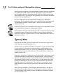
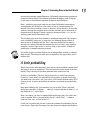
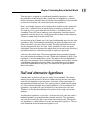
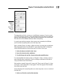
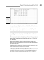
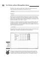
Chapter 1
AL
Evaluating Data in the Real World
In This Chapter
RI
▶ Introducing statistical concepts
▶ Generalizing from samples to populations
TE
▶ Getting into probability
▶ Making decisions
MA
▶ New features in Excel 2007
▶ Understanding important Excel Fundamentals
D
▶ New features in this edition
TE
T
GH
he field of statistics is all about decision-making — decision-making
based on groups of numbers. Statisticians constantly ask questions:
What do the numbers tell us? What are the trends? What predictions can we
make? What conclusions can we draw?
CO
PY
RI
To answer these questions, statisticians have developed an impressive array
of analytical tools. These tools help us to make sense of the mountains of
data that are out there waiting for us to delve into, and to understand the
numbers we generate in the course of our own work.
The Statistical (And Related) Notions
You Just Have to Know
Because intensive calculation is often part and parcel of the statistician’s
toolset, many people have the misconception that statistics is about number
crunching. Number crunching is just one small part of the path to sound decisions, however.
10
Part I: Statistics and Excel: A Marriage Made in Heaven
By shouldering the number-crunching load, software increases our speed of
traveling down that path. Some software packages are specialized for statistical analysis and contain many of the tools that statisticians use. Although
not marketed specifically as a statistical package, Excel provides a number of
these tools, which is why I wrote this book.
I said that number crunching is a small part of the path to sound decisions.
The most important part is the concepts statisticians work with, and that’s
what I talk about for most of the rest of this chapter.
Samples and populations
On election night, TV commentators routinely predict the outcome of elections before the polls close. Most of the time they’re right. How do they
do that?
The trick is to interview a sample of voters after they cast their ballots.
Assuming the voters tell the truth about whom they voted for, and assuming
the sample truly represents the population, network analysts use the sample
data to generalize to the population of voters.
This is the job of a statistician — to use the findings from a sample to make a
decision about the population from which the sample comes. But sometimes
those decisions don’t turn out the way the numbers predicted. History buffs
are probably familiar with the memorable picture of President Harry Truman
holding up a copy of the Chicago Daily Tribune with the famous, but wrong,
headline “Dewey Defeats Truman” after the 1948 election. Part of the statistician’s job is to express how much confidence he or she has in the decision.
Another election-related example speaks to the idea of the confidence in
the decision. Pre-election polls (again, assuming a representative sample of
voters) tell you the percentage of sampled voters who prefer each candidate.
The polling organization adds how accurate they believe the polls are. When
you hear a newscaster say something like “accurate to within three percent,”
you’re hearing a judgment about confidence.
Here’s another example. Suppose you’ve been assigned to find the average
reading speed of all fifth-grade children in the U.S., but you haven’t got the
time or the money to test them all. What would you do?
Your best bet is to take a sample of fifth-graders, measure their reading
speeds (in words per minute), and calculate the average of the reading
speeds in the sample. You can then use the sample average as an estimate of
the population average.
Chapter 1: Evaluating Data in the Real World
Estimating the population average is one kind of inference that statisticians
make from sample data. I discuss inference in more detail in the upcoming
section “Inferential Statistics.”
Now for some terminology you have to know: Characteristics of a population
(like the population average) are called parameters, and characteristics of a
sample (like the sample average) are called statistics. When you confine your
field of view to samples, your statistics are descriptive. When you broaden
your horizons and concern yourself with populations, your statistics are
inferential.
Now for a notation convention you have to know: Statisticians use Greek letters (μ, σ, ρ) to stand for parameters, and English letters , s, r) to stand for
statistics. Figure 1-1 summarizes the relationship between populations and
samples, and parameters and statistics.
Figure 1-1:
The relationship
between
populations, Select
samples, individuals
parameters,
and
statistics.
Parameters
Population
Make
inferences
about
Sample
Statistics
Variables: Dependent and independent
Simply put, a variable is something that can take on more than one value.
(Something that can have only one value is called a constant.) Some variables
you might be familiar with are today’s temperature, the Dow Jones Industrial
Average, your age, and the value of the dollar against the euro.
Statisticians care about two kinds of variables, independent and dependent.
Each kind of variable crops up in any study or experiment, and statisticians
assess the relationship between them.
For example, imagine a new way of teaching reading that’s intended to
increase the reading speed of fifth-graders. Before putting this new method
into schools, it would be a good idea to test it. To do that, a researcher would
randomly assign a sample of fifth-grade students to one of two groups: One
11
12
Part I: Statistics and Excel: A Marriage Made in Heaven
group receives instruction via the new method, the other receives instruction
via traditional methods. Before and after both groups receive instruction,
the researcher measures the reading speeds of all the children in this study.
What happens next? I get to that in the upcoming section entitled “Inferential
Statistics: Testing Hypotheses.”
For now, understand that the independent variable here is Method of
Instruction. The two possible values of this variable are New and Traditional.
The dependent variable is reading speed — which we might measure in
words per minute.
In general, the idea is to try and find out if changes in the independent variable
are associated with changes in the dependent variable.
In the examples that appear throughout the book, I show you how to use Excel
to calculate various characteristics of groups of scores. Keep in mind that
each time I show you a group of scores, I’m really talking about the values of a
dependent variable.
Types of data
Data come in four kinds. When you work with a variable, the way you work
with it depends on what kind of data it is.
The first variety is called nominal data. If a number is a piece of nominal data,
it’s just a name. Its value doesn’t signify anything. A good example is the
number on an athlete’s jersey. It’s just a way of identifying the athlete and
distinguishing him or her from teammates. The number doesn’t indicate the
athlete’s level of skill.
Next comes ordinal data. Ordinal data are all about order, and numbers begin
to take on meaning over and above just being identifiers. A higher number
indicates the presence of more of a particular attribute than a lower number.
One example is Moh’s Scale. Used since 1822, it’s a scale whose values are 1
through 10. Mineralogists use this scale to rate the hardness of substances.
Diamond, rated at 10, is the hardest. Talc, rated at 1, is the softest. A substance that has a given rating can scratch any substance that has a lower
rating.
What’s missing from Moh’s Scale (and from all ordinal data) is the idea of
equal intervals and equal differences. The difference between a hardness of
10 and a hardness of 8 is not the same as the difference between a hardness
of 6 and a hardness of 4.
Chapter 1: Evaluating Data in the Real World
Interval data provides equal differences. Fahrenheit temperatures provide an
example of interval data. The difference between 60 degrees and 70 degrees
is the same as the difference between 80 degrees and 90 degrees.
Here’s something that might surprise you about Fahrenheit temperatures:
A temperature of 100 degrees is not twice as hot as a temperature of 50
degrees. For ratio statements (twice as much as, half as much as) to be valid,
zero has to mean the complete absence of the attribute you’re measuring. A
temperature of 0 degrees F doesn’t mean the absence of heat — it’s just an
arbitrary point on the Fahrenheit scale.
The last data type, ratio data, includes a meaningful zero point. For temperatures, the Kelvin scale gives us ratio data. One hundred degrees Kelvin is
twice as hot as 50 degrees Kelvin. This is because the Kelvin zero point is
absolute zero, where all molecular motion (the basis of heat) stops. Another
example is a ruler. Eight inches is twice as long as four inches. A length of
zero means a complete absence of length.
Any of these types can form the basis for an independent variable or a dependent variable. The analytical tools you use depend on the type of data you’re
dealing with.
A little probability
When statisticians make decisions, they express their confidence about those
decisions in terms of probability. They can never be certain about what they
decide. They can only tell you how probable their conclusions are.
So what is probability? The best way to attack this is with a few examples.
If you toss a coin, what’s the probability that it comes up heads? Intuitively,
you know that if the coin is fair, you have a 50-50 chance of heads and a 50-50
chance of tails. In terms of the kinds of numbers associated with probability,
that’s 1/2.
How about rolling a die? (One member of a pair of dice.) What’s the probability that you roll a 3? Hmmm . . . a die has six faces and one of them is 3, so
that ought to be 1/6, right? Right.
Here’s one more. You have a standard deck of playing cards. You select one
card at random. What’s the probability that it’s a club? Well . . . a deck of
cards has four suits, so that answer is 1/4.
I think you’’re getting the picture. If you want to know the probability that an
event occurs, figure out how many ways that event can happen and divide by
13
14
Part I: Statistics and Excel: A Marriage Made in Heaven
the total number of events that can happen. In each of the three examples,
the event we were interested in (head, 3, or club) only happens one way.
Things can get a bit more complicated. When you toss a die, what’s the probability you roll a 3 or a 4? Now you’re talking about two ways the event you’re
interested in can occur, so that’s (1 + 1)/6 = 2/6 = 1/3. What about the probability of rolling an even number? That has to be 2, 4, or 6, and the probability is
(1 + 1 + 1)/6 = 3/6 = 1/2.
On to another kind of probability question. Suppose you roll a die and toss a
coin at the same time. What’s the probability you roll a 3 and the coin comes
up heads? Consider all the possible events that could occur when you roll a
die and toss a coin at the same time. Your outcome could be a head and 1-6,
or a tail and 1-6. That’s a total of 12 possibilities. The head-and-3 combination
can only happen one way. So the answer is 1/12.
In general the formula for the probability that a particular event occurs is
I began this section by saying that statisticians express their confidence
about their decisions in terms of probability, which is really why I brought
up this topic in the first place. This line of thinking leads us to conditional
probability — the probability that an event occurs given that some other
event occurs. For example, suppose I roll a die, take a look at it (so that you
can’t see it), and I tell you that I’ve rolled an even number. What’s the probability that I’ve rolled a 2? Ordinarily, the probability of a 2 is 1/6, but I’ve
narrowed the field. I’ve eliminated the three odd numbers (1, 3, and 5) as possibilities. In this case, only the three even numbers (2, 4, and 6) are possible,
so now the probability of rolling a 2 is 1/3.
Exactly how does conditional probability plays into statistical analysis?
Read on.
Inferential Statistics: Testing Hypotheses
In advance of doing a study, a statistician draws up a tentative explanation —
a hypothesis — as to why the data might come out a certain way. After the
study is complete and the sample data are all tabulated, he or she faces the
essential decision a statistician has to make — whether or not to reject the
hypothesis.
Chapter 1: Evaluating Data in the Real World
That decision is wrapped in a conditional probability question — what’s
the probability of obtaining the data, given that this hypothesis is correct?
Statistical analysis provides tools to calculate the probability. If the probability turns out to be low, the statistician rejects the hypothesis.
Here’s an example. Suppose you’re interested in whether or not a particular
coin is fair — whether it has an equal chance of coming up heads or tails.
To study this issue, you’d take the coin and toss it a number of times — say
a hundred. These 100 tosses make up your sample data. Starting from the
hypothesis that the coin is fair, you’d expect that the data in your sample of
100 tosses would show 50 heads and 50 tails.
If it turns out to be 99 heads and 1 tail, you’d undoubtedly reject the fair coin
hypothesis. Why? The conditional probability of getting 99 heads and 1 tail
given a fair coin is very low. Wait a second. The coin could still be fair and
you just happened to get a 99-1 split, right? Absolutely. In fact, you never
really know. You have to gather the sample data (the results from 100 tosses)
and make a decision. Your decision might be right, or it might not.
Juries face this all the time. They have to decide among competing hypotheses that explain the evidence in a trial. (Think of the evidence as data.) One
hypothesis is that the defendant is guilty. The other is that the defendant is
not guilty. Jury-members have to consider the evidence and, in effect, answer
a conditional probability question: What’s the probability of the evidence
given that the defendant is not guilty? The answer to this question determines the verdict.
Null and alternative hypotheses
Consider once again that coin-tossing study I just mentioned. The sample
data are the results from the 100 tosses. Before tossing the coin, you might
start with the hypothesis that the coin is a fair one, so that you expect an
equal number of heads and tails. This starting point is called the null hypothesis. The statistical notation for the null hypothesis is H0. According to this
hypothesis, any heads-tails split in the data is consistent with a fair coin.
Think of it as the idea that nothing in the results of the study is out of the
ordinary.
An alternative hypothesis is possible — that the coin isn’t a fair one, and it’s
loaded to produce an unequal number of heads and tails. This hypothesis
says that any heads-tails split is consistent with an unfair coin. The alternative hypothesis is called, believe it or not, the alternative hypothesis. The statistical notation for the alternative hypothesis is H1.
15
16
Part I: Statistics and Excel: A Marriage Made in Heaven
With the hypotheses in place, toss the coin 100 times and note the number
of heads and tails. If the results are something like 90 heads and 10 tails, it’s
a good idea to reject H0. If the results are around 50 heads and 50 tails, don’t
reject H0.
Similar ideas apply to the reading-speed example I gave earlier. One sample
of children receives reading instruction under a new method designed to
increase reading speed, the other learns via a traditional method. Measure
the children’s reading speeds before and after instruction, and tabulate the
improvement for each child. The null hypothesis, H0, is that one method
isn’t different from the other. If the improvements are greater with the new
method than with the traditional method — so much greater that it’s unlikely
that the methods aren’t different from one another — reject H0. If they’re not,
don’t reject H0.
Notice that I didn’t say “accept H0.” The way the logic works, you never accept
a hypothesis. You either reject H0 or don’t reject H0.
Notice also that in the coin-tossing example I said around 50 heads and 50
tails. What does “around” mean? Also, I said if it’s 90-10, reject H0. What about
85-15? 80-20? 70-30? Exactly how much different from 50-50 does the split
have to be for you reject H0? In the reading-speed example, how much greater
does the improvement have to be to reject H0?
I won’t answer these questions now. Statisticians have formulated decision
rules for situations like this, and we’ll explore those rules throughout the
book.
Two types of error
Whenever you evaluate the data from a study and decide to reject H0 or to
not reject H0, you can never be absolutely sure. You never really know what
the true state of the world is. In the context of the coin-tossing example, that
means you never know for certain if the coin is fair or not. All you can do is
make a decision based on the sample data you gather. If you want to be certain about the coin, you’d have to have the data for the entire population of
tosses — which means you’d have to keep tossing the coin until the end
of time.
Because you’re never certain about your decisions, it’s possible to make an
error regardless of what you decide. As I mentioned before, the coin could be
fair and you just happen to get 99 heads in 100 tosses. That’s not likely, and
that’s why you reject H0. It’s also possible that the coin is biased, and yet you
just happen to toss 50 heads in 100 tosses. Again, that’s not likely and you
don’t reject H0 in that case.
Chapter 1: Evaluating Data in the Real World
Although not likely, those errors are possible. They lurk in every study that
involves inferential statistics. Statisticians have named them Type I and
Type II.
If you reject H0 and you shouldn’t, that’s a Type I error. In the coin example,
that’s rejecting the hypothesis that the coin is fair, when in reality it is a fair
coin.
If you don’t reject H0 and you should have, that’s a Type II error. That happens if you don’t reject the hypothesis that the coin is fair, and in reality it’s
biased.
How do you know if you’ve made either type of error? You don’t — at least
not right after you make your decision to reject or not reject H0. (If it’s possible to know, you wouldn’t make the error in the first place!) All you can do
is gather more data and see if the additional data are consistent with your
decision.
If you think of H0 as a tendency to maintain the status quo and not interpret
anything as being out of the ordinary (no matter how it looks), a Type II error
means you missed out on something big. Looked at in that way, Type II errors
form the basis of many historical ironies.
Here’s what I mean: In the 1950s, a particular TV show gave talented young
entertainers a few minutes to perform on stage and a chance to compete for a
prize. The audience voted to determine the winner. The producers held auditions around the country to find people for the show. Many years after the
show went off the air, the producer was interviewed. The interviewer asked
him if he had ever turned down anyone at an audition that he shouldn’t have.
“Well,” said the producer, “once a young singer auditioned for us and he
seemed really odd.”
“In what way?” asked the interviewer.
“In a couple of ways,” said the producer. “He sang really loud, gyrated his
body and his legs when he played the guitar, and he had these long sideburns. We figured this kid would never make it in show business, so we
thanked him for showing up, but we sent him on his way.”
“Wait a minute, are you telling me you turned down . . .”
“That’s right. We actually said ‘no’ . . . to Elvis Presley!”
Now that’s a Type II error.
17
18
Part I: Statistics and Excel: A Marriage Made in Heaven
What’s New in Excel?
The big news in Excel 2007 — throughout Microsoft Office 2007, in fact — is
the user interface. Where a bar of menus once ruled, you now find a tabbed
band. Appearing near the top of the worksheet window, this band is called
the Ribbon. Figure 1-2 shows the appearance of the Ribbon after I select the
Insert tab.
Figure 1-2:
The Insert
Tab in the
Ribbon in
Excel 2007.
The Ribbon exposes Excel’s capabilities in a way that’s much easier to understand than in previous versions. Each tab presents groups of icon-labeled
command buttons rather than menu choices. Mouseover help adds still
more information when you’re trying to figure out the capability a particular
button activates.
Clicking a button typically opens up a whole category of possibilities. Buttons
that do this are called category buttons.
Microsoft has developed shorthand for describing a mouse-click on a command button in the Ribbon, and I use that shorthand throughout this book.
The shorthand is
Tab | Command Button
To indicate clicking on the Insert tab’s Other Charts category button, for
example, I write
Insert | Other Charts
By the way, when I click that button, the gallery in Figure 1-3 appears.
I can extend the shorthand. To select the first chart in that gallery (it’s called
High-Low-Close, as mouseover help would tell you), I write
Insert | Other Charts | High-Low-Close
Chapter 1: Evaluating Data in the Real World
Figure 1-3:
Clicking
Insert |
Other Charts
opens this
gallery.
The downside to all this, of course, is the Ribbon’s newness. If you’ve spent
years with previous versions, you’ve developed an overall sense of where frequently used capabilities reside. Now you have to reorient: The switch from
the menu bar to the Ribbon relocates almost everything.
It’s worth your while to reorient. After you get accustomed to the Ribbon,
you’ll see that everything takes just a few steps now.
Wait a second. Figure 1-3 shows a gallery of charts to insert into a worksheet.
What happened to the Chart Wizard? It’s gone from Excel 2007. In keeping
with everything-takes-just-a-few-steps-now, to create a chart you
1. Select the data to include in the chart.
2. Insert the chart into the worksheet.
3. Use the Design tab and the Layout tab to make modifications.
I’ve oversimplified, but not by much, as Chapter 3 shows. Creating a chart is
more intuitive than it used to be. You’re no longer confined to the order of
steps specified in the Chart Wizard.
Wait another second. Design tab? Layout tab? They’re not in Figure 1-2. After
you insert a chart and select it, they appear. Tabs that appear when needed
are called contextual tabs.
Also in keeping with everything-takes-just-a-few-steps-now, to use a statistical
function you
1. Select a cell for the result of the function.
19
20
Part I: Statistics and Excel: A Marriage Made in Heaven
2. Select a function from the Statistical Functions menu to open a dialog
box for that function.
3. Enter the required information into the dialog box.
4. Close the dialog box.
Again I’ve oversimplified, and again not by much, as you see throughout
the book.
Statistical Functions menu? Yep. This time around, you have a Statistical
Functions menu that wasn’t in the earlier incarnations. It’s buried under
Formulas | More Functions | Statistical
In Chapter 2 I show you how to make that menu more accessible.
Excel 2007’s statistical functionality is by and large the same as in previous
versions. The new version adds three statistical functions: COUNTIFS (counts
the number of cells that meet a set of conditions), AVERAGEIF (finds the average of cells that meet a condition), AVERAGEIFS (finds the average of cells
that meet a set of conditions).
Some Things about Excel You
Absolutely Have to Know
Although I’m assuming you’re not new to Excel, I think it’s wise to take a
little time and space up front to discuss a few Excel fundamentals that figure
prominently in statistical work. Knowing these fundamentals helps you work
efficiently with Excel formulas.
Autofilling cells
The first is autofill, Excel’s capability for repeating a calculation throughout
a worksheet. Insert a formula into a cell, and you can drag that formula into
adjoining cells.
Figure 1-4 is a worksheet of expenditures for R&D in science and engineering at colleges and universities for the years shown. The data, taken from a
U.S. National Science Foundation report, are in millions of dollars. Column H
holds the total for each field, and row 11 holds the total for each year. (More
about column I in a moment.)
Chapter 1: Evaluating Data in the Real World
Figure 1-4:
Expenditures
for R&D in
science and
engineering.
I started with column H blank and with row 11 blank. How did I get the totals
into column H and row 11?
If I want to create a formula to calculate the first row total (for Physical
Sciences), one way (among several) is to enter
= D2 + E2 + F2 + G2
into cell H2. (A formula always begins with “=”.) Press Enter and the total
appears in H2.
Now, to put that formula into cells H3 through H10, the trick is to position the
cursor on the lower right corner of H2 until a “+” appears, hold down the left
mouse button, and drag the mouse through the cells. That “+” is called the
cell’s fill handle.
When you finish dragging, release the mouse button and the row totals
appear. This saves huge amounts of time, because you don’t have to reenter
the formula eight times.
Same thing with the column totals. One way to create the formula that sums
up the numbers in the first column (1990) is to enter
=D2 + D3 + D4 + D5 + D6 + D7 + D8 + D9 + D10
into cell D11. Position the cursor on D11’s fill handle, drag through row 11
and release in column H, and you autofill the totals into E11 through H11.
21
22
Part I: Statistics and Excel: A Marriage Made in Heaven
Dragging isn’t the only way to do it. Another way is to select the array of cells
you want to autofill (including the one that contains the formula), and click
the down arrow next to
Home | Fill
This opens the Fill pop-up menu (see Figure 1-5). Select Down and you
accomplish the same thing as dragging and dropping.
Figure 1-5:
The Fill
pop-up
menu.
Still another way is to select Series from the Fill pop-up menu. Doing this
opens the Series dialog box (see Figure 1-6). In this dialog box, click the
AutoFill radio button, click OK, and you’re all set. This does take one more
step, but the Series dialog box is a bit more compatible with earlier versions
of Excel.
Figure 1-6:
The Series
dialog box.
I bring this up because statistical analysis often involves repeating a formula
from cell to cell. The formulas are usually more complex than the ones in this
section, and you might have to repeat them many times, so it pays to know
how to autofill.
Referencing cells
The second important fundamental is the way Excel references worksheet
cells. Consider again the worksheet in Figure 1-4. Each autofilled formula is
slightly different from the original. This, remember, is the formula in cell H2:
Chapter 1: Evaluating Data in the Real World
= D2 + E2 + F2 + G2
After autofill, the formula in H3 is
= D3 + E3 + F3 + G3
and the formula in H4 is . . . well, you get the picture.
This is perfectly appropriate. I want the total in each row, so Excel adjusts
the formula accordingly as it automatically inserts it into each cell. This is
called relative referencing — the reference (the cell label) gets adjusted relative to where it is in the worksheet. Here, the formula directs Excel to total up
the numbers in the cells in the four columns immediately to the left.
Now for another possibility. Suppose I want to know each row total’s proportion of the grand total (the number in H11). That should be straightforward,
right? Create a formula for I2, and then autofill cells I3 through I10.
Similar to the earlier example, I’d start by entering this formula into I2:
=H2/H11
Press Enter and the proportion appears in I2. Position the cursor on the fill
handle, drag through column I, release in I10, and . . . D’oh!!! Figure 1-7 shows
the unhappy result — the extremely ugly #/DIV0! in I3 through I10. What’s the
story?
Figure 1-7:
Whoops!
Incorrect
autofill!
23
24
Part I: Statistics and Excel: A Marriage Made in Heaven
The story is this: unless you tell it not to, Excel uses relative referencing
when you autofill. So the formula inserted into I3 is not
=H3/H11
Instead, it’s
=H3/H12
Why does H11 become H12? Relative referencing assumes that the formula
means divide the number in the cell by whatever number is nine cells south
of here in the same column. Because H12 has nothing in it, the formula is telling Excel to divide by zero, which is a no-no.
The idea is to tell Excel to divide all the numbers by the number in H11, not
by whatever number is nine cells south of here. To do this, you work with
absolute referencing. You show absolute referencing by adding $-signs to the
cell ID. The correct formula for I2 is
= H2/$H$11
This tells Excel not to adjust the column and not to adjust the row when you
autofill. Figure 1-8 shows the worksheet with the proportions.
Figure 1-8:
Autofill
based on
absolute
referencing.
To convert a relative reference into absolute reference format, select the
cell address (or addresses) you want to convert, and press the F4 key. F4 is
a toggle that goes between relative reference (H11, for example), absolute
Chapter 1: Evaluating Data in the Real World
reference for both the row and column in the address ($H$11), absolute reference for the row-part only (H$11), and absolute reference for the column-part
only ($H11).
What’s New in This Edition?
Although Excel’s statistical functions haven’t changed, I’ve restructured the
instructions for every statistical function. The instructions in this edition fit
in with the steps I outlined in the preceding section.
With the disappearance of the Chart Wizard I’ve restructured the instructions for creating a chart, too. (See Chapter 3.)
One of my points in both editions is that when you report an average, you
should also report variability. For this reason I believe Excel 2007 should also
offer the functions STDEVIF and STDEVIFS in addition to the new functions
AVERAGEIF and AVERAGEIFS. Unfortunately, these functions do not exist in
Excel 2007. To fill the void, I show you how to do what these functions would
do, and in the process take you through some of Excel’s Logical Functions.
(See Chapter 5.)
It’s easier to assign a name to a cell range in Excel 2007 (it takes . . . you
guessed it . . . just-a-few-steps-now). So I rely much more on named cell
ranges in this edition. (See Chapter 2.)
In the Part of Tens, I’ve added a section on importing data from the Web. (See
Chapter 20.)
I pointed out in the Introduction that I’ve added Appendix B and Appendix C.
Each one shows how to do some nifty statistical work that doesn’t come prepackaged in Excel.
25
26
Part I: Statistics and Excel: A Marriage Made in Heaven