1
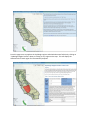
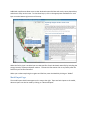
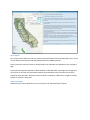
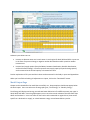
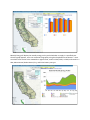
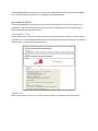
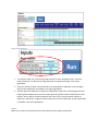
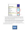
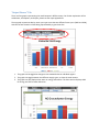
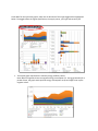
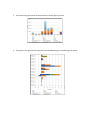
CALMAC Study ID CPU0035.01
Volume 14 of 15
Appendix M
Embedded Energy in Water Studies
Study 1: Statewide and Regional Water-Energy Relationship
Prepared by
GEI Consultants/Navigant Consulting, Inc.
Prepared for the
California Public Utilities Commission
Energy Division
Managed by
California Institute for Energy and Environment
August 31, 2010
Appendix M Model User’s Manual
Water Energy Model Manual Introduction The Water Energy model is composed of two interacting pieces. The core of the model is a spreadsheet file (Spreadsheet Model) that can operate independently. The Spreadsheet Model can be downloaded and run on any computer using Excel 2003. The Spreadsheet Model interacts with a Web Interface that serves as a graphical portal to explore the model. Both the Spreadsheet Model and the Web Interface enable users to utilize the same input and scenario modeling capabilities. While there are numerous outputs presented in the Web Interface, the Spreadsheet Model allows users to view several additional output graphs. Web Interface Introduction Page The introduction page contains a disclaimer about the model, please read and then click accept to continue. Basic Instruction Page After accepting the terms of use, users will be directed to the basic instruction page. This page can be reached at any time, click “Help” at the top of the screen. From this page users can explore the hydrologic regions and wholesale water facilities by clicking on “Hydrologic Region Profiles” above or clicking on any region on the map. This will display the characteristics of each region for informational purposes. Additional map features allow users to view wholesale water facilities and canals, county boundaries, and electric utility service areas. To view these layers, click on the appropriate checkboxes for each layer on at the bottom right corner of the map. When the facility layer is enabled you can view specifics of each wholesale water facility including the energy intensity of pump and power stations. To view this information click on any facility after the facilities layer has been activated. When you are done exploring the regions and facilities, enter the Model by clicking on “Model” Model Input Page The model inputs should now appear on the map to the right. These are basic inputs to the model, advance inputs can also be made by clicking on “advanced inputs” Basic Inputs First, select a future water use scenario; select the Demand Scenario from the drop down menu. There are two options (Low Demand and High Demand) based on DWR projections. Second, select the amount of water to be delivered by the Colorado River Aqueduct: Low, Average or High. Third input the projected reductions in delta outflow in 2020 and 2030. Inputting a percentage value will increase or decrease the withdrawals made by the State Water Project and the Central Valley Project form the Bay Delta. A positive number indicates a reduction in delta flow; a negative number implies an increase in delta flow. Advanced Inputs Advanced inputs can be defined by users by clicking on the “Advanced Inputs” button. Advance inputs allow users to: •
•
Increase or decrease water use in each sector in each region for both 2020 and 2030. Inputs are in the form of a percent change, a negative number decreased use while a positive number increases use. Increase local supply options (Recycled Water, Seawater Desalination, Brackish Desalination, and Local Surface Storage). Increase represent new supply capacity beyond existing capacity and are entered as the annual capacity in thousand acre‐feet. Further explanation of all inputs and their values are documented in the Study 1 report and Appendices. When you have finished making all adjustments to inputs, click on the “Run Model” button. Model Output Page Output can be viewed after the model has successfully run. Output options should now appear below the basic inputs. Users can select one of two graph types, “Total Energy” or “Monthly Energy.” Total Energy will display total energy use and total water deliveries in five different water year types in 2010, 2020, and 2030. Once the graph appears, users can select certain subsets of the data from drop‐
down menus above it. Users can select to view results at the statewide or regional level, view results specific to a wholesaler or supply, or switch between energy use and water delivery results. Monthly Energy will display the monthly energy use by each wholesaler or supply in a specified year. Once the graph appears, users can customize the graph by using the drop‐down menus above it. Users can select to see results at the statewide or regional level; results in 2010, 2020, or 2030; and results in a Wet, Above Normal, Below Normal, Dry, and Critical water year type. The Spreadsheet Model with the last user inputs can be downloaded by clicking on “Download Model File.” Instruction following will help you navigate the Spreadsheet Model. Spreadsheet Model The Excel based model is comprised of multiple sheets including those used for inputs, outputs, and calculations. User interacts with sheets (tabs) in particular: Information, Input, and Output Viewer. These are described in more detail below “Introduction” Tab The introduction tab is the first thing users view after the spreadsheet file is opened. It contains basic instructions to use the spreadsheet model; however these instructions are summarized in more detail in this document. The input tab is illustrated below. “Input” Tab Below is the model input view. This is where all of the model’s user‐defined inputs are entered. Drop down options 1
2
3
3
1. To set future water use, select the Demand Scenario from the drop down menu. The three options (Baseline, Low Demand and High Demand) are explained in depth in the report appendices. 2. Select the amount of water to be delivered by the Colorado River Aqueduct: Low, Average or High. Further explanation is available in the report appendices. 3. The two options for Reduction in Delta Flow 2020/2030 are derivative of the Wanger Decision. Reducing Delta outflow will constrict the water flow from the Bay Delta to SWP and some CVP facilities. Entries will be limited to between 100% and ‐50%. A positive number indicates a reduction in delta flow; a negative number implies an increase in delta flow. Further explanation is available in the report appendices. Inputs Below is the section for manual inputs into the model for water supply and demand. 1 2 1. For each hydrologic region, enter the percentage change for each sub‐item in Urban and Agriculture Demand. Entries will be limited to between 50% and ‐50%. A negative number indicates a reduction in demand; a positive number implies an increase in demand. Further explanation is available in the report appendices. 2. Then enter any new supply construction in thousand acre‐feet. Because they are landlocked regions and have no access to the ocean, you may not enter values for Seawater Desalination for regions of Sacramento River, San Joaquin River, Tulare Lake, North Lahontan, South Lahontan, or Colorado River. Further explanation is available in the report appendices. Once the desired data is input, press the Run button to run the model and update the stored data set. The model will stop on the Output Viewer tab. “Output Viewer” Tab There are four graphs representing the model outputs in different ways. For further explanation of the calculations, assumptions, and inputs, please see the report appendices. The top graph represents data by water year type across the two different future years (2020 and 2030), with the current situation in 2010 being represented by a green base line. 1 2 3
1. The graph can be toggled to change to view statewide data or individual regions. 2. The graph can toggle between the different supply types, or show the total amount. 3. The graph can also display either water or energy information. The Units section displays GWh for energy and TAF for water deliveries. Scroll down for the next three graphs, which are all derivative of the single toggle section highlighted below. The toggles effect the region specification, the supply source, year type and scenario year. 1. The top left graph represents the monthly energy profile by source. Note: When an agencies shows net negative energy consumption (i.e. energy generation) for a period of time, the graph stacks positive energy consumption on top and might cover up the negative values. 2. The bottom left graph represents water deliveries by HR region by source. 3. The graph on the right represents physical and embedded energy in each HR region by source.