1
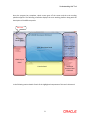
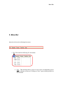
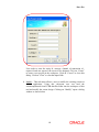
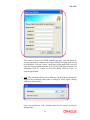
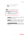
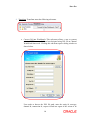
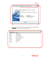
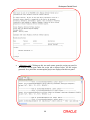
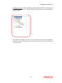
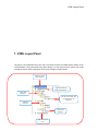
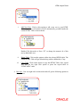
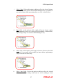
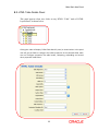
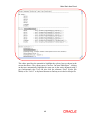
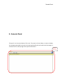
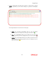
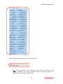
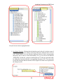
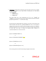
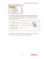
Oracle FLEXCUBE Direct Banking Release 12.0.0 Oracle FLEXCUBE Development Workbench for Direct and Mobile Banking User Manual Part No. E52305-01 Corporate E-Factoring User Manual Table of Contents 1. Overview ..................................................................................................................................... 4 2. Prerequisites .............................................................................................................................. 5 3. How to Run this Tool ................................................................................................................. 6 4. Understanding this Tool ........................................................................................................... 7 5. Menu Bar .................................................................................................................................... 9 6. Workspace Details Panel ........................................................................................................ 18 7. HTML Layout Panel ................................................................................................................. 22 8. Main Work Area Panel ............................................................................................................. 29 9. Console Panel .......................................................................................................................... 50 10. HTML DataTypes Panel ......................................................................................................... 54 11. JavaScript Functions and CSS Panel .................................................................................. 57 12. Deleting Existing Project ...................................................................................................... 62 13. XSL Keywords Lookup ......................................................................................................... 63 3 Overview 1. Overview This Tool is a Swing based User Interface for designing screen based on Light Weight Extensions and Application Programming (LEAP) framework. Earlier user used to make the database entries for creating the new screens in LEAP Framework. Now this workbench gives a platform to user to design a new screen and modify existing screens without directly accessing the database tables. User can preview the changes and generate the SQL scripts using this tool. Prerequisites 2. Prerequisites Following are the prerequisites to run this tool 1. To use this tool one should have “JDK 6” or higher version of java on their machine. 2. Current version of LEAP.jar 3. Following four jars are also required to be copied in the following sub-directories of the main directory where LEAP.jar is present. 1. ext/lib/kernel FCDB_12.0.0.jar 2. ext/lib xalan.jar xercesImpl.jar serializer.jar log4j-1.2.16.jar xml-apis.jar How to Run this Tool 3. How to Run this Tool This tool can be run in following two ways: 1. To run this tool double clicks LEAP. jar, if JDK 6 is available in the recommended programs to execute jar files. 2. OR 3. Use command java –jar LEAP.jar to execute the jar file. Understanding this Tool 4. Understanding this Tool On executing LEAP.jar a splash screen opens with a progress bar in the bottom as shown below Loading Action Loading Progress Bar Understanding this Tool Once the progress bar completes, splash screen goes off the screen and the main working platform appears. The following screenshot displays the main working platform along with the description of the different panels. Menu Bar Workspace Details Panel Main Work Area Panel HTML DataTypes Panel HTML Layout Panel Console Panel JavaScript Functions and CSS Panel In the following section details of each of the highlighted components of this tool is discussed. 8 Menu Bar 5. Menu Bar Menu Bar of this tool has following five menus 1. File: File menu has following five sub-menus a. New : This sub-menu allows a user to create a new screentemplate project in the workspace of the tool. Clicking on “New” opens a dialog window as shown below Menu Bar User needs to enter the entity id, usertype, channel id, transaction id , request id and user agent of the screen to be designed. Click on “Create” to create a new project in the workspace. Click on “Cancel” to close this dialog. Click on “Clear” to clear the input fields. b. Modify: This sub-menu allows a user to modify the existing screens in FCDB application. Using this sub-menu user can load the screentemplatexml from FCDB datafiles folder into the workspace of this tool and modify the screen design. Clicking on “Modify” opens a dialog window as shown below 10 Menu Bar User needs to browse the FCDB /datafiles/gui path, enter the entity id, usertype, channel id, transaction id, request id and user agent of the screen to be modified. Click on “Create”, on the basis of the input field’s tool will copy the screen template xml and js file from FCDB project into its own workspace. Click on “Cancel” to close this dialog. Click on “Clear” to clear the input fields. c. Find: This sub-menu allows user to find any words in the JavaScript file loaded in the JavaScript editor panel. Clicking on “Find” opens a dialog window as shown below. Enter a text and click on “Find” to find the text. Click on “Cancel” to close this dialog window. 11 Menu Bar d. Save: Click on save to save the idrequest.js file. e. Close: Click on “Close” to close the tool. 2. Generate: Generate menu has following three sub-menus. a. Generate XML: This sub-menu allows user to regenerate the screentemplate xml after changing the screen design. It can be considered as an action to save the screen design. b. Generate Script: This menu allows user to generate the complete insert script of the screen design. Clicking this menu will clear all the update/insert/delete script corresponding to an idrequest and provide the user with a fresh complete insert script corresponding to that idrequest. c. Generate MSTHTMLDATATYPES Scripts: This sub-menu allows user to generate the MSTHTMLDATATYPES insert script of the screen design. Clicking this menu will generate script along with Html Data Type Id and its description. 12 Menu Bar 3. Preview: Preview menu has following two sub-menus. a. View in Default Browser: Clicking this sub-menu will launch the system’s default browser with the output html of the current screen design project. User can preview the screen design done by them in this output html. b. Add New Browser and Preview: This menu allows a user to launch a selected browser. Clicking this menu will opens a dialog window as shown below. Click on “Browse” to browse the browser path, Click “OK” to launch the output HTML in selected browser, Click “Cancel” to close this dialog. 13 Menu Bar 4. Transform: Transform menu has following sub-menu. a. Convert Xsl into Workbench: This sub-menu allows a user to convert existing FCDB screen which has been designed using XSL file to Channel Workbench framework. Clicking this sub-menu opens a dialog window as shown below. User needs to browse the XSL file path, enter the entity id, usertype, channel id, transaction id, request id and user agent of the screen to be 14 Menu Bar converted to Channel Workbench framework. Click on “Create”, on the basis of the input field’s tool will convert the XSL file into screentemplate xml and js file and load these files into its own workspace. Click on “Cancel” to close this dialog. Click on “Clear” to clear the input fields. While transforming XSL to Channel Workbench, tool will generate some self-explanatory messages in the output log file available in the directory logs as LEAPOut.log. 5. Help: Help menu has following four sub-menus. a. Go To Home: Clicking this sub- menu opens the welcome panel in the main work area panel, as shown below. 15 Menu Bar b. Help Contents: Clicking this sub-menu opens the complete HTML help for this tool in the bottom console pane under the help tab. c. About: Clicking this sub-menu opens following dialog window which contains the details associated with the tool version and working directories. 16 Menu Bar d. Key Assist: Clicking this sub-menu opens the keyboard shortcuts HTML page in the bottom console pane under the help tab. 17 Workspace Details Panel 6. Workspace Details Panel The topmost left panel of this tool as shown below contains the details of all the screentemplate projects created in the workspace, in a tree layout format. This Tool creates a folder “ScreenTemplate” in the user’s current directory (where LEAP.jar is located), this folder is the workspace for this tool. This tree layout represents the actual directory structure created inside the workspace folder. Workspace Details Panel For each screentemplate project there are three files loaded in the workspace <Idrequest>.js: Clicking on this tree node will open an editor panel in the center main work area panel as shown below. The content of the .js files are loaded in this editor. User can use this editor panel to write/edit the content of the JavaScript file. To save the changes user needs to click the submenu save (Under File Menu) or use “Ctrl+S” as keyboard shortcut. 19 Workspace Details Panel < Idrequest >.sql: Clicking on this tree node menu opens the script text panel in the bottom console pane under the script tab as shown below. All the scripts generated for a particular screentemplate project are displayed in this text panel. 20 Workspace Details Panel < Idrequest >.xml: Clicking on this tree node loads the HTML Layout Panel, in the bottom left of this tool, with the HTML specific details of the screentemplate as shown below. These details are loaded in the form of a tree structure where events are attached to the nodes of the tree. Details of this tree structure and their events have been discussed in the next section. 21 HTML Layout Panel 7. HTML Layout Panel This panel is at the bottom-left of this tool. This panel contains the HTML specific details of the screentemplate. This panel loads the screen design in a tree layout format, where each node represents certain HTML component of the screen design as shown below. HTML Form having name “frmmain” Page main details like Header and disclaimers. HTML Table having id 1. Two cells of the column. One for Label and other for Datatypes. Table Row having id 1. Table Column having id 1. Hidden Fields in the Form HTML Layout Panel Certain nodes shown in the screen shot above have right-click options, user can use these options to add child nodes or delete these nodes. Details of the right-click options available on the nodes has been discussed below 1. HTMLForm: User can right-click on this node and will get the following option as shown below. i. ii. iii. iv. Refresh: Click on this option it refresh the Layout tree. It means Layout tree is render again and if any table order is changed it reflect after the refresh. Generate XML: Click on this option generate XML corresponding to current state of DTO. Generate Script: Click on this option generate SQL script corresponding to current state of DTO. Custom Template: Click on these option display custom templates which are available. This feature developed for mobile banking because many of their screens has same layout. 2. HTMLTables: User can right-click on this node and will get the following option as shown below 23 HTML Layout Panel i. Add New Table: Click on this option to add a new HTML Table to your screen design. A new Table with a numeric id will automatically get added under the “HTMLTables” node as shown below. Double-Click this node or Press “F2” to change the numeric id of this newly added table. ii. Add Custom Table: Click on this option to add a new predefined HTML Table such as H1, H2, H4, LV1, and LV3 to your screen design. A predefined table with a numeric id will automatically get added under the “HTMLTables” node as shown below. This feature is available for mobile banking only. Double-Click this node or Press “F2” to change the numeric id of this newly added table. iii. Paste Table: Click on this option to add a copied HTML Table to your screen design. This option is available only if user has copied any HTML Table. Copying a HTML Table has been discussed in following section. 3. Table<id>: User can right-click on this node and will get the following options as shown below 24 HTML Layout Panel i. Add New Row: Click on this option to add a new row to your HTML Table. A new row with numeric id will automatically get added under the current HTML Table as shown below. Double-Click this node or Press “F2” to change the numeric id of this newly added table row. ii. Delete Table: Click on this option to delete the selected HTML table. The current HTML Table will get deleted along with its child nodes, if any. iii. Copy Table: Click on this option to copy this HTML Table. Once copied user will get the right click option to paste the copied table in “HTMLTables” node. 4. Row<id>: User can right-click on this node and will get the following options as shown below. 25 HTML Layout Panel i. Add Column: Click on this option to add a new column to your HTML Table Row. A new column with numeric id will automatically get added under the current HTML Table Row as shown below. Double-Click this node or Press “F2” to change the numeric id of this newly added column. ii. Delete Row: Click on this option to delete the selected row. The current row will get deleted along with its child nodes, if any. iv. Paste Column: Click on this option to add a copied column to your screen design. This option is available only if user has copied any column. Copying a column has been discussed in following section. 5. Column<id>: User can right-click on this node and will get the following options as shown below. 26 HTML Layout Panel i. Label + Data: Click on this option to add two cells to the selected column, one cell for the label and one for the HTMLDatatypes (for e.g. textbox). A new node will get added representing those two cells, as shown below. ii. Data: Click on this option to add a single cell in the column to place HTMLDatatypes in the cell. A new node will get added, as shown below, representing a single cell meant for HTMLDatatypes only. iii. Label: Click on this option to add a single cell in the column to place label in the cell. A new node will get added, as shown below, representing a single cell meant for labels only. iv. Label + Inner Table: Click on this option to add two cells to the selected column, one cell for adding a label and one cell for adding an inner 27 HTML Layout Panel HTML Table. A new node will get added representing those two cells, as shown below. A new Table<id> node will also get added as a child of this new node representing the inner HTML table. v. Inner Table: Click on this option to add a single cell in the column to place an inner HTML table in the cell. A new node will get added, as shown below, representing a single cell meant for inner HTML table only. A new Table<id> node will also get added as a child of this new node representing the inner HTML table. vi. Delete Column: Click on this option to delete the selected column. The current column will get deleted along with its child nodes, if any. vii. Copy Column: Click on this option to copy this Table column. Once copied user will get the right click option to paste the copied column in table’s row node. 28 Main Work Area Panel 8. Main Work Area Panel This panel appears at the center of this tool. This panel consists of several sub-panels which appear depending upon what component of screen design is being currently worked on by the user. Following are the sub-panels which appear inside this panel Main Work Area Panel 8.1. Welcome Panel This is the default panel which will appear in the main work area panel, as shown below, when the tool is launched. Once the user starts working on any screentemplate project, this panel will be replaced by some other sub-panel depending upon what component of screen design user is configuring. User can come back to this panel by using “Go to Home” sub-menu under the “Help” menu. 30 Main Work Area Panel 8.2. Page Main Details Panel This panel appears when the user clicks on “PageMainDetails” node of HTML Layout panel, as shown below. Clicking this node will display the Page Main Details Panel as shown below. As shown in the screenshot above user can configure following three screen design parameters a. Page Header: User needs to enter XSL keyword (starting with K_) in the text box against this field. The text entered here will appear on the top of the screen design as its page header. A lookup icon is available beside the textbox, clicking this lookup image will open a dialog box where user can search available XSL keywords for a particular text, for more details please refer to section “XSL Keywords Lookup”. 31 Main Work Area Panel b. Disclaimer Header: User needs to enter XSL keyword (starting with K_) in the text box against this field. The text entered here will appear on the top of the screen design as disclaimer header. A lookup icon is available beside the textbox, clicking this lookup image will open a dialog box where user can search available XSL keywords for a particular text, for more details please refer to section “XSL Keywords Lookup”. c. Disclaimer Footer: User needs to enter XSL keyword (starting with K_) in the text box against this field. The text entered here will appear on the bottom of the page as disclaimer footer. A lookup icon is available beside the textbox, clicking this lookup image will open a dialog box where user can search available XSL keywords for a particular text, for more details please refer to section “XSL Keywords Lookup”. Two buttons are there in this panel a. Apply: Once the user has entered the above details, they need to click on “Apply” button to apply the changes done. If not clicked the changes will not get reflected on revisiting this panel. b. Revert: If the user has not clicked on “Apply” and wants to go back to last applied changes, they can click on “Revert” button. 32 Main Work Area Panel 8.3. HTML Table Details Panel This panel appears when user clicks on any HTML “Table” node of HTML Layout Panel, as shown below Clicking this node will display “HTML Table Details” panel, as shown below. In this panel user will get the fields to configure the HTML properties of the selected HTML table. User can configure properties like table border, cellspacing, cellpadding and several other properties listed below. 33 Main Work Area Panel As shown in the screenshot above user can configure following HTML properties of the selected table i. Table Alignment: User can set the alignment property of the HTML table by selecting the text available in this drop down list against this field. Possible values that can be selected are: a. left b. right c. center Tool will not allow the user to apply any value other than the above three values. ii. Table Border: User can set the border property of the HTML table by selecting the text available in this drop down list against this field. User can select only numeric values >= 0. Tool will not allow the user to apply any other values. Recommended value for border is between 0 to 5. iii. Cell Spacing: User can set the cell spacing property of the HTML table by selecting the text available in this drop down list against this field. User can select only numeric values >= 0. Tool will not allow the user to apply any other values. Recommended value for cell spacing is 1. iv. Cell Padding: User can set the cell padding property of the HTML table by selecting the text available in this drop down list against this field. User can select only numeric values >= 0. Tool will not allow the user to apply any other values. Recommended value for cell padding is 1. v. Table CSS: User can set the class property of the HTML Table by entering the text in the text box against this field. User can only enter the CSS classes which are available in this tool. List of all CSS classes is loaded in the bottom-right panel of this tool under “CSS Classes” tab. User can click on the desired class and the value will be automatically populated in this text box. For more details refer to section “CSS Classes” under the heading “JavaScript Functions and CSS Panel”. Tool will not allow the user to apply any other CSS class name other than those available in this tool. Recommended CSS classes for HTML tables are 34 Main Work Area Panel a. formtable: Use this class when the table contains certain input fields. b. formtablereadonly: Use this class to display the table on verification screen where no input fields are there. c. infotable: Use this class to display certain info inside a table. d. standardtable: e. gridtable: Use this class for table in grid format f. uidownload: Use this class for calling UI download framework of FCDB. g. buttonarea: Use this class for making form submission buttons. h. tabpanel: Use this class for making set of tabs inside a table. vi. Table Width: User can set the width property of the HTML table by entering the text in the text box against this field. User can enter numeric value with “px” or “%” as postfix. Tool will not allow the user to apply any other values. Recommended value for width is, it can be left blank or 100%. vii. Table Caption: User can set the caption of the HTML table by entering the text in the text box against this field. User can enter only XSL keyword (starting with K_) in this text box. Tool will not allow the user to apply values not in the format of XSL keyword. A lookup icon is available beside the textbox, clicking this lookup image will open a dialog box where user can search available XSL keywords for a particular text, for more details please refer to section “XSL Keywords Lookup”. viii. Caption Class: User can set the class property of the Table Caption. User can only enter the CSS classes which are available in this tool. List of all CSS classes is loaded in the bottom-right panel of this tool under “CSS Classes” tab. User can click on the desired class and the value will be automatically populated in this text box. For more details refer to section “CSS Classes” under the heading “JavaScript Functions and CSS Panel”. Tool will not allow the user to apply any other CSS class name other than those available in this tool. There is no recommended value for this field, it can be left blank. ix. Caption Align: User can set the alignment property of the HTML table by selecting the text available in this drop down list against this field. Possible values that can be selected are: a. b. c. d. left right top bottom 35 Main Work Area Panel Tool will not allow the user to apply any value other than the above four values. x. Legend Label: User can create a legend for the HTML Table by entering the text in the text box against this field. User can enter only XSL keyword (starting with K_) in this text box. Tool will not allow the user to apply values not in the format of XSL keyword. Legends are recommended only for inner HTML tables. A lookup icon is available beside the textbox, clicking this lookup image will open a dialog box where user can search available XSL keywords for a particular text, for more details please refer to section “XSL Keywords Lookup”. xi. Legend Class: User can set the class property of the table legend. User can only enter the CSS classes which are available in this tool. List of all CSS classes is loaded in the bottom-right panel of this tool under “CSS Classes” tab. User can click on the desired class and the value will be automatically populated in this text box. For more details refer to section “CSS Classes” under the heading “JavaScript Functions and CSS Panel”. Tool will not allow the user to apply any other CSS class name other than those available in this tool. Recommended value for this field is “labeltext” or it can be left blank. xii. Default Hidden: This check box can be checked if the user wants to make this HTML table default hidden when the screen output html page loads for the first time. This feature is recommended where certain HTML table in the form needs to be kept hidden and displayed only on some JavaScript event. xiii. Table Sequence: User can set the sequence number of the HTML table by entering a numeric value in the text box against this field. User can enter only numeric value > 0. This property helps the user to rearrange the order in which the HTML Tables will appear in the form. For e.g., if the current sequence number of the table is 3, it will appear as third HTML table in the form. xiv. Customized Template ID: User can use already existing custom templates available as custom datatypes in this panel. User can select any custom template available in the dropdown list. Use this feature only when you want to use an existing HTML Table layout available, else leave this field blank. User can refer to the data types available in the HTMLDatatypes panel grouped under the “Custom” tab. User can click on the data type 36 Main Work Area Panel button and value will get selected in the drop down against this field. Refer to “Custom” section under heading “HTML DataTypes Panel” for more details on the usage of Customized Template ID. xv. Condition Field: User can enter the text in this text box against this field. This feature is only supported in mobile banking. It’s a XSL expression which return either true or false on basis of this application decides that this table will render or not. Two buttons are there in this panel i. Apply: Once the user has entered the above details, they need to click on “Apply” button to apply the changes done. If not clicked the changes will not get reflected on revisiting this panel. ii. Revert: If the user has not clicked on “Apply” and wants to go back to last applied changes, they can click on “Revert” button. 37 Main Work Area Panel 8.4. HTML Table Data Details Panel This panel appears when user clicks on any of the following node, a. b. c. d. e. Label+Data Data Label Label+Inner Table Inner Table of HTML Layout Panel, as shown below Clicking this node will display “HTML Table Data Details” panel, as shown below. In this panel user will get the fields to configure the HTML components of the particular table column. User can configure properties like fieldname, fieldid, labels and their style, HTMLDataType and several other properties listed below. 38 Main Work Area Panel 39 Main Work Area Panel As shown in the screenshot above user can configure following properties of the column components i. Field Name: User has to enter a field name. It is a mandatory field and cannot be left blank. It is always recommended to use “fld” as prefix with the field name, for e.g. fldbeneficiary. User can enter an alphanumeric value for Name. ii. Field Id: User has to enter a field id. It is a mandatory field and cannot be left blank. This field id has to be unique, user cannot use any field id which has been used while defining the screen. It is always recommended to use “fld” as prefix with the field id, for e.g. fldbeneficiaryid. User can enter an alphanumeric value for Id. iii. Label: User can enter XSL keyword (starting with K_) in the text box against this field. This text will appear as a label in the first cell of the column. Tool will not allow the user to apply values not in the format of XSL keyword. A lookup icon is available beside the textbox, clicking this lookup image will open a dialog box where user can search available XSL keywords for a particular text, for more details please refer to section “XSL Keywords Lookup”. iv. Label Class: User can enter the css class to be applied on the text entered against label. User can only enter the CSS classes which are available in this tool. List of all CSS classes is loaded in the bottom-right panel of this tool under “CSS Classes” tab. User can click on the desired class and the value will be automatically populated in this text box. For more details refer to section “CSS Classes” under the heading “JavaScript Functions and CSS Panel”. Tool will not allow the user to apply any other CSS class name other than those available in this tool. Recommended CSS classes for labels are a. labeltext: Use this class to keep the label text right aligned. b. col1: Use this class for giving a width of 20% to the cell containing label. c. col2: Use this class for giving a width of 30% to the cell containing label. d. col3: Use this class for giving a width of 20% to the cell containing label. e. col4: Use this class for giving a width of 30% to the cell containing label. f. col80: Use this class for giving a width of 80% to the cell containing label. the the the the the One can use a combination of these classes by giving a space between the classes, for e.g. “labeltext col1” will make the label right aligned with a width of 20%. 40 Main Work Area Panel v. Label Width: User can set the width property of the cell containing the label text by entering the text in the text box against this field. User can enter numeric value with “px” or “%” as postfix. Tool will not allow the user to apply any other values. It is recommended to use the CSS classes, as discussed above, to handle the width and leave this field blank. If the above recommended classes do not match your width requirement, then use this field to set the width. vi. Label Col Span: User can select a numeric value (>0) available in this drop down list against this field. This value will determine the number of columns this cell, containing the label, will span. vii. Is Mandatory: User has to check this check-box, if they want to append the mandatory icon, discussed below, to the label of this field. viii. Mandatory Icon: User can enter the key-board special characters like “**” to mark this field as mandatory/or can append this icon to the label for any disclaimer note. ix. Label Type: User can select the label types available in this drop down list. User can refer to the label types available in the HTMLDatatypes panel grouped under the “Label” tab. User can click on the data type button and value will get selected in the drop down against this field. For more details refer to “ Label” section under heading “HTML DataTypes Panel”. x. Label Row Span: User can select a numeric value (>0) available in this drop down list against this field. This value will determine the number of rows this cell, containing the label, will span. xi. Data Class: For details refer to Label Class. This CSS class will be applied on the column cell containing the HTMLDataType like textbox, hence no need to use labeltext CSS class. xii. Data Width: For details refer to Label Width. This width will be applied on the column cell containing the HTMLDataType like textbox. xiii. Data Col Span: User can select a numeric value (>0) available in this drop down list against this field. This value will determine the number of columns this cell, containing the HTMLDataType, will span. xiv. Data Type: User can select the data type available in this drop down list. User can select the HTMLDataType to be displayed in this cell of the column. User can refer to the data types available in the HTMLDatatypes panel grouped under the “Data” tab. User can click on the data type button and value will get selected in the drop down against this field. For more details refer to “Data” section under heading “HTML DataTypes Panel”. For Inner table component this field is read only. 41 Main Work Area Panel xv. Node Value: User can use text box against this field to populate data in different HTMLDataType. For e.g. user can enter a XPATH or a constant value (string‘<value>’) in textbox HTMLDataType to populate the textbox with a default value. Similarly user can use this field to populate list of values in drop down. Refer to “Oracle_FLEXCUBE_Direct_Banking_LEAP_Framework_DeveloperGuide.docx ” for more details on the format of nodevalue for different HTMLDatatypes. For Inner table component this field is read only and contains the table id of child table. xvi. Function Name: User can give the JavaScript function name which they want to attach to the main event of the HTMLComponent, for e.g. giving a function name for dropdown will assign this function to onchange event of the dropdown. The logic of the function has to be written in the corresponding idrequest.js file. xvii. Function Arguments: User can give comma separated arguments to the JavaScript function, discussed above. User can pass only constant values using this field. To pass dynamic values as an argument using XPATH’s, please refer to “Dynamic Function Arguments” below. xviii. Input Size: This field is used for different datatypes with different purposes. a. b. c. d. e. f. g. xix. Textbox: Size of the textbox. Textarea: Rows value of the textarea. Dropdowns: Making a dropdown into a list. Radio Button: Number of radio buttons. Tabs: Number of tabs. Image: Height of the image. Buttons: Size of the button. Input Maximum Length: This field is used for different datatypes with different purposes. a. b. c. d. Textbox: Maximum Length of the Textbox. Textarea: Columns value of textarea. Image: Width of the image. Buttons: Maximum Length of the buttons. xx. IS UDF Field: This is a check-box. If checked, a name-value pair of this field can be assigned to UDFDTO and passed to the service. xxi. Alternate Text: User can enter XSL keyword (starting with K_) in the text box against this field. This text will appear as a tooltip for the HTMLDataType. Tool will not allow the user to apply values not in the format of XSL keyword. A lookup icon is available beside the textbox, clicking this lookup image will open a 42 Main Work Area Panel dialog box where user can search available XSL keywords for a particular text, for more details please refer to section “XSL Keywords Lookup”. For dynamic tooltip user can enter XPATH in this field. For combination of static and dynamic tooltip one should use “^” as the delimiter, so for an input like “K_ACCOUNT^K_BLANK^K_IS^K_BLANK^/faml/response/preparerepaymentiq responsedto/custloanaccounts/customeraccountdto/accounts/accountnodto[positi on()=$rowiteration]/nbraccount”, tooltip will appear as “Account is (evaluated account no)”. xxii. Image URL: User can enter relative path of the image file to be displayed. Recommended to be used when one is using “Image” or “Text Box with Lookup” as HTMLDataType. Relative path of commonly used images are a. images/eng/calander.gif: Use this path for a calendar image. b. images/lookup.gif: Use this path for lookup image. xxiii. Default Static Label: User can enter XSL keyword (starting with K_) in the text box against this field. This field is used for different datatypes with different purposes. a. Drop Downs: First static option K_SELECT in the dropdown list, if required. b. Static drop downs: “~” separated static options to be displayed in the dropdown list. c. Radio buttons: “~” separated values to be assigned as label to each radio button. d. Image: Defines the value of alt attribute of image. e. Buttons: Label to be rendered on button. f. Anchors: Text to be rendered as link. A lookup icon is available beside the textbox, clicking this lookup image will open a dialog box where user can search available XSL keywords for a particular text, for more details please refer to section “XSL Keywords Lookup”. xxiv. Is Readonly: User can check this check-box to make the field read-only. For e.g. a read-only text box. xxv. Tab Index: User can enter a numeric value (>0) as tab index for this field. xxvi. Default Value: This field is used for different datatypes with different purposes. a. Textarea: Textarea wrap attribute value. 43 Main Work Area Panel b. Dropdowns: Default selected value of the dropdown. One can give XPATH or a constant value like string(‘<value>’). c. Radio Buttons: This value will determine which radio button will be default selected. d. Check Box: Check box “checked” attribute value. e. Image: Image align attribute value. f. Anchor: Anchor target attribute value. xxvii. Data Row Span: User can select a numeric value (>0) available in this drop down list against this field. This value will determine the number of rows this cell, containing the HTMLDataType, will span. xxviii. Dynamic Function Arguments: User can give comma separated XPATH’s as arguments to the JavaScript function. These XPATH will be evaluated by the framework and their value will always come after the constant function arguments, discussed above in “Function Arguments”. For e.g. if function name is “fnViewLoanDetails”, function arguments are “‘LDT’, ‘01’” and dynamic function arguments are “//faml/response/prepareloandetailsresponsedto/custaccounts/customeraccountdt o[1]/accounts/accountnodto[position()=$rowiteration]/nbraccount,//faml/respons e/prepareloandetailsresponsedto/custaccounts/customeraccountdto[1]/accounts/a ccountnodto[position()=$rowiteration]/nbrbranch”, then function fnViewLoanDetails will have arguments as (‘LDT’, ‘01’, ‘evaluated account no’, ‘evaluated branch’). xxix. Condition Field: User can enter the text in this text box against condition field. This feature is only supported in mobile banking. It’s a XSL expression which return either true or false on basis of this application decides that this html component will render or not. xxx. Row Iteration: User can enter the XPATH on which they can iterate to create multiple rows dynamically or to create an array of Hidden fields. For more details refer to “Oracle_FLEXCUBE_Direct_Banking_LEAP_Framework_DeveloperGuide.docx ”. Two buttons are there in this panel i. Apply: Once the user has entered the above details, they need to click on “Apply” button to apply the changes done. If not clicked the changes will not get reflected on revisiting this panel. ii. Revert: If the user has not clicked on “Apply” and wants to go back to last applied changes, they can click on “Revert” button. 44 Main Work Area Panel 8.5. Form Hidden Fields Panel This panel appears when the user clicks on “FormHiddenFields” node of HTML Layout panel, as shown below. Clicking this node will display “Form Hidden Fields” panel, as shown below. In this panel user will be able to configure the HTML Form Hidden Fields. User can add, delete and modify hidden fields. 45 Main Work Area Panel Form Hidden field panel for mobile channel. As shown in the screen shot above the hidden fields are displayed in a table grid format with following columns i. Field Name: User has to enter a field name. It is a mandatory field and cannot be left blank. It is always recommended to use “fld” as prefix with the field name, for e.g. fldbeneficiary. ii. Field Id: User has to enter a field id. It is a mandatory field and cannot be left blank. This field id has to be unique, user cannot use any field id which has been used while defining the screen. It is always recommended to use “fld” as prefix with the field id, for e.g. fldbeneficiaryid. iii. Node Value: Node value is the value assigned to this field. It can be either a XPATH or a constant value. For constant value user has to use the syntax string(‘<value>’). iv. Is UDF Field: This is a check-box. If checked, a name-value pair of this field can be assigned to UDFDTO and passed to the service. v. Row Iteration: In certain scenario’s, one need to create array of hidden data using an xsl:for-each loop on a particular xpath. To create such an array one can use this column. In this column user needs to enter the xpath on which the iteration has to be done. vi. Button ID: This field only visible when id channel is “42” i.e. browser based mobile channel. Since in browser based multiple form are supported so hidden field is bounded with a particular form. In this field one need to specify that form name. vii. Condition Field: This feature is only supported in mobile banking. It’s a XSL expression which return either true or false on basis of this application decides that this hidden field will render or not. Three icons are there against each row of hidden field detail 46 Main Work Area Panel i. : Click on this to apply the changes done on the corresponding row of the hidden field’s grid table. ii. : If the user has not clicked on “ ” and wants to go back to last applied changes, they can click on this icon. iii. : Click on this to delete the corresponding row. Deleting the row will remove the hidden field from the HTML form. To add a new row to this grid table, select the last column of the last row and click tab, a new row will get added where user can define a new hidden field. 47 Main Work Area Panel 8.6. Java Script Editor Panel This panel appears when the user clicks on the “<idrequest>.js” file node of a particular project in Work Space Details Panel, as shown below Clicking this node will open an editor panel in the center main work area panel as shown below. The content of the .js files are loaded in this editor. User can use this editor panel to write/edit the content of the JavaScript file. To save the changes user needs to click the submenu “Save” (Under File Menu) or use “Ctrl+S” as keyboard shortcut. 48 Main Work Area Panel This editor panel has the potential to highlight the selected text as shown in the screen shot above. The current cursor is on text “fnCreateTableObject”, clicking on that text automatically highlight the same text in the entire document with a grey background color. User can also click the submenu “Find” (Under File Menu) or use “Ctrl+F” as keyboard shortcut to find any text in the JavaScript file. 49 Console Panel 9. Console Panel This panel is at the center-bottom of this tool. This panel, as shown below, is meant to display the messages generated by the tool, the scripts generated by the tool and the tool help pages. A maximize icon is at the top right of this panel to maximize it. Maximize this Panel. Console Panel As highlighted in the screenshot above the current project details is also displayed, so that a user can identify and distinguish the console messages and scripts for different screentemplate projects. This console panel has following three tabs 51 Console Panel 1. Console: Clicking this tab opens the text panel, as shown below, with the messages generated by the tool while working on a particular screentemplate project. The messages displayed in the console can be of three types a. Success: For successful events/changes done by user, the message generated by the tool is displayed as text in green color with icon b. Error: For events/changes done by user, which are not correct, the message generated by the tool is displayed as text in red color with icon c. Warning: For events/changes done by user, which are correct but are not as per standards, the message generated by the tool is displayed as text in yellow color with icon 52 Console Panel 2. Script: Clicking this tab opens the text panel, as shown below. All the scripts generated for a particular screentemplate project are displayed in this text panel. 3. Help: Clicking this tab opens the help pages of this tool, as shown below. 53 HTML DataTypes Panel 10. HTML DataTypes Panel This panel is at the top-right of this tool. This panel contains all the HTMLDatatypes currently supported in LEAP framework in the form of button’s, as shown below. User can click on these buttons to use these HTMLDatatypes to design the screen. HTML DataTypes Panel These HTMLDatatypes has been classified into three groups 1. Data: These datatypes are those datatypes which helps user to place certain HTML components like textbox, dropdown inside a particular column of a particular row of particular HTML Table. 55 HTML DataTypes Panel 2. Label: These datatypes help user to configure the labels in the form. Currently there are two configurations available. One is “Labels” which can be used for simple label text with mandatory icon, if any and other is “Labels with colon” which can be used for simple label text with mandatory icon, if any and a colon appended at the end. 3. Custom: These datatypes are nothing but a predefined layout which one can directly place at certain position of the screen. By predefined layout it means that rather than defining each component of the screen one can call these datatype templates to place an html layout at a particular table sequence. As these layouts can be used at a particular table sequence which means these datatypes can be used while defining the HTML Table attributes. Clicking these datatypes sets the value in “Customized Template ID” drop down of “HTML Table Details” work area panel. 56 JavaScript Functions and CSS Panel 11. JavaScript Functions and CSS Panel This panel is at bottom-right of this tool. This panel contains the common JavaScript functions and the list of all CSS classes available in LEAP framework as shown below JavaScript Functions and CSS Panel This panel has two tabs as highlighted above 1. Java Script Function: Clicking this tab loads the panel with xsl’s which are part of LEAP framework and the common JavaScript function’s defined in these xsl’s in a tree layout format. User can call these functions directly in their corresponding idrequest.js file to achieve certain functionality. For e.g. user can use the function “fnhideTable” defined in “genericscreenfunctions.xsl” to hide any particular table by calling this function from their corresponding idrequest.js file. User just needs to click this function and the function will be targeted to current cursor position in the idrequest.js file. 58 JavaScript Functions and CSS Panel 2. CSS Classes: Clicking this tab loads the panel with all the CSS classes available in a particular theme in a tree layout format. Currently there are four themes available in FCDB THMRED THMSEABLUE THMBLACK Each theme folder has its own <themename>.css file. For e.g. “THMRED” has “THMRED.css” file. Currently in CSS file of the respective themes the classes have been grouped using a delimiter “/*--” to identify their usage. This tool extracts the preview folder from “LEAP.jar” in the user’s current directory and loads the theme name from the “\preview\css\default.css” file. If a user wants to change the theme name they can edit this file and change the relative url of a different CSS file to be applied. For e.g. if a user prefer to work on screen design using CSS classes of theme blue, they need to change the following import statement of “\preview\css\default.css” and restart the tool. @import url(THMRED/THMRED.css'); to @import url(THMSEABLUE/THMSEABLUE.css'); @import url(THMRED/jquery-ui.css'); to @import url(THMSEABLUE/jquery-ui.css'); After restarting the tool the CSS file name will get changed as shown below. 59 JavaScript Functions and CSS Panel User can use these CSS classes by just clicking them. These CSS classes are linked to all those textboxes in the work area panel where user is supposed to use CSS class name. For e.g. while defining the HTML Table details user can click on these CSS classes to set the value of following fields. Similarly these CSS classes can be used while defining the HTML column components, user can click on these CSS classes to set the value of following fields. 60 JavaScript Functions and CSS Panel 61 Deleting Existing Project 12. Deleting Existing Project For deleting existing project from the workspace, right click on that idrequest node. A menu appears with the option 1. Delete IdRequest 2. Clicking this option will delete the selected IdRequest along with its three files (i.e. .js, .sql, .xml) from Txn Id tree node. XSL Keywords Lookup 13. XSL Keywords Lookup User can search the available XSL keywords for a particular text using the lookup icons available against the fields in the work area panels. These lookup icons are available only against those fields where user is supposed to use XSL keyword. Clicking on the lookup icon will open a search dialog as shown below. 63 XSL Keywords Lookup This dialog box has following fields: 1. Search Criteria: This dropdown has following three values a. Starts With: Use this search criteria to search all XSL key word for text starting with the entered search text. b. Ends With: Use this search criteria to search all XSL key word for text ending with the entered search text. c. Contains: Use this search criteria to search all XSL key word for text containing the entered search text. 2. Search Text: Use this text box to enter the text for which XSL key word is to be fetched. User needs to click on search button to search the XSL keywords. The search results will be available to user in the form of grid table. Currently the maximum search output is 50, if the search output results exceeds limit of 50 records, a message will be displayed in the bottom of the dialog, asking user to further filter the search criteria. User can select any XSL key word from 64 XSL Keywords Lookup the search output and double click on that to automatically target that XSL keyword into the desired text box field from where the lookup dialog has been opened. 65 Oracle FLEXCUBE Direct Banking Oracle FLEXCUBE Development Workbench for Direct and Mobile Banking User Manual May 2012 Version Number: 12.0.0 Oracle Corporation World Headquarters 500 Oracle Parkway Redwood Shores, CA 94065 U.S.A. Worldwide Inquiries: Phone: +1.650.506.7000 Fax: +1.650.506.7200 oracle.com Copyright © 2012 Oracle and/or its affiliates. All rights reserved. This document is provided for information purposes only and the contents hereof are subject to change without notice. This document is not warranted to be error-free, nor subject to any other warranties or conditions, whether expressed orally or implied in law, including implied warranties and conditions of merchantability or fitness for a particular purpose. We specifically disclaim any liability with respect to this document and no contractual obligations are formed either directly or indirectly by this document. This document may not be reproduced or transmitted in any form or by any means, electronic or mechanical, for any purpose, without our prior written permission. Oracle is a registered trademark of Oracle Corporation and/or its affiliates. Other names may be trademarks of their respective owners.