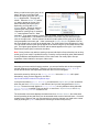
1
E-Data Collection Survey Engine
Version 4.0
E-Centric, Inc.
FEATURES
•
On-the-Fly Survey Builder: Create an entire survey, complete with a reporting system
in minutes.
•
Reports & Pie Charts: Generate reports on survey submission results including
customizable pie charts. (new)
•
Survey Collections: Better organize your surveys by grouping multiple surveys into
survey collections.
•
E-mail Groups:
o
Create email distribution lists.
o
Invite email recipients to complete only surveys you want them to complete.
o
Remind invitees to take surveys who did not complete all surveys they were
asked to take.
•
E-mail Composer: Create plain text or HTML e-mails using a WYSIWYG editor.
•
Survey Layout Manager: Upload HTML and apply custom designs to surveys. (new)
•
Administrative Security:
o
Create Departments allowing Administrative Users to manage only surveys
pertaining to their respective department.
o
Assign roles to Administrative Users determining who can view reports, create
surveys, or publish surveys.
•
Test Data: While logged in as an administrator, submit surveys to create test data to
preview reports.
•
Survey Security:
o
Allow survey takers to submit the survey only once or an unlimited number of
times.
o
Determine type of security to apply to survey collections (Cookies, IP Tracking,
Email Invitations, or none)
o
Set the date range for which the Survey will be active.
•
Survey Logos: Easily upload and apply an image to appear on a survey.
•
Survey Organization:
o
Organize survey questions into sections.
o
Paging options allow you to choose between a single page layout or a multipage layout which inserts page breaks between sections. (new)
o
Assign multiple response types to a single question. E.g., The question, “What is
the city and state in which you reside” may have two fields – one text field for the
user to enter the city name and one dropdown list to select the state.
o
Progress Indicators: Multi-page surveys may display progress bars (where
each bar represents a page) to indicate to the survey-taker how far along in the
process they are currently at. Width and bar colors are customizable. (new)
o
Answer Matrices: Create Answer Matrices for groups of questions.
o
Comment Boxes: Allow users to enter optional comments for questions with
other response types. E.g., The question, “Do you enjoy working at ABC Bank?
(If you answer “no,” please explain.)” will have a “yes/no” radiobutton list as well
as a comments field.
o
Field Validation: Specify which response fields are required fields.
o
Specify input control types for each response type, including single response
controls (e.g., dropdownlists) or multiple response controls (e.g., checkboxes).
•
Textboxes
Radiobuttons
Dropdown lists
Checkboxes (new)
Calendar controls – two to choose from (new)
E-mail control (validates input)
o
Specify your own custom JavaScript for response controls.
o
Use data from external sources (i.e., another database on the server) to
populate dropdownlists with answer options.
Data Analysis:
o
Filter report results by date and, optionally, by question responses (i.e.,
determine custom filters to use as criteria for generating reports).
o
Multiple report views (to display comments, raw scores, question averages,
section averages, text answers, or any combination of the above).
o
View reports averaging results collectively or view reports on individual survey
submissions one by one.
o
Detailed Reports produce a visual representation of response value averages
(by question and by section).
o
Pie Chart view allows you to customize the display (new):
Rotate Pie charts
Resize the graphics
Show or hide the legend
Show or hide slice labels and percentages
Displace a slice for emphasis
Display by section, question or the entire survey.
2
•
Copy Surveys: Copy the entire structure of a survey to base an all new survey on an
existing one with just a few clicks. (new)
•
Print Reports: Easily toggle reports between “Printer Friendly” and “Web Friendly”
versions to print only what you need. (new)
•
Ease of Use: Requires no coding; simply install the database and web application and
begin building surveys.
•
Customizable: With the purchase of the source code version you can make
modifications to fit your specific requirements.
3
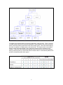
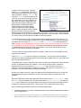
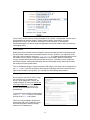
SURVEY HIERARCHY
Before you begin to build surveys, it is important that you understand the database relationships,
or survey hierarchy.
A Survey Collection is simply a way to group multiple surveys together. For example, your
company may have a collection to gather customer feedback on technical support and on the
products. The collection might be named “Customer Satisfaction” and may consist of two
separate surveys: “Technical Support” and “Product Satisfaction”. When the customer visits the
survey collection URL, he will choose one of the surveys from a dropdown list within a survey
page or from links on the collection index page.
If only one active survey is available within the
collection, the menu will not appear and,
instead, the collection will always default to the
one survey it contains.
You can view all active survey collections and
all the active surveys created for them on the
Survey Index page: http://localhost/EDCv4/
(Note: The above URL redirects to the default survey index page:
http://localhost/EDCv4/pages/index.aspx)
Each survey is made up of sections which, as expected, contain questions.
Although in most cases the questions will require a single response, some questions may require
more than one type of response. E-Data Collection allows more than one response input per
question. For example, if the question is, “Would you like to receive email offers? If so, please
provide an email address,” the question might have a “yes/no” radiobutton list as well as an email
textbox control. Furthermore, E-Data Collection allows you to add optional comment boxes to
questions.
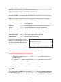
There are two types of response that can be assigned to each question. In the admin screens
they are all referred to as “Answer Groups” and they are as follows:
•
•
Text Input: single line textbox, multiline textbox, email control, date control
Option Groups: dropdown lists, radiobutton lists, and checkbox lists
Text inputs are straightforward as they don’t require the survey designer to create options. The
option groups, on the other hand, are created by the administrator in one of two ways:
•
The administrator can specify the options for a group which will then be assigned to a
question. For example, your answer group may be named “Quality” and the answer
options may consist of “poor”, “fair”, “good”, and “excellent”. In addition to text, each
option may (or may not) have a numeric value used for averaging results in the report
builder.
•
The administrator can fetch the options from a table in another database. For instance, if
the question is “What is your instructor’s name?” the options may be pulled from a table
named “Instructors” in the University database. This will then populate a dropdownlist.
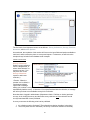
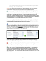
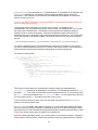
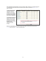
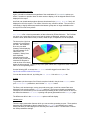
Figure 1 below displays the survey hierarchy described above. (Pay particular attention to the
question answer groups.)
4
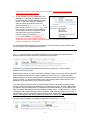
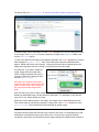
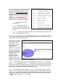
The diagram above demonstrates the hierarchy applicable in most scenarios. There is, however,
one other scenario which has not yet been mentioned. Answer Matrices such as the one shown
below, are actually answer groups that contain other answer groups. And, rather than assigning
the matrix to questions, we assign them to the section itself. The answer matrix in the example
below is named “Importance:Quality” and it contains two answer groups (“Importance” and
“Quality”). Notice how each answer group appears three times (once for each of the questions).
When you add a question to a section that uses an answer matrix, it is automatically added to the
grid with corresponding radio button groups.
5
ADMINISTRATION
You can use the following URL to access the Admin Tool: http://localhost/EDCv4/admin/
(Note: The above URL redirects to the login page: http://localhost/EDCv4/admin/login.aspx)
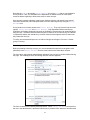
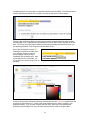
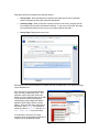
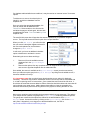
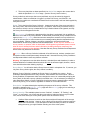
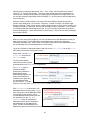
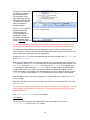
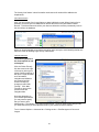
Navigation
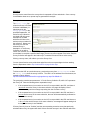
After logging into the survey administration tool, you are redirected to the Analyzer page. From
here, you can easily navigate to any other admin page to which you have access (based on your
role) by using the navigation tabs, shown below:
Some things to note about the navigation tabs follow:
•
Depending on your roles you may or may not see all of the above tabs, or they may be
named differently. For example, a user who only has the “Author” role, will see a tab
labeled “Secure” in place of the “Manage” tab, and instead of managing all users, the
author may only update his own password there.
•
Each tab may have multiple sub-links. On the “Manage” tab visible above, there are two
sub-links: Account Manager and Department Manager. Since the user is currently
visiting the Department Manager page, the link is readonly and the star icon indicates
which page is currently active.
•
Each sub-link has a corresponding short description.
•
View sub-links and navigate to a page on a different tab from the active one simply by
moving your mouse pointer over the tab. In other words, you do not need to click on the
other tabs to view its sub-links.
•
To log out of the system, click on “Logout” in the lower-right of the header (above the
tabs).
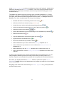
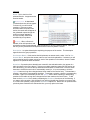
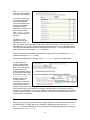
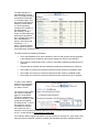
Icons
The following table shows the icons used throughout the survey engine and what they indicate,
as well as whether or not they are clickable and functional:
Icon
Meaning
Function
Indicates the active page in a list of sub-links for a tab.
Not Clickable
Indicates page in a list of sub-links that is not the active page,
but can be navigated to by clicking on it.
Not Clickable
Preview button for the selected resource
Click to preview
6
Delete button for the selected resource. (Requires user
confirmation.)
Click to delete
Details for the corresponding resource.
Click to view details
Purge test data of selected survey
Click to delete
Copy the selected surveys structure to create a new survey.
Click to copy
Promote resource up one row in the resource table.
Click to move up
Demote resource down one row in the resource table.
Click to move down
Edit selected resource
Click to edit
Indicates that the selected Response group is a Matrix
Not Clickable
Help button for the resource or form field.
Click for help
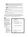
Departments
Each user belongs to a single Department. Only Master Admin users can create or modify
departments. While it is possible to rename the [Default] department, it may not be deleted. If
you or your organization do not require separate departments, all users may be assigned to the
[Default] department.
Users may belong to only one department and may only manage surveys and associated data for
their respective department. Only Master Admin accounts have rights to manage surveys and
users for all departments. As such, while a Master Admin navigates around the admin tool, he is
presented with an additional Department dropdownlist by which he may select other departments
to manage. Other users (who are not Master Admins) are not presented with this option.
Note: Most of the screenshots presented throughout this User Manual do not display the
aforementioned departments dropdownlist since for most users who have more limited roles this
option will not be available.
While you may have the need for more than one department, you will likely still want certain
assets (such as Answer groups, Sources, Designs and Images) to be shared by all. For
example, “yes/no” answer groups should be shared for all survey builders to use regardless of the
department they are assigned to, as this is a common answer group. In order to share assets
among all departments, simply create the asset within the [Default] department. While other
departments will not be able to make modifications to those assets, they can use all assets
created within the [Default] department within their surveys.
Important: All assets created for the [Default] department are shared with all other departments.
Thus, if you have multiple departments, the [Default] department should only be reserved for
creating common resources and managing departments.
7
To create a new department, log in
under a Master Admin account.
Click the Department Manager link
on the Manage tab. Select Add
Department from the Departments
dropdownlist. Enter a unique name
for the department, select an Index
Layout – ”Default Design (Index)” if
no others have been created – and
click the Add Department button.
The screen will refresh with your new
department selected in the dropdownlist and will enter update mode.
When a department is disabled, users assigned to that department are unable to log into the
admin tool and surveys created by those users will be deactivated.
The Index Layout is the design which will be applied to the department’s survey index page
(which lists all available survey collections within that department).
When a department is deleted, the department’s users are also deleted. However, the other
assets (Survey Groups, Answer Groups, etc.) are not deleted. Instead, the user deleting the
department takes ownership of these assets. Therefore, if you want to delete the departments as
well, you should delete the assets prior to deleting the department.
User Accounts
The Admin Tool implements role-based security. Each role has certain rights, and when multiple
roles are assigned to a user account, the least restrictive rights apply. The roles are as follows:
BUSINESS ANALYST:
The business analyst is able to generate reports for his department on any and all of the surveys
that have live data – that is, data which is not test data created by other administrators when they
were building their surveys.
SURVEY AUTHOR:
This user may create new survey collections and surveys for his department. When the author
creates a collection or survey, he is automatically the Owner of that collection or survey. If
another user created a collection, the Survey Author may nevertheless create new surveys
belonging to that collection. This is because the Survey Author cannot publish a survey.
Likewise, the author may not delete the surveys or collections he creates.
In addition to creating surveys and collections, the author may also create new Answer Groups to
use with surveys.
The Survey Author may edit any of his collections, surveys, or answer groups as long as he
remains the Owner and the collections or surveys are not published. (The author may not edit his
own answer groups if other administrators created surveys that utilize the answer group in
question.)
Finally, the author may view Demo Reports with test data. When an administrator is logged into
the Admin Tool, previews a survey, and submits it, the responses are considered test data.
Therefore, Demo Reports offer the author and publisher a way to simulate the reports without
viewing the actual results (“Live Data”). If a user should have all the rights of a Survey Author but
8
at the same time be able to view “Live Data”, the user should be assigned both roles: Survey
Author and Business Analyst.
SURVEY PUBLISHER:
A Survey Publisher may create new survey collections, surveys, answer groups (response
options), create new sources for answer groups, create designs and upload images to be
assigned to surveys. This user may also edit the same, whether or not he is the Owner. The
publisher may also activate or deactivate surveys. When a survey or collection is activated it is
live (i.e., “published” on the internet or intranet). The publisher may also transfer Ownership of
answer groups and surveys to other authors (i.e., reassign work to an author who did not create
the survey initially).
Unlike the Author, the Publisher may edit surveys that are Live. He may also delete survey
collections, surveys, and images, or purge a survey’s test data from the database.
Additionally, the Publisher may create e-mail groups, add e-mail addresses to the groups,
compose and send e-mail invitations and reminders.
Like the Author, the Publisher may only view Demo Reports, and may not generate reports on
“Live Data” If a user should have all the rights of a Survey Publisher but at the same time be able
to view “Live Data”, the user should be assigned both roles: Survey Publisher and Business
Analyst.
DEPARTMENT ADMIN
The Department Admin has the combined rights of Survey Publisher and Business Analyst in
addition to the right to Manage User Accounts. In other words, the Department Admin has full
rights to perform all functions within his department. In addition to those rights listed for the
publisher and analyst, the Department Admin can create new user accounts, assign roles to new
users, activate and deactivate users, and specify the department’s index layout. This user may
not, however, modify his own roles. Once a Department Admin, always a Department Admin
(unless another Department Admin or Master Admin deactivates or modifies his account).
Since the Department Admin may view reports on either “Test Data” or “Live Data” and has full
control over surveys, combining this role with others would have no effect whatsoever.
MASTER ADMIN
The Master Admin differs from Department Admins in just one respect: While Department Admins
have full control over their respective departments, the Master Admin has full control over all
departments and, in fact, is the only type of user who can create and manage other departments.
Master Admin accounts can belong to the [Default] department only.
*NOTE: This document assumes the perspective of Department Admin, except where otherwise
noted.
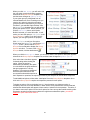
Manage Users
When you log in as either Master Admin or Department Admin, you can manage user accounts.
To access the user accounts screen, click on the Manage tab or the Account Manager sub-link
in the Manage panel.
Your own account details will appear by default. You may update your name, username, or
password, but not your own roles.
9
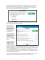
To add a new account, select “Add User”
from the Users dropdownlist. Enter a Name
(first and last are required, while the middle
initial is optional), a unique Username, and
select the Role(s) that should apply to the
new user. If no roles are selected, the user
will not be able to log in to the Admin Tool.
Although a user can be assigned all roles,
having all roles assigned and having only
Master Admin or Department Admin
assigned has the same effect: Master
Admin or Department Admin rights will
apply. Likewise, selecting Survey Publisher
and Survey Author roles is the same as
selecting only Survey Publisher: Survey Publisher rights apply. However, if the user should have
Survey Publisher (or Survey Author) rights and also be able to view “Live Data”, Survey Publisher
(or Survey Author) must be selected in addition to Business Analyst.
If you want the new user to log in for the first time without supplying a password, click the Empty
Password link to hide the password fields (if they are not already hidden). If the password fields
are hidden, the link changes to Set Password. Click Set Password to reveal the password
fields. Whether you set a password or not, the first time a user logs into the Admin Tool, the user
will be required to change the password. The length of the password must be between six and
12 characters and must not be the same as the original. The user will not be able to use the
Admin Tool until the password has be updated.
You may create accounts as either enabled or disabled. When an account is disabled, the user
may not log into the tool.
Click the Add Account button to create the new account. The new user’s name will appear
selected in the Users dropdownlist and the form will change to update mode (i.e., the button’s text
will now read “Update Account”.)
To update a user’s account, select the user’s name from the Users dropdownlist. When selected,
the form is populated with the user’s details. If you wish to modify the name, username,
password or roles, you must click the Update Account button to apply the changes. If,
however, you only wish to disable or enable the account, simply check or uncheck the Enable
checkbox. The form will process the change automatically.
As when you create a new user, when you update a user’s password (other than your own), the
next time that user logs into the Admin Tool, he or she will be required to change his or her
password.
Note that while Master Admin and Department Admin users have the Account Manager under
the Manage tab in the header menu, all other users have the Update Password link under the
Secure tab. Clicking on this link allows users to view their own user details and enables them to
change their password as they please. They may not view or update other users’ details.
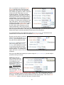
Note the following about Master Admin and the [Default] department:
•
The Master Admin user is, in fact, a Department Admin of the [Default] department as well as
all other departments.
•
If only one department exists in the system (i.e., [Default]), the Master Admin can add other
Master Admin accounts, Survey Publishers, Authors, or Business Analysts to the [Default]
10
department. However, if other departments are created, all of the users in the [Default]
department become Master Admins.
•
As long as there is just one department in the
database (i.e., [Default]), the Master Admin will
be presented with a slightly different Accounts
screen. In this case, there is an additional
option for selecting whether the new user
account should be a Master Account. This
takes the place of the Department Admin role
in the previous screenshot. When the Master
Account option is set to No, the administrator
may select other roles from the listbox.
However, when Yes is selected, Assigned
Roles is not available. Once additional
departments have been created, all [Default]
department users become Master Admins and therefore, the Master Account option will
always be disabled with Yes selected.
The following section discusses the recommended process for creating survey collections and
surveys using the Survey Builder and other tools.
Recommended Process
The Build tab contains the core tasks for building surveys, and thus survey builders will no
doubt find that most of their tasks will be performed using this panel:
Administrators, publishers and authors may create survey collections, surveys, sections,
questions, and answer groups.
When building a survey, the author must select a design to apply to the survey and can optionally
select progress indicators and/or a logo to appear at the top of the form. Furthermore, after
adding a question, the author adds input fields, oftentimes consisting of common answer options
such as “Yes/No”. It is therefore advisable to have the Designs and the Answer Groups in the
database prior to beginning the survey authoring process.
Thus, administrators would do well to create the answer groups, upload the necessary images,
and set up designs and progress indicators prior to creating the surveys. This will enable authors
to create the surveys without having to navigate back and forth between the Survey Builder and
other screens like the Manage Sources and Manage Images screen. In other words, you cannot,
for example, add a response option group to a question if that option group does not yet exist, or
add an image to a survey when the image does not yet exist; which is why it is recommended that
designs and images be uploaded and options defined prior to creating surveys.
The logo, progress indicator and design managers are found on the Design tab:
11
Note that the Design tab and the Source Manager link on the Build tab are not available to
Survey Authors. Thus, it is advisable for the Department or Master Admins to create these
resources before beginning to allow those users to author surveys.
Once images, progress indicators, page layouts, external sources, and answer group options
have been created, the author will spend most of his time authoring surveys using the Survey
Builder form.
Survey Authors do not have access to the Source Manager. They only have the first two menu
options: Survey Builder and Option Manager. Only Department Admins and Survey
Publishers can manage images and sources as modification of these items can potentially affect
many surveys. Therefore, before an author begins to create his or her own surveys, a Publisher
or Department Admin user should set up common resources that might be useful to authors as
they create their surveys.
To recap: the recommended process is as follows: Designs and Images > Sources > Answer
groups > Surveys
Form Navigation
Before proceeding to develop surveys, you must understand the special form navigation used
particularly in the Survey Builder, and to a lesser extent on the other admin screens.
The form has a unique design that facilitates navigation from one level to another without leaving
the page. The advantages of this form design will soon become apparent.
The form is based on the hierarchy described earlier. When Survey Builder is selected from
the menu, the administrator is presented with the survey collection form where he can either add
12
a new Survey Collection or select an existing one to view or edit its details. Included in the
details is a dropdown list of all Surveys it contains. If one of the surveys is selected from the
dropdownlist, the administrator will view the selected survey’s details for editing (seen in the
screenshot above).
The boldface link captions at the top of the form serve as vertical breadcrumbs (i.e., “Survey
Collections > Surveys”), suggesting that the Surveys form is currently selected. The boldface
link caption at the bottom of the form suggests the next level down, i.e., Survey’s child form is
Sections. From here, the administrator can do any of the following:
•
drill down still further to edit existing sections in the survey
•
add new sections for the selected survey (*Sections:), or
•
reorder the survey sections using the promote/demote buttons
•
activate or deactivate the selected survey or any of the survey sections
•
update the selected survey details
•
preview the selected survey, the selected image, or the selected survey collection
•
delete the selected survey
•
copy the selected survey’s structure to build a new survey
•
purge test data for the selected survey
•
return to the selected survey collection’s details
•
select a different survey to view or edit from the Surveys dropdown list, or
•
select a different survey collection to view or edit from the Survey Collections
dropdown list, or
•
select “Add Survey” from the Surveys dropdown list to create a new survey, or
•
select “Add Collection” from the Survey Collections dropdown list to create a new
collection.
, or
, or
, or
, or
, or
, or
, or
, or
, or
In other words, on whichever form you find yourself within the Survey Builder screen, you can
easily navigate to almost any other form to carry out the action you wish to perform. It is,
however, imperative you understand the symbols and icons presented in the bulleted list above.
Note that if you navigate downward to Section details or upward to the parent Survey
Collection without clicking on the Update button, any changes you made to the Survey details
will not be committed.
Navigating to the lowest level in the hierarchy, the Answer Options form, you are presented
with the following screen:
13
In this screen, we are currently viewing the details of the “Quality – Dropdownlist” Answer Option
Group assigned to question number 1 of the “Product Quality” section of the “Product
Satisfaction” survey of the “Customer Satisfaction” survey collection. This screenshot
demonstrates again, how we can easily navigate back to any level to add to, edit or preview any
of the higher levels.
Admin Screens
Now that we have reviewed the form navigation and recommended process for building surveys,
we will proceed to discuss each of the administrative screens. However, you might find, at this
point, that it will be helpful to open the Survey Builder in a separate window and observe how
the sample survey collection (“Customer Satisfaction”) was created. Without modifying the
surveys, navigate around the builder and preview the surveys. Submit the survey a few times
and view the reports. Having some familiarity with how the sample surveys were built will make
the content in this user guide clearer.
First we will discuss Designs, Progress Indicators and Images, all of which can be managed from
the Design tab. If you wish to forego customizing survey designs at this time, and wish to dive
right into the creation of survey forms, you can skip over the following three sections.
Manage Images
Survey authors may want to add an image
(the company logo, for instance) to a
survey. Once assigned to a survey, the
image will appear on the survey below and
to the right of the title (or to the right of the
instructions if instructions exist for the
survey), as the screenshot on the right
demonstrates.
To make an image available, upload images
on the Logo Manager screen. You will find
this link on the Design tab’s panel.
This form is only available to Department
Admin users and Survey Publishers (roles
with sufficient rights to manage images
within their own department).
14
The admin URL to the Logo Manager is: http://localhost/EDCv4/admin/ImageUpload.aspx
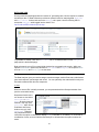
To add an image, select “Add Image” from the Images dropdown list, provide a descriptive name
for this image in the Image Name text box, specify the file path in the Image File textbox, and
click the Add Image button.
You will notice that the new image’s name appears selected in the Images dropdown list, and the
button changes to “Update Image”. Also, in this mode (edit mode) two additional buttons
appear: Delete and Preview (icon buttons). Clicking the preview button (magnifying lens) will
display the image within the form; clicking it a second time will hide the image.
At a later time, if you wish to update the
image, simply select the image name
from the Images dropdown list, select a
new file to replace the existing one with,
and click Update Image.
Note that if you upload an image that is
larger than 300 pixels in width and/or 200
pixels in height, the file will be resized to
the maximum allowable height and/or
width.
Also note that you are able to delete images even when an image is associated with a survey.
Deleting an associated image, will also delete the association. It is advisable to verify that the
logo is not in use, before deleting an image.
Now that you have added images to the system, the images may be associated with surveys.
This is done simply by selecting the descriptive image name in the Surveys details form in the
Survey Builder screen which will be discussed later at greater length.
Progress Indicators
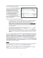
Progress Indicators enable the end-user to get a sense of how much of a multi-page survey has
already been completed and how much is still to come. Each bar in the progress indicator
represents a single page, and the different colors suggest whether the respective bar indicates a
15
completed page, the current page or a page that remains to be completed. The following screen
capture demonstrates that the survey taker is currently on the second of three pages:
There are also subtle gray labels specifying the percentage completed and the page numbers
and total page count. Depending on your preference, you can hide or show any label or the bar
itself. Thus if you only want page numbering without the percentage and without the bars, you
can set that preference on the Progress Indicator admin screen.
One of the advantages, however, of
including a progress bar is that it gives
your users the chance to return to
previous pages without having to
repeatedly click the back button. Also,
by mousing over any of the bars, the
survey taker can read the section title for
that step.
Create a new progress indicator by selecting Add Indicator from the Indicators dropdownlist and
specifying a unique name for it. Check each of the features that you want to include in your
progress indicator. If you uncheck Progress Bar, Bar Size, Step Colors and Hexadecimal
preferences will be hidden from view, as these preferences only relate to Progress Bars.
16
Check Page Count if you want to include page numbering (e.g., “Page 2 of 3”).
Check Percent Completed if you want to include the percent of the survey that will be completed
once the current page is completed.
If either Page Count or Percent Completed is checked and the Progress Bar is also checked, the
text will appear above the bar.
If Progress Bar is checked, you can specify its height, in pixels, and its width, in either pixels or
percentage as it relates to the available page width,
If Page Count is checked, but Percent Completed is not, page numbers will appear without
parentheses; but if both are checked, page numbering will appear within parentheses.
You can also specify colors for individual step types: completed step, current step, or incomplete
step. You can choose the color from the color picker by clicking on the step’s bar, or you can
specify the specific hexadecimal code in the space beneath the bars.
After specifying your preferences, click the button to either add or update the progress indicator.
Once added to the system, the indicator will appear in a dropdownlist in the Survey Builder to
select and apply to surveys. If the survey does not implement paging, however, the preference
will be ignored, and no progress bar will appear in the survey. (Implementation of paging will be
discussed in the section on the Survey Builder admin screen.)
Page Designer
Note: Knowledge of HTML is highly beneficial to enjoy full control over page layouts. This section
assumes the designer has an understanding of HTML.
While the Logo Manager enables you to upload images to appear within the survey, the Page
Designer, by contrast, allows you to control the look-and-feel of the page containing the survey.
For example if you want to add a custom header and footer to your survey to keep the look-andfeel of it consistent with the rest of your Web site, use this form to submit your HTML design. Just
be sure to enter @@Content in the HTML, between header and footer, which is where you’ll want
the Survey form is to be positioned.
The @@Content variable must appear one time for every design and, depending on the version
of E-Data Collection you use, the @@Footer variable may also be required.
When loading pages, @@Footer is replaced with the standard E-Data Collection footer.
The Page Designer form is only available to Department Admin users and Survey Publishers
(roles that have sufficient rights to manage designs within their respective departments).
The admin URL to Page Layouts is: http://localhost/EDCv4/admin/Design.aspx (See
screenshot on the next page).
Like all resources, you are required to give each new design a unique Name.
Select the Layout Type from the following options: Multi-Purpose, Survey Page, Collection Page,
Index Page. The survey engine produces three types of page. When you design layouts you can
specify which page type it should apply to. If one design should be used for all types of pages,
you can choose to create just Multi-Purpose layout. On the other hand, for greater control over
the look-and-feel of each page type, you can create three separate designs, one for each page
type: Survey Index, Survey Collection and individual Survey.
17
Page types and the functionality each provides follows:
•
Survey Index: When a department is specified, this page lists all active collections
within the department along with collection descriptions.
•
Collection Page: When a collection contains more than one survey, this page lists all
the available surveys within the selected collection. If only one survey exists, this page
will automatically redirect to the one survey contained therein and load it.
•
Survey Page: Displays the survey form.
Examples of each of these designs are available through the Help button (icon) beside the Page
Layout dropdown list.
Once the Layout Type has been decided
upon, it’s time to upload the HTML. One
method to quickly and easily submit the
design is to open a Web browser to the URL
of your Web site (which presumably is
essentially the same design that shall be
applied to the E-Data Collection content
pages). With your Web site’s page open in
a browser, click on Page in the browser’s
toolbar and select Save As… and save Web
Page (HTML Only) to your hard drive.
It is important to note that, no Design
resources such as stylesheets, script files or
images may be uploaded to E-Data
18
Collection. Therefore, you are required to verify that all references to images and other files have
specified Fully Qualified URLs. Thus relative references such as ../images/logonew.gif is
not sufficient and must be replaced with the complete URL such as
http://www.dotnetgoodies.com/images/logonew.gif.
Once you have created an HTML file that meets the requirements (including the presence of the
two required variables -- @@Content and @@Footer), either upload the file or copy the HTML
and paste it into the editor in source view.
Aside from the required variables, there are several others that can be used in your design to
include other dynamic content. The full list of variables follows:
@@Content
*Required Enter this where the page's main content (such as the survey
form) ought to go.
@@Footer
*Required Enter this where you want the standard footer the appear.
@@List
Optional
Creates a dropdown list of surveys to choose from.
@@DepartmentName
Optional
Gets the name of the current department.
@@DepartmentUrl
Optional
Links to the current department's index page.
@@SurveyGroupName Optional
Gets the name of the current collection.
@@SurveyGroupUrl
Optional
Links to the current collection's main page.
@@SurveyName
Optional
Get's the current survey's name.
An example of using the above variables
would be to create breadcrumbs as seen in
the capture to the right. The breadcrumbs at
the top of the page are created simply by
adding the following to the HTML:
@@DepartmentUrl > @@SurveyGroupUrl > @@SurveyName
(The dropdown list was created by adding the @@List variable to the HTML.)
Follow these important guidelines for using variables:
All layouts must include one @@Content and one @@Footer variable (and no more
than one of each).
If using the @@List variable, it must precede @@Content (and there must be no more
than one @@List variable per layout).
The @@Content variable must precede the @@Footer variable.
The @@List option is not available for Department index pages.
UPLOAD HTML
If you upload HTML, you MUST wrap your content in <BODY> tags with no attributes specified.
In other words if you use <BODY onload="someFunction();">, the layout will not be read.
You can optionally add some <HEAD> information; but again, when uploading, the HEAD tag in the
19
uploaded HTML file must not have any attributes; otherwise it will be ignored.
When you upload HTML successfully, the HEAD information will be placed in the first TextArea
below the upload control. The BODY (i.e., page content) will be placed in the Rich Text Editor.
Note that the changes will not be committed until you have submitted the form.
RICH-TEXT EDITOR
To Edit the HTML using the Rich Text Editor, click on the toggle source button in the editor
toolbar To Edit in Full screen mode, click the toggle full screen button in the editor toolbarPAGE ELEMENTS & STYLES
When creating a design it is important to pay special attention to Element ID's if, in fact, you
assign ID’s to your elements. Make sure that they do not conflict with any of the ID’s of the
dynamically created controls. Furthermore, if you add styles to the HEAD or reference a
stylesheet, you will want to make sure that the class names do not conflict with existing styles in
the default stylesheet (unless you want to override the style defined therein).
To review all the styles in the default stylesheet, click the Help icon and scroll to the bottom of the
help page where the download link is given. An overview of predefined styles follows:
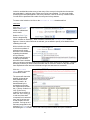
Style Name
Type
Level
Description
body
TABLE
TEXTAREA
a (Anchor)
PageTitle
Standard
Standard
Standard
Standard
Custom
All
All
All
All
All
SubTitle
SelectSurveyClass
SurveyBulletHeader
Custom
Custom
Custom
All
Group/Survey
Group
arrow
IndexSectionHead
IndexSectionText
IndexLink
InstructionTitle
Custom
Custom
Custom
Custom
Custom
Group
Index
Index
Index
Survey
InstructionText
Custom
Survey
SectionName
SectionDescription
headstyle
valueheader
tdstyle
TextOnly
Custom
Custom
Custom
Custom
Custom
Custom
Survey
Survey
Survey
Survey
Survey
Survey
QuestionText
Custom
Survey
Confirmation
Custom
Survey
Body style
Table style
Textarea (multiline textbox) formatting
Link style
Page Title Text (e.g. Survey Group Name
for Surveys)
Subtitle Text (e.g. Survey Name for surveys)
Title text for Survey dropdownlist
Bulleted list items (in list of available or
unavailable surveys)
Bulleted list of surveys (list tag)
Section Header
Section Text (Survey Group description)
Link to Surveys
Instruction Title (title is set in Web.Config,
and appears whenever Instruction Text is
specified for the survey)
Survey instructions (or any other text to
appear at the top of the survey)
Section Name
Section Description Text
Matrix Column Group Header
Matrix column Header
Matrix row header
Question text for questions with NO
responses
Question text for questions WITH responses
(data entry controls)
Confirmation text formatting.
20
APPLYING LAYOUTS
To apply a layout to the Department’s survey index page (which lists all available survey
collections and their child surveys, select the desired layout from the Index Layout dropdown list
on the Department Manager admin page. (If you are not logged in on with Master Admin
account, navigate to this page by clicking on Default Design on the Manage tab’s panel.)
To apply a layout to the Survey Group or Survey, navigate to the Survey Builder admin page, by
clicking on the Survey Builder link on the Build tab’s panel, select either the group or one of
its child survey’s, select the desired design from the Group Layout or Page Layout dropdown
list, and update the resource.
The options in the respective dropdown lists will include the designs that were created specifically
for the page type of the element being updated as well as any layout that was created as a Multipurpose Layout. If any designs are available from the [Default] department for the respective
page type, those layouts will also be listed along with your department-specific layouts.
DEPARTMENT LIST
When the index page is accessed without specifying a department, a list of all departments is
presented with links that direct the user to the selected department’s index. The department list
page can be formatted with a page layout by specifying the default layout in the Web.Config file
in the application’s root directory.
The Web application’s administrator can follow these steps to apply a layout to the department
list:
1. Follow the instructions laid out in this section to create layout.
2. Open the SQL Database table tbl_Designs in the SQL Server Management console
and find the record with the name supplied when creating the layout and note the
DesignId.
3. Locate and open the Web.Config file found in the Web application’s root directory.
4. Under the Default Designs comment in the appSettings section, locate and
update the MainIndexDesign element with the appropriate DesignId.
5. Save the file.
Once completed, the layout should be applied to the department list.
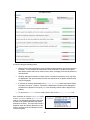
Manage Sources
Many survey questions require the survey taker to respond by selecting an option from a
radiobutton list, dropdown list, or checkbox list. Although E-Data Collection allows you to define
the options via the administrative tool, some answer groups may be so large you might want to
pull it from an existing table or view in a separate database. For instance, if the question is “What
is your instructor’s name?” the options may be pulled from a table named “Instructors” in the
University database. This will then populate a dropdownlist. The Manage Sources screen is
where you can specify such external sources. Access this screen by clicking on the Source
Manager link on the Build tab’s panel. Alternatively, once logged in, the URL is:
http://localhost/EDCv4/admin/Sources.aspx.
There are three requirements, however, which determine whether a source may be added:
1. The database must exist on the same SQL server as the Survey database,
2. You must be able to connect to this database using the same username and password
used to connect to the Survey database.
3. The table must have an identity column set as a unique, numeric key.
21
If a database table satisfies these conditions, it may be used as an “external source” for answer
options.
To add a source, enter a short description to
identify it, and select a database from the
dropdown list.
Once you select the appropriate database, the
form will refresh with an additional field:
Table/View. Select a table or view from the list
and allow the page to refresh again, this time with
an additional two fields: Text Field and Key Field
dropdown lists.
The text field is the text that will populate the answer dropdown list for questions using this
source. The key field ensures that each option has a unique identifier.
When you click Add Source, you will notice that
the new source’s description appears selected in
the Sources dropdown list, and the button
changes to Update Source.
In edit mode, you have an additional checkbox
option to deactivate or activate the source.
Deactivating the source does two things:
1.
2.
Removes it from the available sources
dropdown list in the Option Manager
screen.
Removes the options from any questions where its assigned answer option group used it
as a source to populate dropdown lists or radiobutton lists.
Once added, the source is available to the Option Manager screen (see the next section).
Once you define an option group in the Option Manager as pulling from the added source, it
becomes available to surveys.
It is important to note that you should never deactivate the source unless it is absolutely
necessary. This action may produce undesirable results in the surveys that are associated with
it, or lead to reporting errors or inaccuracies. Once created the source should be left alone. It
should also be noted that sources added to E-Data Collection should be tables and views that will
not be altered to any great extent. Adding data to these tables or views is acceptable, but
deletions should not be performed as long as the survey system is utilizing the table or view.
Option Manager
Most survey questions require multiple choice answers rather than text responses. The options
for a multiple choice question are grouped into Answer Groups containing predefined options.
The groups are created and the options are defined in the administrative tool’s Option
Manager screen. Access this screen by clicking on the Option Manager link on the Build
tab’s panel. Alternatively, once logged in to the administrative tool, the URL is:
http://localhost/EDCv4/admin/AnswerGroups.aspx.
22
As discussed in the previous section, Answer Groups can either pull their options directly from
another source created in the Source Manager, or can have options stored in the E-Data
Collection database. Either way, the group itself is managed from the Source Manager.
To create a new group enter a unique name for the group
in the Description field.
You will notice that the Group Owner is listed in a
dropdownlist. If, however, you only have Survey Author
rights, the Group Owner is readonly.
When a group is created, the Group Owner is, by
default, the creator. Survey Publishers and Department
Admin may, however, select another user as the owner.
When a Survey Publisher or Department Admin user
changes the owner, he is essentially assigning the item
of work to another user. It is not necessary to reassign to
other Department Admin or Survey Publishers since these users are granted rights to edit any
item for any survey, live or inactive, regardless of whether or not he owns the item.
If this answer group will serve as an Answer Matrix to apply to entire survey sections, select True
for the Is Matrix option. (We will soon discuss Answer Matrices in greater detail.)
Some groups should have a numeric value for each option. For instance, “Quality” should have a
numeric rating so results can be averaged together. If the options for the group “Quality” are
“poor”, “fair”, “good” and “excellent”, “poor” may have a rating of 1 and “excellent” a rating of 4.
When we run reports, we can then get an average of the responses. To make this possible,
check the “True” radio button next to Use for Average.
The Data Analyzers allow for custom filters. In order
to filter results generated by the analyzers on specific
questions, the question must have a Filter Alias and at
least one of its answer types must Allow Filtering. If the
answer group should allow filtering (like the “Locations”
answer group shown on the right), then select “True” for
Allow Filtering. By default, “True” is selected.
If you are defining your own options, select “Option
Builder” for Source Type. Otherwise, if you are pulling
options from an external source, select “Database Table”.
Note that external sources may not be used for
averaging. When “Database Table” is selected, the form
refreshes and Use for Average is disabled with “False”
selected.
Also, after the form refreshes, the Data Source
dropdown list appears populated with all the sources
defined in the Source Manager from which you must
choose. You may click the Preview icon to view the
available options with the selected datasource to make
sure it’s the one you want.
Clicking the Preview icon will display a dropdownlist
populated with the options from the data source.
23
When you click Add Group, you will notice that
the new option group’s description appears
selected in the Option Groups dropdown list,
and the button changes to Update Group.
If your option group is pulling data from an
external datasource, there is nothing more you
need to do in order to start using the option
group as question responses for your surveys.
If however, you selected “Option Builder” from
the Source Type dropdown list, you will need to
specify the options to use. Notice that after you
click the Add Group button, with “Option
Builder” selected, you enter edit mode. In edit
mode, you have the option to Add Options to the
Group Options. Indeed, if you don’t specify
options, your new group serves no purpose.
Click Add Options to add your first option.
Simply enter the Option Text, and click the Add
Option button. (Notice that the Option
Groups form contracted to display the Group
Options sub-form. To return to the Option
Groups details, click the details button .
When you click the Add Option button, you will notice that the new option’s description appears
selected in the Group Options dropdown list, and the button changes to Update Option.
Also notice that a checkbox appears
for deactivating and activating the
option. When the option is
deactivated (unchecked), the option
is not included in the group wherever
that group appears in a survey.
However, if surveys were submitted
while that option was active and
survey takers selected that option as
their response to questions, the reports generated by the analyzer will include those responses.
To add additional options, either select “Add Option” from the Group Options dropdown list or
click on the Group Options caption and repeat the process for each option.
To delete an option, click on the delete icon (x). Note that when you delete an option, it
completely removes it from the database; in other words, survey submissions received that had
selected the deleted option will appear to have made no selection for that question. Therefore, if
you want to remove an option from the list of options for future survey takers while retaining older
submission records from past server takers who might have selected the option, you should
disable the option rather than delete it.
24
Click on the details icon beside the Option
Groups dropdown list to view the group’s
details again. Notice that once options have
been added, they appear in a table. Using the
arrows to the left of the options, you can
reorder the options. The order in which the
options appear here determines the order in
which they will appear in the dropdownlists or
radiobuttonlists. You are also able to quickly
activate or deactivate individual options by
checking or unchecking the checkboxes to the
right of the options. Also, Survey Publishers
and Department Admin users have the option
to delete the selected Option Group. Care
should be taken when deleting any survey
element (particularly if the survey is active),
however, if the group is associated with surveys or other answer matrices, you will be notified
when clicking the delete button. After being warned of relationships, you can then opt to click the
delete button again to permanently delete the group and all its associations.
If you had selected the “True” radiobutton option for Use for Average, you would have been
presented with two additional fields in the add/edit Group Options form.
Returning to edit mode for individual
options, if you had selected Use for
Average, you would see the form to
the right, with two additional fields:
Option Value, which is the numeric
value for the option; and, Use for
Average, which determines whether
or not to factor this option into the
overall average when survey takers
select this option. For example, the
option “N/A” with a numeric value of 0 should, in most cases, not be averaged together with other
responses.
Once you have added and ordered your options using the Option Manager, you are ready to
proceed to build your surveys.
Additionally, once you
have created at least one
answer group that is used
for averaging, you can
create Answer Matrices by
selecting the Is Matrix
option when creating the
group. Once you add the
matrix answer group, you
are presented with the
form on the right. You will
notice that after you create
an answer group you may not change its matrix setting. If the group is an answer matrix, the
matrix icon will appear beside the option groups dropdown list. Also, all matrices are Used for
Averaging. Answer Matrices are simply collections of other option groups. Click on the Child
Option Groups caption to add option groups to the answer matrix.
25
When you add a new option group to the
matrix, the form on the right loads.
Select the option group from the Option
Group dropdownlist. The page will
refresh. Enter the Header Text which
you want to appear at the top of the
matrix describing this option group.
Optionally, you may add Header
Subtext as well. Subtext is useful for
explaining the rating system. In the
“Importance” option group, for example,
1 = “Least Important” and 4 = “Most
Important”. If you want to select a certain option by default, select the option in the Default
Selection dropdownlist. The header for each column in the matrix may use either the option
value or the option text. Use the values if the text for certain options in the group is too long to
look presentable in the matrix grid. Value is selected for Column Headers by default. Click on
the Group Details icon to return to the details page. The Child Option Group will appear in a grid.
You can reorder how the option groups appear in the matrix using the up and down arrows in the
grid. The highest group appears on the left and the lowest appears on the right. If you wish to
deactivate an option group, uncheck its checkbox.
Note: Survey Authors may add new option groups and edit Option Groups that they own as long
as the group is not used in a published survey or used by surveys owned by other administrators.
Survey Publishers and Department Admin, on the other hand, can modify Option Groups
regardless of their relations to surveys or other users.
Survey Builder
Assuming you have read the foregoing sections, you are now familiar with the form navigation
and with what each icon indicates. Therefore, we will now focus on the Survey Builder
screen and what each field represents rather than focus on form navigation.
Access this screen by clicking on the Survey Builder link on the Builder tab’s panel.
Alternatively, once you have logged in, the URL is:
http://localhost/EDCv4/admin/SurveyBuilder.aspx
In the previous section (Option Manager), you saw how the Option Groups form contracted
when the next level, Group Options, was selected, and you then navigated back to Option
Groups. The same concept applies to Survey Builder; the only difference being that while
Option Manager consisted of only two levels – or two forms – Option Groups and Group
Options, Survey Builder consists of five.
The screenshot to the below displays the lowest level form, Answer Options, but at the same
time all preceding levels (and forms) can be accessed either to edit or add new items. It is worth
repeating here, however, that you must remember to save the changes you made at the current
level (by clicking the Update button) before returning to another level (or form).
26
The five levels, from highest to lowest, are as follows: Survey Collections, Surveys, Sections,
Questions, and Answer Options.
As mentioned, the remainder of this section will focus on the input fields and options available to
each level, and the effect they have on surveys and reports. Furthermore, we will look at the
sample surveys included in the database as an example.
SURVEY COLLECTION
Survey Collections:
Select a survey collection
from the dropdownlist, or
select “Add Collection” to
create a new one. (You
may also click on the
Survey Collections
caption to add a new
collection.)
*Preview: When the
preview icon is clicked, a
new browser window
opens with a message
asking you to select a survey. If there is only one survey associated with this collection, it will
automatically load the survey. If there are no surveys associated with the collection, a message
will inform you there are no available surveys in the collection.
Note that when a logged in administrator (Department Admin, Publisher or Author) previews
surveys, he is viewing the survey and the entire survey collection as if the collection and all
surveys associated with it were published.
A survey must meet the following criteria to be published:
1. It’s collection must be “Activated” (The collection’s activation checkbox is checked.)
2. The survey itself must be “Activated” (The survey’s activation checkbox is checked.)
27
3. The survey has either no dates specified in its Active Date range or the current date is
within the specified Active Date range. (See the “Survey” section below.)
Survey collections and surveys that are not published, may only be viewed by logged in
administrators. When an administer is logged in, previews the survey, and submits it, the
responses he supplies are considered test data and will not be mixed in with real data supplied by
anonymous users.
Name: This is the title of the Survey Collection. It appears at the top of the survey and also in
the Survey Index, which lists all active surveys. (If, however, there is only one active survey in
the collection, when the survey is loaded the Survey Collection Name will be ignored, and only
the Survey Name will appear as the title.
Deactivate: If a collection is deactivated (the checkbox is unchecked) it is not published,
and none of its child surveys are published. A deactivated (unchecked) survey collection will not
appear in the Survey Index, and when someone attempts to access the survey collection or
one of its child surveys, he will encounter an error message stating that the requested surveys
are not available. Reports, however, can still be generated on surveys that have been
deactivated or whose survey collection has been deactivated. In fact, any item, whether it’s a
survey, section, or question, which is deactivated, will still appear in generated reports; however
when an item is deleted, that item and all child items (including submission responses) are
permanently removed from the database. Note also that only Survey Publishers and Department
Admin users may deactivate a collection.
Delete: When a Survey Collection is deleted, all its child surveys, sections, questions and
submission results are also permanently deleted as well. Note also that only Survey Publishers
and Department Admin users may delete a collection.
Warning: It is important to note the delete function is included (here and elsewhere) in order to
facilitate deletions of outdated collections which will never be accessed again; however, utmost
care should be taken when deleting anything!
Group Owner: You will notice that the Group Owner is listed in a dropdown list. If, however, you
only have Survey Author rights, the Group Owner is readonly.
When a Survey Collection is created, the Group Owner is, by default, the creator. Survey
Publishers and Department Admin may, however, select another user as the owner. When a
Survey Publisher or Department Admin user changes the owner, he is essentially assigning the
item of work (in this case a survey collection) to another user. It is not necessary to reassign to
other Department Admin or Survey Publishers since these users are granted rights to edit any
item for any survey, live or inactive, regardless of whether or not he owns the item.
Description: An optional description explaining the purpose of the survey collection. This
description appears on the Survey Index page and on the Survey page (prior to selecting a
specific survey from the dropdown list).
Survey Security: The available options here are “Cookies”, “Invitation”, “IP Tracking”, and
“None”. In most cases, you will not want the survey taker to submit a single survey more than
once, and in some cases you will only want specific users to submit the survey.
•
Cookies: When selected, a cookie on the client machine will keep track of the surveys
taken from that machine. However, often a family will log onto their computer under the
same local user account. If you anticipate more than one family member, for instance,
taking the survey you might consider selecting one of the other options.
28
•
Invitation: When selected, only users who receive e-mail invitations may take the
surveys in the survey collection. And each invitee may only take each survey one time.
The invitees are identified by a unique URL which they receive in the email. The
disadvantage of this method of security, however, is that you must know the email
address of each user you want to take the survey. Note that e-mail invitations and
reminders may be sent regardless of the security mode.
•
IP Tracking: When selected, the system will keep track of the surveys taken from the
client’s IP address and will disallow duplicate submissions from a single IP address
•
None: When selected, no security applies to the surveys in the collection. Any user can
take the survey multiple times.
Note that when an administrator logs onto the E-Data Collection Admin Tool, and previews
and submits surveys for testing purposes, the security mode does not apply to logged in
administrators.
Also note that if an invitee takes a survey using the URL sent to him, his submission status is
recorded regardless of the mode of security.
Surveys: Selecting a survey or “Add Survey” from this dropdown list will contract the Survey
Collections form. (You may also click on the Survey caption to add a new survey.) If an
existing survey is selected, the details form will appear in edit mode; if “Add Survey” is selected, a
blank details form will open in add mode. Remember to save any changes to the Survey
Collection by clicking the Update button before navigating to the Surveys form.
SURVEYS
Preview icon: When the preview
icon beside the Surveys
dropdown list is clicked, a new
browser window opens up and
loads the selected survey.
Note that when a logged in
administrator (Department
Admin, Publisher or Author)
previews surveys, he is viewing
the survey and the entire survey
collection as if the survey was
published (whether or not it is in
fact published).
A survey must meet the following
criteria to be published:
1. Its collection must be
“Activated” (The
collection’s activation
checkbox is checked.)
2. The survey itself must be
“Activated” (The survey’s
activation checkbox is
checked.)
3. The survey has either no
29
dates specified in its Active Date range or the current date is within the specified Active
Date range.. (See Active Dates below).
Name: This is the title of the selected Survey. It appears at the top of the survey (below the
Survey Collection title) and also in the Survey Index, which lists all active surveys.
Deactivate: A deactivated (unchecked) survey is not published. It will not appear in the
Survey Index and will not be an accessible survey to non-administrative users. When the user
attempts to load a deactivated survey in the browser he will either receive an error message
stating that the selected survey is no longer available or, if there is one other active survey in the
collection, will be redirected to the active survey. If there are multiple active surveys in the
collection, the user will be redirected to the Survey Collection page where he may choose one of
the active surveys, but not the deactivated survey. To preview the load behavior of a deactivated,
or unpublished survey, log out of the administrative tool and try to access it.
The deactivate checkbox setting overrides the Active Date range settings discussed below.
Note also that only Survey Publishers and Department Admin users may activate (publish) or
deactivate a survey. When an author creates a survey, it is not active and it will remain inactive
as long as a publisher or Department Admin user does not activate it.
Copy: Click the copy link or icon to go to the copy page (see screenshot below). You must
specify the origin and destination. Select the department, survey collection and survey to be
copied from the dropdownlists on the left side of the page, and select the destination department
and survey collection, and enter a unique name for the new survey on the right side of the page.
Click the Copy button to create the new survey and enter edit mode. (Note that the screenshot
below is viewed from the perspective of a Super Admin user.)
You will notice that you are also able to preview department index pages, survey collection
pages, and surveys directly from this admin screen in order to ensure that you are copying the
correct survey into the correct survey collection.
Delete: When a Survey is deleted, all its child sections, questions and submission results are
also deleted. (Note the warning in Survey Collections above). Note also that only Survey
Publishers and Department Admin users may delete a survey.
Purge Test Data: Clicking the recycle bin button purges all test data for the selected
survey. When a logged in administrator (Department Admin, Publisher, or Author) submits a
survey from the preview, the submission is flagged as test data. The administrator can then
generate (demo) reports on that test data. When he or she is done testing the survey, the test
data should be purged. Only Survey Publishers and Department Admin users may purge the test
data for a survey.
30
Survey Owner: You will notice that the Survey Owner is listed in a dropdownlist. If, however,
you only have Survey Author rights, the Survey Owner is readonly.
When a Survey is created, the Survey Owner is, by default, the creator. Survey Publishers and
Department Admin may, however, select another user as the owner. When a Survey Publisher or
Department Admin user changes the owner, he is essentially assigning the item of work (in this
case a survey) to another user. It is not necessary to reassign to other Department Admin or
Survey Publishers since these users are granted rights to edit any item for any survey, live or
inactive, regardless of whether or not he owns the item.
Description: A description explaining the purpose of the selected survey. It appears in the
Survey Index.
Active Dates: Click on the From or To textbox buttons to open the calendar pop-up control.
Select the date range for which the selected survey should be active. Although you can
deactivate a survey by simply unchecking the Deactivate checkbox on the day that it should
become inactive, the publisher may forget. The surveys will always be available as long as the
date range is not specified and the Deactivate checkbox is checked. It is also possible to
specify just one of the dates (From or To). If only From is specified (the begin date), the survey
will become available on the date specified and will run indefinitely. Prior to that date, it will not
be available. If, on the other hand, only the To date is specified (the end date), the survey will
remain available from the present until the date specified. Deactivating a survey or survey
collection overrides the Active Dates settings.
Instructions: This is text that appears at the top of the survey, just beneath the survey title.
Confirmation: This is text that appears as confirmation when the form is submitted successfully.
If left blank, the default confirmation message will be used. (The default confirmation message is
set in the Web.Config file in the application’s root directory; update the
ConfirmationMessage application setting to change the default.)
Image: If desired, select an image to appear in the upper-right side (under the survey title and to
the right of the Instructions) of the survey form. Images are uploaded via the Logo Manager
screen. Once you select an image, you can preview it by clicking the preview icon beside the
Image dropdown list.
Sections: If sections have already been created for the selected survey, they will appear in a
table (as shown in the previous screenshot). If there are multiple sections created for the survey,
you can use the up and down arrow button to reorder them. Once the arrow buttons are clicked
the new order is automatically committed (i.e., it is not necessary to click the Update button, as
long other changes haven’t been made to the Survey form). To deactivate a section, uncheck
the corresponding checkbox. To activate a section, check the corresponding checkbox. Again it
is unnecessary to click the Update button when activating or deactivating sections in the table,
as long other changes haven’t been made to the Survey form. To drill down to the Sections
form, and contract the Surveys form do one of the following: If you want to edit a section, click
the pencil icon (edit icon) beside the Section you want to edit; or, to add a new section, click the
Sections caption link. Note that if no sections have yet been created for the selected survey,
your only option is the latter.
31
SECTIONS
Name: This is the title of the
selected Section. It appears as the
Section header.
Deactivate: A deactivated
(unchecked) section will not appear
in the survey, nor will its child
questions. If the survey was
submitted while the section was
active, the results will still appear in
the generated reports though the
section no longer appears in
surveys currently viewed and
submitted by survey takers.
Delete: When a Section is
deleted, all its child questions and
submission results are also deleted. Note the warning in Survey Collections above. Note also
that only Survey Publishers and Department Admin users may delete a section.
Description: An optional description explaining the purpose of the section. This description
appears above the group questions.
Use Answer Matrix: If this section should implement an answer matrix, select “Yes” for Use
Answer Matrix, and select the answer matrix to use from the dropdownlist. If selected, you will
not be asked to specify answer groups for each of the questions in the section, since the matrix
applies to all questions within the section.
Questions: If questions have already been created for the selected section, they appear in a
table (as shown in the figure above). If there are multiple questions created for this section (as
there should be), you can use the up and down arrow buttons to reorder them. Once the arrow
buttons are clicked the new order is automatically saved (i.e., it is not necessary to click the
Update button as long other changes haven’t been made to the Section form). To deactivate a
question, uncheck the corresponding checkbox. To activate a question, check the corresponding
checkbox. Again it is unnecessary to click the Update button when activating or deactivating
questions in the table as long other changes haven’t been made to the Section form. To drill
down to the Questions form, thereby contracting the Sections, form do one of the following: If
you want to edit a question, click the pencil icon (edit icon) beside the Question you want to edit;
or, to add a new question, simply click the Questions caption link. Note that if no questions have
previously been created for the selected section, your only option is the latter.
32
QUESTIONS
Question: Enter the text of the
question as you want it to appear
on the survey within the selected
section.
Deactivate: A deactivated
(unchecked) question will not
appear in the section on the survey
form. If the survey was submitted
while the question was active, the
results will still appear in the
generated reports though the
question no longer appears in
surveys currently viewed and
submitted by survey takers.
Delete: When a question is deleted, all submission results pertaining to that question are
also deleted. (See the warning in Survey Collections above). Note also that only Survey
Publishers and Department Admin users have permission to delete a question.
Filter Alias: When generating reports in the
Analyzer, the survey collection and survey must
be selected (as seen in the screenshot to the
right). In addition to this, though, the Survey
Builder allows you to define additional criteria
for narrowing the results in the Analyzer based
on user input. For instance, if you have a
question on the survey asking what store location
the survey taker usually shops at, the survey
administrator may specify “Location” as a filter to
display results for a specific location. This is done
in the Survey Builder at the question level. In
order to make the filter appear in the report filters form (from which reports are generated), simply
provide an alias for the filter in the Filter Alias field. If the question uses an appropriate answer
option group assigned to it which allows filtering, the filter will appear on the filters form with the
alias as its filter label. The two types of answer option groups that can be used as filters are: (1)
options from external sources, and (2) options created with option builder. In other words,
results cannot be filtered on text input fields.
Show Numbers: When “True” is selected, the question will be numbered. “True” is the default.
(This option is not available for questions in sections that implement answer matrices.)
Allow Comments: When “True” is selected, an optional comments box will appear under the
question. The comments box is not a required field when present on the survey form. By default,
“False” is selected. (This option is not available for questions in sections that implement answer
matrices.)
Positioning: Answer options can be positioned either on the same line as (and to the right of)
the question or on a new line (flushed left). “Same Line” is the default. (This option is not available
for questions in sections that implement answer matrices.)
Answer Options: If option groups have already been assigned to the selected question, they
appear in a table. To deactivate an answer option group, uncheck the corresponding checkbox.
To activate an answer option group, check the corresponding checkbox. It is unnecessary to
33
click the Update button when activating or deactivating answer option groups in the table as long
other changes haven’t been made to the Question form. To drill down to the Answer Options
form, and contract the Questions form do one of the following: If you want to edit an answer
option group, click the edit icon (pencil) beside the answer option group you want to edit; or, to
add a new answer option group, click the Answer Options caption link. Note that if no answer
option groups have yet been created for the selected section, your only option is the latter. (The
answer option feature is not available for questions in sections that implement answer matrices.)
ANSWER OPTIONS
Option Group: Each question
may have multiple answer groups
assigned to it. For instance, the
question, “What is the city and
state in which you reside” may
have two fields – one text field for
the city and one dropdown list with
the state codes. There is,
however, one limitation: there can
be but one of each option group
type. Therefore, two “Frequency”
option groups are not allowed.
Also, note that you may select a
text input, which is also considered an option group. However, each question may only have a
single text input assigned to it.
Deactivate: A deactivated (unchecked) option group will not appear as a response type for
the selected question on the survey form. If the survey was submitted while the option group was
active, the results will still appear in the generated reports though the option group no longer
appears in surveys currently viewed and submitted by survey takers.
Control Type: When Text Input is selected for Option Group, the available Control Types are:
•
•
•
•
Date Control – a textbox that verifies the data entered is a valid date, and when clicked,
the date control pop-up appears to allow the user to easily select a date.
Email Control – a textbox that verifies that the data entered is a valid email address (i.e.,
formatted correctly)
Multiline text box – for questions that elicit longer responses than just a couple words.
Textbox – the standard single line text box (about an inch and a half in length)
When any other Option Group is selected, the available Control Types are “DropDownList”,
“CheckBoxList” and “RadioButtonList”. CheckBoxes allow for multiple responses from a single
submission while RadioButtons and Dropdown Lists allow for single selections only.
Note that there are two date controls from which to choose. This selection is a global setting and
therefore is set for all surveys and all date controls in the admin pages. This setting is therefore
specified once in the Web.config file. One calendar control uses a popup (dialog window), while
the other uses DHTML (a layer on the same page). Many will find the latter preferable to the
former; however, it should only be utilized if you know your users will be using the latest browsers
(IE 7.x, Firefox 2.x or Opera 9.x – these are the latest browsers at the time of this writing). There
is a known issue with DHTML layers in legacy browsers insofar as dropdown lists always appear
on top of other layers. Thus, if your users utilize legacy browsers, you can set the application
setting CalendarPopup in the web.config file to either “true” or “auto” – “true” will always serve
up the popup calendar, whereas “auto” will force the application to try to determine the best
calendar control for the user’s browser. The default is “auto”.
34
Vertical Direction (not pictured above): If “RadioButtonList” or “CheckBoxList” is selected in the
Control Type dropdown list, the direction can be formatted to display options vertically or
horizontally. If this checkbox is left unchecked, the radiobutton list will appear in a horizontal
direction on the survey form.
Client Script: NOTE: This feature requires knowledge of JavaScript and requires access to the
server to upload JavaScript files.
You may add custom JavaScript to the Option Group controls. For textboxes, and
radiobuttonlists, you may add the script to their onclick events. For dropdown lists, you may add
the script to the onchange event. The sample surveys included in the database contain an
example of how to use this functionality. All custom JavaScript functions must receive two
parameters: the source element ID, and a reference to the source element (i.e., the control itself).
To use the example in the sample database, the HTML produced for the control event appears
like this:
…onclick=”NeverSelectNeutral('rptSections__ctl0_UcSectionQuestions1_dgSectionQuestions__ctl2', window.event.srcElement);”
The custom JavaScript function “NeverSelectNeutral” says that if the answer to “How often do
you call our toll-free telephone support line?” is “Never”, then select “Neutral” as the response to
all the questions concerning the customer’s feeling about the toll-free support line.
The custom function follows:
// the following is sample javascript called from a drop down list
function NeverSelectNeutral(id, val) {
if(val.value=='27') {
for(i=0; i < document.Form1.elements.length; i++) {
// compare with this control
compareId = document.Form1.elements[i].name;
if(compareId != undefined) {
if ((compareId.indexOf('rptSections:_ctl0:UcSectionQuestions1') > -1)
&& (compareId.indexOf('ddl') > -1) &&
(compareId != id)) {
var breakout = false;
for (x=0; x < document.Form1.elements[compareId].options.length; x++) {
if ((breakout == false) && (document.Form1.elements[compareId].options[x].value ==
'21')) {
document.Form1.elements[compareId].selectedIndex = x;
f_breakout = true;
}
}
}
}
}
}
}
This function must be added to a JavaScript file named a certain way and added to the
ClientScripts directory in the application’s root directory. The file naming convention is “JS” +
SurveyID + “.js”. Thus if the survey that will use the function has an ID of “5”, the filename must
be “JS5.js” and must be added to the ClientScripts folder. You can determine the ID of the
survey by looking at the SID querystring in the URL for the survey.
To fire the control’s custom function, enter only the name of the function in the Client Script
textbox in the Answer Options form.
Required Field: By default, input fields are required; i.e., if the survey taker attempts to submit
the survey without providing a response, a message will alert the user that not all required fields
have been filled out, and a red asterisk will appear beside the incomplete required field(s). Check
“False” if the Answer Option group or textbox is an optional field.
Important: When generating reports, you have the option to view Section Averages. Suppose a
section named “In-Store Service” contains four questions requiring a response from the “Quality”
35
optional group (consisting of the options “Poor”, “Fair”, “Good”, and “Excellent” with numeric
values of 1, 2, 3, and 4, respectively). The survey taker will rate the sales representatives on
various points. Because the questions are logically grouped together into a single section, we
can now get meaningful reports with section averages; i.e., we can get an overall average rating
for the sales reps.
However, if there is a fifth question in the section that has a different Answer Group with a
numeric value assigned to it, for instance, “Frequency”, instead of “Quality”, the results might
become confusing. There will now be two overall averages for the “In-store Service” section, one
averaging “Frequency” responses, and the other averaging “Quality” responses. For this reason,
it is recommended that when designing surveys, you try to use only one Answer Group that is
Used for Averaging (i.e., whose options have numeric values). This will ensure more meaningful,
more intuitive reports.
Email Groups
Before you can send e-mail invitations, you must first add all the e-mail addresses to which you
want to send e-mails. E-mail addresses are associated with e-mail groups – which are,
essentially, distribution lists. All you need is a comma-delimited list of e-mail addresses and you
can conveniently enter all email addresses in one fell-swoop.
Log in as a Publisher or Department Admin and click on the Email Groups link on the Invite
tab’s panel to access the email groups screen.
Simply enter a unique Email
Group Name and click the
Add Group button.
The form enters update
mode with the newly created
group selected in the Email Groups dropdownlist.
The Enabled option is
checked by default.
Uncheck the checkbox to
deactivate this group.
Deactivated groups are not
sent e-mail invitations or
reminders even when they
are associated with the
survey collection. In update
mode, you have two other Options: View Email List and Add Addresses.
Click Add Addresses to associate e-mail
addresses with the selected group. If you
have a large list of email addresses to add
to the group you may want to copy a
comma-delimited list and paste it into the
box provided. Click the Add Email
Addresses button to associate the
addresses with the group. Duplicate email addresses are not added to the
group. All other e-mail addresses are
added to the group and removed from the textbox.
36
Click View Email List to
view all e-mail addresses
associated with the group.
You’ll notice that the last
screenshot showed that
two e-mail addresses
could not be added to the
e-mail group because it
would have caused
duplications. As shown by
the screenshot on the
right, [email protected] was,
in fact, already added to
the group.
The table of e-mail
addresses shows ten
addresses at a time. To
view more results click on the page number at the bottom of the table. You may remove an email address from the group. However, this action will not delete any survey responses that the
user might have already submitted while associated with the group. You may also deactivate a
user in a group by unchecking the Enabled checkbox.
Search for a specific e-mail address by entering all or part of the e-mail address in the Filter
textbox and clicking the Submit button.
Sort the e-mail addresses by clicking on the Email Address caption in the table header.
To view details for a
specific e-mail address,
click the address in the
table. The e-mail groups
in which the account
holder participates and the
surveys that are accessible
to the user are listed. The
Collection Status
suggests whether the
survey collection is
currently live. Also noted
is the number of surveys
the collection consists of,
whether the selected e-mail group member has been invited or reminded about the surveys, how
many of the surveys in the collection the member may participate in, and how many of those
surveys he has completed. To view more details concerning the users participation in the survey
collection, click on the name of the survey collection. You will then be presented with a table of
surveys and survey statuses.
Emailer
Once surveys and e-mail groups have been created, sending e-mail invitations and reminders is
a simple process. To begin, sign in as a Publisher or Department Admin and click Emailer in
the Invite tab’s panel. Initially, you will be presented with a single dropdownlist from which you
must choose a Survey Collection.
37
ASSOCIATE E-MAIL GROUPS WITH SURVEY COLLECTIONS
Once the survey
collection is selected, the
form on the right
appears. Before
performing any of the
tasks listed (Compose
Mail, Invitation
List, or Send Email)
at least one Email
Group must be checked.
Only selected Email Groups will be sent emails. Furthermore, the Surveys dropdownlist only
appears if at least one e-mail group is check for the survey collection. By default, checked email
groups will be sent invitations/reminders for all surveys in a collection. Once you have included at
least one e-mail group, you can then exclude e-mail groups from taking certain surveys in the
collection.
To exclude a group for a
particular survey, select
the survey from the
Surveys dropdownlist.
Uncheck the group you
want to exclude and click
the Update
Invitation Groups
button.
To return to the Survey Collections e-mail group form, click on the Details icon
.
COMPOSE MAIL
The next step is to
compose the e-mails.
Click on the Compose
Mail button in the
Tasks toolbar.
Select either Invitation or
Reminder from the Email Type dropdownlist. If you want to create an HTML e-mail using the
WYSIWYG rich-text editor, check the HTML radio button.
38
The page will refresh when
you make your selection
from the dropdownlist.
The screenshot on the
right displays the rich text
editor with HTML selected.
The plain text e-mail form
does not include the
formatting toolbar.
The Base URL is the fullyqualified external URL
used to access your
survey application from
outside your domain.
Although this screenshot
shows “localhost” as the
domain, this is not what you will put inside the Base URL.
We are using localhost for testing purposes only (and you may do the same). However, if you
send emails with localhost as the domain, your invitees will not be able to access the surveys.
The application will automatically append “/pages/survey.aspx” and the querystring with the
users’ unique ID. You only need to provide the domain and virtual directory (if the domain’s root
does not point to the virtual directory) of the application.
By default, the Base URL will be auto-populated with the value provided in the Web.config file
for the ApplicationURL.
Enter the e-mail address that you want to have appear in the e-mail header as the sender in the
From textbox. Like the Base URL, this field will be auto-populated with the value provided in the
Web.config file for the DefaultEmail. You can send a Test Email to the address in the
From textbox by simply clicking the Test Email button. All fields must be completed before
sending a test e-mail. If you want to send a test e-mail to an address other than the sender,
simply change the e-mail address to the address to which you want to send the e-mail, click the
Test Email button, and change the From e-mail back to the correct sender e-mail address.
Enter the subject that you want to have appear in the e-mail header as the subject in the Email
Subject textbox.
Enter the e-mail body text in the rich-text editor (or textarea, if you selected the Plain Text option
for Email Type).
The e-mail is not valid until you have entered at least one instance of “@@SurveyLink”. This tag
will be replaced with the actual link to the survey. The @@SurveyLink tag must not have any
formatting applied to it.
Click Create/Update Email to save your changes.
INVITATION LIST
To view all e-mail accounts that may participate in the survey collection, click on the
Invitation List button on the Tasks toolbar.
39
The table displays 15 email addresses at a time.
Click on the page numbers
at the bottom of the table
to view other pages. Sort
the results by either Email
Address, Contact Status,
or Last Contacted by
clicking on the captions in
the table header. Filter
the results by Contact
Status or Email Address by
selecting the appropriate
filter, providing all or part of
the e-mail address or
status in the textbox and
clicking the Submit
button. Clear the textbox
and re-submit the form to
list all addresses (unfiltered) again.
The table provides the following information:
•
The e-mail addresses of all active members of active e-mail groups that may participate
in the selected survey collection and can take at least one survey in the collection.
•
The member’s contact status (none, invited, or reminded) regarding the selected survey
collection.
•
The date that the member was last contacted regarding the selected survey collection.
•
The number of surveys in the selected collection that the member is permitted to take.
•
The number of surveys in the selected collection that the member completed to date.
•
The number of surveys in the selected collection that the member has yet to complete.
To view a more detailed
report for any one invitee,
click the e-mail address
you want to review.
The e-mail groups in which
the invitee is a member
appear in a bulleted list.
The survey collections in
which the member’s e-mail
groups are participants,
are listed as well. If one of
the member’s groups is
excluded from a survey,
but another one of the
member’s e-mail groups is permitted to take a survey, the member will be permitted to take the
survey. In other words, the least restrictive rights apply.
The Collection Status suggests whether the survey collection is currently live. Also noted is how
many surveys the collection consists of, whether the selected e-mail group member has been
40
invited or reminded about the surveys, how many of the surveys in the collection the member
may participate in, and how many of those surveys he has completed. To view more details
concerning the users participation in the survey collection, click on the survey collection name.
You will then be presented with a table of surveys and survey statuses.
To return to the Invitation List click on the Invitation List > breadcrumb link.
SEND EMAIL
Click the Send Email
button in the Tasks
toolbar to validate and
send e-mails.
Select an Email Type
from the dropdownlist
(either Invitation or Reminder). When Invitation is selected, the Validate Email button
appears. However, when Reminder is selected, you are asked to specify a few details before
validating the e-mail.
While invitations are sent
to all active members of
selected e-mail groups
who were never contacted
regarding the selected
survey collection,
reminders may be sent to
e-mail group members
who have been invited but
have not yet been reminded and/or those members who have already been reminded. Check the
status(es) for which you want to send reminders and the minimum number of days that should
have elapsed since the last time individuals having those statuses were contacted.
Click the Validate
Email button to go to the
confirmation screen.
The system will determine
whether all criteria has
been satisfied before
sending e-mails. As
demonstrated by the
screenshot on the right,
the requirements are that
the (1) Survey Collection is
Live, (2) the survey
collection must contain at
least one “Live” survey,(3)
e-mail must have been
composed for the selected
type, and (4) at least one
e-mail recipient must be
specified. As long as an email was composed for the
selected Email Type you can send a test e-mail by entering the e-mail address in the To textbox
and clicking the Send button. If an e-mail has not yet been created, this option is disabled.
41
If the e-mail does not pass all tests, you may not send e-mails. However, you can still view all the
e-mail addresses which will receive the e-mail once the criteria is met and the Send to All
button is clicked.
To view the groups which
individual members are
assigned to, click the
member’s e-mail address.
A message box will appear
with a list of groups which
the member is assigned to.
The application determines
who can receive e-mails
based on the e-mail type
specified and the groups
that have been associated
with the surveys
collections on child
surveys.
When the e-mail satisfies all the criteria, and you are ready to send e-mails, simply click the Send
To All button and click OK on the confirmation alert.
42
SURVEYS
Surveys are the actual forms the survey taker is requested to fill out and submit. Once a survey
is submitted at least once, reports may be generated for analysis.
Survey Index
The Survey Index lists
all active surveys in E-Data
Collection’s database (i.e.,
administered by the
Survey Builder) in the
specified Department. All
active Survey Collections
are listed with their group
descriptions, beneath
which are the links to the
active surveys contained in
the collection. Mouse over
the surveys to view the
selected survey’s
description. If the Survey
Collection is not active,
neither the collection nor the child surveys will appear in the index. If a Survey is inactive (or the
current date is not within a specified date range), that survey will not appear in the index; and, the
Survey Collection will appear in the index only if it contains at least one other active survey.
Clicking a survey name, will redirect you to the Survey form.
You can view all active survey collections and all the active surveys assigned to them starting
from the Department Index: http://localhost/EDCv4/pages/index.aspx
Survey Form
To discover the URL to a particular survey, preview the survey from Survey Builder or from
the Survey Index when the survey is active. The URL is in the address bar of the browser; an
example of which follows:
http://DomainNameOrIPAddress/Survey/pages/survey.aspx?id=45&sid=16.
The querystring contains two parameters: “id” is the Survey Collection ID, while “sid” represents
the Survey ID. Note the following about requested surveys:
•
If the requested survey is not active or the “sid” is not provided in the URL, and there is
more than one active survey in the same collection, the page will display a list of
available surveys with a message requesting the user to select a survey.
•
If the requested survey is not active or the “sid” is not provided in the URL and there is
just one active survey in the same collection, the user will be automatically redirected to
the one active survey.
•
If the requested survey is not active or the “sid” is not provided in the URL and there are,
in fact, no other active surveys in the same collection, a message will appear stating that
the requested survey is not available.
If Survey Security is set to “Cookies” and the user requesting an active survey has previously
submitted the survey, the system will check if there are other surveys in the collection which are
43
active that the user has not yet submitted. If the user already took the survey, a message will
appear to let the user know if there are other surveys that are available which he has not
previously taken. A list of surveys taken appears in a readonly list, and the available surveys
appear in a list with links to those surveys. (See screenshot below.)
A similar message will appear if the user completed all the surveys in the collection. However,
the list of Available Surveys would not be visible.
The screenshot on the
right is an example of a
requested survey that
resides in a Survey
Collection which contains
more than one active
survey that the user has
not yet submitted.
If “Product Satisfaction”
was the only active survey
in its collection, the
Surveys dropdown menu in
the header (which was
added to the associated
Page Layout) would be
absent.
The survey contains just
one section (“Product
Quality”), which in turn
contains six questions.
The first five questions
contain just one Answer Group assigned to each of them. (When a question has more than one
Answer Group assigned to it, the controls will appear side-by-side.) The sixth question has no
answer group assigned to it but, instead, includes the optional comment box (added by checking
the “True” radiobutton option in Allow Comments on the Questions form in Survey Builder.
If there are required fields which the survey taker neglects to fill out before attempting to submit
the form, an alert will pop up and the form will not be submitted until the problems are corrected
and the submit button is clicked again.
Once the form is successfully submitted, the confirmation message appears. If there are other
active surveys in the same collection, the user may select another survey to take.
44
DATA ANALYSIS
Surveys would be meaningless without a means of generating clear, intuitive reports to visualize
and analyze data. E-Data Collection provides two powerful tools for analyzing data: Analyzer
and Pie Charts. Links to both are on the Analyze tab’s panel. Use the following URL to
access the Analyzer while logged into the Admin Tool:
http://localhost/EDCv4/admin/reports.aspx
To generate Pie Charts, click on the Pie Chart link, or for detailed data, use the Analyzer
page (which is the default page).
Both tools require you to fill out some initial criteria prior to generating the results. While your
optional Presentation options are different for Pie Chart and Analyzer, the required Filters
such as date range and Survey Type are the same.
Analyzer
The Data Analyzer gives you result averages, section averages, totals of how many submissions
gave each response, percentages and values. You can optionally view submissions one-by-one
and read comments and other text responses.
FILTERS
When the above URL is initially accessed, you are presented with the filters/presentation form
(see the screenshot below).
Department Admin users
can choose to view either
Test Data or Live
Data. Business Analysts,
however, may only view
Live Data, while Survey
Publishers and Survey
Authors may only view
Test Data. Therefore,
only Department Admin
users have the option to choose their display Mode (“Test Data” or “Live Data”). If a user has a
combination of roles, such as Publisher and Analyst, he will also have the option to select the
mode.
45
Next, the user is presented with the From and To date fields. The date range specified here will
be used to gather results on surveys submitted within that timeframe. By default, the previous
week is selected.
The remainder of the filters are on the left side of the form under the Filters caption. The first two
(“Survey Group” and “Survey Type”) are required. The Survey Group is the collection where you
will find the survey. The Survey Type refers to the survey itself. Before you select a Survey Type
you must first select its parent Survey Group (or collection). The form refreshes when you select
the group and again when you select the type.
If a Filter Alias was specified in the Survey Builder for questions contained in the selected
survey, and at least one of its Answer Option Groups allows filtering, the question’s Answer
Options will appear here as filters with the name specified in Filter Alias. Remember, however,
that the filter will appear only when the question has an appropriate answer option group
assigned to it and allows filtering. The two types of answer option groups that work as filters are:
(1) options from external sources, and (2) options that were created with the Option Manager.
In other words, results cannot be filtered on text input fields.
In the above screenshot, it is clear that only one question in the “Customer Support” survey
specified an alias in the Filter Alias field in the Survey Builder.
The more filters a survey has, the more granular the reports become. In the above example, the
analyst can generate a report displaying all results or only those results for a specific location.
After selecting the type of report to generate using the Presentation options (described below),
the analyst generates reports by clicking the Get Report button.
PRESENTATION
There are six presentation options. Any combination of options may be selected to generate
different views of the survey results. There are two disadvantages to selecting all options at
once: Firstly, it may be somewhat overwhelming to try to analyze so much data at once; and
secondly, a larger result set puts a greater strain on the server.
With no presentation options selected, the only reporting element that appears is the Summary
fieldset indicating the number of total submissions that meet the selected criteria.
The presentation options are described below:
Section Averages: As
you might expect,
averages can only be
performed on responses
that have a numeric value
(i.e., responses selected from Option Groups that are Used for Averaging). Note that some
response options within Option Groups that are Used for Averaging are not used for
averaging. For example, if the options “Neutral” or “N/A” were selected as responses for some
submissions, these responses will not be factored into the average. Section Averages
generates averages for each section and displays a color coded bar to visually represent the
average. Viewing section averages provides an easy way to quickly determine strengths and
weaknesses. You’ll also notice that the Section “Telephone Support” is listed with two different
average types, which is due to the fact that there is more than one numeric answer type assigned
to questions within that section. For example, “Telephone Support” has five questions with an
“Agreement” response, and one question that has a “Frequency” response. Different answer
types (or, answer groups) are not averaged together as that would result in inaccuracies and
46
confusion. In the “Telephone Support” section, only the first question required a “Frequency”
response, while the last five questions required an “Agreement” response. Since there was only
one “Frequency” response (i.e., the first question in the section), the question average for
question number one produces the same result as the “Telephone Support” section average for
“Frequency” responses.
Question Averages:
Again, averages can only
be performed on
responses that have a
numeric value (i.e.,
responses selected from
Option Groups that are
Used for Averaging). Note
that some response options within Option Groups that are Used for Averaging are not used
for averaging. For example, if the options “Neutral” or “N/A” were selected as responses for
some submissions, these responses will not be factored into the average. Question Averages
generates averages for each question and displays a color coded bar to visually represent the
average. Viewing question averages provides an easy way to quickly determine strengths and
weaknesses. The image above displays the question averages for the section “Telephone
Support” (though the full report shows all questions for all sections).
Raw Scores: Like
averages, Raw
Scores can only be
performed on
responses that have a numeric value (i.e., responses selected from Option Groups that are
Used for Averaging). When this option is checked in the Appearance section of the report
generator before running a report, a table like the one shown above appears under each question
for which raw scores can be generated. It contains a Value column representing the numeric
value given to the option, a Text column for the option text, a Count column representing the
number of submissions with this option selected, and a % Total column which calculates the
percent of total submissions that responded with this option selected. This particular raw scores
table belongs to question number three. Looking at question number three in the screenshot for
Question Averages above, you see that the average is “2”. On first glance, it may appear that
there is a discrepancy since ((2x2) +(3x1))/3 equals 2.33. But, “Neutral” is not an option that is
Used for Averaging. Therefore, the formula ignores every instance of “Neutral”, and is simply
(2x2)/2, which equals 2. Also note that although only answer options that were actually selected
by users appear in the table, ignoring those for which there were no responses. You can see,
however, the range of possible responses with the Min and Max values appended to the upperright side of the table.
Show Comments: When Allow
Comments is set to true when
creating questions in the Survey
Builder a multiline textbox
appears beneath the question on
the survey form. To view
feedback supplied by survey
takers, make sure the Show
Comments checkbox is selected. It is advisable to run reports that show comments separately
from reports with other options selected, especially when reporting on a large number of
submissions because the report may become rather lengthy with this option selected. Under
each question for which comments are allowed, the comments appear in a bulleted list. Although
it is unlikely that two submissions will enter exactly the same comments; in the rare case that this
47
occurs, the comments are only listed once with a parenthetical note stating how many times the
form was submitted with that comment.
Text Answers: Text answers appear similar
to raw scores in a table. The only difference
being that they have no numeric value.
Text answers are defined as Answer
Groups that are not used for averaging.
The table has three columns as follows: a
Text column for the option text, a Count
column representing the number of
submissions with this option selected, and a
% Total column which calculates the
percent of total submissions that responded
with this option selected.
There are two things to note about the above image:
1. In the above scenario, there were 20 respondents, but only 6 responded to question #1
and 18 responded to #2. 70% in the first question offered no response, while 10%
offered no response to the second question. These items are shown in gray.
Furthermore, while in the above scenario both questions total 100%, due to rounding, it is
possible that even in instances where total responses equal total submissions,
percentages might add up to slightly more or less than 100% (usually by no more than
1% in either direction).
2. The screenshot above demonstrates another special feature of the Analyzer, namely
that legitimate filters specified in the Filter Alias field in the Survey Builder will
appear as links when they appear in the Text Answers or Raw Scores tables (like
“Dallas” and “New York” in the screenshot above). Clicking on a link will cause the page
to reload with a new report filtering the results further based on the option link that was
clicked.
One-by-one: This option allows you to separate the results into individual reports (one page per
submission included in the results). In the Summary fieldset, a message appears noting the total
number of submissions included in the results and noting which submission you are currently
viewing (e.g., “Displaying the 1st of 3 submissions”). At the bottom of the page will appear a new
dropdown menu listing all the submission dates, with the date and time of the submission
currently being viewed. Click on the “Next” or “Previous” links, or select a different datetime to
view a another individual report. Although when you select One-by-one you are, in fact, viewing
results of individual submissions, you can nevertheless select Question Averages to get a visual
representation of the numeric responses.
RESULTS
Much of what needs to be said regarding the generated reports was already mentioned above in
the previous sections (Filters and Presentation). A few additional notes follow.
To generate a quick visual representation of the results simply check the two Presentation
options “Section Averages” and “Question Averages” and click the Get Report link.
The generated report will look similar to the following screenshot.
48
It is worth noting the following points:
•
Although the “Customer Support” survey consists of three sections, only two are shown in
the report. This is because the third section “Email Promotions” contains no questions
with answer options that have a numeric value; hence, averaging could not be performed
on that section.
•
Similarly, although the section “In-Store Service” contains five questions in all, only three
are displayed in the report because the other two questions do not gather results that are
used for averaging.
•
If a section is currently deactivated (in the Survey Builder), those sections will still be
included in the report. However, if a section is deactivated, its name will be displayed in
red wherever it appears in the report (i.e., in the Summary section and the legend for its
fieldset).
•
To return to the Filters form to modify criteria, click on the Back to filters link.
Also, remember to click the One-by-one option
in the Presentation section of Analyzer in
order to view individual submission responses
for each of the results that satisfy the criteria
selected in the filters. The report will include a
dropdown menu and links at the bottom of the
report to navigate to other submission results
in the result group.
49
The One-by-One feature is best for smaller result sets as all results will be added to the
dropdownlist.
DELETING RECORDS
Also, you can use the One-by-one feature to delete individual records. When One-by-One is
selected, you will be given an additional link button above the survey title labeled “Delete
Record”. Click this button and confirm your desire to delete the record to permanently remove
the record from the database.
While you should probably never delete records for active surveys to avoid skewing results, this
feature is useful for deleting bogus survey submissions.
PRINTING REPORTS
The following applies to
Pie Chart reports as well
as Analyzer:
Click the Printer Friendly
link above and to the right
of the survey title to get a
printer friendly rendering of
the report. Page elements
such as headers,
navigation and sidebars
are removed and the
Printer Friendly link
changes to read “Web
Friendly”. Click Web
Friendly to return to the
previous view with
navigation bars.
Note that depending on
your browser preferences,
you may need to specify
that you want to print
backgrounds. For example, if you use Internet Explorer 7, and you want to print backgrounds,
you must ensure that you have specified same in your browser’s Internet Options.
Tools > Internet Options > Advanced tab > Printing section > Print Background Colors and
Images
50
NOTES ON REPORTING FEATURE
Again, it should be reiterated that regardless of the combination of Presentation options you
select, if a section or question does not have results to display, it will be skipped and will not be
displayed in the report.
As a final note, deactivated questions (that are deactivated in the Survey Builder form), will
displayed in red in the reports. The results, if there be any, will still be shown. The red color is
used simply to signify that these questions and answer groups are no longer available on the
survey form for new survey takers.
Pie Charts
Pie Charts offer a visual representation of data collected by E-Data Collection. The Pie Chart
tool gives you a great deal of control over how the charts are displayed, whether you want to
resize the chart, show labels on the pie slices, rotate the pie, or displace a slice for emphasis.
The chart to the right is an
example of a customized
pie chart. We decided to
show only one label
(Always), while displaying
only percentages on all
other slices. For
emphasis, “Always” has
been displaced
(disconnected from the
rest of the pie), which was
rotated a few degrees in
order to show more clearly
where the slice was split. Clicking on any of the option names in the Legend will show or hide the
label on its corresponding slice.
Use the following URL to access the Pie Chart tool while logged into the Admin Tool:
http://localhost/EDCv4/admin/Charts.aspx
You can also access this tool, by clicking the Pie Charts link on the Analyze tab.
FILTERS
To generate a pie chart report, first fill out the required criteria in the pie chart Filters, select
your Presentation preferences, and click the Get Report button.
The filters, such as date range, survey group and survey type, as well as custom filters were
discussed in the previous section, Analyzer, and thus, if you have not already reviewed those
instructions, we recommend you do so now before proceeding as the current section will focus on
the differences between Pie Charts reporting and reports generated from the Analyzer page.
The differences all lie in the Presentation options and final display.
PRESENTATION
There are eight presentation features which you can set when generating a report. These options
determine the initial display of the pie charts; but, the Pie Chart tool enables you to easily
modify individual pie chart displays even after they have been created. First we’ll have a look at
the initial presentation settings.
51
Display: The creation of pie charts, particularly
those with many slices, can take some time to
build and could potentially put strain on the
server as it is a resource-intensive process.
Furthermore, larger surveys (with many
questions) might produce a very long report.
Therefore, it is advisable to display only a few
questions at a time. Nevertheless, it is
ultimately up to you how many pie charts to
display at once. The options are as follows:
•
All – Display all questions for all
sections at once.
•
Section – Display each section
separately, using links at the bottom of
the section report to navigate between
sections.
•
Question – Display each question separately, using links at the bottom of the question
report to navigate between questions.
Accordion: In the event that you choose to display many pies at once, you might find it useful to
initially collapse all the sections and questions, thus enabling you to expand only the questions
whose reports you particularly want to view.
In the image on the right,
notice that only one of the
pies is visible. This is
because when the report
was generated, we
decided to show All,
however, Accordion was
set to Collapsed; once
the collapsed report was
displayed, we navigated to
the Importance answer
group pie for the
Restaurants question in
the section named
Paradise’s Features. To
display or hide any section,
question or response pie, simply click on its heading text.
Chart Size: Three predefined pie chart sizes are available to choose from. Small is 300x198
pixels, Medium is 450x300 pixels, and Large is 600x395 pixels. Choose the size that looks best
for your screen resolution. Sometimes there are so many slices that when the labels are visible
they overlap. In this scenario, one way to resolve the issue may be to enlarge the pie; for even
though the pie is enlarged, the label font size remains the same.
Legend: Select whether you want to initially Show or Hide the pie chart’s legend. Like most
other Presentation options, you can change the display for each pie after the report loads. For
example, if you have chosen to display the legend initially and then decide to hide one legend for
one of the pie charts after it loads, simply access the pie chart’s toolbar by clicking the toolbar
icon , and then uncheck the Legend checkbox.
52
Colors: Choose whether the pie chart slices should use More or Less colors. If you choose
More, all of the available colors in the color library will be used for slices before repeating colors.
If you choose Less, only the first few colors in the library will be applied to slices. (This setting
cannot be modified once report generation takes place.)
Decimals: Select how many decimal places you want to have appear in percent labels. The
choices are 0, 1, and 2. Due to rounding, the total percentages for slices may add up to slightly
more than 100%; therefore, additional decimal places will help to avoid these minor inaccuracies.
(This setting cannot be modified once report generation takes place.)
Min %: Slices representing less than 1% of the pie cannot be represented in their own slice, but
rather are combined with other small slices to form a single slice labeled “Other”. You can
choose to increase the minimum percentage to 2, 3, 5, or 10. Increasing the minimum
percentage can help to avoid overlapping slice labels, thus ensuring a cleaner graphic
representing the more popular responses. (This setting cannot be modified once report
generation takes place.)
Graphic: Pie charts appear as colored slices. You can optionally add the Option Text and/or
the slice Percentage to the graphic. Once the pie charts are created, however, it is still possible
to remove all labels from any pie, or even remove only labels from certain slices.
Once you have specified all required criteria and selected your initial presentation settings, click
Get Report to view the pie charts.
PIE CHART REPORTS
To get a feel for all features that are available in the pie chart reports, select Section for the
Display setting and click the Get Report button, By doing so, a report will be generated with
multiple questions per page, and as many page as there sections in the survey.
The snapshot to the right is of the
bottom portion of the second page
(second Section) of the Customer
Support survey. Note that the full
page contains five pie charts (not
just two).
At the bottom of the page there are
two links: Previous and Next.
Since this is the second section,
Previous takes the user back to
the first section, and Next takes
the user to the third section. The
Previous link is disabled on the
first page, and the Next link is
disabled on the last.
To move the Legend above the
chart (rather than to the right of it),
click on the swap icon in the
legend’s header: .
Clicking on the various options
within the Legend will either display or hide the option text label on the pie depending on the
53
label’s current state. Similarly, clicking on the percentages with the legend will either display or
hide the percentage label on the pie slice corresponding to the clicked item.
To reveal or hide all labels
or all percentages, display
the pie chart toolbar by
clicking the Tools icon
then check or uncheck
Percents or Labels as
desired.
Before discussing the
other settings available via
the toolbar, note that slice
colors can be selected
simply by clicking the color
square relating to the slice
you want to modify.
Clicking the color square
opens the color picker, where you can choose from 100 colors. Also note that you can
displace a pie slice simply by checking its corresponding checkbox in the legend.
Returning to the toolbar, notice the Rotate icon . Clicking this icon spins the pie 10°
clockwise. To show or hide the legend, simply check or uncheck the Legend checkbox. To
Resize the pie, select Small, Medium or Large from the first dropdownlist. Small is 300x198
pixels, Medium is 450x300 pixels, and Large is 600x395 pixels.
Finally, you can limit the label text length for all slices by selecting a value from the Truncate
dropdownlist. Like some other settings, this option is provided to avoid overlapping of label text
for pies with many thin slices or pies with long responses whose text may exceed the width of the
slice or even exceed the size of the graphic. It is possible to truncate text to 5, 10, 15, 20, or 25
characters in length. Text that exceeds the specified length will appear in truncated form followed
by ellipses (…).
54
GLOSSARY
Accordion – A page that features an accordion is one that contains multiple panels that can be
expanded and contracted. Each panel can have sub-panels. When the outer-most panel is
collapsed, so too are its sub-panels. Reports generated with the Pie Chart tool allows the user to
show and hide different pies by clicking on the sections, questions and responses.
Answer Groups – A collection of options from which a survey taker can select an appropriate
response. For example, multiple choices in a dropdownlist, consisting of two options: Yes, and
No.
Asset – See Resource
Displacement – To emphasize a slice in a pie chart, it can be made to appear disconnected from
the rest of the pie. In other words, when displacement is applied to a slice, it appears to be a
slightly offset (by about 15 pixels) from the rest of the pie.
Element – A part of the survey. Surveys consist of separate elements such as design, sources,
answer groups, and questions. The element may be unique and specific to the survey or may be
a reusable resource.
Fully Qualified URL: The complete URL to a Web resource, such as an image, which includes the
complete path to the resource including domain name, sub-folders, filename and extension. A
Relative URL, by contrast, offers a shorter path to one resource from another without specifying
domain name and folder paths depending where the one path is located in relation to the other.
All resource paths included in the HTML Layouts must specify Fully Qualified URL’s.
Purge – Delete test data submitted by administrators for testing purposes.
Resource – A resource, or asset, is any piece of data that can be re-used by survey elements. A
resource is created and then applied to the survey element, often by selecting the resource from
a list of available resources. An example of a resource is Page design, which can be applied to
multiple surveys.
Sources (External Sources) - Tables in separate SQL Server databases other than the Survey
Engine’s database (EDC) that can be used to provide data for populating response controls such
as dropdown lists.
Test Data: Submission results for surveys for logged in users. When an administrator logs into
the Admin Tool, previews a survey and submits the survey, the data is stored in the database and
flagged as test data. This can be used to preview how results will appear in the analyzers. Since
this is not actual data from authentic survey takers, this data can be purged at any time.
Truncation: Labels appearing on pie slices in the Pie Chart tool may exceed the width of their
slice or even go beyond the boundaries of the pie chart graphic. If this happens, you can truncate
text labels appearing in slices to as few as 5 characters in length.
55