1
Pentia Forms
Version 3.0
User manual
Version: 3.0
1/28
2/24/2005
1 Contents
1
2
Contents ............................................................................................................... 2
Synopsis ............................................................................................................... 3
2.1
Concept......................................................................................................... 3
2.1.1 Concept example: Create a mail form ............................................................. 3
3 Installation ............................................................................................................ 4
3.1
Web.config settings ......................................................................................... 4
4 Starting With Forms ................................................................................................ 5
5 The Forms Editor .................................................................................................... 6
5.1
Functions ....................................................................................................... 7
5.2
Caption ......................................................................................................... 7
5.3
Form ............................................................................................................. 8
5.4
Fields ............................................................................................................ 9
5.5
Information.................................................................................................... 9
5.6
Settings....................................................................................................... 10
5.7
Styles.......................................................................................................... 11
5.8
Attributes .................................................................................................... 11
6 Assigning Functions to Events................................................................................. 12
7 Controls .............................................................................................................. 14
7.1
FieldValidators .............................................................................................. 14
7.1.1 How to use a Field Validator ........................................................................ 15
8 Using Design Lines................................................................................................ 16
9 Forms Settings ..................................................................................................... 17
9.1
Defining Design Lines .................................................................................... 17
9.2
Manipulating Attributes and Styles on Controls .................................................. 17
10
Using SubForms ............................................................................................... 19
10.1
Concept....................................................................................................... 19
10.2
Example: Create a 3 page Wizard.................................................................... 20
10.2.1
Retrieving the session variables with SendMail............................................ 21
11
Advanced Functions .......................................................................................... 22
11.1
Positioning controls with the “position” style. .................................................... 22
11.2
Difference between display=none and visible=false............................................ 22
12
Using the Forms Data Viewer ............................................................................. 23
13
Example: Create a Mail form.............................................................................. 24
13.1
Create the nodes .......................................................................................... 24
13.2
Create the form ............................................................................................ 25
13.3
Assigning functions to events.......................................................................... 26
13.4
Write the mail text ........................................................................................ 26
13.5
Time to test the form..................................................................................... 27
Version: 3.0
2/28
2/24/2005
2 Synopsis
Forms are an editor, enabling you to create Web forms with a drag-n-drop editor. The
forms you create can be fully customized to meet any requirement you might have.
You have full control over the location and design of your controls.
2.1 Concept
When you open the forms editor, you initially start with a blank form. On this form you
drag the desired controls from the library. Controls include text fields; drop down boxes,
check boxes, buttons and so on.
Each control (and the form itself) has events that are fired whenever an action occurs;
when page is loaded, when button is pressed, when control is selected and so forth.
On each event, you can attach one or more functions that execute a piece of code when
that event occurs.
The number and type of events vary from control to control.
The API for the functions is open, which means that you can develop your own functions
(applies to the Pro version only). See the Developer Manual on how to develop functions.
2.1.1 Concept example: Create a mail form
If I was to create a mail form, I could add a text field and a button. In the text field, the
user can enter some text that should be sent to me. On the buttons OnClick() event (an
event that is fired when the user clicks the button), I could attach a SendEmail function.
This function would be given the text field as parameter.
The SendEmail function would then send me the text entered by the user as an email.
Version: 3.0
3/28
2/24/2005
3 Installation
Forms are a normal Sitecore package. Select Tools|Install Package and select the
package.
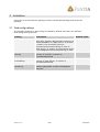
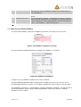
3.1 Web.config settings
All necessary settings in web.config are added by default. But there are optional
web.config settings as well:
Setting
FormsDatabaseMode
FormsAccessConnectio
nString
FormsSQLServerConn
ectionString
FormsDatabaseConnec
tionString
Version: 3.0
Description
Used by the SaveToNarrowTable function to
determine whether data should be saved in a
Access database or a SQL Server. If “Access”
is chosen, the connection string in
FormsAccessConnectionString is used. If
“SQL Server” is chosen, the connection string
in FormsSQLServerConnectionString is used.
Connection string for SaveToNarrowTable
function if “Access” is chosen in
FormsDatabaseMode
Connection string for SaveToNarrowTable
function if “SQL Server” is chosen in
FormsDatabaseMode
Connection string used by
ReadFromDatabase and SaveToDatabase
functions.
4/28
Default value
Access
2/24/2005
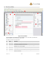
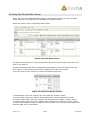
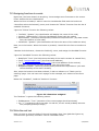
4 Starting With Forms
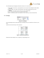
When Forms is installed, a new button is introduced on every node:
Figure 1 New Button on Toolbar
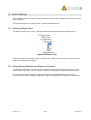
Pressing this button will open the forms editor, and a form will be created for this node.
If a form previously has been opened, you are immediately sent to that form.
Forms are saved as Sitecore sublayouts, and the sublayout is placed on the current node.
But please be aware that the form will not be displayed before you specify a layout for
the node:
Figure 2 A layout is selected for my node
To select a layout you must have the proper rights. If you do not have rights to change
layout settings for your node, please contact your administrator.
Please be aware, that if you use sub forms, certain restrictions apply. See chapter 10,
Using SubForms for more information.
Version: 3.0
5/28
2/24/2005
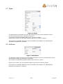
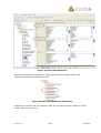
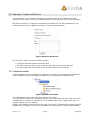
5 The Forms Editor
Figure 3 Forms Editor
The Forms Editor is the heart of the Forms Module. It is in this editor you define the
layout, properties and functionality of your form.
The editor consists of several panels:
#
1
2
Panel
Functions
Caption
3
Form
4
5
6
7
Fields
Information
Settings
Styles
Version: 3.0
Function
General functionality
Displays the name of the current form. Click on the name to edit
the Sitecore properties for the form
The actual form. You define the form design by dragging controls,
validators etc. into this panel.
Tree view of all available fields, validators, etc.
Displays general information about the current form
Setup of grid lines and design lines on the form
Information about the available styles settings for the selected
control on the form
6/28
2/24/2005
8
Attributes
Information about the available attributes for the selected control
on the form
5.1 Functions
Figure 4 Functions Panel
• Close: Closes the editor. You are prompted to save your changes.
• New: Creates a sub form on your form. Read about sub forms in chapter 10, Using
SubForms.
• Save: Saves your form
• Save All: Saves all forms open
• Reload: Clears the cache and reloads the form
• Delete: Deletes the current form
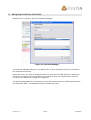
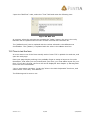
5.2 Caption
Figure 5 Caption
The caption shows the path and name of the current form being edited. Click on the
caption to edit the Sitecore properties for the form:
Figure 6 Sitecore Properties
Please note that you should not edit the data shown in the “Editor” tab. Only edit data on
the “Data” tab.
You use this functionality to define a different placeholder if your form should not be
placed in the “content” placeholder.
Version: 3.0
7/28
2/24/2005
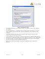
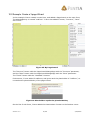
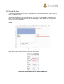
5.3 Form
Figure 7 Form
The form represents the actual form in Sitecore. You drag controls onto this panel.
The grid size can be controlled in the “Settings” panel, see 5.6, Settings.
When you have dragged a control onto the form, you can edit its properties and
attributes by clicking the control. In Figure 7 Form, I have selected the “Submit” button.
You can drag controls by holding down the left mouse button on a control and drag the
control to the desired position.
You can change the control size by holding the left mouse button on one of the square
markers and drag the marker to the desired size. You can see whether you have selected
the correct marker by looking at the mouse cursor that changes depending on what
marker you have selected.
If a control has a text property, you can click once again on the selected control, and you
will be allowed to edit the text. Please note that this is not a double-click action. You
need to wait until the control is properly selected by the system before you click again:
Figure 8 Button control about to have its text property edited
If a control has events, you can double click the selected control to open the function
manager, where you attach functions to events.
Version: 3.0
8/28
2/24/2005
5.4 Fields
Figure 9 Fields
The fields panel holds all controls, validators, etc. The number of available controls varies
from installation to installation, as it is possible to develop new controls, as well as it is
possible to hide controls.
You use the fields by selecting the ICON of the control and dragging the control onto the
form.
5.5 Information
Figure 10 Information
Version: 3.0
9/28
2/24/2005
The information panel displays information about the current form:
• Form: Name of the form, and equivalent to the name of the sublayout which holds
the form.
• Sitecore Node: The name of the Sitecore node which holds the form you are
editing.
• Field name: The name of the control you have selected last.
• Type: The type of the control you have selected last.
• Path: The Sitecore path to the definition of the control you have selected last.
5.6 Settings
Figure 11 Settings
Use the settings panel to setup what grid and design lines you would like to have on your
form.
Grid lines are lines that your form snaps to.
Figure 12 Different grid lines
Read more about design lines in chapter 8, Using Design Lines.
Version: 3.0
10/28
2/24/2005
5.7 Styles
Figure 13 Styles
The Styles panel represents the CSS style settings for the current selected control.
A style setting controls the visuals for a control.
The number of styles available differs from control to control.
Position the mouse over any style name to get the full name as popup.
The number of available attributes can be modified. See chapter 9.2, Manipulating
Attributes and Styles on Controls.
5.8 Attributes
Figure 14 Attributes
The Attributes panel represents the available attributes for the current selected control.
An attribute controls the behavior of a control.
The number of attributes available differs from control to control.
Position the mouse over any attribute name to get the full name as popup.
The number of available attributes can be modified. See chapter 9.2, Manipulating
Attributes and Styles on Controls.
Version: 3.0
11/28
2/24/2005
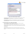
6 Assigning Functions to Events
Double click a control to open the function manager:
Figure 15 Function Manager
The Function Manager allows you to attach one or more functions to all the events that
the selected control has.
Select the event you wish to assign functions to and use the “Add” button to assign the
functions. Functions will be executed in the sequence they are represented in the list.
Use the arrow buttons to change the sequence.
To edit the parameters for the function, select the function from the “Selected functions”
list and press “Edit”. The Parameter Editor window will open:
Version: 3.0
12/28
2/24/2005
Figure 16 Parameter Editor
All available parameters for the selected function will appear in the list in the middle of
the window.
For some parameters you can assign either a constant value (a text string), or you can
select a control to get the value from. For other parameters, only a control is a valid
parameter.
Check the “Constant value” box to use a constant value. Check the “Retrieve from
control” to get the value from a control.
Take this situation as an example: I have a list that needs to be filled with data from the
Sitecore tree. I would add a listbox on my form, and on the OnClick() event, I would add
the FillList function. The function takes several parameters as input: The Sitecore path,
the Sitecore node, the control to populate and son on.
When the user opens the web form, the list box is populates with the nodes from
Sitecore.
Version: 3.0
13/28
2/24/2005
7 Controls
The following controls are available by default:
Name
Calendar
Description
A calendar control
Button
A normal button
CheckBoxList
Checkbox
A list of checkboxes. The values of the checked buttons are
pipe (|) separated.
A normal checkbox
File
A file selection text box. It is a text box and a “browse” button
Group box
A group box. Used to group controls together
Hyperlink
A hyperlink label
Image
A normal image
ImageButton
An image that has the same events as a button
Label
A normal label
RadioButtonList
A list of radio buttons. Only one button can be pressed at any
time
A normal radio button. Use the “Groupname” attribute to group
radio buttons
A normal dropdown box
RadioButton
Dropdown
Listbox
Textbox
A list of strings. The values of the selected items are pipe (|)
separated.
A normal text box
AdRotator
An AdRotator
7.1 FieldValidators
A field validator is a control that is attached to a control. It is capable of validating that
the input of the field is correct.
Field validators are not visible unless the entered input is invalid.
The following field validators are available:
Name
Required
Description
Validates that the value of the control is not empty
Compare
Compares the contents of 2 controls and acts upon the
“operator” attribute. The following operators are available:
•
•
•
•
•
•
•
Version: 3.0
Equal
GreaterThan
GreaterThanEqual
LessThan
LessThanEqual
NotEqual
DataTypeCheck
14/28
2/24/2005
Range
RegularExpression
Summary
Also use the “type” attribute to define the correct type for
the comparison.
Validates that the value of the control is within a certain
range.
The most flexible validator. Validates the input of a control
with a regular expression. For example, to validate that the
control contains a valid email address, use this expression:
(\w[-._\w]*\w@\w[-._\w]*\w\.\w{2,3})
Use this control to summarize all validations
7.1.1 How to use a Field Validator
To use a field validator, select the validator you desire, and drop it on your form:
Figure 17 Validator dropped on a form
Use the ControlToValidate attribute to assign the validator to a control:
Figure 18 Validator Attributes
In Figure 18, the validator validates the value of eEmail.
The ErrorMessage attribute defines what text to display when an error occurs. If the
ErrorMessage attribute is empty, the validator displays the text written in the text field.
The validator in Figure 17, would display “regular expression validator”, if I did not use a
SummaryValidator. When using a SummaryValidator, make sure that the “Display”
attribute is set to “None”.
Version: 3.0
15/28
2/24/2005
8 Using Design Lines
Figure 19 Design Lines
Design lines are guiding horizontal and vertical lines that can be enabled in the editor.
The lines can help you place the controls according to your website design rules.
The guidelines give you visual aid when positioning your controls. They can help you
keeping the same left margin, the same width of all controls, placing the header the
same place and so on.
Please note that your controls will not snap to the design lines. They are merely meant to
be visual guidelines.
The administrator of the web site can define the design lines.
Version: 3.0
16/28
2/24/2005
9 Forms Settings
This chapter applies to website administrators or the person responsible of setting up the
forms module.
All Forms settings are located under /system/modules/forms.
9.1 Defining Design Lines
You define design lines under /system/modules/forms/editor settings/design lines:
Figure 20 Design Lines
Add new design line settings under “Design Lines”. Add the horizontal and vertical lines
under your design line setting.
9.2 Manipulating Attributes and Styles on Controls
The standard package includes the most common style and attributes settings for each
control. But if you wish, you can add or remove any attribute or setting you may wish.
All controls are defined under “/system/modules/forms/field definitions”. Choose a
control and go to the “editable properties” page to manipulate the attributes and styles:
Version: 3.0
17/28
2/24/2005
Figure 21 Styles and Attributes
Styles and Attributes are defined in “/system/modules/forms/field styles” and
“/system/modules/forms/field attributes”:
Figure 22 Styles and Attributes definitions
Please do not remove the “Id” attribute. Also, do not change events unless you know
exactly what you are doing.
Version: 3.0
18/28
2/24/2005
10 Using SubForms
In forms it is possible to create sub forms, i.e. multiple forms on the same page.
If you add a sub form, this form will be drawn together with the main form (the first form
on the page).
The intention of sub forms is to create wizard style forms, where you can browse through
the pages in the wizard.
Each sub form is completely independent of other sub forms. You cannot see the controls
of other sub forms. If sub forms need to exchange data, you can use the SessionSave
function.
10.1 Concept
To properly create a wizard style form, you must add a PageControl to the main form.
The page control has a PlaceholderKey attribute that must match the placeholder of the
forms that the PageControl will display.
You design the wizard as follows:
On the first form, drop a PageControl. Set the PlaceholderKey to “subforms” (just an
example, you can give any name you like).
Create a new sub form by pressing “Add”. Use the Caption (see chapter 5.2, Caption) to
change the placeholder of the sub form to “subforms”.
Add as many sub forms as you need, and remember to change the placeholder to
“subforms”.
The PageControl will display the sub forms one by one, defined by the SelectedIndex
attribute, where 0 is the first sub form and so on.
Use the function PageControlChangePage to switch between the sub forms.
Version: 3.0
19/28
2/24/2005
10.2 Example: Create a 3 page Wizard
In this example I have created a main form, and added a PageControl to the main form.
The placeholderkey is named “subform”. I have also added 3 button, “Previous”, “Next”
and “Finish”:
Figure 23 My PageControl
The “Previous” button calls the PageControlChangePage with the “Previous” parameter,
and the “Next” button calls the PageControlChangePage with the “Next” parameter.
The “Finish” button calls the “SendMail” function.
Furthermore, I have added 3 subforms, and given each the placeholder id “subform”, so
it matches the placeholderkey of the page control:
Figure 24 Placeholder equals the placeholderkey
On the first 2 sub forms, I have added the SessionSave function to the OnSave event:
Version: 3.0
20/28
2/24/2005
Figure 25 SessionSave attached to OnSave
The SessionSave function saves the values of all controls in session variables. This data
can later be retrieved by SessionRead() or by a special syntax in SendMail() and
SaveToDatabase().
The last sub form is a “thank you for entering data” form, that does nothing but telling
the user that the wizard is finished, and ensuring that the OnSave() event is called on
the second sub form.
10.2.1 Retrieving the session variables with SendMail
If you use SendMail() or SaveToDatebase() functions, you can retrieve the session
variables by adding a “session:” in front of the control ID.
Take this example: In the first subform, I have a field called Field1. This field is saved to
a session variable called Field1. To retrieve the value, write the following in the mail body
or header field:
{session:Field1}
This string will be replaced with the value of the session variable. The syntax is case
sensitive, so be careful that you write “session” in all small caps, and the session variable
correct.
Version: 3.0
21/28
2/24/2005
11 Advanced Functions
11.1 Positioning controls with the “position” style.
Many controls have the “position” style tag in their available styles list. The position style
is used to determine how a control is positioned relatively to other elements and controls
on a form.
Position: Absolute
This is the default position. The control is positioned absolutely to the form with
coordinates 0,0 in the upper left corner. The control does not have any position
dependencies to other controls. It is the left, top, right and bottom properties that define
the position of the control.
Position: Relative
Moves a control relative to its normal position, so "left:20" adds 20 pixels to the
element's LEFT position. The control is relative to the parent control. If a button is a child
of a group box, and the position is relative, the coordinates 0,0 is at the upper left corner
of the group box.
Position: Fixed
Gives a control fixed position regardless of the scroll of the browser. The coordinates 0,0
is therefore at the top of the browser, and it does not matter whether you scroll the
browser to the bottom. This setting does not work for all controls.
11.2 Difference between display=none and visible=false
A lot of controls has a style setting called “display” which can be set to “none”, “block”
and “inline”, and a attribute called “Visible” that can be true or false.
It may look as if they are doing the same thing: hiding or displaying the control, but
behind the scenes the result is much different.
If you set the display=none style, the control is actually on the form, but it is not
displayed.
If you set the visible attribute to false, the control is removed from the form, and you
cannot access the control at runtime.
Version: 3.0
22/28
2/24/2005
12 Using the Forms Data Viewer
When using the SaveToNarrowTable function, all data are saved to a value-list table.
These data can be viewed with the standard Forms Data Viewer.
Select the viewer from Tools|Forms Data Viewer:
Figure 26 Forms Data Viewer
The data is stored by form. Use the drop down box at the top to select which form you
wish to see data for.
All data entered through time is displayed chronologically, with the oldest at the top.
Each value for each control on the form is displayed in their own column.
At the far right of each column is a select and delete check box:
Figure 27 Select and Delete column
To delete data, check the “Delete” box and press the “Delete” button.
To archive data, check the “Select” box and press the “Archive Selected” button.
To export data to XML check the “Select” box and press the “Export to XML” button.
To export data to Excel check the “Select” box and press the “Export to Excel” button.
To view archived data, press the “Open Archive” button. You have the same options for
archived data as for normal data.
Version: 3.0
23/28
2/24/2005
13 Example: Create a Mail form
In this example, I will create a complete form where users of the website can order
brochures. The order is sent to the administrator of the brochures in my fictive company.
My fictive company is a computer accessories manufacturer. On their website you can
order brochures on their different products. The form looks like this:
Figure 28 Order Brochures
For this for to work, I need the following items:
• A page in Sitecore that will show the form
• A node in Sitecore where I can write the text that should go into the mail
• A list of nodes with the names of the brochures that can be ordered
13.1 Create the nodes
In this example I have compacted my nodes a bit. Usually you would store the different
nodes elsewhere, but for the sake of explaining, I have made the following tree:
Figure 29 Mail form nodes
The “OrderBrochures” is the node that will show the form.
The “Brochures” node with underlying nodes is my list of brochures that I later use to fill
a checkboxlist. Usually you wouldn’t put such master data under a page node, but in a
“global” section on your website.
Finally, the “MailText” node contains the text in the mail. This node would usually also be
located under a “global” section, so it wouldn’t be confused with a page on the website.
Version: 3.0
24/28
2/24/2005
13.2 Create the form
I select the “OrderBrochures” node, and press the “Forms Editor” button. I also name my
form “OrderBrochures”.
Remember, that when you are finished with your form, you must add a layout for your
form. If you don’t do that, the form will not be displayed. See chapter 4, Starting With
Forms for more information.
On the form, I add a checkboxlist, 3 edit boxes and a button, along with the appropriate
labels:
Figure 30 Mail form
It is important that you give your controls a good ID. If you don’t do that, it will be more
than difficult later in the process to find the right control.
Figure 31 the address field is named "eAddress"
Version: 3.0
25/28
2/24/2005
13.3 Assigning functions to events
Right now, the form doesn’t do anything. I must assign some functions to the events.
First I double click the checkboxlist.
When the form is loaded, I wish to have the checkboxlist filled with the brochures.
I therefore select the OnLoad() event, and choose the “FillList” function from the list of
available functions.
I give the “FillList” function the following values:
• Textfield: “@name” (the checkboxlist will display the name of the node)
• Control: “cblBrochures” (I fill the checkboxlist control with the nodes)
• SitecorePath: “/sitecore/content/home/orderbrochures/brochures” (my data comes
from the children of that node)
• ValueField: “@name” (the checkboxlist will have the name of the nodes as value)
Now, on to the button: When the button is pressed, I would like the form to send me a
mail.
I double click the button, choose the OnClick() event, and assign the SendMail function.
I give the “SendMail” function the following values:
•
•
•
•
•
BodyField: “Text” (the field where the body of the mail is written is named Text)
From: “[email protected]” (the from email address)
To: “[email protected]” (the email address of the receiver)
Subject: “A brochure has been ordered” (the title of the mail)
BodySitecorepath: “/sitecore/content/home/orderbrochures/mailtext” (the node
where the body of the mail is written)
Also, when the brochure has been ordered, I wish to redirect to a “Thank you for
ordering” page. I do not have such a page in this example, so I redirect to the front
page.
Below the “SendMail”, I add the “Redirect” function:
Figure 32 2 Functions assigned
The “Redirect” is given the following values:
• EndResponse: “True” (execution of the current page should terminate)
• Url: “/” (I redirect to the front page. In real life, the Url would probably be more
like /company/thankyou.aspx)
13.4 Write the mail text
Now it is time to write the body of the mail message. Now I am glad that I gave my
controls some good IDs, because I need to remember them.
Version: 3.0
26/28
2/24/2005
I open the “MailText” node, select the “Text” field and write the following text:
Figure 33 Mail text
At runtime, when the web site user presses the “Order” button, the text in the curly
brackets will be replaced with the text of those controls with the same ID.
The {cblBrochures} text is replaced with the values selected in the cblBrochures
checklistbox. The {eName} is replaced with the value in the eName text box.
13.5 Time to test the form
It is now time to see if the form actually works. Press “F9” to publish the web site, and
open the web page.
Does your page display nothing? You probably forgot to assign a layout to the node.
Remember, that when you are finished with your form, you must add a layout for your
form. If you don’t do that, the form will not be displayed. See chapter 4, Starting With
Forms for more information.
I try to enter some test data. I order the “Glow in the dark keyboards” brochure, and
enters some “Test User, Test address…”.
The following mail is sent to me:
Version: 3.0
27/28
2/24/2005
Figure 34 Mail is sent to me
Version: 3.0
28/28
2/24/2005