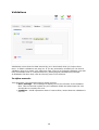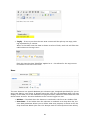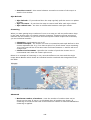
1
User Manual
Fabrik 2.0
Jan 2010
Table of Contents
Rob Clayburn
1
License & Copyright ........................................................................ 5
Suggestions Modifications and Corrections ......................................... 5
Prerequisites.................................................................................. 5
What's new in Fabrik 2.0?.............................................................. 7
Installation .................................................................................... 8
Upgrading ...................................................................................... 8
Additional Help .............................................................................. 8
What is Fabrik? .............................................................................. 9
What is Fabrik? .............................................................................. 0
Key Concepts................................................................................. 9
Placeholders................................................................................ 9
URL structure ............................................................................ 10
Design strategy............................................................................ 11
Forms .......................................................................................... 12
Editing or Adding a Form ............................................................... 14
Basic settings ............................................................................ 14
Details................................................................................... 15
Buttons ................................................................................. 15
Form Processing ..................................................................... 15
Note...................................................................................... 16
Form publishing......................................................................... 16
Groups ..................................................................................... 17
Templates ................................................................................ 18
Options .................................................................................... 19
CCK ...................................................................................... 19
Submission plug-ins ................................................................... 20
Email Submission Plug-in ......................................................... 21
Receipt Submission Plug-in....................................................... 22
Redirect Submission Plug-in ..................................................... 23
Run PHP ................................................................................ 24
Run JS................................................................................... 25
Create a link to your form.............................................................. 27
Creating a search form .................................................................. 27
Groups ......................................................................................... 27
Editing or adding a group .............................................................. 28
Details ..................................................................................... 28
Pagination ................................................................................ 29
Elements ...................................................................................... 29
Editing/Adding an Element............................................................. 30
Details ..................................................................................... 31
Options .................................................................................... 31
Publishing ................................................................................. 31
RSS ...................................................................................... 31
Tips ...................................................................................... 31
Table settings tab ......................................................................... 32
Filters ...................................................................................... 33
Table Column CSS ..................................................................... 35
Calculations .............................................................................. 35
Validations .................................................................................. 36
Is alpha-numeric ....................................................................... 36
Is email.................................................................................... 37
Is not....................................................................................... 38
Is Numeric................................................................................ 39
Is Unique.................................................................................. 40
Not empty ................................................................................ 40
PHP ......................................................................................... 41
Regular Expression .................................................................... 42
2
JavaScript ................................................................................... 43
Setting Element Values With JavaScript ..................................... 44
Element plug-ins .......................................................................... 44
Button...................................................................................... 44
Checkbox ................................................................................. 44
Sub Elements ............................................................................ 45
Add Options .............................................................................. 45
Advanced ................................................................................. 46
Database join............................................................................ 46
Add option in front end ............................................................... 47
Date ........................................................................................ 49
Display text .............................................................................. 50
Drop down................................................................................ 51
Sub Elements ............................................................................ 51
Options .................................................................................... 51
Add Options .............................................................................. 52
Field ........................................................................................ 53
File upload ................................................................................ 54
Display..................................................................................... 55
Thumbnail ................................................................................ 55
Crop ........................................................................................ 56
Storage .................................................................................... 56
ID ........................................................................................... 56
Image ...................................................................................... 57
Link ......................................................................................... 58
Bit.ly ..................................................................................... 58
Radio button ............................................................................. 59
Sub Elements ............................................................................ 59
Add Options .............................................................................. 59
Text area.................................................................................. 60
User......................................................................................... 61
Additional Element Plug-ins............................................................ 62
Timer ....................................................................................... 62
Youtube ................................................................................... 62
Password .................................................................................. 62
Form example ........................................................................ 62
Administration options ............................................................. 62
CAPTCHA.................................................................................. 63
Administration options ............................................................. 63
Subscriber Exclusive Element Plug-ins ............................................. 64
Rating ...................................................................................... 64
Form example ........................................................................ 64
Administration options ............................................................. 64
Google Map............................................................................... 64
Form Example ........................................................................ 64
Administration settings ............................................................ 65
Options............................................................................... 66
Geocoding ........................................................................... 67
Table settings ...................................................................... 68
Cascading Drop down ................................................................. 68
Form example ........................................................................ 68
Administration settings ............................................................ 68
Options............................................................................... 69
Advanced ......................................................................... 69
Front end ......................................................................... 70
Calculation................................................................................ 70
Administration settings ............................................................ 70
Colour Picker............................................................................. 71
3
Form example ........................................................................ 71
Administration settings ............................................................ 71
Yesno....................................................................................... 71
Form example ........................................................................ 71
Table example ........................................................................ 72
Administration settings ............................................................ 72
Parent / Child elements ................................................................. 72
Tables .......................................................................................... 73
Deleting a Table ........................................................................... 74
Parameters.................................................................................. 75
Importing a CSV file to create a new table ....................................... 76
View details ................................................................................. 78
Edit table .................................................................................... 79
Details................................................................................... 81
Filters.................................................................................... 81
Navigation ............................................................................. 82
Layout................................................................................... 82
Notes .................................................................................... 83
Advanced............................................................................... 83
Work in progress .................................................................... 83
The Publishing tab ..................................................................... 84
RSS ...................................................................................... 85
CSV ...................................................................................... 85
Search .................................................................................. 85
Access...................................................................................... 86
Data Tab .................................................................................. 86
Group by ............................................................................... 89
Prefilter ................................................................................. 89
Adding an additional prefilter .................................................... 90
Joins ........................................................................................ 92
Related Data ............................................................................... 0
Table Filters................................................................................... 0
Filtering via the query string ....................................................... 94
Prefilters .................................................................................. 95
Clearing filters........................................................................... 95
Table plug-ins ................................................................................ 0
Copy plug-in ............................................................................. 96
Create a link to you table .............................................................. 97
Connections ................................................................................. 97
Add / Edit a Connection ................................................................. 98
Plug-ins ......................................................................................... 0
Visualizations ................................................................................ 0
Add / Edit Visualization Standard Options.................................... 101
Publishing ............................................................................ 101
Publishing ............................................................................ 101
Plug-ins .................................................................................... 102
Calendar................................................................................. 102
Data.................................................................................... 103
Month View options ............................................................... 103
Anatomy of a Fabrik Calendar ................................................. 104
Filtering ............................................................................... 104
Chart ..................................................................................... 105
Map ....................................................................................... 106
Repeatable controls............................................................... 108
Controls............................................................................... 108
Ajax Refresh ........................................................................ 109
Clustering ............................................................................ 109
Advanced............................................................................. 109
4
Timeline ................................................................................. 110
Create links to visualizations ..................................................... 111
Packages.................................................................................... 111
Scheduled Tasks ........................................................................ 112
Add/Edit a Scheduled Task........................................................ 113
Email plugin ......................................................................... 113
Update ................................................................................ 114
Additional Joomla Plug-ins & Modules ........................................... 0
Modules .................................................................................... 115
Form module........................................................................... 116
Menus ................................................................................. 116
Parameters .......................................................................... 116
Table module .......................................................................... 117
Parameters .......................................................................... 117
Plug-ins .................................................................................... 118
Fabrik .................................................................................... 118
Forms ................................................................................. 118
Tables ................................................................................. 118
Visualisations ....................................................................... 119
Element data........................................................................ 119
Common modifiers ................................................................ 119
Search System Plug-in ............................................................. 119
Scheduled Task System Plug-in ................................................. 120
Compatibility with 3rd Party Libraries........................................ 120
JACL +...................................................................................... 120
Joomfish ................................................................................... 120
sh404SEF .................................................................................. 120
Community Builder ..................................................................... 120
Joomsocial................................................................................. 121
Appendix.................................................................................... 121
Common Joomla PHP coding tasks ................................................ 121
Databases .............................................................................. 121
License & Copyright
The Fabrik manual is copyright 2006 by the individual contributors, All Rights Reserved.
Suggestions Modifications and Corrections
Please email any corrections of this document to [email protected]
Prerequisites
We recommend that you use the latest version of Joomla 1.5.x (1.5.15 as of time of
writing)
Fabrik will run in Native Joomla 1.5 mode, no need to use the legacy plug-in.
Fabrik is tested in IE7+ Google Chrome & FireFox 3.
Fabrik requires PHP5.2+ (preferably 5.2.3+) and MySQL 5+.
5
Preferably a graphics library such as GD or Imagemagick should be installed on your
server.
6
What's new in Fabrik 2.0?
The main menu has had some options added and some removed:
+ Plug-ins - allows you to install new functionality into Fabrik, be that new element
types, form actions, table actions, visualizations or validation rules
+ Visualizations - create new types of views on multiple data sets. E.g. a calendar view
or a charting view
- Validations - these are now added when editing an element
- Validation rules - these are now installed from within the plug-ins section
Form creation:
Now rather than form's defaulting to storing data in tables called
"jos_fabrik_formdata_x", you can specify the name of the database table you want to
store your form's data in.
Rather than requiring a group to be created before creating the form, Fabrik now gives
you the option to automatically create a group when you create the form. This leads to a
much more intuitive process for creating the forms.
Actions performed on form submission are now stored as plug-ins, each form can contain
multiple plug-ins which can be triggered in either the front or back end, and on editing
or creating a record. We have ported Fabrik 1.0.x's email, receipt, redirect and custom
PHP sections to plug-ins. Finally of course, the plug-in architecture allows for expansion
of these features such as sending SMS's messages.
Elements:
By applying a plug-in architecture to Fabrik's element structure Fabrik 2.0 should allow
for a plethora of new elements to be created, currently available from fabrikar.com's
downloads section are the following extra plug-ins:
• Google map - displays a Google map, and allows your users to place a marker
when adding or editing a record. The mark up for the map coordinates are
outputted in the geo microformat.
• CATCHA - create an image verification element to reduce spam from your
forms.
• Rating - provides a series of stars that can be clicked on to apply a rating.
• Colour picker - opens a pop-up window where you can select a colour.
•
7
• Yes/no - a simple yes/no radio option, that when displayed in the table shows a
corresponding tick/cross
Installation
To install Fabrik:
• Download the latest version from http://www.fabrikar.com/project/downloads,
and save it onto your hard drive (e.g. in c:\)
• Open your site's administration page e.g. http://www.mysite.com/administrator,
and sign in as the site administrator.
• From the top menu, select "extension->install/uninstall"
• On the next page press "browse" next to the " Package File" field and locate the
Fabrik component zip you previously downloaded.
• Press "Upload file and install" to install Fabrik.
• A message will appear asking you to wait whilst we uncompress some zip files.
Please do not navigate away from this page whilst this is happening.
• Once installed you are given the choice to install a sample form and table.
After installation you can access Fabrik's administration section from Joomla's top menu:
components->fabrik.
We now provide a nightlies page where a snapshot of the SVN code can be found:
http://fabrikar.com/nightlies
Upgrading
Upgrading from Fabrik 1.0.x is not possible - sorry we simply have too many changes to
make this possible.
Upgrading from a previous version of Fabrik 2 is possible - simply follow the same
instructions as for installation. You element,groups, forms, tables etc will all be left in
tact as well as your table's data.
Additional Help
Whist this document covers the functionality of each part of Fabrik we also have
additonal learning material, details of which are listed below:
A comprehensive series of tutorials can be found here:
http://fabrikar.com/help/tutorials
Our wiki which contains additional information, please take some time to add or update
it as this is a community driven effort.
http://fabrikar.com/wiki
And finally of course we have our forums:
http://fabrikar.com/forums
8
To get the best response please post in the most appropriate board for your subscription
level and please provide as much information as possible about what you are doing. We
LIKE screenshots we LOVE links to the pages in question and we will practically MARRY
YOU if you attach a video!
What is Fabrik?
Fabrik is the application builder to use in Joomla. It allows you to create
forms to record your data
tables to display, filter and report on the data
visualizations to display your table data in a appropriate manner (calendars, maps etc)All
of these views can be shown in your site's front end.
Key Concepts
Placeholders
Through out Fabrik we often refer to placeholders, these are special bits of text that you
can enter in parts of Fabrik's administration forms which when shown on the live site will
be replaced with dynamic data.
An example of a place holder is:
Place holder
Description
{tablename___elementname}
This is what we call the "full element
name" it is replaced with data that
element's data. If in a table view then this
is the current rows data
This is replaced with the current users id,
you can replace the 'id' with any field of
the jos_users table
You can replace 'id' with the following
values:
•
•
•
•
{$my->id}
•
•
•
•
•
{$their->var->id}
name
username
email
usertype - string representing
user type e.g. "Registered"
block - is the user blocked
gid - the acl group that the user
belongs to
registerDate
lastvisitDate
guest - is the user a guest
This is similar to {$my->id}. However the
'var' in this example should refer to the
name of a request variable which contaiins
the user id to load.
9
E.g. my url is :
http://test.com?users___id=62
and I wanted to load the email address for
the user who's id is 62 my placeholder
would be:
{$this->users___id->email}
{$mosConfig_absolute_path}
Replaced with the constant JPATH_SITE this is the server path to your site .e.g.
/var/www/html/mysite
{$mosConfig_live_site}
Replaced wth JURI::base(), this is the url
of your site.e.g. http://mysite.com
{$mosConfig_offset}
The site's timezone offset
{$Itemid}
The current menu item's Itemid
{$mosConfig_sitename}
The site's name
{$mosConfig_mailfrom}
The global "email from" option
{where_i_came_from}
The URL of the previous page (HTTP
referrer)
{$_SERVER->xxx}
Replace xxx with any varaible found in
PHP's $_SERVER global see here for a full
list
http://php.net/manual/en/
reserved.variables.server.php
{session.token}
Will be replaced with the current Joomla
session token
{new:Some text}{edit:Some edit text}
Used on form intro fields, when adding a
new record the text "Some text" will be
displayed. When editing a record the text
"Some edit text" will be displayed
{thistable}
only available in database join concat and
where fields - is replaced with the joins
table name
URL structure
To open a table in your browser you should use this URL, replacing 'X' with the table id
you want to display:
index.php?option=com_fabrik&view=table&tableid=X
To view a form in your browser you should use this URL, replacing 'X" with the form id
you want to display:
index.php?option=com_fabrik&view=form&fabrik=X
If you want to load a specific row for editing then use this url, replacing 'Y' with the
10
rows's id:
index.php?option=com_fabrik&view=form&fabrik=X&rowid=Y
To view a detailed view of the same row, replace the view variable, 'form' with 'details':
index.php?option=com_fabrik&view=details&fabrik=1&rowid=1
For any of these URL's you can add '&fabrikdebug=1' to the end of the URL. This will
provide you with some debug output of what Fabrik is doing. This only occurs when you
have set 'allow fabrik debug' on in Fabrik's global parameters.
Design strategy
Create applications in Fabrik (and in a larger context designing a database) can be a fun
and rewarding exercise.... or can be a series of frustrations.
Lets imagine that we want to make a shop application.
The key to success is planning, so first of all - turn off your computer, get out a pencil
and some paper. Having a diagram of what you want to achieve in is indispensable and
will save you hours of frustration later down the line as it forces you to make decisions
about your application before you start building it - a pencil and a rubber are so much
faster that getting half way through your application before you realize that a
fundamental mistake has been made.
Now with your drawn diagram you are going to try to describe what objects and
relationships you are going to have in your application.
Objects
Objects are fairly straight forward, the are things like "products", "customers",
"manufacturers" and "orders", any noun in your model can be thought of as an object.
Often when we think more about these objects we realize that they contain other
objects. Customers contain "addresses" (they could have a credit card address AND a
different delivery address). Orders are actual made up of "Order items" - each product
that the customer has placed with any given order.
So break down these objects as far as they will go. Then on your piece of paper draw a
box labelled accordingly for each object.
Relationships
Relationships are a little more abstract and take a little more thought about how we
want our application to work. Rather than nouns, relationships are verbs.
At their simplest they are defined by drawing a line from one object's box to another - so
we could draw a line from products to manufacturers, which would indicate that a
product is created by a manufacturer. Note how "created by" is a verb and hence a
relationship.
In this example a product is created by ONE manufacturer and manufacturers can create
MANY products. This type of relationship is know as a "one to many" relationship and can
11
often be created in Fabrik by use of a database join element, or by adding a join to the
Fabrik table.
Now taking our shop example, lets say that "products" can go in "categories" BUT that
any single product can be assigned to multiple categories. This is a "many to many"
relationship and thus we need to create a table for it. This table will have a field to store
the productid and another to store the categoryid.
I tend to name these types of tables "product_categories" as its name describes the
relationship it is modelling. A component like Virtuemart has a similar naming convention
but adds "_xref" to the end of the table name.
This thought process is referred to as database normalization - here's some further
reading on it:
• http://www.troubleshooters.com/littstip/ltnorm.html
• http://en.wikipedia.org/wiki/Database_normalization
Some of our tutorials that deal with modelling these relationships are:
•
•
•
•
Joining some data
One to Many relationships
Many to many relationships
Related data
Forms
Forms are the heart of Fabrik, they allow you to collect data from users to access your
data for editing and viewing.
To access the form's section select components->fabrik->forms. You will see a page
containing a list of your forms similar to the diagram below:
Each form can be selected with the check box to the left of its name. Once selected it
can be altered by clicking on the buttons in the top right hand corner:
• Publish - sets the state of the form to published (note that the form's start and
end publish dates still need to be correctly set up for the form to be visible to
your users)
• Unpublish - sets the form's state to unpublished
• Copy - copies the form
12
• Delete - deletes the form
• Edit - edit the form, note that you can also edit the form by clicking on its
name.
In the top right menu there is also the "New" button which allows you to create a new
form.
For each form in the list you have a couple of links:
• Published - toggles the form's published state
• If your form is set to record to a database table you will also see:
◦ Update database - checks the integrity of the the database and
matches it to your form's fields (you really shouldn't need to touch this
unless you are getting an SQL error when viewing your table's data)
◦ View data - this take you to a view of the data collected by the form.
13
Editing or Adding a Form
Basic settings
14
Details
• Label - The form's title which appears at the top of the form. Note you can use
the place holder text "{Add/Edit}" to dynamically include "Add" or "Edit" into the
title depending upon whether you are adding or editing a record.
• Introduction - This text appears under the form label and is used to let you
introduce the form to your users. If you want text to appear only when the user
is adding a record use the following place holder: "{new:enter your text here}" this will be rendered as "enter your text here". Likewise when wanting to show
text when editing a record you can use "{edit:this is an edited record}", which
will be rendered as "this is an edited record"
• Error message - this text appears at the top of the form, if it fails validation. It
should be used to explain to the user that an error has occurred and the steps to
take to remedy the error.
Buttons
• Reset button - If yes selected shows a reset button at the bottom of the form.
When pressed the form's fields revert back to their initial states
• Reset button label - The text displayed in the reset button
• Copy button - Adds a copy button to the bottom of the form. If editing an
existing record, this button will save the data as a new record. When adding a
new record this button has the same effect as the save button.
• Copy button label - The text displayed in the copy button
• Go Back button - Adds a go back button to the bottom of the form, when
pressed this button takes you back to the previous page without saving or
submitting the form.
• Go back button label - The text displayed in the go back button
• Submit label- The text displayed in the submit button (Submit buttons are
always shown at the bottom of the form)
Form Processing
• Record in database - If ticked the then form saves the data into a database
table
• Table name - If editing a form this shows you the table that the form is saving
to. If creating a new form this is a field into which you can enter the name of the
database table that you want to save the form's data to. The table is created in
the database defined by the default connection. This table name must not exist
already.
• Ajax validation - If 'yes' selected then each element is validated as its data is
changed. Validation occurs on the server, so is more secure than simple
JavaScript validation. Feed back on success or failure of the validation is shown
next to each element as a real time animated effect. Note whether set to 'yes' or
'no' validation will always occur when the form is submitted.
• Success message - The message shown when the form has been successfully
submitted. If left blank the default success message will be shown.
• Spoof Check - If set to no this will remove Joomla's spoof check from the form,
this makes the form less secure but allows for posting data into the table directly
from a URL.
• Use cookies on multipage forms - If you use a multipage form (by turning on
one of your groups' 'Page break' options), and this setting is set to 'Yes' then a
cookie will be set on the computer so that if the form is not completed and the
user comes back to add a record, the user will be returned to the last page they
were editing. Turn this setting off if the form is likely to be used in a public place
where several people will share the same computer
15
Note
• Note - This is an administration feature which allows you to make a note about
the form. The content of this note is shown as a tool tip when you hover over the
form's name in the form list.
Form publishing
The publishing tab allows you to specify certain attributes of the form's creator and when
and if the form is published:
• Published - Set to yes to publish the form, set to no to unpublish the form.
Unpublished forms can not be used in the front end
• Author - The user who created the form
• Author alias - An alias to that user
• Created Date - The date the form was created on
• Start Publishing - The data and time at which to start publishing the form.
Note the form has to be published for this option to be applied
• Finish Publishing - The data and time at which to stop publishing the form.
Note the form has to be published for this option to be applied
16
Groups
Groups are the equivalent of HTML field-sets. They are used to contain your form's
elements. Each element you create is assigned to a group.
Your form must have at least one group.
• Create a group with the same name as this form - When creating a new
form this check box is ticked for you. It will automatically create a group and
assign it to your form.
• Or select and add the following available groups - This will list any groups
you have previously created which have not yet been assigned to a form.
Note: in Fabrik 1 you could assign groups to multiple forms. This is no longer the
case in Fabrik 2, a group can only be assigned to one form.
17
• Add - To add the group to your form select it and press this button
• Current groups - This shows the groups that have already been assigned to the
form. The order they appear in this list is reflected in the order they appear in
the form itself
◦ Up - To order a group up, select in in the current groups list and press
this button
◦ Down- To order a group down, select in in the current groups list and
press this button
◦ Remove- To remove a group from the form, select in in the current
groups list and press this button
Templates
The templates tab allows you to determine which template is used to render your form.
Form templates are found in /components/com_fabrik/views/form/tmpl.
Each template is contained within its own folder. To create a custom template copy one
of the existing template folders, rename it and upload it to your site.
There are some default css styling options for templates which are found in /media/
com_fabrik/css/form.css
• Detailed view template - The template to use when users are viewing a
record.
• Form template - The template to use when users are adding new records or
editing existing records
• PDF template - The template used when rendering the form/detailed view as a
PDF
In addition you can add a custom.css file to your templates' folders which will allow you
to safely modify an existing template without fear of loosing your changes when you
update to a newer version of Fabrik.
18
Options
The options tab lets you define further form options. The first three options define
whether certain buttons are displayed at the top of your form. The features are enabled
if 'yes' selected, or 'use global' selected and your site's global settings for the given
feature are set to 'yes'
• PDF icon - Show a PDF icon which outputs the form in a basic PDF format - note
not as a PDF form.
• Print icon - Shows a print icon which when clicked on will open a new window
with a printer friendly version of the form
• Email icon - Shows an email icon which when clicked on opens a new window
with a form which allows you to email a link to the page to a friend
• Show title - An on/off switch to show/hide the form's title (generally a <h1>
tag) in the HTML page
• Show title in detailed view - When in a detailed view, determine if you should
add the form's title to the page's head's <title> tag. Often you may want to turn
this off to avoid duplicate page titles and instead edit the element's
• Show related data links - For this option to produce results your form needs to
be set to record in database, and its table has to have some options selected in
its related data section.
CCK
These options are used in conjunction with the Fabrik extended editor plug-in. When this
plug-in is installed and activated you get an additional 'Fabrik' editor button which will
pop up a Fabrik form and allow you to add in custom content to your Joomla articles.
See this blog entry for a full demo:
http://fabrikar.com/blog/55-cck-video
• Category - Select which Joomla content category the form should appear in
• CCK Join element - The element which will be used to store the article id,
creating a join between the Joomla article and the Fabrik record.
19
Submission plug-ins
We have a series of plug-ins that can perform tasks when the form is submitted. To add
a new plug-in press the "Add" button. Once pressed you will see a form as shown in the
picture above.
• Do - Select the plug-in you would like to use. Once selected the plug-in's options
will be loaded underneath
• In - state if the plug-in should be run only in when the form is filled in in the
front end, or only in the back end or for both occurrences.
• On - state if the plug-in should be run when adding a new record, editing and
existing record or for both occurrences
• Delete - removes the plug-in from the form
20
Email Submission Plug-in
The email plug-in will send an email when the form is submitted. It has the following
options:
• Email to - A comma separated list of email addresses to which the form's data
will be sent.
• From - A comma separated list of email addresses to which the form's data
appear to have been sent from. element.
• Email subject line - The email's subject
• PHP/HTML Template - - As default Fabrik will send a dump of all the data
submitted by the form. If you need finer control over the output of the email you
can specify a template to use.
Templates can be either html or php files.
Templates should be located in:
/components/com_fabrik/plugins/form/fabrikemail/tmpl.
In HTML templates you can insert the form data with placeholders (see below)
In PHP templates you can use placeholders or access the form's data with :
echo $this->data['tablename___elementname'];
• Article template - If desired you can select a Joomla article to use as a
template. This article can use {tablename__elementname} placeholders which
will be replaced with the submitted form content.
If selected instead of a PHP/HTML template then the content of the article will be
emailed
If selected in addition to a PHP/HTML template the the content of this article will
be available for use in the PHP/HTML tempalte via the use of a placeholder
'{content}'
21
• Condition - PHP code which should return true or false. If it returns false then
the email is not sent. This option can be useful when you only want to send out
the email if the user has selected a particular option in your form. Place holders
can be used, so a simple example of a condition might be:
◦ return '{tablename___elementname}' = 1;
Note for all these options: to access data submitted by the form you can enter the
placeholder "{tablename___elementname}" which will be replaced with the data
submitted in that form element.
Receipt Submission Plug-in
The receipt plug-in sends an email to the user filling in the form, notifying him that the
form submission has been received.
Note for all these options: to access data submitted by the form you can enter the
placeholder "{tablename___elementname}" which will be replaced with the data
submitted in that form element.
• Send confirmation receipt to - The full name of the element that has
collected the user's email address. By full name we mean it should be in the
format tablename___elementname
22
• Receipt title - the title of the email receipt
• Message to send ... - the text to send to the recipient.
Redirect Submission Plug-in
The redirect plug-in allows you to decide where the browser should be redirected to at
the end of the form submission. If no redirect plug-in is entered then the form will
automatically redirect itself to the previous page.
• Jump page - The URL to redirect to once the form has successfully been
submitted
• Append jump url with data - If yes selected the the form's data is appended
to the jump page url
• Thanks message when form submitted - Text to display. Use placeholders to
display data collected by the form. If your jump page option is left empty then
this text is shown on its own page. If your jump page points to a URL on your
site then the thanks message appears as a system message. If your jump page
points to a URL outside of your site then the thanks message is ignored.
• Use as search data - If 'yes' selected then the form's data is used for filtering
the form's tables data.
• Condition - PHP code which should return true or false. If it returns false then
the redirect is not applied. Place holders can be used, so a simple example of a
condition might be:
◦ return '{tablename___elementname}' = 1;
23
Run PHP
Sometimes you are going to need to run some specific code that is not provided for by
one of the other form submission plug-ins. At this point the highly flexible Run PHP plugin is a godsend.
• Process scripts - State where in the form submission process you would like
the script to be executed.
• PHP File - Select the PHP file you would like to run. These files are located in
/components/com_fabrik/plugins/forms/fabrik/php/scripts. The Joomla
framework is available to these scripts, so for example you can access the
Joomla database with :
◦ $db =& JFactory::getDBO();
• PHP code to execute on from submission - If no script is selected then the
code entered here will be run instead.
24
Run JS
Similar to the Run PHP plug-in, the Run JS plug-in allows you to attach an instance of a
javascript class to your form.
The JavaScript files need to be stored in components/com_fabrik/plugins/form/fabrikjs/
scripts.
Each file should contain a class with the same name as its filename, so if for example our
file name was dostuff.js then its class should be created as below:
var dostuff = new Class({
initialize: function(form)
{
this.form = form; //the form js object
}
});
The JavaScript object that controls the form initiates the form plug-in, passing itself into
the required initialize method.
When the form performs various actions, its JavaScript object calls a corresponding
method in all of the form JS plug-ins attached to it.
There is an example.js file in the plug-in which contains a list of each of these possible
methods. For reference it has been included below:
//class name needs to be the same as the file name
var example = new Class({
initialize: function(form)
{
this.form = form; //the form js object
},
//run when submit button is pressed
onSubmit: function()
{
alert('onSubmit');
//return false if you want the form to stop submission
},
//run once the form has sucessfully submitted data via ajax
25
onAjaxSubmitComplete: function(){
alert('complete');
},
onDoElementFX: function(){
alert('onDoElementFX');
},
//run at the start of saving a group to the db
// when you move from one group to another on
//multipage forms
saveGroupsToDb: function(){
alert('saveGroupsToDb');
},
//run once the ajax call has completed when moving
another
//on multipage forms
onCompleteSaveGroupsToDb: function(){
alert('onCompleteSaveGroupsToDb');
},
//run each time you move from one group to another
//multipage forms
onChangePage: function(){
alert('onChangePage');
},
//run if the form has ajax validaton
//run at start of element validaton that occurs on
event
onStartElementValidation: function(){
alert('onStartElementValidation');
},
//run when above element validation's ajax call is
onCompleteElementValidation: function(){
alert('onCompleteElementValidation');
},
//called when a repeatable group is deleted
onDeleteGroup: function(){
alert('onDeleteGroup');
},
//called when a repeat group is duplicated
onDuplicateGroup: function(){
alert('onDuplicateGroup');
},
//called when the form gets updated
onUpdate: function(){
alert('onUpdate');
},
//called when the form is reset
onReset: function(){
}
});
26
from one group to
on
that elements onblur
completed
Create a link to your form
To create a Joomla menu link to your form:
•
•
•
•
Select "Menu->main menu" from the top administration menu.
Then press the new button
Next select "Fabrik->form"
Give your link a name and on the right hand side of the form select the table you
want to link to.
You have some additional options you can edit if so desired:
• Row id - If the form is set to record in the database then you can specify the
record id that will be displayed in the form. Leave blank to open an new form.
Enter "-1" to use the user's id.
• key name - Leave blank unless you know what you are doing! Column name to
be used with the Row id value. Defaults to the tables primary key. If row id is set
to -1 then this field should contain the name of the field that stores the users
ids.
• Show random records - If set to yes then a random record from the table will
be displayed in the form.
• Template - overrides the table's template when viewing the table from this
menu link
Creating a search form
TODO!
Groups
Groups are the equivalent of HTML field-sets. They are used to contain your form's
elements. Each element you create is assigned to a group. Each of your form must have
at least one group.
Each group can be selected with the check box to the left of its name. Once selected it
can be altered by clicking on the buttons in the top right hand corner:
• Published - sets the state of the group to published
• Unpublish - sets the group's state to unpublished
• Copy - copy's the group. This will not copy the group's elements
• Delete - delete the group
27
• Edit - edit the group, note that you can also edit the group by clicking on its
name
In the top right menu there is also the "New" button which allows you to create a new
group.
Groups can be filter by selecting the an option from the 'form' drop down or searching in
the 'group' field both of which appear at the top of the group list.
For each group in the list you have a couple of links or fields shown:
• Published - toggles the form's published state
• Form - tells you which form the group has been assigned to
• Number of elements - tells you the total number of elements in the group,
regardless of whether they are published.
Editing or adding a group
Details
•
•
•
•
Name - the internal reference to the group - this is not shown on the form
Title - the group's title - this appears on the form at the top of the group
CSS - a free form text area into which you can enter some css to style the group
Columns - the number of columns that the group will use to display its elements
28
• Repeat group button - If yes the add/remove buttons are assigned to the top
right of the group. These buttons allow you to duplicate the group and its
elements.
◦ If the group has been created from a table database join. Then each
repeated group will record its data in as a new entry in the joined table.
(or update existing records if you are editing the form)
◦ If the group has not been created from a table database join (i.e. the
normal way in which groups are created), then each elements repeated
data is stored in a single row's cell in the format:
data1//..*..//data2
The //..*..// is Fabrik's internal representation of the data being split by
a group
• Show group in form - Determines if the group is visible when the form is
loaded.
• Javascript to run when repeat group added - Optionally you can specify
some Javascript to run when the group is duplicated
• Javascript to run when repeat group removed - Optionally you can specify
some Javascript to run when a duplicated group is removed
Pagination
Groups can also be used to split up your form into multi-page forms. This is highly useful
when you have large forms, in breaking them down into more manageable sections.
• Page break - If yes selected then this group will become the start of a new
page. Don't select yes for the first group in your form.
• Save to table - If yes selected then when you move from this group's page to a
different page the partially completed form will be saved to the database.
Note that you can turn on your form's "Use cookies on multipage forms" option to set a
cookie each time a user starts a form. This cookie will reload a partially completed form
if the user comes back to edit it at a later stage.
Elements
Elements are the 'widgets' that allow your users to enter data into your forms. They also
define how that data is shown in the table view. Different element types are installable
as plug-ins from the plug-in manager. We pre-install a series of the most commonly
used elements when Fabrik is installed on your Joomla site.
29
Each element can be selected with the check box to the left of its name. Once selected it
can be altered by clicking on the buttons in the top right hand corner:
• Add to table view - Makes the element appear as a column in the table view.
• Remove from table view - Hides the element from the table view.
• Published - sets the state of the element to published (note that other element
publishing options make effect how the element is displayed)
• Unpublish - sets the element's state to unpublished
• Copy - copy's the element
• Delete - deletes the element
• Edit - edit the element, note that you can also edit the element by clicking on
its name
In the top right menu there is also the "New" button which allows you to create a new
element.
For each form in the list you have a couple of links:
• Published - toggles the form's published state
• Show in table - toggles if the element is shown as a column in the table view
• Order - The standard Joomla order widget which defines which order the
element's appear within their groups (note group ordering is handled by editing
the form, selecting the groups tab and reordering the group's in the list)
The element list can quickly become quiet long. Its often advisable to filter it to show
only the elements you are working on. To this effect you can filter using the fields above
the element list
The "Full element name" field shows the text that you should use to access the element
when using placeholders - i.e. {tablename___elementname}
Editing/Adding an Element
30
Details
• Name - The element's name, this is used internally to represent the element. If
you are saving the form to a database table this name is used to define the
table's field that correlates to the element. No white space or non-alpha numeric
characters are allowed in the name (except for "-" and "_")
• Label - This is the text that appears next to the element in the form. In addition
it is the default text that appears at the top of the element's column in the table
view. (This can be overwritten by entering a 'Heading label' - found under the
'Table settings' tab.
• Group - This is required, you need to specify a group that the element belongs
to.
Hint: if you are entering a series of elements into the same group, filter the
element list by said group and when you come to add a new element this dropdown will default to the group you filtered on.
• Order - If creating a new element then the element is automatically added to
the bottom of the selected group. If editing the element then this is a dropdown
where you can select the order that the element appears within the group.
• Element type - Select the element's plug-in. The options subsection will be
filled with the selected plug-ins options.
Options
These are specific to the selected Element type, see below for a detailed description of
each element.
Publishing
• Published - State if the element is published or not, this effects if it is shown in
the form and the table view.
• Add to page title - If yes selected then the element's data will be appended to
the browser's title.
• Access - Defines which user group can enter or modify the element's data
• Read only access - Defines which user group can view a read - only version of
the form's data. With these last two features you can quickly add in features
such as allowing only editors to approve records.
RSS
These options are only applicable if the element's table has been set up to create a RSS
feed of its data
• Show in RSS feed - Selecting 'yes' will add this element's data to the feed
items.
• Include label - If "show in RSS feed" is set to 'yes' then selecting 'yes' here will
add the element's label before the element's data in the RSS feed.
• Use as pseudo key - depreciated feature please ignore.
Tips
Tips are notes that appear when you hover over the element, they are used to provide
extra information to the user filling in the form, generally explaining what type of
31
information is expected.
• Hover text - Enter some text here that will be used as the hover tip content
which is shown when the mouse hovers over the element's label in the form
view.
• Hover text title - The title for the hover text, if left blank the element's label is
used
• Tips over element - If no selected then the tip only appears when you hover
over the element label.
If yes selected then the tip appears when you hover over the label or the
element
• Show tip in detailed view - Show the tip when in the detailed view (tips are
always applied in the form view)
• Comment - An internal memo which allows you to state the purpose of the
element. This is not visible to the people filling in the form
Table settings tab
These options define how the element should behave when in the table view.
• Show in table - Select this option to display the element in the table view.
• Link to details - Select this option to enable the element label to provide a link
in the table view to the detailed or form view.
32
• Allow ordering -Turns the table's heading into a link, clicking on this link will
reorder the data by the values in this element's fields.
• Heading label - Override the use of the element's label as this element's
column heading in the table view.
• Icon folder - Select a folder which contains a series of images in png format.
When in the table view, if an image is found in this folder that matches the
element's value the image is used to represented the value
• custom link - If "link to details" is 'yes' then any url written in here overwrites
the standard link to details url.
• Use as row class - If set to row then each of the table's rows will have this
element's value added as an additional class name. An example where this might
be useful would be if your element was a drop down to select a priority for a
task. With this option turned on your row might have additional classes assigned
to it like "high", "medium" and "low" - you could then edit your table template to
style "high" in red, "medium" in orange and "low" in blue.
Filters
Filters are created above your table and allow your users to filter the data contained with
in your table
• Filter type - defines what filter to use
◦ None - No filter is assigned for this element
◦ Field - A free form text field is displayed allowing user to search for data
within this column
◦ Dropdown - A drop down list of all of the table's distinct values for this
element's data. If creating a drop down filter from a database join
element then the drop down contains all the data found in the joined
table.
◦ Range - Search for data between two given values, this is mostly
applicable to date elements, for creating a ranged date filter.
• Exact match ◦ If selected then only the exact match of the drop down will be returned
in the search data.
◦ E.g.
We had an element called “name” and within it we had rows
containing the following data:
Rob
Robert
Bob
If we select “Rob” from “name's” drop down filter, and this option is
ticked then the returned data set will contain only the record with
“Rob” listed,
If this option is not ticked then “Rob” and “Robert” would be returned
in the data set, as both “Rob” and “Robert” contain the filter “Rob”.
• Filter access - State which user group has access to using the filter.
• Return only full word searches on field searches ◦ When using a field search, and with this option set to “yes” then only full
words are matched by the filter.
◦ E.g.
We had a element called “name” and within it we had rows containing
the following data:
Rob
33
Robert
Bob
We've set the filter to be a search filter.
If this option is selected and the user filters on the string “Rob” then
the returned data set will contain only the record with “Rob” listed
If this option is not selected then the same filter would return “Rob”
and “Robert”
• Include in advanced search - Determine if the element is selectable as an
option in the table's advanced search feature.
• Required - If yes selected then a value has to be selected from the filter before
any data is shown in the table.
34
Table Column CSS
• Heading class - Specify a class name for the element's column heading e.g.
"myHeading"
• Heading CSS - Specify some css for the element's column heading e.g. "fontcolor:red"
• Cell class - Specify a class name for the element's column e.g. "important"
• Cell CSS - Specify some css name for the element's column e.g. "font-color:red"
Calculations
Calculations are shown at the bottom of the table, and contain mathematical operations
performed on the element's data.
• Sum the column total - If yes select then the elements data is added up
• Sum access - Determines which user group can see the sum
• Split on - Specify an element to split the sum calculations into.
◦ E.g.
If we have a table:
Name
Surname
Age
Rob
Clayburn
29
Alice
Bird
25
Stan
Clayburn
80
And we choose to split the sum calculation on “surname” then we
would get 2 results:
sum Clayburn = 109
sum Bird = 25
• Average the column total - If yes selected then the average value of the
element's data is calculated
• Average access - Determines which user group can see the average
• Split on - Same principal as the sum split on option
• Column median -Calculate the element's data's median value
• Median access - Determines which user group can see the median
• Split on - Same principal as the sum split on option
• Count records - Count the total number of records found
• Count value - Only record's whose element data match the value entered here
will be included in the count total
• Count access - Determines which user group can see the count
• Split on - Same principal as the sum split on option
35
Validations
Validations ensure that the data entered by your uses match what you require from
them. In Fabrik validations are plug-ins. If you are technically included you can write a
validation plug-in to match your particular need. There is an example validation rule with
fully commented code in /components/com_fabrik/plugins/validationrule/example.
If validations fail then they raise an warning next to the element.
Is alpha-numeric
This ascertains if the submitted data is alpha-numeric.
• Error message - The message to display next to the element if the validation
fails. This text should explain why the validation failed and what steps the user
should take to remedy the error.
• Condition - A PHP expression which if returns false, means that the validation is
not run.
36
Is email
This ascertains if the submitted data is a valid email address.
• Error message - The message to display next to the element if the validation
fails. This text should explain why the validation failed and what steps the user
should take to remedy the error.
• Condition - A PHP expression which if returns false, means that the validation is
not run.
• Allow empty - If set to yes the validation will allow the user not to enter an
email address, if set to no then an empty value will cause the validation to fail
37
Is not
This ascertains if the submitted data is not a specific value.
• Error message - The message to display next to the element if the validation
fails. This text should explain why the validation failed and what steps the user
should take to remedy the error.
• Condition - A PHP expression which if returns false, means that the validation is
not run.
• Is not - value that the submitted data can not be for validation to pass.
38
Is Numeric
This ascertains if the submitted data is a numeric value.
• Error message - The message to display next to the element if the validation
fails. This text should explain why the validation failed and what steps the user
should take to remedy the error.
• Condition - A PHP expression which if returns false, means that the validation is
not run.
• Allow empty - If set to yes the validation will allow the user not to enter an
email address, if set to no then an empty value will cause the validation to fail
39
Is Unique
This ascertains if the submitted data has not previously been submitted by the form
(requires that the form is set to record in database)
• Error message - The message to display next to the element if the validation
fails. This text should explain why the validation failed and what steps the user
should take to remedy the error.
• Condition - A PHP expression which if returns false, means that the validation is
not run.
• Case insesitive search - When searching for exisiting data should the search
be case sensetive or not?
Not empty
40
The daddy of all validation rules! Ensures that the user has entered or selected
something.
• Error message - The message to display next to the element if the validation
fails. This text should explain why the validation failed and what steps the user
should take to remedy the error.
• Condition - A PHP expression which if returns false, means that the validation is
not run.
PHP
A customizable validation rule. Runs PHP code to test for validation success or failure
• Error message - The message to display next to the element if the validation
fails. This text should explain why the validation failed and what steps the user
should take to remedy the error.
• Condition - A PHP expression which if returns false, means that the validation is
not run.
• PHP -PHP code to run. If it returns 'true' then the validation is successful, if it
returns false then the validation fails. The element's submitted value is found in
the variable $data.
You can also return a string which can be used if the 'Match or replace' option is
set to 'replace'
• Match or Replace - If set to match then the validation behaves as normal and
on validation failure returns you to the form showing the error message. If set to
'replace' then the submitted value is replaced with the data returned from the
'PHP code' script
41
Examples:
Ensure a date elements value (stored in the value $data) is greater than anothers whose
full element name is 'tablename___elementname':
$f = JRequest::getVar('tablename___elementname');
$f = JFactory::getDate($f)->toUnix();
$data = JFactory::getDate($data)->toUnix();
return $data > $f;
Regular Expression
A customizable validation rule. Runs a Regular Expression to test for validation success
or failure
• Error message - The message to display next to the element if the validation
fails. This text should explain why the validation failed and what steps the user
should take to remedy the error.
• Condition - A PHP expression which if returns false, means that the validation is
not run.
• Regular expression - A regular expression (must start and end with /)
Uses PHP's preg_match function to determine if there is a match in the data. If
there is then validation succeeds otherwise it fails
• Match or Replace - If set to match then the validation behaves as normal and
on validation failure returns you to the form showing the error message. If set to
'replace' then the submitted value is replaced with the data contained in the field
'Replace string'
42
• Replace string - the data to replace the submitted data with if the validation
fails and 'Match or Replace' is set to 'Replace'
JavaScript
The Javascript tab allows you to add infinite JavaScript actions to your element. For each
action you have the choice between manually entering some JavaScript code, or using
the GUI to create simple interactions.
Or
• Add - The JavaScript event that will trigger the code either specified in the Code
field or generate from the GUI options.
• Code - The Javascript to run when the specified action occurs. The variable 'this'
refers to the instance of the element plug-in class that has been attached to the
element - for example the check-box class is found in components/com_fabrik/
plugins/elements/fabrikcheckbox/javascrpt.js.
All of these classes inherit from the base element class which is location in
/components/com_fabrik/views/form/element.js
• Do - The Javascript action to perform the description of each option is self
explanatory
• That - the element or group to perform the action upon.
• Is - To perform the action the value of the element must be matched with the
selection chosen here and the value entered in the last field.
e.g.
hide group1 when this == 1
will hide group one when the value of the element is 1
the inverse event would be this:
show group1 when this != 1
43
Setting Element Values With JavaScript
To consistently set the value of an element the following code can be used:
form_1.formElements.get('tablename___elementname').update('newvalue') ;
replace the '1' in 'form_1' with your form's ID.
Remember that for elements such as checkboxes, radio buttons and dropdowns
'newvalue' refers to the sub element's values and not their labels.
For checkboxes and mutliple select dropdown's you can assign mutliple selections
separated with '|-|', e.g.
form_1.formElements.get('tablename___elementname').update('newvalue||anothervalue') ;
Element plug-ins
The element plug options appear when you select a plug-in from the "Element type" drop
down. Below is a description of all the standard element plug-in options.
Button
The button element has no extra options, its text is derived from the label setting, and
javascript actions can be added from within the Javascript tab. Note that a submit button
is automatically added to the form, so creating an element to do the same function is not
required.
Checkbox
The checkbox element allows you to add a group of check boxes to your form. Each
checkbox is defined in the Sub Elements section of the form
44
• Default Value - If no checkbox selected this value will be stored in the
database.
• Default Label - If no checkbox selected this value will be shown in the fabrik
table
• Element before label - If yes then the checkbox appears before its label, if no
then the checkbox appears after the label
• Options per row - The number of check boxes
Sub Elements
• Add - Press this to add in a new checkbox
• Value - The value that is stored in the database if the checkbox is selected
• Label - The label that appears next to the checkbox. Equally this label is shown
in the table view rather than the recorded value (which is stored in the database
table itself)
• Default - is the option selected as default
• Delete - Press this to delete the checkbox
• Note: you can reorder the sub elements by clicking down on the grey bar to the
side of the value field and dragging it within the list.
Add Options
45
• Allow user to add drop down option - Allow your form's users to add in
additional options to your form.
• Only add label - If no selected then the user has to enter both a value and a
label for the checkbox option they are adding. If yes selected then only a label
field is presented to the user the value of which is then used for the value and
label.
• Save new additions - If yes selected then the newly submitted option is stored
by the element, meaning subsequent users of the form will be able to select the
same value.
Advanced
• Separator - String separator to be used when formatting the data contained
within the form email plug-in. Leave blank to default to a new line.
Database join
The database join element is an extremely powerful element. It allows you to look up
data in another database table and to pre-populate a radio list or drop down list with the
46
data returned from the look up. E.g you could easily make a drop-down list containing all
of your Joomla articles, or a list of countries.
• Hidden - is the element shown on the form as a hidden field.
• Render join as - If not hidden do we render the element as a radio list or as a
drop-down?
• Connection - The Fabrik connection that contains the database table whose
data we want to look up to create the list
• Table - The database table that contains the look up data (populated once a
connection has been selected)
• Key - The database table field to use as the value for each of the list options
• Label - The database table field to use as the label for each of the list options
• Or Concat label - Alternatively you can select multiple fields from the database
table by supplying a mySQL concat stringhttp://dev.mysql.com/doc/refman/5.0/
en/string-functions.html#function_concat)
E.g.
lastname, ' ', firstname
• Joins where statement (sql) - A where statement which filters the returned
data.
E.g.
where 'published' = 1
• Apply where beneath - Select which user group AND BELOW will have the join
where statement applied to them
E.g.
If set to 'Administrator' then administrators and users below administrators
would only see published articles in the drop down list. Super administrators,
however, would see all articles regardless of their published state.
• Value of please select option - The text to record in the database if no option
selected from the element. Defaults to ''.
• Label of please select option - The label to show for the 'Please select' option
- if none entered this defaults to 'Please select'
• Eval - Should the default value be evaluated as a PHP expression
• Default - the default value to select when showing a new form
Add option in front end
The form is shown in an AJAX window, when it is submitted it posts the data to the
server via AJAX and then updates the initial drop-down element
• Add option in front end - If you have created a Fabrik table pointing to the
database table you selected for this database join element then you can decide if
you want your users to be able to add records into that form. The element will
then appear with an "add" button like this:
47
• Clicking on "Add" will open an AJAX Fabrik form as such:
Entering Holland and pressing "Save" will post the form via AJAX to the Fabrik
form processing code. Once processed the pop-up window will close and your
database join element will be updated to contain the new value:
• Popup window Y offset - The offset value in pixels from the top of the page
where the popup form should appear - use to nudge your popup form beneath
any JS menus at the top of your site template which might intefer with the
rendering of the popup window.
• Popup window width - the popup window width in pixels
• Link to joined record - Applies when in a detailed view, or if the element's
access levels mean that it is set to read only when in a form.
If this option is selected, then the read only value is encased in a link. This link
48
points to a detailed view of the record referenced by the database join element's
data.
• Front end select - a work in progress - please ignore for the time being
• Popup form - Select the form that corresponds to the database table the join is
connected to. This is the form that is loaded in the popup window when the
"add" button is pressed.
Date
Shows a date picker element:
• Width - The width of the date field - the value represents the number of
characters that can be displayed
• Hidden - sets the date to be rendered as a hidden field
• Eval - If set to yes then the value entered in the default field is taken to be a
PHP expression and is evaluated as such.
• Default - The default value to populate the element with. If the eval option is
selected then this should contain a PHP statement
E.g.
return 'default';
• Table date format - The formatting string to use when rendering the element's
data in the table view, see http://php.net/strftime for the full list of formatting
options
• Form date format - The formatting string to use when rendering the element's
data in the form view, see http://php.net/strftime for the full list of formatting
options
•
49
•
• Default to current date - Default to the current date
• Always return todays date - Regardless of any other setting the element will
always show todays date. Useful when you want to record the date/time that the
record was updated.
• First Week day - Which day is defined as the first day of the week, use 0 for
Sunday, 1 for Monday etc
• Allow typing in field - If set to no then users can not manually type in data
into the fields, but are obliged to use the widgets to enter the date.
• Show time selector - show an additional time selector next to the date picker an example of how this looks is shown below:
• Time format - The strftime format string to use when formatting the time part
of the data (applicable only to the form view)
Display text
Simply displays the element label on its own.
TIP If you need HTML formatted text here then go to tables->parameters and select 'yes'
for the 'Use WYSIWYG editor for element labels' option.
• Eval - evaluate the label as a PHP function.
• Default - The default value to populate the element with. If the eval option is
selected then this should contain a PHP statement
E.g.
return 'default';
• Show label - Should the form show the label as well as the display text
50
Drop down
Sub Elements
• Add - Press this to add in a new drop down option
• Value - The value that is stored in the database if the drop down option is
selected
• Label - The label that appears next to the drop down option. Equally this label is
shown in the table view rather than the recorded value (which is stored in the
database table itself)
• Default - is the option selected as default
• Delete - Press this to delete the drop down option
• Note: you can reorder the sub elements by clicking down on the grey bar to the
left of the value field and dragging it within the list.
Options
• Multiple selections - if yes then uses can ctrl click to select multiple options
from the list
51
• Multiple selections height - if multiple selections turned on then this value
represents how many options are visible in the list before you have to start
scrolling it
• Eval - evaluate the label as a PHP function.
• Default - The default value to populate the element with. If the eval option is
selected then this should contain a PHP statement
E.g.
return 'default';
Add Options
• Allow user to add drop down option - Allow your form's users to add in
additional options to your form.
• Only add label - If no selected then the user has to enter both a value and a
label for the checkbox option they are adding. If yes selected then only a label
field is presented to the user the value of which is then used for the value and
label.
• Save new additions - If yes selected then the newly submitted option is stored
by the element, meaning subsequent users of the form will be able to select the
same value.
52
Field
• Width - - The width of the date field - the value represents the number of
characters that can be displayed
• Hidden - sets the date to be rendered as a hidden field
• Eval - If set to yes then the value entered in the default field is taken to be a
PHP expression and is evaluated as such.
• Default - The default value to populate the element with. If the eval option is
selected then this should contain a PHP statement
• Password - Render the field as a password field (text entered is show as a
series of "*"'s
• Maximum length - The maximum number of characters the user is allowed to
type into the field.
• Format - Define what type of data the field should store in the database
• Integer length - The length of the integer field when the format is set to
integer or decimal
• Decimal length - The decimal length stored in the database when the format is
set to decimal
• Format string - Applies the PHP sprintf function to the string http://fr2.php.net/sprintf when displaying the data in the table view or detailed
view.
• Guess link type - Will try to guess if the data entered is a URL or email
address, if so then in the table view and detailed view the data is encased with
the corresponding link
53
• Disable element - Disable the element, the user is not allowed to changed the
value and the value is NOT stored in the database.
• Read only - The user is not able to change the field's value but the value IS
stored in the database.
File upload
Options
54
• Maximum file size - The maximum file size in Kb of any file uploaded by this
element
• Allowed file types - A comma separated list of file extensions that are allowed
by the element,
E.g.
.jpg, .jpeg, .gif
Leave blank to use Joomla's default list of allowed file extension
• Upload directory - the folder into which the uploaded files can be stored
• Email uploaded file to recipients - If set to yes then the uploaded files are
attached to any email's sent by the form's email plug-in
• Obfuscate Filename - Adds a random series of numbers or letters onto the end
of the filename
• Length random filename - the number of random characters to add to the file
name when 'obfuscate filename' selected
• If existing image found?
◦ Leave original file - the newly uploaded file will not be stored on the
server
◦ Leave original file and increment new file's name - the original file will be
left on the server and the newly uploaded file's name will be amended
(each new file name will be pre-pended with the version number)
• Allow subfolder selection - If set to yes then a drop down appears next to the
upload element field, from which the user can select which sub folder to upload
the file into.
• Delete images? - If set to yes, then if a record is deleted from a Fabrik table
the files contained within that record are also deleted from the server. If set to
no then the files are left on the server.
Display
• Default image - Enter the path to a image to display if none currently available
• Link to file - Create a link to the file when in the table view. Requied if you
want to use a lightbox in the table view.
• Show media in table - If set to yes then Fabrik will show the media in the
table. Depending upon the media type this may be an image, flash, video or a
icon representing a document.
• Show media in form - same as 'show media in table' except this option effects
displaying the media in the form.
• Image library - The image library you wish to use to process images with (used
when resizing and cropping any uploaded images)
• Max width - When uploading images this specifies the maximum width in pixels
that that image can be, if the uploaded image is wider than this value the main
image is scaled down so that its width is no greater than this value.
• Max height - When uploading images this specifies the maximum height in
pixels that that image can be, if the uploaded image is higher than this value the
main image is scaled down so that its height is no greater than this value.
• Title element - If either 'show media in form' or 'show media in table' selected
then the data contained within the title element will be used in the lightbox title.
Thumbnail
• Make a thumbnail of the uploaded image - If set to yes and an image
uploaded then a thumbnail image is also created. This image is used in
preference to the main image when rendering data in the table, form and
detailed views.
55
• Thumbnail directory - the directory to store the thumbnail images in
• Thumbnail prefix - the prefix to attach the the thumbnail image name
• Thumbnail width - When creating the thumbnail this specifies the maximum
width in pixels that the thumbnail can be, if the thumbnail is wider than this
value the main image is scaled down so that its width is no greater than this
value.
• Thumbnail height - When creating the thumbnail this specifies the maximum
height in pixels that that image can be, if the thumbnail is higher than this value
the thumbnail is scaled down so that its height is no greater than this value.
Crop
• Crop - If yes selected then when editing a record, an interface is presented
which allows you to drag the main image around to create a cropped version
• Cropdir - the directory in which to save the cropped images
• Cropwidth - the width of the cropped image
• Cropheight - the cropped image height
Storage
• Storage type ◦ Filesystem - Your files will be stored on your server.
◦ Amazon s3 - Your files will be stored in Amazon's S3 cloud storage
service
• Amazon s3 access key id - Get this information when you sign up for an S3
account
• Amazon s3 secret key - Get this information when you sign up for an S3
account
• Amazon storage location - Select the geographical area which is closest to the
majority of your useres
• Bucket name - A bucket is Amzon's terminology for a folder, select the name of
the bucket you want to store the files in
ID
Creates a hidden field which is used to store record ids
There are no options for this element type
56
Image
Allows you to show an image in the form.
• Default image - The default image to show in the form
• Root folder - If 'Allow user to select image in front end' set to yes then this
specifies which root folder the users can select their image from.
• Allow users to select image in front end - If yes selected then users can
select an image from a list
• Show in table - If set to yes then the image is shown in the table view, if set to
no then the image path is shown
• Float image - When viewing the image in the form or detailed view - is it
floated and if so in which direction?
• Link - when viewing the image in the table form or detailed view, this option
specifies if the image is encased within a link and if so the link's url
57
Link
Allows user to create a link by specifying its url and label
• Width -The width of the date field - the value represents the number of
characters that can be displayed
• Default label - the link's default label
• Default URL - the link's default url.
• Link target - will the links open up in the same window, the parent window or a
new window.
• Smart link - detects the media type of the link (e.g mp3, video, and if found
renders the link using the mediabox plug-in) - Requires fabrik mootools version
to be set to 1.2. (edit this option in tables->parameters)
Bit.ly
The following options allow you to use the bit.ly URL shortening service. It requires you
to have a bit.ly account.
• Use bit.ly: activate bit.ly URL shortening on the link URLs
• Login name: Your bit.ly username
• API Key: Your bit.ly API key
58
Radio button
• Element before label - if yes then each radio button is rendered before its
label, if no the the label is rendered before the element
• Options per row - Specify the number of columns used to render the radio
buttons. In the image below the options per row setting has been set to 2:
Sub Elements
• Add - Press this to add in a new drop down option
• Value - The value that is stored in the database if the drop down option is
selected
• Label - The label that appears next to the drop down option. Equally this label is
shown in the table view rather than the recorded value (which is stored in the
database table itself)
• Default - is the option selected as default
• Delete - Press this to delete the drop down option
• Note: you can reorder the sub elements by clicking down on the grey bar to the
left of the value field and dragging it within the list.
Add Options
• Allow user to add drop down option - Allow your form's users to add in
additional options to your form.
59
• Only add label - If no selected then the user has to enter both a value and a
label for the checkbox option they are adding. If yes selected then only a label
field is presented to the user the value of which is then used for the value and
label.
• Save new additions - If yes selected then the newly submitted option is stored
by the element, meaning subsequent users of the form will be able to select the
same value.
Text area
• Width - If showing a WYSIWYG text area then this value refers to the width of
the editor in pixels, otherwise it refers to the width of the text area in the
number of characters per line.
• Height - If showing a WYSIWYG text area then this value refers to the height of
the editor in pixels, otherwise it refers to the height of the text area in the
number of lines.
• Eval - Select this if you want the default text to be evaluated as PHP
• Default - The default value that the text area will contain. If eval set to yes this
needs to be a PHP expression that returns the default value as a string
• Use WYSIWYG Editor - If set to yes then a WYSIWYG editor is displayed in the
form, if set to no then a simple text area is displayed
• Show max limit - If yes selected then the user is limited to typing a certain
number of characters into the text area (the value of which is defined in the
'Maximum length' field). As the user types a piece of text under the checkbox
informs them as to how many characters they have left.
• Maximum length - Only applicable when 'show max limit' is set to yes,
specifies the maximum number of characters that the user can type into the text
area. In the image below we've highlighted the message that updates as you
type in the text area
60
• Tagify - If set to yes then the text area content will be split up into tags, each
tag separated by a comma.
When in the table view the data is shown as a list of links, each link will filter the
table's data on the tag's text:
Each link has the class 'fabrikTag' applied to it - this allows for the tag icons to
be shown to the side of the link.
User
The user element is a special database join element type, designed specifically for you to
store user data in your forms. It always stores the user id in the database table, but may
display in the table, form and detailed view pages another parameter associated with the
stored users account. Its value defaults to the current logged on user.
• Hidden - if checked then the element is rendered in the form as a hidden field
• User Data - if not hidden then the element is rendered as a drop down list, the
user data parameter allows you to define what user property is shown as for the
drop down lists labels (the user id is always used for the drop down lists values)
61
• Update on edit - Should the user value be altered to the current user when the
record is being edited. Set to yes if, for example, you are recording the last
person to have modified the record. Set to no if, for example, you want to record
the person who initially created the record
Additional Element Plug-ins
Timer
//@TODO
Youtube
//@TODO
Password
Form example
As the password is typed a password strength indicator appears next to the field. Stong
passwords contain eight or more upper and lower case alpha numeric and symbol
characters.
When saved the password is encrypted with the same format that Joomla uses to store
its user passwords.
Administration options
• Maximum length - the size of the password and password confirmation fields.
Note that the password element automatically performs 2 validations:
• Password field is not empty
• Password field matches the confirm password field
62
CAPTCHA
Administration options
• Show when logged in? - You may not want to ask a authenticated user to fill
in the CAPTCHA - if so then set this option to "no"
• Method ◦ Standard - this shows an CAPTCHA image generated by the server:
◦ Recaptcha - this shows a CAPTCHA generated by the recaptcha web
service:
• Width - The width of the captcha image (Applies to standard captcha only)
• Height - The height of the captcha image (Applies to standard captcha only)
• Public key - Get a recaptcha account to obtain your public key
63
• Private key - Get a recaptcha account to obtain your private key
•
Subscriber Exclusive Element Plug-ins
Rating
Form example
Administration options
• Rating Mode ◦ User rating - All users can rate the entry and an average rating is
displayed
◦ Creator rating - Only the creator can set or edit the rating and this is the
value is shown rather than an average.
• No rating option first - should we render the 'no rating' option at the
beginning or end of the star list
• Image file type - the PNG icon's are nicer but use a transparent background,
which is not rendered correctly in IE6 without an appropriate transparent PNG fix
• Rate in form - the rating element will always be active in the detailed view turning this option on will also make it active in the form view.
Google Map
Form Example
A simple example:
64
A more complex example
Administration settings
65
Options
• Google Map Key - Get your Google Map's key here http://code.google.com/
apis/maps
66
• Map type ◦ Normal - shows the map with roads
◦ Satelite - show a satelite image
◦ Hybrid - shows the roads overlayed on top of the satelite image
• Default lat - default latitude when adding a new record.
• Default lon - default longitude when adding a new record
• Start zoom level - default zoom level when adding a new record
• Map width - the map width in pixels
• Map height - the map height in pixels
• 3d Buttons - Use the newer '3D' navigation buttons - as shown in the more
complex example above
• Control - the control allows you to navigate/zoom in and out of the map and is
placed on the top left hand side of the map
◦ None - Don't show the control
◦ Large map control - Show the full control, allowing you to zoom in and
out with a scroll bar and to navigate around the map with left/right/up/
down buttons - this is the option used in the above complex example
image
◦ Small map control - Shows six buttons to zoom in/out and navigate left/
right/up/down.
◦ Small zoom control - Just show a zoom in/out button
• Scale control - Show a indicator of the current map scale in the bottom left
hand corner of the map
• Map Type control - Show a control in the top right hand corner allowing the
user to change the map type (see above for the may type descriptions)
• Overview control - Shows a zoomed out view of the map in the bottom right
hand square of the map, which allows you to scroll the main map
• Use static map - if the map is in a detailed view, then this option determines
how to render the map.
◦ Static - Use the standard Google Map static map (a map image served by
Google including the marker)
◦ Full - The normal Google map is shown, but the marker can not be
moved.
• Mouse scrolling - If set to yes, then moving the mouse over the map and using
its scroll wheel will scroll the map in/out.
• Show lat/lng fields - If set to yes show the markers lat/lng location in two
fields underneath the map.
Geocoding
Geocoding is the process of looking up a lat/lng location from a given address.
• Enable geocoding
◦ No - Disable this feature
◦ Yes - Enable this feature, a field will be placed above the map. The
address typed in here will be used as the geocode address.
◦ Use Elements - Geocoding will be turned on but will use the data entered
in the elements selected below to geocode the address.
• Address 1 ... Country - Select the elements you want to use to geocode the
address from. Used when enable geocoding = use elements.
• Trigger geocode with ◦ Button - Adds a button above the map, labelled 'Geocode', pressing this
will trigger the geocode lookup
◦ As you type - An ajax request is sent to trigger the geocode lookup each
time text in one of the geocode fields is changed.
67
Table settings
• Use static map ◦ Yes - A Google static map image will be shown, indicating the marker
location
◦ No - The raw coordinates will be shown
• Map width- the static map witdth in pixels
• Map height the static map height in pixels
Cascading Drop down
Form example
In the above image the region dropdown is the cascading dropdown and the 'country'
dropdown is a database join which is used as the cascading dropdown's 'watch element'.
Selecting a country will trigger the loading icon to the right of the region dropdown and
will fire an AJAX call to populate the region list with regions belonging to the selected
country.
Administration settings
68
Options
• Connection - the Fabrik connection which contains the table we want to use for
the dropdown's data
• Table - the Fabrik table that we want to use for the dropdown's data
• ID - the Fabrik table element that contains the value we want to use for each
dropdown option - this is the data that is recorded in the database and should
normally be the table's primary key.
• Label - the Fabrik table element that contains the data used for the option label
- this is the text that the user sees for each of the drop down options.
Advanced
• Where query - filter the drop down options with an additional where query.
Don't include 'where' in the text you enter here - e.g "active = 1"
69
• Hidden - is the element hidden
• Show please select - Add a "please select" option to the top of the drop down's
options
• Eval - Do you want to evaluate the default value
• Default - The default value to use when adding a record.
Front end
• Link to joined record - If the element is read only and this option turned on
the the read only text is turned into a link which points to a detailed view of the
joined record. In the front end example above this would take you through to a
detailed view of a region record.
Calculation
The calculation element allows you to perform matematical calculations when the form is
submitted or when the table's data is shown. If you want to perform calculations that are
shown on the form as soon as users enter data (and before they submit the form) then
you will need to create a normal field and add a JavaScript action to that element.
Administration settings
• Hidden - is the element rendered as a hidden field
• Width - the field width
• Calculation - the PHP code you want to use for the calculation. It MUST return
something and MUST be valid PHP code - use placeholders to access the form's
data.
• Format string - Applies the PHP sprintf function to the calculation http://php.net/sprintf, when displaying teh data in the table or detailed view.
• Only Calc on Save - If set to yes the the calculation is run when the form is
submitted. If set to no then the calculation is applied each time the table or
detailed view is rendered.
70
Colour Picker
Form example
Click on the large coloured square to open up the colour picker window.
Use the sliders to create the colour, or click on the small palette colours to automatcially
load a colour.
Administration settings
There are no admin settings for this plug-in.
Yesno
The yes no element is a short cut to the having to manually set up a radio button with a
standard 'yes' or 'no' options. It also has the advantage of automatically showing icons
for the results in the table view
Form example
71
Table example
Administration settings
• Default - should the default selected option be 'yes' or 'no'.
Parent / Child elements
When creating a new Fabrik table whose database table has already been used to create
a previous Fabrik table, Fabrik applies a concept called parent/child elements.
What happens is that Fabrik will create the new table's elements with the same settings
as those of the original Fabrik table's elements.
These new elements are called child elements and are 'linked' to the original parent
element.
Upon editing and saving the parent element all of its child element's will be updated with
the same settings.
When you edit the child element, you will notice that the usual edit element form does
not appear. Instead you see a notification about the element being linked, a link to edit
the parent element, and a check box to unlink the child element:
72
To disable the parent/child relationship click on the "unlink" check box. The usual edit
element form will fade in and when you save the element, it will no longer be linked to
the parent element. Once unlinked the child element can not be linked back to its parent
element.
Tables
Tables allow you to display data collect by your forms, or from existing database tables.
Fabrik tables should be considered as views onto the data contained within MySQL
tables. This is because with Fabrik tables you can:
• Create joins between database tables
• Have multiple Fabrik tables pointing at the same database table.
• Each Fabrik table may then apply its own access levels and filtering to alter the
display of the underlying database table's data.
To access the tables' section select components->fabrik->tables. You will see a page
containing a list of your Fabrik tables similar to the diagram below:
Each table can be selected with the check box to the left of its name. Once selected it
can be altered by clicking on the buttons in the top right hand corner:
• Published - sets the state of the table to published (note that the table's start
and end publish dates still need to be correctly set up for the form to be visible
to your users)
• Unpublish - sets the tables' state to unpublished
• Copy - copy's the table
73
• Delete - deletes the tables
• Edit - edit the form, note that you can also edit the form by clicking on its name
In the top right menu there is also the "New" button which allows you to create a new
table.
The "import" button allows you to import a CSV file to create a new database and
Fabrik table
The "parameters" button allows you to set up options used through out Fabrik
For each form in the list you have a couple of links:
• Form - edit - takes you directly to the form edit page.
• View data - Shows the data contained within the fabrik table, allowing you to
add edit and delete records.
• Published - toggles the table's published state
• View details - shows a list of the table's forms and elements.
The table list can be filtered with the use of the two fields that appear directly above the
table headings.
Deleting a Table
To delete a table check the checkbox next to its name in the table list and press the
delete button found in to top right hand menu.
You will be presented with a screen as shown above. The list below the title shows the
74
tables you previously selected for deletion.
Next you have two choices to make:
• Which associated Fabrik elements you wish to delete with the table. To fully
remove the table and all its parts select "Delete tables, forms, groups and
elements
• Whether you would like to delete (a.k.a drop) the database table that the Fabrik
table was using as its data source. Note that any Joomla table with the Joomla
prefix (normally "jos_") will never be removed by Fabrik. This is to ensure you
don't remove core tables that Joomla relies upon.
Once you are happy with your selections press the delete button.
Parameters
The parameters page can be accessed by pressing the "parameters" button, located in
the table lists top right hand menu. Once clicked a pop-up window will appear as shown
in the image below
The top right of the pop-up window contains save and cancel buttons, save will save the
options you have selected and cancel will close the pop-up window without making any
changes to the parameters
• Use WYSIWYG editor for element labels - The default value is "no". If yes
selected then when you edit an element, its label field is rendered as a
WYSIWYG text editor. This allows you to format your labels with HTML (and is
also useful if you want to use the display text element with HTML formatted text)
• Alter filed types - This feature is depreciated, instead alter this option when
editing a table
• Remove tables on uninstall - this feature is not yet implemented
• Mootools version - Mootools is the JavaScript library that Joomla and Fabrik
use. This option allows you to determine which version of mootools to run.
◦ none - select this if your Joomla template already manually includes the
mootools script
◦ 1.1 - this is the standard version of mootools that Joomla uses. Use this
option for maximum compatibility
◦ 1.2 - this is the latest mootools release - use this if you want to test out
some of the more advanced features of Fabrik (packages and pick list
elements are two examples where mootools 1.2 is required)
75
• Use mediabox instead of slimbox - this determines which JavaScript library
to use for the light box effects that are used by the upload element when in the
table view. A light box effect shows a in-page popup window containing the
required media. Media box has the advantage of being able to show flash, video
etc but requires mootools 1.2 to be selected for the mootools version
• Include lightbox js • Merge JS files - fabrik forms can include several Javascript files (one for each
element type you use) Each HTTP request for a file will increase the page load
time. Select 'yes' to ask Fabrik to collate all of these files and store them as one
file in /components/com_fabrik/js/archive. The next time the form is requested
this collated file will be used rather than each of the element files
• Compress merged JS file - In addition you can ask Fabrik to compress these
merged files. Compression will reduce the size of the requested file, but may
result in javascript errors occurring. JS Min compresses the least but will give
you more stable results than Dean Edwards packer (which is pretty much
guaranteed to not work and is there for testing purposes)
• Spoof check on form submission - defaults to 'yes' You should always leave
this as 'yes' unless you really know why! Turning it off will allow content to be
submitted to the Fabrik engine from outside the Joomla site.This is depreciated you should set this setting when editing each individual form
• Use work in Progress - enables some experimental features, most notably the
packages section. Note this really is work in progress and is likely to contain
issues. If you find any please report them on the forum and we'll do our best to
resolve them for you.
• Allow fabrikDebug - if set to yes then you can append "&fabrikdebug" to your
front end URL's to output debug information about what Fabrik is doing, turn this
option off on a live site.
Importing a CSV file to create a new table
You can create a new Fabrik table by importing an CSV (comma separated variable) file.
To access this screen click on the "Import" button on the table list page. You will then
see a form as shown below:
76
• Connection - select the Fabrik connection in which you want to create the
database table
• CSV file - press the browse button to locate the CSV file on your hard drive
(excel and open office spreadsheets can be exported as CSV file)
• Create new table - enter the name of the database table you wish to create
when importing the CSV file. Must be alphanumeric with no spaces.
• Label - enter a label for the Fabrik table.
• Create primary key - if yes selected then an additional prmary key element will
be added to the imported table.
• Press "import" to continue wit the creation of the Fabrik table from the uploaded
CSV file.
• Press "cancel" to abort this page and return to the table list.
If you had selected 'yes' for the 'create primary key' option then the next screen will look
like this. Here you can set the element type for each imported column and define the
element's label
If you had selected 'no' for the 'created primary key' option then you will see an
additional column as shown in the image below:
77
The Primary key radio list allow you to specify which element is the primary key.
• To continue with the import press the "save" button, this will create the table,
form, group and elements, create the database table and import the CSV data
into the table.
• To cancel the import press the "cancel" button
View details
You can view the table's details by clicking on the 'view details' link next to each table
entry in the table list.
Each hyperlink on this page goes to the edit form for the associated table part.
78
Edit table
79
80
Details
• Label - The text that appears at the top of the table
• Introduction - The introduction text that appears below the title and before the
table
Filters
Filters are fields or drop downs that enable your users to filter the table's data. Below is
an example of a couple of filters:
Note: The template file that is used to render the filter form is located in:
components/com_fabrik/views/form/{tmpl}/default_filter.php
• Filter trigger ◦ On change - The table filters applied when they are changed
◦ Submit form - An "apply" button appears at the end of the filters. The
table data is only filtered when this button is pressed.
• Show Filters - Hides the filters from the form.
• Advanced search -Adds an advanced search link to the table filter table, as
shown in the image below:
◦
Clicking on this link will bring up the advanced filter window. From here
your users can select which elements should meet which criteria for
filtering the table. Pressing the "apply" button applies the filter to the
table, pressing "clear" removes all the current advanced filters.
81
•
Search all - If yes selected then an additional search field will be added to the
table view. This field will allow you to search for text across the entire table.
• Require filtering - If yes selected then the table will show no data untill a filter
has been selected.
Navigation
• Rows per page - The default number of records to show in the table
• Show add - If set to 'No' then the 'add' button will not be shown in the table,
regardless of whether the user has ACL rights to add records.
• Show navigation - Shows or hides the table navigation controls. These controls
will only appear when your table has more records that the "Rows per page"
value you defined above
• Show All option - Includes an 'all' option in the navigation drop down that is
used to select the number of records to show per page. Turn this off if your table
contains a large data set as your users may see an out of memory error when
trying to view all the table data.
• Show total - show the total number of records in the table. If a filter is applied
then this shows the total number of filtered records.
• SEF Slug - When using SEF urls this element's data will be included in the SEF
url for each of the table's row's edit/view links.
Layout
• Template - The template to use to render the table. Templates are found in
components/com_fabrik/views/table/tmpl
• Admin template - The template used when rendering the Fabrik table in
administration pages.
• Detailed view link - Add a detailed view link to each of the table's rows.
Clicking on this link shows a uneditable detailed view of the record
• Empty data message - The message to display when the table is empty, this
will also be shown if filters return an empty table
• Detail url - If the "Detailed view link" option is activated you can override the
link's URL here.
• PDF Icon - Show a PDF button on the page which when clicked will generate a
PDF versions of the table
• PDF Template - You can specify an alternative template for the PDF file to use.
This is often advisable as the PDF generator has issues with re-creating wide
table layouts. If nothing selected here then the table's template setting is used.
82
Notes
• Note - Add an internal memo for yourself and other administrators describing
the purpose of the table. This note will appear as hover text when you roll over
the table's title in the table list page
Advanced
• Alter existing field types - If no selected then Fabrik will not attempt to alter
the existing structure of the database table's fields when you save elements. If
yes selected then Fabrik will update the fields types to best match the settings
you choose for each element. Its advisable to leave this as "yes" unless you are
confident with managing your database tables' structure from outside of Fabrik
Work in progress
This section is activated by going to components->fabrik->tables->parameters and
activating the "work in progress" option
• Joomfish data translation - if yes selected then when the table is saved a
Joomfish XML file will be created in
administrator/components/com_joomfish/contentelements/{tablename}.xml
This file will then allow you to translate your fabrik tables' content
• Title element - The element to use in Joomfish as the record title. If none
selected then the first element will be used.
83
The Publishing tab
84
• Published - Is the table published or not, has to be published for users to see
the table
• Author - The user who created the table
• Author Alias - An alias to the author
• Created date - The date at which the table was created
• Start Publishing - A start date and time at which to start publishing the table
• Finish Publishing - An end date and time at which to stop publishing the table
RSS
Note Fabrik uses its own feed document type, which is an enhancement of the standard
Joomla feed document.
It is located in libraries/joomla/document/fabrikfeed/
With this Fabrik can create special name spaces, such as the GEORSS name space for
including geographical locations within the feed. We also allow for correct enclosures
meaning that you can create pod-casts from your fabrik tables, that are automatically
accessible in iTunes.
• Create RSS feed - If yes selected then Fabrik will create a RSS feed out of the
table's data - See the element's RSS feed options section for further information
on how to structure the content of the feed items.
• Feed title - The element whose data will be used for the feed item's title
• Feed date - The element whose data will be used for the feed item's date
• RSS Limit - Default number of records returned by the feed. This can be
overwritten in the feed url by adding "limit=10"
• RSS Maximum Limit - The maximum number of items that the feed can
output. The RSS limit setting must be lower than the value entered here.
CSV
• CSV import - This selects which user groups can access the CSV import option.
• CSV export - This defines which user groups can access the CSV export option
• Heading format - When you export and import CSV files they should always
have the same heading format. For maximum compatibility within Fabrik choose
"Element full name".
For increased legibility select "Element label"
Search
These options refer to how the data in the Fabrik table is referenced by Joomla's main
search. You must also install the Fabrik search plug-in for the table's data to appear in
Joomla's search results.
• Include in search results - Select 'no' to hide the table's data from the search
results.
• Field - The element whose data will be used as the search results title
• Description - The element whose data will be used as the search results
descriptive text
85
Access
The access tab specifies what each user group can or can't do with the data presented in
the table.
• View table - The user level at which users can view the table
• View records - The user level at which users can view the uneditable details
view
• Edit records - The use level at which users can edit the records
• Or use field -Use this setting if the user doesn't have edit rights based on their
group, but you still want them to be able to edit records that 'belong' to
themselves. Select the element whose data will contain the user's id. The user
will then be able to edit any records where the element's data match the user's
id.
• Add records - The access level at which users can add records
• Delete records - The access level at which users can delete records
• Or use field - the same principal as the Edit record's or use field option, except
this applies to deleting records.
• Empty records - The access level at which users can empty the table. This
removes ALL records from the database and resets the primary key to 0 - Enable
this with extreme caution!
Data Tab
When editing an existing table the start of the data tab will look like this:
86
Note you can now select the additional options:
• Primary key - the element that should be used as the primary key - this
element's data should be unique for each record.
• Auto increment - set the primary key element to be an auto-incrementing value.
This is the recommended setting
When creating a new table the data tab will appear as below:
87
The data tab defines the data that the Fabrik table will use.
• Connection - the Fabrik connection to store the table in
• Create new table - If you want to create a new database table enter its name
here. Its best to user lowercase letters and "_" in the name.
Note: Fabrik does not automatically replace "#_" with Joomla's database prefix
and will strip the "#" from the database name . Trying to create a table called
"#_test" will create one called "_test"
• Link to table - Alternatively you can link to an existing database table. If this
option is selected Fabrik will automatically create the form, group and element's
that correspond with the database table's structure. In addition you can also
88
select a MySQL view to use as your Fabrik table's data source, in this case
however, you will not be able to add or edit records.
• Order by - The element to use to order the data by (note you can set ordering
up for individual elements in their table options tab)
• Oder direction - The default order direction
Group by
Splits the table data up into sub tables. Each sub table is "grouped" by the fact that they
contain the same data for the "group by" element.
• Group by - Select the element to group by
• Order by - Select the element to order the group by.
• Template - HTML template that appears before the start of each grouped by
table. Use element placeholders (e,g, {tablename___elementname}) To insert
data form the first grouped by table's row into the template.
• Order direction - Select the group order direction.
Prefilter
Prefilters will filter the table's data before it is displayed. Unlike normal filters these are
not editable by the end user. The can be used to great effect to filter the table's data
base on the logged in user's user group. So registered users see a small subsection of
the records and administrators see all records.
Prefilters can only be applied once the table has been saved.
To start working with pre-filters you need to be editing an existing table. If you are
creating a new table, fill in the other form fields up to this point and press 'apply' to save
and continue editing the form.
To add your first pre-filter press the "add" button.
• Prefilter query - this can contain an SQL query that is run to get a record from
the database. Its data is stored in an object that can be accessible in the prefilters value field with the variable name $q
• Field - The element to filter on
• Condition - what matching should be done to the element's value
• Value - the value to match on.
Note: If the prefilter type is set to "eval" then any commnets starting with '//'
will be stripped from the code
• Type - How Fabrik should interpret the data in the value field:
◦ Text - fabrk will do a textual comparison between teh fields data and the
value
89
ie. If the value is John then the prefilter expression would be
where name EQUALS 'John'
◦ Eval - fabrik expects the value to be a piece of PHP code that returns the
value to search on. So, we can make the same prefilter as in the first
example if the the type is set to eval and our value is:
return 'John';
◦ Query - Fabrik expects the value to be an SQL query that returns the
value to search on. So, we can make the same prefilter as in the first
example if the type is set to Query and our value is:
select 'John';
◦ No quotes - Use this if you want to compare numeric or date values.
• Apply filter beneath - This access control tells FAbrik to ONLY apply the prefilter IF the user is of the selected access level or Beneath. So setting it to
"Administrator" will mean that the filter is applied to all users EXCEPT super
administrators.
Adding an additional prefilter
When you add an additional prefilter - there are a couple of additional options that need
to be selected.
To explain these settings lets take the example of this data set:
Name
Age
Sex
John
19
Male
John
21
Male
Alice
19
Female
Rob
31
Male
and the following three prefilters:
where name EQUALS John (type text) AND age EQUALS 19 (type no quotes)AND sex
EQUALS male
The 'AND's here are set up by the drop down list that appears underneath the grouped
radio buttons.
This will return the data set:
Name
Age
Sex
John
19
Male
changing all of the ANDs for ORs would give this query:
where name EQUALS John (type text) OR age EQUALS 19 (type no quotes)OR sex
EQUALS male
90
and this data set:
Name
Age
Sex
John
19
Male
John
21
Male
Alice
19
Female
Applying grouped to the second query and reverting the second query from OR to AND
would give us:
where (name EQUALS John (type text) AND age EQUALS 19 (type no quotes)) OR sex
EQUALS male
which in turn gives the following data:
Name
Age
Sex
John
19
Male
John
21
Male
Rob
31
Male
91
Joins
When designing database tables it is always wise to think of each table as an object or
relationship, examples of objects are 'teachers', 'students', 'classes', examples of
relationships are 'which students attend which classes'.
Joins allow you to create relationships between these tables so that your Fabrik table
shows merged data from across these tables. For further reading on joins please see the
mySQL join page
When you edit a record from such a Fabrik table, Fabrik automatically knows which data
gets inserted into which database table.
To add a Join press the "Add" button at the top of the joins section, as you go about
creating your join a preview of the join query will appear at the bottom of the join
section.
• Join type - defines how the data is joined together. Please read this excellent
article on the difference between each of the join types
• From - The table to join from, for your first join this will always be the main
database table that your Fabrik table is using
• To - the database table name that you want to join to
• From column - the column that contains the data that needs to be matched in
the "to" table's "to column". For those of you with some database knowledge
think of this as a foreign key
• To column - the database field whose data should match the data found in the
'From' table's 'from column'.
92
Related Data
• Table - the table that contains a database join element pointing to the current
table you are editing
• Link to table - if you select 'yes' then a column will be added to your table. This
column will contain a link which will take you to the related table, filtering its
results based on the current row's primary key.
E.g:
◦ Your table is called 'teachers' and the related table is 'Students'
◦ Students has a database join element to list which teacher is that
student's mentor.
◦ Activating the 'teachers' link to table option will create a link which for
each listed teacher will show the students that the teacher mentors.
• Label - the link to table's label - e.g. 'students being mentored'
• Popup ◦ No - the link will open in the same page
◦ Yes - the link will open in a popup window
• Link to form - creates a new column with a link to the related table's form. The
database join element will be pre-filled with the active records value.
E.g.
◦ Your table is called 'teachers' and the related table is 'Students'
◦ For the teacher 'Bob Hope' You click on the link 'add student'
◦ The students form appears and its 'mentor' database join element is prefilled with 'Bob Hope' as the desired mentor.
• Label - the link to form's label - e.g. 'add student'
•
• Popup ◦ No - the link will open in the same page
◦ Yes - the link will open in a popup window
93
Table Filters
This applies to all Fabrik 2.0 releases after 2.0rc3
Filters can be applied to a Fabrik table via the following means:
• Querystrings
• Pre-filters
• Element filters
• The table search all filter
• Filter form
Regardless of which method is used the filters are stored in the session (which means
that their results are 'sticky' and will be applied each time the table is viewed
Filtering via the query string
The simplest way to filter in the querystring is to append
"&tablename___elmentname=value" to it
URL date filters accept times that can be converted using PHP's strtotime function
(http://php.net/strtotime)
If you want to match upcoming records for the next 2 weeks you can do this:
?tablename___time_date[value][]=now&tablename__time_date[value][]=%2B2
week&tablename___time_date[condition]=BETWEEN
note the "%2B" in the second date value is the url encoded version of '+'
If you want to match the records from last week you can do this:
?tablename___time_date[value][]=-1
week&tablename__time_date[value][]=now&tablename___time_date[condition]=BETWEEN
If you want to filter on a series of values for the same element do this:
?&tablename___elementname[value][]=64&tablename___elementname[value][]=126&tablename___e
The available 'conditions' are:
•
•
•
•
•
•
•
BETWEEN
BEGINS WITH
CONTAINS
ENDS WITH
>
<
<>
94
Prefilters
The prefilter options can be found by editing a table, and selecting the 'data' tab. Their
general use is described in the table's section of this document.
A more advanced example of what can be achieved is these date examplez:
Get the records stored in the last 2 months:
WHERE: datefield
GREATER THAN: DATE_SUB(CURDATE(),INTERVAL 2 MONTH)
TYPE: QUERY
Get the records for the upcoming week:
WHERE: datefield
GREATER THAN: DATE_ADD(CURDATE(),INTERVAL 1 WEEK)
TYPE: QUERY
Display only the logged in users records:
WHERE: userfield
EQUALS: {$my->id}
TYPE: STRING
Element Filters
For each element you have the option to add a filter to the table view, allowing your
users to filter the table data. These are applied in addition to any pre-filters. For
information about the individual element filter settings see here.
Clearing filters
You can clear the filters by pressing the 'clear' button at the top of the filter table. This
will remove all the users filters from their session, but will still apply the table's prefilters
In addition you can pass in variables via the querystring to clear and/or reset filters
clearfilters=1 : will clear the prvious filters and not apply any other filters except
prefilters (has the same behaviour as the 'clear' button
resetfilters=1 : will clear previous filters and apply any curent querystring filters and
prefilters
95
Table plug-ins
Table plug-in's allow you to add additional functionality to your Fabrik table.
To add a plug-in to your table select the "Plugins" tab and press the "Add" button. Then
select the plug-in from the "Action" drop down. Currently we only distribute as default
the copy plug-in.Create link to table
Copy plug-in
The copy plug-in will add an additional button to your table as per the image below:
Select the rows you wish to copy and then press the copy button.The row will be copied
and the page refreshed showing the newly created rows.
96
Create a link to you table
To create a Joomla menu link to your table:
•
•
•
•
Select "Menu->main menu" from the top administration menu.
Then press the new button
Next select "Fabrik->table"
Give your link a name and on the right hand side of the form select the table you
want to link to.
You have some additional options you can edit if so desired:
• Reload calculations - By default Fabrik only runs element calculations (sum,
average etc) upon form submission. Select 'yes' here if you want those values to
be recalculated each time the menu link is clicked on.
• Template - overrides the table's template when viewing the table from this
menu link
Connections
Connections allow you to connect Fabrik to other MySQL databases in addition to the
database that Joomla uses. Note that the user credentials you enter here must have
access to the database in question.
Each connection can be selected with the check box to the left of its name. Once
selected it can be altered by clicking on the buttons in the top right hand corner:
• Default - Set the connection to be the default connection. This means that this
connection is selected as default when creating new Fabrik tables.
• Published - sets the state of the connection to published
• Unpublish - sets the connection's state to unpublished
• Copy - copy's the connection
• Delete - deletes the connection
• Edit - connection the form, note that you can also edit the connection by
clicking on its name
In the top right menu there is also the "New" button which allows you to create a new
connection.
For each form in the list you have a couple of links:
• Published - toggles the form's published state
• Test connection- Test if the connection is able to connect to the database.
97
Add / Edit a Connection
On this page you can add or edit a connection
• Description - The label used to describe the connection
• Host - the databases host this is most likely 'localhost' but may also be an IP
address
• Database - the database name
• User - the user that has access rights to the database
• Password - The users password
• Confirm password - Confirmation of the password is required so that you don't
enter a misspelt password. (Note that if editing a connection these fields will be
blank, leave them as such to retain the original password)
• Published - Is the connection published?
98
Plug-ins
Fabrik contains several types of plug-ins, each of which is dealt with in more detail in
their corresponding sections. The types of plug-ins Fabrik users are:
•
•
•
•
•
Elements
Forms
Validations
Tables
Visualizations
You can view your installed plug-ins by selecting components->fabrik->plug-ins.
You can filter the list of plug-in from the Type drop down
Plug-ins listed as greyed out are the core plug-ins installed by fabrik and these are not
uninstallable
To unistall a non-core plug-in click on the radio button next to its name and press the
"uninstall" button on the top right of the page.
More plug-ins can be found on the Fabrikar.com web sites download section.
To install a plug-in:
• Press the browse button
• Locate the plug-in zip file on your hard drive
• Press the "upload file and install" button.
99
Visualizations
Visualizations allow you to take data collected in Fabrik tables and to display them it in
new manners.
Each visualization can be selected with the check box to the left of its name. Once
selected it can be altered by clicking on the buttons in the top right hand corner:
• Copy - copy's the visualization
• Delete - deletes the visualization
• Edit - edit the visualization, note that you can also edit the visualization by
clicking on its name
In the top right menu there is also the "New" button which allows you to create a new
visualization.
For each visualization in the list you have the link:
• Published - toggles the form's published state
You can filter the types of visualization shown with the "select plug-in type" drop down.
100
Add / Edit Visualization Standard Options
Details
• Label - The label is used at the top of the visualization as the visualization title
• Intro text - The description text located directly underneath the title
• Plugin - the plug-in visualization to use - see below for specific options
Publishing
• Published - Set to yes to publish the form, set to no to unpublish the form.
Unpublished forms can not be used in the front end
• Author - The user who created the form
• Author alias - An alias to that user
• Created Date - The date the form was created on
• Start Publishing - The data and time at which to start publishing the form.
Note the form has to be published for this option to be applied
• Finish Publishing - The data and time at which to stop publishing the form.
Note the form has to be published for this option to be applied
101
Plug-ins
Calendar
• Template - The template to use to render the calendar. Template folders can be
found in components/com_fabrik/plugins/visualizations/calendar/views/calendar/
tmpl
• Show legend - Select 'yes' to show a legend of event types and their associated
colours
• Standard event table - Select 'yes' if you want to use the default event table.
This is the simplest way to get started using the calendar, and doesn't require
you to select information in the Data section
• Day view - is the day view button visible (see point 3 in the image below) When
clicked this changes the view from a month view to a day view
• Week view - is the week view button visible (see point 3 in the image
below)When clicked this changes the view to a week view
• Popup window y offset - The number of pixels from the top of the page at
which the add event pop-up window appears. Use this to offset the window
beneath any JavaScript navigation feature you may have at the top of your
Joomla template.
• First week day - The day of the week that the calender takes as the beginning
of a new week, select 0 for Sunday, 1 for Monday etc.
102
• Connection - If you want to connect up some of your existing Fabrik tables to
the calendar then you have to select the Fabrik connection in which they will be
found
Data
This section allows you to specify Fabrik tables as data sources to feed into your
calendar. To add a new Fabrik table press the "add" button, to remove a Fabrik table
press the "delete" button
• Table - The fabrik table whose data you want to display in the calendar
• Start date element - The date element whose data corresponds to the event
start date
• End date element - The date element whose data corresponds to the event's
end date
• Label element - The element whose data should be used as the event label
• Color - A hex colour (e.g. #00FF00) that is used as the event background color.
Month View options
• Day width - The height in pixels of the day box
• Day height - The width in pixels of the day box
• Greyscale weekends - Should the weekends be greyed out - see the image
below for how this looks in the month view
103
Anatomy of a Fabrik Calendar
1. The add button allows users to add events - it will open up a pop-up form as
shown with circle (5)
2. The previous and next buttons allow you to scroll through various months
3. This menu lets you change the calendar view from the default month view to a
day or week view.
Clicking on the "Today" button will revert the calendars view to center on today's
date
4. The events are shown as blocks in the calendar. Hover over them to get a
contextual menu. If your user had rights (defined in the Fabrik table) they can
delete or edit the event. Like adding and event, editing it brings up a window
containing the form.
5. Double click on a date to open up the add event form
Filtering
Filters will be shown above the calendar in exactly the same way as above the Fabrik
table whose data it is showing.
104
Setting the table's 'Require Filtering' option will also mean that the calendar will not
show any data until a filter has been selected.
Chart
The chart visualization uses Google's charting api to render charts
• Template - The template to use to display the chart. Templates can be found in
components/com_fabrik/plugins/visualizations/chart/views/chart/tmpl
• Chart type - The chart type you want to render
◦ Single Line Chart
◦ Multi Line Chart
◦ Sparkline
◦ Horizontal Bar Chart
◦ Vertical Bar Chart
◦ Horizontal Bar Chart (Grouped)
◦ Vertical Bar Chart (Grouped)
◦ Pie chart
◦ 3D Pie chart
◦ Scatter plot
• Fill line graph - Should the line graphs be filled or shown as a single line?
• Show legend - Should the legend be shown?
105
• Width - The width in pixels of the chart
• Height - The height in pixels of the chart
• chds - overrides the default chart data size - enter the min and max values
required separated by a comma. If no data entered then the data passed to the
chart's min and max values are used. E.g. 0, 50
• chxl - Enter some custom axis labels, e.g. 0,10,20,30,40,50. If nothing entered
then only the min and max labels are shown
• chg - Add grid lines to the chart - e.g. 10,0,3,3 will add a dashed (3x3) grid
every ten units on the x-axis only
• chm - add specific data point labels to your form, see http://code.google.com/
apis/chart/labels.html#data_point_labels for the full explaination
• Connection - Connect up some of your existing Fabrik tables to the chart by
selecting the Fabrik connection in which they will be found
• Table - The fabrik table whose data you want to display in the chart
• Element - The element that contains the data to chart - if you have calculations
applied to any elements these will also be listed here. You can't mix calculations
and element data in the same chart.
• Legend label - A descriptive label of the data
• Colour - A hex colour (e.g. #00ff00) to use when rendering the graph
• Axis label - The element whose data will be shown on the data axis
• Axis measurement unit - E.g. 'cm', '%'
• Where - add an optional where statement to filter the data set to be plotted to
the graph - e.g. 'name="rob"' (don't include the outer quotes)
Below is an example of the output that can be generated by the chart
Map
The map plug-in lets you take data recorded by the google maps element plug-in
(available as an extra download from fabrikar.com's download section) and plot them on
a google map
106
107
• Connection - - Connect up some of your existing Fabrik tables to the map by
selecting the Fabrik connection in which they will be found
Repeatable controls
you can add and remove instances of the following controls by pressing the add and
remove buttons
• Table - The fabrik table whose data you want to display in the chart
• Bubble template - HTML template that defines the content of the bubble text
that appears when you hover over the map's markers
• Icon - select an image from /images/stories that can be used as the default
marker, if none selected then the standard google maps marker is used
• Data icon - select an image element from your table, the data from this
element will be used as the marker icon. This setting will overwrite any setting
you have selected in the Icon option
• Icon letter - Select
• Poly line element - If an element is selected then a poly line is drawn between
each of the markers ordered by this element
• Polyline width - the width (in pixels) of the polyline.
• Colour - the hex colour to use for the polyline e.g. #00ff00
• Google Map Key - Sign up for your google maps key here
http://code.google.com/apis/maps/signup.html
• Map Type - the map type to render you have
• Start Zoom Level - The start zoom level from 1 to 7
• Center map on - when the map first loads what should it center on?
◦ Middle - The middle of the markers
◦ Last marker - The last marker in the table (useful when time has an
importance on your geo data)
◦ Users location - This option will attempt to locate the user via their
browsers geolocation api. This is an opt-in choice by the user. If they
choose not to reveal their current location then the map is centered on
the middle of the markers.
Note: if a user returns to the map then it is centered and zoomed on the
last location the user was viewing.
• 3D buttons - toggle this on to use the new Google Map button styles, leave off
to use the original button styles
• Map width (px)
• Map height (px)
• Template - the template to render the map in, these can be found in
components/com_fabrik/plugins/visualization/googlemap/views/googlemap/
tmpl/
Controls
• Control - the size of control to show on the map
• Scale control - should the map contain a scale control - this shows the user at
what scale the map is being render
• Map type control - should the map contain a map type control - this allows
your users to switch between the different map types that google allows, e,g
street map or terrain.
108
• Overview control - this control shows a zoomed out version of the map in a
small in-line window.
Ajax Refresh
• Ajax Refresh - If yes selected then the map regularly polls the server to update
its data.
• Ajax re-centre - If yes then the map re-centres itself after each ajax refresh.
• Ajax refresh rate - the time in milliseconds between each Ajax refresh
Clustering
When you start getting large numbers of icons on a map you will see performance drop
in the map. At this point you should consider clustering. Clustering groups a series of
markers into one marker, as you zoom into the map the cluster is split until eventually
you see individual markers
• Clustering - set clustering on or off
• Cluster size split - The cluster icon size is increased at each split defined in this
comma separated list. E.g. if we have a split of 10,50 all cluster icons containing
10 or less icons will be of the same size and those between 11 and 50 will be of
a larger size.
• Cluster size increment - Specifies the number of pixels the cluster icon is
incremented each time the cluster split occurs
Below is an example of clustering in use, note the different icon sizes and the single
image above Nantes which shows an individual marker rendered with image data from
the table.
Advanced
• Maximum number of markers - Limit the number of markers that can be
shown on the map. If set to 0 or left blank then all markers are shown. If
clustering is turned on then this is the maximum number of markers BEFORE the
clustering is applied.
109
Timeline
The timeline visualization plots records on a time line. The top bar is a zoomed in view of
the timeline, whilst the bottom bar is a zoomed out view of the timeline. Scrolling either
will scroll the timeline.
Each event is plotted on the page and can be clicked on to show further information
about the event's record.
Data can be filtered, these settings are taken from the elements found in the fabrik
table's that are used to populate the timeline's data.
110
• Table - the fabrik table whose data will be plotted onto the timeline
• Start date - the element whose data contains the start date information. If
selected date elements don't have 'show time selector' activated then the
timeline shows the event spanning the whole day
• End date - the element whose data contains the end date. If left blank then the
event is presumed to last one day (if the start element's time options are turned
off) or to be a moment in time (if the start element's time options are turned on)
• Bubble template - This is the text that appears in a bubble when your users
click on an event which has been plotted on the timeline. Use place holders (e.g.
{tablename___elementname}) to include data from that event's record.
Create links to visualizations
To create a Joomla menu link to your visualization:
•
•
•
•
•
Select "Menu->main menu" from the top administration menu.
Then press the new button
Next select "Fabrik->visualization"
Give your link a name
On the right hand side of the form select the visualization type you would like to
render.
• Then select the name of the visualization
Packages
We are still working on package, docs will be updated when we have some stable code to
document!
111
Scheduled Tasks
The schedule section allows you to define tasks that are repeatedly run at a give time
and interval.
For the schedule section to work you MUST have installed the Fabrik schedule system
plug-in.
Each scheduled task can be selected with the check box to the left of its name. Once
selected it can be altered by clicking on the buttons in the top right hand corner:
• Run - Force the scheduled task to run straight away.
• Published - sets the state of the scheduled task to published
• Unpublish - sets the scheduled task's state to unpublished
• Copy - copy's the scheduled task
• Delete - deletes the scheduled task
• Edit - edit the scheduled task, note that you can also edit the scheduled task by
clicking on its name
In the top right menu there is also the "New" button which allows you to create a new
scheduled task.
For each form in the list you have a link:
• Published - toggles the form's published state
112
Add/Edit a Scheduled Task
• Label - A descriptive name for the scheduled task
• Every - An integer value stating how often the task should be run
• Unit - Use in combination with the "Every" field to state how often the plug-in
should be run.
E.g. every 1 day
• Starting from - The date time at which the scheduled task should start to run
• Published - If not published the task is not run
• Connection - A Fabrik connection
• Table -select the table whose data you want to grab to run the scheduled plugin on. Its often a good idea to make a custom Fabrik table that is used solely by
the scheduled task
• Plugin - The plug-in that is run on the tables' data. Currently we supply only the
Email plug-in
Email plugin
Will iterate over each table record and send an email out per record.
• Eval- Evaluate the Message as PHP code
• To - Email address to send the notification to - can use the table's record's data
by using placeholders e.g. {tablename___elementname}
• Subject - The email subject - can use the table's record's data by using
placeholders e.g. {tablename___elementname}
113
• Message - The email subject - can use the table's record's data by using
placeholders e.g. {tablename___elementname}
Update
For each record parsed by the task you can set a fields value to a new value. This is
useful if you want to mark a record as having been parsed by the scheduled task.
• Field - the name of the field to update
• Value - the value to update the field to
114
Additional Joomla Plug-ins & Modules
As well as providing special plug-ins for the various features of Fabrik, we also provide
some standard Joomla modules and plug-ins. These can be found in fabrikar.com
downloads section.
Unlike Fabrik plug-ins these should be installed via Joomla's main extension installer:
•
•
•
•
From the top menu select Extensions->Install/Uninstall
Press the "browse" button
Select the module or plug-in zip file that you want to install
Press the "Upload Files & Install" button.
Modules
Modules provide you with the ability to display Fabrik forms and tables in your site's
module positions. We have two modules available one for forms and one for tables, they
can be seen in this image of the module manager (accessible via the top menu
extensions->modules):
115
Form module
• Title - The title that will appear at the top of the module
• Enabled - Is the module enabled on the site? If no then it will not be visible to
users
• Position - The module position in which you want the form to be render
• Order - Within the assigned module position, in what order should the module
appear
• Access Level - What access level is required by the user for the form to be
visible
Menus
• Menus - Which menu item's will display the module
• Menu Selection - If "select menu item(s) from the list" is selected for the
"Menus" option, then ctrl or shift click the menu items in which you want to show
the form
Parameters
• Module class suffix - A suffix to add to the module class name to allow specific
CSS styling
• Form id - The form id to render
• Row id - The row id to render -leave as zero to render a new form.
116
Table module
The Details and Menu assignment options are the same as the form module's options.
Parameters
• Module class suffix - A suffix to add to the module class name to allow specific
CSS styling
• Fabrik table id - The table id to render
• Use AJAX - If no selected and you click on a link in the module to add or edit a
record browser is redirected to a Fabrik component page showing this form. If
yes is selected Fabrik loads the form via Ajax and submission of the form takes
place via Ajax, meaning your browser rests on the current page.
• Randomize records - Randomize which records are shown from the table
• Number of records to show - An integer value specifying how many records to
show in the module's table
• Template - The template to use to render the module, if left blank this will
revert to the template selected for the table when creating it in Fabrik.
117
Plug-ins
Fabrik
The main Fabrik plug-in allows you to embed Fabrik content within your Joomla articles
The syntax for using the plug-in is written in the description field, and is duplicated
below for your convenience:
Forms
{fabrik view=form id=1} Will allow you to add a new record to a form whose id is 1
{fabrik view=form id=1 row=1} will let the user edit that form's row 1.
{fabrik view=details id=1 row=1} will show a read only view of that form's row 1.
Tables
{fabrik view=table id=1} to insert a table whose id id 1.
{fabrik view=form id=1 tablename___elementname=foobar} will filter the table to show
only records where 'elementname' has a value of 'foobar'
118
Visualisations
{fabrik view=visualization id=1} will show visualization id 1
Element data
{fabrik view=element table=11 rowid=239 element=element_test___checkbox} to
insert table 11 row 239's checkbox element's data
Common modifiers
For which ever view you choose you can change its template by adding
'layout=templatename'
Search System Plug-in
The search plug-in extends Joomla's standard search capabilities to enable your users to
search through your Fabrik table data.
Note that the access restrictions that you apply to the Fabrik table will also be applied to
the search results.
The edit plug-in page has the following options:
• Search limit - the maximum number of records to return in a search
• Section heading - the label that is used to describe the search results.
In addition you should be aware that you can exclude table data from the search results
by editing the desired table and in the "search" section in the "publishing" tab selecting
"no" for the "Include in search results" option.
This section also lets you define what data should be shown for the search results title
and description.
119
Scheduled Task System Plug-in
The scheduled task system plug-in has no parameters that need to be set except to
ensure that it is published.
This plug-in is required to be installed and published if you want to use Fabrik's
Scheduled Tasks features.
Compatibility with 3rd Party Libraries
JACL +
Fabrik is fully compatible with JACL+. When installed, anywhere where Fabrik presents a
user group list, this list will show the groups created by JACL+
Joomfish
Fabrik provides some support for Joomfish, which should allow you to translate element
labels, form and table titles. Fabrik's content element files for Joomfish are located in
administrator/components/com_fabrik/contentelements
To enable a translation of the table data you will need to first go to tables->parameters
and turn on the "work in progress" option.
Then edit your table and turn on the 'Joomfish data translation' option.
Once you have saved your table a Joomfish xml file will be created for the table, allowing
you to translate its content from within the Joomlfish interface.
sh404SEF
A sh404SEF adaptor file can be found in the SVN in the folder components/com_fabrik/
sef_ext. This has not be fully tested by the Fabrik team, and should be taken as alpha
code (hence its exclusion from the current release zips)
Community Builder
We provide a Community builder plug-in which is capable of rendering all of Fabrik's
views (forms, tables and visualizations) It uses the same syntax as the Fabirk Plug-in
Get the Fabrik CB plug-in from here:
http://fabrikar.com/index.php?option...d=54&Itemid=29
•
•
•
•
Install it via community builders plug-in management page
Make sure the plug-in is published
Ensure that you have the Joomla Fabrik plug-in installed
Go to community builders 'cb tab manager' page
120
• Edit the fabrik tab that should be there
• On the right hand side in the parameters section enter your Joomla plug-in text
to call Fabrik:
e.g.
{fabrik view=table id=11}
will load table 11
{fabrik view=table id=11 tablename___user={$my->id}}
will load table 11 filtered on the current user
(see the Joomla fabrik plug-in for a full list of options here, but basically you can show
any view that fabrik has (forms/visualizations/tables etc)
Joomsocial
We currently have an alpha Joomsocial plug-in available - see this forum thread for more
details:
http://fabrikar.com/forums/showthread.php?t=8934&highlight=joomsocial
Appendix
Common Joomla PHP coding tasks
Databases
The class that manages database operations can be found in
libraries/joomla/database/database/mysql.php
or
libraries/joomla/database/database/mysqli.php
They both have the same methods, but are written to make use of the mySQL and
mySQLi database types.
Load a single ROW of data as an object:
$db =& JFactory::getDBO();
$db->setQuery("SELECT `fieldA`, `fieldB` FROM `tablename` where `fieldC` =
'value'");
$row = $db->LoadRow();
121
Load a single VALUE from a ROW of data
$db =& JFactory::getDBO();
$db->setQuery("SELECT `fieldA` FROM `tablename` where `fieldC` = 'value'");
$fieldA = $db->LoadResult();
Load an array of rows as objects:
$db =& JFactory::getDBO();
$db->setQuery("SELECT `fieldA`, `fieldB` FROM `tablename` where `fieldC` =
'value'");
$rows = $db->loadObjectList();
Insert some data into a a database:
$db =& JFactory::getDBO();
$db->setQuery("INSERT INTO `tablename` (`fieldA`, `fieldB`) VALUES ('1', '2')");
$db->query();
122