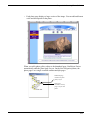
Download User Guide - NetObjects Fusion
Transcript
NetObjects Fusion 9 User Guide Copyright ©2005 Website Pros, Inc. All rights reserved. This manual, as well as the software described in it, is furnished under license and may only be used or copied in accordance with the terms of such license. The information in this manual is furnished for informational use only, is subject to change without notice, and should not be construed as a commitment, representation or warranty regarding the performance of NetObjects Fusion by Website Pros, Inc. Website Pros, Inc. assumes no responsibility for the consequences of any errors or inaccuracies in this manual. Except as permitted by the license for this manual, no part of this publication may be reproduced, stored in a retrieval system, or transmitted, in any form or by any means, electronic, mechanical, recording, or otherwise, without the prior written permission of Website Pros, Inc. Trademarks NetObjects, NetObjects Fusion, PageDraw, and SiteStyles are registered trademarks, and AutoSites, Everywhere HTML, SiteStructure, and “The Web needs you” are trademarks of Website Pros, Inc. These and other graphics, logos, service marks, and trademarks of Website Pros, Inc. and its affiliates may not be used without the prior written consent of Website Pros, Inc. or its affiliates, as the case may be. Flash® is a trademark or registered trademark of Macromedia, Inc. in the United States and/or other countries. Macromedia, Inc. does not sponsor, affiliate, or endorse Website Pros, Inc. or this product. All other brand and product names are trademarks or registered marks of their respective holders. This program was developed using NeoAccess: ©1992-1995 NeoLogic Systems, Inc. Portions of this product were created using LEADTOOLS ©1991-1996 LEAD Technologies, Inc. All rights reserved. International ProofReader™ text proofing software © 2004 Vantage Technology Holdings, Inc. All rights reserved. Reproduction or disassembly of embodied algorithms or database is prohibited. Java and all Java-based trademarks and logos are trademarks of Sun Microsystems, Inc., in the United States and other countries. This product includes software developed by the Apache Software Foundation (www.apache.org). ©1999-2004 The Apache Software Foundation. All rights reserved. SSHTools - Java SSH2 API ©2002-2003 Lee David Painter and Contributors. Companies, names, and dates used in examples herein are fictitious unless otherwise noted. Government Restricted Rights For units of the Department of Defense, use, duplication, or disclosure by the Government is subject to restrictions as set forth in subparagraph (c)(1)(ii) of the Rights in Technical Data and Computer Software clause at DFARS 252.227-7013. Contractor/manufacturer is Website Pros, Inc., 12735 Gran Bay Parkway West, Building 200, Jacksonville, FL 32258. If the Commercial Computer Software Restricted Rights clause at FAR 52.227-19 or its successors apply, the Software and Documentation constitute restricted computer software as defined in that clause and the Government shall not have the license for published software set forth in subparagraph (c)(3) of that clause. Printed in the U.S.A. NetObjects Fusion 9 Build Your Site’s Success . . . . . . . . . . . . . . . . . . . . . . 1 How to Get Started with NetObjects Fusion. . . . . . . . 2 QuickStart Tips . . . . . . . . . . . . . . . . . . . . . . . . . . . . . . . . . . . . . . Step-by-Step. . . . . . . . . . . . . . . . . . . . . . . . . . . . . . . . . . . . . . . . . In-Depth Information. . . . . . . . . . . . . . . . . . . . . . . . . . . . . . . . . . Conventions Used in This Guide. . . . . . . . . . . . . . . . . . . . . . . . . 3 3 3 3 Getting Help . . . . . . . . . . . . . . . . . . . . . . . . . . . . . . . . 5 1 NetObjects Fusion Basics NetObjects Fusion Views . . . . . . . . . . . . . . . . . . . . . . 8 NetObjects Fusion Window . . . . . . . . . . . . . . . . . . . . 9 About the Properties Palette . . . . . . . . . . . . . . . . . . . . . . . . . . . 10 About Toolbars . . . . . . . . . . . . . . . . . . . . . . . . . . . . . . . . . . . . . 11 Navigating in NetObjects Fusion . . . . . . . . . . . . . . . 12 Using the Control Bar Buttons . . . . . . . . . . . . . . . . . . . . . . . . . 12 Using the Go Menu . . . . . . . . . . . . . . . . . . . . . . . . . . . . . . . . . . 12 Using Shortcut Menus . . . . . . . . . . . . . . . . . . . . . . . . . . . . . . . . 13 Choosing Colors . . . . . . . . . . . . . . . . . . . . . . . . . . . . 14 Working with Color Palettes . . . . . . . . . . . . . . . . . . . 15 Choosing a Color Palette . . . . . . . . . . . . . . . . . . . . . . . . . . . . . . 15 Loading a Custom Color Palette . . . . . . . . . . . . . . . . . . . . . . . . 16 Creating or Editing a Color Palette . . . . . . . . . . . . . . . . . . . . . . 16 NetObjects Fusion Folder Structure . . . . . . . . . . . . . 17 2 Setting Application Options Setting Program Options. . . . . . . . . . . . . . . . . . . . . . 20 Setting Preview Options . . . . . . . . . . . . . . . . . . . . . 22 Setting Text Options . . . . . . . . . . . . . . . . . . . . . . . . 23 Setting International Options . . . . . . . . . . . . . . . . . . 25 Updating NetObjects Fusion . . . . . . . . . . . . . . . . . . 26 3 Creating and Managing Sites Starting NetObjects Fusion . . . . . . . . . . . . . . . . . . . 28 Working with Site Files . . . . . . . . . . . . . . . . . . . . . . 28 Creating and Opening Sites . . . . . . . . . . . . . . . . . . . 29 Starting with a Blank Site . . . . . . . . . . . . . . . . . . . . . . . . . . . . . 29 Starting with the Site Wizard . . . . . . . . . . . . . . . . . . . . . . . . . . 31 Opening an Existing Site. . . . . . . . . . . . . . . . . . . . . . . . . . . . . . 31 Working with the SiteStructure . . . . . . . . . . . . . . . . 33 Selecting a Page . . . . . . . . . . . . . . . . . . . . . . . . . . . . . . . . . . . . 33 Working with a Group of Pages . . . . . . . . . . . . . . . . . . . . . . . . 34 Setting Properties . . . . . . . . . . . . . . . . . . . . . . . . . . . 35 Setting Page Properties . . . . . . . . . . . . . . . . . . . . . . . . . . . . . . . Setting Site Management Properties . . . . . . . . . . . . . . . . . . . . . Setting META Tag Properties . . . . . . . . . . . . . . . . . . . . . . . . . . Setting Protection Options . . . . . . . . . . . . . . . . . . . . . . . . . . . . Setting Properties for a Group of Pages . . . . . . . . . . . . . . . . . . 36 37 38 40 42 Adding a Page . . . . . . . . . . . . . . . . . . . . . . . . . . . . . 44 Copying and Pasting Pages . . . . . . . . . . . . . . . . . . . 44 Deleting a Page . . . . . . . . . . . . . . . . . . . . . . . . . . . . 45 Moving a Page . . . . . . . . . . . . . . . . . . . . . . . . . . . . . 45 Replacing the Home Page. . . . . . . . . . . . . . . . . . . . . 46 Renaming Pages . . . . . . . . . . . . . . . . . . . . . . . . . . . . 47 Using Custom Button and Banner Names and File Extensions 48 Setting Up the Site View Display . . . . . . . . . . . . . . . 49 Collapsing the SiteStructure Display. . . . . . . . . . . . . . . . . . . . . 50 Working in Site Outline View . . . . . . . . . . . . . . . . . . . . . . . . . . 50 Printing the SiteStructure . . . . . . . . . . . . . . . . . . . . . 51 Saving Your Work. . . . . . . . . . . . . . . . . . . . . . . . . . . 52 Backing Up Your Site . . . . . . . . . . . . . . . . . . . . . . . . 53 Setting Options for the Current Site . . . . . . . . . . . . . 54 Changing General Settings . . . . . . . . . . . . . . . . . . . . . . . . . . . . 54 Setting Site Protection Options . . . . . . . . . . . . . . . . . . . . . . . . . 55 Versioning and Backup Settings . . . . . . . . . . . . . . . . . . . . . . . . 56 4 Working with Templates Creating a Site from a Template . . . . . . . . . . . . . . . . 60 Using Templates to Expand a Site . . . . . . . . . . . . . . 61 Exporting a Site . . . . . . . . . . . . . . . . . . . . . . . . . . . . 62 Changing an Existing Template . . . . . . . . . . . . . . . . 63 Customizing a Template . . . . . . . . . . . . . . . . . . . . . . . . . . . . . . 64 Sharing NetObjects Fusion Site Files . . . . . . . . . . . . 64 5 Importing Sites and Documents Importing Existing Sites . . . . . . . . . . . . . . . . . . . . . . 68 Creating a New Site from an Existing Site . . . . . . . . . . . . . . . . 70 Using an Existing Site to Expand a Site . . . . . . . . . . . . . . . . . . 72 Importing a Microsoft Office Document . . . . . . . . . 72 6 Page View Basics Exploring Page View . . . . . . . . . . . . . . . . . . . . . . . . 76 MasterBorder and Layout Area. . . . . . . . . . . . . . . . . . . . . . . . . 77 Setting Up the Page Design View Display . . . . . . . . . . . . . . . . 77 Setting Page Properties . . . . . . . . . . . . . . . . . . . . . . . . . . . . . . . 78 Displaying Pages in Page View . . . . . . . . . . . . . . . . 78 Displaying a Page from Site View . . . . . . . . . . . . . . . . . . . . . . 78 Using the Site Navigation Palette . . . . . . . . . . . . . . . . . . . . . . . 79 Setting Page Size . . . . . . . . . . . . . . . . . . . . . . . . . . . 79 Adding Objects to the Page . . . . . . . . . . . . . . . . . . . 81 Using Object Tools . . . . . . . . . . . . . . . . . . . . . . . . . . . . . . . . . . Page View Toolbars. . . . . . . . . . . . . . . . . . . . . . . . . . . . . . . . . . Importing Pages. . . . . . . . . . . . . . . . . . . . . . . . . . . . . . . . . . . . . Reusing Assets . . . . . . . . . . . . . . . . . . . . . . . . . . . . . . . . . . . . . Adding and Modifying Alt Tags . . . . . . . . . . . . . . . . . . . . . . . . 81 81 85 86 87 Editing Objects and Assets . . . . . . . . . . . . . . . . . . . 87 Selecting an Object . . . . . . . . . . . . . . . . . . . . . . . . . . . . . . . . . . 88 Renaming an Object . . . . . . . . . . . . . . . . . . . . . . . . . . . . . . . . . 89 Resizing an Object . . . . . . . . . . . . . . . . . . . . . . . . . . . . . . . . . . 89 Locking Objects . . . . . . . . . . . . . . . . . . . . . . . . . . . . 89 Positioning Objects . . . . . . . . . . . . . . . . . . . . . . . . . 90 Moving or Copying an Object. . . . . . . . . . . . . . . . . . . . . . . . . . Aligning and Distributing Objects . . . . . . . . . . . . . . . . . . . . . . Grouping Objects . . . . . . . . . . . . . . . . . . . . . . . . . . . . . . . . . . . Adding, Moving, and Deleting Guides . . . . . . . . . . . . . . . . . . . 90 91 92 93 Aligning Objects Using Smart Guides . . . . . . . . . . . . . . . . . . . 93 Snapping Objects to Grids, Guides, and Each Other. . . . . . . . . 94 Layering Objects. . . . . . . . . . . . . . . . . . . . . . . . . . . . 94 Rearranging Layered Objects . . . . . . . . . . . . . . . . . . . . . . . . . . 95 Adding Services . . . . . . . . . . . . . . . . . . . . . . . . . . . . 95 7 Controlling Published Output Approaches to Page Design . . . . . . . . . . . . . . . . . . . 98 Selecting a Layout Method . . . . . . . . . . . . . . . . . . . . 99 Using Layouts . . . . . . . . . . . . . . . . . . . . . . . . . . . . . . . . . . . . . . 99 Using Layout Regions . . . . . . . . . . . . . . . . . . . . . . . . . . . . . . . 100 Using Text Boxes. . . . . . . . . . . . . . . . . . . . . . . . . . . . . . . . . . . 100 Using Tables . . . . . . . . . . . . . . . . . . . . . . . . . . . . . . . . . . . . . . 101 Selecting an HTML Output Method . . . . . . . . . . . . 102 Setting the Site’s HTML Output Method . . . . . . . . . . . . . . . . Publishing with Dynamic Page Layout . . . . . . . . . . . . . . . . . . Publishing with Regular Tables . . . . . . . . . . . . . . . . . . . . . . . . Publishing with Fixed Page Layout. . . . . . . . . . . . . . . . . . . . . 103 105 109 109 8 Working with Layouts and Layout Regions Working with Layouts. . . . . . . . . . . . . . . . . . . . . . . 112 Creating a New Layout . . . . . . . . . . . . . . . . . . . . . . . . . . . . . . Selecting a Layout . . . . . . . . . . . . . . . . . . . . . . . . . . . . . . . . . . Renaming a Layout . . . . . . . . . . . . . . . . . . . . . . . . . . . . . . . . . Deleting a Layout . . . . . . . . . . . . . . . . . . . . . . . . . . . . . . . . . . Changing Layout Size . . . . . . . . . . . . . . . . . . . . . . . . . . . . . . . Adding an Object to the Layout. . . . . . . . . . . . . . . . . . . . . . . . 112 113 113 113 114 114 Working with Layout Regions . . . . . . . . . . . . . . . . 114 Creating a Layout Region . . . . . . . . . . . . . . . . . . . . . . . . . . . . 115 Adding Objects to a Layout Region . . . . . . . . . . . . . . . . . . . . .115 Displaying the Layout Region Grid . . . . . . . . . . . . . . . . . . . . .115 Converting a Layout Region to a Table . . . . . . . . . . . . . . . . . .116 Setting the HTML Output Method for a Layout or Layout Region . . . . . . . . . . . . . . . 117 Setting Layout and Layout Region Background Properties . . . . . . . . . . . . . . . . . . . . . 118 9 Working with Text Boxes Adding a Text Box . . . . . . . . . . . . . . . . . . . . . . . . . 122 Selecting a Text Box . . . . . . . . . . . . . . . . . . . . . . . 122 Embedding Objects in a Text Box . . . . . . . . . . . . . 123 Dragging and Dropping an Existing Object . . . . . . . . . . . . . . 124 Creating a New Embedded Object . . . . . . . . . . . . . . . . . . . . . 124 Wrapping Text around Objects . . . . . . . . . . . . . . . 125 Sizing a Text Box. . . . . . . . . . . . . . . . . . . . . . . . . . 126 Setting Text Box Background . . . . . . . . . . . . . . . . 127 Creating Pages that Resize to the Browser Window128 Preserving Your Design Intentions . . . . . . . . . . . . 130 1 0 Managing MasterBorders Working with MasterBorders. . . . . . . . . . . . . . . . . 132 Selecting a MasterBorder. . . . . . . . . . . . . . . . . . . . 133 Modifying the Current MasterBorder . . . . . . . . . . . 133 Creating a MasterBorder. . . . . . . . . . . . . . . . . . . . . 135 Changing MasterBorders . . . . . . . . . . . . . . . . . . . . 136 Applying a MasterBorder to Multiple Pages . . . . . 137 Renaming a MasterBorder . . . . . . . . . . . . . . . . . . . 137 Deleting a MasterBorder. . . . . . . . . . . . . . . . . . . . . 138 11 Working with AutoFrames Understanding Frames . . . . . . . . . . . . . . . . . . . . . . 140 Adding an AutoFrame . . . . . . . . . . . . . . . . . . . . . . 142 Generating HTML Frame Borders . . . . . . . . . . . . . 145 Setting Frame Properties. . . . . . . . . . . . . . . . . . . . . 146 Targeting Links in AutoFrames . . . . . . . . . . . . . . . 148 AutoFrames and Browser Refresh . . . . . . . . . . . . . 149 1 2 Designing with Text Adding Text to a Page. . . . . . . . . . . . . . . . . . . . . . . 152 Using the Text Tool . . . . . . . . . . . . . . . . . . . . . . . . . . . . . . . . . 152 Dragging and Dropping a Text File . . . . . . . . . . . . . . . . . . . . . 153 Pasting Text from the Clipboard . . . . . . . . . . . . . . . . . . . . . . . 153 Formatting Text. . . . . . . . . . . . . . . . . . . . . . . . . . . . 154 Selecting HTML or Cascading Style Sheet Text Formatting . 154 Understanding the Automatic Setting . . . . . . . . . . . . . . . . . . . 155 Formatting Selected Text . . . . . . . . . . . . . . . . . . . . . . . . . . . . Formatting Paragraphs . . . . . . . . . . . . . . . . . . . . . . . . . . . . . . Using the CSS Editor . . . . . . . . . . . . . . . . . . . . . . . . . . . . . . . Formatting Text Objects within Paragraphs . . . . . . . . . . . . . . 156 158 165 166 Working with Text Styles. . . . . . . . . . . . . . . . . . . . 168 Applying a Text Style to a Paragraph . . . . . . . . . . . . . . . . . . . Applying a Style to a Text Span . . . . . . . . . . . . . . . . . . . . . . . Using Custom Styles . . . . . . . . . . . . . . . . . . . . . . . . . . . . . . . . Setting a Style’s Scope . . . . . . . . . . . . . . . . . . . . . . . . . . . . . . Creating a Text Style . . . . . . . . . . . . . . . . . . . . . . . . . . . . . . . . Creating a Custom Text Attribute (CSS only) . . . . . . . . . . . . Importing a Text Style . . . . . . . . . . . . . . . . . . . . . . . . . . . . . . . Modifying a Text Style . . . . . . . . . . . . . . . . . . . . . . . . . . . . . . Deleting a Text Style . . . . . . . . . . . . . . . . . . . . . . . . . . . . . . . . 168 168 169 170 171 173 174 174 174 Creating Bulleted and Numbered Lists . . . . . . . . . 176 Formatting a List . . . . . . . . . . . . . . . . . . . . . . . . . . 177 Setting the List Start Value . . . . . . . . . . . . . . . . . . . . . . . . . . . 178 Setting the List Bullet or Numbering Type . . . . . . . . . . . . . . . 179 Inserting Symbols . . . . . . . . . . . . . . . . . . . . . . . . . 179 Adding Text to a Shape or Picture . . . . . . . . . . . . . 180 Creating and Editing Fields . . . . . . . . . . . . . . . . . . 182 Inserting an Existing Field . . . . . . . . . . . . . . . . . . . . . . . . . . . 182 Creating a User-Defined Variable . . . . . . . . . . . . . . . . . . . . . . 183 Checking Spelling . . . . . . . . . . . . . . . . . . . . . . . . . 184 Finding Text . . . . . . . . . . . . . . . . . . . . . . . . . . . . . . 186 Replacing Text . . . . . . . . . . . . . . . . . . . . . . . . . . . . 186 Counting Words, Lines, Paragraphs, and Characters187 1 3 Placing Pictures Choosing an Image Format. . . . . . . . . . . . . . . . . . . 190 Adding a Picture . . . . . . . . . . . . . . . . . . . . . . . . . . . 190 Using the Picture Properties Palette . . . . . . . . . . . . 193 Optimizing Images . . . . . . . . . . . . . . . . . . . . . . . . . 193 Basic Image Optimization . . . . . . . . . . . . . . . . . . . . . . . . . . . . 194 Advanced Image Optimization . . . . . . . . . . . . . . . . . . . . . . . . 194 Creating a Transparent GIF . . . . . . . . . . . . . . . . . . . . . . . . . . . 197 Resizing and Orienting a Picture . . . . . . . . . . . . . . 199 Resizing a Picture . . . . . . . . . . . . . . . . . . . . . . . . . . . . . . . . . . Tiling a Picture. . . . . . . . . . . . . . . . . . . . . . . . . . . . . . . . . . . . . Rotating a Picture . . . . . . . . . . . . . . . . . . . . . . . . . . . . . . . . . . Flipping a Picture. . . . . . . . . . . . . . . . . . . . . . . . . . . . . . . . . . . Cropping a Picture . . . . . . . . . . . . . . . . . . . . . . . . . . . . . . . . . . 199 200 201 201 202 Adjusting a Picture’s Color. . . . . . . . . . . . . . . . . . . 203 Creating a Border Around a Picture . . . . . . . . . . . . 204 Adding Text to a Picture . . . . . . . . . . . . . . . . . . . . . 205 Removing Red Eye in a Picture . . . . . . . . . . . . . . . 205 Editing Picture Hotspots . . . . . . . . . . . . . . . . . . . . . 206 1 4 Creating Photo Galleries About Photo Galleries. . . . . . . . . . . . . . . . . . . . . . . 210 Adding a Photo Gallery . . . . . . . . . . . . . . . . . . . . . 212 Creating a New Photo Gallery. . . . . . . . . . . . . . . . . . . . . . . . . 212 Inserting an Existing Photo Gallery. . . . . . . . . . . . . . . . . . . . . 213 Working with Photos . . . . . . . . . . . . . . . . . . . . . . . . . . 213 Adding Photos . . . . . . . . . . . . . . . . . . . . . . . . . . . . . . . . . . . . . . . . .214 Replacing Photos. . . . . . . . . . . . . . . . . . . . . . . . . . . . . . . . . . . . . . .216 Arranging Photos. . . . . . . . . . . . . . . . . . . . . . . . . . . . . . . . . . . . . . .216 Resizing Photos . . . . . . . . . . . . . . . . . . . . . . . . . . . . . . . . . . . . . . . .218 Removing Photos . . . . . . . . . . . . . . . . . . . . . . . . . . . . . . . . . . . . . .220 Opening the Photo Gallery Properties Editor . . . . . . . 221 Adding and Editing Photo Titles and Captions . . . . . . 221 Adding and Editing Photo Titles and Captions on the Images Tab.221 Adding and Editing Photo Titles on the Thumbnail Page. . . . . . . .223 Adding and Editing Photo Titles and Captions on the Photo Page .224 Formatting Photo Titles and Captions . . . . . . . . . . . . . 224 Formatting Photo Titles. . . . . . . . . . . . . . . . . . . . . . . . . . . . . . . . . .224 Formatting Photo Captions . . . . . . . . . . . . . . . . . . . . . . . . . . . . . . .226 Formatting Photo Thumbnail Titles . . . . . . . . . . . . . . . . . . . . . . . .227 Controlling Download Time . . . . . . . . . . . . . . . . . . . . 228 Adding Alt Tags. . . . . . . . . . . . . . . . . . . . . . . . . . . . . . 231 Formatting the Thumbnail Page . . . . . . . . . . . . . . . . . 232 Creating a Text Link to a Photo Gallery . . . . . . . . . . . . . . . . . . . . .232 Selecting a Thumbnail Template. . . . . . . . . . . . . . . . . . . . . . . . . . .233 Formatting the Photo Pages . . . . . . . . . . . . . . . . . . . . . 235 Displaying Photo Pages as Pop-Up Windows. . . . . . . . . . . . . . . . .235 Selecting a Photo Page Layout . . . . . . . . . . . . . . . . . . . . . . . . . . . .235 Selecting a Photo Frame Template . . . . . . . . . . . . . . . . . . . . . . . . .236 Navigating Between Photo Pages . . . . . . . . . . . . . . . . 237 Setting Up Navigation for Site Visitors . . . . . . . . . . . . 238 Saving a Photo Gallery Profile . . . . . . . . . . . . . . . . . . 238 Removing a Photo Gallery . . . . . . . . . . . . . . . . . . . 239 1 5 Adding Tables Adding a Table . . . . . . . . . . . . . . . . . . . . . . . . . . . . 242 Setting Table Properties. . . . . . . . . . . . . . . . . . . . . . . . . . . . . . 243 Setting the Table Background . . . . . . . . . . . . . . . . . . . . . . . . . 244 Adjusting the Table Structure . . . . . . . . . . . . . . . . . 245 Resizing Table Rows and Columns . . . . . . . . . . . . . . . . . . . . . Inserting a Row or Column . . . . . . . . . . . . . . . . . . . . . . . . . . . Removing a Row or Column . . . . . . . . . . . . . . . . . . . . . . . . . . Merging and Splitting Table Cells . . . . . . . . . . . . . . . . . . . . . . Setting Row and Column Properties . . . . . . . . . . . . . . . . . . . . 245 246 247 247 249 Working with Table Cells . . . . . . . . . . . . . . . . . . . . 250 Selecting Table Cells . . . . . . . . . . . . . . . . . . . . . . . . . . . . . . . . Setting Cell Properties . . . . . . . . . . . . . . . . . . . . . . . . . . . . . . . Sizing Cells . . . . . . . . . . . . . . . . . . . . . . . . . . . . . . . . . . . . . . . Adding Text and Pictures to Cells . . . . . . . . . . . . . . . . . . . . . . 250 250 252 252 Sorting Table Data . . . . . . . . . . . . . . . . . . . . . . . . . 253 Importing Table Data . . . . . . . . . . . . . . . . . . . . . . . 253 Exporting Table Data . . . . . . . . . . . . . . . . . . . . . . . 254 Setting Table Styles. . . . . . . . . . . . . . . . . . . . . . . . . 255 Defining Table Regions . . . . . . . . . . . . . . . . . . . . . . . . . . . . . . 255 Creating a Table Style . . . . . . . . . . . . . . . . . . . . . . . . . . . . . . . 257 Adding a Table Style in Style View. . . . . . . . . . . . . . . . . . . . . 260 1 6 Drawing Shapes and Lines Drawing Shapes . . . . . . . . . . . . . . . . . . . . . . . . . . . 264 Adding HTML Horizontal Rules . . . . . . . . . . . . . . 265 Adding a SiteStyle Line . . . . . . . . . . . . . . . . . . . . . 266 Drawing Lines and Arrows . . . . . . . . . . . . . . . . . . 267 Editing Lines and Arrows . . . . . . . . . . . . . . . . . . . . . . . . . . . . 269 1 7 Using SiteStyles What Is a SiteStyle? . . . . . . . . . . . . . . . . . . . . . . . . 272 Exploring Style View . . . . . . . . . . . . . . . . . . . . . . . 272 Applying SiteStyles . . . . . . . . . . . . . . . . . . . . . . . . 276 Editing the Graphic Elements of SiteStyles. . . . . . 276 Removing the Read Only Setting . . . . . . . . . . . . . . . . . . . . . . Editing Banners and Buttons. . . . . . . . . . . . . . . . . . . . . . . . . . Adding Banners and Buttons. . . . . . . . . . . . . . . . . . . . . . . . . . Adding End Caps and Section Title Buttons. . . . . . . . . . . . . . Importing Flash Banners and Button Sets. . . . . . . . . . . . . . . . Editing a Navigation Bar. . . . . . . . . . . . . . . . . . . . . . . . . . . . . Editing a Table Style . . . . . . . . . . . . . . . . . . . . . . . . . . . . . . . . Editing a Data List Icon . . . . . . . . . . . . . . . . . . . . . . . . . . . . . Editing a Style Background. . . . . . . . . . . . . . . . . . . . . . . . . . . Editing the SiteStyle Line . . . . . . . . . . . . . . . . . . . . . . . . . . . . 277 277 279 281 283 288 289 290 291 292 Editing the Text Elements of SiteStyles. . . . . . . . . 292 A Note about the Body and Normal (P) Text Styles . . . . . . . . 294 Creating a SiteStyle . . . . . . . . . . . . . . . . . . . . . . . . 295 Managing SiteStyles . . . . . . . . . . . . . . . . . . . . . . . 297 Adding a SiteStyle. . . . . . . . . . . . . . . . . . . . . . . . . . . . . . . . . . 297 SiteStyles from Imported Sites . . . . . . . . . . . . . . . . . . . . . . . . 302 Removing SiteStyles . . . . . . . . . . . . . . . . . . . . . . . . . . . . . . . . 302 Styles Folder Structure . . . . . . . . . . . . . . . . . . . . . . 303 1 8 Creating Navigation Bars and Banners Working with Banners and Navigation Bars . . . . . 306 Using Navigation Bars . . . . . . . . . . . . . . . . . . . . . . 306 Adding a Navigation Bar . . . . . . . . . . . . . . . . . . . . . . . . . . . . . Setting Navigation Structure . . . . . . . . . . . . . . . . . . . . . . . . . . Setting Navigation Bar Orientation . . . . . . . . . . . . . . . . . . . . . Set Border Width and Button Spacing. . . . . . . . . . . . . . . . . . . Setting Button Navigation Bar Properties . . . . . . . . . . . . . . . . Setting Text Navigation Bar Properties . . . . . . . . . . . . . . . . . . Changing a Flash Navigation Bar’s Appearance. . . . . . . . . . . Setting a Navigation Bar Target. . . . . . . . . . . . . . . . . . . . . . . . 307 309 311 311 313 320 321 323 Using Banners. . . . . . . . . . . . . . . . . . . . . . . . . . . . . 323 Adding a Banner . . . . . . . . . . . . . . . . . . . . . . . . . . . . . . . . . . . Changing the Banner Text . . . . . . . . . . . . . . . . . . . . . . . . . . . . Changing a Banner’s Image. . . . . . . . . . . . . . . . . . . . . . . . . . . Changing a Flash Banner’s Appearance . . . . . . . . . . . . . . . . . Setting Banner Style and Orientation . . . . . . . . . . . . . . . . . . . 324 325 325 326 327 1 9 Creating Links and Anchors Creating Links. . . . . . . . . . . . . . . . . . . . . . . . . . . . . 330 Types of Links . . . . . . . . . . . . . . . . . . . . . . . . . . . . . . . . . . . . . Link Indicators. . . . . . . . . . . . . . . . . . . . . . . . . . . . . . . . . . . . . Creating an Internal Link. . . . . . . . . . . . . . . . . . . . . . . . . . . . . Adding, Editing, and Deleting an Anchor . . . . . . . . . . . . . . . . Creating a Smart Link . . . . . . . . . . . . . . . . . . . . . . . . . . . . . . . Creating an External Link . . . . . . . . . . . . . . . . . . . . . . . . . . . . Creating a File Link . . . . . . . . . . . . . . . . . . . . . . . . . . . . . . . . . 330 330 331 333 334 336 339 Setting Link Targets . . . . . . . . . . . . . . . . . . . . . . . . 341 Setting Frame Targets . . . . . . . . . . . . . . . . . . . . . . . . . . . . . . . 341 Setting Pop-Up Window Targets. . . . . . . . . . . . . . . . . . . . . . . 342 Following Links . . . . . . . . . . . . . . . . . . . . . . . . . . . 345 Finding a Link . . . . . . . . . . . . . . . . . . . . . . . . . . . . 346 Editing or Removing a Link . . . . . . . . . . . . . . . . . 346 Adding HTML to a Link . . . . . . . . . . . . . . . . . . . . 346 Working with Imagemaps . . . . . . . . . . . . . . . . . . . 348 Creating an Imagemap . . . . . . . . . . . . . . . . . . . . . . . . . . . . . . 348 Editing an Imagemap . . . . . . . . . . . . . . . . . . . . . . . . . . . . . . . 348 2 0 Creating E-Commerce Catalogs About Catalogs . . . . . . . . . . . . . . . . . . . . . . . . . . . 352 Adding a Catalog . . . . . . . . . . . . . . . . . . . . . . . . . . 354 Creating a New Catalog . . . . . . . . . . . . . . . . . . . . . . . . . . . . . 354 Inserting an Existing Catalog . . . . . . . . . . . . . . . . . . . . . . . . . 355 Working with Products . . . . . . . . . . . . . . . . . . . . . 356 Adding Products . . . . . . . . . . . . . . . . . . . . . . . . . . . . . . . . . . . Arranging Products . . . . . . . . . . . . . . . . . . . . . . . . . . . . . . . . . Removing Products . . . . . . . . . . . . . . . . . . . . . . . . . . . . . . . . . Duplicating Products . . . . . . . . . . . . . . . . . . . . . . . . . . . . . . . . Filtering Products . . . . . . . . . . . . . . . . . . . . . . . . . . . . . . . . . . Importing Products . . . . . . . . . . . . . . . . . . . . . . . . . . . . . . . . . 356 359 362 363 363 364 Formatting the List Page . . . . . . . . . . . . . . . . . . . . 366 Selecting a Layout for Your Catalog . . . . . . . . . . . . . . . . . . . . 366 Displaying Products . . . . . . . . . . . . . . . . . . . . . . . . . . . . . . . . 368 Formatting the Detail Page . . . . . . . . . . . . . . . . . . . . . . . . . . . 370 Configuring the Store. . . . . . . . . . . . . . . . . . . . . . . 371 Controlling Download Time . . . . . . . . . . . . . . . . . . 373 Setting Up Navigation for Site Visitors . . . . . . . . . 376 Saving a Catalog Profile . . . . . . . . . . . . . . . . . . . . . 376 Removing a Catalog . . . . . . . . . . . . . . . . . . . . . . . . 377 2 1 Adding Java and ActiveX Inserting a Java Applet or Servlet. . . . . . . . . . . . . . 380 Inserting a Java Bean Component . . . . . . . . . . . . . 382 Inserting an ActiveX Control . . . . . . . . . . . . . . . . . 385 2 2 Placing Media Inserting a Flash File. . . . . . . . . . . . . . . . . . . . . . . . 388 Inserting a Shockwave File. . . . . . . . . . . . . . . . . . . 390 Inserting a QuickTime Movie . . . . . . . . . . . . . . . . . 392 Inserting a Windows Media Player File . . . . . . . . . 395 Inserting a Sound File . . . . . . . . . . . . . . . . . . . . . . . 396 Inserting a Real Player File. . . . . . . . . . . . . . . . . . . 398 Inserting Other Types of Files. . . . . . . . . . . . . . . . . 400 Replacing a Media File . . . . . . . . . . . . . . . . . . . . . . 402 2 3 Referencing and Editing External HTML Using Referenced Files . . . . . . . . . . . . . . . . . . . . . . . . . . . . . . 404 Referencing HTML from Site View . . . . . . . . . . . 404 Referencing HTML from Page View. . . . . . . . . . . 406 Referencing HTML as an Object. . . . . . . . . . . . . . 408 Toggling Referenced Layouts and Objects . . . . . . 410 Managing Referenced Assets. . . . . . . . . . . . . . . . . 411 Publishing Native HTML . . . . . . . . . . . . . . . . . . . 412 Publishing Unmanaged Assets. . . . . . . . . . . . . . . . 414 2 4 Building Dynamic Pages How Actions Work . . . . . . . . . . . . . . . . . . . . . . . . 416 Adding Actions to Objects and Pages . . . . . . . . . . 417 Adding an Action to Linked Text . . . . . . . . . . . . . 422 Tailoring Actions with Custom Messages . . . . . . . 424 Targeting Several Objects with One Action . . . . . 426 Modifying Actions . . . . . . . . . . . . . . . . . . . . . . . . . 428 Scripting Your Own Actions . . . . . . . . . . . . . . . . . 429 Scripting Parameter Values . . . . . . . . . . . . . . . . . . 430 Examples . . . . . . . . . . . . . . . . . . . . . . . . . . . . . . . . 432 Creating a Button Rollover . . . . . . . . . . . . . . . . . . . . . . . . . . . Colliding One Object with Another. . . . . . . . . . . . . . . . . . . . . Showing One Object While Hiding Others . . . . . . . . . . . . . . . Sequencing Actions for a Slide Show . . . . . . . . . . . . . . . . . . . 432 434 435 437 Customizing Default Actions . . . . . . . . . . . . . . . . . 441 2 5 Designing and Implementing Forms Creating a Form . . . . . . . . . . . . . . . . . . . . . . . . . . . 444 Adding Objects to a Form. . . . . . . . . . . . . . . . . . . . 446 Naming Form Objects . . . . . . . . . . . . . . . . . . . . . . . . . . . . . . . Adding a Single- or Multiple-Line Text Field . . . . . . . . . . . . . Adding Radio Buttons . . . . . . . . . . . . . . . . . . . . . . . . . . . . . . . Adding Check Boxes . . . . . . . . . . . . . . . . . . . . . . . . . . . . . . . . Adding a Combo Box . . . . . . . . . . . . . . . . . . . . . . . . . . . . . . . Adding a File Selector Box . . . . . . . . . . . . . . . . . . . . . . . . . . . Adding Form Labels . . . . . . . . . . . . . . . . . . . . . . . . . . . . . . . . Adding Submit, Reset, Custom, and AutoClose Buttons . . . . Setting Form Object Tab Order . . . . . . . . . . . . . . . . . . . . . . . . Setting Validation Rules for Form Objects . . . . . . . . . . . . . . . Setting Form Error Properties . . . . . . . . . . . . . . . . . . . . . . . . . 447 447 449 450 452 453 454 455 456 457 459 Processing Data. . . . . . . . . . . . . . . . . . . . . . . . . . . . 461 Adding Hidden Fields . . . . . . . . . . . . . . . . . . . . . . . 463 2 6 Using NetObjects Fusion Components Using the Component Manager . . . . . . . . . . . . . . . 466 Adding Toolbars to the Component Manager . . . . . . . . . . . . . 466 Displaying Toolbars in the Component Manager . . . . . . . . . . 466 Using the Component Manager . . . . . . . . . . . . . . . . . . . . . . . . 468 About Components . . . . . . . . . . . . . . . . . . . . . . . . 469 Adding a Rotating Ad Banner . . . . . . . . . . . . . . . . 470 Adding DynaButtons . . . . . . . . . . . . . . . . . . . . . . . 472 Adding Sub-Buttons . . . . . . . . . . . . . . . . . . . . . . . . . . . . . . . . 473 Adding a Go Menu . . . . . . . . . . . . . . . . . . . . . . . . 475 Adding a Google Search Component . . . . . . . . . . 477 The NOF News Component . . . . . . . . . . . . . . . . . 483 Adding the Admin Component on a Page. . . . . . . . . . . . . . . . 483 Adding the Article List Component . . . . . . . . . . . . . . . . . . . . 494 Adding the Full Article Component . . . . . . . . . . . . . . . . . . . . 500 Adding a News Ticker . . . . . . . . . . . . . . . . . . . . . . 506 Loading Pictures onto Your Site . . . . . . . . . . . . . . 510 Adding Pictures That Roll Over . . . . . . . . . . . . . . 510 Adding Rotating Pictures. . . . . . . . . . . . . . . . . . . . 512 Adding an RSS Feeds Component. . . . . . . . . . . . . 514 Directing Visitors to a Browser-Specific Page . . . 517 Adding a Site Map Button . . . . . . . . . . . . . . . . . . . 519 Adding Time Based Pictures . . . . . . . . . . . . . . . . . 520 Adding an Email Page Component . . . . . . . . . . . . 522 Using the Forms Handler Component . . . . . . . . . . 535 Adding an FAQ Page . . . . . . . . . . . . . . . . . . . . . . . 552 Adding the Testimonials Component . . . . . . . . . . . 562 Adding a Guestbook . . . . . . . . . . . . . . . . . . . . . . . . 571 Creating Password-Protected Pages . . . . . . . . . . . . 577 Using Component Suites . . . . . . . . . . . . . . . . . . . . 598 Creating Component Profiles . . . . . . . . . . . . . . . . . 599 Using Style Sheets with Custom Components . . . . 600 Troubleshooting Server-Side Script Errors. . . . . . . 602 Adding Server Tags. . . . . . . . . . . . . . . . . . . . . . . . . 604 2 7 Data Publishing Static and Dynamic Data Publishing . . . . . . . . . . . 608 Storing Data with NetObjects Fusion . . . . . . . . . . . 608 Publishing Data. . . . . . . . . . . . . . . . . . . . . . . . . . . . 610 Creating a Data Object . . . . . . . . . . . . . . . . . . . . . . 611 Creating a Data Object for Internal Data. . . . . . . . . . . . . . . . . 612 Changing an Internal Data Field Name . . . . . . . . . . . . . . . . . . 614 Creating a Data Object for External Data . . . . . . . . . . . . . . . . 614 Creating a Data List . . . . . . . . . . . . . . . . . . . . . . . . 616 Creating Stacked Pages. . . . . . . . . . . . . . . . . . . . . . 619 Designing the Stacked Page Layout . . . . . . . . . . . . . . . . . . . . Adding Navigation Buttons to Stacked Pages . . . . . . . . . . . . . Adding a Stacked Page for Internal Data . . . . . . . . . . . . . . . . Deleting a Stacked Page . . . . . . . . . . . . . . . . . . . . . . . . . . . . . Adding Text and Images to Stacked Pages . . . . . . . . . . . . . . . 620 622 623 623 623 Deleting a Data Object. . . . . . . . . . . . . . . . . . . . . . 624 2 8 Publishing Dynamically from a Database Database Basics . . . . . . . . . . . . . . . . . . . . . . . . . . . 626 How the Database Component Works . . . . . . . . . . 627 Connecting to the Database . . . . . . . . . . . . . . . . . . 630 Establishing a Data Source . . . . . . . . . . . . . . . . . . 631 Creating Connector Profiles. . . . . . . . . . . . . . . . . . 638 Defining a Database Structure . . . . . . . . . . . . . . . . 639 Adding Database Engines . . . . . . . . . . . . . . . . . . . 642 Filtering Recordset Results . . . . . . . . . . . . . . . . . . 642 Using the SQL Editor . . . . . . . . . . . . . . . . . . . . . . . . . . . . . . . 648 Retrieving and Displaying Data. . . . . . . . . . . . . . . 649 Using a Recordset Iterator. . . . . . . . . . . . . . . . . . . . . . . . . . . . 649 Displaying Data Fields . . . . . . . . . . . . . . . . . . . . . . . . . . . . . . 651 Sorting Data . . . . . . . . . . . . . . . . . . . . . . . . . . . . . . 660 Navigating Through Recordsets . . . . . . . . . . . . . . . . . . . . . . . 662 Adding Conditional Statements. . . . . . . . . . . . . . . . . . . . . . . . 664 Modifying a Database . . . . . . . . . . . . . . . . . . . . . . 667 2 9 Working with HTML Directly Editing the Page’s HTML . . . . . . . . . . . . . . . . . . . 674 Working in HTML Source View . . . . . . . . . . . . . . . . . . . . . . . 674 Using the Page HTML Dialog . . . . . . . . . . . . . . . . . . . . . . . . 680 Accessing an AutoFrame’s HTML . . . . . . . . . . . . . 681 Working in the Page HTML Dialog . . . . . . . . . . . . . . . . . . . . 683 Working in the HTML Source Editor . . . . . . . . . . . . . . . . . . . 683 Examples of Page and AutoFrame HTML . . . . . . . 684 Indexing Pages for Search Engines . . . . . . . . . . . . . . . . . . . . . Auto-Forwarding from a Transition Page . . . . . . . . . . . . . . . . Accommodating Browsers that Don't Support Frames . . . . . . Creating a Default Target Frame . . . . . . . . . . . . . . . . . . . . . . . 684 685 686 687 Accessing an Object’s HTML. . . . . . . . . . . . . . . . . 688 Examples of Object HTML . . . . . . . . . . . . . . . . . . 690 Displaying a Message on Mouse Click . . . . . . . . . . . . . . . . . . 690 Inserting HTML in a Text Box . . . . . . . . . . . . . . . . 691 Coding Your Own Objects . . . . . . . . . . . . . . . . . . . 692 Coding Your Own Frames . . . . . . . . . . . . . . . . . . . 693 3 0 Managing Assets Working in Assets View . . . . . . . . . . . . . . . . . . . . . 698 Managing File Assets . . . . . . . . . . . . . . . . . . . . . . . 699 File Asset Characteristics . . . . . . . . . . . . . . . . . . . . . . . . . . . . Adding a File Asset . . . . . . . . . . . . . . . . . . . . . . . . . . . . . . . . . Editing Asset Names and Locations . . . . . . . . . . . . . . . . . . . . Opening a File Asset in an External Application . . . . . . . . . . Displaying a Page Containing a Specific File Asset . . . . . . . . Deleting a File Asset . . . . . . . . . . . . . . . . . . . . . . . . . . . . . . . . Deleting All Unused File Assets . . . . . . . . . . . . . . . . . . . . . . . Verifying File Assets . . . . . . . . . . . . . . . . . . . . . . . . . . . . . . . . 700 700 701 702 702 702 703 703 Managing Links and Link Targets . . . . . . . . . . . . . 705 Updating an External Link. . . . . . . . . . . . . . . . . . . . . . . . . . . . 705 Displaying the Page Containing a Link. . . . . . . . . . . . . . . . . . Adding an External Link . . . . . . . . . . . . . . . . . . . . . . . . . . . . . Deleting a Link . . . . . . . . . . . . . . . . . . . . . . . . . . . . . . . . . . . . Updating Link Targets. . . . . . . . . . . . . . . . . . . . . . . . . . . . . . . Verifying Links . . . . . . . . . . . . . . . . . . . . . . . . . . . . . . . . . . . . 707 707 707 707 708 Managing Data Objects and Photo Galleries . . . . . 708 Managing Variables . . . . . . . . . . . . . . . . . . . . . . . . 709 Adding a Variable . . . . . . . . . . . . . . . . . . . . . . . . . . . . . . . . . . 709 Editing a Variable . . . . . . . . . . . . . . . . . . . . . . . . . . . . . . . . . . 710 Deleting a Variable . . . . . . . . . . . . . . . . . . . . . . . . . . . . . . . . . 710 3 1 Publishing Your Site The Publishing Process . . . . . . . . . . . . . . . . . . . . . 712 Additional Publishing Notes . . . . . . . . . . . . . . . . . . . . . . . . . . 713 Exploring Publish View . . . . . . . . . . . . . . . . . . . . . 714 Publishing Locally . . . . . . . . . . . . . . . . . . . . . . . . . 715 Setting Up to Publish Locally . . . . . . . . . . . . . . . . . . . . . . . . . 716 Setting HTML Options . . . . . . . . . . . . . . . . . . . . . . . . . . . . . . 717 Publishing Your Site . . . . . . . . . . . . . . . . . . . . . . . . . . . . . . . . 720 Setting Up to Transfer Files to Your Web Server . 722 The Server Setup Process . . . . . . . . . . . . . . . . . . . . . . . . . . . . Publish Profile Checklist. . . . . . . . . . . . . . . . . . . . . . . . . . . . . Select the Directory Structure . . . . . . . . . . . . . . . . . . . . . . . . . Define Server Profiles . . . . . . . . . . . . . . . . . . . . . . . . . . . . . . . Creating a Global Publish Profile . . . . . . . . . . . . . . . . . . . . . . Publishing Components. . . . . . . . . . . . . . . . . . . . . . . . . . . . . . Viewing a Server’s Contents . . . . . . . . . . . . . . . . . . . . . . . . . . 722 722 725 727 732 732 732 Transferring Your Site to the Web . . . . . . . . . . . . . 734 3 2 Advanced Publishing Customizing Your Site’s Directory Structure . . . . . 738 Creating a Custom Folder . . . . . . . . . . . . . . . . . . . . . . . . . . . . Renaming Folders and Files . . . . . . . . . . . . . . . . . . . . . . . . . . Deleting Folders. . . . . . . . . . . . . . . . . . . . . . . . . . . . . . . . . . . . Rearranging the Directory Structure . . . . . . . . . . . . . . . . . . . . Viewing and Setting Publishing Properties . . . . . . . . . . . . . . . Suppressing a Page or Asset from the Published Site . . . . . . . 738 739 739 740 740 741 Creating Aliased Folders and Setting the CGI-BIN Directory742 Setting the Server Port and Permissions . . . . . . . . . 745 Publishing with Firewalls or Proxy Servers . . . . . . . . . . . . . . 747 Publishing Special Assets . . . . . . . . . . . . . . . . . . . . 748 Managing Script Assets . . . . . . . . . . . . . . . . . . . . . . . . . . . . . . 748 3 3 Using the Content Management Features Protecting Objects. . . . . . . . . . . . . . . . . . . . . . . . . . 752 Protecting a Layout . . . . . . . . . . . . . . . . . . . . . . . . . 753 Protecting a MasterBorder . . . . . . . . . . . . . . . . . . . 754 Protecting a Page. . . . . . . . . . . . . . . . . . . . . . . . . . . 755 Protecting a Site . . . . . . . . . . . . . . . . . . . . . . . . . . . 756 Editing Protected Objects . . . . . . . . . . . . . . . . . . . . 757 3 4 Using the Site Versions Manager Understanding Versioning. . . . . . . . . . . . . . . . . . . . 760 Setting Versioning Options . . . . . . . . . . . . . . . . . . 760 Creating a Site Version in the Versions Manager . 762 Creating a Site Version while Publishing . . . . . . . 763 Restoring a Version . . . . . . . . . . . . . . . . . . . . . . . . 764 Removing a Version from the Versions Manager . 765 Exporting Connection Credentials for nPower Users765 3 5 Working with Character Sets Available Character Sets . . . . . . . . . . . . . . . . . . . . 768 Setting the Site’s Character Set . . . . . . . . . . . . . . . 769 Setting the Character Set for an Individual Page . . 770 Setting the Character Set for a Section . . . . . . . . . 770 Setting the Character Set for Imported Pages . . . . 771 URL and Page Name Character Requirements . . . 772 Welcome to NetObjects Fusion NetObjects Fusion® 9 is the essential tool for building effective Web sites. Whether you are a professional Web site designer or designing a site for a small business or your family, you can use NetObjects Fusion to design your site quickly and easily. Map out your site structure by dragging and dropping page icons. NetObjects Fusion automatically creates and updates navigation and links. Lay out your pages quickly by dragging text, graphics, and multimedia into place. Select from dozens of SiteStyles®, or customize or create your own to apply a consistent visual theme throughout your site. Build Your Site’s Success Enhance your site design with Flash banners and navigation. Give your site high-impact visual appeal by incorporating Flash navigation and banners onto your pages. Change colors, effects, and display attributes with a few simple clicks without leaving NetObjects Fusion, and watch the results of your Flash animation take effect in real time. Perform advanced image editing. NetObjects Fusion includes all the tools necessary to edit images without having to use third-party software. You can crop images, set borders, adjust size and orientation, reduce red-eye, and add text. In addition, apply custom optimization settings to pictures and auto-generated images that control format and download times. Build a Digital Photo Gallery. Use the Photo Gallery tool to put your images on the Web in minutes. Select the images you want to use, choose a display format, and NetObjects Fusion does the rest. Your photo gallery is published to the Web for your friends and family to view. 1 Add interactivity with powerful components. Incorporate some of today’s latest technology—such as RSS feeds, secure log-in pages, and customer testimonial components—using simple drag-and-drop functionality. Add, remove, and manage these components from the centralized component toolbar. Create an e-commerce catalog. Simplify the process of building your online store with NetObjects Fusion and match your catalog with the look and feel of your Web site. With just a few clicks, you can easily create a catalog, add products and images, and arrange them so that navigation is effortless. Then, integrate credit card processing for an effective way to deliver world-class products and services to your customers online. Work collaboratively with clients using NetObjects nPower™. With NetObjects nPower, site owners are free to update their NetObjects Fusion built Web sites at their convenience—while you maintain full control of site structure and design using NetObjects Fusion's Content Management and Version Control features. Take control of your site's content. Utilize full Web-content-management functionality. Whether you are working collaboratively designing a site for your organization or developing Web sites for several clients, with NetObjects Fusion's content-management features, you can give NetObjects nPower clients the ability to modify their site while you retain control over which aspects of a site are editable. Create archived versions of your site. Using the Version Manager, you can store archived versions of your Web site when it is modified by nPower users. Now, you now longer have to worry about losing your site structure or waste time re-creating its content to restore it to a previous version. Develop database solutions. You can develop a dynamic site in minutes using NetObjects Fusion’s Database component. Incorporate common database elements in objects such as forms, lists, and tables, all from within the NetObjects Fusion interface. Build pages to display data directly from Page view by simply dragging and dropping elements on to the page, setting values in the properties palette, and using wizards to add tables and queries. This is a great way for beginner and advanced NetObjects Fusion users to implement complex solutions in less time. How to Get Started with NetObjects Fusion To ensure success as you start building Web sites with NetObjects Fusion 9, use the tools provided with the program to get started quickly. 2 QuickStart Tips For information about basic NetObjects Fusion concepts, choose NetObjects Fusion QuickStart tips from the Help menu. If you do not have a site open and you go to a NetObjects Fusion view, you see a page of tips about working in that view. Once you create or open a site, the View tips are no longer available. To see the View tips again, close the site. Step-by-Step NetObjects Fusion Getting Started contains step-by-step instructions that provide the quickest path to learning how to build Web sites with NetObjects Fusion. • In Chapter 1, “Creating Your First Web Site,” you build a small site that provides the framework for all the lessons that follow. • Chapter 2, “Touring NetObjects Fusion,” uses the site you built to introduce important NetObjects Fusion features. • Chapter 3, “Designing Site Navigation,” shows you how to set up links to each page in the site so site visitors have access to all pages. Completing the steps in the first three chapters helps you develop the most critical skills. You can do the steps in one or all of the other chapters in any order you choose. In-Depth Information This manual, NetObjects Fusion User Guide, provides information on all NetObjects Fusion features and functions, from the basics of designing with text and graphics, creating links, and so on, to information about forms, data publishing, and using NetObjects Fusion Components. Information in this guide is arranged by topic. Take some time to look through this manual to learn about the broad range of features available in NetObjects Fusion. Conventions Used in This Guide NetObjects Fusion often provides multiple ways to accomplish a task. For example, to display a page in Page view, you can click the Page button on the control bar, choose Page from the View menu, or press Ctrl+3. Procedures in this guide generally include the most convenient method, but other methods are usually available. If you are most comfortable using menu commands, you will probably 3 find the item you are looking for on a menu even if it is not explicitly included in the steps. For readability, this manual presents all file names, paths, file extensions, HTML tags, and URLs like this. Example names that you should replace with your own names appear in bold italic. Both this manual and the online help assume you are proficient with Windows 98, Windows 2000, or Windows XP. If you need help using these systems, consult their respective user guides. This guide also assumes you are familiar with the World Wide Web and its terminology. For general advice about the Web and examples of how to use NetObjects® products, visit Online view. 4 Getting Help NetObjects Fusion offers several options for getting online help. For topic help, select Help Topics from the Help menu to launch the help system and display the table of contents. Click to return to the last topic you viewed Click to move forward and backward through a sequence of related topics Click a book to see the topics it contains; click a topic to see specific information Click the underlined text in an overview topic to jump to detailed information Open this book to see keyboard shortcuts To find information in the online topic help, click: • a book on the Contents tab and then double-click a topic to see the information it contains. Use the >> button to move forward through topics in sequential order. Use the << button to move backward through the sequence. Click the Back button to return to the last topic you viewed. Look at the topics in the Quick Reference book to find keyboard shortcuts. • the Index tab and enter a keyword related to your topic. • the Search tab and type the word or phrase you want to search for. 5 To see information about a specific item in any NetObjects Fusion window or a control in a dialog or palette: • Right-click the object and then select What’s This? from the shortcut menu. • Click the question mark icon in the title bar of a dialog or palette, then click the item you want to learn about. In either case, an explanation of the item pops up. You can also highlight a menu command, then press F1 for an explanation, or if you are in Style view, select an element and press F1. 6 Chapter 1 NetObjects Fusion Basics NetObjects Fusion Basics1 NetObjects Fusion 9 incorporates new technologies with the current browser environment to help you meet today’s site building challenges. Using NetObjects Fusion you’ll find it easy to build dynamic, content-rich sites that use the latest interactive technologies, including cascading style sheets and Dynamic HTML. This chapter introduces NetObjects Fusion, including information about: • NetObjects Fusion views • NetObjects Fusion window • Navigating in NetObjects Fusion • Choosing colors and working with color palettes • NetObjects Fusion folder structure 7 NetObjects Fusion Views NetObjects Fusion Views NetObjects Fusion provides views that correspond to the tasks you complete when you design and build a site. Changes you make in one view are reflected in the others. You can go to any view at any time by clicking a button on the control bar at the top of the NetObjects Fusion window. Site view is selected • You see Online view when you start NetObjects Fusion (if you haven’t changed the settings on the Program tab of the Application Options dialog). Online view offers a variety of resources to help you build successful Web sites. It includes services you can integrate into your site, content you can incorporate on your pages, how-to information to enhance your site building experience, links to NetObjects and third-party resources, and much more. • Start with Site view to create the hierarchical structure of a site or to import an existing site. You can see a structural map of the site, which is a graphic view that shows how the pages relate to each other, or an outline view similar to Windows Explorer. You can quickly rearrange your site by dragging and dropping pages and sections. See Chapter 3, “Creating and Managing Sites.” • Use Page view to design pages and add content. In Page view you see the Layout area and MasterBorder of each page. The Layout area displays objects that are unique to that page. The MasterBorder contains objects that repeat on a set of pages, much as headers and footers appear in a word processing document. You can also preview the page as it will appear in a browser and view and edit the HTML source. See Chapter 6, “Page View Basics.” • A SiteStyle consists of a variety of elements, including navigation buttons, banners, lines, and text. In Style view you can create your own SiteStyle, or choose from pre-built SiteStyles to give your entire site a consistent look and feel. See Chapter 17, “Using SiteStyles.” • Assets include the files, links, data objects, and variables that you reference in your site. Assets view gives you centralized control over all these referenced items. When you change an asset, NetObjects Fusion updates every reference to that asset throughout the site. See Chapter 30, “Managing Assets.” Online view Site view Page view Style view Assets view 8 Chapter 1 • Publish view NetObjects Fusion Basics When you are ready to publish the completed site, go to Publish view to set up your server profiles and publish your site. See Chapter 31, “Publishing Your Site.” NetObjects Fusion Window When you start NetObjects Fusion and create a new blank site, you see a window containing a Home page icon, a Standard toolbar docked at the left side of the window, and a Properties palette. The title bar, menu bar, and control bar are at the top of the NetObjects Fusion window. The title bar shows the name of the current site. Title bar Menu bar Control bar Toolbar Page icon in Site view Properties palette 9 NetObjects Fusion Window About the Properties Palette When you click an object in Site, Page, or Style view, the properties palette changes to display the properties available for that object. Properties appear on tabs that also might change when the selected object changes. For example, when you select a text box in Page view, the Text Properties palette includes Text Box and Actions tabs. When you double-click in the text box to edit the text, the Format tab is added to the display. To shrink the properties palette to display just its title bar, double-click the title bar or click the minimize button; do the same thing again to restore the full display. To completely hide the properties palette, click its close box. To show the palette again, from the View menu, select Properties Palette. A check mark on the menu indicates the palette is displayed. 10 Chapter 1 NetObjects Fusion Basics About Toolbars When you go to Site view, the Standard toolbar is docked at the left side of the Site view window. Additional toolbars are available in Page view. You can move a toolbar by positioning the pointer over the double line at its top and dragging it anywhere in the window. To dock the toolbar, double-click its title bar or drag it to the left side or top of the window. Position the pointer here and drag to move the toolbar Triangle indicates tool is one of a group A small triangle in the lower right corner of a tool button indicates the tool is one of a group. To see the entire group, point to the tool and hold down the left mouse button. A flyout containing the other tools in the group appears. As you move the pointer over each tool, a ScreenTip identifies the tool group and the name of the specific tool. Draw tool flyout To select a tool from a flyout, position the pointer over the tool and release the mouse button. The tool you select is displayed on the toolbar. For example, if you point to the Draw tool on the Page view Standard toolbar and hold down the left mouse button, you can draw a rectangle, rounded rectangle, ellipse, polygon, or line. To hide and show toolbars, from the View menu choose Toolbars, Name of toolbar. A check mark on the menu indicates a toolbar is displayed. Using the Zoom Tools Zoom tools You can select the Zoom In or Zoom Out tool from the Standard toolbar in Site and Page views. The Zoom In tool is a magnifying glass with a plus sign; the Zoom Out tool has a minus sign. You can reverse the function of the current Zoom tool by holding down the Alt key. For example, if the selected Zoom tool is Zoom In, pressing Alt changes it to Zoom Out. When you release the Alt key, it becomes Zoom In again. 11 Navigating in NetObjects Fusion Navigating in NetObjects Fusion NetObjects Fusion provides several navigation tools, including buttons on the control bar and the Go menu. Using the Control Bar Buttons You use the buttons on the control bar to move between views. See “NetObjects Fusion Views” on page 8. Some of the buttons in the middle of the control bar change depending on the view. For example, in Site view and Page view you see a New Page button and in Publish view you see a Publish Settings button. To see how the site will appear in the browser you specify in the Application Options dialog, click the Preview Site button. Preview Site Using the Go Menu The Go menu provides all the navigation features in one place and shows equivalent keyboard shortcuts. A dot to the left of a command indicates the current view. Go menu presents navigation commands and keyboard navigation shortcuts The Go menu commands vary slightly from view to view. • 12 From all views you can go to any other view or the current view’s subviews. From Page view you can also go to other pages. Chapter 1 • NetObjects Fusion Basics Use the Go To command to find any named object in your site. To search the entire site for any named NetObjects Fusion item (a page, layout, SiteStyle, data list, and so on), choose Go To from the Go menu. In the Go To dialog, enter the name, or partial name, of the item you want to locate, choose Begins with, Contains, or Ends with, and click OK. If only one object meets your criteria, NetObjects Fusion opens the appropriate view or dialog to display the object. If several objects meet your criteria, NetObjects Fusion lists them so you can pick one. • Use the Last command to go to the last page or view you were working on. • Use the Recent command to select from a list of the views and pages you displayed during the current session. • Use the Preview command to launch your browser and display a preview of your site. Using Shortcut Menus NetObjects Fusion provides shortcut menus you open by right-clicking an item. The menu lists the commands you can use on the selected item. In all views and in dialogs and properties palettes, you can right-click an item and select What’s This? from the shortcut menu to display a description of the item. Right-click a page icon in Site view to see this shortcut menu 13 Choosing Colors Choosing Colors In NetObjects Fusion, whenever the properties palette includes a Color button, you can change the color of the selected object. For example, you can change the color of the page icons or the background in Site view, objects in Page view, or button text color in Style view. To choose a color for a selected object: 1. Click the Color button in any properties palette where it is offered. The Color Chooser appears. 2. Click the color you want to assign to an object in the Color Chooser. 3. If the desired color is not shown in the Color Chooser, click More Colors to open the Color Picker. Ensure that the Color Table is shown. The name of the current palette is shown below the color display. When the Only Web Colors check box is checked, the palette is dimmed. The last 10 colors you selected from the palette are displayed in the Recent Color boxes. Color field Color slider Colors you used recently 4. In the Color Picker, select a color range by: 14 • Dragging the triangles along the slider. • Clicking inside the color slider. Chapter 1 NetObjects Fusion Basics 5. In the color field, click the color you want to assign to the object, or toggle outside the Color Picker dialog to select a color from the Page view window. When you toggle outside the Color Picker, the mouse pointer will change an eyedropper tool and can be used to select an color within your desktop work area. When you select a color, the color rectangle to the right of the color slider shows the new color in the top section of the rectangle and the original color in the lower half of the rectangle, and HSB, LAB, RGB, CMYK, and HTML hexadecimal values are also displayed. If you clear the Only Web Colors check box and select a color, you might see a warning that the selected color is not Web safe. To avoid unexpected results in your site visitors’ browsers, choose colors that are Web safe. 6. Click OK. The new color appears in the selected object. Working with Color Palettes When you choose colors for the objects in your site, you select from the palette offered in the Color Picker. You can use the Browser Safe Palette, which contains colors that are Web safe, the system palette used by Windows, a palette you import from another application such as Adobe Photoshop, or a custom palette you create. Choosing a Color Palette 1. Click the Color button in any properties palette where it is offered. 2. In the Color Chooser, click More Colors to open the Color Picker. Ensure that the Color Table is shown. 3. In the Color Picker dialog, clear the Only Web Colors check box. 4. Select a palette from the drop-down list at the top of the dialog. If you choose Custom Palette and want to load an existing custom palette, see “Loading a Custom Color Palette.” To create your own custom palette, see “Creating or Editing a Color Palette.” The palette is displayed in the Color Picker until you change it. 5. Click OK. 15 Working with Color Palettes Loading a Custom Color Palette 1. Click the Color button in any properties palette where it is offered. 2. In the Color Chooser, click More Colors to open the Color Picker. Ensure that the Color Table is shown. 3. In the Color Picker dialog, clear the Only Web Colors check box. 4. Select Custom Palette from the drop-down list at the top of the dialog. 5. Click Load. 6. In the Open dialog, navigate to the palette you want to use, then click Open. This palette is displayed in the Color Picker until you change it. 7. Click OK to close the Color Picker. Creating or Editing a Color Palette 1. Click the Color button in any properties palette where it is offered. 2. In the Color Chooser, click More Colors to open the Color Picker. 3. In the Color Picker dialog, clear the Only Web Colors check box. 4. Select Custom Palette from the drop-down list at the top of the dialog. A blank palette appears. 5. Click a box in the palette area. 6. Set the HSB, LAB, RGB, or CMYK values for the color you want to add to the palette, type the hexadecimal (HTML) value for the color, or double-click the blank box and choose or create a color in the Color dialog. 7. Repeat steps 5 and 6 for each color you want to add to the palette. 8. Click Save. 9. In the Save As dialog, type a file name for the palette and click Save. The new palette is displayed in the Color Picker until you change it. 16 Chapter 1 NetObjects Fusion Basics NetObjects Fusion Folder Structure The NetObjects Fusion 9 folder contains all the files you need to use NetObjects Fusion. Do not move or rename the NetObjects Fusion 9 folder or any folders within it. If you need to relocate the NetObjects Fusion folder, you must uninstall and reinstall the program. NetObjects Fusion performs best when the application and its parts remain in the folder recommended during installation. This is especially true with the \User Sites folder. Since NetObjects Fusion keeps track of assets and links, folder names and locations are very important. If you change names and/or locations using Windows Explorer or File Manager, NetObjects Fusion might not be able to track assets and links properly. The subfolders organize files according to their use: • \Components contains the NetObjects Fusion Components, which are miniapplications that can add sophisticated functions to your site and System Components, which are tools and services that can add advanced features and functionality. See Chapter 26, “Using NetObjects Fusion Components.” • \FSI Updater contains files required to auto update NetObjects Fusion. • \Java contains Java applets and beans. • \NetObjects System contains files used by the program; do not delete or remove these files. Note: User profiles are stored in the NetObjects System folder. This folder contains information such as user profile, output settings and site preferences. A unique profile is created for each account set up to use that workstation. • \QuickStart contains files used to display basic NetObjects Fusion concepts when you choose NetObjects Fusion QuickStart Tips from the Help menu, plus files for the View tips and the Site wizard. • \ReadMe contains important information about this version of NetObjects Fusion. • \Sample Sites contains one site that demonstrates NetObjects Fusion 9 features and sample files. 17 NetObjects Fusion Folder Structure • \Styles contains a separate folder for each local SiteStyle, including the ones you create. See Chapter 17, “Using SiteStyles.” • \Templates contains the AutoSites™ folder, which contains the Blank Site and Import templates that you use to create a new site or to import a site. See Chapter 4, “Working with Templates.” Warning:Do not delete or move the AutoSites folder. This folder contains files necessary for NetObjects Fusion to run correctly. • \Tutorial contains the assets you need for the lessons in NetObjects Fusion Getting Started. • \User Sites contains all the sites you create. For each site, NetObjects Fusion automatically creates a subfolder within \User Sites to keep your projects organized. Each NetObjects Fusion site is saved with a .nod extension. The site folder also includes an \Assets folder where the assets originally included in the site template are saved, a \Styles folder where all active SiteStyles associated with the .nod are located, a \Preview folder where HTML sufficient for previewing but not for publishing is stored, and a \Backups folder where backup .nod files are saved. After you publish the site, a \Local Publish folder is added. You can also save sites in other locations. • 18 \Utilities contains the NetObjects Fusion Launch Utility, which allows you to run NetObjects Fusion 9 and previous versions on the same computer. When you run Launch Utility, it will present a list of all NetObjects Fusion installations on your computer. Select, for example, NetObjects Fusion 7 and click the "Launch" button. This will update the appropriate Windows system files for that version and launch it. You will need to run this application whenever you wish to run a version prior to NetObjects Fusion 7 with Update #5 (7.03.0000.5006). You do not need to run this utility to launch version 7.5 or version 8 as it updates the files automatically. Chapter 2 Setting Application Options Setting Application Options 2 Application option settings affect all sites you work on in NetObjects Fusion. You can change settings from any view by choosing Options>Application from the Tools menu. Changes take place as soon as you click OK to close the Application Options dialog. This chapter explains how to set: • Program options • Preview options • Text options • International options • Update options For information about site-specific options, see “Setting Options for the Current Site” on page 54. 19 Setting Program Options Setting Program Options • From the Tools menu, choose Options>Application. The Program tab of the Application Options dialog appears. • Auto save. When this option is selected, your site is saved each time you change views or pages and when you close NetObjects Fusion. If you clear the Auto save check box, be sure to save your site periodically by choosing Save Site from the File menu. • Application window maximized at startup. If you clear the check box for this option, the NetObjects Fusion window opens in the last size you set, rather than full screen size. • Open to most recently used file at startup. When this option is selected, the last site you worked on opens automatically when you start NetObjects Fusion. If Open to most recent view is also selected, the site is displayed in the last view you worked in. If this option or Open to most recent view is cleared, you see Online view when you start NetObjects Fusion. If you switch to another view before opening a site, you see View tips. • Open file to most recent view. If this option is selected, when you open a site, it is displayed in the last view you worked in. 20 Chapter 2 • Setting Application Options Use small fonts in properties palette. If you clear this check box, you see larger properties palettes in Page view. To maximize the area available for your page Layout, leave this option selected. • Compact database upon exit. This option is selected by default. Compacting the files can save you substantial hard disk space. In addition, when this option is selected, NetObjects Fusion performs an error-checking procedure to verify your database as it compacts the files. It is recommended that you do not change this setting. Warning:Do not shut down Windows while the file is being compacted. This could cause your .nod file to become unstable. • Edit locked objects. You can override locking permissions on a site by selecting this option. This allows you to edit a site without having to unlock each locked piece individually. • External file editors. You can select default applications for editing .html, .gif, and .jpg files from within NetObjects Fusion. You launch the default HTML editor by right-clicking the external HTML’s icon in Page view and selecting Open File In External Editor from the shortcut menu. You launch the default image editor by right-clicking the image in Page view or Style view or the image name in Assets view, and selecting Open File In External Editor from the shortcut menu. To choose an external file editor, click Browse and find the file that launches the application. • Auto-generated image output. In most cases, when you add an image to a SiteStyle, crop an image, tile an image, rotate an image, create a transparent GIF, or add text to a shape or picture, NetObjects Fusion generates a new file, referred to as an auto-generated image. You can minimize the time it takes for the images to download by setting the Auto-generated image output. You can create output settings in Site view or in the Picture Properties palette. See “Optimizing Images” on page 193. • Measurement units. Choose the measurement unit you want to use as you build your site. Choose pixels for the most consistent results independent of monitor resolution. 21 Setting Preview Options Setting Preview Options • From the Tools menu, choose Options>Application and click the Preview tab. Installed browsers are shown here • Select previewing default. When you install NetObjects Fusion, it lists the browsers installed on your system. If installed browsers are not listed, you can add them to the list. Choose the Web browser you want to use for previewing sites by selecting its check box. To change the browser used for previewing, return to this dialog and choose a different browser. To add a browser to the list, click Add. In the New Browser dialog, type a name for the browser, browse to the shortcut or .exe file that launches it, and click OK. To remove a browser from the list, select it in the list and click Remove. To change a browser’s name or location, select the browser in the list and click Edit. Enter the new information and click OK. • Preview scope. Choose whether you want to preview only the current page or the entire site you are working on when you click the Preview Site button on the control bar. Previewing the entire site takes longer, but you can move from page to page in the browser to test the site’s navigation buttons. Select the Current page option to preview only the current page. When you select Current page, links to other pages are disabled. You can also preview the current page by clicking the Page Preview tab in Page view. 22 Chapter 2 Setting Application Options You can use keyboard shortcuts to preview either the whole site or just the current page or section: • • If Entire site is selected in the Applications Options dialog, pressing Alt+P or clicking the Preview Site button previews the entire site; pressing Ctrl+Alt+P or clicking the Preview Site button while pressing Ctrl previews just the current page. • If Current page is selected in the Options dialog, pressing Alt+P or clicking the Preview Site button previews the current page; pressing Ctrl+Alt+P or clicking the Preview Site button while pressing Ctrl previews the entire site. Window size. Select the window size or resolution most appropriate for your site visitor’s monitors. This opens a preview window sized to the resolution you select so you can see how site visitors will view your site. Setting Text Options • From the Tools menu, choose Options>Application and click the Text tab. • Browser font settings. To ensure that your pages appear in your browser the way you design them in NetObjects Fusion, choose the same font settings in your browser that you use in your site. For example, if you use Times New Roman, size 12, and Courier New, size 10, for your browser proportional and fixed width fonts, choose the same fonts and sizes in NetObjects Fusion. The 23 Setting Text Options suggested settings are the defaults used by Microsoft Internet Explorer and Netscape Navigator when they are installed. These settings do not change the actual font in the HTML generated by NetObjects Fusion; they only mimic the effect of a font change. To change the font, see “Modifying a Text Style” on page 174. NetObjects Fusion sizes text boxes based on the expected font size, so when you change sizes, you change the Layout of the page slightly. • Automatically select entire word. If this option is selected, when you start to drag the mouse pointer over a word, NetObjects Fusion automatically selects the entire word and the space after it. • Smart spell check. If this option is selected, after NetObjects Fusion checks spelling of a text block, it does not check the same text again unless you modify the text or clear this option. • Check spelling as you type. If this option is selected, NetObjects Fusion will check the text as you type, and then mark possible errors with wavy underlines. To make a correction, right-click on the word and select the correction you want. • Display report message. If this option is selected, after NetObjects Fusion spell checks the page or site, you will see the number of corrections made. If you find this option unnecessary, you can check the “Don’t display again” box after spell-checking your page. 24 Chapter 2 Setting Application Options Setting International Options • From the Tools menu, choose Options>Application and click the International tab. • Date, time, and decimal formats. The date, time, and decimal formats you select affect how these items are displayed wherever they appear in NetObjects Fusion; for example, the last published date of items in Publish view. These settings do not affect generated HTML or text you enter on Web pages. Select a format from the Date/time drop-down list. A sample of the format is shown next to each language. To determine the decimal point character, select a format from the Decimal drop-down list. If you choose Use System Setting for either option, NetObjects Fusion uses the setting in the Windows Regional Settings Properties dialog. • Spelling dictionary. Select the dictionary you want to use when checking spelling. • Sort order. Character variations between languages result in variations in sorting priorities. To ensure that items in Assets view and Publish view are sorted correctly, you can choose the appropriate sort order. This affects only how the items are displayed in NetObjects Fusion; it does not affect the generated HTML. If you choose Use System Setting, NetObjects Fusion uses the current system sort setting. 25 Updating NetObjects Fusion • Imported text uses character set. Choose the character set you want to apply to text in imported sites. For information about character sets, see “Working with Character Sets.” Updating NetObjects Fusion • From the Tools menu, choose Options>Application and click the Updates tab. Set your preferences for checking for online program updates. Select Automatically to check for updates using the frequency and event you specify, or Manually to check only when you select Check for Updates from the Tools menu. Automatically is the default setting. If you select Automatically: 26 • Select an update frequency of Daily, Weekly, or Monthly. • Choose when you want to check for updates. Select: • Launches to search for updates each time you start NetObjects Fusion. • Connects to the Internet to search for updates when you connect to the Internet while using NetObjects Fusion. This is the default setting. Chapter 3 Creating and Managing Sites Creating and Managing Sites 3 Site view is where you create, view, and maintain the architecture of your site. Site view frees you from the details of file and link management, so you can focus on organizing and updating your site. For example, you can drag a page or section to any location in Site view, and NetObjects Fusion updates the links to other pages automatically. This chapter describes Site view and its automated site-building capabilities, including: • Starting NetObjects Fusion • Starting with a blank site • Opening an existing site • Working with the SiteStructure • Selecting pages • Setting page properties • Adding, copying, deleting, and moving pages • Renaming pages • Assigning custom names • Working with the site outline • Printing the SiteStructure • Saving and backing up your site • Changing site settings 27 Starting NetObjects Fusion Starting NetObjects Fusion When you install NetObjects Fusion, it is added to your Windows Start menu. 1. From the Start menu, choose Programs>NetObjects>NetObjects Fusion 9. 2. Follow the on-screen instructions to configure your system, or skip this for now and continue. 3. You can use the Site wizard to create a site or go directly to NetObjects Fusion Online view. • If you choose the Site wizard, follow the on-screen instructions to create your site. • To create a blank site or open an existing site, see “Creating and Opening Sites” on page 29. • To create a new site based on a NetObjects Fusion template file, see Chapter 4, “Working with Templates.” • To create a site from an existing Web site, see Chapter 5, “Importing Sites and Documents.” After the first launch, you can set Application Options so NetObjects Fusion automatically opens the last site you worked on in the last view you used. See “Setting Program Options” on page 20. Working with Site Files A NetObjects Fusion site file is a relational database of information about your site. Site files have a .nod extension. Site files are stored in a folder that has the same name you give the site. For example, if you name the site MySite, the site’s folder is called MySite, and the site file—MySite.nod—is saved inside the folder. The site folder contains an \Assets folder with the asset files used in the site, a \Styles folder with active SiteStyles and a \Backups folder. Once you preview the site, a \Preview folder is added, and when you publish the site locally, a \Local Publish folder is added as long as you do not change the default local publish location. By default your site folder is saved inside the \User Sites folder, but you can store the site in any location on your local computer. Because the paths to the assets in a site file are absolute—they include the drive and folder names—you cannot save the 28 Chapter 3 Creating and Managing Sites site file on another computer on a network. To move a site to another computer, you must export the site as a template, as described in Chapter 4, “Working with Templates.” It’s a good idea to check the size of your .nod files periodically. Some site designs may cause a sudden increase in the size of the .nod file. If this happens, choose Re-optimize from the Tools menu. This command can increase the efficiency of the open site file. For additional assistance, contact NetObjects Technical Support. Creating and Opening Sites When you create a site, you always begin with a template. You can also derive templates from sites you create. A template is a fully designed page or site that you can use as a starting point for your own pages or sites. A typical template might include a banner and navigation buttons, an assigned SiteStyle, and text or other content. You can start a new site from a template or insert one into your current site. Once inserted into a site, you can modify template pages any way you like. Templates are described in detail in Chapter 4, “Working with Templates.” You can also open an existing site and add to it, change its style, or modify it. Starting with a Blank Site You can build a new site from a blank site, which is a template that consists of a Home page with a banner and navigation buttons. To start with a blank site: 1. From the File menu, choose New Site>Blank Site. The New Blank Site dialog appears. 29 Creating and Opening Sites 2. Enter a site name in the dialog. 3. Click Save. Site view opens and displays a Home page. You can begin developing the SiteStructure, as described on page 44. 30 Chapter 3 Creating and Managing Sites Starting with the Site Wizard You can also start a new site using the Site wizard. 1. In Site view, from the File menu, choose New Site>Using Site Wizard. The Site wizard dialog appears. 2. In Step 1, choose a site Type and corresponding Style. Click Preview Style to view the style in a browser, or click Next. 3. In Step 2, select pages and page layouts for your site. You can add pages, remove pages, or keep the pre-selected pages for your site type. 4. In Step 3, enter personal and business information. To save this information in your profile for later use, click “Save to profile.” 5. Click Finish and type a name for your site in the Save Site As dialog. 6. Click Save to build your site. Note: Once you have completed the site wizard, you can edit your site at any time. Opening an Existing Site 1. From the File menu, choose Open Site. 31 Creating and Opening Sites The Open dialog appears. 2. Open the folder that contains the site you want to open. 3. Select the site’s .nod file and click Open. You can also open an existing site by: • • • • 32 Choosing it from the list of recently used files on the File menu. Choosing it from the list of sites in Online view. Double-clicking the .nod file in Windows Explorer. Dragging the .nod file from Windows Explorer to the NetObjects Fusion window. Chapter 3 Creating and Managing Sites Working with the SiteStructure In Site view, the structure of your site is represented by page icons. As in a family tree, pages have parent, child, and sibling relationships. The pages named Mission, Events, Next Tour, and Contest are children of the Home page and siblings of each other. The Events page is the parent of Activities and Highlights and the Contest page is the parent of Wonder Lodge In Site view you can add pages to the site, rename pages, move them, copy them, delete them, and complete other site-oriented actions. To add content to a particular page—for example, to add text or pictures—use Page view. As you construct a site, you typically go back and forth between Site view and Page view. Selecting a Page Before you can add, copy, rename, or move pages, or set page properties, you must select a page. By selecting a page, you identify it as the one you will work with. NetObjects Fusion places a blue border around the selected page. Selected page has a blue border 33 Working with the SiteStructure To select a page: • Click the Selection tool on the toolbar and then click the icon for the page you want to select. Don’t click the page’s name unless you want to rename the page. • Press the arrow keys to select the current page’s parent, child, or sibling pages. Note: Pages that are excluded from the site navigation will have a red border and the line connecting the page to its parent page will be removed. Working with a Group of Pages In addition to selecting individual pages, you can select several pages and change their properties. You can select any combination of noncontiguous pages or you can select a section of your site, which is any page and all its children, their children, and so on. To select noncontiguous pages: 1. Click the first page to select it. 2. Shift+Click additional pages to select them. NetObjects Fusion places a border around each selected page and lists the pages on the Selected Pages tab of the Properties palette. To select a section: 34 Chapter 3 Creating and Managing Sites 1. Click the parent page of the section. 2. Shift+Click the parent page of the section. NetObjects Fusion places a border around each page in the section and lists the pages on the Selected Pages tab of the Properties palette. Sections are not permanent entities. You can deselect the section by clicking any page in the site, or by clicking the Site view background. Setting Properties Pages have properties. Some properties affect the published site; others are for your information only. For example, you can assign colors to the page icons to create visual groups that indicate which pages are finished or which are assigned to a particular designer. You can instruct NetObjects Fusion not to publish a particular page, exclude it from navigation, note if a page is done, and enter comments about the selected page. And you can use META tags to include information about specific pages on each site. 35 Setting Properties Setting Page Properties You set the following properties on the Page tab of the Properties palette: • Page name. Name assigned to the page that is used on the page icon in Site view and the banners and navigation bar buttons generated by NetObjects Fusion. See “Renaming Pages” on page 47. • Page title. Text that appears in the title bar of the browser window when it displays this page. When site visitors bookmark this page, the page title is used. The title is also emphasized in search engine queries. • Custom Names. See “Using Custom Button and Banner Names and File Extensions” on page 48. • Page type. Shows whether the page is a normal page or a stacked page. You cannot change this setting; it is determined by how the page was created. For information about stacked pages, see Chapter 27, “Data Publishing.” • MasterBorder. Shows the MasterBorder assigned to the page. You can change the MasterBorder by selecting from the drop-down list. • Exclude From Navigation. Removes the page from the site navigation. The page is published and typically accessed using links. See “Creating Links and Anchors” on page 329. 36 Chapter 3 Creating and Managing Sites Setting Site Management Properties Click the Management tab to set the following properties: • Done. Page icon displays a check mark when you select Done. This is a convenient way to manage individual pages in a large site. This setting has no effect on the functioning of the site. • Don’t publish. Makes it possible to publish some pages while not publishing others that might be under construction or private. The page icon displays a red indicator when you select Don’t publish. NetObjects Fusion removes pages marked Don’t publish from the navigation bars of other pages in the site, disables manually created links to such pages, and does not generate HTML for these pages during publishing. However, you can preview a page that is designated Don’t publish as an individual page. Do not use the Don't publish setting in an attempt to publish only changed pages to an already-published site. Doing so causes broken links and other undesirable results. Instead, you can publish a section of the site to update it. See Chapter 31, “Publishing Your Site.” • Color code. You can set the color of page icons in Site view to highlight a group of selected pages or pages that share the same MasterBorder. A page icon’s color has no effect on the published site. You can display either a user-defined or MasterBorder color by opening the View menu, choosing Page Color Coding, and then choosing User Defined or MasterBorder. You select the colors to be displayed on the Management tab of the Properties palette. 37 Setting Properties On the Management tab of the Properties palette, click the: • User defined Color button to choose a color for the currently selected page or pages. • MasterBorder Color button to choose a color for pages that have the same MasterBorder as the currently selected page. This option is not available if multiple pages are selected. For example, select a page and choose blue as the MasterBorder color and red as the user-defined color. From the View menu, choose Page Color Coding>MasterBorder. The icons representing all pages that share the MasterBorder of the selected page turn blue. If you create a new page and assign the same MasterBorder, that page icon is also blue. Return to the View menu and choose Page Color Coding, User Defined. The icon of the originally selected page now turns red and the other page icons return to the default color. • Comments. Enter notes about the status or content of individual pages. This option is not available if multiple pages are selected. Setting META Tag Properties You can use META tags to include information about a site within the <HEAD> tag of each page in the site. For example, you might want to include keywords to promote your site with the various search engines, the site author’s name, or copyright information. Site visitors do not see information included in a META tag. You can set META tag properties at the page level or at the site level. To set META tags on a single page: 1. In Site view, select the page you want to work with. 2. Click the META tag tab. 38 Chapter 3 Creating and Managing Sites 3. Select a META tag from the drop-down list. You can select: • Abstract to provide a brief summary or abstract of your Web page. • Author to declare the author of the Web page. • Contact Address to provide contact information for inquiries related to your Web page, including the name and e-mail address of the Webmaster or company. • Copyright to declare copyright information for your Web page. • Date to declare the date your Web page was created. • Description to provide a general description of the contents of your Web page. • Distribution to declare the level of distribution for your Web page and how it should be classified in context to the World Wide Web. Levels of distribution include local, global, and internal use. • Expires to declare a date and time after which the Web page information should be considered expired. • Generator to declare the tool used to build your Web page. • Keywords to list a series of keywords representing the content of your site. • Language to declare the language used on your Web page. • Organization to declare an organization associated with your Web page. • Public to declare if the Web page is available for public viewing. 39 Setting Properties • Rating to declare the content level of your Web page to screen out inappropriate viewers. • Refresh to declare the number of seconds before your Web page is refreshed. • Revisit-After to declare the number of days a search engine should revisit your Web page. • Robots to declare to search engines what content on your Web page to index and spider. 4. Click on the text field and enter your content. 5. To apply the same META tag to some or all of your Web pages: • Enter a META tag to the Home page, then select “Apply META tags to all pages” on the META tag tab. The META tag will appear on all page. • Enter a META tag to a page other than the Home page, then select “Inherit META tags from parent” from the META tag tab. The META tag will appear on all child pages of the parent page. If you make changes to META tags on the child page, the inherited META tags will no longer apply. 6. Repeat the process for one or all of the available META tags. Warning:Adding META tags to a page in Site view will overwrite any existing keywords entered using the Site Options dialog. Setting Protection Options You can set protection options for pages to retain control over each page’s content. Protection options are useful if you are creating Web sites for clients who will use NetObjects nPower to edit their sites. 40 Chapter 3 Creating and Managing Sites Click the Protection Options tab to apply the following protection options. • From deletion. Prevents the page from being deleted or removed from the SiteStructure. • From copying.Prevents the page and its content from being copied. • From move.When this option is checked, the page cannot be cut and then pasted elsewhere in the SiteStructure. • From adding child page. Ensures that new pages cannot be created under the current parent page in the SiteStructure. • Protect layout from editing. Prevents the layout from being modified or resized and protects objects within the layout from being modified. • Allow text editing in layout. Allows only the text within a locked layout to be edited. • Protect MasterBorder from editing.Prevents the MasterBorder from being modified or resized and protects objects within the MasterBorder from being modified. • Allow text editing in MasterBorder. Allows only the text within a locked MasterBorder to be edited. • Site Protection. Opens the Site Protection tab of the Current Site Options dialog so that site-wide protection options can be set. 41 Setting Properties Setting Properties for a Group of Pages When multiple pages are selected, you set properties on the Selected Pages tab of the Properties palette. You can change the properties for all selected pages or for a single page. 1. In Site view, select the pages you want to work with. See “Working with a Group of Pages” on page 34. 42 Chapter 3 Creating and Managing Sites 2. Choose a property from the top drop-down list. You can select: • MasterBorder to change the MasterBorder applied to the selected page or pages. • Page name to change the name of the page in Site view and the default names on the page’s banner and navigation button. • Title to change the text displayed in the title bar of the site visitor’s browser and bookmark list. • Navigation button to change the text displayed on the button in the navigation bar that links to the selected page. • Banner to change the text displayed on the selected page’s banner. • File extension. See “Using Custom Button and Banner Names and File Extensions” on page 48. 3. Select a property value from the drop-down list, or type a value into the field. 4. To apply the new value to all selected pages, click Set on all. The new value is displayed in the list at the bottom of the palette. You can also set Management properties for multiple pages. See “Setting Site Management Properties” on page 37. 43 Adding a Page Adding a Page 1. In Site view, select the page you want to be the parent of the new page. 2. Click the New Page button on the control bar. New Page In Site view, the new page appears beneath the selected page. The new page is named Untitled followed by a number, which indicates the order in which new pages were added. Note: Site visitors may not be able to get to the new page unless navigation is set up in the MasterBorder of the parent page to include the child page. It is also a good idea to set the navigation on the child page to include its parent so site visitors can get back to the previous page. Copying and Pasting Pages You can copy pages in Site view and paste them anywhere in the SiteStructure. 1. Select the page or pages you want to copy and press Ctrl+C. 2. Select the page to be the parent of the copied pages and press Ctrl+V. The copies are pasted into the SiteStructure as children of the selected page. 44 Chapter 3 Creating and Managing Sites Deleting a Page 1. In Site view, select the page or pages you want to delete, right-click the page icon, and choose Delete Page from the shortcut menu. 2. Click Yes to confirm the deletion. If you delete a page that has children, the child pages move up to the level of the deleted page. Note: Deleting a page cannot be undone. You cannot delete the Home page. Moving a Page When you move pages in Site view, NetObjects Fusion updates all affected links within the site. If you move a page that has children, the pages retain their relationship. 1. In Site view, select the page or section you want to move. You cannot move the Home page or noncontiguous pages. 2. Drag the page to the target page, where it becomes a sibling, a child, or a parent in its new location. As you drag the page, a colored outline highlights the target page. A triangle to the left or right of the target page’s border indicates the moved page will be a sibling; a triangle below the target page’s border indicates the moved page will 45 Replacing the Home Page be a child; and a triangle above the target page’s border indicates the moved page will be a parent. A triangle on the side of the target page icon shows that the moved page will be a sibling A triangle on the bottom of the target page icon shows that the moved page will be a child A triangle above the target page icon shows that the moved page will be a parent If you want to move a page so it will be the child of a page that already has children, target the sibling page. You can cut and paste to move noncontiguous pages. Replacing the Home Page You cannot move the Home page, but you can move a page to be the parent of the Home page. 1. In Site view, select the page you want to become the new Home page. 2. Drag the page to the Home page until you see the colored triangle above the Home page. Note: Pages excluded from navigation cannot be made into the Home page. 46 Chapter 3 Creating and Managing Sites When you release the mouse button, the new page becomes the parent of the Home page. Select the Mission page and drag it above the Home page. The Mission page becomes the new Home page. If you move a page that has children to be the parent of the Home page, the Home page becomes the sibling of the child pages. The Activities and Highlights pages are children of the Events page. When you move the Events page into the Home page position, the children of the Events page become siblings of the original Home page. Renaming Pages By default, NetObjects Fusion uses the page name on banners and navigation buttons that identify the page. When you publish your site, NetObjects Fusion uses 47 Renaming Pages the page name as the HTML file name for the page. It also uses the page name when it creates links to the page. NetObjects Fusion converts spaces and non-alphanumeric characters except periods (.) and hyphens (-) in the page name to underscores (_) in the HTML file name. If you give two pages the same name and they are published in the same folder, NetObjects Fusion adds a numeral to the file name when it generates the HTML files for the second and any additional pages. For example, if you have two pages named Great, NetObjects Fusion creates Great.html and Great1.html. This only affects the page names in Publish view. You can change the name directly on the page icon or in the Page name field on the Page tab of the Properties palette. To rename a page on the page icon: 1. In Site view, click the page name text and type a new name. 2. Press Enter or click outside the page icon to enter the name. Once in this edit mode, you can tab between sibling pages to edit their names. NetObjects Fusion remains in edit mode until you press Enter. If a page has no siblings, pressing Tab moves the text edit selection to the page’s parent. To rename a page on the Properties palette: 1. Select the page you want to rename. 2. Edit the text in the Page name field on the Page tab of the Properties palette. 3. Press Tab or click outside the palette to enter the new name. If several pages are selected, you can change the page name on the Selected Pages tab of the Properties palette. See “Setting Properties for a Group of Pages” on page 42. Using Custom Button and Banner Names and File Extensions By default, banners and navigation buttons use the page name. If you prefer, you can specify different names. If you have a long page name, you can break it into two lines. 48 Chapter 3 Creating and Managing Sites To specify custom page names in Site view: 1. Select the page you want to work with. 2. On the Page tab of the Properties palette, click the Custom Names button. 3. In the Custom Names dialog, type the custom names you want to use. • Navigation button. Appears on navigation buttons leading to this page. To add a second line of text, press Enter after the first line. • Banner. Appears in the page’s banner. To add a second line of text, press Enter after the first line. • File extension. Page files usually have an .htm or .html extension. A page sometimes requires a different extension to function with specific server software. For example, pages for secure locations use the extension .shtml. The extension you choose for this page overrides the extension you specify in Publish view. See “Setting Up to Publish Locally” on page 716. 4. When you finish entering names, click OK. You can also rename buttons and banners in Page view using the object’s Properties palette. See “Change a Button’s Name” on page 317 and “Changing the Banner Text” on page 325. Setting Up the Site View Display You use options on the View menu in Site view to set up your Site view display. You can change the Site view orientation and background color and color code the page icons. These settings are strictly for working in Site view. They have no effect on the published site. 49 Setting Up the Site View Display • To change orientation, from the View menu, choose Orientation and then choose Vertical or Horizontal. • To change background color, from the View menu, choose Background Color and select a new color from the Color Picker. • To set up page icon color codes, see “Setting Site Management Properties” on page 37. Collapsing the SiteStructure Display By collapsing the display of the SiteStructure, you hide the child pages of a selected page, displaying only the page icons you want to see. A page with hidden child pages displays a plus symbol beneath its icon. To collapse the display of child pages, click the triangle beneath the parent’s page icon. To expand the display to see child pages again, click the plus sign. Click here to expand the SiteStructure Click here to collapse the SiteStructure You can also collapse the display by selecting a parent page and pressing Tab. To expand the display, press Tab again. The Structure and Outline views display the same expanded and collapsed pages. If you change the child pages hidden and shown in one view, the other view reflects your changes. Working in Site Outline View Site Outline view displays the SiteStructure in outline format, including a table of the properties—child name, page type, status, publishing status, and comments—of 50 Chapter 3 Creating and Managing Sites the child pages of the currently selected page. If the selected page has no children, the table describes the selected page itself. To switch to Outline view: • In Site view, click the Outline tab. Click the minus sign to collapse this branch of the site This branch of the site is collapsed. Click the plus sign to expand it Like SiteStructure view, Site Outline view shows if a branch of the site is collapsed. A collapsed branch is indicated by a plus sign to the left of the page icon; an expanded branch is indicated by a minus sign. • • To expand a branch, click the plus sign to the left of a page. To collapse a branch, click the minus sign to the left of a page. In Outline view you can sort the child pages by their properties so you can quickly identify pages with common characteristics. • Click the heading of the column you want to use to sort the list. NetObjects Fusion sorts the list in ascending (A-Z) order. To sort the list in descending (Z-A) order, point to the column heading and press Shift+Click. Printing the SiteStructure In Site view, you use the Print command on the File menu to print the SiteStructure view of your site or of a section. You cannot print the Site Outline view. The printed structure shows the same magnification, colors, orientation, and expanded or collapsed child pages that you see on the screen. The printout shows the site name in the header and the number of site pages in the footer. • To print the entire site, select the Home page, or click All in the Print dialog. • To print a specific page and its children, select the top-level page or a section, or click Selected page and its children in the Print dialog. • To view what will be printed, select Print Preview from the File menu. Select Close to return to Site view. 51 Saving Your Work • To fit a large site on a single page, from the File menu, choose Print Setup and select the Print to fit option in the Print Setup dialog. Saving Your Work To save your work, choose Save Site from the File menu. NetObjects Fusion also has an auto save feature that saves your work each time you change views. See “Setting Program Options” on page 20. 52 Chapter 3 Creating and Managing Sites Backing Up Your Site You can back up your site manually or automatically. To make a manual backup: 1. From the File menu, choose Save Site As. The Save Site As dialog appears. 2. Type a descriptive name for your backup file and select a location. 3. Click Save. NetObjects Fusion creates a copy of the .nod file in the location you specified and automatically opens that file. Note: The backup you make with the Save Site As command does not collect all assets and make all links relative. Your backup will still refer to assets and components in the original site file folder. To make a backup with assets and relative links, export your site file as a template, as described in Chapter 4, “Working with Templates.” 53 Setting Options for the Current Site Setting Options for the Current Site Site options help you manage your site. You can change these settings from any view. Changes take place as soon as you click OK to close the Current Site Options dialog. These options apply only to the current site. To set options that apply to all sites, see Chapter 2, “Setting Application Options.” Changing General Settings • From the Tools menu, choose Options>Current Site. The General tab of the Current Site Options dialog appears. • Site name. The name assigned to this site when it was created. You cannot change this setting. • SiteStyle. The style currently assigned to this site. To change the SiteStyle, go to Style view. See Chapter 17, “Using SiteStyles.” • Number of pages. Pages currently in this site. This setting is updated when you add or delete pages. 54 Chapter 3 Creating and Managing Sites • Browser compatibility. HTML output method setting for the site. See Chapter 7, “Controlling Published Output.” • New page size. Default width and height for pages you add to the site. Changing this setting does not change the size of existing pages in the site. • Character set. You can choose a character set from the drop-down list. See “Setting the Site’s Character Set” on page 769. • Text formatting. You can choose HTML or cascading style sheets (CSS). See “Selecting HTML or Cascading Style Sheet Text Formatting” on page 154. • Quote type. Select Straight or Curly quotes for the site’s text objects. • HTML Options. Click this button to define characteristics of the HTML generated when you publish your site. See “Setting HTML Options” on page 717. • Variable Options. Click this button to enable variable substitution. You can add a prefix and suffix to NetObjects Fusion’s syntax that will not conflict with your custom-defined variables. Setting Site Protection Options With NetObjects Fusion’s Site Protection options, you can control which pages, layouts, and MasterBorders can be modified. Site Protection options are useful when using NetObjects Fusion collaboratively with nPower clients. See Chapter 33, “Using the Content Management Features.” 55 Setting Options for the Current Site • From the Tools menu, choose Options>Current Site and click the Site Protection tab. • Protect Pages. Set permissions to protect pages from being deleted and from being copied or moved. You can also choose to make the option to add child pages unavailable. • Site Content. You can choose to protect layouts and MasterBorders from being edited. You can also allow text in a locked layout and MasterBorder to be edited. Image files can be restricted to a specified size. Versioning and Backup Settings With NetObjects Fusion, you can create multiple publish profiles and designate a specific profile for staging site versions. As a safeguard, NetObjects Fusion automatically saves backup copies of your site each time you close the application. When configuring site options, you can specify the publish profile to be used for site versions and the location where site backups are stored. You can also specify size and/or number limitations for backups and site versions to avoid running out of server or hard disk space. 56 Chapter 3 Creating and Managing Sites • From the Tools menu, choose Options>Current Site and click the Versioning tab. • Publish Profile used to store site versions. Select a Publish Profile for storing site versions. For information on creating publish profiles, see “Define Server Profiles” on page 727. • Repository Path. Enter the path where site versions will be stored in the selected Publish Profile. Note: The versioning repository contains sensitive information. For security purposes, the repository path should not be accessible for browsing over the Internet. • Alert me when the site versions exceed. Enter a maximum value (in megabytes) of server space for site versions. • Total number of site versions. Specify a maximum number of versions that can be stored in the Versions Manager. You will be prompted to delete previous versions when you exceed the maximum number of versions allowed. 57 Setting Options for the Current Site • Naming convention. Choose a preferred naming convention for site backups. Select a plain format or one that includes the date and time from the drop-down list. • Backup location. NetObjects Fusion saves backup files in the \User Sites\sitename\Backups folder by default. To change the location of the backup files, type a new path name in the Backup location field, or click Browse and select a new location. • Total size of site backups. Enter a maximum value (in megabytes) of hard disk space to be allocated for site version backups. • Total number of site backups. Indicate the number of backups you want NetObjects Fusion to keep. The oldest backups are overwritten as newer backups are created. The default is 4 backups; if you have adequate disk space, you can increase this number. 58 Chapter 4 Working with Templates Working with Templates4 A template is a predefined set of pages and assets that you can modify to meet your needs. Templates can contain a single page, a site section, or an entire site. You can edit a template, create a new site from a template, or add a template to an existing site. You can export your NetObjects Fusion site as a template so you can share your work with other NetObjects Fusion developers or move your site to another computer system. NetObjects Fusion 9 template files are .zip files. Zip files provide a convenient way to group and compress files. Each template .zip file contains a TemplateName.nft file and all the folders required to build a site based on the template. Do not change the content of the .zip file. NetObjects Fusion depends on the structure of the file to find assets when opening the template. If you try to open a .zip file that is not a NetObjects Fusion template file, you see a message and NetObjects Fusion does not open the file. Templates created in earlier versions of NetObjects Fusion are .nft files. If you have templates created in an earlier version of NetObjects Fusion, open them in NetObjects Fusion 9 and export them as templates to create a template .zip file. This chapter describes: • Creating new sites from templates • Using templates to expand sites • Changing an existing template • Exporting sites • Sharing NetObjects Fusion site files 59 Creating a Site from a Template Creating a Site from a Template You can use templates that you or your colleagues create and templates created in previous versions of NetObjects Fusion. See “Upgrading Your Sites” in NetObjects Fusion Getting Started. 1. To create a new site based on a template, launch NetObjects Fusion and from the File menu of any view, choose New Site>From Template. The Select a Template File dialog appears. Note: The Blank Site and Import templates are in the \AutoSites folder. Do not delete or move these templates. If these templates are not available in this folder, you cannot create a new site or import a site. 2. Navigate to the folder containing the template you want, select the appropriate TemplateName.zip file, and click Open. Note: You can also open .nft template files that were created in earlier versions of NetObjects Fusion. The Save Site As dialog appears. 3. Enter a name for the new site in the File name field. 4. Select the location where you want to save the site. By default, NetObjects Fusion saves your site in the NetObjects Fusion 9\User Sites folder, but you can store it in the location of your choice. 5. Click Save. 60 Chapter 4 Working with Templates NetObjects Fusion opens in Site view and displays the page icons of the site you created. You can modify the SiteStructure as described in “Working with the SiteStructure” on page 33. Using Templates to Expand a Site One way to expand a site is to insert NetObjects Fusion templates in a specific location in your site. Templates are especially helpful if you have standard boilerplate sections or pages that you want to add to multiple sites. This is also a great way to share with other developers who use NetObjects Fusion. See “Exporting a Site” on page 62. When you insert a template, follow these guidelines: • Before you insert the template, select the location in Site view where you want to add it. The inserted site, page, or section becomes a child of the selected page. You can move the pages once they are inserted. • All inserted pages take on the SiteStyle of the current site. For example, if several developers separately create parts of a site, export their work as templates, and insert the templates into a single master site for publishing, the master site’s SiteStyle ensures that the compiled site has a consistent look and feel. If you save the site as a template, the SiteStyle is saved as well. See Chapter 17, “Using SiteStyles.” • When NetObjects Fusion inserts a template, if the MasterBorder names duplicate those already in the site, it prefixes the template’s MasterBorders with Inserted and adds them to the current site’s library of MasterBorders. You can rename, edit, or delete these extra MasterBorders. See Chapter 10, “Managing MasterBorders.” • Every template begins with a single root page, which is helpful if you are adding the template to your site. However, if you want the root page of your template to be the Home page of your site, you must create a new site based on the template, rather than inserting it. To insert a template: 1. In Site view, right-click the page under which you want to insert the template. This page becomes the parent of the inserted page or pages. 2. Select Insert Template from the shortcut menu. 61 Exporting a Site The Insert Template dialog appears. 3. Navigate to the template you want to insert and select the TemplateName.zip file. Note: You can also open .nft template files that were created in earlier versions of NetObjects Fusion. To remove unused styles imported from your template in your Style view, See “SiteStyles from Imported Sites” on page 302 4. Click Open. NetObjects Fusion inserts the template under the page you selected. The page data is added to the .nod file and the assets are added to the \Assets folder within the site folder. The original template is still available. Exporting a Site You can export any site or selected pages of a site as a template. NetObjects Fusion copies all assets into the \Assets folder of the template in the location you select and converts absolute paths to relative paths. NetObjects Fusion zips these files and the SiteStyle files and resources for any SiteStyle in use by the source site into the exported template. Exporting a site as a template is the only way to share sites with other NetObjects Fusion developers or to combine sites. You cannot simply copy the .nod file and assets from one computer to another. Before you export a site as a template, it is a good idea to verify the file assets and then delete unused assets. See “Managing File Assets” on page 699. To create a template: 62 Chapter 4 Working with Templates 1. In Site view, from the File menu, choose Export as Template. 2. Select: • Entire Site to include all pages in the site in the template. • Selected Pages to include only those pages selected in Site view in the template. The Save Template dialog appears. 3. Type a name for the template, or accept the name assigned by NetObjects Fusion. 4. Select the folder where you want to store the template. 5. If you want the template to include the publish profiles associated with this site, select Include publish profiles. Be aware that if you select this option and your publish profiles include the password to your site’s FTP location, the password will be included in the publish profiles saved with the template. 6. Click Save. NetObjects Fusion creates the template file, an \Assets folder, and a \Styles folder and zips them together in a single file. To transfer the template to another computer, you simply move the .zip file. Changing an Existing Template You can change or customize any NetObjects Fusion template. For example: 63 Sharing NetObjects Fusion Site Files • You can customize a standard company template so it contains your department name, location, and personnel information. • If your company develops custom sites, you can add your company name, contact information, and default links to the templates you use most often. • If you often create new pages or sites with the same look and feel, you can add standard objects to the NetObjects Fusion Blank Site template. To preserve the original template, copy the template .zip file before you edit or modify a default template. If you need to undo changes to a default NetObjects Fusion template, you can re-install it. Customizing a Template 1. From the File menu, choose New Site>From Template. 2. In the Select a Template File dialog, select the template you want to customize and click Open. 3. In the Save Site As dialog, give the site the same name as the template. Do not enter an extension. 4. Modify the template page(s) and SiteStyle as necessary. 5. In Site view, from the File menu, choose Export as Template. 6. Choose the folder containing the original template if you want to modify the template, or choose another location if you want to preserve the original template. 7. Insert the customized template in other sites as needed. Sharing NetObjects Fusion Site Files Templates are the only effective way to share NetObjects Fusion site files among several developers or across platforms. You cannot copy a Sitename.nod file to another computer and open it, because the file refers to files and styles that are not contained in the Sitename.nod file itself. To distribute or move a NetObjects Fusion site: 1. Export the site as a template according to the information in “Exporting a Site” on page 62. 64 Chapter 4 Working with Templates 2. Copy the template .zip file to the target computer via network, diskette, or other storage media. Locate the template so you do not have to move it after you create the site. This ensures that the assets are mapped correctly. 3. Start NetObjects Fusion on the destination computer. 4. From the File menu, choose New Site>From Template. The Select a Template File dialog appears. 5. Open the template’s folder, select the TemplateName.zip file, and click Open. 6. In the Save Site As dialog, enter a name for the new site in the File name field, select the location where you want to save the site, and click Save. The site that was created in NetObjects Fusion on the source computer is now the active site, with its own Sitename.nod file, on the destination computer. If you open a template that uses a font which is not on your system, NetObjects Fusion substitutes the browser proportional font specified on the Text tab of the Options dialog. You can still apply the original font to any new text box in the site. When you open the site on a system that has the original font, it is restored. 65 Sharing NetObjects Fusion Site Files 66 Chapter 5 Importing Sites and Documents Importing Sites and Documents 5 You can create a site or expand a site you are working on by importing a site that was created using a different site or page development tool. When you import an existing site, NetObjects Fusion duplicates the SiteStructure, page content, and links. It lays out content in a design as close as possible to the original. You can also expand a site by importing Microsoft Word files. The document becomes a page in your NetObjects Fusion site. This chapter describes: • Creating new sites from existing sites • Using existing sites to expand sites • Importing documents 67 Importing Existing Sites Importing Existing Sites When you create or expand a site by using an existing site, follow these guidelines: • Importing a complex site requires processing time. If the source site was created in NetObjects Fusion, it is more efficient to import it as a template. • You can import an existing site from a local or networked drive, or from a remote location such as an intranet server or the World Wide Web. • To import from a local drive, you must know the drive and folder where the site’s Home page, usually named index.htm or index.html, is stored. • To import from a remote location, you must know the URL to the site’s toplevel source page, such as http://www.netobjects.com. •NetObjects Fusion does not import sites that are served behind a proxy server, firewall, or virtually hosted server. You must download the site to the local hard drive and then import from the local drive. 68 • You can limit the number of pages and levels that NetObjects Fusion captures from a local or remote site. Levels are based on the hierarchy of pages in the source site, defined by the site’s navigation; the first level is always the site’s Home page. The second level consists of pages that are linked from the Home page. Third-level pages are linked from second-level pages, and so on. NetObjects Fusion imports as many pages as possible at a higher level before going to a lower level. • You must be connected to the Internet or intranet to activate the remote import. • When NetObjects Fusion imports a site, it starts with the page you specify and stops importing when it hits the page number limit, the site level limit, or the end of the site. If you don’t define import limits, NetObjects Fusion imports to the end of the site—no matter how long that takes or how much it requires in system resources. NetObjects recommends limits of 200 pages and 20 levels. • When you create a new site from an imported site, NetObjects Fusion applies the ZeroMargins MasterBorder. If you expand a site by importing a section, you can apply any MasterBorder already in the site. If you import a NetObjects Fusion 7, NetObjects Fusion 7.5, or NetObjects Fusion 8 site, the MasterBorders in the original site are preserved. Chapter 5 Importing Sites and Documents • HTML coding practices vary, so the contents of the source site pages are unpredictable. Spaces in .html file names cause import problems. • NetObjects Fusion does not import server-side imagemaps or manage serverside resources. If the imported site originally used server resources such as JavaScripts, CGI scripts, or server-side includes, you must manually recreate these on your server. If a page contains too much script, you can reference the HTML. See Chapter 23, “Referencing and Editing External HTML.” • NetObjects Fusion imports all HTML tables in the site. • NetObjects Fusion’s import feature supports most of the HTML 3.2 specification. Cascading style sheet coding is removed from pages during import. Content with no other alignment formatting is placed flush left on its page. • When you import a site that was built using HTML frames, NetObjects Fusion imports the frameset’s content pages as regular pages, and references the original frameset page as an external HTML page. Sites created in NetObjects Fusion 7 or 7.5, or NetObjects Fusion 8 generally import with few problems, but you should be prepared to clean up an imported site created from another source. Adjust font sizes and styles as needed, and add NetObjects Fusion navigation bars and banners as appropriate to your design. If a page does not import the way you expect, check the original source file for incorrect or nonstandard HTML code. 69 Importing Existing Sites Creating a New Site from an Existing Site 1. From the File menu, choose New Site>From Existing Web Site. The Import Web Site dialog appears. When importing a site to add to the current site, you can assign a MasterBorder 2. Select Local or Remote import. 3. Enter the exact file location and path to the top-level page you want to import: • To specify a local site, enter the full drive and path to the local site’s toplevel source page in the Home page field, or click Browse, select the appropriate top-level page, and click OK. • To specify a remote site, enter the full URL to the site’s top-level source page in the Home page field. To ensure accuracy, navigate to the site or page using your browser, then copy and paste the URL from the browser. The starting page of your site import does not have to be the source site’s Home page, usually named index.htm or index.html; it can be any page of any accessible Internet or intranet site. You must have full access to this page and the other pages in the site through HTTP 1.0. If you do not have HTTP 1.0 connectivity or there are other security measures such as robots.txt or ht.access files, virtual hosting, or a firewall, you must download the site to your local hard disk via an FTP connection and then select Local import. This also applies if you have a virtual domain, because virtual domains require HTTP 1.1. 4. Set the limits for the number of pages and number of levels you want to apply to the import process. NetObjects recommends limits of 200 pages and 20 levels. 70 Chapter 5 Importing Sites and Documents 5. If you are importing a local site, enter the domain name for the site’s Home page in the Domain name field. If the local site was ever published on the Web, use the domain name that was used to access it; if not, leave the placeholder www.domain.com in the field. When it imports a local site, NetObjects Fusion needs to know the “home base” domain of that site, so it can tell whether to convert any absolute links it finds into external or internal links. It does that by comparing the targeted domain, if there is one, to the domain name you enter. If you are importing a remote site, make sure your system is connected to the Internet or intranet so NetObjects Fusion can link to and import the site. 6. Click OK. The Save Site As dialog appears. 7. Enter a name for the new site in the File name field. 8. Select the location where you want to save the site. By default, NetObjects Fusion saves the site in the NetObjects Fusion 9\User Sites folder, but you can store it in the location of your choice. 9. Click Save. NetObjects Fusion imports the site and converts its content, structure, and links into NetObjects Fusion format. If you import a site created with NetObjects Fusion, the MasterBorders are imported with the site. For a remote import, it stores the site’s assets and all original HTML files in the \Sitename\Import folder, and assigns the ZeroMargins MasterBorder to each page in the new site. If you are importing a site to expand an existing site, you can choose a MasterBorder from the Assign MasterBorder drop-down list. 10. Navigate to each page and make necessary adjustments. 71 Importing a Microsoft Office Document Using an Existing Site to Expand a Site 1. In Site view, select the page you want to use as the parent of the imported content. 2. From the File menu, choose Import>Web Site. 3. Follow the steps in “Creating a New Site from an Existing Site” on page 70. When you use a site to expand a site, you can also select a MasterBorder for the imported section. From the Assign MasterBorder drop-down list, select the MasterBorder you want to apply to the imported site or section. Importing a Microsoft Office Document If Word 97, Word 2000, or Word version 2002 is installed on your system, you can import documents in Microsoft Word, Word for Macintosh, and .rtf formats. When you import a Microsoft Office document, the imported document becomes a page in your NetObjects Fusion site. Once imported, you can change the design and layout of the page in NetObjects Fusion. In this method of importing, there is no connection between the new pages and the original document. If you update the document, there is no corresponding change in the content of the NetObjects Fusion pages. If you are going to import a very long document, for example a 40-page report, it is a good idea to split it into smaller documents to ensure that you do not exceed the NetObjects Fusion limit for a Layout. If it is important for you to maintain a link to the original document, you can publish an HTML version of the document at the time you publish the site. See “Creating a File Link” on page 339. 1. In Site view, select the page you want to use as the parent of the imported document. 2. From the File menu, choose Import>Document. The Import Document dialog appears. 72 Chapter 5 Importing Sites and Documents 3. Choose the appropriate file type from the Files of type drop-down list, and navigate to the document you want to import. 4. Select a MasterBorder to apply to the new pages from the Assign MasterBorder drop-down list. 5. Click Open. The file is imported into the site and placed as a child page below the selected page in Site view. Note: You can also import a document from Page view. See “Importing Pages” on page 85. 73 Importing a Microsoft Office Document 74 Chapter 6 Page View Basics Page View Basics 6 Page view is where you add text, graphics, and other objects to develop page design and add content. You can use a variety of tools, object properties, and layout aids, such as rulers, guides, and grids, to add and arrange objects on the page. This chapter describes: • MasterBorder and Layout area • Setting up the Page view display • Displaying pages in Page view • Setting page size • Adding objects to the page • Editing objects • Positioning objects • Locking objects • Layering objects 75 Exploring Page View Exploring Page View Page name Docked toolbar Rulers Component Manager MasterBorder area Properties palette Layout area You use the tabs between the control bar and horizontal ruler to see different views of the page. Use: • Page Design view to add objects to the page. • HTML Source view to look at and edit the page’s HTML code. See “Editing the Page’s HTML” on page 674. • 76 Page Preview to view the current page in Microsoft Internet Explorer. Chapter 6 Page View Basics MasterBorder and Layout Area In NetObjects Fusion, a page consists of a Layout area and a MasterBorder area. The Layout area is the body of the page. It contains objects that are unique to that page. The MasterBorder is the page margins. MasterBorders contain objects, such as navigation bars, that appear on multiple pages. You can define multiple Layouts and MasterBorders, then assign one of each to a page. See “Working with MasterBorders” on page 132 and “Working with Layouts” on page 112. Setting Up the Page Design View Display Use the Palette Launcher buttons in the lower left corner of the NetObjects Fusion window to open and close the Properties palette, Site Navigation palette, and Object Tree palette. See “NetObjects Fusion Window” on page 9, “Using the Site Navigation Palette” on page 79, and “Using the Object Tree Palette” on page 88. Properties palette Site Navigation palette Object Tree palette Use the commands on the View menu to show or hide Page Design view elements. • Show and hide palettes and toolbars as described in “NetObjects Fusion Window” on page 9. • Use the MasterBorder command to hide the MasterBorder. This provides more onscreen area for you to work on the page Layout. • Use the Page Labels command to show and hide the Layout and MasterBorder labels and margin lines. • Display object outlines to help you control object size and position. • Use the Object Icons command to display or hide the indicator icons. • Link icon indicates the object has an associated link. • Anchor icon indicates the object has an anchor point to which you can link. • Script icon indicates the object has associated HTML or scripts. 77 Displaying Pages in Page View • HTML tag icon indicates the text has an HTML tag inserted at this point. • Embedded object icon indicates the embedded object’s insertion point. • Action icon indicates an action is associated with the object. Warning icon indicates a potential layout problem or other error condition. A ScreenTip identifies the problem. You cannot hide this icon. • Question mark icon indicates an empty navigation bar. You cannot hide this icon. • Lock icon indicates protection options are associated with the object. Select Rulers & Guides from the View menu to show and hide rulers and guides. • • • Select Grid from the View menu to show and hide grids. Setting Page Properties To display the Page Properties palette, from the View menu, select Page View Options and click the Page tab. See “Setting Page Properties” on page 36. Displaying Pages in Page View You can display a page from Site view, or move between pages in Page view using the Site Navigation palette or the Go To command on the Go menu. For information about the Go To command, see “Using the Go Menu” on page 12. Displaying a Page from Site View From Site view, to display a page in Page view: • • Page view 78 • Click the page icon, then click the Page button on the control bar. Double-click the page icon. Click the page icon, then from the Go menu, choose Page. Chapter 6 Page View Basics Using the Site Navigation Palette The Site Navigation palette displays the SiteStructure. 1. In Page view, click the Site Navigation palette button. Site Navigation palette The Site Navigation palette appears. 2. Double-click the page you want to open. NetObjects Fusion displays the page you select. Setting Page Size The size of a NetObjects Fusion page is defined by the combined size of the MasterBorder and Layout area. The size is 730x555 pixels. You can redefine the default page size on the General tab of the Current Site Options dialog. See “Changing General Settings” on page 54. You can change the size of an individual page by adjusting the size of the MasterBorder area, the Layout area, or both. 79 Setting Page Size MasterBorder handles Layout area handle Layout Width and Height fields Layout area handle MasterBorder handle To resize the Layout and MasterBorder areas: With the rulers showing, drag a Layout or MasterBorder handle to change the area’s height and/or width. Use the far right MasterBorder handle to change the size of the right MasterBorder and the bottom MasterBorder handle to change the size of the bottom MasterBorder. To set Layout size precisely, enter values in the Layout Width and Height fields on the General tab of the Layout Properties palette. For precision MasterBorders, enter values for the left, right, top, and bottom margins on the General tab of the MasterBorders Properties palette. You cannot make a Layout or MasterBorder smaller than the objects it contains. You cannot lock the size of a Layout or MasterBorder. If you add an object that is larger than the Layout or MasterBorder, the area expands to accommodate the 80 Chapter 6 Page View Basics object. If you are working with Windows 98, or ME, the upper limit for a Layout area is 33,000 pixels by 33,000 pixels. Adding Objects to the Page You can use the tools on the toolbars, or drag and drop files onto the page to place objects. Using Object Tools 1. In Page view, select the tool you want to use. 2. Draw a box to position the object. For some objects, you must select a file from the Open dialog. The object appears on the page with the appropriate properties palette. The options displayed on the properties palette vary depending on the object. 3. Set the object properties. After you use a selected tool to place an object on the page, the Selection tool automatically becomes active. To use a tool repeatedly to add several objects, double-click it to keep it active. This does not work for the Form area tool or the Component tools. Page View Toolbars Page view includes Standard, Advanced, Component, and Form toolbars. Internal Page components are on the NetObjects Fusion Components toolbar. If you install third-party Page components, associated toolbars are listed on the View, Toolbars, Component Tools menu. For general information about using toolbars, see “About Toolbars” on page 11. 81 Adding Objects to the Page Standard Toolbar Selection tool See Chapter 1 Text tool See Chapter 12 Link tool See Chapter 19 Zoom tools See Chapter 1 Picture tool See Chapter 13 Anchor tool See Chapter 19 Hotspot tools See Chapter 19 Form area tool See Chapter 25 Draw Shape tools See Chapter 16 Container tools See Chapter 15 and Chapter 8 Navigation tools See Chapter 18 Line tools See Chapter 16 Span tool See Chapter 12 Form Toolbar Forms Button tool See Chapter 25 Radio Button tool See Chapter 25 Check Box tool See Chapter 25 Edit Field tool See Chapter 25 Multi-line tool See Chapter 25 Forms File Selector tool See Chapter 25 Form Area tool See Chapter 25 82 Forms Combo Box tool See Chapter 25 Forms Field Label tool See Chapter 25 Chapter 6 Page View Basics Advanced Toolbar Photo Gallery tool See Chapter 14 E-Commerce Catalog tool See Chapter 20 Data List tool See Chapter 27 External Data Source tool See Chapter 27 Data Field tool See Chapter 27 Object HTML tool See Chapter 23 External HTML tool See Chapter 23 Online Services Toolbar Counter Lite Service See Chapter 6 Counter Pro Service See Chapter 6 Form Manager Service See Chapter 6 Guestbook Service See Chapter 6 Poll Service See Chapter 6 Site Search Service See Chapter 6 83 Adding Objects to the Page NetObjects Fusion Components Toolbar DynaButton tool See Chapter 26 Ad Banner tool See Chapter 26 Go Menu r tool See Chapter 26 Google Search tool See Chapter News Ticker tool See Chapter 26 Picture Loader tool See Chapter 26 Picture Rollover tool See Chapter 26 Rotating Picture tool See Chapter 26 Screen Door tool See Chapter 26 Time Based Picture tool Chapter RSS Feed tool See Chapter 26 Site Mapper tool See Chapter 26 Plug-In’s Toolbar Flash tool See Chapter 26 Shockwave tool See Chapter 26 Windows Media tool See Chapter 26 Active-X tool See Chapter 26 QuickTime tool See Chapter 26 Real Player tool See Chapter 26 Plug-Ins tool See Chapter 26 Java Applet tool See Chapter 26 Sound tool See Chapter 26 84 Java Bean tool See Chapter 26 Chapter 6 Page View Basics Dragging and Dropping Objects 1. In Windows Explorer, select the file you want to place. You can drag and drop any file you can place with an object tool. 2. Drag the file into the NetObjects Fusion window and drop it on the page. 3. Set the object’s properties. Importing Pages In Page view, you can import a page authored elsewhere, convert it to NetObjects Fusion format, and edit its contents as you would any other page. You can import files with .htm, .html, .jsp, .rtf, or .txt extensions, or files created in Microsoft Word 97, Word 2000, or Word version 2002. If you prefer not to convert an HTML page to NetObjects Fusion format, you can place it as an object. See “Referencing HTML from Page View” on page 406. Note: Because of variations in HTML code, not all pages import exactly as you see them. Unpredictable results can occur if the page contains incorrect HTML. Non-HTML, such as JavaScripts and CGI scripts, does not import. If NetObjects Fusion cannot parse the HTML, it is imported, but appears as external HTML. 1. In Page view, display the Layout on which you want to import the page. It is easiest to import a page into a Layout that contains no content, because objects from the imported file will overlay existing objects. 2. From the File menu, choose Import>HTML Page or Import>Document. If you do not have a supported version of Word installed on your system, Import>Document is not available. The File Open or Import Document dialog appears. 3. Select the type of file you want to import from the Files of type list. 4. Select a file from your hard disk or LAN. To use a file on a CD-ROM, copy it to your hard disk. To reuse an HTML file already included in the site, select it from the HTML Assets tab. 5. Click Open. 85 Adding Objects to the Page NetObjects Fusion places the contents of the file on the current page, beginning in the upper left corner of the Layout area. You can also import a document from Site view. See “Importing a Microsoft Office Document” on page 72. Reusing Assets By treating object files as assets, NetObjects Fusion provides you with a convenient way to replace or update multiple instances of an object. Reusing assets can also reduce the number of files stored on the server. Instead of adding multiple copies of a file in several locations, you add the asset once and then select from the list of existing assets when you want to place another instance of the asset. To place an asset: 1. In Page view, choose the appropriate tool and draw a box to specify where you want to place the asset. The File Open dialog appears. 2. Click the Assets tab to see a list of current assets. Create backup of Picture check box saves a copy of the original picture in assets 3. Select the asset you want to place and click Open. NetObjects Fusion places the asset on the page and opens the appropriate properties palette. In Assets view, you can replace all instances of this asset in your site using a single command, or add file assets. See Chapter 30, “Managing Assets.” 86 Chapter 6 Page View Basics Adding and Modifying Alt Tags To make pages load faster, some visitors set up their browsers so they do not display images. To ensure that your pages provide the information you want to convey regardless of how the site visitor’s browser is set up, use alt tags to provide descriptive text that appears when images are not displayed. You can add an alt tag to image, Java, drawn shape, generic plugin, QuickTime, Shockwave, audio, and video objects in the AltTag field of the properties palette. Microsoft Internet Explorer 4.x and greater and Netscape Navigator 4.x display alt tag text in a ScreenTip when site visitors point at an object, so make sure every alt tag is appropriate for a ScreenTip. AltTag field To add or modify an alt tag: • On the object’s Properties palette, type a descriptive name in the AltTag field. Editing Objects and Assets You can edit objects created in other software applications from within NetObjects Fusion. In Page view, right-click the object and select Open File In External Editor from the shortcut menu. In Assets view, you select the Asset, and then from the Asset menu, select Open File in External Editor. If the correct application does not open, the file type of the object or asset is probably not associated with the correct application. You can set external file editors for .html, .gif, and .jpg files on the Program tab of the Options dialog. See “Setting Program Options” on page 20. 87 Editing Objects and Assets Selecting an Object In NetObjects Fusion you might not always be aware of making a selection, but in Page view something is always selected. For example, when you switch from Site view to Page view, the Layout Properties palette appears. You might not see evidence that the Layout is selected, but it is indicated by the properties palette. To find out what is selected at any time, check the properties palette. Using the Selection Tool • Selection tool Click the Selection tool on the Standard toolbar. • Click an object to select it. Click elsewhere to deselect it. • Drag a marquee around multiple objects, or Shift+Click each object you want to select. Shift+Click selected objects one-by-one to deselect them. Using the Object Tree Palette The Object Tree palette provides a convenient way to select objects, especially if you are working with layered or hidden objects. 1. In Page view, click the Object Tree palette button in the lower left corner. Object Tree palette The Object Tree palette appears. 2. Click an object in the Object Tree palette to locate it on the page. Selection handles appear around the object on the page. 88 Chapter 6 Page View Basics Renaming an Object If you add several of the same type of objects to a Layout or MasterBorder, NetObjects Fusion numbers each object in the order in which you placed it. You can rename the objects for easy identification. These names are only for use by NetObjects Fusion; they do not affect the final Web site. 1. In Page view, click the Object Tree palette button in the lower left corner. The Object Tree palette appears. Object Tree palette 2. Select the name of the object, then click again and type a new name. Some objects cannot be renamed. Resizing an Object • Click an object and drag the selection handles to resize the object. To make multiple objects the same size: 1. In Page view, select the objects by Shift+Clicking each one or by drawing a marquee around them. 2. From the Object menu, choose Size Objects: • Width, to make the objects the same width. • Height, to make the objects the same height. The selected objects size to match the largest object you select. Locking Objects You can prevent objects on a site from being altered by locking specific attributes, such as an object’s content, size, and position. This feature is useful if the site will be edited by multiple users. By locking objects, you can control which aspects of the site’s content and layout can be modified. To lock an object: 1. Right-click on the object and select the Protection option from the shortcut menu. The shortcut menu will display a protection option specific to the object you have selected. For example, Text Protection will appear on the shortcut menu 89 Positioning Objects when you right-click on a text box, and Picture Protection will appear on the shortcut menu when you click on an image. The Protection dialog appears. 2. Select the attributes you want to protect: • • • • In the Protect from field, select options to prevent the object’s content (e.g., table cells, text, images) from being changed. You can also prevent the object from being deleted or copied elsewhere on the site. In the Protect Size field, you can retain the object’s current height, width, and aspect ratio by selecting the corresponding check boxes. Lock an object’s horizontal and position on the page by selecting the appropriate check boxes in the Protect Position field. Click All to select all protection options or clear all selected check boxes by clicking None. 3. Click OK to establish the protection options. Positioning Objects Moving or Copying an Object 90 • Click and drag an object to move it. • Press Ctrl, then click and drag an object to copy it. Chapter 6 Page View Basics • To prevent an object from dropping into a container, such as a Layout Region or text box, select the object and press Alt while moving it over a container. • You can move or copy objects from Layout to Layout in Page view using the Cut, Copy, and Paste commands on the Edit menu. To specify the position of an object before you paste it, click the page and then use the Paste command. The upper-left corner of the pasted object appears at the point where you click the page. Aligning and Distributing Objects In a Layout or Layout Region, you can align two or more objects to each other and distribute three or more objects equidistant from each other. You can also align and distribute objects relative to the Layout or Layout Region. 1. In Page view, select the objects you want to align by Shift+Clicking each one or by drawing a marquee around objects in the Layout. If you select different types of objects, the Multi-Object Palette appears. If the object properties appear, click the Position tab. 2. If you want the objects to align or be distributed relative to the Layout or Layout Region in which the objects are placed, select Relative to Layout. 3. In the Align section, specify the horizontal and vertical alignment. When aligning objects, NetObjects Fusion uses the object furthest in the direction you specify as the reference point. For example, if aligning left, the leftmost object is used; the topmost object is used when aligning top. When 91 Positioning Objects centering objects, NetObjects Fusion chooses the average distance between the selected objects as the center point. • Select an option from the Horizontally section to align objects’ left or right sides, or to center them. If you select Relative to Layout, the objects align to the right or left side of the Layout, or are centered in the Layout, one on top of the other. On the left, the objects are aligned horizontally to the left; on the right, the objects are aligned the same way relative to the Layout • Select an option from the Vertically section to align objects’ top or bottom sides, or to center them. If you select Relative to Layout, the objects align to the top or bottom of the Layout, or are centered in the Layout side-by-side. • Select Horizontally or Vertically from the Distribute section to make selected objects equidistant. Note: Object alignment can have an impact on preserving your design and optimizing your code. See “Optimizing Dynamic Page Layout Output” on page 105. Grouping Objects In a Layout or Layout Region, you can group two or more objects to each other. Grouped items are treated as a single object and can easily be copied, as well as aligned, to create consistent design. To group multiple objects: 1. In Page view, select the objects by Shift+Clicking each one or by drawing a marquee around them. 2. From the Object menu, choose Group Objects>Group. 92 Chapter 6 Page View Basics You will see the Group in the Object Tree. Adding, Moving, and Deleting Guides Use the page guides to align objects vertically and horizontally. You can add as many guides as you want to either the MasterBorder or the Layout area. MasterBorder guides are red and Layout area guides are blue. Guides associated with a MasterBorder appear on all pages that use that MasterBorder. Guides you create are saved with the site. To: • • • • Add a guide, select the Layout or MasterBorder, and click in the ruler or hold down the Ctrl key while you drag an existing guide. Move a guide, click its arrow on the ruler and drag it. Delete a guide, click its arrow and drag it off the ruler. Show or hide a guide, select Rulers & Guides from the View menu. Aligning Objects Using Smart Guides Use the smart guides to position an object vertically and horizontally without using page guides. Smart guides are convenient when you want to align one image or object with another that is already set. • To show smart guides, select Smart Guides from the View menu. 93 Layering Objects • To use smart guides, select and move an object in Page view. Object Smart Guides Snapping Objects to Grids, Guides, and Each Other Use the Snap feature to align objects exactly. When you select a Snap to command, NetObjects Fusion creates a “magnetic” attraction between the selected object and the grid, guide, or other objects. Forcing objects to snap to grids, guides, and each other makes your HTML code more efficient. To force objects to snap to: Guides, select Snap to Guides from the View menu. • Grids, select Snap to Grid from the View menu. • Other objects, select Snap to Object Outlines from the View menu. Make sure the item you are snapping to is visible in Page view. See “Setting Up the Page Design View Display” on page 77. • Layering Objects NetObjects Fusion supports Fixed Page Layout, a form of HTML output that displays overlapped objects correctly. Site visitors using Microsoft Internet Explorer 4.x or higher or Netscape Communicator 4.x can see objects overlap other objects. See “Publishing with Fixed Page Layout” on page 109. To overlap objects: 1. In Page view, on the General tab of the Layout Properties palette, select Fixed Page Layout in the HTML output section. 2. Place two or more objects in the Layout or a Layout Region. 94 Chapter 6 Page View Basics Objects are layered in the order in which you place them. To change the layering order, see the next section. Rearranging Layered Objects 1. In Page view, click the Object Tree palette button in the lower left corner. Object Tree palette 2. In the Object Tree palette, click the object you want to move. Handles appear around the object on the page. 3. Click and drag the object up or down the tree to move it to a different layer, or from the Object menu, choose Arrange Objects and select: • • • • Bring Forward to bring the object up one layer. Bring to Front to bring the object to the top of the layer. Send Backward to send the object down one layer. Send to Back to send the object to the bottom layer. Adding Services Use the Services icons on the Advanced toolbar to add hosted services with a page level component to your site. 1. In Page view, select a service from the Advanced toolbar and click on the page where you want to place the service. 2. Follow the on-screen instructions to add a service. 95 Adding Services 96 Chapter 7 Controlling Published Output Controlling Published Output 7 The default settings for NetObjects Fusion generate efficient HTML that faithfully reproduces your visual design on the published page. The design of your text content, however, is subject to each site visitor’s browser settings. To limit these variations, NetObjects Fusion offers ways to control published output. You can: • Select from four different types of page containers to serve as your page layout medium: Layout area, Layout Regions, text boxes, and tables. • Use one of three HTML output methods to generate your site’s HTML: Dynamic Page Layout, Regular Tables, and Fixed Page Layout. • Control the table formatting priority—horizontal or vertical—used to generate Dynamic Page Layout HTML pages. • Select HTML or cascading style sheet (CSS) text formatting. This chapter describes: • Approaches to page design • Selecting a layout method • Selecting an HTML output method • Publishing with Dynamic Page Layout • Publishing with Regular Tables • Publishing with Fixed Page Layout • Matching design priorities with HTML output method 97 Approaches to Page Design Approaches to Page Design In NetObjects Fusion, a container is an object into which you can embed other objects. A container can be any size and can hold any kind and number of objects. NetObjects Fusion provides five types of containers you can use to design and lay out pages: • The Layout is the body of the page, surrounded on all four sides by the MasterBorder. Each page has at least one Layout, although you can create additional layouts as needed. See “Working with Layouts” on page 112. • Layout Regions are mini-layouts that you can use to subdivide the page. You can draw and place Layout Regions anywhere on the page, and place any kind and number of objects—including text boxes or other Layout Regions—within their borders. See “Working with Layout Regions” on page 114. • Text boxes are a special class of objects because you can embed other objects within them. You can also maximize a text box so it fills the entire Layout—in effect, using a single text box to lay out the entire page. See Chapter 9, “Working with Text Boxes.” • Tables serve as containers for objects. If your page design is based on rows or columns of content—as in a spreadsheet or other tabular arrangement—you can lay out all or part of your page in tables. You can then lay out your content within the cells of the table. You can embed any object in a table cell. See Chapter 15, “Adding Tables.” • MasterBorders contain objects that repeat on a set of pages. You can place anything in a MasterBorder that you can place in the Layout, including banners, pictures, and text. By placing navigation bars in a MasterBorder you can give pages with the same navigational needs the same navigational structure. See Chapter 10, “Managing MasterBorders.” The type of container you choose determines which of the following page design options you use. You can: 98 • Position content with pixel-level precision by dragging objects into place. The position-based approach uses Layouts and Layout Regions as containers and preserves your position-based layout by generating pages consisting of HTML and cascading style sheet code. • Use a text-based approach. With text-based design you can preserve the flow of content by embedding objects in text boxes or table cells. Text-based page Chapter 7 Controlling Published Output layout generates lean and efficient HTML code that responds effectively to variations in browser and font size. • Include hand-coded HTML pages in your site. You incorporate external HTML pages as part of your site by referencing them as objects on a page, or the page itself. You can also add HTML in HTML Source view. See Chapter 29, “Working with HTML Directly” and Chapter 23, “Referencing and Editing External HTML.” Selecting a Layout Method There’s no “best way” to lay out your pages; your circumstances determine which method works best. The pros and cons of each method are listed here. Using Layouts If precise placement of content is important to you, or if you want to publish individual pages using an HTML output type that is different from the rest of the site, use the Layout area as the container for your page layout. Layout Advantages • • • • You have pixel-level control of the layout and design of your page. You can drag-and-drop objects into position. You can specify the HTML output type for any individual Layout. Layouts support the column or row priority for page formatting, which means pages adjust more predictably to a site visitor’s font and display configurations. Layout Limitations • Position-based pages require more HTML code to achieve pixel-level placement of content, so your HTML files will be somewhat larger. • Text cannot flow around other objects unless they are embedded in a text box. To create a text wrap effect you have to create multiple text boxes to contain the other objects. • You cannot set the Layout to wrap to the width of your site visitor’s browser. If the browser window is wider than your page, the page’s background fills in; if the window is smaller than your page width, your site visitor has to scroll. 99 Selecting a Layout Method Using Layout Regions Like Layouts, Layout Regions offer pixel-level placement and a choice of HTML output methods, but you can embed them in text boxes. So, if you need precise placement or specific output for some content, but want to generate leaner pages, you can use text boxes as your main layout container and embed Layout Regions for selected content. Layout Region Advantages • You have pixel-level control of the layout and design of content within the Layout Region. • You can embed the Layout Region within a text box, which combines the benefits of both containers. • You can specify the HTML output type for any individual Layout Region. • Layout Regions support the column or row priority for page formatting so selected sections of your page can adjust more predictably to site visitor’s font and display configuration. Layout Region Limitations • HTML page files are significantly larger and download more slowly. • Text cannot flow around other objects unless they are embedded in a text box. To create a text wrap effect, you have to create multiple text boxes within the Layout Region. • You cannot maximize a Layout Region to the full Layout size, or set the Layout Region to wrap to the width of your site visitor’s browser. Using Text Boxes If efficient, lean HTML pages are more critical to site visitors than precise placement of content, use a text box for page layout. Text Box Advantages 100 • NetObjects Fusion generates extremely efficient HTML code for your site. HTML files are smaller, which means they load faster. • Text within the text box can be set to flow around other embedded objects, so you don’t have to create multiple text boxes to achieve a text-wrap effect. Chapter 7 Controlling Published Output • You can set the text box to expand itself to the size of the browser window. When your site visitor views the page, it rewraps to fit within the browser window. • You can use any HTML output method: Dynamic Page Layout, Regular Tables, or Fixed Page Layout. Text Box Limitations • You give up pixel-level control of the layout and design of your page, and use alignment choices to control the placement of objects, which means the way they appear in a browser can be somewhat unpredictable. Using Tables If your page design or page content is tabular, you can use a NetObjects Fusion table to control the layout of the entire page. Table Advantages • Each cell within a table functions like a text box, with all the attributes and controls of a text box outside the table. • You can embed objects within cells, arrange them using each object’s alignment properties, and wrap text around objects. • You can use a percent width layout so the basic layout design adjusts to changes in browser window width, font sizes, or screen resolution. Table Limitations • You give up pixel-level control of the layout and design of your page, and use alignment choices to control the placement of objects. • Browsers interpret tables differently, so be sure to view the table in all versions of the target browsers. 101 Selecting an HTML Output Method Selecting an HTML Output Method The wide range of browser versions and capabilities makes it difficult to know exactly what kind of HTML tags and functions will display effectively to site visitors. Advances in HTML coding and browser abilities have also made it possible to create pages using less code and more efficient downloads—if your site visitor’s browser can support it. To address these concerns and take advantage of these improvements, you can choose from three types of HTML output when publishing your site. • Dynamic Page Layout uses Nested Table tagging and other features of the 3.2 HTML specification. Both Microsoft Internet Explorer 2.x and above and Netscape Navigator 2.x and above correctly display pages published in Nested Tables format. See “Optimizing Dynamic Page Layout Output” on page 105. • Regular Tables uses a single table for your page design and content. Both Microsoft Internet Explorer 2.x and above and Netscape Navigator 2.x and above correctly display pages published in Regular Tables format, although site visitors’ results might vary according to their system and browser font settings. Note: If you select Dynamic Page Layout or Regular Tables, be sure your pages do not have overlapping objects, or your published results will not be what you expect. See “Editing Objects and Assets” on page 87 for information. • Fixed Page Layout uses cascading style sheets, layers, and scripts to position and publish your design and content. Both Microsoft Internet Explorer 4.0 and greater and Netscape Communicator 4.x correctly display pages published in Fixed Page Layout format, although the site visitors’ results might vary according to their system and browser font settings. Netscape Navigator 6.0 does not support this option. On the General tab of the Current Site Options dialog, you designate which type of HTML output is generated. This setting determines the site setting for HTML output. You can override this setting for individual Layouts and Layout Regions, so NetObjects Fusion generates the HTML using a different method. See “Setting the HTML Output Method for a Layout or Layout Region” on page 117 for information. 102 Chapter 7 Controlling Published Output Setting the Site’s HTML Output Method To set the publishing method for your site: 1. From the Tools menu, choose Options>Current Site. The Current Site Options dialog appears. 2. Click the Change button. 103 Selecting an HTML Output Method The Browser Compatibility dialog appears. 3. Select Browser compatibility options. You can select Netscape Navigator 4.x or Microsoft Internet Explorer 4.0 and above or both. 4. Select the default HTML generation option for this site: 104 • Dynamic Page Layout and Regular Tables are compatible with all browsers. • If you select Fixed Page Layout and: • Netscape Navigator 4.x, NetObjects Fusion generates layers using the Netscape <LAYER> tag. This optimizes output for sites viewed in Netscape Navigator 4.x. This option is not supported by Netscape 6.x and above and is not compatible with HTML 4.01 standards. • Microsoft Internet Explorer 4.0 and above, NetObjects Fusion generates cascading style sheet positioning code to achieve a high level of layout accuracy. This optimizes output for sites viewed in Microsoft Internet Explorer. Chapter 7 • Controlling Published Output Netscape Navigator 4.x and Microsoft Internet Explorer 4.0 and above, NetObjects Fusion generates cascading style sheet positioning code and layers. This option is not supported by Netscape 6.x and above and is not compatible with HTML 4.01 standards. Publishing with Dynamic Page Layout When you choose Dynamic Page Layout, NetObjects Fusion uses complex hidden tables to achieve the highest level of layout accuracy across browsers. To see the table borders in your browser, hold down Shift when you click Preview Site or Publish Site. Dynamic Page Layout is the default publishing method for NetObjects Fusion. Using Dynamic Page Layout: • You get relative placement of your content as you designed it in Page view, with relative spacing preserved regardless of the site visitor’s display configuration. • You can prioritize the vertical relationship between objects so site visitors are more likely to see the pages as you designed them, regardless of their local browser, font, and display configurations. • Pages can be viewed in most browsers that support the 3.2 HTML specification, including Microsoft Internet Explorer 2.0 or higher and Netscape Navigator 2.0 to 4.x. Netscape Navigator 6.0 does not support this option. Optimizing Dynamic Page Layout Output If you set a Layout or Layout Region to Dynamic Page Layout output, you can control the text flow for each container by choosing the table formatting priority— columns or rows—that NetObjects Fusion uses to generate the page HTML. This helps to preserve your design if a browser’s font settings change the size of your text. 105 Selecting an HTML Output Method For example, a Columns or vertical priority keeps text together in a vertical orientation when text size changes rearrange the page. The page with a Columns setting in Page view (at left) adjusts vertically to changes in browser text size, as shown at right A Rows or horizontal priority keeps text together in a horizontal orientation when text size changes rearrange the page. The page with a Rows setting in Page view (at left) adjusts horizontally to changes in browser text size as shown at right You can make pages more efficient and predictable by optimizing placement of objects within the site’s underlying table structure. As a general rule, it’s best to align objects to each other and to place text boxes in their own cells within the 106 Chapter 7 Controlling Published Output underlying table structure so they can resize as necessary in response to browser font changes. By staggering the text boxes and image objects, as shown in the diagram at left, you require NetObjects Fusion to create multiple tables with different sized columns. By aligning the page objects, as shown at right, you create a simpler underlying table structure for the page, which can result in . better performance in Netscape browsers. To help determine the best alignment, you can preview the underlying table row and column structure to see if NetObjects Fusion can divide your Layout into cells efficiently or if you need to rearrange some objects. 1. In Page view, select the Layout or Layout Region you want to preview. The General tab of the appropriate Properties palette appears. 2. Select Columns or Rows in the HTML output section. 3. Click and hold the Show button. Show table structure button 107 Selecting an HTML Output Method NetObjects Fusion hides grid lines, guide lines, and object borders in the Layout and displays solid gray lines to show how the Layout is divided into rows and columns. 4. Identify underlying table cells that contain multiple text boxes or other objects. 5. Release the Show button. 6. If row and column dividers do not separate objects the way you think they should, those objects might not be aligned with pixel-level accuracy. To correct this, Shift+Click all the objects you want to align. The Multi-Object Properties palette appears. 7. Click the alignment setting appropriate for the selected objects. 8. Repeat steps 3 through 7 as needed. 9. Preview the site or page. 10. To test the results, reset your browser display fonts to a significantly larger size and preview the site again. You can see a page’s table structure in the browser by holding down Shift when you click the Preview Site button. Optimizing AutoFrames If you are using Dynamic Page Layout, you can control realignment of AutoFrame content by selecting, for each frame, the table alignment setting that best preserves your design. When you use the Show button to preview the Layout’s table 108 Chapter 7 Controlling Published Output structure, the preview includes the table structure that NetObjects Fusion expects to use in AutoFrames. Locking or Maximizing a Text Box If all the objects on a page are embedded in a text box, you can apply three text box properties to reduce the impact of variations in browser configurations: locking the minimum size of a text box, sizing the text box to fill the Layout, and wrapping the text box contents to the browser width. See Chapter 9, “Working with Text Boxes” for information about these options. Publishing with Regular Tables When you choose Regular Tables, NetObjects Fusion translates each page Layout or Layout Region into a single HTML table with rows and columns, and places your content into table cells. If text content expands because of a browser font setting, its table row expands with it, and the content below it on the page is moved down. Regular Tables is recommended when you: • • • • Want pages to display successfully in older versions of some browsers. Use many tables or Layout Regions as containers and want to simplify the HTML output. Include objects with actions on the page, and you choose not to use Fixed Page Layout as the output method. Embed certain JavaScript code that will not work with Dynamic Page Layout. Publishing with Fixed Page Layout Pages published using Fixed Page Layout can only be viewed accurately in Microsoft Internet Explorer 4.0 or higher or Netscape Navigator 4.x browsers. Older browsers can view the pages, but with unpredictable results; in many cases the page content is stacked flush left down the page. Fixed Page Layout uses cascading style sheet positioning, layers, or both to achieve a high level of layout accuracy. NetObjects Fusion determines which of these options are applicable based on how you set up Browser compatibility in the Current Site Options dialog. See “Setting the Site’s HTML Output Method” on page 103. 109 Selecting an HTML Output Method When you choose Fixed Page Layout, NetObjects Fusion expresses the location of content in terms of absolute positioning. For example, instead of using HTML workarounds such as empty table rows and transparent .gifs to position a line of text below the top of the page, the absolute positioning supported by Fixed Page Layout defines placement of the text box a specific distance from the top left corner of the page in a simple statement of x,y coordinates. When you select Fixed Page Layout: 110 • NetObjects Fusion generates HTML code that produces the same results in Microsoft Internet Explorer and Netscape Navigator 4.x. • Pages are typically more compact and download faster than table-based HTML pages. • You can overlap objects in Layouts or Layout Regions. See “Layering Objects” on page 94. • You get consistent results with pages containing actions. See Chapter 24, “Building Dynamic Pages.” • There is some risk for text-rich pages. If a Fixed Page Layout page is viewed in a browser with large font settings, the text boxes expand without regard for other objects on the page, which can result in unplanned overlapping of objects. Chapter 8 Working with Layouts and Layout Regions Working with Layouts and Layout Regions 8 Layouts and Layout Regions are containers for the objects you place on your pages. When you use Layouts and Layout Regions you can position content with pixellevel precision by dragging it into place in the container. This chapter describes: • Working with Layouts • Creating Layouts • Working with Layout Regions • Creating Layout Regions • Setting the HTML output method for Layouts and Layout Regions • Setting the background of Layouts and Layout Regions 111 Working with Layouts Working with Layouts The Layout makes up the body of the page. It is surrounded on all four sides by the MasterBorder. Each Layout is attached to a single page, unlike a MasterBorder, which can be applied to any page in the site. There is no connection between Layouts on separate pages. Each page has a default Layout named PagenameLayout. For example, when you add a page, its page name is Untitled#. Until you rename that page, the default Layout is named Untitled#Layout. You can add multiple Layouts to a page, each with its own properties, design, and content. You might use several Layouts to prototype or publish several versions of the same page. You could also create separate Layouts for different versions of your site, such as English, French, media, and text-only. When you publish the site, NetObjects Fusion publishes each page using the currently selected Layout. The name of the currently selected Layout appears in the Layout drop-down list in the lower-left corner of Page view. Layout drop-down list Current Layout You can control various characteristics of the Layout’s appearance in Page view. See “Setting Up the Page Design View Display” on page 77. You cannot delete a Layout. Objects in any Layout you create are always listed as In Use in Assets view, even if the Layout is not selected. Creating a New Layout 1. In Page view, display the page for which you want to create a new Layout. 2. Select Add from the Layout drop-down list. A new, blank Layout appears. Any content on the previous Layout is stored with that Layout. Each Layout you add is named PagenameLayout#. The number is incremented for each Layout you create for the page. To change the Layout name, see “Renaming a Layout” on page 113. 112 Chapter 8 Working with Layouts and Layout Regions 3. Add objects to the Layout and modify the Layout properties—such as size, background, or HTML output options. Selecting a Layout To display a different Layout for a page: • In Page view, select a Layout from the Layout drop-down list. Renaming a Layout 1. In Page view, select a Layout from the Layout drop-down list. The General tab of the Layout Properties palette appears. 2. Enter a new name in the Layout name field. Use letters and numbers only; Layout names cannot have spaces, hyphens, underscores, or other special characters, and they cannot begin with a number. The name of the Layout changes and the Layout drop-down list is updated. You can also use the Object Tree palette to change the name of the Layout. See “Renaming an Object” on page 89. Deleting a Layout 1. In page view, select the Layout that you want to delete from the Layout dropdown list. The selected Layout will display. 113 Working with Layout Regions 2. Select Delete current from the Layout drop-down list. 3. The selected Layout will be removed from the Layout drop-down list, and Master Layout will appear. Changing Layout Size You can set Layout size by entering specific measurements on the Layout Properties palette or by dragging the Layout handles. See “Setting Page Size” on page 79. To reduce the amount of white space in the Layout area: • In Page view, from the Object menu, select Size Layout to Objects. Adding an Object to the Layout The Layout is the default container for the page, and can contain any object. To place objects in a Layout, you can: • • • Select the appropriate tool and create an object within the Layout. Paste an object into the Layout from the Clipboard. Drag and drop any object that you previously placed with a tool. Working with Layout Regions A Layout Region is a container you use to group objects in a defined area on the page. Layout Regions are page segments that you can place, size, and control independently from the rest of the Layout. There are five key aspects to using Layout Regions: 114 • When you move a Layout Region on the page, its embedded objects move with it and maintain their positions relative to each other and the Layout Region. • You can send cascading action messages to the Layout Region, and it will pass the message to all objects embedded within it. See Chapter 24, “Building Dynamic Pages.” • You can embed a Layout Region within a text box. This gives you positionbased placement of the objects within the Layout Region, while the rest of the page is arranged in a text-based layout. Chapter 8 Working with Layouts and Layout Regions • You can assign an HTML output method to a Layout Region independent of the method used for its parent Layout. See “Setting the HTML Output Method for a Layout or Layout Region” on page 117. • You can designate a Layout Region as a form and embed form objects within it. See Chapter 25, “Designing and Implementing Forms.” Layout Regions define an HTML table. If you use many Layout Regions, or nest Layout Regions, it increases the size of the page’s HTML file and slows page rendering in your site visitor’s browser. Creating a Layout Region 1. In Page view, select the Layout Region tool from the Container flyout on the Standard toolbar. Layout Region tool 2. Draw a Layout Region on the Layout. 3. Position and size the Layout Region, just as you would position any other object. 4. Add objects to the Layout Region. Adding Objects to a Layout Region Like a Layout, a Layout Region can contain any object: text, pictures, media, or even other Layout Regions. To add objects to a Layout Region: • Select the appropriate tool and create an object within the Layout Region. • Drag objects into the Layout Region from elsewhere on the page. • • To make the Layout Region expand as needed to contain the object, drag the object into the Layout Region. • When the Layout Region border changes to a thick blue outline, the object is contained in the Layout Region. To drag an object over a Layout Region without embedding it, hold down Alt as you drag the object. Displaying the Layout Region Grid To make it easier to place objects precisely in the Layout Region, you can use a local alignment grid that is independent from the grid displayed within the Layout. 115 Working with Layout Regions To display and modify the Layout Region grid: 1. In Page view, select the Layout Region. The General tab of the Layout Region Properties palette appears. 2. Select Grid if necessary. 3. Enter values for the width and height of the local grid. The Layout Region grid always displays in pixels. Converting a Layout Region to a Table To see the underlying table structure, you can convert a Layout Region into a table. NetObjects Fusion constructs a table and places objects in the same position they occupied in the Layout Region. 1. Right-click the Layout Region and choose Convert Layout Region to Table from the shortcut menu. The Convert Region to Table dialog appears. 2. Choose how you want NetObjects Fusion to process empty cells. Select: 116 • Leave as individual cells to skip empty cells. • Span in rows to merge cells in row order. • Span in columns to merge cells in column order. Chapter 8 Working with Layouts and Layout Regions Setting the HTML Output Method for a Layout or Layout Region You can select the HTML output method that determines the type of HTML code NetObjects Fusion produces for the current Layout or Layout Region. This HTML method is independent of the method used to publish the parent container. For example, if a Layout Region is placed in a Layout area, you can set the region to a different HTML output method than the one used for the Layout area. When you publish, the Layout area is published using its setting and the Layout Region is published using its setting. See “Design Priorities and Method Choices” on page 111. 1. In Page view, click the Layout or Layout Region. The General tab of the Properties palette appears. 2. In the HTML output section of the General tab, select the HTML output method you want from the drop-down list. For Layouts • For Layout Regions Site Setting generates the Layout using the output method specified for the entire site. To change this setting, from the Tools menu, choose Site Settings and change the Browser compatibility setting. Parent Setting generates the Layout Region using the output method specified for the object that contains it. For example, if a Layout is set to Dynamic Page Layout, that is the parent setting for a Layout Region contained in that Layout. • Dynamic Page Layout uses nested HTML tables to achieve the highest level of layout accuracy across browsers. If you select this option, you can set the table formatting preference. See “Publishing with Dynamic Page Layout” on page 105. 117 Setting Layout and Layout Region Background Properties • Regular Tables uses a single table to place objects on the page. See “Publishing with Regular Tables” on page 109. • Fixed Page Layout uses cascading style sheet positioning and layers to optimize your site in Microsoft Internet Explorer 4.0 and above and Netscape Navigator 4.x. See “Publishing with Fixed Page Layout” on page 109. The method you select for the Layout affects the entire page, including the MasterBorder and frames you assign to that MasterBorder. Setting Layout and Layout Region Background Properties You can control the appearance of each Layout and Layout Region by setting background properties. You can assign a background color and place an image in the background of a Layout or Layout Region. You can attach a background sound to a Layout that plays when a visitor views the page. 1. In Page view, select the Layout or Layout Region. The General tab of the Properties palette appears. 2. Select the Background tab. 3. In the Color field, select: • 118 Automatic to set the background to the background color specified by the Layout’s current SiteStyle or the Layout Region’s parent object. Chapter 8 • Working with Layouts and Layout Regions Transparent to eliminate the background color of a Layout. This option is not available for a Layout Region. • Color to select a background color from the Color Picker. The selected color appears in the box to the right of the Color field. To change the color, click the box and select a new color from the Color Picker. 4. In the Image field, select: • Automatic to set the background to the image specified by the Layout’s current SiteStyle or the Layout Region’s parent object. • None to eliminate the background image of a Layout. This option is not available for a Layout Region. • Browse to select an image from the Open dialog. See “Choosing an Image Format” on page 190. If the picture is smaller than the Layout or Layout Region, the browser tiles the image. To change the image, click the Browse button to the right of the field. 5. To assign a sound to a Layout that plays when a site visitor views the page: a. Select Sound. In the Background Sound dialog, click Browse and select a sound file from your hard disk or LAN. You can use sound files in .au, .aiff, .midi, .ram, or .wav formats. b. To repeat the sound while the page is open, select Continuous Loop. c. Click OK. The selected sound plays when you preview the page. Note: Site visitors must have a sound board, speakers or headphones, and a browser that supports background sounds installed on their computers to hear background sound. To preview and test sounds, your system must also be appropriately configured. Some sound formats also require support from the Web server. See “Inserting a Sound File” on page 396. 119 Setting Layout and Layout Region Background Properties 120 Chapter 9 Working with Text Boxes Working with Text Boxes9 A text box is a container for text as well as other kinds of objects, including pictures, sound objects, and tables. When you use a text box as a container, you do not have pixel-level control over embedded objects. For example, you do not insert a picture in a text box and drag it into position. Instead, you embed the object at a selected point in the text and adjust its placement using alignment, positioning, and text-wrapping choices. When NetObjects Fusion publishes pages that use a text box as the main Layout container, they have extremely lean HTML code and load relatively quickly in the site visitor’s browser. This chapter describes: • Adding a text box • Selecting a text box • Embedding objects in a text box • Wrapping text around objects • Sizing a text box • Setting text box background • Scaling text box contents to the browser window • Preserving your design intentions 121 Adding a Text Box Adding a Text Box 1. Select the Text tool from the Standard toolbar. Text tool 2. Drag a box in the location where you want to place the text box. The text box appears with hollow selection handles indicating you can enter and format text. See Chapter 12, “Designing with Text.” Selecting a Text Box 122 • To add or edit text within a text box, double-click in the text box. The text box selection handles are hollow, and the Text Properties palette includes a Format tab in addition to the Text Box and Actions tabs. • To work with a text box as a container, click the text box. The selection handles are solid, and the Text Properties palette displays only Text Box and Actions tabs. Chapter 9 Working with Text Boxes To add and format text, see Chapter 12, “Designing with Text.” Embedding Objects in a Text Box When you embed an object in a text box, a wide border appears around the box and the insertion point appears as a vertical bar. Text box with wide border Insertion point The insertion point indicates where the object’s HTML tags are inserted when NetObjects Fusion generates the HTML. Insertion marker NetObjects Fusion positions pictures at the insertion point. Text, tables, sound, video, and other objects are placed with the top edge lined up with the top edge of the text line containing the insertion point. You use the object’s alignment options to arrange the object within the text box. An insertion marker indicates the object’s insertion point. Insertion marker Embedded image aligned with Left wrap setting 123 Embedding Objects in a Text Box To move an embedded object, drag it. To place an embedded object on the top line of the text box, drag it until its insertion marker is positioned before the first text character. Insertion marker positioned before the first text character Embedded image aligned with Left wrap setting You can create a new object in a text box or insert an existing object. Dragging and Dropping an Existing Object 1. In Page view, select the Text tool from the Standard toolbar and draw a text box. 2. Add text. See Chapter 12, “Designing with Text.” 3. Select an object elsewhere on the page and drag it into the text box. The thick blue text box boundary indicates the object will be embedded. 4. Position the insertion point at the place in the text where you want to insert the object and drop the object. 5. Position the object within the text box. See “Wrapping Text around Objects.” Creating a New Embedded Object 1. In Page view, select the Text tool from the Standard toolbar and draw a text box. 2. Add text. See Chapter 12, “Designing with Text.” 3. Select the appropriate tool to create the new object. Note: To embed a text box within a text box, you must create it outside the text box and drag it into place. 124 Chapter 9 Working with Text Boxes 4. Position the mouse pointer in the text and draw a box for the new object. If appropriate, the Open file dialog for that type of object appears. Select the object you want to embed and click OK. 5. Position the object within the text box. See “Wrapping Text around Objects.” Wrapping Text around Objects Once you embed an object in a text box, you can wrap text around it. 1. In Page view, select the object embedded in the text box. The object’s properties palette appears. 2. Click the Align tab. 3. Set the alignment options. Depending on the type of object you selected, NetObjects Fusion displays some combination of the following alignment options: • Vertical alignment of the object to the top, middle, or bottom of the text line. • Horizontal alignment of the object to the left, center, or right of the text box, without text wrapping. • Horizontal alignment of the object to the text box, with text wrapping. If you select Left wrap, the text wraps around the right side of the object; if you select Right wrap, the text wraps around the left side of the object. To embed the object at the top left of the text box, move the pointer to the beginning of the text. 125 Sizing a Text Box • In the Space around object section, specify the amount of vertical and horizontal space you want to leave between the image and the text. The text wraps around the object according to your specifications. Sizing a Text Box When you create or select a text box, you can control its width, the minimum height, and the scaling of the text box to the full width of the Layout area or the browser window. 1. In Page view, select a text box or add a new text box. The Text Properties palette appears. 2. Click the Text Box tab if necessary. 3. To set the width of the text box, select it and drag the handles to size the text box as needed. The text box retains the width you set unless you size it to the Layout area as described in step 5. 4. To set a minimum height for the text box, select Lock height and drag the text box handles to the minimum height you want. 126 Chapter 9 Working with Text Boxes If Lock height is not selected, NetObjects Fusion automatically adjusts the height of a text box to fit the text and objects it contains. Selecting Lock height prevents the text box from getting smaller in the site visitor’s browser. 5. To use a text box as the main Layout container on the page, select Size Layout to Text. This results in extremely lean HTML code. Before you do this, embed all objects in the Layout area in the text box or place them in the MasterBorder. Objects left in the Layout area outside the text box will be overlapped by the text box when you size it to the Layout. Unless you want this overlap—and use Fixed Page Layout HTML output to support it— you must embed, move, or remove the objects. Setting Text Box Background You can add colors and pictures to text box backgrounds. If you choose a .gif with a transparent color, the text box background color will show through. 1. In Page view, select the text box and click the Text Box tab on the Text Properties palette. 2. In the Color field, select: • Automatic to set the background to the color specified in the Text Object style in Style view. • Transparent to set the background to the background color specified by the parent object of the text box. For example, if a small text box is embedded in a larger text box with a red background, the small text box will also have a red background if Transparent is selected. • Color to select a background color from the Color Picker. The selected color appears in the box to the right of the Color field. To change the color, click the box and select a new color from the Color Picker. 3. In the Image field, select: • Automatic to set the background to the image specified in the Text Object style in Style view. • None to eliminate the background image. 127 Creating Pages that Resize to the Browser Window • Browse to select an image from the Open dialog. See “Choosing an Image Format” on page 190. If the picture is smaller than the text box, the browser tiles the image. To change the image, click the Browse button to the right of the field. Creating Pages that Resize to the Browser Window You can configure NetObjects Fusion so the text box is maximized in the site visitor’s browser window. When you use this option, NetObjects Fusion generates the page’s HTML without using tables. 1. In Page view, click the MasterBorder. The MasterBorder Properties palette appears. 2. Select the ZeroMargins MasterBorder from the MasterBorder name drop-down list or use any combination of AutoFrames and non-framed MasterBorders with margins set to zero. 3. Select an existing text box or create a new one and embed all objects in the Layout area in the text box. 128 Chapter 9 Working with Text Boxes 4. On the Text Box tab of the Text Properties palette, select Size Layout to Text and then Contents wrap to browser width. If you select Size Layout to Text and Contents wrap to browser width... ...when you publish the page, the contents of the text box adjust to the size of the browser window When you publish this page, the contents of the text box adjust to the size of the browser window. 129 Preserving Your Design Intentions Preserving Your Design Intentions When you place a text box on a page, the text is shown in the default display font. You format the text and position the text box relative to other objects on the page. When you preview or publish the page and view it in your browser, the size of the text box and its alignment with the objects around it are controlled by the font settings in the browser. If your NetObjects Fusion default browser font is 10-point Times Roman, and your browser default font is set to 14-point Arial, you see an immediate difference in the arrangement and spacing of objects, because text boxes expand to accommodate the new font size. Page view at 10-point Times Roman Browser view at 14-point Arial This font variation is not caused by NetObjects Fusion; it’s a consequence of site visitors controlling their browser environment. You can avoid potential problems by viewing the page in a variety of browsers using different font sizes and then adjusting your design to accommodate these changes. See Chapter 7, “Controlling Published Output” and Chapter 8, “Working with Layouts and Layout Regions” for more information about browsers. 130 Chapter 10 Managing MasterBorders Managing MasterBorders 10 NetObjects Fusion divides a page into the Layout area and the MasterBorder area. The MasterBorder contains objects that repeat on a set of pages. You can place anything in a MasterBorder that you can place in the Layout, including banners, pictures, and text. By placing navigation bars in a MasterBorder, you can give pages with the same navigational needs the same navigational structure. You can create a MasterBorder and apply it to all the pages in your site or just to selected pages. A site can use more than one MasterBorder. When you modify a MasterBorder, NetObjects Fusion automatically makes the change on every page that shares the MasterBorder. This chapter describes: • Modifying a MasterBorder • Creating a MasterBorder • Changing MasterBorders • Applying a MasterBorder to pages • Renaming a MasterBorder • Deleting a MasterBorder 131 Working with MasterBorders Working with MasterBorders The MasterBorder is the set of margins—top, bottom, left, and right—on the page. Top margin Left margin Right margin Bottom margin By default, the left, right, and bottom margins are separated from each other by an outline. The lack of an outline between the left margin and the top margin indicates objects can straddle that boundary. All pages have a MasterBorder. If no MasterBorder is visible, either the MasterBorder display is turned off on the View menu, or the assigned MasterBorder has all margins set to zero, like the ZeroMargins MasterBorder included with NetObjects Fusion. You can change the size of any MasterBorder margin, even those set to zero. See “Modifying the Current MasterBorder” on page 133. When you create a new site, NetObjects Fusion creates a default MasterBorder that contains three navigation aids—a banner showing the page name at the top, a button navigation bar on the left, and a text navigation bar on the bottom. As you add levels to the SiteStructure, you can set navigation bar options to provide site visitors with appropriate access to all pages. See “Setting Navigation Structure” on page 309. If you do not want to include the default banner and navigation bars in your site, you can delete them or select the ZeroMargins MasterBorder. 132 Chapter 10 Managing MasterBorders Selecting a MasterBorder • In Page view, click an empty space inside the MasterBorder. If the page has the ZeroMargins MasterBorder, click in the gray area outside the page. This page has a visible MasterBorder. Click inside it This page has the ZeroMargins MasterBorder. Click outside the page Modifying the Current MasterBorder 1. In Page view, select the MasterBorder. The MasterBorder Properties palette appears. The Name field shows the name of the MasterBorder assigned to the current page. If the MasterBorder Properties palette does not appear, check the View menu to make sure the MasterBorder display and the properties palette are turned on. 133 Modifying the Current MasterBorder 2. To change the size of the margins, drag the handles on the ruler. Drag these handles to change the MasterBorder size If an object is in the way—such as a banner occupying the top and left margin— you must move the object to resize the MasterBorder. If the MasterBorder is not visible, you cannot drag the handles. For precise margin settings, in the Margins section of the MasterBorder Properties palette, type values into the fields or click the arrows. 3. Arrange objects such as a banner or navigation buttons, delete unwanted objects, and insert additional text or objects. 4. If conserving browser window space is important to you, when the objects are arranged to your satisfaction, from the Object menu, choose Size MasterBorder to Objects. This shrinks the MasterBorder to the minimum size required to display the objects it contains, but it may also affect your page design. MasterBorder margins before and after being resized 134 Chapter 10 Managing MasterBorders Creating a MasterBorder 1. In Page view, select the MasterBorder. The MasterBorder Properties palette appears. The Name field shows the name of the MasterBorder assigned to the current page. Click to create a new MasterBorder 2. Click the Add/Edit button. The Edit MasterBorder List dialog appears displaying a list of all the MasterBorders in the site. The current MasterBorder is selected. Click to add a MasterBorder 3. To add a MasterBorder, click Add. The New MasterBorder dialog appears. 4. Type a name for the new MasterBorder, select an existing MasterBorder to base it on, and click OK. 135 Changing MasterBorders You cannot include spaces in the MasterBorder name. You cannot begin the MasterBorder name with a number. Type a name for the new MasterBorder Select a MasterBorder to base the new one on NetObjects Fusion creates a new MasterBorder based on the selected MasterBorder and makes it the current MasterBorder for that page. To apply the new MasterBorder to other pages, see “Applying a MasterBorder to Multiple Pages” on page 137. 5. Continue working on the MasterBorder by following the steps in “Modifying the Current MasterBorder” on page 133. Changing MasterBorders 1. In Page view, display the page where you want to apply a different MasterBorder. 2. Click in the MasterBorder to display the MasterBorder Properties palette. 3. Select the MasterBorder you want from the Name drop-down list. The margins of the page now display the contents of the selected MasterBorder. You can change the MasterBorder of a single page or a group of pages in Site view. See “Applying a MasterBorder to Multiple Pages.” 136 Chapter 10 Managing MasterBorders Applying a MasterBorder to Multiple Pages You can apply a MasterBorder to several pages at one time in Site view. 1. In Site view, select the pages to which you want to apply the new MasterBorder. See “Working with a Group of Pages” on page 34. 2. Click the Selected Pages tab. The selected pages are listed at the bottom of the Properties palette. 3. Make sure MasterBorder is displayed in the first Property field. 4. Select the MasterBorder you want from the second Property drop-down list. 5. Click Set on all to apply the MasterBorder to all selected pages. To apply the MasterBorder to an individual page, select the page, then select the MasterBorder you want to apply. You cannot undo this action; to restore the original MasterBorder, you must reassign it. Renaming a MasterBorder 1. In Page view, click in the MasterBorder to display the MasterBorder Properties palette. 2. Click Add/Edit. 137 Deleting a MasterBorder 3. In the Edit MasterBorder List dialog, select the MasterBorder you want to rename and click Rename. Note: You cannot rename the ZeroMargins MasterBorder. 4. In the Rename MasterBorder dialog, type a new name and click OK. 5. Click Close. The new MasterBorder name now appears in the Edit MasterBorder List dialog and in the drop-down list in the MasterBorder Properties palette. Deleting a MasterBorder MasterBorders that are not in use retain their assets and are stored and tracked by NetObjects Fusion. When you import a template, MasterBorders included with the template are added to the list of MasterBorders for the site. To avoid duplication, it is important to delete MasterBorders that are listed but not used in the site. 1. In Page view, click in the MasterBorder to display the MasterBorder Properties palette. 2. Click Add/Edit. 3. In the Edit MasterBorder List dialog, select the MasterBorder you want to delete and click Delete. 4. Click Yes to confirm deletion. If you delete a MasterBorder that is in use, the ZeroMargins MasterBorder is assigned to those pages. 138 Chapter 11 Working with AutoFrames Working with AutoFrames 11 AutoFrames permit site visitors to scroll the body of the page while objects in the AutoFrame, such as navigation buttons, remain in view. You can set any or all of the MasterBorder margins as an AutoFrame. This chapter includes: • Understanding frames • Adding AutoFrames • Setting frame properties • Targeting links in AutoFrames 139 Understanding Frames Understanding Frames Frames are an HTML mechanism you can use to subdivide the browser window into independent areas. When a site visitor scrolls the Layout, the frame doesn’t scroll with it, so you can keep navigation buttons in view at all times. Frames can also reduce the amount of refreshing required by your visitor’s browser. MasterBorder applied to site’s Home page Left border is an AutoFrame with a picture in the background Browser redraws only the content of the Layout area when a site visitor uses a link to a child page sharing the same MasterBorder and frame 140 Chapter 11 Working with AutoFrames Each frame displays its own content, which can include links, a form, regions, or any text, graphic, or media objects. Links within a frame can display a page, or display information in the same frame or a different frame. You can define targets for the links contained in one frame so they retrieve content into another frame. A special type of HTML page—called a frameset—establishes the combination of frames and frame properties that make up the browser window display. The frameset specifies the number of frames, defines their size and placement, and specifies the pages or resources that make up their original or default content. NetObjects Fusion supports two ways of creating frames. • You can use the Properties palette in Page view to set AutoFrames and add navigation controls, banners, text, graphics, links, and scroll bars. An AutoFrame frameset contains a body frame for the Layout area of the page and frames for one or more of the MasterBorder margins: Left, Right, Top, Bottom. An AutoFrame frameset cannot have more than these five frames and they must be in the specified positions. • If you require more than five frames or frames in different positions, you can manually code frames using HTML. See “Examples of Page and AutoFrame HTML” on page 684. Although Netscape Navigator and Microsoft Internet Explorer support frames, not all browsers do. If you use frames, you might want to consider creating an alternate site for visitors with browsers that do not support frames. See “Accommodating Browsers that Don't Support Frames” on page 686 and “Directing Visitors to a Browser-Specific Page” on page 517. Within a frame, you can influence how variations in browser fonts affect your design. The Rows and Columns properties work within a frame the same way they work within a Layout. For information, see “Optimizing Dynamic Page Layout Output” on page 105. 141 Adding an AutoFrame Adding an AutoFrame When you add AutoFrames, NetObjects Fusion applies them to the current MasterBorder and all pages that use that MasterBorder. Before you add AutoFrames, you might want to select or create a designated “framed” MasterBorder that you can apply to the appropriate pages. To apply different framesets to different pages, you’ll need one MasterBorder for each frameset. As you develop these MasterBorders, follow these guidelines: • Objects in frames can’t straddle frame boundaries, so check the corners of your page before you add AutoFrames. For example, if you have a banner across the top of the page that overlaps the left and top borders, resize it or move it before you turn on AutoFrames for either border. • To avoid scroll bars displaying when you don’t need them, add a little extra room to margins you’re going to set as frames or turn off scroll bars on the Frame Properties palette. See “Setting Frame Properties” on page 146. See “Creating a MasterBorder” on page 135 if you need help creating a MasterBorder. To set a MasterBorder margin as an AutoFrame: 1. In Page view, click an empty space inside the MasterBorder, or in the gray area outside the page. The MasterBorder Properties palette appears. 2. Click the AutoFrames tab. 142 Chapter 11 Working with AutoFrames 3. Click the button for each margin you want to set as a frame—Left, Right, Top, or Bottom. NetObjects Fusion adds a label—Left, Right, Top, or Bottom—to indicate a frame. In addition to the frame you select, the Layout area also becomes a frame. The left margin is set as an AutoFrame If you add frames to more than one margin, the selection sequence is important because frames overlap each other in the order in which you add them. You can 143 Adding an AutoFrame change the overlap sequence by clearing the AutoFrame option for all margins and then reselecting them in a different sequence. The left frame was selected, followed by the bottom frame, as indicated by the numbers on the AutoFrames tab. As a result, the left frame extends the full height of the page The bottom frame was selected first, followed by the left frame. The bottom frame extends the full width of the page Keep in mind that because enabling AutoFrames makes your page consist of at least three HTML pages, it can slow page loading. 144 Chapter 11 Working with AutoFrames Generating HTML Frame Borders If you want site visitors to be able to resize the frame, on the AutoFrames tab of the MasterBorders Properties palette, select Generate HTML frame borders. To set frames to be borderless in the site visitor’s browser, clear Generate HTML frame borders. NetObjects Fusion turns off the borders for all frames in that MasterBorder. To combine frames with borders and frames without borders on the same page, you must script the frames. See “Examples of Page and AutoFrame HTML” on page 684. 145 Setting Frame Properties Setting Frame Properties 1. In Page view, click the frame label or right-click in the frame and select Frame properties from the shortcut menu. The Frame Properties palette appears. You cannot change the name of the frame. 2. Select a User scrollable option: • Yes. The browser always displays vertical and horizontal scroll bars in the frame, whether needed or not. • No. The browser never displays scroll bars, even if needed to display all objects in the frame. If the page content is larger than the frame itself, site visitors cannot see the entire page. Due to the nature of browsers, links to anchors on a frame do not work if User scrollable is set to No. • Auto. The browser displays scroll bars if the size of the page content requires them. 3. Select User resizeable frame so site visitors can resize the frame. HTML frame borders must be visible so site visitors can drag them to specify a new size. If User resizable frame is not available, return to the AutoFrames tab and select Generate HTML frame borders. 4. Clear Enable margin padding if you want to place objects at the frame border with no spaces. 146 Chapter 11 Working with AutoFrames Some browsers cut off content that does not have additional padding. Preview your page in several browsers to make sure it appears as you intended. 5. If you are publishing using the Dynamic Page Layout or Regular Tables HTML output method, choose the most efficient table structure—columns or rows. If you are publishing using Fixed Page Layout, this setting has no effect. See Chapter 7, “Controlling Published Output.” 6. Click the Background tab and in the Color field, select: • Automatic to set the frame background to the color specified by the current SiteStyle. • Transparent to eliminate the background color. • Color to select a background color from the Color Picker. The selected color appears in the box to the right of the Color field. To change the color, click the box and select a new color from the Color Picker. 7. In the Image field, select: • Automatic to set the background to the image specified by the current SiteStyle. • None to eliminate the background image. Use this setting to remove the SiteStyle’s background image from the frame. • Browse to select an image from the Picture File Open dialog. See “Choosing an Image Format” on page 190. If the picture is smaller than the frame, the browser tiles the image. If you select a picture with a transparent color, the background color shows through. To change the image, click the Browse button to the right of the field. You can add an action to a frame using the Actions tab. See Chapter 24, “Building Dynamic Pages.” 147 Targeting Links in AutoFrames Targeting Links in AutoFrames When a site visitor clicks a link placed within a frame, the browser has to know where to display the results. The frame that displays the retrieved content is the target of the link; when you specify which frame is to display the results of a link, you are targeting that frame. 1. In Page view, select the object or text that you want to link. The object’s properties palette appears. 2. Click the Link tool on the Standard toolbar. The Link dialog appears. 3. Select the type of link you are targeting: Internal Link, Smart Link, External Link, or File Link and set up the link. See Chapter 19, “Creating Links and Anchors.” 4. In the Target area, click Existing and from the drop-down list choose the target frame in which you want to display the linked information. In this example, body and LeftFrame refer to the two frames on the current page. The other four choices are standard targets that are always available. See “Setting Link Targets” on page 341. You may not need to assign a target. NetObjects Fusion automatically targets most internal links for you. 5. Click Link to close the dialog and create the link. 6. Preview the page to test your targeted links. Targeted links in framesets do not load the URL of the page into the browser Location input field. The browser sees the URL of the frameset, so title and location information about the page reflect the frameset rather than the page’s content. 148 Chapter 11 Working with AutoFrames AutoFrames and Browser Refresh When a site visitor clicks an untargeted link in a frame you created with AutoFrames, the browser either refreshes the entire page or only the content of the Layout area. This doesn’t affect the appearance of the page, but for performance reasons you might not want the browser to refresh the entire page unnecessarily. • The browser refreshes the entire window if a framed MasterBorder contains a dynamic object, such as a banner or highlighted navigation button. The dynamic object, by definition, changes from page to page, so the browser has to load the new page. Rollover buttons do not change from page to page, so they do not affect the page refreshing. • The browser exits the frameset and displays the retrieved resource in the full browser window if the link retrieves a page with a different MasterBorder or an external HTML page. If neither condition exists, the browser refreshes the body frame even if no target is assigned. 149 AutoFrames and Browser Refresh 150 Chapter 12 Designing with Text Designing with Text 12 Text is the primary tool for delivering your message. You can type text onto your pages, add it to pictures and shapes, and format it for maximum impact. NetObjects Fusion includes powerful features that allow formats to flow from one design level to another, for example from a SiteStyle to selected text. You can also create and apply text styles to keep your site design consistent. This chapter describes: • Adding text to a page • Formatting text • Working with text styles • Creating and formatting lists • Inserting symbols • Adding text to a shape or picture • Creating and editing fields • Checking spelling • Finding text • Replacing text • Counting words, lines, paragraphs, and characters 151 Adding Text to a Page Adding Text to a Page To add text to a page, you can use the Text tool, drag and drop text from another application, paste text from the Clipboard, or import text. In each case, the text is placed in a text box. See Chapter 9, “Working with Text Boxes.” When you add text to a page, it’s a good idea to add all your text and then go back and apply formatting. Using the Text Tool 1. In Page view, select the Text tool from the Standard toolbar and draw a text box on the page. Text tool A text box and the Text Properties palette appear. Hollow selection handles indicate the text box is in text editing mode. 2. Type or paste text into the box. The text automatically wraps to the width of the box. To force a line break, position the insertion point at the end of the line and press Shift+Enter. 3. Click outside the text box to deselect it. The text box sizes vertically to the text you enter. 152 Chapter 12 Designing with Text Dragging and Dropping a Text File 1. In Windows Explorer, locate the text file you want to add to the page. Note: You cannot drag and drop Word 2000 .doc files. You can drag and drop Word 97.doc files, but you will get better results if you import them. See “Importing a Microsoft Office Document” on page 72. 2. Drag the file onto the page. The text appears on the page in a text box. Pasting Text from the Clipboard 1. Cut or copy the text from the original source, such as a word processing document. 2. In Page view, click where you want to position the text. 3. From the Edit menu, choose Paste or Paste Special. Select: • Paste to paste the contents of the Clipboard onto the current page. You might lose some of the original text formatting when you copy and paste text from the Clipboard. • Paste Special to retain formatting. You can select: • Formatted Text (RTF) to insert the contents of the Clipboard as text with font and table formatting. • Unformatted Text to insert the contents of the Clipboard as text with no formatting. • HTML Format to insert the contents of the Clipboard as HTML format. To select the Paste Special default, click Set Paste Default and choose one of the three options. 153 Formatting Text Formatting Text You can format selected text using the options on the Text Properties palette or by applying formats to entire paragraphs. The Automatic setting, which is a choice for many options throughout NetObjects Fusion, allows formats to flow from one design level to another. See “Formatting Selected Text” on page 156, “Formatting Paragraphs” on page 158, and “Understanding the Automatic Setting” on page 155. To apply many text attributes at once in a consistent manner, you can use the Styles included with NetObjects Fusion and also create and apply your own text styles. See “Working with Text Styles” on page 168. Selecting HTML or Cascading Style Sheet Text Formatting NetObjects Fusion provides two ways to generate the code that controls the format of the text in your site—HTML or cascading style sheets (CSS). When you select HTML, NetObjects Fusion uses standard HTML tags in the code that controls text formatting. This results in consistent text display across browsers, from older 2.0 and 3.0 versions to the most recent versions of Microsoft Internet Explorer and Netscape Navigator. Using this setting also ensures that you can update sites created with earlier versions of NetObjects Fusion. Cascading style sheets provide a way for site designers to incorporate typographical elements—like line spacing and letter spacing—that are not supported by standard HTML in their sites. These styles are specified in .css files, which are attached to the site. When you select cascading style sheet text formatting, NetObjects Fusion creates style.css and site.css files and links them to the HTML generated for the site. 154 Chapter 12 Designing with Text The CSS standard is still evolving. Cascading style sheets do not work with 2.x or 3.x browser versions. Even the 4.x versions of Netscape Navigator and Microsoft Internet Explorer and the 5.x version of Microsoft Internet Explorer do not fully support all CSS features, and in some cases, support is inconsistent. If you choose cascading style sheets, be sure to test your site using all target browsers to make sure the site displays as you intended. To switch the text format setting: 1. From the Tools menu, choose Options>Current Site. 2. On the General tab, in the Text formatting section, select HTML or Cascading Style Sheets (CSS). 3. Click OK. Understanding the Automatic Setting When you select Automatic in text formatting dialogs, the format attributes of a higher or parent style pass through to the lower or child style. The order of the cascading styles is: Browser SiteStyle Site Page Selected text The SiteStyle is the parent of the Site, which is the parent of the Page. Thus, selecting Automatic for an attribute at the Page level lets the setting for that attribute pass from the Site to the Page. If the same attribute is set to Automatic in the Site as well, then the SiteStyle setting for that attribute flows to the Site and then, unimpeded, to the Page. For example, if you set the font color to red at the SiteStyle level and set font color to Automatic on both the Site level and the Page level, text at the page level is automatically red when you type it. The red attribute flows all the way from SiteStyle to the text. 155 Formatting Text When you change a setting at a higher level, it changes the corresponding setting at the lower level if the setting at the lower level is Automatic. So, if the setting at the Page level is Automatic, and you change the font at the Site level, the font setting changes for the Page level, too. This feature provides you with a fast, powerful way to make formatting changes throughout your site by simply making the change once at the higher levels. Of course, there may be times when you don’t want the changes from the higher levels to be inherited by the lower levels. In that case you can edit the text style so Automatic is not selected for the particular format attribute. Editing a style at any level overrides the settings from the parent level. For example, if you select text and change its color to blue, that editing overrides a setting of red text from the SiteStyle level. You can mix choices among the formatting attributes so some have the Automatic setting and others don’t. For example, you could select the font to be inherited from a higher level (so you set it to Automatic), but manually select the color. See “Working with Text Styles” on page 168 for more information about the flow of text styles and formats to text in your site. Formatting Selected Text With NetObjects Fusion you can reformat selected text to change the text font, size, color, and style, as well as the paragraph alignment and indent. You can format selected characters in text boxes or table cells. On a stacked page, you can format selected characters in formatted text fields, but in simple text fields, all characters have the same format. See Chapter 27, “Data Publishing.” 1. Double-click the text box that contains the text. Hollow selection handles appear around the text box. 2. To select: • Specific characters, drag over those characters. • A word, double-click the word. To select words quickly, you can set your options to automatically select the entire word. See “Setting Text Options” on page 23. 156 • A paragraph, triple-click in the paragraph. • A block of text, click the first character, then Shift+Click the last character. Chapter 12 • Designing with Text Multiple paragraphs, drag through them. 3. Make sure the Format tab on the Text Properties palette is selected. 4. Select a font from the drop-down list on the Text Properties palette. 5. Select a font size from the drop-down list on the Text Properties palette. The relative settings (-2 to 4) set the font size relative to the site visitor’s default browser settings. You can choose the unit for specifying the font size from the drop-down list to the right of the size field. To change the unit throughout the site, you must edit the font size setting for the text format in Style view. 6. Click a font style button to assign characteristics—bold, italic, and underline— to the text. Font style buttons 7. To assign a color other than the SiteStyle color to the text, click the color sample and select a color from the Color Picker. 8. To highlight text, select the highlight tool to the right of the color sample, and select a color from the Color Picker. Alignment buttons Indent buttons 9. To set left, center, right, or block alignment for the paragraph containing the selected text, click an alignment button. 10. To indent the paragraph, click an indent button or press Tab. Using this indenting button nests the selected paragraph under unselected paragraphs. To nest the paragraph to a deeper level, continue to click the button or press Tab. Default indenting is set as part of the text’s format style. 157 Formatting Text You can also assign list formats and text styles to selected text. See “Creating Bulleted and Numbered Lists” on page 176 and “Working with Text Styles” on page 168. Formatting Paragraphs Using the options in the Paragraph Settings dialog, you can set formats for the text in a paragraph, the paragraph alignment, spacing, margins, indents, paragraph border, and paragraph background. When you format paragraphs, type all the text first and then go back and apply the formatting. If you set formats as you enter the text, new paragraphs inherit the style of the paragraph before it. Note: Some options in the Paragraph Settings dialog have no effect if text formatting is set to HTML. These options are marked CSS only in the following sections. If you apply these options, you see them in Page view, but they disappear when you preview or publish the site. Be sure to test your site in all target browsers to ensure pages display as you intended. Formatting Text in a Paragraph 1. Position the insertion point in the paragraph you want to format. You do not need to select text. 2. On the Format tab of the Text Properties palette, click the Format button. The Paragraph Settings dialog appears. 158 Chapter 12 Designing with Text 3. In the Paragraph Settings dialog, click the Character tab. 4. Set the text format options. If you choose Automatic, the settings for the parent style pass through to the paragraph. See “Understanding the Automatic Setting” on page 155. • Font applies the text font; the list of fonts is derived from the font map in the \NetObjects System folder. If the specified font for the formatted text is installed on the site visitor’s system, HTML 3.x-compatible browsers display your text using this font. If the font is not installed, the browser checks a substitution table. If the specified substitution is not possible, the browser uses its default font. You can change the substitution table by editing the fontmap.txt file in the \NetObjects System folder. • Style applies a style to the text. You can select regular, italic, bold, or bold italic. • Size sets the size of the text. You can choose the unit for specifying the font size from the drop-down list to the right of the size field. You can choose any size up to 22192 pt., but the actual font and size site visitors see is based on their browser default setting and therefore is unpredictable. Also, some older browsers do not support all sizes. For those reasons, it is best to use the relative settings (such as -2 to 4). Then, when 159 Formatting Text site visitors increase or decrease their browser font sizes, text size also increases or decreases. But if you use an absolute font size such as points, inches, or picas, the text on your pages stays the same size even if site visitors want to see it larger or smaller. • Color applies color to the text. The color box shows the current text color. To change the color, click the color box and select a color from the Color Picker. • Letter case sets the case (uppercase or lowercase) of the text. Use the Capitalize option to set initial caps, which capitalizes the first letter of each word in the text. Choose None to remove a letter case format set at a higher level. • Small caps sets the text to appear in all small caps. If small caps is selected, it overrides the Letter case setting. Not all browsers support small caps. Choose None to remove a small caps format set at a higher level. • Position sets the text to be subscript or superscript. Choose Normal to remove a position format set at a higher level. • Decoration sets the text to the selected decorations. You can select underline, overline (CSS only), and strikethrough. • Edit with CSS Editor opens the CSS Editor window where you can type or paste cascading style sheet definitions for greater site-design flexibility. The style added in the CSS Editor can be applied by selecting it in the Style drop-down list on the Text Properties palette. See “Using the CSS Editor” on page 165. Setting Paragraph Alignment, Spacing, and Margins 1. Position the insertion point in the paragraph you want to format. You do not need to select text. 2. On the Format tab of the Text Properties palette, click the Format button. 160 Chapter 12 Designing with Text 3. In the Paragraph Settings dialog, click the Paragraph tab. 4. Set paragraph format options. If you choose Automatic, the settings for the parent style pass through to the paragraph. See “Understanding the Automatic Setting” on page 155. • Alignment sets the alignment to left, center, right, or block. Changing alignment here also changes the alignment setting on the Text Properties palette. If no button is selected, the text is aligned using the default alignment. • Image wrap (CSS only) sets how text can wrap around an image. You can choose left, right, or on both sides of the image. To apply wrap settings to a particular image, use the Picture Properties palette. This feature is most useful when creating text styles. See “Creating a Text Style” on page 171. • Line height (CSS only) sets the amount of space between lines of text in the selected unit of measurement. • Letter spacing (CSS only) sets the amount of space between characters in the text in the selected unit of measurement. • Space above (CSS only) and Space below (CSS only) set the amount of space above and below paragraphs in the selected units of measurement. 161 Formatting Text • First line indent sets the tab space indent for the first line of text in the selected unit of measurement. This is the only way to indent a paragraph without using the space bar. • Left margin (CSS only) and Right margin (CSS only) set the margins on either side of the paragraph in the selected units of measurement. Setting Borders and Padding (CSS only) Borders are lines around a paragraph. Padding is the amount of space between the border lines and the text. If no border is set, padding can mimic margins around text. Border Padding This text is inside a border. The padding is the space between the text and the borders. Note: Browsers can interpret your border and padding settings differently. Check the appearance of objects with borders and padding in different browsers to make sure the object appears as you intended. 1. Position the insertion point in the paragraph you want to format. You do not need to select text. 2. On the Format tab of the Text Properties palette, click the Format button. 162 Chapter 12 Designing with Text 3. In the Paragraph Settings dialog, click the Borders tab. 4. Select border settings. If you choose Automatic, the settings for the parent style pass through to the paragraph. See “Understanding the Automatic Setting” on page 155. • Automatic applies the default border setting. • None prevents the parent element’s border settings from being applied. • Border makes the other options available so you can apply individual border settings. Use: Style, Width, and Color to set the border’s line style, width, and color. Click the Color box to select a color from the Color Picker. Active borders to specify which borders appear around the paragraph. All four segments are selected by default, which adds a complete box around the paragraph. You can click any combination of segments. 5. Select the amount of padding you want at each side of the paragraph. 163 Formatting Text Setting Background Options (CSS only) 1. Position the insertion point in the paragraph you want to format. You do not need to select text. 2. On the Format tab of the Text Properties palette, click the Format button. 3. Click the Background tab. 4. Set the background format options for the paragraph. If you choose Automatic, the settings for the parent style pass through to the paragraph. See “Understanding the Automatic Setting” on page 155. • Color sets the background color behind the text. Click the Color box to select a new color from the Color Picker. • Image sets the background to an image. Click Browse to select an image. • Attachment sets the background image to either remain fixed or scroll as the text scrolls. This option applies only to Microsoft Internet Explorer 4.x. • Repeat sets how the image displays behind the text. Choose None to display a single image that does not repeat. Select Both to fill the background entirely with the image. Select Horizontal or Vertical to display a row of images horizontally or vertically behind the text. 164 Chapter 12 Designing with Text The horizontal and vertical settings do not work with many browsers. Do not use this feature unless you expect your site visitors to use Internet Explorer 5.0 or higher for Windows or Internet Explorer 4.5 or higher for the Mac OS. Netscape Navigator 4.7 and earlier do not use this feature properly. • Image Position sets the initial position of the background image. This feature is supported by Internet Explorer 3.0 and higher, but is not supported by Netscape Navigator 4.7 or earlier. To set the position to a specific value, select Value from the Horizontal and Vertical drop-down lists and enter a value for the position in the selected unit of measurement. To position the image correctly in browsers, the horizontal and vertical values interact. Note that when you change the setting for the horizontal or vertical position, the other setting changes accordingly. Using the CSS Editor Using the CSS Editor, you can assign CSS class definitions to your site for greater design flexibility. Launched from the object or paragraph setting dialog, the CSS Editor is a blank window that allows you to type or paste your own custom definitions. 1. Click Edit with CSS Editor from either the Paragraph Settings or Text Format dialog. The Object Format dialog appears. Enter CSS definitions 2. Type or paste CSS definitions in the text area. 165 Formatting Text 3. Click OK to close the Object Format dialog. 4. Apply the CSS definitions by selecting the CSS name from the Style drop-down menus on the object properties palette. Note: NetObjects Fusion does not verify the validity or the syntax of the CSS definitions, so you must ensure that the CSS definitions are entered correctly. Formatting Text Objects within Paragraphs A text object is a portion of text that you can treat as a single unit. For example, a link is a text object. When you create a link and format it, you apply formatting features to the link as a single unit. If you apply a color, it applies to the entire link, not just a few letters. Paragraphs are also text objects because you can format them as a single unit without formatting the entire text box that contains the paragraph. Paragraphs can contain links and other text objects. When you format a paragraph containing another text object, some—but not all—of the new formatting is also applied to the contained object. Generally, the formatting is consistent with the type of object and the formatting available for it. For example, links do not have margins, so if you change the paragraph’s left and right margins, the link is not affected. But because the font of a link can be formatted, if you format the paragraph’s fonts the link’s fonts are also formatted. However, if the link’s font has already been defined, it will not take on the paragraph’s font. If you change the format of the contained object, it does not affect the container object. So, if you change the color of the link text, the surrounding paragraph text is not affected. The following table shows which text attributes affect a contained object and which do not. Text attribute Affects contained object Font x Style x Size x Color x Position Case 166 Does not affect contained object x x Chapter 12 Text attribute Affects contained object Decoration x Small caps x Alignment x Image wrap x Line height x Letter spacing x Word spacing x Does not affect contained object Space above x (relative size corresponds to parent element’s width) Space below x (relative size corresponds to parent element’s width) First line indent x Left margin x Right margin x List style x List indent x All border and background attributes Designing with Text x 167 Working with Text Styles Working with Text Styles A text style is a predefined set of formats for the characters, paragraphs, lists, borders, and backgrounds of text. Text styles provide a convenient way to specify, replicate, and update paragraph formatting for a text selection. You can create text styles or modify the text styles included with NetObjects Fusion. You can also create custom styles to use in conjunction with the styles on the Styles list. Applying a Text Style to a Paragraph 1. In Page view, position the insertion point in the paragraph to which you want to apply a text style. 2. In the Paragraph section of the Text Properties palette, select a text style by clicking the Text Style icon. The text changes to the new style. For example, if the original text is the Normal(P) style, and you select the Heading 1 (H1) style for the text, the entire paragraph changes to the H1 style. Applying a Style to a Text Span A span is a selection of text that you format as a unit. You can assign a custom style or other formats to the characters included in a span to differentiate that text from the rest of the paragraph. For example, if you want your company’s name to always appear in bold italic, you can create a custom style specifying those attributes. Then you select each instance of the company name as a span and apply the custom style. You can achieve the same result by selecting the text and manually formatting it from the Properties palette, but when you use a span you can apply a custom style quickly and then change it globally if necessary. To create a span: 1. In Page view, select the text you want to format. 2. Click the Span tool on the Standard toolbar. Span tool 168 Chapter 12 Designing with Text The New Span dialog appears. 3. Select a custom style from the drop-down list, or click the Format button and apply formatting to the selected text. 4. Click OK. To remove a span, position the insertion point in the span, click the Span tab on the Text Properties palette, and click Remove Span. Using Custom Styles You can create custom styles to augment HTML tag styles. HTML tag styles, such as Heading 1 <H1> or Normal (P), are fundamental design characteristics of HTML. You can see examples of tag styles on the Text tab in Style view. Custom style elements are combined with HTML tag styles to produce a wide range of formats that you can apply to different pages or the entire site. See “Creating a Text Style” on page 171 to create a custom style. For example, suppose the original H1 head is bold and large. You want to create a series of custom H1 styles. On one set of pages you want the H1 heads to look like a shout, so you create a custom style to set the text to all capitals and italic and you call this custom style Shout. On the other pages you might want the H1 heads to look like a whisper, so you create a custom style that sets the text to be lowercase and condensed. Since you don’t want the text to inherit the bold and large size from the original H1 setting, you do not select Automatic. You name this custom style Shhh. When you apply the custom style to the text with the original H1 head, the only text attributes affected are those specified in the custom style. So, if the original H1 head is bold and large, the result of applying the custom style Shout to selected text looks like this: THE H1 HEADS WOULD LOOK LIKE THIS 169 Working with Text Styles The text is bold and large (from the original <H1> head) and also all capitals and italic (from the custom style). The bold and large attributes pass through to the <H1> Shout style because the custom style did not affect those attributes. Applying the Shhh custom style, however, looks like this: The H1 heads would look like this In this case, the<H1> text in the Shhh style does not include the bold and large font size because you changed those attributes instead of using the Automatic settings. If the settings for bold and large remained Automatic, the Shhh style would include the bold and large font. When you apply custom styles, the name of the custom style is appended to the original HTML tag style with a period to differentiate the original HTML tag style from the new custom style. So, the two <H1> custom styles become <H1.Shout> and <H1.Shhh>. When NetObjects Fusion generates the HTML, the styles are represented as <H1 class="Shout"> and <H1 class="Shhh">. Setting a Style’s Scope When creating styles, you can limit the range of a style’s effects by setting the scope of the style. The scope of a style determines where the style’s effects are available and applied. The scope options are: • SiteStyle. The style is available whenever the SiteStyle is applied. • Site. The style is available throughout the current site. • Page. The style is available only on a specific page of the current site. You set the scope of a style when you create it. 170 Chapter 12 Designing with Text Creating a Text Style 1. In Page view, from the Text menu, choose Manage Styles. The Manage Styles dialog appears. The pane on the left lists the currently defined HTML tag styles. The list of styles can include styles that are specific to the current page, the entire site, or part of the SiteStyle. You can also create custom styles for the navigation bar, a text object, lists, and so on, for the styles listed in the pane on the left. 2. To create a new style, click New or Duplicate. 171 Working with Text Styles The New Text Style dialog appears. The Duplicate Text Style dialog box is similar. Duplicating a style is a quick way to give it a different scope. For example, you can duplicate the H1 style to the H2, H3, and H4 headings and then edit them individually. 3. In the Style type section, select: • Redefine HTML tag and choose a tag to edit from the drop-down list. • Create custom style and type a name for the style in the field. A period is added to the custom style’s name, such as .customstylename. In the generated code, the custom style is then referred to as class=customstylename. 4. Select a style scope for the new style. • Page specific. If you select this option the new style is only available for the current page. If you are redefining an existing tag, the original definition is still in force for the rest of the site. If you create a new style, it is not available on any other page of the site. • Site wide. If you select this option the new style is available throughout the current site. If you are redefining an existing tag, all instances of this tag change throughout the site. For example, if you change the H1 font color to red and select Site wide, all text in the site with that style applied becomes red. 5. Click OK. The Text Format dialog appears. You can now set the attributes for each feature of the style. See “Formatting Paragraphs” on page 158 and “Formatting a List” on page 177 for details. 172 Chapter 12 Designing with Text Creating a Custom Text Attribute (CSS only) When you create a text style, the Text Style dialog includes a Custom tab where you can define custom text attributes. You should only create custom text attributes if you know HTML and cascading style sheet coding and understand the implications of cascading style sheet features. For example, if you enter the name cursor and the value wait, the pointer in Microsoft Internet Explorer 5.0 can appear as an hourglass. If you assign this new custom style to the Text Object, the pointer displays as an hourglass when it is over a text object on your site’s pages. Similarly, you can use custom attributes to take advantage of cascading style sheet attributes not supported directly, such as the pointer. To create a custom attribute: 1. Follow the steps in “Creating a Text Style” on page 171 to create a new text style. 2. In the Text Format dialog, click the Custom tab. 3. Click the New button. 4. Enter the style name for the new attribute and then enter its value. 173 Working with Text Styles To edit an existing custom attribute, select it in the list on the Custom tab. Its name and values appear in the Attribute properties boxes on the Custom tab. Make your changes in those boxes. 5. Click OK. Custom attributes do not display in Page view but do appear in the browser if it supports cascading style sheet features. Importing a Text Style 1. In Page view, from the Text menu, choose Manage Styles. The Manage Styles dialog appears. 2. Click Import. The Open dialog appears. 3. Navigate to the CSS file that you want to import and click Open. The imported styles will appear in the Styles list. Modifying a Text Style 1. In Page view, from the Text menu, choose Manage Styles. The Manage Styles dialog appears. 2. Select the style you want to modify, then click Edit. The Text Format dialog appears. 3. To change the style, see “Formatting Text” on page 154. 4. When you finish, click OK in the Text Format dialog. 5. In the Text Styles dialog, click Close. NetObjects Fusion updates any paragraph to which you applied the style. Deleting a Text Style 1. In Page view, from the Text menu, choose Manage Styles. The Manage Styles dialog appears. 2. Select the style you want to delete, then click Delete. 174 Chapter 12 Designing with Text You cannot delete a style defined with multiple scopes. You must delete each one separately. 3. Click OK to confirm deletion and click Close. 175 Creating Bulleted and Numbered Lists Creating Bulleted and Numbered Lists To create a simple numbered or bulleted list: 1. In Page view, select the text you want to format as a numbered or bulleted list. List type buttons 2. Click a list type button on the Text Properties palette to select a numbered list or a bulleted list. When you click a list type button, NetObjects Fusion applies the default Ordered or Unordered List style. To change the style, see “Formatting a List” on page 177. 3. To add an item to the list, press Enter at the end of a line. Press Shift+Enter to start a new line under the same bulleted item. To remove the list style from the selected list level, click the List tab on the Properties palette and click Remove List. To create a multi-level numbered or bulleted list: 1. In Page view, select the text you want to include in the list. Make sure each item in the list is a separate paragraph. 2. Click a list type button on the Text Properties palette. 3. Select the paragraph or paragraphs you want to make subordinate and click the right indent button or press Tab. Each click of the indent button moves the selected paragraphs over one level in the list and adds the appropriate bullet or list character for that level. 176 Chapter 12 Designing with Text Formatting a List 1. In Page view, select any text in a numbered or bulleted list. 2. Click the List tab on the Text Properties palette. 3. Click the Format button. The List Settings dialog appears. 177 Formatting a List 4. Set the List style. If you choose Automatic, the settings for the parent style pass through to the list. See “Understanding the Automatic Setting” on page 155. • Bullet. Select a bullet character or type of numbering from the drop-down list. • Bullet Image (CSS only). To use a graphic as the bullet character, click Browse and select the image you want. 5. Set the Line indent (CSS only). • Automatic applies the indenting of the object that contains the list whenever the list text wraps to a second line. The amount of the indent is preset. See “Understanding the Automatic Setting” on page 155. • All lines indents all lines in each listed item to the same position. • First line only indents the first line of each item in the list, but not the other lines. 6. Click OK. Setting the List Start Value If you select a numbered list and want it to start with a value other than 1 or A, you can define a new start value. To set a new start value: 1. In Page view, select any level in the numbered list. New start values only apply to numbered lists, not bulleted lists. 2. Click the List tab on the Text Properties palette. 3. In the Start Value box, enter a new start value, or click the up and down arrows to set the new value. All entries at that level of the numbered list now conform to the new start value. For example, if you change the start value to 3, the first entry at that level is labeled 3, and the next entry is labeled 4. 178 Chapter 12 Designing with Text Setting the List Bullet or Numbering Type You can choose a type of numbering or bullet character for each level of a list. To set a new bullet or numbering type: 1. In Page view, select any level in the list. 2. Click the List tab on the Text Properties palette. 3. From the Bullet type drop-down list, select the type of bullet character or numbering you want for that level of the list. The text styles associated with lists are List, Ordered <OL>, List, Bulleted <UL>, and List Item <LI>. Selecting the type of bullet character or numbering automatically selects the proper text style from the ordered or bulleted list. Changing the <LI> style affects both types of lists. Note: Lists are formatted with bullets based on the List Item <LI> style; however, you can also format lists using other styles, such as Normal <P>. In that case, the list will not have a bullet character associated with it. Conversely, if you type a series of paragraphs and want to make them a list, you can apply the List Item <LI> style to the paragraphs. Inserting Symbols You can insert special symbols, such as an em dash or copyright symbol into text. 1. In Page view, double-click the text box containing the text where you want to insert the symbol. 2. Click the location in the text where you want to insert the symbol. 179 Adding Text to a Shape or Picture 3. From the Text menu, select Insert Symbol. 4. In the Insert Symbol dialog, select a symbol and click Insert. The symbol appears in the text. You cannot edit the list of symbols. Adding Text to a Shape or Picture When you add text to a shape or picture, the text becomes part of a new image file when you publish the page. Because the text is part of the image, the site visitor’s browser displays the correct font, even if the font is not installed in the visitor’s browser. If you add text to a picture file, when you publish the site, NetObjects Fusion generates a new picture file listed in Publish view as an auto-generated image. Your original file is unchanged in Assets view and not included among the site’s published assets. If you remove the text from the picture, the image remains listed as an auto-generated image. To add text to a shape or picture: 1. In Page view, select the shape or picture to which you want to add text. 180 Chapter 12 Designing with Text The corresponding properties palette appears. If you are working with a picture, click the Text on Image tab. 2. Type the text you want to add. Press Enter to start a new line. If you do not insert line breaks, the text does not wrap and may not be seen if it is wider than the element. 3. In the Font area: • Select a font, style, and size. • Click the Color box and select a color in the Color Picker. 4. In the Position/Text area: • Select Horizontal position and Vertical position for the text. The Horizontal position and Vertical position settings position the text within the object frame. Type in the offset field to position the text from the margins by pixels. You cannot offset text that is positioned in the middle of an image. • Select Alignment position for the text. The alignment left-aligns, centers, or right-aligns two or more lines of text. It has no effect on single lines of text. 181 Creating and Editing Fields Type in the Rotate field to change the text orientation by degrees. On the left, Relative alignment is set to Left, Horizontal position and Vertical position are set to Center. On the right, Relative alignment is set to Center, Horizontal position to Left, and Vertical position to Center To specify multiple lines of text in a SiteStyle banner or button, use the Custom Names dialog as described in “Using Custom Button and Banner Names and File Extensions” on page 48. 5. Preview the image in Page view. You can select the Anti-Alias.option to smooth fonts and remove the jagged edges from a text selection. Turning off this option produces a hard-edged transition between pixels, and therefore the appearance of jagged edges is heightened. Creating and Editing Fields Fields contain variable text that is subject to change, such as the date and time the site was created or last modified, the site name and author, and so on. NetObjects Fusion includes several fields you can use or you can define your own. Inserting an Existing Field 1. In Page view, double-click the text box and position the insertion point where you want to insert the field. 2. From the Text menu, choose Insert Field. 182 Chapter 12 Designing with Text The Insert Field dialog appears. 3. Select the type of field you want to insert from the Type drop-down list. If you select Date & Time, click Date & Time Format, select a format from the list in the Date & Time Format dialog, and click OK. Note: Once you publish the site, the date on the final HTML page does not change automatically. It only changes if you modify the site in NetObjects Fusion and publish again. This is true of all variables. If you select Site & General and choose Author, you must type the author’s name on the META tags tab of the Page Properties palette. See “Setting META Tag Properties” on page 38. 4. Select the specific field to insert from the Field list. 5. Click OK in the Insert Field dialog. Creating a User-Defined Variable A user-defined variable is text or a phrase that is subject to change. For example, if you need to refer to quarterly sales figures, you can create a user-defined variable and insert the number as a field. As the figure changes each quarter, you can edit the field as described in “Editing a Variable” on page 710, and NetObjects Fusion automatically updates the name wherever it appears in your site. You can only create plain text variables. You cannot reference internal NetObjects Fusion fields, such as page names, asset names, or object properties. 183 Checking Spelling 1. In Page view, double-click the text box where you want to insert a user-defined variable. 2. From the Text menu, choose Insert Field. The Insert Field dialog appears. 3. Select User-Defined Variable from the Type drop-down list. 4. Click New. The New Variable dialog appears. 5. Type a name and value for the field and click OK. The field appears highlighted in the Field list of the Insert Field dialog. 6. Click OK. Note: See “Changing General Settings” on page 54 to enable variable substitutions. Checking Spelling You can check the spelling of English language words in NetObjects Fusion. You can add words to a personal dictionary so they will no longer be flagged as misspelled. Your personal dictionary is a simple text file, so you can use any text editor to add or delete words. You can check spelling throughout an entire site, on selected pages, or on a single page. If smart spell check is turned on, once NetObjects Fusion checks spelling in a text block, it does not check the same text again unless you modify the text or turn off smart spell check. See “Setting Text Options” on page 23. 184 Chapter 12 Designing with Text 1. Go to Site view or Page view. 2. From the Tools menu, choose Spell Check. 3. Select: • Entire Site to check the spelling of text on all pages in the site. • Selected Pages to check the spelling of text on the pages selected in Site view. • Current Page to check the spelling of text only on the page displayed in Page view. If NetObjects Fusion does not recognize a word, it displays it in the Not in Dictionary field of the Spelling dialog. Email addresses and URLs are not checked. 4. Click: • Options to choose a language, and to choose a location for your personal dictionary. • Ignore to skip this instance of the word. • Ignore All to skip all instances on this page. • Change to replace this instance with the word in the Change to field. • Change All to replace all instances on this page with the word in the Change to field. • Add to put the word in your personal dictionary. • Suggest to see alternate spellings for the word. Double-click a suggestion to use it. 185 Finding Text • Cancel to cancel the spelling check. Finding Text 1. Go to Site view or Page view. 2. From the Edit menu, choose Find. The Find and Replace dialog appears. 3. In the Find in field, select a scope for the search. The options vary depending on the current view and the selected object. Select: • Entire site to search all text in the site • Selected pages to search text on the pages selected in Site view. • Current page to search text on the page currently displayed in Page view. • Current text box to search text in the text box currently selected in Page view. • Selected text to search only the text currently selected in Page view. 4. In the Find what field, type the word, letters, or phrase you want to find. 5. Select options to narrow the search. 6. Click Find Next. NetObjects Fusion searches for the text. Replacing Text 1. Go to Site view or Page view. 2. From the Edit menu, choose Replace. The Find and Replace dialog appears. 3. In the Find in field, select a scope for the search. The options vary depending on the current view and the selected object. Select: 186 • Entire site to search all text in the site • Selected pages to search text on the pages selected in Site view. Chapter 12 Designing with Text • Current page to search text on the page currently displayed in Page view. • Current text box to search text in the text box currently selected in Page view. • Selected text to search only the text currently selected in Page view. 4. In the Find what field, type the word, letters, or phrase you want to replace. 5. In the Replace with field, type the replacement text. 6. Select options to narrow the search. 7. Click Find Next. 8. Click Replace to replace the found text, or click Replace All to replace all instances of the text with the replacement text. Counting Words, Lines, Paragraphs, and Characters • To get a count for the current page, in Page view, choose Word Count from the Tools menu. If the text box includes embedded objects, the line count is incremented for each embedded object. 187 Counting Words, Lines, Paragraphs, and Characters 188 Chapter 13 Placing Pictures Placing Pictures 13 You can enhance your pages by placing pictures in the Layout area and MasterBorder. This chapter tells how to add pictures and modify their size and appearance. This chapter describes: • Choosing an image format • Adding a picture • Using the Picture Properties palette • Optimizing images for the Web • Resizing and Rotating images • Adjusting an images color • Adding image borders • Adding text to a picture • Removing red eye • Editing image hotspots 189 Choosing an Image Format Choosing an Image Format To display a picture, most browsers require the picture to be stored in one of the following Web-standard formats: • Joint Photographic Experts Group (.jpg) supports 24-bit true color. • Graphics Interchange Format (.gif) supports 8-bit, 256-color images. NetObjects Fusion also supports GIF 89, a format for transparency, interlacing, and animation, as well as animated .gifs. An animated .gif file contains multiple images that a browser plays in sequence, adding movement to your pages without browser plug-ins. • Portable Network Graphics (.png) supports any color-depth image. To view .png images with Netscape Navigator 4.0, the PNG Live 2.0 plug-in is required; Microsoft Internet Explorer 4.0 does not require a plug-in. Earlier versions of both browsers require PNGLive 1.0 to view the image. If you try to place a picture that is in .bmp, .pcx, .pct, or .psd format, NetObjects Fusion offers to convert it to .gif or .jpg format. NetObjects Fusion copies the file, converts the copy, and stores the copy in the site’s \Assets folder. If you are using Windows 98, you can use the Picture tool to place Flashpix (.fpx) images. You can also use the Media Plug-in tool, as described in “Inserting Other Types of Files” on page 400, to place an .fpx file in Windows 98. Adding a Picture 1. In Page view, choose the Picture tool from the Standard toolbar, and click where you want to position the upper left corner of the picture. Picture tool The Picture File Open dialog appears. 2. Select the image file you want from your hard disk or LAN, or select an image already in use in the site from the Image Assets tab. See Chapter 30, “Managing Assets.” You can do advanced image editing such as set the size, color depth, and compression scheme in NetObjects Fusion. See “Using the Picture Properties Palette” on page 193 From the Files of type drop-down list, select: 190 Chapter 13 Placing Pictures • Web Images, to see a list of all image files that can be viewed in a Web browser, including .gif, .jpg, and .png. • A specific file type, to see only files of that type. You can select GIF, JPEG, PNG, BMP, PCX, PICT, or FPX. • All Images, to view all files that are image files. • All Files, to see all files in the selected folder. 3. Make sure Show thumbnail image is selected if you want to preview your image in the dialog. Thumbnail image Show thumbnail image check box Copy to site’s Assets folder check box 4. Make sure Copy to site’s Assets folder is checked if you want to keep a copy of the original file in your Assets folder. Images added to the Assets folder must have a unique name. If you copy an image that has the same name as an existing image in the site’s Assets folder, you will be prompted to either rename the image you are adding or continue using the image without adding it to the Assets folder. Note: If you plan to edit your images, it is recommended you save a copy to your site’s “Assets” folder. This will allow you to easily revert to the original image and remove all changes. 5. Click Open to place the image on the page. 191 Adding a Picture If you select a non-standard Web format, the Unsupported File Format dialog appears. • If you convert to .gif, NetObjects Fusion reduces the image to 256 colors. • If you convert to .jpg, NetObjects Fusion retains the color information from the original file. • If you choose not to convert, NetObjects Fusion positions the image in HTML using the <EMBED> tag. Only browsers that have the appropriate plugin installed can view the image. 6. Choose the appropriate conversion format and click OK. If you chose to Copy to site’s “Assets” in the Picture File Open dialog, NetObjects Fusion copies the file, converts the copy, and stores the copy in the site’s \Assets folder. Both the original file and the copy are listed in Assets view. Only the converted copy is required for your site, so you can delete the original file. The picture and Picture Properties palette appear. 192 Chapter 13 Placing Pictures 7. Type a description of the picture in the AltTag field. See “Adding and Modifying Alt Tags” on page 87. Using the Picture Properties Palette In NetObjects Fusion, you can perform advanced image manipulation using the Properties Palette. If you chose to Copy to site’s Assets Folder, then when you crop an image, tile an image, rotate an image, create a transparent GIF, or add text to a shape or picture, NetObjects Fusion generates a new file, referred to as an autogenerated image. The original image is unchanged and is listed in Assets view. To revert back to the original image file: 1. In Page view, click on the image you want to work with. The Picture Properties palette appears. 2. Click on Revert to Original. This restores only changes made to the image file, such as cropping or flipping. To restore the original image, add the image from the assets folder. Warning:You cannot use Revert to Original if you did not select Save a Copy to site’s “Assets” folder. See “Adding a Picture” on page 190. Optimizing Images Optimization is the process of fine-tuning your images for use on the Web and minimizing the time it takes for the images to download. You can use the optimization settings in the Picture Properties palette and the file size information in the Optimize Image editor to keep track of and adjust download time while maintaining image quality. See “Choosing an Image Format” on page 190 for information on image file types supported. You can optimize your images in two ways: • Select a common, predefined setting for basic optimization. • Preview the image in different file formats and with different file attributes for advanced image optimization. 193 Optimizing Images Basic Image Optimization To control the image format using standard settings: 1. In Page view, click on the image you want to optimize. The Picture Properties palette appears. 2. Select an optimization setting from the Settings drop-down list. NetObjects Fusion offers these common optimization settings: Table 13-1 Best GIF Best JPG Good JPG Progressive Good JPG Small JPG Quality 100% 100% 75% 75% 50% Blur NA 0 0 0 10 Colors 256 NA NA NA NA Dither Floyd Steinberg NA NA NA NA Progressive NA No No Yes No You may choose (Not optimized) from the Settings drop-down list if you prefer not to optimize your image. Advanced Image Optimization To optimize your image with more precision or define your own optimization settings: 194 Chapter 13 Placing Pictures 1. In Page view, click on the image you want to optimize. The Picture Properties palette appears. 2. Click Edit. The Optimize Image editor appears. Original Image Optimized Image View image Approx. download times Optimization settings In this editor, you set the quality of the selected image. As you make changes, NetObjects Fusion displays the approximate download time for the file. Note: Available optimization settings change depending on the image type. You may choose to save and apply previously defined settings. See “Saving Optimization Settings” on page 197. 3. Select the File type. 195 Optimizing Images a. For GIF or PNG-8 file types, set the color reduction, colors, and dither. • Set the color reduction first to change the set of colors available in the color table. Then choose the maximum number of colors to display in the Colors drop-down list. • Choose Floyd Steinberg dithering to use a common algorithm to simulate colors that are not available in the color display system of your computer. • Select Transparency to create a transparent GIF. See “Creating a Transparent GIF” on page 197. b. For JPG file types, set the Quality and Blur. These fields both affect image quality. 100% is the highest quality, 0% the lowest quality. • Set the Quality field first. Each setting corresponds to a range of percents. Low corresponds to 0-39%, Medium to 40-75%, High to 7699%, and Maximum to 100%. • Use the Percent field to fine-tune the quality setting. Select Progressive to create an image that displays progressively in a Web browser. The image will display as a series of overlays, enabling viewers to see a low-resolution version of the image before it downloads completely. As you adjust the settings, the image in the Preview field changes. If the Preview image is scaled down, you can close the editor and check image quality in Page Design view. 196 Chapter 13 Placing Pictures 4. Click OK to close the Optimize Image editor. Saving Optimization Settings To save your optimization settings: 1. In Page view, select the image with the optimization settings you want to save. The Picture Properties palette appears. 2. Click Edit to open the Optimize Image editor. 3. In the Settings area, click the plus (+) button. The Save Settings dialog appears. 4. Type a name for the new output setting. 5. Click OK. To remove a custom optimization setting: 1. In the Settings area, choose the saved setting you want to remove. 2. Click the minus (-) button. The setting is removed. Creating a Transparent GIF When you place a .gif image on a page, you can make every pixel of one color transparent. Although only part of the image is transparent, it is called a transparent 197 Optimizing Images .gif. You can use transparent .gifs to blend an image background with the page background, or to silhouette an image against the page background. Ordinary .gif Page background shows through transparent .gif An image with a solid background works best because only pixels of exactly the same color can be transparent. If the image background is dithered, it contains several colors. Note: Transparency only works with .gifs. You cannot set a transparency for a .jpg or other image file format. To create a transparent .gif: 1. In Page view, select the picture for which you want to create a transparent .gif. The Picture Properties palette appears. 2. Click the General tab. 198 Chapter 13 Placing Pictures 3. Click Edit to open the Optimize Image editor. Transparency Color Picker Check to make a transparent ,gif Select transparent color GIF Optimization Settings 4. Click on the Transparency check box. Click on the Add Color button to open the Color Picker dialog, then select the transparent color. Resizing and Orienting a Picture Resizing a Picture When you resize a picture and publish the site, NetObjects Fusion changes the HTML <HEIGHT> and <WIDTH> attributes of the image, so the file is displayed in the new size. 1. In Page view, select the picture you want to resize. The Picture Properties palette appears. 2. Click the Geometry tab. 199 Resizing and Orienting a Picture 3. To maintain the picture’s scale so that the height and width are proportional, select Maintain Aspect Ratio. Select to maintain image height and width proportions 4. In the Height and Width fields, select the desired image dimensions. You can select to display the image dimensions in Pixels or Percent from the Unit drop-down list. Tiling a Picture You can create multiple instances of a picture by tiling it. 1. In Page view, select the picture you want to tile. The Picture Properties palette appears. 2. Click the Geometry tab. 3. Select Tile. Select to tile the image. 200 Chapter 13 Placing Pictures 4. Drag a selection handle to enlarge the box and display more or fewer tiled images. NetObjects Fusion displays multiple images of the picture in the box. Each image is the size of the picture in the source file. Rotating a Picture You can rotate pictures in 90-degree increments. 1. In Page view, select the picture you want to rotate. The Picture Properties palette appears. 2. Click the Geometry tab. 3. In the Rotate drop-down list, select the desired rotation. Picture rotated 90 degrees Flipping a Picture You can flip pictures horizontally or vertically. 1. In Page view, select the picture you want to flip. The Picture Properties palette appears. 2. Click the Geometry tab. 3. In the Flip field, select: • Horizontal to flip the image horizontally along the vertical axis. 201 Resizing and Orienting a Picture • Vertical to flip the image vertically along the horizontal axis. Image flipped horizontally Original Image Image flipped vertically Cropping a Picture You can crop a picture to make only part of it visible. 1. In Page view, select the picture you want to crop. The Picture Properties palette appears. 2. Click the Geometry tab. 3. In the Crop area, click on the crop tool icon. The crop marquee will appear on the selected image. 202 Chapter 13 Placing Pictures 4. Drag any selection handle to adjust the size of the marquee enclosing the part of the image you want to keep. NetObjects Fusion crops the portion of the picture outside of the marquee. 5. Click Apply in the Properties Palette to crop the image. Adjusting a Picture’s Color You can use the Picture properties to adjust a picture’s overall color. 1. In Page view, select the picture for which you want to adjust the color. The Picture Properties palette appears. 2. Click the Adjustment tab. You will have the ability to edit images: • Brightness to adjust the tonal range. • Contrast to adjust overall contrasts and mixture of colors. 203 Creating a Border Around a Picture • Hue to adjust the color and represents a move around the color wheel. • Saturation to adjust the purity of the color and represents a move across the radius. 3. Adjust the color properties. You can adjust a color property by dragging the slider on the properties palette, or by entering the width directly in the Properties Palette. • To adjust the color property by dragging the slider on the Properties Palette, drag the slider to the right to increase the property, or to the left to decrease the property. • To adjust the color property by entering the value directly in the Properties Palette, type a number in the correct field. As you make changes to the color, view the Spectrum bar at the bottom of the Properties Palette to get an idea of the color range your image will be displayed in. Also, as you make changes, you can preview the image. To reset your image back to the original color, set all values to 0. Creating a Border Around a Picture You can use the Picture properties to add a border around a picture. 1. In Page view, select the picture for which you want to create a border. The Picture Properties palette appears. 2. Click the Borders tab. 3. Click the Border check box to add a border around the picture. 4. Choose a border style from the Line Style drop-down list. 5. Click on the Color icon to open the Color Picker. Select a border and click OK. 204 Chapter 13 Placing Pictures 6. In the Thickness field, specify the thickness of the border. The border color is controlled by the site visitor’s browser and the page text color settings. Check the border appearance in the appropriate browsers before publishing your site. Adding Text to a Picture You can add text to a picture and format its font, size, and alignment. The text you add becomes part of a new image file when you publish the page containing the picture. If you chose to Copy to site’s “Assets” folder in the Picture File Open dialog, when you add text to a picture and publish the site, NetObjects Fusion generates a new file listed in Publish view as an auto-generated image. Your original file is unchanged and included among the site assets. The new file is included in the published site on the server. See “Adding Text to a Shape or Picture” on page 180. Removing Red Eye in a Picture You can use the Picture properties to remove red eye in a picture. 1. In Page view, select the picture for which you want to reduce red eye. The Picture Properties palette appears. 2. Click the Red Eye Removal tab. 3. Click the red eye icon. 205 Editing Picture Hotspots The red eye marquee will appear on the selected image. 4. Drag any selection handle to adjust the size of the marquee enclosing the part of the image you want to reduce the red eye. 5. Select the strength and eye color. 6. Click Apply in the Properties Palette to remove red eye. Editing Picture Hotspots You can edit hotspots from the Picture Properties palette once they have been added. See “Creating an Imagemap” on page 348. 1. In Page view, select the picture for which you want to edit the hotspot. The Picture Properties palette appears. 2. Select the hotspot from the Current list. 206 Chapter 13 Placing Pictures The Current list displays all image hotspots. 3. Type a description of the hotspot in the ALTTag field. 4. Click the Link button to edit the hotspot. See Chapter 19, “Creating Links and Anchors.” 207 Editing Picture Hotspots 208 Chapter 14 Creating Photo Galleries CreatingPhotoGalleries14 Using the Photo Gallery tool, you can quickly create sophisticated Web photo albums. You assemble your digital images, add captions and descriptions, and choose from an assortment of high-quality thumbnail and photo frames. Your images look great on the Web and download quickly. This chapter describes: • Adding galleries • Working with photos • Adding, editing, and formatting titles and captions • Controlling download time • Formatting the thumbnail page • Formatting photo pages • Saving Profiles 209 About Photo Galleries About Photo Galleries Each photo gallery you add to your site includes two types of pages—a thumbnail page and photo pages. • 210 The thumbnail page shows a small image of each photo in the gallery displayed in a template that you select. Site visitors click a thumbnail image to see the photo page. Chapter 14 • Creating Photo Galleries Each photo page displays a large version of the image. You can add and format a title and description for the photo. When you add a photo gallery object to the thumbnail page, NetObjects Fusion automatically adds the photo page for you. On the Site Navigation palette, the photo page is as a single icon that contains multiple pages. Thumbnail page contains the photo gallery object Photo page contains a stack of pages, one for each photo 211 Adding a Photo Gallery Adding a Photo Gallery You can create a new photo gallery or add an existing photo gallery to your site. You can duplicate an existing gallery or add galleries that you removed from the site. See “Removing a Photo Gallery” on page 239. You add the photo gallery object to the page where you want to display thumbnail images of the photos in the gallery. You can add a new page or use an existing page. Creating a New Photo Gallery 1. In Page view, display the page where you want to place the photo gallery object. This is the page where the thumbnail images appear. 2. Choose the Photo Gallery tool from the Advanced toolbar and click in the upper left corner of the Layout area. Photo Gallery tool Start in the upper left corner to allow as much space as possible for the thumbnail images. The Add Photo Gallery dialog appears. Current photo galleries and photo galleries that were added to the site and then removed are listed in the Insert an existing Photo Gallery section at the bottom of the dialog. If no other galleries were created, you do not see this list. Current photo galleries and photo galleries that were added to the site and then removed are listed in the Insert an existing Photo Gallery section as shown at the right. If no other galleries were created, you see the dialog above. 3. Type a name for the new photo gallery. 212 Chapter 14 Creating Photo Galleries NetObjects Fusion uses the name you enter as the name of the photo page. This name appears in the banner at the top of each photo page. You can rename the page in Site view just as you rename any other page, or you can display the photo title in the banner or edit the text on the Banner Properties palette. See “Renaming Pages” on page 47, “Selecting a Photo Page Layout” on page 235, or “Changing the Banner Text” on page 325. You cannot use the name of an existing photo gallery. 4. Choose a Profile. NetObjects Fusion allows you to reuse settings each time you add a new photo gallery. You may choose a profile containing all information associated with an existing photo gallery, or choose Default to create a new profile. “Saving a Photo Gallery Profile” on page 238. Current profiles and profiles of photo galleries that were added to the site and then removed are included in the Create a new Photo Gallery section at the top of the dialog. If no other profiles were created, you can only choose Default. 5. Click OK. Inserting an Existing Photo Gallery 1. Display the designated thumbnail page in Page view. 2. Choose the Photo Gallery tool from the Advanced toolbar and click in the upper left corner of the Layout area. Photo Gallery tool Start in the upper left corner to allow as much space as possible for the thumbnail images. The Add Photo Gallery dialog appears. Available photo galleries are listed in the Insert an existing Photo Gallery section at the bottom of the dialog. 3. Select Insert an existing Photo Gallery. 4. Select the gallery you want to insert and click OK. Working with Photos NetObjects Fusion creates two copies of each image file—one for the thumbnail page and one for the photo page. These copies are published when you publish the 213 Working with Photos site; the files are generally much smaller than the original image file. NetObjects Fusion does not change your original image file. The photo gallery is designed to work best with digital photos. However, you can use scanned photos as well. When scanning, make sure you make the scan larger than necessary. Adding Photos You add photos on the Images tab of the Photo Gallery Properties Editor. If you have just added a photo gallery, the Photo Gallery Editor will appear and you may skip step 1. 1. Open the Photo Gallery Properties Editor. You can: • Add a photo gallery by following the steps in “Adding a Photo Gallery” on page 212. • Double-click a photo on a thumbnail page or a photo page. The Photo Gallery Properties Editor appears, displaying the Images tab. 2. Click Add. 214 Chapter 14 Creating Photo Galleries The Open dialog appears. 3. Navigate to the folder containing the photos you want to add to the gallery. 4. Select the photos for the gallery. You can: • Click a single photo to select it. • Press Shift+Click or Ctrl+Click to select multiple photos. • Press Ctrl+A to select all photos in the folder. • Select “Use file name for title” If you choose the file name for the title, it will exclude the extension and automatically populate the title field in the properties editor. 5. Click Add. The photos you select are listed in the File Name column on the Images tab. 215 Working with Photos Replacing Photos You can easily update a photo gallery by quickly replacing images in the Photo Gallery Properties editor. 1. Click the image you want to replace to open the Photo Gallery Properties Editor. 2. Click Modify. 3. In the Open dialog, navigate to the image you want to use. 4. Click Add to close the dialog box and update the image. Arranging Photos Photos are listed in the File Name column on the Images tab of the Photo Gallery Properties Editor in the order in which you add them to the gallery. This is also the order in which they appear on the photo pages. If you select several files from a folder, they appear in alphabetical order. This is probably not the order in which you want to display the photos, so you must rearrange them. You can rearrange the photos on the Images tab of the Photo Gallery Properties Editor, or directly on the thumbnail page. If you do this on the thumbnail page, you can see the images as you arrange them. This is useful if your photos do not have meaningful file names, for example 01.jpg, 02.jpg. Dragging Photos on the Thumbnail Page 1. Display the thumbnail page in Page view. 2. Click the image you want to move and drag it to a new position. 216 Chapter 14 Creating Photo Galleries A red indicator shows where the image will be placed. Click the photo in the upper left and drag it to the right When you release the mouse button, the photo moves into the new position If your gallery has many photos, they will be easier to organize if you can see all the images in Page view without scrolling. To see as many images as possible, reduce the size of the thumbnail, select a template that has a thin frame (for example, Simple border), and increase the number of columns. When the images are organized as you want them, select the template you want to use, change the number of columns, and then resize the thumbnails. See “Resizing Photos” on page 218 and “Formatting the Thumbnail Page” on page 232. Moving Photos on the Images Tab 1. In Page view, display the thumbnail page or a photo page of the gallery you want to work with. 2. Open the Photo Gallery Properties Editor. 3. Display the Images tab. 4. In the File Name column: • Select a photo and drag it into a new position in the list. 217 Working with Photos An indicator displays as you move the photo. • Select a photo and click Move Up or Move Down to shift it into the proper position. Resizing Photos You can increase or decrease the size of the thumbnail images or the size of an individual photo page image or all the photo page images. NetObjects Fusion retains the image’s proportions when you resize. Note: Some templates do not allow the photos to be resized. If you want to resize photos, you must select another template. To resize photos: 1. In Page view, display the thumbnail page or the photo page of the gallery you want to work with. 2. Click an image. The properties palette appears. 3. Resize the image. 218 Chapter 14 Creating Photo Galleries You can change the image size by dragging the slider on the properties palette, by entering the width directly in the properties palette, or by dragging the image. • To change the image size by dragging, select the image and drag the small white box until the image is the size you want. Drag this box to change the size of the image When you release the mouse button, the image is resized. If you are on the thumbnail page, all images are resized. • To change the image size by dragging the slider on the properties palette: Drag the slider on the properties palette to the right to increase the image size, or to the left to decrease the size. A dotted line rectangle increases or decreases proportionally as you drag and the size of the image is displayed in a ScreenTip. 219 Working with Photos When the image is the size you want, release the mouse button. • To change the image size by entering the width directly in the Thumbnail Properties palette, type a number in the Width field. 4. Apply the change. • If you are on the thumbnail page, click Apply to all to resize all thumbnail images. • If you are on a photo page, click Apply to resize only the current photo or Apply to all to resize all photos in the gallery. Removing Photos You can remove photos from the gallery on the thumbnail page, on the photo page, or on the Images tab of the Photo Gallery Properties Editor. Removing a Thumbnail 1. In Page view, display the thumbnail page of the gallery. 2. Select the image you want to remove and press Delete. Removing a Photo Page 1. In Page view, display the photo page containing the photo you want to remove from the gallery. 2. Click the Delete button on the control bar. Delete 3. Click Yes to confirm deletion. Removing Photos from the Images Tab 1. In Page view, display the thumbnail page or a photo page of the gallery you want to work with. 2. Open the Photo Gallery Properties Editor. 3. Display the Images tab. 4. In the File Name column, select a photo and click Remove. Click Remove All to remove all photos from the gallery. 220 Chapter 14 Creating Photo Galleries Opening the Photo Gallery Properties Editor The tab you see when you open the Photo Gallery Properties Editor depends on how you open it. • If you double-click a photo on a thumbnail page or photo page, the editor opens showing the Images tab with the photo you clicked selected. • If you double-click a thumbnail frame, the editor opens showing the Thumbnail Page tab. • If you double-click a photo frame, the editor opens showing the Photo Page tab. • If you click the Configure button on the Photo Gallery Properties palette on the thumbnail page, the editor opens to the Thumbnail Page tab. • If you click the Configure button on the Photo Gallery Properties palette on a photo page, the editor opens to the Photo Page tab. Adding and Editing Photo Titles and Captions A title and descriptive caption help site visitors enjoy your photos. You can add this text on the Images tab of the Photo Gallery Properties Editor or directly on the page that features the photo. If the selected thumbnail template shows the photo title, you can add it on the thumbnail page. Adding and Editing Photo Titles and Captions on the Images Tab 1. In Page view, display the thumbnail page or a photo page of the gallery you want to work with. 2. Open the Photo Gallery Properties Editor. 3. Display the Images tab. 4. Select a photo in the File Name column. 5. Click in the Title text field and type the title for the photo. Try to make your title descriptive, but brief. 221 Adding and Editing Photo Titles and Captions Text you type here appears on the photo page and at the bottom of the thumbnail image if the selected template includes the photo title. 6. Click in the Caption field and type text that describes the photo. If you do not want to add a caption, skip this step. Text you type here appears on the photo page. 7. Click another photo in the File Name list to continue adding titles and captions, or click Done to close the editor. To edit existing text, click in the text field and make changes. Be aware that if you formatted some or all of the text on the photo page, the formatting will be lost if you modify the text on the Images tab of the Photo Gallery Properties Editor. For information about formatting the title and caption text, see “Formatting Photo Titles and Captions” on page 224. 222 Chapter 14 Creating Photo Galleries Adding and Editing Photo Titles on the Thumbnail Page If the selected thumbnail template accommodates a photo title, you can enter it directly on the thumbnail page. 1. In Page view, display the thumbnail page of the gallery you want to work with. 2. Click in the blue border at the bottom of the thumbnail image and type the title text. To edit existing text, click in the text field and make changes. For information about formatting the title text, see “Formatting Photo Titles and Captions” on page 224. 223 Formatting Photo Titles and Captions Adding and Editing Photo Titles and Captions on the Photo Page 1. In Page view, display the photo page you want to work with. 2. Click in the blue bordered title text field and type the title text. 3. Click in the blue bordered caption text field and type the caption text. To edit existing text, click in the text field and make changes. For information about formatting the title and caption text, see “Formatting Photo Titles and Captions.”.” Formatting Photo Titles and Captions Formatting Photo Titles You can format all the titles at once from the Photo Page tab of the Photo Gallery Properties Editor, or format individual titles on the individual photo pages. Note: If you specify formats and they do not appear in the text, it could be caused by the text style definitions, usually the definition of the Body and Normal(P) tags in the SiteStyle. For example, if the Body tag defines the font size, that definition overrides any font 224 Chapter 14 Creating Photo Galleries size you specify in the Object Format dialog. You can get around this by choosing a SiteStyle that does not define the property you want to set, or by formatting the individual photo titles. See “Formatting an Individual Photo Title” on page 226. Any individual text you format overrides the SiteStyle definitions. Formatting All Photo Titles 1. In Page view, display the thumbnail page or a photo page of the gallery you want to work with. 2. Open the Photo Gallery Properties Editor. 3. Display the Photo Page tab. 4. Click Format Title. The Object Format dialog appears. 5. Set the text format. See “Formatting Text” on page 154. 225 Formatting Photo Titles and Captions Formatting an Individual Photo Title You can apply formatting to all or part of the title text. For example, you can make a single word bold for emphasis. Formatting you apply here is also reflected in the title text on the thumbnail page. 1. In Page view, display a photo page. 2. Click the Next button on the control bar until the photo you want to work on appears. Next 3. Select all or part of the title text. 4. Use the options on the Format tab of the Title Properties palette to format the text. See “Formatting Text” on page 154. Formatting Photo Captions You can format all the captions at once from the Photo Page tab of the Photo Gallery Properties Editor, or format individual captions on the individual photo pages. Note: If you specify formats and they do not appear in the text, it could be caused by the text style definitions, usually the definition of the Body and Normal(P) tags in the SiteStyle. For example, if the Body tag defines the font size, that definition overrides any font size you specify in the Object Format dialog. You can get around 226 Chapter 14 Creating Photo Galleries this by choosing a SiteStyle that does not define the property you want to set, or by formatting the individual photo titles. See “Formatting an Individual Photo Caption” on page 227. Any individual text you format overrides the SiteStyle definitions. Formatting All Photo Captions 1. In Page view, display a photo page of the gallery you want to work with. 2. Open the Photo Gallery Properties Editor. 3. Display the Photo Page tab. 4. Click Format Caption. The Object format dialog appears. 5. Set the text format. See “Formatting Text” on page 154. Formatting an Individual Photo Caption You can apply formatting to all or part of the caption text. For example, you can make a single word bold for emphasis. 1. In Page view, display a photo page. 2. Click the Next button on the control bar until the photo you want to work on appears. Next 3. Select all or part of the caption text. 4. Use the options on the Format tab of the Captions Properties palette to format the text. See “Formatting Text” on page 154. Formatting Photo Thumbnail Titles If the selected thumbnail template includes a photo title, you can format the title of all the photos at once from the Thumbnail Page tab of the Photo Gallery Properties Editor, or you can format individual titles from the thumbnail page. Note: If you specify formats and they do not appear in the text, it could be caused by the text style definitions, usually the definition of the Body and Normal(P) tags in the SiteStyle. For example, if the Body tag defines the font size, that definition overrides any font size you specify in the Object Format dialog. You can get around 227 Controlling Download Time this by choosing a SiteStyle that does not define the property you want to set, or by formatting the individual photo titles. See “Formatting an Individual Thumbnail Title” on page 228. Any individual text you format overrides the SiteStyle definitions. Formatting All Thumbnail Titles 1. In Page view, display the thumbnail page or a photo page of the gallery you want to work with. 2. Open the Photo Gallery Properties Editor. 3. Display the Thumbnail Page tab. 4. Click Format Title. 5. Set the text format. See “Formatting Text” on page 154. Formatting an Individual Thumbnail Title You can apply formatting to all or part of the title text. For example, you can make a single word bold for emphasis. Formatting you apply here is also reflected in the title text on the photo page. 1. In Page view, display the thumbnail page you want to work with. 2. Click in a title text field. 3. Use the options on the Format tab of the Title Properties palette to format the text. See “Formatting Text” on page 154. Controlling Download Time When you configure a photo gallery, be considerate of site visitors by minimizing the time it takes for the images to download. Image quality and size both affect download time. You can use the output settings in the Photo Gallery Properties Editor and the file size information on the properties palette to keep track of and adjust download time while maintaining image quality. To control the image format: 1. In Page view, display the thumbnail page or a photo page of the gallery you want to work with. 2. Open the Photo Gallery Properties Editor. 228 Chapter 14 Creating Photo Galleries 3. Display the Images tab. The output settings for thumbnail images and the photo images are separate. 4. Click the Thumbnail Image tab or Photo Image tab at the bottom of the Images tab. On these tabs you set the quality of the thumbnail and photo images for the selected file. As you make changes, NetObjects Fusion displays the approximate download time for the file. You may choose to save and apply previously defined settings. See “Saving Output Settings” on page 207. 5. Select the File type. Most photos will be JPEG format. 6. Set the Quality and Percent. These fields both affect image quality. 100% is the highest quality, 0% the lowest quality. a. Set the Quality field first. Each setting corresponds to a range of percents. Low corresponds to 0-39%, Medium to 40-75%, High to 76-99%, and Maximum to 100%. b. Use the Percent field to fine-tune the quality setting. As you adjust the settings, the image in the Preview field changes. If the Preview image is scaled down, you can close the editor and check image quality in Page Design view. 7. Select a download speed. 229 Controlling Download Time The most common download time is 56.6. 8. To apply these settings to all the photos in the gallery, click Apply to All. This affects all thumbnail images or all photo images, depending on the selected tab. 9. Set image rotation. This setting affects only the selected image. To display images in their original form 1. In Page view, display the thumbnail page or a photo page of the gallery you want to work with. 2. Open the Photo Galleries Property Editor. 3. Display the Images tab. 4. Click the Photo Images tab at the bottom of the Images tab. This option is not available for thumbnail images. 5. Choose Use Original Image from the Output Settings menu. Note: You may not edit output settings if Original Image Settings are chosen. If you select Original Image on the photos tab, frames that have fixed width cannot be used. You may change the Photo Frame to one that does not have a fixed width (ex. Simple Border) or choose to revert to the previous image setting. To control the image sizes: 1. In Page view, display the thumbnail page or a photo page of the gallery you want to work with. 2. Select a thumbnail or photo image. Notice the image size on the properties palette. If you selected a thumbnail image, you can choose to see the size of the current image or of all thumbnail images. 3. Resize the image. See “Resizing Photos” on page 218. As you resize, the Properties palette shows the effect on the file size. 230 Chapter 14 Creating Photo Galleries Saving Output Settings To save your output settings: 1. In Page view, display the thumbnail page or a photo page of the gallery you want to work with. 2. Open the Photo Gallery Properties Editor. 3. Display the Images tab. The output settings for the thumbnail images and the photo images are separate. 4. Click the thumbnail Image tab or Photo Image tab at the bottom of the Images tab. 5. Click on the Output Settings menu and choose Save Setting. Note that a change must be made to the default settings in order to create a new setting. 6. Type a name for the new output setting. 7. Edit File Type, Quality and Percent, if necessary. 8. Click OK. Adding Alt Tags Adding Alt tags is an easy way to give text descriptions your photos and help visitors that do not have images loaded or are browsing using text-based browsers. Also, using Alt tags is a great way to make sure search engines recognize all content on your site. You can add Alt tags on both the Thumbnail Image and Photo Image tabs. To add Alt tags; 1. In Page view, display the thumbnail page or a photo page of the gallery you want to work with. 2. Open the Photo Galley Properties Editor. 3. Display the Images tab. 231 Formatting the Thumbnail Page 4. Click the Thumbnail Image tab or Photo Image tab at the bottom of the Images tab. 5. In the Alt tag field, type in the text you would like your site visitors to see. Formatting the Thumbnail Page On the thumbnail page, you determine how site visitors enter the photo gallery. You can set up: • a text link that visitors click to see the first photo • thumbnail size renderings of each photo in the gallery so site visitors have access to individual photos Creating a Text Link to a Photo Gallery You can set up a single text link that site visitors click to enter the photo gallery. This takes visitors to the first photo in the gallery. They then use the gallery navigation buttons to move between pages in the gallery. 1. In Page view, display the thumbnail page or a photo page of the gallery you want to work with. 2. Open the Photo Gallery Properties Editor. 3. Display the Thumbnail Page tab. 4. In the Format section of the tab, select Text link. 232 Chapter 14 Creating Photo Galleries 5. In the text field, type the text you want to link. The default is the gallery name. The text link appears on the thumbnail page in the format set by the SiteStyle for linked text. See “Editing the Text Elements of SiteStyles” on page 292. If you use a text link, you can place additional objects on the thumbnail page. 6. Click the Photo Page tab to continue formatting, or click Done to close the editor. Selecting a Thumbnail Template To give site visitors direct access to each photo in the gallery, you can display a small version of each photo on the thumbnail page. NetObjects Fusion provides a variety of thumbnail templates that you can use to format these images; for example, one template looks like a film strip and another like 35mm slides. 1. In Page view, display the thumbnail page or a photo page of the gallery you want to work with. 2. Open the Photo Gallery Properties Editor. 233 Formatting the Thumbnail Page 3. Display the Thumbnail Page tab. 4. In the Format section of the tab, select Thumbnails. 5. Select a template from the drop-down list. Options associated with the selected template appear. For example, the slide template includes Style and Cell spacing, as well as the option to include and format photo titles. Information about the template and when to use it appear next to the preview window. 6. Set the template options. 7. Specify the number of columns you want to include on the thumbnail page. For example, if you have 8 photos in the gallery and set Columns to 4, your thumbnail page will have two rows of four pictures each. 8. Continue formatting or click Done to close the editor. 234 Chapter 14 Creating Photo Galleries Formatting the Photo Pages NetObjects Fusion makes it easy for you to give the photo gallery professional polish. You can choose from a variety of layouts for the photo and its descriptive text and select a frame that complements your SiteStyle. The format options you select apply to all photo pages. Displaying Photo Pages as Pop-Up Windows You can display the Photo Pages in browser windows or as pop-up windows. To display the Photo Pages as pop-ups: 1. In Page view, display the thumbnail page or a photo page of the gallery you want to work with. 2. Open the Photo Gallery Properties Editor. 3. Display the Photo Page tab. 4. Click the “Open in a Pop-Up Window” check box. The Pop-Up Window link fields will become active. 5. Select a Pop-Up Window target from the Name drop-down list or click Add to create a new Pop-Up Window target. See “Setting Pop-Up Window Targets” on page 342. Note: If you edit an existing Pop-Up Window, all links using that Pop-Up Window will be affected. To create Pop-Up Windows for Photo Pages only, click Add to create a new Pop-Up Window target. Selecting a Photo Page Layout 1. In Page view, display the thumbnail page or a photo page of the gallery you want to work with. 2. Open the Photo Gallery Properties Editor. 235 Formatting the Photo Pages 3. Display the Photo Page tab. 4. In the Layout section of the tab, select a layout. In the samples, the boxes with an X represent the photo, the bold line is the title text, and the text block is the caption. 5. To replace the banner text on each page with the title of the photo, select Display title in browser. If you select this option, be sure to select a layout that does not have a title. 6. Continue formatting or click Done to close the editor. Selecting a Photo Frame Template 1. In Page view, display the thumbnail page or a photo page of the gallery you want to work with. 2. Open the Photo Gallery Properties Editor. 3. Display the Photo Page tab. 236 Chapter 14 Creating Photo Galleries 4. In the Photo Frame section of the tab, select a template from the drop-down list. Options associated with the selected template appear. Information about the template and when to use it appear next to the preview window. 5. Set the frame options. 6. Continue formatting or click Done to close the editor. Navigating Between Photo Pages 1. In Page view, display the photo page of the gallery you want to work with. The first photo in the gallery appears. 2. Use the Previous and Next buttons on the control bar to move from photo to photo. Previous and Next 237 Setting Up Navigation for Site Visitors Setting Up Navigation for Site Visitors NetObjects Fusion automatically inserts navigation buttons with smart links on the photo pages. Site visitors can use these buttons to go to the next and previous photo pages and to return to the thumbnail page. The images used for these buttons—SPNavLeft.gif, SPNavRight.gif, and SPNavUp.gif—are in the NetObjects Fusion 9\NetObjects System folder. If you do not want to use these buttons, you can delete them and set up your own smart links between pages. See “Adding Navigation Buttons to Stacked Pages” on page 622. Saving a Photo Gallery Profile NetObjects Fusion allows you to save the settings associated with your newly created photo gallery so it can be the basis for the next photo gallery created. When you save a profile, you save the • Photo image output • Thumbnail image output • Thumbnail page settings (including format, template, style and columns) • Photo page settings (including layout, text attributes. title in banner, template and style. To save a profile: 1. In Page view, display the thumbnail page or photo page of the gallery you want to work with. 2. Open the Photo Gallery Properties Editor. 3. Click Save Profile. Note that the output settings displayed at the time you save your profile will be stored in your profile will be stored in your profile. These output settings will apply to all images created with this profile in the new gallery. 238 Chapter 14 Creating Photo Galleries 4. Type a name for the new profile. If you choose the name of an existing profile, it will replace the existing profile, 5. Click OK. Note: Not all settings are saved in your profile. Rotation, records associated with photos (such as path, caption and title) and Thumbnail page text links are not included in a saved profile. Removing a Photo Gallery 1. In Page view, display the thumbnail page of the gallery you want to remove. 2. Select the photo gallery object and delete it. 3. Go to Site view. 4. Delete the photo page associated with the gallery. When you add a new photo gallery, the name of the gallery you just removed still appears in the Insert an existing Photo Gallery list in the Add Photo Gallery dialog. To delete a photo gallery completely from your site: 1. Go to Assets view. 2. Select the Data Objects tab. 3. Select the photo gallery you want to delete. 239 Removing a Photo Gallery 4. Press Delete. You can delete a photo gallery only if you have first removed it from your site as described above. 240 Chapter 15 Adding Tables Adding Tables 15 Presenting information in tabular format is often an effective way to convey complex concepts and ideas. NetObjects Fusion makes it easy to add tables to a site. You can select and work with a whole table, just a row, just a column, a single cell, or several rows, columns, or cells. Each of these objects has its own properties palette and its own HTML button, so you can apply HTML to the cell, row, column, or table. In addition, you can perform advanced actions such as sorting exporting data. This chapter describes: • Adding tables • Setting table structure • Working with cells • Adding text and pictures to tables • Sorting table data • Importing table data • Exporting table data • Setting Table Styles 241 Adding a Table Adding a Table 1. In Page view, choose the Table tool from the Container flyout on the Standard toolbar and draw a box where you want to position the table. Table tool The Create Table dialog appears. 2. Specify the number of columns and rows in the table. 3. Set the Cell padding, which is the amount of space between the contents of a table cell and the cell boundaries. Cell padding is measured in pixels. Table border Cell padding Cell spacing 4. Set the Cell spacing, which is the distance between cells. 5. Click OK. Note: The properties you set when creating a new table will be saved and used for the next table created. The table appears with the Table Properties palette. These properties apply to the entire table; you can also select a row, column, or individual cell and set its 242 Chapter 15 Adding Tables properties. See “Setting Row and Column Properties” on page 249 and “Setting Cell Properties” on page 250. Each table, column, row, and cell is an individual object. You can view the object hierarchy by choosing Object Tree from the View menu. You can also see which table object is selected by referring to the Object Tree palette. You can rename tables and cells in the Object Tree palette, but you cannot rename rows or columns. You can add an action to a table or cell using the Actions tab on the Properties palette. Setting Table Properties 1. In Page view, select the table and make sure the Table tab of the Table Properties palette is displayed. If the text box containing the table is sized to the Layout, set to wrap to the browser width, and the MasterBorder margins are set to zero, you can use 243 Adding a Table Relative width to size the table as a percentage of the text box. If a site visitor resizes the browser window, the table will resize accordingly. Use Fixed width to ensure that NetObjects Fusion creates a table that does not resize if the site visitor resizes the browser window. 2. Enter a thickness for the table border. Thickness is measured in pixels. Table border Border Properties 3. In the Advanced section of the Table tab, select Generate non-breaking spaces to prevent empty cells from collapsing in Netscape Navigator and Microsoft Internet Explorer. When this option is selected, NetObjects Fusion inserts a space character in every table cell. If you embed an image in a table cell, the extra space causes a gap between the image and the cell border. To remove the gap, clear this option. 4. To make the table a form, select Table is a form. See Chapter 25, “Designing and Implementing Forms.” You can add HTML code to a table. See Chapter 29, “Working with HTML Directly.” You can also convert a table into a Layout Region by right-clicking the table and selecting Convert Table to Layout Region from the shortcut menu. See “Working with Layout Regions” on page 114. Setting the Table Background You can have both a color and a picture in the table background. If the picture has a transparent area, the background color shows through. 1. In Page view, select the table. 244 Chapter 15 Adding Tables 2. Click the Background tab on the Table Properties palette and in the Color field, select: • Automatic to set the table background to the color specified by its parent object. • Color to select a background color from the Color Picker. The selected color appears in the box to the right of the Color field. To change the color, click the box and select a new color from the Color Picker. 3. In the Image field, select: • Automatic to set the background to the image specified by the table’s parent object. • Browse to select an image from the Picture File Open dialog. See “Choosing an Image Format” on page 190. If the picture is smaller than the table, the browser tiles the image. If you select a picture with a transparent color, the background color shows through. To change the image, click the Browse button to the right of the field. Adjusting the Table Structure You can resize, add, or delete rows and columns, and merge or split cells to design the table structure. Resizing Table Rows and Columns • In Page view, select the table, and: 245 Adjusting the Table Structure • Drag the cell guides on the vertical or horizontal ruler to resize a row or column. This changes the overall table height or width. Use these handles to change the column width Use these handles to move the table Use these handles to change the row height • Point to the border of the row or column you want to resize and drag the cell boundary to the new size. If you resize a row, it changes row height and the overall table height. • For precise sizing of rows and columns or to make all rows or all columns the same size, see “Setting Row and Column Properties” on page 249. Inserting a Row or Column 1. In Page view, select the table. The Table Properties palette will appear. 2. Enter the total number of table rows or columns in the Rows field or Columns field. Enter number of rows and columns 246 Chapter 15 Adding Tables Additional rows are added at the bottom of the table, and additional columns are added at the right side of the table. • To insert a row in a specific location, right click on the highlighted row and select Insert Row Above or Insert Row Below from the menu. • To insert a column in a specific location, right click on the highlighted column and select Insert Column Left or Insert Column Right from the menu. You can also insert rows and columns from the Cell Properties palette. See “Setting Row and Column Properties” on page 249 Removing a Row or Column 1. In Page view, select the table. The Table Properties palette will appear. 2. Enter the total number of table rows or columns in the Rows field or Columns field. Extra rows are deleted from the bottom of the table, and extra columns are deleted from the right side of the table. • To delete a specific row, right click on the highlighted row and select Delete Table Row. • To delete a specific column, right click on the highlighted column and select Delete Table Column. Merging and Splitting Table Cells 1. In Page view, select the cells in the table that you want to merge or split. See “Selecting Table Cells” on page 250. The Table Properties palette will appear. 2. In the adjust area on the properties palette: • To divide the cell, select Split Cells and enter the number of rows and/or columns you want to split the cell into in the Split Cells dialog. The maximum is 10 x 20. • To merge cells, select Merge Cells. All borders between the selected cells disappear. 247 Adjusting the Table Structure Merge Cells 248 Split Cells Chapter 15 Adding Tables Setting Row and Column Properties When you select a table row or column, a Row or Column tab is added to the Cell Properties palette. 1. In Page view, select the table. 2. Select a row or column by moving the mouse pointer over the table border and clicking when you see the single-headed arrow. Drag to select multiple rows or columns. The Cell Properties palette appears with the Row or Column tab added. Row properties Column properties 3. Set the Vertical and Horizontal Alignment to position objects within cells. 4. Set Row height or Column width. • Display the Row tab of the Cell Properties palette. To make all selected rows the same height, enter a number in the Height field, and press Enter. • Display the Column tab of the Cell Properties palette. To make selected columns the same width, enter a number in the Width field, and press Enter. To size each selected column to its contents, click Fit to Contents. 5. Select Row is a header to format the cells as a row heading. You can add HTML code to a row. See Chapter 29, “Working with HTML Directly.” 249 Working with Table Cells Working with Table Cells Each table cell is an individual object. You can add cells, set alignment of its content, choose a background color and picture, format text, make the cell a form, or add HTML. Selecting Table Cells 1. Click a cell. 2. Move the pointer over the cell and hold down the left mouse button. 3. When you see the cross-shaped pointer, drag it over the cells you want to select. Selected cells are highlighted with a border. Setting Cell Properties 1. In Page view, click a cell in a table to select it. The Cell Properties palette appears. 2. If necessary, click the Cell tab. 3. Set the Vertical and Horizontal Alignment for the cell. If the cell alignment is set to Auto, the alignment of the row or column containing the cell is shown in parentheses. If you select a different setting for the individual cell, it overrides the row or column setting and is shown in parentheses. • 250 Vertical determines alignment to the top, middle, or bottom of the cell. Chapter 15 • Adding Tables Horizontal determines alignment to the left, center, or right of the cell. If the cell contains text, you can justify it within the cell. 4. To add cells in a table, insert new rows or columns. See “Inserting a Row or Column” on page 246. 5. To apply text styles and formatting to cells, click the Format tab. • To change the cell background color, in the Color field select: • Automatic to set the cell background to the color specified for the table. • Color to select a background color for the cell from the Color Picker. The selected color appears in the box to the right of the Color field. To change the color, click the box and select a new color from the Color Picker. • To change the cell background image, in the Image field, select: • Automatic to set the background to the image used by the table. 251 Working with Table Cells • Browse to select an image for the cell background from the Picture File Open dialog. See “Choosing an Image Format” on page 190. If the picture is smaller than the cell, the browser tiles the image. If you select a picture with a transparent color, the background color shows through. To change the image, click the Browse button to the right of the field. To apply text styles, see Chapter 12, “Designing with Text.” 6. To make the cell a form, select Cell is a form. See Chapter 25, “Designing and Implementing Forms.” 7. Select Cell is a header to format the cell as a column or row heading. This makes it easier for people with disabilities to read the table. You can also add HTML code to a cell. See Chapter 29, “Working with HTML Directly.” Sizing Cells To make a table cell shrink to fit the content in the cell: 1. Right-click in the cell you want to size. 2. Select Fit Cells from the shortcut menu. The cell shrinks to fit the content. Adding Text and Pictures to Cells Working in a table cell is the same as working in a text box. You can: • Add and format text. You can apply formats to all selected cells at one time. See Chapter 12, “Designing with Text.” • Embed objects. See “Embedding Objects in a Text Box” on page 123. • Wrap text around objects. See “Wrapping Text around Objects” on page 125. • Modify text box properties. See Chapter 9, “Working with Text Boxes.” To select the contents of a cell: • Double-click the cell. Cross-hatching appears around the selected cell. You can edit the text in the cell or change cell properties. 252 Chapter 15 Adding Tables Sorting Table Data You can sort the table data by column in ascending or descending order. 1. In Page view, select the table you want to work with. 2. Right click and select Sort Table from the menu. The Sort Table dialog will appear. 3. In the Sort by section, select the columns you want to sort. You can sort by: • Ascending Order (A to Z) • Descending Order (Z to A) • Ascending Numeric Order (1, 2, 3, 4, 5 . . .) • Descending Numeric Order (5, 4, 3, 2, 1 . . .) 4. In the Options area, select: • Exclude Cell headers to exclude cells marked as headers from the sort. Note: If you select to Exclude Cell Headers, the cell headers will appear in the Sort By fields. • Ignore initial white space to sort the cell data by the first character that is not a space. • Sort selected cells only to sort the selected rows only. Importing Table Data You can import existing table data or display data from a file using the Table Import tool. 253 Exporting Table Data 1. In Page view, choose the Table Import tool from the Container flyout on the Standard toolbar and draw a box where you want to position the table. Table Import Tool The Import Table dialog appears. 2. Browse to the location the file that has the table data you want to import. 3. In the Delimiter drop-down list, choose: • Tab to import a tab-delimited (.txt) file. • Comma to import a comma-delimited (.csv) file. • Custom to specify a new delimiter. Type the custom delimiter in the field next to the Delimiter drop-down. This field is only available if using a custom delimiter. Note: Only single-character delimited files can be imported. For example, files using the delimiter “/” are acceptable, while files using “//” are not. 4. Complete the Table Properties section. See “Setting Table Properties” on page 243. Exporting Table Data You can export table data as tab delimited (.txt) and comma separated (.csv) files. 254 Chapter 15 Adding Tables 1. In Page view, select the table you want to work with. 2. Right click and select Export Table from the menu. The Export Table dialog appears. 3. Choose a location to save the file to. 4. Type a file name to save the data as. 5. In the Save as Type drop-down, select: • Text (Tab Delimited) to save as a .txt file • CSV (Comma Delimited) to save as a .csv file. 6. Click Save. The file will be saved to the location specified. Setting Table Styles You can quickly give your table a look that matches your site by creating a table style or applying a table style defined in Style view. Defining Table Regions When creating a table style, you must first define the two regions you will be working with - the middle and border regions. The middle region consists of all repeating cells and is defined in the Table Properties palette as all cells inside the 255 Setting Table Styles blue box. The border region consists of all non-repeating cells and is defined as all cells outside of the blue box. Repeating Cells Middle Region Border Region Border Cells We can further separate the existing table into as many 9 specific regions in which the table style will be applied. These regions can be identified by drawing lines around the middle table style region. It is important to keep these table regions in mind when applying a table style. Top Left Corner Region Top Right Corner Region Top Region Left Side Region Bottom Right Corner Region Right Side Region Bottom Right Corner Region Bottom Region Middle Region 256 • The corner regions are defined by the cross-section of the side regions and do not repeat • The top and bottom regions are repeated horizontally over the y-axis. Chapter 15 Adding Tables • The left- and right-side regions are repeated vertically over the x-axis. • The middle region is repeated to fill the entire selected area without overlapping the border region. Table Style Examples Border Cells Repeating Cells Border Cells Repeating Cells Border Cells Repeating Cells Border Cells Repeating Cells Creating a Table Style To create a Table Style: 257 Setting Table Styles 1. In Page view, select the Table you want to work with. The Table Properties palette appears. 2. Click on the Table Style tab. 3. In the Style Editor area, click on the blue arrow to display the dimensions selector. The dark blue boxes are the cells in the middle region, and the light blue boxes are the cells in the border region. Middle (repeating cell) region Border region 4. Drag your cursor to highlight the boxes and click on the box that is in the last (bottom-right) position to set the table style dimensions. Note: The Style Editor allows you to format a single table region (1x1) up to 25 separate table regions (5x5). However, the table style. can be applied, however, to a table of any size. 258 Chapter 15 Adding Tables 5. Drag the blue handles in the Style Editor area to define the middle, or repeating cell, region. Click on cell to apply formatting 6. To apply text styles and formatting to cells, click on a cell in the Style Editor area. • To change the cell background color, in the Color field select: • Automatic to set the cell background to the color specified for the table. • Color to select a background color for the cell from the Color Picker. The selected color appears in the box to the right of the Color field. To change the color, click the box and select a new color from the Color Picker. • To change the cell background image, in the Image field, select: • Automatic to set the background to the image used by the table. • Browse to select an image for the cell background from the Picture File Open dialog. See “Choosing an Image Format” on page 190. If the picture is smaller than the cell, the browser tiles the image. If you select a picture with a transparent color, the background color shows through. To change the image, click the Browse button to the right of the field. To apply text styles, see Chapter 12, “Designing with Text.” 7. Preview the table style in Page view. To clear a table style and remove all formatting, click the Clear button 259 Setting Table Styles Adding a Table Style in Style View You can save time by creating a new table style and saving it as an element of a site style so that it can be used again, much like a SiteStyle banner or button set. To add a Table Style as a SiteStyle element: 1. In Style view, select a SiteStyle from the list of SiteStyles. The elements of the selected style appear. 2. In the Table Styles area, click on the table image. 260 Chapter 15 Adding Tables The Table Properties palette will appear. Click to duplicate style Click to delete style Click to format cells Clear table style formatting 3. Type a name for the table style in the Name field. 4. Create a table style. See “Creating a Table Style” on page 257. • To add or duplicate a table style, click Duplicate. • To delete a table style, click Delete. To apply a Table Style created in Style view: 1. In Page view, select the Table you want to work with. The Table Properties palette appears. 2. Click on the Table Style tab. 3. In the Table Style section, click on the Site Style drop-down list. 261 Setting Table Styles Select from the list of active site styles. 4. Select a Table Style from the Table Set drop-down list. All table styles associated with the selected site style will be available. 262 Chapter 16 Drawing Shapes and Lines Drawing Shapes and Lines 16 Shapes and lines are essential building blocks for your page designs. You can draw rectangles, rounded rectangles, ellipses, and polygons, as well as HTML horizontal rules, lines, or SiteStyle lines, and set shape and line properties. This chapter describes: • Drawing shapes and setting properties • Drawing horizontal rules • Adding SiteStyle lines • Drawing and editing lines and arrows 263 Drawing Shapes Drawing Shapes To draw an ellipse, rectangle, rounded rectangle, or polygon: 1. In Page view, select the Draw tool on the Standard toolbar and choose the shape you want to add from the flyout. Draw Rectangle tool 2. Draw the shape on the page. • To draw a rectangle, ellipse, or rounded rectangle, click and draw the shape. • To draw a polygon, click to set the start point, click to set all-but-the-last points, and double-click the last point. The Properties palette for the shape you created appears. 3. Type an alt tag in the AltTag field. See “Adding and Modifying Alt Tags” on page 87. 4. In the Line width box, set the shape outline thickness. To make the border invisible, set it to zero. 5. In the Color section of the Properties palette, click the Fill Color button. In the Color Picker, select the color you want to assign to the shape fill and click OK. 6. Click the Line Color button. In the Color Picker, select the color you want to assign to the shape border and click OK. 7. To adjust the shape, drag its handles. 264 Chapter 16 Drawing Shapes and Lines • To change the shape proportionally, drag a corner handle while holding down Ctrl. • To vary the curve of a rounded rectangle, select it, place the pointer over the inside corner handle until it changes to a four-headed arrow, then drag toward the inside or outside of the shape. Use this handle to modify the curve • To edit the lines of a polygon, select it, place the pointer over any handle until you see the four-headed arrow, then drag the handle to adjust the shape. 8. To add text to a shape, see “Adding Text to a Shape or Picture” on page 180. When you publish a page with shapes, NetObjects Fusion generates each shape as a .gif file. If the page contains more than one shape of the same type, NetObjects Fusion adds a number to the shape’s file name. For example, the first rounded rectangle you draw is named a_Rounded_Rectangle.gif, the second one is named a_Rounded_Rectangle1.gif, the third a_Rounded_Rectangle2.gif, and so on. Adding HTML Horizontal Rules HTML rules are always horizontal. They can display with or without beveled edges in a browser. When you embed an HTML rule in a text box, you can set its length as a percentage of the text box width. To draw an HTML horizontal rule: 1. In Page view, select the Line tool on the Standard toolbar and choose the HR Rule tool from the flyout. HR Rule tool 2. Draw the horizontal rule on the page. 265 Adding a SiteStyle Line The HR Rule Properties palette appears. This option appears only when the rule is embedded in a text box 3. In the Thickness box, set the thickness of the rule. The standard width is 2 pixels. 4. Select Shaded to create a bevel effect. The standard HR rule is shaded. 5. If the HR rule is embedded in a text box, you can specify its length as a percentage of the text box. Adding a SiteStyle Line You can use SiteStyle lines to divide a page into sections. A SiteStyle line is part of the current SiteStyle. See Chapter 17, “Using SiteStyles.” 1. In Page view, select the Line tool on the Standard toolbar and choose the SiteStyle Line tool from the flyout. SiteStyle Line tool 266 2. Click where you want to position the left end of the line. Chapter 16 Drawing Shapes and Lines The SiteStyle Line Properties palette appears. 3. To select a different image for the line, click Custom Image and choose an image in the Picture File Open dialog. 4. To use a line from a different SiteStyle, click Other and select a SiteStyle from the drop-down list. If you change SiteStyles, NetObjects Fusion updates the line. A SiteStyle line is a .gif file. You can change the size of the SiteStyle line by dragging a handle. However, if you assign a new SiteStyle, the line returns to its default size. Drawing Lines and Arrows 1. In Page view, select the Line tool from the Draw tool flyout on the Standard toolbar. Line Draw tool 2. Drag from one point to another to set the position, length, and orientation of the line. The point where you start dragging is the head of the line. The point where you finish is the tail of the line, regardless of the direction you drag. To constrain the line to vertical or horizontal, hold down the Shift key while dragging. 267 Drawing Lines and Arrows The Line Properties palette appears. 3. Type an alt tag in the AltTag field. See “Adding and Modifying Alt Tags” on page 87. 4. In the Line width box, set the width of the line in pixels. 5. In the Color section, click the Color button for the line, head, and tail, choose a color in the Color Picker, and click OK. To set all three items to the line color, select All parts use one color. 6. In the Style section, select styles for the head and tail from the drop-down lists. If you want the head and tail to share the same style, select the style for the head, then select Head/Tail same style. Select Outline to assign the line color to the head and tail outlines, regardless of their fill colors. When you publish a page with drawn lines, NetObjects Fusion generates each one as a .gif file. On your page, each line occupies the rectangular area defined by the beginning and ending points of the line. If the page contains more than one shape of the same type, NetObjects Fusion adds a number to the shape’s file name. For example, the first line you draw is named a_ArrowLine.gif, the second one is named a_ArrowLine1.gif, the third a_ArrowLine2.gif, and so on. 268 Chapter 16 Drawing Shapes and Lines Editing Lines and Arrows To change the length and width of a line, or to change the shape and size of the line’s head and tail: 1. In Page view, select the line. Selection handles appear. Place the pointer over a selection handle. The pointer changes to a crosshair. • To make the line longer or shorter, or to change its direction, drag an end handle. • To make the line thicker or thinner, drag a side handle. • To change the shape of the head or tail, drag one of its handles. 2. In the Style section of the Line Properties palette, select a style from the Head or Tail drop-down lists to change the head or tail style. 269 Drawing Lines and Arrows 270 Chapter 17 Using SiteStyles Using SiteStyles 17 SiteStyles are sets of thematic elements you can apply to your site. Some style elements are graphic, some include Flash effects, and others affect the appearance of text on your pages. In Style view, you use SiteStyles to create the look and feel of your entire site. NetObjects Fusion comes with a number of professionally designed SiteStyles that you can use to design your site. You can use SiteStyles as they are or edit them. You can also create SiteStyles using your own artwork. This chapter describes SiteStyles and how to use them, including: • Applying SiteStyles • Editing the graphic and text elements of a site • Creating SiteStyles • Creating text styles • Adding and removing SiteStyles • Styles folder structure 271 What Is a SiteStyle? What Is a SiteStyle? A SiteStyle is a collection of graphic and typographical elements you can apply to every page in your site to create its look and feel. Your site’s SiteStyle gives it a consistent look that survives variations introduced by your site visitor’s browser. When you change the SiteStyle, NetObjects Fusion automatically updates every page in your site with the new look. If you do not find a pre-built style that is appropriate for your site, you can create your own custom SiteStyle. Or, if a SiteStyle works for most, but not all, pages in your site, you can customize it for just a few pages. For even more flexibility—for example, to use more than one banner image in your site or to use a different image for each button in a navigation bar—you can use the Navigation Bar and Banner Properties palettes in Page view. See Chapter 18, “Creating Navigation Bars and Banners.” Exploring Style View When you click the Style button on the control bar, NetObjects Fusion displays Style view. Style view Note: If you see the View tips, open a site to see the list of SiteStyles. Style view shows a list of SiteStyles available for the current site and the graphic and text elements of the selected SiteStyle. When you first launch NetObjects Fusion, you will see 3 SiteStyle lists. • Active SiteStyles. These are SiteStyles associated with a specific .nod. Active SiteStyles are added to your user sites folder at \NetObjects Fusion 9\User Sites\Styles. If you export your site as a template, only the active styles will be included. It is recommended that you keep only those styles currently being used active. 272 • Local SiteStyles. These are SiteStyles included with NetObjects Fusion. Local SiteStyles are not specific to one .nod file and can be made active at any time. The Local SiteStyles list displays the SiteStyles located in NetObjects Fusion\styles and are available for all .nod files. • Online SiteStyles. These are SiteStyles located on a Web server. Online SiteStyles are created in an XML format and are available to all NetObjects Fusion users. Chapter 17 Using SiteStyles You must be connected to the Internet to set or activate an Online SiteStyle. Warning:Removing an Active SiteStyle or a Local SiteStyle will remove the style permanently. See “Removing SiteStyles” on page 302. Click the Graphic tab to see the graphic elements of the currently selected SiteStyle. Click the Text tab to see the text elements, which show how the site’s text appears on the page. Click the Preview tab to view the elements as they would appear in a browser. 273 Exploring Style View Graphic tab Currently selected SiteStyle Graphic elements of the selected style List of SiteStyles Text tab Text elements of the selected SiteStyle 274 Chapter 17 Using SiteStyles Each NetObjects Fusion SiteStyle is composed of graphic and text style elements. On the Graphic tab you see samples of the: • Banner. Image containing the banner text and color. • Primary navigation bar. Images of navigation buttons as they appear and behave • Secondary navigation bar. Images of navigation buttons as they appear and behave on the primary navigation bar. • • • • • • • on the secondary navigation bar. Primary buttons. Design of the primary buttons in regular, highlighted, regular rollover, and highlighted rollover states. Secondary buttons. Design of the secondary buttons in regular, highlighted, regular rollover, and highlighted rollover states. Table Styles. Preview of the middle and border table regions as they appear in Page view. Data list icons. Bullet graphic displayed when you use a data object to create a data list. Page Background. Color or image used as a background of the page. Additional Page Elements. Images of additional page elements used in Decorator styles. Styled line. Image for lines placed with SiteStyle Line tool. The name of the SiteStyle designer is listed above the graphic elements at the top of the view. On the Text tab you see samples of: • • • • • • • • Body. Body text style that sets the overall text style for the entire site. The background of the Body is the same as the background shown on the Graphic tab. Normal(P). Style for text that you type in normal paragraphs. Text Object. Style for text that you type in text objects. Text Navbar. Style used for text navigation bars. Link. Text style and colors for text used for links. Changes made to the link style affect the Text Navbar style. Unordered List. Image and text style for bullet lists. Ordered List. Numbering and text style for numbered lists. Headings. Text styles for H1 through H6 heads. 275 Applying SiteStyles To preview the Style Elements to see how they appear in a browser, click on the Preview tab. Applying SiteStyles By default, navigation banners, buttons, text, lists, and other site design elements obtain their images and text attributes from the SiteStyle assigned to the site. When you apply a SiteStyle, NetObjects Fusion automatically applies style elements throughout your site. For example, it replaces all the buttons in your navigation bars with images from the style you specify, while maintaining the relevant links. To apply a SiteStyle: 1. In Style view, select a SiteStyle from the list of SiteStyles. The elements of the selected style appear. 2. Click the Set Style button on the control bar. Set Style NetObjects Fusion adds the style to your Active SiteStyle list and applies the style to your site. When you go to Page view, you see the new style elements and text attributes on each page. Editing the Graphic Elements of SiteStyles You can edit any graphic element of an existing style to customize it. For instance, if you like every element of a style except the banner, you can change just the banner image. The image for every banner in your site changes to the new image. You can also customize SiteStyle elements for some, but not all pages. See Chapter 18, “Creating Navigation Bars and Banners.” Note: When you edit a SiteStyle, every site that uses the SiteStyle is affected. Your \Styles folder stores only one copy of a SiteStyle. When you change it, the change appears in all sites that use that SiteStyle. If the style you want to change is used in other sites and you don’t want them to be affected, create a new style from the original style. See “Creating a SiteStyle” on page 295. 276 Chapter 17 Using SiteStyles Removing the Read Only Setting All SiteStyles delivered with NetObjects Fusion are set to Read only. Before you can edit a SiteStyle, you must remove the Read only setting. 1. In Style view, select the SiteStyle you want to edit from the list of SiteStyles. 2. Click in the view so the Style Properties palette appears. 3. Clear the Read only option on the Style Properties palette. If you don’t remove the check mark, you cannot edit the selected SiteStyle. Editing Banners and Buttons With SiteStyles, you can choose any font on your system for banner and button text and any image for the banner or button background. NetObjects Fusion dynamically generates image files for these banners and buttons using the font and images you specify for each element. This means that on buttons and banners, your site visitors see the fonts you select regardless of their browser or the fonts installed on their systems. 1. In Style view, select the style you want to change from the list of SiteStyles and clear the Read only option. 2. On the Graphic tab, click the banner or button state you want to edit. 277 Editing the Graphic Elements of SiteStyles The Properties palette appears for the banner or selected button state. 3. Select the font face, size, and style for the text. 4. Click Color and select a color from the Color Picker. 5. To position the text on the banner or button, set the Horizontal and Vertical positions. If horizontal button position is set to Left or Right, or vertical position is set to Top or Bottom, you can use the Offset option to move the text label on the button in small increments. As you change the offset, you can see the text move on the button in Style view. 6. To rotate the text, click the up or down rotation buttons. Click Right angles to limit the rotation to 90-degree increments. If you clear the Right angles box, clicking the rotation buttons increments the rotation angle and rotates the text. You can also type a number in the box. 7. Select an option for multi-line alignment if the banner or button text is more than one line. Each button state has its own Properties palette, so you can vary the images used on a navigation bar. For example, you can choose a happy face for the primary highlighted button and a neutral face for the primary regular button. 278 Chapter 17 Using SiteStyles The Properties palette shows the current image. Browse to change the button image 8. To select a new image, click Browse and choose a file in the Picture File Open dialog. You can select images from your site assets or from any folder on your hard disk. For best results, use an image that is the same size as the button or banner. The images on the Style view Graphic tab reflect changes you make on the palettes. When you finish editing the buttons, check the rollover behavior using the navigation bar samples. To view how the changes will appear in a browser, click on the Preview tab. Adding Banners and Buttons You can add new Flash, image, or text banners and buttons or duplicate existing ones. These SiteStyle elements can vary across pages and elements of different styles can be used to give your page a different look and feel. See Chapter 18, “Creating Navigation Bars and Banners.” To create new banners and buttons: 1. In Style view, with the Graphic tab selected, select the style you want to add a banner or button set to. • If adding a new banner, click on the Banner Properties tab. • If adding a new button set, click on the Primary, Secondary, or Flash Navigation Bar Sample. 279 Editing the Graphic Elements of SiteStyles The Banner or NavBar Sample Properties palette appears, depending on which SiteStyle element you select. 2. Select Flash, Image, or Text as the type of banner or button set to be added. 3. Click Add Banner to add a new Banner, or click Add New Set to add a new button set. To duplicate existing banners and buttons: 1. In Style view, with the Graphic tab selected, select the banner or button set you want to duplicate. • If adding a new banner, click on the Banner Properties tab. • If adding a new button set, click on the Primary, Secondary, or Flash Navigation Bar Sample. The Banner or NavBar Sample Properties palette appears, depending on which SiteStyle element you select. 2. Type a name for the new Banner or Button Set. 3. Click Duplicate. To delete existing banners and buttons: 1. In Style view, with the Graphic tab selected, select the banner or button set you want to duplicate. • 280 If deleting a banner, click on the Banner Properties tab. Chapter 17 • Using SiteStyles If deleting a button set, click on the Primary, Secondary, or Flash Navigation Bar Sample. The Banner or NavBar Sample Properties palette appears, depending on which SiteStyle element you select. 2. Click Delete. Adding End Caps and Section Title Buttons You can customize the SiteStyle navigation button sets by adding end caps and section title buttons. End caps are graphical elements that can be added both before the first button and after the last button of a navigation bar. End caps can be static elements in the navigation bar, or you can choose to link them to their adjoining navigation button. For example, an end cap that appears before the Home page button can function as an extension of the button and serve as a link to the Home page when a user clicks on it. Section title buttons are static buttons that can be placed between other buttons in the navigation bar, and they are used to divide the navigation bar into sections. You can add text to the section buttons so that they serve as “headings” for groups of pages in the navigation bar. End Cap Section Title Button Section Title Button End Cap 281 Editing the Graphic Elements of SiteStyles Adding End Caps to a Button Set 1. In Style view, with the Graphic tab selected, select the style you want to add end caps to. 2. Click on the Primary or Secondary Navigation Bar button set. The NavBar Sample Properties palette appears. Click the check box to add End Caps to the Navigation Bar 3. In the NavBar Sample Properties palette, check the End Caps check box. The end cap buttons for each button state appear below the button set. 4. Click an end cap button in the NavBar sample to select it. 5. Click Browse in the Button Properties palette. The Picture File Open dialog appears. 6. Navigate to the folder containing the image you want to use for the end cap. 7. Click Open. The default end cap will be replaced by the selected image in the NavBar Sample. 8. Repeat steps 4 through 7 to add end caps for each button state in the navigation bar button set. End caps created in Style view can be applied to a navigation bar on the Navigation Bar Properties palette in Page view. See “Setting Button Navigation Bar Properties” on page 313 282 Chapter 17 Using SiteStyles Adding Section Titles to a Button Set In Style view, with the Graphic tab selected, select the style you want to add section titles to. 1. Click on the Primary or Secondary Navigation Bar button set. The NavBar Sample Properties palette appears. Click the check box to add Section Titles to the Navigation Bar 2. In the NavBar Sample Properties palette, check the Section Titles check box. Section title buttons for both regular and regular rollover button states appear below the button set. 3. Modify the appearance of a section title button by selecting it and changing its settings in the Button Properties palette. Section titles added to a button set in Style view can be applied when creating custom navigation bars. See “Creating a Custom Navigation Bar” on page 311. Importing Flash Banners and Button Sets You can add Flash banners and button sets based on the available SiteStyles in Style view. You can also import Flash banners and button sets created outside of NetObjects Fusion. You can modify attributes of imported Flash banners and button sets in NetObjects Fusion depending on the parameters of the Flash file. See “Configuring Flash Banner and Flash Button Properties” on page 285. Importing Flash Banners 1. In Style view, with the Graphic tab selected, select the style you want to add a banner to. 283 Editing the Graphic Elements of SiteStyles 2. Click on the SiteStyle banner. The Banner Properties palette appears. 3. Click the Properties tab of the Banner Properties palette. 4. In the New Banner type drop-down menu, select Flash. 5. Click Add Banner to add a Flash banner to the banner preview area in Style view. 6. Click the banner you created in Style view to select it. 7. In the File section of the Banner Properties palette, click Browse. The Open dialog appears. 8. Navigate to the folder containing the Flash file you want to use as the banner. 9. Click Open to add the Flash banner to the banner list. 10. Enter a name for the banner on the Banner Properties palette. The banner will be available in the Banner Set drop-down menu on the Banner Properties palette in Page view. To apply the Banner to your site pages, see “Setting Banner Style and Orientation” on page 327. Importing Flash Button Sets 1. In Style view, with the Graphic tab selected, select the style you want to add a Flash button set to. 284 Chapter 17 Using SiteStyles 2. Click on the Primary or Secondary Navigation Bar Sample. The Navigation Bar Properties palette appears. 3. Click the General tab of the Navigation Bar Properties palette. 4. In the New Button Set Type drop-down menu, select Flash. 5. Click Add New Set to add the button set to the navigation sample area in Style view. 6. Click the button set you created in Style view to select it. 7. In the File section of the Button Set Properties palette, click Browse. The Open dialog appears. 8. Navigate to the folder containing the Flash file you want to use as the navigation button set. 9. Click Open to add the button set to the Navigation Sample list. 10. Enter a name for the button set on the Navigation Bar Properties palette. The button set will be available in the button drop-down menu on the Style tab of the Navigation Bar Properties palette in Page view. To apply the button set to your site pages, see “Setting Button Navigation Bar Properties” on page 313. Configuring Flash Banner and Flash Button Properties When use Flash banners and Flash navigation button sets, you can edit their Properties within the parameters set in the Flash file. In Style view, you can also 285 Editing the Graphic Elements of SiteStyles specify which aspects of those Flash banners and buttons will be editable on their respective Properties palettes in Page view. 1. In Style view, select the Flash banner or Flash navigation button that you want to work with. The Banner or NavBar Sample Properties palette appears, depending on which SiteStyle element you select. 2. Click the Style tab of the Banner or NavBar Sample Properties palette. The available properties of the Flash file are shown on the Properties palette. Available Flash properties 3. Remove Flash file Properties by selecting the property you want to remove and clicking the minus (-) button on the Properties palette. Properties that are protected cannot be removed. 4. Modify Flash file Properties by double-clicking them in the Properties palette and changing their options in the Edit Options dialog. 5. Hide or protect Flash file Properties by double-clicking them in the Properties palette and clicking the Protected and/or Hidden check boxes. • Flash banner and navigation bar properties that are marked as hidden will not appear on the Properties palette in Page view. • Flash banner and navigation bar properties that are marked as protected cannot be modified on the Properties palette in Page view. 6. Add options to imported Flash banners and navigation bars by clicking the plus (+) button on the properties palette. 286 Chapter 17 Using SiteStyles In the Add Options dialog box, select the type of option you want to add (Boolean, Color, Font, List, Number, or Text) from the type drop-down list, and configure their settings. These values must be known values from the original Flash file. 287 Editing the Graphic Elements of SiteStyles Editing a Navigation Bar In addition to editing button text and images, you can change the navigation bar borders and spacing between buttons. To edit the borders and spacing of a navigation bar: 1. In Style view, with the Graphic tab selected, select the style you want to change and click the Primary or Secondary Navigation Bar Sample. The Primary or Secondary NavBar Sample Properties palette appears, depending on which navigation bar you select. 2. Click the End Caps check box to add graphical End Caps at both ends of the navigation bar. End caps must first be added to the SiteStyle in Style view. See “Adding End Caps and Section Title Buttons” on page 281. 3. Click the Section Titles check box to add buttons to the navigation bar that can be used to divide it into sections. Section titles must first be added to the SiteStyle in Style view. See “Adding End Caps and Section Title Buttons” on page 281. 4. Click the Border up and down buttons or enter the value directly to change the thickness of the border around the navigation bar. 5. Click the Spacing up and down buttons to change the amount of space between the buttons. 288 Chapter 17 Using SiteStyles Editing a Table Style Table Styles can be used to match the look and feel of your table to your SiteStyle. You can create a table style in Style view, then apply the table style in Page view using the Table Properties palette. 1. In Style view, with the Graphic tab selected, select the style you want to edit a table style for. The Table Style Properties palette appears showing the name and format of the current selected table style. 2. Format the table style. See “Setting Table Styles” on page 255. • Click Duplicate to create a duplicate of the table style selected. • Click Clear to delete all formatting associated with the selected table style. Note: When you edit a table style, every site that uses the table style is affected. If the table style you want to change is used in other sites and you don’t want them to be affected, create a new table style from the original table style. 289 Editing the Graphic Elements of SiteStyles Editing a Data List Icon Data list icons appear when you use the Data List tool to create a data list in Page view. See Chapter 27, “Data Publishing.” 1. In Style view, with the Graphic tab selected, select the style you want to change and click a Data List icon. The Bullet Properties palette appears showing the name of the current data list icon image. 2. Click Browse, select a new image in the Picture File Open dialog, and click Open. 290 Chapter 17 Using SiteStyles Editing a Style Background 1. In Style view, with the Graphic tab selected, select the style you want to change and click the Edit Style background box. The Page Background Properties palette appears. 2. In the color field, select: • Automatic to use the default background color set in the browser. • Transparent to let the image or color of a style underneath the background show through. For example, if the site’s paragraph text has a background color, setting the page background color to transparent lets the paragraph background color show through. • Color to use a solid color background. To choose a different color, click the Color button and select from the Color Picker. 3. In the Image field, select: • Automatic to use the default image set in the browser. • None to use a background with no image. • Background.gif to use the SiteStyle background. • Browse to select another image for the background. 291 Editing the Text Elements of SiteStyles Editing the SiteStyle Line You can use a variety of horizontal page-wide images to separate pages into sections. You insert these lines in Page view using the SiteStyle Line tool, as described in “Adding a SiteStyle Line” on page 266. 1. In Style view, with the Graphic tab selected, select the style you want to change and click the SiteStyle Line. The Line Properties palette appears. 2. Click Browse, select a new image in the Picture File Open dialog, and click Open. Editing the Text Elements of SiteStyles You can edit any text element of an existing SiteStyle to customize it. For instance, if you change the Heading 3 text style, the changes appear throughout your site wherever that text style is applied. To customize style elements for some, but not all pages, you do not edit the SiteStyle, you edit the text in Page view. See Chapter 12, “Designing with Text.” When you edit a SiteStyle’s text elements, every site that uses the SiteStyle is affected. If the changes apply to text elements set to Automatic, the changes flow through to the other sites. Note: To edit the text elements of a SiteStyle, you must first remove its Read only setting. See “Removing the Read Only Setting” on page 277. 1. In Style view, select a SiteStyle from the list of styles. 2. Click the Text tab. The text elements appear. 292 Chapter 17 Using SiteStyles 3. Click a text element to select it. Note: The text styles associated with lists are List, Ordered <OL>, List, Bulleted <UL>, and List Item <LI>. Selecting the type of bullet character or numbering automatically selects the proper text style from the ordered or bulleted list. Changing the <LI> style affects both types of lists. The Properties palette for the selected text element appears. 293 Editing the Text Elements of SiteStyles The Attribute column shows the text attributes of the text element. The Value column shows the text format assigned to that attribute. The only attributes listed are those that have been edited. A text element’s default attributes are not listed. 4. Click the Format button. The Text Format dialog appears. 5. Edit the text settings and click OK. See “Formatting Paragraphs” on page 158 and “Understanding the Automatic Setting” on page 155 for descriptions of the options in the Text Format dialog. A Note about the Body and Normal (P) Text Styles If you do not assign a font to the Body or Normal (P) text elements and leave their text styles set to Automatic, the browser’s proportional and fixed width font settings are passed through to the SiteStyle for the Body text and Normal (P) text. Consequently, if you leave the settings as Automatic, Body and Normal (P) text 294 Chapter 17 Using SiteStyles appear in Page view as they do in the browser. All text styles in the site are affected by these settings. This helps you with overall page design because you can see exactly how the fonts look based on the browser settings. Note that the Body and Normal (P) fonts are not generated when you publish your site. They are derived from the site visitor’s browser settings. If you change the text settings applied to the Body text element, some settings might not affect the body text on your pages. The inherited settings depend on the HTML output method you use when publishing your site. The following table shows which settings are affected: Text Attribute Dynamic Page Layout Regular Tables font Y Y font style Y N size N N color Y Y position N N case N N decoration N N small caps N N Creating a SiteStyle You can create original styles to give your site a unique look. When you create a new SiteStyle, each graphic element is saved in the \Images folder within the style’s folder. See “Styles Folder Structure” on page 303. When you create your own SiteStyle, keep these points in mind: • When you use an animated .gif for a style image, only the first frame of the animation displays in the image. • Text labels for buttons and banners are placed on the images. If you want the label to appear above or below the image, leave space above or below the image when you create it in your image editing application. • If you plan to use your SiteStyle on a page with a background color or image, and you want the background to show through your image, make sure you set the background to Automatic or Transparent. 295 Creating a SiteStyle When you create a new SiteStyle, you can start with an existing SiteStyle as a template or a blank SiteStyle. So, before you create a new SiteStyle, select an appropriate SiteStyle as your starting point. To create a new SiteStyle: 1. Create or collect images and Flash files for your banner, buttons, lines, icons, and background. Use an image creation application to create images. To be included in a published site they must be in .gif, .jpg, or .png format. If you use an image in .bmp, .pcx, .pct, or .fpx format, NetObjects Fusion can convert a copy of the image to .gif or .jpg for you. 2. In Style view, click on Active SiteStyles. New Style Note: New Blank SiteStyles must be added to your Active SiteStyles list. 3. Click the New Style button on the control bar. 4. Enter a name for your new SiteStyle and press Enter. Your new style is added to the list of Active SiteStyles and is selected. NetObjects Fusion also creates a folder in the \Styles folder to contain the style elements. See “Styles Folder Structure” on page 303. The Read-Only option is cleared automatically so you can edit the style. 5. Edit each graphic and text element as described in “Editing the Graphic Elements of SiteStyles” on page 276 and “Editing the Text Elements of SiteStyles” on page 292. 6. Click the Set Style button to apply the new style to your site. Your custom SiteStyle images and settings are applied to your site. Set Style To create a SiteStyle using an existing template: 296 Chapter 17 Using SiteStyles 1. In Style view, highlight a style in the SiteStyles list. 2. Go to the Style menu and select Duplicate SiteStyle. 3. Enter a name for your new SiteStyle and press Enter. The elements in the view look just like the style you selected as the basis for your new style. The original SiteStyle—the one you based your new design on —is not affected by your edits. Managing SiteStyles You can add new styles to the list of available styles, such as those you obtain from your colleagues or those you create on your own. You can also remove styles and create folders to better manage your Style view. SiteStyles are stored in folders labeled with the style name. Text styles and graphic styles are stored separately, and new text styles do not automatically transfer to a new site. Adding a SiteStyle You can add a style from any NetObjects Fusion style folder on your hard disk drive, CD-ROM, or LAN, and you can also download online styles. You add styles by first adding a SiteStyle Source in the Style view. A SiteStyle Source is the location where additional styles are stored. Any SiteStyle found at this location will then be available in the Style view. Warning:SiteStyles from earlier versions of NetObjects Fusion do not include all style elements available in NetObjects Fusion 9. If you import an older style, you must update the style to be compatible with the new features. For example, NetObjects Fusion version 3.0 and earlier did not have the rollover style for buttons. Thus, if your style is from version 3.0 you must assign button rollover styles before the navigation bars can display rollovers. 297 Managing SiteStyles To add an online styles source: 1. In Style view, from the Style menu, choose Add SiteStyles Source. The Add SiteStyles Source dialog appears. 2. Select Online SiteStyles as the Source Type. Click Next. Note: You must be connected to the Internet to use this feature. 3. Enter a name for the new source. This is the name that will appear in the Style view. 4. Enter the URL of the online style source. Click Test to verify the URL entered is valid. 5. Click Finish. NetObjects Fusion adds the style source name to the style list. The list of online styles is displayed 298 Chapter 17 Using SiteStyles To add a local styles source: 1. In Style view, from the Style menu, choose Add SiteStyles Source. The Add SiteStyles Source dialog appears. 2. Select Local SiteStyles as the Source Type. Click Next. 3. Enter a name for the new source. This is the name that will appear in the Style view. 4. Type in the path or navigate to the style folder containing the styles you want to add. The path entered must include the folder where the SiteStyles are stored. For example, if your computer stores its styles in a folder called “Mountain Bikes”, the path will look similar to \SiteStyles\Mountain Bikes. Warning:If you do not specify the folder where the styles are located, all of the directory contents will be displayed in Style view. Click Test to verify the path entered is valid. 5. Click Finish. NetObjects Fusion adds the style source name to the style list. The list of local styles is displayed 299 Managing SiteStyles To add a CD style source: 1. In Style view, from the Style menu, choose Add SiteStyles Source. The Add SiteStyles Source dialog appears. 2. Select CD SiteStyles as the Source Type. Click Next. 3. Enter a name for the new source. This is the name that will appear in the Style view. 4. Type in the path or navigate to the styles folder located on your CD. The path entered must include the folder where the SiteStyles are stored. For example, if your SiteStyles CD stores its styles in a folder called “Mountain Bikes”, the path will look similar to \SiteStyles CD\Mountain Bikes. Warning:If you do not specify the folder where the styles are located, all of the CD contents will be displayed in Style view. Click on Find Source to have NetObjects Fusion do an automatic search for the styles or click Test to verify the path entered is valid. 5. Click Finish. NetObjects Fusion adds the style source name to the style list. 300 Chapter 17 Using SiteStyles To add a network source: 1. In Style view, from the Style menu, choose Add SiteStyles Source. The Add SiteStyles Source dialog appears. 2. Select Network SiteStyles as the Source Type. Click Next. 3. Enter a name for the new source. This is the name that will appear in the Style view. 4. Type in the path or navigate to the styles folder located on your network. The path entered must include the folder where the SiteStyles are stored. For example, if your network stores its styles in a folder called “Mountain Bikes”, the path will look similar to \\server\directory\styles. Warning:If you do not specify the folder where the styles are located, all of the directory contents will be displayed in Style view. Click Test to verify the path entered is valid. 5. Click Finish. NetObjects Fusion adds the style source name to the style list. 301 Managing SiteStyles SiteStyles from Imported Sites If you import a site built with a previous version of NetObjects Fusion, you may notice several additional or duplicate styles added to your Style view. Previous versions of NetObjects Fusion associated each style in the SiteStyles list with a site .nod. As a result, all of the SiteStyles included in your template are considered active and therefore imported into your Active SiteStyles You can select which SiteStyles to remove the first time you enter Style view after importing a site. The current set SiteStyle, however, cannot be removed. Removing SiteStyles You can remove a style from the list of styles in the Style view. You cannot remove the currently applied style. When you remove a SiteStyle, its style folder and images associated with that style are permanently deleted. 1. In Style view, select the style you want to remove. 2. From the Style menu, choose Remove Style From List. 3. Click Yes to confirm. Removing Unused Active SiteStyles 1. From the Style menu, select Remove Unused Active SiteStyles. The Remove Unused Active SiteStyles dialog appears. 2. Place a check mark next to the SiteStyles you want to remove. 3. Click Remove. 302 Chapter 17 Using SiteStyles Styles Folder Structure Each SiteStyle stores its images, text styles, and graphic styles in a special folder structure in the \Styles folder. Images are stored in the \Images folder. Text styles are defined in Style.css and graphic styles in Style.ssx. When you select a new image for a style element, NetObjects Fusion copies it into the appropriate folder for the SiteStyle. If you’re editing an existing SiteStyle, the new image replaces the file previously assigned to that element. NetObjects Fusion copies the new image to the folder, but doesn’t overwrite the old file unless the new and old files have identical names. For example, suppose you want to modify the Mountain SiteStyle to change the highlighted button color. First, open P3.gif in the Mountain\Images folder and use an image editing application to change the button’s color. Give the new image file any name you like. Then in Style view, edit the Highlighted Primary Button and choose the edited image. The image file you select is copied to the \Images folder in the NetObjects Fusion 9\Styles\Mountain folder. If the new image file has the same name as the original file, the original is overwritten. Every site you create or open on your machine that uses the Mountain style uses this file for highlighted primary buttons. 303 Styles Folder Structure This applies to all style elements that you can base on images. This also occurs when you replace the image for a single instance of a button or banner. See “Change a Button’s Image” on page 319 and “Changing a Banner’s Image” on page 325. 304 Chapter 18 Creating Navigation Bars and Banners Creating Navigation Bars and Banners 18 NetObjects Fusion includes tools you can use to create banners and navigation bars that help site visitors understand and navigate the structure of your site. A new blank site includes a button navigation bar on the left, a text navigation bar at the bottom, and a banner in the top MasterBorder. You can create your own banners and navigation bars and place them in any MasterBorder or Layout area. You save time using banners and navigation bars because NetObjects Fusion automatically places page names on the banner and links navigation bars to pages in your site. Placing navigation bars in a MasterBorder and then assigning the MasterBorder to multiple pages is an easy way to give pages with the same navigational needs the same navigational structure. New banners and navigation bars you create use elements of the currently selected SiteStyle. However, you can customize the banners and buttons by assigning other styles or labels or by replacing their images with your own. You can also further customize your site by importing Flash navigation bars and buttons. This chapter tells you how to use navigation bars and banners, including: • Adding button and text navigation bars • Setting navigation structure • Setting navigation bar properties • Adding banners • Customizing banners and navigation bars 305 Working with Banners and Navigation Bars Working with Banners and Navigation Bars Typically, in each new site you create, NetObjects Fusion automatically places a banner in the top margin, a button navigation bar in the left margin, and a text navigation bar in the bottom margin. You can place banners and navigation bars anywhere on the page, including MasterBorders and Layouts, as well as inside text boxes, table cells, and Layout Regions. Banner Button navigation bar Button Text navigation bar Banner titles and button names are set to the page name by default. You can change the name using the Custom Names button in Site view, the Custom Names command on the Edit menu, the settings on the Navigation Button or Banner Properties palette in Page view, or the Custom Navigation Bar dialog. Buttons are linked according to your site’s structure. Whenever you change the SiteStructure in Site view, NetObjects Fusion updates the buttons and banners. When you preview or publish your site, NetObjects Fusion creates a .gif file for each button and banner (except Flash buttons and banners). It combines the assigned font style, size, and color with the image file for that SiteStyle element to ensure the font you choose appears despite differences in site visitors’ browsers. Using Navigation Bars Navigation bars are rows or columns of buttons or text that are automatically linked to other pages in your site. NetObjects Fusion provides button navigation bars and text navigation bars. You use the Button Navigation Bar tool and the Text Navigation Bar tool to add navigation bars to MasterBorders or page Layouts. You 306 Chapter 18 Creating Navigation Bars and Banners can also add Flash navigation bars when using NetObjects Fusion local SiteStyles, and you can import custom Flash navigation bars in Style view. The default style for buttons is determined by the SiteStyle you set in Style view. See Chapter 17, “Using SiteStyles.” The SiteStyle button picture is automatically applied to buttons throughout your site. You can change the button style for an individual navigation bar or even an individual button without changing the overall SiteStyle. See “Setting Button Navigation Bar Properties” on page 313 and “Change a Button’s Image” on page 319. You can assign an action to any navigation bar using the Actions tab of the Navigation Bar Properties palette. For example, a navigation bar could fly in from the top when the site visitor opens the page. See Chapter 24, “Building Dynamic Pages.” You cannot assign an action to an individual button. Adding a Navigation Bar You can add a horizontal or vertical button or text navigation bar to a page. 1. In Page view, display the page on which you want to place the navigation bar. 2. Select the Button Navigation Bar tool or the Text Navigation Bar tool from the Navigation flyout on the Standard toolbar. Button Navigation Bar tool 3. Drag a box in the MasterBorder or Layout area where you want to place the navigation bar. Drag in a horizontal direction for a horizontal navigation bar or in a vertical direction for a vertical navigation bar. Text Navigation Bar tool 307 Using Navigation Bars A new navigation bar appears with buttons or text linked to the pages indicated in the Navigation structure and Multi level options sections of the General tab of the Navigation Bar Properties palette. Highlighted button Button navigation bar 308 Chapter 18 Creating Navigation Bars and Banners Setting Navigation Structure You set the navigation structure to specify the relationship between the current page and the pages linked to the buttons on the navigation bar. You can base navigation structure on the site structure or create custom navigation bars to give visitors access to pages on different levels of the site, pages in other sites, and files. Creating Navigation Bars Based on the SiteStructure You can choose a navigation level and then set the multi level options to add links to other pages in the site. Go to Site view or open the Site Navigation palette if you are unsure about the site levels you want to link. Note: If you create a navigation bar with no valid links, NetObjects Fusion displays a question mark. 1. In Page view, select the navigation bar. The General tab of the Navigation Bar Properties palette appears. 2. In the Structure section, choose a level from the drop-down list. • First Level links to the children of the Home page. • Parent Level links to pages in the level above the current page in the SiteStructure. • Current Level links to the current page and all other pages that share the same parent page. • Child Level links to the children of the current page. • Breadcrumb Trail displays the current page as the last level of a navigation tree and each parent page in succession. • All Pages displays all pages at all levels in the SiteStructure. 3. In the Include section, select: • Include home page to add a Home page link to the navigation bar. • Include parent page to include a link to the parent page in the navigation bar. • Include child pages to include links to the child pages in the navigation bar. 309 Using Navigation Bars To include specific pages in the navigation bar: 1. Click the More pages button in the Navigation Bar Properties palette. 2. The More Pages dialog box appears. 3. Select a page in the list on the left and click Add to move it into the list on the right, or drag it from the left to the right. • To add button set section titles, click Add Title and enter a name for the section title button in the Add title dialog. • To remove a page from the navigation bar, select it in the list on the right and click Remove. • To clear the structure and start over, click Remove All. 4. Set link targets for individual pages by clicking the page name in the More pages field and selecting a link target from the Target drop-down list. 5. Click OK to close the More Pages dialog box. Set Button Background You can set a background color for a button navigation bar. A background color can visually unify a navigation bar if buttons are widely spaced; it can also help site visitors distinguish the navigation bar from the background of the page. 1. In Page view, select the navigation bar. 2. Click the Style tab of the Navigation Bar Properties palette. 310 Chapter 18 Creating Navigation Bars and Banners 3. In the Background color section, click radio button to the left of the Color button and select a color from the Color Picker or select None to use no background color. Setting Navigation Bar Orientation 1. In Page view, select the navigation bar. The Navigation Bar Properties palette appears. 2. In the Options section, select Vertical or Horizontal orientation. Set Border Width and Button Spacing You can set the thickness of a button navigation bar’s border, as well as the spacing between buttons. You can increase the spacing between buttons to let the background show through or to add visual breaks around buttons. The border and spacing are measured in pixels regardless of the measurement unit you select in the Options dialog. You cannot change the spacing or border for text navigation bars. To set button border and spacing: 1. In Page view, select the navigation bar. The Navigation Bar Properties palette appears. 2. Click the Style tab of the Navigation Bar Properties palette. 3. In the Display (in pixels) section: • To change the thickness of the navigation bar border, enter a number in the Border field or click the arrows. • To change the spacing between buttons, enter a number in the Spacing field or click the arrows. Creating a Custom Navigation Bar To create a custom navigation bar, you first create a separate site structure that is used only with the navigation bar. You set up a page structure in the same way you would in Site view. In the navigation structure, however, you can have multiple pages at the same level as your Home page, plus add the same page to different trees. This is especially helpful if you are designing sites, such as intranets, in which you want to break your design into “mini” sites. 311 Using Navigation Bars To create a custom navigation bar structure: 1. In Page view, select the navigation bar. 2. In the Structure section, select Custom and click Edit Custom. The Custom Navigation Bar dialog appears. 3. From the Link type drop-down list, select: • Internal Link to link to another page in the site. Select a page in the list on the left and click Add to move it into the list on the right, or drag it from the left to the right. • External Link to link to a page in another site. Type the path to the page you want to link to; for example, http://www.netobjects.com and click Add to move it into the list, or drag it from the left to the right. • File Link to link to a file. Type the path to the file you want to link to or click Browse to locate the file, click Save, and then click Add to move it into the list or drag it from the left to the right. If your site has many pages and a lot of links, click Find to search for a specific link in the list of current links. Click Find Again to search for the next occurrence of the same link. 312 Chapter 18 Creating Navigation Bars and Banners 4. From the Target drop-down list, select: • None to use the default link settings. • Existing to target the link in an existing frame. •_blank loads the specified page into a new browser window. • •_parent loads the designated content into the current frame’s parent. If the current frame has no parent, the content is loaded into the same frame as the element that refers to this target. •_self replaces the page where the link resides with the page of that link. This is similar to how links behave on sites with no frames. •_top loads the designated content into the full, original window. This cancels all other frames. If the current frame has no parent the content is loaded into the same frame as the element that refers to this target. Pop-up Window to display the page in a new pop-up window. To display the designated content in a new named window, you can create a new link target. 5. To add divide your site into sections using section title buttons, click Add Title to add section title buttons to the navigation bar. Enter section title text in the text field. Section title buttons are based on the current SiteStyle, but you can customize the buttons or add new ones in Style view. See “Adding End Caps and Section Title Buttons” on page 281. 6. To arrange the order of pages and section title buttons on the navigation bar, simply drag the pages into position. To remove a page, select it and click Remove. To clear the structure and start over, click Remove All. Setting Button Navigation Bar Properties Set Button Style New navigation bars use the currently applied SiteStyle, but you can set individual navigation bars to use any available button sets associated with a SiteStyle or create a custom style. Primary and secondary navigation bars offer different sets of button pictures, which are defined by the current SiteStyle. Other than the pictures displayed, primary and 313 Using Navigation Bars secondary navigation bars function the same way. Because secondary button pictures are typically different in size, shape, or color, you can use a secondary navigation bar to visually distinguish links to different parts of your site. For example, to help site visitors understand the SiteStructure, you can use the secondary navigation bar for the lower levels of your site. To see the difference between primary and secondary navigation bars, go to Style view. Custom navigation bars are created in Style view and can be used in place of the default primary and secondary navigation bars. Navigation bars available in active site styles can be used on any page, allowing you to create unique styles on individual pages. See “Adding Banners and Buttons” on page 279. You can also choose whether the button for the current page will be highlighted or not. Use button highlighting to show site visitors which page they are on. If you are using AutoFrames, be aware that highlighting affects the way the browser refreshes your page. A highlighted button indicates the current page You can also enable rollover buttons on the navigation bar. If rollover is on, when a site visitor moves the pointer over the button, the SiteStyle rollover image appears. To set the button style: 1. In Page view, select the navigation bar. 2. Click the Style tab of the Navigation Bar Properties palette. 3. In the Button style section: 314 Chapter 18 • Creating Navigation Bars and Banners Select the page level, which is relative to the current page, you want to apply the button style to. The style you choose will apply only to the pages at the selected level. Level -2 Level -1 Level 0 (Current Page Level) Level +1 • Choose the SiteStyle from the drop-down list that contains the button style you want to display. Only active site styles will appear in the list. • Choose the set from the drop-down list that contains the button style you want to display. • Select the Fly-out submenus check box to make child pages not included in the navigation bar visible when the site visitor moves the pointer over the parent page link. 4. Click Apply to all pages to apply the selected style to all buttons in the navigation bar. 5. In the Include section, select: • Rollovers to use the Rollover button state for the selected page in the navigation bar. • Fly-out submenu to make child pages not included in the navigation bar visible when the site visitor moves the pointer over the parent page link. • Highlighted to use the Highlighted button state style for the selected page in the navigation bar. 315 Using Navigation Bars • Auto-close fly-out submenus close the fly-out submenus when the mouse is no longer hovering over. • End caps to display the end caps associated with the selected button set. End caps are graphical elements that appear at both ends of a navigation bar, and they can be added to a button set in Style view. See “Adding End Caps to a Button Set” on page 282. • Link end caps to link the end caps to the adjoining button in the navigation bar. For example, an end cap that is displayed next to the Home page button in the navigation bar will also serve as a link to the Home page. Use fly-out submenus to make child pages not included in the navigation bar visible when the site visitor moves the pointer over the parent page link Creating a Custom Navigation Bar Style New navigation bars use the current SiteStyle, but you can apply button sets associated with any SiteStyle to a page. See “Adding Banners and Buttons” on page 279. In addition, you can apply advanced settings, such as how the fly-out submenus are displayed on the page, to a custom navigation bar. If you change the style of a navigation bar in a MasterBorder, it changes on every page using that MasterBorder. To create a custom navigation bar: 1. In Page view, select the navigation bar. 2. Click the Style tab of the Navigation Bar Properties palette. 3. In the Button Style section, click Advanced. 316 Chapter 18 Creating Navigation Bars and Banners The Custom Style dialog appears. 4. Select a page level from the site structure list on the left that you want to customize. 5. Select the Site Style and Button set you want to use for the page level selected in Step 4. Only active styles will appear in the Site Style drop-down list. 6. Select Include Fly-out submenus to make child pages not included in the navigation bar visible when the site visitor moves the pointer over the parent page link. The advanced Fly-out submenu settings will become active. • Orientation displays the fly-out submenu horizontally or vertically. • Open describes how the menu will unfold. • Offset defines the position of the fly-out submenu. 7. Click Apply to save the current page level settings. 8. Repeat steps to apply custom styles to additional page levels or click OK to close the Custom Style dialog. Change a Button’s Name By default, a button name is the same as the page name. To change the text on a button: 317 Using Navigation Bars 1. In Page view, navigate to the page containing the navigation button you want to change. 2. Double-click the button to select it. A wide border surrounds the button to show it is selected. The General tab of the Navigation Button Properties palette appears. 3. Clear the Use page name in button check box. 4. In the Button title field, type a new name for the button. To enter two lines of text, press Enter at the end of the first line. This changes the button name only in the selected navigation bar. To change the name of all instances of this button on all navigation bars, change the Page name field or use the Custom Names dialog. See “Using Custom Button and Banner Names and File Extensions” on page 48. To restore the default page name, select Use page name in button. 5. Clear the Use page name in AltTag check box to assign an alt tag other than the page name to the button. In the AltTag field, type a new alt tag for the button. 318 Chapter 18 Creating Navigation Bars and Banners Change a Button’s Image You can change the picture on each individual button in a graphic navigation bar in Page view. When you assign a new picture to a button, NetObjects Fusion does not display the page name or custom name on the button. If you want text to appear on the button, you must include the text in your button picture. You do not change the current SiteStyle when you customize a button picture. To change the picture for one button: 1. In Page view, navigate to the page containing the navigation button you want to change. 2. Double-click the button to select it. A wide border surrounds the button to show it is selected. The General tab of the Navigation Button Properties palette appears. Click Browse to change the button image or rollover image and select an image file from your hard disk or LAN. If you want to use an image that is on a CD-ROM, copy it to your hard disk first. 319 Using Navigation Bars Setting Text Navigation Bar Properties 1. In Page view, select a text navigation bar. The Navigation Bar Properties palette will appear. 2. Click the Style tab. 3. In the Background Color field, select: • Automatic to set the background to the color specified in the Text NavBar style in Style view. • Transparent to set the background to the background color specified by the parent object of the text navigation bar. • Color to select a background color from the Color Picker. The selected color appears in the box to the right of the Color field. To change the color, click the box and select a new color from the Color Picker. 4. In the Image field, select: 320 • Automatic to set the background to the image specified in the Text NavBar style in Style view. • None to eliminate the background image. • Browse to select an image from the Open dialog. See “Choosing an Image Format” on page 190. If the picture is smaller than the navigation bar, the browser tiles the image. To change the image, click the Browse button to the right of the field. Chapter 18 Creating Navigation Bars and Banners 5. In the Delimiters section, select the characters you want to use before and after each link in a text navigation bar. The default characters are square [brackets]. You can choose angle brackets, or other characters, or leave this blank. Select Include delimiters in link to extend the underline to include these characters. Delimiter Linked page Current page 6. If you are working with a horizontal text navigation bar, in the Format section, you can select Right, Left, or Center alignment. If you select Constrain to a single line, NetObjects Fusion increases the page width to accommodate the navigation bar on a single line. If you clear this option, you can reduce the width of the navigation bar so it appears on more than one line. 7. By default all pages in a text navigation bar are linked except the current page. Select Link current page in the Options section to include a link to the current page. Text navigation bars use the SiteStyle’s linked text color and the style set for the TextNavBar object. See “Formatting Text” on page 154 and “Editing a Style Background” on page 291. Changing a Flash Navigation Bar’s Appearance You can change the attributes of Flash navigation bars to complement your page. To modify a Flash navigation bar’s appearance: 1. In Page view, select the Flash navigation bar you want to modify. The Navigation Bar Properties palette appears. 2. Click the Style tab of the Navigation Bar Properties palette. 321 Using Navigation Bars 3. Modify the attributes of the Flash navigation bar by selecting an attribute in the left-hand column and then choosing an attribute from the option list in the righthand column. Click to modify Flash attributes Click to open the Add Options dialog The following options are available for all Flash navigation bars native to NetObjects Fusion’s local SiteStyles: • Background: Modify the background color of the Flash navigation bar buttons by picking a color in the Color Chooser. • Rollover: Modify the background color of the Flash navigation bar buttons by picking a color in the Color Chooser. • RollOver Font: Select a background color for the rollover button state in the Color Chooser. • Font: Open the Edit Font dialog to choose a font face, size, color, attribute (bold, italic, underline), and alignment position for the button text. 4. Preview the Flash navigation bar in Page view by right-clicking on the navigation bar and selecting Play from the shortcut menu. Note: Flash navigation bars native to NetObjects Fusion’s SiteStyles have a wide range of editing options available. Flash navigation bars imported into NetObjects Fusion can be modified within the parameters of the Flash. 322 Chapter 18 Creating Navigation Bars and Banners Setting a Navigation Bar Target When a site visitor clicks a navigation bar link, you can target a frame or a pop-up window to display the linked page. For example, if you select _blank as the link target, the page you link to appears in a new browser window. 1. In Page view, select a navigation bar. 2. Click the General tab of the Navigation Bar Properties palette. 3. In the Navigation bar target section, select a target from the drop-down list or click New Target and add a target. For more information on link targets, see “Setting Link Targets” on page 341. Using Banners Banners are picture title bars that display the name of the page, helping site visitors understand where they are in your site. You use the Banner tool to add new banners. You can also import Flash banners in Style view. For information on creating and importing Flash banners, see Chapter 17, “Using SiteStyles.” Set the banner name in Site view or on the Banner Properties palette 323 Using Banners You can assign an action to any banner using the Actions tab of the Banner Properties palette. For example, you can make a banner “grow” into existence when a site visitor goes to the page by assigning the On Page Loaded do Transition action with the transition type set to Iris. See Chapter 24, “Building Dynamic Pages.” Adding a Banner 1. In Page view, go to the page on which you want to place the banner. 2. Choose the Banner tool from the Navigation flyout of the Standard toolbar. Banner tool 3. Drag a box in the MasterBorder or Layout area where you want to place the banner. Drag in a horizontal direction for a horizontal banner or in a vertical direction for a vertical banner. A new horizontal or vertical banner appears in the current SiteStyle. The style of the banner is determined by the current SiteStyle. You can create additional text, graphic, and Flash banners in Style view. See “Adding Banners and Buttons” on page 279. After you create additional banners in Style view, you can apply them to your pages by using the Banner tool to add a banner to your site and then selecting the banner you want to use from the Banner drop-down list on the Banner Properties palette. 324 Chapter 18 Creating Navigation Bars and Banners Changing the Banner Text By default, the banner text is the page name, but you can specify a custom name or no name for the banner. You can also split banner text into two lines. The style of the banner text is determined by the current SiteStyle. To change the banner text: 1. In Page view, select the banner. The General tab of the Banner Properties palette appears. 2. Clear the Use for Banner title check box. 3. In the Banner title field, type the new text for the banner. To make the text two lines, press Enter at the end of the first line. To restore the default page name, select Use for Banner title. This changes the name only on the selected banner. To change the name on all banners on this page, type a new name in the Page name field or use the Custom Names dialog. See “Using Custom Button and Banner Names and File Extensions” on page 48. Changing a Banner’s Image You can change the picture for a selected banner in Style view. When you assign a new picture to a banner, NetObjects Fusion does not display the page or custom banner name on the image. If you want text to appear on the banner, you must include the text in your banner graphic. If you change the image for a banner in a MasterBorder, the change does not affect the banner on all the other pages that use that MasterBorder. To change a banner picture: 1. In Style view, display the style containing the banner you want to change. 2. Select the banner. The General tab of the Banner Properties palette appears. 3. In the Banner Image area, type in the path to the new image or click Browse to select an image file from your hard disk or LAN. If you want to use an image that is on a CD-ROM, copy it to your hard disk first. The selected banner displays the new picture. 325 Using Banners Note: You cannot change images in a Flash banner. Changing a Flash Banner’s Appearance You can change the attributes of Flash banners to complement your page design. You can also change the Flash the default Flash animation. For example, you can choose to have the Banner “fly in” when the page is loaded in a browser window. To modify a Flash banner’s appearance: 1. In Page view, select the Flash banner you want to modify. The Banner Properties palette appears. 2. Click the Style tab of the Banners Properties palette. 3. Modify the attributes of the Flash banner by selecting an attribute in the lefthand column and then choosing an attribute option from the corresponding list in the right-hand column. Click to modify Flash attribute The following options are available for all Flash banners native to NetObjects Fusion’s local SiteStyles: 326 • Effect. Choose an animation effect to control how the text will appear on the banner when the page is loaded in the browser. • Background. Modify the background color of the Flash banner by picking a color in the Color Chooser. • Fill. Select either a gradient or solid fill for the banner background color. Chapter 18 Creating Navigation Bars and Banners • Font. Open the Edit Font dialog to choose a font face, size, color, attribute (bold, italic, underline), and alignment position for the banner text. • Vert Align. Set the banner text’s vertical position (bottom, middle, or top) within the banner. • Horz Align. Set the banner text’s horizontal position (right, center, or left) within the banner. • Corner Type. Choose a Flash banner with rounded or diagonal edges, or choose a rectangular banner by selecting “None”. • Corner Radius. Select a value for the sharpness of banners with diagonal and rounded corners. Banners with a smaller value for the corner radius have more subtle corners, while banners with higher corner radius values have sharper corners. The maximum value is 20. • Border. Select a color for the banner background in the color picker. • Border Thickness. Enter a value for the thickness of the banner’s border. Banners with higher border thickness values have thicker borders than those with lower border thickness values. The maximum value is 50. 4. Preview the Flash banner in Page view by right-clicking on the banner and selecting Play from the shortcut menu. Note: The manner by which Flash banners are created determines which attributes can be modified. Flash banners created in Style view have a wide range of editing options available. Flash banners imported into NetObjects Fusion can be modified within the parameters of the Flash file. Setting Banner Style and Orientation New banners use the current SiteStyle, but you can apply banners associated with any SiteStyle to a page. If you change the style of a banner in a MasterBorder, it changes on every page using that MasterBorder. See “Adding Banners and Buttons” on page 279. 1. In Page view, select the banner. The General tab of the Banner Properties palette appears. 2. In the Site Style field, select the style that contains the banner you want to display. 327 Using Banners Only active styles will appear in the list. 3. In the banner field, select the banner you want to display. 4. In the Display section, select Horizontal or Vertical orientation. 328 Chapter 19 Creating Links and Anchors Creating Links and Anchors 19 NetObjects Fusion makes it easy to create navigation aids using links. You can make any text, image, shape, or area of an image into a navigation aid by adding a link. Link page objects to any point on the Web, including points within your site, or open your link in a pop-up window. You can also create and link to anchors— markers at a specific location on a page—to aid navigation in long pages. This chapter tells you how to create and use: • Internal links • Anchors • Smart links • External links • Email links • Relative links • File links • Link targets • Links with added HTML • Imagemaps 329 Creating Links Creating Links You can use the linking techniques described in this chapter to manually link objects such as text, pictures, and drawn shapes to internal locations in a site and external locations such as files and other Web pages. As you organize a site, you’re likely to create multiple links to the same location. You can easily update these links using the lists in Assets view. You can use the Link button on the Properties palette or click the Link tool on the Standard toolbar to open the Link dialog, where you specify the destination of a link. Types of Links There are four types of links, each with its own options in the Link dialog: • Internal link, which links to a page or anchor within the site. • Smart link, which links to a relative position in the site, such as previous page or next page. Smart links are sometimes called structural links. The Blank link, which you can use to trigger an action without going to a new page, is also a smart link. • External link, which links to a page in another site via a URL, using a protocol such as ftp, mailto, http, or JavaScript. • File link, which links to a file that visitors can download from the site. Link Indicators You can link a selected object or text, or a text insertion point. Link icon 330 • If you Link an object, the Link icon indicates the object is linked. • If you select text and link it, the selected text is underlined and appears in the default font and color for links. • If you place an insertion point in text without selecting text, the link name is inserted in the text. Chapter 19 Creating Links and Anchors Creating an Internal Link Internal links link to pages or anchors within a site. If you move a linked page in the SiteStructure or change the page’s name, NetObjects Fusion automatically updates all associated links. Assets view lists the internal links in your site. Using an anchor, you can link to a specific page or to a specific location on the current page. See “Adding, Editing, and Deleting an Anchor” on page 333. To create an internal link: 1. In Page view, select an object or text to link. If you place an insertion point in text without selecting text, the link name is inserted in the text. 2. Click the Link tool on the Standard toolbar or the Link button on the object’s Properties palette. Link tool The Link dialog appears. 3. Select Internal Link as the link type. List of all pages in the site Anchors on the selected page See “Setting Link Targets” on page 341 See “Adding HTML to a Link” on page 346 331 Creating Links • If you are linking to a page, select the page in the SiteStructure. • If you are linking to an anchor on a specific page, select the page in the SiteStructure and then select the anchor from the list on the right. 4. To set a link target, see “Setting Link Targets” on page 341. 332 Chapter 19 Creating Links and Anchors Note: You may not need to select a frame target. NetObjects Fusion automatically targets most internal links. If you select <none>, NetObjects Fusion uses the default target, which depends on the current frame setup. The destination page for the link appears only in the frame you select. 5. Click Link. NetObjects Fusion creates the link. When a site visitor clicks the linked item, the browser displays the destination page or the selected anchor. Adding, Editing, and Deleting an Anchor An anchor marks a specific location on a page. Anchors let site visitors go directly to a particular part of a long page instead of scrolling and searching for information. You can place an anchor anywhere in a text box or table, or on a picture or drawn shape. You link to an anchor using the Link dialog. When a site visitor clicks the link, the browser displays the page containing the anchor, beginning at the location of the anchor. When an anchor link is in a MasterBorder or AutoFrame, use the Current page option in the Link dialog to ensure that the link always points to an anchor on the current page. If you want an anchor link to always lead to a specific page, select the page name instead of the Current page option when you link to the anchor. For example, suppose your Layout contains a very long text box. You place anchors at the top and bottom of the text box, and in the MasterBorder, you link the words To Top to the top anchor and the words To Bottom to the bottom anchor. In the Link dialog, instead of choosing the current page name in the Page name section, you choose the Current page option. If you copy that text box to another page with the same MasterBorder and replace its content, the To Top and To Bottom links still work, jumping to locations on the current page instead of the page where you made the links. To add an anchor: 1. In Page view, select an image or drawn shape or double-click to place the insertion point within a line of text. If you place the insertion point within the text without selecting any text, the anchor is placed at the location of the insertion point. If you select text, the anchor is placed at the beginning of the selected text. 333 Creating Links 2. On the Standard toolbar, click the Anchor tool. Anchor tool The Add Anchor dialog appears listing anchors already on the page. 3. Type a name for the anchor in the Name field. The name cannot contain spaces. Make sure each anchor has a different name. 4. Click OK. Anchor icon If Object Icons is checked on the View menu, the Anchor indicator appears at the anchor location on the page. To edit the anchor, select the anchored text or object, click the Anchor button on the Properties palette, and change its name in the Change Anchor dialog. To delete the anchor, click the Anchor icon and click Remove in the Change Anchor dialog. If you are working with a text object, you can click the anchor icon to open the Change Anchor dialog. Creating a Smart Link Smart links lead to a page in your site based on its relative position in the SiteStructure, rather than its name. These links automatically adjust when you change the SiteStructure. For example, if your smart link leads to the parent of the current page, and you move the current page to a different parent, NetObjects Fusion updates the link to point to the new parent. Sometimes a smart link is called a structural link. To create a smart link: 1. In Page view, select some text or select an object to link. If you link to a text insertion point, the link name is inserted in the text. 334 Chapter 19 Creating Links and Anchors 2. On the Standard toolbar, click the Link tool. The Link dialog appears. 3. Select the Smart Link type. See “Setting Link Targets” on page 341 See “Adding HTML to a Link” on page 346 4. Select the type of link you want. The links listed depend on the type of page you are on—normal or stacked, and on what pages are available to link to from the page you are on. • Home links to your Home page. • Up links to the parent of the current page. • Next Stacked Page links to the next page in a set of stacked pages. • Previous Stacked Page links to the previous page in a set of stacked pages. • Next Page links to the sibling to the right of this page in the SiteStructure. • Previous Page links to the sibling to the left of the current page in the SiteStructure. • First Child Page links to the first child page of the current page. • Blank creates an empty JavaScript link on the page that you can use to assign an action. 5. Click Link. 335 Creating Links For information about stacked pages, see Chapter 27, “Data Publishing.” Creating an External Link External links are Universal Resource Locators (URLs) that point to other pages and items in other sites. A valid URL can include the protocol, host name or DNS, path name, and sometimes a file name, such as http://www.netobjects.com/products/ fusion.html. Each external link becomes an asset of the site that you can update in Assets view. To create an external link: 1. In Page view, select some text or select an object to link. 2. On the Standard toolbar, click the Link tool. The Link dialog appears. 3. Select the External Link type. URL entry New link list with protocol selected List of previously entered links Name of link in Assets view See “Setting Link Targets” on page 341 See “Adding HTML to a Link” on page 346 4. Select a protocol from the New link drop-down list. If you’re creating a link that does not require a protocol, select (none). If you want to use a protocol that is not in the drop-down list, you can type it in. 336 Chapter 19 Creating Links and Anchors 5. Enter the appropriate information in the URL entry field and click Save, or select an existing link from the list. For example, you could enter a URL, a mailto address, or a Java command depending on the selected protocol. For details about email links, see “Adding an Email Link.” 6. If you’re creating a new external link, you can edit the default name for this link in the Name column by double-clicking in the column field and typing. This name is placed in the text if you do not select text or an object to link. It appears in the list of links in Assets view so you can quickly identify and sort link destinations. It is not added to the HTML generated when your site is published. 7. Click Link. Note: You can also create an external link as you type. If your text includes @ or ://, NetObjects Fusion automatically creates an external link. Adding an Email Link To add a mailto link: 1. In Page view, select some text or select an object to link. If you place the insertion point in text without selecting text, the email address is inserted in the text as the link. 2. On the Standard toolbar, click the Link tool. The Link dialog appears. 3. Select the External Link type. 4. Select mailto from the New link drop-down list. 5. In the text entry field, type the email address using the format [email protected]. 6. Click Link. 7. Preview the page. When you click the link, the browser’s email client displays a mail window with the address you entered in the recipient field, provided the browser is configured to send email using the HTML mailto command. 337 Creating Links Adding a Relative Link Relative links are important if you must link to files that are published separately. Relative links protect the links on your pages if your ISP moves or changes the server location. To create a relative link, you must know where the destination file is relative to the file containing the link. For example, suppose you publish a site using the by Site Section publishing option. Your company PR department wants to place HTML documents on the server, but publish them separately from the main Web site. The PR department has its own Articles directory on the server at the root of the site. There is also a News directory and the index page for the site at the root of the site. The structure looks something like this: index.html /News news.html /Articles PressRelease1.html PressRelease2.html The main News page is published in the News directory. You must create a relative link to link the news.html page to the articles in the Articles directory. To create a relative link: 1. In Page view, select some text or select an object to link. 2. On the Standard toolbar, click the Link tool. The Link dialog appears. 3. Select the External Link type. 4. Select (none) from the New link drop-down list. 5. In the text entry field, type the relative path from the news page to the press release page. For example: ../Articles/PressRelease1.html You cannot test this link by previewing, because it requires the exact configuration of files that only exists on the server. However, after you publish the site and the PR department uploads articles into the Articles directory, the link will work correctly. 338 Chapter 19 Creating Links and Anchors When typing the path, if you do not include periods or slashes in front of the file name, NetObjects Fusion attempts to find the file in the same directory as the page containing the link. This is also true for the format ./filename.html. To back up one directory before looking for the path, use ../path/filename.html. For each directory you need to back up to find the destination file, include another ../. For example, suppose you create a Press Releases page in a directory called PR within the News directory: index.html /News news.html /PR PRlinks.html /Articles PressRelease1.html PressRelease2.html A link from PRlinks.html to PressRelease1.html looks like this: ../../Articles/PressRelease1.html Remember that some servers are case sensitive; your link must exactly match the directory names and file names of where you want to go. 6. Click Link. Creating a File Link You use file links to link to a file. For example, you might create a file link so site visitors can download the file. When you create a file link, the file it refers to becomes an asset of the site and is uploaded to the server when the site is published. To create a file link: 1. In Page view, select some text or select an object to link. If you place the insertion point within the text without selecting text, the file name is inserted in the text. 2. On the Standard toolbar, click the Link tool. The Link dialog appears. 3. Select the File Link type. 339 Creating Links Location of file Converts linked file to HTML List of file links previously entered See “Setting Link Targets” on page 341 See “Adding HTML to a Link” on page 346 The File path field displays the path to the file and the Name column displays the name that appears as the link if no text or object is selected. 4. Click Browse, select a file in the Open dialog, and click Save. 5. If necessary, enter or edit the Name. This name appears as the link if no text or object is selected and also in the list of links in Assets view so you can quickly identify and sort link destinations. It is not added to the HTML generated when your site is published. 6. Select Convert to HTML document when publishing so all site visitors can view the document. If your linked file remains in its original format, it can only be opened by applications that support that file type. This feature only works with .doc, .mcw, .xls, and .rtf files. 7. Click Link. Note: The way the linked file opens for site visitors depends on the configuration of their browser and Web server. Test the link in the appropriate browsers before publishing the site. 340 Chapter 19 Creating Links and Anchors Setting Link Targets NetObjects Fusion allows users to open link targets in existing frames and pop-up windows. Setting Frame Targets As explained in “Understanding Frames” on page 140, when a site visitor clicks a link placed within a frame, the browser has to know where to display the results. The frame that displays the retrieved content is the target of the link; when you specify which frame is to display the results of a link, you are targeting that frame. NetObjects Fusion includes four default targets. Choose: • _blank to load the specified link into a new browser window. • _self to replace the frame where the link resides with the document of that link. This is similar to how links behave on sites with no frames. • _parent to load the designated content into the current window’s parent. If the current frame has no parent the content is loaded into the same frame as the element that refers to this target. • _top to load the designated content into the full, original window. This cancels all other frames. If the current frame has no parent the content is loaded into the same frame as the element that refers to this target. To display the designated content in a new named window, you can create a new link target. To set a link target: 1. In Page view, select the object or text that you want to link. 2. Click the Link tool on the Standard toolbar. The Link dialog appears. 3. Select the type of link you are targeting: Internal Link, Smart Link, External Link, or File Link and set up the link. See “Creating Links” on page 330. 4. In the Target area, choose Existing target from the drop-down list. 341 Setting Link Targets 5. In the Name area, choose a default target from the drop-down list. To display the designated content in a new named window, click Add and type a name for the window in the Custom Target dialog box. If a window with that name already exists, the content is displayed in the existing window. You may not need to assign a target. NetObjects Fusion automatically targets most internal links for you. 6. Click Link to close the dialog and create the link. 7. Preview the page to test your targeted links. Setting Pop-Up Window Targets To display the designated content in a new pop-up window, you can create a new link target. To create pop-up windows: 1. In Page view, select the object or text that you want to link. 2. Click the Link tool on the Standard toolbar. The Link dialog appears. 3. Select the type of link you are targeting: Internal Link, Smart Link, External Link, or File Link, and set up the link. See “Creating Links” on page 330. 4. In the Target area, choose Pop-Up Window from the drop-down list. To display the designated content in a new pop-up window, click Add. The Pop-Up Windows Properties Editor will appear. 5. In the Name field, type in a name for the new pop-up window. 342 Chapter 19 Creating Links and Anchors If a pop-up window with that name already exists, the content is displayed in the existing pop-up window. 6. To set the size of the pop-up window on the screen, enter values for the height and width, in pixels. Select Full Screen to have the pop-up window fill the entire screen. 7. To set the position of the pop-up window on the screen, enter values for the left and top positions, in pixels. Placement will be offset from the upper left corner of the screen. Select Auto Center to automatically center the pop-up window in the middle of the screen. 8. Customize your pop-up window by selecting from the following options: • Show Toolbar to add a navigation toolbar to the browser. • Show Scroll Bar to scroll left-right and up-down in the browser. • Show Menu Bar to add the browser’s menu bar. • Show Status Bar to display the page status in the browser. • Resizable to provide the ability to resize the pop-up window. 9. Click Preview & Set to preview the pop-up window in a browser. 343 Setting Link Targets To adjust the pop-up window settings, resize and reposition the browser preview window, then click Set. The new settings will take effect. 10. Click OK to close the Pop-Up Window Properties Editor. 11. Click Link to close the dialog and create the link. 12. Preview the page to test your targeted links. Editing the Pop-Up Window Script You can also customize the pop-up window by modifying the pop-up window script included in NetObjects Fusion. To edit the Pop-Up Window script in NetObjects Fusion: 1. In Page view, select the object or text that you want to link. 2. Click the Link tool on the Standard toolbar. The Link dialog appears. 3. Select the type of link you are targeting: Internal Link, Smart Link, External Link, or File Link, and set up the link. See “Creating Links” on page 330. 4. In the Target area, choose Pop-Up Window from the drop-down list. To display the designated content in a new pop-up window, click Add. The Pop-Up Windows Properties Editor will appear. 5. Click Edit with Script Editor. The Script Text Editor will appear. 344 Chapter 19 Creating Links and Anchors 6. Modify the script and click OK. Note: To reset the script back to the default settings, click Revert to Original Script. If no modifications have been made, you will only have the option to Edit with the Properties Editor. Following Links Link icon If Object Icons is checked on the View menu, NetObjects Fusion displays the Link icon wherever you create a link to an object. If you place the pointer over the icon, the link is displayed in the status bar at the bottom of the NetObjects Fusion window. Text links are underlined and appear in the default font and color for links. In Page view, you can follow a link you created to its target page or anchor: • Right-click a linked object and select Follow Link from the shortcut menu or select the object and from the Go menu, choose Follow Link. • To follow a text link, select the linked text, right-click, and select Follow Link from the shortcut menu. 345 Finding a Link Finding a Link As the number of pages in your site grows, the number of links will probably increase as well. NetObjects Fusion makes it easy for you to find a link. 1. Open the Link dialog. 2. Click the Find button. The Find link type Link dialog appears. 3. Select criteria for the search, enter the text you want to search for, and click Find. NetObjects Fusion finds the first link that satisfies your criteria. 4. To find the next link that matches the criteria, click Find Again. Editing or Removing a Link To edit a link, select the linked text or object, click the Link button on the Properties palette or Standard toolbar, then change the link in the Link dialog. If an external link is used in multiple places in your site, you can update all instances by editing the link in Assets view. To remove a link, select it, click Link on the Properties palette or Standard toolbar, and click Unlink in the Link dialog. You cannot remove a link in Assets view, but you can verify all instances of a link. If you unlink every instance of a link, it is removed automatically. You can insert HTML and JavaScript before, inside, and after links. See “Adding HTML to a Link.” You can also use a link to trigger an action using the Blank link. See “Adding an Action to Linked Text” on page 422. Adding HTML to a Link You can add your own HTML or JavaScript to a link to extend its capabilities. For example, you might want to add HTML that directs the browser to open the link in 346 Chapter 19 Creating Links and Anchors a new window, or JavaScript that displays a dialog. The steps below demonstrate how to add HTML that directs the browser to open the link in a new window. For more information, see “Accessing an Object’s HTML” on page 688. 1. In Page view, select some text or an object to link. 2. On the Standard toolbar, click the Link tool. The Link dialog appears. 3. Select a link type. 4. Click the HTML button in the Link dialog. If the HTML button is not available. the object does not allow additional HTML. The Link HTML dialog appears. 5. Click the Inside Link tab to indicate where you want to add HTML or JavaScript. 6. If you want the link to open the page in a new window, type target=NewWindow. As you type, the top part of the dialog displays your code in blue type as it will appear in the HTML NetObjects Fusion generates. 7. Click OK in the Link HTML dialog. 8. Click Link in the Link dialog. When you preview or publish the site, the link opens a new browser window. 347 Working with Imagemaps Working with Imagemaps An imagemap can contain several links in a single picture. You create an imagemap by drawing hotspots on a picture. You can link as many hotspots as you like in a single image, but the hotspots cannot overlap or extend beyond the edge of the picture. Because the imagemaps you create with the following procedure do not require a CGI script running on the server, they are called client-side imagemaps. Server-side imagemaps require setup on a Web server to run properly. To create a single link on a picture, you do not need to use an imagemap unless you only want to link part of the image. Imagemaps are only necessary to create multiple links on one object. Creating an Imagemap Hotspot tool 1. In Page view, click the Hotspot tool on the Standard toolbar, and select the appropriate tool from the flyout to create a rectangular, circular, or polygon hotspot. 2. Draw a hotspot on an image. If you are using the Polygon Hotspot tool, you must click to establish each vertex of the polygon, then double-click to complete the hotspot shape. The Link dialog appears. 3. In the Link dialog, select a link type—internal, smart, external, or file. See “Creating Links” on page 330. 4. Select a destination for the link and click the Link button. Once a picture has hotspots, you can move it anywhere on the page and even copy and paste it elsewhere in the site without affecting the imagemap. Editing an Imagemap To edit an existing hotspot, click the hotspot. The General tab of the Hotspot Properties palette appears. • 348 To edit the link, click Link on the Properties palette or the Standard toolbar. The Link dialog appears, displaying the link information. Change the link destination or click Unlink to remove the link. Chapter 19 Creating Links and Anchors • To add HTML to a hotspot, click HTML. See “Accessing an Object’s HTML” on page 688. • To assign an action to a hotspot, click its Actions tab on the Properties palette and follow the procedure described in “Adding Actions to Objects and Pages” on page 417. • To resize a hotspot, select it and drag its handles. • To create an alt tag for the hotspot, type in the AltTag field. The alt tag appears when the browser does not display the image. • To create multiple hotspots on an imagemap, create one hotspot, copy it, and paste it on the image. The pasted hotspot appears in the upper-left corner of the imagemap. Move the hotspot to the appropriate location and edit the link. 349 Working with Imagemaps 350 Chapter 20 Creating E-Commerce Catalogs Creating E-Commerce Catalogs 20 Using the E-commerce Catalog tool, you can easily create an online store and offer site visitors an enjoyable shopping experience. You can add or import products, images and descriptions, and choose from an assortment of display options. Your store looks great on the Web and site visitors can easily find what they are looking for. Add a store engine to process online transactions and further manage products. Choose from several providers that offer cost-effective solutions as a means to doing business on the web. Note: Your store engine may include components that must be published for your catalog to perform correctly on the web. See “Publishing Components” on page 732 or refer to your store engine’s user manual for details. This chapter describes: • Adding catalogs • Working with products • Adding product attributes, images and descriptions • Formatting list pages • Formatting detail pages • Configuring store engines • Controlling download time • Saving Profiles 351 About Catalogs About Catalogs Each catalog you add to your site includes two types of pages—a list page and detail pages. • 352 The list page displays a short summary of each product in the catalog displayed in a format that you select. You can choose to add a thumbnail image of your products so that site visitors can click to see the full detail page. Chapter 20 • Creating E-Commerce Catalogs Each detail page can display a large image of the product. You can also display product attributes such as name, product number, price and weight. When you add a catalog object to the list page, NetObjects Fusion automatically adds the Details page for you. On the Site Navigation palette, the list page is displayed as a single icon that contains multiple pages. 353 Adding a Catalog Adding a Catalog You can create a new catalog or add an existing catalog to your site. You can insert an existing catalog or add catalogs that you removed from the site. See “Removing a Catalog” on page 377. You add the catalog object to the page where you want to display the list of products. You can add a new page or use an existing page. Creating a New Catalog 1. In Page view, display the page where you want to place the catalog object. This is the page where the product list appears. 2. Choose the Catalog tool from the Advanced toolbar and click in the upper left corner of the Layout area. catalog tool Start in the upper left corner to allow as much space as possible for the thumbnail images. The Add E-Commerce Catalog dialog appears. Current catalogs and catalogs that were added to the site and then removed are listed in the Insert an existing E-Commerce Catalog section at the bottom of the dialog. If no other catalogs were created, you do not see this list. Current catalogs and catalogs that were added to the site and then removed are listed in the Insert an existing E-Commerce Catalog section as shown at the right. If no other catalogs were created, you see the dialog 3. Type a name for the new catalog. 354 Chapter 20 Creating E-Commerce Catalogs NetObjects Fusion uses the name you enter as the name of the detail page. This name appears in the banner at the top of each product detail page. You can rename the page in Site view just as you rename any other page, or you can display the product title in the banner or edit the text on the Banner Properties palette. See “Changing the Banner Text” on page 325. You cannot use the name of an existing catalog. 4. Choose a Store. If you intend to offer online credit card processing, you must have a store. Click the Add Store option from the drop-down list to select a store engine. “Configuring the Store” on page 371. Note: NetObjects Fusion allows you to add a catalog without a store. You can save your settings and add a store engine at any time. 5. Choose a Profile. NetObjects Fusion allows you to reuse settings each time you add a new catalog. You may choose a profile containing all information associated with an existing catalog, or choose Default to create a new profile. “Saving a Catalog Profile” on page 376. Current profiles and profiles of catalogs that were added to the site and then removed are included in the Create a New Catalog section at the top of the dialog. If no other profiles were created, you can only choose Default. 6. Click OK. Inserting an Existing Catalog 1. Display the designated list page in Page view. 2. Choose the catalog tool from the Advanced toolbar and click in the upper left corner of the Layout area. catalog tool Start in the upper left corner to allow as much space as possible for the thumbnail images. The Add catalog dialog appears. Available catalogs are listed in the Insert an existing E-Commerce Catalog section at the bottom of the dialog. 355 Working with Products 3. Select Insert an Existing Catalog. 4. Select the catalog you want to insert and click OK. Working with Products You begin building your catalog by adding products, and then setting product attributes, descriptions and choosing images. You can do this one product at a time or import a comma- or tab-delimited file. See “Importing Products” on page 364. Adding Products You add products on the Products tab of the E-Commerce Catalog Properties Editor. 1. Open the E-Commerce Catalog Properties Editor. You can: 356 • Add a catalog by following the steps in “Adding a Catalog” on page 354. • Double-click a product on a list page or a detail page. Chapter 20 Creating E-Commerce Catalogs The E-Commerce Catalog Properties Editor appears, displaying the Products tab. 2. Enter in product information by navigating to the sub-tabs located on the Products tab. • Attributes. Add detailed information that will identify your product, such as a name or part number. To assign specific characteristics such as color and size, see “Adding Options” on page 358. Note: The attributes listed are determined by the store engine being used. Refer to your store’s user manual for further information about the attributes listed. • Description. Provide your customers a brief and extended product description. The descriptions can be shown on the List page and detail pages of your catalog. Also, you can add product comments and keywords related to a specific product. This information can only be viewed in the E-commerce Catalog Properties Editor, 357 Working with Products • Detail Image. Upload an image associated with the selected product. Use the options on the Detail Image tab to configure the image output settings. For more information about image output settings, “Controlling Download Time” on page 373. • Thumbnail Image. Display the product detail image as a thumbnail that can also link to the product detail page. For information about image output settings, see “Controlling Download Time” on page 373. • Related Products. Related products can be used to promote similar products in your catalog. You can display related items that site visitors may be unaware of on the detail page of a product. Adding Options You can create product attributes without having to add separate product records. For example, you can include variations, such as size or color, to one item without having to create additional products. 1. In Page view, display the List page or a detail page of the catalog you want to work with. 2. Open the E-Commerce Catalog Properties Editor. 3. Display the Products tab. 4. In the name column, select a product you want to add options to. 5. Click on Add Options. The Add Group dialog will appear: 6. Enter a Group Name that will identify this group of options. The Group Name will appear only in the E-Commerce Catalog Properties Editor. 358 Chapter 20 Creating E-Commerce Catalogs 7. Enter a label. If no label is entered, the label name will default to the Group Name. The label will appear beside the options on the List page and detail page of your site. 8. Click OK. The Edit Product Options dialog will appear. a. Click New Option to add a value, such as size or color. b. Click Add Another to add more values. c. Click OK to close the Edit Product Options dialog d. Click OK to close the Add Options dialog. e. The option group will now appear in the Options field. • To edit a group and its values, highlight the group in the Options field and click Edit Option. See “Adding Options” on page 358. Arranging Products Products are listed in the Name column on the List Page tab of the E-Commerce Catalog Properties Editor. The products appear in the order you add them to the catalog, which is also the order they appear on the detail pages. This may not be the order you want to display the products, so you must rearrange them. 359 Working with Products You can rearrange the products on the List Page tab of the E-Commerce Catalog Properties Editor. Moving Products on the List Page Tab 1. In Page view, display the List page or a detail page of the catalog you want to work with. 2. Open the E-Commerce Catalog Properties Editor. 3. Display the List Page tab. 4. In the Name column: • Select a product and drag it into a new position in the list. An indicator displays as you move the product. • Select a product and click Move Up or Move Down to shift it into the proper position. Sorting Products 1. In Page view, display the List page or a detail page of the catalog you want to work with. 2. Open the E-Commerce Catalog Properties Editor. 3. Display the List Page tab. 4. Click Sort. 5. Select the product item and choose Ascending or Descending. 6. Click OK. Resizing Product Images 1. In Page view, display the List page or a detail page of the catalog you want to work with. 2. Click an image. The Properties Palette appears. 360 Chapter 20 Creating E-Commerce Catalogs 3. Resize the image. You can change the image size by dragging the slider on the properties palette, by entering the width directly in the Properties Palette, or by dragging the image. • To change the image size by dragging, select the image and drag the small white box until the image is the size you want. When you release the mouse button, the image is resized. If you are on the List page, all images are resized. • To change the image size by dragging the slider on the Properties Palette, drag the slider to the right to increase the image size, or to the left to decrease the image size. A dotted line rectangle increases or decreases proportionally as you drag and the size of the image is displayed in a Screen Tip. When the image is the size you want, release the mouse button. • To change the image size by entering the width directly in the Properties Palette, type a number in the Width field. 4. Apply the change. • If you are on the List page, click Apply to All to resize all thumbnail images. • If you are on a detail page, click Apply to resize only the current photo or Apply to All to resize all photos in the catalog. 361 Working with Products Resizing Product Boundaries 1. In Page view, display the List page or a detail page of the catalog you want to work with. 2. Click on the catalog object. The Properties Palette appears. 3. Resize the product boundaries. You can change the boundary size by dragging the slider on the Properties palette or by entering the width directly in the Properties Palette • To change the boundary size by dragging the slider on the Properties Palette, drag the slider to the right to increase the space or width between products, or to the left to decrease the space or width. • To change the boundary size by entering the space or width directly in the Properties Palette, type a number in the space or width field. 4. Apply the change. • If you are on the List page, click Apply to All to resize all thumbnail images. • If you are on a detail page, click Apply to resize only the current photo or Apply to All to resize all photos in the catalog. Removing Products You can remove products from the catalog on the Products tab of the E-Commerce catalog properties editor. 362 Chapter 20 Creating E-Commerce Catalogs 1. In Page view, display the List page or Detail page of the catalog you want to work with. 2. Open the E-Commerce Catalog Properties Editor. 3. Display the Products tab. 4. In the Product Name column, select a product and click Remove, Duplicating Products You can easily duplicate products that share similar attributes. 1. In Page view, display the List page or Detail page of the catalog you want to work with. 2. Open the E-Commerce Catalog Properties Editor. 3. Display the Products tab. 4. In the Product Name column, select a product and click Duplicate. 5. You will see the duplicate product listed with (copy) in the name, Filtering Products You can filter your product list by searching for products with similar attributes. 1. In Page view, display the List page or Detail page of the catalog you want to work with. 2. Open the E-Commerce Catalog Properties Editor. 3. Display the Products tab. 4. Click on Filter. You will see the Product Filter dialog appear. 363 Working with Products 5. Choose an attribute to search for. 6. Choose a parameter to narrow your search and type in a value. 7. To further narrow your search, place a mark in the check box and add additional parameters. 8. Click OK. To remove the filter so that all products are displayed, click Show All. Importing Products If you have an existing product list or prefer to work with a .txt, .csv, or .xml file, you can import your products into the E-Commerce Properties Editor. When setting up your .txt, .csv, or .xml file, remember: • The first row must contain the row headers. The row headers will be used to match the row to the appropriate field in the E-Commerce Properties Editor. • The image path is relative to the folder which contains it. • Up to 16 fields can be imported and matched to the fields listed in the ECommerce Properties Editor. Note: Sample product files are located in the \NetObjects Fusion 9\Tutorial\Catalog folder. To import products into the E-Commerce Catalog Properties editor: 1. In Page view, display the List page or Detail page of the catalog you want to work with. 2. Open the E-Commerce Catalog Properties Editor. 364 Chapter 20 Creating E-Commerce Catalogs 3. Display the Products tab. 4. Click on Import. The Open file dialog appears. 5. Browse to the file you want to import. You can import: • Tab Delimited Files (.txt). These are plain text files using tabs to separate each text string in a row. • Comma Delimited Files (.csv). These are plain text files using commas to separate each text string in a row. • Extensible Markup Language Files (.xml). These are plain text files using tags to separate each text string in a row. • Excel Files (.xls). These are Microsoft Excel spreadsheet files. 6. Click OK. The Map Columns dialog will appear. E-Commerce Catalog Properties editor key fields Imported file headers 365 Formatting the List Page 7. In the Map Columns dialog, match a Key field from the E-Commerce Properties Editor by choosing a corresponding field from the imported file in the drop-down list. The drop-down list will display the column headers, which is the first row in your imported file. If you matched the file headers in the imported file with the Key headers from the E-Commerce Properties Editor, you can click “Match” and have NetObjects Fusion automatically match the fields. 8. Click OK to close the Map Columns dialog. In the E-commerce Catalog Properties Editor, you will see the imported products listed on the Products tab. Formatting the List Page On the List page, you determine how your site visitors will view your products. You can: • Choose a layout with text and images displayed in rows and columns. • Determine which attributes will be displayed for selected products. • Choose purchase button options. Selecting a Layout for Your Catalog You can select a layout that showcases your products in an attractive way. Text can be placed above, below or beside images in columns and rows. 1. In Page view, display the List page or a detail page of the product you want to work with. 2. Open the E-Commerce Catalog Properties Editor. 3. Display the List Page tab. 4. Click the Layout tab under the product list. 5. Select a layout. 6. Select the number of columns to be used. You can place up to 3 columns on a page. 7. Select “Thumbnail image links to Detail Page” to automatically open the product detail page when a user clicks on the thumbnail image. 366 Chapter 20 Creating E-Commerce Catalogs 8. Continue formatting or click Done to close the editor. 367 Formatting the List Page Displaying Products You choose which product items you want displayed on the List page. Labels can be placed by each item so that site visitors are informed of what each field represents. 1. In Page view, display the List page or a detail page of the catalog you want to work with. 2. Open the E-Commerce Catalog Properties Editor. 3. Display the List Page tab. Click the Display Items tab under the products list. 4. In the Product Item field, highlight an item you want to display with the product listing. To display all attributes, click “Add All”. 5. Highlight the item in the Product Items to Display field and click Format to: • Link the item label to the Detail page and format the text • Edit the item label and format the text • Remove the item label so it is not displayed on the List page. 6. To change the order in which the items are displayed, highlight the item in the Product Items to Display field, then click Move Up or Move Down. To remove an item from the Product Items to Display field, highlight the item and click Remove. To remove all items, click Remove All. 7. Continue formatting or click Done to close the editor. 368 Chapter 20 Creating E-Commerce Catalogs If you have configured a store engine, you can choose to display text or graphical links that will place products in a shopping cart. Note: The Purchase Options tab will only be available if you have configured a store engine. If you are using the catalog without a store engine, you will not have the option to add purchase items. 1. In Page view, display the List page or a detail page of the catalog you want to work with. 2. Open the E-Commerce Catalog Properties Editor. 3. Display the List Page tab. 4. Click on the Purchase Options tab: • • Select “Display Buy” to provide site visitors a link that will take them to your store and begin the purchase process. • To display the link as text, choose Text Link and enter in the text you want to link • To display the link as an image, choose Button Image and browse to the folder containing the image you want to add. Select “Display Add to Cart” to provide site visitors a link that will allow them to add products to their cart while continuing to shop. • To display the link as text, choose Text Link and enter in the text you want to link • To display the link as an image, choose Button Image and browse to the folder containing the image you want to add. 5. Continue formatting or click Done to close the editor. 369 Formatting the List Page Formatting the Detail Page NetObjects Fusion makes it easy for you to present the catalog in a professional and pleasing way. You can choose a layout displaying the product image, include product item labels and descriptive text, and add images that link to your store. The format options you select apply to all detail pages. 1. In Page view, display the List page or a detail page of the catalog you want to work with. 2. Open the E-Commerce Catalog Properties Editor. 3. Display the Detail Page tab. 4. In the Detail Page Layout section of the tab, select a layout. In the samples, the boxes with an X represent the product and the lines are the text. 5. In the Detail Page Display Items section, highlight the product items you would like displayed on the detail page and click Add. To display all product items, click Add All. 6. Highlight the item in the Product Items to Display field and click Format to: • 370 Edit the item label and format the text. Chapter 20 • Creating E-Commerce Catalogs Remove the item label. 7. In the Detail Page Purchase Options section: • • Select “Display Buy” to provide site visitors a link that will take them to your store and begin the purchase process. • To display the link as text, choose Text Link and enter in the text you want to link • To display the link as an image, choose Button Image and browse to the folder containing the image you want to add. Select “Display Add to Cart” to provide site visitors a link that will allow them to add products to their cart while continuing to shop. • To display the link as text, choose Text Link and enter in the text you want to link • To display the link as an image, choose Button Image and browse to the folder containing the image you want to add. Note: The Purchase Options tab will only be available if you have configured a store engine. If you are using the catalog without a store engine, you will not have the option to add purchase items. 8. Continue formatting or click Done to close the editor. Configuring the Store 1. In Page view, display the list page or a detail page of the catalog you want to work with. 2. Open the E-Commerce Catalog Properties Editor. Display the Store tab. 371 Configuring the Store The current store engine is listed in bold. 3. Click Change Engine to use an existing store engine or to sign up for a new store engine account. 4. Configure and administer your account under Store Engine Settings. • Online Administration. Click Launch to open your Store Engine administration panel. • Advanced. Customize your shopping cart’s default settings for the selected store engine. • Monetary Format. Choose the monetary unit to be used with your products. • Weight System. Choose the weight measurement to be used with your products. Note: The Store Engine Settings will depend on the account being used. Refer to your store engine’s user manual for complete information regarding these settings. 5. Continue formatting or click Done to close the editor. 372 Chapter 20 Creating E-Commerce Catalogs Controlling Download Time When you configure a catalog, be considerate of site visitors by minimizing the time it takes for the images to download. Image quality and size both affect download time. You can use the output settings in the E-Commerce Catalog Properties Editor and the file size information on the properties palette to keep track of and adjust download time while maintaining image quality. To control the image format: 1. In Page view, display the list page or a detail page of the catalog you want to work with. 2. Open the E-Commerce Catalog Properties Editor. 3. Display the Products tab. The output settings for detail images and thumbnail images are separate. 4. Click the Thumbnail Image tab or Detail Image tab at the bottom of the Products tab. On these tabs you set the quality of the thumbnail and detail images for the selected product. As you make changes, NetObjects Fusion displays the approximate download time for the file. You may choose to save and apply previously defined settings. See “Saving Output Settings” on page 374. 5. Select the File type. Most photos will be JPEG format. 373 Controlling Download Time 6. Set the Quality and Percent. These fields both affect image quality. 100% is the highest quality, 0% the lowest quality. a. Set the Quality field first. Each setting corresponds to a range of percents. Low corresponds to 0-39%, Medium to 40-75%, High to 76-99%, and Maximum to 100%. b. Use the Percent field to fine-tune the quality setting. As you adjust the settings, the image in the Preview field changes. If the Preview image is scaled down, you can close the editor and check image quality in Page Design view. 7. Select a download speed. The most common download time is 56.6. 8. To apply these settings to all the product images, click Apply to All. This affects all thumbnail images or all detail images, depending on the selected tab. 9. Set image rotation. This setting affects only the selected image. To control the image sizes: 1. In Page view, display the List page or a detail page of the catalog you want to work with. 2. Select a thumbnail or detail image. Notice the image size on the properties palette. If you selected a thumbnail image, you can choose to see the size of the current image or of all thumbnail images. 3. Resize the image. See “Resizing Product Images” on page 360. As you resize, the Properties palette shows the effect on the file size. Saving Output Settings To save your output settings: 1. In Page view, display the list page or a detail page of the catalog you want to work with. 374 Chapter 20 Creating E-Commerce Catalogs 2. Open the E-Commerce Catalog Properties Editor. 3. Display the Products tab. The output settings for the thumbnail images and the detail images are separate. 4. Click the thumbnail Image tab or Detail Image tab at the bottom of the Products tab. 5. Click on the Output Settings menu and choose Save Setting. Note: Note that a change must be made to the default settings in order to create a new setting. 6. Type a name for the new output setting. 7. Edit File Type, Quality and Percent, if necessary. 8. Click OK. Removing Output Settings 1. From the E-Commerce Catalog Properties editor, click the Thumbnail Image tab or Detail Image tab at the bottom of the Products tab. 2. Click on the output settings menu and choose Save Setting. 3. Highlight the setting you want to delete from the Existing Output Settings list. 4. Click Remove. 375 Setting Up Navigation for Site Visitors Setting Up Navigation for Site Visitors NetObjects Fusion automatically inserts navigation buttons with smart links on the detail pages. Site visitors can use these buttons to go to the next and previous detail pages and to return to the thumbnail page. The images used for these buttons—SPNavLeft.gif, SPNavRight.gif, and SPNavUp.gif—are in the NetObjects Fusion 9\NetObjects System folder. If you do not want to use these buttons, you can delete them and set up your own smart links between pages. See “Adding Navigation Buttons to Stacked Pages” on page 622. Saving a Catalog Profile NetObjects Fusion allows you to save the settings associated with your catalog so it can be the basis for future catalogs. When you save a profile, you save the • List page layout • Detail page layout • Displayed items • Purchase options. To save a profile: 1. In Page view, display the list page or detail page of the catalog you want to work with. 2. Open the E-Commerce Catalog Properties Editor. Click Save Profile. Note that the output settings displayed at the time you save your profile will be stored in your profile. These output settings will apply to all images created in a new catalog using this profile. 376 Chapter 20 Creating E-Commerce Catalogs 3. Type a name for the new profile. If you choose the name of an existing profile, it will replace the existing profile. 4. Click OK. Note: Not all settings are saved in your profile. Product records, options and images are not included in a saved profile. Removing a Catalog 1. In Page view, display the list page of the catalog you want to remove. 2. Select the catalog object and delete it. 3. Go to Site view. 4. Delete the detail page associated with the catalog. When you add a new catalog, the name of the catalog you just removed still appears in the Insert an existing catalog list in the Add catalog dialog. To delete a catalog completely from your site: 1. Go to Assets view. 2. Select the Data Objects tab. 3. Select the catalog you want to delete. 4. Press Delete. 377 Removing a Catalog You can delete a catalog only if you have first removed it from your site as described above. 378 Chapter 21 Adding Java and ActiveX Adding Java and ActiveX 21 You can make your site more interesting and interactive by adding special applications, such as Java applets, Java Beans, or ActiveX controls. NetObjects Fusion tools make it easy to insert these items and set their properties. To choose appropriate properties settings, you should be familiar with Java or ActiveX before you add these types of application files to your site. A sample Java applet is available in the NetObjects Fusion 9\Java\Applets folder; sample Java Beans are available in the NetObjects Fusion 9\Java\Beans folder. This chapter describes how to add: • Java applets and servlets • Java Beans • ActiveX controls 379 Inserting a Java Applet or Servlet Inserting a Java Applet or Servlet Java applets and servlets are an efficient way to add sound and animation, such as scrolling messages and color cycling buttons, to a page. Java applets and servlets are platform-independent applications with compact file sizes. Usually, Java applets and servlets run from the client platform, which means site visitors download and run them from a browser; however, servlets can include commands that are executed on the server. Most browsers are Java-compatible, so site visitors don’t need special plugins to run a Java applet. To insert a Java applet or servlet: 1. In Page view, select the Java tool from the Plug-Ins toolbar. Java tool 2. Draw a box to indicate the position of the Java applet or servlet. The Open dialog appears. 3. Select a Java file from your hard disk or LAN, or select one that is currently used in the site from the Java Class Assets tab. See Chapter 30, “Managing Assets.” The extension for a Java file is .class or .jar. 4. Click Open. The Java placeholder image appears on the page, and the Java Properties palette appears. The path to the file you selected appears in the File field on the General tab. To select a new file, click Browse, find the file, and click Open. The current .class file is displayed in the Class field. 380 Chapter 21 Adding Java and ActiveX You can also drag a Java .class file from Windows Explorer onto your page. The Java placeholder appears on the page, and you can set the Java properties for that file. 5. To provide text for the browser to display if it cannot display the file, enter a description in the AltTag field. 6. Select Applet or Servlet depending on which type of file you are inserting. 7. If your applet or servlet requires additional files, click the Additional Files button, then click Add in the Java Applet Files dialog. This list shows all the .class files that NetObjects Fusion detects for the selected Java applet or servlet 8. Select another file in the Add Java Applet Files dialog, and click Open. Click OK to add the selected file. To delete a .class file from the Class list, click the Additional Files button and select the appropriate file in the Java Applet Files dialog. Click Delete, then click OK. 9. To add parameters to the Java applet, click the Parameters tab. 381 Inserting a Java Bean Component This guide assumes you are familiar with Java and understand the effects of setting these parameters. In some cases, Java developers provide documentation that explains the parameters. • To edit parameters, double-click the parameter and enter a value in the Enter Value dialog. For servlets, you can specify that the value is an initialization value for the parameter by checking Value is an initializer in the Enter Value dialog. • To learn more about each parameter, look in the Parameter info section. • To remove a parameter, select it and click the minus (–) button. • To add a parameter, click the plus (+) button and enter a name and value in the Enter Value dialog. • To change the order of the parameters in the generated HTML, click the Up or Down arrow buttons. The selected parameter moves up or down in the Parameters list. Inserting a Java Bean Component Java Beans are a type of Java applet. Unlike Java applets, which require .class files plus other types of files, Java Beans are an all-in-one implementation of Java. A single .jar file contains everything required to run the applet. To insert a Java Bean: 1. In Page view, select the Java Bean tool from the Plug-Ins toolbar. Java Bean tool 2. Draw a box to indicate the position of the Java Bean. The Open dialog appears. 3. Select a Java Bean file from the NetObjects Fusion 9\Java\Beans folder, or select one that is currently used in the site from the Java Archive Assets tab. A Java Bean file can have a .jar or .class extension. Most Java Beans have a .jar extension, but some .jar files might not be Java Beans. If you try to open a .jar file that is not a bean, you see a message from NetObjects Fusion. 4. Click Open. 382 Chapter 21 Adding Java and ActiveX The Java Bean placeholder appears on the page. Beans have different icons in the upper right corner of the placeholder; the icon is created by the bean’s author and has no effect on the bean or its behavior. The path to the file you selected appears in the File field on the General tab of the Java Bean Properties palette. To select a different file, click Browse, find the file, and click Open. The current .class file is displayed in the Class field. 5. To provide text for the browser to display if it cannot display the file, enter a description in the AltTag field. 6. Select Applet or Servlet depending on the type of bean you are inserting. 7. If the bean requires other files, click the Additional Files button, then click Add in the Java Applet Files dialog. 8. Select another file in the Add Java Applet Files dialog, and click Open. Click OK to add the selected file. 383 Inserting a Java Bean Component 9. Click the Properties tab. Different beans have different sets of properties. This guide assumes you are familiar with Java Beans and understand the effects of setting these properties. In some cases, Java Bean developers provide documentation that explains the properties. 10. To edit a property, select the appropriate field. Some properties require you to choose a color or enter a value in a dialog. Other properties toggle True/False or require you to type text. In some cases properties appear that have no affect on the bean or its behavior. 11. Click the Parameters tab. If you know the bean’s internal parameters, you can add or remove them. • To add a parameter, click the plus (+) button and enter a name and value in the Enter Value dialog. • If there are parameters listed, to remove one, select it and click the minus (-) button. • To change the order of the listed parameters, select a parameter and click the Up or Down arrow buttons. 12. Publish the page to see how the bean works. You can add actions to Java Beans using the Actions tab. When you choose a Java Bean as the target or source of an action, you see an expanded selection of available actions or trigger events as appropriate. See Chapter 24, “Building Dynamic Pages.” 384 Chapter 21 Adding Java and ActiveX Inserting an ActiveX Control You use ActiveX controls to embed an application in a Web page. Microsoft Internet Explorer 3.x or later supports ActiveX controls with which you can add custom capabilities such as audio and movie players, calendars, custom buttons, and forms to your pages. You can view documents such as Microsoft Office files in Internet Explorer without launching the associated program. Site visitors must use Internet Explorer 3.x or later to view content created with ActiveX controls. To view the content in Netscape Navigator 4.x, site visitors must install special plugins. For information, go to www.microsoft.com. To insert an ActiveX control: 1. In Page view, select the ActiveX Control tool from the Plug-Ins toolbar. ActiveX Control tool 2. Draw a box to indicate the position of the ActiveX control. The Insert ActiveX Control dialog appears, listing the ActiveX controls currently installed on your system. The bottom section shows the selected ActiveX control, which has an .ocx or .dll extension. 3. Select Set codebase to add the codebase parameter to the generated HTML and ensure that the ActiveX control is published to the Web site. If a visitor who does not have the ActiveX control you are using views the Web site, the option to download the control is offered. 4. Select the control you want and click OK. The ActiveX control appears on your page, and the ActiveX Control Properties palette appears. 385 Inserting an ActiveX Control Palette options vary depending on which ActiveX Control is selected The General tab displays the options for the selected control. Note: If you use an ActiveX control that references an external file, such as a .pdf file, you must specify the relative path of the file as it will be in the final published site. First you must add the file as an asset of the site and set it to always publish. See “Adding a File Asset” on page 700. To determine the file’s relative path in the final site, look at the publish directory structure listed in Publish view. 5. To provide text that the browser displays if it cannot launch the ActiveX control, enter the text in the AltTag field. 6. To change an option, select it and enter the information in the field. • To accept any text you enter, click the check mark or move the cursor to another field. • To cancel the change, click the X. • To use the native property page for the ActiveX control, click the Properties button. You can change the control’s settings using the native property page instead of NetObjects Fusion properties. Some ActiveX controls do not have a native property page. • To insert HTML tags and scripts, click the HTML button. See Chapter 29, “Working with HTML Directly.” You can add actions to ActiveX controls using the Actions tab. 386 Chapter 22 Placing Media Placing Media 22 Media such as sound and video give a site impact. The tools in NetObjects Fusion make it easy to add a variety of media files to your pages. To find sample media files, visit Online view. • This chapter tells how to add: • Flash files • Shockwave files • QuickTime movies • Windows Media Player files • Sound files • Plugins 387 Inserting a Flash File Inserting a Flash File With Flash from Macromedia, you can create rich Internet content and applications. NetObjects Fusion supports Flash (.swf) and Splash (.spl) files. • To insert a Flash file: 1. In Page view, select the Flash tool from the Plug-Ins toolbar. Flash tool 2. Draw a box to indicate the Flash file’s location on the page. The Open dialog appears. 3. Select a Flash file from your hard disk or LAN, or select a Flash file already in use in the site from the Plug-in Assets tab. For information about using assets, see Chapter 30, “Managing Assets.” 4. Click Open. The Flash placeholder appears on your page, and the Flash Properties palette appears. The name of the selected file appears in the File field on the General tab. 5. To provide text for the browser to display if it cannot play the Flash file, enter a description in the AltTag field. See “Adding and Modifying Alt Tags” on page 87. 6. To play the latest Flash movies, you sometimes must change the version. You can find complete information at www.macromedia.com/support/flash/ts/ documents/test_version.htm. 388 Chapter 22 Placing Media 7. Click the Enable Live Preview check box to preview the Flash file in Page view. If unchecked, a placeholder will appear in Page view. 8. Click the HTML button to insert HTML tags and scripts. See Chapter 29, “Working with HTML Directly.” 9. Click the Controls tab. 10. To control the display when using anti-aliasing, select a Quality option. • AutoLow sets the default to normal quality. The host computer uses high quality if it has the capacity. • AutoHigh starts the movie in high quality. The host computer uses low quality if it cannot display the movie in high quality. • High anti-aliases the movie on any computer. • Low uses a normal quality so the movie displays quickly. 11. To determine how the movie fits in the image frame, select a Scale option. • ShowAll displays the movie within the frame but maintains the image proportions. • NoBorder displays the movie so it fills the frame but maintains the ratio of the animation. Some edges of the animation might be trimmed. • ExactFit displays the movie exactly within the frame. 12. To specify the movie’s alignment within the frame, select an Alignment option, such as Left, Bottom, or Top Right. 13. To control the movie’s opacity or transparency, select a WMode option. 389 Inserting a Shockwave File • Window plays the movie in its own window on the page. This is the default value for wmode and it works the way the classic Flash Player works. • Opaque makes the movie hide everything behind it on the page and moves elements behind Flash movies (e.g., dynamic HTML) to prevent them from showing through. • Transparent allows the background of the HTML page, or the DHTML layer underneath the Flash movie or layer, to show through all the transparent portions of the movie. This allows you to overlap the movie with other elements of the HTML page. 14. To play the movie automatically when the site visitor opens the page, select Auto Start. 15. To replay the movie when it ends, select Loop. You can add an action to an object using the Actions tab. See Chapter 24, “Building Dynamic Pages.” Inserting a Shockwave File With Shockwave from Macromedia, you can create multimedia, graphics, and audio that downloads quickly. NetObjects Fusion supports these Shockwave file formats: • • • Shockwave for Director 4.0 and 5.0 (.dcr) Director (.dir) 5.0 or greater Protected Director (.dxr) • To view these files, site visitors must install the Shockwave plugin appropriate for their browser and platform. These plugins are available from the Macromedia Web site at www.macromedia.com. You cannot directly add a Shockwave audio (.swa) file to a page. You must embed it in a Director movie by passing it as a parameter to the movie, and place the movie on your page. Then in Assets view, add the Shockwave audio file as a file asset. Any Shockwave files you place on a page appear inline on the page itself. • To insert a Shockwave file: 1. In Page view, select the Shockwave tool from the Plug-Ins toolbar. Shockwave tool 390 2. Draw a box to indicate the Shockwave Director file’s location on the page. Chapter 22 Placing Media The Open dialog appears. 3. Select a Shockwave Director file from your hard disk or LAN, or select a Shockwave Director file already in use in the site from the Plug-in Assets tab. For information about using assets, see Chapter 30, “Managing Assets.” 4. Click Open. The Macromedia Shockwave placeholder appears on your page, and the Shockwave Director Properties palette appears. For most file formats, NetObjects Fusion sizes the Shockwave placeholder to fit the stage, which is the space where the animation appears. If automatic sizing does not occur, you must size the object manually. Check that you have the right browser plugin or ActiveX control installed. Before NetObjects Fusion can automatically set height and width parameters for Macromedia Director movies, you must install the Macromedia Director ActiveX control (version 6.0.1 or later) or the Macromedia Director Netscape plugin (version 6.0.1 or later). To obtain the ActiveX control, create a site with NetObjects Fusion that contains a Director movie, then preview the site with Microsoft Internet Explorer. The ActiveX control is automatically downloaded and installed. If you don’t have Internet Explorer, you can download the current Macromedia Director plugin at www.macromedia.com/shockwave/download. The name of the selected file appears in the File field on the General tab of the Properties palette. 5. To provide text for the browser to display if it cannot play the Shockwave file, enter a description in the AltTag field. See “Adding and Modifying Alt Tags” on page 87. 391 Inserting a QuickTime Movie 6. Click the HTML button to insert HTML tags and scripts. See Chapter 29, “Working with HTML Directly.” 7. Click the Controls tab. 8. Click the option you want, enter the parameter, and click the check mark. If you’ve worked with Director files, you should be familiar with these options. For information, see your Shockwave or Director user guide. You can add an action to an object using the Actions tab. See Chapter 24, “Building Dynamic Pages.” Inserting a QuickTime Movie QuickTime, developed by Apple Computer, is a multimedia software architecture used to create and deliver graphics, sound, video, text, music, and 3D media. You can use the QuickTime tool to place QuickTime movies. To display QuickTime movies, site visitors must install the QuickTime plugin appropriate to their browser and platform. For more information on QuickTime, visit Apple Computer’s site at www.apple.com/quicktime/. • To insert a QuickTime movie: 1. In Page view, select the QuickTime tool from the Advanced toolbar. QuickTime tool 2. Draw a box to indicate the location of the QuickTime movie. The Open dialog appears. 392 Chapter 22 Placing Media 3. Select a QuickTime file from your hard disk or LAN, or select a QuickTime file that was already used in the site on the Video Assets tab. For information, see Chapter 30, “Managing Assets.” QuickTime media has a .mov or .qt extension. 4. Click Open. The QuickTime placeholder and the QuickTime Properties palette appear. Resize the QuickTime placeholder if necessary. The name of the file you selected appears in the File field on the General tab. To select a different movie file, click the Browse button. 5. To provide text for the browser to display when it cannot play a movie, enter a description in the AltTag field. 6. In the Display section, select: • Play inline to position the movie in the browser window in the same location as the placeholder. • Launch from picture to use a picture to represent the movie on the page and play it in a new browser window when the site visitor clicks the picture. You can use the placeholder icon or click Browse and select a different image file. 7. Click the HTML button to insert HTML tags and scripts. See Chapter 29, “Working with HTML Directly.” 393 Inserting a QuickTime Movie 8. On the Controls tab, set the sound volume for the movie. You can enter a number from 0 to 256. 9. In the Display options section, select: • Hide all if you don’t want to show the movie but want to use it only as background sound. This option does not work if you choose Launch from picture on the General tab. • Controller to display a control bar that site visitors can use to start or stop the movie. This option is not available when Hide all is selected and it does not work if you choose Launch from picture on the General tab. • Auto start to automatically start playing the movie when the page loads. • Loop to replay the movie when it comes to the end. To replay the movie from the end to the beginning, select Back and forth. 10. To store the movie in the cache on the site visitor’s system, select Keep movie in user’s cache. If the visitor leaves the page and comes back, the movie doesn’t have to be downloaded again because it is already in the system cache. You can add an action to an object using the Actions tab. See Chapter 24, “Building Dynamic Pages.” 394 Chapter 22 Placing Media Inserting a Windows Media Player File You can add video, such as an animation or a movie, to a site. To view these files, site visitors must install the appropriate plugin for their browser and platform. The latest browsers often have video players built in. For example, Microsoft Internet Explorer uses Windows Media Player. To ensure that site visitors can view your video, provide a link to a site from which they can download the appropriate plugin. NetObjects Fusion supports these video file formats: • • Windows Media (.wm, .wmv, .asf, .asx, .avi, .wax, .wma) MPEG (.mpg, .mpeg, .m1v, .mp2, .mpa, .mpe, .mpv2, .m3u, .mp2v) • To insert a Windows Media Player file: 1. In Page view, select the Windows Media Player tool from the Plug-Ins toolbar. Windows Media Player tool 2. Draw a box to indicate where you want to position the video. The Open dialog appears. 3. Select a video file from your hard disk or LAN or select a video file already used in the site from the Video Assets tab. For information about using assets, see Chapter 30, “Managing Assets.” 4. Click Open. The Windows Media placeholder appears on the page, and the Windows Media Player Properties palette appears. The selected file name appears in the File field on the General tab. 395 Inserting a Sound File 5. To provide text that the browser displays if it cannot display the video, enter the text in the AltTag field. 6. In the Display section, select: • Inline to display a control that site visitors can use to play the video. • Icon to select one of the three images to represent the video. The video plays in a viewer or on a new blank page. • Picture to use another image file to represent the video. Click Browse and choose an image file. The video plays in a viewer or on a new blank page. 7. Click the HTML button to insert HTML tags and scripts. See Chapter 29, “Working with HTML Directly.” You can add an action to an object using the Actions tab. See Chapter 24, “Building Dynamic Pages.” Inserting a Sound File Sounds are either digital or synthesized audio files that a browser with a built-in player or helper application can play. Visitors can also download helper applications from sound technology developers and install them in their browsers. To play sounds, a system must have a sound card and speakers. NetObjects Fusion supports the following popular audio file formats: 396 • Windows Wave (.wav) format sound files that play on Windows and the Mac OS. For the Mac OS, site visitors must have Netscape 3.x or later. • Audio Interchange File format (.aif) with browser plugins can play on Windows 95, 98, NT, 2000, and ME, and the Mac OS. • Musical Instrument Digital Interface (.midi, .mid) can play on almost all types of operating systems. • Sun’s .au format is used in Java applets and can play on UNIX based operating systems. • RealAudio (.ra, .ram, .rm) can play streaming audio on all systems, requires RealAudio Web server-resident software, and sometimes includes video. Site visitors must install the RealAudio player browser plugin. • Rich Music Format (.rmf) is a sound file format that enhances the use of music and sound in interactive environments, such as the Web. Chapter 22 Placing Media • You can also add any of these formats as a background sound that plays when a visitor views your page. See “Setting Layout and Layout Region Background Properties” on page 118. Because an audio file has no visual object, NetObjects Fusion represents the audio file with a graphic, usually an icon or an inline player control bar that the browser recognizes. When a site visitor clicks the icon or the play button on the inline player control bar, the browser plays the sound file or opens a helper application to play it. • To insert a sound file: 1. In Page view, select the Sound tool from the Plug-ins toolbar. Sound tool 2. Click on the page to indicate the location of the sound file. The Open dialog appears. 3. Select a sound file from your hard disk or LAN, or select a sound file already used in the site from the Audio Assets tab. For information about using assets, see Chapter 30, “Managing Assets.” 4. Click Open. The default sound icon appears on the page, and the Sound Properties palette appears. The name of the file you selected appears in the File field on the General tab. You can use the Browse button to select a different sound file. 5. To provide text that the browser displays if it cannot play the sound, type a description in the AltTag field. 6. In the Display section, select: 397 Inserting a Real Player File • Inline to use the audio player for your browser. If site visitors have Headspace Beatnik installed on their system, the browser uses that player to play the sound. • Icon to select one of the three images to link to the sound. • Picture to select another image file as the visual link to the sound. Click Browse and select an image file. 7. Click the HTML button to insert HTML tags and scripts. See Chapter 29, “Working with HTML Directly.” You can add an action to an object using the Actions tab. See Chapter 24, “Building Dynamic Pages.” Inserting a Real Player File RealAudio (.ra, .ram, .rm) can play streaming audio on all systems, requires RealAudio Web server-resident software, and sometimes includes video. Site visitors must install the RealAudio player browser plugin. • To insert a Real Player file: 1. In Page view, select the Real Player tool from the Plug-Ins toolbar. Real Player tool 2. Click on the page to indicate the location of the Real Player file. The Open dialog appears. 3. Select a Real Player file from your hard disk or LAN, or select a file already used in the site from the Video Assets tab. For information about using assets, see Chapter 30, “Managing Assets.” 4. Click Open. 398 Chapter 22 Placing Media The Real Player placeholder graphic appears on the page, and the Real Player Properties palette appears. The name of the file you selected appears in the File field on the General tab. You can use the Browse button to select a different file. 5. To provide text that the browser displays if it cannot play the video, type a description in the AltTag field. 6. In the Display section, select: • Inline to display a control that site visitors can use to play the video sound track. Note: If you select this option, site visitors do not see the video. They only hear the sound track. • Icon to select one of the three images to represent the video. When a site visitor clicks the icon, Real Player opens playing the specified video. • Picture to use another image file to represent the video. When a site visitor clicks the icon, Real Player opens playing the specified video. 7. Click the HTML button to insert HTML tags and scripts. See Chapter 29, “Working with HTML Directly.” You can add an action to an object using the Actions tab. See Chapter 24, “Building Dynamic Pages.” 399 Inserting Other Types of Files Inserting Other Types of Files Although NetObjects Fusion supports a wide variety of media files, you might have other formats, such as Adobe Acrobat PDF files, that you want to include in your site. You can place other files, including Adobe Acrobat, VRML, RealSpace FlashPix files, and Headspace Beatnik files, using the Plug-In tool. When a site visitor clicks the document’s icon, the file appears in the visitor’s browser or downloads to the visitor’s system. When you insert a file using the PlugIn tool, site visitors need the appropriate plugin for their browser and platform to use the file. • To insert a file using the Plug-In tool: 1. In Page view, select the Plug-In tool from the Plug-ins toolbar. Plug-In tool 2. Draw a box to indicate where you want to position the file. The Open dialog appears. 3. Select a file from your hard disk or LAN, or select a file that was already used in the site from the Plug-in Assets tab. To display the various file types that NetObjects Fusion supports, use the Files of type drop-down list. To insert a file that is not explicitly supported by NetObjects Fusion, choose All Files in the Files of type drop-down list, then select the file. 4. Click Open. 400 Chapter 22 Placing Media The plug-in placeholder image appears on your page, and the Plug-In Properties palette appears. The name of the file you selected appears in the File field on the General tab. 5. To provide text for the browser to display if it cannot display the file, enter a description in the AltTag field. 6. In the Display section, select: • Play inline to display the file on the page in your site. • Launch from picture to use a picture other than the plug-in icon to represent the plugin. When site visitors click the image, the plugin opens in the window. Click Browse and select an image file. 7. Click the HTML button to insert HTML tags and scripts. See Chapter 29, “Working with HTML Directly.” 8. Select the Advanced tab. 401 Replacing a Media File The Advanced options appear. Use the Parameters section to add custom settings to the plugin. You cannot change the plugin’s standard parameters, such as height and width 9. Set the parameters. Because you can add different parameters for different files, see the associated user guide. • To edit parameters that appear in the Parameters section, double-click the parameter. Enter the value in the Add Plug-In Parameter dialog. • To add a parameter, click the plus (+) button and enter the parameter name and value in the Add Plug-In Parameter dialog. • To remove a parameter, select it and click the minus (–) button. • To change the order of the parameters, click the Up or Down arrow buttons. The selected parameter moves up or down in the parameters list. You can add an action to an object using the Actions tab. See Chapter 24, “Building Dynamic Pages.” Replacing a Media File Sites are constantly changing and evolving. As you build your site or after using it for some time, you might want to change a media file that you used in a specific location. You can replace one file with another. To replace a media file with a new file: 1. In Page view or Assets view, double-click the media placeholder on your page. The Open dialog appears. 2. Select the new file and click Open. 402 Chapter 23 Referencing and Editing External HTML Referencing and Editing External HTML 23 In addition to content you create and maintain in Page view, your site might also include pages that require special, hand-coded HTML. Instead of importing and converting this HTML, you can reference HTML files externally and place them anywhere in your site. You can manage the external assets for your referenced file in Assets view. Also, apply a consistent look to the published pages of referenced files by assigning a MasterBorder. You can edit referenced files in HTML Source view or in an external HTML editor such as Notepad or Macromedia HomeSite. To specify a default external HTML editor, see “Setting Program Options” on page 20. Note: You can reference files located on a hard disk or LAN, but not from a remote Web server. Also, <A HREF> links in the original HTML files should point to other HTML files and anchors within those files using relative rather than absolute path names. See “Managing Referenced Assets” on page 411 for information. This chapter describes how to work with external HTML by: • Referencing HTML from Site view, Page view, or as an object • Toggling referenced layouts and objects • Managing referenced assets • Publishing native HTML • Previewing and publishing unmanaged assets 403 Referencing HTML from Site View Using Referenced Files By referencing an external file instead of importing it, you can keep the original file intact and maintain it outside of NetObjects Fusion. When you import a file instead of referencing it, the file becomes a page in the site, and is maintained within NetObjects Fusion. Referenced files become another page in your site but are maintained separately unless you convert them to NetObjects Fusion. Imported files can be either HTML pages created by someone else or document files that you want to add as text boxes on your page. Once you import a file, you maintain it in your site like any other page. You can add an external HTML file as: • A page that appears exactly as it appears in its original file. • A page that appears with your default MasterBorder. • An individual object on a page. See “Referencing HTML from Site View” on page 404 and “Referencing HTML as an Object” on page 408. When you reference an HTML file, NetObjects Fusion copies all of its data to a new HTML file before it is published. The original HTML file remains on your local machine; it is not uploaded to the server when you transfer the site. Because of this, you cannot dynamically update the original file by uploading a new referenced file to the server. Referencing HTML from Site View You can reference an entire site or section of a site from Site view. For example, you might reference an existing site you want to manage with NetObjects Fusion now and convert later. Or, you can reference files you prefer to maintain in their native code. Note: For links to work between the HTML files you reference, use relative path names in the original <A HREF> tags, keep all HTML files in the same directory, and publish files using the same directory structure as the original site. See “Managing Referenced Assets” on page 411 for information. 404 Chapter 23 Referencing and Editing External HTML When you reference HTML from Site view, NetObjects Fusion publishes the <HEAD> content from the original files, along with <HEAD> content it generates. 1. In Site view, select the page to be the parent of the pages you reference. 2. From the File menu, choose Reference External HTML. Select an existing page and choose the Reference External HTML command NetObjects Fusion adds the top level page you’re referencing here, and its children below The Reference External HTML dialog appears. 3. Click Browse. The Open dialog appears. 4. Select the top-level HTML file you want to reference, and click Open to return to the Reference External HTML dialog. NetObjects Fusion references this file and its child files Display referenced HTML on pages with your site’s MasterBorder, or choose ZeroMargins to publish external content with its original look • Assign MasterBorder. Choose a MasterBorder from this drop-down list. Each HTML file you reference occupies the Layout area of a page, while the MasterBorder gives pages the consistent look of your site. To display external content with its original look, choose ZeroMargins. If the HTML contains frames, you must choose the ZeroMargins MasterBorder. 405 Referencing HTML from Page View • Limit number of pages to. Select this option to enter the number of files to reference. NetObjects Fusion begins with the Home page you select and stops referencing when it reaches the end of the site or the number of pages entered here. Note: NetObjects Fusion only follows <A HREF> links; it cannot follow links in JavaScript or cgi scripts. • Down to structural level. Select this option to enter how many levels of your SiteStructure to reference. NetObjects Fusion references as many pages as possible at a higher level before going to a lower level. • Do not manage or move assets. If you select this option, NetObjects Fusion doesn’t copy external assets into Assets view. Do this if you prefer that path names in the published HTML not be edited from your native code. However, you then have to manage images and other assets yourself. See “Publishing Unmanaged Assets” on page 414. 5. Click OK. The referenced files appear in Site view, where you can rename them just like other pages. To keep track of externally referenced pages, you can color code the page icons in Site view. See “Setting Site Management Properties” on page 37. From Site view, going to Page view displays the external file in HTML Source view, where you can edit its HTML code. Referencing HTML from Page View You can reference an external HTML file as the Layout area of a page from Page view, and incorporate the file’s <HEAD> content—for example, to include existing META tag keywords or JavaScript definitions. 1. Create a page in Site view. 2. In Page view, from the File menu, choose Reference External HTML Page. The Reference External HTML Page dialog appears. 3. Click Browse. The Open dialog appears. 406 Chapter 23 Referencing and Editing External HTML 4. Select the external file you want to reference, and click Open to return to the Reference External HTML Page dialog. If the file is already referenced elsewhere in the site, avoid creating a duplicate asset by clicking the HTML Assets tab and selecting the file from there. Open a file from this tab to add a new asset to the site Open a file from this tab to reuse an existing asset 5. Choose whether to import the referenced file’s <HEAD> content and manage external assets. NetObjects Fusion places this file’s <BODY> in the Layout area of your new page Check here to also publish the file’s <HEAD> content... ...either in addition to, or instead of, the <HEAD> NetObjects Fusion generates • Import <HEAD>. Select this option to publish the external HTML page’s <HEAD> content. Choose Append to Current <HEAD> to add external <HEAD> content to what NetObjects Fusion generates, or choose Replace Current <HEAD> to publish only the external page’s <HEAD> content. Note that this setting is not persistent (that is, it is not retained by NetObjects Fusion between sessions), so you must choose this option for each referenced page. Caution: Don’t select Replace Current <HEAD> if the page contains actions, navigation bars with rollover buttons, or is being published using the Fixed Page Layout output option. NetObjects Fusion generates <HEAD> content these options require. 407 Referencing HTML as an Object • Do not manage or move assets. If you select this option, NetObjects Fusion doesn’t copy any external assets into Assets view. Do this if you prefer that path names in the published HTML not be edited from your native code. However, you then have to manage images and other assets yourself. See “Publishing Unmanaged Assets” on page 414. 6. Click OK. In Page view, a placeholder for the referenced HTML fills the Layout area. Information about the referenced file Double-click the referenced Layout area to edit the referenced file in HTML Source view. To edit the file in an external editor, right-click and choose Open File In External Editor from the shortcut menu. To specify a default external HTML editor, see “Setting Program Options” on page 20. Referencing HTML as an Object You can reference an external file as an individual object on a page. For example, you can reference an ad banner, an applet created by a Java generator, or any other object requiring special code. You can even reference several external files on a page. For example, you might construct a front page for a company newsletter that includes a slot for each of several externally maintained story leads. 408 Chapter 23 Referencing and Editing External HTML As when you reference HTML as a Layout area, you can incorporate each file’s <HEAD> tags and script definitions to include existing META tag and script definitions. To reference HTML as an object: 1. In Page view, choose the External HTML tool from the Advanced toolbar. External HTML tool 2. Draw a box where you want the referenced content to appear. Put the box in the Layout area to publish the content on one page, or in the MasterBorder to publish it in the border of several pages. The Reference External HTML Page dialog appears. 3. Click Browse, select the external file you want to reference, and choose whether to import the file’s <HEAD> content and manage external assets, as described in “Referencing HTML from Page View” on page 406. This file’s <BODY> is published in the HTML table cell generated for the object Check here to also publish the file’s <HEAD> content... ...either in addition to, or instead of, the <HEAD> NetObjects Fusion generates 4. Click OK. A placeholder for the referenced HTML file fills the box. Preview the page to see the object. If necessary, go back and adjust the box’s position in Page view to get 409 Toggling Referenced Layouts and Objects the spacing you want. As with other objects, you can drag a referenced object around the page, drag it inside other objects, or even layer it. Referenced object Add other referenced objects as well as pictures, media, and objects created in NetObjects Fusion Double-click the referenced HTML placeholder to edit the referenced file in HTML Source view. To edit the file in an external editor, right-click and choose Open File In External Editor from the shortcut menu. To specify a default external HTML editor, see “Setting Program Options” on page 20. Toggling Referenced Layouts and Objects You can resize a referenced HTML file so it becomes an object in the Layout instead of taking up the entire Layout area. You can do this to make room for other objects in the Layout area. Conversely, you might want to size a referenced object to fill the entire Layout area. You can also import the referenced object into NetObjects Fusion. Adds or removes resize handles from referenced HTML Imports the object into NetObjects Fusion Displays the source code in HTML Source view 1. In Page view, click in the referenced Layout area or object you want to resize. 410 Chapter 23 Referencing and Editing External HTML 2. On the General tab of the External HTML Properties palette: • Select Size to layout to remove resize handles from an object, which fills the Layout. You can then use the Convert to Fusion button to import the referenced object into NetObjects Fusion. Note: Avoid sizing a referenced object to a Layout if there are other objects in the Layout area. You might get unexpected results in some browsers. • Clear Size to layout to add resize handles to a referenced Layout area, so you can resize it, move it, and add other objects. • Click Edit HTML File to edit the referenced file on the HTML Source tab. Managing Referenced Assets When you reference an external HTML file, NetObjects Fusion lists the HTML file in Assets view. Unless you choose otherwise, it imports into Assets view pictures, applets, media, and most other external assets the file references. You can move external assets in your directory structure in Publish view while maintaining paths. When you publish, NetObjects Fusion edits paths to the assets so they can be found. For example, depending on your original and published directory structures, NetObjects Fusion might change the original HTML’s <IMG SRC="Images/Logo.gif"> to <IMG SRC="../Index/Logo.gif"> in the published HTML. However, NetObjects Fusion doesn’t edit paths to other HTML files, or to target anchors within <A HREF> tags. For these links to be maintained, the path names in the original files must work as-is when you publish. The original <A HREF> tags should use relative rather than absolute path names, for example, use <A HREF="Index.html"> rather than <A HREF="HTTP://www.your_original_domain.com/ Index.html">. You must position external HTML files in your NetObjects Fusion directory structure so the original paths work. See “Customizing Your Site’s Directory Structure” on page 738. NetObjects Fusion manages external assets referenced by these tags: • • • • <IMG SRC=> <A HREF=> to non-HTML assets, such as sound files <BODY BACKGROUND=> <EMBED SRC=> 411 Publishing Native HTML • • • • <BGSOUND SRC=> <SCRIPT SRC=> <INPUT SRC=> <APPLET CODE=> Although NetObjects Fusion manages external applets that are assets of referenced HTML, it might not manage certain classes referenced by the applets. Look in Assets view to see if any classes you reference aren’t listed. Then see “Publishing Unmanaged Assets” on page 414 for information on getting these classes and other unmanaged assets to the \Preview folder or Web server. Once an external asset is imported into Assets view, you can use it anywhere throughout your site. Deleting referenced HTML from your site removes its assets from Assets view unless they’re in use elsewhere. Publishing Native HTML When you preview or publish referenced HTML, NetObjects Fusion copies the HTML from the original files to a location in the publish folder. Note that some links may not work in Preview. If managing external assets or including MasterBorders, NetObjects Fusion also adds its own code to the published HTML. Of course it never modifies your original files. 412 Chapter 23 Referencing and Editing External HTML If you don’t want HTML added to the original code when the site is published, you can choose these options in the Reference External HTML and Reference External HTML Page dialogs. When you reference HTML from Site view, choose the ZeroMargins MasterBorder When you reference HTML from Page view, choose Replace current <HEAD> In either case, select this option • When you reference from Site view, choose the ZeroMargins MasterBorder. NetObjects Fusion doesn’t add MasterBorder information to the published HTML or impose a table structure. • When you reference from Page view, choose Replace Current <HEAD> from the Import <HEAD> drop-down list. NetObjects Fusion publishes the original <HEAD> as-is, without adding HTML of its own. Don’t do this if you’re using actions or navigation bars with rollover buttons on the page, or publishing using the Fixed Page Layout output option. • In either case, select Do not manage or move assets. NetObjects Fusion doesn’t copy external assets into Assets view, so it doesn’t edit path names in the published HTML. However, this means you have to publish images and other assets yourself. See “Publishing Unmanaged Assets” on page 414. • Be sure Size to layout is selected on the External HTML Properties palette in Page view. 413 Publishing Unmanaged Assets Publishing Unmanaged Assets If you choose not to manage assets when you reference external HTML files, you have to get external pictures, media files, applets, and other assets to the Web server yourself. You can upload the files to the server from wherever they reside using an FTP utility. Or, use the New File Asset command to copy assets into Assets view so they are published with the rest of the site. 1. In Assets view, from the Assets menu, choose New File Asset. The File dialog appears. 2. Click Browse in the dialog to open an external asset you want to publish, and type a name for the asset. See “Adding a File Asset” on page 700. 3. Select Always publish file and click OK. This causes the file to be published, even though it’s not listed as being in use. 4. In Publish view, position the asset in your directory structure so when it’s published, it can be found by any HTML page referencing it. Because paths to unmanaged assets aren’t edited in the published HTML, you must position assets so the original paths work. See “Customizing Your Site’s Directory Structure” on page 738. 414 Chapter 24 Building Dynamic Pages Building Dynamic Pages24 You can include animations and other interesting effects in your site by adding actions to individual objects or pages. You can make objects move on, off, and around the screen, hide or show them, bump them with other objects, have them exchange places, and so on. Site visitors can drag them around the page. You can even have actions respond to a site visitor’s entry in a form. No programming is required. You build actions by simply choosing a series of options from menus. When you use actions, note that: • Due to limitations of Internet Explorer and Netscape Navigator, actions work only in versions 4.0 and later of Internet Explorer and version 4.x of Netscape Navigator. Actions are not supported in Netscape Navigator 6.0. • You can use actions on pages with AutoFrames; do not use actions on pages with frames that were scripted by adding HTML directly. • For reliable performance, make sure you select Dynamic Page Layout—All Browsers as the HTML output method on the Layout Properties palette. If your site visitors use only version 4.0 and later browsers, select Fixed Page Layout. For Layout Regions containing objects with actions, select Regular Tables. This chapter describes: • Adding actions to pages, objects, and text • Tailoring actions with custom messages • Targeting several objects with one action • Modifying actions • Scripting your own actions • Scripting parameter values • Examples, including a button rollover, collision detection, and a slide show 415 How Actions Work How Actions Work An action consists of a trigger event that causes the action to begin, a message and various parameters specifying what the action does, and one or more targets that perform the action. • A typical trigger event can be a mouse click or simply hovering over a button (called a “mouse over”). But the trigger event can also be an event such as a site visitor entering or exiting a page. In that case, loading the page might trigger pictures to fly across the page. A trigger event can also be another action, so one object flying off the page could make another object fly on. • The action message might be to show or hide an object, make an object fly off the page, make an object stick to the pointer so the site visitor can drag it around the page, display a dialog or alert, and so on. • The target can be one or more objects on the page, the page itself, or a MasterBorder. You add an action to the object that triggers it. For example, suppose you want to add an action to a button so when a person clicks the button Picture A flies off the page. The action you add to the button has the trigger event “when clicked,” plus the action message “fly off the page,” and Picture A as the target. Clicking a button that has an action... Sends a “fly off the page” action message... To the target picture, which flies off the page To sequence actions, you can trigger one with another. For example, suppose that you want the animation to continue so that as soon as the first action makes Picture A fly off the page, the second action makes Picture B fly on. In that case you add an action to Picture A with the trigger event “motion ended,” the action message “fly onto the page,” and Picture B as the target. After a picture with a “motion ended” action flies off the page... It sends a “fly onto the page” action message... To another target picture, which flies onto the page These are, of course, only basic examples of what you can do with actions. Many more ideas are presented throughout this chapter. 416 Chapter 24 Building Dynamic Pages Adding Actions to Objects and Pages You can add an action to any object, Layout, or MasterBorder. NetObjects Fusion comes with several actions you can apply by choosing options from menus. Just specify a trigger event to start the action, the action itself, and the object you want it to target. You can add any number of actions to an object. For example, one action might cause a button to highlight when you mouse over it, while another action removes the highlighting when you move the mouse away. Note: Because MasterBorders can apply to several pages, any object in the Layout that’s targeted by an action involving a MasterBorder must be available in all Layouts using that MasterBorder. 1. In Page view, select the item you want to trigger the action, and click the Actions tab on the Properties palette. Lists all actions this object triggers. Actions with the same trigger event occur in the order listed Adds or removes an action Changes the order of actions Clear the Object initially visible in browser option to hide the object when the page loads. For example, if an action targeting this object makes it fly onto the page, you will want to hide the object until the fly action is triggered. 2. Click the plus (+) button on the Properties palette to add a new action. Add action button The Set Action dialog appears. 3. Specify the action’s trigger event in the When field. 417 Adding Actions to Objects and Pages When menu button Click the When menu button next to the field, point to a trigger category, and click the trigger event you want. Trigger categories Some of the choices available for this object The trigger events available depend on the object you’re adding the action to. These can include: • Mouse. Mouse options do not apply in some cases, including text objects, Layouts, and frames. Mouse options are for triggering an action when the site visitor clicks the object, mouses down or up (for example, you might display a pushed-in picture of a button on mouse down), or moves the pointer over or off the object. • Object. Triggers the action when the object is either hidden or shown as the result of another action that targets this object. • Page. Triggers the action when the page finishes loading, or when the site visitor opens another page. • Transition, Motion, Drag. In a sequence of actions, triggers the action at the start or end of another action that targets this object. For example, ending a drag might trigger another action to restore the object you dragged to its original position. • Custom. These are messages you create to trigger one action with another for specialized action sequences. See “Tailoring Actions with Custom Messages” on page 424. 418 Chapter 24 Building Dynamic Pages 4. Make sure Standard Action is displayed in the action type drop-down list. For information about scripted actions, see “Scripting Your Own Actions” on page 429. 5. Specify the object your action is to target in the Target field. Target menu button The action can target any object on the page, the Layout itself, or even the MasterBorder. By default, it targets the object triggering it. To target another object, click the Target menu button next to the Target field and choose an object from the Object Tree palette. If you add a “Fly Out to Top Right” action to one picture and target it at another, for example, clicking the first picture can trigger the target picture to fly off the page. Select a target from the Object Tree palette Expand or contract levels of the Tree by clicking the plus or minus sign for a level You can also cascade an action to several objects at once; see “Targeting Several Objects with One Action” on page 426. 6. Specify the action you want to occur in the Message field. 419 Adding Actions to Objects and Pages Message menu button Click the Message menu button next to the Message field, point to a category, and click the action you want. Action categories Some of the choices available for this target Your choices for actions depend on the object you’re targeting. These can include: 420 • Object. Includes options for hiding, showing, or otherwise arranging the target in relation to other objects; adding a delay between the trigger event and a subsequent action; loading different images to use for a picture, say to show a highlighted button when a site visitor mouses over it. For examples, see “Creating a Button Rollover” on page 432 and “Sequencing Actions for a Slide Show” on page 437. • Transition, Motion. Redraws the object in any of several ways, or causes it to move in some way across, on, or off the page. • Drag. Makes an object stick to the pointer so site visitors can drag it around the page. One action might make the object stick on mouse down, while another lets the object go on mouse up. For an example, see “Colliding One Object with Another” on page 434. • Get Property, Set Property. These actions are typically used as components of scripted actions or parameter values, in particular when working with values entered in forms. For an example, see “Customizing Default Actions” on page 441. Chapter 24 Building Dynamic Pages • Location, Dialog, Window, Browser. These options appear on the menu if the target is a Layout or MasterBorder. Use these options to open another URL after an animation occurs, display a dialog, set the size, position, or some other state of the window; or check what browser the site visitor is using, say to trigger a different set of actions depending on the browser type. • Custom. These are messages you create to trigger one action with another in specialized action sequences. See “Tailoring Actions with Custom Messages” on page 424. 7. If the action you specify requires parameters or can be tailored with additional parameters, specify a value or expression in the Parameters field. Parameter menu button Click the Parameter menu button next to the Parameters field and click an available option. For example, for a Fly message you can choose a direction parameter like In from Top. Primary choices available for a Fly message Opens a dialog with all default parameter values For some actions, you can click Values on the Parameters menu to choose from a wider selection of values. 421 Adding an Action to Linked Text The Parameter Values dialog appears, listing all parameters currently available for this action and their default values. Parameter values for a Fly message Select a parameter to edit its value in the text field Whether you type a value directly or choose it from a list or dialog depends on the parameter To modify a value, select a parameter and edit its value in the field at the top of the dialog. Depending on the parameter, you might type the value, or choose it from a drop-down list, or from the Color Picker, Picture File Open dialog, or Link dialog. Click OK when you’re done editing parameters. You can also write your own JavaScript expression to generate a parameter value. See “Scripting Parameter Values” on page 430. 8. Click OK in the Set Action dialog. Adding an Action to Linked Text In addition to adding an action to a text block, you can also add an action to linked text by creating a smart, Blank link and then setting the text to have an action instead of linking to another page. A text link can be a trigger, but cannot be a target. 1. In Page view, select the text. 2. From the Object menu, choose Link, or click the Link tool on the Standard toolbar. Link Tool 422 The Link dialog appears. Chapter 24 Building Dynamic Pages 3. Select Smart Link as the link type and select the Blank link. 4. Click the Link button. 5. Click the text you selected earlier. The Text Properties palette now has a Link tab indicating a link is defined for the text. 6. On the Text Properties palette, click the Link tab, then click the Actions button. The Actions dialog appears. 423 Tailoring Actions with Custom Messages 7. Click the plus (+) button and add an action as described in “Adding Actions to Objects and Pages” on page 417. 8. Click OK in the Actions dialog. Tailoring Actions with Custom Messages You can simplify some action combinations or create specialized sequences by triggering actions with custom messages. A custom message is a simple text string you create that becomes available in the When menu as a trigger and in the Message menu as an action. You can then send it as a wildcard action from one object to trigger whatever action is added to another. Some actions also use custom messages as parameter values. Say you want clicking any of several buttons to trigger an action on a picture, but you want to periodically change the action from Wipe to Iris. Instead of having to change each button’s action message from Wipe to Iris, you can have each button send a custom message that triggers a Wipe or Iris action added to the picture. Controlling the effect of each button then requires modifying only the picture’s action. Several uses of custom messages are given in “Examples” on page 432. To create a custom message: 1. Select the object you want to trigger the first action in a sequence, and click the plus (+) button on the Actions tab of the Properties palette. The Set Action dialog appears. 2. In the Set Action dialog, open the When or Message menu, and choose Custom, Edit. The Custom Messages dialog appears. Lists all custom messages created for this site Adds or removes a message from the dialog and the menus 424 Chapter 24 Building Dynamic Pages 3. Click the plus (+) button. The Add Message dialog appears. 4. Type a name for the message and click OK. Do not use spaces or punctuation in message names to avoid causing problems when you publish. The message is added to the Custom Messages dialog. You can remove it by selecting it in the dialog and clicking the minus (-) button. 5. Click OK in the Custom Messages dialog. 6. In the Set Action dialog, create an action that sends your custom message to the target. For example, to make clicking the source object trigger an action added to a picture, fill out the Set Action dialog like this: enter Mouse, Clicked in the When field; the picture object in the Target field; and your custom message, which is now available in the When and Message menus, in the Message field. 7. Click OK in the Set Action dialog to close it. 8. Select the target object, click the plus (+) button on the Properties palette, and add the action you want the custom message to trigger. The Set Action dialog reappears. Enter your custom message in the When field, and specify a target and action in the remaining fields. 9. Click OK in the Set Action dialog. 425 Targeting Several Objects with One Action Targeting Several Objects with One Action You can target an action at a container object—a Layout, MasterBorder, Layout Region, text box, or table—to apply the action to every object in the container. For example, clicking a button could hide all objects in a Layout Region. Just select the Cascade message option in the Set Action dialog when you create the action. Cascading messages work best with custom messages. See “Showing One Object While Hiding Others” on page 435 for an example. 1. In Page view, place the objects you want to target in a Layout, MasterBorder, Layout Region, text box, or table. Note: Actions sent to a Layout or MasterBorder apply to the entire page, not just the Layout or MasterBorder. So cascading a Hide message at a Layout makes the entire page go blank. To hide only a subset of objects on the page, put the objects in a Layout Region and target it instead. Also, hiding the Layout as a Layout Region (or in any container) also hides its contents without cascading. 2. Select the object you want to trigger the action, and click the plus (+) button on the Actions tab of the Properties palette. The Set Action dialog appears. 3. Create an action targeting the container of objects you want the action to apply to. When filling out the Set Action dialog, enter the page, Layout, MasterBorder, Layout Region, text box, or table in the Target field. 426 Chapter 24 Building Dynamic Pages Target a container The action applies to objects n the order listed here 4. Click OK in the Set Action dialog. Triggering the source object targets the action at the container and then at each of its objects as they’re listed in the Object Tree palette. Keep in mind that the container responds to the action if it can. If the container doesn’t know how to respond, it is possible that the child objects might know. In this case you can cascade the action so the child objects can respond appropriately. For an example of cascading an action, see “Showing One Object While Hiding Others” on page 435. 427 
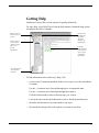
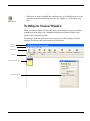
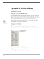
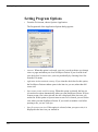
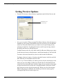
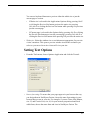
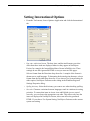
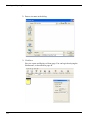
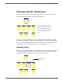
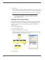
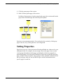
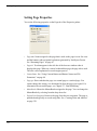
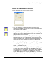
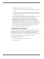
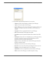
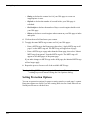
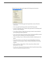
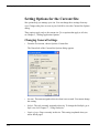
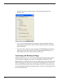
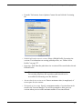
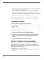
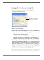
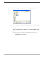
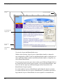
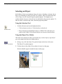
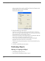
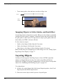
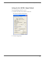
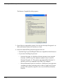
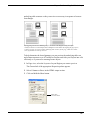
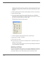
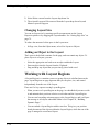
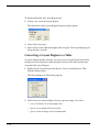
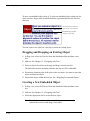
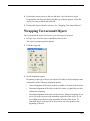
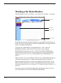
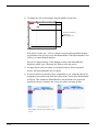
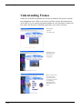
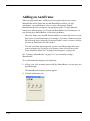
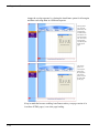
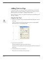
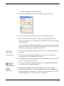
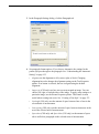
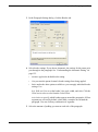
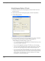
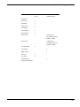
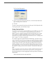
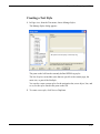
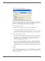
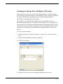
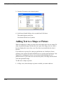
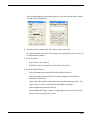
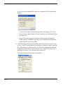
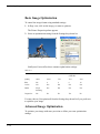
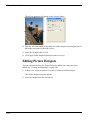
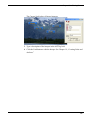
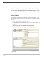
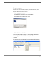
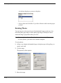
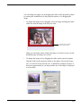
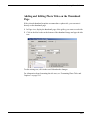
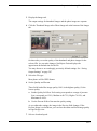
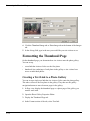
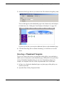
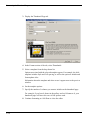
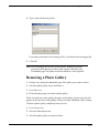
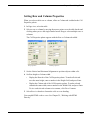
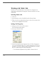
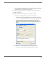
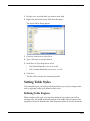
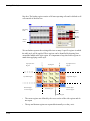
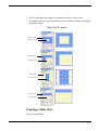
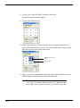
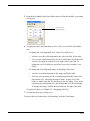
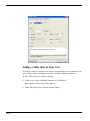
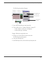
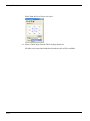
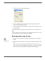
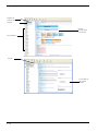
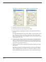
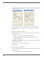
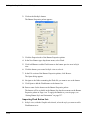
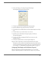
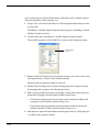
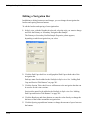
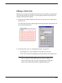
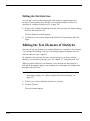
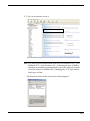
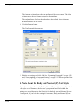
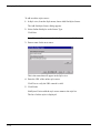
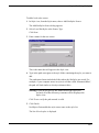
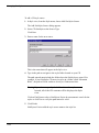
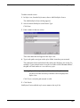
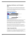
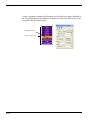
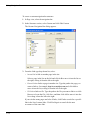
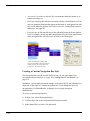
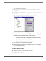
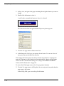
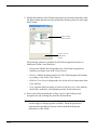
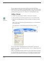
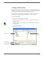
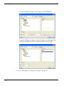
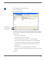
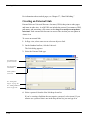
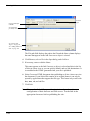
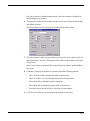
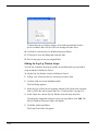
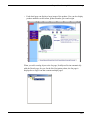
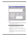
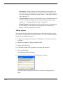
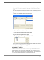
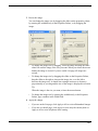
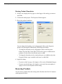
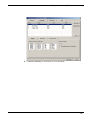
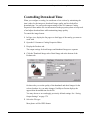
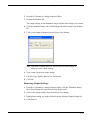
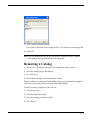
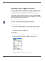
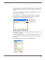
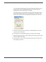
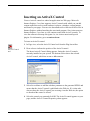
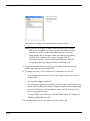
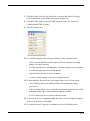
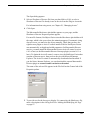
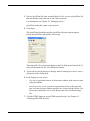
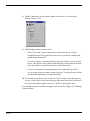
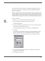
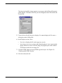
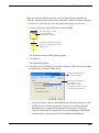
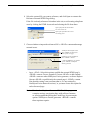
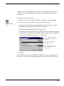
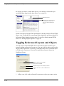
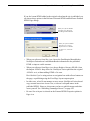
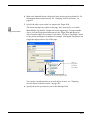
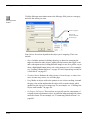
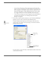
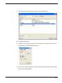
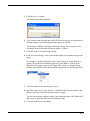
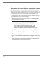
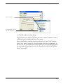
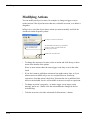
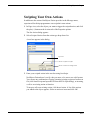
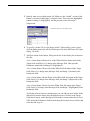
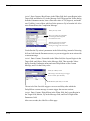
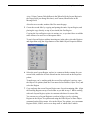
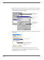
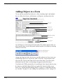
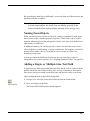
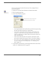
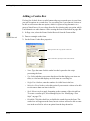
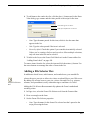
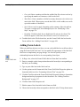
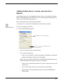
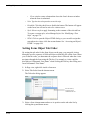
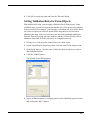
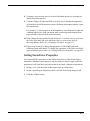
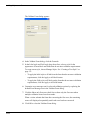
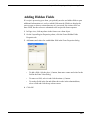
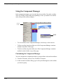
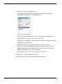
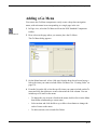
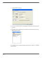
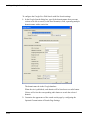
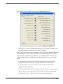
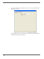
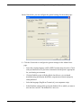
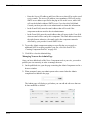
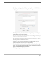
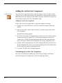
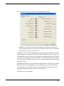
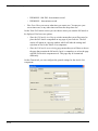
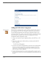
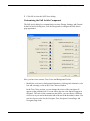
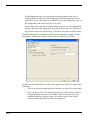
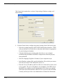
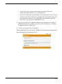
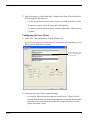
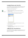
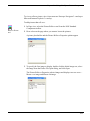
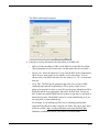
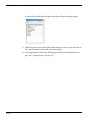
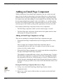
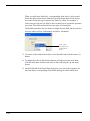
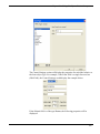
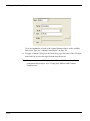
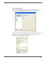
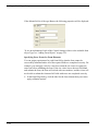
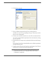
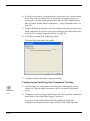
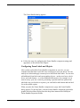
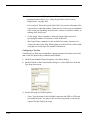
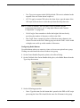
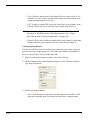
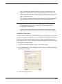
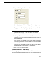
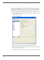
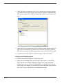
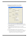
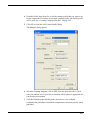
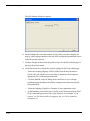
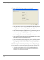
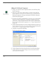
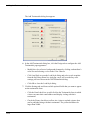
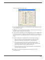
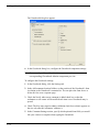
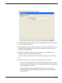
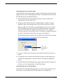
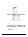
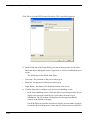
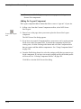
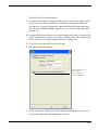
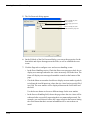
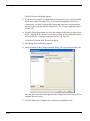
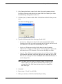
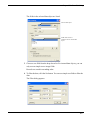
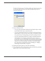
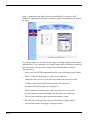
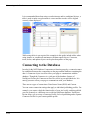
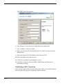
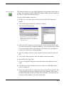
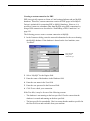
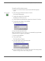
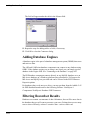
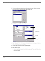
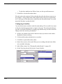
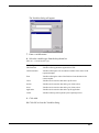
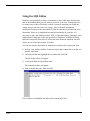
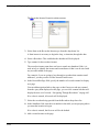
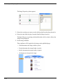
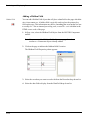
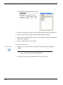
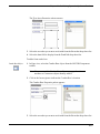
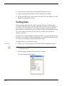
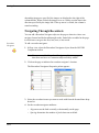
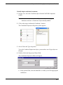
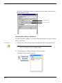
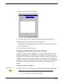
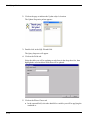
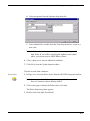
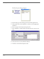
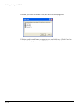
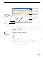
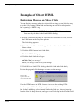
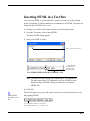
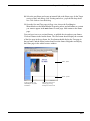
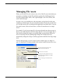
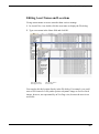
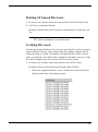
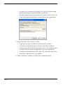
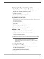
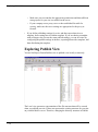
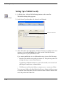
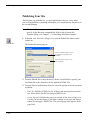
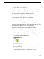
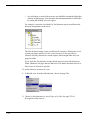
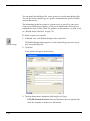
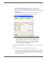
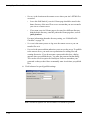
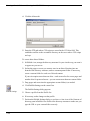
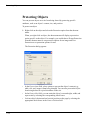
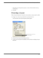
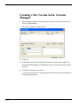
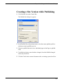
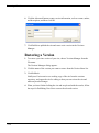
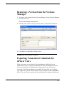
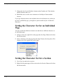
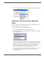
Modifying Actions Modifying Actions You can modify an object’s actions, for example, to change a trigger event, to reorder actions if the object has more than one, to disable an action, or to delete it altogether. In Page view, select the object whose actions you want to modify, and click the Actions tab on the Properties palette. The object’s actions are listed here An unchecked action doesn’t get published but can be used in scripted actions and JavaScript expressions Reorders the selected action • To change the sequence of actions, select an action and click the up or down arrow at the bottom of the palette. If two or more actions share the same trigger event, they occur in the order listed. 428 • If you don’t want to publish an action now but might want to later, or if you want an action available only to use in a scripted action or JavaScript expression, clear that action’s check box. Next time the site is published, this action is not included, but it is still available to insert in a script or expression. • To change an action’s properties—its name, trigger event, target, action message, and so on—double-click the action and make changes in the Set Action dialog. • To delete an action, select the action and click the minus (-) button. Chapter 24 Building Dynamic Pages Scripting Your Own Actions In addition to the actions NetObjects Fusion provides in the Message menu, experienced JavaScript programmers can script their own actions. 1. In Page view, select the object you want to trigger the scripted action, and click the plus (+) button on the Actions tab of the Properties palette. The Set Action dialog appears. 2. Select Scripted Action from the action type drop-down list. A text box appears in the dialog. Type here Inserts text from a text file Inserts a call to an existing action 3. Enter your scripted action in the text box using JavaScript. NetObjects Fusion doesn’t verify code you enter, so be sure to use valid syntax. You can use any combination of typing, inserting existing script text from a text file (click Insert Script and open the file from the File Open dialog), or inserting a call to an existing action or function. To insert a call to an existing action, click Insert Action. A list of the actions you added to the object appears. Select an action to insert and click OK. 429 Scripting Parameter Values NetObjects Fusion inserts the action at the insertion point in the text box, in the form $(ActionName). Selecting this action and clicking OK... Inserts the action call $(FlyOut) in your script 4. Click OK in the Set Action dialog. Note: If you’re scripting an action and need to define JavaScript functions or other parameters, insert the defining script into the Between Head Tags field of the Layout HTML or Master HTML as appropriate. Scripting Parameter Values You can customize an action’s parameter values instead of choosing from the ones NetObjects Fusion provides by generating them with a JavaScript expression. For example, you might use the value a site visitor types in a form object as the number-of-seconds value in a Delay action. If you know JavaScript, you can enter expressions directly. You can also modify code for the default values NetObjects Fusion creates, and you can assemble expressions out of an object’s other actions. For example, an expression might test for a particular condition—like time of day—and then trigger actions you created with the Set Actions dialog based on that condition. Just as the Values dialog often lists several values, an expression can generate one or more values, too. 430 Chapter 24 Building Dynamic Pages For an example even nonprogrammers can try, see “Customizing Default Actions” on page 441. 1. In Page view, select the object whose parameter values you want to script, and add any actions you want to use as components of the JavaScript expression. For these actions, ignore the When field, since each action is triggered by the expression. Also, if an action’s only purpose is to be called by the expression, disable the action by clearing the check box next to it on the Actions tab of the Properties palette. 2. Create the action whose parameter value you want generated by the expression, as described in “Adding Actions to Objects and Pages” on page 417. Or, open an existing action by double-clicking it on the Actions tab of the Properties palette. 3. In the Set Action dialog, open the Parameters menu and choose Expression. The JavaScript Expression dialog appears. If the action already has default parameter values, the dialog displays the code for those values. 4. Enter your own JavaScript to generate the parameter value, or modify the code that’s already there. NetObjects Fusion doesn’t verify code you enter, so be sure to use valid syntax. Enter a JavaScript expression here, replacing or modifying existing code Opens a list of actions you can call from the expression To build your expression around existing actions, click the Insert Action button, select an action from the Actions dialog, and click OK. NetObjects Fusion inserts the action at the insertion point, in the form $(ActionName). 5. Click OK in the JavaScript Expression dialog and again in the Set Action dialog. When the action is triggered, it uses the parameter values generated by your expression. 431 Examples Examples Creating a Button Rollover You can use the Set Image and Use Image actions to give three-dimensional feel to a button, for example, by highlighting it when the site visitor’s pointer passes over it, by making it appear pushed in when pressed, and so on. Highlighted button Button’s look when the page loads For this example, you need three pictures of a button—one showing how it looks when the page loads, one showing it highlighted, and one showing it pressed. Note: This example applies to images of buttons, but not to form buttons. The Set Image action is not available for form buttons. 1. In Page view, place the picture of the button as it looks when the page loads. 2. To add an action to the button, click the Action tab on the Picture Properties palette, and click the plus (+) button. The Set Action dialog appears. 3. In the When field, from the Page drop-down menu choose Page Loaded. Click the Target Menu button next to the Target field and, from the Object Tree dialog that appears, select the button object. In the Message field, from the Object drop-down menu choose Set Image. 4. From the Parameters drop-down menu, choose Values. The Parameters dialog appears. 432 Chapter 24 Building Dynamic Pages 5. Identify when to use which picture file. Make sure the “loaded” version of the button is selected for the Image 1 (Normal) value. Then select the highlighted button for Image 2 (Highlighted), and the pressed version for Image 3 (Depressed). Parameter values for a Set Image action 6. To specify a picture file in a Set Image action’s Values dialog, select a value, click the button next to the edit field, and open a file from the Picture File Open dialog. Click OK. 7. Add four actions to the button, filling out the Set Action dialog for each action like this: Action 1. Enter Mouse, Mouse Over in the When field; the button itself in the Target field; and Object, Use Image in the Message field. Then open the Parameters menu and click Image 2 (Highlighted). Action 2. Enter Mouse, Mouse Out in the When field; the button in the Target field; Object, Use Image in the Message field; and Image 1 (Normal) in the Parameters field. Action 3. Enter Mouse, Mouse Down in the When field; the button in the Target field; Object, Use Image in the Message field; and Image 3 (Depressed) in the Parameters field. Action 4. Enter Mouse, Mouse Up in the When field; the button in the Target field; Object, Use Image in the Message field; and Image 2 (Highlighted) in the Parameters field. To link the rollover button to another page, you can add one more action. In the When field, from the mouse drop-down menu choose Clicked, in the Target field choose layout, in the Message field from the Location menu choose Go to URL, and in the Parameters field from the drop-down menu choose Values and select the link to go to. 433 Examples 8. Preview the page to test your rollover. Mouse over the button to see it highlighted, and click it to see it pushed in. Colliding One Object with Another This example demonstrates a drag action, collision detection, and custom messages, where dragging one object into another makes the second object fly off the page. 1. In Page view, add two objects to the page. 2. Make sure the first object (the one you plan to drag) is in front of the second object. 3. Make a note of each object’s ID as it appears on the Action tab of the properties palette. 4. Select the first object and create a custom message named FlyAway, as described in “Tailoring Actions with Custom Messages” on page 424. Create an action to use in creating the custom message and then delete it. Your message becomes available in the When and Message menus 5. Add an action to the first object (as described in “Adding Actions to Objects and Pages” on page 417) so that mousing down on it makes it stick to the pointer until you mouse up. In the Set Action dialog, enter Mouse, Mouse Down in the When field; the first object in the Target field; Drag, Start Drag in the Message field; and Until Mouse Up in the Parameters field. 6. Add a collision detection action to the first object like this: In the Set Action dialog, enter Page, Page Loaded in the When field; the first object in the Target field; and Drag, Set Collision Detection in the Message field. Then open the Values dialog from the Parameters menu and specify the second object for the Object ID value (type the object’s ID exactly as it appears 434 Chapter 24 Building Dynamic Pages on the Actions tab of its properties palette), and enter FlyAway for the Message value. Values for a collision detection action ID of the object being dragged Custom message sent to trigger the other object to fly away When the first object is dropped over the second, it sends the FlyAway message to the first object. 7. Add yet another action to the first object that’s triggered by the FlyAway message and tells the second object to fly off the page. In the Set Action dialog, enter Custom, FlyAway in the When field; the second object in the Target field; Motion, Fly in the Message field; and Out To Top in the Parameters field. Then preview the page to test your collision. Drag the first object over the second, drop it there, and watch the second object fly off the page. Showing One Object While Hiding Others Here’s an example of cascading a custom message to build a sequence of actions where displaying one object selectively hides others. Say your page displays a map showing the locations of five company offices. For each location, a button superimposes a text box on the page profiling that office’s activities. When a site visitor clicks a location, you want to hide any profile that’s currently visible, and then display the one describing the selected location. 1. In Page view, place the buttons and text boxes in the Layout area, arranging them however you want. 435 Examples 2. Select one of the buttons and create a custom message called HideAllProfiles, as described in“Tailoring Actions with Custom Messages” on page 424. Your message becomes available in the When and Message menus 3. To each button, add an action, as described in “Adding Actions to Objects and Pages” on page 417, so clicking the button cascades the HideAllProfiles message to the Layout. In the Set Action dialog, enter Mouse, Clicked in the When field; the Layout in the Target field; and Custom, HideAllProfiles in the Message field. Also, check the Cascade message option. 4. Add a second action to each button so clicking it targets a Show message to the text box associated with the button. In the Set Action dialog, enter Mouse, Clicked in the When field; the text box this button should display in the Target field; and Object, Show in the Message field. 5. Select each text box, and on the Actions tab of the Properties palette, clear the Object initially visible in browser option. Clear this option for each text box so its contents don’t appear until the site visitor clicks the appropriate button 6. Add an action to each text box that’s triggered by the HideAllProfiles message and hides the text box. In the Set Action dialog, enter Custom, HideAllProfiles in the When field; the text box itself in the Target field; and Object, Hide in the Message field. Then preview the page. Clicking a button should send HideAllProfiles as a cascading action message to the Layout. The Layout doesn’t have any actions triggered by this message so it doesn’t respond. But it does cascade the message down to its embedded objects. As a result, every object on the page receives the message. But only those objects with actions triggered by the message—the text boxes—respond by hiding themselves. Next, the button sends a Show message to its associated text box, which makes itself visible. 436 Chapter 24 Building Dynamic Pages Without cascading messages you’d have to add four additional actions to each button—one for hiding each text box. If you didn’t use a custom message to trigger the text boxes to hide, cascading a Hide message to the Layout would hide every object on the page. Sequencing Actions for a Slide Show Here’s an example of using custom messages and a delay action to build a slide show. When the page loads, a slide flies onto the page, stays there for the duration of time specified by a delay, flies off, and is followed by another slide. Before you begin, gather the pictures you want to show in each slide and set the HTML output to Fixed Page Layout. 1. In Page view, create a Layout Region, and in it, place pictures and text for your first slide. By creating each slide in a Layout Region, you can include multiple objects per slide. 2. Select the Layout Region and clear the Object initially visible in browser option on the Actions tab of the Properties palette. You clear this object so the slide doesn’t appear until an action triggers it to fly onto the page. 3. Create three custom messages named ShowPicture, PictureIsIn, and DelayIsDone, as described in“Tailoring Actions with Custom Messages” on page 424. Your messages become available under Custom in the When and Message menus Using custom messages rather than a generic End Motion trigger to trigger each slide’s entrance and exit lets you control exactly which motion triggers what. 4. Add five actions to the Layout Region, as described in “Adding Actions to Objects and Pages” on page 417. For each action, fill out the Set Action dialog like this: Action 1. Enter Page, Page Loaded in the When field; the Layout Region in the Target field; and Custom, ShowPicture in the Message field. 437 Examples Action 2. Enter Custom, ShowPicture in the When field; the Layout Region in the Target field; and Motion, Fly in the Message field. Then open the Values dialog from the Parameters menu, enter a Direction value of 270 (degrees), and make sure Visibility is set to Show, which tells the picture to fly in from the left. Also enter PictureIsIn as the Completion Message. Values for a Fly action These two settings are equivalent to choosing In From Left from the Parameters menu When the Fly action is complete, this custom message is sent to the target to trigger the next action You define the Fly action’s parameters in the Values dialog, instead of choosing In From Left from the Parameters menu, so you can trigger the next action with a custom message. Action 3. Enter Custom, PictureIsIn in the When field; the Layout Region in the Target field; and Object, Delay in the Message field. Then open the Values dialog from the Parameters menu and enter DelayIsDone as the Custom Message, and 2 for the Delay value. Values for a Delay action The message sent to the target to trigger the next action, after this delay The duration of the delay, in seconds The arrival of the first slide triggers a two-second delay after which the DelayIsDone custom message is sent to trigger the next two actions. Action 4. Enter Custom, DelayIsDone in the When field; the Layout Region in the Target field; Motion, Fly in the Message field; and Out To Right in the Parameters field. After two seconds, the slide flies off the page. 438 Chapter 24 Building Dynamic Pages Action 5. Enter Custom, DelayIsDone in the When field; the Layout Region in the Target field (you change this later); and Custom, ShowPicture in the Message field. Also after two seconds, another slide flies onto the page. 5. Create the second slide by copying and pasting the entire Layout Region, and placing the copy directly on top of (not inside) the first Region. Copying the Layout Region copies its actions, too, so you don’t have to add the same actions over and over to subsequent slides. To stack Layout Regions without inserting one in the other, select the Regions and align them using the Align buttons on the Multi-Object Properties Palette. 6. Select the new Layout Region, replace its contents with the contents for your second slide, and delete its first action from the Actions tab on the Properties palette. To make sure you’re working with the second Layout Region’s actions, open the Object Tree palette (from the View menu choose Palettes, Object Tree), and select the Region. 7. Copy and paste the second Layout Region once for each remaining slide. Align the resulting Regions on top of each other as you did in step 5. While working with each Layout Region, replace its contents with those for a new slide. You can uncover a Layout Region to work on in Page view by selecting Regions in the Object Tree palette and using the Hide Object or Show Object command on the Object menu. Also in the Object Tree palette, you can rename Regions Slide1, Slide2, and so on to keep track of which slide is which. 439 Examples 8. Edit the last action of all but the last slide so it targets the next slide in the show. Double-click the action on the Actions tab of the Properties palette to open the Set Action dialog and change the target. Double-click the last action of Slide 2... to open the Set Action dialog... and edit the action to target the Show Picture action at Slide 3 9. For the last slide, deactivate all but the first action by clearing the box to the left of the action. The last slide’s actions Clear the box next to each action that doesn’t apply to the last slide, so the actions aren’t published By deactivating rather than deleting actions that target another currently nonexistent slide, you can easily add slides to your show later by reactivating and targeting the actions at a new slide. 440 Chapter 24 Building Dynamic Pages Make sure Fixed Page Layout is selected as the HTML output method on the Layout Properties palette and that Word wrap is cleared in the HTML Options dialog you access from the Site Settings General tab. Then preview the page to test your slide show. Loading the page sends a ShowPicture action to the first slide, triggering it to fly onto the page. The completion of the Fly action sends a message that triggers a twosecond delay, after which another custom message triggers both the exit of the current slide and the entrance of the next. Customizing Default Actions The trigger events, action messages, and default parameter values available in the Set Action dialog are defined in the JavaScript Beans (.jsb) and JavaScript (.js) files in the NetObjects Fusion 9\NetObjects System folder. If you’re experienced in JavaScript programming, you can add your own .jsb and .js files to provide even more choices in the Set Action dialog. 441 Customizing Default Actions 442 Chapter 25 Designing and Implementing Forms Designing and Implementing Forms 25 You can add forms to your site to collect information from site visitors; for example, to survey potential customers, conduct credit-card transactions, have customers register products, or otherwise process information visitors submit. Using forms, visitors can type in text fields, upload files to your server, and select options using check boxes, radio buttons, and combo boxes. The form tools built into NetObjects Fusion contain the necessary server-side scripts, written in PHP or ASP, used to process your form responses. You can also use JavaScript or Visual Basic routines with forms. See Chapter 29, “Working with HTML Directly.” This chapter includes: • Creating forms • Adding text fields, check boxes, radio buttons, and combo boxes • Adding Submit, Reset, custom and AutoClose buttons • Setting form object tab order • Setting validation rules for form objects • Submitting data via email or to a text file • Adding hidden fields for client-side parameters 443 Creating a Form Creating a Form With NetObjects Fusion, you can devote an entire Layout area to a complex form containing many items, or create one or more smaller forms, each in a Layout Region, table, or text box. One form might log product registrations, for example, while another emails customer comments to a product manager. You can also add a form to the MasterBorder so it appears on several pages. 1. In Page view, select the Form Area tool from either the Form toolbar or the Standard toolbar, and draw a rectangle in the Layout area or MasterBorder. Form Area tool The Create Form dialog appears. 2. Select a type of form container. Provides flexibility in arranging form objects Good for forms that include a lot of text or have a simple layout Useful for forms with a rigid tabular layout • Create position-based form (Layout Region) creates a form in a Layout Region that you can resize and drag anywhere on the page. When you add form objects, text boxes, and other objects to the Layout Region, you can freely position and align them, just as you position objects in a Layout area. • Create text-based form (Text box) creates a form in a text box. Text you type and form objects you add appear sequentially, just as when you type. This is a good choice for forms that have a lot of text, where objects appear sequentially, or that have a simple layout, like a row of check boxes or a single column of fields. A text box form typically generates less HTML when you publish than a Layout Region form. • Create form in a Table creates a table where you can line up form objects by inserting them in table cells. Each cell acts like a text box, where you type and add objects just as you add other objects to a table. You can only have one table for the entire form. If you define a Layout, Layout Region, or text box as a form, you can insert multiple tables to help align form objects. 444 Chapter 25 • Designing and Implementing Forms Define Layout as a form (limits page to one form) creates a single form on the page that occupies the entire Layout area. 3. Click OK. 4. Add fields, check boxes, and other objects to your form, along with images and other content, as described in “Adding Objects to a Form.” You can also turn an existing Layout or container object into a form. Click the Layout area, Layout Region, text box, or table, and select the form option on the General tab of the Properties palette; for example, Text box is a form. 445 Adding Objects to a Form Adding Objects to a Form You can add any standard form objects to a form, including single- and multipleline text fields, check boxes, radio buttons, scrolling lists, and drop-down lists. Edit fields Check boxes Drop-down list Scrolling list Multi-line text field Radio buttons Form buttons You add objects to a form using the Form toolbar. This toolbar appears when you first create the form, or you can open the toolbar from the View menu by choosing Toolbars, Form Tools. The Form toolbar appears when you create a form Arrange and align the fields, check boxes, and other objects in a form, just as you would arrange objects in a Layout area, table, or text box. You must place form objects inside a form to make them work as part of the form. If you don’t place form objects inside a form, a red warning icon appears in the form object. To minimize the HTML generated by a Layout Region form, align its objects using the options on the Multi-Object Palette or organize the objects in tables or text boxes. See “Aligning and Distributing Objects” on page 91, “Embedding Objects in a Text Box” on page 123, and “Adding Text and Pictures to Cells” on page 252. 446 Chapter 25 Designing and Implementing Forms Browsers display form objects differently, so test your form on all the browsers and platforms you plan to support. Note: If you publish pages containing forms using the Fixed Page Layout output option, the forms may not display properly in the browser and the form objects display warning icons in Page view. Naming Form Objects When you add objects to a form, you provide a name or argument for each object that is passed to the script that processes responses. These names can be used to output or otherwise process the text typed in a field, or the state of each check box, radio button, or combo box. In addition to names, you can also provide a value to be sent when a site visitor selects a check box, radio button, or item in a combo box. For example, a check box named Yellow with a value of Yes might be sent to a script as Yellow=Yes, depending on the script. Actions you add with NetObjects Fusion can also use form object values to manipulate a site visitor’s response. See “Scripting Parameter Values” on page 430. Adding a Single- or Multiple-Line Text Field A single-line text field can accommodate just a few words, such as a name or phone number. Multi-line text fields provide a place for long comments or descriptions. Site visitors can type as much text as they want, and the text scrolls as necessary. After creating the form as described on page 444: 1. In Page view, select the Forms Edit Field tool from the Form toolbar. Edit Field tool 2. Draw a rectangle on the form. The Forms Edit Field Properties palette appears. 447 Adding Objects to a Form 3. Set the Forms Edit Field properties. Name passed to the script processing the form Type text to appear in the field by default Text field width, measured in characters Maximum number of characters that can be entered in the field • Name. Type the name for this field that’s passed to the script processing the form. • Type. Select a field type from the drop-down menu. • Single line: Select this option to provide a text field that will accommodate just a few words, such as a name or phone number. • Multi line: Select this option to provide a text field for long comments or descriptions. • Password: Select this option if the field is for sensitive information like a password or credit card number. Characters site visitors type are submitted to the script, but depending on the browser, visitors see asterisks, bullets, or nothing at all as they type. This option does not create password protection to prevent site visitors from visiting certain pages. That level of protection can only be provided by scripts used by the form or by permission settings on the server itself. • Text. Type text to appear in the field by default. This text is submitted as the response if the site visitor doesn’t replace it. • 448 Wrap. Select a text-wrap setting to control how the visitor’s input will be displayed when the visitor enters more information than can be displayed in the defined text field. This option only applies to multiple-line text fields. Chapter 25 Designing and Implementing Forms • Off prevents text from wrapping to the next line. If a visitor’s text field entry exceeds the boundary of the field, the text will scroll toward the left. Users can enter a hard return to move to the next line in the text field. • Virtual wraps text in the text area. When the visitor’s text field exceeds the bounds of the text field, text wraps to the next line. This option is recommended when sending data to a script of a database word wrap is not applied to the data. Instead, the submitted data is sent as a single string. • Physical wraps text in the text field as well the data when it is submitted for processing. • Char width. Enter a number to define the width of the text box by specifying the number of characters visible in the field. • Max chars/Vis height. Enter a number to define how many characters site visitors can enter in the field. When typing exceeds the field’s visible width or height, text scrolls up to this number of characters. This option only applies to multiple-line text fields. • Style. Select a style for the form field from the drop-down list. • Disabled. Click this check box to disable the text field on the form. The field will appear on the form, but site visitors will not be able to enter text in the field or replace any default text in the field. 4. To add a label to the field, use the Forms Field Label tool on the Forms toolbar. See “Adding Form Labels” on page 454. Select the label and the field and on the Multi-Object Palette, click Align Center to make sure these objects appear correctly in the browser. To make aligning labels and fields easier, include the field and label in the same text box, or insert both objects in table cells. Adding Radio Buttons Use radio buttons when you want site visitors to choose one option from a group. Clicking one radio button deselects all others in its group. After creating the form as described on page 444: 449 Adding Objects to a Form 1. In Page view, select the Radio Button tool from the Form toolbar. Radio Button tool 2. Draw a rectangle on the form. 3. Set the Forms Radio Button properties. Name passed for the group to the script processing the form. This should be the same for all buttons in the group Value passed if this button is selected • Group name. Type the name for this group of buttons that’s passed to the script processing the form. This should be the same for all buttons in the group. • Value sent. Type the value passed for the button if the site visitor selects it. For example, if a visitor selects a button named Large in a group named 4, the output text might appear as 4=Large. • Default. Choose either Selected or Not selected to set the button’s initial state, which is returned as the response if the site visitor doesn’t change it. Remember that only one radio button in a group can be selected at a time and this only works if all buttons in the group have the same group name. • Style. Select a style to apply formatting to the contents of the selected box. To create a custom style, select Manage Styles. See “Modifying a Text Style” on page 174. 4. To add a label to each radio button, use the Forms Field Label tool on the Forms toolbar. See “Adding Form Labels” on page 454. Adding Check Boxes You can provide check boxes for making one or more selections from a group of options, or to turn a single option on or off. Unlike radio buttons, any number of 450 Chapter 25 Designing and Implementing Forms boxes in a group can be selected at the same time. After creating the form as described on page 444: 1. In Page view, select the Forms Checkbox tool from the Form toolbar. Checkbox tool 2. Draw a rectangle on the form. 3. Set the Forms Checkbox properties. Name passed to the script processing the form Value that’s passed if this box is checked • Name. Type the name for this check box that’s passed to the script processing the form. Each check box must have a separate name. • Value. Type the value passed for the box if the site visitor checks it. For example, if a visitor checks a box named 6 that has the value Email, the output text might appear as 6=Email. If the site visitor doesn’t check it, no value is sent to the server. • Default. Choose either Selected or Not selected to set the button’s initial state, which is returned as the response if the site visitor doesn’t change it. • Style. Select a style to apply formatting to the contents of the selected box. To create a custom style, select Manage Styles. See “Modifying a Text Style” on page 174. 4. To add a label to each check box, use the Forms Field Label tool on the Forms toolbar. See “Adding Form Labels” on page 454. 451 Adding Objects to a Form Adding a Combo Box If a long list of check boxes or radio buttons takes up too much space in your form, you can list options in a combo box. Use a scrolling list if you want site visitors to be able to select more than one option, which is a space-saving alternative to a group of check boxes. Or use a drop-down list for selecting only one option, which is an alternative to radio buttons. After creating the form as described on page 444: 1. In Page view, select the Forms Combo Box tool from the Form toolbar. Combo Box tool 2. Draw a rectangle on the form. 3. Set the Forms Combo Box properties. Name passed to the script for the combo box Names and values passed for each item in the list • Name. Type the name for this combo box that’s passed to the script processing the form. • Type. Select whether you want a drop-down list that displays one item at a time, or a list box that displays several items in a scrolling list. • Height. For a list box, enter the number of visible lines in the box. • Multi select. For a list box, select this option if you want site visitors to be able to select more than one item in the list. 452 • Style. Select a style to apply formatting to the contents of the selected box. To create a custom style, select Manage Styles. See “Modifying a Text Style” on page 174. • Disabled. Click this check box to disable the combo box on the form. The combo box will appear on the form, but site visitors will not be able to enter text in the text field or select an option from the drop-down list. Chapter 25 Designing and Implementing Forms 4. To add items to the combo box list, click the plus (+) button and, in the Enter Value dialog, type a name and the value passed to the script for the item. Name that appears in the list Value passed if this item is selected • Name. Type the name passed for this item, which is also the name that appears in the list. • Value. Type the value passed if the item is selected. • Selected by default. Check this option if you want this item initially selected. Unless you’re creating a list box and you select Allow multiple selections, only one item in the list can be selected. 5. To label to the list, use the Forms Field Label tool on the Forms toolbar. See “Adding Form Labels” on page 454. To remove items from the list, select the item and click the minus (-) button. Use the arrow buttons to rearrange the order of items in the list. Adding a File Selector Box In addition to check boxes, radio buttons, and combo boxes, you can add file Forms File Selector tool selector boxes to your site to allow site visitors to upload files to your Web server. By adding file selector boxes to your site, visitors can send files (e.g., pictures, resumes, and spreadsheets) easily without having to send them via e-mail. Adding the File Selector Box automatically updates the Form’s method and encoding values. 1. In Page view, select the Forms File Selector tool from the Form toolbar. 2. Draw a rectangle on the form. 3. Set the Forms File Selector properties. • Name. Type the name for this forms file selector box that’s passed to the script processing the form. 453 Adding Objects to a Form • Char width. Enter a number to define the width of the file selector text box by specifying the number of characters visible in the field. • Max Chars. Enter a number to define how many characters site visitors can enter in the field. When typing exceeds the field’s visible width, text scrolls up to this number of characters. • Style. Select a style to apply formatting to the contents of the selected box. To create a custom style, select Manage Styles. See “Modifying a Text Style” on page 174. • Disabled: Click this check box to disable the file selector box form. The field will appear on the form, but will not be active for visitors to use. 4. To add a label to the File Selector box, use the Forms Field Label tool on the Forms toolbar. See “Adding Form Labels” on page 454. Adding Form Labels When you add form objects to a form, you can easily add labels to each form object using the Forms Field Label tool. You can modify the appearance of the label and label text to complement your page design. You can also quickly create a relationship between the label to its corresponding form object. Forms Field Label tool 1. In Page view, select the Forms Field Label tool from the Form toolbar. 2. Draw a rectangle on the form positioned near the form object corresponding to the label you are adding. 3. Type or paste label text in the label text box. 4. Use the options on the Format tab of the Forms Field Label Properties palette to format the label text. See “Formatting Selected Text” on page 156. 5. Click the Text Box tab on the Forms Field Label Properties palette to format the background and style properties for the form label. See “Setting Text Box Background” on page 127. 6. Click the Form Label Inspector tab. 7. Edit the name of the form label in the Name text field. 8. Choose the form object that corresponds to the label in the To drop-down menu. 454 Chapter 25 Designing and Implementing Forms Adding Submit, Reset, Custom, and AutoClose Buttons After adding objects for collecting data from site visitors, you must add a Submit button to send the data to your Web server. You can also supply a Reset button so visitors can clear the form and start over. After creating the form as described on page 444: 1. In Page view, select the Forms Button tool from the Form toolbar. Forms Button tool 2. Draw a rectangle on the form. 3. Set the Forms Button properties. Select Button to create a custom button Click here to attach a script defining what a custom button does • Name. Use the name your script references. • Type. Choose a button type: • Image. To use a picture as a label, select Image, click Browse, and choose an image file from the Picture File Open dialog. When you use an image as the label for a form button, that button can only submit information. It cannot be used as a reset button. • Submit creates a button that sends the site visitor’s responses to the script on the server. • Reset creates a button that reverts to the form’s initial settings. • Button creates a custom button that runs the script you add using the HTML button. 455 Adding Objects to a Form • Close window creates a button that closes the form’s browser window when the form is submitted. • Value. Type the value to be passed to server-side script. • Disabled. Click this check box to disable the button. The button will appear on the form, but will not be active for visitors to use. • Style. Select a style to apply formatting to the contents of the selected box. To create a custom style, select Manage Styles. See “Modifying a Text Style” on page 174. • HTML. Click to open the Object HTML dialog so you can add a script that runs when site visitors click the custom button. See “Accessing an Object’s HTML” on page 688. Setting Form Object Tab Order By setting the tab order for the form objects on the page, you can guide visitors through a specific sequence of fields and objects when they fill out the form. When you set the tab order, you determine the sequence that is followed when the visitor navigates through the form using the Tab key. For example, a visitor could be directed to a field named “Last Name” when clicking the Tab key after filling out a form field named “First Name”. 1. In Page view, right-click inside a form area. 2. Select Tab Order from the shortcut menu. The Tab order dialog appears. Set tab order by arranging form elements in the list 3. Select a form element name and move its position on the tab order list by clicking the up and down arrows. 456 Chapter 25 Designing and Implementing Forms 4. Click OK to set the tab order and close the Tab order dialog. Setting Validation Rules for Form Objects With NetObjects Fusion, you can apply validation rules to form objects. Using validation rules, you can set requirements that the site visitor must meet to submit a form successfully. For example, you can apply a validation rule for a field so that a site visitor is required to select an option from a drop-down or list box before submitting the form. If the site visitor does not select an option and submits the form, the form will refresh with error markers, and the visitor will not be able to submit the form until all fields with errors are completed correctly. 1. In Page view, click anywhere in the form or on a form object. 2. On the Layout Region Properties palette, click the Form Fields Inspector tab. 3. In the Fields list box, click the name of the form object to which you want to add validation options. 4. Click the Validate button. The Validate Form dialog appears. 5. Apply validation options by selecting options in the Validation options list box and clicking the add (>) button. 457 Adding Objects to a Form Available validation options will vary, depending on the type of form object selected. Validation options include: • Required designates that the site visitor is required to enter text in the text field, select an option from the radio button, check box, or combo box, or summit a file in the file selector. • EmailAddress requires that the visitor’s text input is in valid email address form (e.g., [email protected]). • DomainName requires that the text input follow the conventions for a standard domain name. Text input must contain a a standard URL extension (.org, .com, etc.) and cannot contain certain characters (e.g., @). • LengthInRange specifies range the number of characters that the text input must contain. For example, you can create a validation option so that the text input contains at least 5 characters but no more than 10. • PhoneNumber requires that the visitor’s text input is in valid phone number structure (e.g., 555-555-5555). • CreditCard validates a credit card number the user enters based on the rules of that card. You must a add a form object for each credit card type (Visa, MasterCard, etc.) that you want to validate. • Date requires that the user input a date in the format that you select in the Parameters field. • Number ensures that the visitor’s input is numeric and contains no letters or special characters. • NumberRange verifies that the visitor’s text input is numeric and that the value is within a specified range. For example, you could ask visitors to rate a service on a scale of 1 through 5. Any input that does not fall within that range of values will be invalid. You specify the range of values in the Paramaters field. 6. Remove applied validation options by selecting them in the Validate fields as list box and clicking the remove (<) button. 7. Set available parameters for a validation option by selecting the option in the Validate fields as list box, double-clicking in the Value row, and editing the value. 458 Chapter 25 Designing and Implementing Forms 8. Customize error message text for selected validation options by replacing the default Error Message text. 9. Click the Change the label and field style check box to change the appearance of form labels and fields that do not meet validation requirements when a visitor fills out the form. For example, if a visitor enters an invalid number in a text field with CreditCard validation applied, the field can appear with a red background when the form page refreshes to denote an incorrect field entry. 10. If the Change the label and field style check box is selected, select a style from the Label style and Field style drop-down lists, or create a new style by choosing Manage Styles. See “Creating a Text Style” on page 171. 11. Repeat steps 9 and 10 to change the appearance of labels and fields with validation errors individually. To change the appearance of all labels and fields with validation errors at once, see “Setting Form Error Properties” on page 459. Setting Form Error Properties You can modify the appearance of individual form labels or objects that display when their validation requirements are not met, and you can also apply a uniform appearance to all form labels and objects that do not meet validation requirements. 1. In Page view, click anywhere in the form except on a form object. 2. On the Layout Region Properties palette, click the Form Fields Inspector tab. 3. Click the Validate button. 459 Adding Objects to a Form The Validate Form dialog appears. 4. In the Validate Form dialog, click the Form tab. 5. In the Label style and Field style drop-down lists, select a style for the appearance of form labels and fields that do not meet validation requirements. To create a new style, choose Manage Styles. See “Creating a Text Style” on page 171. • To apply the label style to all labels on the form that do not meet validation requirements, click the Apply to all labels button. • To apply the field style to all labels on the form that do not meet validation requirements, click the Apply to all fields button. 6. Customize error message text for selected validation options by replacing the default Error Message text in the Validate From dialog. 7. Click the Show only first error check list to show only the first error when multiple validation errors have been made. When a visitor submits the form after correcting the first error, the remaining errors will displayed sequentially until each error has been corrected. 8. Click OK to close the Validate Form dialog. 460 Chapter 25 Designing and Implementing Forms Processing Data A script is a program that controls a program on your Web server. Using a script, you can format responses for a particular application, summarize them on a page that’s returned to the site visitor, or do practically anything else with the data. 1. In Page view, click anywhere in the form or on a form object. 2. On the Layout Region Properties palette, click the Form General Properties tab. Select a predefined action or enter an Action name in the field 3. Specify: • Name. Type an arbitrary name for the form. This is required by some browsers. • Action. Select either the ASP or PHP form handler and configure its settings in the parameters grid. You can also use a custom script by typing it in the text field or clicking the browse button and locating the script. 461 Processing Data Note: If your server’s configuration requires publishing scripts somewhere else, you must use the Alias tab of the Define Server dialog in Publish view to specify that location in the script field. See “Creating Aliased Folders and Setting the CGI-BIN Directory” on page 742. If the script isn’t already on the server but needs to be published along with your site’s assets, click Browse and select the script file to be published from the Open dialog. This file appears in the Action field. NetObjects Fusion adds the file as an asset and puts it in the scripts directory. When visitors click Submit, the server executes the script at this URL. • Method. Choose a method for sending form data to the Web server: • Post, which is the preferred method, sends data as a standard stream of name=value pairs, separated by an ampersand (&). • Get sends the values of the form variables as part of the URL. Use Get with care, as some servers truncate data sent using this method. Often, the method you use is determined by the scripts you use. Check your script’s documentation for information. • 462 Encoding. If your server requires data to be encoded in a particular format, such as MIME or BinHex, type the format here. Chapter 25 Designing and Implementing Forms Adding Hidden Fields If a script is processing your form, you probably need to use hidden fields to pass additional information to it, such as which fields must be filled in to display the success page or where to return data once it’s processed. Site visitors don’t see these fields, but the values are submitted to the script with form responses. 1. In Page view, click anywhere in the form or on a form object. 2. On the Layout Region Properties palette, click the Forms Hidden Fields Properties tab. 3. Add names and values for each hidden field in the Form Properties dialog. • To add a field, click the plus (+) button, then enter a name and value for the field in the Enter Value dialog. • To remove a field, select it and click the minus (–) button. • To reorder fields in the list and define their order in the submitted data, select a field and click the up or down arrow. 4. Click OK. 463 Adding Hidden Fields 464 CHAPTER 26 Using NetObjects Fusion Components 26 Components are pre-built mini-applications that add interactivity to your site without custom programming or scripting. Publish components and Page components are available in NetObjects Fusion 9. The component’s type dictates where it appears within NetObjects Fusion, and the Component Manager can be used to easily organize available components in Page view. NetObjects Fusion components are installed when you install NetObjects Fusion. You can also download third-party components from third-party vendors. If you are a software developer and want to create your own NetObjects Fusion Components, sometimes called NFXes, you can use the NetObjects Component Development Kit (CDK). For information, visit www.netobjects.com. Note: You cannot preview components in NetObjects Fusion. When you add a component to a page and preview, you see a placeholder graphic. To see how the component works, you must publish the site locally or remotely. This chapter explains: • Using the Component Manager • Adding NetObjects Fusion Components to a page • Setting component properties 465 Using the Component Manager Using the Component Manager The Component Manager provides a way for you to organize your toolbars and save space as you work in Page view. The first time you open your site in Page view, the Component Manager will be docked to the left of the page. You can move the Component Manager to the right side of the page, or you can close the Component Manager. If you close the Component Manager, the next time you add a toolbar, it will reappear. Note: All NetObjects Fusion toolbars can be added to the Component Manager. Adding Toolbars to the Component Manager To add a component toolbar: 1. From the View menu, choose Toolbars. 2. Select the component toolbar you want to add. The component toolbar will display in the component manager. To remove a component toolbar, deselect the component from the Toolbars menu or click the “x” on the toolbar. Displaying Toolbars in the Component Manager You can display toolbar objects as icons or text and icons. You also have the option to view object descriptions or remove the description field. Additionally, toolbars can be stored in the Component Manager or can float. 466 Chapter 26 Using NetObjects Fusion Components Toolbar Object Label Object Icon To set Component Manager display options: 1. Right click on the toolbar. The toolbar menu will appear. 2. Select: • Show Labels to display the object name next to the icon. • Show Description to display a brief summary of the object. 467 Using the Component Manager Using the Component Manager In the component manager, you view only the active toolbar. You make a toolbar active by clicking on the toolbar and expanding it. Once you make a new toolbar active, the previous toolbar collapses. docked toolbar floating toolbar • To view toolbars in the Component Manager, click the up or down arrows. • To float a toolbar, drag the toolbar out of the Component Manager container and place anywhere on the page. • To dock a toolbar, drag the toolbar out of the Component Manager container and dock to the left side or top of the page. Customizing the Component Manager You can customize the component toolbar to group toolbars with similar attributes. 1. From the File menu, choose View>Toolbars>Customize. 2. In the customize toolbars dialog, type in a keyword that applies to the toolbars you want to group. 468 Chapter 26 Using NetObjects Fusion Components All toolbars with that attribute will be highlighted. 3. Choose the toolbars you want to appear in the component manager and select the Visible check box. 4. Select Show Labels and Show Description to display the component object labels and descriptions. If the component object can only be displayed with a label, the Show labels option will be inactive. 5. Select the location of the component manager. • Dock Left docks the component manager on the left side of the window. • Dock Right docks the component manager on the right side of the window. • Set the position of the component manager in the X and Y fields and click Float to float the component manager. About Components You can use Publish components and Page components in NetObjects Fusion. The component’s type dictates where it appears within NetObjects Fusion. • Publish components are used to post-process the HTML generated by NetObjects Fusion or to change NetObjects Fusion’s FTP capabilities. See “Publishing Components” on page 732. 469 Adding a Rotating Ad Banner • Page components appear on toolbars in Page view. You use the tools to place components on your pages. See “Using the Component Manager.” Note: To add copies of the same component to a site, you must place a new component each time. Copying and pasting components can lead to site corruption. NetObjects Fusion components are automatically available when you install NetObjects Fusion. These components appear on the NetObjects Fusion Components toolbar in Page view, and all are discussed in this chapter. In addition, you can download third-party components. Depending on their type, third-party components are installed in the appropriate place in NetObjects Fusion. Additional component toolbars become available in Page view when you install a third-party Page component and can be displayed in the Component Manager. For information about third-party components, visit Online view. Adding a Rotating Ad Banner You can use the Ad Banner component to display a series of images within a banner. You determine which images display, associate a transition with each image, set the amount of time each image is displayed, and specify a URL linked to each image. NetObjects Fusion supports .gif and .jpg images in components. See “Choosing an Image Format” on page 190. To add an Ad Banner: 1. In Page view, select the Ad Banner tool from the NOF Standard Components toolbar. Ad Banner tool 470 2. Click on the page to indicate the Ad Banner’s location. Chapter 26 Using NetObjects Fusion Components An Ad Banner placeholder and the Ad Banner Properties palette appear. 3. Specify the Banner Type. • Image Size. The Ad Banner is the same size as the images you select. • Standard Banner Size. Click Banner Size and choose from the drop-down list. • Custom. Enter a width and height for the Ad Banner. 4. Enable or disable Automatic Resizing. If Automatic Resizing is disabled, you must choose images that are the same size. If Automatic Resizing is enabled, Ad Banner resizes the larger images to match the smallest image. For best results, use images that are the same size. 5. Set Pause Time to control how long each image is displayed. 6. Enter the total number of images you want to use. You can use from 1 to 50 images. 7. To select an image, double-click the Image row, select the image from the Picture File Open dialog, and click Open. 8. Double-click the URL for Image row and in the Link dialog select a type of link for the image. See “Creating Links” on page 330. 9. Specify the link information and click Link. 10. Click the Transition row and select a transition from the drop-down list. You can choose: • Column to draw increasingly larger columns of the new image onto the old image. The new image appears to slide in from behind the old image. 471 Adding DynaButtons • Fade to change one image into another by drawing a set of random pixels from the new image onto the old image. • Rotate to make it appear as though one image is rotating upward from below the other image. • Smash to drop the new image onto the old one. The old image appears to crumble under the weight of the new image. • Tear to make it appear as though the old image is ripped away to reveal the new image. • Unroll to place the new image on top of the old image and unroll it. When the site displays in the browser, the sequence begins with a random image and its associated transition. 11. Repeat steps 7 through 10 for each image you want to rotate into the Ad Banner. You can add an action to an object using the Actions tab. See Chapter 24, “Building Dynamic Pages.” Adding DynaButtons DynaButtons are Java buttons that link to another page on your site, other sites, or a specific file. You can place DynaButtons anywhere on your pages and assign up to 20 buttons to a DynaButton bar. In addition, you can assign up to 20 sub-buttons to each DynaButton. You can create sub-buttons for navigating from a main page to pages at a lower level. When you publish the site, each button appears in the browser in the primary button style selected for the site and displays the name of the page to which it is linked. You cannot assign custom images to DynaButtons. The button’s style is determined by your SiteStyle. To use custom images for buttons, use the Picture Rollover tool. Because a DynaButton is an active link, the button appears active when a site visitor moves the mouse pointer over the DynaButton or clicks the button. The site visitor can click the DynaButton to go to the appropriate link. To add DynaButtons and set properties: 1. In Page view, select the DynaButtons tool from the NOF Standard Components toolbar. DynaButtons tool 472 2. Click on the page to indicate the DynaButtons’ location. Chapter 26 Using NetObjects Fusion Components A DynaButtons placeholder and the DynaButtons Properties palette appear. 3. Select the buttons’ orientation—vertical or horizontal—from the drop-down list. 4. Click the Number of Buttons row, specify how many buttons you want, and click the check mark. 5. Double-click the number row, such as Button 1. The Link dialog appears. You can link this button to another page, file, smart link, or external link. See “Creating Links” on page 330. 6. Specify the link information and click Link. The details of the link appear in the right column of the button row. You can add an action to an object using the Actions tab. See Chapter 24, “Building Dynamic Pages.” Adding Sub-Buttons If a DynaButton contains sub-buttons, the sub-buttons appear when a site visitor clicks the DynaButton. The sub-button shows information about the link associated with the button. For example, if a sub-button is linked to an external link, the subbutton displays the asset name for the external link. To add sub-buttons and set the properties: 1. In Page view, create a DynaButton as described in “Adding DynaButtons” on page 472. 473 Adding DynaButtons 2. Double-click the Use Sub-Buttons row. Yes appears in the right column and NetObjects Fusion adds a Number Sub-Buttons row under the Use Sub-Buttons row. 3. To specify the number of sub-buttons, select the Number Sub-Buttons row, enter the number of buttons, and click the check mark. The limit is 20 sub-buttons. The appropriate number of sub-button rows appear, numbered in sequential order. 4. To define the link for each sub-button, double-click the appropriate sub-button row, such as Sub-Button 1,2. The first number, in this case the 1, identifies the button for which the sub-button was created, and the second number is the number of the current sub-button. The Link dialog appears. See “Creating Links” on page 330. 5. Specify the link information and click Link. 6. Repeat steps 4 and 5 to create and define each sub-button. 474 Chapter 26 Using NetObjects Fusion Components Adding a Go Menu You can use the Go Menu component to easily create a drop-down navigation menu, with each menu item corresponding to a single page in the site. 1. In Page view, select the Go Menu tool from the NOF Standard Components toolbar. Go Menu tool 2. Draw a box on the page where you want to place the Go Menu. The Go Menu dialog appears. 3. On the Menu Items tab, select a link type from the drop-down list and set up a link to the items you want to include on the Go Menu. See “Creating Links” on page 330. 4. From the list on the left, select the specific items you want to include on the Go menu and click the right arrow to move them into the Link column. You can include up to 50 items on the menu. • To change the way an item is listed on the menu, double-click it in the Menu Item Name column and type a new name. • Select an item and click the Move up or Move down button to change the order of items on the menu. • To delete an item, select it and click Delete. 475 Adding a Go Menu 5. Click the Button Format tab. 6. Select one of the three formats. An example of each format is shown on the left. 7. Click OK. 8. To change the items included on the Go Menu or the button format, use the Go Menu Properties palette. You can add an action to an object using the Actions tab. See Chapter 24, “Building Dynamic Pages.” 476 Chapter 26 Using NetObjects Fusion Components Adding a Google Search Component With the Google Search component, you can easily incorporate a Google Web Search module on your Web site and allow site visitors to search the World Wide Web directly from your site. To add a Google Search component, you place the component on a page and then customize its appearance to complement your page design. Adding a Google Search Component to a Page 1. In Page view, select the NOF Google Search tool from the Standard Component toolbar. Google Search tool 2. Draw a box on the Layout to indicate where you want to position the Google Search component. The Google Search dialog box appears. 3. Select the type of Google Search component you want to add from the dropdown list in the Google Business Solutions fieldset. • Google Free Web Search searches the entire World Wide Web. • Google Free SafeSearch searches the entire World Wide Web while filtering adult content. • Google Free Web Search with site search searches the entire World Wide Web and specific domains. 4. Choose the country you wish to use from the Select Country dialog. 5. Configure the settings for the Google Search component you have chosen as described in this chapter. 477 Adding a Google Search Component To configure the Free Google Web Search settings: 1. In the Optional Customization of Results Page section, choose a background color for the Google logo. 2. In the Target for search window field, select Existing if you want to show the search results in the existing window, or select Pop-up Window if you want to display the search results in a new pop-up window. 3. Enter text for the search button caption in the Search Button Caption text field. The default text that will appear on the search button is Google Search. 4. Click OK to close the Google Search dialog. 478 Chapter 26 Using NetObjects Fusion Components To configure the Google Free SafeSearch settings: 1. In the Target for search window field, select Existing if you want to show the search results in the existing window, or select Pop-up Window if you want to display the search results in a new pop-up window. 2. Enter text for the search button caption in the Search Button Caption text field. The default text that will appear on the search button is Google Search. 3. Click OK to close the Google Search dialog. 479 Adding a Google Search Component To configure the Google Free Web Search with Site Search settings: 1. In the Google Search dialog box, specify the domain names that you want visitors to be able to search, in the Enter domain(s) field, separating multiple domain names with a semicolon. The domain must be in the Google database. When the site is published, each domain will be listed next to a radio button. Visitors will select the corresponding radio button to search the selected domain. 2. Customize the appearance of the search results page by configuring the Optional Customization of Results Page Settings. 480 Chapter 26 Using NetObjects Fusion Components • URL (location) for your logo. Enter the URL for your logo. The logo will be displayed at the top of the search results page. • Alignment of your logo. Select one of the alignment options (Center or Left) for your logo in the Google Search component from the drop-down list. • Google logo background color. Select one of the three options (White, Gray, or Black) for the background color of the Google logo from the dropdown list. • Background (BGCOLOR) color. Choose a background color for the search results page. Click the browse button and select a color from the Color Chooser that best matches or complements your page design. • Text (TEXT) color. Choose a color for the search results text color. Click the browse button and select a color from the Color Chooser. • Link (LINK) color. Choose a color for links. Click the browse button and select a color from the Color Chooser. • Visited link (VLINK) color. Choose a color for displaying visited links. Click the browse button and select a color from the Color Chooser. • Background URL. Choose a background color for URL list field. Click the browse button and select a color from the Color Chooser that will appear. • Active link (ALINK) color. Choose a color for active links. Click the browse button and select a color from the Color Chooser. • Important text color. Choose a color for displaying the links to URLs containing the search terms. These links appear below the excerpt containing the search terms found on each Web site listed on the Google Search page. Click the browse button and select a color from the Color Chooser. • Faint text color. Choose a color to be used for the “Cached” and “Similar pages” links on the Google Search page.text color. Click the browse button and select a color from the Color Chooser. 3. In the Target for search window field, select Existing if you want to show the search results in the existing window, or select Pop-up Window if you want to display the results in a new pop-up window. 4. Enter the text that will appear on the Search Button in the Search Button Caption text field. The default text that will appear on the Search Button is Google Search. 481 Adding a Google Search Component 5. Click OK to close the Google Search dialog box. 482 Chapter 26 Using NetObjects Fusion Components The NOF News Component The NOF News package offers the capability to display news about the products and services offered through the web site. Site visitors can find information on the newly released programs, products or services of the web site. The new information will be available to display as a list of summaries or as a single news record in detail. Visitors can view information on the site, which is provided in a ‘read-only’ format. The NOF News package consists of three components: • The Admin Component: Allows adding, reviewing and managing the news. • The Article List Component: Displays a list of news summaries • The Full Article Component: Displays a single news record in detail.. The NOF News components are available in PHP and ASP. You can place as many NOF News Components on a Web site as you want, but only one NOF News Component may be allowed on a page at a time. The components from the same package are grouped in a suite. You can have one or more suites on a website. The common settings for a suite are stored in a profile. The suites offer the possibility to have more than one component of the same type in the site, with different settings. If you have a site and need more than one news section on it, each one with its own member database, email, settings, etc. then the solution is to place two or more distinct suites on the site and configure them accordingly. The administrator of the website has specific rights on the published site. Only the administrator can add, delete, view, validate, and invalidate news records from the published site. He can also set the number of news displayed on a page. Adding the Admin Component on a Page The Admin Tool The purpose of the Admin component is news management. To provide complete control, the Admin component offers editing and deleting capabilities for the site administrator. The Admin component allows you to edit, delete, and manage any news you want to submit. The Admin component is password-protected to restrict access by unauthorized users. 483 The NOF News Component If you prefer, you can also place the Admin Component on a separate page of your site and exclude it from navigation so that site visitors will not see it. To add the Admin Component on a page: 1. In Page view, select the NOF News>Admin News from the Custom Components toolbar. 2. Draw a box on the Layout to indicate where you want to position the News Component. The NOF News dialog appears. 3. If you have not created a Component Suite, create a new one by typing a name for the suite in the New name field. To include the component as part of an existing suite, click the Existing radio button and select the Component Suite that you want to add the component. See Using Component Suites. 4. From the Profile drop-down list, select the settings profile that you want to use for the component. If you have not created a settings profile, the default profile will be used. See Creating Component Profiles. 5. Click OK to close the NOF News dialog. Customizing the Admin Component The NOF Admin contains four tabs Design, Add Form, Settings, and General. In the Admin dialog box, click the Design tab to modify the appearance of the News Admin page. 484 Chapter 26 Using NetObjects Fusion Components Here, you have two sections: Text Colors and Background Colors.. • Modify the color text or background elements by clicking each element’s color box and selecting a color in the Color Chooser window. In the Text Colors section, you can change the colors of the texts that will appear on the published site. You can choose the text color, which will appear in the panel. The color of the content text may differ; you can choose a different color for it as well as for the button text and the input text. Explained below are several of the options: • Login Form Password Text Color. Choose a color for the text that will be displayed in the Password form when the administrator wants to log in. • Login Form Button Text Color. Choose a color for the text that will be displayed on the Login button. • Login Form Warning Text Color. If the password is incorrect, an error message appears. Here you can customize the color for the text of the error message. • Grid Head Text Color. Choose the text color for the grid’s headings. 485 The NOF News Component • Grid Content Text Color. Customize the text color for news texts on the grid. • Grid Button Text Color. Customize the text color on the grid’s buttons. You can also choose a color for the Navigator Text, Navigator Current Page, Navigator Page Link, and Grid Link Text. In the Background panel, you can customize the appearance of the site by choosing different colors for each background, selecting a different color for each panel. This option is available for every text background. For example, you can change background or the border color for: Login Form Password, Login Form Button, and Login Form; and for the Grid Head, Content, or Button. You can choose the color by clicking on the colored box corresponding to each field. When you click the box, the color chooser window appears. • Click Load Style to open the Load Style dialog and select a style template from the Style drop-down list: Blue, Gray, or Orange. Applying a style will overwrite any color settings you have chosen in the Admin dialog. Click OK to close the Load Style dialog On the Add Form tab, you have two sections: General Settings and Fields. 486 Chapter 26 Using NetObjects Fusion Components In the General Settings section, you can enter the text that you want to appear below the picture upload field. The default text is Picture max size: 200 kb. Note: Default fields that are required for successful form submission are dimmed in the Admin dialog. An asterisk will appear next to these form fields on a published site to indicate that the fields are required for submission. In the Fields section, you can customize the fields from the Admin form. There are five fields named: • Title. In the Label field, you should write what you want to appear before the form where the news title is typed. • Short Message. In the Label field, you should write what you want to appear before the form where the summary of the news or the beginning of the news is typed. 487 The NOF News Component • Full Message. In the Label field, you should write what you want to appear before the form where the entire news is typed. • Author. In the Label field, you should write what you want to appear before the form where the name of the author is typed. • Image. In the Label field, you should write what you want to appear near the picture that is uploaded for that news. On the Fields panel, you have the first four fields, each of which is required and already enabled by default. These fields (on the published site) have an asterisk attached to them that shows that it is compulsory to fill in these fields. If the administrator wants to add a piece of news, the News Title, the Short Message, the Full message and the Author’s Name must be filled out. If you enable the Required check box, the Show option will be enabled automatically. If not enabled on the Show column, these fields will not appear on the Add News subscription form on the published site. If you enable the Image check box, the site administrator will have the possibility to attach an image to the added news. The picture should not be larger than 200kb. If you press on the Form Design button, the Load Style dialog appears: 488 Chapter 26 Using NetObjects Fusion Components You have two options: to customize a style as you wish by changing the colors in the Text and Background sections, or select a predefined style template from the Load Style dialog. • Customize a style as you desire by changing the colors in the Text and Background sections. In the Text Colors section you can change the colors of the texts that will appear on the published site. You can choose the text color, which will appear in the panel. The required fields have some asterisks attached to remind the site visitor that it is essential to fill in those fields correctly. The color of the content text may differ; you may choose a separate color for it as well as for the button text and the input text. In the Background panel, you can customize the appearance of the site by choosing different colors for each background. Each panel may have its own separate color. This option is available for every text background. For example, you can also change the button background color. • Click on Load Style to open the Load Style dialog and select a style template from the Style drop-down list: Blue, Gray, or Orange. Clicking on Applying a style will overwrite any color settings you have chosen in the two sections. Click OK to close the Load Style dialog. On the Settings tab, there is an Admin Design section where you have to fill out a password that you will use to log in as the site administrator. It is important that you 489 The NOF News Component type and remember the password that you want to use to log in to the Admin area and manage your news. On the Grid Page Size form, you will have to set the number of articles displayed on the page that contains the Articles List. 490 Chapter 26 Using NetObjects Fusion Components On the General tab, you can configure the general settings for the Admin page: 1. Click the General tab to configure the general settings for the Admin News page. • Select the scripting language (ASP or PHP) from the drop-down box. Check with your Internet service provider to determine which option is appropriate for your hosting environment. • Click the Publish scripts in Debug Mode check box to view in-depth troubleshooting information should the component not function properly when published. • Select the language (English or German) of your component script. • In the Database settings field, specify the database file to which you want to store the news articles. The default file is news.csv. 491 The NOF News Component • Enter the Server (IP) address and Port of the server that will be used to send/ receive emails. The server (IP) address is not mandatory. PHP will use the SMTP server address specified in the php.ini file on the server, while ASP will use the default windows SMTP server if you leave this field blank. Consult your host provider or site administrator to obtain this information. • In the E-mail field, enter the email address that will be used if the component sends an email to the site administrator. • In the From field, enter the email address that will appear in the From field when an email will be sent by this component. This email address must have the right format; otherwise, the email sent by the component cannot be delivered by your provider’s email SMTP server. 2. To save the Admin component settings as a profile that you can apply to additional NOF News that you add to your site, click Save Profile. See “Creating Component Profiles” on page 599. 3. Click OK to close the Admin dialog. Managing News on the Admin Page Once you have added each of the News Component tools to your site, you need to publish your site remotely, in order to manage the news. 1. On the published site, open the page containing the Admin Component tool in a browser window. 2. When prompted, enter your admin password as created when the Admin component was added to the page. The Admin page will display a grid where you can add and edit news that can be later modified or deleted. 492 Chapter 26 Using NetObjects Fusion Components 3. To add a new article, press the Add button and complete required fields. On the Status field, select Validated from the drop-down list if you want the article to be displayed. 4. To modify an article, select the radio button corresponding to the article you want to change and click the Edit button. 5. To review a news article, select the radio button corresponding to the article you want to view and click the View button. The selected article will appear in the browser window or in a pop-up window, depending on the site administrator’s choice . 6. To delete an article, select the radio button corresponding to the article you want to permanently remove and click the Delete button. 7. To validate all the articles from the list enable the checkbox from the top right corner. Or, if you want to validate/invalidate a single article, check/uncheck the article’s corresponding check box, respectively. 8. Click Logout to log out of the Admin area. 493 The NOF News Component Adding the Article List Component Article List Tool The Article List Component creates a panel on a page of your site where visitors will find a list of all the news posted by the administrator. Only the title, the author, and the short story are displayed on the Article List panel, but the full story may be accessed by pressing on the Title or Read More links. Adding the Article List Component To place the Article List component to a page and configure its settings: 1. In Page view, select NOF News> Article List from the Custom Components toolbar. 2. Draw a box on the Layout to indicate where you want to position the Article List Component. The NOF News dialog appears. 3. If you have not created a Component Suite, create a new one by typing a name for the suite in the New name field. To include the component as part of an existing suite, click the Existing radio button and select the component suite where you want to add the News Component. See Using Component Suites. 4. From the Profile drop-down list, select the settings profile that you want to use for the component. If you have not created a settings profile, the default profile will be used. See Creating Component Profiles. 5. Click OK. The NOF News dialog box appears. Customizing the Article List Component The Article List dialog box contains three tabs: Design, Settings, and General. Click the Design tab to configure the Article List page appearance. 494 Chapter 26 Using NetObjects Fusion Components Here, you have two sections: Text Colors and Background Colors: • Modify the color of text or background elements by clicking each attribute’s color box and selecting a color in the Color Chooser. In this way, you customize the Article list’s style to your preference. Modify the color text or background elements by clicking each element’s color box and selecting a color in the Color Chooser window. In the Text Colors section, you can change the colors of the texts that will appear on the published siteas well as for the text color that will appear in the panel. The color of the content text may differ; you can choose a different color for it as well as for the details link or the text with the author’s name. In the Background panel, you can customize the appearance of the site by choosing different colors for each background. For each panel you can choose a different color. This option is available for every text background. For example, you can change the background or the border color for every item. Click OK to save your settings. 495 The NOF News Component • Click Load Style to open the Load Style dialog and select a style template from the Style drop-down list. Applying a style will overwrite any color settings you have chosen in the Article List dialog. Click OK to close the Load Style dialog. Click the Settings tab to configure the Article List page settings. 1. On the Settings tab, we have three sections: Labels and Links, Date Settings, and View Full Article. 2. On the Label and Links section, you may set the appearance of the List Article panel differently. 496 • Title. Here you may change the text for the title bar of the Article List panel. • Show only. If it is not enabled, then all the articles will be displayed on one single page. But if you enable the checkbox, you are able to set how many articles you want to be displayed at once in the Article List panel. • Link article headline to the full article page. If it is enabled, then pressing the title of the article on the Article List panel can access either the full article page or the full article in a pop-up window. • Show a link to the full article page. If you want another link to the Full Article, check this option and another link will be displayed under the Short Message. • Link Label. Here you have to type the text of the link that will redirect the site visitor to the full article. This link may be like: Read More… ; Details. , Further.. etc. Chapter 26 Using NetObjects Fusion Components With the Date and Time options, you may add new information to the pages that include the News Components. The Date and Time settings will apply to all the News Components. If the settings are changed for one of the News Components, then the settings will apply to all the components. On the Date and Time section you can set: • Show Date and Time of each article. If you enable this checkbox, the date and time are displayed with the news when it is posted. • Date Format. If you choose to show the date, you can also choose a format for the date from the first drop-down list: • • MM/DD/YYYY – month/day/year • DD/MM/YYYY – day/month/year Time Format. If you choose to show the time, you can also choose a format for the time on the second drop-down list, but you can also choose not to show the time by selecting None: 497 The NOF News Component • • HH:MM:SS AM/ PM – hour:minute:second • HH:MM:SS – hour:minute:second Time Zone. Here you can set what time you want to use. You may use your server time zone, or any other time zone from the drop-down list. On the View Full Article section you can choose where you want the full article to be displayed. You have two options: • Show the Full article in a Pop-up window means that you will not need to place the Full Article component on any page of your web site. The full article will appear in a pop-up window, which will take the settings and style that are set for the Article List component. • Show the Full article on an existing page means that you will have to choose the page that contains the full article, but it is compulsory to select the page with the Full Article component on it. This page may be customized differently. On the General tab, you can configure the general settings for the Article List component: 498 Chapter 26 Using NetObjects Fusion Components On the General tab, you will find the same fields as in the Admin General tab. If you have already filled in these fields in the Admin Component (or in any other News Components), the information will become available in the Article List Component. 1. Click the General tab to configure the general settings for the Article List page. • Select the scripting language (ASP or PHP) from the drop-down box. Check with your Internet service provider to determine which option is appropriate for your hosting environment. • Click the Publish scripts in debug mode check box to view in-depth troubleshooting information should the component not function properly when published. • Select the language (English or German) of your component script. • In the Database settings field, specify the database file to which you want to store the news articles. The default file is news.csv. • Enter the Server (IP) address and Port of the server that will be used to send/ receive emails. The server (IP) address is not mandatory. PHP will use the SMTP server address specified in the php.ini file on the server and ASP will use the default windows SMTP server, if you leave this field blank. Consult your host provider or site administrator to obtain this information. • In the E-mail field, enter the email address that will be used if the component sends an email to the site administrator. • In the From field, enter the email address that will appear in the From field when an email will be sent by this component. This email address must have the right format; otherwise, the email sent by the component cannot be delivered by your provider’s email SMTP server. 2. To save the Article List component settings as a profile you can apply to additional NOF News that you add to your site, click Save Profile. See “Creating Component Profiles” on page 599. 3. Click OK to close the Article List dialog. On the published site, the Article List component will display the following panel that contains the list of the posted articles: 499 The NOF News Component Adding the Full Article Component Full Article Tool The Full Article component offers you the capability to show the entire article on an existing page of your Web Site. This may be customized to your preferences. You can modify the appearance of the Full Article component to improve your current page design. First, you have to place the Full Article component on the page of your site where you want the news articles to be displayed one at a time. To add the Full Article Component to a page: 1. In Page view, from the Custom Components toolbar, select NOF News > Full Article. 2. Draw a box on the Layout to indicate where you want to position the Full Article Component. The NOF News dialog appears. 3. If you have not created a Component Suite, create a new one by typing a name for the suite in the New name field. To include the component as part of an existing suite, click the Existing radio button and select the component suite where you want to add the component. 4. From the Profile drop-down list, select the settings profile you want to use for the component. If you have not created a settings profile, the default profile will be used. 500 Chapter 26 Using NetObjects Fusion Components 5. Click OK to close the NOF News dialog. Customizing the Full Article Component The Full Article dialog box contains three sections: Design, Settings, and General. In the Full Article dialog box, click the Design tab to configure the Full Article page appearance. Here, you have two sections: Text Colors and Background Colors. • Modify the color text or background elements by clicking each element’s color box and selecting a color in the Color Chooser window. In the Text Colors section, you can change the colors of the texts that will appear on the published site. You can choose the text color that will appear in the panel. The color of the content text may differ; you can choose a different color for it as you can for the details link or the text with the author’s name. You can also choose colors for the Navigator Text, Navigator Current Page, and Navigator Page Link. 501 The NOF News Component In the Background panel, you can customize the appearance of the site by choosing different colors for each background, choosing a different color for each panel you can. This option is available for every text background, such as the background or the border color for every item. • Click Load Style to open the Load Style dialog and select a style template from the Style drop-down list. Applying a style will overwrite any color settings you have chosen in the View News dialog. Click OK to close the Load Style dialog Click the Settings tab to configure the Full Article component’s settings. On the Settings tab, we have two sections: Labels and Links and Date and Time. On the Label and Links panel, you may set the appearance of the Full Article panel differently. • Title. Here you may change the text for the title bar of the Full Article panel; • 502 Show navigation. If it is not enabled then the site visitor will not be able to navigate from one news article to another in the current page, but if you enable the checkbox, the site visitor will be able to move from one full article to another with the help of the navigation text. Chapter 26 Using NetObjects Fusion Components • Link article headline to the full article page. If it is enabled, then pressing the title of the article on the Article List panel will access either the full article page or the full article in a pop-up window. • Show a link to the articles list page. If you want a link to the Articles List page, check this option and this link will be displayed under the Full Message. • Link Label. Here you have to type the text of the link that will redirect the site visitor to the articles list page. This link may read as: Return to the Articles ; Back to the list.. , Articles List.. etc. On the Date and Time section, you will find the same fields as in the Article List > Settings tab. If you have already filled these fields in the Article List component’s dialog box (or in any other News Components), the information will become available for the Full Article component. • Show Date and Time of each article. If you enable this checkbox, the date and time are displayed with the news when it is posted. • • • Date Format. If you choose to show the date, you can also choose a format for the date from the first drop-down list: • MM/DD/YYYY – month/day/year • DD/MM/YYYY – day/month/year Time Format. If you choose to show the time, you can also choose a format for the time on the second drop-down list, but you can also choose not to show the time by selecting None: • HH:MM:SS AM/ PM – hour:minute:second • HH:MM:SS – hour:minute:second Time Zone. Here you can set what time you want to use. You may use your server time zone or any other time zone from the drop-down list. On the General tab, you will specify the News Suite general settings. Here, you will find the same fields as in the Admin General tab. If you have already filled in these fields in the Admin or in Article List component, the information will become available in the Full Article Component. 503 The NOF News Component The General tab contains three sections: Script settings, Database settings, and Email settings. 1. Click the General tab to configure the general settings for the Full Article page. 504 • Select the scripting language (ASP or PHP) from the drop-down box. Check with your Internet service provider to determine which option is appropriate for your hosting environment. • Click the Publish scripts in debug mode check box to view in-depth troubleshooting information should the component not function properly when published. • Select the language (English or German) of your component script. • In the Database settings field, specify the database file to which you want to store the news articles. The default file is news.csv. • Enter the Server (IP) address and Port of the server that will be used to send/ receive emails. The server (IP) address is not mandatory. The PHP will use the SMTP server address specified in the php.ini file on the server and the ASP will use the default windows SMTP server if you leave this field blank. Consult your host provider or site administrator to obtain this information. Chapter 26 Using NetObjects Fusion Components • In the E-mail field, enter the email address that will be used if the component sends an email to the site administrator. • In the From field, enter the email address that will appear in the From field when an email will be sent by this component. This email address must have the right format; otherwise, the email sent by the component cannot be delivered by your provider’s email SMTP server. 2. To save the Full Article component settings as a profile that you can apply to additional NOF News you add to your site, click Save Profile. See “Creating Component Profiles” on page 599. 3. Click OK to close the Article List dialog. On the published site, the Full Article component will display the following panel that contains the list of the posted articles: 505 Adding a News Ticker Adding a News Ticker News Ticker tool The News Ticker component adds a marquee that displays scrolling text quotes across a page either horizontally or vertically. You can use the News Ticker to inform site visitors of special promotions or events or to relay any type of noteworthy information. When adding a News Ticker, you can customize the attributes of the scrolling text—such as its font, size, alignment, color, indentation, scrolling speed, and background color—to complement your page design. You can add as many News Ticker components as necessary on different pages of your Web site, and you can also place more than one New Ticker on a page. Adding a News Ticker to a Page 1. In Page view, select the News Ticker tool from the Standard Components toolbar. 2. Draw a box on the Layout to indicate where you want to position the News Ticker Component. The News Ticker dialog box appears. 506 Chapter 26 Using NetObjects Fusion Components 3. In the News Ticker dialog box, add quotes to the marquee and configure the News Ticker settings. To add quotes to the News Ticker marquee: 1. In the News Ticker dialog box, click the Items tab. 2. Click the Content tab. 3. Replace the default “Title Goes Here” and “Body Goes Here” text with your desired title and body text. 4. Click the Style button corresponding to the title and text to modify an individual quote’s font, alignment, size, color, and style. 5. Click OK to close the Style dialog. 6. Click the Options tab to customize the settings of the current quote: • Background. Click the color box and select the background color for the marquee in the color chooser. • First line. Enter an indentation value (in pixels) for the first line of the body text. • Hanging. Enter an indentation value (in pixels) for body text other than the first line. • Padding. Enter a value (in pixels) for the amount of space between the quote’s title and body text and the left side of the marquee. The maximum value is 1/2 of the scrolling area. • URL. To make a quote an active link, enter the URL to which you want to link the quote. 507 Adding a News Ticker 7. Add a new quote by clicking the add (+) button in the News Ticker dialog box and entering title and body text. • Use the up and down arrows to move a quote’s position in the News Ticker. • To duplicate a quote, select the quote and click Duplicate. • To remove a quote from the marquee, select the quote and click the remove (-) button. Configuring the News Ticker 1. In the News Ticker dialog box, click the Marquee tab. If you do not see a preview of the News Ticker in the News Ticker dialog, select Show preview from the View menu. Preview changes to your News Ticker settings as you make them. 2. Customize the News Ticker’s general settings: • 508 Orientation. Select the direction that the text will move. Choose Vertical from the drop-down menu for a marquee that moves from the bottom to the top of the screen, and choose Horizontal for a marquee that moves from right to left on the screen. Chapter 26 Using NetObjects Fusion Components • Script type. Select the output code you want the component to generate (Java Applet or DHTML). • Pause. Select the amount of time (in seconds) that each quote remains on the screen when it reaches the end of the display area before displaying the next quote in the marquee. • Speed. Enter a value or use the up and down arrows to increase or decrease speed at which you want the text to move. Select a value from 1 (the slowest speed) to 10 (the fastest speed). If you select a value greater than 10, the speed will remain at the maximum speed of 10. 3. Configure the settings for the news ticker dividers that display between marquee items: • Color. Click the color box and select the color for the marquee dividers in the color chooser. • Primary. Set the width (in pixels) of the divider that appears between the individual quotes in the marquee. • Secondary. Set the width (in pixels) of the divider that appears between the end of the last quote in the marquee and the beginning of the first quote in the marquee when the marquee repeats. 509 Loading Pictures onto Your Site Loading Pictures onto Your Site Use the NetObjects Picture Loader component to load an image from a site other than your own. You can use this to place advertising banners if the banners are located on a server other than your Web server. To load a picture from an external source: 1. In Page view, select the Picture Loader tool from the NOF Standard Components toolbar. Picture Loader tool 2. Draw a box on the page to indicate where you want to place the picture. A placeholder and the Picture Loader Properties palette appear. 3. Click the Image URL row and type the URL where the picture is located. Be sure to type the complete URL. 4. Click the check mark. 5. You can add an action to an object using the Actions tab. See Chapter 24, “Building Dynamic Pages.” Adding Pictures That Roll Over You can use the Picture Rollover component to create JavaScript rollovers for any image on your site. Because this component uses JavaScript, the colors of your images are not compromised. 510 Chapter 26 Using NetObjects Fusion Components To view a rollover picture, site visitors must use Netscape Navigator 3.x and up or Microsoft Internet Explorer 3.x and up. To add pictures that roll over: 1. In Page view, select the Picture Rollover tool from the NOF Standard Components toolbar. Rollover Picture tool 2. Draw a box on the page where you want to locate the pictures. A picture placeholder and the Picture Rollover Properties palette appear. 3. To specify the first image to display, double-click the Initial image row, select the image from the Picture File Open dialog, and click Open. The Picture Rollover Properties palette changes and displays two new rows— Mouse over image and Mouse out image. 511 Adding Rotating Pictures 4. To specify the image to display when the mouse pointer moves over the image, double-click the Mouse over image row, select the image from the Picture File Open dialog, and click Open. Note: The images you select for rollover pictures are resized to the size of the first image you select. For best results, use images that are the same size. 5. To specify which image to display when the site visitor moves the mouse pointer off the picture, double-click the Mouse out image row, select the image from the Picture File Open dialog, and click Open. 6. To link the image to a specific URL, double-click the Link URL row. The Link dialog appears. Because the entire image is treated as one object, you can link it to another page, file, smart link, or external link, such as another site. See “Creating Links” on page 330. 7. Specify the link information and click Link. The details of the link appear in the right column of the button row. You can add an action to an object using the Actions tab. See Chapter 24, “Building Dynamic Pages.” Adding Rotating Pictures You can use the Rotating Picture component to display different pictures in succession in the same place on the page. For example, you could rotate among several images that advertise new products or current sale items. To add a rotating picture, you specify the image to display and the number of seconds to pause before displaying the next picture in the sequence. You can also assign a link to each picture. NetObjects Fusion supports .gif and .jpg formats in components. See “Choosing an Image Format” on page 190. To add pictures that rotate and set their properties: 1. In Page view, select the Rotating Picture tool from the NOF Standard Components toolbar. Rotating Picture tool 512 2. Draw a box on the page to indicate where you want to place the picture. Chapter 26 Using NetObjects Fusion Components The Rotating Picture dialog appears. 3. To add pictures and create a series of rotating images, click the add (+) button. 4. Click the browse button and locate the image you want to add. 5. To display descriptive text that appears when a visitor hovers the mouse pointer over the image, add your desired text in the Alt Tag field 6. To make the image a link, click the Link button. In the Link Target dialog, choose either an internal link to one of your site pages or enter the URL of an external site. 7. Select the script type (DHTML or Applet) for the rotating image. 8. To set the number of seconds each picture is displayed before moving to the next one, click the first check box in the dialog and specify the number of seconds to display each picture. 9. Click the Randomize picture order check box to display the series of rotating images in a random sequence. 10. To automatically resize the image to fit each visitor’s browser, click the Scale picture to fit check box. 11. Change an image’s position in sequence of the rotating picture by moving its position in the list using the up or down arrows. 12. Click the (-) remove button to delete images from the series of rotating images. 513 Adding an RSS Feeds Component 13. Repeat steps 3 and 4 for each additional image. 14. Click OK to close the Rotating Picture dialog. 15. You can add an action to an object using the Actions tab. See Chapter 24, “Building Dynamic Pages.” Adding an RSS Feeds Component With the RSS Feeds component, you can place news aggregators on your pages and display various RSS news feeds on your site. RSS (Real Simple Syndication) is a format for delivering up-to-date news and content. RSS feeds are available on Web sites of major news organizations and other types of Web sites, and instructions on how to use the RSS feeds are typically provided on sites that make them available. By adding an RSS feed to your site pages, you can provide visitors with information geared to their particular interests. For example, a Web site for a sporting goods store could display an RSS feed to provide the latest sports-related news and information for its customers. Before adding the RSS Feeds component, you should obtain the RSS feed information, which is typically a URL with an .xml or .rss extension, from the provider of the RSS feed. Adding an RSS Feed to a Page 1. In Page view, select RSS Feeds from the NOF Standard Components toolbar. 2. Draw a box on the layout to indicate where you want to position the RSS Feeds component. RSS Feed tool 514 Chapter 26 Using NetObjects Fusion Components The RSS Feed dialog box appears. 3. Enter the necessary information for subscribing to an RSS feed: • RSS feed. Enter the address (URL) of the RSS feed in the RSS Feed field. (This information can be found on the site that makes the feed available.) • Refresh rate. Select the check box if you want the RSS Feeds component to check for new items in the feed to which you are subscribing. You can choose to have the RSS Feed check for new items at 15-, 30-, or 60-minute intervals. • Proxy URL. The RSS Feeds component provides proxy scripts in PHP (xmlfetch.php) and ASP (xmlfetch.asp). These proxy scripts act as a gateway between the location on your Web site the news information will be displayed and the news aggregators that offers the RSS feed. You do not have to make any modifications directly to these scripts but you will need to know their location. The default location is /scripts/xmlfetch.php or if you are using ASP, /scripts/xmlfetch.asp. For example, if you publish your Web site on a hosting platform that supports PHP without creating a separate site folder, the path to type in the text box would be: http://www.yourdomain.com/scripts/xmlfetch.php. Substitute yourdomain.com for your actual live domain name. 515 Adding an RSS Feeds Component • Server Script. Select either ASP or PHP, depending on what your Web server uses. The default xml fetch script for the language type that you have selected will be uploaded to your Web server. The script will parse the .xml data to your Web site. 4. Customize the appearance of the news feeds on your site by setting the following options in the Layout fieldset: • • Template. In the drop-down list, select the manner in which the feed information will be displayed: • RSS List presents the information in a list-like manner. • RSS Tree presents the information in a tree-like manner, which allows you expand the items and follow the links. Style. To apply a custom CSS style to the RSS feed, type the name of the CSS style in the text box or select the style from the drop-down list. Note: To create a custom CSS style that will be available for the component form object, see “Using Style Sheets with Custom Components” on page 600. • Loading message. Type the message to be displayed while the component retrieves the requested feed. The default message is “Loading...” • Show all items. Check this option if you want all the items in the feed to be displayed by the RSS Feeds component. • Show only. If you leave the “Show all items” option unchecked, type in the number of items in the feed that you want to be displayed on the page. • Expand items. Check this option if you want all the items in the feed to be expanded. • Show logo for expanded items. Check this option to display the logo of the organization from which the RSS feed originates. For example, if you are using an RSS feed from a major news organization, the organization’s corporate logo will display in the expanded items list. 5. Click OK to close the RSS Feeds dialog. 516 Chapter 26 Using NetObjects Fusion Components Publishing a Site with an RSS Feed To ensure that the RSS Feed component displays correctly on your site, you must add the RSS Feed Publish component prior to publishing the site. 1. In Publish view, from the Publish menu, choose Publish Components. 2. The Publish Setup dialog appears with a list of available components. 3. Click the RSS Feeds Component check box to select it. 4. Click OK. Directing Visitors to a Browser-Specific Page The Screen Door component detects the visitor’s browser type and redirects the visitor to a page targeted for that specific browser. You can choose to direct a visitor to Netscape Navigator 4.x, Microsoft Internet Explorer 4.0 and up, Netscape Navigator 3.0, or Microsoft Internet Explorer 3.0. The Screen Door is not visible on the page. You might want to include information on the page to let site visitors know they are being directed to another page. You can only include one Screen Door per page. 1. In Page view, select the Screen Door tool from the NOF Standard Components toolbar. Screen Door tool 2. Draw a box in the Layout area of the page where you want to place the Screen Door. This component does not work when placed in a MasterBorder. 517 Directing Visitors to a Browser-Specific Page A Screen Door placeholder and the Screen Door Properties palette appear. 3. Choose to pause or not pause before redirecting a site visitor. If you set Pause to Yes, enter the number of seconds you want to pause. 4. Set up appropriate links for the default page and for each individual browser type. See “Creating Links” on page 330. 518 Chapter 26 Using NetObjects Fusion Components Adding a Site Map Button Site Mapper is a Java navigation applet that site visitors can use to create an interactive map of a site. If your site is large, Site Mapper simplifies navigation by providing a detailed view of the site’s levels. Using the site map, visitors can jump directly from page to page without using the page navigation controls. The Site Map button provides three ways for visitors to view the site: • • • By structure, similar to Site view in NetObjects Fusion. In an outline view. By searching for certain words Site visitors can view the site three ways. This map shows the structure. When site visitors move the pointer over a page, the page name appears. The size of each node adjusts so the entire tree fits in the window. With a large site, the nodes may be too small to use. Select the number of levels to display. To add a Site Map button and set its properties: 1. In Page view, display the page where you want to add the Site Mapper component. The Site Mapper does not show pages above this page in the site hierarchy. If you place the Site Mapper component in a MasterBorder, you can place it on any page using that MasterBorder. It is recommended, however, that you place a Site Mapper component in the Layout of a single page in the site. 2. Select the Site Mapper tool from the NOF Standard Components toolbar. Site Mapper tool 3. Draw a box on the page to indicate the location of the Site Map button. 519 Adding Time Based Pictures The Site Map button and the Site Mapper Properties palette appear. 4. To change the image displayed for the Site Map button, double-click the Image row, then select the image file you want from the Picture File Open dialog. The selected image appears on the page. You can add an action to an object using the Actions tab. See Chapter 24, “Building Dynamic Pages.” Adding Time Based Pictures You can use the Time Based Picture component to display different pictures at the same location on your page at the time of day you specify. You select the image to display and specify the hour at which to display it. The browser automatically displays the picture at the specified time. The picture remains on the page until it is time for the next picture to be displayed. NetObjects Fusion supports .gif and .jpg formats in components. See “Choosing an Image Format” on page 190. To add time based pictures and set the properties: 1. In Page view, select the Time Based Picture tool from the NOF Standard Components toolbar. Time Based Picture tool 520 2. Draw a box on the page where you want to locate the picture. Chapter 26 Using NetObjects Fusion Components A picture placeholder and the Time Based Picture Properties palette appear. The number of images is 3 by default. 3. Click the Number of Images row and specify the number of images you want to rotate. You can use up to 24 images. NetObjects Fusion adds an Image, Start Time for Image, and URL for Image row for each image. 4. To select an image, double-click the Image row, select the image from the Picture File Open dialog, and click Open. 5. To create a link to the image, double-click the URL for Image row and in the Link dialog select a type of link for the image. See “Creating Links” on page 330. 6. Click the Start Time for Image row and select a starting time from the dropdown list. The start time determines when the image is displayed on your site. You can select one-hour increments from 12 a.m. to 12 p.m. The image is displayed until the next image’s starting time. Be sure images have consecutive starting times. 7. Repeat steps 4 through 6 for each image you add. You can add an action to an object using the Actions tab. See Chapter 24, “Building Dynamic Pages.” 521 Adding an Email Page Component Adding an Email Page Component With the NetObjects Fusion Email Page component, your site visitors can send pages of your site that are interesting or relevant to themselves or others directly from their browser. Instead of opening their email program, copying and pasting the content in an email, and sending it, visitors simply fill out an online form with the necessary information (recipient’s name, email address, etc.) and then submit the form. The NetObjects Email Page component makes it easy for site visitors to send out pages to their friends, giving you the opportunity to increase site traffic. The NetObjects Email Page component consists of two components: • The Email Page component, which is used to send site pages via email. • The Email Page Stats component, which can be used to gather statistics about which pages are being sent most often. Adding an Email Page Component to a Page There are two methods for placing the Email Page component on a page: • Placing the Email Page component directly on each page that will be sent by email. This is a simple way of using the Email Page component, and it is recommended when you have just a few pages on your site that you want visitors to be able to send to others. • Placing the Email Page component on a separate page and then creating links to the page containing the Email Page component. This method is recommended when you have a site with many pages. You place the Email Page component on a page and create links to the page that contains the component (a link such as “Email this page to a friend”). When this link is clicked, the page containing the email form will open in the browser in either a new page or a a pop-up window. Site visitors fill in and submit the form to send the page. Placing the Email Page Component Directly on a Page 1. In Page view, select NOF Email Page>Email Page from the Custom Components menu. Email Page tool 522 2. Draw a box on the Layout to indicate where you want to position the Email Page component. Chapter 26 Using NetObjects Fusion Components The NOF Email Page dialog appears. 3. If you have not created a Component Suite, create a new one by typing a name for the suite in the New name field. To include the component as part of an existing suite, click the Existing radio button and select the Component Suite that you want to add the add the component to. “Using Component Suites” on page 598. 4. From the Profile drop-down list, select the settings profile that you want to use for the component. If you have not created a settings profile, the default profile will be used. “Creating Component Profiles” on page 599. 5. Click OK to close the NOF Email Page dialog. The Email Page dialog box appears. 6. Follow the steps for configuring the Email Page component settings and appearance as described in this chapter. Linking a Page That Contains the Email Page Component 1. In Site view, create a page on which to place the Email Page component. 2. Exclude this page from the navigation bar by selecting the page in Site view and clicking the Exclude from Navigation check box on the Page Properties palette. 523 Adding an Email Page Component When the page containing the Email Page component is excluded from the navigation, visitors will only be able to access the page by clicking the links to the component that you create. 3. Add an additional new page on which to later place the Email Page Stats component. The Email Stats component compiles a list of your site’s most commonly emailed Web pages and displays the results on a Web page for you to view. 4. On each page that you want to allow visitors to send via email, add an internal link to the page that contains the Email Page component. 5. Open the page that you want to contain the Email Page component in Page view. 6. From the Custom Components toolbar, select NOF Email Page>Email Page Component. 7. Draw a box on the Layout to indicate where you want to position the Email Page component. The NOF Email Page dialog appears. 8. If you have not created a Component Suite, create a new one by typing a name for the suite in the New name field. To include the component as part of an existing suite, click the Existing radio button and select the Component Suite that you want to add the add the component to. “Using Component Suites” on page 598. 9. From the Profile drop-down list, select the settings profile that you want to use for the component. If you have not created a settings profile, the default profile will be used. “Creating Component Profiles” on page 599. 10. Click OK to close the NOF Email Page dialog. The Email Page dialog box appears. 11. Configure the Email Page component settings as described in this chapter. Configuring the Form Labels and Objects After you have placed the Email Page component on your site, you can customize the form that visitors fill out to send pages of your site. You can modify text labels and apply CSS styles to the default form labels. You can also add additional form labels and corresponding objects—such as text boxes, check boxes, and radio 524 Chapter 26 Using NetObjects Fusion Components buttons—to collect additional information. For example, if you wanted to obtain additional information from visitors who are sending pages, such as what specific information they find interesting, you can add an additional text box in which the user can enter that information. When you place the Email Page component on a page, the Email Page dialog appears. If you do not see the Email Page dialog, click on the Email Page component placeholder graphic and select Show Dialog from the drop-down menu on the NetObjects Email Page Properties Palette. Customizing Form Labels On the Fields tab of the Email Page dialog box, configure the labels that will appear on the email form next to the corresponding form object. The defualt labels are listed in the left-hand pane of the Email Page dialog box. • From (email). The email address of the person sending the page will be typed in this text field. • To (email). The email address of the person who will receive the page will be typed in this text field. • Cc. The email addresses of others who will receive this email will be typed in this text field. • Bcc. The hidden email addresses of other people who will receive this email will be typed in this text field. • From (name). The name of the person sending the page will be typed in this text field. • To (name). The name of the person who will receive the page will be typed in this text field. • Subject. The subject of the email will be typed in this text field. • Message. The sender of the site page can send a message along with the page to the recipient in this text field. The message will be sent only if either ZIP or URL format is selected. See “Choosing Formats by which Pages Can Be Sent.” 1. Edit the default label text by selecting the label you want to change and replacing the text in the Label field. 2. Add a new label and form object by clicking the add (+) button, selecting Standard Controls and entering a name for the field in the Name text field. 525 Adding an Email Page Component When you add a new form label, a corresponding form object is also created. Select the desired form object from the Type drop-down menu. Form objects are used to define the type of input a user enters in a form. For example, a visitor can type text in a text field or select a check box to respond to questions on a form. Text fields and check boxes are types of form objects. The default form object for new items is a single-line text field, but you can also choose to add a text box, radio button, check box, and button. Select a form object Type from the drop-down menu 3. To remove a label and its form object, select the label and click the remove (-) button. 4. To change the order in which form elements will appear on the email form, click the label name and move the label on the form using the up and down arrows. 5. On the Fields tab of the Email Page dialog box, you can set the properties for the form objects corresponding to the labels that appear on the email form. 526 Chapter 26 Using NetObjects Fusion Components The Control Settings section will display the properties for each label relative to the form object Type. For example, if the From field is a single-line text box (Edit Field), the Control Settings would display the example below: If the Submit field is of the type Button, the following properties will be displayed: 527 Adding an Email Page Component To see an explanation of each of the Control Settings relative to the available form object Type, see “Adding Form Objects” on page 538. 6. To apply a custom CSS style to the form object, type the name of the CSS style in the text box or select the style from the drop-down list. Note: To create a custom CSS style that will be available for the component form object. See “Using Style Sheets with Custom Components.” 528 Chapter 26 Using NetObjects Fusion Components Customizing Form Objects On the Field tab of the Email Page dialog box, you can set the properties for the form objects corresponding to the labels that appear on the email form. The Control Settings section will display the properties for each label relative to the form object Type. For example, if the From field is a multi-line text box, the Control Settings would display the example below: 529 Adding an Email Page Component If the Submit field is of the type Button, the following properties will be displayed: To see an explanation of each of the Control Settings relative to the available form object Type, see “Adding Form Objects” on page 538. Specifying Error Events for Form Elements You can assign requirements for each form field so that the form cannot be successfully submitted unless all of the required fields are completed correctly. For example, you can apply a rule for a text box so that the site visitor is required to enter text before submitting the form. If the site visitor leaves the text field blank and submits the form, the form will refresh with error markers, and the visitor will not be able to submit the form until all fields with errors are completed correctly. 1. In the Email Page dialog, click the label for the form element that you want to apply validation options. 530 Chapter 26 Using NetObjects Fusion Components 2. Click the Error events tab. 3. Select a validation requirement from the Error event drop-down list. Available error events will vary depending on the type of form object to which the error event is being applied. 4. Click the Active check box so that the error event will be activated on the form. You can also suspend validation requirements for the form element by clearing the Active check box. 5. Edit the default error message text by replacing the default text in the Message field. Error messages for each form element that did not meet validation requirements will appear below the form. 6. To apply a custom CSS style to the form object, type the name of the CSS style in the text box or select the style from the drop-down list. Note: To create a custom CSS style that will be available for the component form object, see “Using Style Sheets with Custom Components” on page 600. 531 Adding an Email Page Component Choosing Formats by which Pages Can Be Sent In the Email Page dialog, you can choose the format by which visitors can send site pages. 1. In the Email Page dialog, click the Fields tab. 2. Click Email Format in the field list. 3. Click the Field tab within the properties tabs to the right of the Fields list. 4. In the Options field, select the formats by which you want visitors to be able to send pages. • HTML (images embedded). The entire page will be sent, including images, links, etc. • HTML (link to images). The entire page will be sent, but links to each image’s source will display in place of the image. • Plain text. The page will be sent as plain text, not HTML. Images will not appear in the email. • URL. Only the Web site address (URL) of the Web page will be sent. 5. Choose the type of list in which to display options. You can select either a dropdown list or a list box. 6. If ListBox is selected as the type, click the Allow multiple selections check box to allow visitors to select more than one option in the list. Configuring the Email Page Component Server-Side Settings The NOF Email Page component requires specific server-side settings to work properly in a browser. You can configure these settings on the General tab of the Email Page dialog. 1. In the Email Page dialog, click the General tab. 2. Select the scripting language (ASP or PHP) from the drop-down box. Check with your Internet service provider to determine which option is appropriate for your hosting environment. 3. Click the Publish scripts in debug mode check box to view in-depth troubleshooting information should the component not function properly when published. 4. Select the language (English or German) of your component script. 532 Chapter 26 Using NetObjects Fusion Components 5. Check the Keep statistics of emailed pages check box and type the location of the database or file where you want the statistics to be kept. By default, the results are sent to the db/emailpage.csv file that Fusion creates in the Scripts folder. 6. Click the Show the most recently sent pages check box to keep statistics of the pages of your site that have most recently been sent via e-mail. 7. Enter the Server (IP) address and Port of the server that will handle sending the e-mail pages. Consult your host provider or site administrator to obtain this information. 8. To save the Email Page Component settings as a profile which can be applied to additional Email Page components that you add to your site, click Save Profile. See “Creating Component Profiles” on page 599. 9. Click OK to close the Email Page dialog. Adding the Email Page Stats Component Use the Email Page Stats component on a site with the Email Page component to display a ranking of the most frequently emailed pages of your site. On the published site, the page containing the Email Page Stats component will display a table with the URLs of the most frequently emailed pages, as well as the number of times each page has been emailed. Note: If you do not want site visitors to be able to view the statistics on the Email Stats component page, exclude the page from the navigation by clicking on the page in Site view and checking the Exclude from navigation check box on the Page Properties palette. 1. Open the page that will contain the Email Page Stats in Page view. Email Stats tool 2. From the Custom Components toolbar, select NOF Email Page>Email Page Stats. 3. Draw a box on the Layout to indicate where you want to position the Email Page Stats component. The NOF Email Page dialog appears. 533 Adding an Email Page Component 4. If you have not created a Component Suite, create a new one by typing a name for the suite in the New name field. To include the component as part of an existing suite, click the Existing radio button and select the Component Suite that you want to add the add the component to. “Using Component Suites” on page 598. 5. From the Profile drop-down list, select the settings profile that you want to use for the component. If you have not created a settings profile, the default profile will be used. “Creating Component Profiles” on page 599. 6. Click OK to close the NOF Email Page dialog. The Email Page Stats dialog box appears. 7. Configure the Email Page Stats component settings. Configuring the Email Page Stats Component’s Settings Email Stats tool 1. On the Settings tab, set the number most frequently emailed pages to keep statistics for. Type the number you want or select it using the up and down arrows. 2. Configure your server settings on the General tab. The General tab contains the same fields as in the Email Page dialog’s General tab. If you have already filled in these fields when adding the Email Page component, the information will become available in the Email Page Stats 534 Chapter 26 Using NetObjects Fusion Components component. See “Configuring the Email Page Component Server-Side Settings” on page 532. 3. Click OK. Using the Forms Handler Component Using the NetObjects Forms Handler component, you can easily create interactive forms to collect information from your users—without knowledge of complex coding. All the information that you collect from users is stored in a database file created by NetObjects Fusion and can be easily imported in third-party applications such as Microsoft Excel and Microsoft Access. You can view and manage the database information, and you can choose to be notified via email when a site visitor fills out and submits the form. 535 Using the Forms Handler Component The NetObjects Forms Handler consists of 2 components: • The Forms Handler component, which is used to collect information from your users. • The Forms Handler Manager component, which can be used to view and manage the information received from users. You can place as many Forms Handler components on your site as you need, but you can only place one Forms Handler component on a page. Adding the Forms Handler Component to a Page 1. In Page View, from the Custom Components toolbar, select NOF Forms Handler>Forms Handler. Forms Handler tool 2. Draw a box on the Layout to indicate where you want to position the Forms Handler component. The NOF Forms Handler dialog box appears. 3. If you have not created a Component Suite, create a new one by typing a name for the suite in the New name field. To include the component as part of an existing suite, click the Existing radio button and select the Component Suite that you want to add the add the component to. See “Using Component Suites” on page 598. 4. From the Profile drop-down list, select the settings profile that you want to use for the component. If you have not created a settings profile, the default profile will be used. See “Creating Component Profiles” on page 599. 5. Click OK to close the NOF Forms Handler dialog. 536 Chapter 26 Using NetObjects Fusion Components The Forms Handler dialog appears. 6. Follow the steps for configuring the Forms Handler component settings and appearance as described in this chapter. Configuring Form Labels and Objects After you have placed the Forms Handler component on your site, you can customize the form that visitors fill out to send pages to suit your needs. You can modify text labels and apply custom styles to the default form labels. You can also add additional form labels and corresponding objects—such as text boxes, check boxes, and radio buttons—to collect additional information. For example, if you want to survey your site visitors by presenting a question and four options from which the user can check as a response, you could add a radio button and text label for each available option. When you place the Forms Handler component on a page, the Forms Handler dialog appears. To edit the form, click the Forms Handler component placeholder graphic and select Show Dialog from the drop-down menu on the NetObjects Forms Handler Properties Palette. 537 Using the Forms Handler Component Modifying Form Labels On the Fields tab of the Forms Handler dialog box, configure the labels that will appear on the form next to the corresponding form object. The defualt labels are listed in the left-hand pane of the Forms Handler dialog box. 1. On the Forms Handler Properties palette, select Show Dialog. 2. On the Fields tab of the Forms Handler dialog box, edit default label text by selecting the label you want to change and replacing the text in the Label field. 3. To change the order in which form elements will appear on the form, click the label name and move the label on the form using the up and down arrows. 4. To remove a label and its form object, select the label and click the remove (-) button. Adding Form Objects On the Fields tab of the Forms Handler dialog box, you can set the properties for the form objects corresponding to the labels that appear on the form. For example, you can add a text label and then add a list box as the label’s corresponding form object. 538 Chapter 26 Using NetObjects Fusion Components To add a new form object and corresponding text label: 1. On the Forms Handler Properties palette, select Show Dialog. 2. On the Fields tab of the Forms Handler dialog box, click the add (+) button. 3. Select Standard Controls. The Add Field dialog appears. 4. Enter a name for the field label in the Name text field. 5. Select the desired form object type from the Type drop-down menu. The default form object for new items is a single-line text field, but you can also choose to add a text box, radio button, check box, and button. Configuring a Single-Line Text Field (Edit Field) A single-line text field (Edit Field) can accommodate just a few words, such as a name or phone number. 1. On the Forms Handler Properties palette, select Show Dialog. 2. On the Field tab of the Forms Handler dialog box, select Edit Field from the Type drop-down menu. 3. Set the following text field properties: • Name. Type the name for this field that’s PHP or ASP script processing the form. You may be able to choose any name or one may be required for this field. • Text. Type text to appear in the field by default. This text is submitted as the response if the site visitor doesn’t replace it. • CSS. To apply a custom CSS style to the form object, type the name of the CSS style in the text box or select the style from the drop-down list. 539 Using the Forms Handler Component Note: To create a custom CSS style that will be available for the component form object, see “Using Style Sheets with Custom Components” on page 600. • Password field. Select this option if the field is for sensitive information like a password or credit card number. Characters site visitors type are submitted to the script, but depending on the browser, visitors see asterisks, bullets, or nothing at all as they type. • Visible length. Enter a number to define the length of the text box by specifying the number of characters visible in the field. • Max length. Enter a numerical value to define how many characters site visitors can enter in the field. When typing exceeds the field’s visible width or height, text scrolls up to this number of characters. Configuring a Text Box A multi-line text field can accommodate a greater amount of text than a text field, and is ideal for input such as comments and feedback. 1. On the Forms Handler Properties palette, select Show Dialog. 2. On the Field tab of the Forms Handler dialog box, select Multi-Line from the Type drop-down menu. 3. Set the following text field Properties: • 540 Name. Type the name for this field that’s passed to the PHP or ASP script processing the form. You may be able to choose any name or one may be required for this field by the script. Chapter 26 Using NetObjects Fusion Components • Text. Type text to appear in the field by default. This text is submitted as the response if the site visitor doesn’t replace it. • CCS. To apply a custom CSS style to the form object, type the name of the CSS style in the text box or select the style from the drop-down list. Note: To create a custom CSS style that will be available for the component form object, see “Using Style Sheets with Custom Components” on page 600. • Visible height. Enter a number to define the height of the text box by specifying the number of characters visible in the field. • Max length. Enter a numerical value to define how many characters site visitors can enter in the field. When typing exceeds the field’s visible width or height, text scrolls up to this number of characters. Configuring Radio Buttons Use radio buttons when you want site visitors to choose one option from a group. Clicking one radio button deselects all others in its group. 1. On the Forms Handler Properties palette, select Show Dialog. 2. On the Field tab of the Forms Handler dialog box, select Radio Button from the Type drop-down menu. 3. Set the following properties: • Name. Type the name for this button that’s passed to the PHP or ASP script processing the form. This should be the same for all buttons in the group. 541 Using the Forms Handler Component • Value. Type the value passed for the button if the site visitor selects it. For example, if a visitor selects a button named Large in a group named 4, the output text might appear as 4=Large. • CSS. To apply a custom CSS style to the form object, type the name of the CSS style in the text box or select the style from the drop-down list. Note: The Cascading Style Sheet must first be added in NetObjects Fusion to be available in the CSS drop-down list. See “Using Style Sheets with Custom Components” on page 600. • Default. Choose either checked or unchecked to set the button’s initial state, which is returned as the response if the site visitor doesn’t change it. Configuring Check Boxes You can provide check boxes for making one or more selections from a group of options, or to turn a single option on or off. Unlike radio buttons, any number of boxes in a group can be selected at the same time. 1. In the Forms Handler Properties palette, select Show Dialog. 2. On the Field tab of the Forms Handler dialog box, select Checkbox from the Type drop-down menu. 3. Set the following properties: • 542 Name. Type the name for this check box that’s passed to the PHP or ASP script processing the form. Each check box must have a separate name. Chapter 26 Using NetObjects Fusion Components • Value. Type the value passed for the box if the site visitor checks it. For example, if a visitor checks a box named 6 that has the value Email, the output text might appear as 6=Email. If the site visitor doesn’t check it, no value is sent to the server. • CSS. To apply a custom CSS style to the form object, type the name of the CSS style in the text box or select the style from the drop-down list. Note: To create a custom CSS style that will be available for the component form object, see “Using Style Sheets with Custom Components” on page 600. • Default. Choose either Checked or Unchecked to set the button’s initial state, which is returned as the response if the site visitor doesn’t change it. Configuring Combo Boxes If a long list of check boxes or radio buttons takes up too much space in your form, you can list options in a combo box. Use a scrolling list if you want site visitors to be able to select more than one option, which is a space-saving alternative to a group of check boxes. Or use a drop-down list for selecting only one option, which is an alternative to radio buttons. 1. In the Forms Handler Properties palette, select Show Dialog. 2. On the Field tab of the Forms Handler dialog box, choose Combo Box from the Type drop-down menu. 3. Set the following properties: 543 Using the Forms Handler Component • Name. Type the name for this combo box that’s passed to the PHP or ASP script processing the form. • Style. To apply a custom CSS style to the form object, type the name of the CSS style in the text box or select the style from the drop-down list. Note: To create a custom CSS style that will be available for the component form object, see “Using Style Sheets with Custom Components” on page 600. • Type. Select whether you want a drop-down list that displays one item at a time, or a list box that displays several items in a scrolling list. • Visible height. For a list box, enter the number of visible lines in the box. • Allow multiple selections. For a list box, select this option if you want site visitors to be able to select more than one item in the list. 4. To add items to the combo box list, click the plus (+) button and, in the Enter Value dialog, type a name and the value passed to the script for the item. 5. Configure the combo box elements: • Name. Type the name passed for this item, which is also the name that appears in the list. • Value. Type the value passed if the item is selected. • Selected. Check this option if you want this item initially selected. Unless you’re creating a list box and you select Allow multiple selections, only one item in the list can be selected. 6. Use the arrow buttons to rearrange the order of items in the list. 7. To remove items from the list, select the item and click the minus (-) button. Customizing the Form Submit Button When using the Forms Handler component to create a form, you can customize the button that users click to submit the form. You can choose to use a standard text button, upload a custom image as a button, or use linked text that submits the form when clicked. 1. In the Forms Handler Properties palette, select Show Dialog. 2. In the Forms Handler dialog, select Submit in the field list. 544 Chapter 26 Using NetObjects Fusion Components 3. Configure the following options for the Submit button. • Name. Type the name for this button that’s passed to the script processing the form. The default button text cannot be changed. To apply a custom CSS style to the form object, type the name of the CSS style in the text box or select the style from the drop-down list. Note: To create a custom CSS style that will be available for the component form object, see “Using Style Sheets with Custom Components” on page 600. 4. Select the type of button you want to use to submit the form. • Text. Select the Text option and enter a name the text field. The text will be displayed on the button. • Image. Select the Image option and choose a picture with the browse button. This picture will then behave as a button that the site visitor will click on it to submit the form. • Link. Select the Link option and type a link in the input field. The link will be displayed on the page and will behave as a normal button. 5. Click OK to close the Forms Handler dialog. Setting Error Events for Form Objects You can assign requirements for each form field so that the form cannot be successfully submitted unless all of the required fields are completed correctly. For 545 Using the Forms Handler Component example, you can apply a rule for a text box so that the site visitor is required to enter text before submitting the form. If the site visitor leaves the text field blank and submits the form, the form will refresh with error markers, and the visitor will not be able to submit the form until all fields with errors are completed correctly. 1. In the Forms Handler dialog, click the label for the form element that you want to apply validation options. 2. Click the Error events tab. 3. Select a validation requirement from the Error event drop-down list. Available error events will vary depending on the type of form object to which the error event is being applied. 4. Click the Active check box so that the error event will be activated on the form. 546 Chapter 26 Using NetObjects Fusion Components You can also suspend validation requirements for the form element by clearing the Active check box. 5. Edit the default error message text by replacing the default text in the Message field. Error messages for each form element that did not meet validation requirements will appear below the form. 6. To apply a custom CSS style to the form object, type the name of the CSS style in the text box or select the style from the drop-down list. Note: To create a custom CSS style that will be available for the component form object, see “Using Style Sheets with Custom Components” on page 600. Setting Error/Success Handling Options After filling in the form, the site visitor will click the Submit button. If the site visitor has filled in the fields correctly, a success page will display. If the site visitor has filled in any fields incorrectly, the browser will refresh the page and display an error message, and the fields that are not correct will be indicated with an error marker. You can configure settings for error messages and error markers on the Page tab. Setting Error-Handling Options 1. In the Forms Handler dialog box, click the Page tab. 547 Using the Forms Handler Component 2. Check the Show error messages check box to display error messages when the site visitor incorrectly fills in a page form field and attempts to submit the form. The error messages will be displayed beneath the controls at the bottom of the page. 3. Check the Show error marker check box to display an error marker (symbol) to indicate the invalid input text, where the site visitor has incorrectly filled in a field. The error marker will be displayed between the field's label and the field. 4. Use the browse button to choose a different image for the error marker. Setting Success-Handling Options 1. In the Forms Handler dialog box, click the Page tab. 2. In the Success Handling field, choose the page where the site visitor will be redirected after successfully submitting the page. If the form is submitted without errors, the site visitor will automatically be redirected to the selected success page. For example, you could choose to have the Home page refresh in the visitor’s browser after the form is submitted successfully. 548 Chapter 26 Using NetObjects Fusion Components Configuring the Forms Handler General Settings 1. In the Forms Handler dialog box, click the General tab. 2. Select the scripting language (ASP or PHP) from the drop-down box. Check with your Internet service provider to determine which option is appropriate for your hosting environment. 3. Click the Publish scripts in debug mode check box to view in-depth troubleshooting information should the component not function properly when published. 4. Select the language (English or German) of your component script. 5. Click the Write to database check box to upload form entries to a database file. • In the Database field, enter the name of the database file to which form information will be written. The default file is formshandler.csv. 549 Using the Forms Handler Component • In the Upload directory field, enter the path to the directory containing the database file. 6. Click the Send e-mail check box to be notified when a visitor submits a form and to notify the visitor that their form has been submitted. • Enter the Server (IP) address and Port of the server that will handle sending the e-mail pages. Consult your host provider or site administrator to obtain this information. • In the E-mail field, enter the e-mail address to which you want form submission notifications to be sent. • In the From field, enter the e-mail address from which you want to send visitors confirmation e-mails. 7. To save the Forms Handler Component settings as a profile which can be applied to additional Forms Handler components that you add to your site, click Save Profile. See “Creating Component Profiles” on page 599. 8. Click OK to close the Forms Handler dialog. Using the Forms Handler Manager Component When you create a form using the Forms Handler component, you can use the Forms Handler Manager to view and manage the information received from users. Form submission results are sent to the customerinfo.csv file that Fusion creates in the Scripts folder. You can use the Forms Handler Manager component to enter information about your Web server settings to configure the database features. 1. From the Custom Components toolbar, select NOF Forms Handler>Forms Handler Manager. Forms Handler Manager tool 2. Draw a box on the page where you want to place the Forms Handler Manager component. The NOF Forms Handler dialog appears. 3. If you have not created a Component Suite, create a new one by typing a name for the suite in the New name field. To include the component as part of an existing suite, click the Existing radio button and select the Component Suite that you want to add the add the component to. See “Using Component Suites” on page 598. 550 Chapter 26 Using NetObjects Fusion Components 4. From the Profile drop-down list, select the settings profile that you want to use for the component. If you have not created a settings profile, the default profile will be used. See “Creating Component Profiles” on page 599. 5. Click OK to close the NOF Forms Handler dialog. The Manager dialog appears. 6. Select the scripting language (ASP or PHP) from the drop-down box. Check with your Internet service provider to determine which option is appropriate for your hosting environment. 7. Click the Publish scripts in debug mode check box to view in-depth troubleshooting information should the component not function properly when published. 551 Adding an FAQ Page 8. Select the language (English or German) of your component script. 9. Click the Write to database check box to upload form entries to a database file. • In the Database field, enter the name of the database file to which form information will be written. The default file is formshandler.csv. • In the Upload directory field, enter the path to the directory containing the database file. 10. Click the Send e-mail check box to be notified when a visitor submits a form and to notify the visitor that their form has been submitted. • Enter the Server (IP) address and Port of the server that will handle sending the e-mail pages. Consult your host provider or site administrator to obtain this information. • In the E-mail field, enter the e-mail address to which you want form submission notifications to be sent. • In the From field, enter the e-mail address from which you want to send visitors confirmation e-mails. 11. To save the Forms Handler Manager component settings as a profile that can be applied to additional Forms Handler components that you add to your site, click Save Profile. See “Creating Component Profiles” on page 599. 12. Click OK to close the Manager dialog. Adding an FAQ Page NetObjects FAQ component allows you to answer your site visitors’ most common questions about your products, services, or company in general. With NetObjects Fusion’s FAQ component, you can display FAQs on your site, which are grouped by category for easy browsing. You can also incorporate a search tool that visitors can use to find the information they need quickly. In addition, you can measure the effectiveness of your FAQs by allowing site visitors to rate the FAQs on your site, and you can view statistics for each FAQ, such as how often a question has been viewed. The NetObjects FAQ component consists of four components: • 552 The FAQ Admin component, which creates a page on which you can add, edit, delete, and manage questions in your FAQ list. Chapter 26 Using NetObjects Fusion Components • The FAQ Details component, which compiles detailed information (such as views and rating) for each question in the FAQ list. • The FAQ Search component, which allows you add a search box to your page so that viewers can quickly find what they’re looking for. • The FAQ TOC component, which a displays the FAQ categories, the number of questions contained in each category, and the total number of questions in the FAQ list. Note: It is not necessary to add each FAQ component to your site, but you must add the FAQ Admin component and the FAQ Details component to add and display FAQ information. How the FAQ Component Works To display the FAQ information on your site, you must first add a page for the FAQ Admin component and a separate page for the FAQ Details component. 1. From the Custom Components toolbar, select NOF FAQ>FAQ Admin. FAQ Admin tool 2. Draw a box on the Layout to indicate where you want to position the FAQ Admin component. The NOF FAQ dialog appears. 3. If you have not created a Component Suite, create a new one by typing a name for the suite in the New name field. To include the component as part of an existing suite, click the Existing radio button and select the Component Suite that you want to add the add the component to. See “Using Component Suites” on page 598. 4. From the Profile drop-down list, select the settings profile that you want to use for the component. If you have not created a settings profile, the default profile will be used. See “Creating Component Profiles” on page 599. 5. Click OK to close the NOF FAQ dialog. 553 Adding an FAQ Page The FAQ Admin dialog box appears. 6. On the Settings tab, select the number of FAQs that you want to display per page by either typing a number in the text field or using the up and down arrows in the Record per page box. 7. Click the Design tab and select the preferred style for the FAQ Admin page in the Style drop-down menu. 8. Click General tab to configure the general settings for the FAQ Admin page. 554 • ·Select the scripting language (ASP or PHP) from the drop-down box. Check with your Internet service provider to determine which option is appropriate for your hosting environment. • ·Click the Publish scripts in debug mode check box to view in-depth troubleshooting information should the component not function properly when published. • ·Select the language (English or German) of your component script. • ·In the Database prefix field, enter a prefix for the file names that the NOF FAQ Component generates in the scripts directory. For example, if you create a .csv file with a prefix of categories, the .csv file is created as categories.csv. Chapter 26 Using NetObjects Fusion Components 9. To save the FAQ Admin Component settings as a profile that can be applied to additional NOF FAQ components that you add to your site, click Save Profile. See “Creating Component Profiles” on page 599. 10. Click OK to close the FAQ Admin dialog box. Note: The FAQ Admin component is not password-protected. It is recommended that you exclude the page containing the FAQ Admin component from navigation by checking the Exclude from Navigation check box on the Page Properties palette in Site view. Adding the FAQ Details Component 1. From the Custom Components toolbar, select NOF FAQ>FAQ Details Component. FAQ Details tool 2. Draw a box on the Layout to indicate where you want to position the FAQ Details component. The NOF FAQ dialog appears. 3. If you have not created a Component Suite, create a new one by typing a name for the suite in the New name field. To include the component as part of an existing suite, click the Existing radio button and select the Component Suite that you want to add the add the component to. See “Using Component Suites” on page 598. 4. From the Profile drop-down list, select the settings profile that you want to use for the component. If you have not created a settings profile, the default profile will be used. See “Creating Component Profiles” on page 599. 5. Click OK to close the NOF FAQ dialog. The FAQ Details dialog box appears. 555 Adding an FAQ Page 6. Configure the FAQ Details page settings on the Settings tab: • Show rating allows visitors to see how others have rated the effectiveness of each FAQ. A number of stars will be displayed to each FAQ to indicate its rating. If you do not check this option, the rating will not be shown. • Show rating editor displays a combo box next to each question to allow site visitors to rate how effectively the FAQ answered their question. You can set up the ratings options in the FAQ Admin component. • Show hits displays the number of times the FAQ has been viewed. • Show navigation displays links in the FAQ Details page that allows visitors to navigate to the previous or next page of FAQs. • Show modified displays the date that the FAQ was last modified or updated. • Records per page sets the number of FAQs that you want to display per page. Either type a number in the text field or use the up and down arrows. 7. Click the Design tab and select the preferred style for your FAQ Details page. 8. Click General tab to configure the general settings for your FAQ Details page. • 556 ·Select the scripting language (ASP or PHP) from the drop-down box. Check with your Internet service provider to determine which option is appropriate for your hosting environment. Chapter 26 Using NetObjects Fusion Components • ·Click the Publish scripts in debug mode check box to view in-depth troubleshooting information should the component not function properly when published. • ·Select the language (English or German) of your component script. • ·In the Database prefix field, enter a prefix for the file names that the NOF FAQ Component generates in the scripts directory. For example, if you create a .csv file with a prefix of categories, the .csv file is created as categories.csv. • To save the FAQ Admin Component settings as a profile that can be applied to additional NOF FAQ components that you add to your site, click Save Profile. See “Creating Component Profiles” on page 599. 9. Click OK to close the FAQ Details dialog box. On the published site, the FAQ Details component will display the list of FAQs for site visitors. The beginning of the answer will be seen underneath each corresponding question. To view the full answer, the site visitor clicks the question; then, the question and its full answer will appear on a new page. The site visitor will also be able to rate each question and answer, to express his opinion on the accuracy and the relevance of the question and answer. Setting Up Your FAQ Once you have added the FAQ Admin and the FAQ Details component tools to your site, you will need to publish your site remotely to create your FAQs. On the published site, you access the page containing the FAQ Admin component, where you can add FAQs, view a list of your current FAQs, create FAQ domains (categories), and establish rankings to allow visitors to rate your site. Adding FAQ Domains With the FAQ component, you can group your questions by category so that your site visitors easily search for the information they need. For example, you A dropdown menu will appear on the FAQ list page, and visitors can select a category specific to the information they are looking for. It is recommended that you create categories before adding questions to your FAQ. When you add categories before adding questions, you can assign the preestablished categories to each question as it is added, which is easier than assigning categories to questions after they have been added. 557 Adding an FAQ Page 1. On the published site, open the page containing the FAQ Admin component tool in a browser window. 2. Click the Domains link. 3. In the window that appears, click Add Domains. Click the Domains link to add domains 4. Enter a name for the category (domain) in the Domain Name text field. 5. Enter a description for the category in the Domain Description test box. 6. Click Save to add the domain to your domain list. 7. Repeat steps 2 through 5 to add additional domains. Adding Questions and Answers to Your FAQ List 1. On the published site, open the page containing the FAQ Admin component tool in a browser window. The FAQ Admin page appears. 2. Click the Add FAQ link. 3. In the page that appears, type or paste a new FAQ in the Question or paste the question’s corresponding answer in the Answer text box. 4. In the Choose Category drop-down list, select the category in which you want to include the question. 5. Click Save to add the question and answer to your FAQ list. 6. Repeat steps 2 through 7 to add additional questions and answers to your FAQ. Modifying the Ranking System for FAQs There are four predefined ranks in the FAQ Admin component: Very Good, Good, Quite, Slightly, but you can modify the ranking system to suit your needs. 1. On the published site, open the page containing the FAQ Admin component tool in a browser window. 558 Chapter 26 Using NetObjects Fusion Components 2. Click the Rating Ranks link. 3. In the window that appears, click the Add rank link. 4. Enter a single-digit numerical value for the new rank in the Rank text field. 5. In the Rank Name, enter a descriptive name for the rank value. For example, a rank value of 5 could have a rank name of “Highly Effective”, and a rank value of 4 could have a rank name of “Very Effective”, etc. 6. Click Save to add the rank value and name to your ratings system. 7. Repeat steps 2 through 6 to add additional ranks. Editing an FAQ 1. On the published site, open the page containing the FAQ Admin component tool in a browser window. 2. Click the List FAQ link. 3. In the window that appears, click the edit link corresponding to the FAQ you want to edit. • Change the category to which the FAQ is assigned by selecting a new category from the Choose Category drop-down list. • Revise a question or answer by editing its text. • Delete an FAQ by clicking the delete link corresponding to the FAQ you want to remove. 4. Click Save to update the FAQ. 559 Adding an FAQ Page Adding the FAQ Search Component 1. In Page view, from the Custom Components toolbar, select NOF FAQ>FAQ Search Component. FAQ Search tool 2. Draw a box on the Layout to indicate where you want to position the FAQ Search component. To ensure the most efficient search, you should place the FAQ Search component on the page containing the FAQ Details component. The NOF FAQ dialog appears. 3. If you have not created a Component Suite, create a new one by typing a name for the suite in the New name field. To include the component as part of an existing suite, click the Existing radio button and select the Component Suite that you want to add the add the component to. See “Using Component Suites” on page 598. 4. From the Profile drop-down list, select the settings profile that you want to use for the component. If you have not created a settings profile, the default profile will be used. See “Creating Component Profiles” on page 599. 5. Click OK to close the NOF FAQ dialog. The FAQ Search dialog box appears. 6. Click the Design tab and select the preferred style for the FAQ Search page. 7. Click the On Success tab. Choose the page in your site structure on where search results will be displayed. 560 Chapter 26 Using NetObjects Fusion Components 8. Click General tab to configure the general settings for the FAQ Search page. • Select the scripting language (ASP or PHP) from the drop-down box. Check with your Internet service provider to determine which option is appropriate for your hosting environment. • ·Click the Publish scripts in debug mode check box to view in-depth troubleshooting information should the component not function properly when published. • ·Select the language (English or German) of your component script. • ·In the Database prefix field, enter a prefix for the file names that the NOF FAQ Component generates in the scripts directory. For example, if you create a .csv file with a prefix of categories, the .csv file is created as categories.csv. • To save the FAQ Admin Component settings as a profile that can be applied to additional NOF FAQ components that you add to your site, click Save Profile. See “Creating Component Profiles” on page 599. 9. Click OK to close the FAQ Search dialog box. Adding the FAQ TOC Component 1. In Page view, from the Custom Components toolbar, select NetObjects FAQ>FAQ TOC Component. FAQ TOC tool 2. Draw a box on the Layout to indicate where you want to position the FAQ TOC component. The FAQ/TOC dialog box appears. 3. On the Settings tab, click the Show details check box to display the number of FAQs in next to each category listed on the TOC page. 4. Click the Design tab and select the preferred style for your FAQ page. 5. Click the On Success tab and select the page that contains the FAQ Details component. The table of contents will be displayed on this page. 561 Adding the Testimonials Component 6. Click General tab to configure the general settings for your FAQ TOC page. • Select the scripting language (ASP or PHP) from the drop-down box. Check with your Internet service provider to determine which option is appropriate for your hosting environment. • ·Click the Publish scripts in debug mode check box to view in-depth troubleshooting information should the component not function properly when published. • ·Select the language (English or German) of your component script. • ·In the Database prefix field, enter a prefix for the file names that the NOF FAQ Component generates in the scripts directory. For example, if you create a .csv file with a prefix of categories, the .csv file is created as categories.csv. • To save the FAQ Admin Component settings as a profile that can be applied to additional NOF FAQ components that you add to your site, click Save Profile. See “Creating Component Profiles” on page 599. 7. Click OK to close the FAQ/TOC dialog box. Adding the Testimonials Component By featuring testimonials on your site, you can share positive feedback you receive from customers about your products, services, or company with all of your site visitors. Using the NetObjects Fusion Testimonials component, you can easily display customer-provided testimonials on your site. You can also offer visitors the opportunity to submit their own testimonials, which you can review before publishing them on the site. The NetObjects Fusion Testimonials component consists of three components: • Add Testimonials, which adds a form to your site that visitors can use to submit testimonials. • View Testimonials, which displays the testimonials. • Admin Testimonials, which allows you to review, manage, and publish, the testimonials that have been submitted by visitors. After you place the Add Testimonials and View Testimonials components on your pages, you can customize their appearance to complement your page design. Each of the three components must be placed on separate site pages to function properly. 562 Chapter 26 Using NetObjects Fusion Components The Add Testimonials Component The Add Testimonials component creates a form on a page that visitors will complete to submit their testimonial. The testimonial will not appear on the View Testimonials page until it is reviewed in the Testimonials Admin area and validated. To place the Add Testimonials component to a page and configure its settings: 1. In Page view, from the Custom Components toolbar, select NOF Testimonials>Add Testimonials. Add Testimonials tool 2. Draw a box on the Layout to indicate where you want to position the Add Testimonials component. The NOF Testimonials dialog appears. 3. If you have not created a Component Suite, create a new one by typing a name for the suite in the New name field. To include the component as part of an existing suite, click the Existing radio button and select the Component Suite that you want to add the add the component to. See “Using Component Suites” on page 598. 4. From the Profile drop-down list, select the settings profile that you want to use for the component. If you have not created a settings profile, the default profile will be used. See “Creating Component Profiles” on page 599. 5. Click OK to close the NOF Testimonials dialog. 563 Adding the Testimonials Component The Add Testimonials dialog box appears. 6. In the Add Testimonials dialog box, click the Design tab to configure the Add Testimonials page appearance. • Modify the color of text or background elements by clicking each attribute’s color box and selecting a color in the Color Chooser. • Click Load Style to open the Load Style dialog and select a style template from the Style drop-down list. Applying a style will override any color settings you have chosen in the Add Testimonials dialog. • Click OK to close the Load Style dialog. 7. Click the Settings tab and choose which optional fields that you want to appear on the testimonials form. 564 • Click the Email check box to add a field on the Testimonials form in which visitors can enter their email address and display it along with their testimonial. • Check the Picture check box to allow site visitors to upload a picture that can be published along with their testimonial. The picture should not be larger than 200kb. Chapter 26 Using NetObjects Fusion Components Note: Default fields that are required for successful form submission are dimmed in the Add Testimonials dialog. An asterisk will appear next to these form fields on a published site to indicate that the fields are required for submission. • Replace the default field text by selecting it and typing your desired text in the field. • Picture requirements text. If you choose to allow visitors to upload a picture to accompany their testimonial, enter the text that you want to appear below the picture upload field. The default text is Picture max size: 200 kb. • Notify on post. Select this box to be notified via email when someone submits a testimonial. In the Email address field, enter a valid email address to which notifications will be sent. 8. Click the General tab to configure the general settings for the Add Testimonials page. • Select the scripting language (ASP or PHP) from the drop-down box. Check with your Internet service provider to determine which option is appropriate for your hosting environment. • Click the Publish scripts in debug mode check box to view in-depth troubleshooting information should the component not function properly when published. • Select the language (English or German) of your component script. • In the Database settings field, specify the database file to which you want to store the testimonials. The default file is testimonials.csv. • Enter the Server (IP) address and Port of the server that will handle sending e-mails confirming testimonial submissions. Consult your host provider or site administrator to obtain this information. • In the E-mail field, enter the e-mail address to which you want testimonial submission notifications to be sent. You will receive an e-mail each time a site visitor submits a testimonial. • In the From field, enter the e-mail address from which you want to send visitors e-mails confirming that their testimonial has been successfully submitted. 565 Adding the Testimonials Component 9. To save the Add Testimonials component settings as a profile that you can apply to additional NOF Testimonials that you add to your site, click Save Profile. See “Creating Component Profiles” on page 599. 10. Click OK to close the Add Testimonials dialog The View Testimonials Component Once you have placed the Add Testimonials component on a page of your site, you can add the View Testimonials component to display the testimonials on your site. You can modify the appearance of the View Testimonials component so that it complements your current page design. To add the View Testimonials component to a page: View Testimonials tool 1. In Page view, from the Custom Components toolbar, select NOF Testimonials>View Testimonials. 2. Draw a box on the Layout to indicate where you want to position the View Testimonials component. The NOF Testimonials dialog appears. 3. If you have not created a Component Suite, create a new one by typing a name for the suite in the New name field. To include the component as part of an existing suite, click the Existing radio button and select the Component Suite that you want to add the add the component to. See “Using Component Suites” on page 598. 4. From the Profile drop-down list, select the settings profile that you want to use for the component. If you have not created a settings profile, the default profile will be used. See “Creating Component Profiles” on page 599. 5. Click OK to close the NOF Testimonials dialog. 566 Chapter 26 Using NetObjects Fusion Components The View Testimonials dialog appears. 6. In the Testimonials dialog box, click the Design tab to modify appearance of the View Testimonials page. 7. Modify the color text or background elements by clicking each element’s color box and selecting a color in the Color Chooser. 8. Click Load Style to open the Load Style dialog and select a style template from the Style drop-down list. Applying a style will override any color settings you have chosen in the View Testimonials dialog. Click OK to close the Load Style dialog. 9. Click the Settings tab to configure the View Testimonial page settings. • Link text. Enter the text that will be displayed as a link to the Add Testimonials component. The default text is “Add Testimonial.” • Select ‘add testimonial’ page. Select the page on which the Add Testimonials component is placed so that visitors will be directed to the correct page when they click the Add Testimonial link. • Number of testimonials on page. Type in the number of testimonials that you want to appear on one page. 10. Click the General tab to configure the general settings for the View Testimonials page. 567 Adding the Testimonials Component • Select the scripting language (ASP or PHP) from the drop-down box. Check with your Internet service provider to determine which option is appropriate for your hosting environment. • Click the Publish scripts in debug mode check box to view in-depth troubleshooting information should the component not function properly when published. • Select the language (English or German) of your component script. • In the Database settings field, specify the database file to which you want to store the testimonials. The default file is testimonials.csv. • Enter the Server (IP) address and Port of the server that will handle sending e-mails confirming testimonial submissions. Consult your host provider or site administrator to obtain this information. • In the E-mail field, enter the e-mail address to which you want testimonial submission notifications to be sent. You will receive an e-mail each time a site visitor submits a testimonial. • In the From field, enter the e-mail address from which you want to send visitors e-mails confirming that their testimonial has been successfully submitted. 11. To save the View Testimonials component settings as a profile that you can apply to additional NOF Testimonials that you add to your site, click Save Profile. See “Creating Component Profiles” on page 599. 12. Click OK to close the View Testimonials dialog The Admin Testimonials Component The Admin Testimonials component allows you to edit, delete, and manage submitted testimonials. You can also review the testimonials before publishing them to the site. The Admin Testimonials component is password-protected to restrict access by unauthorized users. If you prefer, you can also place the Admin Testimonials component on a separate page of your site and exclude it from navigation so that it will not be seen by site visitors. 568 Chapter 26 Using NetObjects Fusion Components Adding the Admin Testimonials Component on a Page Admin Testimonials tool 1. In Page view, from the Custom Components toolbar, select the NOF Testimonials>Admin Testimonials. 2. Draw a box on the Layout to indicate where you want to position the Testimonials component. The NOF Testimonials dialog appears. 3. If you have not created a Component Suite, create a new one by typing a name for the suite in the New name field. To include the component as part of an existing suite, click the Existing radio button and select the Component Suite that you want to add the add the component to. See “Using Component Suites” on page 598. 4. From the Profile drop-down list, select the settings profile that you want to use for the component. If you have not created a settings profile, the default profile will be used. See “Creating Component Profiles” on page 599. 5. Click OK to close the NOF Testimonials dialog. The NetObjects Admin Testimonials dialog appears. 6. Configure the Admin settings in the Admin Testimonials dialog. 7. On the General Settings tab, type the password that you want to use to log in to the Admin area and manage your testimonials. 8. Click the General tab to configure the general settings for the Admin Testimonials page. • Select the scripting language (ASP or PHP) from the drop-down box. Check with your Internet service provider to determine which option is appropriate for your hosting environment. • Click the Publish scripts in debug mode check box to view in-depth troubleshooting information should the component not function properly when published. • Select the language (English or German) of your component script. • In the Database settings field, specify the database file to which you want to store the testimonials. The default file is testimonials.csv. 569 Adding the Testimonials Component • Enter the Server (IP) address and Port of the server that will handle sending e-mails confirming testimonial submissions. Consult your host provider or site administrator to obtain this information. • In the E-mail field, enter the e-mail address to which you want testimonial submission notifications to be sent. You will receive an e-mail each time a site visitor submits a testimonial. • In the From field, enter the e-mail address from which you want to send visitors e-mails confirming that their testimonial has been successfully submitted. 9. To save the Admin Testimonials settings as a profile that you can apply to additional NOF Testimonials components that you add to your site, click Save Profile. See “Creating Component Profiles” on page 599. 10. Click OK to close the Admin Testimonials dialog. Managing Testimonials on the Admin Testimonials Page Once you have added each of the Testimonial component tools to your site, you will need to publish your site remotely to manage testimonials. 1. On the published site, open the page containing the Admin Testimonials component tool in a browser window. 2. When prompted, enter your admin password as created when the Admin Testimonials component was added to the page. The Admin Testimonials page will display a table listing the testimonials that visitors have submitted, including the submitter’s name, the date of submission, and the title of the testimonial. 3. To review a testimonial, click the View link corresponding to the testimonial you want to view. The selected testimonial will appear in the browser window. 4. Click the Validate link below the testimonial to display the testimonial on the page containing the View Testimonials component. 5. Click the Invalidate link below the testimonial if you do not want to display the testimonial. 6. Click the Delete link to permanently remove a testimonial from your testimonials list. 570 Chapter 26 Using NetObjects Fusion Components 7. Click Logout to log out of the Admin Testimonials area. Note: You can also validate, invalidate, and delete testimonials directly on the testimonials list table. Click the Validity check box to validate all testimonials in the list at once. Adding a Guestbook By adding a Guestbook to your site, you give your site’s visitors the opportunity to express their opinions, offer suggestions about your Web site, and develop a sense of community. The NetObjects Guestbook consists of two components: the Guestbook component, which adds a Guestbook to your site, and the Guestbook Admin component, which allows you to edit and delete Guestbook entries. To add a guestbook to your site, you drop the GuestBook component on a page, configure its settings, and then add the Guestbook Admin component. To add a Guestbook to a page: Guestbook tool 1. In Page view, from the Custom Components toolbar, select NOF Guestbook>Guestbook. 2. Draw a box on the Layout to indicate where you want to position the Guestbook component. The NOF Guestbook dialog appears. 3. If you have not created a Component Suite, create a new one by typing a name for the suite in the New name field. To include the component as part of an existing suite, click the Existing radio button and select the Component Suite that you want to add the add the component to. See “Using Component Suites” on page 598. 4. From the Profile drop-down list, select the settings profile that you want to use for the component. If you have not created a settings profile, the default profile will be used. See “Creating Component Profiles” on page 599. 5. Click OK to close the NOF Guestbook dialog. 571 Adding a Guestbook The Guestbook dialog box appears. 6. In the Guestbook dialog box, configure the Guestbook component settings. Note: You can only add one Guestbook component and one corresponding Guestbook Admin component per site. To configure the Guestbook settings: 1. In the Guestbook dialog, click the Settings tab. 2. In the Add comment location fieldset, set the position of the Guestbook’s form in relation to the Guestbook’s comment list. You can place the form above or below this list or on a separate page. 3. Check the Notify when a new comment is added check box so that the webmaster or site owner will be notified each time a new Guestbook entry is posted. 4. Check The New entry requires admin validation check box so that it appears on the site only after the webmaster validates it. 5. In the Comment Settings section, specify which optional form fields you would like your visitors to complete when signing the Guestbook. 572 Chapter 26 Using NetObjects Fusion Components 6. Click the Emoticons check box to display a panel of emoticons that visitors can use in their Guestbook entries. 7. Click the Show time check box to display the time at which each Guestbook entry is posted. 8. Click the Design tab to customize the appearance of your Guestbook by choosing a style from the Style drop-down list. A short description of the style and a preview image will appear in the dialog box. 9. Click the General tab to configure the Guestbook’s general settings. • Select the scripting language (ASP or PHP) from the drop-down box. Check with your Internet service provider to determine which option is appropriate for your hosting environment. • Click the Publish scripts in debug mode check box to view in-depth troubleshooting information should the component not function properly when published. • Select the language (English or German) of your component script. • In the Database settings field, specify the database file to which you want to store the guestbook entries. The default file is guestbook.dat. • Enter the Server (IP) address and Port of the server that will handle sending e-mails confirming guestbook submissions. Consult your host provider or site administrator to obtain this information. • In the E-mail field, enter the e-mail address to which you want testimonial submission notifications to be sent. You will receive an e-mail each time a site visitor submits a guestbook entry. • In the From field, enter the e-mail address from which you want to send visitors e-mails confirming that their guestbook entry has been successfully submitted. 10. To save the Guestbook component settings as a profile that you can apply to additional NOF Guestbook components that you add to your site, click Save Profile. See “Creating Component Profiles” on page 599. 11. Click OK to close the Guestbook dialog. 573 Adding a Guestbook The Guestbook Admin Component The Guestbook Admin component allows you to edit and delete entries in your Guestbook. It can be placed anywhere on your Web site, and it is passwordprotected to restrict access by unauthorized users. To use the Guestbook Admin component When you log in to the Guestbook Admin area, you can delete or edit any of the existing Guestbook entries. To add the Guestbook Admin component: Guestbook Admin tool 1. In Page view, from the Custom Components toolbar, select Guestbook>Guestbook Admin. 2. Draw a box on the Layout to indicate where you want to position the Guestbook Admin component. The NOF Guestbook dialog appears. 3. If you have not created a Component Suite, create a new one by typing a name for the suite in the New name field. To include the component as part of an existing suite, click the Existing radio button and select the Component Suite that you want to add the add the component to. See “Using Component Suites” on page 598. 4. From the Profile drop-down list, select the settings profile that you want to use for the component. If you have not created a settings profile, the default profile will be used. See “Creating Component Profiles” on page 599. 5. Click OK to close the NOF Guestbook dialog. 574 Chapter 26 Using NetObjects Fusion Components The Guestbook Admin dialog box appears. 6. In the Administrator password field, enter a password that you will use to log in to the Guestbook Admin area. 7. Enable the Emoticons check box to be able to see the emoticons that visitors use in their Guestbook entries. If not checked, the Emoticons option will not be available on the Admin Page. 8. Click the Design tab to customize the appearance of your Guestbook by choosing a style from the Style drop-down list. A short description of the style and a preview image will appear in the dialog box. 9. Click the General tab to configure the Guestbook’s general settings. • Select the scripting language (ASP or PHP) from the drop-down box. Check with your Internet service provider to determine which option is appropriate for your hosting environment. • Click the Publish scripts in debug mode check box to view in-depth troubleshooting information should the component not function properly when published. 575 Adding a Guestbook • Select the language (English or German) of your component script. • In the Database settings field, specify the database file to which you want to store the guestbook entries. The default file is guestbook.dat. • Enter the Server (IP) address and Port of the server that will handle sending e-mails confirming guestbook submissions. Consult your host provider or site administrator to obtain this information. • In the E-mail field, enter the e-mail address to which you want testimonial submission notifications to be sent. You will receive an e-mail each time a site visitor submits a guestbook entry. • In the From field, enter the e-mail address from which you want to send visitors e-mails confirming that their guestbook entry has been successfully submitted. 10. To save the Guestbook Admin component settings as a profile that you can apply to additional NOF Guestbook components that you add to your site, click Save Profile. See “Creating Component Profiles” on page 599. 11. Click OK to close the Guestbook Admin dialog. Managing Guestbook Entries Using the Guestbook Admin Component Once you have added each of the Guestbook component tools to your site, you will need to publish your site remotely to manage guestbook entries. On the published site, you access the page containing the Guestbook Admin component, where you can add review, edit, and delete guestbook entries. 1. On a published site, launch the page containing the Guestbook Admin page in a browser window. 2. When prompted, enter your admin password as created when the Guestbook Admin component was added to the page. The Guestbook Admin area appears. 3. To edit a guestbook entry, click the edit button corresponding to the guestbook you want to edit. 4. The Guestbook form will appear. 5. Modify the guestbook entry by editing the text in text fields. 6. Click Update comment to apply the changes and return to the Guestbook Admin page. 576 Chapter 26 Using NetObjects Fusion Components 7. Delete a guestbook entry by clicking delete in the entry area. 8. Click Log out to exit the Guestbook Admin area. Creating Password-Protected Pages The NetObjects Fusion Secure Site package has all the tools needed to build a secure site with password-protected pages. When you add password protection to pages, you protect the page content from being viewed by unregistered users. Visitors will have to sign up and create a user account before gaining access to the protected pages. All the information collected from users at sign-up will be stored permanently in a database file which can easily imported into third-party applications, such as Microsoft Excel and Microsoft Access. The registered users will be able to change their passwords and request to have their forgotten passwords sent by e-mail. The site Administrator will be able to notify registered users regarding any changes in the user accounts The NetObjects Secure Site package consists of seven components: • The Admin component, which allows the site owner to manage user accounts. • The Signup component, which allows the user to sign up for a new account with the user name, password, and additional data. • The Secure Page component, which prompts users for their user ID and password and denies access to the protected pages without that information. • The Login component, which handles the process of user sign in and validation. • The Logout component, which signs users out of their account. • The Change Password component, which users can use to change their passwords. • The Get Password component, which allows users to request their user name and password via email if they cannot provide the information. Adding the Signup Component to a Page Using the Signup component, you can create the form that visitors need to create an account and gain access to secure pages. 577 Creating Password-Protected Pages Secure Site Signup tool 1. In Page view, from the Custom Components menu, select NOF Secure Site >Signup. 2. Draw a box on the page where you want to place the Secure Site Signup component. The NOF Secure Site dialog appears. 3. If you have not created a Component Suite, create a new one by typing a name for the suite in the New name field. To include the component as part of an existing suite, click the Existing radio button and select the Component Suite that you want to add the add the component to. See “Using Component Suites” on page 598. 4. From the Profile drop-down list, select the settings profile that you want to use for the component. If you have not created a settings profile, the default profile will be used. See “Creating Component Profiles” on page 599. 5. Click OK to close the NOF Secure Site dialog. The Signup dialog appears. 6. Follow the steps for configuring the Signup component settings as described in this chapter. Configuring the Secure Site Form Labels and Objects After you have placed the Signup component on your site, you can customize the form that visitors fill out to sign up for access to password-protected pages. You can modify text labels and apply CSS styles to the default form labels. You can also add additional form labels and corresponding objects—such as text boxes, check boxes, and radio buttons—to collect additional information. For example, if you wanted to obtain additional information from visitors who are registering to use your site, you can add an additional text box in which the user can enter that information. When you place the Signup component on a page, the Signup dialog appears. If you do not see the Signup dialog, click on the Signup component placeholder graphic and select Show Dialog from the drop-down menu on the NetObjects Secure Site Properties Palette. 578 Chapter 26 Using NetObjects Fusion Components Customizing Secure Site Form Labels On the Fields tab of the Signup dialog, configure the labels that will appear on the signup form next to the corresponding form object. The defualt labels are listed in the left-hand pane of the Signup dialog box. 1. Edit the default label text by selecting the label you want to change and replacing the text in the Label field. 2. Add a new label and form object by clicking the add (+) button, selecting Standard Controls and entering a name for the field in the Name text field. When you add a new form label, a corresponding form object is also created. Select the desired form object from the Type drop-down menu. Form objects are used to define the type of input a user enters in a form. For example, a visitor can type text in a text field or select a check box to respond to questions on a form. Text fields and check boxes are types of form objects. The default form object for new items is a single-line text field, but you can also choose to add a text box, radio button, check box, and button. Select a form object Type from the drop-down menu 3. To remove a label and its form object, select the label and click the remove (-) button. 4. To change the order in which form elements will appear on the Signup form, click the label name and move the label on the form using the up and down arrows. 5. On the Fields tab of the Signup dialog, configure the labels that will appear on the form, as well as the appearance of the Submit button. Customizing Secure Site Form Objects On the Field tab of the Signup Page dialog box, you can set the properties for the form objects corresponding to the labels that appear on the signup form. 579 Creating Password-Protected Pages The Control Settings section will display the properties for each label relative to the form object Type. For example, if the From field is a single-line text box (Edit Field) , the Control Settings would display the example below: If the Submit field is of the type Button, the following properties will be displayed: To see an explanation of each of the Control Settings relative to the available form object Type, see “Adding Form Objects” on page 538. Specifying Error Events for Signup Form Elements You can assign validation requirements for each form field so that the form cannot be successfully submitted unless all of the required fields are completed correctly. For example, you can apply a rule for a text box so that the site visitor is required to enter text before submitting the form. If the site visitor leaves the text field blank and submits the form, the form will refresh with error markers, and the visitor will not be able to submit the form until all fields with errors are completed correctly. 1. In the Signup dialog, click the label for the form element to which you want to apply validation options. 580 Chapter 26 Using NetObjects Fusion Components 2. Click the Error events tab. Error events tab 3. Select a validation requirement from the Error event drop-down list. Available error events will vary depending on the type of form object to which the error event is being applied. 4. Click the Active check box so that the error event will be activated on the form. You can also suspend validation requirements for the form element by clearing the Active check box. 5. Edit the default error message text by replacing the default text in the Message field. Error messages for each form element that did not meet validation requirements will appear below the form. 6. To apply a custom CSS style to the form object, type the name of the CSS style in the text box or select the style from the drop-down list. Note: To create a custom CSS style that will be available for the component form object, see “Using Style Sheets with Custom Components” on page 600. Configuring the Error/Success Options After filling in the signup form, the site visitor will click the Submit button. If the site visitor has filled in the fields correctly, a success page will display. If the site 581 Creating Password-Protected Pages visitor has filled in any fields incorrectly, the browser will refresh the page and display an error message, and the fields that are not correct will be indicated with an error marker. To configure Error/Success settings: 1. Click the Page tab of the Signup dialog. 2. Set the Error-Handling Options • Check the Show error messages check box to display error messages when the site visitor incorrectly fills in a page form field and attempts to submit the form. The error messages will be displayed beneath the controls at the bottom of the page. • Check the Show error marker check box to display an error marker (symbol) to indicate the invalid input text, where the site visitor has incorrectly filled in a field. The error marker will be displayed between the field's label and the field. Use the browse button to choose a different image for the error marker. 3. Set the Success-Handling Options: • In the Success Handling field, choose the page where the site visitor will be redirected after successfully submitting the page. If the form is submitted without errors, the site visitor will automatically be redirected to the selected success page. For example, you could choose to have a page thanking the visitor for signing up load in the visitor’s browser after the form is submitted successfully. Configuring the Signup Page General Settings 1. On the Signup dialog, click the General tab. 2. On the General tab, configure the following settings: 582 • Select the scripting language (ASP or PHP) from the drop-down box. Check with your Internet service provider to determine which option is appropriate for your hosting environment. • Click the Publish scripts in debug mode check box to view in-depth troubleshooting information should the component not function properly when published. • Select the language (English or German) of your component script. Chapter 26 Using NetObjects Fusion Components • In the Path to database field, enter the path to the database file where you registered users’ information is to be stored. The default database file is db/ users.csv. • Enter the Server (IP) address and Port of the server that will handle sending e-mails confirming new user accounts. Consult your host provider or site administrator to obtain this information. • In the E-mail field, enter the e-mail address to which you want customer signup notifications to be sent. You will receive an e-mail each time a visitor creates an account. • In the From field, enter the e-mail address from which you want to send visitors e-mails confirming that their account has been successfully created. • To save the Secure Site Signup component settings as a profile that you can apply to additional NOF Secure Site components that you add to your site, click Save Profile. See “Creating Component Profiles” on page 599. 3. Click OK to close the Signup dialog. Adding the Secure Page Component You can easily add password protection to your site pages by dropping the Secure Page component on any site pages you want to protect. 1. In Page view, click the page you want to protect. Secure Page tool 2. From the Custom Components menu, select NOF Secure Site>Secure Page. 3. Draw a box on the Layout to indicate where you want to position the Secure Page component. The NOF Secure Site dialog appears. 4. If you have not created a Component Suite, create a new one by typing a name for the suite in the New name field. To include the component as part of an existing suite, click the Existing radio button and select the Component Suite that you want to add the add the component to. See “Using Component Suites” on page 598. 5. From the Profile drop-down list, select the settings profile that you want to use for the component. If you have not created a settings profile, the default profile will be used. See “Creating Component Profiles” on page 599. Click OK to close the NOF Secure Site dialog. 583 Creating Password-Protected Pages 6. The Secure Page dialog appears. 7. On the Security tab, configure the following settings: • Show secure logo. Allows you to add an image that indicates that the page is secure from entry. • Users that can access this page. Indicates if the page is accessible for administrators only or normal users. 8. On the Access Denied tab, select the page of your site to which visitors will be redirected if they do not enter a valid user name or password. For example, you could place both the Signup and Login components on the same page and choose this as the page that refreshes in the browser so that visitors can either re-enter their user name and password or sign up for access. 9. On the General tab, configure the following settings: 584 • Select the scripting language (ASP or PHP) from the drop-down box. Check with your Internet service provider to determine which option is appropriate for your hosting environment. • Click the Publish scripts in debug mode check box to view in-depth troubleshooting information should the component not function properly when published. • Select the language (English or German) of your component script. • In the Path to database field, enter the path to the database file where you registered users’ information is to be stored. The default database file is db/ users.csv. • Enter the Server (IP) address and Port of the server that will handle sending e-mails confirming new user accounts. Consult your host provider or site administrator to obtain this information. • In the E-mail field, enter the e-mail address to which you want customer signup notifications to be sent. You will receive an e-mail each time a visitor creates an account. • In the From field, enter the e-mail address from which you want to send visitors e-mails confirming that their account has been successfully created. • To save the Secure Page component settings as a profile that you can apply to additional NOF Secure Site components that you add to your site, click Save Profile. See “Creating Component Profiles” on page 599. Chapter 26 Using NetObjects Fusion Components 10. Click OK to close the Secure Page dialog. Adding the Login Component The Login component is used to create the form in which visitors will enter their user name and password to gain access to your protected pages. Secure Site Login tool 1. In Page view, from the Custom Components toolbar, select NOF Secure Site>Login. 2. Draw a box on the Layout to indicate where you want to position the Login component. The NOF Secure Site dialog appears. 3. If you have not created a Component Suite, create a new one by typing a name for the suite in the New name field. To include the component as part of an existing suite, click the Existing radio button and select the Component Suite that you want to add the add the component to. See “Using Component Suites” on page 598. 4. From the Profile drop-down list, select the settings profile that you want to use for the component. If you have not created a settings profile, the default profile will be used. See “Creating Component Profiles” on page 599. 585 Creating Password-Protected Pages Click OK to close the NOF Secure Site dialog. The Login dialog appears. 5. On the Fields tab of the Login dialog, you can set the properties for the form labels and objects that appear on the Login form, as well as to establish the error events. The following are the default form fields: • User name - the username of the person who logs in. • Password - the password of the person who logs in • Login Button - this button will submit the formm to the server. 6. Click the Page tab to configure error- and success-handling events: • In the Error Handling section, Check the Show error messages check box to display error messages when the site visitor enters incorrect log-in information. The log-in form will display error messages beneath the controls at the bottom of the page. Check the Show error marker check box to display an error marker (symbol) to indicate the invalid input text, where the site visitor has incorrectly filled 586 Chapter 26 Using NetObjects Fusion Components in a field. The error marker will be displayed between the field's label and the field. Use the browse button to choose a different image for the error marker. • In the Success Handling section, choose the page where the site visitor will be redirected after successfully logging in to the site. If a valid user name and password are entered, the site visitor will automatically be redirected to the selected success page. For example, you could choose to have the Home page refresh in the browser after visitor logs in successfully. 7. On the General tab, configure the following settings: • Select the scripting language (ASP or PHP) from the drop-down box. Check with your Internet service provider to determine which option is appropriate for your hosting environment. • Click the Publish scripts in debug mode check box to view in-depth troubleshooting information should the component not function properly when published. • Select the language (English or German) of your component script. • In the Path to database field, enter the path to the database file where you registered users’ information is to be stored. The default database file is db/ users.csv. • Enter the Server (IP) address and Port of the server that will handle sending e-mails confirming new user accounts. Consult your host provider or site administrator to obtain this information. • In the E-mail field, enter the e-mail address to which you want customer signup notifications to be sent. You will receive an e-mail each time a visitor creates an account. • In the From field, enter the e-mail address from which you want to send visitors e-mails confirming that their account has been successfully created. • To save the Login component settings as a profile that you can apply to additional NOF Secure Site components that you add to your site, click Save Profile. See “Creating Component Profiles” on page 599. 8. Click OK to close the Login dialog. 587 Creating Password-Protected Pages Note: You cannot add the Login component to a page containing a Secure Site component. Adding the Logout Component The Logout component adds a button that allows a user to “sign out” of your site. 1. In Page view, from the Custom Components toolbar, select NOF Secure Site>Logout. Secure Site Logout tool 2. Draw a box on the page where you want to place the Secure Site Logout component. The NOF Secure Site dialog appears. 3. If you have not created a Component Suite, create a new one by typing a name for the suite in the New name field. To include the component as part of an existing suite, click the Existing radio button and select the Component Suite that you want to add the add the component to. See “Using Component Suites” on page 598. 4. From the Profile drop-down list, select the settings profile that you want to use for the component. If you have not created a settings profile, the default profile will be used. See “Creating Component Profiles” on page 599. Click OK to close the NOF Secure Site dialog. 588 Chapter 26 Using NetObjects Fusion Components 5. The Logout dialog appears. Click the Field tab to set the form label and object properties 6. On the Fields tab of the Logout dialog, you can choose to display the log-out button as a text button, image button, or text link. 7. Click the Page tab to configure error- and success-handling events for the logout button. 8. On the General tab, configure the following settings: • Select the scripting language (ASP or PHP) from the drop-down box. Check with your Internet service provider to determine which option is appropriate for your hosting environment. • Click the Publish scripts in debug mode check box to view in-depth troubleshooting information should the component not function properly when published. • Select the language (English or German) of your component script. • In the Path to database field, enter the path to the database file where you registered users’ information is to be stored. The default database file is db/ users.csv. 589 Creating Password-Protected Pages • Enter the Server (IP) address and Port of the server that will handle sending e-mails confirming new user accounts. Consult your host provider or site administrator to obtain this information. • In the E-mail field, enter the e-mail address to which you want customer signup notifications to be sent. You will receive an e-mail each time a visitor creates an account. • In the From field, enter the e-mail address from which you want to send visitors e-mails confirming that their account has been successfully created. • To save the Logout component settings as a profile that you can apply to additional NOF Secure Site components that you add to your site, click Save Profile. See “Creating Component Profiles” on page 599. 9. Click OK to close the Logout dialog. Adding the Secure Site Admin Component This Secure Site Admin component allows the site administrator to view a table containing information about registered site visitors, such as personal data and account status. The administrator can log in to this page from the published site to validate and invalidate user accounts, add and remove users accounts, view and edit the user details, and also provide administrative rights to a regular user. There are three types of Web site users: • Visitors, who will not have access to the restricted pages. • Registered users, who have access to the restricted pages, except for the site administrator’s page. • Administrators, who have access to all the pages of the site, including the Admin component. The page that hosts the Admin component is a secure page, which can be viewed by the administrator on a published site. This component has the ability to send an email to the user, when the administrator validates/invalidates a user account. Placing the Admin Component on a Page 1. In Page view, from the Custom Components menu, select NOF Secure Site >Admin. Secure Site Admin tool 590 2. Draw a box on the Layout to indicate where you want to position the Secure Site Admin component. Chapter 26 Using NetObjects Fusion Components The NOF Secure Site dialog appears. 3. If you have not created a Component Suite, create a new one by typing a name for the suite in the New name field. To include the component as part of an existing suite, click the Existing radio button and select the Component Suite that you want to add the add the component to. See “Using Component Suites” on page 598. 4. From the Profile drop-down list, select the settings profile that you want to use for the component. If you have not created a settings profile, the default profile will be used. See “Creating Component Profiles” on page 599. 5. Click OK to close the NOF Secure Site dialog. 6. The Admin dialog box appears. Click to allow users to have access to password-protected content immediately 7. On the Account tab, enter the user name and password that you wish to use to log in to the Admin area and manage user accounts. 591 Creating Password-Protected Pages 8. Click the User can login without administrator clearing check box to allow visitors to access secure pages immediately after filling out the signup form. 9. Click the Access Denied tab and choose the page in your site that will display when the visitor does not enter a valid user name or password. For example, you could have the log-in page refresh, or you could direct visitors to the page containing the Secure Site Signup component. Note: For increased protection from unauthorized access, you can exclude the admin page from navigation so that visitors will not see the page in the navigation bar. To exclude a page from navigation, select the page in Site view and click the Exclude from Navigation check box on the Page Properties palette. 10. On the General tab, configure the following settings: 592 • Select the scripting language (ASP or PHP) from the drop-down box. Check with your Internet service provider to determine which option is appropriate for your hosting environment. • Click the Publish scripts in debug mode check box to view in-depth troubleshooting information should the component not function properly when published. • Select the language (English or German) of your component script. • In the Path to database field, enter the path to the database file where you registered users’ information is to be stored. The default database file is db/ users.csv. • Enter the Server (IP) address and Port of the server that will handle sending e-mails confirming new user accounts. Consult your host provider or site administrator to obtain this information. • In the E-mail field, enter the e-mail address to which you want customer signup notifications to be sent. You will receive an e-mail each time a visitor creates an account. • In the From field, enter the e-mail address from which you want to send visitors e-mails confirming that their account has been successfully created. • To save the Admin component settings as a profile that you can apply to additional NOF Secure Site components that you add to your site, click Save Profile. See “Creating Component Profiles” on page 599. Chapter 26 Using NetObjects Fusion Components Click OK to close the Admin dialog. Adding the Get Password Component By adding the Get Password component on your site, you can allow visitors to receive their log-in information via email if they either forget or do not have access to this information. With the Get Password component, visitors can receive the login information automatically—without having to contact the site administrator. 1. In Page view, from the Custom Components menu, select NOF Secure Site >Get Password. Secure Site Get Password tool 2. Draw a box on the Layout to indicate where you want to position the Get Password component. The NOF Secure Site dialog appears. 3. If you have not created a Component Suite, create a new one by typing a name for the suite in the New name field. To include the component as part of an existing suite, click the Existing radio button and select the Component Suite that you want to add the add the component to. See “Using Component Suites” on page 598. 4. From the Profile drop-down list, select the settings profile that you want to use for the component. If you have not created a settings profile, the default profile will be used. See “Creating Component Profiles” on page 599. Click OK to close the NOF Secure Site dialog. 593 Creating Password-Protected Pages 5. The Get Password dialog appears. Click to modify the form label properties Click to apply form error events Click to modify the form field and button properties 6. On the Field tab of the Get Password dialog, you can set the properties for the form labels and objects that appear on the form, as well as establish the error events. 7. Click the Page tab to configure error- and success-handling events: • In the Error Handling section, Check the Show error messages check box to display error messages when the site visitor incorrectly fills in the form. The form will display error messages beneath the controls at the bottom of the page. • Check the Show error marker check box to display an error marker (symbol) to indicate the invalid input text, where the site visitor has incorrectly filled in a field. The error marker will be displayed between the field's label and the field. Use the browse button to choose a different image for the error marker. • 594 In the Success Handling field, choose the page where the site visitor will be redirected after successfully requesting their user name and password. For example, you could choose to have the a page refresh in the browser letting the visitor know that their account information will be sent to them via email. Chapter 26 Using NetObjects Fusion Components 8. On the General tab, configure the following settings: • Select the scripting language (ASP or PHP) from the drop-down box. Check with your Internet service provider to determine which option is appropriate for your hosting environment. • Click the Publish scripts in debug mode check box to view in-depth troubleshooting information should the component not function properly when published. • Select the language (English or German) of your component script. • In the Path to database field, enter the path to the database file where you registered users’ information is to be stored. The default database file is db/ users.csv. • Enter the Server (IP) address and Port of the server that will handle sending e-mails confirming new user accounts. Consult your host provider or site administrator to obtain this information. • In the E-mail field, enter the e-mail address to which you want customer signup notifications to be sent. You will receive an e-mail each time a visitor creates an account. • In the From field, enter the e-mail address from which you want to send visitors e-mails confirming that their account has been successfully created. • To save the Get Password component settings as a profile that you can apply to additional NOF Secure Site components that you add to your site, click Save Profile. See “Creating Component Profiles” on page 599. 9. Click OK to close the Get Password dialog. Adding the Change Password Component By adding the Change Password component on your site, you can allow visitors to change their account password directly on the published site. With the Change Password component, visitors can change their password automatically—without having to contact the site administrator. 1. In Page view, from the Custom Components menu, select NOF Secure Site >Change Password. Secure Site Get Password tool 2. Draw a box on the Layout to indicate where you want to position the Change Password component. 595 Creating Password-Protected Pages The NOF Secure Site dialog appears. 3. If you have not created a Component Suite, create a new one by typing a name for the suite in the New name field. To include the component as part of an existing suite, click the Existing radio button and select the Component Suite that you want to add the add the component to. See “Using Component Suites” on page 598. 4. From the Profile drop-down list, select the settings profile that you want to use for the component. If you have not created a settings profile, the default profile will be used. See “Creating Component Profiles” on page 599. Click OK to close the NOF Secure Site dialog. 5. The Change Password dialog appears. 6. On the Field tab of the Change Password dialog, you can set the properties for the form labels and objects that appear on the Change Password form, as well as establish the error events. 7. Click the Page tab to configure error- and success-handling events: 596 Chapter 26 Using NetObjects Fusion Components • In the Error Handling section, Check the Show error messages check box to display error messages when the site visitor fills in the form incorrectly. The Change Password form will display error messages beneath the controls at the bottom of the page. • Check the Show error marker check box to display an error marker (symbol) to indicate the invalid input text, where the site visitor has incorrectly filled in a field. The error marker will be displayed between the field's label and the field. Use the browse button to choose a different image for the error marker. • In the Success Handling field, choose the page where the site visitor will be redirected after changing their password. 8. On the General tab, configure the following settings: • Select the scripting language (ASP or PHP) from the drop-down box. Check with your Internet service provider to determine which option is appropriate for your hosting environment. • Click the Publish scripts in debug mode check box to view in-depth troubleshooting information should the component not function properly when published. • Select the language (English or German) of your component script. • In the Path to database field, enter the path to the database file where you registered users’ information is to be stored. The default database file is db/ users.csv. • Enter the Server (IP) address and Port of the server that will handle sending e-mails confirming new user accounts. Consult your host provider or site administrator to obtain this information. • In the E-mail field, enter the e-mail address to which you want customer signup notifications to be sent. You will receive an e-mail each time a visitor creates an account. • In the From field, enter the e-mail address from which you want to send visitors e-mails confirming that their account has been successfully created. • To save the Change Password component settings as a profile that you can apply to additional NOF Secure Site components that you add to your site, click Save Profile. See “Creating Component Profiles” on page 599. 597 Using Component Suites 9. Click OK to close the Change Password dialog. Using Component Suites When you add NetObjects Fusion Custom Components to your site, you create component suites for components that will be used together. For example, if you want to feature multiple guestbooks on a site—each with its own Guestbook Admin area—you would add each Guestbook component and its corresponding Guestbook Admin component as part of the same suite. When you add a Custom Component to a page, you will be prompted to either create a new suite or to add the component as part of an existing suite. To create a new Component Suite: 1. In the dialog that appears when placing a component on a page, ensure that the New name radio button is selected. Click the New name radio button and enter a name for the component suite. 2. Type a name for the Component Suite in the New Name text field. 3. If you have already created a Profile for the components settings, select the profile you want to apply to the component in the Profile drop-down list. 4. If you have not yet created a profile for this Component Suite, you can do so when you configure the component settings. See “Creating Component Profiles” on page 599. 5. Click OK to close the dialog. 598 Chapter 26 Using NetObjects Fusion Components To make the component part of an existing Component Suite: 1. In the dialog that appears when placing a component on a page, ensure that the Existing radio button is selected. Click the Existing check box and select the suite in which you want to include the component. 2. Select the Component Suite that you want to add the component to from the drop-down menu. 3. If you have already created a Profile for the components settings, select the profile you want to apply to the component in the Profile drop-down list. 4. If you have not yet created a profile for this Component Suite, you can do so when you configure the component settings. See “Creating Component Profiles” on page 599. 5. Click OK to close the dialog. Creating Component Profiles When you add NetObjects Fusion Custom Components to your site, you can save the component’s general settings as a profile, and then apply the profile to additional components that you add to your site. For example, if you add the NOF Secure Site’s Signup component to your site, you can save the general settings for that component as a profile. When you add additional NOF Secure Site components (e.g., Login, Logout, Secure Page) to the site, you can apply the saved profile to the components so that the additional NOF Secure Site components have the same general settings. You can also create multiple setting profiles and apply them to components for specific purposes. For example, you can add multiple NOF Guestbook components to your site, and each guestbook can have its own Guestbook Admin settings so that you can allow specific users access to each Guestbook Admin. 599 Using Style Sheets with Custom Components Component profiles also make it easier to modify component settings. When you create a Custom Component profile, you can make changes to the profile settings, and these changes will be applied to each component that uses that profile. You create component profiles when configuring a component’s general settings To create a Custom Component profile: 1. After adding a Custom Component to a page, click the General tab of the component dialog. 2. Configure the settings for the component. 3. Click Save Profile. The Save Profile dialog appears. 4. Enter a name for the profile in the Name field. 5. Click Save to save the profile and close the Save Profile dialog. Note: You can remove existing component profiles by selecting the profile name in the profile list and clicking Remove. If the deleted profile is in use by a component, the Default settings profile will be used. Using Style Sheets with Custom Components You can customize the appearance of many NOF Custom Component design elements. In component dialogs that offer a CSS drop-down list, you can apply custom styles to specific page elements. To use custom CSS classes definitions, you must add the CSS classes in NetObjects Fusion’s HTML source. More than one CSS name can be added and stored in the CSS drop-down box, but only the selected CSS will be active. To add a CSS styles to a NOF Custom Component. 1. In Page view, click an area in the page Layout. 2. Click the HTML button on the Layout Properties palette. 600 Chapter 26 Using NetObjects Fusion Components The Page HTML dialog box appears. Click to insert a custom style sheet 3. In the Page HTML dialog box, click the Between Head Tags tab. 4. In the HTML text box, type <Style>. 5. Click Insert File and locate the CSS file you want to use. 6. Type </Style> in the tab. 7. Click OK to close the Page HTML dialog box. When you add the CSS style in NetObjects Fusion’s Page HTML dialog, the CSS definition can be referenced in the Custom Component CSS drop-down menus. Configuring Server-Side Settings Several components require that you have ability to grant permissions to files on the server to which the site is published. Contact your ISP for information on granting permissions. After you publish your site on the server, go to the directory where you have published and in the scripts folder you must give write permission (chmod 757 /home/ users/me/public_html/mysite/scripts). If you want to permit your site visitors to upload images on the page where you have placed the Testimonials component, give write permission to the image folder 601 Troubleshooting Server-Side Script Errors from the scripts directory (chmod 757 /home/users/me/public_html/mysite/scripts/ images). Troubleshooting Server-Side Script Errors Many NetObjects Fusion’s Custom Components require specific server-side configurations to function properly. The following is a list of common server-side errors and their resolutions. Error 104—Could not reach the specified Web page Cause. A page required by a script is missing or cannot be accessed. Resolution. Republish your site. Error 110—Email template could not be found Cause. The template file used for generating the email message was not found. The file may not have been published on the server. Resolution. Verify that the Publish Component check box was checked. In Publish view, select Publish>Publish Components and ensure that the correct Publish Component has been checked. Error 201—SMTP Server Error Cause. The SMTP server specified in the configuration file does not exist or does not respond. Resolution. Verify the SMTP settings in the component editors or contact the system administrator. Error 202—SMTP Server Error—Invalid email address Cause. The To or From email addresses used for the mail settings are not correct. Resolution. Check the email addresses in the To and From fields in the component settings dialogs and ensure that the syntax is valid email address syntax, (e.g., [email protected]). Error 302—PHP settings error Cause. The directory specified by upload_tmp_dir entry in php.ini file does not physically exist or it is not possible to write in it. 602 Chapter 26 Using NetObjects Fusion Components Resolution. Contact the ISP provider or, if you have the appropriate access rights, verify if the directory pointed by the above entry exists or the write permissions are granted. Error 400—Component not found Cause. The component ID in the configuration XML was not found. Resolution. Republish your site. Error 500—Failed to create CSV file Cause. This error occurs when the write permissions on the directory where the .csv file will be created are not granted. Resolution. Check the publish destination and be sure that the write permissions are granted for the directory in which the .csv file will be created. Error 501—Fail to read from the CSV text file Cause. This error occurs when the read permissions on the directory where the .csv file resides are not granted. Resolution. Check the publish destination and be sure that the read permissions are granted for the directory in which the .csv file resides. Error 502—Fail to write to CSV text file Cause. This error occurs when the write permissions on the directory where the .csv file will be created are not granted. Resolution. Check the publish destination and be sure that the write permissions are granted for the directory in which the .csv file will be created Error 520—Fail to open CSV text file Cause. This error occurs when the read permissions on the directory where the .csv file resides are not granted. Resolution. Check the publish destination and be sure that the read permissions are granted for the directory in which the .csv file resides. Error 600—XML error Cause. Most likely this error is caused by a syntax error or bad XML formatting. Resolution. Publish the site once again. Error 601—XML file cannot be opened 603 Adding Server Tags Cause. This error occurs when the read permissions on the directory where the .xml file resides are not granted. Resolution. Check the publish destination and be sure that the read permissions are granted for the directory in which the .xml file resides. Error 620—XML file not found Cause. The .xml configuration file was not found. Most likely, this error is caused by a publish issue. Resolution. Publish the site once again. Error 650—XML server object could not be created Cause. The XML server object needed to parse the configuration files could not be created on the server side. Resolution. Be sure that an XML parser object is installed on the server, or that Internet Explorer 6.0 or greater is installed. Error 701—Upload – Path cannot be found Cause. The path for the uploaded files does not exist on the server. Resolution. Verify if the destination for the uploaded files exists physically on the server. If not, create it and grant the write permissions on it Error 702—Upload—Cannot create file Cause. The destination directory exists but there are no write permissions on that directory. Resolution. Verify if write permissions are granted on the upload files directory. Error 800—POST parameter not passed Cause. Missing an xml node in the component configuration file . Resolution. Republish your site. Adding Server Tags The NetObjects Fusion Server Tag Library component provides you with server tags, allowing you to incorporate queries, actions, and other dynamic elements into your Web site or application. The tag libraries provide complete reference information. 604 Chapter 26 Using NetObjects Fusion Components NetObjects Fusion offers support for the following tag libraries: ColdFusion • JSP • Struts Before working with Tag Libraries, you should be familiar with tag functionality and requirements. • To add server tags and set the properties: 1. In Page view, go to View>Toolbars>Tag Libraries and select a toolbar with the language you want to use. 2. Select a tag from the toolbar, then click on the page where you want to place the tag. A tag placeholder and the tag properties appear. 3. In the Tag Properties palette, set the TAGTYPE to: • Start if it is a beginning tag • End if it is a closing tag. Note: Tags that do not require a closing tag do not have the TAGTYPE attribute listed. 4. Specify the tag attributes in the tag properties palette. NetObjects Fusion does not verify the tags attributes and values you add, so be sure to use valid syntax. Many tags have attributes that require values for the tags to function correctly. 605 Adding Server Tags 606 Chapter 27 Data Publishing Data Publishing 27 NetObjects Fusion makes it easy to publish information such as employee directories, product and service catalogs, and event schedules. You can enter, manage, and store this information as records either in your NetObjects Fusion site, or in an external application such as a database or spreadsheet. To publish the data, you specify its source and create a layout for the pages that will display it. NetObjects Fusion uses your Layout to create a separate page for each record, and can automatically provide site visitors with buttons to navigate between them. This chapter describes how to publish data using NetObjects Fusion, including: • Static and dynamic data publishing • Creating a data object • Storing data internally • Using data stored externally • Creating a data list • Creating stacked pages 607 Static and Dynamic Data Publishing Static and Dynamic Data Publishing NetObjects Fusion supports two kinds of data publishing: static and dynamic. • Static data publishing takes any kind of data—text, pictures, multimedia files, and so on—from a database or spreadsheet. NetObjects Fusion publishes the data on your site, where it remains unchanged—static—until the source data is changed and the site is re-published. Static data publishing, which is the focus of this chapter, uses data objects that derive data from internal or external sources. • Dynamic data publishing makes it possible to refresh the data each time a visitor goes to the site. When the browser requests the data, it is assembled on the spot; it does not depend on re-publishing the site. Dynamic data publishing requires third-party components. Third-party publishers regularly release new components for NetObjects Fusion. For the latest information, visit Online view. Storing Data with NetObjects Fusion Using the data publishing capabilities of NetObjects Fusion, you can store text and pictures in a database internal to your site, or import data from external sources such as Microsoft Excel or Access using an ODBC data source connection. In both cases, NetObjects Fusion publishes your data in standard HTML pages. This makes it easy to add listings, such as product and service catalogs, employee directories, and event schedules to your site. You use the following objects when you publish data in NetObjects Fusion: 608 • Data objects. A data object is a collection of data fields that define what data will be published. Creating a data object is the essential first step in adding internal or external data to your site. The data object becomes an asset of your site. When you reference records internally, you must specify the data fields you want to store. When you store records from external data, NetObjects Fusion includes all fields available in the source. • Data fields. Defined in the data object, data fields appear on stacked pages and are the containers for the data in your site. You can arrange and label data fields; the arrangement appears on all stacked pages. • Data lists. The data list appears on the parent page of the stacked pages that contain the actual data. The data list functions as a table of contents for the Chapter 27 Data Publishing internal or external data in your site. You select the fields you want to display as column headers in the list. The field data from either the internal or external source populates the data list when you publish. • Stacked pages. Each record in your database appears on a separate stacked page below the page containing the data list. Stacked pages are not siblings of each other, but instead are iterations of the same page, containing the fields defined in your data object. The following illustration shows the relationship of these objects for internal and external databases. For example, you could publish a backpack catalog on your site with a record for each backpack. Each row in the data list lets the site visitor navigate to the stacked page that contains the corresponding backpack’s description, photo, and price. To create the backpack catalog, your first step is to create a backpack data object. You can define a data object once and use it in different filtered data lists. For example, you can create one data list of all the backpacks in your database. With the same data object, you can create additional data lists of internal frame backpacks, external frame backpacks, frameless backpacks, and so on. 609 Publishing Data If you create a data object from an external source—for example, from a Microsoft Access database—and then update or change the external source, you must republish the site to update the data. For example, suppose your backpack data object referenced 50 records originally and the external database is increased with 25 new records. After you republish your site, the data object references 75 records, the backpack data list contains 75 rows, and there are 75 stacked pages. After you create a data list on a page, NetObjects Fusion generates the first stacked page. You create the initial Layout of how all stacked pages look on the first stacked page. When you create the Layout of the first stacked page, the remaining stacked pages automatically inherit the same Layout. Changes you make in the Layout in any one stacked page affect the Layout of all stacked pages in that set. The following illustration shows how the data list page and its child stacked pages appear in Site view. Data list page Stacked pages Publishing Data In general, when you work with data publishing, you follow this process: 1. Create a data object. 2. Create a data list. 3. Design a set of stacked pages. When you create a data list, you create the stacked page for the data object. On this stacked page you create the Layout to be used for all the pages in the stack, including the field data you want to display on the page. 610 • If you are storing data internally, you enter the field data on the stacked page itself. • If you are using an external source, the field data is drawn from the external database, spreadsheet, or ASCII text file. Chapter 27 Data Publishing When you use the Data List tool in Page view, you can perform all three tasks within the Data Publishing dialog. Create or select a data object Choose options for the data list Choose options for stacked pages Click OK to create the data list and stacked pages Creating a Data Object You can create two types of data objects: • Internal data objects reference simple text, formatted text, and picture data fields stored or placed within your site. • External data objects import fields from a data field created in a program other than NetObjects Fusion. External data sources include external databases, spreadsheets, and ASCII text files. Importing external data takes a single table from a database or a single worksheet from a program such as Microsoft Excel; it does not import the entire database. Use external data if your database is maintained by others who do not use NetObjects Fusion, if you have large quantities of data, or if the data is frequently updated. The tools for creating the two data object types appear on the Data tools flyout on the Advanced toolbar. Use the New External Data Source tool to create a data object for external data; use the Data List tool to create a data object for internal 611 Creating a Data Object data. After you create an internal data object, use the Data Field tool to add data fields to the stacked pages. Data Field tool (only available on stacked pages) Data List tool New External Data Source tool Creating a Data Object for Internal Data Internal data is records and fields stored within your site. You enter internal data directly into a stacked page by typing text or numbers and by placing pictures. You can create a data object in Page view or in Assets view. If you create a data object in Page view, you can immediately create stacked pages and start entering data. If you create a data object in Assets view, you must return to Page view to create a data list and stacked pages. To create a new internal data object: 1. Display the Data Object dialog: Data List tool New Asset 612 • In Page view, select the Data List tool from the Advanced toolbar, and draw a rectangle on the page. In the Data Publishing dialog, click the New button. • If you are in Assets view, click the Data Objects tab and then click the New Asset button on the control bar. Chapter 27 Data Publishing 2. Select Internal and enter a name for the data object and comments about it. NetObjects Fusion uses the data object name in the list of data objects in the Data Publishing dialog and in Assets view. 3. Click the plus (+) button to add a field. Fields define the kind of data you can enter. The Data Field dialog appears. 4. Type the field name and select a data type for the field. • Formatted text. Characters in these fields can be formatted individually. Formatted text fields can contain paragraph and line breaks, and can exceed 255 characters. You cannot sort on formatted text fields. • Simple text. All characters in these fields share the same formatting characteristics. Simple text fields cannot contain paragraph or line breaks, and cannot exceed 255 characters. You can sort on simple text fields. • Image file. These fields can contain an image in one of these formats: .bmp, .gif (animated, embedded, interlaced), .jpg, .pct, .pcx, .png, .psd, .tga, or .tif. You can sort on image file fields. NetObjects Fusion uses the file names to sort the image files. Note: Carefully plan the fields you define within an internal data object. After you click OK in the Data Object dialog, you cannot delete the field from the data object or change the data field type. 5. Click OK. 6. Repeat steps 3, 4, and 5 to add fields. 7. When you are done, click OK in the Data Object dialog. 613 Creating a Data Object The data object is now an asset of your site, and you can continue as follows: Data List tool • If you’re working in Page view, the Data Publishing dialog is still open. You can select fields and format the data list as described in “Creating a Data List” on page 616, and lay out your stacked pages as described in “Creating Stacked Pages” on page 619. • If you’re in Assets view, go to Page view, select the Data List tool from the Advanced toolbar, and draw a rectangle on the page. In the Data Publishing dialog, select the newly created data object from the drop-down list. Select fields and format the data list as described in “Creating a Data List” on page 616, and lay out your stacked pages as described in “Creating Stacked Pages” on page 619. Changing an Internal Data Field Name 1. Go to Assets view. 2. Click the Data Objects tab. 3. Double-click the data object name. The Data Object dialog appears. 4. In the Fields list, double-click the name of the field you want to rename. The Data Field dialog appears. 5. Type a new name in the Name field and click OK. 6. Click OK. Creating a Data Object for External Data External data exists in local desktop databases or in ODBC data sources. Open Data Base Connectivity (ODBC) drivers draw data from Structured Query Language (SQL) data sources, such as Oracle and Sybase data files. They also support Microsoft Excel, Microsoft Access, delimited text files, and others. NetObjects Fusion automatically imports all the fields available in the external database file. If a simple text field contains a valid path to an image file, NetObjects Fusion asks if you want to make the field an image field. Before you add an external data object, make sure you have all the necessary fields. You cannot add fields once you create the external data object. 614 Chapter 27 Data Publishing Note: NetObjects Fusion Connector for Macromedia ColdFusion and NetObjects Fusion Connector for Microsoft Active Server Pages support dynamic data publishing. Visit Online view for information about these connectors. To create a data object from a SQL data source: 1. Display the Select Data Source dialog: • In Page view, select the New External Data Source tool from the Advanced Tools toolbar, and draw a rectangle on the page. • If you are in Assets view, click the Data Objects tab, and then click the New Asset button on the control bar. The Data Object dialog appears. Select External and then click the Source button. New External Data Source tool New Asset The Select Data Source dialog appears. 2. You can select an existing data source or create a new data source. To create a new data source, click New in the Select Data Source dialog and follow the steps in the Windows Create New Data Source wizard. To select an existing ODBC source on your system, you can use the File Data Source tab or the Machine Data Source tab: • File Data Source. Select from the list of data sources and click OK. • Machine Data Source. Select from the Data Source Name list and click OK. Depending on the data source type you choose, the Select Workbook or Select Database dialog appears. 3. Follow these steps: • Select a file in the dialog and click OK. • If the source refers to a multiple-file database or a spreadsheet with multiple tabs, the Select dialog appears. Select the file or tab and click OK. NetObjects Fusion creates the data object, gives it the name of the selected file or tab, and imports its fields as simple text fields. If a simple text field contains a valid path to an image file, you can choose to make it a text field or an image field. 615 Creating a Data List The data object is now an asset of your site, and you can continue as follows: Data List tool • If you’re working in Page view, the Data Publishing dialog is still open. You can select fields and format the data list as described in “Creating a Data List” on page 616, and lay out your stacked pages as described in “Creating Stacked Pages” on page 619. • If you’re in Assets view, go to Page view, select the Data List tool from the Advanced toolbar, and draw a rectangle on the page. In the Data Publishing dialog, select the newly created data object from the drop-down list. Select fields and format the data list as described in “Creating a Data List” on page 616, and lay out your stacked pages as described in “Creating Stacked Pages” on page 619. Creating a Data List Once you create a data object, you can create a data list on any page. You create a data list and a set of stacked pages at the same time. NetObjects Fusion automatically includes linked data list icons in the first column in the data list. The data list thus acts as a table of contents—each row contains data for, and is linked to, a single stacked page. To create a data list: 1. In Page view, display the page on which you want to place the data list. 2. Select the Data List tool from the Advanced toolbar and draw a rectangle in the Layout area. Data List tool 616 The Data Publishing dialog appears. Select the data object you want to use for this data list. Chapter 27 Data Publishing The fields in the selected data object are listed. Current data object Fields in the table or worksheet in the current data object 3. Choose a sort field from the drop-down list. For internal data objects, you can only sort on simple text or image fields. Records are sorted in ascending order. 4. To filter the data, click the Set button. You can use simple text fields to filter the data. The Filter dialog appears. 617 Creating a Data List By default, all available records in the data list and on stacked pages appear. You can create selection criteria that isolate the records you want in your data list. 5. Enter your selection criteria and click OK. If you do not use all three lines, choose end from the drop-down list at the end of the last line you use. 6. In the Data list area of the Data Publishing dialog, enter a name for the data list. 7. In the Fields list, select fields to include in the data list by clicking the check boxes to the left of the fields. As a shortcut, you can click the Add All button, which marks all fields for display. Typically, however, you display only a subset of fields in the data list and display all fields on stacked pages. 8. To link a field to its stacked page, select the field in the Data Publishing dialog and click the Link/Unlink button. A data list automatically includes a navigation button that links to the record’s stacked page. When you link a field, site visitors can click either the button or the linked field to jump to the record’s stacked page. 9. To change the order in which fields appear in the data list, click a field and then click the up and down arrow buttons. Continue to select fields and click the up and down arrow buttons until the list is in the order you want. 10. Set the Stacked Page options: • Display all fields places all fields available in the data object in a simple layout when NetObjects Fusion creates the first stacked page. Use this shortcut to avoid placing fields individually as described in “Designing the Stacked Page Layout” on page 620. • Add navigation buttons creates smart links to navigation buttons (next/previous/ up) when NetObjects Fusion creates the first stacked page. Use this shortcut so you don’t have to create these buttons as described in “Adding Navigation Buttons to Stacked Pages” on page 622. 618 Chapter 27 Data Publishing Note: The images used for these buttons—SPNavLeft.gif, SPNavRight.gif, and SPNavUp.gif—are in the NetObjects Fusion 9\NetObjects System folder. 11. Click OK. The data list placeholder appears. Its column heads are the names of the fields you selected for display, and a data list button appears at the left of the first row. NetObjects Fusion populates the data list only when you preview or publish the page. Data never appears in the data list in Page view. 12. Set the Data List properties. Data List icon from the current SiteStyle Field names identify columns of data Adjust the settings to change the bullet type, background color, border size, spacing of data, and column title display. Drag the column heading borders to adjust column width. You cannot change the font type or color in a data list except by editing the text style. See “Working with Text Styles” on page 168. When you are satisfied with the appearance of the data list, create a layout for the stacked pages as described in “Designing the Stacked Page Layout” on page 620. Creating Stacked Pages Stacked pages correspond to records in a database. When you store information internally in NetObjects Fusion, you enter data for one record on each stacked page. If you are drawing information from an external data file, each stacked page automatically displays information from a record. 619 Creating Stacked Pages Note: You can add or delete stacked pages for internal data as described in “Adding a Stacked Page for Internal Data” on page 623. To add or delete records for external data, you must make the changes in your external database or spreadsheet and then republish the site. Designing the Stacked Page Layout The stacked page Layout determines the appearance of all the stacked pages. Data fields and non-data objects (text, pictures, or other assets) added to the stacked page Layout are repeated on all stacked pages. Layout changes you make to any stacked page are automatically applied to all pages in the stack. If you did not select any stacked page options when you created your data list, your stacked page Layout is blank. You can add text and graphic objects to this page, just like any other page. The key items to be added, however, are the data fields you defined in the data object. To design stacked pages: 1. Go to Site view or use the Site Navigation palette in Page view to navigate to a stacked page. If you are working with external data, the control bar indicates this is 1 of as many records as were imported from the external source. If you are working with an internal data object, it indicates this is 0 of 0 because you have not created any records. Data Field tool 2. In Page view, select the Data Field tool from the Advanced toolbar, and draw a rectangle in the Layout area of the stacked page. The dashed rectangle represents the first field you are adding. Drawing a data field 620 Chapter 27 Data Publishing The Data Field dialog appears. The fields available on the Name drop-down list are in the data object you selected in the Data Publishing dialog when you created the stacked pages. 3. Select a field and click OK. • If you are using external data, NetObjects Fusion displays image or simple text field data from the first record in the data file. • If you are using internal data and select an image file field, the field area is marked with an X. After you create a new record, you can double-click the X to open the Picture File Open dialog, select the file, and then click OK. • If you are using internal data and select a simple or formatted internal text field, NetObjects Fusion displays a blank field if you have at least one record. If there are no records, NetObjects Fusion displays a field containing the field name. Simple text fields allow only one line of information and all characters use the same formatting. Formatted text fields allow multiple lines of information and individual character formatting. See “Adding a Stacked Page for Internal Data” on page 623. 4. Drag the field to the location you want on the stacked pages. 5. Place additional data fields. Add text blocks to label your fields, lines, and other graphics until you are satisfied with the Layout. 621 Creating Stacked Pages 6. Use the Data Field Properties to set the background and other options for the current data field. 7. Do one of the following: • If you are using external data, your stacked pages are already created. You can use the Next and Previous buttons on the control bar to scroll though all pages in the stack. • If you are using internal data, add records as described in “Adding a Stacked Page for Internal Data” on page 623. You cannot enter data until you add a record to contain it. Adding Navigation Buttons to Stacked Pages Next and Previous buttons simplify navigation between stacked pages. You can automatically add navigation buttons when creating your data list as described in “Creating a Data List” on page 616, or you can create custom navigation aids by drawing or importing buttons, as described here. To add navigation buttons for stacked pages: 1. In Page view, on one of the stacked pages, add an object to serve as a button. You can place text, draw a button using the Draw tool, or import an image using the Picture tool. Visit Online view to learn where you can locate a variety of images. 2. Select the object. 3. Click Link on the object’s Properties palette. 622 Chapter 27 Data Publishing 4. In the Link dialog, select the Smart Link type. 5. Select Next Stacked Page or Previous Stacked Page, and then click Link. Adding a Stacked Page for Internal Data To add a new record to internal data, you create a new stacked page. Each new stacked page has the same layout of data fields and non-data objects as all the other pages in the stack. You can create as many new stacked pages as you want. For each new stacked page, NetObjects Fusion adds a row to the data list on the data list page. You can delete stacked pages for internal data whenever you want. Note: You cannot add or delete stacked pages associated with an external data object. To add or delete records when data is stored externally, you must update your external database or spreadsheet application and re-publish your site. To add internal data stacked pages: • In Page view, on a stacked page, click the plus (+) button on the control bar. A stacked page with blank data fields appears. The counter on the control bar indicates the new total of records in the stack. Add Deleting a Stacked Page To delete the current stacked page of an internal data object: • Delete In Page view, click the minus (-) button on the control bar and click Yes to confirm deletion. Adding Text and Images to Stacked Pages When a stacked page displays data from an internal data object, you can enter text and add pictures in data fields on the stacked page. You cannot edit text on stacked pages that reference external data. To enter text in a text data field: • Double-click the data field. 623 Deleting a Data Object A dotted outline with hollow handles highlights the field, and an insertion point appears inside. Type the text you want, then click outside the field to deselect it. To add an image in an image file data field: • Double-click the data field and select the image you want in the dialog that appears. After you add data to the stacked pages, the data list can display it. Preview the data list page to see how it will look in your browser. Deleting a Data Object If you created stacked pages for the data object, you must delete the stacked pages and any data lists before you can delete the data object. 1. Go to Site view and select the stacked pages. 2. Press Delete, and click Yes to confirm. 3. Switch to Page view, select the data list, and press Delete. 4. Switch to Assets view. 5. Click the Data Objects tab. 6. Select the data object and press Delete. 7. Click Yes to confirm the deletion. 8. Click the Files tab. 9. Select the data source file and press Delete. 10. Click Yes to confirm the deletion. 624 Chapter 28 Publishing Dynamically from a Database Publishing Dynamically from a Database 28 You can use the NOF DB Component for PHP, ASP, or ColdFusion to let your Web site visitors view and instantly update live data in a Microsoft Access, MySQL, or other standard database. Customers can change their own contact information in your customer database, search a database for a particular item, or list the latest prices of all products. What one visitor changes, another can see instantly, without having to wait while you re-publish. You do all this by placing NOF Database Objects in NetObjects Fusion that publish data, via a Web server, between your Web site and any PHP, ASP, or ColdFusion compliant database. You do not need to write your own ASP, ColdFusion, or PHP code; the components create this code for you. Knowledge of SQL or specific database technology is not necessary, but you should have some knowledge of the way your database is structured and what data you intend to store in your database to most effectively work with the NOF Database Objects. This chapter describes: • Database basics • How the Database Component works • Connecting to a database • Establishing a data source • Defining a database structure • Filtering results • Adding data-output objects • Adding form objects • Using conditional objects • Modifying a database 625 Database Basics Database Basics A database contains at least one table. Each table is identified by a name (e.g., “Customers” or “Orders”). Table rows contain the records (rows) with data. For example, if you owned an online sporting goods business, you could create a database table named “Customers”, listing the name and address of customers who have ordered products from your Web site. The table above contains three records (one for each person) and four columns (LastName, FirstName, Address, and City). SQL Queries SQL stands for “Structured Query Language”. It is the native language spoken by most database products, including Microsoft Access and MySQL. With SQL, we can ask the database a question (query) and have a recordset returned. A query like this: SELECT LastName FROM Customers Gives a recordset like this: A query like this: SELECT LastName FROM Members where City = “Miami” and Address LIKE ‘%Shade Tree%’ 626 Chapter 28 Publishing Dynamically from a Database Gives a recordset like this: NetObjects Fusion and SQL SQL is a very powerful language that can be extremely complex and difficult to work with. NetObjects Fusion simplifies the process of using SQL by providing an easy-to-use graphical interface and dialogs. Adding data-driven functionality to your Web site is easy with NetObjects Fusion. How the Database Component Works You create database functionality in NetObjects Fusion by adding database component tools to your pages. NetObjects Fusion provides components specific to common server types. When creating a database enabled-Web site, which NOF Database Component set you choose depends on the type of server that hosts your Web site. For example if your server is a ColdFusion server, you would select NOF DB – ColdFusion components to interact with your database. If your server is a PHP server, you would select the NOF DB – PHP components to interact with your database. The process also applies to ASP and ASP.NET servers. Information about the capabilities of the server hosting your site is available from your hosting provider. Once you have selected which set of NOF Database Components to use on your page, you need to establish a connection to the database. That connection is used by the components on the page to view and update data in your database. 627 How the Database Component Works Once a connection to the database has been established, you can place NOF Database Components on the page to create the dynamic functionality you need for the page. For example, suppose you want to create a page containing listings of all the names and addresses of your customers. Also suppose that you have a database containing that information. You can create a page to show this information using the following steps: • Select a set of NOF DB components based on your web hosting specifications. • Place a Connector on the page to connect to your database. Connectors allow access to your data. They define where the data resides. • Configure a Recordset to define the data that will be displayed. Recordsets define what data is to be displayed. • Place a Start Iterator on the page to allow you to process every record. Iterators and other components define how the data is to be displayed. 628 • Place a Label on the page that represents the member’s name. • Place a Label on the page that represents the member’s phone number. • Place an End Iterator on the page to stop processing. Chapter 28 Publishing Dynamically from a Database You cannot preview database components in NetObjects Fusion. When you add a component object to a page and preview, you see a placeholder graphic. To see how the database component works, you must publish the site remotely. The code generated by the NOF Database Component is evaluated on the server you publish to. Note: It is important that you verify your server supports the database language you are using. For information on server requirements, check with your hosting provider or refer to your platform documentation. To fully integrate dynamic elements into your Web site, you can use the NetObjects Fusion Tag Libraries and add server tags to a page using the database component. See “Adding Server Tags” on page 604. Adding a Database Component Toolbar To place NOF Database Components onto your page, you must first add the component toolbar to Page view. 1. In Page view, from the View menu, choose Toolbars>Database. 2. Select the database language you will be working with. The Database toolbar will appear. Using Tables for Object Placement Certain database objects must be added or placed in the correct order for the code to be generated correctly. For example, when using a Recordset Iterator object, the “Start” iterator object must be placed before the “end” iterator object. Otherwise, the site will publish with errors and the database will not be functional. 629 Connecting to the Database It is recommended that when using recordset iterator and/or conditional objects, a table is used to make sure placement is correct and the records will be aligned correctly when displayed. While using tables is not required, the examples in this guide include tables when using iterators or conditional statements with data-output objects. Connector, insert, delete, and update objects can be placed anywhere on the page. Connecting to the Database In order for the NOF Database Components to function properly, a connection must be established between the components on the page and the database containing the data. A Connector object is used to allow your page to communicate with the database. Though the Connector is a vital part of the database features of NetObjects Fusion, the Connector will not be visible in your published site. It is merely present to allow your page to communicate with your database. There are two types of connections: Data Source Name (DSN) and Custom. You can create connection settings that apply to individual publishing profiles. For example, you want to check the functionality of your site locally, and then publish your site remotely to a different server with and a different database. NetObjects Fusion allows you to set up a Connector Profile for local publishing and a separate Connector Profile for your remote publish profile. 630 Chapter 28 Publishing Dynamically from a Database Establishing a Data Source Before you can use a Connector on your page, you must create a Data Source. A Data Source is a way for Windows to find your database. You register your database with Windows to create a data source. You can use a data source to connect to a variety of database management systems, such as MSAccess. If using a data source, you must register your database as an ODBC data source on your computer before building your database application. If you’re testing the application by publishing to a separate computer, repeat these steps to register the database on that machine too. Note: The instructions below illustrate how to register a database on a computer running Microsoft Windows XP. If you are using a different operating system, refer to your operating system’s Help for information about registering a database. Registering a Microsoft Access Database 1. Open the Control Panel from the Windows Start, Settings menu and doubleclick the ODBC or ODBC (32 Bit) icon. The ODBC Data Source Administrator opens. If you don’t see this icon in the Control Panel window, download and install the Microsoft ODBC drivers from www.microsoft.com. 2. Click the System DSN tab. Then click Add. The Create New Data Source wizard opens. 631 Establishing a Data Source 3. Select Microsoft Access Driver and click Finish. The ODBC Setup dialog opens. 4. Type the name of your data source in the Data Source Name field. 5. In the Database fieldset, click Select. 6. Navigate to the folder your database is stored in and select the file. 632 Chapter 28 Publishing Dynamically from a Database 7. Click OK to close the Select Database, ODBC Setup, and Data Source Administrator dialogs. Registering Other Types of Databases The process for connecting to other types of databases is similar. For example, if you have a MySQL database installed on your local machine, follow the following steps: 1. Install MyODBC on your machine from http://www.mysql.com. 2. Ensure that MySQL is running on your machine. 3. Open the Control Panel from the Windows Start, Settings menu and doubleclick the ODBC or ODBC (32 Bit) icon. The ODBC Data Source Administrator opens. 4. Click the System DSN tab and then click Add. The Create New Data Source wizard opens. 5. Select MySQL ODBC Driver and click Finish. 633 Establishing a Data Source The ODBC Setup dialog appears. 6. Type the name of your data source in the Data Source Name field. 7. Type “localhost” in the Server field. 8. Enter your user name for this database in the User field. Consult your system administrator. 9. Enter your password for this database in the Password field. 10. Select the database from the select box. 11. Click Test to confirm your information is correct. 12. Click OK to close the Connector/ODBC, ODBC Setup, and Data Source Administrator dialogs. Establishing a DSN Connection Once you have registered and created a Data Source (DSN), you can add Connector objects so that your page can communicate with the database. 634 Chapter 28 Connector Object Publishing Dynamically from a Database The Connector dialogs will vary slightly depending on the platform being used. For example, some settings available in the PHP Connector dialog are not available in the ASP, or ColdFusion Connector dialogs. To set up a DSN database connection: 1. In Page view, select the Connector object from the NOF DB Component toolbar. 2. Click on the page to indicate the connector’s location. The Connector dialog appears. Current connectors are listed in the Insert an Existing connector section as shown on the right. If no other connectors were created, you see the dialog above. 3. If this is the first Connector created in Fusion, you are prompted for the name you want to assign to this Connector. Otherwise, you are presented with a list of Connectors that have been used in the past. You still have the opportunity to create a new connector by entering its name. 4. Select an existing Connector or type a name for the new connector and click OK. 5. Click on the Connection tab to enter the database connection settings. 6. Select DSN in the Type field. 7. If you are using PHP components, select the Engine of the database you are using. 8. Click Browse to select the Data Source you created in “Establishing a Data Source” on page 631. 9. Enter a user name in the User field, and a password in the Password field. This is only required if you have set up this security in the database. This is more common on MySQL and Microsoft SQL Server databases. If security has not been set up in the database, leave these fields blank. 635 Establishing a Data Source 10. Click Test to test your connection. If the Test fails, it may be for one of the following reasons: • The database is not running on the host specified in the Data Source definition. Check to ensure that the database is created and running on the host specified. This does not apply to Microsoft Access type databases. • The host specified in the Data Source definition is unreachable. Check to ensure that the machine specified in the Host field is on and reachable from your machine. • The security information is not correct. Ensure that the User and Password fields are correct for your database. • You do not have permission to connect to the specified database. Ensure that you have permissions to connect to the database. Consult your system administrator. Establishing a Custom Connection There are situations where you may not want to use a Data Source. For example, some hosting providers use systems that are not compatible with Data Sources. There are also some advanced configuration options available only by using a custom connection. The process of configuring a custom connection is different for PHP, ASP, and ASP.NET. You cannot establish a custom connection for ColdFusion in NetObjects Fusion. Creating a custom connection for ASP and ASP.NET Since ASP and ASP.NET operate only on Microsoft Windows hosting systems, Data Sources are most commonly used to connect to databases using NOF DB Components. However, there are situations where it is beneficial to use a custom connection to connect to databases when using these components. For example, connecting to a database not supported by default in NetObjects Fusion, such as Oracle. When not using a Data Source, a connection to the database is established by a connection string. A connection string for Microsoft Access and SQL Server databases consists of a combination of parameters separated by semicolons. 636 Chapter 28 Publishing Dynamically from a Database Creating a custom connection for PHP PHP sites typically operate on Linux or Unix hosting platforms and use MySQL databases. Therefore, custom connection creation for PHP pages in NetObjects Fusion is optimized for connecting PHP to MySQL databases. However, it is possible to connect to a database other than MySQL using PHP components by using a DSN connection as described in “Establishing a DSN Connection” on page 634. The following process creates a custom connection to MySQL. 1. In the Connector dialog, enter the network information for the server hosting the MySQL database. If the database is hosted on the local machine, enter “localhost”. Select Custom String as the connection type. 2. Select “MySQL” for the Engine field. 3. Enter the name of the database in the Database field. 4. Enter the user name in the User field. 5. Enter the user password in the Password field. 6. Click Test to check your connection. If the Test fails, it may be for one of the following reasons: • The database is not running on the host specified. Check to ensure that the database is created and running on the host specified. • The host specified is unreachable. Check to ensure that the machine specified in the Host field is on and reachable from your machine. 637 Creating Connector Profiles • The database specified in the Database field has not been created. Ensure that the database has been created on the running instance of MySQL on the host specified in the Host field. • The security information is not correct. Ensure that the User and Password fields are correct for your database. • You do not have permission to connect to the specified database. Ensure that you have permissions to connect to the database. Consult your system administrator. Creating Connector Profiles With NetObjects Fusion you can create separate Connector Profiles to allow you to associate different databases with publish profiles. In some situations, it is desirable to connect to different databases at different stages in the site development process. For example, after the site has been on the Internet for some time, you may want to test changes to the site locally before publishing. To ensure correct behavior you might need to create a test database to connect to locally. If you do not need this feature, simply leave the Profile field as “Default”. When you publish your site, NetObjects Fusion will select the appropriate Connector Profile and publish that connection information at the time of publish. To establish separate Connector Profiles for each publish profile that requires a different database connection setting: 1. In the Connector dialog, select the publish profile in the Profile field. 2. Complete the connection related fields as described in “Connecting to the Database” on page 630. It is not necessary to specify settings for each profile. If the Default profile is configured, its settings will apply to any profile that is not explicitly configured. Note: Connector Profiles for a remote server may not be tested in this dialog using the Test button because the database may not be accessible from your machine. This is a security feature and does not indicate a problem. To test the functionality, publish the site to that profile and test if the page displays correctly. 638 Chapter 28 Publishing Dynamically from a Database Defining a Database Structure After establishing the database connection, you need to define the structure of your database. This structure is necessary to ensure that the database components can show meaningful data in your pages. There are two methods of informing NetObjects Fusion of the structure of your database. • Automatic database structure definition • Manual database structure definition Information about the structure of the database is used to create a Recordset. A Recordset is used to define what specific data to display. A Recordset can be thought of as a filter that is applied to the data in the database to ensure that only what is necessary is displayed. Example of a database structure Automatic Database Structure Definition The most common method of informing NetObjects Fusion about the structure of your database is to let NetObjects Fusion import the structure information from the connection. NetObjects Fusion retrieves the names of all of the tables and columns in the database. For more information on database basics, see “Database Basics” on page 626. 639 Defining a Database Structure Select to automatically import the database schema If you have correctly configured a connection in the Connection tab of the Connector dialog, NetObjects Fusion can import the structure of your database. Allowing NetObjects Fusion to import your database structure has the following advantages: • It saves considerable manual work. • It ensures that the content of your pages matches exactly what is in the database. To view the data contained in an individual table in the database, select the table in the Schema window and click View Data. The first 25 records will be displayed. Note: The Import from Connection check box is selected by default. You may notice a delay when switching tabs while the schema editor is retrieving the schema information. Manual Database Structure Definition If you are unable to connect to your database or want to add specific tables and fields, you can modify the database structure manually. This can be useful, for example, if the database is being developed by a different person, and you know what the structure will be, but it is not in the database yet. You can manually define the structure of the tables and columns so that you can continue to work in NetObjects Fusion while the database is completed. When the database is completed, the site will work over the structure that has been created in the database. Ensure that the structure entered in NetObjects Fusion is exactly the same structure that is being created in the database. 640 Chapter 28 Publishing Dynamically from a Database To manually modify the database structure: 1. In Page view, select the Connector object from the NOF DB Component toolbar. Connector Object 2. Click on the page to indicate the connector’s location. The Connector dialog appears. 3. Complete the settings on the Connection tab. The Database tab will become active. 4. Click the Database tab and uncheck the “Import from Connection” check box. 5. To add a table to the database, click Add Table. The Table dialog will appear. 6. Type in the table name and click OK. While some platforms are not case-sensitive, it is recommended you type the name of the table exactly as it appears in your database. 7. Select the newly added table. 8. Click on Add Column. The Column dialog will appear. 9. Click Add Column to add a field from the table. The Column dialog will appear. 10. Type in a field name and select a field type and click OK. The field type should match the field type chosen when creating your table. 641 Adding Database Engines The field will appear under the table in the Schema field. 11. Repeat the steps for adding tables or fields, if necessary. 12. Click OK to close the Connector dialog. Adding Database Engines A database engine is the part of a database management system (DBMS) that stores and retrieves data. The ASP and ColdFusion database components can connect to any database using ODBC. If the database engine you are using is not listed, you can simply type the database in the Engine field. See “Connecting to the Database” on page 630 The PHP database component connects directly to any MySQL database or to an MS Access database on a Windows platform using a datasource. Full support for MS Access and MySQL are provided and can be selected in the PHP Connector Properties palette. For databases that you do not see a driver, you may get them from the Adodb v3.05 for PHP distribution and install to the following location: \NetObjects 9 \Components\ NetObjects\ Database\ PHP\Connector. Filtering Recordset Results Databases can contain vast amounts of data. Oftentimes, there will be more data in the database than you will want to present to your users. Perhaps there are too many rows to show efficiently, or there is sensitive data—such as credit card 642 Chapter 28 Publishing Dynamically from a Database information—that you would not want to show to all users who view a page. NetObjects Fusion provides Recordsets to filter the data that is presented to users. There are three components to a Recordset: columns to display, where clause, and order by. • Columns to display. Often a table will have many columns, but you will only want to display a portion of the available columns. NetObjects Fusion provides the ability to restrict the columns displayed to the user to a more manageable level. This allows you to create a more concise presentation of only the information necessary. • Where clause. A “Where” clause defines search criteria and returns only those records matching that particular set of criteria. For example, if you had a database containing 10,000 customer records, you could use a Where clause to search for customers who reside in a specific zip code, which in turn, will return only those records meeting that criteria. The Where clause is not required; however, using a Where clause is recommended. If you have, for example, 10,000 rows of data, it is likely you won't want to return them all. You can use the Where clause to filter your results to a manageable number. • Order by. The data from the database is displayed in an orderly, but unsorted fashion if no ordering is specified for the Recordset. You can specify which direction to sort the data and which column upon which to base the ordering. For example, if you were creating a phone listing site, you would probably want to default to sorting by last name, ascending. That way, records whose values started with ‘A’ would appear at the top, and records whose values started with ‘Z’ would appear at the bottom To add a recordset: 1. In Page view, double-click on the Connector object you want to work with to display the Connector dialog. 643 Filtering Recordset Results 2. Click on the Recordset tab and select a Recordset by name. If none is present, create a new one by entering a name and clicking Add. 3. Click Edit to open the Recordset editor. Datafields added to the recordset Where clauses Sort order Number of records to display 4. In the Select list field, click the name of the table you are working with and then click a field that you want to display. 5. Click the plus sign to add it to the right hand pane. 6. In the Where section: • 644 Select a data field from the list of fields in this table. This is the field used to restrict the output. Chapter 28 • Publishing Dynamically from a Database Choose an operator. An operator is a phrase like “is greater than”, or “is equal to”. Table 28-1 Operator Definitions Operator Description and All conditions must be met or no results are returned or At least one condition must be met or no results are returned is empty Tests that the value on the top is empty. is not empty Tests that the value on the top side contains data. is equal to Tests that values match completely or no results are returned. is not equal to Tests that values are different. is lower than Tests that the value on the left side of the operator is less than the value on the right side. is lower or equal Tests that the value on the left side of the operator is less than or equal to the value on the right side. is greater than Tests that the value on the left side of the operator is greater than the value on the right side. is greater or equal Tests that the value on the left side of the operator is greater than or equal to the value on the right side. contains Tests that the value on the left side of the operator includes the value on the right side. starts with Tests that the value on the left side of the operator starts with the value on the right side. ends with Tests that the value on the left side of the operator ends with the value on the right side. does not contain Tests that the value on the left side of the operator does not includes the value on the right side. • Choose a value from the drop-down list or type in a custom value. • Click the plus sign to add this filter to the right-hand Where pane. • To replace the existing condition, repeat steps 1 through 3, highlight the condition on the right side you want to replace it with, and click the check button. • To add additional conditions, select AND to narrow the query results or OR to broaden the query results, and click the plus sign. • To remove conditions from a where clause, highlight the condition on the right side and click the minus sign. 645 Filtering Recordset Results • To order the conditions in a Where clause, use the up and down arrows. 7. Click OK to close the Recordset editor. The end result is the creation of a Recordset that describes the data you want to see. For example, “select product name from products where sale price is greater than 0.00” is the type of filter that can be created from the Recordset dialog. You could name this Recordset “productsForSale”. Configuring Variables You can define custom variables in the Recordset dialog. This is useful if you want to filter the data that appears based on inputs to the page. This advanced technique provides even greater flexibility in creating pages that are truly user driven and can change as the user searches your database. 1. In Page view, double-click on the Connector object you want to work with to display the Connector dialog. 2. Click on the Recordset tab and select a recordset. 3. Click Edit to open the Recordset editor. 4. In the Select section, click on the Table you are working with and select fields to be available for display. 5. Add a Where clause. See “Filtering Recordset Results” on page 642. 6. In the Value drop-down field, choose Custom Variable. 646 Chapter 28 Publishing Dynamically from a Database The Variables dialog will appear. 7. Enter a variable name. 8. Select the variable type from the drop-down list. Table 28-2 Custom Variable Types Variable Type Description URL Parameter Variables reflecting parameters appended to a URL. CGI Environment Variables reflecting the CGI environment variables of the context of the requested template. Form Variables reflecting the values of the fields in a form submitted to the current template. Client Variables used to associate data with a specific client. Session Variables used to associate data with a given client session. Server Variables used to associate data with a given client session. Application Variables used to associate data with a specific application. Cookie Variables reflecting cookies passed by the requesting browser. 9. Click Add. 10. Click OK to close the Variables dialog. 647 Filtering Recordset Results Using the SQL Editor Databases can potentially contain vast amounts of data. Often there will be more data in the database than you will want to present to your users. Perhaps there are too many rows to show efficiently, or there is sensitive data that you would not want to show to all users who view a page—like credit card information. NetObjects Fusion provides Recordsets to filter the data that is presented to users. Sometimes, however, to implement advanced functionality in your site, it is necessary to query the database in SQL. SQL, or Structured Query Language, is the standard native language used to ask questions of databases. NetObjects Fusion hides this complexity from users in all but the most advanced situations, but still allows access to this functionality if needed. You can also use the SQL Editor to modify the existing code or input your own. 1. In Page view, double-click the Connector object that contains the recordset you want to work with. 2. On the Recordset tab, highlight the recordset and click Edit. The Recordset editor will appear. 3. Click on the Edit in Expert Mode link. The Advanced editor will appear. 4. Add or modify the code, then click OK. The recordset is established and reflects the custom SQL filter. 648 Chapter 28 Publishing Dynamically from a Database Retrieving and Displaying Data Using a Recordset Iterator Recordset Iterator The recordset Iterator object is used to loop through a query recordset. During each iteration, the columns of the current row are available for output. The iterations will continue until one or more conditions are met. For example, if you are querying a database and want to return only one record that matches the condition FirstName = Joe, you do not need to add an iterator. The query will return the first record meeting that condition, then terminate. However, if you want to return all records in which FirstName = Joe, you will need to add an iterator so that all records in the database are searched and those meeting the condition will be returned. It is important to remember that when using a recordset iterator, you must add at least 2 to the page—the first to begin the loop and the second to terminate it. If you do not add a terminating iterator, you will receive errors on the published page. Warning:Recordset Iterator objects must be added or placed in the correct order for the code to be generated correctly. It is recommended that you insert your iterator objects in a table to ensure placement is correct. “Using Tables for Object Placement” on page 629. To add a Recordset Iterator object: 1. In Page view, select the Recordset Iterator object from the NOF DB Component toolbar. Note: You cannot add a Recordset Iterator to a page that does not have a Connector object already added. 2. Click on the page to indicate the recordset iterator’s location. 649 Retrieving and Displaying Data The Recordset Iterator Properties palette appears. 3. Select Start as the Recordset Iterator type from the drop-down list. A Start iterator is necessary to begin the loop, or iteration, through the data. 4. Select a Recordset. This establishes the data that will be displayed. 5. Type a name for the recordset iterator. The recordset iterator name does not have to match any database fields; it is used strictly to identify the iterator and its attributes so that it can be used with any recordset added to the page. For example, if you are going to loop through a recordset that contains email addresses, you may want to call the iterator EmailIterator. 6. In the RecordsPerPage field, specify the number of records returned to display on a page. You can add navigation links to the page so that if more records are returned from the query than displayed on the page, you can click a smart link that will display the next set of records. “Navigating Through Recordsets” on page 662. If no value is entered, all records will be displayed. 7. Select the recordset being queried from the Recordset drop-down list. 8. In the StartRow field, enter the row number in the table you are querying where you want the iteration to begin. If no value is entered, the first row will be the default. 9. Add a second iterator to the page. 650 Chapter 28 Publishing Dynamically from a Database 10. In the Recordset Iterator Properties editor, select End as the type. If this is the second Iterator, it should default to End. Make sure to leave empty cells in between the Start and End iterators so that data-output objects can be included in the loop. Displaying Data Fields You can display recordset results using any of the data output objects provided. Multiple types of data output objects can be placed on a page. For example, you can place Label, Link, and Hidden Field objects on the page to display the data fields correctly. If you added Recordset Iterator objects to the page, you will need to place these data-output objects between the Start and End recordset iterators. Otherwise, the data-fields will not be included in the loop and no data will be displayed. Displaying Text, Image, and Link Fields Label Object The most common way to display data is with the use of the Text data or Label object. A Label object, placed on a page will determine where one field of the output of a database query will appear on the page. You can display text, image, and link fields. To display text data fields: 1. In Page view, select the Label object from the NOF DB Component toolbar. Note: You cannot add a Label object to a page that does not have a Connector object already added. 651 Retrieving and Displaying Data 2. Click on the page to indicate the label’s location. The Label Properties palette appears. Selected Label object You can add one or several labels to your page. For example, if your table contains first and last names in separate fields, you can add 2 labels to display the full name. In the example above, the first column will display the first name, and the second column will display the last name. 3. Select the recordset you want to work with from the Recordset drop-down list. 4. Select the data field to display from the DataField drop-down list. 5. Set the text attributes for the data field. This is how the data fields will appear on the published page. Formatting defines whether to use CSS or HTML attributes to format text output. If CSS is selected for formatting, all custom CSS classes available in Fusion can be used to style your text output for this field. If HTML is selected for formatting, the options below are visible and used to format the output for this field. 652 • FontColor determines the text color. • FontFace determines the text type. • FontBold displays the text in bold. • FontItalic displays the text in italics. Chapter 28 • Publishing Dynamically from a Database FontSize determines the text size. Note that Start and End Iterators placed in a table. Space has been provided to allow for other components to present the data. The Labels are placed in that space. A structure similar to the one above will generate multiple rows as defined in the Recordset. To display image data fields: Image Object Sometimes, the text data in the database may represent paths to images on the site. Stored in the database as simple text, this data represents a path and can be used to generate images, such as product pictures in a catalog. 1. In Page view, select the Image object from the NOF DB Component toolbar. Note: You cannot add an Image object to a page that does not have a Connector object already added. 2. Click on the page to indicate the image’s location. 653 Retrieving and Displaying Data The Image Properties palette appears. 3. Select the recordset you want to work with from the Recordset drop-down list. 4. Select the data field to display from the DataField drop-down list. The data field you are working with should include a full or relative link to the images being displayed. 5. Set the image attributes. These attributes will be applied to the image on the published page. 654 • Width determines the image width, in pixels. • Height determines the image height, in pixels. • Border determines the image border, in pixels. • Alt displays an alt tag for the image. Chapter 28 Publishing Dynamically from a Database To display link data fields: Sometimes, the text data in the database may represent paths to other pages somewhere else in your site or on the Internet. Stored in the database as simple text, this data represents a URL and can be used to generate links to the specified location. Link Object 1. In Page view, select the Link object from the NOF DB Component toolbar. Note: You cannot add a Link object to a page that does not have a Connector object already added. 2. Click on the page to indicate the link’s location. The Link Properties palette appears. 3. Select the recordset you want to work with from the Recordset drop-down list. 4. Select the data field to display from the DataField drop-down list. The data field you are working with should contain the correct link information. 5. Set the link attributes. • Target determines the frame that displays the contents of the link. • Protocol determines the type of URL link being used, such as http:// or mailto. • BaseURL is the prefix that will be added to the final link URL. • Image places an image on the page that site visitors click to jump to the link. • Image Src is the location of the image link. 655 Retrieving and Displaying Data Adding a Hidden Field Hidden Field You can add a Hidden Field object that will place a datafield on the page which the site visitor cannot see. A hidden field is typically used to place the primary key field on the page. This information may not be something that we want the site user to readily see—like an internal processing code, or user ID—so it is hidden in the HTML source code of the page. 1. In Page view, select the Hidden Field object from the NOF DB Component toolbar. Note: You cannot add a Hidden Field object to a page that does not have a Connector object already added. 2. Click on the page to indicate the hidden field’s location. The Hidden Field Properties palette appears. 3. Select the recordset you want to work with from the Recordset drop-down list. 4. Select the data field to display from the DataField drop-down list. 656 Chapter 28 Publishing Dynamically from a Database 5. The hidden field will be published, but not displayed on the published page. Using Form Objects You can use form objects to display data in forms. Note: Form objects must be placed in a form layout region. For information on creating forms and form object definitions, see Chapter 25, “Designing and Implementing Forms.” To add a form text box: Textbox Object 1. In Page view, select the Textbox object from the NOF DB Component toolbar. Note: You cannot add a Text Box object to a page that does not have a Connector object already added. 2. Click in the form region to indicate the Text Box’s location. 657 Retrieving and Displaying Data The Text Box Properties palette appears. 3. Select the recordset you want to work with from the Recordset drop-down list. 4. Select the data field to display from the DataField drop-down list. 5. Enter a value in the MaxChars field. This is the maximum number of characters that will be displayed. 6. Type in a name for the text box object. To add a form text area: Text Area Object 1. In Page view, select the Text Area object from the NOF DB Component toolbar. Note: You cannot add a Text Area object to a page that does not have a Connector object already added. 2. Click in the form region to indicate the Text Area’s location. 658 Chapter 28 Publishing Dynamically from a Database The Text Area Properties palette appears. 3. Select the recordset you want to work with from the Recordset drop-down list. 4. Select the data field to display from the DataField drop-down list. To add a form combo box: Combo Box Object 1. In Page view, select the Combo Box object from the NOF DB Component toolbar. Note: You cannot add a Combo Box object to a page that does not have a Connector object already added. 2. Click in the form region to indicate the Combo Box’s location. The Combo Box Properties palette appears. 3. Select the recordset you want to work with from the Recordset drop-down list. 659 Sorting Data 4. Select the data field to display from the DataField drop-down list. 5. In the ControlStyle drop-down list, choose DropDown or ListBox. 6. If using a ListBox, enter a value in the Lines field. This is the number of records that will be displayed at one time. Sorting Data When presenting information in a table format on your page you may need to provide users the ability to sort the data while they view your site. For example, if you have a list of club members, a site visitor may want to sort the members by their last names, first names, or state of residence. This kind of functionality in your site creates a better experience for your users by creating a more interactive, dynamic experience. By far, the most common method of using a Sort object is to place it in the first row of a table, over a column of data. When placed over a column, the Sort object can be used to sort all the data by information in that column. To enable sorting of your database output: Sort Object 1. In Page view, select the Sort object from the NOF DB Component toolbar. Note: You cannot add a Sort object to a page that does not have a Connector object. 2. Click on the page to indicate the Sort object’s location. The Sort Properties palette appears. 660 Chapter 28 Publishing Dynamically from a Database 3. Select the Recordset you want to work with from the Recordset drop-down list. 4. Select the data field to display from the DataField drop-down list. The data field you are working with should contain the correct sort column information. 5. Type in LabelText or accept the default that NetObjects Fusion inserts. This matches the name of the DataField. This text will be displayed in the published page where the Sort object was placed in Page view. 6. DescendingImage and AscendingImage are used to allow for the placement of up and down arrow images in the generated page. Up and down arrows are provided in the distribution. • Ascending image. \NetObjects Fusion 9.0\Build\Components\NetObjects\Database\ASP\Sort\ NOF_DB_Sort_Ascending.gif • Descending image. \NetObjects Fusion 9.0\Build\Components\NetObjects\Database\ASP\Sort\ NOF_DB_Sort_Descending.gif 7. Set the other Sort attributes. Formatting defines whether to use CSS or HTML attributes to format text output. • CSS makes all CSS classes in Fusion available for the style of your text output for this field. • HTML makes the formatting options below available for formatting the output for this field. •FontColor determines the text color •FontFace determines the text type. •FontBold displays the text in bold. •FontItalic displays the text in italics. •FontSize determines the text size. The generated page will contain a table with multiple rows of data. At the top of each column will be a column header corresponding to the data in that column. If no ascending or descending images are specified, the header will appear as a link that, when clicked, will reverse the direction of the sorting. If ascending and 661 Sorting Data descending images are specified, the images are displayed to the right of the column header. When clicked, the images serve as a link to sort the data in the direction specified by the image link. If the up arrow is clicked, the column is sorted ascending. Navigating Through Recordsets You can add a Recordset Navigator object to the page so that site visitors can navigate forward and backward through results. Smart links are added to the page in which users can go to the first, last, next, or last record. Recordset Navigator To add a recordset navigator: 1. In Page view, select the Recordset Navigator object from the NOF DB Component toolbar. Note: You cannot add a Recordset Navigator object to a page that does not have a Connector object already added. 2. Click on the page to indicate the recordset navigator’s location. The Recordset Navigator Properties palette appears. 3. Select the recordset iterator you want to work with from the IteratorName dropdown list. 4. Set the recordset navigator attributes. 662 • Alignment sets the links vertically or horizontally on the page. • Spacing determines the number of pixels between each link. Chapter 28 Publishing Dynamically from a Database • FirstVisible places a link on the page that goes to the first record in the recordset. • FirstImage places an image on the page that is used as the link to the first record in the recordset. • FirstCaption places text on the page that is used as the link to the first record in the recordset. • Formatting defines whether to use CSS or HTML attributes to format text output. CSS makes all custom CSS classes in Fusion available for the style of your text output for this field. HTML makes the formatting options below available for formatting the output for this field. •FontColor determines the text color •FontFace determines the text type. •FontBold displays the text in bold. •FontItalic displays the text in italics. •FontSize determines the text size. Attributes with Previous link to the previous record in a recordset. Attributes with Next link to the next record in a recordset. Attributes with Last link to the last record in a recordset. 663 Sorting Data Adding Conditional Statements You can further narrow your query results or define how and which records are displayed using the Conditions object. The Where clause filters records at the database level; the conditional statement queries your Recordset results at the page level as the page is presented to the user. For example, lets assume that you have a Students table in your database. You have constructed a Recordset for your Students table and returned 200 records of students whose major is Psychology. Now, you would like to display these records on your Web site; however, you want to display students at the senior level with a red font to set them apart. In this case, you can build a conditional expression by searching the Classification field for Senior. In NetObjects Fusion, it is possible to create a Conditions object that would represent the following functionality: If Classification = “Senior” font = red Else font = black EndIf You can add multiple conditions to one expression by including an ElseIf object. If you wanted to display records of freshman students in a blue font, the resulting expression would be: If Classification = “Senior” font = red ElseIf Classification= “Freshman” font = blue Else font = black EndIf Notice that, like recordset iterators, each expression has a beginning object (If) and a closing object (EndIf). 664 Chapter 28 Publishing Dynamically from a Database To build simple conditional statements: 1. In Page view, select the Conditions object from the NOF DB Component toolbar. Note: You cannot add a Conditional Expression object to a page that does not have a Connector object already added. 2. Click on the page to indicate the Condition’s location. The Conditional Expression Properties palette appears. 3. Select If from the Type drop-down. To use the Condition Expressions object, you must have one If type object on the page. 4. Double-click in the Expression Wizard field. The Conditional Expression Editor will appear. a. In the operand field, select the datafield or variable you will be applying the condition to. 665 Sorting Data b. Select an operator from the Operator drop-down list. c. Select a datafield or variable from the Value drop-down list, or type in a new value. d. Click a check box to add additional condition fields, or click OK to close the Conditional Expression Editor. 5. Add a data-output below the Conditional Expression object and set its properties. The datafield you select in the properties palette will be displayed on the published page only if the conditions set in Step 4 are met. 6. Add a new Conditional Expression object below the data-output object. Select Else as the Type. 7. Add another data-output below the second Conditional Expression object and set its properties. All records that did not meet the conditions set in Step 4 will be displayed here. 8. Add a final Conditional Expression object below the data-output object. Select EndIf as the Type. To build compound conditional statements: 1. Repeat Steps 1-5 for building a simple conditional statement. 2. Add a new Conditional Expression object below the data-output object. Select ElseIf as the Type. 3. Add another data-output below the second Conditional Expression object and set its properties. All records that did not meet the conditions set in Step 1 will be displayed here. 4. Repeat steps 2 and 3 to add additional conditions. You can add an unlimited number of ElseIf objects. 5. Add a new Conditional Expression object below the data-output object. Select Else as the Type. 6. Add a final data-output below the last Conditional Expression object with type ElseIf and set its properties. 666 Chapter 28 Publishing Dynamically from a Database All records that did not meet any of the above conditions will be displayed here. 7. Add a final Conditional Expression object below the data-output object. Select EndIf as the Type. Modifying a Database You can use forms with the NOF Database Component to insert records, delete records, and update records. For example, you would use forms with the NOF Database Component if you wanted to create a database of customer contacts and allow users to maintain their own information online. When using forms to modify your database with the NOF Database Component, keep the following in mind: • • When using a form variable, verify that the method type in the Form Settings Properties is set to “Get”. Verify that the form field names are identical to the field names of the table you are using. 667 Modifying a Database • Verify the Form Settings Properties contains the correct path to and extension of the submission page. Verify the path Verify the method Inserting Records in a Database To insert records in a database, you create a form and submit to the page the Insert object is placed on. Insert Object 1. In Page view, select the Insert object from the NOF DB Component toolbar. Note: You cannot add an Insert object to a page that does not have a Connector object already added. 2. Click on the page to indicate the Insert object’s location. The Insert Properties palette appears. 668 Chapter 28 Publishing Dynamically from a Database 3. Double-click in the SQL Wizard field. The Insert Inspector dialog will appear. 4. Select the table you will be inserting records into from the drop-down list. 5. Highlight the data fields new data will be submitted to. If the data field is not highlighted, the field will not be recognized and no data will be submitted to it. 6. Click OK to close the SQL Wizard. Updating and Deleting Records from a Database To update or delete records in a database, you create a form and submit it to the page the component object is placed on. It is recommended you perform a query using a Where clause first to view the impact of updating or deleting records before actually carrying out the action. By performing this query, any records marked for updating or deletion will be displayed. If you see that the data you will be deleting is wrong, you can make adjustments before taking any actions that cannot be undone. To update records in a database: Update Object 1. In Page view, select the Update object from the NOF DB Component toolbar. Note: You cannot add an Update object to a page that does not have a Connector object already added. 669 Modifying a Database 2. Click on the page to indicate the Update object’s location. The Update Properties palette appears. 3. Double-click in the SQL Wizard field. The Query Inspector will appear. 4. Click on the Fields tab. Select the table you will be updating records from in the drop-down list, then highlight the associated data fields that will be updated. 5. Click on the Where Clause tab. a. In the operand field, select the datafield or variable you will be applying the condition to. 670 Chapter 28 Publishing Dynamically from a Database b. Select an operator from the Operator drop-down list. c. Select a datafield or variable from the Value drop-down list, or type in a new value. Note: A Where clause is necessary if you want to update specific data fields. If you will be applying the updates to the entire table, you do not need to add a Where clause. 6. Click a check box to activate additional conditions. 7. Click OK to close the Update Inspector editor. To delete records from a database: Delete Object 1. In Page view, select the Delete object from the NOF DB Component toolbar. Note: You cannot add a Delete object to a page that does not have a Connector object already added. 2. Click on the page to indicate the Delete object’s location. The Delete Properties palette appears. 3. Double-click in the SQL Wizard field. 671 Modifying a Database The Delete Properties dialog will appear. 4. Select the table you will be deleting records into from the drop-down list. 5. In the operand field, select the datafield or variable you will be applying the condition to. 6. Select an operator from the Operator drop-down list. 7. Select a datafield or variable from the Value drop-down list, or type in a new value. 8. Click a check box to activate additional conditions. 9. Click OK to close the Delete Properties editor. 672 Chapter 29 Working with HTML Directly Working with HTML Directly 29 In addition to adding content, links, and DHTML actions to your site using NetObjects Fusion tools, you can work directly with the code to insert HTML and scripts. For example, you can add META tags to index your site for search engines, power content with JavaScript or Visual Basic routines, center pages throughout your site, or do whatever else you can when coding raw HTML. You can’t edit the HTML that NetObjects Fusion automatically generates, but you can add your own code virtually anywhere. Before working with HTML directly, you should be familiar with HTML tags and page structure. If you’re not familiar with HTML, you can still complete the tasks in “Examples of Page and AutoFrame HTML” on page 684 and “Examples of Object HTML” on page 690. You can also insert code within link tags and add your own actions. See “Adding HTML to a Link” on page 346 and “Customizing Default Actions” on page 441. Note: NetObjects Fusion doesn’t verify HTML you add, so be sure to use valid syntax, enclosing scripts within <SCRIPT> and </ SCRIPT> tags, and so on. Also, assets referenced in your HTML aren’t managed in Assets view. If you move the HTML or its assets in your directory structure, edit paths in the HTML accordingly. This chapter tells you how to add HTML or scripts by: • Editing the page’s HTML • Accessing an AutoFrame’s HTML • Accessing an object’s HTML • Inserting HTML in a text box • Coding your own objects and frames 673 Editing the Page’s HTML Editing the Page’s HTML You can add HTML or script to the HTML NetObjects Fusion generates in HTML Source view or in the Page HTML dialog. Using the Page HTML dialog, you can add or edit the page’s code • Before the <HTML> tag • Between <HEAD> tags • Inside the <BODY> tag • At the beginning of the <BODY> tag • Before the </BODY> tag • After the </HTML> tag For more control over where you insert HTML code, use the NetObjects Fusion internal HTML editor in HTML Source view. HTML Source view displays all of the page’s HTML code in one place, which makes it easier to insert and edit code. You can also use the Find, Cut, Copy, and Paste commands in this view. Code that you can edit appears on a white background. You cannot edit code that appears on a gray background. Working in HTML Source View HTML Source view combines advanced HTML editing features, such as color syntax highlighting and language element insertion, with familiar word processing features, including drag and drop, text editing, and text search. In NetObjects Fusion, HTML code is either protected or unprotected. Protected code is the HTML that NetObjects Fusion generates when you publish your site. You cannot edit this code. Unprotected code is the code you insert. You can edit unprotected HTML code in Source view. In HTML Source view you can: 674 • Copy protected blocks of generated HTML and paste them in unprotected areas, but you cannot modify or delete them. • Drag and drop unprotected blocks of HTML. • Go to a specific place in the code using the Find command. • Add code between objects inside the <BODY> and </BODY> tags. Chapter 29 Working with HTML Directly • Add HTML code at various insertion points outside the <BODY> and </BODY> tags. • Insert a field such as the date and time the site was created or last modified. NetObjects Fusion includes several fields you can use and you can also define your own. • Insert an HTML, script, or other text file in an unprotected area. • Undo, redo, copy, cut, and paste unprotected code. • View and add frames in a frameset. • Set and change many HTML options such as formatting, whether to include HTML comments in your published code, and so on. See “Setting HTML Options” on page 717. In HTML Source view you cannot: • • • Edit code generated by NetObjects Fusion. Insert code inside: • text generated by NetObjects Fusion. • the <BODY> tag. Insert code across a range of pages. Use the Page HTML, Link HTML, or Object HTML dialog to insert code in those areas. See “Using the Page HTML Dialog” on page 680, “Adding HTML to a Link” on page 346, and “Accessing an Object’s HTML” on page 688. Exploring HTML Source View To go to HTML Source view: • In Page view, click the HTML Source tab. HTML Source view appears. 675 Editing the Page’s HTML Document Map HTML Source Editor Source view is divided into the Document Map pane on the left and the HTML Source Editor pane on the right. You can resize the panes by dragging the divider bar. The Document Map displays the hierarchy of HTML components and language elements on the current page. It provides you with quick access to code for NetObjects Fusion objects. • To expand a tag’s code in the Document Map, click the plus sign. • To collapse a tag’s code, click the minus sign or right-click and choose Collapse Item from the shortcut menu. To collapse all tags, choose Collapse Map from the shortcut menu. • Double-click a tag to highlight the corresponding code in the HTML Source Editor. • To hide the Document Map, choose Hide from the shortcut menu. To restore the Document Map display, choose Document Map from the HTML Source Editor’s shortcut menu. The HTML Source Editor displays the source code for the current page. 676 • Protected code is displayed on a gray background. You cannot edit this code. • Unprotected code is displayed on a white background. You can edit this code or add code anywhere there is a white background. Chapter 29 • Working with HTML Directly Language elements are differentiated by text color: • • • • • • • • Blue: HTML tag Green: HTML attribute names Maroon: HTML attribute values Black: Text that appears on the page Gold: HTML and SCRIPT comments Purple: SCRIPT tags Teal: SCRIPT tags Red: Unknown tags • SCRIPT keywords appear in bold text. • If the page contains frames, a tab for each frame appears at the bottom of the HTML Source Editor. See “Working in the HTML Source Editor” on page 683. • Blocks of code can be expanded and collapsed by clicking its plus or minus sign respectively. Adding and Editing HTML and Scripts in HTML Source View 1. In Page view, click the HTML Source tab. 2. Edit the source code as necessary. You can: • Add or edit code anywhere there is a white background. • Copy blocks of protected code and paste them in unprotected areas. • Drag and drop unprotected blocks of code. See “Moving Text Using Drag and Drop” on page 679. • Insert the contents of an HTML, script, or other text file. • Insert fields such as the date and time. 3. To save your edits, from the File menu, choose Save Site. If you switch to another view before saving your changes, the Save Files dialog appears. 677 Editing the Page’s HTML 4. When you switch to another view, the Save Files dialog appears. 5. Select each file and frame you want to save, and click Save. Click Cancel to undo all changes you made in HTML Source view since the last save. 678 Chapter 29 Working with HTML Directly Moving Text Using Drag and Drop You cannot drag and drop protected code; you can only do this with your own code. To select a block of text: 1. Move the pointer into the selected block and hold down the mouse button. A rectangle appears under the tail of the pointer, indicating that the text can be moved. 2. Without releasing the mouse button, move the pointer to the text block’s new location, indicated by the blinking text insertion point. 3. Release the mouse button to complete moving the text block. Finding Text In the HTML Source Editor, as in a word processor, you can search for text in the current document. To find text: 1. View the source code for the page you want to search. 2. From the Edit menu, choose Find. The Find dialog appears. 3. In the Find what field, type the word, letters, or phrase you want to find and select options to narrow the search. 4. Click Find Next. NetObjects Fusion highlights the text you are searching for. Note: You can only search all the code on a page. If you select some code and then search, the HTML Source Editor begins searching the code that occurs after the selection. Inserting a File You can insert the contents of an HTML, script, or other text file. 1. Click in a white area in the HTML Source Editor. 2. Choose Insert File from the Text menu. 3. In the Open dialog, select a file to insert. 679 Editing the Page’s HTML 4. Click Open. Inserting a Field You can insert fields that contain variable text such as the date and time the site was created or last modified, the site name and author, and so on. NetObjects Fusion includes several fields you can use; you can also define your own. To insert a field into your source code, choose Insert Field from the Text menu. See “Creating and Editing Fields” on page 182 for details on inserting fields. To use the author META tag, you must specify the name of the author in the Meta Tag tab of the Page Properties palette. See “Setting META Tag Properties” on page 38. Using the Page HTML Dialog In Page View, select the area of the page you want to access—the Layout area to access the current page’s HTML, or a MasterBorder to access the HTML of several pages. Then use the Page HTML dialog to add code to the document. To find out how to add HTML or script to pages that use AutoFrames, see “Accessing an AutoFrame’s HTML” on page 681. 1. In Page Design view, click in an empty spot in the Layout area or MasterBorder. To select a ZeroMargins MasterBorder, click outside the page. 2. Click the HTML button on the Properties palette. The Page HTML dialog appears. Click a tab to indicate where in the HTML you want to add tags or script. Unlike the HTML Source view, this dialog only lets you enter your HTML or script code into one of six locations. • Between Head Tags. Adds code to the <HEAD> content, inserting it just before the </HEAD> tag. 680 • Inside Body Tag. Adds code inside the <BODY> tag, as in <BODY attribute=value>, where attribute=value is your code. • Beginning of Body. Adds code just below the <BODY> tag. • the • End of Body. Adds code just above the </BODY> tag. Chapter 29 • Working with HTML Directly End of Page. Adds code after the </HTML> tag. 3. Enter your code on the tab. Your typing also appears in blue in the dialog’s gray area, where you can preview its location in the HTML that gets generated. Note: To enter a tab character as part of the HTML, press Shift+Ctrl+Tab. Click to insert contents of an HTML, script, or other text file Click to insert a field Preview your code in placeholder HTML that NetObjects Fusion generates To add HTML or script between the <HEAD> and </HEAD>... Type or paste your HTML or script on the tab ...inside the <BODY> tag itself... ...or to the page's content You can click the Insert File button to insert contents of an HTML, script, or other text file. Click the Insert Field button to insert a field. See “Managing Variables” on page 709. 4. Click OK. Preview the site to test your code, and view the source from your browser to see the resulting HTML. To edit your code, open the Page HTML dialog again, click the tab containing the code, and make your changes. Accessing an AutoFrame’s HTML If your site uses AutoFrames, you can add HTML or script to the frameset file that gets generated, for example, to include a <NOFRAMES> tag for browsers that 681 Accessing an AutoFrame’s HTML don’t support frames or to modify the size or layout of your frames. You can also add code to any content page the frames display, for example, to center the frame’s contents. 682 Chapter 29 Working with HTML Directly Working in the Page HTML Dialog In Page view: • To access the frameset’s HTML, click in the MasterBorder or AutoFrame, then click the HTML button on the General tab of the Properties palette. Or rightclick in the MasterBorder or AutoFrame, and choose Master HTML from the shortcut menu. The code is applied to the frameset instead of across a range of pages. • To add code to a frame’s HTML page, click the AutoFrame label and then click the HTML button on the Frame Properties palette. Or right-click in the AutoFrame, and choose Frame HTML from the shortcut menu. In each case, the Page HTML dialog appears, where you can add code as described in “Editing the Page’s HTML” on page 674. Note: If you remove the AutoFrame from a MasterBorder, code added to the frame’s content HTML is deleted. Working in the HTML Source Editor You can also add or edit a frameset in the HTML Source Editor. When a page contains frames, tabs appear at the bottom of the HTML Source Editor, one for each frame in the frameset, one for the page Layout (the Body frame), and one for the frameset. The names of frames are assigned by default when you choose a frame on the AutoFrames tab of the MasterBorder Properties palette. The frame names display as framename_pagename.html for all frames that must change from page to page and as framename_masterbordername for all frames that do not change. The default names are Left Frame, Right Frame, Top Frame, and Bottom Frame, depending on which type of frame you selected. Additionally, there are two other tabs: Body Frame and Frameset Page. The Body Frame tab displays the code for the page Layout. The Frameset Page tab specifies information about the frameset such as the names and attributes for each frame in the frameset and META tags for the page. 683 Examples of Page and AutoFrame HTML Left Frame is the source code for the left frame Body Frame is the source code for the main page (Layout) Frameset Page is the source code for the frameset To edit a frame: 1. Click the HTML Source tab in Page view. 2. Click the tab with the name of the frame you want to edit. See “Editing the Page’s HTML” on page 674. Examples of Page and AutoFrame HTML Indexing Pages for Search Engines To give your content the best chance of being found and ranked by search engines like AltaVista, you can add META tag descriptions and keywords to your pages’ <HEAD> content. Site visitors don’t see this information, but search engines require it to index your site. Note: Search engines index frameset files, so if your site uses AutoFrames or scripted frames, be sure to access Master HTML so your tags are added to the frameset file. 1. In Page view, click in the Layout area of the page you want indexed, or in the MasterBorder or AutoFrame to index a set of pages. 684 Chapter 29 Working with HTML Directly 2. Click the HTML button on the General tab of the Properties palette. The Page HTML dialog appears. 3. Click the Between Head Tags tab and enter META tags that describe your content. For example, type: <META NAME="DESCRIPTION" CONTENT="Large selection of valuable, high quality antiques and collectibles for any budget."> where the content is a one-sentence description containing the most important keywords site visitors might search for. Then type: <META NAME="KEYWORDS" CONTENT="antiques, quality antiques, valuable antiques, low-cost antiques, collectibles, jewelry, furniture, novelties"> where the content lists all important keywords. Note: You can also enter META keywords in the Meta Tags tab of the Page Properties palette. See“Setting META Tag Properties” on page 38. 4. Click OK. 5. Register your site with search engines. You must do this separately with each search engine for it to find your site. Visit AltaVista, Excite, Lycos, Yahoo, and so on, for information. Search engines continually evolve how they use content to index and rank pages, and many of them make this information available at their sites. Visit Online view for registration information. To see the resulting HTML, publish the site and view the source in your browser. To test the tags you added, publish the site and search for keywords using the various search engines. Be patient, as it can take days or weeks for indexers to find your site. Auto-Forwarding from a Transition Page You can create a transition page that appears for a few seconds, for example, to display a product logo, and then forwards site visitors automatically to another page. You do this by inserting a META tag in the page’s <HEAD>. 1. In Page view, click in the Layout area of the transition page, and click the HTML button on the Layout Properties palette. 685 Examples of Page and AutoFrame HTML The Page HTML dialog appears. 2. Click the Between Head Tags tab and type: <META HTTP-EQUIV="REFRESH" CONTENT="seconds; URL=http:// server.domain.com/page.html"> where seconds is the number of seconds you want the transition page to appear, and http://server.domain.com/page.html is the URL of the page you want to link to. 3. Click OK. Preview the site to test the transition, and go to HTML Source view to see your code. Accommodating Browsers that Don't Support Frames Some older browsers don’t support frames. To prevent site visitors using these browsers from being greeted with a blank page or error message when they access your site, add alternate content for them using the HTML <NOFRAMES> tag. You add the <NOFRAMES> tag and your alternate content to the frameset file generated when you publish. Your content can include text, pictures, and links, using standard HTML tags. 1. In Page view, right-click in the MasterBorder and choose Master HTML. The Page HTML dialog appears. 2. Click the Beginning of Body tab and enter: <NOFRAMES> <H1>Thanks for visiting our site!</H1> We’re sorry you haven’t had a chance to upgrade your browser yet and can’t see our framed site. We think the frames make it easier to find what you want. <P>If you want to obtain a more current browser, check out either Microsoft’s <A HREF=”http://www.microsoft.com”>Internet Explorer</A> or Netscape’s <A HREF=”http://www.netscape.com”>Navigator or Communicator</A> products! </NOFRAMES> 3. Click OK to close the dialog. 686 Chapter 29 Working with HTML Directly A site visitor with a browser that supports frames sees the framed site as you designed it. A site visitor with an older browser sees the following: Creating a Default Target Frame If you code your own frames, and one content page contains a lot of links that target the same frame, you can make that frame the default target. That way you don’t have to choose a target attribute for each link. The default target for the contents of a frame that displays navigational buttons, for example, might be a frame that displays the primary content those buttons point to. Unless you add a target attribute specifying differently, all links on that page display their contents in the default frame. 1. In Page view, open the content page to be targeted. 2. Click the HTML button on the Layout Properties palette. The Page HTML dialog appears. 3. Select the Between Head Tags tab and enter: <base target="framename"> where framename is the name of the frame as defined in the frameset file that you want to be the default target. 4. Click OK to close the Page HTML dialog. 687 Accessing an Object’s HTML Create several links on the content page using the Link dialog. Don’t add any HTML specifying a target frame. Preview the site and test the links. They should all display contents in the default target frame. Accessing an Object’s HTML You can add HTML or script to pictures, media, a text box, or any other object, to modify or control that object. You can enclose the object in HTML tags, or add HTML or script inside the object’s tag. You can add code before and after a text box’s HTML as described here. To insert code inside a text box, see “Inserting HTML in a Text Box” on page 691. 1. In Page view, select the object you want to add code to, and click the HTML button on the Properties palette. Or from the Object menu, choose HTML. The Object HTML dialog appears. 2. Click the tab to indicate where you want to insert HTML or script. • Before Tag. Adds code just before the object’s tag, as in your_code <IMG SRC=>, if the object is a picture. • Inside Tag. Adds code inside the object’s tag, as in <IMG SRC=”Image.gif” attribute>, where attribute is your code. This tab appears only if you can add something inside the object’s tag. • After Tag. Adds code just after the object’s tag; for example, to insert a closing HTML tag for any opening tag inserted before the object. 3. Enter your code on the tab. Your typing also appears, shown in blue, in the dialog’s gray area, where you can preview its location in the object’s HTML. 688 Chapter 29 Working with HTML Directly Click to insert contents of an HTML, script, or other text file Click to insert a field Preview your code in placeholder HTML that NetObjects Fusion generates To add HTML or script between the <HEAD> and </HEAD>... Type or paste your HTML or script on the tab ...inside the <BODY> tag itself... ...or to the page's content You can click the Insert File button to insert contents of an HTML, script, or other text file. Click the Insert Field button to insert a field. See “Managing Variables” on page 709. 4. Click OK. The object is marked with an HTML icon. HTML indicator icon Preview the site to test your code, and view the source from your browser to see the resulting HTML. To edit the code, open the Object HTML dialog again, click the tab containing your code, and make changes. 689 Examples of Object HTML Examples of Object HTML Displaying a Message on Mouse Click You can display a message when site visitors click an image or text link. One way to do this is by creating a Blank link and inserting an onClick JavaScript in the link’s opening <A HREF> tag. Note: You cannot add or edit HTML for links in HTML Source view. You can only do this in the Link HTML dialog. 1. In Page view, select the image or exact text site visitors are to click, and click the Link button on the Properties palette. The Link dialog appears. 2. Select Smart Link from the Link type drop-down list and select Blank in the Name column. 3. Click the HTML button in the Link dialog. The Link HTML dialog appears. 4. Click the Inside Link tab and type: onClick="alert('your message')" where your message is the text of your message. 5. Click OK in the Link HTML dialog, then click Link in the Link dialog. Preview the page and click the image or text to see the message. Message that appears when site visitors click the link View the HTML source in HTML Source view to see the resulting HTML. Another way to add this JavaScript to a picture or text link is to create a custom link. In the Link dialog, select External Link as the Link type, choose javascript from the New link drop-down list, and type the onClick script in the New link field. 690 Chapter 29 Working with HTML Directly Inserting HTML in a Text Box You can insert HTML or script inside the contents of a text box at the insertion point, for example, to add text attributes or comments to the HTML. Note that you cannot do this in HTML Source view. 1. In Page view, double-click in the text box to get an insertion point. 2. From the Text menu, choose Insert HTML. The Insert HTML dialog appears. 3. Enter your HTML or script. What you type or paste here... ...is inserted where you clicked in the text box, in the published HTML For <STRONG>SPECIAL DEALS</STRONG>, click Note: The Insert HTML dialog can contain up to 255 characters. To insert more than 255 characters, use the HTML Source Editor or Object HTML dialog or reference an external HTML file. 4. Click OK. Marks HTML inserted in a text box Preview the page to test your code, and view the source from your browser to see the resulting HTML. You can double-click here to reopen the Insert HTML dialog to view or edit the code 691 Coding Your Own Objects Coding Your Own Objects You can create an object, such as a Java applet or a table you want to code yourself, by entering HTML or script in an empty text box. 1. In Page view, draw a text box where you want the object to go. The box marks the object’s position when you publish, but it can grow vertically or horizontally depending on the object. To approximate the published size in your Layout area, select Lock height on the Text Box tab of the Text Properties palette. 2. Right-click in the text box and choose Object HTML from the shortcut menu. The Object HTML dialog appears. 3. On the Before Tag tab, type, paste, or insert the HTML or script. 4. Press Enter after the script and type <!-5. On the After Tag tab, type --> 6. Click OK. You defined a space on the page for a text item, inserted the HTML or script, and told NetObjects Fusion to put the HTML or script in place of the text. Preview the page to test your code, and view the source from your browser to see the resulting HTML. If necessary, go back and adjust the box’s position in Page view to get the actual spacing you want. 692 Chapter 29 Working with HTML Directly Coding Your Own Frames You can create HTML frames in any part of the MasterBorder without coding HTML by using AutoFrames. But if you want to put frames in the body of your page, you can script them, just as with any HTML editor. Here’s an example of accessing HTML to create a section of a site that uses two horizontal frames–one body frame that scrolls, and a footer frame that doesn’t. Navigation buttons in the footer open each of two pages in the body, while a Home Page button links out of the frames section to the site’s Home page. 1. In Site view, create a new page for the frameset—the page where your frames begin. Name the page Frames. 2. Beneath this page, create three content pages for the frames to display, named Footer, One, and Two. Attach HTML to this page to define it as a frameset Add content to the frames on these pages using NetObjects Fusion tools 3. Display the Frames page in Page view, and add HTML that defines it as a frameset, setting the size and position of each frame, and the content it initially displays. Select the Layout, click the HTML button on the Layout Properties palette, and type the following in the Between Head Tags area of the Page HTML dialog: <frameset rows=”*,70”> <frame name=”main” src=”./html/one.html”> <frame name=”footer” src=”./html/footer.html”> </frameset> Or, if you’re publishing the site using the Flat directory structure rather than the by Asset Type structure, type the following for the second and third lines: <frame name=”main” src=”./one.html”> <frame name=”footer” src=”./footer.html”> 693 Coding Your Own Frames This HTML creates two horizontal frames—one called “main” that occupies the bulk of the page, and a 70-pixel-high frame called “footer” at the foot of the page. Click OK in the dialog when you’re done. Note: The src attribute is a relative path name to a content page that must match exactly the path name generated when you publish the page. The path depends on the directory structure selected in Publish view (from the Publish menu, choose Arrange Files, and then choose one of the submenu options). The file name is the page’s name in Site view, all lowercase, with an .html extension and an underscore in place of spaces and other special characters. So One in Site view becomes one.html in the resulting HTML. If you’re not sure where a content file is relative to your frameset page, or what its HTML name is, look in Publish view. 4. Open the Footer page in Page view. 5. Click in the MasterBorder and select ZeroMargins in the Name field on the MasterBorder Properties palette. 6. Click in the Layout area and enter 110 in the Height field on the Layout Properties palette. 7. Add three text boxes to the Layout, containing the text One, Two, and Home. 8. Select the text One, click Link, select the Internal Link type, and select the One page. In the Target section of the Link dialog, click New and type main in the text field next to the New button. Click Link to close the dialog. 9. Select the text Two and create an internal link to the Two page. In the Target section of the Link dialog, click Existing and select main from the drop-down list. Click Link to close the dialog. 694 Chapter 29 Working with HTML Directly 10. Select the text Home and create an internal link to the Home page. In the Target section of the Link dialog, click Existing and select _top from the drop-down list. Click Link to close the dialog. 11. Open the One and Two pages in Page view, choose the ZeroMargins MasterBorder on the MasterBorder Properties palette, and add whatever content you want to appear in the main frame for each page. Add content to the Home page. You can’t preview to see scripted frames, so publish the site and test your frames. Click each button in the bottom frame. The One button should display the contents of the One page in the top frame, the Two button should display the Two page in the top frame, and the Home button should exit the frames altogether and display the Home page in the whole browser window. “main” frame “footer” frame Frameset HTML you added defines the frame boundaries Add pictures and text to content pages using NetObjects Fusion tools 695 Coding Your Own Frames 696 Chapter 30 Managing Assets Managing Assets 30 With NetObjects Fusion, you can manage all the assets—files, links, data objects, and variables—used in your site. In Assets view, you can navigate to the pages on which these assets appear, delete unused assets, and verify the location of assets that are in use. For information about how to add assets to a site, see Chapter 6, “Page View Basics.” NetObjects Fusion uses aliases for files and external links, so you can globally replace an item that appears on several pages—such as a picture or an external link—by replacing the file or link once in Assets view. If you insert a variable in text boxes on different pages, you can edit the value of the variable in Assets view and NetObjects Fusion updates all instances of the variable throughout your site automatically. This chapter describes: • Managing files • Managing links and link targets • Managing data objects • Managing variables 697 Working in Assets View Working in Assets View Assets view When you switch to Assets view, choose which kind of asset to view by clicking one of the four tabs below the control bar. You can sort a list by clicking a column heading, and you can change the width of any column by dragging the column divider to the left or right. Click a tab to see file assets, links, data objects, or user-defined variables Click a column heading to sort the table Drag the column divider to change column width Depending on the selected tab, Assets view shows: Asset type 698 Column headings Files Name, Type, In Use, Location, Size, Date, Verify Status Links Name, Link To, Type, Target, Verify Status Data Objects Name, Type Variables Name, Contents Chapter 30 Managing Assets Managing File Assets When you click the Files tab in Assets view, a list of the files associated with your site appears, including external files and those generated by NetObjects Fusion. File types include image, audio, video, applets/plugins, Java class, HTML, data source, and link target. In Assets view, you can add assets, edit asset names, and go directly to the page containing a selected asset. You can verify the locations of assets in your site, and you can open an asset file for editing in the application associated with it. You can also replace assets, delete selected assets, or delete all unused assets in a single action. For example, if you have an image file of an arrow that indicates the next page in the site, you could name this asset Next Page and place it on several pages. If you later decide to change the image to a pointing finger, you need only edit the file asset so Next Page uses the pointing finger image file. NetObjects Fusion automatically changes the image on all the pages that include the Next Page image asset. The File dialog displays an asset’s name, location, and the pages on which it is used. To display the File dialog, double-click an asset’s name in Assets Files view. This is the name that appears in the Name list in Assets Files view This is the asset’s location Selecting this option publishes the asset any time the site is published, even if the asset is not in use These are the pages on which the asset is used 699 Managing File Assets Note: Image files that you place on stacked pages to populate an internal data object are not listed in Assets view. You can manage such files directly on the stacked pages. For information about data objects and stacked pages, see Chapter 27, “Data Publishing.” File Asset Characteristics To effectively manage assets, it helps to understand the characteristics of asset files and how NetObjects Fusion handles them in Assets view. • • • • Assets view lists all assets ever added to a site whether they are currently included in the site or not. Assets view is a list of pointers to the asset files in their directories. Assets view does not contain the actual asset files themselves. When you publish a site, assets are copied from their current location to the publish location. Assets are not copied to the \Assets folder except in special cases—when you import a site that contains assets in its assets directory or start a site based on a template with assets. Assets view does not show the contents of any specific directory on your local hard disk or server. Adding a File Asset 1. In Assets Files view, from the Assets menu, choose New File Asset, or click New Asset on the control bar. New Asset The File dialog appears. 2. In the Location field of the File dialog, type the path and file name of the asset you want to add, or click Browse and select a file. 3. If you want, edit the Asset name and click OK. See “Editing Asset Names and Locations.” 4. To force publication of the file, even if it is not in use, select Always publish file. 5. Click OK. When you add an asset in this manner, it is available for use in your site, but it is not yet actually in use. The asset now appears on the Assets tab in the Open dialog. See “Reusing Assets” on page 86. 700 Chapter 30 Managing Assets Editing Asset Names and Locations Giving custom names to assets can make them easier to manage. 1. In Assets Files view, double-click the asset name to display the File dialog. 2. Type a new name in the Name field and click OK. The original asset name appears here This picture shows its new name You can also edit the location directly in the File dialog. For example, you could enter a URL instead of a file path to point to a dynamic image on a server. Such images, however, are represented by an X in Page view, because the asset is not accessible. 701 Managing File Assets Opening a File Asset in an External Application NetObjects Fusion can automatically open a file asset in the external application with which the file asset is associated. For HTML documents, and .gif and .jpeg image files, you can specify your preferred editing application in the Application Options dialog. See “Setting Program Options” on page 20. For other types of files, see “Editing Objects and Assets” on page 87. To open a file asset in an external application: 1. In Assets Files view, select the asset. 2. From the Assets menu, choose Open Asset. 3. Make your changes and save the file in the external application. Displaying a Page Containing a Specific File Asset 1. In Assets Files view, double-click a file asset to open the File dialog. 2. Select the page you want to see from the list of pages. 3. Click the Go To button. The page you selected appears in Page view. Deleting a File Asset You should only delete assets not in use. If you delete an asset in use on a page, the object containing that asset appears as a blank or with an “X” through it in Page view. To avoid deleting assets in use, double-click the asset in Assets view to see if it’s used on any pages before you decide to delete the asset. To delete a file asset: 1. In Assets view, right-click the file asset you want to delete and choose Delete File Asset from the shortcut menu. You can also select the file asset in the list and press the Delete key on the keyboard. 2. Click Yes to confirm the deletion. Note: You cannot undo this operation. You must use the New File Asset command on the Assets menu to recreate the file asset. 702 Chapter 30 Managing Assets Deleting All Unused File Assets 1. In Assets view, from the Assets menu choose Delete All Unused File Assets. 2. Click Yes to confirm the deletion. NetObjects Fusion removes all file assets for which the In Use indicator is not Yes. Note: You cannot undo this operation. You must use the New File Asset command to recreate file assets. Verifying File Assets To make sure assets publish correctly, you can verify that all file assets are in their expected folders. However, if any portion of the file’s path has changed, the file will not be found or verified. For example, if the hard disk drive letter is not the same, or not present, or if a folder name is changed or the folder is moved, or if the file name is changed or the file is moved, the file will not be found. 1. In Assets view, from the Assets menu choose Verify All File Assets. NetObjects Fusion verifies and reports the path status of all files. • When a file’s path information is correct, NetObjects Fusion lists the date and time found in the Verify Status column. 703 Managing File Assets • If a single file is not found, the Verifying Files Used by File Assets dialog appears identifying the missing file and the original path. • If a folder containing assets is not found, the Verifying Folders Used by File Assets dialog appears identifying the missing folder and its original path. 2. Resolve the paths of any lost files or folders. • To specify a new path, click Browse and locate the file or folder. • To skip the lost item and continue verification, click Skip. NetObjects Fusion gives this file Not found status and goes on to verify subsequent files or folders. If the file is due to be published, you receive a publish error. • To stop the verification process, click Cancel. The verification status of the current file or subsequent files is not updated. 3. When verification is complete, click OK in the confirmation dialog. 704 Chapter 30 Managing Assets Managing Links and Link Targets When you click the Links tab, a list of all the links and link targets used in your site appears, including external links, file links, user-defined internal links, and smart links. See Chapter 19, “Creating Links and Anchors.” Links between entries in a data list and their associated stacked pages do not appear in Assets view. You can manage such links directly on the data list pages. See “Creating a Data List” on page 616. Updating an External Link The Link To location varies depending on the type of link. In Assets view, you can change the location of an external link yourself by changing the URL. You can also change the name of the link for Assets view but not the link’s other characteristics. 1. In Assets Links view, double-click the external link you want to update. 705 Managing Links and Link Targets The Links dialog appears. Name of the link Location of the link List of pages that use the link 2. Change the name in the Name field if desired. 3. Update the URL in the Link To field and click OK. You can only update the location of one link at a time. To update other external link URLs, repeat the process. If you have a list of links created in HTML and import the HTML into Page view, the links are automatically added to Assets view. Otherwise, you cannot import a list of links in Assets view. 706 Chapter 30 Managing Assets Displaying the Page Containing a Link 1. Double-click the link in Assets Links view. The Links dialog appears. 2. Select the page you want to see in the list of pages. 3. Click the Go To button. The page you selected appears in Page view. Adding an External Link 1. In Assets Links view, from the Assets menu choose New Link, or click New Asset on the control bar. The Links dialog appears. 2. Enter a name. 3. Type the link destination and click OK. Be sure to include http:// or a similar designator. Deleting a Link 1. In Assets Links view, select the link you want to delete 2. From the Edit menu, choose Delete Link or press Delete. 3. Click Yes to confirm the deletion. You cannot delete a link that is in use. You must use the Link dialog to unlink. Note: You cannot undo this operation. You must use the Add Link command to recreate the external link. If you accidentally delete a non-external link, you must recreate it in Page view. Updating Link Targets 1. In Assets Links view, double-click the link target you want to update. The Link Targets dialog appears. 2. Change the name of the link target if desired. 3. Click OK. 707 Managing Data Objects and Photo Galleries Verifying Links To make sure links will work properly when a site visitor clicks them, you can verify link destinations. 1. In Assets Links view, from the Assets menu, choose Verify All Links. NetObjects Fusion displays a progress bar as it verifies and reports the status of link destinations. It accesses the Internet to verify external link references. If you are not connected to the Internet, the external links are not verified. • When a link’s destination is found, the date and time of validation appear in the Verify Status column. • If a link’s destination is not found, the problem is described in the Verify Status column. When verification is complete, the progress bar disappears. 2. Resolve the destinations of broken links by double-clicking the link and editing it as described in “Updating an External Link.” Link verification takes place in the background, so you can switch to another view and continue working while links are being verified. To verify links through a proxy server, open the Windows Control Panel and double-click the Internet icon. In the Internet Properties dialog, click the Advanced tab, select Use Proxy Server, and configure your proxy server settings. Note: When NetObjects Fusion cannot verify that an http, rlogin, tn3270, snews, or JavaScript link is valid, “Unsupported URL Type”displays in the Verify Status column. If NetObjects Fusion cannot verify a mailto, news, or telnet link, no status displays. Managing Data Objects and Photo Galleries Data objects are collections of fields of data. You can use a data object to publish data without using CGI scripts or database programming. For information about data objects, including how to create and delete them in Assets view, see Chapter 27, “Data Publishing.” 708 Chapter 30 Managing Assets When you click the Data Objects tab, NetObjects Fusion displays a list of all the data objects used in your site. In an internal data object, you can edit the name and field names and add new fields. See “Changing an Internal Data Field Name” on page 614. For an external data object, you can change Simple fields to Image fields and vice versa, but you cannot edit field names or add new fields, because these items depend on data in the external data file. Data objects can also be deleted, but use care when deleting and make sure the data object is no longer in use on the site. Photo galleries are a special type of data object. For information about photo galleries, including how to delete them in Assets view, see Chapter 14, “Creating Photo Galleries.” You can configure a photo gallery here by double-clicking it. Managing Variables Text variables make it easy to update text that appears throughout your site. Userdefined variables are displayed in Assets Variables view so you can edit, create, or delete them. NetObjects Fusion also provides standard variables, such as the date and time the site was created or last modified, but these are not displayed in Assets Variables view. Note: substitutions Adding a Variable 1. In Assets Variables view, from the Assets menu choose New User-Defined Variable, or click New Asset on the control bar. New Asset The New Variable dialog appears. 2. Enter a name and value for your variable and click OK. 709 Managing Variables Editing a Variable 1. Double-click the variable in Assets Variables view. The Edit Variable dialog appears. 2. Edit the name and value of the variable and click OK. If you edit the value of the variable, NetObjects Fusion updates all text blocks containing that variable with the new value. See “Creating a User-Defined Variable” on page 183 for information about adding variables to your pages. Deleting a Variable 1. In Assets Variables view, select the variable you want to delete. 2. From the Edit menu, choose Delete User-Defined Variable. 3. Click Yes to confirm the deletion. Note: You cannot undo this operation. You must use the New Variable command to recreate the variable. Do not delete a variable that is in use. If you do, it will be replaced with Undefined User variable:variable name in the text where it was used. 710 Chapter 31 Publishing Your Site Publishing Your Site 31 After completing your site design and development, you’re ready to publish the results. Publishing puts your site on a FTP, SFTP, or WebDAV server, so you and others can see it using a browser. The NetObjects Fusion publishing process generates HTML files for the site’s pages and associated assets. NetObjects Fusion transfers the generated HTML files to the server you use for Web hosting. You can control the location of your site, directing NetObjects Fusion to save it to a local disk drive so only you can see it, or to a remote server so others can see it, too. When you’re sure the site is ready for the Web, you publish it to a Web server so everyone in the world can visit your site. Note: Sites published with NetObjects Fusion work with any Web server, on any operating platform. No special Web-server extensions are required. If your site contains special components also installed on the server, it requires extra steps to set up to publish on a server. This chapter describes: • The publishing process • Exploring Publish view • Publishing locally • Transferring the site to the Web 711 The Publishing Process The Publishing Process The NetObjects Fusion publishing process involves two basic steps: generating HTML files and then transferring the generated HTML files to the Web server. • When you select Publish Site, NetObjects Fusion converts your site into HTML pages and associated assets using the SiteStructure, page design, content, links, and assets information in the Sitename.nod file. These generated HTML files are used by browsers to display your Web site. You specify where the generated HTML files are saved. A typical scenario is to publish the HTML files locally onto your computer’s hard disk where you can then open, run, and test the site in your browser without connecting to the Internet. When the site is exactly right, you’re ready to publish it to a Web server. • Selecting Transfer Files to Server from the Publish menu copies the locally published HTML files to the server you use for Web access. To speed the transfer process, NetObjects Fusion uses its own built-in FTP program. Caution:You must use NetObjects Fusion to transfer your site’s HTML and asset files from one location to another. You cannot move generated HTML files from one location to another, nor can you rename the files in Windows Explorer. Renaming the files or moving them to a new location breaks links because the file locations are different than those specified in the generated HTML files. NetObjects Fusion’s default publish setting (Local Publish) is preconfigured to publish the HTML files on your local disk. You do not have to do additional setup. However, when you’re ready to publish to a remote Web server, you must set up a publish profile for your ISP’s Web server. You can create as many publish profiles as you need, but you can only log on to one server at a time. If you’re working on a company’s intranet and want a few site visitors to test the site before you transfer it to the Internet, you can publish the HTML files to one or more private intranet servers. Then, when it’s ready to share with the world, you can publish the site directly to your company’s Web server. 712 Chapter 31 Publishing Your Site The following figure summarizes the basic publishing process with NetObjects Fusion. Additional Publishing Notes • Sites published with NetObjects Fusion work with any Web server, on any operating platform. No special Web server extensions are required. • When you re-publish your site, for example to update pages or add new information, NetObjects Fusion overwrites existing files as needed. • NetObjects Fusion does not automatically publish through firewalls or to proxy servers. See “Publishing with Firewalls or Proxy Servers” on page 747. • If NetObjects Fusion has difficulty storing your site on a remote Web server: • Make sure your system is online and has a valid connection to your network or the Internet. • Make sure the server is not down or offline. • Make sure your publish profile settings are correct. Test the remote server, account name, and password settings displayed in the Publish Settings dialog by using them to log on to the server using a separate FTP or telnet application. 713 Exploring Publish View • • Make sure your account has the appropriate permissions and that sufficient storage space for your site is available on the server. • If your company uses a proxy server or has established firewalls for security, make sure the server settings are appropriate for the proxy or firewall. If you define publishing settings for a site, and then export that site as a template, those settings travel with the template. If you are sharing a template with colleagues who can use the same publish settings, you can save time by configuring the publish settings in advance, exporting them with a template, and then distributing the template. Exploring Publish View You use NetObjects Fusion Publish view to publish a site locally or remotely. The Local view presents a representation of the file structure that will be created when you publish your site. It does not represent the existing structure for your site on your hard disk or server. Therefore, changing the directory structure in Publish 714 Chapter 31 Publishing Your Site view does not affect the page relationships in Site view and, likewise, changing the page relationships in Site view does not affect the representation in Publish view. Changes that you make to the directory structure in Publish view only affect your site’s current directory structure when you publish your site. The drop-down list in the Local view displays the directory structure of your site as it will be published on your server. Click a directory’s plus sign to expand the display to show the subdirectories beneath it. Click a directory’s minus sign to collapse the display and hide the subdirectories beneath it. Or click the folder next to the drop-down box to navigate up one level. The Remote view on the right displays the contents of the remote directory you are currently connected to. (If you are not connected to a remote server, you will see drop-down list of available remote profiles.) You can delete, rearrange, or rename the directories shown in the Local and Remote panes, and you can create new subdirectories at any level below the root. Locked components and their related assets, signified by a black lock image on their icons, cannot be renamed or rearranged. For each local and remote directory, page, or asset displayed, the Local and Remote pane displays its name, type, attributes, and the date and time of the last local and remote publish or modification. You can sort the content files and folders by clicking a column heading, and you can resize the columns by dragging the column heading border. The icons associated with different file types are set in the Windows File Types Registry. Publishing Locally While developing a site, you should publish it at least once to your local hard disk to check that the site works as intended. After the site is published to your hard disk, NetObjects Fusion launches your browser so you can view the site and see how it will appear to site visitors on the Web. If, after publishing the site to your hard disk, you make changes to the site in NetObjects Fusion, republish the site. Depending on the complexity of the site, you may publish several times to get the site working as desired. Then, when the site works perfectly, publish it to your Web server or ISP server so everyone in the world can appreciate your handiwork. 715 Publishing Locally Setting Up to Publish Locally 1. In Publish view, click the Publish Settings button on the control bar. The Publish Settings dialog appears. Publish Settings 2. In the Server Type drop-down list, choose Local/Network. Choose Local/Network 3. Check the Folder name. By default, NetObjects Fusion pre-configures the local location to \Sitename\Local Publish. Also, make sure the local disk drive has sufficient space for your published site files. If you want to publish the site to a different directory, do one of the following: • Enter the drive and directory path you want to use. This path can point to an existing directory or create a new directory. To publish to a different machine on your local network, create a new local publish profile and browse to that machine. • Click Browse and select the folder you want to use, or create a new folder. To create a new folder, select the folder in the Browse dialog in which you want to create the new folder, then click OK. Enter the name of the new folder at the end of the path in the Folder field. 716 Chapter 31 Publishing Your Site To prevent your site’s HTML files from getting mixed in with other files, you should always use an empty directory the first time you save the files. 4. Click Advanced to configure publish settings. 5. Select the options for your site’s pages: • Home page file name. Index is the default page name recognized by most Web servers. Select Current Page Name to set the Home page to use the same name as in Site view. Select Home or Default to set the page as in Home.html and Default.html. • File extension for HTML pages. Select .htm, .html or .shtml depending on the page extension your browser recognizes. Click the browse button to enter a page extension that is not available in the drop-down list. Make sure you use a page extension that your browser recognizes or it might not display the page properly. If you used the Custom Names dialog in Site view to assign a file name extension for an individual page, that customized extension overrides the site default for that page. 6. Click Close. Setting HTML Options NetObjects Fusion includes a variety of options to control HTML format and generation. 1. In any view, from the Tools menu, choose Options>Current Site. 717 Publishing Locally The Current Site Options dialog appears. 2. On the General tab, click HTML Options. The HTML Options dialog appears. 3. Set the HTML formatting options. These settings do not affect the appearance of your site. The settings only affect the HTML code that is created when you publish the site. • Indentation. Select tabs or a specific number of spaces to indent lines of the code so it is easier to read. • Maximum compression. Select this option if you do not want site visitors to easily read your HTML code. If this option is selected, line breaks, tabs, and unnecessary spaces that make the code more readable are stripped from the generated HTML code. The generated HTML code uses as few characters as possible and the code will be unintelligible. To restore compressed code so you can read it, clear this option and republish the site. • 718 Line breaks. Choose PC/Unix or Mac to set the line breaks in the code for the platform you expect to use to view the code. Your choice of line breaks does not affect the browser’s interpretation of the code regardless of the computer platform being used to view your site. Chapter 31 • Publishing Your Site Word wrap. Select the number of characters per line of code before it wraps to the next line. This option enhances readability of the HTML code in text editors that do not automatically wrap text. However, this can cause text to wrap in the middle of an HTML tag, which prevents code from working properly, and for some JavaScript code, you may need to deselect this option so the lines do not wrap. • HTML tags. Select whether the HTML tags are in uppercase or lowercase— such as <H1> or <h1>—in the generated HTML code. • Attributes. Select whether the tag attributes are in uppercase or lowercase— such as BGCOLOR or bgcolor—in the generated HTML code. • Generate NOF - Specific Attributes. Select this option to generate additional code that will help to import a New Site from an Existing Web Site. See “Creating a New Site fom an Existing Site” on page 70. The additional code generated does not meet HTML 4.01 standards. • Use transparent GIF as spacer. Select this option if you want NetObjects Fusion to use a transparent GIF named clearpixel.gif to space items accurately on a page. If you generate tables on a page, NetObjects Fusion places invisible image files of varying widths and heights in the table cells to ensure accurate placement of objects. • Include HTML comments. Select this option to insert comments into your generated HTML code that makes reading it easier. For example, with this option selected, the comment <!--Start of the Body for this page--> appears before the <BODY> tag. • Include character set meta tag. Select this option to include the character set for the site in the META tag of each page. Normally you only use this option if your site uses a non-Western character set. • Background image offset. Select this option to compensate for the small borders most browsers add to the top and left sides of their windows. By selecting this option you can shift the image in NetObjects Fusion so the page content starts in the upper left corner of the page. Enter values in the Top and Left boxes to offset the background image. 4. Click OK when you finish selecting HTML options. 719 Publishing Locally Publishing Your Site The first time you publish a site, you must publish the entire site. Later, when you’re fixing problems or updating information, you can publish only the portion of the site that changed. Note: The site’s files are generated in the HTML output format that you specify in the Browser compatibility field of the Current Site Options dialog. See Chapter 7, “Controlling Published Output.” 1. In Publish view, Site view, or Page view, click the Publish Site button on the control bar. Publish Site The Publish Site dialog appears. Choose a Publish Profile or choose Local Publish to publish to your hard disk Select the portion of the site you want to publish 2. From the Publish files to drop-down list, choose Local Publish to specify your local hard disk as the destination for the published HTML files. 3. From the Pages to publish drop-down list, select the portion of the site you want to publish: • Entire Site. Publishes HTML files for all pages and associated assets for the site. Select Entire Site the first time you publish a site. • Current Page only. Publishes the page you selected in Site view or Page view. Usually you use this feature if you make a change on one page and want to update just that page’s HTML files. The selected page name appears in the page field. 720 Chapter 31 • Publishing Your Site Select Page(s).... Publishes the pages you select in the SiteStructure. Click the arrow (>>) to display the SiteStructure and select the pages you want to publish. The page name(s) appears in the page field. Note: If you add a page to the site, or change the site’s directory structure after publishing, make sure you re-publish the entire site and not just a site section so all the links are updated. 4. Select Publish changed assets only to publish the asset files that have changed since the last time you published the site. Note: NetObjects Fusion does not query your hard disk to see if it has all the unchanged assets needed by the site. If you publish changed assets only, be sure you publish to the same location on the hard disk that you did previously, so unchanged assets are still available. 5. Select Check in the current document to the versioning system to store a version of the site in the versions repository. See Chapter 34, “Using the Site Versions Manager” 6. Click Publish. NetObjects Fusion creates the local directories, converts the site to HTML, and stores the site’s HTML files on the local hard disk. Note: Changes you make to the site while it is being stored are not included in the HTML files until you re-publish the page or section containing the changes. 7. When publishing is complete and your site is in place, your browser opens so you can examine the results. You can return to NetObjects Fusion, make changes to the site, and re-publish the site or its changed portions as needed. When the site works perfectly, you’re ready to publish it to your ISP’s server, Web server, or other server that puts the site on the Web. Before you can publish to a remote server, however, you need to define a remote publish profile. 721 Setting Up to Transfer Files to Your Web Server Setting Up to Transfer Files to Your Web Server To put your site on the Web you must transfer its HTML files and related asset files from your computer’s local hard disk to a server that has access to the Web. This can be an ISP server that you use to access the Web, your company’s Web server, or any other server that gives you Internet access. NetObjects Fusion transfers your site’s files to the Web server using FTP, SFTP, or WebDAV protocols. Therefore, to transfer to a remote Web server, your computer must connect using an FTP, SFTP, or WebDAV protocol unless that remote server is on your company LAN, in which case you can use the Local Publish option. Prior to transferring to the server the first time, however, you must set up a profile of the server to receive the transferred HTML files. The setup for a Web server also applies to an intranet server. If you’ll transfer a site from your hard disk to your company’s intranet server prior to transferring to the Web server, use the setup steps in this section for both your intranet server and Web server. The Server Setup Process To set up a server you select transfer options and define a profile. After you select the appropriate options you don’t have to select them again. You just transfer the site from your hard disk to the server(s). If you change servers, you must select options and define a publish profile for the new server. The setup process consists of selecting the directory structure, defining the server profile, and selecting publish components if necessary. These settings are saved in your Sitename.nod file so you don’t have to create a publish profile each time you want to publish the site. When setup is complete, you can transfer files from a local directory to the remote server’s location. Publish Profile Checklist Make sure you can answer the questions in the following checklist before you create a publish profile for a remote server. 722 Chapter 31 Publishing Your Site 1. Who is your service provider? This is the business, organization, or department that is going to store your site on its server and provide your site visitors access to it on the Web. The technical support staff of your service provider should be able to provide the answers to the rest of these questions. Service providers and other organizations that provide hosting services often offer technical support pages on their own Web sites. 2. What is the name of your host? This is the name of the server that you are going to publish your site to. It might be the same as your domain name, such as www.yourname.com; a name assigned by the service provider, such as inbox.isp.com; or a specific IP address, a series of four numbers separated by periods. 3. What is your directory? When you log on to your remote host, you automatically begin in the home directory for your log-in account. This might not be the right place to put your site, however. For a variety of reasons, you might need to publish your site in a subdirectory of your home directory. You must know the relative path from your account’s home directory to the base directory where your site should be stored. When NetObjects Fusion publishes your site and logs on to your service provider, it stores your site’s pages and assets in this base directory. You enter this path statement as the Directory in the Publish Settings dialog. You can create a new base directory below your initial base directory to publish and test a site without disturbing your existing site. For example, if the base directory is /Sitename/, you can create a new base directory as /Sitename/test/ and then run the site from that base directory to test it. However, the host and base directory might not look anything like the URL that your site visitors use to access your site. For security and other reasons, hosting services frequently name their host machines and user directories according to their own needs. Note: If you have your own domain, such as www.mycompany.com, and are logging in directly to the account that owns that domain, you might not need to specify a base directory, because the home directory of that account might be the same location as the base directory. 723 Setting Up to Transfer Files to Your Web Server 4. What is the name and password for your account? You need this information so NetObjects Fusion can log on to the server and publish your site. 5. What is the preferred name for the default Home page? Your service provider determines what file name the server displays by default for each directory on the server. Most servers are configured to display by default any file named index; others default to home or default. You must match this preferred name in the Advanced Publish Settings dialog for remote server transfer. 6. What HTML file name extension does your server support? Web page servers typically support .html, .htm, or .shtml as file name extensions. Some service providers map one to the other so the server recognizes all of them; others require you to use a specific one. You must set the Advanced Publish Settings dialog so NetObjects Fusion transfers files with the correct extension. You can also enter a custom extension, if your server supports it. 7. Is a specific port required for upload? The service provider or hosting service might have designated a specific port on the server that it wants you to use to upload files. If so, you must specify this for NetObjects Fusion. See “Setting the Server Port and Permissions” on page 745. 8. Does your log-in account have the necessary permissions? Servers use permission configurations to control what you are allowed to do while logged on—whether you can delete files, for example, or create new directories. In Publish view, you can specify the file and directory structure that you want NetObjects Fusion to create or use for your site by selecting Arrange Files from the Publish menu. Your log-in account—which NetObjects Fusion uses to store the files—must have the server permissions necessary to create the directory structure you defined. If your service provider does not let you create directories, then you must use the Flat directory structure option to transfer and store your site. 9. How much server space do you have? Before you publish your site to the Web server, check the size of the generated HTML files on your hard disk. The default location for the files is a folder named User Sites\Sitename\Local Publish. Make sure you include all the subfolders as well. Check that the space allocated on the Web server can accommodate all the files in the Local Publish folder. 10. Does your server have security systems in place, such as proxies or firewalls? Firewalls and proxy servers can prevent NetObjects Fusion from uploading files properly. See “Publishing with Firewalls or Proxy Servers” on page 747. 724 Chapter 31 Publishing Your Site Select the Directory Structure Many ISPs, hosting companies, and Web servers require Web site files to be arranged in a certain directory structure. NetObjects Fusion supports the three most popular directory structures used by ISPs and Web servers, but you should check with your service provider to determine which structure to use. If your ISP or Web server has special requirements for a site’s directory structure, you can customize the site directory structure in Publish view. See “Customizing Your Site’s Directory Structure” on page 738 for information. When you publish your site to a Web server, you specify the directory structure of your files and assets on the server. Setting the directory structure for your site does not change the structure that the site visitor sees, nor does it affect the links between pages and assets. It simply specifies the path names where your pages and assets are stored on the server, and what URL is required to access them. For example, some servers require a one-level structure, with all pages, images, and other assets in the same directory; others let you set up your own directories. NetObjects Fusion provides three pre-configured directory structures: • Flat for servers that require all resources and assets to be in a single directory. Many commercial ISPs and hosting companies require this kind of structure. • Asset Type arranges your site contents into folders according to their asset type. This is the default setting in NetObjects Fusion. For example, if your site contains a typical mix of text and media, a structure set by Asset Type arranges your contents into the structure shown below. • Site Structure arranges your site contents into a directory arrangement that looks like your site in Site view: • Your Home page and its assets are stored in the site’s root directory. • Each first-level page is stored in its own folder with its assets. 725 Setting Up to Transfer Files to Your Web Server • Any child page is stored with its assets in a subfolder beneath the folder that contains its parent page. You determine the maximum number of subfolders by setting the Number of Levels option. For example, a structure set with the by Site Structure option would have this directory arrangement on the server. The Site Structure setting creates an efficient file structure, allowing the server to load your pages quickly in a site visitor’s browser. It also provides an effective directory structure for search engines, which might index only one page per folder. If you apply the Site Structure setting, shared assets are stored in the deepest folder common to all pages that use that asset. This makes the shared access to those assets as efficient as possible. To set the directory structure for a site: 1. In Publish view, from the Publish menu, choose Arrange Files. 2. Choose by Site Structure, by Asset Type, or by Flat. See page 725 for descriptions of the choices. 726 Chapter 31 Publishing Your Site If you want to customize the structure, select the option that produces the structure similar to the one you’ll create. See “Customizing Your Site’s Directory Structure” on page 738. If you choose Site Structure, a dialog appears so you can set the number of levels of subdirectories for your site. If Site Structure is already selected, choose it again to see this dialog and set the levels. Click the up and down arrows in the dialog to set the number of levels. Click OK. 3. If you customized the directory structure, but want to reset it to one of the menu options, choose Clear All Customizations. The directory structure is reset to the option currently selected on the Arrange Files menu. NetObjects Fusion removes custom folders and changes all customized asset names back to the original names. 4. Click Yes to accept the new structure. The directory structure is revised and displayed in Publish view. Define Server Profiles Each Web server has a name and a set of properties that define the connection settings NetObjects Fusion uses to publish your site to that location and server. You can select a server or set its properties any time before you publish. The publish profile is stored in the Sitename.nod file. NetObjects Fusion includes one default server profile, Local Publish, which is on your local hard disk in the My Computer\Drive\NetObjects Fusion\User Sites\Sitename\Local Publish directory. See “Setting Up to Publish Locally” on page 716 to modify the settings for publishing to your local hard disk. 727 Setting Up to Transfer Files to Your Web Server You can modify the default profile, create your own, or delete unneeded profiles. You can also create a global copy of a profile, which makes the profile available across different sites. The information needed to connect to a remote server is specific to your server. Contact your ISP, hosting company, or Web server administrator for the precise information to enter in these fields. For guidance on the questions you need to ask, see “Publish Profile Checklist” on page 722. To define a remote server profile: 1. In Publish view, click Publish Settings on the control bar. Publish Settings The Publish Settings dialog appears. It is the same dialog you used to set up your local publish profile. 2. Click New. A new profile will appear in the list box. 3. The drop-down menu contains the following Server Types: • 728 FTP (File Transfer Protocol). Protocol that allows users to transfer files from one computer to another over the Internet. Chapter 31 • • Publishing Your Site SFTP (Secure File Transfer Protocol). Secure version of the FTP protocol. SFTP uses SSL to encrypt the entire user session, thereby protecting the contents of the files and the user’s login name and password from outside sources. WebDAV. Set of extensions to the HTTP protocol which allows users to cooperatively edit and manage files on remote web servers. Note: Although many ISPs and hosting companies use a single server to receive files and provide Web hosting, the service you use may have separate servers for receiving files and Web hosting. Select the server to receive your transferred files. Check with your ISP administrator for the correct server to select to receive your files. 4. Enter a name that identifies the server in the Profile Name box or use the default name. 5. Enter information in the remaining fields in the Attributes section. • Server is the name or IP number you use to connect to the remote server. This can be your site’s domain name, the name of an intranet server, or the name of your ISP’s server. Confirm this information with your ISP administrator or server administrator. 729 Setting Up to Transfer Files to Your Web Server • Directory is the location on the remote server where your site’s HTML files are stored. • Leave this field blank if your site’s Home page should be stored in the home directory of the user ID or server account that you use to transfer your site to a remote server. • If you want your site’s Home page to be stored in a different directory than the home directory, enter the path to the Home page here, such as /public_html/user. For more information about the directory setting, see “Publish Profile Checklist” on page 722. • User name is the name you use to log on to the remote server so you can transfer files to it. • Password is the password that authorizes you to access the server. To publish to the remote server, you need server permissions for adding files and creating directories. If you do not enter a password in this box, a dialog appears when you publish the site. You enter the password in that dialog. You can also select an option for NetObjects Fusion to remember your password so that you don’t have to manually enter it each time you publish files. 6. Click Advanced to specify publish settings. Note: Advanced options are not available for WebDAV profiles. 730 Chapter 31 Publishing Your Site 7. Select the options for your site. • Home page file name. Index is the default page name recognized by most Web servers. Select Current Page Name to set the Home page to use the same name as in Site view. Select Home or Default to set the page as in Home.html and Default.html. • File extension for HTML pages. Select .htm, .html, or .shtml, depending on the page extension your browser recognizes. That extension is applied to all HTML files for each page in your site. Click the up and down arrows to see all the options. To add an extension to the list, click the browse button. Your service provider or hosting company can tell you which extension to use for the Web server. Make sure you use a page extension that your browser recognizes or it might not display the page properly. If you used the Custom Name dialog in Site view and a file name extension for an individual page, that customized extension overrides the site default for that page. If pages do not seem to publish with the correct extension, custom names that you applied to the pages may be incorrect. Check the names of the affected pages. The Aliases and Advanced S/FTP tabs are for advanced setup options. See Chapter 32, “Advanced Publishing.” To create additional publish profiles, click New and repeat the process. To edit an existing publish profile, select it from the Profile list, make the changes, and click Close. To duplicate an existing publish profile, select it from the Profile list, and click Duplicate. To delete an existing profile, select it from the Profile list, click Remove, and click Yes to confirm deletion. 8. Click Test to verify you can connect to your remote server. Review “The Server Setup Process” on page 722 if you experience problems connecting to your remote server. 9. Click Close. You’re now ready to publish your site. 731 Setting Up to Transfer Files to Your Web Server Creating a Global Publish Profile NetObjects Fusion saves publish profiles with the site you are publishing. If you want to use the same profile to publish several different sites, you can create a global copy of the profile, which makes it available to all the sites you build.To create a global publish profile: 1. Create a publish profile as described in “Define Server Profiles” on page 727. 2. In the Publish settings dialog, click Save as Global Profile. 3. Click Close.This publish profile will be available for use for all sites you build. Publishing Components If you installed third-party Publish components, you can choose to publish or not publish them. These components generally perform post-publish processing of the generated HTML files. Publish components are also available for NetObjects Advanced Components and need to be published when a site contains the component. 1. In Publish view, from the Publish menu, choose Publish Components. The Publish Setup dialog appears with a list of available components. NetObjects Fusion 9 does not include Publish components by default, so if you do not install third-party components, such as NetObjects Fusion Connector for Macromedia ColdFusion, this dialog is blank. 2. Select a component to include it with your site’s HTML files when they are transferred. 3. Click OK. Viewing a Server’s Contents Prior to transferring files to the server, you may want to see which files are already on the server and the dates they were modified. To see a server’s contents: 1. In Publish view, in the Remote pane, choose the profile associated with the server you want to review and click Connect. 732 Chapter 31 Publishing Your Site 2. Check the folder and file names and the modified dates to determine which folders and files you want to save or delete before transferring new HTML files to the server. 733 Transferring Your Site to the Web Transferring Your Site to the Web To put your site on the Web, you transfer it to your ISP or Web server. When the publish process is complete, your site is available to the world. To transfer your site’s HTML files: 1. From the Publish menu, choose Transfer Files to Server. The Transfer Files dialog appears. 2. From the Transfer files from local directory drop-down list, select the name of the local directory where you published and saved the site’s HTML files. This is usually the Local Publish selection for your local hard disk, or an intranet server where you initially generated the HTML files. 3. From the Transfer files to remote server drop-down list, select the publish profile where you want to transfer the files. If you need to define a new publish profile before transferring the files, click the pencil icon next to the drop-down lists. The Publish Settings dialog appears. 4. Click OK. NetObjects Fusion generates a temporary copy of the site, connects to the remote server using the settings in the publish profile, and uses its internal file transfer program to transfer the site’s HTML files and directories to the remote server, using the file and directory structure you specify. While NetObjects Fusion is transferring the published site to the server, you can select a different view and continue working. You cannot open a different site. Note: Changes made to the site while it is being transferred are not automatically made in the published version. 734 Chapter 31 Publishing Your Site When the transfer is complete and your site is in place, open it in your browser and examine the results. That’s it. Your site is on the Web and available for the world to see. See Chapter 32, “Advanced Publishing” for more publishing options. 735 Transferring Your Site to the Web 736 Chapter 32 Advanced Publishing Advanced Publishing 32 NetObjects Fusion provides a range of advanced features to deal with a variety of Web publishing requirements. For example, some Web servers require special directory structures to host a Web site. In addition, some complex sites may need additional publishing settings to make the site function properly. This chapter describes: • Customizing your site’s directory structure • Creating aliased folders and setting the CGI-BIN directory • Setting the server port and permissions • Publishing special assets 737 Customizing Your Site’s Directory Structure Customizing Your Site’s Directory Structure Although NetObjects Fusion offers three preconfigured directory structures, you might need to customize your site’s directory structure further. Customizing the site’s directory structure is usually only necessary if your ISP or host server requires a specific structure for Web sites. You can customize the site’s directory structure in Publish view by renaming, rearranging, or deleting site folders, creating custom folders, or changing the publishing properties for folders, pages, and assets. A C in the Attributes column of an item in Publish view indicates the item was customized. For example, a directory with a new name or a file moved from one directory to a new directory displays a C in the Attributes column. Note: Customizing your directory structure does not change the appearance, design, or content that your site visitor sees; it only controls how the pages and assets are stored on the server, and the URL to access the site’s interior information. NetObjects Fusion saves the customized directory structure in the Sitename.nod file so you don’t have to reconfigure the structure each time you generate the site’s HTML files or transfer them to a server. Warning:When you make changes to folders, pages, and assets in the Remote pane, you are changing the folders, pages, and assets located on the server you publish to. Be careful not to delete any important files as it will affect your published site. Creating a Custom Folder 1. In either pane of Publish view, select the folder, page, or asset where you want to add a custom folder, right-click, and select New Folder from the shortcut menu. NetObjects Fusion adds a custom subfolder named New Folder below the selected folder or file. 2. Enter a new name for the folder and press Enter or select another object to record the folder name. 3. Drag other folders or files into the custom folder as needed. 738 Chapter 32 Advanced Publishing Renaming Folders and Files 1. In either pane of Publish view, right-click the folder or file and select Rename from the shortcut menu. 2. Edit the existing object name or enter a new name. Press Enter or select another object to record the new name. You can rename auto-generated folders and files if they are not locked in the Local pane. NetObjects Fusion auto-generates names of images that you modify in Page view. For example, if you crop an image or set it to be transparent, NetObjects Fusion auto-generates a new name for the altered image. Auto-generated image names are in the format of a_filename.ext where a stands for auto-generated, filename is the name of the original image, and ext is the extension of the image, .gif or .jpg. Auto-generated image names only appear in Publish view. NetObjects Fusion remembers the new names the next time you generate the HTML files for your site. Any local folder or file that you rename is considered customized. If you name a customized folder with a name used by an autogenerated folder, it is still treated as a customized folder. Aliased folders are also considered customized folders. Publish view displays them in the directory structure, even if they are empty, and tracks their name and location in the event you change them. See “Creating Aliased Folders and Setting the CGIBIN Directory” on page 742. By definition you cannot change read-only assets, such as script files and directory files used by NetObjects Fusion Components. NetObjects Fusion ignores attempts to move or rename read-only files. An R attribute and lock symbol in the directory structure indicate a read-only file. Deleting Folders 1. In either pane of Publish view, click the folder you want to delete and make sure it is empty. You cannot delete a folder until it is empty, and you cannot delete pages or assets in Publish view. 2. Right-click the folder and select Delete Folder from the shortcut menu. NetObjects Fusion deletes the folder. 739 Customizing Your Site’s Directory Structure Rearranging the Directory Structure • In either pane of Publish view, click the folder, page, or asset you want to move and drag it to its new location. If the change was made in the Local pane, NetObjects Fusion moves the object and updates all references and links to it. If you move local pages, NetObjects Fusion remembers their new locations, but might continue to auto-generate folders needed to contain that page’s assets. Components and their related assets have a black lock image on their icons, signifying that they cannot be renamed or rearranged. Viewing and Setting Publishing Properties In addition to their other properties, your site’s folders, pages, and assets have publishing properties that indicate or control the way they are included in your published site. Three of these publishing properties indicate the publishing status for that Local folder, page, or asset: • Folders, pages, and assets that were renamed or moved from their default location have a customized publication property. Customized assets display a C in the Local Attributes column in Publish view, and a checkmark in the Customized option in the Attributes section of the Properties dialog. To see the Properties dialog for a customized asset, select the asset in either pane of Publish view and from the Publish menu, choose Properties. • Some folders, pages, and assets are marked read-only: • Assets created by NetObjects Fusion components such as Site Mapper. • Dependent Java .class files that were added to the site’s assets. When you add a Java object and preview or publish your site, NetObjects Fusion analyzes the object’s .class file to see if it calls for other .class files; if so, those dependent .class files are added as read-only assets. Read-only assets display an R in the Attributes column in Publish view, and a check in the Read-only option of the Properties dialog. • 740 Pages and assets have two published date properties that display the latest publication date in both the Last Remote Publish and Last Local Publish columns of Publish view. Chapter 32 Advanced Publishing • If an asset was never published locally or remotely, it displays Never Published in red in the appropriate column, and has a check in the Needs publishing option of the publication Properties dialog. HTML files always appear in red. • If an asset was changed since the last time it was transferred to the server, it displays the Last Published date in red, and has a check in the Needs publishing option of the publication Properties dialog. If you select Publish changed assets only when you publish this site, the assets with red dates are republished to the server. Pages always appear red because they are always republished unless you specifically choose not to publish a page. To see the publication properties of a folder, page, or asset listed in Publish view: 1. Right-click the item. 2. Select Properties from the shortcut menu. The Properties dialog for the selected item appears. Suppressing a Page or Asset from the Published Site You can also suppress publishing for a selected page or asset by setting its Don’t publish property in the Local pane. If you set this property, NetObjects Fusion: • Overrides the Needs publishing or Publish changed assets setting for this page or asset. 741 Creating Aliased Folders and Setting the CGI-BIN Directory • Displays a diagonal red slash mark through the page or file icon in Publish view and adds a D to its Attribute column. • Publishes the site without that page or asset. To suppress publishing for a page or asset: 1. In the Publish view, right-click the page or asset in the Local pane and choose Properties from the shortcut menu. The Properties dialog appears. 2. Select Don’t publish, then click OK. NetObjects Fusion displays a red slash through the page or asset icon and suppresses it from the site when published. To re-enable publishing for a suppressed page or asset, repeat step 1, clear Don’t publish, and click OK. Note: This Don’t publish command is not the same as the Don’t publish command in Site view. Selecting the Don’t publish command in Site view eliminates the pages and all links to it from the published site. In Publish view, the Don’t publish command does not eliminate the page from the published site. The page is simply not generated again and not recopied to the site. The page and all links to it remain. The images and assets of the page may be republished, but the page will not. Creating Aliased Folders and Setting the CGI-BIN Directory Sometimes you need to store certain assets of your site in a location separate from the rest of your site. For example: 742 • You can link to programs such as CGI scripts or other executables that have to be placed in a specific CGI directory so they run properly. • You can place an order form or other pages in a secure location that requires authorized access, without restricting access to the rest of your site. • You can link to images or other assets that are maintained or controlled by others, and stored in a protected location. Chapter 32 Advanced Publishing Note: You must create a publish profile with server type as FTP to use an alias. This option is not available for local, SFTP or WebDAV publish profiles. To do this, you create alias folders, using a process in which you define two locations: the actual physical location on your Web server where you want to transfer the pages or assets, and the URL or logical address that you want NetObjects Fusion to use when referring to that object. On some servers, this is referred to as creating virtual folders. After the site is transferred to the Web server, you or your server administrator must configure the server to look in the FTP location for assets that are described as being in the URL location. For example, your site might include several stock images from your company’s marketing department, such as the company logo and other approved artwork. When you create your site, you use copies of the artwork that you stored on a local disk. When you transfer your site’s HTML files to the company server, however, you want to use the “official” images that have been approved and maintained by the marketing department. Check with your server administrator to see if your site contents or remote server configuration requires a CGI directory or other aliases. To specify the CGI-BIN directory: 1. In Publish view, click Publish Settings on the control bar. The Publish Settings dialog appears. Publish Settings 2. Choose a profile from the Profile list. The publish profile Server Type must be FTP. 3. Click Advanced. The Advanced Publish Settings dialog appears. 743 Creating Aliased Folders and Setting the CGI-BIN Directory 4. Click the Aliases tab. 5. Enter the FTP path where CGI scripts are stored in the CGI alias field. This establishes an alias to the executable directory on the server where CGI scripts are kept. To create other aliased folders: 1. In Publish view, arrange the directory structure for your site the way you want it to appear on your server. 2. Isolate the pages or assets you want to store in an aliased location into one branch of the directory structure, under a common parent folder. If necessary, create a custom folder for each set of aliased content. If your site requires more than one alias—such as one alias for secure pages and another alias for protected assets—you can create more than one custom folder. 3. Drag pages and assets into the appropriate custom folder(s) as needed. 4. Click Publish Settings on the control bar. The Publish Settings dialog appears. Publish Settings 5. Choose a profile from the Profile list. 6. If necessary, make changes to that profile. 7. Position the Publish Settings dialog so you have a clear view of the Contents of directory pane in Publish view. Refer to the directory structure to make sure you type the URL to your custom folder correctly. 744 Chapter 32 Advanced Publishing 8. Click Advanced publish settings and then click the Aliases tab. 9. To add a new alias, click the New Alias button. To edit an existing alias, select it from the list, then click the Edit Alias button. The New Alias (or Edit Alias) dialog appears. 10. Enter the absolute or relative path from your site’s root folder to the custom folder containing the aliased pages and assets as the URL Path. Refer to the directory panel as needed to enter the path exactly as it appears, including the use of uppercase and lowercase names and spaces. For example, if you create a custom folder called Companypix and place it under your Assets folder, the URL Path would be./Companypix. 11. Enter the FTP path that you want to use to actually store that folder and its contents. This FTP location must be on the same server as the rest of the site because your publish profile only logs onto one server at a time. 12. Click OK. 13. To add additional aliases, click New Alias again and repeat the process. When you publish your site, NetObjects Fusion keeps all links and references to your aliased content pointing toward the URL path, but actually stores the pages and assets in the FTP location you specified. Note: The server must be configured to support this alias. This is a system administrator task outside of NetObjects Fusion, so you or your server administrator must define the alias on the server. Setting the Server Port and Permissions Depending on your Web server configuration, you might need to set specific permissions or a specific port so your Web server software can access your site’s HTML files. Setting permissions might override the default permissions normally set by NetObjects Fusion. The permission settings only apply to FTP and SFTP 745 Setting the Server Port and Permissions servers that support the CHMOD command. Windows IIS servers do not support the CHMOD command, therefore to change the permissions on a Windows IIS server, see your server administrator. To set the server port and permissions: 1. In Publish view, click Publish Settings on the control bar. The Publish Settings dialog appears. Publish Settings 2. Choose a profile from the Profile list. 3. Click Advanced publish settings and then click the Advanced S/FTP tab. 4. Select options for the Advanced S/FTP settings: • Server port is the port from which your server accepts FTP connections. By default the port setting is 21, which is the most common ISP setting. However, some security systems or other server configurations may require a different setting. Check with your ISP administrator for the proper server port setting. • Connect passive mode is for publishing to servers not within your company’s firewall, or if your ISP or host company’s FTP manager establishes connections using passive mode. Passive mode (or PASV) is a security mode in which a client sends a connect signal for data, the server replies with a confirmation signal, and then the data begins uploading. This allows the server to confirm the identity of the client that is connecting before data begins uploading. Although some firewalls allow PASV as a security mode, others may not be configured for PASV. In that case, publishing will not 746 Chapter 32 Advanced Publishing work. Typically, NetObjects Fusion cannot publish through firewalls or proxies. If a message tells you that NetObjects Fusion cannot connect to the server, the problem is usually a firewall preventing you from logging on. Also, in some cases of publishing to a proxy server, the publishing process appears to succeed but the files do not appear on your site. 5. Click Close. Publishing with Firewalls or Proxy Servers If you develop sites behind a firewall and need to publish to a remote server that is outside the firewall, you might be able use FTP passive mode to connect to the server. 1. In Publish view, click Publish Settings on the control bar. 2. Choose a profile from the Profile list. Publish Settings 3. Click Advanced publish settings and then click the Advanced S/FTP tab. 4. Select Connect passive mode. 5. Click Close. If the reverse is true and your remote server is behind a firewall or stored on a proxy server, NetObjects Fusion cannot publish directly to the server. If that’s the case, follow these steps: 1. Publish your site to a local folder other than the \Sitename\Preview folder of your site. Use whatever directory structure and HTML output method you would normally use. The default setting, Local Publish, publishes to the folder \Sitename\Local Publish. 2. Consult with your server administrator for the preferred method of transferring content to the remote server. Potential methods include: • Transferring the entire directory structure of the local site to a holding location on an unprotected server, so an authorized administrator can then transfer the site to the protected location. • Using an FTP application such as WS-FTP or other means of access authorized by the server administrator to transfer the entire directory structure of the local site to the protected server. • Installing Personal Web Server (PWS) and remotely publishing to it. Then you send the site’s files via FTP from PWS to the server. 747 Publishing Special Assets Whichever method you use, be sure to transfer all files and to duplicate the local folder structure precisely. Publishing Special Assets When you transfer your site to the Web server, NetObjects Fusion transfers the entire site to the designated location, including special assets you tell it to manage. These special assets include things like Java classes, images and assets contained on external HTML pages, and CGI scripts. The list of managed assets included in your published site is displayed in Assets view. When you transfer the site’s files to the Web server, you can use any of three methods to ensure that the special assets are included in your site’s managed assets. • Include the assets when you add the object that refers to them. For example: • If you reference external HTML pages using the External HTML tool, NetObjects Fusion analyzes the external pages and, if it finds assets in the external pages, includes those assets in Assets view. • If you add Java objects to your pages using the Java tool, NetObjects Fusion analyzes their .class files and adds other .class files referenced there. If you listed additional files on the Java Properties palette, NetObjects Fusion includes them as managed assets. See “Inserting a Java Applet or Servlet” on page 380. • You can reference an asset in a file link and NetObjects Fusion manages and publishes the asset. See “Creating a File Link” on page 339. • You can explicitly add any special asset to Assets view and select Always publish file to ensure that NetObjects Fusion manages and publishes the asset. If you select Always publish file and do not move the file in Publish view, and then only publish a section of the site, NetObjects Fusion places this asset at the root of the site. See “Adding a File Asset” on page 700. Managing Script Assets NetObjects Fusion does not analyze custom scripts that you add to pages, MasterBorders, or other objects. If those scripts reference special assets, they are not automatically included in the site’s managed assets. To have NetObjects Fusion manage and publish assets called in custom scripts, you must create file links to those assets, or explicitly add them to Assets view. 748 Chapter 32 Advanced Publishing When you add the file asset, select Always publish file to ensure that the asset is marked In Use. After publishing the first time, you can clear this setting if you only publish changed assets. Scripts have very specific calls to those files, generally ./imagename.gif, image.gif, or images/imagename.gif for images and cgi-bin/form.cgi, complete http path to form.cgi, or ./form.cgi for .exe files. • When you add an asset and the directory structure is set to by Asset Type, the added asset is always added to the assets/images folder. • If you add an asset and the directory structure is set to by Site Section, the added asset is always placed in the root if it is an image, or in the existing cgi-bin if it is an .exe. • If the directory structure is set to by Flat, the asset is added to the root. Be sure to move the added asset to the correct location in Publish view so the file is published to the correct location on the server. 749 Publishing Special Assets 750 Chapter 33 Using the Content Management Features Using the Content Management Features 33 NetObjects Fusion’s Content Management features provide Web designers the ability to lock objects in place while they design, protect objects when collaborating with other designers, and work seamlessly with NetObjects nPower to offer clients and designers a solution that protects the integrity of the site design. This chapter describes: • Protecting objects • Protecting a Layout • Protecting MasterBorders • Protecting a page • Protecting a site • Editing protected objects 751 Protecting Objects Protecting Objects You can prevent objects on a site from being altered by protecting specific attributes, such as an object’s content, size, and position. To protect an object: 1. Right-click on the object and select the Protection option from the shortcut menu. When you right-click an object, the shortcut menu will display a protection option specific to the object. For example, you would choose Picture Protection from the shortcut menu to set protection options for an image and Text Protection to set protection options for text. The Protection dialog appears. • • • 752 In the Protect from field, select options to prevent the object’s content (e.g., table cells, text, images) from being changed. You can also prevent the object from being deleted or copied elsewhere on the site. In the Protect Size field, you can retain the object’s current height, width, and aspect ratio by selecting the corresponding check boxes. Lock an object’s horizontal and vertical position on the page by selecting the appropriate check boxes in the Protect Position field. Chapter 33 • Using the Content Management Features Click All to select all protection options, or clear all selected check boxes by clicking None. 2. Click OK. Protecting a Layout When a Layout is protected, it cannot be resized, and new content cannot be added 1. In Page view, select a Layout from the Layout drop-down list. The General tab of the Layout Properties palette appears. Click this check box to protect the Layout from editing 2. Click the Protect Layout from editing check box. 3. To allow text in a Layout to be modified, select the Allow text editing in Layout check box. 753 Protecting a MasterBorder Protecting a MasterBorder You can protect any MasterBorder on a site so that it is not editable. 1. In Page view, click in the MasterBorder to display the MasterBorder Properties palette. Select this check box to protect the MasterBorder from editing 2. Select the MasterBorder you want to protect from the Name drop-down menu. 3. Click the Protect MasterBorder from editing check box. 4. To allow MasterBorder text to be modified, select the Allow text editing in MasterBorder check box. 754 Chapter 33 Using the Content Management Features Protecting a Page You can set Protection Options for an entire page of your site so that protected attributes cannot be altered. 1. In Site view, select the page or pages to which you want to apply protection options. The Page Properties palette appears. 2. Click the Protection Options tab of the Page Properties palette. Protection Options tab 3. In the Protect Page field, select the page protection properties. • From deletion prevents the page from being deleted. • From copying restricts the page from being copied and pasted elsewhere on the site. • From move locks the page’s position in the SiteStructure. • From adding child page prevents new pages from being created under the parent page. 4. In the Protect Page Content field, set the protection options for the page content. • Protect layout from editing prevents a user from resizing or adding new content to the layout. 755 Protecting a Site • Allow text editing in layout permits text editing within a protected layout. • Protect MasterBorder from editing prevents the MasterBorder from being changed, resized, or edited. • Allow text editing in a MasterBorder allows text in a protected MasterBorder to be edited. • Inherit Protection Options from parent applies the Protection Options of the parent page to the selected child page. Protecting a Site You can apply Protection Options to an entire site so that protected elements cannot be edited on any page of the site. 1. In Site view, select Options>Current Site from the Tools menu. The Current Site Options dialog appears. 2. Click the Site Protection tab. 3. In the Protect Page field, select the site protection properties. Site Protection tab • 756 From deletion prevents all site pages from being deleted. Chapter 33 Using the Content Management Features • From copying restricts all pages from being copied and pasted elsewhere on the site. • From moving locks the position of all pages in the SiteStructure. • From adding child pages prevents new pages from being created under any parent page. 4. In the Protect Page Content field, set the protection options for the page content. • Protect layout from editing prevents a user from resizing or adding new content to all page layouts. • Allow text editing in layout permits text editing within protected layouts. • Protect MasterBorder from editing prevents all MasterBorders from being changed, resized, or edited. • Allow text editing in a MasterBorder allows text in all protected MasterBorders to be edited. • Inherit Protection Options from parent applies the Protection Options of the each parent page to their respective child page. • Restrict new image file sizes to allows you to specify a maximum allowable size for each image on the site. 5. Click OK to apply the site-wide Protection Options. Editing Protected Objects If you have set Protection Options for several elements throughout your site, you can easily suspend those Protection Options so that you can continue to modify your site without having to remove and restore each Protection Option individually. 1. To suspend Protection Options on a site, select Options>Application from the Tools menu. The Application Options dialog appears. 2. Select the Edit Locked Options check box. 3. Click OK to suspend the Protection Options and continue editing your site. Note: Applying this option allows you to edit your Web site while the protection options are still applied in the background. 757 Editing Protected Objects 758 Chapter 34 Using the Site Versions Manager Using the Site Versions Manager 34 With NetObjects Fusion’s Versions Manager, you can store site versions in template form, in a remote location, with a few simple clicks. This chapter describes: • Setting Versioning options • Creating a version while publishing • Creating a version of a published site • Restoring a previous version of a site • Removing a version from the Versions Manager • Exporting connection credentials for nPower clients 759 Understanding Versioning Understanding Versioning Using the NetObjects Fusion Versions Manager, you can create a backup version of your site at any time. The versions are checked into NetObjects Fusion’s Versions Manager and can be restored with a few easy clicks. NetObjects Fusion also creates a publishing credentials (.nfc) file that can be used to collaborate with nPower clients to connect and retrieve the latest version of their site and make changes. Setting Versioning Options Before you can store site versions in the Versions Manager, you must specify versioning settings such as the publish profile to be used for storing site versions as well as the path for the versions Repository. 1. From the Tools menu, choose Options>Current Site and click the Versioning tab. • 760 Publish Profile used to store site versions. Select a Publish Profile for storing site versions. Chapter 34 • Using the Site Versions Manager Repository Path. Enter the path where site versions will be stored in the selected Publish Profile. Note: The versioning repository contains sensitive information. For security purposes, the repository path should not be accessible for browsing over the Internet. • Alert me when the site versions exceed. Enter a maximum value (in megabytes) of server space for site versions. • Total number of site versions. Specify a maximum number of versions that can be stored in the Versions Manager. You will be prompted to delete previous versions when you have created the maximum number of versions allowed. • Naming convention. Choose a preferred naming convention for site versions. Site versions will be named using either the site name and version number or the site name and date the version was created, depending on which option you choose. • Backup location. Choose a location on your local hard disk to store backups of site files. • Total size of backups. Enter a maximum value (in megabytes) of hard disk space to be allocated for site version backups. You will be prompted to remove previous backups when you exceed this value. • Total number of backups. Specify a maximum number of backups that can be stored on the local hard disk. You will be prompted to delete previous backups when you have exceed the maximum number of backups allowed. 2. Click OK. 761 Creating a Site Version in the Versions Manager Creating a Site Version in the Versions Manager 1. After setting up a Remote Publish profile, in Page View, from the File menu, select Versions Manager. The Versions Manager dialog appears. 2. Click New. 3. In the Details field, enter information, such as the version name, author, and description, that will help you identify the specific version should you need to restore it. 4. Click OK to create the site version. A version of your Web site is transported to your Web server and checked in to the appropriate directory. 762 Chapter 34 Using the Site Versions Manager Creating a Site Version while Publishing 1. Click Publish Site on the Control Bar. The Publish Site dialog box appears. 2. In the Publish files to drop-down menu, select the remote publish profile to which you want to publish your site. 3. Choose to publish the entire site or individual pages in the Pages to publish field. 4. To publish only those assets that have changed, check the Publish changed assets only check box. 5. Click the Check in the current document to the versioning system check box. 763 Restoring a Version 6. Click the Advanced button to enter version information, such as a name, author, and description, and then click OK. 7. Click Publish to publish the site and create a site version in the Versions Manager. Restoring a Version 1. To restore a previous version of your site, choose Versions Manager from the File menu. The Versions Manager dialog appears. 2. Click the name of the version you want to restore from the Version Name list. 3. Click Rollback. NetObjects Fusion retrieves a working copy of the site from the versions repository, and opens the site for editing so that you can review the site and make any needed changes. 4. When you have finished editing the site and are pleased with the results, follow the steps for Publishing Your Site to restore the selected version. 764 Chapter 34 Using the Site Versions Manager Removing a Version from the Versions Manager 1. To remove a site version from the Versions Manager, choose Versions Manager from the File menu. The Versions Manager dialog appears. 2. Click the name of the version you want to remove in the Version Name list. 3. Click Remove to delete the selected version. Warning:This action cannot be undone. Exporting Connection Credentials for nPower Users When you create a site version in the Version Manager, NetObjects Fusion automatically creates a connection credentials file (.nfc file) that nPower clients will use to open their sites. When nPower clients open the .nfc file, they are connected to the Versions Manager, from which they will check out a working copy of their site. The site will be marked “in use” until the client has republished the site. The .nfc file also contains the site's publish profile settings so that nPower 765 Exporting Connection Credentials for nPower Users users can easily publish their changes to the Web without having to enter publish settings. 1. To export an .nfc file, choose Versions Manager from the File menu. The Versions Manager dialog appears. 2. Click the name of the Version you want to export from the Version Name list. 3. Click Export Connection. The Save As dialog appears. 4. In the Save in drop-down, select a location on your hard disk in which to save the nfc file. 5. Enter a name for the nfc file in the File name field. 6. Click Save to save the file to the location you specified. 7. You can retrieve the .nfc file and distribute it to your clients who use nPower. When nPower users open the .nfc file, they will be connected to the Versions Manager repository from which they will retrieve their Web site for editing. 766 Chapter 35 Working with Character Sets Working with Character Sets 35 In the past, most computers used the same character set to represent upper and lowercase English language letters, number characters, and punctuation characters. This character set is known as ASCII. However, ASCII is a very limited character set, unable to support a variety of alphabets. To accommodate computer users worldwide, different character sets were developed. These new character sets are often identified by a number, such as code page 850 or ISO-8859-1. Character sets are composed of code points, which are the numbers assigned to characters that the computer uses to identify the character. For example, in ASCII, when you type a capital A, the computer sees its code point, which is the number 65; if you type a B, the computer sees a 66. Both the code page 850 and the ISO8859-1 character sets include accented characters, but 850 uses the code point 130 for the character é, and 8859-1 uses 233 for the same character. To eliminate this confusion, an effort is underway to create a universal character set that includes every character from every language. This character set is called Unicode. Characters display correctly in NetObjects Fusion because they are stored in Unicode. When NetObjects Fusion publishes or previews a page, it converts the text from Unicode to the character set selected for the site or for the individual page. Suppose you type Greek characters on a page, set the page character set to Western European (ISO-8859-1), and preview the page. Because their particular code points do not have equivalents in the Western European character set, the Greek characters may appear as question marks. If you want to guarantee that the Greek characters on the NetObjects Fusion page display correctly when you preview or publish, you should choose a character set that includes Greek characters. This character set is then inserted in the charset parameter in the generated HTML META tag, which tells the browser how to interpret and display the characters. If you have a page that contains languages that use different character sets, for example, English on the right and Greek on the left, to guarantee that all characters will be interpreted correctly by the browser, you can use Unicode (UTF-8) or twobyte Unicode (UCS-2) as a character set for the page. Remember that Unicode is evolving; it is not complete yet, but it does include code points for most characters 767 Available Character Sets in languages commonly used on computers today. Note that only Netscape 4.x and Microsoft Explorer 4.0 and up currently support UTF-8, and only the most recent versions of Netscape and Microsoft Explorer support UCS-2. Available Character Sets The following character sets are included with NetObjects Fusion: • • • • • • • • • • • • • • • • • • • • • • • • Baltic (CP-1257) Central European (ISO-8859-2) Central European (Windows-1250) Chinese Simplified (GB2312) Chinese Traditional (BIG5) Cyrillic (ISO-8859-5) Cyrillic (KO18-R) Cyrillic (Windows-1251) Greek (ISO-8859-7) Greek (Windows-1253) Japanese (EUC-JP) Japanese (ISO-2022-JP) Japanese (SHIFT_JIS) Korean (KSC5601) Turkish (ISO-8859-9) Turkish (Windows-1254) Unicode (UCS-2) Unicode (UTF-7) Unicode (UTF-8) Western European (CP437) Western European (CP850) Western European (ISO-8859-1) Western European (ISO-8859-15) Western European (Windows-1252) The following character sets are not included with NetObjects Fusion, but are supported once installed in your operating system. You can download language kits at www.microsoft.com or install them from your Windows NT installation disks. 768 Chapter 35 • • • • • • • Working with Character Sets Western European (CP-437) Western European (CP-850) Central European (CP-852) Cyrillic (CP-866) Greek (CP-869) Greek (CP-737) Turkish (CP-857) Setting the Site’s Character Set 1. In any view, from the Tools menu, choose Options>Current Site. 2. On the General tab of the Current Site Options dialog, select a character set from the Character set drop-down list. To ensure that characters display properly: 1. Load a localized operating system. For example, for a Cyrillic site, you must use a Cyrillic OS. 2. Set the site’s character set. 769 Setting the Character Set for an Individual Page 3. Change the font for each SiteStyle element on the Graphics tab. This includes banners, buttons, and so on. 4. Publish the site to see the correct characters in NetObjects Fusion and the browser. If you type characters that are not included in the selected character set, when you preview or publish the page, you might see question marks in place of unknown characters. Setting the Character Set for an Individual Page You can override the default site character set and choose a different character set for individual pages. 1. In Page or Site view, right-click on the page and select Page Character Set from the shortcut menu. 2. Select a character set for the page from the Page Character Set drop-down. This character set will be applied only to this page. Setting the Character Set for a Section 1. Go to Site view and select a section. 2. Right-click the parent page of the section and select Section Character Set from the shortcut menu. 770 Chapter 35 Working with Character Sets 3. Select a character set for the section from the Section Character Set drop-down. Setting the Character Set for Imported Pages When you import a site into NetObjects Fusion, you must ensure that it has the correct character set before you begin the import. 1. From the Tools menu, choose Options>Application. 2. In the Application Options dialog, click the International tab. 3. In the Imported HTML section of the dialog, select a character set for imported text from the drop-down list. If you know the HTML pages in the site you are importing have the appropriate character set specified in the META tag, you can use the Specified in imported Meta tag setting. If, however, you know the site is in Greek and the correct character set is not specified in the META tag, then before importing you should choose an appropriate character set from the drop-down list. If there is no character set specified in the META tag, and you forget to set the correct character set before importing, NetObjects Fusion assigns the ISO-8859-1 character set. 771 URL and Page Name Character Requirements URL and Page Name Character Requirements The characters in a URL are limited to those represented in lower ASCII, which includes uppercase and lowercase English letters, numbers, and common English punctuation. You cannot use accented characters or other special characters in a URL. You can, however, name pages using accented characters. The names on the banner and buttons display in the correct international form. In Publish view, however, file names, page names, and folders change to names with unaccented characters. For Japanese, NetObjects Fusion uses the ASCII characters that are normally converted to a Japanese character. For other Asian languages, a numeric file name is assigned. For European languages, NetObjects Fusion strips out the accents; the words look the same but without accents. For example, if you name a page été in Site view, in Publish view it is listed as ete.html. 772 Symbols .nfc file exporting 765 A A HREF 411 Action icon 78 actions 415 action messages 416, 420 adding to objects 417 adding to text 422 assigning to banners 324 assigning to navigation bars 307 button rollover example 432 cascading 426 cascading message example 435 collision detection example 434 custom message example 434, 435, 437 custom messages 424 customizing Set Action dialog 441 deactivating 428, 431, 440 delay example 438 deleting/modifying 428 dragging example 434 examples 432 parameters 421, 430 reordering 428 restrictions with frames 415 scripting your own 429, 430 slide show example 437 targets 416, 419, 426 trigger events 416, 418 ActiveX controls 385 Ad Banner component 470 Add Testimonials Component 563 adding labels 454 Admin Testimonials Component 568 Adobe Acrobat PDF files 400 aif files 396 aliased folders 739, 742 aligning objects 91, 92 alt tags adding and modifying 87 Anchor icon 77, 334 anchors adding 333 deleting 333, 334 editing 333, 334 external HTML 411 see also links animated .gif files 190 SiteStyles 295 animation, see video files 395 APPLET CODE 412 application options international 25 preview 22 updates 26 Application Options dialog arrows, see lines asset type directory structure, publishing 725 assets custom HTML 673 custom names 701 customized 740 data objects 708 displaying pages containing file assets 702 displaying pages containing links 707 editing 87 file 699 file types 699 import limitations 69 links 705 managing external HTML 411 managing script 748 publishing external HTML 414 publishing special 748 reusing 86 unmanaged 414 variables 709 see also file assets, links, variables Assets folder 18 Assets view 8, 698 au files 396 audio file formats 396 auto close button 456 Auto save preference 20 auto updates 26 AutoFrames 141 adding 142 adding HTML/scripts 681, 686 browser refresh 149 defined 139 optimizing layout 108 padding 146 properties 146 removed from MasterBorders, effect on HTML 683 selection sequence 143 setting background 147 spacing 146 table structure 108 targeting links in 148 using with actions 415 see also frames auto-generated image name 739 automatic 294 automatic formatting 154 automatic setting 155, 170 B background AutoFrames 147 frames 147 Layout Region 118, 127, 245, 251, 259, 320 page 118, 127, 245, 251, 259, 320 sounds 119 table 244 background color in text boxes 127 Site view 50, 406 background image offset 719 Backups folder 18 banners 306 adding 324 assigning actions 324 changing pictures 325 custom names 48 default location 306 editing 277 Flash 283 importing 283 orientation 327 setting style 327 SiteStyle text 278 using 323 base directory 723 BGSOUND SRC 412 blank site default MasterBorder 132 BODY BACKGROUND 411 body style 294 body text style 275 borderless frames 145 borders 163 creating around pictures 203, 204, 205 tables 244 Browser Safe Palette 15 browsers action support 415 compatibility options 103 default display font 130 displaying forms 447 font settings 23 fonts in AutoFrames 141 frame support 141 frameless, alternate content 686 previewing sites 22 redirecting site visitors 517 refreshing pages 149 setting compatibility 55 using unsupported image files 192 bullet type 179 bulleted lists 176 bullet type 179 button navigation bars 306 adding 307 default location 306 Flash 283 see also navigation bars setting style 313 buttons 306 auto close 456 changing picture on one button 319 custom names 48 default style 307 Flash properties 285 rollover action 432 SiteStyle text 278 C cascading actions 426 CGI directory for publishing 744 CGI scripts 742 character sets available 768 imported pages 771 overview 767 page 770 section 770 check boxes in forms 450 checklist, publish profile 722 child pages 33 CHMOD command 746 class files 380, 382 client-side imagemaps 348 close window button 456 collision detection action 434 Color Picker 14 colors Browser Safe palette 15 changing 14 HTML code 677 palettes 15, 16 text 157 Web safe 15 combo boxes adding 659 combo boxes in forms 452 Component Development Kit (CDK) 465 component suites using 598 components Ad Banner 470 DynaButtons 472 Go Menu 475 internal components 470 Page components 470 Picture Loader 510 Picture Rollover 510 Publish components 469 rotating banner 470 Rotating Picture 512 Screen Door 517 Site Mapper 519 third-party components 470 Time Based Picture 520 types Components folder 17 Components toolbar 84 conditional statements 664, 665 connector object 630 containers defined 98 Layout Regions 111 Layouts 111 text boxes 121 Content Management 751 control bar 12 conventions 3 Creating a Data Source 631 cropping pictures 202 CSS Editor 160, 165 Current Site Options dialog 103 custom attribute 173 Custom Components using style sheets with 600 custom messages in actions 434, 435 customize the form 524 customized assets 740 customizing templates 63 D data sorting 660 data fields defined 608 formatted text 613 image file 613 simple text 613 data list icon SiteStyle, editing 290 data lists creating 616 defined 608 searching 13 data objects defined 608 deleting 624 external 611, 614 internal 611, 612 managing 708 data publishing 607 data lists, creating 616 process 610 stacked pages 619 data sources establishing 631 ODBC 633 database 626 combo boxes 659 conditional statements 664 conditional statements, compound 666 conditional statements, simple 665 connecting to 630 connector object 630 deleting records 669 establishing data sources 631 form textboxes 657 hidden fields 656 image data fields 653 inserting records 668 link data fields 655 modifying 667 recordset navigator 662 registering 631 sorting data 660 text areas 658 updating 669 using form objects 657 databases registering 633 date format 25 date property, published sites 740 dcr files 390 decimal format 25 delete records 671 deleting anchors 334 data objects 624 file assets 702 folders 739 links 346, 707 MasterBorders 138 stacked pages 623 table rows and columns 247 text styles 174 unused file assets 703 variables 710 dir files 390 Director ActiveX control 391 Netscape plugin 391 directory structure 725 custom HTML 673 customizing 738 external HTML 411, 414 distributing objects 91, 92 dithering in transparent .gif files 198 dll files 385 Document Map 676 documents importing 72, 85 domain names imported sites 71 drop-down lists in forms 452 DSN connection establishing 634 dxr files 390 DynaButtons component 472 sub-buttons 473 Dynamic Page Layout HTML output method 102, 105 optimizing output 105 using with actions 415 dynamic page layout 295 dynamic pages 415 E edit fields in forms 447 edit fields tool 447 edit style background SiteStyle 291 editing anchors 333 color palettes 16 custom HTML you added 681, 689 file assets 701, 702 hotspots 348 HTML 674 HTML and scripts 677 imagemaps 348 links 346, 348 paths to custom HTML assets 673 SiteStyles 303 variables 710 ellipses, see shapes email links 337 Email Page Component 522 choosing email page formats 532 customizing form objects 529 server-side settings 532 specifying error events 530 Email Stats Component 533 EMBED SRC 411 Embedded object icon 78 embedded objects creating 124 moving 124 End Caps 281 adding 281 exporting sites 62 expressions, JavaScript 430 external data objects definition of types 611 filtering 617 ODBC drivers 614 external file editors setting 21 external HTML adding 404 assets managed 411 distinguishing in Site view 406 publishing unmodified code 412 referencing as object 408 referencing external HTML 403 referencing from Site view 404 referencing in the Layout area 406 referencing instead of importing 404 sizing on page 410 external links 330 creating 336 updating 705 F FAQ Component 552 adding questions and answers 558 editing an FAQ 559 FAQ Details Component 555 FAQ Domains 557 FAQ Search Component 560 FAQ TOC Component 561 fields adding to internal data object 613 adding to stacked pages 620 changing field names 614 displaying all on Layout 618 inserting 182 file directory structure 725 file assets adding 700 deleting 702, 703 editing 702 external HTML 411 managing 699 opening 702 types 699 verifying 703 File Data Source, external data objects 615 file editors setting external 21 file formats .jpg/.jpeg files 613 audio 396 for internal data 613 images 190 Shockwave 390 video 395 file links 330 creating 339 file names HTML 694 in frameset files 694 file selector box 453 files .nfc 765 .nod 28 moving 64 renaming 739 site files 28 filtering external data 617 firewalls, publishing with 747 Fixed Page Layout forms 447 HTML output method 102, 109, 110 overlapping objects 94 Flash 284 banner properties 284 banners and buttons 280 button properties 285 Flash Banners 283 adding 279 changing properties 285 importing 283 Flash banners importing 283 Flash Banners and Button Sets 283 Flash banners and buttons importing 283 Flash Button changing properties 285 Flash button sets importing 284 properties 284 Flash buttons adding 279 importing 283 Flash file Properties changing properties 286 Flash files 388 Flash Navigation adding 279 Flashpix files 190 flyouts 11 folders aliased 739, 742 creating custom 738 deleting 739 renaming 739 folders, virtual see aliased folders 742 font size 159 fonts browser fonts in AutoFrames 141 browsers 23 default display in browser 130 SiteStyle banners and buttons 277 form area tool 444 form error properties setting 459 form objects adding 446 creating 446 naming 447 using 657 validating 457 warning icons 447 Form toolbar 82, 446 form valaidation options 457 formatted text fields 613 forms adding auto close button 456 adding objects 446 check boxes 450 combo boxes 452 creating 444 displaying in browsers 447 edit fields 447 field label tool forms 454 file selector boxes 453 Fixed Page Layout 447 Form toolbar 446 hidden fields 463 HTML output method 447 multiple line text fields 447 objects 446 passwords 448 position-based 444 radio buttons 449 Reset button 455 setting tab order 456 single-line text fields 447 Submit button 455 tables 444 text-based 444 types 444 upload files 453 validating 457 forms edit field properties 448 forms field label tool 454 Forms Handler Component 535 adding to a page 536 configuring form objects and labels 537 Forms Handler Manager 550 forms, setting validation rules 457 fpx picture files 190 frameless browsers, alternate content 686 frames adding 142 AutoFrames 141 borderless 145 browser support 141, 686 coding your own 693 creating default target 687 defined 140 generating borders in HTML frames 145 generating visible borders 145 HTML 141 links within 141 padding 146 properties 146 selection sequence 143 setting background 147 spacing 146 targeting in HTML 148 using in external HTML 405 using with actions 415 see also AutoFrames framesets 141 accessing HTML in AutoFrames 683 coding your own 693 FTP host 723, 729 FTP settings 746 G generate HTML files 712 GIF transparent 719 gif files 190 animated 190 dithered background 198 editor, choosing 21 transparent 197 Go menu 12 Go Menu component 475 Google Free SafeSearch 477, 479 Google Free Web Search 477 Google Free Web Search with Site Search 480 Google Search Component 477 Google Web Search 478 graphic-based Layouts 98 Graphics Interchange Format see gif files grids Layout Region 115 showing/hiding 78 snap to 94 Guestbook 571 Guestbook Admin Component 574 guides adding/moving/deleting 93 Layout Region 115 showing/hiding 78, 93 snap to 94 H HEAD referencing externally 405 using content in external HTML 413 Headspace Beatnik files 400 help online help topics 5 QuickStart tips View tips 3 What’s This? 6 hidden fields displaying 656 home page file name 717, 731 hotspots 348 adding HTML 349 editing 348 HTML accessing 673 adding to AutoFrames 681, 686 adding to hotspots 349 adding to links 346 adding to object 688, 690 adding to page 674 coding your own frames 693 coding your own frameset 693 colors in code 677 custom file extensions 48 custom, editing 681, 689 custom, managing assets 673 drawing horizontal rules 265 editing 674 editor, choosing 21 file names 48 frames 141 importing pages 85 importing tables 69 inserting in text box 691 Layouts 99 minimizing file size 446 referencing external 403 syntax when adding 673 typing a tab character 681 see also specific HTML tag HTML examples accommodating frameless browsers 686 auto-forwarding from transition page 685 coding frames 693 creating default target frame 687 displaying Alert on mouse-click 690 indexing pages for search engines 684 HTML file name extension 717 HTML files generate 712, 720 HTML options 717 HTML output Dynamic Page Layout 102, 105 Dynamic Page Layout, actions 415 Fixed Page Layout 102, 109, 110 previewing tables 107 Regular Tables 102, 109 selecting method 102 setting for publishing 102 setting output method 117 HTML Source Editor defined 676 tabs for frames 677 HTML Source view adding and editing code 677 defined 674 HTML tag icon 78 HTML-based Layouts 99 I icons indicator 77 object 77 image data fields displaying 653 image file fields 613 adding images 624 identifying 621 image files formats 190 SiteStyle formats 296 stacked pages and Assets view 700 thumbnail 191 transparent .gif files 197 unsupported formats 192 see also pictures image name auto-generated 739 imagemaps creating 348 editing 348 hotspots 348 images adding to stacked pages 623 editing 87 IMG SRC 411 importing assets 69 HTML pages 85 HTML tables 69 Microsoft Word documents 72 INPUT SRC 412 internal components 470 internal data fields, changing names 614 internal data objects adding stacked pages 623 creating 612 defined 611 internal links 330, 331 J jar files 382 Java applets 380 file parameters 381 files 380 servlets 380 Java Beans 382 adding actions 384 Java folder 17 JavaScript in actions 429, 430 in links 346, 690 Joint Photographic Experts Group, see jpg/jpeg files jpg/jpeg files 190 editor, choosing 21 K keyboard shortcuts 12 L Layers overlapping objects 94 Layout Regions adding objects 115 container 98 converting to table 116 creating 115 defined 114 grids/guides 115 minimizing HTML 446 setting background color 118, 127, 245, 251, 259, 320 setting HTML output method 117 working with 114 Layouts accessing HTML 674 adding objects 114 adding sounds 119 cascading action messages to 426 container 98 creating 112 defined 8, 112 deleting 112, 113 external HTML 406 graphics based 98 HTML-based 99 multiple 112 naming 113, 753 naming requirements 113 selecting 112, 113 selecting layout method 99 setting background color 118, 127, 245, 251, 259, 320 setting HTML output method 117 showing/hiding label 77 sizing 80, 114 text-based 98 working with 112 layouts protecting 753 layouts, protecting 753 lines adding SiteStyle 266 constraining to horizontal/vertical 267 drawing 267 editing 269 horizontal rules 265 SiteStyle, editing 292 link data fields displaying 655 Link icon 77, 345 Link Tool 331 links adding 707 adding anchors 333 adding HTML 346 adding JavaScript 346 broken, resolving 708 creating 330 deleting 346, 707 deleting anchors 333 editing 346, 348 editing anchors 333 email 337 external 330, 336 external, updating 705 file 330, 339 following 345 hotspots 348 imagemaps 348 in external HTML 411 internal 330, 331 mailto 330, 337 managing 705 relative 338 smart 330, 334, 335 targeting 148 text, adding actions 422 untargeted 149 updating targets 707 verifying 708 within a frame 141 see also anchors lists formatting 177 local server 720 M Machine Data Source, external data objects 615 Macromedia Director, see Director Macromedia Flash 388 Macromedia Shockwave, see Shockwave mailto links 330, 337 Manage Styles dialog 171 margins 132 MasterBorders 754 accessing/adding HTML 674 applying 136 changing 136 changing margins 134 converted from AutoFrames, effect on HTML 683 creating 135 default in blank site 132 defined 77, 132 deleting 138 modifying 133 naming 137, 754 selecting 133 setting for multiple pages 137 setting properties 133 showing/hiding 77 sizing 80, 134 with actions 417, 426 ZeroMargins 132 measurement unit choosing 21 media files replacing 402 sample 387 messages Alert, displaying on mouse-click 690 META tags 38, 684, 685 Microsoft Internet Explorer action support 415 Microsoft Word importing documents 85 Microsoft Word documents importing 72 midi files 396 mov files 393 MPEG formats 395 multiple-line text fields 447 N naming custom for assets 701 files 739 folders 739 form objects 447 Layouts 113, 753 MasterBorders 137, 754 objects 89 pages 47 sites 60 navigating 12 between pages 78 control bar buttons 12 Site Navigation palette 79 navigation bars 275, 306 actions 307 highlighted buttons 314 primary and secondary 313 rollover buttons 314 see also button navigation bars, text navigation bars setting border width 311 setting button spacing 311 setting display options 309 setting targets 323 setting type 314 using 306 navigation buttons adding to stacked pages 618 stacked pages 622 navigation controls, see banners, button navigation bars, text navigation bars NetObjects Component Development Kit (CDK) 465 NetObjects Fusion folder structure 17 navigating 12 starting 28 updating 26 views 8 NetObjects Fusion Components, see components NetObjects System folder 17 Netscape Navigator action support 415 ActiveX support 385 News Ticker adding quotes 507 customizing 508 News Ticker Component 506 NFX components, see components nod files 28 NOFRAMES tag 686 normal (P) style 294 nPower exporting connection credentials 765 exporting versions from 766 using protection options with 40 using versioning with clients 760 working with clients 40 numbered lists 176 start value 178 O object HTML, examples 690 Object Tree 88 in actions 419, 427, 439 using with tables 243 objects accessing/adding HTML 688 adding 81 adding actions 417 adding to Layout Regions 115 adding to Layouts 114 aligning 91, 92 coding your own 692 copying 90 creating embedded 124 distributing 91, 92 dragging and dropping 85 embedding 98, 123 formatting 166 layering 94 moving 90 naming 89 optimizing placement on page 106 overlapping 94, 102 pasting 91 placing 81 protecting 752 resizing 89 selecting 88 showing/hiding indicator icons 77 showing/hiding outlines 77 sizing 89 snapping 94 updating multiple instances 86 wrapping text around 125 ocx files 385 ODBC drivers 614 online help, see help Open Data Base Connectivity see ODBC 614 options HTML 717 preview 22 orientation, Site view 50 Outline view 50 output method see HTML output ovals, see shapes overlapping objects 94 P padding 163 Page components 470 Page Design view 76 page layout see Layouts page names allowable characters 48 character requirements 772 setting 323 spaces in 48, 694 Page Preview 76 page size 79 Page view 8, 75 displaying pages 78 referencing external HTML 406 pages accessing/adding HTML 674 adding 44 adding actions 417 assigned MasterBorder 36 character set 770 child 33 color coding in Site view 37 containing file assets, displaying 702 containing links, displaying 707 copying 44 default size 55 deleting 45 displaying 78 Don’t Publish setting 37 dynamic 415 editing HTML 674 importing 85 indexing for search engines 684 margins 132 moving 45 naming 36 navigating 78 optimizing object placement 106 parent 33 pasting 44 protecting 755 redirecting site visitors 517 referencing external HTML 406 renaming 47 searching 13 selecting 33 selecting multiple 34 selecting sections 34 setting background 118, 127, 245, 251, 259, 320 setting Management properties 37 setting properties 36, 42 setting size 79 showing/hiding Layout and MasterBorder labels 77 sibling 33 site sections 34 sizing 79 title in browser window 36 transition, creating 685 palettes color 15 properties 10, 21 showing/hiding 77 parameters action 421 parent pages 33 passive mode 746 passwords forms 448 paths custom HTML assets, editing 673 in external HTML 411, 413 in frameset files 694 pdf files 400 photo galleries adding 212, 213, 354, 355 adding captions 221 adding photos 214, 356 adding text 221 adding titles 221 arranging photos 216 controlling download time 21, 193, 228, 373 deleting 239 editing captions 221 editing properties 221 editing titles 221 formatting photo captions 226 formatting photo pages 235 formatting photo titles 224 formatting text 224 formatting thumbnail page 232 formatting thumbnail titles 227 navigating photo pages 237 removing 239 removing photos 220 resizing photos 218 site navigation 238, 376 using existing 213, 355 photo pages formatting 235 navigating 237 selecting frame template 235, 236 Picture Loader component 510 Picture Rollover component 510 pictures adding 190 adding text 180 adding to stacked pages 623 changing in banners 325 changing on one button 319 creating borders 203, 204, 205 cropping 202 rotating 201 sizing 199 png files 190 polygons, see shapes Portable Network Graphics see png files position-based forms 444 preferences international 25 Preferences dialog, see Application Options dialog Preview folder 18 Preview Site button 12 previewing choosing browser 22 setting scope 22 setting window size 23 primary button states 275 primary navigation bars 275, 313 printing SiteStructure 51 Properties palette 10 protected code 674 protecting 752, 754 protecting layouts 753 protecting MasterBorders 754 protecting objects 752 protecting pages 755 protection options 55 proxy server 747 publish 712 Publish components 469 publish components 732 publish profiles 712 checklist 722 defining 716 exporting 63 Publish view 9, 714 publishing aliased folders 739, 742 asset type directory structure 725 base directory 723 CGI directory 744 configuring setup 725 creating custom folders 738 custom properties 740 customizing directory structure 738 data,see data publishing deleting folders 739 external HTML, unmodified 412 firewall 747 firewalls 747 flat directory structure 725 forced 700 FTP host 723 guidelines 713 locally 715 managing script assets 748 overlapping objects 102 properties 740, 741 proxy servers 747 publish profile checklist 722 publish profiles 716 read-only folders, pages, assets 740 rearranging directory structure 740 referenced pages 404 remote profiles 728 renaming custom files/folders 739 server profiles 727 setting HTML output 102, 103 site section directory structure 725 special assets 748 unmanaged assets 414 publishing directory 723 publishing method see HTML output Q qt files 393 QuickTime movies display options 393, 394 inserting 392 volume 394 QuickTime plugin 392 quote type 55 R ra/ram files 396, 398 radio buttons in forms 449 read only 277 read-only folders, pages, assets 740 RealAudio files 396, 398 RealSpace FlashPix files 400 recordset navigator 662 rectangles, see shapes referenced files publishing 404 referencing external HTML see external HTML Regular Tables HTML output method 102, 109 regular tables 295 relative links 338 relative paths in external HTML 411 in frameset files 694 remote publishing defining profiles 728 Reset button in forms 455 resize panes in HTML Source view 676 resizing objects 89 restoring 764 Rich Music Format files 396 right-click menus 13 rmf files 396 rotating pictures 201 text 182 Rotating Picture component 512 rounded rectangles, see shapes RSS Feeds Component 514 rulers showing/hiding 78, 93 S Sample Sites folder 17 saving sites 20 scaling pictures 199 scope 170 Screen Door component 517 Script icon 77 SCRIPT keywords 677 SCRIPT SRC 412 SCRIPT tags 673 scripts adding to AutoFrames 681 adding to objects 688 adding to page HEAD or BODY 674 inserting in actions 429, 430 inserting in links 690 inserting in text boxes 691 managing assets 412, 748 scrolling lists in lists 452 search engines directory structure for publishing 726 indexing pages 684 secondary button states 275 secondary navigation bars 275, 313 Section Title Buttons adding 281 section titles adding to a button set 283 sections 34 applying MasterBorder 137 character set 770 selecting Layouts 112, 113 MasterBorders 133 objects 88 table cells 252 text 156 text boxes 122 tools from flyout 11 server contents 732 server permissions 746 server port 746 server profiles 727 publishing 727 server setup 722 checklist 722 Server Tags adding 604 servers publishing with proxy servers 747 server-side imagemaps 348 Server-Side Script troubleshooting 602 Server-Side Settings configuring for Custom Components 601 Set Action dialog 417 customizing 441 setting 55 shapes adding text 180 drawing 264 editing lines of polygons 265 varying curve of rounded rectangles 265 Shockwave files audio 390 Director 390 formats 390 inserting 390 Shockwave plugin 390 shortcuts keyboard 12 menus 13 shtml files 49 sibling pages 33 simple text fields creating 613 single-line text fields 447 see edit fields site transfer to Web 734 site files 28 Site Mapper component 519 Site Navigation palette 79 site protection options setting 55 site section directory structure, publishing 725 Site view 8, 27 background color 50 orientation 50 Outline view 50 SiteStructure 33 sites backing up 53 converting 67 copying 64 creating 29, 60 distributing 64 domain names 71 expanding 61, 72 exporting 62 importing 67, 68 inserting templates 61 modification history 57, 760 moving 64 naming 30, 60 opening 31 opening last automatically 20 referencing external HTML 404 saved 28 saving 20 searching 13 selecting sections 34 setting browser compatibility 55 setting options 54 setting publishing method 103 sharing 64 structure 33 wizards 31 sites, protecting 756 SiteStructure 33 expanding and collapsing 50 printing 51 SiteStyles adding 297 adding SiteStyle lines 266 applying 276 creating 295 defined 272 editing 276, 292, 303 folder structure 303 importing 297 managing 297 removing 302 text in banners and buttons 278 updating list 302 sizing columns in tables 245 Layouts 114 Layouts to objects 410 MasterBorders 134 multiple objects 89 objects 89 pages 79 pictures 199 rows in tables 245 text 157 text boxes 126 smart links 330 creating 334 defined 334 stacked pages 622 types 335 sort order 25 sounds file display options 397, 399 file formats 119 inserting 396 page 119 spans creating 168 spelling checker 184 spelling dictionary 25 spl files 388 Splash files 388 SQL 627 queries 626 stacked pages 619 adding for internal data 623 adding navigation buttons 618, 622 adding pictures 623 adding text 623 defined 609 deleting 623 designing 620 image files and Assets view 700 moving through pages 622 using smart links 622 see also pages Standard toolbar 82 starting NetObjects Fusion 28 structural links, see smart links 330 Style Sheets using with custom components 600 Style view 8, 272, 274 styles automatic 155 Styles folder 18 sub-buttons 473 Submit button in forms 455 swa files 390 swf files 388 symbols inserting 179 T tab order setting 456 tab, typing in HTML 681 tables adding 242, 254, 258, 261 background 244 border thickness 244 cell padding 242 cell spacing 242 column width 249 container 98 converting Layout Regions 116 deleting rows and columns 247 forms 444 identifying objects 243 inserting rows and columns 246 merging cells 247 row height 249 selecting cells 252 selecting rows and columns 249 setting cell properties 250, 253, 255 setting row and column properties 249 setting table properties 243 sizing cells 252 sizing columns and rows 245 splitting cells 247 working with cells 250 targets creating default frames 687 in actions 416, 419 managing 705 navigation bar 323 updating link 707 templates appending 61 Blank Site 29 creating 62 creating sites 60 customizing 63 defined 29, 59 expanding an existing site 61 exporting sites 62 including publish profiles 63 inserting 61 using 59 Templates folder 18 Testimonials managing 570 Testimonials Component 562 testing your site 12 text adding 152 adding actions 422 adding to photo gallery 221 adding to picture 180 adding to shape 180 adding to stacked pages 623 applying styles 168 assigning font styles 157 bulleted lists 176 checking spelling 184 copying and pasting 153 creating styles 171 creating user-defined variables 183 deleting styles 174 dragging and dropping 153 finding 186 formatting 156 formatting photo gallery 224 inserting symbols 179 inserting variables 182 modifying styles 174 numbered lists 176 Paste Special 153 rotating 182 searching 186 selecting 156 setting color 157 setting size 157 SiteStyle banners and buttons 277 spans 168 typing 152 word count 187 wrapping around objects 125 text areas displaying 658 text boxes adding 122 container 98, 121 embedding objects 123 inserting HTML/scripts 691 scaling contents 128 selecting 122 setting background color 127 setting minimum height 126 sizing 126 text fields formatted 613 simple 613 text navigation bars 306 default location 306 see also navigation bars text styles applying 168 applying custom style 169 creating 171 editing 292 importing 174 modifying 168 scope 170 text-based Layouts 98 text-based forms 444 third-party components 470 thumbnail image 191 thumbnail page formatting 232 selecting template 233 Time Based Picture component 520 time format 25 toolbars 11, 81 flyouts 11 hiding/showing 11 showing/hiding 77 tools Data Field 620 Selection tool 81, 88 sticky tools 81 toolbars 11, 81 using to add objects 81 Zoom 11 transfer site files 712, 722 transition page, creating 685 transparent .gif files 197 transparent GIF 719 trigger events, actions 416, 418 tutorial 3 Tutorial folder 18 U understanding versioning 760 Universal Resource Locators, see URLs unprotected code 674 URLs external links 336 protocol 336 User Sites folder 18, 28 user-defined variables 183 V validate form dialog 457 validation options adding 457 removing 458 validation rules 457 setting 457 variables adding 709 deleting 710 editing 710 inserting in text 182 managing 709 user-defined 183 versioning 760 setting options 760 understanding 760 versions 760, 764 creating 762 exporting for nPower users 765 removing from Versions Manager 765 restoring 764 storing 760 used with Publish Profiles 760 Versions Manager 759, 762 versions repository 764 versions, setting number stored 761 video files display options 396 View Testimonials Component 566 views 8 Assets view 698 Page Design view 76 Page Preview 76 Page view 75 Publish view 714 Style view 272 virtual folders,see aliased folders VRML files 400 W Warning icon 78 wav files 396 Web transfer your site 734 Web server, transfer site files 722 Web sites importing 67 What’s This? popup 13 window size at startup 20 Windows Media formats 395 Windows Media Player 395 wizards 31 WMode 389 word count 187 wrapping text around objects 125 Z ZeroMargins MasterBorder 132 external HTML 405, 413 Zooming in/out 11