1
HCI Design Principles for eReaders
Jennifer Pearson1 , George Buchanan2 , Harold Thimbleby1
1
Future Interaction Technology Laboratory
Swansea University
Swansea
2
Centre for HCI Design
City University
London
{csjen, h.w.thimbleby} @swan.ac.uk [email protected]
ABSTRACT
As interactive digital documents are becoming more and
more commonplace, we find ourselves searching for new ways
to make good use of them. The fast delivery and large
storage capacity that digital devices offer, make reading
from bulky physical books seem obsolete, even nonsensical. EReaders, the latest craze in digital reading, follows
from the introduction of eInk and promises paper-like reading capabilities with the added digital benefits.. But is the
excitement justified? Can you ‘curl up’ with an eReader in
the same way as you can a physical book, or is the design of
eReading devices hindering this process?
As of yet, no one has taken a scientific view of current
eReader technology from the systematic standpoint of basic HCI principles. This paper discusses guidelines for good
eReader design and illustrates them with examples of shortcomings of some of the more popular eReader devices on the
market today.
Categories and Subject Descriptors
H.5.2 [User Interfaces]: input devices and strategies; interaction styles; prototyping
General Terms
Design, Human Factors, Experimentation
Keywords
eReaders, eInk, Digital Documents, Evaluation
1.
INTRODUCTION
Mass printing in the fifteenth century established what we
know as the modern book, with its physical format of covers
and paper pages, with now standard features such as page
numbers. Reading is a complex human activity, that has
evolved, and co-evolved, with technology over thousands of
years. Reading has become a core part of human culture. To
Permission to make digital or hard copies of all or part of this work for
personal or classroom use is granted without fee provided that copies are
not made or distributed for profit or commercial advantage and that copies
bear this notice and the full citation on the first page. To copy otherwise, to
republish, to post on servers or to redistribute to lists, requires prior specific
permission and/or a fee.
Copyright 200X ACM X-XXXXX-XX-X/XX/XX ...$10.00.
the extent that new technologies conform to our cognitive,
perceptual and cultural constraints, they will succeed. They
may also free us from unnecessary constraints, and open new
opportunities, introducing new ideas that will transform the
culture of reading. As new technologies explore and push
the boundaries, sometimes they will not be “quite right” and
sometimes they will not go “far enough” — and some innovations will perhaps be very good for special purposes (even
new purposes not previously envisaged) but not for reading
in general. What are the tradeoffs for ease of use, and how
do the leading reading technologies perform?
Although physical books are traditional, the written word
is becoming more common in digital form, opening up a wide
range of new reading possibilities. Despite the potential of
digital texts, people are still reluctant to read from computer
screens [9]. One possible reason for this preference is the
eye strain caused by back-lit displays. This problem may be
overcome by the introduction of eInk, which is illuminated,
like print on paper, by reflected light.
EInk technology underpins current eReader developments,
providing paper-like reading from lightweight digital devices.
EReaders are both light and portable, and can store a vast
amount of reading material that would be bulky and heavy
in print. However, whether these new tools are a suitable
substitute to traditional paper books, or whether they are
best suited to slightly different purposes, remains to be seen.
For example, somebody going on a long vacation may prefer being able to carry many books without weight penalties. On some vacations, the reliance of eReaders on battery
power may be a problem, as well as the possibility of breaking the eReader if it is dropped. In contrast, conventional
physical books rarely fail.
Traditional books are fixed, and can only serve one sort
of use. For example, a large format book, which is easy to
read for a user with vision defects, would be found large
and unwieldy for a child with good vision. Most eReaders
allow the size of text to be changed under user control, so
the same book can be read by a user with high acuity or
with vision defects needing large text. Some eReaders can
generate a synthesized voice, so they are suitable for blind
users. Similarly, dynamic search of the text for a word or
phrase is a distinct advantage to digital books. However,
printed books behave (broadly) consistently, whereas digital
interaction allows for a greater variety and inconsistency.
Furthermore, a digital book may become unreadable due to
changes in standards or licensing.
Hence the design of the hardware and of the software
within the devices is crucial to the overall reading experience
of the user: how do eReaders support the tasks of readers?
This is an HCI (human computer interaction) question.
This paper presents a discussion on the basic HCI design
principles of eReaders. We examine the fine detail of good
eReader design and reflect on guidelines appropriate for improved interaction. We illustrate our design guidelines for
eReaders with a short review of three popular eReader devices:
• The Sony Pocket Edition (PRS-300): Small and portable.
Designed concisely with reading in mind.
• The Sony Touch Edition (PRS-600): Touch screen interaction to aid in document mark-ups.
• The Amazon Kindle 2: Wi-fi enabled with full QWERTY keyboard for document mark-up and web browsing.
An Appendix provides brief technical overviews of these
devices. The paper ends with a summary of the findings
from our critique and a conclusion.
2.
RELEVANT HCI ISSUES
Before we discuss what we learned from the example devices,
we will first discuss key HCI principles associated with good
eReader design. From these basic principles, we can assess
the success of available eReaders and (as appropriate) suggest areas of improvement.
As an initial study, we have used heuristic evaluation [6,
7] to uncover usability concerns that are relevant to a crosssection of the most popular eReaders. The evaluation is also
informed by the research literature on the HCI of reading
(e.g. [1, 4]). Heuristic evaluation will not uncover all the
usability issues with eReaders, but this initial study will
uncover some systemic issues that can be readily addressed,
and set a useful context for future work. What we focus on
in this paper is how current eReaders might have different
interaction designs that would improve their usability. We
have applied the issues in this section to other devices, not
reported in this paper, and they recurred in those other
eReaders.
Note: for clarity, we refer to ‘users’ in the normal way
and reserve the words ‘reader’ and ‘eReader’ to refer to the
devices themselves. We do not pedantically keep referring
to conventional books or physical books when the context
is clear, but we do also use the term book to refer to the
readable electronic content of eReaders, be it PDF or in
some other format.
2.1
Metaphor
A metaphor is an expression that makes the comparison
that something is like something else, and metaphors have
been promoted as efficient ways of helping users understand
interactive systems. Clearly, an eReader is like a book, and
a book is therefore a metaphor for understanding eReaders.
As books do not have buttons, the metaphor is only partial.
2.2
Lightweight
Marshall introduced the term ‘lightweight’ [5] for almost effortless activities, such as page turning, or putting a slip of
paper into a book as a place marker. Clearly an important
part of the success of eReaders is that sufficient lightweight
reading activities in the physical world are successfully carried over into the eReader world and remain lightweight.
2.3
Ergonomics
The ergonomics of the device hardware is crucial for the
overall success of an eReader. Making them thin and portable
enough to hold in one hand is only a portion of what should
be considered before manufacture. For example, which functions have dedicated buttons as opposed to on screen menus?
And how easy is it to access these buttons from the main
facia while holding the device as you would a book? Are
frequently needed buttons or actions (e.g., for page turns)
comfortable and flexible so the user is unlikely to get strain
injuries? Are the buttons and actions re-assignable, so that
the device caters for left and right handed people equally
well? Are the displays legible, particularly for users with
vision deficits?
2.4
Consistency
When designing a digital interface, thought should be given
to the consistency of buttons and functions within it to ensure smooth user interaction with the tools. Poor consistency leads to bad interaction, and possibly low rates of use
of the tools included in the system. It is vital therefore,
that dedicated buttons should be well labeled and always
perform the same function, such as: back buttons should
always go back to the previous screen, zoom buttons should
always zoom, and so on. Any variation in the functionality
of these buttons could lead to confusion from the user.
2.5
Completeness
When reading a physical copy of a book, there are certain
actions and affordances that are impossible to re-create on
digital equivalents. For example, folding, ripping and flicking are just a sample of actions that are difficult to perform
on an electronic reader device. Although there are certain
things that cannot be replicated in this way, there are other
actions and functions that could easily be incorporated into
the software but are left out leaving us with a strong sense of
incompleteness. For example, in physical books, when we insert a bookmark, we can usually see it along with any others
entered, sticking out of the book while we are still reading.
In digital eReaders however, bookmarked pages can only be
seen while reading if they happen to be on the page you are
reading. Otherwise, you must exit reading to view a list of
all bookmarks within a book.
In a physical book, you can insert as many bookmarks
as you please. In a sense, the bookmark process generalizes
from a single example to being complete. In eReaders, there
are often restrictions on bookmarks. Or an eReader may
make the last page read an automatic, but special bookmark. This assumes that a user is only reading a book in
one place at a time, as now the user has to distinguish between the last page they were reading and other pages they
have bookmarked. For example, the page they are reading changes, but bookmarks do not. So looking up another
bookmark loses the current reading location.
2.6
Reading Functions
EInk displays are slow to update, and combined with the
simple microprocessors of readers, the number of steps a
user takes to perform any task is more critical than on PCs,
which have faster processors and faster displays. Thus, the
features of a reader should be easily accessible, with minimal
menu navigation, and short sequences of button presses.
Some eReaders have touch screens, but these are slow to
respond and tricky to manipulate because of screen update
delays. Also, requiring a reader to hold a pen is “out of
metaphor,” so more commonly used features should be or be
complimented by dedicated physical buttons on the device’s
facia. The features we will focus on in this paper are:
2.6.1
Bookmarking
Bookmarking in paper books is a lightweight [5] process;
adding and removing physical placeholders can be so unselfconscious that users are unlikely to remember doing it. The
equivalent tools on digital books are fraught with usability
issues [3] and are consequently little used. How do eReaders
accomplish such a well used feature within their documents?
Do they provide dedicated buttons for this function? Can
they be easily organized and deleted? How can the user view
all the bookmarks in a single document?
2.6.2
Annotations
Reading is not always passive. When engrossed in a research
project, many users will accompany reading with making
notes; for example, highlighting, commenting and underlining [8]. This process is known as ‘active reading’ [2] and is a
common activity for those who engage in knowledge-based
tasks [1]. Annotations then, can be considered a by-product
of the active reading process and can be easily achieved on
paper documents using any of many lightweight methods.
Assuming that eReader devices have catered for all reading
audiences, as opposed to those who simply want to read a
novel without making notes or placing bookmarks, how well
do they incorporate active reading tools into their design?
2.6.3
Page Turning
Although page turning may seem trivial, how the device
changes pages is a rather fundamental feature that if implemented incorrectly, would seriously hinder the reading
process. When using the device for reading only, the most
commonly used function will be the ‘Next’ button as it is
used every time a user wants to change the page. The positioning of this next button, then, will be critical to the
ease in which these devices are used. Placing the button
in an awkward spot will cause un-natural hand movements
which could be uncomfortable for users, and possibly lead
to Repetitive Strain Injury (RSI).
2.6.4
Magnification
One feature that cannot be accomplished on paper without additional tools is magnification. This magnification or
‘zoom’ function should ideally allow visually impaired users
to read from the same device and read the same books as
those with perfect vision. One side problem with this feature, is how the devices restructure the document to fit on
the screen when the zoom level has altered. Fundamentally,
this is not an issue; the device will simply put more or less
words on the screen than the original document presented.
Looking deeper here however, we realize that this now alters
what we know as page numbers; for example if the original
document had 100 pages and the we zoom in to double magnification, it will now contain around 200 pages. What was
page 1 will now be spread over page 1 and page 2. Clearly,
this will now effect features such as bookmarks that rely on
a page-referencing method of page numbers for relocation.
How devices deal with this issue can effect users experience
with reading as well as the features that are bound by it.
80
70
1.0
0.8
0.6
0.4
Amazon Kindle
0.2
0.0
Sony Touch
60
Sony Pocket
50
40
30
20
10
0
1 Star
2 Stars
3 Stars
4 Stars
5 Stars
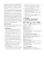
Figure 1: Graph showing the percentage of customer reviews giving each star level (source: Amazon.com).
Alternatively, a page can be zoomed to look larger, but
not be reflowed. This retains the original page format and
page numbering, but now requires the user to pan across
pages to read them. (often this is the only option available
for pictures.) It happens that the key design decision is
typically forced by the format of the document being read:
some documents cannot be reflowed, so most devices must
provide both mechanisms.
2.7
Summary
In this section we identified some salient HCI principles
that can frame a critique of current reader design. This was
followed by a brief summary of some of the concerns that
may arise in commonplace features of the reader software.
We will now take a short glance at some readily available
data on the user satisfaction reported with these devices.
3.
USER DATA
Before we go into detail of our evaluation of our chosen example devices, is useful to consider consumer thoughts on
the products. We looked to the ‘Customer Review’ section of Amazon.com for the 5 star Likert ratings given by
buyers of the devices, gathered from the US Amazon site
www.Amazon.com. Figure 1 shows the data we gathered.
The sample respondents of the Kindle is far greater than
that of the Sony devices (some 15,000 for the Kindle versus
less than 100 for both Sonys). We assume this is due to
the exclusivity of the Kindle being sold on Amazon only,
whereas the Sonys can be bought from many stores and
online retailers, and therefore their users are less likely to
provide assessments on Amazon.
It is clear from Figure 1 that the majority of users think
highly of all three devices; giving scores of mostly 4s and
5s out of a 5 point Likert scale. However, the reviewers on
Amazon are self-selected. If they had bad experiences they
might tell the manufacturers, or if they simply gave up using the device they would probably wish to forget about it.
On the other hand, excited users would likely be keen to tell
everybody about their experiences. For an unbiased experiment, respondents need to be selected randomly or in some
other controlled way, not self-selected. Nevertheless, what
the Amazon data shows is that people who like eReaders
really like them.
One might then ask, why the present paper if enough people already like the devices? HCI is about making things
easier and nicer, and if enough people like something, isn’t
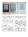
5 cm
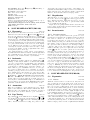
Figure 2: The eReaders reviewed in this paper: LEFT: Sony PRS-300 (pocket), MIDDLE: Sony PRS-600
(touch), and RIGHT: Amazon Kindle 2.
the HCI work finished? No. This simplistic view comes from
commercial usability: if a manufacturer can stay in business
selling profitable products to enough customers, then the
business cost of further HCI research is questionable. In
contrast, in research — where we place this paper — the
issue is whether in principle a better user interface can be
designed. In future, we would anticipate manufacturers using this research ‘for free’ and thus making better products.
hand (regardless of which hand they use). A similar position
has been used in the Sony Pocket design.
In contrast to this, the Kindle has thought harder about
their choice of button placement, choosing to place their two
‘next’ buttons on the sides of the device; perfect for clicking
by the thumb of an individual holding the device in either
hand. See sections B.1, C.1 and D.1 for details of how each
of the three example systems deal with bookmarks.
4.
4.2
DISCUSSION
We will now discuss the main findings from our evaluation of
three popular eReader devices (shown in Figure 2). For clarity, technical details of the devices are summarized in the appendices. Appendix A provides brief technical descriptions
of all devices considered here — form factor, battery, etc,
and appendices B onwards provide critical reviews of specific models based on the HCI issues raised above in section
2. Considering the analyses of the various devices taken individually from the appendices, we now summarize the role
of the various HCI principles for eReaders in general.
4.1
Ergonomics
The ergonomic design of eReaders strongly affects not only
the ease of use of the functions, but in some cases, the comfort of the user while engaged with it, e.g. where commonly
used buttons are positioned. The devices we evaluated have
obviously been designed with aesthetics in mind, sometimes
paying little attention to the position of such buttons. The
Sony Touch for example, has opted for the minimalist design approach putting only 5 thin strip buttons on its facia.
Unfortunately however, the most commonly used button on
the device (i.e. the ‘next’ button) has been placed second
from the left in the row of buttons; an extremely awkward
position for users to press while holding the device with one
Consistency
The consistency of the software within devices is certainly
something that can be improved upon. We have touched
upon several cases within our evaluation of the three examples in which the consistency of certain functions do not
follow platform conventions. Examples of these range from
button inconsistencies as in the case of the Sony Pocket’s
button (see section B.6), to function inconsisReturn
tencies, like all the zoom function’s inability to increase the
size of menus. Even the page numbers within several of these
devices seem to be inconsistent (see 4.4), recalculating page
numbers at every zoom level undermines the traditional connection between a word or sentence and a particular page
(or location) identifier, and complicates the interaction for
functions that are dependent upon them; e.g. bookmarks.
4.3
Completeness
As we have discussed earlier in the paper, digital devices
that mimic physical ones have certain expectations that are
not always fulfilled; consequently the sense of completeness
within devices such as these, are rare. For example, in a
paper book it is possible, that in certain situations you would
want to add more than one bookmark to a page; perhaps in
the form of Post-its to mark interesting parts on the top
and bottom sections. This function however, is impossible
on all three of the devices we sampled; in all three readers,
a page could either be bookmarked or not bookmarked with
no facility to add additional ones.
Another example of this would be flicking through a document: a process that is easy to accomplish on paper and
useful for quick navigation. Achieving this interaction on
eReaders though is far more cumbersome. Of the readers we
reviewed, the two Sony models had no tool for such interaction. The Pocket Edition (PRS-300) did include dedicated
number buttons for navigation to specific page numbers, but
neither allowed for free flicking through pages within the
document. In contrast, the Kindle made use of its 5-way
directional stick to allow for quick flicking through pages.
Unfortunately the screen update speed of the Kindle is slow,
and so it is difficult to see how quickly you are moving from
page to page.
4.4
Page Numbers
The slow refresh speed of eInk technology means that eInkbased reading devices use pagination rather than scrolling.
The use of pagination is therefore a critical issue within the
use of eReaders, as it is the only viable navigational method.
Whereas paper documents inextricably connect the physical
page and page numbers, digital texts are free from that constraint, and may be re-formatted, completely altering the
numbering system. Besides the obvious problem of referencing physical books to their digital equivalents, this system gives a lot more freedom than paginated documents can
offer. Why then are we still using paper-like ideas like bookmarks in our digital reading design?
The page numbering on the PRS-300 for example, follows suit with most Sony eReaders. The device does not
seem to keep the page numbers of the original document
unless they are encoded into the document itself. If they are
well-made PDFs with specific page numbers then the pages
stay constant throughout: if you zoom in then the device
does not reorder the pages, it simply splits each page into
smaller pages and names them accordingly. For example, if
an original document was 10 pages and we zoom to 4x magnification, page 1 would now span over 4 pages; all of which
would be called Page 1. This method of page numbering is
useful if users are co-ordinating with physical copies of the
same book (e.g. in a reading group). It can be confusing
however, to have multiple pages with the same page number.
A more suitable solution to this problem when on a larger
zoom level would be to keep the original page numbers but
also include how many of them they are, as in “Page X (Part
Y of Z)”.
The other, more common page numbering system used by
Sonys eReaders is to calculate the number of pages within a
document on the fly depending upon the zoom level. Thus
the more zoomed in you are, the more pages there are in the
book. This method however, now leads into further problems, such as the shared reference problem encountered by
those collaborating using the same document [4]. Previously,
when two users were reading separate copies of the same document, they could say “hey look at page X, paragraph Y”.
Now to find the particular passage a user would also have
to say “go to zoom level S then go to page X paragraph Y”.
Another problem faced here is bookmarking. If a user
places a bookmark on a page then zooms in, the old bookmark is ‘lost’ as only one of the multiple pages the original
page now spans over is left bookmarked by the system. For
example, if I were to bookmark page 10 on the smallest
zoom level then zoom in to 4-times magnification, my original page 10 now spans over 4 pages, except the system only
bookmarks one of these 4 pages. Similarly, if a bookmark is
made when the document is on a high zoom level, then it is
zoomed out again, the bookmarked page is now far bigger
than it originally was; how then, will the user know exactly
which part they intended on bookmarking?
What the system seems to do here is take the first line
on the page being bookmarked and take that as the anchor point for the bookmark, ignoring any other text on
the page. Thus whatever page the first word of the original
bookmarked page is now on, is the only one which gets a
bookmark on the new zoom level.
In contrast to the Sony Models, the Kindle 2 has opted to
do-away with conventional page number format and replaces
them with ‘locations’ that correspond to specific places within
the text. Instead of page numbers then, which are in fact,
rather useless in the digital world as they are not ‘pages’ as
such, the Kindle measures the file in locations that are linked
to specific positions of text within the document. Each location always corresponds to the same position in the text no
matter now the text is being split for the display; i.e. how
big or small the font is. This means that one screen can
contain more than one location depending upon the zoom
level and where the text breaks.
Despite this location system however, the device still seems
to have trouble with bookmarks. As with the Sony’s, the
Kindle 2 also takes the first word of the originally bookmarked page to be the anchor for the bookmark and ignores
any text thereafter. This means of course, that if the interesting part of the page you bookmarked happened to be
at the bottom, you would lose its place if you changed to a
different zoom setting.
Both the Sony’s and the Kindle fall into the electronic
bookmark trap; first forcing bookmarks to reference ‘pages’
and then not reformatting them when the arrangement of
the pages change. A major improvement to these devices
then, would include a ‘bookmark’ system that as far as the
user is concerned, bookmarks pages, but underneath actually references specific positions within the text. The Kindle’s location system is well equipped for this system already,
yet fails to utilize it in a useful manner. When a ‘page’ is
bookmarked, despite the zoom level, each and every part of
the text within that ‘page’ should be tagged as being bookmarked. It is these tags that should then be used when
the document is resized to calculate which pages should be
bookmarked. This would solve the problem of only one out
of many zoomed pages to be bookmarked after a reformat
to a higher zoom level.
We now turn to the reading functions listed in Section 2.6
and discuss in turn the usability concerns with each of the
tools that a user may commonly use in their use of a reader.
4.5
Bookmarks
As we have just discussed, the problem of so called ‘page
numbers’ within digital texts can significantly affect what
we know as bookmarks. This is not the only problem that
eReader bookmarks can suffer from however.
Despite bookmarks being a well-used function in physical
books, many eReader designs do not incorporate a dedicated
bookmark button into their facia design. Instead forcing internal menus to be used. Furthermore, in all three of the
devices we evaluated, viewing a list of bookmarks cannot be
done whilst reading a book; rather, the user must navigate
out of the document and into a menu to retrieve the bookmark list. See sections B.2, C.2 and D.2 for details of how
each of the three example systems deal with bookmarks.
4.6
Annotation
Active reading [2] is a very common activity and describes
not only reading, but also the process of thinking and markingup documents by annotating, highlighting, extracting information etc. On paper these actions are easily performed and
can be considered to be ‘lightweight’ [5] as the user actions
can be “so unselfconscious, they are not apt to remember
them later”.
It is clear then, that in order to facilitate active reading
in the same way as paper, adequate mark-up tools need to
be included into eReader designs. Sadly however, of the
three we sampled, only one (Sony Touch PRS-600) had the
touch-screen facility to create hand drawn notes, while the
Kindle made do with highlights and hidden typed notes. The
Sony Pocket PRS-300 had no annotation facility whatsoever;
making the device useless for active reading and rendering
it somewhat incomplete (see section 2.5). See sections B.3,
C.3 and D.3 for details of how each of the three example
systems deal with annotations and marks.
4.7
Magnification
With the exception of the Sony Touch Edition that does
offer an additional zoom and pan function (for within documents only), magnification on the devices actually involves
reformatting the text of the documents by increasing or decreasing the font size. This is a useful feature particularly
for those with vision impairments. Unfortunately however,
the consistency of the magnification of these devices is inconsistent and does not extend to the menus, rendering the
device relatively useless for those with poor vision unless a
third party performs all the device navigation. See sections
B.5, C.5 and D.5 for details of how each of the three example
systems deal with magnification.
4.8
Improvements
There are several areas of eReader design that could be significantly improved by paying attention to the basic HCI
principles outlined in this paper. Firstly, the button choice
and placement on the devices facia should be carefully considered. Commonly used functions such as next and bookmarks should have their own dedicated buttons and should
be placed conveniently to avoid discomfort during long reading sessions. As we discuss in the Appendix, the ‘next’ buttons on the Kindle are perfectly positioned to coincide with
the thumb positions of users holding the device in their left
or right hand.
Further to button positioning, device manufacturers must
also ensure that the buttons and functions within the device
are consistent. Users should not have to wonder what action the button or function will perform every time they use
it; it should consistently perform the same action. Designers should also strive for completeness: ensuring that tools
and actions within the device mimic the actions that can be
performed on paper, unless this is demonstrably inefficient
in a digital interaction. In doing so, the functions within
the device will become more ‘lightweight’ and improve the
interaction between the user and device.
There are certain principle conventions that should be followed in order to ensure good user interaction with the tools.
For example, due to the technology used, the screen update
speed is slow on these devices. Therefore, an obvious remedy to this problem would be to reduce the number of screen
updates. Sadly in the examples we chose there were several
instances where the devices failed to do this. In the Sony
Touch for example, the main menu screen is not one big list;
you must scroll down after several entries to view the second
half despite there being ample room for the entire list on the
screen at one time. This causes unnecessary button clicks
and page refreshes that could easily be avoided if the menu
was contained in a single list.
4.9
eDocuments
Bearing in mind predictions of a paperless office [11], it
might be useful to consider the heart of the operation; digital versions of traditional reading material, also known as
eDocuments. There are many formats of electronic document (eg PDF, BBeB, EPUB), most of which can be used
on the eReaders we have critiqued in this paper.
One of the major concerns users seem to have with the
eDocument paradigm, is the fact that they do not actually
own a physical copy of the book. In previous studies we have
conducted [3, 10] on this topic, we discovered that many
users feel almost cheated by buying an electronic document,
coming up with comments like “I’d rather have the [physical]
book because it looks good on my shelf”.
Another issue with electronic documents is the price. Often, if you go to a book store you can buy a physical book
on sale for only a few dollars or benefit from a buy one get
one free offer. However, if you head to Amazon to buy an
eBook they are, more often than not, full price making them
more expensive than buying a physical copy. The overheads
of electronic books are practically nothing; no printing, material or delivery costs are incurred, yet these savings are
not passed on to the consumer. In fact in many cases they
are trying to charge more for an electronic copy.
Further to this, what happens if you already own a physical copy of a book but now want to read it on your eReader?
The answer is, you must buy another copy. When you buy
a CD you can listen to it in your car or on your stereo and
you can also rip a copy onto your computer so you can listen to it on your MP3 player. The popularity of portable
music devices like MP3 players would be no where near as
high if consumers had to rebuy all their music in digital format as opposed to simply copying it from CDs. So why are
books so different? Why can’t physical books come with a
memory device containing an electronic copy attached? Or,
if an electronic copy is all that is required, should they not
be cheaper than their physical counterparts considering how
cheap they are to produce?
These issues, if left unresolved, could seriously hinder the
success of devices such as eReaders. Although the current
digital reading consumer market is, at present, content with
simply being able to store and read hundreds of books on
one device, they will not ignore these issues forever.
5.
CONCLUSIONS
This paper has explored the basic principles and issues associated with eReader design and backs them up with real
world examples from three popular electronic reading devices. Our paper has used HCI principles to think about design. This provides a much wider range of insights than what
has become the ‘conventional’ mode of HCI which is based
on empirical experiments. Here, empirical experiments can
only answer one question at a time (unless they are carefully designed), and then the data itself does not provide
insights into design rationale. Hence this paper was based
on an exploration of principles — a variant of expert heuristic evaluation.
It is clear from our investigations that these devices leave
a lot to be desired, at least from an HCI perspective if not
from a business/usability perspective. Many of them have
focused too strongly on the aesthetics of the hardware design
to ensure they have included a visually pleasing symmetrical
pattern on the facia.
Of the three devices we inspected, we feel the Kindle 2
has matched our criteria better than the others. Its ergonomic design makes it easier to hold and, more importantly, turn pages. It caters to users independent of their
left/right handedness. Despite it lacking a touch screen interface, the Kindle still manages to facilitate active reading
[2] by incorporating a full QWERTY keyboard into its design, which aids with annotations and web browsing. We
were also impressed with its location method of page positioning, even though (in our opinion) it could have been put
to better use. Obviously the Kindle is not a perfect example
of what an eReader could be, but by paying close attention
to the principles and guidelines laid down here it could be
largely improved — as could any such device.
Acknowledgements
Jennifer Pearson is sponsored by Microsoft Research and
we gratefully acknowledge their support. This research is
supported by EPSRC Grant EP/F041217.
6.
REFERENCES
[1] Annette Adler, Anuj Gujar, Beverly L. Harrison,
Kenton O’Hara, and Abigail Sellen. A diary study of
work-related reading: design implications for digital
reading devices. In CHI ’98: Proceedings of the
SIGCHI conference on Human factors in computing
systems, pages 241–248. ACM Press, 1998.
[2] M. J. Adler and C. Doren. How to Read a Book: The
Art of Getting a Liberal Education. Simon and
Schuster, 1972.
[3] George Buchanan and Jennifer Pearson. Improving
placeholders in digital documents. In Research and
Advanced Technology for Digital Libraries, volume
5173 of LNCS, pages 1–12. Springer: Berlin, 2008.
[4] Catherine C. Marshall. Reading and Writing the
Electronic Book. Synthesis Lectures on Information
Concepts, Retrieval, and Services. Morgan & Claypool
Publishers, 2009.
[5] Catherine C. Marshall and Sara Bly. Turning the page
on navigation. In JCDL ’05: Proceedings of the 5th
ACM/IEEE-CS joint conference on Digital libraries,
pages 225–234, New York, NY, USA, 2005. ACM.
[6] Rolf Molich and Jakob Nielsen. Improving a
human-computer dialogue. Commun. ACM,
33(3):338–348, 1990.
[7] Jakob Nielsen and Rolf Molich. Heuristic evaluation of
user interfaces. In CHI ’90: Proceedings of the SIGCHI
conference on Human factors in computing systems,
pages 249–256. ACM: New York, NY, USA, 1990.
[8] Kenton O’Hara. Towards a typology of reading goals,
1996.
[9] Kenton O’Hara and Abigail Sellen. A comparison of
reading paper and on-line documents. In CHI ’97:
Proceedings of the SIGCHI conference on Human
factors in computing systems, pages 335–342, New
York, NY, USA, 1997. ACM.
[10] Jennifer Pearson, George Buchanan, and Harold W.
Thimbleby. Improving annotations in digital
documents. In ECDL, volume 5714 of LNCS, pages
429–432. Springer: Berlin, 2009.
[11] Abigail J. Sellen and Richard H. R. Harper. The Myth
of the Paperless Office. MIT Press: Cambridge, MA,
USA, 2003.
[12] Ben Shneiderman and Catherine Plaisant. Designing
the User Interface: Strategies for Effective
Human-Computer Interaction (4th Edition). Pearson
Addison Wesley, 2004.
APPENDICES
A. TECHNICAL SPECIFICATIONS
A.1 Sony Reader Pocket (PRS-300)
Display: 5 inch eInk (8-Level Greyscale)
(Home),
Physical Buttons/Devices: Power Switch,
(Return),
(Previous Page),
(Next Page),
(Next
(Previous Page & Move Cursor),
Page & Move Cursor),
<blank> (Enter),
(Bookmark),
(Size), Number Buttons X 10
Resolution: 800 x 600 pixels
Size: 159 x 108 x 10mm
Weight: 220g
Wireless Connectivity: None
Memory: 512MB Internal
Expansion: None
Power: Sealed Internal Lithium Ion Battery - around 6800
page turns on one charge
eBook Formats Supported: Adobe PDF, TXT, RTF, Microsoft Word, BBeB, EPUB
RRP: £199.99
A.2
Sony Reader Touch (PRS-600)
Display: 6 inch Touch Screen eInk (8-Level Greyscale)
Physical Buttons/Devices: Power Switch, Vol -, Vol +,
< (Previous),
> (Next), (Home), (Size), Options
Resolution: 800 x 600 pixels
Size: 175 x 122 x 10 mm
Weight: 286g
Wireless Connectivity: None
Memory: 512MB Internal
Expansion: Accepts Memory Stick Pro Duo (MS) and Secure Digital (SD) cards up to 16GB
Power: Sealed Internal Lithium Ion Battery - around 7500
page turns on one charge
eBook Formats Supported: Adobe PDF, TXT, RTF, Microsoft Word, BBeB, EPUB
RRP: £279.99
A.3
Amazon Kindle 2
Display: 6 inch eInk (16-Level Greyscale)
Physical Buttons/Devices: Power Switch, Vol -, Vol +,
PREV PAGE, NEXT PAGE X 2, HOME, MENU, BACK,
Full QWERTY Keyboard, SYM (Symbol), A (Text Size), 5way Directional Controller
Resolution: 800 x 600 pixels
Size: 203 x 135 x 9 mm
Weight: 289g
Wireless Connectivity: 3G
Memory: 2GB Internal
Expansion: None
Power: Sealed Internal Lithium Polymer Battery - up to
one week (with wireless on) on one charge
eBook Formats Supported: Kindle (AZW), TXT, ADOBE
PDF, HTML, MS WORD, JPEG, GIF, PNG
RRP: $189.99
A
B.
B.1
SONY READER POCKET (PRS-300)
Ergonomics
PRS-300
The Sony Pocket edition has several sets of buttons on its
and return
buttons,
main facia. As well as its home
the device also includes dedicated buttons for bookmarks
and font size as well as a circular directional pad and enter
button and a set of 10 numerical inputs. These buttons have
been arranged in a somewhat symmetrical pattern forcing
the directional inputs (used for next and previous functions)
to be placed in the middle of the device below the display
screen. This is not the best place to position a feature as
commonly used as the next button as it can only be easily
accessed by the thumb of a left or right hand if the device
is being held by the bottom edge.
For quick navigation to menu options or page numbers,
the PRS-300 has 10 numeric buttons down its right hand
side. Unusually however, these 10 buttons have been combined into 5 sets of 2 that resemble on/off switches.
B.2 Bookmarks
PRS-300
.
The PRS-300 model has a dedicated bookmark button
Clicking on this button within a document will cause a
‘dog ear’ to appear in the top right hand corner, indicating
that the page has been bookmarked. Clicking the button
on an already bookmarked page deletes the current bookmark. This ‘dog ear’ visualization however, does not give
an overview of which pages are bookmarked, as only the
currently open page can be seen on screen. To view a list of
all bookmarked pages, the user has one of two choices. The
first option, that can be accessed through the main menu
(button) –
All Bookmarks (on screen menu),
lists all bookmarks in all books stored on the device in one
big list. The second and possibly more useful option, is to
view only the bookmarks within a single book. This function
however, must be accessed from the Options menu for that
particular document which is not an easy menu to locate.
B.3
Annotations
PRS-300
There are no facilities to create annotations, notes or highlights on the PRS-300. The manual confirms that these
functions can be used within the eBook library on a paired
PC, but the device would be unable to open or use them.
B.4
Page Turning
PRS-300
on the PRS-300 is accomplished by using
Page turning
the circular directional pad below the main screen;
and
for Next and
and
for Previous. Assuming the device
will be held in one hand for reading, the position of this
directional pad is just about in range of the thumb of a
right handed individual holding it on the bottom half. Left
handed users however, may find it a strain to stretch their
thumb to the next button after several page turns.
B.5
Magnification
B.6
Inconsistencies
PRS-300
Although there does not seem to be a zoom mode within
button that toggles between
the device, there is a size
three different font sizes. This button, however, does not
change the font size of the home or options menus, which
are a constant size throughout.
Despite the device giving visual feedback to state the zoom
is not possible on the menu, it is an inconsistency that could
hinder visually impaired users.
PRS-300
B.6.1 Document Options
PRS-300
The device offers a specific menu for the options of a document that provides functions for utilities such as document
info, table of contents etc. As there is no dedicated options button, the user has one of two choices to access the
menu. Firstly, selecting a document from a list (either by
title, author or date) on the device will automatically show
the options for that document before allowing reading to
commence. The second option which can be accessed from
within a currently open book, requires the user to click the
button to access the options screen. Obviously,
return
this button is not labeled as an options function and does
not always behave in the way you would expect: i.e. return the user to the screen they were on prior to the current
screen. Under normal circumstances (e.g. if you are in the
Date and Time menu) clicking return
, takes you back
to the previous screen: (e.g. the main Settings page). However, in some instances it behaves as a menu button: e.g.
if you were on page 5, and then use the number buttons to
take you to page 55, the return button should take you back
to page 5. Similarly, if you were on the home screen then
continue reading, the return button should take you back to
the home screen again. However, in these two examples, the
return button actually takes the user to the options screen
for a book instead of returning them to the previous screen.
C.
SONY READER TOUCH (PRS-600)
C.1
C.1.1
Ergonomics
Buttons
PRS-600
PRS-600
With the added benefit of a touch screen, Sony has been
able to make the screen the main focus of the device by
limiting the number of physical buttons on its facia. They
have opted to place 5 thin buttons on the device and place
the icons of their functionality just above them effectively
reducing their target boundary. The positioning of these
buttons however has not been thoroughly thought out and
looks strikingly similar to the layout you would expect to
buttons
find on a digital music player. The page turning
(<) and (>) for example, have been placed adjacent to each
other on the left hand side of the device. This puts the most
commonly used function, i.e. the next page button (>), in
an extremely awkward position; one that would not suit the
thumb or finger position of a left or right handed individual.
C.1.2
The Display
PRS-600
One of the main selling points of eInk hardware is the absence of a back-lit display making it more comparable to
ink on physical paper documents. This technology not only
saves battery power, but also to facilitates traditional paper
reading practices that are more difficult to accomplish on
illuminated digital devices, e.g. no backlighting reads better
in direct sunlight. Unfortunately, the Touch Edition Sony
Reader has undermines this feature due to a translucent top
layer that is responsible for the touch screen functions of the
device. This additional layer is partially reflective and therefore picks up ambient light in the room making the device
more difficult to read and feel less like a real book.
C.2
Bookmarks
PRS-600
There are two methods of creating a bookmarks on the
PRS-600, but unfortunately, both demonstrate poor user interaction. The bookmark feature is classed by the device as
a ‘Note’ and therefore exists within the Notes menu: OpCreate/Edit Notes (on screen
tions (button) –
menu) –
(on screen icon). This seems like a rather
long-winded method of performing a simple operation like
bookmarking; a task that is so easily accomplished on paper.
To get around this, the device has a short-cut bookmark option that requires double tapping in the top right corner.
However, this feature is not supported by any kind of visual
cue and therefore can only be discovered by close reading of
the full user manual (not included) or by random discovery.
To indicate to the user which pages are bookmarked, the
device displays a small triangular ‘dog ear’ in the top right
corner the display which can be seen only when a bookmarked page is open. To view a list of all bookmarks within
a document, the user must navigate through a series of
Create/Edit Notes (on
menus: Options (button) –
screen menu) –
Notes (on screen menu). The
‘Notes’ menu is an ordered list of all annotations associated
with a particular document; specifically, it merges every user
created mark-up within a specific document into the same
list, i.e. bookmarks, highlights, handwriting and comments.
Each of these different annotation types are distinguished in
the list by a different icon, and the lists can be ordered by
page number, type or comment. One major flaw of this type
of list based interaction however, is the lack of overview of
where bookmarks exist in the document. In paper books
relative placement of bookmarks can be easily seen as well
as how much has been read/left to read etc.
C.3
Annotations
PRS-600
The Touch edition Sony reader contains a within-document
‘notes’ system that can be accessed via a series of menus,
Create/Edit Notes
specifically: Options (button) –
(on screen menu). This then scales the document view
very slightly to provide a small, clear space for the notes
menu that sits along the top of the viewing window. Within
this menu, users can either; add highlights to the book content, access free-hand mode using the stylus, delete using
the eraser, add/remove bookmarks and access the notes list.
In reality, notes and bookmarks are different things to the
majority of users. It seems odd never mind long winded
then, that Sony has decided to combine them into a single entity and effectively bury one within the other. The
following subsections describe the functions that Sony has
grouped under the common name ‘Notes’.
C.3.1
Highlights
PRS-600
Existing text within the open document can be highlighted
by first accessing the highlighter function hidden within the
Notes menu: Options (button) –
Create/Edit Notes
(on screen menu) –
(on screen icon). They can be
removed by using the eraser tool also found within the Notes
menu. As mentioned above, one a highlight has been created it is automatically added to the Notes list along with
other types of annotations in the document.
C.3.2
Handwriting
PRS-600
The device makes good use of its touch screen technology
by incorporating a handwriting function into its design. By
accessing the same Notes menu as other document annotaCreate/Edit Notes
tion tools (Options (button) –
(on screen menu) –
(on screen icon)), users can
‘draw’ directly onto the PDF surface with a stylus or finger.
This is a useful function that would be better accompanied
by variable pen thickness sizes.
C.3.3 Comments
PRS-600
Although you cannot simply add a text box to a page and
type directly onto it, there is a tool that allows you to add
hidden text and handwriting to both bookmarks and highlights (these are known as comments). Sadly however, this
facility is so well hidden within the device that it can take
weeks to find via random discovery. This situation is exacerbated by the absence of a full manual with the Reader. To
add a comment, a previously created bookmark or highlight
must be tapped once (double tapping accesses a different
function) to bring up a menu that allows users to choose the
type of comment they wish to anchor to the note: either
handwriting or keyboard entry (Note: Comment creation
can only be accomplished when the Notes menu is off). Once
a comment has been made and committed, it will disappear
from view and can be accessed by tapping once on the icon
adjacent to the bookmark or highlight. Not only does this
functionality deny the creation of comments randomly on a
page as each one must be anchored to an existing note, but
each note (i.e. bookmarks or highlights) can only sustain
one comment each.
C.4
Page Turning
PRS-600
Changing pages on the device can be accomplished either
by using the dedicated buttons on the device itself, or by
making sweeping gestures on the touch screen. To move to
the next or previous pages within the document, the screen
must be dragged in the appropriate direction with a stylus
or finger, and to repeatedly change pages (i.e. flick quickly
through document), the screen must be held after the gesture has been made. The default page turning gesture directions have been designed to coincide with the buttons on the
device: specifically, gesturing from right to left ( < ) takes
you to the previous page and from left to right ( > ) takes
you to the next page. These directions, however logical, contradict the learned behavior of reading physical books. For
example, when reading ahead in a paper book (i.e. going to
the next page), one would take the right page and flip it
to the left. Conversely, to go back to a previous page, one
would take the left page and flip it to the right; completely
opposite to the gestures provided in the devices hardware.
Fortunately, the page turn gesture can be modified from its
default direction via the device settings in the main menu.
C.5
Magnification
PRS-600
The PRS-600 offers two types of document resizing. The
first, which allows users to change to one of 5 different font
sizes (S, M, L, XL and XXL, where S is the original size),
is designed to re-render and display a newly formatted version of an open document page with the desired sized font.
This feature however, can be slightly temperamental on certain documents. For example, some tables, specifically those
that span the entire width of a two columned document prohibit larger font sizes for that particular page (i.e. M, L, XL
and XXL). In addition, some images, particularly embedded
PDF images, are rendered incorrectly with the device reformatting any text within them along with the main body of
the document. To get around any possible magnification
problems, the device also offers a standard zoom function
that does not reformat document pages, but zooms in on
specific points and facilitates panning using 4 directional arrows on the touch screen.
One major downfall of the device is its lack of consistency of the zoom function. Specifically, one can zoom in on
documents but not on menus making the device extremely
difficult to use for visually impaired users.
C.6
Usability
PRS-600
Another problem with the PRS-600 software design is that
the main options menu unnecessarily spans two pages (i.e.
you must click to change to the second half of the menu)
despite the fact there is sufficient room on the screen to place
all items within it on one page. This adds a needless extra
click to an already slow menu system and goes against the
minimal refresh/screen clicks principle we laid down earlier.
D.
AMAZON KINDLE 2
D.1 Ergonomics
Kindle
There are several notable properties of the ergonomic design
of the Amazon Kindle 2. Firstly, it is useful to note that its
sleek thin shape and lightweight properties make it easy to
hold with one hand. This, coupled with the clever positioning of the two ‘Next Page’ buttons, makes linear reading
easy to accomplish with the thumb of the right or left hand.
Unlike the Sony’s, the Kindle 2 does not have buttons with
icons above them, they use descriptive words on the buttons
themselves to state their purpose. The size of the Kindle’s
buttons are also a lot larger than the Sony Touch, making
them much easier to press.
Unfortunately, the thought that went into the design and
position of the next buttons was not given to the function
of the 5-way directional stick. This mini joystick does not
promote direct manipulation [12] as it is hard to control the
on-screen cursor using continuous movement on a slow refresh screen speed. An alternative, but tedious and difficult,
way of navigating with the 5-way, is to continuously flick up,
down, left or right to scroll through on screen menus.
D.2
Bookmarks
Kindle
Following suit with the Sony Touch’s design, the Kindle
does not have a dedicated button for bookmarking. Instead,
to bookmark a page the user must click Menu (button)
then scroll down 6 items and select Add a Bookmark (on
screen menu). To bookmark a page on the Kindle then,
requires 8 button clicks; a rather large number for such a
commonly used function. On closer inspection of the user
manual, I discovered the Kindle does have an accelerator
shortcut for this which makes bookmarking far less cumbersome: ALT (button) + B (button).
When a page has been bookmarked, it renders a ‘dog
eared’ corner in the top right of the screen. Surprisingly
however, pages that have not been bookmarked, show a
dashed dog ear in the top right corner; a confusing design
that has no apparent function whatsoever.
D.3
Annotations
Kindle
Despite the lack of touch screen, the Kindle 2 still offers a
small set of mark-up tools. These include highlights and
notes and can be viewed in a list (all grouped together with
bookmarks too) from the main menu: Menu (button) –
My Notes and Marks (on screen menu).
D.3.1 Highlights
Kindle
To create a highlight the user must first be in annotation
mode. This is accomplished either by moving the caret into
the document area (simply by using the directional stick) or
by selecting Menu (button) – Add a Note or Highlight
(on screen menu). Next, the user must move the caret
to the beginning of the place they wish to highlight using
the 5-way directional controller and ‘start’ by clicking the
5-way down. The caret then turns italic and will highlight
text that is selected using the 5-way directional buttons.
Clicking the 5-way down again will finish the highlight which
is subsequently indicated by a faint grey underline.
D.3.2 Notes
Kindle
Users can add notes to specific points in the text by first
going into annotation mode (described above) then moving
the cursor to the place in the text they want to anchor the
note. To create a note in a specific location, the user only
needs to start typing using the full QWERTY keyboard included on the facia of the device. They then select the ‘save
note’ option using the 5-way and a new note is created in
the specified position.
D.4
Page Turning
Kindle
There are two next buttons but they are positioned in the
right place for fingers unlike the sony reader where you have
to strain your hands to use. Has been designed with both
right and left handed users in mind. i.e. there are two
“next” buttons positioned on the sides of the devices in such
a way that they can be utilized by either thumb and more
importantly, be used with only one hand.
Since books are designed to be read sequentially from start
to finish, the previous button is expected to be used less frequently. This is reflected in its position: a single small button above the ‘Next Page’ button on the left of the device.
D.5
Magnification
Kindle
The Kindle 2 offers 6 font size variations accessible through
the size A button on the device. It also allows users to
change the margin size of the text using the strangely worded
‘Words Per Line’ feature of: fewest, fewer, default. Following suit with the Sony’s inconsistency, the Kindle 2 also sets
its menus at a fixed size. Unlike the Sony’s however, the
Kindle gives no visual, audio or tactile feedback when attempting to change the font size within a menu.
A