1
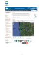
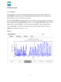
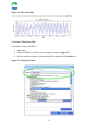
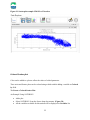
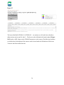
How to use the SATURN Observation Network: Endurance Stations Site:
Table of Contents
Preface............................................................................................................................................. 2
Introduction to the SATURN Interface........................................................................................... 3
Fixed station user interface ............................................................................................................. 5
The Recent Tab ........................................................................................................................... 6
Reading the graph ................................................................................................................... 8
Zoom Box ............................................................................................................................... 9
Stack Plot .............................................................................................................................. 10
How to Use The Data Explorer ..................................................................................................... 12
Adding Plots.............................................................................................................................. 13
Time Series plot ........................................................................................................................ 14
Scatter plots ............................................................................................................................... 18
Colored Scatter plot .................................................................................................................. 22
Saving, Opening and Commenting on sessions ........................................................................ 26
Plot Controls ............................................................................................................................. 27
Data Availability ....................................................................................................................... 28
Fixed station user interface II ....................................................................................................... 29
The Inventory Tab..................................................................................................................... 32
Quality Assurance (QA)/ Quality Control (QC) General Information ................................. 34
The Metrics Tab ........................................................................................................................ 36
The Map Tab ............................................................................................................................. 38
1
Preface
How to use the SATURN Observation Network: Endurance Stations site is designed to allow
someone to physically manipulate the SATURN Observation Network: Endurance Stations site
located on the Center for Coastal Margin Observation and Prediction website. SATURN stands
for Science and Technology University Research Network. SATURN includes tidal freshwater
stations, ocean gliders, autonomous underwater vehicles (AUVs), and estuarine and plume
stations measuring everything from salinity and temperature to biogeochemistry and microbial
diversity on a twenty-four hour time frame every day of the year. The data collected from
SATURN feeds into the Virtual Columbia River, a modeling system that offers multiple
representations of processes, variability and change across river-to-ocean scales.
This how-to manual is part of an effort to translate CMOP environmental systems knowledge to
a broader audience so we can inform people and help to develop a workforce skilled in science
and technology.
1. How to manipulate your way through the SATURN website.
2. How to manipulate the tools located on the SATURN website.
2
Introduction to the SATURN Interface
Go to http://www.stccmop.org/datamart/observation_network , the title at the top of this
webpage should say SATURN Observations Network: Endurance Stations under the CMOP
heading the Endurance Stations are listed to the left, Figure 1.
There are three ways to pick a station:
1. To the left of the screen, under the Endurance Stations drag the cursor over each bulleted
heading and click desired station
2. Choose a specific type of station by clicking the Order, Show, and Station list
3. By clicking on the markers on the map of the Columbia River and the
Columbia River Estuary.
This map has several interesting features:
•
•
•
Click the word Satellite in the upper right corner of the map to view as a satellite image.
Click the plus or minus sign in the upper left corner to enlarge or shrink it. The yellow
person above the plus sign is a Google overlay function for the map. To use,
Click the yellow person in the left hand corner, drag, and then release at particular area of
interest to see image of a road or address location.
To get back to the map: Click the back arrow and then click any of the red highlighted words
saying Observation Network
Below the map are markers which look like upside down colored teardrops. These markers,
represented both on and under the map, show where and how the data is recorded at each station.
In the upper right hand corner of this page you will see the words DATA Explorer inside a
square box. This is a shortcut to the DATA Explorer which will be discussed later.
3
Figure 1.
4
Fixed station user interface
The Fixed station user interface allows for manipulation of data from those stations which
remain in a fixed location in the Columbia River and the Columbia River Estuary.
•
•
•
Click on the SATURN-03 Endurance Station
You will see the Fixed station user interface heading at the top of the page and SATURN03 listed below in the drop down box.
Located below the drop down box are four tabs named Recent, Inventory, Metrics, and
Map (Figure 2.)
Figure 2.
5
The Recent Tab
The Recent tab shows data collected within the last 15 days.
Using the Recent tab you may perform the following tasks:
•
Graphically obtain information by choosing a variable under the Latest observations item
box on the right side of the graph.
o The variables available may include: Salinity, Temperature, Dissolved oxygen,
Turbidity, Phycoerythrin, Colored Dissolved Organic Matter (CDOM),
Chlorophyll, Nitrate, pH, and pCO2 , among others.
Example: Salinity
Click the box where Salinity [psu] is written.
•
•
The Salinity box becomes gray
o You now have the option to graphically represent Salinity at depths of 2.4 meters
(m), 8.2m, 13m and/or 14.8m.
Click inside the checkboxes boxes under Salinity [psu].
o All four depths of 2.4m, 8.2m, 13m, and 14.8m can be viewed at the same time.
Temperature [C], Dissolved oxygen [ml/l], and other variables can be viewed in the same way.
Note: Using the Fixed station user interface variables such as Salinity [psu] and Temperature
[C] cannot be viewed together at the same time. This can be done in the DATA Explorer which
will be discussed later.
In the bottom right hand corner of Figure 3, you see Time on PST followed by green
highlighted letters, MM DD h:m. This shows the time it was when the data was captured, if it
has been less than 24 hours.
•
•
•
•
PST stands for Pacific Standard Time
MM stands for month
DD stands for day
H stands for hour
The yellow highlighting stands for times less than 48 hours, red stands for times greater than
48 hours, and the purple means the feature is not working. The color indicates when the latest
data for the instrument has been collected.
6
Figure 3.
Below the graph there are square boxes which say 2 Days, 7 days, 15 Days, Zoom, Stack Plot,
and Data Explorer. The 2, 7, or 15 Day buttons change the number of days of observation data
that will be plotted on the graph.
7
Reading the graph
Look at Figure 4
Above the graph you will see a heading. This heading tells you what station is being used
(SATURN03), the depth being viewed (8.2 meters) and best. Best means the data has been
through quality assurance and control assessment.
Below the SATURN03 (8.2 m) best heading you will find starting date through the ending date
that is displayed on the graph (2013-05-13 – May 13, 2013 through 2013-05-28 – May 28, 2013)
followed by the time (23:59:00 –11:59 PM) and time zone (PST – Pacific Standard Time).
On the graph, time is located on the horizontal x-axis and the variable chosen, in this case
Salinity is located on the vertical y—axis.
Figure 4.
8
Look at Figure 5.
Under the Salinity heading on the right hand side the 2.4m, 8.2m and 13m boxes have been
checked.
Three colored lines appear in the graph.
Each depth is represented by a different color.
The blue line is 2.4m, red line is 8.2m, and green line is 13.0m. Inside the graph matches the
corresponding data highlighted in its specific color for the representative data.
Figure 5
Zoom Box
Clicking the Zoom box allows you to enlarge and print the graph.
To return to the Fixed station user interface go to the right upper corner of the graph and click
the X.
9
Stack Plot
Clicking the stack plot box shows time series plots according to the 2 Days, 7 Days, or 14 Days
selected on the Fixed station user interface page. These plots are graphed in the order of the
items listed in the Latest observation item box located on the Fixed station user interface
webpage.
•
•
•
Choose 2 Days, 7 Days, or a5 Days
Click the Stack Plot box located below the graph
All of the time series plots will be very small (Figure 6)
Figure 6.
To enlarge the stack plots of the time series image (Figure 7):
•
•
Move your cursor over the stack plots and the cursor will change to a magnifying glass
with a plus sign in the middle,
Now click
Figure 7
10
Description of what is seen on the page, example Figure 7:
Above time series graph is listed: 2013-05-15 – 2013-05-30 (PST)
•
Describes the dates represented by time series plots and the time zone
Writing on the left hand side of each plot is listed: Salinity (psu), Temperature (C),
Chlorophyll (ug/l), CDOM (ppb)
•
Describes what is being measured on each particular time series
Legend on the right hand side of each time series plots, the first legend is listed as an example
below:
----- SATURN03 (2.4m) best
----- SATURN03 (8.2m) best
----- SATURN03 (13.0m) best
----- SATURN03 (14.8m) best
•
•
•
•
Colored lines corresponds to data represented in the graph
SATURN03 is the Endurance station
(2.4m, 8.2m, 13.0m, 14.8m) is the depth at which the sensor recorded the data
best is describing the quality of the data
Although not shown in Figure 7, the X-axis is found below the last time series plot on the
webpage in which:
•
All of the time series plots are graphed over the same dates
To minimize the stack plots click on the graphs.
To leave the page, close the tab of the stack plots page.
The original page for the Fixed station user interface will still be open under the tab.
11
How to Use The Data Explorer
The Data Explorer allows you to construct graphs of the different data from all of the sensors
throughout the Observation Network.
Click on the Data Explorer box below the graph. A toolbar and blank page will appear, as in
Figure 8.
Look at Figure 8.
Data Explorer help page can be found by click the box with a picture of and (i) in a circle found
in the upper right hand corner.
Tool Bar
The tool bar is a set of buttons found at the top of the page under Data Explorer that allow users
to (from left to right): Add new plots, Save session, Open session, Download session as image,
and Clear all plots from canvas.
Figure 8.
12
Canvas Controls
Canvas controls allow users to minimize (-), maximize (+), and remove (x) selected plots.
Canvas
Canvas is the working area where plots are added.
Plots
Plots are elements added to the canvas by users during a session.
Adding Plots
There are three different types of plots in Data Explorer: Time series, Scatter plot, and Colored
plots.
To add a Plot, click on the first button to the left, as seen in Figure 9
Figure 9. Data Explorer Tool Bar
The Plotting parameters window will appear (Figure 10)
13
Figure 10. Plotting Parameters window
Time Series plot
A Time Series is a sequence of data points which is typically measured at uniform time intervals
(ex. once every hour). A time series plot represents these measurements on a graph over time.
See Figure 11.
14
Figure 11. Time Series Plot
To Create a Time Series Plot:
An Example Using SATURN03
•
•
•
Add a plot
Select SATURN03 from the Source drop-down menu. (Figure 12)
All the variables available for this station will be displayed on Variables list
Figure 12. Selecting a Station
15
•
•
•
Select CDOM at 2.4m by clicking on the value in the variables window
While it is still highlighted in blue, click the > button by the Y: box (Third button down)
Repeat for the variables CDOM at 8.2m, and CDOM at 13m (Figure 13)
o The selected variables will be added to “Y” variables. Notice that “X” variable
value by default is “Time”.
Figure 13. Adding Y Variables
Note: If you want to add variables from other stations, repeat directions above. If you want to
remove a series from Y variables, select the variable you want to remove and click on <
•
•
Click on Add series button and the variables from Y: will be moved to a list of plots.
Click on Next button to change time/date. (Figure 14.)
16
Figure 14. Adding Y variables to the plot
•
•
•
After clicking on Next button the Time range menu is displayed.
There are two ways to change the time range of the data:
o Select one of the standard time spans (1, 7, 15, and 30 days) and select the end
date
o Change start time and end time (Figure 15)
Click on Next button
Figure 15. Changing the time parameters
17
Quality Levels
Quality levels describe the level of processing the data has gone through. The 3 quality levels
currently available are: raw data, with no quality control (abbreviated as PD0); preliminary data,
with some quality control applied (PD1); and verified data (PD2), which has been subject to full
quality control processing.
Note: We are currently working to perfect the quality control feature in Data Explorer.
•
Click Next
The Next button adds the new plot/(s) to the canvas.
Same variables are grouped in the same plot, i.e. if we added salinity from SATURN-03,
SATURN-05, and SATURN-02 this will create one plot not three plots. If you want different
plots for the same variable, repeat steps 1-5 for each plot
Scatter plots
A scatter plot is a graph of plotted points that show the relationship between two sets of data.
To Create a Scatter Plot:
An Example Using SATURN03
•
•
•
Add a plot
Select SATURN03 from the Source drop-down menu. (Figure 16)
All the variables available for this station will be displayed on Variables list
18
Figure 16. Selecting a Station
•
•
•
•
Select CDOM at 8.2 m by clicking on the value in the variables window
While it is still highlighted in blue, click the > button by the Y: box (Third button down)
Select Elevation at 14.8 m by clicking on the value in the variables window
While it is still highlighted in blue, click the > button by the X: box (First button down)
(Figure 17)
19
Figure 17. Adding X and Y Variables to the plot
•
•
•
•
•
Click on Add series button and the variables from X: and Y: will be moved to a list of
plots.
Click on Next button to change time/date. (Figure 18.)
The Time range menu is displayed. There are two ways to change the time range of the
data:
o Select one of the standard time spans (1, 7, 15, and 30 days) and select the end
date
o Change start time and end time (Figure 18)
For the purpose of this exercise, choose 7 days from End date
Click on Next button
20
Figure 18. Changing the time parameters
Quality Levels
Quality levels describe the level of processing the data has gone through. The 3 quality levels
currently available are: raw data, with no quality control (abbreviated as PD0); preliminary data,
with some quality control applied (PD1); and verified data (PD2), which has been subject to full
quality control processing.
Note: We are currently working to perfect the quality control feature in Data Explorer.
•
Click Next
The Next button adds the new plot/(s) to the canvas. (Figure 19)
21
Figure 19. Scatterplot example CDOM vs. Elevation
Colored Scatter plot
Color can be added to a plot to reflect the values of a third parameter.
Time series and Scatter plots can be colored using a third variable adding a variable to Colored
by field.
To Create a Colored Scatter Plot:
An Example Using SATURN03
•
•
•
Add a plot
Select SATURN03 from the Source drop-down menu. (Figure 20)
All the variables available for this station will be displayed on Variables list
22
Figure 20. Selecting a Station
•
•
•
•
•
•
Select CDOM at 8.2 m by clicking on the value in the variables window
While it is still highlighted in blue, click the > button by the Y: box (Third button down)
Select Elevation at 14.8 m by clicking on the value in the variables window
While it is still highlighted in blue, click the > button by the X: box (First button down)
(Figure 21)
Select Dissolved Oxygen at 13 m by clicking on the value in the variables window
While it is still highlighted in blue, click the > button by the Colored by: box (Fifth
button down)
23
Figure 21. Adding X, Y, and Colored by Variables to the plot
•
•
•
•
Click on Add series button and the variables from X: and Y: will be moved to a list of
plots.
Click on Next button to change time/date. (Figure 22.)
The Time range menu is displayed. There are two ways to change the time range of the
data:
o Select one of the standard time spans (1, 7, 15, and 30 days) and select the end
date
o Change start time and end time (Figure 22)
For the purpose of this exercise, choose 7 days from End date
24
•
Click on Next button
Figure 22. Changing the time parameters
Quality Levels
Quality levels describe the level of processing the data has gone through. The 3 quality levels
currently available are: raw data, with no quality control (abbreviated as PD0); preliminary data,
with some quality control applied (PD1); and verified data (PD2), which has been subject to full
quality control processing.
Note: We are currently working to perfect the quality control feature in Data Explorer.
•
Click Next
The Next button adds the new plot/(s) to the canvas. (Figure 23)
25
Figure 23. Scatterplot example CDOM vs. Elevation Colored by Dissolved O2
Saving, Opening and Commenting on sessions
Data Explorer allows you to save, retrieve, and share your work with other users.
ONLY LOGGED IN USERS ARE ALLOWED TO SAVE SESSIONS.
For more information on saving, opening, or commenting on sessions please refer to the CMOP
website through the following links:
How do I save my session?
How do I share my saved session?
How do I delete a saved session?
How do I comment on a saved session?
How do I publish a saved session as a web page?
26
Plot Controls
Some of the plot controls are similar to canvas controls, but only affect the behavior of one plot.
The plot controls also add the plot options control and the download data control.
Figure 24. Plot Controls
This control allows users to edit, clone, display URL, download data, and select a plot.
Edit plot, opens “plot parameters” windows and users can add or delete variables, change time
range, change limits, and change layout of a plot. If multiple plots are selected a confirmation
will ask you if you want to edit the current plot or all the selected plots.
Clone plot, creates a copy of a plot.
URL, displays the URL of the plot. You can copy and paste the URL on an email if you want to
share the image with another user.
Data, allows you to download the data used on a plot.
Select/Deselect, selects and deselects a plot to tie its behavior to “canvas controls”.
27
Data Availability
The Data Availability control brings up a diagram representing years and months data was
collected for each variable at each station.
Figure 25. Data Availability
•
Select Source: SATURN 03
•
Select CDOM at 8.2 meters
•
Click the Availability box
•
A table pops up which allows you to see when data was collected for this variable, at this
station.
28
Fixed station user interface II
Fixed station user interface gives directions on the use of Inventory tab, Metrics tab and
Map tab (Figure 26).
Using this page you may also perform the following task:
•
Go back to the home page of the Observation network
•
Check the Network status of the observation network stations and sensors
•
Write us
•
Link to this webpage
•
Go to the Inventory tab, Metrics tab, and Map tab
Figure 26.
Clicking Network status, Figure 27
•
This webpage provides a Daily field report/record of the sensors and stations.
o A map allows you to look at the reports by day, month, and year, example
May 29, 2013 has been selected on the calender
There are two ways this webpage may be displayed to the user, example view 1-Figure 27 and
view 2-Figure 28/29. Major similarity and difference from the way in which you may see this
webpage presented.
•
Similarity- both view 1 and view 2 will have a comment box at the bottom of the
webpage
•
Difference- view 2 uses the legend in the upper right to denote status of stations
and sensors in that station
29
Figure 27.
The boxes labelled SATURN-01, SATURN-02… are stations as well as the boxes that have
abbreviations such as am169, cbnc3.... The boxes on the left hand side found in view 2-Figure
28/29 such as ADP, Algae watch, CDOM Fluorometer are the sensors.The abbriviated stations
are defined and a description of the sensors can be located under the Definitions of Relevant
Terms for the Observation Network.
30
Figure 28 (Top half of the webpage)
Figure 29 (Bottom half of the webpage)
31
The Inventory Tab
The Inventory Tab page shows the data collected before, during, and after the Quality Control,
Quality Assurance checks. Data Quality Assurance methods can be viewed if needed, Figure 30.
Key features of the Inventory page:
•
This page allows access to the RAW, PRELIMINARY, and VERIFIED data
collected via RAW, PRELIMINARY, VERIFIED radial buttons.
•
When orange highlighted line, for example CDOM (ppb), CDOM fluorometer at
depth 8.2 m is chosen under the RAW heading in the webpage that data will come
up in a excel spreadsheet.
Figure 30
•
Scrolling down the page you will find a calendar with orange highlighted dates and
months and black highlighted dates and months, Figure 31.
o Orange highlighted dates on the calendar denote data that is avaliable
o Black dates on the calendar denotes data that is not avaliable
32
Figure 31
•
Click on Verified radial button you will find information about Data Quality
Assurance (QA) Methods, example, Figure 32.
Figure 32
A further description of the QA and Quality Control (QC) methods used are written below.
33
Quality Assurance (QA)/ Quality Control (QC) General Information
This is general descriptive information regarding quality controlled data levels and QA/QC
procedures.
Levels of Data Processing Available via the Data Explorer:
•
PD0 (processed data level 0): These are the raw data prior to any corrections.
•
PD1 (processed data level 1): These are preliminary data that have undergone some
initial quality control, such as a real-time correction for a data artifact or preliminary
flagging of periods of bad data, but they have not been subjected to the full quality
control process outlined below.
•
PD2 (processed data level 2): These are the verified data that have been subjected to the
full quality control process outlined below and assigned one of 5 data quality levels.
Data Quality Levels:
Data that have been evaluated are assigned one of five data quality levels ranging from good at
level 1 to bad at level 5:
•
QL1 (GOOD): data have met all of the criteria for that sensor type to qualify as good
data.
•
QL2: data that are often good, but may be missing some information to verify the data
are good
•
QL3: data that have some quality concerns and users should pay particular attention to
the quality control notes (via metadata or supporting documentation) to determine
whether data are appropriate for use.
•
QL4: data that have serious quality concerns. Users should pay particular attention to the
quality control notes (via metadata or supporting documentation) and use the data with
caution.
•
QL5 (BAD): "garbage" data such as during periods of sensor malfunction or outliers.
QA/QC procedure:
The QA/QC of biogeochemical data include the following types of evaluation:
34
1. Visual Inspection: of the data: the data are examined visually to identify periods of
sensor malfunction, outliers and any unusual or suspect data patterns.
2. Calibration Evaluation: for those sensors that are calibrated, the accuracy of the
calibration is evaluated based on the results of sensor-specific field protocols. For some
sensors, a calibration is developed based on data from field samples.
3. Data corrections: may be applied to certain data sets to correct for calibration drift or
offset, data artifacts, or for sensor fouling (when possible).
The visual inspection of data, calibration evaluation, and any data corrections each result in their
own quality assessment, all of which are used to determine the final data quality flag. For
example if visual inspection found the data to be good (QL1), but the calibration was determined
to be of intermediate quality (QL3), the final data quality flag would be QL3.
Versioning:
Occasionally there will be updates or changes to the quality controlled data or quality
assessments. Each release of quality flags is assigned a version number which will be provided
with the relevant flag metadata. A log detailing the flag-set versions, the dates the changes were
applied, and a description of the type of changes made to the quality flags will also be available
with the flag metadata.
Access to QA/QC Information:
Users are encouraged to consult the QA/QC metadata and the in order to fully understand the
reasoning behind the quality assessments prior to determining whether the data is appropriate for
a particular use.
Metadata: all data that are flagged as less than good and some good data will have associated
comments detailing the data quality determination. These comments are included in the QC
metadata available for through the Data Explorer. To view the QC metadata for plotted data,
select the QC metadata link under the tool icon in the upper right corner of the Data Explorer
plot.
35
The Metrics Tab
The Metrics tab, this page quantifies the number of data records of the particular sensors located
in the station of choice, Figure 33.
Figure 33
The definition of what the MSL Depth, N Recorded, N After QA, N Possible Records, %
Possible, and % After QA can be found by scrolling down to the bottom of the page, example
Figure, 34. The Variable (ID name) are the probes and sensors of that particular station. In this
case it still is SATURN-03.
36
Figure 34
37
The Map Tab
The Map tab, this page uses a map to show the location of the stations in Columbia River and
Columbia River Estuary, Figure 35.
Salient features of the Map tab:
•
Stations are represented by red markers with a black dot in the middle
•
Points to the location of the station you are using with white glove
•
A station can be selected by clicking on a marker
Figure 35
38