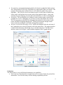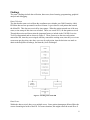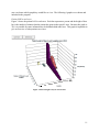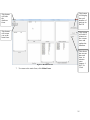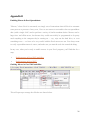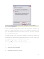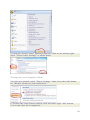
1
University of Michigan Health System Program and Operations Analysis Creating a Multi-Dimensional Tracking Chart for the University of Michigan Emergency Department Project Final Report To: Jeff Desmond, MD, Service Chief, Adult Emergency Medicine John Younger, MD, Associate Chair for Research Steven Kronik, MD, Associate Service Chief, Emergency Department CC: Sam Clark, IE Lean Coach, Program and Operations Analysis Mark Van Oyen, Industrial and Operational Engineering Faculty From: IOE 481 Project 3 Team, Program and Operations Analysis Chris Chang Josh Hiemstra Robert Kahn Nicole Roels David Ruebenson Date: April 27, 2009 1 Table of Contents Executive Summary ........................................................................................................................ 3 Introduction ..................................................................................................................................... 6 Background ..................................................................................................................................... 6 Key Issues ....................................................................................................................................... 6 Goals and Objectives ...................................................................................................................... 7 Project Scope .................................................................................................................................. 7 Findings........................................................................................................................................... 8 Selected Graphs ............................................................................................................................ 10 Limitations .................................................................................................................................... 20 Expected Impact............................................................................................................................ 20 Recommendations for Real-Time Data Team .............................................................................. 20 Appendix A ................................................................................................................................... 22 Appendix B ................................................................................................................................... 26 References ..................................................................................................................................... 32 2 Executive Summary This project is a detailed account of the analysis of the patient flow at the University of Michigan’s Emergency Department (ED) and the proposed framework for real time snapshot display of patient flow. Jeff Desmond, Service Chief of Adult Emergency Medicine, and John Younger, Associate Chair for Research, asked the team to provide data analysis and to develop a preliminary framework of a multidimensional graphical display to help with the development of an automated programming tool for patient flow in the Adult Emergency Department. The overcrowding in the ED has been reported as an ongoing issue, which has resulted in many patients not receiving care in a timely fashion. A real time graphical chart of patient information can assist in the discovery of bottlenecks in the process flow of the ED. The patient information necessary to create this display would need to include the patient’s status in the ED and the time spent in each designated location. The purpose of this project was to analyze the previous year’s patient flow data while researching different display techniques to develop a multidimensional graphical display. Background The ED at the University of Michigan currently does not have a way to display patient flow. The implementation of a graphical display system could improve the flow of patients through the ED. The display would assist in finding bottlenecks in the current system and would provide the current patient flow status of the ED. Methodology Many different methods were used during this project. All of the team’s activities and their explanations are listed below. • Collected data on patient flow. Sam Clark, project coordinator, provided calendar year 2008 Centricity Adult Main ED data. The data provided time stamps of the patient flow through the ED which was separated into the following steps: arrival, triage, waiting room, in exam room, with physician, decision discharge or admit, and “discharge” from ED. • Data Errors. The data had quality problems which varied between invalid entries to blanks in the data set. The following were different situations found in the data set. o The data did not follow proper chronological order with an example being that the time stamp of a patient’s discharge was before that patient was seen by a physician. o Empty cells in spreadsheets o Inaccurate data entry which led to outliers in the patient flow. • Data Cleansing. The 2008 data provided contained errors and nulls that needed to be eliminated. Patients who never saw a physician (LBE’s) were removed from the system. All data was rearranged to follow the chronological order of the patient flow. In the case of a null value, the patient’s data was analyzed based on a set of assumptions to determine the accurate timestamp to fill that null. The time stamp creates a chronological flow to accurately mimic the patient’s flow through the ED. If a patient did not have a discharge time, the patient’s information was removed. 3 • • • Programming. A programming language had to be chosen to graphically display patient flow. Microsoft Excel 2002 (sp3) Visual Basic for Applications (VBA) was chosen. This program allowed the team to analyze data as well as generate graphs using various algorithms. 2002 VBA for Excel was chosen because it was the most available to the clients, and it could perform the necessary tasks of the graphical display. Along with choosing the proper language, the team had to determine how to code in each language. Debugging. The code needed to be validated to ensure that the graphs created by the program were correct. Debugging was necessary to ensure the program ran correctly. The VBA program provided tools for debugging that included a watch window, break points, and allowed stepping through code. Testing of the program through outside sources and fool proofing the code further debugged the program Interface selection and developing visuals. Iterative development led to the selection of the 9 graphs that were selected to properly reflect the patient flow. The graphs needed to contain useful information while being easy to read and understand. The Main Form interface can be seen in Figure 1 and it includes snapshots of the 9 graphs chosen. Figure 1: Main Form interface Limitations The final product is very useful but has limitations to its capabilities. • Excel only has a limited number of graphs that can be created to display the patient flow information. Excel also has many versions making compatibility an issue. 4 • • Dirty data led to interpretations of the data which was cleansed and converted manually. This process cannot be performed in real time with the current program. Implementation of the graphical display into the ED is not possible with the final product. The final product is a desktop application and not a screen saver. Also, this instrument only has Adult Main ED data loaded in. Recommendations The final product, an ED Overview program, shows that a display tool is possible to create. This program provides the preliminary framework for an automated monitoring system and has the ability to display non normalized data. The team would recommend to a real time data team that the program be reworked to function with real time data. The new program should store additional hourly data on real time, implement real time data cleansing, and verify accuracy of the data as much as possible. This would allow faculty and staff at the hospital to reduce overcrowding and fix bottlenecks in patient flow. 5 Introduction Emergency department (ED) overcrowding has been reported as an ongoing issue at the University of Michigan (UM). EDs treat patients with injuries, illnesses or severe pains that require urgent attention. However, overcrowding causes some patients to not get care in a timely fashion. The first step to avoiding overcrowding in the ED is to understand and document the patient situation in the ED, however, there are currently no visual displays to provide a snapshot of the current patient situation of the ED. A real time graphical chart of patient information, including the patient’s status in the ED and time spent there, can assist in the discovery of bottlenecks in the process flow of the ED. An effective chart will divide the patient visits into the following steps: arrival, triage, waiting room, bed pre Medical Doctor, bed post MD, and discharged and waiting. Using previous year patient flow data, the team developed multidimensional graphs for the ED display to show snapshots of changes in patient status. This report presents the design of this monitoring system. Background A hospital ED is one of the most vital components of any health care institute, providing treatment to a broad spectrum of illness or injuries that may require immediate attention. Overcrowding in the ED has become an increasingly significant problem in hospitals throughout the U.S. The implementation of a monitoring system that could help improve the flow of patients through the ED in the long term provides the current status of the ED. The users of this chart will be the doctors and nurses. They will be able to get a sense of where bottlenecks may be occurring in the ED. With the knowledge of where the bottlenecks are occurring, the doctors and nurses can take action to try to eliminate the bottleneck. The steps in the patient process that will need to be monitored are: • Arrival –Begins when a patient is finished registered at the front desk, and ends when a patient enters Triage • Triage –Begins when a patient enters triage (severity assessment) and ends when a patient enters the waiting room • Waiting room – Begins when a patient enters the waiting room and ends when a patient is given a bed • Bed pre-MD –Begins when a patient arrives to a bed and ends when the MD arrives • Bed post-MD –Begins when the MD leaves and ends when the patient is discharged • Discharged – Begins when a patient is discharged and ends when o The patient is admitted to the hospital o The patient is leaves the ED Key Issues The following factors are key issues that drove the need for this project: • There is no real time visual display tool used at the UM ED 6 • It is difficult to know where the bottlenecks occur in the ED Goals and Objectives To develop a preliminary framework for a patient flow monitoring system the team: • Documented patient flow through the UM ED • Obtained, validated and analyzed relevant ED data to determine which charts should be included in the display With this information the team: • Developed the UM ED Overview Tool which consists of a display to allow for quick analysis of the ED status from 2008 Project Scope This project included the patient processes of the Adult Main ED at UM. The project examined the location of patients and how long they are at each location. The patient flow through the ED was separated into the following steps: arrival, Triage, waiting room, bed pre-MD, bed post-MD, and discharged. These steps range from when a patient enters the ED and is registered to when the patient is released from the ED. The project included development of a visual display to show the status of the ED, which included the status of each patient. Figure 1 gives a visual description of the scope of the project. The parts highlighted in yellow are things that were completed to create the ED Overview Program. The scope included historical data, excel, data cleansing, and graphical development. This project did not include any hospital operations or processes outside of the Emergency Department. It did not include any inpatient or outpatient departmental processes. The display was not designed to be used with any real time data. It was developed using data from 2008. Implementation of the UM ED monitoring tool was not included. Validation of current data was included in the project, but the team did not collect any raw data. Figure 1: Project Scope The scope did not include: • Staff workflow patterns • Staff workflow analysis 7 Findings The team’s findings include data collection, data errors, data cleansing, programming, graphical analysis and debugging. Data Collection The data that the team received from the coordinator was calendar year 2008 Centricity Adult ED Main data and was presented in an Excel format. It gave data for each patient that entered the Main ED. This data was received by time stamps. When the patient entered one of the new states, a time stamp of this time was recorded. There was a total of 55,146 data points received. Through discussion and observation the important factors to include in the UM ED Overview Tool were determined and are shown in Figure 2. These factors were the time each patient entered the ED, time they were triaged, time they entered the waiting room, time they were in an exam room pre-physician, time they were seen by a physician, time the decision was made to admit to the hospital or discharge, and time they were discharged. Figure 2: Tracking states in the ED Data Errors Within the data received, there were multiple errors. Some patient timestamps did not follow the correct chronological order of the ED. For some situations, this might reflect the actual flow of 8 that patient through the ED. For example, a patient may be rushed into the exam room before being triaged. This patient would not be following the chronological order of the ED. However, due to the large amount of data the team had to make the assumption that this was a data error. Another example is when a patient departs before they are seen by a physician. Also, a patient should never be in the ED department for more than three days. Table 1 gives the summary of data errors. Along with data not following the chronological order of patient flow, there were many nulls where timestamps were supposed to be. This inaccurate data entry has led to many outliers in the analysis of patient flow. Table 1: Data Errors Data Cleansing For the program to run accurately, these data errors need to be cleansed. • • • If a patient didn’t have a time stamp for the most important parts of patient flow, then they were deleted due to inaccurate data entry. These included all of the patients who were missing one or more of the following time stamps: arrival, in exam room, seen by a physician, and departure. All of the patients which were left before exam (LBE) were deleted. If a patient’s in exam room time, with physician time, or departure time was before their arrival time, then this patient was deleted. 9 • • • • • • If a patient’s with physician or departure time was before their in exam room time, then this patient was deleted from the data set. If a patient’s departure time was before their with physician time, this patient was deleted. For triage time and waiting room time, if there was no time stamp then the arrival time was entered. If the triage time or the waiting room time was greater than the in exam room time, then the arrival time was used for this time stamp. If the decision to admit or decision to discharge were after the discharge time, then the patient’s discharge time was entered for either decision to admit or decision to discharge. If a patient had been in the ED for a total of 3 days they were deleted from the data set. These cleansing steps deleted the errors and made each patient follow the system chronologically. Programming Language A programming language had to be chosen to graphically display patient flow. Microsoft Excel 2002 (sp3) Visual Basic for Applications (VBA) was chosen. This program allowed the team to analyze data as well as generate graphs using various algorithms. 2002 VBA for Excel was chosen because it was the most available to the clients, and it could perform the necessary tasks of the graphical display. Along with choosing the proper language, the team had to determine how to code in each language. Graphical Analysis Graphs from the data were created to display the current situation in the ED. The team created graphs to visually show the situation. Multiple graphs were created for the clients to choose the best for them to look at the graph and know quickly what currently is happening. The graphs the team created are in the appendix. Debugging The code needed to be validated to ensure that the graphs created by the program were correct. Debugging was necessary to ensure the program ran correctly. The VBA program provided tools for debugging that included a watch window, break points, and allowed stepping through code. Testing of the program through outside sources and fool proofing the code further debugged the program. First, outside sources were asked to evaluate the ease of use of the program. Next, they were asked to try to break the code to assist with the debugging. Selected Graphs Based on meetings with the clients and careful consideration 9 graphs were chosen to be included in the ED Overview Program. These 9 graphs are clickable in the program so that the 10 user can choose which graph they would like to view. The following 9 graphs were chosen and included in the program: Patient LOS in each area Figure 3 shows the patient LOS in each area. Each bar represents a person and the height of that bar is the number of minutes that the patient has spent in that specific area. Because this graph is 3D, it is possible for some information to be hidden behind other bars. This graph is important to give an overview of what patients are where. Figure 3: Patient length of stay in each location 11 Patient Cumulative LOS in Each Area Figure 4 shows the cumulative LOS for each patient. Each bar represents a person and the height of the bar is the total amount of time that the patient has spent in the ED. The previous graph, Figure 4 showed the amount of time in the area, while this one shows the amount of time spent in the ED. From this graph once can also see the locations that the patients are in. This graph is important in helping pinpoint which patients have been in the ED for a very long time. Figure 4: Total length of stay for each patient and current location 12 Patient LOS by Three Intervals Figure 5 shows the patient LOS with the ED visits split into three intervals: Arrival to Exam Room, Exam Room to Physician, and Physician to Discharge. Each bar represents a patient and the height of the bar is the amount of time that the patient has spent at that interval. Figure 5: Patient length of stay for selected intervals 13 Individual Graphs Figure 6 shows seven individual graphs to represent patient LOS in those seven areas of the ED. It doesn’t show any additional information when compared to Figure 3, but because all of the information is side by side, no information is hidden from the viewer. It takes longer to understand what these graphs are showing because the scales are all different. Had all of the scales been set to be the same and the graph areas set to be the same, a lot of information would be lost because the scales would be inappropriate for the data. Figure 6: Patient length of stay for each location 14 Patient Count in Each Area Figure 7 shows the patient count in each area. The x-axis has the names of the areas and the yaxis shows the number of patients in each area. Figure 7: Number of patients in each area 15 Box plot of LOS Figure 8 shows a box plot of the LOS’s of all adult patients in the main ED. This graph is important because it shows the long tails and outliers. The tails show the range of patient LOS in each location. The box shows the 25th and 75th percentile. The “x” in the box shows the median. Figure 8: Box plot of patient length of stay by location 16 Average LOS by Hour Figure 9 shows the average LOS by hour of the day along with the 95th and 5th percentiles. The 95th and 5th percentiles are based on the last 30 days of data. The average LOS is calculated by taking the ED LOS for each patient currently in the ED and averaging them. This graph allows comparison of the data and hour with the previous 30 days at the same hour. Figure 9: Average length of stay compared to 5th and 95th percentile 17 Total LOS by Hour Figure 10 shows the total LOS by hour of the day along with the 95th and 5th percentiles. The 95th and 5th percentiles are based on the last 30 days of data. The total LOS is calculated by taking the ED LOS of all patients currently in the ED and adding them up. This graph allows comparison of the data and hour with the previous 30 days at the same hour. Figure 10: Total length of stay compared to 5th and 95th percentile 18 Number of Patients by Hour Figure 11 shows the number of patients in the ED by hour of the day, compared to the 95th and 5th percentiles as calculated from the last 30 days and plotted by the hour. This graph allows the viewer to see how the ED census compares with the percentiles from the last 30 days. Figure 11: Current census compared to 5th and 95th percentile Assumptions for Percentile Graphs A sample of 30 data points was used to create the 5th and 95th percentiles in figures 9, 10, and 11. The small sample size of 30 data points allows for more outliers to be found above and below the 5th and 95th percentile. Because 30 data points are needed to create the 5th and 95th percentiles, this graph cannot be created until after February 15. The small sample size was used because a larger sample size would need more data points and prevent development of these graphs until further into the year. With the limited number of only 2008 data, 30 days was the most appropriate. Program The final product is an ED Overview program. The program allows users to chose a date and time from 2008 and click on any of 9 buttons to view different graphs. Each graph shows a different aspect of the ED at that time (see the attached User's Guide). The program is robust and other ED data could be added to the file. 19 Limitations This project can be very useful to the ED but there are still many limitations to its capabilities. The program that was chosen, Excel, is limited in the capabilities and options that are available. Excel only has a limited number of useful graphs that could be chosen from its arsenal. If another program was chosen, more dynamic and useful graphs could have been chosen. Excel also has many different versions that run differently. The differences in Excel versions cause it to further limit Excel’s functionality. Most of the code and macros are alike across versions but some of it has to be changed so that the program can run properly. The data used in this project is another limitation. The data that was given to the team was dirty data. Dirty data refers to the fact that there were many nulls and errors in the spreadsheets. The errors and nulls caused the team to interpret the data which might not properly reflect the actual situation being shown in the data. By cleaning the data so that it could be used in creating a display board, useful data points could have gotten lost. The cleansing was up to the team’s discretion. A cleaner and more accurate set of data would eliminate the need for interpretation and would more properly reflect the patient flow through the ED. The last major limitation to this project is the problem with actual implementation of the final product. As discussed above, there are real time data problems that would have to be corrected as the data is entered into the database. New code or a new programming language would have to be used to fix real time errors. Another limitation to the possibility of implementation is that the display created is a desktop application and not a screen saver. Therefore, this display could not be streaming real time throughout the ED. The code was created to only analyze historical data and provide a proof of concept for an actual screen saver used in the ED. The team was only given 2008 Adult Main ED data but the program has the ability to function with additional data that could include other areas of the ED. The data included in the project did not include MEDPATH or any other subsidiary department of the ED which could cause changes in the Adult Main ED. Expected Impact The team provided a program with charts to display the patient flow status in the Adult Main ED. The program provides a foundation for development of a real-time display that will be able to retrieve data from other systems and automatically update so a current snapshot of the ED will always be available. This display will have the capabilities of showing the non normalized data of the ED. This snapshot will help reduce bottlenecks in the patient flow in the ED by making them easily recognizable to staff. The discovery and reduction of bottlenecks will aid in the process of the improvement of overcrowding. Recommendations for Real-Time Data Team The scope of this project didn’t include any real-time data so it is necessary to make recommendations from the findings. These recommendations will help the real-time data team develop a real-time program more easily. The program will need to be reworked to receive and function with real time data. To assist with development of a real-time tool, a user’s manual is 20 included in Appendix A and the programming code has been commented. To run the program in Excel, Macros must be enabled and the steps to do that are included in Appendix B. Data Cleansing When cleansing the data, the team made many assumptions previously mentioned in the findings. When the program is running in real time, many of these assumptions cannot be made. Store Additional Data To calculate the 95th and 5th percentiles for the graphs, the values had to be calculated ahead of time and stored in a separate column of Excel. However, if the values could be continuously updated as the data is being collected no additional time would be added in developing graphs. Verify Accuracy of Data Because the program will be running in real-time, data will need to be collected accurately. It will be very important that the time stamps are correct because people will be using the program as an assistant in recognizing bottlenecks. If the data is incorrect, false assumptions will be made about how the ED is running. 21 Appendix A To Operate the ED Overview Program You must enable macros in Excel for the program to work. If you do not know how to enable macros, please follow the directions in the attached PDF called “Enabling Macros in Excel”. Developing Graphs The ED Overview Program allows you to view ED data from a chosen date and time in 9 different graphs. 1. Open the ED Overview Excel Program. 2. Click Open Main or press ctrl+shift+R on the keyboard. 3. Adjust the list boxes shown in Figure 1 to the date and time that you are interested in viewing graphs from. Adjust them in this order: Month, Day, Hour, Min. Figure 2: Date entry 4. 5. Click Submit Date. Wait until the occupancy has been updated in the upper right corner of the form. 22 Figure 3: Main Form 6. 7. 8. Click one of the 9 graph images. Wait until the Main Form disappears and the appropriate graph is generated. There are two buttons visible on the graph as shown in Figure 3. Click Open Main Click Delete Graph Opens up the main form without deleting the current graph. You will be able to pick another date if you want and develop another graph. Opens up the main form and deletes the graph. You will be asked again if you would like to delete the graph. The main form will open up after you have deleted the graph. 23 Figure 4: 3D LOS Graph Viewing the Database By viewing the data base you can see patient numbers. This will help you pinpoint the patient that is causing problems in the system. 1. Open the ED Overview Excel Program 2. Click Open Main 3. Adjust the list boxes shown in Figure 4 to the date and time that you are interested in viewing graphs from. Adjust them in this order: Month, Day, Hour, Min. Figure 5: Date entry 4. Click Submit Date. 5. Wait until the occupancy has been updated in the upper right corner of the form. 6. Click Database. Figure 5 shows the Database form. Here you can see which patient is in which area. Using the Plus 15 button or changing the value in the date/time box will not adjust the time in the Main Form. Also, you can’t generate graphs from the Database form. 24 This button will display the total number of patients in the ED This button will hide the database form. This button will return you to the main form. This button will add 15 minutes to the current time and update the database. Figure 6: Database Form 7. To return to the main form, click Main Form. This shows the current date and time, in minutes since January 1 2007, at 12am. 25 Appendix B Enabling Macros In Excel Spreadsheets "Macros," where Excel is concerned, are simply sets of instructions that tell Excel to automate some process or processes. In my case, I love to use macros to sort and/or clear out spreadsheet data (with a single click!) and to perform a variety of similar mundane duties. Macros can be huge time- and effort-savers, but because they could conceivably be programmed to do pretty much anything to the computer they're running on — say, wipe out the hard drive, or even something worse — we have to be very careful with the Excel macros we run. You always want to verify a spreadsheet macro's source, and make sure you trust the soul who created the thing. In any case, when you're ready to enable macros in your Excel program, you'll find that it's a snap. Enable macros in Excel 2003 and older. Enable macros in Excel 2007. Enabling Macros in Excel 2003 and Older 1. In your Excel menubar, click TOOLS —> MACRO —> SECURITY, as shown below. This will open up a message box like the one shown below. 26 2. Select your macro Security Level: either "Medium" (recommended) or "Low" (not recommended). Checking the radio button beside "Medium" (which is what I'd recommend) means Excel will prompt you for permission each time a macro tries to run. Checking the radio button beside "Low" (not something I'd encourage!) means Excel will have free reign to run any and all macros in the spreadsheets you open. You might notice the words "Virus scanner(s) installed" in the bottom left corner of that screenshot. Having a good antivirus program running at all times is a great idea; having a good antivirus program running when you're using Excel macros is a must. Still Not Working? There May Be an Excel Quirk at Work. 1. Complete the procedure above, then save and close your spreadsheet. 2. Close Excel completely. 3. Reopen Excel and your spreadsheet 4. Complete the procedure above once more. 27 5. Save and close Excel again. 6. When you open Excel the next time, your macros should be operating normally. Yeah, it's odd, but I find that in Excel 2003, I usually have to change the security settings, save, and close Excel a couple of times before the changes take effect. It's annoying ... but that's life, right? Enabling Macros in Excel 2007 1. In Excel, click the Office button in the upper left corner of the screen. The "Office Button" is the fancy button with the colorful Office logo. Click it to open the menu shown in the next step. 2. Click the "Excel Options" button in the lower right. 28 3. Click the "Trust Center" button on the left. Then, at the bottom right, select "Trust Center Settings" as shown below. The image above can be enlarged by clicking. 4. In the next window, select "Macro Settings," then select the radio button for "Disable all macros with notification." 5. To close the Trust Center window, click the lower right "OK" button. 6. Save and close Excel completely. 29 7. Reopen Excel and your spreadsheet (one with macros, anyway). Now there should be a SECURITY WARNING notification beneath the Office ribbon, as shown in the next step. 8. In the SECURITY WARNING banner, click the "Options" button. 9. Select the radio box beside "Enable this content," then click "OK." After you click "OK" and the window closes, your macros should function normally. Because you selected "Disable all macros with notification" in Step 4 above, you will need to follow Steps 8 and 9 each time you open a spreadsheet that contains macros (if you want the macros to run, that is). Alternately, in Step 4 above, you could select "Enable all macros." This would allow any and all macros to run freely at all times. But I would not suggest it! Don't do this unless you are ABSOLUTELY SURE you won't be downloading or using unsafe spreadsheets (and by 30 extension, macros) from ANY source! Malicious macros and Active-X controls can do serious damage to your computer and/or network! 31 References "Enabling Macros in Excel Spreadsheets @ Moneyspot.org." It's Your Money! Personal Finance, Debt, and Budgeting Steps and Spreadsheets. Sonata Creations, LLC. 26 Apr. 2009 <http://www.mdmproofing.com/iym/macros.php>. "Visual Basic sample code - Functions for calculating the Min, Max and StdDev - Source code examples."Happy Codings - Visual Basic Programming Sample Code Source Code Search Engine, Code Examples. Happy Codings. 26 Apr. 2009 <http://www.visualbasic.happycodings.com/Applications-VBA/code8.html>. 32