1
CUE Rules
Comparative Usability Evaluation
1. Purpose
The purpose of the comparative evaluation is to provide a survey of the state-of-the art
within professional usability testing.
Six usability labs have agreed to carry out a professional usability test of a commercial
calendar program for the Microsoft Windows platform.
2. Project Plan
a) If you have any comments on this proposal, please let me know immediately. If you
have no objections please send me your approval. Send comments or approval to me
by e-mail as soon as possible, and before Tuesday 02 December 1997.
b) Inform me before Tuesday 09 December 1997 of the starting date that suits you best
for your usability test. The starting date must not be later than Monday 16 February
1998.
c) Approximately one week before the starting date you will receive from me a
demonstration version of a commercial calendar program, Task Timer for Windows
(TTW).
The demonstration version consists of an envelope containing a standard diskette, an
introductory folder (eight pages in A5-format) and an order form. The only limitations in
the demonstration version is that it can be started only fifty times, and that the
networking functions are disabled.
d) Your task is to carry out within three weeks a usability test in accordance with your
company's standard procedures and write a usability test report for Time/system. Use
the Usability Test Scenario in section 3. If you have questions to the customer that are
not answered by the usability test scenario, please send them to me after reading
section 7 carefully.
You are free to perform any activities that you deem necessary in addition to the
usability test if you consider it beneficial for the cost/benefit ratio. If you perform
additional activities, please make sure that you distinguish clearly between these
activities and the usability test in your reporting of resources.
e) Within three weeks of the starting date send the deliverables listed in section 4 to me
using e-mail. Send reports as attached files. Microsoft Word 6 or Word 97 format
preferred.
f) As soon as I have received all deliverables from you I will distribute the anonymous
usability test reports to each of you and ask for your comments and general
observations. I will also send the anonymous reports to a few additional people with
expertise in the field and ask for their comments. If I have not received all reports on
Tuesday 10 March 1998 I will distribute the reports I have received to those teams that
are finished by this time.
g) Based on the comments I receive from you and on my own observations, I will put
together a brief paper for the UPA98 panel, summarizing the major findings of the
comparative evaluation.
I welcome comments on the paper or brief statements from each of you that will be part
of the paper. I will attempt to produce a version for review approximately ten days
before the deadline.
Rolf Molich, DialogDesign, 24 November 1997
Page 1
Comparative Usability Evaluation
The UPA98 deadline for the paper is Wednesday 01 April 1998.
3. The Usability Test Scenario
Time/system ® is a Danish company that manufactures and distributes paper calendars. In
the fall of 1994 Time/system released Task Timer for Windows version 2 as a computer
version of the paper calendar.
The primary user group for TTW is professional office workers, typically lower and middle
level managers and their secretaries. Time/system also offers the demo version of TTW
freely to anyone at hardware and software exhibitions, conferences, and ”events”, e.g.
Microsoft presentations. Time/system hopes that the demo version will catch the interest of
people who pick it up by chance.
TTW is intended for users who have a basic knowledge of Windows. Familiarity with the
paper version of the calendar or with other electronic calendars is not required.
Time/system is planning to send out version 3 of TTW in April 1998. However, their sales
staff have heard negative comments about users' initial experience with the program, and
TTW faces stiff competition from other programs, like Microsoft Schedule.
They have therefore asked you to perform a cheap usability test involving e.g. five typical
users to test the usability of the software for new users of the product.
Task Timer for Windows is a diary, task and project management program for individuals
and work groups. To reduce cost, you have agreed with Time/system to focus mainly on
the diary and address book functions for individuals. In other words: Do not test task
management, project management, networking functions, etc.
4. Deliverables from You
You should deliver to me
- A usability test report for the developers of TTW
- An addendum to the usability test report
The usability test report should appear in your company's standard format except for one
thing: The name of your company should not be directly or indirectly deducible from the
report. If you do not have a standard format, please use a format that you consider
appropriate for this task.
You may chose later to break the anonymity but I suggest that all published material is
anonymous because the purpose of the comparative evaluation is not to select a "winner".
In the addendum please answer the following questions:
- Deviations from your standard usability test procedure.
- Resources used for the test (person hours).
- Comments on how realistic the exercise has been.
Rolf Molich, DialogDesign, 24 November 1997
Page 2
Comparative Usability Evaluation
5. About Task Timer for Windows
TTW runs under Windows 3.x and Windows 95. TTW is marketed and distributed by
Time/system. It was written for Time/system by the Danish company DSI.
In the real world, Time/system has recently issued version 4 of the program for Windows
95. My rationale for suggesting version 2 for this exercise is that
• Time/system can argue that all of the usability problems pointed out in your reports
have been corrected in later versions of the software.
• Approximately 100 Danish university students in an introductory human factors course
have extensively tested version 2 (in Danish), and I would like to be able to make a
rough comparison between professional and student usability testing.
Time/system is not one of my clients. I have informed them in writing about this use of their
software for usability testing, and I have obtained their consent. This includes public
showing of video tapes of tests etc.
6. Publication of Results
I have submitted a proposal for a panel at UPA98 to discuss the findings of this study.
Participation in this exercise involves no obligation for anyone but me to participate in
UPA98 - although a seat has been reserved for each of you at the panel. UPA98 has
confirmed the receipt of the submission. Acceptance or rejection of the panel is due on 15
January 1998.
In addition to conducting the UPA Panel I will attempt to produce a paper for a recognized
refereed journal about our survey. If a refereed paper comes out of this effort, one person
from each of the actively participating usability labs will be listed as a co-author.
7, Open-Ended Study
A number of reasonable questions are deliberately left unanswered in the above
description of the study. Examples:
• What are the exact goals of this study from Time/system’s point of view?
• What is a ”typical” user? What is ”basic knowledge of Windows”?
• How much should be included in the usability report?
For each of these questions please make your own assumptions in accordance with the
limited information provided in this document. Document your decisions in the usability
test report or in the addendum. The scenario is: When you ask the customer
representative from Time/system about his opinion, he will reply that he knows too little
about usability to answer your question, and that this is a pilot study, and that he asks you
to do the best possible job with respect to cost/benefit and the time limit. In other words:
Act as you would if you had little or no in-person contact with the client.
The real answer is that these are some of the problems that we want to survey.
Rolf Molich
24 November 1997
Rolf Molich, DialogDesign, 24 November 1997
Page 3
Comparative Usability Evaluation
Appendix 1. List of participating organizations
Nigel Bevan, National Physical Laboratory (UK)
Scott Butler, Rockwell Software
Mary Beth Rettger, The MathWorks (withdrew)
Jurek Kirakowski, Human Factors Research Group (Ireland)
Dick Horst, Userworks (withdrew)
Erika Kindlund, Sun Microsystems – Java Soft Division
Rolf Molich, DialogDesign, 24 November 1997
Page 4
Team A
Task Timer for Windows
Evaluation by CO. X.
Author:
[deleted]
Date: 13/3/98
Document ref:[deleted]
Task Timer for Windows Evaluation by CO. X.
Page 1 of 40
Summary of Findings and Recommendations
•
•
•
•
•
•
•
•
The screen layout was positively commented on by the users: this is a strong feature of the software.
Cancel/ Delete operations should be made clearer. Users have difficulty finding how to carry them out as they are.
Icons: the icons are not always obvious. Of particular concern were icons to add/edit new database entries, and all
the phone number icons apart from the 'work phone number' icon (which was comprehensible.)
Error messages are lacking in context. They must be contextualised to allow the user to understand how to get out
of the error situation.
The introductory documentation is too terse, and badly laid out. Some users, for instance, didn't find the list of
icons and their explanations at the back.
Experienced Windows '95 users found interacting with the software less effortful than did users with Low
Windows '95 experience. Overall, mental effort was considered to be 'somewhat effortful'.
The software as a whole has a low usability profile, generally below the market average. Experienced windows
users found it a little more satisfying to use than did users with Low Experience of windows. The strongest
element of Task Timer was that the users quite liked it: this score (SUMI Affect, or Likeability) came in above the
market average.
Users reported however that they did not enjoy using the software and that they would not recommend it to others.
This, together with the poor usability profile overall is not a good omen for software which is designed for
discretionary use in a competitive market. If the software is to be released as it is, then pricing and market
penetration strategies must be addressed.
Task Timer for Windows Evaluation by CO. X.
Page 2 of 40
Table of Contents
Summary of Findings and Recommendations .....................................................................................2
Summary of Document...........................................................................................................................4
Introduction to the Evaluation of Task Timer for Windows. .............................................................5
Results......................................................................................................................................................6
Mental Effort ........................................................................................................................................6
Subjective Usability..............................................................................................................................6
Critical Incidents...................................................................................................................................7
Conclusions..............................................................................................................................................8
Appendix 1: Context of Use Analysis ....................................................................................................9
Appendix 2: List of Tasks ....................................................................................................................11
Appendix 3: Overview of Metrics........................................................................................................11
Appendix 4: Outputs from SUMISCO ..............................................................................................11
Total Dataset.......................................................................................................................................11
Experienced User Subset ....................................................................................................................11
Low Experienced User Subset............................................................................................................11
Appendix 5: Critical Incident Analysis...............................................................................................11
Negative Comments............................................................................................................................11
Summary.............................................................................................................................................11
Positive Comments .............................................................................................................................11
Appendix 6: Costings and Background ..............................................................................................11
Resources Used...................................................................................................................................11
Deviations from standard procedure...................................................................................................11
Realism of exercise.............................................................................................................................11
Background to study ...........................................................................................................................11
Task Timer for Windows Evaluation by CO. X.
Page 3 of 40
Summary of Document
The Summary of Findings and Recommendations lists the eight main findings and action points arising from the
evaluation of Task Timer for Windows carried out by Company X in March, 1998.
The Introduction to the Evaluation of Task Timer for Windows describes the Context of Use analysis carried out by
CO. X.. Usually this would be checked by discussion with the organisation which commissioned the evaluation. The
analysis drew from the description provided by Prof Molich in his introduction to the comparative study. The Context
of Testing is described in this section, and the various metrics used in the evaluation are also listed here.
The Results are divided between the data for Mental Effort, Subjective Usability, and Critical Incidents. The data
which led to the recommendations made at the start of the document are highlighted in this section.
The Conclusions summarise the obtained findings in a general way and include comments from users which were
considered too important to be left to the appendices.
Appendix 1 is the Context of Use analysis, carried out using the CO. X. version of [deleted].
Appendix 2 is the List of Tasks as given to the users to carry out.
Appendix 3 is a statistical overview of the metrics collected during the evaluation.
Appendix 4 is the SUMI report, edited from the SUMISCO (scoring program) output.
Appendix 5 is the listing of the Critical Incidents and their analysis
Appendix 6 is a statement of various items of information required for the study and a copy of the background material
to the study (not included in commercial report).
Task Timer for Windows Evaluation by CO. X.
Page 4 of 40
Introduction to the Evaluation of Task Timer for Windows.
The Task Timer package, consisting of the setup software and a user's manual, was sent electronically to CO. X.. It was
set up on a computer in the CO. X. office, where there is a fair amount of normal office activity. CO. X. conducts
usability analysis mainly by employing representative user samples to carry out typical tasks under realistic work
conditions.
Following the description given by Prof Molich, the Context of Use was analysed (see Appendix 1), and the following
conclusions about usage and testing were made:
•
•
•
•
•
•
•
•
The product should be tested either in a home environment or a normal office environment.
Users should be of two varieties: those with experience of using windows '95 in their professional work, and those
with some familiarity with Windows '95.
Users would be recruited from [deleted] offices and other local business offices. They would be paid a small sum
for their participation.
The software should be tested in its standalone version, that is, not connected to a network of other users.
Since the first opinion is likely to be critical, users' first experiences with the software only should be tested. The
information manual supplied by Task Timer would be pointed out to users in a neutral way.
All users would approach Task Timer when it is running, with the Appointments screen displayed, and approx. 20
entries in the contacts database.
Users would be given a list of tasks to carry out (see Appendix 2) and on completion of the tasks, a number of
metrics would be taken. These are summarised below.
The evaluator would not interfere with the users; the first time the user asks for help, the evaluator would direct the
user to the documentation; the second time, the evaluator would provide the needed help verbally.
The following measures were taken:
•
•
•
•
The total time on task (including queries and search time when looking at the manual) was measured.
The SMEQ questionnaire from the Technical University of Delft was administered, to measure the amount of
mental effort users felt they had expended.
The SUMI questionnaire from HFRG, Cork, was filled out to measure user satisfaction, and to gain an overview of
the general problems users identified with the software.
Users were asked to fill out a short Critical Incident report, summarising one good and one poor feature of the
software.
Time taken to recruit the users was minimal since they form part of an informal 'user panel' for CO. X. evaluations.
Average time for completing the tasks was about 20 minutes, and total time spent by each user in the evaluation was
targeted at 30 minutes, an allowance of 30 minutes travel was made in the fee paid the users. The slowest user took 32
minutes to complete the tasks; the fastest, four minutes.
In all, 10 Experienced users took part in the evaluation (ie, users who considered themselves to be 'Experienced in using
Windows '95 in a work situation'), and 9 Low Experienced users (ie, users who considered themselves to have 'some,
but not much, experience in using Windows '95 in a work situation'). Data was lost from one 'Low Experienced' user
thus bringing the total to 10 Experienced and 8 Low Experienced.
Task Timer for Windows Evaluation by CO. X.
Page 5 of 40
Results
Mental Effort
The SMEQ Mental Effort rating scale produces values of rated mental effort from a score of 150, which is somewhere
above the verbal anchor 'tremendously effortful' down to zero, which is just below the verbal anchor of 'not at all
effortful'.
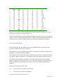
The two separate groups of users produced the following mental effort data:
User Group
Experienced
Low Experience
SMEQ
35
46
Position on scale
less than 'somewhat effortful'
more than 'somewhat effortful'
It would appear that the Low experienced in Windows '95 group experienced greater amounts of mental effort in
carrying out the tasks with the software. The difference between the two is approximately half an expected standard
deviation for SMEQ (following data from [deleted] ) which is considerable. Overall, the rated mental effort is less than
that expected from a web-site providing tourist information and more than that expected from a simple text-processor.
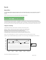
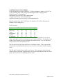
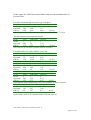
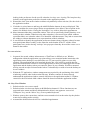
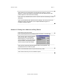
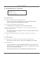
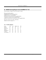
Subjective Usability
The SUMI questionnaire provides numeric assessments on the following scales:
Efficiency: degree to which user feels he gets his work done well with the system
Affect: degree to which user feels the system is enjoyable and stress-free to use
Helpfulness: degree to which user feels the system helps him along
Control: degree to which user feels in control of the system, rather than vice versa
Learnability: degree to which user feels he can learn new operations with the system
There is also a Global usability score, which is a combination of items from each of the above scales.
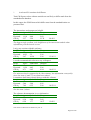
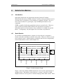
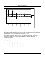
Appendix 3 gives the detailed SUMI outputs for the data. This section brings out the highlights from this analysis.
70
60
50
40
Exper
Less Exp
30
20
10
0
Glob
Effic
Affect
Helpf
Contr
Learna
Task Timer for Windows Evaluation by CO. X.
Page 6 of 40
•
•
•
SUMI scales are so arranged that 50 is the value to be expected on all scales from software which is currently
commercially available; the expected standard deviation is 10, so that the score of 40 on Helpfulness for the Low
Experienced users represents a significant drop from the market average, likewise, the scores of over 60 on Affect
and Learnability for the Experienced users is a significant step up from the market average. However, it can be
seen that Low Experience users on the whole show scores below the market average, and Experienced Windows
users show scores on or a little above the market average.
Both groups have a low opinion of the software's Helpfulness.
There is a wide divergence between the two groups on the software's Learnability: Experienced users feel that
Learnability is much higher than the Low Experienced users do.
Going on to the results from the Item Consensual Analysis, we find the following points emerge. Again, comparisons
are made with the patterns expected from the market standardisation:
•
•
•
•
•
poor instructions & prompts (item 3)
documentation not very informative (item 15)
help not very useful (item 8)
don’t know what to do next (item 6)
don’t enjoy (item 7) or recommend (item 2)
Experienced users found fewer problems. Overall, the SUMI results show a poor profile for software designed for
discretionary use.
Critical Incidents
Users were asked to say what they thought was the best, most favorable aspect of the software, and what they thought
was the worst or least favorable aspect. When a user response included two items, these were separated, so that the
total n does not add up to 18 for the 'worst features' category. There were a number of single items in the 'best features'
category that did not cluster with any others: these were omitted as potential 'noise'.
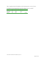
Worst features
n
10
6
4
3
%
43%
26%
17%
13%
Cluster
Delete/Cancel difficult
Learning difficulty
Uninformative Icons
Poor instructions/ error messages
Best features
n
8
%
35%
Cluster
Well structured layout
Looking at the specific points in the 'worst features' category, the following issues emerge:
•
•
•
•
Cancel/ Delete operations are mentioned as being difficult.
The introductory documentation is too terse, and badly laid out.
Icons to add/edit new database entries, and all the phone number icons apart from the 'work phone number' icon
(which was comprehensible) were a source of difficulty to the users.
Error messages were considered to be un-informative and not helpful. They did not allow the user to understand
how to get out of the error situation.
Task Timer for Windows Evaluation by CO. X.
Page 7 of 40
Conclusions
The good point about the software is the attractive way in which the 'appointments' screen is laid out, and in general, the
'clean' look of the various screens, and their helpful layout.
A number of specific issues arose which detract from the usability of the software, and give it a generally low usability
profile. For software which is intended for a competitive, discretionary user market, this low usability profile is
worrying. It must be added that some of the more advanced features of Task Timer were not evaluated, and that the
presented data refers to first impressions only. Some users commented afterwards that they expected with time to
become more proficient with the software.
A comment that may also be considered is the issue of the printed documentation. Two users pointed out that if the
software is meant to be immediately usable, this documentation should be irrelevant, but in fact, all users were observed
consulting this documentation, especially when error messages arose. Only one Experienced user out of the ten
completed the tasks without looking at the documentation more than once. This Experienced user scanned the
documentation quickly, and then went on to carry out the tasks in quick effortless succession.
Task Timer for Windows Evaluation by CO. X.
Page 8 of 40
Appendix 1: Context of Use Analysis
Task Timer for Windows Evaluation by CO. X.
Page 9 of 40
Usability Context Analysis Form
Version 1.0
Product name and version:
Date:
Analysis by:
Checked by:
Task Timer for Windows
1/3/98
[deleted]
Task Timer for Windows Evaluation by CO. X.
Page 10 of 40
USER CHARACTERISTICS
P = relevant to Product, E = relevant to this Evaluation
USER 1
User category name:
USER ROLE
Direct user
Indirect user
Supporting user
Monitoring user
Other
SKILLS & KNOWLEDGE
Education level
General computer experience
Training and experience in the business processes
Related product experience
Training in product use
Qualifications for job
Input Skills
Linguistic Ability
P E Experienced
1 1
1 1 Experienced with Windows '95 at work
1
Will have seen standard Microsoft etc offerings.
1 1 None is supposed to be required.
PHYSICAL ATTRIBUTES
Age
Gender
Physical Limitations & Disabilities
ATTITUDE AND MOTIVATION
Attitude to the job/ task
Task Timer for Windows Evaluation by CO. X.
1
This is a discretionary product in a competitive market.
Page 11 of 40
Attitude to the product
Attitude to information technology
Attitude to employing organisation
Level of motivation to use system
1
Depends how much they paid for it.
JOB CHARACTERISTICS
Job Function (title)
Job History
Hours of Work / Operation
Job Flexibility
USER 2
User category name:
USER ROLE
Direct user
Indirect user
Supporting user
Monitoring user
Other
SKILLS & KNOWLEDGE
Education level
General computer experience
Training and experience in the business processes
Related product experience
Training in product use
Qualifications for job
Input Skills
Linguistic Ability
P E Low experience
1 1
1 1 Low Windows '95 experience at work.
1 1 None is supposed to be required.
PHYSICAL ATTRIBUTES
Task Timer for Windows Evaluation by CO. X.
Page 12 of 40
Age
Gender
Physical Limitations & Disabilities
ATTITUDE AND MOTIVATION
Attitude to the job/ task
Attitude to the product
Attitude to information technology
Attitude to employing organisation
Level of motivation to use system
1
This is a discretionary product in a competitive market.
1 1 Would be expected to be generally enthusiastic otherwise why
bother?
1 1 High, out of interest in product.
JOB CHARACTERISTICS
Job Function (title)
Job History
Hours of Work / Operation
Job Flexibility
Task Timer for Windows Evaluation by CO. X.
Page 13 of 40
TASK CHARACTERISTICS
TASK 1
Task name
Task objective
Degree of choice in use of system to carry out task
Criticality of the task output
Degree of precision required in output
Autonomy of user in completing task
Other task constraints
Task input / starting condition
Task output / finishing condition
Task side effects
Task dependencies
Linked tasks
Task frequency
Task duration
Task flexibility / pacing
Physical & mental demands
Complexity as perceived by user
Safe to operator
Safe to secondary users
Implications for immediate informational envronment
Implications for wider informational environment
TASK 2
Task name
Task Timer for Windows Evaluation by CO. X.
P E
1
1
1
1
1
Add name to database
1 Insert name into database
?may be imported from other source
1
1 name must be correct, fields correctly placed
1 complete
1 1 some names will already exist in database
1 1 database is amended
1 1 storage
1 1 making appointments
1 1 few minutes
1 1 none
1 1 yes
1 1 screens will change, local hard disk updated
P E
Amend database entry
Page 14 of 40
Task objective
Degree of choice in use of system to carry out task
Criticality of the task output
Degree of precision required in output
Autonomy of user in completing task
Other task constraints
1
1
1
1
1
1 alter details of entry in database
1 none
1
1 correct info in ocrrect fields
1 complete
Task input / starting condition
Task output / finishing condition
Task side effects
Task dependencies
Linked tasks
1
1
1
1
1 name must exist in database
1 name is saved in database
1 storage
1 Add name to database
Task frequency
Task duration
Task flexibility / pacing
Physical & mental demands
Complexity as perceived by user
Safe to operator
Safe to secondary users
Implications for immediate informational envronment
Implications for wider informational environment
TASK 3
Task name
Task objective
Degree of choice in use of system to carry out task
Criticality of the task output
Degree of precision required in output
Autonomy of user in completing task
Task Timer for Windows Evaluation by CO. X.
1 1 few minutes
1 1 none
1 1 yes
1 1 screens will change, local hard disk updated
P E
1
1
1
1
Delete database entry
delete the entry in the datatbase
1 none
1
1 name must be correctly identified
1 complete
Page 15 of 40
Other task constraints
Task input / starting condition
Task output / finishing condition
Task side effects
Task dependencies
Linked tasks
Task frequency
Task duration
Task flexibility / pacing
Physical & mental demands
Complexity as perceived by user
Safe to operator
Safe to secondary users
Implications for immediate informational envronment
Implications for wider informational environment
TASK 4
Task name
Task objective
Degree of choice in use of system to carry out task
Criticality of the task output
Degree of precision required in output
Autonomy of user in completing task
Other task constraints
Task input / starting condition
Task output / finishing condition
Task side effects
Task Timer for Windows Evaluation by CO. X.
1 1 name exists in database
1 1 database is amended
1 1 storage
1 1 few minutes
1 1 none
1 1 yes
1 1 screens will change, local hard disk updated
P E
1
1
1
1
1
Create appointment
1 create an appointment on the calendar with link to database
1 none
1
1 database link must be correct
1 complete
1 1 some names will already exist in database
1 1 screen is amended
1 1 storage
Page 16 of 40
Task dependencies
Linked tasks
Task frequency
Task duration
Task flexibility / pacing
Physical & mental demands
Complexity as perceived by user
Safe to operator
Safe to secondary users
Implications for immediate informational envronment
Implications for wider informational environment
TASK 5
Task name
Task objective
Degree of choice in use of system to carry out task
Criticality of the task output
Degree of precision required in output
Autonomy of user in completing task
Other task constraints
Task input / starting condition
Task output / finishing condition
Task side effects
Task dependencies
Linked tasks
Task frequency
Task duration
Task Timer for Windows Evaluation by CO. X.
1 1 searching database
1 1 few minutes
1 1 none
1 1 yes
1 1 screens will change, local hard disk updated
P E
1
1
1
1
1
Cancel appointment
1 cancel an appointment on the calendar
1 none
1
1 appointment must be properly deleted
1 complete
1 1 appointment will exist
1 1 screen is amended
1 1 storage
1 1 searching database
1 1 few minutes
Page 17 of 40
Task flexibility / pacing
Physical & mental demands
Complexity as perceived by user
1 1 none
Safe to operator
Safe to secondary users
Implications for immediate informational envronment
Implications for wider informational environment
1 1 yes
TASK 6
Task name
Task objective
Degree of choice in use of system to carry out task
Criticality of the task output
Degree of precision required in output
Autonomy of user in completing task
Other task constraints
1 1 screens will change, local hard disk updated
P E
Task input / starting condition
Task output / finishing condition
Task side effects
Task dependencies
Linked tasks
Task frequency
Task duration
Task flexibility / pacing
Physical & mental demands
Complexity as perceived by user
Safe to operator
Task Timer for Windows Evaluation by CO. X.
Page 18 of 40
Safe to secondary users
Implications for immediate informational envronment
Implications for wider informational environment
Task Timer for Windows Evaluation by CO. X.
Page 19 of 40
USER / TASK MAPPING
User / Task mapping
Tasks:
User types:
1
Add name to
database
2
3
4
Amend
Delete
Create
database entry database entry appointment
5
6
Cancel
appointment
1 Experienced
2
2
2
2
2
2 Low
2
2
2
2
2
Place a '1' in the table if the task is carried out by the user type described.
Place a '2' in the table if this user type / task combination is part of this evaluation.
Task Timer for Windows Evaluation by CO. X.
Page 20 of 40
ENVIRONMENT ANALYSIS
ENVIRONMENT
For user categories:
For task categories:
SOCIAL
Multi / single user environment
Assistance available (eg help desk)
Interruptions
ORGANISATIONAL
policy
aims
culture
procedures
mode of communication
User monitoring in progress
Feedback on job given
TECHNICAL
Standalone / networked
(Supporting) software required
Hardware required
Additional hardware / software resources required
Type of network connection required
PHYSICAL
Standard Office
Laboratory or training class
Home / Informal
Kiosk
Task Timer for Windows Evaluation by CO. X.
1, 2
P E 1, 2, 3, 4
1 1 single user
1 1 list of instructions provided by manufacturer
1 1 possible but not integral
1 1 not relevant
1 O standalone or network possible, only did standalone
1 1 windows '95
1 1 to support windows '95
1 1 talking, noise in background
Page 21 of 40
Other: specify
Location
Auditory Environment
Thermal Environment
Visual Environment
Stability of Environment
Posture required of user
Necessary furniture
Amount of available space
Health hazards
Protective clothing needed
Task Timer for Windows Evaluation by CO. X.
Page 22 of 40
Appendix 2: List of Tasks
WELCOME TO TASK-TIMER!!
YOUR TASKS ARE AS FOLLOWS
INSTRUCTIONS
1. Add a name and address:
Xxx Xxxxxx ,
Xxxxxxx Xxxxxxxx ,
Xxxxxx Xxx XXX.,
Xxxxx Xx. ,
Xxxxxxx, XX. XXXXXXXX
Phone XXX XXX XXX XXX
2. Go back to Appointment screen. Make an appointment for 6 p.m. that day, (dinner
with Xxx Xxxxxx).
3. Add a work phone number for Xxx Xxxxx: XXX XXX XXX XXX
4. Go back to Appointments screen. Xxx Xxxxxx cancelled his appointment. Delete
6.p.m. appointment.
5. You have decided that Xxx Xxxxxx is an unreliable person and you no longer wish
to do business with him. Delete his name and details from the directory.
THANK YOU VERY MUCH FOR YOUR CO-OPERATION.
PLEASE REPORT TO THE EVALUATOR.
Task Timer for Windows Evaluation by CO. X.
Page 23 of 40
Task Timer for Windows Evaluation by CO. X.
Page 24 of 40
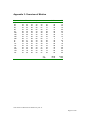
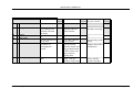
Appendix 3: Overview of Metrics
User
1E
2E
3E
5E
6E
7E
10E
12E
15E
18E
4L
8L
11L
13L
14L
16X
17X
19L
Globa Effic Affec Helpf Contr Learn
52
50
44
40
53
52
23
24
32
44
24
27
53
52
63
55
45
68
67
53
66
58
61
71
57
52
65
65
55
61
50
40
56
43
49
59
45
44
42
35
48
60
49
55
64
32
45
62
40
41
64
39
33
24
69
71
68
66
62
71
52
41
51
40
47
55
25
29
28
33
35
36
41
35
45
39
39
42
46
42
55
53
45
43
40
44
62
33
41
33
61
55
52
50
64
67
24
18
46
24
35
19
61
56
56
52
57
63
Av
StD
SMEQ
55
45
58
38
12
28
40
39
29
3
39
39
58
58
42
14
65
56
TT
15
13
30
15
20
25
12
15
13
4
30
8
18
19
26
20
32
25
39.89
17.50
18.89
7.86
Task Timer for Windows Evaluation by CO. X.
Page 25 of 40
Appendix 4: Outputs from SUMISCO
Total Dataset
SUMI Scoring Report from SUMISCO 7.38
Time and date of analysis: 20:59:10 on 03-09-1998
Files used in this analysis:
SUMI English (UK) Language Items
SUMI Version 2.1 Scoring Keys
distributions from January 1996 standardisation
weights from January 1996 standardisation
population parameters from January 1996 standardisation
Data file analysed: tt.ASC: Task Timer for Windows 6/3/98 Total Dataset
Number of users analysed: 18
Profile Analysis
Scale
UF
Ucl
Medn Lcl
LF
Global
74
56
50
43
23
Efficiency
66
50
44
38
27
Affect
83
61
55
50
26
Helpfulness
70
47
42
36
17
Control
71
51
46
41
23
Learnability 90
65
57
49
9
It would appear that the highest scores of this software come on Affect and
Learnability, although these scores themselves are not very high. The software is
substandard for Efficiency, Helpfulness, and Control
Note: The Median is the middle score when the scores are arranged in numerical
order. It is the indicative sample statistic for each usability scale.
The Ucl and Lcl are the Upper and Lower Confidence Limits. They represent the
limits within which the theoretical true score lies 95% of the time for this sample of
users.
The UF and LF are the Upper and Lower Fences. They represent values beyond
which it may be plausibly suspected that a user is not responding with the rest of the
group: the user may be responding with an outlier.
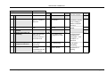
Individual User Scores
User
1
2
Globa
52
53
Effic
50
52
Affec
44
63
Helpf
40
55
Contr
53
45
Learn
52
68
1E
3E
Task Timer for Windows Evaluation by CO. X.
Page 26 of 40
3
4
5
6
7
8
9
10
11
12
13
14
15
16
17
18
23
67
57
50
45
49
40
69
52
25
41
46
40
61
24
61
24
53
52
40
44
55
41
71
41
29
35
42
44
55
18
56
32
66
65
56
42
64
64
68
51
28
45
55
62
52
46
56
44
58
65
43
35
32
39
66
40
33
39
53
33
50
24
52
24
61
55
49
48
45
33
62
47
35
39
45
41
64
35
57
27
71
61
59
60
62
24
71
55
36
42
43
33
67
19
63
2E (GE)
5E
6E
7E
10E
12E
15E
18E (E)
4L
8L
11L
13L
14L
16X
17X (E)
19L
Efficiency seems to be a scale which has low scores, with two extremely low scores,
but also one uncharacteristically high score.
Any scores outside the interval formed by the Upper and Lower Fences are potential
outliers. The user who produced an outlier is indicated in the right hand column. The
initial letter of the scales in which outliers are found are indicated in parentheses.
Item Consensual Analysis
In the following table, the numbers in the row labelled 'Profile' are the observed
responses of the actual users to each item.
The numbers in the row labelled 'Expected' are the number of responses expected on
the basis of the standardisation database.
The Goodness of Fit between the observed and expected values is summarised using
Chi Square, and these statistics are presented on the line below the expected values.
The number at the end of the Goodness of Fit line is the total Chi Square which
applies to that item. The greater the value of the total Chi Square, the more likely it
is that the obtained values differ from what is expected from the standardisation
database.
Each total Chi Square marked with
***
is at least 99.99% certain to be different
**
is at least 99% certain to be different
Task Timer for Windows Evaluation by CO. X.
Page 27 of 40
*
is at least 95% certain to be different
Total Chi Square values without asterisks are not likely to differ much from the
standardisation database.
In this output, the SUMI items which differ most from the standardisation are
presented first.
The instructions and prompts are helpful.
Item 3
Agree Undecided Disagree
Profile
6
1
11
Expected 11.14
4.04
2.82
Chi Sq
2.37
2.29
23.74
28.4***
The biggest single problem is the helpfulness of the instructions and the other
information presented on the screen.
I enjoy my sessions with this software.
Item 7
Agree Undecided Disagree
Profile
5
13
0
Expected 10.23
5.5
2.28
Chi Sq
2.67
10.24
2.28
15.18***
I would recommend this software to my colleagues.
Item 2
Agree Undecided Disagree
Profile
4
11
3
Expected 11.29
4.45
2.26
Chi Sq
4.71
9.65
0.24
14.61***
For software which is supposed to be 'discretionary' the information conveyed by
these two items (2 and 7) is very bad news indeed.
I sometimes don't know what to do next with this software.
Item 6
Agree Undecided Disagree
Profile
12
4
2
Expected 5.46
2.98
9.56
Chi Sq
7.82
0.35
5.98
14.15***
See also item 3, above.
The software documentation is very informative.
Item 15
Agree Undecided Disagree
Profile
5
5
8
Expected 6.34
8.98
2.68
Chi Sq
0.28
1.77
10.57
12.62**
Task Timer for Windows Evaluation by CO. X.
Page 28 of 40
More complaints about the helpfulness of the documentation: see also 8, below.
I find that the help information given by this software is not very useful.
Item 8
Agree Undecided Disagree
Profile
9
4
5
Expected 3.71
6.01
8.28
Chi Sq
7.53
0.67
1.3
9.5**
Task Timer for Windows Evaluation by CO. X.
Page 29 of 40
Experienced User Subset
SUMI Scoring Report from SUMISCO 7.38Time and date of analysis: 20:59:34 on
03-09-1998Files used in this analysis:
SUMI English (UK) Language Items
SUMI Version 2.1 Scoring Keys
distributions from January 1996 standardisation
weights from January 1996 standardisation
population parameters from January 1996 standardisation
Data file analysed: tte.ASC: Task Timer for Windows 6/3/98 Expert user subset
Number of users analysed: 10
Profile Analysis
Scale
UF
Ucl
Medn Lcl
LF
Global
69
59
51
43
33
Efficiency
65
58
51
44
29
Affect
86
71
64
56
23
Helpfulness
77
51
44
36
20
Control
65
55
49
42
35
Learnability 84
70
61
51
36
In general, slightly more up-beat than the Low experienced Windows users, but note
the poor Helpfulness scores, and the generally low Control, Efficiency and Global
scores.Note: The Median is the middle score when the scores are arranged in
numerical order. It is the indicative sample statistic for each usability scale.
The Ucl and Lcl are the Upper and Lower Confidence Limits. They represent the
limits within which the theoretical true score lies 95% of the time for this sample of
users.
The UF and LF are the Upper and Lower Fences. They represent values beyond
which it may be plausibly suspected that a user is not responding with the rest of the
group: the user may be responding with an outlier.
Individual User Scores
User
1
2
3
4
5
6
7
8
Globa
52
53
23
67
57
50
45
49
Effic
50
52
24
53
52
40
44
55
Affec
44
63
32
66
65
56
42
64
Helpf
40
55
44
58
65
43
35
32
Contr
53
45
24
61
55
49
48
45
Learn
52
68
27
71
61
59
60
62
1E
3E
2E (GECL)
5E
6E
7E
10E
12E
Task Timer for Windows Evaluation by CO. X.
Page 30 of 40
9
40
41
64
39
33
24
15E (CL)
10
69
71
68
66
62
71
18E (GE)
Any scores outside the interval formed by the Upper and Lower Fences are potential
outliers. The user who produced an outlier is indicated in the right hand column. The
initial letter of the scales in which outliers are found are indicated in parentheses.
Item Consensual Analysis
In the following table, the numbers in the row labelled 'Profile' are the observed
responses of the actual users to each item.
The numbers in the row labelled 'Expected' are the number of responses expected on
the basis of the standardisation database.
The Goodness of Fit between the observed and expected values is summarised using
Chi Square, and these statistics are presented on the line below the expected values.
The number at the end of the Goodness of Fit line is the total Chi Square which
applies to that item. The greater the value of the total Chi Square, the more likely it
is that the obtained values differ from what is expected from the standardisation
database.
Each total Chi Square marked with
***
is at least 99.99% certain to be different
**
is at least 99% certain to be different
*
is at least 95% certain to be different
Total Chi Square values without asterisks are not likely to differ much from the
standardisation database.
In this output, the SUMI items which differ most from the standardisation are
presented first.
Task Timer for Windows Evaluation by CO. X.
Page 31 of 40
In general, not many disagreements from the standardisation base: a very 'average'
piece of software as seen by these more experienced Windows users.The instructions
and prompts are helpful.
Item 3
Agree Undecided Disagree
Profile
4
0
6
Expected 6.19
2.25
1.57
Chi Sq
0.77
2.25
12.55
15.57***
Complaints about the helpfulness of the onscreen information: see also item 15, next.
The software documentation is very informative.
Item 15
Agree Undecided Disagree
Profile
4
2
4
Expected 3.52
4.99
1.49
Chi Sq
0.07
1.79
4.24
6.1*
Task Timer for Windows Evaluation by CO. X.
Page 32 of 40
Low Experienced User Subset
SUMI Scoring Report from SUMISCO 7.38Time and date of analysis: 20:59:57 on
03-09-1998Files used in this analysis:SUMI English (UK) Language Items
SUMI Version 2.1 Scoring Keys
distributions from January 1996 standardisation
weights from January 1996 standardisation
population parameters from January 1996 standardisation
Data file analysed: ttl.ASC: Task Timer for Windows 6/3/98 Low Experienced
Number of users analysed: 8
Profile Analysis
Scale
UF
Ucl
Medn Lcl
LF
Global
81
53
44
34
9
Efficiency
67
50
42
33
15
Affect
65
58
52
45
36
Helpfulness
69
46
40
33
15
Control
67
50
43
36
22
Learnability 83
53
43
32
10
Generally low for users with Low Windows experience, Helpfulness is the worst
aspect, and Affect is the best (although not very high at all).Note: The Median is the
middle score when the scores are arranged in numerical order. It is the indicative
sample statistic for each usability scale.
The Ucl and Lcl are the Upper and Lower Confidence Limits. They represent the
limits within which the theoretical true score lies 95% of the time for this sample of
users.
The UF and LF are the Upper and Lower Fences. They represent values beyond
which it may be plausibly suspected that a user is not responding with the rest of the
group: the user may be responding with an outlier.
Task Timer for Windows Evaluation by CO. X.
Page 33 of 40
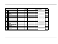
Individual User Scores
User
1
2
3
4
5
6
7
8
Globa
52
25
41
46
40
61
24
61
Effic
41
29
35
42
44
55
18
56
Affec
51
28
45
55
62
52
46
56
Helpf
40
33
39
53
33
50
24
52
Contr
47
35
39
45
41
64
35
57
Learn
55
36
42
43
33
67
19
63
4L
8L (A)
11L
13L
14L
16X
17X
19L
User 2 has very low Affect score, which is not characteristic for this sub-group.
Any scores outside the interval formed by the Upper and Lower Fences are potential
outliers. The user who produced an outlier is indicated in the right hand column. The
initial letter of the scales in which outliers are found are indicated in parentheses.
Item Consensual Analysis
In the following table, the numbers in the row labelled 'Profile' are the observed
responses of the actual users to each item.
The numbers in the row labelled 'Expected' are the number of responses expected on
the basis of the standardisation database.
The Goodness of Fit between the observed and expected values is summarised using
Chi Square, and these statistics are presented on the line below the expected values.
The number at the end of the Goodness of Fit line is the total Chi Square which
applies to that item. The greater the value of the total Chi Square, the more likely it
is that the obtained values differ from what is expected from the standardisation
database.
Each total Chi Square marked with
***
is at least 99.99% certain to be different
**
is at least 99% certain to be different
*
is at least 95% certain to be different
Total Chi Square values without asterisks are not likely to differ much from the
standardisation database.
Task Timer for Windows Evaluation by CO. X.
Page 34 of 40
In this output, the SUMI items which differ most from the standardisation are
presented first.
I would recommend this software to my colleagues.
Item 2
Agree Undecided Disagree
Profile
0
6
2
Expected 5.02
1.98
1.0
Chi Sq
5.02
8.19
0.99
14.2***
Not very positive for 'discretionary' software: see also 22 and 7, below.
The instructions and prompts are helpful.
Item 3
Agree Undecided Disagree
Profile
2
1
5
Expected 4.95
1.8
1.25
Chi Sq
1.76
0.35
11.21
13.32**
This seems to be the major problem with the software.
I would not like to use this software every day.
Item 22
Agree Undecided Disagree
Profile
0
5
3
Expected 1.7
41.32
4.93
Chi Sq
1.74
10.22
0.76
12.72**
I enjoy my sessions with this software.
Item 7
Agree Undecided Disagree
Profile
1
7
0
Expected 4.54
2.44
1.01
Chi Sq
2.76
8.5
1.01
12.27**
I sometimes don't know what to do next with this software.
Item 6
Agree Undecided Disagree
Profile
6
2
0
Expected 2.43
1.32
4.25
Chi Sq
5.25
0.35
4.25
9.85**
I find that the help information given by this software is not very useful.
Item 8
Agree Undecided Disagree
Profile
5
0
3
Expected 1.65
2.67
3.68
Chi Sq
6.8
2.67
0.13
9.6**
Items 6 and 8 seem to be common themes with this software.
Task Timer for Windows Evaluation by CO. X.
Page 35 of 40
Appendix 5: Critical Incident Analysis
Negative Comments
Cluster
1
1
1
1
1
1
1
1
1
1
2
2
2
2
3
3
3
3
3
3
4
4
4
Comment
I found it difficult to cancel the appointment. It was not obvious to me how to do it.
Trying to delete phone numbers.
It is difficult to cancel the appointment.
Canceling an appointment is difficult unless you have already used the software.
The screen doesn’t provide enough information on how to proceed with tasks especially
when deleting an appointment.
Hard to delete appointments
Deleting an appointment - should have been a separate function.
Canceling an appointment was difficult.
Trying to cancel anything: a bit erratic.
Trying to delete an appointment is hard.
Not enough elaboration on the icons.
The two envelope symbols could be confusing.
Not being very sure what the icons meant.
Some of the symbols need getting used to (eg beside the phone numbers).
It takes a long time to learn all the functions.
You need practice before you can use it efficiently.
Difficult to change between edit and add keys when trying to add a work phone number
to a clients address already entered.
Getting from screen to screen.
Too many functions initially make getting used to package a bit difficult.
Entering anything is not easy.
Written instructions are very confusing eg changing from one screen to another not very
well explained.
Adding new information (eg new phone number) difficult to figure out from
instructions.
The error messages give absolutely no explanation why a particular thing is 'illegal'
Summary
n
10
6
4
3
23
%
43%
26%
17%
13%
100%
Cluster
Delete/Cancel difficult
Learning difficulty
Poor Icons
Poor instructions/ error messages
Total
Task Timer for Windows Evaluation by CO. X.
Page 36 of 40
Positive Comments
Cluster
1
1
1
1
2
3
3
3
3
3
3
3
3
4
4
5
6
7
7
8
9
Comment
After initial problems it becomes easy to use
With practice it would be easy to use.
Reasonably user friendly.
Simple enough
A lot of functions there to help you organise yourself
Layout is extremely easy to use
Logical.
Clear overview of what has to be done.
You can see your day or week ahead of you in a clear manner.
It seemed to be well laid out.
Well structured, you can see everything at a glance.
Organises your appointments.
Allows you to organise your day, month, year.
Easy to go from one thing to another.
Easy maneouvrability between various schedules.
The icons are easy to interpret and help with proceeding the task.
Easy to find a person and that person's details.
Gave reasonably detailed view of person you're dealing with (address sheet)
The fact that you can network with other people: directory is handy.
I could see confirmation of my actions.
Canceling name was easy.
Task Timer for Windows Evaluation by CO. X.
Page 37 of 40
Team A - Addendum
Appendix 6: Costings and Background
(This is not normally included in a report)
Resources Used
xx
1
3
Context and Planning
Setup
Sample Recruitment
Data Collection
Analysis
Report Writing
1
2
Totals
7
Assist
2
3
2
10
2
19
26
Deviations from standard procedure
We would normally work in conjunction with the company involved to derive the Context of Use.
We would consult with the company on which metrics etc. they would find it most meaningful to
receive, and on the aims of their study (eg what will happen to this report).
We would produce a draft first report, and only produce a final report after receiving comments on the
first report.
Verbal presentation of findings and discussion is an optional extra.
Realism of exercise
We are used to working interactively with the company commissioning the study and would expect to
be able to check our assumptions and procedure as we go along: doing the study as a remote site gave
an element of unreality to the scenario, it was difficult not to treat it as a research project rather than as
a piece of commercial work.
Xxxxxxxxxxxxxxxxxxxxxxxxxxxxxxxxxxxxxxxxxxxxxxxxxxxxxxxxxxxxxxxxxxx who supported the
costs of the evaluation additional to the salaries of the workers concerned.
Background to study
This project is part of a multi-national collaboration between research institutes in UK, USA, Australia,
Denmark, and Ireland. The objective is to compare different ways of evaluating a piece of software for
its usability. Each research institute will apply its favourite methods to a commercial software item and
will keep track of results as well as costs (in person-hours). The results will be communicated via a
discussion panel in the 1997 Usability Professionals Association conference (Washington). A joint
publication including the names of all the principal investigators is envisaged, perhaps in the Comm.
ACM.
An integral part of this proposal is the presentation at the discussion panel of UPA and the consequent
assessment of the comparative methods at that panel discussion.
Proposed investigation
Task Timer for Windows Evaluation by CO. X.
Page 38 of 40
1. The purpose of the comparative evaluation is to provide a snapshot of the state-of-the art
within professional usability testing. This will be the first such investigation which proposes
to make its results publicly available, and which will employ comparative data on the
effectiveness of different proprietary tools on usability evaluation. Participants come from
the following countries: UK, USA, Australia, Denmark, and Ireland, and are well-known
internationally for their use of different methods of usability evaluation.
2. Each participant will receive on a certain date to be agreed an envelope containing a
demonstration version of a commercial calendar program. The envelope contains a diskette,
a few pages of introductory documentation and an order form. The program runs under
Windows 3.x and Windows 95. The program was made by a Danish company. The only
limitation in the demo version is that it can be started only 50 times.
3. The usability test scenario: Time System is a Danish company that manufactures and
distributes paper calendars. In the fall of 1994 they sent out Task Timer for Windows (TTW)
version 2 as a computer version of the paper calendar. Time System is planning to send out
version 3 of the program in six months time. However, their sales staff have heard negative
comments about users' initial experience with the program and TTW is losing market share
to other more usable programs, like Microsoft Schedule. They have therefore asked you to
perform a cheap usability test to test the usability of the software for beginners. The software
is intended for users who are already familiar with Windows. Familiarity with the paper
version of the calendar is not required.
4. TTW has recently issued version 4 of the program for Windows 95. Our rationale for
suggesting version 2 for this exercise is that 100 Danish university students in an
introductory human factors course have extensively tested version 2 (in Danish), and we
would like to be able to make a rough comparison between professional and student usability
testing.
5. We have absolutely no relation with Time System, except that we have informed them about
the use of their program for usability testing and have obtained their consent.
6. Our task is to carry out a usability test in accordance with our centre’s standard procedures
and write a usability test report for Time System. The report should appear in our centre’s
standard format.
7. We will send the test report to Prof Molich (Denmark) within three weeks after receiving the
diskette. The three-week limit is a suggestion which corresponds well with our commercial
experience.
8. In a separate report or letter the following questions will be answered:
- Deviations from our standard usability test procedure
- Resources used for the test (person hours)
- Comments on how realistic the exercise has been
9. Prof Molich will distribute the (anonymous) test reports to each of us and ask for our
comments and general observations. He would also like to send out the material to three or
four additional people with expertise in the field to ask for their comments.
10. We expect that this material will form a good background for a panel at UPA98 and a
subsequent paper for a refereed journal.
11. If a refereed paper comes out of this effort, one person from each of the actively
participating usability labs will be an author.
Task Timer for Windows Evaluation by CO. X.
Page 39 of 40
12. We are free to perform any activities that we deem necessary _in addition to_ the usability
test if we consider it beneficial for the cost/benefit ratio.
Task Timer for Windows Evaluation by CO. X.
Page 40 of 40
Team B
Usability Study Report: TaskTimer 2.0 for Windows
February 27, 1998
Contents:
Study Description p.2
Study Objectives p.2
Methodology p.2
Study Findings p.3
1.0 - Impressions and comments on TT environment and components p.4
1.1 - General reactions to TT application toolbar p.4
1.2 - Mini Calendar Window p.5
1.3 - General Calendar View Window comments p.5
1.4 - Day View Window p.6
1.5 - Week View Window p.7
1.6 - Month View Window p.7
1.7 - Address List p.8
1.8 - Phone List p.8
1.9 - Application Preferences p.8
1.10 - Help p.9
1.11 - Miscellaneous Quotes p.9
2.0 - Usability issues associated with tasks p.9
2.1 - Using Phone list p.9
2.2 - Creating Appointments p.9
2.3 - Deleting Appointments p.10
2.4 - Confirming Appointments p.10
2.5 - Creating Group Appointments p.11
2.6 - Creating Repeating Appointments p.11
2.7 - Editing Repeating Appointments p.12
2.8 - Creating Contacts p.12
2.9 - Setting Alarms (Reminders) p.12
2.10 - Creating/Editing Notes p.13
2.11 - Browsing Other Calendars p.13
2.12 - Comparing Calendars p.13
2.13 - Creating a Standard Task p.14
Recommendations for future steps p.14
2
Usability Study Report: TaskTimer 2.0 for Windows
Study Description:
Two usability engineers conducted a task-based usability study of the calendar and names database
features of the TaskTimer 2.0 for Windows Demo version software (here after referred to as TT)
between February 10-12, 1998.
Five participants were recruited for individual 2 hour sessions where they were asked to perform
calendar and names database activities typical for a networked, office environment. Participants were
either middle managers or administrative assistants. The participants had limited exposure to the
Windows 95 environment, so the study did not address platform conventions.
The study was conducted on a PC with Windows 95 operating system installed. Unfortunately, it was
discovered post-study that the PC sound capability had been off throughout the study, so participants
experienced the software without audio feedback.
The software was pre-installed and loaded with appointments and names to fit a scenario of a small
business office.
Study Objectives:
The study was designed to evaluate the following concerns:
•
Could someone familiar with tasks that are typical to other networked calendar and names
database tools come into an office and use the TT software to coordinate people and schedules
with minimal instruction?
•
What are users' reactions to the TT environment?
•
What are the conventions that users expect from a calendar or names database tool and how does
TT compare?
Methodology:
For this study, participants were provided with a scenario for a small business whose system
administrator had just migrated the thirty person company to using TT for all calendar and names
database activities. Participants were asked to "assume the role" of a company employee with job
3
responsibilities of coordinating marketing department activities.
Thirty names had been added to the names database as TT users. Appointments reflecting the context of
the scenario were loaded to represent "migrated" calendars (i.e., participants could assume that any
appointments that had existed on their old calendar were now accessible in TT;).
Because we were aware that our participants had limited experience with the windows platform, we
provided instructions for launching TT from the 'Start' menu and using the basic Windows 95 task bar
and window controls.
Participants were instructed to ignore non-calendar and names database features of TT.
Participants were asked to perform the following tasks:
•
Access personal calendar; view today's schedule and identify appointments; view next week's
schedule.
•
Search for phone number of a colleague, explore search capabilities of phone and/or address list.
•
Enter a personal (i.e., private) record in the names database; Enter a selective record in the
names database.
•
Create an appointment with a colleague (Browse their calendar); attach a note to appointment.
•
Create a reminder for a 'To Do' item - set alarm.
•
Reschedule appointment with colleague; Reschedule an existing meeting with a non-TT user.
•
Create a personal, recurring appointment.
•
Create an appointment between three colleagues and notify a fourth (compare calendars)
•
Locate information about a colleague whose name your not sure how to spell.
•
Delete an appointment
•
Reschedule your personal, recurring appointment.
Each task was presented in the context of the scenario. The calendars' of other characters in the scenario
were also populated to create potential conflicts, etc.
During each task, participants were asked to comment on the UI elements associated with the tasks.
Participants were encouraged to explore the interface and consider the following issues associated with
the tasks: privacy, conflict, confirmation, sorting, user identities, access control.
The time constraint of 2 hour sessions necessarily limited the exposure participants had with TT.
4
One usability engineer remained in the lab as a test administrator, directing participants using a prescripted task scenario. The other usability engineer worked in the observation room, taking detailed
notes.
Study Findings:
The following section identifies user impressions and comments about the TT environment, usability
issues associated with specific tasks, and design recommendations, all to be considered in future
development of TT. This is by no means a complete list of all the findings generated by the study. Due
to limitations in a major resource - time - we were unable to complete a comprehensive analysis of all
our data. Raw data is on file should more time be allocated for analysis at a later date.
1.0 - Impressions and comments on TT environment and components
1.1 - General reactions to the TT application toolbar:
1. After launching TT, about half the users hesitated, waiting for something to open up in the empty
gray window. Two users specifically stated that they thought it odd that the program did not
open up to their calendar. Why were they looking at a big empty gray window?
2. While the three arrow buttons for day, week and month navigation were discovered and used
correctly by all the participants, most commented that their icons were not appealing or intuitive.
It wasn't until they used each one once that they fully comprehended their function.
3. Most users figured out how to launch the various calendar views by using their respective
buttons located on the application toolbar.
4. Many had difficulty figuring out what the number on the week button on the application toolbar
represented. Over half the users commented that the week number on the Week View button was
a bit misleading. They had a tendency to look at the row of buttons and want to see the dd/mm/yr
numbers across the three buttons. Many had the initial impression that the number on the Week
View button was the month.
5. Most participants did not readily see the status bar at the bottom of the TT window and had to
guess what the purpose was for many of the buttons on the toolbar. Most participants expected
"tool tips" to identify a button name/function.
6. Participants experimented with the navigation buttons but did not try navigating by typing in
dates. That function went mostly unnoticed.
7. Participants did try to type into the large white empty field on the right of the date field. They
were baffled as to what this field was for when they discovered that it was not editable.
8. Participants confused the icon for the Address List to represent e-mail.
5
9. Participants thought it was a pain to return back to "Today" because there was no today button
on the toolbar or in any of the menu options. No one tried typing the word "Today" into the date
field.
10. Many tried to navigate within a day/week/month view window by using the application toolbar
arrow buttons as opposed to the arrow buttons on the window toolbar. They were surprised when
the window did not update to reflect the change. It took a while for users to understand that the
application toolbar arrow buttons did not have any effect on the currently opened calendar view
windows. This was particularly a problem when a window view was maximized!!! Many errors
were made when participants used the wrong set of navigation buttons to locate a date of a new
appointment entry.
11. Many participants were disappointed when they could not find an "undo" option in the Edit
menu.
12. Some of the participants interpreted the icon used for 'close a task' to represent the ability to look
at other people's calendars.
Recommendations:
1. Add tooltips to all toolbar graphical elements in the toolbar. Remove status text area.
2. In terms of the calendar tasks directly addressed by this study, we highly recommend evaluating
an alternative design which eliminates the date navigation buttons from the application tool bar.
To eliminate user error, date controls should reside only in day/week/month view windows. The
view window buttons on the application tool bar should be able to launch multiple windows of
the same category. If the user wants to compare the day view of two different dates, they would
launch 2 Day View windows and navigate each to an alternate date being compared. (not sure
how this will affect higher level task management processes - not the scope of this study!)
3. If date navigation controls remain on the application toolbar, a "Today" button needs to be
added.
4. Invest in designing date navigation control buttons that take up less screen real estate, which
might also be more intuitive to users.
5. The Holiday display field should not look like a text entry or editable field. Consider eliminating
from the application tool bar and displaying this information only in day/week/month view
windows (not sure whether this field impacts task management process).
6. Week number of the year was not a necessary feature for our participants. In fact, it lead to some
confusion. While it might have useful implications for task management of certain types of jobs,
it does not translate effectively to basic calendar tasks. Consider not displaying this number
between the day and the month - doing so creates ambiguity in determining the selected date.
7. Need new icon to represent address list. Current icon implies e-mail functionality.
8. Add 'Undo' option to the 'Edit' menu
1.2 - Mini Calendar Window:
6
1. The mini calendar window was not used by all the participants to navigate. One user opened it
only to see what the button did, then closed the window and never used it again. Because of the
single click interaction they experienced with the application toolbar buttons, most did not
realize that double clicking on a date would open a view window. Not a single user recognized
that a Week View window could be launched by double clicking on the week number in the mini
calendar.
2. All commented that a Today button should be available in all calendar view windows and on the
application toolbar.
3. Participants expected that the day view of today would be launched when the "Today" button
was selected!
4. All commented that they did not like that the mini calendar always stayed on the top layer when
opened.
Recommendations:
1. Investigate this component in future study. Since these users tended not to navigate with this
component we need more data to make firm recommendations.
2. If a Day View window is launched by the mini-calendar, the default should be that the two are
synchronized.
3. If no Day View window has been launched, selecting "Today" should launch a Day View
window displaying today's schedule.
4. Mini calendar should not be a floating window.
1.3 - General Calendar View Window comments:
1. Most participants commented that the default window size did not display enough information.
2. Participants were frustrated with default calendar window sizes.
3. Maximized windows were confusing because the window controls are drawn directly underneath
the application window controls. Users weren't sure which ones to use. The entire application
was accidentally minimized as a result.
4. Participants were a bit confused in general because they were faced with multiple sets of
navigation buttons when a window was open. Participants had a tendency to use the application
toolbar buttons to navigate within a window - particularly when a window was maximized!
5. Most initially thought that the default selected cell (the cell automatically selected when the
window is opened) was a scheduled appointment.
6. Commented that there were too many scroll bars - too busy and cluttered.
7. Many complained about the 24 hour times displayed in the calendar windows but most didn't try
to modify this. Those who did looked first to the menu bar for a preferences option, then tried
7
looking in the preferences for the specific calendar view they were viewing. The last place they
looked was the application preferences located on the application toolbar.
8. Wanted the clock icon on the window toolbars to dynamically reflect real time, like the clock on
the application toolbar.
9. If window is resized narrow and long, the Add/Edit/Delete buttons do not get displayed. This
creates a problem for users trying to delete an appointment, since delete is not an option in the
menus, nor did their choice of using the "backspace" key work to delete their appointment.
10. Most commented that they wanted the window Title area to specifically identify that they were
looking at their calendar. When browsing other calendars, it was not obvious which windows
represented their own calendar: others were identified with short names. They had to assume that
the windows without shortnames were representations of their calendars.
11. It was difficult to identify the application preferences button (along with many others) because
most participants did not readily see the status bar at the bottom of the TT window. Most
participants were used to having "tool tips" text pop open when they hovered the cursor over a
button in the toolbar.
Recommendations:
1. In general, the nested window infrastructure of TaskTimer is difficult to use. Window
management within the application was quite tedious, not to mention further interaction with
applications on the desktop! It was difficult to use TT just to quickly glance at your daily
schedule. The application had to be launched, then the day view had to be opened, then the
parent and child windows had to be resized appropriately so that you could toggle between the
application and the desktop when you wanted to glance at your calendar. Would recommend
moving towards an object oriented model where a calendar object could exist on the desktop as
its own window.
2. Within the TT application, window management was stymied by the positioning of the child
windowing controls when in the maximized state. Window controls are drawn directly
underneath the application window controls AND above the application toolbar!!!! Window
controls for the maximized child window should be drawn beneath the application toolbar.
1.4 - Day View Window:
1. Default window size was too small.
2. Default window size does not display Add/Edit/Delete buttons!!!! These functions are not
supported in the menus and direct manipulation for delete is not apparent - users tried
"backspace" key, not the "delete" key, on an expanded keyboard.
3. Window opens to the current time, and since most wanted to look at the entire day they had to
waste time scrolling and/or resizing.
4. Assumed the default selected cell was a scheduled appointment.
8
5. Many thought it odd that if you maximized one open window, all the other windows you may
have open would be maximized as well. When you were done looking at the one you had
originally maximized, you then had to minimize all the others! Participants commented that his
was a waste of time.
6. A few participants never realized that you could create an note by double clicking on the empty
note cell.
7. None of the participants understood out what the OK column was for. They guessed that if you
checked it, you were confirming your attendance at the appointment.
8. Many commented that this window was visually complex. They did not see the advantage of
having the separate areas for tasks and contacts. Preferred the more simple distinction of just
timed and untimed appointments (untimed being things you want to accomplish at some point
during the day).
Recommendations:
1. Default window size should be large enough to display all GUI elements (Add/Edit/Delete
buttons!)
2. Default window size should be large enough to display all work day hours (user configurable in
preferences). Users want to be able to quickly open a day view and glance at their entire work
day schedule without having to scroll.
3. There should be no default time selection when window opens. Users mistake this as a scheduled
appointment.
1.5 - Week View Window:
1. Default window size too small.
2. Wanted Sunday to be the first day of the week.
3. Did not understand why Sunday, and not Saturday, was colored red.
4. Participants had a tendency to schedule appointments in the wrong month when using the week
view window. February 16th , 1998 happens to be on the same day of the week as March 16th,
1998. The month indication in not very salient in the week view window.
Recommendations:
1. Default window size should al least show all the work day hours designated in preferences.
2. Allow week order to be user configurable.
3. Consider using a less aggressive color to indicate non-working days. Red usually indicates an
error.
9
4. Better for the month to be spelled out as in other views (e.g., 'March 13' rather than '3/13'). This
would allow the month to be more prevalent so that users won't accidentally schedule
appointments in the wrong month.
1.6 - Month View Window:
1. Default window size should show entire month!!!
2. All commented that they did not like the month view in particular. It has an unconventional
layout - with hours along the top and days down the side. They prefer the convention used by
print calendars - days along the top.
3. Many also thought it unnecessary to show so much detail in the month view. "Why not only
show times of existing appointments and not waste space displaying all the hours in a day."
4. All commented that the monday-sunday day order was unconventional. They preferred the US
convention of sunday-saturday. This is not configurable in preferences.
5. Some had difficulty distinguishing the time axis from the week number axis. It wasn't obvious
that the numbers on the left axis were referring to the week number in the year. Many incorrectly
assumed that these were the hours of the day and scheduled appointments incorrectly!!!!
Recommendations:
1. Consider evaluating a redesigned month view that looks like a typical calendar (Seven Days
along top, four rows with a square for each day). Only show scheduled appointments for each
day. Double clicking on an appointment cold pop-up appointment detail dialog. Days with lots of
appointments could have a (...) element indicating that it would be more advantageous to look at
this day in the Day View window. Allow users to launch the day view by clicking on the day
number in the month view, etc...
2. Make calendar day order user configurable.
3. Do not display week number of the year in its current axis. Causes user error! Consider
removing this feature.
1.7 - Address List
1. Most participants didn't understand why you would use the address list since one had access to
more information by viewing a personal record from the phone list. And since the phone list
provided more context when open, most preferred to use this as a starting point for locating
information about an entry.
2. Not used frequently.
1.8 - Phone List
10
1. Everyone really liked the incremental search capability.
2. Most didn't like that it searched all visible columns. Wanted to be able to specify which columns
to search without having to limit which ones were viewed.
3. Icons for phone number entries were a bit ambiguous. Many just guessed on the distinction. Tool
tips would clear up ambiguity.
4. Really liked that they could combine their personal entries with the public company-wide entries
in the one database. Also understood and liked that entries could be made available to selectively
designated people.
1.9 - Application Preferences
1. Most accessed application preferences and assumed that it applied only to network or printing
functions since these are addressed by the first two options. It was difficult to identify what
preferences were available since the icons were ambiguous and do not have labels.
2. Add tooltips to all the GUI elements in the dialog.
3. Many participants went to the Edit menu to locate preferences. Consider adding preferences to
Edit menu.
1.10 - Help
1. Participants who accessed help (2) didn't like the fact that 'Help' was modal in the sense that they
couldn't have 'Help' open and try to complete the task at the same time.
1.11 - Miscellaneous Quotes
1. "If I used a program like this for half of the time that we have in this study I would have stopped
using it by now and requested another one from my manager."
2. "This is really a piece of work!"
3. [Comment on help:] "This is miserable!"
2.0 - Usability Issues associated with tasks:
2.1 - Using Phonelist:
All participants generally had successful interactions with this feature. See 'Phone List' section above for
comments.
2.2 - Creating Appointments: (See also Creating Group Appointments)
11
1. Participants were confused by the fact that there was a 'New Task' button but not a 'New
Appointment' button. They did not realize that the 'New Task' button allows the user to specify
the type of task (includes appointments).
2. Some of the participants created appointments for the unintended dates because they were
referring to the date on the system toolbar rather than the date in the view from which they were
originating the appointment. Participants weren't aware that they had made this mistake, and as a
result they were confused as to why the appointment didn't exist (when in reality it did exist, but
on the wrong date).
3. None of the participants had any idea what the 'References' fields in the main window to create
an appointment were for. One of the participants attempted entering information about the
meeting in the fields.
4. Two of the participants inadvertently kept hitting the 'cancel' button on the main appointment
dialog after selecting 'OK' on the previous child dialog where they had established attendees. Our
assumption is that these users believed that, after selecting the attendees and hitting 'OK', they
were finished with the appointment creation. Returning to the subsequent parent dialog did not
make sense to them, so they hit 'cancel'. Again, we're assuming that they were expecting to
return to the calendar after hitting 'OK' on the child dialog. Not sure how to respond to this
feedback since we agree that child dialogs should return to parent dialogs. However, potentially
providing some visual indication on the parent dialog that attendees had in fact been added might
help. (needs further investigation)
5. Many created an appointment, as opposed to a contact, when they were setting a reminder to call
someone by a certain time. Due to their not understanding what the 'References' fields were for,
they typed in the person's phone number into the 'References'.
6. Participants were confused about the meaning of the 'OK' box in the appointment dialog
window. (The use of the 'OK' field throughout the TT interface was confusing to users).
7. Inconsistent terminology caused some of the participants to have difficulty making an
appointment so that only they could view it. 'Confidential' is the term used in the appointment
dialog, but 'Private' is used in the telephone and address directories.
8. The items in the 'Duration' pull-down menu were limited (i.e., only offered :30, 1:00, 2:00, 4:00,
and 8:00).
9. When creating an appointment, the 'Appointment' dialog is modal, thereby not allowing the user
to browse their calendar while creating the appointment or when informed of booking conflicts.
2.3 - Deleting Appointments:
1. The day view window does not display the 'Add,' 'Edit,' and 'Del' buttons unless the user resizes
the window. As a result, participants had difficulty knowing how to delete an appointment.
Recommendation: The default size that the window opens to when the 'Day View' button is
selected should be large enough to display the all of the interface.
2. Participants expected to be able to delete an appointment by highlighting the appointment and
hitting the 'backspace' key. Only a few of the participants discovered that the 'Delete' key worked
in this manner.
12
3. Participants felt that the message they received when they tried to delete an appointment that had
not taken place yet (i.e., 'Appointment is not completed; Delete anyway?') was confusing. In
addition, the participants who thought they understood why they were receiving this message
(i.e., because the date of the appointment had not passed yet) did not ever discover that the
dialog was not dependent on whether the appointment had passed or not, but rather whether or
not the user put check in the 'OK' field in the day view.
4. One of the participants recommended that a dialog with the message 'Are you sure you want to
delete this appointment' appear whenever the user deletes an appointment. (This message would
make more sense than the ' Appointment is not completed; Delete anyway?' message. In
addition, this will help ensure that users don't accidentally delete an appointment--especially
given that there isn't an 'Undo' feature in TT!
2.4 - Confirming Appointments:
1. Although confirming appointments was not entirely in the scope of this study, participants were
generally confused about how the people in the meeting would accept or decline proposed
meetings, and the interaction involved in this process.
2. Participants thought that the 'OK' field in the day view might be used to confirm a proposed
appointment.
3. Some of the participants stated that they would want the ability to send an e-mail to the people
involved in the proposed meeting to let them know that an appointment has been scheduled for
them. They preferred only having to look in one place for messages (i.e., their e-mail) rather than
having to check an additional place for appointments ("What if I forget to look there?").
4. The message list was not evaluated in the study, however one of the participants explored this
feature and commented that the 'R' in the fourth column was confusing. His only guess was that
it meant that he had refused the appointment. In addition, he wasn't comfortable with the
terminology of 'acknowledging' (represented as 'Ack.' in the interface) versus 'Refusing' a
proposed appointment. More intuitive terminology might be 'Accept' versus 'Decline.'
2.5 - Creating Group Appointments:
1. Participants wanted to be able to browse/compare other people's calendars directly from the
'Appointment' dialog. They felt that it made sense to have this information easy to access when
setting-up a meeting.
2. The terminology in the 'Connect People' dialog is confusing. Participants were confused about
what the terms 'Not connected' and 'Disconnect' meant. One of the participants commented that
the terms made him think that he had to be connected to the network to see the calendar. This is
a poor choice of terminology, especially in a networked environment.
3. In general, participants were confused about the distinction between 'involving' vs. 'informing' a
person for an appointment. One participant expected to both 'involve' and 'inform' the person,
13
because she thought that 'informing' them meant that the person would be sent an e-mail to
inform them of the appointment. When she was unable to involve the person (because the person
was being informed) she assumed that it meant that the person might have a scheduling conflict.
4. Participants commented that they would like to have an indication of who's available for an
appointment, rather than the '?' indicating who isn't confirmed for the appointment yet.
5. The interface in the 'Booking Conflict' dialog confused many of the participants. To begin with,
participants wanted an easy way from the 'Appointment' dialog to check people's calendars when
setting up the appointment, so that they would know when scheduling the appointment if
someone had a conflict, what the conflict was, and what the rest of the person's schedule looked
like. That is, participants wanted to have the information presented in the 'Booking Conflict'
dialog before when they were setting-up the appointment. In the 'Booking Conflict' dialog,
participants were confused by the 'Remove conflicts' button. It appeared that the terminology
'Remove Conflicts' lead participants to think that the reason for the conflict, rather than the
person with the conflict, would be removed. In addition, participants seemed confused by the
redundancy in the interface in the ability to either 'Remove conflicts' or 'Exclude' one of the
'booked' people. In addition, the participants did not seem to notice the message at the top of the
dialog indicating that the booking conflict could be because the appointment is in conflict with
either the working hours or other booked appointments. It took some participants a very long
time to realize that the reason there was a conflict was because the appointment was scheduled
past the working hours of some of the people. Recommendation: It would be beneficial if the
interface directly informed the user of the cause of the booking conflict.
2.6 - Creating Repeating Appointments:
1. Participants were extremely confused by the 'Add Weeks' and 'Add Days' buttons in the 'Repeat
Appointment' dialog. All of the participants selected the days and the number of weeks they
wanted the appointment to repeat and then hit the 'OK' button (without using the 'Add Weeks')
button first. Recommendation: Get rid of the 'Add Weeks' and 'Add Days' buttons. The ability to
selectively delete days in the 'Selected Days' portion of the dialog can be maintained by
automatically showing the selected days as the user defines them.
2. Some of the participants were confused by the distinction of the 'Repeat Weeks' versus the
'Repeat Days' sections of the 'Repeat Appointment' dialog. This is because there is overlap in
these two interfaces in the sense that some tasks could be completed using one or the other of
these two sections due to users having the ability to select days in the 'Repeat Weeks' section.
(Note: The recommendation is not to get rid of the ability to select days in the 'Repeat Weeks'
section, given that participants found this feature extremely handy.)
3. There appears to be a bug in the implementation logic of the 'Repeat Appointment' dialog. If
multiple days in the 'Repeat Weeks' portion of the interface are selected (e.g., this Wed and Fri)
then it sets the appointment up for the original date chosen in the 'Appointment' dialog as well as
repeating it for the selected days (e.g., this Wed and Fri, as well as next Wed). In other words,
the implementation treats repeating to mean 'also repeat it on these dates' rather than 'the dates on
which the repeating appointment should occur are...' This created many problems for the
14
participants: not only did they think that they made a mistake when setting-up the appointment,
but they never figured out the logic of the interface.
2.7 - Editing Repeating Appointments:
1. When editing a repeating appointment, there is no feedback in the appointment's dialog to
indicate that the appointment is part of a repeating series of appointments. The 'Repeat
Appointment' dialog resets (to one day) after the user selects the 'OK' button on the dialog.
2. Users are unable to modify a repeating appointment, without modifying each of the dates of the
appointment individually. Changes made to a repeating appointment only affect the appointment
for the date that is selected to open the appointment's dialog. Recommendation: The default
should be that the changes affect all of the appointments in the repeating series. The user should
be provided with a dialog asking whether they want the changes to be made to all of the
appointments or 'this one only.'
2.8 - Creating Contacts:
1. Most of the participants treated the task of setting a reminder (and alarm) to remember to call
someone by a certain time as an appointment (rather than a contact).
2. Participants did not notice 'New' in the 'Person' pull-down menu when they were creating a
contact for someone who was not in the Address/Phone list. Participants tried to type the person's
name in the 'Person' field.
3. One participant commented that she didn't see the benefit of entering the information as a contact
rather than an appointment. She didn't like that she would still have to double click to see the
person's phone number if she entered it as a contact. She preferred that TT included phone and email functionality as part of the appointment dialog.
2.9 - Setting Alarms (Reminders):
1. Many had difficulty setting the early warning for the alarm. Setting up an early alarm often
caused the alarm time to reset, and vice versa. The help for setting an alarm states, "Specify
either Early Warning or Alarm Time. They both express the same thing." It does not make sense
to have both in the interface since they have the same effect. Quite confusing!!!
2. Participants were unsure of the format for setting an early alarm. Some of the participants
expected to be able to indicate that they would want the early alarm to sound, for example, 15
minutes before the actual alarm time. They did not know whether this meant that they should
type 00:15 in the early warning field or whether they should type, for example, 15:45 for a 16:00
deadline (the help did not address this issue). Recommendation: There should be a pull-down
menu for users to select the time, with an option for the user to type-in a particular time (this
would help to serve as an example of the format as well as to facilitate the task).
3. One participant suggested that TT automatically type a colon for them when they typed in the
first two digits of the time for the early warning.
15
4. Participants typed the incorrect time for the early warning because they were basing the time on
12-hour clock as opposed to a 24-hour clock. The only reason one of the participants noticed this
was because the alarm was being set for the same day and the time she typed in originally (based
on a 12-hour clock) had already passed.
2.10 - Creating/editing notes:
1. Our participants did not see the general need for creating notes attached to appointments. More
specifically, they indicated they would prefer to be able to incorporate e-mail functionality with
their calendar. They indicated that they would tend to generate documents (i.e., notes) with a
standard text editing package. If these documents were to be discussed at a meeting, then they
would just send them before hand as an e-mail attachment.
2. Most participants had difficulty realizing you could initiate a note by double clicking in the
empty note column. Additionally, it was not that obvious that double clicking on the 'X' would
open up the existing note. This was in part due to the fact that when you single clicked on the 'X',
the entire appointment would be high lighted. This visual feedback made users assume that you
could not perform an action on the specific items in the appointment because there was not
visual differentiation when selecting the note, the OK, or the appointment.
2.11 - Browsing Other Calendars:
1. Participants had extreme difficulty determining how to browse other people's calendars. It was
not intuitive for this functionality to be 'hidden' in the preferences, since this is a common task.
None of the participants discovered that they could also perform the task by double clicking on
the day/week/month view buttons.
2. The dialog box for selecting user/people is different depending upon whether it is accessed
through the day view versus the week or month views. The day view is set-up to allow a single
user to be chosen in order to view their calendar, while the week and month views allow multiple
calendars to be compared at the same time. It is not apparent why this distinction exists in the
interface. Furthermore, it is confusing to have two different interfaces to perform similar tasks.
3. Participants expected to be able to browse other people's calendars from their contact
information in the address book.
4. Many participants attempted to view another person's calendar through the menu (i.e., they
expected to select "View Calendar" from the main menu and be able to choose who's calendar to
view).
5. Participant's were confused by the fact that the views of their calendar didn't indicate anywhere
that it was their calendar they were viewing. Recommendation: The user's login name could
appear in the title bar of the window to indicate that it is their calendar.
6. Participants expected an icon in the system tool bar to allow them to browse other people's
calendars.
16
2.12 - Comparing Calendars:
1. As with browsing other's calendars, participants had extreme difficulty determining how to
compare calendars. It was not intuitive for this functionality to be 'hidden' in the preferences,
since this is a common task. None of the participants discovered that they could also perform the
task by double clicking on the week/month view buttons.
2. Some of the participants expected to be browsing the other person's calendar rather than looking
at multiple calendars.
3. Some of the participants had difficulty with the 'Select people' dialog because they would
highlight the person's name and then select the 'OK' button rather than selecting the 'Select'
button first. Some of the participants expected that highlighting a person's name and then hitting
the 'Enter' button on the keyboard would behave the same as selecting the 'Select' button, rather
than the 'OK' button. (Note: The title of the dialog should read 'Select People' rather then 'Select
people' in order to be consistent with the rest of the dialogs in TT.)
4. In the 'Select people' dialog, participants expected double clicking on a person to behave the
same as if they had highlighted the person and hit the 'Select' button (i.e., double clicking should
add the person to the 'Selected' box).
5. Participants had difficulty finding the people whose calendars they wanted to compare because
people's names are alphabetized by short name.
6. There should be a search mechanism to be able to quickly locate the names of the people whose
calendars are to be displayed. Scrolling through a list of names becomes unacceptable once there
is a decent number of people in the list. One of the participants commented, "This is painful if
you have to go through the whole list this way."
7. Although the study didn't focus on the interface used to compare calendars, it is obvious that
there are a number of usability issues with this interface. In particular, participants were
extremely confused by the bar diagram used in the 'People Involved' dialog. Recommendation: If
such a diagram is used, there should be a legend identifying how things are represented in the
diagram.
2.13 - Creating a Standard Task:
1. Creating a standard task was not one of the tasks of the study, however one of the participants
used a standard task to complete Task 6 (as opposed to creating a contact). One of the main
issues that the participant had with the 'Standard Task' dialog was with setting the priority of the
task. The pull-down menu next to the 'Priority' label contained the letters 'A,' 'B,' and 'C' which
appear to arbitrary. When each of the letters is selected, the following information is displayed:
(1) A = Important and Urgent, (2) B = Important, and C = Urgent. This pairing doesn't make
sense because A to C doesn't map to linear importance.
2. The default setting for the 'Starting Date' and 'Deadline' are both 'Today,' however when the user
switches the 'Starting Date' to be 'Tomorrow' the 'Deadline' remains on 'Today.' The interface
17
should automatically update the setting for the 'Deadline' in this case.
Recommendations for future steps:
Because of the extensive list of usability issues identified in this study, we recommend conducting
future studies of smaller task sets. These studies should methodically explore detailed usage of limited
UI components/dialogs. Upon resolving the usability issues associated with individual tasks, a further
comprehensive usability study exploring task integration would be appropriate.
Additionally, we would seriously recommend revisiting the initial task analysis done on this product
(assuming there is one). Our initial response to TT is that the interaction required to accomplish some of
the tasks we investigated clearly did not match how users expect to perform these activities.
18
Team B - Addendum
Description of our typical process:
At our company, usability engineers are not members of any one product team, but act as "consultants"
who provide usability services to facilitate a user-centered design process.
A usability engineer initiates a study after receiving a request from a product team. Before a usability
study is designed and conducted by a usability engineer, the product team requesting the evaluation is
required to provide the following: 1) a walkthrough of the product design goals and features (can be
provided by specs); 2) a list of identified tasks and/or features to be evaluated; 3) user profiles; 4)
engineering support for maintaining prototype or pre-release code through the duration of the study.
The usability engineer then designs a study which targets the specified user tasks and product features
identified above.
These studies are designed to confirm/validate design decisions manifested in the UI and are based on
task analyses conducted prior to the design phase of the product.
Volunteers who meet the user profile criteria are recruited to participate in the study. Volunteers are
generally recruited from external sources, although internal employees who fit the user profile are
often recruited as pilot participants or to compensate for last minute cancellations. Volunteers are given
gifts and/or minimal compensation.
Participant sessions are observed by team members. Following the last session, all observers are
invited to a study debriefing meeting, where the group identifies and discusses big issues witnessed in
the user sessions. Participation from product team members at this stage is important in establishing
usability priorities.
Armed with data from the user sessions and input from team members during the debriefing meeting,
the usability engineer is now ready to begin analysis and generate a usability study report.
The usability engineer distributes the report to product team and arranges for a Presentation Meeting.
The Presentation Meeting is generally the starting point for the next design iteration.
Caveats:
1. We recruited 5 participants total. Four internal participants and one external participant. Participants
volunteered and were not given compensation for their time. The participant profiles deviate from
the expected target user for TaskTimer because of financial constraints and limitations of recruiting
for this “extracurricular” study.
Three Participants had minimal exposure to the Windows 95 operating environment. One had 6
months experience (current) with Windows. One was a current Window user. None had exposure to
MicroSoft Schedule plus or Organizer.
Participants were middle managers or administrators who used networked calendar and names
database tools provided by their company.
2. Because our participants were not regular windows users, we did not evaluate tasks associated with
interaction with the windows desktop, etc.. We also offered instruction for using PC window
controls for those participants with the least exposure to windows.
3. Identifying tasks for our TaskTimer study was, by the nature of this experiment, relatively
arbitrary compared to our normal procedure. Lacking any contextual information provided by a
dedicated human interface designer and/or product marketing personnel, we opted to use the task
analysis for one of our own calendar/name database software projects as the basis for identifying
tasks.
While our tasks in no way reflect the sum of the possible uses of TaskTimer, the tasks do represent
a sub-set of the typical tasks associated with using calendar and names database solutions in a
networked/enterprise environment.
4. The process of this study completely conflicted with the methodology promoted within our
organization. Typically, members across the product team are involved throughout the process of
user evaluations. Their involvement in our studies (including such things as: providing information
which feeds the study design, observing users, and participating in a post-study debriefing session)
promotes an inter-disciplinary process which we strongly advocate. This process is not facilitated
by isolated usability engineers evaluating products and delivering a stand alone report.
Lacking dialog with engineers, designers and marketing personnel, we felt that the TT study was
being conducted in a vacuum. We had a very narrow understanding of the scope of TT in terms of
implementation parameters, design goals, and target user requirements. This affected our ability to
adequately focus our evaluation of the product.
5. Because the scope of TT is so vast, we had extreme difficulty keeping our investigation narrow and
focused on the issues we set out to investigate. Clearly we bit off more than we anticipated and
collected more feedback than we can address with the time we’ve allocated for conducting this
study. In particular:
•
•
•
•
It was very difficult to isolate calendar tasks from task management when participants actually
tried to complete the tasks.
We were too unfamiliar with the product and were often just as surprised as the participants at
some behavior. Having a member of the development team walk us through product
features/intricacies would have prevented this.
We clearly understood that some of the design decisions are directly addressing task
management requirements, although they might have negative effects on simple calendar tasks.
How should we address this?
We ran out of time to address all the issues related to the tasks we set out to investigate. This
made it difficult to place priority on the issues we did identify, so we refrained.
6. Because we didn’t have a communication channel with the team UI designers, we did not know
how to refer to all the graphical elements. We made up our own names. Please bear with them!
7. Finally, it was very difficult to understand how we should communicate much of the negative user
feedback. Clearly, our participants expected a certain level of integration between things like email, calendar, and desktop, that was missing from this old version of TT. Whether or not it makes
sense to evaluate this old version of TT in terms of current office protocol is, for the sake of the
larger UPA panel goals, debatable.
Resources used for the study:
•
•
•
•
Study design and preparation: ~10 person hours
Study facilitation: 20 person hours (total for 2 engineers)
Participant time: 10 person hours
Evaluation and report: ~40 person hours
Total: ~80 person hours
Recommendations for Future Rounds of UPA Comparative Study:
1. Provide more background information on the product being evaluated. This should at least
comprise detailed target user profile information, functional requirements specification, design
goals and/or specifications, and a rough idea of any implementation constraints that should be
considered to limit recommendations. Ideally, it would have been wonderful to have a specific limited - list of user tasks to evaluate, which would have negated the need for the above items.
2. Consider finding a more compact product to evaluate. It was unrealistic to adequately evaluate this
product because it was too large. Due to the powerful and extensive nature of TT, it was difficult to
contain the scope of the tasks. Additionally, the fact that there were so many usability issues
throughout the product made prioritizing the findings near impossible, considering the lack of
product team involvement.
Team C
Usability Evaluation:
TaskTimer
Page 2
TaskTimer Jan’98
Table of Contents
TABLE OF CONTENTS ........................................................................................ 1
TASKTIMER USABILITY EVALUATION: JANUARY’98..................................... 4
OVERVIEW OF THIS REPORT............................................................................... 4
THANKS............................................................................................................. 5
HUMAN INTERFACE TARGETS (HITS) .............................................................. 6
MORE DETAILED USABILITY COMMENTS ....................................................... 8
SCENARIO 0: INSTALL AND EXPLORE TASKTIMER ................................................ 8
Installation ................................................................................................. 8
Exploration ................................................................................................ 8
SCENARIO 1: INPUT ENTRIES INTO YOUR TASKTIMER “DIARY”............................ 10
SCENARIO 2: INPUT ADDRESSES INTO A TASKTIMER ADDRESS BOOK ................. 10
SCENARIO 3: PRINTING YOUR ADDRESSES & DIARY ENTRIES ............................ 11
TEST ADMINISTRATOR’S COMMENTS ON TASKTIMER’S OVERALL APPEARANCE AND
EASE OF USE .................................................................................................. 12
APPENDIX 1: SCENARIOS ................................................................................ 14
SCENARIO 0 – INTRODUCTION, INSTALLATION, AND EXPLORATION ...................... 14
Introduction ............................................................................................. 14
Install and Explore TaskTimer ................................................................ 14
Post Scenario Questions ........................................................................ 14
SCENARIO 1 – KEEP AN ELECTRONIC DIARY...................................................... 15
Post Scenario Questions ........................................................................ 15
SCENARIO 2 – INPUT ADDRESS INTO THE ADDRESS BOOK .................................. 16
Post Scenario Questions ........................................................................ 16
SCENARIO 3 – PRINTING YOUR ADDRESSES & DIARY ENTRIES .......................... 17
Post Scenario Questions ........................................................................ 17
APPENDIX 2: USER BACKGROUND ................................................................ 19
APPENDIX 3: LOG FILES .................................................................................. 21
USER 1 ........................................................................................................... 21
Scenario 0 ............................................................................................... 21
Scenario 1 ............................................................................................... 21
Scenario 2 ............................................................................................... 22
Scenario 3 ............................................................................................... 22
USER 2 ........................................................................................................... 23
Scenario 0 ............................................................................................... 23
Scenario 1 ............................................................................................... 24
Scenario 2 ............................................................................................... 24
Scenario 3 ............................................................................................... 24
USER 3 ........................................................................................................... 25
Scenario 0 ............................................................................................... 25
Scenario 1 ............................................................................................... 25
Scenario 2 ............................................................................................... 26
Scenario 3 ............................................................................................... 26
USER 4 ........................................................................................................... 26
Scenario 0 ............................................................................................... 26
Company Name Confidential
TaskTimer Jan’98
Page 3
Scenario 1 ............................................................................................... 27
Scenario 2 ............................................................................................... 28
Scenario 3 ............................................................................................... 28
Company Name Confidential
Page 4
TaskTimer Jan’98
TaskTimer Usability Evaluation: January’98
Product:
Week of:
Location:
Users:
Domain Experts:
Test Administrator:
TaskTimer for Windows, Test Version 2.0
12 January 1998
Insert Location of Test Here. Omitted for anonymity.
4
None
Insert Test Administrator’s Name Here. Omitted for
anonymity.
Overview of This Report
Four users of online and hardcopy contact management/calendar tools used
TaskTimer for Windows, Test Version 2.0 to complete the following tasks:
Scenario 0. Install and explore TaskTimer
Scenario 1. Input entries into your TaskTimer “diary”
Scenario 2. Input addresses into a TaskTimer address book
Scenario 3. Print addresses from the TaskTimer address book and journal.
Users’ first impressions of TaskTimer were not sufficiently positive to make them
give up their current contact management/calendar tools (MSOutlook and
Franklin Planner). Reasons given were that TaskTimer’s functions were not
robust enough (e.g., lack of a journal tool) and that they were already used to
working with their current tools. Use the following sections to identify
opportunities for improvement to TaskTimer’s GUI and functionality:
Section
Page
Contains this information
Human Interface Targets (HITs)
6
High-level summary of frequently
encountered problems observed during
the usability evaluation.
More Detailed Usability
Comments
8
More detailed summary of user
reactions to TaskTimer, with
explanations or redesigns, where
appropriate. Feedback is based on
observing users and performing a GUI
review.
Appendix 1: Scenarios
14
Exercises users completed while
working with TaskTimer.
Company Name Confidential
TaskTimer Jan’98
Page 5
Section
Page
Contains this information
Appendix 3: Log Files
21
Notes that the test administrator took
during the usability evaluation. Contains
many user comments. This is the “raw
data” that the body of this report is
based upon. Reading this section will
give you a good feeling for user
comments.
Thanks
The TaskTimer development team would like to thank the following people for
participating in the usability evaluation as users:
(names omitted)
Company Name Confidential
Page 6
TaskTimer Jan’98
Human Interface Targets (HITs)
This section contains the most common problems/issues that users encountered
while working with TaskTimer. This list also contains cross-references to more
detailed design recommendations, where appropriate.
Problem
Description/Recommendation
Billboards go by too quickly for
users to read.
If billboards are going to be presented,
slow installation billboards down so
users have time to read the information
contained in them.
Online information was frequently
sub-optimal and sometimes nonexistent.
Provide tool tips, What’s This? help,
provide appropriate keywords in the
index (e.g., journal, diary).
Refer to the following sections for more
information:
Exploration beginning on page 8.
Scenario 1: Input Entries into Your
TaskTimer “Diary” beginning on page 10.
Scenario 2: Input Addresses into a
TaskTimer Address Book beginning on
page 10.
Journal function was non-existent or
not what users/test administrator
expected.
Improve (provide?) journal function.
Users expected pop-up right mouse
menus.
Provide right mouse menus.
Refer to section Scenario 1: Input Entries
into Your TaskTimer “Diary” beginning
on page 10.
Refer to Exploration beginning on page
8.
Use of color distracting, GUI too
busy.
Typical user reaction to GUI upon first
glance was “Wow” or “Eww”. Neither
reaction was positive.
Refer to Exploration beginning on page
8.
Test Administrator’s Comments on
TaskTimer’s Overall Appearance and
Ease of Use beginning on page 12.
Company Name Confidential
TaskTimer Jan’98
Page 7
Problem
Description/Recommendation
Printing did not work like users
expected it to.
Change default print options and
improve functionality.
Refer to section
Scenario 3: Printing Your Addresses &
Diary Entries beginning on page 11 for
more information.
Users complained about the way
they were required to enter
information.
Notes, diary entries, address entries are
frequently buried two dialogs away from
a primary window.
Refer to the following sections for more
information:
Scenario 1: Input Entries into Your
TaskTimer “Diary” beginning on page 10.
Scenario 2: Input Addresses into a
TaskTimer Address Book beginning on
page 10.
Test Administrator’s Comments on
TaskTimer’s Overall Appearance and
Ease of Use beginning on page 12.
Users had a hard time getting to
their data once it was entered.
Eliminate dialog transaction required for
appointment, contact, and task entry.
Refer to the following sections for more
information:
Refer to Scenario 1: Input Entries into
Your TaskTimer “Diary” beginning on
page 10.
Scenario 2: Input Addresses into a
TaskTimer Address Book beginning on
page 10.
Users thought Windows behaved
strangely.
Windows should remember size and
location.
Refer to Exploration beginning on page
8.
Company Name Confidential
Page 8
TaskTimer Jan’98
More Detailed Usability Comments
This section contains details about usability problems that users commented
upon or that were observed by the test administrator. Comments are ordered by
scenario.
Scenario 0: Install and Explore TaskTimer
Installation
Users were generally satisfied with the installation and all users successfully
installed TaskTimer.
One user commented that subdirectories to the
TTW2 directory should be created automatically,
i.e., not require user confirmation. (See message
at right.)
Users remarked that the billboards went by too quickly to be read.
Exploration
Upon opening TaskTimer, the four users’ comments were, respectively: “wow”,
“zoinks”, “eewww”, and “it’s busy”. None of these was a positive comment.
Users seemed to be commenting on the number of horizontal lines on the day
view.
One user noted the lack of right mouse menus.
Note: Despite the low number of users who commented upon this, absence of
right mouse menus is a serious deficiency in Windows products. Seriously
consider implementing right mouse menus throughout your product.
While exploring and working through the remainder of the scenarios, users
noted strange window behavior. For instance:
•
Windows didn’t remember their size/position. When users closed a
maximized day view and then reopened it, the day view reverted to a
“restored” state.
•
When users opened the Telephone Directory, maximized views (e.g., the
day view) would “restore” for no apparent reason.
Company Name Confidential
TaskTimer Jan’98
Page 9
Users commented negatively on TaskTimer’s use of color. For instance:
•
Users did not like the use of red as a background color in toolbars. One user
gave credit for attempting to deviate from standard Windows colors, but
thought the attempt failed.
This background is red –
the antithesis of a
background color.
•
Users thought the use of two shades of gray in dialogs yielded dialogs that
were too busy.
Objects seem to have the standard, solid
Windows gray…
…while dialog backgrounds have a dithered
gray background. Users did not like this
combination of solid and dithered grays.
Toolbar icons, in general, were unclear. Users commented
upon the use of color and the use of text in these icons as
being strange.
All users wanted standard Microsoft tool tips (shown at right)
even though they noticed the status bar messages. Users
said tool tips were easier to use because they could keep
focused on the top of the screen instead of having to shift
their gaze to the bottom of the screen.
Company Name Confidential
Page 10
TaskTimer Jan’98
Scenario 1: Input Entries into Your TaskTimer “Diary”
Note to development team: You wanted me to usability test the diary function in
task timer, but I am not certain where the diary function is. As a result, the diary
function may not have been tested. This is an example of why there needs to be
better communication between your development team and my test team.
The four users had great difficulty figuring out where the diary function was. All
five of us decided that you intended the File>Notes>New function to serve as the
diary function. No one was satisfied with the diary functionality provided by
File>Notes>New, if indeed this was what you intended when you said “diary”.
Users expected diary entries to be accessible from their daily view. The three
Franklin Planner users expected the diary function to be instantiated like it is in
the Franklin – a free-form text area to the right of the Appointments area.
Users thought that diary entries should be associated with a particular day, not
free-floating on their hard disk in *.mmo files.
One user solved diary problem by creating tasks and using their descriptions to
title his journal entry. He then typed the journal entry into the task note. He liked
that an “X” appeared in the Note column for the task record to let him know that a
note was associated with the task and that he could access the note by double
clicking the “X”. He did not like the fact that he had to go two levels deep to type
notes in the first place.
Users commented that the diary function was touted in the paper “Welcome to
TaskTimer” document, but that the keywords “diary” and “journal” were not in the
help index.
Scenario 2: Input Addresses into a TaskTimer Address Book
Users did not have much trouble completing this task. They input an address
from the G, H, and J sections of the paper-based address book contained in their
scenario materials without encountering serious difficulty.
The users’ most common question was, “What are these
phone number icons and why couldn’t they just use text?”
Users consistently went to help for information about these
icons and were disappointed that the icons were not
displayed in the help along with definitions, as in the
illustration at right.
Most users requested What’s This? help at about this time.
Company Name Confidential
TaskTimer Jan’98
Page 11
Users asked for more input fields. One user asked for fields for a second
address. A couple users asked for email fields. One user asked why the notes
couldn’t appear on the Person Record dialog.
Users were very satisfied with the Search function and used it intuitively to locate
addresses.
Users were dissatisfied with Address Directory dialog in that it only showed one
address at a time. They wanted to have multiple addresses appear in a
scrollable, resizable window.
Scenario 3: Printing Your Addresses & Diary Entries
Users didn’t know what A4 was.
Users expected portrait to be the default paper orientation, not landscape.
Users did not receive enough feedback
about the OK button on this dialog.
Before pushing it, some users were
unsure whether or not it would initiate a
print job. Others, after pushing it, were
unsure if their print job was initiated.
Users did not expect page breaks between letters of the alphabet. They
considered this to be a waste of paper.
Users commented that the font on print outs was very small.
Users wanted notes to print out on address reports.
Company Name Confidential
Page 12
TaskTimer Jan’98
Test Administrator’s Comments on TaskTimer’s Overall Appearance and
Ease of Use
This section contains the Test Administrator’s suggestions for the TaskTimer
GUI. Nothing in this section is based on user feedback. This kind of feedback
borders on a User Interface (UI) Review, and while you specified that I conduct
only a usability review, I feel that it is important for me to convey this information
to you.
The suggestions in this section are presented to give you an indication of the
direction TaskTimer’s GUI could be taken. For more information about
Windows’95 interface conventions, refer to The Windows Interface Guidelines for
Software Design (MS Press, ISBN 1-55615-679-0)
In general, TaskTimer’s interface has a very dated appearance. There are some
graphical conventions you can adopt to make your interface appear more like a
Windows’95 interface. For instance:
Typical Windows’95 toolbar icons (at right,
above) typically have the following
characteristics: they are detailed, they have
depth, they use subtle colors, and they don’t
contain words. By contrast, TaskTimer’s icons (at
right, below) are crude/clunky, use saturated
colors, and contain English words.
Buttons on TaskTimer’s dialogs (at right, below)
are not proportioned like a typical Windows’95
button (at right, above). Also, note the difference
in text and default button shading.
In general, TaskTimer has a very Windows 3.1-like, even DOS-like, interaction
style. Whenever users want to enter data, they must transact with dialogs. For
instance, to enter an appointment, users must perform the following actions:
1.
2.
3.
4.
5.
Click the appropriate starting time slot.
Press Enter (or double click the start time to combine steps 1 & 2)
(A dialog appears.) Type an appointment description
Specify an end time, if the default is not correct.
Click OK.
Compare the above workflow with a less transaction-based workflow:
Continued on next page...
Company Name Confidential
TaskTimer Jan’98
Page 13
1. Drag the range of times that your meeting will involve.
2. Start typing a description for your meeting. Description appears in the area
you selected.
3. Click off your highlighted range to accept your meeting.
Making user interactions less transaction based will make all of your task objects
(e.g., addresses, tasks, contact tasks, appointments) easier to interact with.
I don’t know if you can see the D (at right) that serves as
the system menu icon. Consider using a standard system
menu icon (i.e., an icon). This icon could also be used on
the toolbar, thereby creating an association between the
window and the tool that calls it.
Also, when choosing the icon’s color, consider the contrast
between your icon and Window’s default color for title bars.
The current color had very low contrast with the default title
bar color and is therefore hard to see.
Consider using text to explicitly identify a window type. In
this case, the window could be named “Day View – Today”
instead of just “Today”.
Using densely packed black lines on a white background resulted in a design
that most users thought was too busy. There are some simple changes you can
make to your design to make is more elegant. For instance:
Use fewer lines in the Appointments region
Use gray lines instead of black as shown in the Appointments and
Contacts regions.
Compare the redesigned Appointments and Contacts regions to the original
design that remains in the Tasks region. Which seems the busiest? Which region
has the lowest contrast between foreground (i.e., text) and background (i.e., grid
lines)? You want to design your interface to have high contrast between
foreground and background.
Company Name Confidential
Page 14
TaskTimer Jan’98
Appendix 1: Scenarios
Scenario 0 – Introduction, Installation, and Exploration
Introduction
In this usability evaluation, you’ll be doing the following tasks:
Scenario 4. Install and explore TaskTimer
Scenario 5. Input entries into your TaskTimer “diary”
Scenario 6. Input addresses into your TaskTimer address book
Scenario 7. Print addresses from your TaskTimer address book.
Install and Explore TaskTimer
Install TaskTimer to whatever directory you’d like – the default directory the
installation provides is fine.
After installing, take a few minutes to explore TaskTimer. Try to get a feel for how
you’ll accomplish the tasks in Scenarios 1 - 3.
Post Scenario Questions
1. What are your first impressions of TaskTimer?
2. How does TaskTimer compare to other contact/schedule management
software that you’re familiar with?
3. How does TaskTimer compare to other Windows products you’re familiar
with?
4. What did you think of TaskTimer’s installation?
Company Name Confidential
TaskTimer Jan’98
Page 15
Scenario 1 – Keep an Electronic Diary
Imagine you wanted to keep an electronic diary of important daily events,
thoughts, inspirations, etc.. Use task timer to record such events for the past
seven days. (They can be real or imagined – the point is to use TaskTimer to
record seven days worth of diary entries.)
Explore the options available to you when you’re keeping your journal.
Post Scenario Questions
1. What did you like best about keeping an online diary with TaskTimer?
2. What did you like least about keeping an online diary with TaskTimer?
3. Did you use online help? What did you like best/least about help?
Company Name Confidential
Page 16
TaskTimer Jan’98
Scenario 2 – Input address into the Address Book
Imagine you are going to input
addresses into TaskTimer from
your paper-based address
book. The page of data you
want to input is shown to the
right.
When you are done inputting
this data, search through your
addresses for a few specific
phone numbers, for example:
•
Dr. Lawrence Hardy’s
phone number
•
George Hackwood’s
phone number
Post Scenario Questions
1. What did you like best about entering addresses into TaskTimer?
2. What did you like least about entering addresses into TaskTimer?
3. Was the information you typed into TaskTimer in this scenario like the
information you’d enter if you were using TaskTimer in real life? If not, how is
your address information different?
4. What did you like best/least about searching for addresses in TaskTimer?
5. Did you use online help? What did you like best/least about help?
Company Name Confidential
TaskTimer Jan’98
Page 17
Scenario 3 – Printing Your Addresses & Diary Entries
You want a hardcopy of your online addresses so you can tack it to the corkboard above your desk. Print out all of the addresses in TaskTimer.
You also want a hardcopy of your diary. Print that out too.
Post Scenario Questions
1. What did you like best about printing addresses and journal entries from
TaskTimer?
2. What did you like least about printing addresses and journal entries from
TaskTimer?
3. Are your print outs satisfactory? How could they be improved?
4. In real life, why might you make a hardcopy print out of online addresses and
diary? How well does TaskTimer meet your needs?
5. Did you use online help? What did you like best/least about help?
Company Name Confidential
Page 18
TaskTimer Jan’98
Company Name Confidential
TaskTimer Jan’98
Page 19
Appendix 2: User Background
User
Job
Contact Management
Software Used
Hardcopy Contact
Management
1
Information
Development
MSOutlook, Exchange,
Schedule+
Franklin Planner
2
User Interface
Designer
MSOutlook
Address book. Does not
make a lot of journal entries
3
Information
Specialist
MSOutlook
Franklin Planner with diary,
addresses, journal
4
Usability
Specialist
Outlook for calendar
Franklin Planner for tasks,
appointments, prioritize
tasks. Keep a hardcopy
address book that’s
identical to my online
address book. I keep notes,
not exactly a diary or
journal, on the right hand
page of my Franklin.
Online addresses kept
in the address book in
Outlook. No online
diary.
Company Name Confidential
Page 20
TaskTimer Jan’98
Company Name Confidential
TaskTimer Jan’98
Page 21
Appendix 3: Log Files
User 1
Scenario 0
Event
0: Explore TaskTimer
Paper Info (User)
Installation (User)
Installation (User)
GUI (User)
GUI (User)
GUI (User)
GUI (User)
GUI (User)
Help (User)
Help (User)
Help (User)
Help (User)
Help (User)
End Scenario
Post 1
Post 2 & 3
Post 4
Description
No comment
I notice there's no installation information. I expect something about
A:\start
The billboards in the installation go by too quickly to read them.
Installation was easy.
There's no tooltips or What's This Help of context sensitive help button.
(didn't notice status bar msgs)
This is kind of striking, all these lines in the appointments field. Can you
set the time to 1/2 hour so you can get rid of some of these lines?
(In calendar) I assume the white number is today, but I'm not sure what
the red dates are? Holidays?
The weekly view is nice. This is like other calendars I've seen. You can
plan your schedule on a broader scale.
The Monthly view is confusing. I'd expect a calendar setup with blocks.
This doesn't give you much room to enter things. If I have four 1/2 hour
appointments starting at 8:00 in the morning, that doesn't give me much
room to enter informaiton.
The help window is kind of big. It opened where I left it, that's a good
thing.
It would be nice if the Help window for dialogs would explain what the
different option buttons on the dialog were for.
It's kind of strange that in the Address Directory that when you right click
on a column heading that you go right to the help for that window. I'd
expect pop up help. In this case, it's not a bad thing because I'm getting
the help I need. And it's defining what the different buttons on this dialog
do. This kind of information would be useful elsewhere, like the task
window.
(Reading about red letter days) I guess those are the days in red that I
saw.
I'd like information about what these buttons are in the note editor.
No comment
I like the features it has, it seems to be like Franklin Planner and other
such tools I've seen. I'd like more help on individual tools. There are too
many lines on the primary window.
It doesn't have the polish that Microsoft products have, but it seems to
have a lot of the same features. MS products have better help. I'd expect
the monthly calendar to look like a monthly calendar. I'd like the feel of a
hardcopy calendar on line. This calendar doesn't look like any calendar
I've seen before.
It was easy
Tape Start
1 0:01:29
1 0:02:27
End
0:01:31
0:02:53
1
1
1
0:03:52
0:04:21
0:06:19
0:04:15
0:04:26
0:06:45
1
0:06:46
0:07:12
1
0:07:23
0:07:44
1
0:08:28
0:08:56
1
0:08:58
0:10:04
1
0:10:13
0:10:24
1
0:11:40
0:12:14
1
0:12:33
0:13:52
1
0:16:05
0:16:21
1
1
1
0:19:03
0:19:35
0:20:02
0:19:13
0:19:36
0:20:04
1
0:20:54
0:21:41
1
0:22:29
0:22:42
1
1
0:22:48
0:23:13
0:23:03
0:23:36
1
1
0:23:38
0:26:20
0:24:03
0:26:55
1
0:29:20
0:30:11
1
0:30:42
0:32:16
Scenario 1
1: Input Diary
Help (User)
Help (User)
GUI (User)
GUI (User)
uHelp (User)
No comment
That's a really weird place for your help menu. I'd expect to see it right
after the Window menu.
There's no Index . . . Oh yes there is, it's called Search.
I'm trying to figure out how to change these appointment lines to be every
half hour because my appointment are usually every half hour.
I just set a recurring event for 15 weeks and I'm wondering why it didn't
show up on the monthly calendar. (Because I didn't add weeks.)
I didn't find anything in the help about journal or diary. I expect a diary to
be like the right page of the Franklin planner and I didn't find that. So I
Company Name Confidential
Page 22
TaskTimer Jan’98
GUI (User)
GUI (User)
GUI (User)
Help (User)
GUI (User)
GUI (User)
GUI (User)
End Scenario
Post 1
Post 2
Post 3
started entering meetings which is like the LEFT page of the Franklin
planner.
I've typed a couple of notes and saved them to the hard disk. Now I'd
expect to be able to have a Notes View where I could see Notes_1 and
Notes_2 that I just created.
The Archive Now dialog looks like seomthing from Outlook where you
can archive your email. But there's no notes option button in this.
Does the OK checkbox on the task dialog mean Completed? If so, I'd
expect this button to be named "Completed". (Discovers that some notes
are associated with tasks.)
(Goes to help and looks up NOTES) This looks like what I did, create
independent notes.
File>Notes>Open is how I open my notes. Can you get a list of them? It
looks like I can only see them one at a time.
I'd like to see notes show up on the day they were typed, like the right
side of a Franklin. I'd expect to see notes in place of Contacts. Contacts
are something you'd reference on a daily basis, but you could go to the
address book to look them up.
I'd expect the note to show up somewhere on Friday the 9th since that's
where I created it -- it's a note for that day.
No comment
It's easy to enter the notes and tell them where to save them.
I didn't like the way notes were recalled. I'd like notes associated with the
days they were created on. The Franklin planner is my preferred model
for how to handle notes. I'd put notes ahead on contacts in terms of
what goes on a day's view.
Diary and Journal weren't in the help. In general, help has been pretty
good so far. When I got to the help on notes, that was helpful.
1
0:33:10
0:34:14
1
0:35:22
0:35:46
0:37:38
0:38:02
1
0:38:26
0:38:33
1
0:39:18
0:39:40
1
0:39:53
0:41:43
1
0:42:40
0:43:02
1
1
1
0:44:10
0:44:27
0:44:42
0:44:20
0:44:41
0:45:17
1
0:45:21
0:46:56
No comment
1 0:48:10
When I maximised the Address Book, it didn't act like I expected . . . I still
1 0:48:37
had the same sized window.
I'd expect to be able to drag and drop between fields. (It didn't) But you
1 0:49:40
can do cut and paste.
Is the address book the same as contacts? I expected the name I entered
1 0:50:31
in the address book to show up in the contacts field in the day view.
(goes to help) Oh, these Contacts are contact TASKS, as in I have to call
this person.
I like how search works. However, from the first pane of the Address
1 0:59:16
Book, there is no access to or indication of the note that exists for this
entry.
1
1:01:34
It's very easy to enter addresses. It's nice to be able to enter custom
1 1:01:37
labels for phone numbers. This is pretty intuitive. B
I'd like to be able to enter home and work addresses separately. It didn't
1 1:02:27
have a note indication on the first pane of the Address.
Yes, the information used in thie scenario was like he information I'd have
1 1:03:26
in real life, except I have more addresses for people in real life. I'd like to
add those addresses without having to create multiple entries for a
person.
It's easy.
1 1:04:26
No, but I looked at it. The help looks pretty good. Seems to have
1 1:04:33
information about the fields.
0:48:10
0:49:04
1
Scenario 2
2: Input Addresses
GUI (User)
GUI (User)
GUI (User)
GUI (User)
No comment
Post 1
Post 2
Post 3
Post 4
Post 5
0:49:59
0:52:10
0:59:58
1:01:34
1:02:12
1:02:25
1:03:23
1:04:23
1:04:29
Scenario 3
3: Print Addresses
GUI (User)
GUI (User)
End Scenario
Post 1
Post 2
No comment
I think I like the Good Morning dialog, so I'll know what my day looks like
over a cup of hot chocolate.
I pressed OK after selecting a paper type, it did something, but I'm not
sure what. (Not sure that the print job was started.)
No comment
It's easy and I like the shading used.
I don't like that there are page breaks for each letter. (Finds the pref to
turn off letter page breaks.) I like that you can turn off certain fields.
Company Name Confidential
1
1
1:04:59
1:08:03
1:04:59
1:08:27
1
1:08:55
1:09:15
1
1
1
1:10:48
1:10:59
1:11:31
1:10:57
1:11:24
1:12:03
TaskTimer Jan’98
Post 3
Post 4
Post 5
Comparison
Page 23
Yes. I'd like to be able to increase the font size a little. I can't find out
where to do that. It would be nice to be able to do that. Hopefully you can
print on little pages to put in your Franklin planner -- can you add
different page sizes?
I'd print out addresses for my Franklin Planner. I can enter the info I want,
but I need separate entries for an individual to enter all the information I
want about a person.
I didn't use help.
I continue to use Outlook for work and Franklin Planner. I like the setup
and views in Outlook better than TaskTimer. I'm not sure if I'd use this, but
it might be because I'm used to what I have. NOTE: User never noticed
"tool tips" that appeared in the status area.
1
1:12:36
1:12:35
1
1:14:13
1:14:23
1
1
1:14:25
1:16:24
1:14:53
1:18:08
1
1
1:20:17
1:20:28
1:20:17
1:21:00
1
1:21:57
1:23:48
1
1:23:49
1:25:34
1
1:25:35
1:25:51
1
1:26:24
1:27:03
1
1:27:04
1:27:45
1
1:28:48
1:29:17
1
1:30:40
1:31:46
1
1:31:48
1:32:27
1
1:33:04
1:33:17
1
1:34:46
1:35:14
1
1:35:27
1:35:46
1
1:36:24
1:38:02
1
1
1:38:20
1:38:25
1:38:21
1:39:00
1
1:39:10
1:39:39
User 2
Scenario 0
0: Explore TaskTimer
GUI (User)
GUI (User)
GUI (User)
GUI (User)
GUI (User)
GUI (User)
GUI (User)
GUI (User)
GUI (User)
GUI (User)
GUI (User)
GUI (User)
GUI (User)
End Scenario
Post #1
Post #2
USER #2 (User does not reference paper docs..)
The billboards are going by kind of quickly. I couldn't read any of them. I
got through 2 bullets on the last billboard.
I like the use of color, I don't know if I'd pick those colors. I like the idea of
using non-standard windows colors to help define the GUI. It adds a
certain individuality to the product, instead of making it look like Microsoft.
I don't like that they use a grey and a dithered grey for dialogs. (grey
background, dithered grey for objects.) I don't know what I'd like better, if
you're going to use two different colors, maybe it would be better to just
go for it. With present color, it looks like something is going on, but you're
not sure what. It's busy.
It could use tooltips, but status bar is fine. I'd prefer tooltips so I wouldn't
have to look down.
The TASK ABC tool (with status bar message "Tasks") doesn't match the
pull down menu choice, Task View.
Some of these tool icons are unclear, e.g. Archive Box. It looks like a
square box with a red line through it. I'm also not sure what the
TaskTimer tool is for.
Oh, that's a telephone (on one of the tool icons.) Message List icon is
also unclear.
There seem to be some inconsistency in how icons were designed.
Calendar doesn't look like a calendar. I don't like the use of text within an
icon. The second row of icons are smaller, to be the same height as the
add/edit/Del buttons. I'd have made them the same height as the first row
of toolbar buttons.
You have two preference tools (System and Ddaily View) that both use
the same icom (a computer).
I guess the "D" (System Menu) stands for day. It's strange that the D
pops up whenever you open the calendar. It goes away when you close
the window. (It's just a system menu. User should know this, but it's
confusing him.)
I wasn't sure what the blue, black, red, green tools would do until I tried
them. It's different. I'm not sure how I feel about that.
You have the same icon for preferences here. Maybe it's OK here
because it's on an individual dialog box.
I think I know what I don't like about these groupings. The group label is
on the same background as the group box. It should be on the same color
as the dlg background. The weird thing is that there is no line border
between the two grays. I'd the second gray to be bordered by a black
line before it changes to the first gray.
No comment
It wasn't bad. I like the use of non-Windows color in the interface. It
seemed fairly easy to navigate through, but then I'm not looking for
anything in particular. The toolbars bug me, the inconsistencies, the use
of text.
It seems typical of a schedule application. It seems to involve one or two
more steps than I'm used to, but they're not bad.
Company Name Confidential
Page 24
TaskTimer Jan’98
Post #3
It's a typical Windows product. Toolbars are confusing, both in individual
content and in comparison with other tools. The two grays used on
dialogs needs work.
Seems typical, although I don't remember other setups asking me if I
wanted to create a directory that didn't exist. I figure it would just assume
that it needed to create a directory that didn't exist.
Post #4
1
1:39:46
1:40:38
1
1:40:46
1:40:46
No comment
What I'm looking for is something like a journal functions. Diary/journals is
something I wouldn't normally do with a schedule program. (Goes to
help.)
Searches on diary and journal.
I'd expect the diary to tied in to the calendar. It doesn't have to be part of
the day view, but it should be tied into it.
(Goes to File>Notes)
I'm not sure this is doing it (when asked to save note to disk) I'm not sure
if this is a diary function or not. I'd like to tie notes to a particular day. If I'm
going to keep a journal, there's got to be an easy way to go to it and tie it
to the day. I want to do a diary for today and I want to do a diary for the
day before.
Obviously a journal needs to be tied into a calendar. Whether it's part of
the day or just tied into it, it's got to be clear how you would access
those entries. I could say previous day and access the previous day's
entries.
I would first try to see if I could integrate the diary into the day view
window. If not, I'd design a clear path to the diary. Try to do it all on one
window rather than having multiple windows.
No comment
I didn't have to do it because I couldn't find it.
I don't know because I couldn't find it.
Yes I used help. I couldn't find help on diaries/journals. (Reads paper doc
and finds that TaskTimer is billed as being a diary tool. Says, "Well, it's not
there.)
1
1
1:41:57
1:43:16
1:41:57
1:44:15
1
1
1:44:34
1:46:05
1:44:39
1:47:37
1
1
1:47:43
1:48:41
1:47:51
1:49:08
1
1:50:39
1:51:34
1
1:52:52
1:53:11
1
1
1
1
1:53:41
1:53:48
1:54:08
1:54:18
1:53:40
1:54:06
1:54:15
1:54:31
No comment
I take it these icons are supposed to represent different kinds of phone
numbers.
I'm looking for help on these icons to make sure, but there's no
information about what these icons are. I'm looking for a picture of the
icon and what it is. I can't find it.
I'm not going to even bother with the short name. (Note to self: Since
short name is required , consider auto filling it with the contents of First
Name.)
I can't find any clear place to add additional information. I saw Note, and
that seems like it might be one way, but I'm going to look for another way.
I think I got the fax number in the right place. I'm not sure what the phone
icon is under the home icon.
If I was looking for information about George it's not there unless I look in
the note. (Again, no indicaiton that there's a note associated with an
address.)
It was pretty straightforward.
Phone number icons were unclear. Better use of icons or just spell it out.
It would be nice to have an email line. It would be nice to be able to use
longer descriptors for the additional phone numbers.
I'd like to see lines for email/web. I'd rather have the notes section be part
of the address dialog so it's right there instead of in another window.
Yes. It was there, but I couldn't find the information I was looking for
when I was looking for icon info. It reinforced the idea of note.
1
2
1:55:24
0:02:31
1:55:25
0:03:51
2
0:03:56
0:03:55
2
0:05:08
0:05:45
2
0:09:04
0:09:53
2
0:12:56
0:13:28
2
0:15:21
0:15:57
2
2
0:16:01
0:16:09
0:16:06
0:16:43
2
0:17:24
0:18:10
2
0:18:13
0:18:44
2
2
0:18:53
0:22:11
0:18:59
0:22:11
Scenario 1
1: Input Diary
GUI (User)
Help (User)
GUI (User)
GUI (User)
GUI (User)
GUI (User)
GUI (User)
End Scenario
Post #1
Post #2
Post #3
Scenario 2
2: Input Addresses
GUI (User)
Help (User)
GUI (User)
GUI (User)
GUI (User)
GUI (User)
Post #1
Post #2
Post #3
Post #5
Scenario 3
3: Print Addresses
End Scenario
No comment
No comment
Company Name Confidential
TaskTimer Jan’98
Post #1
Post #2
Post #3
Post #4
Post #5
Overall comments.
Overall comments
Page 25
It was easy.
I have four entries and it printed out four pieces of paper. I would like the
default to be that there be no page breaks between letters of the
alphabet. Also, where's my note about George's manager? That's lame,
why else would I have typed it.
Little bigger or bolder font. It needs to stand out a bit more, a bigger font
would help. It's those icons again too. They are hard to tell apart.
It's easier than accessing online references. For addresses it meets my
needs, but I wouldn't use it.
No.
I want alarms in my schedule program. Address book for me is hard copy
and I don't need to go online. It's the most convenient and fast way of
accessing addresses. It's good for scanning addresses, when I'm not
sure what I'm looking for. If I were to keep a journal, I doubt I would do it
online because diaries are personal and it seems that too many people
can access it.
I would stick with Outlook because I know how to use it and it meets my
needs.
2
2
0:22:15
0:22:34
0:22:32
0:23:36
2
0:23:38
0:24:20
2
0:24:25
0:24:44
2
2
0:24:46
0:26:21
0:24:55
0:28:33
2
0:28:55
0:29:16
2
2
0:29:30
0:32:57
0:29:30
0:34:14
2
2
0:36:45
0:36:49
0:36:46
0:38:51
2
2
0:38:53
0:41:56
0:41:53
0:42:20
2
0:42:28
0:43:36
2
0:43:40
0:45:08
2
2
0:45:09
0:47:57
0:45:09
0:49:05
2
0:51:30
0:52:32
2
0:53:37
0:54:06
2
2
0:56:18
1:04:38
0:58:01
1:06:24
2
2
1:07:55
1:07:57
1:07:55
1:10:31
2
1:11:09
1:11:51
2
1:11:52
1:12:33
User 3
Scenario 0
0: Explore TaskTimer
GUI (User)
End Scenario
Post 1
GUI (User)
Post 2
Post 3
Post 4
No comment
"Zoiks." (When he first sees the interface.) I haven't used the schedule
part of Outlook, so I don't really know what this is.
No comment
It looks pretty straightforward when you take a good hard look at it. I
guess these are hours across the top, if so I guess they are in military
time. Consider using a 12-hour time clock. I'm not positive it's a time bar,
but I would guess that.
I just saw the Help menu.
I don't know because I don't use these features too much in my current
online tool.
I expected to see tooltips, but I got them in the status bar. I'd prefer MS
tooltips so I don't have to look at the bottom of the screen and look back
up. I would expect Help menu to be next to the Window menu.
Installation seemed straightforward. The billboards went way too quickly.
I didn't have time to read them. Consider making them larger and giving
people more time to read them. You're defeating the purpose of using that
medium to give info to your users. Or you could hone down the
information to present only that informaiton users need.
Scenario 1
1: Input Diary
Help (User)
GUI (User)
Admin Comment
GUI (User)
GUI (User)
End Scenario
Post 1
Post 2
Post 3
No comment
looked for the following keywords -- Journal, diary, electronic diary can't find help on this.
I'd expect diary entries to be on a per day basis, specific to every day.
However, I don't know if it's part of the daily calendar or separate from it.
File>Note>Open dialog fills list boxes with gray. Makes control look
grayed out.
I don't see how to keep a diary.
So I saved my note, is it attached to a particular contact? I would hope it
is. With nothing checked in the contract line I would assume it's not
attached to a particular contact.
No comment
I don't think I got to the point where I kept a diary. Because it's not
attached to a day. I was thinking I'd input a long task descriptor and when
I went to read it, it would expand downward so I could read prose.
Seemed like I was opening too many dialogs to get done what I wanted.
Also, the note isn't attached to the event I had highlighted.
I ventured into it. This whole format seems odd to me, but that's probably
because I'm used to looking at our stuff. I guess I'd expect stuff to be
Company Name Confidential
Page 26
TaskTimer Jan’98
GUI (User)
GUI (User)
Help (User)
more task based, spelling out in a step-by-step format what I need to get
done. Everything is paragraph format.
(Good feedback on help)
The way you can attach notes to tasks is what I'm looking for in terms of
keeping a journal. (Summary: user didn't seem to want a note editor
embedded within the day. He wanted to be able to associate notes with
entries in the task list.)
I'd expect contact sensitive help on dialogs.
2
2
1:13:29
1:15:30
1:14:03
1:16:07
2
1:16:09
1:16:16
2
2
1:17:18
1:19:13
1:17:18
1:21:09
2
1:29:28
1:29:50
2
2
2
2
2
2
1:30:00
1:30:04
1:30:22
1:30:56
1:31:49
1:33:21
1:30:01
1:30:21
1:30:52
1:31:47
1:33:19
1:34:08
No comment
Landscape is the default printer layout. Consider making it portrait.
No comment
It's pretty straightforward.
Nothing
Why don't you print out address notes along with the addresses? (There
is no "Show Notes" preference.) I'd prefer no page breaks between
letters of the alphabet to save paper, just give me alphabet headers to
break the addresses up.
Put them in my planner. Fills my need except that it doesn't print out
address notes.
I looked for help on the phone icons
2
2
2
2
2
2
1:34:10
1:35:13
1:38:19
1:38:23
1:38:32
1:38:38
1:34:10
1:35:29
1:38:19
1:38:30
1:38:34
1:43:17
2
1:43:19
1:43:26
2
1:43:31
1:43:29
No comment
I'd like the >> and << arrows to move calendars between list boxes in the
installation.
The billboards go by too quickly to read them (in the installation). I really
wish I knew what all that said.
I don't understand the "database not created" message. This database,
really an empty folder, was created during install c:\ttw20\db. But I'll
create it again because I don't think it would ask me for it if it thought it
had it.
Eww. It's very busy. Appointments, contacts, tasks, are all the same
thing to me. I don't see why they are broken up. I don't know why the
back of the tool bar is red. Icons have 7 different colors in them and they
don't look similar across them.
I'd prefer to have tooltips if I could only have one, but I'd like to have both.
I want a "go back to today button" (found it in scenario #1)
I don’t understand why the date in the toolbar date box is different than
the date I'm viewing in the single day view.
Tooltip and status bar messages would present me with the same
information if I had both.
3
3
0:00:46
0:01:52
0:00:47
0:02:13
3
0:02:15
0:02:27
3
0:02:58
0:04:08
3
0:04:11
0:05:15
3
3
3
0:05:17
0:06:17
0:06:42
0:05:19
0:06:40
0:07:13
3
0:07:25
0:07:56
Scenario 2
2: Input Addresses
Help (User)
Admin Comment
End Scenario
Post 1
Post 2
Post 3
Post 4
Post 5
No comment
I'm trying to see what all these (phone number) icons are for. Buried in
this line of text the tellme about the different kinds of phone numbers. I'd
prefer to have the icon with its text label next to it. You could have done
that with context sensitivity.
It looks like the Note checkbox gets checked when you enter a note for
an address. Investigate.
No comment
Pretty straightforward. It worked like I thought.
The absence of context sensitive help for controls.
I'd add anniversary information and I'd put that in a note.
Searching was very straightforward.
Yes. Again, I'd be looking for tooltips and task information. I expect field
description in WT? Help, not off of the Help button.
Scenario 3
3: Print Addresses
Admin Comment
End Scenario
Post 1
Post 2
Post 3
Post 4
Post 5
User 4
Scenario 0
0: Explore TaskTimer
GUI (User)
GUI (User)
GUI (User)
GUI (User)
GUI (User)
GUI (User)
GUI (User)
GUI (User)
Company Name Confidential
TaskTimer Jan’98
GUI (User)
GUI (User)
GUI (User)
Post 1
Post 2
Post 3
Post 4
Page 27
I'm still not sure why I have two different date fields (in toolbar and in the
window, surrounded with <<< << < > >> >>>)
The term Martin Luther King replaces the date in the field in the day view
window. I'd like both the date and the description in that field.
I'd expect to see the Help menu directly to the right of the Window menu.
I don't like it. It's very busy. It's visually distracting. I'm not sure why I have
a couple of date fields. It's not well-organized. I'm not sure where I have
to go to do things.
It has the same kind of functionality with contacts, tasks, appointments.
Ohhh, I don't have right mouse functionality. I don't like that. I'd like to
right-click appointments>Add.
Not real consistent with them, e.g., right mouse brings up help. It has
standard Windows controls, e.g., menus, max/min buttons, but it doesn't
look like a standard Windows app. They don't usually look this cluttered.
It was pretty easy. Billboards went by too fast. I was prompted to creat
the DB directory in install and then I was prompted to create it again
when I started the application.
3
0:08:13
0:08:41
3
0:09:14
0:09:52
3
3
0:09:53
0:11:53
0:10:30
0:12:25
3
0:12:27
0:13:20
3
0:13:21
0:14:06
3
0:14:51
0:15:26
3
3
3
0:15:27
0:16:55
0:17:31
0:15:28
0:17:17
0:18:01
3
0:18:02
0:18:16
3
3
0:18:22
0:20:26
0:18:29
0:20:50
3
0:22:16
0:23:02
3
0:23:03
0:23:19
3
3
3
0:23:38
0:24:35
0:25:04
0:24:09
0:24:43
0:25:47
3
0:26:07
0:26:40
3
0:27:40
0:29:01
3
0:29:03
0:29:20
3
0:32:34
0:33:36
3
3
0:34:00
0:35:20
0:34:59
0:36:18
3
3
0:37:09
0:39:37
0:37:25
0:39:51
3
3
3
0:39:52
0:40:10
0:40:13
0:40:09
0:40:11
0:40:28
3
0:40:30
0:41:10
3
0:41:12
0:41:52
Scenario 1
1: Input Diary
GUI (User)
GUI (User)
Help (User)
Help (User)
GUI (User)
Admin Comment
GUI (User)
Help (User)
GUI (User)
GUI (User)
GUI (User)
GUI (User)
GUI (User)
GUI (User)
GUI (User)
GUI (User)
GUI (User)
GUI (User)
Admin Comment
End Scenario
Post 1
Post 2
Post 3
No comment
The term "docking" doesn't mean to me what TaskTimer wants it to mean.
The System Preference dialog has five buttons, each called Setup, and
each having a different icon associated with them.
Some contact sensitive help would be really nice (on the System Pref's
dlg.)
Looking up "diary" (not there)
User is at the Save Notes dlg and presses OK w/out naming the file. Gets
no feedback whatsoever. User needs a "Name your note" message.
Whenever you click on the directories list box, it erases your file name.
Also, it's not clear what directory you're saving to. One directory is
highlighted. Another directory is open.
It's annoying that the OK button doesn't close the Note>Save dlg. (It will,
but there's still an * in the mmo name.
Journal, memo, diary, notes -- none of these is in the help.
Right mouse brings up help -- argh!
When I click weekly view with daily view open and maximized, it opens
the weekly view and puts the daily view into a kind of restored state.
These check boxes don't look like checkboxes. They should have a white
interior. Currently they are hard to see and they look grayed out to me.
I want to call the diary function "journal" or "notes". I want it to be on the
right hand side of the window. I don't need to see tasks because they
are highly correlated with appointments. Also, I don't need to see
contacts because I'll go somewhere to get contacts. Put a notes field
there.
Get Notes tool doesn't do anything. Is it gray? It looks grayed out, but that
shade of gray is used elsewhere.
I'd prefer to have my notes be in a note editor where I can enter free
form text via a text editor. Like put the Note editor in the contacts area.
The Note doesn't provide me with a default name, just *.mmo
This is really a pain. Having to click the little pencil, type the text, save the
text to a location. I just made a note and I don't see it on my daily view. I
want to see my notes in my daily view.
I assume TT is associating notes with days.
This isn't so bad, but I don't see when that note was created when I
open the note.
Also, when users open notes they restore the day view window.
No comment
Not much. I have the ability to make notes, but that's stretching to find
something I liked.
It took me about a half hour to find it, it doesn't show me the text of the
note on my screen in the day view. The records look like a piece of paper
with lines on it. I'd expect these lines to fill with text.
Yes. I liked least, the keywords I searched for weren't supported. It said I
could take a tour and I couldn't figure out how to take a tour from where I
was. Best, it works like a help tool typically does.
Company Name Confidential
Page 28
TaskTimer Jan’98
Scenario 2
2: Input Addresses
GUI (User)
GUI (User)
Help (User)
GUI (User)
GUI (User)
GUI (User)
GUI (User)
GUI (User)
GUI (User)
End Scenario
Post 1
Post 2
Post 3
Post 4
Bug
Post 5
No comment
Here I'm looking for an address book tool in the toolbar.
File>New should cascade to Task, Appointment, Address, that sort of
thing. It would save me a click.
I'd like to see Add Address in the topics associated with Address
Directory. This is very object based.
What's this icon? It looks like a house. (The factory icon.) I'm assuming it's
a factory and that's his work number. I'm not sure what the difference
between the house icon and the telephone icon is.
I'd expect down arrow to move me to the next cell. Tab does.
I'm trying to stretch the address viewer and I can't. That's annoying.
It would be nice to stretch this address viewer and be able to see
multiple names at once. I don't want to just see one name at a time and
use these < > buttons to move between them.
(At addresser viewer) How do I know I made a note? I see nothing to tell
me that there's a note associated with this record.
That sucks. (How to view existing notes for address records.)
No comment
Once I found the address utility, it was pretty easy. The phone number
icons are cryptic. Why not spell out Home, Fax, Car, etc.
I couldn't use my arrow keys to navigate.
Yes, it's like my real life information.
It's real nice to be able to type it in and have it find things as you type
letters. It would also be nice to be able to see more than one record at a
time.
When I select text in the search field and press Delete, it thinks I want to
delete the record.
Yes. I went to find out how to enter an address. The envelope tool icon
means email to me.
3
3
3
0:41:53
0:42:13
0:42:30
0:41:53
0:42:28
0:42:49
3
0:43:51
0:44:11
3
0:46:48
0:46:59
3
3
3
0:49:09
0:52:17
0:53:34
0:49:43
0:52:29
0:54:04
3
0:56:59
0:57:12
3
3
3
0:58:28
0:58:40
0:58:43
0:58:39
0:58:40
0:59:09
3
3
3
0:59:10
0:59:49
1:00:05
0:59:47
1:00:03
1:00:39
3
1:00:40
1:00:56
3
1:00:58
1:01:17
3
3
3
1:01:18
1:02:04
1:03:56
1:01:19
1:02:10
1:04:27
3
3
3
1:04:30
1:05:23
1:06:14
1:04:43
1:05:30
1:06:26
3
3
1:08:39
1:09:47
1:08:47
1:10:08
3
1:10:26
1:10:54
3
3
3
3
3
1:10:56
1:10:59
1:11:11
1:12:13
1:12:24
1:10:56
1:10:59
1:11:08
1:12:23
1:13:18
3
1:13:21
1:15:56
Scenario 3
3: Print Addresses
GUI (User)
GUI (User)
GUI (User)
Help (User)
GUI (User)
GUI (User)
GUI (User)
GUI (User)
End Scenario
Post 1
Post 2
Post 3
Post 4
Post 5
No comment
I don't know what A4 and A5 mean.
I didn't succeed. I only printed George's entry. I had GE typed in the
search field.
(Maximizes address view.) That's maximized?!
Can't find help about how to print all addresses.
I'm having difficulty figuring out how to print the whole address book at
once.
Admin told user how to print all addresses.
Admin told user that notes are not associated with days. They are on the
hard disk just like TXT files.
It gave me a different sheet for each. I'd prefer to have everything on one
page. It's a big waste of paper.
No comment
It was pretty easy to find the print function.
I'd like to explicitly say Print All.
Don't put page breaks between letters of the alphabet.
I like paper. I'd put it in my planner. Doesn't meet my needs well at all.
Very hard to use. Very hard to find the functionality. I don't like the red on
the GUI. Red scares me. Terminology was confusing. I couldn't find
things in help.
Yes. It works like a standard help tool. The info I wanted wasn't there.
Keywords weren't there.
Company Name Confidential
Team C - Addendum
Usability Report Addendum
Deviations from standard usability test procedure
What I did for this test
What I normally do
I served as test administrator,
responsible for planning and carrying
out the general test methodology and
data collection.
The same.
I wrote all of the scenarios.
I normally advise product development
teams about scenario development. I
give them sample scenarios and help
them identify their primary tasks. Then
I proof-read, and edit their scenarios
after they write them and develop
supporting materials.
I identified and recruited users.
I normally help development teams
understand their user profiles, but I
normally don’t recruit users.
I wrote the report.
I normally write reports, but this report
contains much less re-design work
than normal. Read the text below for
why this report is shorter than normal
In general, there was no real deviation from what I do as test administrator for a usability test.
While I took total responsibility for writing scenarios, this wasn’t a big deal because I normally
have a great deal of input into scenario development. And while I recruited users, this wasn’t
completely out of the ordinary because I’ve done this in the past to help out development teams
who were overworked.
The big difference was the utter lack of involvement of the TaskTimer development team in the
usability test process. This would not have been acceptable at my company and if I were a
contractor, I would not have agreed to this kind of relationship with a customer.
In my normal process, members of the development team are actively involved in scenario
preparation, user identification and recruitment, and always attend usability evaluations. Usually,
we have a programmer, a writer, and a marketing representative. As a result of lack of
involvement on the part of the TaskTimer development team in this exercise, I cannot be sure if
I’ve fully met their needs. For instance, I have no idea whether I’ve tested the journal function. If
what I guessed to be the journal function is not the journal function then I missed a major
customer requirement for this test. I’m also unsure whether my scenarios are robust enough.
As to user recruitment, I chose to run users with experience with these kinds of tools because
they were readily available for this academic exercise. However, if I had been testing TaskTimer
in real life, their lack of feedback would have caused me to have serious questions about my
method.
I suppose the biggest problem is that I have had no face to face interaction with my customer.
This is a big problem because if I had interactions with the customer, I think I’d have a better feel
for how I should approach this report. For instance:
•
Should I take a loss on this report, put in a lot of hours and try to sell the customer on
usability/redesign services?
•
Should I give him exactly what he asked for – a low cost usability test with little to know
redesign. I’m not going to waste time on redesign if I don’t know what portions of the GUI
they are going to work on. “Do the best with respect to the cost/benefit ratio” is a vague
charter and not one that I would work under in real life.
Resources used for the test
Resource
Hours
Test prep ...................................................... 6
User 1 + Administrator ................................. 4
User 2 + Administrator ................................. 4
User 3 + Administrator ................................. 4
User 4 + Administrator ................................. 4
Report preparation ....................................... 10
Total 32
How realistic the exercise has been
As far as the specific activities surrounding the usability test are concerned, this has been very
realistic. As far as developer involvement and all the issues surrounding that go, this was not
very realistic.
This exercise felt like something out of Mission Impossible. I got a package in the mail with
some vague instructions and a general mandate to do a usability test. This is not intended as a
criticism of our method, I’m just saying that I would never involve myself in such a usability
evaluation in real life. That’s not to say that usability testing this product was impossible. It’s just
that there was and continues to be a feeling of isolation and uncertainty surrounding this activity
for me. I feel as if I signed a contract without reading it.
Team D
Usability Evaluation of
TaskTimer for Windows 2.0
Report of a user-based evaluation for UPA’98
Version 1
March 1998
UPA’98 Report
RESTRICTED COMMERCIAL
No part of this document may be reproduced without the permission of the original
copyright holder
UPA’98/CUE/Report/v1
2/Error! Unknown switch argument.
UPA’98 Report
RESTRICTED COMMERCIAL
Contents
1. EXECUTIVE SUMMARY
5
1.1 Method Used
5
1.2 Results Obtained
5
2. INTRODUCTION
7
2.1 Product Tested
7
2.2 Evaluation Objectives
7
2.3 Approach Taken
2.3.1 Usability Context Analysis
2.3.2 Observational User-based Evaluation
2.3.3 Software Usability Measurement Inventory (SUMI)
2.3.4 Participative Evaluation
7
8
8
9
9
3. EVALUATION METHOD
11
3.1 Context Analysis
3.1.1 Users
3.1.2 Tasks
3.1.3 Environment
11
12
12
12
4. SATISFACTION METRICS
13
4.1 Introduction
13
4.2 Scale Results
13
5. OBSERVATIONS AND RECOMMENDATIONS
15
5.1 Installation and Log-in
5.1.1 Memorising the short name
5.1.2 Short name
5.1.3 Log-in password
5.1.4 Non-standard choice of country
5.1.5 National base calendar language choice
5.1.6 ‘Install base calendar’ button
5.1.7 Installing the national base calendar
5.1.8 Introductory splash screens
15
15
15
16
16
16
16
16
17
5.2 Windows and Layout
5.2.1 Duplicate windows opening
5.2.2 Duplicate windows log-in
5.2.3 Windows minimise automatically
17
17
17
17
5.3 General Appearance
5.3.1 The style of the interface
5.3.2 Interface clutter
5.3.3 Two date fields on view
5.3.4 Default calendar view
5.3.5 Using the ‘enter’ key to tab to next field
5.3.6 Screen colours
5.3.7 SYSOP message
5.3.8 Appointment venue
5.3.9 Early warning alarm
5.3.10 ‘Involved’ and ‘informed’
5.3.11 ‘Go to’ function
17
17
18
18
18
18
18
19
19
19
19
19
UPA’98/CUE/Report/v1
3/Error! Unknown switch argument.
UPA’98 Report
RESTRICTED COMMERCIAL
5.3.12 ‘Reference’ fields
5.3.13 Appointments in day view
5.3.14 Address book and phone book
5.3.15 ‘Entry types’ field in address book
5.3.16 Deleting user names from the address book
20
20
20
20
20
5.4 Buttons and icons
5.4.1 Toolbar icons
5.4.2 Set-up icon
5.4.3 Daily view icon
21
21
21
21
5.5 Help facilities
5.5.1 Installation instructions
5.5.2 On-line help
5.5.3 Written instructions
21
21
21
22
UPA’98/CUE/Report/v1
4/Error! Unknown switch argument.
UPA’98 Report
1.
RESTRICTED COMMERCIAL
Executive Summary
This report describes and presents the findings of a usability evaluation of
TaskTimer for Windows v2.0 demonstration version, which was carried out in
February 1998.
The purpose of the evaluation was to uncover usability defects in the software,
with reference to the target users and expected scenarios for use. Also,
because the primary purpose of the demonstration version of TaskTimer is to
impress new users, the users’ satisfaction was measured after they had
installed the software and had an opportunity to familiarise themselves with it.
1.1
Method Used
The first step was to analyse the context of use of TaskTimer. This involves
identifying the characteristics of the users of the software, the tasks they
perform with it, and the environment in which they use it. This information is
then used to select representative users, design real work tasks, and control the
environment for the test.
Five representative users were selected and each took part in the evaluation
individually. Each participant was told that they had obtained the TaskTimer
demonstration pack themselves or through a colleague, and were asked to
install it. After installation, each participant was asked to spend 20 minutes to
become familiar with the features of the software. During this phase, each
participant was observed but not interrupted, allowing them to carry out the
installation and familiarisation in as natural a way as possible. A
psychometric questionnaire, SUMI, was then administered to measure the
participant’s satisfaction with the software.
Each participant was then asked to perform two sample tasks, adding a contact
and scheduling a meeting. During this phase, a usability analyst sat with the
participant and prompted for feedback as appropriate, gathering more detailed
information than is possible with pure observation.
To put the results gained into context, each participant was asked a number of
relevant questions about their skills and previous experience, as identified by
the initial context analysis.
1.2
Results Obtained
Two sets of results were obtained:
•
SUMI satisfaction scores (section 4 of this report), which indicate the
level of satisfaction of the users after installing TaskTimer and using it for
20 minutes
UPA’98/CUE/Report/v1
5/Error! Unknown switch argument.
UPA’98 Report
•
RESTRICTED COMMERCIAL
a list of identified usability problems and recommendations for improving
TaskTimer (section 5 of this report). These were obtained by observing
the difficulties encountered by the users, and from users comments
The results of the SUMI questionnaire, completed by the user after installation
and familiarisation, are poor. In particular, the users did not like the software
and thought it to be unhelpful in use. This indicates that the current
demonstration version does not achieve its main goal of leaving trial users
with a favourable impression of TaskTimer.
A total of 33 problems with the interface were identified, and potential
solutions for these are presented in this report. None of the identified
problems prevented the users from carrying out their tasks. However, they did
delay, inconvenience and confuse the users, and in combination contributed to
the poor satisfaction scores. It is our opinion that the users experience with
the software, and their satisfaction with it, would be improved if the
recommendations in this report were adopted in subsequent development.
UPA’98/CUE/Report/v1
6/Error! Unknown switch argument.
UPA’98 Report
2.
RESTRICTED COMMERCIAL
Introduction
This report presents the findings of a user-based evaluation of TaskTimer for
Windows 2.0, demonstration version. It contains a brief description of the
work carried out and presents the results. A separate Support Materials
document provides all the detailed background information about the
evaluation and methods used.
2.1
Product Tested
TaskTimer for Windows is a diary, task and project management program for
individuals and workgroups. It was agreed to focus on the diary and address
book functions for this evaluation.
The version tested was the demonstration version of Tasktimer 2.0. This is
supplied in an envelope containing a single floppy disk with a four-page
instruction leaflet.
The Tasktimer demonstration pack is given away free at conferences and
through direct mailing, etc. The demonstration version does not have the
networking features of Tasktimer enabled and is limited to 50 uses.
The aim of the demonstration version is to give a favourable first impression
of the Tasktimer application to those who may consider purchasing it, or those
who may be in a position to recommend purchasing it or otherwise influence a
purchasing decision in its favour.
2.2
Evaluation Objectives
The aim of the evaluation was to test the calendar and address book functions
to collect design feedback and indicative suggestions of usability. A further
aim is to assess the satisfaction of users after gaining initial experience with
the demonstration version.
The results of the evaluation can be used to improve the next version of
Tasktimer to make it more intuitive to use and thus leave the users of the
demonstration version with a more favourable impression.
2.3
Approach Taken
To meet the evaluation objectives and make the best use of the resources
available, it was decided to:
•
use Usability Context Analysis to identify the context of use of the
product and specify representative users, real work tasks, and a realistic
environment for the tests
UPA’98/CUE/Report/v1
7/Error! Unknown switch argument.
UPA’98 Report
RESTRICTED COMMERCIAL
•
run an observational user-based evaluation to obtain information about
the users’ behaviour with the product without artificial interference, and
to focus their attention on the aspects of the system we wanted emotive
feedback about
•
assess the users’ satisfaction with the product by administering a
psychometric questionnaire, the Software Usability Measurement
Inventory (SUMI), which is designed specifically for that purpose
•
run a participative evaluation to obtain more focused subjective
qualitative feedback about the product.
These four techniques are described below.
2.3.1
Usability Context Analysis
A product does not have an intrinsic quality of ‘usability’. Rather, usability is
the quality of a product in use, or its fitness for a particular purpose.
Consequently, the usability of a product is dependent upon its suitability for:
the people using it, the tasks they use it for, and the environment they use it in.
Collectively, these three aspects are called the Context of Use.
Understanding the Context of Use of a product is a prerequisite to any form of
usability assessment. We use a structured method for collecting the context
information, called Usability Context Analysis, which provides a list of
prompts for characteristic information about the users, tasks and environment.
Such an approach helps us to document the assumptions about context
characteristics and take account of these in the design, running, and
interpretation of an evaluation.
In our experience, such a structured approach to understanding and
documenting the context of use helps reduce the risk of inconsistent implicit
assumptions being made by different people involved in the evaluation (e.g.
customer, developer, analyst), and also renders the results of the evaluation
more useful for later comparative use.
Ordinarily, we would collect the context information directly from the client
through a facilitated meeting, or at least ask the client to formally sign off the
assumptions. In this case that was not possible because of the constraints of
the exercise.
2.3.2
Observational User-based Evaluation
Observational user-based evaluation is a technique where the user is observed
while using the product. Various degrees of control are possible, and
wherever possible we use a controlled technique with set tasks and a strict
protocol for handling the users. This is to ensure that the users are focused on
real work tasks and that each is given the same potential experience with the
UPA’98/CUE/Report/v1
8/Error! Unknown switch argument.
UPA’98 Report
RESTRICTED COMMERCIAL
system – minimising the risk of confounding variables such as evaluator
influence.
The method used to carry out the user-based evaluation is based on the
MUSiC Performance Measurement Method, developed by the National
Physical Laboratory as a structured means to obtain reliable and valid
measures of the performance of a work system in context. However, we have
found that it makes a sound basis for specifying and running a valid
observational evaluation, regardless of whether measures are taken.
In this case, although performance measures are not being made, the
coherence of the SUMI results is improved by having a controlled experience
for the users, so the MUSiC Performance Measurement Method is used to
ensure this.
Because performance measures were not being taken, we were able to ask the
users to ‘think aloud’ – that is, to explain what they were doing. Thinking
aloud can affect performance, so is not recommended when collecting
performance data.
2.3.3
Software Usability Measurement Inventory (SUMI)
The Software Usability Measurement Inventory is a psychometric
questionnaire developed by the Human Factors Research Group at University
College Cork to measure the satisfaction of users of computer software. The
questionnaire consists of 50 statements about software, against which the user
ticks one of three boxes to indicate whether they agree with the statement,
disagree with the statement, or are undecided.
The results are normalised against a large standardisation database of SUMI
questionnaires, such that the mean of the database is 50 and the standard
deviation is 10 for each scale. This allows the results for a particular software
application to be compared against a population of software packages – a
score over 50 is better than average, and a score less than 50 is worse than
average.
To provide useful data, those who complete the questionnaire must have had
hands on experience with the software. It is also desirable that all users have
similar experience with the software to minimise the influence of external
factors. For this reason, we usually administer the SUMI questionnaire after a
controlled observational evaluation session (with set tasks and environment),
and before we perform any participative activity so as to avoid influencing the
users’ perception of their own performance (which may in turn influence their
subjective reaction to the software).
2.3.4
Participative Evaluation
Participative evaluation is a technique where an evaluator sits with the user
and guides them to certain parts of the product, or prompts them for certain
UPA’98/CUE/Report/v1
9/Error! Unknown switch argument.
UPA’98 Report
RESTRICTED COMMERCIAL
information. This allows answers to specific questions about the interface to
be explored, especially when done after an observational session. However,
the evaluator cannot avoid influencing the behaviour and opinions of the user,
so this technique should not precede any attempt at gathering quantitative
data.
UPA’98/CUE/Report/v1
10/Error! Unknown switch argument.
UPA’98 Report
3.
RESTRICTED COMMERCIAL
Evaluation Method
To obtain adequate feedback for designers within a reasonable budget, we
recommend testing with 5 representative users. Also, due to resource
constraints, each user session was limited to a maximum of 90 minutes.
Based on the context analysis and the objectives of the evaluation, it was
decided to test the installation task by observational evaluation, and to provide
some time to allow the user to become familiar with the system after
installation without directed tasks, as this is considered to be the normal mode
for demonstration software. The SUMI questionnaire was administered
immediately after installation and familiarisation to gather information about
the users’ perception of the software after a typical session with such
demonstration software. In addition, to obtain more detailed information
about the software, two selected everyday usage tasks (adding a contact and
scheduling a meeting) were tested with participative evaluation.
The sessions took place on the 12th and 13th February 1998 in our purposebuilt usability laboratory facility.
Based on the time constraints for the sessions, and on experience gained from
the pilot session, a pre-set time limit of 15 minutes was allowed to carry out
tasks 1,3 and 4, with 20 minutes allocated for the participants to familiarise
themselves with the software after having installed it (task 2). While carrying
out the tasks, the participants were recorded on videotape for further detailed
inspection after each session, and notes were taken during the session by an
experienced usability analyst.
Following the tasks, the participants were interviewed to elicit further
subjective information and to clarify any issues arising from the session.
Each session was conducted according to a written protocol specified in
advance, and all documentation relating to the session, including task
instructions, interview prompts, etc. are presented in the Support Materials
document.
3.1
Context Analysis
A context study was carried out to identify the product’s users, their tasks and
their environment using Usability Context Analysis (UCA). This information
forms the basis for the design of the evaluation, and serves to document all
assumptions about the significant factors affecting the usability of TaskTimer.
The full detailed context report is provided in the Support Materials
document. A summary of the important characteristics of Users, Tasks and
Environment is presented here for convenience.
UPA’98/CUE/Report/v1
11/Error! Unknown switch argument.
UPA’98 Report
3.1.1
RESTRICTED COMMERCIAL
Users
The briefing for this study specified that the users would:
•
be primarily professional office workers (lower and middle managers and
their secretaries)
•
have a basic knowledge of Windows
•
not necessarily have any familiarity with the paper version of the calendar
or with other electronic calendars
Context Analysis also identified a number of user characteristics, which may
influence the use of the product. Information about these characteristics was
gathered for each participant to help interpret the individual user results.
Examples of such characteristics include:
3.1.2
•
amount of experience with similar products
•
attitude to the task, the product, and information technology in general
•
job function and length of time in current job
Tasks
The information documented by the Context Analysis helped identify and
construct realistic task scenarios which were appropriate for the goals of the
evaluation.
The tasks identified for the evaluation were:
1. install the software
2. familiarise with software
3. add a contact record
4. schedule a meeting
3.1.3
Environment
The Context Analysis identified a standard office environment with the
software running on a ‘medium-range’ standard PC running Windows. Most
other characteristics of the environment were identified as variable across the
range of potential uses for TaskTimer. It was decided to control these
characteristics in the evaluation. For example, the user was not interrupted
while performing the installation and familiarisation task during the
evaluation, although interruption may be quite common in some working
environments.
The evaluation was carried out in our usability laboratory, which provides a
standard office environment. The PC used was an Elonex PC-560/1 (Pentium
60, 16MB RAM) in standard configuration, with a 17” colour monitor at
800x600 resolution. The operating system was Windows 95.
UPA’98/CUE/Report/v1
12/Error! Unknown switch argument.
UPA’98 Report
RESTRICTED COMMERCIAL
4.
Satisfaction Metrics
4.1
Introduction
Participant satisfaction was measured using the Software Usability
Measurement Inventory (SUMI), which is a widely used psychometric test for
assessing users’ perception of the usability of computer software. Due to a
lack of session time for 1 participant, only 4 SUMI questionnaires were
completed.
SUMI is capable of delivering quantitative data on several levels. However,
some of the more detailed data (related to the deviation of responses to
individual questions from normal) is only available for a sample size greater
than 5. Consequently, only the higher-level scale data was produced.
4.2
Scale Results
It is usually recommended that a sample of at least 8 users is required to
obtain reasonable confidence with the scale results. However, in this case the
users opinions were so similar that the confidence intervals are exceptionally
narrow and useful for such a small sample size.
70
60
50
Ucl
40
Medn
30
Lcl
20
10
Learnability
Control
Helpfulness
Affect
Efficiency
Global
0
Figure 1: Profile Analysis Graph
Figure 1 shows the median SUMI satisfaction scores for the 4 participants in
graphical form. The median is the indicative “average” statistic for small
samples because it is less prone to extreme outlying values than a mean. Each
UPA’98/CUE/Report/v1
13/Error! Unknown switch argument.
UPA’98 Report
RESTRICTED COMMERCIAL
scale also shows the 95% confidence intervals around the median – that is, the
range within which we are 95% certain that the true median of the user
population lies.
All of the median scores were below 50, indicating that the TaskTimer for
Windows 2.0 is generally perceived by the participants as worse than
‘average’ software in all areas analysed and that it would be unfavourably
received in the market place as a result.
The low scores for both affect and helpfulness should cause concern, with
both upper confidence limits below 50. After installation and 20 minutes
familiarisation, the users like the software less, and find it less helpful, than
average software. This is unlikely to leave them with a favourable impression
to recommend purchasing it, and thus indicates a strategic failure of the
demonstration version.
UPA’98/CUE/Report/v1
14/Error! Unknown switch argument.
UPA’98 Report
5.
RESTRICTED COMMERCIAL
Observations and Recommendations
This section documents the problems observed during the evaluation of the
TaskTimer for Windows 2.0 and shows the results below.
The problems observed during the evaluation relate to both specific
difficulties experienced by the participants and observations by the analysts.
Each description of a problem is presented in the same format, containing:
•
a description of the nature of the problem from the user’s point of view
•
potential solution
recommended remedial action to avoid or lessen
the cause or effects of the problem
The recommended solutions refer to possible courses of remedial action which
may be undertaken by the customer in the re-design of the software and are
categorised into the following subheadings:
• Installation and Log-in
• Windows and Layout
• General Appearance
• Buttons and Icons
• Help facilities
5.1
Installation and Log-in
5.1.1
Memorising the short name
When logging in, the user must enter their ‘short name’. Participants had
difficulty remembering what they had specified as their short name.
Potential Solution
5.1.2
The user could be given a list of current registered users
from which to choose a short name.
Short name
Some participants had trouble understanding what was meant by a ‘short
name’, despite on-screen instructions.
Potential Solution
UPA’98/CUE/Report/v1
The term ‘short name’ should be changed to ‘initials’.
15/Error! Unknown switch argument.
UPA’98 Report
5.1.3
RESTRICTED COMMERCIAL
Log-in password
The logic password field created confusion and was a barrier to entry if
participant tried to enter anything.
Potential Solution
5.1.4
If passwords are not required, the option should not be
available to the user, or if it is a common error this
should be explained to the user.
Non-standard choice of country
It was observed by the analyst that there is a non-standard choice of country
for the National Base Calendar - it uses England, N.Ireland and Scotland as
separate choices rather than the standard choice of United Kingdom.
Potential Solution
5.1.5
Provide United Kingdom as the standard choice.
National base calendar language choice
There is a non-standard choice of language for the National Base Calendar - it
offers a choice of England, N.Ireland and Scotland instead of the more
standard choice of United Kingdom.
Potential Solution
5.1.6
Offer the standard choice of United Kingdom instead of
England, N.Ireland and Scotland.
‘Install base calendar’ button
Some users did not click the ‘Install base calendar’ button and clicked straight
on the OK button which meant that the database was not properly installed
Potential Solution
5.1.7
Ensure the user selects a language by reminding the user
that a language must be installed before the database
will operate, or by relocating the ‘OK’ button closer to
the ‘Install base calendar’ button.
Installing the national base calendar
It was observed by the analyst that when the task timer database is not
initially set up with a national base calendar (an action which the system will
accept), the user is not presented with normal opening screen but is again
prompted to install the national base calendar.
Potential Solution
UPA’98/CUE/Report/v1
Ensure the user installs the database the first time it is
asked for.
16/Error! Unknown switch argument.
UPA’98 Report
5.1.8
RESTRICTED COMMERCIAL
Introductory splash screens
Intro. screens giving information about the program flashed by without giving
the user time to read the information.
Potential Solution
Relocate the information within the on-line help or slow
down the rate at which the information appears on
screen
5.2
Windows and Layout
5.2.1
Duplicate windows opening
The various calendar buttons in the toolbar open a new window view each
time even when an existing one is open. Some participants seemed to expect
the currently opened view to be brought to foreground instead and this caused
some irritation.
Potential Solution
5.2.2
When one of the calendar view buttons is selected, a
new window should not be opened each time. Only one
window should remain in view.
Duplicate windows log-in
A pop-up window appears when a new window view is selected and asks for
a user to be selected. One participant thought was unnecessary as he had
already logged in.
Potential Solution
5.2.3
The user should not be asked to log-in again. This
window need not appear.
Windows minimise automatically
Windows automatically minimise on opening, this results in the user spending
too much time rearranging the presentation of windows which will auto
minimise if not in the foreground.
Potential Solution
Accept the user defined options for window sizes, and
disable the auto minimise feature.
5.3
General Appearance
5.3.1
The style of the interface
One user felt the initial interface looked old and was more like Windows 3.1
than Windows 95 and that it was “a bit tacky”.
UPA’98/CUE/Report/v1
17/Error! Unknown switch argument.
UPA’98 Report
Potential Solution
5.3.2
RESTRICTED COMMERCIAL
This impression would change if the program was made
to comply more with the standardised look and feel of
Windows ’95 than Windows 3.1
Interface clutter
Users felt that the interface was “cluttered “ and “very confusingly
presented”, which “makes it an effort to do what at the end of the day is a
very simple task”.
Potential Solution
5.3.3
Re design the interface to be less confusing and with
fewer options to reduce clutter, referring in this instance
to the duplication of windows .
Two date fields on view
Users were confused about the existence of two date fields on view (today’s
date and last viewed date). Neither field was clearly labelled.
Potential Solution
5.3.4
There are two possible solutions - either have only one
date on view or clearly label each one
Default calendar view
When entering the system, users found that the calendar did not default to the
current day view but instead goes to the last date viewed when the program
was last used.
Potential Solution
5.3.5
Redesign to ensure the default view is the current day.
Using the ‘enter’ key to tab to next field
In the ‘Person Record’ window, one user pressed the ‘enter’ button to tab to
the next field which action instead closed the window. The user expressed
confusion and later reported that her action was recognised in other Windows
applications and assumed the same would result in this case.
Potential Solution
5.3.6
The design to be more consistent with standard windows
with respect to tabbing through data fields, or to show an
alert or confirmation dialogue to the user before exiting
the program
Screen colours
A comment was made by one user that the screen colours were “Garish”
Potential Solution
UPA’98/CUE/Report/v1
“When used indiscriminately, color can have a negative
18/Error! Unknown switch argument.
UPA’98 Report
RESTRICTED COMMERCIAL
or distracting effect”. (Windows Interface Guidelines,
Ch 13). Employ more discerning use of colour based on
these guidelines and also to comply with ISO 9241-12,
7.5.2, which relates to indiscriminate use of colour
leading to ‘clutter’.
5.3.7
SYSOP message
When a participant tried to edit his own record entry he noticed a line at the
bottom of the window that said ‘originator SYSOP - System operator’. The
user stated that this “looks serious” but that it meant nothing to him and thus
questioned the reason for it being there.
Potential Solution
5.3.8
Reassess the value of this information for the user.
Appointment venue
Users were not clear where to enter the details of a meeting venue as there
seemed to be no clear field for this in the appointment window.
Potential Solution
5.3.9
Specify a dedicated field for this purpose, perhaps
entitled ‘Appointment Venue’.
Early warning alarm
One user commented that the early warning alarm for an appointment defaults
to zero and does not specify the unit of time as hours, minutes or seconds.
Users were observed having to click in the alarm time field for it to perform a
calculation to say when alarm will go off.
Potential Solution
Make the alarm function more obvious and specify the
unit of time as hours, minutes or seconds
5.3.10 ‘Involved’ and ‘informed’
When selecting people to attend an appointment, users thought the difference
between the words ‘involved’ and ‘informed’ was unclear.
Potential Solution
Expand the heading names to be more explicit or rename
the headings to clearly define the difference
5.3.11 ‘Go to’ function
No quick way was found by any user to advance to an appointment two years
on from the current date and mainly resorted to using the mouse to click
through month by month.
Potential Solution
UPA’98/CUE/Report/v1
The visibility of this function could be increased
19/Error! Unknown switch argument.
UPA’98 Report
RESTRICTED COMMERCIAL
5.3.12 ‘Reference’ fields
In the appointments windows, the participants were unsure about the function
of the ‘Reference’ fields.
Potential Solution
Make their function clearer, or remove them if they offer
no usefulness to the user in making an appointment.
5.3.13 Appointments in day view
When an appointment appears in a calendar view, users suggested it could
display more information about who is attending. Also it was suggested that
the person involved in an appointment should be able to see they are involved.
Potential Solution
Make this information available on screen in the
calendar window.
5.3.14 Address book and phone book
One participant felt the distinction between the address book and phone book
was blurred and could not see why needed two different distinct entities
which performed largely similar functions.
Potential Solution
Make their function clearer, or remove one of them if
they add no benefit to the user in keeping contact details.
5.3.15 ‘Entry types’ field in address book
Users were unsure what this field referred to and what the various
classifications meant when adding a contact to the address book. One user
was particularly confused by the choice of ‘TT_user’. This points to the
inadequacy of the labelling to describe the purpose of the field.
Potential Solution
Try to make the function more clear, or remove it if they
add no value to the user in keeping contact details.
5.3.16 Deleting user names from the address book
One user tried to delete his own name from address book as the delete button
is not disabled. An error message was shown.
Potential Solution
UPA’98/CUE/Report/v1
The delete button should not be available in this case
and should be displayed with unavailable state emphasis
(‘greyed out’)
20/Error! Unknown switch argument.
UPA’98 Report
RESTRICTED COMMERCIAL
5.4
Buttons and icons
5.4.1
Toolbar icons
Users were not sure what the toolbar icons represented nor some of the icons
in the address book. Also, in the ‘People Entry Note’ window, one participant
said that she did not understand the buttons with the letters N, L and X nor the
colour circles.
Potential Solution
5.4.2
Redesign the icon graphics to make them more obvious.
Also provide a pop-up description for an icon
(‘Tooltips’) when the user holds the mouse pointer over
it.
Set-up icon
One user was unsure which icon to click on to install the software.
Potential Solution
5.4.3
One user was not used to installing software using
Windows 95 and this lack of knowledge gave her
immediate problems during installation
Daily view icon
The name ‘Day view’ rather than ‘Daily view’ was suggested by one
participant to make the meaning of this particular button more clear.
Potential Solution
Rename the icon as recommended
5.5
Help facilities
5.5.1
Installation instructions
Many users bemoaned the lack of written installation instructions and
commented that they would like to see them on the documentation as well as
the disk. Installation instructions provided only on the disk was reported to be
“a bit silly” by one user who had to take the disk out to read them.
Potential Solution
5.5.2
Include installation instructions in the documentation for
future releases
On-line help
Where on-line help was used , it was not found to be particularly useful for
the users, was “sparse” and did not address the specific problem.
Potential Solution
UPA’98/CUE/Report/v1
Include more context sensitive on-line help.
21/Error! Unknown switch argument.
UPA’98 Report
5.5.3
RESTRICTED COMMERCIAL
Written instructions
Users felt that the written instructions do show how to do the really obvious
things but details on how to set-up work groups and networks were not
documented.
Potential Solution
UPA’98/CUE/Report/v1
Add more information about group working to the
written instructions.
22/Error! Unknown switch argument.
Usability Evaluation of
TaskTimer for Windows 2.0
Report of a user-based evaluation for UPA’98
SUPPORT MATERIALS
Version 1
March 1998
RESTRICTED COMMERCIAL
No part of this document may be reproduced without the permission of the original
copyright holder.
Contents
A. INTRODUCTION............................................................................................................... 4
B. PERFORMANCE MEASUREMENT METHOD ........................................................... 5
B.1. APPLYING THE METHOD ...................................................................................................... 5
C. CONTEXT REPORT ......................................................................................................... 7
D. PARTICIPANT INTRODUCTION ................................................................................ 26
E. EVALUATION SCENARIO............................................................................................ 27
F. TASKS................................................................................................................................ 28
F.1. TASK 1 – INSTALL THE SOFTWARE ..................................................................................... 28
F.2. TASK 2 – FAMILIARISATION PERIOD ................................................................................... 29
F.3. TASK 3 – ADD A CONTACT RECORD ................................................................................... 30
F.4. TASK 4 – SCHEDULE A MEETING ........................................................................................ 31
G. INDIVIDUAL INTERVIEW RESULTS ........................................................................ 32
G.1. INTERVIEW QUESTIONNAIRE [POST-SESSION] ................................................................... 32
G.1..1 About the session...................................................................................................... 32
G.1..2 Other Information .................................................................................................... 32
G.1..3 User Characteristics ................................................................................................ 33
G.2. INTERVIEW QUESTIONNAIRE [POST-SESSION] ................................................................... 35
G.2..1 About the session...................................................................................................... 35
G.2..2 Other Information .................................................................................................... 35
G.2..3 User Characteristics ................................................................................................ 36
G.3. INTERVIEW QUESTIONNAIRE [POST-SESSION] ................................................................... 37
G.3..1 About the session...................................................................................................... 37
G.3..2 Other Information .................................................................................................... 37
G.3..3 User Characteristics ................................................................................................ 38
G.4. INTERVIEW QUESTIONNAIRE [POST-SESSION] ................................................................... 39
G.4..1 About the session...................................................................................................... 39
G.4..2 Other Information .................................................................................................... 39
G.4..3 User Characteristics ................................................................................................ 40
H. SUMI SCORING REPORT FROM SUMISCO 7.38 .................................................... 42
H.1. PROFILE ANALYSIS ........................................................................................................... 42
H.2. INDIVIDUAL USER SCORES ................................................................................................ 43
RESTRICTED COMMERCIAL
A. Introduction
This document contains the details of the method used and results obtained, including the
completed user questionnaires and evaluation documentation. These are provided to
give the reader further information to help clarify and substantiate the results and
recommendations made in the main report.
• Performance Measurement Method - a brief description of the method used to plan,
specify and carry out the evaluation
• Usability Context Analysis - the tool used to determine the characteristics of the
users, the tasks and the environment of use. Contains a detailed specification of the
context of use of the product.
• Evaluation plan - the plan of the evaluation based on the information in the context
analysis.
• Task instructions - details of the tasks given to each user
• User questionnaire and responses - the full set of responses from the post session
questionnaire.
• SUMI analysis - results from the satisfaction questionnaire.
UPA’98/CUE/Support/v1
4/Error! Unknown switch argument.
RESTRICTED COMMERCIAL
B. Performance Measurement Method
The Performance Measurement Method facilitates the measurement of performance
metrics. It aims to provide data on the effectiveness and efficiency of users' interaction
with a product, thus enabling comparisons with similar products, or with previous versions
of the product under development.
It can also highlight areas where a product can be enhanced to improve usability. When
used with the other methods, you can build a complete picture of the usability of a system.
This method gives you a way of evaluating the usability of a product by observing and
analysing how successfully tasks can be performed by users of the product.
With limitations on time and effort it was not appropriate to conduct full performance
measurement to obtain these metrics but instead we looked for design feedback
information and used psychometric testing to guage user attitude to it, in this case using
SUMI.
B.1. Applying the Method
The Performance Measurement Method takes you through all the stages of the evaluation,
from deciding what and how to evaluate, to producing the final usability report. The steps
involved are as follows:
1. Defining the product to be tested. You do this in a structured way using a form
supplied as part of the Usability Context Analysis Guide
2. Defining the Context of Use For the measures of usability to be meaningful, you must
set up an evaluation test with:
•
Users who are representative of the population of users who use the product
•
Tasks that are representative of the ones for which the system is intended
•
Conditions that are representative of the normal conditions in which the product is
used
With the help of the Usability Context Analysis Guide, you produce a specification of key
factors concerning the users, the tasks they will perform, and the environments in which
they will work.
3. Specifying the Context of Evaluation so that the evaluation can be carried out in
conditions as close as possible to those in which the product will be used.
The Usability Context Analysis Guide provides a structured questionnaire format to assist you
in defining and documenting the Evaluation Plan.
4. Preparing an evaluation to meet the specified Context of Evaluation. The evaluation
measures the performance of users as they perform set tasks within this context. The
UPA’98/CUE/Support/v1
5/Error! Unknown switch argument.
RESTRICTED COMMERCIAL
Usability Context Analysis Guide describes a procedure for setting up an appropriate
evaluation test.
5. Performing the user tests. When you are using the full Performance Measurement
Method, evaluation sessions are recorded on video. DRUM – the Diagnostic Recorder
for Usability Measurement – is a software tool that enables you to make an accurate
and comprehensive record of the interaction and to analyse it.
The DRUM User Guide describes how to use the software and specifies the hardware set-up
and connections.
6. Analysing the data, again with the help of DRUM. When you analyse a usability
session, you analyse the task output that a user produces and the video record of the
usability session to produce certain measures. This produces measures of Task, Snag,
Search, and Help Times.
You then use these measures to calculate metrics, which provide a quantitative measure of
usability. Metrics are Effectiveness, Efficiency, Productive Period and Relative User
Efficiency.
If you just want to derive measures of Efficiency and Effectiveness, then a video recording
is unnecessary.
7. Producing a usability report. This should give a description of the performance
metrics of the system under test, and could be used to compare the system with similar
systems, or with the same system as it is developed over time.
Priorities – for example, of speed or accuracy – can be assessed, and features of the
product where the usability can be improved can be highlighted.
UPA’98/CUE/Support/v1
6/Error! Unknown switch argument.
RESTRICTED COMMERCIAL
C. Context Report
Name and version of product
TaskTimer for Windows, version 2.0 demo
Report completed by
Date
XXX
5/2/98
Organisation
XXX
Objectives
UPA’98/CUE/Support/v1
7/Error! Unknown switch argument.
RESTRICTED COMMERCIAL
To evaluate the initial experiences of the product by new users and to test the calendar and address book functions of the demo
version.
UPA’98/CUE/Support/v1
8/Error! Unknown switch argument.
RESTRICTED COMMERCIAL
1.1
1.1.1
Affects
Usability
USER TYPES
User types being considered
a) user types identified
Professional office workers (lower and middle management)
YC
Secretaries
visitors at conferences and exhibitions
b) user types for usability evaluation
Professional office workers (lower and middle management)
YC
Secretaries
1.1.2
Secondary or indirect users who:
a) interact with the product
b) are affected by its output
UPA’98/CUE/Support/v1
visitors at conferences and exhibitions, prospective customers
MI
Project workers affected by the meetings made, customers etc..
YI
9/Error! Unknown switch argument.
RESTRICTED COMMERCIAL
User Type
1.2
SKILLS & KNOWLEDGE
1.2.1
Experience in the
business processes and
methods which the
product supports
1.2.2
Experience in
a)
using the product
b)
using other products with
similar main functions
c)
using products with the
same interface style or
operating system
Training in
a)
tasks supported by the
products main functions
using the product’s main
functions
using other products’ with
similar main functions
using products with the
same interface style or
operating system
1.2.3
b)
c)
d)
UPA’98/CUE/Support/v1
Managers
Affects
Secretary
Usability
Affects
Usability
Full range. Managers will usually have had
experience in the use of calendars and address
books, especially paper based
YM
Full range. Secretaries will usually have
had experience in the use of calendars and
address books, especially paper based
none initially, this will increase with time
YC
none
variable - could have used other on-line
diaries/address books
YM
variable - could have used other on-line
diaries/address books
users will have basic Windows experience and
be familiar with a PC
YC
users will have basic Windows experience
and be familiar with a PC
YC
Possibly some
MM
Possibly some
MM
none
YC
none
YC
possibly
YM
possibly
YM
possibly
YM
possibly
YM
YM
YC
YM
10/Error! Unknown switch argument.
RESTRICTED COMMERCIAL
User Type
1.2.4
Qualifications
1.2.5
Relevant input skills
1.2.6
Linguistic ability
1.2.7
Background knowledge
1.3
PHYSICAL ATTRIBUTES
1.3.1
Age
1.3.2
Gender
1.3.3
Physical limitations and
disabilities
1.4
MENTAL ATTRIBUTES
1.4.1
Intellectual abilities
1.4.2
a)
distinctive abilities
b)
specific mental disabilities
Managers
Affects
Secretary
Usability
Affects
Usability
Wide ranging up to Master’s and MBA
MM
Wide ranging up to Higher degree level,
probably with a typing or other secretarial
qualification.
MM
Mouse skills, basic typing skills (possibly just
“hunt and peck”).
YM
Mouse skills, good typing skills
YM
A command of English
YC
A command of English
YC
office specific knowledge
YMC
office specific knowledge
YMC
20-65
YM
16-65
YM
mostly male
YC
mostly female
YC
varies. Some possible
YM
varies. Some possible
YM
possibly
YI
possibly
YM
possibly
YM
possibly
YM
Motivations
UPA’98/CUE/Support/v1
11/Error! Unknown switch argument.
RESTRICTED COMMERCIAL
Managers
User Type
a)
attitude to job & task
b)
attitude to the product
c)
attitude to information
technology
d)
employees attitude to the
employing organisation
1.5
JOB CHARACTERISTICS
1.5.1
Job function
1.5.2
Job history
a)
how long employed
b)
how long in current job
1.5.3
Affects
Secretary
Usability
Varies, the task is important to support the work Y M
but is not critical to it.
Affects
Usability
YM
Wide ranging, may depend on their boss.
May have positive attitude to the task as it is
central to their job
initial interest in its possibilities
YM
varied
YM
generally positive as a means to improving
business efficiency, maybe not so positive for
personal use.
YM
generally positive but some may feel
automation could lead to job losses.
YM
Will vary widely
MI
Will vary
MI
Managing projects, other staff and some day to
day administration. Details vary
YCM
Varies. General administration/typing and
organising and perhaps reporting to 2 or 3
managers.
YCM
0-47 years
N
0-49
N
0-10 years
MM
0-30
MM
Varies according to culture, but usually 8am to
6pm
MCM
Varies according to culture. 9am to 6pm
MCM
Hours of work / operation
a)
hours of work
UPA’98/CUE/Support/v1
12/Error! Unknown switch argument.
RESTRICTED COMMERCIAL
User Type
b)
hours using product
1.5.4
Job flexibility
1.6
LIST OF TASKS
a)
b)
tasks identified
tasks for usability
evaluation
UPA’98/CUE/Support/v1
Managers
Affects
Secretary
Usability
Affects
Usability
perhaps half an hour every day
YC
couple of hours per day
YC
quite high
N
some flexibility, but usually under direction N
of manager and determined by external
factors such as the telephone.
Installation of product
scheduling meetings.
scheduling meetings.
Checking and amending schedules
Checking and amending schedules
Editing and looking up contacts in address book
Editing and looking up contacts in address
book
Organising project meetings
Organising project meetings
Managing tasks for projects
data entry from paper notes and verbal
meetings
Install demo version
YC
Install demo version
Enter new contact details
Enter new contact details
Schedule a meeting
Schedule a meeting
Find and amend existing contact details
Find and amend existing contact details
YC
13/Error! Unknown switch argument.
RESTRICTED COMMERCIAL
User type 1
Task name
2
TASK CHARACTERISTICS
2.1
Task goal
2.2
Choice
2.3
Task output
2.4
Side effects
2.5
Task frequency
UPA’98/CUE/Support/v1
Manager
Install Software
Affects Add a contact
Usability
successfully load
software and start
the demo
no
correctly add new
contact details
YR
product installed on
the system
possibility of
corrupting the
system
once
Affects Schedule a meeting
Usability using the calendar
no
Schedule a meeting
YR
new contact details
on the system
YM
YCM
may incorrectly
enter the details and
may get duplication
of short names and
may overwrite
existing data
varies - one per
month to ten per day
Affects
Usability
no
YR
New meeting on the
system
YM
YCM
Changes may affect
existing data
Varies, usually
several every day
YM
YCM
14/Error! Unknown switch argument.
RESTRICTED COMMERCIAL
User type 1
Task name
2
TASK CHARACTERISTICS
2.6
Task duration
2.7
Task flexibility
2.8
Physical and mental
demands
a) Factors which make task
demanding
b) How demanding in
comparison with others
2.9
Task dependencies
UPA’98/CUE/Support/v1
Manager
Install Software
approx. 5 minutes
expected
none
none - but possibly
difficulty restarting software if
password used
none, rarely
demanding
need disk,
documentation and
licence number
Affects Add a contact
Usability
Affects Schedule a meeting
Usability using the calendar
Affects
Usability
YCM
YCM
YCM
YR
YCM
N
YC
3-4 minutes
limited
poor handwriting,
incomplete records
etc..
less demanding
contact details
YR
YC
N
YC
<2 minutes usually
and according to
number of people
involved
limited
possibly limited
availability of
participants. Also
need their cooperation.
can be quite
demanding
need details of
meeting
YR
YC
N
YC
15/Error! Unknown switch argument.
RESTRICTED COMMERCIAL
User type 1
Task name
2
TASK CHARACTERISTICS
2.10
Linked tasks
2.11
Safety
2.12
Criticality of the task output
UPA’98/CUE/Support/v1
Manager
Install Software
none, but would
usually try out the
software after
installation
N/A
Needs to work to
be able to use the
software
subsequently
Affects Add a contact
Usability
Affects Schedule a meeting
Usability using the calendar
Affects
Usability
YC
YC
YC
N
YM
none
N/A
none
N
YI
none
N/A
varies, some
meetings very
important
N
YC
16/Error! Unknown switch argument.
RESTRICTED COMMERCIAL
User type 2
Task name
2
TASK CHARACTERISTICS
2.1
Task goal
2.2
Choice
2.3
Task output
2.4
Side effects
2.5
Task frequency
2.6
Task duration
2.7
Task flexibility
2.8
Physical and mental
demands
2.9
2.10
Secretary
Install Software
Affects Add a contact
Usability
varies, but as often
as 4/5 a day
Affects Make an meeting usingAffects
Usability the calendar
Usability
YC
varies, but as often
as twice a day
YC
a) Factors which make task
demanding
b) How demanding in
comparison with others
Task dependencies
Linked tasks
UPA’98/CUE/Support/v1
17/Error! Unknown switch argument.
RESTRICTED COMMERCIAL
User type 2
Task name
2
TASK CHARACTERISTICS
2.11
Safety
2.12
Criticality of the task output
UPA’98/CUE/Support/v1
Secretary
Install Software
Affects Add a contact
Usability
Affects Make an meeting usingAffects
Usability the calendar
Usability
18/Error! Unknown switch argument.
RESTRICTED COMMERCIAL
User Type
3
3.1
ORGANISATIONAL
ENVIRONMENT
STRUCTURE
3.1.1
Group working
3.1.2
Assistance
3.1.3
Interruptions
3.1.4
Management structure
3.1.5
Communications structure
3.2
ATTITUDES & CULTURE
3.2.1
IT Policy
3.2.2
Organisational aims
3.2.3
Industrial relations
UPA’98/CUE/Support/v1
Manager
possibly additional communication via
phone/meeting
None - possibly peer support
Poss frequent - telephone etc..
Reporting to higher management
Various - electronic, paper, oral, telephonic
Variable, mainly positive
whole variety, predominantly profit making
can vary widely
Affects Secretary
Usability
Affects
Usability
YC
YC
YC
YC
N
YC
N
N
N
even more likely to be engaged in related
communication (managers, telephones)
None - possibly peer support
Varies, probably very frequent - visitors
and telephone calls.
Reporting to higher management
Various. electronic, paper, oral, telephonic
YC
N
YC
N
Variable, mainly positive
predominantly profit making
can vary widely
YC
N
N
19/Error! Unknown switch argument.
RESTRICTED COMMERCIAL
User Type
3
3.3
ORGANISATIONAL
ENVIRONMENT
WORKER/USER CONTROL
3.3.1
Performance monitoring
3.3.2
Performance feedback
3.3.3
Pacing
4
TECHNICAL ENVIRONMENT
4.1
Hardware
a) required to run the product
b) likely to be encountered
when using the product
4.2
Manager
Varies. Often by results, to higher
management. Working to deadlines but
unlikely to be directly monitored
will be at review meetings and infrequent
appraisals
Varies. Usually by deadline or workload depends on the quantity of work to be done
No specification provided. A medium range
PC assumed
Whole variety including keyboard, mouse,
printers
Affects Secretary
Usability
Affects
Usability
YM
YM
YC
YCM
YC
YC
Varies. Often ongoing appraisals.
more likely to receive criticism
immediately
depends on the quantity of work to be done
and work rate of managers. Usually by
deadline or workload
No specification provided. A medium range
PC assumed
Whole variety including keyboard, mouse,
printers
YC
YCM
YC
YC
Software
UPA’98/CUE/Support/v1
20/Error! Unknown switch argument.
RESTRICTED COMMERCIAL
User Type
3
Manager
Affects Secretary
Usability
Affects
Usability
YC
YC
ORGANISATIONAL
ENVIRONMENT
a) required to run the product
(e.g. operating system)
b) likely to be encountered
when using the product
Windows 3.x, windows 95
Whole range - incl. wordprocessors,
spreadsheets, calculators.
4.3
Reference materials
5
PHYSICAL ENVIRONMENT
5.1
ENVIRONMENTAL CONDITIONS
5.1.1
Atmospheric conditions
5.1.2
Auditory environment
5.1.3
Thermal environment
5.1.4
Visual environment
5.1.5
Environmental instability
5.2
WORKPLACE DESIGN
5.2.1
Space and furniture
5.2.2
User posture
UPA’98/CUE/Support/v1
on line help for windows 3.x, windows 95
YCM
YM
Windows 3.x, windows 95
YCM
none
on line help for windows 3.x, windows 95
YM
Affects
Usability
If product is for use in standard European office conditions, then answer “SO”
SO
SO
SO
SO
SO
SO
SO
YC
YC
YC
YC
YC
YC
YM
21/Error! Unknown switch argument.
RESTRICTED COMMERCIAL
5
PHYSICAL ENVIRONMENT
5.2.3
Location
a) of the product
b) of the workplace
5.3
HEALTH & SAFETY
5.3.1
Health hazards
5.3.2
Protective clothing and
equipment
UPA’98/CUE/Support/v1
Affects
Usability
SO
SO
SO
none
YC
YC
N
N
22/Error! Unknown switch argument.
RESTRICTED COMMERCIAL
Evaluation Plan
This document outlines the plan for evaluating the application TaskTimer for Windows, test version 2,
by Time/system. The plan is in three sections which reflect the three major areas of the context of
evaluation: users, tasks, and environment.
Users
Five users will be selected to participate in the evaluation, and there will be an even split of males and
females. For the evaluation two user types have been identified - professional office workers such as
lower or middle management who have managed projects and secretaries who perform general
administrative duties reporting to one or more managers. Each user will have the following
characteristics, which are to be controlled by the evaluation according to the context report:
•
a basic working knowledge of Windows 95 and be familiar with a PC (1.2.2c)
•
no previous experience of using TaskTimer for Windows (1.2.2a)
•
a command of the English language (1.2.6)
•
office specific knowledge (1.2.7)
•
would make use of this product for at least half an hour a day (1.5.3b)
Other items that are to be monitored will be observed during the evaluation or will form part of the pre
or post-session questionnaire. Items to be monitored during the evaluation include:
•
input skills, mouse and basic typing ability, etc..(1.2.5)
•
physical limitations and specific mental disabilities (1.3.3)
•
attitude to the product (1.4.2b)
Items to be monitored as part of the questionaire include:
•
experience in the business processes and methods which the product supports(1.2.1)
•
experience in using other products with similar main functions(1.2.2b)
•
training in:
•
tasks supported by the products main functions(1.2.3a)
•
using other products’ with similar main functions(1.2.3c)
•
using products with the same interface style or operating system(1.2.3d)
•
relevant qualifications (1.2.4)
•
input skills(1.2.5)
UPA’98/CUE/Support/v1
23/Error! Unknown switch argument.
RESTRICTED COMMERCIAL
•
age(1.3.1)
•
physical limitations and specific mental disabilities (1.3.3)
•
attitude to job & task(1.4.2a)
•
attitude to the product(1.4.2b)
•
attitude to information technology(1.4.2c)
•
job function(1.5.1)
•
how long in current job(1.5.2b)
•
hours of work(1.5.3a)
Tasks
There will be a specific amount of time allocated for each of the three tasks. The first task will be
performed with no external help and the participant will have only the documentation provided with
the software. Tasks 3 and 4 will be performed in a co-operative manner, with a usability analyst
present to elicit information by asking questions as the task is executed.
1. The participant will be presented with a copy of the application on a disk together with certain
documentation and will be asked to perform the installation.
2. Following this each user will restart the program and spend some time familiarising themselves with
the diary and address book functions.
3. Each participant will then be asked to add details of a new contact using information supplied by the
analyst.
4. Each participant will then be asked to schedule a meeting using the diary facility.
Physical Environment and location
The evaluation will be carried out in a standard office environment, replicated in our usability
laboratory. At least one usability analyst will conduct the evaluation although there will be no help
provided other than that specified in the context report.
Organisational Environment
The follwing items listed in the context report are to be controlled, such that their occurance in the
evaluation is predetermined:
• Group working - Users will work alone as the network facilities have been disabled
UPA’98/CUE/Support/v1
24/Error! Unknown switch argument.
RESTRICTED COMMERCIAL
• Assistance - No assistance will be provided to the participants other than the documentation
provided
• Interruptions - There will be no interuptions other than the cut-off times for tasks as follows:
• Task 1 - 15 minutes
• Task 2 - 20 minutes
• Task 3 - 15 minutes
• Task 4 - 15 minutes
Usability Measures
The aim of the evaluation is to report all problems seen by the observers or by the participants to obtain
diagnostic information. There is no requirement to obtain performance measures or metrics relating to
the performance of the system in use, although a user satisfaction questionnaire, SUMI, will be
administered immediately following Task 2.
UPA’98/CUE/Support/v1
25/Error! Unknown switch argument.
RESTRICTED COMMERCIAL
D. Participant Introduction
Thank you for helping us in this evaluation.
The purpose of this exercise is to find out how easily people like yourself can use TaskTimer for
Windows, a time management software application.
To achieve this, we will ask you to perform some tasks, and your performance will be recorded on
videotape for later analysis. Then, to help us understand the results, we will ask you to complete a
standard questionnaire, and to answer a few questions about yourself and your usual workplace.
We should like to stress that the system you will be using is a demonstration version, so some areas
may be unfinished or otherwise unavailable. The aim of this evaluation is to help assess the product,
and the results may be used to help in its redesign.
Please remember that we are testing the software, not you.
UPA’98/CUE/Support/v1
26/Error! Unknown switch argument.
RESTRICTED COMMERCIAL
E. Evaluation Scenario
You or someone you know has just returned from a software conference with a new time management
software application called TaskTimer for Windows 2.0 (TTW). It is a demonstration version that
combines diary and address book functionality with networked project management capabilities. You
are keen to have a look at the product which you have not seen before, to find out whether it could
meet your current business needs.
For the purposes of this excercise, we are only testing the diary and address book functions, as the
network facility has been disabled.
You will perform the following tasks:
1. Install the software.
2. Following this you will be asked to restart the program and take some time to familiarise yourself
with it and specifically the diary and address book functions,
3. Add details of a new contact to the address book using information supplied.
4. Schedule a meeting using the diary facility.
We are interested to know how you go about these tasks using TTW and whether you find the software
helpful or not. If you can, it would be helpful to us if you “think aloud” while performing the tasks –
that is, you talk out loud about what you are doing while you are doing it. A usability analyst will be
present while you perform tasks 3 and 4 to record this information.
LET US KNOW WHEN YOU ARE READY TO BEGIN
UPA’98/CUE/Support/v1
27/Error! Unknown switch argument.
RESTRICTED COMMERCIAL
F. Tasks
F.1. Task 1 – Install the software
(YOU HAVE UP TO 15 MINUTES FOR THIS TASK)
There is an envelope on the desk entitled TaskTimer for Windows,
version 2.0. It contains a diskette, an introductory folder in A5 format
and an order form. It has been given to you by a colleague for you to
assess its usefulness at work as a time management package.
When you are ready, install the software. All the information you need is
provided in the envelope.
LET US KNOW WHEN YOU ARE READY TO MOVE ON
UPA’98/CUE/Support/v1
28/Error! Unknown switch argument.
RESTRICTED COMMERCIAL
F.2. Task 2 – Familiarisation period
Spend as long as you need to familiarise yourself with the diary and
address book functions.
(YOU HAVE UP TO 20 MINUTES)
LET US KNOW WHEN YOU ARE READY TO MOVE ON
UPA’98/CUE/Support/v1
29/Error! Unknown switch argument.
RESTRICTED COMMERCIAL
F.3. Task 3 – Add a contact record
(YOU HAVE ABOUT 15 MINUTES FOR THIS TASK)
• Use the software to add the following contact details.
NAME COMPANY
ADDRESS -
DR GIANFRANCO ZOLA
CHELSEA DREAMS LTD
25 FULHAM ROAD
LONDON
SW23 9PP
TEL:
(WORK)
(HOME)
0181-976 3987
01923 234645
LET US KNOW WHEN YOU ARE READY TO MOVE ON
UPA’98/CUE/Support/v1
30/Error! Unknown switch argument.
RESTRICTED COMMERCIAL
F.4. Task 4 – Schedule a meeting
(YOU HAVE ABOUT 15 MINUTES FOR THIS TASK)
• Use the software to schedule the following meeting.
DATE:
23 NOVEMBER 2001
PLACE: THE BLUE FLAG TAVERN, CAMBRIDGE
TIME:
12.00 TO 16.00
ATTENDEES: YOURSELF AND GIANFRANCO ZOLA.
LET US KNOW WHEN YOU HAVE FINISHED
UPA’98/CUE/Support/v1
31/Error! Unknown switch argument.
RESTRICTED COMMERCIAL
G. Individual Interview Results
G.1. Interview Questionnaire
[Post-session]
PRODUCT:_TTWV 2.0,DEMO_
USER REF:_U02____
DATE:_12/2/98_
G.1..1 About the session
♦ What did you think of the style of the written instructions?
I didn’t look or refer to them at all, I felt I did not need them, but I did look for installation
instructions. However, I only found these on the disk
♦ If you used it, what did you think of the on-line help?
I refered to it once, it was basic, a bit sparce, but OK. It was not context sensitive
♦ Have you used similar products to TaskTimer before. If yes, what where they and how does
TaskTimer compare to them.
Now-up-to-date calendar used, which is better and simpler to get the information you want.
TTW has annoying tiling effect (which is a side effect and a waste of time) and resizing of
windows(it minimises previously active window)
♦ Would you recommend this software to your colleagues, or obtain it for your own use?
No, not even if it was free, too many other inexpensive products
G.1..2 Other Information
♦ Is there anything you would like to tell us about your experience with this software?
♦ Initial Impression
looks tacky. There are a lot of windows and icons on the toolbar. The colours are garish
and the graphics are poor, they “looked confusing”. It was not easy to see where to begin,
even before any information was put in it.
UPA’98/CUE/Support/v1
32/Error! Unknown switch argument.
RESTRICTED COMMERCIAL
♦ Icons
could not interperet them without reference to the status bar - which defeats the object of
them.
When changing between the day and week view, a new dialogue popped up called “choice
of people” which was simply an extra hurdle to get over. User is forced to chose the select
button rather than simply double clicking - too much mouse work. “Very confusingly
presented”.
The distinction between telephone and address directory is blurred.
The software does not default to the current date but rather the last one worked with and
shrinks the current view even when user has maximised it.
The top display date is todays date but the default view is of the last edited day - giving two
dates.
What is the difference between involved and informed?
G.1..3 User Characteristics
♦ What is your job title and function?
Research Scientist
♦ How long have you worked in an office environment?
7/8 years
♦ How much experience have you had in using computers, generally?
10/12 years
♦ What do you think of computers generally?
Positive attitude mostly
♦ How would you describe your keyboard skills (hunt and peck, competent, touch-typing)
slow touch type
UPA’98/CUE/Support/v1
33/Error! Unknown switch argument.
RESTRICTED COMMERCIAL
♦ Have you received any relevant training specific to the tasks you have performed (for example, in
computing or office skills)?
Self taught on windows
♦ Have you had experience with paper based calendars or address books?
Yes- filofax and hand held electronic diary
♦ What is the highest qualifications you possess (GCSE, Masters, MBA etc)?
Yes - now-up-to-date
♦ What age range are you in (please circle appropriate range)?
Under 20
20-30 31-40
41-50 51-60 60+
♦ Do you have any physical limitations or difficulties which may affect your performance today? (for
example, ‘colour blindness’, ‘hard of hearing’ etc)
no
UPA’98/CUE/Support/v1
34/Error! Unknown switch argument.
RESTRICTED COMMERCIAL
G.2. Interview Questionnaire
[Post-session]
PRODUCT:_TTW 2.0_________
USER REF:_____U03________
DATE:13/2/98________
G.2..1 About the session
♦ What did you think of the style of the written instructions?
No installation instructions, rest of instructions where helpful.
♦ If you used it, what did you think of the on-line help?
Used on-line help, but not very helpful.
License number did not work.
♦ Have you used similar products to TaskTimer before. If yes, what where they and how does
TaskTimer compare to them.
No
♦ Would you recommend this software to your colleagues, or obtain it for your own use?
No, not impressed by it, or some of the icons, or with the appointment section or with
switching to the next year.
G.2..2 Other Information
♦ Is there anything you would like to tell us about your experience with this software?
Buttons not obvious.
Likes opening up as small window.
UPA’98/CUE/Support/v1
35/Error! Unknown switch argument.
RESTRICTED COMMERCIAL
G.2..3 User Characteristics
♦ What is your job title and function?
Support assistant in Centre and personal assistant to head of Centre
♦ How long have you worked in an office environment?
Two and a half years.
♦ How much experience have you had in using computers, generally?
Four years.
♦ What do you think of computers generally?
Do not really like them - too slow and unhelpful, often crash.
♦ How would you describe your keyboard skills (hunt and peck, competent, touch-typing)
Competant.
♦ Have you received any relevant training specific to the tasks you have performed (for example, in
computing or office skills)?
Lots of computer courses - MS Word, Excel, Access & Powerpoint.
♦ Have you had experience with paper based calendars or address books?
Diaries and filofaxces
♦ What is the highest qualifications you possess (GCSE, Masters, MBA etc)?
GCSE’s
♦ What age range are you in (please circle appropriate range)?
Under 20
20-30
31-40
41-50 51-60 60+
♦ Do you have any physical limitations or difficulties which may affect your performance today? (for
example, ‘colour blindness’, ‘hard of hearing’ etc)
No
UPA’98/CUE/Support/v1
36/Error! Unknown switch argument.
RESTRICTED COMMERCIAL
G.3. Interview Questionnaire
[Post-session]
PRODUCT:_TTW v 2.0 DEMO
USER REF:___U04____
DATE:___13/2/98__
G.3..1 About the session
♦ What did you think of the style of the written instructions?
They do show the obvious, but no mention of how to set up groups and network the
software. Expected also to see disk installation instructions
♦ If you used it, what did you think of the on-line help?
Not helpful in trying to clarify points and not useful in solving problems.
♦ Have you used similar products to TaskTimer before. If yes, what where they and how does
TaskTimer compare to them.
MS Schedule and Netscape meeting planner. This does not compare with them, and is not
as easy to perform tasks.
♦ Would you recommend this software to your colleagues, or obtain it for your own use?
No
G.3..2 Other Information
♦ Is there anything you would like to tell us about your experience with this software?
Did not like the ‘go-to-date’ function. Where was it? But adding records was simple.
♦ General Impression?
Negative first impression. It looks odd, and definitely Windows 3.1 feel, not windows ‘95
Would be better to have text bubble appearing over the icons to identify them more clearly,
and to have ‘help’ listed in the menu bar.
When making an appointment, I could not highlight the appointment block of time.
UPA’98/CUE/Support/v1
37/Error! Unknown switch argument.
RESTRICTED COMMERCIAL
In time I would get used to it.
G.3..3 User Characteristics
♦ What is your job title and function?
Software engineer
♦ How long have you worked in an office environment?
9 years
♦ How much experience have you had in using computers, generally?
20 years
♦ What do you think of computers generally?
I like them
♦ How would you describe your keyboard skills (hunt and peck, competent, touch-typing)
adequate
♦ Have you received any relevant training specific to the tasks you have performed (for example, in
computing or office skills)?
Computing degree
♦ Have you had experience with paper based calendars or address books?
Yes a diary
♦ What is the highest qualifications you possess (GCSE, Masters, MBA etc)?
Computing degree
♦ What age range are you in (please circle appropriate range)?
Under 20
UPA’98/CUE/Support/v1
20-30
31-40 41-50 51-60 60+
38/Error! Unknown switch argument.
RESTRICTED COMMERCIAL
♦ Do you have any physical limitations or difficulties which may affect your performance today? (for
example, ‘colour blindness’, ‘hard of hearing’ etc)
No
G.4. Interview Questionnaire
[Post-session]
PRODUCT:_TTW 2.0________
USER REF:_____U06_______
DATE: __16/2/98________
G.4..1 About the session
♦ What did you think of the style of the written instructions?
Not very clear, felt everything you need was there but not very well laid out.
♦ If you used it, what did you think of the on-line help?
On line help not very useful; could not find what she was looking for.
♦ Have you used similar products to TaskTimer before. If yes, what where they and how does
TaskTimer compare to them.
Looked at others, but not used them. Use paper calendars. Does not use databases of
addresses.
♦ Would you recommend this software to your colleagues, or obtain it for your own use?
No, though might say have a look at it.
G.4..2 Other Information
♦ Is there anything you would like to tell us about your experience with this software?
User has never installed software on PC before felt installation was OK.
Percieved icons as being fairly intuitive, though not clear what the work or fax icons in
address book represented or what the project icon represented. Was not aware of meaning
of icon being described in status bar at bottom of window, though felt if she’d thought about
it she should have been as this was ‘normal’ for windows programs.
UPA’98/CUE/Support/v1
39/Error! Unknown switch argument.
RESTRICTED COMMERCIAL
Could not find where to put place of meeting in appointment.
Felt program was OK, easy to use, though was not sure where to put things.
Found windows annoying. preferred having only one window open at a time.
Thought she had installed the English language at start.
G.4..3 User Characteristics
♦ What is your job title and function?
Support administrator providing nmainly general administrative support.
♦ How long have you worked in an office environment?
Eight years
♦ How much experience have you had in using computers, generally?
Eight years using PCs on a daily basis.
♦ What do you think of computers generally?
More of a blessing than a hindrance.
♦ How would you describe your keyboard skills (hunt and peck, competent, touch-typing)
Hunt and peck.
♦ Have you received any relevant training specific to the tasks you have performed (for example, in
computing or office skills)?
Yes, various - computing courses, databases etc
♦ Have you had experience with paper based calendars or address books?
Yes
♦ What is the highest qualifications you possess (GCSE, Masters, MBA etc)?
O level Mathematics and English.
UPA’98/CUE/Support/v1
40/Error! Unknown switch argument.
RESTRICTED COMMERCIAL
♦ What age range are you in (please circle appropriate range)?
Under 20
20-30
31-40
41-50 51-60 60+
31-40.
♦ Do you have any physical limitations or difficulties which may affect your performance today? (for
example, ‘colour blindness’, ‘hard of hearing’ etc)
UPA’98/CUE/Support/v1
41/Error! Unknown switch argument.
RESTRICTED COMMERCIAL
H. SUMI Scoring Report from SUMISCO 7.38
Time and date of analysis: 14:19:05 on 02-19-1998
Files used in this analysis:
SUMI English (UK) Language Items
SUMI Version 2.1 Scoring Keys
distributions from January 1996 standardisation
weights from January 1996 standardisation
population parameters from January 1996 standardisation
Data file analysed: ttw.ASC: TaskTimer
Number of users analysed: 4
H.1. Profile Analysis
Scale
Global
Efficiency
Affect
Helpfulness
Control
Learnability
UF
63
67
62
55
65
67
UPA’98/CUE/Support/v1
Ucl
56
55
44
42
54
56
Medn
44
42
33
36
44
45
Lcl
33
29
22
29
34
34
LF
16
5
2
15
16
18
42/Error! Unknown switch argument.
RESTRICTED COMMERCIAL
60
50
40
Ucl
Medn
30
Lcl
20
10
Learnability
Control
Helpfulness
Affect
Efficiency
Global
0
Note:
The Median is the middle score when the scores are arranged in numerical order. It is the indicative
sample statistic for each usability scale.
The Ucl and Lcl are the Upper and Lower Confidence Limits. They represent the limits within which
the theoretical true score lies 95% of the time for this sample of users.
The UF and LF are the Upper and Lower Fences. They represent values beyond which it may be
plausibly suspected that a user is not responding with the rest of the group: the user may be
responding with an outlier.
H.2. Individual User Scores
User
1
2
3
4
Globa
19
44
49
45
Effic
14
38
47
46
UPA’98/CUE/Support/v1
Affec
17
27
39
45
Helpf
27
30
43
41
Contr
24
48
40
49
Learn
25
56
46
44
U02
U03
U04
U06
43/Error! Unknown switch argument.
RESTRICTED COMMERCIAL
Any scores outside the interval formed by the Upper and Lower Fences are potential outliers. The
user who produced an outlier is indicated in the right hand column. The initial letter of the scales in
which outliers are found are indicated in parentheses.
Note:
With less than 6 users, Item Consensual Analysis is not calculated.
UPA’98/CUE/Support/v1
44/Error! Unknown switch argument.
Team D - Addendum
You wanted some specific details about the process:
------------------------------------------------------------------------------1. deviations from standard test procedure
We did not deviate from our test procedure as such, as our procedure allows
a great deal of flexibility. However, as mentioned in the report, with a
real client we would have the opportunity to gather context information
rather than just documenting our assumptions.
Although the Performance Measurement Method was used to run the evaluation,
it is important to note that it can be applied flexibly as a framework for
user-based evaluation, even when no measures of performance are required.
2. resources used for the test
12 person days (86.4 hours) of analyst time was used for this exercise.
This includes all planning, carrying out the tests, and reporting the
results. However, in a commercial environment we have a much better idea
of the specific goals for the evaluation and are able to target our effort
accordingly to achieve the information needed. For example, we could do a
similar evaluation for less effort by being more selective in the scope, or
by just reporting the findings with less interpretation or explanation.
This could reduce the effort to as little as 5 days where we had the close
support of the client organisation.
It should be noted that video recordings of the sessions were only used for
post-analysis for clarification of identified problems in cases of
ambiguity. It is also possible to create a tape of 'highlights' to
illustrate the more important points in the report at very little extra
cost, because the session logs were marked-up in some detail in real time
using the DRUM software.
3. how realistic was the exercise
For a real client we would take far more care to ascertain the client's
needs for the evaluation when negotiating the contract, and would design
the services offered to address those needs. We prefer not to just 'do a
user-based evaluation', but to engineer one or more evaluations to answer
more direct and relevant questions (e.g. 'does the product meet XYZ
performance goals', or 'how can we improve the product for XYZ users').
This requires a great deal more information about the client's aims and
objectives, and how they intend to use the results of the evaluation.
-------------------------------------------------------------------------------