1
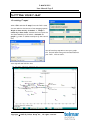
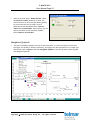
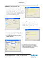
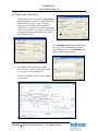
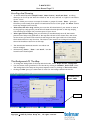
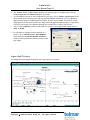
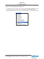
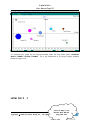
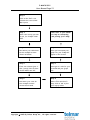
P-MAPS 2011 User Manual Page 1 P-MAPS 2015 User Manual For further assistance call the Helpdesk on 020 7467 2575 Copyright 2015 By Telmar Group Inc., All rights reserved P-MAPS 2011 User Manual Page 2 INTRODUCTION .................................................................................. 3 Main Features Of Telmar P-Maps ..............................................................................................................3 SETTING UP YOUR CROSSTAB .................................................................. 4 Getting Started..............................................................................................................................................4 Entering Your Table Base .............................................................................................................................4 Entering Your Two Columns .........................................................................................................................4 Entering Your Rows........................................................................................................................................4 PLOTTING YOUR P-MAP ......................................................................... 5 Accessing P-maps ...........................................................................................................................................5 CHANGING THE APPEARANCE OF YOUR GRAPH .............................................. 7 Moving Data Labels ........................................................................................................................................7 Colour Data Labels .........................................................................................................................................7 Editing The Number Of Brands Shown On Your Map ............................................................................8 Data Labels/Data Lines/Data Bubbles ......................................................................................................8 Free Arrows And Free Labels .....................................................................................................................9 Weighted Symbols ....................................................................................................................................... 10 X/Y Axis and Title Text ............................................................................................................................. 12 Scrolling And Zooming ................................................................................................................................ 13 The Background Of The Map .................................................................................................................... 13 Logos And Pictures ...................................................................................................................................... 14 Origin At 100 And Resize For Best Fit ................................................................................................... 15 SAVING AND EXPORTING YOUR P-MAP ...................................................... 16 Saving Your P-Map As A Default Template File ................................................................................... 16 Saving Your P-Map As A Graph File ......................................................................................................... 16 Opening A Previously Saved P-Map .......................................................................................................... 16 Saving Your P-Map For Use Within PowerPoint (Or Graphics Package) .......................................... 16 Copying/Pasting Your P-Map Into PowerPoint (Or Graphics Package) ............................................. 17 Setting Up P-Maps Using Your Own Data ............................................................................................... 17 SETTING UP P-MAPS USING YOUR OWN DATA............... 18 Entering your own data ............................................................................................................................... 18 HOW DO I …? .................................................................................... 20 For further assistance call the Helpdesk on 020 7467 2575 Copyright 2015 By Telmar Group Inc., All rights reserved P-MAPS 2011 User Manual Page 3 INTRODUCTION Telmar’s innovative P-Maps program allows clients to plot full-colour graphs directly from TNT+ or using their own data (please see page 18 of the manual). To create a map directly from TNT+ all the user has to do is enter two columns in TNT+ (e.g. ‘Age 45+’; ‘Class ABC1’) together with a selection of rows (usually brands). In a matter of seconds P-Maps will plot your TNT+ data as a full colour graph, with your two columns represented by the X and Y axes. Main Features Of Telmar P-Maps A quick and easy way to obtain an instant overview of a market. Graphs are plotted directly from TNT+. Full-colour graphs. Brand sizes can be represented by different sized circles. Ability to customise the appearance of your P-Map. Option of exporting your P-Map into PowerPoint or a similar graphics package. For further assistance call the Helpdesk on 020 7467 2575 Copyright 2015 By Telmar Group Inc., All rights reserved P-MAPS 2011 User Manual Page 4 SETTING UP YOUR CROSSTAB Getting Started Click on the TNT+ icon. Select the survey you wish to use, for example TGI 2007 Q1 (October 2005- September 2006). Entering Your Table Base Now select the group of people on which you wish to base your Crosstab. In this example we have chosen a base of ‘Men’. Entering Your Two Columns The columns you select here will represent the X and Y axes on your P-Map. Remember to enter just two columns, as P-Maps only plots in two dimensions. In the example below, we have chosen to plot a selection of brands by age and class. We have selected the two columns: ‘Age 45+’ and ‘Class ABC1’. Entering Your Rows Now enter the brands that you wish to plot on your P-Map. These should be entered separately, as shown below. In this example, we have chosen a selection of After Shave/Male Fragrance brands. For further assistance call the Helpdesk on 020 7467 2575 Copyright 2015 By Telmar Group Inc., All rights reserved P-MAPS 2011 User Manual Page 5 PLOTTING YOUR P-MAP Accessing P-maps Select ‘File’ and then ‘P-maps’ from the TNT+ menu. You are asked to choose one of two mapping options: ‘Graph a data item by 2 columns’ or ‘Graph a column by 2 data items’. Choose the first option. In this same window you can select a ‘Variable to graph’ e.g. index or audience and specify the X and Y axis. You will now be prompted to save your graph file. This will have been given the same name as your TNT+. Click on ‘Save’. Your map will now look like this: For further assistance call the Helpdesk on 020 7467 2575 Copyright 2015 By Telmar Group Inc., All rights reserved P-MAPS 2011 User Manual Page 6 Alternatively, if you select the second option - ‘Graph a column by 2 data items’. Choose two different data items for the X and Y axis This graph looks like this: For further assistance call the Helpdesk on 020 7467 2575 Copyright 2015 By Telmar Group Inc., All rights reserved P-MAPS 2011 User Manual Page 7 CHANGING THE APPEARANCE OF YOUR GRAPH Moving Data Labels When the program has plotted your P-Map, you may find that some of your data labels are overlapping with each other, particularly if you have entered a large number of brands. To move a data label, simply click on it and drag it to the required position. A line will automatically lead from the data point. Colour Data Labels To change the characteristics of all labels, lines and bubbles, select ‘Options’, ‘Colour Data Labels’. Each brand label will automatically be given a different colour. As indicated in the map below: If you wish to temporarily remove the visibility of all your brands select ‘Options’, ‘Hide Labels/Lines’. For further assistance call the Helpdesk on 020 7467 2575 Copyright 2015 By Telmar Group Inc., All rights reserved P-MAPS 2011 User Manual Page 8 Editing The Number Of Brands Shown On Your Map All the brands entered in TNT+ will be shown on your map. If, however, you wish to limit the number of brands shown, e.g., to just the larger ones, click on the ‘Data’ option next to ‘Graph’. To sort brands by audience size, click on ‘Weight’. To eliminate the smaller rows, click on the first brand you wish to eliminate from the list, and then on the ‘Toggle Select’ button. Only the larger brands will now be selected. There is also the choice to ‘Select All’ the brands or ‘Select None’. Press ‘Graph’ to return to the map, as the following picture shows. Data Labels/Data Lines/Data Bubbles The Top menu ‘Global Format’, Data Labels/Data Lines/Data Bubbles allows you to collectively change all brands. For further assistance call the Helpdesk on 020 7467 2575 Copyright 2015 By Telmar Group Inc., All rights reserved P-MAPS 2011 User Manual Page 9 To individually alter a label, line or bubble place the cursor on the brand you wish to change and than right-hand click on your mouse, the ‘Label Properties’ box option appears. When individually altering labels you are given three options: ‘Label/Arrows/Bubble Properties’, from ‘Label Properties’ you can add a border and background to a specified width, shape and colour. In ‘Line Properties’ you can change the width colour, and the arrowhead height and width. In ‘Bubble Properties’ a border can be created with colour, shape and background. To hide or make invisible a particular brand on the graph, either right-hand click on the brand and select ‘Hide This Point’ or in ‘Label Properties’ de-select ‘Make Point Visible’. When a bubble that you want shown on the map is hidden behind another, right-hand click on the large bubble and a box with the option – ‘Bring To Front’ will appear, select it, and the small bubble will appear infront. When all Bubbles have been changed to the same colour, if you than decide that you would like a different colour for all bubbles, go to the dropdown menu ‘Global Format’, ‘Randomise Bubble Colours’. Free Arrows And Free Labels To give particular emphasis to a brand on your map you can place additional arrows and labels anywhere on your map by clicking on ‘Graph Format’, ‘Add Free Arrows/Labels’. For further assistance call the Helpdesk on 020 7467 2575 Copyright 2015 By Telmar Group Inc., All rights reserved P-MAPS 2011 User Manual Page 10 Under drop down menu ‘ Global Format’, ‘Free Arrows/Free Labels’ allows you to alter the characteristics of all arrows and labels globally. If you decide that you no longer require additional arrows and labels select ‘Options’, ‘Hide Free Arrows/Labels’. Alternatively you can delete individual arrows and labels by RHC, select ‘Remove Arrow/Label’. Weighted Symbols This option instantly changes the size of each data point to reflect the size of the brand; the larger the brand (in terms of audience), the bigger the data point will be. To weight your data points, select ‘Options’ and then ‘Weighted Symbols’ from the top menu. Below a graph with weighted symbols: For further assistance call the Helpdesk on 020 7467 2575 Copyright 2015 By Telmar Group Inc., All rights reserved P-MAPS 2011 User Manual Page 11 Quadrant Text And Axis Text Your map is divided into four quadrants. These can be labeled in order to enhance your audience’s understanding of the map. To add a quad text, select ‘Graph Format’, ‘Quadrant Text’ from the top menu, and type in your text. By selecting ‘Properties’ you can add a border and background, and ‘Set Font’ allows you to change the font if you so wish. Within the ‘Quadrant Text’ is the ‘Properties’ button, this allows you to give the text a visible border and background, to a specified width, colour, style and font. Alternatively, ‘Quadrant Properties’ can be accessed through the ‘Global Format’ drop-down menu. If you wish to abbreviate the X and Y axis text, alter it or change the font go to ‘Graph Format’, ‘Axis Text’. If you wish to hide the X and Y axis, select ‘Options’, ‘Hide Axis’. The ‘Set Font’ button in the ‘Axis Text’ window can also be accessed from ‘Global Format’, ‘Axis Properties’. In this screen the font characteristics can be changed. For further assistance call the Helpdesk on 020 7467 2575 Copyright 2015 By Telmar Group Inc., All rights reserved P-MAPS 2011 User Manual Page 12 X/Y Axis and Title Text To label the X and Y axis, select ‘Graph Format’, ’Title’ and type in a text. The ‘Axis’ window also allows you to type in an X and Y axis text, change the font, add grid lines and keep or remove the axis values. The X and Y axis degree values can be altered. The option now also exists to change the colour and width of the X and Y axis and line border. The ‘Titles’ window allows you to add a title and source, alter the font giving them a left, right or centre alignment. Here is an example of some of the changes you can make: The TOP/RIGHT AXIS window also allows you to type in a Top and Right axis text and change the font. The TOP/RIGHT axis degree values can be altered. For further assistance call the Helpdesk on 020 7467 2575 Copyright 2015 By Telmar Group Inc., All rights reserved P-MAPS 2011 User Manual Page 13 Scrolling And Zooming To Scroll and Zoom select ‘Graph Format’, ‘Chart Position’, ‘Scroll and Zoom’. Scrolling allows you to scroll ‘up’ and ‘down’ the values of the ‘X’ axis, and ‘left’ to ‘right’ for the values of the ‘Y’ axis. ‘Zoom +’ allows you to zoom-in on specific brands or groups of brands. ‘Zoom -’ gives you the ability to move away from specific brands and zoom-out of the graph. The ‘Reset’ button turns any changes back to normal. ‘Allow zoom with left-drag’ enables you to use the left-hand side of your mouse to zoom-in to the graph by using specific points where brands have been plotted on the map. Simply, click and drag (a straight line) on a data point of your choice. ‘Allow right-mouse Panning’ gives you the ability to simultaneously move all the brands plotted on the map to any quadrant of the map with the aid of the mouse. Place the cursor on the section you wish to move and click and drag with the right-hand side of the mouse, the brands will move in any direction. The values of the X and Y axis change according to where the brands are moved to on the map. The minimum and maximum X and Y axis values can also be changed. Alternatively, ‘Zoom +’, ‘Zoom –‘ and ‘Scroll…’ are also located on the button panel. The Background Of The Map To change the background of the map and the border, select ‘Graph Format‘, ‘Background’. You can choose colour gradients for the border by clicking on ‘Gradient’, ‘Start’/‘End’ colour. The background of the map can be given a separate colour by clicking on ‘Plot Area Colour’. Clicking on ‘Solid’ gives you a solid band of colour for the background and the border. BACKGROUND/ PLOT AREA BORDER For further assistance call the Helpdesk on 020 7467 2575 Copyright 2015 By Telmar Group Inc., All rights reserved P-MAPS 2011 User Manual Page 14 The ‘Picture’ option in ‘Chart Area’ allows you to add a picture or company Logo. Click on ‘Load Picture’ and then ‘Remove Picture’ if you wish. To load smaller pictures to the background of your map, click on ‘Insert Logo/Picture’ on the button panel at the bottom of the map. By choosing ‘Insert Picture’ an icon (ico), Metafile (wmf), Bitmap (bmp) or JPEG Image File (JPEG), picture can be loaded. The location of the image appears on the button panel. The image can be dragged around the map; by right-hand clicking on the image a box appears allowing you to duplicate or remove your picture. There is also a ‘Remove’ button on the panel. To return to the original button panel click on ‘Back to Graph’. It is possible to change the data bubbles to a picture. Go to ‘Global Format’, ‘Data Bubbles’ which opens up the Default Bubble Properties window. Select Load under Bubble picture to add your image. Logos And Pictures The P-Map below has weighted symbols and a logo added as a picture: For further assistance call the Helpdesk on 020 7467 2575 Copyright 2015 By Telmar Group Inc., All rights reserved P-MAPS 2011 User Manual Page 15 Origin At 100 And Resize For Best Fit As a default your X and Y origin is set at an index of 100. The ‘Resize for Best Fit’ will alter the origin, if you desire to reset at 100, select ‘Origin at 100’ under ‘Global Format’. ‘Resize for Best Fit’ resets your X and Y-axis so that all brands sit on the map comfortably. For further assistance call the Helpdesk on 020 7467 2575 Copyright 2015 By Telmar Group Inc., All rights reserved P-MAPS 2011 User Manual Page 16 SAVING AND EXPORTING YOUR P-MAP Saving Your P-Map As A Default Template File If you wish to save your map with specific characteristics for later use, you can save your P-map as a TEMPLATE or DEFAULT TEMPLATE file (TEM). Select ‘File’, ’Template’, ‘Save As…’ or ‘Save as Default’. At a later date, when you wish to open the file, select ‘File’, ‘Open’, As below: Saving Your P-Map As A Graph File Click on ‘File’ and then ‘Save As’, ‘Graph File(GP2)’ from the top menu. Your graph will now be saved for future reference. Opening A Previously Saved P-Map Click on ‘File’ and then ‘Open’, P-maps Graph File (GP2)’ from the top menu. Select your chosen ‘P-Map’ and click on ‘OK’. Saving Your P-Map For Use Within PowerPoint (Or Graphics Package) If you would like to be able to save your P-Map in a file format that can be accessed from within PowerPoint or another graphics package, click on ‘File’, than ‘Save As’, once in the ‘Save As’ box, click on ‘Save As Type’: Bitmap(BMP); Metafile (WMF); Enh. Metafile (EMF). To access your file from within PowerPoint, choose ‘Insert’, ‘Picture’, ‘From File’ from the PowerPoint drop down menu. For further assistance call the Helpdesk on 020 7467 2575 Copyright 2015 By Telmar Group Inc., All rights reserved P-MAPS 2011 User Manual Page 17 Copying/Pasting Your P-Map Into PowerPoint (Or Graphics Package) Alternatively, if you wish to paste your P-Map straight into PowerPoint, click on ‘Edit’ and then ‘Copy as Bitmap’, ’Copy as Metafile’. Go into the program and click on paste. Your P-Map will now appear. From the same option the data values can be copied into Excel, click on ‘Copy as Value’. Setting Up P-Maps Using Your Own Data Telmar’s innovative P-Maps program allows clients to plot full-colour graphs using their own data. All the user has to do is enter four criteria, seconds later a versatile graph is drawn. The graph can then be easily customised with the ability to: Change the scale of your axis Automatic resize the chart for best fit Save your own templates (e.g. Font sizes) Bubble radius size options Zooming and Panning facility Logos/Pictures can be imported as bubbles and backgrounds Export facility into Powerpoint or similar graphics package For further assistance call the Helpdesk on 020 7467 2575 Copyright 2015 By Telmar Group Inc., All rights reserved P-MAPS 2011 User Manual Page 18 SETTING UP P-MAPS USING YOUR OWN DATA Entering your own data Open P-Maps and select the ‘Start New Manual Map (Own Data)’ option. This is the first grid you will see. Enter the title that you want shown on the map, then place the total universe size of the item in that row in the WEIGHT cell. Secondly, enter X and Y axis variables; this tells the program where you want the title to sit on the map. For further assistance call the Helpdesk on 020 7467 2575 Copyright 2015 By Telmar Group Inc., All rights reserved P-MAPS 2011 User Manual Page 19 To add extra rows double click on the next available row. You can either manually input your data as shown above or paste data into the grid from another application using PASTE button. You can highlight rows and copy the data into other packages, by selecting the relevant rows and then clicking on COPY SELECTED. If you want to copy the whole grid into other packages click on the COPY ALL button. The SAVE AS button saves the data as a .CSV file. To see the graph, click on the GRAPH button. The program confirms how many items will be processed. Select YES to continue and the graph will appear. For further assistance call the Helpdesk on 020 7467 2575 Copyright 2015 By Telmar Group Inc., All rights reserved P-MAPS 2011 User Manual Page 20 To customize your graph use the options available under the drop down menus: OPTIONS; GRAPH FORMAT; GLOBAL FORMAT. For a full explanation of the graph options available please see pages 7-15. HOW DO I …? Create P-Map on the Bottled Wine Market For further assistance call the Helpdesk on 020 7467 2575 using TGI data Copyright 2015 By Telmar Group Inc., All rights reserved P-MAPS 2011 User Manual Page 21 Step 1 Click on the TNT+ icon. Choose the ‘Start a New Run’ option. Step 2 Select the survey you wish to use, for example ‘1999 TGI’. Now refer to your manual for help on customising and printing your P-Map. Step 3 Step 8 Now select your table base. In this example we have chosen ‘all adults’. Once you have saved your graph file, your P-Map will appear on the screen! Step 4 Step 7 Enter two columns (your ‘x’ and ‘y’ axes). Here we have chosen ‘ABC1; and ‘45+’. Now type in a title for your Crosstab and your graph file. Step 5 Step 6 Now enter your rows. In this example we have chosen wine brands. Select ‘File’ and then ‘Pmap’. Click on ‘OK’ to plot your map by index. For further assistance call the Helpdesk on 020 7467 2575 Copyright 2015 By Telmar Group Inc., All rights reserved