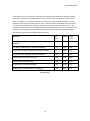
1
Group MEA12633
2
Group MEA12633
3
Group MEA12633
4
Group MEA12633
Table Of Contents
1. Preface ........................................................................................................................................................... 7
2. Problem Analysis ........................................................................................................................................... 8
2.1. Target Group Analysis........................................................................................................................... 10
2.2. Motivation ............................................................................................................................................ 11
2.3. User Interface ....................................................................................................................................... 12
3. Problem Statement ..................................................................................................................................... 14
4. Concept........................................................................................................................................................ 15
5. LO-FI Design ................................................................................................................................................. 18
5.1. Design Process ...................................................................................................................................... 20
5.1.1. The First Draft ................................................................................................................................ 20
5.1.2. The Second Draft ........................................................................................................................... 21
5.1.3. Evaluating the Drafts ..................................................................................................................... 23
6. Test Methods ............................................................................................................................................... 24
7. LO-FI 1: Interface Usability .......................................................................................................................... 25
7.1. Procedure ............................................................................................................................................. 26
7.2. Host Introduction ................................................................................................................................. 26
7.3. Hypotheses ........................................................................................................................................... 26
7.4. Analysis ................................................................................................................................................. 26
8. LO-FI 2: Animation and Rotation ................................................................................................................. 28
8.1. Procedure ............................................................................................................................................. 29
8.2. Host Introduction ................................................................................................................................. 29
8.3. Analysis ................................................................................................................................................. 30
9. HI-FI Design .................................................................................................................................................. 31
9.1. Animated Interface ............................................................................................................................... 32
9.2. Initial Animation ................................................................................................................................... 37
10. Animation .................................................................................................................................................. 40
10.1. Design ................................................................................................................................................. 40
10.2. Implementation .................................................................................................................................. 47
11. Implementation ......................................................................................................................................... 51
5
Group MEA12633
11.1. Setup ................................................................................................................................................... 52
11.2. Code Implementation ......................................................................................................................... 54
12. HI-FI Test .................................................................................................................................................... 58
12.1. Procedure ........................................................................................................................................... 58
12.2. Setup ................................................................................................................................................... 59
12.3. Host Introduction ............................................................................................................................... 59
12.4. Hypotheses ......................................................................................................................................... 60
12.4.1. Test 1 ........................................................................................................................................... 60
12.4.2. Test 2 ........................................................................................................................................... 60
12.4.3. Test 3 ........................................................................................................................................... 60
12.4.4. Test 4 ........................................................................................................................................... 61
12.5. Analysis ............................................................................................................................................... 61
12.5.1. Test 1 ........................................................................................................................................... 61
12.5.2. Test 2 ........................................................................................................................................... 62
12.5.3. Test 3 ........................................................................................................................................... 63
12.5.4. Test 4 ........................................................................................................................................... 65
13. Discussion .................................................................................................................................................. 69
14. Conclusion ................................................................................................................................................. 72
15. Perspective ................................................................................................................................................ 73
16. References ................................................................................................................................................. 74
16.1. Litterature ........................................................................................................................................... 74
16.2. Figure Images...................................................................................................................................... 76
6
Group MEA12633
1. Preface
The following report was written during the sixth semester project in the period of 01.02-01.06
-2012 in the study of medialogy at Aalborg University by group MEA12633.
The report concerns a case study in cooperation with Hjørring library, investigating aspects of
animations and it influence on user experience.
Throughout the report the source of references are made following the methods of the
Chicago style. The references are thus given by the author's surname followed by the
publication year contained inside brackets, e.g. [surname, year]. In the case of multiple
authors, the brackets will include “et al.” e.g. [surname et al., year]
Furthermore, when the reference are typed before a period of a sentence it refers to the
current sentence. If typed after a sentence it refers to the entire section.
The group members will like to thank the people who have supported us throughout the
project. Special thanks goes to Hjørring library, warmly welcoming us and putting their
facilities to disposal in relation to our experiment.
7
Group MEA12633
2. Problem Analysis
With Hjørring library as collaborator, the initial agenda concerned gaining an understanding of
the premise and vision that characterized the library. In this section, the most significant goals
and vision will be enlightened in the process of developing a suitable concept complementing
the library room.
The libraries in Denmark, has through the recent decade faced the challenges of being relevant
in a society where information quickly and easily can be accessed, due to significance of the
technological progress as well as the increasing globalization. The internet has progressively
become available to everyone and can supply almost every needed information that the library
avails. The dissemination of E-books together with the popularity of smartphones, kindles and
Tablets, also competes with the fictional and nonfictional literature available. Most libraries so
far manages this transition successfully by facilitating online services and offering digital
products, such as acquiring licenses to E-books, music and films. However, the identity of the
physical library had to be renewed to satisfy other needs than product-oriented services.
In a recent report, initiatives as to the direction of the public libraries was elaborated,
emphasizing several aspects that facilitates the needs to promote Denmark as a knowledge
society. This is related to a globalization that has become more and more prominent and
apparent. The Danish companies relocate their production abroad the borders as the price of
labor is not close to competitive in comparison. This stresses the importance of promoting the
competitiveness of Denmark in other areas such as offering products and services, qualifying
themselves through their functionality, innovative and high-quality abilities. Knowledge is a
key element that enables these aspects, thus, focusing on high education, entrepreneurship
and innovation are important.[Styrelsen for Bibliotek og Medier, 2010]
Hjørring main library has successfully taken part in this development with the vision to inspire
the public to learn, be innovative and creative. The physical library is well known even outside
the borders of Denmark and is in itself a medium for their vision. The physical room facilitates
a lot of functionalities such as events and workshops, inspiring installations and decorations
and simply as a place to meet. It is meant to create the good and inspiring experience that
affects people.[Hjørring Kommune 2011] To give an impression of the library see the images in
figure 2.
Through the initial meetings the library presented their vision and further clarified which
interesting aspects that could be addressed as part of the case. However, no fixed framework
was elaborated, thus giving the freedom to be creative in the development of a suitable
product or installation. The presented aspects included:
8
Group MEA12633
Coherency: This is one of the most evident elements presented by the library with multiple
significances. The interior of the library is connected by a broad red line meant to create
connections throughout the library room (see figure 2). The staff wished to further emphasize
this physical connection by additional measures. In addition, a few small rooms were rarely
visited, which also enabled possible initiatives to enhance the awareness of these.
The library makes sure to repeatedly renew itself and keep itself interesting. Not only through
events and cooperations with a variety of institutes, but also its interior facilities, frequently
interchanging the installations and highlighted material. This motive follows certain themes,
selected by the library staff, which are prominent for a period of time. Developing a concept
that in some way relates to these themes would further enhance the aspect of coherency. In
the time frame of this case, the theme was “the 30’s”, leaving room for free interpretation to
satisfy this request.
Inspiration: Following the previous mentioned vision, the goal to inspire and motivate people
to independently learn and keep learning, was a major aspect to be attended. By this, the
concept did not have to be of obvious educational nature, but knowledge and information
could be incorporated as an underlying premise in the design.
The good experience: The general mission of the library revolves around the good experience.
The library’s role as a cultural and knowledge based institution with appeal to the different
segments of the society, has to be attractive and affect people. Designing for the good
experience is thus a prominent rule of thumb in this context.
Figure 2. Images illustrating the environment of Hjørring library.[1]
Preserving the above mentioned values as a foundation for the concept and design of an
installation or product, would ideally provide a favorable end-result from the library’s point of
view. Thus, attempting to incorporate as many aspects as possible was intended.
9
Group MEA12633
2.1. Target Group Analysis
The following information is based on a survey conducted prior 2010. It relates to the general
public library and is thus assumed to apply to Hjørring library. All presented conclusions and
presumption consequently relates to these data. [Styrelsen for Bibliotek & Medier, 2010]
Even though libraries in general is in transition, where the physical room has to attend
different tasks than product oriented services, the act of lending books is still one of the main
reasons that the Danes visits the library. Following this is: “lending electronic media”, “taking
the kids to the library” and “going to events”. In 2004, 85% of the adult library users did visit
the library with intention of lending books. However, there has been a decrease in the physical
book and media loans by 22 % from 2000 to 2008. In parallel the online loans has increased by
48% from 2007 to 2008 showing a tendency, that the web-based services are taking over. Yet,
the number of visitors remains stable, which evidently illustrates that the library succeeds to
remain relevant in other areas as a result of the process of renewal. Statistics shows that two
thirds of the Danish public is using the library and 29% of the adult segment visits the library at
least once every month. In 2008 the public libraries had more than 34 million visitors.
Based on these statistics, the segment of the common library visitors is broad and many adults
are looking for physical material when visiting. As the library strives to satisfy the needs of the
general public, any segment, being it children, young, adults or the elderly, needs to be
represented and facilitated.
Reviewing the most important values established through the library’s vision and the target
group analysis, the rough initial concept for a product was developed. As it was evident that
the physical material still was relevant and needed to properly be presented and made aware
of, it was proposed that this could be achieved through an interactive informative table. It had
to complement the vision to inspire and create basis for a good experience for the visiting
guests. In addition, it should have the ability to create a connection to other parts of the library
and complement the theme, to support the aspect of coherency.
To be relevant in a room saturated with aesthetic design and experience-facilitated
installations and exhibitions, the interactive table had to attract the visitors and motivate them
to use and explore it, to access the information it offered. Motivation is a key term in this
aspect, as the success partly relies on the visitors’ interest and willingness to utilize the
products, as well as the beneficial outcomes of the experience. This will further enlighten
which factors that promotes inspiration and creativity.
10
Group MEA12633
2.2. Motivation
If nothing else mentioned [Ryan, R. & Deci, E. 2000]
Motivation is basically the phenomenon that moves the human being to act and do something.
It is the why of the actions and the research in the area has mainly concerned the context of
learning and task-handling in schools and workplaces. A lot of theories have been applied to
define motivation, one of the most prominent being the self-determination theory. This seeks
to distinguish between different types of motivation, and how each of these affects the selfperception of an act. Roughly, it can be separated into two general categories, namely:
Intrinsic and extrinsic motivation.
The intrinsic motivation relates to the satisfaction and interest of the act itself. The reason for
doing something is thus only reliant on the self-perception of pleasure with no conscious
external factor affecting the decision for approaching the task. The feeling of complete
autonomy is thus the defining ground stone of this definition. Researcher stresses that intrinsic
motivation should be pursued, especially in the context of learning, as it will significantly
contribute to increased creativity, learnability and curiosity. Optimal challenge and the feeling
of competence are important factors promoting this aspect. However, these factors are only
applicable as long as the task is self-determined. Free choices and opportunities are thus
natural criteria for facilitating the intrinsic motivation.
Extrinsic motivation contradicts intrinsic and they cannot coexist by definition. The extrinsic
motivation generally involves some sort of external factors influencing on some way or
another, making the act not exclusively autonomous.
It should be noted that the degree of a specific motivation is varying and that the orientation
should not be treated as a bidirectional property when applied in praxis. This is explained by a
subcategory to the self-determination theory called the orgasmic integration theory which
further divides the extrinsic motivation based on the degree of autonomy that dominates a
specific task. Here intrinsic motivation is reliant on the self-perception of high competence and
complete self-determination. While this might be unrealistic to hope for when presenting a
new product, facilitating the factors promoting intrinsic motivation as much as possible should
be pursued to approximate intrinsically values.
Applying these theoretical aspects to the vision of the library, it is clear that intrinsic
motivation is the most applicable. In contrast to the educational institutes, it is not the main
interest of the library to teach the public, but rather inspire them to learn for themselves and
create an interest in various categories of knowledge through the good experiences.
Consequently this will foster creativity and innovative qualities. When developing the case
product, the focus should concurrently be concentrated around a premise that strives to
motivate the users in this direction. The next section will investigating interaction and
11
Group MEA12633
interface design to cast light on some elements that researchers propose are contributing
towards a greater user experience.
2.3. User Interface
Following the typical usability heuristics, it is important to design for factors such as
effectiveness and efficiency when developing a user interface [Frøkjær et. al., 2000]. However,
researchers in the area of human-computer interaction has progressively valued the aspect of
the user experience as just as an important dimension. This basically relates to the individuals
subjective attitude towards a product and is thus separated from the aspect of productivity.
This is true, even though some studies has suggested that usability and pleasure are
correlating in some contexts. Acknowledging and understanding the relation between usability
and the user experience is therefore important, as knowing when they complement and
contrast each other can lead to a more successful design. [Rogers, Y. et. al., 2007] A
challenging interaction prone to error can for instance lead to a more enjoyable experience
following the theory of flow.
Aiming for enhanced user experience aligns with the goals that usually applies to the area of
entertainment, such as video games[Jung, J. et. al. 2010]. Here the concepts of engagement
and fun are the dominating metrics for success. Several studies has dealt with the facilitation
of playful interfaces and has suggested that integrating factors increasing the need to be active
and to explore, can result in a more pleasurable interaction [Stoney, S., et. al. 1998] &
[Korhonen, H. et. al., 2009].
A set of design principles has been formulated to help facilitating the experience design that,
under many circumstances, should be accounted during the development and evaluation of
user-facilitated product. The most common are visibility, feedback, constraints, consistency
and affordances. [Rogers, Y. et. al., 2007]
Correlation with many of the above principles, the use of a physical object as part of the
interaction, is potentially the most rewarding. It involves the utility of a physical token, used
alone or in collaboration with other input methods as a way of manipulating virtual functions.
A classical computer mouse, for example, do actually fit this category. However, the utility of a
such is still of more or less abstract nature. Physical objects has the advantages of providing a
more effortless mapping making it easier to use, when integrated successfully. Studies like
[Bruce, T et al., 2001] emphasize that closely coupling the action- and the perception space
will improve the user interaction. Most tangible user interface (TUI) provides this connection
and further amplifies it by unifying the input and output visually. [Scneider et. al.,] proposes
that a tangible object further can contribute to enhanced playful interactions when used in
learning environments.
12
Group MEA12633
Visual appeal can enhance the experience of an interface. However, few have studied the
applications and benefits from using animation in the design. According to [Bruce, T. et.al.
2001] using the principles from cartoon animation, have shown several advances that
contribute to the user experience when applied to the interface itself. The abrupt transitions
between different menus and states can seem distracting for user, even when it is only for a
split of a second. By animating a continuing transition, chances are that focus will be
maintained on the task at hand. Hypothetical, this will further preserve the sensation of
engagement important to the experience design. Another contributing factor is that it can
signify affordances related to a virtual object by giving it substance and guide the users
attention to different attributes of the visual space. Factors such as anticipation and
exaggeration are applicable in this context. In relation to feedback animation can further
emphasize the results of the users actions.
According to the findings of this study, the application of animation does facilitate the user
experience on many levels and emphasizes several factors that supports the previous stated
design principles. Incorporating the use of both tangible objects and animations is
consequently prosperous contributions when designing the interactive table.
13
Group MEA12633
3. Problem Statement
Through the problem analysis several concepts has been attended, all which are related to
optimize the experience of human-computer interactions. Based on the vision of Hjørring
library, it was suggested that the good and joyful experience would intrinsically motivate the
visitors, fostering qualities such as inspiration and creativity. A concept of installing an
interactive table in the library room, containing information related to the theme and relevant
material, was established based on the desired criteria proposed by the library staff.
The presented principles and findings, constituting a good interface design in relation to the
user experience, proposed many possible opportunities for what qualities the interactive table
could possess. Aspects such as playfulness, activity and exploration should be moderately
incorporated, while not contradicting the visitors self-perception of competence during
interaction. The subtle balance between usability and user experience must therefore be
sought for a successful result.
Tangible objects was proposed to facilitate the ease of use, as well as contribute with the
quality of playfulness. This combination complements the desired relation and is thus obvious
to take advantage of in the design process. Even though only few studies has investigated the
benefits of integrating animations in the interface, a successfully utility of this concept seems
promising. The visual appeal and continuity of virtual events optimally promotes the chance of
engagement and pleasure during interaction. At the same time it shows qualities in guiding the
users attention and increasing affordances of the virtual elements. As it complements a lot of
the above premises for the good experience design, animation is a area that merits further
investigation in this context.
This leads to the following statement:
“How can an tangible user-interface be developed, that facilitates an enjoyable userexperience for the visitors of Hjørring library, using animation in the visual design.”
The experience should: motivate them to initiate use, motivate them to explore the content
information of the interface and consequently inspire them.
Animation in this study is defined as a continuar sequence consisting of more than two frames
which enables movement and progress.
14
Group MEA12633
4. Concept
Following the aspects from the section 2.Problem analysis, a more extensive concept for the
interactive table could be established. It was apparent that both the use of tangible objects
and animations correlated with the design principles of promoting the good user experience.
Consequently, these should be a significant element in the further development.
The first considerations concerned more specifically which role and identity the interactive
table should possess to fit the visionary criteria of the library. In this aspect, the table should
not function as a replacement or an improvement of any information system already installed
in the library. Rather, it should act as an installation that highlights specific material and
informations to inspire the visitors on some level. This could be about a physical book available
somewhere in the library or interesting aspect about the present theme. These information
should consequently be elicited via a visual displays on the top of the table.
As the table should be installed in the library room, accommodating the possibility for multiple
users at a time was a an obvious attribute to integrate. To facilitate this need, the concept of a
movable interfaces was established. The users should be able to have their own local interface
and interaction space on the same time. Already having determined to utilize tangible objects
in the design, the applicability in this aspect was a prominent opportunity. Based on this, it was
decided to connect the tangible objects as a way to move the visual interface around if
needed.
Deciding to incorporate the tangible benefits as a way to transport the visual attributes,
required the need to use an additional input method. It was therefore decided to
accommodate the use of natural interaction, already constituted by tangible objects, by
allowing the use of multi touch.
Based on the above aspects, three interaction methods was decided to be used. These are
illustrated in figure 4.
15
Group MEA12633
Figure 4. The three kinds of interactions which are used by the user to manipulate the interface.
Left: rotate the tangible object. Middle: Move the tangible o bject. Right: touch on surface to
enter functions.
The tangible objects should facilitate movement and rotation and the multi touch should be
used as a way to interact with the virtual attributes of the visual display.
As the end goal of this development relates to motivating the user to explore the interface
and inspire about the theme and literature within the library, the specifics about the what
information the interface should contain, needed to be specified. Similar to the already
established systems of the library, the interface should feature a book container including
descriptive informations about a number of books. These informations should be constituted
by aspects such as reviews, content, author biography and its location in the library.
To facilitate the theme of the library, additional informations related to this should also be
available. Taking advantages of the possibilities of a visual display, elements such as images
and movies was obvious to include, diverging the type of media to satisfy a broader area of
interest. In addition, a selected variety of facts related to the theme should also be included.
As previously mentioned, the content information should be limited to include only a selected
collection of informations. It enables the library to emphasize and create attention on a
narrow area to their interest. However, as the utility of several tangible object already was
decided, the concept was further expanded to apply uniqueness to them. Consequently, the
current theme could be separated in additional sub-themes each linked to a specific object.
This aspect would incorporate a broader variety of information, still maintaining the factor of
delimitation. Such an object was named “chip”.
The structure of the visual interface should present different menus within the system. The
user should launch the interface by placing the chip on the tables surface, representing the
possibility to move and rotate the menus as pleased. The initial display serves as the main
menu where it should be possible to explore the different function by touching. When
16
Group MEA12633
accessing the functions related to the theme, a previewer should be presented allowing the
user to browse between different movies, images or facts as pleased. When entering the
books function, a selection of these are visually presented by their original covers and their
titles. By selecting one of the books’ sub functions this should be displayed. This includes
specific informations about the writer, the contents and reviews. The functions as well as the
sub functions should be presented in different views according to the state of the chip, forcing
the user to rotate or move it. Even though this increases the challenge of using the interface, it
is an important aspect, that is meant to increase the joyful interaction. This is based on the
findings from the problem analysis: User experience, suggesting that increased activity as well
as optimally challenge, results in an improved user experience.
This concept was the bare principle in the development process. Utilizing the tangible objects
to turn and rotate the visual interface, satisfies both the comfortability for multiple users, but
also hypothetically contributes to an enhanced user-experience. The main concern, has been
to satisfy the criteria set by the library, related to coherency, inspiration and the good
experience. Despite building the system of information according to the theme, the location of
the highlighted material is presented, motivating the visitors to physically progress in the
library room, after using the interactive table. Both aspects complements an enhancement of
coherency. Benefitting from this, the location of the table should optimally be close to the
library entrance.
The animation and visual interface serves as the main tools to motivate the utilization the
table. In addition, as sound feedback is not suitable to be used in a library, this further stresses
the importance of emphasizing this aspect.
17
Group MEA12633
5. LO-FI Design
When designing a user experience with focus on inspiring the library´s visitors, the goal is to
develop a good user interface which facilitates the criterias from human computer interaction
design principles related to the ones mentioned in section 2.3 User Interface. Based on this,
the following section will elaborate these and describe how they are used in relation to the
Interactive Information Table.
The design principles is an approach towards developing a product in conjunction with human
computer interactions. They are used as a guideline as to identify elements which supports a
positive experience.[Rogers, Y. et. al., 2007] These will now shortly be elaborated:
Affordance relates the attributes of an object which elicits how it can be used. For
example, a button should signify that it can be pressed. The affordances of virtual objects
often needs to be learned, whereas physical objects are more obvious and therefore
generally does not require a learning process.
Visibility, as the name implies, relates to how visible the different available functions are,
in addition to the placement of these relative to the users field of attention.
Feedback has to quickly and meaningfully be communicated in correlation with a
successfully performed user-action. The mediation can be constituted through visual,
auditory, tactile or verbal stimuli.
Constraints dictates that the possible options available at a given time should be restricted
and limited to a minimum. In addition to a possible reduced cognitive load of the user, this
will contribute to a need to explore and be active due to the increased amount interaction
that follows.
Consistency requires the interface to have similar behavior to a given action as well as a
consistent rule of structure.
The following subsection will elaborate the principles in relation to the Interactive Information
Table. In order to initiate the user experience, the first step to consider is how to direct the
user’s attention towards the table and make it clear that the table is interactive. This is
managed through the principles affordance and visibility at which an initial animation is
established. These dynamic animations will be described more thoroughly in chapter
Animation. The elements in the interface have to give a clear affordance and visibility to give
an expression of which interactive elements can be manipulated with apposed to others.
Therefore elements acting like buttons in the interface have to signal that they can be
interacted with and differ from the rest of the design. In order to empower the difference,
18
Group MEA12633
the effect of change blindness is incorporated through animations.
When the buttons are activated through actions, the interface have to give a unabiguish
feedback. The user should be given a clear acknowledgement of their interactions, making the
system give a visualized cue when recognizing the commands. Without any response from the
system the users might repeat the action which can cause undesirable problems. To prevent
such complications, it would be optimal if the system included 100 milliseconds or less before
responding, giving an instantaneous effect.
To limit the cognitive load, the functions are organized in different set of menus, reducing the
available possibilities to a minimal. These are constrained to the tangible object as the center
of the interface.
In context with the learning process the behavior have to be consistent in the way it responds,
which may make the interface easy to learn.
Finally, to enable a dynamic design in context with tangible objects, the interface should
somehow afford that it can be moved or rotated by using the chip. On this basis, the design
has been inspired by circular chart, where dynamics will be used as a motivational elements.
The design will be showed and discussed in section 5.LO-FI Design where the dynamics will be
developed after the LO-FI testings where it should be used in the final testings see section 10.
Animation.
19
Group MEA12633
5.1. Design Process
In extension to functions mentioned in section 4.Concept some drafts of the interface with
respect of the gathered knowledge have been developed. In this context the following section
will explain the ideas attached to the certain drafts and finish with and evaluation towards
which would be most suited and used in the testings.
5.1.1. The First Draft
The first draft is based on a simple interface including the needed elements described in
the section 4.Concept with some few added details due to the design principles. The draft
is developed upon the idea of making the interface as simple as possible including icon
designs to empower the functions oriented the chip. The menus for this first draft is
presented in figure 5.1 which give an overview of the idea.
Figure 5.1. This illustrates an overview of the menus from the first draft of the interface with
assigned numbers.
The main menu (1) illustrates the prime functions given by four different icons attached to the
squared chip. When touching the buttons which signal a book you enter the function related
to books (2). There will be displayed different books and in this case, six appears. To gain
further knowledge about the specific books, you point on one and the different aspects of
informations entailed to the single book is presented typographically beside the chosen (3).
20
Group MEA12633
When entering the button with an image, you enter a image previewer, (4) where it is possible
to shift between a series of different images. Above the previewer, a roll of images is
illustrated to indicate the amount of images. You shift between images by pointing on the
arrowheads allocated left and right of the presented image. A solid white arrowhead indicates
there are more images to see various the gray indicates the opposite, that there are no images
to see. A similar action is displayed when touching the button signaling information (6), where
different facts appear in a previewer. However, there is not any indication of how many
different facts available. The last function facilitates an overview of Hjørring library which
guides you to specific areas the library facilitates like importance bookshelves or even the
toilet.
When entering the different functions the feedback would be shifting to the related menu
instantly where any delays will be avoided. When going further into the different functions like
when pinpointing a book the book will shift appearance and make it clear that it is the one
picked among the rest of the books. The other books will still be displayed in case you would
change to another. When accessing the interface´s functions, and subfunctions, you are able to
go back by touching the buttons, enabling the main menu to appear once again.
5.1.2. The Second Draft
The second draft was developed upon the idea that the interface should be obvious for
the user to rotate the tangible object hence the interface and the draft is oriented on the
user experience towards books where all the information is related to a specific book
chosen by the user. An overview of the draft is seen in figure 5.2.
Figure 5.2. This illustrates an overview of the menues from the second draft of the interface
with assigned numbers.
The chip is round and when it is placed on the table the first menu appears (1). This menu
forces the user to choose a book before going deeper into the interface. When a book is picked
the other disappears and other functions will be displayed (2). By entering one of the functions
21
Group MEA12633
their respective menus will occur as an extension on the current menu, keeping the elements
within. When entering the functions called forfatter, referat and anmeldelse text boxes will be
showed where the respectively knowledge is attached. (3,4,5) illustrates the
functions appearing from different angular aspects oriented to the chip. When accessing the
function related to images (6), a image previewer is displayed including one image which can
be shifted by the fixed arrowheads. By touching fakta a representation of a specific amount of
facts is displayed which can be highlighted if pressed (7). In the function kort a map of Hjørring
library will be displayed and the area where the chosen book will be pointing out (8).
When shifting between the different menus it is possible to go back and chose a different
book, back in the start menu, by pressing the book icon visualised in all the menus.
22
Group MEA12633
5.1.3. Evaluating the Drafts
Both the drafts held good and bad things. Draft number one illustrates the required concept
very simple with an minimalistisk and static appearance where the focus is towards the
functions. Draft number two is a more complex and dynamic approach which is based on
specific elements of selected books.
Due to the aspects in the concept the interface design should be focused on knowledge from
the books available through the library. Draft number two facilitates this in a proper context
suited for this project where its dynamic should motivate the user to be inspired. Based on
this, draft number two is the interface design which is evaluated in further testings.
23
Group MEA12633
6. Test Methods
The following is a short description of the methods used for data analysis in the two LO-FI tests
and the HIFI test conducted in this project. All the data is assumed to be normal distributed
and when the test suffers from a low sample size of under thirty test subjects a students tdistribution is used. Descriptive data, confidence intervals, binomial confidence intervals and
independent two samples t-test are used to describe the data. The confidence intervals are
used to compare the means of two populations and make estimates on the true population
value. 95 percent of all means will be placed within the confidence intervals for an infinite
number of samples. The binomial confidence intervals are used when the samples can be
partitioned into two categories. This interval is not centered by a mean but instead centered
around proportion of success in percent. Independent two sample t-test is used when
comparing the mean of two independent samples. Here the range of possible differences
between the two values of the mean is in focus. [McKillup, S. 2005]. All the calculations for the
tests can be seen in appendix CD Excel.
24
Group MEA12633
7. LO-FI 1: Interface Usability
The goal of the first interface test was to find out how effective and efficient the interface was
and how satisfied the users were with the system. The test was related to the aspects
described in section 2.Problem Analysis, emphasizing that both usability and the user
experience should be proper facilitated for a successful end result. At this state of the process
it was thus interesting to investigate parts of the design, specifically focusing on complications
with comprehending its utility through the second draft. The focus was mainly to observe the
test subject while doing different tasks on a paper version of the interface and give them an
after-scenario questionnaires containing usability metrics about the three fundamental areas
of usability, - effectiveness, efficiency and satisfaction.
A task was made for each part of the system in relation to the functions mentioned in section
4.Concept. See the tasks in table 7. When the test subjects completed a task, they had to note
it down, to make sure they did not complete the task by chance without realizing it.
Task 1: Find the book <<Englemaersken>> and read the summary.
Task 2: Find out where the book <<Englemaersken>> is placed on the library.
Task 3: Find the book <<Rom>> and explore the images related to it.
Task 4: Find and read the author biography of the book <<Rom>>.
Task 5: Find and read the review of the book <<Englemaersken>>.
Task 6: Find and read the facts related to the book <<Rom>>.
Firgue 7. The six tasks from the interface usability LO-FI test.
The focus of the observation was to look after sign of frustration and where problems could
occur using the interface. For instance observing if they moved and rotated the chip as
intended. Effectiveness was estimated on the test subjects ability to complete a task and
efficiency was estimated on the amount of effort required to complete a task. The
questionnaire mainly contained usability metrics about the users satisfaction, but also about
effectiveness and efficiency of the interface. The after scenario questionnaire used 5 point
likert scales going from strongly disagree to strongly agree.[Tullis, T et al., 2008]
25
Group MEA12633
7.1. Procedure
Before the test a pilot test was conducted to avoid certain problems that could bias or damage
the final results. The target group for the LOFI-test was fellow students with knowledge of
technology. Each test subject was given a brief introduction and the six tasks in randomized
order. The host read the introduction and controlled the papers for the interface while the
observer wrote down every interesting observation. See illustration of the setup in section
11.1.Setup. When the test subject completed all tasks he was given the after-scenario
questionnaire. If there were any task the test subject did not complete, it was noted and he
continued with the next task. See the papers used during this LO-FI in Appendix.
7.2. Host Introduction
Welcome.
You have to do six tasks by exploring the interface in front of you. The interface is made of
paper, and functions as a touchscreen, where the interface changes when you press on
different buttons. You are allowed to rotate the interface if it helps you. You are asked to think
loud.
Thank you for your participation.
7.3. Hypotheses
It was expected that all the confidence intervals from the data collection were above 2.5
indicating the test subjects were satisfied with all parts of the interface and found it easy to
use.
7.4. Analysis
As seen in table 7.4, all the means of the data collection are more than 2.5 as expected and it
seems the test subjects are satisfied with the interface and find it easy to use. However, most
of the confidence intervals contain 2.5 and, thus, it can not be concluded with a 95 percent
probability. Only the fact that it is easy to find the summary and author biography is
statistically significant.
Observation and comments showed problems which might can be prevented by changing
some elements in the design for next iteration. Some test subjects thought they should turn
the triangle towards the book covers to choose a book, instead of just pressing the book
covers. In addition, it was commented the book covers did not look like buttons, were too
26
Group MEA12633
small and text was not consistent. Furthermore comments and observation showed that the
other buttons neither looked like buttons and the book covers titles were not visible. There
were no problems of rotating the interface and many test subjects liked the idea, but it was
difficult to test in the LO-FIdelity version. Thus, a new test will be made with focus on buttons
and rotation of interface in a more high fidelity version where the touch table is in use. The
problems occurred in this test will be changed for the following iteration. It is possible we have
biased the test subject because we did not change between positive and negative charged
words and this will also be changed in later iterations.
Question
Left
Limit
Mean Right
Limit
I am satisfied with how easy it is to use the
interface
2.45
4.14
5.83
It is easy to learn how to use the interface
2.37
4.29
6.20
It was easy to shift between the different books
2.1
3.86
5.62
In general I am satisfied with the interface
2.31
4
5.69
It was easy to find the summary
2.52
4.29
6.05
It was easy to find the map
2.22
4.14
6.07
It was easy to find the pictures
2.44
4.29
6.13
It was easy to find the author biography
2.78
4.57
6.37
Table 7.4. Confidence intervals from the questionnaires data. “1” is strongly disagree and “5” is
strongly agree.
27
Group MEA12633
8. LO-FI 2: Animation and Rotation
The goal of the following LO-FI test was to find the most appealing animation and static
appearance in relation to an interactive book button. The test was divided into three small
tests which were executed on the touch table utilizing fellow students as test subjects.
The first test concerned the different animations of the book buttons where the animations
chosen to be tested against each other was wiggle, pulse, shine and open/close, as illustrated
in figure 8.
Figure 8a. The four different animations. 1:Wiggle, as if the book is shaking. 2: Shine, where a
diffused rectangle is glenching downwards the cover. 3: Open/Close, as to flipping the
frontpage. 4: Pulse, resizing the cover with a scaling effect.
The second test concerned the visual appearance of the book buttons and the different effects
tested against each other can be seen in figure 8b.
Figure 8b. The book buttons including different compositions of layers as to make them pop out
of its background. 1: framing the button with different shades. 2: Round corners with a opacity
layer underneath. 3: Plain. 4: A solid frame.
28
Group MEA12633
A third test was conducted to find out how the user felt about the concept of rotating an
interface in order to read the displayed text. Different colored buttons was placed around a
prototype of the chip, and text became visible when the button was pressed. The direction of
the text was related to the position of the buttons which accordingly had the purpose to make
the test subject rotate the chip to read it. The chip, buttons and text is illustrated in figure 8c.
Figure x.x: Illustrates the design of the interface for the test of rotation. Picture 1 shows the
different colored buttons where picture 2 shows the text when one of the buttons is pressed.
8.1. Procedure
Before the LO-FI test was carried out a pilot test was conducted to avoid certain problems that
could bias or damage the final results. The host read the introduction paper and controlled the
touch table and computer, while the observer wrote down every interesting observation. First
the test subject was presented to an interface of the different book button animations and had
to chose the one motivating them the most. Secondly a new interface was showed with the
different book buttons static appearances and the test subject was asked to do the same task
again. Thereafter a new interface was showed where the test subject was asked to press
different buttons around a circle and read the associated text. Finally the test subjects was
asked if they thought the rotation of the interface was annoying with focus on gathering
qualitative data.
8.2. Host Introduction
Welcome.
You will be shown three different interfaces. In the first and second you have to choose the
button you think look most pressible. In the third you have to press different buttons in the
order I tell you and then read the associated text. Finally, we will have a talk about what you
29
Group MEA12633
tried.
Thank you for your participation.
8.3. Analysis
Related to the first task, to pinpoint which animations the test subject liked, the animation
with the shine effect was selected. Comments indicates the three dynamic animations got
annoying while the shine animation balanced between steering the users attention without
distracting them. Thus, the shine animation will be used for the book covers in the interface. In
the second task the test subject did find the book covers with round edges and perspective
most appealing to press because of the depth and this design will additionally be used for next
iteration.
In the third test it appeared it was annoying to rotate the interface if the purpose was
informations searching, but at the same time it contributed to entertainment. The short text
objects made the test subject rotate the interface more frequently than was intended for the
design accordingly to the concept. In the context of the entire system, the rotation is not
needed as frequent, and will hopefully not be a source of irritation but instead seen as a
enjoyable part of the interface.
For the next iteration the rotation system will be maintained and the book cover design with
round edges in perspective with shine animation will be used.
30
Group MEA12633
9. HI-FI Design
Based on the two drafts illustrated in section 5.LO-FI Design and the two LO-FI tests in section
7.LO-FI 1 and section 8.LO-FI 2, a high fidelity version of the interface has been designed. This
section describes design choices, design changes and considerations to the interface. This will
in large parts contain the visual aspects. The section is divided into two subsections consisting
of the animated version of the interface and the design of the initial animation.
To test how well the animation functions as a motivating element, another version without
animation has been made for the final test. This version is completely similar to the other, with
the only exception of animation which makes sure only one variable is changed.
The concept has been developed with focus on multiple chips for the table. However more
than one object was not possible to incorporate into the prototype as the resolution of the
table was too low to accommodate more than one interface at a time. As a consequence, only
one chip has been developed for the high fidelity version. The chip has been chosen to contain
a description fitting with the theme, which for this version will be: “The Great Depression”. The
chip can be seen in figure 9.
Figure 9. Picture 1 shows the design of the chip from the top. Picture 2 shows the design of the
chip from the bottom which contain a fiducial.
The design of the chip is round to create affordances of its functionality, to motivate the users
to rotate it and consequently the interface. It is made of a large layer of cork to have a height
31
Group MEA12633
which makes it easy to grab. Its size is adapted to the fiducial which is attached under it. More
about fiducials can be found in section 11.Implementation.
9.1. Animated Interface
To give the user the opportunity to explore more, the concept from first draft and the second
draft, have been put together. This mean the interface is to contain different layers. One layer
will concern the theme of the library in relation to the sub theme on the chip. This happens via
BILLEDER - images about the sub theme, FILM - movies about the sub theme, FAKTA - facts
about the sub themes and BØGER - books which relate to the sub theme. They are always
visible and therefore accessible for interaction.The other layer will concern information about
different books to chose from. This concerns ANMELDELSE - book reviews, FORFATTER - author
biography, LOCATION - map of the book placement in the library as well as a REFERAT synopsis. Figure 9.1a illustrates a series of images with the basic design of the start menu parts
for the subject, which acts as the first layer.
Figure 9.1a. Shows the different end poses for the start menu concerning the sub theme. Picture
1 shows the start menu which appears when the chip is placed. Picture 2 shows the circle slice
which should contain the book menu. Picture 3 shows the circle slice made with a textbox for
32
Group MEA12633
facts. Picture 4 shows the circle slice which should contain pictures and picture 5 shows the
circle slice which should contain movieclips.
As it can be seen, the design has changed from a closed circle stroke in the second draft to
consist of one or more open circles strokes. This is done in relation to the problems which
became apparent in LO-FI 1, where users were in doubt whether the circle slice should be
turned as, functioning like a button, as opposed to pressing the book they wanted to view. The
open circles strokes hinder this form interaction being available without being hard. The text
boxes is almost the same, but LO-FI 1 revealed that it was confusing for the user if the way the
text was represented was not consistent. This will be corrected in this version. Colors are
changed to only contain red nuances and white. This corresponds with the red line which is
ubiquitous in the Hjørring library. Furthermore it gives the opportunity to emphasize buttons
that can be interacted with as everything other than the red base color will be noticeable. The
start menu which contains the sub theme buttons has been made with less start buttons to
make them bigger and fit the amount of functions represented.
The second layer should motivate the user to find out of more about the chosen books the
interface will represent. Figure 9.1b illustrates a series of images with the basic sub book menu
parts under the books menu which act as the second layer. As seen, a darker red color has
been chosen to underline that it is the second layer in the interface the user is in.
33
Group MEA12633
Figure 9.1b shows the different end poses of the circle slices for the sub book menu. Picture 1
shows the circle slice with the review. Picture 2 shows the circle slice which should contain
only the sub book menu for the chosen book. Picture 3 shows the circle slice where a map of
the library should be placed. Picture 4 shows the circle slice for author info and picture 5 shows
the circle slice which should contain a synopsis of the chosen book .
Figure 9.1a and 9.1b illustrates the basic interface stages. To ensure the user can interact with
it, it has to be decided where the elements consisting of the book buttons, sub book buttons,
films, images, text and map should be placed. Most of the placement is retained from draft 2.
Figure 9.1c illustrates a series of images with the placement of the aforementioned elements.
34
Group MEA12633
Figure 9.1c The green rectangle illustrates movies and images. The white rectangle illustrates a
book and the strokes illustrates text. Picture 1 show the placement of movies and images and
how to leaf through them by the white triangles. Picture 2 shows the placement for the map
with the book it relates to and the sub book menu. Picture 3 shows the placement for text, sub
book menu and the book it relates to. Picture 4 shows the placement of books for the book
menu.
The BILLEDER circle slice and FILM circle slice should have the setup in the same way, wherein
a description text is placed above and buttons to each side to indicate the ability to browse
through the media. This functionality has been retained from the second draft. One of the sub
book buttons should lead to a circle slice containing a map of the library. Here it shows the
placement of the specific book as well as provide associated information, making it easier to
find. Figure 9.1d shows the placement of a book on the library via the map as it will appear in
the interface.
35
Group MEA12633
Figure 9.1d. Shows a map of the library. The yellow circle indicates where the book is placed.
When the interface is in the sub book menu relating to a specific book, it will be illustrated by
the book being to the right of the interface. In this way it is always possible to see which book
the information relates to. In addition, the sub book menu consist of a row of buttons that is
placed along the circle stroke making it possible to always press another sub book button. In
this way, it will never be necessary with a close function or back button. LO-FI 1 showed that it
was confusing which parts of the interface that were buttons. The buttons did not show if the
menu chosen did belong to them either and appeared too small. The latter can be corrected by
enlarging the buttons.To indicate that the buttons is interactive it has for this version been
chosen to give them a 3D effect as to imitate physical buttons and apply an animation. The
animation is described further in section 10.Animation. To make the user see which function
the button leads to, the function name will be written beside the button.This means that the
icons described in the first draft will not be implemented as misunderstandings may arise. To
make the user able to see which function the interface is showing the button for the function
should in this version also indicate that it is not interactive at the current time when the
function is up. This is done by creating an active and passive state based on the color. The
color of the active button is chosen to be light red which make a contrast in relation to the
color of the rest of the interface and therefore makes the buttons more visible. The passive
button is chosen to be a grey nuance indicating it has turned off. Figure 9.1e shows two images
where the first is the active button and the second is the passive version.
36
Group MEA12633
Figure 9.1e. Button 1 is active and button 2 is passive.
As the second draft the different books which the user of the interface can view is placed along
a circle stroke. Under LO-FI 1 however it was revealed that the books should have their title
displayed above to make the user able to read the name. This should therefore be
implemented. The test did also show that books were not perceived as interactive buttons. LOFI 2 animation investigated different animations which could give the impression that the
books where interactive. Here it was analysed that books with shine effect was the most
attractive animation for interaction visually appealing with round corners and perspective; this
should accordingly be part of the design.
9.2. Initial Animation
As described in section 5.LO-FI Design, the HI-FI setup should include an animation which tells
the user how the table should be used in addition for motivating to use of the interface. The
interface springs from the chip and circular forms and to create a relation between these it has
been chosen that the animation should contain a circle. Furthermore it can represent a virtual
version of the chip. This is desirable as the chip starts the interface and therefore plays a
central role. The color of the circle is chosen to be red to fit with the red color which is
ubiquitous at Hjørring library via the red line. The setup of the animation is inspired by a movie
which can be seen in the link [TatMobileUI,2008] in the reference list. It contains an animation
with a phone in the center of the animation with text appearing on each side of the phone.
The effect is made as a text being written in real time and when new text appears the old
disappears by floating upwards and losing opacity from the bottom up. The described setup of
the animation can be used in conjunction with the circle, as the setup can be imitated by
merely replacing the place of the phone with that of the circle. Based on this description the
information to the user will be exclusively through text.
The text which acts as a simple user manual needs to be easily understandable as the library
has a wide target audience as described in section Problem 2.1.Target Group Analysis In
addition the text should direct to where the user can find the chip which to be placed on a
table nexts to the interactive information table. Based on these criteria the text has been
written as such: “Hallo, I imagine a chip. You can find the real chip on the table in the direction
the arrow points. If you take the chip and put it here on the table you can find information
about the theme and inspiration for the loan of books. The table detects when you touch it and
so your finger will act as a computer mouse. "
In the western part of the world arrows are often used in relation to directions. Therefore the
text describes an arrow which points in the direction of the chip. It is attached to the side of
the circle as symbolising an arm. This approach has been chosen because the chip cannot lie
37
Group MEA12633
directly on the table as the initial animation would have to run together with the interface. The
elements of the initial animation as described can be seen on the image on figure 9.2.
Figure 9.2a. Shows the elements used for the initial animation.
In addition to the arrow leading attention to the chip, the setup has been chosen to include a
poster close by the chip to avoid the user missing it when looking in the direction of the arrow.
The poster should also inform about the theme in the library to ensure the user knows what
the interface is based upon. The poster is also kept in the red color to fit with the style. In
figure 9.2b the setup of the poster can be seen.
38
Group MEA12633
Figure 9.2b. Shows the poster which should complement the initial animation. The goal of the
poster is to direct the user´s attention towards the chip without spoiling the concept of the
interface. Thus the information is restricted.
A static version of the initial animation is made for the HI-FI to test how well the animation
functions as a motivating element to attract the visitors of Hjørring library. These two version
is completely similar to each other, with the only exception of animation which makes sure
only one variable is changed.
39
Group MEA12633
10. Animation
After deciding the functionality and appearance of the interface, it has to be decided how the
animation is to be designed and presented. The following section is divided into two parts. One
explains the different techniques and inspirational sources which have been applicable in
designing the animations. The other concerns the choice for the method of their
implementation.
10.1. Design
Before the animations are created, it is interesting to look at what principles are commonly
used by animators to get the best possible result. In addition, inspiration from other
animations might give cues as to how an animation could be designed. This section concerns
the methods and inspirational sources used. It is divided into three parts, one concerning
animation principles, another, the animations for the interface that the users can interact with
and lastly one that describes the initial animation.
In The Illusion of Life [Johnston, O et al., 1981] 12 animation principles are defined with
relation to character animation, in order to get a natural expression. Four of these have been
chosen for use in the project, as it is possible to map them to the style used in the interface
and the initial animation. They include staging, pose to pose, slow ind and slow out and
exaggeration.
Staging means to direct attention to the important part of an image. This can be be achieved
in numerous ways, for example by using lighting conditions and camera angles. A use case
scenario is to illustrate where a user should press to interact with the interface.
Pose to pose is a way to partition animation positions. Extreme positions are chosen and
selected as keys. This allows for animating movement between the keys later or automatically.
It ensures the timeline for the animation is kept as well as getting the animation ready for the
next key without being distorted. Several computer programs use this technique for
animation, where the program fills out the frames between the keys,
Slow in and slow out: is used when an animation is starting or stopping. When the animation
is starting it will slowly accelerate. The opposite is true when the animation is stopping. This is
used to imitate the acceleration caused by movement of the body mass and all start and stop
animations in the interface should make use of this concept.
Exaggeration: If an animation has realistic movements, it can look flat and uninteresting.
Exaggeration is therefore used in animations to make them look dynamic. This is a balance
however, as the level of exaggeration changes the expression of the animation. The more
40
Group MEA12633
exaggerated the movement is, the more comical the animation will look. The interface should
use this to make movement seem more dynamic, and make it more interesting to interact
with.
Based on the aforementioned animation principles it is possible to design the animations for
the interface. As mentioned in section 5.LO-FI Design its visuals are inspired by circular charts.
The animations support this by being anchored in the circle where menus move in relation to
this. The possibilities for this design are many and to limit the scope, inspiration has been
sought with other animations containing a circle theme. The inspiration springs from
techniques such as radial wipe, which means a circle appears or disappears from its radius and
round. Slow in and slow out would be ideal to use in conjunction with this technique and other
movements where a natural movement is desired. Radial wipe is to be used, among other
places, in relation to the way the interface appears when the chip is placed on the table. This is
illustrated in figure 10.1a which contains different poses.
Figure 10.1a. Gallery which shows three parts of a radial wipe animation that is shown when
chip i placed on the table. The animation appears from black screen and expose the interface
start menu clockwise. The effect is to be applied to different layers so the darker part, brighter
part and the text starts to show at different time.
Another interesting technique uses scaling which gives a spring effekt. This can be achieved by
scaling a little larger than the end pose and then scaling down so it fits with the end pose. This
technique uses exaggeration, as it looks like the character, which in this instance is the
interface, contains an exaggerated amount of energy. The spring effect is to be used when the
interface’s start menu appears around the chip and at different circle slices to make them
appear more dynamic. Figure 10.1b illustrates a series of images with one of the circle slice
applied the spring effect.
41
Group MEA12633
Figure 10.1b The gallery shows the spring effect. Picture 1 shows a pose w here the circle slice is
on the way to pop out. Picture 2 shows the circle slice when it is at the greatest and picture 3
shows the stage where the circle slice is reduced to its final end pose.
Another animation that relates to this effect is a shock wave, that also uses exaggeration. It is
to appear after the chip has been placed on the table and the start menu is appearing. It can
be implemented by using a circle with no fill, so only the stroke is visible and scaling it upwards
from the center of the circle whilst making it increasingly transparent. This creates the shock
wave, as it will look like the “wave” moves outward from the circle while disappearing. Figure
10.1c illustrates some poses from the interface with the effect.
Figure 10.1c Shows the shock wave effect. Picture 1 shows the start pose. Picture 2 shows how
the wave begins to show. Picture 3 show how it has expanded and picture 4 shows a stage
where the wave has expanded further and at the same time becoming more transparent. After
some time the wave should be very transparent and no longer visible.
The spring effect is meant to help the user of the interface understand that interaction is
registered when a button is pushed. This can either be from growing out of nothing or
shrinking back, depending upon the menu should be showed or closed down. The button that
is pressed should after the effect reveal the start menu text by disappearing with a radial wipe.
The latter is illustrated in figure 10.1d with the book menu.
42
Group MEA12633
Figure 10.1d Shows the radial wipe effect that remove the start menu button to reveal the name
of the circle slice underneath. Picture 1 shows how the wipe begins from left side of the circle
slice. Picture 2 shows how the name underneath starts to show and picture 3 sho ws when
nothing of the start menu button is left .
The last technique from which inspiration has been taken, uses circle strokes of different
radiuses which rotate. This can be used in relation to staging where the movement of the
circles strokes can lead the eye in certain directions. Therefore this is used to lead the users
attention to relevant positions in the interface. After the circle slice has appeared the attention
is lead around with the circle strokes, that appear from the side of the circle slice and stop
when the interface is ready for interaction again. The circle strokes should, among other
things, lead attention to the book menu and sub book menu.
Figure 10.1e illustrates a series of images, where poses are shown of the circle stroke that
appears at the circle slice which contains the book menu. Additionally this series relates to the
animation described in figure x.x as the stroke should look like it is being pushed outwards
from the menu start button disappearing with the radial wipe.
Figure 10.1e The circle stroke should lead the eye, so the attention aims towards the book
menu that should be placed on it. Picture 1 shows the stage just before the circle stroke
becomes visible. Picture 2 shows the circle stroke in a later stage where i t has appeared and
picture 3 shows the last pose where the circle stroke has finished animating.
43
Group MEA12633
The animation with the circle strokes can be implemented by use of a radial wipe. The
animation time of the circle strokes should fit so they are no more than one second. This is
true for most animations in the interface however, as the user should not wait too long and
lose patience. Most animations end with being two seconds long though, because as
mentioned before a animation should run which pops out when a button is pressed and the
same animation should play in reverse when a press occurs somewhere else. This is to give
the effect that everything grows out and pulls together from the start menu. Figure 10.1f
shows how circle strokes are to be animated with one of the circle slices which should contain
text.
Figure 10.1f This illustrates the circle strokes which has to be animated in relation to several of
the circle slices. The circle strokes starts from both sides. Picture 1 shows a stage where circle
strokes from both sides is beginning to appear. Picture 2 shows a stage where the circle strokes
meets each other. Picture 3 shows the last pose where the animation has stopped. The circle
strokes do not begin at the same time but has to stop at same time i n order to keep the range of
one second.
The animations from which inspiration is gathered, can be seen in [Patterson Zach, 2012] radial wipe [Holms Steve, 2009] - spring effect l[Futuristic Hud, 2009 ] - circle strokes which can
be found in the list of references.
As described in section 9.HI-FI Design the interface should contain animated buttons for the
sub book menu. They are chosen to scale up and down to give the effect of pulsing to show
they are active. The animation should stop when they are passive. The books which should
also function as buttons should have an animated shine effect running over them as shown in
the results from the LO-FI 2. The shine effect can be made with a gradient blended with the
book cover and then moved from the top to dawn. The books should be animated to glide
along the circle strokes reserved for them. This is chosen to fit with the rest of the interface
design.
In section 9.HI-FI Design the visual design of the initial animation is described in relation to the
animation of the phone as the base of the design. According to this the animation design is
described with a focus on what other inspirational sources and principles that are used as well
as how to make the effects described.
44
Group MEA12633
As mentioned in HI-FI Design the circle should look like the chip placed on the table, and act as
a center for the animation. Therefore it has been chosen to have human features as inspired
by the movie 2001: A Space Oddessey wherein there is a computer based artificial intelligence
called Hal 9000. It has been given human features appearing in the form of a red light which
rises and falls in luminosity when it speaks. This is in the initial animation imitated by changing
the opacity of the circle when text appears. In addition, exaggeration is used by changing the
scale up and down in conjunction with the opacity change to underline that the circle is
expressing itself via the text. The animation should run at different speeds so the circle does
not become monotone to look at. Figure 10.1g illustrates a series of images with different
poses of the circle as it should look when “talking”.
Figure 10.1h Scaling and opacity should make the circle look like talking. It has to be animated
with different speeds so it does not look monotone. Pictur e 1 shows a pose where the circle is
big and bright. Picture 2 shows where the circle is scaled down and applied opacity to reduce
brightness. Picture 3 shows a pose where the circle is big and bright again.
As described in section 9.HI-FI Design, the initial animation is inspired from the movie where a
phone is visualised with the text placed at both sides. Based on this it has been chosen that
there should be one to two sentences on either side of the circle. To imitate the effect with the
text disappearing og reappearing a linear wipe can be used. When a new text appears it can be
done by a linear wipe which removes the previous text from the bottom so space is created for
the new. The new text can then appear with a linear wipe appearing from left to right, so more
and more of the text is revealed. Figure 10.1i illustrates a series of images with the text placed
to either side of the red circle, and the way the text should act when the circle “speaks”.
45
Group MEA12633
Figure 10.1i. Picture 1 shows how the text begins to appear from the left. Picture 2 shows how
the text on the right side of the circle begins to disappear to make room for new text.
The animation is chosen to appear at the center of the table. This is possible since there are no
other animations running at the same time and therefore uses staging to get the user’s
attention. The animation is the first thing the user sees if there is no other interactions with
the table. Therefore it is important the animation is not too slow to relay the information so
they lose concentration. The same is true if it moves too fast so they will not have time to
perceive the information and thereby lose interest. The text in the animation should have a
speed slow enough allowing to be read and should therefore be static for a few seconds. This
means the circle will “speak” with breaks in between serving as a natural thinking break during
a conversation. To ensure the user can see the correlation between the animation and the
interface it relates to the same shockwave effect that is used in the interface. The animation
runs without the chip but the circle will in the start grow outward, thereby creating the
shockwave. The text in the animation refers to the arrow which shows where the chip is
located. Therefore the arrow needs to be animated to appear at this time. To underline that it
points at something it is chosen that is should bounce forwards and backwards. This also relate
to staging where the arrow function as a vector which leads the eye in the direction the arrow
points. Furthermore all other animation is stopped when the arrow moves as to not create
confusion about what is in focus. Figure 10.1j illustrates a series of images with different poses
of the arrow.
46
Group MEA12633
Figure 10.1j Picture 1 shows the arrow on its way to appear. Picture 2 shows the full length of
the arrow. The animation should use the positions of picture 1 and 2 a couple of times before
disappearing as seen in picture 3.
To ensure the reader knows when there is no more new information, the circle will scale down
together with the text to give a shrinking effect. After a short while the animation needs to run
again thereby continuing in a loop until the chip is placed.
10.2. Implementation
After the animation design is done, a method for implementation should be chosen. This
section goes through the options that have been discussed, as well as the choices taken.
Furthermore some of the techniques used to create the animations are described. Lastly an
image presentation of the finish implemented interface is shown.
Animation can be done in several different ways. It can be done by pre animating a film by
using After Effects for example or it can be done in code. There is also the option of choosing
an application like adobe flash that offers both solutions in the same application. There are
pros and cons with both forms of animation, where the result for the user visually will be the
same. Below these are discussed in relation to coding and pre animation of films as well as
programs in which they can be made. See table 10.2a.
Coded
animation
Pros
Cons
By animating with a coding
language you have the opportunity
to use vector images which allows
for scaling in real time.
It is hard to code complex
animations as many factors will
play in when an animation
reaches a certain degree of
complexity.
By coding the animation you get
better control on how the
application behaves which can
lead to the interface running more
smoothly.
Pre
animated
film
Complex animations can be made
relatively fast as they do not have
to be coded.
As the finished animation
consists of raster graphics it is
not possible to scale in realtime
without data loss.
Changing cannot be made to the
47
Group MEA12633
movie without having to re
render.
The animation is dependant on a
library to play the movies.
Table 10.2a Pros and cons of using pre animated film and coded animation.
Based on the above mentioned description the most obvious choice is to use flash to create
the animations as it is possible to both have control and animate via the code, while at the
same time creating something complex via the built in tools. This was not chosen however, as
there was not sufficient knowledge about the application during the project to be able to use
it. The alternative choice was to use the processing library with Java to control the
functionality of the interface and After Effects to create the animations. This means there has
been created pre animated films. They make the process quick but at the same time sets
requirements to the preparation of the animations’ behaviour because a rerender is required
to change them. To increase flexibility of the interface, it would be an advantage to code the
most simple animations which in this project will be the buttons below the book menus and
the books which function as buttons as well as the text and accompanying images. This
ensures menu parts can be quickly added and removed and new books, text, film and images
can be inserted.
After Effects has a lot of functionality making it easy to produce animations based on vectors.
Basically it is possible to import files directly from the drawing application Adobe Illustrator.
The file structure with drawings separated into different layers is imported automatically. The
program can, based on the image files, create animation by setting poses which function as
keys. At every image layer After Effects has some standard manipulation options which can be
applied to the layer. If one of these is applied to the layer, the program can take the chosen
keys and make inbetween frames. This gives the opportunity to create a fast and linear
animation. Likewise, one of the aforementioned principles from section 10.1.Design slow in
and slow out is implemented in the application. This makes it possible to use the effect on all
the keys where it can be specified whether it should be a slow in or slow out. Aside from the
standard options for manipulation After Effects has a long range of effects which can be
added. This was used in relation to linear and radial wipe, where the effect was put on a set for
the wanted image. At some of the animations the built in animation options did not fit
however. This was in relation to the circle stroke containing the textbox. Here a stroke with a
90 degree angle and a circle part should appear little by little. To make the animation there
was manually drawn af path that followed the form of the geometry. This was overlayed on
the images whereafter it could be set that the geometry should follow the path as it appeared.
Figure 10.2b shows an image of the geometry with the drawn path which is marked with
yellow.
48
Group MEA12633
Figure 10.2b. Picture of the interface start menu with the path marked in yellow
which the geometri should follow.
When the animations are done, After Effects provide different settings for rendering. Here it is
possible to chose between different movie formats where the .mov format for use in this
project to import to movies to processing was an option. Animations which was implemented
in After Effects can be seen on the cd in the back of the report.
After the animations were rendered they could be imported into processing to be put together
with books, text, images, film and book menu buttons which were animated by code.
Afterwards the interface could be timed so different films ran based on what was pressed.
Images of the implemented interface can be seen in figure 10.2c.
49
Group MEA12633
Figure 10.2c. Picture 1 shows the implemented interface displaying the book menu.
Picture 2 shows a summary under a chosen book.
50
Group MEA12633
11. Implementation
Following the design criteria of the developed interface, methods to recognize a tangible
object at runtime was needed. Specifically, information such as object position and orientation
was important factors to account for in this matter. As the general concept concerned more
than one object to be available at the same time, each with a different content related to a
theme, a unique identity was also needed. In addition, it should permit the tracking of touch
input.
Implementing a reliant image processing software that satisfies all the above needs is
extensive and out of the scope of this study. In addition a lot of open-source applications has
been developed that successfully satisfies the specific requirements. This includes frameworks
such as ARToolKit and ReacTIVision, where the latter seems to be the most prominent judging
from speed and appliances
Reactivision is an open-source application originally developed to be used as the tracking
component of the TUIO based synthesizer called Reactable. It provides a fast tracking of 2D
markers called Fiducials, which can be attached to the bottom of any desired object and
recognized through a translucent tabletop. In addition, it provides the tracking of fingertips.
The partern of the fiducial used is seen in figure 11.
Figure 11. Fiducial - One of the unique symbol marker recognized by the ReacTIVision
application.
The Fiducial is recognized based on its topology of the black and white circles, called leaves, in
relation to their surrounding region. The disposition of this is matched to a directory which
returns a unique identity. The position and angle are calculated from these leaves as well,
51
Group MEA12633
creating a vector from the centroid of the combined set of leaves to the centroid of all the
black or white leaves. These data, as well as the multi touch events, are formatted to Open
Sound Control packets conforming to the TUIO protocol.[Bencina, R. 2005]
11.1. Setup
This chapter will discuss the technical approach towards the setup of the interactive
information table, focusing on the lightning aspects and complications.
Several lighting techniques can be considered when making a multi-touch table. However,
based on the nature of the interaction constituted by multi-touch and fiducials, there are only
two candidate lightning techniques which incorporates both.
One technique is called diffused illumination(DI). It contains two different approaches
depending on the position of Infrared light. By placing it above the surface (front illumination),
the camera will detect the shadow of objects or fingers on the surface. Placing it below (rear
illumination), the camera will detect illuminated objects or fingers. When fiducials have to be
recognised according to different patterns of blobs they would not be detected proper by the
camera based on shadows. The rear illumination enlights a touch surface with Infrared light
from below in conjunction with a diffuser placed either below or above. This enables a
reflection when touching the surface, which will reflect more light and differ from the diffuser
and the elements in the background and sensed by a camera. See the setup for this technique
in figure 11.1a.
Figure 11.1a (Left)This show the basic setup for the DI technique.
(right) This shows the enlightning fingers which the camera can detect. [2]
The other technique is called diffused surface illumination, DSI. This approach is similar to the
DI, but uses a special acrylic to to spread the Infrared illumination evenly across the surface. By
enlightening the surface with a LED frame where the light enters from the edges the acrylic
52
Group MEA12633
include small particles which works like tiny mirrors spreading the lights to its surface. See the
setup in figure 11.1b.
Figure 11.1b. (left)This show the basic setup for the DI technique.
(right) This shows the enlightning fingers which the camera can detect.[3]
The DI and the DSI is very similar approaches however they facilitate different advantages and
disadvantages.
The DI is good to clearly distinguish the enlightened objects and fingers from unwanted
elements like the diffusers and elements in the background. But to achieve such good results
the location of Infrared light have to be perfect and this is very difficult.
When using the DSI the Infrared light is rather easily to comprehend when they are placed at
the edges of the surface. But because of issues with the plexiglass redirecting the Infrared light
towards the camera the enlightened areas of objects and fingers include less good contrast.
This can represent some problems with ambient Infrared lights and lead to certain size
restrictions.
Based on this the DI would have been the preferable approach to establish the interactive
table. But due to the resources and an available table built by other fellow students at Aalborg
University which include the DSI, it is hard to ignore the great advantage to use this setup
despite of the disadvantages it may include. Hence it will be the platform used for the TUI in
this project. The setup is showed and elaborated in figure 11.1c.
53
Group MEA12633
Figure 11.1c. This is the setup for the multitouch table. The acryl glass include Orgasol spreading
the lights evenly. To break the bouncing of infrared lights in the glass a compliant layer of
silicone and Xylol is added to its surface. The camera is a Logitech 9000 with a wide an gle and a
high resolution.
11.2. Code Implementation
Because of time constraints and the fact that the focus area primarily is concentrated on
the design aspects in this study, the application was written in Java, in conjunction with
Processing. Even though it is not the most efficient solution, the Processing libraries
provides uncomplicated ways to manage otherwise complex operations. This section will
provide a short overview of the code-implementation, specifically focusing on the
methods of transformation.
Communicating with the ReacTIVision framework required a client library to decode the
incoming Tangible User Interface Objects(TUIO) messages. These are available for several
different programming languages, including java and Processing. By implementing the
client in the application all available information about the fiducial and finger position are
provided at runtime.
Implementing the designed interface, first of all required the visual animated properties to
be positioned and follow the movements of the chip. The visual interface should thus be
translated in correlation with the provided position received from tracker. In addition, this
behavior should hold true for rotation as well. Benefitting from the Processing native 2D
transformation library, made this part straightforward.
Processing transformations can be done using the utilities of matrix stacks. This applies to
54
Group MEA12633
the coordinate system of the visual frame. The matrices can be pushed, causing all
following transformation to be applied to that specific coordinate dimension and popped
to restore the previous coordinate frame. The benefits from this is that it can provide a
local object space, causing all elements drawn in that specific stack, to be placed relative
to the translated and rotated position of the chip(see figure 11.2a). It should be noted that
orders matter, and as the actions in processing draw call are executed sequentially,
translation should be done before rotation and scaling.
Figure:11.2a. Demonstration of translation and rotation, using the utilities of matrix Stack in
Processing. Notice the coordinates of the added point remain the same during the
transformation.
As the interactive table was not built to facilitate the use of fiducial tracking, a consistent
recognition of the pattern was not possible. This especially applied when movement or
rotation was too rapid or when pressing down the object against the surface too hard. The
symbol marker was simply very sensitive to distortion because of the camera's frame rate and
resolution as well as the negative consequences of using Diffused Surface Illumination rather
than Diffused Illumination. This caused the visual feeds to disappear or abruptly changing
position and orientation. Measures as to compensate for this therefore had to be
implemented.
Using interpolation together with a burn-time period, caused the problem to be severely
reduced. A timer class was already implemented to facilitate delta time to be used in the
animation, and was therefore extended to include a burn function. The interpolation simply
required to always calculate attributes of the movement as a difference between the last
received position and the object’s current position on every update (see figure 11.2b).
55
Group MEA12633
acceleration = abs(interfacePos - newTuioPos)*accelerationFactor
if(interfacePos > newTuioPos + floatError)
interfacePos -= newTuioPos*acceleration;
else if(interfacePos < newTuioPos - floatError)
interfacePos += newTuioPos*acceleration;
Figure 11.2b. Interpolation of translation.
The above code calculates an acceleration based on the moved distance, thus giving a smooth
transition of the graphics element. However, in this transition, it separates the visual display
and the object slightly, which might decrease the perception of it as part of the interface. This
is a more acceptable aspect than the alternative though. The same principle applies to the
rotation.
Due to the buttons and image being in the local coordinate system of the chip space and the
finger-touch data in the global, the hit detection involved a transformation between spaces.
The relative coordinate point had to be correspondingly regulated, when tracking whether the
touch was inside the bounds of an intractable virtual object.
The approach was to construct a vector from the object- to the finger position and regulate the
applied transformation, by the inverse rotation matrix(see figure 11.2c and figure 11.2d).
Figure 11.2c. The applied method of regulation the transformation of the object, to calcula te the
finger-touch position relative to the object’s local coordinate-system. Consequently the inverse
matrix could be used.
56
Group MEA12633
Figure 11.2d. Visualization of the regulation applied in the context of hit -detection. In global
space the touch coordinates are positioned right above the object, whereas in local coordinates
its positioned to the left relative to the applied transformation.
In the case of deeper nested matrix stacks, the transformations could be concatenated by a
simple matrix multiplication.
The animation of the buttons was primitively implemented using a dedicated matrix stack to
apply a scale in conjunction with a cosine function. Every time a desired animation had
performed a cycle, a timer was activated to create a delay, imitating the desired pulsing effect.
This principle was applied to the interactive book buttons as well.
Using the native video library in Processing, the created animated movies could be easily
loaded in and controlled, satisfying the need to apply forward and backward playback. A
duration attribute could be fetched from each individual clip, to facilitate an approximately
precise transition between previous and present animations.
The use of videos in conjunction with the heavy transformations instead of implementing the
animated interface via code is a severely memory inefficient methods. However, as the scope
of this study addresses the design and animation of the interface, it is a sufficient approach.
Some elements was neglected during the final implementation as a result of time constraints
or last minute complications. These applies to:
The sub book buttons not gradually easing in, following the animated patterns. They were
rather abruptly added, when the animation was finished.
The selected book had an incorrect angle, not strictly following the desired design.
The intended shined effect to the books was replaced due to last minute complications with
the Processing blend effect. Instead, the pulse effect was added, being the second most
popular user choice according to the LO-FI results in LO-FI 2.
57
Group MEA12633
12. HI-FI Test
The main goal of the HI-FI test was to investigate the qualities of the developed interface,
specifically focusing on the implemented animations. The HI-FI test was divided into four small
tests and each was related to different aspects of the prototype and tested at Hjørring library.
12.1. Procedure
As seen in table 12.1 the test took place over two days with focus on gathering data to make
decision about the hypotheses. See section 12.4.Hypotheses. Before the test a pilot test was
conducted to avoid certain problems that could bias or damage the final results. In the
morning hours both days the test concerned how animation attracted the visitors of the
library. In the afternoon both days the test concerned the exploration and rotation of the
interface. Afterwards the test subjects were handed an post-scenario questionnaire about
their experience with the touch table. All relevant information about the test subjects
interaction was additionally logged at during the test-run. This relates to aspects such as
menus visited, time spent and radians rotated.
The ideal method would be to let the test subject approach the table by themselves,
facilitating intrinsic motivational interaction and thus explore the interface as a selfdetermined act. However, this would not provide sufficient data because it complicates the
approach to measure isolated occurrences. The ‘good’ test design is a balance between a
controlled environment and making it realistic in natural surroundings, which had been
pursued in this test. [McKillup, S. 2005].
Day 1
Day 2
Morning
(08001200)
No start animation before the chip is
placed. Count how many interacts with
the table and how many who is attracted
to the table without using it. (Test 1)
Start animation before the chip is
placed. Count how many interacts with
the table and how many who is
attracted to the table without using it.
(Test 1)
Afternoon
(12001600)
Test Subjects are found and ask to try
the touch table with no animation in the
interface. Amount of steps are counted
and whether they rotate the interface.
Afterwards they are giving the
questionnaire. (Test 2+3+4)
Test Subjects are found and ask to try
the touch table with animation in the
interface. Amount of steps are
counted and whether they rotate the
interface. Afterwards they are giving
the questionnaire.
58
Group MEA12633
(Test 2+3+4)
Figure 12.1. Test days structure overview
12.2. Setup
It was important that the touchtable was placed in a part of the library where people came
around and where the illumination was controllable. The touch table functioned as a part of an
exhibition in relation to the library theme “the 30’s” and placed near the entrance of the
library. Furthermore the Chip was placed next to a poster to steer the users attention. See
figure 12.2.
Figure 12.2. The setup for the HI-FI testings.
12.3. Host Introduction
Welcome and thank you for your participation.
You are now presented to a touch table. When you place the chip of the topic “The great
Depression” on the table an interface will appear on the screen. You are asked to explore the
interface until you do not find it interesting anymore, and afterwards complete a
questionnaire.
59
Group MEA12633
12.4. Hypotheses
12.4.1. Test 1
The first goal is to motivate the user to interact with the table, using animation before the chip
is placed on its surface. There will be made two versions, one where there is no animation
before the chip is placed and another where the touch table shows animation. It is expected
that most people interact with the table when animation is showed. See section 2.Problem
Analysis.
Null Hypothesis: Most users interact with the table when no animation is showed before start,
or an equal amount of users.
Alternative Hypothesis: Most users interact with the table when animation is showed on the
table before the chip is placed.
12.4.2. Test 2
The second goal is to motivate the users to explore the interface with animation. There will be
made two versions, one where there is no animation in the interface and another with
animation. It is expected the users are motivated to explore the interface in the version with
animation and thereby using more steps. There will be a minimum time of 10 second after the
chip is placed on the table to avoid any error data. If the time is under the 10 second the data
will be omitted.
Null-hypotheses: There have been used most steps in the version without animation or an
equal amount of steps in both versions.
Alternative: There have been used most steps in the version with animation.
12.4.3. Test 3
The third goal is to motivate the users to rotate the chip. The interface has been designed with
this purpose and it is tested by counting how many radians the chip has been moved. It is
expected that more than half of the test subjects rotate the chip. Furthermore it is expected
the version with animation motivates the users to rotate the interface.
Null Hypothesis: Most users do not rotate the chip, or an equal amount of users rotate the
chip.
60
Group MEA12633
Alternative Hypothesis: Most users rotate the chip.
Null Hypothesis: The chip is rotated more in the version without animation or it is the same in
both versions.
Alternative Hypothesis: The chip is rotated more in the version with animation.
12.4.4. Test 4
The fourth goal is to motivate and inspire the users to borrow books. The test subjects are
handed an after scenario questionnaire where they will be asked if they are inspired to find
out more about the topic, for instance by borrowing books. The questionnaire will also contain
questions related to the other aspects of the test. For instance a question will concern the
difficulty level of navigating in the interface to conclude, in relation to test 2, that they used
more steps because they explored more and not because it was difficult to use. Furthermore
there will, as before mentioned, be questions concerning why they felt motivated to explore
the interface, whether it was because they were told to or they did it of interest. The
questionnaire also concerns how experienced the test subjects are with computers to give
indications on why they performed as they did.
The after scenario questionnaire uses 5 point likert scales going from strongly disagree to
strongly agree. The statements shift between positive and negative to avoid social desirability
bias, because the test subjects have a tendency to answer in a way that would not disappoint
the evaluator.[Tullis, T et al., 2008]
12.5. Analysis
After the prototype test in Hjørring library the gathered data was analyzed in relation to
section Test Methods to find out if the null-hypotheses could be rejected with a 95 percent
probability.
12.5.1. Test 1
Figure 12.5.1 shows two binomial confidence intervals of how many percent of the users
interacted with the table of those who noticed it. As seen in the figure, the confidence
intervals are overlapping and the difference is not significant between animation before start
and no animation before start. Thus, the null-hypotheses can not be rejected with a 95 percent
probability. However, it can be seen that more percent of the users interacted with the table
61
Group MEA12633
when the animation was displayed and there is a greater probability that with an infinite
number of users, most interacts with the table with animation.
Figure 12.5.1. Two binomial confidence intervals. With an infinite number of users, there is a 95
percent probability that between 19 and 51 percent of people who see the table will interact
with it, when a start animation is showed. When there is no start animation between 7 and 35
percent of an infinite number of users will interact with it.
12.5.2. Test 2
It is expected the version with animation motivates the users to explore the interface by using
more steps. Thus, the calculations has been done looking in the direction of the version with
animation and the data only shows if the version with animation is significantly greater than
without animation. Table 12.5.2a. calculations of t-values from the observation in relation to
the two-sampled t-test. If the t-values are above the critical t-value of a Students t-test with 38
degrees of freedom and a significance level of 0.05 as a one-sided graph, the version with
animation is significantly greater than the version without animation. The critical t-value is
read as 1.6860 in Dist Calc.
TValue
Significant difference in direction of version
with animation
Steps total
1.34
No
Entered the function
Film
1.77
Yes
Table 12.5.2a. Calculated t-values and whether the two versions are significant difference in the
direction of version with animation. Compared with the critical t-value 1.6860.
62
Group MEA12633
As seen in table x.x the t-value of total steps made by the users is under the critical t-value
indicating no significant difference between the two versions. This conclusion is consistent
with figure 12.5.2b showing the two confidence intervals are overlapping. However, the mean
from the version with animation is greater than without animation, showing a tendency that
the users have used more steps here. Nevertheless, the null-hypotheses, that the users will
use more steps in the version without animation cannot be rejected with a 95 percent
probability. The only significant difference between the two versions is that more users
entered the function FILM in the version with animation than in the version without
animation. However, it seems to be a coincidence since the function FILM did not differ from
the other functions.
Figure 12.5.2b Two confidence intervals of steps made in the two versions. With an infinite
number of users, there is a 95 percent probability that the mean is between 10.91 and 24.69
steps in the version with animation. Without animation the mean will be between 8.91 and
16.59 steps with a 95 percent probability.
12.5.3. Test 3
As seen in table 12.5.3a the rotation of interface is under the critical t-value indicating no
significant difference between rotation in the two versions. Thus this null-hypothesis can not
be rejected. However, the hypotheses about rotation did not only concern the difference in
the two versions, but also an expectation that more than 50 percent of the users rotated the
interface in general. Observation showed that 100 percent of all test subjects rotated the
interface which is consistent with the expectation. No proper statistics are made on this
sample because of the unambiguous data. The null-hypotheses can be rejected and it seems
the users are not in doubt that they have to rotate the interface.
Rotation of
interface
Tvalue
Significant difference in direction of version with
animation
0.16
No
63
Group MEA12633
Table 12.5.3a. Calculated t-values and whether the two versions are significant difference in the
direction of version with animation. Compared with the critical t -value 1.6860.
As seen in table 12.5.3b comments give some indications on what can be improved for the
next iteration related to the rotation. It seems the mixture of interaction types, respectively
touch and tangible object, might confuse the users and, thus, it is important to have proper
information and introduction available. However, all the test subjects rotated the interface
showing, that it is not that important.
“Easy because of simple structure. Once you found out to use both the fingers and the chip it
worked fine. On the chip it could have been written, that if you move it, the interface will
move as well.”
Table 12.5.3b. Comment from the questionnaire.
From figure 12.5.3c it can be seen that there is a 95 percent probability that an infinite number
of users will find the rotation of interface positive in the version with animation.
Figure x.x: Two confidence intervals related to how positive the users find the rotation of
interface. For an infinite number of users there is a 95 percent probability the mean of their
answers will be in the intervals.
64
Group MEA12633
12.5.4. Test 4
As seen in table 12.5.4a the only significant difference between the two versions from the
questionnaire is the inspiration to borrow books and how positive they are about rotation of
the interface. Thus, with an infinite number of users there is a 95 percent probability that the
users are more inspired to borrow books and positive to rotate the interface when they are
trying the version with animation. At least according to themselves.
Tvalue
Significant difference in
direction of version with
animation
I think the great depression is an
interesting topic
0.52
No
I explored the interface more because it
was a test
0.53
No
I am inspired to borrow books
2.32
Yes
I explored the interface because I would
see what happened when pressing the
buttons
0.12
No
It was difficult to use the interface
0.96
No
It was a positive element to rotate the
interface
2.02
Yes
It was a positive experience to try the
interface
1.28
No
I did not realize how to use the interface
-1.03
No
The touch table has inspired me to find
out more about the topic
0.26
No
The interface reacted too slowly when I
pressed on it
0.12
No
Table 12.5.4a Calculated t-values and whether the two versions are significant difference in the
direction of version with animation. Compared with the critical t -value 1.6860.
65
Group MEA12633
As seen in figure 12.5.4b the statement about how inspired the users are to borrow books is
not significant difference and not consistent with the two-sampled t test, since the intervals
are overlapping. It sometimes occur that confidence intervals overlaps all though there
actually is a significant difference as in this case. Thus, comparison of confidence intervals does
only lead to a correct conclusion if they do not overlap. If the intervals do not overlap, the twosampled t-test will always show a significant difference.
Figure 12.5.4b Two confidence intervals related to how inspired the users felt to borrow books
after using the interface. For an infinite number of users there is a 95 percent probability the
mean of their answers will be in the intervals.
Even though the users are more inspired to borrow books when they have tried the version
with animation than without animation, the intervals are placed most in the left side of the
likert scale indicating a greater probability that they do not feel inspired. However as seen in
table 12.5.4c a comment shows that not all uses the library to borrow books. From observation
it also appeared that many people use the library as a place to meet and hang out, which is
also stated in section 2.Problem Analysis. Thus, it is not necessary to inspire the users to
borrow books, but rather give them an positive experience.
“I usually never borrow books”
Table 12.5.4c A comment from the questionnaire.
As seen in figure 12.5.4d it appears the users like the experience of trying the touch table. For
an infinite number of users, there is a 95 percent probability that they will find the experience
positive for both versions. It seems that they find the experience with animation more positive
than without, but it cannot be concluded with a 95 percent probability.
66
Group MEA12633
Figure 12.5.4d Two confidence intervals related to how positive the users felt about using the
interface. For an infinite number of users there is a 95 percent probability the mean of their
answers will be in the confidence intervals.
The difficulty of using the interface may influence the users experience with the touch table
and figure 12.5.4e indicates the users did not find the interface difficult to use. For an infinite
number of users, there is a 95 percent probability that they will not find the interface difficult
to use for both versions. From the figure it also appears the version with animation is easier to
use than the version without, but the difference is not significant since the intervals are
overlapping, which also is concluded from the t-test.
Figure 12.5.4e Two confidence intervals related to how difficult the users evaluated the
interface in both versions. For an infinite number of users there is a 95 percent probability the
mean of their answers will be in the confidence intervals.
In relation to test 2, where it was concluded the users had a tendency to explore the interface
more in the version with animation, they were asked whether they explored the interface
more because they participated in a test. As seen in figure 12.5.4f more of the users who tried
the version with animation felt they explored it because of this than in the version without
animation. However this is not significant and cannot be concluded within the 95 percent
probability.
67
Group MEA12633
Figure 12.5.4f. Two confidence intervals related to if the users explored the test more because it
was a test. For an infinite number of users there is a 95 percent probability the mean of their
answers will be in the confidence intervals.
All of the test subject uses computer, mobile phones, Ipad and similar on a daily basis and
table 12.5.4g indicates that it is positive to use elements in the design which users already are
used to.
“It is an easy system. Especially when you are used to Ipad.”
Table 12.5.4g Comment from the questionnaire.
As seen in table 12.5.4h comments also concerned some of the problem which occurred in
relation to the illumination in Hjørring library and the resolution of the projector. See more
about the problems in section 13.Discussion.
“It was difficult because the graphics were not very good”
“The resolution is too poor and the sensitivity is somehow uncertain”
“Having to press hard on the buttons”
Table 12.5.4h. Comments from the questionnaire.
68
Group MEA12633
13. Discussion
This chapter will elaborate issues which occurred during the work of the final testings. They are
important to clarify as they might have had an impact of the final test results which can lead to
reconsiderations involving future testings.
The testing took place over two days at Hjørring library, where the version including
animations was presented the first day and the version without animation was presented the
second day. It gives some uncertainties, where some days may be better than others to
establish the testings.
Based on the weather there might have been a small number of visitors where the summer
could have changed the motivation to visit the Library. The different subsections of the
testings started around 11 A.M and 15 P.M, in relation to difficulties in the setup and may also
have had an influence on which kind of people was used as test subjects. Although the test
subjects represented all ages, it was the elderly and the adolescents who constituted the
majority of the visitors.
Before conducting the testings in Hjørring library a pilot test was performed in order to ensure
the methodological approach was viable. Hence, detect any potential problems which can be
corrected in advance prior to the real testings. The participants for this test included fellow
students which may have a more technical understanding of the prototype than the target
audience. This can be an advantage as they can help identify technical errors, which perhaps
had never been found by the target audience. However the target audience might have helped
identifying other important errors and changed the approach to the testings.
Through all test studies, excluding some ethnographic approaches, the participants are aware
of their role as test subjects and know that they are being studied. The test subject may
improve their behaviour and give “better” results than they normally would if they where not
been studied. This is called the Hawthorne effect and is hard to prevent during any
circumstances.
The prototype was designed related to the library and its theme (the 30’s). Despite of testing
the prototype after the theme has been published, there were many test subjects who was not
aware of the theme and an elaboration was necessary and included in the introduction by the
host. This led to an inconsistency introduction and the test subjects may have been handled
differently by the host.
Since none of the group members are accustomed to being in the field, the behaviour towards
test subjects could have influenced the test subjects experience and actions. By making the
69
Group MEA12633
test subject uncomfortable could have caused them to rush through the test without
considering the given tasks. Additional it seemed difficult to explain that the test subjects
could use two different types of interactions, this could have been elaborated more clearly
using specific phrases and tested more thorough in the pilot study.
At the end of each test session the individual test subject was given a questionnaire to
complete. They were settled close to the interactive table where social desirability and other
distractions easily could have influenced their answers. This could have been prevented by
isolating the test subjects and given them some more privacy in a secluded environment.
When observing whether the test subjects were attracted to the table, the chip was placed on
the edge of the table, which may have encouraged the test subject to interact with the TUI
more than it may have, when placed on another table as planned. Furthermore it seemed the
test subjects did not read or understand the text on the initial animation or interface correctly
as to the lack of actions. Instead of text this could have been visualized through a photostream
presenting a type of tutorial to comprehend a better understanding of the specific actions and
eliminate the requirements of reading.
Considering the circumstances and the environment the table was placed in, see section
12.2.Setup, the table may not have been such an attraction as hoped for. The Library is
adapted to the society and the technological developments making the table blend in with the
surroundings and making it one out of many possible elements to interact with. Thus drawing
the test subjects attention towards the TUI in this environment was a hard task from the start
which also is reflected in the gathered data where only 35 percent interacted with the table
with animation and 21 percent interacted with the table without animation before start. See
figure 12.5.1 in section 12.5.Analysis.
The tables unfinished appearance could also have had an influence. In the perspective of the
visitors it could have seemed that it was a table under construction and not available for the
test subjects to access. This could have been prevented by covering all the technical materials
such as laptop, projector and camera even more, making the table look finished. But due to
time restrictions and materials this was not possible.
Subjective observations demonstrated that the elderly was more open towards the library´s
theme and looked more into the pictures and movies whereas the adolescents seemed to have
no difficulties in learning the TUI and in conjunction had a better understanding of how to
handle the TUI which resulted in exploration.
Due to the lightning technique used building the table, see section 11.1.Setup, it was known
that the light in the surroundings would probably be a problem when placing the table at the
Library.
70
Group MEA12633
The sunlight and the light from the ceiling caused Infrared distortion around the chip which led
to changes in the interactions as to prevent the TUI to access different functions by itself. The
hitboxes around the buttons were moved further away from the chip making the system work
but had the effect that the buttons no longer visualized the hitboxes. This mismatch led to
confusion and lack of feedback when the test subjects pointed out the button without any
reactions from the TUI.
As to maintain the flow in the system the resolution was reduced. It was still possible for the
test subject to read the interface but it could have had a negative influence on their
experience.
Other aspects as sound could have provided the test subjects a better understanding of the
interface and settled a specific mood, but in context with the focus on the project this was
never a subject of interest.
71
Group MEA12633
14. Conclusion
Throughout this study, the goal has been to develop a tangible user-interface, facilitating an
enjoyable experience for the visitors of Hjørring library, by including animation in the visual
design. The intention was to motivate the visitors to initiate interaction, explore the content
information and consequently inspire them.
The interface has been designed and implemented based on theories and principles suggested
to optimize the user experience. Through two Lo-Fi tests, aspects of the design was evaluated
and the findings employed in the further process.
A prototype version of the interface was tested over two days at Hjørring library, specifically
focusing on the effect of the developed animations. Hypothesizes related to the initial goals
was formulated and investigated through observational methods and questionnaires,
favouring the animated interface over a control version. The data analysis revealed few
significant differences between the two versions. These was related to the subjective
statements of being inspired to loan books and having a positive attitude towards rotating the
interface. Judging from these findings, it seems that the developed animation to some degree
has contributed to factors promoting the enjoyable user experience. However, the majority of
the results showed no significant differences, thus not conforming with all of the initial
requirements constituting this experience.
The unambiguous findings can be a consequence of several bias which could have influenced
the test data. Consequently, the experiment would benefit from repetition, accounting for
these uncertainties. In addition, this study only attend a specific set of animations, therefore
not applicable to animations in general.
72
Group MEA12633
15. Perspective
The aspects including future potentials and optimizing the prototype into a finished product,
will be elaborated through the following section.
To optimize the prototype thus making it a finished product and more convenient according to
the end user utilizing it, there are several aspects to reconsider. The maintaining of the content
should be an easy process where the end user have full control of what knowledge the table
displays and can be shifted between different themes.
Enabling more chips a social perspective can be implemented and expand the scope of
knowledge. Thus expanding the size of the table will be a must. Different chips would give a
varied approach to knowledge hence incorporate more playfull elements like games
Achieving more reliable tracking where sunlight do not cause any problem will be a necessity
making the product more flexible to different environments. Thus empowering the flow and
resolution will be a desirable outcome and maybe enhance the positive user experience.
Including features where it is possible for the user to upload media, for instance through a
Internet connection, might enhance the social aspect of sharing knowledge and publish
personal experiences.
With a connection to the Internet it would be easy to expand the perimeters of the knowledge
by establishing several products in a context in a national and international perspective. Based
on this the product should be versatile towards different cultures and ages.
When establishing the product in different kind of environments it might enable a situation
where sound can be implemented. Whereas it could be used as a contribution to feedback
attached the users actions or gain a specific desired atmosphere in its surroundings.
73
Group MEA12633
16. References
16.1. Litterature
[Bruce, T et al., 2001]
Bruce H. Thomas & Calder, Paul. Applying Cartoon Animation Techniques to
Graphical User Interfaces. ACM Transactions on Computer-Human Interaction. 2001. Vol. 8.
[Johnston, O et al., 1981]
Johnston, Ollie & Thomas, Frank. The Illusion of Life. Disney animation. Hyperion. 1995. 2.
edition. ISBN 0-7868-6070-7.
[Video Copilot, 2009] [Patterson, Z, 2012] [Holm, s. 2009]
Video Copilot.Future Hud. 2009.
http://www.videocopilot.net/tutorial/futuristic_hud/ (seen 25.06.12)
[Patterson, Z, 2012]
Patterson, Zach. The Fundamentals of geometry. 2012.
http://www.youtube.com/watch?v=ZiIcEvf26gc&feature=relmfu (seen 25.06.12)
[Holm, s. 2009]
Holms, Steve. Popping Animation Effect In Adobe After Effects. 2009.
http://layersmagazine.com/popping-animation-effect-in-adobe-after-effects-2.html.
(seen 25.06.12)
TatMobileUI. Abstract UI. 2008.
http://www.youtube.com/watch?v=frgRR0hx_-E (seen 24.06.12)
[Hjørring Kommune 2011]
Bibliotekspolitik 2011-2014 for Hjørring Kommune
http://www.google.dk/url?sa=t&rct=j&q=&esrc=s&source=web&cd=1&ved=0CE4QFjAA&u
rl=http%3A%2F%2Fwww.bibliotekerne.hjoerring.dk%2Fpage3886.aspx&ei=ZoKT5GfH47BtAb0lqzPDQ&usg=AFQjCNGVVTIwVwehIO4cIdwVAsHlUmvFpg&sig2=L3zPxYlVU97M
bnvxlg7I1A (seen 24.05.12)
[Styrelsen for Bibliotek & Medier, 2010]
Styrelsen for Bibliotek & Medier. Folkebibliotekerne i vidensamfundet - Rapport fra Udvalget
om folkebibliotekerne i vidensamfundet. Styrelsen for Bibliotek og Medier. 2010. ISBN: 978-8792057-91-4
http://www.bibliotekogmedier.dk/fileadmin/publikationer/rapporter_oevrige/folkebib_i_
74
Group MEA12633
vidensamfundet/pdf/Folkebib__i_videnssamf.pdf (seen 24.05.12)
[Ryan, R. & Deci, E. 2000]
Richard M., Ryan & Edward L., Deci. Intrinsic and Extrinsic Motivations: Classic Definitions and
New Directions. University of Rochester, Contemporary Educational Psychology. 2000
[Frøkjær et al, 2000]
Frøkjær, Erik & Hertzum, Morten & Hornbæk, Kasper. Measuring Usability: Are Effectiveness,
Efficiency, and Satisfaction Really Correlated? Association for Computing Machinery, New York.
2000.
[Jung, J. et. al. 2010]
J.H. Jung & Schneider, Christoph & Valacich, Joseph. Enhacing the motivational affordances of
information Systems: The effect of Real-time performance feedback and goal setting in group
collaboration environments. Institute for Operations Research and the Management Sciences
(INFORMS), Linthicum, Maryland. 2010.
[Korhonen, H. et. al., 2009 ]
Korhonen, Hannu & Montola, Markus & Arrasvuori, Juha. Understanding playful user
experiences through digital games. Compiegne University Of Technology. 2009.
[Stoney, S., et. al. 1998]
Stoney, S & Wild, M Motivation and interface design: maximizing the opportunities. Faculty of
business, Edith Cowan University. Journal of computer assisted Learning. 1998
[Scneider et. al.,]
Benefits of a Tangible Interface for Collaborative Learning and Interaction
Bertrand Schneider, Patrick Jermann, Guillaume Zufferey, and Pierre Dillenbourg
[Rogers, Y. et. al., 2007]
Sharp, Helen & Yvonne, Rogers & Jenny, Preece. Interaction Design: Beyond Human-Computer
Interaction. 2007. John Sharp & Sons. 2nd Edition.
ISBN:978-0-470-01866-8
[Tullis, T et al., 2008]
Tullis, Tom & Albert, Bill. Measuring the user experience. Elsevier Science & Technology.
2008. SBN-10:0123735580
[McKillup, S. 2005]
McKillup, Steve. Statistics Explained. Cambridge University. 2005.
SBN-10: 0-511-13976-4 (EBL)
75
Group MEA12633
[Bencina, R. 2005]
Bencina, Ross & Kaltenbrunner, Martin & Jord`a, Sergi. Improved Topological Fiducial Tracking
in the ReacTIVision System. Music Technology Group, Audiovisual Institute Universitat Pompeu
Fabra, Barcelona, Spain. 2005
16.2. Figure Images
[1]http://www.bibliotekerne.hjoerring.dk/HjoerringBibliotekerne/Billedgalleri/Hjoerring-Bibliotek.aspx
[2] http://wiki.nuigroup.com/Diffused_Illumination
[3] http://wiki.nuigroup.com/Diffused_Surface_Illumination
76