1
OLD STANDARD
A Unicode Font
for Classical and Medieval Studies
User’s manual
Version 2.3
Alexey Kryukov
This manual is set in Old Standard with Latin Modern fonts used for missing styles
(e. g. typewriter fonts).
Copyright © 2006–2011 Alexey Kryukov.
Permission is granted to copy, distribute and/or modify this document under the terms
of the GNU Free Documentation License, Version 1.2 or any later version published by
the Free Software Foundation; with no Invariant Sections, no Front-Cover Texts, and no
Back-Cover Texts. A copy of the license is included in the section entitled “GNU Free
Documentation License”.
Contents
1 About Old Standard
1.1 Origin and Design . . . . . . . . . . . . . . . . . . . . . . . . . . . . . . .
1.2 Greek font design . . . . . . . . . . . . . . . . . . . . . . . . . . . . . . .
2 Installation and Usage
2.1 Obtaining Old Standard . . . . . . . . . . . . . .
2.2 Which format to prefer? . . . . . . . . . . . . .
2.3 Source Package . . . . . . . . . . . . . . . . . .
2.4 System Requirements . . . . . . . . . . . . . . .
2.4.1 Windows . . . . . . . . . . . . . . . . .
2.4.2 Linux and X11 Windowing Environment
2.5 Installation Instructions . . . . . . . . . . . . .
2.5.1 Windows . . . . . . . . . . . . . . . . .
2.5.2 Linux and X11 . . . . . . . . . . . . . .
2.5.3 OpenOffice.org . . . . . . . . . . . . . .
2.5.4 TEX systems . . . . . . . . . . . . . . .
2.6 Terms of use . . . . . . . . . . . . . . . . . . . .
2.7 Acknowledgments . . . . . . . . . . . . . . . . .
.
.
.
.
.
.
.
.
.
.
.
.
.
.
.
.
.
.
.
.
.
.
.
.
.
.
.
.
.
.
.
.
.
.
.
.
.
.
.
.
.
.
.
.
.
.
.
.
.
.
.
.
.
.
.
.
.
.
.
.
.
.
.
.
.
.
.
.
.
.
.
.
.
.
.
.
.
.
.
.
.
.
.
.
.
.
.
.
.
.
.
.
.
.
.
.
.
.
.
.
.
.
.
.
.
.
.
.
.
.
.
.
.
.
.
.
.
.
.
.
.
.
.
.
.
.
.
.
.
.
.
.
.
.
.
.
.
.
.
.
.
.
.
.
.
.
.
.
.
.
.
.
.
.
.
.
.
.
.
.
.
.
.
.
.
.
.
.
.
3
4
5
.
.
.
.
.
.
.
.
.
.
.
.
.
8
8
8
9
10
10
11
11
11
12
13
14
14
16
3 Multilingual Support, Unicode and OpenType
3.1 Unicode coverage . . . . . . . . . . . . . . . . .
3.1.1 General principles . . . . . . . . . . . . .
3.1.2 Character repertoire . . . . . . . . . . .
3.1.3 TODO . . . . . . . . . . . . . . . . . . .
3.1.4 How you can help . . . . . . . . . . . . .
3.2 Smart Font Capabilities and Language Support .
3.2.1 What is OpenType? . . . . . . . . . . .
3.2.2 Latin Script . . . . . . . . . . . . . . . .
3.2.3 Greek Script . . . . . . . . . . . . . . . .
3.2.4 Cyrillic Script . . . . . . . . . . . . . . .
3.2.5 Graphite Support . . . . . . . . . . . . .
.
.
.
.
.
.
.
.
.
.
.
.
.
.
.
.
.
.
.
.
.
.
.
.
.
.
.
.
.
.
.
.
.
.
.
.
.
.
.
.
.
.
.
.
.
.
.
.
.
.
.
.
.
.
.
.
.
.
.
.
.
.
.
.
.
.
.
.
.
.
.
.
.
.
.
.
.
.
.
.
.
.
.
.
.
.
.
.
.
.
.
.
.
.
.
.
.
.
.
.
.
.
.
.
.
.
.
.
.
.
.
.
.
.
.
.
.
.
.
.
.
.
.
.
.
.
.
.
.
.
.
.
.
.
.
.
.
.
.
.
.
.
.
.
.
.
.
.
.
.
.
.
.
.
17
17
17
18
20
20
21
21
22
28
32
37
4 GNU Free Documentation License
4.1 Applicability and Definitions .
4.2 Verbatim Copying . . . . . . .
4.3 Copying in Quantity . . . . .
4.4 Modifications . . . . . . . . .
.
.
.
.
.
.
.
.
.
.
.
.
.
.
.
.
.
.
.
.
.
.
.
.
.
.
.
.
.
.
.
.
.
.
.
.
.
.
.
.
.
.
.
.
.
.
.
.
.
.
.
.
.
.
.
.
44
44
46
46
47
.
.
.
.
.
.
.
.
.
.
.
.
.
.
.
.
.
.
.
.
.
.
.
.
.
.
.
.
.
.
.
.
.
.
.
.
.
.
.
.
2
Table of contents
4.5 Combining Documents . . . . . . . . . . . . . . . . .
4.6 Collection of Documents . . . . . . . . . . . . . . . .
4.7 Aggregation with Independent Works . . . . . . . . .
4.8 Translation . . . . . . . . . . . . . . . . . . . . . . .
4.9 Termination . . . . . . . . . . . . . . . . . . . . . . .
4.10 Future Revisions of this License . . . . . . . . . . . .
ADDENDUM: How to use this License for your documents
.
.
.
.
.
.
.
.
.
.
.
.
.
.
.
.
.
.
.
.
.
.
.
.
.
.
.
.
.
.
.
.
.
.
.
.
.
.
.
.
.
.
.
.
.
.
.
.
.
.
.
.
.
.
.
.
.
.
.
.
.
.
.
.
.
.
.
.
.
.
.
.
.
.
.
.
.
48
49
49
49
50
50
50
Chapter 1
About Old Standard
Everybody who has ever thumbed through any old books printed in the late 19th or early
20th century may have noted a specific typeface style most commonly used at that time:
basically, a variation of the modern (classicist) antiqua, but less contrast and more legible. This group of typefaces also had an accompanying style of italics with some specific
shapes: k with the upper leg terminating with a rounded ball, open bowl on g (again,
with a rounded ball at its end), curved bowl on y and so on. May be, you was wandering,
why it is so difficult to find a digital typeface of similar style, despite the vast amount of
computer fonts currently available. In general, the Modern style was almost completely
abandoned in the middle 20th century, as it no longer corresponded to the tastes of the
time; moreover, contemporary typographers often consider this lettertype obsolete and
out-of-fashion due to its “unnaturality”.
Nevertheless, the classicist style in general, and its modification used in early 20th
century in particular, has at least one advantage: it is still very suitable for typesetting
scientific papers, especially on social and humanitarian sciences, as its specific features
are closely associated in the people’s eyes with old books they learned on. However,
it would be even more important to stress the fact that the book printing in many nonWestern languages first appeared or was greatly improved in 19th century, and thus many
classical typefaces for non-Latin scripts (the most beautiful examples of Greek and Cyrillic
lettertypes in particular) were designed to be harmonizable with the Modern faces — the
standard Roman printing style of the time.
That’s why the Modern style should be considered an extremely good choice for typesetting multilingual texts, and so I am really surprised that still nobody has attempted to
implement a multilingual typeface on this basis. Instead, multilingual typesetting is usually done with Times-styled fonts, which eliminate specific features of each script instead
of stressing them. This is the main reason for which I have designed Old Standard, a
multilingual font which attempts to revive the most common printing style of early 20th
century. Old Standard has two main purposes: it is intended to be used as a specialized font for philologists (mainly classicists and slavists) and also as a general-purpose
font for typesetting various editions in languages which use Greek or Cyrillic script. For
this reason Old Standard provides glyphs for a wide range of Latin, Greek and Cyrillic
characters.
4
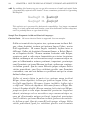
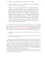
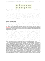
CHAPTER 1. ABOUT OLD STANDARD
Figure 1.1: The regular version of the Russian “Standard” typeface from the 1966 font
catalogue
1.1 Origin and Design
Old Standard was first intended as a digital version of Обыкновенная (Standard) typeface
found in the following font catalogues printed in the Soviet Union:
• Каталог ручных и машинных шрифтов. М.: Книга, 1966.
• Каталог ручных шрифтов и наборных украшений. Харьков: Прапор, 1973.
That’s where the name originates from: I have have only added “Old” to stress the
difference from Обыкновенная Новая (“New Standard”) — another, a bit similar and yet
quite different typeface, much more popular in the Soviet typography. Currently there is
a good digital version of New Standard, available from Paratype, so I was not planning
to reproduce it.
Later, however, I realized that the Обыкновенная typeface, as it was used in Soviet
printing of the second half of the 20th century, is not an independent family, but rather a
bunch of various sets inherited from pre-1917 Russian typography. So I had to improve
the initial design basing mainly on various Russian and German editions of the late 19th
and early 20th centuries, mainly manuals of ancient languages and editions of classical
(Greek and Latin) authors, where I could find good examples of Latin, Greek, and, in case
of Russian books, also Cyrillic letters, used alongside. I have also brought the following
font catalogue, which, unlike later Soviet catalogues, contains examples of several “Standard” typefaces, so that I could compare the letterforms and select those I considered
the most elegant: Государственный трест ВСНХ «Полиграф». Образцы шрифтов. М.,
1927.
Thus the current version of Old Standard doesn’t reproduce any particular typeface,
but rather attempts to revive the general style of the early 20th century typography (mostly Russian and German). Nevertheless, I have decided to keep the initial name: of course,
it doesn’t look very original, but seems to be a good choice for a lettertype which was once
so common that no special name was associated with it (typefaces of this style are usually
called just “Standard” or “Modern” in old font catalogues).
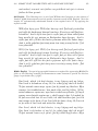
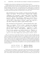
1.2. GREEK FONT DESIGN
5
1.2 Greek font design
The Greek characters in Old Standard require a separate note. The upright letters follow
the style first introduced by famous French typecutter Firmin Didot and then widely used
in various editions both in Greece itself and many other European countries. It would be
no exaggeration to state that the most part of Greek editions printed in continental Europe
for more than 100 yers was set with Didot faces. So it is no wonder that digital versions
of this design have already been created by several type foundries. However almost all
these fonts either cover just the Greek script and provide no support for Latin (not to
say Cyrillic) characters, or combine Didot’s Greek design with a stylistically incompatible
(usually Times-styled) Latin face. Most of them (even some hightly overpriced commercial
products) also don’t meet my quality standards.
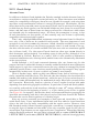
Figure 1.2: An excerpt from a French edition typeset with a Didot face. The example
is taken from: Les hanrangues de Démosthène. Text grec publié d’après les travaux les
plus récents de la philologie avec un commentaire critique et explicatif, une introduction
générale et des notices sur chaque discours par Henri Weil. Deuxieme édition entèrement
revue et corrigée. Paris, 1881.
A notable exception is GFS Didot, now available for free from Greek Font Society.
Unlike many others, the designers of this font did care about a matching Latin face, but,
surprisingly, their choice has nothing to do with the classicist style: instead, they implemented their font as an accompanying Greek family for Adobe Palatino. For this reason
the proportions and metrics of GFS Didot are quite different from those of original Greek
Didot; in particular ascenders and descenders are significantly shorter. The Unicode version now comes with its own Latin alphabet, but, again, it is based mostly on the Palatino
design, although some glyph features are adapted to the geometrical shapes of Greek capitals. The resulting font may be very elegant, but, again, it is not suitable to reproduce
the authentic look of old editions, and essentally should have not been called Didot due to
a different style of its Latin part.
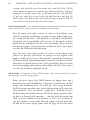
It should also be noted that the historic Didot style had several variations; in particular
its German version (popular also in Russia) is slightly different from the font used in
6
CHAPTER 1. ABOUT OLD STANDARD
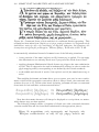
Figure 1.3: A modification of the Didot style, used in German editions. The example is
taken from: Herodoti Historiae. Recensuit Henricus Stein. Tomus II. Berolini, 1871.
P. 318.
French editions of the same time. Old Standard seems to be the only digital typeface
which follows mostly the German and Russian understanding of the Didot style, although
for some characters (e. g. Greek circumflex) I have preferred French forms, considering
them more elegant.
Figure 1.4: An example of the Teubner Greek font, taken from: Herodotus für den Schulgebrauch erklärt. Von Dr. K. Abicht, Direktor des Gymnasiums zu Ols. Vierter Band.
Buch VIII. Dritte verbesserte Auflage. Leipzig, 1882. S. 192.
Designing an italic style for a Greek typeface represents a separate problem. Most
modern implementations of Greek Didot are accompanied with italic versions obtained
by applying a slant to the upright glyphs. I have chosen a different solution: instead
of creating a slanted version of the Didot family (completely unknown to the traditional
typography), I have based my italics on various cursive Greek fonts actually used in the
German typography of the early 20th century. The most elegant of those fonts was the
1.2. GREEK FONT DESIGN
7
face used by the famous Teubner publishing house in Leipzig for their editions of classical
authors.
Surprisingly, until recently nobody has attempted to implement a digital version of
the Teubner Greek font, and this is a pity, because Teubner editions are still considered a
model of fine Greek printing in Germany, Russia and, I think, many other European countries, exactly like the Loeb classical library in the Anglo-American world. It should be
noted here that the actual Teubner typeface is sometimes confused with another cursive
Greek font, also called “λιπσιακό” in Greece, which does have some digital implementations, in particular Monotype Greek 91 and the grml/grbl fonts which Claudio Beccari has
designed to provide a matching italic font for his CB Greek package. Indeed, a similar
font was sometimes used in Leipzig editions (mainly for headings), but it is quite different
from the standard text face these editions are set with.
I should admit however, that even Old Standard Italic doesn’t provide an authentic
reproduction of the Teubner font. The problem is that the Greek letters used in Leipzig
editions are a bit bolder than their accompanying Latin face, so that it was really difficult
to bring them into a better correspondence with Latin and Cyrillic glyphs. That’s why I
had to consider also some less elegant, but lighter Greek typefaces used by other printing
houses in Germany at the same time. I hope however that the general style of the Teubner
font is preserved, so that anybody who likes Leipzig editions of classical authors will like
Old Standard as well.
Chapter 2
Installation and Usage
2.1 Obtaining Old Standard
If you are reading this document, then you probably have already downloaded Old Standard. You may check if you have the most recent version by visiting the following page at
the Thessalonica web site:
http://www.thessalonica.org.ru/en/fonts.html
This page contains information about all font projects I am currently developing and
download links.
2.2 Which format to prefer?
The Old Standard font family is currently available in two formats, so that before downloading fonts you should consider with which software you are planning to use them:
TrueType fonts, or, more precisely, OpenType fonts with TrueType outlines;
OpenType fonts with PostScript outlines (also called OpenType-CFF).
Note that fonts in those two formats have different file extensions: *.ttf for TrueType, *.otf for OpenType-CFF (this is the convention most font developers currently
follow). There also used to be a small difference in Windows icons: while *.otf files appear in a folder or on a disk with a dog-eared page icon showing a slanted letter “O” (for
OpenType), an old icon with two overlapping “T’s” has been used for TrueType fonts. It
is worth pointing out, that the icon was misleading, since the TrueType version of the Old
Standard family beginning from the very first releases supported the same set of advanced
OpenType features as its OpenType-CFF counterpart (see chapter 3 for information on
how to take advantage of those features).
The reason for displaying the old icon is that Windows checks the presense of a digital
signature in a TrueType font, considering (quite illogically) this would allow to distinguish
“old” TrueType fonts from “modern” OpenType fonts with TrueType outlines. This is
not a problem by itself, but it has recently been reported that Microsoft Word 2010 (the
2.3. SOURCE PACKAGE
9
first version with optional OpenType features support) has adopted the same approach
and doesn’t allow to access optional features in a TrueType font which is not digitally
signed. So now my TTF fonts contain a dummy digital signature (which seems sufficient
to fool both Windows Explorer and Word), and thus appear with the same “O” icon as
the OTF versions.
The two formats are different in many aspects, which are important from a developer’s
point of view, but almost not noticeable for an ordinary user. In particular, OpenTypeCFF fonts use PostScript oputlines, based on third-order (cubic) Beziér curves, while
in TrueType fonts second-order (quadratic) splines are used. There is also a significant
difference in hinting (grid-fitting) area: TrueType hints theoretically allow to achieve
much better quality of screen rendering, but quality hinting is a very difficult and timeconsuming process.
Note that it is possible to install both TrueType and OpenType-CFF versions alongside: in order to prevent name clashes a “TT” suffix is appended to font name/family
name fields in TrueType fonts. Thus you can compare both versions and decide which
one better fits your needs. In the older versions of this manual I recommended installing
TrueType versions, since this format used to be better supported in many applications on
various platforms. However most of the problems with OpenType-CFF fonts have been
fixed in recent software releases. In particular:
• In most Windows programs (except Adobe’s desktop publishing applications) kerning1 worked only for the first 256 characters in the font. Of course this means that
you couldn’t get kerning working neither for Greek nor for Cyrillic letters. This
issue seems to no longer exist in Windows Vista/7;
• older version of OpenOffice.org didn’t embed OpenType-CFF fonts into PDF files.
Moreover, under Unix-like systems OpenOffice.org could not access such fonts at
all, so that using TTF versions was the only option. This is fixed in OpenOffice.org
3.2 (and LibreOffice).
Thus selecting one of two formats is now essentially a matter of taste. Since Old
Standard has been drawn in cubic splines (and then converted to quadratic for the TTF
version), and since it still has only autogenerated TrueType hints, the OpenType-CFF
format may theoretically give you even a better screen rendering quality. However note
that only the TTF version currently supports the Graphite rendering technologie (this is
a limitation of the technologie itself), and this might be a reason to still prefer TrueType
fonts for OpenOffice.org/LibreOffice users.
2.3 Source Package
You also can download the FontForge sources of the Old Standard font family. Of course
this package may be useful for you only if you have the FontForge font editor, as well as
some other font editing utilities, and know how to use them. Note that downloading the
1
Kerning is the adjustment of space between pairs of letters, especially by placing two characters closer
together than normal. Kerning makes certain combinations of letters, such as WA, MW, TA or VA, look
better. Kerning data is specific for each particular font and for this reason is normally specified in the font
file; carefully designed fonts normally have a large number of kerning pairs.
10
CHAPTER 2. INSTALLATION AND USAGE
source package may make a sense for you only if you are going to apply some modifications
to the original files, i. e. to prepare your own version of the fonts. Please consult the
Terms of Use section of this document to see which license conditions should be met
when distributing such derivative works.
Sometimes I am getting e-mails from packagers of Linux distributions asking if they
could build Old Standard from sources just like they used to do for application executables.
Well, I can’t prohibit this (as the fonts are available under a free license and even the
name itself is not reserved, as explained below) but I strongly discourage doing so. The
reason is that, despite the common name, font sources aren’t very much like application
sources, and similarly TTF or OTF fonts have very few common with compiled programs.
When an application is built from sources, the resulting files are usually suitable only
for a particular platform or system and cannot be used in other environments. Fonts
represent just an opposite case: font sources are specific for a particular font editing
application, while the output files are suitable for various platforms and can be easily
disassembled/opened/edited.
This means rebuilding fonts from sources will not give you any productivity improvements, but you can easily lose some functionality (e. g. because your FontForge version
doesn’t work exactly like one I used to build the original font files). That’s why I can
recommend this approach only of you know what are you doing and your intent is to apply
some real changes/ improvements to the font sources.
2.4 System Requirements
2.4.1
Windows
Old Standard is a large Unicode font.
For Windows, you need at least Windows 95 (or at least Windows 2000 for the
PostScript-flavored OpenType fonts) and a word processor that can handle Unicode-based
documents, such as Microsoft Word 97 and above, OpenOffice.org 1.0 and above, or LibreOffice, which has splitted from the OpenOffice.org project in 2010 and has now superseded
it in most Linux distributions.
You will also need a way to enter the Unicode characters that are not directly accessible from standard keyboards. Remember that you can browse the contents of any font
and copy characters to the clipboard by using the Character Map utility that comes with
Windows. Character Map does not support Unicode values beyond the Basic Multilingual
Plane; an excellent alternative is Andrew West’s BabelMap (free). Some applications
also provide their own mechanisms for entering characters, such as Insert→Symbol in
MS Word or Insert→Special Character in OpenOffice.org/LibreOffice. In Microsoft Office applications you can also enter a Unicode character by typing its hexadecimal number
followed by ALT-x.
Of course inputting Unicode characters via a character table or accessing them directly
by their hexadecimal codes has some significant disadvantages: first, it is relatively slow
and so may be used only for characters which you need relatively rare, and second, it
may be recommended only for experienced users, since Unicode includes a lot of similar
characters, which, however, are intended for different purposes, so that sometimes it is
difficult to make the correct choice without consulting the documentation. So normally you
2.5. INSTALLATION INSTRUCTIONS
11
will need a special keyboard utility allowing to input characters needed for the language
of your choice. Some custom keyboard layouts for such languages as Classical Greek are
provided by my Thessalonica package. Alternatively, you may use Tavultesoft Keyman —
the leading keyboard mapping utility, providing an extensive range of features. There is
a large number of keyboard layouts already designed for Tavultesoft Keyman, so you
probably just have to check the list of available keyboard to select one or more which are
suitable for your needs.
2.4.2 Linux and X11 Windowing Environment
Most Unix-like systems now use the same basic framework, called X Window System
(commonly X or X11) to build graphical user interfaces. This means that all issues related with font installation and usage are basically the same, no matter, if you use Linux,
BSD, Solaris or some other system. In order to be able to handle TrueType or OpenType fonts your system should have the freetype library installed and enabled; this is
normally done by default in all modern distributions. As under Windows, you will need
a Unicode-aware word processor. Presumable you will do most of your work in OpenOffice.org or LibreOffice; other, less powerful word processors, like AbiWord or KWord,
support Unicode as well.
As under Windows, you may input Unicode characters using either a character map
utility (both the most full-featured X11-based desktop environments, KDE and Gnome,
include such utilities, comparable with the Windows Character Map), or a special keyboard driver. Again, you can try Thessalonica for OpenOffice.org. Another good choice
is kmfl — a keyboarding input method which aims to bring Tavultesoft Keyman functionality to *nix operating systems. KMFL is being jointly developed by SIL International
and Tavultesoft. Note that KMFL is not available by default in some popular Linux distributions, so that you may have to compile, install and configure it yourself. This task is
a bit difficult for an average user, but the result surely worth efforts.
2.5 Installation Instructions
2.5.1 Windows
Font installation under Windows is simple. You can install Old Standard as you would any
TrueType or OpenType-CFF font by placing the font files to the Windows fonts folder.
To do that:
1. Go to the Windows Control Panel and open the “Fonts” applet;
2. On the File menu, select “Install New Font…”;
3. Switch to the drive and directory that contain the fonts you want to add;
4. To select more than one font to add, press and hold down the CTRL key, click the
fonts you want, then click on OK.
You may need to restart some applications before they can access the fonts you have
just installed.
12
CHAPTER 2. INSTALLATION AND USAGE
2.5.2
Linux and X11
Currently there are no prepackaged RPM or DEB files for Old Standard, but, of course,
you can always install the fonts manually, which is actually not so complex task with modern Linux distributions. A tricky part is related with the fact that there are actually two
engines responsible for font installation and handling in X11 environment: fontconfig and
an older X11 engine. Since fontconfig is used by almost all recent applications (including
those based on GTK2 and QT4), in most cases it is sufficient to install fonts via fontconfig
(this is the only option in case of OpenType-CFF fonts). On most distributions you can
do that just by placing the font files to your /.fonts directory. After that you may need
to run
$ fc-cache
from your command line to update your fontconfig configuration. You can also use a
graphical font installation tool provided by KDE (the most powerful graphical desktop
environment for X11), but be aware that this tool actually does just the things described
above, i. e. copies the fonts to the appropriate directory and runs fc-cache.
However, if you want to make TrueType fonts accessible to some older X11 applications, then additional steps are required:
1. Find the place in your directory tree where your X stores TTF fonts. The usual
place is /usr/X11R6/lib/X11/fonts/truetype and the subdirectories therein;
2. create under that location a subdirectory for the fonts you are going to install, for
example:
$ mkdir /usr/X11R6/lib/X11/fonts/truetype/oldstand.
You should become root to do that. Then copy the *.ttf files there:
$ cp *.ttf /usr/X11R6/lib/X11/fonts/oldstand/;
3. switch to the directory where you have just copied the font files and run the following
commands:
$ ttmkfdir > fonts.scale $ mkfontdir
4. Now the hardest part: we have to inform your X server about the path where the
recently installed fonts are placed. This can be done by two ways:
(a) in most distributions fonts are managed directly by the X11 system. In this
case the information about font paths is stored in the main X11 server configuration file, which is located under /etc/X11 and may be called xorg.conf,
XF66Config or XF86Config-4 depending from your distribution and the version of the X11 server it uses. So open that file in your favorite text editor,
and add the following line to the “Files” section:
FontPath "/usr/X11R6/lib/X11/fonts/oldstand/";
(b) some Linux distributions (Alt Linux in particular) handle fonts using a special X Font Server (xfs). You can easily determine if your distribution belongs to this second group, as in this case the only “FontPath” element in your
xorg.conf or XF86Config will look as follows:
FontPath "unix/:-1"
2.5. INSTALLATION INSTRUCTIONS
13
If you have noticed such a line in your main X11 configuration file, you should
keep it untouched and instead edit the /etc/X11/xfs/config file and add the
new font path there.
5. Finally, if everything is done correctly, the fonts will be accessible for X11 applications when you restart your X Server. However, you can also activate your new
fonts immediately. Again, this can be done by two ways:
(a) if your system doesn’t use xfs, then you should execute the following commands:
$ xset fp+ /usr/X11R6/lib/X11/fonts/oldstand/
$ xset rehash
(b) otherwise you have to restart your X Font Server. Usually this can be done by
executing
$ service xfs restart
2.5.3 OpenOffice.org
Under MS Windows OpenOffice.org/LibreOffice just uses system-wide installed fonts, but
Unix versions have their own font administration utility, inherited from the dark times
when no suitable engine that would be able to properly handle scalable fonts existed at
the X11 level. Normally OpenOffice.org/LibreOffice can automatically detect X11 fonts
and add them to its configuration (so no additional steps are required), but sometimes
it fails to find them. In this case you should let OpenOffice.org/LibreOffice know about
your new fonts using the spadmin utility. You can either run this tool manually from your
OpenOffice.org directory, or select the “OpenOffice.org printer administration” GUI menu
item in KDE or Gnome (you should close any open OpenOffice.org/LibreOffice instances
before you can do this). When the spadmin window appears, do the following:
1. click on the “Fonts...” button;
2. click on ”Add...;
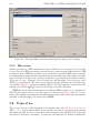
3. look for the directory where the fonts are installed
(e. g. /usr/share/fonts/truetype/oldstand/), as Figure 2.2 shows;
4. Click on “Select all”;
5. Click on OK.
When you restart OpenOffice.org/LibreOffice, the fonts should be available to its applications.
14
CHAPTER 2. INSTALLATION AND USAGE
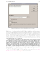
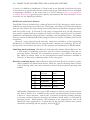
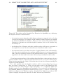
Figure 2.1: The OpenOffice.org printer administration utility: main window
2.5.4
TEX systems
Adding new fonts to a TEX installation is always difficult for an average user, as in order
to use a font with TEX typesetting system one has to generate many additional files, TEX
font metrics files (TFM) in particular. Yet I still haven’t provided a TEX support package
for Old Standard, mainly because Old Standard currently has only three shapes (regular,
italic and bold), and thus such a package would have very limited functionality from the
TEX point of view. However, you can easily use Old Standard (as well as any other
TrueType or OpenType-CFF font) in your TEX documents without any additional steps
if you install XƎTEX — a Unicode enabled version of the TEX compiler. In particular this
manual was set with XƎLATEX using the TrueType versions of the fonts.
XƎTEX has many other advantages over traditional TEX compilers, as it combines the
full Unicode support with a very good support of advanced OpenType features. In particular, this manual (including all examples demonstrating smart font rendering features
available in Old Standard) was typeset with XƎTEX.
2.6 Terms of use
The current version of Old Standard is distributed under the SIL Open Font License
(OFL) v. 1.1. I have selected OFL for my typeface because it is the only known license
developed specially for fonts, which meets the standards of the FLOSS (Free/Libre and
Open Source Software) community, in particular the Debian Free Software Guidelines.
2.6. TERMS OF USE
15
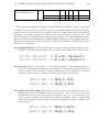
Figure 2.2: Adding new fonts to OpenOffice.org via spadmin
Both the text of the license itself and the OFL FAQ are included into the fonts package,
so I don’t reproduce them here. Basically licensing under OFL means that you can freely
use, copy, modify and distribute the fonts, as long as the terms of the license are not
violated. In particular you are not allowed to remove the original copyright notices from
the font software and to change licensing conditions (i. e. distribute either original or
modified versions under a different license). One more significant restriction is that you
can’t sell the fonts alone (however OFL allows to bundle and sell them together with any
other software, either free or commercial).
A large part of OFL is devoted to so-called Reserved Font Names which can’t be used
in derivative works without a written permission of the original author. However there
are no Reserved Font Names specified for Old Standard. This is because I think I can’t
prohibit anybody from using such common words as “Old” or “Standard” in their font
names. In fact I even encourage you to base names of your modified versions on the
original one, so that the user can easily determine where the main design comes from.
For example, if you have modified Old Standard in order to get Serbian Cyrillic glyphs
displayed by default instead of Russian ones, it might be logical to call your version “Old
Standard Serbian”. It is still desired however that you don’t take the original name as is,
but add some suffix specific for your version.
Note that this manual is NOT covered by SIL OFL, but distributed under the GNU
Free Documentation license. See chapter 4 for more information.
16
CHAPTER 2. INSTALLATION AND USAGE
2.7 Acknowledgments
I would like to thank:
• George Williams for his excellent FontForge program, and especially for his responsiveness in fixing bugs and adding new features. Without his assistance this package
would never be released!
• Peter Baker for his xgridfit utility, which provides a good Open Source solution for
adding TrueType instructions to a font, and also for valuable information on the
design of the Middle English letter yogh he provided;
• Tavmjong Bah (Tav), who kindly granted me his Perl scripts (originally written for
his Arev fonts) used to convert separate kerning pairs defined in a FontForge source
file into kerning classes;
• Andrew Panov for valuable remarks on the design of mathematical characters and
scanned images he provided.
Chapter 3
Multilingual Support, Unicode and
OpenType
3.1 Unicode coverage
3.1.1 General principles
Since Old Standard is a multilingual font family, I will always do my best to extend the
range of supported characters, thus providing support for more languages. Nevertheless,
I would like to protect my typeface from some problems shared by many similar free
font projects. The developers of those fonts are often attempting to cover the widest
possible number of scripts and Unicode blocks, even if the Unicode code charts is the
only source of their knowledge about the design of a specific character. Of course, the
resulting glyphs not always look really acceptable for actual typesetting. Moreover, due
to the lack of time and resources the designers are often unable to keep all glyphs at
the same quality level: for example, we often can see autogenerated accented characters
with mispositioned diacritics. In particular, there are so many fonts which are claimed to
support the extended Greek range, but actually are not suitable for typesetting classical
Greek… Another common problem is that only the regular version of each particular font
is really actively developed, while all additional weights and shapes fall far behind it (e. g.
support much less Unicode characters).
That’s why I have formulated for myself several principles which I am always trying
to follow when designing additional glyphs:
• I shall never add any new characters just for completeness, i. e. to get a specific
Unicode range fully covered. Before drawing a new glyph I must ensure that I
really understand its intended purpose and the principles of its design;
• since Old Standard is supposed to reproduce the actual printing style of the early 20th century, I shall avoid implementing new characters basing just on general
considerations. Ideally, all glyphs should be based on real examples taken from
some old editions. Of course, exceptions from this rule are sometimes necessary, as
many characters were first introduced only in 20th century, or even never existed in
traditional typography before they were adopted by the Unicode standard;
18
CHAPTER 3. MULTILINGUAL SUPPORT, UNICODE AND OPENTYPE
• I shall try to develop all font styles (currently regular, italic and bold) only simultaneously, i. e. if a specific character is added to the regular font, it should also
be designed for italics and bold. The exceptions are allowed for glyphs which don’t
have dedicated codepoints and supposed to be accessible via smart font features, as
well as for those characters which have no corresponding italic or slanted style (this
is the case of many mathematical symbols).
3.1.2
Character repertoire
Currently the following Unicode ranges are fully or partially covered by Old Standard:
Basic Latin (0000–007F) Fully supported.
Latin 1 Supplement (0080–00FF) Fully supported.
Latin Extended-A (0100–017F) Fully supported.
Latin Extended-B (0180–024F) Old Standard implements two groups of characters
from this block, namely several letters needed for various Old Germanic languages
and Croatian accented characters and digraphs.
IPA Extensions (0250–02AF) From this range Old Standard currently implements a
few characters which can be used in other contexts, except IPA. One such example
is U+0280 LATIN LETTER SMALL CAPITAL R, needed for the transliteration of
Old Norse runic inscriptions.
Spacing Modifier Letters (02B0–02FF) Old Standard implements spacing versions of
some combining diacritical marks, available in the next block.
Combining Diacritical Marks (0300–036F) Most standard accents, commonly used in
various European languages, are supported.
Greek and Coptic (0370–03FF) Fully covered, except Coptic letters.
Cyrillic (0400–04FF) Old Standard implements all modern Slavic (i. e. Russian, Ukrainian, Byelorussian, Serbian and Macedonian) characters, as well as historical
characters and extensions for Old Slavonic.
Phonetic Extensions (1D00–1D7F) Only one character (U+1D79 LATIN SMALL LETTER INSULAR G) is implemented. Note that the uppercase version of this letterform is now encoded in Latin Extended-D range.
Latin Extended Additional (1E00–1EFF) This range is coveref except Vietnamese
acented characters and medievalist additions.
Greek Extended (1F00–1FFF) Fully supported.
General Punctuation (2000–206F) Fully supported, except invisible control characters.
Superscripts and Subscripts (2070–209F) Subscript and superscript forms of digits
and math operators (but not letters), available in this block, are covered.
3.1. UNICODE COVERAGE
19
Currency Symbols (20A0–20CF) The EURO SIGN U+20AC.
Letterlike Symbols (2100–214F) In this block Old Standard implements a few characters, belonging to the following two categories: first, a few standard symbols,
present in most Western or Cyrillic fonts (in particular NUMERO SIGN U+2116,
TRADE MARK SIGN U+2122 and OHM SIGN U+2126), and second, some characters which may be useful for textual criticism (such as Fraktur ℭ and ℌ).
Number Forms (2150–218F) Fully covered.
Mathematical Operators (2200–22FF) This block is far from being finished, and yet it
already includes (I hope) all symbols which are most commonly used in mathematical
typesetting.
Miscellaneous Technical (2300–23FF) In this block Old Standard implements angle
brackets U+2329 and U+232A (these characters should probably be avoided: use
“mathematical” angle brackets at U+27E8/U+27E9 instead) and ancient metrical
symbols (23D1—23D9).
Geometric Shapes (25A0–25FF) Old Standard implements only a few of these symbols,
for compatibility with legacy fonts and charsets.
Miscellaneous Mathematical Symbols-A (27C0–27EF) Old Standard implements
mathematical angle, square and double angle brackets (useful also for critical text
editions).
Supplemental Mathematical Operators (2A00–2AFF) In this block I have implemented
only a few characters, in particular alternate “less than” and “greater than” symbols
with a slanted bar, which actually where preferred forms in the traditional European
typesetting before the arrive of modern standards.
Cyrillic Extended-A (2DE0–2DFF) Fully covered.
Supplemental Punctuation (2E00–2E7F) Old Standard implements New Testament
editorial symbols, Ancient Greek textual symbols and half brackets.
CJK Symbols and Punctuation (3000–303F) Again, Old Standard includes angle and
square brackets at U+3008/U+3009 and U+301A/U+301B correspondingly, as some
people have used to use them for textual criticism. Nevertheless “mathematical”
versions of those characters (see above) should probably be preferred for their purposes.
Cyrillic Extended-B (A640–A69F) Old Standard implements letters and signs for Old
Cyrillic (but not letters for old Abkhasian orthography).
Latin Extended-D (A720–A7FF) LATIN CAPITAL LETTER INSULAR G (U+A77D)
and Ancient Roman epigraphic letters.
Private Use Area This block includes a few additional accented Greek letters and some
glyphs traditionally mapped to PUA codepoints in Adobe fonts (I find this practice
reasonable, even if Adobe itself now has dropped it). It is not recommended to use
20
CHAPTER 3. MULTILINGUAL SUPPORT, UNICODE AND OPENTYPE
those glyphs directly: instead, you should access them by applying various smart
font features (see subsection 3.2.1 and subsection 3.2.5 for more information), if
only your application allows this.
Alphabetic Presentation Forms (FB00–FB4F) In this block the standard Latin fligatures are available.
Math Alphanumeric Symbols (1D400–1D7FF) Old Standard includes a few Fraktur
letters, useful for critical editions of ancient/biblical texts. This block is far from
being complete (and I am not planning to implement the whole alphabet anyway);
however, it already includes all characters which appear in the Nestle—Aland New
Testament.
3.1.3
TODO
As you can see, still lots of characters are waiting to be implemented. Since Old Standard is oriented mainly to historians and philologists, I am especially interested in adding
those characters which might be useful for textual studies and studying various ancient
languages. Here are some priorities:
• Old Standard still lacks a bold italic version;
• for beatiful typesetting small capitals, superscripts, lining numerals and old style
numerals are needed;
• some characters useful for medievalists are still missing from the Latin Extended-B
range;
• some IPA characters (at least those needed for English phonetic transcription);
• a large group of medievalist additions has been adopted in Unicode 5.1. Of course
it would be nice to implement them in Old Standard.
3.1.4
How you can help
If you would like to get a specific character available in Old Standard, then probably the
best help you can offer is to provide some high resolution (normally 600dpi) scans showing
you character used in an old book, where the rest of text is set with a Modern typeface
(this condition is especially important for additional Latin letters). If it is impossible to
find such examples (e. g. because your character had not yet been introduced at the time
when Modern typefaces were popular), then at least provide a clear description on how it
should be designed (or point me to a such description). Also remember that, except the
upright character, I will have to implement also an italic version, and the design of italic
glyphs may often require additional notes.
Of course you can also design the desired character(s) yourself and then contribute
them to Old Standard. Such contributions are always very welcome, but be aware that
I will review the submissions carefully in order to be able to guarantee a high level of
quality for the fonts. Please don’t be discouraged if I do not include a submission for this
reason, or ask you to make some specific revisions.
3.2. SMART FONT CAPABILITIES AND LANGUAGE SUPPORT
21
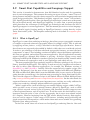
3.2 Smart Font Capabilities and Language Support
This section is intended to demonstrate, how Old Standard can be used for typesetting
texts in various languages. This assumes discussing two types of issues: “smart” font rendering features intended to provide a better support for each particular language and some
glyph design peculiarities. Old Standard currently supports two “smart” font technologies: OpenType and Graphite. Since the OpenType technologie is much more widespread,
this section deals mostly with OpenType rendering. It starts from a special paragraph
which describes the advantages of the OpenType technologie and discusses the level of
OpenType support in various applications. Then the manual proceeds to various languagespecific details (again, focusing mainly on OpenType features), sorting them by scripts:
Latin, Greek and Cyrillic. The Graphite rendering mode is described in a separate paragraph.
3.2.1 What is OpenType?
OpenType is a smart font rendering technology, that allows proper typographic treatment
of complex scripts and advanced typographic effects for simpler scripts. This is achieved
by applying various features, or tags, described in the OpenType specification. Some of
those features are supposed to be enabled by default, while others are considered optional.
In order to get advantage of all those advanced typographic features, you need two basic
components: a “smart” font including certain extra tables, where the features applicable to
this font are specified, and an OpenType-aware application. Not all applications currently
support OpenType, although their number is growing. So before relying on any smart
features provided by Old Standard or another typeface you should carefully examine which
of those features are expected to work in your application, and which are not.
The most popular OpenType rendering engine for Windows platform is the Uniscribe
library, developed by Microsoft. This library is used not only by own Microsoft software,
but also by many other Windows applications, for example, the Windows versions of
OpenOffice.org and LibreOffice. Initially Uniscribe supported only complex scripts (like
Arabic or Devanagari), but the most recent versions, supplied with Microsoft Windows
XP SP2 and Microsoft Office 2003 (note that MS Office uses its own version of Uniscribe
rather than the system library) also perform some processing for Latin, Greek and Cyrillic.
The Uniscribe support for Western scripts is still limited: Microsoft Word 2003 performs
only accent positioning and character composition/decomposition. On the other hand, the
supported features are actually the most important ones, and they are really sufficient for
proper text rendering, although without additional typographic niceties.
Adobe’s applications (such as InDesign) use another shaping engine, called CoolType,
which provides access to many optional features offered by OpenType, such as small
caps, stylistic sets and various types of ligatures. Old Standard currently supports some
of those optional features, such as stylistic sets. To tell the truth, this functionality is very
important from the point of view of a fine typography, but in most cases almost useless
for a linguist. However beginning from the CS3 version Adobe Creativity Suite applications are said to support a wider range of OT features, including mark positioning and
glyph composition/decomposition, which makes them much more suitable for typesetting
linguistic texts when previously.
In the Unix world, there are at least two free OpenType rendering libraries. One such
22
CHAPTER 3. MULTILINGUAL SUPPORT, UNICODE AND OPENTYPE
library is Pango, used in applications based on the GTK2 toolkit. This library currently
has nearly the same capabilities as MS Uniscribe (although still there are some glitches).
Another, even more powerful rendering engine is ICU, used by XƎTEX. ICU properly
handles virtually all features provided by Old Standard, even those not supported by most
other rendering engines (language-dependent substitutions for example). Unix versions
of OpenOffice.org and LibreOffice also use ICU, but, unfortunately, this is not very useful
for our purposes, as they enable complex text processing only for complex scripts.
I know very little about Mac, but I have to mention that many applications for this
platform also have a very good level of OpenType support. One such application is Mellel, the leading word processor for Mac OS X, designed to serve scholars, creative and
technical writing and multilingual word processing.
3.2.2
Latin Script
Standard Ligatures
Old Standard currently includes 5 standard f-ligatures (namely ff, fi, fl, ffi and ffl) present
in most OpenType fonts and also fj and ffj ligatures which are required for proper typesetting in Nordic languages. All these ligatures are accessible via the liga feature, enabled
by default in most applications which support it (such as Adobe InDesign). Two languagedependent exceptions have been made from this rule, according to the common convention
usually applied to OpenType fonts:
• Turkish, Azerbaijani and Crimean Tatar alphabets have two distinct versions of the
letter i, one dotted and the other dotless. For this reason the fi and ffi ligatures
are not applied for those language systems to avoid the confusion which would be
possible otherwise.
• No ligatures are enabled by default for German, since this language has very complex rules of ligature processing. You still can get them if you enable the dlig feature
tag in addition to liga.
Note that the exceptions described above will work as expected only if your application
can perform OpenType processing depending from the current language.
Combining Mark Positioning
One of the most attractive possibilities offered by OpenType is smart diacritic positioning:
if you type a letter followed by a diacritic from the Unicode “Combining Diacritics” range,
the diacritic will be placed exactly above or below the letter. To achieve this effect, an
OpenType font should support the mark feature tag. This feature allows to add anchor
points both to base letters and diacritics, so that, when an accent mark is typed after a base
character, the glyphs are positioned by such a way that their anchor points are coincident.
Another type of anchor points, specified by the mkmk feature, is used to position two marks
with respect to each other, so that an additional diacritic can be stacked properly above
the first.
Old Standard provides proper mark and mkmk anchor points for most Latin letters and
combining marks, so that you can type them in almost any combination and the result
3.2. SMART FONT CAPABILITIES AND LANGUAGE SUPPORT
23
will be visually identical with the corresponding precomposed accented characters (in
case they are available in the font). Most OpenType renderers (except older versions of
Adobe’s Cooltype library) support the corresponding feature tags, and so you can safely
use these features in most OpenType-aware applications (MS Word 2003 for example).
Unicode Composition and Decomposition
Another important OpenType feature is ccmp. This feature allows to decompose a
character into two glyphs or, on the contrary, to compose two characters into a single glyph for better glyph processing. Often such substitutions correspond to canonical
(de)compositions specified in the Unicode character database, but this is not a required
condition. So if we would like to replace a specific glyph or a group of glyphs with another glyph or a group of glyphs, such replacement can almost always be implemented
via ccmp: the only important limitation here is that this feature is not supposed to (an
often just cannot) be turned off, and thus it should not be used for optional typographic
refinements, such as Latin ligatures.
Old Standard uses ccmp mainly to compose accented glyphs from an accent and a base
character in those cases where a simple accent positioning would not produce the desired
result. For example, the Czech alphabet has some accented characters (ď, ľ, ť) where
the accent is identified with the haček (caron), but actually looks like an apostrophe. So
when you type d, l or t followed by combining haček, Old Standard just substitutes the
corresponding Czech character for you.
There are also some situations where mark and ccmp should be used together to produce a better result. For example, before you can place an accent above letters like i or j
you have to replace the base letter with a dotless variant first, and this can be done only with ccmp. For this reason all OpenType renderers which support accent positioning
support also this feature (Word 2003 does).
Stylistic Sets
Stylistic sets are used to enable a group of stylistic variant glyphs, designed to harmonize
visually, and make them automatically substituted instead of the default forms. OpenType
allows to specify up to 20 stylistic sets, marking them ss01, ss02… ss20. The following
stylistic sets, currently available in Old Standard, are relevant for the Latin script:
ss01 This set allows to automatically substitute small and capital s and t with commaaccent (U+0218, U+0219, U+021A, U+021B) instead of the corresponding letters with
cedilla (U+015E, U+015F, U+0162, U+0163), as required by Romanian typographic
rules. The same substitution can be done automatically for Romanian and Moldavian languages, if only your application supports the local feature tag; otherwise
you can use ss01 instead. Of course this is important only if the glyph variants with
commaaccent are not typed directly (which is also possible, as now those letterforms
have separate Unicode codepoints).
raţiune şi conştiinţă ⇒ rațiune și conștiință
raţiune şi conştiinţă ⇒ rațiune și conștiință
24
CHAPTER 3. MULTILINGUAL SUPPORT, UNICODE AND OPENTYPE
ss02 By enabling this feature tag you can get all occurrences of small and capital Latin
g automatically replaced with “insular” forms, sometimes preferred for typesetting
Old English:
Gosfregð ⇒ Ᵹosfreᵹð
Gosfregð ⇒ Ᵹosfreᵹð
This stylistic set is preserved for backwards compatibility: I no longer recommend
using it, as both capital and small insular g now have dedicated Unicode codepoints,
and it is probably better to type them directly.
Sample Text Fragments in Old and Classical Languages
Classical Latin
Of course classical Latin is supported. Just an example:
Gallia est omnis divīsa in partes tres, quārum unam incŏlunt Belgae, aliam Aquitāni, tertiam qui ipsōrum lingua Celtae, nostra
Galli appellantur. Hi omnes lingua, institūtis, legĭbus inter se
diffĕrunt. Gallos ab Aquitānis Garumna flumen, a Belgis Matrŏna et Sequăna divĭdit. Horum omnium fortissimi sunt Belgae,
propterea quod a cultu atque humanitāte provinciae longissime
absunt, minimeque ad eos mercatōres saepe commeant atque ea,
quae ad effeminandos anĭmos pertĭnent, important, proximique
sunt Germānis, qui trans Rhenum incŏlunt, quibuscum continenter bellum gerunt. Qua de causa Helvetii quoque relĭquos Gallos
virtūte praecēdunt, quod fere cotidiānis proeliis cum Germānis
contendunt, cum aut suis finĭbus eos prohĭbent aut ipsi in eōrum
finĭbus bellum gerunt.
Gallia est omnis divīsa in partes tres, quārum unam incŏlunt
Belgae, aliam Aquitāni, tertiam qui ipsōrum lingua Celtae, nostra Galli appellantur. Hi omnes lingua, institūtis, legĭbus inter
se diffĕrunt. Gallos ab Aquitānis Garumna flumen, a Belgis Matrŏna et Sequăna divĭdit. Horum omnium fortissimi sunt Belgae,
propterea quod a cultu atque humanitāte provinciae longissime
absunt, minimeque ad eos mercatōres saepe commeant atque ea,
quae ad effeminandos anĭmos pertĭnent, important, proximique
sunt Germānis, qui trans Rhenum incŏlunt, quibuscum continenter bellum gerunt. Qua de causa Helvetii quoque relĭquos Gallos
virtūte praecēdunt, quod fere cotidiānis proeliis cum Germānis
3.2. SMART FONT CAPABILITIES AND LANGUAGE SUPPORT
25
contendunt, cum aut suis finĭbus eos prohĭbent aut ipsi in eōrum
finĭbus bellum gerunt.
Old English The following text (a writ from William the Conqueror to the citizens of
London, 1066) demonstrates several specific characters used in Old English. Note the
insular “G” automatically substituted instead of the regular Latin “G” by applying the
stylistic set 02.
Will(el)m kynᵹ ᵹret Will(el)m bisceop and Ᵹosfreᵹð portirēfan
and ealle þā burhwaru binnan Londone, Frencisce and Enᵹlisce,
frēondlīce. And ic kȳðe ēow þæt ic wylle þæt ᵹet bēon eallre þǣra
laᵹa weorðe þē ᵹyt wǣran on Eadwerdes dæᵹe kynᵹes. And ic
wylle þæt ǣlc cyld bēo his fæder yrfnume æfter his fæder dæᵹe.
And ic nelle ᵹeþolian þæt ǣniᵹ man ēow ǣniᵹ wranᵹ bēode. Ᵹod
ēow ᵹehealde!
Middle English No special typographic features are required for typesetting Middle English, so the following example just demonstrates some characters, specific for this language, in particular the ȝ (yogh):
Our Lord, which ich shal douten, is my liȝtyng and my helpe.
Our Lord is defendour of my lif; for what þyng shal ich drede?
To þat noiand comen neȝe vp me, þat hij etand my flesshes: Myn
enemys, þat trubleden me, ben made sike, and hij fellen. Ȝif hij
setten manaces oȝains me, myn hert ne shal nouȝt drede. Ȝyf myn
enemy arere bataile oȝains me, y shal hopen in þat. Ich asked þe
lif þat euer shal last of our Lord; ich shal bisechen þat, þat ich
mai wonne in þe hous of our Lord alle þe daies of my lif; Þat ich
se þe wille of our Lord and uisite his temple.
Our Lord, which ich shal douten, is my liȝtyng and my helpe.
Our Lord is defendour of my lif; for what þyng shal ich drede?
To þat noiand comen neȝe vp me, þat hij etand my flesshes: Myn
26
CHAPTER 3. MULTILINGUAL SUPPORT, UNICODE AND OPENTYPE
enemys, þat trubleden me, ben made sike, and hij fellen. Ȝif hij
setten manaces oȝains me, myn hert ne shal nouȝt drede. Ȝyf myn
enemy arere bataile oȝains me, y shal hopen in þat. Ich asked þe
lif þat euer shal last of our Lord; ich shal bisechen þat, þat ich
mai wonne in þe hous of our Lord alle þe daies of my lif; Þat ich
se þe wille of our Lord and uisite his temple.
Gothic Transliteration Two additional letters are used in Gothic transliteration: þ (þiuþ,
thorn) and ƕ (hwair). Both of them are available in Old Standard:
Akei ik sunja izwis qiþa: batizo ist izwis ei ik galeiþau; unte
jabai ik ni galeiþa, parakletus ni qimiþ at izwis; aþþan jabai gagga, sandja ina du izwis. Jah qimands is gasakiþ þo manaseþ bi
frawaurht jah bi garaihtiþa jah bi staua; bi frawaurht raihtis,
þata þatei ni galaubjand du mis; iþ bi garaihtiþa, þatei du attin
meinamma gagga, jah ni þanaseiþs saiƕiþ mik; iþ bi staua, þatei
sa reiks þis fairƕaus afdomiþs warþ.
Akei ik sunja izwis qiþa: batizo ist izwis ei ik galeiþau; unte
jabai ik ni galeiþa, parakletus ni qimiþ at izwis; aþþan jabai
gagga, sandja ina du izwis. Jah qimands is gasakiþ þo manaseþ
bi frawaurht jah bi garaihtiþa jah bi staua; bi frawaurht raihtis,
þata þatei ni galaubjand du mis; iþ bi garaihtiþa, þatei du attin
meinamma gagga, jah ni þanaseiþs saiƕiþ mik; iþ bi staua, þatei
sa reiks þis fairƕaus afdomiþs warþ.
Old Icelandic A fragment of text in Old Icelandic. Note some specific letters used in
that language, as well as the fj ligature.
Kømr nú þessi fregn fyrir Hrólf konung ok kappa hans upp í
kastalann, at maðr mikilúðligr sé kominn til hallarinnar ok hafi
drepit einn hirðmann hans, ok vildu þeir láta drepa manninn.
Hrólfr konungr spurðisk eptir, hvárt hirðmaðrinn hefði verit saklauss drepinn. „Því var næsta“, sǫgðu þeir. Kómusk þá fyrir
Hrólf konung ǫll sannindi hér um. Hrólfr konungr sagði þat skyldu fjarri, at drepa skyldi manninn — „hafi þit hér illan vanda upp
tekit, at berja saklausa menn beinum; er mér í því óvirðing, en
yðr stór skǫmm, at gøra slíkt. Hefi ek jafnan rœtt um þetta áðr,
ok hafi þit at þessu engan gaum gefit, ok hygg ek at þessi maðr
3.2. SMART FONT CAPABILITIES AND LANGUAGE SUPPORT
27
muni ekki alllítill fyrir sér, er þér hafið nú á leitat; ok kallið hann
til mín, svá at ek viti hverr hann er“.
Kømr nú þessi fregn fyrir Hrólf konung ok kappa hans upp í
kastalann, at maðr mikilúðligr sé kominn til hallarinnar ok hafi
drepit einn hirðmann hans, ok vildu þeir láta drepa manninn.
Hrólfr konungr spurðisk eptir, hvárt hirðmaðrinn hefði verit saklauss drepinn. „Því var næsta“, sǫgðu þeir. Kómusk þá fyrir
Hrólf konung ǫll sannindi hér um. Hrólfr konungr sagði þat skyldu fjarri, at drepa skyldi manninn — „hafi þit hér illan vanda
upp tekit, at berja saklausa menn beinum; er mér í því óvirðing,
en yðr stór skǫmm, at gøra slíkt. Hefi ek jafnan rœtt um þetta áðr,
ok hafi þit at þessu engan gaum gefit, ok hygg ek at þessi maðr
muni ekki alllítill fyrir sér, er þér hafið nú á leitat; ok kallið hann
til mín, svá at ek viti hverr hann er“.
A special note is required on the shape of the Icelandic letter þ (thorn). In modern
fonts this character’s design is almost always based on the lowercase p with an ascender
added. This design is also the only mentioned by Icelandic type designer Gunnlaugur SE
Briem in his article Thorn and eth: how to get them right. And yet this letterform doesn’t
look characteristic for the traditional typography. Generally speaking, there were two
styles of thorn most commonly used in the late 19th and early 20th century printing:
• a glyph based on the lowercase p, but with a double sided serif at the top of the
ascender;
• a glyph with its top and bottom serifs positioned under an angle to the vertical stem
and the bowl stretched upwards.
In both cases the upper element often doesn’t reach the full ascender height, which
makes a significant advantage over the modern letterform where the glyph often looks
unbalanced due to the fact that the ascender is significantly longer than the descender.
I have preferred the second form for the upright font, as it looks more elegant and
seems to be preferable for Old English and the Gothic transliteration. However, it is
important to stress the fact, that it is also perfectly suitable for Norse languages. In
particular it was actively used for this purpose in the German printing, as for example the
“Sammlung kurzer Grammatiken Germanischer Dialekte” series, published in Halle a.S.
in early 20th century and now, thanks to the Germanic Lexicon Project, available on the
web in the form high resolution scans, can demonstrate.
In the same books, however, the italic thorn already has the contemporary style. So
I have implemented this letterform too in the italic font (where, indeed, it looks more
appropriate than in the regular version).
28
CHAPTER 3. MULTILINGUAL SUPPORT, UNICODE AND OPENTYPE
3.2.3
Greek Script
Alternate Forms
In addition to the basic Greek alphabet the Unicode standard includes alternate forms for
several letters, such as script theta, stroked phi and so on. These characters were included
mainly for compatibility with legacy character sets (Symbol for example), and using them
anywhere except mathematical contexts is strongly discouraged. Nevertheless, the fact
these characters are encoded causes a great mess by itself, since it convinces font designers
to think that any Greek typeface can and should include two basic forms for several Greek
letters, and that some of these forms are always preferred for a Greek text, while others
are intended only for mathematical usage. Of course this assumption is wrong: in fact
all such letterforms are font-specific, so that normally only one of them is stylistically
compatible with each particular typeface.
That’s why, although OldStandard implements several alternate forms for Greek letters, only a few of them can be considered really useful. The most important of such
exceptions is curly beta U+03D0: this character, indeed, should be available in any correct
Greek font, since according to the French typographic rules it is used instead of the regular beta with descender as a medial and final form (the same rule was sometimes applied
also in Greece itself). For this reason French classicists often type U+03D0 directly in
their documents, and particularly I see nothing wrong in this practice, although it is not
recommended by Unicode. However, in a “smart” font it is also possible to implement a
contextual substitution rule, allowing initial/medial forms to be automatically substituted
at the correct places.
In Old Standard v. 1.0 I used contextual alternates (the calt feature tag) for this
purpose, but later I realized this feature is normally enabled by default in most applications
which support it, and, since contextual forms are not very common in contemporary Greek
publishing outside France, most classicists would probably be discouraged if they appear
automatically in their texts. So now a stylistic set (ss06) is used instead.
Theta is another letter, which can have two different forms, both of which are stylistically compatible with Didot faces. The Unicode code chart displays the closed theta θ at
U+03B8 (thus making it the default letterform), while the open, or script variant form ϑ is
mapped to U+03D1 and intended only for mathematical usage. Most fonts currently follow
this convention. Historically, however, selection of one or another form has been made
depending from national typographic traditions. In particular, French and Greek publishers certainly preferred the closed letterform, although in some 19th century editions the
open theta is used at the beginning of words, i. e. a rule, similar to one of beta, is applied
(see Figure 3.1 for example). On the other hand, in German and Russian typography the
open theta was normally used; this is also the only style of this letter found in the Teubner
font and other cursive Greek typefaces of a German origin.
Since my sources contained good examples of both open and closed theta in Didotstyled Greek fonts, I have implemented them both, and have added a closed letterform
even to the italic font for better compatibility with the regular version. However, since
Old Standard mainly follows German typographic conventions, it seemed inappropriate
to map this form to U+03B8 and thus make it the only accessible glyph for the case advanced Open Type features are not supported by user’s application. Instead the following
solution has been preferred: the open theta is mapped both to U+03B8 (GREEK SMALL
LETTER THETA) and U+03D1 (GREEK THETA SYMBOL), while the closed glyph may
3.2. SMART FONT CAPABILITIES AND LANGUAGE SUPPORT
29
Figure 3.1: Contextual forms of beta and theta in traditional Greek typesetting. This
example has been taken from: Ὡρολόγιον τὸ μέγα, περιέχον ἁπάσαν τὴν ἀνήκουσαν αὐτῷ
ἀκολουθίαν, κατὰ τὴν τάξιν τῆς ἀνατολικῆς τοῦ Χριστοῦ ἐκκλησίας, καὶ ἐξαιρέτως τῶν
ὑποκειμένων αὐτῇ εὐαγῶν μοναστηρίων. Ἔκδοσις ἑβδόμη. Ἐν Βενετία, 1851. Σ. 32.
be automatically substituted instead of U+03B8 in one of the following situations:
• in any postition, if the ss05 (stylistic set 05) feature tag is applied. You can apply
this substitution to an ordinary Greek text if you prefer the closed form of theta;
• applying the mgrk (Mathematical Greek) feature tag triggers the same substitution
as well. This is supposed to be used in mathematical contexts in order to make the
glyph mapping exactly corresponding to one defined by the Unicode standard;
• at the middle and the end of words, if the stylistic set 06 (the ss06 feature tag) is
active.
Thus enabling both ss05 and ss06 allows you to typeset your text in exact comformance with French typographic conventions (theta is aways closed, the contextual substitution for beta is on). On the other hand, activating just ss06 will turn on contextual
forms both for beta and theta, as demonstrated below:
θαυμασθεὶς βάρβαρος ⇒ θαυμασθεὶς βάρϐαρος
θαυμασθεὶς βάρβαρος ⇒ θαυμασθεὶς βάρϐαρος
Note that the U+03D1 character will always be displayed as a script theta, no matter,
which feature tags you have applied.
The following example shows a fragment of Greek text with contextual alternates
(note the medial beta and the closed theta substituted in the appropriate places):
Κῦρος δὲ συγκαλέσας τοὺς στρατηγοὺς καὶ λοχαγοὺς τῶν
Ἑλλήνων συνεϐουλεύετό τε πῶς ἂν τὴν μάχην ποιοῖτο καὶ
30
CHAPTER 3. MULTILINGUAL SUPPORT, UNICODE AND OPENTYPE
αὐτὸς παρῄνει θαρρύνων τοιάδε· «ὦ ἄνδρες Ἕλληνες, οὐκ
ἀνθρώπων ἀπορῶν [βαρϐάρων] συμμάχους ὑμᾶς ἄγω, ἀλλὰ
νομίζων ἀμείνονας καὶ κρείττους πολλῶν βαρϐάρων ὑμᾶς εἶναι,
διὰ τοῦτο προσέλαϐον. ὅπως οὖν ἔσεσθε ἄνδρες ἄξιοι τῆς
ἐλευθερίας ἧς κέκτησθε καὶ ἧς ὑμᾶς ἐγὼ εὐδαιμονίζω. εὖ γὰρ
ἴστε ὅτι τὴν ἐλευθερίαν ἑλοίμην ἂν ἀντὶ ὧν ἔχω πάντων καὶ ἄλλων
πολλαπλασίων».
Κῦρος δὲ συγκαλέσας τοὺς στρατηγοὺς καὶ λοχαγοὺς τῶν
Ἑλλήνων συνεϐουλεύετό τε πῶς ἂν τὴν μάχην ποιοῖτο καὶ
αὐτὸς παρῄνει θαρρύνων τοιάδε· «ὦ ἄνδρες Ἕλληνες, οὐκ
ἀνθρώπων ἀπορῶν [βαρϐάρων] συμμάχους ὑμᾶς ἄγω, ἀλλὰ
νομίζων ἀμείνονας καὶ κρείττους πολλῶν βαρϐάρων ὑμᾶς εἶναι,
διὰ τοῦτο προσέλαϐον. ὅπως οὖν ἔσεσθε ἄνδρες ἄξιοι τῆς
ἐλευθερίας ἧς κέκτησθε καὶ ἧς ὑμᾶς ἐγὼ εὐδαιμονίζω. εὖ γὰρ ἴστε
ὅτι τὴν ἐλευθερίαν ἑλοίμην ἂν ἀντὶ ὧν ἔχω πάντων καὶ ἄλλων
πολλαπλασίων».
Except the script theta to closed theta substitution, the mgrk feature allows to change
the appearance of some other glyphs. This includes kappa in all font styles and rho in italic
(in regular and bold the default shape for this character is Unicode conforming). Note
that the k-shaped glyph for kappa, which can be activated by this way, doesn’t harmonize
well with other Didot-styled letters (although I’ve done my best to make it aesthetically
acceptable), so using it anywhere outside of math contexts is not recommended.
Old Standard also implements stroked phi (U+03D5), omega-like pi (U+03D6) and lunate
epsilon (U+03F5). There are no special “smart” font features to get those glyph substituted
instead of default letterforms, so they can be accessed only by their Unicode codepoints.
Again, there is no reason to do so when typesetting ordinary Greek texts, although the
glyphs might be useful in mathematical contexts.
The same statement would be true for the lunate sigma, both small and capital: although it is sometimes reasonable to use this form e. g. for typesetting papyrological
texts (where word breaks and thus the usage of final sigmas are sometimes not obvious),
it is probably impossible to implement a lunate sigma fully conforming the Didot style.
So I don’t recommend using this letterform and have implemented it mainly in order to
make existing documents which use this character (such as some texts from the Thesaurus
Linguae Graecae corpus) readable.
Combining Mark Positioning
Unicode provides codepoints for all accented characters needed for the standard Greek orthography, and yet this set is often insufficient for classicists. The most common problem
is combining a breathing and/or an accent with a macron or a breve mark. Also one often
has to put a macron, a breve or a circumflex above epsilon or omicron when publishing
epigraphical documents, although such combinations make no sense for literary Greek.
3.2. SMART FONT CAPABILITIES AND LANGUAGE SUPPORT
31
For this reason some Unicode Greek fonts include a huge number of additional accented
characters in the Unicode Private Use Area. The most important problem here is that
each vendor uses its own arrangement of PUA slots, so that fonts are often incompatible
with each other, especially because very few of them have more or less correct OT layouts
allowing to access those glyphs without typing them directly.
Old Standard uses a different approach: it has a carefully adjusted set of anchor points
and ccmp rules, which allow to correctly position accent marks relatively to each other
and combine breathings with accents to specially designed combinations, when necessary.
Moreover, when you type a capital letter folowed by one or more accents, these accents
are placed before the letter, and the letter itself is shifted right to the necessary amount
of space. Thus you can type any possible accented combination using combining marks,
if only your application supports smart accent positioning (but this is not a problem at
least with Microsoft Word 2003 and above). Note that you should observe the following
order of typing diacritics: first a macron or a breve, then a breathing and finally an accent.
For example, combining marks were used to type the following fragment of the Mantinea
inscription:
ὀσ̱εό ι ἂν χρε̄στε̄ρ́ ιον κακρι ́νε̄ || ε̄̓̀ γνο̄σι ́αι κακριθε̄έ ̄ το̄ν͂ χρε̄μάτο̄ν, |
πὲ τοι ͂ς ϝοικιάται(ς) τᾶς θεο̄͂ ε̄ν̓͂ αι, κὰ ϝοικι ́ας δάσασθαι τὰς ἂν ο̄δ̓͂ ᾽
ἐασ
́ ας. ει ̓ τοι ͂ς ϝο̄φλε̄κόσι ἐπι ̀ τοι ͂δ᾽ ἐδικάσαμε[ν], | ἄ τε θεὸς κὰς οι ̓
δικασσται ̀, ἀπυσ̱εδομι ́ν[ος] || το̄ν͂ χρε̄μάτο̄ν τὸ λάχος, ἀπεχομι ́νος
| κὰ το̄ῤ ρέντερον γένος ε̄ν̓͂ αι | ἄματα πάντα ἀπὺ τοι ͂ ι ̓εροι ͂, ι ̓́λαον
ε̄ν̓͂ αι.
́
ὀσε̱ ό ι ἂν χρε̄στε̄ριον
κακρι ́νε̄ || ε̄ ̓̀ γνο̄σι ́αι κακριθε̄ε̄́ το̄ν͂ χρε̄μάτο̄ν,
̓͂
| πὲ τοι ͂ς ϝοικιάται(ς) τᾶς θεο̄ ͂ ε̄ναι,
κὰ ϝοικι ́ας δάσασθαι τὰς
̓͂ ἐασ́ ας. ει ̓ τοι ͂ς ϝο̄φλε̄κόσι ἐπι ̀ τοι ͂δ᾽ ἐδικάσαμε[ν], | ἄ τε
ἂν ο̄δ᾽
θεὸς κὰς οι ̓ δικασσται ̀, ἀπυσ̱εδομι ́ν[ος] || το̄ν͂ χρε̄μάτο̄ν τὸ λάχος,
̓ ντερον γένος ε̄ναι
̓͂
ἀπεχομι ́νος | κὰ το̄ρρέ
| ἄματα πάντα ἀπὺ τοι ͂
̓͂
ι ̓εροι ͂, ι ̓́λαον ε̄ναι.
Old Standard includes also several precomposed accented Greek characters in the
PUA, added for compatibility with Ralph Hancock’s fonts. However, you should use
those characters with a caution and only if your application doesn’t support combining
mark positioning.
Tilde-Shaped Circumflex vs. Lunate Circumflex
Greek circumflex (perispomeni) often becomes a matter of discussions. I know, that some
(mostly English and American) classicists prefer porsonic (lunate) circumflex, similar to
an inverted breve, mainly because this form is characteristic for most Greek fonts traditionally used in English and American typography. However, in fact the preferred design
of this accent is a purely font specific question. For most typefaces of the continental
European origin (such as Didot or Teubner) only the tilde-shaped form is acceptable, as
inverted breve just cannot be harmonized with most letters. So, don’t ask me to implement
a version with “porsonic” circumflex.
32
CHAPTER 3. MULTILINGUAL SUPPORT, UNICODE AND OPENTYPE
Iota Adscript vs. Iota Subscript
Combinations of Greek vowels with “mute” iota, defined in Unicode, is one more important group of glyphs, which may be designed by various ways, depending from the
designer’s preferences. Most ancient Greek language manuals state that mute iota (called
iota subscript) is written below lowercase letters, but after capital vowels a regular small
iota, written inline and so called iota adscript, should be used instead. Currently most
Unicode Greek fonts follow this convention, and many classicists even suppose any over
implementations of uppercase combinations with mute iota to be illegal.
However, iota subscript below capital letters also may occur in some editions. In
particular, this orthography is very common for liturgical books of the Greek Orthodox
church. Particularly I prefer this typographic tradition, not only because it is inherited
from fine Greek typography of the past centuries, but also for some technical reasons. The
problem here is that, if a mute iota is designed as a regular iota and printed inline, it should
behave as a separate character. This means that, when letterspacing for the surrounding
text is changed, the distance between the iota and the preceding vowel should be scaled
too. Of course this is impossible if both characters are implemented as a single glyph.
That’s why in Old Standard mute iota is looks like a iota subscript in all accented
combinations with capital vowels. Note that unaccented capital vowels with mute iota
represent a special case: unlike their accented counterparts, they are used in upper case
only, i. e. may occur only in a fully capitalized text. So for these glyphs (namely, Unicode
characters U+1FBC, U+1FCC, U+1FFC) I have designed a special version of iota adscript,
which looks like a capital Iota, decreased in size. To my mind, this shape will better
match to the design of surrounding capital glyphs.
Such an implementation of capital vowels with mute iota has nothing wrong by itself,
but, of course, it would be nice to allow replacing each of affected Unicode codepoints
with a pair of glyphs: the vowel itself and a regular iota. Theoretically, this could be
done by applying a smart font feature, but, unfortunately, I am not aware of any suitable
OpenType feature, which:
• can be used for replacing a single glyph with two or more glyphs, as in our case;
• can be disabled if a user doesn’t like it.
Things are different for Graphite, since this technologie doesn’t impose any limitations
on the number and usage of features the designer would consider appropriate. That’s why
in Graphite-enabled applications Old Standard now uses the adscript design by default.
This can be easily changed by applying another value to the appropriate feature. Unfortunately I can’t implement the same behavior in a way compatible with OpenType, so all
other applications will just use the default glyphs for capital vowels with the mute iota.
If you absolutely don’t like the subscript design, at least you can always type regular iota
as a separate character.
3.2.4
Cyrillic Script
Combining Mark Positioning
Smart combining mark positioning is often necessary for Cyrillic. Although the stress
is usually not indicated in modern languages which use the Cyrillic script, accentuation
3.2. SMART FONT CAPABILITIES AND LANGUAGE SUPPORT
33
Figure 3.2: Serbian and Macedonian variant forms. Russian norms on the left, Serbian
and Macedonian norms on the right
is still mandatory for textbooks, dictionaries and books for children. This is especially
important for Serbian, which has long and short vowels and four types of accent. Nevertheless, there are virtually no precomposed Cyrillic accented characters in Unicode, so
that using combining marks remains the only option. So Old Standard provides all necessary anchor points allowing to place accents above Cyrillic vowels (see the following
sections about Serbian and Old Slavonic for examples).
Serbian Alternate Forms
It is a well known fact, that, except several specific letters, Serbian Cyrillic alphabet also
has different preferred shapes for some letters common for most languages which use
the Cyrillic script. According to the most common opinion, four Serbian variant forms
are specific for the italic style, while one can occur both in roman and italic styles, as
Figure 3.2 demonstrates. This practice was adopted by many font designers, and Adobe
even included Serbian variant forms into its Cyrillic specification, although they have not
been accepted by Unicode.
However, after studying several examples of old Serbian printing (a small collection
of such examples was previously available at the site of the faculty of Mathematics at the
Belgrade university) I have an impression that the modern practice is not fully justified
by the preceding tradition.
As far as I can see, there are only two letters (namely Cyrillic п and т), which always
have typically “Serbian” forms, clearly distinct from their Russian counterparts. However, the late 19th and early 20th century editions, set with Modern typefaces, also show a
significant difference from the contemporary “Serbian” style, as the horizontal bar (the
most characteristic feature of “Serbian” п and т) is attached to the base glyph rather than
positioned above it (like a diacritical mark). The т also may look like a slanted upright
glyph, but I have preferred to draw both п and т in the same “historical” style.
It is especially important to stress that “Serbian” д with a hook below seems to never
occur in the traditional Serbian printing, although there was absolutely no problem to
reproduce this form, if somebody considered it correct, as Latin italic g has exactly the
same shape in Modern typefaces of the early 20th century. My own opinion is that the
contemporary Serbian letterform first appeared as a result of uncritically reproducing the
handwritten shape, erroneously considered typically Serbian (actually it is not, as the
same style is preferred also in the Russian handwriting, which doesn’t mean this practice
should necessarily be reflected in printing). On the other hand, I have an impression
that the “Russian” italic д (with an ascender) is also not so common in Serbian printing:
often it is replaced with a slanted version of the upright letter. This glyph seemed a
good compromise for me: based on the historical tradition and at the same time certainly
34
CHAPTER 3. MULTILINGUAL SUPPORT, UNICODE AND OPENTYPE
acceptable for those Serbs who absolutely don’t like the Russian form.
In Old Standard only three italic letters, listed above (д, п and т) form the default set
of Serbian alternate forms, which are automatically enabled when you mark a text with
Serbian language. Alternatively, if your application doesn’t support the locl feature tag
(which is probably the case) you can achieve the same result by enabling the stylistic set
11. Here an example of a fully accentuated Serbian text, which demonstrates both the
combining mark positioning and the localized forms in the italic style:
На но̀ве̄мбарско̄м су̑нцу прѐврће̄ се пр̏љава̄ у̏троба на̏ше̄ ку̏ће̄.
Чу̏дно сам ту̑жан. И док но̏сӣм с ма̑јко̄м си̑вӯ о̀тр̄ца̄нӯ
сла̏марицу ту̑по за̀гледан у јѐдан мр̑твӣ о̏бла̄к над цр̑нӣм,
ни̏скӣм кро̀вовима на̏ше̄г прѐдгра̄ђа — са̀плиће̄м се о пра̏г. О̀ на
ми ка̑же̄: „Па̏зи“. О̏ нда̄ бри̑жно: „Шта̏ ти је да̀нас?“ О̀ на је
ве̏лика гла̑дна̄ жѐна, си́во̄ст ѝзбӣја̄ ѝз ње̄. У̀опште, све̏ је да̀нас
си̑во. И не̏бо, и на̏ша а̀влија, и шу́паљ, гра̀нат о̀рах сред ње̑, и
о̀ве̄ на̏ше ства̑ри ко̀је̄, јѐдна по јѐдна, ѝзлазе̄ на да̑н.
На но̀ве ̄мбарско̄м су̑нцу ре ̀врће ̄ се р̏љава̄ у̏роба на̏ше ̄ ку̏ће ̄.
Чу̏но сам у̑жан. И ок но̏сӣм с ма̑јко̄м си̑вӯ о̀р̄ца̄нӯ
сла̏марицу у̑о за̀глеан у је ̀ан мр̑вӣ о̏бла̄к на цр̑нӣм,
ни̏скӣм кро̀вовима на̏ше ̄г ре ̀гра̄ђа — са̀лиће ̄м се о ра̏г.
О̀ на ми ка̑же ̄: „Па̏зи“. О̏ на̄ бри̑жно: „Ша̏ и је а̀нас?“
О̀ на је ве ̏лика гла̑на̄ же ̀на, си́во̄с ѝзбӣја̄ ѝз ње ̄. У̀ оше, све ̏
је а̀нас си̑во. И не ̏бо, и на̏ша а̀влија, и шу́аљ, гра̀на о̀рах
сре ње ̑, и о̀ве ̄ на̏ше сва̑ри ко̀је ̄, је ̀на о је ̀на, ѝзлазе ̄ на а̑н.
The case of the letter б is basically the same as one of the д. The only difference here
is that the “script” form actually seems to be more common for Russian, than for Serbian
printing, although in the Russian tradition it is applicable only for the italic style. At
least it was used in the italic version of one particular “Standard” typeface of early 20th
century. That’s why I have implemented this letterform in Old Standard, although the
italic version of the glyph is actually based on a Russian source, and the upright shape has
been added just for completeness. These glyphs are not automatically applied for Serbian
text by default, but you can enable the stylistic set 12 to get them substituted, as in the
following example:
мртви облак ⇒ мртви олак
мрви облак ⇒ мрви олак
Finally, the case of “Serbian” г is a bit special: here the specific shape is really justified
by the peculiarities of the Serbian handwriting tradition, and yet the letterform normally
used in pre-computer Serbian printing was typically Russian, i. e. had no horizontal bar
above. Particularly I think the modern “Serbian” variant has nothing wrong by itself, but,
3.2. SMART FONT CAPABILITIES AND LANGUAGE SUPPORT
35
of course, it is difficult to implement it, if both п and т are designed in the historical style,
so that there is no gap between the bar and the base glyph. Nevertheless I have attempted
to implement a Serbian г in the same style as п and т, basing on the recommendations
by Nikola Kovanovich, but this glyph is purely experimental, and thus currently it is not
accessible via any OpenType features.
Old Slavonic and Church Slavonic
Until 2008, Unicode included only a subset of historical Cyrillic characters, which was not
sufficient for typesetting any actual texts. Thus legacy encodings or PUA-based solutions
were the only solution for representing historical documents in old Slavic languages which
used the Cyrillic script. In Unicode 5.1 the range of supported early Cyrillic characters
was greatly extended and now includes all letters and signs normally used in scientific
publication and Orthodox liturgical books (including even combining letters). Beginning
from the version 2.0 Old Standard fully supports historical Cyrillic, including Unicode 5.1
extensions.
However, except just having all necessary characters available in a font, typesetting
Old Slavonic or Church Slavonic also requires some complex text rendering. So the following smart font features necessary for this purpose are implemented in Old Standard:
Combining mark positioning Old Slavonic (and especially modern Church Slavonic) has
a wide range of combining characters, such as accents, breathings, titlos and superscript letters. Basically the accentuation system is very similar to Greek one,
but, unlike for Greek, there are no precomposed accented characters available in
Unicode, so that using combining marks is the only option.
Enclosing combining marks Church Slavonic inherited from Greek its numeric system,
where numbers are denoted with letters. However, special enclosing marks, shown
in the following table, have been invented to denote large numbers beginning from
10000:
Notation
а҃⃝
а҃҈
а҃҉
а҃꙰
а҃꙱
Numerical
meaning
10 000
100 000
Old Slavonic
name
тьма
легион
1 000 000
леодр
10 000 000
ворон
100 000 000
колода
Old Standard implements two types of OT lookups to achieve proper positioning for
this kind of marks: first, standard anchor points (the mark feature) used to attach
a mark to a base character, and second, contextual positioning lookups allowing
to increase the base character bearings and advance width when it is followed by
enclosing marks. Unfortunately, this technique is not guaranteed to work in all
OpenType-aware applications: in particular at the time this manual was written
contextual positioning did not properly work in XƎTEX.
36
CHAPTER 3. MULTILINGUAL SUPPORT, UNICODE AND OPENTYPE
Historic letterforms Although the modern Cyrillic script (so called “civil” style) is often
used to typeset medieval texts, some of the modern letterforms are especially closely
associated with the typographic reform under Peter the Great, and thus would look
out of place in a historical context. That’s why Old Standard provides some stylistic
alternates, specially intended for Old Russian and Old (Church) Slavonic:
не вѣдыи бѹдѹщаго ⇒ не вѣдыи бѹдѹщаго
не вѣдыи бѹдѹщаго ⇒ не вѣыи бѹѹщаго
These alternates are enabled for Old Church Slavonic, if your application understands the locl feature tag and allows to mark a text with this language. Alternatively you can get the same substitutions by applying the stylistic set 14 (ss14).
There is also an additional stylistic set (ss15) intended to handle the Cyrillic I vs.
Cyrillic N problem. It is a well known fact that in the oldest Cyrillic manuscripts
these two letters looked more like their Greek prototypes (Eta and Nu), and only
in 15th century the middle bar slope has aquired its modern form. However using
an H-shaped Cyrillic I and N-shaped Cyrillic N by default (even for typesetting Old
Slavonic) would probably be misleading in some context. So these substitutions
(they are available only in regular and bold) are optional:
не вѣдыи бѹдѹщаго ⇒ не вѣдыи бѹдѹщаго
Contextual letterforms Some Cyrillic letters have tall ascenders, while in medieval
manuscripts the same letters normally did not extend above x-height, so that it was
possible to put an accent or a combining letter above them. Old Standard includes
special low forms for some of such letters (namely б and ѣ) and can automatically
subsitute them when the letter is followed by an accent:
прѣдъ богомъ ⇒ прѣⷣ҇ бⷢо҇ мъ
прѣъ богомъ ⇒ прѣⷣ҇ бⷢо҇ мъ
Finally an example of Old Slavonic text with combining marks and historic letters and
letterforms:
А҆ ѡ҆ сеⷨ Иракліи и҆ною̀ притчею рекоша сеⷤ Феѡ҆́ фиⷧ҇ мⷣ рыи хронограⷴ
написа. Є҆рміи же раⷥумѣвь на нь творѧщꙋся братію ѿиде, ꙁлато
многѡ̀ вꙁемъ, и҆ и҆де въ Є҆гѷпеⷮ҇ къ коленꙋ Хамову сн҃а Ноєва. иⷤ
и҆ пріаша є҆́го с̾ честію. и҆ живе тѹ во̑ вѣлице чьсти, носѧ риꙁу
ꙁлаⷮу и҆ мⷣ рствꙋꙗ҆́ ше па Є҆гѷпетскыⷯ влъхвоⷯ,҇ влъх̾вѹѧ и҆ повѣда и҆мъ
хотѧщаѧ̀ быти. бѣ̏ же и҆ хїтръ бесѣдаⷨ. и҆ кланѧхꙋсѧ є҆́му гл҃ще
б҃ъ Є҆рміин ꙗ҆ ко повѣдающа иⷨ хотѧщаѧ̀ быти и҆мъ и повѣдающа
3.2. SMART FONT CAPABILITIES AND LANGUAGE SUPPORT
37
иⷨ и҆мѣніє є҆гоⷤ и дателѧ богаⷮствѹ нарицахѹ ꙗ҆ ко ꙁлат̾наго б҃а
мнѧще.
А҆ ѡ҆ се ⷨ Иракліи и҆ною̀ притчею рекоша се ⷤ Феѡ҆́ фиⷧ҇ мⷣрыи
҆
хронограⷴ написа. Єрміи
же раⷥумѣвь на нь творѧщꙋся братію
҆
ѿие, ꙁлато многѡ̀ вꙁемъ, и҆ и҆е въ Єгѷпе
҇ ⷮ къ коленꙋ Хамову
сн҃а Ноєва. иⷤ и҆ пріаша є ҆́го с ̾ честію. и҆ живе тѹ во̑ вѣлице
҆
чьсти, носѧ риꙁу ꙁлаⷮу и҆ мⷣрствꙋꙗ҆́ ше па Єгѷпетскыⷯ
влъхвоⷯ,҇
влъх̾вѹѧ и҆ повѣа и҆мъ хотѧщаѧ̀ быти. бѣ̏ же и҆ хїтръ бесѣаⷨ.
҆
и҆ кланѧхꙋсѧ є ҆́му гл҃ще б҃ъ Єрміин
ꙗ҆ ко повѣающа иⷨ хотѧщаѧ̀
быти и҆мъ и повѣающа иⷨ и҆мѣніє є ҆гоⷤ и ателѧ богаⷮствѹ
нарицахѹ ꙗ҆ ко ꙁлат̾ наго б҃а мнѧще.
3.2.5 Graphite Support
Graphite is a rendering technologie developed by SIL International. It is similar to OpenType at some aspects, but doesn’t prescribe a list of features with predefined meanings
and their possible implementations, thus leaving more freedom to a font designer. Another advantage of Graphite is that it gives a better control on some subtle aspects of
font behavior. However, this technologie isn’t currently widely supported: except SIL’s
own WorldPad editor (a Windows-only application which requires a .NET runtime), the
Graphite support is now built into OpenOffice.org (beginning from the 3.2 version) and
LibreOffice. There is also an open-source project to put Graphite support into Mozilla.
This means the Graphite support in Old Standard would be mostly actual for OpenOffice.org/LibreOffice users. Since this office suite still lacks proper OpenType support for
Wester scripts (its Windows version depends from Miscrosoft Uniscribe rendering engine), Graphite gives a nice possibility to get a consistent rendering both on Linux and
Windows platforms. It also provides an optional features support (although for reasons
discussed below I’d not recommend to actively use it at the present time).
Note that it is currently not possible to add Graphite tables to OpenType-CFF fonts.
So for now the technologie is only supported by the TrueType version of Old Standard.
Graphite Features in Old Standard
In Graphite fonts each feature is identified by a human-readable name (which may be
localized, but Old Standard currently includes only US English names) and a unique ID.
Those IDs are often numerical, but in Old Standard 4-letter codes, similar to OpenType
feature tags, are used for this purpose. A Graphite feature normally has several states
(or settings), which again have their own names and IDs. In the simplest case a feature
is boolean, i. e. supports just two two possible settings: 1 (true) and 0 (false).
The following table lists all Graphite features defined in Old Standard with their possible settings. It also tells which settings are available for each particular style (for example, there are no required Serbian forms in regular and bold). The last column shows the
correspondences between OpenType and Graphite features. Note that some cells in this
columns are left blank, and this means the given feature setting corresponds to the default
38
CHAPTER 3. MULTILINGUAL SUPPORT, UNICODE AND OPENTYPE
font behavior, without any OpenType features applied. A dash (—) indicates there is no
OpenType feature similar to this Graphite feature/setting pair.
Supported Features
English Name
ID
Diagonal Fractions
Vertical Position
Ligatures
Diphthong Ligatures
French Spacing Rules
for Punctuation Marks
Localized Forms
for Romanian
Feature Settings Font Styles OpenType
Name
ID Rg Bd It
equiv.
frac False/True
vpos Normal Vertical
Position
Superiors
Inferiors
liga No Ligatures
Common Ligatures
dphl False/True
frsp False/True
rolc No Localized
Forms
Required
Localized Forms
Localized Forms
srlc No Localized
for Serbian
Forms
Required
Localized Forms
Optional
Localized Forms
Localized Forms
oslc No Localized
for Old Slavonic
Forms
Required
Localized Forms
Optional
Localized Forms
Greek Punctuation Marks elpt False/True
Mathematical Greek
mgrk False/True
Greek Theta
elth Script Form
Closed Form
Contextual Forms
elct False/True
for Greek
Greek Accents
elmk Before Capitals
Above Capitals
Greek Mute Iota
elis Adscript
with Capitals
Subscript
Capitalized Greek
elcp False/True
1
dlig for German.
0/1
0
+
+
+
+
+
+
frac
1
2
0
2
0/1
0/1
+
+
+
+
+
+
+
+
+
+
+
+
+
+
+
+
+
+
sups
subs
0
+
+
+
1
+
+
+
0
+
+
+
1
−
+
−
locl; ss11
2
+
+
+
ss12
0
+
+
+
1
+
+
+
locl; ss14
2
+
−
+
ss15
0/1
0/1
0
1
0/1
+
+
+
+
+
+
+
+
+
+
+
+
+
+
+
locl
mgrk
0
1
0
+
+
+
+
+
+
+
+
+
—
—
1
0/1
+
+
+
+
+
+
—
liga1
dlig
-
locl; ss01
ss05
ss06
3.2. SMART FONT CAPABILITIES AND LANGUAGE SUPPORT
Language-Dependent
Feature Modifications
fmod Default
Dutch
Turkish
0
+
+
+
19
31
+
+
+
+
+
+
39
—
—
Note that some OpenType features, supported by Old Standard, (such as ccmp, mark
or mkmk) are not listed in this table. In fact my Graphite tables implement nearly the
same functions as provided by those features, but the corresponding rules are considered
mandatory and always executed, so there are no optional features to control them. On
the other hand, you can see that most Graphite features have their OpenType equivalents.
However, due to more flexible nature of the Graphite technologie it was possible to describe
some additional features, which would be too difficult to implement in OpenType. These
features are listed below.
French Spacing Rules This feature adds extra space to some punctuation marks, as required by the French typographic rules. It will be on by default for a French text.
Il a dit: «Bonjour!» ⇒ Il a dit : « Bonjour ! »
Il a dit: «Bonjour!» ⇒ Il a dit : « Bonjour ! »
Greek Accents Setting this feature to the “Above Capitals” state causes Greek accents/breathings to be displayed above capital letters instead of their default position
before capitals. This convention would probably look a bit chocking for a modern
classicist, but it was quite common in Greek 19th century typography.
ᾨδὴ ἐν ᾍδη ⇒ Ὠιδὴ ἐν Ἅιδη
̔́
ᾨδὴ ἐν ᾍδη ⇒ Ὠιδὴ ἐν Αιδη
Greek Mute Iota with Capitals This feature allows to select the preferred style of the
Greek mute iota in combination with capital letters. See section 3.2.3 for more
information of this issue. Note that the adscript style (i. e. a normal lowercase
iota) is used by default if the Graphite rendering is enabled, while in applications
which don’t support Graphite the corresponding glyphs are always rendered with
iota subscript.
ᾨδὴ ἐν ᾍδη ⇒ Ὠιδὴ ἐν Ἅιδη
ᾨδὴ ἐν ᾍδη ⇒ Ὠιδὴ ἐν Ἅιδη
40
CHAPTER 3. MULTILINGUAL SUPPORT, UNICODE AND OPENTYPE
Capitalized Greek This feature converts lowercase Greek letters to uppercase. The accents/breathings are removed, unless the “Greek Accents” feature is set to “Above
Capitals”:
ἄυλος αὐλὸς ⇒ ΑΫΛΟΣ ΑΥΛΟΣ
ἄυλος αὐλὸς ⇒ ΑΫΛΟΣ ΑΥΛΟΣ
Ιn the later case the diacritical marks preserved, but placed at the top of the capitalized letters:
̓ ̀Σ
ἄυλος αὐλὸς ⇒ ἌΥΛΟΣ ΑΥΛΟ
̓́
̓ Σ
̀
ἄυλος αὐλὸς ⇒ ΑΥΛΟΣ
ΑΥΛΟ
Language-Dependent Feature Modifications This feature may modify the effect produced by some other features depending from its current setting. For example, in
the Turkish mode fi-ligatures are disabled. In OpenType the same effect is achieved
by associating a feature lookup with a specific combination of scripts/languages. It
is not recommended to manually change settings of this feature: they are supposed
to be activated by default depending from the language assigned to a text in your
application.
Using Graphite Features in OpenOffice.org/LibreOffice
OpenOffice.org 3.2 and above (or LibreOffice) automatically recognizes fonts which contain Graphite tables. For such fonts Graphite rendering is enabled by default. However,
currently there is no special GUI allowing to select typographic features (either OpenType or Graphite). Instead, a special extended font name syntax has been developed: in
order to activate an optional feature, its ID, followed by an equals sign and the ID of the
desired setting, are appended directly to the font name string. An ampersand is used to
separate different feature/settings pairs.
For example, the following “font” should be used in order to get capitalized Greek text
with accents and breathings placed above letters:
Old Standard TT:elmk=1&elcp=1
Of course modifying the font name directly is very inconvenient, since it is difficult to
remember short tags and numerical values used for feature/setting IDs in different fonts.
Things may be simplified if you install Keith Stribley’s Graphite Font Extension, which
provides a dialog to make feature selection easy.
However, at the present time (as for March 2011) this extension should be used with
a caution due to several problems related both with the extension itself and the Graphite
renderer:
3.2. SMART FONT CAPABILITIES AND LANGUAGE SUPPORT
41
Figure 3.3: The window of the Graphite Font Extension for OpenOffice.org, displaying
the Graphite features of Old Standard.
• the extension cannot determine which feature settings are supposed to be on for the
current text language. For example, in Old Standard common ligatures are enabled
by default but disabled for German. Thus you can’t activate the standard Latin
ligatures in a German text with the Graphite extension, since it will consider they
are already on;
• the displayed list of features and their possible settings will always correspond to
the regular font, even if the the selected text is formatted in bold or italic;
• the extension doesn’t care about the order of applied features, and, unfortunately,
this order may be significant, since applying multiple features at once may sometimes
lead to incorrect rendering. However, this problems doesn’t occur, if feature IDs are
appended to the font name in the same order as they are defined in the font file.
If you have experienced any of the problems described above, then you have only two
options available: either to avoid using optional features at all, or to access them by modifying the font name directly. Refer to the table above for the list of feature/setting IDs
supported by Old Standard.
It is also possible that the Graphite renderer will do wrong things for you, so
that you want to avoid using it. Then you can either switch to the OpenType-CFF
version of the font (which doesn’t support Graphite), or to completely disable the
Graphite engine for your OpenOffice.org installation. You can do this by modifying the
SAL_DISABLE_GRAPHITE environment variable which is set in ~/.profile on Linux and
HKCU/environment in the Windows registry. Graphite Font Extension provides a GUI
option to simplify this operation (however, it didn’t work on my Ubuntu box).
42
CHAPTER 3. MULTILINGUAL SUPPORT, UNICODE AND OPENTYPE
Using Graphite Features in XƎTEX
Graphite Support has recently been added to XƎTEX, which means Graphite features are
now accessible from TEX documents. Moreover, it is possible to enable the Graphite font
renderer with the fontspec package, which greatly simplifies selecting system-installed
fonts in LATEX documents for users of Unicode-based TEX compilers (XƎTEX and LuaTEX).
This functionality is relatively new, so you’ll need at least TEX Live 2010 or MikTEX2.9
for the recommendations below to work.
You can activate the Graphite rendering mode for a particular font via the the Renderer
option (its value should be set to Graphite) in the argument list of a font selection command (such as \fontspec, \newfontfamily or \setmainfont). Since there are no standard feature tags in Graphite, most of the fontspec feature selection interface is useless
here: optional feature identifiers and their settings are just passed to the RawFeature option (which normally serves the last resort for accessing OpenType features which aren’t
supported otherwise).
As the fontspec package author has explained, both <feature ID>=<setting ID>
and <feature name>=<setting name> combinations can be used to specify the desired
optional feature settings. However in my tests the first syntax didn’t work, probably
because Old Standard unlike most other Graphite fonts doesn’t use numerical feature
identifiers. So for example in order to get capitalized Greek text with accents above vowels
one should write something like the following (note that settings passed to RawFeature
are separated with a semicolon:
\fontspec[
Renderer=Graphite,
RawFeature={
Capitalized Greek=True;
Greek Accents=Above Capitals}
]{Old Standard TT}
Of course this code is quite easy to understand, but it is surely not optimal in terms of
conciseness.
The Graphite support in XƎTEX and fontspec is not very much tested, and so various
undesired effects may still occur. Here’s a few problems I have noticed with their solutions:
• fontspec sometimes would complain that the current roman font does not support
a particular script (say, Cyrillic or Greek). This error is reported because fontspec
expects to find the information about supported scripts in the font’s tables responsible for its “smart” rendering. Well, this makes some sense for OpenType, but
Graphite essentially has no “script” concept at all (it allows to define languagespecific some behavior, but doesn’t group languages by their script). So there is
just no desired data in Graphite tables, and this leads to an error. Fortunately the
workaround is simple: it is sufficient to explicitly tell fontspec to use the desired
font for a particular script by defining the appropriate font family. For example:
\newfontfamily\greekfont[
Renderer=Graphite
]{Old Standard TT}
3.2. SMART FONT CAPABILITIES AND LANGUAGE SUPPORT
43
• under certain conditions XƎTEX correctly loads additional font family members
(e. g. bold or italic) but apparently doesn’t recognize them as Graphite fonts. The
workaround is to explicitly specify all the additional styles in fontspec options, e. g.:
\fontspec[
Renderer=Graphite,
ItalicFont={OldStandardTT-Italic},
BoldFont={OldStandardTT-Bold}
]{Old Standard TT}
Chapter 4
GNU Free Documentation License
Version 1.2, November 2002
Copyright © 2000,2001,2002 Free Software Foundation, Inc.
51 Franklin St, Fifth Floor, Boston, MA 02110-1301 USA
Everyone is permitted to copy and distribute verbatim copies of this license document,
but changing it is not allowed.
Preamble
The purpose of this License is to make a manual, textbook, or other functional and useful
document “free” in the sense of freedom: to assure everyone the effective freedom to copy
and redistribute it, with or without modifying it, either commercially or noncommercially.
Secondarily, this License preserves for the author and publisher a way to get credit for
their work, while not being considered responsible for modifications made by others.
This License is a kind of “copyleft”, which means that derivative works of the document must themselves be free in the same sense. It complements the GNU General Public
License, which is a copyleft license designed for free software.
We have designed this License in order to use it for manuals for free software, because free software needs free documentation: a free program should come with manuals
providing the same freedoms that the software does. But this License is not limited to
software manuals; it can be used for any textual work, regardless of subject matter or
whether it is published as a printed book. We recommend this License principally for
works whose purpose is instruction or reference.
4.1 Applicability and Definitions
This License applies to any manual or other work, in any medium, that contains a notice
placed by the copyright holder saying it can be distributed under the terms of this License.
Such a notice grants a world-wide, royalty-free license, unlimited in duration, to use that
work under the conditions stated herein. The “Document”, below, refers to any such
manual or work. Any member of the public is a licensee, and is addressed as “you”. You
accept the license if you copy, modify or distribute the work in a way requiring permission
under copyright law.
44
4.1. APPLICABILITY AND DEFINITIONS
45
A “Modified Version” of the Document means any work containing the Document or a
portion of it, either copied verbatim, or with modifications and/or translated into another
language.
A “Secondary Section” is a named appendix or a front-matter section of the Document
that deals exclusively with the relationship of the publishers or authors of the Document
to the Document’s overall subject (or to related matters) and contains nothing that could
fall directly within that overall subject. (Thus, if the Document is in part a textbook of
mathematics, a Secondary Section may not explain any mathematics.) The relationship
could be a matter of historical connection with the subject or with related matters, or of
legal, commercial, philosophical, ethical or political position regarding them.
The “Invariant Sections” are certain Secondary Sections whose titles are designated,
as being those of Invariant Sections, in the notice that says that the Document is released
under this License. If a section does not fit the above definition of Secondary then it is
not allowed to be designated as Invariant. The Document may contain zero Invariant
Sections. If the Document does not identify any Invariant Sections then there are none.
The “Cover Texts” are certain short passages of text that are listed, as Front-Cover
Texts or Back-Cover Texts, in the notice that says that the Document is released under
this License. A Front-Cover Text may be at most 5 words, and a Back-Cover Text may
be at most 25 words.
A “Transparent” copy of the Document means a machine-readable copy, represented
in a format whose specification is available to the general public, that is suitable for revising the document straightforwardly with generic text editors or (for images composed
of pixels) generic paint programs or (for drawings) some widely available drawing editor,
and that is suitable for input to text formatters or for automatic translation to a variety of
formats suitable for input to text formatters. A copy made in an otherwise Transparent
file format whose markup, or absence of markup, has been arranged to thwart or discourage subsequent modification by readers is not Transparent. An image format is not
Transparent if used for any substantial amount of text. A copy that is not “Transparent”
is called “Opaque”.
Examples of suitable formats for Transparent copies include plain ASCII without
markup, Texinfo input format, LaTeX input format, SGML or XML using a publicly
available DTD, and standard-conforming simple HTML, PostScript or PDF designed
for human modification. Examples of transparent image formats include PNG, XCF and
JPG. Opaque formats include proprietary formats that can be read and edited only by proprietary word processors, SGML or XML for which the DTD and/or processing tools are
not generally available, and the machine-generated HTML, PostScript or PDF produced
by some word processors for output purposes only.
The “Title Page” means, for a printed book, the title page itself, plus such following
pages as are needed to hold, legibly, the material this License requires to appear in the
title page. For works in formats which do not have any title page as such, “Title Page”
means the text near the most prominent appearance of the work’s title, preceding the
beginning of the body of the text.
A section “Entitled XYZ” means a named subunit of the Document whose title either
is precisely XYZ or contains XYZ in parentheses following text that translates XYZ in
another language. (Here XYZ stands for a specific section name mentioned below, such
as “Acknowledgements”, “Dedications”, “Endorsements”, or “History”.) To “Preserve
the Title” of such a section when you modify the Document means that it remains a section
46
CHAPTER 4. GNU FREE DOCUMENTATION LICENSE
“Entitled XYZ” according to this definition.
The Document may include Warranty Disclaimers next to the notice which states that
this License applies to the Document. These Warranty Disclaimers are considered to be
included by reference in this License, but only as regards disclaiming warranties: any
other implication that these Warranty Disclaimers may have is void and has no effect on
the meaning of this License.
4.2 Verbatim Copying
You may copy and distribute the Document in any medium, either commercially or noncommercially, provided that this License, the copyright notices, and the license notice
saying this License applies to the Document are reproduced in all copies, and that you
add no other conditions whatsoever to those of this License. You may not use technical
measures to obstruct or control the reading or further copying of the copies you make
or distribute. However, you may accept compensation in exchange for copies. If you distribute a large enough number of copies you must also follow the conditions in section 4.3.
You may also lend copies, under the same conditions stated above, and you may publicly
display copies.
4.3 Copying in Quantity
If you publish printed copies (or copies in media that commonly have printed covers) of the
Document, numbering more than 100, and the Document’s license notice requires Cover
Texts, you must enclose the copies in covers that carry, clearly and legibly, all these Cover
Texts: Front-Cover Texts on the front cover, and Back-Cover Texts on the back cover.
Both covers must also clearly and legibly identify you as the publisher of these copies.
The front cover must present the full title with all words of the title equally prominent
and visible. You may add other material on the covers in addition. Copying with changes
limited to the covers, as long as they preserve the title of the Document and satisfy these
conditions, can be treated as verbatim copying in other respects.
If the required texts for either cover are too voluminous to fit legibly, you should put
the first ones listed (as many as fit reasonably) on the actual cover, and continue the rest
onto adjacent pages.
If you publish or distribute Opaque copies of the Document numbering more than 100,
you must either include a machine-readable Transparent copy along with each Opaque
copy, or state in or with each Opaque copy a computer-network location from which the
general network-using public has access to download using public-standard network protocols a complete Transparent copy of the Document, free of added material. If you use
the latter option, you must take reasonably prudent steps, when you begin distribution
of Opaque copies in quantity, to ensure that this Transparent copy will remain thus accessible at the stated location until at least one year after the last time you distribute an
Opaque copy (directly or through your agents or retailers) of that edition to the public.
It is requested, but not required, that you contact the authors of the Document well
before redistributing any large number of copies, to give them a chance to provide you
with an updated version of the Document.
4.4. MODIFICATIONS
47
4.4 Modifications
You may copy and distribute a Modified Version of the Document under the conditions
of sections 2 and 3 above, provided that you release the Modified Version under precisely
this License, with the Modified Version filling the role of the Document, thus licensing
distribution and modification of the Modified Version to whoever possesses a copy of it.
In addition, you must do these things in the Modified Version:
A. Use in the Title Page (and on the covers, if any) a title distinct from that of the
Document, and from those of previous versions (which should, if there were any,
be listed in the History section of the Document). You may use the same title as a
previous version if the original publisher of that version gives permission.
B. List on the Title Page, as authors, one or more persons or entities responsible for
authorship of the modifications in the Modified Version, together with at least five
of the principal authors of the Document (all of its principal authors, if it has fewer
than five), unless they release you from this requirement.
C. State on the Title page the name of the publisher of the Modified Version, as the
publisher.
D. Preserve all the copyright notices of the Document.
E. Add an appropriate copyright notice for your modifications adjacent to the other
copyright notices.
F. Include, immediately after the copyright notices, a license notice giving the public
permission to use the Modified Version under the terms of this License, in the form
shown in the Addendum below.
G. Preserve in that license notice the full lists of Invariant Sections and required Cover
Texts given in the Document’s license notice.
H. Include an unaltered copy of this License.
I. Preserve the section Entitled “History”, Preserve its Title, and add to it an item
stating at least the title, year, new authors, and publisher of the Modified Version as
given on the Title Page. If there is no section Entitled “History” in the Document,
create one stating the title, year, authors, and publisher of the Document as given
on its Title Page, then add an item describing the Modified Version as stated in the
previous sentence.
J. Preserve the network location, if any, given in the Document for public access to
a Transparent copy of the Document, and likewise the network locations given in
the Document for previous versions it was based on. These may be placed in the
“History” section. You may omit a network location for a work that was published at
least four years before the Document itself, or if the original publisher of the version
it refers to gives permission.
48
CHAPTER 4. GNU FREE DOCUMENTATION LICENSE
K. For any section Entitled “Acknowledgements” or “Dedications”, Preserve the Title
of the section, and preserve in the section all the substance and tone of each of the
contributor acknowledgements and/or dedications given therein.
L. Preserve all the Invariant Sections of the Document, unaltered in their text and in
their titles. Section numbers or the equivalent are not considered part of the section
titles.
M. Delete any section Entitled “Endorsements”. Such a section may not be included in
the Modified Version.
N. Do not retitle any existing section to be Entitled “Endorsements” or to conflict in
title with any Invariant Section.
O. Preserve any Warranty Disclaimers.
If the Modified Version includes new front-matter sections or appendices that qualify
as Secondary Sections and contain no material copied from the Document, you may at
your option designate some or all of these sections as invariant. To do this, add their
titles to the list of Invariant Sections in the Modified Version’s license notice. These titles
must be distinct from any other section titles.
You may add a section Entitled “Endorsements”, provided it contains nothing but
endorsements of your Modified Version by various parties — for example, statements of
peer review or that the text has been approved by an organization as the authoritative
definition of a standard.
You may add a passage of up to five words as a Front-Cover Text, and a passage of
up to 25 words as a Back-Cover Text, to the end of the list of Cover Texts in the Modified
Version. Only one passage of Front-Cover Text and one of Back-Cover Text may be added
by (or through arrangements made by) any one entity. If the Document already includes
a cover text for the same cover, previously added by you or by arrangement made by the
same entity you are acting on behalf of, you may not add another; but you may replace
the old one, on explicit permission from the previous publisher that added the old one.
The author(s) and publisher(s) of the Document do not by this License give permission
to use their names for publicity for or to assert or imply endorsement of any Modified
Version.
4.5 Combining Documents
You may combine the Document with other documents released under this License, under
the terms defined in section 4.4 above for modified versions, provided that you include in
the combination all of the Invariant Sections of all of the original documents, unmodified,
and list them all as Invariant Sections of your combined work in its license notice, and
that you preserve all their Warranty Disclaimers.
The combined work need only contain one copy of this License, and multiple identical
Invariant Sections may be replaced with a single copy. If there are multiple Invariant
Sections with the same name but different contents, make the title of each such section
unique by adding at the end of it, in parentheses, the name of the original author or
publisher of that section if known, or else a unique number. Make the same adjustment
4.6. COLLECTION OF DOCUMENTS
49
to the section titles in the list of Invariant Sections in the license notice of the combined
work.
In the combination, you must combine any sections Entitled “History” in the various
original documents, forming one section Entitled “History”; likewise combine any sections
Entitled “Acknowledgements”, and any sections Entitled “Dedications”. You must delete
all sections Entitled “Endorsements”.
4.6 Collection of Documents
You may make a collection consisting of the Document and other documents released under this License, and replace the individual copies of this License in the various documents
with a single copy that is included in the collection, provided that you follow the rules of
this License for verbatim copying of each of the documents in all other respects.
You may extract a single document from such a collection, and distribute it individually
under this License, provided you insert a copy of this License into the extracted document,
and follow this License in all other respects regarding verbatim copying of that document.
4.7 Aggregation with Independent Works
A compilation of the Document or its derivatives with other separate and independent
documents or works, in or on a volume of a storage or distribution medium, is called an
“aggregate” if the copyright resulting from the compilation is not used to limit the legal
rights of the compilation’s users beyond what the individual works permit. When the
Document is included in an aggregate, this License does not apply to the other works in
the aggregate which are not themselves derivative works of the Document.
If the Cover Text requirement of section 4.3 is applicable to these copies of the Document, then if the Document is less than one half of the entire aggregate, the Document’s
Cover Texts may be placed on covers that bracket the Document within the aggregate, or
the electronic equivalent of covers if the Document is in electronic form. Otherwise they
must appear on printed covers that bracket the whole aggregate.
4.8 Translation
Translation is considered a kind of modification, so you may distribute translations of the
Document under the terms of section 4.4. Replacing Invariant Sections with translations
requires special permission from their copyright holders, but you may include translations
of some or all Invariant Sections in addition to the original versions of these Invariant
Sections. You may include a translation of this License, and all the license notices in the
Document, and any Warranty Disclaimers, provided that you also include the original
English version of this License and the original versions of those notices and disclaimers.
In case of a disagreement between the translation and the original version of this License
or a notice or disclaimer, the original version will prevail.
If a section in the Document is Entitled “Acknowledgements”, “Dedications”, or “History”, the requirement (section 4.4) to Preserve its Title (section 1) will typically require
changing the actual title.
50
CHAPTER 4. GNU FREE DOCUMENTATION LICENSE
4.9 Termination
You may not copy, modify, sublicense, or distribute the Document except as expressly provided for under this License. Any other attempt to copy, modify, sublicense or distribute
the Document is void, and will automatically terminate your rights under this License.
However, parties who have received copies, or rights, from you under this License will
not have their licenses terminated so long as such parties remain in full compliance.
4.10 Future Revisions of this License
The Free Software Foundation may publish new, revised versions of the GNU Free Documentation License from time to time. Such new versions will be similar in spirit to
the present version, but may differ in detail to address new problems or concerns. See
http://www.gnu.org/copyleft/.
Each version of the License is given a distinguishing version number. If the Document
specifies that a particular numbered version of this License “or any later version” applies
to it, you have the option of following the terms and conditions either of that specified
version or of any later version that has been published (not as a draft) by the Free Software
Foundation. If the Document does not specify a version number of this License, you may
choose any version ever published (not as a draft) by the Free Software Foundation.
ADDENDUM: How to use this License for your documents
To use this License in a document you have written, include a copy of the License in the
document and put the following copyright and license notices just after the title page:
Copyright © YEAR YOUR NAME. Permission is granted to copy, distribute
and/or modify this document under the terms of the GNU Free Documentation License, Version 1.2 or any later version published by the Free Software
Foundation; with no Invariant Sections, no Front-Cover Texts, and no BackCover Texts. A copy of the license is included in the section entitled “GNU
Free Documentation License”.
If you have Invariant Sections, Front-Cover Texts and Back-Cover Texts, replace the
“with … Texts.” line with this:
with the Invariant Sections being LIST THEIR TITLES, with the FrontCover Texts being LIST, and with the Back-Cover Texts being LIST.
If you have Invariant Sections without Cover Texts, or some other combination of the
three, merge those two alternatives to suit the situation.
If your document contains nontrivial examples of program code, we recommend releasing these examples in parallel under your choice of free software license, such as the
GNU General Public License, to permit their use in free software.