1
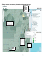
QuickMaps User Guide February 2012 HealthLandscape Australia Index SOFTWARE REQUIRED A summary of software needed to run the HealthLandscape Australia programs smoothly. BACKGROUND Information on the background, aims and development of HealthLandscape Australia, QuickMaps and the Interactive Mapper (Appendix C). UNDERSTANDING THE DATA An outline of the resources, measures and terms used in QuickMaps. INSTRUCTIONS Step-by-step visual and written instructions on the basic functions of QuickMaps, including Explore, Navigate, and ‘Build your Map’. FAQS A comprehensive list of frequently asked questions and answers. The FAQs were last updated [date]. DATA DICTIONARY Description and source information for key terms relevant to QuickMaps. KNOWLEDGE BASE Contact and support details For Australian technical support and information on the HealthLandscape Australia programs and GRAPHC projects. References A list of references, useful articles, reports and papers related to the National Centre for Geographic and Resource Analysis in Primary Health Care (GRAPHC) and background articles on geospatial technology and health. If you don't find the answers to your questions in this user guide, please contact us for further information. 2 Software required For optimum use of the HealthLandscape programs, please ensure you have the following software installed and enabled: > Adobe Flash Player: This cross platform, plug-in, multimedia platform is used to add animation, video and interactivity to web pages. We recommend version 10+ to run the HealthLandscape Australia programs smoothly. Flash Player is downloadable free of charge from the Adobe website: http://get.adobe.com/flashplayer > JavaScript is used as part of a web browser in order to provide enhanced user interfaces and dynamic websites. To use the Interactive Mapper and QuickMaps, your browser must have Javascript enabled. To check if Javascript is active: Mozilla Firefox: Tools Content Google Chrome: Spanner icon, Settings Under the Bonnet Content Settings o Internet Explorer 8: Tools Internet Options Security Internet Custom Level Enable Active Scripting Information on this program can be obtained from www.javascript.com o o We recommend the following browsers: • • • Internet Explorer 8+ Mozilla Firefox 8+ Google Chrome 18+ The HealthLandscape Australia maps are not recommended for use in Internet Explorer 6. 3 Background WHAT IS THE NATIONAL CENTRE FOR GEOGRAPHIC AND RESOURCE ANALYSIS IN PRIMARY HEALTH CARE? The Australian Primary Health Care Research Institute (APHCRI)’s National Centre for Geographic and Resource Analysis in Primary Health Care (GRAPHC) was established in November 2011. This occurred following over 18 months of consultation with a national reference group comprised of government, academic and health care professionals. The aim is to support communities, health care service providers, academia and policy makers to improve equity and access to health care services through better resource allocation. GRAPHC uses location data, spatial analytic methodologies and online mapping to analyse, interpret and display information in ways that promote better understanding of primary health care and the forces that affect it. WHAT IS HEALTHLANDSCAPE AUSTRALIA? HealthLandscape Australia is a set of interactive web-based mapping tools. It allows health professionals, policy makers, academic researchers and planners to combine, analyse, and display information in ways that promote better understanding of health and the forces that affect it. The tools bring together various sources of health, socio-economic and environmental information in a convenient, central location to help answer questions about and improve health and healthcare. HealthLandscape Australia can be used to create maps from publicly available data sets including community health, demographic and service data. HealthLandscape Australia current includes two user-friendly programs: QuickMaps and Interactive Mapper. IS THERE VARYING TERMINOLOGY USED IN HEALTHLANDSCAPE AUSTRALIA PROGRAMS TO THAT USED IN THE USA? The HealthLandscape Australia Interactive Mapper program available on this website might also be referred to as the ‘Health Landscape Player’ by technicians here and in USA. The HealthLandscape Australia QuickMaps program available on this website might also be referred to as ‘Tool Tip’ by technicians here and in the USA. WHY WAS IT DEVELOPED? HealthLandscape Australia was developed in order to meet a growing demand for and appreciation of the value of geographic information systems. They provide an efficient, effective display of data in developing and improving primary health care in Australia. The adoption of a geographic approach to primary health care research facilitates the development of the evidence base to inform locally relevant and equitable solutions for targeting health resources and services. 4 HealthLandscape Australia programs provide useful tools for public and primary health care researchers, academic groups, policy advisers, planners, service providers and bodies, health professionals and members of the community. WHO CAN USE QUICKMAPS? QuickMaps is an easy to use and useful tool for providing an effective and efficient display of data for stakeholders in the community who are interested in accessing and displaying data on health and health services. Those who might commonly benefit include public and primary health care researchers and academic groups, policy advisers and planners (state, local and community), service providers and bodies (local service providers, Medicare Locals, AGPN, allied health bodies, councils, workforce agencies), health professionals and members of the community. HOW CAN IT BE USED? The QuickMaps program has two main functions. Firstly, it allows the user to produce a coloured geographical map (with legends) of a selected Australian community (SLA) with relevant overlays of selected health, demographic and service data. It also provides selection of optional views for layers for inserting key location data. Secondly, overall data on SLA groups according to particular themed health information is available for display, comparison and sorting. This includes the tabling of data according to particular themes and graphed comparative trends between rural and regional locations. You are able to print or save the view of the current map as a JPG file, and deselect and reselect the data options to produce another map. WHO MIGHT BENEFIT FROM USING THE INTERACTIVE MAPPER PROGRAM? Public and primary health care researchers, academic groups, policy advisers, planners, service providers and bodies, health professionals and members of the community might all find the Interactive Mapper program a valuable tool. Interactive Mapper allows users to discover community characteristics and local needs, and to share information. The program provides options for selecting frequently requested individual themes of health, demographic and service data. It allows the user to produce a coloured geographical map (with legends) of a Statistical Local Area (SLA), the second smallest unit of area used by the Australian Bureau of Statistics (ABS). 5 Understanding the data DATA SCOPE – AREAS Statistical local areas (SLAs) HealthLandscape Australia uses the most current accessible data on Statistical Local Areas (SLA) in Australia to provide a convenient and familiar geographic area that is large enough for relevant measures. The SLA is an Australian Standard Geographical Classification (ASGC) defined area. This is the third smallest unit of area used by the Australian Bureau of Statistics (ABS), and in noncensus years the smallest geographic unit. SLAs are displayed as boundaries on the HealthLandscape Australia maps. SLAs cover, in aggregate, the whole of Australia without gaps or overlaps (Australian Bureau of Statistics, 2006a; Public Health Information Development Unit (PHIDU), 2008). For more information on SLAs follow this link: http://abs.gov.au/AUSSTATS/[email protected]/66f306f503e529a5ca25697e0017661f/50F6E014 E67EBB7CCA256F1900127934 OTHER AREAS Some data is also represented as boundaries and locations on the map as optional overlays, including the geography of Divisions of General Practice, Medicare Local networks and Remoteness Areas (Rural Health Areas, Australian Standardised Geographical Classifications)(Australian Bureau of Statistics, 2006c). DIVISIONS OF GENERAL PRACTICE These are the geographical administrative boundaries that manage, support and coordinate a collective of general practice medical practices and centres. Division boundaries are based on 2006 ABS Collection Districts as at 1st July 2008. Allocation of doctors to Australian General Practice Network The headcount is allocated to the Division where the provider claimed the most services and counted when they provided at least one service during the financial year. Providers are allocated to a Division of General Practice using the provider's street or practice address, unlike other workforce data sources that are based on postcode. Where a provider has worked in more than one Division during the reference period their services, FTE and FWE are allocated where the service was provided GP Headcount (Australian Bureau of Statistics, 2006d). MEASURES CONSIDERED Remoteness areas/VR study areas Australian Standardised Geographical Classification (ASGC) Remoteness Structure is used to classify Census Collection Districts (CDs) which share common characteristics of remoteness into broad geographical regions called Remoteness Areas (RAs). This is maintained as a separate structure in the ASGC because the spatial units (RAs) do not align with those from any of the other structures. There are six classes, which when aggregated cover the whole of Australia. One of six options describe the remoteness of the SLA groups: 6 ‘Major Cities of Australia’, ’Outer Regional Australia’, ‘Inner Regional Australia’, ’Remote Australia’, or ‘Very Remote Australia’ (2006) (Australian Bureau of Statistics, 2006c). TYPES OF DATA USED AND THEIR SOURCES Data used for the main map and data table view in HealthLandscape Australia is from the following sources: • • • • Social Health Atlas of Australia 2008 – This is a range of socio-demographic and health data compiled by the Public Health Information Development Unit at the University of Adelaide. The sources include Census Data 2006, National Health Survey 2004-2205, and Prometheus 2002-2006. Australian Bureau of Statistics Census Data 2006 - This is the data source for the health care workforce theme, the base maps and the optional index of relative disadvantage layer. Department of Health and Ageing, Medical Benefits Division, General Practice Statistics Section – This is the data source for the Divisions of General Practice module. Department of Immigration and Citizenship Settlement Database - This is the data source for humanitarian arrivals in QuickMaps. MEASURES OF DATA SETS FOR LAYERS View the data The following measurements and definitions are used to map data themes on layers and in the tables of all SLAs in the ‘Data’ view. Health workforce Total Health Workforce per 10,000 population This covers all allied health professionals (250, 251, 252), pharmacists, dental workers, medical workers (253), nursing workers and health managers. Allied health professionals include optometrists/orthoptists, chiropractors/osteopaths, physiotherapists, psychologists and indigenous health workers, along with 19 other categories. Note: ‘medical workers’ is a separate category from ‘allied health professionals’ (Australian Bureau of Statistics, 2006e). Total Medical Workers per 10,000 population Medical practitioners diagnose and provide medical care to patients to promote and restore good health and can be generalists or specialists. Generalist medical practitioners (ANZSCO unit group 2531) have a Bachelor degree or higher and at least one year of hospital-based training. Specialists include anaesthetists (2532), internal medicine specialists (2533), surgeons (2535), psychiatrists (2534), and other medical practitioners (2539)(Australian Bureau of Statistics, 2006e). Nursing Workers - per 10,000 population by occupation This category includes registered nurses (Unit Group 2544), midwives (2541), nurse educators and researchers (2542) and nurse managers (2543) who usually have a Bachelor degree or higher. Also included in this category are enrolled and mothercraft nurses (4114) who usually work under the supervision of a registered nurse or midwife. 7 Dental Workers per 10,000 population by occupation The total approximate occupation of 29,500 Australians, which covers dental practitioners, hygienists, technicians, therapists, and assistants (Australian Bureau of Statistics, 2006e). Chiropractors and Osteopaths per 10,000 population The total approximate occupation of 3,300 Australians (Australian Bureau of Statistics, 2006e). Optometrists and Orthoptists per 10,000 population The total approximate occupation of 3,500 Australians (Australian Bureau of Statistics, 2006e) . Pharmacists per 10,000 population The total approximate occupation of 15,000 Australians (Australian Bureau of Statistics, 2006e). Physiotherapists per 10,000 population The total approximate occupation of 12,000 Australians (Australian Bureau of Statistics, 2006e) . Psychologists per 10,000 population The total approximate occupation of 13,700 Australians (Australian Bureau of Statistics, 2006e) Aboriginal Health Workers per 10,000 In Aboriginal and Torres Strait islander health clinics (Australian Bureau of Statistics, 2006e). Index of Relative Disadvantage The Index of Relative Disadvantage is a measure of socioeconomic disadvantage for each SLA as a decile. It ranges from the most disadvantaged (1st-2nd decile) to the least disadvantaged (9th-10th decile). This index is derived from Census variables related to disadvantage such as low income, low educational attainment, unemployment and dwellings without motor vehicles (based on Australian score = 1000) (2006). Decile Ranking of SLAs for the Index of Relative Socio-economic Disadvantage A ten category ranking (1 to 10) of SLAs for the Index of Relative Socio-economic Disadvantage. The values -1 and 0 were added for no data spatial units. This indicator is displayed in the disaDecl shapefile with no normalisation (Quantile Classification with 11 Classes) (Australian Bureau of Statistics, 2006b). Composite score of deprivation This composite score from 3 to 15 was constructed combining measures of remoteness areas, physician to population ratios and the Index of Relative Socio-economic Disadvantage (IRSD), then validated against health outcome measures. These health measures included avoidable mortality per 100,000, risk behaviour rate per 1,000 and diabetes rate per 1,000. All analyses were conducted at the statistical local area (SLA) geography and weighted to be population representative. A score of 15 corresponds to the most deprived SLA, whilst a score of 3 is the least deprived (Butler & Patterson, 2010). 8 Avoidable standard death rate Avoidable Standard Death Rate is the average annual rate per 10,000. It covers all causes of death and ages 0-74. Avoidable Death Rate is displayed as a manual classification with 10 classes (2002-2006). Avoidable and amenable mortality comprises those causes of death that are potentially avoidable at the present time, given available knowledge about social and economic policy impacts, health behaviours, and health care (the latter relating to the subset of amenable causes). Avoidable deaths included are from cancers, cardiovascular diseases, cerebrovascular diseases, respiratory system diseases, road traffic injuries, suicide, and self-inflicted injuries (2002-2006) (Public Health Information Development Unit (PHIDU), 2008). Population at risk This data relates to the estimated number of people with at least one of the four following health risk factors - smoking, harmful use of alcohol, physical inactivity and obesity - aged 18 years and over (2004-2005) (Public Health Information Development Unit (PHIDU), 2008). Risk standard rate This data relates to the estimated number of people with at least one of four major health risk factors, 18 years and over, indirectly age-standardised ratio, rate per 1,000 population. It is displayed as a manual classification with 10 classes (Public Health Information Development Unit (PHIDU), 2008). Diabetic standard rate This data relates to the estimated number of people with Type 2 Diabetes as an indirectly age-standardised ratio. It is displayed as a manual classification with 10 classes. rate per 1000 population (2004-2005) (Public Health Information Development Unit (PHIDU), 2008). % Indigenous population This data relates to the total Indigenous population for the SLA group in 2006. This relates closely to the ABS Census 2006 numbers (Public Health Information Development Unit (PHIDU), 2008). Policy relevant areas: boundaries and data layer options General Practice Divisions These are the geographical administrative boundaries that manage, support and coordinate a collective of general practice medical practices and centres. Division boundaries are based on 2006 ABS Collection Districts as at 1st July 2008. Allocation of doctors to Australian General Practice Network The headcount is allocated to the Division where the provider claimed the most services and counted when they provided at least one service during the financial year. Providers are allocated to a Division of General Practice using the provider's street or practice address, unlike other workforce data sources that are based on postcode. Where a provider has worked in more than one Division during the reference period their services, FTE and FWE are allocated where the service was provided GP Headcount (Australian Bureau of Statistics, 2006d). 9 Remoteness areas Australian Standardised Geographical Classification (ASGC) Remoteness Structure is used to classify Census Collection Districts (CDs) which share common characteristics of remoteness into broad geographical regions called Remoteness Areas (RAs). This is maintained as a separate structure in the ASGC because the spatial units (RAs) do not align with those from any of the other structures. There are six classes, which when aggregated cover the whole of Australia. One of six options describe the remoteness of the SLA groups: ‘Major Cities of Australia’, ’Outer Regional Australia’, ‘Inner Regional Australia’, ’Remote Australia’, or ‘Very Remote Australia’ (2006) (Australian Bureau of Statistics, 2006c). Point layers: location and data layer options Medical schools This provides data definitions with the full name of the Medical School, full mailing address, associated Australian post code, location in degrees, minutes, and seconds south of the Equator, location in degrees, minutes and seconds east of the Prime Meridian, East-West location in decimal degrees, North-South location in decimal degrees and indicators by SLA name (Butler, 2009). Humanitarian arrivals This relates to the number of humanitarian arrivals. These settlement statistics represent permanent arrivals in this area under all migration streams in 2006 in selected in SLAs (DIAC Settlement Database Team, 2006). DATA LIMITATIONS Much of the data is based on statistics from 2004-2006. The user should be aware that circumstances in certain areas may have changed since this time. Data provided in HealthLandscape Australia’s Interactive Mapper and QuickMaps should therefore be used in consideration of this, and ideally with other sources. The Health Workforce topic gives a total headcount by area of residence. It does not give information about workload (full time vs. part time) or where people are actually working. Total medical workforce includes all doctors, not only general practitioners. Disease and Conditions topics use data collected for the National Health Survey 2004-2005. They do not include the most remote areas of Australia, and so findings for these variables in remote areas need to be considered with caution. INTERPRETING THE DATA In order to get a picture of primary health care need and access of a given area, it is important to think of the data and maps as a rough outline. They show some of the underlying structure of the full picture, but don’t provide all the details necessary to do fully analyse the situation. The data and geo-visualisation of the data are tools only meant to help planners and policy advisers, communities and service providers. This information should be used with other sources to get the complete picture. HealthLandscape Australia programs are best used to compliment other data collection methods and information. 10 REFERENCE LIST FOR DATA Australian Bureau of Statistics. ASGC Remoteness Structure (RA) Digital Boundaries (ABS Cat. No. 1259.0.30.004). Product Brief. Canberra. Australian Bureau of Statistics. (2006a). ABS Census 2006. Retrieved from http://www.health.gov.au/internet/main/publishing.nsf/Content/work-res-ruraudtoc~work-res-ruraud-lis~work-res-ruraud-lis-d~work-res-ruraud-lis-d-sla. Australian Bureau of Statistics. (2006b). ABS, Socio-economic Indexes for Areas (SEIFA), Data only. Table 3. SLA Index of Relative Socio-economic Disadvantage, 2006. Retrieved from http://www.ausstats.abs.gov.au/Ausstats/subscriber.nsf/0/408900B305C15961CA2574 17001175EA/$File/2033055001_%20seifa,%20statistical%20local%20areas,%20data%2 0cube%20only,%202006.xls Australian Bureau of Statistics. (2006c). ASGC Remoteness Structure (RA) Digital Boundaries (ABS Cat. No. 1259.0.30.004). Product Brief., from Australian Government http://www.abs.gov.au/AUSSTATS/[email protected]/Lookup/1259.0.30.004Main+Features1200 6?OpenDocument Australian Bureau of Statistics. (2006d). Division boundaries are based on ABS Collection Districts. Allocation of doctors to Australian General Practice Network Retreived 30th July 2008. . Canberra. Retrieved from http://www.health.gov.au/internet/main/publishing.nsf/Content/health-pcd-programsdivisions-boundarymaps. Australian Bureau of Statistics. (2006e). Employed persons in health related occupations.Attachment D.ABS Census 2006. Canberra. Retrieved from http://www.health.gov.au/internet/main/publishing.nsf/Content/work-res-ruraudtoc~work-res-ruraud-lis~work-res-ruraud-lis-d~work-res-ruraud-lis-d-sla. Butler, D. (2009). Compilation of data on the location of Australian Medical Schools. APHCRI. Australian National University, Canberra. Butler, D., & Patterson, S. (2010). Composite score of deprivation. Health Landscape Australia data dictionary. APHCRI / RGC. Canberra. DIAC Settlement Database Team. (2006). Humanitarian Arrivals to Australia: 1 January - 31 December 2006. Canberra. Public Health Information Development Unit (PHIDU). (2008). A Social Health Atlas of Australia Retrieved from http://www.publichealth.gov.au/data_online/aust_sla_online_2008/Australia_sla_data_ 2008.xls 11 Clicking here will take you back to the national ‘QuickMaps’ view User guide Assistance menu Training and resources: instructions, FAQs, data definitions, glossary The title of the map building program Controls to minimise/maximise view Data tab option for overall data table display Scholarly Articles on Geospatial technology and HealthLandscape Australia The Map View tab (default setting) Zoom/ scale bar, enlarges and decreases the view of an area Print control tab Export function button Main map data layer theme selections Contents box with options for maps Policy relevant areas layer display options SLAs – Statistical Local Areas Point layer display options The map has a zoom function which allows you to go immediately to a state or area of interest. Roll forward with your mouse or left click to zoom in; roll backwards to zoom out. Scale 12 Tooltip: Points option – marks location information on key locations associated with policy relevant and point layer Legend – when a theme is selected from the contents menu, a corresponding legend and histogram will be displayed here FUNCTIONS IN QUICKMAPS Explore and navigate On the Australian Primary Health Care Research Institute’s website, select ‘Research’ from the the navigation menu and click the link for GRAPHC. Choose QuickMaps to load the program. The page has many tabs and buttons which provide options that will help you to start building your map. Some key features include: > Blue label at the top left, above the map: mapping program QuickMaps. > White and blue tabs top left above the map, below the title: o o > Blue Assistance menu tabs at the top of the page: Getting started, articles and support provide resources for users. Home is a link that allows the user at any time to return to the HealthLandscape Australia page. Grey tabs at the top right of the map, above the content box: o o > The ‘Map’ tab controls the page as a ‘map view’. This is the default view. The ‘Data’ tab when selected illustrates a table view of all SLA,s on select themes. The default setting is: ‘ Healthcare Workforce’. The data, headings, and order may be sorted. This icon, along with the ‘Home’ tab on the blue panel (see below) provides a link back to the entry page at any point in the programs use. o o > : Blue icon to the far top left of the page: o > This is the title of the ‘print tab’, provides an option to print the current view of the page (including maps, and data tables. ‘ export tab’, exports the current view of the map to a JPG file. Grey buttons at the top of the contents box, adjoining the Explore the map label: o o The left button minimises the view of the contents box. The right button maximises the view to full screen. 13 > The contents box provides options for layering data onto the map. Sections within the contents box: > View the data – This section provides options for layering data on to SLA area maps of popular health themes. (Only one theme is able to be selected for display at a time). > Priority Relevant Areas - This section provides options for additional layers that define boundaries and locations aasociated with General Practice Divisions and/or Remoteness Areas. > Point Layers - This section provides options for descriptive data to be introduced to the view of the map, relevant to the location and priority relevant areas of Medical Schools and Humanitarian Arrivals. > Show tooltips – These buttons enable the display of data and points relevant to the location and certain previous selections made when the cursor is rolled over an area. These functions are set as ‘on’ by default. > Legend - When a theme is selected from the contents menu to produce a layer on the map, a corresponding legend and histogram will be displayed. On the map itself: > Zoom function - The map has a zoom function which allows you to go immediately to a state or area of interest. Roll forward with your mouse or double click to zoom in; roll backwards to zoom out. > SLAs – Each polygon-like shape on the map represents a Statistical Local Area (SLA). The SLA is an Australian Standard Geographical Classification (ASGC) defined area. This is the third smallest unit of area used by the Australian Bureau of Statistic (ABS), and in non-census years the smallest geographic unit. SLAs are displayed as boundaries on the HealthLandscape Australia maps. 14 > Map scale bar at the bottom left of the map o > This map scale bar illustrates the change the scale of the map from a maximum of 1:591,657,528 to a minimum of 1:72,224, as it is adjusted by the user throught ‘zoom’ functions. The zoom bar at the top left of the map - when dragged up or down this enlarges and decreases the view of an area. Please continue on to ‘Build your Map’ in the next view to better understand how to use the QuickMaps program. 15 Finding a location and choosing a theme for a background view layer Select the preferred theme for display on the map: Nurses per 10,000 Zoom in to a location using your mouse and /or zoom bar. ie. Toowoomba Central Key local SLA location and data, produced automatically by rollover of the mouse Current map scale 16 Legend for use in interpreting Build your map FIND A LOCATION It is possible to zoom in on locations of interest using your mouse or the zoom bar. For this exercise, you will be locating the SLA of Toowoomba Central in Queensland. > You know that Toowoomba is a city just west of Brisbane. Use your mouse to roll over the map of Australia, noting the location of Queensland and Brisbane. > With the cursor resting in the vicinity of this location, zoom in by double clicking or moving the roller forward on the mouse. You are now able to clearly locate the city of Toowoomba on the map. > Guiding the cursor toward Toowoomba. You will see a bright yellow polygon, and then as you move closer, bright yellow boundaries and area information appearing on the screen. This information identifies specific SLAs at that point on the map. You will note that Toowoomba is comprised of several SLAs. > Use your mouse to hover over Toowoomba. Toowoomba Central becomes visible as a yellow area and information box when the cursor is over that area of the map. > Keeping your cursor over that location, double click or move the roller of your mouse forward to zoom in on this area. Alternatively you may wish use the zoom bar to increase the view. To use the zoom bar, drag the marker toward the + end. > You can adjust the location view with the use of the ‘drag’ function. With the cursor over the current location left click and hold the mouse. At the same time move the mouse to ‘drag’ the map in the direction that you wish to view. CHOOSING THE THEME FOR A BACKGROUND LAYER ON THE MAP Where the user has a particular health-related theme in mind for an SLA location, they are able to create a background layer with accompanying legend and information by choosing from the view the data section within the contents menu. The default theme is ‘Total Healthcare Workforce’. It is possible to make a selection from the view the data section prior to, in conjunction with or after selecting your location. For this exercise, using the above view, you will be selecting the theme ‘Nurses per 10,000’ for display as a layer on your map. > In the contents box, under View the data, click on the radio button to select the theme titled ‘Nurses per 10,000’. Note that you can only choose one theme from this list at a time. > You will now be able to see that the selections you made have resulted in changes. At the bottom section of the contents box a coloured legend with indicators (histogram) has appeared, and corresponding layer is visible on the map. You now have a map of Toowoomba Central similar to that below. In your view, you will see a basemap with topographic details accompanied by a legend, a corresponding background layer of colour and data related the health theme ‘Nurses per 10,000’ and key SLA data on rollover. 17 Topographic base map with street view (default) Map Legend: note matches layer on map Current map scale SLA Data: with rollover of mouse 18 Data table 19 Viewing the Data table display The Data tab provides the user with an extensive data table of all SLAs (where data is available) in relation to the currently selected topics. The Data tab is a grey tab situated directly above the map, on the left. For this exercise you will view the data associated with your previous selection: ‘Nurses per 10,000’. > Select the Data tab by clicking on the label. A table of related data appears on the screen. > You will note that the columns listed relate to the Healthcare Workforce topics, of which Nurses are a part. > Should you wish to order the data alphabetically by place name or topic, click on the title at the top of the column. > The data view table can be saved or printed using the print or export functions. > You should now be able to see a table of Healthcare Workforce data from all available SLAs in Australia. > When you are ready to exit the data view and return to the map, click on the Map tab to the left of the Data label. 20 Selecting Policy Relevant Areas for display Data view theme l t d Policy relevant areas marked on the map Policy Relevant areas selected ‘Remoteness Areas’ layer on map Note the accompanying legend to selection choices Current map scale 21 Selecting Policy Relevant Areas for display Policy Relevant Areas are popular choices for users in identifying key locations, boundaries and their characteristics. Areas include Divisions of General Practice and Remoteness Areas. These options are located in the middle of the contents box. Either or both options may be chosen for display. For this exercise, using the current map that you have built, you will be selecting both ‘General Practice Divisions’ and ‘Remoteness Areas’ to add further layers to your map. a) In the contents box under the section Policy Relevant Areas, identify the titles General Practice Divisions and Remoteness Areas. b) Click on each checkbox to activate/deactivate it. c) Your map will be updated to match your selection: • Selecting General Practice Divisions activates a label with the location and related information. • Selecting Remoteness Areas activates a coloured legend with indicators (and a corresponding layer becomes visible on the map (note the label and striping). You will now have a map of Toowoomba Central similar to that on the previous page. You will see a basemap with topographic details, a legend, a corresponding background layer of colour and data related the health theme ‘Nurses per 10,000’ and key SLA data on rollover and a further layer with the location identifiers and information on the policy relevant areas of Divisions of General Practice, and Remoteness Areas. To find out more on the functions of QuickMaps, please continue to the next section. 22 Point layers – humanitarian arrivals ‘Points Layers’ Humanitarian Arrivals, selected ‘Points Layers’ Humanitarian Arrivals marked on the map 23 Introducing Points Layers to your map Points Layers provide the user with additional location data for Medical Schools (based on the physical address of the site) and Humanitarian Arrivals (indicated if at least one Humanitarian Immigrant resides in an SLA). These options are located toward the middle of the contents box. Either or both options may be chosen for display. For this exercise you will add a ‘Humanitarian Arrivals’ Points Layer to the map you have built. > In the contents box under the section Points Layers, identify the titles ‘Medical Schools’ and ‘Humanitarian Arrivals’. > Click the checkboxes to activate and deactivate them. > You will now be able to see that the selections you made have resulted in particular changes. > Your map will be updated to reflect your selection: o A box of Humanitarian Arrivals and related statistics for the SLA will appear on the map. You will now have a map of Toowoomba Central similar to that on the previous page. You will see a basemap with topographic details, a legend, a corresponding background layer of colour and data related the health theme ‘Nurses per 10,000’, key SLA data on rollover, a further layer with the location identifiers and information on the policy relevant areas Divisions of General Practice and Remoteness Areas and a Points Layer for Humanitarian Arrivals. 24 Tool Tips Point Layer ‘Humanitarian Arrivals’ selected Note the marking of ‘Humanitarian Arrivals’ by points and data using ‘Tooltips’ in the SLA associated with 25 Selections for ‘tooltips’ data and points, when location is identified and hovered over Using Tool Tips Further information can be added onto the map of the currently selected SLA using either or both selections from the Show Tool Tips section in the contents box. These are used in conjunction with selections from View the Data and Points Layers. Optional tabs include Data and Points. Data is used to add a label to the map. This is set on by default. When the tool is on, written data will appear on the map. Options can be switched on and off by clicking on the Data button. The font in the typing mode will differ from the actual font displayed on the map. The font size of the labels and width of the outline cannot change, regardless of the zoom level. This labelling will go away when you next click the map. Selecting Points allows the user to add the location of chosen data with a marker filled in with a set colour. The width of the outlines cannot change regardless of the zoom level. The polygon will stay the same size, relative to the zoom on your map. For this exercise you will deselect and reselect select both Tool Tips for display. > In the contents box, in the section Show tool tips, identify the buttons labelled Data and Points. > These buttons are used to turn the ‘Tool Tips’ on or off. The default function is ‘on’. Click the buttons to activate and deactivate them. > You will now be able to see how the selections you made have changed the map: o A coloured polygon and statistics associated with the previously selected Point Layer of Humanitarian Arrivals will appear/disappear and re-appear on the map. You will now have a map of Toowoomba Central similar to that on the previous page. You will see a basemap with topographic details, a legend, a corresponding background layer of colour and data related the health theme ‘Nurses per 10,000’, key SLA data on rollover, a further layer with the location identifiers and information on the policy relevant areas Divisions of General Practice and Remoteness Areas and a Points Layer for Humanitarian Arrivals. Data and Points Tooltips will also be visible. 26 Print tab, when selected produces a separate pop-up box Printing and exporting your map Pop-up box with print selections 27 Export tab, when selected produces a separate popup box Printing your map A map can be printed directly from the mapping screen by the user by clicking the ‘Print’ button above the map. The Print tab is located on the control bar at the top right above the map. EXPORTING THE MAP TO A JPG FILE The user is able to save the view of the map on the screen as a JPG file using the Export tab. The Export tab is located on the control bar at the top right of the map (next to the Print tab). To start again If you wish to start over again with a clear map: > Use the options within the contents box to de-select and re-select themes and layers for a new layered data display on the map of current location. You may find more details on these steps in the find a location walkthrough in this User Guide. > Use the zoom bar or mouse to leave the current view and navigate to a new location. This function can be used in conjunction with the first option. You can find more details on these steps in the choosing the theme for a background layer on the map walkthrough in this User Guide. > Press the F5 key on your keyboard. This will reload and refresh the program. For this exercise you may wish to print, or save that map that you have produced on the screen, or you may now like to Start again and build a new map on the location of your choice. For further information and support please use the resources located on the ‘Assistance menu’ toolbar located centrally above the map view. 28 Frequently asked questions ANSWERS TO QUESTIONS ABOUT COMMON FUNCTIONS OF QUICKMAPS FAQ: How do I expand or reduce the map? Solution: Drag the Zoom bar to the desired level of magnification, double click or use the roller on your mouse to zoom in and out. FAQs: How do I locate an SLA area of my interest on the map? Solution: Please refer to the Build your map: Finding a location walkthrough on page 19 of this User Guide. FAQ: What is the quickest way to expand the view of the map on the screen? Solution: The quickest way to expand the map to full screen view is to click on the full screen button at the top far right of the contents box. This is situated alongside the ‘Explore the map’ label and minimise button. FAQ: How do I put individual themed data onto my local area map? Solution: Make a selection from View the data prior to, in conjunction with, or after selecting your location, by clicking on the corresponding radio button. The default theme from this list is ‘Total Healthcare Workforce’. FAQ: Where can I find comprehensive data on all Statistical Local Area (SLAs) for particular themes? Solution: Once a theme is selected from the menu from View the data, click on the ‘Data’ tab, which is located at the top left above the map. This will produce a comprehensive data table on the screen of all SLAs where data is available. This table can be printed using the Print tab, or saved as a JPG file using the Export tab at the top right of the map. FAQ: How do you change the appearance of the base map? Solution: It is not possible to change the appearance of the base map in QuickMaps. Should you require other types of base maps, you may prefer to use the alternative program Interactive Mapper, accessible via the HealthLandscape Australia home page. Options in the Interactive Mapper for base maps include Topographic, Street, Terrain, Terrain with Labels’, Canvas, and Canvas with Labels. FAQs: How do I mark the boundaries and key features in the SLA area that I am investigating? Certain features are automatically marked, or occur through selection of options for layering onto the map of the SLA. QuickMaps does not have drawing tools. Automatically indicated are the boundaries of the state, location, title, and defined SLA boundaries. From the first view of the Australian map you will see basic boundaries. As you zoom in on a local you will see more defined highlighted boundaries and information appearing on the screen. This 29 information identifies specific SLAs by highlighting them yellow, and an information box pops up on mouseover. Options for further marking of locations can be set in the contents box. FAQ: How many layers of data can I display on my QuickMaps at a given time? Solution: One theme from View the data can be activated at a time. All options from Policy relevant areas and Points layers can be activated simultaneously. FAQ: What is the best way of exporting my map? Solution: The user is able to save the view of the map on the screen as a JPG file using the Export tab. The Export tab is located on the control bar at the top right of the map (next to the Print tab). FAQ: How do I print a map on the screen? Solution: A map can be printed directly from the mapping screen by the user by clicking the ‘Print’ button above the map. The Print tab is located on the control bar at the top right above the map. FAQs: How do I find out more about the key terms and symbols when using the QuickMaps program? Solution: Please visit the Glossary section of this User Guide. FAQ: What is the Data tab? Solution: The Data tab provides the user with an extensive data table of all SLAs where data is available. The default view is Total Healthcare Workforce. The ‘Data’ tab is a grey label situated directly above the map, on the left. Select the Data tab by clicking on the label. A table of related data appears on the screen. If you wish to sort the data table alphabetically, click on the relevant column heading. The data view table is also able to be saved or printed using the Print or Export functions on the top right side of the map. To return to the Map, click on the ‘Map’ tab to the left the ‘Data’ label. 30 FAQ: How do I start again in producing another map? Solution: If you wish to start over again with a clear map: > Use the options within the contents box to de-select and re-select themes and layers for a new layered data display on the map of current location. You may find more details on these steps in the find a location walkthrough in this User Guide. > Use the zoom bar or mouse to leave the current view and navigate to a new location. This function can be used in conjunction with the first option. You can find more details on these steps in the choosing the theme for a background layer on the map walkthrough in this User Guide. > Press the F5 key on your keyboard. This will reload and refresh the program. FAQs: Will the information available for display on the maps be updated regularly? Solution: You can expect that the information available for display on the HealthLandscape Australia programs will change as data and its uses are identified for use in this way. The development of these programs are the result of strong international and national partnerships aimed at providing relevant interactive web-based mapping tools that allow health professionals, policy makers, academic researchers and planners to combine, analyse and display information in ways that promote better understanding of health and the forces that affect it. FAQs: I have questions about –HealthLandscape Australia. Who should I contact for further information? Solution: For technical support, please contact Paul Konings on +61 2 6125 6549, or: [email protected] For details on the National Centre of Geographic and Resource Analysis in Primary Health Care and its associated projects, Dr Ian McRae, Research Fellow, on +61 2 6125 8088, or [email protected] 31 Data dictionary A ABS: Australian Bureau of Statistics APHCRI: The Australian Primary Health Care Research Institute (APHCRI) was established at The Australian National University (ANU) in 2003 as part of the Primary Health Care Research Evaluation and Development (PHCRED) Strategy of the Australian Government Department of Health and Ageing. GRAPHC projects, and ‘HealthLandscape- Australia’ programs operate within APHCRI. Assistance menu: This toolbar is located at the top of the web page. It has various options and resources to assist you in using the HealthLandscape Australia programs. The tabs are: > Getting started, articles, and support (to load) these provide user resources. > Home is a link to the main HealthLandscape Australia page. Avoidable Standard Death Rate: Indirectly age-standardised avoidable death ratio (all causes, ages 0-74). Displayed as a manual classification with 10 classes. Avoidable and amenable mortality comprises those causes of death that are potentially avoidable at the present time, given available knowledge about social and economic policy impacts, health behaviours, and health care (the latter relating to the subset of amenable causes). Avoidable deaths included are from cancers, cardiovascular diseases, cerebrovascular diseases, respiratory system diseases, road traffic injuries, suicide, and self-inflicted injuries Average annual rate expressed as per 100,00(2002-2006). B Background map: You can choose from contextual maps of a location. Only one background map may be selected at a time. When the user first loads QuickMaps they will see the default background map of Australia. To view a location of choice, you may to then use various options to zoom in or out of the map to locate a community. Boundaries: In QuickMaps, this is associated with a key of the legend, and the definition of boundaries from selections map of State and selected SLA of focus; and particular sections under the contents menu within basic layers. Buttons: These are identified shapes on the screen that have the purpose. When pointed to, and clicked on, they will open another set view with information and other options. C Composite Score of Deprivation: This composite score from 3 to 15 was constructed combining measures of remoteness areas, physician to population ratios and the Index of Relative Socio-economic Disadvantage (IRSD), then validated against health outcome measures. These health measures included measures such as avoidable mortality per 100,000, risk behaviour rate per 1000 and diabetes rate per 1000. All analyses were conducted at the statistical local area (SLA) geography and weighted to be population 32 representative. A score of 15 corresponds to the most deprived SLA, whilst a score of 3 is the least deprived. Contents Box: This is an area on the visible page at the left of the map on the computer screen in the Australian ‘HealthLandscape’ programs, QuickMaps and Interactive Mapper. Within it is information and selection options related to the themes selected from the menu. D Data: A collection of facts, information, photos, text, anything, on a computer or on the internet. Database: A Database is a structured collection of data that is stored on a computer or server. Data label: This tool can be activated in the contents menu under the heading ‘Show tool tips’. Use this tool to add a label to the map. Click on the tool, and written data will appear on the map with a further click of the mouse in that location. The font size of the labels and width of the outline cannot change regardless of the zoom level. This labelling will go away when you next click the map. Data scope: QuickMaps uses the most current accessible data on Statistical Local Areas (SLAs) in Australia, on the most relevant topics and themes. Data view: When selected a table with data for the all SLAs in Australia relevant to the themes selected from the contents box appears. Default settings: There are two primary default settings in QuickMaps. By default you will be looking at a map of Australia. When you zoom in to a location the view of the map will be a topographical base map. The default theme is ‘Total Healthcare Workforce’. Diabetic Standard Rate: Estimated number of people with Type 2 Diabetes as an indirectly age-standardised ratio. Displayed as a manual classification with 10 classes. rate per 1000 population (2004-2005) E Exit button: Resets settings. In QuickMaps this is the Home tab in the Assistance Menu Panel. F FAQs: A comprehensive list of Frequently Asked Questions. Available as a section in the User Guide. Flash Plug in: Is an abbreviation for Adobe Flash Player. This is a cross-platform, plug-in, multi-media platform to add animation, video and interactivity to web pages. It is required to run QuickMaps and is downloadable free of charge: www.get.adobe.com/flashplayer G General Practice Divisions: These are the geographical administrative boundaries that manage/support/coordinate a collective of general practice medical practice/centres. Division boundaries are based on 2006 ABS Collection Districts as at 1st July 2008. 33 GRAPHC: The National Centre for Geographic and Resource Analysis in Primary Health Care uses location data, spatial analytic methodologies and online mapping to analyse, interpret and display information in ways that promote better understanding of primary health care and the forces that affect it. H Homepage: Clicking the ‘home’ tab in the assistance menu will return you to the HealthLandscape Australia homepage. Humanitarian Arrivals: Number of Humanitarian Arrivals - These settlement statistics represent permanent arrivals in this area under all migration streams selected in 2006. I Icon: This is the blue shape located at the far left of the assistance menu and provides you with a link back to the entry page at any point in the programs use. Index of Relative Disadvantage – A measure of socioeconomic disadvantage for each SLA as a decile (ranges from the most disadvantaged (1st-2nd decile) to the least disadvantaged (9th-10th decile). % Indigenous Population: Total indigenous population for the SLA group, total number, 2006. Information tab: provides the user with further information on the terms of the theme selected and in current view. This tab is found at the top right of the map, above the contents box. J JavaScript: Is used as part of a Web browser in order to provide enhanced user interfaces and dynamic websites. It is required to run the HealthLandscape Australia programs. Information on this software can be obtained from: www.javascript.com L Legend: This is an explanatory list of the symbols on a map or chart. The legend is located on the bottom of the page under the current map displayed. M Map and data tabs: These are the white and blue tabs top left, directly above the map. The Map tab activates the ‘map view’. This is the default. The Data tab brings up a table view of all SLAs on select themes. The default setting is ‘Total Healthcare Workforce’. Map Scale: Displays the scale of the current view of the map Map View: Presents the user with a dominant view of the screen as a map. Medical Schools: For display as an optional layer on the map, includes data with the name, address, postal code, location and SLA (Butler, 2009). 34 Medical Workers per 10,000: Theme. Medical workforce by headcount per 10,000 population N Nursing Workers per 10,000 population by occupation: This category includes Registered nurses (Unit Group 2544), Midwives (2541), Nurse educators and researchers (2542) and Nurse managers (2543) who usually have a Bachelor degree or higher. Also included in this category are Enrolled and mothercraft nurses (4114) who usually work under the supervision of a registered nurse or midwife. O Overall data sets: written statistics on available data sets relative to each SLA group. Data sets might be selected from the Data tab on the top left corner of the map. Data sets for viewing include population, medical workers, nurses, Australian death rate, index of relative disadvantage and comparative score of deprivation. (Note: Measures of Data in this set may not match that available within the data view). P Points Layers: Option that activates Points Layers with site information for the map of the community (SLA) that you have selected, as alternative or additional information. This can include Medical Schools (based on the physical address of the site), and Humanitarian Arrivals (indicated if at least one Humanitarian Immigrant resides in an SLA). Policy Relevant Areas: Individual or multiple choices from this section can provide an overlay of information on relevant boundaries for your currently selected SLA. Options include: > General Practice Divisions - This function allows you to map boundaries and data relating to General Practice workforce across Australia. > Medicare Local – This function allows you to map boundaries and data relating to General Practice workforce across Australia for General Practice Networks. Relevant data from this section might be layered on the map of the SLA and thematic data view selected. > Remoteness Areas - Australian Standardised Geographical Classification of remoteness areas. Categorisation determined through this function include: o o o o o Major Cities Inner Regional Outer Regional Remote Very Remote Population at Risk: Estimated number of people with at least one of the four following health risk factors - smoking, harmful use of alcohol, physical inactivity, obesity - aged 18 years and over (2004-2005) 35 Print and export tabs: These tabs are located at the top right of the map, above the content box. The print button provides you with an option to print the current view of the page, including maps, and data tables. The export button enables you to export the current view of the map as a JPG file. R Remoteness Areas: ASGC Remoteness Structure is used to classify Census Collection Districts (CDs) which share common characteristics of remoteness into broad geographical regions called Remoteness Areas (RAs). The six categories are Major Cities, Inner Regional, Outer Regional, Remote, and Very Remote. Risk Standard Rate: Estimated number of people with at least one of four major health risk factors, 18 years and over, indirectly age-standardised ratio. This is displayed as a manual classification with 10 classes. Robert Graham Center: The American Academy of Family Physicians (AAFP's) Robert Graham Center for Policy Studies in Family Medicine and Primary Care is a research centre sponsored by the AAFP but operated with editorial independence. It was established a decade ago to provide evidence for policy-making and to bring a family medicine and primary care perspective to health policy deliberations. The Robert Graham Center staff are experts in the use and analysis of large datasets using Geographic Information Systems (GIS), and have a strong and team-based approach to GIS-related work and application development. S Show Tool Tips: Further information can be added onto your SLA map by selecting the boxes associated with either or both functions. The options are: > Data > Points SLA: Each polygon on the map represents a Statistical Local Area (SLA). QuickMaps uses the most current accessible data on Statistical Local Areas (SLA) in Australia to provide a convenient and familiar geographic area that is large enough for relevant measures. The SLA is an Australian Standard Geographical Classification (ASGC) defined area. This is the third smallest unit of area used by the Australian Bureau of Statistics (ABS), and in noncensus years the smallest geographic unit. It is displayed as boundaries on the HealthLandscape Australia maps. SLAs cover, in aggregate, the whole of Australia without gaps or overlaps. These areas relate roughly as postcode, suburbs, local government areas and Medicare Local networks. (Australian Bureau of Statistics, 2006a; Public Health Information Development Unit (PHIDU), 2008). SLA rollovers: These rollovers are always on. They contain information about the SLA from the modules and data layers that are active in the contents box. A yellow outline of the selected area will appear along with a text box stating the name of the SLA and the count for that area. A corresponding yellow bar will appear in the histogram and the legend along the bottom of the page. 36 Spatial Type Polygon: This is always "Polygon" for the SLA spatial units. T Theme: This is associated with the topics selected from the View the data section of the contents box. Total Health Workforce per 10,000 population: All allied health professionals (250, 251, 252), pharmacists, dental workers, medical workers (253), nursing workers, and health managers. Allied health professionals include; optometrists/orthoptists, chiropractors/osteopaths, physiotherapists, psychologists, and indigenous health workers, along with 19 other categories. Note: ‘medical workers’ is a separate category from ‘allied health professionals’. Total Medical Workers per 10,000 population: Medical practitioners diagnose and provide medical care to patients to promote and restore good health and can be generalists or specialists. Generalist medical practitioners (ANZSCO unit group 2531) have a Bachelor degree or higher and at least one year of hospital-based training. Specialists include ; Anaesthetists (2532), Internal Medicine Specialists (2533), Surgeons (2535), Psychiatrists (2534), and Other Medical Practitioners (2539). U User: Referring to a computer user. User Manual: This document. V View the data: This section of the contents box lists the major data themes available for display They provide an overlay of information onto the base map. Z Zoom/Scale Bar: Allows the user to change the scale of the map from a maximum of 1:591,657,528 to a minimum of 1:72,224. Click on the plus (+) or minus (-) signs at either end of the bar to change the scale. You can also click and hold the scale indicator and drag it to the desired scale. 37 Knowledge base CONTACT DETAILS For technical assistance please contact: Paul Konings T +61 2 6125 6549 E [email protected] For details on the National Centre of Geographic and Resource Analysis in Primary Health Care and its associated projects: Dr Ian McRae Research Fellow T +61 2 6125 8088 E [email protected] INTERNATIONAL PROJECT PARTNERS Australian Primary Health Care Institute (APHCRI) APHCRI is an initiative of the Australian Government a part of the Primary Health Care Research, Evaluation and Development (PHC RED) strategy, and is supported by a grant from the Australian Government, Department of Health and Ageing. It sits within the PHC RED strategy sharing the common overall aim of embedding a research culture in Australian general practice specifically, and primary health care more generally. HealthLandscape LLC and the Health Foundation of Greater Cinncinatti HealthLandscape LLC develops, administers and markets geospatial analysis software tools and professional services. The LLC is a subsidiary of the non-profit Health Foundation of Greater Cincinnati, which worked with the AAFP and Robert Graham Center in the successful development of the ‘HealthLandscape’ mapping platform. This group has extensive experience in GIS applications relating to health centres and primary care and works closely on all projects as a team. The Robet Graham Center The Robert Graham Center for Policy Studies in Family Medicine and Primary Care is a research centre sponsored by the American Academy of Family Physicians (AAFP) but operated with editorial independence. It was established a decade ago to provide evidence for policy-making and to bring a family medicine and primary care perspective to health policy deliberations. The Robert Graham Center staff are experts in the use and analysis of large datasets using Geographic Information Systems (GIS), and have a strong and teambased approach to GIS-related work and application development. 38 NATIONAL REFERENCE GROUP MEMBER ORGANISATIONS The National Resource Group Members of this centre and project include the following organisations: > Australian Institute of Health and Welfare (AIHW) > Australian National University (ANU) > Australian Primary Health Care Research Institute (APHCRI) – ANU > Centre for Primary Health Care and Equity > Consumers’ Health Forum (CHF) > Curtin University –CRCS > Department of Health and Ageing (DoHA) > Flinders University > General Practice Victoria (GPV) > Griffith University > Health First > Health Foundation > Health Workforce Australia (HWA) > LaTrobe University > Monash University > National Centre for Social and Economic Modelling (NATSEM) > Queensland Aboriginal and Torres Strait Islander Health Commission (Q AIHC) > Rural Workforce Agency Victoria (RWAV) > University of Adelaide and University of Adelaide Medical Deans > University of Melbourne > University of New England > University of Western Sydney > University of Wollongong 39 Articles and references THE NATIONAL CENTRE FOR GEOGRAPHIC AND RESOURCE ANALYSIS IN PRIMARY HEALTH CARE Butler, D. (2010). APHCRI Centre for Geo-analysis in Primary Health Care. The Robert Graham Center: Policy Studies in Family Medicine and Primary Care, Australian Insttute of Primary Health Care. Canberra: Australian National University. Butler, D. (2010). APHCRI Centre for Geo-analysis in Primary Health Care: Stakeholder workshop report. The Robert Graham Center: Policy Studies in Family Medicine and Primary Care, Australian Primary Health Care Research Institute. Canberra: Australian National University. Butler, D., Douglas, K., Petterson, S., & Bazemore, A. (2010). Use of measures of socioeconomic deprivation in planning primary health care workforce and defining health care need in Australia. Australian Journal of Rural Health, 18(5), 199-204. doi:10.1111/j.1440-1584.2010.01154.x Butler, D., Naccarella, L., Brooks, P., & Newton, B. (2011). Evidence-based primary health care workforce reforms: Priority areas for research. Medical Journal of Australia, 194(3), 109-110. Douglas, K., Butler, D., & Humphreys, J. (2010). Submission in response to the Medicare Locals discussion paper on goverance and functions. Australian Primary Health Care Reseearch Institute, College of Medicine, Biology & Environment. Canberra: The Australian National University. Douglas, K., Butler, D., Humphreys, J., & Phillips, B. (2010). Submission in response to the Medicare Locals discussion paper on governence and functions. Australian Primary Health Care Institute. Canberra: Australian National University. 40 BACKGROUND ARTICLES AND REFERENCES: GEOSPATIAL TECHNOLOGY AND HEALTH Abbas J, Carlin H, Cunningham A, Dedman D, & McVey D. (2009). Technical Briefing 5: Geo-demographic Segmentation: Association of Publlic Health (APHO). Adhikari P. (2008). Research paper - Socio-economic indexes for areas: Introduction, use and future use. (catalogue number 1351.0.55.015). Canberra: Australian Bureau of Statistics. Australian Government. (2009). A national and hospital network: Further investments in Australia's health Canberra: Australian Government. Bazemore A, Diller P, & Carrozza MT. (2010). The impact of a clinic move on vulnerable patients with chronic disease: A geographic information systems analysis (GIS) Journal of American Board of Family Physicians, 23, 128-130. Clements A. (2008). Spatial risk assessment and management of disease. Chapter 8. Spatial Analysis in Epidemiology. NC: Oxford University Press. Darkins A, Ryan P, R, K., Foster L, Edmonson E, Wakefield B, & Lancaster EA. (2009). Care coordination/ home tele-health: The systematic implementation of health informatics, home tele-health, and disease management to support the care of veteran patients with chronic conditions, Telemedicine and e-Health, 14(10), 1118-1126. doi: 10.1089/tmj.2008.0021 Davey R, Hurst G, & Smith G. (2009). 'My Health Matters' - A Community-led intervention to reduce health inequalities related to physical activity and healthy eating, November, 2009: Stoke on Trent Primary Care Trust. Del Fante P, Allan D, & Babidge E. (2006). Getting the most out of your practice: The practice health atlas and business modelling opportunities. Australian Family Physician, 35(1), 34-38. EJS Hovenga et al (Eds.). (2010). Primary care Informatics and integrated care, chapter 20, Health Informatics: IOS Press. Goodman D, & Wright-Slaughter P. (2004). The generalizability of primary care service areas to non-Medicare populations: A technical report prepared for the Health Resources and Services Administration under Contract. Guagliardo M. (2004). Spatial accessibility of primary care: Concepts, methods and challenges. International Journal of Health Geographics. Health Intelligence Branch. (2008). Population health status assessment: Chronic conditions and risks factors in South Australia. Adelaide: SA Health. Hugo G, Smailes P, Macgregor C, Fenton M, & Brunckorst D. (2001). Defining social catchments in Non-metropolitan Australia. Canberra: Australian Bureau Of Rural Sciences. Humphreys JS. (1998). Delimiting 'rural': implication of and agreed 'rurality' index for health care planning and resource allocation. Australian Family Physician, 6(4), 212-216. 41 Kamel Boulos M, Curtis A, & Abdel Malik P. (2009). Musings on privacy issues in health research involving disaggregate geographics data about individuals. International Journal of Health Geographics, 8, 46. MCGrail M, & Humphreys JS. (2009). Geographical classifications to guide rural health policy in Australia. Australian and New Zealand Health Policy, 28(8). McGrail M, & Humphreys JS. (2009). Measuring spatial accessibility in rural areas: Improving the effectiveness of the two-step floating catchment area method. Applied Geography, 29(533-541). McGrail M, & Humphreys JS. (2009). A new index of access to primary care services in rural areas. Australian & New Zealand Journal of Public Health, 33(5), 418-423. National Health and Hospital Reform (NHHR) Commission.(2009). A healthier future for all Australians : Final report. Canberra Noble M, McLennan D, Wilkinson K, Whitworth A, & Barnes H. (2008). The English Indices of multiple deprivation 2007, Social Disadvantage Research Centre, University of Oxford. Noble M, Wright G, Dibben C, Smith GAN, McLennan D, Anttila C, . . . Lloyd M. (2004). Report to the Office of the Deputy Prime Minister. London: Neighbourhood Renewal Unit O'Dwyer L. (2007). Space and place: Geography in health promotion. In H Kelher, C MacDougall & B Murphy (Eds.), Understanding health promotion. Oxford: Oxford University Press. Openshaw S. (1984). The Modifiable Areal Unit: Problem concepts and techniques (Vol. 38). Norwich: Geo Books. Roager L, Reed R, & Smith B. (2010). Equity of access in the spatial distribution of GPs within and Australian metropolitan city. Australian Journal of Primary Health Care, 16(4), 284-290. Salmond C, & Crampton P. (2002). Heterogeneity of deprivation within very small areas. Journal of Epidemiology and Community Health, 56(669-670). Schofield D, McRae I, & Shrestha R. (2008). Equity, poverty and access to GP service in Australia. Paper presented at the International Workforce Conference. Wang F, & Luo W. (2005). Assessing spatial and non-spatial factors for health care access: Toward and integrated approach to defining health professional shortage areas. Health and Place, 131-146. White P, Gunston J, Salmond C, Atkinson J, & Crampton P. (2008). Atlas of Socio-economic deprivation in New Zealand 2006. Wellington: Ministry of Health. 42