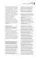
1
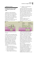
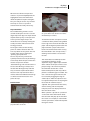
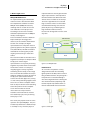
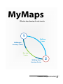
MyMaps
Effective day planning for city tourists
1
Walking:
9 mins
Walking to
busstop: 3 mins
Bus trip:
3 mins
Walking from
busstop: 3 mins
2
Sijme Geurts, Niek Muris, Christian Sallustro
Foundations of tangible user interfaces
M1.1
MyMaps 2
Foundations of tangible interaction
Table of contents
1.
2.
3.
4.
5.
Reflection on lecture
Description of MyMaps
New insights on TI
Individual reflections
References
MyMaps 3
Foundations of tangible interaction
1. Reflection on lecture
Emerging frameworks for tangible
user interfaces by Ullmer & Ishii
(2000)
Tangible user interfaces (TUI) give
digital systems a physical form. These
physical artifacts act as representations
and as controls. The main difference
between “physical” and “tangible” lies
with the physical representation of the
system; even if the mediated
computational components are turned
off, the state of the system is still
expressed.
Figure 1: MVC and MCRpd models (Ullmer &
Ishii, 2000)
In figure 1, the first model MVC (modelview-controller) is the interaction model
for a standard GUI, which has a visual
representation (view) which is often a
graphical display. The second model,
MCRpd (model-view-representation
(physical and digital)), adds also a
physical presentation. The MCRpd
model highlights the integration of
control and physical representation.
The key characteristics of the MCRpd
model are:
1. Physical representations are
coupled to the underlying model.
2. Physical representations show that
they can be controlled.
3. Physical representations are
coupled to digital representations.
4.
Tangibles carry out the physical
state of the system.
The physical artifacts represent “hidden”
digital information, they are statically of
dynamically coupled to computationally
mediated components. The artifacts can
either have a symbolic (they do not
share visual or physical references) or an
iconic representation (they share a link
with the object to which they refer). The
iconic physical artifacts are called
“phicons”.
The physical artifacts can act as
containers, tokens or tools.
TUIs can be placed within 4 different
instances:
1. spatial systems, which use position
and orientation of multiple physical
artifacts, 2. constructive systems, which
are modular systems for constructing
models, 3. relational systems, in which
sequence, surroundings and other
obvious relations between multiple
tangibles are coupled to computational
interpretations and associative systems,
where individual physical artifacts are
coupled to digital information, but there
are no relations between multiple
physical artifacts.
There are 12 application domains for
TUIs, illustrated by the 4 different
instances: information storage, retrieval
and manipulation, information
visualization, simulation, modeling and
construction, systems management,
configuration and control, education,
programming systems, collocated
collaborative work, entertainment, remote
MyMaps 4
Foundations of tangible interaction
communication and awareness, artistic
expression and, as last one, augmentation.
TUI can be placed within a very broad
context; people have always been
interacting with the physical world and
the association with symbolic functions
and relations with physical objects.
Cognitive science and psychology focus
on external representations, which are
physical objects, symbols and
dimensions and external rules,
constraints and relations.
Looking at the principles of direct
manipulation within the area of HCI,
these principles can also be integrated
within TUI; a continuous representation
of the object of interest and tool-like
interaction.
Comment on paper
The paper gives a very clear distinction
between the GUIs and TUIs, using
models for explaining the differences
between those two.
When creating a TI concept this paper is
very useful to validate if the design
actually belongs to tangible interaction.
Using different steps you can design a TI
concept and place this within a TI
instance, which gives you information
about similar concepts. TI is applicable
within many fields, but TI is not always
the best interaction method to apply.
Making Sense of Sensing Systems:
Five Questions for Designers and
Researchers by Belotti et al. (2002)
The paper discusses the new classes of
interactive systems, in order to provide
new developments in design of novel
"sensing" user-interfaces for computing
technology, borrowing ideas from the
social sciences. In particular, there are
five design challenges performed,
inspired by analysis of human resources
and human communication that are
addressed by traditional design
prosaically graphical user interface (GUI).
To make this analysis explicit a similar
approach was considered to that used
by social scientists to study humanhuman interaction can inform the
design of new interaction mechanisms
used to manage human-computer
communication accomplishments.
Designers of user interfaces for standard
applications must take care to answer
the following questions: When I address
a system, how does it know I am
addressing it?
When I ask a system to do something
how do I know it is attending?
When I issue a command how does the
system know what it relates to?
How do I know the system understands
my command and is correctly executing
my intended action?
How do I recover from mistakes?
The article presents a framework to
address the inherent challenges of
design detection systems, development
on lessons about the human-human
interaction (HHI) in the social sciences,
useful for the design of systems within
GUI-style interaction paradigms. Indeed
they provide designers with
generalizations concerning the parts,
the rules and meanings that constitute
the human system dialogue.
Norman proposes an approximate
model of seven stages of action on the
system of interaction as performance
and assessment: Forming the goal,
Forming the intention, Specifying an
action, Executing the action, Perceiving
the state of the world, Interpreting the
state of the world, Evaluating the result.
It is important to note that Norman's
theory of action focuses on the
knowledge of users. Also reflects an
implicit difference between HHI and HCI,
highlighting the differences between
humans and computers are not equal
partners in dialogue. Computers are
dumb slaves, have limited functionality,
and rarely take the initiative. On the
other hand, computers have the
capabilities that humans do not have.
The case in the GUI is to use the different
roles and power relationships between
computer and user sophistication and
the communication problem by forcing
MyMaps 5
Foundations of tangible interaction
the user using a display and a pointing
and selection device to drive interaction,
continuously discovery and control of
many things possible that the system is
capable to interpret the current action.
Unlike Norman, the objective of Xerox
Palo Alto is to use an approach that
emphasizes the communicative side,
rather than cognitive aspects of
interaction, while agreeing with the
model of Norman-human intent of
evaluating the actions of the system.
They give more attention to the results
of joint user and the system that are
required to complete the interaction,
rather than the user's mental model. This
position is driven by a growing
appreciation of two developments: 1.
the potential value of social sciences in
the field of HCI and 2. a trend toward HCI
detection systems.
In the field of social sciences, Goffman
has been particularly influential; he was
an interaction analyst, whom has written
extensively on interpersonal verbal and
nonverbal communication. He provides
a perspective on HHI, which clarifies how
people manage the implementation,
such as address, service and courtesy
ignoring each other. He has also
developed a concept of frames that are
social constructs that allow us to give
meaning to what otherwise might seem
inconsistent to human actions. In the
same way humans and systems must
manage and repair their
communications, and must be able to
establish a share topic. That perspective
provide inspiration for the following five
points which are intended to cover the
same ground as Norman's seven stages
of execution, but with the emphasis now
being communication rather than
cognition.
• Address: directing communication to a
system.
• Attention: establishing that the system
is attending.
• Action: defining what should be done
with the system.
• Alignment: monitoring system
response.
• Accidents: avoiding or recovering from
errors or misunderstandings.
These problems can be posed five
questions that a user must be able to
respond to accomplish some action.
Comment on paper
When designing a user interface,
according to the schedule and
answering the five questions mentioned
in the paper, you can understand where
the design problems are located; within
one (or multiple) of those five questions.
It is good to follow this advice and mix
this with your own point of view, as a
designer.
MyMaps 6
Foundations of tangible interaction
2. Description of MyMaps
Design context
Tourists often have as goal to see as
many attractions as possible in a limited
time span. When visiting a city they’d
normally buy a city map and try to
define the most effective route based on
the attractions they planned to see.
Problems with this approach are for
example that they don’t know the travel
time from one point to another and they
don’t know the departure times of
public transport. Altogether tourists
might end up losing a lot of precious
time waiting at a bus stop due to bad
planning.
MyMaps
With MyMaps those problems are most
likely reduced. MyMaps is an interactive
installation placed at central points in
the city like the tourist office. It displays
a digital map on a horizontal surface like
a table where users can stand all around.
By putting physical artifacts on this
digital map tourists can plan their own
routes in the city to visit all the sights.
These artifacts are shaped as flag
markers which the users can put on any
point on the digital map. The main
tourist attractions are displayed on the
map and when a flag is placed on one of
those specific information about that
attraction will be displayed. This could
for example be the average time to
spend there; costs; the best time to visit
the attraction or the waiting time to get
in.
All flags are numbered so that tourists
can also determine the order of their
visits. Flag number one is placed on the
digital map to select their start location
which will in most cases be the tourist
office. Secondly, they put flag two on
their first destination. Now that there’s a
starting point and at least one
destination the system reacts to that. On
the map a digital lines appear which
connect flag one to flag two and each of
those represents another means of
transportation. For example, the system
will give tourists the option to walk or to
take the public transport (this can be a
bus or a metro) if available on that route.
A route which contains a bus trip will
typically display three parts: first walking
to the bus stop, then the bus trip and
finally walking from the bus stop to the
destination.
In order to make it possible for users to
compare differences in travel times next
to each travel option the average time is
displayed digitally. The lines with public
transportation therefore display three
times: twice the time to walk and once
the time to sit in the bus.
Of course there are more destination
flags than just two. When flag number
three is placed a second set of travel
options is calculated between this and
the last attraction. This process can be
repeated for as many destination flags as
there are; in the model eight of them
were built. Two destinations can be the
same (for example starting and ending
the day in a hotel) by placing the first
and last flags really close to each other.
Routes are only calculated for
destinations when the numbers on the
flags are following up. So should a user
for example place flag five together with
one and two then only the route
between one and two is calculated. This
is to make the route easier to
understand with a lot of destinations.
A very important aspect is that all
destinations can be modified any time,
which makes it easier for the user to find
their optimal route. For example,
switching from first Eiffel Tower and
then Notre Dame to the other way
around is simply done by switching the
physical flags. Instantly, MyMaps
calculates the new travel options.
MyMaps 7
Foundations of tangible interaction
When the user finishes his personal
route he can print his MyMap with the
highlighted routes and information
about the public transport and sights.
They are ready to see the city and later
this map can serve as a personal
souvenir from the newly visited city.
Physical artifacts
The numbered flag markers are the
controls used by the user to access the
digital map. Their physical shape should
explain that they only can be placed in
one way on the digital map. In the
model this was reached by making the
stand-part of the artifact heavier than
the flag-part itself.
Turning the artifact so that the flag
points in another direction does not
have any effect on the system. This was
tried to make clear by making the
‘pointing’ part quite small.
There’s only one way in which the
system persuades users to put the flags
on the map: above the place where the
markers are placed is written
‘destination flags’. This should convince
the user that the flags actually have a
relation with the digital map and that
they are meant to point destinations.
Also the iconic representation of the
artifacts should contribute to that: flags
are often used to mark start or end
points of a trip.
Demonstrator
Photo 1: Set-up of the digital map, with the
physical markers on the left.
Photo 2: While putting the markers on the map,
the system draws routes between the markers
which follow up in numbers.
To demonstrate the concept we created
a simulation of the product using Adobe
Flash. Flags were made out of wood and
paper and the digital representation was
projected onto a paper surface from
below. The demonstrator works exactly
like we defined in the concept earlier, a
working version of that is enclosed on
CD-rom.
This model does not embody location
recognition of the flags, so the
supervisor drags a digital representation
of the artifacts to the place where a user
just put a flag. Like in the final product
the simulation then draws a route
between two pointers, but only if these
pointers are following up in number. The
user is able to change the route he/she
has created by dragging the flags to
another place. After the supervisor also
has adjusted the pointers in the program
the routes will automatically be
adjusted. The system shows two routes;
one for walking and one for public
transport, it will also display the time it
take to walk the route.
When a pointer is placed on a picture of
an attraction more information about
that attraction will pop up on the left of
the screen. For example, it recommends
time to spend there and for which public
this sight is meant.
MyMaps 8
Foundations of tangible interaction
TI?
This system has a digital as well as a
physical representation and they are
linked to each other through a model.
Also there is control through the
physical representation, because
moving the physical artifacts will directly
cause the digital system to respond. This
together convinced us that we can
speak of tangible interaction.
We saw four advantages of MyMaps over
a similar system with no TI.
1. Such a system would probably
need more actions than picking up
and placing the flags
2. With less actions MyMaps is
probably faster in use
3. The tabletop invites to stand
around and discuss the plan
together collectively
4. There’s a chance that kids
immediately start to play with
MyMaps so that now kids also have
an influence on the planning
(where their influence might be
less with a digital system because
that maybe doesn’t attract them so
much)
5. People have a personalized map as
a souvenir
MyMaps 9
Foundations of tangible interaction
3. New insights on TI
MRCpd Model Revision
As requested during the introduction
lecture we had a collective talk about
the completeness of Ulmer and Ishii’s
MRCpd model (2000). We altered it,
although also we are still not sure if it
now embodies all role-players now.
According to us two extra variables
should be implemented in the MRCpd
model, see the figure 2.
First we introduce a distance between
Rep-P and Rep-D. The bigger this
distance, the less obvious the between
the two. For example, the digital
representation of a computer mouse is
generally quite far away from its physical
one (about 40cm). We didn’t introduce
methods for measuring that yet, but
maybe just measuring in meters will
suffice.
The second variable we introduce is the
togetherness of Rep-P. and Rep-D. When
the physical and the digital
representation are very likely to belong
together we predict that the interaction
will be more natural. For example, a
magnifying glass is likely to go with
something small to study. In the image
this can be found back from the shapes
of Rep-P. and Rep-D.’s boxes. The box of
the physical representation doesn’t
seem to ‘fit’ into the digital one, so they
are not so likely to belong together. Also
this is the case with a computer mouse:
from its shape it doesn’t seem to belong
to the little pointer on the computer
screen which makes the overall
interaction less transparent. We
wouldn’t at all know how to measure
this relationship yet, we’re just stating
that it plays a role.
This vision party explains how we came
up to the concept of MyMaps. First, we
tried to keep the distance between RepP. and Rep-D. very small: the physical
representation was literally put onto the
digital representation. We hoped that
this would make it be obvious that the
artifacts have an influence on the map.
To reach a high likeliness we selected
flags as artifacts. These are more often
used with determining start and end
points. By the way, numbering these
flags made the likeliness smaller,
because not all flags behave in the same
way now.
TOGETHERNESS
Control
Rep-P.
DISTANCE
PHYSICAL
DIGITAL
Model
Figure 2: our MCRpd model
Feed forward
As a team we analyzed the a newly
designed interaction for controlling
lights by Norma de Boer, Renée van den
Berg and Meriete Horst. They designed a
lamp which was controlled though a
wire that hung down from it. Pulling the
wire would make the (impolitely said)
bucket-shaped lamp tumble down so
that the light would start to ‘float out’.
Figure 3: tumble light
Rep-D.
MyMaps 10
Foundations of tangible interaction
They expected that the rope would
express to the user that the device
would tumble when the rope is pulled
from. To us that seemed strange,
because when an object is floating (like
with a balloon) we’d expect it to come
down entirely when you pull a rope
attached to it. Secondly, because you
know it is a lamp you might actually also
expect the rope to function as a regular
light switch (the edition with a rope). If
we were the user then we would have
given a different meaning to this
interaction then the designers intended.
We found that actually users – not
designers – give meaning to
interactions. We learned that the feed
forward was missing: users don’t know
what’s going to happen when the rope
pulled from. After some thoughts we
came up with the solution to make it
clear that there’s an axis around which
the lamp spins. In that case users might
predict that the lamp is going to tumble.
Limitations
In discussions we found that it can be
useful to limit a user in his freedom of
actions. This can serve to guide him in
the right direction and to prevent him
from making mistakes. In a discussion
with the team we were speaking about
the placement of the flags on the digital
map. Using our demonstrator users
could always pick any of all flags. When
the user would first place flag one and
secondly flag five nothing happens,
because in our concept routes would
only be calculated to following
destination. This might confuse the user
and it might make him question if the
device is actually working. To prevent
this particular example, a dedicated slot
could be integrated which contains all
flags. After the first one has been taken
out only flag number two can be taken
out. In this way the user gets the flags in
the right order which prevents him from
making mistakes.
MyMaps 11
Foundations of tangible interaction
4. Individual reflections
Reflection Sijme Geurts
Although the concept of TI was not
entirely new to me there were still many
parts to learn. The most important thing
I learned was definitely that the user –
not the designer – gives meaning to for
example artifacts (like with the lamp
example). This opposed my
expectations, because with other types
of design designers are expected to
make users see what’s best for them by
telling how their design is meant to
work. To me it was interesting to let the
shape be the user manual.
I think that the concept we came up
with was definitely an example of TI, but
like Elise vd Hoven already mentioned
it’s been done before. I regret not so
much the fact that it’s been done before
(to me it was new), but I regret that we
didn’t spend so much thinking about the
actual tangible interaction. In this week
we only shortly thought about the shape
and persuasive elements of the flags,
but there were no out-of-the-box ideas
which provide innovative interaction.
When another student advised to make
slots which forces the user to take the
flags in the right order, I realized that I
wanted to have focused on this more
important part. Anyway, now that I have
read the literature I am provided with
the knowledge to do better next time.
Reflection Niek Muris
During this module I have learned what
tangible interaction is about; the link
between physical objects and digital
media which is clearly understandable
for the user (Ullmer and Ishii, 2000), the
system should be able to give the user
information on how to use the product
(feed forward). While I created a concept
for a tangible user interface this made
me realize that I already used tangible
interaction in my previous projects,
especially in my FBP where I designed an
interactive climbing wall. Within this
project there was a clear link between
the physical part (the climbing holds)
and the digital part (the system which
was able to see which climbing holds
were touched by the user). And also the
clear understanding for the user to
touch the climbing holds was
integrated.
A new thing I learned was that, however
the designer create the product, the user
gives meaning to the product. This can
be very difficult, because the product
must be obvious to the user; the product
needs to guide the user in a certain
direction.
The examples given in the lectures and
in the papers made me aware of the
possibilities of tangible interaction
within the field of industrial design; by
coupling the physical and the digital
world using representations of both I
can develop a much broader view on all
kinds of topics.
Although we received some feedback
that using tabletops with tangible
interaction are quite cliché, for me this
was a good example to experience the
basic principles of tangible interaction. I
am able to use the gained knowledge
and experiences in the future.
Reflection Christian Sallustro
As a student Erasmus from the
University of Florence, this has been a
big opportunity for me to enrich my
curriculum and my educational
background. Initially I had difficulties in
understanding terms that were
unknown to me. But from the second
day working with my team I could see
that tangible interaction is not very
different from the approach I use for my
studies of ergonomics.
This course has improved my gaps as a
designer and broadened my knowledge
in this area. From the papers I deepened
the discipline of interaction human-
MyMaps 12
Foundations of tangible interaction
machine thanks to contributions from
some of the most successful teachers
and researchers. Starting from the
fundamental basics of ergonomics,
psychology, information science,
through the current issues around
universal accessibility, usability,
analytical and empirical evaluation of
the quality of interaction, I came to
examine the practical challenges and
opportunities of new technologies in the
fields of computing, multi-device user
interfaces, and tangible interaction.
Tangible Interaction is an
interdisciplinary area. It include a
mixture of viewpoints, such as HCI and
Interaction Design, but especially on
interfaces and systems that are in some
way physically embodied - be it in
physical artifacts or in environments.
Also my studies were put in act
following the experience of the design
concept MyMap closely with my team.
Discussions with them I could see how
operate to develop a task and improve
the human-machine interaction. In my
view a product is a link between a user
and a need. I am interested in man and
his needs.
The design where the concept is as
important as the shape and
functionality. It creates products with
very strong identities. It brings stories to
the human world by making life easier
and establishes interactions. It highlights
my vision of design in the actual society.
The design is the meeting point
between needs, technology and
creativity. We can touch things, and our
senses tell us when our hands are
touching something. But most computer
input devices cannot detect when the
user touches or releases the device or
some portion of the device. Thus, adding
touch sensors to input devices offers
many possibilities for novel interaction
techniques.
In the actual society the technologies
coming quickly around us, and the
necessity to design appliances contain
electronic and digital components
become very conspicuous. For
designers, this constituted new
challenges as well as new opportunities
(Djajadiningrat, Overbeeke, Wensveen
2004; Djajadiningrat et al. 2004).
Our research is not about creating new
technology, but rather creating more
humanlike communication with
machines through the study of humanto-human communication to improve
human-machine interactions.
MyMaps 13
Foundations of tangible interaction
5. References
•
Ullmer, B., & Ishii, H. (2000).
Emerging frameworksfor tangible
user interfaces. IBM Systems Journal
, 39, 915-931
•
Bellotti, V., Back, M., Edwards, K. W.,
Brinter, R. E., Henderson, A., &
Lopes, C. (2002). Making Sense of
Sensing Systems: Five Questions for
Designers and Researchers. CHI
2002, 415-422
•
Djajadiningrat, T. W. (2004).
Tangible Products: redressing the
balance between appearance and
action. Personal and Ubiquitos
Computing , 9 (5), 294-309
•
Wensveen, S. D. (2004). Interaction
Frogger: a Design Framework.
Proceedings of DIS (4), 177-184