1
User's Manual
© 2000-2001 • Infragistics, Inc.
© 2000-2001 Infragistics, Inc. All rights reserved.
Information in this document is subject to change without notice and does not
represent a commitment on the part of Infragistics, Inc. The software described in
this document is furnished under a license agreement or nondisclosure agreement.
The software may be used or copied only in accordance with the terms of the
agreement. It is against the law to copy the software on any medium except as
specifically allowed in the license or nondisclosure agreement. No part of this
document may be reproduced or transmitted in any form or by any means,
electronic or mechanical, including photocopying and recording, for any purpose
without the express written permission of Infragistics, Inc.
UltraGrid, Infragistics and the Infragistics logo are trademarks of Infragistics, Inc.
Microsoft, Visual Basic and Windows are registered trademarks of Microsoft
Corporation.
All other trademarks and registered trademarks are the property of their
respective owners.
Table Of Contents
ULTRAGRID OVERVIEW .............. 13
Key UltraGrid Concepts ................. 13
Bands and Hierarchical Data ............. 13
Appearance Objects and Formatting .. 13
Override Objects and Default
Property Settings ............................ 14
Understanding Grid Structure......... 15
Object and Collection Hierarchies ...... 15
Hierarchial Data Structures............... 16
Grid Activation and Validation ........... 16
Using Overrides to Control
Formatting and Behavior .................. 16
Using Appearance Objects to
Change How the Grid Looks .............. 16
Custom Drawing Functionality ........... 17
Grid Formatting............................... 17
Overview of Graphics and
Formatting Features ........................ 17
Introduction to Hierarchical Rows ...... 18
Introduction to Appearance .............. 18
Objects Related to Grid Formatting .... 18
Using the Property Pages to
Set Up the Grid ............................... 18
Using Different Column Styles........... 19
Working with Column and Group
Headers ......................................... 19
Using Column Groups ...................... 19
Working with Scrolling Regions ......... 19
Using Hierarchical Views of Data ....... 20
Grid Formatting ............................ 27
Format The Grid At Design-Time ....... 27
Control The Look Of The Grid Interface28
Create And Apply Appearances.......... 28
Move And Swap Columns
And Groups .................................... 29
Shrink And Hide Columns
And Groups .................................... 29
Create A Multiple-Row Layout
(Use Levels) ................................... 30
Use Row Preview ............................. 30
Change Cell Type (To Button,
Combo Box, Etc.) ............................ 31
Create A Scrolling Region ................. 31
Create One Or More Non-Scrolling
Columns......................................... 32
Save And Restore A Grid Layout ........ 32
Control The Look Of Data
In The Grid .................................. 33
Display Multi-Line Cells .................... 33
Display A Picture In A Grid Cell ......... 34
Change Cell Appearance Based
On Value ........................................ 34
Control The Format Of Displayed
Data (Masking) ............................... 34
Display One Value But Store Another
With Value Lists .............................. 35
Use Columns To Sort Grid Data ......... 35
Display HTML Formatted Text In
Grid Cells ....................................... 36
Customizing Grid Behavior............. 20
Grid Interaction ............................ 36
Overview of Grid Customization
Options .......................................... 20
Behavior Customization.................... 21
Using and Changing Mouse Interaction21
Use PerformAction To Simulate
User Activity ................................... 36
Customize Grid Dialog Strings ........... 37
Activate and Deactivate Events ......... 37
TASK-BASED HELP .................... 22
Working With Data ....................... 22
Bind The Grid To An ADO
Data Control ................................... 22
Bind The Grid To A Data
Environment ................................... 23
Bind The Grid To A Memory Array
Through ADO .................................. 23
Access A Specific Row In The Grid ..... 23
Set Focus To A Cell And Place It
In Edit Mode ................................... 24
Loop Through Every Row In
A Band Of The Grid.......................... 25
Determine How Many Child Bands
A Band Has..................................... 25
Add Unbound/Computed Columns
To The Grid .................................... 26
Printing and Previewing Data.......... 37
Print and Print Preview Of Grid Data
(Overview) ..................................... 38
Setting Up a Print Job in the
InitializePrint Event.......................... 39
Using the BeforePrint Event to
Examine User Settings ..................... 39
Using the InitializeRow Event to
Examine and Change Row Data......... 40
Using the InitializeRow Event to
Examine and Change Row Data......... 40
PROPERTIES .............................42
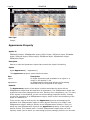
Activation Property........................ 42
ActiveCell Property........................ 42
ActiveCellAppearance Property ....... 43
ActiveColScrollRegion Property ....... 44
Page 4
UltraGrid
ActiveRow Property....................... 45
ActiveRowAppearance Property ...... 45
ActiveRowScrollRegion Property ..... 46
AddButtonCaption Property............ 47
AddButtonToolTipText Property ...... 47
AddNewBox Property .................... 48
AllowAddNew Property .................. 49
AllowColMoving Property ............... 49
AllowColSizing Property ................. 51
AllowColSwapping Property............ 52
AllowDelete Property..................... 53
AllowGroupMoving Property ........... 53
AllowGroupSwapping Property........ 54
AllowUpdate Property.................... 55
AlphaBlendEnabled Property .......... 56
AlphaLevel Property ...................... 57
Appearance Property..................... 58
Appearances Property ................... 59
AutoEdit Property ......................... 60
AutoPreviewEnabled Property......... 61
AutoPreviewField Property ............. 62
AutoPreviewHidden Property .......... 62
AutoPreviewIndentation Property.... 63
AutoPreviewMaxLines Property ....... 64
AutoSizeEdit Property.................... 64
BackColorAlpha Property ............... 65
BackColor Property ....................... 66
Band Property .............................. 67
Bands Property............................. 68
BaseColumnName Property............ 68
BaseTableName Property............... 69
Bookmark Property ....................... 69
BorderAlpha Property .................... 70
BorderColor Property .................... 71
BorderStyle Property..................... 72
BorderStyleCaption Property .......... 73
BorderStyleCell Property................ 74
BorderStyleHeader Property........... 75
BorderStyleRow Property............... 76
BorderWidth Property.................... 77
Bottom Property ........................... 77
ButtonAppearance Property ........... 78
ButtonBorderStyle Property ........... 78
ButtonConnectorColor Property ...... 79
ButtonConnectorStyle Property....... 80
ButtonDisplayStyle Property........... 81
CancelBeep Property ..................... 82
Caption Property .......................... 83
CaptionAppearance Property .......... 83
Case Property .............................. 84
Cell Property ................................ 85
CellAppearance Property ................ 85
CellClickAction Property ................. 86
CellMultiLine Property .................... 87
CellPadding Property ..................... 88
Cells Property ............................... 88
CellSpacing Property ..................... 89
ClientHeight Property .................... 90
ClientWidth Property ..................... 90
ClippingOverride Property .............. 91
Code Property .............................. 92
ColHeaderLines Property ................ 93
ColHeadersVisible Property............. 94
Collate Property ............................ 94
ColScrollRegion Property................ 95
ColScrollRegions Property .............. 96
ColSpan Property .......................... 96
Column Property ........................... 97
Columns Property ......................... 98
Copies Property ............................ 98
Count Property ............................. 99
DataChanged Property................. 100
DataError Property ...................... 100
DataField Property ...................... 101
DataFilter Property ...................... 102
DataMember Property.................. 102
DataSource Property ................... 103
DataType Property ...................... 103
DataValue Property ..................... 105
DefaultColWidth Property ............. 105
DefaultRowHeight Property .......... 106
Description Property.................... 107
DialogStrings Property ................. 107
DisplayEllipses Property ............... 109
DisplayErrorDialog Property.......... 110
DisplayStyle Property .................. 110
DisplayText Property ................... 112
DocumentName Property ............. 112
DrawFilter Property ..................... 113
DrawState Property..................... 114
DriverOverride Property ............... 115
DroppedDown Property................ 116
EditCellAppearance Property......... 116
Enabled Property ........................ 117
EstimatedRows Property .............. 118
EventEnabled Property ................ 119
ExclusiveColScrollRegion
Property .................................... 121
Expandable Property ................... 122
Expanded Property...................... 122
UltraGrid
ExpandChildRowsOnLoad
Property .....................................123
ExpandRowsOnLoad Property........124
ExpansionIndicator Property .........125
FetchRows Property .....................125
FieldLen Property.........................126
Files Property..............................127
FirstRow Property ........................127
FitWidthToPages Property .............128
FixedHeight Property....................129
Font Property ..............................130
ForeColor Property.......................131
ForeColorDisabled Property...........131
ForegroundAlpha Property ............132
Format Property ..........................133
Grid Property ..............................135
Group Property ...........................136
GroupHeaderLines Property ..........137
GroupHeadersVisible Property .......137
Groups Property ..........................138
HasRows Property .......................138
hDC Property ..............................139
Header Property ..........................140
HeaderAppearance Property..........140
HeaderClickAction Property...........141
Height Property ...........................142
Hidden Property ..........................143
hWnd Property ............................144
hWndEdit Property.......................145
ImageList Property ......................145
ImagesMasking Property ..............146
Images Property..........................147
ImagesURL Property ....................148
Indentation Property ....................148
Index Property ............................149
InterBandSpacing Property ...........150
InvalidText Property ....................150
InvalidValue Property...................151
IsInEditMode Property..................151
Key Property...............................152
Layout Property...........................153
Layouts Property .........................154
Left Property...............................155
Level Property.............................155
LevelCount Property ....................156
LockedWidth Property ..................157
MarginBottom Property ................157
MarginLeft Property .....................158
MarginRight Property ...................159
MarginTop Property .....................159
Page 5
MaskClipMode Property................ 160
MaskDataMode Property .............. 161
MaskDisplayMode Property........... 162
MaskError Property ..................... 163
MaskInput Property..................... 164
MaxColScrollRegions Property....... 165
MaxDate Property ....................... 166
MaxHeight Property..................... 167
MaxRowScrollRegions Property ..... 167
MaxSelectedCells Property ........... 168
MaxSelectedRows Property .......... 169
MaxWidth Property...................... 169
MinDate Property ........................ 170
MinWidth Property ...................... 170
MouseIcon Property .................... 171
MousePointer Property................. 172
Nullable Property ........................ 173
OLEDropMode Property................ 174
Orientation Property.................... 175
OriginalValue Property................. 175
Override Property ....................... 176
Overrides Property ...................... 177
PageFooter Property.................... 178
PageFooterAppearance Property ... 179
PageFooterBorderStyle Property ... 179
PageFooterHeight Property........... 180
PageHeader Property................... 181
PageHeaderAppearance Property .. 182
PageHeaderBorderStyle Property .. 182
PageHeaderHeight Property.......... 183
PageRange Property .................... 184
ParentColumn Property................ 184
ParentUIElement Property............ 185
PhysicalPageNumber Property ...... 186
Picture Property.......................... 186
PictureAlign Property ................... 187
PictureAlpha Property .................. 188
PictureBackground Property ......... 189
PictureBackgroundAlpha
Property .................................... 190
PictureBackgroundOrigin
Property .................................... 191
PictureBackgroundStyle
Property .................................... 192
PictureMasking Property .............. 193
PictureVAlign Property ................. 194
Position Property ........................ 195
PreviewAppearance Property ........ 196
PreviewWindowIcon Property ....... 196
PreviewWindowTitle Property........ 197
Page 6
PrintColors Property ....................
PrinterDeviceName Property ........
PrinterDriverVer Property ............
PrintInfo Property .......................
Prompt Property .........................
PromptChar Property ..................
ProportionalResize Property .........
Range Property ..........................
Rect Property .............................
RectDisplayed Property ...............
RectInvalid Property ...................
Redraw Property.........................
Right Property............................
Row Property .............................
RowAlternateAppearance
Property ....................................
RowAppearance Property.............
RowConnectorColor Property........
RowConnectorStyle Property ........
RowPreviewAppearance
Property ....................................
Rows Property............................
RowScrollRegion Property ............
RowScrollRegions Property ..........
RowSelectorAppearance
Property ....................................
RowSelectors Property ................
RowSizing Property .....................
RowSizingArea Property ..............
RowSizingAutoMaxLines
Property ....................................
RowSpacingAfter Property ...........
RowSpacingBefore Property .........
ScrollBar Property.......................
ScrollBars Property .....................
ScrollTipField Property.................
Selected Property .......................
Selected Property (SSUltraGrid) ...
SelectedCellAppearance
Property ....................................
SelectedRowAppearance
Property ....................................
SelectTypeCell Property...............
SelectTypeCol Property ...............
SelectTypeRow Property ..............
SelLength Property .....................
SelStart Property ........................
SelText Property.........................
SizingMode Property ...................
SortedCols Property ....................
UltraGrid
197
198
199
199
200
201
201
202
203
203
204
205
205
206
207
208
209
209
210
211
211
212
213
214
214
215
216
217
218
218
219
220
221
222
223
223
224
225
226
227
228
229
229
230
SortFilter Property....................... 231
SortIndicator Property ................. 232
SortStyle Property....................... 233
Source Property.......................... 233
StartHeight Property ................... 234
StartPosition Property.................. 235
StartWidth Property .................... 236
Style Property ............................ 236
Style Property (AddNew Box) ....... 237
TabNavigation Property ............... 238
TabStop Property ........................ 239
TagVariant Property .................... 240
TextAlign Property ...................... 241
TextValign Property..................... 242
TipDelay Property ....................... 242
TipStyleCell Property ................... 243
TipStyleRowConnector Property .... 244
TipStyleScroll Property ................ 245
Top Property .............................. 246
Type Property............................. 246
UIElement Property ..................... 248
UIElements Property ................... 249
UpdateMode Property .................. 250
UseImageList Property................. 251
Value Property............................ 251
ValueList Property ....................... 252
ValueListItems Property............... 253
ValueLists Property ..................... 253
VertScrollBar Property ................. 254
ViewStyle Property...................... 255
ViewStyleBand Property............... 256
Visible Property .......................... 257
VisibleHeaders Property ............... 258
VisiblePosition Property................ 259
VisibleRows Property ................... 259
Width Property ........................... 260
Zoom Property ........................... 261
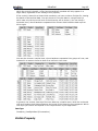
METHODS .............................. 263
AboutBox Method........................ 263
Add Method (Appearances
Collection) ................................. 263
Add Method (Columns
Collection) ................................. 264
Add Method (GroupCols
Collection) ................................. 265
Add Method (Groups Collection).... 265
Add Method (Images Collection) ... 266
Add Method (Layouts Collection) ... 267
Add Method (Overrides
UltraGrid
Collection) ..................................268
Add Method (SelectedCells
Collection) ..................................268
Add Method (SelectedCols
Collection) ..................................269
Add Method (SelectedRows
Collection) ..................................270
Add Method (SortedCols
Collection) ..................................270
Add Method (SSDataObjectFiles
Collection) ..................................271
Add Method (ValueListItems
Collection) ..................................272
Add Method (ValueLists
Collection) ..................................272
AddNew Method ..........................273
AfterDraw Method .......................274
AfterGetValue Method ..................274
AfterSortEnd Method....................275
BeforeDraw Method .....................276
BeforeDrawBackground Method.....277
BeforeDrawBorders Method ..........278
BeforeDrawForeground Method .....279
BeforeSetCursor Method...............280
BeforeSetValue Method ................281
BeforeSortBegin Method...............282
CancelUpdate Method ..................283
CanResolveUIElement Method.......283
Clear Method ..............................285
ClearAll Method ...........................285
ClearFont Method ........................286
ClearUnbound Method ..................286
Clone Method..............................287
Collapse Method ..........................289
CollapseAll Method ......................290
Compare Method .........................290
CopyFrom Method .......................292
Delete Method.............................294
DeleteSelectedRows Method .........295
Exists Method .............................295
Expand Method ...........................296
ExpandAll Method ........................297
Find Method................................297
GetChild Method..........................298
GetChildFromBookmark Method ....299
GetData Method ..........................300
GetExtent Method........................301
GetFormat Method.......................302
GetOrigin Method ........................303
GetParent Method........................303
Page 7
GetRectPtr Method ...................... 304
GetRelatedVisibleColumn
Method ...................................... 305
GetRelatedVisibleGroup Method .... 305
GetRow Method .......................... 306
GetRowFromBookmark Method..... 307
GetSibling Method....................... 308
GetText Method .......................... 309
GetUIElement Method ................. 310
GetUIElementPopup Method ......... 311
GetVisibleColumn Method ............ 312
GetVisibleGroup Method .............. 313
HasChild Method......................... 313
HasNextSibling Method ................ 314
HasParent Method....................... 315
HasPrevSibling Method ................ 316
IsSameAs Method ....................... 316
Item Method .............................. 317
Load Method .............................. 318
OLEDrag Method......................... 321
PerformAction Method ................. 321
PlaySoundFile Method.................. 324
PostMessage Method ................... 326
PrintData Method ........................ 326
PrintPreview Method.................... 328
Refresh Method .......................... 329
Remove Method.......................... 330
Replace Method .......................... 330
Reset Method ............................. 331
ResolveAppearance Method.......... 333
ResolveOverride Method .............. 334
ResolvePreviewAppearance
Method ...................................... 336
ResolveUIElement Method............ 337
ResolveOverride Method .............. 338
Save Method .............................. 340
Scroll Method ............................. 342
ScrollCellIntoView Method............ 343
ScrollColumnIntoView Method ...... 344
ScrollGroupIntoView Method ........ 345
ScrollRowIntoView Method ........... 346
SetData Method.......................... 347
Split Method............................... 348
UIElementFromPoint Method ........ 349
Update Method ........................... 350
EVENTS .................................351
AfterCellActivate Event ................ 351
AfterCellCancelUpdate Event ........ 351
AfterCellListCloseUp Event ........... 352
Page 8
AfterCellUpdate Event .................
AfterColPosChanged Event...........
AfterColRegionScroll Event...........
AfterColRegionSize Event.............
AfterEnterEditMode Event ............
AfterExitEditMode Event ..............
AfterGroupPosChanged Event.......
AfterRowActivate Event ...............
AfterRowCancelUpdate Event .......
AfterRowCollapsed Event .............
AfterRowExpanded Event.............
AfterRowInsert Event ..................
AfterRowRegionScroll Event .........
AfterRowRegionSize Event ...........
AfterRowResize Event .................
AfterRowsDeleted Event ..............
AfterRowUpdate Event ................
AfterSelectChange Event .............
AfterSortChange Event................
BeforeAutoSizeEdit Event ............
BeforeCellActivate Event..............
BeforeCellCancelUpdate Event......
BeforeCellDeactivate Event ..........
BeforeCellListDropDown Event .....
BeforeCellUpdate Event ...............
BeforeColPosChanged Event ........
BeforeColRegionRemoved Event ...
BeforeColRegionScroll Event ........
BeforeColRegionSize Event ..........
BeforeColRegionSplit Event..........
BeforeEnterEditMode Event..........
BeforeExitEditMode Event ............
BeforeGroupPosChanged Event ....
BeforePrint Event .......................
BeforeRowActivate Event.............
BeforeRowCancelUpdate Event .....
BeforeRowCollapsed Event...........
BeforeRowDeactivate Event .........
BeforeRowExpanded Event ..........
BeforeRowInsert Event................
BeforeRowRegionRemoved Event .
BeforeRowRegionScroll Event.......
BeforeRowRegionSize Event.........
BeforeRowRegionSplit Event ........
BeforeRowResize Event ...............
BeforeRowsDeleted Event ............
BeforeRowUpdate Event ..............
BeforeSelectChange Event ...........
BeforeSortChange Event..............
CellChange Event .......................
UltraGrid
352
353
354
355
355
356
356
357
358
359
359
360
361
361
362
362
363
364
365
365
366
367
367
368
369
370
371
372
373
374
376
376
377
378
379
380
381
381
382
383
384
385
386
387
388
389
390
391
392
393
CellListSelect Event ..................... 394
Click Event ................................. 394
ClickCellButton Event .................. 395
DblClick Event ............................ 395
Error Event ................................ 396
InitializeLayout Event .................. 397
InitializeLogicalPrintPage Event..... 397
InitializePrint Event ..................... 399
InitializePrintPreview Event .......... 399
InitializeRow Event...................... 400
KeyDown Event .......................... 401
KeyPress Event........................... 401
KeyUp Event .............................. 402
MouseDown Event....................... 403
MouseEnter Event ....................... 404
MouseExit Event ......................... 404
MouseMove Event ....................... 405
MouseUp Event........................... 406
OLECompleteDrag Event .............. 407
OLEDragDrop Event .................... 408
OLEDragOver Event .................... 410
OLEGiveFeedBack Event .............. 411
OLESetData Event....................... 413
OLEStartDrag Event .................... 414
OnKillFocus Event ....................... 415
OnSelectionDrag Event ................ 415
OnSetFocus Event ....................... 416
PostMessageReceived Event ......... 417
OBJECTS ............................... 418
SSAddNewBox Object.................. 418
SSAppearance Object .................. 419
SSAutoSizeEdit Object ................. 420
SSBand Object ........................... 421
SSCell Object ............................. 422
SSColScrollRegion Object............. 423
SSColumn Object........................ 423
SSDataError Object..................... 424
SSDataObject Object................... 425
SSError Object ........................... 426
SSGroup Object .......................... 426
SSHeader Object ........................ 427
SSImage Object ......................... 428
SSLayout Object ......................... 428
SSMaskError Object .................... 429
SSOverride Object ...................... 430
SSPreviewInfo Object .................. 431
SSPrintInfo Object ...................... 432
SSReturn Objects........................ 433
SSRow Object ............................ 434
UltraGrid
SSRowScrollRegion Object............434
SSSelected Object .......................435
SSUGDraw Object .......................436
SSUIElement Object ....................436
SSUIRect Object..........................437
SSUltraGrid Object ......................438
SSValueList Object ......................438
SSValueListItem Object................439
COLLECTIONS ......................... 441
SSAppearances Collection.............441
SSBands Collection ......................441
SSCells Collection ........................442
SSColScrollRegions Collection .......442
SSColumns Collection ..................443
SSDataObjectFiles Collection.........443
SSGroupCols Collection ................444
SSGroups Collection.....................445
SSHeaders Collection ...................445
SSImages Collection ....................446
SSLayouts Collection....................446
SSOverrides Collection .................447
SSRowScrollRegions Collection ......447
SSSelectedCells Collection ............448
SSSelectedCols Collection.............449
SSSelectedRows Collection ...........449
SSSortedCols Collection ...............450
SSUIElements Collection ..............450
SSValueListItems Collection ..........451
SSValueLists Collection ................451
SSVisibleRows Collection ..............452
INTERFACES ........................... 453
ISSUGDataFilter Interface ............453
ISSUGDrawFilter Interface............453
ISSUGDrawFilter Interface............453
ISSUGSortFilter Interface .............454
ISSUGSortFilter Interface .............454
EXAMPLES ............................. 456
Activation Property Example ........... 456
ActiveCell Property Example ........... 456
ActiveCellAppearance Property
Example ....................................... 456
ActiveRow Property Example........... 456
ActiveRowAppearance Property
Example ....................................... 456
Add Method (Appearances
Collection) Example ....................... 457
Add Method (SelectedCells
Collection) Example ....................... 457
Page 9
Add Method (SelectedCols Collection)
Example ....................................... 457
Add Method (SelectedRows Collection)
Example ....................................... 458
AddButtonCaption Property
Example ....................................... 458
AddButtonToolTipText Property
Example ....................................... 458
AddNew Method Example ............... 458
AfterCellActivate Event Example...... 459
AfterCellUpdate Event Example ....... 459
AfterGetValue Method Example ....... 459
AfterRowInsert Event Example ........ 460
AfterRowUpdate Event Example ...... 460
AfterSelectChange Event Example ... 460
AllowAddNew Property Example ...... 461
AllowColMoving Property Example ... 461
AllowColSizing Property Example ..... 461
AllowColSwapping Property
Example ....................................... 461
AllowDelete Property Example......... 461
AllowGroupMoving Property
Example ....................................... 462
AllowGroupSwapping Property
Example ....................................... 462
AllowUpdate Property Example........ 462
AlphaBlendEnabled Property
Example ....................................... 462
AlphaLevel Property Example .......... 462
Appearance Property Example......... 463
Appearances Property Example ....... 463
AutoEdit Property Example ............. 463
AutoSizeEdit Property Example ....... 463
BackColor Property Example ........... 464
Band Property Example .................. 464
Bands Property Example ................ 464
BeforeAutoSizeEdit Event Example .. 464
BeforeCellDeactivate Event
Example ....................................... 465
BeforeDrawBackground Method
Example ....................................... 465
BeforeDrawForeground Method
Example ....................................... 466
BeforeRowCancelUpdate Event
Example ....................................... 468
BeforeRowInsert Event Example...... 468
BeforeRowsDeleted Event Example .. 468
BeforeRowUpdate Event Example .... 468
BeforeSelectChange Event
Example ....................................... 469
Bookmark Property Example ........... 469
BorderColor Property Example ........ 470
BorderStyleCell Property Example ... 470
BorderStyleHeader Property
Example ....................................... 470
Page 10
UltraGrid
BorderStyleRow Property Example... 470
ButtonAppearance Property
Example ....................................... 470
ButtonBorderStyle Property
Example ....................................... 471
ButtonConnectorColor Property
Example ....................................... 471
ButtonConnectorStyle Property
Example ....................................... 471
ButtonDisplayStyle Property
Example ....................................... 471
CancelBeep Property Example ......... 471
CancelUpdate Method Example ....... 472
Caption Property Example .............. 472
CaptionAppearance Property
Example ....................................... 472
Case Property Example .................. 472
CellAppearance Property Example ... 473
CellClickAction Property Example..... 473
CellMultiLine Property Example ....... 473
CellPadding Property Example ......... 473
Cells Property Example .................. 473
CellSpacing Property Example ......... 474
Clear Method Example ................... 474
ClearAll Method Example ................ 474
ClearFont Method Example ............. 474
Clone Method Example................... 474
ColHeaderLines Property Example ... 475
ColHeadersVisible Property
Example ....................................... 475
Collapse Method Example ............... 475
CollapseAll Method Example............ 475
Columns Property Example ............. 475
DataError Property Example ........... 476
DataField Property Example ............ 476
DataMember Property Example ....... 476
DataSource Property Example......... 476
DataType Property Example............ 477
DefaultColWidth Property Example .. 477
DefaultRowHeight Property Example 477
Description Property Example ......... 477
DialogStrings Property Example ...... 478
DisplayErrorDialog Property
Example ....................................... 478
EditCellAppearance Property
Example ....................................... 478
Enabled Property Example .............. 478
ExclusiveColScrollRegion Property
Example ....................................... 479
Expandable Property Example ......... 479
ExpandChildRowsOnLoad Property
Example ....................................... 479
Expanded Property Example ........... 479
ExpandRowsOnLoad Property
Example ....................................... 480
FieldLen Property Example.............. 480
FirstRow Property Example ............. 480
FixedHeight Property Example......... 480
Font Property Example ................... 481
ForeColor Property Example............ 481
ForeGroundAlpha Property
Example ....................................... 481
GetRow Method Example................ 481
Group Property Example ................ 481
GroupHeaderLines Property
Example ....................................... 482
Groups Property Example ............... 482
Header Property Example ............... 482
HeaderAppearance Property
Example ....................................... 483
Hidden Property Example ............... 483
ImageList Property Example ........... 483
Images Property Example............... 483
ImagesMasking Property Example ... 484
InitializeLayout Event Example........ 484
InitializeRow Event Example ........... 484
InterbandSpacing Property
Example ....................................... 484
Key Property Example.................... 485
Layout Property Example................ 485
Level Property Example.................. 485
LevelCount Property Example.......... 485
Load Method Example .................... 486
LockedWidth Property Example ....... 486
MaskClipMode Property Example ..... 486
MaskDataMode Property Example .... 487
MaskDisplayMode Property
Example ....................................... 487
MaskError Property Example ........... 487
MaskInput Property Example .......... 487
MaxColScrollRegions Property
Example ....................................... 487
MaxHeight Property Example .......... 488
MaxRowScrollRegions Property
Example ....................................... 488
MaxSelectedCells Property
Example ....................................... 488
MaxSelectedRows Property
Example ....................................... 488
MaxWidth Property Example ........... 488
MinWidth Property Example ............ 489
Nullable Property Example .............. 489
OriginalValue Property Example ...... 489
Override Property Example ............. 489
Overrides Property Example............ 490
PerformAction Method Example ....... 490
Picture Property Example ............... 490
PictureAlign Property Example......... 491
PictureAlpha Property Example........ 491
PictureBackground Property
UltraGrid
Example ....................................... 491
PictureBackgroundAlpha Property
Example ....................................... 491
PictureBackgroundOrigin Property
Example ....................................... 491
PictureBackgroundStyle Property
Example ....................................... 492
PictureMasking Property Example .... 492
PictureVAlign Property Example....... 492
PlaySoundFile Method Example ....... 492
Position Property Example .............. 493
PostMessageReceived Event
Example ....................................... 493
Prompt Property Example ............... 494
PromptChar Property Example ........ 494
ProportionalResize Property
Example ....................................... 494
Range Property Example ................ 494
Rect Property Example ................... 495
Redraw Property Example............... 495
Refresh Method Example ................ 495
Replace Method Example................ 496
ResolveAppearance Method
Example ....................................... 496
Row Property Example ................... 496
RowAlternateAppearance
Property Example .......................... 496
RowAppearance Property Example... 497
RowConnectorColor Property
Example ....................................... 497
RowConnectorStyle Property
Example ....................................... 497
Rows Property Example.................. 497
RowScrollRegions Property
Example ....................................... 497
RowSelectorAppearance Property
Example ....................................... 498
RowSelectors Property Example ...... 498
RowSizing Property Example........... 498
RowSizingAutoMaxLines Property
Example ....................................... 498
RowSpacingAfter Property
Example ....................................... 499
RowSpacingBefore Property
Example ....................................... 499
Save Method Example.................... 499
Scroll Method Example ................... 499
Scrollbar Property Example............. 499
Scrollbars Property Example ........... 500
ScrollCellIntoView Method
Example ....................................... 500
ScrollColumnIntoView Method
Example ....................................... 500
ScrollGroupIntoView Method
Example ....................................... 500
Page 11
ScrollRowIntoView Method
Example ....................................... 501
ScrollTipField Property Example....... 501
Selected Property Example ............. 501
SelectedCellAppearance Property
Example ....................................... 501
SelectedRowAppearance Property
Example ....................................... 502
SelectTypeCell Property Example..... 502
SelectTypeCol Property Example ..... 502
SelectTypeRow Property Example .... 502
SizingMode Property Example ......... 503
Sorted Property Example................ 503
SortIndicator Property Example....... 503
Source Property Example ............... 503
Split Method Example .................... 504
StartHeight Property Example ......... 504
StartPosition Property Example ....... 504
StartWidth Property Example .......... 504
Style Property Example .................. 505
TabNavigation Property Example ..... 505
TabStop Property Example ............. 505
TipStyleScroll Property Example ...... 505
UIElement Property Example .......... 506
UIElementFromPoint Method
Example ....................................... 506
Update Method Example................. 507
UpdateMode Property Example........ 508
Value Property Example ................. 508
ValueLists Property Example ........... 508
ValueLists Property Example ........... 508
ViewStyle Property Example ........... 509
ViewStyleBand Property Example .... 509
VisiblePosition Property Example ..... 509
OBJECT MODEL........................510
PROPERTY PAGES ....................511
TECHNICAL SPECIFICATIONS ......521
Envrironment Issues ................... 521
Programmatic IDs ....................... 522
System Requirements ................. 522
Trappable Errors ......................... 522
FILES & DISTRIBUTION ............524
Distributable Files ....................... 524
Included Files ............................. 524
Non-Distributable Files ................ 525
KEYBOARD INTERFACE ..............526
TROUBLESHOOTING & TIPS
ANSWERS...............................530
Page 12
UltraGrid
PRODUCT SUPPORT .................. 540
INDEX .................................. 543
UltraGrid
Page 13
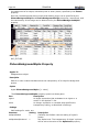
UltraGrid Overview
Key UltraGrid Concepts
The UltraGrid introduces a number of unique new concepts that you must understand in
order to make full use of the control's extensive features. This topic can give you a quick
overview of some of UltraGrid's key features and help you to understand how to
navigate the control's powerful object model. The documentation will repeatedly refer to
these concepts; they are essential to comprehending how UltraGrid works. If you are
coming to UltraGrid from another grid product, this topic may help you better apply your
existing knowledge to UltraGrid.
Bands and Hierarchical Data
Because the UltraGrid is designed to display hierarchical data, the concept of data bands
is built into the grid at every level. A band of data is equivalent to all the rows that are
drawn from the same recordset, or alternatively, all the rows that appear at the same
level of the data hierarchy. Even when displaying a flat (non-hierarchical) recordset, the
UltraGrid still uses the band structure (a flat recordset simply appears in a single band).
Each band, which contains rows, represents one level of the hierarchy in a hierarchical
recordset. Many of the objects that correspond to visible parts of the grid (e.g., columns
and headers) are not accessed directly from the control level, but from the band level.
So if you are trying to find an object, property or method that you know exists, but
cannot locate it at the control level, try looking for the item as a sub-object, property or
method of the SSBand object or its SSOverride object, provided by the Override
property.
Appearance Objects and Formatting
The UltraGrid consists of many parts, each of which may be uniquely formatted in a
variety of ways. However, most of the formatting applied to the grid will be the same for
a given type of object. (For example, you probably will not want to apply different fonts
to every row in the grid, or a different color scheme to every column.) If you are familiar
with other Infragistics products, you may have encountered a convention called
StyleSets that was used to deal with these types of formatting issues. StyleSets were
named groups of formatting settings that could be applied all at once to various objects,
making it easy to achieve a unified, consistent look and feel without laboriously and
repeatedly setting formatting properties one at a time through code.
The UltraGrid takes this idea to a new level with the addition of Appearance objects. An
Appearance is an object that has a variety of formatting-related properties, such as
alignment, font, color, picture and alpha-blending information. If an object can be
formatted, instead of directly supporting properties such as Font, BackColor,
ForeColor, Picture and PictureAlignment, the object has a single Appearance
property that provides access to these types of properties. The Appearance property
can either point to an SSAppearance sub-object that controls the formatting of the
object it is attached to (and can have its properties set individually) or it can serve as a
reference to a named SSAppearance object that will supply the property settings for the
object being formatted.
The control has an SSAppearances collection that is used to hold named SSAppearance
objects that you create. You can create an SSAppearance object that has the settings
you want to apply to multiple objects, then simply assign that object to the Appearance
property of the object(s) you want to format. This object-based approach to formatting
has several advantages. Primarily, it reduces the amount of code you have to write and
Page 14
UltraGrid
makes it easy to apply uniform settings wherever you want. In addition, because all the
settings are encapsulated in an object, you gain the ability to dynamically change
settings for multiple objects simultaneously by changing the single SSAppearance object
that controls their formatting.
Note that the properties of an SSAppearance object can also operate in a hierarchical
fashion. Certain properties can be set to a "Use Default" value, which indicates to the
control that the property should take its setting from the object's parent. This
functionality is enabled by default, so that unless you specify otherwise, child objects
resemble their parents, and formatting set at higher levels of the grid hierarchy is
inherited by objects lower in the hierarchy. For example, by default, a cell inherits its
background color from its row, which inherits its background color from its band. For a
more detailed description of this concept, please refer to the next section on Override
objects.
If you are trying to format an object and cannot locate an essential property, check to
see if that object has an Appearance property. If it does, you can probably find the
property you are looking for by examining the SSAppearance sub-object of the object
you want to format.
Override Objects and Default Property Settings
Bands share many of the same properties as are found on the grid itself. However,
because each band is independent, it can have its own property settings that are distinct
from those of the grid, or from other bands. Also, since a data hierarchy may be several
levels or more deep, you may want some bands to derive their properties from the band
directly before them, or from higher levels of the hierarchy. Because these objects have
overlapping behaviors and formatting options, there has to be a structure for
determining the formatting of any given object. This structure is provided by the
override hierarchy.
Whenever the UltraGrid must determine how an object appears and behaves, it checks
that object's override hierarchy. If a property that is part of the override hierarchy has
been explicitly set for that object (that is, if it is no longer set to the default value) then
the specified setting is used. However, if a property has not been set, the object will use
the setting of the same property from the object above it in the override hierarchy. If
that object is also using the default setting, the next object up the chain is checked for
the specified value. This may continue for several iterations, until an object is
encountered that has an explicit (non-default) setting for the property, or until the top
level of the chain (the grid itself) is reached.
Properties that are part of the override hierarchy do not appear as direct properties of
the grid or the SSBand object. Instead, they are grouped together as properties of a
sub-object: the SSOverride object. The SSOverride is similar to the SSAppearance in
that its property settings apply to the object that is its parent. In general, any property
that can be set for both the SSBand object and the grid itself belongs to the override
hierarchy. For example, the MaxSelectedCells property, which can determine the
maximum number of cells that may be selected in a particular band or in the entire grid,
is a property of the SSOverride object.
There are several side-effects of this system that will affect the way you write code for
the control. One is that, for all properties of the SSOverride object, the default (initial)
setting is "Use Default." In this case, the word "Default" does not refer to the initial
setting of the object's property, but the setting inherited from the object one level up in
the override hierarchy. Note that the default (initial) setting of many override properties
is "Use Default" (property not explicitly set at this level). If a property is set to "Use
Default" at the topmost (grid) level, the UltraGrid's internal presets are used as the
UltraGrid
Page 15
default values. Therefore, without any explicit action by you, all bands will use the gridlevel settings for their Override properties, and the grid will use its own internal default
settings. Another aspect of the override system is that properties you might expect to
have Boolean values are actually set using enumerated integers, since any true/false
property in the override hierarchy requires three possible settings: True, False, and "Use
Default".
For example, suppose you have a grid that is displaying a three-level set of hierarchical
data. There are bands for Customers, Orders and Order Details. At the grid level you
have set the SelectTypeRow property so that only single rows may be selected:
SSUltraGrid1.Override.SelectTypeRow = ssSelectTypeSingle
But you want the user to be able to select multiple orders or multiple items from an
order, so for the Orders band, you have set SelectTypeRow to allow multiple row
selection:
SSUltraGrid1.Bands("Orders").Override.SelectTypeRow = ssSelectTypeExtended
SelectTypeRow is a property of the SSOverride object, so the selection type for each
band is determined by the settings in the override hierarchy. Because you have not
changed the value for the Order Details band, it is set to its initial value "ssSelectTypeDefault" - which corresponds the "Use Default" option. When the grid
creates the Order Detail band, this property will indicate that the setting of
SelectTypeRow must come from higher in the override hierarchy, so the grid will look
at the parent of the Order Details band, which is the Orders band. Since you have
specifically set the value of the property for the Orders band, the control will use that
same value for the Order Details band.
When creating the Orders band, the SelectTypeRow property has been set to a specific
value, which the control will use for that band. Creating the Customer band reveals that
"Use Default" is the value of SelectTypeRow, so the control "walks" up the object
hierarchy again, this time to the grid level, to obtain the setting. Since you have
explicitly set the grid to use "ssSelectTypeSingle" that is the value that will be in effect
for the Customers band. If you had not set this property for the grid, it would also be set
to the "Use Default" option. At the top level of the hierarchy, a setting of "Use Default"
causes the control to use its own internal presets as the default values.
Understanding Grid Structure
This section provides a brief introduction into the features of the UltraGrid control's
structure.
Object and Collection Hierarchies
With most grid components, developers are limited in the ways they can access and
manipulate the parts that constitute the grid. Programmers who want complete control
over their applications are forced to jump hurdles and scale walls other grid components
place in their way.
In UltraGrid, everything is an object, with its own properties and methods. There are
group, header, column, row, and cell objects with which to work, plus many more.
Nearly every item displayed by the UltraGrid control can be manipulated in some
manner. This means that you have unprecedented control over the functionality and
appearance of their applications; you can now handle virtually any programming
situation they encounter.
Page 16
UltraGrid
Because UltraGrid is composed of many object types, you have control over the grid and
its data like never before.
Hierarchial Data Structures
When the UltraGrid is bound to a hierarchical Recordset, rows can have child rows and
the metadata for parent and child are not generally the same. For the UltraGrid, the
columns collection is contained within an object called a Band. For each level in the
hierarchy, one band object is created to represent it.
For example, if an UltraGrid was bound to a hierarchical ADO Recordset object
consisting of Customers and Orders (each Customer record having a set of Order
children records), then the UltraGrid would create two band objects to encapsulate the
hierarchy; one band object for the Customers table and one for the Orders table.
Grid Activation and Validation
The UltraGrid contains abilities to control the type of activation at the Cell, Column, and
Row object levels. You can disable, allow activation, or allow edit. The SSCell object is
subordinate to the settings for the Activation properties of the SSRow and SSColumn
objects that contain the cell. If either the cell's row or column has its Activation
property set to False, the cell cannot be activated, regardless of its own setting for
Activation. The setting of the other type of parent also has no effect; setting
Activation to False on a cell's row makes the cell inactive regardless of the setting of its
column.
For fine control of validation conditions UltraGrid has BeforeCellActivate,
AfterCellActivate, BeforeCellDeactivate, BeforeRowActivate, AfterRowActivate,
and BeforeRowDeactivate events to help you manage situations where you need to
control user interaction.
Using Overrides to Control Formatting and Behavior
The SSOverride object provides powerful abilities to control formatting and behavior at
different levels of a hierarchical record set. The SSOverride object makes it easy to
specify different appearances and behaviors for each band by assigning each SSBand
object its own SSOverride object. If a band does not have an override assigned to it, the
SSUltraGrid control will use the override at the next higher level of the override
hierarchy to determine the properties for that band. If no overrides are set at any band
level then grid level settings are used.
Using Appearance Objects to Change How the Grid Looks
The SSAppearance object represents a collection of appearance-related properties that
can be applied to various interface elements in the grid, or to the grid itself. The
Appearance hierarchy provides a way for Grid objects to inherit the settings of the
properties that affect the object's appearance, such as properties related to color, font
and transparency. UltraGrid groups most of the properties that relate to the visual
formatting of an object together under the SSAppearance object. SSAppearance objects
are automatically created for objects that can be formatted, and certain objects support
multiple SSAppearance objects to handle different formatting aspects specific to the
object. For example, the SSRow object has its own formatting attributes, but it can also
UltraGrid
Page 17
control the formatting of the cells that make up the row. Also, the row selector attached
to the row may be formatted independently of the rest of the row. Therefore, the SSRow
object has three SSAppearance objects attached to it; one that controls the formatting
of the row and is accessed through the Appearance property, one that controls the
formatting of the cells and is accessed through the CellAppearance property, and one
that controls the formatting of the row selector and is accessed through the
RowSelectorAppearance property.
You can also create your own SSAppearance objects to act as templates for formatting
properties, then apply them to different parts of the control. This functionality makes it
easy to implement a uniform look throughout the control, or to switch from one set of
formatting attributes to another. SSAppearance objects control attributes such as
alignment, color, font, pictures, transparency (alpha blending) and mouse pointer
appearance. Note that not all of the properties of the SSAppearance object will
necessarily be applicable to every object the appearance can be applied to. If an
SSAppearance object contains property settings that are not needed by the object to
which they are applied, the extra properties are simply ignored.
Objects that are formatted using SSAppearance objects also have the ability to inherit
their formatting attributes in a hierarchical way. Each property of the SSAppearance
object has a special setting called "Use Default" that causes the property to inherit its
value from the next higher object in the Appearance hierarchy.
Custom Drawing Functionality
The UltraGrid provides an ISSUGDrawFilter interface that you can implement to integrate
your own custom drawing code into the display logic that the grid uses to paint its
various elements on screen. The methods of the interface are passed an SSUGDraw
object, which includes information about the interface element (UIElement) that is being
drawn, as well as the device context (hDC) and rectangle (UIRect) involved in the
drawing operation. With this information, you can use Windows API drawing functions to
take over the creation of the UIElement.
Once you implement your custom version the ISSUGDrawFilter in code, you activate it
by assigning the interface to the DrawFilter property of the grid.
Grid Formatting
This section of the overview provides a brief introduction into the many elements of the
UltraGrid control that can be formatted.
Overview of Graphics and Formatting Features
Nearly every aspect of the UltraGrid control can be visually manipulated in some
manner. With UltraGrid, developers can modify the way almost all objects are displayed,
in a virtually limitless number of combinations. Developers now have complete control
over an object's foreground and background colors and pictures, text font and
alignment, border style and color—even translucency—all without writing a single line of
code.
Page 18
UltraGrid
Introduction to Hierarchical Rows
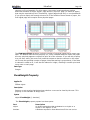
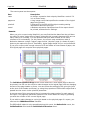
For ultimate flexibility the UltraGrid control supports three view styles for displaying
data, single-band, and multi-band vertical and horizontal. Developers are free to choose
the view style best suited for the type of data with which their users are working. In
addition to displaying data in flat, or single-band view, the UltraGrid control also
supports two additional view styles, multi-band vertical and multi-band horizontal. Each
band contains rows and represents one level of the hierarchy in a hierarchical recordset.
Introduction to Appearance
The UltraGrid consists of many parts, each of which can be uniquely formatted in a
variety of ways. This is because nearly every onscreen element has its own
SSAppearance object, which controls how the object is displayed. You can now take
precise control over almost every object's display attributes.
Objects Related to Grid Formatting
Virtually every onscreen element provides an SSAppearance object so you have
complete control over its display such as foreground and background colors (ForeColor
and BackColor properties) and pictures (Picture and PictureBackground properties),
text font and alignment (Font, TextAlign, and TextVAlign properties), border style
(BorderStyle and BorderColor properties), and even translucency (AlphaLevel
properties).
Not only do most objects have SSAppearance objects associated with them, but many
objects have "alternate" appearances, based on their states. For example, in addition to
specifying how a cell should appear in general, you can indicate how cells should appear
when selected, active, or being edited, by setting the SelectedCellAppearance,
ActiveCellAppearance, and EditCellAppearance properties respectively.
Of course, because of the Appearance hierarchy, you don't have to set all of these
properties for each individual object; they inherit default values from their parents in the
chain. This means that you don't have to set the appearance of every cell in the grid,
since cells, by default, will look like the row that contains them.
Additionally, if you don't like the way something in the control looks and the
SSAppearance object doesn't go far enough, change the way the control looks with
advanced features like owner-drawn objects (DrawFilter property).
With the SSAppearance object and custom-drawing features, you control virtually every
aspect of the appearance of the UltraGrid control.
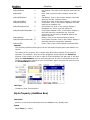
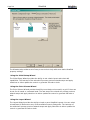
Using the Property Pages to Set Up the Grid
The SSUltraGrid contains a set of custom property pages. These pages are accessed by
right-clicking on the control and selecting 'Property Pages' or 'Properties' from the
context menu or by using the property sheet of your design environment and choosing
the '(Custom)' property.
The SSUltraGrid property pages contains six tabs with each tab providing a different
ability to set up the SSUltraGrid at design-time.
The Alphabetic and Categorized Tabs list properties in alphabetic order and grouped into
categories. In both the Alphabetic and the Categorized tabs, objects that contain other
objects and properties can be expanded or collapsed by clicking on the + or - to the left
UltraGrid
Page 19
of the object name. Move your mouse point to the vertical line that separates properties
from their values and you can move the splitter left or right to suit your viewing needs.
Hold your mouse over a property or object and a tool-tip description will appear.
The Images Tab provides access to the SSUltraGrid's Images collection.
The Wizards Tab provides a number of easy to use step-by-step tools to help with some
basic SSUltraGrid property settings. Wizards include: Initial Setup, Color Scheme, and
Layout.
The Groups and Columns Tab provides a tree representation of the SSUltraGrid and the
ability to add, rearrange, rename, remove, and set visibility of Groups, Levels, Columns,
and unbound columns.
The Value Lists Tab provides a means to create Value Lists and Value List Items and set
them to a column.
Using Different Column Styles
The SSColumn object of the SSUltraGrid contains a Style property that enables a SSCell
in that column to appear and perform in a number of different types. Using ssStyleEdit
will set the cell to display a text edit area. Using ssStyleEditButton will set the cell to
display a text edit area plus an edit (ellipsis) button. Using ssStyleCheckBox will set the
cell to display a check box. Using ssStyleDropDown will set the cell to display a text edit
area plus a dropdown list. Using ssStyleDropDownList will set the cell to display a
dropdown list with no text edit area. Using ssStyleDropDownValidate will set the cell to
display a text edit area plus a dropdown list where any text entered in to the edit are is
validated against the items in the list. Using ssStyleButton will set the cell to display a
button. Using ssStyleDropDownCalendar will set the cell to display a text edit area plus a
dropdown calendar. Using ssStyleHTML will set the cell to display rendered HTML.
Beyond the Style property settings of the SSColumn it's also possible, using the
advanced features of the SSUltraGrid to position and use your own or other outside
controls into a cell of a column. See the CustomEdit sample for details.
Working with Column and Group Headers
The SSHeader object represents the label that appears at the top of a column or group.
Headers are used to move and resize groups and columns.
Using Column Groups
The SSGroup object represents a group of SSColumn objects. You can group columns
together based on any criteria that makes sense in the context of your program.
Columns in a group share a common group header, and they can be moved and
formatted as a unit.
Working with Scrolling Regions
The SSUltraGrid contains two objects associated with scrolling regions. The
ColScrollRegion object represents an area of the grid where columns may be scrolled
horizontally. A grid can have multiple, independent SSColScrollRegions, which are
separated by splitters. A column or cell may appear in multiple SSColScrollRegions
Page 20
UltraGrid
simultaneously. The SSRowScrollRegion object represents an area of the grid where
rows may be scrolled vertically. A grid can have multiple, independent
SSRowScrollRegions, which are separated by splitters. A row or cell may appear in
multiple SSRowScrollRegions simultaneously. However, only one of those rows can have
the input focus at any one time.
The MaxColScrollRegions property sets the number of possible column scrolling
regions. The MaxRowScrollRegions property sets the number of possible row scrolling
regions.
Using Hierarchical Views of Data
The SSUltraGrid contains two properties that determine how data is viewed. The
ViewStyle property will display data as a flat recordset when set to
ssViewStyleSingleBand. When the ViewStyle property is set to ssViewStyleMultiBand,
which is the default, data will be displayed hierarchically. Note that the grid must have a
data source that is supplying a hierarchical recordset for ssViewStyleMultiBand to work
properly.
The ViewStyleBand property of the UltraGrid determines how bands will be arranged
within the control. The arrangement of bands also depends on the type of recordset to
which the control is bound - a flat (non-hierarchical) recordset will only appear in a
single band, regardless of the setting of this property.
If the control is bound to a hierarchical recordset, you have a choice of styles for
viewing the bands of hierarchical data. You can choose to view the data in a single band
(in which case only the top-most level of the hierarchy will be shown). You can select a
horizontal view, where bands are separated into columns that break the data up from
left to right.
You can also choose a vertical view, where bands are separated into groups of rows,
and indented in a manner similar to that of an outline or tree view.
In general, the vertical view style fits more data into a smaller area, while the horizontal
view style makes the divisions between the levels of the hierarchy more apparent. Which
view style you choose will depend on the requirements of your application.
Customizing Grid Behavior
This section provides a brief overview into customizing the UltraGrid control's behavior.
Overview of Grid Customization Options
Not only do you dictate the way the UltraGrid control looks, but the way the control
functions as well.
Event triggering can be enabled and disabled easily. In this manner, you can prevent an
event from being generated when you don't want it to be. This means that you no longer
have to use extra variables to code around an event procedure; simply disable an event
by setting the EventEnabled property and then re-enable it after your code completes.
For example, if you wanted to split a column scrolling region, but you didn't want the
UltraGrid
Page 21
BeforeColRegionSplit event to fire, you could write the following code:
'Disable BeforeColRegionSplit event
SSUltraGrid1.EventEnabled(ssGridEventBeforeColRegionSplit) = False
'Split the column scrolling region
SSUltraGrid1.ColScrollRegions(0).Split
'Enable BeforeColRegionSplit event
SSUltraGrid1.EventEnabled(ssGridEventBeforeColRegionSplit) = True
This is very useful when you want an event to generate, say, as a result of a user's
action, but not yours. Every event in the control can be disabled. In fact, all events, as
well as the "After" and "Before" events, can all be disabled with just a single line of code.
Another aspect of the control that can easily be modified is the dialog text that is
displayed when one of several actions or conditions arise. In some situations, it's useful
to be able to display custom text, especially when dealing with regional issues. Although
you could easily prevent these dialogs from being displayed and instead show your own,
it's often more convenient to modify the existing dialog text with the DialogStrings
property.
Many more facets of the UltraGrid control's behavior can be modified, such as how it
reacts to user interaction.
Behavior Customization
Although the UltraGrid control has been programmed to react to user interaction in the
way we feel most users would expect, not everyone expects the same thing.
Furthermore, there are often situations where you would want the control to respond
differently.
The TabNavigation property, for example, enables you to decide whether pressing the
TAB key would give focus to the next cell or give it to the next control on the form. The
CellClickAction property determines how the control reacts when a cell is clicked. You
can have the control enter edit mode, select the cell, or select the cell's row; any one of
those options may be appropriate. Similarly, the HeaderClickAction property indicates
how the control behaves when a column header is clicked. Should the control select the
column, continue a multi-sort operation, or begin a new single-sort operation? It's up to
you.
Of course, we can't anticipate every custom action you would want to perform. That's
why the UltraGrid control provides a mechanism with the express purpose of mimicking
user interaction: the PerformAction method.
With the PerformAction method, emulating an action the user would take, such as
moving to the previous or next cell or row, is simple. In fact, it enables you to command
the way the user interacts with the UltraGrid control. For example, by default, the ENTER
key doesn't have an action associated with it. If you wanted the user to navigate to the
row below the current row when the ENTER key is pressed, it would be easy to
implement.
Using and Changing Mouse Interaction
The SSUltraGrid contains MouseEnter and MouseExit events. These events return a
reference to an SSUIElement object. You can use this reference to set properties and
invoke methods against these UIElement. Using the Type property of the UIElement will
aid you in determining which type of UIElement the mouse is entering or exiting.
Page 22
UltraGrid
The SSUltraGrid also contains a DrawFilter interface with a BeforeSetCursor Method.
Implementing this interface and method enables a developer to display custom mouse
pointers whenever the mouse moves over an area of a user interface element
(UIElement) of the grid.
Task-Based Help
This Task-Based Help section is designed to provide quick solutions to some typical
scenarios when using UltraGrid.
Working With Data
The following topics provide concise, detailed descriptions of how to accomplish the
specified task.
Bind The Grid To An ADO Data Control
To bind the UltraGrid to an ADO Data Control, follow these steps:
1. Place an ADO Data Control onto a Form.
2. Right-click the control and select "ADODC Properties."
3. Click the "Build" button.
4. For the Provider, select "Microsoft Jet 4.0 OLE DB Provider." If you do not have this
provider on your system, use the highest version Jet provider on the list. Then click
the "Next" button.
5. Type in or locate the path to Biblio.mdb on your hard drive. This database file comes
with Visual Basic.
6. Click OK.
7. Switch to the Recordsource Tab.
8. Under "Command Type" select "2-adCmdTable."
9. Under "Table or Stored Procedure Name" select "Authors." Click OK. The Data control
is now set up.
10. Place an UltraGrid on the Form.
11. Set the DataSource of the UltraGrid to the name of the Data Control. By default, the
Data Control will be ADODC1.
12. Run the project and you should see the Authors table displayed in the UltraGrid.
UltraGrid
Page 23
Bind The Grid To A Data Environment
To bind the UltraGrid to a Data Environment, follow these steps:
1. Add a Data Environment to the project.
2. Right-Click on the Data Environment's Connection and select "Properties..."
3. For the Provider, select "Microsoft Jet 4.0 OLE DB Provider." If you do not have this
provider on your system, use the highest version Jet provider on the list. Then click
the "Next" button.
4. Type in or locate the path to Biblio.mdb on your hard drive. This database file comes
with Visual Basic. Click OK.
5. Right-Click the Connection again and select "Add Command." A new Command object
appears under the Connection.
6. Right-Click on the Command and select "Properties..."
7. Select "Table" from the "Database Object" dropdown.
8. Select "Authors" under the "Object Name" dropdown. Click OK.
9. Place an UltraGrid on the form.
10. Set the DataSource property of the UltraGrid to the name of the DataEnvironment.
By default, the Name is DataEnvironment1.
11. Set the DataMember Property of the UltraGrid to the name of the Command. The
default Name is "Command1."
12. Run the program and the UltraGrid should display the "Authors" table.
Bind The Grid To A Memory Array Through ADO
An example of how to bind the SSUltraGrid to a memory array through ADO is
demonstrated in the ArrayProvider sample that is installed in your product samples
folder.
Access A Specific Row In The Grid
How you access a particular row depends on which row you wish to access and what
information you have about the row. This first example will show how to get rows in the
grid by traversing the grid's structure. If you want to get a row by searching or by using
it's bookmark, scroll down to the second Example.
Example 1
Page 24
UltraGrid
This example will show you how to traverse the grid to get to a particular row.
1. In order to traverse the rows in the grid, you must get a reference to a row.
Commonly, you will want to access the first row in the grid and work from there. You
can do this with the GetRow method. Dim aRow As SSRow Set aRow =
SSUltraGrid1.GetRow(ssChildRowFirst)
2. Once you have access to the first row, you can use several methods to get
references to other rows. If you want to get the next row in the same band, you
would first check to see if there is a next row. To see if the row has a next sibling,
you use the HasNextSibling Method. If aRow.HasNextSibling Then
3. Once it is established there is a next sibling, you can access it by using the
Dim NextRow As SSRow
Set NextRow =
GetSibling method of the row.
aRow.GetSibling(ssSiblingRowNext) End If
4. In a similar way, you can get a reference to a child row by using the HasChild and
Dim ChildRow As SSRow
GetChild methods. If aRow.HasChild Then
Set ChildRow = aRow.GetChild(ssChildRowFirst) End If
Example 2
If you want to access a row based on some value in that row, then it will probably be
better to get access to it by searching the recordset.
Assume you have a grid bound to the "Authors" table of Biblio.mdb (a sample Access
database that comes with Visual Studio). The key field of this table is the Author ID
which is called "AU_ID"
Suppose you want to find the row in the grid where the Author ID is 15.
1. ADO provides a way to find a record in the recordset using the Find Method.
Adodc1.Recordset.Find "Au_ID = 15"
2. Once the record has been found in the recordset, you can get access to the row in
the grid by using the GetRowFromBookmark method. Set aRow =
SSUltraGrid1.GetRowFromBookmark(Adodc1.Recordset.Bookmark)
Set Focus To A Cell And Place It In Edit Mode
Sometimes you may want to force focus into a cell and put that cell into edit mode to
indicate to a user that a value needs to be changed. This can be accomplished by setting
the ActiveCell property of the grid, and then calling PerformAction to put the cell into
edit mode.
1. First, you need a reference to the cell you want to set focus to. In this case, assume
the cell is in the ActiveRow and is in a column called "LastName." You get a reference
to the cell by using the Cells collection of the ActiveRow object. Dim aCell As
SSCell Set aCell = SSUltraGrid1.ActiveRow.Cells("Lastname")
2. Now that you have a reference to the cell, you can make it active by setting the
ActiveCell of the grid. Set SSUltraGrid1.ActiveCell = aCell
3. At this point, you may need to set focus to the grid. This is only necessary if the grid
does not already have focus. SSUltraGrid1.SetFocus
UltraGrid
Page 25
4. You can force the cell into edit mode by calling the PerformAction method.
SSUltraGrid1.PerformAction ssKeyActionEnterEditMode
Loop Through Every Row In A Band Of The Grid
This task assumes that you already have a bound UltraGrid on the Form and that it has
at least one row of data.
To loop through every row in the first band of the grid, follow these steps:
1. First, declare a variable as an SSRow. Dim aRow As SSRow
2. Set the row variable to the first row in the grid. You can get the first row of the grid
by using the GetRow method. Set aRow =
SSUltraGrid1.GetRow(ssChildRowFirst)
3. You
you
you
row
You
now have a row object which references the first row in the grid. At this point,
can manipulate the data any way you want. For the purposes of this example,
will loop through each row of the Grid and display the data in first column of that
to the Immediate Window. You start by displaying the contents of the first row.
can access data in the row from the SSCells collection. Debug.Print
aRow.Cells(0).Value
4. Next, start a loop. The loop will continue until aRow has no Next Sibling (this will be
the case when aRow is the last row in the Band). The HasNextSibling method tells
whether the row has a next sibling. Do Until Not aRow.HasNextSibling
5. Once it has been determined that there is a next sibling, you can get a reference to it
Set aRow =
using the GetSibling method.
aRow.GetSibling(ssSiblingRowNext)
6. You can then display the contents of the new row and close the loop.
Debug.Print aRow.Cells(0).Value Loop
7. When this code is executed, it will loop through every row of Band 0 of the grid and
display the contents of the first cell in that row.
Determine How Many Child Bands A Band Has
Sometimes when writing code to traverse the grid, it is necessary to know the number of
child bands that a particular band has. You can write a function that does this.
1. Declare a function called GetNumberOfChildBands. This function will accept a Band
object and return the number of child bands. Private Function
GetNumberOfChildBands(aBand As UltraGrid.SSBand) As Integer
2. A band object is actually a special type of column. You can take advantage of this by
looping through the columns in the band. Set up a For...Each Loop to go through the
columns in the Band that was passed into the Function. Dim aCol As
UltraGrid.SSColumn For Each aCol In aBand.Columns
UltraGrid
Page 26
3. You can now check each column one at a time and determine if it is a Band.
If
aCol.DataType = ssDataTypeChapter Then
4. If the column is a band, add one to the return value of the function.
GetNumberOfChildBands = GetNumberOfChildBands + 1
End If
5. Then just close the loop. Next aCol
Add Unbound/Computed Columns To The Grid
It is possible to add an Unbound Column to a grid. This is useful for displaying
calculations based on other fields in the row, or for placing Check Boxes into the grid so
users can select multiple rows.
Note that a grid must have at least one Bound column. It can never contain only
unbound columns.
This task assumes that you already have a bound UltraGrid on the Form.
1. There are two ways to add an unbound column to the grid. At Design-time, you can
use the custom property pages. At run-time, you can add a column using the
Columns Collection of a Band.
Property Pages (Design-time)
a. Right-Click on the grid and select Properties...
b. Select the Groups and Columns tab. Here you can see a list of bands and
columns based on the datasource of the grid. Double-click the name of
the Band you want to add the Unbound Column to so the Band is
selected and expanded.
c.
Now click the Add button next to the word Column on the right hand side
of the properties page dialog. A new column is created with a default
name.
d. You can change the name by typing in a new one, like
"CalculatedColumn". When you are finished, click OK
Code (Run-time)
e. To add the column in code, access the Add method of the Columns
Collection SSUltraGrid1.Bands(0).Columns.Add
"CalculatedColumn", "CalculatedColumn"
2. Once you have the unbound column established, you can use it just like any other
column. Most commonly, you will use it for calculations or as a checkbox.
Calculated Column
a. Assume the grid has two columns, UnitPrice and Quantity, and that you
just added an Unbound Column called Total. You would likely populate
the Total column using the InitializeRow event. This event is the perfect
place for calculation code, because it will fire when any of the values in
the row change and recalculate the total. Row.Cells("Total").Value
= Row.Cells("UnitPrice").Value *
UltraGrid
Page 27
Row.Cells("Quantity").Value
CheckBox
b. To make the column appear as a CheckBox, set the Style property. The
best place to do this is in the InitializeLayout event. Assuming that the
Unbound column you created is in Band 0 and is named "CheckBox" the
code would look like this.
SSUltraGrid1.Bands(0).Columns("CheckBox").Style =
ssStyleCheckBox
c. In order to make the Checkbox function properly, it has to be used with a
Boolean column. So you must also set the DataType property.
SSUltraGrid1.Bands(0).Columns("Total").DataType =
ssDataTypeBoolean
Grid Formatting
Format The Grid At Design-Time
The UltraGrid contains some design-time features that enable quick formatting.
The bottom of the UltraGrid right-click menu contains:
1. Properties ... Selecting this menu item will open the Infragistics Property Pages.
2. Retrieve Structure The Retrieve Structure menu item will read the meta-data of
the attached DataSource and DataMember and will redraw the design-time
representation of the UltraGrid.
3. Reset Layout Selecting the Reset Layout menu item will display a confirmation
dialog asking you if you're sure you want to reset the UltraGrid's Layout. Selecting
the Yes button will reset the UltraGrid to all default property settings.
At design-time the UltraGrid can be visually manipulated:
1. Scrolling Click on either the vertical or horizontal scroll bars to scroll the designtime grid. Note that dragging the scroll bar thumb is not supported.
2. Closing and Opening Nodes You can open and close band nodes in the UltraGrid
by clicking on the plus and minus signs to the left of the row.
3. Groups, Levels, and Columns Width Clicking the mouse down and moving it when
the mouse is over the vertical separator between two Groups, Levels, or Columns will
cause the object to be resized.
4. Creating Scroll Regions In the upper right corner and the lower left corner are
areas in the UltraGrid that enable the developer to create scrolling regions at designtime. Simply move the mouse over one of the these areas, and when the mouse
pointer changes to a splitter pointer, hold the mouse down and drag either right or
Page 28
UltraGrid
down. To remove, click and hold the mouse down on a splitter bar and drag it back
to it's origin. Moving the mouse to the intersection of two splitters will turn the
mouse pointer into a four-points mouse pointer. Click and hold the mouse down and
then drag to resize.
5. Swapping Groups and Columns You can change the order of Groups and Columns
in the design-time grid by dragging and dropping. Click a Group or Column once to
select it. Click and hold the mouse down and move the mouse to start the drag
operation. As you drag the mouse the Column or Group will appear under the mouse
pointer. As you drag near an intersection of other columns or groups red arrows will
appear to indicate a valid position to drop. You can select multiple columns or groups
by holding down the shift key when selecting.
Control The Look Of The Grid Interface
The following topics provide concise, detailed descriptions of how to accomplish the
specified task.
Create And Apply Appearances
This topic assumes you have a bound grid with at least one row of data.
1. To create an Appearance object, you use the Appearances collection of the grid.
Objects in the grid that support Appearances already have an Appearance object, so
you do not need to create any Appearance objects if you don't want to. However, it is
useful to create an Appearance object when you want to apply the same appearance
to several different objects. Start by adding an Appearance object to the
Appearances collection and assigning it a key. SSUltraGrid1.Appearances.Add
"Highlighted"
2. Once you have created an Appearance object, you can access it's properties, such as
BackColor and ForeColor.
SSUltraGrid1.Appearances("Highlighted").BackColor = vbRed
SSUltraGrid1.Appearances("Highlighted").ForeColor = vbWhite
3. You can then apply this Appearance to almost any object in the grid. For example, if
you always want the Active Row to appear with white text on a red background, you
can apply the Appearance you just created to the ActiveRowAppearance of the grid.
SSUltraGrid1.Override.ActiveRowAppearance = "Highlighted"
4. You can apply the same settings to the RowSelectors by setting the
RowSelectorAppearance to the same Appearance object.
SSUltraGrid1.Override.RowSelectorAppearance = "Highlighted"
5. You could have achieved the same effect by altering the RowSelectorAppearance and
ActiveRowAppearance directly.
SSUltraGrid1.Override.ActiveRowAppearance.BackColor =
SSUltraGrid1.Override.ActiveRowAppearance.ForeColor =
SSUltraGrid1.Override.RowSelectorAppearance.BackColor
SSUltraGrid1.Override.RowSelectorAppearance.ForeColor
vbRed
vbWhite
= vbRed
= vbWhite
UltraGrid
Page 29
6. However, there is a big advantage to the first method of creating an Appearance
object and applying it. If you used the first method, you can change the properties of
the Appearance object and it will carry over to all the objects it is applied to.
SSUltraGrid1.Appearances("Highlighted").BackColor = vbBlue After this
line of code is executed, all the RowSelectors and the ActiveRow in the grid all
change from Red to Blue.
Move And Swap Columns And Groups
By default, the grid allows Column Moving, but not column swapping. This topic assumes
you have a bound grid on a form with at least one row of data.
Column Moving
1. You can move a column at run-time by selecting the column, then clicking and
dragging it into it's new position.
Run the Program.
2. Select a Column by clicking on the Column Header. You can click and drag on a
column header to select multiple columns.
3. Once the Column or Columns are selected, click the Column header again and drag
the mouse. As you move the mouse over the column headers, you will see red arrow
indicating where the columns will be placed when you release the mouse button.
4. Release the mouse to drop the columns into their new position.
Column Swapping
1. Column swapping allows you to swap two columns positions. By default, Column
swapping is not enabled.
To enable Column Swapping, you must first set the AllowColumnSwapping property
of the Override object. You would most likely do this in the InitializeRow event.
SSUltraGrid1.Override.AllowColSwapping =
ssAllowColSwappingWithinBand
2. When the program is run, the Column Header for each row will display a dropdown
arrow. To swap columns, drop down the arrow and select the column with which to
swap.
3. As soon as an item is selected from the list, the two columns will switch positions.
Shrink And Hide Columns And Groups
This topic assumes you have a bound grid with at least one row of Data.
Run-time
1. To hide a Column or Group at run-time, just set the Hidden property.
SSUltraGrid1.Bands(0).Groups(0).Hidden = True
Page 30
UltraGrid
SSUltraGrid1.Bands(0).Columns(0).Hidden = True
Design-time
1. If your grid has a DataSource set up at Design-time, you can hide columns or groups
in the property pages. Open the property pages by right-clicking on the grid and
selecting Properties...
2. Switch to the Groups and Columns tab.
3. Select the Column or Group you want to hide on the tree.
4. Click the Show/Hide button.
Create A Multiple-Row Layout (Use Levels)
One Row in a grid can consist of multiple Levels. This topic assume you have a bound
grid with at least one row of data.
1. In order to use multi-level rows, you must have your columns divided into Groups.
Start by creating some groups. Suppose your database contained personal address
information (like from a rolodex). Your fields might include First Name, Last Name,
Street Address, City, State, Zip, Phone Number, Fax Number. In this case, you
might want three Groups like Name, Address, and Phone.
SSUltraGrid1.Bands(0).Groups.Add "Name", , "Name"
SSUltraGrid1.Bands(0).Groups.Add "Address", , "Address"
SSUltraGrid1.Bands(0).Groups.Add "Phone", , "Phone"
2. You can then assign each Column to a particular Group.
SSUltraGrid1.Bands(0).Columns("First Name").Group = "Name"
SSUltraGrid1.Bands(0).Columns("Last Name").Group = "Name"
SSUltraGrid1.Bands(0).Columns("Street Address").Group = "Address"
SSUltraGrid1.Bands(0).Columns("City").Group = "Address"
SSUltraGrid1.Bands(0).Columns("State").Group = "Address"
SSUltraGrid1.Bands(0).Columns("Zip").Group = "Address"
SSUltraGrid1.Bands(0).Columns("Phone Number").Group = "Phone"
SSUltraGrid1.Bands(0).Columns("Fax Number").Group = "Phone"
3. To create a new level, set the LevelCount property.
SSUltraGrid1.Bands(0).LevelCount = 2
4. At this point, all the columns are on Level 0, and Level 1 is empty (Note that Levels
are 0-based). Move some columns to the second (lower) level by setting the Level
property. SSUltraGrid1.Bands(0).Columns("City").Level = 1
SSUltraGrid1.Bands(0).Columns("State").Level = 1
SSUltraGrid1.Bands(0).Columns("Zip").Level = 1
SSUltraGrid1.Bands(0).Columns("Fax Number").Level = 1
Use Row Preview
UltraGrid
Page 31
Row previewing allows you to add a Description to a row.
1. In order to use row preview, it must first be enabled. The AutoPreviewEnabled
property is a property of each Band object in the grid. This can be done in the
InitializeLayout event. SSUltraGrid1.Bands(0).AutoPreviewEnabled =
True
2. You can then set a Description for any row in the grid. Typically you would do this
inside the InitializeRow event so the Description is displayed when the row first
appears. Row.Description = "Row Description"
3. However, you could also change the Description at other times, to give feedback to
your users. SSUltraGrid1.ActiveRow.Description = "This row has
invalid data. Please fix it before closing the program."
Change Cell Type (To Button, Combo Box, Etc.)
Each column in the grid has a Style property which can be set to enable the cells in a
column to perform differently.
1. To make a column appear and function like a button, set the Style of the Column to
ssStyleButton. SSUltraGrid1.Bands(0).Columns(0).Style =
ssStyleButton To respond to a click on a button in a cell, use the ClickCellButton
event.
2. To make a column appear and function like a checkbox, set the Style of the Column
to ssStyleCheckBox. In order for a checkbox column to function properly, the
column must have a DataType of Boolean.
SSUltraGrid1.Bands(0).Columns(0).Style = ssStyleCheckBox If the
column is unbound, be sure to set the DataType property.
SSUltraGrid1.Bands(0).Columns(0).DataType = ssDataTypeBoolean
3. You can also make a Column act like a DropDownList or ComboBox.
SSUltraGrid1.Bands(0).Columns(0).Style = ssStyleDropDown
SSUltraGrid1.Bands(0).Columns(1).Style = ssStyleDropDownList
SSUltraGrid1.Bands(0).Columns(2).Style = ssStyleDropDownValidate
When using any of these Styles, you must create a ValueList and attach it to the column.
Create A Scrolling Region
By default, the grid starts out with 1 ColScrollRegion and 1 RowScrollRegion.
1. To create a new RowScrollRegion or ColScrollRegion, you must use the Split
method on an existing region and specify the height of the new region.
SSUltraGrid1.ColScrollRegions(0).Split
Page 32
UltraGrid
(SSUltraGrid1.ColScrollRegions(0).Width / 2)
SSUltraGrid1.RowScrollRegions(0).Split 1000
Create One Or More Non-Scrolling Columns
You can create a ColScrollRegion that only displays certain columns. This is useful for
keeping one column displayed at all times, even when the user scrolls horizontally.
1. In order for this to work, you need at least 2 ColScrollRegions. The grid starts off
with one automatically, so create another one like so:
SSUltraGrid1.ColScrollRegions(0).Split 2000
2. Then you can make a particular column Exclusive to the first region.
SSUltraGrid1.Bands(0).Columns(0).Header.ExclusiveColScrollRegion
= SSUltraGrid1.ColScrollRegions(0) Once this line of code executes, all
columns will disappear from the first ColScrollRegion except Column 0.
3. To add a second column to the ColScrollRegion, set it's ExclusiveColScrollRegion as
well.
SSUltraGrid1.Bands(0).Columns(1).Header.ExclusiveColScrollRegion
= SSUltraGrid1.ColScrollRegions(0)
Save And Restore A Grid Layout
You can save the layout of the grid and restore it with a single line of code. This is often
done so that users can adjust the layout of their grid to their preference and the layout
can be persisted and restored the next time they run the application.
1. To save a grid layout, use the Save method of the Layout object. This would
commonly be done in the Form_Unload event or during the termination of the
application so the layout is saved for the next time the application is run. To save the
entire layout of the grid to a file, you would use the following line of code:
SSUltraGrid1.Layout.Save "C:\Windows\Desktop\Layout.UGD",
ssPersistenceTypeFile, ssPropCatAll
2. You can also save a partial Layout. If you only want to save the RowScrollRegions,
your code would look like so: SSUltraGrid1.Layout.Save
"C:\Windows\Desktop\Layout.UGD", ssPersistenceTypeFile,
ssPropCatRowScrollRegions
3. You can save more than one part of the grid in one operation. For example, if you
want to save both the RowScrollRegions and the ColScrollRegions, your code would
look like this: SSUltraGrid1.Layout.Save
"C:\Windows\Desktop\Layout.UGD", ssPersistenceTypeFile,
ssPropCatRowScrollRegions + ssPropCatColScrollRegions
4. To Load a layout into the grid, use the Load method with almost the same syntax.
SSUltraGrid1.Layout.Load "C:\Windows\Desktop\Layout.UGD",
ssPersistenceTypeFile, True, ssPropCatAll The Load method has one
extra parameter called Erase, which determines if the grid clears it's existing settings
UltraGrid
Page 33
before applying the new ones.
5. If you don't want to save the Layout to a file, you can save it to the registry.
SSUltraGrid1.Layout.Save "HKEY_CURRENT_USER\Software\VB and VBA
Program Settings\UltraGrid", ssPersistenceTypeRegistry,
ssPropCatAll, "GridLayout"
6. If you want to save a Layout for use at run-time, you can store the layout to a
variable, by specifying ssPersistenceTypeStream. Layout's saved to a variable must
be saved to a Variant. Dim vLayout as VariantSSUltraGrid1.Layout.Save
vLayout, ssPersistenceTypeStream, ssPropCatAll
7. Just as you can Save a partial Layout, you can also Load only part of a Layout. It is
possible to save the entire Grid Layout and load in only part of it. If you want to save
the entire layout and only load the RowScrollRegions and the ColScrollRegions, you
could do it like so: 'Save the entire grid Layout
SSUltraGrid1.Layout.Load "C:\Windows\Desktop\Layout.UGD",
ssPersistenceTypeFile, ssPropCatAll 'Load in only the
RowScrollRegions and the ColScrollRegions
SSUltraGrid1.Layout.Load "C:\Windows\Desktop\Layout.UGD",
ssPersistenceTypeFile, ssPropCatRowScrollRegions +
ssPropCatColScrollRegions
Control The Look Of Data In The Grid
The following topics provide concise, detailed descriptions of how to accomplish the
specified task.
Display Multi-Line Cells
This topic assumes you have a bound grid with at least one row of data.
1. You must set the CellMultiLine property of the column object to
ssCellMultiLineTrue. SSUltraGrid1.Bands(0).Columns(0).CellMultiLine
= ssCellMultiLineTrue
2. A natural implementation of the CellMultiLine property could be as follows by also
setting the VertScrollBar property of the column to True.
SSUltraGrid1.Bands(0).Columns(0).VertScrollBar = True
3. You may want to increase the default row height of the grid to better illustrate this
sample. SSUltraGrid1.Override.DefaultRowHeight = 800
4. Place the above snippets into the InitializeLayout event of the UltraGrid. Run the
project and type into a cell on column 0. Press the enter key for a new line. If the
contents of the cell exceed the height of the row, you can use the vertical scrollbar to
view the cell contents.
Page 34
UltraGrid
Display A Picture In A Grid Cell
This topic assumes you have a bound grid with at least one row of data.
1. You must set the PictureBackground property of the cells appearance object to a
picture object. SSUltraGrid1.GetRow(ssChildRowFirst) _
.Cells(0).Appearance.PictureBackground = _
LoadPicture("C:\WINNT\Seaside.bmp")
2. If necessary change the path of the filename in the LoadPicture function to point to a
valid bitmap.
3. Place the above snippets into the InitializeLayout event of the UltraGrid.
4. Run the project and you should see the picture you loaded as the background of the
first cell on the first row on band 0.
Change Cell Appearance Based On Value
Two scenarios which you may want to change the color of a cell could be when the cell is
displayed initially, as well as after the user changes the contents of the cell.
1. If you want the backcolor of the cell to be changed only after a user modifies the
cell's contents. You can use the AfterCellUpdate event of the UltraGrid. 'First
check the column's key If Cell.Column.Key = "Column_5" Then
'Check the value of the cell
If Cell.Value = 100 Then
'If the value is 100, change the back color
'of
the cells appearance object to red
Cell.Appearance.BackColor = vbRed
Else
Cell.Appearance.BackColor = vbWhite
End If End If
2. If you want the backcolor of the cell to be set depending on it's value when the grid
initially loads as well as after a user modifies the cell's contents. You can use the
InitializeRow event of the UltraGrid.
3. First check the ReInitialize parameter of the InitializeRow event. ReInitialize
indicates whether the row's data has changed since the last time it was displayed.
If
Then change the cell's backcolor accordingly If ReInitialize Then
Row.Cells("Subject").Value = "test" Then
Row.Cells("Subject").Appearance.BackColor = vbRed
Else
Row.Cells("Subject").Appearance.BackColor = vbWhite
If End If
End
Control The Format Of Displayed Data (Masking)
You can use UltraGrids powerful masking features to control how the grid handles saving
and displaying of data from a cell
1. Set an input mask for the column. This is a typical phone number mask. You will only
see the mask when the cell is in edit mode.
UltraGrid
Page 35
SSUltraGrid1.Bands(0).Columns("Notes").MaskInput = "(###) #######"
2. The mask display mode controls how the cell will be displayed when it is not in edit
mode, so that your data shows with it's mask even when not in edit mode.
SSUltraGrid1.Bands(0).Columns("Notes") _
ssMaskModeIncludeLiteralsWithPadding
.MaskDisplayMode =
3. By default the grid saves your data in it's raw format without the mask. You can
control how the data is saved to the database using the MaskDataMode. In this case
we are saving spaces as well as mask characters to the database
SSUltraGrid1.Bands(0).Columns("Notes") _
ssMaskModeIncludeLiteralsWithPadding
.MaskDataMode =
Display One Value But Store Another With Value Lists
Using ValueLists you can display one value and store another:
1. Add a ValueList to the UltraGrid ValueLists collection.
SSUltraGrid1.ValueLists.Add "List1"
2. In order to show a particular value and save another value, we must work with the
DataValue property as well as the DisplayText propertywhen we add
ValueListItems to the ValueList.
SSUltraGrid1.ValueLists("List1").ValueListItems.Add 1, "One"
SSUltraGrid1.ValueLists("List1").ValueListItems.Add 2, "Two"
SSUltraGrid1.ValueLists("List1").ValueListItems.Add 3, "Three"
3. Make sure to set the display style of the ValueList so that it shows the DisplayText,
and saves the DataValue.
SSUltraGrid1.ValueLists("List1").DisplayStyle =
ssValueListDisplayStyleDisplayText
4. Now that the ValueList is configured, associate the ValueList with a column
SSUltraGrid1.Bands(0).Columns("Notes").ValueList = "List1"
Use Columns To Sort Grid Data
To use columns to sort data in the UltraGrid:
1. In order to enable the UltraGrid advanced sorting you must set the FetchRows
property of the UltraGrid. This will enable the grid pre-loading functionality which is
required in order for the grid to do it's own sorting.
SSUltraGrid1.Override.FetchRows = ssFetchRowsPreloadWithParent
2. Set the HeaderClickAction of the grid to enable the grid's sorting functionality.
When this property is set to 3 (ssHeaderClickActionSortMulti),the user can use
the CTRL key in combination with the mouse to select multiple columns for sorting.
The order in which columns are selected is significant, determining the order in which
the data will be sorted. SSUltraGrid1.Override.HeaderClickAction =
ssHeaderClickActionSortMulti
UltraGrid
Page 36
Display HTML Formatted Text In Grid Cells
This code assumes you have a grid with at least one row of data.
1. Set the style of the column to ssStyleHTML so cells in the column display rendered
HTML. SSUltraGrid1.Bands(0).Columns("Notes").Style = ssStyleHTML
2. Set the value of the cell to an HTML formatted string. This string will display a link to
the Infragistics website
SSUltraGrid1.GetRow(ssChildRowFirst).Cells(5).Value = "<A
HREF=http://www.infragistics.com>Infragistics</A>"
Grid Interaction
The following topics provide concise, detailed descriptions of how to accomplish the
specified task.
Use PerformAction To Simulate User Activity
The PerformAction method gives you the ability to simulate user actions on the grid.
1. When a cell is in edit mode (there is a cursor in the cell), the up and down arrows will
move the cursor to the left and right within the cell. Suppose you want to make the
up and down arrow keys behave more intuitively. You can use PerformAction to alter
this keyboard behavior. First, check in the KeyDown event to see if the grid is in edit
mode. If Not SSUltraGrid1.IsInEditMode Then Exit Sub If the grid is not
in Edit mode, then the up arrow will move the focus upward, so there is no need for
the rest of the code.
2. Once you know the grid is in edit mode, check to see if the key being pressed is the
Up Arrow. If KeyCode = vbKeyUp Then
3. Since you are now going to process the keystroke yourself, you need to let the grid
know it should not process this key. You do this by setting the Keycode to 0.
KeyCode = 0
4. In order to move up a cell, you need to take the grid out of edit mode. You do this
SSUltraGrid1.PerformAction
with PerformAction.
ssKeyActionExitEditMode
5. You can then move up one cell by calling PerformAction again.
SSUltraGrid1.PerformAction ssKeyActionAboveCell
6. To make things as easy as possible for the user, you can place the grid back into edit
SSUltraGrid1.PerformAction ssKeyActionEnterEditMode
mode.
7. Remember to close the If Statement.
End If
UltraGrid
Page 37
8. You can repeat almost the same code to trap the Down Arrow. The only difference is
that you look for a down arrow and the middle action becomes ssKeyActionBelowCell
KeyCode
instead of ssKeyActionAboveCell. If KeyCode = vbKeyDown Then
= 0
SSUltraGrid1.PerformAction ssKeyActionExitEditMode
SSUltraGrid1.PerformAction ssKeyActionBelowCell
SSUltraGrid1.PerformAction ssKeyActionEnterEditMode End If
Customize Grid Dialog Strings
Sometimes, a user action will cause the grid to a display a message. If you don't like the
default message, you can change it.
1. If you highlight a row in the grid and press the DELETE key, the grid will display a
confirmation dialog that says "You have selected 1 row for deletion. Choose Yes to
delete the row or No to exit." You can change this message using the DialogStrings
property of the grid. SSUltraGrid1.DialogStrings(ssDeleteRow) =
"Deleting this row could destroy the entire Universe. Are you
sure you want to risk it?" This line of code changes the text of the dialog,
but it will not affect the Yes and No buttons. Clicking Yes will still delete the rows and
clicking No will cancel the delete.
Activate and Deactivate Events
Almost every programmer has occasionally come across a situation where he has needed
to use a Flag to stop an event's code from firing temporarily. Sometimes, code in an
event will cause the event to fire recursively, and you don't want it to. UltraGrid gives
you the ability to disable events without using all those messy extra variables.
1. To disable an event, use the EventEnabled property of the grid.
SSUltraGrid1.EventEnabled(ssGridEventCellChange) = False Once this
line of code executes, the grid will not fire the CellChange event. Note that this only
affects the code you write, not the functionality of the grid. This does not mean that
you cannot change data in a cell. The grid will still handle changing cell data when
the user types as normal. The only different is that any code you have placed into
the CellChange event will not be called because the event will not fire.
2. To re-enabled the event, set the EventEnabled back to True.
SSUltraGrid1.EventEnabled(ssGridEventCellChange) = True
3. You can disable groups of events, as well. To disable all the "After" events of the
grid, use: SSUltraGrid1.EventEnabled(ssGridAllAfterEvents) = False
4. If you want to disable all "After" events except AfterCellActivate, you could use
code like this: SSUltraGrid1.EventEnabled(ssGridAllAfterEvents) =
FalseSSUltraGrid1.EventEnabled(ssGridEventAfterCellActivate) =
True
Printing and Previewing Data
Page 38
UltraGrid
The following topics provide concise, detailed descriptions of how to accomplish the
specified task.
Print and Print Preview Of Grid Data (Overview)
The UltraGrid gives you the ability to print the data in the grid in a simple report format.
All of the formatting and layout options available to you when designing your on-screen
grid interface are also available when it comes time to print. The UltraGrid also gives you
the ability to display a print preview of what the report will look like when printed. This
makes it easy for the user to verify and/or change print job settings such as page
margins and how many pages the job will require.
Previewing or printing a report of the data in a UltraGrid is as simple as invoking a single
method. The PreviewData method will invoke an interactive Print Preview dialog with
the current grid data formatted exactly as it will appear when printed. The PrintData
method will print out a report using the current layout and contents of the grid. You only
need to specify whether or not to display Print and Page Setup dialogs. You can
optionally gain greater control over the appearance of the previewed or printed report by
supplying an SSLayout object to control the formatting and layout of the data.
For example, to create a "Print Current Grid" button, you would simply add the button to
the same form as your Data Grid and specify the following code in the Click event:
SSUltraGrid1.PrintData False, False
This code will print all the rows in the grid, without displaying either of the print dialog
boxes, as indicated by the two False values passed to the event - the first for the Page
Setup dialog, the second for the Print dialog.
The PrintData method implements basic printing functionality. To obtain greater control
over the printed results, you can create an SSLayout object that will be applied to the
print job, then pass this object as a parameter to the method. The SSLayout object
operates on the printed data in the same way it would operate on a grid that was
displayed on screen. For example, properties such as InterbandSpacing, ViewStyle
and the Appearance-related properties will be used to determine how the printout should
look. Note that you can create multiple SSLayout objects and store them in the
SSLayouts collection of the grid, then retrieve the one you want when it is time to
preview or print. You can take advantage of this functionality to provide the user with a
selection of report formats to choose from.
To examine or change the settings of the print job once it has been initiated, you can
use the InitializePrint and BeforePrint events. These events provide an ssPrintInfo
object that you can examine and change to modify the settings of the pending print job.
InitializePrint gives you the opportunity to examine all the print settings supplied by
the control when the PrintData method is invoked. If you display the Page Setup and/or
Print dialogs to the end user, the BeforePrint event gives you the chance to examine
the settings of the print job after they have made their configuration changes via the
dialogs.
As the report prints, the UltraGrid will raise a series of InititalizeRow events that give
you an even finer degree of control over the report. You can examine any row of data
before it is printed and change its settings or take some other action such as stopping
the report. To see an example of how this event can be used, see "Using the
UltraGrid
Page 39
InitializeRow event to examine and change row data".
Before each page of rows is printed, the control also raises an
InitializeLogicalPrintPage event that you can use to change page-related settings,
such as the text used for page headers and footers. Another possible use of this event is
to change the margins of a page based on whether it is an odd or even page for reports
that will be bound along one edge. You should note that there is a distinction between
logical and physical pages when printing reports. For details on the difference between
logical and physical pages, see the control reference topic for the
InitializeLogicalPrintPage event.
Setting Up a Print Job in the InitializePrint Event
When you invoke the PrintData method, the UltraGrid generates an ssPrintInfo object
and immediately passes it to the InitializePrint event. This object contains default
formatting information about the pending print job. You then change the values of the
ssPrintInfo object's properties to control the formatting of the print job.
For example, suppose you wanted three collated copies of a report, in landscape mode,
with half-inch margins on each side. You would add the following code to the
InitializePrint event:
With PrintInfo
.Collate = True
.Copies = 3
.Orientation = ssOrientationLandscape
.MarginLeft = 0.5
.MarginRight = 0.5
.MarginTop = 0.5
.MarginBottom = 0.5
End With
When invoking the PrintData method, you can specify whether or not to display Print
Setup and Print dialogs to the user. If you choose to do so, the values you assign to the
ssPrintInfo object in the InitializePrint event will be used to fill in the values that will
be displayed to the user in the dialog boxes. The user can then change any of the values
you have specified.
To find out the values the user specified in the dialogs, you would use the BeforePrint
event.
Using the BeforePrint Event to Examine User Settings
When you invoke the PrintData method to create a report of the data in the grid, you
must specify whether or not to display Print Setup and Print dialogs to the user. The
default values displayed by these dialogs are the ones assigned to the ssPrintInfo object
in the InitializePrint event.
If the user makes any changes to the values in either of the two dialogs, those changes
will be reflected in the ssPrintInfo object when it is passed to the BeforePrint event. In
this event, you can examine the changes the user has made and take appropriate action.
You may want to change the choices the user has made, or store their preferences for
use in subsequent print jobs.
For example, suppose you want to save the margins the user has selected to an instance
UltraGrid
Page 40
of a class you have created called clsUserPrnPrefs which is designed to store printer
information. Also, to avoid excessive printer traffic, you want to make sure that the user
prints no more than ten copies of the report at one time. You would use the BeforePrint
event to implement both of these features by adding the following code:
clsUserPrnPrefs.Left = ssPrintInfo.MarginLeft
clsUserPrnPrefs.Right = ssPrintInfo.MarginRight
clsUserPrnPrefs.Top = ssPrintInfo.MarginTop
clsUserPrnPrefs.Bottom = ssPrintInfo.MarginBottom
If ssPrintInfo.Copies > 10 Then
ssPrintInfo.Copies = 10
MsgBox "Only 10 copies may be printed at once."
End If
Using the InitializeRow Event to Examine and Change Row Data
While a report is being created, the InitializeRow event will occur once for each row of
data that is included in the report. Because the SSRow object is available in the event, it
is possible to examine the contents of any cell and take action based on what you find.
You can also change or reformat row contents "on the fly" - changes will be reflected in
the printed report, but not in the displayed grid.
The above example simply hides row data that is not needed, but you can also examine
and change row data during the print operation. For example, suppose you have a grid
layout that displays negative currency amounts in red. You want the negative numbers
to stand out in the printed report, even though it will be printed to a black-and-white
printer. You can use the RowInitialize event to boldface negative numbers in the
printed data.
The following code uses the RowInitialize event to format the currency data so that
negative numbers appear in boldface. If the event is being invoked due to a print
operation, it steps through each cell in the row, checking for currency data. If it finds
currency data that is less than zero, the appearance of the cell is set to use a boldface
font.
If context = ssContextPrint Then
Dim aCell as UltraGrid.SSCell
For Each aCell in row.Cells
If aCell.Column.DataType = ssDataTypeCurrency Then
If aCell.Value < 0 Then
aCell.Appearance.Font.Bold = True
End If
End If
Next aCell
Set aCell = Nothing
End If
Using the InitializeRow Event to Examine and Change Row Data
You can place a picture in the header or footer of a report. You can choose whether to
place the graphic on every page of the report or only on certain pages.
UltraGrid
Page 41
1. Set the PictureBackground property of the header or footer's Appearance object to
a picture object. For the page header:
PrintInfo.PageHeaderAppearance.PictureBackground =
LoadPicture("C:\PICTURES\CorpLogo.bmp")
Or for the page footer:
PrintInfo.PageFooterAppearance.PictureBackground = _
LoadPicture("C:\PICTURES\CorpLogo.bmp")
2. You must change the path of the filename in the LoadPicture function to point to a
valid bitmap.
3. If you want the picture to appear on every page, place the code in the
InitializePrint event.
4. If you also want the picture to appear on every page of the print preview, you must
add similar code to the InitializePrintPreview event. this code uses the PrintInfo
property of the SSPreviewInfo object to access the appropriate appearance property:
PreviewInfo.PrintInfo.PageHeaderAppearance.PictureBackground = _
LoadPicture("C:\PICTURES\CorpLogo.bmp")
5. If you want the picture to appear on only certain pages, place the code in the
InitializeLogicalPrintPage event. You should then put the code inside of an If...
Then block that will test for the page or pages on which the picture should appear.
For example, to have the picture appear only in the header of odd-numbered logical
pages, you would use the following code:
If (pagenum / 2) <> Int(pagenum / 2) Then
'page number is odd
PrintInfo.PageHeaderAppearance.PictureBackground = _
LoadPicture("C:\PICTURES\CorpLogo.bmp")
End If
6. Although you have specified a background picture, the picture will not be visible
unless the header or footer area itself is visible. If you have specified header or
footer text via the PageHeader or PageFooter property the header or footer will
automatically be visible. Otherwise, you must specifically set the height of the header
or footer area using the PageHeaderHeight or PageFooterHeight property.
Add the following line of code following the code you previously entered:
PrintInfo.PageHeaderHeight = 100
Or, if you entered the code in the InitializePrintPreview event, add this line of
code to that event:
PreviewInfo.PrintInfo.PageHeaderHeight = 100
7. Run the project and generate a report. You should see the picture you specified
appearing in the header or footer of all pages (if you put the code in InitializePrint)
or odd-numbered pages (if you put the code in InitializeLogicalPrintPage.)
UltraGrid
Page 42
Properties
Activation Property
Applies To
SSCell object, SSColumn object, SSRow object
Description
Returns or sets a value that determines how an object will behave when it is activated.
Syntax
object.Activation [ = value]
The Activation property syntax has these parts:
Part
object
Description
An object expression that evaluates to an object or a
control in the Applies To list.
An integer expression or constant that determines how a
cell behaves when it is activated, as described in Settings.
value
Settings
Valid settings for value are:
Constant
ssActivationAllowEdit
Setting
0
ssActivationActivateOnly 1
ssActivationDisabled
2
ssActivationActivateOnly 3
NoEdit
Remarks
Description
(Default) Allow Edit. The grid fires the
BeforeEnterEditMode event. If the event is not
canceled, the grid puts the object into edit mode.
Activate Only. The object may be selected (and text
may be highlighted and copied to the clipboard) but
the contents of the object may not be edited.
Although changes to the object's text are not
allowed, this setting effectively places the object in
edit mode, and any edit-related events will occur.
Disabled. The object may not be activated and text
may not be selected or edited.
Activate Only No Editing. The object may be selected
but may not be edited. No edit-related events will
occur when the object is selected.
The Activation property of the SSCell object is subordinate to the settings of the
Activation properties of the SSRow and SSColumn objects that contain the cell. If either
the cell's row or column has its Activation property set to False, the cell cannot be
activated, regardless of its own setting for Activation. The setting of the other type of
parent also has no effect; setting Activation to False on a cell's row makes the cell
inactive regardless of the setting of its column.
Data Type
Constants_Activation (Enumeration)
ActiveCell Property
UltraGrid
Page 43
Applies To
SSUltraGrid object
Description
Returns or sets the active cell. This property is not available at design-time.
Syntax
object.ActiveCell [ = cell]
The ActiveCell property syntax has these parts:
Part
object
cell
Remarks
Description
An object expression that evaluates to an object or a
control in the Applies To list.
An SSCell object that will become the active cell. The active
cell appears highlighted in the grid, and is drawn with the
focus rectangle displayed.
Use the ActiveCell property to determine which cell is currently active, or change which
cell is currently active. If you assign an SSCell object to the ActiveCell property, the
specified cell will become active.
Only one cell at a time may be the active cell. The active cell is formatted using a special
SSAppearance object, as specified by the ActiveCellAppearance property. The active
cell is also the cell that will receive input focus when the Grid goes into edit mode. The
row containing the active cell is the active row, and may be determined by using the
ActiveRow property.
If no cell is active, this property will return Nothing. To deactivate the active cell, set this
property to Nothing.
Data Type
SSCell object
ActiveCellAppearance Property
Applies To
SSOverride object
Description
Returns or sets the SSActiveCellAppearance object.
Syntax
object.ActiveCellAppearance [ = appearance]
The ActiveCellAppearance property syntax has these parts:
Part
object
Description
An object expression that evaluates to an object or a
control in the Applies To list.
Page 44
appearance
Remarks
UltraGrid
An SSAppearance object that defines the formatting
attributes that will be applied to the active cell.
The ActiveCellAppearance property is used to specify the appearance of the active cell
(as determined by the ActiveCell property). When you assign an SSAppearance object
to the ActiveCellAppearance property, the properties of that object will be applied to
any cell that becomes the active cell. You can use the ActiveCellAppearance property
to examine or change any of the appearance-related properties that are currently
assigned to the active cell, for example:
SSUltraGrid1.Override.ActiveCellAppearance.BackColor = vbBlue
Because you may want the active cell to look different at different levels of a hierarchical
record set, ActiveCellAppearance is a property of the SSOverride object. This makes it
easy to specify different active cell appearances for each band by assigning each SSBand
object its own SSOverride object. If a band does not have an override assigned to it, the
control will use the override at the next higher level of the override hierarchy to
determine the properties for that band. In other words, any band without an override
will use its parent band's override, and the top-level band will use the grid's override.
Therefore, if the top-level band does not have its override set, the active cell will use the
grid-level setting of ActiveCellAppearance.
Data Type
SSAppearance object
ActiveColScrollRegion Property
Applies To
SSUltraGrid object
Description
Returns/Sets the active SSColScrollRegion object. This property is not available at
design-time.
Syntax
object.ActiveColScrollRegion [ = colscrollregion]
The ActiveColScrollRegion property syntax has these parts:
Part
object
colscrollregion
Remarks
Description
An object expression that evaluates to an object or a
control in the Applies To list.
An SSColScrollRegion object that will become the active
ColScrollRegion. The active ColScrollRegion is the one that
responds to keyboard input.
Use the ActiveColScrollRegion property to determine which SSColScrollRegion object
is currently active. If you assign an SSColScrollRegion object to the
ActiveColScrollRegion property, it will become the active column scrolling region.
Only one column scrolling region at a time may be the active ColScrollRegion. The active
ColScrollRegion is the one that receives keyboard navigation focus. For example, if you
use the left and right arrow keys to scroll columns, the columns in the column scrolling
UltraGrid
Page 45
region specified by ActiveColScrollRegion are the ones that will move.
Data Type
SSColScrollRegion object
ActiveRow Property
Applies To
SSUltraGrid object
Description
Returns or sets the active row. This property is not available at design-time.
Syntax
object.ActiveRow [ = row]
The ActiveRow property syntax has these parts:
Part
object
row
Remarks
Description
An object expression that evaluates to an object or a
control in the Applies To list.
An SSRow object that will become the current active row.
Use the ActiveRow property to determine which row is currently active, or change
which row is currently active. If you assign an SSRow object to the ActiveRow property,
the specified row will become active.
Only one row at a time may be the active row. The active row is formatted using a
special SSAppearance object, as specified by the ActiveRowAppearance property. The
active row contains the active cell, which is the cell that will receive input focus when the
Grid goes into edit mode. You can determine which cell is the active cell using the
ActiveCell property.
If no row is active, this property will return Nothing. To deactivate the active row, set
this property to Nothing.
Data Type
SSRow object
ActiveRowAppearance Property
Applies To
SSOverride object
Description
Returns or sets the active row's SSAppearance object.
Syntax
object.ActiveRowAppearance [ = appearance]
Page 46
UltraGrid
The ActiveRowAppearance property syntax has these parts:
Part
object
appearance
Remarks
Description
An object expression that evaluates to an object or a
control in the Applies To list.
An SSAppearance object that defines the formatting
attributes that will be applied to the active row.
The ActiveRowAppearance property is used to specify the appearance of the active
row (as determined by the ActiveRow property). When you assign an SSAppearance
object to the ActiveRowAppearance property, the properties of that object will be
applied to any row that becomes the active row. You can use the
ActiveRowAppearance property to examine or change any of the appearance-related
properties that are currently assigned to the active row, for example:
SSUltraGrid1.Override.ActiveRowAppearance.BackColor = vbBlue
Because you may want the active row to look different at different levels of a hierarchical
record set, ActiveRowAppearance is a property of the SSOverride object. This makes
it easy to specify different active row appearances for each band by assigning each
SSBand object its own SSOverride object. If a band does not have an override assigned
to it, the control will use the override at the grid level to determine the properties for
that band. In other words, any band without an override will use the grid's override,
therefore the active row in that band will use the grid-level setting of
ActiveRowAppearance.
Data Type
SSAppearance object
ActiveRowScrollRegion Property
Applies To
SSUltraGrid object
Description
Returns or sets the active SSRowScrollRegion object This property is not available at
design-time.
Syntax
object.ActiveRowScrollRegion [ = rowscrollregion]
The ActiveRowScrollRegion property syntax has these parts:
Part
object
rowscrollregion
Remarks
Description
An object expression that evaluates to an object or a
control in the Applies To list.
An SSRowScrollRegion object that will become the active
RowScrollRegion. The active RowScrollRegion is the one
that responds to keyboard input.
Use the ActiveRowScrollRegion property to determine which SSRowScrollRegion
object is currently active. If you assign an SSRowScrollRegion object to the
UltraGrid
Page 47
ActiveRowScrollRegion property, it will become the active row scrolling region.
Only one row scrolling region at a time may be the active RowScrollRegion. The active
RowScrollRegion is the one that contains the active row (as specified by the ActiveRow
property). It is also the row scroll region that receives keyboard navigation focus. For
example, if you use the up and down arrow keys to scroll rows, the rows in the row
scrolling region specified by ActiveRowScrollRegion are the ones that will move.
Data Type
SSRowScrollRegion object
AddButtonCaption Property
Applies To
SSBand object
Description
Returns or sets the caption text of the Band's Add button.
Syntax
object.AddButtonCaption [ = text]
The AddButtonCaption property syntax has these parts:
Part
object
text
Remarks
Description
An object expression that evaluates to an object or a
control in the Applies To list.
A string expression that evaluates to the text displayed in
the caption of the Add button in the AddNew box.
When the AddNew box is displayed, it contains a button for each band in the grid. The
buttons are arranged in a hierarchical display that mimics the arrangement of the bands
in the grid. The user can click the appropriate button to add a new row to the indicated
band. The AddButtonCaption property determines what will be displayed on the
AddNew box button for the current band. By default, this property uses the name of the
recordset that it retrieves from the data provider (if it is available).
Data Type
String
AddButtonToolTipText Property
Applies To
SSBand object
Description
Returns or sets the text used as the Add button's tool tip
Syntax
UltraGrid
Page 48
object.AddButtonToolTipText [ = text]
The AddButtonToolTipText property syntax has these parts:
Part
object
text
Remarks
Description
An object expression that evaluates to an object or a
control in the Applies To list.
A string expression that evaluates to the text displayed in
the tool tip of the Add button of the SSAddNewBox object.
When the AddNew box is displayed, it contains a button for each band in the grid. The
buttons are arranged in a hierarchical display that mimics the arrangement of the bands
in the grid. The user can click the appropriate button to add a new row to the indicated
band. The AddButtonToolTipText property determines what will be displayed in the
tooltip that appears when the mouse is over the AddNew box button for the current
band. By default, this property is set to an empty string("") indicating that no tooltip will
be displayed.
Note that the TipDelay property of the grid controls the amount of time that will elapse
before any kind of tooltip is displayed. If you specify a value for AddButtonToolTipText
but do not see a tooltip when you pass the mouse pointer over the Add button, check
the value of TipDelay to make sure the display of tooltips is enabled.
Data Type
String
AddNewBox Property
Applies To
SSLayout object, SSUltraGrid object
Description
Returns a reference to the SSAddNewBox object. This property is read-only at designtime and run-time.
Syntax
object.AddNewBox
The AddNewBox property syntax has these parts:
Part
object
Remarks
Description
An object expression that evaluates to an object or a
control in the Applies To list.
This property returns a reference to an SSAddNewBox object that can be used to set
properties of, and invoke methods on, the AddNew box. You can use this reference to
access any of the AddNew box's properties or methods.
Use the returned reference to show or hide the AddNew box or adjust its or its buttons'
appearance.
Data Type
UltraGrid
Page 49
SSAddNewBox object
AllowAddNew Property
Applies To
SSOverride object
Description
Returns or sets a value that determines whether the user is allowed to add a new row of
data.
Syntax
object.AllowAddNew [ = value]
The AllowAddNew property syntax has these parts:
Part
object
Description
An object expression that evaluates to an object or a
control in the Applies To list.
An integer expression or constant that indicates whether a
new row can be added by the user, as described in
Settings.
value
Settings
Valid settings for value are:
Constant
ssAllowAddNewDefault
ssAllowAddNewYes
ssAllowAddNewNo
ssAllowAddNewTabRepeat
Remarks
Setting
0
1
2
3
Description
(Default) Default. Use the setting of object's parent.
Yes. New Rows can be added by the user.
No. New Rows cannot be added by the user.
Use Tab Key To Add New Rows. New Rows can be
added by the user by pressing the Tab key while
focus is on the last cell of the current new row.
This property determines whether the user can add new rows to the data in the band or
the grid controlled by the specified override. This property also controls the appearance
of the buttons in the AddNew box. If AllowAddNew is set to 2 (ssAllowAddNewNo) for a
particular band, that band's button will be disabled in the AddNew box. This prevents the
user from adding new data to the specified band.
Data Type
Constants_AllowAddNew (Enumeration)
AllowColMoving Property
Applies To
SSOverride object
Description
Returns or sets a value that determines whether the user is allowed to move columns.
UltraGrid
Page 50
Syntax
object.AllowColMoving [ = value]
The AllowColMoving property syntax has these parts:
Part
object
value
Settings
Description
An object expression that evaluates to an object or a
control in the Applies To list.
An integer expression or constant that indicates whether
columns can be moved by the user, as described in
Settings.
Valid settings for value are:
Constant
ssAllowColMovingDefault
Setting Description
0
(Default) Use Default. Use the setting of object's
parent.
ssAllowColMovingNotAllowed 1
Not Allowed. Columns cannot be moved by the
user.
ssAllowColMovingWithinGroup 2
Within Group. Columns can be moved by the
user within the same group.
ssAllowColMovingWithinBand 3
Within Band. Columns can be moved by the user
within the same band.
Remarks
The AllowColMoving property determines how columns can be moved by the user in
the band or the grid controlled by the specified override. Depending on the setting of
AllowColMoving, users can move columns anywhere within the band, only within a
group, or not at all. In order for the user to be able to move columns, column headers
must be visible. If AllowColMoving is set to allow column moving within the band or
the group, column headers become draggable, and are used to re-arrange the order of
the columns via the mouse.
This property does not affect the ability of users to swap columns using the column
swapping dropdown found in the column header (controlled by the AllowColSwapping
property) or on the ability of the user to move groups within the grid (controlled by the
AllowGroupMoving property).
UltraGrid
Page 51
Data Type
Constants_AllowColMoving (Enumeration)
AllowColSizing Property
Applies To
SSOverride object
Description
Returns or sets a value that determines whether the user is allowed to size columns.
Syntax
object.AllowColSizing [ = value]
The AllowColSizing property syntax has these parts:
Part
object
Description
An object expression that evaluates to an object or a
control in the Applies To list.
An integer expression or constant that indicates whether
columns can be sized by the user, as described in Settings.
value
Settings
Valid settings for value are:
Constant
ssAllowColSizingDefault
ssAllowColSizingNone
ssAllowColSizingSync
Setting
0
1
2
ssAllowColSizingFree
3
Remarks
Description
(Default) Default. Use the setting of object's parent.
None. Columns cannot be sized by the user.
Sync. Columns can be sized by the user; columns in
other bands are sized as well.
Free. Columns can be sized by the user, with no effect
on columns in other bands.
UltraGrid
Page 52
The AllowColSizing property specifies how column resizing will be handled in the band
or the grid controlled by the specified override. The AllowColSizing property
determines not only whether columns can be resized, but how resizing columns within
one band will affect the width of columns in other bands. When AllowColSizing is set to
2 (ssAllowColSizingSync) a column resized in one band will resize all columns in other
bands that occupy the same position. (By default, columns are aligned across multiple
bands. You can change the alignment of columns across bands by using the ColSpan
property.) When AllowColSizing is set to 3 (ssAllowColSizingFree) the width of columns
in the specified band can be changed independently of the widths of columns in other
bands.
Data Type
Constants_AllowColSizing (Enumeration)
AllowColSwapping Property
Applies To
SSOverride object
Description
Returns or sets a value that determines whether the user is allowed to swap columns.
Syntax
object.AllowColSwapping [ = value]
The AllowColSwapping property syntax has these parts:
Part
object
value
Settings
Description
An object expression that evaluates to an object or a
control in the Applies To list.
An integer expression or constant that indicates whether
columns can be swapped by the user, as described in
Settings.
Valid settings for value are:
Constant
ssAllowColSwappingDefault
ssAllowColSwappingNotAllowed
Setting Description
0
(Default). Use the setting of object's parent.
1
Not Allowed. Columns cannot be swapped by
the user.
ssAllowColSwappingWithinGroup 2
Within Group. Columns can be swapped by the
user within the same group.
ssAllowColSwappingWithinBand 3
Within Band. Columns can be swapped by the
user within the same band.
Remarks
The AllowColSwapping property determines how columns can be swapped by the user
in the band or the grid controlled by the specified override. Depending on the setting of
AllowColSwapping, users can swap columns within the band, within a group, or not at
all. In order for the user to be able to swap columns, column headers must be visible. If
AllowColSwapping is set to allow column swapping within the band or the group, the
column headers will display a dropdown interface that is used to select the column that
will be swapped with the current one. The contents of the dropdown list are also affected
UltraGrid
Page 53
by the setting of AllowColSwapping.
This property does not affect the ability of users to move columns using the column
moving functionality of the column headers (controlled by the AllowColMoving
property) or on the ability of the user to swap groups within the grid (controlled by the
AllowGroupSwapping property).
Data Type
Constants_AllowColSwapping (Enumeration)
AllowDelete Property
Applies To
SSOverride object
Description
Returns or sets a value that determines whether the user is allowed to delete rows.
Syntax
object.AllowDelete [ = value]
The AllowDelete property syntax has these parts:
Part
object
Description
An object expression that evaluates to an object or a
control in the Applies To list.
An integer expression or constant that indicates whether
rows can be deleted by the user, as described in Settings.
value
Settings
Valid settings for value are:
Constant
ssAllowDeleteDefault
ssAllowDeleteYes
ssAllowDeleteNo
Remarks
Setting
0
1
2
Description
(Default) Default. Use the setting of object's parent.
Yes. Rows can be deleted by the user.
No. Rows cannot be deleted by the user.
This property determines whether the user can delete rows of data from the band or the
grid controlled by the specified override. It does not control the deletion of data within
individual cells (field-level deletion) only the removal of complete records from the data
source (record-level deletion).
Data Type
Constants_AllowDelete (Enumeration)
AllowGroupMoving Property
Applies To
SSOverride object
UltraGrid
Page 54
Description
Returns or sets a value that determines whether the user is allowed move groups.
Syntax
object.AllowGroupMoving [ = value]
The AllowGroupMoving property syntax has these parts:
Part
object
value
Settings
Description
An object expression that evaluates to an object or a
control in the Applies To list.
An integer expression or constant that indicates whether
Groups can be moved by the user, as described in Settings.
Valid settings for value are:
Constant
ssAllowGroupMovingDefault
Setting
0
ssAllowGroupMovingNotAllowed
1
ssAllowGroupMovingWithinBand
2
Remarks
Description
(Default) Default. Use the setting of object's
parent.
Not Allowed. Groups cannot be moved by the
user.
Within Band. Groups can be moved by the
user within the same band.
The AllowGroupMoving property determines whether groups can be moved by the
user in the band or the grid controlled by the specified override. Depending on the
setting of AllowGroupMoving, users can move groups anywhere within the band, or
not at all. In order for the user to be able to move groups, group headers must be
visible. If AllowGroupMoving is set to allow group moving, group headers become
draggable, and are used to re-arrange the order of the groups via the mouse.
This property does not affect the ability of users to swap groups using the group
swapping dropdown found in the group header (controlled by the
AllowGroupSwapping property) or on the ability of the user to move columns within
the grid (controlled by the AllowColMoving property).
Data Type
Constants_AllowGroupMoving (Enumeration)
AllowGroupSwapping Property
Applies To
SSOverride object
Description
Returns or sets a value that determines whether the user is allowed to swap groups.
Syntax
object.AllowGroupSwapping [ = value]
The AllowGroupSwapping property syntax has these parts:
UltraGrid
Part
object
value
Settings
Page 55
Description
An object expression that evaluates to an object or a
control in the Applies To list.
An integer expression or constant that indicates whether
groups can be swapped by the user, as described in
Settings.
Valid settings value are:
Constant
ssAllowGroupSwappingDefault
ssAllowGroupSwappingNotAllowed
ssAllowGroupSwappingWithinBand
Remarks
Setting Description
0
(Default) Default. Use the setting of
object's parent.
1
Not Allowed. Groups cannot be swapped
by the user.
2
Within Band. Groups can be swapped by
the user within the same band.
The AllowGroupSwapping property determines whether groups can be swapped by the
user in the band or the grid controlled by the specified override. Depending on the
setting of AllowGroupSwapping, users can swap groups within the band, or not at all.
In order for the user to be able to swap groups, group headers must be visible. If
AllowGroupSwapping is set to allow group swapping, the group headers will display a
dropdown interface that is used to select the group that will be swapped with the current
one.
This property does not affect the ability of users to move groups using the group moving
functionality of the group headers (controlled by the AllowGroupMoving property) or
on the ability of the user to swap columns within the grid (controlled by the
AllowColSwapping property).
Data Type
Constants_AllowGroupSwapping (Enumeration)
AllowUpdate Property
Applies To
SSOverride object
Description
Returns or sets a value that determines whether the user is allowed to update the data.
Syntax
object.AllowUpdate [ = value]
The AllowUpdate property syntax has these parts:
Part
object
value
Settings
Description
An object expression that evaluates to an object or a
control in the Applies To list.
An integer expression or constant that indicates whether
data can be modified by the user, as described in Settings.
UltraGrid
Page 56
Valid settings for value are:
Constant
ssAllowUpdateDefault
ssAllowUpdateYes
ssAllowUpdateNo
Remarks
Setting
0
1
2
Description
(Default) Default. Use the setting of object's parent.
Yes. Data can be modified by the user.
No. Data cannot be modified by the user.
The AllowUpdate property determines whether to permit changes to the data displayed
in the band or the grid controlled by the specified override. All data entry functionality is
disabled when AllowUpdate is set to False. Cells may be selected and placed in edit
mode, but their contents cannot be edited. Users can still view data, select all or part of
it and copy it to the clipboard. They can also re-arrange the layout of the grid by moving
and resizing columns, groups, rows, etc.
Data Type
Constants_AllowUpdate (Enumeration)
AlphaBlendEnabled Property
Applies To
SSUltraGrid object, SSLayout object
Description
Enables the alpha blending (transparency) features of the control.
Syntax
object.AlphaBlendEnabled [= boolean]
The AlphaBlendEnabled property syntax has these parts:
Part
object
boolean
Settings
Description
An object expression that evaluates to an object or a
control in the Applies To list.
A Boolean expression specifying whether transparency
features will be enabled, as described in Settings.
Valid settings for boolean are:
Setting
True
False
Remarks
Description
(Default) The transparency features are enabled.
The transparency features are disabled.
The AlphaBlendEnabled property is used to enable or disable the alpha blending
features of the control. Alpha blending is only available when it is supported by the
operating system and the screen is in a high-color or true-color mode (16-bit video or
higher). If the system does not support alpha blending, this property has no effect and
will return False at runtime.
Once you have enabled alpha blending, you must use the alpha-related properties of the
objects in the UltraGrid to set it up. The AlphaLevel property and other properties that
end in the word "Alpha" (such as BorderAlpha, BackColorAlpha, ForegroundAlpha,
etc.) are used in conjunction to determine the type and amount of alpha blending to use
UltraGrid
Page 57
for specific objects.
AlphaBlending only works under Windows 2000 and Windows 98, Windows 98 SE and
Windows Me.
Data Type
Boolean
AlphaLevel Property
Applies To
SSAppearance object
Description
Specifies the level of transparency.
Syntax
object.AlphaLevel [ = number]
The AlphaLevel property syntax has these parts:
Part
object
number
Remarks
Description
An object expression that evaluates to an object or a
control in the Applies To list.
An integer expression that specifies the amount of alpha
blending (transparency) to apply to the object.
The AlphaLevel property is used to determine the amount of transparency (alpha
blending) that will be used when displaying the object. The AlphaLevel property works
in conjunction with other properties that end in the word "Alpha" such as BorderAlpha,
BackColorAlpha, ForegroundAlpha, etc. These properties control the type of alpha
blending that will be used for various parts of the grid interface, and can be set to make
the specified element opaque, transparent, or to use the value specified by AlphaLevel
to make the element semi-transparent. The setting of AlphaLevel takes effect for an
element only when its "alpha" property is set to 1 (ssAlphaUseAlphaLevel).
The minimum value for this property is 0, which means to use the default value from the
next higher level of the Appearance hierarchy. A setting of 1 means that the object will
be transparent. The maximum value for this property is 255, which means the object will
be opaque. This property only applies on systems that support alpha blending and are in
either high color or true color mode.
UltraGrid
Page 58
Data Type
Integer
Appearance Property
Applies To
SSUltraGrid object, SSAddNewBox object, SSCell object, SSColumn object, SSHeader
object, SSLayout object, SSRow object, SSUGDraw object, SSValueItem object,
SSValueList object
Description
Returns or sets the Appearance object that controls the object's formatting.
Syntax
object.Appearance [ = appearance]
The Appearance property syntax has these parts:
Part
object
appearance
Remarks
Description
An object expression that evaluates to an object or a
control in the Applies To list.
An SSAppearance object that defines the formatting
attributes that will be applied to the object.
The Appearance property of an object is used to associate the object with an
SSAppearance object that will determine its appearance. The SSAppearance object has
properties that control settings such as color, borders, font, transparency, etc. For many
of the objects in the UltraGrid, you do not set formatting properties directly. Instead,
you set the properties of an SSAppearance object, which controls the formatting of the
object it is attached to.
There are two ways of working with the Appearance property and assigning the
attributes of an SSAppearance object to other objects. One way is to create a new
SSAppearance object, adding it directly to the SSAppearances collection. Then you
assign the new SSAppearance object to the Appearance property of the object you
want to format. This method uses a "named" SSAppearance object that you must
explicitly create (and to which you must assign property settings) before it can be used.
UltraGrid
Page 59
For instance, you could create an object in the grid's SSAppearances collection and
assign it some values as follows:
SSUltraGrid1.Appearances.Add "New1"
SSUltraGrid1.Appearances("New1").BorderColor = vbBlue
SSUltraGrid1.Appearances("New1").ForeColor = vbRed
Creating the object in this way does not apply formatting to any visible part of the grid.
The object simply exists in the collection with its property values, waiting to be used. To
actually use the object, you must assign it to the grid's (or another object's)
Appearance property:
SSUltraGrid1.Appearance = SSUltraGrid1.Appearances("New1")
In this case, only one SSAppearance object exists. The grid's appearance is governed by
the settings of the "New1" object in the collection. Any changes you make to the object
in the collection will immediately be reflected in the grid.
The second way of working with the Appearance property is to use it to set property
values directly, such as:
SSUltraGrid1.Appearance.ForeColor = vbBlue
In this case, an SSAppearance object is automatically created by the control. This
SSAppearance object is not a member of an SSAppearances collection and it does not
have a name. It is specific to the object for which it was created; it is an "intrinsic"
SSAppearance object. Changes to the properties of an intrinsic SSAppearance object are
reflected only in the object to which it is attached.
Note that you can assign properties from a named SSAppearance object to an intrinsic
SSAppearance object without creating a dependency relationship. For example, the
following code...
SSUltraGrid1.Appearance.ForeColor =
SSUltraGrid1.Appearances("New1").ForeColor
...does not establish a relationship between the foreground color of the intrinsic object
and that of the named object. It is simply a one-time assignment of the named object's
value to that of the intrinsic object. In this case, two SSAppearance objects exist - one in
the collection and one attached to the grid - and they operate independently of one
another.
If you wish to assign all the properties of a named object to an intrinsic object at once
without creating a dependency relationship, you can use the Clone method of the
SSAppearance object to duplicate its settings and apply them. So if you wanted to apply
all the property settings of the named SSAppearance object "New1" to the grid's intrinsic
SSAppearance object, but you did not want changes made to "New1" automatically
reflected in the grid, you would use the following code:
SSUltraGrid1.Appearance = SSUltraGrid1.Appearances("New1").Clone
Note that the properties of an SSAppearance object can also operate in a hierarchical
fashion. Certain properties can be set to a "use default" value, which indicates to the
control that the property should take its setting from the object's parent. This
functionality is enabled by default, so that unless you specify otherwise, child objects
resemble their parents, and formatting set at higher levels of the grid hierarchy is
inherited by objects lower in the hierarchy. For a more detailed description of this
concept, please refer to the section on Override objects in Key UltraGrid Concepts.
Data Type
SSAppearance object
Appearances Property
UltraGrid
Page 60
Applies To
SSUltraGrid object, SSLayout object
Description
Returns a collection of SSAppearance objects. This property is read-only at run-time.
This property is not available at design-time.
Syntax
object.Appearances
The Appearances property syntax has these parts:
Part
object
Remarks
Description
An object expression that evaluates to an object or a
control in the Applies To list.
The Appearances property is used to access the collection of SSAppearance objects
associated with an SSLayout object or the UltraGrid. SSAppearance objects are used to
apply formatting to the grid and its sub-objects.
Each SSAppearance object in the collection can be accessed by using its Index or Key
values. Using the Key value is preferable, because the order of an object within the
collection (and therefore its Index value) may change as objects are added to and
removed from the collection.
Data Type
SSAppearances collection
AutoEdit Property
Applies To
SSColumn object
Description
Determines if the column will support AutoEdit (automatic value completion).
Syntax
object.AutoEdit [= boolean]
The AutoEdit property syntax has these parts:
Part
object
boolean
Settings
Description
An object expression that evaluates to an object or a
control in the Applies To list.
A Boolean expression that determines if the column will
support AutoEdit, as described in Settings.
Valid settings for boolean are:
Setting
Description
UltraGrid
True
False
Remarks
Page 61
(Default) The column supports AutoEdit.
AutoEdit is disabled.
This property applies only to columns that have their ValueList property set to a
populated value list. When a list of pre-defined values exists for the column, setting the
AutoEdit property to True will enable automatic edit value completion for the cells of
that column, based on the values in the value list.
When AutoEdit is True and the user types a character in a cell's editing area, the
control will search the contents of the ValueList to see if it contains a value that begins
with the same character. If it does, this value will appear in the editing area, with all of
its characters highlighted except the one that the user typed. If the user types a second
character, the control will check to see if it is the next highlighted character is in the
value that appeared. If it is, the value stays and the character typed becomes
deselected. If the second character does not appear in the value, the control searches
the ValueList again for a value that begins with the first two characters that were typed.
If one exists, it appears in the edit area; otherwise the selected text is removed and no
more searching takes place. This process continues until the user shifts the input focus
away from the cell.
If no ValueList is specified for the column, the AutoEdit property has no effect.
Data Type
Boolean
AutoPreviewEnabled Property
Applies To
SSBand object
Description
Returns or sets a value that determines whether the AutoPreview area will be displayed.
Syntax
object.AutoPreviewEnabled [= boolean ]
The AutoPreviewEnabled property syntax has these parts:
Part
object
boolean
Settings
Description
An object expression that evaluates to an object or a
control in the Applies To list.
A Boolean expression that determines how the AutoPreview
feature behaves, as described in Settings.
Valid settings for boolean are:
Setting
True
False
Remarks
Description
Enables AutoPreview display for all rows that have a
Description and whose AutoPreviewHidden property is
false.
(Default) Disables display of AutoPreview for all rows.
UltraGrid
Page 62
The AutoPreview area appears under a row and provides a way to display multiple lines
of text associated with that row. You can specify how many lines of text should be
displayed, and choose to either display the value from a cell in the row or a custom text
string that you specify. One common use might be to display the contents of a memo
field that initially appears off-screen when the grid is loaded.
The AutoPreviewEnabled property determines whether the AutoPreview area can be
displayed for rows in the specified band. Once AutoPreview has been enabled, it can be
displayed for any row by setting the SSRow object's AutoPreviewHidden property to
False.
Data Type
Boolean
AutoPreviewField Property
Applies To
SSBand object
Description
Returns or sets the name of the field used to supply the text for the AutoPreview area.
Syntax
object.AutoPreviewField [ = text]
The AutoPreviewField property syntax has these parts:
Part
object
text
Remarks
Description
An object expression that evaluates to an object or a
control in the Applies To list.
A string expression that specifies which field to use in the
AutoPreview area.
The AutoPreview area appears under a row and provides a way to display multiple lines
of text associated with that row. You can specify how many lines of text should be
displayed, and choose to either display the value from a cell in the row or a custom text
string that you specify. One common use might be to display the contents of a memo
field that initially appears off-screen when the grid is loaded.
The AutoPreviewField property specifies the data field that will be used to populate the
AutoPreview area. Whatever value is present in the specified field will be displayed in the
AutoPreview area.
Data Type
String
AutoPreviewHidden Property
Applies To
SSRow object
UltraGrid
Page 63
Description
Determines if the Description will be displayed in the AutoPreview area for this row.
This property is not available at design-time.
Syntax
object.AutoPreviewHidden [= boolean]
The AutoPreviewHidden property syntax has these parts:
Part
object
boolean
Settings
Description
An object expression that evaluates to an object or a
control in the Applies To list.
A Boolean expression that determines the display of the
auto preview area of the row, as described in Settings.
Valid settings for boolean are:
Setting
True
False
Remarks
Description
The auto preview area of the row is hidden, and the row's
description will not be visible.
(Default) The auto preview area of the row is visible, and
displays the row's description.
The auto preview area of a row is a blank area that appears at the bottom of a row
across the row's entire width. This area can be used to display the text of the row's
description, as determined by the Description property of the SSRow object.
Data Type
Boolean
AutoPreviewIndentation Property
Description
Returns or sets a value that determines the amount of indenting used for the
AutoPreview area of rows.
Syntax
object.AutoPreviewIndentation [ = number]
The AutoPreviewIndentation property syntax has these parts:
Part
object
number
Remarks
Description
An object expression that evaluates to an object or a
control in the Applies To list.
A single precision value that specifies the amount of extra
horizontal indenting to apply to the AutoPreview area of
rows in the band, in scale mode units of the object's
container.
You can use the AutoPreviewIndentation property to specify how much indenting
should be applied to the AutoPreview area beyond the default indenting done by the
UltraGrid
Page 64
control. The default value for this property is -1, which indicates that the grid's default
indenting should be used.
Data Type
Single
AutoPreviewMaxLines Property
Applies To
SSBand object
Description
Returns or sets the maximum number of lines to be auto-previewed.
Syntax
object.AutoPreviewMaxLines [ = number]
The AutoPreviewMaxLines property syntax has these parts:
Part
object
number
Remarks
Description
An object expression that evaluates to an object or a
control in the Applies To list.
An integer expression specifying the maximum number of
lines to display in the AutoPreview area.
The AutoPreview area appears under a row and provides a way to display multiple lines
of text associated with that row. You can specify how many lines of text should be
displayed, and choose to either display the value from a cell in the row or a custom text
string that you specify. One common use might be to display the contents of a memo
field that initially appears off-screen when the grid is loaded.
The AutoPreviewMaxLines property specifies the maximum number of lines of text
that will appear in the AutoPreview area. The default value is 3.
Data Type
Integer
AutoSizeEdit Property
Applies To
SSColumn object
Description
Determines if the column will allow auto-expanding pop-up edit windows.
Syntax
object.AutoSizeEdit [ = value]
The AutoSizeEdit property syntax has these parts:
UltraGrid
Part
object
value
Settings
Page 65
Description
An object expression that evaluates to an object or a
control in the Applies To list.
An integer expression or constant that determines if the
column will use auto-sized pop-up edit windows, as
described in Settings.
Valid settings for value are:
Constant
Setting Description
ssAutoSizeEditFalse 0
(Default) False. Auto-expand editing for the cells of the
column is disabled.
ssAutoSizeEditTrue 1
True. Auto-expand editing for the cells of the column is
enabled.
Remarks
One of the features the UltraGrid offers is the ability to expand a cell when it is in edit
mode to provide a greater area for the user to enter data. This is controlled by the
AutoSizeEdit property. When set to True, text editing for any cell takes place in a popup window that expands to accommodate the amount of text being entered. When the
user shifts the input focus away, the edit window disappears and the cell is shown
normally.
The attributes of the pop-up edit window are determined by the properties of the
SSAutoSizeEdit object. You can access this object by using the AutoSizeEdit property of
the column. Available properties let you specify the starting and maximum height and
width of the pop-up window.
Data Type
Constants_AutoSizeEdit (Enumeration)
BackColorAlpha Property
Applies To
SSAppearance object
Description
Returns or sets a value that determines the transparency of an object's background
color.
Syntax
object.BackColorAlpha [ = value]
The BackColorAlpha property syntax has these parts:
Part
object
value
Settings
Description
An object expression that evaluates to an object or a
control in the Applies To list.
An integer expression or constant that specifies the
transparency setting, as described in Settings.
UltraGrid
Page 66
Valid settings for value are:
Constant
ssAlphaDefault
ssAlphaUseAlphaLevel
ssAlphaOpaque
ssAlphaTransparent
Remarks
Setting Description
0
(Default) Use Default. Use the setting of object's
parent.
1
Use Alpha Level. The transparency of object's
background color will be set to the value of the
AlphaLevel property for object's appearance.
2
Opaque. The background color of object is not
transparent.
3
Transparent. The background color of object is
completely transparent.
This property is used to specify whether an object's background color appears
transparent. An object's background color is specified by the BackColor property.
Use setting 1 (ssAlphaUseAlphaLevel) to specify that the object's background color
should use a particular level of transparency, specified by the AlphaLevel property.
Use setting 2 (ssAlphaOpaque) to specify that the object's background color should not
be transparent and setting 3 (ssAlphaTransparent) to indicate that it should be
completely transparent, meaning that the background color will not appear at all.
This property is ignored if the AlphaBlendEnabled property is set to False.
The BorderAlpha, ForegroundAlpha, PictureAlpha, and PictureBackgroundAlpha
properties can be used to specify the transparency settings for an object's border,
foreground color, picture, and background picture respectively.
Note that setting 1 (ssAlphaUseAlphaLevel) is not supported on all operating systems.
Data Type
Constants_Alpha (Enumeration)
BackColor Property
Applies To
SSAppearance object
Description
Returns or sets the background color of an object.
Syntax
object.BackColor [ = color]
The BackColor property syntax has these parts:
Part
object
color
Remarks
Description
An object expression that evaluates to an object or a
control in the Applies To list.
A value or constant that determines the color of the
specified object.
The BackColor property determines color of the object's background. This property can
UltraGrid
Page 67
be used in conjunction with the BackColorAlpha property to specify a semi-transparent
background color. The PictureBackgound property can also be used to specify a
picture to appear in the background of the object.
Data Type
OLE_COLOR
Band Property
Applies To
SSColumn object, SSGroup object, SSRow object, SSUIElement object
Description
Returns the SSBand that the object belongs to, if any. This property is read-only at runtime. This property is not available at design-time.
Syntax
object.Band
The Band property syntax has these parts:
Part
object
Remarks
Description
An object expression that evaluates to an object or a
control in the Applies To list.
The Band property of an object refers to a specific band in the grid as defined by an
SSBand object. You use the Band property to access the properties of a specified
SSBand object, or to return a reference to the SSBand object that is associated with the
current object.
SSBand objects are the foundation of the hierarchical data structure used by UltraGrid.
Any row or cell in the grid must be accessed through its SSBand object. Bands are also
used to apply consistent formatting and behavior to the rows that they comprise. An
SSBand object is used to display all the data rows from a single level of a data hierarchy.
SSBand objects contain multiple sets of child SSRow objects that actually display the
data of the recordset. All of the rows that are drawn from a single Command in the
DataEnvironment make up a band.
The rows of a band are generally displayed in groups of one more in order to show rows
from subsequent bands that are linked to rows in the current band via the structure of
the data hierarchy. For example, if a hierarchical recordset has Commands that display
Customer, Order and Order Detail data, each one of these Commands maps to its own
Band in the UltraGrid. The rows in the Customer band will appear separated by any
Order data rows that exist for the customers. By the same token, rows in the Order band
will be appear separated to make room for Order Detail rows. How this looks depends on
the ViewStyle settings selected for the grid, but the concept of visual separation is
readily apparent when the UltraGrid is used with any hierarchical recordset.
Although the rows in a band may appear to be separated, they are treated contiguously.
When selecting a column in a band, you will see that the cells of that column become
selected in all rows for the band, regardless of any intervening rows. Also, it is possible
to collapse the hierarchical display so that any children of the rows in the current band
are hidden.
UltraGrid
Page 68
Data Type
SSBand object
Bands Property
Applies To
SSUltraGrid object, SSLayout object
Description
Returns a flat collection of SSBand objects, one per hierarchical recordset This property
is read-only at run-time.
Syntax
object.Bands
The Bands property syntax has these parts:
Part
object
Remarks
Description
An object expression that evaluates to an object or a
control in the Applies To list.
The Bands property is used to access the collection of SSBand objects associated with
an SSLayout object or the UltraGrid. SSBand objects are used to display all the data
rows from a single level of a data hierarchy.
Each SSBand object in the collection can be accessed by using its Index or Key values.
Using the Key value is preferable, because the order of an object within the collection
(and therefore its Index value) may change as objects are added to and removed from
the collection.
Data Type
SSBands collection
BaseColumnName Property
Applies To
SSColumn object
Description
Returns the internal name of the field in the data source that corresponds to a column.
This property is read-only at run-time.
Syntax
object.BaseColumnName
The BaseColumnName property syntax has these parts:
Part
object
Description
An object expression that evaluates to an object or a
UltraGrid
Remarks
Page 69
control in the Applies To list.
This property returns the internal name of the field in the data source, regardless of any
aliasing that may be used.
If an OLE DB provider does not support this functionality, this property will return an
empty string.
The BaseTableName property can be used to determine the internal name of the table
in the data source that contains the field corresponding to a column.
Data Type
String
BaseTableName Property
Applies To
SSColumn object
Description
Returns the internal name of the table in the data source that contains the field
corresponding to a column. This property is read-only at run-time.
Syntax
object.BaseTableName
The BaseTableName property syntax has these parts:
Part
object
Remarks
Description
An object expression that evaluates to an object or a
control in the Applies To list.
This property returns the internal name of the table in the data source, regardless of any
aliasing that may be used.
If an OLE DB provider does not support this functionality, this property will return an
empty string.
The BaseColumnName property can be used to determine the internal column name
for a column.
Data Type
String
Bookmark Property
Applies To
SSRow object
Description
UltraGrid
Page 70
Returns the bookmark associated with the row. This property is read-only at run-time.
This property is not available at design-time.
Syntax
object.Bookmark [bookmarktemplate]
The Bookmark property syntax has these parts:
Part
object
bookmarktemplate
Remarks
Description
An object expression that evaluates to an object or a
control in the Applies To list.
Optional. A variant of the data type of which the bookmark
will be returned.
This property returns the bookmark that is associated with a row. Bookmarks are unique
data markers that always point to the same record within a recordset.
The bookmarktemplate argument can be used to return the bookmark as a particular
type of variant. For example, a variant of data type vbString could be specified to return
the bookmark as a string-type variant.
The GetRowFromBookmark method can be invoked to obtain a reference to the row
with which the bookmark is associated.
The GetChildFromBookmark method can be invoked to obtain a reference to a child
row of a row by the child's bookmark.
Data Type
Variant
BorderAlpha Property
Applies To
SSAppearance object
Description
Returns or sets a value that determines the transparency of an object's border.
Syntax
object.BorderAlpha [ = value]
The BorderAlpha property syntax has these parts:
Part
object
value
Settings
Description
An object expression that evaluates to an object or a
control in the Applies To list.
An integer expression or constant that specifies the
transparency to use for the object border, as described in
Settings.
Valid settings for value are:
Constant
Setting
Description
UltraGrid
ssAlphaDefault
0
ssAlphaUseAlphaLevel
1
ssAlphaOpaque
ssAlphaTransparent
2
3
Page 71
(Default) Use Default. Use the setting of object's
parent.
Use Alpha Level. The transparency of object's border
will be set to the value of the AlphaLevel property for
object's appearance.
Opaque. The border color of object is not transparent.
Transparent. The border of object is completely
transparent.
Remarks
This property is used to specify whether an object's border appears transparent.
Use setting 1 (ssAlphaUseAlphaLevel) to specify that the object's border should use a
particular level of transparency, specified by the AlphaLevel property.
Use setting 2 (ssAlphaOpaque) to specify that the object's border should not be
transparent and setting 3 (ssAlphaTransparent) to indicate that it should be completely
transparent, meaning that the border will not appear at all.
This property is ignored if the AlphaBlendEnabled property is set to False.
The BackColorAlpha, ForegroundAlpha, PictureAlpha, and
PictureBackgroundAlpha properties can be used to specify the transparency settings
for an object's background color, foreground color, picture, and background picture
respectively.
Note that setting 1 (ssAlphaUseAlphaLevel) is not supported on all operating systems.
Data Type
Constants_Alpha (Enumeration)
BorderColor Property
Applies To
SSAppearance object
Description
Returns or sets the color of the border.
Syntax
object.BorderColor [ = color]
The BorderColor property syntax has these parts:
Part
object
color
Remarks
Description
An object expression that evaluates to an object or a
control in the Applies To list.
A value or constant that determines the color of the
specified object.
The BorderColor property determines color of the object's border. This property can be
used in conjunction with the BorderAlpha property to specify a semi-transparent border
color. The BorderStyle property can also be used to specify how the object's border
should be drawn.
UltraGrid
Page 72
The AddNewBox.ButtonAppearance.BorderColor property is ignored when the
AddNewBox.ButtonBorderStyle property is set to ssBorderStyleDefault.
Data Type
OLE_COLOR
BorderStyle Property
Applies To
SSUltraGrid object, SSAddNewBox object, SSLayout object
Description
Returns or sets a value that determines the border style of an object.
Syntax
object.BorderStyle [ = value]
The BorderStyle property syntax has these parts:
Part
object
value
Settings
Description
An object expression that evaluates to an object or a
control in the Applies To list.
An integer expression or constant that determines the
border style of an object, as described in Settings.
Valid settings for value are:
Constant
ssBorderStyleDefault
Setting Description
0
(Default) Use Default. Use the setting of object's
parent.
ssBorderStyleNone
1
None. No border is drawn.
ssBorderStyleSmallDots 2
Small Dots. The border is drawn with small dots.
ssBorderStyleLargeDots 3
Large Dots. The border is drawn with large dots.
ssBorderStyleDashes
4
Dashes. The border is drawn with dashes.
ssBorderStyleSolidLine 5
Solid Line. The border is drawn with solid lines.
ssBorderStyleInset
6
Inset. The border is drawn with a two pixel beveled
border that appears inset using standard beveling
colors.
ssBorderStyleRaised
7
Raised. The border is drawn with a two pixel beveled
border that appears raised using standard beveling
colors.
ssBorderStyleInsetSoft 8
Inset Soft. The border is drawn with a one pixel
beveled border that appears inset.
ssBorderStyleRaisedSoft 9
Raised Soft. The border is drawn with a one pixel
beveled border that appears raised.
Remarks
The border style of cells, rows, and headers can be set by the BorderStyleCell,
BorderStyleRow, and BorderStyleHeader properties respectively.
The border style of the AddNew box buttons can be set by the ButtonBorderStyle
property.
UltraGrid
Page 73
Note that not all styles are available on all operating systems. If the version of the OS
that your program is running on does not support a particular border style, borders
formatted with that style will be drawn using solid lines.
Data Type
Constants_BorderStyle (Enumeration)
BorderStyleCaption Property
Applies To
SSUltraGrid object, SSLayout object
Description
Returns or sets the border style of the grid's caption.
Syntax
object.BorderStyleCaption [ = value]
The BorderStyleCaption property syntax has these parts:
Part
object
Description
An object expression that evaluates to an object or a
control in the Applies To list.
An integer expression or constant that determines the
appearance of the border of the grid's caption, as described
in Settings.
value
Settings
Valid settings for value are:
Constant
ssBorderStyleDefault
Setting
0
ssBorderStyleNone
ssBorderStyleSmallDots
1
2
ssBorderStyleLargeDots
3
ssBorderStyleDashes
ssBorderStyleSolidLine
4
5
ssBorderStyleInset
6
ssBorderStyleRaised
7
ssBorderStyleInsetSoft
8
ssBorderStyleRaisedSoft
9
Remarks
Description
(Default) Default. Use the setting of object's
parent.
None. The caption is drawn without a border.
Small Dots. The caption border is drawn with small
dots.
Large Dots. The caption border is drawn with large
dots.
Dashes. The caption border is drawn with dashes.
Solid Line. The caption border is drawn with a solid
line.
Inset. The caption is drawn with a two pixel
beveled border that appears inset using standard
windows beveling colors (ButtonHighlightColor,
ButtonShadowColor, etc.)
Raised. The caption is drawn with a two pixel
beveled border that appears raised using standard
windows beveling colors.
Inset Soft. The caption is drawn with a one pixel
beveled border that appears inset.
Raised Soft. The caption is drawn with a one pixel
beveled border that appears raised.
UltraGrid
Page 74
This property is used to set the caption appearance of the grid. You can choose from
several line styles. Note that not all styles are available on all operating systems. If the
version of the OS that is running your program does not support a particular line style,
borders formatted with that style will be drawn using solid lines.
Data Type
Constants_BorderStyle (Enumeration)
BorderStyleCell Property
Applies To
SSOverride object
Description
Returns or sets the border style of the object.
Syntax
object.BorderStyleCell [ = value]
The BorderStyleCell property syntax has these parts:
Part
object
Description
An object expression that evaluates to an object or a
control in the Applies To list.
An integer expression or constant that determines the
appearance of the border of a cell, as described in Settings.
value
Settings
Valid settings for value are:
Constant
ssBorderStyleDefault
ssBorderStyleNone
ssBorderStyleSmallDots
ssBorderStyleLargeDots
ssBorderStyleDashes
ssBorderStyleSolidLine
ssBorderStyleInset
Setting
0
1
2
3
4
5
6
ssBorderStyleRaised
7
ssBorderStyleInsetSoft
8
ssBorderStyleRaisedSoft 9
Remarks
Description
(Default) Default. Use the setting of object's parent.
None. The cell is drawn without a border.
Small Dots. The cell border is drawn with small dots.
Large Dots. The cell border is drawn with large dots.
Dashes. The cell border is drawn with dashes.
Solid Line. The cell border is drawn with a solid line.
Inset. The cell is drawn with a two pixel beveled
border that appears inset using standard windows
beveling colors (ButtonHighlightColor,
ButtonShadowColor, etc.)
Raised. The cell is drawn with a two pixel beveled
border that appears raised using standard windows
beveling colors.
Inset Soft. The cell is drawn with a one pixel beveled
border that appears inset.
Raised Soft. The cell is drawn with a one pixel
beveled border that appears raised.
This property is used to set the border appearance of cells in the band or the grid
controlled by the specified override. You can choose from several line styles. Note that
not all styles are available on all operating systems. If the version of the OS that is
running your program does not support a particular line style, borders formatted with
UltraGrid
Page 75
that style will be drawn using solid lines.
Data Type
Constants_BorderStyle (Enumeration)
BorderStyleHeader Property
Applies To
SSOverride object
Description
Returns or sets the border style of the object.
Syntax
object.BorderStyleHeader [ = value]
The BorderStyleHeader property syntax has these parts:
Part
object
Description
An object expression that evaluates to an object or a
control in the Applies To list.
An integer expression or constant that determines the
appearance of the border of a header, as described in
Settings.
value
Settings
Valid settings for value are:
Constant
ssBorderStyleDefault
ssBorderStyleNone
ssBorderStyleSmallDots
Setting
0
1
2
ssBorderStyleLargeDots
3
ssBorderStyleDashes
ssBorderStyleSolidLine
4
5
ssBorderStyleInset
6
ssBorderStyleRaised
7
ssBorderStyleInsetSoft
8
ssBorderStyleRaisedSoft
9
Remarks
Description
(Default) Default. Use the setting of object's parent.
None. The header is drawn without a border.
Small Dots. The header border is drawn with small
dots.
Large Dots. The header border is drawn with large
dots.
Dashes. The header border is drawn with dashes.
Solid Line. The header border is drawn with a solid
line.
Inset. The header is drawn with a two pixel beveled
border that appears inset using standard windows
beveling colors (ButtonHighlightColor,
ButtonShadowColor, etc.)
Raised. The header is drawn with a two pixel
beveled border that appears raised using standard
windows beveling colors.
Inset Soft. The header is drawn with a one pixel
beveled border that appears inset.
Raised Soft. The header is drawn with a one pixel
beveled border that appears raised.
This property is used to set the border appearance of a column or group header in the
band or the grid controlled by the specified override. You can choose from several line
styles. Note that not all styles are available on all operating systems. If the version of
UltraGrid
Page 76
the OS that is running your program does not support a particular line style, borders
formatted with that style will be drawn using solid lines.
Data Type
Constants_BorderStyle (Enumeration)
BorderStyleRow Property
Applies To
SSOverride object
Description
Returns or sets the border style of the object.
Syntax
object.BorderStyleRow [ = value]
The BorderStyleRow property syntax has these parts:
Part
object
Description
An object expression that evaluates to an object or a
control in the Applies To list.
An integer expression or constant that determines the
appearance of the border of a row, as described in Settings.
value
Settings
Valid settings for value are:
Constant
ssBorderStyleDefault
ssBorderStyleNone
ssBorderStyleSmallDots
ssBorderStyleLargeDots
ssBorderStyleDashes
ssBorderStyleSolidLine
ssBorderStyleInset
Setting
0
1
2
3
4
5
6
ssBorderStyleRaised
7
ssBorderStyleInsetSoft
8
ssBorderStyleRaisedSoft 9
Remarks
Description
(Default) Default. Use the setting of object's parent.
None. The row is drawn without a border.
Small Dots. The row border is drawn with small dots.
Large Dots. The row border is drawn with large dots.
Dashes. The row border is drawn with dashes.
Solid Line. The row border is drawn with a solid line.
Inset. The row is drawn with a two pixel beveled border
that appears inset using standard windows beveling
colors (ButtonHighlightColor, ButtonShadowColor, etc.)
Raised. The row is drawn with a two pixel beveled
border that appears raised using standard windows
beveling colors.
Inset Soft. The row is drawn with a one pixel beveled
border that appears inset.
Raised Soft. The row is drawn with a one pixel beveled
border that appears raised.
This property is used to set the border appearance of a row in the band or the grid
controlled by the specified override. You can choose from several line styles. Note that
not all styles are available on all operating systems. If the version of the OS that is
running your program does not support a particular line style, borders formatted with
that style will be drawn using solid lines.
Data Type
UltraGrid
Page 77
Constants_BorderStyle (Enumeration)
BorderWidth Property
Applies To
SSUGDraw object
Description
Returns the width of the UI element's border, in pixels.
Syntax
object.BorderWidth [ = number]
The BorderWidth property syntax has these parts:
Part
object
number
Remarks
Description
An object expression that evaluates to an object or a
control in the Applies To list.
An integer expression that specifies the width of the
object's border in pixels.
This property determines the width of the object's border. For objects that are displayed
in the grid, the value of this property is specified in pixels.
Data Type
Integer
Bottom Property
Applies To
SSUIRect object
Description
Returns the distance between the bottom edge of an object and the top edge of the
control in pixels. This property is read-only at run-time. This property is not available at
design-time.
Syntax
object.Bottom
The Bottom property syntax has these parts:
Part
object
Remarks
Description
An object expression that evaluates to an object or a
control in the Applies To list.
The value returned is always expressed in terms of pixels.
This is a property of the SSUIRect object, which is similar to the Windows' RECT
Page 78
UltraGrid
structure and defines the coordinates of a rectangle.
In addition to this property, the Left, Right, Top, Height, and Width properties can be
used to determine the size and position of a rectangle. This is useful when working with
UIElements and custom-draw features of the control.
The GetRectPtr method can be used to return a handle to a corresponding RECT
structure of an SSUIRect object.
Data Type
Long
ButtonAppearance Property
Applies To
SSAddNewBox object
Description
Returns or sets the SSAppearance object that controls the formatting of the buttons in
the SSAddNewBox object.
Syntax
object.ButtonAppearance [ = appearance]
The ButtonAppearance property syntax has these parts:
Part
object
appearance
Remarks
Description
An object expression that evaluates to an object or a
control in the Applies To list.
An SSAppearance object that defines the formatting
attributes that will be applied to the SSAddNewBox object
button.
The ButtonAppearance property provides access to the SSAppearance object being
used to control the formatting of the buttons in the AddNew box. The SSAppearance
object has properties that control settings such as color, borders, font, transparency,
etc. For more information on how to use properties that end in "Appearance", consult the
topic for the Appearance property.
Data Type
SSAppearance object
ButtonBorderStyle Property
Applies To
SSAddNewBox object
Description
Returns or sets a value that determines the border style of the AddNew box buttons.
UltraGrid
Page 79
Syntax
object.ButtonBorderStyle [ = value]
The ButtonBorderStyle property syntax has these parts:
Part
object
Description
An object expression that evaluates to an object or a
control in the Applies To list.
An integer expression or constant that determines
the border style of the AddNew box buttons, as described
in Settings.
value
Settings
Valid settings for value are:
Constant
ssBorderStyleDefault
ssBorderStyleNone
ssBorderStyleSmallDots
ssBorderStyleLargeDots
ssBorderStyleDashes
ssBorderStyleSolidLine
ssBorderStyleInset
Setting
0
1
2
3
4
5
6
ssBorderStyleRaised
7
ssBorderStyleInsetSoft
8
ssBorderStyleRaisedSoft 9
Remarks
Description
(Default) Default. Use the setting of object's parent.
None. No border is drawn.
Small Dots. The border is drawn with small dots.
Large Dots. The border is drawn with large dots.
Dashes. The border is drawn with dashes.
Solid Line. The border is drawn with solid lines.
Inset. The border is drawn with a two pixel beveled
border that appears inset using standard beveling
colors.
Raised. The border is drawn with a two pixel beveled
border that appears raised using standard beveling
colors.
Inset Soft. The border is drawn with a one pixel beveled
border that appears inset.
Raised Soft. The border is drawn with a one pixel
beveled border that appears raised.
The border style of the AddNew box can be set by the BorderStyle property.
The style of the lines used to connect AddNew box buttons can be set by the
ButtonConnectorStyle property.
Note that not all styles are available on all operating systems. If the version of the OS
that your program is running on does not support a particular border style, borders
formatted with that style will be drawn using solid lines.
Data Type
Constants_BorderStyle (Enumeration)
ButtonConnectorColor Property
Applies To
SSAddNewBox object
Description
Determines the color of the lines that will be used to connect the SSAddNewBox object
buttons.
Page 80
UltraGrid
Syntax
object.ButtonConnectorColor [ = color]
The ButtonConnectorColor property syntax has these parts:
Part
object
color
Remarks
Description
An object expression that evaluates to an object or a
control in the Applies To list.
A value or constant that determines the color of the
specified object.
The ButtonConnectorColor property determines the color of the lines used to connect
the buttons in the AddNew box. In addition to specifying the color of these lines, you can
also set their style using the ButtonConnectorStyle property.
Data Type
OLE_COLOR
ButtonConnectorStyle Property
Applies To
SSAddNewBox object
Description
Returns or sets a value that determines the style of the lines that connect the AddNew
box buttons.
Syntax
object.ButtonConnectorStyle [ = value]
The ButtonConnectorStyle property syntax has these parts:
Part
object
value
Settings
Description
An object expression that evaluates to an object or a
control in the Applies To list.
An integer expression or constant that determines the style
of the lines that connect the AddNew box buttons, as
described in Settings.
Valid settings for value are:
Constant
ssConnectorStyleDefault
Setting Description
0
(Default) Use Default. Use the setting of object's
parent.
ssConnectorStyleNone
1
None. No button connectors are drawn.
ssConnectorStyleSmallDots 2
Small Dots. The button connectors are
drawn with small dots.
ssConnectorStyleLargeDots 3
Large Dots. The button connectors are
drawn with large dots.
ssConnectorStyleDashes
4
Dashes. The button connectors are drawn with
dashes.
UltraGrid
ssConnectorStyleSolidLine
5
ssConnectorStyleInset
6
ssConnectorStyleRaised
7
Page 81
Solid Line. The button connectors are drawn with
solid lines.
Inset. The button connectors are drawn with a two
pixel beveled border that appears inset using
standard beveling colors.
Raised. The button connectors are drawn with a two
pixel beveled border that appears raised using
standard beveling colors.
Remarks
The border style of the AddNew box can be set by the BorderStyle property.
The border style of the AddNew box buttons can be set by the ButtonBorderStyle
property.
Note that not all styles are available on all operating systems. If the version of the OS
that your program is running on does not support a particular border style, borders
formatted with that style will be drawn using solid lines.
Data Type
Constants_ConnectorStyle (Enumeration)
ButtonDisplayStyle Property
Applies To
SSCell object
Description
Returns or sets a value that determines how cell buttons are displayed for a column's
cells.
Syntax
object.ButtonDisplayStyle [= value]
The ButtonDisplayStyle property syntax has these parts:
Part
object
value
Settings
Description
An object expression that evaluates to an object or a
control in the Applies To list.
An integer expression or constant that determines how cell
buttons will be displayed for a column's cells, as described
in Settings.
Valid settings for value are:
Constant
ssButtonDisplayStyleOnMouseEnter
Setting Description
0
On Mouse Enter. A cell button is displayed
for a column's cell when the mouse pointer
enters that cell and hidden when the
mouse pointer exits.
ssButtonDisplayStyleAlways
1
Always. Cell buttons are always displayed
in the column's cells.
ssButtonDisplayStyleOnCellActivate 2
On Cell Activate. Cell buttons are
UltraGrid
Page 82
ssButtonDisplayStyleOnRowActivate 3
Remarks
displayed in the column's cells only when a
cell is activated.
On Row Activate. Cell buttons are
displayed in the column's cells only when a
cell's row is activated.
This property is used to indicate how cell buttons are displayed for the cells of a column.
Setting 1 (ssButtonDisplayStyleAlways) always displays the buttons while the other
settings cause the buttons to be displayed only as a result of user interaction with the
control.
This property only has an effect if the column's Style property is set to 2
(ssStyleEditButton), 4 (ssStyleDropDown), 5 (ssStyleDropDownList), 6
(ssStyleDropDownValidate), 7 (ssStyleDropDownButton), or 8
(ssStyleDropDownCalendar).
Data Type
Boolean
CancelBeep Property
Applies To
SSMaskError object
Description
Returns or sets a value that determines whether the control "beeps" in response to an
input validation error. This property is not available at design-time.
Syntax
object.CancelBeep [= boolean]
The CancelBeep property syntax has these parts:
Part
object
boolean
Settings
Description
An object expression that evaluates to an object or a
control in the Applies To list.
A Boolean expression that determines if the control sends
an audible signal if an error is encountered, as described in
Settings.
Valid settings for boolean are:
Setting
True
False
Remarks
Description
The control will not send an audible signal upon a validation
error.
(Default) The control will send an audible signal upon a
validation error.
This property can be used to prevent the control from sending an audible "beep" upon
failing input validation.
This property has no meaning unless it is used in conjunction with the errorinfo
UltraGrid
Page 83
argument of the Error event and the MaskInput property is set, meaning that data
masking is enabled.
Data Type
Boolean
Caption Property
Applies To
SSUltraGrid object, SSHeader object, SSLayout object
Description
Returns or sets the caption text of the object.
Syntax
object.Caption [ = text]
The Caption property syntax has these parts:
Part
object
text
Remarks
Description
An object expression that evaluates to an object or a
control in the Applies To list.
A string expression that evaluates to the text displayed as
the object's caption.
The Caption property is used to determine the text that will be displayed for an object.
Generally, text specified by Caption is static (cannot be edited by the user). Editable
text is usually specified by the Value property of an object.
Data Type
String
CaptionAppearance Property
Applies To
SSUltraGrid object, SSLayout object
Description
Sets the formatting attributes of an object's caption based upon the SSAppearance
object.
Syntax
object.CaptionAppearance [ = appearance]
The CaptionAppearance property syntax has these parts:
Part
object
Description
An object expression that evaluates to an object or a
control in the Applies To list.
UltraGrid
Page 84
appearance
An SSAppearance object that defines the formatting
attributes that will be applied to the caption of the object.
Remarks
The CaptionAppearance property is used to specify the appearance of the grid's
caption (the grid's caption is visible whenever the Caption property of the grid is set to
a non-empty string). When you assign an SSAppearance object to the
CaptionAppearance property, the properties of that object will be applied to the grid's
caption. You can use the CaptionAppearance property to examine or change any of the
appearance-related properties that are currently assigned to the caption, for example:
SSUltraGrid1.CaptionAppearance.ForeColor = vbBlue
Data Type
SSAppearance object
Case Property
Applies To
SSColumn object
Description
Returns or sets the case to use when editing or displaying column text.
Syntax
object.Case [ = value]
The Case property syntax has these parts:
Part
object
Description
An object expression that evaluates to an object or a
control in the Applies To list.
An integer expression or constant that determines the case
to use for column text.
value
Settings
Valid settings for value are:
Constant
ssCaseUnchanged
ssCaseLower
ssCaseUpper
Remarks
Setting
0
1
2
Description
(Default) Unchanged. Text appears as it was entered.
Lowercase. All text appears as lowercase.
Uppercase. All text appears as uppercase.
The Case property specifies whether the column should display text in a specific case
and change the case of the text being edited. This property actually changes the case of
edited text; if you set Case to a non-zero value, any text you edit or enter will be stored
in the database as either all uppercase or all lowercase. Note that while the text is
displayed using the specified case, the changed case text is not committed back into the
database unless a change is made to the value of the cell. Simply placing the cell into
edit mode will not change the data to the displayed case.
Data Type
Constants_Case (Enumeration)
UltraGrid
Page 85
Cell Property
Applies To
SSDataError object, SSUIElement object
Description
Returns the cell associated with the object. This property is read-only at run-time. This
property is not available at design-time.
Syntax
object.Cell
The Cell property syntax has these parts:
Part
object
Remarks
Description
An object expression that evaluates to an object or a
control in the Applies To list.
The Cell property of an object refers to a specific cell in the grid as defined by an SSCell
object. You use the Cell property to access the properties of a specified SSCell object, or
to return a reference to an SSCell object.
The Cell property only applies to two objects, the SSUIElement object and the
SSDataError object. For the SSUIElement object, Cell returns the SSCell object that the
UIElement belongs to, if any. For instance, a text UIElement that is the child of a cell UI
element would return a valid SSCell. For the SSDataError object, the Cell property
determines whether the error was caused by a cell. If set, this property returns the
SSCell object implicated in the error.
To access a specific cell in the grid, you must use the Cells property of the SSRow
object, which returns a collection of the SSCell objects that make up the row.
Data Type
SSCell object
CellAppearance Property
Applies To
SSOverride object, SSRow object, SSGroup object
Description
Determines the formatting attributes that will be applied to the cells in a band or the
grid.
Syntax
object.CellAppearance [ = appearance]
The CellAppearance property syntax has these parts:
UltraGrid
Page 86
Part
object
appearance
Remarks
Description
An object expression that evaluates to an object or a
control in the Applies To list.
An SSAppearance object that defines the formatting
attributes that will be applied to the cell.
The CellAppearance property is used to specify the appearance of all the cells in a
band or the grid. When you assign an SSAppearance object to the CellAppearance
property, the properties of that object will be applied to all the cells belonging to the
object specified. You can use the CellAppearance property to examine or change any of
the appearance-related properties that are currently assigned to the cells, for example:
SSUltraGrid1.Override.CellAppearance.BackColor = vbYellow
Because you may want the cells to look different at different levels of a hierarchical
record set, CellAppearance is a property of the SSOverride object. This makes it easy
to specify different cell appearances for each band by assigning each SSBand object its
own SSOverride object. If a band does not have an override assigned to it, the control
will use the override at the next higher level of the override hierarchy to determine the
properties for that band. In other words, any band without an override will use its parent
band's override, and the top-level band will use the grid's override. Therefore, if the toplevel band does not have its override set, the cells of that band will use the grid-level
setting of CellAppearance.
You can override the CellAppearance setting for specific cells by setting the
Appearance property of the SSCell object directly. The cell will always use the values of
its own SSAppearance object before it will use the values inherited from the
SSAppearance object specified by the CellAppearance property of the band it occupies.
If any of the properties of the SSAppearance object specified for the CellAppearance
property are set to default values, the properties from the SSAppearance object of the
row containing the cell are used.
Data Type
SSAppearance object
CellClickAction Property
Applies To
SSOverride object
Description
Returns or sets a value that indicates what will occur when a cell is clicked.
Syntax
object.CellClickAction [ = value]
The CellClickAction property syntax has these parts:
Part
object
value
Description
An object expression that evaluates to an object or a
control in the Applies To list.
An integer expression or constant that specifies what will
occur when the user clicks a cell, as described in Settings.
UltraGrid
Page 87
Settings
Valid settings for value are:
Constant
ssClickActionDefault
Setting Description
0
(Default) Use Default. Use the setting of object's
parent.
ssClickActionEdit
1
Edit. Selects and highlights the cell that was clicked and
displays the cell in edit mode (insertion point marked
with a caret).
ssClickActionRowSelect 2
Row Select. Selects and highlights the entire row
containing the cell that was clicked.
ssClickActionCellSelect 3
Cell Select. Selects and highlights the cell that was
clicked.
Remarks
The CellClickAction property specifies what will occur when the user navigates through
the grid by clicking on cells in the band or the grid controlled by the specified override.
You can choose whether cells that are clicked will put the cell into edit mode or select
the cell or its row. Depending on your application, you may want to enable the user to
edit any cell just by clicking on it, or you may want to require a separate action to
trigger cell editing, such as double-clicking or a keystroke combination. Similarly, you
can choose whether cells should be individually selectable, or if selecting the row is a
sufficient response to clicking on a cell.
Data Type
Constants_CellClickAction (Enumeration)
CellMultiLine Property
Applies To
SSOverride object, SSColumn object
Description
Determines if the cell's data should be displayed in a multi-line format.
Syntax
object.CellMultiLine [= value]
The CellMultiLine property syntax has these parts:
Part
object
Settings
Description
An object expression that evaluates to an object or a
control in the Applies To list.
Valid settings for value are:
Constant
ssCellMultiLineDefault
ssCellMultiLineTrue
ssCellMultiLineFalse
Remarks
Setting Description
0
(Default) Use Default. Use the setting of object's
parent.
1
True. Multiple lines of text can be displayed in a cell.
2
False. Restricts display of text in a cell to a single line.
UltraGrid
Page 88
This property controls the display of multiple lines of text in edit cells in the band or the
grid controlled by the specified override. When True, text will wrap in the area of the
cell. If the RowSizing property is set to automatically resize the row, the row will
expand in height until all lines of text are displayed (or the number of lines specified by
the RowSizingAutoMaxLines property is reached).
The CellMultiLine property does not pertain to multi-line editing.
Data Type
Constants_CellMultiLine (Enumeration)
CellPadding Property
Applies To
SSOverride object
Description
Returns or sets the amount of spacing between the cell's border and the cell's contents.
Syntax
object.CellPadding [ = number]
The CellPadding property syntax has these parts:
Part
object
number
Remarks
Description
An object expression that evaluates to an object or a
control in the Applies To list.
A single precision expression that determines the padding
between the edges of the cell and the cell's text. As
CellPadiing increases, the borders of the cell expand.
The CellPadding property determines the amount of space between the edges of a cell
and the text of the cell in the band or the grid controlled by the specified override. It is
similar to an internal margin for the cell. If you want to control the amount of space that
surrounds the cell itself, use the CellSpacing property.
Setting CellPadding to a value of -1 will cause it to use the value from the next highest
object in the override hierarchy.
Data Type
Single
Cells Property
Applies To
UltraGrid
Page 89
SSRow object, SSSelected object
Description
Returns a reference to a collection of SSCell objects. This property is read-only at runtime. This property is not available at design-time.
Syntax
object.Cells
The Cells property syntax has these parts:
Part
object
Remarks
Description
An object expression that evaluates to an object or a
control in the Applies To list.
This property returns a reference to a collection of SSCell objects that can be used to
retrieve references to the SSCell objects that, for the SSRow object, belong to a row, or
for the SSSelected object, are currently selected. You can use this reference to access
any of the returned collection's properties or methods, as well as the properties or
methods of the objects within the collection.
For the SSRow object, the returned collection provides a way to work with the cells that
constitute the row.
For the SSSelected object, as cells are selected and deselected, their corresponding
SSCell objects are added to and removed from the SSSelectedCells collection returned
by this property. When a cell is selected or deselected, the BeforeSelectChange event
is generated.
The Count property of the returned collection can be used to determine the number of
cells that either belong to a row or are currently selected.
Data Type
For the SSRow object, SSCells collection
For the SSSelected object, SSSelectedCells collection
CellSpacing Property
Applies To
SSOverride object
Description
Returns or sets the amount of spacing between cells.
Syntax
object.CellSpacing [ = number]
The CellSpacing property syntax has these parts:
Part
object
number
Description
An object expression that evaluates to an object or a
control in the Applies To list.
A single precision value that determines the spacing
UltraGrid
Page 90
Remarks
between cells in scale mode units of the grid's container.
The CellSpacing property determines the amount of empty space in a row that will
surround each cell in the band or the grid controlled by the specified override. Spacing
between cells allows the background of the underlying row to become visible, along with
any color, transparency or background picture that was assigned to the SSRow object.
Cell spacing adds space equally on all sides of the cell - top, bottom, left and right.
Setting CellSpacing to a value of -1 will cause it to use the value from the next highest
object in the override hierarchy.
This property does not have any effect on the inside of the cell. To control the cell's
interior spacing, use the CellPadding property.
Data Type
Single
ClientHeight Property
Applies To
SSColScrollRegion object, SSRowScrollRegion object
Description
Returns the height of the scrolling region. This property is read-only at run-time.
Syntax
object.ClientHeight[(scrollregion)]
The ClientHeight property syntax has these parts:
Part
object
scrollregion
Remarks
Description
An object expression that evaluates to an object or a
control in the Applies To list.
Optional. A scroll region of the opposite type from the one
whose property you are accessing, which specifies the
region for which you wish to return the ClientHeight. For
example, if you are accessing the ClientHeight property of
a RowScrollRegion, you could optionally pass a
SSCollScrollRegion object as a parameter.
The value returned by this property excludes the height of the grid's outer border (if
any) and the height of the scrollregion's scrollbar (if visible). This property optionally
takes a scrolling region as a parameter; because the presence or absence of a scrollbar
can change from region to region, and because the presence or absence of a scrollbar
affects the value returned by this property.
Data Type
Single
ClientWidth Property
UltraGrid
Page 91
Applies To
SSColScrollRegion object, SSRowScrollRegion object
Description
Returns the width of the scrolling region. This property is read-only at run-time.
Syntax
object.ClientWidth[(scrollregion)]
The ClientWidth property syntax has these parts:
Part
object
scrollregion
Remarks
Description
An object expression that evaluates to an object or a
control in the Applies To list.
Optional. A scroll region of the opposite type from the one
whose property you are accessing, which specifies the
region for which you wish to return the ClientWidth. For
example, if you are checking the ClientWidth property of a
ColScrollRegion, you could optionally pass a
SSRowScrollRegion object as a parameter.
The value returned by this property excludes the height of the grid's outer border (if
any) and the width of the scrollregion's scrollbar (if visible). This property optionally
takes a scrolling region as a parameter; because the presence or absence of a scrollbar
can change from region to region, and because the presence or absence of a scrollbar
affects the value returned by this property.
Data Type
Single
ClippingOverride Property
Description
Returns or sets a value that determines whether to use extended clipping.
Syntax
object.ClippingOverride [ = value]
The ClippingOverride property syntax has these parts:
Part
object
value
Settings
Description
An object expression that evaluates to an object or a
control in the Applies To list.
An integer expression or constant specifying how to clip
text, as described in Settings.
Valid settings for value are:
Constant
Setting Description
ssClippingOverrideAuto 0
(Default) Automatic. The control will determine whether
UltraGrid
Page 92
ssClippingOverrideYes
ssClippingOverrideNo
Remarks
1
2
or not to use extended clipping.
Yes. The control will always use extended clipping.
No. The control will not use extended clipping.
There are inconsistencies in the way certain printer drivers implement the printing APIs
that UltraGrid uses to create its reports. In most instances, the control can detect the
presence of these drivers and compensate automatically.
Some printer drivers handle the clipping of text regions inconsistently. Without
compensation, reports printed using these drivers may have text that overlaps multiple
cells, or letters may extend below the grid lines dividing headers from rows, or rows
from rows. Text wrapping may also be affected.
Note that, while rows can automatically resize themselves vertically to accommodate
larger font sizes, column and group headers cannot. If the text in a column or group
header is being clipped, you may simply need to resize the header so that all the text is
showing. However, under normal circumstances the header text should never extend
past the borders of the header, either vertically or horizontally.
The ClippingOverride property gives you the ability to determine how UltraGrid will
handle the detection and correction of printer driver clipping inconsistencies. The default
setting, ssClippingOverrideAuto, causes the control to automatically detect whether the
current driver requires compensation, and apply it if it does. This setting should work in
most cases, and should not be changed unless you absolutely have to.
The other settings of ClippingOverride give you manual control over whether clipping
compensation is applied. Setting the property to ssClippingOverrideYes will apply text
clipping compensation even if the control determines the driver does not require it. A
setting of ssClippingOverrideNo will turn off compensation, even if the control
determines that it is necessary.
You may find that you only need to apply correction to certain versions of a particular
printer driver. You can use the PrinterDeviceName and PrinterDriverVer properties
to determine which printer dirver is being used to print the report and what the version
of that driver is.
Note An incorrect setting for the ClippingOverride property may produce
unpredictable results when printing reports. You may see text overlapping the lines in
the grid, text extending outside the cell that contains it, or you may see a gap between
the edge of the printed text and the edge of the cell. If you experience problems such as
these, first try setting ClippingOverride to its default setting. If you find these types of
problems occurring when using the default value, try setting the property to one of the
other values.
You should also note that problems of this nature may stem from problems completely
external to UltraGrid and your application, such as insufficient printer memory. When
attempting to troubleshoot printing problems, make sure your printer settings are
correct and try using different driver settings (such as printing TrueType fonts as
graphics or printing at a lower resolution) before changing the value of this property.
Data Type
Constants_ClippingOverride (Enumeration)
Code Property
UltraGrid
Page 93
Applies To
SSError object
Description
The error code that represents the underlying error. This property is read-only at runtime. This property is not available at design-time.
Syntax
object.Code
The Code property syntax has these parts:
Part
object
Remarks
Description
An object expression that evaluates to an object or a
control in the Applies To list.
When a data or masking error occurs, the SSError object is created to hold any
information about the error. Then the Error event occurs, and the SSError object is
passed to the event so that the programmer may analyze it and determine the cause of
the error.
The Code property of the SSError object returns the code of the error that occurred. You
can also use the value of the Description property of the SSError object to retrieve a
text string that explains the meaning of the error code.
Data Type
Long
ColHeaderLines Property
Applies To
SSBand object
Description
Returns or sets the number of lines to display for column headers.
Syntax
object.ColHeaderLines [ = number]
The ColHeaderLines property syntax has these parts:
Part
object
number
Remarks
Description
An object expression that evaluates to an object or a
control in the Applies To list.
An integer expression specifying how many lines of text will
be displayed in the column headers.
The ColHeaderLines property determines how many lines of text can appear inside of a
column header. Setting the value of this property will change the height of the column
headers to accommodate the specified number of lines, whether or not any column
header actually contains enough text to fill multiple lines. The minimum value for this
UltraGrid
Page 94
property is 1. The maximum value is 10.
Data Type
Integer
ColHeadersVisible Property
Applies To
SSBand object
Description
Determines if column headers are visible.
Syntax
object.ColHeadersVisible [= boolean]
The ColHeadersVisible property syntax has these parts:
Part
object
boolean
Settings
Description
An object expression that evaluates to an object or a
control in the Applies To list.
A Boolean expression that determines the display of the
column headers, as described in Settings.
Valid settings for boolean are:
Setting
True
False
Remarks
Description
(Default) The column headers are displayed.
The column headers are not displayed.
The ColHeadersVisible property is used to toggle the visibility of column headers.
When column headers are not visible, certain header-related functionality, such as
column selection, moving and swapping, may become unavailable.
Data Type
Boolean
Collate Property
Description
Determines the order in which multiple copies of pages will be printed.
Syntax
object.Collate [= boolean]
The Collate property syntax has these parts:
Part
object
Description
An object expression that evaluates to an object or a
UltraGrid
boolean
Settings
Page 95
control in the Applies To list.
A Boolean expression specifying whether copies will be
collated, as described in Settings.
Valid settings for boolean are:
Setting
True
False
Remarks
Description
Collate. Multiple copies will be collated when printed.
(Default) Do not collate. Multiple copies will be printed in
page order.
Collating ensures that multiple copies of a printout emerge from the printer as complete
individual documents. When collated, the first copy of a document will be printed in its
entirety before the second copy of the document is begun. If you do not use collating, all
the required copies of one page will be printed before the next page in the document is
begun.
For example, if you print two copies of a three-page document, the collated document
will be produced in this order: Page 1, Page 2, Page 3, Page 1, Page 2, Page 3. If you did
not collate the document, the pages would be produced in this order: Page 1, Page 1,
Page 2, Page 2, Page 3, Page 3.
This setting has no effect when printing a single copy of a document.
Data Type
Boolean
ColScrollRegion Property
Applies To
SSUIElement object
Description
Returns the SSColScrollRegion object to which a UIElement belongs. This property is
read-only at run-time. This property is not available at design-time.
Syntax
object.ColScrollRegion
The ColScrollRegion property syntax has these parts:
Part
object
Remarks
Description
An object expression that evaluates to an object or a
control in the Applies To list.
This property returns a reference to an SSColScrollRegion object that can be used to set
properties of, and invoke methods on, the colscrollregion to which the UIElement
belongs. You can use this reference to access any of the returned colscrollregion's
properties or methods.
If the UIElement does not belong to a colscrollregion, Nothing is returned.
The RowScrollRegion property can be used to return a reference to an
UltraGrid
Page 96
SSRowScrollRegion object to which a UIElement belongs.
Data Type
SSColScrollRegion object
ColScrollRegions Property
Applies To
SSUltraGrid object, SSLayout object
Description
Returns a collection of SSColScrollRegion objects. This property is not available at
design-time and is read-only at run time.
Syntax
object.ColScrollRegions
The ColScrollRegions property syntax has these parts:
Part
object
Remarks
Description
An object expression that evaluates to an object or a
control in the Applies To list.
The ColScrollRegions property is used to access the collection of SSColScrollRegion
objects associated with the UltraGrid. SSColScrollRegion objects represent the column
scrolling regions that are visible in the grid. The number of possible column scrolling
regions is limited by the value of the MaxColScrollRegions property.
The user can create a column scrolling region by dragging the column splitter bar from
the edge of the grid into the area occupied by existing columns. Dragging the column
splitter bar will also resize an existing column scrolling region. You can also create and
resize column scrolling regions through code.
Columns and groups in a column scrolling region may be scrolled independently of the
columns and groups in other column scrolling regions. A column or group may appear in
multiple column scrolling regions simultaneously. You can also lock the width of a
column scrolling region, or disable the ability to scroll the columns in it. Changes made
to the contents or appearance of a column are reflected across all column scrolling
regions.
Each SSColScrollRegion object in the collection can be accessed by using its Index or
Key values. Using the Key value is preferable, because the order of an object within the
collection (and therefore its Index value) may change as objects are added to and
removed from the collection.
Data Type
SSColScrollRegions collection
ColSpan Property
Applies To
UltraGrid
Page 97
SSColumn object
Description
Returns or sets a value that determines the number of columns to skip when
synchronizing columns across multiple bands.
Syntax
object.ColSpan [ = number]
The ColSpan property syntax has these parts:
Part
object
number
Remarks
Description
An object expression that evaluates to an object or a
control in the Applies To list.
An integer expression that specifies how many columns to
ignore when performing cross-band column
synchronization.
This property performs a function similar to the COLSPAN attribute used in HTML tables.
ColSpan is commonly used with the multi-band vertical view style when a band is
indented from its parent. You can use it to "unlock" column synchronization for the first
column in the child band so that it does not become too narrow by aligning itself with the
edge of a column that ends directly above it in the parent band.
ColSpan and column synchronization have no effect on bands that contain groups; only
bands that do not have groups will participate in column synchronization.
Data Type
Integer
Column Property
Applies To
SSCell object, SSHeader object
Description
Returns the SSColumn object. This property is not available at design-time.
Syntax
object.Column
The Column property syntax has these parts:
Part
object
Remarks
Description
An object expression that evaluates to an object or a
control in the Applies To list.
The Column property of an object refers to a specific column in the grid as defined by
an SSColumn object. You use the Column property to access the properties of a
specified SSColumn object, or to return a reference to an SSColumn object.
An SSColumn object represents a single column in the grid. The SSColumn object is
Page 98
UltraGrid
closely linked with a single underlying data field that is used to supply the data for all the
cells in the column (except in the case of unbound columns, which have no underlying
data field). The SSColumn object determines what type of interface (edit, dropdown list,
calendar, HTML, etc.) will be used for individual cells, as well as controlling certain
formatting and behavior-related settings, such as data masking, for the cells that make
up the column.
Data Type
SSColumn object
Columns Property
Applies To
SSBand object, SSSelected object, SSGroup object
Description
Returns a reference to a collection of SSColumn objects. This property is read-only at
run-time. This property is not available at design-time.
Syntax
object.Columns
The Columns property syntax has these parts:
Part
object
Remarks
Description
An object expression that evaluates to an object or a
control in the Applies To list.
This property returns a reference to a collection of SSColumn objects that can be used to
retrieve references to the SSColumn objects that, for the SSBand and SSGroup objects,
belong to a band or a group, respectively, or for the SSSelected object, that are
currently selected. You can use this reference to access any of the returned collection's
properties or methods, as well as the properties or methods of the objects within the
collection.
For the SSSelected object, as columns are selected and deselected, their corresponding
SSColumn objects are added to and removed from the SSSelectedCols collection
returned by this property. When a column is selected or deselected, the
BeforeSelectChange event is generated.
The Count property of the returned collection can be used to determine the number of
columns that either belong to a band or a group or are currently selected.
Data Type
For the SSBand object, SSColumns collection
For the SSGroup object, SSGroupCols collection
For the SSSelected object, SSSelectedCols collection
Copies Property
UltraGrid
Page 99
Description
Returns or sets a value that specifies how many copies of the document will be printed.
Syntax
object.Copies [ = number]
The Copies property syntax has these parts:
Part
object
number
Remarks
Description
An object expression that evaluates to an object or a
control in the Applies To list.
An integer expression that specifies the number of copies
to print.
The Copies property determines how many copies of a data report will be printed. The
default value of Copies is 1.
Data Type
Integer
Count Property
Applies To
SSAppearances Collection, SSBands Collection, SSCells Collection, SSColScrollRegions
Collection, SSColumns Collection, SSDataobjectFiles Collection, SSGroupCols Collection,
SSGroups Collection, SSHeaders Collection, SSImages Collection, SSOverrides
Collection, SSRowScrollRegions Collection, SSSelectedCells Collection, SSSelectedCols
Collection, SSSelectedRows Collection, SSSortedCols Collection, SSUIElements
Collection, SSValueListItems Collection, SSValueLists Collection, SSVisibleRows
Collection
Description
Returns the number of objects in a collection. This property is read-only at run-time.
This property is not available at design-time.
Syntax
object.Count
The Count property syntax has these parts:
Part
object
Remarks
Description
An object expression that evaluates to an object or a
control in the Applies To list.
This property can be used with a For...Next statement to carry out operations on objects
in a collection.
Data Type
Integer
UltraGrid
Page 100
DataChanged Property
Applies To
Cell object, Row object
Description
Returns a value that determines whether the data in a cell or row has been changed, but
not committed to the data source. This property is read-only at run-time. This property
is not available at design-time.
Syntax
object.DataChanged [= boolean]
The DataChanged property syntax has these parts:
Part
object
boolean
Settings
Description
An object expression that evaluates to an object or a
control in the Applies To list.
A Boolean expression that determines whether the data in a
cell or row has changed, but not committed to the data
source, as described in Settings.
Valid settings for boolean are:
Setting
True
False
Remarks
Description
The cell's value has changed but has not been committed to
the data source.
The cell's value has not changed.
This property returns True when a cell or row's data has changed, but has not yet been
committed to the data source; otherwise, it returns False.
When the value of a cell is changed, either programmatically by setting its Value
property, or by user interaction, this property is set to True and the BeforeCellUpdate
and AfterCellUpdate events are generated. Note that the cell's new value is not
necessarily committed to the data source at this time, however, since various factors
such as the type of record locking employed by the data source, as well as the value of
the UpdateMode property, can affect when the actual update occurs. Once the data
source is actually updated, the BeforeRowUpdate and AfterRowUpdateevents are
generated and this property is set back to False.
The OriginalValue property of the cell can be used to determine a cell's value before it
was changed.
Data Type
Boolean
DataError Property
Applies To
UltraGrid
Page 101
SSError object
Description
Returns the object that is created when a data error occurs. If the error is not datarelated, this property returns Nothing. This property is read-only at run-time. This
property is not available at design-time.
Syntax
object.DataError
The DataError property syntax has these parts:
Part
object
Remarks
Description
An object expression that evaluates to an object or a
control in the Applies To list.
The DataError property of the SSError object provides access to an SSDataError object.
When a data error occurs, the SSError object is created to hold any information about
the error. Then the Error event occurs, and the SSError object is passed to the event so
that the programmer may analyze it and determine the cause of the error. If the error is
data-related, the DataError property will contain a reference to an SSDataError object.
If the error is masking-related, the SSDataError object will not be created and the
DataError property will return Nothing.
You can use the DataError property to access the properties of the SSDataError object
and return information about the data-related error, such as the cell or row that is
involved in the error, and the value that caused the error to occur.
Data Type
SSDataError object
DataField Property
Applies To
SSColumn object
Description
Returns the name of a field in the data source to which a column is bound.
Syntax
object.DataField [ = string]
The DataField property syntax has these parts:
Part
object
string
Remarks
Description
An object expression that evaluates to an object or a
control in the Applies To list.
A string expression that specifies the name of the field in
the data source to which a column is bound.
This property, used in conjunction with the DataSource and DataMember properties,
is used to indicate to which field a column should be bound in the data source.
UltraGrid
Page 102
This property returns an empty string for unbound columns.
Data Type
String
DataFilter Property
Applies To
SSUltraGrid object, SSLayout object
Description
Returns or sets the ISSUGDataFilter interface that handles custom data parsing routines
in the grid. This property is not available at design-time.
Syntax
object.DataFilter [ = idatafilter]
The DataFilter property syntax has these parts:
Part
object
idatafilter
Remarks
Description
An object expression that evaluates to an object or a
control in the Applies To list.
An interface of type ISSUGDataFilter that has been
implemented to parse and/or modify data as it moves
between the control and the data source.
The UltraGrid provides an ISSUGDataFilter interface that you can implement to gain
complete control over all communications between the control and the data source to
which it is bound. The methods implemented by this interface will be invoked whenever
data passes from the data source into the grid or from the grid back to the data source.
Once you implement your custom version of the ISSUGDataFilter in code, you activate it
by assigning the interface to the DataFilter property of the grid.
For more information on how to implement a custom interface in Visual Basic, see
"Creating and Implementing an Interface" in the Visual Basic documentation. This topic
can be found under the Programmer's Guide heading, in the section entitled "Part 2:
What Can You Do With Visual Basic?". Look under Programming With Objects /
Polymorphism.
Data Type
ISSUGDataFilter interface
DataMember Property
Applies To
SSUltraGrid object
Description
Returns or sets a specified data member from among several offered by the data
UltraGrid
Page 103
provider for an ADO database connection.
Syntax
object.DataMember [ = datamember]
The DataMember property syntax has these parts:
Part
object
datamember
Remarks
Description
An object expression that evaluates to an object or a
control in the Applies To list.
A string expression that evaluates to the name of a data
member.
A data provider can have multiple sets of data that a data consumer can choose to bind
to. Each set of data is called a "data member," and is identified by a unique string. For
example, when using a Data Environment that contains several Command objects as a
DataSource, the DataMember property specifies which Command object to use.
Data Type
DataMember
DataSource Property
Applies To
SSUltraGrid object
Description
Returns or sets a data source through which the control is bound to data.
Syntax
object.DataSource [ = datasource]
The DataSource property syntax has these parts:
Part
object
datasource
Remarks
Description
An object expression that evaluates to an object or a
control in the Applies To list.
An object reference that evaluates to a valid data source.
This property is used to identify the data source that will be used to provide data to the
control, such as a Data Environment, ADO Data Control, or in-memory ADO recordset.
If the data source contains more than one data member, the DataMember property
must be set.
Data Type
DataSource
DataType Property
UltraGrid
Page 104
Applies To
SSColumn object
Description
Returns the column's underlying data type. This property is read-only for bound
columns.
Syntax
object.DataType [ = value]
The DataType property syntax has these parts:
Part
object
Description
An object expression that evaluates to an object or a
control in the Applies To list.
An integer expression specifying the underlying data type,
as described in Settings.
value
Settings
Valid settings for value are:
Constant
ssDataTypeEmpty
ssDataTypeInteger
ssDataTypeLong
ssDataTypeSingle
ssDataTypeDouble
ssDataTypeCurrency
ssDataTypeDate
ssDataTypeText
ssDataTypeObject
ssDataTypeError
ssDataTypeBoolean
ssDataTypeVariant
ssDataTypeDecimal
ssDataTypeByte
ssDataTypeBigInt
ssDataTypeGuid
ssDataTypeBinary
ssDataTypeChar
ssDataTypeWChar
ssDataTypeNumeric
ssDataTypeDBDate
ssDataTypeDBTime
ssDataTypeDBTimeStamp
ssDataTypeChapter
Remarks
Setting
0
2
3
4
5
6
7
8
9
10
11
12
14
17
20
72
128
129
130
131
133
134
135
136
Description
Empty.
Integer.
Long.
Single.
Double.
Currency.
Date.
(Default) Text.
Object.
Error.
Boolean.
Variant.
Decimal.
Byte.
Eight-byte signed integer.
Globally unique identifier.
Binary.
Single Byte Character.
Double Byte Character.
Numeric.
Date.
Time.
TimeStamp.
Chapter.
You can use this property to determine what type of data from the data source is
expected or supplied by the field that is bound to the column. DataType values
correspond to the standard data field types available through OLE DB.
When this property is set to 136 (ssDataTypeChapter), the Hidden, Locked, Width,
MinWidth, MaxWidth, and Selected properties are ignored for the column.
This property cannot be set to 72 (ssDataTypeGuid) or 136 (ssDataTypeChapter) for
UltraGrid
Page 105
unbound columns.
Data Type
Constants_DataType (Enumeration)
DataValue Property
Applies To
SSValueItem object
Description
Returns or sets the value that will be stored in the data source when a particular
valuelistitem is selected.
Syntax
object.DataValue [ = value ]
The DataValue property syntax has these parts:
Part
object
value
Remarks
Description
An object expression that evaluates to an object or a
control in the Applies To list.
A variant expression that indicates the value that
corresponds to the SSValueListItem object.
This property, in conjunction with the DisplayText property, provides a way to store
one value in the datasource while displaying another. In this manner, the user can be
presented with a list of states, for example, and if he or she selects "New York," the
value "NY" could be stored in the data source. In this example, "New York" is the value
of the DisplayText property while "NY" is the value of the DataValue property.
When data from the data source matches the data value for a particular valuelistitem,
that valuelistitem's display text will be shown in the cell.
Values for this property do not have to be unique within the SSValueListItems collection.
The Find method can be invoked to search for a valuelistitem by its data value.
Data Type
Variant
DefaultColWidth Property
Applies To
SSOverride object
Description
Returns or sets a value representing the default column width.
Syntax
UltraGrid
Page 106
object.DefaultColWidth [ = number]
The DefaultColWidth property syntax has these parts:
Part
object
number
Remarks
Description
An object expression that evaluates to an object or a
control in the Applies To list.
A single precision value specifying the default width of the
columns in scale mode units of the grid's container.
You can use this property to specify the width that columns will start with when the band
or the grid controlled by the specified override is first displayed. Setting this property to
0 will cause the control to use the largest font size specified for the column to determine
the column's width. Pictures are not taken into account by the control when calculating
the default column width, so large pictures in cells may be clipped when they are
displayed.
Setting DefaultColWidth to a value of -1 will cause it to use the value from the next
highest object in the override hierarchy.
Data Type
Single
DefaultRowHeight Property
Applies To
SSOverride object
Description
Returns or sets a value representing the default row height.
Syntax
object.DefaultRowHeight [ = number]
The DefaultRowHeight property syntax has these parts:
Part
object
number
Remarks
Description
An object expression that evaluates to an object or a
control in the Applies To list.
A single precision value that specifies the default height of
rows in scale mode units of the grid's container.
You can use this property to specify the height that rows will start with when the band or
the grid controlled by the specified override is first displayed. Setting this property to 0
will cause the control to use the largest font size specified for the row to determine the
row's height. Pictures are not taken into account by the control when calculating the
default row height, so large pictures in cells may be clipped when they are displayed.
Setting DefaultRowHeight to a value of -1 will cause it to use the value from the next
highest object in the override hierarchy.
Data Type
UltraGrid
Page 107
Single
Description Property
Applies To
SSError object, SSRow object
Description
Returns or sets the text that will be displayed as a description (SSRow) or returns the
text that describes the error condition (SSError).
Syntax
object.Description [ = text]
The Description property syntax has these parts:
Part
object
text
Remarks
Description
An object expression that evaluates to an object or a
control in the Applies To list.
(SSRow object only) A string expression that specifies the
text that will be displayed in AutoPreview or
GroupByHeader rows.
For the SSRow object, the Description property determines the text that will be
displayed in the AutoPreview area for a row. This property will be read-only if its band's
AutoPreviewField property is set to a valid field or column name.
When a data or masking error occurs, the SSError object is created to hold any
information about the error. Then the Error event occurs, and the SSError object is
passed to the event so that the programmer may analyze it and determine the cause of
the error.
The Description property of the SSError object contains the most detailed description
available of the error that occurred. You can also use the Code property of the SSError
object to return the code of the error that occurred. If an error dialog is shown by the
control, the contents of the Description property are displayed in the dialog. The value
of Description can be changed in the Error event to customize the message. This
property is not available at design-time.
Data Type
String
DialogStrings Property
Applies To
SSUltraGrid object
Description
Returns or sets various dialog strings.
UltraGrid
Page 108
Syntax
object.DialogStrings(index) [ = text]
The DialogStrings property syntax has these parts:
Part
object
index
text
Settings
Description
An object expression that evaluates to an object or a
control in the Applies To list.
An integer expression or constant that specifies the dialog
string being referenced, as described in Settings.
A string expression that replaces the current text of the
specified dialog string. The text will be displayed when the
specified dialog appears.
Valid settings for index are:
Constant
ssAddNewPrompt
ssDeleteRowsCaption
ssDeleteRows
ssDeleteRow
ssTooManyItemsCaption
ssTooManyItems
ssIllegalValue
ssDataErrorCaption
ssCantBind
ssDataErrorNotUpdateable
ssDataErrorUnspecified
ssDataErrorInsufficientContext
ssInvalidSelection
ssConfirmResetLayoutCaption
ssConfirmResetLayout
ssInvalidDate
ssPrintPreviewZoom500
Setting
0
1
2
3
4
5
6
7
8
9
10
11
12
13
14
15
16
ssPrintPreviewZoom200
17
ssPrintPreviewZoom150
18
ssPrintPreviewZoom100
19
ssPrintPreviewZoom75
20
ssPrintPreviewZoom50
21
ssPrintPreviewZoom25
22
ssPrintPreviewZoom10
23
ssPrintPreviewZoomWholePage 24
ssPrintPreviewPrint
ssPrintPreviewSetup
ssPrintPreviewClose
Remarks
25
26
27
Description
Add New Prompt.
Delete Rows Dialog Caption.
Delete Row Dialog Text (multiple rows).
Delete Row Dialog Text (single row).
Too Many Items Dialog Caption.
Too Many Items Dialog Text.
Illegal Value.
Data Error Dialog Caption
Data Error Dialog Can't Bind Text.
Data Error Dialog Not Updateable Text.
Data Error Dialog Unspecified Error Text.
Data Error Dialog Insufficient Context Error Text.
Invalid Selection Error Dialog Text.
Confirm Layout Reset Dialog Caption.
Confirm Layout Reset Dialog Text.
Invalid Date Error Dialog Text.
Print Preview Dialog Zoom Selection Combo Box
Text for 500% Option.
Print Preview Dialog Zoom Selection Combo Box
Text for 200% Option.
Print Preview Dialog Zoom Selection Combo Box
Text for 150% Option.
Print Preview Dialog Zoom Selection Combo Box
Text for 100% Option.
Print Preview Dialog Zoom Selection Combo Box
Text for 75% Option.
Print Preview Dialog Zoom Selection Combo Box
Text for 50% Option.
Print Preview Dialog Zoom Selection Combo Box
Text for 25% Option.
Print Preview Dialog Zoom Selection Combo Box
Text for 10% Option.
Print Preview Dialog Zoom Selection Combo Box
Text for Whole Page Option.
Print Preview Dialog Print Button Caption.
Print Preview Dialog Print Setup Button Caption.
Print Preview Dialog Close Button Caption.
UltraGrid
Page 109
The UltraGrid displays dialogs under various conditions to communicate with the user.
There are instances when you may want to customize the text that appears in these
dialogs. For example, you may want to replace the default message with a more
descriptive one that is tailored to your application, or you may want to localize your
application and replace the English messages with text in another language.
You can customize any of the messages that appear in the UltraGrid dialogs by using the
DialogStrings property. You can also customize the captions of the dialog boxes that
display the errors.
The DialogStrings property is a parameterized property. When you set or retrieve the
value of the property, you must use a parameter that specifies which dialog string you
want to work with. (DialogStrings is effectively an array of string values. The value you
supply is an index indicating which value in the array you want to examine or change.)
For example, to change the text displayed in the caption of the dialog that appears when
the user is about to delete rows, you would use the following code:
SSUltraGrid1.DialogStrings(ssDeleteRowsCaption) = "Deleting Rows! Are you
sure?"
Data Type
String
DisplayEllipses Property
Description
Returns or sets whether the column will display an ellipses in the cell when it is
displaying text and the text does not fit in the available area.
Syntax
object.DisplayEllipses [ = value]
The Case property syntax has these parts:
Part
object
value
Settings
Description
An object expression that evaluates to an object or a
control in the Applies To list.
An integer expression or constant that specifies whether
the ellipses should be displayed, as described in Settings.
Valid settings for value are:
Constant
Setting Description
ssDisplayEllipsesDef 0
(Default) Use Default. The setting of the object's parent will
ault
be used.
ssDisplayEllipsesYes 1
Display Ellipses. The ellipsis will appear in any cell in the
column that is too small to display all of its text.
ssDisplayEllipsesNo 2
Do Not Display Ellipses. The ellipsis will not appear in any
cells of the column. Text too big to fit in the cell will simply
be truncated for display.
Remarks
When you have a column that is displaying text in cells, frequently some of those cells
will contain more text than can fit in the visible area of the cell. The DisplayEllipses
property gives you a way to display an ellipses (...) in a cell instead of simply truncating
UltraGrid
Page 110
the displayed text at the cell boundary. This provides a visual indication to the user that
there is more text than is being displayed.
Data Type
Constants_DisplayEllipses (Enumeration)
DisplayErrorDialog Property
Applies To
SSError object
Description
Determines whether the control displays the error dialog. This property is not available
at design-time.
Syntax
object.DisplayErrorDialog [= boolean]
The DisplayErrorDialog property syntax has these parts:
Part
object
boolean
Settings
Description
An object expression that evaluates to an object or a
control in the Applies To list.
A Boolean expression that determines display of the error
dialog, as described in Settings.
Valid settings for boolean are:
Setting
True
False
Remarks
Description
(Default) If the error causes a dialog to appear, that dialog
will be displayed to the user.
Any error dialog generated by the control will be
suppressed.
This property determines whether the error dialog will be displayed to the user. You can
set this property to False in the Error event in order to suppress the display of any builtin error message to the user. You can then take action to deal with the error, or display
your own customized error notification dialog. Note that this property applies only to
generic and data-related errors; mask-related errors do not display any dialogs.
Data Type
Boolean
DisplayStyle Property
Applies To
SSValueList object
Description
UltraGrid
Page 111
Determines what information will be displayed in the drop down and edit area of a cell in
a drop down style column, and how the information will be formatted.
Syntax
object.DisplayStyle [ = style]
The DisplayStyle property syntax has these parts:
Part
object
style
Settings
Description
An object expression that evaluates to an object or a
control in the Applies To list.
An integer expression or constant that determines what
type of display will be used in drop down cells, as described
in Settings.
Valid settings for style are:
Constant
ssValueListDisplayStyleDefault
ssValueListDisplayStyleDataValue
ssValueListDisplayStyleDataValueAndPicture
ssValueListDisplayStyleDisplayText
ssValueListDisplayStyleDisplayTextAndPicture
ssValueListDisplayStylePicture
Remarks
Setting Description
0
(Default) Use Defaults. The
DisplayText property of the
SSValueListItem object is used
to display the item unless the
item is Null, in which case
DisplayValue is used.
1
Use Data Value. The DataValue
property is used to display the
item.
2
Use Data Value and Picture. The
DataValue property is used in
combination with the Picture
property to display the item. See
Remarks for information on how
the control determines the
Picture to use.
3
Use Display Text and Picture.
The DisplayText property is
used to display the item.
4
Use Display Text And Picture.
The DisplayText is used in
combination with the Picture
property to display the item. See
Remarks for information on how
the control determines the
picture to use.
5
Use Picture. The Picture
property will be used to display
the item. See Remarks for
information on how the control
determines the picture to use.
If DisplayStyle is set to any of the settings that make use of a picture, the picture will
be resolved using:
y
The Picture property of the SSAppearance object of the SSValueListItem object
whose value matches the value for that cell.
UltraGrid
Page 112
y
The Picture property of the SSAppearance object of the SSValueList object.
If no SSValueListItem object in the ValueList matches the cell's value, or if a
SSValueListItem is matched to the cell's value, but its Picture property is not set, then
the Picture property of the ValueList's SSAppearance object will be used. If the Picture
property of the ValueList's SSAppearance object is not set, no picture will be used.
Data Type
Constants_ValueListDisplayStyle (Enumeration)
DisplayText Property
Applies To
SSValueItem object
Description
Returns or sets a value that determines the text to be displayed instead of the cell data.
Syntax
object.DisplayText [ = text]
The DisplayText property syntax has these parts:
Part
object
text
Remarks
Description
An object expression that evaluates to an object or a
control in the Applies To list.
A string expression that specifies the text that will be
displayed in the cell in place of the value from the data
source.
This property, in conjunction with the DataValue property, provides a way to store one
value in the data source while displaying another. In this manner, the user can be
presented with a list of states, for example, and if he or she selects "New York," the
value "NY" could be stored in the data source. In this example, this property is set to
"New York" while "NY" is the value of the DataValue property.
Values for this property do not have to be unique within the SSValueListItems collection.
The Find method can be invoked to search for a valuelistitem by its display text.
Data Type
String
DocumentName Property
Description
Returns or sets the text displayed in the Windows Print Manager for the print job.
Syntax
object.DocumentName [ = text]
UltraGrid
Page 113
The DocumentName property syntax has these parts:
Part
object
text
Remarks
Description
An object expression that evaluates to an object or a
control in the Applies To list.
A string expression that evaluates to the text displayed in
the Windows Print Manager for the print job.
The DocumentName property gives you the opportunity to add a descriptive name for
the print job that will appear in the Windows Print Manager. If you do not specify a value
for this property, a blank string is used, and the user will not be able to differentiate
between different print jobs that were sent from your application into the print queue.
Data Type
String
DrawFilter Property
Applies To
SSUltraGrid object, SSLayout object
Description
Returns or sets a ISSUGDrawFilter interface that handles custom drawing routines in the
grid. This property is not available at design-time.
Syntax
object.DrawFilter [ = idrawfilter]
The DrawFilter property syntax has these parts:
Part
object
idrawfilter
Remarks
Description
An object expression that evaluates to an object or a
control in the Applies To list.
An interface of type ISSUGDataFilter that has been
implemented to parse and/or modify data as it moves
between the control and the data source.
The UltraGrid provides an ISSUGDrawFilter interface that you can implement to integrate
your own custom drawing code into the display logic that the grid uses to paint its
various elements on screen. The methods of the interface are passed an SSUGDraw
object, which includes information about the interface element (UIElement) that is being
drawn, as well as the device context (hDC) and rectangle (UIRect) involved in the
drawing operation. With this information, you can use Windows API drawing functions to
take over the creation of the UIElement.
Once you implement your custom version the ISSUGDrawFilter in code, you activate it
by assigning the interface to the DrawFilter property of the grid.
For more information on how to implement a custom interface in Visual Basic, see
"Creating and Implementing an Interface" in the Visual Basic documentation. This topic
can be found under the Programmer's Guide heading, in the section entitled "Part 2:
UltraGrid
Page 114
What Can You Do With Visual Basic?". Look under Programming With Objects /
Polymorphism.
Data Type
ISSUGDrawFilter Interface
DrawState Property
Applies To
SSUIElement object
Description
Determines how the element will be drawn This property is read-only at run-time. This
property is not available at design-time.
Syntax
object.DrawState [ = value]
The DrawState property syntax has these parts:
Part
object
Description
An object expression that evaluates to an object or a
control in the Applies To list.
An integer expression or constant that determines how
various UIElements will be drawn, as described in Settings.
value
Settings
Valid settings for value are:
Constant
ssDrawStateActive
Setting
1
Description
Active. The UIElement should be drawn in its
active state.
ssDrawStateSelected
2
Selected. The UIElement should be drawn in its
selected state.
ssDrawStateFocus
4
Focus. The UIElement should be drawn with input
focus.
ssDrawStateDisabled
8
Disabled. The UIElement should be drawn in its
disabled state.
ssDrawStateBtnPressed
16(&H10) Pressed. The UIElement (button) should be drawn
in its pressed state.
ssDrawStateChecked
32(&H20) Checked. The UIElement (checkbox) should be
drawn in its checked state.
ssDrawStateIndeterminate 64(&H40) Indeterminate. The UIElement (checkbox) should
be drawn in its indeterminate (grayed) state.
ssDrawStateAlternateRow 128(&H80) Alternate Row. The element should be drawn
using the alternate row colors.
Remarks
The DrawState property provides information about the SSUIElement object that can
be used to determine how the element should be drawn. This property is especially
useful when implementing custom drawing routines via the ISSUGDrawFilter interface.
You can also use it to examine a UIElement and take action based upon the condition of
that element, such as whether it is selected or has focus.
UltraGrid
Page 115
Data Type
Constants_DrawState (Enumeration)
DriverOverride Property
Description
Returns or sets a value that determines whether to override printer driver settings.
Syntax
object.DriverOverride [ = value]
The DriverOverride property syntax has these parts:
Part
object
value
Settings
Description
An object expression that evaluates to an object or a
control in the Applies To list.
An integer expression or constant specifying how to
override the printer driver, as described in Settings.
Valid settings for value are:
Constant
Setting Description
ssDriverOverrideAuto 0
(Default) Automatic. The control will determine whether or
not to override the print driver.
ssDriverOverrideYes 1
Yes. The control will always override the printer driver.
ssDriverOverrideNo
2
No. The control will not override the printer driver.
Remarks
There are inconsistencies in the way certain printer drivers implement the printing APIs
that UltraGrid uses to create its reports. In most instances, the control can detect the
presence of these drivers and compensate automatically.
The DriverOverride property gives you the ability to determine how the control will
handle the detection and correction of printer driver inconsistencies. The default setting,
ssDriverOverrideAuto, causes UltraGrid to automatically detect whether the current
driver requires compensation, and apply it if it does. This setting should work in most
cases, and should not be changed unless you absolutely have to.
The other settings of DriverOverride give you manual control over whether
compensation is applied. Setting the property to ssDriverOverrideYes will cause UltraGrid
to always perform detection and apply correction if necessary. A setting of
ssDriverOverrideNo will turn off compensation, even if the control determines that it is
required.
You may find that you only need to apply correction to certain versions of a particular
printer driver. You can use the PrinterDeviceName and PrinterDriverVer properties
to determine which printer driver is being used to print the report and what the version
of that driver is.
Note An incorrect setting for the DriverOverride property may produce unpredictable
results when printing reports. You may get multiple blank pages, pages containing
garbage data, or find that multi-page reports contain progressively smaller printed areas
on each consecutive page. If you experience problems such as these, first try setting
DriverOverride to its default setting. If you find these types of problems occurring
UltraGrid
Page 116
when using the default value, try setting the property to one of the other values.
You should also note that problems of this nature may stem from problems completely
external to UltraGrid and your application. When attempting to troubleshoot printing
problems, make sure your printer settings are correct and try using different driver
settings (such as printing TrueType fonts as graphics or printing at a lower resolution)
before changing the value of this property.
Data Type
Constants_DriverOverride (Enumeration)
DroppedDown Property
Applies To
SSCell object
Description
Returns or sets a value that determines whether a cell's dropdown list is displayed.
Syntax
object.DroppedDown [= boolean]
The DroppedDown property syntax has these parts:
Part
object
boolean
Settings
Description
An object expression that evaluates to an object or a
control in the Applies To list.
A Boolean expression that indicates whether a cell's
dropdown list is displayed, as described in Settings.
Valid settings for boolean are:
Setting
True
False
Remarks
Description
The cell's dropdown list is displayed.
The cell's dropdown list is not displayed.
Use this property to cause a cell's dropdown list to be dropped down programmatically,
or to determine whether the list is currently displayed.
When a cell's dropdown list is dropped down, the BeforeCellListDropDown event is
generated.
When a cell's dropdown list is closed, the AfterCellListCloseUp event is generated.
Data Type
Boolean
EditCellAppearance Property
Applies To
UltraGrid
Page 117
SSOverride object
Description
Determines the SSAppearance object applied to the SSCell object when it is in editing
mode.
Syntax
object.EditCellAppearance [ = appearance]
The EditCellAppearance property syntax has these parts:
Part
object
appearance
Remarks
Description
An object expression that evaluates to an object or a
control in the Applies To list.
An SSAppearance object that determines the formatting
that will be applied to the cell when it is in edit mode. Only
one cell at a time may be in edit mode.
The EditCellAppearance property is used to specify the appearance of the cell that is in
edit mode. (The ActiveCell property indicates which cell is currently active; a cell that is
being edited is always the active cell. You can use the IsInEditMode property of the
control to determine whether the cell is currently being edited.) When you assign an
SSAppearance object to the EditCellAppearance property, the properties of that object
will be applied to any cell that is in edit mode. You can use the EditCellAppearance
property to examine or change any of the appearance-related properties that are
currently assigned to the cell being edited, for example:
SSUltraGrid1.Override.EditCellAppearance.BackColor = vbRed
Because you may want the edit cell to look different at different levels of a hierarchical
record set, EditCellAppearance is a property of the SSOverride object. This makes it
easy to specify different appearances for each band by assigning each SSBand object its
own SSOverride object. If a band does not have an override assigned to it, the control
will use the override at the next higher level of the override hierarchy to determine the
properties for that band. In other words, any band without an override will use its parent
band's override, and the top-level band will use the grid's override. Therefore, if the toplevel band does not have its override set, the edit cell will use the grid-level setting of
EditCellAppearance.
Data Type
SSAppearance object
Enabled Property
Applies To
SSUltraGrid object, SSHeader object, SSLayout object
Description
Determines the state of the object.
Syntax
object.Enabled [= boolean]
UltraGrid
Page 118
The Enabled property syntax has these parts:
Part
object
boolean
Settings
Description
An object expression that evaluates to an object or a
control in the Applies To list.
A Boolean expression that determines whether the object
can be activated, as described in Settings.
Valid settings for boolean are:
Setting
True
False
Remarks
Description
Enabled. The object can be activated.
Disabled. The object cannot be activated.
You can use the Enabled property to selectively activate or deactivate an object. When
an object is disabled, its appearance changes (based on the system disabled colors) and
it becomes unavailable to the user. Certain properties or methods of the object may also
be unavailable through code when it is disabled.
Data Type
Boolean
EstimatedRows Property
Applies To
SSUltraGrid object, SSLayout object
Description
Returns or sets the estimated number of rows in the grid. This property is used when
calculating the size of the scrollbar thumb in proportion to the overall size of the
scrollbar.
Syntax
object.EstimatedRows [ = number]
The EstimatedRows property syntax has these parts:
Part
object
number
Remarks
Description
An object expression that evaluates to an object or a
control in the Applies To list.
A long integer expression that specifies the estimated
number of rows present in the grid. This number should
take into account the rows present in all bands.
The scrollbar thumb indicates the position of the currently displayed rows within a
recordset, and the size of the thumb indicates how the number of displayed rows
corresponds to the total number of rows in that recordset. Because the total number of
rows in a recordset is not known when the UltraGrid begins to read data, the UltraGrid
must estimate the size of the recordset in order to display a vertical scrollbar. The
estimate is based on a value supplied by the data provider, which may or may not be an
accurate figure for the total number of rows.
UltraGrid
Page 119
At first, the size and position of the scrollbar thumb are based on the estimate of the
size of the recordsource that was supplied to the grid. As the user scrolls through the
recordset and more rows are read, the estimated number of rows may prove to be
inaccurate. When this occurs, the estimated number of rows is updated, and the
scrollbar thumb is changed to reflect the new estimate. Visually, this causes the thumb
to shrink and rise towards the top of the scrollbar each time the estimate is updated. If
the recordset is large, the estimated number of rows may be updated many times.
If you find that the value supplied by your data provider for the total number of rows is
generally inaccurate, and you know in advance the approximate or exact number of rows
that will occur in the recordset, you can supply this information to the grid using the
EstimatedRows property. If you specify a value for this property, the grid will use that
value as its initial estimate of the size of the recordset. This will ensure that the the
scrollbar thumb is positioned and sized as accurately as possible, and that it will not
change its size or position unexpectedly as the user scrolls through the rows in the
recordset.
Data Type
Long
EventEnabled Property
Applies To
SSUltraGrid object
Description
Returns or sets the enabled status for any of the control's events.
Syntax
object.EventEnabled(eventid) [= boolean]
The EventEnabled property syntax has these parts:
Part
object
eventid
boolean
Settings
Description
An object expression that evaluates to an object or a
control in the Applies To list.
An integer expression or constant that specifies the event
to be enabled or disabled, as described in Settings.
A Boolean expression that determines whether the specified
event will be fired by the control, as described in Settings.
Valid settings for eventid property are:
Constant
Setting
Description
ssGridAllBeforeEvents
ssGridAllEvents
ssGridEventAfterCellActivate
ssGridEventAfterCellCancelUpdate
ssGridEventAfterCellUpdate
ssGridEventAfterColPosChanged
ssGridEventAfterColRegionScroll
ssGridEventAfterColRegionSize
2147483646
2147483647
1000
1067
1002
1003
1005
1004
All events beginning with "Before..."
All events in the control.
The AfterCellActivavte event.
The AfterCellCancelUpdate event.
The AfterCellUpdate event.
The AfterColPosChanged event.
The AfterColRegionScroll event.
The AfterColRegionSize event.
Page 120
UltraGrid
ssGridEventAfterEnterEditMode
ssGridEventAfterExitEditMode
ssGridEventAfterGroupPosChanged
ssGridEventAfterRowActivate
ssGridEventAfterRowCancelUpdate
ssGridEventAfterRowInsert
ssGridEventAfterRowRegionScroll
ssGridEventAfterRowRegionSize
ssGridEventAfterRowResize
ssGridEventAfterRowsDeleted
ssGridEventAfterRowUpdate
ssGridEventAfterSelectChange
ssGridEventAfterSortChange
ssGridEventBeforeAutoSizeEdit
ssGridEventBeforeCellActivate
ssGridEventBeforeCellCancelUpdate
ssGridEventBeforeCellUpdate
ssGridEventBeforeColPosChanged
ssGridEventBeforeColRegionRemoved
1006
1007
1009
1010
1019
1012
1014
1013
1015
1011
1016
1017
1018
1020
1021
1066
1023
1024
1028
ssGridEventBeforeColRegionScroll
ssGridEventBeforeColRegionSize
ssGridEventBeforeColRegionSplit
ssGridEventBeforeEnterEditMode
ssGridEventBeforeExitEditMode
ssGridEventBeforeGroupPosChanged
ssGridEventBeforeRowActivate
ssGridEventBeforeRowCancelUpdate
ssGridEventBeforeRowCollapsed
ssGridEventBeforeRowDeactivate
ssGridEventBeforeRowExpanded
ssGridEventBeforeRowInsert
ssGridEventBeforeRowRegionRemoved
1025
1026
1027
1030
1031
1033
1065
1047
1035
1034
1037
1038
1042
ssGridEventBeforeRowRegionScroll
ssGridEventBeforeRowRegionSize
ssGridEventBeforeRowRegionSplit
ssGridEventBeforeRowResize
ssGridEventBeforeRowsDeleted
ssGridEventBeforeRowUpdate
ssGridEventBeforeSelectChange
ssGridEventBeforeSortChange
ssGridEventCellListCloseUp
ssGridEventCellListDropDown
ssGridEventChange
ssGridEventClick
ssGridEventClickCellButton
ssGridEventDblClick
ssGridEventError
ssGridEventInitializeLayout
ssGridEventInitializeRow
ssGridEventKeyDown
ssGridEventKeyPress
ssGridEventKeyUp
ssGridEventMouseDown
1039
1040
1041
1043
1036
1044
1045
1046
1052
1029
1048
-600
1051
-601
1055
1056
1057
-602
-603
-604
-605
The AfterEnterEditMode event.
The AfterExitEditMode event.
The AfterGroupPosChanged event.
The AfterRowActivate event.
The AfterRowCancelUpdate event.
The AfterRowInsert event.
The AfterRowRegionScroll event.
The AfterRowRegionSize event.
The AfterRowResize event.
The AfterRowsDeleted event.
The AfterRowUpdate event.
The AfterSelectChange event.
The AfterSortChange event.
The BeforeAutoSizeEdit event.
The BeforeCellActivate event.
The BeforeCellCancelUpdate event.
The BeforeCellUpdate event.
The BeforeColPosChanged event.
The BeforeColRegionRemoved
event.
The BeforeColRegionScroll event.
The BeforeColRegionSize event.
The BeforeColRegionSplit event.
The BeforeEnterEditMode event.
The BeforeExitEditMode event.
The BeforeGroupPosChanged event.
The BeforeRowActivate event.
The BeforeRowCancelUpdate event.
The BeforeRowCollapsed event.
The BeforeRowDeactivate event.
The BeforeRowExpanded event.
The BeforeRowInsert event.
The BeforeRowRegionRemoved
event.
The BeforeRowRegionScroll event.
The BeforeRowRegionSize event.
The BeforeRowRegionSplit event.
The BeforeRowResize event.
The BeforeRowsDeleted event.
The BeforeRowUpdate event.
The BeforeSelectChange event.
The BeforeSortChange event.
The CellListCloseUp event.
The CellListDropDown event.
The Change event.
The Click event.
The ClickCellButton event.
The DblClick event.
The Error event.
The InitializeLayout event.
The InitializeRow event.
The KeyDown event.
The KeyPress event.
The KeyUp event.
The MouseDown event.
UltraGrid
ssGridEventMouseEnter
ssGridEventMouseExit
ssGridEventMouseMove
ssGridEventMouseUp
ssGridEventOnKillFocus
ssGridEventOnSetFocus
ssGridEventPostMessageReceived
Valid settings for boolean are:
Setting
True
False
Remarks
49
50
-606
-607
1061
1060
1062
Page 121
The
The
The
The
The
The
The
MouseEnter event.
MouseExit event.
MouseMove event.
MouseUp event.
OnKillFocus event.
OnSetFocus event.
PostMessageReceived event.
Description
The event is enabled and will occur whenever the conditions
that trigger it arise in the control.
The event is disabled and will not occur.
This property can be used to enable or disable any event generated by the control.
This property is a parameterized property. When the value of the property is set or
retrieved, a parameter that indicates which event should be enabled or disabled must be
specified. For example, to disable the MouseMove event, you would use the following
code:
SSUltraGrid1.EventEnabled(ssGridEventMouseMove) = False
Data Type
Boolean
ExclusiveColScrollRegion Property
Applies To
SSHeader object
Description
Returns or sets the only colscrollregion in which a column is displayed.
Syntax
object.ExclusiveColScrollRegion [ = colscrollregion]
The ExclusiveColScrollRegion property syntax has these parts:
Part
object
colscrollregion
Remarks
Description
An object expression that evaluates to an object or a
control in the Applies To list.
An object expression that evaluates to the only
SSColScrollRegion object in which the column is displayed.
This property returns a reference to an SSColScrollRegion object that can be used to set
properties of, and invoke methods on, the colscrollregion whose value will be modified.
You can use this reference to access any of the returned colscrollregion's properties or
methods.
When this property is set, the column will only appear in the specified colscrollregion; it
will not appear in any other colscrollregion. When a colscrollregion is first made
exclusive, only the column whose header had this property set will appear in the
UltraGrid
Page 122
scrolling region. However, additional columns can be added to the colscrollregion by
setting this property for their headers.
If an exclusive colscrollregion is unable to display its columns because their headers
have been hidden, the colscrollregion will display all visible columns.
The VisibleHeaders property of a colscrollregion can be used to return references to
the columns that are displayed in a colscrollregion.
Data Type
SSColScrollRegion object
Expandable Property
Applies To
SSBand object
Description
Returns or sets a value that determines if a band is expandable.
Syntax
object.Expandable [= boolean]
The Expandable property syntax has these parts:
Part
object
boolean
Settings
Description
An object expression that evaluates to an object or a
control in the Applies To list.
A Boolean expression that determines if the SSBand object
is expandable, as described in Settings.
Valid settings for boolean are:
Setting
True
False
Remarks
Description
(Default) The SSBand object is expandable.
The SSBand object is not expandable.
The Expandable property determines whether the rows in a band can be expanded. If
set to False, any expanded rows are collapsed and the row expansion (plus/minus)
indicators become inactive.
The ExpansionIndicator property can be used to hide the expansion indicators.
Data Type
Boolean
Expanded Property
Applies To
SSRow object
UltraGrid
Page 123
Description
Returns or sets whether the row is expanded. This property is not available at designtime.
Syntax
object.Expanded [= boolean]
The Expanded property syntax has these parts:
Part
object
boolean
Settings
Description
An object expression that evaluates to an object or a
control in the Applies To list.
A Boolean expression that determines whether the row is
expanded, as described in Settings.
Valid settings for boolean are:
Setting
True
False
Remarks
Description
The row is expanded.
The row is not expanded.
If set to False, child row expand/collapse information is not discarded. We throw an error
if we set this to True and the Expandable Property of the Band Object is False
Data Type
Boolean
ExpandChildRowsOnLoad Property
Applies To
SSRow object
Description
Returns or sets a value that determines whether the children of a parent row will be
displayed when that row is loaded.
Syntax
object.ExpandChildRowsOnLoad [ = value]
The ExpandChildRowsOnLoad property syntax has these parts:
Part
object
Description
An object expression that evaluates to an object or a
control in the Applies To list.
An integer expression or constant that determines if the
children of a row are displayed when the row is loaded, as
described in Settings.
value
Settings
Valid settings for value are:
Constant
Setting Description
UltraGrid
Page 124
ssExpandOnLoadDefault 0
ssExpandOnLoadYes
ssExpandOnLoadNo
Remarks
(Default) Use Default. Use the setting of object's
parent.
True. Child rows will initially be expanded.
False. Child rows will initially be collapsed.
1
2
The ExpandChildRowsOnLoad property determines how the Grid will handle the rows
of an SSBand that has children. Depending on the setting of this property, child rows will
either expand automatically as soon as their parent row is loaded, or will remain
collapsed until the user explicitly expands them.
Data Type
Constants_ExpandOnLoad (Enumeration)
ExpandRowsOnLoad Property
Applies To
SSOverride object
Description
Determines whether the row's children will be automatically expanded when the row is
loaded.
Syntax
object.ExpandRowsOnLoad [ = value]
The ExpandRowsOnLoad property syntax has these parts:
Part
object
Description
An object expression that evaluates to an object or a
control in the Applies To list.
An integer expression or constant that determines whether
child rows will be automatically expanded when the row is
displayed.
value
Settings
Valid settings for value are:
Constant
Setting
ssExpandOnLoadDefault 0
ssExpandOnLoadYes
1
ssExpandOnLoadNo
Remarks
2
Description
(Default - SSBand) Use Default. Use the setting of
object's parent.
(Default - SSUltraGrid) True. Child rows will initially
be expanded.
False. Child rows will initially be collapsed.
You can use the ExpandRowsOnLoad property to control the automatic display of
lower levels of a data hierarchy in the band or the grid controlled by the specified
override. As the UltraGrid loads each band, ExpandRowsOnLoad is used to determine
whether the children of that band's rows will also be displayed. If set to 2
(ssExpandOnLoadNo) then the children of the band will remain hidden until the rows
containing them are explicitly expanded.
The Expanded property can be set to programmatically expand or collapse a row.
UltraGrid
Page 125
Data Type
Constants_ExpandOnLoad (Enumeration)
ExpansionIndicator Property
Applies To
SSOverride object
Description
Returns or sets a value that determines whether row expansion (plus/minus) indicators
are displayed.
Syntax
object.ExpansionIndicator [ = value]
The ExpansionIndicator property syntax has these parts:
Part
object
value
Settings
Description
An object expression that evaluates to an object or a
control in the Applies To list.
An integer expression or constant that determines whether
row expansion indicators are displayed, as described in
Settings.
Valid settings for value are:
Constant
ssExpansionIndicatorDefault
Value
0
ssExpansionIndicatorShow
ssExpansionIndicatorHide
Remarks
1
2
Description
(Default) Default. Use the setting of object's
parent.
Show row expansion (plus/minus) indicators.
Hide row expansion (plus/minus) indicators.
This property can be used to show expansion indicators for a row that has no children or
hide them for a row that does.
The Expanded property can be used to indicate whether the expansion indicator
appears expanded (minus) or collapsed (plus).
The BeforeRowExpanded and BeforeRowCollapsed events are generated when the
user expands or collapses a row by clicking an expansion indicator.
Data Type
Constants_ExpansionIndicator (Enumeration)
FetchRows Property
Applies To
SSOverride object
UltraGrid
Page 126
Description
Returns or sets a value that determines how the grid will preload and/or cache rows.
Syntax
object.FetchRows [ = value]
The FetchRows property syntax has these parts:
Part
object
value
Settings
Description
An object expression that evaluates to an object or a
control in the Applies To list.
An integer expression or constant that specifies how data
should be loaded and cached, as described in Settings.
Valid settings for value property are:
Constant
ssFetchRowsDefault
Setting
0
ssFetchRowsOnDemandKeep
1
ssFetchRowsOnDemandDiscard
2
ssFetchRowsPreloadWithSiblings 3
ssFetchRowsPreloadWithParent
4
Remarks
Description
Use Default. Use the setting of the parent
object.
Rows will be loaded as they are needed for
display and cached in memory.
Rows will be loaded as they are needed for
display. When a row is no longer displayed it
will be discarded.
When a row is loaded, all of its sibling rows
will be pre-loaded and cached.
When a row is loaded, any of its parent rows
will also be loaded and cached.
The FetchRows property determines whether the band or the grid should use preloading functionality. Pre-loading can improve the perceived performance of the control
in your application, and is necessary for sorting operations so that the control can
determine how to sort the records.
It is important to note that the UltraGrid does not cache record data. Whenever a cell is
displayed, the data for that cell is re-fetched from the data source. Similarly, when a sort
is performed, the data used is the data that is current at that time. The FetchRows
property specifies how the SSRow objects used to display the data (with their attendant
attributes) will be cached.
Data Type
Constants_FetchRows (Enumeration)
FieldLen Property
Applies To
SSColumn object
Description
Returns or sets the maximum column field length for editing.
Syntax
UltraGrid
Page 127
object.FieldLen [ = number]
The FieldLen property syntax has these parts:
Part
object
number
Remarks
Description
An object expression that evaluates to an object or a
control in the Applies To list.
A long integer expression that specifies the maximum
length allowed when editing data.
The FieldLen property gives you the ability to limit the amount of text that can be
entered in column cells. You can use this property to enforce database-specific or
application specific limitations.
Data Type
Long
Files Property
Applies To
SSDataobject object
Description
Returns an ssDataObjectFiles collection, which in turn contains a list of all filenames
used by an ssDataObject object (such as the names of files that a user drags to or from
the Windows Explorer). This property is read-only at run-time. This property is not
available at design-time.
Syntax
object.Files(index)
The Files property syntax has these parts:
Part
object
index
Remarks
Description
An object expression that evaluates to an object or a
control in the Applies To list.
An integer expression which is an index to an array of
filenames.
The ssDataObjectFiles collection is filled with filenames only when the ssDataObject
object contains data of type ssCFFiles (The ssDataObject object can contain several
different types of data. See the GetFormat constants for more information.) You can
iterate through the collection to retrieve the list of file names.
The ssDataObjectFiles collection can be filled to allow the UltraGrid control to act as a
drag source for a list of files.
Data Type
SSDataObjectFiles collection
FirstRow Property
Page 128
UltraGrid
Applies To
SSRowScrollRegion object
Description
Returns or sets the SSRow object that is displayed at the top of a rowscrollregion. This
property is not available at design-time.
Syntax
object.FirstRow [ = row]
The FirstRow property syntax has these parts:
Part
object
row
Remarks
Description
An object expression that evaluates to an object or a
control in the Applies To list.
An object expression that evaluates to an SSRow object
that will become the first visible row in the rowscrollregion.
This property returns a reference to an SSRow object that can be used to set properties
of, and invoke methods on, the row that is displayed at the top of the rowscrollregion.
You can use this reference to access any of the returned row's properties or methods.
This property can also be used to specify the row that is displayed at the top of a
rowscrollregion. If doing so causes the rowscrollregion to be scrolled, the
BeforeRowRegionScroll event is generated.
Data Type
SSRow object
FitWidthToPages Property
Description
Returns or sets a value that specifies the maximum number of sheets of paper that will
be used to print a single logical page of the report.
Syntax
object.FitWidthToPages [ = number]
The FitWidthToPages property syntax has these parts:
Part
object
number
Remarks
Description
An object expression that evaluates to an object or a
control in the Applies To list.
An integer expression that specifies how many sheets wide
a page of the report may be.
When you print a report using UltraGrid, you may find that the data from the grid does
not easily fit onto a single sheet of paper. Although this is usually because there are too
many rows to fit vertically, it is also possible that your data consists of too many
UltraGrid
Page 129
columns to fit horizonatally. For this reason, the control must sometimes make a
distinction between a single "logical" page and the "physical" page (or sheets of paper)
that may be required to print it. Essentially, logical pages break only on row boundaries.
If you print a report with enough columns to fill the widths of three sheets of paper, the
first logical page will comprise three physical pages.
The FitWidthToPages property limits the number of physical pages that a report may
span. The default value for this property is 0, which indicates that the report may span
as many physical pages are required to print all of the columns. If you set this property
to a non-zero value, the control will scale the output so that the columns in the report
will fit onto the specified number of pages. Note that scaling is proportional; if the data
is reduced in width to fit, it will also be reduced in height, resulting in smaller print and
more rows on each page.
Data Type
Integer
FixedHeight Property
Applies To
SSRow object
Description
Returns or sets a value that determines whether a row can be sized by the user. This
property is not available at design-time.
Syntax
object.FixedHeight [= boolean]
The FixedHeight property syntax has these parts:
Part
object
boolean
Description
An object expression that evaluates to an object or a
control in the Applies To list.
A Boolean expression that determines if the row can be
UltraGrid
Page 130
Settings
sized by the user, as described in Settings.
Valid settings for boolean are:
Setting
True
False
Remarks
Description
The row cannot be sized by the user.
(Default) The row can be sized by the user.
This property can be used to indicate a specific row should not be resized, regardless of
whether the RowSizing property enables the user to resize rows.
If this property is set to True for a particular row, the user may still indirectly resize that
row if the RowSizing property is set to 3, since the row's size may be affected by the
sizing of another row.
This property only affects whether the user can resize a row. A row can be sized
programmatically, regardless of the value of this property, by setting its Height
property.
Data Type
Boolean
Font Property
Applies To
SSUltraGrid object, SSAppearance object, SSLayout object
Description
Returns the Font object that contains information used to format text on the object.
Syntax
object.Font
The Font property syntax has these parts:
Part
object
Remarks
Description
An object expression that evaluates to an object or a
control in the Applies To list.
Use the Font property of an object to identify a specific Font object whose properties you
want to use. A Font object has properties that control the display of text, such as Bold,
Italic, and Size.
You can use the Font property of an object (typically an SSAppearance or SSLayout
object) to access the Font properties that control the display of text associated with the
object. For example, you would use the following code to change the Bold property of
the grid's Font object:
SSUltraGrid1.Font.Bold = True
Data Type
OLE_FONT
UltraGrid
Page 131
ForeColor Property
Applies To
SSAppearance object
Description
Returns or sets the foreground (text) color.
Syntax
object.ForeColor [ = color]
The ForeColor property syntax has these parts:
Part
object
color
Remarks
Description
An object expression that evaluates to an object or a
control in the Applies To list.
A value or constant that determines the color of the
specified object.
The ForeColor property determines color of the object's text. This property can be used
in conjunction with the ForegroundAlpha property to specify a semi-transparent color
for the object's text.
Data Type
OLE_COLOR
ForeColorDisabled Property
Description
Returns or sets the foreground (text) color of disabled objects.
Syntax
object.ForeColorDisabled [ = color]
The ForeColorDisabled property syntax has these parts:
Part
object
color
Remarks
Description
An object expression that evaluates to an object or a
control in the Applies To list.
A value or constant that determines the text color of the
specified object when it is disabled.
The ForeColor property determines color of the object's text when the object is in its
normal, editable state. If the object has been disabled, the control generally uses a
default disabled text color. If you want to specify a specific color for the text of objects
when they are disabled, use the ForeColorDisabled property.
Data Type
OLE_COLOR
UltraGrid
Page 132
ForegroundAlpha Property
Applies To
SSAppearance object
Description
Returns or sets a value that determines the transparency of an object's foreground color.
Syntax
object.ForeGroundAlpha [ = value]
The ForeGroundAlpha property syntax has these parts:
Part
object
Description
An object expression that evaluates to an object or a
control in the Applies To list.
An integer expression or constant that specifies the
transparency setting, as described in Settings.
value
Settings
Valid settings for value are:
Constant
ssAlphaDefault
Setting
0
ssAlphaUseAlphaLevel
1
ssAlphaOpaque
2
ssAlphaTransparent
3
Remarks
Description
(Default) Use Default. Use the setting of object's
parent.
Use Alpha Level. The transparency of object's
foreground will be set to the value of the
AlphaLevel property for object's appearance.
Opaque. The foreground color of object is not
transparent.
Transparent. The foreground color of object is
completely transparent.
This property is used to specify whether an object's foreground color appears
transparent. An object's background color is specified by the ForeColor property.
Use setting 1 (ssAlphaUseAlphaLevel) to specify that the object's foreground color should
use a particular level of transparency, specified by the AlphaLevel property.
Use setting 2 (ssAlphaOpaque) to specify that the object's foreground color should not
be transparent and setting 3 (ssAlphaTransparent) to indicate that it should be
completely transparent, meaning that the foreground color will not appear at all.
This property is ignored if the AlphaBlendEnabled property is set to False.
The BackColorAlpha, BorderAlpha, PictureAlpha, and PictureBackgroundAlpha
properties can be used to specify the transparency settings for an object's background
color, border, picture, and background picture respectively.
Note that setting 1 (ssAlphaUseAlphaLevel) is not supported on all operating systems.
Data Type
Constants_Alpha (Enumeration)
UltraGrid
Page 133
Format Property
Description
Returns or sets a string used to control the formatting of displayed text.
Syntax
object.Format [ = text]
The Format property syntax has these parts:
Part
object
text
Remarks
Description
An object expression that evaluates to an object or a
control in the Applies To list.
A string expression that determines the display formatting
of the text in the cell.
The Format property is similar to the Visual Basic Format function, and supports all of
the named arguments and literal strings supported by that function when the UltraGrid is
being used in Visual Basic. In other host environments, the Format property provides a
subset of the Format function's capabilites, including the use of named arguments.
The Format property applies only to cells that are not in edit mode.
The following named arguments are supported by the Format property:
Name
General Number
Currency
Fixed
Standard
Percent
Scientific
Yes/No
True/False
On/Off
General Date
Long Date
Medium Date
Short Date
Long Time
Description
Display number with no thousand separator.
Display number with thousand separator, if appropriate;
display two digits to the right of the decimal separator.
Output is based on system locale settings.
Display at least one digit to the left and two digits to the
right of the decimal separator.
Display number with thousand separator, at least one digit
to the left and two digits to the right of the decimal
separator.
Display number multiplied by 100 with a percent sign (%)
appended to the right; always display two digits to the right
of the decimal separator.
Use standard scientific notation.
Display No if number is 0; otherwise, display Yes.
Display False if number is 0; otherwise, display True.
Display Off if number is 0; otherwise, display On.
Display a date and/or time. For real numbers, display a
date and time, for example, 4/3/93 05:34 PM. If there is no
fractional part, display only a date, for example, 4/3/93. If
there is no integer part, display time only, for example,
05:34 PM. Date display is determined by your system
settings.
Display a date according to your system's long date format.
Display a date using the medium date format appropriate
for the language version of the host application.
Display a date according to your system's short date
format.
Display a time using your system's long time format;
Page 134
UltraGrid
includes hours, minutes, seconds.
Display time in 12-hour format using hours and minutes
and the AM/PM designator.
Short Time
Display a time using the 24-hour format, for example,
17:45.
Literal strings (for example, "mm/dd/yy" ) are supported for date/time data types, but
are not supported for numeric or boolean data types. Literal strings cannot contain
"mixing" of characters, i.e., valid date characters and valid time characters cannot be
intermingled within the same literal string. So, for example, "mm/dd/yyyy" is a valid
string and "hh:nn:ss tt" is a valid string but "mm/dd/yy hh:nn:ss tt" is not valid.
Medium Time
If the data type of the value being displayed in the cell is date/time, literal format strings
are first checked for the presence of the following characters: 'h', 'n', 's' and 't'. If the
literal format string contains any of these characters, the format string is assumed to
represent a time, and the data is formatted as such. In the absence of these characters,
the literal format string is assumed to represent a date.
The following are the characters used to contruct a literal format string:
Name
(:)
(/)
c
d
dd
ddd
dddd
ddddd
dddddd
w
ww
m
mm
Description
Time separator. In some locales, other characters may be
used to represent the time separator. The time separator
separates hours, minutes, and seconds when time values
are formatted. The actual character used as the time
separator in formatted output is determined by your
system settings.
Date separator. In some locales, other characters may be
used to represent the date separator. The date separator
separates the day, month, and year when date values are
formatted. The actual character used as the date separator
in formatted output is determined by your system settings.
Display the date as ddddd and display the time as ttttt, in
that order. Display only date information if there is no
fractional part to the date serial number; display only time
information if there is no integer portion.
Display the day as a number without a leading zero (1 –
31).
Display the day as a number with a leading zero (01 – 31).
Display the day as an abbreviation (Sun – Sat).
Display the day as a full name (Sunday – Saturday).
Display the date as a complete date (including day, month,
and year), formatted according to your system's short date
format setting. For Microsoft Windows, the default short
date format is m/d/yy.
Display a date serial number as a complete date (including
day, month, and year) formatted according to the long date
setting recognized by your system. For Microsoft Windows,
the default long date format is mmmm dd, yyyy.
Display the day of the week as a number (1 for Sunday
through 7 for Saturday).
Display the week of the year as a number (1 – 54).
Display the month as a number without a leading zero (1 –
12). If m immediately follows h or hh, the minute rather
than the month is displayed.
Display the month as a number with a leading zero (01 –
12). If m immediately follows h or hh, the minute rather
UltraGrid
mmm
mmmm
q
y
yy
yyyy
h
hh
n
nn
s
ss
ttttt
AM/PM
am/pm
A/P
a/p
AMPM
Data Type
String
Grid Property
Applies To
SSLayout object
Page 135
than the month is displayed.
Display the month as an abbreviation (Jan – Dec).
Display the month as a full month name (January –
December).
Display the quarter of the year as a number (1 – 4).
Display the day of the year as a number (1 – 366).
Display the year as a 2-digit number (00 – 99).
Display the year as a 4-digit number (100 – 9999).
Display the hour as a number without leading zeros (0 –
23).
Display the hour as a number with leading zeros (00 – 23).
Display the minute as a number without leading zeros (0 –
59).
Display the minute as a number with leading zeros (00 –
59).
Display the second as a number without leading zeros (0 –
59).
Display the second as a number with leading zeros (00 –
59).
Display a time as a complete time (including hour, minute,
and second), formatted using the time separator defined by
the time format recognized by your system. A leading zero
is displayed if the leading zero option is selected and the
time is before 10:00 A.M. or P.M. For Microsoft Windows,
the default time format is h:mm:ss.
Use the 12-hour clock and display an uppercase AM with
any hour before noon; display an uppercase PM with any
hour between noon and 11:59 P.M.
Use the 12-hour clock and display a lowercase AM with any
hour before noon; display a lowercase PM with any hour
between noon and 11:59 P.M.
Use the 12-hour clock and display an uppercase A with any
hour before noon; display an uppercase P with any hour
between noon and 11:59 P.M.
Use the 12-hour clock and display a lowercase A with any
hour before noon; display a lowercase P with any hour
between noon and 11:59 P.M.
Use the 12-hour clock and display the AM string literal as
defined by your system with any hour before noon; display
the PM string literal as defined by your system with any
hour between noon and 11:59 P.M. AMPM can be either
uppercase or lowercase, but the case of the string
displayed matches the string as defined by your system
settings. For Microsoft Windows, the default format is
AM/PM.
UltraGrid
Page 136
Description
Returns the SSUltraGrid control associated with an SSLayout object. This property is
read-only at run-time. This property is not available at design-time.
Syntax
object.Grid
The Grid property syntax has these parts:
Part
object
Remarks
Description
An object expression that evaluates to an object or a
control in the Applies To list.
This property returns a reference to an SSUltraGrid object that can be used to set
properties of, and invoke methods on, the UltraGrid control. You can use this reference
to access any of the control's properties or methods.
This property is used to determine which UltraGrid control is associated with an
SSLayout object.
This property returns Nothing for SSLayout objects not associated with an UltraGrid
control.
Data Type
SSUltraGrid control
Group Property
Applies To
SSColumn object, SSHeader object
Description
Returns or sets the SSGroup object that the object is associated with. This property is
not available at design-time.
Syntax
object.Group [ = group]
The Group property syntax has these parts:
Part
object
group
Remarks
Description
An object expression that evaluates to an object or a
control in the Applies To list.
An object expression that evaluates to a SSGroup object
that indicates to which group the object belongs.
The Group property of an object refers to a specific group of columns in the grid as
defined by an SSGroup object. You use the Group property to access the properties of a
specified SSGroup object, or to return a reference to an SSGroup object. An SSGroup is
a group of columns that appear together in the grid, and can be resized, moved or
swapped together as a unit. Columns in the same group share a group header, and can
be arranged into a multi-row layout within the group, with different columns occupying
UltraGrid
Page 137
different vertical levels within a single row of data. Groups also help with the logical
arrangement of columns within the grid.
When used with the SSHeader object, the Group property will return an SSGroup object
only if header type is 1 (ssHeaderTypeGroup) or if the header type is 0
(ssHeaderTypeColumn) and the column is a member of a group.
Data Type
SSGroup object
GroupHeaderLines Property
Applies To
SSBand object
Description
Returns or sets the number of lines of text to display for groups headers.
Syntax
object.GroupHeaderLines [ = number]
The GroupHeaderLines property syntax has these parts:
Part
object
number
Remarks
Description
An object expression that evaluates to an object or a
control in the Applies To list.
An integer expression specifying how many lines of text will
be displayed in the group headers.
The GroupHeaderLines property determines how many lines of text can appear inside
of a group header. Setting the value of this property will change the height of the group
headers to accommodate the specified number of lines, whether or not any group header
actually contains enough text to fill multiple lines. The minimum value for this property
is 1. The maximum value is 10.
Data Type
Integer
GroupHeadersVisible Property
Applies To
SSBand object
Description
Determines if group headers are visible.
Syntax
object.GroupHeadersVisible [= boolean]
UltraGrid
Page 138
The GroupHeadersVisible property syntax has these parts:
Part
object
boolean
Settings
Description
An object expression that evaluates to an object or a
control in the Applies To list.
A Boolean expression that specifies the display of the group
headers, as described in Settings.
Valid settings for boolean are:
Setting
True
False
Remarks
Description
(Default) The group headers are displayed.
The group headers are not visible.
The GroupHeadersVisible property is used to toggle the visibility of group headers.
When group headers are not visible, certain header-related functionality, such as group
selection, moving and swapping, may become unavailable.
Data Type
Boolean
Groups Property
Applies To
SSBand object
Description
Returns the collection of SSGroup objects. This property is read-only at run-time.
Syntax
object.Groups
The Groups property syntax has these parts:
Part
object
Remarks
Description
An object expression that evaluates to an object or a
control in the Applies To list.
The Groups property is used to access the collection of SSGroup objects associated with
an SSBand object. An SSGroup is a group of columns that appear together in the grid,
and can be resized, moved or swapped together as a unit.
Each SSGroup object in the collection can be accessed by using its Key value. SSGroup
objects in this collection do not support an Index value as the position of the object
within the collection is not significant.
Data Type
SSGroups collection
HasRows Property
UltraGrid
Page 139
Description
Determines whether the control contains any rows. This property is read-only at run
time. This property is not available at design-time.
Syntax
object.HasRows [= boolean]
The HasRows property syntax has these parts:
Part
object
boolean
Settings
Description
An object expression that evaluates to an object or a
control in the Applies To list.
A Boolean expression that determines whether there are
rows in the grid, as described in Settings.
Valid settings for boolean are:
Setting
True
False
Remarks
Description
The grid contains rows of data.
The grid does not contain any rows of data.
The HasRows property can be used to determine whether the grid is currently
displaying any rows of data. You can use this property before invoking the GetRow
method in cases where you suspect the grid may be empty. If
GetRow(ssChildRowFirst) is invoked when the grid has no rows, an error occurs.
Use HasRows to avoid this error.
Data Type
Boolean
hDC Property
Applies To
SSUGDraw object
Description
Returns a handle to the GDI device context that the DrawFilter code should use for
custom drawing. This property is read-only at run-time. This property is not available at
design-time.
Syntax
object.hDC
The hDC property syntax has these parts:
Part
object
Remarks
Description
An object expression that evaluates to an object or a
control in the Applies To list.
Page 140
UltraGrid
This property returns a Windows operating environment device context handle useful
when implementing custom drawing.
Because the value returned can change while an application is running, this property
should be read each time it is needed, rather than storing the value in a variable.
Data Type
OLE_HANDLE
Header Property
Applies To
SSColumn object, SSGroup object, SSUIElement object
Description
Returns the SSHeader object associated with the object. This property is read-only at
run-time. This property is not available at design-time
Syntax
object.Header
The Header property syntax has these parts:
Part
object
Remarks
Description
An object expression that evaluates to an object or a
control in the Applies To list.
The Header property of an object refers to a column or group header, as defined by an
SSHeader object. You use the Header property to access the properties of a specified
SSHeader object, or to return a reference to an SSHeader object.
An SSHeader object represents a column or group header that specifies information
about the column or group, and can also serve as the interface for functionality such as
moving, swapping or sorting the column or group. Group headers have the added
functionality of serving to aggregate multiple columns under a single heading.
The Header property provides access to the header that is associated with an object.
The Header property provides access to the header that is associated with an object. In
some instances, the type of header may be ambiguous, such as when accessing the
Header property of an SSUIElement object. You can use the Type property of the
SSHeader object returned by the Header property to determine whether the header
belongs to a column or a group.
Data Type
SSHeader object
HeaderAppearance Property
Applies To
SSOverride object
UltraGrid
Page 141
Description
Returns or sets the SSAppearance object used to set the header formatting attributes.
Syntax
object.HeaderAppearance [ = appearance]
The HeaderAppearance property syntax has these parts:
Part
object
appearance
Remarks
Description
An object expression that evaluates to an object or a
control in the Applies To list.
An SSAppearance object that determines the formatting
attributes of the header.
The HeaderAppearance property is used to specify the appearance of all the headers in
a band or the grid. When you assign an SSAppearance object to the
HeaderAppearance property, the properties of that object will be applied to all the
column or group headers associated with the object that you specified. You can use the
HeaderAppearance property to examine or change any of the appearance-related
properties that are currently assigned to headers, for example:
SSUltraGrid1.Override.HeaderAppearance.BackColor = vbBlack
Because you may want the headers to look different at different levels of a hierarchical
record set, HeaderAppearance is a property of the SSOverride object. This makes it
easy to specify different header appearances for each band by assigning each SSBand
object its own SSOverride object. If a band does not have an override assigned to it, the
control will use the override at the next higher level of the override hierarchy to
determine the properties for that band. In other words, any band without an override
will use its parent band's override, and the top-level band will use the grid's override.
Therefore, if the top-level band does not have its override set, the headers of that band
will use the grid-level setting of HeaderAppearance.
You can override the HeaderAppearance setting for specific headers by setting the
Appearance property of the SSHeader object directly. The header will always use the
values of its own SSAppearance object before it will use the values inherited from the
SSAppearance object specified by the HeaderAppearance property of the band it
occupies.
Data Type
SSAppearance object
HeaderClickAction Property
Applies To
SSOverride object
Description
Returns or sets a value that determines what will occur when the user clicks on a
header.
Syntax
object.HeaderClickAction [ = value]
Page 142
UltraGrid
The HeaderClickAction property syntax has these parts:
Part
object
value
Settings
Description
An object expression that evaluates to an object or a
control in the Applies To list.
An integer expression or constant that specifies the action
that will occur when a header is clicked, as described in
Settings.
Valid settings for value are:
Constant
ssHeaderClickActionDefault
Setting Description
0
(Default) Use Default. The setting of the object's
parent will be used.
ssHeaderClickActionSelect
1
Select. Clicking the header will select the column
(or all the columns in a group if the header is a
group header).
ssHeaderClickActionSortSingle 2
Sort Using Single Column. Clicking the header
will sort the column. Only one column at a time
may be selected and the data will be sorted
according to the values in that column.
ssHeaderClickActionSortMulti 3
Sort Using Multiple Columns. Clicking the header
will sort the column. Multiple columns may be
selected, sorting the data according to multiple
criteria, based on the order in which the columns
are selected.
Remarks
Setting HeaderClickAction to enable column sorting disables selection via group
headers. Group headers cannot be used for sorting; the 2
(ssHeaderClickActionSortSingle) and 3 (ssHeaderClickActionSortMulti) settings only
affect column headers.
When this property is set to 3 (ssHeaderClickActionSortMulti), the user can use the CTRL
key in combination with the mouse to select multiple columns for sorting. The order in
which columns are selected is significant, determining the order in which the data will be
sorted.
Data Type
Constants_HeaderClickAction (Enumeration)
Height Property
Applies To
SSUltraGrid object, SSCell object, SSColScrollRegion object, SSHeader object, SSRow
object, SSRowScrollRegion object, SSUIRect object
Description
Returns or sets the height of an object in container units.
Syntax
UltraGrid
Page 143
object.Height [ = number]
The Height property syntax has these parts:
Part
object
number
Remarks
Description
An object expression that evaluates to an object or a
control in the Applies To list.
A single precision value that specifies the height of the
object using the scale mode units of the object's container
(or in pixels if an SSUIRect object).
The Height property is used to determine the vertical dimension of an object. It is
generally expressed in the scale mode of the object's container, but can also be specified
in pixels.
For the SSColScrollRegion object, this property returns the height available to row data.
This value excludes the height of the grid's outer border. The height occupied by the
scrollbars does not affect the value of this property.
For the SSRowScrollRegion object, this property always includes the horizontal
scrollbar's Height for the ColScrollRegion.
For the SSHeader object, this property is read-only. In a particular band, each column
header has the same height. This height is determined by taking the largest height that
results from the resolution of each column's header's Appearance attributes and the
band's ColHeaderLines property.
For the SSUIRect object, this property is read-only and the value returned is always
expressed in terms of pixels. The SSUIRect object is similar to the Windows' RECT
structure and defines the coordinates of a rectangle. In addition to this property, the
Left, Right, Top, Bottom, and Width properties can be used to determine the size and
position of a rectangle. This is useful when working with UIElements and custom-draw
features of the control. The GetRectPtr method can be used to return a handle to a
corresponding RECT structure of an SSUIRect object.
Data Type
For the SSCell, SSColScrollRegion, SSHeader, SSRow, and SSRowScrollRegion objects,
Single
For the SSUIRect object, Long
Hidden Property
Applies To
SSAddNewBox object, SSBand object, SSColScrollRegion object, SSColumn object,
SSGroup object, SSRow object, SSRowScrollRegion object
Description
Determines whether the object will be displayed. This property is not available at designtime.
Syntax
object.Hidden [= boolean]
UltraGrid
Page 144
The Hidden property syntax has these parts:
Part
object
boolean
Settings
Description
An object expression that evaluates to an object or a
control in the Applies To list.
A Boolean expression that determines the display of the
object, as described in Settings.
Valid settings for boolean are:
Setting
True
False
Remarks
Description
The object is not displayed.
The object is displayed.
The Hidden property determines whether an object is visible. Hiding an object may
have have effects that go beyond simply removing it from view. For example, hiding a
band also hides all the rows in that band. Also, changing the Hidden property of an
object affects all instances of that object. For example, a hidden column or row is hidden
in all scrolling regions.
There may be instances where the Hidden property cannot be changed. For example,
you cannot hide the currently active rowscrollregion or colscrollregion. If you attempt to
set the Hidden property of the active rowscrollregion to True, an error will occur:
'The following code will produce an error
SSUltraGrid1.ActiveRowScrollRegion.Hidden = True
This property is ignored for chaptered columns; that is, columns whose DataType
property is set to 136 (ssDataTypeChapter).
Data Type
Boolean
hWnd Property
Applies To
SSUltraGrid object
Description
Returns the hWnd for the control. This property is read-only at run-time. This property is
not available at design-time.
Syntax
object.hWnd
The hWnd property syntax has these parts:
Part
object
Remarks
Description
An object expression that evaluates to an object or a
control in the Applies To list.
The Microsoft Windows operating environment identifies each form and control in an
application by assigning it a window handle.Many Windows API functions require a
UltraGrid
Page 145
window handle as an argument.
The hWnd property is used to return a window handle for the grid that can be used with
calls to the Windows API. The handle belongs to the grid's top-level window. You can
also get the handle to the grid's text editing area using the hWndEdit property.
Data Type
OLE_HANDLE
hWndEdit Property
Applies To
SSUltraGrid object
Description
Returns a handle to the edit portion of the grid. This property is read-only at run-time.
This property is not available at design-time.
Syntax
object.hWndEdit
The hWndEdit property syntax has these parts:
Part
object
Remarks
Description
An object expression that evaluates to an object or a
control in the Applies To list.
The Microsoft Windows operating environment identifies each form and control in an
application by assigning it a window handle. Sub-objects that are displayed on screen
may also have their own window handle. Many Windows API functions require a window
handle as an argument.
The hWndEdit property is used to return a window handle for the text editing area of
the grid. The text editing area is a window that is dynamically created whenever the grid
needs to make text editable. You can also get the window handle of the grid's top-level
window by using the hWnd property.
Data Type
OLE_HANDLE
ImageList Property
Applies To
SSUltraGrid object
Description
Returns or sets the ImageList control, if any, that is associated with another control.
Syntax
UltraGrid
Page 146
object.ImageList [ = control]
The ImageList property syntax has these parts:
Part
object
control
Remarks
Description
An object expression that evaluates to an object or a
control in the Applies To list.
A string expression that evaluates to the name of an
existing ImageList control.
For the control to use the ImageList property, you must put an ImageList control on
the form. Then, at design time, you can set the ImageList property in the associated
control's property page from the drop down box containing the names of all the
ImageList controls currently on the form. To associate an ImageList with a control at run
time, set the control's ImageList property to the ImageList control you want to use, as
in this example:
Set SSUltraGrid1.ImageList = ImageList1
Data Type
Object (generic)
ImagesMasking Property
Applies To
SSUltraGrid object
Description
Returns or sets a value that determines whether images contained in the SSImages
collection are drawn transparently.
Syntax
object.ImagesMasking [= boolean]
The ImagesMasking property syntax has these parts:
Part
object
boolean
Settings
Description
An object expression that evaluates to an object or a
control in the Applies To list.
A Boolean expression that determines if images in the
SSImages collection are drawn transparently, as described
in Settings.
Valid settings for boolean are:
Setting
True
False
Remarks
Description
(Default) Images are drawn transparently, using the color
of the lower left pixel of the individual image as a mask.
Images will not be drawn transparently.
This property controls image masking for all images contained in the control's SSImages
collection, which serves as an internal imagelist for the control.
UltraGrid
Page 147
When this property is set to True, transparency is enabled for the images stored in the
SSImages collection.Therefore, when an SSAppearance object's Picture property is set
to an image in the SSImages collection, areas of the image willbe transparent, based on
its mask color. The mask color of the image is determined by the color of the pixel in the
lower left corner of that image.That color, wherever used in the image, becomes
transparent when the graphic is displayed.
When this property is set to False, the images in the SSImages collection are displayed
normally.
This property only affects images within the control's internal imagelist, not those from
external sources, such as an ImageList control or pictures obtained by the LoadPicture
function. The PictureMasking property of an SSAppearance object is used to control
masking for images from external sources.
Data Type
Boolean
Images Property
Applies To
SSUltraGrid object
Description
Returns a collection of SSImage objects. This property is read-only at run-time.
Syntax
object.Images
The Images property syntax has these parts:
Part
object
Remarks
Description
An object expression that evaluates to an object or a
control in the Applies To list.
The Images property is used to access the collection of SSImage objects associated
with the UltraGrid. SSImage objects are used to store the pictures that the grid uses to
enhance the user interface, highlight data values, provide visual feedback, and so on.
The collection of SSImage objects is internal to the UltraGrid, but functionally it is
identical to the external ImageList common control. All pictures stored in an SSImages
collection must be the same size.
Each SSImage object in the collection can be accessed by using its Index or Key
values. Using the Key value is preferable, because the order of an object within the
collection (and therefore its Index value) may change as objects are added to and
removed from the collection.
The UseImageList property is used to specify whether the UltraGrid will use its internal
SSImages collection or an external ImageList control as its source of images. If an
external ImageList control is used, the SSImages collection should not be populated, and
the Images property should not be used.
Similarly, if the UltraGrid is being hosted in a web browser, the images used by the
control can be provided using a graphics file located at a specific URL. You can enable
UltraGrid
Page 148
this behavior by setting a value for the ImagesURL property. If images are supplied
using this technique, the SSImages collection and the Images property should not be
used.
Data Type
SSImages collection
ImagesURL Property
Applies To
SSUltraGrid object
Description
A URL pointing to a vertically segmented bitmap containing images that is
asynchronously downloaded and used to provide images for the control.
Syntax
object.ImagesURL [ = text]
The ImagesURL property syntax has these parts:
Part
object
text
Remarks
Description
An object expression that evaluates to an object or a
control in the Applies To list.
A string expression that evaluates to the Internet address
(URL) of a picture (bitmap) file stored on a server that is
accessible to the application.
Note that to allow an image to be displayed while this is downloading a single image can
be placed in the Images property.
All file types that OLE_PICTURE can handle are supported: bitmap, cursor, icon,
metafile, enhanced metafile, JPEG and GIF files.
Data Type
String
Indentation Property
Description
Returns or sets a value that determines the amount of indenting used for bands.
Syntax
object.Indentation [ = number]
The Indentation property syntax has these parts:
Part
object
Description
An object expression that evaluates to an object or a
UltraGrid
number
Remarks
Page 149
control in the Applies To list.
A single precision value that specifies the amount of extra
horizontal indenting to apply to bands, in scale mode units
of the object's container.
You can use the Indentation property to specify how much indenting should be applied
to bands beyond the default indenting done by the control. The default value for this
property is -1, which indicates that the grid's default indenting should be used.
Data Type
Single
Index Property
Applies To
SSColumn object, SSBand object, SSImage object, SSValueList object, SSValueItem
object, SSGroup object
Description
Number that specifies an object's position in a collection.
Syntax
object.Index [ = number]
The Index property syntax has these parts:
Part
object
number
Remarks
Description
An object expression that evaluates to an object or a
control in the Applies To list.
An integer expression that specifies an object's unique
position within a collection. This position is subject to
change over the life of the collection, and may or may not
relate to the item's visible location.
The Index property is set by default to the order of the creation of objects in a
collection. The index for the first object in a collection will always be zero.
The value of the Index property of an object can change when objects in the collection
are reordered, such as when objects are added to or deleted from the collection. Since
the Index property may change dynamically, it may be more useful to refer to objects
in a collection by using its Key property.
Not all objects in a collection support an Index property. For certain objects, the Index
value is essentially meaningless except as an internal placeholder within the collection.
In these cases, the object will not have an Index property, even though it is in a
collection. You can use other mechanisms, such as the Key property or the For
Each... loop structure, to access the objects in the collection.
Data Type
Integer
UltraGrid
Page 150
InterBandSpacing Property
Applies To
SSUltraGrid object, SSLayout object
Description
Returns or sets the vertical space between bands.
Syntax
object.InterbandSpacing [ = number]
The InterbandSpacing property syntax has these parts:
Part
object
number
Remarks
Description
An object expression that evaluates to an object or a
control in the Applies To list.
A single precision value that specifies the spacing between
bands in the scale mode units of the control's container.
This is the vertical space between the last child row of parent record A, and the first child
row of Parent Record B, where Parent record B is the next sibling record after parent
record A.
The InterbandSpacing property determines the spacing between bands in a
hierarchical record set. Specifically, it determines the vertical space between the last row
of one band and the first row of that band's child band. The higher the value, the greater
the space between bands and their children.
The default setting of this property is 60.
Data Type
Single
InvalidText Property
Applies To
SSMaskError object
Description
Returns the text of the cell that failed validation against the data input mask. This
property is read-only at run-time. This property is not available at design-time.
Syntax
object.InvalidText
The InvalidText property syntax has these parts:
Part
object
Description
An object expression that evaluates to an object or a
control in the Applies To list.
UltraGrid
Page 151
Remarks
The text returned by this property includes the invalid character as well as any
placeholders and literal characters used in the input mask. The StartPosition property
can be used to determine the first character that failed validation.
This property has no meaning unless it used in conjunction with the errorinfo argument
of the Error event and the MaskInput property is set, meaning that data masking is
enabled.
This property has no meaning unless it used in conjunction with the errorinfo argument
of the Error event and the MaskInput property is set, meaning that data masking is
enabled. The PromptChar property specifies which character will be used to prompt the
user to input data.
Data Type
String
InvalidValue Property
Applies To
SSDataError object
Description
If set, the invalid value implicated in the error. This property is read-only at run-time.
This property is not available at design-time.
Syntax
object.InvalidValue
The InvalidValue property syntax has these parts:
Part
object
Remarks
Description
An object expression that evaluates to an object or a
control in the Applies To list.
When a data error occurs, the InvalidValue property indicates the value that caused
the error to occur.
Data Type
Variant
IsInEditMode Property
Applies To
SSUltraGrid object
Description
Returns a value that determines whether a cell in the grid is currently being edited. This
property is read-only at run-time. This property is not available at design-time.
UltraGrid
Page 152
Syntax
object.IsInEditMode [= boolean]
The IsInEditMode property syntax has these parts:
Part
object
boolean
Settings
Description
An object expression that evaluates to an object or a
control in the Applies To list.
A Boolean expression that determines whether a cell is
being edited, as described in Settings.
Valid settings for boolean are:
Setting
True
False
Remarks
Description
A cell is being edited.
A cell is not being edited.
This property indicates whether a cell is in edit mode. The ActiveCell property can be
used to determine which cell is in edit mode.
The BeforeEnterEditMode event is generated before a cell enters edit mode.
The BeforeExitEditMode event is generated before a cell exits edit mode.
Data Type
Boolean
Key Property
Applies To
SSAppearance object, SSBand object, SSColumn object, SSGroup object, SSImage
object, SSValueList object
Description
Returns or sets a value that uniquely identifies an object in a collection.
Syntax
object.Key [ = text]
The Key property syntax has these parts:
Part
object
text
Remarks
Description
An object expression that evaluates to an object or a
control in the Applies To list.
A string expression used to identify the specified object in a
collection. Key values must be unique for each object in a
collection.
The Key property is a unique, user-defined object identification string that can be used
interchangeably with the Index of an object when accessing it through code. If you
attempt to assign a value to the Key property is not unique in the collection, an error
will occur.
UltraGrid
Page 153
The value of the Index property of an object can change when objects in the collection
are reordered, such as when you add or remove objects. If you expect the Index
property to change dynamically, refer to objects in a collection using the Key property.
In addition, you can use the Key property to make your program "self-documenting" by
assigning meaningful names to the objects in a collection.
You can set the Key property when you use the Add method to add an object to a
collection. In some instances, the Key property of an object may be blank if that object
does not appear in a collection.
Not all objects in a collection will support a Key property. This is usually because there is
an existing unique value that identifies the object and that value is more easily
maintained than a Key value would be, due to the number of objects in the collection or
their lifespan. For example, the SSRow object does not have a Key value, because it is
easier to use the Bookmark property of a row than to assign and track unique values
for rows as they are added to and deleted from collections by the control. Also, note that
the uniqueness of keys is only enforced when the Key property is set to a value. If a
collection supports objects with blank keys, that collection may contain multiple objects
that whose Key property is empty. In that case, you must use Index property to
differentiate between the objects that have blank keys.
Data Type
String
Layout Property
Applies To
SSUltraGrid object, SSUIElement object, SSBand object
Description
Returns the SSLayout object that determines the layout of the object. This property is
read-only at run-time.
Syntax
object.Layout
The Layout property syntax has these parts:
Part
object
Remarks
Description
An object expression that evaluates to an object or a
control in the Applies To list.
The Layout property of an object is used to access the SSLayout object that determines
the settings of various properties related to the appearance and behavior of the object.
The SSLayout object provides a simple way to maintain multiple layouts for the grid and
apply them as needed. You can also save grid layouts to disk, the registry or a storage
stream and restore them later.
The SSLayout object has properties such as Appearance and Override, so the
SSLayout object has sub-objects of these types, and their settings are included as part
of the layout. However, the information that is actually persisted depends on how the
settings of these properties were assigned. If the properties were set using the SSLayout
object's intrinsic objects, the property settings will be included as part of the layout.
Page 154
UltraGrid
However, if a named object was assigned to the property from a collection, the layout
will only include the reference into the collection, not the actual settings of the named
object. (For an overview of the difference between named and intrinsic objects, please
see the Appearance property.
For example, if the SSLayout object's Appearance property is used to set values for the
intrinsic SSAppearance object like this:
SSUltraGrid1.Layout.Appearance.ForeColor = vbBlue
Then the setting (in this case, ForeColor) will be included as part of the layout, and will
be saved, loaded and applied along with the other layout data. However, suppose you
apply the settings of a named object to the SSLayout's Appearance property in this
manner:
SSUltraGrid1.Appearances.Add "New1"
SSUltraGrid1.Appearances("New1").ForeColor = vbBlue
SSUltraGrid1.Layout.Appearance = SSUltraGrid1.Appearances("New1")
In this case, the ForeColor setting will not be persisted as part of the layout. Instead,
the layout will include a reference to the "New1" SSAppearance object and use whatever
setting is present in that object when the layout is applied.
By default, the layout includes a copy of the entire SSAppearances collection, so if the
layout is saved and restored using the default settings, the object should always be
present in the collection when it is referred to. However, it is possible to use the Load
and Save methods of the SSLayout object in such a way that the collection will not be
re-created when the layout is applied. If this is the case, and the layout contains a
reference to a nonexistent object, the default settings for that object's properties will be
used.
Data Type
SSLayout object
Layouts Property
Description
Returns the SSLayouts collection of SSLayout objects. This property is read-only at runtime.
Syntax
object.Layouts
The Layouts property syntax has these parts:
Part
object
Remarks
Description
An object expression that evaluates to an object or a
control in the Applies To list.
The Layouts property is used to access the collection of SSLayout objects associated
with the UltraGrid. SSLayout objects are used to store formatting information about the
grid.
Each SSLayout object in the collection can be accessed by using its Index or Key
values. Using the Key value is preferable, because the order of an object within the
collection (and therefore its Index value) may change as objects are added to and
UltraGrid
Page 155
removed from the collection.
Data Type
SSLayouts collection
Left Property
Applies To
SSUltraGrid object, SSColScrollRegion object, SSUIRect object
Description
Returns the distance between the left edge of an object and the left edge of the control.
This property is read-only at run-time. This property is not available at design-time.
Syntax
object.Left
The Left property syntax has these parts:
Part
object
Remarks
Description
An object expression that evaluates to an object or a
control in the Applies To list.
For the SSColScrollRegion object, the value returned is expressed in terms of the
coordinate system specified by the control's container.
For the SSUIRect object, this property is read-only and the value returned is always
expressed in terms of pixels. The SSUIRect object is similar to the Windows' RECT
structure and defines the coordinates of a rectangle. In addition to this property, the
Right, Top, Bottom, Height, and Width properties can be used to determine the size
and position of a rectangle. This is useful when working with UIElements and customdraw features of the control. The GetRectPtr method can be used to return a handle to
a corresponding RECT structure of an SSUIRect object.
Data Type
For the SSColScrollRegion, Single
For the SSUIRect object, Long
Level Property
Applies To
SSColumn object
Description
Returns or sets the level of a band in which a column resides.
Syntax
object.Level [ = value]
UltraGrid
Page 156
The Level property syntax has these parts:
Part
object
value
Remarks
Description
An object expression that evaluates to an object or a
control in the Applies To list.
An integer expression that specifies the level of a band in
which a column resides.
A band can contain more than one level of columns by setting its LevelCount property.
This property is 0-based; to specify that a column should reside in the first level of a
band, set this property to 0.
Data Type
Integer
LevelCount Property
Applies To
SSBand object
Description
Set or returns how many levels will be displayed for a single record.
Syntax
object.LevelCount [ = number]
The LevelCount property syntax has these parts:
Part
object
number
Remarks
Description
An object expression that evaluates to an object or a
control in the Applies To list.
An integer expression that specifies the number of levels
that will be displayed.
Typically, each data record in a band occupies a single row of the grid, with all of the
cells stretching from left to right. In some circumstances, you may want to have a single
record occupy more than one row. For example, if you have address data stored in a
record, you may want to have the first and last name fields on one level, the street
address on a second level, and city, state and postal code fields on a third level. The
LevelCount property is used to specify how many levels of data a band will display for
each record in the data source.
Levels work in conjunction with groups to create blocks of fields within a band. If you do
not have any groups specified for a band, the LevelCount property will have no effect.
If one or more groups are specified (and column moving is enabled within the group or
band) you can re-arrange fields vertically within the group by dragging their column
headers to different levels.
The minimum value for this property is 1. The maximum value for this property is 50.
When you specify a value greater than 1 for LevelCount, the control will automatically
expand the band to create room for the number of levels you have requested, regardless
of whether you actually have cells occupying those levels. Note that if you specify too
UltraGrid
Page 157
high a number of levels, the user may initially see only column headers - the data itself
may be pushed off the screen and may not be visible. Also, the amount of blank space
allocated for each record may break up the visual continuity of the band and create
confusion for the user.
Data Type
Integer
LockedWidth Property
Applies To
SSColumn object
Description
Determines if the width of the column can be changed by the user.
Syntax
object.LockedWidth [= boolean]
The LockedWidth property syntax has these parts:
Part
object
boolean
Settings
Description
An object expression that evaluates to an object or a
control in the Applies To list.
A Boolean expression that determines if the width of the
column can be changed, as described in Settings.
Valid settings for boolean are:
Setting
True
False
Remarks
Description
The width of the column can be changed by the user.
The width of the column cannot be changed by the user.
You can use the LockedWidth property to disable user resizing of a column. Columns
can still be resized through code even when this property is True. Note that setting this
property to True may disable the resizing of other columns than the one specified. If the
specified column is synchronized with a column in a child band, that column will also
become locked. Similarly, setting the LockedWidth property to True for certain columns
in a group may result in the user being unable to resize the group, depending on the
position of the locked columns.
This property is ignored for chaptered columns; that is, columns whose DataType
property is set to 136 (ssDataTypeChapter).
Data Type
Boolean
MarginBottom Property
Description
UltraGrid
Page 158
Returns or sets the bottom margin of a printed page of data.
Syntax
object.MarginBottom [ = number]
The MarginBottom property syntax has these parts:
Part
object
number
Remarks
Description
An object expression that evaluates to an object or a
control in the Applies To list.
A single precision value that specifies the bottom margin of
each physical page of the printout.
The MarginBottom property specifies the distance between the bottom of the printed
text and the bottom of the page on a printout. This includes any text specified for the
page footer.
The system of measurement used by the operating system (as specified by Regional
Settings Properties in the Control Panel) will determine the units used by the
MarginBottom property. If the U.S. (English) system is being used, the setting will be
in inches. If the Metric system is being used, the setting will be in millimeters.
Data Type
Single
MarginLeft Property
Description
Returns or sets the left margin of a printed page of data.
Syntax
object.MarginLeft [ = number]
The MarginLeft property syntax has these parts:
Part
object
number
Remarks
Description
An object expression that evaluates to an object or a
control in the Applies To list.
A single precision value that specifies the left margin of
each physical page of the printout.
The MarginLeft property specifies the distance between the left side of the printed text
and the left edge of the page on a printout.
The system of measurement used by the operating system (as specified by Regional
Settings Properties in the Control Panel) will determine the units used by the
MarginLeft property. If the U.S. (English) system is being used, the setting will be in
inches. If the Metric system is being used, the setting will be in millimeters.
Data Type
Single
UltraGrid
Page 159
MarginRight Property
Description
Returns or sets the right margin of a printed page of data.
Syntax
object.MarginRight [ = number]
The MarginRight property syntax has these parts:
Part
object
number
Remarks
Description
An object expression that evaluates to an object or a
control in the Applies To list.
A single precision value that specifies the right margin of
each physical page of the printout.
The MarginRight property specifies the distance between the right side of the printed
text and the right edge of the page on a printout.
The system of measurement used by the operating system (as specified by Regional
Settings Properties in the Control Panel) will determine the units used by the
MarginRight property. If the U.S. (English) system is being used, the setting will be in
inches. If the Metric system is being used, the setting will be in millimeters.
Data Type
Single
MarginTop Property
Description
Returns or sets the top margin of a printed page of data.
Syntax
object.MarginTop [ = number]
The MarginTop property syntax has these parts:
Part
object
number
Remarks
Description
An object expression that evaluates to an object or a
control in the Applies To list.
A single precision value that specifies the top margin of
each physical page of the printout.
The MarginTop property specifies the distance between the top of the printed text and
the top of the page on a printout. This includes any text specified for the page header.
The system of measurement used by the operating system (as specified by Regional
Settings Properties in the Control Panel) will determine the units used by the MarginTop
property. If the U.S. (English) system is being used, the setting will be in inches. If the
Metric system is being used, the setting will be in millimeters.
UltraGrid
Page 160
Data Type
Single
MaskClipMode Property
Applies To
SSColumn object
Description
Returns or sets a value that determines how cell values for a column will be copied to
the clipboard when data masking is in enabled.
Syntax
object.MaskClipMode [ = value]
The MaskClipMode property syntax has these parts:
Part
object
value
Settings
Description
An object expression that evaluates to an object or a
control in the Applies To list.
An integer expression or constant that determines how cell
values for a column will be copied, as described in Settings.
Valid settings for value are:
Constant
ssMaskModeRaw
Value
0
ssMaskModeIncludeLiterals
1
ssMaskModeIncludePromptChars
2
ssMaskModeIncludeBoth
3
ssMaskModeIncludeLiteralsWithPadding 4
Remarks
Description
(Default) Raw Data Mode. Only
significant characters will be returned.
Any prompt characters or literals will be
excluded from the text.
Include Literal Characters. Data and
literal characters will be returned.
Prompt characters will be omitted.
Include Prompt Characters. Data and
prompt characters will be returned.
Literals will be omitted.
Include both Prompt Characters and
Literals. Text will be returned exactly as
it appears in the object when a cell is in
edit mode. Data, prompt character and
literals will all be included.
Include Literals With Padding. Prompt
characters will be converted into
spaces, which are then included with
literals and data when text is returned.
This property is used to determine how mask literals and prompt characters are handled
when the text of a masked cell is copied to the Windows clipboard. Based on the setting
of this property, the text in the clipboard will contain no prompt characters or literals
(just the raw data), the data and just the literals, the data and just the prompt
characters, or all the text including both prompt characters and literals. The formatted
UltraGrid
Page 161
spacing of partially masked values can be preserved by indicating to include literals with
padding, which includes data and literal characters, but replaces prompt characters with
spaces.
The MaskInput property is used to specify how data input will be masked for the cells
in a column. The mask usually includes literal characters that are used to delimit the
data entered by the user. This property has no effect unless the MaskInput property is
set, meaning that data masking is enabled.
When data masking is enabled, the MaskDataMode property determines how cell
values are stored by the data source, the MaskDisplayMode property indicates how cell
values are displayed, and the PromptChar property specifies which character will be
used to prompt the user to input data.
Data Type
Constants_MaskMode (Enumeration)
MaskDataMode Property
Applies To
SSColumn object
Description
Returns or sets a value that determines how cell values for a column will be stored by
the data source when data masking is enabled.
Syntax
object.MaskDataMode [ = value]
The MaskDataMode property syntax has these parts:
Part
object
value
Settings
Description
An object expression that evaluates to an object or a
control in the Applies To list.
An integer expression or constant that determines how cell
values will be stored, as described in Settings.
Valid settings for value are:
Constant
ssMaskModeRaw
ssMaskModeIncludeLiterals
ssMaskModeIncludePromptChars
ssMaskModeIncludeBoth
Setting Description
0
(Default) Raw Data Mode. Only
significant characters will be stored. Any
prompt characters or literals will be
excluded from the text.
1
Include Literal Characters. Data and
literal characters will be stored. Prompt
characters will be omitted.
2
Include Prompt Characters. Data and
prompt characters will be stored. Literals
will be omitted.
3
Include both Prompt Characters and
Literals. Text will be stored exactly as it
appears in when a cell is in edit mode.
UltraGrid
Page 162
ssMaskModeIncludeLiteralsWithPadding 4
Remarks
Data, prompt character and literals will
all be included.
Include Literals With Padding. Prompt
characters will be converted into spaces,
which are then included with literals and
data when text is stored.
This property is used to determine how mask literals and prompt characters are handled
when a cell values are stored by the data source. Based on the setting of this property,
the text in the clipboard will contain no prompt characters or literals (just the raw data),
the data and just the literals, the data and just the prompt characters, or all the text
including both prompt characters and literals. The formatted spacing of partially masked
values can be preserved by indicating to include literals with padding, which includes
data and literal characters, but replaces prompt characters with spaces.
Generally, simply the raw data is committed to the data source and data masking is
used to format the data when it is displayed. In some cases, however, it may be
appropriate in your application to store mask literals as well as data.
The MaskInput property is used to specify how data input will be masked for the cells
in a column. The mask usually includes literal characters that are used to delimit the
data entered by the user. This property has no effect unless the MaskInput property is
set, meaning that data masking is enabled.
When data masking is enabled, the MaskClipMode property determines how cell values
are copied to the clipboard, the MaskDisplayMode property indicates how cell values
are displayed, and the PromptChar property specifies which character will be used to
prompt the user to input data.
Data Type
Constants_MaskMode (Enumeration)
MaskDisplayMode Property
Applies To
SSColumn object
Description
Returns or sets a value that determines cell values will be displayed when the cells are
not in edit mode and data masking is enabled.
Syntax
object.MaskDisplayMode [ = value]
The MaskDisplayMode property syntax has these parts:
Part
object
value
Settings
Description
An object expression that evaluates to an object or a
control in the Applies To list.
An integer expression or constant that determines how cell
values will be displayed, as described in Settings.
UltraGrid
Page 163
Valid settings for value are:
Constant
ssMaskModeRaw
ssMaskModeIncludeLiterals
ssMaskModeIncludePromptChars
ssMaskModeIncludeBoth
ssMaskModeIncludeLiteralsWithPadding
Remarks
Setting Description
0
Raw Data Mode. Only significant
characters will be displayed. Any
prompt characters or literals will be
excluded from the text.
1
Include Literal Characters. Data and
literal characters will be displayed.
Prompt characters will be omitted.
2
Include Prompt Characters. Data and
prompt characters will be displayed.
Literals will be omitted.
3
Include both Prompt Characters and
Literals. Text will be displayed exactly
as it appears in the object when a cell
is in edit mode. Data, prompt
character and literals will all be
included.
4
Include Literals With Padding. Prompt
characters will be converted into
spaces, which are then included with
literals and data when text is
displayed.
This property is used to determine how mask literals and prompt characters are
displayed when a cell is not in edit mode. Based on the setting of this property, the
text in the clipboard will contain no prompt characters or literals (just the raw data), the
data and just the literals, the data and just the prompt characters, or all the text
including both prompt characters and literals. The formatted spacing of partially masked
values can be preserved by indicating to include literals with padding, which includes
data and literal characters, but replaces prompt characters with spaces.
Generally, prompt characters disappear when a cell is no longer in edit mode, as a visual
cue to the user. In some cases, however, it may be appropriate in your application to
display mask literals as well as data when a cell is no longer in edit mode.
The MaskInput property is used to specify how data input will be masked for the cells
in a column. The mask usually includes literal characters that are used to delimit the
data entered by the user. This property has no effect unless the MaskInput property is
set, meaning that data masking is enabled.
When data masking is enabled, the MaskClipMode property determines how cell values
are copied to the clipboard, the MaskDataMode property indicates how cell values are
stored by the data source, and the PromptChar property specifies which character will
be used to prompt the user to input data.
Data Type
Constants_MaskMode (Enumeration)
MaskError Property
Applies To
UltraGrid
Page 164
SSError object
Description
Returns the object that is created when a mask error occurs. If the error is not maskrelated, this property returns Nothing. This property is read-only at run-time. This
property is not available at design-time.
Syntax
object.MaskError
The MaskError property syntax has these parts:
Part
object
Remarks
Description
An object expression that evaluates to an object or a
control in the Applies To list.
The MaskError property of the SSError object provides access to an SSMaskError
object. When a masking error occurs, the SSError object is created to hold any
information about the error. Then the Error event occurs, and the SSError object is
passed to the event so that the programmer may analyze it and determine the cause of
the error. If the error is masking-related, the MaskError property will contain a
reference to an SSMaskError object. If the error is data-related, the SSMaskError object
will not be created and the MaskError property will return Nothing.
You can use the MaskError property to access the properties of the SSMaskError object
and return information about the masking-related error, such as the invalid text and the
position of the character that caused the error to occur.
Data Type
SSMaskError object
MaskInput Property
Applies To
SSColumn object
Description
Returns of sets the input mask for the object.
Syntax
object.MaskInput [ = string]
The MaskInput property syntax has these parts:
Part
object
string
Remarks
Description
An object expression that evaluates to an object or a
control in the Applies To list.
A string expression that indicates the text used to mask
data input for a column.
This property is used to specify an input mask for a column.
UltraGrid
Page 165
The input mask can consist of the following characters:
Character
#
.
Description
Digit placeholder. Character must be numeric (0-9) and entry is required.
Decimal placeholder. The actual character used is the one specified as the
decimal placeholder by the system's international settings. This character
is treated as a literal for masking purposes.
,
Thousands separator. The actual character used is the one specified as
the thousands separator by the system's international settings. This
character is treated as a literal for masking purposes.
:
Time separator. The actual character used is the one specified as the time
separator by the system's international settings. This character is treated
as a literal for masking purposes
/
Date separator. The actual character used is the one specified as the date
separator by the system's international settings. This character is treated
as a literal for masking purposes.
\
Treat the next character in the mask string as a literal. This allows you to
include the '#', '&', 'A', and '?' characters in the mask. This character is
treated as a literal for masking purposes.
&
Character placeholder. Valid values for this placeholder are ANSI
characters in the following ranges: 32-126 and 128-255 (keyboard and
foreign symbol characters).
>
Convert all the characters that follow to uppercase.
<
Convert all the characters that follow to lowercase.
A
Alphanumeric character placeholder. For example: a-z, A-Z, or 0-9.
Character entry is required.
a
Alphanumeric character placeholder. For example: a-z, A-Z, or 0-9.
Character entry is not required.
9
Digit placeholder. Character must be numeric (0-9) but entry is not
required.
Optional minus sign to indicate negative numbers. Must appear at the
beginning of the mask string.
C
Character or space placeholder. Character entry is not required. This
operates exactly like the '&' placeholder, and ensures compatibility with
Microsoft Access.
?
Letter placeholder. For example: a-z or A-Z. Character entry is not
required.
Literal
All other symbols are displayed as literals; that is, they appear as
themselves.
When an input mask is defined, placeholders are defined by the PromptChar property.
When inputting data, the user can only replace a placeholder with a character that is of
the same type as the one specified in the input mask. If the user enters an invalid
character, the control rejects the character and generates the Error event. The control
can distinguish between numeric and alphabetic characters for validation, but cannot
validate for valid content, such as the correct month or time of day.
When data masking is enabled, the MaskClipMode property determines how cell values
are copied to the clipboard, the MaskDataMode property specifies how cell values are
stored by the data source, and the MaskDisplayMode property indicates how cell
values are displayed.
Data Type
String
MaxColScrollRegions Property
UltraGrid
Page 166
Applies To
SSUltraGrid object, SSLayout object
Description
Returns or sets the maximum number of column scrolling regions.
Syntax
object.MaxColScrollRegions [ = number]
The MaxColScrollRegions property syntax has these parts:
Part
object
number
Remarks
Description
An object expression that evaluates to an object or a
control in the Applies To list.
An integer expression specifying the maximum number of
ColScrollRegions the control will allow. A setting of 0
indicates that there is no limit beyond that imposed by
system resources.
The MaxColScrollRegions property can be used to limit the number of column scrolling
regions that may be present at one time in the UltraGrid. When the maximum number of
regions has been created, no more may be added either through code or by using the
user interface of the grid.
The default setting of this property is 10. A setting of 0 indicates that there is no upper
limit on the number of column scrolling regions, other than that imposed by system
resources.
Data Type
Integer
MaxDate Property
Description
Specifies the maximum date that may be entered in the cell. Only applies when the
Style of the cell is set to ssStyleDropDownCalendar.
Syntax
object.MaxDate [ = text]
The MaxDate property syntax has these parts:
Part
object
text
Remarks
Description
An object expression that evaluates to an object or a
control in the Applies To list.
A string expression in date format indicating maximum
date that may be selected or entered for the column.
When you are using the dropdown calendar column style, you can use the MaxDate
UltraGrid
Page 167
property to specify the upper boundary for a date range that will be accepted by the
control. When a date range is stipulated, and a date that is outside that range is entered
or selected by the user, the Error event will fire when the cell loses focus. The dropdown
calendar control that appears in columns with the appropriate style
(ssStyleDropDownCalendar) will reject a date setting that occurs after the date specified
by MaxDate.
Data Type
String
MaxHeight Property
Applies To
SSAutoSizeEdit object
Description
Returns or sets the maximum height of the object. This property is not available at
design-time.
Syntax
object.MaxHeight [ = number]
The MaxHeight property syntax has these parts:
Part
object
number
Remarks
Description
An object expression that evaluates to an object or a
control in the Applies To list.
A single precision value that specifies the maximum height
of the object in scale mode units of the object's container.
The MaxHeight property limits the height of the object to no more than the value
specified. Setting the value of MaxHeight to 0 indicates that there is no maximum
height limit for the object.
Data Type
Single
MaxRowScrollRegions Property
Applies To
SSUltraGrid object, SSLayout object
Description
Returns or sets the maximum number of row scrolling regions.
Syntax
object.MaxRowScrollRegions [ = number]
Page 168
UltraGrid
The MaxRowScrollRegions property syntax has these parts:
Part
object
number
Remarks
Description
An object expression that evaluates to an object or a
control in the Applies To list.
An integer expression specifying the maximum number of
SSRowScrollRegions the control will allow. A setting of 0
indicates that there is no limit beyond that imposed by
system resources.
The MaxRowScrollRegions property can be used to limit the number of row scrolling
regions that may be present at one time in the UltraGrid. When the maximum number of
regions has been created, no more may be added either through code or by using the
user interface of the grid.
The default setting of this property is 10. A setting of 0 indicates that there is no upper
limit on the number of row scrolling regions, other than that imposed by system
resources.
Data Type
Integer
MaxSelectedCells Property
Applies To
SSOverride object
Description
Determines the maximum number of cells that a user can select at any one time.
Syntax
object.MaxSelectedCells [ = number]
The MaxSelectedCells property syntax has these parts:
Part
object
number
Remarks
Description
An object expression that evaluates to an object or a
control in the Applies To list.
A long integer value that specifies the maximum number of
cells that can be selected.
The MaxSelectedCells property determines the maximum number of cells that can be
selected at any one time in the band or the grid controlled by the specified override. This
is an SSOverride object property that can apply at either the grid level or the band level.
When set at the band level, it determines how many cells may be simultaneously
selected within the band. When applied at the grid level, it determines how many cells
may be simultaneously selected in the entire control. The grid-level setting will override
any band-level settings.
This property operates independently of any column or row scrolling regions.
Data Type
UltraGrid
Page 169
Long
MaxSelectedRows Property
Applies To
SSOverride object
Description
Determines the maximum number of rows that a user can select at any one time.
Syntax
object.MaxSelectedRows [ = number]
The MaxSelectedRows property syntax has these parts:
Part
object
number
Remarks
Description
An object expression that evaluates to an object or a
control in the Applies To list.
A long integer expression that specifies the maximum
number of rows that can be selected.
The MaxSelectedRows property determines the maximum number of rows that can be
selected at any one time in the band or the grid controlled by the specified override. This
is an SSOverride object property that can apply at either the grid level or the band level.
When set at the band level, it determines how many rows may be simultaneously
selected within the band. When applied at the grid level, it determines how many rows
may be simultaneously selected in the entire control. The grid-level setting will override
any band-level settings.
This property operates independently of any row scrolling regions.
Data Type
Long
MaxWidth Property
Applies To
SSAutoSizeEdit object, SSColumn object
Description
Returns or sets the maximum width of the object in container units. This property is not
available at design-time.
Syntax
object.MaxWidth [ = number]
The MaxWidth property syntax has these parts:
Part
Description
Page 170
object
number
Remarks
UltraGrid
An object expression that evaluates to an object or a
control in the Applies To list.
A single precision value that specifies the maximum width
of the object in scale mode units of the object's container.
The MaxWidth property limits the width of the object to no more than the value
specified. Setting the value of MaxWidth to 0 indicates that there is no maximum width
limit for the object, or that the object's width is limited only by available screen area.
If the object has a MinWidth property, you cannot set MaxWidth to a value less than
that specified by the MinWidth property.
This property is ignored for chaptered columns; that is, columns whose DataType
property is set to 136 (ssDataTypeChapter).
Data Type
Single
MinDate Property
Description
Specifies the minimum date that may be entered in the cell. Only applies when the Style
of the cell is set to ssStyleDropDownCalendar.
Syntax
object.MinDate [ = text]
The MinDate property syntax has these parts:
Part
object
text
Remarks
Description
An object expression that evaluates to an object or a
control in the Applies To list.
A string expression in date format indicating minimum date
that may be selected or entered for the column.
When you are using the dropdown calendar column style, you can use the MinDate
property to specify the lower boundary for a date range that will be accepted by the
control. When a date range is stipulated, and a date that is outside that range is entered
or selected by the user, the Error event will fire when the cell loses focus. The dropdown
calendar control that appears in columns with the appropriate style
(ssStyleDropDownCalendar) will reject a date setting that occurs before the date
specified by MinDate.
Data Type
String
MinWidth Property
Applies To
UltraGrid
Page 171
SSColumn object
Description
Returns or sets the minimum width for a column.
Syntax
object.MinWidth [ = number]
The MinWidth property syntax has these parts:
Part
object
number
Remarks
Description
An object expression that evaluates to an object or a
control in the Applies To list.
A single precision value that specifies the maximum width
of the object in scale mode units of the object's container.
The MinWidth property limits the width of the object to no less than the value specified.
Setting the value of MinWidth to 0 indicates that there is no minimum width limit for
the object, although a 120 twip minimum is imposed system-wide.
You cannot set MinWidth to a value greater than that specified by the MaxWidth
property.
This property is ignored for chaptered columns; that is, columns whose DataType
property is set to 136 (ssDataTypeChapter).
Data Type
Single
MouseIcon Property
Applies To
SSAppearance object
Description
Mouse cursor that is displayed when the MousePointer property is set to '99 ssCustom'.
Syntax
object.MouseIcon [ = picture]
object.MouseIcon = LoadPicture(pathname)
The MouseIcon property syntax has these parts:
Part
object
picture
pathname
Remarks
Description
An object expression that evaluates to an object or a
control in the Applies To list.
An object expression that evaluates to a picture, most
commonly the Picture property from a Form object,
PictureBox control, Image control or SSImage object.
A string expression specifying the path and filename of the
file containing the custom icon.
UltraGrid
Page 172
The MouseIcon property provides a custom icon that is used when the MousePointer
property is set to 99 (Custom).The setting of this property only affects the default
cursor, not the custom cursors displayed by the control, such as the splitter bar
reposition cursor.
Data Type
OLE_PICTURE
MousePointer Property
Applies To
SSAppearance object
Description
Returns or sets a value specifying the type of mouse pointer displayed when the mouse
is over a particular part of an object at run time.
Syntax
object.MousePointer [ = value]
The MousePointer property syntax has these parts:
Part
object
Description
An object expression that evaluates to an object or a
control in the Applies To list.
An integer expression or constant that specifies the
Windows mouse pointer to use, as described in Settings.
value
Settings
Valid settings for value are:
Constant
ssDefault
ssArrow
ssCross
ssIBeam
ssIcon
ssSize
Setting
0
1
2
3
4
5
ssSizeNESW
6
ssSizeNS
ssSizeNWSE
7
8
ssSizeEW
ssUpArrow
ssHourglass
ssNoDrop
ssArrowHourglass
ssArrowQuestion
ssSizeAll
ssHand
ssCustom
9
10
11
12
13
14
15
16
99
Description
(Default) Shape determined by the object.
Arrow.
Cross (cross-hair pointer).
I Beam.
Icon (small square within a square).
Size (four-pointed arrow pointing north, south, east, and
west).
Size NE SW (double arrow pointing northeast and
southwest).
Size N S (double arrow pointing north and south).
Size NW, SE (double arrow pointing northwest and
southeast).
Size WE (double arrow pointing west and east).
Up Arrow.
Hourglass (wait).
No Drop.
Arrow and hourglass.
Arrow and question mark.
Size all.
Pointing hand.
Custom icon specified by the MouseIcon property.
UltraGrid
Page 173
Remarks
You can use this property when you want to indicate changes in functionality as the
mouse pointer passes over the control. For example, the Hourglass setting, 11
(ssHourglass), is useful for indicating that the user should wait for a process or operation
to finish. You can also use the Custom setting, 99 (ssCustom), to specify an icon of your
own choosing through the use of the MouseIcon property.
Data Type
Constants_MousePointer (Enumeration)
Nullable Property
Applies To
SSColumn object
Description
Determines how the control stores null or empty data in the database.
Syntax
object.Nullable [ = value]
The Nullable property syntax has these parts:
Part
object
Description
An object expression that evaluates to an object or a
control in the Applies To list.
An integer expression or constant that determines how the
control stores null or empty data, as described in Settings.
value
Settings
Valid settings for value are:
Constant
ssNullableAutomatic
ssNullableNull
ssNullableEmptyString
Remarks
Setting Description
0
(Default) Automatic. If a field contains a null value or
an empty string, the control will first check the data
source to see if null values are allowed. If nulls are
allowed, a null value will be stored in the database.
Otherwise an empty string will be stored.
1
Null. The control will store the data as a null value.
2
Empty String. The control will store the data as an
empty string value ("").
Different databases deal with null values in different ways. Since the UltraGrid is
designed to work with a variety of data sources, it has the ability to query the back end
and find out which way to store null values. Depending on the type of connection to the
database, this can have a significant impact on performance. If you know how the
database handles the storage of null values, you can improve performance by setting the
Nullable property to either 1 (ssNullableNull) or 2 (ssNullableEmptyString). Setting this
value to 0 (ssNullableAutomatic) will provide a greater range of compatibility, but
performance will suffer.
If the database does not support null values, and you attempt to force the storage of
UltraGrid
Page 174
nulls by setting Nullable to 1 (ssNullableNull), an error will result. If you encounter
problems when you attempt to save a record that contains a null value, you can change
the setting of Nullable which should fix the problem. In any case, you should implement
error-checking code to insure that the storage operation succeeded.
The setting of this property controls how the UltraGrid control will attempt to store the
null value. In some cases, the mechanism used for data binding may change the null
value before actually committing it to the database.
Data Type
Constants_Nullable (Enumeration)
OLEDropMode Property
Applies To
SSUltraGrid object
Description
Returns or sets a value that determines whether this control can act as an OLE drop
target.
Syntax
object.OLEDropMode [ = value]
The OLEDropMode property syntax has these parts:
Part
object
Description
An object expression that evaluates to an object or a
control in the Applies To list.
An integer expression specifying how the control will handle
OLE drag-and-drop operations, as described in Settings.
value
Settings
Valid settings for value are:
Constant
ssOLEDropNone
ssOLEDropManual
ssOLEDropAutomatic
Remarks
Setting Description
0
(Default) Accepts no OLE drag/drop operations.
1
Accepts an OLE drag/drop under programmatic control
only.
2
Accepts an OLE drag/drop without programmatic control.
When OLEDropMode is set to 0 (ssOLEDropNone), the OLEDragDrop and OLEDragOver
events will not be generated.
When OLEDropMode is set to 1 (ssOLEDropManual), the control will generate all of the
OLE drag and drop events when an object is dropped onto the control, giving you the
ability to customize how the control handles the object. You can implement your own
code for dealing with various types of objects, and choose which OLE drag-and-drop
objects the control will accept.
In Visual Basic, the target component inspects what is being dragged over it in order to
determine which events to trigger; the OLE drag/drop events, or the Visual Basic
drag/drop events. There is no collision of components or confusion about which events
are fired, since only one type of object can be dragged at a time.
UltraGrid
Page 175
Data Type
Constants_OLEDrop (Enumeration)
Orientation Property
Description
Returns or sets a value that determines the orientation of the printed page.
Syntax
object.Orientation [ = value]
The Orientation property syntax has these parts:
Part
object
value
Settings
Description
An object expression that evaluates to an object or a
control in the Applies To list.
An integer expression or constant that specifies the page
orientation, as described in Settings.
Valid settings for value property are:
Constant
ssOrientationPortrait
Setting Description
0
(Default) Portrait. The report will be printed using portrait
orientation.
ssOrientationLandscape 1
Landscape. The report will be printed using landscape
orientation.
Remarks
This setting determines the orientation of the printed page. You can choose to print in
portrait (tall) or landscape (wide) mode. The capabilities of your print device may
determine whether this setting has any effect.
Data Type
Constants_Orientation (Enumeration)
OriginalValue Property
Applies To
SSCell object
Description
Returns the original value of the cell. This property is read-only at run-time. This
property is not available at design-time.
Syntax
object.OriginalValue
The OriginalValue property syntax has these parts:
UltraGrid
Page 176
Part
object
Remarks
Description
An object expression that evaluates to an object or a
control in the Applies To list.
This property is used to retrieve the original value of a cell, after it has been modified,
but not yet committed to the data source.
When the value of a cell is changed, either programmatically by setting its Value
property, or by user interaction, the BeforeCellUpdate event is generated and the
DataChanged property is set to True. Note that the cell's new value is not necessarily
committed to the data source at this time, however, since various factors such as the
type of record locking employed by the data source, as well as the value of the
UpdateMode property, can affect when the actual update occurs. When the update
does take place, this property is set to the new value of the cell.
Data Type
Variant
Override Property
Applies To
SSUltraGrid object, SSBand object, SSLayout object
Description
Returns or sets the Override for the object. This property is not available at design-time.
Syntax
object.Override [ = override]
The Override property syntax has these parts:
Part
object
override
Remarks
Description
An object expression that evaluates to an object or a
control in the Applies To list.
An SSOverride object that determines the behavior of the
object.
The Override property of an object is used to associate the object with an SSOverride
object that will determine the object's appearance and behavior. SSOverride objects are
used to consolidate certain properties of the grid and the SSBand object that can derive
their settings from other objects in a hierarchical fashion. Properties of the SSOverride
object provide a form of inheritance for SSBand objects that exist in a hierarchical
relationship; they can be set so that they take their values from objects above them in
the hierarchy.
There are two ways of working with the Override property and assigning the settings of
an SSOverride object to other objects. One way is to create a new SSOverride object,
adding it directly to the SSOverrides collection. Then you assign the new SSOverride
object to the Override property of the object whose appearance and behavior you want
to modify. This method uses a "named" SSOverride object that you must explicitly
create (and to which you must assign property settings) before it can be used. For
instance, you could create an object in the grid's SSOverrides collection and assign it
UltraGrid
Page 177
some values as follows:
SSUltraGrid1.Overrides.Add "New1"
SSUltraGrid1.Overrides("New1").SelectTypeRow = ssSelectTypeExtended
SSUltraGrid1.Overrides("New1").MaxSelectedRows = 5
Creating the object in this way does not apply its property settings to any band or to the
grid itself. The object simply exists in the collection with its property values, waiting to
be used. To actually use the object, you must assign it to the Override property of the
grid or an SSBand object:
SSUltraGrid1.Bands(0).Override = SSUltraGrid1.Overrides("New1")
In this case, only one SSOverride object exists. The behavior and appearance of the first
band in the grid is governed by the settings of the "New1" object in the collection. Any
changes you make to the object in the collection will immediately be reflected in the
grid.
The second way of working with the Override property is to use it to set property values
directly, such as:
SSUltraGrid1.Bands(0).Override.SelectTypeCol = ssSelectTypeSingle
In this case, an SSOverride object is automatically created by the control. This
SSOverride object is not a member of an SSOverrides collection and it does not have a
name. It is specific to the object for which it was created; it is an "intrinsic" SSOverride
object. Changes to the properties of an intrinsic SSOverride object are reflected only in
the object to which it is attached (in this case, the SSBand object indicated by
"Bands(0)").
Note that you can assign properties from a named SSOverride object to an intrinsic
SSOverride object without creating a dependency relationship. For example, the
following code...
SSUltraGrid1.Bands(0).Override.MaxSelectedRows =
SSUltraGrid1.Overrides("New1").MaxSelectedRows
...does not establish a relationship between the number of rows that can be selected in
the intrinsic object and the same setting in the named object. It is simply a one-time
assignment of the named object's value to that of the intrinsic object. In this case, two
SSOverride objects exist - one in the collection and one attached to the SSBand object and they operate independently of one another.
If you wish to assign all the properties of a named object to an intrinsic object at once
without creating a dependency relationship, you can use the Clone method of the
SSOverride object to duplicate its settings and apply them. So if you wanted to apply all
the property settings of the named SSOverride object "New1" to the grid's intrinsic
SSOverride object, but you did not want changes made to "New1" automatically
reflected in the grid, you would use the following code:
SSUltraGrid1.Override = SSUltraGrid1.Overrides("New1").Clone
Data Type
SSOverride Object
Overrides Property
Applies To
SSUltraGrid object, SSLayout object
Description
UltraGrid
Page 178
Returns a collection of Override objects. This property is not available at design-time.
Syntax
object.Overrides
The Overrides property syntax has these parts:
Part
object
Remarks
Description
An object expression that evaluates to an object or a
control in the Applies To list.
The Overrides property is used to access the collection of SSOverride objects associated
with an SSLayout object or the UltraGrid. SSOverride objects are used to determine the
appearance and behavior of the grid and its SSBand sub-objects, using hierarchical
relationships.
Each SSOverride object in the collection can be accessed by using its Index or Key
values. Using the Key value is preferable, because the order of an object within the
collection (and therefore its Index value) may change as objects are added to and
removed from the collection.
Data Type
SSOverrides Collection
PageFooter Property
Description
Returns or sets the text that will be printed at the bottom of each page.
Syntax
object.PageFooter [ = text]
The PageFooter property syntax has these parts:
Part
object
text
Remarks
Description
An object expression that evaluates to an object or a
control in the Applies To list.
A string expression that evaluates to the text of the page
footer.
The text you specify for the page footer will appear at the bottom of each physical page.
If you want to make changes to the text of the footer, you can do so in the
InitializeLogicalPrintPage event. This will change the footer for the logical page only.
(See the InitializeLogicalPrintPage event topic for a description of the difference
between logical and physical pages.) If you want to use a different footer for each
physical page of the printout, you must use the ISSUGDrawFilter interface.
You can insert the page number in to the text of your page footer by using a substitution
code. The code will be replaced with the physical page number of the page being
printed. To insert the physical page number into the page footer, add the following
substitution code to the text string you assign to the PageFooter property:
You can choose to include the physical page number, the logical page number or some
UltraGrid
Page 179
combination of the two on each page. To insert the physical page number on each page,
simply include the substitution code in the text of your page footer. To insert the logical
page number, you can intitalize a logical page counter variable in the IntializePrint
event, then use the InitializeLogicalPrintPage event to increment the counter variable
and change the text of the page footer to include the new logical page count value.
You can justify individual sections of the page footer by specifying a tab-delimited string
for the PageFooter property. Text specified will be left-aligned until a tab character is
encountered. Text following the first tab character that comes before the second tab
character will be centered. Text following the second tab character will be right-aligned.
For example, you could right align the entire page footer by beginning the text string
with two tab characters.
Including a tab character in the footer text will override any alignments specified for the
footer. If no tab characters are included in the text, the default alignment will be used
(as determined by the settings of the SSAppearance object returned by
PageFooterAppearance.)
Data Type
String
PageFooterAppearance Property
Description
Returns or sets the SSAppearance object that controls the formatting of page footer.
Syntax
object.PageFooterAppearance [ = appearance]
The PageFooterAppearance property syntax has these parts:
Part
object
appearance
Remarks
Description
An object expression that evaluates to an object or a
control in the Applies To list.
An SSAppearance object that defines the formatting
attributes that will be applied to the page footer.
The PageFooterAppearance property provides access to the SSAppearance object
being used to control the formatting of the text that appears at the bottom of the
printout. The SSAppearance object has properties that control settings such as color,
font, etc. For more information on how to use properties that end in "Appearance",
consult the topic for the Appearance property.
Data Type
SSAppearance object
PageFooterBorderStyle Property
Description
Returns or sets a value that determines the printed border style of the page footer.
UltraGrid
Page 180
Syntax
object.PageFooterBorderStyle [ = value]
The PageFooterBorderStyle property syntax has these parts:
Part
object
Description
An object expression that evaluates to an object or a
control in the Applies To list.
An integer expression or constant that determines the
border style of the footer area of the printed page, as
described in Settings.
value
Settings
Valid settings for value are:
Constant
ssBorderStyleDefault
ssBorderStyleNone
ssBorderStyleSmallDots
ssBorderStyleLargeDots
ssBorderStyleDashes
ssBorderStyleSolidLine
ssBorderStyleInset
Setting
0
1
2
3
4
5
6
ssBorderStyleRaised
7
ssBorderStyleInsetSoft
8
ssBorderStyleRaisedSoft 9
Remarks
Description
Use Default. Use the setting of object's parent.
(Default) None. No border is drawn.
Small Dots. The border is drawn with small dots.
Large Dots. The border is drawn with large dots.
Dashes. The border is drawn with dashes.
Solid Line. The border is drawn with solid lines.
Inset. The border is drawn with a two pixel beveled
border that appears inset using standard beveling colors.
Raised. The border is drawn with a two pixel beveled
border that appears raised using standard beveling
colors.
Inset Soft. The border is drawn with a one pixel beveled
border that appears inset.
Raised Soft. The border is drawn with a one pixel beveled
border that appears raised.
The border styles available for report footers are the same as those available for other
types of UltraGrid objects, such as cells, rows and column headers. If you choose the
default setting, the page footer will be drawn without borders.
Note that not all styles are available on all operating systems. If the version of the OS
that your program is running on does not support a particular border style, borders
formatted with that style will be drawn using solid lines.
Data Type
Constants_BorderStyle (Enumeration)
PageFooterHeight Property
Description
Returns or sets a value that specifies the height of the page footer.
Syntax
object.PageFooterHeight [ = number]
The PageFooterHeight property syntax has these parts:
UltraGrid
Part
object
number
Remarks
Page 181
Description
An object expression that evaluates to an object or a
control in the Applies To list.
An integer expression that specifies the height of the page
footer.
The PageFooterHeight property determines the amount of space reserved on each
page of the report for the page header information. The default value for this property is
-1, which causes the control to allocate space for the footer based on the size of the text
specified in the PageFooter property.
Data Type
Integer
PageHeader Property
Description
Returns or sets the text that will be printed at the bottom of each page.
Syntax
object.PageHeader [ = text]
The PageHeader property syntax has these parts:
Part
object
text
Remarks
Description
An object expression that evaluates to an object or a
control in the Applies To list.
A string expression that evaluates to the text of the page
header.
The text you specify for the page header will appear at the bottom of each physical
page. If you want to make changes to the text of the header, you can do so in the
InitializeLogicalPrintPage event. This will change the header for the logical page only.
(See the InitializeLogicalPrintPage event topic for a description of the difference
between logical and physical pages.) If you want to use a different header for each
physical page of the printout, you must use the ISSUGDrawFilter interface.
You can insert the page number in to the text of your page header by using a
substitution code. The code will be replaced with the physical page number of the page
being printed. To insert the physical page number into the page header, add the
following substitution code to the text string you assign to the PageHeader property:
You can choose to include the physical page number, the logical page number or some
combination of the two on each page. To insert the physical page number on each page,
simply include the substitution code in the text of your page header. To insert the logical
page number, you can intitalize a logical page counter variable in the IntializePrint
event, then use the InitializeLogicalPrintPage event to increment the counter variable
and change the text of the page header to include the new logical page count value.
You can justify individual sections of the page header by specifying a tab-delimited string
for the PageHeader property. Text specified will be left-aligned until a tab character is
encountered. Text following the first tab character that comes before the second tab
character will be centered. Text following the second tab character will be right-aligned.
Page 182
UltraGrid
For example, you could right align the entire page header by beginning the text string
with two tab characters.
Including a tab character in the header text will override any alignments specified for the
header. If no tab characters are included in the text, the default alignment will be used
(as determined by the settings of the SSAppearance object returned by
PageHeaderAppearance.)
Data Type
String
PageHeaderAppearance Property
Description
Returns or sets the SSAppearance object that controls the formatting of page header.
Syntax
object.PageHeaderAppearance [ = appearance]
The PageHeaderAppearance property syntax has these parts:
Part
object
appearance
Remarks
Description
An object expression that evaluates to an object or a
control in the Applies To list.
An SSAppearance object that defines the formatting
attributes that will be applied to the page header.
The PageHeaderAppearance property provides access to the SSAppearance object
being used to control the formatting of the text that appears at the top of the printout.
The SSAppearance object has properties that control settings such as color, font, etc.
For more information on how to use properties that end in "Appearance", consult the
topic for the Appearance property.
Data Type
SSAppearance object
PageHeaderBorderStyle Property
Description
Returns or sets a value that determines the printed border style of the page header.
Syntax
object.PageHeaderBorderStyle [ = value]
The PageHeaderBorderStyle property syntax has these parts:
Part
object
value
Description
An object expression that evaluates to an object or a
control in the Applies To list.
An integer expression or constant that determines the
UltraGrid
Page 183
border style of the header area of the printed page, as
described in Settings.
Settings
Valid settings for value are:
Constant
ssBorderStyleDefault
ssBorderStyleNone
ssBorderStyleSmallDots
ssBorderStyleLargeDots
ssBorderStyleDashes
ssBorderStyleSolidLine
ssBorderStyleInset
Setting
0
1
2
3
4
5
6
ssBorderStyleRaised
7
ssBorderStyleInsetSoft
8
ssBorderStyleRaisedSoft 9
Remarks
Description
Use Default. Use the setting of object's parent.
(Default) None. No border is drawn.
Small Dots. The border is drawn with small dots.
Large Dots. The border is drawn with large dots.
Dashes. The border is drawn with dashes.
Solid Line. The border is drawn with solid lines.
Inset. The border is drawn with a two pixel beveled
border that appears inset using standard beveling
colors.
Raised. The border is drawn with a two pixel beveled
border that appears raised using standard beveling
colors.
Inset Soft. The border is drawn with a one pixel beveled
border that appears inset.
Raised Soft. The border is drawn with a one pixel
beveled border that appears raised.
The border styles available for report headers are the same as those available for other
types of UltraGrid objects, such as cells, rows and column headers. If you choose the
default setting, the page header will be drawn without borders.
Note that not all styles are available on all operating systems. If the version of the OS
that your program is running on does not support a particular border style, borders
formatted with that style will be drawn using solid lines.
Data Type
Constants_BorderStyle (Enumeration)
PageHeaderHeight Property
Description
Returns or sets a value that specifies the height of the page header.
Syntax
object.PageHeaderHeight [ = number]
The PageHeaderHeight property syntax has these parts:
Part
object
number
Remarks
Description
An object expression that evaluates to an object or a
control in the Applies To list.
An integer expression that specifies the height of the page
header.
The PageHeaderHeight property determines the amount of space reserved on each
page of the report for the page header information. The default value for this property is
UltraGrid
Page 184
-1, which causes the control to allocate space for the header based on the size of the
text specified in the PageHeader property.
Data Type
Integer
PageRange Property
Description
Returns or sets the range of pages to be printed.
Syntax
object.PageRange [ = text]
The PageRange property syntax has these parts:
Part
object
text
Remarks
Description
An object expression that evaluates to an object or a
control in the Applies To list.
A string expression that evaluates to a valid page range.
The PageRange property specifies the range of logical pages that will be printed. The
string specified for PageRange must consist only of digits, commas and/or hyphens.
Other characters are not allowed.
The text of this property corresponds to the text you would enter in the Pages field in
the Print dialog of an application such as Microsoft Word. You can specify a number to
print just that page, two or more numbers separated by commas to print multiple
individual pages, or two numbers separated by a hyphen to print a range of pages.
Some examples:
15
3,5,7,9
Prints page 15 of the printout
Prints only pages 3, 5, 7 and
9.
3-9
Prints pages 3 through 9,
inclusive.
2,4,6-10
Prints pages 2, 4, 6, 7, 8, 9
and 10.
Data Type
String
ParentColumn Property
Applies To
SSBand object, SSBand object
Description
UltraGrid
Page 185
Returns the chapter column in the parent band that created the band.
Syntax
object.ParentColumn
The ParentColumn property syntax has these parts:
Part
object
Remarks
Description
An object expression that evaluates to an object or a
control in the Applies To list.
A hierarchical rowset is a collection of rowsets linked together via chapters. Hierarchies
model one-to-many relationships between tables, such as a master-detail relationship
between Customers, Orders, and Order Details. Chapters identify specific groups of
rows; the rows may have a common characteristic, such as being drawn from the same
data table, or meeting a particular filter condition. Each distinct grouping, such as all the
Order Details for a particular Customer, is identified by a chapter. These chapters work
as distinct collections with a beginning and an end, but also exhibit some of the
behaviors of the rowset to which they belong.
In the UltraGrid, a chapter is treated as a special type of column in a band, one that
contains all the rows of the band's child rowset. The ParentColumn property returns
the chapter column for a band, identifying the chapter column in the parent band that is
being used to link the parent and child.
Data Type
SSColumn object
ParentUIElement Property
Applies To
SSUIElement object
Description
Returns the parent UIElement of a UIElement. This property is read-only at run-time.
This property is not available at design-time.
Syntax
object.ParentUIElement
The ParentUIElement property syntax has these parts:
Part
object
Remarks
Description
An object expression that evaluates to an object or a
control in the Applies To list.
This property returns a reference to an SSUIElement object that can be used to set
properties of, and invoke methods on, the parent UIElement. You can use this reference
to access any of the returned UIElement's properties or methods.
The Type property can be used to determine what type of UIElement was returned.
Every UIElement has a parent except for the control, for which this property will return
UltraGrid
Page 186
Nothing.
The GetUIElement method can be invoked to obtain the UIElement associated with an
object.
The ResolveUIElement method can be invoked to return an ancestor of a UIElement
by its type.
The UIElements property can return references to child UIElements of a UIElement.
Data Type
SSUIElement object
PhysicalPageNumber Property
Description
Returns a value specifying the physical page number of the page being rendered. This
property is read-only at run time. This property is not available at design time.
Syntax
object.PhysicalPageNumber
The PhysicalPageNumber property syntax has these parts:
Part
object
number
Remarks
Description
An object expression that evaluates to an object or a
control in the Applies To list.
An integer expression that specifies the number of the
physical page containg the UIElement specified by the
UGDraw object.
The PhysicalPageNumber property is used both to indicate whether the drawing
operation is being done as part of a print job, and to specify the number of the page
containing the element to be rendered.
If the UGDraw object is involved in a drawing operation for display, the
PhysicalPageNubmer property will be set to 0. If the UGDraw object is being used to
render a printed UIElement, the PhysicalPageNumber property will be set to the
number of the physical page containing the UIElement being rendered. (For a description
of the difference between physical and logical pages in printed reports, see the
InitializeLogicalPrintPage event.
Data Type
Integer
Picture Property
Applies To
SSAppearance object, SSImage object
Description
UltraGrid
Page 187
Returns or sets a picture for an object.
Syntax
object.Picture [ = picture]
object.Picture = LoadPicture(pathname)
The Picture property syntax has these parts:
Part
object
picture
pathname
Remarks
Description
An object expression that evaluates to an object or a
control in the Applies To list.
A variant expression that evaluates to a valid picture. This
can be a reference to an existing picture (such as the
Picture property of another object) or an index or key into
the internal imagelist or an ImageList control.
A string expression specifying the path and filename of the
file containing the picture.
The Picture property is used to specify a picture that will be displayed inside an object.
The picture can be drawn from a variety of sources, such as the control's internal
imagelist (maintained by the SSImages collection), an ImageList control, a Picture object
returned by the LoadPicture function, or the Picture property of another control, such
as a PictureBox.
When working with the control's internal imagelist or an ImageList control, picture
should be an index or key that identifies the image to be displayed; otherwise, it should
be a valid Picture object.
Once set, the image can be modified in several ways: it can be horizontally and vertically
aligned, specified by the PictureAlign and PictureVAlign properties, respectively; it
can contain masked regions, determined by the PictureMasking property; and it can be
displayed translucently, by setting the PictureAlpha property.
In order to work with an ImageList control, the ImageList and UseImageList
properties must be set. The ImageList control provides a manner to mask its images. To
mask the images used by the control's internal imagelist, the ImagesMasking property
must be set to True.
In addition to a foreground image, the SSAppearance object supports a background
image, specified by the PictureBackground property.
Data Type
Variant
PictureAlign Property
Applies To
SSAppearance object
Description
Returns or sets a value that determines how a picture is horizontally aligned within an
object.
Syntax
UltraGrid
Page 188
object.PictureAlign [ = value]
The PictureAlign property syntax has these parts:
Part
object
Description
An object expression that evaluates to an object or a
control in the Applies To list.
An integer expression or constant that determines how a
picture is horizontally aligned within an object, as described
in Settings.
value
Settings
Valid settings for value are:
Constant
ssAlignDefault
ssAlignLeft
ssAlignCenter
ssAlignRight
Remarks
Setting
0
1
2
3
Description
(Default) Use Default. Use the setting of object's parent.
Left. The picture is aligned to the left.
Center. The picture is centered horizontally.
Right. The picture is aligned to the right.
A picture can be specified for an object by setting the Picture property of the object's
SSAppearance object.
This property controls horizontal alignment for an object's picture. To indicate
the vertical alignment for an object's picture or the horizontal or vertical alignment of an
object's text, set the PictureAlign property and the TextAlign and TextVAlign
properties, respectively, of the object's appearance.
Data Type
Constants_Align (Enumeration)
PictureAlpha Property
Applies To
SSAppearance object
Description
Returns or sets a value that determines the transparency of an object's picture.
Syntax
object.PictureAlpha [ = value]
The PictureAlpha property syntax has these parts:
Part
object
value
Settings
Description
An object expression that evaluates to an object or a
control in the Applies To list.
An integer expression or constant that specifies the
transparency setting, as described in Settings.
Valid settings for value are:
Constant
Setting Description
UltraGrid
ssAlphaDefault
ssAlphaUseAlphaLevel
0
1
ssAlphaOpaque
2
ssAlphaTransparent
3
Remarks
Page 189
(Default) Use Default. Use the setting of object's parent.
Use Alpha Level. The transparency of object 's picture
will be set to the value of the AlphaLevel property for
object's appearance.
Opaque. The picture displayed by object is not
transparent.
Transparent. The picture displayed by object is
completely transparent.
This property is used to specify whether an object's picture appears transparent. An
object's picture is specified by the Picture property.
Use setting 1 (ssAlphaUseAlphaLevel) to specify that the object's picture should use a
particular level of transparency, specified by the AlphaLevel property.
Use setting 2 (ssAlphaOpaque) to specify that the object's picture should not be
transparent and setting 3 (ssAlphaTransparent) to indicate that it should be completely
transparent, meaning that the picture will not appear at all.
This property is ignored if the AlphaBlendEnabled property is set to False.
The BackColorAlpha, BorderAlpha, ForegroundAlpha, and
PictureBackgroundAlpha properties can be used to specify the transparency settings
for an object's background color, border, foreground color, and background picture
respectively.
Note that setting 1 (ssAlphaUseAlphaLevel) is not supported on all operating systems.
Data Type
Constants_Alpha (Enumeration)
PictureBackground Property
Applies To
SSAppearance object
Description
Returns or sets a background picture for an object.
Syntax
object.PictureBackground [ = picture]
object.PictureBackground = LoadPicture(pathname)
The BackgroundPicture property syntax has these parts:
Part
object
picture
pathname
Remarks
Description
An object expression that evaluates to an object or a
control in the Applies To list.
A variant expression that evaluates to a valid picture.
A string expression specifying the path and filename of the
file containing the background picture.
The BackgroundPicture property is used to specify a picture that will be displayed in
UltraGrid
Page 190
the background of an object, behind any text or other picture, specified by the Picture
property.
Once set, the background picture's style and drawing origin can be specified by the
PictureBackgroundStyle and PictureBackgroundOrigin properties, respectively, and
the translucency of the image can be determined by the PictureBackgroundAlpha
property.
Data Type
OLE_PICTURE
PictureBackgroundAlpha Property
Applies To
SSAppearance object
Description
Returns or sets a value that determines the transparency of an object's background
picture.
Syntax
object.PictureBackgroundAlpha [ = value]
The PictureBackgroundAlpha property syntax has these parts:
Part
object
Description
An object expression that evaluates to an object or a
control in the Applies To list.
An integer expression or constant that specifies the
transparency setting, as described in Settings.
value
Settings
Valid settings for value are:
Constant
ssAlphaDefault
Setting
0
ssAlphaUseAlphaLevel
1
Description
(Default) Use Default. Use the setting of object's
parent.
Use Alpha Level. The transparency of object 's picture
will be set to the value of the AlphaLevel property
UltraGrid
ssAlphaOpaque
2
ssAlphaTransparent
3
Page 191
for object's appearance.
Opaque. The picture displayed by object is not
transparent.
Transparent. The picture displayed by object is
completely transparent.
Remarks
This property is used to specify whether an object's background picture appears
transparent. An object's background picture is specified by the PictureBackground
property.
Use setting 1 (ssAlphaUseAlphaLevel) to specify that the object's background picture
should use a particular level of transparency, specified by the AlphaLevel property.
Use setting 2 (ssAlphaOpaque) to specify that the object's background picture should not
be transparent and setting 3 (ssAlphaTransparent) to indicate that it should be
completely transparent, meaning that the background picture will not appear at all.
This property is ignored if the AlphaBlendEnabled property is set to False.
The BackColorAlpha, BorderAlpha, ForegroundAlpha, and PictureAlpha properties
can be used to specify the transparency settings for an object's background color,
border, foreground color, and picture respectively.
Note that setting 1 (ssAlphaUseAlphaLevel) is not supported on all operating systems.
Data Type
Constants_Alpha (Enumeration)
PictureBackgroundOrigin Property
Applies To
SSAppearance object
Description
Returns or sets a value that determines the drawing origin of the background picture.
Syntax
object.PictureBackgroundOrigin [ = value]
The PictureBackgroundOrigin property syntax has these parts:
Part
object
value
Settings
Description
An object expression that evaluates to an object or a
control in the Applies To list.
An integer expression or constant that specifies the
drawing origin, as described in Settings.
Valid settings for value are:
Constant
ssPictureBackgroundOriginRelative
ssPictureBackgroundOriginForm
Setting Description
0
Relative. The background picture
originates in object.
1
Form. The background picture originates
in the form.
UltraGrid
Page 192
ssPictureBackgroundOriginContainer
2
ssPictureBackgroundOriginClient
3
Remarks
Container. The background picture
originates in the control's container.
Client. The background picture originates
in the client area of the control.
This property is used to specify where drawing begins for the object's background
picture (determined by the PictureBackground property) and directly affects the
drawing style of the background picture, indicated by the PictureBackgroundStyle
property.
Setting this property to 0 (ssPictureBackgroundOriginRelative) causes the background
picture to originate within the object: When the image is centered, it is centered in the
middle of the object; when it is stretched, it sizes itself to fill the object's area; when it is
tiled, tiling begins in the upper-left corner of the object and ends in the lower-right.
By contrast, the other three settings cause drawing to begin outside the object, although
the image is only displayed inside it. For example, if the background picture is stretched,
and this property is set to 2 (ssPictureBackgroundOriginClient) for a column header's
appearance, the image will be stretched to fill the client area of the control, not the
header; however, the image will not be displayed in the control's client area or
background, only in the header itself. Therefore, if a small background picture is
centered in the client area of the control, the image may not even be displayed,
depending on whether the object for which this property was set is positioned over the
center of the control.
Due to limitations in Internet Explorer, settings 1 (ssPictureBackgroundOriginForm) and
2 (ssPictureBackgroundOriginContainer) may not function properly in that environment.
Data Type
Constants_PictureBackgroundOrigin (Enumeration)
PictureBackgroundStyle Property
Applies To
SSAppearance object
Description
Returns or sets a value that indicates how the background picture of an object will be
displayed.
Syntax
object.PictureBackgroundStyle [ = value]
The PictureBackgroundStyle property syntax has these parts:
Part
object
value
Settings
Description
An object expression that evaluates to an object or a
control in the Applies To list.
An integer expression or constant specifying how the
background picture will be displayed, as described in
Settings.
UltraGrid
Page 193
Valid settings for value are:
Constant
ssPictureBackgroundStyleDefault
Setting
0
ssPictureBackgroundStyleCentered
1
ssPictureBackgroundStyleStretched
2
ssPictureBackgroundStyleTiled
3
Remarks
Description
(Default) Default. Use the setting of
object's parent.
Centered. The background of the object
will be filled with a picture that will
appear actual size in the center of the
object and be clipped by the object's
boundaries. If the picture does not fill the
object's area, it will be bounded by an
area.
Stretched. The background of the object
will be filled with a picture that will be
stretched or shrunk horizontally and/or
vertically to fill the background of the
object.
Tiled. The background of the object will
be filled with a picture that will be tiled
from the upper left hand corner of the
object, and will be repeated as many
times as necessary to fill the background
of the object.
This property can be used to set the style of a background image for an object, specified
by the PictureBackground property.
Setting this property to 0 (ssPictureBackgroundStyleCentered) displays an image at
actual size in the center of the object. If the image is smaller than the object, it will be
surrounded by a background color, specified by the BackColor property. If the image is
larger than the object, it will be cropped by the edges of the control.
Setting this property to 1 (ssPictureBackgroundStyleStretched) automatically alters the
size of the image to match that of the object, enlarging or shrinking it as necessary. The
entire area of the object will be filled with the specified image.
Setting this property to 2 (ssPictureBackgroundStyleTiled) repeats the specified picture,
starting in the upper left corner of the object, as many times as needed to fill the area of
the object. If the picture is larger than the object, it will be cropped by the right and
bottom edges of the object.
The positioning of the background picture can further be modified by setting the
PictureBackgroundOrigin property.
The level of transparency of the background picture is specified by the
PictureBackgroundAlpha property.
Data Type
Constants_PictureBackgroundStyle (Enumeration)
PictureMasking Property
Applies To
SSAppearance object
UltraGrid
Page 194
Description
Returns or sets a value that determines whether images from a source other than the
internal imagelist are drawn transparently.
Syntax
object.PictureMasking [ = value]
The PictureMasking property syntax has these parts:
Part
object
Description
An object expression that evaluates to an object or a
control in the Applies To list.
An integer expression or constant that indicates whether
images are drawn transparently, as described in Settings.
value
Settings
Valid settings for value are:
Constant
Setting
ssPictureMaskingDefault 0
ssPictureMaskingTrue
1
ssPictureMaskingFalse
Remarks
2
Description
(Default) Use Default. Use the setting of object's
parent.
True. Images are drawn transparently, using the color
of the lower left pixel of the image as a mask.
False. Images will not be drawn transparently.
This property controls image masking for an SSAppearance object's picture, specified by
the Picture property, when that picture comes from a source other than the internal
imagelist (stored by the control's SSImages collection) or an ImageList control. Both
imagelists provide their own way to mask images.
When this property is set to 1 (ssPictureMaskingTrue), masking is enabled for an
SSAppearance object's picture, provided that it did not come from either the control's
internal imagelist or an ImageList control. The mask color of the image is determined by
the color of the pixel in the lower left corner of that image. That color, wherever used in
the image, becomes transparent when the graphic is displayed.
When this property is set to 2 (ssPictureMaskingFalse), the image is displayed normally.
The PictureMasking property is only used when the Picture property on the
Appearance object has a picture object in it. The ImagesMasking property is used
when the Image list is used for the image.
Data Type
Constants_PictureMasking (Enumeration)
PictureVAlign Property
Applies To
SSAppearance object
Description
Returns or sets a value that determines how a picture is vertically aligned within an
object.
UltraGrid
Page 195
Syntax
object.PictureVAlign [ = value]
The PictureVAlign property syntax has these parts:
Part
object
Description
An object expression that evaluates to an object or a
control in the Applies To list.
An integer expression or constant that determines how a
picture is vertically aligned within an object, as described in
Settings.
value
Settings
Valid settings forvalue are:
Constant
ssVAlignDefault
ssVAlignTop
ssVAlignMiddle
ssVAlignBottom
Remarks
Setting
0
1
2
3
Description
(Default) Use Default. Use the setting of object's parent.
Top. The picture is aligned to the top.
Middle. The picture is centered vertically.
Bottom. The picture is aligned to the bottom.
A picture can be specified for an object by setting the Picture property of the object's
appearance.
This property controls vertical alignment for an object's picture. To indicate the
horizontal alignment for an object's picture or the horizontal or vertical alignment of an
object's text, set the PictureAlign property and the TextAlign and TextVAlign
properties, respectively, of the object's appearance.
Data Type
Constants_VAlign (Enumeration)
Position Property
Applies To
SSColScrollRegion object
Description
Returns or sets the position of a scroll bar in a colscrollregion. This property is not
available at design-time.
Syntax
object.Position [ = value]
The Position property syntax has these parts:
Part
object
value
Remarks
Description
An object expression that evaluates to an object or a
control in the Applies To list.
A single precision value that specifies the position of the
scroll bar.
Page 196
UltraGrid
The valid range for this property is from 0 to the value of the colscrollregion's Range
property, inclusive. This property equals the Range property when the scroll bar is in its
rightmost position.
In addition to using this property, a colscrollregion can be scrolled by invoking its Scroll
method. When a colscrollregion is scrolled, the BeforeColRegionScroll event is
generated.
A colscrollregion's scroll bar can be hidden by setting the colscrollregion's ScrollBar
property to 3 (ssScrollBarHide). When a colscrollregion's scroll bar is not displayed, the
value of this property is 0.
Data Type
Single
PreviewAppearance Property
Description
Returns or sets the SSAppearance object that controls the formatting of row's
AutoPreview area.
Syntax
object.PreviewAppearance [ = appearance]
The PreviewAppearance property syntax has these parts:
Part
object
appearance
Remarks
Description
An object expression that evaluates to an object or a
control in the Applies To list.
An SSAppearance object that defines the formatting
attributes that will be applied to the RowPreview area.
The PreviewAppearance property provides access to the SSAppearance object being
used to control the preview area of the SSRow object. The SSAppearance object has
properties that control settings such as color, borders, font, transparency, etc. For more
information on how to use properties that end in "Appearance", consult the topic for the
Appearance property.
You can also use the RowPreviewAppearance property of the SSOverride object to
control the settings of the row preview area. To determine the settings for a given row,
use the ResolvePreviewAppearance method.
Data Type
SSAppearance object
PreviewWindowIcon Property
Description
Returns or sets the icon displayed in the Print Preview window.
Syntax
UltraGrid
Page 197
object.PreviewWindowIcon [ = picture]
object.PreviewWindowIcon = LoadPicture(pathname)
The PreviewWindowIcon property syntax has these parts:
Part
object
picture
pathname
Remarks
Description
An object expression that evaluates to an object or a
control in the Applies To list.
A variant expression that evaluates to a valid icon. This can
be a reference to an existing icon (such as the Icon
property of another object) or an index or key into the
internal Images collection or an ImageList control.
A string expression specifying the path and filename of the
file containing the icon.
The PreviewWindowIcon property specifies the icon that will appear in the title bar of
the Print Preview dialog. You can specify the icon by referencing another icon used in
your project (as in PreviewInfo.PreviewWindowIcon = Form1.Icon) or by using
the LoadPicture function to load an existing icon file from disk.
Data Type
Variant
PreviewWindowTitle Property
Description
Returns or sets the caption text of the print preview window's title bar.
Syntax
object.PreviewWindowTitle [ = text]
The PreviewWindowTitle property syntax has these parts:
Part
object
text
Remarks
Description
An object expression that evaluates to an object or a
control in the Applies To list.
A string expression that evaluates to the text displayed in
the title bar of the Print Preview Window.
The PreviewWindowTitle property specifies the text that will appear in the title bar of the
print preview window when it is displayed.
Data Type
String
PrintColors Property
Description
Determines whether the printout will appear in color.
UltraGrid
Page 198
Syntax
object.PrintColors [= boolean]
The PrintColors property syntax has these parts:
Part
object
boolean
Settings
Description
Determines whether colors and shading will be printed.
An object expression that evaluates to an object or a
control in the Applies To list.
A Boolean expression specifying whether colors and shading
will be printed, as described in Settings.
Valid settings for boolean are:
Setting
True
False
Remarks
Description
(Default) Colors specified in the grid layout will appear in
the printed report, either as the specified color (color
printers) or as a shade of gray (black and white printers).
Colors/shading will not be printed. Only data will appear in
the printout.
You can use the PrintColors property to determine whether a report will include the
colors or shading in grid rows. Colors used will be those specified by the Appearance
objects applied to the Grid. Grid data will be printed in the colors specified on a color
printer, or in a corresponding shade of gray on a monochrome printer. PrintColors also
determines whether text will print in color.
If PrintColors is set to False, all output will be in black and white, with text appearing on
a blank background.
Data Type
Boolean
PrinterDeviceName Property
Description
Returns or sets the name of the printer (based on the device driver) used to print the
report.
Syntax
object.PrinterDeviceName [ = text]
The PrinterDeviceName property syntax has these parts:
Part
object
text
Remarks
Description
An object expression that evaluates to an object or a
control in the Applies To list.
A string expression that evaluates to the name of the
printer to be used.
There are inconsistencies in the way certain printer drivers implement the printing APIs
UltraGrid
Page 199
that UltraGrid uses to create its reports. In most instances, the control can detect the
presence of these drivers and compensate automatically.
The PrinterDeviceName property is provided so that you can determine the name of
the printing device being used, and take action based on the information. The name
returned is the permanent device name specified by the printer driver, not the Windows
printer name, which is user-configurable.
Note The PrinterDeviceName property is not available in the InitializePrint event. If
you check it's value in that event, it will be empty. Device information does not become
available until the BeforePrint event. Any code that uses the PrinterDeviceName
property should be placed in that event.
Depending on the printer being used, you may want to change or limit print settings.
You can also perform print troubleshooting if needed. This property is useful when trying
to determine whether to use the ClippingOverride and DriverOverride properties to
deal with printing problems. If you are using this property, you will probably also want to
use the PrinterDriverVer property to determine which version of the printer driver is
being used.
Data Type
String
PrinterDriverVer Property
Description
Returns the version of the printer driver being used to print the report.
Syntax
object.PrinterDriverVer [ = number]
The PrinterDriverVer property syntax has these parts:
Part
object
number
Remarks
Description
An object expression that evaluates to an object or a
control in the Applies To list.
An integer expression that specifies the version number of
the printer driver.
There are inconsistencies in the way certain printer drivers implement the printing APIs
that UltraGrid uses to create its reports. In most instances, the control can detect the
presence of these drivers and compensate automatically.
The PrinterDriverVer property can be useful in determining whether to apply clipping
and driver overrides using the ClippingOverride and DriverOverride properties. If you
are using this property, you will probably also want to use the PrinterDeviceName
property to determine which printer driver is being used.
Data Type
Integer
PrintInfo Property
Page 200
UltraGrid
Description
Returns the SSPrintInfo object associated with the report that is being previewed. This
property is read-only at run-time. This property is not available at design-time.
Syntax
object.PrintInfo
The PrintInfo property syntax has these parts:
Part
object
Remarks
Description
An object expression that evaluates to an object or a
control in the Applies To list.
The PrintInfo property refers to the SSPrintInfo object containing inforrmation about
the print job currently being previewed. You use the PrintInfo property to access the
properties of a specified SSPrintInfo object, or to return a reference to the SSPrintInfo
object.
You can use the SSPrintInfo object to examine and change settings related to the print
job, such as the page header, the page footer, the margins and the device being used to
print.
Data Type
SSPrintInfo object
Prompt Property
Applies To
SSAddNewBox object
Description
Specifies a custom prompt string that will appear in the AddNew box.
Syntax
object.Prompt [ = text]
The Prompt property syntax has these parts:
Part
object
text
Remarks
Description
An object expression that evaluates to an object or a
control in the Applies To list.
A string expression that determines the text of the
message that is displayed in the AddNewBox.
The AddNew box displays a text message that indicates to the user how to add rows to
the desired band. The Prompt property determines the text that will be displayed. At
run-time, you can change this property through code to alter the message. This property
is not available at design-time.
Data Type
UltraGrid
Page 201
String
PromptChar Property
Applies To
SSColumn object
Description
Returns or sets a value that determines the prompt character used during masked input.
Syntax
object.PromptChar [ = text]
The PromptChar property syntax has these parts:
Part
object
text
Remarks
Description
An object expression that evaluates to an object or a
control in the Applies To list.
A string expression that indicates the character that will be
used to prompt the user for data input.
Use this property to set the character used to indicate that user input is required at a
specific location in the input mask. Although you can use any character, the standard
input prompt character is the underscore.
This property will only accept a single character. If an attempt is made to assign a multicharacter string to it, an error will occur.
The MaskInput property is used to specify how data input will be masked for the cells
in a column. The mask usually includes literal characters that are used to delimit the
data entered by the user. This property has no effect unless the MaskInput property is
set, meaning that data masking is enabled.
When data masking is enabled, the MaskClipMode property determines how cell values
are copied to the clipboard, the MaskDataMode property indicates how cell values
are stored by the data source, and the MaskDisplayMode property specifies how cell
values are displayed.
Data Type
String
ProportionalResize Property
Applies To
SSColumn object
Description
Determines adjustment of column width when a group is resized.
Syntax
UltraGrid
Page 202
object.ProportionalResize [= boolean]
The ProportionalResize property syntax has these parts:
Part
object
boolean
Settings
Description
An object expression that evaluates to an object or a
control in the Applies To list.
A Boolean expression that determines if the column width
will be proportionally adjusted when a group is resized, as
described in Settings.
Valid settings for boolean are:
Setting
True
False
Remarks
Description
The column width will be proportionally adjusted when a
group is resized.
(Default) The column width will not be proportionally
adjusted when a group is resized.
When a group is resized, all columns with this property set to True and the
AllowColSizing property of their band set to 2 (ssAllowColSizingSync) or 3
(ssAllowColSizingFree) will have their width's adjusted proportionally. If no columnin the
group satisfies these conditions, the rightmost column in a band with its AllowColSizing
property set to2 (ssAllowColSizingSync) or 3 (ssAllowColSizingFree) will be adjusted
when the group is resized.
Data Type
Boolean
Range Property
Applies To
SSColScrollRegion object
Description
Returns a scroll bar's maximum, or rightmost, position in a colscrollregion. This property
is read-only at run-time. This property is not available at design-time.
Syntax
object.Range
The Range property syntax has these parts:
Part
object
Remarks
Description
An object expression that evaluates to an object or a
control in the Applies To list.
This property indicates the value of a scroll bar's Position property when the scroll box
is in its rightmost position.
The value of this property, itself, is the width of the area not in view in the
colscrollregion, expressed in terms of the coordinate system set by the scale mode of the
UltraGrid
Page 203
control's container.
When the total area is viewable in the colscrollregion, this value of this property is 0.
Data Type
Single
Rect Property
Applies To
SSUIElement object
Description
Returns a reference to an SSUIRect object that defines a UIElement's size and position.
This property is read-only at run-time. This property is not available at design-time.
Syntax
object.Rect
The Rect property syntax has these parts:
Part
object
Remarks
Description
An object expression that evaluates to an object or a
control in the Applies To list.
This property returns a reference to an SSUIRect object that can be used to set
properties of, and invoke methods on, the UIRect that describes a UIElement's size and
position. You can use this reference to access any of the returned UIRect's properties or
methods.
The SSUIRect object is similar to the Windows' RECT structure and defines the
coordinates of a rectangle by its Left, Right, Top, Bottom, Height, and Width
properties. This is useful when working with UIElements and custom-draw features of
the control.
This coordinates returned by this property refer to the entire UIElement, regardless of
whether it is fully displayed. If part of a UIElement is not displayed, the offscreen
coordinates are still included in the measurements. The RectDisplayed property returns
coordinates of only the onscreen part of a UIElement.
The GetRectPtr method can be used to return a handle to a corresponding RECT
structure of the SSUIRect object.
Data Type
SSUIRect object
RectDisplayed Property
Applies To
SSUIElement object
UltraGrid
Page 204
Description
Returns the SSUIRect object that defines an onscreen UIElement's size and position. This
property is read-only at run-time. This property is read-only at run-time. This property is
not available at design-time.
Syntax
object.RectDisplayed
The RectDisplayed property syntax has these parts:
Part
object
Remarks
Description
An object expression that evaluates to an object or a
control in the Applies To list.
This property returns a reference to an SSUIRect object that can be used to set
properties of, and invoke methods on, the UIRect that describes an onscreen
UIElement's size and position. You can use this reference to access any of the returned
UIRect's properties or methods.
The SSUIRect object is similar to the Windows' RECT structure and defines the
coordinates of a rectangle by its Left, Right, Top, Bottom, Height, and Width
properties. This is useful when working with UIElements and custom-draw features of
the control.
This coordinates returned by this property refer to only the onscreen part of a
UIElement. If part of a UIElement is not displayed, the offscreen coordinates are not
included in the measurements. The Rect property returns coordinates of the entire
UIElement, regardless of whether it is fully displayed.
The GetRectPtr method can be used to return a handle to a corresponding RECT
structure of the SSUIRect object.
Data Type
SSUIRect object
RectInvalid Property
Applies To
SSUGDraw object
Description
Returns the portion of the UIElement's Rect that is invalid and ready to be drawn.
Syntax
object.RectInvalid
The RectInvalid property syntax has these parts:
Part
object
Remarks
Description
An object expression that evaluates to an object or a
control in the Applies To list.
UltraGrid
Page 205
This property is read-only at run-time. This property is not available at design-time.
Data Type
SSUIRect object
Redraw Property
Applies To
SSUltraGrid object
Description
Returns or sets a value that determines when the control should repaint itself.
Syntax
object.Redraw [= boolean]
The Redraw property syntax has these parts:
Part
object
boolean
Settings
Description
An object expression that evaluates to an object or a
control in the Applies To list.
A Boolean expression that specifies when the control should
repaint itself, as described in Settings.
Valid settings for boolean are:
Setting
True
False
Remarks
Description
(Default) The control repaints itself whenever necessary.
Repainting of the control is suspended until the Redraw
property is set to True.
This property is useful when performing many operations on the control that would
normally cause a noticeable flicker or delay. Setting Redraw to False before the
operations begin, and then resetting it to True, when the operations end, will minimize
the repainting performed by the control, as well as increase performance.
Data Type
Boolean
Right Property
Applies To
SSUIRect object
Description
Returns the distance between the right edge of an object and the left edge of the control
in pixels. This property is read-only at run-time. This property is not available at designtime.
Page 206
UltraGrid
Syntax
object.Right
The Right property syntax has these parts:
Part
object
Remarks
Description
An object expression that evaluates to an object or a
control in the Applies To list.
The value returned isalways expressed in terms of pixels.
This is a property of the SSUIRect object, which is similar to the Windows' RECT
structure and defines the coordinates of a rectangle.
In addition to this property, the Left, Top, Bottom, Height, and Width properties can
be used to determine the size and position of a rectangle. This is useful when working
with UIElements and custom-draw features of the control.
The GetRectPtr method can be used to return a handle to a corresponding RECT
structure of an SSUIRect object.
Data Type
Long
Row Property
Applies To
SSCell object, SSDataError object, SSUIElement object
Description
Returns the Row object associated with the object. This property is not available at
design time. This property is read-only at run time.
Syntax
object.Row [ = row]
The Row property syntax has these parts:
Part
object
Remarks
Description
An object expression that evaluates to an object or a
control in the Applies To list.
The Row property of an object refers to a specific row in the grid as defined by an
SSRow object. You use the Row property to access the properties of a specified SSRow
object, or to return a reference to the SSRow object that is associated with the current
object.
An SSRow object represents a single row in the grid that displays the data from a single
record in the underlying data source. The SSRow object is one mechanism used to
manage the updating of data records either singly or in batches (the other is the SSCell
object). When the user is interacting with the grid, on SSRow object is always the active
row, and determines both the input focus of the grid and the position context of the data
source to which the grid is bound.
UltraGrid
Page 207
When used with the SSDataError object, the Row property determines whether the error
was caused by a row. If set, this property returns the SSRow object implicated in the
error.
Data Type
SSRow Object
RowAlternateAppearance Property
Applies To
SSOverride object
Description
Returns or sets the Appearance object for alternate rows.
Syntax
object.RowAlternateAppearance [ = appearance]
The RowAlternateAppearance property syntax has these parts:
Part
object
appearance
Remarks
Description
An object expression that evaluates to an object or a
control in the Applies To list.
An SSAppearance object that determines the formatting
attributes of alternate rows in the grid.
The RowAlternateAppearance property is used in conjunction with the
RowAppearance property to apply different formatting options to odd and even rows in
the grid. Even-numbered rows will use the Appearance specified by the
RowAlternateAppearance property. If you do not specify a value for
RowAlternateAppearance, the Appearance specified by RowAlternateAppearance
will apply to all the rows in the band or the grid.
When you assign an SSAppearance object to the RowAlternateAppearance property,
the properties of that object will be applied to the even-numbered rows belonging to the
object specified. You can use the RowAlternateAppearance property to examine or
change any of the appearance-related properties that are currently assigned to the rows,
for example:
SSUltraGrid1.Override.RowAppearance.ForeColor = vbRed
Because you may want the alternate rows to look different at different levels of a
hierarchical record set, RowAlternateAppearance is a property of the SSOverride
object. This makes it easy to specify different alternate row appearances for each band
by assigning each SSBand object its own SSOverride object. If a band does not have an
override assigned to it, the control will use the override at the next higher level of the
override hierarchy to determine the properties for that band. In other words, any band
without an override will use its parent band's override, and the top-level band will use
the grid's override. Therefore, if the top-level band does not have its override set, the
alternate rows of that band will use the grid-level setting of RowAlternateAppearance.
You can override the RowAlternateAppearance setting for specific rows by setting the
Appearance property of the SSRow object directly. The row will always use the values
of its own SSAppearance object before it will use the values inherited from the
UltraGrid
Page 208
SSAppearance object specified by the RowAlternateAppearance property of the band
it occupies.
Data Type
SSAppearance Object
RowAppearance Property
Applies To
SSOverride object
Description
Returns or sets the Appearance object for non-alternate rows.
Syntax
object.RowAppearance [ = appearance]
The RowAppearance property syntax has these parts:
Part
object
appearance
Remarks
Description
An object expression that evaluates to an object or a
control in the Applies To list.
An SSAppearance object that determines the formatting
attributes of rows in the grid.
The RowAppearance property is used to specify the appearance of all the rows in a
band or the grid. You can use this property in combination with
RowAlternateAppearance to apply different formatting options to odd and even rows
in the grid. Odd-numbered rows will use the Appearance specified by the
RowAppearance property. If you do not specify a value for
RowAlternateAppearance, the Appearance specified by RowAppearance will apply to
all the rows in the band or the grid.
When you assign an SSAppearance object to the RowAppearance property, the
properties of that object will be applied to all the applicable rows belonging to the object
specified. You can use the RowAppearance property to examine or change any of the
appearance-related properties that are currently assigned to the rows, for example:
SSUltraGrid1.Override.RowAppearance.ForeColor = vbYellow
Because you may want the rows to look different at different levels of a hierarchical
record set, RowAppearance is a property of the SSOverride object. This makes it easy
to specify different row appearances for each band by assigning each SSBand object its
own SSOverride object. If a band does not have an override assigned to it, the control
will use the override at the next higher level of the override hierarchy to determine the
properties for that band. In other words, any band without an override will use its parent
band's override, and the top-level band will use the grid's override. Therefore, if the toplevel band does not have its override set, the rows of that band will use the grid-level
setting of RowAppearance.
You can override the RowAppearance setting for specific rows by setting the
Appearance property of the SSRow object directly. The row will always use the values
of its own SSAppearance object before it will use the values inherited from the
SSAppearance object specified by the RowAppearance property of the band it
UltraGrid
Page 209
occupies.
Data Type
SSAppearance Object
RowConnectorColor Property
Applies To
SSUltraGrid object, SSLayout object
Description
Returns or sets the color of the lines used to connect rows
Syntax
object.RowConnectorColor [ = color]
The RowConnectorColor property syntax has these parts:
Part
object
color
Remarks
Description
An object expression that evaluates to an object or a
control in the Applies To list.
A value or constant that determines the color of the
specified object.
The RowConnectorColor property determines the color of the lines used to connect
rows and bands when hierarchical data is being displayed by the grid. In addition to
specifying the color of these lines, you can also set their style using the
RowConnectorStyle property.
Data Type
OLE_COLOR
RowConnectorStyle Property
Applies To
SSUltraGrid object, SSLayout object
Description
Returns or sets the style of the lines used to connect rows
Syntax
object.RowConnectorStyle [ = value]
The RowConnectorStyle property syntax has these parts:
Part
object
value
Description
An object expression that evaluates to an object or a
control in the Applies To list.
An integer expression or constant that determines the
Page 210
Settings
UltraGrid
appearance of the row connector style of an object, as
described in Settings.
Valid settings for value are:
Constant
ssConnectorStyleDefault
Setting Description
0
(Default) The row connector style of the object
defaults to the row connector style of the parent
object.
ssConnectorStyleNone
1
None. This setting displays no row connectors.
ssConnectorStyleSmallDots 2
Small Dots. This setting displays row connectors as
a small dots.
ssConnectorStyleLargeDots 3
Large Dots. This setting displays row connectors as
large dots.
ssConnectorStyleDashes
4
Dashes. This setting displays row connectors as
dashes.
ssConnectorStyleSolidLine 5
Solid Line. This setting displays row connectors as
a solid line.
ssConnectorStyleInset
6
Inset. This setting displays row connectors that are
inset.
ssConnectorStyleRaised
7
Raised. This setting displays row connectors that
are raised.
Remarks
The RowConnectorStyle property is used to determine the type of line that will be
used to connect child bands to their parents. You can choose from several line styles.
Note that not all styles are available on all operating systems. If the version of the OS
that is running your program does not support a particular line style, row connector lines
formatted with that style will be drawn using solid lines.
Data Type
Constants_ConnectorStyle (Enumeration)
RowPreviewAppearance Property
Description
Returns or sets the SSAppearance object that controls the formatting of row's
AutoPreview area.
Syntax
object.RowPreviewAppearance [ = appearance]
The RowPreviewAppearance property syntax has these parts:
Part
object
appearance
Remarks
Description
An object expression that evaluates to an object or a
control in the Applies To list.
An SSAppearance object that defines the formatting
attributes that will be applied to the AutoPreview area.
The RowPreviewAppearance property provides access to the SSAppearance object
being used to control the AutoPreview area of the rows in a band or the grid. The
UltraGrid
Page 211
SSAppearance object has properties that control settings such as color, borders, font,
transparency, etc. For more information on how to use properties that end in
"Appearance", consult the topic for the Appearance property.
To determine the settings of the AutoPreview area for a given row, use the
ResolvePreviewAppearance method of the SSRow object.
Data Type
SSAppearance object
Rows Property
Applies To
SSSelected object
Description
Returns a reference to an SSSelectedRows collection of the SSRow objects that are
currently selected. This property is read-only at run-time. This property is not available
at design-time.
Syntax
object.Rows
The Rows property syntax has these parts:
Part
object
Remarks
Description
An object expression that evaluates to an object or a
control in the Applies To list.
This property returns a reference to an SSSelectedRows collection that can be used to
retrieve references to the SSRow objects that are currently selected. You can use this
reference to access any of the returned collection's properties or methods, as well as the
properties or methods of the objects within the collection.
As rows are selected and deselected, their corresponding SSRow objects are added to
and removed from the SSSelectedRows collection returned by this property.
When a row is selected or deselected, the BeforeSelectChange event is generated.
The Count property of the returned SSSelectedRows collection can be used to determine
the number of rows currently selected.
Data Type
SSSelectedRows collection
RowScrollRegion Property
Applies To
SSUIElement object
Description
UltraGrid
Page 212
Returns the SSRowScrollRegion object to which a UIElement belongs. This property is
read-only at run-time. This property is not available at design-time.
Syntax
object.RowScrollRegion
The RowScrollRegion property syntax has these parts:
Part
object
Remarks
Description
An object expression that evaluates to an object or a
control in the Applies To list.
This property returns a reference to an SSRowScrollRegion object that can be used to
set properties of, and invoke methods on, the rowscrollregion to which the UIElement
belongs. You can use this reference to access any of the returned rowscrollregion's
properties or methods.
If the UIElement does not belong to a rowscrollregion, Nothing is returned.
The ColScrollRegion property can be used to return a reference to an
SSColScrollRegion object to which a UIElement belongs.
Data Type
SSRowScrollRegion object
RowScrollRegions Property
Applies To
SSUltraGrid object, SSLayout object
Description
Returns a collection of RowScrollRegion objects. This property is not available at designtime.
Syntax
object.RowScrollRegions
The RowScrollRegions property syntax has these parts:
Part
object
Remarks
Description
An object expression that evaluates to an object or a
control in the Applies To list.
The RowScrollRegions property is used to access the collection of SSRowScrollRegion
objects associated with the UltraGrid. SSRowScrollRegion objects represent the row
scrolling regions that are visible in the grid. The number of possible row scrolling regions
is limited by the value of the MaxRowScrollRegions property.
The user can create a row scrolling region by dragging the row splitter bar from the edge
of the grid into the area occupied by existing rows. Dragging the row splitter bar will also
resize an existing row scrolling region. You can also create and resize row scrolling
regions through code.
UltraGrid
Page 213
Rows in a row scrolling region may be scrolled independently of the rows in other row
scrolling regions. A row may appear in multiple row scrolling regions simultaneously. You
can also lock the height of a row scrolling region, or disable the ability to scroll the rows
in it. Changes made to the contents or appearance of a row are reflected across all row
scrolling regions.
Each SSRowScrollRegion object in the collection can be accessed by using its Index or
Key values. Using the Key value is preferable, because the order of an object within the
collection (and therefore its Index value) may change as objects are added to and
removed from the collection.
Data Type
SSRowScrollRegions Collection
RowSelectorAppearance Property
Applies To
SSOverride object, SSRow object
Description
Determines how the row selectors will look.
Syntax
object.RowSelectorAppearance
The RowSelectorAppearance property syntax has these parts:
Part
object
Remarks
Description
An object expression that evaluates to an object or a
control in the Applies To list.
The RowSelectorAppearance property is used to specify the appearance of the row
selectors. When you assign an SSAppearance object to the RowSelectorAppearance
property, the properties of that object will be applied to the row selectors of all all rows
in the band or the rid, depending on where the SSOverride object is being used. You can
use the RowSelectorAppearance property to examine or change any of the
appearance-related properties that are currently assigned to the active cell, for example:
SSUltraGrid1.Override.RowSelectorAppearance.ForeColor = vbBlack
Because you may want the row selectors to look different at different levels of a
hierarchical record set, RowSelectorAppearance is a property of the SSOverride
object. This makes it easy to specify different row selector appearances for each band by
assigning each SSBand object its own SSOverride object. If a band does not have an
override assigned to it, the control will use the override at the next higher level of the
override hierarchy to determine the properties for that band. In other words, any band
without an override will use its parent band's override, and the top-level band will use
the grid's override. Therefore, if the top-level band does not have its override set, the
row selectors will use the grid-level setting of RowSelectorAppearance.
Data Type
SSAppearance object
UltraGrid
Page 214
RowSelectors Property
Applies To
SSOverride object
Description
Returns or sets a value that determines whether row selectors will be displayed.
Syntax
object.RowSelectors [ = value]
The RowSelectors property syntax has these parts:
Part
object
Description
An object expression that evaluates to an object or a
control in the Applies To list.
An integer expression or constant that determines whether
row selectors will be displayed, as described in Settings.
value
Settings
Valid settings for value are:
Constant
Setting
ssRowSelectorsDefault 0
ssRowSelectorsOn
1
ssRowSelectorsOff
Remarks
2
Description
(Default - SSBand) Use Default. Use the setting of the
parent object.
(Default - SSUltraGrid) On. Row selectors will be
displayed.
Off. Row selectors will not be displayed.
Row selectors are the part of the grid interface that appears at the left edge of each row.
Row selectors provide information about the rows (which row is currently active, which
rows have uncommitted edits) and you can click on a row selector to select the entire
row at once. You can choose to display record selectors or not, either for the whole grid
or on a band-by-band basis. The RowSelectors property specifies whether row
selectors will be displayed in the band or the grid controlled by the specified override.
Data Type
Constants_RowSelectors (Enumeration)
RowSizing Property
Applies To
SSOverride object
Description
Returns or sets a value that determines the type of row sizing.
Syntax
object.RowSizing [ = value]
UltraGrid
Page 215
The RowSizing property syntax has these parts:
Part
object
value
Settings
Description
An object expression that evaluates to an object or a
control in the Applies To list.
An integer expression or constant that determines how
rows can be resized, as described in Settings.
Valid settings for value are:
Constant
ssRowSizingDefault
ssRowSizingFixed
Setting Description
0
(Default) Default. Use the setting of object's parent.
1
Fixed. Rows cannot be resized by the user and will
not be resized by the control.
ssRowSizingFree
2
Free. Rows can be resized by the user on a row-byrow basis.
ssRowSizingSynchronized 3
Synchronized. Rows can be resized by the user. All
rows in the resize simultaneously; resizing a single
row resizes all rows.
ssRowSizingAutoFixed
4
Auto-Sizing Fixed. The control will automatically
resize the rows to accommodate the largest cell of
any row. All rows will remain the same size.
ssRowSizingAutoFree
5
Auto-Sizing Free. The control will automatically resize
each row individually to accommodate the largest cell
in the row. Row heights will vary depending on cell
contents.
Remarks
The RowSizing property specifies whether the user can resize rows using the mouse in
the band or the grid controlled by the specified override and, if they can, how that
resizing is accomplished. The grid can also resize rows automatically, based on the
amount of data present in the cells that make up the row. If one cell contains a large
amount of text, the row can be resized to accommodate all the text, or a particular
number of lines of text, provided the cell is capable of displaying multiple lines of text.
The RowSizing property also determines whether rows are resized independently of one
another, or whether their heights are synchronized.
When using one of the auto-sizing settings, the size of each row is determined by the
number of lines of text required to display the contents of a cell. The cell in the row that
displays the most lines of text determines the size of the entire row. The CellMultiLine
property is used to specify whether the text in a cell will wrap to multiple lines. You can
limit the number of lines used by setting the RowSizingAutoMaxLines property.
Data Type
Constants_RowSizing (Enumeration)
RowSizingArea Property
Applies To
SSOverride object
Description
Returns or sets a value that determines which part of the grid's interface may be used to
UltraGrid
Page 216
resize rows.
Syntax
object.RowSizingArea [ = value]
The RowSizingArea property syntax has these parts:
Part
object
value
Settings
Description
An object expression that evaluates to an object or a
control in the Applies To list.
An integer expression or constant that determines how
rows can be resized using the mouse, as described in
Settings.
Valid settings for value are:
Constant
ssRowSizingAreaDefault
Setting
0
ssRowSizingAreaRowSelectorsOnly
1
ssRowSizingAreaRowBordersOnly
2
ssRowSizingAreaEntireRow
3
Remarks
Description
(Default) Use Defaults. The object will
use the settings of its parent object.
Resize Using Row Selectors Only. Rows
may be resized only by clicking on the
bottom edge of a row selector and
dragging. The borders between rows in
the data area will not be mouse
sensitive.
Resize Using Row Borders Only. Rows
may be resized only by clicking the
borders between rows in the data area
and dragging. The edges of the row
selectors will not be mouse-sensitive.
Resize Using The Entire Row. Either the
borders between rows (in the data area)
or the bottom edges of row selectors
may be clicked and dragged with the
mouse to resize rows.
If row resizing is enabled (as determined by the RowSizing property) the user can
resize rows using the mouse. Resizing is always accomplished by clicking on the bottom
edge of the row and dragging the mouse. The RowSizingArea property specifies which
part of the row responds to the mouse pointer to initiate resizing of the row. You can
choose to have just the record selectors, just the borders of the data area, or both be
active for row resizing. When the mouse pointer passes over the active area of the row,
the cursor changes to a resizing cursor.
When setting a value for this property, you may want to consider whether the record
selectors will remain visible at all times as your application runs, or whether they can be
scrolled out of view, and what effect this will have on the ability of users to resize rows.
Also, you will need to determine if having the row borders in the data area active for row
resizing will interfere with other mouse operations in the grid and distract the user.
Data Type
Constants_RowSizingArea (Enumeration)
RowSizingAutoMaxLines Property
UltraGrid
Page 217
Applies To
SSOverride object
Description
Returns or sets the maximum number of lines a row will display when Auto-Sizing is
enabled.
Syntax
object.RowSizingAutoMaxLines [ = number]
The RowSizingAutoMaxLines property syntax has these parts:
Part
object
number
Remarks
Description
An object expression that evaluates to an object or a
control in the Applies To list.
An integer expression that specifies the maximum number
of lines a row will automatically accommodate. Setting this
value to 0 removes the limitation.
You can use the RowSizing property to specify that the control should automatically
adjust the height of rows to accommodate multiple lines of text in the band or the grid
controlled by the specified override. If a row contains one or more cells with the
CellMultiLine property set to display more than one line of text, the row can resize
itself so that all the text in the cell(s) is visible. Depending on the setting of RowSizing,
just the row containing a multiline cell may be resized, or all the rows in the band or grid
may be resized to match the one containing the multiline cell.
The RowSizingAutoMaxLines property is used to limit amount of row resizing the
control will use to accommodate multiline cells. If one or more rows are being resized to
display multiple lines of text, their height will only be increased enough to display the
number of lines of text specified by this property. Use this property when you have rows
that are being automatically resized and you want to display memo or long text fields in
a multiline cell, but do not want rows growing too tall and disrupting the overall layout of
the grid.
Data Type
Integer
RowSpacingAfter Property
Applies To
SSOverride object, SSRow object
Description
Returns or sets the amount of space rendered after a row.
Syntax
object.RowSpacingAfter [ = number]
UltraGrid
Page 218
The RowSpacingAfter property syntax has these parts:
Part
object
number
Remarks
Description
An object expression that evaluates to an object or a
control in the Applies To list.
A single precision value that specifies the amount of space
that appears following a row in scale mode units of the
grid's container.
You can use the RowSpacingAfter property to specify the space that follows a row in
the band or the grid controlled by the specified override. Space between rows allows the
background area of the grid to show through, and can be useful when you have specified
a picture or a texture for the background. To control the space that precedes a row, use
the RowSpacingBefore property.
Data Type
Single
RowSpacingBefore Property
Applies To
SSOverride object, SSRow object
Description
Returns or sets the amount of spacing rendered before a row.
Syntax
object.RowSpacingBefore [ = number]
The RowSpacingBefore property syntax has these parts:
Part
object
number
Remarks
Description
An object expression that evaluates to an object or a
control in the Applies To list.
A single precision value that specifies the amount of space
that appears following a row in scale mode units of the
grid's container.
You can use the RowSpacingBefore property to specify the space that precedes a row
in the band or the grid controlled by the specified override. Space between rows allows
the background area of the grid to show through, and can be useful when you have
specified a picture or a texture for the background. To control the space that follows a
row, use the RowSpacingAfter property.
Data Type
Single
ScrollBar Property
UltraGrid
Page 219
Applies To
SSColScrollRegion object, SSRowScrollRegion object
Description
Returns or sets a value that indicates whether a scroll bar will be displayed for a scrolling
region.
Syntax
object.ScrollBar [ = value]
The ScrollBar property syntax has these parts:
Part
object
Description
An object expression that evaluates to an object or a
control in the Applies To list.
An integer expression or constant that specifies if a scroll
bar will be displayed, as described in Settings.
value
Settings
Valid settings for value are:
Constant
ssScrollBarDefault
Setting
0
ssScrollBarShow
1
ssScrollBarShowIfNeeded 2
ssScrollBarHide
Remarks
3
Description
(Default) Default. The value of the control's
ScrollBars property determines if a scroll bar will be
displayed.
Show. A scroll bar is always displayed.
Show If Needed. A scroll bar is displayed only when
there are more columns (for colscrollregions) or
rows (for rowscrollregions) than will fit in the
scrolling region's view.
Hide. A scroll bar is not displayed.
This property determines whether a scroll bar should be displayed for a scrolling region.
When a colscrollregion is scrolled, the BeforeColRegionScroll event is generated.
When a rowscrollregion is scrolled, the BeforeRowRegionScroll event is generated.
A scrolling region can be scrolled programmatically, even if no scroll bars are displayed,
by invoking its Scroll method.
The user can be prevented from scrolling a colscrollregion or rowscrollregion, even if its
scroll bars are displayed, by setting the cancel argument of the BeforeColRegionScroll
or BeforeRowRegionScroll event, respectively, to True.
The current, as well as maximum, position of a colscrollregion's scroll bar can be
determined by its Range and Position properties, respectively.
The ScrollBars property can be used to set the value of the ScrollBar property for all
colscrollregions and rowscrollregions that have their ScrollBar property set to 0
(ssScrollBarDefault).
Data Type
Constants_ScrollBar (Enumeration)
ScrollBars Property
UltraGrid
Page 220
Applies To
SSUltraGrid object, SSLayout object
Description
Returns or sets a value that indicates which scroll bars will be displayed.
Syntax
object.ScrollBars [ = value]
The ScrollBars property syntax has these parts:
Part
object
Description
An object expression that evaluates to an object or a
control in the Applies To list.
An integer expression or constant that specifies which scroll
bars will be displayed, as described in Settings.
value
Settings
Valid settings for value are:
Constant
ssScrollBarsNone
ssScrollBarsHorizontal
ssScrollBarsVertical
ssScrollBarsBoth
Setting
0
1
2
3
ssScrollBarsAutomatic
4
Remarks
Description
None. No scroll bars will be displayed.
Horizontal. A horizontal scroll bar will be displayed.
Vertical. A vertical scroll bar will be displayed.
Both. Both vertical and horizontal scroll bars will be
displayed.
(Default) Automatic. A vertical scroll bar, horizontal
scroll bar, or both will be displayed, as needed.
This property serves as a way to set the value of the ScrollBar property for all
colscrollregions and rowscrollregions that have their ScrollBar property set to 0
(ssScrollBarDefault).
When a colscrollregion is scrolled, the BeforeColRegionScroll event is generated.
When a rowscrollregion is scrolled, the BeforeRowRegionScroll event is generated.
A scrolling region can be scrolled programmatically, even if no scroll bars are displayed,
by invoking its Scroll method.
The user can be prevented from scrolling a colscrollregion or rowscrollregion, even if its
scroll bars are displayed, by setting the cancel argument of the BeforeColRegionScroll
or BeforeRowRegionScroll event, respectively, to True.
Data Type
Constants_ScrollBars (Enumeration)
ScrollTipField Property
Applies To
SSBand object
Description
UltraGrid
Page 221
Returns or sets the name of the data field or column that the ScrollTip will display.
Syntax
object.ScrollTipField [ = text]
The ScrollTipField property syntax has these parts:
Part
object
text
Remarks
Description
An object expression that evaluates to an object or a
control in the Applies To list.
A string expression that specifies the name of the data field
or column whose value will be used as the text of the scroll
tip.
The ScrollTipField property specifies which field should be used to supply the text for
the scroll tips. Scroll tips appear over the scrollbar as the user is scrolling through a
recordset. They display the specified data as a navigational aid; the user can release the
mouse button and the recordset will be positioned on the record containing the data
indicated in the scroll tip.
Note that enabling the use of scroll tips may have an impact on performance, as the
control must repeatedly read data from the record source in order to populate the
scrolltip while the user is scrolling.
Data Type
String
Selected Property
Applies To
SSUltraGrid object, SSCell object, SSColumn object, SSGroup object, SSRow object
Description
Returns or sets a value that determines whether an object is selected.
Syntax
object.Selected [= boolean]
The Selected property syntax has these parts:
Part
object
boolean
Settings
Description
An object expression that evaluates to an object or a
control in the Applies To list.
A Boolean expression that determines whether the object is
selected, as described in Settings.
Valid settings for boolean are:
Setting
True
Description
The object will be selected, and if visible, will be added to
the visible selection. The object will also be added to the
appropriate SSSelected collection (SSSelectedCells,
Page 222
False
Remarks
UltraGrid
SSSelectedCols, SSSelectedRows).
The object will not be selected. If it was previously part of a
visible selection, it will be removed from that selection. The
object will also be removed from the appropriate
SSSelected collection.
Setting the Selected property of an object causes it to become selected. This property
can also be used to determine whether the object has been selected.
Depending on the settings of the selection style properties (SelectTypeRow,
SelectTypeCol, SelectTypeCell) and maximum selection properties
(MaxSelectedRows, MaxSelectedCells) changing the value of the Selected property
may affect the selection of other objects within the band or the control.
For example, if SelectTypeRow is set to 2 (ssSelectTypeSingle) so that only one row
may be selected at a time, when you set the Selected property of an SSRow object to
True, the Selected properies of all other SSRow objects will be set to False. As another
example, if you have set the MaxSelectedRows property to 3, then attempt to set the
Selected property to True for four rows, a run-time error will occur when you set the
Selected property to True for the fourth row.
When an object is selected or deselected, the BeforeSelectChange event is generated.
This property is ignored for chaptered columns; that is, columns whose DataType
property is set to 136 (ssDataTypeChapter).
Data Type
Boolean
Selected Property (SSUltraGrid)
Applies To
SSUltraGrid object, SSCell object, SSColumn object, SSGroup object, SSRow object
Description
Returns a reference to an SSSelected object containing collections of all the selected
objects in the grid. This property is read-only at run-time. This property is not available
at design-time.
Syntax
object.Selected
The Selected property syntax has these parts:
Part
object
Remarks
Description
An object expression that evaluates to an object or a
control in the Applies To list.
The Selected property of the UltraGrid is used to work with any of the currently selected
items in the grid. It provides access to the SSSelected object, which contains three
collection sub-objects. Each collection holds one type of selected object; there are
collections for rows, columns and cells. Whenever an SSRow, SSColumn or SSCell object
in the grid is selected, it is added to the corresponding collection of the SSSelected
UltraGrid
Page 223
object. Deselecting an object removes it from the collection.
You can use the Selected property to iterate through the selected items of any type, or
to examine or change the properties of any selected item.
Data Type
SSSelected object
SelectedCellAppearance Property
Applies To
SSOverride object
Description
Returns or sets the default SSAppearance object for a selected cell.
Syntax
object.SelectedCellAppearance [ = appearance]
The SelectedCellAppearance property syntax has these parts:
Part
object
appearance
Remarks
Description
An object expression that evaluates to an object or a
control in the Applies To list.
An SSAppearance object that determines the formatting
attributes of the selected cell.
The SelectedCellAppearance property is used to specify the appearance of any
selected cells (you can determine which cells are selected by using the Cells property of
the SSSelected object). When you assign an SSAppearance object to the
SelectedCellAppearance property, the properties of that object will be applied to any
cell that becomes selected. You can use the SelectedCellAppearance property to
examine or change any of the appearance-related properties that are currently assigned
to selected cells, for example:
SSUltraGrid1.Override.SelectedCellAppearance.BackColor = vbRed
Because you may want the selected cell(s) to look different at different levels of a
hierarchical record set, SelectedCellAppearance is a property of the SSOverride
object. This makes it easy to specify different selected cell appearances for each band by
assigning each SSBand object its own SSOverride object. If a band does not have an
override assigned to it, the control will use the override at the next higher level of the
override hierarchy to determine the properties for that band. In other words, any band
without an override will use its parent band's override, and the top-level band will use
the grid's override. Therefore, if the top-level band does not have its override set, the
selected cell(s) will use the grid-level setting of SelectedCellAppearance.
Data Type
SSAppearance Object
SelectedRowAppearance Property
UltraGrid
Page 224
Applies To
SSOverride object
Description
Returns or sets the default SSAppearance object for a selected row.
Syntax
object.SelectedRowAppearance [ = appearance]
The SelectedRowAppearance property syntax has these parts:
Part
object
appearance
Remarks
Description
An object expression that evaluates to an object or a
control in the Applies To list.
An SSAppearance object that determines the formatting
attributes applied to a selected row.
The SelectedRowAppearance property is used to specify the appearance of any
selected rows (you can determine which rows are selected by using the Rows property
of the SSSelected object). When you assign an SSAppearance object to the
SelectedRowAppearance property, the properties of that object will be applied to any
row that becomes selected. You can use the SelectedRowAppearance property to
examine or change any of the appearance-related properties that are currently assigned
to selected rows, for example:
SSUltraGrid1.Override.SelectedRowAppearance.BackColor = vbYellow
Because you may want the selected row(s) to look different at different levels of a
hierarchical record set, SelectedRowAppearance is a property of the SSOverride
object. This makes it easy to specify different selected row appearances for each band
by assigning each SSBand object its own SSOverride object. If a band does not have an
override assigned to it, the control will use the override at the next higher level of the
override hierarchy to determine the properties for that band. In other words, any band
without an override will use its parent band's override, and the top-level band will use
the grid's override. Therefore, if the top-level band does not have its override set, the
selected row(s) will use the grid-level setting of SelectedRowAppearance.
Data Type
SSAppearance Object
SelectTypeCell Property
Applies To
SSOverride object
Description
Returns or sets a value that determines the cell selection type.
Syntax
object.SelectTypeCell [ = value]
UltraGrid
Page 225
The SelectTypeCell property syntax has these parts:
Part
object
value
Settings
Description
An object expression that evaluates to an object or a
control in the Applies To list.
An integer expression or constant that determines the type
of selection to use for the cell object, as described in
Settings.
Valid settings for value are:
Constant
ssSelectTypeDefault
Setting Description
0
(Default - SSBand) Use Default. Use the setting of the
parent object.
ssSelectTypeNone
1
None. Cells may not be selected.
ssSelectTypeSingle
2
Single Select. Only one cell may be selected at any time.
ssSelectTypeExtended 3
(Default - SSUltraGrid) Extended Select. Multiple cells
may be selected at once.
Remarks
This property is used to specify which selection type will be used for the cells in the band
or the grid controlled by the specified override. You can choose to allow the user to have
multiple cells selected, only one cell at a time selected, or to disallow the selection of
cells.
You can use the SelectTypeCol and SelectTypeRow properties to specify the way in
which columns and rows may be selected.
Because you may want to enable different types of selection at different levels of a
hierarchical record set, SelectTypeCell is a property of the SSOverride object. This
makes it easy to specify different selection options for each band by assigning each
SSBand object its own SSOverride object. If a band does not have an override assigned
to it, the control will use the override at the next higher level of the override hierarchy to
determine the properties for that band. In other words, any band without an override
will use its parent band's setting for SelectTypeCell, and the top-level band will use the
grid's setting.
Data Type
Constants_SelectType (Enumeration)
SelectTypeCol Property
Applies To
SSOverride object
Description
Returns or sets a value that determines the column selection type.
Syntax
object.SelectTypeCol [ = value]
The SelectTypeCol property syntax has these parts:
Part
Description
UltraGrid
Page 226
object
An object expression that evaluates to an object or a
control in the Applies To list.
An integer expression or constant that determines the type
of selection to use for the column object, as described in
Settings.
value
Settings
Valid settings for value are:
Constant
ssSelectTypeDefault
Setting
0
ssSelectTypeNone
1
ssSelectTypeSingle
2
ssSelectTypeExtended 3
Remarks
Description
(Default - SSBand) Use Default. Use the setting of the
parent object.
(Default - SSUltraGrid) None. Columns may not be
selected.
Single Select. Only one column may be selected at any
time.
Extended Select. Multiple columns may be selected at
once.
This property is used to specify which selection type will be used for the columns in the
band or the grid controlled by the specified override. You can choose to allow the user to
have multiple columns selected, only one column at a time selected, or to disallow the
selection of columns.
You can use the SelectTypeCell and SelectTypeRow properties to specify the way in
which cells and rows may be selected.
Because you may want to enable different types of selection at different levels of a
hierarchical record set, SelectTypeCol is a property of the SSOverride object. This
makes it easy to specify different selection options for each band by assigning each
SSBand object its own SSOverride object. If a band does not have an override assigned
to it, the control will use the override at the next higher level of the override hierarchy to
determine the properties for that band. In other words, any band without an override
will use its parent band's setting for SelectTypeCol, and the top-level band will use the
grid's setting.
Data Type
Constants_SelectType (Enumeration)
SelectTypeRow Property
Applies To
SSOverride object
Description
Returns or sets a value that determines the row selection type.
Syntax
object.SelectTypeRow [ = value]
The SelectTypeRow property syntax has these parts:
Part
Description
UltraGrid
object
value
Settings
Page 227
An object expression that evaluates to an object or a
control in the Applies To list.
An integer expression or constant that determines the type
of selection to use for the row object, as described in
Settings.
Valid settings value are:
Constant
ssSelectTypeDefault
Setting Description
0
(Default - SSBand) Use Default. Use the setting of the
parent object.
ssSelectTypeNone
1
None. Rows may not be selected.
ssSelectTypeSingle
2
Single Select. Only one row may be selected at any time.
ssSelectTypeExtended 3
(Default - SSUltraGrid) Extended Select. Multiple rows
may be selected at once.
Remarks
This property is used to specify which selection type will be used for the rows in the band
or the grid controlled by the specified override. You can choose to allow the user to have
multiple rows selected, only one row at a time selected, or to disallow the selection of
rows.
You can use the SelectTypeCol and SelectTypeCell properties to specify the way in
which columns and cells may be selected.
Because you may want to enable different types of selection at different levels of a
hierarchical record set, SelectTypeRow is a property of the SSOverride object. This
makes it easy to specify different selection options for each band by assigning each
SSBand object its own SSOverride object. If a band does not have an override assigned
to it, the control will use the override at the next higher level of the override hierarchy to
determine the properties for that band. In other words, any band without an override
will use its parent band's setting for SelectTypeRow, and the top-level band will use
the grid's setting.
Data Type
Constants_SelectType (Enumeration)
SelLength Property
Applies To
SSCell object
Description
Returns or sets the number of characters selected in a cell being edited.
Syntax
object.SelLength [ = number]
The SelLength property syntax has these parts:
Part
object
Description
An object expression that evaluates to an object or a
control in the Applies To list.
UltraGrid
Page 228
number
Remarks
A long integer expression specifying the number of
characters selected in the cell.
This property, in conjunction with the SelStart and SelText properties, is useful for
tasks such as setting the insertion point, establishing an insertion range, selecting
substrings, or clearing text in the cell being edited.
The valid range for this property is 0 to the length of the cell text. Attempting to set this
property to a value outside that range will reset this property to the highest acceptable
value.
This property can only be set or retrieved when the control is in edit mode, which can be
determined by using the IsInEditMode property. If the control is in edit mode, the
ActiveCell property can be used to determine which cell is currently being edited. If the
control is not in edit mode, attempting to use this property will generate an error.
Data Type
Long
SelStart Property
Applies To
SSCell object
Description
Returns or sets the starting point of text selected or the position of the insertion point if
no text is selected in a cell being edited.
Syntax
object.SelStart [ = number]
The SelStart property syntax has these parts:
Part
object
number
Remarks
Description
An object expression that evaluates to an object or a
control in the Applies To list.
A long integer expression specifying the starting point of
the selected text.
This property, in conjunction with the SelLength and SelText properties, is useful for
tasks such as setting the insertion point, establishing an insertion range, selecting
substrings, or clearing text in the cell being edited.
The valid range for this property is 0 to the length of the cell text. Attempting to set this
property to a value outside that range will reset this property to the highest acceptable
value.
This property can only be set or retrieved when the control is in edit mode, which can be
determined by using the IsInEditMode property. If the control is in edit mode, the
ActiveCell property can be used to determine which cell is currently being edited. If the
control is not in edit mode, attempting to use this property will generate an error.
Setting this property changes the selection to an insertion point and sets the SelLength
UltraGrid
Page 229
property to 0.
Data Type
Long
SelText Property
Applies To
SSCell object
Description
Returns or sets the selected text of the cell being edited.
Syntax
object.SelText [ = text]
The SelText property syntax has these parts:
Part
object
text
Remarks
Description
An object expression that evaluates to an object or a
control in the Applies To list.
A string expression indicating the selected text of the cell.
This property, in conjunction with the SelLength and SelStart properties, is useful for
tasks such as setting the insertion point, establishing an insertion range, selecting
substrings, or clearing text in the cell being edited.
Setting this property to a new value sets the SelLength property to 0 and replaces the
selected text with the specified text.
This property can only be set or retrieved when the control is in edit mode, which can be
determined by using the IsInEditMode property. If the control is in edit mode, the
ActiveCell property can be used to determine which cell is currently being edited. If the
control is not in edit mode, attempting to use this property will generate an error.
Data Type
String
SizingMode Property
Applies To
SSColScrollRegion object, SSRowScrollRegion object
Description
Returns or sets a value that indicates whether the user can resize two adjacent scrolling
regions with the splitter bar. This property is not available at design-time.
Syntax
object.SizingMode [ = value]
UltraGrid
Page 230
The SizingMode property syntax has these parts:
Part
object
Description
An object expression that evaluates to an object or a
control in the Applies To list.
An integer expression or constant that specifies whether
the user can resize two adjacent scrolling regions, as
described in Settings.
value
Settings
Valid settings for value are:
Constant
ssSizingModeFree
ssSizingModeFixed
Remarks
Setting Description
0
(Default) Free Sizing. The splitter bar between the adjacent
scrolling regions is free and can be sized by the user.
1
Fixed Sizing. The splitter bar between the adjacent scrolling
regions is fixed and cannot be sized by the user.
When this property is set for a colscrollregion, it either frees or restricts the splitter bar
between that colscrollregion and the one to its right, unless the current colscrollregion is
the rightmost region, in which case the splitter bar between that colscrollregion and the
one to its right is affected.
When a colscrollregion is sized, the BeforeColRegionSize event is generated.
When this property is set for a rowscrollregion, it either frees or restricts the splitter bar
between that rowscrollregion and the one beneath it, unless the current rowscrollregion
is the bottommost region, in which case the splitter bar between that rowscrollregion
and the one above it is affected.
When a rowscrollregion is sized, the BeforeRowRegionSize event is generated.
Data Type
Constants_SizingMode (Enumeration)
SortedCols Property
Applies To
SSBand object
Description
Returns a collection of sorted column objects. This property is not available at designtime.
Syntax
object.SortedCols
The SortedCols property syntax has these parts:
Part
object
Remarks
Description
An object expression that evaluates to an object or a
control in the Applies To list.
UltraGrid
Page 231
The SortedCols property is used to access the collection of SSColumn objects
associated with an SSBand. An SSColumn object represents a single column in the grid;
it usually corresponds to a data field in the recordset underlying the grid, and it has
properties that determine the appearance and behavior of the cells that make up the
column.
While the UltraGrid does not sort the data in columns automatically, it does give you to
tools to offer this functionality to users and implement the sorting behavior through
code. Column headers can display a sort indicator in a column's header. When clicked
and the HeaderClickAction property is set to 2 (ssHeaderClickActionSortSingle) or 3
(ssHeaderClickActionSortMulti), the SortIndicator property is set to specify the order in
which the column should be sorted, and the column is added to a special SSColumns
collection just for sorted columns. This is the collection that is accessed by the
SortedCols property.
In addition to adding the column to the SSColumns collection accessed by SortedCols,
the control fires the BeforeSortChange and AfterSortChange events so that you can
examine the contents of the collection, check the value of the SortIndicator property of
each column, and perform the sort.
Data Type
SSSortedCols collection
SortFilter Property
Applies To
SSUltraGrid object, SSLayout object
Description
Returns or sets a ISSUGSortFilter interface that handles custom data sorting in the grid.
This property is not available at design-time.
Syntax
object.SortFilter [ = isortfilter]
The SortFilter property syntax has these parts:
Part
object
isortfilter
Remarks
Description
An object expression that evaluates to an object or a
control in the Applies To list.
An interface of type ISSUGSortFilter that has been
implemented to sort data from the data source on one or
more columns before the data appears in the grid.
The UltraGrid provides an ISSUGSortFilter interface that you can implement to integrate
your own custom sorting into the grid. The methods of the interface are passed
information about the bands, rows and cells that are being loaded, as well as information
regarding the type of comparison requested. With this information, you can implement
code that sorts the data that will appear in one or more columns according to your own
needs.
Once you implement your custom version the ISSUGSortFilter in code, you activate it by
assigning the interface to the SortFilter property of an SSLayout object.
UltraGrid
Page 232
For more information on how to implement a custom interface in Visual Basic, see
"Creating and Implementing an Interface" in the Visual Basic documentation. This topic
can be found under the Programmer's Guide heading, in the section entitled "Part 2:
What Can You Do With Visual Basic?". Look under Programming With Objects /
Polymorphism.
Data Type
ISSUGSortFilter Interface
SortIndicator Property
Applies To
SSColumn object
Description
Returns or sets the convenience variable provided to store the sorted order of this
column. Setting this property will not sort the column.
Syntax
object.SortIndicator [ = value]
The SortIndicator property syntax has these parts:
Part
object
Description
An object expression that evaluates to an object or a
control in the Applies To list.
An integer expression or constant that sets the variable for
storing sorted order information, as described in Settings.
value
Settings
Valid settings for value are:
Constant
ssSortIndicatorNone
ssSortIndicatorAscending
Setting
0
1
ssSortIndicatorDescending 2
ssSortIndicatorDisabled
Remarks
3
Description
(Default) None. The column should not be sorted.
Ascending. The column should be sorted in
ascending order.
Descending. The column should be sorted in
descending order.
Disabled. Sorting should be disabled for the
column.
While the UltraGrid can sort the data in columns automatically, it also gives you to tools
to implement your own sorting behavior through code. Column headers can display a
sort indicator in a column's header. When clicked and the HeaderClickAction property
is set to 2 (ssHeaderClickActionSortSingle) or 3 (ssHeaderClickActionSortMulti), the
SortIndicator property is set to specify the order in which the column should be sorted,
and the column is added to a special SSColumns collection just for sorted columns.
If automatic sorting is disabled, in addition to adding the column to the SSColumns
collection accessed by SortedCols, the control fires the BeforeSortChange and
AfterSortChange events so that you can examine the contents of the collection, check
the value of the SortIndicator property of each column, and perform the sort.
UltraGrid
Page 233
Data Type
Constants_SortIndicator (Enumeration)
SortStyle Property
Applies To
SSValueList object
Description
Returns or sets a value that determines how valuelistitems will be sorted in a valuelist.
Syntax
object.SortStyle [ = value]
The SortStyle property syntax has these parts:
Part
object
value
Settings
Description
An object expression that evaluates to an object or a
control in the Applies To list.
An integer expression or constant that determines how
valuelistitems in the valuelist will be sorted, as described in
Settings.
Valid settings for value are:
Constant
ssValueListSortStyleNone
ssValueListSortStyleAscending
ssValueListSortStyleDescending
Remarks
Setting Description
0
(Default) None. The valuelist will not be
sorted.
1
Ascending. The valuelist will be sorted in
ascending order.
2
Descending. The valuelist will be sorted in
descending order.
This property is used to alphabetically sort the valuelistitems in a valuelist.
Valuelistitems are sorted based on their display text, which is set by the DisplayText
property, not their data value.
When valuelistitems are sorted, their order in the SSValueListItems collection does not
actually change, only the order in which they are displayed to the user.
Data Type
Constants_ValueListSortStyle (Enumeration)
Source Property
Applies To
SSDataError object
UltraGrid
Page 234
Description
Returns or sets a value that determines the source of a generated error. This property is
read-only at run-time. This property is not available at design-time.
Syntax
object.Source [ = value]
The Source property syntax has these parts:
Part
object
value
Settings
Description
An object expression that evaluates to an object or a
control in the Applies To list.
An integer expression or constant that determines the
source of a generated error, as described in Settings.
Valid settings for value are:
Constant
Setting Description
ssSourceCellUpdate 0
Cell Update. The error occurred when attempting to update
a cell.
ssSourceRowUpdate 1
Row Update. The error occurred when attempting to update
a row.
ssSourceRowAdd
2
Row Add. The error occurred when attempting to add a new
row.
ssSourceRowDelete 3
Row Delete. The error occurred when attempting to delete
a row.
ssSourceProvider
4
Provider. The error was generated by the data source.
Remarks
This property can be used to determine the source of the error that generated the Error
event.
value indicates what caused the error to occur. If an invalid value generated the error,
the value is specified by the InvalidValue property. If a specific cell or row is involved
in the error, the Cell and Row properties of the SSDataError object will return
references to the SSCell and SSRow objects, respectively, that were involved.
If value is 4 (ssSourceProvider), the Description, Number, and Type properties of the
SSError object can be used in conjunction to ascertain why the error occurred.
Data Type
Constants_DataErrorSource (Enumeration)
StartHeight Property
Applies To
SSAutoSizeEdit object
Description
Returns or sets the starting height of the object in container units. This property is not
available at design-time.
Syntax
UltraGrid
Page 235
object.StartHeight [ = number]
The StartHeight property syntax has these parts:
Part
object
number
Remarks
Description
An object expression that evaluates to an object or a
control in the Applies To list.
A single precision value that specifies the initial height of
the object in scale mode units of the object's container.
The StartHeight property specifies the height the popup edit window will be when it
appears. Specifying a value of 0 for this property indicates that the popup edit window
should be the same height as the cell when it appears.
Data Type
Single
StartPosition Property
Applies To
SSMaskError object
Description
Returns the position of the first character that failed validation against the data input
mask. This property is read-only at run-time. This property is not available at designtime.
Syntax
object.StartPosition
The StartPosition property syntax has these parts:
Part
object
Remarks
Description
An object expression that evaluates to an object or a
control in the Applies To list.
The property returns the position of the first character to fail validation, including any
placeholders and literal characters used in the input mask. Note that the value is zerobased; the first character of the string is considered position 0. Be sure to take this into
account when using string functions, such as Mid, that are one-based, and consider the
first character to be position 1.
The InvalidText property is used to retrieve the text of the cell that failed validation.
This property has no meaning unless it used in conjunction with the errorinfo argument
of the Error event and the MaskInput property is set, meaning that data masking is
enabled. The PromptChar property specifies which character will be used to prompt the
user to input data.
Data Type
Integer
UltraGrid
Page 236
StartWidth Property
Applies To
SSAutoSizeEdit object
Description
Returns or sets the starting width of the object in container units. This property is not
available at design-time.
Syntax
object.StartWidth [ = number]
The StartWidth property syntax has these parts:
Part
object
Description
An object expression that evaluates to an object or a
control in the Applies To list.
A single precision value that specifies the initial width of the
object in scale mode units of the object's container.
number
Remarks
The StartWidth property specifies the width the popup edit window will be when it
appears. Specifying a value of 0 for this property indicates that the popup edit window
should be the same width as the cell when it appears.
Data Type
Single
Style Property
Applies To
SSColumn object
Description
Returns or sets a value that determines the column's style.
Syntax
object.Style [ = value]
The Style property syntax has these parts:
Part
object
Description
An object expression that evaluates to an object or a
control in the Applies To list.
An integer expression or constant that determines the
column's style, as described in Settings.
value
Settings
Valid settings for value are:
Constant
Setting Description
UltraGrid
ssStyleDefault
0
ssStyleEdit
1
ssStyleEditButton
2
ssStyleCheckBox
ssStyleDropDown
3
4
ssStyleDropDownList
5
ssStyleDropDownValidate
6
ssStyleButton
ssStyleDropDownCalendar
7
8
ssStyleHTML
Remarks
9
Page 237
Use Default. The style of the object's parent will be
used.
Edit. Cells in the the column display a text edit
area.
Edit Button. Cells in the column display a text edit
area plus an edit (ellipsis) button.
Check Box. Cells in the column display a check box.
Drop Down. Cells in the column display a text edit
area plus a dropdown list.
Drop Down List. Cells in the column display a
dropdown list. There is no text edit area.
Drop Down Validate. Cells in the column display a
text edit area plus a dropdown list. Any text
entered in the edit area is validated against the
items in the list.
Button. Cells in the column display a button.
Drop Down Calendar. Cells in the column display a
text edit area plus a dropdown calendar.
HTML. Cells in the column display rendered HTML.
This property specifies what type of cell will be used to display and input data for the
column.
The setting of this property for a column may affect other aspects of the control's
operation. For example, using one of the dropdown styles requires the ValueList
property of the column to be set in order to fill the dropdown list with text. It will also
cause the CellListSelect event to be fired whenever an item is selected from the list.
Similarly, setting this property to one of the button styles will cause the control to fire
the ClickCellButton event.
Data Type
Constants_Style (Enumeration)
Style Property (AddNew Box)
Description
Returns or sets a value that determines the AddNew box's display style.
Syntax
object.Style [ = value]
UltraGrid
Page 238
The Style property syntax has these parts:
Part
object
value
Settings
Description
An object expression that evaluates to an object or a
control in the Applies To list.
An integer expression or constant that determines the
AddNew box's style, as described in Settings.
Valid settings for value are:
Constant
ssAddNewBoxStyleFull
Setting Description
0
Full Size. The AddNew Box will display AddNew
buttons in a hierarchical arrangement.
ssAddNewBoxStyleCompact 1
Compact. The AddNew Box will display AddNew
buttons in a flat arrangement.
Remarks
This property specifies the display style of the AddNew box. When set to
0 (ssAddNewBoxStyleFull) the full AddNew Box will be displayed, with the arrangement
of the buttons corresponding to the the hierarchical relationships of the bands in the
grid. When the 1 (ssAddNewBoxStyleCompact) setting is used, the AddNew Box will be
displayed using as little real estate as possible while still maintaining a visually
acceptable appearance.
The following illustations demonstrate the full style of the AddNew Box:
...and the compact style of the AddNew Box:
Note that in the compact view the AddNew buttons appear in the same horizontal row,
regardless of the hierarchical structure. Buttons for sibling bands do not necessarily
appear adjacent to one another; if a band has child bands, their AddNew buttons will
appear immediately following that of their parent band. For example, "Orders" and
"Orders_2" are sibling bands, but because "Orders" has 2 child bands, "Orders_2" does
not appear until after the child bands of "Orders".
Data Type
Constants_AddNewBoxStyle (Enumeration)
TabNavigation Property
Applies To
SSUltraGrid object, SSLayout object
Description
UltraGrid
Page 239
Returns or sets a value that indicates how the control will respond when the TAB key is
pressed.
Syntax
object.TabNavigation [ = value]
The TabNavigation property syntax has these parts:
Part
object
value
Settings
Description
An object expression that evaluates to an object or a
control in the Applies To list.
An integer expression or constant that indicates how
the control will respond when the TAB key is pressed, as
described in Settings.
Valid settings for value are:
Constant
ssTabNavigationNextCell
Setting Description
0
(Default) Next Cell. Focus will be given to the next
cell or row in the control when the TAB key is
pressed.
ssTabNavigationNextControl 1
Next Control. Focus will be given to the next
control in the form's tab order when the TAB key
is pressed.
ssTabNavigationNextControl 2
Next Control On Last Cell. When the last cell in the
OnLastCell
grid has focus, the TAB key will give focus to the
next control on the form. Otherwise, it will move
to the next cell in the grid.
Remarks
When this property is set to 0 (ssTabNavigationNextCell) and a cell has focus, pressing
TAB will give focus to the cell to the right, or the first cell in the row below the active row
if the active cell is the rightmost cell in the row. If a row has focus, pressing TAB will
give focus to the row below the active row, unless the active row is the last row in the
control, in which case the next control in the form's tab order will receive focus.
When this property is set to 1 (ssTabNavigationNextControl) the control passes focus
from itself to the next control in the tab order when the TAB key is pressed.
The 2 (ssTabNavigationNextControlOnLastCell) combines these two kinds of
functionality. The TAB key will shift focus to the next control on the form only when the
last cell in the grid has focus, otherwise it will move between cells. 9Similarly, when the
first cell in the grid has focus, pressing SHIFT+TAB will shift focus to the previous control
on the form.)
Use the TabStop property of a cell or column to determine whether an individual cell or
the cells in a column should receive focus when the user presses the TAB key.
Data Type
Constants_TabNavigation (Enumeration)
TabStop Property
Applies To
UltraGrid
Page 240
SSCell object, SSColumn object
Description
Returns or sets a value that determines whether the user can give focus to an object
by pressing the TAB key.
Syntax
object.TabStop [ = value]
The TabStop property syntax has these parts:
Part
object
Description
An object expression that evaluates to an object or a
control in the Applies To list.
An integer expression or constant that determines whether
the user can give focus to an object by pressing the TAB
key, as described in Settings.
value
Settings
Valid settings for value are:
Constant
ssTabStopDefault
ssTabStopTrue
ssTabStopFalse
Remarks
Setting Description
0
(Default) Default. Use the setting of object's parent.
1
True. Pressing the TAB key will give focus to objects in the
control.
2
False. Pressing the TAB key will not give focus to the next
object in the control.
Use this property to specify whether the user can navigate to a cell or the cells in a
column by pressing the TAB key.
The TabNavigation property is used to specify how the control will respond when the
TAB key is pressed.
Data Type
Constants_TabStop (Enumeration)
TagVariant Property
Applies To
SSUltraGrid object, SSAddNewBox object, SSAppearance object, SSBand object, SSCell
object, SSColScrollRegion object, SSColumn object, SSDataError object, SSError object,
SSGroup object, SSHeader object, SSLayout object, SSMaskError object, SSOverride
object, SSRow object, SSRowScrollRegion object, SSValueList object, SSValueItem
object
Description
Stores any extra data needed for your program. You can use this property to attach data
of any type (except user-defined types) to an object or control.
Syntax
object.TagVariant [ = variant]
UltraGrid
Page 241
The TagVariant property syntax has these parts:
Part
object
Description
An object expression that evaluates to an object or a
control in the Applies To list.
A variant expression containing information specified by the
programmer.
variant
Remarks
The TagVariant property is similar to the Visual Basic Tag property. However, in
addition to string expressions, the TagVariant property can store any data type,
including other objects. The TagVariant property can store all data types except userdefined types.
Data Type
Variant
TextAlign Property
Applies To
SSAppearance object
Description
Returns or sets a value that determines how text is horizontally aligned within an object.
Syntax
object.TextAlign [ = value]
The TextAlign property syntax has these parts:
Part
object
Description
An object expression that evaluates to an object or a
control in the Applies To list.
An integer expression or constant that determines how a
picture is horizontally aligned within an object, as described
in Settings.
value
Settings
Valid settings for value are:
Constant
ssAlignDefault
ssAlignLeft
ssAlignCenter
ssAlignRight
Remarks
Setting
0
1
2
3
Description
(Default) Use Default. Use the setting of object's parent.
Left. The picture is aligned to the left.
Center. The picture is centered horizontally.
Right. The picture is aligned to the right.
This property controls horizontal alignment for an object's text. To indicate the vertical
alignment for an object's text or the horizontal or vertical alignment of an object's
picture, set the TextAlign property and the PictureAlign and PictureVAlign
properties, respectively, of the object's appearance.
Data Type
Constants_Align (Enumeration)
UltraGrid
Page 242
TextValign Property
Applies To
SSAppearance object
Description
Returns or sets a value that determines how text is vertically aligned within an object.
Syntax
object.TextVAlign [ = value]
The TextVAlign property syntax has these parts:
Part
object
Description
An object expression that evaluates to an object or a
control in the Applies To list.
An integer expression or constant that determines how a
picture is vertically aligned within an object, as described in
Settings.
value
Settings
Valid settings forvalue are:
Constant
ssVAlignDefault
ssVAlignTop
ssVAlignMiddle
ssVAlignBottom
Remarks
Setting
0
1
2
3
Description
(Default) Use Default. Use the setting of object's parent.
Top. The text is aligned to the top.
Middle. The text is centered vertically.
Bottom. The text is aligned to the bottom.
This property controls vertical alignment for an object's text. To indicate the horizontal
alignment for an object's text or the horizontal or vertical alignment of an object's
picture, set the TextAlign property and the PictureAlign and PictureVAlign
properties, respectively, of the object's appearance.
Data Type
Constants_VAlign (Enumeration)
TipDelay Property
Applies To
SSUltraGrid object, SSLayout object
Description
Returns or sets the delay for showing a tip.
Syntax
object.TipDelay [ = number]
The TipDelay property syntax has these parts:
UltraGrid
Part
object
Page 243
Description
An object expression that evaluates to an object or a
control in the Applies To list.
An integer expression specifying the number of milliseconds
the control will wait between the time the mouse pointer
stops moving and the time a tip is displayed.
number
Remarks
The TipDelay property determines the amount of time that will elapse before a cell tip,
line tip or scrollbar tip is displayed. The default value is 50 milliseconds.
Data Type
Long
TipStyleCell Property
Applies To
SSOverride object
Description
Returns or sets a value that determines whether a tip will be displayed when the mouse
pauses over a cell.
Syntax
object.TipStyleCell [ = value]
The TipStyleCell property syntax has these parts:
Part
object
Description
An object expression that evaluates to an object or a
control in the Applies To list.
An integer expression or constant that determines whether
to display a mouse tip for the cell.
value
Settings
Valid settings for value are:
Constant
ssTipStyleDefault
ssTipStyleShow
ssTipStyleHide
Remarks
Setting Description
0
(Default) Use Default. Use the setting of object's parent.
1
Show Tips. The cell will display mouse tips. Mouse tips only
appear if some of the cell's text is not visible.
2
Hide Tips. The cell will not display mouse tips.
This property determines whether the cells of the band or the grid controlled by the
specified override will be capable of displaying pop-up tips. Cell tips display the contents
of the cell, and generally only appear when the cell's area is not large enough to display
all the data it contains, and the mouse has come to rest over the cell for a period of time
(as specified by the TipDelay property).
Data Type
Constants_TipStyle (Enumeration)
UltraGrid
Page 244
TipStyleRowConnector Property
Applies To
SSOverride object
Description
Returns or sets a value that determines whether a tip will be displayed when the mouse
pauses over a row connector line.
Syntax
object.TipStyleRowConnector [ = value]
The TipStyleRowConnector property syntax has these parts:
Part
object
Description
An object expression that evaluates to an object or a
control in the Applies To list.
An integer expression or constant that determines whether
to display a mouse tip for the row connector line.
value
Settings
Valid settings for value are:
Constant
ssTipStyleDefault
ssTipStyleShow
ssTipStyleHide
Remarks
Setting
0
1
2
Description
Use Default. Use the setting of the parent object
Show Tips. The row connector line will display mouse tips.
Hide Tips. The row connector line will not display mouse
tips.
This property determines whether the lines connecting the rows of the band or the grid
controlled by the specified override will be capable of displaying pop-up tips. When using
hierarchical recordsets, often the parent record of a band will be out of view, above the
top or below the bottom of the control. Row connector tips are a convenient way to
discover which record is the parent of the data currently being displayed without having
to scroll the control.
Row connector tips display data from a record that is attached to the connector line
when the mouse has come to rest over the line for a period of time (as specified by the
TipDelay property). The tip displays the name and value of one field in the record, as
determined by the ScrollTipField property of the band in which the line is located.
When the mouse pointer passes over a connector line, it changes to a special connector
line cursor that indicates the direction of the record whose data is being displayed in the
pop-up tip. Normally, this cursor is an upward-pointing double arrow and the pop-up tip
displays data from the previous record connected to line. But if the CTRL key on the
keyboard is depressed, the mouse pointer changes to a downward-pointing double arrow
and the pop-up tip displays data from the following record connected to line.
UltraGrid
Page 245
Data Type
Constants_TipStyle (Enumeration)
TipStyleScroll Property
Applies To
SSOverride object
Description
Returns or sets a value that determines whether a tip displayed over the scrollbar when
the scroll bar thumb is dragged.
Syntax
object.TipStyleScroll [ = value]
The TipStyleScroll property syntax has these parts:
Part
object
Description
An object expression that evaluates to an object or a
control in the Applies To list.
An integer expression or constant that determines whether
to display a mouse tip while the scrollbar thumb is being
moved.
value
Settings
Valid settings for value are:
Constant
ssTipStyleDefault
ssTipStyleShow
ssTipStyleHide
Remarks
Setting Description
0
Use Default. Use the setting of the parent object
1
Show Tips. The scrollbar will display mouse tips when the
thumb is dragged.
2
Hide Tips. The scrollbar will not display mouse tips.
This property determines whether the scrollbar of the band or the grid controlled by the
specified override will be capable of displaying pop-up tips. When you drag the scrollbar
thumb to scroll through a recordset, the data is not displayed in the grid until you
release the mouse button to reposition the thumb. When TipStyleScroll is set to display
scroll tips, a pop-up tip will appear over the thumb indicating which record will appear at
the top of the grid when the scrollbar is released. The ScrollTipField property is used to
specify which field from the data record will be displayed in the pop-up tip.
Data Type
UltraGrid
Page 246
Constants_TipStyle (Enumeration)
Top Property
Applies To
SSUltraGrid object, SSRowScrollRegion object, SSUIRect object
Description
Returns the distance between the top edge of an object and the top edge of the control.
This property is read-only at run-time. This property is not available at design-time.
Syntax
object.Top
The Top property syntax has these parts:
Part
object
Remarks
Description
An object expression that evaluates to an object or a
control in the Applies To list.
For the SSRowScrollRegion object, the value returned is expressed in terms of the
coordinate system specified by the control's container.
For the SSUIRect object, this property is read-only and the value returned is always
expressed in terms of pixels. The SSUIRect object is similar to the Windows' RECT
structure and defines the coordinates of a rectangle. In addition to this property, the
Left, Right, Bottom, Height, and Width properties can be used to determine the size
and position of a rectangle. This is useful when working with UIElements and customdraw features of the control. The GetRectPtr method can be used to return a handle to
a corresponding RECT structure of an SSUIRect object.
Data Type
For the SSRowScrollRegion, Single
For the SSUIRect object, Long
Type Property
Applies To
SSError object, SSHeader object, SSRow object, SSUIElement object
Description
Returns or sets a value that indicates what type of object is being accessed.
Syntax
object.Type [ = value]
The Type property syntax has these parts:
Part
Description
UltraGrid
object
value
Settings
Page 247
An object expression that evaluates to an object or a
control in the Applies To list.
An integer expression or constant that determines the type
of object, as described in Settings.
For the SSError object, valid settings for value are:
Constant
ssErrorTypeData
ssErrorTypeMask
For the SSHeader
Setting Description
0
Data Error. The error is related to data binding.
1
Mask Error. The error is related to data masking.
object, valid settings for value are:
Constant
Setting Description
ssHeaderTypeColumn 0
Column
ssHeaderTypeGroup
1
Group
For the SSRow object, valid settings for value are:
Constant
Setting Description
ssRowTypeBound
1
(Default) Bound
ssRowTypeAddRow 2
Add Row
For the SSUIElement object, valid settings for value are:
Constant
ssUIElementAddNewBox
ssUIElementAddNewRowButton
ssUIElementBandHeaders
ssUIElementButton
ssUIElementButtonCell
ssUIElementButtonConnector
ssUIElementCaptionArea
ssUIElementCell
ssUIElementCheckBox
ssUIElementColScrollBar
ssUIElementColSplitBox
ssUIElementColSplitterBar
ssUIElementDataArea
ssUIElementDropDown
ssUIElementDropDownBtn
ssUIElementEdit
ssUIElementExpansionIndicator
ssUIElementGrid
ssUIElementHeader
ssUIElementNone
ssUIElementPicture
ssUIElementPreRowArea
ssUIElementRow
ssUIElementRowAutoPreview
ssUIElementRowCellArea
ssUIElementRowColRegionIntersection
Setting
400 (&H190)
6600 (&H19C8)
3000 (&HBB8)
6200 (&H1838)
6700(&H1A2C)
7000 (&H1B58)
200 (&HC8)
6000 (&H1770)
6100 (&H17D4)
1100 (&H44C)
1300 (&H514)
1200 (&H4B0)
300 (&H12C)
600 (&H258)
6300 (&H189C)
500 (&H1F4)
5200 (&H1450)
100 (&H64)
4000 (&HFA0)
1
10100(&H2774)
5100 (&H13EC)
5000 (&H1388)
5500 (&H157C)
5400 (&H1518)
1000 (&H3E8)
ssUIElementRowScrollBar
ssUIElementRowSelector
ssUIElementRowSplitBox
ssUIElementRowSplitterBar
ssUIElementScrollBarIntersection
ssUIElementSiblingRowConnector
1400
5300
1600
1500
1800
2000
(&H578)
(&H14B4)
(&H640)
(&H5DC)
(&H708)
(&H7D0)
Description
Add New Box
Add New Row Button
Band Headers
Button
Button Cell
Button Connector
Caption Area
Cell
Check Box
Column Scroll Bar
Column Split Box
Column Splitter Bar
Data Area
Drop Down
Drop Down Button
Edit
Expansion Indicator
Grid
Header
None
Picture
PreRowArea
Row
Row Auto Preview
Row Cell Area
Row & Column Scroll Region
Intersection
Row Scroll Bar
Row Selector
Row Split Box
Row Splitter Bar
Scroll Bar Intersection
Sibling Row Connector
UltraGrid
Page 248
ssUIElementSortIndicator
ssUIElementSplitterIntersection
ssUIElementSwapBtn
ssUIElementText
Remarks
6500 (&H1964)
1700 (&H6A4)
6400 (&H1900)
10000(&H2710)
Sort Indicator
Splitter Intersection
Swap Button
Text
The value of the Type property will vary depending on the object with which the
property is being used. Different objects use different sets of enumerated constants to
examine and change the value of the Type property.
For the SSRow object, Type determines whether the row is an Add row or a Bound row.
Add rows are used only to add new data to the data source represented by a band.
Bound rows are used to to display and change the data in a data source.
For the SSHeader object, Type determines whether the header belongs to a column or a
group. The Type property of the SSHeader prevents ambiguity in situations where you
are accessing the header without knowing in advance what kind of header it is. Note that
the enumerations for this property match those used with the SSUIElement object.
For the SSUIElement object, Type returns the type of object the UIElement applies to.
Certain types of UIElements can apply to multiple objects (such as the Caption
UIElement). The Type property is used to find out how the UIElement is being used in a
particular instance.
For the SSErrorInfo object, the Type property determines which class of error has
occurred (masking or data) and also which type of sub-object (SSDataError or
SSMaskError) has been created.
Data Type
For the SSError object, Constants_ErrorType (Enumeration)
For the SSHeader object, Constants_HeaderType (Enumeration)
For the SSRow object, Constants_RowType (Enumeration)
For the SSUIElement object, Constants_UIElement (Enumeration)
UIElement Property
Applies To
SSUGDraw object
Description
Returns the UIElement being drawn. This property is read-only at run-time. This
property is not available at design-time.
Syntax
object.UIElement
The UIElement property syntax has these parts:
Part
object
Remarks
Description
An object expression that evaluates to an object or a
control in the Applies To list.
The UltraGrid refers to any part of the user interface that appears on screen using the
generic term UIElement. A UIElement can be an interactive grid element with a large
UltraGrid
Page 249
amount of functionality, such as a cell or a column header, or it can simply be a
graphical element with a single function, such as the handle used to move the horizontal
splitter bar.
The UIElement property provides access to an SSUIElement object that contains
information about the specific element being referenced. The SSUIElement object has
properties that specify the other grid objects with which the UIElement is associated
(such as band, cell or scrolling region). The object supports properties such as Rect and
RectDisplayed that return drawing-related information. You can also determine both
the parent of the UIElement and any child UIElements it may posses.
You can use the Type property of the SSUIElement object to determine what type of
object you are dealing with.
Data Type
SSUIElement object
UIElements Property
Applies To
SSUIElement object
Description
Returns a reference to a collection of child UIElements. This property is read-only at runtime. This property is not available at design-time.
Syntax
object.UIElements
The UIElements property syntax has these parts:
Part
object
Remarks
Description
An object expression that evaluates to an object or a
control in the Applies To list.
This property returns a reference to an SSUIElements collection that can be used to
retrieve references to child UIElements of the UIElement. You can use this reference to
access any of the returned collection's properties or methods, as well as the properties
or methods of the objects within the collection.
The Type property can be used to determine what type of UIElement was returned.
The GetUIElement method can be invoked to obtain the UIElement associated with an
object.
The ParentUIElement property can be used to return the parent of a UIElement.
The ResolveUIElement method can be invoked to return the ancestors of a UIElement.
The Count property can be used to determine whether the UIElement has any children.
Data Type
SSUIElements collection
UltraGrid
Page 250
UpdateMode Property
Applies To
SSUltraGrid object
Description
Returns or sets a value that indicates when the control will commit updates to the data
source.
Syntax
object.UpdateMode [ = value]
The UpdateMode property syntax has these parts:
Part
object
value
Settings
Description
An object expression that evaluates to an object or a
control in the Applies To list.
An integer expression or constant specifying when the
control will commit updates to the data source, as
described in Settings.
Valid settings for value are:
Constant
ssUpdateOnRowChange
ssUpdateOnCellChange
ssUpdateOnUpdate
Remarks
Setting Description
0
(Default) On Row Change. Updates are committed
when a row other than the row that has been modified
is activated.
1
On Cell Change. Updates are committed when a cell
other than the cell that has been modified is activated.
2
On Update. Updates are not committed until the
Update method is invoked.
Use this property to specify when updates are committed back to the data source, either
based on user interaction, upon row or cell change, or programmatically, when the
Update method is invoked.
When this property is set to 0 (ssUpdateOnRowChange) or 1 (ssUpdateOnCellChange),
updates are committed to the data source when the user leaves a row or cell,
respectively, that has been modified. When a cell that has been modified loses focus, its
DataChanged property is set to True and the BeforeCellUpdate event is generated.
Similarly, when a row that has been modified loses focus, its DataChanged property is
set to True and the BeforeRowUpdate event is generated.
When this property is set to 2 (ssUpdateOnUpdate), no updates are actually committed
to the data source until the Update method is invoked.
If an attempt is made to update a data source that cannot be updated, the Error event
is generated.
Data Type
Constants_UpdateMode (Enumeration)
UltraGrid
Page 251
UseImageList Property
Applies To
SSUltraGrid object
Description
Returns or sets whether to use an external ImageList control or the internal Images
collection.
Syntax
object.UseImageList [ = boolean]
The UseImageList property syntax has these parts:
Part
object
boolean
Remarks
Description
An object expression that evaluates to an object or a
control in the Applies To list.
A Boolean expression that specifies whether to use the
control's internal SSImages collection or the external
ImageList control specified by the ImageList property as
the source for the control's pictures.
The UseImageList property is used to specify whether the UltraGrid will use its internal
SSImages collection or an external ImageList control as its source of images. If an
external ImageList control is used, the internal SSImages collection should not be
populated, and the Images property should not be used.
Similarly, if the UltraGrid is being hosted in a web browser, the images used by the
control can be provided using a graphics file located at a specific URL. You can enable
this behavior by setting a value for the ImagesURL property. If images are supplied
using this technique, the ImageList control should not be used and the UseImageList
property should be set to False.
When this property is set to True, the control will use an external ImageList control as its
source of images. You must also set the ImageList property of the control to specify the
ImageList control from which the UltraGrid should retrieve its images.
When this property is set to False, you can use the internal SSImages collection to
provide images for the control, or if the control is being hosted in a web browser, you
can specify the URL of a graphics file that will act as a source of images using the
ImagesURL property.
Data Type
SSAppearance Object
Value Property
Applies To
SSCell object, SSReturn objects
Description
Page 252
UltraGrid
Returns or sets the underlying data value of a cell. This property is not available at
design-time.
Syntax
object.Value [ = value]
The Value property syntax has these parts:
Part
object
value
Remarks
Description
An object expression that evaluates to an object or a
control in the Applies To list.
A variant expression that represents the
underlying data value of a cell.
Use this property to retrieve or modify a cell's value. When the value of a cell is
changed, the BeforeCellUpdate and the AfterCellUpdate events are generated and
the cell's DataChanged property is set to True. Note that the cell's new value is not
necessarily committed to the data source when this property is set, however, since
various factors such as the type of record locking employed by the data source, as well
as the value of the UpdateMode property, can affect when the actual update occurs.
The OriginalValue property of the cell can be used to determine the cell's value before
it was changed.
The GetText method can be invoked to return the formatted value of a cell.
Data Type
Variant
ValueList Property
Applies To
SSColumn object
Description
Returns a reference to an SSValueList object containing the list of values used by a
column. This property is read-only at run-time. This property is not available at designtime.
Syntax
object.ValueList
The ValueList property syntax has these parts:
Part
object
Remarks
Description
An object expression that evaluates to an object or a
control in the Applies To list.
This property returns a reference to an SSValueList object that can be used to set
properties of, and invoke methods on, the valuelist that is associated with a column. You
can use this reference to access any of the returned valuelist's properties or methods.
This property is also used to assign a particular SSValueList object to a column. Once
UltraGrid
Page 253
assigned, the valuelist enables a column to use the dropdown list styles and intelligent
data entry, specified by the Style and AutoEdit properties, respectively, of the column
for which this property is set.
Data Type
SSValueList object
ValueListItems Property
Applies To
SSValueList object
Description
Returns a reference to an SSValueListItems collection, containing the valustlistitems of
an SSValueList object. This property is read-only at run-time. This property is not
available at design-time.
Syntax
object.ValueListItems
The ValueListItems property syntax has these parts:
Part
object
Remarks
Description
An object expression that evaluates to an object or a
control in the Applies To list.
This property returns a reference to an SSValueList collection that can be used to
retrieve references to the SSValueListItem objects that are contained by the valuelist.
You can use this reference to access any of the returned collection's properties or
methods, as well as the properties or methods of the objects within the collection.
A reference to an SSValueList object for a column can be obtained from the column's
ValueList property. Valuelistitems can be added to or removed from an SSValueList
object by invoking its Add and Remove methods, respectively.
Data Type
SSValueListItems collection
ValueLists Property
Applies To
SSUltraGrid object, SSLayout object
Description
Returns a collection of SSValueList objects. This property is read-only at run-time. This
property is not available at design-time.
Syntax
object.ValueLists
UltraGrid
Page 254
The ValueLists property syntax has these parts:
Part
object
Remarks
Description
An object expression that evaluates to an object or a
control in the Applies To list.
The ValueLists property is used to access the collection of SSValueList objects
associated with the UltraGrid. SSValueList objects are used to provide the contents of
the dropdown lists that are displayed in a cell when the column containing the cell has
its Style property set to one of the dropdown list styles.
Each SSValueList object in the collection can be accessed by using its Index or Key
values. Using the Key value is preferable, because the order of an object within the
collection (and therefore its Index value) may change as objects are added to and
removed from the collection.
Data Type
SSValueLists Collection
VertScrollBar Property
Applies To
SSColumn object
Description
Returns or sets a value that determines whether a vertical scroll bar is displayed in a
column.
Syntax
object.VertScrollBar [= boolean]
The VertScrollBar property syntax has these parts:
Part
object
boolean
Settings
Description
An object expression that evaluates to an object or a
control in the Applies To list.
A Boolean expression that specifies whether a vertical scroll
bar is displayed in a column, as described in Settings.
Valid settings for boolean are:
Setting
True
False
Remarks
Description
A vertical scroll bar is displayed in a column.
(Default) A vertical scroll bar is not displayed in a column.
This property can be used to allow the user to scroll a column whose cells contain too
much text to be displayed at once.
If the CellMultiLine property, which is used to indicate whether a cell's text should be
displayed in multiple lines, is set to False for the column, this property is ignored.
Data Type
UltraGrid
Page 255
Boolean
ViewStyle Property
Applies To
SSUltraGrid object, SSLayout object
Description
Returns or sets a value that determines the type of view displayed by the control.
Syntax
object.ViewStyle [ = value]
The ViewStyle property syntax has these parts:
Part
object
Description
An object expression that evaluates to an object or a
control in the Applies To list.
An integer expression or constant that determines the type
of view displayed by the control, as described in Settings.
value
Settings
Valid settings for value are:
Constant
ssViewStyleSingleBand
ssViewStyleMultiBand
Remarks
Setting
0
1
Description
Single Band. The grid will display a flat recordset.
(Default) Multiple Band. The grid will display a
hierarchical recordset.
If the grid is bound to a valid data source, the grid checks the ViewStyle property and
determines if the data source is supplying a hierarchical recordset or a flat recordset.
If the data source is supplying hierarchical data and the ViewStyle property is set to
1 (ssViewStyleMultiBand) the grid displays a hierarchical recordset resembling:
UltraGrid
Page 256
Otherwise, the grid displays a flat, single-band recordset, which looks like this:
Data Type
Constants_ViewStyle (Enumeration)
ViewStyleBand Property
Applies To
SSUltraGrid object, SSLayout object
Description
Returns or sets a value that determines the type of view displayed by the control.
Syntax
object.ViewStyleBand [ = value]
The ViewStyleBand property syntax has these parts:
Part
object
Description
An object expression that evaluates to an object or a
control in the Applies To list.
An integer expression or constant that specifies the type of
view, as described in Settings.
value
Settings
Valid settings for value are:
Constant
ssViewStyleBandVertical
Setting
0
ssViewStyleBandHorizontal
1
Remarks
Description
(Default) Vertical. The top position of new rows
appears beneath the parent's bottom position.
The left position of new rows appears indented to
the right of the parent's left.
Horizontal. The top position of new rows appears
aligned to the parent's top position. The left
position of new rows appears to the parent's right
position.
The ViewStyleBand property of the UltraGrid determines how bands will be arranged
within the control. The arrangement of bands also depends on the type of recordset to
UltraGrid
Page 257
which the control is bound - a flat (non-hierarchical) recordset will only appear in a
single band, regardless of the setting of this property.
If the control is bound to a hierarchical recordset, you have a choice of styles for viewing
the bands of hierarchical data. You can choose to view the data in a single band (in
which case only the top-most level of the hierarchy will be shown). You can select a
horizontal view, where bands are separated into columns that break the data up from
left to right:
You can also choose a vertical view, where bands are separated into groups of rows, and
indented in a manner similar to that of an outline or tree view:
In general, the vertical view style fits more data into a smaller area, while the horizontal
view style makes the divisions between the levels of the hierarchy more apparent. Which
view style you choose will depend on the requirements of your application.
Data Type
Constants_ViewStyleBand (Enumeration)
Visible Property
UltraGrid
Page 258
Applies To
SSUltraGrid object
Description
Returns or sets whether a value indicating whether an object is visible or hidden.
Syntax
object.Visible [= boolean]
The Visible property syntax has these parts:
Part
object
boolean
Settings
Description
An object expression that evaluates to an object or a
control in the Applies To list.
A Boolean expression specifying whether the object is
visible or hidden, as described in Settings.
Valid settings for boolean are:
Setting
True
False
Remarks
Description
(Default) The object is visible.
The object is hidden.
To hide an object at startup, set the Visible property to False at design-time. Setting
this property in code enables you to hide and later redisplay a control at run-time in
response to a particular event.
Data Type
Boolean
VisibleHeaders Property
Applies To
SSColScrollRegion object
Description
Returns a reference to an SSHeaders collection of SSHeader objects that are currently
visible within a colscrollregion. This property is read-only at run-time. This property is
not available at design-time.
Syntax
object.VisibleHeaders
The VisibleHeaders property syntax has these parts:
Part
object
Remarks
Description
An object expression that evaluates to an object or a
control in the Applies To list.
This property returns a reference to an SSHeaders collection that can be used to retrieve
UltraGrid
Page 259
references to the SSHeader object or objects that are currently visible within a
colscrollregion. You can use this reference to access any of the returned collection's
properties or methods, as well as the properties or methods of the objects within the
collection.
To determine the visible position of the header or headers in the collection, use the
VisiblePosition property of the SSHeader object or objects.
Because groups and columns both have headers, use the Type property of the returned
header or headers in the collection to determine whether they belong to columns or
groups.
Data Type
SSHeaders collection
VisiblePosition Property
Applies To
SSHeader object
Description
Returns or sets the position of a header.
Syntax
object.VisiblePosition [ = value]
The VisiblePosition property syntax has these parts:
Part
object
value
Remarks
Description
An object expression that evaluates to an object or a
control in the Applies To list.
An integer expression indicating the position of the header.
This property can be used to specify the ordinal positions of groups and columns.
For group headers, this property returns or sets the position of the group within that
group's band. For column headers, this property returns or sets the position of
the column within its group, if the column belongs to a group, or its band, if the column
belongs to a band.
Data Type
Integer
VisibleRows Property
Applies To
SSRowScrollRegion object
Description
Returns a reference to an SSVisibleRows collection of the SSRow objects that are
Page 260
UltraGrid
currently displayed in a rowscrollregion. This property is read-only at run-time. This
property is not available at design-time.
Syntax
object.VisibleRows
The VisibleRows property syntax has these parts:
Part
object
Remarks
Description
An object expression that evaluates to an object or a
control in the Applies To list.
This property returns a reference to an SSVisibleRows collection that can be used to
retrieve references to the SSRow objects that are currently displayed in a
rowscrollregion. You can use this reference to access any of the returned collection's
properties or methods, as well as the properties or methods of the objects within the
collection.
As rows in the rowscrollregion are scrolled into and out of view, their corresponding
SSRow objects are added to and removed from the SSVisibleRows collection returned by
this property.
Rows that have their Hidden property set to True, and therefore are not displayed, are
not included in the collection.
The Count property of the returned SSVisibleRows collection can be used to determine
the number of rows currently displayed in the rowscrollregion.
Data Type
SSVisibleRows Collection
Width Property
Applies To
SSUltraGrid object, SSCell object, SSColScrollRegion object, SSColumn object, SSGroup
object, SSRowScrollRegion object
Description
Returns or sets the width of an object in container units.
Syntax
object.Width [ = number]
The Width property syntax has these parts:
Part
object
number
Remarks
Description
An object expression that evaluates to an object or a
control in the Applies To list.
A single precision value that specifies the width of the
object using the scale mode units of the object's container
(or in pixels if the object is an SSUIRect).
The Width property is used to determine the horizontal dimension of an object. It is
UltraGrid
Page 261
generally expressed in the scale mode of the object's container, but can also be specified
in pixels.
For the SSColumn and SSGroup objects, Width can be set to a numeric value or an
asterisk (*). If "*" is set as the value for Width, the group or column will be
proportionally resized by the control. When proportional resizing is used, the width of the
column increases or decreases proportionally as the area occupied by the column
changes size, due to the resizing of adjacent columns or of the grid itself. This property
is ignored for chaptered columns; that is, columns whose DataType property is set to
136 (ssDataTypeChapter).
For the SSColScrollRegion object, this property always includes the vertical scrollbar's
Width for the RowScrollRegion.
For the SSUIRect object, this property is read-only and the value returned is always
expressed in terms of pixels. The SSUIRect object is similar to the Windows' RECT
structure and defines the coordinates of a rectangle. In addition to this property, the
Left, Right, Top, Bottom, and Height properties can be used to determine the size
and position of a rectangle. This is useful when working with UIElements and customdraw features of the control. The GetRectPtr method can be used to return a handle to
a corresponding RECT structure of an SSUIRect object.
Data Type
For the SSCell, SSColScrollRegion, SSColumn, SSGroup, and SSRowScrollRegion objects,
Single
For the SSUIRect object, Long
Zoom Property
Description
Returns or sets a value that determines the zoom level of the print preview window.
Syntax
object.Zoom [ = value]
The Zoom property syntax has these parts:
Part
object
Description
An object expression that evaluates to an object or a
control in the Applies To list.
An integer expression or constant that determines the
zoom level of the print preview, as described in Settings.
value
Settings
Valid settings for value are:
Constant
ssZoom500
ssZoom200
ssZoom150
ssZoom100
Setting Description
0
Zoom to 500%.
of actual size.
1
Zoom to 200%.
of actual size.
2
Zoom to 150%.
of actual size.
3
Zoom to 100%.
size.
Preview image will be magnified to 500%
Preview image will be magnified to 200%
Preview image will be magnified to 150%
Preview image will be displayed at actual
UltraGrid
Page 262
ssZoom75
4
ssZoom50
5
ssZoom25
6
ssZoom10
7
ssZoomWholePage
8
Remarks
Zoom to 75%. Preview image will be reduced to 75% of
actual size.
Zoom to 50%. Preview image will be reduced to 50% of
actual size.
Zoom to 25%. Preview image will be reduced to 25% of
actual size.
Zoom to 10%. Preview image will be reduced to 10% of
actual size.
(Default) Zoom to Fit Whole Page. Preview image will be
reduced by the amount required to display a single page in
the preview window.
the Zoom property specifies the level of zoom that will be in effect when the Print
Preview dialog is first displayed. Once the print preview is displayed, the user can
change the zoom level by using the controls available in the dialog.
Data Type
Constants_Zoom (Enumeration)
UltraGrid
Page 263
Methods
AboutBox Method
Applies To
SSUltraGrid object
Description
Displays version information about the control.
Syntax
object.AboutBox
The AboutBox method syntax has these parts:
Part
object
Remarks
Description
An object expression that evaluates to an object or a
control in the Applies To list.
Invoking this method displays the About dialog box for the control. This corresponds to
the (About) property available at design-time.
Return Type
None
Add Method (Appearances Collection)
Applies To
SSAppearances Collection
Description
Adds an SSAppearance object to an SSAppearances collection and returns a reference to
the newly created object.
Syntax
object.Add [key]
The Add method syntax has these parts:
Part
object
key
Remarks
Description
An object expression that evaluates to an object or a
control in the Applies To list.
Optional. A unique string expression that can be used to
access the new member of the collection.
Invoke this method to add a new SSAppearance object to an SSAppearances collection,
such as the one returned by the Appearances property of the control or an SSLayout
object.
UltraGrid
Page 264
Once the new SSAppearance object is added, a reference to it is returned. This reference
can be used to set properties of, and invoke methods on, the new appearance. You can
use this reference to access any of the returned appearance's properties or methods.
The Key property of the new SSAppearance object is set to the value specified by key.
Use the key to reference the SSAppearance object in an SSAppearances collection.
The Clear and Remove methods can be invoked to remove all SSAppearance objects,
or a particular one, respectively, from an SSAppearances collection. The Count property
can be used to determine how many SSAppearance objects are in an SSAppearances
collection.
Return Type
SSAppearance object
Add Method (Columns Collection)
Applies To
SSColumns Collection
Description
Adds an unbound SSColumn object to an SSColumns collection and returns a reference
to the newly created object.
Syntax
object.Add [key] [, caption]
The Add method syntax has these parts:
Part
object
key
caption
Remarks
Description
An object expression that evaluates to an object or a
control in the Applies To list.
Optional. A unique string expression that can be used to
access a member of the collection.
Optional. A string expression that determines the caption
text for the new column's header.
Invoking this method adds an unbound column to a band. An unbound column must be
added to a band before it is added to a group.
The Key property of the new SSColumn object is set to the value specified by key. Use
the key to reference the SSColumn object in collections that contain SSColumn objects.
The Caption property of the new column's SSHeader object is set to the value specified
by caption. If caption is not specified, the default value is the value specified by key.
Once the new SSColumn object is added, a reference to it is returned. This reference can
be used to set properties of, and invoke methods on, the new column. You can use this
reference to access any of the returned column's properties or methods.
The Clear and Remove methods can be invoked to remove all columns, or a particular
one, respectively, from a band. The ClearUnbound method can be invoked to remove
only unbound columns. The Count property can be used to determine how many
columns are in a band.
UltraGrid
Page 265
Return Type
SSColumn object
Add Method (GroupCols Collection)
Applies To
SSGroupCols Collection
Description
Adds an SSColumn object to an SSGroupCols collection.
Syntax
object.Add column [,visibleposition] [, level]
The Add method syntax has these parts:
Part
object
column
visibleposition
level
Remarks
Description
An object expression that evaluates to an object or a
control in the Applies To list.
Required. A variant expression that indicates the SSColumn
object to be added to the collection. This may be a
reference to an SSColumn object, an integer expression
specifying the index of the column, or a string expression
specifying the key of the column.
Optional. An integer expression specifying the position in
which the column should be placed.
Optional. An integer expression specifying the level in the
group in which the column should be placed.
Invoke this method to add an existing column to a group. The column must exist prior to
adding it, meaning that it must be added to a band first, by invoking the Add method of
the band's SSColumns collection.
The visibleposition argument can be used to specify where in the group the column
should appear.
The level argument can be used to indicate in which group level the column should
appear.
The Clear and Remove methods can be invoked to remove all columns, or a particular
one, respectively, from a group. The Count property can be used to determine how
many columns are in a group.
Return Type
None
Add Method (Groups Collection)
Applies To
SSGroups Collection
UltraGrid
Page 266
Description
Adds an SSGroup object to an SSGroups collection and returns a reference to the newly
created object.
Syntax
object.Add [key] [, index] [, caption]
The Add method syntax has these parts:
Part
object
key
index
caption
Remarks
Description
An object expression that evaluates to an object or a
control in the Applies To list.
Optional. A unique string expression that can be used to
access the new member of the collection.
Optional. An integer specifying the position where the new
SSGroup object should be inserted. If an index is not
specified, the object is added to the end of the collection.
Optional. A string expression that specifies the caption of
the new group.
Invoke this method to add a new SSGroup object to the SSGroups collection returned by
the Groups property of an SSBand object.
Once the new SSGroup object is added, a reference to it is returned. This reference can
be used to set properties of, and invoke methods on, the new group. You can use this
reference to access any of the returned group's properties or methods.
In order to add columns to the new group, invoke the Add method of the SSGroupCols
collection returned by the Columns property of the group.
The Key property of the new SSGroup object is set to the value specified by key. Use
the key to reference the SSGroup object in an SSGroups collection. The Caption
property of the new SSGroup object is set to the value specified by caption.
The Clear and Remove methods can be invoked to remove all groups, or a particular
group, respectively, from a band. The Count property can be used to determine how
many columns are in a group.
Return Type
SSGroup object
Add Method (Images Collection)
Applies To
SSImages Collection
Description
Adds an SSImage object to an SSImages collection and returns a reference to the newly
created object.
Syntax
object.Add [index] [, key] [, picture]
UltraGrid
Page 267
The Add method syntax has these parts:
Part
object
index
key
picture
Remarks
Description
An object expression that evaluates to an object or a
control in the Applies To list.
Optional. An integer specifying the position where the
object should be inserted. If an index is not specified, the
object is added to the end of the collection.
Optional. A unique string expression that can be used to
access a member of the collection.
Optional. Specifies the picture to be added to the collection.
This must be an expression that evaluates to a valid
picture. For example, the Picture property of another
object, or a graphic returned by the LoadPicture function.
Invoke this method to add images to the control for use with an object's Appearance
property. Once an image is added to the control's SSImages collection, it can be used
with an object's SSAppearance object by setting the Picture property to the image's
Index or Key.
The Clear and Remove methods can be invoked to remove all images, or a particular
one, respectively, from an SSImages collection. The Count property can be used to
determine how many images are in an SSImages collection.
Return Type
SSImage object
Add Method (Layouts Collection)
Description
Adds an SSLayout object to the SSLayouts collection and returns a reference to the
newly created object.
Syntax
object.Add [key]
The Add method syntax has these parts:
Part
object
key
Remarks
Description
An object expression that evaluates to an object or a
control in the Applies To list.
Optional. A unique string expression that can be used to
access the new member of the collection.
Invoke this method to add a new SSLayout object to the SSLayouts collection of the
UltraGrid
Once the new SSLayout object is added, a reference to it is returned. This reference can
be used to set properties of, and invoke methods on, the layout. You can use this
reference to access any of the returned layout's properties or methods.
The Key property of the SSLayout object is set to the value specified by key. Use the
key to reference the SSLayout object in an SSLayouts collection.
Page 268
UltraGrid
The Clear and Remove methods can be invoked to remove all SSLayout objects, or a
particular one, respectively, from an SSLayouts collection. The Count property can be
used to determine how many SSLayout objects are in the SSLayouts collection.
Return Type
SSLayout object
Add Method (Overrides Collection)
Applies To
SSOverrides Collection
Description
Adds an SSOverride object to an SSOverrides collection and returns a reference to the
newly created object.
Syntax
object.Add [key]
The Add method syntax has these parts:
Part
object
key
Remarks
Description
An object expression that evaluates to an object or a
control in the Applies To list.
Optional. A unique string expression that can be used to
access the new member of the collection.
Invoke this method to add a new SSOverride object to an SSOverrides collection, such
as the one returned by the Overrides property of the control or an SSLayout object.
Once the new SSOverride object is added, a reference to it is returned. This reference
can be used to set properties of, and invoke methods on, the new override. You can use
this reference to access any of the returned override's properties or methods.
The Key property of the new SSOverride object is set to the value specified by key. Use
the key to reference the SSOverride object in an SSOverrides collection.
Invoke the Remove method to remove a particular SSOverride object from an
SSOverride collection, or the Clear method to remove all SSOverride objects.
Return Type
SSOverride object
Add Method (SelectedCells Collection)
Applies To
SSSelectedCells Collection
Description
Adds a SSCell object to an SSSelectedCells collection and returns a reference to the
UltraGrid
Page 269
newly created object.
Syntax
object.Add cell
The Add method syntax has these parts:
Part
object
cell
Remarks
Description
An object expression that evaluates to an object or a
control in the Applies To list.
Required. An object expression that evaluates to an SSCell
object to be added to the collection.
Invoking this method adds an SSCell object to an SSSelectedCells collection and causes
the cell's Selected property to be set to True, which causes the BeforeSelectChange
event to be generated.
Set the cell's Selected property to False or invoke the Remove method of
the SSSelectedCells collection to deselect the cell.
Return Type
SSCell object
Add Method (SelectedCols Collection)
Applies To
SSSelectedCols Collection
Description
Adds an SSColumn object to an SSSelectedCols collection and returns a reference to the
newly created object.
Syntax
object.Add column
The Add method syntax has these parts:
Part
object
column
Remarks
Description
An object expression that evaluates to an object or a
control in the Applies To list.
Required. An object expression that evaluates to an
SSColumn object to be added to the collection.
Invoking this method adds an SSColumn object to an SSSelectedCols collection and
causes the column's Selected property to be set to True, which generates the
BeforeSelectChange event.
Set the column's Selected property to False or invoke the Remove method of the
SSSelectedCols collection to deselect the column. Invoke the Clear method to remove
all columns from an SSSelectedCols collection.
Return Type
UltraGrid
Page 270
SSColumn object
Add Method (SelectedRows Collection)
Applies To
SSSelectedRows Collection
Description
Adds a SSRow object to an SSSelectedRows collection and returns a reference to the
newly created object.
Syntax
object.Add row
The Add method syntax has these parts:
Part
object
row
Remarks
Description
An object expression that evaluates to an object or a
control in the Applies To list.
Required. An object expression that evaluates to an SSRow
object to be added to the collection.
Invoking this method adds an SSRow object to an SSSelectedRows collection and causes
the row's Selected property to be set to True, which generates the
BeforeSelectChange event.
Set the row's Selected property to False or invoke the Remove method of
the SSSelectedRows collection to deselect the column.
Return Type
SSRow object
Add Method (SortedCols Collection)
Applies To
SSSortedCols Collection
Description
Adds a SSColumn object to a SSSortedCols collection and returns a reference to the
newly created object.
Syntax
object.Add column [, descending]
The Add method syntax has these parts:
Part
object
Description
An object expression that evaluates to an object or a
control in the Applies To list.
UltraGrid
column
descending
Settings
Page 271
Required. An object expression that evaluates to a
SSColumn object to be added to the collection.
Optional. A Boolean expression indicating the value of the
SortIndicator property for the SSColumn object to be
added.
Valid settings for descending are:
Value
True
False
Remarks
Description
The added SSColumn will have its SortIndicator property set to
2 (ssSortIndicatorDescending).
(Default) The added SSColumn will have its SortIndicator
property set to 1 (ssSortIndicatorAscending).
Columns are automatically added to the SSSortedCols collection when their contents are
sorted by the user. You can also use the Add method to manually add a column to this
collection. Columns added to the SortedCols collection will automatically have their
contents sorted. You can specify whether the newly added column will be sorted in
ascending or descending order.
Return Type
SSColumn object
Add Method (SSDataObjectFiles Collection)
Applies To
SSDataobjectFiles Collection
Description
Adds a filename to the SSDataObjectFiles collection of an SSDataObject object.
Syntax
object.Add bstrfilename [, vindex]
The Add method syntax has these parts:
Part
object
bstrfilename
vindex
Remarks
Description
An object expression that evaluates to an object or a
control in the Applies To list.
Required. A string expression specifying the filename to be
added.
Optional. An integer specifying the position where the
object should be inserted. If an index is not specified, the
object is added to the end of the collection.
The SSDataObjectFiles collection can be filled only with filenames that are of the type
vbCFFiles. The SSDataObject object itself, however, can contain several different types
of data. To retrieve a list of file names, iterate through the SSDataObjectFiles collection.
Return Type
None
UltraGrid
Page 272
Add Method (ValueListItems Collection)
Applies To
SSValueListItems Collection
Description
Adds a SSValueListItem object to a SSValueListItems collection and returns a reference
to the newly created object.
Syntax
object.Add datavalue [, displaytext] [, index]
The Add method syntax has these parts:
Part
object
datavalue
displaytext
index
Remarks
Description
An object expression that evaluates to an object or a
control in the Applies To list.
Required. A variant expression containing the data to be
added.
Optional. A string expression containing the display text
associated with the item being added.
Optional. An integer specifying the position where the
object should be inserted. If an index is not specified, the
object is added to the end of the collection.
Invoke this method to add valuelistitems to a valuelist.
The DataValue and DisplayText properties of the new SSValueListItem object are set
to the values specified by datavalue and displaytext, respectively.
The DataValue property, in conjunction with the DisplayText property, provides a way
to store one value in the datasource while displaying another. In this manner, the user
can be presented with a list of states, for example, and if he or she selects "New York,"
the value "NY" could be stored in the data source. In this example, "New York" is the
value of the DisplayText property while "NY" is the value of the DataValue property.
Return Type
SSValueListItem object
Add Method (ValueLists Collection)
Applies To
SSValueLists Collection
Description
Adds an SSValueList object to an SSValueLists collection and returns a reference to the
newly created object.
Syntax
UltraGrid
Page 273
object.Add [key]
The Add method syntax has these parts:
Part
object
key
Remarks
Description
An object expression that evaluates to an object or a
control in the Applies To list.
Optional. A unique string expression that can be used to
access a member of the collection.
Invoke this method to add a new SSValueList object to an SSValueLists collection, such
as the one returned by the ValueLists property of the control or an SSLayout object.
Once the new SSValueList object is added, a reference to it is returned. This reference
can be used to set properties of, and invoke methods on, the new valuelist. You can use
this reference to access any of the returned valuelist's properties or methods.
The Key property of the new SSValueList object is set to the value specified by key. Use
the key to reference the SSValueList object in an SSValueLists collection.
The Clear and Remove methods can be invoked to remove all SSValueList objects, or a
particular one, respectively, from an SSValueLists collection. The Count property can be
used to determine how many SSValueList objects are in an SSValueLists collection.
Return Type
SSValueList object
AddNew Method
Applies To
SSBand object
Description
Displays the add row for the band. If the current ActiveRow does not provide enough
context then an error is thrown. ActiveRow needs to be on a sibling band or a parent
band.
Syntax
object.AddNew
The AddNew method syntax has these parts:
Part
object
Remarks
Description
An object expression that evaluates to an object or a
control in the Applies To list.
The AddNew method will display a data entry row for the user to enter data for a new
record. When this method is invoked, the AddNew row appears at the bottom of the
group of rows (in the current band) that contains the active row. If there is no active
row, and the control does not have enough context to determine where the add row
should appear, an error occurs.
If you attempt to invoke the AddNew method on a read-only data source, you will also
UltraGrid
Page 274
receive an error.
Return Type
SSRow object
AfterDraw Method
Applies To
ISSUGDrawFilter Interface
Description
Called after the default background has been drawn, after the borders have been drawn,
and after all child UIElements have been drawn.
Syntax
object.AfterDraw draw
The AfterDraw method syntax has these parts:
Part
object
draw
Remarks
Description
An object expression that evaluates to an object or a
control in the Applies To list.
An SSUGDraw object used to implement custom drawing
behavior for the UIElement.
AfterDraw is one of the methods of the ISSUGDrawFilter interface that you must
implement in order to create your own custom drawing routines. This method is invoked
before the background of the UIElement is drawn. The parameters passed to the method
include an UGDraw object that contains information about the user interface element
(UIElement) involved in the drawing operation, such as the device context being used for
drawing operations, the SSUIElement Object that represents the item being drawn, and
the SSAppearance Object that specifies what formatting elements should be applied to
the UIElement. You will use this information to create code that performs the actual API
calls that draw the object on screen.
The AfterDraw method is used to render any part of the interface that will be
superimposed on top of the UIElement. Because this method is invoked after the
BeforeDrawBackground method, the BeforeDrawBorders method and the
BeforeDrawForeground method, any drawing you do will take place on top of the
drawing done for the background, borders and foreground of the item.
Return Type
None
AfterGetValue Method
Applies To
ISSUGDataFilter Interface
Description
UltraGrid
Page 275
Called once the value is retrieved from the data source but before it is displayed in the
control.
Syntax
object.AfterGetValue context, cell, value
The AfterGetValue method syntax has these parts:
Part
object
context
cell
value
Settings
Description
An object expression that evaluates to an object or a
control in the Applies To list.
Required. An integer expression or constant that specifies
the context of the operation.
Required. An SSCell object that specifies the grid cell that
will display the data.
Required. A variant expression that contains the data that
was retrieved from the data provider.
Valid settings for context are:
Constant
Setting
ssGetValueContextReserved 0
Remarks
Description
Context Reserved.
AfterGetValue is one of the methods of the ISSUGDataFilter interface that you must
implement in order to create your own custom data parsing interface. The
AfterGetValue method is invoked after a data value has been retrieved from a field in
the recordset, but before it has been used to populate a cell in the UltraGrid. You can
use this event to make any modifications to the data that you want. For example, you
might want to perform a conversion on a currency field to convert it into a local currency
format, or you might want to choose to replace sensitive information (such as credit card
numbers) with an innocuous string depending on a setting in the program, such as the
security level of the user. You would then use the BeforeSetValue method to perform
the reverse currency conversion, or prevent the useless string from overwriting the
actual data in the credit card number field.
The context argument is reserved for future use and should always be set to 0.
Return Type
None
AfterSortEnd Method
Applies To
ISSUGSortFilter Interface
Description
Called after all data sorting has been completed.
Syntax
object.AfterSortEnd band, parentrow
The AfterSortEnd method syntax has these parts:
UltraGrid
Page 276
Part
object
band
parentrow
Remarks
Description
An object expression that evaluates to an object or a
control in the Applies To list.
An SSBand object that specifies the band which was sorted
by the operation.
An SSRow object that specifies the parent row, if any, of
the band that was sorted by the operation.
AfterSortEnd is one of the methods of the ISSUGSortFilter interface that you must
implement in order to create your own custom data sorting interface. The
ISSUGSortFilter interface works in combination with the UltraGrid's built-in sorting
capabilities to give you an expedient way of handling customized sorting tasks. Because
it is part of the grid's own sorting mechanism, the FetchRows property of the Grid must
be set to one of the preload values (ssFetchRowsPreloadWithSiblings or
ssFetchRowsPreloadWithParent) before you can use this interface. If you want to
implement your own sorting routine from scratch, without relying on the Grid's
functionality, you can choose one of the other preload settings of FetchRows and use
the BeforetSortChange event and the AfterSortChange event to re-shape your data
source so that records are sorted according to the criteria you specify.
The AfterSortEnd method is called when the sorting of all the cells involved in the sort
is complete. You can use the SSBand object and SSRow object passed into the method
to navigate the sorted band or move to the parent row of the sorted band. Any changes
you make to the data in the Grid will be applied after the fact to the sorted data.
Return Type
None
BeforeDraw Method
Applies To
ISSUGDrawFilter Interface
Description
Called before the UIElement is drawn, before the default background is drawn, and
before child UIElements are drawn.
Syntax
object.BeforeDraw draw [, cancel]
The BeforeDraw method syntax has these parts:
Part
object
draw
cancel
Settings
Description
An object expression that evaluates to an object or a
control in the Applies To list.
An SSUGDraw object used to implement custom drawing
behavior for the UIElement.
A boolean expression that determines whether the
remaining custom draw methods will be invoked, as
described in Settings.
Valid settings for cancel are:
UltraGrid
Setting
True
False
Remarks
Page 277
Description
The custom drawing operation should not proceed and no
further drawing methods should be invoked.
(Default) The custom drawing operation should proceed
normally.
BeforeDraw is one of the methods of the ISSUGDrawFilter interface that you must
implement in order to create your own custom drawing routines. This method is invoked
before the custom drawing operation begins. The parameters passed to the method
include an SSUGDraw object that contains information about the user interface element
(UIElement) involved in the drawing operation and a Boolean cancel parameter that can
be used to stop the custom drawing code of the interface from being used.
In addition to containing information about the UIelement involved in the drawing
operation, the SSUGDraw object can be used to determine if any appearance-related
properties should be applied to the item being drawn, the device context being used to
draw the item, and other important information.
You can use the BeforeDraw method to examine this object and determine what, if any
drawing actions need to be taken. You can also change the properties of the SSUGDraw
object, which will then be passed on to the other drawing methods that make up the
interface.
Return Type
None
BeforeDrawBackground Method
Applies To
ISSUGDrawFilter Interface
Description
Called before the default background is drawn, and before child UIElements are drawn.
Syntax
object.BeforeDrawBackground draw [, cancel]
The BeforeDrawBackground method syntax has these parts:
Part
object
draw
cancel
Settings
Description
An object expression that evaluates to an object or a
control in the Applies To list.
Required. An SSUGDraw object used to implement custom
drawing behavior for the UIElement.
Optional. A Boolean expression that determines whether
the remaining custom draw methods will be invoked, as
described in Settings.
Valid settings for cancel are:
Setting
True
Description
The custom drawing operation should not proceed and no
Page 278
False
Remarks
UltraGrid
further drawing methods should be invoked.
(Default) The custom drawing operation should proceed
normally.
BeforeDrawBackground is one of the methods of the ISSUGDrawFilter interface that
you must implement in order to create your own custom drawing routines. This method
is invoked before the background of the UIElement is drawn. The parameters passed to
the method include an SSUGDraw object that contains information about the user
interface element (UIElement) involved in the drawing operation and a Boolean cancel
parameter that can be used to stop the custom drawing code of the interface from being
used.
In addition to containing information about the UIelement involved in the drawing
operation, the SSUGDraw object can be used to determine if any appearance-related
properties should be applied to the item being drawn, the device context being used to
draw the item, and other important information. This method is invoked following the
BeforeDraw method, which may have modified the settings of the UGDraw object from
their initial values.
You use the BeforeDrawBackground method to implement the code that will draw the
background of the UIElement being rendered. You can use this method to implement
custom handling of the item's background color and picture. The SSUGDraw object
provides the device context and rect information that are required when implementing
drawing routines via the Windows API.
Any changes you make to properties of SSUGDraw object will be passed on to the
BeforeDrawBorders method and BeforeDrawForeground method. If you set the
cancel parameter of this method to True, the custom drawing of the UIElement will not
continue, and the borders and foreground of the object will be drawn normally,
bypassing the code of your interface.
Return Type
None
BeforeDrawBorders Method
Applies To
ISSUGDrawFilter Interface
Description
Called after the default background has been drawn, before borders are drawn, and
before child UIElements are drawn.
Syntax
object.BeforeDrawBorders draw [, cancel]
The BeforeDrawBorders method syntax has these parts:
Part
object
draw
Description
An object expression that evaluates to an object or a
control in the Applies To list.
An SSUGDraw object used to implement custom drawing
behavior for the UIElement.
UltraGrid
cancel
Settings
Page 279
Optional. A Boolean expression that determines whether
the remaining custom draw methods will be invoked, as
described in Settings.
Valid settings for cancel are:
Setting
True
False
Remarks
Description
The custom drawing operation should not proceed and no
further drawing methods should be invoked.
(Default) The custom drawing operation should proceed
normally.
BeforeDrawBorder is one of the methods of the ISSUGDrawFilter interface that you
must implement in order to create your own custom drawing routines. This method is
invoked before the border of the UIElement is drawn. The parameters passed to the
method include an SSUGDraw object that contains information about the user interface
element (UIElement) involved in the drawing operation and a Boolean cancel parameter
that can be used to stop the custom drawing code of the interface from being used.
In addition to containing information about the UIelement involved in the drawing
operation, the SSUGDraw object can be used to determine if any appearance-related
properties should be applied to the item being drawn, the device context being used to
draw the item, and other important information. This method is invoked following the
BeforeDraw method and the BeforeDrawBackground method, either of which may
have modified the settings of the SSUGDraw object from their initial values.
You use the BeforeDrawBorders method to implement the code that will draw the
border area of the UIElement being rendered. You can use this method to implement
custom handling of the item's borders. The UGDraw object provides the device context
and rect information that are required when implementing drawing routines via the
Windows API.
Any changes you make to properties of SSUGDraw object will be passed on to the
method and BeforeDrawForeground method. If you set the cancel parameter of this
method to True, the custom drawing of the UIElement will not continue, and the
foreground of the object will be drawn normally, bypassing the code of your interface.
Return Type
None
BeforeDrawForeground Method
Applies To
ISSUGDrawFilter Interface
Description
Called before the default foreground is drawn, and before child UIElements are drawn.
Syntax
object.BeforeDrawForeground draw [, cancel]
The BeforeDrawForeground method syntax has these parts:
UltraGrid
Page 280
Part
object
draw
cancel
Settings
Description
An object expression that evaluates to an object or a
control in the Applies To list.
An SSUGDraw object used to implement custom drawing
behavior for the UIElement.
Optional. A Boolean expression that determines whether
the remaining custom draw methods will be invoked, as
described in Settings.
Valid settings for cancel are:
Setting
True
False
Remarks
Description
The custom drawing operation should not proceed and no
further drawing methods should be invoked.
(Default) The custom drawing operation should proceed
normally.
BeforeDrawForeground is one of the methods of the ISSUGDrawFilter interface that
you must implement in order to create your own custom drawing routines. This method
is invoked before the background of the UIElement is drawn. The parameters passed to
the method include an SSUGDraw object that contains information about the user
interface element (UIElement) involved in the drawing operation and a Boolean cancel
parameter that can be used to stop the custom drawing code of the interface from being
used.
In addition to containing information about the UIelement involved in the drawing
operation, the SSUGDraw object can be used to determine if any appearance-related
properties should be applied to the item being drawn, the device context being used to
draw the item, and other important information. This method is invoked following the
BeforeDraw method, the BeforeDrawBackground method and the
BeforeDrawBorders methods, any of which may have modified the settings of the
SSUGDraw object from their initial values.
You use the BeforeDrawForeground method to implement the code that will draw the
foreground of the UIElement being rendered. You can use this method to implement
custom handling of the item's text and picture. The UGDraw object provides the device
context and rect information that are required when implementing drawing routines via
the Windows API.
If you set the cancel parameter of this method to True, the custom drawing of the
UIElement will not continue, and AfterDraw method will not be invoked.
Return Type
None
BeforeSetCursor Method
Applies To
ISSUGDrawFilter Interface
Description
Called just before each WM_SETCURSOR message is sent to the grid's window.
UltraGrid
Page 281
Syntax
object.BeforeSetCursor draw [, cancel]
The BeforeSetCursor method syntax has these parts:
Part
object
draw
cancel
Settings
Description
An object expression that evaluates to an object or a
control in the Applies To list.
An SSUGDraw object used to implement custom drawing
behavior for the UIElement.
Optional. A Boolean expression that determines whether
the remaining custom draw methods will be invoked, as
described in Settings.
Valid settings for cancel are:
Setting
True
False
Remarks
Description
The custom drawing operation should not proceed and no
further drawing methods should be invoked.
(Default) The custom drawing operation should proceed
normally.
BeforeSetCursor is one of the methods of the ISSUGDrawFilter interface that you must
implement in order to create your own custom drawing routines. This method is invoked
whenever the control receives a WM_SET_CURSOR message as a result of the mouse
pointer moving over the area of a user interface element (UIElement) of the Grid. The
parameters passed to the method include an SSUGDraw object that contains information
about the UIElement involved in the drawing operation and a Boolean cancel parameter
that can be used to prevent any custom mouse pointers from being displayed.
You use the BeforeSetCursor method to determine the type of UIElement the mouse
cursor is moving over and display a custom mouse pointer as a result. Also, the Grid
automatically displays its own custom mouse pointers for certain operations, such as
resizing rows and columns or re-positioning splitter bars. By setting the cancel
parameter of this method to True, you can bypass the display of these cursors. You
should also set cancel to True if you are substituting your own mouse pointer for one of
the Grid's built-in custom cursors.
If you set the cancel parameter of this method to True, the custom drawing of the
UIElement will not continue, and AfterDraw method will not be invoked.
Return Type
None
BeforeSetValue Method
Applies To
ISSUGDataFilter Interface
Description
Called once the value has been updated in the control but before it is returned to the
data source.
UltraGrid
Page 282
Syntax
object.BeforeSetValue cell, value
The BeforeSetValue method syntax has these parts:
Part
object
cell
value
Remarks
Description
An object expression that evaluates to an object or a
control in the Applies To list.
An SSCell object that specifies the grid cell that supplied
the data.
A variant expression containing the data that will be sent to
the data provider.
BeforeSetValue is one of the methods of the ISSUGDataFilter interface that you must
implement in order to create your own custom data parsing interface. The
BeforeSetValue method is invoked after a cell's value has committed by the UltraGrid,
but before it has actually been passed back to the data handler for storage in a data
field. You can use this event to make any modifications to the data that you want. For
example, you might want to perform a conversion on a currency field to convert it from
a local currency format into the standard format used by the database, or you might
want to choose to discard certain data depending on settings in the program, such as
the security level of a user. You would use the AfterGetValue method to perform the
initial currency conversion in the local format for display, or to prevent the user from
seeing sensitive information if their security level setting was too low.
Return Type
None
BeforeSortBegin Method
Applies To
ISSUGSortFilter Interface
Description
Called after data has been retrieved but before the sort operation has begun.
Syntax
object.BeforeSortBegin band, parentrow, cancel
The BeforeSortBegin method syntax has these parts:
Part
object
band
parentrow
cancel
Remarks
Description
An object expression that evaluates to an object or a
control in the Applies To list.
An SSBand object that specifies the band that will be sorted
by the operation.
An SSRow object that specifies the parent row, if any, of
the band that will be sorted by the operation.
A Boolean value that specifies whether the sort operation
should proceed.
UltraGrid
Page 283
BeforeSortBegin is one of the methods of the ISSUGSortFilter interface that you must
implement in order to create your own custom data sorting interface. The
ISSUGSortFilter interface works in combination with the UltraGrid's built-in sorting
capabilities to give you an expedient way of handling customized sorting tasks. Because
it is part of the grid's own sorting mechanism, the FetchRows property of the Grid must
be set to one of the preload values (ssFetchRowsPreloadWithSiblings or
ssFetchRowsPreloadWithParent) before you can use this interface. If you want to
implement your own sorting routine from scratch, without relying on the Grid's
functionality, you can choose one of the other preload settings of FetchRows and use
the BeforetSortChange event and the AfterSortChange event to re-shape your data
source so that records are sorted according to the criteria you specify.
The BeforeSortBegin method is called before the sorting operation begins. You can use
the SSBand object and SSRow object passed into the method to navigate the sorted
band or move to the parent row of the sorted band. You can examine the data and make
any necessary changes before the sorting operation gets under way. You can also
choose to cancel the sorting operation altogether by setting the cancel parameter to
False. If cancel is False when the call to the method ends, the sort will not be performed.
CancelUpdate Method
Applies To
SSCell object, SSUltraGrid object, SSRow object
Description
Cancels the update of the row or cell when data has been changed (similar to pressing
ESC).
Syntax
object.CancelUpdate
The CancelUpdate method syntax has these parts:
Part
object
Remarks
Description
An object expression that evaluates to an object or a
control in the Applies To list.
When the CancelUpdate method is invoked for a cell, the cell's contents return to their
original value. The OriginalValue property of the SSCell can be used to determine what
this value is before invoking the method.
When the CancelUpdate method is invoked for a row, any changes made to the cells of
the active row are removed. The cells display their original values, and the row is taken
out of edit mode. The row selector picture changes from the "Write" image
the "Current" image
. The DataChanged property will be set to false.
Return Type
None
CanResolveUIElement Method
back to
UltraGrid
Page 284
Applies To
SSUIElement object
Description
Returns whether a given object or any of its ancestor objects can be resolved as a
specified type of UIElement.
Syntax
object.CanResolveUIElement type
The CanResolveUIElement method syntax has these parts:
Part
object
type
Settings
Description
An object expression that evaluates to an object or a
control in the Applies To list.
An integer expression or constant that specifies the type of
UIElement that should be checked for the capability of
resolution, as described in Settings.
Valid settings for type are:
Constant
ssUIElementAddNewBox
ssUIElementAddNewRowButton
ssUIElementBandHeaders
ssUIElementButton
ssUIElementButtonCell
ssUIElementButtonConnector
ssUIElementCaptionArea
ssUIElementCell
ssUIElementCheckBox
ssUIElementColScrollBar
ssUIElementColSplitBox
ssUIElementColSplitterBar
ssUIElementDataArea
ssUIElementDropDown
ssUIElementDropDownBtn
ssUIElementEdit
ssUIElementExpansionIndicator
ssUIElementGrid
ssUIElementHeader
ssUIElementNone
ssUIElementPicture
ssUIElementPreRowArea
ssUIElementRow
ssUIElementRowAutoPreview
ssUIElementRowCellArea
ssUIElementRowColRegionIntersection
Setting
400 (&H190)
6600 (&H19C8)
3000 (&HBB8)
6200 (&H1838)
6700(&H1A2C)
7000 (&H1B58)
200 (&HC8)
6000 (&H1770)
6100 (&H17D4)
1100 (&H44C)
1300 (&H514)
1200 (&H4B0)
300 (&H12C)
600 (&H258)
6300 (&H189C)
500 (&H1F4)
5200 (&H1450)
100 (&H64)
4000 (&HFA0)
1
10100(&H2774)
5100 (&H13EC)
5000 (&H1388)
5500 (&H157C)
5400 (&H1518)
1000 (&H3E8)
ssUIElementRowScrollBar
ssUIElementRowSelector
ssUIElementRowSplitBox
ssUIElementRowSplitterBar
1400
5300
1600
1500
(&H578)
(&H14B4)
(&H640)
(&H5DC)
Description
Add New Box
Add New Row Button
Band Headers
Button
Button Cell
Button Connector
Caption Area
Cell
Check Box
Column Scroll Bar
Column Split Box
Column Splitter Bar
Data Area
Drop Down
Drop Down Button
Edit
Expansion Indicator
Grid
Header
None
Picture
PreRowArea
Row
Row Auto Preview
Row Cell Area
Row & Column Scroll Region
Intersection
Row Scroll Bar
Row Selector
Row Split Box
Row Splitter Bar
UltraGrid
ssUIElementScrollbarIntersection
ssUIElementSiblingRowConnector
ssUIElementSortIndicator
ssUIElementSplitterIntersection
ssUIElementSwapBtn
ssUIElementText
Remarks
1800 (&H708)
2000 (&H7D0)
6500 (&H1964)
1700 (&H6A4)
6400 (&H1900)
10000(&H2710)
Page 285
Scroll Bar Intersection
Sibling Row Connector
Sort Indicator
Splitter Intersection
Swap Button
Text
This method returns True if the object or any of its ancestor objects can be resolved as
the specified type of UIElement. The control will follow the hierarchy chain of objects
until it finds a match. Otherwise, the method will return False. You often use this method
in conjunction with the ResloveUIElement method.
Return Type
Boolean
Clear Method
Applies To
SSValueListItems Collection, SSAppearance object, SSDataobject object, SSOverride
object, SSAppearances Collection, SSDataobjectFiles Collection, SSGroupCols Collection,
SSGroups Collection, SSImages Collection, SSOverrides Collection, SSSelectedCells
Collection, SSSelectedCols Collection, SSSelectedRows Collection, SSSortedCols
Collection, SSValueLists Collection
Description
Removes all objects in a collection.
Syntax
object.Clear
The Clear method syntax has these parts:
Part
object
Remarks
Description
An object expression that evaluates to an object or a
control in the Applies To list.
Use the Clear method to remove the entire contents of a collection.
To remove only one object from a collection, use the Remove method.
Return Type
None
ClearAll Method
Applies To
SSSelected object
Description
UltraGrid
Page 286
Deselects all selected cells, columns, and rows.
Syntax
object.ClearAll
The ClearAll method syntax has these parts:
Part
object
Remarks
Description
An object expression that evaluates to an object or a
control in the Applies To list.
This method is similar to a collection's Clear method. In addition to removing selected
objects from an SSSelected collection, this method actually deselects the selected
objects in the control.
When an object is deselected, its Selected property is set to False and the
BeforeSelectChange event is generated.
Return Type
None
ClearFont Method
Applies To
SSAppearance object
Description
Resets the Font property of an SSAppearance object.
Syntax
object.ClearFont
The ClearFont method syntax has these parts:
Part
object
Remarks
Description
An object expression that evaluates to an object or a
control in the Applies To list.
Invoke this method to reset the Font property of an SSAppearance object to the Font
property of the control. All attributes of the appearance's Font property, such as Bold,
Italic, Name, and Size, are set to the values specified by the Font property of the
control.
Return Type
None
ClearUnbound Method
Applies To
UltraGrid
Page 287
SSColumns Collection
Description
Removes all unbound columns from an SSColumns collection.
Syntax
object.ClearUnbound
The ClearUnbound method syntax has these parts:
Part
object
Remarks
Description
An object expression that evaluates to an object or a
control in the Applies To list.
Invoke this method to remove all unbound columns in an SSColumns collection.
Unbound columns are added to an SSColumns collection by invoking the Add method.
The Clear and Remove methods can be invoked to remove all columns, or a particular
one, respectively, from an SSColumns, regardless of whether the columns are bound or
unbound. The Count property can be used to determine how many columns, bound or
unbound, are in a collection.
Return Type
None
Clone Method
Applies To
SSAppearance object, SSLayout object, SSOverride object
Description
Returns a reference to copy of an existing object.
Syntax
For the SSAppearance and SSOverride objects:
object.Clone
For the SSLayout object:
object.Clone [categories]
The Clone method syntax has these parts:
Part
object
categories
Settings
Description
An object expression that evaluates to an object or a
control in the Applies To list.
Optional. An integer expression or constant that determines
the categories of properties that will be included in the
cloning operation.
Valid settings for categories are:
Constant
Setting
ssPropCatAppearanceCollection 1
Description
Appearances Collection. The current
UltraGrid
Page 288
(&H001)
ssPropCatOverrideCollection
2
(&H002)
ssPropCatBands
4
(&H004)
ssPropCatGroups
12
(&H00C)
ssPropCatUnboundColumns
20
(&H014)
ssPropCatSortedCols
36
(&H024)
ssPropCatColScrollRegions
64
(&H040)
ssPropCatRowScrollRegions
128
(&H080)
ssPropCatGeneral
256
(&H100)
ssPropCatValueLists
1024
(&H400)
ssPropCatAll
-1
Remarks
SSLayout object will contain a copy of the
specified layout's SSAppearances
collection.
Overrides Collection. The current
SSLayout object will contain the property
settings that apply to objects in the
specified layout's SSOverrides collection.
Bands. The current Layout object will
contain the property settings that apply
to objects in the specified layout's
SSBands collection.
Groups. The current SSLayout object will
contain the property settings that apply
to objects in the specified layout's
SSGroups collection.
Columns. The current SSLayout object
will contain any unbound columns that
occur in the specified layout. If this option
is not specified, unbound columns will be
excluded and only bound columns will
appear in the current Layout.
Sorted Columns. The current SSLayout
object will contain the property settings
that apply to objects in the specified
layout's SSSortedCols collection.
Column Scrolling Regions. The current
SSLayout object will contain the property
settings that apply to objects in the
specified layout's SSColScrollRegions
collection.
Row Scrolling Regions. The current
SSLayout object will contain the property
settings that apply to objects in the
specified layout's SSRowScrollRegions
collection.
General. The current SSLayout object will
contain general property settings from
the specified Layout. See Remarks for a
complete list of properties encompassed
by this option.
Valuelists. The current SSLayout object
will contain the property settings that
apply to objects in the specified layout's
SSValueLists collection.
All. The current SSLayout object will
contain all property settings of the
specified SSLayout.
Invoke this method to return a reference to a copy of an object. This is different from
setting a variable equal to an object, which does not make a new copy.
This method is also useful when you want to base one object on another. For example, if
you wanted one SSAppearance object to be the same as another, with the exception of
several properties, you could clone the existing SSAppearance object, make changes to
the copy, and use it to change an object's appearance.
UltraGrid
Page 289
For the SSLayout object, when specifying 256 (ssPropCatGeneral), the following property
settings for the SSLayout object are copied:
y
AddNewBox
y
EstimatedRows
y
ScrollBars
y
AlphaBlendEnabled
y
Font
y
TabNavigation
y
BorderStyle
y
InterBandSpacing
y
TagVariant
y
BorderStyleCaption
y
MaxColScrollRegions
y
TipDelay
y
Caption
y
MaxRowScrollRegions
y
ViewStyle
y
Enabled
y
Override
y
ViewStyleBand
y
RowConnectorColor
y
RowConnectorStyle
Multiple SSLayout categories can be copied by combining them using logical Or.
The SSLayout object supports an additional way to copy from an SSLayout object, the
CopyFrom method.
Return Type
For the SSAppearance object, SSAppearance object
For the SSLayout object, SSLayout object
For the SSOverride object, SSOverride object
Collapse Method
Applies To
SSBand object
Description
Collapses every row in the band, but preserves the expanded/collapse information for
children.
Syntax
object.Collapse
The Collapse method syntax has these parts:
Part
object
Remarks
Description
An object expression that evaluates to an object or a
control in the Applies To list.
The Collapse method collapses the child rows of a band, but retains information about
which children were themselves expanded, and which were not. If the user manually
expands the band again, or if you invoke the Expand method on the band through code,
the rows of the band will be restored to the state they were in before the Collapse
UltraGrid
Page 290
method was invoked.
When you invoke the Collapse method, the control fires the BeforeRowCollapsed
event for every row in the band. In that event, you have the opportunity to cancel the
collapse of any row. After the event has been fired for each row, the control collapses all
rows except those for which the event was cancelled.
Return Type
None
CollapseAll Method
Applies To
SSUltraGrid object, SSBand object, SSRow object
Description
Collapses every row in the band and discards all of the expand/collapse information for
the child rows.
Syntax
object.CollapseAll
The CollapseAll method syntax has these parts:
Part
object
Remarks
Description
An object expression that evaluates to an objector a control
in the Applies To list.
The CollapseAll method collapses the child rows of a band and discards any information
about which children were themselves expanded.
When you invoke the CollapseAll method, the control fires the BeforeRowCollapsed
event for every row in the band. In that event, you have the opportunity to cancel the
collapse of any row. For all rows except those for which the event was cancelled, the
control then collapses the row and any of its children. If those children have children,
they are also collapsed, and so on down to the bottom level of the hierarchy. Any
context information that was previously accumulated as the result of the user expanding
and collapsing child rows is discarded.
Return Type
None
Compare Method
Applies To
ISSUGSortFilter Interface
Description
Called to compare two cells and determine the order in which they should be sorted.
UltraGrid
Page 291
Syntax
object.Compare cell1, cell2, ascending, dodefaultcompare, cell1lessthancell2
The Compare method syntax has these parts:
Part
object
cell1, cell2
ascending
dodefaultcompare
cell1lessthancell2
Settings
Description
An object expression that evaluates to an object or a
control in the Applies To list.
SSCell objects that represent the cells being compared as
part of the sorting operation.
A Boolean value that specifies the direction of the sort, as
described in Settings.
A Boolean value that specifies whether the Grid will
compare the two cells when the call to the method ends.
This parameter is always passed to the method as True.
A Boolean value that specifies whether the value of the first
SSCell object is less than the value of the second SSCell
object. This parameter is always passed to the method as
True, regardless of the actual values of cell1 and cell2.
Valid settings for ascending are:
Setting
True
Description
Sort ascending. Cells are being sorted from lowest value to
highest value.
False
Sort descending. Cells are being sorted from highest value
to lowest value.
Valid settings for dodefaultcompare are:
Setting
True
Description
(Default) Default Compare. The Grid will perform a default,
case-insensitive comparison on the two cells when the call
to the method ends.
False
Non-default compare. The Grid will not perform a
comparison on the two cells when the call to the method
ends.
Valid settings for cell1lessthancell2 are:
Setting
True
False
Remarks
Description
(Default.) Indicates that the value of cell 1 is less than that
of cell 2. For an ascending sort, cell 2 will follow cell 1. For
a descending sort, cell 1 will follow cell 2.
Indicates that the value of cell 1 is greater than that of cell
2. For an ascending sort, cell 1 will follow cell 2. For a
descending sort, cell 2 will follow cell 1.
Compare is one of the methods of the ISSUGSortFilter interface that you must
implement in order to create your own custom data sorting interface. The
ISSUGSortFilter interface works in combination with the UltraGrid's built-in sorting
capabilities to give you an expedient way of handling customized sorting tasks. Because
it is part of the Grid's own sorting mechanism, the FetchRows property of the Grid
must be set to one of the preload values (ssFetchRowsPreloadWithSiblings or
ssFetchRowsPreloadWithParent) before you can use this interface. If you want to
implement your own sorting routine from scratch, without relying on the Grid's
functionality, you can choose one of the "on demand" preload settings of FetchRows
Page 292
UltraGrid
(ssFetchRowsOnDemandKeep or ssFetchRowsOnDemandDiscard) and use the
BeforeSortChange event and the AfterSortChange event to re-shape your data
source so that records are sorted according to the criteria you specify.
The control invokes the Compare method when it must compare the values of two
different cells in a column to determine the order in which they will be sorted. The
Compare method is invoked before the Grid performs its own comparison of the two
values, and gives you the chance to perform your own comparison, optionally bypassing
the Grid's comparison operation.
The keys to handling the comparison on your own are the parameters passed to the
method. Two of them, dodefaultcompare and cell1lessthancell2 are always True when
passed to the method. The ascending parameter specifies the type of sort being
performed by the control. The SSCell objects containing the values to be compared are
passed in as cell1 and cell2. You can compare the values of these two objects in any way
you want, choosing, for example, to do a case-sensitive comparison (the Grid's default
comparison is case-insensitive) or to take into account the values of cells other than the
two being compared, such as the values of other cells in the corresponding rows. Based
on the results of your custom comparison, you then set the value of cell1lessthancell2 to
reflect the results, and set the value of dodefaultcompare to False.
If dodefaultcompare is False when the call to the method ends, the Grid will bypass its
internal comparison routine for the cells being compared and use the order you specified
via cell1lessthancell2. If dodefaultcompare is True when the method call ends, the
results you specified will be discarded and the Grid will proceed to do its own comparison
of the two cell values. This arrangement makes it simple to compare values of only the
cells in columns that interest you. If the cells are not from a column that requires special
handling, the grid will compare the cells automatically, based on the default value of
dodefaultcompare.
Return Type
None
CopyFrom Method
Applies To
SSLayout object
Description
Applies the attributes of an existing SSLayout object to the current SSLayout object,
using the property categories specified.
Syntax
object.CopyFrom layout [, categories]
The CopyFrom method syntax has these parts:
Part
object
layout
categories
Description
An object expression that evaluates to an object or a
control in the Applies To list.
Required. An object expression that evaluates to an
SSLayout object whose attributes will be copied into the
current SSLayout object.
Optional. An integer expression or constant that determines
UltraGrid
Settings
Page 293
the categories of properties that will be included in the
cloning operation.
Valid settings for categories are:
Constant
ssPropCatAppearanceCollection
Setting
1
(&H001)
ssPropCatOverrideCollection
2
(&H002)
ssPropCatBands
4
(&H004)
ssPropCatGroups
12
(&H00C)
ssPropCatUnboundColumns
20
(&H014)
ssPropCatSortedCols
36
(&H024)
ssPropCatColScrollRegions
64
(&H040)
ssPropCatRowScrollRegions
128
(&H080)
ssPropCatGeneral
256
(&H100)
ssPropCatValueLists
1024
(&H400)
ssPropCatAll
-1
Description
Appearances Collection. The current
SSLayout object will contain a copy of
the specified layout's SSAppearances
collection.
Overrides Collection. The current
SSLayout object will contain the
property settings that apply to objects
in the specified layout's SSOverrides
collection.
Bands. The current Layout object will
contain the property settings that apply
to objects in the specified layout's
SSBands collection.
Groups. The current SSLayout object
will contain the property settings that
apply to objects in the specified layout's
SSGroups collection.
Columns. The current SSLayout object
will contain any unbound columns that
occur in the specified layout. If this
option is not specified, unbound
columns will be excluded and only
bound columns will appear in the
current Layout.
Sorted Columns. The current SSLayout
object will contain the property settings
that apply to objects in the specified
layout's SSSortedCols collection.
Column Scrolling Regions. The current
SSLayout object will contain the
property settings that apply to objects
in the specified layout's
SSColScrollRegions collection.
Row Scrolling Regions. The current
SSLayout object will contain the
property settings that apply to objects
in the specified layout's
SSRowScrollRegions collection.
General. The current SSLayout object
will contain general property settings
from the specified Layout. See Remarks
for a complete list of properties
encompassed by this option.
Valuelists. The current SSLayout object
will contain the property settings that
apply to objects in the specified layout's
SSValueLists collection.
All. The current SSLayout object will
contain all property settings of the
UltraGrid
Page 294
specified SSLayout.
Remarks
Invoke this method to copy some or all of an existing SSLayout object's property
settings to another SSLayout object.
Invoke the Clone method to make a copy of the current SSLayout object. Clone returns
a reference to an SSLayout object, whereas this method does not.
Multiple categories can be copied by combining them using logical Or.
When specifying 256 (ssPropCatGeneral), the following property settings for the
SSLayout object are copied:
y
AddNewBox
y
EstimatedRows
y
ScrollBars
y
AlphaBlendEnabled
y
Font
y
TabNavigation
y
BorderStyle
y
InterBandSpacing
y
TagVariant
y
BorderStyleCaption
y
MaxColScrollRegions
y
TipDelay
y
Caption
y
MaxRowScrollRegions
y
ViewStyle
y
Override
y
ViewStyleBand
y
RowConnectorColor
y
RowConnectorStyle
y
Enabled
Return Type
None
Delete Method
Applies To
SSRow object
Description
Deletes a row.
Syntax
object.Delete
The Delete method syntax has these parts:
Part
object
Remarks
Description
An object expression that evaluates to an object or a
control in the Applies To list.
When a row is deleted, the BeforeRowsDeleted event is generated. Afterwards, the
row is removed from the control and its corresponding record is deleted from the data
UltraGrid
Page 295
source. If the record cannot be removed from the data source, the Error event is
generated.
The DeleteSelectedRows method of the control can be invoked to delete all selected
rows.
Return Type
None
DeleteSelectedRows Method
Applies To
SSUltraGrid object
Description
Deletes all rows that are selected.
Syntax
object.DeleteSelectedRows
The DeleteSelectedRows method syntax has these parts:
Part
object
Remarks
Description
An object expression that evaluates to an object or a
control in the Applies To list.
Invoke this method to delete all selected rows. A particular row, regardless of whether it
is selected, can be deleted by invoking its Delete method.
When one or more selected rows are deleted, the BeforeRowsDeleted event is
generated, which provides an opportunity to prevent a specific row from being deleted.
When a row is deleted, it is removed from the control and its corresponding record is
deleted from the data source. If the record cannot be removed from the data source, the
Error event is generated.
Selected SSRow objects are contained in an SSSelectedRows collection, which can be
accessed via the Rows property of the Selected property of the control.
Return Type
None
Exists Method
Description
Returns whether an object with a specific Key value is a member of a collection.
Syntax
object.Exists key
Page 296
UltraGrid
The Exists method syntax has these parts:
Part
object
key
Remarks
Description
An object expression that evaluates to an object or a
control in the Applies To list.
An string value that uniquely identifies an object in a
collection.
The Exists method provides an easy way to determine if an object with a specific Key
value exists in a collection. Invoking the Exists method of the collection and specifying
the desired Key value will return true if an object with that key exists in the collection.
Otherwise, the method returns False.
Return Type
Boolean
Expand Method
Applies To
SSBand object
Description
Expands every row in the band, but does not expand any child rows. If children were
previously expanded when the band was collapsed, they will be expanded again.
Syntax
object.Expand
The Expand method syntax has these parts:
Part
object
Remarks
Description
An object expression that evaluates to an object or a
control in the Applies To list.
The Expand method expands all the rows of a band, but will not expand any children of
those rows. If the band was previously expanded and the children of rows in the band
were also expanded, invoking Expand will restore the children of any rows to their
previous expanded/collapsed state.
When you invoke the Expand method, the control fires the BeforeRowExpanded
event for every row in the band. In that event, you have the opportunity to cancel the
expansion of any row. After the event has been fired for each row, the control expands
all rows except those for which the event was cancelled.
The ExpandAll method can be invoked to expand all descendent rows.
The Collapse method can be invoked to collapse a row.
Return Type
None
UltraGrid
Page 297
ExpandAll Method
Applies To
SSUltraGrid object, SSBand object, SSRow object
Description
Expands all rows (and bands, if applicable) in the object. Ignores the existing
expanded/collapsed state of any rows or bands.
Syntax
object.ExpandAll
The ExpandAll method syntax has these parts:
Part
object
Remarks
Description
An object expression that evaluates to an object or a
control in the Applies To list.
The ExpandAll method expands all the child rows of a band. If those rows have any
children, they are also expanded, and so on until the bottom level of the hierarchy is
reached.
When you invoke the ExpandAll method, the control fires the BeforeRowExpanded
event for every row in the band. In that event, you have the opportunity to cancel the
expansion of any row. For all rows except those for which the event was cancelled, the
control then expands the row and any of its children. If those children have children,
they are also expanded, and so on down to the bottom level of the hierarchy. Any
context information that was previously accumulated as the result of the user expanding
and collapsing child rows is discarded.
The Expand method can be invoked to expand child rows, but not all descendents.
The CollapseAll method can be invoked to collapse all descendent rows.
Return Type
None
Find Method
Applies To
SSValueList object
Description
Returns the SSValueListItem object matching the specified criteria.
Syntax
object.Find criteria [, compare] [, beginatindex]
The Find method syntax has these parts:
Part
Description
UltraGrid
Page 298
object
criteria
compare
beginatindex
Settings
An object expression that evaluates to an object or a
control in the Applies To list.
Required. A variant expression specifying the value of the
SSValueListItem being sought.
Optional. An integer expression or constant that specifies
how the search should be conducted, as described in
Settings.
Optional. An integer expression indicating the index of the
SSValueListItem at which to begin the search.
Valid settings for compare are:
Constant
ssValueListFindTextExact
Setting Description
0
Text Exact. Find the valuelistitem whose display text
exactly matches criteria.
ssValueListFindTextPartial 1
Text Partial. Find the valuelistitem whose display
text begins with criteria.
ssValueListFindDataValue 2
Data Value. Find the valuelistitem whose data value
equals criteria.
Remarks
This method returns a reference to an SSValueListItem object that can be used to set
properties of, and invoke methods on, the valuelistitem that matches the specified
criteria. You can use this reference to access any of the returned valuelistitem's
properties or methods.
A valuelistitem can be sought by its display text (DisplayText Property) by specifying
either 0 (ssValueListFindTextExact) or 1 (ssValueListFindTextPartial) or by its data value
(DataValue property) by specifying 2 (ssValueListFindDataValue) for compare.
When 0 (ssValueListFindTextExact) is specified for compare, this method performs a
literal, but case insensitive search for the first valuelistitem whose display text equals
criteria. When 1 (ssValueListFindTextPartial) is specified, a case insensitive search for
the first valuelistitem whose display text begins with criteria is conducted.
The beginatindex argument, which specifies the index at which to begin the search,
enables a search to continue after the first matching valuelistitem is found.
If an SSValueListItem matching the criteria is not found, this method returns Nothing.
Return Type
SSValueListItem object
GetChild Method
Applies To
SSRow object
Description
Returns a reference to the first or last child row of a row.
Syntax
object.GetChild child [, band ]
UltraGrid
Page 299
The GetChild method syntax has these parts:
Part
object
Description
An object expression that evaluates to an object or a
control in the Applies To list.
An integer expression or constant that indicates which child
row to return, as described in Settings.
Optional. A variant expression that evaluates to an SSBand
object indicating the band in which to find a child row.
child
band
Settings
Valid settings for child are:
Constant
ssChildRowFirst
ssChildRowLast
Remarks
Setting Description
0
First Child. Find the first child row of the row.
1
Last Child. Find the last child row of the row.
Invoke this method to return a reference to either the first or last child row of a parent
row. If a child row does not exist, this method returns Nothing.
The band argument can be used to specify a child rowset in which a child row should be
sought. If band is not specified, this method attempts to find a child row in all child
rowsets.
The HasChild method can be invoked to determine whether a row has a child row.
The GetParent and GetSibling methods can be invoked to return references to a
parent row and a sibling row, respectively.
Return Type
SSRow object
GetChildFromBookmark Method
Applies To
SSRow object
Description
Returns a reference to a child row of a row by a bookmark of the child row.
Syntax
object.GetChildFromBookmark bookmark [, band]
The GetChildFromBookmark method syntax has these parts:
Part
object
bookmark
band
Remarks
Description
An object expression that evaluates to an object or a
control in the Applies To list.
Required. A variant expression that evaluates to a
bookmark value. A bookmark is a value that uniquely
identifies a row of data in context.
Optional. An variant expression that evaluates to an
SSBand object containing the child row.
UltraGrid
Page 300
Invoke this method to return a reference to a child row using a bookmark of the child
row. If a bookmark is not found in the specified band, the Error event is generated.
The band argument can be used to specify a child rowset in which the child row should
be sought. If band is not specified, this method attempts to find the child row in all child
rowsets.
Bookmarks are unique data markers that always point to the same record within a
recordset. This method accepts a bookmark value that is provided by the recordset and
returns the child row. You can use the Bookmark property of an SSRow object to return
the bookmark for a row, or you can use the Bookmark property of an ADO recordset.
The GetChild method can be invoked to return a reference to the first or last child row
of a row.
Return Type
SSRow object
GetData Method
Applies To
SSDataobject object
Description
Returns data from an SSDataObject object in the form of a variant.
Syntax
object.GetData [format]
The GetData method syntax has these parts:
Part
object
Description
An object expression that evaluates to an object or a
control in the Applies To list.
Optional. A value or constant that specifies the data format,
as described in Settings. Parentheses must enclose the
constant or value. If format is 0 or omitted, GetData
automatically uses the appropriate format.
format
Settings
Valid settings for format are:
Constant
ssCFText
ssCFBitmap
ssCFMetafile
ssCFDIB
ssCFPalette
ssCFEMetafile
ssCFFiles
ssCFRTF
Remarks
Setting
1
2
3
8
9
14
15
-16639
Description
Text. Text (.TXT files).
Bitmap. Bitmap (.BMP files).
Metafile. Metafile (.WMF files).
DIB. Device-independent bitmap (.DIB files).
Palette. Color palette.
Metafile. Enhanced metafile (.EMF files).
Files. List of files (Explorer).
RTF. Rich text format (.RTF files).
It's possible for the GetData and SetData methods to use data formats other than
those listed in Settings, including user-defined formats registered with Windows via the
UltraGrid
Page 301
RegisterClipboardFormat() API function. However, there are a few caveats:
y
The SetData method requires the data to be in the form of a byte array when it does
not recognize the data format specified.
y
The GetData method always returns data in a byte array when it is in a format that it
doesn't recognize, although Visual Basic can transparently convert this returned byte
array into other data types, such as strings.
The byte array returned by GetData will be larger than the actual data when running
on some operating systems, with arbitrary bytes at the end of the array. The reason
for this is that the application does not always know the data's format, and knows
only the amount of memory that the operating system has allocated for the data. This
allocation of memory is often larger than is actually required for the data. Therefore,
there may be extraneous bytes near the end of the allocated memory segment. As a
result, you must use appropriate functions to interpret the returned data in a
meaningful way (such as truncating a string at a particular length with the Left
function if the data is in a text format).
Not all applications support 2 (ssCFBitmap) or 9 (ssCFPalette), so it is recommended
that you use 8 (ssCFDIB) whenever possible.
y
Return Type
Variant
GetExtent Method
Applies To
SSBand object
Description
Returns the absolute width of the band.
Syntax
object.GetExtent [bandorigin]
The GetExtent method syntax has these parts:
Part
object
Description
An object expression that evaluates to an object or a
control in the Applies To list.
Optional. An integer expression or constant that determines
which part of the band is considered to be the leftmost, as
described in Settings.
bandorigin
Settings
Valid settings for bandorigin are:
Constant
ssBandOriginPreRowArea
Setting
0
ssBandOriginRowSelector
1
ssBandOriginRowCellArea
2
Description
(Default) Pre-Row Area. The left edge of the band's
pre-row area is considered the leftmost point when
returning the origin.
Row Selectors. The left edge of the band's record
selectors is considered the leftmost point when
returning the origin.
Cell Area. The left edge of the band's leftmost
UltraGrid
Page 302
cell(s) is considered the leftmost point when
returning the origin.
Remarks
You can use the GetExtent method to return the total width of a band, using the scale
mode of the grid's container. This method does not take into account how much of the
band is visible, the size of the ColScrollRegion, or even how much screen area is
available on the system. It simply calculates the total width that would be required to
display the band in its entirety, starting with the position you specify.
Return Type
Single.
GetFormat Method
Applies To
SSDataobject object
Description
Returns a Boolean value indicating whether an item in an SSDataObject object
matches the specified format.
Syntax
object.GetFormat [format]
The GetFormat method syntax has these parts:
Part
object
Description
An object expression that evaluates to an object or a
control in the Applies To list.
Optional. An integer expression or constant specifying the
data format, as specified in Settings.
format
Settings
Valid settings for format are:
Constant
ssCFText
ssCFBitmap
ssCFMetafile
ssCFDIB
ssCFPalette
ssCFEMetafile
ssCFFiles
ssCFRTF
Remarks
Setting
1
2
3
8
9
14
15
-16639
Description
Text. Text (.TXT files).
Bitmap. Bitmap (.BMP files).
Metafile. Metafile (.WMF files).
DIB. Device-independent bitmap (.DIB files).
Palette. Color palette.
Metafile. Enhanced metafile (.EMF files).
Files. List of files (Explorer).
RTF. Rich text format (.RTF files).
The GetFormat method returns True if an item in the SSDataObject object matches the
specified format. Otherwise, it returns False.
Return Type
Boolean
UltraGrid
Page 303
GetOrigin Method
Applies To
SSBand object
Description
Returns the absolute coordinate of the leftmost point on the band, taking into
consideration the control's entire virtual area.
Syntax
object.GetOrigin [bandorigin]
The GetOrigin method syntax has these parts:
Part
object
Description
An object expression that evaluates to an object or a
control in the Applies To list.
Optional. An integer expression or constant that determines
which part of the band is considered to be the leftmost, as
described in Settings.
bandorigin
Settings
Valid settings for bandorigin are:
Constant
ssBandOriginPreRowArea
ssBandOriginRowSelector
ssBandOriginRowCellArea
Remarks
Setting Description
0
(Default) Pre-Row Area. The left edge of the band's
pre-row area is considered the leftmost point when
returning the origin.
1
Row Selectors. The left edge of the band's record
selectors is considered the leftmost point when
returning the origin.
2
Cell Area. The left edge of the band's leftmost cell(s)
is considered the leftmost point when returning the
origin.
You can use the GetExtent method to return leftmost point on a band, using the scale
mode of the grid's container. The coordinate returned by GetOrigin is relative to the
absolute left edge of the grid's virtual area. The grid's virtual area is the total space
occupied by the grid's data, independent of any display issues. The size of the virtual
area is not dependent on the size of the size of the control, it's container, or the
system's display settings. How the grid is scrolled and what portion of the band is
currently visible on screen will have no effect on the value returned by this method.
Return Type
Single
GetParent Method
Applies To
SSRow object
UltraGrid
Page 304
Description
Returns a reference to a row that is the parent or ancestor of a row.
Syntax
object.GetParent [band]
The GetParent method syntax has these parts:
Part
object
band
Remarks
Description
An object expression that evaluates to an object or a
control in the Applies To list.
Optional. An variant expression that evaluates to an
SSBand object indicating the band in which to find a parent
or ancestor row.
Invoke this method to return a reference to either a parent or ancestor row of a child
row. If a parent or ancestor row does not exist, this method returns Nothing.
The band argument can be used to specify a parent band in which a parent or ancestor
row should be sought. If band is not specified, this method attempts to find a parent or
ancestor row in all parent bands.
The HasParent method can be invoked to determine whether a row has a parent row.
The GetChild and GetSibling methods can be invoked to return references to a child
row and a sibling row, respectively.
Return Type
SSRow object
GetRectPtr Method
Applies To
SSUIRect object
Description
Returns a handle to a Windows RECT structure that contains the same values as an
SSUIRect object.
Syntax
object.GetRectPtr
The GetRectPtr method syntax has these parts:
Part
object
Remarks
Description
An object expression that evaluates to an object or a
control in the Applies To list.
This property returns a handle to a Windows RECT structure that is a copy of
the SSUIRect object for which this method was invoked. Handles are convenient when
working with Windows API functions when implementing custom drawing.
Because this property only returns a handle to a copy, making changes to the left, top,
UltraGrid
Page 305
right, or bottom members of the RECT structure via the API will not have an effect on
the SSUIRect object for which this method was invoked.
Return Type
Long
GetRelatedVisibleColumn Method
Description
Returns a column related to the current one based on visible position.
Syntax
object.GetRelatedVisibleColumn relatedvisiblecolumn
The GetRelatedVisibleColumn method syntax has these parts:
Part
object
relatedvisiblecolumn
Settings
Description
An object expression that evaluates to an object or a
control in the Applies To list.
An integer expression or constant that specifies which
column to return in relation to the current one.
Valid settings for relatedvisiblecolumn are:
Constant
ssRelatedVisibleColumnFirst
Setting Description
0
Return the first visible column in the same
column scrolling region as the current one.
ssRelatedVisibleColumnLast
1
Return the last visible column in the same
column scrolling region as the current one.
ssRelatedVisibleColumnNext
2
Return the next visible column in the same
column scrolling region as the current one.
ssRelatedVisibleColumnPrevious 3
Return the previous visible column in the same
column scrolling region as the current one.
Remarks
The GetRelatedVisibleColumn method returns columns based on their visible
positions. For a given column, you can determine which column precedes it, follows it, is
the first visible column in the column scrolling region or the last visible column in the
scroll region. You can use this method when writing code to navigate between columns.
An SSColumn's postion (index) within the SSColumns collection does not necessarily
correspond to its visible position within the band; this method gives you a simple way to
work with columns based on their visible position.
Return Type
SSColumn object
GetRelatedVisibleGroup Method
Description
Returns a group related to the current one based on visible position.
Page 306
UltraGrid
Syntax
object.GetRelatedVisibleGroup relatedvisiblegroup
The GetRelatedVisibleGroup method syntax has these parts:
Part
object
relatedvisiblecolumn
Settings
Description
An object expression that evaluates to an object or a
control in the Applies To list.
An integer expression or constant that specifies which
column to return in relation to the current one.
Valid settings for relatedvisiblegroup are:
Constant
ssRelatedVisibleGroupFirst
Setting Description
0
Return the first visible group in the same column
scrolling region as the current one.
ssRelatedVisibleGroupLast
1
Return the last visible group in the same column
scrolling region as the current one.
ssRelatedVisibleGroupNext
2
Return the next visible group in the same column
scrolling region as the current one.
ssRelatedVisibleGroupPrevious 3
Return the previous visible group in the same
column scrolling region as the current one.
Remarks
The GetRelatedVisibleGroup method returns columns based on their visible positions.
For a given group, you can determine which group precedes it, follows it, is the first
visible group in the column scrolling region or the last visible group in the scroll region.
You can use this method when writing code to navigate between groups. An SSGroup's
postion (index) within the SSGroups collection does not necessarily correspond to its
visible position within the band; this method gives you a simple way to work with groups
based on their visible position.
Return Type
SSGroup object
GetRow Method
Applies To
SSUltraGrid object
Description
Returns the first or last row of band 0 or Nothing if there are no rows.
Syntax
object.GetRow child
The GetRow method syntax has these parts:
Part
object
child
Description
An object expression that evaluates to an object or a
control in the Applies To list.
An integer expression or constant that determines which
UltraGrid
Page 307
row to return.
Settings
Valid settings for child are:
Constant
ssChildRowFirst
ssChildRowLast
Remarks
Setting Description
0
Return first child row.
1
Return last child row.
The GetRow method can be used to determine whether the grid contains data, and
optionally return either the first or last row of the topmost level of the data hierarchy.
Typically, you will use the GetRow method to return an SSRow object as a starting point
for performing navigation through the recordset. Once you have the first or last row at
the topmost level, you can use methods of the SSRow object such as HasNextSibling,
HasPrevSibling, HasChild, GetSibling and GetChild to navigate through the data
hierarchy.
If no rows exist in the first band, Nothing is returned.
Return Type
SSRow object
GetRowFromBookmark Method
Applies To
SSUltraGrid object
Description
Returns a row (from band 0 only) or throws an error if the bookmark was not found in
band 0.
Syntax
object.GetRowFromBookmark bookmark
The GetRowFromBookmark method syntax has these parts:
Part
object
bookmark
Remarks
Description
An object expression that evaluates to an object or a
control in the Applies To list.
A variant expression that evaluates to a bookmark value. A
bookmark is a unique value that identifies a row of data in
context.
Bookmarks are unique data markers that always point to the same record within the
recordset. The GetRowFromBookmark method accepts a bookmark value that is
provided by the recordset and returns the SSRow object in the grid being used to display
the specified record. You can use the Bookmark property of an SSRow object to return
the bookmark for a row, or you can use the Bookmark property of the ADO recordset.
The GetChildFromBookmark method can be invoked to return a reference to a child
row of a row by a bookmark of the child row.
Return Type
UltraGrid
Page 308
SSRow object
GetSibling Method
Applies To
SSRow object
Description
Returns a reference to a sibling row of a row.
Syntax
object.GetSibling sibling, spanbands
The GetSibling method syntax has these parts:
Part
object
sibling
spanbands
Settings
Description
An object expression that evaluates to an object or a
control in the Applies To list.
An integer expression or constant that indicates which
sibling to return, as described in Settings.
Optional. A Boolean expression indicating whether rows in
other bands are considered siblings, as described in
Settings.
Valid settings for sibling are:
Constant
ssSiblingRowFirst
ssSiblingRowLast
ssSiblingRowNext
Description
First Sibling. Find the first sibling row of the row.
Last Sibling. Find the last sibling row of the row.
Next Sibling. Find the sibling row immediately below the
row.
ssSiblingRowPrevious 3
Previous Sibling. Find the sibling row immediately above
the row.
Valid settings for spanbands are:
Setting
True
False
Remarks
Setting
0
1
2
Description
Rows in other bands are considered siblings.
(Default) Rows in other bands are not considered siblings.
Invoke this method to return a reference to the first, last, next, or previous sibling row
of a row. If a sibling row does not exist, this method returns Nothing.
The spanbands argument can be used to indicate whether rows in other bands are
considered siblings.
The HasNextSibling and HasPrevSibling methods can be invoked to determine
whether a row has a sibling row after it and before it, respectively.
The GetChild and GetParent methods can be invoked to return references to a child
row and a parent row, respectively.
Return Type
SSRow object
UltraGrid
Page 309
GetText Method
Applies To
SSCell object
Description
Returns the text for the object using the specified mask mode.
Syntax
object.GetText maskmode
The GetText method syntax has these parts:
Part
object
maskmode
Settings
Description
An object expression that evaluates to an object or a
control in the Applies To list.
An integer expression or constant that specifies the mask
mode to use when retrieving the text, as described in
Settings. Depending on the mask mode specified, text can
be returned with literals and prompt characters both
included, with just literal characters, with just prompt
characters, or with neither (raw text).
Valid settings for maskmode are:
Constant
ssMaskModeRaw
Setting Description
0
Raw Data Mode. Only significant
characters will be returned. Any
prompt characters or literals will be
excluded from the text.
ssMaskModeIncludeLiterals
1
Raw Data Mode. Only significant
characters will be returned. Any
prompt characters or literals will be
excluded from the text.
ssMaskModeIncludePromptChars
2
Include Prompt Characters. Data and
prompt characters will be returned.
Literals will be omitted.
ssMaskModeIncludeBoth
3
Include both Prompt Characters and
Literals. Text will be returned exactly
as it appears in the object when
the control has focus. Data, prompt
character and literals will all be
included.
ssMaskModeIncludeLiteralsWithPadding 4
Include Literals With Padding. Prompt
characters will be converted into
spaces, which are then included with
literals and data when text is returned.
Remarks
There may be times when you need to work with the text of an object in a particular
format, but do not wish to change the settings of any of the masking properties
(MaskClipMode, MaskDataMode or MaskDisplayMode). For example, if you want to
UltraGrid
Page 310
retrieve the text of an object with all literals and prompt characters intact, but don't
want to change the way data will be sent to the the database and don't want to use the
clipboard. This is the purpose of the GetText method.
GetText returns a string value, containing the text of the object, in the format you
specify. When you invoke the GetText method, you pass it a maskmode parameter that
determines how the object's text will be returned. This gives you the ability to bypass
the settings of the object's masking properties and determine on an ad hoc basis
whether to use prompt characters, literals or just the raw text the user has entered.
Return Type
String
GetUIElement Method
Applies To
SSUltraGrid object, SSAddNewBox object, SSCell object, SSColScrollRegion object,
SSHeader object, SSRow object, SSRowScrollRegion object
Description
Returns the SSUIElement object that is associated with an object.
Syntax
For the SSAddNewBox, SSUltraGrid objects:
object.GetUIElement
For the SSCell, SSHeader, SSRow objects:
object.GetUIElement [rowscrollregion] [,colscrollregion]
For the SSColScrollRegion object:
object.GetUIElement [rowscrollregion]
For the SSRowScrollRegion object:
object.GetUIElement [colscrollregion]
The GetUIElement method syntax has these parts:
Part
object
rowscrollregion
colscrollregion
Remarks
Description
An object expression that evaluates to an object or a
control in the Applies To list.
Optional. A variant value that evaluates to an
SSRowScrollRegion object that more specifically indicates
the object whose UIElement should be returned, since the
object may exist in more than one rowscrollregion.
Optional. A variant value that evaluates to an
SSColScrollRegion object that more specifically indicates
the object whose UIElement should be returned, since the
object may exist in more than one colscrollregion.
Invoke this method to return a reference to an object's UIElement. The reference can be
used to set properties of, and invoke methods on, the SSUIElement object associated
with an object. You can use this reference to access any of the UIElement's properties or
methods.
UltraGrid
Page 311
The Type property can be used to determine what type of UIElement was returned. If no
UIElement exists, meaning the object is not displayed, Nothing is returned.
The ParentUIElement property can be used to return a reference to a UIElement's
parent SSUIElement object. The UIElements property can be used to return a reference
to a collection of child SSUIElement objects for a UIElement.
The UIElementFromPoint method can be invoked to return a reference to an
SSUIElement object residing at specific coordinates.
The CanResolveUIElement method can be invoked to determine whether an object or
one of its ancestors can be resolved as a specific type of UIElement.
The GetUIElement method does not take into account the presence of a pop-up edit
window or the drop-down portion of a combo if these elements are present, and will
never return a UIElement that corresponds to one of these elements. The
GetUIElementPopup method can be invoked to return a reference to a popup window's
UIElement.
Return Type
SSUIElement object
GetUIElementPopup Method
Applies To
SSUltraGrid object
Description
Returns the SSUIElement object that is associated with an object, taking into account
pop-up and drop-down windows.
Syntax
object.GetUIElement
The GetUIElementPopup method syntax has these parts:
Part
object
type
Settings
Description
An object expression that evaluates to an object or a
control in the Applies To list.
An integer expression or constant that determines the type
of pop-up element to return, as described in Settings.
Valid settings for type are:
Constant
ssUIElementPopupDropdown
ssUIElementPopupEdit
Remarks
Setting
600
(&H258)
500
(&H1F4)
Description
Combo Dropdown
Pop-up Edit
Invoke this method to return a reference to an object's UIElement. The reference can be
used to set properties of, and invoke methods on, the SSUIElement object associated
with an object. You can use this reference to access any of the UIElement's properties or
UltraGrid
Page 312
methods.
The ParentUIElement property can be used to return a reference to a UIElement's
parent SSUIElement object. The UIElements property can be used to return a reference
to a collection of child SSUIElement objects for a UIElement.
The UIElementFromPoint method can be invoked to return a reference to an
SSUIElement object residing at specific coordinates.
The CanResolveUIElement method can be invoked to determine whether an object or
one of its ancestors can be resolved as a specific type of UIElement.
The GetUIElement method can be invoked to return a reference to the UIElement
underneath a pop-up window. GetUIElement does not take pop-up windows into
account when returning a UIElement.
Return Type
SSUIElement object
GetVisibleColumn Method
Description
Returns the first or last visible column in a band.
Syntax
object.GetVisibleColumn visiblecolumn, [colscrollregion]
The GetVisibleColumn method syntax has these parts:
Part
object
visiblecolumn
colscrollregion
Settings
Description
An object expression that evaluates to an object or a
control in the Applies To list.
An integer expression or constant that specifies which
column to return.
(Optional) A reference to an SSColScrollRegion that
specifies the column scrolling region containing the column.
If this value is not supplied, the active column scrolling
region is used.
Valid settings for visiblecolumn are:
Constant
Setting Description
ssVisibleColumnFirst 0
Return the first (leftmost) column that is visible in the
band.
ssVisibleColumnLast 1
Return the last (rightmost) column that is visible in the
band.
Remarks
The GetVisibleColumn method gives you a way to retrieve the first or last visible
column in a band based on its position. You can use this method when navigating among
columns through code.
You can optionally specify a column scrolling region by passing an SSColScrollRegion
object as the second parameter of the method. An SSColScrollRegion may be required if
the set of visible columns is different between scrolling regions. (If any column headers
UltraGrid
Page 313
have their ExclusiveColScrollRegion property set, those columns will be visible only in
a specific column scrolling region.)
Return Type
SSColumn object
GetVisibleGroup Method
Description
Returns the first or last visible group in a band.
Syntax
object.GetVisibleGroup visiblegroup, [colscrollregion]
The GetVisibleGroup method syntax has these parts:
Part
object
Description
An object expression that evaluates to an object or a
control in the Applies To list.
An integer expression or constant that specifies which
group to return.
(Optional) A reference to an SSColScrollRegion that
specifies the column scrolling region containing the group.
If this value is not supplied, the active column scrolling
region is used.
visiblegroup
colscrollregion
Settings
Valid settings for visiblegroup are:
Constant
ssVisibleGroupFirst
ssVisibleGroupLast
Remarks
Setting Description
0
Return the first (leftmost) group that is visible in the band.
1
Return the last (rightmost) group that is visible in the
band.
The GetVisibleGroup method gives you a way to retrieve the first or last visible group
in a band based on its position. You can use this method when navigating among
columns or groups through code.
You can optionally specify a column scrolling region by passing an SSColScrollRegion
object as the second parameter of the method. An SSColScrollRegion may be required if
the set of visible groups is different between scrolling regions. (If any group headers
have their ExclusiveColScrollRegion property set, those groups will be visible only in a
specific column scrolling region.)
Return Type
SSColumn object
HasChild Method
Applies To
UltraGrid
Page 314
SSRow object
Description
Returns a Boolean expression indicating whether a row has a child row.
Syntax
object.HasChild [band]
The HasChild method syntax has these parts:
Part
object
band
Remarks
Description
An object expression that evaluates to an object or a
control in the Applies To list.
Optional. An variant expression that evaluates to an
SSBand object indicating the band in which to find a child
row.
Invoke this method to determine whether a row has at least one child row. If a child row
exists, this method returns True; otherwise, this method returns False.
The band argument can be used to specify a child band in which a child row should be
sought. If band is not specified, this method attempts to find a child row in all child
bands.
A reference to the first or last child row can be returned by invoking the GetChild
method.
The HasParent, HasNextSibling, and HasPrevSibling methods can be invoked to
determine if a row has a parent row, sibling row above it, and sibling row below it,
respectively.
Return Type
Boolean
HasNextSibling Method
Applies To
SSRow object
Description
Returns a Boolean expression indicating whether a row has a sibling row below it.
Syntax
object.HasNextSibling spanbands
The HasNextSibling method syntax has these parts:
Part
object
spanbands
Description
An object expression that evaluates to an object or a
control in the Applies To list.
Optional. A Boolean expression indicating whether rows in
other bands are considered siblings, as described in
Settings.
UltraGrid
Page 315
Settings
Valid settings for spanbands are:
Setting
True
False
Remarks
Description
Rows in other bands are considered siblings.
(Default) Rows in other bands are not considered siblings.
Invoke this method to determine whether a row has a sibling row below it. If a sibling
row exists below the row, this method returns True; otherwise, this method returns
False.
The spanbands argument can be used to indicate whether rows in other bands are
considered siblings.
A reference to a sibling row can be returned by invoking the GetSibling method.
The HasChild, HasParent, and HasPrevSibling methods can be invoked to
determine whether a row has a child row, a parent row, and sibling row below it,
respectively.
Return Type
Boolean
HasParent Method
Applies To
SSRow object
Description
Returns a Boolean expression indicating whether a row has a parent row.
Syntax
object.HasParent [band]
The HasParent method syntax has these parts:
Part
object
band
Remarks
Description
An object expression that evaluates to an object or a
control in the Applies To list.
Optional. An variant expression that evaluates to an
SSBand object that specifies the band you want to use to
resolve the row's parent.
Invoke this method to determine whether a row has a parent row. If a parent row exists,
this method returns True; otherwise, this method returns False. If you specify an
SSBand for the band parameter, the control will determine whether the row has an
ancestor row in that band.
If a parent row exists, a reference to it can be returned by invoking the GetParent
method.
The HasChild, HasNextSibling, and HasPrevSibling methods can be invoked to
determine whether a row has a child row, sibling row above it, and sibling row below it,
UltraGrid
Page 316
respectively.
Return Type
Boolean
HasPrevSibling Method
Applies To
SSRow object
Description
Returns a Boolean expression indicating whether a row has a sibling row above it.
Syntax
object.HasPrevSibling spanbands
The HasPrevSibling method syntax has these parts:
Part
object
Description
An object expression that evaluates to an object or a
control in the Applies To list.
Optional. A Boolean expression indicating whether rows in
other bands are considered siblings, as described in
Settings.
spanbands
Settings
Valid settings for spanbands are:
Setting
True
False
Remarks
Description
Rows in other bands are considered siblings.
(Default) Rows in other bands are not considered siblings.
Invoke this method to determine whether a row has a sibling row above it. If a sibling
row exists above the row, this method returns True; otherwise, this method returns
False.
The spanbands argument can be used to indicate whether rows in other bands are
considered siblings.
A reference to a sibling row can be returned by invoking the GetSibling method.
The HasChild, HasNextSibling, and HasParent methods can be invoked to
determine whether a row has a child row, a sibling row after it, and a parent row,
respectively.
Return Type
Boolean
IsSameAs Method
Applies To
UltraGrid
Page 317
SSValueListItems Collection, SSUltraGrid object, SSAddNewBox object, SSAppearance
object, SSBand object, SSCell object, SSColScrollRegion object, SSColumn object,
SSDataError object, SSError object, SSGroup object, SSHeader object, SSLayout object,
SSMaskError object, SSOverride object, SSRow object, SSRowScrollRegion object,
SSValueList object, SSValueItem object, SSGroups Collection, SSValueLists Collection
Description
Compares the current object or object reference to the specified object or object
reference and returns True if they are, or refer to, the same object.
Syntax
object.IsSameAs objecttotest
The IsSameAs method syntax has these parts:
Part
object
objecttotest
Remarks
Description
An object expression that evaluates to an object or a
control in the Applies To list.
An object expression that evaluates to the object to be
compared.
This method returns True if the objects being compared are the same object and False if
they are not. This is useful in comparing two objects that do not have a property that
uniquely identifies them. For example, this method could be used to determine whether
the row returned by the ActiveRow property is the same row that is being returned by
the GetRow method, or whether it matches a particular row contained within an
SSRows collection.
This method may return False when comparing an object to a reference to the object.
For example, when an object is passed in as an argument of an event procedure and the
argument refers to a new state of the object, the IsSameAs method will return False
when comparing the existing object to the copy passed in as the new state of the same
object.
This method is similar to Visual Basic's Is operator.
Return Type
Boolean
Item Method
Applies To
SSCells Collection, SSValueListItems Collection, SSAppearances Collection, SSBands
Collection, SSColScrollRegions Collection, SSColumns Collection, SSDataobjectFiles
Collection, SSGroupCols Collection, SSGroups Collection, SSHeaders Collection,
SSImages Collection, SSOverrides Collection, SSRowScrollRegions Collection,
SSSelectedCells Collection, SSSelectedCols Collection, SSSelectedRows Collection,
SSSortedCols Collection, SSUIElements Collection, SSValueLists Collection,
SSVisibleRows Collection
Description
Returns a specific member of a collection either by position or by key.
UltraGrid
Page 318
Syntax
object.Item index
The Item method syntax has these parts:
Part
object
index
Remarks
Description
An object expression that evaluates to an object or a
control in the Applies To list.
An integer or string expression that uniquely identifies the
object within the collection to be returned. Use an integer
to specify the value of the Index property; use a string to
specify the value of the Key property.
If the value provided as index does not match any existing member of the collection, an
error occurs.
The Item method is the default for a collection.
Return Type
Various (depending on object)
Load Method
Applies To
SSLayout object
Description
Loads a layout from storage, using the specified property categories.
Syntax
object.Load source [, persistencetype] [, categories] [, erase] [, valuename] [, grid]
The Load method syntax has these parts:
Part
object
source
persistencetype
categories
erase
valuename
Description
An object expression that evaluates to an object or a
control in the Applies To list.
A variant value that specifies the storage location to use
when loading the layout. Depending on the setting of
persistencetype, this can be a filename, a URL, a registry
key or a pointer to a storage stream.
An integer expression or constant that specifies the type of
storage to use when loading the layout, as described in
Settings.
A long integer or constant value that determines the
categories of properties that will be applied from the loaded
Layout, as described in Settings. You can specify multiple
categories by combining categories values using logical Or.
A Boolean value that specifies whether to clear the settings
of the existing Layout before loading the new layout, as
described in Settings.
Optional. A string value that represents the value name
UltraGrid
grid
Settings
Page 319
used to retrieve Layout data in the Windows registry. Not
used when the Layout is being loaded from a disk file, URL
or storage stream.
Optional. Used when accessing a Layout object that you
have created through code. In order to save or load layout
data, the SSLayout object must be associated with an
UltraGrid control. If you have created a Layout object in
memory that is not associated with any grid, you must use
this parameter to refer to a grid that already exists in your
application.
Valid settings for persistencetype are:
Constant
ssPersistenceTypeFile
Setting
0
ssPersistenceTypeRegistry
1
ssPersistenceTypeStream
2
ssPersistenceTypeURL
3
Valid settings for categories are:
Description
The SSLayout information will be loaded from a
file on disk. The value specified for source should
be a fully-qualified path name to the file.
The SSLayout information will be loaded from the
system registry. The value specified for source
should be a fully-qualified registry key. You can
also use the valuename parameter to specify a
value of the registry key from which the data
should be loaded.
The SSLayout information will be loaded from a
storage stream. The value specified for source
should be a variant variable that was previously
used to store a Layout object.
The SSLayout information will be downloaded
from a specific location on the Internet or other
TCP/IP-based network. The value specified for
source should be a URL that points to the location
of the layout file.
Constant
Setting
ssPropCatAppearanceCollection 1
(&H001)
ssPropCatOverrideCollection
2
(&H002)
ssPropCatBands
4
(&H004)
ssPropCatGroups
12
(&H00C)
ssPropCatUnboundColumns
20
(&H014)
ssPropCatSortedCols
36
(&H024)
Description
The saved layout's SSAppearance object
will be loaded.
The property settings that apply to
objects in the saved layout's SSOverrides
collection will be loaded.
The property settings that apply to
objects in the saved layout's SSBands
collection will be loaded.
The property settings that apply to
objects in the saved layout's SSGroups
collection will be loaded.
Any unbound columns that occur in the
saved Layout will be loaded. If this option
is not specified, unbound columns will be
excluded and only bound columns will be
loaded.
The property settings that apply to
objects in the saved layout's
SSSortedColumns collection will be
loaded.
UltraGrid
Page 320
ssPropCatColScrollRegions
64
(&H040)
ssPropCatRowScrollRegions
128
(&H080)
ssPropCatGeneral
256
(&H100)
ssPropCatValueLists
1024
(&H400)
ssPropCatAll
-1
Valid settings for erase are:
Setting
True
False
Remarks
The property settings that apply to
objects in the saved layout's
SSColScrollRegions collection will be
loaded.
The property settings that apply to
objects in the saved layout's
SSRowScrollRegions collection will be
loaded.
The general property settings from the
saved layout will be loaded. See the
Remarks section for a complete list of
properties encompassed by this option.
The property settings that apply to
objects in the saved layout's SSValueLists
collection will be loaded.
All the property settings of the saved
Layout will be loaded.
Description
The existing layout will be cleared before the new layout is
applied. Any properties not loaded will be reset to their
defaults.
The properties of the existing layout maintained when the
new layout is applied. Properties that are loaded from the
saved layout will overwrite those in the current layout. Any
properties not loaded from the saved layout will retain their
original values.
Invoking this method loads a layout, created by invoking the Save method, from a file,
the registry, a variable, or a URL, as specified by persistencetype.
The Clone and CopyFrom methods can be invoked to make a duplicate of a layout.
When specifying 256 (ssPropCatGeneral), the following property settings for the
SSLayout object are loaded:
y
AddNewBox
y
EstimatedRows
y
ScrollBars
y
AlphaBlendEnabled
y
Font
y
TabNavigation
y
BorderStyle
y
InterBandSpacing
y
TagVariant
y
BorderStyleCaption
y
MaxColScrollRegions
y
TipDelay
y
Caption
y
MaxRowScrollRegions
y
ViewStyle
y
Enabled
y
Override
y
ViewStyleBand
y
RowConnectorColor
y
RowConnectorStyle
Return Type
UltraGrid
Page 321
None
OLEDrag Method
Applies To
SSUltraGrid object
Description
Causes the control to initiate an OLE drag/drop operation.
Syntax
object.OLEDrag
The OLEDrag method syntax has these parts:
Part
object
Remarks
Description
An object expression that evaluates to an object or a
control in the Applies To list.
When the OLEDrag method is called, the component's OLEStartDrag event occurs,
allowing it to supply data to a target component.
Return Type
None
PerformAction Method
Applies To
SSUltraGrid object
Description
Simulates user interaction with the control.
Syntax
object.PerformAction action
The PerformAction method syntax has these parts:
Part
object
action
Settings
Description
An object expression that evaluates to an object or a
control in the Applies To list.
An integer expression or constant that determines the user
action that will be simulated, as described in Settings.
Valid settings for action are:
Constant
ssKeyActionAboveCell
Setting Description
19(&H13) Above Cell. The cell above the active
cell in the current band becomes the
Page 322
ssKeyActionAboveRow
ssKeyActionActivateCell
ssKeyActionBelowCell
ssKeyActionBelowRow
ssKeyActionCloseDropdown
ssKeyActionCollapseRow
ssKeyActionDeactivateCell
ssKeyActionDeleteRows
ssKeyActionEnterEditMode
ssKeyActionEnterEditModeAndDropdown
ssKeyActionExitEditMode
ssKeyActionExpandRow
ssKeyActionFirstCellInBand
ssKeyActionFirstCellInGrid
ssKeyActionFirstCellInRow
ssKeyActionFirstRowInBand
ssKeyActionFirstRowInGrid
ssKeyActionLastCellInBand
ssKeyActionLastCellInGrid
ssKeyActionLastCellInRow
ssKeyActionLastRowInBand
ssKeyActionLastRowInGrid
UltraGrid
active cell.
17(&H11) Above Row. The row above the
active row in the current band
becomes the active row.
39(&H27) Activate Cell. Activates the current
cell.
20(&H14) Below Cell. The cell below the active
cell in the current band becomes the
active cell.
18(&H12) Below Row. The row below the
active row in the current band
becomes the active row.
23(&H17) Close Dropdown. Closes any
dropdown that is currently dropped
down.
40(&H28) Collapse Row. Collapses the active
row if it is expanded.
38(&H26) Deactivate Cell. Deactivates the
active cell.
37(&H25) Delete Rows. Deletes the selected
rows.
24(&H18) Enter Edit Mode. Causes the active
cell to enter edit mode.
25(&H19) Enter Edit Mode and Drop Down.
Causes the active cell to enter edit
mode and drop down its dropdown
list, if its column supports dropdown
lists.
44(&H2D) Exit Edit Mode. Exits edit mode if a
cell is in edit mode.
30(&H1E) Expand Row. Expands the active
row if it is collapsed.
26(&H1A) First Cell in Band. The first cell in
the band becomes the active cell.
28(&H1C) First Cell in Grid. The first cell in the
grid becomes the active cell.
7
First Cell in Row. The first cell in the
active row becomes the active cell.
33(&H21) First Row in Band. The first row in
the current band becomes the active
row.
31(&H1F) First Row in Grid. The first row in
the grid becomes the active row.
27(&H1B) First Cell in Band. The first cell in
the current band becomes the active
cell.
29(&H1D) Last Cell in Grid. The last cell in the
grid becomes the active cell.
8
Last Cell in Row. The last cell in the
active row becomes the active cell.
34(&H22) Last Row in Band. The last row in
the current band becomes the active
row.
32(&H20) Last Row in Grid. The last row in the
grid becomes the active row.
UltraGrid
ssKeyActionNextCell
3
ssKeyActionNextCellByTab
42(&H2A)
ssKeyActionNextCellInBand
5
ssKeyActionNextRegion
15
ssKeyActionNextRow
1
ssKeyActionPageDownCell
9
ssKeyActionPageDownRow
11
ssKeyActionPageUpCell
10
ssKeyActionPageUpRow
12
ssKeyActionPrevCell
4
ssKeyActionPrevCellByTab
43(&H2B)
ssKeyActionPrevCellInBand
6
ssKeyActionPrevRegion
16(&H10)
ssKeyActionPrevRow
2
ssKeyActionToggleCellSel
35(&H23)
ssKeyActionToggleCheckbox
41(&H29)
ssKeyActionToggleDropdown
14
Page 323
Next Cell (Using Mouse/Arrow Key).
The cell after the active cell
becomes the active cell, as if the
mouse or arrow key was used.
Next Cell (Using TAB). The cell after
the active cell becomes the active
cell, as if the TAB key was pressed.
Next Cell in Band. The cell after the
active cell in the current band
becomes the active cell.
Next Region. The scrolling region
after the current scrolling region is
given focus.
Next Row. The row below the
current row, regardless of band,
becomes the active row.
Page Down Cell. Scrolls down one
page in the current row scrolling
region, selecting the next cell in the
current column.
Page Down Row. Scrolls down one
page in the current row scrolling
region, selecting the next row in the
current band.
Page Up Cell. Scrolls up one page in
the current row scrolling region,
selecting the next cell in the current
column.
Page Up Row. Scrolls up one page in
the current row scrolling region,
selecting the next row in the current
band.
Previous Cell (Using Mouse/Arrow
Key). The cell before the active cell
becomes the active cell, as if the
mouse or arrow key was used.
Previous Cell (Using TAB Key). The
cell before the active cell becomes
the active cell, as if the TAB key was
pressed.
Previous Cell in Band. The cell
before the active cell in the current
band becomes the active cell.
Previous Region. The scrolling
region before the current scrolling
region is given focus.
Previous Row. The row before the
active row, regardless of band,
becomes the active row.
Toggle Cell Selected. Toggles the
selection state of the active cell.
Toggle Checkbox. Toggles the value
of the active cell's check box, if its
column supports check boxes.
Toggle Dropdown. Toggles the
UltraGrid
Page 324
dropdown state of the active cell's
dropdown list, if its column supports
dropdown lists.
13
Toggle Edit Mode. Toggles the edit
mode of the control.
36(&H24) Toggle Row Selected. Toggles the
selection state of the active row.
21(&H15) Undo Cell Editing. Cancels the
changes made to the active cell
before they are committed.
22(&H16) Undo Row Editing. Cancels the
changes made to the active row
before they are committed.
ssKeyActionToggleEditMode
ssKeyActionToggleRowSel
ssKeyActionUndoCell
ssKeyActionUndoRow
Remarks
Invoke this method to simulate an action the user can perform.
Many actions are only appropriate in certain situations; if an action is inappropriate, it
will not be performed. For example, attempting to delete rows by performing 37
(ssKeyActionDeleteRows) will have no effect if no rows are selected. Similarly, an
attempt to toggle a cell's dropdown list by performing 14 (ssKeyActionToggleDropdown)
will also be ignored if the column does not have a dropdown list associated with it.
Return Type
None
PlaySoundFile Method
Applies To
SSUltraGrid object
Description
Plays a sound file or a system sound.
Syntax
object.PlaySoundFile sound [, soundflags]
The PlaySoundFile method syntax has these parts:
Part
object
sound
soundflags
Settings
Description
An object expression that evaluates to an object or a
control in the Applies To list.
A string expression that that specifies the name, filename
or URL of the sound file or system sound event to play.
Optional. A value or constant that determines how
asynchronous downloading of the sound file will be
handled, or whether a system sound will be used, as
described in Settings.
Valid settings for soundflags are:
Constant
ssWaitAndPlay
Setting
1
Description
Wait And Play. Download immediately and play
UltraGrid
ssDownload
2
ssPlayDefault
4
ssPlayIfCached
8
ssPlayWhenDownloaded 16
ssPlaySystemSound
Remarks
32
Page 325
when finished.
Download. Start an asynchronous download. This
flag is used if you only need the file to be
downloaded but not to be played.
Play Default. Play the system default sound before
starting download if the sound file is not already
cached.
Play If Cached. If file has already been downloaded,
play immediately. Nothing is played if file is not on
the local system.
Play When Downloaded. Play the sound file after it
has been asynchronously downloaded.
Play System Sound. Play a system registered sound.
The PlaySoundFile method may be used to associate a sound with any of the
UltraGrid's events. Common uses include playing a sound when the row changes, when a
cell is clicked, or when a drag-and-drop operation has been completed.
The PlaySoundFile method can use a sound file stored locally on the user's machine, or
can play a file located at a specific URL on the Internet. When using the PlaySoundFile
method to play a remote sound, you can specify several options that affect the way in
which the sound file will be downloaded, cached and played.
Note that the following flags can be combined: ssDownload, ssPlayDefault,
ssPlayIfCached and ssPlayWhenDownloaded. Because the soundflags parameter is a bit
field, you can combine flags using a logical Or to get the desired combination of effects.
To play a system registered sound, specify ssPlaySystemSound for the soundflags
parameter, and pass in the sound event name as the sound parameter in place of a file
name or URL. To determine what system sounds are available, open the Windows
Control Panel and double-click the Sounds icon. You will see a listing of sound events
available on your system. Common examples of system sounds are "SystemAsterisk",
"SystemQuestion," "SystemExclamation," "Minimize," "Maximize," "SystemStart," and
"SystemExit."
The PlaySoundFile soundflags parameters are useful when you are using the UltraGrid
on a web site and need to manage how sound files will be accessed. You have several
ways to deal with bandwidth issues, depending on the speed of a user's connection to
the web server.
For example, if you know most users will be accessing the website over a slow dial-up
connection, you could use the following VBScript code:
Call SSUltraGrid1.PlaySoundFile("http://www.infragistics.com/beep.wav", 2
Or 4 Or 8)
The above example will play the system Default sound and start downloading the sound
file if it is not cached locally. If the sound file is already in the cache when the code is
executed, it will simply be played.
If, on the other hand, you know the user will be accessing the web site via a high-speed
LAN connection (for example, on a corporate intranet) you could use the following
VBScript code:
Call SSUltraGrid1.PlaySoundFile("http://www.infragistics.com/beep.wav", 8
Or 16)
The above example will download the file and play it if it is the first time that the website
is accessed. The second time that the website will be accessed, the sound file that is
already in the cache will be played.
UltraGrid
Page 326
Return Type
None
PostMessage Method
Applies To
SSUltraGrid object
Description
Posts a user defined message. When message comes due the grid will fire the
PostMessageReceived event.
Syntax
object.PostMessage MsgID [, MsgData1] [, MsgData2]
The PostMessage method syntax has these parts:
Part
object
MsgID
MsgData1
MsgData2
Remarks
Description
An object expression that evaluates to an object or a
control in the Applies To list.
A long integer expression that uniquely identifies a userdefined message that will be processed in the
PostMessageReceived event.
Optional. A variant expression that supplies user-defined
data to be processed in the PostMessageReceived event.
Optional. A variant expression that supplies user-defined
data to be processed in the PostMessageReceived event.
The PostMessage method and the PostMessageReceived event work together give
you an easy way to defer processing of certain actions until the the execution of the
current event ends. When you invoke the PostMessage method, a message is placed in
a queue for later processing by the PostMessageReceived event. You specify a
message ID and optionally a variant value that will be passed to the event.
When one or more messages are waiting in the queue, the PostMessageReceived
event will be fired. In that event, you write code that checks the ID of the message that
triggered the event, then takes some action that is specific to the message, optionally
making use of the variant data you provided. When the event ends, if there is another
message waiting in the queue, PostMessageReceived will be fired again. This
continues until all messages have been processed.
Be careful when using the PostMessage method inside the PostMessageReceived
event to make sure you do not cause a cascading event.
Return Type
None
PrintData Method
Description
UltraGrid
Page 327
Prints the data from the grid using the current property settings of the ssPrintInfo
object.
Syntax
object.PrintData (showpagedialog As Boolean, showprintdialog As Boolean,
[printlayout As Variant])
The PrintData method syntax has these parts:
Part
object
showpagedialog
showprintdialog
printlayout
Settings
Description
An object expression that evaluates to an object or a
control in the Applies To list.
A Boolean expression that specifies whether to display the
Page Setup dialog to the user, as described in Settings.
A Boolean expression that specifies whether to display the
Print dialog to the user, as described in Settings.
Optional. A variant expression that specifies the SSLayout
object that will be used to control the formatting of the
printed report.
Valid settings for showpagedialog are:
Setting
True
Description
The Page Setup dilaog will be displayed to the user. Any
changes the user makes will be applied to the SSPrintInfo
object.
False
The Page Setup dialog will not be displayed. The user will
not be able to change the page setup attributes of the print
job.
Valid settings for showprintdialog are:
Setting
True
False
Remarks
Description
The Print dilaog will be displayed to the user. Any changes
the user makes will be applied to the SSPrintInfo object.
The Print dialog will not be displayed. The user will not be
able to change the parameters of the print job.
The PrintData method initiates a print job. It creates an SSPrintInfo object that
contains information about the print job, such as how many copies will be printed, what
the margins of the page will be, the text of headers and footers, et cetera. When you
invoke the PrintData method, you specify the data you want to be printed, whether to
display a standard windows Print Setup and/or Print dialog to the user, and optionally
specify an SSLayout object to govern the data that will be printed. The Print Setup and
Print dialogs provide the user with the ability to configure their own print settings, such
as choosing how many pages to print, which printer to use and so on. The SSLayout
object gives you a way to create a completely customized appearance for the printed
data.
Once you invoke the PrintData method, an InitializePrint event occurs. The newly
created SSPrintInfo object is passed to the InitializePrint event, where you can set any
of its properties to the default attributes of the print job. After the Print Setup and Print
dialogs have been displayed, a BeforePrint event occurs, during which you can examine
the properties of the SSPrintInfo object to see what changes the user has made to the
print job. As each page of the report prints, an InitializeLogicalPrintPage event fires,
giving you the opportunity to make page-specific changes, such as changing the text of
UltraGrid
Page 328
the page header or footer.
Return Type
None
PrintPreview Method
Description
Previews how the data from the grid will be printed using the current property settings of
the ssPrintInfo object.
Syntax
object.PrintPreview (showprintdialog As Boolean, printlayout As Variant)
The PrintPreview method syntax has these parts:
Part
object
showprintdialog
printlayout
Settings
Description
An object expression that evaluates to an object or a
control in the Applies To list.
A Boolean expression that specifies whether to display the
Print dialog to the user, as described in Settings.
A variant expression that specifies the layout that will be
used to print the report.
Valid settings for showprintdialog are:
Setting
True
False
Remarks
Description
The Print dilaog will be displayed to the user. Any changes
the user makes will be applied to the SSPrintInfo object.
The Print dialog will not be displayed. The user will not be
able to change the parameters of the print job.
The PreviewData method initiates a print preview. It creates an SSPrintInfo object that
contains information about the print job, such as how many copies will be printed, what
the margins and layout of the page will be, the text of headers and footers, et cetera. It
also creates a PreviewInfo object that determines the attributes of the print preview
screen. When you invoke the PrintPreview method, you use the showprintdialog
parameter to specify whether to display a standard windows Print dialog to the user
should they choose to print directly from the preview window.
Once you invoke the PrintPreview method, a InitializePrintPreview event occurs.
The newly created SSPrintInfo object is passed to the InitializePrintPreview event,
where you can set some of the attributes of the print job, such as margins, headers,
footers, etc. These changes will appear in the preview window. You can also use the
SSPreviewInfo object that is created to set some of the attributes of the preview window
itself. The end user can use the window to make changes to various settings of the print
job, and if the user decides to print directly from the preview window, these changes will
be reflected in the SSPrintInfo object passed to the InitializePrint event. You can also
use the showprintdialog parameter to specify whether the Print dialog should be
displayed to the user if they choose to print directly from the preview window.
Return Type
UltraGrid
Page 329
None
Refresh Method
Applies To
SSUltraGrid object, SSAddNewBox object, SSCell object, SSRow object, SSUIElement
object
Description
Refresh the display and/or refetch the data with or without events.
This method gives the developer the ability to have the control repaint the display area,
or have the control refire the InitializeRow event for any row that has previously been
loaded the next time they are brought into view. The InitializeRow is fired
immediately for any visible rows.
(For the AddNewBox ) Recreates the AddNewBox based on the current data bindings.
Syntax
For SSAddNewBox, SSCell, SSUIElement
object.Refresh
For SSRow, SSUltraGrid
object.Refresh [action]
The Refresh method syntax has these parts:
Part
object
action
Settings
Description
An object expression that evaluates to an object or a
control in the Applies To list.
Optional. An integer expression or constant that determines
the type of refresh action, as described in Settings.
Valid settings for action are:
Constant
ssRefreshDisplay
Setting Description
0
(Default) Display. Only causes the display to be
repainted.
ssFireInitializeRow
1
Re-Initialize. Causes the IntializeRow event to
occur.
ssRefetchAndFireInitializeRow 2
Re-Fetch And Re-Initialize. Causes data to be
refreshed from the data source and the
IntializeRow event to occur.
Remarks
Generally, painting a control is handled automatically while no events are occurring.
However, there may be situations where you want the form or control updated
immediately, for example, after some external event has caused a change to the form.
In such a case, you would use the Refresh method.
The Refresh method can also be used to ensure that the user is viewing the latest copy
of the data from the record source.
Return Type
UltraGrid
Page 330
None
Remove Method
Applies To
SSValueListItems Collection, SSAppearances Collection, SSColScrollRegions Collection,
SSColumns Collection, SSDataobjectFiles Collection, SSGroupCols Collection, SSGroups
Collection, SSImages Collection, SSOverrides Collection, SSRowScrollRegions Collection,
SSSelectedCells Collection, SSSelectedCols Collection, SSSelectedRows Collection,
SSSortedCols Collection, SSValueLists Collection
Description
Removes a specific member from a collection.
Syntax
object.Remove index
The Remove method syntax has these parts:
Part
object
index
Remarks
Description
An object expression that evaluates to an object or a
control in the Applies To list.
An integer or string expression that uniquely identifies the
object to be removed from the collection.
Use this method to remove a single object from a collection. To remove all the members
of a collection, use the Clear method.
Return Type
None
Replace Method
Applies To
SSAppearance object, SSOverride object
Description
Replaces all references to an object with a different object of the same type.
Syntax
For the SSAppearance object:
object.Replace [newappearance]
For the SSOverride object:
object.Replace [newoverride]
UltraGrid
Page 331
The Replace method syntax has these parts:
Part
object
newappearance
newoverride
Remarks
Description
An object expression that evaluates to an object or a
control in the Applies To list.
Optional. A variant expression that evaluates to an
SSAppearance object that will replace the existing one.
Optional. A variant expression that evaluates to an
SSOverride object that will replace the existing one.
Invoke this method to replace the settings of one SSAppearance or SSOverride object
with those of another.
If the Replace method is invoked without a parameter, it will clear the contents of the
SSAppearance or SSOverride object.
Return Type
None
Reset Method
Applies To
SSLayout object
Description
Resets the properties of the object to their default values.
Syntax
object.Reset [categories] [, fireinitializelayout]
The Reset method syntax has these parts:
Part
object
categories
fireinitializelayout
Settings
Description
An object expression that evaluates to an object or a
control in the Applies To list.
Optional. An integer expression or constant that determines
the categories of properties that will be reset, as described
in Settings.
Optional. A Boolean value that specifies whether the
InitializeLayout event will occur when the properties are
reset.
Valid settings for categories are:
Constant
ssPropCatAppearanceCollection
ssPropCatOverrideCollection
ssPropCatBands
Setting
1
(&H001)
2
(&H002)
4
(&H004)
Description
The saved layout's SSAppearance object
will be reset.
The property settings that apply to
objects in the layout's SSOverrides
collection will be reset.
The property settings that apply to
objects in the layout's SSBands
UltraGrid
Page 332
ssPropCatGroups
12
(&H00C)
ssPropCatUnboundColumns
20
(&H014)
ssPropCatSortedCols
36
(&H024)
ssPropCatColScrollRegions
64
(&H040)
ssPropCatRowScrollRegions
128
(&H080)
ssPropCatGeneral
256
(&H100)
ssPropCatValueLists
1024
(&H400)
ssPropCatAll
-1
collection will be reset.
The property settings that apply to
objects in the layout's SSGroups
collection will be reset.
Any unbound columns that occur in the
Layout will be removed. Note that using
this option will also reset any band
information (the same as specifying
ssPropCatBands).
The property settings that apply to
objects in the layout's SSSortedColumns
collection will be reset.
The property settings that apply to
objects in the layout's
SSColScrollRegions collection will be
reset.
The property settings that apply to
objects in the layout's
SSRowScrollRegions collection will be
reset.
The general property settings from the
saved layout will be reset. See the
Remarks section for a complete list of
properties encompassed by this option.
The property settings that apply to
objects in the layout's SSValueLists
collection will be reset.
All the property settings of the saved
Layout will be reset.
Valid settings for fireinitializelayout are:
Setting
True
False
Remarks
Description
The InitializeLayout event will occur when the Reset
method is invoked.
The InitializeLayout event will not occur when the Reset
method is invoked.
Use this event to reset the properties of an SSLayout object to their default values. The
appearance of any object associated with the SSLayout object will change accordingly.
You can specify which groups of properties should be reset using the categories
parameter. If you do not specify a value for this parameter, all property values are reset.
You can also specify whether the InitializeLayout event will fire as a result of this
method being invoked. If you do not specify this parameter, the event does not occur.
When specifying 256 (ssPropCatGeneral), the following property settings for the
SSLayout object are reset:
y
AddNewBox
y
EstimatedRows
y
ScrollBars
y
AlphaBlendEnabled
y
Font
y
TabNavigation
y
BorderStyle
y
InterBandSpacing
y
TagVariant
UltraGrid
Page 333
y
BorderStyleCaption
y
MaxColScrollRegions
y
TipDelay
y
Caption
y
MaxRowScrollRegions
y
ViewStyle
y
Enabled
y
Override
y
ViewStyleBand
y
RowConnectorColor
y
RowConnectorStyle
Multiple SSLayout categories can be copied by combining them using logical Or.
Return Type
None
ResolveAppearance Method
Applies To
SSUltraGrid object, SSAddNewBox object, SSCell object, SSHeader object, SSRow object
Description
Returns an SSAppearance object with its properties set to the actual values that will be
used to display the object.
Syntax
For the SSCell and SSRow objects:
object.ResolveAppearance [rowscrollregion]
For the SSAddNewBox and SSHeader objects and the SSUltraGrid:
object.ResolveAppearance
The ResolveAppearance method syntax has these parts:
Part
object
rowscrollregion
Remarks
Description
An object expression that evaluates to an object or a
control in the Applies To list.
An variant expression that evaluates to an
SSRowScrollRegion object that contains the row or cell.
This is the scroll region for which the object's appearance
will be resolved.
Examining the value of an SSAppearance object property that has not been set will
return the "use default" value, not the internal value that is actually being used to
display the object affected by the SSAppearance object. In order to find out what values
are being used, you must use the ResolveAppearance method. This method will
evaluate the property values of an SSAppearance object and return an SSAppearance
object with all of its properties set to meaningful values that can be used to determine
how the object will look.
When you change the properties of an SSAppearance object, you are not required to
specify a value for every property that object supports. Whether the SSAppearance
object is a stand-alone object you are creating from scratch, or an intrinsic object that is
Page 334
UltraGrid
already attached to some other object, you can set certain properties and ignore others.
The properties you do not explicitly set are given a "use default" value that indicates
there is no specific setting for that property.
Properties that are set to the "use default" value derive their settings from other objects
by following an appearance hierarchy. In the appearance hierarchy, each object has a
parent object from which it can inherit the actual numeric values to use in place of the
"use default" values. The "use default" value should not be confused with the initial
setting of the property, which is generally referred to as the default value. In many
cases, the default setting of an object's property will be "use default"; this means that
the property is initially set not to use a specific value. The "use default" value will be 0
for an enumerated property (usually indicated by a constant ending in the word
"default", such as ssAlignDefault) or -1 (0xFFFFFFFF) for a numeric setting, such as that
used by color-related properties.
So for example, if the SSAppearance object of a cell has its BackColor property set to 1, the control will use the setting of the row's BackColor property for the cell, because
the row is above the cell in the appearance hierarchy. The top level of the appearance
hierarchy is the UltraGrid control itself. If any of the UltraGrid's SSAppearance object
properties are set to their "use default" values, the control uses built-in values (the
"factory presets") for those properties. For example, the factory preset of the BackColor
property of the grid's SSAppearance object is the system button face color
(0x8000000F). This is the value that will be used for the grid's background color when
the BackColor property of the grid's SSAppearance object is set to the "use default"
value.
The ResolveAppearance method will return an SSAppearance object with all of its "use
default" settings converted into actual values. It does this by navigating the appearance
hierarchy for each property until an explicit setting or a factory preset is encountered. If
you simply place a grid on a form, run the project, and examine the setting of the
BackColor property of the grid's intrinsic SSAppearance object:
MsgBox Hex(SSUltraGrid1.Appearance.BackColor)
...you will see that it is set to the "use default" value (0xFFFFFFFF). However, if you use
the ResolveAppearance method to return the same value:
MsgBox Hex(SSUltraGrid1.ResolveAppearance.BackColor)
...you will see that it is set to the system button face color (0x8000000F). Note that this
code takes advantage of the fact that the ResolveAppearance method returns an
SSAppearance object to simplify the code that must be written. This code could be
written out in a longer form as follows:
Dim objAppearance as SSAppearance
Set objAppearance = SSUltraGrid1.ResolveAppearance
MsgBox Hex(objAppearance.BackColor)
Return Type
SSAppearance object
ResolveOverride Method
Description
Returns an SSOverride object with its properties set to the actual values that will be
applied to the object.
Syntax
UltraGrid
Page 335
object.ResolveOverride
The ResolveOverride method syntax has these parts:
Part
object
Remarks
Description
An object expression that evaluates to an object or a
control in the Applies To list.
Examining the value of an SSOverride object property that has not been set will return
the "use default" value, not the internal value that is actually being used to control the
object affected by the SSOverride object. In order to find out what values are being
used, you must use the ResolveOverride method. This method will evaluate the
property values of an SSOverride object and return an SSOverride object with all of its
properties set to meaningful values that can be used to determine how the object will
behave.
When you change the properties of an SSOverride object, you are not required to specify
a value for every property that object supports. Whether the SSOverride object is a
stand-alone object you are creating from scratch, or an intrinsic object that is already
attached to some other object, you can set certain properties and ignore others. The
properties you do not explicitly set are given a "use default" value that indicates there is
no specific setting for that property.
Properties that are set to the "use default" value derive their settings from other objects
by following an override hierarchy. In the override hierarchy, each object has a parent
object from which it can inherit the actual numeric values to use in place of the "use
default" values. The "use default" value should not be confused with the initial setting of
the property, which is generally referred to as the default value. In many cases, the
default setting of an object's property will be "use default"; this means that the property
is initially set not to use a specific value. The "use default" value will be 0 for an
enumerated property (usually indicated by a constant ending in the word "default," such
as ssHeaderClickActionDefault) or -1 (0xFFFFFFFF) for a numeric setting, such as that
used by size and position-related properties.
So for example, if the SSOverride object of the top-level band has its
HeaderClickAction property set to 0 (ssHeaderClickActionDefault), the control will use
the setting of the grid's HeaderClickAction property for the band, because the grid is
above the top-level band in the override hierarchy. The top-most level of the override
hierarchy is the UltraGrid control itself. If any of the UltraGrid's SSOverride object
properties are set to their "use default" values, the control uses built-in values (the
"factory presets") for those properties. For example, the factory preset of the
HeaderClickAction property of the grid's SSOverride object is the value that causes the
column headers to be used for selecting columns: 1 (ssHeaderClickActionSelect). This is
the value that will be used to determine how column headers in the grid will behave
when the HeaderClickAction property of the grid's SSOverride object is set to the "use
default" value.
The ResolveOverride method will return an SSOverride object with all of the "use
default" settings converted into actual values. It does this by navigating the override
hierarchy until an explicit setting or a factory preset is encountered for each property. If
you simply place a grid on a form, run the project, and examine the setting of the
HeaderClickAction property of the first band's intrinsic SSOverride object:
MsgBox SSUltraGrid1.Bands(0).Override.HeaderClickAction
...you will see that it is set to the "use default" value (0). However, if you use the
ResolveOverride method to return the same value:
MsgBox SSUltraGrid1.Bands(0).ResolveOverride.HeaderClickAction
Page 336
UltraGrid
...you will see that it is set to the ssClickActionSelect value (1). Note that this code takes
advantage of the fact that the ResolveOverride method returns an SSOverride object
to simplify the code that must be written. This code could be written out in a longer form
as follows:
Dim objOverride as SSOverride
Set objOverride = SSUltraGrid1.Bands(0).ResolveOverride
MsgBox objOverride.HeaderClickAction
Return Type
SSOverride object
ResolvePreviewAppearance Method
Description
Returns an SSAppearance object with its properties set to the actual values that will be
used to display a row's AutoPreview area.
Syntax
object.ResolvePreviewAppearance [rowscrollregion]
The ResolvePreviewAppearance method syntax has these parts:
Part
object
rowscrollregion
Remarks
Description
An object expression that evaluates to an object or a
control in the Applies To list.
A variant expression that evaluates to an
SSRowScrollRegion object that contains the row preview
area. This is the scroll region for which the object's
appearance will be resolved.
Examining the value of an SSAppearance object property that has not been set will
return the "use default" value, not the internal value that is actually being used to
display the object. In the case of the row's AutoPreview area, you must use the
ResolvePreviewAppearance method in order to find out what values are being used
for the object. This method will evaluate the property values of an SSAppearance object
and return an SSAppearance object with all of its properties set to meaningful values
that can be used to determine how the AutoPreview area will look.
When you change the properties of an SSAppearance object, you are not required to
specify a value for every property that object supports. Whether the SSAppearance
object is a stand-alone object you are creating from scratch, or an intrinsic object that is
already attached to some other object, you can set certain properties and ignore others.
The properties you do not explicitly set are given a "use default" value that indicates
there is no specific setting for that property.
Properties that are set to the "use default" value derive their settings from other objects
by following an appearance hierarchy. In the appearance hierarchy, each object has a
parent object from which it can inherit the actual numeric values to use in place of the
"use default" values. The "use default" value should not be confused with the initial
setting of the property, which is generally referred to as the default value. In many
cases, the default setting of an object's property will be "use default"; this means that
the property is initially set not to use a specific value. The "use default" value will be 0
for an enumerated property (usually indicated by a constant ending in the word
UltraGrid
Page 337
"default", such as ssAlignDefault) or -1 (0xFFFFFFFF) for a numeric setting, such as that
used by color-related properties.
The ResolvePreviewAppearance method will return an SSAppearance object with all
of its "use default" settings converted into actual values. It does this by navigating the
appearance hierarchy for each property of the row's AutoPreview area until an explicit
setting or a factory preset is encountered.
Return Type
SSAppearance object
ResolveUIElement Method
Applies To
SSUIElement object
Description
Returns a UIElement of the specified type that corresponds to the object or one of its
ancestor objects.
Syntax
object.ResolveUIElement type
The ResolveUIElement method syntax has these parts:
Part
object
type
Settings
Description
An object expression that evaluates to an object or a
control in the Applies To list.
An integer expression or constant that specifies the type of
UIElement that should resolved, as described in Settings.
Valid settings for type are:
Constant
ssUIElementAddNewBox
ssUIElementAddNewRowButton
ssUIElementBandHeaders
ssUIElementButton
ssUIElementButtonCell
ssUIElementButtonConnector
ssUIElementCaptionArea
ssUIElementCell
ssUIElementCheckBox
ssUIElementColScrollBar
ssUIElementColSplitBox
ssUIElementColSplitterBar
ssUIElementDataArea
ssUIElementDropDown
ssUIElementDropDownBtn
ssUIElementEdit
ssUIElementExpansionIndicator
ssUIElementGrid
ssUIElementHeader
Setting
400 (&H190)
6600 (&H19C8)
3000 (&HBB8)
6200 (&H1838)
6700(&H1A2C)
7000 (&H1B58)
200 (&HC8)
6000 (&H1770)
6100 (&H17D4)
1100 (&H44C)
1300 (&H514)
1200 (&H4B0)
300 (&H12C)
600 (&H258)
6300 (&H189C)
500 (&H1F4)
5200 (&H1450)
100 (&H64)
4000 (&HFA0)
Description
Add New Box
Add New Row Button
Band Headers
Button
Button Cell
Button Connector
Caption Area
Cell
Check Box
Column Scroll Bar
Column Split Box
Column Splitter Bar
Data Area
Drop Down
Drop Down Button
Edit
Expansion Indicator
Grid
Header
UltraGrid
Page 338
ssUIElementNone
ssUIElementPicture
ssUIElementPreRowArea
ssUIElementRow
ssUIElementRowAutoPreview
ssUIElementRowCellArea
ssUIElementRowColRegionIntersection
ssUIElementRowScrollBar
ssUIElementRowSelector
ssUIElementRowSplitBox
ssUIElementRowSplitterBar
ssUIElementScrollbarIntersection
ssUIElementSiblingRowConnector
ssUIElementSortIndicator
ssUIElementSplitterIntersection
ssUIElementSwapBtn
ssUIElementText
Remarks
1
10100(&H2774)
5100 (&H13EC)
5000 (&H1388)
5500 (&H157C)
5400 (&H1518)
1000 (&H3E8)
None
Picture
PreRowArea
Row
Row Auto Preview
Row Cell Area
Row & Column Scroll Region
Intersection
1400 (&H578)
Row Scroll Bar
5300 (&H14B4) Row Selector
1600 (&H640)
Row Split Box
1500 (&H5DC)
Row Splitter Bar
1800 (&H708)
Scroll Bar Intersection
2000 (&H7D0)
Sibling Row Connector
6500 (&H1964) Sort Indicator
1700 (&H6A4)
Splitter Intersection
6400 (&H1900) Swap Button
10000(&H2710) Text
This method returns a UIElement of the specified type if either the object itself or one of
its ancestors can be resolved as the specified type of UIElement. The control will follow
the hierarchy chain of objects until it finds a UIElement of the type specified. You can
use the CanResolveUIElement method in combination with this method to determine
whether a particular type of element can be resolved from the current object.
The ParentUIElement property can be used to return the parent UIElement of a
UIElement.
If the UIElement specified by type cannot be resolved using the current object, Nothing
is returned.
Return Type
None
ResolveOverride Method
Applies To
SSBand object
Description
Returns an SSOverride object with its properties set to the actual values that will be
applied to the object.
Syntax
object.ResolveOverride
The ResolveOverride method syntax has these parts:
Part
object
Remarks
Description
An object expression that evaluates to an object or a
control in the Applies To list.
UltraGrid
Page 339
Examining the value of an SSOverride object property that has not been set will return
the "use default" value, not the internal value that is actually being used to control the
object affected by the SSOverride object. In order to find out what values are being
used, you must use the ResolveOverride method. This method will evaluate the
property values of an SSOverride object and return an SSOverride object with all of its
properties set to meaningful values that can be used to determine how the object will
behave.
When you change the properties of an SSOverride object, you are not required to specify
a value for every property that object supports. Whether the SSOverride object is a
stand-alone object you are creating from scratch, or an intrinsic object that is already
attached to some other object, you can set certain properties and ignore others. The
properties you do not explicitly set are given a "use default" value that indicates there is
no specific setting for that property.
Properties that are set to the "use default" value derive their settings from other objects
by following an override hierarchy. In the override hierarchy, each object has a parent
object from which it can inherit the actual numeric values to use in place of the "use
default" values. The "use default" value should not be confused with the initial setting of
the property, which is generally referred to as the default value. In many cases, the
default setting of an object's property will be "use default"; this means that the property
is initially set not to use a specific value. The "use default" value will be 0 for an
enumerated property (usually indicated by a constant ending in the word "default," such
as ssHeaderClickActionDefault) or -1 (0xFFFFFFFF) for a numeric setting, such as that
used by size and position-related properties.
So for example, if the SSOverride object of the top-level band has its
HeaderClickAction property set to 0 (ssHeaderClickActionDefault), the control will use
the setting of the grid's HeaderClickAction property for the band, because the grid is
above the top-level band in the override hierarchy. The top-most level of the override
hierarchy is the UltraGrid control itself. If any of the UltraGrid's SSOverride object
properties are set to their "use default" values, the control uses built-in values (the
"factory presets") for those properties. For example, the factory preset of the
HeaderClickAction property of the grid's SSOverride object is the value that causes the
column headers to be used for selecting columns: 1 (ssHeaderClickActionSelect). This is
the value that will be used to determine how column headers in the grid will behave
when the HeaderClickAction property of the grid's SSOverride object is set to the "use
default" value.
The ResolveOverride method will return an SSOverride object with all of the "use
default" settings converted into actual values. It does this by navigating the override
hierarchy until an explicit setting or a factory preset is encountered for each property. If
you simply place a grid on a form, run the project, and examine the setting of the
HeaderClickAction property of the first band's intrinsic SSOverride object:
MsgBox SSUltraGrid1.Bands(0).Override.HeaderClickAction
...you will see that it is set to the "use default" value (0). However, if you use the
ResolveOverride method to return the same value:
MsgBox SSUltraGrid1.Bands(0).ResolveOverride.HeaderClickAction
...you will see that it is set to the ssClickActionSelect value (1). Note that this code takes
advantage of the fact that the ResolveOverride method returns an SSOverride object
to simplify the code that must be written. This code could be written out in a longer form
as follows:
Dim objOverride as SSOverride
Set objOverride = SSUltraGrid1.Bands(0).ResolveOverride
MsgBox objOverride.HeaderClickAction
Return Type
UltraGrid
Page 340
SSOverride object
Save Method
Applies To
SSLayout object
Description
Saves a layout to storage, using the specified property categories.
Syntax
object.Save destination [, persistencetype] [, categories] [, valuename] [, grid]
The Save method syntax has these parts:
Part
object
Description
An object expression that evaluates to an object or a
control in the Applies To list.
A variant value that specifies the storage location to use
when saving the layout. Depending on the setting of
persistencetype, this can be a filename, a registry key or a
pointer to a storage stream.
Optional. An integer expression or constant that specifies
the type of storage to use when saving the layout, as
described in Settings.
Optional. A long integer or constant value that determines
the categories of properties that will be saved into the
stored Layout, as described in Settings. You can specify
multiple categories by combining categories values using
logical Or.
Optional. A string value that represents the value name
used to store layout data in the Windows registry. Not used
when the layout is being saved to a disk file or storage
stream.
Optional. Used when accessing a SSLayout object that you
have created through code. In order to save or load layout
data, the SSLayout object must be associated with an
UltraGrid control. If you have created a SSLayout object in
memory that is not associated with any grid, you must use
this parameter to refer to a grid that already exists in your
application.
destination
persistencetype
categories
valuename
grid
Settings
Valid settings for persistencetype are:
Constant
ssPersistenceTypeFile
Setting
0
ssPersistenceTypeRegistry 1
Description
The SSLayout information will be saved to a file on
disk. The value specified for source should be a
fully-qualified path name to the file.
The SSLayout information will be saved to the
system registry. The value specified for source
should be a fully-qualified registry key. You can
also use the valuename parameter to specify a
UltraGrid
ssPersistenceTypeStream
2
ssPersistenceTypeURL
3
Page 341
value of the registry key from which the data
should be saved.
The SSLayout information will be saved to a
storage stream. The value specified for source
should be a variant variable created to store the
data.
This option is not used when saving a Layout.
Attempting to do so generates an error.
Valid settings for categories are:
Constant
Setting
ssPropCatAppearanceCollection 1
(&H001)
ssPropCatOverrideCollection
2
(&H002)
ssPropCatBands
4
(&H004)
ssPropCatGroups
12
(&H00C)
ssPropCatUnboundColumns
20
(&H014)
ssPropCatSortedCols
36
(&H024)
ssPropCatColScrollRegions
64
(&H040)
ssPropCatRowScrollRegions
128
(&H080)
ssPropCatGeneral
256
(&H100)
ssPropCatValueLists
1024
(&H400)
ssPropCatAll
-1
Remarks
Description
The current layout's SSAppearance object
will be saved.
The property settings that apply to
objects in the current layout's
SSOverrides collection will be saved.
The property settings that apply to
objects in the current layout's SSBands
collection will be saved.
The property settings that apply to
objects in the current layout's SSGroups
collection will be saved.
Any unbound columns that occur in the
current layout will be saved. If this option
is not specified, unbound columns will be
excluded and only bound columns will be
saved.
The property settings that apply to
objects in the current layout's
SSSortedColumns collection will be
saved.
The property settings that apply to
objects in the current layout's
SSColScrollRegions collection will be
saved.
The property settings that apply to
objects in the current layout's
SSRowScrollRegions collection will be
saved.
The general property settings from the
current layout will be saved. See the
Remarks section for a complete list of
properties encompassed by this option.
The property settings that apply to
objects in the current layout's
SSValueLists collection will be saved.
All the property settings of the current
layout will be saved.
Invoking this method saves a layout to a file, the registry, a variable, or a URL, as
specified by persistencetype.
Invoke the Load method to restore the saved layout.
The Clone and CopyFrom methods can be invoked to make a duplicate of a layout.
UltraGrid
Page 342
When specifying 256 (ssPropCatGeneral), the following property settings for the
SSLayout object are saved:
y
AddNewBox
y
EstimatedRows
y
ScrollBars
y
AlphaBlendEnabled
y
Font
y
TabNavigation
y
BorderStyle
y
InterBandSpacing
y
TagVariant
y
BorderStyleCaption
y
MaxColScrollRegions
y
TipDelay
y
Caption
y
MaxRowScrollRegions
y
ViewStyle
y
Enabled
y
Override
y
ViewStyleBand
y
RowConnectorColor
y
RowConnectorStyle
Return Type
None
Scroll Method
Applies To
SSColScrollRegion object, SSRowScrollRegion object
Description
Scrolls a scrolling region by the specified increment.
Syntax
object.Scroll action
The Scroll method syntax has these parts:
Part
object
action
Settings
Description
An object expression that evaluates to an object or a
control in the Applies To list.
An integer expression or constant specifying the increment
by which to scroll, as described in Settings.
For the SSColScrollRegion object, valid settings for action are:
Constant
ssColScrollActionLineLeft
ssColScrollActionLineRight
ssColScrollActionPageLeft
Setting Description
0
Line Left. Region scrolls left by one line (equivalent
to clicking the left scroll button on the scroll bar).
1
Line Right. Region scrolls right by one line
(equivalent to clicking the right scroll button on the
scroll bar).
2
Page Left. Region scrolls left by one page
(equivalent to clicking the scroll bar in the area to
UltraGrid
Page 343
the left of the thumb).
Page Right. Region scrolls right by one page
(equivalent to clicking the scroll bar in the area to
the right of the thumb).
ssColScrollActionLeft
6
To Left. Region scrolls as far left as possible.
ssColScrollActionRight
7
To Right. Region scrolls as far right as possible.
For the SSRowScrollRegion object, valid settings for action are:
ssColScrollActionPageRight 3
Constant
ssRowScrollActionLineUp
Setting Description
0
Line Up. Region scrolls up by one line (equivalent
to clicking the up scroll button on the scroll bar).
ssRowScrollActionLineDown 1
Line Down. Region scrolls down by one line
(equivalent to clicking the down scroll button on
the scroll bar).
ssRowScrollActionPageUp
2
Page Up. Region scrolls up by one page (equivalent
to clicking the scroll bar in the area above the
thumb).
ssRowScrollActionPageDown 3
Page Down. Region scrolls down by one page
(equivalent to clicking the scroll bar in the area
below the thumb).
ssRowScrollActionTop
6
To Top. Region scrolls to the top.
ssRowScrollActionBottom
7
To Bottom. Region scrolls to the bottom.
Remarks
Invoke this method to scroll a scrolling region.
When a colscrollregion is scrolled, the value of the colscrollregion's Position property
changes and the BeforeColRegionScroll event is generated.
When a rowscrollregion is scrolled, the BeforeRowRegionScroll event is generated.
The ScrollCellIntoView, ScrollColumnIntoView, ScrollGroupIntoView, and
ScrollRowIntoView methods can be invoked to scroll an object into a scrolling region's
viewable area.
Return Type
None
ScrollCellIntoView Method
Applies To
SSColScrollRegion object, SSRowScrollRegion object
Description
Scrolls the specified cell into view for a scrolling region.
Syntax
For the SSColScrollRegion object:
object.ScrollCellIntoView cell [, rowscrollregion] [, leftalign]
For the SSRowScrollRegion object:
object.ScrollCellIntoView cell [, colscrollregion]
The ScrollCellIntoView method syntax has these parts:
UltraGrid
Page 344
Part
object
cell
rowscrollregion
leftalign
colscrollregion
Settings
Description
An object expression that evaluates to an object or a
control in the Applies To list.
Required. An object expression that evaluates to the SSCell
object that will be scrolled into view.
Optional. A variant expression that evaluates to the
SSRowScrollRegion object that should be scrolled.
Optional. A Boolean expression that specifies whether the
cell's column should be aligned with the left border of the
column scrolling region, as described in Settings.
Optional. A variant expression that evaluates to the
SSColScrollRegion object that should be scrolled.
Valid settings for leftalign are:
Setting
True
False
Remarks
Description
The cell will be scrolled until it is aligned with the left edge
of the column scrolling region.
The cell will be scrolled only until it becomes visible in the
column scrolling region.
Invoke this method to ensure that a cell is viewable in a column or row scrolling region.
If this method is invoked for a colscrollregion and the column is already in the viewable
area of the region, this method does not perform any scrolling.
If the colscrollregion is scrolled as a result of invoking this method, the value of the
column scrolling region's Position property changes and the BeforeColRegionScroll
event is generated. If the rowscrollregion is scrolled as a result of invoking this method,
the BeforeRowRegionScroll event is generated.
The Scroll, ScrollColumnIntoView, ScrollGroupIntoView, and ScrollRowIntoView
methods can also be invoked to scroll an object into a scrolling region's viewable area.
Return Type
None
ScrollColumnIntoView Method
Applies To
SSColScrollRegion object
Description
Scrolls the specified column into view for a colscrollregion.
Syntax
object.ScrollColumnIntoView column [, leftalign]
The ScrollColumnIntoView method syntax has these parts:
Part
object
Description
An object expression that evaluates to an object or a
control in the Applies To list.
UltraGrid
column
leftalign
Settings
Page 345
Required. An object expression that evaluates to the
SSColumn object to be scrolled into view.
Optional. A Boolean expression that specifies whether the
column should be aligned with the left border of the column
scrolling region, as described in Settings.
Valid settings for leftalign are:
Setting
True
False
Remarks
Description
The column will be scrolled until it is aligned with the left
edge of the column scrolling region.
The column will be scrolled only until it becomes visible in
the column scrolling region.
Invoke this method to ensure that a column is viewable in a column scrolling region.
If the column is already in the viewable area of the column scrolling region, this method
does not perform any scrolling.
If the colscrollregion is scrolled as a result of invoking this method, the value of the
column scrolling region's Position property changes and the BeforeColRegionScroll
event is generated.
The Scroll, ScrollCellIntoView, and ScrollGroupIntoView methods can also be
invoked to scroll an object into a colscrollregion's viewable area.
Return Type
None
ScrollGroupIntoView Method
Applies To
SSColScrollRegion object
Description
Scrolls the specified group into view for a colscrollregion.
Syntax
object.ScrollGroupIntoView group [, leftalign]
The ScrollGroupIntoView method syntax has these parts:
Part
object
group
leftalign
Settings
Description
An object expression that evaluates to an object or a
control in the Applies To list.
An object expression that evaluates to the SSGroup object
that should scroll into view.
Optional. A Boolean expression that specifies whether the
column should be aligned with the left border of the column
scrolling region, as described in Settings.
Valid settings for leftalign are:
UltraGrid
Page 346
Setting
True
False
Remarks
Description
The group will be scrolled until it is aligned with the left
edge of the column scrolling region.
The group will be scrolled only until it becomes visible in the
column scrolling region.
Invoke this method to ensure that a group is viewable in a column scrolling region. If the
group is already in the viewable area of the column scrolling region, this method does
not perform any scrolling.
If invoking this method does cause the column scrolling region to be scrolled, the value
of the column scrolling region's Position property changes and the
BeforeColRegionScroll event is generated.
The Scroll, ScrollCellIntoView, and ScrollColumnIntoView methods can also be
invoked to scroll an object into a column scrolling region's viewable area.
Return Type
None
ScrollRowIntoView Method
Applies To
SSRowScrollRegion object
Description
Scrolls the specified row into view for a rowscrollregion.
Syntax
object.ScrollRowIntoView row
The ScrollRowIntoView method syntax has these parts:
Part
object
row
Remarks
Description
An object expression that evaluates to an object or a
control in the Applies To list.
Required. An object expression that evaluates to an SSRow
object to be scrolled into view.
Invoke this method to ensure that a row is viewable in a rowscrollregion.
If the row is already in the viewable area of the row scrolling region, this method does
not perform any scrolling.
If the rowscrollregion is scrolled as a result of invoking this method, the
BeforeRowRegionScroll event is generated.
The Scroll and ScrollCellIntoView methods can also be invoked to scroll an object into
a rowscrollregion's viewable area.
Return Type
None
UltraGrid
Page 347
SetData Method
Applies To
SSDataobject object
Description
Inserts data into an SSDataObject object using the specified data format.
Syntax
object.SetData [data] [, format]
The SetData method syntax has these parts:
Part
object
Description
An object expression that evaluates to an object or a
control in the Applies To list.
Optional. A variant containing the data to be passed to the
SSDataObject object.
Optional. An integer expression specifying the format of the
data being passed, as described in Settings.
data
format
Settings
Valid settings for format are:
Constant
ssCFText
ssCFBitmap
ssCFMetafile
ssCFDIB
ssCFPalette
ssCFEMetafile
ssCFFiles
ssCFRTF
Remarks
Settings
1
2
3
8
9
14
15
-16639
Description
Text. Text (.TXT files).
Bitmap. Bitmap (.BMP files).
Metafile. Metafile (.WMF files).
DIB. Device-independent bitmap (.DIB files).
Palette. Color palette.
Metafile. Enhanced metafile (.EMF files).
Files. List of files (Explorer).
RTF. Rich text format (.RTF files).
The data argument is optional. This allows you to set several different formats that the
source component can support without having to load the data separately for each
format. Multiple formats are set by calling SetData several times, each time using a
different format. If you wish to start fresh, use the Clear method to clear all data and
format information from the SSDataObject.
The format argument is also optional, but either the data or format argument must be
specified. If data is specified, but not format, then your development environment
should try to determine the format of the data. If it is unsuccessful, then an error is
generated. When the target requests the data, and a format was specified, but no data
was provided, the OLESetData event occurs, and the source can then provide the
requested data type.
It's possible for the GetData and SetData methods to use data formats other than
those listed in Settings, including user-defined formats registered with Windows via the
RegisterClipboardFormat() API function. However, there are a few caveats:
y
The SetData method requires the data to be in the form of a byte array when it does
not recognize the data format specified.
UltraGrid
Page 348
y
The GetData method always returns data in a byte array when it is in a format that it
doesn't recognize, although Visual Basic can transparently convert this returned byte
array into other data types, such as strings.
The byte array returned by GetData will be larger than the actual data when running
on some operating systems, with arbitrary bytes at the end of the array. The reason
for this is that the application does not always know the data's format, and knows
only the amount of memory that the operating system has allocated for the data. This
allocation of memory is often larger than is actually required for the data. Therefore,
there may be extraneous bytes near the end of the allocated memory segment. As a
result, you must use appropriate functions to interpret the returned data in a
meaningful way (such as truncating a string at a particular length with the Left
function if the data is in a text format).
Not all applications support 2 (ssCFBitmap) or 9 (ssCFPalette), so it is recommended
that you use 8 (ssCFDIB) whenever possible.
y
Return Type
None
Split Method
Applies To
SSColScrollRegion object, SSRowScrollRegion object
Description
Splits a scrolling region into two scrolling regions.
Syntax
For the SSColScrollRegion object:
object.Split [width]
For the SSRowScrollRegion object:
object.Split [height]
The Split method syntax has these parts:
Part
object
width
height
Remarks
Description
An object expression that evaluates to an object or a
control in the Applies To list.
Optional. A single precision value that determines the width
of the leftmost ColScrollRegion, in terms of the coordinate
system set by the scale mode of the control's container.
Optional. A single precision value that determines the
height of the topmost RowScrollRegion, in terms of the
coordinate system set by the scale mode of the control's
container.
Invoke this method to split one scrolling region into two scrolling regions. This method
returns an SSColScrollRegion object or an SSColScrollRegion object that corresponds to
the new scrolling region that is created by the split.
ColScrollRegions are split from right to left, with the new region created by the split
appearing to the left of the existing region. RowScrollRegions are split from bottom to
UltraGrid
Page 349
top, with the new region created by the split appearing above the existing region.
Specifying width when splitting a ColScrollRegion will set the width of the new region
(leftmost of the two resulting ColScrollRegions.) Specifying height when splitting a
RowScrollRegion will set the height of the new region (topmost of the two resulting
RowScrollRegions.)
When a ColScrollRegion is split, the BeforeColRegionSplit and the
AfterColRegionSplit events are generated. When a RowsScrollRegion is split, the
BeforeRowRegionSplit and the AfterRowRegionSplit events are generated.
Return Type
SSColScrollRegion object or SSRowScrollRegion Object
(Object returned is of same type as object used to invoke method.)
UIElementFromPoint Method
Applies To
SSUltraGrid object
Description
Returns an SSUIElement object based upon a pair of coordinates.
Syntax
object.UIElementFromPoint x, y [, ignorepopups]
The UIElementFromPoint method syntax has these parts:
Part
object
x
y
ignorepopups
Settings
Description
An object expression that evaluates to an object or a
control in the Applies To list.
A single precision value that indicates the horizontal screen
coordinate of the specified point.
A single precision value that indicates the vertical screen
coordinate of the specified point.
Optional. A Boolean value that specifies whether popup
windows (the popup edit area or the dropdown portion of a
dropdown list) should be included when returning the
UIElement.
Valid settings for ignorepopups are:
Setting
True
False
Remarks
Description
Popup windows will not be taken into account when
returning a UIElement. If the x and y coordinates specify
the location of a popup window, the UIElement that is
underneath that window at that position will be returned.
(Default) Popup windows will be taken into account when
returning a UIElement. If the x and y coordinates specify
the location of a popup window, that window will be
returned as the UIElement.
UltraGrid
Page 350
The UIElementFromPoint method gives you an easy way to coordinate the position of
the mouse pointer with a specific interface element in the grid. When you invoke this
method, you pass it x and y coordinates that correspond to a particular point on the
screen, and an optional ignorepopups parameter.
The ignorepopups parameter gives you a way to determine whether you want to include
popup windows among the possible UIElements returned by the the method. When the
user is editing a cell, an edit popup window may appear that covers the area of several
cells; similarly, the dropdown portion of a dropdown cell my cover several cells or other
objects such as a splitter bar. You can use ignorepopups to specify whether the control
should ignore these popup windows and return the UIElement that is being hidden by
the popup, or whether the control should simply return the popup window as the
UIElement.
You can determine which type of UIElement was found by checking the value of the
Type property of the SSUIElement object returned by the method.
Return Type
SSUIElement object
Update Method
Applies To
SSUltraGrid object, SSRow object
Description
Updates any modified information.
Syntax
object.Update
The Update method syntax has these parts:
Part
object
Remarks
Description
An object expression that evaluates to an object or a
control in the Applies To list.
The Update method updates any modified information in the grid, sending it to the data
provider. When the update is complete, any rows that were marked as having modified
data will have that mark cleared. The DataChanged property will be set to False.
Normally, the grid handles the updating of data automatically, so there will be few
situations in which you will need to invoke this method. The major exception is when you
have set the UpdateMode property to 2 (ssUpdateOnUpdate). When using that setting,
the grid will not send any data to the data provider until you invoke the Update method.
You must use the method to manually update the data provider whenever data has been
changed and you are ready to commit the changes.
Return Type
None
UltraGrid
Page 351
Events
AfterCellActivate Event
Applies To
SSUltraGrid object
Description
Occurs after a cell becomes active.
Syntax
Sub control_AfterCellActivate ([index As Integer])
The event syntax has these parts:
Part
index
Remarks
Description
An integer expression that uniquely identifies a control if it
is in a control array.
This event is generated after a cell is activated, which means it has been given focus.
The ActiveCell property can be used to determine which cell was activated.
The BeforeCellActivate event, which occurs before a cell is activated, is generated
before this event.
AfterCellCancelUpdate Event
Applies To
SSUltraGrid object
Description
Occurs after the user cancels changes to a cell's value by pressing the ESC key.
Syntax
Sub control_AfterCellCancelUpdate ([index As Integer,] cell As UltraGrid.SSCell)
The event syntax has these parts:
Part
index
cell
Remarks
Description
An integer expression that uniquely identifies a control if it
is in a control array.
A reference to the SSCell object that had its changes
canceled.
The cell argument returns a reference to an SSCell object that can be used to set
properties of, and invoke methods on, the cell whose update was canceled. You can use
this reference to access any of the returned cell's properties or methods.
UltraGrid
Page 352
This event is generated after the user presses the ESC key to cancel changes made to a
cell's value. It is not generated when the CancelUpdate method is invoked.
The BeforeCellCancelUpdate event, which occurs before a cell's update is canceled, is
generated before this event.
AfterCellListCloseUp Event
Applies To
SSUltraGrid object
Description
Occurs after a cell's dropdown list has been closed.
Syntax
Sub control_AfterCellListCloseUp ([index As Integer,] cell As UltraGrid.SSCell)
The event syntax has these parts:
Part
index
cell
Remarks
Description
An integer expression that uniquely identifies a control if it
is in a control array.
A reference to the SSCell object that had its dropdown list
closed.
The cell argument returns a reference to an SSCell object that can be used to set
properties of, and invoke methods on, the cell that had its dropdown list closed. You can
use this reference to access any of the returned cell's properties or methods.
This event is generated when a cell's dropdown list has been closed, either
programmatically, or by user interaction. A cell's dropdown list can be closed
programmatically by setting the cell's DroppedDown property to False.
This event is only generated for a cell whose column's Style property is set to 4
(ssStyleDropDown), 5 (ssStyleDropDownList), 6 (ssStyleDropDownValidate), or 8
(ssStyleDropDownCalendar).
Set the column's ValueList property in order to populate the dropdown list.
The BeforeCellListDropDown event is generated when a cell's dropdown list is
dropped down.
AfterCellUpdate Event
Applies To
SSUltraGrid object
Description
Occurs after a cell accepts a new value.
Syntax
UltraGrid
Page 353
Sub control_AfterCellUpdate ([index As Integer,] cell As UltraGrid.SSCell)
The event syntax has these parts:
Part
index
Description
An integer expression that uniquely identifies a control if it
is in a control array.
A reference to the SSCell object that has accepted a new
value.
cell
Remarks
The cell argument returns a reference to an SSCell object that can be used to set
properties of, and invoke methods on, the cell whose value has been modified. You can
use this reference to access any of the returned cell's properties or methods.
This event is generated when a cell's value has been changed. Note that the cell's new
value is not necessarily committed to the data source at this time, since various factors
such as the type of record locking employed by the data source, as well as the value of
the UpdateMode property, can affect when the update occurs. The BeforeRowUpdate
event is generated when the new value is to be committed to the data source.
The BeforeCellUpdate event, which is generated before this event, provides an
opportunity to prevent the change from occurring.
AfterColPosChanged Event
Applies To
SSUltraGrid object
Description
Occurs after a column has been moved, sized or swapped.
Syntax
Sub control_AfterColPosChanged ([index As Integer,] action As
UltraGrid.Constants_PosChanged, columns As UltraGrid.SSSelectedCols)
The event syntax has these parts:
Part
index
Description
An integer expression that uniquely identifies a control if it
is in a control array.
A value or constant that indicates the action that occurred,
as described in Settings.
A reference to the SSSelectedCols collection containing the
SSColumn object or objects that were moved, swapped, or
sized.
action
columns
Settings
Valid settings for action are:
Constant
ssPosMoved
ssPosSwapped
Setting
0
1
ssPosSized
2
Description
Position Moved. The column or columns were moved.
Position Swapped. The column or columns were
swapped.
Position Sized. The column or columns were resized.
UltraGrid
Page 354
Remarks
The action argument indicates which action occurred to the column or columns: moving,
swapping, or sizing.
The columns argument returns a reference to an SSSelectedCols collection that can be
used to retrieve references to the SSColumn object or objects that were moved,
swapped, or sized. You can use this reference to access any of the returned collection's
properties or methods, as well as the properties or methods of the objects within the
collection.
This event is generated after one or more columns are moved, swapped, or sized, either
programmatically, or by user interaction. A column can be sized programmatically by
setting its Width property and can be moved programmatically by setting its header's
VisiblePosition property.
The VisiblePosition property of a column's header can be used to determine the new
position of a column that was moved or swapped.
To prevent the user from attempting to move, swap, or size a column, set the
AllowColMoving, AllowColSwapping, or AllowColSizing properties, respectively.
The AfterGroupPosChanged event is generated after one or more groups are moved,
swapped, or sized.
The BeforeColPosChanged event, which occurs before one or more columns are
moved, swapped, or sized, is generated before this event.
AfterColRegionScroll Event
Applies To
SSUltraGrid object
Description
Occurs after a colscrollregion is scrolled.
Syntax
Sub control_AfterColRegionScroll ([index As Integer,] colscrollregion As
UltraGrid.SSColScrollRegion)
The event syntax has these parts:
Part
index
colscrollregion
Remarks
Description
An integer expression that uniquely identifies a control if it
is in a control array.
A reference to the SSColScrollRegion object that was
scrolled.
The colscrollregion argument returns a reference to an SSColScrollRegion object that can
be used to set properties of, and invoke methods on, the colscrollregion that was
scrolled. You can use this reference to access any of the returned colscrollregion's
properties or methods.
This event is generated after a colscrollregion is scrolled, either programmatically, or by
user interaction. A colscrollregion can be scrolled programmatically by invoking its Scroll
UltraGrid
Page 355
method.
The ScrollBar property of a scrolling region determines whether a scroll bar is displayed
for that scrolling region.
The BeforeColRegionScroll event, which occurs before a colscrollregion is scrolled, is
generated before this event.
AfterColRegionSize Event
Applies To
SSUltraGrid object
Description
Occurs after a colscrollregion is sized.
Syntax
Sub control_AfterColRegionSize ([index As Integer,] colscrollregion As
UltraGrid.SSColScrollRegion)
The event syntax has these parts:
Part
index
colscrollregion
Remarks
Description
An integer expression that uniquely identifies a control if it
is in a control array.
A reference to the SSColScrollRegion object that was sized.
The colscrollregion argument returns a reference to an SSColScrollRegion object that can
be used to set properties of, and invoke methods on, the colscrollregion that was sized.
You can use this reference to access any of the returned colscrollregion's properties or
methods.
This event is generated once for every colscrollregion affected by the sizing, meaning
that this event is typically generated twice, as each sizing generally affects two adjacent
colscrollregions.
This event is generated after a colscrollregion is sized, either programmatically, or by
user interaction. A colscrollregion can be sized programmatically by setting its Width
property.
The BeforeColRegionSplit event is generated before a colscrollregion is split into two
colscrollregions.
The BeforeColRegionSize event, which occurs before a colscrollregion is sized, is
generated before this event.
AfterEnterEditMode Event
Applies To
SSUltraGrid object
Description
UltraGrid
Page 356
Occurs after a cell enters edit mode.
Syntax
Sub control_AfterEnterEditMode ([index As Integer])
The event syntax has these parts:
Part
index
Remarks
Description
An integer expression that uniquely identifies a control if it
is in a control array.
This event is generated after a cell enters edit mode, meaning that the cell is prepared
to accept input from the user. This is different from cell activation, which occurs when
the cell receives focus. The BeforeCellActivate event is generated before a cell is
activated.
When a cell is in edit mode, the control's IsInEditMode property is set to True.
The BeforeEnterEditMode event, which occurs before a cell enters edit mode, is
generated before this event.
The BeforeExitEditMode event is generated before a cell exits edit mode.
AfterExitEditMode Event
Applies To
SSUltraGrid object
Description
Occurs after a cell exits edit mode.
Syntax
Sub control_AfterExitEditMode ([index As Integer])
The event syntax has these parts:
Part
index
Remarks
Description
An integer expression that uniquely identifies a control if it
is in a control array.
When a cell is not in edit mode, the control's IsInEditMode property is set to False.
The BeforeExitEditMode event, which occurs before a cell exits edit mode, is
generated before this event.
The BeforeEnterEditMode event is generated before a cell enters edit mode.
AfterGroupPosChanged Event
Applies To
SSUltraGrid object
UltraGrid
Page 357
Description
Occurs after an SSGroup object has been moved, sized, or swapped.
Syntax
Sub control_AfterGroupPosChanged ([index As Integer,] action As
UltraGrid.Constants_PosChanged, groups As UltraGrid.SSGroups)
The event syntax has these parts:
Part
index
action
groups
Settings
Description
An integer expression that uniquely identifies a control if it
is in a control array.
A value or constant that indicates the change that occurred,
as described in Settings.
A reference to the SSGroups collection containing the
SSGroup object or objects that generated this event.
Valid settings for action are:
Constant
ssPosMoved
ssPosSwapped
ssPosSized
Remarks
Setting Description
0
Position Moved. The Column or Columns in columns were
moved.
1
Position Swapped. The Column or Columns in columns were
swapped.
2
Position Sized. The Column or Columns in columns were
sized.
The action argument indicates which action occurred to the group or groups: moving,
swapping, or sizing.
The groups argument returns a reference to an SSGroups collection that can be used to
retrieve references to the SSGroup object or objects that were moved, swapped, or
sized. You can use this reference to access any of the returned collection's properties or
methods, as well as the properties or methods of the objects within the collection.
This event is generated after one or more groups are moved, swapped, or sized, either
programmatically, or by user interaction. A group can be sized programmatically by
setting its Width property and can be moved programmatically by setting its header's
VisiblePosition property.
The VisiblePosition property of a group's header can be used to determine the new
position of a group that was moved or swapped.
To prevent the user from attempting to move or swap a group, set the
AllowGroupMoving or AllowGroupSwapping properties, respectively.
The AfterColPosChanged event is generated after one or more columns are moved,
swapped, or sized.
The BeforeGroupPosChanged event, which occurs before one or more groups are
moved, swapped, or sized, is generated before this event.
AfterRowActivate Event
UltraGrid
Page 358
Applies To
SSUltraGrid object
Description
Occurs after a row becomes active.
Syntax
Sub control_AfterRowActivate ([index As Integer])
The event syntax has these parts:
Part
index
Remarks
Description
An integer expression that uniquely identifies a control if it
is in a control array.
This event is generated after a row is activated, which means it has been given focus.
When a child row is activated, its parent row is activated first, meaning that this event is
generated twice when a child row is activated.
The ActiveRow property can be used to determine which row was activated.
Once a row has been activated, its Selected property is set to True.
The BeforeRowActivate event, which occurs before a row is activated, is generated
before this event.
AfterRowCancelUpdate Event
Applies To
SSUltraGrid object
Description
Occurs after the user cancels updates to a row by pressing the ESC key.
Syntax
Sub control_AfterRowCancelUpdate ([index As Integer,] row As UltraGrid.SSRow)
The event syntax has these parts:
Part
index
row
Remarks
Description
An integer expression that uniquely identifies a control if it
is in a control array.
A reference to the SSRow object that generated this event.
The row argument returns a reference to an SSRow object that can be used to set
properties of, and invoke methods on, the row that will be updated. You can use this
reference to access any of the returned row's properties or methods.
This event is generated after the user presses the ESC key to cancel changes made to a
cells in a row. It is not generated when the CancelUpdate method is invoked.
The BeforeRowCancelUpdate event, which occurs before a row's update is canceled, is
generated before this event.
UltraGrid
Page 359
AfterRowCollapsed Event
Applies To
SSUltraGrid object
Description
Occurs after a row has been collapsed.
Syntax
Sub control_AfterRowCollapsed ([index As Integer,] row As UltraGrid.SSRow)
The event syntax has these parts:
Part
index
row
Remarks
Description
An integer expression that uniquely identifies a control if it
is in a control array.
A reference to the SSRow object that has been collapsed.
The row argument returns a reference to an SSRow object that can be used to set
properties of, and invoke methods on, the row that was collapsed. You can use this
reference to access any of the returned row's properties or methods.
This event is generated after a row has been collapsed, either programmatically, or by
user interaction. A row can be collapsed programmatically by setting its Expanded
property to False.
The expansion (plus/minus) indicators can be hidden for a row to preventthe user from
expanding or collapsing it by setting the ExpansionIndicator property.
The BeforeRowExpanded and AfterRowExpanded events are generated before and
after, respectively, a collapsed row has been expanded.
The BeforeRowCollapsed event, which occurs before a row has been collapsed, is
generated before this event.
AfterRowExpanded Event
Applies To
SSUltraGrid object
Description
Occurs after a row has been expanded.
Syntax
Sub control_AfterRowExpanded ([index As Integer,] row As UltraGrid.SSRow)
The event syntax has these parts:
Part
index
Description
An integer expression that uniquely identifies a control if it
UltraGrid
Page 360
row
Remarks
is in a control array.
A reference to the SSRow object that was expanded.
The row argument returns a reference to an SSRow object that can be used to set
properties of, and invoke methods on, the row that was expanded. You can use this
reference to access any of the returned row's properties or methods.
This event is generated after a row has been expanded, either programmatically, or by
user interaction. A row can be expanded programmatically by setting its Expanded
property to True.
The expansion (plus/minus) indicators can be hidden for a row to preventthe user from
expanding or collapsing it by setting the ExpansionIndicator property.
The BeforeRowCollapsed and AfterRowCollapsed events are generated before and
after, respectively, an expanded row has been collapsed.
The BeforeRowExpanded event, which occurs before a row has been expanded, is
generated before this event.
AfterRowInsert Event
Applies To
SSUltraGrid object
Description
Occurs after a new row is inserted and displayed to the user.
Syntax
Sub control_AfterRowInsert ([index As Integer,] row As UltraGrid.SSRow)
The event syntax has these parts:
Part
index
row
Remarks
Description
An integer expression that uniquely identifies a control if it
is in a control array.
A reference to the SSRow object that was inserted.
The row argument returns a reference to an SSRow object that can be used to set
properties of, and invoke methods on, the row that was inserted. You can use this
reference to access any of the returned row's properties or methods.
This event is generated after a new row has been inserted, either programmatically, or
by user interaction. A new row can be inserted programmatically by invoking the
AddNew method.
Note that the new row is not necessarily committed to the data source at the time of
insert, however, since various factors such as the type of record locking employed by the
data source, as well as the value of the UpdateMode property, can affect when the
actual update occurs.
The BeforeRowInsert event, which occurs before a row is inserted, is generated before
this event.
UltraGrid
Page 361
AfterRowRegionScroll Event
Applies To
SSUltraGrid object
Description
Occurs after a rowscrollregion is scrolled.
Syntax
Sub control_AfterRowRegionScroll ([index As Integer,] rowscrollregion As
UltraGrid.SSRowScrollRegion)
The event syntax has these parts:
Part
index
rowscrollregion
Remarks
Description
An integer expression that uniquely identifies a control if it
is in a control array.
A reference to the SSRowScrollRegion object that was
scrolled.
The rowscrollregion argument returns a reference to an SSRowScrollRegion object that
can be used to set properties of, and invoke methods on, the rowscrollregion that was
scrolled. You can use this reference to access any of the returned rowscrollregion's
properties or methods.
This event is generated after a rowscrollregion is scrolled, either programmatically, or by
user interaction. A rowscrollregion can be scrolled programmatically by invoking its
Scroll method.
The ScrollBar property of a scrolling region determines whether a scroll bar is displayed
for that scrolling region.
The BeforeRowRegionScroll event, which occurs before a rowscrollregion is scrolled, is
generated before this event.
AfterRowRegionSize Event
Applies To
SSUltraGrid object
Description
Occurs after a rowscrollregion is sized.
Syntax
Sub control_AfterRowRegionSize ([index As Integer,] rowscrollregion As
UltraGrid.SSRowScrollRegion)
The event syntax has these parts:
Part
index
Description
An integer expression that uniquely identifies a control if it
UltraGrid
Page 362
rowscrollregion
Remarks
is in a control array.
A reference to the SSRowScrollRegion object that was
sized.
The rowscrollregion argument returns a reference to an SSRowScrollRegion object that
can be used to set properties of, and invoke methods on, the rowscrollregion that was
sized. You can use this reference to access any of the returned rowscrollregion's
properties or methods.
This event is generated once for every rowscrollregion affected by the sizing, meaning
that this event is typically generated twice, as each sizing generally affects two adjacent
rowscrollregions.
This event is generated after a rowscrollregion is sized, either programmatically, or by
user interaction. A rowscrollregion can be sized programmatically by setting its Height
property.
The BeforeRowRegionSplit event is generated before a rowscrollregion is split into two
rowscrollregions.
The BeforeRowRegionSize event, which occurs before a rowscrollregion is sized, is
generated before this event.
AfterRowResize Event
Applies To
SSUltraGrid object
Description
Occurs after a row has been resized.
Syntax
Sub control_AfterRowResize ([index As Integer,] row As UltraGrid.SSRow)
The event syntax has these parts:
Part
index
row
Remarks
Description
An integer expression that uniquely identifies a control if it
is in a control array.
A reference to the SSRow object that was resized.
The row argument returns a reference to an SSRow object that can be used to set
properties of, and invoke methods on, the row that was resized. You can use this
reference to access any of the returned row's properties or methods.
Depending on the value of the RowSizing property, more than one row can be affected
by the resize. In this case, row refers to the original row being resized.
The BeforeRowResize event, which occurs before a row has been resized, is generated
before this event.
AfterRowsDeleted Event
UltraGrid
Page 363
Applies To
SSUltraGrid object
Description
Occurs after one or more rows have been deleted.
Syntax
Sub control_AfterRowsDeleted ([index As Integer])
The event syntax has these parts:
Part
index
Remarks
Description
An integer expression that uniquely identifies a control if it
is in a control array.
This event is generated after one or more rows have been deleted, either
programmatically, or by user interaction. To prevent the user from deleting rows, set the
AllowDelete property to False. Rows can be deleted programmatically by invoking
either the Delete method or the DeleteSelectedRows method.
The BeforeRowsDeleted event is generated before this event.
AfterRowUpdate Event
Applies To
SSUltraGrid object
Description
Occurs after a row is updated, meaning changes made to its cells are actually committed
to the data source
Syntax
Sub control_AfterRowUpdate ([index As Integer,] row As UltraGrid.SSRow)
The event syntax has these parts:
Part
index
row
Remarks
Description
An integer expression that uniquely identifies a control if it
is in a control array.
A reference to the SSRow object that was updated.
The row argument returns a reference to an SSRow object that can be used to set
properties of, and invoke methods on, the row that was updated. You can use this
reference to access any of the returned row's properties or methods.
This event is generated when a row is updated, meaning changes made to its cells are
actually committed to the data source. Note that this is not necessarily when the row
loses focus, since various factors such as the type of record locking employed by the
data source, as well as the value of the UpdateMode property, can affect when the
update occurs. The BeforeCellUpdate event is generated when a cell is accepting a
new value.
UltraGrid
Page 364
To prevent the user from making changes to a cell, set the AllowUpdate property to 2
(ssAllowUpdateNo). A cell's value can be changed programmatically by setting its Value
property.
A row can be updated programmatically by invoking its Update method.
The BeforeRowUpdate event, which occurs before a row is updated, is
generated before this event.
If an error occurs while attempting to commit the changes to the data source, the Error
event is generated.
AfterSelectChange Event
Applies To
SSUltraGrid object
Description
Occurs after one or more row, cell, or column objects were selected or deselected.
Syntax
Sub control_AfterSelectChange ([index As Integer,] selectchange As
UltraGrid.Constants_SelectChange)
The event syntax has these parts:
Part
index
Description
An integer expression that uniquely identifies a control if it
is in a control array.
A value or constant that indicates what is now selected, as
described in Settings.
selectchange
Settings
Valid settings for selectchange are:
Constant
ssSelectChangeRow
ssSelectChangeCell
ssSelectChangeColumn
Setting
0
1
2
ssSelectChangeClearAll 3
Remarks
Description
Row. One or more rows were selected or deselected.
Cell. One or more cells were selected or deselected.
Column. One or more columns were selected or
deselected.
Clear All. All rows, columns, and cells were deselected.
The selectchange argument indicates what type of object or objects involved in the
selection: rows, cells, or columns. When a row or column is selected, the cells contained
in it are not considered selected.
This event is generated before one or more objects have been selected or deselected,
either programmatically, or by user interaction.
The control's Selected property can be used to determine what object or objects are
currently selected.
The BeforeSelectChange event, which occurs before one or more row, cell, or column
objects have been selected or deselected, is generated before this event.
UltraGrid
Page 365
AfterSortChange Event
Applies To
SSUltraGrid object
Description
Occurs after a sort action is completed.
Syntax
Sub control_AfterSortChange ([index As Integer,] band As UltraGrid.SSBand)
The event syntax has these parts:
Part
index
band
Remarks
Description
An integer expression that uniquely identifies a control if it
is in a control array.
A reference to the SSBand object that generated this
event.
The band argument returns a reference to an SSBand object that can be used to set
properties of, and invoke methods on, the band that was sorted. You can use this
reference to access any of the returned band's properties or methods.
The BeforeSortChange event, which occurs before a sort action is completed, is
generated before this event.
BeforeAutoSizeEdit Event
Applies To
SSUltraGrid object
Description
Occurs before the multiple-line edit window is expanded.
Syntax
Sub control_BeforeAutoSizeEdit ([index As Integer,] autosizeedit As
UltraGrid.SSAutoSizeEdit, cancel As UltraGrid.SSReturnBoolean)
The event syntax has these parts:
Part
index
autosizeedit
cancel
Settings
Description
An integer expression that uniquely identifies a control if it
is in a control array.
Returns a reference to the SSAutoSizeEdit object
representing the multiple-line edit window.
A Boolean expression that determines if the multiple-line
edit window should be expanded, as described in Settings.
Valid settings for cancel are:
UltraGrid
Page 366
Setting
True
False
Remarks
Description
The multiple-line edit window should not be expanded.
(Default) The multiple-line edit window should be expanded.
The autosizeedit argument returns a reference to an SSAutoSizeEdit object that can be
used to set properties of, and invoke methods on, the multiple-line edit window. You can
use this reference to access any of the returned edit window's properties or methods.
The cancel argument enables you to programmatically prevent the multiple-line edit
window from being displayed. This argument can be used to prevent the multiple-line
edit window from being displayed unless a certain condition is met.
This event can be used to adjust the size of the multiple-line edit window or prevent it
from being displayed at all.
BeforeCellActivate Event
Applies To
SSUltraGrid object
Description
Occurs before a cell becomes active.
Syntax
Sub control_BeforeCellActivate ([index As Integer,] cell As UltraGrid.SSCell, cancel
As UltraGrid.SSReturnBoolean)
The event syntax has these parts:
Part
index
cell
cancel
Settings
Description
An integer expression that uniquely identifies a control if it
is in a control array.
A reference to the SSCell object that will be activated.
A Boolean expression that determines if the cell should be
activated, as described in Settings.
Valid settings for cancel are:
Setting
True
False
Remarks
Description
The cell should not be activated.
(Default) The cell should be activated.
The cell argument returns a reference to an SSCell object that can be used to set
properties of, and invoke methods on, the cell that will be activated. You can use this
reference to access any of the returned cell's properties or methods.
The cancel argument enables you to programmatically prevent the cell from being
activated. This argument can be used to prevent the cell from activating unless a certain
condition is met.
This event is generated before a cell is activated, which means it has been given focus.
The BeforeCellDeactivate event is generated before a cell is deactivated, meaning it
UltraGrid
Page 367
will lose focus.
The AfterCellActivate event, which occurs after a cell is activated, is generated after
this event, provided cancel is not set to True.
BeforeCellCancelUpdate Event
Applies To
SSUltraGrid object
Description
Occurs before the user cancels changes to a cell's value by pressing the ESC key.
Syntax
Sub control_BeforeCellCancelUpdate ([index As Integer,] cell As UltraGrid.SSCell,
cancel As UltraGrid.SSReturnBoolean)
The event syntax has these parts:
Part
index
cell
cancel
Settings
Description
An integer expression that uniquely identifies a control if it
is in a control array.
A reference to the SSCell object that will have its changes
canceled.
A Boolean expression that determines if the changes should
be canceled, as described in Settings.
Valid settings for cancel are:
Setting
True
False
Remarks
Description
The changes to the cell's value should not be canceled.
(Default) The changes to the cell's value should be canceled, and
the cell will revert to its previous value.
The cell argument returns a reference to an SSCell object that can be used to set
properties of, and invoke methods on, the cell whose update is about to be canceled.
You can use this reference to access any of the returned cell's properties or methods.
The cancel argument enables you to programmatically prevent the cell's update from
being canceled. This argument can be used to prevent the user from canceling an update
unless a certain condition is met.
This event is generated when the user presses the ESC key to cancel changes made to a
cell's value. It is not generated when the CancelUpdate method is invoked.
The AfterCellCancelUpdate event, which occurs after a cell's update has been
canceled, is generated after this event, provided cancel is not set to True.
BeforeCellDeactivate Event
Applies To
UltraGrid
Page 368
SSUltraGrid object
Description
Occurs before a cell is deactivated.
Syntax
Sub control_BeforeCellDeactivate ([index As Integer,] cancel As
UltraGrid.SSReturnBoolean)
The event syntax has these parts:
Part
index
cancel
Settings
Description
An integer expression that uniquely identifies a control if it
is in a control array.
A Boolean expression that determines if the cell should
deactivate, as described in Settings.
Valid settings for cancel are:
Setting
True
False
Remarks
Description
The cell should not deactivate.
(Default) The cell should deactivate.
The cancel argument enables you to programmatically prevent the the cell from
deactivating, meaning it will not lose focus. This argument can be used to prevent the
user from leaving the cell unless a certain condition is met.
This event is generated when the user attempts to move to a different cell, deactivating
the original cell.
The BeforeCellActivate event is generated before a cell is activated, which means it
will get focus.
The ActiveCell property can be used to determine which cell is currently active.
BeforeCellListDropDown Event
Applies To
SSUltraGrid object
Description
Occurs before a cell's dropdown list is dropped down.
Syntax
Sub control_BeforeCellListDropDown ([index As Integer,] cell As UltraGrid.SSCell,
cancel As UltraGrid.SSReturnBoolean)
The event syntax has these parts:
Part
index
cell
Description
An integer expression that uniquely identifies a control if it
is in a control array.
A reference to the SSCell object that will have its dropdown
UltraGrid
cancel
Settings
Page 369
list dropped down.
A Boolean expression that determines if the cell's dropdown
list should drop down, as described in Settings.
Valid settings for cancel are:
Setting
True
False
Remarks
Description
The cell's dropdown list should not dropdown.
(Default) The cell's dropdown list should dropdown.
The cell argument returns a reference to an SSCell object that can be used to set
properties of, and invoke methods on, the cell that will have its dropdown list dropped
down. You can use this reference to access any of the returned cell's properties or
methods.
The cancel argument enables you to programmatically prevent the cell's dropdown list
from being dropped down. This argument can be used to prevent the dropdown list from
dropping down unless a certain condition is met.
This event is generated when a cell's dropdown list is about to be dropped down, either
programmatically, or by user interaction. A cell's dropdown list can be dropped down
programmatically by setting the cell's DroppedDown property to True.
This event is only generated for a cell whose column's Style property is set to 4
(ssStyleDropDown), 5 (ssStyleDropDownList), 6 (ssStyleDropDownValidate), or 8
(ssStyleDropDownCalendar).
Set the column's ValueList property to an SSValueList object to populate the dropdown
list.
The AfterCellListCloseUp event is generated when a cell's dropdown list is closed.
BeforeCellUpdate Event
Applies To
SSUltraGrid object
Description
Occurs before a cell accepts a new value.
Syntax
Sub control_BeforeCellUpdate ([index As Integer,] cell As UltraGrid.SSCell,
newvalue As Variant, cancel As UltraGrid.SSReturnBoolean)
The event syntax has these parts:
Part
index
cell
newvalue
cancel
Description
An integer expression that uniquely identifies a control if it
is in a control array.
A reference to the SSCell object that will accept a new
value.
An integer expression indicating the new value.
A Boolean expression that determines if the change should
be accepted, as described in Settings.
UltraGrid
Page 370
Settings
Valid settings for cancel are:
Setting
True
False
Remarks
Description
The cell should not accept the new value.
(Default) The cell should accept the new value.
The cell argument returns a reference to an SSCell object that can be used to set
properties of, and invoke methods on, the cell whose value will be modified. You can use
this reference to access any of the returned cell's properties or methods. However, the
Value property of this cell is read-only.
The newvalue argument indicates what the new value of the cell will be. The Value
property of the SSCell object returned by cell can be used to determine the existing
value of the cell.
The cancel argument enables you to programmatically prevent the cell from accepting
the new value. This argument can be used to prevent the cell from accepting the new
value unless a certain condition is met.
This event is generated when a cell's value has been changed, either programmatically,
or by user interaction. Note that the cell's new value is not necessarily committed to the
data source at this time, since various factors such as the type of record locking
employed by the data source, as well as the value of the UpdateMode property, can
affect when the update occurs. The BeforeRowUpdate event is generated when the
new value is to be committed to the data source.
A cell's value can be changed programmatically by setting its Value property.
Attempting to set the Value property of the cell whose value will be modified in this
event procedure, however, will generate an error.
The AfterCellUpdate event, which occurs after a cell accepts a new value, is generated
after this event, provided cancel is not set to True.
BeforeColPosChanged Event
Applies To
SSUltraGrid object
Description
Occurs before one or more columns have been moved, swapped, or sized.
Syntax
Sub control_BeforeColPosChanged ([index As Integer,] action As
UltraGrid.Constants_PosChanged, columns As UltraGrid.SSSelectedCols, cancel
As UltraGrid.SSReturnBoolean)
The event syntax has these parts:
Part
index
action
Description
An integer expression that uniquely identifies a control if it
is in a control array.
A value or constant that indicates the action that will occur,
as described in Settings.
UltraGrid
columns
cancel
Settings
Page 371
A reference to the SSSelectedCols collection containing the
SSColumn object or objects that will be moved, swapped,
or sized, as they will exist after the action.
A Boolean expression that determines if the column or
columns in columns should be moved, swapped, or sized,
as described in Settings.
Valid settings for action are:
Constant
ssPosMoved
ssPosSwapped
ssPosSized
Valid settings for
Setting
True
False
Remarks
Setting Description
0
Position Moved. The column or columns were moved.
1
Position Swapped. The column or columns were swapped.
2
Position Sized. The column or columns were sized.
cancel are:
Description
The column or columns should not be moved, swapped, or sized.
(Default) The column or columns should be moved, swapped, or
sized.
The action argument indicates which action will occur to the column or columns: moving,
swapping, or sizing.
The columns argument returns a reference to an SSSelectedCols collection that can be
used to retrieve references to the SSColumn object or objects that will be moved,
swapped, or sized. You can use this reference to access any of the returned collection's
properties or methods, as well as the properties or methods of the objects within the
collection. However, all properties of the affected columns are read-only in this event
procedure.
The cancel argument enables you to programmatically prevent the column or columns
from being moved, swapped, or sized. This argument can be used to prevent the user
from moving, swapping, or sizing columns unless a certain condition is met. To prevent
the user from attempting to move, swap, or size a column, set the AllowColMoving,
AllowColSwapping, AllowColSizing properties, respectively.
This event is generated before one or more columns are moved, swapped, or sized,
either programmatically, or by user interaction. A column can be sized programmatically
by setting its Width property and can be moved programmatically by setting its
header's VisiblePosition property.
The VisiblePosition property can be used to determine both the current and new
positions of the column or columns that will be moved or swapped. New positions can be
determined by reading the property off of the header of the column or columns in
columns, while current positions can be determined by reading the property off of the
header of the column or columns in the appropriate band.
The BeforeGroupPosChanged event is generated before one or more groups are
moved, swapped, or sized.
The AfterColPosChanged event, which occurs after one or more columns are moved,
swapped, or sized, is generated after this event, provided cancel is not set to True.
BeforeColRegionRemoved Event
UltraGrid
Page 372
Applies To
SSUltraGrid object
Description
Occurs before a colscrollregion is removed.
Syntax
Sub control_BeforeColRegionRemoved ([index As Integer,] colscrollregion As
UltraGrid.ColScrollRegion, cancel As UltraGrid.SSReturnBoolean, x As Single, y
As Single)
The event syntax has these parts:
Part
index
colscrollregion
cancel
Settings
Description
An integer expression that uniquely identifies a control if it
is in a control array.
A reference to the SSColScrollRegion object that will be
removed.
A Boolean expression that determines if the colscrollregion
should be removed, as described in Settings.
Valid settings for cancel are:
Setting
True
False
Remarks
Description
The colscrollregion should not be removed.
(Default) The colscrollregion should be removed.
The colscrollregion argument returns a reference to an SSColScrollRegion object that can
be used to set properties of, and invoke methods on, the colscrollregion that was
removed. You can use this reference to access any of the returned colscrollregion's
properties or methods.
The cancel argument enables you to programmatically prevent the colscrollregion from
being removed. This argument can be used to prevent the user from removing the
colscrollregion unless a certain condition is met.
This event is generated before a colscrollregion is removed, either programmatically, or
by user interaction. A colscrollregion can be removed programmatically by invoking the
Remove method of the SSColScrollRegions collection.
The BeforeColRegionSplit event is generated before a colscrollregion is split in two.
The BeforeRowRegionSplit event is generated before a rowscrollregion is split in two.
BeforeColRegionScroll Event
Applies To
SSUltraGrid object
Description
Occurs before a colscrollregion is scrolled.
Syntax
UltraGrid
Page 373
Sub control_BeforeColRegionScroll ([index As Integer,] newstate As
UltraGrid.SSColScrollRegion, oldstate As UltraGrid.SSColScrollRegion, cancel As
UltraGrid.SSReturnBoolean)
The event syntax has these parts:
Part
index
newstate
oldstate
cancel
Settings
Description
An integer expression that uniquely identifies a control if it
is in a control array.
A reference to the SSColScrollRegion object that will be
scrolled, as it exists before the scroll.
A reference to the SSColScrollRegion object that will be
scrolled, as it will exist after the scroll.
A Boolean expression that determines if the colscrollregion
should be scrolled, as described in Settings.
Valid settings for cancel are:
Setting
True
False
Remarks
Description
The colscrollregion should not be scrolled.
(Default) The colscrollregion should be scrolled.
The newstate argument returns a reference to an SSColScrollRegion object that can be
used to set properties of, and invoke methods on, the colscrollregion as it exists before
the scroll. You can use this reference to access any of the returned colscrollregion's
properties or methods.
The oldstate argument returns a reference to an SSColScrollRegion object that can be
used to set properties of, and invoke methods on, the colscrollregion as it will exist after
the scroll. You can use this reference to access any of the returned colscrollregion's
properties or methods. However, the Position and Width properties of this
colscrollregion are read-only in this event procedure.
The cancel argument enables you to programmatically prevent the colscrollregion from
scrolling. This argument can be used to prevent the user from scrolling unless a certain
condition is met.
This event is generated before a colscrollregion is scrolled, either programmatically, or
by user interaction. A colscrollregion can be scrolled programmatically by invoking its
Scroll method.
The ScrollBar property of a scrolling region determines whether a scroll bar is displayed
for that scrolling region.
The AfterColRegionScroll event, which occurs after a colscrollregion was scrolled, is
generated after this event, provided cancel is not set to True.
The BeforeRowRegionScroll event is generated before a rowscrollregion is scrolled.
BeforeColRegionSize Event
Applies To
SSUltraGrid object
Description
UltraGrid
Page 374
Occurs before two adjacent colscrollregions are sized.
Syntax
Sub control_BeforeColRegionSize ([index As Integer,] region1 As
UltraGrid.SSColScrollRegion, region2 As UltraGrid.SSColScrollRegion, cancel As
UltraGrid.SSReturnBoolean)
The event arguments are:
Part
index
region1
region2
cancel
Settings
Description
An integer expression that uniquely identifies a control if it
is in a control array.
A reference to the leftmost SSColScrollRegion object that
will be sized.
A reference to the rightmost SSColScrollRegion object that
will be sized.
A Boolean expression that determines if the colscrollregions
should be sized, as described in Settings.
Valid settings for cancel are:
Setting
True
False
Remarks
Description
The colscrollregions should not be sized.
(Default) The colscrollregions should be sized.
The region1 argument returns a reference to an SSColScrollRegion object that can be
used to set properties of, and invoke methods on, the leftmost colscrollregion that will
be sized. You can use this reference to access any of the returned colscrollregion's
properties or methods. However, the Width property of this rowscrollregion is read-only
in this event procedure.
The region2 argument returns a reference to an SSColScrollRegion object that can be
used to set properties of, and invoke methods on, the rightmost colscrollregion that will
be sized. You can use this reference to access any of the returned colscrollregion's
properties or methods. However, the Width property of this rowscrollregion is read-only
in this event procedure.
The cancel argument enables you to programmatically prevent the colscrollregions from
sizing. This argument can be used to prevent the user from resizing the colscrollregions
unless a certain condition is met. To prevent users from actually moving the
colscrollregion's splitter bar, set its SizingMode property to 0 (ssSizingModeFixed).
This event is generated before a colscrollregion is sized, either programmatically, or by
user interaction. A colscrollregion can be sized programmatically by setting its Width
property. Because colscrollregions are vertical scrolling regions, the height of all
colscrollregions will always be identical. Attempting to set the Width property of a
rowscrollregion being sized in this event procedure, however, will generate an error.
The BeforeColRegionSplit event is generated before a colscrollregion is split into two
colscrollregions.
The AfterColRegionSize event, which occurs after a colscrollregion was sized, is
generated after this event, provided cancel is not set to True.
BeforeColRegionSplit Event
UltraGrid
Page 375
Applies To
SSUltraGrid object
Description
Occurs before a colscrollregion is split into two colscrollregions.
Syntax
Sub control_BeforeColRegionSplit ([index As Integer,] originalcolscrollregion As
UltraGrid.SSColScrollRegion, newcolscrollregion As UltraGrid.SSColScrollRegion,
cancel As UltraGrid.SSReturnBoolean)
The event syntax has these parts:
Part
index
originalcolscrollregion
newcolscrollregion
cancel
Settings
Description
An integer expression that uniquely identifies a control if it
is in a control array.
A reference to the SSColScrollRegion object that will be
split, as it exists before the split.
A reference to the SSColScrollRegion object that will be
split, as it will exist after the split.
A Boolean expression that determines if the colscrollregion
should be split, as described in Settings.
Valid settings for cancel are:
Setting
True
False
Remarks
Description
The colscrollregion should not be split.
(Default) The colscrollregion should be split.
The originalcolscrollregion argument returns a reference to an SSColScrollRegion object
that can be used to set properties of, and invoke methods on, the colscrollregion as it
exists before the split. You can use this reference to access any of the returned
colscrollregion's properties or methods. However, the Position and Width properties of
this colscrollregion are read-only in this event procedure.
The newcolscrollregion argument returns a reference to an SSColScrollRegion object that
can be used to set properties of, and invoke methods on, the colscrollregion as it will
exist after the split. You can use this reference to access any of the returned
colscrollregion's properties or methods.
The cancel argument enables you to programmatically prevent the colscrollregion from
being split. This argument can be used to prevent the user from splitting the
colscrollregion unless a certain condition is met.
This event is generated before a colscrollregion is split, either programmatically, or by
user interaction. A colscrollregion can be split programmatically by invoking its Split
method.
The BeforeColRegionRemoved event is generated before a colscrollregion is removed.
The BeforeColRegionSize event is generated before a colscrollregion is sized.
The BeforeRowRegionSplit event is generated before a rowscrollregion is split.
UltraGrid
Page 376
BeforeEnterEditMode Event
Applies To
SSUltraGrid object
Description
Occurs before a cell enters edit mode.
Syntax
Sub control_BeforeEnterEditMode ([index As Integer,] cancel As
UltraGrid.SSReturnBoolean)
The event syntax has these parts:
Part
index
cancel
Settings
Description
An integer expression that uniquely identifies a control if it
is in a control array.
A Boolean expression that determines if the cell should
enter edit mode, as described in Settings.
Valid settings for cancel are:
Setting
True
False
Remarks
Description
The cell should not enter edit mode.
(Default) The cell should enter edit mode.
The cancel argument enables you to programmatically prevent the cell from entering
edit mode, meaning that the cell is prepared to accept input from the user. This
argument can be used to prevent the cell from entering edit mode unless a certain
condition is met.
This event is generated before a cell enters edit mode. This is different from cell
activation, which occurs when the cell receives focus. The BeforeCellActivate event is
generated before a cell is activated.
When a cell is in edit mode, the control's IsInEditMode property is set to True.
The AfterEnterEditMode event, which occurs after a cell enters edit mode, is generated
after this event, provided cancel is not set to True.
The BeforeExitEditMode event is generated before a cell exits edit mode.
BeforeExitEditMode Event
Applies To
SSUltraGrid object
Description
Occurs before a cell exits edit mode.
Syntax
UltraGrid
Page 377
Sub control_BeforeExitEditMode ([index As Integer,] cancel As
UltraGrid.SSReturnBoolean)
The event syntax has these parts:
Part
index
cancel
Settings
Description
An integer expression that uniquely identifies a control if it
is in a control array.
A Boolean expression that determines if the cell should exit
edit mode, as described in Settings.
Valid settings for cancel are:
Setting
True
False
Remarks
Description
The cell should not exit edit mode.
(Default) The cell should exit edit mode.
The cancel argument enables you to programmatically prevent the cell from exiting edit
mode. This argument can be used to prevent the cell from leaving edit mode unless a
certain condition is met.
When a cell is not in edit mode, the control's IsInEditMode property is set to False.
The AfterExitEditMode event, which occurs after a cell exits edit mode, is generated
after this event, provided cancel is not set to True.
The BeforeEnterEditMode event is generated before a cell enters edit mode.
BeforeGroupPosChanged Event
Applies To
SSUltraGrid object
Description
Occurs before one or more groups have been moved, swapped, or sized.
Syntax
Sub control_BeforeGroupPosChanged ([index As Integer,] action As
UltraGrid.Constants_PosChanged, groups As UltraGrid.SSGroups, )
The event syntax has these parts:
Part
index
action
groups
cancel
Settings
Description
An integer expression that uniquely identifies a control if it
is in a control array.
A value or constant that indicates the action that will occur,
as described in Settings.
A reference to the SSGroups collection containing the
SSGroup object or objects that will be moved, swapped, or
sized, as they will exist after the action.
A Boolean expression that determines if the group or
groups in groups should be moved, swapped, or sized, as
described in Settings.
UltraGrid
Page 378
Valid settings for action are:
Constant
ssPosMoved
ssPosSwapped
ssPosSized
Valid settings for
Setting
True
False
Remarks
Setting Description
0
Position Moved. The group or groups were moved.
1
Position Swapped. The group or groups were swapped.
2
Position Sized. The group or groups were sized.
cancel are:
Description
The group or groups should not be moved, swapped, or sized.
(Default) The group or groups should be moved, swapped, or
sized.
The action argument indicates which action will occur to the group or groups: moving,
swapping, or sizing.
The groups argument returns a reference to an SSGroups collection that can be used to
retrieve references to the SSGroup object or objects that will be moved, swapped, or
sized. You can use this reference to access any of the returned collection's properties or
methods, as well as the properties or methods of the objects within the collection.
However, all properties of the affected groups are read-only in this event procedure.
The cancel argument enables you to programmatically prevent the group or groups from
being moved, swapped, or sized. This argument can be used to prevent the user from
moving, swapping, or sizing groups unless a certain condition is met. To prevent the
user from attempting to move or swap a group, set the AllowGroupMoving or
AllowGroupSwapping properties, respectively.
This event is generated before one or more groups are moved, swapped, or sized, either
programmatically, or by user interaction. A group can be sized programmatically by
setting its Width property and can be moved programmatically by setting its header's
VisiblePosition property.
The VisiblePosition property can be used to determine both the current and new
positions of the group or groups that will be moved or swapped. New positions can be
determined by reading the property off of the header of the group or groups in groups,
while current positions can be determined by reading the property off of the header of
the group or group in the appropriate band.
The BeforeColPosChanged event is generated before one or more columns are moved,
swapped, or sized.
The AfterGroupPosChanged event, which occurs after one or more groups are moved,
swapped, or sized, is generated after this event, provided cancel is not set to True.
BeforePrint Event
Description
Occurs after a print job has been initiated and configured by the user, just before data is
sent to the printer.
Syntax
Sub control_BeforePrint ([index As Integer,] printinfo As UltraGrid.SSPrintInfo,
cancel As UltraGrid.SSReturnBoolean)
UltraGrid
Page 379
The event syntax has these parts:
Part
index
printinfo
cancel
Settings
Description
An integer expression that uniquely identifies a control if it
is in a control array.
A reference to the SSPrintInfo object containg setting
information about the print job.
A Boolean expression that determines if the report should
be printed, as described in Settings.
Valid settings for cancel are:
Setting
True
False
Remarks
Description
The report will not be printed.
(Default) The report will be sent to the printer.
The BeforePrint event occurs before the report is sent to the printer, but after the user
has had the opportunity to configure the print job using the Print and Page Setup
dialogs. The Print and Page Setup dialogs can be made available to the user when
invoking the PrintData method, and will contain any default settings you have specified
for the print job in the InitializePrint event. The BeforePrint event is the last
opportunity you have to change the parameters of a print job before it is committed to
the print queue.
You can use the BeforePrint event to programmatically examine any changes to the
SSPrintInfo object resulting from the user's actions. You can then choose to modify the
user's settings where appropriate, or store them for later use.
The SSPrintInfo object is only accessible during this event, the
InitializeLogicalPrintPage event, the InitializePrint event and the
InitializePrintPreview event.
BeforeRowActivate Event
Applies To
SSUltraGrid object
Description
Occurs before a row is activated.
Syntax
Sub control_BeforeRowActivate ([index As Integer,] row As UltraGrid.SSRow)
The event syntax has these parts:
Part
index
row
Remarks
Description
An integer expression that uniquely identifies a control if it
is in a control array.
A reference to the SSRow object that will be activated.
The row argument returns a reference to an SSRow object that can be used to set
properties of, and invoke methods on, the row that will be activated. You can use this
UltraGrid
Page 380
reference to access any of the returned row's properties or methods.
This event is generated before a row is activated, which means it has been given focus.
When a child row is activated, its parent row is activated first, meaning that this event is
generated twice when a child row is activated.
The BeforeRowDeactivate event is generated before a row is deactivated, meaning it
will lose focus.
The AfterRowActivate event, which occurs after a row is activated, is generated after
this event.
BeforeRowCancelUpdate Event
Applies To
SSUltraGrid object
Description
Occurs before the user cancels updates to a row by pressing the ESC key.
Syntax
Sub control_BeforeRowCancelUpdate ([index As Integer,] row As
UltraGrid.SSRow, cancel As UltraGrid.SSReturnBoolean)
The event syntax has these parts:
Part
index
row
cancel
Settings
Description
An integer expression that uniquely identifies a control if it
is in a control array.
A reference to the SSRow object that generated this event.
A Boolean expression that determines if the update should
be canceled, as described in Settings.
Valid settings for cancel are:
Setting
True
False
Remarks
Description
The update should not be canceled.
(Default) The update should be canceled.
The row argument returns a reference to an SSRow object that can be used to set
properties of, and invoke methods on, the row whose update will be canceled. You can
use this reference to access any of the returned row's properties or methods.
The cancel argument enables you to programmatically prevent the row's update from
being canceled. This argument can be used to prevent the user from canceling an update
unless a certain condition is met.
This event is generated when the user presses the ESC key to cancel changes made to
cells in a row. It is not generated when the CancelUpdate method is invoked.
The AfterRowCancelUpdate event, which occurs after a row's update has been
canceled, is generated after this event, provided cancel is not set to True.
UltraGrid
Page 381
BeforeRowCollapsed Event
Applies To
SSUltraGrid object
Description
Occurs before a row is collapsed.
Syntax
Sub control_BeforeRowCollapsed ([index As Integer,] row As UltraGrid.SSRow,
cancel As UltraGrid.SSReturnBoolean)
The event syntax has these parts:
Part
index
row
cancel
Settings
Description
An integer expression that uniquely identifies a control if it
is in a control array.
A reference to the SSRow object that will be collapsed.
A Boolean expression that determines if the row should
collapse, as described in Settings.
Valid settings for cancel are:
Setting
True
False
Remarks
Description
The row should not collapse.
(Default) The row should collapse.
The row argument returns a reference to an SSRow object that can be used to set
properties of, and invoke methods on, the row that will collapse. You can use this
reference to access any of the returned row's properties or methods.
The cancel argument enables you to programmatically prevent the row from collapsing.
This argument can be used to prevent the user from collapsing a row unless a certain
condition is met.
This event is generated before a row has been collapsed, either programmatically, or by
user interaction. A row can be collapsed programmatically by setting its Expanded
property to False.
The expansion (plus/minus) indicators can be hidden for a row to preventthe user from
expanding or collapsing it by setting the ExpansionIndicator property.
The BeforeRowExpanded and AfterRowExpanded events are generated before and
after, respectively, a collapsed row has been expanded.
The AfterRowCollapsed event, which occurs after a row has been collapsed, is
generated after this event, provided cancel is not set to True.
BeforeRowDeactivate Event
Applies To
SSUltraGrid object
UltraGrid
Page 382
Description
Occurs before a row is deactivated.
Syntax
Sub control_BeforeRowDeactivate ([index As Integer,] cancel As
UltraGrid.SSReturnBoolean)
The event syntax has these parts:
Part
index
cancel
Settings
Description
An integer expression that uniquely identifies a control if it
is in a control array.
A Boolean expression that determines if the row should
deactivate, as described in Settings.
Valid settings for cancel are:
Setting
True
False
Remarks
Description
The row should not deactivate.
(Default) The row should deactivate.
The cancel argument enables you to programmatically prevent the the row from
deactivating, meaning it does not lose focus. This argument can be used to prevent the
user from leaving the row unless a certain condition is met.
This event is generated when the user attempts to move to a different row, deactivating
the original row.
The BeforeRowActivate event is generated before a row is activated, which means it
will get focus.
The ActiveRow property can be used to determine which row is currently active.
BeforeRowExpanded Event
Applies To
SSUltraGrid object
Description
Occurs before a row is expanded.
Syntax
Sub control_BeforeRowExpanded ([index As Integer,] row As UltraGrid.SSRow,
cancel As UltraGrid.SSReturnBoolean)
The event syntax has these parts:
Part
index
row
cancel
Description
An integer expression that uniquely identifies a control if it
is in a control array.
A reference to the SSRow object that will be expanded.
A Boolean expression that determines if the row should
expand, as described in Settings.
UltraGrid
Page 383
Settings
Valid settings for cancel are:
Setting
True
False
Remarks
Description
The row should expand.
(Default) The row should not expand.
The row argument returns a reference to an SSRow object that can be used to set
properties of, and invoke methods on, the row that will expand. You can use this
reference to access any of the returned row's properties or methods.
The cancel argument enables you to programmatically prevent the row from expanding.
This argument can be used to prevent the user from expanding a row unless a certain
condition is met.
This event is generated before a row has been expanded, either programmatically, or by
user interaction. A row can be expanded programmatically by setting its Expanded
property to True.
The expansion (plus/minus) indicators can be hidden for a row to preventthe user from
expanding or collapsing it by setting the ExpansionIndicator property.
The BeforeRowCollapsed and AfterRowCollapsed events are generated before and
after, respectively, an expanded row has been collapsed.
The AfterRowExpanded event, which occurs after a row has been expanded, is
generated after this event, provided cancel is not set to True.
BeforeRowInsert Event
Applies To
SSUltraGrid object
Description
Occurs before a new row is inserted and displayed to the user.
Syntax
Sub control_BeforeRowInsert ([index As Integer,] band As UltraGrid.SSBand, row
As UltraGrid.SSRow, cancel As UltraGrid.SSReturnBoolean)
The event syntax has these parts:
Part
index
band
parentrow
cancel
Settings
Description
An integer expression that uniquely identifies a control if it
is in a control array.
A reference to the SSBand object into which the new row
will be inserted.
A reference to the SSRow object that will be the parent of
the new row.
A Boolean expression that determines if the row should be
inserted, as described in Settings.
Valid settings for cancel are:
UltraGrid
Page 384
Setting
True
False
Remarks
Description
The row should not be inserted.
(Default) The row should be inserted.
The band argument returns a reference to an SSBand object that can be used to set
properties of, and invoke methods on, the band into which the new row will be inserted.
You can use this reference to access any of the returned band's properties or methods.
The parentrow argument returns a reference to an SSRow object that can be used to set
properties of, and invoke methods on, the row that will be the parent of the row to be
inserted. You can use this reference to access any of the returned row's properties or
methods. If the row being inserted is not a child, parentrow will be set to Nothing.
The cancel argument enables you to programmatically prevent the row from being
inserted. This argument can be used to prevent the user from inserting a new row unless
a certain condition is met.
This event is generated after a new row has been inserted, either programmatically, or
by user interaction. A new row can be inserted programmatically by invoking the
AddNew method.
The AfterRowInsert event, which occurs after a row is inserted, is generated after this
event, provided cancel is not set to True.
BeforeRowRegionRemoved Event
Applies To
SSUltraGrid object
Description
Occurs before a rowscrollregion is removed.
Syntax
Sub control_BeforeRowRegionRemoved ([index As Integer,] rowscrollregion As
UltraGrid.SSRowScrollRegion, cancel As UltraGrid.SSReturnBoolean)
The event syntax has these parts:
Part
index
rowscrollregion
cancel
Settings
Description
An integer expression that uniquely identifies a control if it
is in a control array.
A reference to the SSRowScrollRegion object that will be
removed.
A Boolean expression that determines if the rowscrollregion
should be removed, as described in Settings.
Valid settings for cancel are:
Setting
True
False
Remarks
Description
The rowscrollregion should not be removed.
(Default) The rowscrollregion should be removed.
The rowscrollregion argument returns a reference to an SSRowScrollRegion object that
UltraGrid
Page 385
can be used to set properties of, and invoke methods on, the rowscrollregion that was
removed. You can use this reference to access any of the returned rowscrollregion's
properties or methods.
The cancel argument enables you to programmatically prevent the colscrollregion from
being removed. This argument can be used to prevent the user from removing the
rowscrollregion unless a certain condition is met.
This event is generated before a rowscrollregion is removed, either programmatically, or
by user interaction. A rowscrollregion can be removed programmatically by invoking the
Remove method of the SSRowScrollRegions collection.
The BeforeRowRegionSplit event is generated before a rowscrollregion is split in two.
The BeforeColRegionSplit event is generated before a colscrollregion is split in two.
BeforeRowRegionScroll Event
Applies To
SSUltraGrid object
Description
Occurs before a rowscrollregion is scrolled.
Syntax
Sub control_BeforeRowRegionScroll ([index As Integer,] newstate As
UltraGrid.SSRowScrollRegion, oldstate As UltraGrid.SSRowScrollRegion, cancel
As UltraGrid.SSReturnBoolean)
The event syntax has these parts:
Part
index
newstate
oldstate
cancel
Settings
Description
An integer expression that uniquely identifies a control if it
is in a control array.
A reference to the SSRowScrollRegion object that will be
scrolled, as it exists before the scrolling.
A reference to the SSRowScrollRegion object that will be
scrolled, as it will exist after the scrolling.
A Boolean expression that determines if the rowscrollregion
should be scrolled, as described in Settings.
Valid settings for cancel are:
Setting
True
False
Remarks
Description
The rowscrollregion should not be scrolled.
(Default) The rowscrollregion should be scrolled.
The newstate argument returns a reference to an SSRowScrollRegion object that can be
used to set properties of, and invoke methods on, the rowscrollregion as it exists after
the scroll. You can use this reference to access any of the returned rowscrollregion's
properties or methods.
The oldstate argument returns a reference to an SSRowScrollRegion object that can be
used to set properties of, and invoke methods on, the rowscrollregion as it will exist
UltraGrid
Page 386
after the scroll. You can use this reference to access any of the returned
rowscrollregion's properties or methods.
The cancel argument enables you to programmatically prevent the rowscrollregion from
scrolling. This argument can be used to prevent the user from scrolling unless a certain
condition is met.
This event is generated before a rowscrollregion is scrolled, either programmatically, or
by user interaction. A rowscrollregion can be scrolled programmatically by invoking its
Scroll method.
The ScrollBar property of a scrolling region determines whether a scroll bar is displayed
for that scrolling region.
The AfterRowRegionScroll event, which occurs after a rowscrollregion was scrolled, is
generated after this event, provided cancel is not set to True.
The BeforeColRegionScroll event is generated before a colscrollregion is scrolled.
BeforeRowRegionSize Event
Applies To
SSUltraGrid object
Description
Occurs before a SSRowScrollRegion object is sized.
Syntax
Sub control_BeforeRowRegionSize ([index As Integer,] region1 As
UltraGrid.SSRowScrollRegion, region2 As SSRowScrollRegion, cancel As
UltraGrid.SSReturnBoolean)
The event syntax has these parts:
Part
index
region1
region2
cancel
Settings
Description
An integer expression that uniquely identifies a control if it
is in a control array.
A reference to one of the two SSRowScrollRegion objects
that generated this event.
A reference to the other SSRowScrollRegion object that
generated this event.
A Boolean expression that determines if the rowscrollregion
should be sized, as described in Settings.
Valid settings for cancel are:
Setting
True
False
Remarks
Description
The rowscrollregion should not be sized.
(Default) The rowscrollregion should be sized.
The region1 argument returns a reference to an SSRowScrollRegion object that can be
used to set properties of, and invoke methods on, the leftmost rowscrollregion that will
be sized. You can use this reference to access any of the returned rowscrollregion's
properties or methods. However, the Height property of this rowscrollregion is read-only
UltraGrid
Page 387
in this event procedure.
The region2 argument returns a reference to an SSRowScrollRegion object that can be
used to set properties of, and invoke methods on, the rightmost rowscrollregion that will
be sized. You can use this reference to access any of the returned rowscrollregion's
properties or methods. However, the Height property of this rowscrollregion is read-only
in this event procedure.
The cancel argument enables you to programmatically prevent the rowscrollregions from
sizing. This argument can be used to prevent the user from resizing the rowscrollregions
unless a certain condition is met. To prevent users from actually moving the
rowscrollregion's splitter bar, set its SizingMode property to 0 (ssSizingModeFixed).
This event is generated before a rowscrollregion is sized, either programmatically, or by
user interaction. A rowscrollregion can be sized programmatically by setting its Height
property. Because rowscrollregions are vertical scrolling regions, the width of all
rowscrollregions will always be identical. Attempting to set the Height property of a
rowscrollregion being sized in this event procedure, however, will generate an error.
The BeforeRowRegionSplit event is generated before a rowscrollregion is split into two
rowscrollregions.
The AfterRowRegionSize event, which occurs after a rowscrollregion was sized, is
generated after this event, provided cancel is not set to True.
BeforeRowRegionSplit Event
Applies To
SSUltraGrid object
Description
Occurs before a rowscrollregion is split into two rowscrollregions.
Syntax
Sub control_BeforeRowRegionSplit ([index As Integer,] originalrowscrollregion As
UltraGrid.SSRowScrollRegion, newrowscrollregion As
UltraGrid.SSRowScrollRegion, cancel As UltraGrid.SSReturnBoolean)
The event syntax has these parts:
Part
index
originalrowscrollregion
newrowscrollregion
cancel
Settings
Description
An integer expression that uniquely identifies a control if it
is in a control array.
A reference to the SSRowScrollRegion object that will be
split, as it exists before the split.
A reference to the SSRowScrollRegion object that will be
split, as it will exist after the split.
A Boolean expression that determines if the rowscrollregion
should be split, as described in Settings.
Valid settings for cancel are:
Setting
True
Description
The rowscrollregion should not be split.
UltraGrid
Page 388
False
Remarks
(Default) The rowscrollregion object should be split.
The originalrowscrollregion argument returns a reference to an SSRowScrollRegion
object that can be used to set properties of, and invoke methods on, the rowscrollregion
as it exists before the split. You can use this reference to access any of the returned
rowscrollregion's properties or methods. However, the Height property of
this rowscrollregion is read-only in this event procedure.
The newrowscrollregion argument returns a reference to an SSRowScrollRegion object
that can be used to set properties of, and invoke methods on, the rowscrollregion as it
will exist after the split. You can use this reference to access any of the returned
rowscrollregion's properties or methods. However, the Height property of
this rowscrollregion is read-only in this event procedure.
The cancel argument enables you to programmatically prevent the rowscrollregion from
being split. This argument can be used to prevent the user from splitting the
rowscrollregion unless a certain condition is met.
This event is generated before a rowscrollregion is split, either programmatically, or by
user interaction. A rowscrollregion can be split programmatically by invoking its Split
method.
The BeforeRowRegionRemoved event is generated before a rowscrollregion is
removed.
The BeforeRowRegionSize event is generated before a rowscrollregion is sized.
The BeforeColRegionSplit event is generated before a colscrollregion is split.
BeforeRowResize Event
Applies To
SSUltraGrid object
Description
Occurs before a row has been resized.
Syntax
Sub control_BeforeRowResize ([index As Integer,] row As UltraGrid.SSRow,
newheight As UltraGrid.SSReturnFloat, cancel As UltraGrid.SSReturnBoolean)
The event syntax has these parts:
Part
index
row
newheight
cancel
Settings
Description
An integer expression that uniquely identifies a control if it
is in a control array.
A reference to the SSRow object that will be resized.
An integer expression indicating the new height of the row.
A Boolean expression that determines if the row should be
resized, as described in Settings.
Valid settings for cancel are:
Setting
Description
UltraGrid
True
False
Remarks
Page 389
The row should not be resized.
(Default) The row should be resized.
The row argument returns a reference to an SSRow object that can be used to set
properties of, and invoke methods on, the row that will be resized. You can use this
reference to access any of the returned row's properties or methods.
The rowheight argument indicates the new height of the row. The current height is
indicated by the Height property of the SSRow object returned by row.
The cancel argument enables you to programmatically prevent the row from being
resized. This argument can be used to prevent the row from resizing unless a certain
condition is met.
Depending on the value of the RowSizing property, more than one row can be affected
by the resize. In this case, row refers to the original row being resized.
The AfterRowResize event, which occurs after a row has been resized, is generated
after this event, provided cancel is not set to True.
BeforeRowsDeleted Event
Applies To
SSUltraGrid object
Description
Occurs before one or more rows are deleted.
Syntax
Sub control_BeforeRowsDeleted ([index As Integer,] rows As
UltraGrid.SSSelectedRows, displaypromptmsg As UltraGrid.SSReturnBoolean,
cancel As UltraGrid.SSReturnBoolean)
The event syntax has these parts:
Part
index
rows
displaypromptmsg
cancel
Settings
Description
An integer expression that uniquely identifies a control if it
is in a control array.
A reference to an SSRows collection containing the SSRow
object or objects that will be deleted.
A Boolean expression that determines if a confirmation
message box should be displayed to the user before
deleting the row or rows, as described in Settings.
A Boolean expression that determines if the row or rows
should be deleted, as described in Settings.
Valid settings for displaypromptmsg are:
Setting
True
False
Description
(Default) A confirmation message box should be displayed to the
user before the row or rows are deleted.
A confirmation message box should not be displayed to the user
before the row or rows are deleted.
UltraGrid
Page 390
Valid settings for cancel are:
Setting
True
False
Remarks
Description
The row or rows should not be deleted.
(Default) The row or rows should be deleted.
The rows argument returns a reference to an SSRows collection that can be used to
retrieve references to the SSRow object or objects being deleted. You can use this
reference to access any of the returned collection's properties or methods, as well as the
properties or methods of the objects within the collection.
The displaypromptmsg argument enables you to hide the default confirmation message.
This argument can be used to display your own dialog.
The cancel argument enables you to programmatically prevent the rows from being
deleted. This argument can be used to prevent the user from deleting rows unless a
certain condition is met.
This event is generated when rows are to be deleted, either programmatically, or by
user interaction. To prevent the user from deleting rows, set the AllowDelete property
to False. Rows can be deleted programmatically by invoking either the Delete method or
the DeleteSelectedRows method.
To prevent an individual row from being deleted, remove it from the SSRows collection
returned by rows.
The text displayed in the default confirmation dialog can be modified by setting the
DialogStrings property.
The AfterRowsDeleted event, which occurs after rows are deleted, is generated after
this event, provided cancel is not set to True.
BeforeRowUpdate Event
Applies To
SSUltraGrid object
Description
Occurs before a row is updated, meaning changes made to its cells are actually
committed to the data source.
Syntax
Sub control_BeforeRowUpdate ([index As Integer,] row As UltraGrid.SSRow,
cancel As UltraGrid.SSReturnBoolean)
The event syntax has these parts:
Part
index
row
cancel
Settings
Description
An integer expression that uniquely identifies a control if it
is in a control array.
A reference to the SSRow object that will be updated.
A Boolean expression that determines if the row should be
updated, as described in Settings.
UltraGrid
Page 391
Valid settings for cancel are:
Setting
True
False
Remarks
Description
The row should not be updated; changes should not be committed
to the data source.
(Default) The row should be updated; changes should be
committed to the data source.
The row argument returns a reference to an SSRow object that can be used to set
properties of, and invoke methods on, the row that will be updated. You can use this
reference to access any of the returned row's properties or methods.
The cancel argument enables you to programmatically prevent the row from being
updated and from committing changes to the data source. This argument can be used to
prevent the row from being updated unless a certain condition is met.
This event is generated when a row is updated, meaning changes made to its cells are
actually committed to the data source. Note that this is not necessarily when the row
loses focus, since various factors such as the type of record locking employed by the
data source, as well as the value of the UpdateMode property, can affect when the
update occurs. The BeforeCellUpdate event is generated when a cell is accepting a
new value.
To prevent the user from making changes to a cell, set the AllowUpdate property to 2
(ssAllowUpdateNo). A cell's value can be changed programmatically by setting its Value
property.
A row can be updated programmatically by invoking its Update method.
The AfterRowUpdate event, which occurs after a row is updated, is generated after
this event, provided cancel is not set to True.
BeforeSelectChange Event
Applies To
SSUltraGrid object
Description
Occurs before one or more row, cell, or column objects are selected or deselected.
Syntax
Sub control_BeforeSelectChange ([index As Integer,] selectchange As
UltraGrid.Constants_SelectChange, newselections As UltraGrid.SSSelected, cancel
As UltraGrid.SSReturnBoolean)
The event syntax has these parts:
Part
index
selectchange
newselections
Description
An integer expression that uniquely identifies a control if it
is in a control array.
A value or constant that indicates what will be selected, as
described in Settings.
A reference to an SSSelected object, which can be used to
obtain a reference to the object or objects that will be
UltraGrid
Page 392
cancel
Settings
selected.
A Boolean expression that determines if the selection
should change, as described in Settings.
Valid settings for selectchange are:
Constant
ssSelectChangeRow
ssSelectChangeCell
ssSelectChangeColumn
Setting
0
1
2
Valid settings for cancel are:
Setting
True
False
Remarks
Description
Row. One or more rows were selected or deselected.
Cell. One or more cells were selected or deselected.
Column. One or more columns were selected or
deselected.
Description
The selection should not change.
(Default) The selection should change.
The selectchange argument indicates what type of object or objects were involved in the
selection: rows, cells, or columns. When a row or column is selected, the cells contained
in it are not considered selected.
The newselections argument returns a reference to an SSSelected collection that can be
used to retrieve references to the rows, cells, or columns that will be selected. You can
use this reference to access any of the returned collection's properties or methods, as
well as the properties or methods of the objects within the collection.
The cancel argument enables you to programmatically prevent the object or objects
from being selected. This argument can be used to prevent the user from changing the
selection unless a certain condition is met.
This event is generated before one or more objects have been selected or deselected,
either programmatically, or by user interaction.
The control's Selected property can be used to determine what object or objects were
previously selected.
The AfterSelectChange event, which occurs after one or more row, cell, or column
objects have been selected or deselected, is generated after this event.
BeforeSortChange Event
Applies To
SSUltraGrid object
Description
Occurs before the sort indicator is changed.
Syntax
Sub control_BeforeSortChange ([index As Integer,] band As UltraGrid.SSBand,
newsortedcols As UltraGrid.SSSortedCols, cancel As UltraGrid.SSReturnBoolean)
The event syntax has these parts:
Part
Description
UltraGrid
index
Page 393
An integer expression that uniquely identifies a control if it
is in a control array.
A reference to the SSBand object that generated this
event.
A reference to a SSSortedCols collection containing the
SSColumn object(s) affected.
A Boolean expression that determines if the sort indicator
should be changed, as described in Settings.
band
newsortedcols
cancel
Settings
Valid settings for cancel are:
Setting
True
False
Remarks
Description
The sort indicator should not change.
(Default) The sort indicator should change.
The band argument returns a reference to an SSBand object that can be used to set
properties of, and invoke methods on, the band that will be sorted. You can use this
reference to access any of the returned band's properties or methods.
The newsortedcols argument returns a reference to an SSSortedCols collection that can
be used to retrieve references to the SSColumn object or objects being sorted. You can
use this reference to access any of the returned collection's properties or methods, as
well as the properties or methods of the objects within the collection.
The cancel argument enables you to programmatically prevent the columns from being
sorted. This argument can be used to prevent the user from sorting columns unless a
certain condition is met.
The AfterSortChange event, which occurs after a sort action is completed, is generated
before this event, provided cancel is not set to True.
CellChange Event
Applies To
SSUltraGrid object
Description
Occurs when a cell in edit mode has its value modified by the user.
Syntax
Sub control_CellChange ([index As Integer,] cell As UltraGrid.SSCell)
The event syntax has these parts:
Part
index
cell
Remarks
Description
An integer expression that uniquely identifies a control if it
is in a control array.
A reference to the SSCell object whose value is being
modified.
The cell argument returns a reference to an SSCell object that can be used to set
properties of, and invoke methods on, the cell whose value is being modified. You can
UltraGrid
Page 394
use this reference to access any of the returned cell's properties or methods.
This event is generated when the user is modifying the value of a cell in edit mode. Note
that this does not necessarily mean that the changes will be committed to the data
source, only that the user is editing the value of the cell.
CellListSelect Event
Applies To
SSUltraGrid object
Description
Occurs when the user selects an item from a cell's dropdown list.
Syntax
Sub control_CellListSelect ([index As Integer,] cell As UltraGrid.SSCell)
The event syntax has these parts:
Part
index
cell
Remarks
Description
An integer expression that uniquely identifies a control if it
is in a control array.
A reference to the SSCell object that had an item selected
from its dropdown list.
The cell argument returns a reference to an SSCell object that can be used to set
properties of, and invoke methods on, the cell that had an item selected. You can use
this reference to access any of the returned cell's properties or methods.
This event is generated when an item is selected from the cell's dropdown list. A
dropdown list item is considered selected when the user clicks it or highlights it when
navigating the list using navigation keys.
This event is only generated for a cell whose column's Style property is set to 4
(ssStyleDropDown), 5 (ssStyleDropDownList), 6 (ssStyleDropDownValidate), or 8
(ssStyleDropDownCalendar).
Click Event
Applies To
SSUltraGrid object
Description
Occurs when the user presses and then releases a mouse button over the control.
Syntax
Sub control_Click ([index As Integer])
The event syntax has these parts:
UltraGrid
Part
index
Remarks
Page 395
Description
An integer expression that uniquely identifies a control if it
is in a control array.
This event is generated when the user presses and then releases a mouse button
anywhere over the control, except for the scrollbars.
The DblClick event is generated when the user presses and releases a mouse button
and then presses and releases it again over the control.
The MouseDown and MouseUp events are generated when the user presses and
releases, respectively, a mouse button over the control.
The ClickCellButton event is generated when a cell's button is clicked.
ClickCellButton Event
Applies To
SSUltraGrid object
Description
Occurs when the user clicks a cell's button.
Syntax
Sub control_ClickCellButton ([index As Integer,] cell As UltraGrid.SSCell)
The event syntax has these parts:
Part
index
cell
Remarks
Description
An integer expression that uniquely identifies a control if it
is in a control array.
A reference to the SSCell object whose button was clicked.
The cell argument returns a reference to an SSCell object that can be used to set
properties of, and invoke methods on, the cell whose button was clicked. You can use
this reference to access any of the returned cell's properties or methods.
This event is generated when the user clicks a cell's button. A cell may be represented
by a button or contain a button, based on its style.
This event is only generated for a cell whose column's Style property is set to
2 (ssStyleEditButton) or 7 (ssStyleButton).
DblClick Event
Applies To
SSUltraGrid object
Description
Occurs when the user presses and releases a mouse button and then presses and
UltraGrid
Page 396
releases it again over the control.
Syntax
Sub control_DblClick ([index As Integer])
The event syntax has these parts:
Part
index
Remarks
Description
An integer expression that uniquely identifies a control if it
is in a control array.
This event is generated when the user presses and releases a mouse button and then
presses and releases it again over the control, except for the scrollbars.
The Click event is generated when the user presses and releases a mouse button over
the control.
The MouseDown and MouseUp events are generated when the user presses and
releases, respectively, a mouse button over the control.
Error Event
Applies To
SSUltraGrid object
Description
Occurs when an error condition arises in the control.
Syntax
Sub control_Error ([index As Integer,] errorinfo As UltraGrid.SSError)
The event syntax has these parts:
Part
index
errorinfo
Remarks
Description
An integer expression that uniquely identifies a control if it
is in a control array.
A reference to the SSError object that generated this event.
The errorinfo argument returns a reference to an SSError object that can be used to set
properties of, and invoke methods on, the error that generated this event. You can use
this reference to access any of the returned error's properties or methods.
The Code and Description properties of errorinfo can be used to determine the number
and description, respectively, of the error that generated this event.
When the error is related to the data source, the DataError property is set and can be
used to further analyze what occurred.
Conversely, when the error is related to input validation, the MaskError property is set.
The control can distinguish between numeric and alphabetic characters for input
validation, but cannot validate for valid content, such as the correct month or time of
day. In these cases, this event is not generated.
This event can be generated any time the control encounters an unexpected situation,
UltraGrid
Page 397
such as if an update is attempted and the data source is not updateable.
InitializeLayout Event
Applies To
SSUltraGrid object
Description
Occurs when the control is loading data from the data source.
Syntax
Sub control_InitializeLayout ([index As Integer,] context As
UltraGrid.Constants_Context, layout As UltraGrid.SSLayout)
The event syntax has these parts:
Part
index
context
layout
Settings
Description
An integer expression that uniquely identifies a control if it
is in a control array.
A value or constant that indicates the reason this event was
generated, as described in Settings.
A reference to an SSLayout object representing the layout
of the control.
Valid settings for context are:
Constant
ssContextDisplay
Remarks
Setting Description
0
Display. This event is being generated because the control
is displaying data.
The layout argument returns a reference to an SSLayout object that can be used to set
properties of, and invoke methods on, the layout of the control. You can use this
reference to access any of the returned layout's properties or methods.
Like a form's Load event, this event provides an opportunity to configure the control
before it is displayed. It is in this event procedure that actions such as creating
appearances, valuelists, and unbound columns should take place.
This event is generated when the control is first preparing to display data from the data
source. This may occur when the data source changes, or when the Refresh method is
invoked.
InitializeLogicalPrintPage Event
Description
Occurs when a logical page is being formatted for printing.
Syntax
Sub control_InitializeLogicalPrintPage ([index As Integer,] pagenum As Long,
printinfo As UltraGrid.SSPrintInfo, cancel As UltraGrid.SSReturnBoolean)
UltraGrid
Page 398
The event syntax has these parts:
Part
index
pagenum
printinfo
cancel
Remarks
Description
An integer expression that uniquely identifies a control if it
is in a control array.
A long integer value that specifies the number of the logical
page being printed.
A reference to the SSPrintInfo object containg setting
information about the print job.
A Boolean expression that determines if the report should
be printed, as described in Settings.
When you print a report using UltraGrid, you may find that the data from the grid does
not easily fit onto a single sheet of paper. Although this is usually because there are too
many rows to fit vertically, it is also possible that your data consists of too many
columns to fit horizonatally. For this reason, the control must sometimes make a
distinction between a single "logical" page and the "physical" page (or sheets of paper)
that may be required to print it. Essentially, logical pages break only on row boundaries.
If you print a report with enough columns to fill the widths of three sheets of paper, the
first logical page will comprise three physical pages.
The InitializeLogicalPrintPage event occurs whenever a new logical page is about to
be printed. You can use the event to make changes to the logical page, such as changing
the text of the page header or footer. You can access the settings of the print job (such
as the text of the header and footer) by using the properties of SSPrintInfo object that is
passed into the event via the printinfo parameter.
A common use of this event would be to increment the page number for each page of
the report. The pagenum parameter passed to the event makes this easy by providing
you with the number of the current logical page.
If you wish to make changes to a print job based on the physical page of a report, you
must use the ISSUGDrawFilter interface.
The SSPrintInfo object is only accessible during this event, the BeforePrint event, the
IntitializePrint event and the IntitializePrintPreview event.
UltraGrid
Page 399
InitializePrint Event
Description
Occurs when a print job is first initiated by invoking the PrintData method.
Syntax
Sub control_InitializePrint ([index As Integer,] printinfo As UltraGrid.SSPrintInfo
The event syntax has these parts:
Part
index
printinfo
Remarks
Description
An integer expression that uniquely identifies a control if it
is in a control array.
A reference to the SSPrintInfo object containing setting
information about the print job.
The InitializePrint event occurs when the print job is first initiated via the PrintData
method. It gives you the opportunity to set the default parameters for the print job
(number of copies, page orientation, header & footer text, etc.) After you have set up
the default print settings in the InitializePrint event, the Page Setup and Print dialogs
may be displayed to the end user, depending on the parameters passed to the
PrintData method. The user can change the defaults you have specified through these
dialogs. Once the user has completed their changes, the BeforePrint event occurs,
giving you the chance to examine the user's settings, change them if necessary or store
them for future use.
The SSPrintInfo object is only accessible during this event, the BeforePrint event, the
IntitializePrintPreview event and the InitializeLogicalPrintPage event.
InitializePrintPreview Event
Description
Occurs when a print preview is first initiated by invoking the PrintPreview method.
Syntax
Sub control_InitializePrintPreview ([index As Integer,] previewinfo As
UltraGrid.SSPreviewInfo
The event syntax has these parts:
Part
index
previewinfo
Remarks
Description
An integer expression that uniquely identifies a control if it
is in a control array.
A reference to the SSPreviewInfo object containing setting
information about the print preview.
The InitializePrintPreview event occurs when the print job is first initiated via the
PrintPreview method. It gives you the opportunity to set the default parameters for the
print preview (level of zoom, preview window title & icon) and to apply default print job
settings (such as page header & footer, margins, etc.) to the data being previewed. You
UltraGrid
Page 400
use the SSPrintInfo object passed to the event via the printinfo parameter to apply
these settings.
After you have set up the default print settings in the InitializePrintPreview event, the
Print Preview screen will be displayed to the end user, previewing what the print job will
look like using the settings you have specified. The user can view different parts of the
report or change the settings of the print job by interacting directly with the provided
interface. They can also choose to print directly from the preview screen, which will
trigger the InitializePrint event. depending on how the PrintPreview method was
invoked, the Print dialog may also be displayed.
The SSPrintInfo object is only accessible during this event, the BeforePrint event, the
InitializePrint event and the InitializeLogicalPrintPage event.
InitializeRow Event
Description
Occurs when the control loads a row.
Syntax
Sub control_InitializeRow ([index As Integer,] context As
UltraGrid.Constants_Context, row As UltraGrid.SSRow, reinitialize As Boolean)
The event syntax has these parts:
Part
index
context
row
reinitialize
Settings
Description
An integer expression that uniquely identifies a control if it
is in a control array.
A value or constant that indicates the reason this event was
generated, as described in Settings.
A reference to the SSRow object being displayed.
A Boolean value indicating whether the row's data has
changed since the last time it was displayed.
Valid settings for context are:
Constant
ssContextDisplay
Setting Description
0
Display Context. The event is being generated because a
row is being displayed.
ssContextPrint
1
Display Print. The event is being generated because a row
is being printed.
Valid settings for reinitialize are:
Setting
True
False
Remarks
Description
The row's data has changed since it was last displayed.
The row's data has not changed since it was last displayed.
The row argument returns a reference to an SSRow object that can be used to set
properties of, and invoke methods on, the row being displayed. You can use this
reference to access any of the returned row's properties or methods.
The reinitialize argument can be used to determine whether the row's data has been
changed since it was last displayed. The value of reinitialize can also be controlled when
invoking the control or row's Refresh method, which causes this event to be generated.
UltraGrid
Page 401
This event is generated once for each row being displayed or printed and provides an
opportunity to perform actions on the row before it is rendered, such as populating an
unbound cell or changing a cell's color based on its value.
The ViewStyle and ViewStyleBand properties of the control and SSLayout object are
read-only in this event procedure.
KeyDown Event
Applies To
SSUltraGrid object
Description
Occurs when the user presses a key while the control has the focus.
Syntax
Sub control_KeyDown ([index As Integer,] keycode As UltraGrid.SSReturnShort,
shift As Integer)
The event syntax has these parts:
Part
index
keycode
shift
Remarks
Description
An integer expression that uniquely identifies a control if it
is in a control array.
A key code, such as vbKeyF1 (the F1 key) or vbKeyHome
(the HOME key).
An integer that corresponds to the state of the SHIFT,
CTRL, and ALT keys at the time of the event. A bit is set if
the key is down.
The shift argument is a bit field with the least-significant bits corresponding to the SHIFT
key (bit 0), the CTRL key (bit 1), and the ALT key (bit 2). These bits correspond to the
values 1, 2, and 4, respectively. The shift argument indicates the state of these keys.
Some, all, or none of the bits can be set, indicating that some, all, or none of the keys
are pressed. For example, if both CTRL and ALT are pressed, the value of shift is 6.
Your development environment may have predefined constants for the values of keycode
and shift; you should use them wherever possible.
KeyPress Event
Applies To
SSUltraGrid object
Description
Occurs when the user presses and releases a key while the control has the focus.
Syntax
Sub control_KeyPress ([index As Integer,] keyascii As UltraGrid.SSReturnShort)
UltraGrid
Page 402
The event syntax has these parts:
Part
index
keyascii
Remarks
Description
An integer expression that uniquely identifies a control if it
is in a control array.
An integer expression that returns a standard numeric
ANSI keycode.
Use the KeyDown and KeyUp event procedures to handle any keystroke not recognized
by the KeyPress event, such as function keys, editing keys, navigation keys, and any
combinations of these with keyboard modifiers. Unlike the KeyDown and KeyUp
events, KeyPress doesn't indicate the physical state of the keyboard; instead, it passes
a character.
KeyPress interprets the uppercase and lowercase of each character as separate key
codes and, therefore, as two separate characters. The KeyDown and KeyUp events
interpret the uppercase and lowercase of each character by means of two arguments:
keycode, which indicates the physical key, and shift , which indicates the state of the
SHIFT key.
KeyUp Event
Applies To
SSUltraGrid object
Description
Occurs when the user presses and releases a key while the control has the focus.
Syntax
Sub control_KeyUp ([index As Integer,] keycode As UltraGrid.SSReturnShort, shift
As Integer)
The event syntax has these parts:
Part
index
keycode
shift
Remarks
Description
An integer expression that uniquely identifies a control if it
is in a control array.
A key code, such as vbKeyF1 (the F1 key) or vbKeyHome
(the HOME key).
An integer that corresponds to the state of the SHIFT,
CTRL, and ALT keys at the time of the event. A bit is set if
the key is down.
The shift argument is a bit field with the least-significant bits corresponding to the SHIFT
key (bit 0), the CTRL key (bit 1), and the ALT key (bit 2). These bits correspond to the
values 1, 2, and 4, respectively. The shift argument indicates the state of these keys.
Some, all, or none of the bits can be set, indicating that some, all, or none of the keys
are pressed. For example, if both CTRL and ALT are pressed, the value of shift is 6.
Your development environment may have predefined constants for the values of keycode
and shift; you should use them wherever possible.
UltraGrid
Page 403
MouseDown Event
Applies To
SSUltraGrid object
Description
Occur when the user presses a mouse button.
Syntax
Sub control_MouseDown ([index As Integer,] button As Integer, shift As Integer, x
As Single, y As Single)
The event syntax has these parts:
Part
index
button
shift
x, y
Remarks
Description
An integer expression that uniquely identifies a control if it
is in a control array.
An integer expression that identifies the button that was
pressed when the event occurred. The button argument is a
bit field with bits corresponding to the left button (bit 0),
right button (bit 1), and middle button (bit 2). These bits
correspond to the values 1, 2, and 4, respectively. Only one
of the bits is set, indicating the button that caused the
event.
An integer that corresponds to the state of the SHIFT,
CTRL, and ALT keys at the time of the event. A bit is set if
the key is down.
A single-precision value that specifies the location of the
mouse pointer. The x and y values are always expressed in
terms of, and are relative to, the coordinate system set by
the scale mode of the control's container.
Use a MouseDown event procedure to specify actions that will occur when a given
mouse button is pressed. Unlike the Click and DblClick events, MouseDown and
MouseUp events enable you to distinguish between the left, right, and middle mouse
buttons. You can also write code for mouse-keyboard combinations that use the SHIFT,
CTRL, and ALT keyboard modifiers.
The shift argument is a bit field with the least-significant bits corresponding to the SHIFT
key (bit 0), the CTRL key (bit 1), and the ALT key (bit 2). These bits correspond to the
values 1, 2, and 4, respectively. The shift argument indicates the state of these keys.
Some, all, or none of the bits can be set, indicating that some, all, or none of the keys
are pressed. For example, if both CTRL and ALT are pressed, the value of shift is 6.
The following applies to both the Click and DblClick events:
y
If a mouse button is pressed while the pointer is over a control, that object
"captures" the mouse and receives all mouse events up to and including the last
MouseUp event. This implies that the x, y mouse-pointer coordinates returned by a
mouse event may not always be in the internal area of the object that receives them.
y
If mouse buttons are pressed in succession, the object that captures the mouse after
the first press receives all mouse events until all buttons are released.
UltraGrid
Page 404
Your development environment may have predefined constants for the values of button
and shift; you should use them wherever possible.
You can use a MouseMove event procedure to respond to an event caused by moving
the mouse. The button argument for MouseDown and MouseUp differs from the
button argument used for MouseMove. For MouseDown and MouseUp, the button
argument indicates exactly one button per event, whereas for MouseMove, it indicates
the current state of all buttons.
MouseEnter Event
Applies To
SSUltraGrid object
Description
Occurs when the mouse pointer enters the boundary of an SSUIElement object in the
control.
Syntax
Sub control_MouseEnter ([index As Integer,] uielement As UltraGrid.SSUIElement)
The event syntax has these parts:
Part
index
uielement
Remarks
Description
An integer expression that uniquely identifies a control if it
is in a control array.
A reference to the SSUIElement object whose boundary
was entered.
The uielement argument returns a reference to an SSUIElement object that can be used
to set properties of, and invoke methods on, the UIElement whose boundary was
entered. You can use this reference to access any of the returned UIElement's properties
or methods.
The Type property of the UIElement can be used to determine which type of UIElement
that had its boundary entered.
The MouseExit event is generated when the mouse pointer leaves the boundary of a
UIElement.
In cases where child UIElements exist for a parent UIElement, multiple MouseEnter
events may be generated before a single MouseExit event. For example, when moving
the mouse pointer over a cell's text, the MouseEnter event will be generated once for
each ancestor of the cell text: the row, the row's cell area, the cell itself, and finally for
the cell's text. This would all occur before a MouseExit event, as none of the cell text's
ancestors has had the mouse pointer leave its boundary.
MouseExit Event
Applies To
SSUltraGrid object
UltraGrid
Page 405
Description
Occurs when the mouse pointer exits the boundary of an SSUIElement object in the
control.
Syntax
Sub control_MouseExit ([index As Integer,] uielement As UltraGrid.SSUIElement)
The event syntax has these parts:
Part
index
uielement
Remarks
Description
An integer expression that uniquely identifies a control if it
is in a control array.
A reference to the SSUIElement whose boundary was
exited.
The uielement argument returns a reference to an SSUIElement object that can be used
to set properties of, and invoke methods on, the UIElement whose boundary was exited.
You can use this reference to access any of the returned UIElement's properties or
methods.
The Type property of the UIElement can be used to determine which type of UIElement
that had its boundary exited.
The MouseEnter event is generated when the mouse pointer enters the boundary of a
UIElement.
In cases where child UIElements exist for a parent UIElement, multiple MouseEnter
events may be generated before a single MouseExit event. For example, when moving
the mouse pointer over a cell's text, the MouseEnter event will be generated once for
each ancestor of the cell text: the row, the row's cell area, the cell itself, and finally for
the cell's text. This would all occur before a MouseExit event, as none of the cell text's
ancestors has had the mouse pointer leave its boundary.
MouseMove Event
Applies To
SSUltraGrid object
Description
Occurs when the user moves the mouse.
Syntax
Sub control_MouseMove ([index As Integer,] button As Integer, shift As Integer, x
As Single, y As Single)
The event syntax has these parts:
Part
index
button
Description
An integer expression that uniquely identifies a control if it
is in a control array.
An integer expression that identifies the button that was
pressed when the event occurred. The button argument is a
bit field with bits corresponding to the left button (bit 0),
UltraGrid
Page 406
shift
x, y
Remarks
right button (bit 1), and middle button (bit 2). These bits
correspond to the values 1, 2, and 4, respectively. Only one
of the bits is set, indicating the button that caused the
event.
An integer that corresponds to the state of the SHIFT,
CTRL, and ALT keys at the time of the event. A bit is set if
the key is down.
A single-precision value that specifies the location of the
mouse pointer. The x and y values are always expressed in
terms of, and are relative to, the coordinate system set by
the scale mode of the control's container.
This event is generated continually as the mouse pointer moves across objects. Unless
another object has captured the mouse, an object recognizes this event whenever the
mouse pointer is positioned within its borders.
The shift argument is a bit field with the least-significant bits corresponding to the SHIFT
key (bit 0), the CTRL key (bit 1), and the ALT key (bit 2). These bits correspond to the
values 1, 2, and 4, respectively. The shift argument indicates the state of these keys.
Some, all, or none of the bits can be set, indicating that some, all, or none of the keys
are pressed. For example, if both CTRL and ALT are pressed, the value of shift is 6.
Your development environment may have predefined constants for the values of button
and shift; you should use them wherever possible.
The button argument for the MouseMove event differs from the button argument for
the MouseDown and MouseUp events. For MouseMove, the button argument
indicates the current state of all buttons; a single MouseMove event can indicate that
some, all, or no buttons are pressed. For MouseDown and MouseUp, the button
argument indicates exactly one button per event.
MouseUp Event
Applies To
SSUltraGrid object
Description
Occur when the user or releases a mouse button.
Syntax
Sub control_MouseUp ([index As Integer,] button As Integer, shift As Integer, x As
Single, y As Single)
The event syntax has these parts:
Part
index
button
Description
An integer expression that uniquely identifies a control if it
is in a control array.
An integer expression that identifies the button that was
pressed when the event occurred. The button argument is a
bit field with bits corresponding to the left button (bit 0),
right button (bit 1), and middle button (bit 2). These bits
correspond to the values 1, 2, and 4, respectively. Only one
UltraGrid
shift
x, y
Remarks
Page 407
of the bits is set, indicating the button that caused the
event.
An integer that corresponds to the state of the SHIFT,
CTRL, and ALT keys at the time of the event. A bit is set if
the key is down.
A single-precision value that specifies the location of the
mouse pointer. The x and y values are always expressed in
terms of, and are relative to, the coordinate system set by
the scale mode of the control's container.
Use a MouseUp event procedure to specify actions that will occur when a given mouse
button is released. Unlike the Click and DblClick events, MouseDown and MouseUp
events enable you to distinguish between the left, right, and middle mouse buttons. You
can also write code for mouse-keyboard combinations that use the SHIFT, CTRL, and
ALT keyboard modifiers.
The shift argument is a bit field with the least-significant bits corresponding to the SHIFT
key (bit 0), the CTRL key (bit 1), and the ALT key (bit 2). These bits correspond to the
values 1, 2, and 4, respectively. The shift argument indicates the state of these keys.
Some, all, or none of the bits can be set, indicating that some, all, or none of the keys
are pressed. For example, if both CTRL and ALT are pressed, the value of shift is 6.
The following applies to both the Click and DblClick events:
y
If a mouse button is pressed while the pointer is over a control, that object
"captures" the mouse and receives all mouse events up to and including the last
MouseUp event. This implies that the x, y mouse-pointer coordinates returned by a
mouse event may not always be in the internal area of the object that receives them.
y
If mouse buttons are pressed in succession, the object that captures the mouse after
the first press receives all mouse events until all buttons are released.
Your development environment may have predefined constants for the values of button
and shift; you should use them wherever possible.
You can use a MouseMove event procedure to respond to an event caused by moving
the mouse. The button argument for MouseDown and MouseUp differs from the
button argument used for MouseMove. For MouseDown and MouseUp, the button
argument indicates exactly one button per event, whereas for MouseMove, it indicates
the current state of all buttons.
OLECompleteDrag Event
Applies To
SSUltraGrid object
Description
Occurs when a source component is dropped onto a target component, informing the
source component that a drag action was either performed or canceled.
Syntax
Sub control_OLECompleteDrag ([index As Integer,] effect As
UltraGrid.SSReturnLong)
UltraGrid
Page 408
The event syntax has these parts:
Part
index
Description
An integer expression that uniquely identifies a control if it
is in a control array.
A value or constant set by the source object identifying the
action that has been performed, thus allowing the source to
take appropriate action if the component was moved (such
as the source deleting data if it is moved from one
component to another), as described in Settings.
effect
Settings
Valid settings for effect are:
Constant
ssOLEDropEffectNone
Setting
0
ssOLEDropEffectCopy
1
ssOLEDropEffectMove
2
Remarks
Description
None. Drop target cannot accept the data, or the drop
operation was canceled.
Copy. Drop results in a copy of data from the source to
the target. The original data is unaltered by the drag
operation.
Move. Drop results in a link to the original data being
created between drag source and drop target.
The OLECompleteDrag event is the final event to be called in an OLE drag/drop
operation. This event informs the source component of the action that was performed
when the object was dropped onto the target component. The target sets this value
through the effect argument of the OLEDragDrop event. Based on this, the source can
then determine the appropriate action it needs to take. For example, if the object was
moved into the target, the source needs to delete the object from itself after the move.
OLEDragDrop Event
Applies To
SSUltraGrid object
Description
Occurs when a source component is dropped onto a target component when the source
component determines that a drop can occur.
Syntax
Sub control_OLEDragDrop ([index As Integer,] data As UltraGrid.SSDataObject,
effect As UltraGrid.SSReturnLong, button As Integer, shift As Integer, x As Single,
y As Single)
The event syntax has these parts:
Part
index
data
Description
An integer expression that uniquely identifies a control if it
is in a control array.
Returns a reference to an SSDataObject object containing
formats that the source will provide and, in addition,
possibly the data for those formats. If no data is contained
UltraGrid
effect
button
shift
x, y
Settings
Page 409
in the SSDataObject object, it is provided when the control
calls the GetData method. The SetData and Clear
methods cannot be used here.
A value or constant set by the target component identifying
the action that has been performed (if any), thus allowing
the source to take appropriate action if the component was
moved (such as the source deleting the data), as described
in Settings.
An integer expression that identifies the button that was
pressed when the event occurred. The button argument is a
bit field with bits corresponding to the left button (bit 0),
right button (bit 1), and middle button (bit 2). These bits
correspond to the values 1, 2, and 4, respectively. Only one
of the bits is set, indicating the button that caused the
event.
An integer expression that corresponds to the state of the
SHIFT, CTRL, and ALT keys when the event occurred. A bit
is set if the key is down.
A single-precision value that specifies the location of the
mouse pointer when it entered the control. The x and y
values are always expressed in terms of the coordinate
system set by the scale mode of the object's container.
Valid settings for effect are:
Constant
ssOLEDropEffectNone
ssOLEDropEffectCopy
ssOLEDropEffectMove
Remarks
Setting Description
0
None. Drop target cannot accept the data, or the drop
operation was canceled.
1
Copy. Drop results in a copy of data from the source to
the target. The original data is unaltered by the drag
operation.
2
Move. Drop results in a link to the original data being
created between drag source and drop target.
The source ActiveX component should always mask values from the effect argument to
ensure compatibility with future implementations of ActiveX components. Presently, only
three of the 32 bits in the effect argument are used. In the future, these other bits may
be used. Therefore, as a precaution against future problems, drag sources and drop
targets should mask these values appropriately before performing any comparisons.
For example, a source component should not compare an effect against, say,
ssOLEDropEffectCopy, such as in this manner:
If Effect = ssOLEDropEffectCopy Then ...
Instead, the source component should mask for the value or values being sought, such
as this:
If Effect And ssOLEDropEffectCopy = ssOLEDropEffectCopy Then ...
This allows for the definition of new drop effects in the future while preserving
backwards compatibility with your existing code.
The shift argument is a bit field with the least-significant bits corresponding to the SHIFT
key (bit 0), the CTRL key (bit 1), and the ALT key (bit 2). These bits correspond to the
values 1, 2, and 4, respectively. The shift argument indicates the state of these keys.
Some, all, or none of the bits can be set, indicating that some, all, or none of the keys
are pressed. For example, if both CTRL and ALT are pressed, the value of shift is 6.
UltraGrid
Page 410
Your development environment may have predefined constants for the values of button
and shift; you should use them wherever possible.
OLEDragOver Event
Applies To
SSUltraGrid object
Description
Occurs when one component is dragged over another.
Syntax
Sub control_OLEDragOver ([index As Integer,] data As UltraGrid.SSDataObject,
effect As UltraGrid.SSReturnLong, button As Integer, shift As Integer, x As Single,
y As Single, state As UltraGrid.SSReturnShort)
The event syntax has these parts:
Part
index
data
effect
button
shift
x, y
state
Settings
Description
An integer expression that uniquely identifies a control if it
is in a control array.
Returns a reference to an SSDataObject object containing
formats that the source will provide and, in addition,
possibly the data for those formats. If no data is contained
in the SSDataObject object, it is provided when the control
calls the GetData method. The SetData and Clear
methods cannot be used here.
A value or constant set by the target component identifying
the action that has been performed (if any), thus allowing
the source to take appropriate action if the component was
moved (such as the source deleting the data), as described
in Settings.
An integer expression that identifies the button that was
pressed when the event occurred. The button argument is a
bit field with bits corresponding to the left button (bit 0),
right button (bit 1), and middle button (bit 2). These bits
correspond to the values 1, 2, and 4, respectively. Only one
of the bits is set, indicating the button that caused the
event.
An integer expression that corresponds to the state of the
SHIFT, CTRL, and ALT keys when the event occurred. A bit
is set if the key is down.
A single-precision value that specifies the location of the
mouse pointer when it entered the control. The x and y
values are always expressed in terms of the coordinate
system set by the scale mode of the object's container.
A value or constant that corresponds to the transition state
of the control being dragged in relation to a target form or
control, as described in Settings.
Valid settings for effect are:
UltraGrid
Page 411
Constant
ssOLEDropEffectNone
Setting Description
0
None. Drop target cannot accept the data, or the drop
operation was canceled.
ssOLEDropEffectCopy
1
Copy. Drop results in a copy of data from the source to
the target. The original data is unaltered by the drag
operation.
ssOLEDropEffectMove
2
Move. Drop results in a link to the original data being
created between drag source and drop target.
Valid settings for state are:
Constant
ssEnter
ssLeave
ssOver
Remarks
Setting Description
0
Enter. Source component is being dragged within the range
of a target.
1
Leave. Source component is being dragged out of the range
of a target.
2
Over. Source component has moved from one position in
the target to another.
The source ActiveX component should always mask values from the effect argument to
ensure compatibility with future implementations of ActiveX components. Presently, only
three of the 32 bits in the effect argument are used. In the future, these other bits may
be used. Therefore, as a precaution against future problems, drag sources and drop
targets should mask these values appropriately before performing any comparisons.
For example, a source component should not compare an effect against, say,
ssOLEDropEffectCopy, such as in this manner:
If Effect = ssOLEDropEffectCopy Then ...
Instead, the source component should mask for the value or values being sought, such
as this:
If Effect And ssOLEDropEffectCopy = ssOLEDropEffectCopy Then ...
This allows for the definition of new drop effects in the future while preserving
backwards compatibility with your existing code.
The shift argument is a bit field with the least-significant bits corresponding to the SHIFT
key (bit 0), the CTRL key (bit 1), and the ALT key (bit 2). These bits correspond to the
values 1, 2, and 4, respectively. The shift argument indicates the state of these keys.
Some, all, or none of the bits can be set, indicating that some, all, or none of the keys
are pressed. For example, if both CTRL and ALT are pressed, the value of shift is 6.
Your development environment may have predefined constants for the values of button
and shift; you should use them wherever possible.
OLEGiveFeedBack Event
Applies To
SSUltraGrid object
Description
Occurs after every OLEDragOver event.
Syntax
Sub control_OLEGiveFeedBack ([index As Integer,] effect As Integer, defaultcursors
UltraGrid
Page 412
As Integer)
The event syntax has these parts:
Part
index
Description
An integer expression that uniquely identifies a control if it
is in a control array.
A value or constant set by the source object identifying the
action that has been performed, thus allowing the source to
take appropriate action if the component was moved (such
as the source deleting data if it is moved from one
component to another), as described in Settings.
A Boolean expression which determines whether the default
mouse cursor provided by the component is displayed, or a
user-defined mouse cursor is displayed, as described in
Settings.
effect
defaultcursors
Settings
Valid settings for effect are:
Constant
ssOLEDropEffectNone
Setting
0
ssOLEDropEffectCopy
1
ssOLEDropEffectMove
2
ssOLEDropEffectScroll
-2147483648
(&H80000000)
Description
None. Drop target cannot accept the data, or
the drop operation was canceled.
Copy. Drop results in a copy of data from the
source to the target. The original data is
unaltered by the drag operation.
Move. Drop results in a link to the original data
being created between drag source and drop
target.
Scroll. Scrolling is occurring or about to occur
in the target component. This value is used in
conjunction with the other values. Use only if
you are performing your own scrolling in the
target component.
Valid settings for defaultcursors are:
Setting
True
False
Remarks
Description
(Default) Default mouse pointer is used.
Use a custom mouse pointer.
If there is no code in the OLEGiveFeedback event, or if the defaultcursors argument is
set to True, then the mouse cursor is automatically set to the default cursor provided by
the component.
The source ActiveX component should always mask values from the effect argument to
ensure compatibility with future implementations of ActiveX components. Presently, only
three of the 32 bits in the effect argument are used. In the future, these other bits may
be used. Therefore, as a precaution against future problems, drag sources and drop
targets should mask these values appropriately before performing any comparisons.
For example, a source component should not compare an effect against, say,
ssOLEDropEffectCopy, such as in this manner:
If Effect = ssOLEDropEffectCopy Then ...
Instead, the source component should mask for the value or values being sought, such
as this:
If Effect And ssOLEDropEffectCopy = ssOLEDropEffectCopy Then ...
UltraGrid
Page 413
This allows for the definition of new drop effects in the future while preserving
backwards compatibility with your existing code.
The shift argument is a bit field with the least-significant bits corresponding to the SHIFT
key (bit 0), the CTRL key (bit 1), and the ALT key (bit 2). These bits correspond to the
values 1, 2, and 4, respectively. The shift argument indicates the state of these keys.
Some, all, or none of the bits can be set, indicating that some, all, or none of the keys
are pressed. For example, if both CTRL and ALT are pressed, the value of shift is 6.
Your development environment may have predefined constants for the values of button
and shift; you should use them wherever possible.
OLESetData Event
Applies To
SSUltraGrid object
Description
Occurs on a source component when a target component performs the GetData
method on the source's SSDataObject object, but the data for the specified format has
not yet been loaded.
Syntax
Sub control_OLESetData ([index As Integer,] data As UltraGrid.SSDataObject,
dataformat As UltraGrid.SSReturnShort)
The event syntax has these parts:
Part
index
Description
An integer expression that uniquely identifies a control if it
is in a control array.
Returns a reference to an SSDataObject object in which to
place the requested data. The component calls the
SetData method to load the requested format.
A value or constant specifying the format of the data that
the target component is requesting, as described in
Settings. The source component uses this value to
determine what to load into the SSDataObject object.
data
dataformat
Settings
Valid settings for dataformat are:
Constant
ssCFText
ssCFBitmap
ssCFMetafile
ssCFDIB
ssCFPalette
ssCFEMetafile
ssCFFiles
ssCFRTF
Remarks
Value
1
2
3
8
9
14
15
-16639
Description
Text (.TXT files)
Bitmap (.BMP files)
Metafile (.WMF files)
Device-independent bitmap (DIB)
Color palette
Enhanced metafile (.EMF files)
List of files
Rich text format (.RTF files)
In certain cases, you may wish to defer loading data into the SSDataObject object of a
source component to save time, especially if the source component supports many
UltraGrid
Page 414
formats. This event allows the source to respond to only one request for a given format
of data. When this event is called, the source should check the dataformat argument to
determine what needs to be loaded and then perform the SetData method on the
SSDataObject object to load the data which is then passed back to the target
component.
OLEStartDrag Event
Applies To
SSUltraGrid object
Description
Occurs when a component's OLEDrag method is performed, or when a component
initiates an OLE drag/drop operation when the OLEDragMode property is set to
Automatic.
Syntax
Sub control_OLEStartDrag ([index As Integer,] newdata As
UltraGrid.SSDataObject, allowedeffects As UltraGrid.SSReturnLong)
The event syntax has these parts:
Part
index
data
allowedeffects
Settings
Description
An integer expression that uniquely identifies a control if it
is in a control array.
Returns a reference to an SSDataObject object in which to
place the requested data. The component calls the
SetData method to load the requested format.
A value or constant set by the source object identifying the
action that has been performed, thus allowing the source to
take appropriate action if the component was moved (such
as the source deleting data if it is moved from one
component to another), as described in Settings.
Valid settings for allowedeffects are:
Constant
ssOLEDropEffectNone
ssOLEDropEffectCopy
ssOLEDropEffectMove
Remarks
Setting Description
0
None. Drop target cannot accept the data, or the drop
operation was canceled.
1
Copy. Drop results in a copy of data from the source to
the target. The original data is unaltered by the drag
operation.
2
Move. Drop results in a link to the original data being
created between drag source and drop target.
The source component should logically Or together the supported values and place the
result in the allowedeffects argument. The target component can use this value to
determine the appropriate action (and what the appropriate user feedback should be).
You may wish to defer putting data into the SSDataObject object until the target
component requests it. This allows the source component to save time by not loading
multiple data formats.
UltraGrid
Page 415
When the target performs the GetData method on the SSDataObject object, the
source's OLESetData event will occur if the requested data is not contained in the
SSDataObject. At this point, the data can be loaded into the SSDataObject, which will in
turn provide the data to the target.
If the user does not load any formats into the SSDataObject, then the drag/drop
operation is canceled.
OnKillFocus Event
Applies To
SSUltraGrid object
Description
Occurs when the control loses the input focus.
Syntax
Sub control_OnKillFocus ([index As Integer,] hwndgettingfocus As
Stdole.OLE_HANDLE)
The event syntax has these parts:
Part
index
hwndgettingfocus
Remarks
Description
An integer expression that uniquely identifies a control if it
is in a control array.
An expression that evaluates to the handle of the window
that took focus from the control.
This event is similar to the LostFocus event except that the additional argument,
hwndgettingfocus, indicates the window handle of the window that is taking focus from
the control.
The LostFocus event is generated after this event.
The OnSetFocus and GotFocus events are generated when the control receives the
input focus.
OnSelectionDrag Event
Applies To
SSUltraGrid object
Description
Occurs when the user holds the primary mouse button down over a selected object for a
short duration.
Syntax
Sub control_OnSelectionDrag ([index As Integer,] cancel As
UltraGrid.SSReturnBoolean)
UltraGrid
Page 416
The event syntax has these parts:
Part
index
Description
An integer expression that uniquely identifies a control if it
is in a control array.
A Boolean expression that determines if a new selection
should occur, as described in Settings.
cancel
Settings
Valid settings for cancel are:
Setting
True
False
Remarks
Description
A new selection will occur.
(Default) A new selection will not occur.
Since creating a new selection (of rows, columns, cells, etc.) and initiating a drag and
drop operation can both be triggered by the same action (the user holding down the
primarily mouse button and moving the mouse pointer), this event serves to
differentiate between the two.
This event is generated when the user holds the primary mouse button down over a
selected object for a short duration before actually moving the mouse pointer. If the
mouse pointer is not moved before the duration expires, this event is generated;
otherwise, a new selection is created and this event is not generated.
The cancel argument enables you to programmatically restore the selection process,
allowing the user to continue the selection action.
Once this event is generated, invoke either the Drag or OLEDrag method to initiate a
drag and drop operation.
OnSetFocus Event
Applies To
SSUltraGrid object
Description
Occurs when the control receives the input focus.
Syntax
Sub control_OnSetFocus ([index As Integer,] hwndlosingfocus As
Stdole.OLE_HANDLE)
The event syntax has these parts:
Part
index
hwndlosingfocus
Remarks
Description
An integer expression that uniquely identifies a control if it
is in a control array.
An expression that evaluates to the handle of the window
from which the control took focus.
This event is similar to the GotFocus event except that the additional argument,
hwndlosingfocus, indicates the window handle of the window that lost focus.
UltraGrid
Page 417
The GotFocus event is generated after this event.
The OnKillFocus and LostFocus events are generated when the control loses the input
focus.
PostMessageReceived Event
Applies To
SSUltraGrid object
Description
Occurs after a message call using the PostMessage method.
Syntax
Sub control_PostMessageReceived ([index As Integer,] msgid As Long, msgdata1
As Variant, msgdata2 As Variant)
The event syntax has these parts:
Part
index
msgid
msgdata1
msgdata2
Remarks
Description
An integer expression that uniquely identifies a control if it
is in a control array.
A long integer that identifies the message that was
received.
A variant expression containing the user-defined data
associated with the message received by the control.
A variant expression containing the user-defined data
associated with the message received by the control.
The PostMessage method and the PostMessageReceived event give you an easy way
to defer processing of certain actions until the current event code execution ends. You
use the PostMessage method to send a message ID code and any necessary data to
the PostMessageReceived event. In that event, you check the ID code of the message
waiting to be processed, then take action based on that value, optionally making use of
the data you provided.
UltraGrid
Page 418
Objects
SSAddNewBox Object
Applies To
SSUltraGrid object
Description
The SSAddNewBox object represents the AddNew Box interface for entering new data
rows into the grid.
Syntax
object.AddNewBox
The AddNewBox object syntax has these parts:
Part
object
Remarks
Description
An object expression that evaluates to an object or a
control in the Applies To list.
When a grid is being used to display a flat recordset, the conventional approach for
adding data has been to place an empty row at the bottom of the grid. New data is
entered into this row and appended to the data source, then the row reserved for new
data entry is cleared and moved down to appear below the newly added row. However,
when working with a hierarchical recordset, this metaphor is no longer effective. Multiple
bands of data are represented as distinct groups of rows, and which group of rows
receives the new data is significant. Simply adding new data to the last row in a band
will not position the new record correctly with respect to the band's parent recordset.
To effectively add new data to a hierarchical recordset, the UltraGrid implements a new
interface called the "AddNew Box." The AddNew Box displays one or more buttons that
are used to trigger the addition of new data. The number of buttons corresponds to the
number of hierarchical bands displayed. Each band has its own AddNew button, and
connecting lines link the buttons, illustrating a hierarchical relationship that mirrors that
of the data.
To use the AddNew Box, you first set focus to a row or cell in the band to which you
want to add data. You should determine where in the hierarchy you want the record to
appear, then select a record that corresponds to that location. You then click the
AddNew button for the band you want to contain the new data, and an empty data entry
row appears in the band a the point you selected. For example, if you have a
Customers/Orders hierarchy and you wanted to add data for a new order, you would first
locate the customer to whom the order belonged, select that customer's record (or one
of that customer's existing order records) and click the AddNew button for the Orders
band. A blank row would appear below any existing orders that were displayed for the
customer.
The SSAddNewBox object contains properties that control the various attributes of the
AddNew Box interface. For example, you can use the Hidden property of the
SSAddNewBox object to selectively display or hide the interface, thus enabling or
disabling the user's ability to add new data. You can also use this object to control the
appearance of the AddNew buttons, and specify other formatting features.
UltraGrid
Page 419
Data Type
SSAddNewBox object
SSAppearance Object
Applies To
SSUltraGrid object
Description
The SSAppearance object represents a collection of appearance-related properties that
can be applied to various interface elements in the grid, or to the grid itself.
Syntax
object.Appearance
The Appearance object syntax has these parts:
Part
object
Remarks
Description
An object expression that evaluates to an object or a
control in the Applies To list.
Because the UltraGrid was designed primarily to work with hierarchical data, hierarchical
concepts are built into the control at many levels. One of the fundamental design
attributes of the Grid is that the objects that make up the control exist in hierarchies,
and are influenced by the other objects in a hierarchical fashion. Through the concept of
inheritance, objects in the Grid can derive the settings of their properties from the
settings of objects that exist above them in a given hierarchy.
Two of the main hierarchies you will encounter in the UltraGrid are the Appearance
hierarchy and the Override hierarchy. The Appearance hierarchy provides a way for Grid
objects to inherit the settings of the properties that affect the object's appearance, such
as properties related to color, font and transparency. The Override hierarchy provides
the inheritance framework for other properties of the grid that are not necessarily
related to appearance. These two hierarchies are implemented through two objects: the
Page 420
UltraGrid
SSAppearance object and the SSOverride object. Both of these objects serve as
"formatters" - they offer collections of properties that are applied to other objects in
order to produce a desired appearance or behavior. For example, the SSBand object has
an SSOverride sub-object. All of the Band's properties that can inherit their values exist
as properties of the Band's Override object; they do not appear directly as properties of
the SSBand object itself.
UltraGrid groups most of the properties that relate to the visual formatting of an object
together under the SSAppearance object. SSAppearance objects are automatically
created for objects that can be formatted, and certain objects support multiple
SSAppearance objects to handle different formatting aspects specific to the object. For
example, the SSRow object has its own formatting attributes, but it can also control the
formatting of the cells that make up the row. Also, the row selector attached to the row
may be formatted independently of the rest of the row. Therefore, the SSRow object has
three SSAppearance objects attached to it; one that controls the formatting of the row
and is accessed through the Appearance property, one that controls the formatting of
the cells and is accessed through the CellAppearance property, and one that controls
the formatting of the row selector and is accessed through the
RowSelectorAppearance property.
You can also create your own SSAppearance objects to act as templates for formatting
properties, then apply them to different parts of the control. This functionality makes it
easy to implement a uniform look throughout the control, or to switch from one set of
formatting attributes to another. SSAppearance objects control attributes such as
alignment, color, font, pictures, transparency (alpha blending) and mouse pointer
appearance. Note that not all of the properties of the SSAppearance object will
necessarily be applicable to every object the appearance can be applied to. If an
SSAppearance object contains property settings that are not needed by the object to
which they are applied, the extra properties are simply ignored.
Objects that are formatted using SSAppearance objects also have the ability to inherit
their formatting attributes in a hierarchical way. Each property of the SSAppearance
object has a special setting called "Use Default" that causes the property to inherit its
value from the next higher object in the Appearance hierarchy. To find out more about
how these hierarchies work, see Key UltraGrid Concepts section, and the topics for the
Appearance property and the ResolveAppearance method.
Data Type
SSAppearance object
SSAutoSizeEdit Object
Applies To
SSUltraGrid object
Description
The SSAutoSizeEdit object contains information related to the auto-sizing of the edit
portions of cells. With auto-sizing, the text entry area of a cell that is being edited can be
expanded to provide a larger area for user-entered text.
Syntax
object.AutoSizeEdit
UltraGrid
Page 421
The AutoSizeEdit object syntax has these parts:
Part
object
Remarks
Description
An object expression that evaluates to an object or a
control in the Applies To list.
The SSAutoSizeEdit object is used to control the pop-up AutoSizeEdit window that
appears over a cell when the text of cell extends outside the cell's borders while it is
being edited. The properties of this object control the pop-up edit window's initial size
and maximum size.
The SSAutoSizeEdit object is passed as a parameter to the BeforeAutoSizeEdit event.
In the code of that event, you can change the properties of the SSAutoSizeEdit object to
control the pop-up window that is about to appear. You use the AutoSizeEdit property
of the SSColumn object to determine whether auto size editing will be enabled for the
cells of the column; the property does not return an SSAutoSizeEdit object, it simply
determines whether one will be created.
Data Type
SSAutoSizeEdit object
SSBand Object
Applies To
SSUltraGrid object
Description
The SSBand object represents all the rows that occur at a single level of a hierarchical
data set. Bands can be expanded or collapsed to display the data in the rows they
contain.
Syntax
object.Band
The Band object syntax has these parts:
Part
object
Remarks
Description
An object expression that evaluates to an object or a
control in the Applies To list.
The SSBand object represents all the records at one level of a hierarchical recordset.
Bands are the foundation of hierarchical data in the UltraGrid. When bound to an ADO
recordset, each band corresponds to a single Command. (A band can also be considered
as roughly equivalent to the table or query level of organization within a database.)
Although the rows in a band may be visually separated (appearing grouped under the
rows of the next higher band in the hierarchy) they are in fact one set of records. In the
data hierarchy of the grid, bands come after the grid itself, but before rows and cells.
There is always at least one SSBand present in the UltraGrid, even when it is displaying
a single-level (flat) recordset. Most of the properties that apply to the control at the
topmost (grid) level also apply to the SSBand object, since the band rather than the
control is the primary container object for data. There is also broad support for applying
Page 422
UltraGrid
different formatting and behavior attributes to individual bands. Since a band is
effectively "a grid within a grid" you may want to have bands be markedly different from
one another. For example, one band might display column headers and row selectors for
each group of records, while another might display only data cells.
Bands can be displayed either horizontally or vertically within the grid, depending on the
setting of the ViewStyleBand property. You can also hide entire bands from view by
setting the Hidden property of the SSBand object.
Data Type
SSBand object
SSCell Object
Applies To
SSUltraGrid object
Description
The SSCell object represents a cell in the grid. Cells are the basic unit used to display
individual fields of data. A cell corresponds to a single field within a specific record of the
underlying data source. (Whether a cell is data-bound is determined by the SSColumn
object that cell belongs to.)
Syntax
object.Cell
The Cell object syntax has these parts:
Part
object
Remarks
Description
An object expression that evaluates to an object or a
control in the Applies To list.
The SSCell object represents to an individual data cell in the grid. A cell corresponds to a
single field within a single record of the data source. Cells represent the atomic unit for
accessing and formatting data, and occupy the lowest level of the data hierarchy,
following rows, bands and the grid itself. Despite this, cells provide a lot of functionality,
and the ability to work with data at a very fine level.
SSCell objects change state in response to user interactions with the grid. Aside from
simply displaying data, a cell can be selected, activated or in put into edit mode. There
are properties that deal with each of these states, giving you control over cells under
any circumstance.
While you can control the appearance and (to some extent) the behavior of individual
cells, more often you will want to work with cells in aggregate, either as members of a
column or a row. Both the SSColumn object and the SSRow object have multiple
properties specifically for formatting the cells that they contain. For example, the
SSColumn object determines the type of input and display capabilities a cell has whether it appears as a button, check box, dropdown combo or dropdown calendar and
whether it displays plain text or rendered HTML. Both the SSColumn and the SSRow
have a property (the CellAppearance property) that can determine the formatting
attributes of individual cells.
UltraGrid
Page 423
Data Type
SSCell object
SSColScrollRegion Object
Applies To
SSUltraGrid object
Description
The SSColScrollRegion object represents an area of the grid where columns may be
scrolled horizontally. A grid can have multiple, independent SSColScrollRegions, which
are separated by splitters. A column or cell may appear in multiple SSColScrollRegions
simultaneously.
Syntax
object.ColScrollRegion
The ColScrollRegion object syntax has these parts:
Part
object
Remarks
Description
An object expression that evaluates to an object or a
control in the Applies To list.
Column scrolling regions are groups of columns that are separated by splitter bars in the
grid. All of the columns in a given column scrolling region scroll in horizontal
synchronization, even though the rows that intersect those columns may be split into
multiple row scrolling regions. Each column scrolling region in the grid is represented by
an SSColScrollRegion object, which determines the attributes of that region.
Common uses for column scrolling regions are to compare different sections of a
recordset that has many columns, and to lock several columns in one place while
allowing the user to scroll other ones. You can determine which columns will occupy a
given column scrolling region, the size of the region, whether the region can be resized
by the user, and whether the columns of the region can be scrolled.
A single column may appear simultaneously in multiple column scrolling regions. For this
reason, many methods or properties that deal with column or cell scrolling or positioning
can accept a SSColScrollRegion object as a parameter indicating the column scrolling
region in which you want the action to take place.
Data Type
SSColScrollRegion object
SSColumn Object
Applies To
SSUltraGrid object
UltraGrid
Page 424
Description
The SSColumn object represents a column of SSCell objects in the grid.
Syntax
object.Column
The Column object syntax has these parts:
Part
object
Remarks
Description
An object expression that evaluates to an object or a
control in the Applies To list.
An SSColumn object represents a column of cells in the grid. A column in the UltraGrid
usually corresponds to a single field in the underlying data source, although it is also
possible to have columns that are unbound. Columns may display headers, and may also
be grouped with other columns under a common header. Options you can specify for
each column include whether it is bound or unbound, and whether it can be resized by
the user.
The SSColumn object determines the type of data entry and display interface that will be
used by the cells that make up the column. Cells can offer standard text editing
functionality, or they can appear as a command button, a check box, a drop-down
combo box, or a drop-down calendar. Cells can mask data input to enforce rules on the
type of data that can be entered. Cells can also display multiple lines of text or even
rendered HTML (if the field contains raw HTML code as text.) The various data display
and entry options are controlled by properties of the SSColumn object such as Style,
MaskInput and CellMultiLine.
In the data and object hierarchy used by the UltraGrid, cells are sub-objects of rows,
which are sub-objects of bands. Cells are not considered sub-objects of the columns they
occupy in terms of the data or object hierarchies, although clearly the attributes of the
column have an effect on the cells that make up the column. What is important to realize
is that you cannot directly gain programmatic access to the SSCell objects that make up
a column - the SSColumn object does not support a Cells property or collection.
Instead, you access SSCell objects programmatically through the SSRow object.
Columns can be grouped together, in which case they will appear under a common group
header, and will be associated with a common SSGroup object. Groups can be used
simply to provide an organizational structure, but they serve other purposes in the grid
as well. For example, it is possible to have multi-line records, where different fields
appear on different lines, but only if the columns that correspond to the fields are in a
group. Groups can also be used limit certain types of user interaction with columns, such
as the ability to move or swap column positions.
Columns are also used to sort data. The sorting mechanism of the UltraGrid is built into
the column header, which has its own SSHeader object. You can access the SSHeader
object associated with any column by using the Header property of the SSColumn
object.
Data Type
SSColumn object
SSDataError Object
UltraGrid
Page 425
Applies To
SSUltraGrid object
Description
The SSDataError object is a sub-object of the SSError object, which is used in the Error
event to provide information about the error that occurred. If the error was related to
data binding, the SSDataError object will contain information about the error. If the error
was not data-related, this object will be set to Nothing.
Syntax
object.DataError
The DataError object syntax has these parts:
Part
object
Remarks
Description
An object expression that evaluates to an object or a
control in the Applies To list.
The SSDataError object exists only as a parameter that is passed to the Error event
when a data-related error occurs. As a sub-object of the SSError object, the properties
of the SSDataError object are used to pass information to the event that is required only
when attempting to deal with a data-related problem.
Data Type
SSDataError object
SSDataObject Object
Applies To
SSUltraGrid object
Description
An SSDataObject object is a container for data being transferred from an component
source to an component target. The data is stored in the format defined by the method
using the SSDataObject object.
Syntax
object.DataObject
The DataObject object syntax has these parts:
Part
object
Remarks
Description
An object expression that evaluates to an object or a
control in the Applies To list.
The SSDataObject, which mirrors the Visual Basic DataObject object and the IDataObject
interface, allows OLE drag and drop and clipboard operations to be implemented.
Data Type
SSDataObject object
Page 426
UltraGrid
SSError Object
Applies To
SSUltraGrid object
Description
The SSError object is used by the Error event to provide information about the error that
occurred.
Syntax
object.Error
The Error object syntax has these parts:
Part
object
Remarks
Description
An object expression that evaluates to an object or a
control in the Applies To list.
The SSError object exists only as a parameter that is passed to the Error event when an
error occurs. The properties of the SSError object contain generic error-related
information that you can use to identify what type of error has occurred and take
appropriate action in your code. The SSError object contains two sub-objects,
SSDataError and SSMaskError, that provide information specific to two different types of
error that can occur. Depending on the type of error, one or both of these sub objects
may be set to Nothing. If one of the sub-objects is set to a value other than nothing,
that indicates that an error of the corresponding type (mask-related or data-related) has
occurred.
Data Type
SSError object
SSGroup Object
Applies To
SSUltraGrid object
Description
The SSGroup object represents a group of SSColumn objects. You can group columns
together based on any criteria that makes sense in the context of your program.
Columns in a group share a common group header, and they can be moved and
formatted as a unit.
Syntax
object.Group
The Group object syntax has these parts:
Part
object
Description
An object expression that evaluates to an object or a
UltraGrid
Remarks
Page 427
control in the Applies To list.
The SSGroup object represents a group of SSColumn objects that appear together under
a common header in the grid. The Columns property of the SSGroup object returns an
SSColumns collection of all the SSColumn objects that belong to the group. Similarly,
each SSColumn object in the group has a Group property that returns a reference to the
SSGroup object to which the column belongs.
Groups can be used simply to provide an organizational structure, but they serve other
purposes in the grid as well. For example, it is possible to have multi-line records, where
different fields appear on different lines, but only if the columns that correspond to the
fields are in a group. (This functionality is controlled by the Level property of the
SSColumn object, but this property has no effect unless the column is in a group.)
Groups can also be used limit certain types of user interaction with columns, such as the
ability to move or swap column positions. When these options are enabled, the
programmer can chose whether moving and swapping should take place only within a
group, or anywhere within the band that the columns occupy.
Data Type
SSGroup object
SSHeader Object
Applies To
SSUltraGrid object
Description
The SSHeader object represents the label that appears at the top of a column or group.
Headers are used to move and resize groups and columns.
Syntax
object.Header
The Header object syntax has these parts:
Part
object
Remarks
Description
An object expression that evaluates to an object or a
control in the Applies To list.
The SSHeader object is used to set the attributes of a column or group header. You can
use the Type property to determine whether the SSHeader object represents the header
of a column or a group, and the Group and Column properties to return a reference to
the actual SSGroup or SSColumn object the header belongs to.
You can also use the SSHeader object to limit a column or group to a particular scrolling
region. The ExclusiveColScrollRegion property will specify the one column scrolling
region in which the column (or columns, if a group header) will be visible. The primary
purpose of this property is to make it easy to set up a grid where certain columns are
fixed while the others scroll. That way, data from certain fields (such as name or account
number) always stays on screen, but the user can scroll left and right to view the
remainder of the data.
Page 428
UltraGrid
To accomplish this, you set up a column scrolling region of a fixed size that is wide
enough to accommodate the columns, and disable scrolling for that region. You then set
the ExclusiveColScrollRegion property for the headers of the columns you want to
appear in the fixed region. Or you can group the columns and set the
ExclusiveColScrollRegion property for the group's header. Those columns will appear
in the fixed part of your grid, but will not be visible in the remaining data that the user
can scroll.
Data Type
SSHeader object
SSImage Object
Applies To
SSUltraGrid object
Description
SSImage objects are used to store pictures in the control's internal SSImages collection,
which provides the same functionality as the ImageList common Windows control. In
addition to providing access to a picture, the SSImage object stores information used to
access the picture, such as key and index values.
Syntax
object.Image
The Image object syntax has these parts:
Part
object
Remarks
Description
An object expression that evaluates to an object or a
control in the Applies To list.
SSImage objects can be used for any graphic in the UltraGrid. All of the pictures stored
in the SSImages collection must be of the same dimensions. Common uses include
pictures that accompany certain data values, pictures used in column or group headers,
and pictures used as supplemental mouse pointers.
Data Type
SSImage object
SSLayout Object
Applies To
SSUltraGrid object
Description
A SSLayout object is used to apply a group of attributes to another part of the grid, or
the grid itself. The properties of a SSLayout object represent the attributes of the grid
(or sub-object) that can be stored and re-applied.
UltraGrid
Page 429
Syntax
object.Layout
The Layout object syntax has these parts:
Part
object
Remarks
Description
An object expression that evaluates to an object or a
control in the Applies To list.
There are many situations where you might want to persist the state of the UltraGrid. A
common one is when you have provided the user of your application with the means to
customize the grid by re-arranging and resizing columns, creating groups, changing
colors, etc. When the application terminates, it would be inconvenient to discard all this
customization and have the user re-create it the next time the used the program. The
SSLayout object serves to encapsulate a number of appearance and behavior properties
so that they may be easily saved and restored. By saving and restoring SSLayout
objects, you provide a seamless experience for the end user who must use your
UltraGrid-based program repeatedly.
Many of the properties of the UltraGrid appear also as properties of the SSLayout object,
giving you the ability to save and restore a good deal of the control's functionality. You
can choose to selectively persist only certain categories of properties, if you do not want
all of the features in the SSLayout to be saved and restored. The Save and Load
methods of the SSLayout object will persist and re-apply a layout, using the categories
of properties you specify, to either a file on disk, the system registry, or a storage
stream. You can tailor the persistence capabilities of the UltraGrid to the specific needs
of your application.
Data Type
SSLayout object
SSMaskError Object
Applies To
SSUltraGrid object
Description
The SSMaskError object is a sub-object of the SSError object, which is used in the Error
event to provide information about the error that occurred. If the error was related to
data masking, the SSMaskErrorobject will contain information about the error. If the
error was not mask-related, this object will be set to Nothing.
Syntax
object.MaskError
The MaskError object syntax has these parts:
Part
object
Remarks
Description
An object expression that evaluates to an object or a
control in the Applies To list.
Page 430
UltraGrid
The SSMaskError object exists only as a parameter that is passed to the Error event
when an error related to data masking occurs. As a sub-object of the SSError object, the
properties of the SSMaskError object are used to pass information to the event that is
required only when attempting to deal with a masking-related problem.
Data Type
SSMaskError object
SSOverride Object
Applies To
SSLayout object, SSUltraGrid object, SSAddNewBox object, SSCell object, SSHeader
object, SSRow object, SSUGDraw object, SSValueListItems Collection, SSValueLists
Collection, SSColumn object, SSGroup object, SSUIElement object, SSDataError object,
SSError object, SSBand object
Description
The SSOverride object is used to determine how the grid or a sub-object of the grid will
behave. Applying an SSOverride to an object replaces that object's default behavior with
the behavior specified by the settings of the Override.
Syntax
object.Override
The Override object syntax has these parts:
Part
object
Remarks
Description
An object expression that evaluates to an object or a
control in the Applies To list.
Because the UltraGrid was designed primarily to work with hierarchical data, hierarchical
concepts are built into the control at many levels. One of the fundamental design
attributes of the Grid is that the objects that make up the control exist in hierarchies,
and are influenced by the other objects in a hierarchical fashion. Through the concept of
inheritance, objects in the Grid can derive the settings of their properties from the
settings of objects that exist above them in a given hierarchy.
Two of the main hierarchies you will encounter in the UltraGrid are the Appearance
hierarchy and the Override hierarchy. The Appearance hierarchy provides a way for Grid
objects to inherit the settings of the properties that affect the object's appearance, such
as properties related to color, font and transparency. The Override hierarchy provides
the inheritance framework for other properties of the grid that are not necessarily
related to appearance. These two hierarchies are implemented through two objects: the
SSAppearance object and the SSOverride object. Both of these objects serve as
"formatters" - they offer collections of properties that are applied to other objects in
order to produce a desired appearance or behavior. For example, the SSBand object has
an SSOverride sub-object. All of the Band's properties that can inherit their values exist
as properties of the Band's Override object; they do not appear directly as properties of
the SSBand object itself.
You will encounter two types of SSOverride objects. Intrinsic Override objects are built in
to other objects. They contain the Override properties associated with that object. They
do not appear in the control's SSOverrides collection. The other type of SSOverride is the
UltraGrid
Page 431
stand-alone object that you can create by invoking the Add method of the SSOverrides
collection. The settings of a stand-alone Override's properties do not have any effect on
the Grid until the stand-alone object is applied to one of the intrinsic Override objects.
Stand-alone SSOverrides give you an easy way to create groups of attributes and apply
them to objects as needed.
When you change the properties of an SSOverride object, you are not required to specify
a value for every property that object supports. Whether the SSOverride object is a
stand-alone object you are creating from scratch, or an intrinsic object that is already
attached to some other object, you can set certain properties and ignore others. The
properties you do not explicitly set are given a "use default" value that indicates there is
no specific setting for that property.
Properties that are set to the "use default" value derive their settings from other objects
by following an override hierarchy. In the override hierarchy, each object has a parent
object from which it can inherit the actual numeric values to use in place of the "use
default" values. The "use default" value should not be confused with the initial setting of
the property, which is generally referred to as the default value. In many cases, the
default setting of an object's property will be "use default"; this means that the property
is initially set not to use a specific value. The "use default" value will be 0 for an
enumerated property (usually indicated by a constant ending in the word "default," such
as ssHeaderClickActionDefault) or -1 (0xFFFFFFFF) for a numeric setting, such as that
used by size and position-related properties.
So for example, if the SSOverride object of the top-level band has its
HeaderClickAction property set to 0 (ssHeaderClickActionDefault), the control will use
the setting of the grid's HeaderClickAction property for the band, because the grid is
above the top-level band in the override hierarchy. The top-most level of the override
hierarchy is the UltraGrid control itself. If any of the UltraGrid's SSOverride object
properties are set to their "use default" values, the control uses built-in values (the
"factory presets") for those properties. For example, the factory preset of the
HeaderClickAction property of the grid's SSOverride object is the value that causes the
column headers to be used for selecting columns: 1 (ssHeaderClickActionSelect). This is
the value that will be used to determine how column headers in the grid will behave
when the HeaderClickAction property of the grid's SSOverride object is set to the "use
default" value.
Data Type
SSOverride object
SSPreviewInfo Object
Description
The PreviewInfo object contains information about a pending print preview. You can use
it to determine how the preview window should appear.
Syntax
object.PreviewInfo
The PreviewInfo object syntax has these parts:
Part
object
Description
An object expression that evaluates to an object or a
control in the Applies To list.
Page 432
UltraGrid
Remarks
The SSPreviewInfo object contains information about a pending print preview. it's
properties determine the attributes of the preview window, such as level of zoom and
title bar caption. The SSPreviewInfo object also has a PrintInfo property that you can
use to access the SSPrintInfo object for the print job that is being previewed.
The SSPreviewInfo object is created by invoking the PrintPreview method. When a
print preview is displayed, the control responds as if a print job is being created, except
that data is sent to the preview window instead of the printer. For example, the
InitializeRow event will occur for each row of data previewed, with the context value of
1 (ssContextPrint) being passed to the event.
The user can use the preview window to change certain parameters of the print job,
such as margins. These changes are applied to the SSPrintInfo object corresponding to
the print job. If the user chooses to print directly from the preview window, the updated
SSPrintInfo object will be passed to the control's printing events. If the user makes
changes then closes the preview window, their changed settings are stored in the
SSPrintInfo object maintained by the control.
Data Type
SSPreviewInfo object
SSPrintInfo Object
Description
The SSPrintInfo object contains information about a pending print job. You can use it to
determine the status or change the parameters of a print job before it is sent to the
printer.
Syntax
object.PrintInfo
The SSPrintInfo object syntax has these parts:
Part
object
Remarks
Description
An object expression that evaluates to an object or a
control in the Applies To list.
The SSPrintInfo object contains information about a pending print job. The properties
of the object may be set through code, or by the end user via the Print and Print Setup
dialog boxes.
The SSPrintIno object is created by invoking the PrintData method. It is available only
within the scope of two events: InitializePrint and BeforePrint. The SSPrintInfo object
is passed as a parameter to both of these events.
In the InitializePrint event, you can set the properties of the SSPrintInfo object to
determine the default settings for the print job. If you have specified in the PrintData
method that the Print Setup or Print dialog(s) should be displayed to the user, the
settings applied to the SSPrintInfo object during this event will determine the default
values in the dialogs.
In the BeforePrint event, you can examine the properties of the SSPrintInfo object to
UltraGrid
Page 433
see what changes the user has made via the Print Setup and Print dialogs, optionally
storing the values for later use. You can also change the properties of SSPrintInfo object
if the user's selections are somehow unsuitable, and cancel the print job if desired.
Data Type
SSPrintInfo object
SSReturn Objects
Applies To
SSUltraGrid object
Description
SSReturn objects are used during OLE drag-and-drop operations and by some ActiveX
host environments (mostly Internet Explorer) to pass Boolean, Floating point, Long
Integer, integer and String values. SSReturn objects have only one property, which
returns the object's value and is not required as part of the syntax used to access the
object.
Syntax
control.SSReturnBoolean
control.SSReturnFloat
control.ReturnLong
control.ReturnShort
control.ReturnString
The SSReturn object syntax has these parts:
Part
control
Remarks
Description
The name of the UltraGrid control. SSUltraGrid is the only
valid setting.
The SSReturn objects are required when using an ActiveThreed control with Microsoft®
Internet Explorer in an Internet application. In Visual Basic, event parameters are
passed by reference for use in certain event procedures, but this is not possible when
the control is operating in Internet Explorer. To overcome this limitation, parameters are
passed to the event procedures as objects of type SSReturnBoolean, SSreturnFloat,
SSReturnLong, SSReturnShort or SSReturnString depending on the type of value being
passed.
The SSReturnBoolean, SSReturnFloat, SSReturnLong, SSReturnShort and
SSReturnString objects have only one property - a Value property which is the default
property of the object. It is not necessary to specify this property when using the object;
simply referring to the object by name will return the object's value.
The inclusion of these objects in UltraGrid simplifies developing code for the Internet and
Visual Basic. Visual Basic developers can use the values returned by these objects just
as if they were the standard parameters passed by reference. In short, Visual Basic
developers do not need to be aware of these objects or do anything special to use their
values.
Data Type
Page 434
UltraGrid
SSReturnBoolean object, SSReturnFloat object, SSReturnLong, SSReturnShort,
SSReturnString
SSRow Object
Applies To
SSUltraGrid object
Description
The SSRow object represents a row of data in the grid. A SSRow corresponds to a single
record in an underlying data source.
Syntax
object.Row
The Row object syntax has these parts:
Part
object
Remarks
Description
An object expression that evaluates to an object or a
control in the Applies To list.
The SSRow object represents a single row of data, and corresponds to a single record in
the underlying recordset. Rows occupy a position in the data hierarchy of the UltraGrid
between Cells and Bands. The SSRow object is always the child of an SSBand object,
and its children are SSCell objects.
Much of the data-binding functionality of the grid involves working with the SSRow
object. You can select how SSRow objects will be loaded and cached by using the
FetchRows property. (Note that the FetchRows property controls only the loading and
caching of SSRow objects; the data that makes up a row is never cached by the grid.)
Whenever an SSRow object is loaded by the grid, the InitializeRow event is fired.
SSRow objects can influence the formatting of the cells they contain through the setting
of the SSRow's CellAppearance property. Rows can also be formatted independently of
the cells they contain. Frequently, cells are drawn from the top of the row to the bottom
and are aligned edge to edge so that they occupy the entire area of the row; the row
itself is not visible because cells are always "above" the row in the grid's z-order.
However it is possible to specify spacing between and around cells that lets the
underlying SSRow object show through. Only then will formatting applied directly to the
SSRow object be visible to the user.
Data Type
SSRow object
SSRowScrollRegion Object
Applies To
SSUltraGrid object
Description
UltraGrid
Page 435
The SSRowScrollRegion object represents an area of the grid where rows may be
scrolled vertically. A grid can have multiple, independent SSRowScrollRegions, which are
separated by splitters. A row or cell may appear in multiple SSRowScrollRegions
simultaneously. However, only one of those rows can have the input focus at any one
time.
Syntax
object.RowScrollRegion
The RowScrollRegion object syntax has these parts:
Part
object
Remarks
Description
An object expression that evaluates to an object or a
control in the Applies To list.
Row scrolling regions are groups of rows that are separated by splitter bars in the grid.
All of the rows in a given row scrolling region scroll in vertical synchronization, even
though the columns that intersect those rows may be split into multiple column scrolling
regions. Each row scrolling region in the grid is represented by an SSRowScrollRegion
object, which determines the attributes of that region.
A common use for row scrolling regions is to compare records from different locations
within a recordset that has many rows, allowing the user to view one part of the
recordset while working with another, or in a hierarchical recordset, view the parent
record and its children at the same time, even if the parent record has more children
than will fit on the screen at one time.
A single row may appear simultaneously in multiple row scrolling regions. For this
reason, many methods or properties that deal with row scrolling or positioning can
accept a SSRowScrollRegion object as a parameter indicating the column scrolling region
in which you want the action to take place. Note that, although a row can appear in
multiple regions at once, only one row at a time may have the input focus. If you set
focus to a row in one row scrolling region, the other instances of that row are unaffected.
Data Type
SSRowScrollRegion object
SSSelected Object
Applies To
SSUltraGrid object
Description
The SSSelected object provides access to all of the selected objects in a grid. One or
more cells, rows or columns may be selected individually or in combination, and you can
use the SSSelected object to find out which objects of each type are selected and work
with them.
Syntax
object.Selected
UltraGrid
Page 436
The Selected object syntax has these parts:
Part
object
Remarks
Description
An object expression that evaluates to an object or a
control in the Applies To list.
The SSSelected object provides an easy way to access all the selected objects in the
grid. The object has three sub-objects: an SSSelectedCells collection, and
SSSelectedRows collection and an SSSelectedColumns collection. The contents of each
collection corresponds to the objects of each type that are currently selected in the grid.
You can use the Cells, Rows and Columns property of the SSSelected object to access
the collections of selected items.
Data Type
SSSelected object
SSUGDraw Object
Applies To
SSUltraGrid object
Description
The SSUGDraw object is used to implement custom drawing behavior for grid elements.
This makes it possible for programmers to implement their own code to achieve special
display effects.
Syntax
object.UGDraw
The UGDraw object syntax has these parts:
Part
object
Remarks
Description
An object expression that evaluates to an object or a
control in the Applies To list.
The SSUGDraw object is passed as a parameter when the control invokes the methods of
the ISSUGDrawFilter interface. it contains information about the area of the grid that
must be drawn using the custom drawing code you implement through the interface. The
properties of the SSUGDraw object include a reference to the SSAppearance object
currently applied to the object being drawn, the handle to the device context that should
be used to draw the interface element, and UIElement property that corresponds to the
element that needs to be displayed. You use the information provided by this object to
determine what type of drawing code to execute in the custom drawing routines you
create when implementing the ISSUGDrawFilter interface.
Data Type
SSUGDraw object
SSUIElement Object
UltraGrid
Page 437
Applies To
SSUltraGrid object
Description
The SSUIElement object represents a specific visible interface element of the grid - a
row, a column, a cell, a header, a record selector, a splitter bar, the grid border, the
AddNewBox area, etc.
Syntax
object.UIElement
The UIElement object syntax has these parts:
Part
object
Remarks
Description
An object expression that evaluates to an object or a
control in the Applies To list.
Any part of the UltraGrid that the user can see and click with the mouse is represented
by an SSUIElement object. The SSUIElement provides information that is specific to
drawing the element on the screen. This object is useful when implementing custom
drawing routines using the ISSUGDrawFilter interface, and is returned by by the
GetUIElement method in order to supply an SSUIElement object that corresponds to
the object from which the method was invoked.
For example, the SSRow object has properties that relate to the row's appearance and
content. The SSUIElement for the row has properties that relate to the row's position on
screen and how it will be drawn. The SSRow object has a property (Cells) that you can
use to obtain a collection of the SSCell objects that are children of the SSRow. The
SSUIElement for the row has a property (UIElements) that you can use to obtain a
collection of the SSUIElement objects of the cells that are the row's children.
The Type property of the SSUIElement object tells you what type of user interface
element you are dealing with. The enumerations used by the Type property
(Constants_UIElement) constitute a list of all the user interface elements used by the
UltraGrid. Note that there is no direct correspondence between UIElements and object in
the grid. Some objects have no corresponding UIElement (for example, the SSLayout
object or the SSOverride object) and some UIElements have no corresponding object
(for example, the pre-row area and the area where the scrollbars intersect).
Data Type
SSUIElement object
SSUIRect Object
Applies To
SSUltraGrid object
Description
The SSUIRect object is used to implement custom drawing behavior within the grid. It
corresponds to the screen area occupied by a cell, row, column, button, etc.
UltraGrid
Page 438
Syntax
object.UIRect
The UIRect object syntax has these parts:
Part
object
Remarks
Description
An object expression that evaluates to an object or a
control in the Applies To list.
The SSUGRect object represents a set of screen coordinates that define a rectangle to be
used as a drawing region. This object is used with the SSUGDraw and SSUIElement
objects to encapsulate rectangle information for properties and methods. For example,
both the Rect and RectDisplayed properties of the SSUIElement object return an
SSUGRect object.
Data Type
SSUIRect object
SSUltraGrid Object
Description
The SSUltraGrid control is a highly customizable grid for formatting and displaying data
from a data source.
Syntax
object.UltraGrid
The UltraGrid object syntax has these parts:
Part
object
Remarks
Description
An object expression that evaluates to an object or a
control in the Applies To list.
The SSUltraGrid object represents the UltraGrid control itself. It occupies the top-most
level of all control hierarchies. In the data hierarchy used by the control, bands, rows
and cells are all child objects of the grid. Many of the properties that apply to the
SSBand object also apply to the grid. In addition, there are properties unique to the
SSUltraGrid object, such as MaxColScrollRegions and MaxRowScrollRegions, which
limit the number of column and row scrolling regions and affect all bands.
Data Type
SSUltraGrid object
SSValueList Object
Applies To
SSUltraGrid object
Description
UltraGrid
Page 439
A SSValueList object is used to provide drop-down selection of pre-determined items
from the cells in a particular column. A single SSValueList item may be applied to
multiple columns wherever appropriate.
Syntax
object.ValueList
The ValueList object syntax has these parts:
Part
object
Remarks
Description
An object expression that evaluates to an object or a
control in the Applies To list.
The SSValueList object is a list of items that can be attached to the cells in a column to
provide pre-defined choices for data entry. The SSValueList object is used to populate
the drop-down portion of cells that are being displayed as drop-down combo boxes, and
it also provides auto-complete functionality to regular text cells. When a value list is
attached to a text cell, any characters the user types that match those of an item on the
list will cause the list item to appear in the cell with the remainder of its (untyped)
characters selected. The user can then choose to accept the auto-complete entry by
leaving the cell, or continue typing characters to search for other matches in the list, or
use text that is not on the list.
For instance, suppose the value list contains the items "catalog" and "category", and the
user types the letter "c". The "catalog" item will appear in the cell, with the letters
"atalog" selected. As the user types the letters "a" and "t", those letters will become
deselected. If the user then types the letter "e", the remaining text ("alog") will be
replaced with the remaining text of the "category" option ("gory"). If the user then types
a letter other than "g", the remaining selected letters will be removed.
The items that make up a value list are themselves objects of type SSValueListItem. The
SSValueList object provides access to the collection of these objects through its
ValueListItems property, and also provides formatting and sorting options for the
items in the list.
Data Type
SSValueList object
SSValueListItem Object
Applies To
SSUltraGrid object
Description
A SSValueListItem object represents a list item that occurs within a SSValueList.
SSValueListItems are presented to the user as a list of choices they can select for the
value of the current cell.
Syntax
object.ValueListItem
The ValueListItem object syntax has these parts:
Page 440
Part
object
Remarks
UltraGrid
Description
An object expression that evaluates to an object or a
control in the Applies To list.
The SSValueListItem object represents a list item that appears in value list represented
by an SSValueList object. The SSValueListItem contains the text of the item, and also
provides data aliasing features. By using the DisplayText and DataValue properties of
the object, the control can display one value to the user, while storing another to the
data source when the item is selected.
SSValuListItem objects are used to populate combo box drop-down lists and to provide
auto-complete functionality to text cells. See the SSValueList object for more
information.
Data Type
SSValueListItem object
UltraGrid
Page 441
Collections
SSAppearances Collection
Applies To
SSUltraGrid object
Description
A collection of SSAppearance objects. When used at the grid level, the collection includes
all the SSAppearance objects in the control. Certain properties will also return an
SSAppearances collection when their value is retrieved.
Syntax
object.Appearances(index)
The Appearances collection syntax has these parts:
Part
object
index
Remarks
Description
An object expression that evaluates to an object or a
control in the Applies To list.
An integer or string expression that specifies respectively
the Index or the Key value of the SSAppearance object in
the SSAppearances collection.
The SSAppearances collection is used to contain SSAppearance objects that you have
created and added to the grid as pre-defined formatting templates. It does not represent
a collection of all the SSAppearance objects that exist in the grid. The intrinsic
SSAppearance objects that are built into objects such as the SSBand, SSRow, SSheader
and SSCell objects are not included in the grid's SSAppearances collection.
Data Type
SSAppearances collection
SSBands Collection
Applies To
SSUltraGrid object
Description
A collection of SSBand objects. When used at the grid level, the collection includes all
the SSBand objects in the control.
Syntax
object.Bands(index)
The Bands collection syntax has these parts:
Part
object
Description
An object expression that evaluates to an object or a
Page 442
index
Remarks
UltraGrid
control in the Applies To list.
An integer or string expression that specifies respectively
the Index or the Key value of the SSBand object in the
SSBands collection.
The SSBands collection contains all of the SSBand objects in the grid. Each SSBand
object represents a single level of a hierarchical data set.
Data Type
SSBands collection
SSCells Collection
Applies To
SSUltraGrid object
Description
A collection of SSCell objects. When used at the grid level, the collection includes all the
SSCell objects in the control.
Syntax
object.Cells(index)
The Cells collection syntax has these parts:
Part
object
index
Remarks
Description
An object expression that evaluates to an object or a
control in the Applies To list.
An integer or string expression that specifies respectively
the Index or the Key value of the SSCell object in the
SSCells collection.
The SSCells collection is available from the grid and from the SSRow object through the
Cells property. The SSCells collection of the SSRow object contains just the cells that
make up the row. There is also an SSSelectedCells collection that also contains SSCell
objects. That collection is available through the Cells property of the SSSelected object.
Data Type
SSCells collection
SSColScrollRegions Collection
Applies To
SSUltraGrid object
Description
A collection of SSColScrollRegion objects. There may be up to ten SSColScrollRegions in
a control.
UltraGrid
Page 443
Syntax
object.ColScrollRegions(index)
The ColScrollRegions collection syntax has these parts:
Part
object
index
Remarks
Description
An object expression that evaluates to an object or a
control in the Applies To list.
An integer or string expression that specifies respectively
the Index or the Key value of the SSColScrollRegion
object in the SSColScrollRegions collection.
The SSColScrollRegions collection contains the SSColScrollRegion objects that represent
all of the column scrolling regions that exist in the grid.
Data Type
SSColScrollRegions collection
SSColumns Collection
Applies To
SSUltraGrid object
Description
A collection of SSColumn objects.
Syntax
object.Columns(index)
The Columns collection syntax has these parts:
Part
object
index
Remarks
Description
An object expression that evaluates to an object or a
control in the Applies To list.
An integer or string expression that specifies respectively
the Index or the Key value of the SSColumn object in the
SSColumns collection.
The SSColumns collection contains all of the SSColumn objects that belong to a band.
You can use the Columns property of the SSBand object to return a collection of all the
columns associated with the object. Other collections of SSColumn objects used by the
control include the SSGroupCols collection, which contains all the columns that belong to
a particular group; the SSSelectedCols collection that contains all the selected columns
in the grid; and the SSSortedCols collection, which contains the columns being used as
criteria to sort the data in a band.
Data Type
SSColumns collection
SSDataObjectFiles Collection
UltraGrid
Page 444
Applies To
SSUltraGrid object
Description
A collection of filenames used with the SSDataObject object.
Syntax
object.SSDataObjectFiles
The SSDataObjectFiles object syntax has these parts:
Part
object
Remarks
Description
An object expression that evaluates to an object or a
control in the Applies To list.
The SSDataObjectFiles collection is a collection of strings which represent a set of files
which have been selected either through the GetData method, or through selection in
an application such as the Windows Explorer.
Although the SSDataObjectFiles collection has methods and properties of its own, you
should use the Files property of the SSDataObject object to view and manipulate the
contents of the SSDataObjectFiles collection.
Data Type
SSDataObjectFiles collection
SSGroupCols Collection
Applies To
SSUltraGrid object
Description
A collection of all the SSColumn objects that make up a single group.
Syntax
object.GroupCols(index)
The GroupCols collection syntax has these parts:
Part
object
index
Remarks
Description
An object expression that evaluates to an object or a
control in the Applies To list.
An integer or string expression that specifies respectively
the Index or the Key value of the SSColumn object in the
SSGroupCols collection.
The SSGroupCols collection contains SSColumn objects that belong to a common group
and are associated with the same SSGroup object. You use the the Columns property of
the SSGroup object to access the SSgroupCols collection.
UltraGrid
Page 445
Data Type
SSGroupCols collection
SSGroups Collection
Applies To
SSUltraGrid object
Description
A collection of SSGroup objects. When used at the grid level, the collection includes all
the SSGroup objects in the control.
Syntax
object.Groups(index)
The Groups collection syntax has these parts:
Part
object
index
Remarks
Description
An object expression that evaluates to an object or a
control in the Applies To list.
An integer or string expression that specifies respectively
the Index or the Key value of the SSGroup object in the
SSGroups collection.
The SSGroups collection contains all of the SSGroup items that exist in a band.
Data Type
SSGroups collection
SSHeaders Collection
Applies To
SSUltraGrid object
Description
A collection of SSHeader objects. When used at the grid level, the collection includes all
the SSHeader objects in the control.
Syntax
object.Headers(index)
The Headers collection syntax has these parts:
Part
object
index
Description
An object expression that evaluates to an object or a
control in the Applies To list.
An integer or string expression that specifies respectively
the Index or the Key value of the SSHeader object in the
UltraGrid
Page 446
Remarks
SSHeaders collection.
The SSHeaders collection is used to contain all of the headers that are visible in a
particular column scrolling region. You can use the VisibleHeaders property of the
SSColScrollRegion object to return a collection of all the SSHeader objects found in that
region.
Data Type
SSHeaders Collection
SSImages Collection
Applies To
SSUltraGrid object
Description
A collection of all the SSImage objects stored by the control. All images stored in the
collection are the same size.
Syntax
object.Images(index)
The Images collection syntax has these parts:
Part
object
index
Remarks
Description
An object expression that evaluates to an object or a
control in the Applies To list.
An integer or string expression that specifies respectively
the Index or the Key value of the SSImage object in the
SSImages collection.
The SSImages collection is the internal mechanism used by the UltraGrid to store
pictures for use in the control. It is functionally similar to the ImageList common
control provided with Visual Basic, and can be used in much the same way. The
SSImages collection contains a set SSImage objects, each of which contains a picture,
plus Key and Index data.
All of the pictures in the SSImages collection are the same size; the dimensions used are
determined by the dimensions of the first image added to the collection. If an image of a
different size is added to the collection, it is scaled to these dimensions.
Data Type
SSImages collection
SSLayouts Collection
Description
A collection used to store SSLayout objects for easy retrieval.
UltraGrid
Page 447
Syntax
object.Layouts(index)
The Layouts collection syntax has these parts:
Part
object
index
Remarks
Description
An object expression that evaluates to an object or a
control in the Applies To list.
An integer or string expression that specifies respectively
the Index or the Key value of the SSLayout object in the
SSLayouts collection.
One way to persist SSLayout objects and apply them to different objects is to save them
out to storage using the SaveLayout and LoadLayout methods. If you wish to persist a
Layout object without using these methods, you can also add it to the SSLayouts
collection for later retrieval and use.
Data Type
SSLayouts collection
SSOverrides Collection
Applies To
SSUltraGrid object
Description
A collection of SSOverride objects.
Syntax
object.Overrides(index)
The Overrides collection syntax has these parts:
Part
object
index
Remarks
Description
An object expression that evaluates to an object or a
control in the Applies To list.
An integer or string expression that specifies respectively
the Index or the Key value of the SSOverride object in the
SSOverrides collection.
The SSOverrides collection is used to contain SSOverride objects that you have created
and added to the grid as pre-defined behavior templates. It does not represent a
collection of all the SSOverride objects that exist in the grid. The intrinsic SSOverride
objects that are built into the grid and the SSBand are not included in the grid's
SSOverrides collection.
Data Type
SSOverrides collection
SSRowScrollRegions Collection
UltraGrid
Page 448
Applies To
SSUltraGrid object
Description
A collection of SSRowScrollRegion objects. There may be up to ten SSRowScrollRegion
objects in a control.
Syntax
object.RowScrollRegions(index)
The RowScrollRegions collection syntax has these parts:
Part
object
index
Remarks
Description
An object expression that evaluates to an object or a
control in the Applies To list.
An integer or string expression that specifies respectively
the Index or the Key value of the SSRowScrollRegion
object in the SSRowScrollRegions collection.
The SSRowScrollRegions collection contains the SSRowScrollRegion objects that
represent all of the row scrolling regions that exist in the grid.
Data Type
SSRowScrollRegions collection
SSSelectedCells Collection
Applies To
SSUltraGrid object
Description
A collection of all the SSCell objects that are currently selected.
Syntax
object.SelectedCells(index)
The SelectedCells collection syntax has these parts:
Part
object
index
Remarks
Description
An object expression that evaluates to an object or a
control in the Applies To list.
An integer or string expression that specifies respectively
the Index or the Key value of the SSSelectedCell objects
in the SSSelectedCells collection.
The SSSelectedCells collection contains all of the SSCell objects that are currently
selected in the grid. You can access this collection by using the Cells property of the
SSSelected object.
UltraGrid
Page 449
Data Type
SSSelectedCells collection
SSSelectedCols Collection
Applies To
SSUltraGrid object
Description
A collection of all the SSColumn objects that are currently selected.
Syntax
object.SelectedCols(index)
The SelectedCols collection syntax has these parts:
Part
object
index
Remarks
Description
An object expression that evaluates to an object or a
control in the Applies To list.
An integer or string expression that specifies respectively
the Index or the Key value of the SSColumn object in the
SSSelectedCols collection.
The SSSelectedCols collection contains all of the SSColumn objects that are currently
selected in the grid. You can access this collection by using the Columns property of the
SSSelected object.
Data Type
SSSelectedCols collection
SSSelectedRows Collection
Applies To
SSUltraGrid object
Description
A collection of all the SSRow objects that are currently selected.
Syntax
object.SelectedRows(index)
The SelectedRows collection syntax has these parts:
Part
object
index
Description
An object expression that evaluates to an object or a
control in the Applies To list.
An integer or string expression that specifies respectively
the Index or the Key value of the SSRow object in the
UltraGrid
Page 450
Remarks
SSSelectedRows collection.
The SSSelectedRows collection contains all of the SSRow objects that are currently
selected in the grid. You can access this collection by using the Rows property of the
SSSelected object.
Data Type
SSSelectedRows collection
SSSortedCols Collection
Applies To
SSUltraGrid object
Description
A collection of sorted SSColumn objects.
Syntax
object.SortedCols(index)
The SortedCols collection syntax has these parts:
Part
object
index
Remarks
Description
An object expression that evaluates to an object or a
control in the Applies To list.
An integer or string expression that specifies respectively
the Index or the Key value of the SSColumn object in the
SSSortedCols collection.
The SSSortedCols collection contains all the SSColumn objects in a band that have been
sorted. By adding a column to this collection, you are specifying that its contents should
be sorted; similarly, any column that is sorted is automatically added to this collection.
The order in which columns are added to the collection is significant and determines the
order used for sorting the data based on the contents of the columns.
Data Type
SSSortedCols collection
SSUIElements Collection
Applies To
SSUltraGrid object
Description
A collection of SSUIElement objects.
Syntax
object.UIElements(index)
UltraGrid
Page 451
The UIElements collection syntax has these parts:
Part
object
index
Remarks
Description
An object expression that evaluates to an object or a
control in the Applies To list.
An integer or string expression that specifies respectively
the Index or the Key value of the SSUIElement object in
the SSUIElements collection.
The SSUIElements colelction contains SSUIElements that are children of an existing
UIElement. For example, the SSUIlement for an SSRow object might contain an
SSUIElements collection with the UIElement objects for the pre-row area, the row
selector and the row cell area.
Data Type
SSUIElements collection
SSValueListItems Collection
Applies To
SSUltraGrid object
Description
A collection of SSValueListItem objects.
Syntax
object.ValueListItems(index)
The ValueListItems collection syntax has these parts:
Part
object
index
Remarks
Description
An object expression that evaluates to an object or a
control in the Applies To list.
An integer or string expression that specifies respectively
the Index or the Key value of the SSValueListItem object
in the SSValueListItems collection.
Each SSValueList object has an SSValueListItems collection that contains the
SSValueListItem objects that make up the list.
Data Type
SSValueListItems collection
SSValueLists Collection
Applies To
SSUltraGrid object
UltraGrid
Page 452
Description
A collection of SSValueList objects.
Syntax
object.ValueLists(index)
The ValueLists collection syntax has these parts:
Part
object
index
Remarks
Description
An object expression that evaluates to an object or a
control in the Applies To list.
An integer or string expression that specifies respectively
the Index or the Key value of the SSValueList object in
the SSValueLists collection.
The SSValueList item represents an item in a value list that is attached to a column. the
ValueLists property of the grid and the SSOverride object returns a an SSValueLists
collection.
Data Type
SSValueLists collection
SSVisibleRows Collection
Applies To
SSUltraGrid object
Description
A collection of all the SSRow objects that are currently visible in the grid. As rows are
scrolled into view, they are added to this collection. As they are scrolled out of view,
they are removed from this collection.
Syntax
object.VisibleRows(index)
The VisibleRows collection syntax has these parts:
Part
object
index
Remarks
Description
An object expression that evaluates to an object or a
control in the Applies To list.
An integer or string expression that specifies respectively
the Index or the Key value of the SSRow object in the
SSVisibleRows collection.
The SSVisibleRows collection contains all of the SSRow objects that are visible in the
specified SSRowScrollRegion.
Data Type
SSVisibleRows collection
UltraGrid
Page 453
Interfaces
ISSUGDataFilter Interface
Applies To
SSUltraGrid object
Description
An interface used to implement custom data handling. You can implement this interface
through code, then use its methods to modify data coming from the data source before
it is displayed in the grid, or modify data modified by the grid before it is committed into
the data source.
Syntax
object.ISSUGDataFilter
The ISSUGDataFilter interface syntax has these parts:
Part
object
Remarks
Description
An object expression that evaluates to an object or a
control in the Applies To list.
The ISSUGDataFilter interface is an abstract interface that you can implement in your
own code. Once you implement the interface, the control will invoke its methods
whenever it retrieves the value of a data field from the record source, and whenever it
passes the value of a data field back to the record source. You can use this interface to
examine and/or change any data that passes between the Grid and its data provider.
As with any interface, you must implement all the methods of ISSUGDataFilter in order
to make use of it.
Data Type
ISSUGDataFilter interface
ISSUGDrawFilter Interface
Applies To
SSUltraGrid object
Description
An interface used to implement custom drawing behavior. You can implement this
interface through code, then use its methods to assist with your custom drawing
routines.
Syntax
object.ISSUGDrawFilter
The ISSUGDrawFilter interface syntax has these parts:
UltraGrid
Page 454
Part
object
Remarks
Description
An object expression that evaluates to an object or a
control in the Applies To list.
The ISSUGDrawFilter interface is an abstract interface that you can implement in your
own code. Once you implement the interface, the control will invoke its methods
whenever it needs to draw any part of its user interface on the screen, either due to
changes in the control or to changes in the state of the application (being minimized or
maximized, being covered or clipped by other windows, etc.) You use the methods of the
interface to write drawing code that typically uses the Windows API to draw directly on a
specified region of the screen.
The heart of this interface is the SSUGDraw object, which is passed to each method as a
container for the information you will need to implement the interface. The SSUGDraw
object contains an SSUIElement object, which you must examine to determine white
type of item is being drawn. The SSUGDraw object also contains an SSAppearance
object, which indicates the formatting attributes that your drawing code should take into
account when rendering the interface element. The object also contains information
about the width of the interface element's border and the device context & rect into
which the element must be drawn.
As with any interface, you must implement all the methods of ISSUGDrawFilter in order
to make use of it.
Data Type
ISSUGDrawFilter interface
ISSUGSortFilter Interface
Applies To
SSUltraGrid object
Description
An interface used to implement custom data sorting. You can implement this interface
through code, then use its methods to sort data coming from the data source before it is
displayed in the grid.
Syntax
object.ISSUGSortFilter
The ISSUGSortFilter interface syntax has these parts:
Part
object
Remarks
Description
An object expression that evaluates to an object or a
control in the Applies To list.
The ISSUGSortFilter interface is an abstract interface that you can implement in your
own code. Once you implement the interface, the control will invoke its methods
whenever it has to perform a sorting operation on the data in a band. You can use this
interface to augment or change the way the Grid's built-in sorting mechanism works,
such as implementing a case-sensitive sort (the Grid sorts data on a case-insensitive
basis.)
UltraGrid
Page 455
In order for this interface to operate, the Grid must be able to perform automatic data
sorting, which means you must be using one of the preload modes of loading data into
the Grid (the FetchRows property must be set to ssFetchRowsPreloadWithSiblings or
ssFetchRowsPreloadWithParent.) Note that you do not have to implement this interface
to implement your own sorting in the Grid. If you want to manually implement your own
sorting routine, without relying on the Grid's functionality, you can choose one of the
other preload settings of the FetchRows property and use the BeforeSortChange
event and the AfterSortChange event to re-shape your data source so that records are
provided to the grid in the correct order.
As with any interface, you must implement all the methods of ISSUGSortFilter in order
to make use of it.
Data Type
ISSUGSortFilter interface
Page 456
UltraGrid
Examples
Activation Property Example
Demonstrates how a row will behave when it is activated in the UltraGrid.
Private Sub Command1_Click()
SSUltraGrid1.GetRow(ssChildRowFirst).Activation = ssActivationDisabled
End Sub
ActiveCell Property Example
Demonstrates how to set the active cell in the UltraGrid.
Private Sub Command1_Click()
'Make the first cell in the grid active
Set SSUltraGrid1.ActiveCell = _
SSUltraGrid1.GetRow(ssChildRowFirst).Cells(0)
'Put the Active Cell into edit mode
SSUltraGrid1.SetFocus
SSUltraGrid1.PerformAction ssKeyActionEnterEditMode
End Sub
ActiveCellAppearance Property Example
Demonstrates how to apply an appearance object to the ActiveCellAppearance property
in the UltraGrid.
Private Sub SSUltraGrid1_InitializeLayout(ByVal Context As
UltraGrid.Constants_Context, ByVal Layout As UltraGrid.SSLayout)
'Create an Appearance object with a green BackColor
SSUltraGrid1.Appearances.Add "GreenCell"
SSUltraGrid1.Appearances("GreenCell").BackColor = vbGreen
'Apply the Appearance to the ActiveCell of the grid
SSUltraGrid1.Override.ActiveCellAppearance = "GreenCell"
End Sub
ActiveRow Property Example
Demonstrates how to set the active row in the UltraGrid.
Private Sub Command1_Click()
'Make the last row in the grid active
'Note this is the last row in Band 0
Set SSUltraGrid1.ActiveRow = SSUltraGrid1.GetRow(ssChildRowLast)
End Sub
ActiveRowAppearance Property Example
UltraGrid
Page 457
Demonstrates how to apply an appearance object to the ActiveRowAppearance property
in the UltraGrid.
Private Sub SSUltraGrid1_InitializeLayout(ByVal Context As
UltraGrid.Constants_Context, ByVal Layout As UltraGrid.SSLayout)
'Create an Appearance object with a green BackColor
SSUltraGrid1.Appearances.Add "GreenBack"
SSUltraGrid1.Appearances("GreenBack").BackColor = vbGreen
'Apply the Appearance to the ActiveRowAppearance of the grid
SSUltraGrid1.Override.ActiveRowAppearance = "GreenBack"
End Sub
Add Method (Appearances Collection) Example
Demonstrates how to use the Add method in the UltraGrid to create an new Appearance
in the Appearances collection and then apply it to the UltraGrid.
Private Sub Command1_Click()
Dim objAppearance As SSAppearance
Set objAppearance = SSUltraGrid1.Appearances.Add("GreenBack")
objAppearance.BackColor = vbGreen
With SSUltraGrid1
.Appearance = objAppearance
.Override.CellAppearance = objAppearance
End With
End Sub
Add Method (SelectedCells Collection) Example
Demonstrates how to use the Add method of the SelectedCells Collection in the UltraGrid
to select the first three odd cells in the active row in the UltraGrid.
Private Sub Command1_Click()
With SSUltraGrid1.Selected.Cells
.Add SSUltraGrid1.ActiveRow.Cells(0)
.Add SSUltraGrid1.ActiveRow.Cells(2)
.Add SSUltraGrid1.ActiveRow.Cells(4)
End With
End Sub
Add Method (SelectedCols Collection) Example
Demonstrates how to use the Add method of the SelectedCols Collection in the UltraGrid
to select the first three odd columns in the first band in the UltraGrid.
Private Sub Command1_Click()
With SSUltraGrid1.Selected.Columns
.Add SSUltraGrid1.Bands(0).Columns(0)
.Add SSUltraGrid1.Bands(0).Columns(2)
.Add SSUltraGrid1.Bands(0).Columns(4)
Page 458
UltraGrid
End With
End Sub
Add Method (SelectedRows Collection) Example
Demonstrates how to use the Add method of the SelectedRows Collection in the
UltraGrid to select the first three odd visible rows in the first RowScrollRegion in the
UltraGrid.
Private Sub Command1_Click()
With SSUltraGrid1.Selected.Rows
.Add SSUltraGrid1.RowScrollRegions(0).VisibleRows(0)
.Add SSUltraGrid1.RowScrollRegions(0).VisibleRows(2)
.Add SSUltraGrid1.RowScrollRegions(0).VisibleRows(4)
End With
End Sub
AddButtonCaption Property Example
Demonstrates how to set the caption of the button in the Add New Box in the UltraGrid.
Private Sub SSUltraGrid1_InitializeLayout(ByVal Context As
UltraGrid.Constants_Context, ByVal Layout As UltraGrid.SSLayout)
SSUltraGrid1.Bands(0).AddButtonCaption = _
"Click to Add a row to Band 0"
End Sub
AddButtonToolTipText Property Example
Demonstrates how to set the tool tip text of the button in the Add New Box in the
UltraGrid.
Private Sub SSUltraGrid1_InitializeLayout(ByVal Context As
UltraGrid.Constants_Context, ByVal Layout As UltraGrid.SSLayout)
SSUltraGrid1.Bands(0).AddButtonToolTipText =
"Click here to Add a row to Band 0"
End Sub
AddNew Method Example
Demonstrates how to use the AddNew method in the UltraGrid.
Private Sub Command1_Click()
SSUltraGrid1.Bands(0).AddNew
End Sub
UltraGrid
Page 459
AfterCellActivate Event Example
Demonstrates how to use the AfterCellActivate Event in the UltraGrid.
Private Sub SSUltraGrid1_AfterCellActivate()
MsgBox "Cell " & SSUltraGrid1.ActiveCell.Column.DataField _
& " is active"
End Sub
AfterCellUpdate Event Example
Demonstrates how to use the AfterCellUpdate Event in the UltraGrid to change the
appearance of another cell. (Lines broken with ¬ symbol must be entered as a single line
in your code.)
Private Sub SSUltraGrid1_AfterCellUpdate(ByVal Cell As UltraGrid.SSCell)
If Cell.Column.DataField = "Quantity" Then
If Cell.Value > 100 Then
SSUltraGrid1.ActiveRow.Cells("ExtendedPrice")¬
.Appearance.Font.Strikethrough = True
End If
End If
End Sub
AfterGetValue Method Example
Demonstrates how to use the AfterGetValue method in the UltraGrid to format a column
as currency. See the DataFilter sample for a more detailed example.
Option Explicit
Implements ISSUGDataFilter
Private Sub Form_Load()
SSUltraGrid1.DataFilter = Me
End Sub
Private Sub ISSUGDataFilter_AfterGetValue(ByVal Context As
UltraGrid.Constants_GetValueContext, ByVal Cell As UltraGrid.SSCell, Value
As Variant)
Dim Grid As UltraGrid.SSUltraGrid
On Error GoTo ErrHandler
'if the value is empty and therefore
'could not be formatted then exit
If IsEmpty(Value) Then Exit Sub
'otherwise get a reference to the grid this form is attached to
Set Grid = Cell.Column.Band.Layout.Grid
If Not Grid Is Nothing Then
'if there is a grid, get the activecell
If Not Grid.ActiveCell Is Nothing Then
'if the cell passed to this function
'is the activecell and we are in edit mode,
UltraGrid
Page 460
'then exit so that the raw data value is used.
If Grid.ActiveCell.IsSameAs(Cell) And Grid.IsInEditMode Then
Exit Sub
End If
End If
End If
If Cell.Column.DataField = "ExtendedPrice" Then
Value = Format(Value, "Currency")
End If
ErrHandler:
'
End Sub
AfterRowInsert Event Example
Demonstrates how to use the AfterRowInsert event in the UltraGrid.
Private Sub SSUltraGrid1_AfterRowInsert(ByVal Row As UltraGrid.SSRow)
'Populate the columns in the newly added row with default data
Row.Cells(1).Value = 0
Row.Cells(1).Value = "New York"
Row.Cells(2).Value = 1995
End Sub
AfterRowUpdate Event Example
Demonstrates how to use the AfterRowUpdate event in the UltraGrid.
Private Sub SSUltraGrid1_AfterRowUpdate(ByVal Row As UltraGrid.SSRow)
Select Case Row.Band.Index
Case 0
'ColTotal is a form-level variable which is
'keeping a running total of Band 0, Column 2
ColTotal = ColTotal + Row.Cells(2).Value
lblTotal.Caption = ColTotal
Case Else
'Do Nothing
End Select
End Sub
AfterSelectChange Event Example
Demonstrates how to use the AfterSelectChange event in the UltraGrid.
Private Sub SSUltraGrid1_AfterSelectChange(ByVal SelectChange As
UltraGrid.Constants_SelectChange)
'total all selected cells in band 0 , column 0
Dim i As Integer, total As Integer
With SSUltraGrid1.Selected
For i = 0 To .Cells.Count - 1
If .Cells(i).Column.Key = "Au_ID" Then
total = total + .Cells(i).Value
UltraGrid
Page 461
End If
Next i
End With
'display total
Text1.Text = total
End Sub
AllowAddNew Property Example
Demonstrates how to set if new rows can be added in the UltraGrid.
Private Sub SSUltraGrid1_InitializeLayout(ByVal Context As
UltraGrid.Constants_Context, ByVal Layout As UltraGrid.SSLayout)
SSUltraGrid1.Override.AllowAddNew = ssAllowAddNewNo
End Sub
AllowColMoving Property Example
Demonstrates how to set if columns may be moved in the UltraGrid.
Private Sub SSUltraGrid1_InitializeLayout(ByVal Context As
UltraGrid.Constants_Context, ByVal Layout As UltraGrid.SSLayout)
SSUltraGrid1.Override.AllowColMoving = ssAllowColMovingNotAllowed
End Sub
AllowColSizing Property Example
Demonstrates how to set if columns may be sized in the UltraGrid.
Private Sub SSUltraGrid1_InitializeLayout(ByVal Context As
UltraGrid.Constants_Context, ByVal Layout As UltraGrid.SSLayout)
SSUltraGrid1.Override.AllowColSizing = ssAllowColSizingFree
End Sub
AllowColSwapping Property Example
Demonstrates how to set how columns may be swapped in the UltraGrid.
Private Sub SSUltraGrid1_InitializeLayout(ByVal Context As
UltraGrid.Constants_Context, ByVal Layout As UltraGrid.SSLayout)
SSUltraGrid1.Override.AllowColSwapping = ssAllowColSwappingWithinBand
End Sub
AllowDelete Property Example
Demonstrates how to set if rows can be deleted in the UltraGrid.
Private Sub SSUltraGrid1_InitializeLayout(ByVal Context As
Page 462
UltraGrid
UltraGrid.Constants_Context, ByVal Layout As UltraGrid.SSLayout)
SSUltraGrid1.Override.AllowDelete = ssAllowDeleteYes
End Sub
AllowGroupMoving Property Example
Demonstrates how to set if groups can be moved in the UltraGrid.
Private Sub SSUltraGrid1_InitializeLayout(ByVal Context As
UltraGrid.Constants_Context, ByVal Layout As UltraGrid.SSLayout)
SSUltraGrid1.Override.AllowGroupMoving =_
ssAllowGroupMovingNotAllowed
End Sub
AllowGroupSwapping Property Example
Demonstrates how to set if groups can be swapped in the UltraGrid.
Private Sub SSUltraGrid1_InitializeLayout(ByVal Context As
UltraGrid.Constants_Context, ByVal Layout As UltraGrid.SSLayout)
SSUltraGrid1.Override.AllowGroupSwapping = _
ssAllowGroupSwappingWithinBand
End Sub
AllowUpdate Property Example
Demonstrates how to set if updating is allowed in the UltraGrid.
Private Sub SSUltraGrid1_InitializeLayout(ByVal Context As
UltraGrid.Constants_Context, ByVal Layout As UltraGrid.SSLayout)
SSUltraGrid1.Override.AllowUpdate = ssAllowUpdateNo
End Sub
AlphaBlendEnabled Property Example
Demonstrates how to enable Alpha Blending in the UltraGrid.
Private Sub SSUltraGrid1_InitializeLayout(ByVal Context As
UltraGrid.Constants_Context, ByVal Layout As UltraGrid.SSLayout)
SSUltraGrid1.AlphaBlendEnabled = True
End Sub
AlphaLevel Property Example
Demonstrates how to use the AlphaLevel property in the UltraGrid to show an image in
the grid at 50% transparency.
Private Sub SSUltraGrid1_InitializeLayout(ByVal Context As
UltraGrid
Page 463
UltraGrid.Constants_Context, ByVal Layout As UltraGrid.SSLayout)
SSUltraGrid1.Appearance.Picture = _
LoadPicture("C:\WINDOWS\Circles.bmp")
SSUltraGrid1.Appearance.PictureAlpha = ssAlphaUseAlphaLevel
SSUltraGrid1.Appearance.AlphaLevel = 128
End Sub
Appearance Property Example
Demonstrates how to set the appearance of the UltraGrid.
Private Sub SSUltraGrid1_InitializeLayout(ByVal Context As
UltraGrid.Constants_Context, ByVal Layout As UltraGrid.SSLayout)
'Create an Appearance object with a green BackColor
SSUltraGrid1.Appearances.Add "GreenBack"
SSUltraGrid1.Appearances("GreenBack").BackColor = vbGreen
'Apply the Appearance to the Appearance of the grid
SSUltraGrid1.Appearance = "GreenBack"
End Sub
Appearances Property Example
Demonstrates how to work with the appearances of the UltraGrid.
Private Sub SSUltraGrid1_InitializeLayout(ByVal Context As
UltraGrid.Constants_Context, ByVal Layout As UltraGrid.SSLayout)
'Create an Appearance object with a green BackColor
SSUltraGrid1.Appearances.Add "GreenBack"
SSUltraGrid1.Appearances("GreenBack").BackColor = vbGreen
'Apply the Appearance to the Appearance of the grid
SSUltraGrid1.Appearance = "GreenBack"
SSUltraGrid1.Override.CellAppearance = "GreenBack"
End Sub
AutoEdit Property Example
Demonstrates how to set the AutoEdit property of columns of the UltraGrid.
Private Sub SSUltraGrid1_InitializeLayout(ByVal Context As
UltraGrid.Constants_Context, ByVal Layout As UltraGrid.SSLayout)
Dim i As Integer
For i = 0 To SSUltraGrid1.Bands(0).Columns.Count - 1
SSUltraGrid1.Bands(0).Columns(i).AutoEdit = False
Next i
End Sub
AutoSizeEdit Property Example
Demonstrates how to set if a column will allow auto expanding edit windows in the
Page 464
UltraGrid
UltraGrid.
Private Sub SSUltraGrid1_InitializeLayout(ByVal Context As
UltraGrid.Constants_Context, ByVal Layout As UltraGrid.SSLayout)
Dim aColumn As Ultragrid.SSColumn
For Each aColumn In SSUltraGrid1.Bands(0).Columns
aColumn.AutoSizeEdit = ssAutoSizeEditTrue
Next
End Sub
BackColor Property Example
Demonstrates how to set the BackColor property in the UltraGrid.
Private Sub SSUltraGrid1_InitializeLayout(ByVal Context As
UltraGrid.Constants_Context, ByVal Layout As UltraGrid.SSLayout)
SSUltraGrid1.Appearance.BackColor = vbRed
SSUltraGrid1.Bands(0).Columns(0).CellAppearance.BackColor = vbGreen
End Sub
Band Property Example
Demonstrates how to use the Band property in the UltraGrid.
Private Sub SSUltraGrid1_BeforeRowUpdate(ByVal Row As UltraGrid.SSRow,
ByVal Cancel As UltraGrid.SSReturnBoolean)
If Row.Band.Index = 1 Then
If Row.Cells(0).Value > Row.Cells(1).Value Then
Cancel = True
MsgBox "Cell 0 must be greater than the Cell 1", _
vbOKOnly, "Update Error"
End If
End If
End Sub
Bands Property Example
Demonstrates how to use the Bands property in the UltraGrid.
Private Sub SSUltraGrid1_InitializeLayout(ByVal Context As
UltraGrid.Constants_Context, ByVal Layout As UltraGrid.SSLayout)
Dim i As Integer
For i = 0 To SSUltraGrid1.Bands.Count - 1
Debug.Print SSUltraGrid1.Bands(i).Key
Next i
End Sub
BeforeAutoSizeEdit Event Example
Demonstrates how to use the BeforeAutoSizeEdit Event in the UltraGrid to set the
UltraGrid
Page 465
starting height of a columns AutoSizeEdit box.
Private Sub SSUltraGrid1_InitializeLayout(ByVal Context As
UltraGrid.Constants_Context, ByVal Layout As UltraGrid.SSLayout)
SSUltraGrid1.Bands(0).Columns(1).AutoSizeEdit = ssAutoSizeEditTrue
End Sub
Private Sub SSUltraGrid1_BeforeAutoSizeEdit(ByVal AutoSizeEdit As
UltraGrid.SSAutoSizeEdit, ByVal Cancel As UltraGrid.SSReturnBoolean)
AutoSizeEdit.StartHeight = 100
End Sub
BeforeCellDeactivate Event Example
Demonstrates how to use the BeforeCellDeactivate event in the UltraGrid.
Private Sub SSUltraGrid1_BeforeCellActivate(ByVal Cell As UltraGrid.SSCell,
ByVal Cancel As UltraGrid.SSReturnBoolean)
'This code will allow the user to use a
'slider control to modify cell values.
Slider1.Left = Cell.GetUIElement.Rect.Left * Screen.TwipsPerPixelX
Slider1.Top = Cell.GetUIElement.Rect.Bottom * Screen.TwipsPerPixelY
Slider1.Width = Cell.GetUIElement.Rect.Width * Screen.TwipsPerPixelX
Slider1.Visible = True
End Sub
Private Sub SSUltraGrid1_BeforeCellDeactivate(ByVal Cancel As
UltraGrid.SSReturnBoolean)
Slider1.Visible = False
End Sub
Private Sub Slider1_Scroll()
SSUltraGrid1.PerformAction ssKeyActionExitEditMode
SSUltraGrid1.ActiveCell.Value = Slider1.Value
End Sub
BeforeDrawBackground Method Example
Demonstrates how to use the BeforeDrawBackground Method in the UltraGrid. See the
CustomDrawing sample for a more detailed example.
Private Sub ISSUGDrawFilter_BeforeDrawBackground(ByVal Draw As
UltraGrid.SSUGDraw, Cancel As Boolean)
Dim Vertices(0 To 1) As TRIVERTEX
Dim Rect As GRADIENT_RECT
If Draw.UIElement.Type = ssUIElementRowSelector Then
Vertices(0).X = Draw.UIElement.Rect.Left
Vertices(0).Y = Draw.UIElement.Rect.Top
Vertices(0).Blue = ?00
Vertices(0).Red = ?00
Vertices(0).Green = ?00
Vertices(0).Alpha = ?0
Vertices(1).X = Draw.UIElement.Rect.Right
Vertices(1).Y = Draw.UIElement.Rect.Bottom
Vertices(1).Blue = ?00
Vertices(1).Red = ?00
UltraGrid
Page 466
Vertices(1).Green = ?00
Vertices(1).Alpha = ?0
Rect.UpperLeft = 0
Rect.LowerRight = 1
'The GradientFill API call is not available
'on Windows NT or Windows 95
On Error Resume Next
GradientFill Draw.hdc, Vertices(0), 2, Rect, _
1, GRADIENT_FILL_RECT_H
On Error GoTo 0
Cancel = True
ElseIf Draw.UIElement.Type = ssUIElementCell Then
If Draw.UIElement.Row.Selected Or Draw.UIElement.Cell.Selected _
Then Exit Sub
Vertices(0).X = Draw.UIElement.Rect.Left
Vertices(0).Y = Draw.UIElement.Rect.Top
Vertices(0).Blue = ?00
Vertices(0).Red = ?00
Vertices(0).Green = ?00
Vertices(0).Alpha = ?0
Vertices(1).X = Draw.UIElement.Rect.Right
Vertices(1).Y = Draw.UIElement.Rect.Bottom
If chkDeepGradient.Value = 1 Then
Vertices(1).Blue = ?0
Vertices(1).Red = ?0
Vertices(1).Green = ?0
Else
Vertices(1).Blue = ?00
Vertices(1).Red = ?00
Vertices(1).Green = ?00
End If
Vertices(1).Alpha = ?0
Rect.UpperLeft = 0
Rect.LowerRight = 1
'The GradientFill API call is not available
'on Windows NT or Windows 95
On Error Resume Next
GradientFill Draw.hdc, Vertices(0), 2, Rect, 1, _
GRADIENT_FILL_RECT_H
On Error GoTo 0
Cancel = True
End If
End Sub
BeforeDrawForeground Method Example
Demonstrates how to use the BeforeDrawForeground Method in the UltraGrid. See the
CustomDrawing sample for a more detailed example. (Lines broken with ¬ symbol must
be entered as a single line in your code.)
Private Sub ISSUGDrawFilter_BeforeDrawForeground(ByVal Draw As
UltraGrid.SSUGDraw, Cancel As Boolean)
'This event gets fired before a UIElement
'draws its foreground. Put custom drawing code here.
Dim objUIElementUnderPoint As SSUIElement
'Only draw cells under cursor, or in
'rowcolscrollregionintersections (grid background)
If Not Draw.UIElement.Type = ssUIElementRowColRegionIntersection Then
Exit Sub
UltraGrid
Page 467
End If
'Get the UIElement that the mouse is over
Set objUIElementUnderPoint = GetGrid.UIElementFromPoint(m_lX, m_lY)
If Not objUIElementUnderPoint.CanResolveUIElement¬
(ssUIElementRowColRegionIntersection) Then Exit Sub
Dim lShapeBrush As Long
Dim lFillBrush As Long
'Create brush
lShapeBrush = CreateHatchBrush(HS_DIAGCROSS, RGB(128, 128, 255))
FillBrush = CreateSolidBrush(RGB(64, 64, 128))
If lShapeBrush <> 0 And lFillBrush <> 0 Then
Dim lOldBrush As Long
Dim theRect As Rect
Dim Point As POINTAPI
'Get the UIElement's rect.
theRect.Bottom = Draw.UIElement.Rect.Bottom
theRect.Top = Draw.UIElement.Rect.Top
theRect.Left = Draw.UIElement.Rect.Left
theRect.Right = Draw.UIElement.Rect.Right - 1
If optCursor(2).Value Then
Dim X As Single
Dim Y As Single
Dim cxSrc As Single
Dim cySrc As Single
Dim xSrc As Single
Dim ySrc As Single
X = m_lXPixels - Ship_Width / 2
Y = m_lYPixels - Ship_Height / 2
cxSrc = ScaleX(Ship_Width, vbPixels, vbHimetric)
cySrc = ScaleY(Ship_Height, vbPixels, vbHimetric)
xSrc = ScaleX(0, vbPixels, vbHimetric)
ySrc = ScaleY(0, vbPixels, vbHimetric)
Spaceship_Picture.Render Draw.hdc, X, Y, _
Ship_Width, Ship_Height, xSrc, ySrc, cxSrc, cySrc, 0
ElseIf optCursor(1).Value Then
lOldBrush = SelectObject(Draw.hdc, lFillBrush)
Ellipse Draw.hdc, _
m_lXPixels - Circle_Radius, _
m_lYPixels - Circle_Radius, _
m_lXPixels + Circle_Radius, _
m_lYPixels + Circle_Radius
SelectObject Draw.hdc, lShapeBrush
Ellipse Draw.hdc, _
m_lXPixels - Circle_Radius, _
m_lYPixels - Circle_Radius, _
m_lXPixels + Circle_Radius, _
m_lYPixels + Circle_Radius
SelectObject Draw.hdc, lOldBrush
End If
End If
'Free up the system resources.
If lShapeBrush <> 0 Then DeleteObject (lShapeBrush)
If lFillBrush <> 0 Then DeleteObject (lFillBrush)
End Sub
UltraGrid
Page 468
BeforeRowCancelUpdate Event Example
Demonstrates how to use the BeforeRowCancelUpdate event in the UltraGrid.
Private Sub SSUltraGrid1_BeforeRowCancelUpdate(ByVal Row As
UltraGrid.SSRow, ByVal Cancel As UltraGrid.SSReturnBoolean)
Dim Result As VbMsgBoxResult
Result = MsgBox("You are about to undo all changes made to the " _
& "current row. Are you sure you want to do this?", _
vbYesNo, "Warning!")
If Result = vbNo Then
Cancel = True
End If
End Sub
BeforeRowInsert Event Example
Demonstrates how to use the BeforeRowInsert event in the UltraGrid.
Private Sub SSUltraGrid1_BeforeRowInsert(ByVal Band As UltraGrid.SSBand,
ByVal ParentRow As UltraGrid.SSRow, ByVal Cancel As
UltraGrid.SSReturnBoolean)
If Band.Index = 0 Then
Cancel = True
MsgBox "You cannot add to this band.", vbOKOnly, "Insert Error"
End If
End Sub
BeforeRowsDeleted Event Example
Demonstrates how to use the BeforeRowsDeleted event in the UltraGrid.
Private Sub SSUltraGrid1_BeforeRowsDeleted(ByVal Rows As
UltraGrid.SSSelectedRows, ByVal DisplayPromptMsg As
UltraGrid.SSReturnBoolean, ByVal Cancel As UltraGrid.SSReturnBoolean)
Dim Result As VbMsgBoxResult
Dim strPrompt As String
'Don't display the default message
DisplayPromptMsg = False
'Display a MsgBox instead
strPrompt = "You are about to delete " & Rows.Count _
& " rows from the grid. Are you sure you want to do this?"
Result = MsgBox(strPrompt, vbYesNo, "Confirm?")
If Result = vbNo Then
'If the user chose to cancel the delete operation,
'set Cancel to True
Cancel = True
End If
End Sub
BeforeRowUpdate Event Example
UltraGrid
Page 469
Demonstrates how to use the BeforeRowUpdate event in the UltraGrid.
Private Sub SSUltraGrid1_BeforeRowUpdate(ByVal Row As UltraGrid.SSRow,
ByVal Cancel As UltraGrid.SSReturnBoolean)
Select Case Row.Band.Index
Case 0
If (Row.Cells(1).Value < 1) Or (Row.Cells(1) > 100) Then
Cancel = True
MsgBox "Update failed. The value in column 1 must be" _
& " between 1 and 100.", vbOKOnly, "Error"
Exit Sub
End If
Case 1
If Row.Cells("Min").Value > Row.Cells("Max").Value Then
Cancel = True
MsgBox "Update failed. Min value cannot be higher than" _
& " Max value", vbOKOnly, "Error"
End If
End Select
End Sub
BeforeSelectChange Event Example
Demonstrates how to use the BeforeSelectChange event in the UltraGrid.
Private Sub SSUltraGrid1_BeforeSelectChange(ByVal SelectChange As
UltraGrid.Constants_SelectChange, ByVal NewSelections As
UltraGrid.SSSelected, ByVal Cancel As UltraGrid.SSReturnBoolean)
'What did the user just select? 'column, cell, row, nothing?
Dim i As Integer
With NewSelections
Select Case SelectChange
Case ssSelectChangeCell
'Do not allow selections on row with a particular name
'value. This can be any criteria
For i = 0 To NewSelections.Cells.Count - 1
If .Cells(i).Column.Key = "Au_ID" Then
If .Cells(i).Row.Cells(1).Value = _
"Thiel, James R." Then
Cancel = True
End If
If .Cells(i).Row.Cells(1) = "Boddie, John" Then
Cancel = True
End If
End If
Next i
End Select
End With
End Sub
Bookmark Property Example
Demonstrates how to use the Boookmark property in the UltraGrid.
Private Sub Command1_Click()
Dim vBkMark As Variant
vBkMark = SSUltraGrid1.ActiveRow.Bookmark
UltraGrid
Page 470
End Sub
BorderColor Property Example
Demonstrates how to use the BorderColor property in the UltraGrid.
Private Sub SSUltraGrid1_InitializeLayout(ByVal Context As
UltraGrid.Constants_Context, ByVal Layout As UltraGrid.SSLayout)
SSUltraGrid1.Appearance.BorderColor = vbGreen
End Sub
BorderStyleCell Property Example
Demonstrates how to use the BorderStyleCell property in the UltraGrid.
Private Sub SSUltraGrid1_InitializeLayout(ByVal Context As
UltraGrid.Constants_Context, ByVal Layout As UltraGrid.SSLayout)
SSUltraGrid1.Override.BorderStyleCell = ssBorderStyleRaised
End Sub
BorderStyleHeader Property Example
Demonstrates how to use the BorderStyleHeader property in the UltraGrid.
Private Sub SSUltraGrid1_InitializeLayout(ByVal Context As
UltraGrid.Constants_Context, ByVal Layout As UltraGrid.SSLayout)
SSUltraGrid1.Override.BorderStyleHeader = ssBorderStyleRaised
End Sub
BorderStyleRow Property Example
Demonstrates how to use the BorderStyleRow property in the UltraGrid.
Private Sub SSUltraGrid1_InitializeLayout(ByVal Context As
UltraGrid.Constants_Context, ByVal Layout As UltraGrid.SSLayout)
SSUltraGrid1.Override.BorderStyleRow = ssBorderStyleRaised
End Sub
ButtonAppearance Property Example
Demonstrates how to use the ButtonAppearance property in the UltraGrid.
Private Sub SSUltraGrid1_InitializeLayout(ByVal Context As
UltraGrid.Constants_Context, ByVal Layout As UltraGrid.SSLayout)
'Create an Appearance object with a green BackColor
SSUltraGrid1.Appearances.Add "GreenBack"
SSUltraGrid1.Appearances("GreenBack").BackColor = vbGreen
'Apply the Appearance to the AddNewBox of the grid
UltraGrid
Page 471
SSUltraGrid1.AddNewBox.ButtonAppearance = "GreenBack"
End Sub
ButtonBorderStyle Property Example
Demonstrates how to use the ButtonBorderStyle property in the UltraGrid.
Private Sub SSUltraGrid1_InitializeLayout(ByVal Context As
UltraGrid.Constants_Context, ByVal Layout As UltraGrid.SSLayout)
SSUltraGrid1.AddNewBox.ButtonBorderStyle = ssBorderStyleInset
End Sub
ButtonConnectorColor Property Example
Demonstrates how to use the ButtonConnectorColor property in the UltraGrid.
Private Sub SSUltraGrid1_InitializeLayout(ByVal Context As
UltraGrid.Constants_Context, ByVal Layout As UltraGrid.SSLayout)
SSUltraGrid1.AddNewBox.ButtonConnectorColor = vbGreen
End Sub
ButtonConnectorStyle Property Example
Demonstrates how to use the ButtonConnectorStyle property in the UltraGrid.
Private Sub SSUltraGrid1_InitializeLayout(ByVal Context As
UltraGrid.Constants_Context, ByVal Layout As UltraGrid.SSLayout)
SSUltraGrid1.AddNewBox.ButtonConnectorStyle = ssConnectorStyleRaised
End Sub
ButtonDisplayStyle Property Example
Demonstrates how to use the ButtonDisplayStyle property in the UltraGrid.
Private Sub SSUltraGrid1_InitializeLayout(ByVal Context As
UltraGrid.Constants_Context, ByVal Layout As UltraGrid.SSLayout)
SSUltraGrid1.Bands(0).Columns(0).ButtonDisplayStyle = _
ssButtonDisplayStyleOnMouseEnter
End Sub
CancelBeep Property Example
Demonstrates how to use the CancelBeep property in the UltraGrid.
Private Sub SSUltraGrid1_Error(ByVal ErrorInfo As UltraGrid.SSError)
Select Case ErrorInfo.Type
Case ssErrorTypeMask
ErrorInfo.MaskError.CancelBeep = True
Page 472
UltraGrid
End Select
End Sub
CancelUpdate Method Example
Demonstrates how to use the CancelUpdate method in the UltraGrid.
Private Sub Command1_Click()
If SSUltraGrid1.ActiveRow.Cells("notes").Value = "NoGood" Then
SSUltraGrid1.CancelUpdate
End If
End Sub
Caption Property Example
Demonstrates how to use the Caption property in the UltraGrid.
Private Sub SSUltraGrid1_InitializeLayout(ByVal Context As
UltraGrid.Constants_Context, ByVal Layout As UltraGrid.SSLayout)
SSUltraGrid1.Caption = "My Grid"
SSUltraGrid1.Bands(0).Columns(0).Header.Caption = "Column 0"
SSUltraGrid1.Bands(0).Columns(1).Header.Caption = "Column 1"
SSUltraGrid1.Bands(0).Columns(2).Header.Caption = "Column 2"
End Sub
CaptionAppearance Property Example
Demonstrates how to use the CaptionAppearance property in the UltraGrid.
Private Sub SSUltraGrid1_InitializeLayout(ByVal Context As
UltraGrid.Constants_Context, ByVal Layout As UltraGrid.SSLayout)
'Create an Appearance object with a green BackColor
SSUltraGrid1.Appearances.Add "GreenBack"
SSUltraGrid1.Appearances("GreenBack").BackColor = vbGreen
'Apply the Appearance to the Caption of the grid
SSUltraGrid1.Caption = "My Grid"
SSUltraGrid1.CaptionAppearance = "GreenBack"
End Sub
Case Property Example
Demonstrates how to use the Case property in the UltraGrid.
Private Sub SSUltraGrid1_InitializeLayout(ByVal Context As
UltraGrid.Constants_Context, ByVal Layout As UltraGrid.SSLayout)
SSUltraGrid1.Bands(0).Columns(0).Case = ssCaseUpper
End Sub
UltraGrid
CellAppearance Property Example
Demonstrates how to use the CellAppearance property in the UltraGrid.
Private Sub SSUltraGrid1_InitializeLayout(ByVal Context As
UltraGrid.Constants_Context, ByVal Layout As UltraGrid.SSLayout)
'Create an Appearance object with a green BackColor
SSUltraGrid1.Appearances.Add "GreenCell"
SSUltraGrid1.Appearances("GreenCell").BackColor = vbGreen
'Apply the Appearance to the Cell of the grid
SSUltraGrid1.Override.CellAppearance = "GreenCell"
End Sub
CellClickAction Property Example
Demonstrates how to use the CellClickAction property in the UltraGrid.
Private Sub SSUltraGrid1_InitializeLayout(ByVal Context As
UltraGrid.Constants_Context, ByVal Layout As UltraGrid.SSLayout)
SSUltraGrid1.Override.CellClickAction = ssClickActionRowSelect
End Sub
CellMultiLine Property Example
Demonstrates how to use the CellMultiLine property in the UltraGrid.
Private Sub SSUltraGrid1_InitializeLayout(ByVal Context As
UltraGrid.Constants_Context, ByVal Layout As UltraGrid.SSLayout)
SSUltraGrid1.Override.CellMultiLine = ssCellMultiLineTrue
End Sub
CellPadding Property Example
Demonstrates how to use the CellPadding property in the UltraGrid.
Private Sub SSUltraGrid1_InitializeLayout(ByVal Context As
UltraGrid.Constants_Context, ByVal Layout As UltraGrid.SSLayout)
SSUltraGrid1.Override.CellPadding = 100
End Sub
Cells Property Example
Demonstrates how to use the Cells property in the UltraGrid.
Private Sub SSUltraGrid1_InitializeLayout(ByVal Context As
UltraGrid.Constants_Context, ByVal Layout As UltraGrid.SSLayout)
Dim i As Integer
For i = 0 To Row.Cells.Count - 1
If Row.Cells(i).Value = "" Then
Page 473
Page 474
UltraGrid
Cancel = True
MsgBox "You must fill in the entire row", _
vbOKOnly, "Update Error"
End If
Next i
End Sub
CellSpacing Property Example
Demonstrates how to use the CellSpacing property in the UltraGrid.
Private Sub SSUltraGrid1_InitializeLayout(ByVal Context As
UltraGrid.Constants_Context, ByVal Layout As UltraGrid.SSLayout)
SSUltraGrid1.Override.CellSpacing = 100
End Sub
Clear Method Example
Demonstrates how to use the Clear method in the UltraGrid.
Private Sub Command1_Click()
SSUltraGrid1.Selected.Rows.Clear
End Sub
ClearAll Method Example
Demonstrates how to use the ClearAll method in the UltraGrid.
Private Sub Command1_Click()
SSUltraGrid1.Selected.ClearAll
End Sub
ClearFont Method Example
Demonstrates how to use the ClearFont method in the UltraGrid.
Private Sub Command1_Click()
If SSUltraGrid1.Appearance.Font.Name = "Tahoma" Then
SSUltraGrid1.Appearance.ClearFont
Else
SSUltraGrid1.Appearance.Font.Name = "Tahoma"
End If
End Sub
Clone Method Example
Demonstrates how to use the Clone method in the UltraGrid.
UltraGrid
Private Sub Command1_Click()
Dim app_MainGrid As SSAppearance
Set app_MainGrid = SSUltraGrid1.Appearance.Clone
app_MainGrid.Font.Bold = True
app_MainGrid.Font.Name = "Tahoma"
Set SSUltraGrid2.Appearance = app_MainGrid
Set app_MainGrid = Nothing
End Sub
ColHeaderLines Property Example
Demonstrates how to use the ColHeaderLines property in the UltraGrid.
Private Sub SSUltraGrid1_InitializeLayout(ByVal Context As
UltraGrid.Constants_Context, ByVal Layout As UltraGrid.SSLayout)
SSUltraGrid1.Bands(0).ColHeaderLines = 3
End Sub
ColHeadersVisible Property Example
Demonstrates how to use the ColHeadersVisible property in the UltraGrid.
Private Sub SSUltraGrid1_InitializeLayout(ByVal Context As
UltraGrid.Constants_Context, ByVal Layout As UltraGrid.SSLayout)
SSUltraGrid1.Bands(0).ColHeadersVisible = False
End Sub
Collapse Method Example
Demonstrates how to use the Collapse method in the UltraGrid.
Private Sub SSUltraGrid1_InitializeLayout(ByVal Context As
UltraGrid.Constants_Context, ByVal Layout As UltraGrid.SSLayout)
SSUltraGrid1.Bands(1).Collapse
End Sub
CollapseAll Method Example
Demonstrates how to use the CollapseAll method in the UltraGrid.
Private Sub SSUltraGrid1_InitializeLayout(ByVal Context As
UltraGrid.Constants_Context, ByVal Layout As UltraGrid.SSLayout)
SSUltraGrid1.CollapseAll
End Sub
Columns Property Example
Page 475
Page 476
UltraGrid
Demonstrates how to use the Columns property in the UltraGrid.
Private Sub Command1_Click()
Dim i As Integer
For i = 0 To SSUltraGrid1.Bands(0).Columns.Count - 1
SSUltraGrid1.Bands(0).Columns(i).Selected = True
Next i
End Sub
DataError Property Example
Demonstrates how to use the DataError property in the UltraGrid.
Private Sub SSUltraGrid1_Error(ByVal ErrorInfo As UltraGrid.SSError)
If ErrorInfo.Type = ssErrorTypeData Then
ErrorInfo.DataError.DisplayErrorDialog = False
MsgBox ErrorInfo.Description, vbOKOnly, "Error"
End If
End Sub
DataField Property Example
Demonstrates how to use the DataField property in the UltraGrid.
Private Sub SSUltraGrid1_BeforeCellUpdate(ByVal Cell As UltraGrid.SSCell,
NewValue As Variant, ByVal Cancel As UltraGrid.SSReturnBoolean)
If Cell.Column.DataField = "PKey" Then
Cancel = True
MsgBox "You may not change this field", vbOKOnly, "Error"
End If
End Sub
DataMember Property Example
Demonstrates how to use the DataMember property in the UltraGrid.
Private Sub Form_Load()
Set SSUltraGrid1.DataSource = DataEnvironment1
SSUltraGrid1.DataMember = "Orders"
End Sub
DataSource Property Example
Demonstrates how to use the DataSource property in the UltraGrid.
Private Sub Form_Load()
Set SSUltraGrid1.DataSource = ADODC1
End Sub
UltraGrid
Page 477
DataType Property Example
Demonstrates how to use the DataType property in the UltraGrid.
Private Sub SSUltraGrid1_KeyPress(KeyAscii As UltraGrid.SSReturnShort)
If SSUltraGrid1.ActiveCell Is Nothing Then Exit Sub
If SSUltraGrid1.ActiveCell.Column.DataType = ssDataTypeLong Then
If KeyAscii
KeyAscii = 0
End If
End If
End Sub
DefaultColWidth Property Example
Demonstrates how to use the DefaultColWidth property in the UltraGrid.
Private Sub SSUltraGrid1_InitializeLayout(ByVal Context As
UltraGrid.Constants_Context, ByVal Layout As UltraGrid.SSLayout)
SSUltraGrid1.Override.DefaultColWidth = 500
End Sub
DefaultRowHeight Property Example
Demonstrates how to use the DefaultRowHeight property in the UltraGrid.
Private Sub SSUltraGrid1_InitializeLayout(ByVal Context As
UltraGrid.Constants_Context, ByVal Layout As UltraGrid.SSLayout)
SSUltraGrid1.Override.DefaultRowHeight = 400
End Sub
Description Property Example
Demonstrates how to use the Description property in the UltraGrid.
Description (SSRow)
Private Sub SSUltraGrid1_InitializeLayout(ByVal Context As
UltraGrid.Constants_Context, ByVal Layout As UltraGrid.SSLayout)
SSUltraGrid1.Bands(0).AutoPreviewEnabled = True
End Sub
Private Sub SSUltraGrid1_InitializeRow(ByVal Context As
UltraGrid.Constants_Context, ByVal Row As UltraGrid.SSRow, ByVal
ReInitialize As Boolean)
Row.Description = "This row is information about Order Number " _
& Row.Cells(0).Value
End Sub
Page 478
UltraGrid
Description (SSError)
Private Sub SSUltraGrid1_Error(ByVal ErrorInfo As UltraGrid.SSError)
If ErrorInfo.Type = ssErrorTypeData Then
ErrorInfo.DataError.DisplayErrorDialog = False
MsgBox ErrorInfo.Description, vbOKOnly, "Error"
End If
End Sub
DialogStrings Property Example
Demonstrates how to use the DialogStrings property in the UltraGrid.
Private Sub SSUltraGrid1_InitializeLayout(ByVal Context As
UltraGrid.Constants_Context, ByVal Layout As UltraGrid.SSLayout)
SSUltraGrid1.DialogStrings(ssDeleteRows) = "Warning: " _
& "Deleting rows cannot be undone. Are you sure you want " _
& "to delete the selected rows?"
End Sub
DisplayErrorDialog Property Example
Demonstrates how to use the DisplayErrorDialog property in the UltraGrid.
Private Sub SSUltraGrid1_Error(ByVal ErrorInfo As UltraGrid.SSError)
If ErrorInfo.Type = ssErrorTypeData Then
ErrorInfo.DataError.DisplayErrorDialog = False
MsgBox ErrorInfo.Description, vbOKOnly, "Error"
End If
End Sub
EditCellAppearance Property Example
Demonstrates how to use the EditCellAppearance property in the UltraGrid.
Private Sub SSUltraGrid1_InitializeLayout(ByVal Context As
UltraGrid.Constants_Context, ByVal Layout As UltraGrid.SSLayout)
'Create an Appearance object with a green BackColor
SSUltraGrid1.Appearances.Add "GreenCell"
SSUltraGrid1.Appearances("GreenCell").BackColor = vbGreen
'Apply the Appearance to the ActiveCell of the grid
SSUltraGrid1.Override.EditCellAppearance = "GreenCell"
End Sub
Enabled Property Example
Demonstrates how to use the Enabled property in the UltraGrid.
Private Sub SSUltraGrid1_InitializeLayout(ByVal Context As
UltraGrid.Constants_Context, ByVal Layout As UltraGrid.SSLayout)
UltraGrid
Page 479
SSUltraGrid1.Enabled = False
End Sub
EventEnabled Property Example
Demonstrates how to use the EventEnabled property in the UltraGrid.
Private Sub SSUltraGrid1_InitializeLayout(ByVal Context As
UltraGrid.Constants_Context, ByVal Layout As UltraGrid.SSLayout)
SSUltraGrid1.EventEnabled(ssGridAllBeforeEvents) = False
End Sub
ExclusiveColScrollRegion Property Example
Demonstrates how to use the ExclusiveColScrollRegion property in the UltraGrid. (Lines
broken with ¬ symbol must be entered as a single line in your code.)
Private Sub Command1_Click()
SSUltraGrid1.ColScrollRegions(0).Split 1000
Set SSUltraGrid1.Bands(0).Columns(0).Header.¬
ExclusiveColScrollRegion = SSUltraGrid1.ColScrollRegions(0)
End Sub
Expandable Property Example
Demonstrates how to use the Expandable property in the UltraGrid.
Private Sub Command1_Click()
SSUltraGrid1.Bands(3).Expandable = False
End Sub
ExpandChildRowsOnLoad Property Example
Demonstrates how to use the ExpandChildRowsOnLoad property in the UltraGrid.
Private Sub SSUltraGrid1_InitializeRow(ByVal Context As
UltraGrid.Constants_Context, ByVal Row As UltraGrid.SSRow, ByVal
ReInitialize As Boolean)
Row.ExpandChildRowsOnLoad = ssExpandOnLoadNo
End Sub
Expanded Property Example
Demonstrates how to use the Expanded property in the UltraGrid.
Private Sub SSUltraGrid1_InitializeRow(ByVal Context As
UltraGrid.Constants_Context, ByVal Row As UltraGrid.SSRow, ByVal
ReInitialize As Boolean)
UltraGrid
Page 480
Row.Expanded = False
End Sub
ExpandRowsOnLoad Property Example
Demonstrates how to use the ExpandRowsOnLoad property in the UltraGrid.
Private Sub SSUltraGrid1_InitializeLayout(ByVal Context As
UltraGrid.Constants_Context, ByVal Layout As UltraGrid.SSLayout)
SSUltraGrid1.Override.ExpandRowsOnLoad = ssExpandOnLoadNo
End Sub
FieldLen Property Example
Demonstrates how to use the FieldLen property in the UltraGrid.
Private Sub SSUltraGrid1_InitializeLayout(ByVal Context As
UltraGrid.Constants_Context, ByVal Layout As UltraGrid.SSLayout)
SSUltraGrid1.Bands(0).Columns.Add "Unbound"
SSUltraGrid1.Bands(0).Columns("Unbound").FieldLen = 10
End Sub
FirstRow Property Example
Demonstrates how to use the FirstRow property in the UltraGrid.
Private Sub Command1_Click()
Dim aRow As SSRow
'Store the FirstRow property of the RowScrollRegion
Set aRow = SSUltraGrid1.RowScrollRegions(0).FirstRow
'Scroll to the bottom of the grid. This is just
'to represent some operation that scroll the RowScrollRegion
SSUltraGrid1.RowScrollRegions(0).Scroll ssRowScrollActionLineDown
'Bring the RowScrollRegion back to the original view.
Set SSUltraGrid1.RowScrollRegions(0).FirstRow = aRow
End Sub
FixedHeight Property Example
Demonstrates how to use the FixedHeight property in the UltraGrid.
Private Sub SSUltraGrid1_InitializeRow(ByVal Context As
UltraGrid.Constants_Context, ByVal Row As UltraGrid.SSRow, ByVal
ReInitialize As Boolean)
If Row.Band.Index = 0 Then
Row.FixedHeight = True
End If
End Sub
UltraGrid
Page 481
Font Property Example
Demonstrates how to use the Font property in the UltraGrid.
Private Sub SSUltraGrid1_InitializeLayout(ByVal Context As
UltraGrid.Constants_Context, ByVal Layout As UltraGrid.SSLayout)
SSUltraGrid1.Font.Name = "Arial"
End Sub
ForeColor Property Example
Demonstrates how to use the ForeColor property in the UltraGrid.
Private Sub SSUltraGrid1_InitializeLayout(ByVal Context As
UltraGrid.Constants_Context, ByVal Layout As UltraGrid.SSLayout)
SSUltraGrid1.Appearance.ForeColor = vbGreen
End Sub
ForeGroundAlpha Property Example
Demonstrates how to use the ForeGroundAlpha property in the UltraGrid.
Private Sub SSUltraGrid1_InitializeLayout(ByVal Context As
UltraGrid.Constants_Context, ByVal Layout As UltraGrid.SSLayout)
SSUltraGrid1.Appearance.AlphaLevel = 50
SSUltraGrid1.Appearance.ForegroundAlpha = ssAlphaUseAlphaLevel
End Sub
GetRow Method Example
Demonstrates how to use the GetRow method in the UltraGrid. Gets the last row,
changes a cells value, and forces an immediate update.
Private Sub Command1_Click()
Dim aRow As UltraGrid.SSRow
Set aRow = SSUltraGrid1.GetRow(ssChildRowLast)
aRow.Cells(2).Value = 5
SSUltraGrid1.Update
End Sub
Group Property Example
Demonstrates how to use the Group property in the UltraGrid.
Private Sub SSUltraGrid1_InitializeLayout(ByVal Context As
UltraGrid.Constants_Context, ByVal Layout As UltraGrid.SSLayout)
Dim aCol As SSColumn
Page 482
UltraGrid
SSUltraGrid1.Bands(0).Groups.Add "Group A"
SSUltraGrid1.Bands(0).Groups.Add "Group B"
For Each aCol In SSUltraGrid1.Bands(0).Columns
Select Case aCol.DataType
Case ssDataTypeLong
aCol.Group = "Group B"
Case Else
aCol.Group = "Group A"
End Select
Next
End Sub
GroupHeaderLines Property Example
Demonstrates how to use the GroupHeaderLines property in the UltraGrid.
Private Sub SSUltraGrid1_InitializeLayout(ByVal Context As
UltraGrid.Constants_Context, ByVal Layout As UltraGrid.SSLayout)
Dim aCol As SSColumn
SSUltraGrid1.Bands(0).Groups.Add "Group A"
SSUltraGrid1.Bands(0).Groups("Group A").Header.Caption = _
"Group A" & vbCrLf & "This group contains all Long columns"
SSUltraGrid1.Bands(0).Groups.Add "Group B"
SSUltraGrid1.Bands(0).Groups("Group B").Header.Caption = _
"Group B" & vbCrLf & "This group contains all non-Long columns"
For Each aCol In SSUltraGrid1.Bands(0).Columns
Select Case aCol.DataType
Case ssDataTypeLong
aCol.Group = "Group B"
Case Else
aCol.Group = "Group A"
End Select
Next
SSUltraGrid1.Bands(0).GroupHeaderLines = 2
End Sub
Groups Property Example
Demonstrates how to use the Groups property in the UltraGrid.
Private Sub SSUltraGrid1_InitializeLayout(ByVal Context As
UltraGrid.Constants_Context, ByVal Layout As UltraGrid.SSLayout)
Dim i As Integer
Dim aCol As SSColumn
For i = 0 To SSUltraGrid1.Bands(0).Groups.Count - 1
For Each aCol In SSUltraGrid1.Bands(0).Groups(i).Columns
Debug.Print SSUltraGrid1.Bands(0).Groups(i).Key, aCol.Key
Next
Next i
End Sub
Header Property Example
UltraGrid
Demonstrates how to use the Header property in the UltraGrid.
Private Sub SSUltraGrid1_InitializeLayout(ByVal Context As
UltraGrid.Constants_Context, ByVal Layout As UltraGrid.SSLayout)
With SSUltraGrid1.Bands(0)
.Columns(0).Header.Caption = "Column 0"
.Columns(1).Header.Caption = "Column 1"
.Columns(2).Header.Caption = "Column 2"
End With
End Sub
HeaderAppearance Property Example
Demonstrates how to use the HeaderAppearance property in the UltraGrid.
Private Sub SSUltraGrid1_InitializeLayout(ByVal Context As
UltraGrid.Constants_Context, ByVal Layout As UltraGrid.SSLayout)
'Create an Appearance object with a green BackColor
SSUltraGrid1.Appearances.Add "GreenBack"
SSUltraGrid1.Appearances("GreenBack").BackColor = vbGreen
'Apply the Appearance to the HeaderAppearance of the grid
SSUltraGrid1.Override.HeaderAppearance = "GreenBack"
End Sub
Hidden Property Example
Demonstrates how to use the Hidden property in the UltraGrid.
Private Sub SSUltraGrid1_InitializeLayout(ByVal Context As
UltraGrid.Constants_Context, ByVal Layout As UltraGrid.SSLayout)
SSUltraGrid1.AddNewBox.Hidden = False
End Sub
ImageList Property Example
Demonstrates how to use the ImageList property in the UltraGrid.
Private Sub SSUltraGrid1_InitializeLayout(ByVal Context As
UltraGrid.Constants_Context, ByVal Layout As UltraGrid.SSLayout)
Set SSUltraGrid1.ImageList = ImageList1
End Sub
Images Property Example
Demonstrates how to use the Images property in the UltraGrid.
Private Sub SSUltraGrid1_InitializeLayout(ByVal Context As
UltraGrid.Constants_Context, ByVal Layout As UltraGrid.SSLayout)
SSUltraGrid1.Images.Add 0, "LeftArrow", _
LoadPicture("C:\Windows\LeftArrow.BMP")
Page 483
Page 484
UltraGrid
End Sub
ImagesMasking Property Example
Demonstrates how to use the ImagesMasking property in the UltraGrid.
Private Sub SSUltraGrid1_InitializeLayout(ByVal Context As
UltraGrid.Constants_Context, ByVal Layout As UltraGrid.SSLayout)
SSUltraGrid1.ImagesMasking = True
End Sub
InitializeLayout Event Example
Demonstrates how to use the InitializeLayout event in the UltraGrid.
Private Sub SSUltraGrid1_InitializeLayout(ByVal Context As
UltraGrid.Constants_Context, ByVal Layout As UltraGrid.SSLayout)
With Layout
.AddNewBox.Hidden = False
.BorderStyle = ssBorderStyleInset
.Caption = "Test Grid"
.CaptionAppearance.BackColor = vbGreen
.Font.Italic = True
.Font.Size = 8
.RowConnectorColor = vbRed
.RowConnectorStyle = ssConnectorStyleSmallDots
.ScrollBars = ssScrollbarsVertical
.TipDelay = 4000
.ViewStyleBand = ssViewStyleBandHorizontal
End With
End Sub
InitializeRow Event Example
Demonstrates how to use the InitializeRow event in the UltraGrid.
Private Sub SSUltraGrid1_InitializeRow(ByVal Context As
UltraGrid.Constants_Context, ByVal Row As UltraGrid.SSRow, ByVal
ReInitialize As Boolean)
If Row.Cells(0).Value < 20 Then
Row.Cells(0).Appearance.BackColor = vbRed
End If
End Sub
InterbandSpacing Property Example
Demonstrates how to use the InterbandSpacing property in the UltraGrid.
Private Sub SSUltraGrid1_InitializeRow(ByVal Context As
UltraGrid.Constants_Context, ByVal Row As UltraGrid.SSRow, ByVal
ReInitialize As Boolean)
SSUltraGrid1.InterBandSpacing = 400
UltraGrid
Page 485
End Sub
Key Property Example
Demonstrates how to use the Key property in the UltraGrid.
Private Sub SSUltraGrid1_BeforeCellUpdate(ByVal Cell As UltraGrid.SSCell,
NewValue As Variant, ByVal Cancel As UltraGrid.SSReturnBoolean)
If Cell.Column.Key = "OrderID" Then
Cancel = True
End If
End Sub
Layout Property Example
Demonstrates how to use the Layout property in the UltraGrid.
Private Sub Form_Unload(Cancel As Integer)
SSUltraGrid1.Layout.Save App.Path & "\Layout.lay", _
ssPersistenceTypeFile, ssPropCatAll
End Sub
Private Sub SSUltraGrid1_InitializeLayout(ByVal Context As
UltraGrid.Constants_Context, ByVal Layout As UltraGrid.SSLayout)
Dim strFileName As String
strFileName = App.Path & "\Layout.lay"
If Dir(strFileName) <> "" Then
Layout.Load strFileName, ssPersistenceTypeFile, ssPropCatAll, True
End If
End Sub
Level Property Example
Demonstrates how to use the Level property in the UltraGrid.
Private Sub SSUltraGrid1_InitializeLayout(ByVal Context As
UltraGrid.Constants_Context, ByVal Layout As UltraGrid.SSLayout)
Dim i As Integer
SSUltraGrid1.Bands(0).Groups.Add "Group 1"
For i = 0 To SSUltraGrid1.Bands(0).Columns.Count - 1
SSUltraGrid1.Bands(0).Columns(i).Group = 0
Next i
SSUltraGrid1.Bands(0).LevelCount = 2
SSUltraGrid1.Bands(0).Columns(3).Level = 1
SSUltraGrid1.Bands(0).Columns(4).Level = 1
SSUltraGrid1.Bands(0).Columns(5).Level = 1
End Sub
LevelCount Property Example
Page 486
UltraGrid
Demonstrates how to use the LevelCount property in the UltraGrid.
Private Sub SSUltraGrid1_InitializeLayout(ByVal Context As
UltraGrid.Constants_Context, ByVal Layout As UltraGrid.SSLayout)
Dim i As Integer
SSUltraGrid1.Bands(0).Groups.Add "Group 1"
For i = 0 To SSUltraGrid1.Bands(0).Columns.Count - 1
SSUltraGrid1.Bands(0).Columns(i).Group = 0
Next i
SSUltraGrid1.Bands(0).LevelCount = 2
SSUltraGrid1.Bands(0).Columns(3).Level = 1
SSUltraGrid1.Bands(0).Columns(4).Level = 1
SSUltraGrid1.Bands(0).Columns(5).Level = 1
End Sub
Load Method Example
Demonstrates how to use the Load method in the UltraGrid to load a layout saved to a
stream.
If you need to set both the DataMember and DataSource properties and you still want to
retain layout information you may need to save the layout before the sets and then load
it afterward.
The following code illustrates the concept:
Dim SavedLayout As Variant
SSUltraGrid1.Layout.Save Savedlayout, ssPersistenceTypeStream
SSUltraGrid1.DataMember = ""
Set SSUltraGrid1.DataSource = DataEnv.rsLabIO
SSUltraGrid1.Layout.Load Savedlayout, ssPersistenceTypeStream
LockedWidth Property Example
Demonstrates how to use the LockedWidth property in the UltraGrid.
Private Sub SSUltraGrid1_InitializeLayout(ByVal Context As
UltraGrid.Constants_Context, ByVal Layout As UltraGrid.SSLayout)
SSUltraGrid1.Override.AllowColSizing = ssAllowColSizingFree
SSUltraGrid1.Bands(0).Columns(0).LockedWidth = True
End Sub
MaskClipMode Property Example
Demonstrates how to use the MaskClipMode property in the UltraGrid.
Private Sub SSUltraGrid1_InitializeLayout(ByVal Context As
UltraGrid
UltraGrid.Constants_Context, ByVal Layout As UltraGrid.SSLayout)
SSUltraGrid1.Bands(0).Columns(0).MaskClipMode = _
ssMaskModeIncludeLiteralsWithPadding
End Sub
MaskDataMode Property Example
Demonstrates how to use the MaskDataMode property in the UltraGrid.
Private Sub SSUltraGrid1_InitializeLayout(ByVal Context As
UltraGrid.Constants_Context, ByVal Layout As UltraGrid.SSLayout)
SSUltraGrid1.Bands(0).Columns(0).MaskDataMode = ssMaskModeRaw
End Sub
MaskDisplayMode Property Example
Demonstrates how to use the MaskDisplayMode property in the UltraGrid.
Private Sub SSUltraGrid1_InitializeLayout(ByVal Context As
UltraGrid.Constants_Context, ByVal Layout As UltraGrid.SSLayout)
SSUltraGrid1.Bands(0).Columns(0).MaskDisplayMode = _
ssMaskModeIncludeBoth
End Sub
MaskError Property Example
Demonstrates how to use the MaskError property in the UltraGrid.
Private Sub SSUltraGrid1_Error(ByVal ErrorInfo As UltraGrid.SSError)
ErrorInfo.MaskError.CancelBeep = True
End Sub
MaskInput Property Example
Demonstrates how to use the MaskInput property in the UltraGrid.
Private Sub SSUltraGrid1_InitializeLayout(ByVal Context As
UltraGrid.Constants_Context, ByVal Layout As UltraGrid.SSLayout)
SSUltraGrid1.Bands(0).Columns(0).MaskInput = "####.##"
End Sub
MaxColScrollRegions Property Example
Demonstrates how to use the MaxColScrollRegions property in the UltraGrid.
Private Sub SSUltraGrid1_InitializeLayout(ByVal Context As
UltraGrid.Constants_Context, ByVal Layout As UltraGrid.SSLayout)
'Do not allow ColScroll Regions
Page 487
Page 488
UltraGrid
SSUltraGrid1.MaxColScrollRegions = 1
End Sub
MaxHeight Property Example
Demonstrates how to use the MaxHeight property in the UltraGrid.
Private Sub SSUltraGrid1_InitializeLayout(ByVal Context As
UltraGrid.Constants_Context, ByVal Layout As UltraGrid.SSLayout)
SSUltraGrid1.Bands(1).Columns(1).AutoSizeEdit = ssAutoSizeEditTrue
End Sub
Private Sub SSUltraGrid1_BeforeAutoSizeEdit(ByVal AutoSizeEdit As
UltraGrid.SSAutoSizeEdit, ByVal Cancel As UltraGrid.SSReturnBoolean)
AutoSizeEdit.MaxHeight = 400
End Sub
MaxRowScrollRegions Property Example
Demonstrates how to use the MaxRowScrollRegions property in the UltraGrid.
Private Sub SSUltraGrid1_InitializeLayout(ByVal Context As
UltraGrid.Constants_Context, ByVal Layout As UltraGrid.SSLayout)
SSUltraGrid1.MaxRowScrollRegions = 1
End Sub
MaxSelectedCells Property Example
Demonstrates how to use the MaxSelectedCells property in the UltraGrid.
Private Sub SSUltraGrid1_InitializeLayout(ByVal Context As
UltraGrid.Constants_Context, ByVal Layout As UltraGrid.SSLayout)
SSUltraGrid1.Override.SelectTypeCell = ssSelectTypeExtended
SSUltraGrid1.Override.MaxSelectedCells = 3
End Sub
MaxSelectedRows Property Example
Demonstrates how to use the MaxSelectedRows property in the UltraGrid.
Private Sub SSUltraGrid1_InitializeLayout(ByVal Context As
UltraGrid.Constants_Context, ByVal Layout As UltraGrid.SSLayout)
SSUltraGrid1.Override.SelectTypeRow = ssSelectTypeExtended
SSUltraGrid1.Override.MaxSelectedRows = 3
End Sub
MaxWidth Property Example
UltraGrid
Page 489
Demonstrates how to use the MaxWidth property in the UltraGrid.
Private Sub SSUltraGrid1_InitializeLayout(ByVal Context As
UltraGrid.Constants_Context, ByVal Layout As UltraGrid.SSLayout)
SSUltraGrid1.Bands(0).Columns(0).MaxWidth = 2000
End Sub
MinWidth Property Example
Demonstrates how to use the MinWidth property in the UltraGrid.
Private Sub SSUltraGrid1_InitializeLayout(ByVal Context As
UltraGrid.Constants_Context, ByVal Layout As UltraGrid.SSLayout)
SSUltraGrid1.Bands(0).Columns(0).MinWidth = 120
End Sub
Nullable Property Example
Demonstrates how to use the Nullable property in the UltraGrid.
Private Sub SSUltraGrid1_InitializeLayout(ByVal Context As
UltraGrid.Constants_Context, ByVal Layout As UltraGrid.SSLayout)
SSUltraGrid1.Bands(0).Columns(0).Nullable = ssNullableAutomatic
End Sub
OriginalValue Property Example
Demonstrates how to use the OriginalValue property in the UltraGrid.
Private Sub SSUltraGrid1_BeforeCellUpdate(ByVal Cell As UltraGrid.SSCell,
NewValue As Variant, ByVal Cancel As UltraGrid.SSReturnBoolean)
If Cell.Value < Cell.OriginalValue Then
Cancel = True
End If
End Sub
Override Property Example
Demonstrates how to use the Override property in the UltraGrid.
Private Sub SSUltraGrid1_InitializeLayout(ByVal Context As
UltraGrid.Constants_Context, ByVal Layout As UltraGrid.SSLayout)
SSUltraGrid1.Overrides.Add "GreenBack"
SSUltraGrid1.Overrides("GreenBack").CellAppearance.BackColor = _
vbGreen
Set SSUltraGrid1.Bands(0).Override = _
SSUltraGrid1.Overrides("GreenBack")
Set SSUltraGrid1.Bands(4).Override = _
SSUltraGrid1.Overrides("GreenBack")
End Sub
Page 490
UltraGrid
Overrides Property Example
Demonstrates how to use the Overrides property in the UltraGrid.
Private Sub SSUltraGrid1_InitializeLayout(ByVal Context As
UltraGrid.Constants_Context, ByVal Layout As UltraGrid.SSLayout)
SSUltraGrid1.Overrides.Add "GreenBack"
SSUltraGrid1.Overrides("GreenBack").CellAppearance.BackColor = _
vbGreen
Set SSUltraGrid1.Bands(0).Override = _
SSUltraGrid1.Overrides("GreenBack")
Set SSUltraGrid1.Bands(4).Override = _
SSUltraGrid1.Overrides("GreenBack")
End Sub
PerformAction Method Example
Demonstrates how to use the PerformAction method in the UltraGrid.
Private Sub SSUltraGrid1_BeforeCellActivate(ByVal Cell As UltraGrid.SSCell,
ByVal Cancel As UltraGrid.SSReturnBoolean)
'This code will allow the user to use a slider control
'to modify cell values.
Slider1.Left = Cell.GetUIElement.Rect.Left * Screen.TwipsPerPixelX
Slider1.Top = Cell.GetUIElement.Rect.Bottom * Screen.TwipsPerPixelY
Slider1.Width = Cell.GetUIElement.Rect.Width * Screen.TwipsPerPixelX
Slider1.Visible = True
End Sub
Private Sub SSUltraGrid1_BeforeCellDeactivate(ByVal Cancel As
UltraGrid.SSReturnBoolean)
Slider1.Visible = False
End Sub
Private Sub Slider1_Scroll()
SSUltraGrid1.PerformAction ssKeyActionExitEditMode
SSUltraGrid1.ActiveCell.Value = Slider1.Value
End Sub
Picture Property Example
Demonstrates how to use the Picture property in the UltraGrid.
Private Sub SSUltraGrid1_InitializeLayout(ByVal Context As
UltraGrid.Constants_Context, ByVal Layout As UltraGrid.SSLayout)
SSUltraGrid1.Appearance.Picture = _
LoadPicture("C:\WINDOWS\Circles.bmp")
End Sub
UltraGrid
Page 491
PictureAlign Property Example
Demonstrates how to use the PictureAlign property in the UltraGrid.
Private Sub SSUltraGrid1_InitializeLayout(ByVal Context As
UltraGrid.Constants_Context, ByVal Layout As UltraGrid.SSLayout)
SSUltraGrid1.Appearance.Picture = _
LoadPicture("C:\WINDOWS\Circles.bmp")
SSUltraGrid1.Appearance.PictureAlign = ssAlignCenter
End Sub
PictureAlpha Property Example
Demonstrates how to use the PictureAlpha property in the UltraGrid.
Private Sub SSUltraGrid1_InitializeLayout(ByVal Context As
UltraGrid.Constants_Context, ByVal Layout As UltraGrid.SSLayout)
SSUltraGrid1.Appearance.Picture = _
LoadPicture("C:\WINDOWS\Circles.bmp")
SSUltraGrid1.Appearance.PictureAlpha = ssAlphaUseAlphaLevel
SSUltraGrid1.Appearance.AlphaLevel = 128
End Sub
PictureBackground Property Example
Demonstrates how to use the PictureBackground property in the UltraGrid.
Private Sub SSUltraGrid1_InitializeLayout(ByVal Context As
UltraGrid.Constants_Context, ByVal Layout As UltraGrid.SSLayout)
SSUltraGrid1.Appearance.PictureBackground = _
LoadPicture("C:\WINDOWS\Circles.bmp")
End Sub
PictureBackgroundAlpha Property Example
Demonstrates how to use the PictureBackgroundAlpha property in the UltraGrid.
Private Sub SSUltraGrid1_InitializeLayout(ByVal Context As
UltraGrid.Constants_Context, ByVal Layout As UltraGrid.SSLayout)
SSUltraGrid1.Appearance.PictureBackground = _
LoadPicture("C:\WINDOWS\Circles.bmp")
SSUltraGrid1.Appearance.PictureBackgroundAlpha = ssAlphaUseAlphaLevel
SSUltraGrid1.Appearance.AlphaLevel = 128
End Sub
PictureBackgroundOrigin Property Example
Demonstrates how to use the PictureBackgroundOrigin property in the UltraGrid.
Private Sub SSUltraGrid1_InitializeLayout(ByVal Context As
UltraGrid.Constants_Context, ByVal Layout As UltraGrid.SSLayout)
Page 492
UltraGrid
SSUltraGrid1.Appearance.PictureBackground =
LoadPicture("C:\WINDOWS\Circles.bmp")
SSUltraGrid1.Appearance.PictureBackgroundStyle = _
ssPictureBackgroundStyleTiled
SSUltraGrid1.Appearance.PictureBackgroundOrigin = _
ssPictureBackgroundOriginContainer
End Sub
PictureBackgroundStyle Property Example
Demonstrates how to use the PictureBackgroundStyle property in the UltraGrid.
Private Sub SSUltraGrid1_InitializeLayout(ByVal Context As
UltraGrid.Constants_Context, ByVal Layout As UltraGrid.SSLayout)
SSUltraGrid1.Appearance.PictureBackground = _
LoadPicture("C:\WINDOWS\Circles.bmp")
SSUltraGrid1.Appearance.PictureBackgroundStyle = _
ssPictureBackgroundStyleTiled
End Sub
PictureMasking Property Example
Demonstrates how to use the PictureMasking property in the UltraGrid.
Private Sub SSUltraGrid1_InitializeLayout(ByVal Context As
UltraGrid.Constants_Context, ByVal Layout As UltraGrid.SSLayout)
SSUltraGrid1.Appearance.Picture = _
LoadPicture("C:\WINDOWS\Circles.bmp")
SSUltraGrid1.Appearance.PictureMasking = ssPictureMaskingTrue
End Sub
PictureVAlign Property Example
Demonstrates how to use the PictureVAlign property in the UltraGrid.
Private Sub SSUltraGrid1_InitializeLayout(ByVal Context As
UltraGrid.Constants_Context, ByVal Layout As UltraGrid.SSLayout)
SSUltraGrid1.Appearance.Picture = _
LoadPicture("C:\WINDOWS\Circles.bmp")
SSUltraGrid1.Appearance.PictureVAlign = ssVAlignMiddle
End Sub
PlaySoundFile Method Example
Demonstrates how to use the PlaySoundFile method in the UltraGrid.
Private Sub SSUltraGrid1_BeforeRowCollapsed(ByVal Row As UltraGrid.SSRow,
ByVal Cancel As UltraGrid.SSReturnBoolean)
SSUltraGrid1.PlaySoundFile "C:\WINDOWS\MEDIA\Ding.WAV"
End Sub
UltraGrid
Page 493
Private Sub SSUltraGrid1_BeforeRowExpanded(ByVal Row As UltraGrid.SSRow,
ByVal Cancel As UltraGrid.SSReturnBoolean)
SSUltraGrid1.PlaySoundFile "C:\WINDOWS\MEDIA\CHIMES.WAV"
End Sub
Position Property Example
Demonstrates how to use the Position property in the UltraGrid.
Private Sub SSUltraGrid1_InitializeLayout(ByVal Context As
UltraGrid.Constants_Context, ByVal Layout As UltraGrid.SSLayout)
SSUltraGrid1.ColScrollRegions(0).Position = _
SSUltraGrid1.ColScrollRegions(0).Range
End Sub
PostMessageReceived Event Example
Demonstrates how to use the PostMessageReceived Event in the UltraGrid. See the
Custom Edit sample for a more in-depth demonstration.
Private Sub gridCustomEdit_PostMessageReceived(ByVal MsgID As Long,
Optional ByVal MsgData1 As Variant, Optional ByVal MsgData2 As Variant)
Dim Ctl As Control
If Not IsMissing(MsgData1) Then
'check if there was data passed in and if so,
'if it is an object
If IsObject(MsgData1) Then
'if an object was passed in, then assign it to the
'local control variable declared above
Set Ctl = MsgData1
End If
End If
With gridCustomEdit
Select Case MsgID
Case PM_POSITIONCTRL
'position a control over a cell
PositionOverCell Ctl, gridCustomEdit
Case PM_MOVEPREVCELL
'Move to the previous cell. A control positioned
' must have lost focus due to a shift-tab
.SetFocus
.PerformAction ssKeyActionPrevCellByTab
Case PM_MOVENEXTCELL
'Move to the next cell. A control positioned
' must have lost focus due to a tab key
.SetFocus
.PerformAction ssKeyActionNextCellByTab
Case PM_EXITEDITMODE
'The positioned control signal that the user wants
' to exit edit mode
HideControl Ctl
Case PM_PROCESSKEY
'A "special" keystroke was pressed and should be
UltraGrid
Page 494
' processed by the UltraGrid.
.SetFocus
Select Case MsgData1
Case vbKeyUp
.PerformAction ssKeyActionAboveCell
Case vbKeyDown
.PerformAction ssKeyActionBelowCell
Case vbKeyPageUp
.PerformAction ssKeyActionPageUpCell
Case vbKeyPageDown
.PerformAction ssKeyActionPageDownCell
End Select
.PerformAction ssKeyActionEnterEditMode
End Select
End With
End Sub
Prompt Property Example
Demonstrates how to use the Prompt property in the UltraGrid.
Private Sub SSUltraGrid1_InitializeLayout(ByVal Context As
UltraGrid.Constants_Context, ByVal Layout As UltraGrid.SSLayout)
SSUltraGrid1.AddNewBox.Prompt = "Click here to add a record..."
End Sub
PromptChar Property Example
Demonstrates how to use the PromptChar property in the UltraGrid.
Private Sub SSUltraGrid1_InitializeLayout(ByVal Context As
UltraGrid.Constants_Context, ByVal Layout As UltraGrid.SSLayout)
SSUltraGrid1.Bands(0).Columns(2).MaskInput = "###.##"
SSUltraGrid1.Bands(0).Columns(2).PromptChar = "?"
End Sub
ProportionalResize Property Example
Demonstrates how to use the ProportionalResize property in the UltraGrid.
Private Sub SSUltraGrid1_InitializeLayout(ByVal Context As
UltraGrid.Constants_Context, ByVal Layout As UltraGrid.SSLayout)
SSUltraGrid1.Bands(0).Columns(2).ProportionalResize = True
End Sub
Range Property Example
Demonstrates how to use the Range property in the UltraGrid.
Private Sub SSUltraGrid1_InitializeLayout(ByVal Context As
UltraGrid.Constants_Context, ByVal Layout As UltraGrid.SSLayout)
SSUltraGrid1.ColScrollRegions(0).Position = _
UltraGrid
Page 495
SSUltraGrid1.ColScrollRegions(0).Range
End Sub
Rect Property Example
Demonstrates how to use the Rect property in the UltraGrid.
Private Sub SSUltraGrid1_BeforeCellActivate(ByVal Cell As UltraGrid.SSCell,
ByVal Cancel As UltraGrid.SSReturnBoolean)
'This code will allow the user to use a slider control_
'to modify cell values.
Slider1.Left = Cell.GetUIElement.Rect.Left * Screen.TwipsPerPixelX
Slider1.Top = Cell.GetUIElement.Rect.Bottom * Screen.TwipsPerPixelY
Slider1.Width = Cell.GetUIElement.Rect.Width * Screen.TwipsPerPixelX
Slider1.Visible = True
End Sub
Private Sub SSUltraGrid1_BeforeCellDeactivate(ByVal Cancel As
UltraGrid.SSReturnBoolean)
Slider1.Visible = False
End Sub
Private Sub Slider1_Scroll()
SSUltraGrid1.PerformAction ssKeyActionExitEditMode
SSUltraGrid1.ActiveCell.Value = Slider1.Value
End Sub
Redraw Property Example
This example demonstrates how to prevent the UltraGrid from redrawing when selecting
multiple rows.
Private Sub Command1_Click()
With SSUltraGrid1
.Redraw = False
Dim grdRow As SSRow
Set grdRow = .GetRow(ssChildRowFirst)
grdRow.Selected = True
Do While grdRow.HasNextSibling
Set grdRow = grdRow.GetSibling(ssSiblingRowNext)
grdRow.Selected = True
Loop
.Redraw = True
End With
End Sub
Refresh Method Example
Demonstrates how to use the Refresh method in the UltraGrid.
Page 496
UltraGrid
Private Sub Command1_Click()
SSUltraGrid1.Refresh(ssFireInitializeRow)
End Sub
Replace Method Example
Demonstrates how to use the Replace method in the UltraGrid.
Private Sub SSUltraGrid1_InitializeLayout(ByVal Context As
UltraGrid.Constants_Context, ByVal Layout As UltraGrid.SSLayout)
SSUltraGrid1.Overrides.Add "Greenback"
With SSUltraGrid1.Overrides("GreenBack")
.CellAppearance.BackColor = vbGreen
.ActiveCellAppearance.BackColor = vbRed
End With
SSUltraGrid1.Override.Replace SSUltraGrid1.Overrides("GreenBack")
End Sub
ResolveAppearance Method Example
Demonstrates how to use the ResolveAppearance method in the UltraGrid.
Private Sub SSUltraGrid1_InitializeLayout(ByVal Context As
UltraGrid.Constants_Context, ByVal Layout As UltraGrid.SSLayout)
Form1.BackColor = SSUltraGrid1.ResolveAppearance.ForeColor
End Sub
Row Property Example
Demonstrates how to use the Row property in the UltraGrid
Private Sub Command1_Click()
With SSUltraGrid1
Dim grdRow As SSRow
Set grdRow = .GetRow(ssChildRowFirst)
grdRow.Delete
End With
End Sub
RowAlternateAppearance Property Example
Demonstrates how to set the color of alternate rows in the UltraGrid.
Private Sub Command1_Click()
With SSUltraGrid1
.Override.RowAlternateAppearance.BackColor = vbBlue
End With
End Sub
UltraGrid
Page 497
RowAppearance Property Example
Demonstrates how to set the color of rows in the UltraGrid. Note that this does not effect
the alternate rows.
Private Sub Command1_Click()
With SSUltraGrid1
.Override.RowAppearance.BackColor = vbRed
End With
End Sub
RowConnectorColor Property Example
Demonstrates how to set the color of row connectors in the UltraGrid.
Private Sub Command1_Click()
With SSUltraGrid1
.RowConnectorColor = vbBlue
End With
End Sub
RowConnectorStyle Property Example
Demonstrates how to set the connector style of row connectors in the UltraGrid.
Private Sub Command1_Click()
With SSUltraGrid1
If .RowConnectorStyle = 7 Then
.RowConnectorStyle = 0
Else
.RowConnectorStyle = .RowConnectorStyle + 1
End If
End With
End Sub
Rows Property Example
Demonstrates how to work with the Rows property of the Selected Class in the UltraGrid.
Private Sub Command1_Click()
Dim i As Integer
With SSUltraGrid1
For i = 0 To .Selected.Rows.Count - 1
.Selected.Rows(i).Selected = False
Next i
End With
End Sub
RowScrollRegions Property Example
Page 498
UltraGrid
Demonstrates how to split a RowScrollRegion using the RowScrollRegions property in the
UltraGrid.
Private Sub Command1_Click()
SSUltraGrid1.RowScrollRegions(0).Split 1500
End Sub
RowSelectorAppearance Property Example
Demonstrates how to change colors of the row selectors by using the
RowSelectorAppearance property in the UltraGrid.
Private Sub Command1_Click()
With SSUltraGrid1.Override.RowSelectorAppearance
.BackColor = vbGreen
.BorderColor = vbBlue
End With
End Sub
RowSelectors Property Example
Demonstrates how to turn off the row selectors by using the RowSelectors property in
the UltraGrid.
Private Sub Command1_Click()
SSUltraGrid1.Bands(1).Override.RowSelectors = ssRowSelectorsOff
End Sub
RowSizing Property Example
Demonstrates how to change how rows may be resized by using the RowSizing property
in the UltraGrid.
Private Sub Command1_Click()
SSUltraGrid1.Override.RowSizing = ssRowSizingFree
End Sub
RowSizingAutoMaxLines Property Example
Demonstrates how to set the maximum number of lines a row will display when AutoSizing is enabled in the UltraGrid.
Private Sub Command1_Click()
SSUltraGrid1.Override.RowSizing = ssRowSizingAutoFree
SSUltraGrid1.Override.RowSizingAutoMaxLines = 5
End Sub
UltraGrid
Page 499
RowSpacingAfter Property Example
Demonstrates how to set the amount of space rendered after a row in the UltraGrid.
Private Sub Command1_Click()
SSUltraGrid1.Override.RowSpacingAfter = 100
End Sub
RowSpacingBefore Property Example
Demonstrates how to set the amount of space rendered before a row in the UltraGrid.
Private Sub Command1_Click()
SSUltraGrid1.Override.RowSpacingBefore = 100
End Sub
Save Method Example
Demonstrates how to use the Save method in the UltraGrid.
Private Sub Form_Unload(Cancel As Integer)
SSUltraGrid1.Layout.Save App.Path & "\Layout.lay", _
ssPersistenceTypeFile, ssPropCatAll
End Sub
Private Sub SSUltraGrid1_InitializeLayout(ByVal Context As
UltraGrid.Constants_Context, ByVal Layout As UltraGrid.SSLayout)
Dim strFileName As String
strFileName = App.Path & "\Layout.lay"
If Dir(strFileName) <> "" Then
Layout.Load strFileName, ssPersistenceTypeFile, _
ssPropCatAll, True
End If
End Sub
Scroll Method Example
Demonstrates how to use the Scroll method in the UltraGrid.
Private Sub Command1_Click()
SSUltraGrid1.ColScrollRegions(0).Scroll ssColScrollActionRight
End Sub
Scrollbar Property Example
Demonstrates how to set how the scrollbar will be displayed in the UltraGrid.
Private Sub Command1_Click()
SSUltraGrid1.RowScrollRegions(0).Scrollbar = ssScrollbarHide
UltraGrid
Page 500
End Sub
Scrollbars Property Example
Demonstrates how to set how the scrollbars will be displayed in the UltraGrid.
Private Sub Command1_Click()
SSUltraGrid1.ScrollBars = ssScrollbarsNone
End Sub
ScrollCellIntoView Method Example
Demonstrates how to use the ScrollCellIntoView method in the UltraGrid.
Private
Dim
Dim
Dim
Sub Command1_Click()
i As Integer
aRow As UltraGrid.SSRow
aCell As UltraGrid.SSCell
'Get the first row in the grid
Set aRow = SSUltraGrid1.GetRow(ssChildRowFirst)
'Get the fifth sibling (row 6)
For i = 1 To 5
Set aRow = aRow.GetSibling(ssSiblingRowNext)
Next i
'Get cell 5 from the row
Set aCell = aRow.Cells(5)
'Highlight the cell so it's easy to see
aCell.Appearance.BackColor = vbGreen
'Bring the cell into view
SSUltraGrid1.ColScrollRegions(0).ScrollCellIntoView aCell, , True
End Sub
ScrollColumnIntoView Method Example
Demonstrates how to use the ScrollColumnIntoView method in the UltraGrid.
Private Sub Command1_Click()
SSUltraGrid1.ColScrollRegions(0).ScrollColumnIntoView _
SSUltraGrid1.Bands(3).Columns(4), True
End Sub
ScrollGroupIntoView Method Example
Demonstrates how to use the ScrollGroupIntoView method in the UltraGrid.
Private Sub Command1_Click()
SSUltraGrid1.ColScrollRegions(0).ScrollGroupIntoView _
UltraGrid
Page 501
SSUltraGrid1.Bands(3).Groups(1), True
End Sub
ScrollRowIntoView Method Example
Demonstrates how to use the ScrollRowIntoView method in the UltraGrid.
Private Sub Command1_Click()
Dim i As Integer
Dim aRow As UltraGrid.SSRow
'Get the first row in the grid
Set aRow = SSUltraGrid1.GetRow(ssChildRowFirst)
'Get the fifth sibling (row 6)
For i = 1 To 5
Set aRow = aRow.GetSibling(ssSiblingRowNext)
Next i
'Bring the cell into view
SSUltraGrid1.RowScrollRegions(0).ScrollRowIntoView aRow
End Sub
ScrollTipField Property Example
Demonstrates how to set which field will be displayed by the ScrollTip in the UltraGrid.
Private Sub Command1_Click()
SSUltraGrid1.Bands(0).ScrollTipField = "title"
End Sub
Selected Property Example
Demonstrates how to set the selected property in the UltraGrid. Here a row is being set
to selected.
Private Sub Command1_Click()
With SSUltraGrid1
Dim grdRow As SSRow
Set grdRow = .GetRow(ssChildRowFirst)
grdRow.Selected = True
End With
End Sub
SelectedCellAppearance Property Example
Demonstrates how to set the appearance of selected cells in the UltraGrid.The first band
will have selected cells with green text with a blue background and the second band will
be displayed selected cells with red text and a cyan background.
Private Sub Command1_Click()
Page 502
UltraGrid
With SSUltraGrid1.Bands(0).Override.SelectedCellAppearance
.ForeColor = vbGreen
.BackColor = vbBlue
End With
With SSUltraGrid1.Bands(1).Override.SelectedCellAppearance
.ForeColor = vbRed
.BackColor = vbCyan
End With
End Sub
SelectedRowAppearance Property Example
Demonstrates how to set the appearance of selected rows in the UltraGrid. The first
band will have selected rows with green text with a blue background and the second
band will be displayed selected rows with red text and a cyan background.
Private Sub Command1_Click()
With SSUltraGrid1.Bands(0).Override.SelectedRowAppearance
.ForeColor = vbGreen
.BackColor = vbBlue
End With
With SSUltraGrid1.Bands(1).Override.SelectedRowAppearance
.ForeColor = vbRed
.BackColor = vbCyan
End With
End Sub
SelectTypeCell Property Example
Demonstrates how to set how cells will behave when selected in the UltraGrid. Setting to
Extended will allow multiple cells to be selected at once.
Private Sub Command1_Click()
SSUltraGrid1.Override.SelectTypeCell = ssSelectTypeExtended
End Sub
SelectTypeCol Property Example
Demonstrates how to set how columns will behave when selected in the UltraGrid.
Extended will allow multiple columns to be selected.
Private Sub Command1_Click()
SSUltraGrid1.Override.SelectTypeCol = ssSelectTypeExtended
End Sub
SelectTypeRow Property Example
Demonstrates how to set how rows will behave when selected in the UltraGrid. By
setting to Extended, multiple rows may be selected at once.
UltraGrid
Page 503
Private Sub Command1_Click()
SSUltraGrid1.Override.SelectTypeRow = ssSelectTypeExtended
End Sub
SizingMode Property Example
Demonstrates how to use the SizingMode property in the UltraGrid to set an
ActiveColScrollRegion to be restricted from sizing.
Private Sub Command1_Click()
SSUltraGrid1.ActiveColScrollRegion.SizingMode = ssSizingModeFixed
End Sub
Sorted Property Example
Demonstrates how to use the Sorted property in the UltraGrid to set a ValueListItems
collection to sorted.
Private Sub Command1_Click()
With SSUltraGrid1.ValueLists
.Add "KeyList"
.Item("KeyList").Sorted = True
.Item("KeyList").ValueListItems.Add "Alpha"
.Item("KeyList").ValueListItems.Add "Epsilon"
.Item("KeyList").ValueListItems.Add "Beta"
.Item("KeyList").ValueListItems.Add "Delta"
End With
SSUltraGrid1.Bands(0).Columns(3).ValueList = "KeyList"
End Sub
SortIndicator Property Example
Demonstrates how to use the SortIndicator property in the UltraGrid to set the first
column in the first band of a grid to ascending.
Private Sub Command1_Click()
SSUltraGrid1.Bands(0).Columns(0).SortIndicator = _
ssSortIndicatorAscending
End Sub
Source Property Example
Demonstrates how to use the Source property in the UltraGrid to display an error when
generated by the data source.
Private Sub SSUltraGrid1_Error(ByVal ErrorInfo As UltraGrid.SSError)
If ErrorInfo.DataError.Source = ssSourceProvider Then
MsgBox "Error Source = ADO Provider" & vbCrLf _
& ErrorInfo.Description
End If
Page 504
UltraGrid
End Sub
Split Method Example
Demonstrates how to use the Split method in the UltraGrid to evenly split the current
active column scroll region.
Private Sub Command1_Click()
SSUltraGrid1.ActiveColScrollRegion.Split _
SSUltraGrid1.ActiveColScrollRegion.Width / 2
End Sub
StartHeight Property Example
Demonstrates how to use the StartHeight property in the UltraGrid to set the starting
height of a columns AutoSizeEdit box.
Private Sub SSUltraGrid1_InitializeLayout(ByVal Context As
UltraGrid.Constants_Context, ByVal Layout As UltraGrid.SSLayout)
SSUltraGrid1.Bands(0).Columns(1).AutoSizeEdit = ssAutoSizeEditTrue
End Sub
Private Sub SSUltraGrid1_BeforeAutoSizeEdit(ByVal AutoSizeEdit As
UltraGrid.SSAutoSizeEdit, ByVal Cancel As UltraGrid.SSReturnBoolean)
AutoSizeEdit.StartHeight = 100
End Sub
StartPosition Property Example
Demonstrates how to use the StartPosition property in the UltraGrid to display the
position of the first character that failed validation against a data input mask.
Private Sub SSUltraGrid1_InitializeLayout(ByVal Context As
UltraGrid.Constants_Context, ByVal Layout As UltraGrid.SSLayout)
SSUltraGrid1.Bands(0).Columns(0).MaskInput = "#######"
End Sub
Private Sub SSUltraGrid1_Error(ByVal ErrorInfo As UltraGrid.SSError)
If Not ErrorInfo.MaskError Is Nothing Then
Debug.Print ErrorInfo.MaskError.StartPosition
End If
End Sub
StartWidth Property Example
Demonstrates how to use the StartWidth property in the UltraGrid to set the starting
width of the AutoSizeEdit in a cell.
Private Sub SSUltraGrid1_InitializeLayout(ByVal Context As
UltraGrid.Constants_Context, ByVal Layout As UltraGrid.SSLayout)
UltraGrid
Page 505
SSUltraGrid1.Bands(0).Columns(1).AutoSizeEdit = ssAutoSizeEditTrue
End Sub
Private Sub SSUltraGrid1_BeforeAutoSizeEdit(ByVal AutoSizeEdit As
UltraGrid.SSAutoSizeEdit, ByVal Cancel As UltraGrid.SSReturnBoolean)
AutoSizeEdit.StartWidth = 400
End Sub
Style Property Example
Demonstrates how to use the Style property in the UltraGrid to set a column to display
as a button and the button to always be visible.
Private Sub Command1_Click()
SSUltraGrid1.Bands(0).Columns(0).Style = ssStyleButton
SSUltraGrid1.Bands(0).Columns(0).ButtonsAlwaysVisible = True
End Sub
TabNavigation Property Example
Demonstrates how to use the TabNavigation property in the UltraGrid to allow the user
to tab from cell to cell.
Private Sub Command1_Click()
SSUltraGrid1.TabNavigation = ssTabNavigationNextCell
End Sub
TabStop Property Example
Demonstrates how to use the TabStop property in the UltraGrid to only allow Column(1)
to be tabbed to by the user.
Private Sub Command1_Click()
SSUltraGrid1.Bands(0).Columns(0).TabStop = ssTabStopFalse
SSUltraGrid1.Bands(0).Columns(1).TabStop = ssTabStopTrue
SSUltraGrid1.Bands(0).Columns(2).TabStop = ssTabStopFalse
End Sub
TipStyleScroll Property Example
Demonstrates how to hide scroll tips in the UltraGrid.
Private Sub Command1_Click()
SSUltraGrid1.Override.TipStyleScroll = ssTipStyleHide
End Sub
UltraGrid
Page 506
UIElement Property Example
Demonstrates how to use the UIElement property in the UltraGrid to determine when the
mouse is down if the mouse is over a cell or a header. (Lines broken with ¬ symbol must
be entered as a single line in your code.)
Private Sub SSUltraGrid1_MouseDown(Button As Integer, Shift As Integer, X
As Single, Y As Single)
Dim UI_GridElement As SSUIElement
Set UI_GridElement = SSUltraGrid1.UIElementFromPoint(X, Y, True)
Select Case UI_GridElement.Type
Case ssUIElementText
Debug.Print "Type ssUIElementText Resolves to ",
If UI_GridElement.CanResolveUIElement(ssUIElementCell) Then
Debug.Print "Type ssUIElementCell"
ElseIf UI_GridElement.CanResolveUIElement¬
(ssUIElementHeader) Then
Debug.Print "Type ssUIElementHeader"
Else
Debug.Print "Type Not trapped"
End If
Case Else
Debug.Print "Type Not trapped"
End Select
End Sub
UIElementFromPoint Method Example
Demonstrates how to use the UIElementFromPoint Method in the UltraGrid to determine
what UIElement the mouse is currently over.
Private Sub SSUltraGrid1_MouseMove(Button As Integer, Shift As Integer, X
As Single, Y As Single)
Dim objUIElement As SSUIElement
Dim strType As String
Set objUIElement = SSUltraGrid1.UIElementFromPoint(X, Y)
Select Case objUIElement.Type
Case ssUIElementAddNewBox
strType = "ssUIElementAddNewBox"
Case ssUIElementAddNewRowButton
strType = "ssUIElementAddNewRowButton"
Case ssUIElementBandHeaders
strType = "ssUIElementBandHeaders"
Case ssUIElementButton
strType = "ssUIElementButton"
Case ssUIElementButtonCell
strType = "ssUIElementButtonCell"
Case ssUIElementButtonConnector
strType = "ssUIElementButtonConnector"
Case ssUIElementCaptionArea
strType = "ssUIElementCaptionArea"
Case ssUIElementCell
strType = "ssUIElementCell"
Case ssUIElementCheckBox
strType = "ssUIElementCheckBox"
Case ssUIElementColScrollBar
strType = "ssUIElementAddNewBox"
Case ssUIElementColSplitBox
strType = "ssUIElementColSplitBox"
UltraGrid
Case ssUIElementColSplitterBar
strType = "ssUIElementColSplitterBar"
Case ssUIElementDataArea
strType = "ssUIElementDataArea"
Case ssUIElementDropDown
strType = "ssUIElementDropDown"
Case ssUIElementDropDownBtn
strType = "ssUIElementDropDownBtn"
Case ssUIElementEdit
strType = "ssUIElementEdit"
Case ssUIElementExpansionIndicator
strType = "ssUIElementExpansionIndicator"
Case ssUIElementGrid
strType = "ssUIElementGrid"
Case ssUIElementHeader
strType = "ssUIElementHeader"
Case ssUIElementNone
strType = "ssUIElementNone"
Case ssUIElementPicture
strType = "ssUIElementPicture"
Case ssUIElementPopupDropDown
strType = "ssUIElementPopupDropDown"
Case ssUIElementPopupEdit
strType = "ssUIElementPopupEdit"
Case ssUIElementPreRowArea
strType = "ssUIElementPreRowArea"
Case ssUIElementRow
strType = "ssUIElementRow"
Case ssUIElementRowAutoPreview
strType = "ssUIElementRowAutoPreview"
Case ssUIElementRowCellArea
strType = "ssUIElementRowCellArea"
Case ssUIElementRowColRegionIntersection
strType = "ssUIElementRowColRegionIntersection"
Case ssUIElementRowScrollBar
strType = "ssUIElementRowScrollBar"
Case ssUIElementRowSelector
strType = "ssUIElementRowSelector"
Case ssUIElementRowSplitBox
strType = "ssUIElementRowSplitBox"
Case ssUIElementRowSplitterBar
strType = "ssUIElementRowSplitterBar"
Case ssUIElementScrollbarIntersection
strType = "ssUIElementScrollbarIntersection"
Case ssUIElementSiblingRowConnector
strType = "ssUIElementSiblingRowConnector"
Case ssUIElementSortIndicator
strType = "ssUIElementSortIndicator"
Case ssUIElementSplitterIntersection
strType = "ssUIElementSplitterIntersection"
Case ssUIElementSwapBtn
strType = "ssUIElementSwapBtn"
Case ssUIElementText
strType = "ssUIElementText"
End Select
Debug.Print strType
End Sub
Update Method Example
Demonstrates how to use the Update method in the UltraGrid. Gets the last row,
changes a cells value, and forces an immediate update.
Page 507
Page 508
UltraGrid
Private Sub Command1_Click()
Dim aRow As UltraGrid.SSRow
Set aRow = SSUltraGrid1.GetRow(ssChildRowLast)
aRow.Cells(2).Value = 5
SSUltraGrid1.Update
End Sub
UpdateMode Property Example
Demonstrates how to use the UpdateMode property in the UltraGrid. Sets the grid to
commit updates to the data source when a cell is changed.
Private Sub SSUltraGrid1_InitializeLayout(ByVal Context As
UltraGrid.Constants_Context, ByVal Layout As UltraGrid.SSLayout)
SSUltraGrid1.UpdateMode = ssUpdateOnCellChange
End Sub
Value Property Example
Demonstrates how to use the Value property in the UltraGrid. Sets the underlying value
of a cell to 'New Value'.
Private Sub Command1_Click()
SSUltraGrid1.GetRow(ssChildRowFirst).Cells(1).Value = "New Value"
End Sub
ValueLists Property Example
Demonstrates how to use the ValueLists property in the UltraGrid. A valuelist called
'KeyList' is created, four items are added, and the list is assigned to a column.
Private Sub Command1_Click()
With SSUltraGrid1.ValueLists
.Add "KeyList"
.Item("KeyList").ValueListItems.Add "Alpha"
.Item("KeyList").ValueListItems.Add "Epsilon"
.Item("KeyList").ValueListItems.Add "Beta"
.Item("KeyList").ValueListItems.Add "Delta"
End With
SSUltraGrid1.Bands(0).Columns(3).ValueList = "KeyList"
End Sub
ValueLists Property Example
Demonstrates how to use the VertScrollBar property in the UltraGrid to show a vertical
scroll bar in a multi line cell.
Private Sub Command1_Click()
With SSUltraGrid1.Bands(0).Columns(1)
.CellMultiLine = ssCellMultiLineTrue
UltraGrid
Page 509
.VertScrollBar = True
End With
End Sub
ViewStyle Property Example
Demonstrates how to use the ViewStyle property in the UltraGrid to display data as a
single band.
Private Sub SSUltraGrid1_InitializeLayout(ByVal Context As
UltraGrid.Constants_Context, ByVal Layout As UltraGrid.SSLayout)
SSUltraGrid1.ViewStyle = ssViewStyleSingleBand
End Sub
ViewStyleBand Property Example
Demonstrates how to use the ViewStyleBand property in the UltraGrid to arrange bands
of hierarchical data to be displayed in a horizontal view.
Private Sub SSUltraGrid1_InitializeLayout(ByVal Context As
UltraGrid.Constants_Context, ByVal Layout As UltraGrid.SSLayout)
SSUltraGrid1.ViewStyleBand = ssViewStyleBandHorizontal
End Sub
VisiblePosition Property Example
Demonstrates how to use the VisiblePosition property in the UltraGrid to position a
column to the first position in its band.
Private Sub Command1_Click()
SSUltraGrid1.Bands(0).Columns(0).Header.VisiblePosition = 1
End Sub
Page 510
Object Model
UltraGrid
UltraGrid
Page 511
Property Pages
Infragistics custom controls support a feature known as property pages. Property pages
provide an interface through which you can view and modify the properties of your
custom control objects. The purpose of property pages is twofold. First, property pages
allow you to set properties at design time that would not otherwise be available - the socalled "runtime" properties. Second, property pages allow you to modify your control in a
host environment that does not provide a property sheet.
Alphabetic Tab
There will always be at least two tabs called 'Alphabetic' and 'Categorized'. The
Alphabetic tab contains an alphabetic listing of all properties supported by the control.
The Categorized tab contains a list of properties grouped into categories.
Categorized Tab
Page 512
UltraGrid
In this example the Categorized tab contains categories such as Appearance, Behavior,
Collection, Font, Misc, Picture, and Position, under which related properties are listed. A
category can be expanded or collapsed by clicking on the + or - to the left of the
category name.
In both the Alphabetic and the Categorized tabs, objects that contain other objects and
properties can be expanded or collapsed by clicking on the + or - to the left of the object
name. Move your mouse point to the vertical line the separates properties from their
values and you can move the splitter left or right to suit your viewing needs. Hold your
mouse over a property or object and a tool-tip description will appear.
Each custom control may also have additional property page tabs. These tabs may
contain added functions or utilities. In the picture above, the Property Pages also
supports Images, Wizards, Groups and Columns and Value Lists property pages that
provide a means to perform special functions with the control.
Accessing Property Pages
The method you use to access the property pages of your control depends on two
things; the version of the control you are using, and the host environment in which you
are using the control.
Many host environments support the use of the secondary mouse button to pop up a
context-specific menu. In these environments, you simply click on your control with the
UltraGrid
Page 513
secondary mouse button, and choose 'Property Pages' or 'Properties' from the context
menu.
If this behavior is not supported, use the property sheet of your design environment.
You will see a property labeled '(Custom)' in the property sheet. By double-clicking this
property or pressing the '...' button, you can invoke the property pages for the selected
control.
If neither of these methods are supported, you will need to consult the documentation
of your host environment for information on how to change the properties of objects.
You may need to choose a special menu option, or perform a shifted mouse-click or
double-click on the control. Try searching your environment's online help file for
references to objects, embedded objects, object properties, object settings, OLE linking,
OLE servers, or properties.
Custom Property Pages
UltraGrid provides several custom property pages that give you the ability to work with
the objects and collections of the control at design time. The custom property pages also
contain tools for managing collections of graphics, wizards to assist with some basic
related properties, managing and arranging groups, levels, and columns, and creating
Value Lists.
The UltraGrid control provides an "Images" tab in the property pages, as displayed
below.
Page 514
UltraGrid
This page enables you to add images to the internal Images collection.
Clicking the "Insert Image..." button will display the Select Picture dialog box, which
enables you to select which graphic or graphics should be added to the Images
collection. The order in which multiple files are selected in the Select Picture dialog is
significant. The last file you select will be the first file imported into the Images
collection. Because the files are imported in reverse order, you should begin by selecting
the last file you want to use, and work your way back to the first one. For example, if
you wish to import ten bitmaps, BMP01.BMP through BMP10.BMP, you should select
BMP10.BMP first, then BMP09.BMP and so on, until you finally select BMP01.BMP.
Adding a New Image to the Images Collection
1. Click the "Insert Image..." button
2. Select the image file(s) from the "Select Picture" dialog.
The image has been added to the Images collection, and a preview will appear in the
box labeled Image Viewer.
Removing an Image from the Images Collection
1. Select the image you wish to remove from the box labeled Image Viewer.
2. Click the "Remove Image..." button.
UltraGrid
Page 515
The image has been removed from the collection.
Importing Images from a .PNG (Portable Network Graphics) File
A single .PNG file can be segmented into multiple images. To import an existing .PNG
file for use with the Images collection:
1. Click the "Import From File..."
2. Select the .PNG file from the "Enter Image Filename" dialog.
The .PNG file will be segmented, and each individual image will be added to the Images
collection. A preview will appear for each image in the box labeled Image Viewer.
Exporting Multiple Images to a .PNG (Portable Network Graphics) File
1. Add images to the Image Viewer by pressing the "Insert Image..." button and
selecting the image(s) using the "Select Picture" dialog.
2. Click the "Export as File..." button and specify a name for the .PNG file.
A .PNG file will be created that contains all of the images in the Image Viewer.
The UltraGrid control provides a "Wizards" tab in the property pages, as displayed below.
Page 516
UltraGrid
The Wizards tab provides a set of easy to use tools to help with some basic UltraGrid
property settings.
Using the Initial Setup Wizard
The Initial Setup Wizard provides the ability to set a basic layout and select edit
capabilities. The last step of the wizard will process previous wizards steps and apply
selections to either update the control or generate VB code or both.
Using the Color Scheme Wizard
The Color Scheme Wizard provide the ability to set basic colors used in a grid. Colors can
be set for all bands or a selected band. The last step of the wizard will process previous
wizards steps and apply selections to either update the control or generate VB code or
both.
Using the Layout Wizard
The Layout Wizard provides the ability to load or save UltraGrid Layouts. You can select
to load/save All Elements or any of the available Property Categories. The last step of
the wizard will process previous wizards steps and apply selections to either update the
control or generate VB code or both.
UltraGrid
Page 517
The UltraGrid control provides a "Groups and Columns" tab in the property pages, as
displayed below.
The Groups and Columns Tab provides a visual representation of the UltraGrid with
abilities to Add/Remove/Show/Hide and Arrange various elements of the UltraGrid
hierarchy.
Groups and Columns Tree Symbols:
Grid
Band
Band Hidden
Group
Group Hidden
Group New
Group Deleted
Page 518
UltraGrid
Level
Level New
Level Deleted
Bound Column
Bound Column Hidden
Unbound Column
Unbound Column Hidden
Unbound Column New
Unbound Column Deleted
Adding Groups, Levels, and Unbound Columns:
To add a Group, select a Band node and either press the Group Add button or right-click
and choose the Add Group menu item. The added Group node will be set into edit mode
to enable you to set the Group Caption.To add a Level, select a Group node and either
press the Level Add button or right-click and choose the Add Level menu item.To add an
Unbound Column, select either a Band or Level node and either press the Column Add
button or right-click and choose the Add Column menu item. The added Unbound
Column node will be set into edit mode to enable you to set the Unbound Column Key
and Caption. While the Unbound Column appears with an Unbound Column New tree
symbol, any changes to the node text will result in both the Key and Caption properties
being updated. Once the Apply button has been pressed, only the Caption property can
be subsequently updated.
Removing Groups, Levels, and Unbound Columns:
To remove a Group, select a Group node and either press the Group Remove button,
press the Delete key, or right-click and choose the Remove menu item. Note that all
columns that were in the Group will be re-parented to the Band node.To remove a Level,
select a Level node and either press the Level Remove button, press the Delete key, or
right-click and choose the Remove menu item. Note that you cannot remove Level 0
from a Group.To remove an Unbound Column, select an Unbound Column node and
either press the Column Remove button, press the Delete key, or right-click and choose
the Remove menu item. Note that if the Unbound Column is a child of a Level node it will
be re-parented to the Band node.To remove a Bound Column from a level, select a
Bound Column node and either Press the Column Remove button, press the Delete key,
or right-click and choose the Remove menu item. Note that the Bound column will be reparented to the Band node.
Showing/Hiding Bands, Groups, and Columns:
To Show or Hide a Band, select a Band node and either press the Show/Hide button or
right-click and choose the Hidden menu item. Note that the Hidden menu item will
display a check if the selected node is hidden.To Show or Hide a Group, select a Group
node and either press the Show/Hide button or right-click and choose the Hidden menu
item. Note that the Hidden menu item will display a check if the selected node is
hidden.To Show or Hide a Column or an Unbound Column, select a Column or an
Unbound Column node and either press the Show/Hide button or right-click and choose
the Hidden menu item. Note that the Hidden menu item will display a check if the
selected node is hidden.
Renaming Groups and Columns:
To Rename a Group, select a Group node and either click the node a second time, press
UltraGrid
Page 519
F2, or right-click and choose the Rename menu item. The node will be placed into edit
mode. Any changes to the Group node text will result in the Group.Header.Caption
property being updated when the Apply button is pressed.To Rename a Column or an
Unbound Column, select a Column or Unbound Column node and either click the node a
second time, press F2, or right-click and choose the Rename menu item. The node will
be placed into edit mode. Any changes to the Column or Unbound Column node text will
result in the Column.Header.Caption property being updated when the Apply button is
pressed.
Arranging Groups, Levels, and Columns:
Dragging and dropping nodes within the Groups and Columns Tree can reorder groups,
Levels, and Columns.
The UltraGrid control provides a "Value Lists" tab in the property pages, as displayed
below.
Page 520
UltraGrid
The Value Lists tab provides the ability to create Value Lists at design time for use by an
UltraGrid column.
Adding Value Lists and Value List Items:
Press the New List button or right-click and choose the New List menu item to add a new
Value List. Press the New List Item button or right-click and choose the New List Item
menu item to add a new Value List Item to the currently selected Value List.
Removing Value Lists and Value List Items:
Press the Remove button or right-click and choose the Remove menu item to remove
either a selected Value List and its' Value List Items or a selected Value List Item.
Renaming Value Lists and Value List Items:
To Rename a Value List or Value List Item, select a node and either click the node a
second time, press F2, or right-click and choose the Rename menu item. The node will
be placed into edit mode.
Modifying Value List Properties:
Use the List Properties Tab, which is automatically selected when a Value List node in the
Value Lists & List Items Tree is selected or added.To select which columns should be
associated with a selected Value List, drop down the Column dropdown list and select a
column. The selected column will appear as checked. Repeating the selection process
can choose more columns. To selecting a column that has a check before it will remove
the check and the Value List will no longer be associated with that column.Choosing an
item from the DisplayStyle dropdown list will set the DisplayStyle property of the Value
List.A text string may be placed in the TagVariant property of the Value List by entering
text in the TagVariant text box.Choosing an item from the SortStyle dropdown list will
set the SortStyle property of the Value List.
Modifying Value List Item Properties:
Use the Item Properties Tab, which is automatically selected when a Value List Item
node in the Value Lists & List Items Tree is selected or added.The DisplayText property
of the Value List Item can be set by entering text in the DisplayText text box.A text
string may be placed in the TagVariant property of the Value List Item by entering text
in the TagVariant text box.
UltraGrid
Page 521
Technical Specifications
Environment Issues
UltraGrid is a fully-compliant ActiveX control, and can be used in a variety of
development and operating environments. However, not all environments will support
the advanced features the control has to offer, and some environments may impose
their own restrictions on how the control operates.
The following is a list of the known environment-related issues that affect the UltraGrid
control:
AlphaBlending performance varies from system to system.
We have noticed that AlphaBlending performance may increase dramatically when you
reduce the level of hardware acceleration for your video card.
To determine if AlphaBlending performance is affected by your video driver's full
acceleration mode, please follow these steps:
1. Run the AlphaBlending sample in the Samples Explorer project. Move the slider and
note the speed that the UltraGrid refreshes the display.
2. Under Windows 2000 and Windows 98/Me*, right click on your desktop and select
"Properties".
3. Select the "Settings" tab.
4. Click on the "Advanced" tab.
5. Select the "Troubleshooting" tab.
6. Reduce hardware acceleration one notch. It should now say something like, "Disable
cursor and bitmap accelerations. etc".
7. Hit the Apply button. Your video driver may or may not require the reboot of your
OS.
8. Run the AlphaBlending sample in the Samples Explorer project again. Move the slider
and note the speed that the UltraGrid refreshes the display.
* AlphaBlending only works under Windows 2000 and Windows 98, Windows 98 SE and
Windows Me.
IE5 has a problem with printing the UltraGrid on a web page.
You will need IE5.5 for this to work.
This control does not work in Visual Basic 5.0.
This control requires an OLE DB binding manager which exists in Visual Basic 6.0.
UltraGrid
Page 522
Programmatic IDs
The Controls collection of Visual Basic 6.0 allows you to add controls to an application at
run time without first having an instance of the control on a form. You can even add
controls to an application that were not originally referenced in the application's Visual
Basic project. In order to add controls to the Controls collection, you must supply a
programmatic identifier (or ProgID) to the Add method of the collection. ProgIDs are also
used in some control licensing situations.
The following are the ProgIDs for the UltraGrid control:
Control Name
Programmatic
ClassID
Identifier
Infragistics UltraGrid UltraGrid.SSUltraGrid B3014671-7872-4671-BE73-5D05EB5B2AF5
Infragistics UltraGrid UltraGrid.SSLayout
6AAEF4D6-BF24-40bb-8933-AD25FF2BEC1D
Layout
System Requirements
You must have the following to run this product.
A hard disk with approximately 15 megabytes of available space for a full installation,
including all documentation and sample files. For just the controls and system DLLs, less
than 2 megabytes is required.
At least four megabytes of RAM. Some environments may require more than four
megabytes.
Windows 95, 98 or later, or Windows NT 4.0 or later. If you are using Windows NT 4.0,
you must have Service Pack 3 or greater installed.
A host environment that fully supports the ActiveX control specifications
Trappable Errors
Trappable errors can occur while an application is running. Some trappable errors can
also occur during development or compile time. You can test and respond to trappable
errors in Visual Basic using the On Error statement and the Err object.
Value
40002
40007
40008
40009
40010
40011
40012
40013
40014
40015
40016
40017
40018
Description
"Invalid Index value was passed in"
"Rowset has not been initialized"
"End of rowset reached"
"Can't set MaxColScrollRegions
"Can't set MaxRowScrollRegions > # of existing regions."
"Can't remove last visible row or column scroll region."
"Bookmark not found."
"Object is on a different Band."
"Band is not a child band of this row."
"Band is not a parent band of this row."
"Not a bound row."
"This row does not have a parent row."
"This column is in another group."
UltraGrid
40019
40020
40021
40022
40023
40024
40025
40026
40027
40028
40029
40030
40031
40032
40033
40034
40035
40036
40037
40038
40039
40040
40041
40042
40043
40044
40045
40046
40047
40048
40049
40050
40051
40052
41504
Page 523
"This column is not in any group. To add this column to a group either
set the column's 'Group' property or use the Group's 'GroupCols.Add'
method."
"Can't select cell with CellClickAction set to 'RowSelect'."
"Can't select with SelectType set to 'None'."
"Can't select a group of columns with SelectTypeCol set to 'Single'."
"This row's band doesn't have any child bands."
"This property is read-only in this event."
"This method is not supported in this event."
"Level must be from 0 to Band.LevelCount - 1."
"MinWidth can only be set to zero or to a value >= 120 twips"
"MinWidth can not be set smaller than MaxWidth when MaxWidth is >
0."
"MaxWidth can only be set to zero or to a value >= MinWidth and >=
120 twips."
"Too many items have been selected. Only up to
MaxSelectedCells/MaxSelectedRows may be selected."
"Can't hide the last visible row or col scroll region."
"This region is too small to split."
"This column is bound and can not be removed from the column's
collection."
"Can't adjust the size of the rightmost or bottommost scroll region."
"Provider does not support minimum binding requirements"
"Item not found."
"Either there is no active row or the active row does not provide
enough context to add a row to this band."
"Due to security restrictions access to this file is denied."
"Unable to open/create registry entry, the key passed in is not valid."
"String is not a valid URL path."
"Can not begin another download before previous download is
complete."
"Can't split column region since MaxColScrollRegions value already
reached. "
"Can't split row region since MaxRowScrollRegions value already
reached. "
"Column not found"
"Not enough room to split region here. "
"Can not select item because an item of the same type is already
selected in another band."
"Can't set Value while in edit mode."
"Can't expand row because band's 'Expandable' property is set to
false."
"Setting of 'MaxDate' property is less than the setting of 'MinDate'
property."
"Setting of 'MinDate' property exceeds setting of 'MaxDate' property.
"Can't set visible position for band header."
"Can't set exclusive column scrolling region for band header."
"Error accessing passed in object"
UltraGrid
Page 524
Files & Distribution
Distributable Files
This section describes files you will need to distribute in addition to your application files
and runtime DLL's.
If your application makes use of the UltraGrid control you will need to install the
following files on the user's system:
Filename(s)
IGULTRAGRID20.OCX
IGPRINT.DLL
SSMASK.DLL
SSPNG2.DLL
Description
ActiveX component file that contains the UltraGrid control.
Library file that provides support for printing.
Library file that provides support for data masking.
Library file that provides support for .PNG image support.
Only required when utilizing .PNG files and the ImagesURL
property when the control is used on a web page.
In order for UltraGrid to function properly, the following minimum versions of these
system support files must be installed:
Filename
Version Required
ASYCFILT.DLL
2.30.4261
MSVCRT.DLL
6.00.8168.0
OLEAUT32.DLL
2.30.4261
OLEPRO32.DLL
5.0.4261
STDOLE2.TLB
2.30.4261
If you wish to use the UltraGrid control in a web browser-based application, you should
provide users with access to the following file:
Filename(s)
Description
IGULTRAGRID20.CAB
CAB file that contains the UltraGrid control.
This file must be downloaded and installed (either manually by the user or automatically
by their web browser) before the UltraGrid control can be used. This file contains the
authenticated and signed version of the ActiveX control and any files needed to support
its operation.
Included Files
The following table gives a brief description of the files that are installed on your hard
disk during the Setup process.
Filename(s)
IGULTRAGRID20.OCX
IGULTRAGRID20.CAB
SSULTRAGRID.CAB
ULTRAGRID.CHM
README.HTM
INFRAGISTICS.HTM
Description
Main file containing the SSUltraGrid control.
UltraGrid CAB file for installing controls across an
intranet or the Internet.
UltraGrid CAB file for installing controls across an
intranet or the Internet.
UltraGrid on-line HTML help system file.
Pertinent, up-to-date version information on UltraGrid,
plus additions and corrections to the documentation.
Link to the Infragistics home page on the World Wide
Web.
UltraGrid
SSPPG2.DLL
IGULTRAGRIDPPG.OCX
\Conversion
Utility\DWLayoutConversion.exe
\Product Activation
Wizard\ProdActWiz.exe
\Product Activation
Wizard\CFC.DLL
ICKHTTPS2.OCX
MSXML.DLL
SCRRUN.DLL
XENROLL.DLL
IGPRINT.DLL
SSMASK.DLL
SSPNG2.DLL
ASYCFILT.DLL
COMDLG32.OCX
MSCOMCTL.OCX
MSVBVM60.DLL
MSVCRT.DLL
OLEAUT32.DLL
OLEPRO32.DLL
SSTABS2.OCX
STDOLE2.TLB
\SAMPLES\*.*
UNINSTAL.EXE
INSTALL.LOG
Page 525
Property Page DLL for design-time support.
Property Page OCX for design-time support.
DataWidgets 3.x to UltraGrid Layout conversion utility.
If installing licensed version of control. Licenses the
control for developer use.
Support file required by the Product Activation Wizard.
Support file required by the Product Activation Wizard.
Support file required by the Product Activation Wizard.
Support file required by the Product Activation Wizard.
Support file required by the Product Activation Wizard.
Printing support DLL.
Masked edit support DLL.
UltraGrid support DLL.
System support file required by ActiveX controls.
System support file required by the UltraGrid property
pages.
System support file required by the UltraGrid property
pages.
System support file required by the UltraGrid property
pages.
System support file required by ActiveX controls.
System support file required by ActiveX controls.
System support file required by ActiveX controls.
System support file required by the UltraGrid property
pages.
System support file required by ActiveX controls.
Samples, Data, and Graphics provided with UltraGrid.
Uninstall program used to uninstall UltraGrid.
Log file created by the install program and used by
UNINSTAL.EXE.
Non-Distributable Files
Non-distributable files are required to support the product in a development
environment. Under the terms of your license agreement, you cannot distribute these
files with your application. These include the executable and support files for the designtime environment and the design-time support files for product components.
The following files may NOT be distributed:
Filename(s)
SSPPG.DLL
SSPPG2.DLL
IGULTRAGRIDPPG.OCX
ProdActWiz.EXE
*.CHM, *.HTM
Description
Support files for the property pages.
Support files for the property pages.
Support files for the property pages.
Utility to activate UltraGrid.
Any documentation files included with the product.
UltraGrid
Page 526
Keyboard Interface
The following describes the keyboard interface for SSUltraGrid:
Key
Alt + char
Description
Where char is underscore alias in AddNew button, clicks
appropriate Addnew button.
F2
If there is an active cell and the cell is not in edit mode then go
into edit if the cell's Activation property allows it. If the active cell
is in edit mode, it will exit edit mode (similar to Escape but
changes are not cancelled).
F4
Alt + Down
Alt + Up
If in edit mode and the cell's column is a 'dropdown' type, toggle
the dropdown state. If not in edit mode and the cell's column is a
'dropdown' type, enter edit mode and drop down the dropdown.
F6
Activate next row/col scroll region intersection (snaking left to
right and then top to bottom), wrapping after reaching the
bottom/right region intersection.
Shift + F6
Activate previous row/col scroll region intersection (snaking right
to left and then bottom to top), wrapping after reaching the
top/left region intersection.
Space
If in edit mode then the editing control gets primary crack at this
message. Some types may use it, e.g. an edit, dropdown or
checkbox (toggles check state), and others may not in which case
edit mode will be exited and the following logic will apply.
If there is an active cell and SelectStyleCell = Extended it toggles
the active cell's selected state.
Otherwise, if there is an active row but no active cell and
SelectStyleRow = Extended it toggles the active row's selected
state.
Ctrl + Space
If there is an active cell it deactivates it (effectively placing the
grid into row selection mode).
If there is an active row but no active cell it activates the first
activateable cell in the active row. If no cells are activateable in
the row it does nothing.
Right
If there is no active row then select and activate the first (band 0)
row. If the first row is not activateable (Activation property), then
select, activate and scroll into view the first row (in any band) that
can be activated.
If in edit mode then the editing control gets primary crack at this
message. Some types may use it (e.g. an edit or dropdown) and
others may not (e.g. a checkbox) in which case edit mode will be
exited and the following logic will apply.
If there is an active cell, selects, activates and scrolls into view
the next cell in the active row or if the active cell is the last cell in
UltraGrid
Page 527
the row selects, activates and scrolls into view the first cell on the
next row (spanning bands).
Note: If the cell to be activated is disabled (Activation property)
then we keep looking for the next cell that can be activated until
the end of the rowset is encountered (in which case we do
nothing). Also note that the newly activated cell is set as the pivot
cell for any future extended cell range selection.
If there is no active cell:
y
y
Shift + Right
If the active row is collapsed and is expandable (i.e. has
at least one non-hidden child band and ViewStyle is
multi-band) then the active row is expanded.
Otherwise, selects, activates and scrolls into view the
next row (spanning bands). If the next row is not
activateable then keeps looking for the next
activateable row until the end of the rowset is
encountered (in which case we do nothing). Also, the
newly activated row is set as the pivot row for any
future extended row range selection.
The same behavior as 'Right' without the 'Shift' key except that we
don't allow spanning on bands. In other words rows and cells from
intervening bands will be ignored (jumped over).
If the band's SelectTypeRow/SelectTypeCell is set to 'Extended'
then all rows/cells in the same band from the pivot row/cell to the
newly activated row/cell will be selected. Note that the pivot
row/cell is not changed.
Ctrl + Right
The same behavior as 'Shift Right' except that only the pivot
row/cell will be set to the newly activated row/cell, it will not be
selected.
Left
Shift + Left
Ctrl + Left
The same behavior as the corresponding 'Right' keys just
substitute the word 'last' for 'first and 'previous' for 'next'. Also,
instead of expanding a collapsed row it will be collapsing an
expanded row.
Down [Arrow]
If there is no active row then select and activate the first (band 0)
row. If the first row is not activateable (Activation property), then
select, activate and scroll into view the first row (in any band) that
can be activated.
If in edit mode then the editing control gets primary crack at this
message. Some types may use it (e.g. an edit or dropdown) and
others may not (e.g. a checkbox) in which case edit mode will be
exited and the following logic will apply.
If there is an active cell, selects, activates and scrolls into view
the cell from the same column in the next row in the same band.
Note: if the cell to be activated is disabled (Activation property)
then we keep looking for the next activateable cell until the end of
the rowset is encountered (in which case we do nothing). Also
Page 528
UltraGrid
note that the newly activated cell is set as the pivot cell for any
future extended cell range selection.
If there is no active cell selects, activates and scrolls into view the
next row in the same band. If the next row cannot be activated
then keeps looking for the next activateable row in this band until
the end of the rowset is encountered (in which case we do
nothing). Also, the newly activated row is set as the pivot row for
any future extended row range selection.
Shift + Down
The same behavior as 'Down' without the 'Shift' key except that if
the band's SelectTypeRow/SelectTypeCell is set to 'Extended' then
all rows/cells in the same band from the pivot row/cell to the
newly activated row/cell will be selected. Note that the pivot
row/cell is not changed.
Ctrl + Down
The same behavior as 'Shift Down' except that only the pivot
row/cell will be set to the newly activated row/cell, it will not be
selected.
Up
Shift + Up
Ctrl + Up
The same behavior as the corresponding 'Down' keys just
substitute the word 'previous' for 'next'
Page Down
Shift + Page Down
Ctrl + Page Down
The same behavior as 'Down' except the 'next' row means the
'next' row past the the active row scroll region's worth of rows.
Page Up
Shift + Page Up
Ctrl + Page Up
The same behavior as 'Up' except the 'previous' row means the
'previous' row before the active row scrolling region's worth of
rows.
Home
If in edit mode then the editing control gets primary crack at this
message. Some types may use it (e.g. an edit or dropdown) and
others may not (e.g. a checkbox) in which case edit mode will be
exited and the following logic will apply.
If there is an active cell activate and scroll into view the first
activateable cell in the active row. However, if the active cell is
already on the first activateable cell in the row then activate and
scroll into view the first activateable cell in the first activateable
row in that band.
Otherwise, if there is an active row activate and scroll into view
the first activateable row in that band.
Note, the newly activated row/cell is set as the pivot row/cell for
any future extended row/cell range selection.
Shift + Home
The same behavior as 'Home' without the 'Shift' key except that if
the band's SelectTypeRow/SelectTypeCell is set to 'Extended' then
all rows/cells in the same band from the pivot row/cell to the
newly activated row/cell will be selected. Note that the pivot
row/cell is not changed.
Ctrl + Home
If in edit mode then the editing control gets primary crack at this
message. Some types may use it (e.g. an edit or dropdown) and
others may not (e.g. a checkbox) in which case edit mode will be
exited and the following logic will apply.
UltraGrid
Page 529
If there is an active cell activate and scroll into view the first
activateable cell in the first activateable row in the grid.
Otherwise, if there is an active row activate and scroll into view
the first activateable row in the grid.
Note, the newly activated row/cell is set as the pivot row/cell for
any future extended row/cell range selection.
End
Shift + End
Ctrl + End
The same behavior as the corresponding 'Home' keys just
substitute the word 'last' for 'first and 'previous' for 'next'.
Del
If a row or rows are selected, deletes row or rows. Deletes text if
cell is in edit mode.
Insert
Toggles overtype and insert mode when editing cell data.
Esc
If in the middle of a resize operation (column, row or scroll region)
cancels the resize.
If a cell is dropped down closes it up.
Otherwise, if in edit mode cancels current edit operation, and
displays original cell data.
Otherwise, if active row has pending changes, cancels the
changes.
Tab
If there is no active row or the TabNavigation property is set to
'NextControl' then let the tab go to the next control on the form.
If there is an active cell, selects, activates and scrolls into view
the next cell in the active row or if the active cell is the last cell in
the row selects, activates and scrolls into view the first cell on the
next row (spanning bands).
Note: if the cell to be activated is disabled (Activation property)
then we keep looking for the next activateable cell until the end of
the rowset is encountered (in which case we do nothing). Also
note that the newly activated cell is set as the pivot cell for any
future extended cell range selection.
If there is no active cell selects, activates and scrolls into view the
next row (spanning bands). If the next row is not activateable
then keeps looking for the next activateable row until the end of
the rowset is encountered (in which case we do nothing). Also, the
newly activated row is set as the pivot row for any future extended
row range selection.
Shift + Tab
The same behavior as the 'Tab' key without 'Shift' just substitute
the word 'last' for 'first and 'previous' for 'next'.
UltraGrid
Page 530
Troubleshooting & Tips Answers
This is a list of common questions that you may have when using the product and
writing and distributing applications that use it.
Does UltraGrid have an Unbound or AddItem Mode?
No. UltraGrid must be bound to an ADO Data control, DataEnvironment, or an ADO
recordset. However there is an ArrayProvider sample which demonstrates how to bind an
Array as an ADO recordset. And many of the samples demonstrate how to create an
ADO recordset in memory.
How can I force the UltraGrid to scroll a row into view based on a value in that
row?
The following is a simple example of how you might search the first Band of the
UltraGrid to find a particular value and bring that row into view. Note that the easiest
way to accomplish this task is to use the Find method of the recordset. The code
presented here is deliberately written without using the recordset to demonstrate
navigation through the grid.
Dim tmp As UltraGrid.SSRow
With SSUltraGrid1
'Get the first row in the UltraGrid
Set tmp = .GetRow(ssChildRowFirst)
'Loop until the correct value is found
'This example uses the Authors table from Biblio.mdb
'and searches for an author whose ID is 4.
Do Until tmp.Cells("Au_Id") = 4
'Check to see if the row has a next sibling.
If Not tmp.HasNextSibling Then
'If there is a next row, set the tmp variable to
'the next row.
Set tmp = tmp.GetSibling(ssSiblingRowNext)
Else
'If not, set tmp to nothing and exit the loop
Set tmp = Nothing
Exit Do
End If
Loop
'Check to see if tmp is nothing. If it is, the row was not
found.
If Not tmp Is Nothing Then
'If the row was found, set the FirstRow Property of the
'RowScrollRegion to bring it into view.
Set .ActiveRowScrollRegion.FirstRow = tmp
End If
End With
Can I bind the UltraGrid to the Remote Data Control (RDC), DAO Data Control,
or DAO recordset?
UltraGrid
Page 531
No. The UltraGrid control can only be bound to the ADO Data Control, a Data
Environment, or an ADO recordset.
Can I add groups and switch columns between groups at runtime?
Yes. Use the Add method on the Groups collection and set the Group property of each
Column object.
The following code sample demonstrates how to add three new groups to the UltraGrid,
then assign two columns to each group.
You can also add Column objects to the GroupCols collection of the Group object.
Private Sub Command1_Click()
Dim i As Integer
With SSUltraGrid1.Bands(0)
'add three groups
For i = 0 To 2
.Groups.Add "KEY_GRP_" & i, , "Group " & i
Next i
'assign columns to the defined groups
.Columns(0).Group = 0
.Columns(1).Group = 0
.Columns(2).Group = 1
.Columns(3).Group = 2
.Columns(4).Group = 1
.Columns(5).Group = 2
End With
End Sub
How can I loop through every row in every Band in the UltraGrid in the order
they appear?
Since there can be multiple child Bands for a single Band, the easiest way to do this is to
write a recursive function. The following sample code displays the entire contents of the
UltraGrid to the VB Immediate Window.
Private Sub Command1_Click()
Dim tmp As UltraGrid.SSRow
With SSUltraGrid1
Set tmp = .GetRow(ssChildRowFirst)
DisplayRows tmp
End With
End Sub
Private
Dim
Dim
Dim
Dim
Sub DisplayRows(aRow As UltraGrid.SSRow)
aCol As UltraGrid.SSColumn
NextRow As UltraGrid.SSRow
aCell As UltraGrid.SSCell
Output As String
'This code displays the contents of the row as
'a comma delimited string
Output = ""
For Each aCell In aRow.Cells
UltraGrid
Page 532
If aCell.Column.DataType ssDataTypeChapter Then
If Output "" Then Output = Output & ","
Output = Output & aCell.Value
End If
Next
Debug.Print Output
'This code determines if there are any child bands for this
row
For Each aCol In aRow.Band.Columns
If aCol.DataType = ssDataTypeChapter Then
'The current band has a chapter column. Check to see if
there
'are any children for this particular row in the child
band
If aRow.HasChild(SSUltraGrid1.Bands(aCol.Key)) Then
'The row has children in this band, so display them
DisplayRows aRow.GetChild(ssChildRowFirst,
SSUltraGrid1.Bands(aCol.Key))
End If
End If
Next
'Check to see if there is another row
If aRow.HasNextSibling Then
'There is another row, so display it.
DisplayRows aRow.GetSibling(ssSiblingRowNext)
End If
End Sub
How can I tell how many child Bands a particular Band has?
Private Function GetNumberOfChildBands(aBand As UltraGrid.SSBand) As
Integer
Dim aCol As UltraGrid.SSColumn
For Each aCol In aBand.Columns
If aCol.DataType = ssDataTypeChapter Then
GetNumberOfChildBands = GetNumberOfChildBands + 1
End If
Next
End Function
How can I make the Enter key navigate the UltraGrid like the Tab key?
Change the keycode in the KeyDown event.
Private Sub SSUltraGrid1_KeyDown(KeyCode As UltraGrid.SSReturnShort,
Shift As Integer)
If KeyCode = vbKeyReturn Then
KeyCode = vbKeyTab
End If
End Sub
UltraGrid
Page 533
Does UltraGrid support Unicode?
We do not specifically test our controls for Unicode, however, all of our products should
work in a Unicode application - the OS should translate strings from Unicode to ANSI.
Does UltraGrid support Double-Byte Characters (Multi-Byte)?
We do not specifically test our controls for multi-byte, however, the non-MFC products
(ActiveThreed, ActiveThreed Plus, ActiveTreeView, ActiveToolBars, ActiveToolBars Plus,
ActiveListBar, UltraGrid) should expose no problems.
How can I lock a cell, row or column in the UltraGrid?
Use the Activation property of the object to disable a cell, row or column object.
'To disable the first cell in the first row of band 0
SSUltraGrid1.GetRow(ssChildRowFirst).Cells(0).Activation =
ssActivationDisabled
'To disable the first row in the grid
SSUltraGrid1.GetRow(ssChildRowFirst).Activation =
ssActivationDisabled
'To disable the first column of band 0
SSUltraGrid1.Bands(0).Columns(0).Activation = ssActivationDisabled
How can I total a Column in the UltraGrid?
Place an UltraGrid, Command button, and Text box on a form. Use the following code to
loop through all the rows on Band 0.
Private Sub Command1_Click()
Dim lTemp As Long
Dim ugRow As SSRow
Set ugRow = SSUltraGrid1.GetRow(ssChildRowFirst)
lTemp = ugRow.Cells(0).Value
Do While ugRow.HasNextSibling
Set ugRow = ugRow.GetSibling(ssSiblingRowNext)
lTemp = lTemp + ugRow.Cells(0).Value
Loop
Set ugRow = Nothing
Text1.Text = lTemp
End Sub
How would I color a Cell in the UltraGrid based upon what has been entered
into the cell?
Simply set the backcolor of the cell's Appearance object. A good place to do this is in the
AfterCellUpdate event. AfterCellUpdate passes you the Cell that has just been updated.
Private Sub SSUltraGrid1_AfterCellUpdate(ByVal Cell As
UltraGrid.SSCell)
If Cell.Column.Key = "state" Then
If Cell.Value = "NY" Then
Page 534
UltraGrid
Cell.Appearance.BackColor = vbRed
Else
Cell.Appearance.BackColor = vbWhite
End If
End If
End Sub
How can I create my own tooltips for the UltraGrid?
Using the coordinates of the mouse (e.g. in the MouseMove event), you can use the
UIElementFromPoint and the CanResolveUIElement methods of the UIElement object.
You can use the information provided from these methods to set your tooltip text.
Private Sub SSUltraGrid1_MouseMove(Button As Integer, Shift As
Integer, X As Single, Y As Single)
Dim element As SSUIElement
Set element = SSUltraGrid1.UIElementFromPoint(X, Y)
Dim tip As String
Select Case element.Type
Case ssUIElementBandHeaders
tip = "BandHeader"
Case ssUIElementCaptionArea
tip = "CaptionArea"
Case ssUIElementCell
tip = "Cell"
Case ssUIElementRowColRegionIntersection
tip = "ColRegionIntersection"
Case ssUIElementColScrollBar
tip = "ColScrollBar"
Case ssUIElementHeader
tip = "Header"
Case ssUIElementNone
tip = "None"
Case ssUIElementRow
tip = "Row"
Case ssUIElementRowScrollBar
tip = "RowScrollBar"
Case ssUIElementRowSelector
tip = "RowSelector"
Case ssUIElementRowSplitterBar
tip = "RowSplitterBar"
Case ssUIElementSortIndicator
tip = "SortIndicator"
Case ssUIElementGrid
tip = "Grid"
Case ssUIElementText
tip = "text"
'try to resolve to parent elements.
If element.CanResolveUIElement(ssUIElementCell) Then
tip = "cell"
ElseIf element.CanResolveUIElement(ssUIElementHeader)
UltraGrid
Page 535
Then
tip = "header"
Else
tip = "Not Accounted For " & element.Type
End If
Case Else
tip = "Not Accounted For " & element.Type
End Select
SSUltraGrid1.ToolTipText = tip
End Sub
Can I hide rows in the UltraGrid?
Yes. Each row object has a Hidden property which can be set to True to hide the Row.
Private Sub SSUltraGrid1_InitializeRow(ByVal Context As
UltraGrid.Constants_Context, ByVal Row As UltraGrid.SSRow, ByVal
ReInitialize As Boolean)
If Row.Cells("OrderID").Value
Row.Hidden = True
End If
End Sub
How can I highlight the ActiveCell of the UltraGrid?
You must override the ActiveCellAppearance object on the UltraGrid.
Private Sub SSUltraGrid1_InitializeLayout(ByVal Context As
UltraGrid.Constants_Context, ByVal Layout As UltraGrid.SSLayout)
With SSUltraGrid1.Override.ActiveCellAppearance
.BackColor = vbRed
.ForeColor = vbCyan
.Font.Bold = True
End With
End Sub
How can I get the width of a column after it has been sized?
To get the width, use the BeforeColPosChanged event of the UltraGrid.The event passes
in a Columns collection which you can use to get the old width as well as the new width
of the Column that has been sized.
Private Sub SSUltraGrid1_BeforeColPosChanged(ByVal Action As
UltraGrid.Constants_PosChanged, ByVal Columns As
UltraGrid.SSSelectedCols, ByVal Cancel As UltraGrid.SSReturnBoolean)
Dim ssCol As UltraGrid.SSColumn
Select Case Action
Case ssPosSized
For Each ssCol In Columns
Debug.Print ssCol.Header.Caption
Debug.Print "Old Width:" &
ssCol.Band.Columns(ssCol.Key).Width
Debug.Print "New Width:" & ssCol.Width
Next ssCol
UltraGrid
Page 536
End Select
End Sub
How can I set the ValueList of a Column so that the user can only select an
item?
To allow the user to select an item, but not be able to edit or type a new item into the
cell, set the Style property of the Column to ssStyleDropDownList.
Private Sub SSUltraGrid1_InitializeLayout(ByVal Context As
UltraGrid.Constants_Context, ByVal Layout As UltraGrid.SSLayout)
With SSUltraGrid1
.ValueLists.Add "Test"
With .ValueLists("Test").ValueListItems
.Add "Test 1"
.Add "Test 2"
.Add "Test 3"
End With
With .Bands(0).Columns(3)
.ValueList = "Test"
.Style = ssStyleDropDownList
End With
End With
End Sub
How can I validate entries in the edit portion of a Column against the Column's
ValueList?
Loop through the ValueListItems collection for the Column.
Private Sub SSUltraGrid1_BeforeCellUpdate(ByVal Cell As
UltraGrid.SSCell, NewValue As Variant, ByVal Cancel As
UltraGrid.SSReturnBoolean)
If Cell.Column.Key = "state" Then
Dim i As Integer
Dim bFound As Boolean
bFound = False
With Cell.Column.ValueList.ValueListItems
For i = 0 To .Count - 1
If NewValue = .Item(i).DataValue Then
bFound = True
Exit For
End If
Next i
End With
If Not bFound Then MsgBox "Item not in list"
End If
End Sub
When using UltraGrid in Visual C++ ATL, why do I get errors on events that
have an Enum parameter?
This is a Microsoft confirmed ATL 3.0 bug, with a simple resolution. For more information
on the cause of this issue, and how to quickly resolve it, please review article #Q237771
on the Microsoft knowledge base. Or, follow this URL:
UltraGrid
Page 537
http://support.microsoft.com/support/kb/articles/Q237/7/71.ASP
When I place an UltraGrid on a Visual C++ ATL Dialog, the grid's events do not
fire. Why?
This is a Microsoft confirmed ATL 3.0 bug, with a simple resolution. When you insert an
ActiveX control on an ATL dialog box, and add event handlers for it, the event handler is
not called. For more information on the cause of this issue, as well as the resolution,
please review article #Q190530 on the Microsoft knowledge base or follow the following
URL:
http://support.microsoft.com/support/kb/articles/Q190/5/30.ASP
How can I place a bound UltraGrid on an HTML page?
You can only bind the UltraGrid directly to an ADO recordset on an HTML page. Create a
recordset in code, and set it to the UltraGrid's DataSource property.You should note that
you cannot bind directly to the Microsoft RDS. However, you can bind to the RDS's
recordset object (since it returns an ADO recordset).
<HTML>
<HEAD>
<TITLE>"UltraGrid bound to an ADO recordset example"</TITLE>
<SCRIPT ID=clientEventHandlersVBS LANGUAGE=vbscript>
<!-Sub window_onload
Dim Connection
Dim Recordset
Set Connection = CreateObject("ADODB.Connection")
Connection.Open
"Provider=SQLOLEDB.1;Password=YOUR_PASSWORD;Persist Security
Info=True;User ID=YOUR_USERNAME;Initial Catalog=pubs;Data
Source=YOUR_SERVERNAME"
Set Recordset = CREATEOBJECT("ADODB.RECORDSET")
Recordset.CursorLocation = 3'use client
Recordset.Open "SELECT * FROM Titles", Connection
set SSUltraGridControl1.DataSource = Recordset
End Sub
-->
</SCRIPT>
</HEAD>
<BODY>
<P>
<OBJECT classid="clsid:D30CFC72-67B3-11D3-9475-00104B9E078A"
id=SSUltraGridControl1
style="HEIGHT: 345px; LEFT: 0px; TOP: 0px; WIDTH: 502px"
VIEWASTEXT>
<PARAM NAME="_ExtentX" VALUE="13282">
<PARAM NAME="_ExtentY" VALUE="9128">
<PARAM NAME="_Version" VALUE="65536">
UltraGrid
Page 538
<PARAM NAME="GridFlags" VALUE="1280">
<PARAM NAME="OLEDropMode" VALUE="0"></OBJECT>
</P>
</BODY>
</HTML>
When I set the Style property of a Column, the column displays the wrong
style. Why?
The UltraGrid constants for the Style property are also defined by some other Infragistics
controls, like Data Widgets. If you have an UltraGrid in the same project with another
Infragistics control, the constant may be returning the wrong value for the UltraGrid. To
avoid this problem, always preface UltraGrid constants with the word UltraGrid.
'For example:
SSUltraGrid1.Bands(0).Columns(0).Style = UltraGrid.ssStyleButton
Will Ole Object database fields display in the UltraGrid?
UltraGrid does not support Ole Object types. All cells in the Ole Object field will display
empty in the UltraGrid.
Can I size Columns in different Bands independently?
Yes. By default, the AllowColSizing property of the Override object is set to synchronize
Column sizing. This means that when Column 0 is sized, it is sized in every Band. To size
Columns on each Band independently, AllowColSizing can be set to ssAllowColSizingFree.
Private Sub SSUltraGrid1_InitializeLayout(ByVal Context As
UltraGrid.Constants_Context, ByVal Layout As UltraGrid.SSLayout)
SSUltraGrid1.Override.AllowColSizing = ssAllowColSizingFree
End Sub
Why am I getting a "memory cannot be read error" when I exit my ATL
application?
If the control is cited on a dialog, the smart pointer may be getting an extra addref.If
you are using smart pointers to reference the UltraGrid object, make sure you call the
release method of the smart pointer prior to exiting your application.
How can I change the appearance of only the currently active cell in the
UltraGrid?
You can set the Appearance property of the ActiveCell object off of the UltraGrid's
Override object. If you set the Appearance property of the ActiveCell object off of the
UltraGrid instead, the appearance will apply to each cell as it becomes active.
SSUltraGrid1.Override.ActiveCellAppearance.BackColor = vbRed
How can I make the arrow keys navigate through the grid?
UltraGrid
Page 539
Normally, when the UltraGrid is in Edit Mode, the arrow keys will only move within the
cell. If you want to make the arrows keys navigate from cell to cell instead, use the
PerformAction method in the KeyDown event of the UltraGrid.
Private Sub SSUltraGrid1_KeyDown(KeyCode As UltraGrid.SSReturnShort,
Shift As Integer)
Dim bEditMode As Boolean
Dim Action As UltraGrid.Constants_KeyActions
'Store whether the grid is in Edit mode
bEditMode = SSUltraGrid1.IsInEditMode
'Determine which action to take
Select Case KeyCode
Case vbKeyLeft
Action = ssKeyActionPrevCell
Case vbKeyRight
Action = ssKeyActionNextCell
Case vbKeyUp
Action = ssKeyActionAboveCell
Case vbKeyDown
Action = ssKeyActionBelowCell
End Select
'Set KeyCode to 0 to kill the keystroke
KeyCode = 0
'Take the grid out of edit mode. This is necessary in order to
'perform an action that changes cells.
SSUltraGrid1.PerformAction ssKeyActionExitEditMode
'Take the appropriate action
SSUltraGrid1.PerformAction ssKeyActionPrevCell
'If the grid was in edit mode to start with, put it back into
'edit mode
If bEditMode Then
SSUltraGrid1.PerformAction ssKeyActionEnterEditMode
End If
End Sub
Dragging the scroll thumb upward from the bottom results in the thumb
snapping back to the bottom when server-side cursors are used.
Unfortunately, some server-side cursors don't provide enough support for thumb
positioning.
To get around the problem for small to medium rowsets, if band 0 contains 1000 rows
or less, then 'FetchRows' default will behave like 'PreloadWithSiblings' instead of
'OnDemandKeep'. For larger rowsets the way way to get thumbing to work properly is to
set 'FetchRows' to one of the preload options explicitly.
Page 540
UltraGrid
Product Support
Trial Support
Trial users of Infragistics products are entitled to Trial Support, which includes:
Access to the General-level Knowledge Base on the site. We recommended this as
the first place to look for answers.
No-charge technical support via Web Support or fax. Included is help for questions
regarding installation problems, debugging, programming issues, product usage
issues or explanation of error messages.
Access to the Peer-to-Peer Newsgroups, a collection of Internet newsgroups that
allow you to share problems and ideas with other Infragistics users. (Infragistics does
NOT support these newsgroups directly. They are peer-to-peer only.)
Standard Support (Included with Purchase)
Registered users of Infragistics products with valid licenses are entitled to Standard
Support which includes:
Access to the General-level Knowledge Base on the site. We recommended this as
the first place to look for answers.
No-charge direct technical support for 30 days from date of your first support contact
— via telephone, Web Support, or fax — for the specific licensed copy of the product
purchased. Included is help for questions regarding installation problems, debugging,
programming issues, product usage issues or explanation of error messages. Support
beyond the first 30 days via e-mail or fax continues free of charge.
Infragistics Technical Support is available via telephone from 9 a.m. to 5 p.m. EST,
Monday through Friday, except holidays. The telephone number for Infragistics is
(609) 655-5000. The FAX number is (609) 655-5353.
Access to the Peer-to-Peer Newsgroups, a collection of Internet newsgroups that
allow you to share problems and ideas with other Infragistics users. (Infragistics does
NOT support these newsgroups directly. They are peer-to-peer only.)
Product Updates and Hot Fixes are available from the Infragistics web site.
For answers to questions that fall outside of the Technical Support realm as indicated
above, such as designing or planning for deployment, software development, code review,
and implementation planning, contact the Infragistics Consulting Group
([email protected]) for customized development or training services.
Per-Incident Support
Per-Incident Support is available to customers outside the 30-day initial support period
who are not enrolled in a current Enterprise Program that includes the product under
inquiry, and to those customers who have exceeded the number of free incidents
included with a current Update/Enhancement Service. The cost is $99 per incident. This
charge will be billed to your American Express, MasterCard or Visa charge card. Quantity
Incident Pack pricing, offering substantial savings, is available in unit multiples of five
(5) or ten (10).
Note: Per-Incident Support should be purchased prior to contacting Infragistics's
Technical Support group.
UltraGrid
Page 541
Per-Incident Support features include:
Support via telephone for a single question or support issue.
Access to an Infragistics Technical Support Engineer.
A support incident includes answers to questions regarding installation problems,
debugging, programming issues, product usage issues or explanation of error
messages.
Note: No charge will be incurred if the incident reported is due to a verifiable bug in
Infragistics' software.
Update/Enhancement Service (Annual)
Covers a Specific Product
(Available with Corporate Licenses of 25 units or more)
The Update/Enhancement Service includes all Standard Support features plus the
following:
Any new versions (chargeable upgrades) of the covered product for a period of one
year at no charge.
Access to Partner-level Knowledge Base.
Access to an Infragistics Technical Support Engineer.
One (1) free support incident within a year from the date of purchase or renewal of
the UES for each licensed copy of the product covered under that
Update/Enhancement Service. A support incident includes answers to questions
regarding installation problems, debugging, programming issues, product usage
issues or explanation of error messages.
Subscription Service (Annual)
Available for Suites and UltraGrid
The Subscription Service includes all Standard Support features plus the following:
Any new products introduced during the year as part of the Suite covered under the
Subscription Service at no charge.
Any new versions (chargeable upgrades) of the included products for a period of one
year at no charge.
Access to Partner-level Knowledge Base.
Enterprise Program (Annual)
Available for Suites and UltraGrid
The Enterprise Program includes all Subscription Service features plus the following:
Priority e-mail support (e-mails picked up from priority box three times per business
day, guaranteed response within two hours of pick-up) for a period of one year at no
charge.
Priority telephone support for one year at no charge - calls are moved to the head of
the Enterprise queue. All Enterprise priority telephone calls are handled ahead of all
regular telephone support calls.
Page 542
UltraGrid
This help system was produced using:
- Allaire HomeSite
- RoboHELP HTML
- JASC PaintShop Pro
By the many fine people at Infragistics Software.
UltraGrid
Page 543
Index
A
AboutBox Method ............................. 264
Activation Property ............................. 43
ActiveCell Property ............................. 43
ActiveCellAppearance Property............. 44
ActiveColScrollRegion Property............. 45
ActiveRow Property ............................ 46
ActiveRowAppearance Property ............ 46
ActiveRowScrollRegion Property ........... 47
Add Method ............................. 264, 265,
266, 267, 268, 269, 270, 271, 272, 273
SSAppearances Collection............... 264
SSColumns Collection .................... 265
SSDataObjectFiles Collection........... 272
SSGroupCols Collection .................. 266
SSGroups Collection ...................... 266
SSImages Collection ...................... 267
SSLayouts Collection....