1
ColorNeg
Adobe Photoshop* Plug-In for Macintosh
User's Manual for Release 1.01
September, 2007
David Dunthorn
www.c-f-systems.com
ColorNeg 1.01 is an Adobe Photoshop plug-in that correctly converts scanned color negative
film images to digital positive images. ColorNeg is distributed as a fully functional demo
version on our web site (http://www.c-f-systems.com/Plug-ins.html). ColorNeg has built-in
data for about 115 types of film from Kodak, Fuji, Agfa, Ferrania, and Konica as well as
simple devices that can be used with legacy and problem films. For more critical work there
is a comprehensive color balance system with CC (color compensation) filter readouts,
familiar to many photographers. ColorNeg is now available for both PC and Macintosh.
Note: Some screenshots in this manual have been adjusted to match those in the PC manual to
make the numbers consistent with previously devised descriptions.
*As used in this manual, Adobe and Photoshop are registered trademarks of Adobe Systems,
Inc.
1
Contents (Clickable)
Getting Started.....................................................................................................................3
Installation ....................................................................................................................3
Auxiliary File Locations ...............................................................................................4
Photoshop 7 and Photoshop CS .............................................................................4
Photoshop CS2 and Photoshop CS3.......................................................................4
Scanning the Negative ..................................................................................................5
Starting ColorNeg .........................................................................................................5
Descriptive Table of Contents - ColorNeg's Capabilities....................................................7
Introduction .........................................................................................................................9
Legal Notice ........................................................................................................................8
Preview Image Clicking for Color Balance.......................................................................10
CC (Color Compensation) Filter Readout.........................................................................10
ScrollBar Controls.............................................................................................................11
Auto Color ..................................................................................................................11
Lightness.....................................................................................................................11
Color Adjustment........................................................................................................12
Shadow .......................................................................................................................12
Gamma........................................................................................................................13
Film Type....................................................................................................................14
Panel Controls ...................................................................................................................15
Main Control Panel - Registration ............................................................................15
Tails Control Panel .....................................................................................................16
Selection Control Panel ..............................................................................................17
Feathered Selections.............................................................................................17
How to Make Selections on a Negative ...............................................................18
CC Master Control Panel............................................................................................18
A Brief CC (Color Correction) Filter Tutorial .....................................................18
The CC Reference Problem and the Zero and Initial Buttons..............................19
Matching a Series of Similar Images ...................................................................20
Film Selection System ................................................................................................22
Legacy Films ........................................................................................................23
My Films ..............................................................................................................23
User Films ............................................................................................................23
Calibration Feature .....................................................................................................25
Known Calibration ...............................................................................................28
Approximate Calibration......................................................................................31
Natural Grayscale Calibration ..............................................................................32
Sigma and the "Best" Calibration.........................................................................33
Calibration Modes ................................................................................................34
Problems and Comments...................................................................................................35
General Problems Getting a Good Inversion ..............................................................35
Color Balance Extreme Problems...............................................................................35
Different Lighting in Different Parts of an Image ......................................................35
Color Balance Differs in the Shadows and Highlights ...............................................35
Setting the Color Balance ...........................................................................................36
Color Management and Color Negatives....................................................................37
Color Management and Setting Gamma C .................................................................37
Getting the Gamma C Value for a Different Profile...................................................38
Gamma from Manufacturer's Data .............................................................................39
2
Getting Started
After you have installed ColorNeg (described just below), there are four requirements for
getting a good start:
1. A good, well-exposed and properly processed negative. You can often get acceptable
results from problem negatives, but wait until you have a little experience.
2. A good 16-bit/channel linear scan. Easy to do with some scanners, very tricky to do with
others. If you can't get ColorNeg to work satisfactorily with good negatives, this is almost
certainly the reason. Proper scans are the key to success and Scanning the Negative, below,
tells how to find that key.
3. A good "gray" area in the image as a color reference. Although ColorNeg often makes a
good first estimate of the color balance, an area of anything from a dark gray road through a
middle gray side walk to the (known) white of clothing is more certain. Later on ColorNeg
has several methods to aid in color balance of problem images.
4. Even if your results are satisfactory Mac users in particular need to look at the section
Color Management and Setting Gamma C in the manual. This will get you on the right
road to color management of your converted negatives.
Installation
We have not provided an installation program, but have taken the same approach as Adobe
has in distributing "RAW" conversion plug-in revisions. You have downloaded a zip archive
file. Put the zip file on your desktop and double-click to expand it as a folder with the same
name. This folder will contain this PDF manual, addendum manual (if any), a ReadMe.txt file,
four data files ColorNeg.negpos, negpos.grayscale, ColorNegPath.txt, ColorNegKey.txt, and the
plug-ins, ColorNeg.plugin - etc. All that really has to happen is the correct ColorNeg.plugin file
needs to be placed in the Photoshop filters folder. Locate the proper plug-in file archive for
your Mac/Photoshop combination:
Photoshop 7, CS, or CS2: ColorNeg.plugin CW.zip
Photoshop CS2 or CS3 PowerPC: ColorNeg.plugin XC PPC.zip
Photoshop CS3 (and higher), PowerPC or Intel: ColorNeg.plugin XC UNI.zip
Note that with some Mac/Photoshop combinations you have a choice.
Put the proper ColorNeg plugin archive (zip) file in the Photoshop filters folder, which
typically can be found by bringing up Applications in Finder, double-clicking Adobe Photoshop
x (where "Photoshop x" specifies the version of Photoshop), then double-clicking Plug-Ins and
finally double-clicking Filters. Once the ColorNeg.plugin archive (zip) file has been placed in
the Filters folder, double-click it to extract the ColorNeg.plugin. At this point you may remove
the archive file (zip). Photoshop will automatically configure for ColorNeg the next time it is
started. If your installation is not the default, you probably already know how to find the
corresponding filters folder on your system. This is all that has to be done for installation, but
you can benefit from distributing several of the remaining files as described in the next
section.
3
Auxiliary File Locations
If you have been a PC user of ColorNeg, you will find that the main difference in the Mac
version is the treatment of auxiliary files. Programming for Photoshop on the Mac requires a
precise and very odd mix of current and long past Mac practices and to be frank about it, after
unsuccessfully trying a dozen or so ways to bring up a file-open or navigator dialog box to
write a file to a user-selected folder we gave up, at least for the nonce. Photoshop Mac
apparently wants written files to go in a specific place and that place varies, being different
for Photoshop 7, CS, CS2, and CS3 which were used in developing the software.
Photoshop 7 and Photoshop CS
The location of auxiliary files for Photoshop 7 and Photoshop CS is very odd and very nearly
the same. To get there, double-click Applications in Finder, then double-click Adobe Photoshop
x, where x is either 7 or CS. Now locate the Adobe Photoshop x icon you might normally
double-click to start Photoshop, but do not double-click. This icon may or may not have .App
after the Adobe Photoshop x. Although it does not appear so, this icon is really a folder. Single
click with the right mouse button (or control-click on a single button mouse) to bring up a
menu of options. Click on the option Show Package Contents. This will open a new Finder
window with a folder Contents (and possibly other items). Double-click Contents. That will
disclose several other folders. For Photoshop 7 The folder you want is MacOS, while for
Photoshop CS, the folder you want is MacOsClassic. That is the folder where the auxiliary
files go, so double-click it and transfer in ColorNeg.negpos, negpos.grayscale, and
ColorNegKey.txt. ColorNegPath.txt is not used for these versions of Photoshop. ColorNeg will
always read and write its files to and from this folder, so this is where you will always find
them. You can create aliases and place them in other folders for easier access if you often
work with these files.
Photoshop CS2 and Photoshop CS3
These versions of Photoshop do not write to a peculiar folder, but neither do they make it easy
to control where files go. They pick the root folder instead of the hidden folders described for
Photoshop 7 and CS. You can just let ColorNeg put its files in the root folder if you wish, but
as the root folder is not really a good place to put files, we provide a clumsy workaround. The
root folder is the one with a path that is a single slash, "/" often shown in Finder as Macintosh
HD. Put the file ColorNegPath.txt in the root folder, then edit that file to contain the path to
where you really want the files. As delivered, the ColorNegPath.txt file contains the path
/Users/MyUserName/Documents, so if you substitute your actual user name for MyUserName ,
ColorNeg will put its files in your Documents folder. The path must be a valid path - that
means that if you want to use a new folder, you must first create the new folder yourself
(probably using Finder) before it will work. Now go the target folder in your chosen path and
transfer in ColorNeg.negpos, negpos.grayscale, and ColorNegKey.txt. ColorNeg will always read
and write its files to and from this folder. It is possible to change this path from within
ColorNeg whenever you load or save a file, as described below under User Films and CC
Master Control Panel.
4
Scanning the Negative
To gain familiarity with the system, start by scanning a properly exposed, well-processed
negative. This first step in using ColorNeg depends entirely upon which scanner software
you are using and unfortunately can range from very simple to very confusing. Please
understand that this step is the key to getting ColorNeg to work properly. The working file
must be 16-Bits/Channel RGB and must be in Linear mode. It simply is not mathematically
possible to accurately invert an 8-Bits/Channel negative image, so ColorNeg will not allow
this and in fact is grayed out in the menu for 8-Bits/Channel images. Of course it is possible
to fool the system by converting an 8-Bits/Channel image - linear or not - to 16-Bits/Channel
and then running ColorNeg, but do not expect satisfactory results if you do this. (Read CFS244 Negative to Positive on our web site if you want a full mathematical explanation.)
Scanners which scan at 12-Bits/Channel or more and produce a 16-Bits/Channel file should
be adequate. In some scanner software there is no mention of Linear scans, but it still can be
achieved by changing gamma from 2.2 to 1.0 somewhere in the scanner software.
The negative can be scanned as a negative, but usually more satisfactory results are gained by
treating it as though it were a positive slide. A 16-bit linear scan is required in either case and
it is always a good idea to turn off anything which claims to "manage" or "improve" the color.
What may be good for a positive is usually disastrous when applied to a negative. Scratch
correction and overall exposure control are normally OK. What you want to end up with in
Photoshop is a negative image which may have the same color cast as the negative (usually
orange) and may be quite dark. Though primarily intended for color, ColorNeg also works
with 16-Bit grayscale negatives. With some scanners (Minolta, for example) getting a 16bit/channel linear scan is simply a matter of checking obvious preference boxes. If you have
difficulty or are not sure you are getting a proper scan, please look at the scanner page on our
web site:
http://www.c-f-systems.com/Scanners.html
which has detailed instructions for obtaining linear 16-Bits/Channel scans from several
different scanners and scanner software systems. These instructions were contributed by
ColorNeg users. Even if your scanner software is not listed, comparing these case studies
with what you are experiencing may give a clue that bridges the gap. We welcome
contributions to the scanner page, which we will add with or without attribution, as requested.
Starting ColorNeg
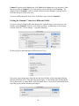
Once you have a properly scanned negative in an active Photoshop window, the rest is simple.
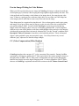
From the Photoshop Filter menu: Filter→C F Systems→ColorNeg. The C F Systems entry
should be near the bottom of the Filter menu. (If ColorNeg is missing or appears in the menu
but is grayed out, please read Scanning the Negative just above.) There will be a short delay
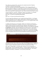
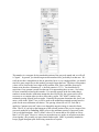
as ColorNeg builds tables describing the color negative, then a dialog will appear that looks
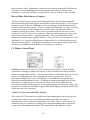
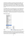
like the one pictured on the first page of this manual.
Select the maker of your film from the narrower pop-up list at the bottom of the dialog and
then select the type of film from the pop-up at bottom left. At this point the image should be
nearly correct - sometimes it is satisfactory as is. To explore the next, simple level of
ColorNeg capability, you will see to the right of the scrollbar control a checklist of ScrollBar
options. "Lightness" should already be checked. Use the scrollbar to set the approximate
lightness you desire for the image. If the color balance needs to be adjusted, the easiest and
5
often most effective method is to find a patch in the preview image that should be gray
(colorless) and click on it. "Gray" can be anywhere from quite dark to white. If possible,
click several gray patches and see what happens to the image, choosing the best result.
With a good, correctly exposed, properly processed negative of identified film type, that is all
that is required for satisfactory results with most images. For best results please check Color
Management and Gamma C to ensure you are correctly set up for your preferred color
management. ColorNeg also has many features designed to give you a high degree of control
over the appearance and quality of your color negative images while retaining the color
integrity of the image. For instance, there are images which do not have well-defined gray
patches in them, so the Auto Color and Color Adjust ScrollBar options, described below,
take care of them and provide for more critical color balance in general. The remainder of
this manual explains ColorNeg features and how to use them. We recommend using the
Descriptive Table of Contents as an easy way to understand what ColorNeg does and to
locate what you need.
6
Descriptive Table of Contents - ColorNeg's Capabilities (Clickable)
Besides inverting normal color negatives quickly, easily, and correctly, ColorNeg provides
tools to deal with color negatives of unknown type, color negatives with problems which
result from poor processing or other sources, tools for perfectionists who want the best
possible results, and tools to help speed the processing and matching the results from
negatives that are similar.
To correctly invert a color negative, four considerations are necessary. First, a good and
proper scan of the negative is absolutely necessary for good results. This is the most likely
source of trouble if ColorNeg consistently does not work well on good test negatives. While
ColorNeg cannot help directly with scanning, see Scanning the Negative and the scanner page
on our web site:
http://www.c-f-systems.com/Scanners.html to learn how or if you are having problems.
Second, the film must be properly characterized. ColorNeg provides several way of doing
that. This often is as easy as selecting the type of film from a list (see Film Selection
System), which works well for well-processed negatives of a known film type. Negatives of
unknown type often can be quickly and satisfactorily characterized by trying the several builtin generic film types as explained in Legacy Films or by using the Film Type ScrollBar
control, as explained in Film Type Scrolling. Negatives of a known type that have not been
processed properly can sometimes be brought to proper characterization as explained under
the Gamma ScrollBar control. For the ultimate in characterization, see the Calibration
Feature. Using calibration the film may be directly characterized with the aid of a grayscale
with known gray values (see Known Calibration), a grayscale for which the gray values are
not known (see Approximate Calibration) or even with a grayscale composed of gray
elements within a normal scene (see Natural Grayscale Calibration).
Third, the image lightness must be properly set. As described in Lightness, this is done
automatically by ColorNeg but because the density range of a color negative is so much
greater than of the target digital image, the automatic setting can usually be improved. The
setting for automatic lightness can be adjusted - see Tails Control Panel.
Fourth, although ColorNeg makes an initial guess at proper color balance, if a color cast
remains in the image, the color balance must be adjusted. Frequently this is as simple as
clicking a gray patch within the preview image - see Color Balance by Preview Image
Click. For images in which there is no convenient gray patch, the Auto Color ScrollBar
control systematically takes you through a range of settings that should produce good color
balance for your negative. Finally, Color Adjustment explains how to use the ScrollBar
control to directly adjust the color balance, monitoring the result with the CC filter pack
readout.
ColorNeg also has a comprehensive CC (color conversion) filter system including both
readouts in terms of CC filter packs and the ability to save color correction and shadow
settings for use on series of similar negatives. See CC Master Control Panel for complete
details including A Brief CC (Color Correction) Filter Tutorial for those who are
unfamiliar with this, an extremely useful concept that has largely gone missing from digital
imaging.
7
The Problems and Comments section deals with what to do with negatives that do not
respond to normal treatment with sections on Color Balance Extreme Problems, Different
Lighting, Color Balance Differs in the Shadows and Highlights, Setting the Color
Balance (in Photoshop proper), Color Management and Color Negatives, Color
Management and Setting Gamma C, Getting the Gamma C Value for a Different
Profile, and calculating Gamma from Manufacturer's Data.
By default ColorNeg applies an S-curve to highlights and shadows. Normally this does an
excellent job of preventing blocked shadows and blown highlights. Like all tricks, however,
it can sometimes cause problems. If you are having a problem with highlight or shadow
blocking or other problems in those areas, the section on the Tails Control Panel explains
how the highlights and shadow curves are controlled.
ColorNeg allows different treatment of the inversion inside and outside a feathered selection.
See Selection Control Panel for details and Feathered Selections and How to Make
Selections on a Negative for hints on how to effectively use this feature. Also placed in the
otherwise empty Selection Control Panel are the option for including the image edges in the
histograms that control ColorNeg and a place where the effective system gamma can be
changed if necessary, see Color Management and Setting Gamma C.
8
Introduction
This manual is not necessary to start using ColorNeg, although you will need to read the
ReadMe.txt file or the Getting Started section to learn how to get the linear 16-bit/channel
scan that is so necessary for correctly inverting color negatives. But ColorNeg is a very
powerful system and this manual explains how to use its many features when you become
more familiar with it. We especially recommend reviewing the Descriptive Table of
Contents, which both explains ColorNeg and helps locate the information you want.
The demo version of ColorNeg embeds a gridwork in the images it produces. In general, this
gridwork is not obtrusive enough to prevent evaluating the results and in fact we expect that
some less critical users may find the results usable as is. To unlock the demo version and
eliminate the gridwork, a key code may be purchased via a secure link from our web site:
http://www.c-f-systems.com/Plug-ins.html
As we convert our ColorPos and GamSat plug-ins for the Macintosh, the same key code will
unlock those plug-ins, as well.
Legal Notice
This software is provided "as is" without any warranty or condition, whether expressed,
implied or statutory. In no event will C F Systems be liable for any lost profits or other
consequential, incidental or special damages (however arising, including negligence) in
connection with the ColorNeg software even if C F Systems has been advised of the
possibility of such damages. In no event will C F Systems' liability in connection with the
ColorNeg software regardless of the form of action, exceed the purchase price of the
software. C F Systems retains all right, title, and interest in and to the ColorNeg software.
This software and manual are Copyright © 2004 - 2007 by C F Systems. All rights reserved.
You may make copies of this software for personal use or for use within your own single
business location, not to exceed three (3) copies total. You are prohibited from making copies
for distribution in any other form.
9
Preview Image Clicking for Color Balance
When you click a point in the preview image in ColorNeg, the image is adjusted to make the
clicked point gray (colorless) while keeping the image lightness approximately the same. This
is the preferred tool for setting a color balance of an image; that is, for removing any color
casts. If there is a good gray area, mid-tone, light, dark, or even white and if the image has
color integrity this is sufficient to remove any color cast from the image.
Three things must be recognized in using this tool. First, color negatives can be quite grainy
and images of real gray objects may be uneven, so take several clicks to be certain that the
gray patch reading is stable. Second, while ColorNeg has a primary goal of producing
images with color integrity, there is no way to absolutely guarantee this. If your image has
different color casts in the shadows, mid-tones, and highlights it does not have color integrity,
which usually means that film is incorrectly characterized. See the "Second" condition in the
Descriptive Table of Contents to learn how to deal with this problem. Third, with natural
objects, what you think is gray may not quite be gray. It is always better to try several
different "gray" objects to see how the image changes.
CC (Color Compensation) Filter Readout
ColorNeg introduces the concept of CC (color correction) filter controls. During ScrollBar
operations or clicking gray patches the CC filter equivalent of the current settings is shown to
the right of the scrollbar. The CC filter pack is an important concept in color photography
that has been largely lost in the digital imaging world. For those unfamiliar with CC filters,
their use in ColorNeg is explained in detail in the section on the CC Master Control Panel.
10
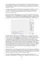
ScrollBar Controls
In Getting Started we briefly used ScrollBar controls. The complete set of six is as follows:
Note that some dialog elements change for the different scrollbar controls. The ScrollBar
control in the Macintosh version is not (yet) a "live" control. That is, it is necessary to release
the thumb button to see the results of scrolling - the image remains the same as long as you
are dragging the thumb button. We hope to add live scrolling in the future.
Auto Color
Auto Color is used when there are no suitable gray patches in the preview image or clicking
does not seem to give a satisfactory result. Check the "Auto Color" option and use the
scrollbar. Over the range of the scroll the image will go through the settings most likely to
produce a good color balance. Finer control of the scrollbar can be had by using the
PageUp/PageDown or Up/Down Arrow keys. Once the color is set, select the "Lightness"
option again for fine tuning. Two different methods based upon gray balances internal to the
image are used, one in the lower half of the scrollbar and another in the upper half. Scrolling
through these settings is often very uneven, with long scrolls through very similar settings
followed by a fairly rapid change of settings. Occasionally there even will be a range where
the color balance is extremely far off. This is normal and the behavior will typically be
somewhat different for each negative. The actual amount of color change is tracked in the CC
boxes in terms of a CC filter pack (see the section CC (Color Correction) Filters for a full
explanation). In our experience if the film is properly identified or calibrated Auto Color will
locate a near-ideal color balance in the vast majority of cases, but be aware that like any shortcut there will be rare instances where it does not work. For such cases you will need to use
Color Adjustment, which is also useful for critical fine tuning of Auto Color results. See
Problems and Comments at the end of this manual for dealing with particularly difficult
cases.
Lightness
Lightness is the most fundamental control in ColorNeg controlling the overall lightness or
darkness of the image. ColorNeg makes an initial guess at image lightness. This guess can
be controlled somewhat (see Tails Control Panel) or set precisely for a series of similar
negatives (see CC Master Control Panel) but it is a mistake to think that it can ever be set-itand-forget-it except for photographers who exert a very precise control over their shooting.
This is because color negatives are capable of recording a much wider dynamic-density range
11
than can be expressed with either print or computer display, and it is always a matter of
selecting a smaller range of tones for the final result from within the wide range recorded on
the film. Lightness, which is equivalent to "exposure" in traditional printing, makes that
selection. Being equivalent to "exposure" this control preserves the color integrity of the
image. When using Lightness you will see two boxes at the lower right of the scrollbar; in the
illustration above, these contain "Green" and "0.8408." Lightness, the exposure adjustment,
effectively drives some portion of the image to saturation. In the example, more Red pixels
have been driven to saturation than either Green or Blue, and 0.8408% of the Red pixels been
driven to saturation. However, recognize that ColorNeg curves the saturated regions just as
color printing paper does, so that actual saturated ("blown") highlights will represent
considerably less than 0.8408% of pixels and highlight detail will be retained (See Tails
Control Panel).
Color Adjustment
Color Adjustment is the Lightness control applied individually to the primary colors, which
can be selected using the checkboxes for the subtractive primaries Cyan, Magenta, Yellow, or
the additive primaries Red, Green, Blue. The subtractive primaries each gang together two
additive primaries, so that Cyan simultaneously adjusts Blue and Green, Magenta
simultaneously adjusts Red and Blue, and Yellow simultaneously adjusts Red and Green. The
All checkbox simultaneously adjusts Red, Green, and Blue so that when All is checked, Color
Adjustment is exactly the same as Lightness.
The use of Color Adjustment is exactly equivalent to applying CC filters to the image. This
effect can be seen in the two CC boxes to the right of the color selection checkboxes (see the
section CC (Color Compensation) Filter Readout for a full explanation). Being equivalent
to CC filter adjustment, this control preserves the color integrity of the image. Use this
control to fine tune a color balance made by clicking the preview or using Auto Color, or to
find a correct color balance for the rare cases that the automatic methods cannot handle. The
two boxes at the lower right of the scrollbar behave as described above for Lightness.
The Problems and Comments section at the end of this manual describes an easy method for
color balancing or checking the color balance of images that have color integrity.
Shadow
The Shadow adjustment allows setting the blackness of the shadow areas while preserving the
color integrity of the image as well as possible. Adjusting the shadows also has an apparent
effect on image contrast. The shadows adjustment in the Photoshop Levels tool behaves very
poorly with regard to color integrity, so it is important to make any necessary shadow
adjustments in ColorNeg. ColorNeg makes an initial guess at shadow darkness and this
guess can be controlled somewhat (see Tails Control Panel). Further Shadow adjustments
are not routinely required. When they are needed, use the Shadow control, typically with the
All checkbox checked, which simultaneously adjusts Red, Green, and Blue. In cases where
the deep shadows have an undesirable color cast after the overall image color has been set, a
shadow adjustment of one of the primary colors may be required. These colors can be
selected using the checkboxes for the subtractive primaries Cyan, Magenta, Yellow, or the
additive primaries Red, Green, Blue. The subtractive primaries each gang together two
12
additive primaries, so that Cyan simultaneously adjusts Blue and Green, Magenta
simultaneously adjusts Red and Blue, and Yellow simultaneously adjusts Red and Green.
When using the Shadow control you will see two boxes at the lower right of the scrollbar; in
the above example they contain "Blue" and "1.0128." The Shadows adjustment effectively
drives some portion of the image to pure black. In the example, more Blue pixels have been
driven to black than Green or Red pixels, and 1.0128% of the Blue pixels been driven to
black. When you use the Shadows control, this is a measure of what is happening to the
shadow areas of your image. However, recognize that ColorNeg curves the deep shadow
regions just as color printing paper does, so that actual pure black shadows will be
considerably less than indicated (1.0128% of pixels in the above example) and shadow detail
is retained. See Tails Control Panel and CC Master Control Panel for details on this and
the several methods of shadow control.
Gamma
Gamma adjustments are equivalent to the "middle gray" slider in the Photoshop Levels tool.
In that form gamma adjustment is the single control most responsible for the loss of color
integrity in digital images. Thus it is with some reluctance that we include a gamma control
here, however, the Gamma adjustment done by ColorNeg is more accurate than the one in
Photoshop Levels. Short of calibration, a ganged gamma adjustment is the best correction for
negatives known to be over- or under-developed, resulting from time, temperature, or
developer strength errors; the most common processing problem. If you believe that your
negative may have been poorly processed, use the Gamma control to adjust the image to have
a more natural look, but do not go beyond this. If your intent is to enhance the image to be
either more flat or more bold than it would naturally be, we suggest that you use our GamSat
plug-in instead, as this will preserve color integrity as much as possible while doing this.
Gamma gang-adjusts Red, Green, and Blue simultaneously and as shown in the illustration
above, will display a single mean value of gamma as this takes place. You may also see the
CC values change as you adjust Gamma. Please understand that such changes do not
represent true CC filter pack changes as is the case with Lightness adjustments. With the
Gamma adjustment you are effectively changing the assumed characteristics of the film, not
its color balance.
Gamma adjustments made to built-in film types, as might be required for underdeveloped or
overdeveloped films, can be saved to a user film type, but there are specific conditions which
govern when this can be done. In particular, there must be an actual significant scrollbar
adjustment of Gamma and the User film "maker" must be selected immediately afterward. In
this case the adjusted gammas are carried over to the User mode and can be Added to the User
Film List either under the current film name or a new name can be entered and the results can
be permanently saved to a file as described under Film Selection System, User Films. The
results of this characterization can then be used for other color negatives which are believed to
be similarly underdeveloped or overdeveloped. When switching to the User maker in all
other cases, gamma values are changed to first User film characteristics.
The Gamma adjustment is also used to assist in making "Apprx" calibrations.
13
Film Type
The Film Type ScrollBar control is a tool which can be used to characterize the film type of a
color negative. Our tests show that if used with care Film Type scrolling can estimate the
characteristics (gammas) of a color negative with quite reasonable accuracy. This control
works by scrolling continuously through characteristics which represent the range of known
film types. The preview image must be carefully observed during this scrolling and gray
patches in the preview image frequently clicked to keep the image in the best color balance
possible. Look for the point in scrolling where the whole image seems to be most natural in
color. In particular, any color cast should be similar in the shadows, mid-tones, and
highlights. Preferably there should be no color cast at all in any of these.
After a suitable Film Type has been scrolled, if the image seems too flat or too contrasty, that
can be tweaked using the Gamma ScrollBar control. In general it is not wise to have the
average gamma go above 2.0 or below 1.0 when doing this.
Selecting the Film Type control automatically changes the maker to User. The results of the
Film Type scrolling can be Added to the User Film List either under the current film name or
a new name can be entered. The results can be permanently saved to a file as described under
Film Selection System, User Films. The results of this characterization can then be used for
other color negatives which are believed to be of the same type.
14
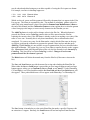
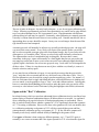
Panel Controls
ColorNeg has some very powerful features that are initially hidden from view. The panel just
under the OK and Cancel button at the upper right of the dialog has several different faces that
are selected using the checkboxes marked Above, to the right of the upper scrollbar:
Each of these checkboxes causes one of the following controls to appear:
Main Control Panel - Registration
ColorNeg first comes up showing the Main Control Panel, which will look like the Panel on
the far left. The "Register" button will appear until a purchased key code has been entered.
Pressing the Register button brings up a dialog box:
After typing in the key code (or see paragraph below for an alternate method) and pressing
OK, you must also OK or Cancel out of ColorNeg to complete the registration. The next
time you call up ColorNeg, the Main Control Panel will change to the second version shown
above. The two upper text boxes will contain the registration name and replacing the
"Register" button will be a box that contains the name of the current User *.negpos file,
"ColorNeg" to start with. In loading or saving files (see Film Selection and CC Master
sections) editing the name in this box allows the loading and saving of files besides the
default ColorNeg.negpos and ColorNeg.negcc.
We were unable to get copy-paste to work for the registration key code on the Mac. As a
workaround for those who find hand-entering the long key too tedious and error-prone, we
have provided the ColorNegKey.txt file, which should be in the same folder ColorNeg puts its
*.negpos and *.negcc files, as explained under Installation. Edit this file as a text file, pasting
in your registration key as its first line, making sure nothing besides the registration key is on
that line. Then, when ColorNeg puts up its dialog box asking for the registration key, simply
press the OK button. It is not necessary to leave the ColorNegKey.txt file in place after this has
been done, and we recommend that you do not.
15
Undo in the main panel will allow you to cycle back and ahead through the previous twenty
steps. Understanding exactly what "step" means requires some experience using Undo.
Tails Control Panel
When ColorNeg starts it ordinarily makes its first guess at Lightness and Shadow settings
according the percentage of pixels at the allowed to saturate in the highlights (H%) and the
percentage of pixels allowed to go completely black in the shadows (S%). The default for
these percentages is 1% but may be adjusted to any reasonable percentage. If your images are
routinely too dark, try a higher value for H%. Too light, a lower value.
ColorNeg does not actually allow the H% of pixels to go into saturation or S% to go into
complete blackness, but applies an S-Curve so that the image gracefully goes into saturation
just as would be the case with a negative printed on photographic print paper. The "Tail
Start" figures show the point in image lightness at which the S-curves begin to be applied.
Typically values of 0.90 or 0.95 and 0.05 or 0.10 are used for this, the fractional start points
being based on the image as adjusted for system gamma. That is, at the default values shown
above the shadow curve will start at 0.1 x 255 = 25 and the highlights curve will start at 0.95
x 255 = 242 in the final, positive image.
The tail curves work with no problems for most images, but can sometimes misbehave. If
you experience poor behavior in the highlights or deep shadows, adjusting the tail start values
can help. Setting "High" to 1.0 or "Shad" to 0.0 will completely turn off the tail and allow
you to tell for sure if it is causing a problem.
The need for blackpoint adjustment arises from imperfections and non-ideal behavior of
photographic materials and equipment. As such, a blackpoint setting is normally required,
but the "correct" setting for blackpoint is not easily defined. The choice of blackpoint will
affect both overall saturation and color integrity. ColorNeg is designed to minimize the effect
of blackpoint selection on color integrity, limiting its effects to the darkest shadows insofar as
possible. There are three choices for blackpoint, Tail, Min, and no blackpoint. Tail bases the
blackpoint on the shadows cutoff point, initially S%, and Min adjusts the blackpoint to the
shadows to that resulting from the highlight cutoff point, initially H%. We believe the best
setting is Tail.
16
Selection Control Panel
First, the Selection Control Panel also has two orphaned, rarely used items in addition to
selections. Scans of negatives can have light leaks around the edges, and such light leaks can
seriously distort the ColorNeg's analysis of the image. For this reason a 10% border around
the edges of the negative is routinely ignored in the analysis. In cases where this is
undesirable, check Edges in Histogram and the edges will be included.
The Gamma C value is the normal system gamma in which gamma-adjusted images are
stored using Photoshop. It is normally the default value of 2.2 but for some Macintosh
systems it should be 1.8. See Color Management and Setting Gamma C to see if you need
to change this. It is not intended for individual image adjustment purposes.
Feathered Selections
ColorNeg allows the use of feathered selections. Color negative film has a very wide
exposure latitude and usually contains more highlight detail and more shadow detail than can
be accurately produced in a normal digitial positive image. Feathered selections can often be
used to bring out this detail in a way that the eye still sees as normal. To use this feature,
select an area or areas that are brightly lighted, as when sunlight falls directly on part of a
scene while the remainder is in shadow. Feather the selection suitably for a smooth transition
- choosing the right amount of feathering varies with every image and comes with experience.
Then in ColorNeg, work on the entire image adjusting lightness, adjusting the color balance,
etc. until the most prominent part of the image looks good. Then click either In or Out under
Use Selection to work on the area in the selection or outside the selection. Start with
whichever part you paid least attention to as you worked on the entire image. When you have
that part adjusted to your liking, change from In to Out (or vice versa) and adjust the other
part so that the balance between In and Out is smooth. It may take going back and forth a few
times. When viewing a real scene, the eye naturally accommodates as you gaze at bright and
dark areas and the brain blends it, so the result of working on selections like this can appear
quite natural. Feathered selections are also very useful in dealing with an image where two
parts of the image are under different lighting conditions. You will find that Auto Color is
less useful in working with selections, but clicking a gray patch in the work area will still
work. Still, it is best to get a good color balance before starting on the selections. After you
start using selections, the CC filter pack will reflect the color balance inside or outside the
selection, whichever is the active mode. In addition, if you save or insert CC filter packs
while using selections, only the filter packs for the active mode will be saved. Note that it is
possible to save filter packs for both inside and outside the selection by switching from In to
Out and using different names when saving the two filter packs.
NOTE: Once you start to use selections, there is no going back. You will no longer be able to
work on the entire image without restarting ColorNeg. Undo will not go back past the start of
17
using selections, either. Additionally, calibration uses selections in an entirely different way.
Any time you call up ColorNeg with an image that has selections you can try to run a
calibration or work with selections as explained above, but you will not be able to do both.
How to Make Selections on a Negative
The above selection feature sounds all well and good, but how do you make meaningful
selections working with a dark negative that is hard to read in the first place? It is a lot easier
and more accurate to first use ColorNeg to create a preliminary positive and then make the
selections using the positive image. If you are working with Photoshop 7 you may even want
to convert the positive to 8-Bit/Channel first so that the magic wand and other aids are
available in making the selection. Once you have accurately made the selection, save the
selection in a new file: Select→Save Selection. Make sure the Document: pop-up says New
and give the selection a Name: - anything convenient. When you OK this will save the
selection in a separate image, typically Untitled-1. Now you can revert if you haven't overrun
the History list, or reload the original negative image and Select→Load Selection to put the
selection over the negative. In doing this remember to save the negative image first if there is
any chance you might overrun the History list in making your selection.
CC Master Control Panel
ColorNeg features the concept of CC (color correction) filter controls. During ScrollBar
operations or clicking gray patches the current CC filter equivalent of the chosen settings is
shown to the right of the scrollbar. Color correction filters or color density filters have been a
part of color photography since the beginning, and with very good reason. They are
equivalent to changes in the color of the lighting of a scene and thus represent the most
physically natural adjustments of color. In addition to monitoring the application of color
corrections to a single image, the concept of CC filters can be used to match the color
correction treatment of similar negatives. As many photographers already know, images from
the same roll or emulsion of film that are taken under similar lighting conditions will normally
require the same color corrections.
A Brief CC (Color Correction) Filter Tutorial
The concept of CC filters has been missing from digital photography not because they were
no longer believed necessary or useful but apparently because there was a lack of
understanding of how to program the equivalent of CC filters. Thus CC filters may be an
unfamiliar concept to some but we strongly believe that digital photographers will benefit
greatly from understanding and using CC filter equivalents in assessing their images.
18
A 10R CC filter is of a light red color and passes all red light while having a density of 0.1 to
both blue light and green light. Physically this means the 10R adjusts the lighting by passing
100% of red light while passing only about 80% of green light and 80% of blue light. The
filter has a red color and by convention the 0.1 density is multiplied by 100 in naming the
filter "10R." CC filters densities of the same color are additive, so that two sandwiched 10R
filters are equivalent to 20R. In traditional color photography color adjustments are made
using combinations of CC filters, for example 10R 5B, called a "filter pack." CC filters of
different primary (RGB) colors are not additive, so a filter pack may be 10R 5G. A filter pack
of equal density in all three primary colors appears gray. For example 10R 10G 10B, appears
gray has a "neutral density" of 0.1. Since neutral density is equivalent to a simple exposure
change, by convention such combinations are subtracted out before reporting CC filter packs.
Thus a filter pack 10R 15G 5B would have 5R 5G 5B subtracted from it and be reported
simply as 5R 10G. In this way, filter packs never contain CC filters of more than two of the
three primary (RGB) colors. The filter pack is thus a good measure of what is happening to
the color balance of an image independent of overall lightness.
Those of you familiar with using CC filters or dialed-in equivalents for printing color with an
enlarger and print paper will find that the CC filter pack reported by ColorNeg is not a
printing filter pack for the negative. When a 5R CC filter is listed, the image will appear
more red, not more cyan. Those of you familiar with the "factor of 2" difference between
viewing filters and printing filters will find that has gone missing, also. Originally we did
plan to report CC filters as the filter pack applied to the negative for printing, but the result
was very confusing at best, even to a person quite familiar with that usage. For digital
imaging it really is better to report the CC filter pack in terms of changes to the resulting
positive image, as we are doing it.
The CC Reference Problem and the Zero and Initial Buttons
Our plug-ins for positive images were first to have a display of the CC filter pack. This is
because the CC filter pack is by nature a comparison, rather than an absolute measure. With
positive images it is obvious that the comparison should be with the starting image as
reference. With color negatives it is not at all obvious what should be used as the comparison
reference and in fact different references may be appropriate under different circumstances.
When ColorNeg first comes up, the CC reference is set to the initial guess at color balance so
that the filter pack normally starts at zero. In some cases this will be sufficient. However, it
is often helpful to change the reference point for easier CC comparisons. At any time the
reference may be set to the current image colors by pressing the Zero button. This will cause
the CC readout to become zero and further CC comparisons will refer to the current state of
the image. To get an overall view of color changes it is also possible at any time to go back to
using the initial state of the image as reference by pressing the Initial button.
19
Matching a Series of Similar Images
Often a series of color negatives has been taken under very similar lighting conditions using
the same film and processing. In such cases the CC filter pack can be identical for all
negatives in the series. ColorNeg makes it easy to match such a series. Start with a typical
negative and make any adjustments necessary to have it come out as you want it. Then, press
the Zero button to make the current filter pack the current CC reference as described above.
Click the "CC Master" button in the Above checklist to show the CC Master control. The
pop-up (showing "Ocean" above) is a list of ten names. Select one of the existing names to
hold your CC data. You can leave the selected name or enter a new one. There is a twelve
character limit on the length of the name. (Initially all the names start with "Z" so new names
you add will be at the top of the list. Press the Insert button and the current CC reference will
be saved under that name. Note again that prior to pressing Insert, you need to press the
Zero button to make the current CC reference the same as the current preview image. The
Insert action also records your current Shadow settings as part of the CC record stored under
the chosen name.
Once a CC Master has been saved it can be applied to other negatives by selecting the name
in the CC Master pop-up and pressing the Apply button. This will apply the color correction
to the current negative so that it will match the positive version of the reference negative and
the CC readout will report how much the negative has been changed from its initial setting.
The "Apply These" checkboxes govern exactly which correction will be applied when the
Apply button is pressed. The "CC" option will apply the color correction settings without
altering the lightness of the image. The "Light" option will apply just the Lightness setting of
the reference negative without altering the color correction. The "Blackpoint" option will
apply just the Shadow settings of the reference negative. These three options can be used in
any combination. If you did not do a special Shadow adjustment to the reference negative,
don't apply blackpoint. Whether to use the Light option along with the CC option will depend
largely on how the pictures were taken. It is a simple matter to change which options are
checked and press Apply again to see how the image changes.
The changes you make to the CC Master, changing names and CC data for any of the ten
names, will automatically be recorded for use on the next negative when you press the OK
button to exit ColorNeg. Note that the changes are not saved if you Cancel out of ColorNeg.
You can arrange to have adjustments automatically made to the next negative by checking the
"Carry Over" box. Whichever CC name is selected when you exit ColorNeg using OK will
be automatically applied to the next negative, using whichever options were last checked.
20
For systematic photographers, the CC Master settings from one batch of films may also be a
good starting point for another batch. Remember, however, that applying a CC Master does
not affect the film type setting. Make sure that the proper film type has been selected before
applying a CC Master.
CC Master settings naturally become obsolete as one batch of film is finished and we move
on to another. Thus the ten CC Master name slots provided should be enough for most
operations. Nonetheless the Save and Load buttons provide the means for saving and
reloading CC Master settings.
When either the Save or Load button is pressed the preview image disappears and two large
buttons appear, asking you to Confirm the Save or Load, or to Cancel it. Under Photoshop
CS2 and higher, a save/load path box and the Set New Path and Save New Path buttons will
also appear. These path-related items will not appear under Photoshop 7 or Photoshop CS.
The Save button is intended to save the CC Master setting as a *.negcc file under a specific
file name. Similarly, the Load button will load and replace the CC Master settings from a
specific *.negcc file. Before ColorNeg is registered the file to be saved or loaded will always
be ColorNeg.negcc. After ColorNeg has been registered, the name of the currently active
*.negpos User film data file normally will be shown in the Main Control Panel area at the
upper right of the ColorNeg dialog, under the registration data. However, during CC Master
Load and Save operations when the large buttons appear, the Main Panel is shown (for
registered plug-ins) and this name is replaced by the name of the currently active CC Master
file (if this name differs from the currently active User *.negpos file). The name, as shown in
the blue-outlined box above, becomes editable and so can be changed, within limits. The
name must formed from letters and numbers and can be no longer than 12 characters,
exclusive of the ".negcc".
Confirm will save to or load from the currently named file (be ColorNeg.negcc if ColorNeg is
not yet registered). When the Confirm button is pressed, the edited name will be used for the
load or save as long as that name is a legal file name. The length of the name is limited to the
display name length of 12 characters and will be trimmed if longer.
The section Auxiliary File Locations describes where the find the affected files for
Photoshop 7 and Photoshop CS. For Photoshop CS2 and higher the path where the files will
21
be found appears in an editable box, as shown above. This path may be changed. To use a
path that you have changed just for the current ColorNeg session (including the current
Save/Load operation), press Set New Path. To record the path that you have changed in
/ColorNegPath.txt and so cause it to be used in future ColorNeg sessions, press Save New
Path. In either case, the changed path is first checked. If it does not already exist, the path
will not be changed and will revert back to what it was previously. If the target folder that
you want to use does not exist, you may use Finder to create it first and then enter the path to
that folder.
The CC Master settings are saved as tab-delimited text files. Except for the chosen names,
the data in these files will not in general be comprehensible to the user. CC Master names
are always written as the entire group of ten and Load expects to find ten records. This
somewhat complicates the reuse of saved CC Master names but of course the user is free to
use a text editor to cobble together a *.negcc file with a group of ten records selected from
different saved files. We suggest that any such put-together file be read into and written back
out of ColorNeg to be compared with the original and be sure it is being interpreted correctly.
Film Selection System
ColorNeg has a built-in selection for around 115 types of color negative film from Agfa, Fuji,
Kodak, Ferrania, and Konica-Minolta, derived from the manufacturer's published film data.
First choose the maker from the pop-up on the right and then choose the specific film type
from the list on the left. If you later exit ColorNeg using OK (not Cancel), the film selection
will still be effective the next time you use ColorNeg.
22
Legacy Films
There is a Legacy maker listed in addition to the five actual manufacturers. Legacy is simply
a list of eleven generalized film types typical of color negative films, Vintage 1 through
Vintage B. These selections can be used to try and find a suitable match for any color
negative film that is not included on the list. In doing this, try each of the selections and then
click a gray patch or use AutoColor to get the best color balance. Pick the Vintage that gives
the best overall color - shadow, mid-tone and highlight - after doing this. If the same film
selection also performs well on several other negatives of the same type you have a useful
match. Searching the Legacy list can also be very useful in trying to find a reasonable
solution for films that have been poorly stored or processed and are not a good match with the
film manufacturer's data. The FilmData ScrollBar operation is an alternate way of doing this.
My Films
The sheer number of choices makes selecting a film more annoying than it should be. To aid
against this we have added an item to the Maker list called "MyFilms" and a control button
at the bottom right of the dialog called "+MyFilms" or "-MyFilms." When you have selected
a Maker, for instance Kodak, and a Film, for instance GA200, you can press the +MyFilms
button and the GA200 will be added to your MyFilms list, for up to 20 film types. These
selected films types will appear in the pop-up Film list when the Maker is set to MyFilms.
While you are in MyFilms you can press the -MyFilms button to remove a film from the
MyFilms list. Films will remain in the master built-in list whether or not they are in the
MyFilms list. Removing a film from the MyFilms list will not remove it from the master list.
Films from the User list below cannot be added to MyFilms. Manage User films by editing
and saving the *.negpos file.
As an aside here, we really hated to call this "MyFilms" because the "MyWhatever" concept
has been so abused and so inappropriately set up on PCs in general, starting with Microsoft.
After reviewing the possible alternatives, however, we came to believe that this really is one
of the few appropriate uses of the "MyWhatever" concept.
User Films
Dedicated users of ColorNeg who want to get the best possible results eventually will want to
calibrate according to their actual film usage or will want to track down manufacturer's data
for old films which are not on the built-in list. In either case, such data can be added to
ColorNeg under the User "maker." When the User maker is chosen, four buttons at the
lower right of the dialog become available to allow you to control this special film list. Note
that it is not possible to alter the settings for the built-in films; only the list of films under the
User maker can be changed or added to.
User film data is kept in a text file with a *.negpos. This file may be located anywhere the
user wishes, and there may be more than one such file. A file ColorNeg.negpos is supplied that
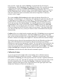
contains a few films calibrated for C F Systems home processing, to serve as examples.
These samples may or may not work well for similar films depending upon whether the
processing was also similar home processing. The file is a standard tab-delimited text file and
23
may be altered and edited using any text editor capable of saving the file in pure text format.
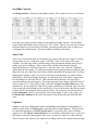
For example, two lines in ColorNeg.negpos are:
1.719
1.600
1.129
1.090
1.202
0.978
Ektacolor 35mm
Ektacolor S
Which are the red, green, and blue gammas followed by the name that is to appear in the Film
List pop-up. The items are separated by tabs. The method of calculating gamma values for
other films using manufacturer's data is described in Gamma from Manufacturer's Data at
the end of this manual, and the Calibration Feature section explains how to calculate gamma
values from grayscale images, to more exactly characterize the film that you use.
The Add/Chg button is used to add or change values in the film list. When this button is
pressed, the current, active ColorNeg gamma values will be entered into the film list,
replacing the current values if the film name is already on the list or making a new entry if the
name is a new one. Normally this is only done immediately after a calibration has been
completed. To create a new entry for the User maker, simply edit the film name in the popup edit box, perform the calibration to generate the gamma values in place and then press
Add/Chg. With ColorNeg it is not possible to type in gammas that you have calculated other
than with calibration. The easiest way is to use a text editor to operate directly on the *.negpos
file. Please note: Both Add/Chg and Delete affect only the list currently in use internally by
ColorNeg. This list will be lost when ColorNeg is exited. Changes do not become
permanent until the Save button is pressed.
The Delete button will delete the named entry from the film list (if the name exists on the
list).
The Save and Load buttons provide the means for saving and reloading the User film list.
When either the Save or Load button is pressed the preview image disappears and two large
buttons appear, asking you to Confirm the Save or Load, or to Cancel it. Under Photoshop
CS2 and higher, a save/load path box and the Set New Path and Save New Path buttons will
also appear. These path-related items will not appear under Photoshop 7 or Photoshop CS.
The Save button is intended to save the entire User film data under a specific file name with
an extension of *.negpos. Similarly, the Load button will load and replace User film data
24
from a specific *.negpos file. Before ColorNeg is registered this file will always be
ColorNeg.negpos. After ColorNeg has been registered, the name of the currently active User
*.negpos file will be shown in the Main Control Panel area at the upper right of the
ColorNeg dialog, under the registration data. During Load and Save the name, as shown in
the blue-outlined box above, becomes editable and so can be changed, within limits. The
name must formed from letters and numbers and can be no longer than 12 characters,
exclusive of the ".negpos".
The section Auxiliary File Locations describes where the find the affected files for
Photoshop 7 and Photoshop CS. For Photoshop CS2 and higher the path where the files will
be found appears in an editable box, as shown above. This path may be changed. To use a
path that you have changed just for the current ColorNeg session (including the current
Save/Load operation), press Set New Path. To record the path that you have changed in
/ColorNegPath.txt and so cause it to be used in future ColorNeg sessions, press Save New
Path. In either case, the changed path is first checked. If it does not already exist, the path
will not be changed and will revert back to what it was previously. If the target folder that
you want to use does not exist, you may use Finder to create it first and then enter the path
with that folder.
Confirm will save to or load from the currently named file. If ColorNeg is not yet registered,
the file will always be ColorNeg.negpos. When the Confirm button is pressed, the edited
name will be used for the load or save as long as that name is a legal file name. The length of
the name is limited to the display name length of 12 characters and will be trimmed if longer.
The built-in values are derived from manufacturer's data for each film and as such they will
apply well to film that has been stored properly and processed properly according to
manufacturer's specifications and properly scanned. For color negative film in particular, this
is not always a safe assumption. Variations due to processing time, developer strength, or
temperature can sometimes be compensated as explained above under Gamma. The Legacy
settings and Film Type scrolling may help deal with more significant variations, but
Calibration is often the best idea when time and circumstances permit.
Calibration Feature
As you can guess from the length of this section dealing with it, calibration requires
dedication and attention to detail to do correctly. Calibration is not necessary to the
successful use of ColorNeg, but when properly mastered it can make a significant difference
in the quality of your work. Note that for consistency some of the illustrations in this section
have been retained from the PC manual for ColorNeg. Calibration is operated mainly
through a single box that appears in the Control Panel area at the upper right corner of the
dialog when Calibration is checked in the Above box:
25
The calibrations performed follow and automate the methods described in Dunthorn
Calibration as explained on our web page
http://www.c-f-systems.com/DunthornCalibration.html. This web page explains why
grayscale calibration is both necessary and sufficient for three color RGB or CMY systems
like color negatives. Calibration is possible using negatives of a known grayscale (where the
target values of each grayscale step are known) or negatives of an unknown grayscale or even
from a natural grayscale in regular negatives, where various elements of the image have been
selected to function as a grayscale. Although it certainly is not required, we recommend
making a Dunthorn grayscale for this purpose, using the method described in
http://www.c-f-systems.com/DunthornCalibration.html
or in
http://www.c-f-systems.com/AlternateGrayscale.html.
We do not suggest that calibration is easy even with the tools provided here. It will require
using the tools enough to become familiar with them and it will require attention to detail to
determine whether the results of a calibration are valid or not. We do suggest that these skills
can be readily learned and are well worth the effort.
To calibrate, there must always be a selection. If there is no selection (or if the image is
monochrome) the calibration box will indicate "Not Set Up" (as shown above) and will not
function. (Selections may be used either for doing calibrations as described here or for
making different adjustments inside and outside the selected area as described in the Selection
Control Panel section above, but not for both purposes at the same time.) The selection
should be the portions of the image to be used as a grayscale. In many cases the selected
portion will actually be an image of a grayscale. For best results - or at least less confusing
results - the negative image should not be closely cropped. The complete image surrounding
the grayscale should be used, but with a selection made that includes only the grayscale:
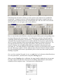
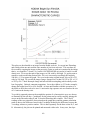
This image should be a linear 16-bit scan, as required for ColorNeg in general. Normally, the
histogram from such a selection will not show sharp peaks, especially in a high resolution
image. For proper calibration it normally is necessary to sharpen the peaks using
Filter→Blur→Gaussian Blur. (Yes, that's right. Use blur to increase the sharpness of
histogram peaks.) We have found that a radius of 7-10 pixels normally will produce nicely
sharpened peaks, but that will vary with the scanner resolution being used. The resulting
histograms in the Image→Adjustments→Levels tool may look like this:
26
If the histograms are hard to evaluate, as is the case here, the peaks may be expanded for
examination. Using the levels tool, slide the highlights slider (white, at right in the above
histograms) until it almost hits the area with histogram data. OK out of the Levels tool and
then call up the Levels tool again, with a result similar to:
Here we can see that each of the three colors has ten quite distinct peaks corresponding to the
ten steps of the grayscale in the negative. For calibration to work best, the peaks must be
reasonably distinct and separate, as in the above. Even though calibration often will work
with peaks that are partly merged into one another and that are more uneven spires than the
above, for good, consistent results, target producing histograms as distinct as the above. Do
not expect good results from a poor gray scale pattern. Poor patterns may result from
incorrect exposure, uneven lighting with shadows or reflections on the grayscale, poor
processing, etc. The radius chosen for Gaussian Blur will have an effect on this, but it is not a
cure-all. If too large a radius is chosen, adjacent steps will start to blend in with one another;
also, blur-blending itself becomes a questionable process when more than a small amount of
blending is required.
Once you have examined the peaks, be sure you undo the Levels adjustment (that allowed you
to see the peaks better, yourself) before using the ColorNeg plug-in.
When you start ColorNeg to do a calibration, the image initially displayed may (or may not)
be poorly expressed because the selected areas are initially analyzed by the same method
normally used for complete scenes. Look again at the calibration box:
27
When ColorNeg is entered with a color image having a selection, it is properly set up to
attempt a calibration and the message box at the bottom will be blank. The calibration can be
either against a grayscale with Known exact target values or it can be an Apprx calibration in
which the target values are not known.
Known Calibration
For a known grayscale, the target values must be in a file named negpos.grayscale and that file
must be in the same folder as the *.negpos file currently in use. Each time a *.negpos is opened
or Loaded an attempt is made to load negpos.grayscale from the same folder. Thus it is
possible to use several different negpos.grayscale files in different folders. If no
negpos.grayscale file is found, ColorNeg reverts to built-in values for the Dunthorn grayscale.
The negpos.grayscale file provided with ColorNeg contains the values for the Dunthorn
grayscale in comma-delimited text format:
13, 38, 64, 89, 115, 140, 166, 191, 217, 242
There is a technical detail about the Dunthorn grayscale that becomes more important when
using a Macintosh. The Dunthorn grayscale should be produced using a profile with a
Gamma that matches the Gamma C used by ColorNeg in its analysis. On a PC and on most
Macs operating in Photoshop, the working profile Gamma is 2.2, but some native Mac
working profiles have a Gamma of 1.8. Please see Color Management and Setting
Gamma C to be sure you know your working profile's Gamma and that Gamma C is set to
that value.
If the Dunthorn grayscale was printed using a different working profile (for instance if it was
printed on another machine in the past) it is still possible to use it. If the working profile
Gamma used to produce the Dunthorn grayscale is 2.2 and your working profile gamma is
1.8, use grayscale values of:
7, 25, 47, 70, 96, 123, 151, 179, 209, 239
If the working profile Gamma used to produce the Dunthorn grayscale is 1.8 and your
working profile gamma is 2.2, use grayscale values of:
22, 54, 82, 108, 133, 156, 179, 201, 223, 244
If some other known grayscale is being used, its values may be entered into a negpos.grayscale
file and used. The values should be on the 0 to 255 pixel value scale and values near 0 or near
255 should be avoided. If the end steps of the target grayscale are considered to be black = 0
or white = 255, omit those steps from the list in the file and also do not include them in the
selection area when preparing the negative for calibration. The number of grayscale steps is
arbitrary, but needs to be at least four. The number of steps found in the file negpos.grayscale
will appear under "Steps" in the Calibration box on entry to ColorNeg.
Pressing the Known button will match the grayscale negative against the known grayscale
values and will produce a set of gammas for R, G, and B that best fit the grayscale. It will
also adjust the shadow and highlight percentages to approximately match the blackpoint and
28
color balance determined as part of the matching. These gammas can then be saved according
to a selected film type name, as described above. If you then OK out of ColorNeg, the
resulting positive image grayscale should be fairly close to the known grayscale. It may be
necessary to scale the image according to the brightest cell for best agreement. To do this,
activate the Levels tool Image→Adjust→Levels. There are three eye-dropper buttons at the
lower right. Double-click the rightmost (highlight) dropper button and the Color Picker
dialog box will appear:
R, G, and B, show the value of 255 above. Enter the value of the pixel corresponding to the
lightest step of the grayscale (242 for the Dunthorn grayscale) for each of these and click OK.
The mouse cursor appears as a dropper. Use it to select areas in the lightest square of the
grayscale image. Pick several points and stop when the Levels histogram seems to bounce
about the least.
Now OK the Levels dialog. Probably a message box will inquire whether you wish to save
the new target colors as defaults. Answer No. This adjustment is effectively an overall
lightness adjustment and the pixel values in the steps of the grayscale will now match the
target values fairly closely if the calibration is a good one.
The most frequent difficulty with grayscale negatives is in the light end of the grayscale
(which becomes the black end of the positive grayscale). If this happens, exclude the darkest
cell or cells in the selection for calibration and in ColorNeg change the number of steps to the
number of steps remaining after the exclusion. This will automatically ignore the correct
darkest cells in doing a Known calibration.
After each successful calibration trial a number will appear in the box at the bottom of the
calibration area and a value will appear in the "Min P" box:
29
This number is a surrogate for the standard deviation of the grayscale match and we will call
it "sigma". In general, you should target smaller numbers here, preferably less than one. We
really do not have enough data on this to generalize but as a very rough guideline, you should
start to be more suspicious as this number gets much larger than one. The three color gamma
values will be listed to the lower right of the scrollbar, Red, Green, and Blue from top to
bottom as in the above illustration (i. e. the Red gamma is 2.331). You should also be
suspicious if any gamma is much less than one or is approaching three or more. See below
for more comments related to this number. If a message appears in the box rather than a
number it means that the calibration attempt has been rejected by the system and it will be
necessary to re-examine what you have done and try again. The "Min P" number is the
minimum spacing allowed between peaks. Normally the program determines this, but if you
enter a value in the "Min P" box, it will be used as the minimum permitted spacing between
peaks for the next calibration calculation. The spacing is based on a 0-255 scale and is
applied to "gamma-corrected" values even though the negative image is entered in linear
form. That is, if you look at the histogram of the selected portion of the positive image of the
grayscale produced by ColorNeg, Min P refers to the minimum spacing of grayscale peaks
you see on that histogram. Note: A Min P value of 3.0 means that no two peaks are closer
than 3 (of 255) apart. However, it does not mean that any two peaks are anywhere near that
close together - they usually are spaced much further apart. Min P is primarily intended to
keep a jagged histogram peak from being counted as two peaks.
30
Approximate Calibration
It is usually possible to do a good calibration even when the target values for the grayscale
steps are unknown, first tying down the calibration by fixing one of the color gammas. For
Apprx calibration, first use the Gamma ScrollBar Control to set the mean gamma and then
press the Apprx button. The three color gammas, as well as the blackpoints and color
balance, are then calculated. The three color gamma values will be listed to the lower right of
the scrollbar, Red, Green, and Blue from top to bottom as in the above illustration (i. e. the
Red gamma is 2.331). The number of steps in the grayscale (Steps) can be more freely set in
doing an Apprx calibration than was the case for Known. If Steps is set at 5, then for Apprx,
the five tallest peaks will be selected for each color. Since we are working with gray steps,
the five (or whatever number) tallest peaks will generally correspond to one another across R,
G, and B. In fact, it can be useful to see what happens to the gammas when different numbers
of steps are taken into account and thus see how stable the calibration is.
In doing an Apprx calibration, a key question is exactly what to use for the mean gamma (set
using the Gamma ScrollBar) that controls the calculation. There is no "correct" value to use.
We have noted that the data from Kodak characteristic curves seems have red gamma the
highest and to favor a red gamma of about 1.75. Accordingly, we normally try to end up with
a maximum color gamma of 1.75. If the result seems too contrasty we lower the target from
1.75 and if too flat, we raise the target from 1.75. In any event, gammas much below one or
approaching three or more should be suspect. If you have trouble getting an Apprx
calibration to work, and are getting FAILURE messages in the "sigma" box, it is worth trying
a few different values for the mean gamma. If you started with 1.75 or 2.0, try 1.0 or even
lower. If the message persists it very likely indicates an unsatisfactory histogram.
The number in the "sigma" box will normally be less for an Apprx calibration versus a
Known calibration of the same grayscale and does not mean that the Apprx calibration is
better. The reason for this will be obvious to anyone who understands the concept of "degrees
of freedom" but too involved to explain here otherwise. Again the calibration becomes more
suspect as this number gets much larger than one. See Sigma and the "Best" Calibration
below for more general comments on sigma. If a message appears in the box rather than a
number it means that the calibration attempt has been rejected by the system and it will be
necessary to re-examine what you have done and try again.
31
Natural Grayscale Calibration
As more fully explained on the Dunthorn Calibration web page, it is often possible to
calibrate an image of a natural scene which does not contain a grayscale image as such. This
is particularly useful for old negatives where it is impossible to make new grayscale
calibration images. The idea is to select a number of areas in a negative which are fairly even
in tone and which are known or believed to be nearly neutral in color. Objects such as white
shirts, blacktop roads, white houses, sand, tree bark, branches, etc. can be used to form a
natural grayscale. Consider the following image:
Working in this mode it is usually best to first use ColorNeg to create a preliminary positive
and make the selections using the positive image as a guide. Try to select areas which are
evenly toned and have tones which range up the tonal scale. The Info window helps in
showing the pixel values of areas to be selected. Make sure the different areas selected have
distinctly different values for all three colors - if one color shows nearly the same pixel values
in two different selected areas it will have one less peak in its histogram than the other colors.
Note that the "magic wand" selection tool is specifically intended to select patches of an even
tone and thus can be very helpful in selecting suitable areas. If you look carefully at the
above picture you will find that five areas have been selected.
The selections have to be applied to the negative, of course. To do this, save the selection:
Select→Save Selection. Make sure the Document: pop-up says New and give the selection a
Name: - anything convenient. When you OK this will save the selection in a separate image,
typically Untitled-1. Now you can revert or reload the original negative image and
Select→Load Selection to put the selection over the negative.
After making gaussian blur and highlight slider adjustments as explained above, the Levels
histograms for these selections is as follows:
32
This set of peaks is adequate - but only barely adequate - to use for an Apprx calibration with
5 Steps. Selecting a good natural grayscale is not particularly easy and it can be quite difficult
to get even the minimum four or five representative areas. Experimentation with different
gaussian blur pixel radii may be required. Fortunately, when calibrating to a natural grayscale
it usually is evident from the result when it is not working well. Gammas much below one or
approaching three or more should be suspect. In any case several images from the same film
type should be tried and compared.
A natural grayscale will normally be inferior to a specially produced grayscale - the steps will
vary more from a true neutral. It very likely will require some practice before you will be
able to select acceptable surrogate grayscales from natural images, but if you work at all with
old negatives, it is worth the effort. Be sure to select fairly small uniformly colored areas.
The sigma number can be of considerable help in doing this. Because there is more
uncertainty in the grays, sigma will normally be a little higher than for true grayscales and
may range up toward ten or more even in some successful cases although sigmas that high
typically signal a bad choice for at least one grayscale step. Look at the Levels histograms for
all three colors. If there is a step that seems out of place with the rest, identify it, remove it
from the selection, and try again.
As we stated in our calibration web page, it is not strictly necessary that the grayscale be
"gray," only that it be even-toned and not very deficient in any of the three colors. Gray is
best, but alternatives may be useful in trying to produce natural gray scales. For instance, if
there are flesh tones from a single individual that show sufficient differences in shading and
are even toned, it can be possible to form a "Gray" scale and calibrate on those. In doing this,
however, remember that ColorNeg will be trying to make the tonal scale gray and it will be
necessary to color balance back to flesh tones (using the highlights color sliders) afterwards.
Sigma and the "Best" Calibration
In technical terms (which you need not understand) these calibrations involve non-linear least
squares fitting of function combinations that are ill-behaved due to cross-talk. As explained
in our calibration web page the behavior of blackpoint and gamma is confounded. Due to
this, it can be difficult to know whether a gamma of 2.25 is significantly better than a gamma
of 1.75 in setting a calibration. However, the three color gammas will track one another; that
is, a calibration producing a red gamma of 2.25 will also require higher green and blue
gammas than the calibration giving a red gamma of 1.75. In fact, the three gammas will
normally track closely with the method used by ColorNeg for the gamma scroll.
If an Apprx calibration is done using two different gammas, say 1.75 and 2.25 again, it
normally is not correct to assume that if the sigma reported for 2.25 is less than the sigma for
33
1.75 then the 2.25 calibration is better. The design of Apprx is such that it cannot validly
compare the two.
You will also find slight variation between two calibrations that ought to be identical. For
example, if you do a Known calibration to a grayscale and then do an Apprx calibration
without changing the gamma, the results should be identical. Similarly, if you do a
calibration of either type and then repeat the calibration with "Use S%" checked, leaving the
Shadow %s as the calibration set them, the results should be identical. In either of these
cases, there will actually be small changes in the values so that they are not exactly identical.
This has to do with such factors as the granularity of the histograms, is normal, and is not of
consequence.
Calibration Modes
The calibration area has a Mode box. This selects exactly how differences are weighed in
matching the calibration. Mode 1 is the normal mode in which the "gamma-corrected" pixel
values are used. In Mode 3, the linear pixel intensities are used, and Mode 2 is halfway in
between. Here "gamma-corrected" refers to the system gamma, called "Gamma C" in
ColorNeg. Normally the difference in the results of the three weighting systems will be small
and it is usually an indication of a marginal grayscale if the differences are large. This control
is largely intended for our own testing.
34
Problems and Comments
General Problems Getting a Good Inversion
We must repeat that a good and proper scan of the negative is absolutely necessary for good
results. This is the most likely source of trouble if ColorNeg consistently does not work well
on good test negatives of identified film type. See the section on Scanning the Negative and
the scanner page on our web site:
http://www.c-f-systems.com/Scanners.html.
Color Balance Extreme Problems
There will be will be a small number of images do not have gray patches suitable for preview
click color balance and which also do not respond well to the Auto procedure. In our
experience this is nearly always because one color (Red, Green, or Blue) is missing from the
highest highlights. In those rare cases when color balance is way off, use Color Adjust to
scroll the color that seems to be missing. That is, if the image has a strong cyan (blue-green)
cast, adjust Red, for a strong magenta (red-blue) cast, adjust green and for a yellow cast,
adjust Blue. Very likely you will be able to scroll to a reasonable color balance, and normally
a major adjustment of only one color will be required (followed by a Lightness adjustment).
If the color balance seems to be still off a bit, try the suggestion for Setting the Color
Balance below, in Photoshop.
Different Lighting in Different Parts of an Image
Normal color balance depends directly on lighting, so if the primary source of light is
different in parts of an image, the parts may require different color balance. ColorNeg can
deal directly with this when there are only two parts with different lighting - see Selection
Control Panel including Feathered Selections and How to Make Selections on a Negative.
In the rare cases where there are more than two principal light sources, these same sections
can be of help, but see Setting the Color Balance below for an explanation of how to do the
color balance within Photoshop itself, where multiple selections can be handled. It is
important to realize that in images with more than one principal light source it may be
undesirable to completely color balance all the parts of the image as this may not be what the
eye would see. For instance an image that is partly in sunlight and partly in shade (with a
large influence of blue sky) might actually look worse if the two parts of the image were each
fully color balanced. ColorNeg makes it easy to move partway to a full color balance using
the CC filter pack readout, but working with multiple parts of the image in Photoshop will not
have this capability.
Color Balance Differs in the Shadows and Highlights
For a negative that has been properly characterized color balance is normally an easy task.
The principal symptom of a poorly characterized negative is that the color balance will be
different in the shadows, mid-tones, and highlights and none of the color balance methods
will fix this. For example, when the bright tones of an image look OK the dark areas are
magenta. Particularly if you are having serious problems color balancing several negatives
from the same film there is a good chance that the film is not properly characterized. This can
35
be because the selected type of film is not correct, but it can happen even if the type of film is
definitely known and the processing differed from the manufacturer's spec, the film was
stored poorly, or any of the numerous other problems that can occur in film handling. In such
cases - especially if there are several similar negatives - it is worth trying to characterize the
film using the method described for the Film Type ScrollBar. If the best results from that are
still unsatisfactory, take those best results and with the and set the color balance for the lighter
areas of the image as best they can be. Then use the methods described for the Shadow
ScrollBar to bring the shadow areas into color balance.
Finally, remember that you can't make a silk purse from a sow's ear. There are negatives with
problems serious enough that they never will produce a good image.
Setting the Color Balance
For images with color integrity - such as a negative properly inverted using ColorNeg - it is
normally very easy to do a precise color balance within Photoshop in those cases where the
balance produced in ColorNeg itself seems off or where it is necessary to separately color
balance several different areas in an image. The technique is based on the same principles as
the method used when clicking on the preview image in ColorNeg. In most cases there will
be a gray patch somewhere in the image that will be satisfactory and it can be easier to find
such patches in Photoshop than in the ColorNeg preview. Our page http://www.c-fsystems.com/RoutineBalance.html includes a target with shades of flesh tones and sky colors
to use in color balancing in place of the gray, but it is trickier to use than grays from the image
itself.
When gray patches can be found, with the image loaded into Photoshop, use the
Image→Adjust→Levels command and double-click the highlights dropper to bring up the
Color Picker window. Look for an area in the image that should be gray, anything from
almost white (but with no pixel above about 245-250) to quite dark gray. (Yes, for an image
with color integrity the "highlights" adjustment is appropriate for dark gray as well as true
highlights.) White or gray clothing, asphalt, concrete, tree bark are often good targets if really
gray. Put the cursor over that area or click on it. Watch the pixel numbers that appear in the
color picker and be sure they are fairly consistent. Now pick the middle value of R, G, or B in
the color picker window and type that same number in for the other two colors so they are all
the same. OK out of the Color Picker and click the highlight dropper cursor on the same area
you picked for the gray previously, again. The calibrated image has been color balanced. If
you are not satisfied with the result, pick another apparently gray area and try again. In doing
this you may wish to add a little to the Color Picker numbers to lighten an image or subtract a
little to darken an image, but we do not recommend doing any major changes in tone depth.
When you exit out of Levels, it may ask if you want to save the settings you have selected
with the Color Picker. You do not, as they will only lead to confusion later.
Perhaps you have noticed that here we exclude white from the "grays" that can be picked
while inside ColorNeg we allow white. This is because in the positive image the white areas
will tend either to have gone into saturation or to be S-curved as ColorNeg does. In
ColorNeg we work directly on the color negative and because it has a greater dynamic range
the image data normally continues to be valid well above where the positive image has gone
into saturation.
36
Once the image has reached this stage – and not before – we recommend using our GamSat
plug-in for any major color or contrast enhancing that is to be done. Such enhancements
move the image away from color integrity, but GamSat will preserve color integrity insofar
as is possible. If GamSat is not able to make the desired changes, we suggest that any major
adjustments of contrast enhancement, lightening, darkening, etc. be done by first converting
the image to Lab mode and using the Curves tool to make the adjustments. Lab mode also
preserves color integrity insofar as possible, but of course can do so only after color integrity
has been established, as we have here. The curves tool can be used to minimize the loss of
highlight and shadow detail.
Color Management and Color Negatives
Any "color management" applied to color negative images prior to their being delivered to
ColorNeg will certainly not improve results and in fact is very likely to create problems
which may not be correctable. The first order of business is to make sure the scanner and
Photoshop deliver a clean, unaltered, 16-bit/channel linear image for ColorNeg to use.
As to what color management should be done after ColorNeg, it is a matter of what appears
to work best for you. We normally assign Adobe RGB, by default. This appears to be a
casual, unreasoned answer, but that is not the case. By the time the image gets into positive
digital form it has gone through primary color separation via the three (or more) sensitized
silver halide layers in the film, is then expressed by the primary colors in the cyan, magenta,
and yellow dyes of the film, goes again through primary color separation according to the
sensitivities of the scanner, and will finally be expressed as a positive image using yet another
set of primaries. Added to this are the variations in film gamma caused by processing
differences. Even in the best scenario, for different films and different scanners each of these
steps will behave a little differently and the detailed characteristics for the steps are not
generally available. That the system works at all is due only to the fact that the designers of
these system have, over the years, aimed at similar - but not identical - targets. All in all this
makes the choice between profiles such as Adobe RGB and sRGB a matter of preference
rather than accuracy.
Color Management and Setting Gamma C
Our recommended procedure is once you have scanned in your linear 16-bit/channel negative
image, assign your preferred profile to the negative image (Edit → Assign Profile…).
Assigning the profile does not alter the image, but it gives Photoshop the correct instructions
for rendering the preview image which ColorNeg produces and for interpreting the final
result. ColorNeg will correctly interpret the negative as linear 16-bit/channel regardless of
the assigned profile.
ColorNeg delivers a fully corrected image back to Photoshop and the Gamma C value is
used to make sure it agrees with the working profile in use. Typically the default value of 2.2
is what is wanted, but particularly on the Mac, this is not necessarily the case. The default
value is correct for the commonly used Adobe RGB 1998 and sRGB working profiles, but the
Apple RGB or ColorMatch RGB profiles will require Gamma C to be set as 1.8 in
ColorNeg.
37
Gamma C appears on the Select menu, click Select in the Above box to see the menu. Enter
the correct value of Gamma C (if it is not already correct) and OK out of ColorNeg. The
changed value of Gamma C will be retained in future sessions (though it is always wise to
check the first new session to be sure).
If you use a different profile, here is how to find the correct value for Gamma C.
Getting the Gamma C Value for a Different Profile
If you are using a working profile other than the few common ones we have listed you can
find the correct Gamma C value for your profile as follows. In Photoshop, with an image
selected click Edit → Color Settings… to get the following:
Do the pop-up for Working Spaces RGB and you will see:
First select your working space from this list (the list will likely will be somewhat different
than the one shown here). Then select the pop-up again. Your working space profile should
have a check mark, as Adobe RGB (1998) does in the above. Now select Custom RGB at the
top of the pop-up and the following will appear.
38
This will show the Gamma for your working space. This Gamma is the Gamma C value to
be set in side ColorNeg. Gamma C appears on the Select menu, so click Select in the Above
box to see the menu. Enter the correct value of Gamma C (if it is not already correct) and
OK out of ColorNeg. The changed value of Gamma C will be retained in future sessions
(though it is always wise to check the first new session to be sure).
For working with B&W, explore the gray working space pop-up in a manner similar to the
above. Again, for whatever working profile you use, set Gamma C to the same (sometimes
approximate) gamma. Alternatively you can select a working profile that actually has a
gamma for use with ColorNeg and the use Edit → Convert to Profile… to put the image into
your working non-gamma profile.
Gamma from Manufacturer's Data
If you have or can obtain manufacturer's data for films beyond those built into ColorNeg, you
can find the gammas for the films and produce *.negpos files for use with ColorNeg. Look for
the characteristic curve for the film, which should be a plot of density versus log10 exposure.
Be sure that the units spacing is the same on both axes, that is, that the distance between 1.0
and 2.0 is the same for the horizontal and vertical axes. For an image of a graph, this can be
done quite neatly by changing the image size in Photoshop using a different amount for width
than for height. Then the gamma can be determined from by calculating slope of the straight
portion of the characteristic curve and taking its inverse. To see this in detail, examine the
following characteristic, taken from the Kodak web site:
39
This plot was downloaded as an image from the Kodak web site. It was put into Photoshop
and scaled so that one unit took the same number of pixels on each axis. This was done by
first carefully cropping the image so that precisely 4 units on each axis remained in the image;
that is, we cropped at -3.0 and (+)1.0 on the LOG EXPOSURE axis and at 0.0 and 4.0 on the
density axis. Let us say that part of the image was 500 wide by 400 high. To get the units to
match we need to make that portion 500 x 500, so it is necessary to multiply the height by
500/400 = 1.25 to square the graph. We revert to the entire original image; let's say it is 552
wide by 501 high. We rescale the image (Image→Image Size) so that it is 552 by 501 x 1.25
or 552 by 626. Check Resample Image and select bilinear resampling (which usually works
best for graphs). Uncheck constrain proportions. Leave the width as is (552 in the example),
change the height from 501 to 626, and OK. At least until familiar with this operation, it is
advisable to check the result to be sure 1.0 unit on the log exposure axis now matches the size
of 1.0 unit on the density scale.
Two widely separated points on the straight line portion of a characteristic curve are chosen,
as illustrated by the red dots. Coordinates for the points can be read by carefully placing the
cursor on the line and reading X and Y from the Photoshop Info window. The X and Y
readings of the two points have been printed on the graph above and the gamma calculation
made as shown, the difference between the X readings divided by the difference between the
Y readings, taken as a positive number. This is done separately for the three colors R, G, and
B. Alternatively, the plot can be printed and measured with a ruler. In any case, the slope
40
required is the (positive) measured distance between the two points on the Log Exposure axis
divided by the (positive) measured distance between the two points on the density axis.
41