1
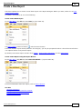
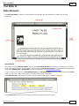
Report Manager User Manual
Copyright © 2008-2012, Better Days Enterprises, LLC.
3213 West Main Street #119
Rapid City, SD 57702-2314
Revision: February 4, 2012
Version: 1.917
CleverQ® Report Manager User Manual
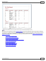
Table of Contents
Introduction ......................................................................................................................... 4
Starting the Report Manager ............................................................................................... 5
Report Manager Concepts................................................................................................... 7
Preferences ...................................................................................................................... 7
Data Sources ................................................................................................................. 10
Access ....................................................................................................................... 11
ODBC ....................................................................................................................... 13
CleverQ ..................................................................................................................... 14
PDC – Preferred Data Source ................................................................................... 15
Report Designs .............................................................................................................. 15
Creating a New Report Design ................................................................................. 17
Editing a Report Design ............................................................................................ 17
Parameters ..................................................................................................................... 18
Data Parameters ........................................................................................................ 18
My Parameters .......................................................................................................... 21
Global Parameters ..................................................................................................... 21
Report Definitions ......................................................................................................... 22
Editing a Report Definition ....................................................................................... 22
Creating a New Report Definition ............................................................................ 23
Categories ..................................................................................................................... 31
Batch Groups ................................................................................................................ 33
Running Reports ............................................................................................................... 35
Manual Selection .......................................................................................................... 35
Report List ................................................................................................................ 35
Report Carousel ........................................................................................................ 39
Report Queue ................................................................................................................ 39
Adding Reports to the Report Queue ........................................................................ 39
Report Queue List ..................................................................................................... 41
Report Queue Calendar ............................................................................................. 42
Report Queue Processing .......................................................................................... 45
Repository ................................................................................................................. 45
Report Design ................................................................................................................... 46
Using the Report Designer ............................................................................................ 46
Special ToolBar Commands ......................................................................................... 48
Save ........................................................................................................................... 48
New ........................................................................................................................... 48
Open a Report ........................................................................................................... 48
Save to File ............................................................................................................... 48
Load Parameters........................................................................................................ 48
Data Connection........................................................................................................ 49
Add Data Source ....................................................................................................... 49
Script to Clipboard .................................................................................................... 49
CleverQ Help ............................................................................................................ 49
Special CleverQ Reports ............................................................................................... 50
CleverQ® Report Manager User Manual
Appendix A - DevExpress End-User Documentation ...................................................... 53
Copyright © 2008-2012, CleverQ
Patent Pending
Designed for use with QuickBooks®
QuickBooks® is a trade mark and service mark of Intuit Inc., registered in the United
States and other countries.
Microsoft Excel® and Microsoft Access® are trademarks and service marks of
Microsoft, registered in the United States and other countries.
®
CleverQ is a trade mark and service mark of CleverQ and Better Days Enterprises, LLC.
CleverQ™ Report Manager User Manual
Introduction
This document is to be used to learn how to use Report Manager Plus both as a user
viewing reports, and also as a user who creates reports. It is highly recommended that
you have previously read all other CleverQ manuals.
Report Manager Plus is a new addition to CleverQ that will eventually replace the
existing Report Manager. Report Manager Plus will be simply referred to within this
document as the Report Manager since it will be the only Report Manager at some point.
The CleverQ Report Manager is a powerful reporting tool that runs as a separate program
and is launched from within CleverQ. The Report Manager is based on the latest
technology available and provides numerous and powerful features as listed below.
Features include:
Create reports from almost any data source including CleverQ QBD files, Microsoft
Access, or any ODBC source including SQL Server, MySQL, Oracle, etc.
Run reports immediately or later based on a scheduled time using a familiar calendar
view (day, week, month, timeline) or a simple list view
Reports can be previewed, printed, or emailed
Reports can be saved in different file formats including: PDF, HTML, MHT, RTF,
TXT, CSV, XLS, XLXS, BMP, EMF, GIF, JPEG, PNG, TIFF, and WMF
Reports can be predefined as a system report or a user report
User reports can be optionally shared among other users
Reports can be categorized based on a system or user defined category
Reports can be grouped so a group of reports can be scheduled with a single selection
All report designs and definitions are stored in a single file so they can easily be
retrieved and managed
Includes user defined report filtering
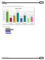
Charts and pivot tables can be included on a report
Reports can include data grouping, sorting, sub-reports, pictures, advanced styles,
summaries, calculated fields, scripting, watermarks, bookmarks, and more
Different reports can be based on different data sources
Reports can be scheduled to run once or in a recurrence pattern (i.e. daily, weekly,
monthly, etc.)
Report designs and definitions can be copied to make new designs or definitions
easily
Browse reports using the unique report carousel
Report output can be saved in a user defined folder or repository
An automatically created HTML home page providing a link to folders and reports in
the repository can be created to provide a static web site of reports.
Reports can be send to an FTP site to be part of a external web site.
Page 4
CleverQ™ Report Manager User Manual
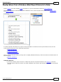
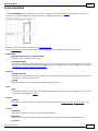
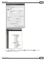
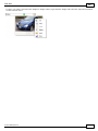
Starting the Report Manager
From CleverQ, the Report Manager can be started from the Navigator, Drop-down menu,
or from within the program when viewing a specific report. This includes the additional
drilldowns from a gauge or a scorecard from a dashboard.
When the Report Manager is started from the Navigator or Drop-down menu, the user
can set a preference to have the opening form be the Report Manager Navigator, a list of
Report Definitions, or the Report Carousel. Refer to a later section about the various
preferences available.
When the Report Manager is started from a gauge drilldown or to display a particular
scorecard, that report is automatically opened in print preview.
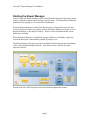
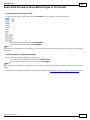
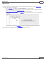
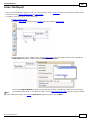
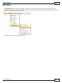
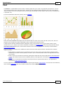
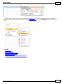
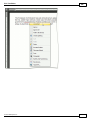
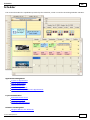
The Report Manager Navigator provides a clickable flowchart showing the relationships
of the various Report Manager elements. Each block can be clicked to open that
particular element.
Details of the use of the Navigator form is described throughout this manual.
Page 5
CleverQ™ Report Manager User Manual
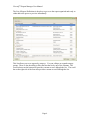
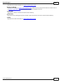
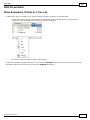
The List of Report Definitions is the place to go to see the report organized and ready to
either add to the queue or preview immediately.
This list allows you to see reports by category. You can collapse or expand category
groups. There is also the ability to filter and sort the list by any of the columns. The
record selector on the bottom left provides a means to move through the list. The scroll
bar on the right side of the form also provides a means to scroll through the list.
Page 6
CleverQ™ Report Manager User Manual
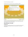
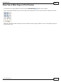
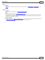
The Report Carousel is a great place to browse report definitions available.
From here you can add a report definition to the queue or preview it directly. You can
click on the form to have the report carousel move, or use the scroll bar on the bottom
right, or the record selectors on the bottom left.
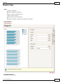
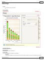
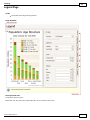
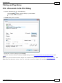
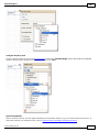
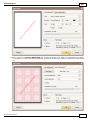
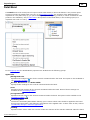
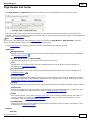
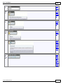
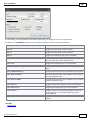
Report Manager Concepts
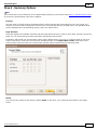
Preferences
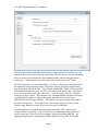
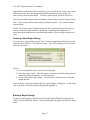
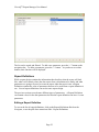
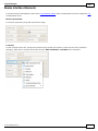
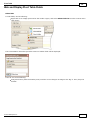
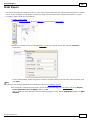
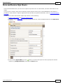
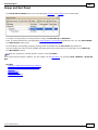
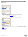
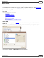
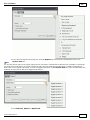
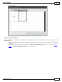
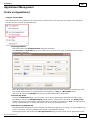
The preferences for the Report Manager can be set by clicking on the Preferences block
on the Navigator or from the Edit – Preferences menu selection. You will see the
following form.
Page 7
CleverQ™ Report Manager User Manual
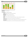
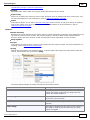
The preferences are organized by the following categories:
Program
Email
FTP
Web
Data
The Program preferences include the starting form, setting the starting month of the
Fiscal Year, and repository location. The starting form preference determines how the
Report Manager will open. The repository location is the default directory on your
computer where reports processed by the Report Manager will be stored.
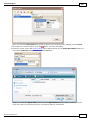
The Email preferences include all the necessary items needed to send emails with reports
as attachments when the Report Manager processes the report queue and the report is
setup to be sent via email.
Page 8
CleverQ™ Report Manager User Manual
The FTP preferences include the required items to send a report file to an FTP site. By
default the files will be sent to the root folder of the FTP site, but you can have subfolders
and you can specify the subfolder as the destination folder when defining the Report
Queue entry. Only reports processed from the queue can be sent to an FTP site.
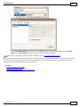
The Web preference to “Create Home Page” if set to yes, will create an index.htm file in
the repository so the repository can be a local static web site for reports and the home
page will contain links to the files. Files indexed include PDF, HTML, HTM, and MHT.
If an IndexMaster.htm file exists, it will be used as part of the Home Page. This allows
you to create a custom home page with a logo. If you do not have this file, a default
home page will be created. The repository may contain subfolders and these are treated
as groups and will appear as a link on the parent index.htm and will open a new
index.htm file created in the subfolder. This allows you to group reports and organize
the static web site more. You might also use this feature to provide security on the
website, using Windows security to give access to users by subfolder.
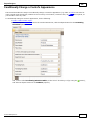
The Data preference is optional and contains the preference “PDC” which means
“Preferred Data Connection”. This is used if you are connecting several reports to a
specific data source, like a SQL Server database, and not the default QBD file. By
changing this preference, report designs with the data source type PDC will use this
Page 9
CleverQ™ Report Manager User Manual
preference. So you can change this preference, and all your PDC reports will be
connected to the data source specified by this connection string rather than the connection
saved with the report design. To set the PDC initially you can start a report design with
the wizard and then click on the Data Connection button. If the report is not connected to
the default QBD file you will be prompted to change it to the QBD file. If you reply
with "No", you will then be prompted to save the connection string in the PDC
preference.
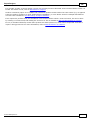
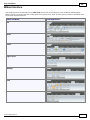
Data Sources
Data Sources within the Report Manager are used for two purposes: (1) To specify a
data source for a report design and (2) to specify a source for creating a list of items to be
used to select parameters for a report.
For example, if a report is to be based on employee data, you might want to specify
where the data is coming from. This can be used as the data source for the report, but
when you want to select a particular employee for a particular report definition, the same
data source can be used to create an “employee” parameter and the dropdown list for the
employee parameter will contain a list of employees to choose from. There will be more
examples of this later.
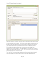
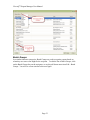
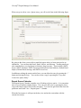
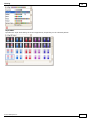
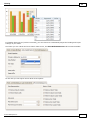
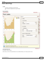
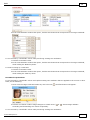
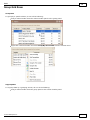
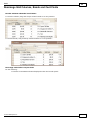
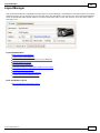
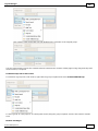
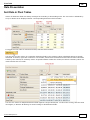
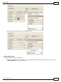
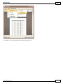
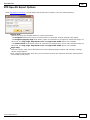
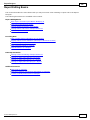
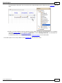
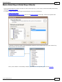
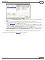
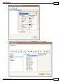
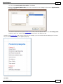
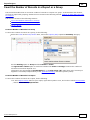
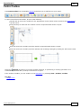
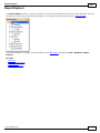
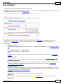
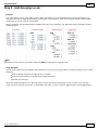
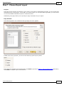
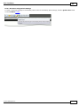
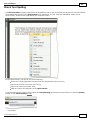
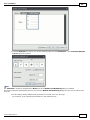
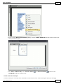
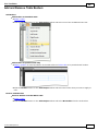
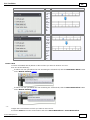
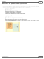
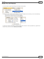
You can see a list of existing data sources by clicking on the Data Sources block on the
Navigator, or choosing the pull down menu item Edit – Data Sources. The list of Data
Sources will be displayed as shown in the next figure.
Page 10
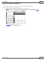
CleverQ™ Report Manager User Manual
With this list you can scroll though the list using the record selectors on the bottom of the
form. This navigation bar contains other buttons as well. Just move your mouse over
the buttons to see what function they perform. You can also delete a data source here by
selecting the data source and then clicking on the “-“ button.
The list can be refreshed with the Refresh button. You would probably use this after
you have edited a source using the “Edit/View Data Source” button and then returned to
this form.
You can copy an existing data source or create a new one using the buttons on the bottom
of the form.
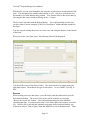
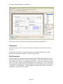
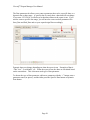
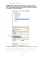
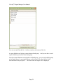
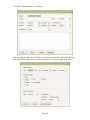
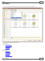
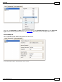
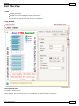
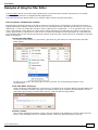
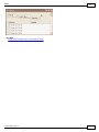
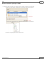
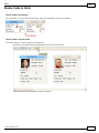
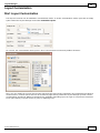
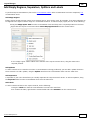
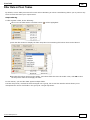
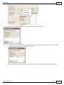
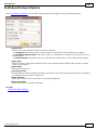
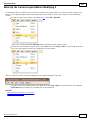
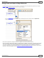
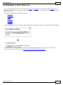
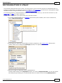
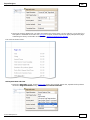
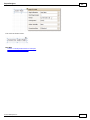
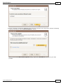
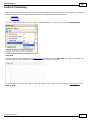
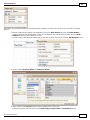
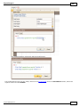
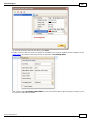
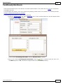
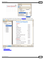
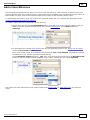
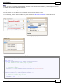
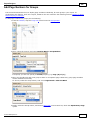
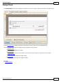
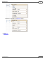
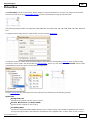
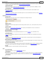
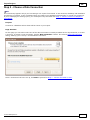
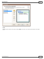
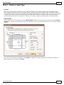
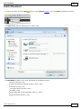
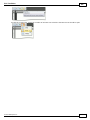
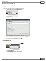
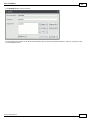
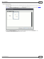
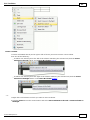
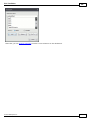
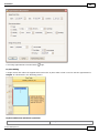
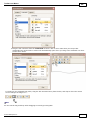
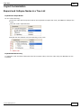
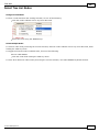
When you create a new data source, the following form will be displayed.
You should first enter a Data Source Name. This name needs to be unique among all
other data sources. Then choose the type of data source: Access, ODBC, CleverQ, or
PDC.
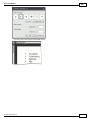
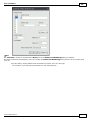
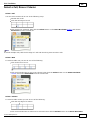
Access
When creating an Access data source, you will need to enter the Microsoft Access file
that contains the data. The Access File text box will be enabled, as well as the
“Browse for Access File” button. Click on this button and point to the MDB file
containing the data. You may need to enter a User Name and/or Password to access this
file. Once the file is selected and optionally user name and/or password entered, you
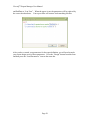
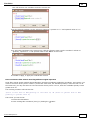
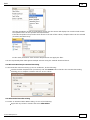
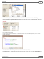
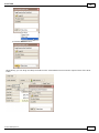
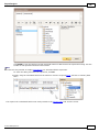
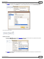
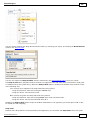
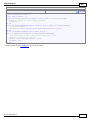
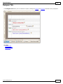
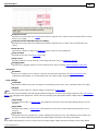
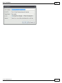
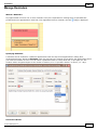
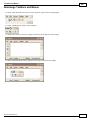
will need to select a Table or Query from that MDB file to use as the data source. There
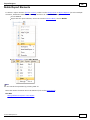
Page 11
CleverQ™ Report Manager User Manual
can be only one table or query per data source, so if there are more than one you need,
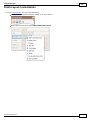
you will need to create more than one data source. Once the table or query is selected,
you can test the connection by using the “Test Select Field Value” dropdown that will
give you a list of the fields or columns in that table or query.
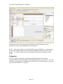
You can also check out the source by pressing the View Data button.
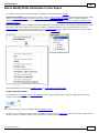
Page 12
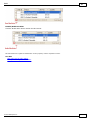
CleverQ™ Report Manager User Manual
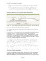
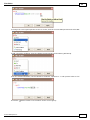
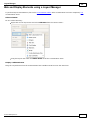
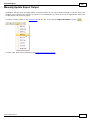
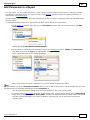
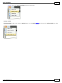
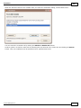
On this form you can sort, filter, and group data. It may appear that you can edit the
data, but the data is read only and will not be written back to the database.
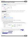
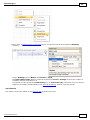
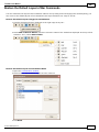
ODBC
The ODBC connection allows you to connect through Open Database Connectivity data
sources setup on your computer. This is done using the Windows Control Panel or
Administrative Tools prior to making the data source in the Report Manager. ODBC
connections provide the ability to connect to Microsoft SQL Server, MySQL, Oracle, or a
variety of other database management systems. There is even an ODBC driver available
for QuickBooks. (Check the Intuit website for more details).
NOTE: If you are using a 64 bit computer, you will need to run the 32 bit ODBC driver
to be compatible with the Report Manager. This can be done by manually running the
odbcad32.exe in the syswow64 directory under Windows.
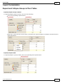
After selecting ODBC as the Data Source Type, the ODBC DSN dropdown will be
populated with the installed ODBC data sources on your machine. Choose the data
source name.
You may need to enter a User Name and/or Password to access this data. Once the DSN
is selected and optionally user name and/or password entered, you will need to select a
Table or View from that database to use as the data source. There can be only one table
or view per data source, so if there are more than one you need, you will need to create
more than one data source. Once the table or view is selected, you can test the
connection by using the “Test Select Field Value” dropdown that will give you a list of
the fields or columns in that table or view.
Page 13
CleverQ™ Report Manager User Manual
You can also check out the source by pressing the View Data button. It may appear that
you can edit the data, but the data is read only and will not be written back to the
database.
CleverQ
The CleverQ Data Source allows you to create a link to the data structures within your
QBD file. Several of them have already been setup for you and you may not need to
create any new sources to the QBD file.
The “Table Query View” called “Extracted_Data” is the link to any data that CleverQ has
extracted. Understanding the structure of this query will help you in creating your own
custom reports based on this data. Refer to the other CleverQ manuals for more
information on this data structure.
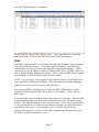
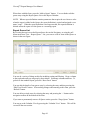
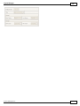
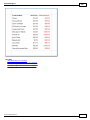
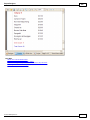
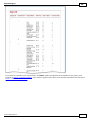
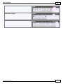
The CleverQ Data Sources pre-configured include:
Page 14
CleverQ™ Report Manager User Manual
Data Source Name
Dashboard Details
Dashboard and Gauges
Filter#
Gauge Definitions
Indicator Category
Indicators
Parameters
Description
This is a complete breakdown of each dashboard, gauge, and
indicator with all the internal properties for all elements.
This is similar to Dashboard Details except the indicator
element and properties are not included.
There are up to 8 filter data sources each listing the values of
the filters based on the extracted data.
This is a breakdown of each gauge and indicator with all the
internal properties of each.
This is a simple list of indicator categories.
This is a list of all indicators and their properties.
This is a list of all parameters and their properties.
PDC – Preferred Data Source
The PDC allows you to connect to a data source using the preference “PDC” as a
connection string. This is an advanced option and like an ODBC connection, allows
ultimate flexibility on connecting to a variety data sources.
Report Designs
A Report Design is defined as all the information that describes what the report will look
like, what it will contain, where the data comes from, and any calculations to be made. It
also contains what parameters are going to be used to create the report when the report is
run.
A Report Design does not contain, the values of any parameters, any data, the destination
of the report, the format of the report (i.e pdf, xls, htm), or when it is going to be run.
The time, destination and format of the report is determined either when a report is
previewed as requested by the user, or when the report is processed by the report queue.
The values of any parameters are determined by the Report Definition which will be
covered in a later section. By not having a Report Design contain these various elements,
it allows one design to be used several times for different purposes. You can use one
report design to display data for last year, and then with a different report definition using
the same report design, you can use it again to display data for this year.
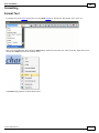
You can access the report designs by clicking on the Report Design block on the
Navigator. Or you can use the pull down menu item File – New Report Design to create
a new one, or use the pull down menu item Edit – Report Designs to select an existing
report design to edit or view. When viewing existing report designs you will see the
following form:
Page 15
CleverQ™ Report Manager User Manual
On this form you will see a list of report designs. The list includes a report design name,
data source type, the user id that created the design, and a checkbox to indicate whether
the design is private to only the user who created it. The Report Manager comes with
some preloaded designs with the user id “system”. You cannot edit these, but you can
copy them and rename them, and modify their design if you want. They are also a good
training aid to see samples and how they are designed. You will see on this list your
report designs as well as any other users designs if they choose not to make them private.
The Data Source Type can be one of the following: CleverQ, PDC, Other. This setting
determines how data sources on reports are handled. For CleverQ reports, the report
design is based on the default QBD file. If the QBD file is moved, the report designs
may be pointing to a QBD file in a different location. This can be fixed for all CleverQ
report designs by using the menu item Tools – Fix CleverQ Report Data Source. If a
report is a PDC type, then when the report is previewed or processed, the data source is
replaced by the connection string in the preference PDC. For “Other” data source types,
no changes are ever made to the data source of the report design.
This list can be sorted and filtered if you want. You can use the navigation bar on the
bottom to scroll through the records as well as delete a design by pressing the “-“ button.
Page 16
CleverQ™ Report Manager User Manual
Other buttons on the bottom of the form allow you to refresh the list, create a new report
definition, preview the report design using default parameters, copy a design, and
edit/view the selected report design. To select a report design, just click on the row.
You can also edit the design name and whether a report design is private directly on this
form. If you want to hide a system report, just make it private. You can also rename
system reports.
NOTE: The system report “Standard Scorecard” has a special name that CleverQ uses
when a scorecard is requested from a dashboard. Renaming this design and it’s
associated report definition will cause that functionality to stop working resulting in an
error.
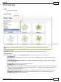
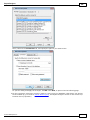
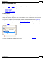
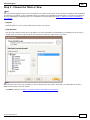
Creating a New Report Design
To create a new report design, use the “New” button from the Report Design List or the
pull down menu item File – New Report Design. You will be prompted to select a data
source for the report.
Choose...
1) for an existing data source you have already defined
2) to use the report wizard. This will require you know the location and associated
information about the database you will connect to.
3) to start with a blank report design. You can choose your data source using the
design interface.
Once you make your select and press OK, the report designer will appear. At this point,
refer to the later section about Report Design and Appendix A.
Editing a Report Design
To edit an existing design, select the report from the Report Design List and press the
“Edit/View Report Design” button. The report designer will appear similar to the figure
below:
Page 17
CleverQ™ Report Manager User Manual
At this point, refer to the later section about Report Design and Appendix A.
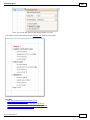
Parameters
NOTE: Parameters within the Report Manager are different from Parameters within
CleverQ.
A Parameter is a means to control what data is processed and displayed on a report.
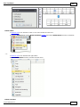
Parameters fall into three categories: Data, My, and Global.
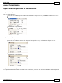
Data Parameters
A Data Parameter is a parameter that is normally used to control the filtering of a report.
It can specify a particular class, employee, data range, etc. These parameters can come
from a data source, a list, or just a single specific value. If they are to come from a data
source or list, you will need to set them up before you can use them. This is done from
the Navigator by clicking on the Parameter block, or from the pull down menu item Edit
– Parameters – Data Parameter. After making this selection you will see a list of data
parameters as shown in the next figure:
Page 18
CleverQ™ Report Manager User Manual
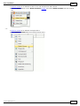
This list shows you the data parameters already created. Several come with the software
initially. Two type of parameters can exist: 1) from a data source, 2) from a list.
A good example of a parameter from a data source is any of the filters associated with
CleverQ data or something like a list of dashboards.
Page 19
CleverQ™ Report Manager User Manual
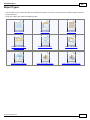
Sample Parameter from a Data Source
Sample Parameter from a List
NOTE: Parameters can be created and edited by any user. Deleting or changing
an existing parameter may affect other user’s report designs and report definitions,
so be careful what you change.
Page 20
CleverQ™ Report Manager User Manual
My Parameters
“My” parameters are those parameters associated with a particular user. These
parameters are only accessible by the user who created them and provides a way to
personalize a report. Typical uses for My parameters include: name, address, phone
numbers, email addresses, etc.
To access the “My” parameters, click on the “My Parameters” block on the Navigator or
use the pull down menu item Edit – Parameters – My Parameters. The following form
will be displayed:
The list can be sorted and filtered. To add a new parameter, press the “+” button on the
navigation bar. To delete a parameter, press the “-“ button. As you hover over other
buttons, their function will be displayed.
Global Parameters
“Global” parameters are those parameters not associated with a particular user. These
parameters are accessible by all users and provides a way to add information to a report
that can be changed in one place. Typical uses for Global parameters include: company
name, company address, phone numbers, etc.
To access the “Global” parameters, click on the “Global Parameters” block on the
Navigator or use the pull down menu item Edit – Parameters – Global Parameters. The
following form will be displayed:
Page 21
CleverQ™ Report Manager User Manual
The list can be sorted and filtered. To add a new parameter, press the “+” button on the
navigation bar. To delete a parameter, press the “-“ button. As you hover over other
buttons, their function will be displayed.
Report Definitions
While a report design contains the information that describes what the report will look
like, what it will contain, where the data comes from, calculations to be made, and what
parameters are going to be used to create the report when the report is run, a Report
Definition contains the value of parameters that are to be used when a report definition is
run. Several report definitions can use the same report design.
The previous section covered some different types of parameters. A Report Definition
can contain values for the data parameters but also the report definition can have it’s own
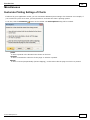
parameters.
Editing a Report Definition
To access the list of report definitions, click on the Report Definitions block on the
Navigator, or use the pull down menu item Edit – Report Definitions.
Page 22
CleverQ™ Report Manager User Manual
Creating a New Report Definition
To add a new Report Definition, use the pull down menu item File – New Report
Definition, or press the “+” button on the Report Definition List. If you use the Report
Definition List, you will need to refresh the list before you can “Edit/View” the
definition.
On this list you can sort, filter, and group by any of the columns. You can edit the
definition name and titles. The Navigation bar on the bottom of the list allows you to
move through the definitions as well as add or delete definitions.
Other buttons on the bottom of the form provide the ability to refresh the list, copy an
existing definition, edit/view the definition, or preview the report. Select the report
definition first before copying, editing, or previewing the report.
Report definitions are associated with the user id that created the definition. The Report
Manager comes with some preloaded definitions with the user id “system”. You cannot
edit these, but you can copy them and rename them, and modify them if you want. They
are also a good training aid to see samples and how they are designed. You will see on
this list your report definitions as well as any other users definitions if they choose not to
make private.
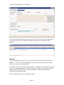
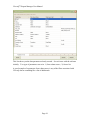
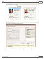
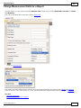
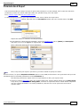
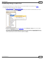
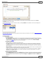
When you select to “Edit/View” a report definition you will see the following form:
Page 23
CleverQ™ Report Manager User Manual
This form contains two sections: on the top portion is the main part of the form contains
the main elements of the definition. This includes a name, optional description, user id,
private checkbox, what report design is associated with this definition, title1 and title2.
The Custom Filter checkbox is for advanced users and we will ignore that for now.
When adding a new report definition, you can choose your report design from a
dropdown list of available designs. If the report design is your design, you can also go
right into the report designer from here. NOTE: This is necessary in order to add report
definition parameters to your report design.
Title 1 and Title 2 are optional report definition specific parameters that can be part of
your report design so you can add specific titles to your report depending on the
Page 24
CleverQ™ Report Manager User Manual
definition that is being processed. This makes it even more flexible when reusing report
designs.
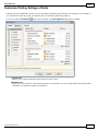
The bottom portion of the form contains multiple tabs and provides a way to associate the
report definition with Report Categories and Batch Groups. More about that later.
There is also a tab for Parameters and here you can specify the parameters that you will
use to control what data is contained on a report. Parameters fall into four(4) types:
Data, Text, Numeric, and Date. There is no limit to the number of parameters you can
have with a report.
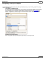
Note: If you leave a value blank for the Data, Text, Numeric, or Date parameters, the
user will be prompted for a value when the report is previewed or added to the queue.
For date parameters, a blank value will popup a calendar to enter a specific data. If you
set the date parameter value to “Choose Specific”, the same thing will occur; a popup
calendar will appear allowing you to specify a specific date. If you want to enter a
specific data range, you should have two parameters, one for the start date and one for the
end date, and set the filter in the report design accordingly. You can also set the date
parameter value to “Choose Dynamic”, and a list of date options will appear so the user
can choose something like ‘This Year’.
Data Parameters have already been discussed and here you can choose to include those
parameters needed for this report definition. In the previous figure, you see the
Parameter Name “Dashboard”. The parameter name column contains a dropdown list of
parameters previously defined. The Operator column will normally just contain an “=”.
The value column will contain a dropdown of values either from the data source or from
the list. In this example, we are able to pull a list of dashboards and select one.
The Text , Numeric, and Date parameter tabs are for report definition specific parameters.
You enter a parameter name, and value. There are no pull-down lists for either parameter
name or value for Text or Numeric types since these are created here and again are
specific to the report definition. The operator is always “=”. (When you use custom
filters, you can use an operator other than = ).
Page 25
CleverQ™ Report Manager User Manual
The Date parameter tab allows you to enter a parameter that can be a specific date, or a
dynamic date or date range. A specific date is exactly that, a date that will not change.
If you enter 12/31/2010, it will always be that date whenever the report is run. If you
need to create a specific date range, you will need to create two date parameters like
Start_Date and End_Date and set your report design filter accordingly.
Dynamic dates can change depending on when the report is run. Examples of that is
“This Year”, “Last Month”, etc. When the report is run, the dates are calculated based
on the current date. This is the most used type of date parameter.
To choose the type of date parameter, add a new parameter with the “+” button, enter a
parameter name (no spaces), and the either press the Specific Date button or Dynamic
Date button.
Page 26
CleverQ™ Report Manager User Manual
Page 27
CleverQ™ Report Manager User Manual
Warning: The date parameters are unique in that they can be a date or a string value.
An absolute date is a real date type, but a dynamic date like “Last Month” is a string
value. When including a date parameter in your report design, you must be careful that
the parameter type is specified appropriately.
Another issue with dynamic dates is sometimes they can be a single date (e.g. Yesterday)
and other times they can be date ranges (e.g. Last Year). You must setup your report
design filters and cqControls appropriately so the date parameters will work. There are
two special parameter names you can use that will convert the string date ranges to
absolute date types: StartDate and EndDate. So, for example you want to extract data
for last year and use the dynamic date range “Last Year”. Set two parameters StartDate
Page 28
CleverQ™ Report Manager User Manual
and EndDate to “Last Year”. When the report is run, the parameters will be replaced by
the correct absolute dates. Your report filter will want to look something like this.
After you have created your parameters for the report definition, you will need to make
your report design aware of these parameters. Press the “Design” button from this form
and then press the “Load Parameters” item on the menu bar.
Page 29
CleverQ™ Report Manager User Manual
Now you can specify a report filter using these parameters. Don’t forget to save your
report design after loading the parameters.
Page 30
CleverQ™ Report Manager User Manual
The parameter list in the report design will include your Global Parameters, My
Parameters, and any report definition specific parameters.
NOTE: Since report designs are shared by different report definitions, it is important to
be consistent with parameter name between report definitions that use the same report
design. It is easier to define one report definition and copy it when sharing a report
design.
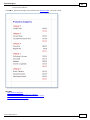
Categories
You saw Categories mentioned on the Report Definition Details form already.
Categories allow you to group reports when displaying them for user selection. You can
edit the list of Categories by clicking on the Categories box on the Navigator, or by using
the pull down menu Edit – Categories.
Page 31
CleverQ™ Report Manager User Manual
You can sort and filter this list. To add a new entry, simply add it to the bottom of the
list.
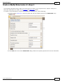
The next figure shows how categories are used to organize the list of report definitions.
This list is displayed by clicking on the top icon on the Reports block of the navigator or
using the pull down menu item View - Reports – List.
A single report definition can show up under any number of categories.
Page 32
CleverQ™ Report Manager User Manual
Batch Groups
In a similar fashion to categories, Batch Groups are used to organize reports based on
when they are run or who might be the recipient. To edit the list of Batch Groups, click
on the Batch Groups box on the navigator, or use the pull down menu item Edit – Batch
Groups. You will see a form similar to the next figure.
Page 33
CleverQ™ Report Manager User Manual
You can sort and filter this list. Add new entries to the bottom of the list.
A report definition can belong to more than one batch group. And you can have several
report definitions part of the same batch group.
Once the report definitions are assigned to the batch group, you can easily add the group
to the Report Queue by pressing the button on the bottom of the form labeled “Add
Selected Batch Group to Queue”. The form in the next figure will be displayed.
Page 34
CleverQ™ Report Manager User Manual
Refer to the section on the Report Queue for more information about this form.
Running Reports
When you run a report, you are actually running a Report Definition. Report Definitions
can be run in three ways:
1. A specific report definition can be run from within CleverQ either by choosing a
Scorecard from a Dashboard selection, or from an additional gauge drilldown.
2. You can select a report definition to run manually from the Report List or Report
Carousel within the Report Manager.
3. You can add a report definition to run to the Report Queue to run at a later time.
Running reports from within CleverQ will not be covered in this manual. Refer to other
user manuals for more information.
Manual Selection
To select a report to run, you will either use the Report List or the Report Carousel. They
each have their advantages that will be covered in the next subsections. You can also set
your starting form to be either of these form rather than the Navigator.
Report List
To bring up the Report List, click on the top icon on the Reports block on the Navigator
or use the pull down menu item View – Reports – List.
Page 35
CleverQ™ Report Manager User Manual
The advantage of this form is you can see the reports grouped, you can sort and you can
filter. You can also reorganize the list by dragging columns. In the next figure you can
see the User ID was swapped for Groups and now you can see report definitions by User
ID.
Page 36
CleverQ™ Report Manager User Manual
To run a report, select a report by clicking on a row, and press the “Preview” button.
The preview window will appear and it may take a minute or two for the report to be
processed. Be patient.
Page 37
CleverQ™ Report Manager User Manual
From the Preview window, you can view the report, print the report, export it, email it, as
well as several other functions. Refer to Appendix A for more details about the Preview
window.
Page 38
CleverQ™ Report Manager User Manual
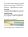
Report Carousel
To open the Report Carousel, click on the bottom icon in the Reports Block on the
Navigator or use the pull down menu item View – Reports – Carousel.
The Report Carousel provides a nice way to browse reports. The key here is the entire
description can be seen to assist the user in understanding the reports. You can click on
the form to have the report carousel move, or use the scroll bar on the bottom right, or the
record selectors on the bottom left.
To run a report, press the “Preview” button.
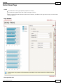
Report Queue
The purpose of the Report Queue is to have the Report Manager process the report at a
specified time, and set the destination for the report. You can schedule the report to run
periodically, set the format, and location, and email recipient as well.
Adding Reports to the Report Queue
To add a report to the Report Queue, you can do it from one of three places:
1) From the Report List where you manually select one report to add to the queue
Page 39
CleverQ™ Report Manager User Manual
2) From the Report Carousel where you manually select one report to add to the
queue.
3) From the Batch Group list where you select a Batch Group and add several
reports to the report queue at the same time. This can be opened from the
navigator or from the pull down menu item Tools – Add Batch Group to Queue.
From either of these sources, you will get the following form displayed:
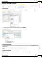
On this form, you can specify the date and time for the report to run. The form will open
with the data and time set for 3 minutes from the current time.
You can specify a priority which will be used only if more than one report has the same
date and time.
If you are going to save the report to a file, you can optionally include a date time stamp
as part of the filename. If you do include the date time stamp, files will not be
overwritten and you can accumulate a history of reports. Without the data time stamp,
the files will be overwritten and this is useful if you establish a shortcut to the file and
want to shortcut to work all the time. Or, if you are creating web pages that are part of a
website, you will need to maintain the same filename.
You can check off “Send to FTP site into Destination Folder”. If you have correctly
setup the FTP preferences, the report will be saved to the local repository first, then
uploaded to the FTP site. If the FTP site has subfolders, you can direct the file to the
subfolder by including the subfolder name in the Destination Folder text box.
There are a number of formats available including PDF, HTML(single),
HTML(Multiple), MHT, RTF, TXT, CSV, XLS, XLXS, BMP, EMF, GIF, JPEG, PNG,
TIFF, and WMF.
If you specify “Printer” as the format, then use the dropdown list to select a printer. The
Copies field is used only for the Printer.
If you specify a format that is not the “Printer”, the file will be saved in the Destination
Folder which defaults to the preference setup on the Preferences form. But you can
change this location for any file and the Browse button can be used to select the location.
Page 40
CleverQ™ Report Manager User Manual
When done with this form, press the “Add to Queue” button. You can further edit the
queue entry using the Report Queue List or the Report Calendar.
NOTE: When a report definition contains parameters that require the use choose a value
when the report is added to the Queue, the report definition is copied and assigned a user
name “temp”. When the report definition is no longer needed, the report definition is
deleted unless the report is in the Queue as a recurring report.
Report Queue List
By Pressing the top icon on the Report Queue box on the Navigator, or using the pull
down menu item View – Report Queue – List, you can see a list of items in the Queue as
shown in the next figure.
You can do a variety of things on this list including sorting and filtering. Drag a column
to the top header and you can group by that column. Rearrange columns and more. To
go back to the standard layout, press the “Reset Form” button.
You can edit the details of any queue entry by selecting the entry and then pressing the
“Edit/View Details” button. After making changes and returning to this form, press the
“Refresh” button.
You can delete a single entry by selecting the entry and pressing the “-“ button on the
navigation toolbar on the bottom of the form.
If you want to permanently remove all Queue entries, press the “Purge Queue” button.
You can go to the Calendar View by pressing the “Calendar View” button. This will be
covered in the next section.
Page 41
CleverQ™ Report Manager User Manual
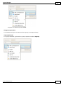
When you go to edit or view a Queue entry, you will see the form in the following figure.
By going to this form, you are able to email the report after it as been processed as an
attachment. You can enter the Email, Email, Subject, and Message. Sending emails are
also controlled by a set of preferences which are setup one time. These include: SMTP
Server, SMTP Username, SMTP Password, Default From Email Address, Default Email
Subject, Default Email message, and SMTP Server Port.
In addition to editing the entries on this form, you can delete the entry by pressing the “-”
button and closing the form. You can also create a copy by pressing the “Copy and
Create New Queue Entry”.
Report Queue Calendar
The Report Queue Calendar is another way of looking at Queue entries. It is convenient
since it uses a familiar calendar format. You can get to this view by pressing the lower
icon on the Report Queue block in the Navigator. You can also get to this form from the
pull down menu item View – Report Queue – Calendar.
When the form opens, it will open in the day view and on the current date with the
current time on top.
Page 42
CleverQ™ Report Manager User Manual
You can go to different days by using the monthly calendar on the top right of the screen.
By right mouse clicking on various elements you can change the view, timescale, edit
entries, etc.
There are views by day, week, workweek, month, and timeline.
By right mouse clicking on an individual entry and selecting “Open”, you have the ability
to change the time and also set the Recurrence of the report. This is the only way you
can set reports to recur.
Page 43
CleverQ™ Report Manager User Manual
After pressing the “Recurrence” button you will get the form in the next figure and you
have all kinds of options for the recurrence pattern as well as the range of recurrence.
Page 44
CleverQ™ Report Manager User Manual
Report Queue Processing
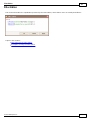
In order for the reports to be processed in the Queue, you will need to start the Report
Processor. This is done from either clicking on the block on the Navigator labeled “Start
Report Processor” or by using the pull down menu item Tools – Process Queue. When
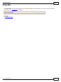
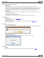
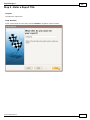
you do this you will see this message...
The message says that as long as the Report Manager is opened, the queue will be
processed. But normally you will want to run a series of reports after hours and this
requires starting the Report Processor automatically. This is done using the Windows
Task Scheduler. The Report Manager has automatically created a batch job file as listed
in the message box and pasted the name of the file to the clipboard for creating a
scheduled task using Windows.
Since there are so many different versions of Windows now and each has it’s own
interface, the details of how to do this is not covered here. You can refer to numerous
online references about Scheduled Tasks.
For Windows XP Users press the Start button, All Programs, Accessories, System Tools,
and Scheduled Tasks.
You should set the task to only run for a period of time sufficient to process all your
reports. It is suggested that you run the reports at night either before or after backups are
done. For example, backups are run at 1am and usually run for 1 hour. Start the Report
Processor after at 2:30am and let it run for 3 hours. Then schedule all your reports to run
between 2:30am and 5:30am.
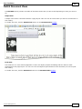
Repository
The Repository is the default location where reports are saved after being processed by
the Report Processor. The repository is set using the Report Manager preferences form
as previously discussed.
To access the Repository, click on the Repository block on the Navigator or choose the
pull down item View – Repository.
If you set the web preference “Create Home Page” to yes, an index.htm file in the
repository is created so the repository can be a local static web site for reports and the
Page 45
CleverQ™ Report Manager User Manual
home page will contain links to the files. Files indexed include PDF, HTML, HTM, and
MHT. If an IndexMaster.htm file exists, it will be used as part of the Home Page. This
allows you to create a custom home page with a logo. If you do not have this file, a
default home page will be created. The repository may contain subfolders and these are
treated as groups and will appear as a link on the parent index.htm and will open a new
index.htm file created in the subfolder. This allows you to group reports and organize
the static web site more. You might also use this feature to provide security on the
website, using Windows security to give access to users by subfolder.
Report Design
If you will be creating new reports or modifying existing reports, you will use the Report
Designer. The concepts regarding Report Designs was covered in an earlier section and
it is suggested that you review this section again. In this section, more details about
report design will be covered.
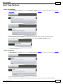
Using the Report Designer
Each report design must have a data source. You can establish this ahead of time, or
create a data source directly from within the Report Designer. For reports that are based
on the CleverQ QBD file, which is the default for all system reports included with the
software, the data source should be established ahead of time using the Data Sources
functionality of the Report Manager.
Warning! If you move your CleverQ QBD file from one location to another, the report
designs will be pointing to the previous location. In order to fix this, choose the pull
down menu item Tools – Fix CleverQ Report Data Source.
When you create a new report design, using either the “New” button from the Report
Design List or the pull down menu item File – New Report Design, you will be prompted
to select a data source for the report.
Page 46
CleverQ™ Report Manager User Manual
Choose...
1) for an existing data source you have already defined. This selection is necessary
if you are going to use your CleverQ QBD file as the source.
2) to use the report wizard. This will require you know the location and associated
information about the database you will connect to.
3) to start with a blank report design. You can choose your data source using the
design interface.
Selecting 2 or 3 are used when you are connecting to a data source external to the
CleverQ QBD file.
Once you make your select and press OK, the report designer will appear.
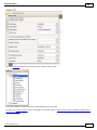
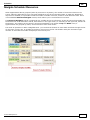
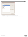
When you are in the Report Designer, to view the data source or add a new one if you
choose option 3 above, click on the top left corner in the design layout area as shown in
the next figure.
Page 47
CleverQ™ Report Manager User Manual
The name of the Data Source is arbitrary and if you created the report from an existing
data source, this will automatically be named as will the Data Member and Data Adapter.
The “Filter String” will be where you enter the filter that will tie parameters to data and
filter what data shows up on the report. More about that later.
On the Right side of the screen, click on the tab “Field List”. This will show you the
fields contained in the data source. You can simple drag these fields right onto the report
layout.
The details of actually creating a report layout and using the various controls are
contained in Appendix A of this user manual.
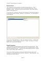
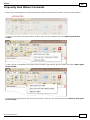
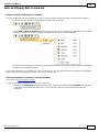
Special ToolBar Commands
There is a special toolbar within the Report Designer that is unique to the Report
Manager.
Save
Press this button to save your report design. Your report design will be saved in the
connected QBD file you are using.
New
Create a new blank report. This is only used if you are going to create a new report and
not save it in the connected QBD file, but rather to an external file.
Open a Report
To open a report design saved to an external file, click on this button.
Save to File
Most of the time, you will save your report to the connected QBD file using the Save
button previously described. This is necessary to utilize the report design with report
definitions and being able to run the report from the Report Manager. But, if you want
save a report to an external file to transfer to another QBD file, the “Save to File” button
is the method to save the report design to an external file.
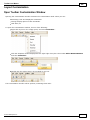
Load Parameters
To make a report design aware of the parameters associated with the report definition,
you need to open the report design from the Report Definition Detail form and then press
this button. The parameters should then show up on the Field List tab.
Page 48
CleverQ™ Report Manager User Manual
Data Connection
Use this button to check the data connection to your current QBD file. If the report is to
an external data source, do not press this button.
Add Data Source
You can add multiple data sources to a report. This is useful if you have several pivot
tables or charts on a single report and each will have a different data source.
Script to Clipboard
If you are going to use the CleverQ Analytical Calculation Engine (ACE) to feed
information into your report, you will need to add one or more scripts to the report.
Pressing this button copies the standard script to the clipboard so you can paste it
appropriately into your reports scripts. More about that later.
CleverQ Help
If you are going to use the CleverQ Analytical Calculation Engine (ACE) to feed
information into your report, this button will bring up some good information to allow
you to add controls to your report linked to ACE.
Page 49
CleverQ™ Report Manager User Manual
Special CleverQ Reports
As previously mentioned, report designs can be connected to external data sources as
well as the linked CleverQ Data File. If your report is based on data in the linked
CleverQ data file, you would have already established a data source within the Report
Manager. That data source might include some already defined system sources having
to do with parameters, indicators, gauges, or dashboards. You might also connect to a
data source internal to the linked CleverQ QBD file that contains the extracted data.
If you need to use the CleverQ Analytical Calculation Engine (ACE) to feed information
into your report, some special items need to be done.
1. Controls need to be added to the report layout with special names
depending on the inputs and outputs required for ACE
2. One or more scripts need to be added to the report to cause ACE to
process the report
At any time, you can press the CleverQ Help button to see help similar to the following
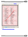
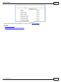
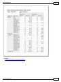
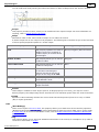
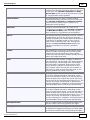
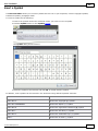
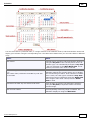
table which is a reference guide to the ACE controls.
ACE is used in one of three modes:
1. Calculate a formula only
2. Return the value of an Indicator and the Indicator’s properties
3. Return the image of a Gauge and the Gauge’s properties
Controls (Labels) are placed on a report and named as shown in the following table
below. Bold blue items are required depending on the mode (Formula only, Indicator,
Gauge), Light blue items are optional. Blue items need to be set to a value either
directly, or bound to a data source or parameter. When a report is printed, the items
listed in the table in black can be displayed on the report in a label control or other
specific control as noted.
Page 50
CleverQ™ Report Manager User Manual
Formula Only
Element
Indicator
Gauge
cqGauge
cqGaugeID
cqIndicator
Notes
Gauge Name
Indicator Name
cqFormula
cqInitialDateRange
cqLockDateRange
Dates
cqDefaultDateRange
cqDateRange
Data
Type
Filters
cqIndDateRange
cqDateRange
cqDateRange
cqIndDataType
cqDataType
cqFilters
cqFilter#
cqDataType
cqIndFilters
cqFilters
cqFilter#
cqValue
cqValueFormatted
cqValue
cqValueFormatted
cqChart
cqDisplayFilters
cqError
cqChart
cqDisplayFilters
cqError
cqDesiredHigh
cqDesiredHighDef
cqDesiredHighFormatted
cqDesiredLow
cqDesiredLowDef
cqDesiredLowFormatted
cqFormula
cqIcon
cqIcon1
cqIcon2
cqIcon3
cqKeyIndicator
cqMaxValue
cqMaxValueDef
cqMaxValueFormatted
cqMedian
cqMedianDef
cqMedianFormatted
cqMinValue
cqMinValueDef
cqMinValueFormatted
cqNote
cqBenchmark
Links Indicator to Gauge
cqDataType
cqGaugeFilters
cqDashboardFilters
cqFilters
cqFilter#
cqGaugeImage
Results
Gauge Defaults
Dashboard Default Date
Range
Links Date Range to
Gauge
Page 51
cqDisplayFilters
cqError
cqIndDateRange
cqIndDataType
cqIndFilters
cqGaugeName
cqDisplayDateRange
cqGaugeTypeName
Use Picture Box Control
Use Chart Control
Displays errors
CleverQ™ Report Manager User Manual
Formula Only
Indicator
Gauge
cqBenchmarkDef
cqBenchmarkFormatted
cqTip
cqTip1
cqTip2
cqTip3
cqValue1
cqValue1Def
cqValue1Formatted
cqValue2
cqValue2Def
cqValue2Formatted
cqColor (auto applied to border of cqIcon)
cqColor1
cqColor2
cqColor3
Notes
Items underlined must have a 'BeforePrint' script that calls ACE. The "Script to
Clipboard" button will assist with the necessary code. If a report band is passed, then
output only goes to the band controls and inputs will come from band controls first and
then if necessary other controls on the report.
You access the scripts by pressing the scripts button on the bottom of the layout window.
Choose the control and the “Before Print” event. The highlighted text is the text that is
pasted after you press the “Script to Clipboard” button.
Page 52
CleverQ™ Report Manager User Manual
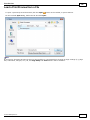
Appendix A - DevExpress End-User Documentation
The following section is provided by Developer Express and describes in detail the use of
the various Report Manager Elements including Charts, Filter Editor, Grid, Pivot Table,
Print Preview, and Report Designer.
Page 53
Contents
1
Table of Contents
Interface Elements for Windows (Home Page)
Charting ................................................................................................................................................. 9
Chart Wizard
........................................................................................................................................................................................... 10
Chart Type..................................................................................................................................................................................
Page
12
Appearance
..................................................................................................................................................................................
Page
13
Series Page
.................................................................................................................................................................................. 15
Data Page .................................................................................................................................................................................. 17
Chart Page.................................................................................................................................................................................. 21
Diagram Page
.................................................................................................................................................................................. 23
Panes Page.................................................................................................................................................................................. 25
Axes Page .................................................................................................................................................................................. 27
Series View
..................................................................................................................................................................................
s Page
29
Point Labels
..................................................................................................................................................................................
Page
31
Chart Titles..................................................................................................................................................................................
Page
33
Legend Page
.................................................................................................................................................................................. 35
Annotations
..................................................................................................................................................................................
Page
37
Select Chart
...........................................................................................................................................................................................
Elem ents
39
Zoom a Chart
........................................................................................................................................................................................... 41
Scroll a Chart
........................................................................................................................................................................................... 42
Rotate a Chart
........................................................................................................................................................................................... 43
Editors ................................................................................................................................................. 44
Working w ...........................................................................................................................................................................................
ith Dropdow n Editors
45
Editing Values,
...........................................................................................................................................................................................
Selecting Text and Using the Clipboard
46
Editor Context
...........................................................................................................................................................................................
Menu
48
Expression
.................................................................................................................................................
Editor
49
Expression...........................................................................................................................................................................................
Operators, Functions and Constants
51
Filter Editor
................................................................................................................................................. 57
Filter Data via
...........................................................................................................................................................................................
the Filter Editor
58
Exam ples of
...........................................................................................................................................................................................
Using the Filter Editor
61
Grid
................................................................................................................................................. 68
Data Editing........................................................................................................................................................................................... 69
Add and Delete
..................................................................................................................................................................................
Grid Records
69
Edit Grid Cells
.................................................................................................................................................................................. 70
Data Presentation
........................................................................................................................................................................................... 72
Sort Grid Row
..................................................................................................................................................................................
s
72
Group Grid..................................................................................................................................................................................
Row s
75
Filter Grid Data
.................................................................................................................................................................................. 78
Show Sum..................................................................................................................................................................................
m aries (Totals) in Grids
82
Layout Custom
...........................................................................................................................................................................................
ization
83
Expand and..................................................................................................................................................................................
Collapse Row s and Cards in Grids
83
Hide and Display
..................................................................................................................................................................................
Grid Colum ns, Bands and Card Fields
85
Rearrange ..................................................................................................................................................................................
Grid Colum ns, Bands and Card Fields
89
Resize Cards
..................................................................................................................................................................................
in Grids
91
Resize Grid..................................................................................................................................................................................
Colum ns, Bands and Card Fields
93
Selection and
...........................................................................................................................................................................................
Navigation
95
Locate Grid..................................................................................................................................................................................
Records
95
Navigate Through
..................................................................................................................................................................................
Grid Records
96
Select Grid..................................................................................................................................................................................
Row s and Cards
97
© 2011 DevExpress Inc.
1
Contents
2
Layout Manager
................................................................................................................................................. 98
Layout Custom
...........................................................................................................................................................................................
ization
99
Start Layout
..................................................................................................................................................................................
Custom ization
99
Finish Layout
..................................................................................................................................................................................
Custom ization
100
Hide and Display
..................................................................................................................................................................................
Elem ents using a Layout Manager
101
Change Elem
..................................................................................................................................................................................
ent Layout
102
Resize Interface
..................................................................................................................................................................................
Elem ents
103
Add Em pty
..................................................................................................................................................................................
Regions, Separators, Splitters and Labels
104
Change Text
..................................................................................................................................................................................
Label Options
105
Work w ith..................................................................................................................................................................................
Interface Elem ent Groups
106
Create and
..................................................................................................................................................................................
Delete Tabbed Groups
108
Save and Restore
...........................................................................................................................................................................................
Layout
112
Save and Restore
..................................................................................................................................................................................
Interface Layout
112
Navigation
.................................................................................................................................................
Bars
113
Navigation...........................................................................................................................................................................................
Pane
114
Navigation...........................................................................................................................................................................................
Bar
117
Pivot Table
................................................................................................................................................. 119
Data Editing
........................................................................................................................................................................................... 120
Edit Data in
..................................................................................................................................................................................
Pivot Tables
120
Data Presentation
........................................................................................................................................................................................... 122
Sort Data in
..................................................................................................................................................................................
Pivot Tables
122
Filter Data..................................................................................................................................................................................
in Pivot Tables
123
Layout Custom
...........................................................................................................................................................................................
ization
126
Expand and
..................................................................................................................................................................................
Collapse Groups in Pivot Tables
126
Hide and Display
..................................................................................................................................................................................
Pivot Table Fields
127
Reorder Pivot
..................................................................................................................................................................................
Table Fields
131
Selection ...........................................................................................................................................................................................
and Navigation
132
Select Cells
..................................................................................................................................................................................
in Pivot Tables
132
Print Preview
................................................................................................................................................. 134
File Managem
...........................................................................................................................................................................................
ent
137
Save a Print
..................................................................................................................................................................................
Preview to a File
137
Load a Print
..................................................................................................................................................................................
Preview from a File
138
Printing and
...........................................................................................................................................................................................
Page Setup
139
Print a Docum
..................................................................................................................................................................................
ent via the Print Dialog
139
Print a Docum
..................................................................................................................................................................................
ent Using Default Settings
140
Change Printing
..................................................................................................................................................................................
Settings via the Page Setup Dialog
141
Specify Page
..................................................................................................................................................................................
Margins in Print Preview
142
Headers and
...........................................................................................................................................................................................
Footers
143
Insert Page
..................................................................................................................................................................................
Header and Page Footer into Printed Docum ents
143
Insert Page
..................................................................................................................................................................................
Num bers into Printed Docum ents
144
Insert Date
..................................................................................................................................................................................
and Tim e into Printed Docum ents
145
Insert the..................................................................................................................................................................................
User Nam e into Printed Docum ents
146
Insert a Logo
..................................................................................................................................................................................
into Printed Docum ents
147
Scaling ........................................................................................................................................................................................... 148
Scale Print
..................................................................................................................................................................................
Preview by Entering a Zoom Factor
148
Scale Print
..................................................................................................................................................................................
Preview by Specifying Width in Pages
149
Zoom ing ........................................................................................................................................................................................... 150
Zoom Print
..................................................................................................................................................................................
Preview In or Out
150
Zoom Print
..................................................................................................................................................................................
Preview by Entering a Zoom Factor
151
Zoom Print
..................................................................................................................................................................................
Preview to Show Whole Pages or Fit Content
152
Show Tw o
..................................................................................................................................................................................
or More Pages in Print Preview
153
View ing and
...........................................................................................................................................................................................
Navigating
154
Navigate Betw
..................................................................................................................................................................................
een Pages in Print Preview
154
Use the Hand
..................................................................................................................................................................................
Tool in Print Preview
155
© 2011 DevExpress Inc.
2
Contents
3
Navigate in
..................................................................................................................................................................................
Print Preview Using Bookm arks
156
Search for..................................................................................................................................................................................
a Specific Text in Print Preview
157
Sw itch Print
..................................................................................................................................................................................
Preview Display Mode
158
Waterm ark
...........................................................................................................................................................................................
and Background
160
Change Waterm
..................................................................................................................................................................................
ark and Background Settings in Print Preview
160
Rem ove a..................................................................................................................................................................................
Waterm ark in Print Preview
163
Exporting........................................................................................................................................................................................... 164
Exporting..................................................................................................................................................................................
from Print Preview
164
PDF-Specific
..................................................................................................................................................................................
Export Options
166
HTML-Specific
..................................................................................................................................................................................
Export Options
168
MHT-Specific
..................................................................................................................................................................................
Export Options
169
RTF-Specific
..................................................................................................................................................................................
Export Options
170
XLS-Specific
..................................................................................................................................................................................
Export Options
171
XLSX-Specific
..................................................................................................................................................................................
Export Options
172
CSV-Specific
..................................................................................................................................................................................
Export Options
173
TXT-Specific
..................................................................................................................................................................................
Export Options
174
Im age-Specific
..................................................................................................................................................................................
Export Options
175
Passing Param
...........................................................................................................................................................................................
eters
176
Miscellaneous
........................................................................................................................................................................................... 177
Custom ize
..................................................................................................................................................................................
Printing Settings of Charts
177
Custom ize
..................................................................................................................................................................................
Printing Settings of Grids
178
Custom ize
..................................................................................................................................................................................
Printing Settings of Pivot Tables
179
Custom ize
..................................................................................................................................................................................
Printing Settings of Tree View s
180
Warnings ...........................................................................................................................................................................................
and Error Messages
181
Report Designer
................................................................................................................................................. 182
Report Editing
...........................................................................................................................................................................................
Basics
183
Back Up the
..................................................................................................................................................................................
Current Layout Before Modifying It
184
Manually Update
..................................................................................................................................................................................
Report Output
185
Change Elem
..................................................................................................................................................................................
ent Layout in Your Report
186
Change Fonts
..................................................................................................................................................................................
and Colors of Report Elem ents
187
Delete Report
..................................................................................................................................................................................
Elem ents
188
Add or Modify
..................................................................................................................................................................................
Static Inform ation in Your Report
189
Display Values
..................................................................................................................................................................................
from a Database (Bind Report Elem ents to Data)
192
Use Mail Merge
..................................................................................................................................................................................
in Report Elem ents
196
Add Calculated
..................................................................................................................................................................................
Fields to a Report
197
Add Param
..................................................................................................................................................................................
eters to a Report
200
Change Value
..................................................................................................................................................................................
Form atting of Report Elem ents
203
Change or..................................................................................................................................................................................
Apply Data Sorting to a Report
204
Change or..................................................................................................................................................................................
Apply Data Filtering to a Report
206
Change or..................................................................................................................................................................................
Apply Data Grouping to a Report
208
Add Totals
..................................................................................................................................................................................
to a Report
211
Add Page ..................................................................................................................................................................................
Num bers and System Inform ation to a Report
214
Create or ..................................................................................................................................................................................
Modify Waterm arks of a Report
218
Create Reports
........................................................................................................................................................................................... 221
Basic Operations
.................................................................................................................................................................................. 222
Create a New
...........................................................................................................................................................................
Report
223
Bind a Report
...........................................................................................................................................................................
to Data
224
Controls Positioning
........................................................................................................................................................................... 229
Change Measurem
...........................................................................................................................................................................
ent Units for a Report
232
Change Page
...........................................................................................................................................................................
Settings for a Report
233
Report Types
.................................................................................................................................................................................. 237
Static Report
........................................................................................................................................................................... 238
Table Report
........................................................................................................................................................................... 240
Label Report
........................................................................................................................................................................... 243
Master-Detail
...........................................................................................................................................................................
Report (Detail Report Bands)
245
Multi-Colum
...........................................................................................................................................................................
n Report
248
Cross-Tab
...........................................................................................................................................................................
Report
250
© 2011 DevExpress Inc.
3
Contents
4
Param eterized
...........................................................................................................................................................................
Report
254
Chart w ith...........................................................................................................................................................................
Static Series
257
Chart w ith...........................................................................................................................................................................
Dynam ic Series
262
Styles and..................................................................................................................................................................................
Conditional Form atting
267
Understand
...........................................................................................................................................................................
Styles Concepts
268
Use Odd and
...........................................................................................................................................................................
Even Styles
271
Store and...........................................................................................................................................................................
Restore Style Sheets
273
Conditionally
...........................................................................................................................................................................
Change a Control's Appearance
276
Conditionally
...........................................................................................................................................................................
Hide Bands
281
Conditionally
...........................................................................................................................................................................
Change a Label's Text
285
Navigation.................................................................................................................................................................................. 288
Add Bookm
...........................................................................................................................................................................
arks
289
Create Hyperlinks
........................................................................................................................................................................... 291
Add a Cross-Reference
........................................................................................................................................................................... 292
Miscellaneous
.................................................................................................................................................................................. 294
Handle Events
...........................................................................................................................................................................
via Scripts
295
Show the ...........................................................................................................................................................................
Current Row Index
300
Count the...........................................................................................................................................................................
Num ber of Records in a Report or a Group
301
Add Page ...........................................................................................................................................................................
Num bers for Groups
304
Sort Groups
...........................................................................................................................................................................
by a Sum m ary Function Result
306
Cancel Printing
...........................................................................................................................................................................
If a Report Does Not Contain Any Records
308
Lim it the Num
...........................................................................................................................................................................
ber of Records per Page
309
Report Designer
...........................................................................................................................................................................................
Reference
313
Report Designer
..................................................................................................................................................................................
UI
314
Com ponent
...........................................................................................................................................................................
Tray
315
Context Menu
........................................................................................................................................................................... 316
Control Toolbox
........................................................................................................................................................................... 317
Design Panel
........................................................................................................................................................................... 318
Designer ...........................................................................................................................................................................
Tab
319
Field List ........................................................................................................................................................................... 320
Form atting
...........................................................................................................................................................................
Toolbar
321
Group and...........................................................................................................................................................................
Sort Panel
322
HTML View
...........................................................................................................................................................................
Tab
323
Layout Toolbar
........................................................................................................................................................................... 324
Main Menu
........................................................................................................................................................................... 325
Main Toolbar
........................................................................................................................................................................... 326
Preview Tab
........................................................................................................................................................................... 327
Property Grid
........................................................................................................................................................................... 328
Report Explorer
........................................................................................................................................................................... 329
Scripts Errors
...........................................................................................................................................................................
Panel
330
Scripts Tab
........................................................................................................................................................................... 331
Sm art Tag........................................................................................................................................................................... 332
Status Bar........................................................................................................................................................................... 334
Zoom Toolbar
........................................................................................................................................................................... 335
Report Controls
.................................................................................................................................................................................. 336
Label
........................................................................................................................................................................... 340
Check Box
........................................................................................................................................................................... 343
Rich Text ........................................................................................................................................................................... 346
Picture Box
........................................................................................................................................................................... 349
Panel
........................................................................................................................................................................... 353
Table
........................................................................................................................................................................... 356
Table Row........................................................................................................................................................................... 359
Table Cell........................................................................................................................................................................... 361
Line
........................................................................................................................................................................... 364
Shape
........................................................................................................................................................................... 366
Bar Code ........................................................................................................................................................................... 369
Zip Code ........................................................................................................................................................................... 375
Chart
........................................................................................................................................................................... 377
© 2011 DevExpress Inc.
4
Contents
5
Pivot Grid........................................................................................................................................................................... 382
Page Info ........................................................................................................................................................................... 385
Page Break
........................................................................................................................................................................... 388
Cross-band
...........................................................................................................................................................................
Line
389
Cross-band
...........................................................................................................................................................................
Box
391
Subreport........................................................................................................................................................................... 393
Report Bands
.................................................................................................................................................................................. 395
Detail Band
........................................................................................................................................................................... 397
Grouping ...........................................................................................................................................................................
Bands
400
Report Header
...........................................................................................................................................................................
and Footer
404
Page Header
...........................................................................................................................................................................
and Footer
406
Page Margin
...........................................................................................................................................................................
Bands
408
Detail Report
...........................................................................................................................................................................
Band for Master-Detail Reports
410
Report Settings
.................................................................................................................................................................................. 413
Report Wizard
........................................................................................................................................................................................... 418
Standard Report
..................................................................................................................................................................................
Wizard
419
Step 1 - Enter
...........................................................................................................................................................................
a Dataset Nam e
421
Step 2 - Choose
...........................................................................................................................................................................
a Data Connection
422
Step 3 - Choose
...........................................................................................................................................................................
the Table or View
423
Step 4 - Choose
...........................................................................................................................................................................
Colum ns to Display in Your Report
424
Step 5 - Add
...........................................................................................................................................................................
Grouping Levels
426
Step 6 - Sum
...........................................................................................................................................................................
m ary Options
429
Step 7 - Choose
...........................................................................................................................................................................
Report Layout
431
Step 8 - Choose
...........................................................................................................................................................................
Report Style
432
Step 9 - Enter
...........................................................................................................................................................................
a Report Title
433
Label Report
..................................................................................................................................................................................
Wizard
434
Step 1 - Select
...........................................................................................................................................................................
a Label Type
435
Step 2 - Custom
...........................................................................................................................................................................
ize Label Options
436
Preview , Print
...........................................................................................................................................................................................
and Export Reports
437
Ribbon ................................................................................................................................................. 438
Frequently
...........................................................................................................................................................................................
Used Ribbon Com m ands
439
Minim ize ...........................................................................................................................................................................................
Ribbon
441
Invoke Ribbon
...........................................................................................................................................................................................
Com m ands
442
Rich Text
.................................................................................................................................................
Editor
443
Text Editor
...........................................................................................................................................................................................
UI
446
Editor Elem
..................................................................................................................................................................................
ents
446
Toolbars .................................................................................................................................................................................. 449
Ribbon Interface
.................................................................................................................................................................................. 454
File Operations
........................................................................................................................................................................................... 456
Create a New
..................................................................................................................................................................................
Docum ent
456
Load a Docum
..................................................................................................................................................................................
ent
457
Save a Docum
..................................................................................................................................................................................
ent
458
Print a Docum
..................................................................................................................................................................................
ent
460
Margins and
...........................................................................................................................................................................................
Page Orientation
462
View ing and
...........................................................................................................................................................................................
Navigating
464
Navigate through
..................................................................................................................................................................................
a Docum ent
464
Sw itch Docum
..................................................................................................................................................................................
ent View s
465
Zoom a Docum
..................................................................................................................................................................................
ent
468
Text Editing
........................................................................................................................................................................................... 469
Select Text
.................................................................................................................................................................................. 469
Delete Text
.................................................................................................................................................................................. 471
Find and Replace
..................................................................................................................................................................................
Text
472
Use a Clipboard
.................................................................................................................................................................................. 475
Check Text
..................................................................................................................................................................................
Spelling
476
Undo and ..................................................................................................................................................................................
Redo Last Operations
478
Form atting
........................................................................................................................................................................................... 479
© 2011 DevExpress Inc.
5
Contents
6
Form at Text
.................................................................................................................................................................................. 479
Form at Paragraphs
.................................................................................................................................................................................. 481
Apply Styles
.................................................................................................................................................................................. 483
Lists
........................................................................................................................................................................................... 484
Num bered
..................................................................................................................................................................................
Lists
484
Bulleted Lists
.................................................................................................................................................................................. 488
Multilevel..................................................................................................................................................................................
Lists
492
Tables ........................................................................................................................................................................................... 497
Insert a Table
.................................................................................................................................................................................. 497
Add and Rem
..................................................................................................................................................................................
ove Table Borders
498
Custom ize
..................................................................................................................................................................................
a Style of Cell Borders
501
Select a Cell,
..................................................................................................................................................................................
Row or Colum n
502
Insert a Cell,
..................................................................................................................................................................................
Row or Colum n
504
Delete a Cell,
..................................................................................................................................................................................
Row or Colum n
509
Merge or ..................................................................................................................................................................................
Split Cells
513
Align Text..................................................................................................................................................................................
in Table Cells
515
Set Background
..................................................................................................................................................................................
Color of Cells
516
Header and
...........................................................................................................................................................................................
Footer
517
Em bedding
...........................................................................................................................................................................................
Fields (Mail Merge)
520
Docum ent...........................................................................................................................................................................................
Protection
522
Protect and
..................................................................................................................................................................................
Unprotect a Docum ent
522
Edit a Protected
..................................................................................................................................................................................
Docum ent
524
Miscellaneous
........................................................................................................................................................................................... 525
Insert a Bookm
..................................................................................................................................................................................
ark
525
Insert a Hyperlink
.................................................................................................................................................................................. 527
Insert a Page
..................................................................................................................................................................................
Break
529
Insert a Picture
.................................................................................................................................................................................. 530
Insert Page
..................................................................................................................................................................................
Num bers
531
Insert a Sym
..................................................................................................................................................................................
bol
533
Scheduler
................................................................................................................................................. 534
Appointm...........................................................................................................................................................................................
ent Managem ent
536
Create an..................................................................................................................................................................................
Appointm ent
536
Edit an Appointm
..................................................................................................................................................................................
ent
539
Manage Rem
..................................................................................................................................................................................
inders
543
Delete an ..................................................................................................................................................................................
Appointm ent
545
Restrictions
..................................................................................................................................................................................
for Operations w ith Appointm ents
547
Layout Custom
...........................................................................................................................................................................................
ization
548
Sw itch Scheduler
..................................................................................................................................................................................
View s
548
Scheduler..................................................................................................................................................................................
Grouping
550
Zoom the..................................................................................................................................................................................
Scheduling Area
551
Selection ...........................................................................................................................................................................................
and Navigation
552
Navigate Dates
..................................................................................................................................................................................
in the Scheduler
552
Navigate Scheduler
..................................................................................................................................................................................
Resources
554
Navigate Scheduler
..................................................................................................................................................................................
Tim e Cells
555
Scheduler..................................................................................................................................................................................
Navigation Buttons
557
Scheduler..................................................................................................................................................................................
'More' Buttons
558
Toolbars
.................................................................................................................................................
and Menus
559
Layout Custom
...........................................................................................................................................................................................
ization
560
Open Toolbar
..................................................................................................................................................................................
Custom ization Window
560
Finish Toolbar
..................................................................................................................................................................................
Custom ization
562
Hide and Display
..................................................................................................................................................................................
Toolbars
563
Hide and Display
..................................................................................................................................................................................
Bar Com m ands
564
Rearrange..................................................................................................................................................................................
Toolbars and Menus
566
Rearrange..................................................................................................................................................................................
Bar Com m ands
567
Restore the
..................................................................................................................................................................................
Default Layout of Bar Com m ands
568
Navigation........................................................................................................................................................................................... 570
© 2011 DevExpress Inc.
6
Contents
7
Keyboard..................................................................................................................................................................................
Navigation in Menus and Toolbars
570
Select Com
...........................................................................................................................................................................................
m ands
571
Invoke Toolbar
..................................................................................................................................................................................
and Menu Com m ands
571
Tree List
................................................................................................................................................. 572
Data Editing
........................................................................................................................................................................................... 573
Data Presentation
........................................................................................................................................................................................... 575
Show Sum
..................................................................................................................................................................................
m aries (Totals) in a Tree List
575
Sort Tree ..................................................................................................................................................................................
List Nodes
576
Layout Custom
...........................................................................................................................................................................................
ization
577
Expand and
..................................................................................................................................................................................
Collapse Nodes in a Tree List
577
Hide and Display
..................................................................................................................................................................................
Tree List Colum ns
578
Reorder Tree
..................................................................................................................................................................................
List Colum ns
580
Resize Tree
..................................................................................................................................................................................
List Colum ns
581
Selection ...........................................................................................................................................................................................
and Navigation
582
Navigation..................................................................................................................................................................................
in a Tree List
582
Select Tree
..................................................................................................................................................................................
List Nodes
583
Vertical.................................................................................................................................................
Grid
584
Data Editing
........................................................................................................................................................................................... 585
Layout Custom
...........................................................................................................................................................................................
ization
587
Expand and
..................................................................................................................................................................................
Collapse Row s in Vertical Grids
587
Resize Row
..................................................................................................................................................................................
s and Colum ns in Vertical Grids
588
Navigation........................................................................................................................................................................................... 589
© 2011 DevExpress Inc.
7
8
Interface Elements for Windows
This documentaion provides information on individual User Interface Elements such as grids, navigation panes,
data editors, etc. Each element can provide context menus, allow numerous mouse operations and support a
number of keyboard shortcuts.
To obtain information about these features, browse through the table of contents to locate the element you are
interested in.
Charting
Editors
Expression Editor
Filter Editor
Grid
Layout Manager
Navigation Bars
Pivot Table
Print Preview
Report Designer
Ribbon
Rich Text Editor
Scheduler
Toolbars and Menus
Tree List
Vertical Grid
© 2011 DevExpress Inc.
8
Charting
9
Charting
This section describes the capabilities provided by Charts.
Topics in this section:
Chart Wizard
Select Chart Elements
Zoom a Chart
Scroll a Chart
Rotate a Chart
© 2011 DevExpress Inc.
9
Charting
10
Chart Wizard
Use the chart wizard dialog to quickly and easily create a new chart, or modify an existing one.
The Chart Wizard contains the following pages.
Construction group
Chart Type Page
Appearance Page
Series Page
Data Page
Presentation group
Chart Page
Diagram Page
Panes Page
Axes Page
Series Views Page
© 2011 DevExpress Inc.
10
Charting
11
Point Labels Page
Chart Titles Page
Legend Page
Annotations Page
To navigate through the Chart Wizard's pages, use the navigation bar or
To complete the chart, use the
© 2011 DevExpress Inc.
button, and the
and
buttons.
button, to cancel all changes.
11
Charting
12
Chart Type Page
Tasks
Choose a chart type.
Page Elements
Chart type selector
Contains icons representing chart types. Click an icon to choose the appropriate chart type.
Chart type filter
Filters chart types available in the Chart type selector. The following chart filters are available:
All Chart Types.
Bar Series (Bar, Stacked Bar, 100% Stacked Bar, 3D Bar, 3D Stacked Bar, 3D 100% Stacked Bar and
Manhattan Bar).
Point and Line Series (Point, Bubble, Line, Scatter Line, Swift Plot, Step Line, Spline, 3D Line, 3D Step
Line and 3D Spline).
Pie Series (Pie, Doughnut, 3D Pie and 3D Doughnut).
Funnel Series (Funnel and 3D Funnel).
Area Series (Area, Stacked Area, 100% Stacked Area, Spline Area, Spline Area Stacked, 100% Stacked
Spline Area, 3D Area, 3D Stacked Area, 3D 100% Stacked Area, 3D Spline Area, 3D Spline Stacked Area
and 3D 100% Stacked Spline Area).
Radar and Polar Series (Radar Point, Radar Line, Radar Area, Polar Point, Polar Line and Polar Area).
Range Bar and Gantt Series (Range Bar, Side by Side Range Bar, Gantt and Side by Side Gantt).
Financial Series (Stock and Candle Stick).
© 2011 DevExpress Inc.
12
Charting
13
Appearance Page
Tasks
Choose a palette to color a series.
Choose the style specifying the chart's appearance.
Page Elements
Chart preview area
Previews a chart's layout.
Palette Editor
Specifies a palette to color a series.
© 2011 DevExpress Inc.
13
Charting
14
Style Editor
Specifies the style determining the chart's appearance, depending on the selected palette.
© 2011 DevExpress Inc.
14
Charting
15
Series Page
Tasks
Create or remove a series of points.
Define the series name, visibility and view type.
Customize additional series options, point and legend point options.
Enable and customize the Top N Values feature.
Page Elements
Series list
This list displays all available series. You can click list entries to access properties of the corresponding series. To
switch between series, use the
and
buttons.
Series management buttons
Use the Add, Copy and Remove buttons to manage the series collection.
© 2011 DevExpress Inc.
15
Charting
16
Main series properties
Choose whether the selected series should be visible, define its name, and select a view type.
Options tabs
The following tabs are available on this page:
Series Options
Specifies argument and value scale types, point sort order, visibility in legend and legend text.
Top N Options
Specifies whether the Top N Values feature is enabled, and allows you to control this feature's options.
Point Options
Specifies the format of values displayed in chart labels.
Legend Point Options
Specifies the format of values displayed in the chart legend.
© 2011 DevExpress Inc.
16
Charting
17
Data Page
Tasks
Provide data for a chart;
Bind a chart or individual series to a data source;
Customize an argument and a value scale type;
Customize the view type of auto-generated series;
Apply data filtering and sorting;
Adjust the Pivot Chart settings.
Page Elements
You can provide data for a chart using the following tabs.
Points tab
Series Binding tab
Auto-created Series tab
Points Tab
Use it to manually enter data points for series.
© 2011 DevExpress Inc.
17
Charting
18
Note that valid Argument and Value entries must correspond to the Argument scale type and the Value scale
type selected for the appropriate series on the Series Page. Otherwise, an error message will be invoked.
Series Binding Tab
Use it to provide specific data binding options for each series.
The following illustration demonstrates how it works.
© 2011 DevExpress Inc.
18
Charting
19
Auto-created Series Tab
Use it to specify data columns used to generate series, as well as the series view type and other options like
sorting, filtering and name template.
The following illustration demonstrates how it works.
© 2011 DevExpress Inc.
19
Charting
20
For familiar data sources (such as Pivot Grid), you can choose to automatically adjust the binding and layout
settings of your Chart.
And when you set a Pivot Grid as a Chart's data source, the Pivot Grid Data Source tab becomes available.
On this tab you can adjust various Pivot Chart options.
© 2011 DevExpress Inc.
20
Charting
21
Chart Page
Tasks
Define a chart's background color and background image.
Page Elements
Chart preview area
Previews a chart's layout.
Options tabs
The following tabs are available on this page.
Appearance
Specifies a chart's background color, fill style and background image.
Padding
Specifies the diagram's inner indents.
Empty Chart Text
© 2011 DevExpress Inc.
21
Charting
22
Specifies the message displayed in the chart, when there's no data to display.
Small Chart Text
Specifies the message displayed in the chart, when the chart size is too small to fit the diagram.
© 2011 DevExpress Inc.
22
Charting
23
Diagram Page
Tasks
Rotate a diagram;
Define a diagram's padding;
Add or remove secondary axes;
Add or remove panes;
Define panes' layout direction;
Enable or disable a diagram's scrolling and zooming.
Page Elements
Chart preview area
Previews a chart's layout.
© 2011 DevExpress Inc.
23
Charting
24
Options tabs
The following tabs are available on this page.
General
Choose whether a diagram should be rotated, set its padding values, and (if it contains several panes)
define the panes' layout direction.
Elements
Add or remove secondary axes and panes.
Scroll & Zoom
Enable or disable a diagram's scrolling and zooming, and specify the scrolling and zooming options.
© 2011 DevExpress Inc.
24
Charting
25
Panes Page
Tasks
Customize panes properties.
Page Elements
Chart preview area
Previews a chart's layout.
Pane selector
Specifies a pane to be customized.
Options tabs
The following tabs are available on this page.
General
Determines whether the selected pane should be visible, specifies its name, size mode and size value.
© 2011 DevExpress Inc.
25
Charting
26
Appearance
Specifies a pane's background color and fill style, and its background image.
Border
Determines whether a pane's border should be visible, and defines its color.
Shadow
Determines whether a pane's shadow should be visible, and defines its color and size.
Scroll & Zoom
Enable or disable a pane's scrolling and zooming for specific axes.
Scroll Bars
If scrolling and/or zooming is enabled for an axis, adjust the scroll bars visibility, position and appearance.
© 2011 DevExpress Inc.
26
Charting
27
Axes Page
Tasks
Customize axes properties;
Customize the appearance of axis labels;
Add a constant line and a strip line to an axis;
Enable automatic and manual scale breaks.
Page Elements
Chart preview area
Previews a chart's layout.
Note that you can select an axis to be modified on the chart preview area directly.
© 2011 DevExpress Inc.
27
Charting
28
Axis selector
Specifies an axis to be customized.
Options tabs
The following tabs are available on this page.
General
Specifies visibility, position, range and format properties.
Appearance
Defines color, thickness and interlacing options.
Elements
Customizes title, tickmarks and grid lines properties.
Labels
Specifies position and text for automatically created labels, or allows custom labels to be defined.
Strips
Allows you to create strips, define their visibility, name, limits, appearance, etc.
Constant Lines
Allows you to create constant lines, define their visibility, name, value, legend text, appearance, title, etc.
Scale Breaks
Allows you to enable automatic and / or create custom scale breaks, and define their appearance.
© 2011 DevExpress Inc.
28
Charting
29
Series Views Page
Tasks
Customize the view-type-specific properties of series;
Customize the appearance and border settings of series;
Add or remove financial indicators (Fibonacci indicators, trendlines and regression lines) and customize
their properties.
Page Elements
Chart preview area
© 2011 DevExpress Inc.
29
Charting
30
Previews a chart's layout.
Note that you can select a series to be modified directly in the chart preview area.
Series selector
Specifies a series to be customized.
Options tabs
The following tabs are available on this page.
General
Specifies a series bar's width, distance, color, transparency, etc.
Appearance
Specifies a series color, transparency and fill style. Additionally, determines whether series points should
be painted individually.
Border
Determines whether a series border should be visible, and defines its color and thickness.
Shadow
Specifies whether a series' shadow should be visible, determines its color and size.
Fibonacci Indicators
Allows you to add or remove Fibonacci indicators of a required kind (Fibonacci Arcs, Fibonacci Fans or
Fibonacci Retracement). Specifies their points' arguments and value levels. Determines whether to display
additional levels. Specifies the appearance of the indicators' lines and labels.
Trendlines
Allows you to add or remove trendlines. Determines whether to extrapolate them to infinity. Specifies
their points' arguments and value levels. Defines their color, dash style and thickness.
Regression Lines
Allows you to add or remove regression lines. Determines their value level and appearance.
© 2011 DevExpress Inc.
30
Charting
31
Point Labels Page
Tasks
Resolve overlapping of point labels;
Customize the appearance of point labels.
Page Elements
Chart preview area
Previews a chart's layout.
Note that you can select point labels to be modified directly in the chart preview area.
© 2011 DevExpress Inc.
31
Charting
32
Series selector
Specifies a series to be customized.
Options tabs
The following tabs are available on this page.
General
Specifies whether labels should be visible and shown for zero values, determines their text and resolve
overlapping settings.
Line
Determines whether labels' lines should be visible, and specifies their appearance.
Appearance
Specifies the background color and fill style of labels.
Border
Determines whether labels borders should be visible, and defines their color and thickness.
Shadow
Specifies whether a labels' shadow should be visible, and defines its color and size.
© 2011 DevExpress Inc.
32
Charting
33
Chart Titles Page
Tasks
Create chart titles;
Enable the word-wrapping for lengthy chart titles;
Customize the appearance and position of chart titles.
Page Elements
Chart preview area
Previews a chart's layout.
Note that you can select chart titles to be modified in the chart preview area directly.
© 2011 DevExpress Inc.
33
Charting
34
Titles management section
Allows you to add or remove titles from the titles list, and choose a title to be customized.
Options tabs
The following tabs are available on this page.
Text
Sets a text for the selected chart title. Note that the basic HTML formatting is supported for chart titles.
General
Specifies a title's visibility, alignment and font options, and determines whether the word-wrapping is
enabled for a title.
© 2011 DevExpress Inc.
34
Charting
35
Legend Page
Tasks
Customize chart legend's properties.
Page Elements
Chart preview area
Previews a chart's layout.
Note that you can select the legend directly on the chart preview area.
© 2011 DevExpress Inc.
35
Charting
36
Options tabs
The following tabs are available on this page.
General
Specifies legend visibility, direction, alignment, spacing, limits and margins.
Appearance
Specifies legend background color and background image.
Marker
Specifies visibility and dimensions of legend markers.
Text
Specifies legend text antialiasing, color and font.
Border
Specifies visibility, color and thickness of legend borders.
Shadow
Specifies visibility, color and size of the legend shadow.
© 2011 DevExpress Inc.
36
Charting
37
Annotations Page
Tasks
Create and customize image and text annotations.
Page Elements
Chart preview area
Previews a chart's layout.
© 2011 DevExpress Inc.
37
Charting
38
Annotation selector
Specifies an annotation to be created and/or customized.
Note that you can select an annotation directly on the chart preview area.
Options tabs
The following tabs are available on this page.
General
Specify an annotation's name, adjust its visibility, z-order and layout.
Anchor Point
Choose an element to anchor to (chart, pane, or series point), and adjust the corresponding options.
Shape Position
Choose an annotation's shape position type (free or relative), and adjust the corresponding options.
Content
Depending on an annotation's type (text or image), specify its content.
Padding
Specify an annotation's inner indents.
Appearance
Adjust an annotation's background color, fill style, shape and connector options.
Border
Specify visibility, color and thickness of an annotation's borders.
Shadow
Specifies visibility, color and size of an annotation's shadow.
© 2011 DevExpress Inc.
38
Charting
39
Select Chart Elements
If you are working with 2D charts, you can highlight and select different chart elements via the mouse.
Selection
Any chart element that can be selected, is highlighted when the mouse pointer hovers over it.
To select a particular chart element, simply click it.
Selectable Elements
Chart elements which can be highlighted or selected, are shown in the following illustration.
© 2011 DevExpress Inc.
39
Charting
© 2011 DevExpress Inc.
40
40
Charting
41
Zoom a Chart
If you are working with 2D XY-charts (Bar, Line, Point, etc.) or 3D charts, you can zoom in or out of a chart. This
allows you to see some of the chart's data in greater detail, or get a more general picture or your data.
Note that zooming is unavailable for 2D Pie, 2D Doughnut, Radar, and Polar charts.
Zoom In a Chart
To zoom in a chart, do one of the following.
Hold down SHIFT and click.
After you press SHIFT, the mouse pointer is changed to
. Then, move the mouse pointer to the chart
region to be zoomed into, and click (while holding SHIFT). The magnification factor is 300%.
Press SHIFT and select a region on a diagram.
After you press SHIFT and the mouse pointer is changed to
dragging.
. Then select a region by clicking and
After releasing the left mouse button, a chart is zoomed into the bounds of the selected region on a
diagram.
Note
This feature is available for 2D charts only.
Use CTRL+PLUS SIGN.
In this case, the magnification factor is 120%.
Use the mouse wheel.
In this case, the magnification factor is 120%.
Note that if you press SHIFT and can't zoom in anymore (the mouse pointer is changed to
), then a chart is
already zoomed in by 100 times (10000%). This is the maximum possible zoom factor allowed.
Zoom Out of a Chart
To zoom out of a chart, do one of the following.
Hold down ALT and click.
After you press ALT, the mouse pointer is changed to
. Then, move the mouse pointer to the region to
be zoomed out, and click (while holding ALT). The magnification factor is 300%.
Use CTRL+MINUS SIGN.
In this case, the magnification factor is 120%.
Use the mouse wheel.
In this case, the magnification factor is 120%.
Undo Zooming
Press CTRL+Z to return to the state before the first zoom operation in a series.
© 2011 DevExpress Inc.
41
Charting
42
Scroll a Chart
You can scroll a chart only if a chart is already zoomed in (therefore, its zoom factor is more than 100%). Since in
this case, the entire chart is not visible at one time, it's possible to scroll a chart.
Scroll a 2D Chart
To scroll a 2D chart, do one of the following:
Click a chart, and drag it.
After you click a chart, the mouse pointer is changed from
scroll the diagram.
to
. Then drag the mouse pointer, to
to
. Then drag the mouse pointer, to
Use scrollbars.
Use CTRL+ARROW combinations.
Scroll a 3D Chart
To scroll a 3D chart, do one of the following:
Click the mouse wheel button on a chart and drag it.
After you click a chart, the mouse pointer is changed from
scroll a chart's diagram.
Use CTRL+ARROW combinations.
© 2011 DevExpress Inc.
42
Charting
43
Rotate a Chart
If you are working with 3D charts, you can rotate a chart's diagram. This may be required if a chart displays
multiple series or data points, and it's required to change the current rotation angle to view chart data in detail.
To rotate a 3D chart's diagram, click a chart's diagram and drag it. After you click a chart's diagram, the mouse
pointer is changed from
© 2011 DevExpress Inc.
to
. Then, drag the mouse pointer to rotate the chart.
43
Editors
44
Editors
This section describes the capabilities provided by the editor controls:
Topics in this section:
Working with Dropdown Editors
Editing Values, Selecting Text and Using the Clipboard
Editor Context Menu
© 2011 DevExpress Inc.
44
Editors
45
Working with Dropdown Editors
Open Editor's Dropdown
Do one of the following:
Focus the editor and press ALT+DOWN ARROW or F4.
Click the editor's dropdown button:
Close Editor's Dropdown
For all editors providing a dropdown, you can close the dropdown by pressing ALT+DOWN ARROW, ESC or F4.
If the calculator is displayed in the dropdown, it can be closed via CTRL+ENTER.
Dropdowns displaying lists of items can be closed by clicking an item with the mouse, or by selecting an item with
the keyboard and pressing ENTER.
© 2011 DevExpress Inc.
45
Editors
46
Editing Values, Selecting Text and Using the Clipboard
Select and Deselect Editor's Contents
To select all text within an editor, you can invoke the Editor Context Menu and choose Select All. To select a part
of the edit value, click on a position where the selection should start, drag the pointer to the end position and
then release the mouse button.
Additionally, the following keyboard shortcuts allow you to manage selections.
Shortcut
Description
CTRL+A or F2
Select all within an editor.
SHIFT+ARROW
Extends or shrinks the selection by one character.
CTRL+SHIFT+ARROW
Extends or shrinks the selection by one word.
Clipboard Operations
Clipboard operations are supported for editors that support caret moving.
To copy selected text into the clipboard, do the following.
Press CTRL+C or CTRL+INSERT.
Open the Editor Context Menu and select Copy.
To paste text from the clipboard, do the following.
Press CTRL+V or SHIFT+INSERT.
Open the Editor Context Menu and select Paste.
To cut some text from an editor into the clipboard, do the following.
Press CTRL+X or SHIFT+DELETE.
Open the Editor Context Menu and select Cut.
Delete Selected Text
To delete the selected text within an editor, do one of the following:
Press DELETE or BACKSPACE.
Open the Editor Context Menu and select Delete.
Undo
To undo the last text editing operation, do one of the following:
Press CTRL+Z.
Open the Editor Context Menu and select Undo.
Note
After you've undone an operation, you can return to the previous edit value by executing the Undo command once
again.
Change Date/Time Values
© 2011 DevExpress Inc.
46
Editors
47
You can edit these values without opening the dropdown calendar. Position the caret at the portion of a date/time
value that needs to be changed. To increment the value, press UP ARROW. To decrement the value, press DOWN
ARROW. Or, use the mouse wheel.
Change Numeric Values
To increment a value, press UP ARROW. To decrement the value, press DOWN ARROW. Or, use the mouse wheel.
Change Values of Editors That Display Items in the Dropdown
To select the previous value, press UP ARROW. To select the next value, press DOWN ARROW. Or use the mouse
wheel.
To learn how to open and close dropdown windows, see Working with Dropdown Editors.
Edit Images
To copy, cut, paste, load and save images in image editors, right click the image and select the required command
via the context menu:
© 2011 DevExpress Inc.
47
Editors
48
Editor Context Menu
Text editors support a context menu providing common commands. To open the menu, right-click an editor.
© 2011 DevExpress Inc.
48
Expression Editor
49
Expression Editor
Expression Editor
The Expression Editor allows you to edit various Boolean or regular expressions in controls:
In this editor, you can type an expression manually, or select functions, operators and operands using the editor's
controls.
An expression is a string that, when parsed and processed, evaluates some value. Expressions consist of column/
field names, constants, operators and functions. Column/field names must be wrapped with brackets. The
following are examples of regular expressions:
" [Qu an tity] * [U n itPrice] * (1 - [Bon u s Am ou n t])"
" [Firs tN am e] + ' ' + [L as tN am e]"
Boolean expressions:
" [Cou n try] == 'U SA'"
" [OrderDate] > #8 /1 6 /1 9 9 4 # AN D [Qu an tity] > 2 0 "
The Expression Editor supports numerous standard functions, allowing you to easily perform different string, datetime, logical and math operations over data. You can access the available functions by selecting the Functions
category.
© 2011 DevExpress Inc.
49
Expression Editor
50
See Also
Expression Operators, Functions and Constants
© 2011 DevExpress Inc.
50
Expression Editor
51
Expression Operators, Functions and Constants
WinForms Controls > Expression Editor > Expression Operators, Functions and Constants
This topic lists operators and functions supported by the Expression Editor. It also provides information on how
constants can be specified in expressions.
Operators
Operator
Description
Example
+
Adds the value of one numeric
expression to another, or
concatenates two strings.
[FirstName] + ' ' + [LastName]
[UnitPrice] + 4
-
Finds the difference between two
numbers.
[Price1] - [Price2]
*
Multiplies the value of two
expressions.
[Quantity] * [UnitPrice] * (1 [BonusAmount])
/
Divides the first operand by the
second.
[Quantity] / 2
%
Returns the remainder (modulus)
obtained by dividing one numeric
expression into another.
[Quantity] % 3
|
Compares each bit of its first
operand to the corresponding bit
of its second operand. If either bit
is 1, the corresponding result bit is
set to 1. Otherwise, the
corresponding result bit is set to 0.
[Flag1] | [Flag2]
&
Performs a bitwise logical AND
operation between two integer
values.
[Flag] & 10
^
Performs a logical exclusion on two
Boolean expressions, or a bitwise
exclusion on two numeric
expressions.
[Flag1] ^ [Flag2]
==
Returns true if both operands have
the same value; otherwise, it
returns false.
[Quantity] == 10
!=
Returns true if the operands do not
have the same value; otherwise, it
returns false.
[Country] != 'France'
<
Less than operator. Used to
compare expressions.
[UnitPrice] < 20
<=
Less than or equal to operator.
Used to compare expressions.
[UnitPrice] <= 20
>=
Greater than or equal to operator.
Used to compare expressions.
[UnitPrice] > 30
>
Greater than operator. Used to
compare expressions.
[UnitPrice] >= 30
In (,,,)
Tests for the existence of a
[Country] In ('USA', 'UK', 'Italy')
© 2011 DevExpress Inc.
51
Expression Editor
52
property in an object.
Like
Compares a string against a
pattern. If the value of the string
matches the pattern, result is true.
If the string does not match the
pattern, result is false. If both
string and pattern are empty
strings, the result is true.
[Name] Like 'An%'
Between (,)
Specifies a range to test. Returns
true if a value is greater than or
equal to the first operand and less
than or equal to the second
operand.
[Quantity] Between (10, 20)
And
Performs a logical conjunction on
two expressions.
[InStock] And ([ExtendedPrice]>
100)
Or
Performs a logical disjunction on
two Boolean expressions.
[Country]=='USA' Or [Country]
=='UK'
Not
Performs logical negation on an
expression.
Not [InStock]
Function
Description
Example
AddDays(DateTime, DaysCount)
Returns a date-time value that is
the specified number of days away
from the specified DateTime.
AddDays([OrderDate], 30)
AddHours(DateTime, HoursCount)
Returns a date-time value that is
the specified number of hours
away from the specified DateTime.
AddHours([StartTime], 2)
AddMilliSeconds(DateTime,
MilliSecondsCount)
Returns a date-time value that is
the specified number of
milliseconds away from the
specified DateTime.
AddMilliSeconds(([StartTime],
5000))
AddMinutes(DateTime,
MinutesCount)
Returns a date-time value that is
the specified number of minutes
away from the specified DateTime.
AddMinutes([StartTime], 30)
AddMonths(DateTime,
MonthsCount)
Returns a date-time value that is
the specified number of months
away from the specified DateTime.
AddMonths([OrderDate], 1)
AddSeconds(DateTime,
SecondsCount)
Returns a date-time value that is
the specified number of seconds
away from the specified DateTime.
AddSeconds([StartTime], 60)
AddTicks(DateTime, TicksCount)
Returns a date-time value that is
the specified number of ticks away
from the specified DateTime.
AddTicks([StartTime], 5000)
AddTimeSpan(DateTime, TimeSpan)
Returns a date-time value that is
away from the specified DateTime
for the given TimeSpan.
AddTimeSpan([StartTime],
[Duration])
Functions
Date-time Functions
© 2011 DevExpress Inc.
52
Expression Editor
53
AddYears(DateTime, YearsCount)
Returns a date-time value that is
the specified number of years
away from the specieid DateTime.
AddYears([EndDate], -1)
GetDate(DateTime)
Extracts a date from the defined
DateTime.
GetDate([OrderDateTime])
GetDay(DateTime)
Extracts a day from the defined
DateTime.
GetDay([OrderDate])
GetDayOfWeek(DateTime)
Extracts a day of the week from
the defined DateTime.
GetDayOfWeek([OrderDate])
GetDayOfYear(DateTime)
Extracts a day of the year from the
defined DateTime.
GetDayOfYear([OrderDate])
GetHour(DateTime)
Extracts an hour from the defined
DateTime.
GetHour([StartTime])
GetMilliSecond(DateTime)
Extracts milliseconds from the
defined DateTime.
GetMilliSecond([StartTime])
GetMinute(DateTime)
Extracts minutes from the defined
DateTime.
GetMinute([StartTime])
GetMonth(DateTime)
Extracts a month from the defined
DateTime.
GetMonth([StartTime])
GetSecond(DateTime)
Extracts seconds from the defined
DateTime.
GetSecond([StartTime])
GetTimeOfDay(DateTime)
Extracts the time of the day from
the defined DateTime, in ticks.
GetTimeOfDay([StartTime])
GetYear(DateTime)
Extracts a year from the defined
DateTime.
GetYear([StartTime])
Now()
Returns the current system date
and time.
AddDays(Now(), 5)
Today()
Returns the current date.
Regardless of the actual time, this
function returns midnight of the
current date.
AddMonths(Today(), 1)
UtcNow()
Returns the current system date
and time, expressed as
Coordinated Universal Time (UTC).
AddDays(UtcNow(), 7)
Function
Description
Example
Iif(Expression, TruePart, FalsePart)
Returns either TruePart or
FalsePart, depending on the
evaluation of the Boolean
Expression.
Iif([Quantity]>=10, 10, 0 )
IsNull(Value)
Returns True if the specified Value
is NULL.
IsNull([OrderDate])
IsNullOrEmpty(String)
Returns True if the specified String
object is NULL or an empty string;
otherwise, False is returned.
IsNullOrEmpty([ProductName])
Logical Functions
© 2011 DevExpress Inc.
53
Expression Editor
54
Math Functions
Function
Description
Example
Abs(Value)
Returns the absolute, positive
value of the given numeric
expression.
Abs(1 - [Discount])
Acos(Value)
Returns the arccosine of a number
(the angle, in radians, whose
cosine is the given float
expression).
Acos([Value])
Asin(Value)
Returns the arcsine of a number
(the angle, in radians, whose sine
is the given float expression).
Asin([Value])
Atn(Value)
Returns the arctangent of a
number (the angle, in radians,
whose tangent is the given float
expression).
Atn([Value])
Atn2(Value1, Value2)
Returns the angle whose tangent
is the quotient of two specified
numbers, in radians.
Atn2([Value1], [Value2])
BigMul(Value1, Value2)
Returns an Int64 containing the full
product of two specified 32-bit
numbers.
BigMul([Amount], [Quantity])
Ceiling(Value)
Returns the smallest integer that is
greater than or equal to the given
numeric expression.
Ceiling([Value])
Cos(Value)
Returns the cosine of the angle
defined in radians.
Cos([Value])
Cosh(Value)
Returns the hyperbolic cosine of
the angle defined in radians.
Cosh([Value])
Exp(Value)
Returns the exponential value of
the given float expression.
Exp([Value])
Floor(Value)
Returns the largest integer less
than or equal to the given numeric
expression.
Floor([Value])
Log(Value)
Returns the natural logarithm of a
specified number.
Log([Value])
Log(Value, Base)
Returns the logarithm of a specified
number in a specified Base.
Log([Value], 2)
Log10(Value)
Returns the base 10 logarithm of a
specified number.
Log10([Value])
Power(Value, Power)
Returns a specified number raised
to a specified power.
Power([Value], 3)
Rnd()
Returns a random number that is
less than 1, but greater than or
equal to zero.
Rnd()*100
Round(Value)
Rounds the given value to the
nearest integer.
Round([Value])
© 2011 DevExpress Inc.
54
Expression Editor
55
Sign(Value)
Returns the positive (+1), zero (0),
or negative (-1) sign of the given
expression.
Sign([Value])
Sin(Value)
Returns the sine of the angle,
defined in radians.
Sin([Value])
Sinh(Value)
Returns the hyperbolic sine of the
angle defined in radians.
Sinh([Value])
Sqr(Value)
Returns the square root of a given
number.
Sqr([Value])
Tan(Value)
Returns the tangent of the angle
defined in radians.
Tan([Value])
Tanh(Value)
Returns the hyperbolic tangent of
the angle defined in radians.
Tanh([Value])
Function
Description
Example
Ascii(String)
Returns the ASCII code value of
the leftmost character in a
character expression.
Ascii('a')
Char(Number)
Converts an integerASCIICode to a
character.
Char(65) + Char(51)
CharIndex(String1, String2)
Returns the starting position of
String1 within String2, beginning
from the zero character position to
the end of a string.
CharIndex('e', 'devexpress')
CharIndex(String1, String2,
StartLocation)
Returns the starting position of
String1 within String2, beginning
from the StartLocation character
position to the end of a string.
CharIndex('e', 'devexpress', 2)
Concat(String1, ... , StringN)
Returns a string value containing
the concatenation of the current
string with any additional strings.
Concat('A', ')', [ProductName])
Insert(String1, StartPosition,
String2)
Inserts String2 into String1 at the
position specified by StartPositon
Insert([Name], 0, 'ABC-')
Len(Value)
Returns an integer containing
either the number of characters in
a string or the nominal number of
bytes required to store a variable.
Len([Description])
Lower(String)
Returns String in lowercase.
Lower([ProductName])
PadLeft(String, Length)
Left-aligns characters in the
defined string, padding its left side
with white space characters up to
a specified total length.
PadLeft(String, Length, Char)
Left-aligns characters in the
defined string, padding its left side
with the specified Char up to a
specified total length.
PadLeft([Name], 30, '<')
PadRight(String, Length)
Right-aligns characters in the
PadRight([Name], 30)
String Functions
© 2011 DevExpress Inc.
55
Expression Editor
56
defined string, padding its left side
with white space characters up to
a specified total length.
PadRight(String, Length, Char)
Right-aligns characters in the
defined string, padding its left side
with the specified Char up to a
specified total length.
PadRight([Name], 30, '>')
Remove(String, StartPosition,
Length)
Deletes a specified number of
characters from this instance,
beginning at a specified position.
Remove([Name], 0, 3)
Replace(String, SubString2,
String3)
Returns a copy of String1, in which
SubString2 has been replaced with
String3.
Replace([Name], 'The ', ''
Reverse(String)
Reverses the order of elements
within String.
Reverse([Name])
Substring(String, StartPosition,
Length)
Retrieves a substring from String.
The substring starts at
StartPosition and has the specified
Length..
Substring([Description], 2, 3)
Substring(String, StartPosition)
Retrieves a substring from String.
The substring starts at
StartPosition.
Substring([Description], 2)
ToStr(Value)
Returns a string representation of
an object.
ToStr([ID])
Trim(String)
Removes all leading and trailing
SPACE characters from String.
Trim([ProductName])
Upper(String)
Returns String in uppercase.
Upper([ProductName])
Constant
Description
Description
String constants
String constants must be wrapped
in apostrophes.
If a string contains an apostrophe,
the apostrophe must be doubled.
[Country] == 'France'
[Name] == 'O''Neil'
Date-time constants
Date-time constants must be
wrapped in '#'.
[OrderDate] >= #1/1/2009#
True
Represents the Boolean True
value.
[InStock] == True
False
Represents the Boolean False
value.
[InStock] == False
?
Represents a null reference, one
that does not refer to any object.
[Region] != ?
Constants
See Also
Expression Editor
© 2011 DevExpress Inc.
56
Filter Editor
57
Filter Editor
This section describes the capabilities provided by the Filter Editor, which allows users to visually build filters:
Topics in this section:
Filter Data via the Filter Editor
Examples of Using the Filter Editor
© 2011 DevExpress Inc.
57
Filter Editor
58
Filter Data via the Filter Editor
Filter Editor
The Filter Editor is used to edit filter criteria. To create and customize filter criteria, use the
embedded into the control and context menus supported by the editor's elements:
and
buttons
Remarks
A filter condition group is a set of conditions combined by the same logical operator. The following filter expression
contains two groups combined by the logical OR operator: "([Product] = 'Chang' And [Quantity] > 20) Or ([Product]
In ('Tofu', 'Konbu') And [Quantity] < 100)". In the Filter Editor it's represented as follows:
For step-by-step examples of creating filter criteria, see Examples of Using the Filter Editor.
Add Conditions
To add a condition to a logical group, do one of the following:
Focus any condition within the group or the group's logical operator and then press INSERT or ADD on the
keyboard.
Click the
button for the group.
Click the group's logical operator and select Add Condition.
To add a condition or a group of conditions that have been copied to the clipboard, press CTRL+V or
SHIFT+INSERT. The new condition will be added to the focused group.
© 2011 DevExpress Inc.
58
Filter Editor
59
Delete Conditions
To delete a condition, do one of the following:
Focus the condition and press DELETE or SUBTRACT.
Click the
button.
To delete a group of conditions, do one of the following:
Focus the group's logical operator and press DELETE or SUBTRACT
Click the group's logical operator and select Remove Group.
To delete all conditions, do one of the following:
Focus the topmost logical operator and press DELETE or SUBTRACT.
Click the topmost logical operator and select Clear All.
To cut a condition/group of conditions to the clipboard, focus this condition or the group's logical operator and
press CTRL+X or SHIFT+DELETE.
Clipboard Operations
To copy a condition or a group of conditions to the clipboard, focus this condition or the group's logical operator
and press CTRL+C or CTRL+INSERT.
To cut a condition or a group of conditions to the clipboard, focus this condition or the group's logical operator and
press CTRL+X or SHIFT+DELETE.
To paste a condition or a group of conditions from the clipboard to the focused group, press CTRL+V or
SHIFT+INSERT.
Change a Column in a Filter Condition
To change a condition's column, invoke the column list by doing one of the following:
Click the current column.
Focus the current column via the keyboard and press SPACE or ALT+DOWN ARROW.
Then, choose the required column from the list that will be invoked
Change an Operator in a Filter Condition
To change a condition's operator, invoke the operator list by doing one of the following:
Click the condition's current operator.
Focus the current operator via the keyboard and press SPACE or ALT+DOWN ARROW
Then, choose the required operator from the list that will be invoked
Edit a Condition's Value
To edit a condition's value, click the operand value and type text.
To activate the operand value's edit box without changing the value, click the value or focus the operand value via
the keyboard and press F2, SPACE, ENTER or ALT+DOWN
To close the active edit box, press ENTER.
To discard changes to the value and close the active edit box, press ESC.
Navigation
To focus a specific filter condition or a group's operator within the Filter Editor, do one of the following:
Click the target element.
© 2011 DevExpress Inc.
59
Filter Editor
60
Use arrow keys to move focus via the keyboard.
See Also
Examples of Using the Filter Editor
© 2011 DevExpress Inc.
60
Filter Editor
61
Examples of Using the Filter Editor
The Filter Editor allows you to filter data (display those records that meet specific requirements), by visually
constructing filter criteria in a straightforward graphical form.
The following sections demonstrate how to construct filter criteria using the Filter Editor.
How to Construct a Simple Filter Condition
Basically, filter conditions specify what data to select from a data source and display in a data-bound control. A
typical simple filter condition consists of three parts: the column/field name, operator and a value(s). For instance,
'[Discount] >= 0.05' is a simple filter condition, where '[Discount]' is a field name, '>=' is an operator and '0.05' is a
value. This condition when applied to a data-aware control will display records that have values in the Discount
column greater than or equal to 0.05. Here is how to create this condition via the Filter Editor (it's assumed that
the underlying data source contains the Discount column, otherwise, this column will not be accessible in the Filter
Editor's column list):
1.Invoke the Filter Editor.
To invoke the Filter Editor in a grid control, right-click any grid column's header and select the Filter
Editor option.
To learn how to invoke the Filter Editor for other controls, see corresponding sections in this
documentation.
2.The Filter Editor will pop up.
When invoking the Filter Editor for a grid control, if no filtering has yet been applied, the Filter Editor will
contain a new filter condition referring to the clicked column. If, for example, the Filter Editor has been
opened by right-clicking a Product Name column, it will look like the image below:
3.Select a column.
Now, to filter against the Discount column, click the condition's link displaying a column name ('Product
Name'). This will display the list of available columns. Select the Discount column in this list:
© 2011 DevExpress Inc.
61
Filter Editor
62
4.Select a comparison operator.
To select the '>=' comparison operator, click the condition's operator link ('Equals') to display the list of
supported comparison operators and select the required operator:
The comparison operator list displays only those operators that are supported by the current column's
data type. For instance, the Discount column is of the numeric type, and the operator list doesn't display
the 'Begins with' operator and other operators that are related to strings.
5.Enter a value.
Now, click the value box and enter a comparison value ('0.05'):
© 2011 DevExpress Inc.
62
Filter Editor
63
6.Save changes.
Click OK or Apply, to filter data using the created filter condition. The grid will show the filter panel
displaying the current filter criteria:
The filter panel will contain the 'Edit Filter' button, which also allows you to invoke the Filter Editor.
How to Construct Filter Criteria with Multiple Conditions Joined by One Logical Operator
Filter criteria typically consist of two or more simple filter conditions combined by logical operators (AND, OR, NOT
AND, NOT OR). The following example shows how to construct filter criteria in the Filter Editor that consist of
multiple conditions combined by one logical operator. The "[ProductName] = 'Tofu' AND [Discount] >= 0.1 AND
[Quantity] > 99" filter expression contains three simple filter conditions combined by the AND operator. To
construct it, do the following:
1.Invoke the Filter Editor. When the Filter Editor is invoked for a grid control, the Filter Editor may display
an unfinished new filter condition:
2.Set the condition's operator to Equals and operand value to 'Tofu' (as described in the previous
section):
3.To add one more condition, press the
© 2011 DevExpress Inc.
button next to the group's AND operator:
63
Filter Editor
64
This will create a new condition under the current one:
4.For the second condition, set the column to 'Discount', operator to '>=' and operand value to '0.1':
5.To add a third condition to the same group, click the
button again. Set the condition's column to
'Quantity', operator to '>' and operand value to '99'. Below is the result:
6.Click OK or Apply, to apply the created filter criteria.
How to Construct Filter Criteria Involving Different Logical Operators
Some filter criteria contain multiple logical (Boolean) operators combining simple filter conditions. For instance, you
want to see items whose price is under 10, and at the same time, the available quantity is also less than 10. At
the same time, you may also want to see those items whose price is over 10, while the available quantity is also
greater than 10.
The resulting condition will look like this:
(Price is less than 10 AND Quantity is less than 10) OR (Price is greater than 10 AND
Quantity is greater than 10)
This is how you can do this:
1.Invoke the Filter Editor.
2.Clear existing filter conditions (if any) by clicking the
© 2011 DevExpress Inc.
button:
64
Filter Editor
65
3.Change the root logical operator to OR. To do this, click the current AND operator and select OR:
4.Add a new filter condition group by clicking the OR operator and selecting Add Group.
5.For the created condition, set the column to 'UnitPrice', operator to '<' and operand value to '10':
6.Click the
© 2011 DevExpress Inc.
button to add a new condition to the current group:
65
Filter Editor
66
7.For the new condition, set the column to 'Quantity', operator to '<' and operand value to '10':
8.Add a new filter condition group. To do this, click the root OR operator and select Add Group.
9.For the condition within the created group, set the column to 'UnitPrice', operator to '>' and operand
value to '10':
10.Click the
© 2011 DevExpress Inc.
button to add a new condition to the new group:
66
Filter Editor
67
11.For the new condition, set the column to 'Quantity', operator to '>' and operand value to '10':
12.Click OK or Apply, to apply the created filter criteria.
See Also
Filter Data via the Filter Editor
© 2011 DevExpress Inc.
67
Grid
68
Grid
This section describes the capabilities provided by the Grid control, which represents data in a tabular or card
form, supports data editing, sorting, grouping, filtering, summary calculation and many other features:
Data Editing
Edit Grid Cells
Add and Delete Grid Records
Data Presentation
Sort Grid Rows
Group Grid Rows
Filter Grid Data
Show Summaries (Totals) in Grids
Layout Customization
Expand and Collapse Rows and Cards in Grids
Hide and Display Grid Columns, Bands and Card Fields
Rearrange Grid Columns, Bands and Card Fields
Resize Cards in Grids
Resize Grid Columns, Bands and Card Fields
Selection and Navigation
Locate Grid Records
Navigate Through Grid Records
Select Grid Rows and Cards
© 2011 DevExpress Inc.
68
Grid
69
Data Editing
Add and Delete Grid Records
Add Records
Click the Append button within the Navigator control:
Delete Records
Click the Delete button within the Navigator control:
© 2011 DevExpress Inc.
69
Grid
70
Edit Grid Cells
Activate Cell Editor
Do one of the following:
Click a cell.
Focus a cell (for instance, via the keyboard), and press ENTER or F2.
Focus a cell and press any alpha-numeric key. The editor will be invoked and its contents will be replaced
with the pressed character.
Focus a cell and click the Navigator control's Edit button:
If a cell editor provides a dropdown, you can activate the editor and open its dropdown by pressing ALT+DOWN
ARROW or F4.
Select and Deselect Cell Text
Press F2 or CTRL+A.
Close Cell Editor and Accept Changes Made
Do one of the following:
Press ENTER.
Click the End Edit button within the Navigator control:
Click any other grid cell.
Focus any other control.
Discard Changes
To discard changes made in a cell press ESC.
To discard changes made in all cells in a row/card, do one of the following:.
Press ESC twice.
Click the Cancel Edit button within the Navigator control:
Open Cell Editor's Dropdown
Do one of the following:
Press ALT+DOWN ARROW or F4.
Click the editor's dropdown button:
Close Cell Editor's Dropdown
© 2011 DevExpress Inc.
70
Grid
71
For all editors providing a dropdown, you can close the dropdown by pressing ALT+DOWN ARROW.
If the calculator is displayed in the dropdown, it can be closed via CTRL+ENTER.
Dropdowns displaying lists of items can be closed by clicking an item with the mouse, or by selecting an item with
the keyboard and pressing ENTER.
Change Values
Change Date/Time Values
You can edit these cell values without opening the dropdown calendar. Position the caret at the portion of a date/
time value that needs to be changed. To increment the value, press CTRL+UP ARROW. To decrement the value,
press CTRL+DOWN ARROW.
Change Numeric Values
To increment the value, press CTRL+UP ARROW. To decrement the value, press CTRL+DOWN ARROW.
Change Values of Cells That Provide Dropdown Items
To select the previous value, press CTRL+UP ARROW. To select the next value, press CTRL+DOWN ARROW.
Note: this feature is not applicable to all editors.
Edit Images
To copy, cut, paste, load and save images in image editors, right click the image and select the required command
via the context menu:
© 2011 DevExpress Inc.
71
Grid
72
Data Presentation
Sort Grid Rows
Sort Data in Grid Views
To sort records by a column's values and replace existing sort conditions that are applied to the current or other
columns, click the target column's header, until an Up or Down Arrow icon is displayed within the header. The Up
and Down Arrows indicate ascending and descending sort orders respectively.
To sort records by a column's values while preserving existing sort conditions, do one of the following:
Click a column header while holding the SHIFT key down, until an Up or Down Arrow icon is displayed
within the header.
Right-click a column header and select Sort Ascending or Sort Descending from the context menu that
appears:
To remove sorting by a column, click a column header while holding the CTRL key down. You can also select Clear
Sorting from the column header context menu.
Sort Data in Card Views
To sort records by a card field's values and replace existing sort conditions that are applied to the current or other
fields:
1.Click the Customize button:
© 2011 DevExpress Inc.
72
Grid
73
2.In the Customization window that opens, click the Sort button that corresponds to the target card field:
To sort records by a card field's values while preserving existing sort conditions:
1.Click the Customize button.
2.In the Customization window that opens, click the Sort button that corresponds to the target card field,
while holding the SHIFT key down.
To remove sorting by a card field:
1.Click the Customize button.
2.In the Customization window that opens, click the Sort button that corresponds to the target card field,
while holding the CTRL key down.
Sort Data in Layout Views
To sort records by a card field's values and replace existing sort conditions that are applied to the current or other
fields, do the following:
1.Hover over the target card field within any card. The sort (
) and filter buttons will appear.
2.Click the sort button until its image changes to a black arrow (
ascending and descending sort orders respectively.
or
). These images indicate
To sort records by a card field's values while preserving existing sort conditions:
© 2011 DevExpress Inc.
73
Grid
74
1.Hover over the target card field within any card. The sort and filter buttons will appear.
2.Hold the SHIFT key down and click the sort button until its image changes to a black arrow (
or
).
To remove sorting by a card field:
1.Hover over the target card field within any card. The sort and filter buttons will appear.
2.Hold the CTRL key down and click the sort button until its image changes to a gray arrow (
© 2011 DevExpress Inc.
).
74
Grid
75
Group Grid Rows
Group Data
To group by a specific column, do one of the following:
Drag a column header from the column header panel to the group panel:
Right-click a column header and select Group By This Column from the context menu:
Ungroup Data
To ungroup data by a grouping column, do one of the following:
Drag a column header from the group panel to the column header panel:
© 2011 DevExpress Inc.
75
Grid
76
Right-click a grouping column's header and select UnGroup from the context menu:
To remove grouping by all columns, right click the group panel and select Clear Grouping from the context menu:
Change Group Order
To change group order, move a grouping column header to another position within the group panel:
© 2011 DevExpress Inc.
76
Grid
77
See Also
Expand and Collapse Rows and Cards in Grids
© 2011 DevExpress Inc.
77
Grid
78
Filter Grid Data
Invoke the Filter Dropdown List
In Grid Views, hover over the column header. Click the filter button ( ) within the column header that
appears.
In Card Views, click the Customize button and then click the Filter button corresponding to the target
column.
In Layout Views, hover over the target card field within any card. Click the filter button (
) that appears.
Create a Simple Filter Condition
To select records that contain a specific value in a specific column/card field, do the following:
1.Invoke the filter dropdown list containing available filter values.
By default, if filtering is applied, the filter dropdown will only display the values which match the current
filter criteria. If the SHIFT key is pressed while opening the filter dropdown, all values will be listed (not
only those that match the current filter criteria).
2.Select the required filter value in the filter dropdown list:
© 2011 DevExpress Inc.
78
Grid
79
The filter dropdown list will be immediately closed, and the control will display the records which contain
the specified value in the specified column/card field.
If the filter dropdown list provides check boxes to the left of filter values, multiple values can be selected
(checked) simultaneously:
In this mode, click OK to close the filter dropdown list and apply the filter.
You can sequentially filter data against multiple columns using the method described above.
Use Microsoft Excel Style Custom Filter Dialog
To construct filter criteria involving up to two conditions, do the following:
Invoke the filter dropdown list (see above) and click Custom. This will invoke the Custom Filter Dialog,
allowing you to compare a column with one or two values:
Use Advanced Filter Editor Dialog
To invoke an advanced Filter Editor dialog, do one of the following:
Right-click any column's header and select Filter Editor:
© 2011 DevExpress Inc.
79
Grid
80
If the filter panel at the bottom of the grid control is visible, click the Edit Filter button:
The Filter Editor is also invoked when choosing the (Custom) item in a column's filter dropdown list, if the current
filter criteria applied to the column consists of three or more simple filter conditions, or if the filter criteria contain
advanced comparison operators such as "Is between" and "Is any of".
To learn how to work with the Filter Editor, refer to Filter Data via the Filter Editor.
Clear the Filter
To clear the filter applied to a specific column, do one of the following:
Invoke the filter dropdown list (see below) and click (All).
In Grid Views, right-click the column header and select Clear Filter:
To clear all filter criteria, click the Close Filter button within the Filter Panel:
© 2011 DevExpress Inc.
80
Grid
81
Disable/Enable the Filter
Click the Enable Filter button within the Filter Panel:
All trademarks and registered trademarks are the property of their respective owners.
See Also
Filter Data via the Filter Editor
Examples of Using the Filter Editor
© 2011 DevExpress Inc.
81
Grid
82
Show Summaries (Totals) in Grids
To change the type of summary for a specific column or apply a summary, do the following:
1.Right-click a region within a group footer or grid footer under a specific column:
A context menu displaying a list of supported summary types will be displayed:
2.Select the required option from the context menu.
© 2011 DevExpress Inc.
82
Grid
83
Layout Customization
Expand and Collapse Rows and Cards in Grids
Expand/Collapse Group Rows in Grid Views
To expand/collapse a group row, do one of the following:
Click the row's expand button:
Double-click the group row.
Double-click the indicator cell corresponding to the group row:
Focus the group row and press PLUS (to expand the row) or MINUS (to collapse the row).
Focus the group row and press RIGHT ARROW (to expand the row) or LEFT ARROW (to collapse the row).
To expand or collapse all group rows, right-click the group panel at the top of the control. This opens the group
panel context menu. Then select Full Expand or Full Collapse respectively:
Expand/Collapse Master Rows in Grid Views
To expand/collapse a master row, do one of the following:
Click the master row's expand button:
© 2011 DevExpress Inc.
83
Grid
84
Double-click the indicator cell corresponding to the master row:
Focus the master row and press CTRL+PLUS (to expand the row) or CTRL+MINUS (to collapse the row).
Expand/Collapse Cards in Card and Layout Views
Do one of the following:
Click a card's Expand button:
Click a card's caption and press PLUS (to expand the card) or MINUS (to collapse the card).
© 2011 DevExpress Inc.
84
Grid
85
Hide and Display Grid Columns, Bands and Card Fields
Hide Columns/Bands in Grid Views
Do one of the following:
Click a column header/band header and drag it onto the grid control's cell area, until the cursor changes
its image to a big 'X'. Then drop the header.
Drag and drop a column/band header onto the Customization Form if it's open:
Display Hidden Columns/Bands in Grid Views
1.Open the Customization Form by right-clicking a column header and selecting Column Chooser:
© 2011 DevExpress Inc.
85
Grid
86
The Customization Form will be displayed listing hidden columns and bands (if any):
2.Drag the required column/band from the Customization Form onto the column/band header panel and
drop it at a specific position.
Note
When a band is hidden together with its child bands and columns, headers of hidden children are not displayed
within the Customization Form.
Change the Visibility of Fields in Card Views
1.Click the Customize button:
© 2011 DevExpress Inc.
86
Grid
87
2.To hide specific fields, clear corresponding check boxes in the opened window. To display hidden items,
enable corresponding check boxes:
Change the Visibility of Fields in Layout Views
1.Click the Customization button within the header panel:
2.To hide a field, in the Layout View Customization Window, drag and drop the field from the Template
Card onto the Hidden Items list. To display a hidden field, drag it from the Hidden Items list onto the
Template Card at the required position:
© 2011 DevExpress Inc.
87
Grid
88
3.Click OK or Apply.
© 2011 DevExpress Inc.
88
Grid
89
Rearrange Grid Columns, Bands and Card Fields
Reorder Columns and Bands in Grid Views
To reorder columns, drag and drop a column header to a new position:
To reorder bands, drag and drop a band header to a new position:
Rearrange Card Fields in Layout Views
Do the following:
1.Click the Customization button displayed within the header panel:
© 2011 DevExpress Inc.
89
Grid
90
The LayoutView Customization window will open:
2.Rearrange fields using drag and drop, as required.
3.Close the Customization window to apply the changes.
© 2011 DevExpress Inc.
90
Grid
91
Resize Cards in Grids
Resize Cards in Card Views
In Card Views, to resize cards horizontally, drag card separators (if they are visible):
Resize Cards in Layout Views
In Layout Views, to resize cards do the following:
1.Click the Customization button displayed within the header panel:
The LayoutView Customization window will open:
© 2011 DevExpress Inc.
91
Grid
92
2.Resize the template card as required.
3.Close the Customization window to apply the changes.
© 2011 DevExpress Inc.
92
Grid
93
Resize Grid Columns, Bands and Card Fields
Resize Columns and Bands in Grid Views
To resize columns and bands, drag the right edge of the target column/band header:
To change a column's width so that it displays its contents compactly in their entirety, do one of the following:
Double-click the right edge of the column header.
Right-click the column's header and select Best Fit:
To change the widths of all columns so that they display their contents in the best possible way, right-click the
header of any column and select Best Fit (all columns).
Resize Card Fields in Layout Views
To resize cards or card fields do the following:
1.Click the Customization button displayed within the header panel:
© 2011 DevExpress Inc.
93
Grid
94
The LayoutView Customization window will open:
2.Resize the template card and/or fields within the template card as required.
3.Close the Customization window to apply the changes.
© 2011 DevExpress Inc.
94
Grid
95
Selection and Navigation
Locate Grid Records
In Grid Views, you can locate a data row by typing the initial characters of the values contained in this row.
To locate the nearest row that contains a specific value in a specific column, do the following:
Focus any cell in the column, against which a search will be performed.
Type the initial character(s) of the value to be located. The nearest row that contains the specified value
in the clicked column will be located.
To proceed with the search in the forward direction, press CTRL+DOWN ARROW.
To proceed with the search in the backward direction, press CTRL+UP ARROW.
To erase the previously typed characters in the search string, press BACKSPACE.
© 2011 DevExpress Inc.
95
Grid
96
Navigate Through Grid Records
Move Focus Between Rows and Cards
To move focus between cells and rows use the ARROW, TAB, HOME, END, PAGE UP and PAGE DOWN keys. Note
that the ARROW, HOME and END keys are used for navigation between rows/cards only when the focused cell is
not being edited. Othewise, these keys affect focus movement within the currently edited cell.
To focus the next cell, do one of the following:
Press TAB.
In Grid Views, press RIGHT ARROW. In Card Views and Layout Views, press DOWN ARROW. If a cell editor
is active, pressing RIGHT ARROW moves focus to the next cell if the caret is positioned at the end of the
current cell's text, or if the cell's text is selected in its entirety.
To focus the previous cell, do one of the following:
Press SHIFT+TAB.
In Grid Views, press LEFT ARROW. In Card Views and Layout Views, press UP ARROW. If a cell editor is
active, pressing LEFT ARROW moves focus to the previous cell if the caret is positioned at the beginning of
the current cell's text, or if the cell's text is selected in its entirety.
To focus the first cell within the current row in Grid Views, press HOME.
To focus the last cell within the current row in Grid Views, press END.
To focus the first row/card:
press CTRL+HOME in Grid Views.
press HOME or CTRL+HOME in Card Views and Layout Views.
To focus the last row/card:
press CTRL+END in Grid Views.
press END or CTRL+END in Card Views and Layout Views.
To move focus to the Auto Filter Row displayed at the top of a Grid View, do one of the following:
Click this row.
If a top data row is focused, press CTRL+UP ARROW.
Move Focus Away From the Grid Control
Press CTRL+TAB or CTRL+SHIFT+TAB.
© 2011 DevExpress Inc.
96
Grid
97
Select Grid Rows and Cards
Select Individual Rows/Cards
To select a row/card and clear the existing selection, do one of the following:
In Grid Views, click the row's indicator cell or any of its data cells:
In Card and Layout Views, click the card's caption or any of its data cells.
Select the row/card using the ARROW keys.
Select Multiple Rows or Cards
To select a row/card while preserving the current selection, do one of the following:
In Grid Views, click the row's indicator cell or any of its data cells, while holding the CTRL key down.
In Card and Layout Views, click the card's caption or any of its data cells, while holding the CTRL key
down.
To toggle the focused row's/card's selected state, do one of the following:
Press CTRL+SPACE.
Click the row/card while holding the CTRL key down.
To move focus between rows and cards while preserving the current selection, use CTRL+ARROW keyboard
shortcut (supported by Grid and Card Views).
Select a Range of Rows/Cards
To select all rows/cards, press CTRL+A (supported by Grid and Layout Views). Before pressing this shortcut,
ensure that the focused cell is not being edited
To select a continuous range or rows/cards, you can do the following
Use ARROW, PAGE UP, PAGE DOWN keys while holding the SHIFT key down.
To selects all rows/cards between the currently focused row/card and another one, click the target row/
card while holding the SHIFT key down.
To select a continuous range of cards in Layout Views, drag with the mouse around cards that are to be
selected (marquee selection).
Copy Selected Records to the Clipboard
Press CTRL+C or SHIFT+INS.
© 2011 DevExpress Inc.
97
Layout Manager
98
Layout Manager
This section describes the capabilities provided by the Layout Manager. It maintains a consistent layout of controls
within a form for you, so whenever you resize the form, the controls do not overlap. You can invoke customization
mode to temporarily hide specific editors, and then show them again, resize the controls, save and then restore
the layout, etc.
Layout Customization
Start Layout Customization
Finish Layout Customization
Hide and Display Elements using a Layout Manager
Change Element Layout
Resize Interface Elements
Add Empty Regions, Separators, Splitters and Labels
Change Text Label Options
Work with Interface Element Groups
Create and Delete Tabbed Groups
Save and Restore Layout
Save and Restore Interface Layout
© 2011 DevExpress Inc.
98
Layout Manager
99
Layout Customization
Start Layout Customization
The layout of controls can be modified in customization mode. To invoke customization mode, right-click an empty
space within the Layout Manager and select Customize Layout:
As a result, the Customization Form opens a list of service items and currently hidden elements:
Now, you can modify the current layout using drag-and-drop and resizing operations and commands provided by
context menus. Context menus that can be invoked by right-clicking within the Layout Manager provide various
customization commands. Different commands are available depending upon the type of a layout item which has
been right-clicked (a regular control, a group or tabbed group).
© 2011 DevExpress Inc.
99
Layout Manager
100
Finish Layout Customization
To finish customization, do one of the following:
Close the Customization form by clicking on its close button.
Right-click the form and select Hide Customization Form.
© 2011 DevExpress Inc.
100
Layout Manager
101
Hide and Display Elements using a Layout Manager
To perform layout customization, first invoke Customization Mode. After customization has been completed, exit
customization mode.
Hide an Element
Do one of the following:
Right-click on the layout item and select Hide Item from the context menu:
Drag the layout item onto the Hidden Items list of the Customization Form.
Display a Hidden Element
Drag the required item from the Customization form's Hidden Items list onto the main form.
© 2011 DevExpress Inc.
101
Layout Manager
102
Change Element Layout
To perform layout customization, first invoke Customization Mode. After customization has been completed, exit
customization mode.
Change Element Layout
To rearrange items within the form, use drag-and-drop operations.
© 2011 DevExpress Inc.
102
Layout Manager
103
Resize Interface Elements
To perform layout customization, first invoke Customization Mode. After customization has been completed, exit
customization mode.
Resize Layout Items
To resize a layout item, drag the layout item's edge:
Lock Size
To lock a layout item's size, and prevent it from being resized (for instance, when the size of the container
changes), right-click on a layout item and select the Size Constraints | Lock Size menu command:
© 2011 DevExpress Inc.
103
Layout Manager
104
Add Empty Regions, Separators, Splitters and Labels
To perform layout customization, first invoke Customization Mode. After customization has been completed, exit
customization mode.
Add Empty Regions
Empty regions enable greater control over element layout. They can be used, for example, if you want elements to
be aligned to the right or bottom edge of a resizeable container. To add an empty region, do one of the following:
Drag the Empty Space Item from the Customization form and drop at the required position on the form.
Right-click the Layout Control and select Create EmptySpace Item from the context menu:
A new empty region will be added at the bottom of the Layout Control. Then, drag this item to the
required position.
Add Splitters
To allow controls to be resized even when no customization is being performed, you can add a splitter between
these controls. To add a splitter, drag the Splitter item from the Customization form onto the main form.
Add Separators
A separator is just a line that allows you visually separate the Layout Control's areas. To add a separator, drag
the Separator item from the Customization form onto the main form.
Add Labels
To add a static text label to the Layout Control, do the following:
1.Drag the Label item from the Customization form onto the main form.
2.To rename the label, right-click the created label and select Rename from the context menu.
© 2011 DevExpress Inc.
104
Layout Manager
105
Change Text Label Options
To perform layout customization, first invoke Customization Mode. After customization has been completed, exit
customization mode.
Rename Labels
To rename a layout item's text label, right-click the item and select Rename from the context menu.
To rename a group, right-click the group's caption and select Rename.
Change a Label's Visibility
To hide a layout item's text label or a group's caption, right-click the item/group and select Hide Text from the
context menu.
To display a layout item's hidden text label or a group's hidden caption, right-click the item/group and select Show
Text.
Change a Label's Position
To change the position of an item's label or a group's caption, right-click the item/group to open the context menu.
Then, select Text Position and the required command from this submenu.
© 2011 DevExpress Inc.
105
Layout Manager
106
Work with Interface Element Groups
To perform layout customization, first invoke Customization Mode. After customization has been completed, exit
customization mode.
Combine Layout Items into Groups
1.Select a layout item that is to be added to a new group by clicking it.
You can select multiple items simultaneously by clicking them while holding the SHIFT key down.
2.Right-click any of the selected layout items and select Group from the context menu:
Note that only adjacent selected layout items can be combined into a group, and only if the region
occupied by them forms a rectangle. Otherwise, the Group command is not available when right-clicking
the selection.
As a result, a new group is created:
You can subsequently rename the group and customize its contents using drag-and-drop and context menus if
required.
Rename Groups
Do the following:
1.Right-click the group's caption and select Rename:
© 2011 DevExpress Inc.
106
Layout Manager
107
2.Type a new name and press ENTER.
Change Group Content
To customize the layout of controls within a group, use drag-and-drop.
Ungroup Elements
To ungroup elements, right-click the group's caption and select Ungroup:
© 2011 DevExpress Inc.
107
Layout Manager
108
Create and Delete Tabbed Groups
To perform layout customization, first invoke Customization Mode. After customization has been completed, exit
customization mode.
Combine Layout Items into a Tab Control
1.Select a layout item that is to be added to a tab control by clicking it.
You can select multiple items simultaneously by clicking them while holding the SHIFT key down.
2.Right-click any of the selected layout items and select Group from the context menu:
Note that only adjacent selected layout items can be combined into a group, and only if the region
occupied by them forms a rectangle. Otherwise, the Group command is not available when right-clicking
the selection.
As a result, a new group is created:
3.Right-click the group's caption and select Create Tabbed Group.
© 2011 DevExpress Inc.
108
Layout Manager
109
This creates a tab control with one tab displaying the contents of the original group.
You can subsequently rename the created tab and customize the contents of tab pages using drag-and-drop and
context menus, if required.
Combine Groups into a Tab Control
To transform a group into a tab control, right-click the group's caption and select Create Tabbed Group.
To add a group as a tab page to an existing tab control, drag the group's caption onto the tab control's header
area.
Rename Tab Pages
© 2011 DevExpress Inc.
109
Layout Manager
110
Do the following:
1.Right-click a tab header and select Rename:
2.Type a new name and press ENTER.
Customize Tabbed Groups
To customize the layout of controls and the order of tab pages within a tab control , use drag-and-drop.
Ungroup Tabbed Groups
To disassemble a tab control into regular groups, right-click the tab control's header area and select Ungroup
Tabbed Group.
As a result, the tab control will be destroyed and all its tab pages will be displayed as regular groups, one below
another.
© 2011 DevExpress Inc.
110
Layout Manager
© 2011 DevExpress Inc.
111
111
Layout Manager
112
Save and Restore Layout
Save and Restore Interface Layout
You can save the current layout of controls to an XML file, and subsequently, restore it.
Save the Layout of Controls
1.Invoke Customization mode.
2.In the Customization form that opens, click the Save Layout button (
).
3.The Save As dialog will appear. It allows you to specify the XML file to which the layout is to be saved.
Load a Layout of Controls
1.Invoke Customization mode.
2.In the Customization form that opens, click the Load Layout button (
).
3.The Open File dialog will appear. It allows you to specify the XML file from which the layout is to be
loaded.
© 2011 DevExpress Inc.
112
Navigation Bars
113
Navigation Bars
This section describes the capabilities provided by the Navigation Bars.
Topics in this section:
Navigation Pane
Navigation Bar
© 2011 DevExpress Inc.
113
Navigation Bars
114
Navigation Pane
Expand Groups
A Navigation Pane displays only one group at a time. Other groups are collapsed and their buttons are displayed
at the bottom or in the Overflow panel. You can use the horizontal splitter to control the number of group buttons
shown outside of the Overflow panel.
To activate a group, click its caption button.
Minimize the Navigation Pane
To minimize the Navigation Pane, click the Minimize button:
Display the Contents of the Minimized Navigation Pane
To display the contents of a minimized Navigation Pane, you can restore it to its normal state, or display its
contents while it's in the minimized state.
To restore the minimized Navigation Pane to its normal size, click the Maximize button:
© 2011 DevExpress Inc.
114
Navigation Bars
115
To display the contents of the Navigation Pane when it's in the minimized state, click the current group's button:
To display the contents of the group that is currently hidden, do the following:
1.Click the dropdown button at the bottom of the Navigation Pane:
2.Select the required group in the menu that opens:
© 2011 DevExpress Inc.
115
Navigation Bars
116
3.Click the current group's button:
© 2011 DevExpress Inc.
116
Navigation Bars
117
Navigation Bar
Expand Groups in the Navigation Bar That Can Display Multiple Groups at One Time
Windows Explorer Bar style navigation bars can display multiple groups at one time, as in the image below:
To collapse a specific expanded group, click the expand button within the group's header:
To expand a specific collapsed group, click the collapse button:
Expand Groups in the Navigation Bar That Displays One Group at a Time
To expand a specific collapsed group, click the group's button. The previously opened group will be collapsed.
© 2011 DevExpress Inc.
117
Navigation Bars
© 2011 DevExpress Inc.
118
118
Pivot Table
119
Pivot Table
This section describes the capabilities provided by the Pivot Table, which represents data in a cross-tabulated
form:
Data Editing
Edit Data in Pivot Tables
Data Presentation
Sort Data in Pivot Tables
Filter Data in Pivot Tables
Layout Customization
Expand and Collapse Groups in Pivot Tables
Hide and Display Pivot Table Fields
Reorder Pivot Table Fields
Selection and Navigation
Select Cells in Pivot Tables
© 2011 DevExpress Inc.
119
Pivot Table
120
Data Editing
Edit Data in Pivot Tables
Edit Cell Values
To edit a cell value, click the cell and specify a new value:
Cell values are specified via editors of different types (e.g. text editor, calculator, etc.), depending on the cell data
type and pivot table settings.
Edit Expressions
Specific columns allow you to set a regular or Boolean expression which will be used to calculate their values.
Clicking the column header invokes the Expression Editor used to specify the expression:
© 2011 DevExpress Inc.
120
Pivot Table
121
To learn more about using the Expression Editor, see Expression Editor.
© 2011 DevExpress Inc.
121
Pivot Table
122
Data Presentation
Sort Data in Pivot Tables
Values of dimension fields are always arranged in ascending or descending order. The sort order is indicated by
an Up or Down arrow displayed within a corresponding dimension field's header:
To toggle the sort order for a dimension field, click this field's header:
You can also sort the values of a particular dimension field by the summary values calculated against a specific
data field. To do this, right-click a column or row header, and choose the dimension field whose values should be
sorted by the column/row summary values. A specific indicator marks the column/row whose summary values are
used to define the sort order.
You can sort values of multiple dimension fields against a single column/row. To cancel the sorting, click the same
item again, or 'Remove All Sorting' to cancel sorting for all dimension fields.
© 2011 DevExpress Inc.
122
Pivot Table
123
Filter Data in Pivot Tables
By default, a Pivot Table processes all records when calculating its values. Data filtering allows you to process only
those records that meet your requirements.
Simple Filtering
To filter against a field, do the following:
Hover over the field header. The filter button ( ) will be highlighted:
Click the filter button to display the filter drop-down list containing field values that can be filtered:
Deselect field values that must be hidden, and select fields that must be visible. Then, click OK to close
the drop-down filter list and apply the filter.
In this manner, you can filter data against multiple fields.
The filter drop-down, invoked for fields arranged into a group, has a tree-like interface which allows you to
manipulate the values of all fields in the group via a single drop-down.
© 2011 DevExpress Inc.
123
Pivot Table
124
To remove filtering against a specific field, invoke the field's filter drop-down list and select (Show All).
You can tell whether a field is being filtered by looking at its header. Filter buttons for these fields are visible even
when you're not hovering over the field headers:
Build Complex Filter Criteria
To build complex filter criteria consisting of multiple filter clauses using various filter operators, you can use the
Prefilter (Filter Editor):
The Prefilter doesn't affect filtering via filter drop-down lists of fields (see above).
To invoke the Prefilter, click an empty space within the Pivot Table's header region and select Show Prefilter from
the context menu:
© 2011 DevExpress Inc.
124
Pivot Table
125
After building and applying a filter via the Prefilter, the filter panel at the bottom of the control becomes visible. It
displays the current filter criteria:
To modify the current filter, open the Prefilter. You can now open it by clicking the Edit Prefilter button.
To temporarily disable the filter, uncheck the
To remove filtering, click the
button.
button.
See Filter Data via the Filter Editor for information on the filtering capabilities of the Prefilter. To learn how to
create filter criteria via the Prefilter, please see Examples of Using the Filter Editor.
See Also
Filter Data via the Filter Editor
Examples of Using the Filter Editor
© 2011 DevExpress Inc.
125
Pivot Table
126
Layout Customization
Expand and Collapse Groups in Pivot Tables
Expand/Collapse Groups of Values
To expand/collapse groups of values, do one of the following:
Click a corresponding expand button:
Right-click a value that has nested values, and select the required Expand or Collapse command from the
menu that opens:
Expand/Collapse Fields
To expand/collapse a group of fields, click a corresponding field expand button:
© 2011 DevExpress Inc.
126
Pivot Table
127
Hide and Display Pivot Table Fields
Hide Fields
To hide fields, do the following:
Right-click on an empty space within the header region, and select Show Field List from the context menu
that opens:
The Customization Form that provides access to hidden fields will be displayed:
Then do one of the following:
Drag a field away from the header panel, until the cursor changes its image to the big 'X'. Then, drop the
header:
© 2011 DevExpress Inc.
127
Pivot Table
128
Drag and drop a field onto the Customization Form:
Display Hidden Fields
To display hidden fields do the following:
If the Customization Form is hidden, open it by right-clicking the control's header region and selecting
Show Field List from the context menu.
© 2011 DevExpress Inc.
128
Pivot Table
129
The Customization Form that provides access to hidden fields will be displayed:
Then, you can display the required field using the functionality provided by the Customization Form, as follows:
1.Click the required field in the Customization Form.
2.In the dropdown combobox, select the Pivot Table's area within which the field is to be displayed.
© 2011 DevExpress Inc.
129
Pivot Table
130
3.Click the Add To button:
Alternatively, you can drag-and-drop the field from the Customization Form onto the required area of the Pivot
Table:
© 2011 DevExpress Inc.
130
Pivot Table
131
Reorder Pivot Table Fields
To move a field to another position, use drag-and-drop operations.
To move a field to a different position within the same area, you can also use the field's context menu:
Right-click the field's header to activate the context menu:
Select the required command from the Order menu:
© 2011 DevExpress Inc.
131
Pivot Table
132
Selection and Navigation
Select Cells in Pivot Tables
Multiple cells can be selected simultaneously, and their contents can then be copied to the clipboard. This topic
shows how.
Select Cells and Clear the Current Selection
To select a single cell, do one of the following:
Click the cell.
Focus the cell using the ARROW keys.
To select a row or column of cells, click the appropriate header:
To select a continuous range of cells, do one of the following:
Use ARROW, PAGE UP, PAGE DOWN keys while holding the SHIFT key down.
Press the mouse button over the starting cell and drag the mouse cursor towards the ending cell. Then
release the mouse button.
© 2011 DevExpress Inc.
132
Pivot Table
133
Click the starting cell. Then click the ending cell while holding the SHIFT key down.
To select a continuous range of columns or rows, do one of the following:
Press the mouse button over the starting column/row header and drag the mouse cursor towards to the
ending column or row header. Then release the mouse button.
Click the starting column or row header. Then click the ending column/row header while holding the SHIFT
key down.
To select all the cells, press CTRL+A.
Select Cells While Preserving the Current Selection
Hold the CTRL key down while selecting cells.
Copy Selected Cells to the Clipboard
Press CTRL+C or SHIFT+INS.
© 2011 DevExpress Inc.
133
Print Preview
134
Print Preview
This section describes the capabilities provided by the Print Preview form:
File Management
Save a Print Preview to a File
Load a Print Preview from a File
Printing and Page Setup
Print a Document via the Print Dialog
Print a Document Using Default Settings
Change Printing Settings via the Page Setup Dialog
Specify Page Margins in Print Preview
Headers and Footers
Insert Page Header and Page Footer into Printed Documents
Insert Page Numbers into Printed Documents
Insert Date and Time into Printed Documents
Insert the User Name into Printed Documents
© 2011 DevExpress Inc.
134
Print Preview
135
Insert a Logo into Printed Documents
Scaling
Scale Print Preview by Entering a Zoom Factor
Scale Print Preview by Specifying Width in Pages
Zooming
Zoom Print Preview In or Out
Zoom Print Preview by Entering a Zoom Factor
Zoom Print Preview to Show Whole Pages or Fit Content
Show Two or More Pages in Print Preview
Viewing and Navigating
Navigate Between Pages in Print Preview
Use the Hand Tool in Print Preview
Navigate in Print Preview Using Bookmarks
Search for a Specific Text in Print Preview
Switch Print Preview Display Mode
Watermark and Background
Change Watermark and Background Settings in Print Preview
Remove a Watermark in Print Preview
Exporting
Exporting from Print Preview
PDF-Specific Export Options
HTML-Specific Export Options
MHT-Specific Export Options
RTF-Specific Export Options
XLS-Specific Export Options
XLSX-Specific Export Options
CSV-Specific Export Options
TXT-Specific Export Options
Image-Specific Export Options
Passing Parameters
Passing Parameters in Print Preview
Miscellaneous
Customize Printing Settings of Charts
Customize Printing Settings of Grids
Customize Printing Settings of Pivot Tables
Customize Printing Settings of Tree Views
© 2011 DevExpress Inc.
135
Print Preview
136
Warnings and Error Messages
Warnings and Error Messages in Print Preview
© 2011 DevExpress Inc.
136
Print Preview
137
File Management
Save a Print Preview to a File
If you've modified your document, and there's a chance you'll need to print out this document version more than
once, you can save the document to a file on disk. After that, you can simply load your document and print it out,
without having to apply the same changes again.
To save a document to the file, click the Save
button on the toolbar, or press CTRL+S.
On the invoked Save As dialog, locate a folder where you want to store your file, enter the document's name and
click Save.
Your document will be saved with the .prnx file extension. Note that this extension will be added to the file name
even if you enter another one.
Note
If you open a document which was previously saved to the hard drive, it is impossible to change its page settings (e.
g. page size, orientation, margins, etc.). So, the Page Setup and the Scale buttons will be disabled.
© 2011 DevExpress Inc.
137
Print Preview
138
Load a Print Preview from a File
To open a previously saved document, click the Open
button on the toolbar, or press CTRL+O.
On the invoked Open dialog, define the file and click Open.
Note
If you open a document previously saved to the hard drive, it is impossible to change its page settings (e.g. page
size, orientation, margins, etc.). So, the Page Setup and Scale buttons will be disabled.
© 2011 DevExpress Inc.
138
Print Preview
139
Printing and Page Setup
Print a Document via the Print Dialog
To print a document, do one of the following.
Click the Print
button on the toolbar, or press CTRL+P.
On the File menu, click Print....
The Print dialog will be invoked.
Specify the necessary settings and click Print.
To print a document without invoking the Print dialog, see the Print a Document Using Default Settings topic.
Note
If you try to print a document whose margins are outside of the printable area, you'll see a warning message. Click
Yes to print the document anyway, if you are sure that your printer supports the specified page margins.
© 2011 DevExpress Inc.
139
Print Preview
140
Print a Document Using Default Settings
To send a document directly to the default printer without customizing print settings, do one of the following.
Click the Quick Print
button on the toolbar.
On the File menu, click Print.
To learn how to select a printer, number of copies, and other printing options, refer to the Print a Document via
the Print Dialog topic.
Note
If you try to print a document whose margins are outside of the printable area, you'll see a warning message. Click
Yes to print the document anyway, if you're sure that your printer supports the specified page margins.
© 2011 DevExpress Inc.
140
Print Preview
141
Change Printing Settings via the Page Setup Dialog
To start the page setup dialog box, do one of the following.
Click the Page Setup
button on the toolbar.
On the File menu, click Page Setup...
The following dialog will be invoked.
This dialog allows you to do the following:
Change page orientation (choose Portrait or Landscape).
Select paper size.
Choose paper source.
Change page margins. (This can also be done in the Print Preview dialog)
Note
If you're working with a document that was loaded from file, the Page Setup commands on the toolbar and main
menu will be disabled.
© 2011 DevExpress Inc.
141
Print Preview
142
Specify Page Margins in Print Preview
To set document page margins, do one of the following.
Use the Page Setup dialog
In the Page Setup dialog, enter the required top, left, bottom and right page margins' values into the
appropriate editors.
Then, click OK to save changes.
Use drag-and-drop in the Print Preview window
To use this approach, point to the dotted line indicating the margin's border. When the pointer changes
to
, drag the pointer to move the margin.
Note
If you're working with a document that was loaded from file, it is impossible to change its page settings (e.g. page
size, orientation, margins, etc.).
© 2011 DevExpress Inc.
142
Print Preview
143
Headers and Footers
Insert Page Header and Page Footer into Printed Documents
To insert a page header and page footer into a document, click the Header and Footer
This will invoke the Header and Footer dialog.
button on the toolbar.
Specify header and footer content using the appropriate text boxes, depending on the required alignment.
If needed, you can also adjust vertical alignment and font settings.
Click OK to save changes and close the dialog.
© 2011 DevExpress Inc.
143
Print Preview
144
Insert Page Numbers into Printed Documents
To insert or remove page numbers from a document, first invoke the Header and Footer dialog.
Focus a text box, depending on the required alignment, and do one of the following:
If you need to simply display the current page number, click the Page Number
button.
If you need to display the page number out of the total number of pages, click the Page # of Pages #
button.
When you click one of these buttons, the dialog adds an alias within square brackets at the current cursor
position. You can surround this alias with any text you like. If you no longer need page numbers in your document,
delete this alias.
Click OK to save changes and close the dialog.
© 2011 DevExpress Inc.
144
Print Preview
145
Insert Date and Time into Printed Documents
If you need to display the date and time when a document is printed, first invoke the Header and Footer dialog.
Then, click on the appropriate text box, depending on the required alignment, and do the following:
To add a date stamp, click the Date Printed
button.
To add a time stamp, click the Time Printed
button.
When you click one of these buttons, the dialog adds an alias within square brackets at the current cursor
position. You can surround this alias with any text you like. If you no longer need to display date and time in your
document, delete this alias.
Click OK to save changes and close the dialog.
© 2011 DevExpress Inc.
145
Print Preview
146
Insert the User Name into Printed Documents
To insert user name into a document's header or footer, first invoke the Header and Footer dialog.
Then, focus an appropriate text box, depending on the required alignment, and click the User Name
button.
When you click this button, the dialog adds an alias within square brackets at the current cursor position. You can
surround this alias with any text you like. If you no longer need to display user name in your document, delete
this alias.
Click OK to save changes and close the dialog.
© 2011 DevExpress Inc.
146
Print Preview
147
Insert a Logo into Printed Documents
To insert a logo into a document's header or footer, first invoke the Header and Footer dialog.
Then, focus an appropriate text box, depending on the required alignment, and click the Image
button.
Select the image from the dropdown list.
Click OK to save changes and close the dialog.
Note
If the Image button is disabled, then logo insertion is not supported by your software vendor.
© 2011 DevExpress Inc.
147
Print Preview
148
Scaling
Scale Print Preview by Entering a Zoom Factor
To scale a document, click the Scale
button on the toolbar. The Scaling dialog will be invoked.
Set the required percentage value in the editor.
Click OK to save changes and close the dialog.
Note
If you're working with a document loaded from file, you cannot use scaling.
© 2011 DevExpress Inc.
148
Print Preview
149
Scale Print Preview by Specifying Width in Pages
To scale a document to fit into X pages, click the Scale
invoked.
button on the toolbar. The Scaling dialog will be
Set the required number of pages in the editor.
Click OK to save changes and close the dialog.
Note
If you're working with a document loaded from file, you cannot use scaling.
© 2011 DevExpress Inc.
149
Print Preview
150
Zooming
Zoom Print Preview In or Out
Zoom In and Out of a Document
To zoom in a document, click the Zoom In
button on the toolbar, or press CTRL+PLUS SIGN.
To zoom out of a document, click the Zoom Out
button on the toolbar, or press CTRL+MINUS SIGN.
To zoom in or out of a document, you can also hold down CTRL and rotate the mouse wheel.
Use the Magnifier Tool
Use the Magnifier Tool
to switch between 100% and "fit whole page" views. Simply click anywhere in the
document, to toggle views.
© 2011 DevExpress Inc.
150
Print Preview
151
Zoom Print Preview by Entering a Zoom Factor
To zoom to a specific zoom factor, do one of the following.
Click the Zooming dropdown list button. The following list will be invoked.
Choose one of the zoom factor presets.
You can manually enter any value into the Zooming box.
© 2011 DevExpress Inc.
151
Print Preview
152
Zoom Print Preview to Show Whole Pages or Fit Content
Zoom Documents to Fit Page Content
To zoom to the page or text width, click the Zooming box. The following list will be invoked.
To zoom to the page width, click Page Width.
To zoom to the text width, click Text Width.
Note
If the preview window will be resized later, the current zoom factor will also be changed, to fit the current page or
text width.
Zoom Documents to Display Whole Pages
First, invoke the zooming dropdown (see above).
To display one whole page at a time, click Whole Page.
To fit two pages into the current view, click Two Pages.
Note
If the preview window will be resized later, the current zoom factor will be also changed in order to fit one or two
pages.
If you want to preview more pages simultaneously, refer to the Show Two or More Pages in Print Preview topic.
© 2011 DevExpress Inc.
152
Print Preview
153
Show Two or More Pages in Print Preview
To preview two or more pages at one time, click the Multiple Pages
button on the toolbar.
Then, in the invoked dialog, hover over the page icons, depending on the required number of pages to preview.
When the required number of pages has been selected, click the popup window to close it and apply changes to
the document view.
© 2011 DevExpress Inc.
153
Print Preview
154
Viewing and Navigating
Navigate Between Pages in Print Preview
To navigate between pages, use the scrollbars or navigation buttons
allow you to switch to the first, previous, next, or last page of a document.
© 2011 DevExpress Inc.
on the toolbar. These buttons
154
Print Preview
155
Use the Hand Tool in Print Preview
The Hand Tool enables you to scroll content by dragging the document instead of using scrollbars.
To activate the Hand Tool, click the Hand Tool
button on the toolbar.
Then, after you click a document's page, the mouse pointer is changed from
scroll the document.
© 2011 DevExpress Inc.
to
. Drag the mouse pointer to
155
Print Preview
156
Navigate in Print Preview Using Bookmarks
If a document contains bookmarks, you can use the Document Map feature to quickly navigate to a required
section.
Show or Hide the Document Map
To show or hide the document map, click the Document Map
button on the toolbar.
Go to a Specific Bookmark
To go to the specific bookmark, click it in the Document Map, and the appropriate text will be highlighted in the
document.
© 2011 DevExpress Inc.
156
Print Preview
157
Search for a Specific Text in Print Preview
To search for a specific text within a document, click the Search
Find dialog will be invoked.
button on the toolbar, or press CTRL+F. The
In this dialog, you can input the text to find, and specify whether to match case or the whole word during the
search, or set the search direction.
To start searching, or search again, click Find Next or press ENTER.
© 2011 DevExpress Inc.
157
Print Preview
158
Switch Print Preview Display Mode
Enable the Facing Layout View
To enable the facing layout view, on the View menu, point to Page Layout, and then click Facing.
This allows you to preserve an entire page view, whether you resize the preview window, scroll a document or
choose a multiple page view mode.
Enable the Continuous Layout View
To enable the continuous layout view, on the View menu, point to Page Layout, and then click Continuous.
© 2011 DevExpress Inc.
158
Print Preview
159
This allows you to continuously scroll a page layout view.
© 2011 DevExpress Inc.
159
Print Preview
160
Watermark and Background
Change Watermark and Background Settings in Print Preview
Invoke the Watermark Dialog
To add a watermark to a document, click the Watermark
button on the toolbar, or click Watermark... on the
Background menu. The Watermark dialog will be invoked.
Add a Text Watermark
To add a text watermark, open the Text Watermark tab.
Input the required text, or choose one from the provided options. If required, define other text properties, such as
direction, color, font, size, transparency, etc.
Add an Image Watermark
To add a picture watermark, open the Picture Watermark tab.
© 2011 DevExpress Inc.
160
Print Preview
161
Load the image and customize its properties, such as size mode, horizontal and vertical alignment, tiling,
transparency, etc.
Specify the Pages Where you will Display Your Watermark
Specify the required pages to apply a watermark in the Page Range section of the dialog.
Separate page numbers with commas, or specify page ranges using a dash.
Add a Background Color to a Document
To add a background color to a document, click the Background Color
the Background menu. The Background Color dialog will be invoked.
© 2011 DevExpress Inc.
button on the toolbar, or click Color... on
161
Print Preview
162
Then, choose a color from the Custom, Web or System palettes.
See Also
Remove a Watermark in Print Preview
© 2011 DevExpress Inc.
162
Print Preview
163
Remove a Watermark in Print Preview
To remove a watermark from a document, invoke the Watermark dialog. Click Clear All, then click OK to save
changes and close the dialog.
See Also
Change Watermark and Background Settings in Print Preview
© 2011 DevExpress Inc.
163
Print Preview
164
Exporting
Exporting from Print Preview
There are two options available for a document being exported to.
Export Document to a File on Disk
Send Exported File via E-Mail
Export Document to a File on Disk
To export a document and save the resulting file on your hard drive, do one of the following.
On the toolbar, click the arrow near the Export Document... button
.
On the File menu, choose the Export Document... item.
Choose the required format from the invoked list.
Then, you may be prompted to define format-specific options. See corresponding help topics in this documentation
for details, e.g. PDF-Specific Export Options.
Once you've specified exporting options, the Save As dialog appears, allowing you to enter the file name. Then,
the following message will be invoked.
Click Yes, if you want to preview the exported file.
Send Exported File via E-Mail
To send the resulting PDF file via e-mail, do one of the following.
On the toolbar, click the arrow near the Send via E-Mail... button
.
On the File menu, choose the Send via E-Mail... item.
Choose the required format in the invoked list.
© 2011 DevExpress Inc.
164
Print Preview
165
Then, you may be prompted to define format-specific options. See corresponding help topics in this documentation
for details, e.g. PDF-Specific Export Options.
Once you've specified exporting options, the Save As dialog appears, allowing you to enter the file name.
Finally, the created document will be attached to a new empty message, created in your default mail program.
© 2011 DevExpress Inc.
165
Print Preview
166
PDF-Specific Export Options
When exporting a document, you can define PDF-specific exporting options using the following dialog.
General Options
Page range
Define the pages which will be included in the complete file. Separate the pages with a comma, set a
range of pages with a dash.
Don't embed these fonts
Define the fonts that will not be embedded in the complete file, to reduce the file size. Separate the fonts
with a semicolon.
Images quality
Choose the required document's image quality level. The higher the quality, the bigger the file, and vice
versa.
Compressed
Check this to enable compression.
Show print dialog on open
Check this, if desired.
Password Security Options
© 2011 DevExpress Inc.
166
Print Preview
167
These options allow you to adjust the security options of the resulting PDF file (e.g. enable open document,
editing, printing and copying protection, and specify which changes are allowed).
Additional Options
You can also fill the Application, Author, Keywords, Subject, and Title fields.
See Also
Exporting from Print Preview
© 2011 DevExpress Inc.
167
Print Preview
168
HTML-Specific Export Options
When exporting a document, you can define HTML-specific exporting options using the following dialog.
Export mode
The following modes are available.
- The Single file mode allows export of a document to a single file, without preserving the page-by-page
breakdown.
- The Single file page-by-page mode allows export of a document to a single file, while preserving pageby-page breakdown. In this mode, the Page range, Page border color and Page border width options
are available.
- The Different files mode allows export of a document to multiple files, one for each document page. In
this mode, the Page range, Page border color and Page border width options are available.
Page range
Specify the pages which will be included in the resulting file. Separate page numbers with commas; set
page ranges using hyphens.
Page border color
Choose the color for the page border from the available palettes.
Page border width
Define the page border width.
Title
Enter the required document title.
Character set
Define the character set for your HTML document.
Also, using the appropriate check box, you can choose whether to remove carriage returns.
See Also
MHT-Specific Export Options
© 2011 DevExpress Inc.
168
Print Preview
169
MHT-Specific Export Options
When exporting a document, you can define MHT-specific exporting options using the following dialog.
Export mode
Choose one from the available modes to export a document.
- The Single file mode allows export of a document to a single file, without dividing it into pages.
- The Single file page-by-page mode allows export of a document to a single file, divided into pages. In
this mode, the Page range, Page border color and Page border width options are available.
- The Different files mode allows export of a document to multiple files, one for each document page. In
this mode, the Page range, Page border color and Page border width options are available.
Page range
Define the pages which will be included in the result. Separate page numbers with commas; set page
ranges using hyphens.
Page border color
Choose the color for the page borders from the available palettes.
Page border width
Define the width of page borders.
Title
Enter the required document title.
Character set
Define the character set, which will be used in the exported document.
Also, using the appropriate check box, you can choose whether to remove carriage returns.
See Also
HTML-Specific Export Options
© 2011 DevExpress Inc.
169
Print Preview
170
RTF-Specific Export Options
When exporting a document, you can define RTF-specific export options using the following dialog.
Export mode
Choose one from the available modes to export a document.
- The Single file mode allows export of a document to a single file, without dividing it into pages.
- The Single file page-by-page mode allows export of a document to a single file, divided into pages. In
this mode, the Page range, Page border color and Page border width options are available.
- The Different files mode allows export of a document to multiple files, one for each document page. In
this mode, the Page range, Page border color and Page border width options are available.
Page range
Define the pages which will be included in the result. Separate page numbers with commas, set page
ranges using hyphens.
Also, using the appropriate check box, you can choose whether the exported document should include
watermarks (if they exist).
© 2011 DevExpress Inc.
170
Print Preview
171
XLS-Specific Export Options
When exporting a document, you can define XLS-specific export options using the following dialog.
Export mode
Choose one of the available modes to export a document.
- The Single file mode allows export of a document to a single file, without dividing it into pages.
- The Different files mode allows export of a document to multiple files, one for each document page.
Page range
Define the pages which will be included in the result. Separate page numbers with commas; set page
ranges using hyphens.
Sheet name
Define the sheet name.
Text export mode
Choose whether value formatting should be converted to the native XLS format string (if it is possible), or
embedded into cell values as plain text.
Show grid lines
Check if it's required to show grid lines in the resulting XLS file.
Export hyperlinks
Check if it's required to export hyperlinks.
See Also
XLSX-Specific Export Options
© 2011 DevExpress Inc.
171
Print Preview
172
XLSX-Specific Export Options
When exporting a document, you can define XLSX-specific export options using the following dialog.
Export mode
Choose one of the available modes to export a document.
- The Single file mode allows export of a document to a single file, without dividing it into pages.
- The Single file page-by-page mode allows export of a document to a single file, with each shown in a
separate sheet.
- The Different files mode allows export of a document to multiple files, one for each document page.
Page range
Define the pages which will be included in the result. Separate page numbers with commas; set page
ranges using hyphens.
Sheet name
Define the sheet name.
Text export mode
Choose whether value formatting should be converted to the native XLSX format string (if it is possible),
or embedded into cell values as plain text.
Show grid lines
Check if it's required to show grid lines in the resulting XLSX file.
Export hyperlinks
Check if it's required to export hyperlinks.
See Also
XLS-Specific Export Options
© 2011 DevExpress Inc.
172
Print Preview
173
CSV-Specific Export Options
When exporting a document, you can define CSV-specific exporting options using the following dialog.
Encoding
Define the encoding used in the exported document.
Text export mode
Choose whether to use the formatting of the data fields in the bound dataset for the cells in the exported
document. Note that if this property is set to Text, all data fields are exported to the CSV file as strings,
with the corresponding formatting embedded into those strings.
Text separator
Define a text separator (comma by default).
You can also specify whether to quote strings with separators.
© 2011 DevExpress Inc.
173
Print Preview
174
TXT-Specific Export Options
When exporting a document, you can define TXT-specific exporting options using the following dialog.
Encoding
Define the encoding used in the exported document.
Text export mode
Choose whether to use the formatting of the data fields in the bound dataset for the cells in the exported
document. Note that if this property is set to Text, all data fields are exported to the Text file as strings,
with the corresponding formatting embedded into those strings.
Text separator
Define a text separator (TAB by default).
You can also specify whether to quote strings with separators.
© 2011 DevExpress Inc.
174
Print Preview
175
Image-Specific Export Options
When exporting a document, you can define image-specific exporting options using the following dialog.
Image format
Choose one from the available image formats to export a document: BMP, EMF, WMF, GIF, JPEG, PNG or
TIFF.
Resolution (dpi)
Define the required image resolution.
Export mode
Choose one from the available modes to export a document.
The Single file mode allows export of a document to a single file, without dividing the output into
pages.
The Single file page-by-page mode allows export of a document to a single file, divided into pages. In
this mode, the Page range, Page border color and Page border width options are available.
The Different files mode allows export of a document to multiple files, one for each document page. In
this mode, the Page range, Page border color and Page border width options are available.
Page range
Defines the pages which will be included in the result. Separate page numbers with commas; set page
ranges using hyphens.
Page border color
Specifies page border color.
Page border width
Sets page border width.
© 2011 DevExpress Inc.
175
Print Preview
176
Passing Parameters
Some documents or reports allow you to control data display, and what data is to be displayed by specifying
parameter values.
To show the Parameters window, click the Parameters
change parameter values will be invoked.
button on the main toolbar. A window allowing you to
Enter the required values and click Submit. To reset settings, click Reset.
© 2011 DevExpress Inc.
176
Print Preview
177
Miscellaneous
Customize Printing Settings of Charts
If allowed by your application vendor, you can customize additional print settings of a document. For example, if
you are about to print out a chart, you may be able to customize the chart's printing options.
To do this, click the Customize
button on the toolbar. The Print Options dialog will be invoked.
None
A chart is printed in the identical size shown on the form.
Stretch
A chart is stretched or shrunk to fit the page on which it is printed.
Zoom
A chart is resized proportionally (without clipping), so that it best fits the page on which it is printed.
© 2011 DevExpress Inc.
177
Print Preview
178
Customize Printing Settings of Grids
If allowed by your application vendor, you can customize additional print settings of a document. For example, if
you are about to print out a grid, you may be able to customize grid printing options.
To do this, click the Customize
button on the toolbar. The Print Options dialog will be invoked.
Options tab
Allows you to uncheck elements that you don't want to print.
Behavior tab
Allows you to pre-process a grid before printing it. For instance, you can enable automatic column width
calculation, or automatic group row expansion.
© 2011 DevExpress Inc.
178
Print Preview
179
Customize Printing Settings of Pivot Tables
If allowed by your application vendor, you can customize additional print settings of a document. For example, if
you are about to print out a Pivot Table, you may be able to customize its printing options.
To do this, click the Customize
button on the toolbar. The Print Options dialog will be invoked.
Options tab
Allows you to specify which elements are to be printed.
Behavior tab
Allows you to pre-process a Pivot Table before printing it. For instance, you can enable field value
merging.
© 2011 DevExpress Inc.
179
Print Preview
180
Customize Printing Settings of Tree Views
If allowed by your application vendor, you can customize additional print settings of a document. For example, if
you are about to print out a tree view, you may be able to customize its printing options.
To do this, click the Customize
button on the toolbar. The Print Options dialog will be invoked.
Options tab
Allows you to specify which elements are to be printed.
Behavior tab
Allows you to pre-process a tree view before printing it. For instance, you can enable automatic column
width or row height calculation.
© 2011 DevExpress Inc.
180
Print Preview
181
Warnings and Error Messages
Warnings
Warning Text
Description
The specified file doesn't have a PRNX extension.
This message is invoked if you try to open a file with
an extension different from PRNX.
Click Yes if you are sure that the file contains the
compatible markup. Otherwise, click No.
One or more margins are set outside the printable
area of the page.
This message is invoked when you try to print a
document, whose margins are outside of the printable
area of the page.
Click Yes if you are sure that your printer supports
the specified page margins. Otherwise, click No.
Errors
Error Text
Description
The specified file doesn't contain valid XML data in the
PRNX format. Loading is stopped.
This message is invoked if you try to open a file with
an incompatible markup.
This file cannot be loaded in the Print Preview. Try to
open a file with a compatible markup.
© 2011 DevExpress Inc.
181
Report Designer
182
Report Designer
This guide contains information about the basic principles of creating reports with Report Designer.
The Report Designer allows you to create new reports from scratch, bind them to data, and even pass them to
another workstation and load them into another instance of the report designer. In addition to report editing
capabilities, it allows you to display its Print Preview and send its output to a printer or export it to a file on disk.
The following sections are available in this guide.
Report Editing Basics
Create Reports
Report Designer Reference
Report Wizard
Preview, Print and Export Reports
Note
Some features described in this guide may differ from what you see in your application. This depends on your
application vendor.
© 2011 DevExpress Inc.
182
Report Designer
183
Report Editing Basics
This section describes the most basic tasks you may encounter when initiating a report edit in the Report
Designer.
The following documents are available in this section.
Report Editing Basics
Back Up the Current Layout Before Modifying It
Manually Update Report Output
Change Element Layout in Your Report
Change Fonts and Colors of Report Elements
Delete Report Elements
Providing Data
Add or Modify Static Information in Your Report
Display Values from a Database (Bind Report Elements to Data)
Use Mail Merge in Report Elements
Add Calculated Fields to a Report
Add Parameters to a Report
Data Representation
Change Value Formatting of Report Elements
Change or Apply Data Sorting to a Report
Change or Apply Data Filtering to a Report
Change or Apply Data Grouping to a Report
Additional Features
Add Totals to a Report
Add Page Numbers and System Information to a Report
Create or Modify Watermarks of a Report
© 2011 DevExpress Inc.
183
Report Designer
184
Back Up the Current Layout Before Modifying It
To guarantee that you will be able to revert your report to its original state, you need to create a backu p copy.
Then, you can apply changes without worrying that it will be hard to restore your report, in case something
breaks.
To save a copy of your report, in the Main Menu, select File | Save As.
Then, in the invoked standard Save File dialog, specify the folder and file name.
To save the current layout of your report, in the Main Menu select File | Save, or press CTRL+S. In this
case, the report will be saved in the application's current folder.
After your report is saved, its path is displayed in the Report Designer's title bar.
To load a previously saved report, in the Main Menu, click File | Open, or press CTRL+O. The standard
Open File dialog will allow you to locate and open report files.
See Also
Change Element Layout in Your Report
Delete Report Elements
© 2011 DevExpress Inc.
184
Report Designer
185
Manually Update Report Output
Sometimes you may need to simply update a couple of values in your report before printing it. In these cases, the
simplest way to correct your report is to export it to an editable file (e.g. RTF), then use an appropriate editor tool
to edit values and print your report.
To export a report, switch to the Preview Tab and click the arrow near the Export Document... button
.
To learn more about report exporting, see Exporting from Print Preview.
© 2011 DevExpress Inc.
185
Report Designer
186
Change Element Layout in Your Report
To select a control, simply click it. To select the next control in tab order, press TAB. To select the previous control
in tab order, click SHIFT + TAB.
Individual controls can be moved, using either mouse or keyboard.
They can be precisely aligned to each other using either Sn ap Gird or Sn ap L in es . For details on this, refer to
Controls Positioning.
To resize a control using the mouse, select it, and then drag a rectangle drawn on its edge or corner.
To resize a band, drag its header strip.
To resize an element using the keyboard, press SHIFT+ARROW or CTRL+SHIFT+ARROW.
To select multiple elements, do one of the following.
Click elements while holding CTRL or SHIFT.
Click on a blank space and drag the mouse to create a selection frame. When the mouse button is
released, all controls within the selection frame's boundaries will be selected. In this case, the previous
selection is cleared.
You can also easily align multiple controls or make them the same size, by utilizing the Layout Toolbar.
In addition, to copy, paste and delete controls simultaneously, you can place them within the Panel.
For more information, refer to Controls Positioning.
See Also
Change Fonts and Colors of Report Elements
Delete Report Elements
© 2011 DevExpress Inc.
186
Report Designer
187
Change Fonts and Colors of Report Elements
To change fonts and colors (as well as paddings, text alignment and other appearance properties) of a report
control or band, select this element and do one of the following.
Use the Formatting Toolbar.
Use the Property Grid, where all appearance-related properties are located under the Appearance
category.
Note that the appearance settings of a band are applied to all controls contained within it.
When it's required to apply styles in bulk, we recommend using common s tyle tem plates , which also can be stored
in an external style sheet file, and applied to multiple reports. In addition, this allows you specify separate odd/
even s tyles , to improve your reports' readability. Another noteworthy option, is the capability to con dition ally
change the appearance of report elements based on a certain logical expression (e.g. if a control's value satisfies
some rule). For more information, refer to Styles and Conditional Formatting in Reports.
© 2011 DevExpress Inc.
187
Report Designer
188
Delete Report Elements
To delete a report element (band or control), select it in the Design Panel or Report Explorer (to select multiple
elements, hold down SHIFT while selecting), and then do one of the following.
Press DELETE.
Right-click the report element, and in the invoked Context Menu, choose Delete.
In the Main Menu, select Edit | Delete.
Note
You can cancel the operation by pressing CTRL+Z.
Note that certain elements cannot be deleted (such as the Detail band).
See Also
Change Element Layout in Your Report
© 2011 DevExpress Inc.
188
Report Designer
189
Add or Modify Static Information in Your Report
In a report, s tatic and dyn am ic information is displayed using appropriate controls.
Dynamic information changes through a report, such as values from a database (which comprise the main report
data) or service information (such as current user name or page numbers). Approaches to embed dynamic
information to your report are detailed in the following document: Display Values from a Database (Bind Report
Elements to Data).
Static information is text or images that aren't obtained from a data source, and therefore don't change through
the report, and don't depend on the current computer. Static information can be printed only once (e.g. in a
Report Header), can repeat on each page (e.g. in a Page Header) or can repeat with every entry in your report's
data source (a data-bound label, which is placed onto the Detail band).
Static information can be either edited in-place, or loaded from an external file.
Change Static Information
Text elements (e.g. Labels and Rich Text Boxes) allow in-place editing of their content. Simply double-click an
element and activate the editor.
Note
For in-place editing, you also can utilize the Formatting Toolbar.
Another way to change a control's static information, is by clicking its Smart Tag. Then, the invoked actions list will
contain a link (or, a button) allowing you to edit this control's content.
© 2011 DevExpress Inc.
189
Report Designer
190
Load Static Information to Your Report
To load static information to your report from an external file, drop an appropriate control from the Control Toolbox
(e.g. Label, Rich Text Box or Picture Box). After it is properly positioned, edit its content using the Smart Tag.
For instance, the following instructions describe how to display a rich text (a formatted text with embedded
images) into your report.
1.Drop the Rich Text control from the Toolbox onto the Detail band.
2.To load content from an external RTF or TXT file, select the created control and click its Smart Tag. In the
invoked actions list, click the Load File... link.
Then, in the invoked dialog, locate the required file, and click Open.
© 2011 DevExpress Inc.
190
Report Designer
191
See Also
Change Fonts and Colors of Report Elements
Display Values from a Database (Bind Report Elements to Data)
Use Mail Merge in Report Elements
© 2011 DevExpress Inc.
191
Report Designer
192
Display Values from a Database (Bind Report Elements to Data)
Report controls can either display static information or dyn am ic data fetched from the bound database.
Data-bound controls are indicated by a yellow database icon in their top-right corner, both in the Design Panel
and Report Explorer.
To embed dynamic information to a report, if this information is contained in the report's data source, this can
easily be done using one of the following approaches.
Using the Field List
Using the Smart Tag
Using the Property Grid
After a control is bound to data, you may wish to employ additional features, which are listed in the final section of
this document.
Special Capabilities
Using the Field List
To bind an existing report control to a data field, click the required field item in the Field List, and then
drag and drop it onto the control. The yellow database icon inside it will indicate that it's been successfully
bound.
© 2011 DevExpress Inc.
192
Report Designer
193
To add a new data-bound control, simply drag the required data field from the Field List onto a report
band. This will create a Label bound to this data field.
A more flexible way to create data-bound elements is to right-click a Field List item, and then drag and
drop it onto a report. This will invoke the Context Menu, where you can choose which control should
represent your data, and it will be automatically created and bound to the selected data field.
Using the Smart Tag
Click a control's Smart Tag, and in the invoked actions list, expand the Data Binding drop-down list, and select the
required data field.
© 2011 DevExpress Inc.
193
Report Designer
194
Using the Property Grid
Click a control to select it, and in the Property Grid, expand the (Data Bindings) branch that holds the bindable
options. Specify a data field for the required attribute (e.g. Text).
Special Capabilities
After a control is bound, you can apply formatting to its dynamic content (e.g. for it to be treated as currency, or
date-time content). For details on this, refer to Change Value Formatting of Report Elements.
© 2011 DevExpress Inc.
194
Report Designer
195
It is possible to make a control display a result of a summary function calculated across the data field to which it is
bound. For details on this, refer to Add Totals to a Report.
Another noteworthy option is to combine both static and dynamic content within the same control (e.g. to append
some text prefix or postfix to a value obtained from a database), or even bind a control to multiple data fields at
one time. This is detailed in Use Mail Merge in Report Elements.
If it's required to perform some pre-calculations over the data field to which a control is bound, this can be done
by creating a calcu lated field, and binding the control to it. This is detailed at Add Calculated Fields to a Report.
In turn, a calculated field may contain both dynamic and static param eters , which can be requested each time a
report is being previewed. For more information, refer to Add Parameters to a Report.
© 2011 DevExpress Inc.
195
Report Designer
196
Use Mail Merge in Report Elements
The m ail m erge feature allows you to combine both static and dynamic content within the same control (e.g. to
append some text prefix or postfix to a value obtained from a database), or even bind a control to multiple data
fields at one time.
Mail merge is available for the following controls.
Bar Code
Check Box
Label
Rich Text
Table Cell
Zip Code
To embed dynamic data into a control's static content, type in data field names surrounded by [square brackets].
To learn how valu es form attin g can be applied to the embedded data fields (e.g. for them to be treated as
cu rren cy, or date-tim e content), refer to Change Value Formatting of Report Elements.
© 2011 DevExpress Inc.
196
Report Designer
197
Add Calculated Fields to a Report
This document demonstrates how to add a calcu lated field to a report. The main purpose of calculated fields is to
perform pre-calculations (of virtually any level of complexity) over data fields. To learn how to easily perform simple
calculations within a single data field, refer to Add Totals to a Report.
In the Report Designer, a calculated field is similar to an ordinary data field (e.g. you can bind controls to it, and
group, sort and filter your report against it).
To add a calculated field to your report, follow the instructions below.
1.To create a calculated field, in the Field List, right-click any data member, and on the invoked menu,
choose Add Calculated Field.
2.In the Field List, select the created field to show its properties in the Property Grid. Among these
options, make sure to change the Field Type property to an appropriate value.
3.Now, let's create an expression for the calculated field.
Click the ellipsis button in the Expression section, to invoke the Expression Editor. You can also invoke
this dialog by right-clicking your calculated field within the Field List and selecting Edit Expression...
© 2011 DevExpress Inc.
197
Report Designer
198
Click Fields to see the field list. Double-click field names to add them to the expression string. Use the
toolbar to add operators between field names.
Note
Note that it's also possible to employ parameters in a calculated field's expression.
To close the dialog and save the expression, click OK.
4.Finally, drag the calculated field from the Field List onto the required band, just like an ordinary data
field.
The report with a calculated field is now ready. Switch to the Preview Tab, and view the result.
© 2011 DevExpress Inc.
198
Report Designer
199
See Also
Add Parameters to a Report
Change or Apply Data Filtering to a Report
Change or Apply Data Grouping to a Report
Change or Apply Data Sorting to a Report
© 2011 DevExpress Inc.
199
Report Designer
200
Add Parameters to a Report
For your report, you can employ param eters , which can be requested each time the report is being previewed.
And, based on specified values, the report will then being filtered. It's also possible to employ parameters in
expressions of calculated fields.
In this example, we'll create two date-time parameters, to filter out orders which don't fall in the specified range,
from the report.
To add parameters and filter your report based on their values, follow the steps below.
1.In the Field List window, right-click over the Parameters section and in the invoked menu, click Add
Parameter.
Repeat this action to create the second parameter.
2.In the Field List, select the first parameter, and in the Property Grid, set its (Name) and Description.
And make sure to set its Type to an appropriate value.
Then, repeat this step for the second parameter.
Now, every time your report is previewed, you will be asked to specify two dates.
Note
In Print Preview, if a report's Request Parameters option is set to Yes, its document is not generated until you have
submitted values of all visible parameters via the Parameters UI.
The following instructions explain how to use parameters to filter your report's data.
3.Click your report's Smart Tag, and in the invoked actions list, click the ellipsis button for the Filter String
entry. Then, in the invoked Filter String Editor, construct an expression where a data field is compared
with the created parameters. To access parameters, click the icon on the right until it turns into a
question mark.
© 2011 DevExpress Inc.
200
Report Designer
201
The complete filtering expression will then look like this.
The parameterized report is now ready. Switch to the Preview Tab, and in the Parameters section, define the
required values and click Submit.
© 2011 DevExpress Inc.
201
Report Designer
202
See Also
Add Calculated Fields to a Report
Change or Apply Data Filtering to a Report
© 2011 DevExpress Inc.
202
Report Designer
203
Change Value Formatting of Report Elements
To apply value formatting for a data-bound control's content (e.g. for it to be treated as currency, or date-time
content), locate this control, click its Smart Tag, and in the invoked actions list, click the ellipsis button for the
Format String entry.
Then, in the invoked format string editor, choose one of the predefined formatting styles, or specify a custom one.
To quit the dialog and apply the changes, click OK.
Similarly, when the mail-merge is employed for a control's dynamic content, to apply a value formatting to an
embedded data field, select it in the in-place editor, and click the control's smart tag. Then, in the invoked actions
list, specify the required format.
Note that when a s u m m ary fu n ction is being applied to a control's dynamic content, value formatting is applied
separately, via the Summary Editor, as described at Add Totals to a Report.
Independently from the general (or, summary) value formatting, you can specify a native XLSX format string, which
is to be preserved when the report is being exported to XLSX. This can be done via a control's Xlsx Format String
property.
© 2011 DevExpress Inc.
203
Report Designer
204
Change or Apply Data Sorting to a Report
This document demonstrates how to sort a report's data. Note that as with data grouping, sorting can be
performed only if a report is bound to a data source. In this example, we'll use the report created in the following
tutorial: Change or Apply Data Grouping to a Report.
To sort records in a data-aware report, do the following.
1.Switch to the Group and Sort Panel, and click Add a Sort. In the invoked list, choose a data member
across which the report is to be sorted.
Note that sorting across calculated fields is supported, as well.
2.To manage the sorting order (ascending or descending), use the Sort Order drop-down list.
And, if multiple sorting criteria are specified, you can define the priority for each one, by selecting it in
the Group and Sort Panel, and using the Move Up and Move Down buttons.
The sorting is now applied. Switch to the Preview Tab, and view the result.
© 2011 DevExpress Inc.
204
Report Designer
205
See Also
Change or Apply Data Grouping to a Report
Change or Apply Data Filtering to a Report
Add Calculated Fields to a Report
Sort Groups by a Summary Function Result
© 2011 DevExpress Inc.
205
Report Designer
206
Change or Apply Data Filtering to a Report
For your report, you can specify a filtering expression (of virtually any level of complexity), to exclude excessive or
undesired data.
To filter a report's data, click its Smart Tag, and in the invoked actions list, click the ellipsis button for the Filter
String entry. Then, in the invoked Filter String Editor, construct an expression.
In the Filter String Editor, you can either use the Visual expression builder, or specify the expression in Text.
Note that it is possible to embed parameters into the expression, and also request them each time a report is
© 2011 DevExpress Inc.
206
Report Designer
207
previewed.
To quit the dialog and save the changes, click OK.
See Also
Change or Apply Data Grouping to a Report
Change or Apply Data Sorting to a Report
© 2011 DevExpress Inc.
207
Report Designer
208
Change or Apply Data Grouping to a Report
This document demonstrates how to group a report's data. Note that data grouping can be performed only if a
report is bound to a data source.
To group records in a report, do the following.
1.Create a new report and bind it to a data source. In this tutorial, we'll start with the following report.
2.Now, switch to the Group and Sort Panel, and click Add a Group. In the invoked list, choose a data
member across which the report is to be grouped. Note that grouping across calculated fields is
supported, as well.
If multiple groups are created, you can specify the priority for each group, by selecting it in the Group
and Sort Panel, and using the Move Up and Move Down buttons.
3.After this, a Group Header band is added to the report, with the specified data member being set as its
grouping criterion.
Now, it's only left to drop the corresponding item from the Field List onto this band, so that it's displayed
as a header for each group.
If required, you also can apply mail merge to this label.
4.In addition, you can enable the corresponding Group Footer band, by checking the Show Footer option
in the Group and Sort Panel.
© 2011 DevExpress Inc.
208
Report Designer
209
To manage the sorting order of the group's items (ascending or descending), use the Sort Order dropdown list.
5.Then, you can calculate a total across the group, by placing a Label onto this band, and specifying its
Summary properties in the following way.
Note also that valu e form attin g is applied to a summary independently of the general formatting, and
has a greater priority.
The report is now ready. Switch to the Preview Tab, and view the result.
© 2011 DevExpress Inc.
209
Report Designer
210
To learn how groups can be sorted against a summary function result, see Sort Groups by a Summary Function
Result.
To learn how page numbers can be added to groups independently from the report's page numbers, refer to Add
Page Numbers for Groups.
See Also
Sort Groups by a Summary Function Result
Count the Number of Records in a Report or a Group
Change or Apply Data Sorting to a Report
Change or Apply Data Filtering to a Report
Add Calculated Fields to a Report
© 2011 DevExpress Inc.
210
Report Designer
211
Add Totals to a Report
With Report Designer, you can force a data-bound control to calculate one of the standard summary functions (
Average, Summary, Count, Running Summary, Percentage, Max or Min).
To calculate summaries (totals) within a report, follow the instructions below.
1.To display the result at the bottom of a report, the Report Footer band should be present. To add it,
right-click anywhere over the report's area and in the invoked Context Menu, select Insert Band |
ReportFooter.
2.Click the field for which a summary will be calculated, to select it. Then, hold down CTRL and drag the
field onto the Report Footer area, to create an exact copy of the Label that will display the summary.
Note
You can also create a new label for your total by simply dragging it from the Control Toolbox.
3.Now, select the newly created Label, click its Smart Tag, and in its actions list, click the ellipsis button for
the Summary item. And, in the invoked Summary Editor, specify the summary options.
The following image shows an example of how you can set up your total. Note that the Summary
Running option is set to Report, to ensure that all values from the specified data field are taken into
account.
© 2011 DevExpress Inc.
211
Report Designer
212
Note
The Ignore NULL values option won't affect the result in this example, since NULL values are treated like zeros, by
default. So, Sum won't change whether these values are taken into account or not. This option makes sense for
functions like Count or Average, because the number of elements counted will depend on it.
Note also that valu e form attin g is applied to a summary independently of the general formatting, and
has a greater priority.
When calculating totals for groups, you can sort the groups against a summary function result.
To save the settings and close the dialog, click OK.
Switch to the Preview Tab, and view the result.
© 2011 DevExpress Inc.
212
Report Designer
213
See Also
Change or Apply Data Filtering to a Report
Change or Apply Data Grouping to a Report
Change or Apply Data Sorting to a Report
Sort Groups by a Summary Function Result
© 2011 DevExpress Inc.
213
Report Designer
214
Add Page Numbers and System Information to a Report
This document describes how to insert page n u m bers or other system information (e.g. cu rren t date an d tim e, u s er
n am e, etc.) into a report.
Generally, this information is displayed within the Page Header and Footer or Page Margin bands. To add page
numbers or system information to a report, locate the Control Toolbox and drag and drop the Page Info control.
Then, follow the instructions below for your specific task.
Add Page Numbers
Add System Date and Time
Add the User Name
Add Page Numbers
1.Select the Page Info control, click its Smart Tag, and in the invoked actions list, expand the drop-down
list for the Page Information entry.
Select whether to display only the page number (Latin or Roman - uppercase or lowercase), or the
current page number with total pages.
2.To format the control's text, via its Smart Tag, invoked its actions list, and specify the required format (e.
g. Page {0} of {1}).
© 2011 DevExpress Inc.
214
Report Designer
215
3.Using the control's actions list, you also can specify the s tartin g page n u m ber, and the ru n n in g ban d (e.g.
this option is available when there are groups in a report, and it's required to apply independent page
numbering for them). For details on this, refer to Add Page Numbers for Groups.
The result is shown below.
Add System Date and Time
1.Select the Page Info control, click its Smart Tag, and in the invoked actions list, expand the drop-down
list for the Page Information entry, and select Current Date and Time.
© 2011 DevExpress Inc.
215
Report Designer
216
2.To format the control's text, via its Smart Tag, invoked its actions list, and specify the required format.
You can either type it in the Format field, or, click its ellipsis button and use the Format String Editor.
The result is shown below.
Add the User Name
1.Select the Page Info control, click its Smart Tag, and in the invoked actions list, expand the drop-down
list for the Page Information entry, and select User Name.
2.To format the control's text, via its Smart Tag, invoke its actions list, and specify the required format (e.
g. Current User: {0}).
© 2011 DevExpress Inc.
216
Report Designer
217
The result is shown below.
See Also
Create or Modify Watermarks of a Report
Add Page Numbers for Groups
© 2011 DevExpress Inc.
217
Report Designer
218
Create or Modify Watermarks of a Report
This document describes how to add a text w aterm ark in a report, or turn a picture into a report's backgrou n d.
Note that watermarks are visible only in Preview and HTML View modes.
To create a new watermark in a report (or to modify the existing one), do the following.
1.Click the report's Smart Tag, and in its actions list, click the ellipsis button for the Watermark entry.
2.In the Text tab of the invoked Watermark dialog, define the required properties for the text watermark.
© 2011 DevExpress Inc.
218
Report Designer
219
3.Then, switch to the Picture Watermark tab, to load the image to be used as a watermark, and define
its properties, such as Size mode, Alignment (vertical and horizontal), Tiling, Transparency, Page Range,
etc.
© 2011 DevExpress Inc.
219
Report Designer
220
As you can see, it is possible to use both textual and image watermarks simultaneously.
The report with watermark is now ready. Switch to the Preview Tab, and view the result.
See Also
Add Page Numbers and System Information to a Report
© 2011 DevExpress Inc.
220
Report Designer
221
Create Reports
With the help of the Report Designer, you can edit existing reports, as well as create your own reports from
scratch. The following sections contain tutorials providing step-by-step instructions on both basic and advanced
report customization.
Basic Operations
The topics in this section cover the basics of working with reports in the Report Designer.
Report Types
The tutorials in this section provide you detailed instructions on how to create reports of different types
with the Report Designer.
Styles and Conditional Formatting in Reports
The topics of this section cover appearance-related information about the Report Designer.
Report Navigation
The tutorials of this section cover the navigation-related features of the Report Designer.
Miscellaneous Report Management Capabilities
The topics of this section cover the Report Designer features that don't fall into other categories.
© 2011 DevExpress Inc.
221
Report Designer
222
Basic Operations
The topics in this section cover the basics of working with reports in the Report Designer.
This section consists of the following topics.
Create a New Report
Bind a Report to Data
Controls Positioning
Change Measurement Units for a Report
Change Page Settings for a Report
© 2011 DevExpress Inc.
222
Report Designer
223
Create a New Report
This topic explains how to create a new blank report in the Report Designer. Before you start, make sure to back
up the current report.
To create a new report, do one of the following.
Create a New Blank Report
In the Main Menu, click File and then New (or press CTRL+N).
The Main Toolbar contains a button ( ) with the same function.
If there is another report already loaded in the designer, you may be prompted whether it should be saved before
it is replaced with a newly created report.
By default, the created report contains three bands - Page Header and Footer, and the Detail band.
Create a New Report Using the Report Wizard
In the Main Menu, click File and then New with Wizard... (or press CTRL+W).
For more information about this option, refer to Report Wizard.
See Also
Controls Positioning
Change Measurement Units for a Report
Change Page Settings for a Report
Bind a Report to Data
© 2011 DevExpress Inc.
223
Report Designer
224
Bind a Report to Data
The Report Designer is primarily designed to work with data-aw are reports , meaning that a report obtains its
general ( dyn am ic) data from an external data s ou rce (most types of which are supported). This document
describes how a newly created report can be bou n d to a data source.
To bind a report to data, do the following.
1.Create a new report.
2.Click its Smart Tag, and in the invoked actions list, expand the Data Source drop-down list and click Add
New DataSource.
3.In the first page of the invoked Report Wizard, define the datas et name, which will then appear in the
Field List.
© 2011 DevExpress Inc.
224
Report Designer
225
4.On the next page, specify the database to be used. If it is absent in the drop-down selector containing
existing connections, click the New Connection... button.
Then, in the invoked Data Link Properties dialog, explore the Provider tab, to choose your data
provider.
© 2011 DevExpress Inc.
225
Report Designer
226
Then, switch to the Connection tab, and specify the path to your data source.
To quit the dialog and apply the changes, click OK. Click Next, to proceed to the following page.
5.On the next page, select data m em bers ( tables or view s ) from your database. Note that if you choose
several tables (e.g. to create a master-detail report), the Report Designer creates a data relation s h ip
between them (if possible).
© 2011 DevExpress Inc.
226
Report Designer
227
To accomplish data source creation, click Finish.
After performing the steps above, the report's Data Source, Data Member and Data Adapter properties are
defined.
© 2011 DevExpress Inc.
227
Report Designer
228
And, the Field List reflects the structure of the report's data source.
This means that the report has been successfully bound to the data.
To learn how report controls can be assigned to data fields , refer to Display Values from a Database (Bind Report
Elements to Data).
© 2011 DevExpress Inc.
228
Report Designer
229
Controls Positioning
This document describes how to easily construct professional looking reports, by precisely aligning their elements
to each other. For this, the two following facilities are introduced in the Report Designer.
Snap Grid
Snap Lines
You can choose which mode to use for controls alignment within your report, by setting its Snapping Mode.
Snap Grid
When a report is being designed in the Design Panel, it is lined up by the Snap Grid. This helps to establish the
distance between report elements, and to precisely align them to each other.
To quickly align a control to the report's Snap Grid, right click the control, and in the invoked Context Menu, click
Align To Grid.
© 2011 DevExpress Inc.
229
Report Designer
230
You can choose whether the Snap Grid should be visible, by selecting your report, and setting the Draw the Grid
option in the Property Grid.
You also can adjust the Snap Grid Size, which is measured in the measurement units set for your report.
The Snap to Grid option specifies whether controls are snapped to the Grid when they are moved as usual (with
no additional keys being hold down). When the Snap to Grid option is enabled, the default move behavior works
in the following way.
For controls to be aligned to the Snap Grid while being moved:
- Using the keyboard: move them using the ARROW keys.
- Using the mouse: move them as usual.
For controls to ignore the Snap Grid while being moved:
- Using the keyboard: move them using ARROW keys while hold down CTRL.
- Using the mouse: move them while hold down ALT.
Disabling the Snap to Grid option swaps the default manipulation to its opposite (you should press CTRL or ALT,
to enable the Grid snapping).
Snap Lines
Instead of the Snap Grid for control positioning and alignment, you can utilize the Snap Lines. These are guide
© 2011 DevExpress Inc.
230
Report Designer
231
lines appearing when a control is being moved, and indicating the distance to other report elements (bands and
controls).
For each report element, you can modify its default Snap Line spacing ( paddin gs for bands and Panel, and m argin s
for other controls) using the Property Grid.
To learn how to manage the position of multiple controls at one time, refer to Change Element Layout in Your
Report.
See Also
Change Measurement Units for a Report
Change Page Settings for a Report
© 2011 DevExpress Inc.
231
Report Designer
232
Change Measurement Units for a Report
For your report, you can choose its global Measure Units, which can be either Hundredths of an Inch, or Tenths
of a Millimeter.
This can be specified either using the report's Smart Tag ...
... or via the Property Grid.
This defines the basic measurement unit for all the unit-related options of a report and its bands and controls
(such as location , s ize, border w idth , etc.). And, this determines the measurement unit of the report's Snap Grid.
See Also
Controls Positioning
Change Page Settings for a Report
© 2011 DevExpress Inc.
232
Report Designer
233
Change Page Settings for a Report
In the Report Designer, page settings of a report can be specified in one of two ways. The first approach forces
the default printer settings to be used when the report is printed, while the other one enables you to alter page
settings independently.
Using settings of the default printer
For the orientation, margins and paper size, you can specify a requirement that applies the corresponding
printer settings instead of the report's. In this instance, the page properties in the Property Grid are
disabled and displayed as grayed out. This may be useful when the report is printed in several places
with different printers and printer settings.
Specify the report's page settings
While designing the report, you can specify the page settings via the Property Grid:
© 2011 DevExpress Inc.
233
Report Designer
234
You can set the page orientation and modify the margins. The margin values are expressed in the
report's measurement units. You can select from the predefined paper sizes (Paper Kind property),
choose Custom and create your own paper size, or select one which is already defined for this printer (
Paper Name property).
These settings affect the layout of the report's design surface. After their modification, you may notice red
warning marks, indicating that the controls go beyond the page width. These warnings can be switched
off by setting the Show Printing Warnings property of the report to No.
Modify the settings in Preview Tab
The report's Preview Tab toolbar has a corresponding button that enables you to modify the page
settings. Clicking this button invokes the Page Setup dialog, which allows you to adjust the page layout
before printing or exporting, and select the printer.
© 2011 DevExpress Inc.
234
Report Designer
235
The margins can also be set visually by dragging the dashed lines in the Preview Tab as needed.
To change the measurement units shown in the margins tooltips, customize the report's Measure Units
property.
Measure Units = Hundredths of an Inch
Measure Units = Tenths of a Millimeter
© 2011 DevExpress Inc.
235
Report Designer
236
To learn about other options available for a report, refer to Report Settings.
See Also
Controls Positioning
Change Measurement Units for a Report
© 2011 DevExpress Inc.
236
Report Designer
237
Report Types
The tutorials in this section provide you detailed instructions on how to create reports of different types with the
Report Designer.
Choose a report type from the following table.
Static Report
Table Report
Label Report
Master-Detail Report
(Detail Bands)
Multi-Column Report
Cross-Tab Report
Parameterized Report
Chart with Static Series
Chart with Dynamic Series
© 2011 DevExpress Inc.
237
Report Designer
238
Static Report
This tutorial describes the steps to create a s tatic report, which means that the report will not be bound to a data
source. In this example, we will create a simple one-page announcement to be repeated 20 times in a report.
To create a static report, do the following.
1.Create a new report.
2.From the Control Toolbox, drop the Rich Text control onto the Detail band.
3.Select the created control and click its Smart Tag. In the invoked actions list, click the Load File...
context link.
In the invoked dialog, define the path to an RTF or TXT file containing a text of the announcement, and
click Open.
Note
Note that you can perform additional text formatting using the Formatting Toolbar.
4.To repeat the created report 20 times, select the Detail band and in the Property Grid set its Repeat
Count when Data Source is Empty property to 20.
And, to make the announcement print on separate pages, set the band's Page Break property to After
the Band.
© 2011 DevExpress Inc.
238
Report Designer
239
The static report is now ready. Switch to the Preview Tab, and view the result.
See Also
Table Report
Label Report
Multi-Column Report
© 2011 DevExpress Inc.
239
Report Designer
240
Table Report
This tutorial describes the steps to create a table report, which means that the report's data is arranged into a
table-like layout. This feature should not be confused with the master-detail report or cross-tab report.
To create a table report, follow the steps below.
1.Create a new report.
2.Bind the report to a data source.
3.To add a Page Header to the report, right-click anywhere on the report's surface, and in the invoked
Context Menu, choose Insert Band | Page Header.
4.Now, add two Table controls to the report's Page Header and Detail band.
To do this, in the Toolbox, click the Table icon. Then, in the Page Header's content area, click and hold
down the left mouse button while dragging the mouse cursor across the Detail band.
As a result, two tables are created. One will be used as a header, and the other one - for the report's
detail information.
5.Type the headers into the upper table's cells, and bind the corresponding cells in the detail section to
© 2011 DevExpress Inc.
240
Report Designer
241
the appropriate data fields. This can be done by simply dropping these fields from the Field List onto the
cells.
6.Finally, you can customize various properties of the tables, to improve their appearance. For example,
using the Property Grid you can define their Borders, as well as Background Color. To customize the
cells' text options, use the Formatting Toolbar.
A noteworthy feature is the capability to specify odd-even styles for the detail table.
The table report is now ready. Switch to the Preview Tab, and view the result.
© 2011 DevExpress Inc.
241
Report Designer
242
See Also
Multi-Column Report
© 2011 DevExpress Inc.
242
Report Designer
243
Label Report
This tutorial describes the steps to create a label report containing employee badges, using the Report Wizard.
To create a label report, do the following.
1.In the Main Menu, select File and click New with Wizard... (or press CTRL+W).
2.Next, the Wizard will guide you through the process of creating a label report. For detailed instructions
on the wizard's steps, refer to Label Report Wizard.
3.Bind the report to a data source containing information about employees.
4.Finally, drop the required fields from the Field List onto the available Detail band's area, and customize
their layout.
Note that you can employ the mail merge, to combine multiple data fields within the same control.
The label report is now ready. Switch to the Preview Tab, and view the result.
© 2011 DevExpress Inc.
243
Report Designer
244
See Also
Static Report
Table Report
Multi-Column Report
© 2011 DevExpress Inc.
244
Report Designer
245
Master-Detail Report (Detail Report Bands)
This tutorial describes the steps to create a m as ter-detail report (or, in voice report) with hierarchically linked data,
using the Detail Report band.
To create a master-detail report using the Detail Report band, do the following.
1.Create a new report.
2.Bind the report to a data source. And, on the Reports Wizard's last page, select the required data
tables, and click Finish.
If possible, the Report Wizard will automatically create the data relation s h ip (e.g. by the common key
field) between the selected tables.
Then, if the relation is successfully created, you'll see the corresponding node in the Field List.
© 2011 DevExpress Inc.
245
Report Designer
246
3.Now, to add a Detail Report band, right-click anywhere on the report's surface, and in the invoked
Context Menu, point to Insert Detail Report. When the report's data source contains a data
relationship, it is displayed in the Context Menu.
4.Then, drop the required data fields from the Field List onto the corresponding bands.
As for the Detail Report band, note that you should drop items from the relation n ode (in this example it
is the Categories Products section), or there will be incorrect output in the report.
The master-detail report is now ready. Switch to the Preview Tab, and view the result.
© 2011 DevExpress Inc.
246
Report Designer
247
See Also
Parameterized Report
© 2011 DevExpress Inc.
247
Report Designer
248
Multi-Column Report
This tutorial describes the steps to create a m u lti-colu m n report, meaning that each page of the report document
is laid out in a specified number of columns.
To demonstrate the multi-column feature, we'll use a report with grouping, similar the one created in the following
tutorial: Change or Apply Data Grouping to a Report.
1.Select the Detail band, and in the Property Grid, expand the Multi-Column Options section.
First, set the required Mode. It determines whether the number of columns is manually specified, or it
depends on the fixed column width.
2.Then, if you've chosen to Use Column Count, set the Column Count to 2, and Column Spacing to 10.
The Direction determines the order in which records of the same group are processed.
3.Now, on the Detail band's surface a grey area appears, delimiting the available column's width. Adjust
the controls width, so that they fit within the effective borders.
The multi-column report is now ready. Switch to the Preview Tab, and view the result.
© 2011 DevExpress Inc.
248
Report Designer
249
See Also
Label Report
© 2011 DevExpress Inc.
249
Report Designer
250
Cross-Tab Report
This tutorial describes the steps to create a cros s -tab report using a Pivot Grid control. This feature should not be
confused with the master-detail report or table report.
To create a cross-tab report, do the following.
1.Create a new report.
2.Drop the Pivot Grid control from the Toolbox onto the report's Detail band.
3.To bind the pivot grid to a data source, click its Smart Tag, and in the invoked actions list, expand the
Data Source drop-down selector and click Add New DataSource.
The invoked Report Wizard will guide you through the process of assigning a data source to the grid.
For detailed instructions on the Wizard's steps, refer to Bind a Report to Data, as this process is similar.
Note
Note that after these steps, the report's Data Source property must be set to None.
© 2011 DevExpress Inc.
250
Report Designer
251
Otherwise, the grid will be blank at the preview and repeated as many times as there are records in the data
source.
4.After the dataset is created, it is assigned to the grid's Data Source property. Its Data Member
property defines from which table or view of your dataset the grid obtains its data. And, the Data
Adapter property is auto-defined, as well.
So once again, click the grid's Smart Tag, and in the invoked actions list, click the Run Designer... link.
5.In the invoked Property Editor, click Retrieve Fields.
6.Then, switch to the Layout section in the navigation bar on the left.
Drag and drop the required fields to the Row Fields, Column Fields and Data Items areas.
© 2011 DevExpress Inc.
251
Report Designer
252
Click Apply and close the editor.
7.In the last step, you can set your report's Vertical Content Splitting option to Smart. This will split the
grid's columns precisely by their borders in the Print Preview.
The cross-tab report is now ready. Switch to the Preview Tab, and view the result.
© 2011 DevExpress Inc.
252
Report Designer
253
See Also
Master-Detail Report (Detail Report Bands)
© 2011 DevExpress Inc.
253
Report Designer
254
Parameterized Report
This tutorial describes the steps to create a report with parameters. In this example, we'll create two date-time
parameters, to filter out orders which don't fall in the specified range, from the report.
First, create a report and bind it to a data source.
To add parameters and filter your report based on their values, follow the steps below.
1.In the Field List window, right-click over the Parameters section and in the invoked menu, click Add
Parameter.
Repeat this action to create the second parameter.
2.In the Field List, select the first parameter, and in the Property Grid, set its (Name) and Description.
And make sure to set its Type to an appropriate value.
Then, repeat this step for the second parameter.
Now, every time your report is previewed, you will be asked to specify two dates.
Note
In Print Preview, if a report's Request Parameters option is set to Yes, its document is not generated until you have
submitted values of all visible parameters via the Parameters UI.
The following instructions explain how to use parameters to filter your report's data.
3.Click your report's Smart Tag, and in the invoked actions list, click the ellipsis button for the Filter String
entry. Then, in the invoked Filter String Editor, construct an expression where a data field is compared
with the created parameters. To access parameters, click the icon on the right until it turns into a
question mark.
© 2011 DevExpress Inc.
254
Report Designer
255
The complete filtering expression will then look like this.
The parameterized report is now ready. Switch to the Preview Tab, and in the Parameters section, define the
required values and click Submit.
© 2011 DevExpress Inc.
255
Report Designer
© 2011 DevExpress Inc.
256
256
Report Designer
257
Chart with Static Series
This document describes how to create a report with a Chart control bound to data, so that a particular s eries has
its own data s ou rce, and other settings. To simplify the example, both series obtain their data from the same data
source. However, different data sources can be used for different series, if necessary.
This example describes how to construct a chart of products and their prices for a chosen category.
To adjust a Chart by manually creating its series, do the following.
1.Create a new report.
2.Drop the Chart control from the Toolbox onto the report's Detail band.
Note that after you drop the Chart, the Chart Wizard may be invoked (if its "Show wizard every time a
new chart is added" option is enabled). In this example, we don't need to use the Wizard, so click
Cancel to close its window.
3.To bind the Chart to a data source, click its Smart Tag. In the invoked actions list, expand the Data
Source drop-down selector, and click Add New DataSource.
© 2011 DevExpress Inc.
257
Report Designer
258
The invoked connection Wizard will guide you through the process of assigning a data source to the
Chart. For detailed instructions on the Wizard's steps, refer to Bind a Report to Data, as this process is
similar.
Note
Note that after these steps, the report's Data Source property must be set to None.
Otherwise, the Chart will be blank when previewed, and repeated as many times as there are records in the data
source.
4.After the dataset is created, it is assigned to the Chart's Data Source property. Its Data Member
property defines from which table or view of your dataset the Chart obtains its data. And, the Data
Adapter property is auto-defined, as well.
So once again, click the Chart's Smart Tag, and in the invoked actions list, click the Series... link.
© 2011 DevExpress Inc.
258
Report Designer
259
5.Now, in the invoked Series Collection Editor, create a s eries of the required view type (e.g. Bar).
Then, switch to the Properties tab at the right of the editor's window, and assign the existing data set
object to the Data Source property of the series. And, assign the required data fields to the Argument
Data Member and Value Data Member properties, which determine the coordinates for series points.
In addition, you can filter the series data. To do this, click the ellipsis button for its Data Filters property,
and in the invoked dialog, create and adjust the filtering criteria.
© 2011 DevExpress Inc.
259
Report Designer
260
To save the changes and quit the dialog, click Close.
Then, back in the Series Collection Editor, click Copy, to create a similar series, but change its View to
Point.
6.Finally, to improve your Chart's appearance, you can make the following adjustments.
- Remove the Chart's legend, as it shows the same data for both series. To do this, click the Legend,
and in the Property Grid, set its Visible property to No.
- The point labels for Series1 are unnecessary, so select the label and set its Visible property to No.
- Customize the appearance of the Series2 markers (e.g. replace the default circle with the upside-down
triangle by the View.Point Marker Options.Kind property and set its Size to 12).
- Rotate the X-axis labels for better readability. To do this, select the AxisX item in the chart by mouse
click, and adjust properties for its labels (via the Label property). For instance, if the Angle property is
20 and the Antialiasing property is set to Yes, the labels look neat.
If required, it is possible to customize many other properties for the Chart, which are not described
here.
The chart is now ready. Switch to the Preview Tab, and view the result.
© 2011 DevExpress Inc.
260
Report Designer
261
See Also
Chart with Dynamic Series
© 2011 DevExpress Inc.
261
Report Designer
262
Chart with Dynamic Series
This document describes how to create a report with a Chart control bound to data, so that all series are autocreated based on a common tem plate, which specifies universal options for all series. This is possible when the
data for all series (their names, along with points' arguments and values) are stored in the same data table.
Note that in this scenario, the view type, and certain other settings, will be the same for all series.
To adjust a Chart with automatically created series, do the following.
1.Create a new report.
2.Drop the Chart control from the Toolbox onto the report's Detail band.
Note that after you drop the Chart, the Chart Wizard may be invoked (if its "Show wizard every time a
new chart is added" option is enabled). In this example, we don't need to use the Wizard, so click
Cancel to close its window.
3.To bind the Chart to a data source, click its Smart Tag. In the invoked actions list, expand the Data
Source drop-down selector, and click Add New DataSource.
© 2011 DevExpress Inc.
262
Report Designer
263
The invoked connection Wizard will guide you through the process of assigning a data source to the
Chart. For detailed instructions on the Wizard's steps, refer to Bind a Report to Data, as this process is
similar.
Note
Note that after these steps, the report's Data Source property must be set to None.
Otherwise, the Chart will be blank when previewed, and repeated as many times as there are records in the data
source.
4.After the dataset is created, it is assigned to the Chart's Data Source property. Its Data Member
property defines from which table or view of your dataset the Chart obtains its data. And, the Data
Adapter property is auto-defined, as well.
Now, to specify the data field which should provide data for the series names (so that a new series is
created for each record in that data field), set the Series Data Member property value.
© 2011 DevExpress Inc.
263
Report Designer
264
5.Then, adjust the series template which is accessed via the chart's Series Template property. First, set
the Argument Data Member (which specifies from where the data for points' argu m en ts is obtained).
Make sure that the Argument Scale Type property is set to an appropriate value. Otherwise (e.g. when
your data is of the date-tim e type, but this property is set to Qualitative), the resulting Chart will be
seriously affected, and incorrectly represent its underlying data.
6.And, specify the Value Data Members property, indicating the data field(s) from which the points' valu es
are obtained.
© 2011 DevExpress Inc.
264
Report Designer
265
As with the argument, make sure to appropriately specify the Value Scale Type.
7.At this point, the chart's data options are completely defined, so in this step some additional
customization capabilities are described.
- Adjust the Series Name Template
By default, the name for every auto-created series is obtained directly from an appropriate data field in
the bound data source. However, you can add some text to the beginning or to the end of every series
name, via the Series Name Template property. For instance, here we set the Begin Text property to
"GSP in ".
- Customize Series Labels
To hide labels for all series points, and prevent a chart from being crowded with numerous overlapping
labels, set the Series Template.Label.Visible property to No. Alternatively, you can specify the Resolve
Overlapping Mode option, to enable automatic collision detection and resolution for the labels.
- Customize Axis Labels
To avoid overlapping axis labels, select an axis and set its Label.Staggered property to Yes.
If required, it is possible to customize many other properties for the Chart, which are not described
here.
The chart is now ready. Switch to the Preview Tab, and view the result.
© 2011 DevExpress Inc.
265
Report Designer
266
See Also
Chart with Static Series
© 2011 DevExpress Inc.
266
Report Designer
267
Styles and Conditional Formatting
The topics of this section cover appearance-related information about the Report Designer.
This section consists of the following topics.
Understand Styles Concepts
Use Odd and Even Styles
Store and Restore Style Sheets
Conditionally Change a Control's Appearance
Conditionally Hide Bands
Conditionally Change a Label's Text
© 2011 DevExpress Inc.
267
Report Designer
268
Understand Styles Concepts
This document describes how you can provide a professional look to your reports, by effectively adjusting the
appearance of its elements.
This document consists of the following sections.
The Appearance Properties
Styles Priority and Inheritance
The Appearance Properties
In the Report Designer, a report and each of its elements (bands and controls) has a complete set of appearance
options (such as Background Color, Borders, Font, Foreground Color, Text Alignment, etc.). By default, these
properties aren't specified, meaning that their real values are obtained from a control's (or band's) paren t, which is
the report itself. So, the appearance, specified for a report, is distributed to all its child elements. Similarly, the
appearance of a band is translated to the controls it contains.
In turn, a control's appearance can be adjusted independently from its parent.
© 2011 DevExpress Inc.
268
Report Designer
269
When it is required to reset a value assigned to a control's appearance property, you can right-click this property
in the Property Grid, and in the invoked menu, click Reset. So, the control will be restored to the appearance of its
parent.
Styles Priority and Inheritance
To differentiate appearance settings in your report, you can create comprehensive s tyles (which are stored in the
report's s tyle s h eet), and then can be assigned to individual elements. There are two ways to store a report's
styles.
to save them to external files (with REPSS extension), and then load them to a report via its Style Sheet
Path property (this is described at Store and Restore Style Sheets);
to store the styles within the report, so that they can be easily accessed via its Style Sheet property.
Note that if styles contained in a style sheet loaded via the Style Sheet Path property have the same names as
styles already contained in a report, the latter ones are overridden.
When both styles and individual appearance settings are assigned to an element, you can control the priority of
their differing options, via an element's Style Priority property.
By default, most of the Style Priority's options (Use Background Color, Use Border Color, etc.) are set to Yes.
© 2011 DevExpress Inc.
269
Report Designer
270
This means that if any style is assigned to a control, its properties will have a higher priority than the appearance
properties of this element or its parent. You can assign a higher priority to an element's appearance property, by
disabling the corresponding Use* property.
The same principles are applied to the odd-even s tyles feature, which allows you to alternate the appearance of
consecutive data rows in your report. For details on this, refer to Use Odd and Even Styles.
Note
When conditional formatting is applied to an element, its appearance definition has the highest priority.
See Also
Use Odd and Even Styles
Store and Restore Style Sheets
Conditionally Change a Control's Appearance
© 2011 DevExpress Inc.
270
Report Designer
271
Use Odd and Even Styles
This tutorial describes how to apply odd an d even s tyles to report controls, e.g. to alternate the background color
for each record.
To utilize odd and even styles, do the following.
1.Create a table report.
2.Select the detail table, and in the Property Grid, expand its Styles.
Invoke the drop-down list for the Even Style, and click (New).
This will create a style and assign it to the control's Even Style.
3.Now, expand the Even Style property, and adjust the required options, e.g. set the Background Color
to ControlLight.
If required, perform the same steps, to create and assign an odd style, as well.
Switch to the Preview Tab, and view the result.
© 2011 DevExpress Inc.
271
Report Designer
272
See Also
Understand Styles Concepts
Store and Restore Style Sheets
Conditionally Change a Control's Appearance
© 2011 DevExpress Inc.
272
Report Designer
273
Store and Restore Style Sheets
This tutorial describes how you can save a report's style sheet into an external file, and then load it back to the
report.
You can store a report's style sheet (containing all the report's styles) in an external REPSS file. This makes it
possible to easily restore a report's appearance from this file. For general information, refer to Understand Styles
Concepts.
To learn how to store and restore report style sheets, do the following.
1.Create a new report and bind it to a data source.
2.Click the report's Smart Tag, and in the invoked actions list, click the ellipsis button for the Style Sheet
property.
3.In the invoked Styles Editor, use the
button, to create new styles. For them, specify the desired
options (e.g. Background Color), and click the Save button.
© 2011 DevExpress Inc.
273
Report Designer
274
Then, in the invoked Save File dialog, define a name for the style sheet file (.REPSS), and click Save.
4.Then delete the created styles, using the
button, and close the dialog.
5.Select the report, and in the Property Grid, click its ellipsis button for the Style Sheet Path property. In
the invoked Open File dialog, load the created REPSS file.
When you invoke the Styles Editor (via the report's Style Sheet property) again, you'll see that the
styles are read-only, meaning that they are obtained from an external file.
© 2011 DevExpress Inc.
274
Report Designer
275
If the Style Sheet Path property is then set to None, and a style sheet is loaded using the Styles
Editor of the Style Sheet property, all these styles will become editable.
To learn how you can assign styles to report elements, refer to Use Odd and Even Styles.
Note
Note that the styles loaded from a style sheet file have priority over the styles which exist in a report's style sheet.
So, if the styles stored in the report have the same names as the styles loaded from a style sheet file, then the
styles from the file will substitute for their namesakes.
See Also
Understand Styles Concepts
Use Odd and Even Styles
Conditionally Change a Control's Appearance
© 2011 DevExpress Inc.
275
Report Designer
276
Conditionally Change a Control's Appearance
This tutorial describes the steps to conditionally change a control's appearance (e.g. make a Label's text red if its
value exceeds some threshold). Thanks to the form attin g ru les feature, to achieve this, no scripts are required, so
you shouldn't write any code.
To conditionally change a control's appearance, do the following.
1.Create a data-aware report.
2.Click the report's Smart Tag, and in the invoked actions list, click the ellipsis button for the Formatting
Rule Sheet option.
And, in the invoked Formatting Rule Sheet Editor, create a new form attin g ru le (by using the
and click the ellipsis button for its Condition property.
© 2011 DevExpress Inc.
button),
276
Report Designer
277
3.Then, in the invoked Condition Editor, define the required Boolean condition (which means that its result
is returned as either tru e or fals e). In this tutorial, we will format fields if the UnitPrice value is greater
than 30.
To save the condition and close the dialog, click OK.
4.Now, back in the Formatting Rule Sheet Editor, define the formatting to be applied (e.g. specify the
desired font color).
© 2011 DevExpress Inc.
277
Report Designer
278
To save the changes and quit the dialog, click Close.
5.Finally, select the band or control to which the formatting rule must be applied (in this example it is the
Detail band), and via its Smart Tag, access its collection of Formatting Rules.
And, in the invoked Formatting Rules Editor, move the rule from left to right (using the > button), for it
to come into effect for this band.
© 2011 DevExpress Inc.
278
Report Designer
279
If multiple rules are applied, it is possible to customize their precedence, by using the up and down
arrow buttons at the right of the dialog. So, the rules are applied in the same order that they appear in
the list, and the last rule in the list has the highest priority.
The result is shown in the following image.
See Also
© 2011 DevExpress Inc.
279
Report Designer
280
Conditionally Hide Bands
Conditionally Change a Label's Text
© 2011 DevExpress Inc.
280
Report Designer
281
Conditionally Hide Bands
This tutorial describes how to hide bands if a certain logical condition is met. Note that no scripts are required to
accomplish this task.
To demonstrate this feature, we'll use a report with grouping, similar to the one created in the following tutorial:
Change or Apply Data Grouping to a Report.
To conditionally hide bands in a report, do the following.
1.Select the Group Header, and click its Smart Tag. Then, in the invoked actions list, click the ellipsis button
for the Formatting Rules option.
In the invoked Formatting Rules Editor, click the Edit Rule Sheet... button.
2.Now, in the invoked Formatting Rule Sheet Editor, click the
button, to create a new rule. Then, set
its Visible property to No, and click the ellipsis button for the Condition property.
© 2011 DevExpress Inc.
281
Report Designer
282
3.Construct the required logical expression (e.g. [CategoryID] < 2), and click OK.
© 2011 DevExpress Inc.
282
Report Designer
283
To quit the Formatting Rule Sheet Editor, click Close.
4.Back in the Formatting Rules Editor, move the created rule to the dialog's right section (Applied Rules),
to make it active.
And, do the same for the report's Detail band. That is, click the ellipsis button for its Formatting Rules
property, and in the invoked dialog, apply the same rule to this band, as well.
Switch to the Preview Tab, and view the result. In our example, you can see that the first category isn't shown.
So, the conditional formatting was applied properly.
See Also
© 2011 DevExpress Inc.
283
Report Designer
284
Conditionally Change a Control's Appearance
Conditionally Change a Label's Text
© 2011 DevExpress Inc.
284
Report Designer
285
Conditionally Change a Label's Text
This tutorial demonstrates how to change a label's text if a certain condition is met, without using scripts.
To conditionally change a label's text, do the following.
1.Create a new report and bind it to a data source.
2.To create a calculated field, in the Field List, right-click any item inside the created dataset, and on the
invoked menu, choose Add Calculated Field.
3.Select the calculated field, and in the Property Grid, set its Field Type to String. Then, click the ellipsis
button for its Expression property.
And, in the invoked Expression Editor, define the required logical condition for the calculated field (e.g.
Iif([UnitsOnOrder] == 0, 'None', [UnitsOnOrder]), which means that if the UnitsOnOrder data field's
value is equal to 0, the control's text will be replaced with None).
© 2011 DevExpress Inc.
285
Report Designer
286
To save the changes and close the dialog, click OK.
4.Finally, drop the required data fields (and the created calculated field as well) from the Field List onto
the report's Detail band.
The report is now ready. Switch to the Preview Tab, and view the result.
© 2011 DevExpress Inc.
286
Report Designer
287
See Also
Conditionally Change a Control's Appearance
Conditionally Hide Bands
© 2011 DevExpress Inc.
287
Report Designer
288
Navigation
The tutorials of this section cover the navigation-related features of the Report Designer.
This section consists of the following tutorials.
Add Bookmarks
Create Hyperlinks
Add a Cross-Reference
© 2011 DevExpress Inc.
288
Report Designer
289
Add Bookmarks
This tutorial describes the steps to create a report with bookm arks (a so-called Docu m en t M ap). This feature allows
you to easily navigate through the report during print preview.
To demonstrate the Document Map feature, we'll use a report with grouping, similar the one created in the
following tutorial: Change or Apply Data Grouping to a Report.
To create a report with bookmarks, do the following.
1.Click the Label in the Report Header band, to select it, and in the Property Grid, set its Bookmark
property to the same value as its text (i.e. Products by Categories).
2.Now, select the Label in the report's Group Header band. As this control is bound to data, we will bind
its Bookmark property to the same data field, using the (Data Bindings) property.
Note that as with other bindable properties, you also can apply value formatting to the Bookmark
property (e.g. Category {0}).
3.Then, for this Label, specify its Bookmark, and set the Parent Bookmark property to the Report
Header's label, to define the document map's hierarchy.
© 2011 DevExpress Inc.
289
Report Designer
290
The report with bookmarks is now ready. Switch to the Preview Tab, and view the result.
See Also
Create Hyperlinks
Add a Cross-Reference
© 2011 DevExpress Inc.
290
Report Designer
291
Create Hyperlinks
This tutorial demonstrates how to embed a h yperlin k into your report.
Note that a label will behave as a hyperlink both in a report's Print preview, HTML preview and when the report is
exported to PDF, HTML, MHT, RTF, XLS and XLSX formats.
To insert a hyperlink into your report, do the following.
1.Create a new report.
2.Drop a Label onto the report, and in the Property Grid, change its Text to the one required for the link.
In addition, to make the Label look like a typical link, you can change its appearance appropriately (e.g.
make it blue and underlined).
3.Now, set its Navigation Target to the required value ( _ blan k, _ paren t, _ s earch , _ s elf, or _ top), and
define the required Navigation URL.
The hyperlink is now ready. Switch to the Preview Tab (or, HTML View Tab), and view the result.
See Also
Add Bookmarks
Add a Cross-Reference
© 2011 DevExpress Inc.
291
Report Designer
292
Add a Cross-Reference
This tutorial demonstrates how to add a cros s -referen ce to your report. A cross-reference is simply a link whose
target is located within the current document, which allows you to establish easy navigation through a report. In
this example, we place a link at the bottom of each group, leading to the beginning of the report.
To demonstrate this feature, we'll use a report with grouping, similar the one created in the following tutorial:
Change or Apply Data Grouping to a Report.
To create a report with cross-references, do the following.
1.Drop a label onto the created ReportHeader band, which will serve as the report's headline. Click the
label, to type the desired contents into it. Then, in the Property Grid, set its Name property to
reportTop.
2.To accompany the existing Group Header with the corresponding Footer, in the Group and Sort Panel,
check the Show Footer option.
Then, drop a label onto it. As it will be the link, change its Text to Top of Report, and apply the desired
formatting to it (e.g. the blue color and underlined text).
Set its Navigation Target property to _self. Then, if you click the drop-down list of the Navigation URL
property, you can see the controls available in your report. Choose the one named reportTop.
The report with cross-references is now ready. Switch to the Preview Tab (or, HTML View Tab), and view the
result.
© 2011 DevExpress Inc.
292
Report Designer
293
See Also
Add Bookmarks
Create Hyperlinks
© 2011 DevExpress Inc.
293
Report Designer
294
Miscellaneous
The topics of this section cover the Report Designer features that don't fall into other categories.
This section consists of the following topics.
Handle Events via Scripts
Show the Current Row Index
Count the Number of Records in a Report or a Group
Add Page Numbers for Groups
Cancel Printing If a Report Does Not Contain Any Records
Limit the Number of Records per Page
© 2011 DevExpress Inc.
294
Report Designer
295
Handle Events via Scripts
This document describes the basic principles of s criptin g, which can be performed by handling the events of a
report, and its bands and controls.
This documents consists of the following sections.
Scripting Overview
Scripting Specifics
Example: Custom Summary
Scripting Overview
Scripts are program commands, placed within the even t h an dlers of the required report elements. And, when the
corresponding event occurs (e.g. a mouse click), the script code runs.
You can write s cripts for a report or any of its elements (bands and controls), to be executed when the report is
being previewed, printed or exported.
Although when in the Report Designer, virtually any task can be accomplished without scripting (Conditionally
Change a Control's Appearance, Conditionally Change a Label's Text and Conditionally Hide Bands), scripting is
made available to extend the standard functionality as far as may be required. And, scripting is the only way to
calculate cu s tom s u m m aries (this is detailed in the last section of this document).
Every report element has an set of script events, which are individual for each element's type. For example, the
events of the Detail band are shown in the following image.
After you click (New) for an event (e.g. the Before Print, which is the most used), the Scripts Tab is switched on,
where you can manage and edit all the report's scripts.
© 2011 DevExpress Inc.
295
Report Designer
296
In this tab, for a selected event, a script template is auto-added, in the language specified via the Script
Language property of the report.
You can verify that your report's scripts are valid, by clicking Validate. The validation result is then displayed in
the Scripts Errors Panel.
Note that scripts are saved to a file along with the report's layout (for details on this, refer to Back Up the Current
Layout Before Modifying It).
Scripting Specifics
1.Scripting language
The report scripts may be written in one of the following languages that the .NET framework supports C#, Visual Basic and J#. Since J# is not installed with the framework installation, by default, make sure
it is present before writing code in it. The scripting language is specified via the Script Language
property of the Report object. It is set to C#, by default.
2.Scripting scope
Script execution is performed in the following way:
The report engine generates a temporary class in memory. The names of the variables are defined by
the Name properties of the controls and objects they represent. When the script is preprocessed, its
namespace directives are cut from the script code and added to the namespace, where the temporary
class is defined.
After preprocessing, all scripts are placed in the code of the temporary class. Then, the resulting class is
compiled in memory, and its methods are called when events occur.
Scripting offers many advantages: you can declare classes (they will become inner classes), variables,
methods, etc. A variable declared in one script is accessible in another script, because it is, in fact, a
variable of the temporary class.
3.Reference External Assemblies
The Script References property of the Report object specifies the full paths (including the file names) to
the assemblies that are referenced in the scripts used in a report. These paths should be specified for
all the assemblies that are included in scripts via the using (C#), Imports (Visual Basic) or import (J#)
directives.
© 2011 DevExpress Inc.
296
Report Designer
297
Note
Usually, you don't need include any assembles, because most standard assemblies that you may require in scripts
are already referenced by the Report Designer.
Example: Custom Summary
In this example, we will display the total number of product unit packs in a group.
To perform this, execute steps similar to the ones described in Add Totals to a Report, except that for the
summary field, you should set the Function property to Custom.
Then, the additional events are added to the label's Scripts property.
You can handle these events in the following way.
C#
C opy C ode
// Declare a summary and a pack.
double totalUnits = 0;
double pack = 15;
private void OnSummaryReset(object sender, System.EventArgs e) {
// Reset the result each time a group is printed.
totalUnits = 0;
}
private void OnSummaryRowChanged(object sender, System.EventArgs e) {
// Calculate a summary.
totalUnits += Convert.ToDouble(GetCurrentColumnValue("UnitsOnOrder"));
}
private void OnSummaryGetResult(object sender,
DevExpress.XtraReports.UI.SummaryGetResultEventArgs e) {
// Round the result, so that a pack will be taken into account
// even if it contains only one unit.
e.Result = Math.Ceiling(totalUnits / pack);
e.Handled = true;
© 2011 DevExpress Inc.
297
Report Designer
298
}
Visual Basic
C opy C ode
' Declare a summary and a pack.
Private totalUnits As Double = 0
Private pack As Double = 15
Private Sub OnSummaryReset(ByVal sender As Object, ByVal e As System.EventArgs)
' Reset the result each time a group is printed.
totalUnits = 0
End Sub
Private Sub OnSummaryRowChanged(ByVal sender As Object, ByVal e As System.EventArgs)
' Calculate a summary.
totalUnits += Convert.ToDouble(GetCurrentColumnValue("UnitsOnOrder"))
End Sub
Private Sub OnSummaryGetResult(ByVal sender As Object, _
ByVal e As DevExpress.XtraReports.UI.SummaryGetResultEventArgs)
' Round the result, so that a pack will be taken into account
' even if it contains only one unit.
e.Result = Math.Ceiling(totalUnits / pack)
e.Handled = True
End Sub
Finally, switch to the Preview Tab, and view the result.
© 2011 DevExpress Inc.
298
Report Designer
299
See Also
Show the Current Row Index
Count the Number of Records in a Report or a Group
Add Page Numbers for Groups
Cancel Printing If a Report Does Not Contain Any Records
Limit the Number of Records per Page
© 2011 DevExpress Inc.
299
Report Designer
300
Show the Current Row Index
This document describes how to accompany every record in a data-bound report with its current row index.
To show the current row index in a report, use a Label control bound to a data field, and specify its Summary
options in the following way.
The result is shown in the following image.
See Also
Count the Number of Records in a Report or a Group
Limit the Number of Records per Page
Cancel Printing If a Report Does Not Contain Any Records
© 2011 DevExpress Inc.
300
Report Designer
301
Count the Number of Records in a Report or a Group
This tutorial describes how to count the number of records in a report or a group. To demonstrate this feature,
we'll use a report with grouping, similar the one created in the following tutorial: Change or Apply Data Grouping
to a Report.
This tutorial consists of the following sections.
Count the Number of Records in a Group
Count the Number of Records in a Report
Get the Result
Count the Number of Records in a Group
To count the number of records in a group, do the following.
Select the Label in the Group Footer area, and in the Property Grid, expand its Summary category.
Set the Running option to Group and the Function to Count.
The Ignore NULL values option is useful for functions like Count or Average, because the number of
elements counted will depend on it.
If required, you can specify the Format String (e.g. as Units Count: {0}). Note that valu e form attin g is
applied to a summary independently of the general formatting, and has a greater priority.
Count the Number of Records in a Report
To count the number of records in a report, do the following.
1.To add a Report Footer band to your report, right-click anywhere on it, and in the invoked Context Menu
, choose Insert Band | ReportFooter.
© 2011 DevExpress Inc.
301
Report Designer
302
2.Then, place a Label bound to a data field onto it, and in the Property Grid, expand its Summary
category.
Set the Running option to Report and Function to Count.
The Ignore NULL values option is useful for functions like Count or Average, because the number of
elements counted will depend on it.
If required, you can specify the Format String (e.g. as Total Count: {0}). Note that valu e form attin g is
applied to a summary independently of the general formatting, and has a greater priority.
Get the Result
The report is now ready. Switch to the Preview Tab, and view the result.
© 2011 DevExpress Inc.
302
Report Designer
303
See Also
Show the Current Row Index
Limit the Number of Records per Page
Cancel Printing If a Report Does Not Contain Any Records
Add Page Numbers for Groups
© 2011 DevExpress Inc.
303
Report Designer
304
Add Page Numbers for Groups
This tutorial demonstrates how to display page numbers individually, for each group in your report. To
demonstrate this feature, we'll use a report, similar to the one created in the following tutorial: Change or Apply
Data Grouping to a Report.
To add page numbers for groups, do the following.
1.From the Toolbox, drop the Page Info control onto the Group Footer.
2.Then, select the control, and set its Running Band to GroupHeader1.
If required, you also can specify its Format property (e.g. Page {0} of {1}).
3.Now, you should force each new group to start on a separate page. Otherwise, group page numbers
will be calculated incorrectly.
To do this, select the Group Footer, and set its Page Break to After the Band.
4.Finally, select the Group Footer, and click its Smart Tag. In its actions list, check the Repeat Every Page
option.
© 2011 DevExpress Inc.
304
Report Designer
305
Then, you can do the same for the Group Header, as well.
The report is now ready. Switch to the Preview Tab, and view the result.
See Also
Sort Groups by a Summary Function Result
Show the Current Row Index
Count the Number of Records in a Report or a Group
Cancel Printing If a Report Does Not Contain Any Records
Limit the Number of Records per Page
© 2011 DevExpress Inc.
305
Report Designer
306
Sort Groups by a Summary Function Result
This tutorial demonstrates how to sort groups based on the result of a function summary specified for them. To
demonstrate this feature, we'll use a report similar to the one created in the following tutorial: Change or Apply
Data Grouping to a Report.
To sort groups by a summary function result, do the following.
1.Select the Group Header band and click its Smart Tag. In the invoked actions list, click the ellipsis button
for the Sorting Summary option.
2.Then, in the invoked Group Sorting Summary Editor, check the Enabled option, and specify a field and
summary function against which the group should be sorted.
If required, you also can change the default sorting order (from descending to ascending), and choose
© 2011 DevExpress Inc.
306
Report Designer
307
to ignore null values.
Click OK to apply the changes, and switch to the Preview Tab to view the result.
See Also
Add Totals to a Report
Change or Apply Data Grouping to a Report
Count the Number of Records in a Report or a Group
Add Page Numbers for Groups
© 2011 DevExpress Inc.
307
Report Designer
308
Cancel Printing If a Report Does Not Contain Any Records
To cancel printing when a report does not contain any records, simply set the report's Print when Data Source is
Empty property to No.
You can quickly perform this via the report's Smart Tag.
See Also
Show the Current Row Index
Count the Number of Records in a Report or a Group
Limit the Number of Records per Page
© 2011 DevExpress Inc.
308
Report Designer
309
Limit the Number of Records per Page
This tutorial demonstrates how to define how many records should be displayed at each page in a report's Print
Preview. Note that no scripts are required to accomplish this task.
To demonstrate this feature, we'll use a report, similar to the one created in the following tutorial: Change or
Apply Data Grouping to a Report.
To limit the number of records per page, do the following.
1.To add a parameter to the report, in the Field List, right-click the Parameters section, and in the invoked
menu, choose Add Parameter.
2.Select the parameter, and in the Property Grid, set its Description to Rows per Page:, Parameter Type
to Int32 and (Name) to rowsNumber.
3.From the Toolbox, drop the Page Break control onto the top of the report's Detail band.
© 2011 DevExpress Inc.
309
Report Designer
310
4.Select the Page Break, and set its Visible property to No. Then, click the ellipsis button for its
Formatting Rules property, and in the invoked Formatting Rules Editor, click the Edit Rule Sheet...
button.
5.Now, in the invoked Formatting Rule Sheet Editor, click , to create a new formatting rule. Set its
Visible property to Yes, and click the ellipsis button for its Condition property.
6.In the invoked Condition Editor, define a logical expression for the rule, (e.g. ([DataSource.
CurrentRowIndex] % [Parameters.rowsNumber] == 0) And ([DataSource.CurrentRowIndex] != 0)
).
© 2011 DevExpress Inc.
310
Report Designer
311
To save the changes and close the dialog, click OK.
Then, click Close, to quit the Formatting Rule Sheet Editor, as well.
7.Now, back in the Formatting Rules Editor, move the created rule to the list of applied rules on the right,
using the arrow buttons in the middle of the dialog.
To save the changes and close the editor, click OK.
The report is now ready. Switch to the Preview Tab, and in the Parameters section, define the required value and
click Submit.
© 2011 DevExpress Inc.
311
Report Designer
312
Note that while in this example, the number of rows is specified each time the report is being previewed, you can
make this number secure, by setting the parameter's Value option to the desired value, and then setting the
report's Request Parameters option to No.
See Also
Show the Current Row Index
Count the Number of Records in a Report or a Group
Cancel Printing If a Report Does Not Contain Any Records
© 2011 DevExpress Inc.
312
Report Designer
313
Report Designer Reference
A report is built from controls (text labels, images, zip codes, charts, etc) spread across report sections called
bands (various headers, footers and content sections). The main interface elements helping you manage these
building blocks are Control Toolbox, Field List and Property Grid. These elements allow you add controls to your
report, bind them to data and change their appearance and behavior settings, respectively.
To learn more about these and other elements used in the Report Designer, use the following links.
Report Designer UI
The documents in this section are dedicated to the elements of the Report Designer user interface.
Report Controls
The documents in this section describe options of each report control available in the Report Designer.
Report Bands
The documents in this section details the available kinds of report bands and their settings.
Report Settings
This document details settings that affect the entire report.
© 2011 DevExpress Inc.
313
Report Designer
314
Report Designer UI
The documents in this section are dedicated to the elements of the Report Designer user interface.
The Report Designer interface is comprised of the following elements.
General Elements
Control Toolbox
Design Panel
Main Menu
Quick Access Tools
Context Menu
Smart Tag
Toolbars
Main Toolbar
Formatting Toolbar
Layout Toolbar
Zoom Toolbar
Dock Panels
Field List
Group and Sort Panel
Property Grid
Report Explorer
Scripts Errors Panel
Tabs
Designer Tab
Preview Tab
HTML View Tab
Scripts Tab
Additional Elements
Component Tray
Status Bar
© 2011 DevExpress Inc.
314
Report Designer
315
Component Tray
The Component Tray shows components (non-visual report helpers) whose primary purpose is to bind a report to
data. You can click them to display and edit their settings using the Property grid.
Note
Component management and data binding configuration are usually performed by system administrators or your
application vendor, since these areas require advanced knowledge of database connectivity. You will rarely, if ever,
need to access component settings when modifying existing reports.
See Also
Status Bar
© 2011 DevExpress Inc.
315
Report Designer
316
Context Menu
The Context Menu can be invoked by the right-clicking a report...
... or its elements (bands and controls). This menu provides quick access to frequently used commands (e.g.
zooming, clipboard operations, inserting bands, etc.) The available action set varies, depending on the element
where you invoked the Context Menu.
See Also
Smart Tag
© 2011 DevExpress Inc.
316
Report Designer
317
Control Toolbox
The Control Toolbox lists all available controls and allows you to add them to your report.
To add a control from the Toolbox, do one of the following.
Double-click an item in the Toolbox for the appropriate control, which will be created at the Detail band's
top left corner.
Drag and drop an item from the Toolbox onto the required location within a report.
Select an item in the Toolbox, and then click the required location within a report.
Select an item in the Toolbox, and then indicate the bounding rectangle by holding the left mouse button.
Select the
Pointer item when you need to perform selection, re-positioning or resizing operations. It is
automatically selected after you drop a control onto a report.
If the Toolbox is hidden, you can enable it in the Main Menu, by selecting View | Toolbars | Toolbox.
See Also
Design Panel
© 2011 DevExpress Inc.
317
Report Designer
318
Design Panel
The Design Panel is the Report Designer's main area, where a report is being constructed and previewed.
On the Designer Tab, multiple reports can be opened at once (each in its own Design Panel).
The Design Panel provides the following tabs (switched at the bottom).
Designer Tab
Allows you to modify your report.
Preview Tab
Shows a print preview, and enables you to print out your report or export it to a file on disk.
HTML View Tab
Shows the report output in HTML format.
Scripts Tab
Allows you to manage your report's scripts.
See Also
Control Toolbox
© 2011 DevExpress Inc.
318
Report Designer
319
Designer Tab
The Designer Tab allows you to customize a report, manage its bands and controls and define their properties.
See Also
Preview Tab
HTML View Tab
Scripts Tab
© 2011 DevExpress Inc.
319
Report Designer
320
Field List
The Field List window serves the following purposes.
Displays the list of all available data fields (attributes you can show in your report) and allows you to
create report elements that will show information from these fields.
Allows you to create calculated fields by building expressions based on the values of data fields, report
parameter values, etc.
Shows existing report parameters, and allows you to add parameters to your report.
If the Field List is hidden, you can enable it in the Main Menu, by selecting View | Windows | Field List.
See Also
Group and Sort Panel
Property Grid
Report Explorer
Scripts Errors Panel
© 2011 DevExpress Inc.
320
Report Designer
321
Formatting Toolbar
The Formatting Toolbar allows you to easily customize an element's font, color and alignment settings.
If the Formatting Toolbar is hidden, you can enable it in the Main Menu, by selecting View | Toolbars | Formatting
Toolbar.
See Also
Layout Toolbar
Main Toolbar
Zoom Toolbar
© 2011 DevExpress Inc.
321
Report Designer
322
Group and Sort Panel
The Group and Sort Panel allows you to quickly apply grouping and sorting to your report data.
To create a new grouping or sorting criterion, simply click Add a Group or Add a Sort.
Then, to control whether the corresponding Group Header or Footer band should be seen, use the Show Header
and Show Footer check boxes.
An ascending or descending grouping (sorting) mode is specified via the Sort Order drop-down list.
You can change the order in which multiple grouping and sorting criteria are to be performed, via the Move Up
and Move Down buttons.
To remove a grouping or sorting criterion, select it, and click Delete.
Note
If the Group and Sort Panel is hidden, you can enable it in the Main Menu, by selecting View | Windows | Group and
Sort.
See Also
Change or Apply Data Grouping to a Report
Change or Apply Data Sorting to a Report
Field List
Property Grid
Report Explorer
Scripts Errors Panel
© 2011 DevExpress Inc.
322
Report Designer
323
HTML View Tab
The HTML View Tab allows you to preview the HTML output of a report.
See Also
Designer Tab
Preview Tab
Scripts Tab
© 2011 DevExpress Inc.
323
Report Designer
324
Layout Toolbar
The Layout Toolbar allows you to easily align report elements to one another, change their size to match one
another and customize spacing and z-order.
If the Layout Toolbar is hidden, you can enable it in the Main Menu, by selecting View | Toolbars | Layout Toolbar
.
See Also
Formatting Toolbar
Main Toolbar
Zoom Toolbar
© 2011 DevExpress Inc.
324
Report Designer
325
Main Menu
The Main Menu contains various commands grouped in four sub-menus. These menu items duplicate various
commands available in the Report Designer's Toolbars, and allow you to switch between different Tabs, and hide
or show the available Toolbars and Panels.
To switch focus on the Main Menu, press ALT.
© 2011 DevExpress Inc.
325
Report Designer
326
Main Toolbar
The Main Toolbar contains buttons which provide the capability to create new reports, save and load report
layouts, cut, copy and paste report elements, and undo-redo actions in the Report Designer.
If the Main Toolbar is hidden, you can enable it in the Main Menu, by selecting View | Toolbars | Main Toolbar.
See Also
Formatting Toolbar
Layout Toolbar
Zoom Toolbar
© 2011 DevExpress Inc.
326
Report Designer
327
Preview Tab
The Preview Tab is intended to check the print output of a report and customize its additional options.
To learn more about print preview capabilities, refer to the Print Preview topic.
See Also
Designer Tab
HTML View Tab
Scripts Tab
© 2011 DevExpress Inc.
327
Report Designer
328
Property Grid
The Property Grid allows you to change the settings of the currently selected report element.
To select an element and show its properties within the Property Grid, do one of the following.
Click the required element on the Report Designer surface.
Select an element using the Report Explorer window.
Select an element from the Property Grid's combo box.
To reset a property value, right-click this property, and in the invoked menu, click Reset.
If the Property Grid is hidden, you can enable it in the Main Menu, by selecting View | Windows | Property Grid.
See Also
Field List
Group and Sort Panel
Report Explorer
Scripts Errors Panel
© 2011 DevExpress Inc.
328
Report Designer
329
Report Explorer
The Report Explorer shows a report's structure in a tree form, providing easy access to report elements. Once an
element has been selected in the Report Explorer, it's settings can be changed using the Property Grid.
If the Report Explorer is hidden, you can enable it in the Main Menu, by selecting View | Windows | Report
Explorer.
See Also
Field List
Group and Sort Panel
Property Grid
Scripts Errors Panel
© 2011 DevExpress Inc.
329
Report Designer
330
Scripts Errors Panel
The Scripts Errors Panel displays the result of scripts validation after it's forced in the Scripts Tab.
Then, if errors are located, they are listed in this panel. To get to the corresponding line of code, click the
corresponding item in the panel's list.
Or, if all scripts are valid, the panel reports this.
For more information, refer to Handle Events via Scripts.
See Also
Field List
Group and Sort Panel
Property Grid
Report Explorer
© 2011 DevExpress Inc.
330
Report Designer
331
Scripts Tab
The Scripts Tab allows you to manage your report's scripts. It provides centralized access to all the scripts being
written for a report or any of its elements (bands and controls).
The built-in scripts validation capability is provided in this tab. After clicking Validate, the result is displayed in the
Scripts Errors Panel.
For more information, refer to Handle Events via Scripts.
See Also
Designer Tab
Preview Tab
HTML View Tab
© 2011 DevExpress Inc.
331
Report Designer
332
Smart Tag
Most report elements have Smart Tags that provide easy access to the most frequently used settings. Clicking an
element's Smart Tag invokes an actions list with action links and editors, allowing you to customize this element.
Report Smart Tag
A report's Smart Tag icon is located at the top left corner of the Design Panel.
Band Smart Tag
A band's Smart Tag icon is located on the band strip right next to its caption. For instance, the Smart Tag
for the Page Header is shown in the following image.
Control Smart Tag
A control's Smart Tag icon is located at the top right corner of the control. For instance, the Smart Tag for
the Rich Text control is shown in the following image.
© 2011 DevExpress Inc.
332
Report Designer
333
And, this is the Smart Tag for the Picture Box control.
See Also
Context Menu
© 2011 DevExpress Inc.
333
Report Designer
334
Status Bar
The Status Bar is located at the bottom of the Report Designer, and displays hints about currently selected
commands in the Main Menu or toolbars.
See Also
Component Tray
© 2011 DevExpress Inc.
334
Report Designer
335
Zoom Toolbar
The Zoom Toolbar allows you to zoom a report in and out, providing easier control over report's layout.
If the Zoom Toolbar is hidden, you can enable it in the Main Menu, by selecting View | Toolbars | Zoom Toolbar.
See Also
Formatting Toolbar
Layout Toolbar
Main Toolbar
© 2011 DevExpress Inc.
335
Report Designer
336
Report Controls
The documents in this section describe options of each report control available in the Report Designer.
In general, report con trols allow you to represent information of different kinds (e.g. simple or formatted text,
pictures, tables, etc.) in you report both static and dynamic, and to adjust your report's layout (by organizing
controls within panels, and inserting page breaks at the required positions).
In the Report Designer, the available controls are listed in the Control Toolbox from which they are dropped onto
the required bands.
You also can extend the standard functionality of each control by writing scripts for its available events.
This document consists of the following sections.
Available Controls
Add Controls to a Report
Available Controls
The following table lists the available controls (in the same order as in the Control Toolbox). For each control's
options description, refer to the corresponding document.
© 2011 DevExpress Inc.
Label
The most basic Label control is
intended to display text in your
report. It can represent static or
dynamic text, or both. In addition,
it can be used to calculate
standard summary functions
across a data field. The Label's
text can only be formatted as a
whole. So, if it's required to
differently format parts of text, use
the Rich Text control.
Check Box
The Check Box control is intended
to display True/False or Checked/
Unchecked/Indeterminate states
in a report, by displaying (or not) a
check mark, which can be
accompanied by a text description.
Rich Text
The Rich Text control allows you
to display formatted text in your
report. It can represent static or
dynamic text, or both. You can
load content to the Rich Text from
an external TXT or RTF file (which
can also contain images) and then
format any part of it. The
formatting options include font
face, styles and sizes, and color.
Picture Box
The Picture Box control is
intended to display images of
numerous formats in a report. An
image can be loaded from an
external file, from a bound data
source, or from a web location
using the specified URL.
Panel
The Panel control is a container
that frames separate report
336
Report Designer
337
controls to allow them to be easily
moved, copied and pasted, and
visually unite them in the report's
preview (with borders or a uniform
color background).
© 2011 DevExpress Inc.
Table
The Table control is designed to
arrange information in a tabular
layout. It may contain any number
of Rows comprised of individual
Cells. Both Rows and Cells can be
selected and customized
individually. In most aspects, a Cell
is similar to a Label, but can also
contain other controls (e.g. Picture
Box or Rich Text).
Line
The Line control draws a line of a
specified direction, style, width
and color. It can be used for both
decoration and visual separation
of a report's sections. The Line
cannot cross bands, as opposed
to the Cross-band Line control.
Shape
The Shape control allows you to
embed simple graphic objects into
your report. You can choose one of
multiple predefined shapes (e.g.
rectangles, ellipses, arrows,
polygons, crosses and brackets of
various kinds).
Bar Code
The Bar Code control transforms
its content into a bar code of the
specified type. Multiple standard
bar code symbologies are
supported.
Zip Code
The Zip Code control transforms
its content into a zip code. The
width of a zip code's segment is
adjustable.
Chart
The Chart is a sophisticated
control used to embed graphs into
your report. It graphically
represents a s eries of poin ts using
numerous 2D or 3D chart types. A
Chart can be populated with
points both m an u ally (by
specifying argu m en ts and valu es
for each point) and dyn am ically (by
connecting it to the report's data
source, or binding it to a separate
one).
Pivot Grid
The Pivot Grid control represents
dynamic data (obtained from an
underlying data source) in a crosstabulated form to create cross-tab
reports, similar to Pivot Tables in
337
Report Designer
338
Microsoft Excel®. Column headers
display unique values from one
data field, and row headers - from
another field. Each cell displays a
summary for the corresponding
row and column values. By
specifying different data fields, you
can see different totals. This
allows you to get a compact layout
for a complex data analysis.
Page Info
The Page Info control is intended
to add page numbers and system
information (the current date and
time or the current user name)
into your report. As with many
other controls, you can format this
control's content.
Page Break
The Page Break control's sole
purpose is to insert a page
delimiter at any point within a
report.
Cross-band Line
The Cross-band Line control
allows you to draw a line through
several bands. This can be useful if
it is required to visually emphasize
a section consisting of multiple
band areas. In other aspects, it is
similar to a regular Line.
Cross-band Box
The Cross-band Box control
allows you to draw a rectangle
through several bands. This can
be useful if it is required to visually
encompass a section consisting of
multiple band areas.
Subreport
The Subreport control allows you
to include other reports in your
current report.
Add Controls to a Report
To create a control, drag it from the Toolbox panel onto the report area.
To automatically create a control bound to data, drag a field from the Field List panel, and drop it onto a report's
surface. When dropping a field onto an existing control, this control will be bound to the data field.
© 2011 DevExpress Inc.
338
Report Designer
339
If you drag the field with the right mouse button, when the button is released the context menu is invoked. Use
this menu to specify which control should be created.
To learn more on data binding for report controls, refer to Display Values from a Database (Bind Report Elements
to Data).
Note
When controls overlap, the report may be shown incorrectly when exported to some formats. Red markers and a
report tooltip will warn of this situation. You may switch off the red warning marks via the report's Show Export
Warnings property.
To learn how report controls can be relocated and resized, refer to Change Element Layout in Your Report and
Controls Positioning.
© 2011 DevExpress Inc.
339
Report Designer
340
Label
The most basic Label control is intended to display text in your report. It can represent static or dynamic text, or
both. In addition, it can be used to calculate standard summary functions across a data field. The Label's text can
only be formatted as a whole. So, if it's required to differently format parts of text, use the Rich Text control.
After a Label is added to a report, you can customize its text, appearance and other properties, which can be
accessed in the Property Grid. The most important properties are also available via a control's Smart Tag, which
makes it easy to perform common operations. And, the Formatting Toolbar allows you to easily adjust a Label's
text formatting.
In the Property Grid, the Label control's properties are divided into the following groups.
Appearance
Background Color
Specifies the background color for the control. This option is also available in the Formatting Toolbar ( ).
Borders, Border Color and Border Width
Specify border settings for the control.
Font
Specifies the font settings for the control. Some of these settings are available in the Formatting Toolbar.
Foreground Color
Specifies the text color for the control. This option is also available in the Formatting Toolbar (
).
Formatting Rules
Invokes the Formatting Rules Editor, allowing you to choose which rules should be applied to the control
during report generation, and define the precedence of the applied rules. To learn more on this, refer to
Conditionally Change a Control's Appearance.
Padding
Specifies indent values which are used to render the contents of a Label.
Style Priority
Specifies the priority of various style elements (such as background color, border color, etc.). For more
information on style inheritance, refer to Understand Styles Concepts.
Styles
Specifies odd and even styles for the control, as well as to assign an existing style to the control (or a
newly created one). For more information on style inheritance, refer to Understand Styles Concepts.
Text Alignment
Specifies the alignment of the control's text. This option is also available in the Formatting Toolbar.
Behavior
Anchor Vertically
Specifies the vertical anchoring style of a Label, so that after page rendering it stays attached to the top
control, bottom control, or both. The property setting is useful for data-bound Labels located between
upper and lower controls, which are allowed to resize depending on their contents.
Note that if the Anchor Vertically property is set to Bottom or Both, the Can Grow and Can Shrink property
(see below) values are ignored, and don't participate in calculating a final height value of this control.
Angle
Specifies the rotation angle of the text. The measurement unit is a degree, and the orientation is counterclockwise. Since standard HTML does not support text orientation, this parameter is ignored when a
report is displayed within a web page.
© 2011 DevExpress Inc.
340
Report Designer
341
Auto Width
Specifies whether or not a Label's width should be automatically determined based on its text.
Can Grow
When this property is set to Yes, a Label's height can be automatically increased, if required, to display
the text. If there are other controls below the current Label, they will be pushed down to prevent them
from overlapping. Note that if a control overlaps the growing Label by even one pixel, it will not be pushed
down by the growing Label.
Can Shrink
When this property is set to Yes, and the text does not completely fill a Label, then the Label's height will
be decreased to the height of its text. If there are other controls below the current Label, they will be
moved up to fill the gap. Note that if a control overlaps the shrinking Label by even one pixel, it will not be
pushed up by the shrinking Label.
Keep Together
Specifies whether the contents of a Label can be horizontally split across pages. In other words, if a Label
occupies more space than remains on the page, this property specifies whether this Label should be split
between the current page and the next, or whether it will be printed entirely on the next page. This
property is in effect only when a Label's content does not fit on the current page. If it does not fit on the
next page either, then the Label will be split, irrespective of this property's value.
Multiline
When this property is set to Yes, a Label processes newline characters found in the text to start a new
line. For example, when editing a Label's text, you can insert a new line by pressing ENTER, and in this
case, the Multiline property will be automatically set to Yes.
Process Duplicates
Determines the control's behavior when its data source contains consecutive repeating records. They can
be processed as is (when the property is set to Leave), suppressed except for the first entry(Suppress)
and suppressed with the blank space printed instead of the repeated records (Suppress and Shrink).
Process Null Values
Determines whether to process Null (blank) values if they appear in the control's data source. They can be
processed as is (when the property is set to Leave), suppressed (Suppress) and suppressed with the
blank space printed instead of the blank records (Suppress and Shrink).
Scripts
This property contains events, which you can handle with the required scripts. For more information on
scripting, refer to Handle Events via Scripts.
Visible
Specifies whether the control should be visible in print preview.
Word Wrap
When this property is set to Yes, text entered into the multiline Label is wrapped to the next line if it
doesn't fit the line or comes across a newline character. If the this property is set to No, text entered into
the multiline Label will be displayed on the same line until a newline character is entered.
Data
(Data Bindings)
If the current report is bound to data, this property allows you to bind some of the control's properties
(Bookmark, Navigation URL, Tag and Text) to a data field obtained from the report's data source, and to
apply a format string to it. For more information on this, refer to Display Values from a Database (Bind
Report Elements to Data).
Lines
Provides access to the Text property of a Label in the Multiline mode.
Summary
Allows you to perform calculations (summary, max, min, average, etc.) over a data field. For more
information on calculating summaries, refer to Add Totals to a Report.
Note
Summarization is possible for a single data column only. To perform calculations with several data fields, use
calculated fields.
© 2011 DevExpress Inc.
341
Report Designer
342
Tag
This property allows you to add some additional information to the control; for example its id, by which it
can then be accessible via scripts.
If the current report has a data source, the Tag property can be bound to a data field obtained from the
data source. To do this, expand the (Data Bindings) property and in the Tag.Binding drop-down selector,
select the required data field.
Text
Allows you to define a line of static text to be displayed. To type several lines of text, click the control's
Smart Tag, and in the invoked actions list, click Edit Text, or use the Lines property. Note that when a
Label is selected in the designer, you may simply start typing the text, and it will be automatically entered
into the in-place editor.
If the current report has a data source, the Text property can be bound to a data field obtained from the
data source. To do this, expand the (Data Bindings) property and in the Text.Binding drop-down selector,
select the required data field. For more information on this, refer to Display Values from a Database (Bind
Report Elements to Data).
Xlsx Format String
Specifies the native XLSX format string for the control's content, which is to be preserved when the report
is being exported to XLSX. This format string is independent from the general value formatting.
Design
(Name)
Determines a control's name, by which it can be accessed in the Report Explorer, Property Grid or via
scripts.
Layout
Location
Specifies the control's location, in report measurement units.
Size
Specifies the control's size, in report measurement units.
Snap Line Margin
Specifies the margin (in report measurement units), which is to be preserved around the control when it
is aligned using Snap Lines, or when other controls are aligned next to it.
Navigation
Bookmark and Parent Bookmark
These properties are intended for the creation of a hierarchical structure within a report called a
document map. For an explanation and help, refer to Add Bookmarks.
If the current report has a data source, the Bookmark property can be bound to a data field, obtained
from the data source. To do this, expand the (Data Bindings) property, and in the Bookmark.Binding dropdown selector, select the required data field.
Navigation URL and Navigation Target
Use the Navigation URL property to specify a URL for web browser navigation, when a user clicks a Label.
The web browser displays a page in a window or a frame as specified by the Navigation Target property.
Note that a URL should have an appropriate prefix (e.g. "http://"). You can create cross-references within
the report by assigning the name of the target control to the Navigation URL property, and setting the
Navigation Target property to "_self". For more information, refer to Create Hyperlinks.
If the current report has a data source, the Navigation URL property can be bound to a data field
obtained from the data source. To do this, expand the (Data Bindings) property, and in the Navigation
URL.Binding drop-down selector, select the required data field.
© 2011 DevExpress Inc.
342
Report Designer
343
Check Box
The Check Box control is intended to display True/False or Checked/Unchecked/Indeterminate states in a report,
by displaying (or not) a check mark, which can be accompanied by a text description.
In the Property Grid, the Check Box control's properties are divided into the following groups.
Appearance
Background Color
Specifies the background color for the control. This option is also available in the Formatting Toolbar ( ).
Borders, Border Color and Border Width
Specify border settings for the control.
Font
Specifies the font settings for the control. Some of these settings are available in the Formatting Toolbar.
Foreground Color
Specifies the text color for the control. This option is also available in the Formatting Toolbar (
).
Formatting Rules
Invokes the Formatting Rules Editor allowing you to choose which rules should be applied to the control
during report generation, and define the precedence of the applied rules. To learn more on this, refer to
Conditionally Change a Control's Appearance.
Padding
Specifies indent values which are used to render the contents of a Check Box.
Style Priority
Allows you to define the priority of various style elements (such as background color, border color, etc.).
For more information on style inheritance, refer to Understand Styles Concepts.
Styles
This property allows you to define odd and even styles for the control, as well as to assign an existing
style to the control (or a newly created one). For more information on style inheritance, refer to
Understand Styles Concepts.
Text Alignment
Allows you to change the alignment of the control's text. This option is also available in the Formatting
Toolbar.
Behavior
Anchor Vertically
Specifies the vertical anchoring style of the control, so that after page rendering it stays attached to the
top control, bottom control, or both. The property setting is useful for data-bound Check Boxes located
between upper and lower controls, which are allowed to resize depending on their contents.
Keep Together
Specifies whether the contents of a Check Box can be horizontally split across pages. In other words, if a
Check Box occupies more space than remains on the page, this property specifies whether this Check Box
should be split between the current page and the next, or whether it will be printed entirely on the next
page. This property is in effect only when a Check Box's content does not fit on the current page. If it
does not fit on the next page either, then the Check Box will be split despite this property's value.
Scripts
This property contains events, which you can handle with the required scripts. For more information on
scripting, refer to Handle Events via Scripts.
Visible
© 2011 DevExpress Inc.
343
Report Designer
344
Specifies whether the control should be visible in print preview.
Word Wrap
When this property is set to Yes, text entered into a Check Box is wrapped to the next line if it doesn't fit
the line.
Data
(Data Bindings)
If the current report is bound to data, this property allows you to bind some of the control's properties
(Bookmark, Check State, Navigation URL, Tag and Text) to a data field obtained from the report's data
source, and to apply a format string to it. For more information on this, refer to Display Values from a
Database (Bind Report Elements to Data).
Check State
This property allows you to quickly specify the Checked/Unchecked/Indeterminate state of a Check Box
(the Indeterminate state is displayed as a grayed out checked box.) Note that if you only want to use
Checked and Unchecked states, you may use the Checked property, instead.
Checked
This property allows you to define whether a Check Box is checked or not.
Tag
This property allows you to add some additional information to the control; for example its id, by which it
can then be accessible via scripts.
If the current report has a data source, the Tag property can be bound to a data field obtained from the
data source. To do this, expand the (Data Bindings) property and in the Tag.Binding drop-down selector,
select the required data field.
Text
Allows you to define a line of static text to be displayed. Note that when a Check Box is selected in the
designer, you may simply start typing the text, and it will be automatically entered into the in-place editor.
If the current report has a data source, the Text property can be bound to a data field obtained from the
data source. To do this, expand the (Data Bindings) property, and in the Text.Binding drop-down selector,
select the required data field. For more information on this, refer to Display Values from a Database (Bind
Report Elements to Data).
Xlsx Format String
Specifies the native XLSX format string for the control's content, which is to be preserved when the report
is being exported to XLSX. This format string is independent from the general value formatting.
Design
(Name)
Determines a control's name, by which it can be accessed in the Report Explorer, Property Grid or via
scripts.
Layout
Location
Specifies the control's location, in report measurement units.
Size
Specifies the control's size, in report measurement units.
Snap Line Margin
Specifies the margin (in report measurement units), which is to be preserved around the control when it
is aligned using Snap Lines, or when other controls are aligned next to it.
Navigation
© 2011 DevExpress Inc.
344
Report Designer
345
Bookmark and Parent Bookmark
These properties are intended for the creation of a hierarchical structure within a report called a
document map. For an explanation and help, refer to Add Bookmarks.
If the current report has a data source, the Bookmark property can be bound to a data field obtained from
the data source. To do this, expand the (Data Bindings) property and in the Bookmark.Binding drop-down
selector, select the required data field.
Navigation URL and Navigation Target
Use the Navigation URL property to specify a URL for web browser navigation when a user clicks a Check
Box. The web browser displays a page in a window or a frame as specified by the Navigation Target
property. Note that a URL should have an appropriate prefix (e.g. "http://"). You can create crossreferences within the report by assigning the name of the target control to the Navigation URL property,
and setting the Navigation Target property to "_self". For more information, refer to Create Hyperlinks.
If the current report has a data source, the Navigation URL property can be bound to a data field
obtained from the data source. To do this, expand the (Data Bindings) property and in the Navigation
URL.Binding drop-down selector, select the required data field.
© 2011 DevExpress Inc.
345
Report Designer
346
Rich Text
The Rich Text control allows you to display formatted text in your report. It can represent static or dynamic text,
or both. You can load content to the Rich Text from an external TXT or RTF file (which can also contain images) and
then format any part of it. The formatting options include font face, styles and sizes, and color.
A content from an external TXT or RTF file can be loaded to this control via its Smart Tag.
In the Property Grid, the Rich Text control's properties are divided into the following groups.
Appearance
Background Color
Specifies the background color for the control. This option is also available in the Formatting Toolbar ( ).
Borders, Border Color and Border Width
Specify border settings for the control.
Font
Specifies the font settings for the control. Some of these settings are available in the Formatting Toolbar.
Foreground Color
Specifies the text color for the control. This option is also available in the Formatting Toolbar (
).
Formatting Rules
Invokes the Formatting Rules Editor allowing you to choose which rules should be applied to the control
during report generation, and define the precedence of the applied rules. To learn more on this, refer to
Conditionally Change a Control's Appearance.
Padding
Specifies indent values which are used to render the contents of the control.
Style Priority
Allows you to define the priority of various style elements (such as background color, border color, etc.).
For more information on style inheritance, refer to Understand Styles Concepts.
Styles
This property allows you to define odd and even styles for the control, as well as to assign an existing
style to the control (or a newly created one). For more information on style inheritance, refer to
Understand Styles Concepts.
© 2011 DevExpress Inc.
346
Report Designer
347
Behavior
Anchor Vertically
Specifies the vertical anchoring style of the control, so that after page rendering it stays attached to the
top control, bottom control, or both. The property setting is useful for data-bound controls located
between upper and lower controls, which are allowed to resize depending on their contents.
Note that if the Anchor Vertically property is set to Bottom or Both, the Can Grow and Can Shrink
properties (see below) values are ignored, and don't participate in calculating a final height value of this
control.
Can Grow
When this property is set to Yes, the control's height can be automatically increased, if required, to
display the text. If there are other controls below the current control, they will be pushed down to
prevent them from overlapping. Note that if a control overlaps the growing Rich Text by even one pixel, it
will not be pushed down by the growing Rich Text.
Can Shrink
When this property is set to Yes, and the text does not completely fill a Rich Text, then the control's
height will be decreased to the height of its text. If there are other controls below the current one, they
will be moved up to fill the gap. Note that if a control overlaps the shrinking Rich Text by even one pixel, it
will not be pushed up by the shrinking Rich Text.
Keep Together
Specifies whether the contents of the control can be horizontally split across pages. In other words, if the
control occupies more space than remains on the page, this property specifies whether this control should
be split between the current page and the next, or whether it will be printed entirely on the next page.
This property is in effect only when the control's content does not fit on the current page. If it does not fit
on the next page either, then the control will be split despite this property's value.
Process Duplicates
Determines the control's behavior when its data source contains consecutive repeating records. They can
be processed as is (when the property is set to Leave), suppressed except for the first entry(Suppress)
and suppressed with the blank space printed instead of the repeated records (Suppress and Shrink).
Process Null Values
Determines whether to process Null (blank) values if they appear in the control's data source. They can be
processed as is (when the property is set to Leave), suppressed (Suppress) and suppressed with the
blank space printed instead of the blank records (Suppress and Shrink).
Scripts
This property contains events, which you can handle with the required scripts. For more information on
scripting, refer to Handle Events via Scripts.
Visible
Specifies whether the control should be visible in print preview.
Data
(Data Bindings)
If the current report is bound to data, this property allows you to bind some of the control's properties
(Bookmark, Navigation URL, Rtf and Tag) to a data field obtained from the report's data source, and to
apply a format string to it. For more information on this, refer to Display Values from a Database (Bind
Report Elements to Data).
Lines
Provides access to the Text property of the control, allowing you to input multiple lines of static text.
Tag
This property allows you to add some additional information to the control; for example its id, by which it
can then be accessible via scripts.
If the current report has a data source, the Tag property can be bound to a data field obtained from the
data source. To do this, expand the (Data Bindings) property, and in the Tag.Binding drop-down selector,
select the required data field.
Text
Allows you to define a line of static text to be displayed. To type several lines of text, use the Lines
© 2011 DevExpress Inc.
347
Report Designer
348
property. Note that when the control is selected in the designer, you may simply start typing the text, and
it will be automatically entered into the in-place editor.
If the current report has a data source, the Rtf property (instead of Text) can be bound to a data field
obtained from the data source. To do this, expand the (Data Bindings) property and in the Rtf.Binding
drop-down selector, select the required data field. For more information on this, refer to Display Values
from a Database (Bind Report Elements to Data).
Design
(Name)
Determines a control's name, by which it can be accessed in the Report Explorer, Property Grid or via
scripts.
Layout
Location
Specifies the control's location, in report measurement units.
Size
Specifies the control's size, in report measurement units.
Snap Line Margin
Specifies the margin (in report measurement units), which is to be preserved around the control when it
is aligned using Snap Lines, or when other controls are aligned next to it.
Navigation
Bookmark and Parent Bookmark
These properties are intended for the creation of a hierarchical structure within a report, called a
document map. For an explanation and help, refer to Add Bookmarks.
If the current report has a data source, the Bookmark property can be bound to a data field obtained from
the data source. To do this, expand the (Data Bindings) property and in the Bookmark.Binding drop-down
selector, select the required data field.
Navigation URL and Navigation Target
Use the Navigation URL property to specify a URL for web browser navigation when a user clicks the
control. The web browser displays a page in a window or a frame as specified by the Navigation Target
property. Note that a URL should have an appropriate prefix (e.g. "http://"). You can create crossreferences within the report by assigning the name of the target control to the Navigation URL property,
and setting the Navigation Target property to "_self". For more information, refer to Create Hyperlinks.
If the current report has a data source, the Navigation URL property can be bound to a data field
obtained from the data source. To do this, expand the (Data Bindings) property, and in the Navigation
URL.Binding drop-down selector, select the required data field.
© 2011 DevExpress Inc.
348
Report Designer
349
Picture Box
The Picture Box control is intended to display images of numerous formats in a report. An image can be loaded
from an external file, from a bound data source, or from a web location using the specified URL.
The following image formats are supported: BMP, DIB, RLE, JPG, JPEG, JPE, JFIF, GIF, EMF, WMF, TIF, TIFF, PNG and
ICO.
To quickly load an image from an external file, use the control's Smart Tag.
To bind the control to a data field containing images, right-click the corresponding Field List item, and then drag
and drop it onto a report. This will invoke the Context Menu, where you can choose the Picture Box, and it will be
automatically created and bound to the selected data field.
In the Property Grid, the Picture Box control's properties are divided into the following groups.
Appearance
Background Color
Specifies the background color for the control.
Borders, Border Color and Border Width
Specify border settings for the control.
Formatting Rules
Invokes the Formatting Rules Editor allowing you to choose which rules should be applied to the control
during report generation, and define the precedence of the applied rules. To learn more on this, refer to
© 2011 DevExpress Inc.
349
Report Designer
350
Conditionally Change a Control's Appearance.
Padding
Specifies indent values which are used to render the contents of the control.
Style Priority
Allows you to define the priority of various style elements (such as background color, border color, etc.).
For more information on style inheritance, refer to Understand Styles Concepts.
Styles
This property allows you to define odd and even styles for the control, as well as to assign an existing
style to the control (or a newly created one). For more information on style inheritance, refer to
Understand Styles Concepts.
Behavior
Anchor Vertically
Specifies the vertical anchoring style of the control, so that after page rendering it stays attached to the
top control, bottom control, or both. The property setting is useful for data-bound controls located
between upper and lower controls, which are allowed to resize depending on their contents.
Keep Together
Scripts
This property contains events, which you can handle with the required scripts. For more information on
scripting, refer to Handle Events via Scripts.
Sizing
Defines the sizing mode of a contained image. To quickly adjust the image size and position within the
control, click its Smart Tag, and choose Sizing.
The image sizing settings are briefly described in the following table.
Mode
Description
Normal
The image is placed in the upper-left corner of the
control. The image is clipped if it is larger than the
Picture Box which contains it.
Stretch Image
The image within the control is stretched or shrunk to
fit the size of a Picture Box.
Auto-Size
The Picture Box size is adjusted to that of the image it
contains.
Center Image
The image is displayed in the center of the control. If
the image is larger than the Picture Box, the outer
edges are clipped.
© 2011 DevExpress Inc.
350
Report Designer
351
Zoom Image
The image is sized proportionally (without clipping) for
best fit into the control.
Squeeze
If the dimensions of a Picture Box exceed that of the
image it contains, the image is centered and shown
full-size. Otherwise, the image is resized to fit into the
Picture Box's dimensions.
Visible
Specifies whether the control should be visible in print preview.
Data
(Data Bindings)
If the current report is bound to data, this property allows you to bind some of the control's properties
(Bookmark, Image, Image URL, Navigation URL and Tag) to a data field obtained from the report's data
source, and to apply a format string to it. For more information on this, refer to Display Values from a
Database (Bind Report Elements to Data).
Image
Specifies an image to display in the Picture Box control.
When you click the ellipsis button, you will see the Open File dialog that enables you to specify the file to
load. Then, this image is embedded into a report and saved within this report, so it is always available.
Note that this increases the size of a saved report definition. If you want to save only the image path,
and not the image itself, use the Image URL property instead.
Image URL
Specifies the URL of the image to display in the Picture Box control. It supports both absolute and relative
paths. A relative path may be related to the Web site or to the current Web page. In the second case, the
path to the image must start with the "~" symbol. Setting a relative path makes it easier to move the
entire application to another directory on the server without having to update the code.
Tag
This property allows you to add some additional information to the control; for example its id, by which it
can then be accessible via scripts.
If the current report has a data source, the Tag property can be bound to a data field obtained from the
data source. To do this, expand the (Data Bindings) property and in the Tag.Binding drop-down selector,
select the required data field.
Design
(Name)
Determines a control's name, by which it can be accessed in the Report Explorer, Property Grid or via
scripts.
Layout
Location
Specifies the control's location, in report measurement units.
Size
Specifies the control's size, in report measurement units.
Snap Line Margin
Specifies the margin (in report measurement units), which is to be preserved around the control when it
is aligned using Snap Lines, or when other controls are aligned next to it.
Navigation
Bookmark and Parent Bookmark
These properties are intended for the creation of a hierarchical structure within a report called a
document map. For an explanation and help, refer to Add Bookmarks.
If the current report has a data source, the Bookmark property can be bound to a data field obtained from
the data source. To do this, expand the (Data Bindings) property and in the Bookmark.Binding drop-down
© 2011 DevExpress Inc.
351
Report Designer
352
selector, select the required data field.
Navigation URL and Navigation Target
Use the Navigation URL property to specify a URL for web browser navigation when a user clicks the
control. The web browser displays a page in a window or a frame as specified by the Navigation Target
property. Note that a URL should have an appropriate prefix (e.g. "http://"). You can create crossreferences within the report by assigning the name of the target control to the Navigation URL property,
and setting the Navigation Target property to "_self". For more information, refer to Create Hyperlinks.
If the current report has a data source, the Navigation URL property can be bound to a data field
obtained from the data source. To do this, expand the (Data Bindings) property and in the Navigation
URL.Binding drop-down selector, select the required data field.
© 2011 DevExpress Inc.
352
Report Designer
353
Panel
The Panel control is a container that frames separate report controls to allow them to be easily moved, copied
and pasted, and visually unite them in the report's preview (with borders or a uniform color background).
Currently, there are several limitations on Panel usage. One of them is that Panel cannot shrink, and therefore
cannot suppress the white space that appears when the controls inside are shrunk or collapsed. Also, the Panel
cannot cross bands, as Cross-band Line and Cross-band Box can do.
In the Property Grid, the Panel's properties are divided into the following groups.
Appearance
Background Color
Specifies the background color for the control.
Borders, Border Color and Border Width
Specify border settings for the control.
Formatting Rules
Invokes the Formatting Rules Editor allowing you to choose which rules should be applied to the control
during report generation, and define the precedence of the applied rules. To learn more on this, refer to
Conditionally Change a Control's Appearance.
Padding
Specifies indent values which are used to render the contents of controls contained in a Panel.
Style Priority
Allows you to define the priority of various style elements (such as background color, border color, etc.).
For more information on style inheritance, refer to Understand Styles Concepts.
Styles
This property allows you to define odd and even styles for the control, as well as to assign an existing
style to the control (or a newly created one). For more information on style inheritance, refer to
Understand Styles Concepts.
Behavior
Anchor Vertically
Specifies the vertical anchoring style of the control, so that after page rendering it stays attached to the
top control, bottom control, or both.
Note that if the Anchor Vertically property is set to Bottom or Both, the Can Grow property (see below)
values are ignored, and don't participate in calculating a final height value of this control.
Can Grow
When this property is set to Yes, the control's height can be automatically increased, if required, to
display the text. If there are other controls below the current control, they will be pushed down to
© 2011 DevExpress Inc.
353
Report Designer
354
prevent them from overlapping. Note that if a control overlaps the growing Panel by even one pixel, it will
not be pushed down by the growing Panel.
Keep Together
Specifies whether the contents of the control can be horizontally split across pages. In other words, if the
control occupies more space than remains on the page, this property specifies whether this control should
be split between the current page and the next, or whether it will be printed entirely on the next page.
This property is in effect only when the control's content does not fit on the current page. If it does not fit
on the next page either, then the control will be split despite this property's value.
Scripts
This property contains events, which you can handle with the required scripts. For more information on
scripting, refer to Handle Events via Scripts.
Visible
Specifies whether the control should be visible in print preview.
Data
(Data Bindings)
If the current report is bound to data, this property allows you to bind some of the control's properties
(Bookmark, Navigation URL and Tag) to a data field obtained from the report's data source, and to apply
a format string to it. For more information on this, refer to Display Values from a Database (Bind Report
Elements to Data).
Tag
This property allows you to add some additional information to the control; for example its id, by which it
can then be accessible via scripts.
If the current report has a data source, the Tag property can be bound to a data field obtained from the
data source. To do this, expand the (Data Bindings) property and in the Tag.Binding drop-down selector,
select the required data field.
Design
(Name)
Determines a control's name, by which it can be accessed in the Report Explorer, Property Grid or via
scripts.
Layout
Location
Specifies the control's location, in report measurement units.
Size
Specifies the control's size, in report measurement units.
Snap Line Margin
Specifies the margin (in report measurement units), which is to be preserved around the control when it
is aligned using Snap Lines, or when other controls are aligned next to it.
Snap Line Padding
Specifies the padding (in report measurement units), which is to be preserved within the control when
controls it contains are aligned using Snap Lines.
Navigation
Bookmark and Parent Bookmark
These properties are intended for the creation of a hierarchical structure within a report called a
document map. For an explanation and help, refer to Add Bookmarks.
If the current report has a data source, the Bookmark property can be bound to a data field obtained from
the data source. To do this, expand the (Data Bindings) property and in the Bookmark.Binding drop-down
selector, select the required data field.
Navigation URL and Navigation Target
Use the Navigation URL property to specify a URL for web browser navigation when a user clicks the
control. The web browser displays a page in a window or a frame as specified by the Navigation Target
© 2011 DevExpress Inc.
354
Report Designer
355
property. Note that a URL should have an appropriate prefix (e.g. "http://"). You can create crossreferences within the report by assigning the name of the target control to the Navigation URL property,
and setting the Navigation Target property to "_self". For more information, refer to Create Hyperlinks.
If the current report has a data source, the Navigation URL property can be bound to a data field
obtained from the data source. To do this, expand the (Data Bindings) property and in the Navigation
URL.Binding drop-down selector, select the required data field.
© 2011 DevExpress Inc.
355
Report Designer
356
Table
The Table control is designed to arrange information in a tabular layout. It may contain any number of Rows
comprised of individual Cells. Both Rows and Cells can be selected and customized individually. In most aspects, a
Cell is similar to a Label, but can also contain other controls (e.g. Picture Box or Rich Text).
When a Table is dropped onto a band from the Toolbox, it has one row and three columns. If you click and drag
over several bands, the resulting table will be split by the bands into several tables. This creates a table header
and the detail table with one mouse move.
When you drag and drop an entire data table from the Field List, a Table with cells bound to the corresponding
data fields is created automatically.
A table's elements are managed by using its Context Menu.
© 2011 DevExpress Inc.
356
Report Designer
357
The whole Table, or its individual Row or Cell can be selected either in the Report Designer, the Report Explorer or
the drop-down selector of the Property Grid.
In the Property Grid, the Table's properties are divided into the following groups.
Appearance
Background Color
Specifies the background color for the control. This option is also available in the Formatting Toolbar ( ).
Borders, Border Color and Border Width
Specify border settings for the control.
Font
Specifies the font settings for the control. Some of these settings are available in the Formatting Toolbar.
Foreground Color
Specifies the text color for the control. This option is also available in the Formatting Toolbar (
).
Formatting Rules
Invokes the Formatting Rules Editor, allowing you to choose which rules should be applied to the control
during report generation, and define the precedence of the applied rules. To learn more on this, refer to
Conditionally Change a Control's Appearance.
Padding
Specifies indent values which are used to render the contents of a Table's cells.
Style Priority
Allows you to define the priority of various style elements (such as background color, border color, etc.).
For more information on style inheritance, refer to Understand Styles Concepts.
Styles
This property allows you to define odd and even styles for the control, as well as to assign an existing
style to the control (or a newly created one). For more information on style inheritance, refer to
Understand Styles Concepts.
Text Alignment
Allows you to change the alignment of a Table's text. This option is also available in the Formatting
Toolbar.
Behavior
Anchor Vertically
Specifies the vertical anchoring style of a Table, so that after page rendering it stays attached to the top
control, bottom control, or both.
Keep Together
Specifies whether the contents of a Table can be horizontally split across pages. In other words, if a Table
occupies more space than remains on the page, this property specifies whether the Table should be split
between the current page and the next, or whether it will be printed entirely on the next page. This
property is in effect only when a Table's content does not fit on the current page. If it does not fit on the
next page either, then the Table will be split despite this property's value.
Scripts
This property contains events, which you can handle with the required scripts. For more information on
scripting, refer to Handle Events via Scripts.
Visible
Specifies whether the control should be visible in print preview.
Data
Tag
This property allows you to add some additional information to the control; for example its id, by which it
can then be accessible via scripts.
© 2011 DevExpress Inc.
357
Report Designer
358
Design
(Name)
Determines a control's name, by which it can be accessed in the Report Explorer, Property Grid or via
scripts.
Layout
Location
Specifies the control's location, in report measurement units.
Size
Specifies the control's size, in report measurement units.
Snap Line Margin
Specifies the margin (in report measurement units), which is to be preserved around the control when it
is aligned using Snap Lines, or when other controls are aligned next to it.
Navigation
Bookmark and Parent Bookmark
These properties are intended for the creation of a hierarchical structure within a report called a
document map. For an explanation and help, refer to Add Bookmarks.
If the current report has a data source, the Bookmark property can be bound to a data field obtained from
the data source. To do this, expand the (Data Bindings) property and in the Bookmark.Binding drop-down
selector, select the required data field.
© 2011 DevExpress Inc.
358
Report Designer
359
Table Row
The Table Row Control represents a single row within a Table.
This control is useful for changing the layout of the entire row. Although in this document, a Row is described as a
separate control, in fact most of its properties are actually applied to the Cells contained within the selected row.
In the Property Grid, the Table Row's properties are divided into the following groups.
Appearance
Background Color
Specifies the background color for the control. This option is also available in the Formatting Toolbar ( ).
Borders, Border Color and Border Width
Specify border settings for the control.
Font
Specifies the font settings for the control. Some of these settings are available in the Formatting Toolbar.
Foreground Color
Specifies the text color for the control. This option is also available in the Formatting Toolbar (
).
Formatting Rules
Invokes the Formatting Rules Editor, allowing you to choose which rules should be applied to the control
during report generation, and define the precedence of the applied rules. To learn more on this, refer to
Conditionally Change a Control's Appearance.
Padding
Specifies indent values which are used to render the contents of a Row.
Style Priority
Allows you to define the priority of various style elements (such as background color, border color, etc.).
For more information on style inheritance, refer to Understand Styles Concepts.
Styles
This property allows you to define odd and even styles for the control, as well as to assign an existing
style to the control (or a newly created one). For more information on style inheritance, refer to
Understand Styles Concepts.
Text Alignment
Allows you to change the alignment of the control's text. This option is also available in the Formatting
Toolbar.
Behavior
Keep Together
Specifies whether the contents of a Row can be horizontally split across pages. In other words, if a Row
occupies more space than remains on the page, this property specifies whether this Row should be split
between the current page and the next, or whether it will be printed entirely on the next page. This
property is in effect only when a Row's content does not fit on the current page. If it does not fit on the
next page either, then the Row will be split despite this property's value.
Scripts
This property contains events, which you can handle with the required scripts. For more information on
scripting, refer to Handle Events via Scripts.
Visible
Specifies whether the control should be visible in print preview.
© 2011 DevExpress Inc.
359
Report Designer
360
Data
Tag
This property allows you to add some additional information to the control; for example its id, by which it
can then be accessible via scripts.
Design
(Name)
Determines a control's name, by which it can be accessed in the Report Explorer, Property Grid or via
scripts.
Layout
Height
Specifies the Row's height, in report measurement units.
Snap Line Margin
Specifies the margin (in report measurement units), which is to be preserved around the control when it
is aligned using Snap Lines, or when other controls are aligned next to it.
© 2011 DevExpress Inc.
360
Report Designer
361
Table Cell
The Table Cell control represents an individual cell within a Table.
In general, the Table Cell control's properties are similar to the properties of the Label control.
In the Property Grid, the Table Cell's properties are divided into the following groups.
Appearance
Background Color
Specifies the background color for the control. This option is also available in the Formatting Toolbar ( ).
Borders, Border Color and Border Width
Specify border settings for the control.
Font
Specifies the font settings for the control. Some of these settings are available in the Formatting Toolbar.
Foreground Color
Specifies the text color for the control. This option is also available in the Formatting Toolbar (
).
Formatting Rules
Invokes the Formatting Rules Editor, allowing you to choose which rules should be applied to the control
during report generation, and define the precedence of the applied rules. To learn more on this, refer to
Conditionally Change a Control's Appearance.
Padding
Specifies indent values which are used to render the contents of a Label.
Style Priority
Allows you to define the priority of various style elements (such as background color, border color, etc.).
For more information on style inheritance, refer to Understand Styles Concepts.
Styles
This property allows you to define odd and even styles for the control, as well as to assign an existing
style to the control (or a newly created one). For more information on style inheritance, refer to
Understand Styles Concepts.
Text Alignment
Allows you to change the alignment of the control's text. This option is also available in the Formatting
Toolbar.
Behavior
Angle
Specifies the rotation angle of a Cell's text. The measurement unit is a degree, and the orientation is
counter-clockwise. Since standard HTML does not support text orientation, this parameter is ignored
when a report is displayed within a web page.
Can Grow
When this property is set to Yes, a Cell's height can be automatically increased, if required, to display the
text. If there are other controls below the current Cell, they will be pushed down to prevent them from
overlapping. Note that if a control overlaps the growing Cell by even one pixel, it will not be pushed down
by the growing Cell.
Can Shrink
When this property is set to Yes, and the text does not completely fill a Cell, then the Cell's height will be
decreased to the height of its text. If there are other controls below the current Cell, they will be moved
up to fill the gap. Note that if a control overlaps the shrinking Cell by even one pixel, it will not be pushed
up by the shrinking Cell.
© 2011 DevExpress Inc.
361
Report Designer
362
Keep Together
Specifies whether the contents of a Cell can be horizontally split across pages. In other words, if a Cell
occupies more space than remains on the page, this property specifies whether this Cell should be split
between the current page and the next, or whether it will be printed entirely on the next page. This
property is in effect only when a Cell's content does not fit on the current page. If it does not fit on the
next page either, then the Cell will be split despite this property's value.
Multiline
When this property is set to Yes, a Cell processes newline characters found in the text to start a new line.
For example, when editing a Cell's text, you can insert a new line by pressing ENTER, and in this case the
Multiline property will be automatically set to Yes.
Process Duplicates
Determines the control's behavior when its data source contains consecutive repeating records. They can
be processed as is (when the property is set to Leave), suppressed except for the first entry(Suppress)
and suppressed with the blank space printed instead of the repeated records (Suppress and Shrink).
Process Null Values
Determines whether to process Null (blank) values if they appear in the control's data source. They can be
processed as is (when the property is set to Leave), suppressed (Suppress) and suppressed with the
blank space printed instead of the blank records (Suppress and Shrink).
Scripts
This property contains events, which you can handle with the required scripts. For more information on
scripting, refer to Handle Events via Scripts.
Visible
Specifies whether the control should be visible in print preview.
Word Wrap
When this property is set to Yes, text entered into the multiline Cell is wrapped to the next line if it
doesn't fit the line or comes across a newline character. If the this property is set to No, text entered into
the multiline Cell will be displayed on the same line until a newline character is entered.
Data
(Data Bindings)
If the current report is bound to data, this property allows you to bind some of a Cell's properties
(Bookmark, Navigation URL, Tag and Text) to a data field obtained from the report's data source, and to
apply a format string to it. For more information on this, refer to Display Values from a Database (Bind
Report Elements to Data).
Lines
Provides access to the Text property of a Cell in the Multiline mode.
Summary
Allows you to perform calculations (summary, max, min, average, etc.) over a data field. For more
information on calculating summaries, refer to Add Totals to a Report.
Note
Summarization is possible for a single data column only. To perform calculations with several data fields, use
calculated fields.
Tag
This property allows you to add some additional information to the control; for example its id, by which it
can then be accessible via scripts.
If the current report has a data source, the Tag property can be bound to a data field obtained from the
data source. To do this, expand the (Data Bindings) property and in the Tag.Binding drop-down selector,
select the required data field.
Text
Allows you to define a line of static text to be displayed. When a Cell is selected in the designer, you may
simply start typing the text, and it will be automatically entered into the in-place editor.
© 2011 DevExpress Inc.
362
Report Designer
363
To type several lines of text, use the Lines property.
If the current report has a data source, the Text property can be bound to a data field obtained from the
data source. To do this, expand the (Data Bindings) property, and in the Text.Binding drop-down selector,
select the required data field. For more information on this, refer to Display Values from a Database (Bind
Report Elements to Data).
Xlsx Format String
Specifies the native XLSX format string for the control's content, which is to be preserved when the report
is being exported to XLSX. This format string is independent from the general value formatting.
Design
(Name)
Determines a control's name, by which it can be accessed in the Report Explorer, Property Grid or via
scripts.
Layout
Snap Line Margin
Specifies the margin (in report measurement units), which is to be preserved around the control when it
is aligned using Snap Lines, or when other controls are aligned next to it.
Width
Specifies the Cell's width, in report measurement units.
Navigation
Bookmark and Parent Bookmark
These properties are intended for the creation of a hierarchical structure within a report called a
document map. For an explanation and help, refer to Add Bookmarks.
If the current report has a data source, the Bookmark property can be bound to a data field obtained from
the data source. To do this, expand the (Data Bindings) property and in the Bookmark.Binding drop-down
selector, select the required data field.
Navigation URL and Navigation Target
Use the Navigation URL property to specify a URL for web browser navigation when a user clicks a Cell.
The web browser displays a page in a window or a frame as specified by the Navigation Target property.
Note that a URL should have an appropriate prefix (e.g. "http://"). You can create cross-references within
the report by assigning the name of the target control to the Navigation URL property, and setting the
Navigation Target property to "_self". For more information, refer to Create Hyperlinks.
If the current report has a data source, the Navigation URL property can be bound to a data field
obtained from the data source. To do this, expand the (Data Bindings) property and in the Navigation
URL.Binding drop-down selector, select the required data field.
© 2011 DevExpress Inc.
363
Report Designer
364
Line
The Line control draws a line of a specified direction, style, width and color. It can be used for both decoration and
visual separation of a report's sections. The Line cannot cross bands, as opposed to the Cross-band Line control.
In the Property Grid, the Line's properties are divided into the following groups.
Appearance
Background Color
Specifies the background color for the control.
Borders, Border Color and Border Width
Specify border settings for the control.
Foreground Color
Specifies the Line's color.
Formatting Rules
Invokes the Formatting Rules Editor allowing you to choose which rules should be applied to the control
during report generation, and define the precedence of the applied rules. To learn more on this, refer to
Conditionally Change a Control's Appearance.
Line Direction
The line can be drawn vertically, horizontally and from one corner of the rectangle, representing the Line
control, to another, across the rectangle. That is, Vertical, Horizontal, Slant and Back Slant types.
Line Style
You can select the solid (by default), dashed, dotted or mixed style for the line.
Line Width
Specifies the Line's width, in report measurement units.
Padding
Specifies indent values which are used to render the contents of the control.
Style Priority
Allows you to define the priority of various style elements (such as background color, border color, etc.).
For more information on style inheritance, refer to Understand Styles Concepts.
Styles
This property allows you to define odd and even styles for the control, as well as to assign an existing
style to the control (or a newly created one). For more information on style inheritance, refer to
Understand Styles Concepts.
Behavior
Anchor Vertically
Specifies the vertical anchoring style of the control, so that after page rendering it stays attached to the
top control, bottom control, or both.
Keep Together
Specifies whether the contents of the control can be horizontally split across pages. In other words, if the
control occupies more space than remains on the page, this property specifies whether this control should
be split between the current page and the next, or whether it will be printed entirely on the next page.
This property is in effect only when the control's content does not fit on the current page. If it does not fit
on the next page either, then the control will be split despite this property's value.
Scripts
This property contains events, which you can handle with the required scripts. For more information on
© 2011 DevExpress Inc.
364
Report Designer
365
scripting, refer to Handle Events via Scripts.
Visible
Specifies whether the control should be visible in print preview.
Data
(Data Bindings)
If the current report is bound to data, this property allows you to bind the control's Tag property.
Tag
This property allows you to add some additional information to the control; for example its id, by which it
can then be accessible via scripts.
Design
(Name)
Determines a control's name, by which it can be accessed in the Report Explorer, Property Grid or via
scripts.
Layout
Location
Specifies the control's location, in report measurement units.
Size
Specifies the control's size, in report measurement units.
Snap Line Margin
Specifies the margin (in report measurement units), which is to be preserved around the control when it
is aligned using Snap Lines, or when other controls are aligned next to it.
© 2011 DevExpress Inc.
365
Report Designer
366
Shape
The Shape control allows you to embed simple graphic objects into your report. You can choose one of multiple
predefined shapes (e.g. rectangles, ellipses, arrows, polygons, crosses and brackets of various kinds).
In the Property Grid, the Shape's properties are divided into the following groups.
Appearance
Background Color
Specifies the background color for the control. This option is also available in the Formatting Toolbar ( ).
Borders, Border Color and Border Width
Specify border settings for the control.
Fill Color
Specifies the color to fill the contour of a Shape, if applicable. It is transparent by default.
Foreground Color
Determines the color of a Shape's contour. This option is also available in the Formatting Toolbar (
).
Formatting Rules
Invokes the Formatting Rules Editor allowing you to choose which rules should be applied to the control
during report generation, and define the precedence of the applied rules. To learn more on this, refer to
Conditionally Change a Control's Appearance.
Line Width
Here you can set the width of a line used to draw the Shape, expressed in the measure units defined by
the report's Measure Units property. To learn more about this, refer to Change Measurement Units for a
Report.
Padding
Specifies indent values which are used to render the contents of the control.
Style Priority
Allows you to define the priority of various style elements (such as background color, border color, etc.).
For more information on style inheritance, refer to Understand Styles Concepts.
Styles
This property allows you to define odd and even styles for the control, as well as to assign an existing
style to the control (or a newly created one). For more information on style inheritance, refer to
Understand Styles Concepts.
Behavior
Anchor Vertically
Specifies the vertical anchoring style of the control, so that after page rendering it stays attached to the
top control, bottom control, or both.
Angle
The value in degrees specifies the rotation angle of a Shape. It indicates counterclockwise rotation.
© 2011 DevExpress Inc.
366
Report Designer
367
You can hold CTRL while pressing the left mouse button to rotate a Shape within the control's borders.
Scripts
This property contains events, which you can handle with the required scripts. For more information on
scripting, refer to Handle Events via Scripts.
Shape
Determines which of the various built-in shapes to use within the control.
A certain shape has its own unique set of properties. The following list is intended to give a brief overview
of these special properties specific to a certain shape.
Property
Description
Supported by Shapes
Fillet
This property specifies how much a
Shape's corners are rounded. It
enables display of rounded boxes
and triangles.
Arrows, Polygons, Stars and Cross
Number of Sides
This property allows you to set the
number of sides.
Polygons
Count of Star Points
This property allows you to set the
number of star points.
Stars
Concavity
Defines the level of inward-curve
for the lines connecting the
vertices of a Star. It may be an
integer in the range of 0 - 100.
Stars
Tip's Length
This property specifies the length
of the Bracket's ends.
Bracket and Brace
Tail's Length
This property specifies the tail
length of a Brace.
Brace
Stretch
If the Shape is rotated to some degree (that is, its Angle property is not zero), you may turn on the
Stretch property. The Shape image will be stretched to cover maximum space within the control's borders.
Visible
Specifies a value indicating whether the current control should be printed (when set to Yes) or hidden
(No) on report generation.
Data
(Data Bindings)
If the current report is bound to data, this property allows you to bind some of the control's properties
(Bookmark, Navigation URL and Tag) to a data field obtained from the report's data source, and to apply
a format string to it. For more information on this, refer to Display Values from a Database (Bind Report
Elements to Data).
Tag
This property allows you to add some additional information to the control; for example its id, by which it
can then be accessible via scripts.
© 2011 DevExpress Inc.
367
Report Designer
368
If the current report has a data source, the Tag property can be bound to a data field obtained from the
data source. To do this, expand the (Data Bindings) property and in the Tag.Binding drop-down selector,
select the required data field.
Design
(Name)
Determines a control's name, by which it can be accessed in the Report Explorer, Property Grid or via
scripts.
Layout
Location
Specifies the control's location, in report measurement units.
Size
Specifies the control's size, in report measurement units.
Snap Line Margin
Specifies the margin (in report measurement units), which is to be preserved around the control when it
is aligned using Snap Lines, or when other controls are aligned next to it.
Navigation
Bookmark and Parent Bookmark
These properties are intended for the creation of a hierarchical structure within a report called a
document map. For an explanation and help, refer to Add Bookmarks.
If the current report has a data source, the Bookmark property can be bound to a data field obtained from
the data source. To do this, expand the (Data Bindings) property and in the Bookmark.Binding drop-down
selector, select the required data field.
Navigation URL and Navigation Target
Use the Navigation URL property to specify a URL for web browser navigation when a user clicks the
control. The web browser displays a page in a window or a frame as specified by the Navigation Target
property. Note that a URL should have an appropriate prefix (e.g. "http://"). You can create crossreferences within the report by assigning the name of the target control to the Navigation URL property,
and setting the Navigation Target property to "_self". For more information, refer to Create Hyperlinks.
If the current report has a data source, the Navigation URL property can be bound to a data field
obtained from the data source. To do this, expand the (Data Bindings) property and in the Navigation
URL.Binding drop-down selector, select the required data field.
© 2011 DevExpress Inc.
368
Report Designer
369
Bar Code
The Bar Code control transforms its content into a bar code of the specified type. Multiple standard bar code
symbologies are supported.
Note
The barcode quality can degrade when the report is exported to formats other than PDF. To ensure reliable barcode
recognition, print the report directly from an application using the native printing methods. The Module and AutoModule properties of a control should be used with care.
In the Property Grid, the Bar Code's properties are divided into the following groups.
Appearance
Alignment
Determines the alignment of the barcode image within the control. To define the text alignment, use the
Text Alignment property.
Background Color
Specifies the background color for the control. This option is also available in the Formatting Toolbar ( ).
Borders, Border Color and Border Width
Specify border settings for the control.
Font
Specifies the font settings for the control. Some of these settings are available in the Formatting Toolbar.
Foreground Color
Specifies the text and image color for the bar code. This option is also available in the Formatting Toolbar (
).
Formatting Rules
Invokes the Formatting Rules Editor, allowing you to choose which rules should be applied to the control
during report generation, and define the precedence of the applied rules. To learn more on this, refer to
Conditionally Change a Control's Appearance.
Padding
Specifies indent values which are used to render the contents of a Bar Code.
Style Priority
Allows you to define the priority of various style elements (such as background color, border color, etc.).
For more information on style inheritance, refer to Understand Styles Concepts.
Styles
This property allows you to define odd and even styles for the control, as well as to assign an existing
style to the control (or a newly created one). For more information on style inheritance, refer to
Understand Styles Concepts.
Text Alignment
Allows you to change the alignment of the control's text. This option is also available in the Formatting
Toolbar. To define the alignment of the barcode image, use the Alignment property.
Behavior
Anchor Vertically
Specifies the vertical anchoring style of the control, so that, after page rendering, it stays attached to the
top control, bottom control, or both.
Auto-Module
When this property is set to Yes, the barcode image is stretched to fit the entire control's width. When
© 2011 DevExpress Inc.
369
Report Designer
370
this option is turned off, this behavior is determined by the Module property.
Keep Together
Specifies whether the contents of the control can be horizontally split across pages. In other words, if the
control occupies more space than remains on the page, this property specifies whether this Bar Code
should be split between the current page and the next, or whether it will be printed entirely on the next
page. This property is in effect only when a Bar Code's content does not fit on the current page. If it does
not fit on the next page either, then the Bar Code will be split, despite this property's value.
Module
Specifies the width of the narrowest bar or space in the barcode, in report measurement units. You may
set this property to Yes for automatic adjustment of its value, when the control is resized. Note that if the
Module value is too low, the barcode output may become unreadable by a barcode scanner.
When the Auto-Module property is set to No, there could be a situation when the barcode image
generated with the current setting of Module property is larger than the control itself. In this case, the
control displays a warning, as illustrated below.
So, increase the dimensions of the control, to avoid this.
Orientation
The barcode image within the control can be rotated. If you need this feature, use the Orientation
property to specify one of four possible orientations (Normal, Upside Down, Rotate to the Left and Rotate
to the Right) for an image within the control.
Scripts
This property contains events, which you can handle with the required scripts. For more information on
scripting, refer to Handle Events via Scripts.
Show Text
Determines whether to display the numerical value, or only the barcode within the control.
Symbology
The Symbology defines the mapping between barcode text and an image. Currently, the Bar Code control
supports only linear 1D symbologies. They are listed in the following table:
Symbology
Description
Codabar
The Codabar is an old format that uses discrete, selfchecking symbology, capable of encoding 16 different
characters, plus an additional 4 start/stop characters.
You should also specify the Start and Stop Symbols
and Wide Narrow Ratio properties.
Code11
Code 11, also known as USD-8, was developed as a
high-density numerical-only symbology. The
symbology is discrete, and is able to encode the
numbers 0 through to 9, the dash symbol (-), and
start/stop characters.
Code128
Code 128 has been widely implemented. It is a highdensity symbology which permits encoding messages
of arbitrary lengths of any character of the ASCII
character set. The symbology includes a checksum
digit for verification. You should also specify the
Character Set. The recommended setting is Auto
Charset.
© 2011 DevExpress Inc.
370
Report Designer
371
Code39
Code 39 is also known as "3 of 9 Code" and "USD-3".
It can encode uppercase letters (A through Z), digits
(0 through 9) and several special characters like the $
sign. The Calculate a Checksum and Wide Narrow
Ratio (which should be in a range of 2.2 -3)
properties can also be specified.
Code39Extended
This is an extension of Code 39, also known as "Full
ASCII Code 39". It is capable of encoding all 128
ASCII characters. The Calculate a Checksum and
Wide Narrow Ratio (which should be in a range of
2.2 -3) properties can be specified.
Code93
Code 93 was designed to supplement and improve
Code 39. It is an alphanumeric, variable length
symbology, providing higher reliability and density
than Code 39. The Calculate a Checksum property
can be specified.
Code93Extended
It enables encoding of all 128 ASCII characters using
Code 93's "Full ASCII Mode". This is accomplished by
using the ($), (/), (%), and (+) symbols as "shift"
characters. The Calculate a Checksum property can
be specified.
CodeMSI
MSI symbology, also known as Modified Plessey, is a
low-density, numerical only symbology. To specify the
checksum, use the MSI Checksum property. It can be
set to None, Modulo 10 and Double Modulo 10.
EAN128
UCC/EAN-128 symbology has the newer name GS1128. It is based on the Code128 standard,
additionally specifying the Application Identifiers for
data sections within the code. It includes best before
dates, batch numbers, quantities, weights and other
attributes. The Character Set property can be
specified (Auto Charset is the recommended value).
The FNC1 Functional Character property defines a
symbol that is not included in a bar code when met in
text, but used to generate the application identifiers.
The Human-Readable Text property, when set to
Yes, inserts parentheses into the text below the bar
code for better readability.
EAN13
The EAN-13 barcode contains 13 digits, no letters or
other characters. The first two or three digits
represent the country. The leading zero actually
signifies the USA, and UPC-A coding. The last digit is
the checksum digit. The control calculates it
automatically and it should not be present in the
control's text string. So, make sure that the text for
this symbology contains no more than 12 digits. If
fewer digits are supplied, the string is padded with
zeroes on the left.
EAN8
EAN-8 is a shortened version of the EAN-13 code. It
includes a 2 or 3 digit country code, 4 of 5 data digits
(depending on the length of the country code), and a
checksum digit. The control calculates the checksum
digit automatically and it should not be present in the
control's text string. So, make sure that the text for
this symbology contains no more than 7 digits. If
fewer digits are supplied, the string is padded with
zeroes on the left.
© 2011 DevExpress Inc.
371
Report Designer
372
Industrial2of5
The Industrial (or non-interleaved) 2 of 5 code is a
numerical, low-density symbology, based on two-outof-five code. The Calculate a Checksum and Wide
Narrow Ratio (which should be greater than or equal
to 2.5) properties can be specified.
Interleaved2of5
The Interleaved 2 of 5 code is a higher-density
numerical symbology, based on two-out-of-five code.
The Calculate a Checksum and Wide Narrow Ratio
(which should be greater than or equal to 2.5)
properties can be specified.
Matrix2of5
A variant of non-interleaved 2 of 5 code. It is a
numerical only symbology. The Calculate a Checksum
and Wide Narrow Ratio (which should be greater
than or equal to 2.5) properties can be specified.
PDF417
This Portable Data File symbology is used in a variety
of applications, and can also be used to generate
postage accepted by the United States Postal Service.
It consists of a variable number of rows, each of
which is like a small linear bar code. Among other
options, the Error Correction Level specifies the
amount of redundancy, to protect a barcode's
legibility.
PostNet
This symbology is used by the United States Postal
Service to assist in directing mail. The code usually
contains the zip-code and delivery point number.
Unlike most other barcodes, PostNet actually encodes
data in the height of the bars.
UPCA
The UPC-A barcode contains 12 digits, no letters or
other characters. The first digit is the prefix signifying
the product type. The last digit is the "check digit".
The check digit is calculated using the first eleven
figures when the barcode is constructed. So, for a
correct UPC-A, make sure that the text contains no
more than 11 digits. If there are fewer than 11, the
string is padded with zeroes on the left.
UPCE0
This symbology is a variation of UPC-A which allows
for a more compact barcode by eliminating "extra"
zeros. The first digit is always zero; the last digit is a
checksum digit of the original UPC-A code. Not every
UPC-A code can be transformed into UPC-E0. E.g., the
control's text string "4210000526" is displayed by
UPC-E0 symbology as "04252614" and represents the
"042100005264" UPC-A code (check digit included).
UPCE1
This symbology is a variation of UPC-A, which allows
for a more compact barcode by eliminating "extra"
zeros. The first digit is always 1, and the last digit is a
checksum digit of the original UPC-A code. Not every
UPC-A code can be transformed into UPC-E1. E.g., the
control's text string "4210000526" is displayed by
UPC-E1 symbology as "14252611" and represents the
"142100005261" UPC-A code (check digit included).
UPCSupplemental2
This is a supplemental two-digit barcode. Make sure
that the control's text string contains two digits.
UPCSupplemental5
This is a supplemental five-digit barcode, usually used
to indicate the suggested retail price of a book. Make
sure that the control's text string contains five digits.
© 2011 DevExpress Inc.
372
Report Designer
373
Visible
Specifies whether the control should be visible in print preview.
Data
(Data Bindings)
If the current report is bound to data, this property allows you to bind some of the control's properties
(Bookmark, Navigation URL, Tag and Text) to a data field obtained from the report's data source, and to
apply a format string to it. For more information on this, refer to Display Values from a Database (Bind
Report Elements to Data).
Tag
This property allows you to add additional information to the control; for example its id, by which it can
then be accessible via scripts.
If the current report has a data source, the Tag property can be bound to a data field obtained from the
data source. To do this, expand the (Data Bindings) property, and in the Tag.Binding drop-down selector,
select the required data field.
Text
Allows you to define a string to be encoded as a barcode. You can define whether to display this value
within the control using the Show Text property. Note that when the control is selected in the designer,
you may simply start typing the text, and it will be automatically entered into the in-place editor.
If the content does not conform to the rules of a certain symbology (determined by the Symbology
property), the control may display a warning, as in the picture below, or automatically correct the input
string by padding it with zeroes or only allowing an acceptable number of characters to be displayed.
If the current report has a data source, the Text property can be bound to a data field obtained from the
data source. To do this, expand the (Data Bindings) property, and in the Text.Binding drop-down selector,
select the required data field. For more information on this, refer to Display Values from a Database (Bind
Report Elements to Data).
Design
(Name)
Determines a control's name, by which it can be accessed in the Report Explorer, Property Grid or via
scripts.
Layout
Location
Specifies the control's location, in report measurement units.
Size
Specifies the control's size, in report measurement units.
Snap Line Margin
Specifies the margin (in report measurement units), which is to be preserved around the control when it
is aligned using Snap Lines, or when other controls are aligned next to it.
Navigation
© 2011 DevExpress Inc.
373
Report Designer
374
Bookmark and Parent Bookmark
These properties are intended for the creation of a hierarchical structure within a report, called a
document map. For an explanation and help, refer to Add Bookmarks.
If the current report has a data source, the Bookmark property can be bound to a data field obtained from
the data source. To do this, expand the (Data Bindings) property, and in the Bookmark.Binding drop-down
selector, select the required data field.
Navigation URL and Navigation Target
Use the Navigation URL property to specify a URL for web browser navigation when a user clicks a Bar
Code. The web browser displays a page in a window or a frame as specified by the Navigation Target
property. Note that a URL should have an appropriate prefix (e.g. "http://"). You can create crossreferences within the report by assigning the name of the target control to the Navigation URL property,
and setting the Navigation Target property to "_self". For more information, refer to Create Hyperlinks.
If the current report has a data source, the Navigation URL property can be bound to a data field
obtained from the data source. To do this, expand the (Data Bindings) property, and in the Navigation
URL.Binding drop-down selector, select the required data field.
© 2011 DevExpress Inc.
374
Report Designer
375
Zip Code
The Zip Code control transforms its content into a zip code. The width of a zip code's segment is adjustable.
In the Property Grid, the Zip Code's properties are divided into the following groups.
Appearance
Background Color
Specifies the background color for the control. This option is also available in the Formatting Toolbar ( ).
Borders, Border Color and Border Width
Specify border settings for the control.
Foreground Color
Specifies the color for the control. This option is also available in the Formatting Toolbar (
).
Formatting Rules
Invokes the Formatting Rules Editor allowing you to choose which rules should be applied to the control
during report generation, and define the precedence of the applied rules. To learn more on this, refer to
Conditionally Change a Control's Appearance.
Padding
Specifies indent values which are used to render the contents of the control.
Style Priority
Allows you to define the priority of various style elements (such as background color, border color, etc.).
For more information on style inheritance, refer to Understand Styles Concepts.
Styles
This property allows you to define odd and even styles for the control, as well as to assign an existing
style to the control (or a newly created one). For more information on style inheritance, refer to
Understand Styles Concepts.
Behavior
Anchor Vertically
Specifies the vertical anchoring style of the control, so that after page rendering it stays attached to the
top control, bottom control, or both.
Keep Together
Specifies whether the contents of the control can be horizontally split across pages. In other words, if the
control occupies more space than remains on the page, this property specifies whether this Zip Code
should be split between the current page and the next, or whether it will be printed entirely on the next
page. This property is in effect only when a Zip Code's content does not fit on the current page. If it does
not fit on the next page either, then the Zip Code will be split despite this property's value.
Scripts
This property contains events, which you can handle with the required scripts. For more information on
scripting, refer to Handle Events via Scripts.
Segment Width
This property setting specifies the width of the lines (in pixels) used to draw the numbers in the zip boxes
of the control.
Visible
Specifies whether the control should be visible in print preview.
© 2011 DevExpress Inc.
375
Report Designer
376
Data
(Data Bindings)
If the current report is bound to data, this property allows you to bind some of the control's properties
(Bookmark, Navigation URL, Tag and Text) to a data field obtained from the report's data source, and to
apply a format string to it. For more information on this, refer to Display Values from a Database (Bind
Report Elements to Data).
Tag
This property allows you to add some additional information to the control; for example its id, by which it
can be then accessible via scripts.
If the current report has a data source, the Tag property can be bound to a data field obtained from the
data source. To do this, expand the (Data Bindings) property, and in the Tag.Binding drop-down selector,
select the required data field.
Text
The Text box should contain digits or dashes. Other characters are displayed as empty zip boxes.
If the current report has a data source, the Text property can be bound to a data field obtained from the
data source. To do this, expand the (Data Bindings) property, and in the Text.Binding drop-down selector,
select the required data field. For more information on this, refer to Display Values from a Database (Bind
Report Elements to Data).
Design
(Name)
Determines a control's name, by which it can be accessed in the Report Explorer, Property Grid or via
scripts.
Layout
Location
Specifies the control's location, in report measurement units.
Size
Specifies the control's size, in report measurement units.
Snap Line Margin
Specifies the margin (in report measurement units), which is to be preserved around the control when it
is aligned using Snap Lines, or when other controls are aligned next to it.
Navigation
Bookmark and Parent Bookmark
These properties are intended for the creation of a hierarchical structure within a report called a
document map. For an explanation and help, refer to Add Bookmarks.
If the current report has a data source, the Bookmark property can be bound to a data field obtained from
the data source. To do this, expand the (Data Bindings) property, and in the Bookmark.Binding drop-down
selector, select the required data field.
Navigation URL and Navigation Target
Use the Navigation URL property to specify a URL for web browser navigation when a user clicks the
control. The web browser displays a page in a window or a frame as specified by the Navigation Target
property. Note that a URL should have an appropriate prefix (e.g. "http://"). You can create crossreferences within the report by assigning the name of the target control to the Navigation URL property,
and setting the Navigation Target property to "_self". For more information, refer to Create Hyperlinks.
If the current report has a data source, the Navigation URL property can be bound to a data field
obtained from the data source. To do this, expand the (Data Bindings) property, and in the Navigation
URL.Binding drop-down selector, select the required data field.
© 2011 DevExpress Inc.
376
Report Designer
377
Chart
The Chart is a sophisticated control used to embed graphs into your report. It graphically represents a s eries of
poin ts using numerous 2D or 3D chart types. A Chart can be populated with points both m an u ally (by specifying
argu m en ts and valu es for each point) and dyn am ically (by connecting it to the report's data source, or binding it to
a separate one).
For more information about this control, refer to Charting.
There are many available Chart types you can choose from. To name a few, these are Bar, Point, Line, Pie and
Doughnut, Area, Radar and Polar, Range Bar, Gantt, Candle Stick and Stock charts.
A Chart control contains multiple elements (diagram, series, series points, axes, legend, titles, labels, strips,
constant lines, etc.). When any of these elements is selected, the Property Grid shows only the properties which
correspond to the selected item. Visual Chart elements which can be highlighted or selected, are described in
Select Chart Elements.
The Chart control is data-aware in a different manner than the other report controls. Consider three common
report scenarios:
1.Static data for a Chart's series is provided m an u ally. It can be done using the Series Collection Editor
invoked by the Chart's Series property. It allows you to manually define values and arguments for each
series point.
2.Chart's series are created au tom atically, getting their data from the Chart's Data Source and dependent
on the rules defined by the Series Template property. This approach is described in Chart with Dynamic
Series.
3.Each series is created and customized manually and has a separate Data Source. This approach is
described in Chart with Static Series.
You can customize a created chart using both the Property Grid and the Chart Wizard. To invoke the Chart Wizard,
click a Chart's Smart Tag, and in the invoked actions list, click the Run Wizard... link.
© 2011 DevExpress Inc.
377
Report Designer
378
Then, the Chart Wizard will guide you through the whole process of customizing the Chart, from defining its view
type to providing its data and customizing its appearance.
In the Property Grid, the Chart's properties are divided into the following groups.
Appearance
Appearance Name
Allows you to choose one of the available appearances, to be used to draw the Chart's elements
(Diagram, Axes, Legend, etc.).
Background Color
Specifies the background color for a Chart.
Background Image
Allows you to load a background image to a Chart (or define its URL), and also define whether it should
be stretched to fit the entire Chart's area, or not.
Borders, Border Color and Border Width
Specify border settings for the control.
Fill Style
Determines the fill style of a Chart's background (Empty, Solid, Gradient or Hatch) and define other fill
options if required.
Formatting Rules
Invokes the Formatting Rules Editor allowing you to choose which rules should be applied to the control
during report generation, and define the precedence of the applied rules. To learn more on this, refer to
Conditionally Change a Control's Appearance.
Image Type
Determines whether a Chart should be internally rendered as a metafile in a report (in this case the
quality of the rendered image is always good, but in particular cases some details of the control may be
lost), or as a bitmap (in this case the quality of the rendered image is sometimes poor, but it allows a
control to be drawn more precisely).
Indicators Palette Name
Specifies the palette that is used to paint all indicators that exist in a Chart.
Padding
Specifies the internal space between the Chart's content (the diagram and legend) and its edge, in pixels.
Palette Name
Allows you to choose one from the built-in palettes to be used to draw a Chart's series.
© 2011 DevExpress Inc.
378
Report Designer
379
Palette's Base Color Number
Allows you to define an integer index determining the base color for the palette defined by the Chart's
Palette Name property.
Style Priority
Allows you to define the priority of various style elements (such as background color, border color, etc.).
For more information on style inheritance, refer to Understand Styles Concepts.
Behavior
Anchor Vertically
Specifies the vertical anchoring style of the control, so that after page rendering it stays attached to the
top control, bottom control, or both.
Automatic Binding Settings Enabled
Specifies whether or not the Chart's data binding is automatically adjusted when its data source is a Pivot
Grid.
Automatic Layout Settings Enabled
Specifies whether or not the Chart's layout is automatically adjusted when its data source is a Pivot Grid.
Empty Chart Text
Specifies the text to be shown in the Chart, when it has no data to display.
Scripts
This property contains events, which you can handle by the required scripts. For more information on
scripting, refer to Handle Events via Scripts.
Small Chart Text
Specifies the text to be shown in the Chart, when it's too small to fit the diagram.
Visible
Specifies whether a Chart should be visible in print preview.
Data
(Data Bindings)
If the current report is bound to data, this property allows you to bind some of a Chart's properties
(Bookmark, Navigation URL and Tag) to a data field obtained from the report's data source, and to apply
a format string to it. For more information on this, refer to Display Values from a Database (Bind Report
Elements to Data).
Data Adapter
Determines a data adapter that will populate a Chart's data source which is assigned via the Data Source
property. It is automatically set to the appropriate value, when the Data Member property is defined. To
learn more on this, refer to Chart with Static Series.
Data Member
Determines the data source member which supplies data to a Chart. To learn more on this, refer to Chart
with Static Series.
Note
Usually, it is not necessary to specify the Data Member property when binding a Chart to data. This property should
only be set directly if the dataset contains more than one table.
Data Source
Determines a Chart's data source. To learn more on this, refer to Chart with Static Series.
Pivot Grid Data Source Options
Determines a Chart's data source. To learn more on this, refer to Chart with Static Series.
Series Data Member
Determines the name of the data field whose values are used to automatically generate and populate a
Chart's series. To learn more on this, refer to Chart with Dynamic Series.
When Chart binding is used to automatically generate series within a chart control based upon the data
obtained from the associated data source (defined by the Data Source property), a rule needs to be
defined that helps the Chart recognize the data records whose values are used to construct individual
series objects. To do this, the Series Data Member property, which specifies the data field whose values
© 2011 DevExpress Inc.
379
Report Designer
380
are taken into account when series objects are automatically created and populated, can be used.
Each automatically generated series gets its name from the data field specified by the Series Data
Member property. For example, this name is used to identify a series within the chart control's legend. The
names of all automatically generated series can be supplemented with the same prefix and postfix
defined by the settings which are available via the Series Name Template property.
The template settings for the dynamically created series are defined by the specific properties which are
available via the SeriesTemplate property of a Chart. In particular, the Argument Data Member and Value
Data Members properties specify the data fields from which the arguments and data values of the series
data points are obtained.
Note
Note that if the Series Data Member property is not set for a Chart, the Chart control can't automatically generate
series even if the Argument Data Member and Value Data Members properties are defined.
Series Name Template
Determines the settings used to name data bound series defining the prefix and postfix texts for the
names of series which are dynamically created as a result of binding a Chart to data (using the Data
Source, Series Data Member, Argument Data Member and Value Data Members properties). The series
names, to which these prefixes and postfixes are added, are taken by each series from the data field
defined by the Series Data Member property. To learn more on this, refer to Chart with Dynamic Series.
Note
Note that the settings available via the Series Name Template property are not applied to the data bound series
which are contained within the Series collection of a Chart.
Series Sorting
Allows you to define the sort mode of a Chart's series (None by default, Descending or Ascending).
Series Template
Allows you to customize a template for series which are created dynamically as a result of binding a Chart
to data (via the Data Source and Series Data Member properties). The settings which are available via the
Series Template property are common to all such data bound series. These settings allow you to provide
centralized customization of all dynamically created data bound series. To learn more on using this
property, refer to Chart with Dynamic Series.
Note that the settings which are customized via the Series Template property don't apply to the series
contained within the Series collection of a Chart.
Tag
This property allows you to add some additional information to the control; for example its id, by which it
can then be accessible via scripts.
If the current report has a data source, the Tag property can be bound to a data field obtained from the
data source. To do this, expand the (Data Bindings) property and in the Tag.Binding drop-down selector,
select the required data field.
Design
(Name)
Determines a control's name, by which it can be accessed in the Report Explorer, Property Grid or via
scripts.
Elements
Annotation Repository
Provides centralized access to all annotations that are present in the Chart.
Annotations
Provides access to the annotations collection of the Chart.
Diagram
Allows you to customize a Chart's diagram elements: main and secondary axes and panes.
By default, a Chart is displayed in the Default Pane, but if necessary, you can display each Chart's series
in a separate pane. To do this, click the Pane's ellipsis button, to invoke the Pane Collection Editor,
allowing you to manage and customize panes. Then, select the required series within the Chart and set
its View.Pane property to the required pane.
Note that the diagram is null until no visible series exists in the Chart's collection. So, to access the
diagram's options, you should create a series first.
© 2011 DevExpress Inc.
380
Report Designer
381
Legend
Allows you to customize a Chart's legend, by defining such properties as text alignment and antialiasing,
font style, background color or image, border options, markers' size and visibility, shadow options, etc.
Series
Invokes the Series Collection Editor, which allows you to manage and customize a Chart's series.
Note that series which are bound to data at the level of a chart control (in particular, using the Data
Source, Series Data Member and both the Argument Data Member and Value Data Members properties)
are created dynamically, based upon the data obtained from the specified data source, and they are not
presented within the Series collection. To perform a centralized customization of such series, use the
settings which are available via the Series Template property.
Titles
Invokes the Chart Title Collection Editor, which allows you to manage and customize a Chart's titles.
Layout
Location
Specifies the control's location, in report measurement units.
Size
Specifies the control's size, in report measurement units.
Snap Line Margin
Specifies the margin (in report measurement units), which is to be preserved around the control when it
is aligned using Snap Lines, or when other controls are aligned next to it.
Navigation
Bookmark and Parent Bookmark
These properties are intended for the creation of a hierarchical structure within a report called a
document map. For an explanation and help, refer to Add Bookmarks.
If the current report has a data source, the Bookmark property can be bound to a data field obtained from
the data source. To do this, expand the (Data Bindings) property and in the Bookmark.Binding drop-down
selector, select the required data field.
Navigation URL and Navigation Target
Use the Navigation URL property to specify a URL for web browser navigation when a user clicks the
control. The web browser displays a page in a window or a frame as specified by the Navigation Target
property. Note that a URL should have an appropriate prefix (e.g. "http://"). You can create crossreferences within the report by assigning the name of the target control to the Navigation URL property,
and setting the Navigation Target property to "_self". For more information, refer to Create Hyperlinks.
If the current report has a data source, the Navigation URL property can be bound to a data field
obtained from the data source. To do this, expand the (Data Bindings) property, and in the Navigation
URL.Binding drop-down selector, select the required data field.
© 2011 DevExpress Inc.
381
Report Designer
382
Pivot Grid
The Pivot Grid control represents dynamic data (obtained from an underlying data source) in a cross-tabulated
form to create cross-tab reports, similar to Pivot Tables in Microsoft Excel®. Column headers display unique values
from one data field, and row headers - from another field. Each cell displays a summary for the corresponding row
and column values. By specifying different data fields, you can see different totals. This allows you to get a
compact layout for a complex data analysis.
The Pivot Grid has a designer which allows you to easily adjust its layout. It can be invoked using the control's
Smart Tag.
For more information on using this control, refer to Pivot Table.
In the Property Grid, the Pivot Grid's properties are divided into the following groups.
Appearance
Appearance
Allows you to define the appearance properties (such as Background Color, Foreground Color, Font, etc.)
for the Pivot Grid's elements (Cell, Field Value, Filter Separator, Header Group Line, etc.).
Formatting Rules
Invokes the Formatting Rules Editor allowing you to choose which rules should be applied to the control
during report generation, and define the precedence of the applied rules. To learn more on this, refer to
Conditionally Change a Control's Appearance.
Styles
Allows you to invoke the Styles Editor, which is intended to manage and customize the control's styles,
which then can be assigned to the Pivot Grid's elements.
Behavior
Anchor Vertically
Specifies the vertical anchoring style of the Pivot Grid, so that after page rendering it stays attached to
the top control, bottom control, or both.
Keep Together
Specifies whether the contents of the control can be horizontally split across pages. In other words, if the
control occupies more space than remains on the page, this property specifies whether this Pivot Grid
should be split between the current page and the next, or whether it will be printed entirely on the next
page. This property is in effect only when a Pivot Grid's content does not fit on the current page. If it does
not fit on the next page either, then the Pivot Grid will be split despite this property's value.
Scripts
This property contains events, which you can handle by the required scripts. For more information on
scripting, refer to Handle Events via Scripts.
© 2011 DevExpress Inc.
382
Report Designer
383
Visible
Specifies whether the control should be visible in print preview.
Data
Data Adapter
Determines a data adapter that will populate a Pivot Grid's data source which is assigned via the Data
Source property. It is automatically set to the appropriate value, when the Data Member property is
defined. To learn more on this, refer to Cross-Tab Report.
Data Member
Determines the data source member which supplies data to a Pivot Grid. To learn more on this, refer to
Cross-Tab Report.
Note
Usually, it is not necessary to specify the Data Member property when binding a Pivot Grid to data. This property
should only be set directly if the dataset contains more than one table.
Data Source
Determines a Pivot Grid's data source. To learn more on this, refer to Cross-Tab Report.
Fields
Invokes the Pivot Grid Field Collection Editor, allowing you to manage and fully customize a Pivot Grid's
fields.
OLAP Connection String
Specifies a connection string to a cube in an Microsoft Analysis Services database. A sample connection
string is shown below:
OLAPConnectionString="Provider=msolap;Data Source=localhost;Initial
Catalog=Adventure Works DW;Cube Name=Adventure Works;Query Timeout=100;"
A connection string can be built via the Connection String Editor. To invoke it, click the ellipsis button for
the OLAP Connection String property.
To represent information from the bound cube, create specific Pivot Grid fields, and bind them to the
required fields in the data source.
If the OLAP Connection String property is set to a valid string, the value of the Data Source property is
cleared. Setting the Data Source property to a valid object clears the OLAP Connection String property.
Prefilter
When this property is expanded in the Property Grid, you can set its Enabled property to Yes, and use the
Criteria property to invoke the Pivot Grid Prefilter dialog.
This dialog allows you to build complex filter criteria with an unlimited number of filter conditions, combined
by logical operators. It provides a set of logical operators that significantly simplify the process of creating
filters for text, numeric and date-time fields.
Note
The Prefilter is not supported in OLAP mode.
Design
(Name)
Determines a control's name, by which it can be accessed in the Report Explorer, Property Grid or via
scripts.
Layout
Location
Specifies the control's location, in report measurement units.
Size
Specifies the control's size, in report measurement units.
Snap Line Margin
Specifies the margin (in report measurement units), which is to be preserved around the control when it
is aligned using Snap Lines, or when other controls are aligned next to it.
Navigation
© 2011 DevExpress Inc.
383
Report Designer
384
Bookmark and Parent Bookmark
These properties are intended for the creation of a hierarchical structure within a report called a
document map. For an explanation and help, refer to Add Bookmarks.
Options
Data Field Options
Allows you to customize the options which control the presentation of the data fields.
Data Options
Allows you to define whether a Pivot Grid's fields must be case sensitive or not.
Options Chart Data Source
Provides access to the options controlling the display of the Pivot Grid's data in a Chart.
Print Options
Allows you to customize the print options of a Pivot Grid.
View Options
Allows you to customize the Pivot Grid's display options.
All trademarks and registered trademarks are the property of their respective owners.
© 2011 DevExpress Inc.
384
Report Designer
385
Page Info
The Page Info control is intended to add page numbers and system information (the current date and time or the
current user name) into your report. As with many other controls, you can format this control's content.
In the Property Grid, the Page Info control's properties are divided into the following groups.
Appearance
Background Color
Specifies the background color for the control. This option is also available in the Formatting Toolbar ( ).
Borders, Border Color and Border Width
Specify border settings for the control.
Font
Specifies the font settings for the control. Some of these settings are available in the Formatting Toolbar.
Foreground Color
Specifies the text color for the control. This option is also available in the Formatting Toolbar (
).
Formatting Rules
Invokes the Formatting Rules Editor, allowing you to choose which rules should be applied to the control
during report generation, and define the precedence of the applied rules. To learn more on this, refer to
Conditionally Change a Control's Appearance.
Padding
Specifies indent values which are used to render the contents of the control.
Style Priority
Allows you to define the priority of various style elements (such as background color, border color, etc.).
For more information on style inheritance, refer to Understand Styles Concepts.
Styles
This property allows you to define odd and even styles for the control, as well as to assign an existing
style to the control (or a newly created one). For more information on style inheritance, refer to
Understand Styles Concepts.
Text Alignment
Allows you to change the alignment of the control's text. This option is also available in the Formatting
Toolbar.
Behavior
Anchor Vertically
Specifies the vertical anchoring style of the control, so that after page rendering it stays attached to the
top control, bottom control, or both.
Format
This property allows you to specify the format string for the text displayed in the control. When you click
the ellipsis button, you will see the Format String Editor window that will select the predefined format or
customize it as needed. For more information about this, refer to Change Value Formatting of Report
Elements.
Page Information
You can select the type of information displayed in the control.
Type
© 2011 DevExpress Inc.
Description
385
Report Designer
386
None
Displays an empty control.
Page Number
The string, specified by the Format property, is
displayed. The {0} combination in the string is
replaced with the current page number.
"Current of Total" Page Numbers
The string, specified by the Format property, is
displayed. The {0} combination in the string is
replaced with the current page number, the {1}
combination - with a total number of pages in the
report. To display the typical "Page 1 of 11" text, use
the format string "Page {0} of {1}".
Page Number (Roman, Lowercase)
The current page number is displayed using Roman
numerals in lowercase.
Page Number (Roman, Uppercase)
The current page number is displayed using Roman
numerals in uppercase.
Current Date and Time
The string, specified by the Format property, is
displayed. The {0:[format]} combination is replaced
with the current system date and time formatted
according to the [format] string. Use the Format
String Editor of the Format property (see below) to
select or construct the proper string.
User Name
The name of the current user, which was used to log
into the operating system, is displayed.
Running Band
Specifies the name of the band, from which the Page Info gathers information. This allows you to
implement page numbering independently for the report and its groups. For a tutorial on this, refer to Add
Page Numbers for Groups.
By default, this property is not set to any value, meaning that the entire report is being taken into
account.
Scripts
This property contains events, which you can handle with the required scripts. For more information on
scripting, refer to Handle Events via Scripts.
Start Page Number
Here you can set the start number for page numbering.
Visible
Specifies whether the control should be visible in print preview.
Word Wrap
When this property is set to Yes, text contained in the control is wrapped to the next line if it doesn't fit
the line or comes across a newline character. If the this property is set to No, the text in this case will be
displayed on the same line until a newline character is entered.
Data
(Data Bindings)
If the current report is bound to data, this property allows you to bind some of the control's properties
(Bookmark, Navigation URL and Tag) to a data field obtained from the report's data source, and to apply
a format string to it. For more information on this, refer to Display Values from a Database (Bind Report
Elements to Data).
Tag
This property allows you to add some additional information to the control; for example its id, by which it
can be then accessible via scripts.
If the current report has a data source, the Tag property can be bound to a data field obtained from the
data source. To do this, expand the (Data Bindings) property and in the Tag.Binding drop-down selector,
select the required data field.
© 2011 DevExpress Inc.
386
Report Designer
387
Design
(Name)
Determines a control's name, by which it can be accessed in the Report Explorer, Property Grid or via
scripts.
Layout
Location
Specifies the control's location, in report measurement units.
Size
Specifies the control's size, in report measurement units.
Snap Line Margin
Specifies the margin (in report measurement units), which is to be preserved around the control when it
is aligned using Snap Lines, or when other controls are aligned next to it.
Navigation
Bookmark and Parent Bookmark
These properties are intended for the creation of a hierarchical structure within a report called a
document map. For an explanation and help, refer to Add Bookmarks.
If the current report has a data source, the Bookmark property can be bound to a data field obtained from
the data source. To do this, expand the (Data Bindings) property and in the Bookmark.Binding drop-down
selector, select the required data field.
Navigation URL and Navigation Target
Use the Navigation URL property to specify a URL for web browser navigation when a user clicks the
control. The web browser displays a page in a window or a frame as specified by the Navigation Target
property. Note that a URL should have an appropriate prefix (e.g. "http://"). You can create crossreferences within the report by assigning the name of the target control to the Navigation URL property,
and setting the Navigation Target property to "_self". For more information, refer to Create Hyperlinks.
If the current report has a data source, the Navigation URL property can be bound to a data field
obtained from the data source. To do this, expand the (Data Bindings) property and in the Navigation
URL.Binding drop-down selector, select the required data field.
© 2011 DevExpress Inc.
387
Report Designer
388
Page Break
The Page Break control's sole purpose is to insert a page delimiter at any point within a report.
This control is visually represented by a short line, attached to the report's left margin, as shown in the following
image.
The Page Break control is useful when you need to insert a page break between controls within a band - for
example, to divide subreports, so that the second subreport starts printing on a new page. Another example of
the Page Break's use can be found in the following tutorial: Limit the Number of Records per Page.
Note
Note that when you need a page break before or after printing a certain band, you may set its Page Break property
to Before the Band or After the Band, instead of using the Page Break control.
In the Property Grid, the Page Break control's properties are divided into the following groups.
Appearance
Formatting Rules
Invokes the Formatting Rules Editor, allowing you to choose which rules should be applied to the control
during report generation, and define the precedence of the applied rules. To learn more on this, refer to
Conditionally Change a Control's Appearance.
Behavior
Scripts
This property contains events, which you can handle with the required scripts. For more information on
scripting, refer to Handle Events via Scripts.
Visible
Specifies whether the control should be visible in print preview.
Design
(Name)
Determines a control's name, by which it can be accessed in the Report Explorer, Property Grid or via
scripts.
Layout
Location
Specifies the control's location, in report measurement units.
Snap Line Margin
Specifies the margin (in report measurement units), which is to be preserved around the control when it
is aligned using Snap Lines, or when other controls are aligned next to it.
© 2011 DevExpress Inc.
388
Report Designer
389
Cross-band Line
The Cross-band Line control allows you to draw a line through several bands. This can be useful if it is required to
visually emphasize a section consisting of multiple band areas. In other aspects, it is similar to a regular Line.
Another cross-band control available is the Cross-band Box.
In the Property Grid, the Cross-band Line control's properties are divided into the following groups.
Appearance
Foreground Color
Specifies the color of the control's line. This option is also available in the Formatting Toolbar (
).
Formatting Rules
Invokes the Formatting Rules Editor allowing you to choose which rules should be applied to the control
during report generation, and define the precedence of the applied rules. To learn more on this, refer to
Conditionally Change a Control's Appearance.
Line Style
You can select a solid (by default), dashed, dotted or mixed style for the line.
Behavior
Anchor Vertically
Specifies the vertical anchoring style of the control, so that after page rendering it stays attached to the
top control, bottom control, or both.
Visible
Specifies whether the control should be visible in print preview.
Data
Tag
This property allows you to add some additional information to the control; for example its id, by which it
then can be accessible via scripts.
Design
(Name)
Determines a control's name, by which it can be accessed in the Report Explorer, Property Grid or via
scripts.
Layout
End Band
Determines a band, in which the control finishes drawing.
© 2011 DevExpress Inc.
389
Report Designer
390
End Point
Determines the end point (from a band's upper left corner) where the control finishes drawing.
Location
Specifies the control's location, in report measurement units.
Snap Line Margin
Specifies the margin (in report measurement units), which is to be preserved around the control when it
is aligned using Snap Lines, or when other controls are aligned next to it.
Start Band
Determines a band, in which the control starts drawing.
Start Point
Determines the starting point (from a band's upper left corner) where the control starts drawing.
Width
Specifies the line's width in report measurement units.
© 2011 DevExpress Inc.
390
Report Designer
391
Cross-band Box
The Cross-band Box control allows you to draw a rectangle through several bands. This can be useful if it is
required to visually encompass a section consisting of multiple band areas.
Another cross-band control available is the Cross-band Line.
In the Property Grid, the Cross-band Box control's properties are divided into the following groups.
Appearance
Borders, Border Color and Border Width
Specify border settings for the control.
Formatting Rules
Invokes the Formatting Rules Editor, allowing you to choose which rules should be applied to the control
during report generation, and define the precedence of the applied rules. To learn more on this, refer to
Conditionally Change a Control's Appearance.
Behavior
Anchor Vertically
Specifies the vertical anchoring style of the control, so that after page rendering it stays attached to the
top control, bottom control, or both.
Visible
Specifies whether the control should be visible in print preview.
Data
Tag
This property allows you to add some additional information to the control; for example its id, by which it
can then be accessible via scripts.
Design
(Name)
Determines a control's name, by which it can be accessed in the Report Explorer, Property Grid or via
scripts.
Layout
End Band
Determines a band, in which the control finishes drawing.
End Point
Determines the end point (from a band's upper left corner) where the control finishes drawing.
Location
© 2011 DevExpress Inc.
391
Report Designer
392
Specifies the control's location, in report measurement units.
Snap Line Margin
Specifies the margin (in report measurement units), which is to be preserved around the control when it
is aligned using Snap Lines, or when other controls are aligned next to it.
Start Band
Determines a band, in which the control starts drawing.
Start Point
Determines the starting point (from a band's upper left corner) where the control starts drawing.
Width
Specifies the width of the Box, in report measurement units.
© 2011 DevExpress Inc.
392
Report Designer
393
Subreport
The Subreport control allows you to include other reports in your current report.
There are several reasons for using subreports. The first one is to reu s e reports. This can be of help if there is a
particular report structure ( tem plate) that has to be included in all reports, and the report must have consistent
appearance and functionality. A good example is a report header that contains the company information, logo,
date, etc. The second reason for using subreports is creation of m as ter-detail reports (or, in voice reports with
hierarchically linked data).
However, for master-detail reports creation, another approach is recommended: using Detail Report bands.
You can click a subreport, to open the report to which it is linked in a new Design Panel.
In the Property Grid, the Subreport's properties are divided into the following groups.
Appearance
Formatting Rules
Invokes the Formatting Rules Editor allowing you to choose which rules should be applied to the control
during report generation, and define the precedence of the applied rules. To learn more on this, refer to
Conditionally Change a Control's Appearance.
Behavior
Can Shrink
Determines whether a Subreport's height should be decreased if its contents don't completely fill the
control.
Use this property to specify whether the height of the Subreport control should be taken into account
when generating a report. This may be required, because usually the mutual location of report controls is
considered when generating a report document. But, as the Subreport control actually represents a
report itself, the height of a Subreport normally should not be taken into account in the generated report
document.
Also, note that there is no Can Grow option for the Subreport control, as it always increases its height
depending on its contents.
Scripts
This property contains events, which you can handle by the required scripts. For more information on
scripting, refer to Handle Events via Scripts.
Visible
Specifies a value indicating whether the current control should be printed (when set to Yes) or hidden
(No) on report generation.
Data
Report Source
Determines a report to be included as a subreport.
If report classes of the application that invoked the Report Designer are compiled into one assembly, then
they are available as items in this combo box.
Report Source Url
Defines an URL of a report definition file (*.REPX), to be used as a report source.
© 2011 DevExpress Inc.
393
Report Designer
394
Design
(Name)
Determines a control's name, by which it can be accessed in the Report Explorer, Property Grid or via
scripts.
Layout
Location
Specifies the control's location, in report measurement units.
Size
Specifies the control's size, in report measurement units.
The Subreport isn't limited by the visible size of the control. The size of its actual content is taken into
account when rendering the subreport on the page. Note that depending on its contents, its width is
unlimited and its height is increased.
Snap Line Margin
Specifies the margin (in report measurement units), which is to be preserved around the control when it
is aligned using Snap Lines, or when other controls are aligned next to it.
© 2011 DevExpress Inc.
394
Report Designer
395
Report Bands
The documents in this section details the available kinds of report bands and their settings.
In the Report Designer, a report is built upon ban ds - sections of varied type and purpose, where report controls
are contained. Bands are featured in the Designer Tab, solely to represent different sections of a report document
(such as detail, report or page header, or footer). They allow you to select exactly where a control should be
printed, and how many times.
Band Types
The following band types are available.
Detail Band
Groop Header and Footer
Report Header and Footer
Page Header and Footer
Page Margin Bands
Detail Report Band (for Master-Detail Reports)
Manage Bands
To manage bands in a report, click its Smart Tag, and in the invoked actions list, click the Edit and Reorder
Bands... link.
Then, in the invoked Report Editor you can easily add, remove and reorder bands, and adjust their options.
Alternatively, you can invoke the Report Editor via any band's Smart Tag.
© 2011 DevExpress Inc.
395
Report Designer
396
To quickly insert a band of any type (except for the Detail band, since it is required in a report), right-click
anywhere on a report's surface, and in the invoked Context Menu, point to Insert Band, and choose the band
type.
See Also
Detail Band
Grouping Bands
Report Header and Footer
Page Header and Footer
Page Margin Bands
Detail Report Band for Master-Detail Reports
© 2011 DevExpress Inc.
396
Report Designer
397
Detail Band
The Detail band is the central part of a report. Unlike other bands, it cannot be deleted - the present report
structure includes the Detail band in its core. In a data-bound report, the contents of the Detail band are
repeated for every data entry (e.g. if you're building a report listing, say, products, it will be rendered for each
product in the database). And, if static data is also present in the Detail band, in the resulting report, it is
repeated with each new entry.
In the Property Grid, the Detail Band's properties are divided into the following groups.
Appearance
Background Color
Specifies the background color for the controls contained within the band. This option is also available in
the Formatting Toolbar ( ).
Borders, Border Color and Border Width
Specify border settings for the controls contained within the band.
Font
Specifies the font settings for the controls contained within the band. Some of these settings are
available in the Formatting Toolbar.
Foreground Color
Specifies the text color for the controls contained within the band. This option is also available in the
Formatting Toolbar ( ).
Formatting Rules
Invokes the Formatting Rules Editor allowing you to choose which rules should be applied to the band
during report generation, and define the precedence of the applied rules. To learn more on this, refer to
Conditionally Change a Control's Appearance.
Padding
Specifies indent values which are used to render the contents of the controls contained within the band.
© 2011 DevExpress Inc.
397
Report Designer
398
Style Priority
Allows you to define the priority of various style elements (such as background color, border color, etc.).
For more information on style inheritance, refer to Understand Styles Concepts.
Styles
This property allows you to define odd and even styles for the controls contained within the band, as well
as to assign an existing style to them (or a newly created one). For more information on style inheritance,
refer to Understand Styles Concepts.
Text Alignment
Allows you to change the text alignment of the controls contained within the band. This option is also
available in the Formatting Toolbar.
Behavior
Keep Together
As stated above, the detail band is printed repeatedly for every data entry. When the Keep Together
option is on, the report engine tries to keep sequential detail band entries together. This option makes
sense only when data is grouped or you're working with a master-detail report. In this case, the report
engine tries to keep group contents on one page. If a group doesn't fit and it starts somewhere in the
middle of a page, the report moves this group to a new page, thus trying to reduce the number of page
breaks in continuous data.
Multi-Column Options
This property allows you to arrange the printout of the band's content in several columns. For more
information, refer to Multi-Column Report.
Page Break
Use this property if the current report design requires that the detail section should be separated from
previous sections or follow-ups. Specify the Before the Band or After the Band values to insert a page
break before or after the current band. In many cases, this property may be used instead of the Page
Break control.
Scripts
This property contains events, which you can handle by the required scripts. For more information on
scripting, refer to Handle Events via Scripts.
Visible
Specifies whether the band should be visible in print preview.
Data
Sort Fields
Invokes the Group Field Collection Editor, which enables you to specify the fields for sorting the records
within the band, the sorting order (Ascending/Descending) for each field and the order sequence. For
more information, refer to Change or Apply Data Sorting to a Report.
Tag
This property allows you to add some additional information to the band; for example its id, by which it
can then be accessible via scripts.
Design
(Name)
Determines a band's name, by which it can be accessed in the Report Explorer, Property Grid or via scripts
.
Layout
Height
Specifies the band's height, in report measurement units.
Snap Line Padding
Specifies the padding (in report measurement units), which is to be preserved within the band when
controls it contains are aligned using Snap Lines.
© 2011 DevExpress Inc.
398
Report Designer
399
Misc
Keep Together with Detail Reports
When this option is on, the Detail Band will be always printed on the same page together with its child
Detail Report Band, or multiple bands.
© 2011 DevExpress Inc.
399
Report Designer
400
Grouping Bands
The Group Header and Group Footer bands are shown above and below each group. Usually, you don't need to
manually manage these bands, as they are auto-created via the Group and Sort Panel. For more information, refer
to Change or Apply Data Grouping to a Report and Change or Apply Data Sorting to a Report.
You may use the Group Header bands for grouping by multiple data fields in one of the following ways.
1.Add several Group Header bands. Specify one group field for each of these bands.
This results in nested grouping of the report's data.
2.Specify several group fields for the Group Fields property of the Group Header band. The data will be
grouped by certain combinations of field values.
© 2011 DevExpress Inc.
400
Report Designer
401
The Group Footer band is unnecessary without the corresponding Group Header band, to which its properties are
similar. The Group Footer can be used to display group totals, or group page numbers.
In the Property Grid, the properties of both these bands are divided into the following groups.
Appearance
Background Color
Specifies the background color for the controls contained within the band. This option is also available in
the Formatting Toolbar ( ).
Borders, Border Color and Border Width
Specify border settings for the controls contained within the band.
Font
Specifies the font settings for the controls contained within the band. Some of these settings are
available in the Formatting Toolbar.
Foreground Color
Specifies the text color for the controls contained within the band. This option is also available in the
Formatting Toolbar ( ).
Formatting Rules
Invokes the Formatting Rules Editor allowing you to choose which rules should be applied to the band
during report generation, and define the precedence of the applied rules. To learn more on this, refer to
Conditionally Change a Control's Appearance.
Padding
Specifies indent values which are used to render the contents of the controls contained within the bands.
Style Priority
Allows you to define the priority of various style elements (such as background color, border color, etc.).
For more information on style inheritance, refer to Understand Styles Concepts.
Styles
This property allows you to define odd and even styles for the controls contained within the bands, as
well as to assign an existing style to them (or a newly created one). For more information on style
inheritance, refer to Understand Styles Concepts.
Text Alignment
© 2011 DevExpress Inc.
401
Report Designer
402
Allows you to change the text alignment of the controls contained within the bands. This option is also
available in the Formatting Toolbar.
Behavior
Group Fields
This property is available for the Group Header band only. It invokes the Group Field Collection Editor,
allowing you to add and remove grouping fields, define data fields to be used as grouping criteria and the
grouping order (ascending or descending).
In most scenarios, it's quick and practical to use the Group and Sort Panel, rather than manually adjust
the band's group fields collection. However, this is the only way to assign multiple group fields to a single
Group Header.
Group Union
Determines whether group rows can be printed on different pages (in this case both Group Union and
Group Footer Band.Group Union are set to None), or the entire group will be printed on a single page (if
the Group Union is set to Whole Page).
Also, if a group can be split across pages, but you don't want a Group Header to be printed on a page if
there is no data row below it (in case a group starts at the bottom of the page and there is enough room
for only a Group Header), you may set the Group Union to With First Detail. In this case, if a Group Header
is alone on a page, it will be moved to the beginning of the next page.
It is the same for the Group Footer. If you don't want it to be printed alone on a page, you may set its
Group Union to With Last Detail, and the last group row from the previous page will be moved to the next
page to be printed together with a Group Footer.
This property is quickly accessible via the band's Smart Tag.
Keep Together
When this option is on, the report tries to fit the band contents entirely on one page, not allowing it to
split across several pages. In general, if the contents are too large to fit on a single page, then the band
is started on a new page, and continues on the following page.
Level
Specifies the nesting level of a group band. The lower the level number, the closer the group band is to
the Detail band. The numeration starts at zero. It is the parameter that identifies the Group Header /
Group Footer band pairs.
This option is auto-defined when using the Group and Sort Panel.
Page Break
Use this property if the current report design requires that the band's section should be separated from
previous sections or follow-ups. Specify the Before the Band or After the Band values to insert a page
break before or after the current band. In many cases, this property may be used instead of the Page
Break control.
Print at Bottom
This property is available for the Group Footer band only. It determines whether the band should be
printed at the bottom of a page, or immediately after the last group's details.
If a report contains several Group Footers with their Print at Bottom properties set to different values,
then the outer Group Footer has the highest priority.
This feature is helpful when the Page Break property of the Group Header band is set to After the Band.
In this instance each group starts a new page, and the Group Footer has two distinct places to reside after the last row, or at the bottom of the page.
Repeat Every Page
This property improves the readability of reports with group contents that are several pages long.
Without a repeated group header at the top of the page, the report may be difficult to read.
This property is also accessible via the band's Smart Tag.
Scripts
This property contains events, which you can handle with the required scripts. For more information on
scripting, refer to Handle Events via Scripts.
Sorting Summary
This property is available for the Group Header band only. It allows you to sort groups by a summary
function result.
© 2011 DevExpress Inc.
402
Report Designer
403
Visible
Specifies whether the bands should be visible in print preview.
Data
Tag
This property allows you to add some additional information to the band; for example its id, by which it
can then be accessible via scripts.
Design
(Name)
Determines a band's name, by which it can be accessed in the Report Explorer, Property Grid or via scripts
.
Layout
Height
Specifies the band's height, in report units.
Snap Line Padding
Specifies the padding (in report measurement units), which is to be preserved within the band when
controls it contains are aligned using Snap Lines.
© 2011 DevExpress Inc.
403
Report Designer
404
Report Header and Footer
The Report Header and Report Footer are the only types of report bands rendered once per report.
The Report Header is the first band of a report on the first page (not counting margins as they are "out-of-page"
zones). The Report Header also precedes the Page Header, making it the best place to display the report's name,
company logo, date of creation and user name, etc.
And, if you plan to add a Chart that visualizes the report's data, place this control onto this band.
The Report Footer finalizes the informative part of the report. It is placed before the Page Footer and Bottom
Margin on the report's last page. Use the Report Footer for report grand totals or conclusions.
In the Property Grid, the properties of these bands are divided into the following groups.
Appearance
Background Color
Specifies the background color for the controls contained within the band. This option is also available in
the Formatting Toolbar ( ).
Borders, Border Color and Border Width
Specify border settings for the controls contained within the band.
Font
Specifies the font settings for the controls contained within the band. Some of these settings are
available in the Formatting Toolbar.
Foreground Color
Specifies the text color for the controls contained within the band. This option is also available in the
Formatting Toolbar ( ).
Formatting Rules
Invokes the Formatting Rules Editor allowing you to choose which rules should be applied to the band
during report generation, and define the precedence of the applied rules. To learn more on this, refer to
Conditionally Change a Control's Appearance.
Padding
Specifies indent values which are used to render the contents of the controls contained within the bands.
Style Priority
Allows you to define the priority of various style elements (such as background color, border color, etc.).
For more information on style inheritance, refer to Understand Styles Concepts.
Styles
This property allows you to define odd and even styles for the controls contained within the bands, as
well as to assign an existing style to them (or a newly created one). For more information on style
inheritance, refer to Understand Styles Concepts.
Text Alignment
Allows you to change the text alignment of the controls contained within the bands. This option is also
available in the Formatting Toolbar.
Behavior
© 2011 DevExpress Inc.
404
Report Designer
405
Keep Together
When this option is on, the report tries to fit the band contents entirely on one page, not allowing it to
split across several pages. In general, if the contents are too large to fit on a single page, then the band
is started on a new page, and continues on the following page.
Page Break
Use this property if the current report design requires that the band's section should be separated from
previous sections or follow-ups. Specify the Before the Band or After the Band values to insert a page
break before or after the current band. In many cases, this property may be used instead of the Page
Break control.
Print at Bottom
This property is available for the Report Footer band only, and determines whether this band should be
printed at the bottom of the last page, or immediately after the last report's details. The Report Footer
has priority over the Group Footer's Print at Bottom property, so the Group Footer can never be placed
after the Report Footer.
Scripts
This property contains events, which you can handle with the required scripts. For more information on
scripting, refer to Handle Events via Scripts.
Visible
Specifies whether the band should be visible in print preview.
Data
Tag
This property allows you to add some additional information to the band; for example its id, by which it
can then be accessible via scripts.
Design
(Name)
Determines a band's name, by which it can be accessed in the Report Explorer, Property Grid or via scripts
.
Layout
Height
Specifies the band's height, in report units.
Snap Line Padding
Specifies the padding (in report measurement units), which is to be preserved within the band when
controls it contains are aligned using Snap Lines.
© 2011 DevExpress Inc.
405
Report Designer
406
Page Header and Footer
The Page Header and Page Footer bands are located at the top and bottom of every page in a report.
The Page Header/Footer bands are the best place for information that should be printed on every page. For
example, use them to display the header of a table which is continued from the previous page (an example can be
found at the Table Report tutorial).
Note
If you insert page break right after the Report Header (by setting its Page Break to After the Band), the Page
Footer and Page Header bands will not be printed on the first page.
In the Property Grid, the properties of these bands are divided into the following groups.
Appearance
Background Color
Specifies the background color for the controls contained within the band. This option is also available in
the Formatting Toolbar ( ).
Borders, Border Color and Border Width
Specify border settings for the controls contained within the band.
Font
Specifies the font settings for the controls contained within the band. Some of these settings are
available in the Formatting Toolbar.
Foreground Color
Specifies the text color for the controls contained within the band. This option is also available in the
Formatting Toolbar ( ).
Formatting Rules
Invokes the Formatting Rules Editor, allowing you to choose which rules should be applied to the band
during report generation, and define the precedence of the applied rules. To learn more on this, refer to
Conditionally Change a Control's Appearance.
Padding
Specifies indent values which are used to render the contents of the controls contained within the bands.
Style Priority
Allows you to define the priority of various style elements (such as background color, border color, etc.).
For more information on style inheritance, refer to Understand Styles Concepts.
Styles
This property allows you to define odd and even styles for the controls contained within the bands, as
well as to assign an existing style to them (or a newly created one). For more information on style
inheritance, refer to Understand Styles Concepts.
Text Alignment
Allows you to change the text alignment of the controls contained within the bands. This option is also
available in the Formatting Toolbar.
Behavior
Scripts
© 2011 DevExpress Inc.
406
Report Designer
407
This property contains events, which you can handle with the required scripts. For more information on
scripting, refer to Handle Events via Scripts.
Visible
Specifies whether the band should be visible in print preview.
Data
Tag
This property allows you to add some additional information to the band; for example its id, by which it
can then be accessible via scripts.
Design
(Name)
Determines a band's name, by which it can be accessed in the Report Explorer, Property Grid or via scripts
.
Layout
Height
Specifies the band's height, in report units.
Snap Line Padding
Specifies the padding (in report measurement units), which is to be preserved within the band when
controls it contains are aligned using Snap Lines.
Misc
Print On
This property specifies whether the band should be printed on the same page with Report Header and
Report Footer bands.
© 2011 DevExpress Inc.
407
Report Designer
408
Page Margin Bands
The Top Margin and Bottom Margin bands represent the top and bottom page margins. Unlike other bands, they
are not accompanied by strips displaying their titles in the Design Panel.
They are intended for displaying page numbers, or some sort of supplementary information (e.g. current system
time or the user name).
In the Property Grid, the properties of these bands are divided into the following groups.
Appearance
Background Color
Specifies the background color for the controls contained within the band. This option is also available in
the Formatting Toolbar ( ).
Borders, Border Color and Border Width
Specify border settings for the controls contained within the band.
Font
Specifies the font settings for the controls contained within the band. Some of these settings are
available in the Formatting Toolbar.
Foreground Color
Specifies the text color for the controls contained within the band. This option is also available in the
Formatting Toolbar ( ).
Formatting Rules
Invokes the Formatting Rules Editor allowing you to choose which rules should be applied to the band
during report generation, and define the precedence of the applied rules. To learn more on this, refer to
Conditionally Change a Control's Appearance.
Padding
Specifies indent values which are used to render the contents of the the controls contained within the
bands.
Style Priority
Allows you to define the priority of various style elements (such as background color, border color, etc.).
For more information on style inheritance, refer to Understand Styles Concepts.
Styles
This property allows you to define odd and even styles for the controls contained within the bands, as
well as to assign an existing style to them (or a newly created one). For more information on style
inheritance, refer to Understand Styles Concepts.
Text Alignment
Allows you to change the text alignment of the controls contained within the bands. This option is also
available in the Formatting Toolbar.
Behavior
Scripts
This property contains events, which you can handle with the required scripts. For more information on
scripting, refer to Handle Events via Scripts.
© 2011 DevExpress Inc.
408
Report Designer
409
Visible
Specifies whether the band should be visible in print preview.
Data
Tag
This property allows you to add some additional information to the band; for example its id, by which it
can then be accessible via scripts.
Design
(Name)
Determines a band's name, by which it can be accessed in the Report Explorer, Property Grid or via scripts
.
Layout
Height
Specifies the band's height, in report units.
Note
Note that this property is tied to the report's Margins.Top (or Margins.Bottom) property, so that changing this
property's value will cause the appropriate Margin value to be changed, and vice versa.
Snap Line Padding
Specifies the padding (in report measurement units), which is to be preserved within the band when
controls it contains are aligned using Snap Lines.
© 2011 DevExpress Inc.
409
Report Designer
410
Detail Report Band for Master-Detail Reports
The Detail Report band is a type of band used to incorporate one report into another in master-detail reports. It
is quite different from the Detail band, since it holds the whole detail report in a m as ter-detail report layout, and
therefore can contain other types of bands within it.
There can be an unlimited number of Detail Report bands nested inside one another.
To add a Detail Report band, use the Context Menu. If the bound data source contains a data relation s h ip, the
submenu will contain an item with its name. Otherwise, add an unbound detail report and specify its data binding
options later.
© 2011 DevExpress Inc.
410
Report Designer
411
In the Property Grid, the properties of this band are divided into the following groups.
Appearance
Background Color
Specifies the background color for the controls contained within the band. This option is also available in
the Formatting Toolbar ( ).
Borders, Border Color and Border Width
Specify border settings for the controls contained within the band.
Font
Specifies the font settings for the controls contained within the band. Some of these settings are
available in the Formatting Toolbar.
Foreground Color
Specifies the text color for the controls contained within the band. This option is also available in the
Formatting Toolbar ( ).
Formatting Rules
Invokes the Formatting Rules Editor, allowing you to choose which rules should be applied to the band
during report generation, and define the precedence of the applied rules. To learn more on this, refer to
Conditionally Change a Control's Appearance.
Padding
Specifies indent values which are used to render the contents of the controls contained within the band.
Text Alignment
Allows you to change the text alignment of the controls contained within the band. This option is also
available in the Formatting Toolbar.
Behavior
Level
Specifies the order of several Detail Report Band objects in a report. It allows the reordering of different
Detail Report Bands at the same level of master-detail relationships. The lower the level number, the
closer the band is to the Detail band.
Page Break
Use this property if the current report design requires that the band's section should be separated from
previous sections or follow-ups. Specify the Before the Band or After the Band values to insert a page
break before or after the current band. In many cases, this property may be used instead of the Page
Break control.
Print when Data Source is Empty
Specifies whether the band should be printed if its data source is empty.
Scripts
This property contains events which you can handle with the required scripts. For more information on
scripting, refer to Handle Events via Scripts.
Visible
© 2011 DevExpress Inc.
411
Report Designer
412
Specifies whether the band should be visible in print preview.
Data
Data Adapter
Determines a Detail Report Band's data adapter that provides the detail data for the report. To learn
more, refer to Master-Detail Report (Detail Report Bands).
Data Member
Determines a name of the data relationship established within the bound data source. To learn more,
refer to Master-Detail Report (Detail Report Bands).
Data Source
Determines the data source that provides the detail data for the report. If this property isn't defined, the
detail report gets data from the master report's data source. To learn more, refer to Master-Detail Report
(Detail Report Bands).
Filter String
Allows you to invoke the Filter String Editor, which is intended to easily define a filtering condition for a
detail report's data. For more information, refer to Change or Apply Data Filtering to a Report.
Tag
This property allows you to add some additional information to the band; for example its id, by which it
can then be accessible via scripts.
XML Data Path
Allows you to define a path to the data contained in an XML file. The data contained in the file will then be
used as the Detail Report Band's data source.
In this case, the Data Member property will specify the bound list in the XML data source.
Note
Note that a detail report uses the XML Data Path property value only when the Data Source property is set to None.
The XML Data Path property has a lower priority than the Data Source property.
Design
(Name)
Determines a band's name, by which it can be accessed in the Report Explorer, Property Grid or via scripts
.
Detail Print Count
Specifies how many times the Detail band should be printed when a data source is defined for the
subreport, and it is not empty.
Detail Print Count when Data Source is Empty
Specifies how many times the Detail band should be printed when no data source is defined for the
subreport.
Structure
Bands
Allows you to invoke the Report Editor intended to manage and customize the report's bands.
© 2011 DevExpress Inc.
412
Report Designer
413
Report Settings
This document details settings that affect the entire report.
A Report is the main object in the Report Designer, as it's the document being edited. A typical report is shown in
the following image (as it looks in the Designer Tab).
While the main report's properties can be accessed via the report's Smart Tag, the complete settings list is
available in the Property Grid, where all the report's properties are divided into the following groups.
Appearance
Background Color
Specifies the background color of report elements. This option is also available in the Formatting Toolbar (
).
Borders, Border Color and Border Width
Specify border settings for report elements.
Font
Specifies the font settings for report elements. Some of these settings are available in the Formatting
Toolbar.
Foreground Color
Specifies the text color for report elements. This option is also available in the Formatting Toolbar (
).
Formatting Rule Sheet
Invokes the Formatting Rule Sheet Editor, allowing you to manage and customize formatting rules, which
can then be defined for a report's bands and controls. To learn more on this, refer to Conditionally
Change a Control's Appearance.
Formatting Rules
Invokes the Formatting Rules Editor, allowing you to choose which rules should be applied to the report
during report generation, and define the precedence of the applied rules. To learn more on this, refer to
Conditionally Change a Control's Appearance.
Padding
Specifies indent values used to render the contents of a report's controls.
Page Color
Specifies the fill color for report pages. This color may be changed later in a report's Print Preview.
Style Sheet
© 2011 DevExpress Inc.
413
Report Designer
414
Allows you to invoke the Styles Editor, which is intended to manage and customize a report's style
sheets. To learn more on this, refer to Store and Restore Style Sheets.
Style Sheet's Path
Allows you to define a path to the style sheet contained in a report style sheet file (.REPSS). To learn
more on this, refer to Store and Restore Style Sheets.
Text Alignment
Allows you to change the alignment of a report controls' text. This option is also available in the
Formatting Toolbar.
Watermark
Allows you to customize a report's watermark options. For more information about this, refer to Create or
Modify Watermarks of a Report.
Behavior
Display Name
Specifies the name of the report, which is displayed in its Design Panel tab.
Export Options
Allows you to set the export options for each file type (PDF, XLS, TXT, etc.). These options vary with the
file type.
Measure Units
Allows you to choose units of measurement for a report (one hundredth of an inch or a tenth of a
millimeter).
Print when Data Source is Empty
Script Language
Allows you to choose the programming language to be used in scripting (C#, Visual Basic or J#).
Script References
Allows you to manage the collection of strings that represent the paths to the assemblies used by the
scripts in a report.
Scripts
This property contains events which you can handle with the required scripts. For more information on
scripting, refer to Handle Events via Scripts.
Show Margin Lines in Preview
The page margin lines are dotted lines shown on the currently selected page in the report's preview. Use
this property to change the visibility of these lines.
Vertical Content Splitting
Allows you to choose whether report controls outside the right page margin should be split across pages,
or moved in their entirety to the next page. This option is useful for the cross-tab reports creation.
Visible
Specifies whether a report should be created in print preview.
Data
Calculated Fields
Allows you to access a report's calculated fields collection.
Data Adapter
Determines a report's data adapter used to populate the report's data source. It is created automatically
when the Data Member property is defined. To learn more about this, refer to Bind a Report to Data.
Data Member
© 2011 DevExpress Inc.
414
Report Designer
415
Determines a specific list in a report's Data Source, for which the Report Designer objects display data. To
learn more about this, refer to Bind a Report to Data.
Note
Usually, it is not necessary to specify the Data Member property when binding a report to data. This property should
only be set directly if the dataset contains more than one table.
Data Source
Determines a report's data source. To learn more about this, refer to Bind a Report to Data.
Filter String
Allows you to invoke the Filter String Editor, which is intended to easily define a filtering condition for a
report's data. For more information about this, refer to Change or Apply Data Filtering to a Report.
Tag
This property allows you to add some additional information to a report; for example its id, by which it can
then be accessible via scripts.
XML Data Path
Allows you to define a path to data contained in an external XML file. The data contained in the file will
then be used as a report's data source.
Design
(Name)
Determines a report's name, by which it can be accessed in the Report Explorer, Property Grid or via
scripts.
Data Source's Schema
Allows you to load an XML/XSD file, containing the schema of a report's data source.
Designer Options
Contains the following options.
- Show Designer's Hints
The designer hints are intended to provide tooltips, both describing the purpose of certain report
elements for inexperienced users, and describing the reasons and solutions for possible export or printing
warnings. By using this property, these hints can be turned on or off.
- Show Export Warnings
The export warnings appear when report controls are overlapped, indicating that a report layout may be
incorrect when exporting to certain table-based formats (such as XLS, HTML or RTF).
- Show Printing Warnings
The printing warnings are intended to notify you that some of a report's controls are placed outside the
right page margin, so that the report contains unnecessary pages.
© 2011 DevExpress Inc.
415
Report Designer
416
Detail Print Count
Specifies how many times the Detail band should be printed when a data source is defined for the report,
and it is not empty.
Detail Print Count when Data Source is Empty
Specifies how many times the Detail band should be printed when no data source is defined for the
report.
Draw the Grid
Determines whether to draw the Snap Grid when a report is being designed.
Snap Grid Size
Determines the size of the Snap Grid's cells.
Snap to Grid
Specifies whether to snap controls to the Snap Grid when they are located or resized.
Snapping Mode
Specifies the snapping mode for report elements when they are being aligned using the Snap Grid.
Navigation
Bookmark
Allows you to define how a report is named in the document map when the report bookmarks are
implemented. By default, it is synchronized with the report's Name property.
Page Settings
Landscape
Determines whether the page orientation is Landscape (when set to Yes) or Portrait (when set to No).
Margins
Determines the width of a report's margins (measured in report units).
Note
Note that the report's Margins.Top and Margins.Bottom properties are tied to the Height property of the Page Margin
Bands. So, changing these properties' values will cause changing the appropriate bands' Height value as well, and
vice versa.
Page Height
Specifies page height, in report units. This property can only be set if the Paper Kind property is set to
Custom.
Page Width
Specifies page width, in report units. This property can only be set if the Paper Kind property is set to
Custom.
Paper Kind
Determines the type of paper for a report. Setting this property to any value different from Custom will
prevent the Page Height, Page Width and Paper Name properties from being customized.
Note
If the Paper Kind property is set to Custom, then the printer paper will be selected according to the Paper Name
© 2011 DevExpress Inc.
416
Report Designer
417
property's value. In this case, it's also necessary to set the Page Width and Page Height properties to the
corresponding values of the paper selected.
Paper Name
Determines the name of the custom paper used in the printer that will print the document.
The Paper Name property's value is in effect only when the Paper Kind property is set to Custom. If the
printer on which a document is printed doesn't support the paper type specified by the Paper Name
property's value, then it will default to the Letter paper size. In this case, it's also necessary to set the
Page Width and Page Height properties to the corresponding values of the selected paper.
Printer Name
Determines the name of the printer to use when printing a report. Note that the specified printer should
be installed on the machine.
Using Settings of the Default Printer
Specifies which of the default printer's settings should be used when printing a report.
Parameters
Parameters
Allows you to access a report's parameters collection.
Request Parameters
Allows you to define whether it's required to request the values of a report's parameters when
generating the report.
Printing
Show Print Margin Warnings
Specifies whether an error message is shown when the page margins are set outside the printable area.
Show Print Status Dialog
Specifies whether a print status dialog is shown when a document is being printed.
Structure
Bands
Allows you to invoke the Report Editor, intended to manage and customize a report's bands.
© 2011 DevExpress Inc.
417
Report Designer
418
Report Wizard
The Report Wizard is a tool that allows you to easily create reports based on built-in templates. Using this tool,
you can do the following.
Create a new report from scratch
In the main menu, select File | New with Wizard... or press CTRL+W.
Edit an existing report
Click the report's Smart Tag and in the invoked actions list, click the Design in Report Wizard... context
link.
Note
In this case, data binding steps are omitted, since a report already has a bound data source. Note that the initial
report layout will be lost after completing the wizard.
The Report Wizard provides two different ways to setup your report.
Standard Report Wizard
Using this wizard, you can easily create a banded report displaying data in a tabular format. While setting
up your report, you'll be able to group data, add totals to your report, apply one of the predefined report
styles, etc.
Label Report Wizard
This wizard is useful if you need to print out labels. In this case, you're likely to purchase label paper that
meets your particular requirements. Depending on paper supplier and label type, your report will need to
generate labels with a specific size and location within paper sheets.
With the Label Report Wizard, you won't have to adjust these settings manually, since we provide a wide
choice of paper suppliers and their products. Simply choose your paper type, and the report is adjusted
automatically. After completing the wizard, you get an empty report that clearly indicates label
boundaries, and of course, properly positions labels within paper sheets.
© 2011 DevExpress Inc.
418
Report Designer
419
Standard Report Wizard
The Report Wizard allows you to create reports of two kinds - standard reports and label reports. To create a
standard report, invoke the Report Wizard dialog and choose the Standard Report option on the Welcome page.
After completing the Standard Report wizard, you will get a tabular banded report. Depending on how many
wizard steps you complete (you don't necessarily have to go through all the pages), you can apply data grouping,
display totals, select one of the predefined style sheets, etc.
The following image shows a sample report created using the Standard Report Wizard.
© 2011 DevExpress Inc.
419
Report Designer
420
Use the links below to learn more about every step of the Standard Report wizard.
Note
Depending on the method you used to invoke the Wizard, you may be creating an entirely new report or modifying
an existing one. Creating reports from scratch requires database connection knowledge. In these cases, it's better if
you contact your application administrator or vendor for assistance with the first three steps of the wizard. If you're
modifying an existing report, you'll skip these initial data binding steps and start with Step 4 - Choose Columns to
Display in Your Report.
Step 1 - Enter a Dataset Name
Step 2 - Choose a Data Connection
Step 3 - Choose the Table or View
Step 4 - Choose Columns to Display in Your Report
Step 5 - Add Grouping Levels
Step 6 - Summary Options
Step 7 - Choose Report Layout
Step 8 - Choose Report Style
Step 9 - Enter a Report Title
© 2011 DevExpress Inc.
420
Report Designer
421
Step 1 - Enter a Dataset Name
Note
This wizard step appears only if you're creating a new report from scratch. In this instance, familiarity with database
connections is required, so we recommend that you contact your application administrator or vendor for assistance.
If you're modifying an existing report, you will skip this step and start with Step 4 - Choose Columns to Display in
Your Report.
The first page is intended to set the dataset name, which will be used in the report (e.g. in the Field List).
Note
When specifying the dataset name you need to avoid special characters, such as: whitespace, !, #, %, $, ^, &, *,
(, ), -, +, =, \, /, etc.
Then, click Next to proceed to Step 2 to select a data connection.
© 2011 DevExpress Inc.
421
Report Designer
422
Step 2 - Choose a Data Connection
Note
This wizard step appears only if you're creating a new report from scratch. In this instance, familiarity with database
connections is required, so we recommend that you contact your application administrator or vendor for assistance.
If you're modifying an existing report, you will skip this step and start with Step 4 - Choose Columns to Display in
Your Report.
Purpose
Connect to a database whose data will be shown in your report.
Page Interface
On this page you can either select one of the data connections currently available in the drop-down list, or create
a new one. To create a new connection, click the New Connection... button. It invokes a Data Link Properties
dialog, allowing you to set up a new database connection.
Once a connection has been set up, click Next to proceed to Step 3 - Choose the Table or View.
© 2011 DevExpress Inc.
422
Report Designer
423
Step 3 - Choose the Table or View
Note
This wizard step appears only if you're creating a new report from scratch. In this instance, familiarity with database
connections is required, so we recommend that you contact your application administrator or vendor for assistance.
If you're modifying an existing report, you will skip this step and start with Step 4 - Choose Columns to Display in
Your Report.
Purpose
Select a table or a view, whose data will be used in your report.
Page Interface
The list on the left-hand side shows all tables and views available in the database you specified in the previous
wizard step. To select a required item, click it and then press the right arrow (>) button.
Note
Note that you can select only one table or view to be bound to the report. Therefore, it's impossible to create a
master-detail report with this wizard.
Click Next to proceed to Step 4 - Choose Columns to Display in Your Report.
© 2011 DevExpress Inc.
423
Report Designer
424
Step 4 - Choose Columns to Display in Your Report
Purpose
Choose fields (attributes) whose data will be displayed in your report. The selected fields and corresponding
captions will be automatically added to your report, arranged one under another.
Page Interface
The list on the left-hand side shows all available fields (attributes). To select the required fields, double-click them
or drag them to the list box on the right-hand side. Another way to select fields is to use arrow buttons to move
them back and forth.
Note that you can move multiple fields at once. To do this, you first need to select them by clicking while holding
CTRL or SHIFT, or by using SHIFT+UP ARROW or SHIFT+DOWN ARROW shortcuts.
Note
To continue or finish report creation, you must select at least one field.
Result
You can stop the wizard at this step by clicking Finish. In this case, your report will look similar to the image
below.
© 2011 DevExpress Inc.
424
Report Designer
425
If you want to customize your report further, click Next to proceed to Step 5 - Add Grouping Levels.
© 2011 DevExpress Inc.
425
Report Designer
426
Step 5 - Add Grouping Levels
Purpose
This page allows you to group data in your report. For instance, if you are displaying car sales information, you
may want to keep records corresponding to the same model together. Each set of records with the same model
will become a "group" with its own header.
Nested grouping and grouping against multiple fields are fully supported. The following image illustrates all basic
grouping types.
Note
If you don't need to group your data, simply click Next on this page to skip this step.
Page Interface
The list on the left-hand side displays data fields that can be used to group data. To apply grouping, do one of the
following.
Select columns and click the right arrow (>) button.
Drag required columns to the box on the right-hand side.
Double-click columns.
Note that grouping fields on the right-hand side can be selected by clicking them. This is useful if you need to
remove them or change their order. To accomplish the latter, use the up arrow ( ) and down arrow ( ) buttons.
© 2011 DevExpress Inc.
426
Report Designer
427
Result
You can stop the wizard on this step by clicking Finish. In this case, your report will look similar to the image
below.
© 2011 DevExpress Inc.
427
Report Designer
428
If you want to customize your report further, click Next. If data grouping has been applied on this page, you'll
proceed to Step 6 - Summary Options. If you haven't grouped your data, you'll skip the Summaries step and go to
Step 7 - Choose Report Layout.
© 2011 DevExpress Inc.
428
Report Designer
429
Step 6 - Summary Options
Note
This wizard step is only available if you've applied data grouping in the previous step (Step 5 - Add Grouping Levels).
If you haven't grouped data, this step is skipped.
Purpose
Use this page to specify totals to be displayed for each data group and grand totals for the entire report. For
instance, you may need to display the sum of values in a particular field, the average value, etc. Specified totals
will be displayed after corresponding groups, and in the report footer.
Page Interface
This page displays all available numerical and date-time fields that aren't used to group data. Using the check box
table, you can specify which functions should be calculated for these fields.
Sometimes, data fields can contain empty values (this is different from, say, zero in a numeric field). If you don't
want to take these values into account when calculating totals, check Ignore NULL values. Otherwise, these
values will be treated as zeros for numeric fields and the earliest system date for date-time fields.
Result
You can stop the wizard on this step by clicking Finish. In this case, your report will look similar to the image
below.
© 2011 DevExpress Inc.
429
Report Designer
430
If you want to customize your report further, click Next to proceed to Step 7 - Choose Report Layout.
© 2011 DevExpress Inc.
430
Report Designer
431
Step 7 - Choose Report Layout
Purpose
This page sets the layout of elements in your report. If you haven't applied data grouping, you can specify how
data field values are arranged - into a table, one under another, etc. If report data is grouped, you can choose
one of the available indentation styles for nested elements.
Additionally, this page allows you to specify the page orientation for your report.
Page Interface
The following options are available if data grouping has been applied.
If data hasn't been grouped, you will see the following report layout options.
If you want to customize your report further, click Next to proceed to Step 8 - Choose Report Style. Otherwise,
click Finish to complete report customization.
© 2011 DevExpress Inc.
431
Report Designer
432
Step 8 - Choose Report Style
Purpose
Apply a predefined style sheet to your report.
Page Interface
Select one of the predefined styles from the list box.
If you want to customize your report further, click Next to proceed to Step 9 - Enter a Report Title. Otherwise,
click Finish to complete report customization.
© 2011 DevExpress Inc.
432
Report Designer
433
Step 9 - Enter a Report Title
Purpose
Specifies the report title.
Page Interface
Enter a title string into the editor and click Finish to complete report creation.
© 2011 DevExpress Inc.
433
Report Designer
434
Label Report Wizard
The Report Wizard allows you to create reports of two kinds - standard reports and label reports. To create a
label report, invoke the Report Wizard dialog and choose the Label Report option on the Welcome page.
After completing the Label Report wizard, you will get a blank report that generates labels of a particular size.
Since the report designer will clearly indicate the label area, you can then populate this area with the required
content and print out your labels.
Use the links below, to learn more about every step in the Label Report wizard.
Step 1 - Select a Label Type
Step 2 - Customize Label Options
© 2011 DevExpress Inc.
434
Report Designer
435
Step 1 - Select a Label Type
Purpose
When you need to print out stickers or, say, water-proof labels, you need to purchase the appropriate paper.
Every supplier will provide it's own specific label size or label position within a paper sheet. To make it easier for
you to produce labels, this wizard step lists several label paper suppliers and their products. Once you've selected
a supplier and a product (paper and label type), the report will change its settings so that your labels will be
printed exactly where they're supposed to, without you having to adjust the label position and size manually.
Page Interface
On this page, choose the supplier from the Label Products combo box and a particular product from the Product
Number list. The box on the left-hand side will be updated to show you label dimensions for the currently selected
product.
If you don't need further customization, click Finish to complete the report adjustment. If manual correction of
label or paper size is required, click Next.
© 2011 DevExpress Inc.
435
Report Designer
436
Step 2 - Customize Label Options
Purpose
On this page, you can manually adjust settings that were automatically specified in the previous step, based on
your supplier and product choice.
Page Interface
Editors on this page allow free customization of all parameters specified on the previous page. The pane on the
left-hand side provides a label dimensions preview based on current values.
Click Finish to complete report setup.
© 2011 DevExpress Inc.
436
Report Designer
437
Preview, Print and Export Reports
Preview and Print a Report
To switch a report to the print preview mode, click the Preview Tab. You will see your report populated with data
and broken down into pages, as specified. When in the Print Preview mode, you can print out your report using
the appropriate menu and toolbar commands.
Note
To learn more about the options available in the print preview mode, refer to the Print Preview section of this
documentation.
Export a Report
In the Preview Tab, you can export your report to files in different formats. The resulting files can either be saved
to the hard drive or sent by e-mail.
The following documents describe the basics of report exporting and format-specific export options.
Exporting from Print Preview
PDF-Specific Export Options
HTML-Specific Export Options
MHT-Specific Export Options
RTF-Specific Export Options
XLS-Specific Export Options
XLSX-Specific Export Options
CSV-Specific Export Options
TXT-Specific Export Options
Image-Specific Export Options
© 2011 DevExpress Inc.
437
Ribbon
438
Ribbon
The Ribbon organizes commands into a tabbed interface, providing quick and intuitive access to these commands.
Topics in this section:
Frequently Used Ribbon Commands
Minimize Ribbon
Invoke Ribbon Commands
© 2011 DevExpress Inc.
438
Ribbon
439
Frequently Used Ribbon Commands
Frequently used commands are typically displayed within the Quick Access Toolbar, at the top of the Ribbon:
To add any command to the Quick Access Toolbar, right-click the command and select Add to Quick Access
Toolbar:
To add a group of commands to the Quick Access Toolbar, right-click the group's caption and select Add to Quick
Access Toolbar:
To remove any command from the Quick Access Toolbar, right-click the command and select Remove from Quick
Access Toolbar:
© 2011 DevExpress Inc.
439
Ribbon
© 2011 DevExpress Inc.
440
440
Ribbon
441
Minimize Ribbon
To minimize the Ribbon, right-click any command and select Minimize the Ribbon:
To restore the Ribbon, right-click any command or page and uncheck the Minimize the Ribbon option:
You can also minimize and restore the Ribbon by double-clicking any tab page header.
© 2011 DevExpress Inc.
441
Ribbon
442
Invoke Ribbon Commands
To select a specific command, you can click it with the mouse or invoke it via its shortcut. See below for more
information.
Shortcuts are associated with each page and command in the Ribbon. To see the shortcuts, press ALT or F10.
Shortcuts will appear next to the corresponding tab pages and commands:
Shortcuts can be composed of one, two or three symbols. If a shortcut is represented by one symbol, you can
invoke the command by pressing this symbol. If a shortcut is represented by two or three symbols, to invoke the
command, press the symbols one after another.
Initially, when pressing ALT or F10, shortcuts are displayed for commands within the Quick Access Toolbar (at the
top of the Ribbon) and for tab pages. To access shortcuts for commands within a specific tab page, you need to
press the shortcut associated with this page.
For example, to display shortcuts for commands within the Home page (see the image above), press H:
© 2011 DevExpress Inc.
442
Rich Text Editor
443
Rich Text Editor
This section describes the capabilities provided by the Rich Text Editor.
Text Editor UI
Editor Elements
Toolbars
Ribbon Interface
File Operations
Create a New Document
Load a Document
Save a Document
Print a Document
Margins and Page Orientation
Margins and Page Orientation
Viewing and Navigating
Navigate through a Document
Switch Document Views
Zoom a Document
Text Editing
Select Text
© 2011 DevExpress Inc.
443
Rich Text Editor
444
Delete Text
Find and Replace Text
Use a Clipboard
Check Text Spelling
Undo and Redo Last Operations
Formatting
Format Text
Format Paragraphs
Apply Styles
Lists
Numbered Lists
Bulleted Lists
Multilevel Lists
Tables
Insert a Table
Add and Remove Table Borders
Customize a Style of Cell Borders
Select a Cell, Row or Column
Insert a Cell, Row or Column
Delete a Cell, Row or Column
Merge or Split Cells
Align Text in Table Cells
Set Background Color of Cells
Header and Footer
Header and Footer
Embedding Fields (Mail Merge)
Embedding Fields (Mail Merge)
Document Protection
Protect and Unprotect a Document
Edit a Protected Document
Miscellaneous
Insert a Bookmark
Insert a Hyperlink
Insert a Page Break
Insert a Picture
Insert Page Numbers
© 2011 DevExpress Inc.
444
Rich Text Editor
445
Insert a Symbol
© 2011 DevExpress Inc.
445
Rich Text Editor
446
Text Editor UI
Editor Elements
The Rich Text Editor consists of visual elements that provide you with capability of editing and viewing
documents.
Main Elements
The main area of the Rich Text Editor control is the Text Editing Surface that displays a document to be edited.
Here, a document can look as it will appear when you print it (Print Layout View), or with reduced formatting and
pagination (Simple View or Draft View). For more information, see Switch Document Views.
To the top and to the left of the Text Editing Surface, the Rich Text Editor displays horizontal and vertical rulers,
which you can use to align text, graphics, and other elements in a document.
The horizontal ruler controls the horizontal spacing of paragraph margins, columns, and tabs.
The vertical ruler allows you to set the top and bottom margins of the document.
© 2011 DevExpress Inc.
446
Rich Text Editor
447
Note
If the ruler is hidden, switch the current view to either the Draft View or Print Layout View.
At the bottom and at the right of the Text Editing Surface there are horizontal and vertical scrollbars allowing
you to navigate through a document.
Context Menu
The Rich Text Editor supports the Context Menu that appears when you right-click within the Text Editing
Surface. The context menu provides common commands and displays suggested corrections if you right-click the
misspelled word.
© 2011 DevExpress Inc.
447
Rich Text Editor
© 2011 DevExpress Inc.
448
448
Rich Text Editor
449
Toolbars
The Rich Text control can be accompanied by a set of toolbars that provide a comprehensive functionality for the
Rich Editor.
Tool
bar
Nam
e
Visual Appearance
Prov
ided
Func
tion
ality
Com
mon
Crea
te a
New
Docu
ment
Load
a
Docu
ment
Save
a
Docu
ment
Print
a
Docu
ment
Und
o
and
Redo
Last
Oper
ation
s
Clip
boar
d
Use
a
Clipb
oard
Font
Form
at
Text
Para
grap
h
Form
at
Para
grap
hs
Editi
ng
Find
and
Repl
ace
Text
© 2011 DevExpress Inc.
449
Rich Text Editor
450
Styl
es
Appl
y
Style
s
Pag
es
Inse
rt a
Page
Brea
k
Tabl
es
Inse
rt a
Tabl
e
Illus
trati
ons
Inse
rt a
Pictu
re
Link
s
Inse
rt a
Book
mark
Inse
rt a
Hype
rlink
Hea
der
&
Foot
er
Hea
der
and
Foot
er
Inse
rt
Page
Num
bers
© 2011 DevExpress Inc.
450
Rich Text Editor
451
Sym
bols
Inse
rt a
Sym
bol
Pag
e
Setu
p
Marg
ins
and
Page
Orie
ntati
on
Mail
Mer
ge
Emb
eddi
ng
Field
s
(Mail
Merg
e)
Doc
ume
nt
Vie
ws
Swit
ch
Docu
ment
View
s
Sho
w
Sho
w
Ruler
s
Zoo
m
Zoo
ma
Docu
ment
Navi
gati
on
Hea
der
and
Foot
er
Opti
ons
Hea
der
and
Foot
er
© 2011 DevExpress Inc.
451
Rich Text Editor
452
Clos
e
Hea
der
and
Foot
er
Tabl
e
Styl
es
Add
and
Rem
ove
Tabl
e
Bord
ers
Set
Back
grou
nd
Colo
r of
Cells
Dra
w
Bord
ers
Cust
omiz
e a
Style
of
Cell
Bord
ers
Tabl
e
Sele
ct a
Cell,
Row
or
Colu
mn
Row
s&
Colu
mns
Inse
rt a
Cell,
Row
or
Colu
mn
Dele
te a
Cell,
Row
or
Colu
mn
Mer
ge
Merg
e or
Split
Cells
© 2011 DevExpress Inc.
452
Rich Text Editor
453
Alig
nme
nt
Align
Text
in
Tabl
e
Cells
Prot
ect
Prot
ect
and
Unpr
otect
a
Docu
ment
© 2011 DevExpress Inc.
453
Rich Text Editor
454
Ribbon Interface
The comprehensive functionality for the Rich Text control can be provided via a set of Ribbon tabbed pages.
Ribbon pages are structurally and visually split into logical groups. Each of these groups includes commands that
have some common features.
Ribbon Tab Name
Visual Appearance
File
Home
Insert
Page Layout
Mailings
View
Review
© 2011 DevExpress Inc.
454
Rich Text Editor
455
Header & Footer Tools / Design
Table Tools / Design
Table Tools / Layout
© 2011 DevExpress Inc.
455
Rich Text Editor
456
File Operations
Create a New Document
To create a new empty document, use the New button of the Common toolbar or the CTRL+N keyboard shortcut.
© 2011 DevExpress Inc.
456
Rich Text Editor
457
Load a Document
To load a document, click the Open
button on the Common toolbar or use the CTRL+O keyboard shortcut.
The Open dialog appears, allowing you to select a file.
The Rich Editor enables you to open documents of the following types:
Rich Text Format (*.rtf)
Hyper Text Markup Language format (*.htm, *.html)
Text Files format (*.txt)
web page archive format (*.mht)
WordML (*.xml)
Open Office XML format (aka Office 2007 or *.docx)
Open Document Format (*.odt)
© 2011 DevExpress Inc.
457
Rich Text Editor
458
Save a Document
To save a document, click the Save
button on the Common toolbar or use the CTRL+S keyboard shortcut. This
allows you to save a document using the save parameters that were previously set.
If you want to save a document using another file name or to modify other parameters (e.g. file format or
location), click the Save As
button on the Common toolbar or press the F12 key.
After that, the Save As dialog will appear. Note that the same dialog appears if you click the Save
save a document, which has been never saved before.
button to
In this dialog you can specify document name, document format and the location to which the document should be
saved. The Rich Edit control allows you to save documents in the following formats:
Rich Text Format (*.rtf)
Hyper Text Markup Language format (*.htm, *.html)
Text Files format (*.txt)
web page archive format (*.mht)
WordML (*.xml)
Office Open XML format (aka Office 2007 or *.docx)
Open Document Format (*.odt)
© 2011 DevExpress Inc.
458
Rich Text Editor
459
Note
When saving a document in HTML format, in-line pictures are saved in the %FileName%_files folder, where %
FileName% is the name of the document file. Image files are named "imageN.png", where N is the picture index
starting from the beginning of the document.
© 2011 DevExpress Inc.
459
Rich Text Editor
460
Print a Document
Preview a Document Before Printing
To display the document as it will look when printed, click the Print Preview button on the Common toolbar.
Print a Document
1.Click the Print button on the Common toolbar...
...or press CTRL+P.
The Print dialog will be invoked.
2.In the Print dialog, specify all required settings and click Print.
© 2011 DevExpress Inc.
460
Rich Text Editor
461
Print a Document Using Default Settings
To send a document directly to the default printer without customizing print settings, click the Quick Print button
on the Common toolbar.
© 2011 DevExpress Inc.
461
Rich Text Editor
462
Margins and Page Orientation
Change Page Margins
1.Click the Margins button on the Page Setup toolbar.
2.From the invoked list, select the margin sizes to set for the document.
Change Page Orientation
1.Click the Orientation button on the Page Setup toolbar.
2.From the invoked list, select Portrait or Landscape.
Split Text into Columns
1.Click the Columns button on the Page Setup toolbar.
© 2011 DevExpress Inc.
462
Rich Text Editor
463
2.From the invoked list, select the number of columns into which the document text should be split.
© 2011 DevExpress Inc.
463
Rich Text Editor
464
Viewing and Navigating
Navigate through a Document
You can navigate through a document in the following ways:
Use the mouse device to click anywhere in the document;
Use the mouse device to drag the scroll box to move through the document;
Rotate the wheel button to scroll up and down the document;
Use keyboard shortcuts.
The following table lists the default keyboard shortcuts to navigate through a document.
Keyboard Shortcut
Effect
LEFT ARROW
Moves the cursor to the previous character.
RIGHT ARROW
Moves the cursor to the next character.
UP ARROW
Moves the cursor to the previous line.
DOWN ARROW
Moves the cursor to the next line.
HOME
Moves the cursor to the start of the current line.
END
Moves the cursor to the end of line.
PAGE UP
Moves the cursor backward by the number of lines in
the current control's window, minus one.
PAGE DOWN
Moves the cursor forward by the number of lines in
the current control's window, minus one.
CTRL+LEFT ARROW
Moves the cursor to the previous word.
CTRL+RIGHT ARROW
Moves the cursor to the next word.
CTRL+UP ARROW
Moves the cursor to the beginning of the previous
paragraph.
CTRL+DOWN ARROW
Moves the cursor to the beginning of the next
paragraph.
CTRL+HOME
Moves the cursor to the start of the document, and
scrolls the document to show the cursor position.
CTRL+END
Moves the cursor to the end of the document, and
scrolls the document to show the cursor position.
CTRL+PAGE UP
Moves the cursor to the beginning of the previous
page.
CTRL+PAGE DOWN
Moves the cursor to the beginning of the next page.
© 2011 DevExpress Inc.
464
Rich Text Editor
465
Switch Document Views
The Rich Edit control provides a number of document views that you can switch depending on what you want to
do.
Simple View
A simple view shows a document without a page layout. This view can be useful when you want to concentrate on
text editing.
To enable this view, click the Simple View button on the Document View toolbar.
Draft View
The draft view is a view without pagination. It does not display complex formatting features that are most
appropriate to the page layout. You can use it for the simplest representation of the document, as well as quick
text editing.
To enable this view, click the Draft View button on the Document View toolbar.
© 2011 DevExpress Inc.
465
Rich Text Editor
466
In draft view the horizontal ruler is available. To show or hide it, click Horizontal Ruler on the Show toolbar.
Print Layout View
The print layout view is intended to display all formatting in the document, including complex formatting, and can
be used to preview the document printout.
To enable this view, click the Print Layout button on the Document View toolbar.
© 2011 DevExpress Inc.
466
Rich Text Editor
467
When the print layout view is active, the horizontal and vertical rulers are available. To show or hide horizontal
and vertical rulers, click the Horizontal Ruler and Vertical Ruler buttons on the Show toolbar, respectively.
© 2011 DevExpress Inc.
467
Rich Text Editor
468
Zoom a Document
You can zoom in and out of a document in the following ways:
Click the Zoom In and Zoom Out buttons on the Zoom toolbar.
Use the CTRL+SUBTRACT and CTRL+ADD keyboard shortcuts.
Hold the CTRL button and rotate your mouse wheel.
© 2011 DevExpress Inc.
468
Rich Text Editor
469
Text Editing
Select Text
To select text in the Rich Editor, use the following mouse actions and keyboard shortcuts.
Selecting one character
To select only one character, click before the character, hold down the Shift key and click the Right Arrow
once.
Selecting one word
To select one word in a document, place the cursor anywhere in the word (or just before it) and doubleclick with the left mouse button. Another method is to place your cursor at the beginning of the word,
hold down the Shift and Ctrl keys, and click the Right Arrow.
Selecting one paragraph
Selecting one paragraph is similar to selecting one word. Place the cursor in the paragraph and click three
times with the left mouse button. Another method is to place the cursor in the left margin and click twice
to highlight the whole paragraph.
Selecting entire document
Click three times on the left side of the page in the margin area, and the entire document will be
highlighted. Also, the CTRL+A keyboard shortcut can be used to highlight the entire document.
Selecting one line
The cursor in the margin will highlight one line with one click. Another method is to place the cursor at the
beginning of the line, and use the SHIFT+END keyboard shortcut to extend selection to the end of the
line. Similarly, at the end of the line the SHIFT+HOME keyboard shortcut can be used.
The following table lists the default keyboard shortcuts used for selecting text in the Rich Editor.
SHIFT+LEFT ARROW
Extends the selection to the previous character.
SHIFT+RIGHT ARROW
Extends the selection to the next character.
SHIFT+UP ARROW
Extends the selection to the previous line.
SHIFT+DOWN ARROW
Extends the selection one line down.
SHIFT+HOME
Extends the selection to the beginning of the line.
SHIFT+END
Extends the selection to the end of the current line.
SHIFT+PAGE UP
Extends selection to the previous screen.
SHIFT+PAGE DOWN
Extends the selection to the next screen.
CTRL+SHIFT+LEFT ARROW
Extends the selection to the previous word.
CTRL+SHIFT+RIGHT ARROW
Extends the selection to the next word.
CTRL+SHIFT+UP ARROW
Extends the selection to the next paragraph.
CTRL+SHIFT+DOWN ARROW
Extends the selection to the next paragraph.
CTRL+SHIFT+HOME
Extends the selection to the beginning of the
document.
CTRL+SHIFT+END
Extends the selection to the end of the document.
CTRL+SHIFT+PAGE UP
Extends the selection to the previous page.
CTRL+SHIFT+PAGE DOWN
Extends the selection to the next page.
© 2011 DevExpress Inc.
469
Rich Text Editor
470
CTRL+A
Selects the entire document.
CTRL+CLEAR
Selects the entire document.
CTRL+NUM 5
Selects the entire document.
© 2011 DevExpress Inc.
470
Rich Text Editor
471
Delete Text
The Backspace key deletes one character to the left of the caret. The Delete key deletes one character to the
right of the caret.
To delete more than just a few characters, select text and press the Delete key.
The following table lists the default keyboard shortcuts used for deleting text.
BACKSPACE
Moves the cursor backwards and erases the character
in that space.
CTRL+BACKSPACE
Deletes the previous word in the text.
DELETE
Deletes the selected text.
CTRL+DELETE
Deletes the next word in the text.
SHIFT+DELETE
Cuts the selected text and places it on the clipboard.
CTRL+X
Cuts the selected text and places it on the clipboard.
© 2011 DevExpress Inc.
471
Rich Text Editor
472
Find and Replace Text
Find Text
To search for every occurrence of a specific word or phrase:
1.Click the Find button on the Editing toolbar...
... or press CTRL+F.
The Find and Replace dialog will be invoked.
2.In the Find what box, type the text to search for.
3.Select other search options that you want and click Find Next.
4.To cancel a search, click Cancel or press ESC.
Find and Replace Text
To automatically replace text:
1.Click the Replace button on the Editing toolbar...
... or press CTRL+H.
The Find and Replace dialog will be invoked.
© 2011 DevExpress Inc.
472
Rich Text Editor
473
2.In the Find what box, type the text to replace.
3.In the Replace with box, type the replacement text.
4.Select other search options that you want and click Find Next, Replace or Replace All.
Use Regular Expressions to Find and Replace Text
You can use regular expressions to search for specific text containing a particular pattern:
1.Click Find or Replace on the Editing toolbar...
... or press CTRL+F or CTRL+H.
The Find and Replace dialog will be invoked.
2.Select the Regular expression check box.
3.In the Find what box, enter the regular expression pattern using a list of specific characters:
© 2011 DevExpress Inc.
473
Rich Text Editor
474
4.If you want to replace the found text, click the Replace tab and enter the replacement text in the
Replace with box.
Note
You can tag various parts of a regular expression to use them in replacement expression (for example, to rearrange
the parts of the expression). A regular expression may have up to 9 tagged expressions, numbered according to
their order in the regular expression. To enter a tagged expression in the Replace with box, enter its index after the
symbol & or select it from the list of tagged expressions:
5.Click Find Next, Replace or Replace All.
© 2011 DevExpress Inc.
474
Rich Text Editor
475
Use a Clipboard
The Rich Text Editor allows you to move and copy text and images using the Clipboard.
To move or copy text or image:
1.Select the text or image you want to move or copy.
2.Depending on what you want, do one of the following:
To move the selection, click the Cut
button on the Clipboard toolbar, or press CTRL+X, or press
SHIFT+DELETE. This cuts the selection from the document and places it on the Clipboard.
To copy the selection, click the Copy
button on the Clipboard toolbar, or press CTRL+C, or press
CTRL+INSERT. This copies the selection and places it on the Clipboard.
3.Point to the position where you want to insert the contents from the Clipboard.
4.Click the Paste
button on the Clipboard toolbar, or press CTRL+V, or press SHIFT+INSERT. This
pastes the contents of the Clipboard.
© 2011 DevExpress Inc.
475
Rich Text Editor
476
Check Text Spelling
The Rich Text Editor supports spell-check. All misspelled words in your document (words that are not found within
the available dictionaries in the Spell Checker) are underlined. You can work with misspelled words via the
context menu, invoked when right-clicking the underlined word.
In the context menu, you can do one of the following:
Select one of the suggested corrections for the misspelled word to correct it;
Ignore the current occurrence of the word;
Ignore all occurrences of the word;
Add the word to the dictionary in the Spell Checker.
To perform spell check word-by-word, select the Check Spelling item from the context menu, or click the Spelling
button on the Check Spelling toolbar...
... or press F7.
© 2011 DevExpress Inc.
476
Rich Text Editor
477
The Spelling dialog will be invoked.
In this dialog, select what to do with the misspelled word, click corresponding button, and you will jump to the
next misspelled word.
© 2011 DevExpress Inc.
477
Rich Text Editor
478
Undo and Redo Last Operations
The Rich Editor allows you to undo and redo the last operation using special buttons (Undo and Redo) in the
Common toolbar.
The Undo command reverses the most recent action you have performed. To undo an action, click the Undo
button on the Common toolbar, or press CTRL+Z, or press ALT+BACKSPACE.
You can execute multiple Undo operations. To return the document to its previous state, just keep performing
Undo.
The Redo command enables you to take back the last action you've undone. To redo an action, click the Redo
button, or press CTRL+Y, or press ALT+SHIFT+BACKSPACE.
© 2011 DevExpress Inc.
478
Rich Text Editor
479
Formatting
Format Text
To format text, first select it and then use the Font toolbar to change the font family, size, color, etc.
Also, you can modify the font using the Font dialog. Select the text that you want to format, right-click it and
choose the Font item from the context menu.
The Font dialog appears as illustrated below.
© 2011 DevExpress Inc.
479
Rich Text Editor
480
In this dialog, you can specify all required font parameters, and apply them to the selected text.
In addition, the Rich Editor provides a list of default keyboard shortcuts for text formatting:
CTRL+B
Toggles the bold style on the selection.
CTRL+I
Toggles the italic style on the selection.
CTRL+U
Toggles the underline style on the selection.
CTRL+D
Invokes the Font dialog that allows you to change the
font, size and style of the selected text.
CTRL+PLUS
Toggles the subscript style on the selection.
CTRL+CLOSEBRACKETS (])
Increases the font size of the selected text by one
point.
CTRL+OPENBRACKETS ([)
Decreases the font size of the selection by one point.
CTRL+SHIFT+PERIOD
Increases the font size of the selection to the closest
larger predefined value.
CTRL+SHIFT+COMMA
Decreases the font size of the selection to the closest
smaller predefined value.
CTRL+SHIFT+D
Toggles the double underline style on the selection.
CTRL+SHIFT+PLUS
Toggles the superscript style on the selection.
CTRL+SHIFT+H
Toggles between the normal and hidden text mode
for the selection. To view the hidden text, press
CTRL+SHIFT+8.
CTRL+SPACE
Clears formatting of selected text - resets it to
default.
See Also
Apply Styles
© 2011 DevExpress Inc.
480
Rich Text Editor
481
Format Paragraphs
To format a paragraph, first click anywhere within it or select the paragraph, and then use the Paragraph toolbar
to change line spacing, indentation, alignment and styles.
Also, you can use the Paragraph dialog to format the paragraph. To invoke this dialog, right-click the paragraph
and select the Paragraph item from the context menu.
The Paragraph dialog appears, as illustrated below.
In this dialog, you can change different parameters for the paragraph.
The Rich Editor provides a list of the default keyboard shortcuts to format paragraphs.
© 2011 DevExpress Inc.
481
Rich Text Editor
482
CTRL+1
Formats a current paragraph with single line spacing.
CTRL+2
Formats a current paragraph with double line spacing.
CTRL+5
Formats a current paragraph with one and a half line
spacing.
CTRL+E
Toggles centered paragraph alignment on and off.
CTRL+J
Toggles justified paragraph alignment on and off.
CTRL+L
Toggles left paragraph alignment on and off.
CTRL+R
Toggles right paragraph alignment on and off.
See Also
Apply Styles
© 2011 DevExpress Inc.
482
Rich Text Editor
483
Apply Styles
To format a text or a paragraph you can apply styles. A style is a group of formatting characteristics. All these
characteristics are applied to a text or a paragraph at once when you apply a style. Thus, styles allow you to
change text and paragraph appearance quicker than setting all formatting characteristics separately (Format Text,
Format Paragraphs).
A character based style includes characteristics to format text within a paragraph (e.g., font type and size, bold
and italic formats, etc.)
A paragraph based style affects paragraph formatting characteristics such as text alignment, line spacing, etc. It
can also include character formatting characteristics.
To apply a style, do the following.
1.Select text or a paragraph that you want to format.
2.Click or type a required style name in the Quick Styles box on the Styles toolbar.
© 2011 DevExpress Inc.
483
Rich Text Editor
484
Lists
Numbered Lists
Create a Numbered List as You Type
1.Point to the position within a document from which you want to begin your list.
2.Click the Numbering
button on the Paragraph toolbar.
3.Type the text.
4.Press ENTER to create the next item of the list.
5.To finish the list, press ENTER twice.
Make a Numbered List from the Selected Text
You can add numbers to existing lines of text in two ways. The first one is to use the Paragraph toolbar:
1.Select the text lines that you want to transform into a list.
2.Click the Numbering
button on the Paragraph toolbar.
Another way to do the same thing is to use the context menu:
1.Select the text to be transformed into a list.
2.Right-click within the document and select the Bullets and Numbering item from the appeared context
menu.
© 2011 DevExpress Inc.
484
Rich Text Editor
485
3.In the invoked Bullets and Numbering dialog, click the Numbered tab and choose the list style that you
want to apply.
Create Your Own List Style
You can create your own style for a numbered list on the basis of one of the existing list styles, by changing
different list parameters.
© 2011 DevExpress Inc.
485
Rich Text Editor
486
1.Select the numbered list (or text to be transformed into the numbered list) to which you want to apply
your own style.
2.Right-click within the document and select the Bullets and Numbering item from the resulting context
menu. The Bullets and Numbering dialog will be displayed.
3.Click the Numbered tab, choose one of the existing styles and click Customize.... The Customize
Numbered List dialog will be invoked.
Note
The Customize... button is disabled if the None item of the Bullets and Numbering dialog is selected.
This item is selected automatically, when you invoke the Bullets and Numbering dialog for lines of text rather than
for a list.
4.In this dialog, change different list parameters to create your own list style.
For instance, if you specify list parameters in the following way,...
© 2011 DevExpress Inc.
486
Rich Text Editor
487
...you will get the list style as illustrated below.
© 2011 DevExpress Inc.
487
Rich Text Editor
488
Bulleted Lists
Create a Bulleted List as You Type
1.Point to the position in a document from where you want to begin your list.
2.Click the Bullets
button on the Paragraph toolbar.
3.Type the text.
4.Press ENTER to create the next item of the list.
5.To finish the list, press ENTER twice.
Make a Bulleted List from the Selected Text
You can add bullets to existing lines of text in two ways. The first method is to use the Paragraph toolbar:
1.Select the text lines that you want to transform into a list.
2.Click the Bullets
button on the Paragraph toolbar.
Another way to do the same thing is to use the context menu:
1.Select the text to be transformed into a list.
2.Right-click within the document and select the Bullets and Numbering item from the invoked context
menu.
3.In the invoked Bullets and Numbering dialog, click the Bulleted tab and choose the list style that you
© 2011 DevExpress Inc.
488
Rich Text Editor
489
want to apply.
Create Your Own List Style
You can create your own style for a bulleted list on the basis of one of the existing list styles, by changing various
list parameters.
1.Select the bulleted list (or text to be transformed into the bulleted list) to which you want to apply your
own style.
2.Right-click within the document and select the Bullets and Numbering item from the resulting context
menu. The Bullets and Numbering dialog will be displayed.
© 2011 DevExpress Inc.
489
Rich Text Editor
490
3.Click the Bulleted tab, choose one of the existing styles and click Customize.... The Customize Bulleted
List dialog will be invoked.
Note
The Customize... button is disabled if the None item of the Bullets and Numbering dialog is selected.
This item is selected automatically when you invoke the Bullets and Numbering dialog for lines of text, rather than
for a list.
4.In this dialog, change different list parameters to create your own list style.
For instance, if you specify list parameters in the following way,...
© 2011 DevExpress Inc.
490
Rich Text Editor
491
...you will get the list style as illustrated below.
© 2011 DevExpress Inc.
491
Rich Text Editor
492
Multilevel Lists
Create a Multilevel List as You Type
1.Point to the position within a document from which you want to begin your list.
2.Click the Multilevel list
button on the Paragraph toolbar.
3.Type the text.
4.To change levels of the list, press TAB and SHIFT+TAB, or click the Increase Indent
Indent
and Decrease
buttons on the Paragraph toolbar. Press ENTER to create the next item on the current level.
5.To finish the list, press ENTER twice.
Make a Multilevel List from the Selected Text
You can make multilevel list from existing lines of text in two ways. The first one is to use the Paragraph toolbar:
1.Select the text lines that you want to transform into a list.
2.Click the Multilevel list
button on the Paragraph toolbar.
3.Use TAB and SHIFT+TAB, or the Increase Indent
Paragraph toolbar to change levels.
and Decrease Indent
buttons of the
Another way to do the same thing is to use the context menu:
1.Select the text to be transformed into a list.
2.Right-click within the document and select the Bullets and Numbering item from the invoked context
menu.
© 2011 DevExpress Inc.
492
Rich Text Editor
493
3.In the invoked Bullets and Numbering dialog, click the Outline Numbered tab and choose the list style
that you want to apply.
4.Use TAB and SHIFT+TAB, or the Increase Indent
Paragraph toolbar to change levels.
and Decrease Indent
buttons of the
Create Your Own List Style
You can create your own style for a multilevel list on the basis of one of the existing list styles, by changing
© 2011 DevExpress Inc.
493
Rich Text Editor
494
different list parameters.
1.Select the multilevel list (or text to be transformed into the multilevel list) to which you want to apply
your own style.
2.Right-click within the document and select the Bullets and Numbering item from the resulting context
menu. The Bullets and Numbering dialog will be displayed.
3.Click the Outline Numbered tab, choose one of the existing styles and click Customize.... The
Customize Outline Numbered List dialog will be invoked.
© 2011 DevExpress Inc.
494
Rich Text Editor
495
Note
The Customize... button is disabled if the None item of the Bullets and Numbering dialog is selected.
This item is selected automatically, when you invoke the Bullets and Numbering dialog for lines of text, rather than
for a list.
4.In this dialog, change different list parameters to create your own list style.
For instance, if you specify list parameters in the following way,...
© 2011 DevExpress Inc.
495
Rich Text Editor
496
...you will get the list style as illustrated below.
5.Use TAB and SHIFT+TAB, or the Increase Indent
Paragraph toolbar, to change levels.
© 2011 DevExpress Inc.
and Decrease Indent
buttons of the
496
Rich Text Editor
497
Tables
Insert a Table
Insert a Table
1.Click the position within a document where you want to insert a table.
2.Click the Table button on the Tables toolbar.
3.In the invoked Insert Table dialog, select the required number of table rows and columns.
Insert a Table inside Another Table
Tables that are located inside other tables are called nested tables.
To insert a nested table:
1.Point to the position within a table cell where you want to insert a table.
2.Insert a table.
© 2011 DevExpress Inc.
497
Rich Text Editor
498
Add and Remove Table Borders
Add Borders
Add Borders to the Whole Table
.1.Select a table.
.2.Click the Borders button on the Table Styles toolbar and select one of the available border sets.
Add Borders to Specified Cells Only
.1.Display gridlines to view boundaries of the table cells and select cells to be provided with borders.
.2.Click the Borders button on the Table Styles toolbar and select the border that you want to apply to
cells.
Remove Table Borders
Remove Borders from the Whole Table
.1.Select a table.
.2.Click the Borders button on the Table Styles toolbar and select No Borders from the invoked list.
© 2011 DevExpress Inc.
498
Rich Text Editor
499
Remove Borders from Specified Cells Only
.1.Display gridlines to view boundaries of the table cells and select cells from which you want to remove
borders.
.2.Click the Borders button on the Table Styles toolbar and select No Borders from the invoked list.
Show or Hide Gridlines
Gridlines show boundaries of a table cells when no borders are applied. Unlike borders, gridlines are shown on
screen only and never printed.
To show or hide table gridlines, click the View Gridlines button on the Table toolbar.
© 2011 DevExpress Inc.
499
Rich Text Editor
© 2011 DevExpress Inc.
500
500
Rich Text Editor
501
Customize a Style of Cell Borders
Before you add borders to table cells, you can specify a style to be applied to borders.
To set a style for cell borders, do the following:
1.Select a table or specific cells whose borders you want to customize.
2.Change required options (Line Style, Line Weight, Pen Color) on the Draw Borders toolbar.
3.Add borders using the Table Styles toolbar.
© 2011 DevExpress Inc.
501
Rich Text Editor
502
Select a Cell, Row or Column
Select a Cell
You can select a table cell in one of the following ways.
Double-click a cell.
Click the left edge of a cell.
Click a cell to be selected. Then click the Select button on the Rows & Columns toolbar and choose
Select Cell from the invoked list.
Note
To select multiple cells, click the left edge of a cell and then drag it across other cells.
Select a Row
To select a table row you can do one of the following.
Click to the left of a row.
Click a cell included into a row to be selected. Then click the Select button on the Rows & Columns
toolbar and choose Select Row from the invoked list.
Select a Column
To select a table column you can do one of the following.
Click the top edge of a column.
Click a cell included into a column to be selected. Then click the Select button on the Rows & Columns
© 2011 DevExpress Inc.
502
Rich Text Editor
503
toolbar and choose Select Column from the invoked list.
Select a Table
Click any cell of a table. Then click the Select button on the Table toolbar and choose the Select Table item from
the invoked list.
© 2011 DevExpress Inc.
503
Rich Text Editor
504
Insert a Cell, Row or Column
Insert a Cell
1.Click a cell located directly to the right or below where you want to insert a cell, and then click the Insert
Cells button on the Rows & Columns toolbar.
- or Right-click a cell relative to which you want to add a new cell, select the Insert item from the context
menu and click Insert Cells.
2.In the invoked Insert Cells dialog choose one of the available options:
Option
Shift cells right
© 2011 DevExpress Inc.
Descr
iption
Example
Insert
a new
cell
just
to the
left of
the
select
ed
cell
and
move
504
Rich Text Editor
505
the
select
ed
cell
and
all
other
cells
follow
ing
this
cell in
that
row
to the
right.
Shift cells down
© 2011 DevExpress Inc.
Insert
a new
cell in
the
select
ed
cell's
place
and
move
other
cells
in
that
colum
n
down
one
row
each.
A new
row
will
be
adde
d at
the
botto
m of
the
table
to
includ
e the
last
existi
ng
cell.
Remai
ning
cells
in this
new
row
will
be
empty
505
Rich Text Editor
506
.
Insert entire row
Insert
a new
row
just
above
the
row
contai
ning
the
select
ed
cell.
Insert entire column
Insert
a new
colum
n just
to the
left of
the
colum
n
contai
ning
the
select
ed
cell.
Insert a Row
1.Click a cell located directly below or above where you want to insert a new row.
2.Do one of the following:
To add a new row just above the row containing the selected cell, click the Insert Rows Above button
on the Rows & Columns toolbar.
To add a new row just below the row containing the selected cell, click the Insert Rows Below button
on the Rows & Columns toolbar.
- or 1.Right-click a cell relative to which you want to insert a row.
2.Click the Insert item in the context menu and select Insert Rows Above or Insert Rows Below.
© 2011 DevExpress Inc.
506
Rich Text Editor
507
Insert a Column
1.Click a cell located directly to the right or left of where you want to insert a new column.
2.Do one of the following:
To add a new column just to the left of the column containing the selected cell, click the Insert
Columns to the Left button on the Rows & Columns toolbar.
To add a new column just to the right of the column containing the selected cell, click the Insert
Columns to the Right button on the Rows & Columns toolbar.
- or 1.Right-click a cell relative to which you want to insert a column.
2.Click the Insert item in the context menu and select Insert Columns to the Left or Insert Columns to
the Right.
© 2011 DevExpress Inc.
507
Rich Text Editor
© 2011 DevExpress Inc.
508
508
Rich Text Editor
509
Delete a Cell, Row or Column
Delete a Cell
1.Click a cell to be deleted and then click the Delete button on the Rows & Columns toolbar and select
Delete Cells from the invoked list.
- or Right-click a cell to be deleted and select Delete Cells from the context menu.
2.In the invoked Delete Cells dialog choose one of the available options:
Option
© 2011 DevExpress Inc.
Des
crip
tion
Example
509
Rich Text Editor
510
Shift cells left
Del
ete
the
sel
ect
ed
cell
and
mo
ve
all
oth
er
cell
s in
the
row
to
the
left.
Shift cells up
Del
ete
the
sel
ect
ed
cell
and
mo
ve
all
oth
er
cell
s in
the
colu
mn
up.
Delete entire row
Del
ete
a
row
con
tain
ing
the
sel
ect
ed
cell.
© 2011 DevExpress Inc.
510
Rich Text Editor
Delete entire column
511
Del
ete
a
colu
mn
con
tain
ing
the
sel
ect
ed
cell.
Delete a Row
1.Select a row to be deleted or click on one cell included into that row.
2.Click the Delete button on the Rows & Columns toolbar and select Delete Rows from the invoked list.
- or 1.Select a row to be deleted and right-click it.
2.Select Delete Rows from the invoked context menu.
Delete a Column
© 2011 DevExpress Inc.
511
Rich Text Editor
512
1.Select a column to be deleted or click on one cell included into that column.
2.Click the Delete button on the Rows & Columns toolbar and select Delete Columns from the invoked
list.
- or 1.Select a column to be deleted and right-click it.
2.Select Delete Columns from the invoked context menu.
© 2011 DevExpress Inc.
512
Rich Text Editor
513
Merge or Split Cells
Merge Cells
1.Select cells that you want to merge. For example, you can select multiple cells, a whole row or column.
2.Click the Merge Cells button on the Merge toolbar.
Note
The Merge Cells button becomes available, after you have selected the table cells to be merged.
Split Cells
1.Click a cell or select multiple cells that you want to split.
2.Click the Split Cells button on the Merge toolbar.
3.In the invoked Split Cells dialog, set the number of columns and rows into which the selected cells
should be split.
If multiple cells are selected, you can first merge these cells and then spit the newly created cell into the
specified number of columns and rows (select the Merge cells before split check box in the dialog) ...
... or each of the selected cells can be split (clear the Merge cells before split check box).
© 2011 DevExpress Inc.
513
Rich Text Editor
514
Split Table
1.Click any cell included into a row relative to which you want to split a table. This row will be the first row
of the second table.
2.Click the Split Table button on the Merge toolbar.
© 2011 DevExpress Inc.
514
Rich Text Editor
515
Align Text in Table Cells
By default, text is aligned to the top left corner of a table cell. You can change both the vertical and horizontal
alignment of text in a table cells.
1.Click a cell or select multiple cells containing text that you want to align.
2.Click one of the available buttons on the Alignment toolbar.
© 2011 DevExpress Inc.
515
Rich Text Editor
516
Set Background Color of Cells
1.Select a table or specific cells whose background color you want to set.
2.Click the Shading arrow and select a color to fill-in the background of the selected cells.
© 2011 DevExpress Inc.
516
Rich Text Editor
517
Header and Footer
Headers and footers are the areas at the bottom or on the top of each page in the document. You can insert text
or graphics into headers and footers (for example, page numbers, a company logo, the document title or file
name, or the author's name).
Insert a Header or Footer
1.Click the Header or Footer button on the Header & Footer toolbar.
2.Type text or insert graphics in the header or footer area.
3.To switch between the header and footer areas, use the Go to Header and Go to Footer buttons of
the Navigation toolbar.
4.If necessary, you can align and format text in the header and footer areas, as required.
5.To finish, double-click anywhere in the document, or click Close on the Close toolbar.
Create a Different Header or Footer for the First Page
© 2011 DevExpress Inc.
517
Rich Text Editor
518
You can skip the header or footer on the first page, or create a unique header or footer for the first page of the
document.
1.Double-click the header or footer area on the first page of the document.
2.Click the Different First Page button on the Options toolbar.
3.If necessary, click the Show Previous and Show Next buttons on the Navigation toolbar to activate
the First Page Header and First Page Footer areas.
4.Change the contents of the header or footer on the first page (or delete the contents of the header or
footer to use no header or footer on the first page of the document).
Create a Different Header or Footer for Odd and Even Pages
1.Click the Header or Footer button on the Header & Footer toolbar.
2.Click the Different Odd & Even Pages button on the Options toolbar.
© 2011 DevExpress Inc.
518
Rich Text Editor
519
3.If necessary, click the Show Previous and Show Next buttons on the Navigation toolbar to move into
the header or footer areas of odd or even pages.
4.Create the header or footer for odd pages in the Odd Page Header or Odd Page Footer areas and
create the header or footer for even pages in the Even Page Header or Even Page Footer areas.
© 2011 DevExpress Inc.
519
Rich Text Editor
520
Embedding Fields (Mail Merge)
The Mail Merge feature enables you to use the text retrieved from a data source for filling in the fields in a
document template. This feature is useful for letters, catalogs, mailing labels, and for personalizing any kind of
document.
Note
If the data source provides formatted text to insert in the merge field, its formatting won't be recognized and
properly processed.
To merge data fields in a Rich Text Editor's document, perform the following steps:
Prepare a Data Source
To perform a mail merge, you need a template and a data source. The template is a document containing
fields (placeholders for the information that will be merged). The data source contains the data that will
be merged into the fields in the main document, to create the merged documents.
Insert Fields
Then, when an application runs with the mail merge data source attached to the Rich Text Editor, you
can select the field to insert by clicking the Insert Merge Field button on the Mail Merge toolbar. The
drop-down list or a dialog window containing field names is shown:
Choose the required field and click Insert. Then, the field is inserted at the cursor position.
Preview Field Values
The Show All Field Codes button on the Mail Merge toolbar displays field codes for all fields in the
© 2011 DevExpress Inc.
520
Rich Text Editor
521
document.
The Show All Field Results button on the Mail Merge toolbar displays field placeholders if the View
Merged Data button is switched off. If this button is switched on, then the current record of the data
source is displayed in place of the field.
The merge field code looks like the following:
{MERGEFIELD " field n am e" [\* MERGEFORMAT]
The optional \* MERGEFORMAT switch, which you can add manually, retains formatting applied to the field.
Perform a Merge
To finalize the process, you should create the resulting document. To do this, click the Merge to New
Document button on the Mail Merge toolbar.
© 2011 DevExpress Inc.
521
Rich Text Editor
522
Document Protection
Protect and Unprotect a Document
Add Protection to a Document
To protect a document by specifying a password, follow the steps below.
1.Click the Protect Document button on the Protect toolbar.
2.In the invoked Start Enforcing Protection dialog, specify a password to restrict people from editing a
document. To do this, type a password in the Enter new password (optional) box and confirm it in the
Reenter password to confirm box.
You can also allow particular users to change certain parts of a document.
Give Users Permission to Edit Certain Parts of a Document
Before adding protection to a document, you can specify certain parts of the document where you want to remove
the restriction and allow a particular user or group of users to modify these parts.
1.Select a part of a document to be unrestricted.
2.Click the Range Editing Permissions button on the Protect toolbar.
3.In the invoked Editing Permissions dialog, select a user or group of users to be allowed to edit the
selected part of a document.
© 2011 DevExpress Inc.
522
Rich Text Editor
523
4.Editable ranges will be highlighted and enclosed in brackets.
5.Continue to select the document regions and give users permission to edit them.
6.After specifying all required unrestricted parts of a document, add protection.
Remove Protection from a Document
You can unprotect a document, if you know the password for removing document protection.
1.Click the Unprotect Document button on the Protect toolbar.
2.In the invoked Unprotect Document dialog, type the password.
© 2011 DevExpress Inc.
523
Rich Text Editor
524
Edit a Protected Document
When a document is protected, it is read-only except for specific unrestricted parts. You can modify a document
part if you have been given permission to make changes to this part. Editable document regions can be easily
recognized - they are highlighted and enclosed in brackets.
© 2011 DevExpress Inc.
524
Rich Text Editor
525
Miscellaneous
Insert a Bookmark
A Bookmark exposes a document range with a name. The range can have a zero length. The name should start
with a letter, and does not have to be unique in the collection of bookmarks in the current document.
To create a new bookmark, place the caret at the chosen location, or select the text to mark, and click the
Bookmark button on the Links toolbar...
...or choose the Bookmark... item from the context menu.
The Bookmark dialog will appear.
© 2011 DevExpress Inc.
525
Rich Text Editor
526
After that, you can insert a hyperlink to make a cross-reference to this bookmark.
© 2011 DevExpress Inc.
526
Rich Text Editor
527
Insert a Hyperlink
The Hyperlink marks the document range as a hot spot in the document. It can be activated by clicking or
pressing ENTER, to navigate the specified external URL, file or bookmark within the same document.
To create a new hyperlink, select a range to mark and click the Hyperlink button on the Links toolbar...
...or select the Hyperlink... item from the context menu ...
... or use the CTRL+K keyboard shortcut.
The Edit hyperlink dialog will appear.
© 2011 DevExpress Inc.
527
Rich Text Editor
© 2011 DevExpress Inc.
528
528
Rich Text Editor
529
Insert a Page Break
The Rich Text Editor allows you to insert a page break in your document anywhere you want. To insert a page
break:
1.Point to the position within a document where you want to insert a page break.
2.Click the Page Break button on the Pages toolbar...
... or press CTRL+ENTER.
You can use the following keyboard shortcuts to insert breaks of different types:
CTRL+SHIFT+ENTER
Inserts a column break in the document.
CTRL+SHIFT+SPACE
Inserts a non-breaking space.
CTRL+ENTER
Inserts a page break.
ENTER
Inserts a paragraph break.
SHIFT+ENTER
Inserts the line break.
TAB
Inserts the tab
© 2011 DevExpress Inc.
529
Rich Text Editor
530
Insert a Picture
To insert graphics into your document, point to the required position and click the Picture button on the
Illustrations toolbar.
The Open dialog appears, allowing you to locate a file with graphics.
The Rich Text Editor enables you to insert graphics of the following types:
Bitmap (*.bmp, *.dib)
JPEG File Interchange Format (*.jpg, *.jpeg)
Portable Network Graphics (*.png)
Graphics Interchange Format (*.gif)
Tagged Image Format (*.tif, *.tiff)
Microsoft Enhanced Metafile (*.emf)
Windows Metafile (*.wmf)
© 2011 DevExpress Inc.
530
Rich Text Editor
531
Insert Page Numbers
Insert a Page Number
1.Click the Header or Footer button on the Header & Footer toolbar. For more information, see Header
and Footer.
2.Point to anywhere in the header or footer area where you want to insert the page number.
3.To add page numbers, click the Page Number button on the Header & Footer toolbar.
Insert a Page Count
1.Click the Header or Footer button on the Header & Footer toolbar. For more information, see Header
and Footer.
2.Point to anywhere in the header or footer area where you want to insert the number of pages.
© 2011 DevExpress Inc.
531
Rich Text Editor
532
3.To add the number of pages, click the Page Count button on the Header & Footer toolbar.
© 2011 DevExpress Inc.
532
Rich Text Editor
533
Insert a Symbol
The Rich Text Editor allows you to insert symbols that are not on your keyboard, such as copyright symbols,
trademark symbols, paragraph marks.
To insert a symbol, do the following:
1.Point to the position within the document where you want to insert a symbol.
2.Click the Symbol button on the Symbols toolbar.
The Symbol dialog will be invoked.
3.Select the symbol to be inserted and click OK, or double-click the symbol.
In addition, some symbols can be inserted in the document using default keyboard shortcuts:
CTRL+ALT+C
Inserts the copyright (©) symbol.
CTRL+ALT+OEMPERIOD
Inserts the ellipsis (…) symbol.
CTRL+ALT+R
Inserts the registered trademark (®) symbol.
CTRL+ALT+-
Inserts the em dash (—) symbol.
CTRL+ALT+T
Inserts the trademark sign (™) symbol.
CTRL+-
Inserts the en dash (-) symbol.
© 2011 DevExpress Inc.
533
Scheduler
534
Scheduler
This section describes the capabilities provided by the Scheduler, which is used for scheduling/calendar activities.
Appointment Management
Create an Appointment
Edit an Appointment
Manage Reminders
Delete an Appointment
Restrictions for Operations with Appointments
Layout Customization
Switch Scheduler Views
Scheduler Grouping
Zoom the Scheduling Area
Selection and Navigation
Navigate Dates in the Scheduler
© 2011 DevExpress Inc.
534
Scheduler
535
Navigate Scheduler Resources
Navigate Scheduler Time Cells
Scheduler Navigation Buttons
Scheduler 'More' Buttons
© 2011 DevExpress Inc.
535
Scheduler
536
Appointment Management
Create an Appointment
Using the Context Menu
The following items are available in the context menu, invoked when you right-click any region of the Scheduler
(except for areas covered by appointments).
1.New Appointment
This item invokes the Edit Appointment dialog shown below.
The Start time and End time values are initially set to the lower and upper boundaries of the current
date and time selection.
Fill in other fields, if necessary. For example, use the large text box at the bottom of the dialog to enter
text, which will be shown as an appointment's description in a Day or a Work Week views.
Also, you can select the Reminder check box to enable appointment notifications.
2.New All Day Event
Invokes the Edit Event dialog, used to create a new all-day appointment (also called 'all-day event').
The dialog is identical to Edit Appointment (shown above), except that in this case, the All day event
option is checked, its time range is measured in days (not hours) and marked as Free. The appointment
can be transformed into an all-day event and vice-versa, by checking this box.
3.New Recurring Appointment
All appointments maintained by the scheduler can either be simple (non-recurring), i.e. they happen only
once, or recurring - occurring multiple times within a specified time interval.
Selecting this menu item invokes the Edit Appointment dialog, used to create a new appointment, and
© 2011 DevExpress Inc.
536
Scheduler
537
also invokes the Recurrence dialog, which allows the recurrence pattern to be specified for the new
appointment.
4.New Recurring Event
Selecting this menu item invokes the Appointment editor dialog used to create a new all-day
appointment, and also invokes the Recurrence dialog, which allows the recurrence pattern to be
specified for the new event.
Keyboard Shortcuts and Mouse Operations
Action
Description
An alphanumeric key or ENTER
This invokes an in-place editor, to create an
appointment occupying the currently selected area.
Once you've typed your appointment's caption, you
can either create and save the appointment, by
pressing ENTER or changing the focus, or cancel the
operation by pressing ESC. This method does not
work in the Month View mode of the scheduler.
The type of the created appointment depends on the
selected time cell(s). When typing is done in Day View
mode, the appointment is created with the time
interval starting with the earliest time of the selected
cells, and ending with the latest, and the time is
marked as Busy. If an all-day area is selected, then
an all-day appointment is created with the time
marked as Free. When the scheduler display mode is
Week View, the appointment is created with the
start time set to 12 AM of the first selected day, and
the end time is set to 12 AM of the day following the
last selected day.
Double-click
Double-clicking within a scheduler view's time cell that
© 2011 DevExpress Inc.
537
Scheduler
538
doesn't contain any appointments invokes the Edit
Appointment dialog described above.
CTRL+N
This keyboard shortcut invokes the Edit Appointment
dialog. Then, this dialog can be used to create a new
appointment.
Dragging an appointment while holding CTRL
This action creates a copy of the selected
appointment and moves it, leaving the original
appointment intact.
© 2011 DevExpress Inc.
538
Scheduler
539
Edit an Appointment
Using Context Menu
After an appointment has been clicked with the right mouse button, the following context menu is invoked.
The Show Time As and Label As items are used to alter the appointment. They allow changing the basic visual
characteristics - Label and Status.
Edit Appointment Dialog
Selecting the Open item of the context menu invokes the Edit Appointment dialog, which allows editing the
properties of the current appointment. Note that if the appointment is a part of a recurring series, then this item
allows only the current appointment to be edited, but not the entire series. The appointment with changed start/
end times still belongs to the series, but is marked "exception". The visual indicator of an exception is the crossed
recurrence sign
© 2011 DevExpress Inc.
539
Scheduler
540
To edit the entire series of recurring appointments, it's necessary to select the Edit Series item of the context
menu instead. In this instance, the Edit Appointment dialog is shown with a different window icon. Time fields are
inaccessible.
The Recurrence button of the Edit Appointment dialog serves to edit the recurrence pattern. When clicked, it
opens the following window.
© 2011 DevExpress Inc.
540
Scheduler
A recurring appointment is marked with a
541
sign.
In-place Editing
A single mouse click within the appointment invokes the in-place editor which is used to edit the appointment's
Subject. It is illustrated in the following picture:
Keyboard Shortcuts and Mouse Operations
Action
© 2011 DevExpress Inc.
Description
541
Scheduler
542
ENTER or CTRL+O
Invokes the Edit Appointment dialog for the selected
appointment.
Double-click
Double-clicking an appointment invokes the Edit
Appointment dialog.
F2
This key starts in-place editing.
Drag appointment edges
Resizing the rectangle, representing an appointment,
results in changing its start/end times.
Drag an appointment
Dragging with the left mouse button moves the
appointment across time cells, changing its Start time
and End time properties.
© 2011 DevExpress Inc.
542
Scheduler
543
Manage Reminders
What is a Reminder?
Any appointment can have one or more reminders. They are responsible for sending alerts at specified time
periods before an appointment's start time. If an appointment has a reminder, the bell
image is displayed.
Specifying Reminders
A reminder can be created for a particular appointment with the help of the appointment's editing form,
demonstrated below. Select the Reminder check box and enter the amount of time before the appointment when
you want the reminder to occur. You can select a predefined value in a drop-down list, or just type it in. The
duration editor recognizes digits as the number of minutes, if an "h" postfix is added - as hours, "d" - days.
How Does It Work?
© 2011 DevExpress Inc.
543
Scheduler
544
When the time has come for the reminder alert, it invokes the notification dialog, as illustrated below:
You can switch the reminders off by clicking the Dismiss or Dismiss All buttons.
Another option is to shift the alert time by selecting the time interval in the combo box and clicking the Snooze
button. Then, the notification will be postponed for a specified time frame.
© 2011 DevExpress Inc.
544
Scheduler
545
Delete an Appointment
Using the Context Menu
You can delete the selected appointment using the Delete item of the context menu, which is invoked when an
appointment is right-clicked.
Selecting this item removes the current appointment. If the current appointment is recurring, then the Confirm
Delete dialog is invoked.
Edit Appointment Dialog
When the appointment is being edited via the Edit Appointment dialog, in order to delete the corresponding
appointment (or series of recurring appointments) click the Delete button of this dialog. If the current appointment
is recurring, then the Confirm Delete dialog is also invoked.
Keyboard Shortcuts
© 2011 DevExpress Inc.
545
Scheduler
546
The DELETE key or the CTRL+D keyboard shortcut can be used to delete the selected appointment(s).
© 2011 DevExpress Inc.
546
Scheduler
547
Restrictions for Operations with Appointments
Access to several operations may be restricted. You may find that you're not able to perform the following
operations due to restrictions applied by your application vendor or administrator.
Create new appointments.
Edit appointments.
Invoke the appointment editing form.
Activate an in-place editor for an appointment.
Change the time boundaries of appointments.
Drag and drop appointments to another time slot or date.
Drag and drop appointments between resources.
Copy appointments.
Delete appointments.
Select more than one appointment simultaneously.
Share the scheduled time between two or more appointments.
When you drag an appointment to relocate it, it may conflict with another. This situation is visually
indicated as illustrated below:
© 2011 DevExpress Inc.
547
Scheduler
548
Layout Customization
Switch Scheduler Views
Change Active View
The Scheduler is intended to display appointment data using one of the standard Views. The currently active view
used by the Scheduler can be either selected intentionally, or changed according to the Scheduler's internal logic.
To change the active view, use the corresponding item of the Scheduler's context menu. This menu is
invoked when you right-click any region of the Scheduler control (not occupied with an appointment).
Note
Depending on the application vendor, some options may be unavailable in your application.
While navigating dates via the Go To Date dialog, you can specify a view type to display a new time
interval. The following picture illustrates selecting the View type:
The Scheduler selects a view mode automatically, according to the date range selected in the Calendar.
To learn more about this capability, refer to the Selecting Dates topic.
Available View Types
Day View
This view provides the most detailed view of appointments for a certain day(s).
Work-Week View
This view displays appointments for the working days in a particular week.
Week View
© 2011 DevExpress Inc.
548
Scheduler
549
This view displays appointments for any given weekly period.
Month (also called Multi-Week) View
The month view is the least detailed of the views, and is designed to allow browsing and long-term plans
analysis. This view positions the days one after another horizontally, so that they form weeks, while
weeks are placed one under another.
Timeline View
This view plots appointments as horizontal bars along the timescales, and provides a clearer overview for
scheduling purposes.
See Also
Selecting Dates
© 2011 DevExpress Inc.
549
Scheduler
550
Scheduler Grouping
The data can be grouped either by resources or by dates, to enhance the visual representation. The following
pictures illustrate the appearance of the control in grouping mode.
Appointments are grouped by resources:
Appointments are grouped by dates:
See also the Navigate Scheduler Resources topic.
© 2011 DevExpress Inc.
550
Scheduler
551
Zoom the Scheduling Area
In Day View, Work-Week View and Timeline View, you can use CTRL+PLUS SIGN, CTRL+MINUS SIGN or
CTRL+MOUSE WHEEL to zoom in and out of the Scheduler's area.
Zooming in allows you to display content in more detail. Speaking technically, this action makes the scale step
smaller.
Zooming out allows you to get a broader look of the View.
© 2011 DevExpress Inc.
551
Scheduler
552
Selection and Navigation
Navigate Dates in the Scheduler
Using the Context Menu
Right-clicking within the main area of the Scheduler control opens the context menu, which contains items for
navigating through dates.
They are:
Go to This Day
Only available in the Week View and Month View modes. This item is active when only one day is
selected, and when activated, displays the target day in the Day View mode.
Go to Today
Moves focus to the current date, preserving the existing view mode.
Go to Date...
Invokes a dialog (shown below) to select the date and view type. The date can be selected either by
using the Calendar control, or by entering a string with the placeholders. To select the desired view type,
use the Show In drop-down box.
Using the Calendar Control
If the Scheduler control is accompanied by the Calendar control, you can use that control to navigate through
dates. The common look of the Calendar control is illustrated in the following picture.
© 2011 DevExpress Inc.
552
Scheduler
553
You can select either a particular date, or a range of dates in the Calendar control, and the Scheduler control will
display your selection using the corresponding view. The table below details how you can select dates in different
ways.
Action
Effect
Click a date
A single date is selected, and the Scheduler displays it
using the Day View. If the currently active view is of
another type, it is automatically changed to Day View
. The only exception is the Work Week View. In this
instance, the entire work week is selected.
Click and drag across multiple dates
--or-click a start date, hold down the SHIFT key and click
an end date
The continuous range of dates is selected. The
Scheduler adjusts the currently active view to display
the selected range of dates. If the selection is smaller
than a week, the view type is switched to Day View.
A week-long range is displayed using the Week View.
If the range is more than a week, then the Month
View is used.
Hold down the CTRL key and click several dates
A set of dates is selected. The Scheduler displays it
using the Day View, irrespective of the size of the
selected range.
Click a week number
A corresponding week-long range is selected. The
Scheduler displays it using the Week View.
© 2011 DevExpress Inc.
553
Scheduler
554
Navigate Scheduler Resources
When appointment data is grouped (either by resources or by dates), the number of resources shown on the
screen within the Scheduler at once can make it difficult to see all the scheduled data. To make the Scheduler's
layout more readable, it is possible to limit the number of visible resources, and then scroll between them. There
is an embedded Resource Navigator control, which allows you to scroll between resources.
The Resource Navigator control is composed of a scrollbar and a set of buttons. It may be shown horizontally (on
the bottom line of the Scheduler control, with buttons in the right corner) or vertically (on the right side, buttons at
the bottom). The position of the control is chosen automatically. It is vertical in Day and Week views, if
appointments are grouped by dates, and horizontal in other view modes.
The mode of operation is rather straightforward - you can click the buttons to move back and forth through the list
of resources; one by one, or straight to the first or last one on the list. The buttons with plus and minus signs
increase or decrease the number of displayed resources by one.
© 2011 DevExpress Inc.
554
Scheduler
555
Navigate Scheduler Time Cells
The following table contains the typical navigation operations:
Action
Effect
Clicking a cell
Moves focus to the clicked cell, selects it.
UP ARROW
DOWN ARROW
Day View, Work Week View - Moves focus to the
previous or next time cell within the current day.
Week View - Moves focus to the previous or next
day.
Month View - Moves focus to the same day of the
week for the previous or next week.
LEFT ARROW
RIGHT ARROW
Day View, Work Week View - Moves focus to the
corresponding time cell of the previous or next
day.
Week View - Moves focus to the left or right of the
corresponding cell of a column. The view is scrolled
to the previous or next week if necessary.
Month View - Moves focus to the previous or next
day.
PAGE DOWN
Moves the row focus one page down, preserving the
column focus.
PAGE UP
Moves the row focus one page up, preserving the column
focus.
HOME
Day View, Work-Week View - Moves focus to the
start of Work Time within the current day.
Week View, Month View - Moves focus to the first
day shown in the current week.
END
Day View, Work-Week View - Moves focus to the
end of Work Time within the current day.
Week View, Month View - Moves focus to the last
day shown in the current week.
CTRL+HOME
Day View, Work-Week View - Moves focus to the
first cell of the day's visible time span.
Week View, Month View - Moves focus to the first
day shown in the current week.
CTRL+END
Day View, Work-Week View - Moves focus to the
last cell of the day's visible time span.
Week View, Month View - Moves focus to the last
day shown in the current week.
TAB
© 2011 DevExpress Inc.
Switches to appointments navigation. Focus shifts to the
next time appointment within the time span shown.
Pressing the key repeatedly iterates through the
appointments in the following way - appointments with a
definite duration are followed by all-day appointments.
555
Scheduler
SHIFT+TAB
ALT+UP ARROW
ALT+DOWN ARROW
556
Switches to appointments navigation. Focus shifts to the
previous time appointment within the time span shown.
Pressing the key repeatedly iterates through the
appointments in the following way - appointments with a
definite duration are followed by all-day appointments.
Day View, Work-Week View, Month View Moves focus one week before or after.
Week View - acts like the LEFT(RIGHT) ARROW
keys
ALT+PAGE UP
ALT+PAGE DOWN
Day View, Week View, Month View - Moves focus
to the start or end of a current month.
ALT+HOME
Day View, Work-Week View - Moves focus to the
beginning of a current week.
ALT+END
Day View, Work-Week View - Moves focus to the
end of a current week.
Note
When appointments are grouped, only ARROW keys can move focus to another resource group.
© 2011 DevExpress Inc.
556
Scheduler
557
Scheduler Navigation Buttons
The Navigation Buttons are used to scroll to the previous or next appointment. This is helpful when there is a
significant time interval between scheduled appointments.
Navigation buttons are displayed if there are no currently visible appointments within the Scheduler control area.
If there are appointments that refer to a previous or successive date, the Previous Appointment and Next
Appointment navigation buttons provide the capability to navigate to the corresponding date. If there are no
appointments in a specific direction, the corresponding navigation button is disabled.
Note that if the Scheduler control currently displays appointments for multiple resources, navigation buttons are
displayed independently for each resource.
© 2011 DevExpress Inc.
557
Scheduler
558
Scheduler 'More' Buttons
The "More" buttons indicate that more appointments exist on a particular date. Click these buttons to see all
appointments in a more detailed view, or to simply scroll to the next appointment.
Day View:
Month View:
© 2011 DevExpress Inc.
558
Toolbars and Menus
559
Toolbars and Menus
This section describes the capabilities provided by toolbars and menus.
Layout Customization
Open Toolbar Customization Window
Finish Toolbar Customization
Hide and Display Toolbars
Hide and Display Bar Commands
Rearrange Toolbars and Menus
Rearrange Bar Commands
Restore the Default Layout of Bar Commands
Navigation
Keyboard Navigation in Menus and Toolbars
Select Commands
Invoke Toolbar and Menu Commands
© 2011 DevExpress Inc.
559
Toolbars and Menus
560
Layout Customization
Open Toolbar Customization Window
Opening the Customization window activates the customization mode where you can:
Rearrange, hide and display bar commands.
Change display options of bar commands.
Hide bars, etc
To open the Customization window, do one of the following:
Right-click any bar or the empty space, and select Customize...
Click the dropdown button displayed at the right edge of any bar. Then select Add or Remove Buttons
and then Customize...
Double-click the empty space, not occupied by any bar.
The Customization window will be opened, containing three tabs:
© 2011 DevExpress Inc.
560
Toolbars and Menus
561
The Toolbars tab allows you to hide specific bars and display hidden ones.
The Commands tab allows you to access bar commands and add them to bars.
The Options tab allows you to control options affecting the display of menus and bar commands.
© 2011 DevExpress Inc.
561
Toolbars and Menus
562
Finish Toolbar Customization
To finish customization, click the Customization window's Close button:
© 2011 DevExpress Inc.
562
Toolbars and Menus
563
Hide and Display Toolbars
Use the Quick Customization Menu
Right-click any bar, and check or uncheck the required toolbars.
Use the Customization Window
Open the Customization window. Under the Toolbars tab, check or uncheck the required toolbars.
© 2011 DevExpress Inc.
563
Toolbars and Menus
564
Hide and Display Bar Commands
Temporarily Hide and Display Bar Commands
You can temporarily hide bar commands, and then restore hidden commands within a specific bar as follows:
1.Click the dropdown button displayed at the right edge of the bar:
2.Select Add or Remove Buttons, and then select the name of the clicked bar displayed at the top of the
submenu. A check list of bar commands displayed within the bar will be displayed:
3.To hide specific commands, uncheck corresponding items via mouse click. To display hidden commands,
check the corresponding items.
If a specific command is not available in a bar's command list, you can still access this command in customization
mode, and add this command to the bar. See below, to learn more.
Hide and Display Bar Commands in Customization Mode
First, open the Customization window.
To add a specific bar command to a bar, do the following:
1.Switch to the Commands tab page and locate the required command in the Commands list. Typically,
commands are grouped into categories, so you can first select a category to quickly locate the
command.
© 2011 DevExpress Inc.
564
Toolbars and Menus
565
2.Drag the bar command from the Commands list onto a bar or menu. Note that you can put bar
commands into nested menus. Menus will automatically open when you drag a bar command over their
parent menu items.
To remove a bar command from a bar, drag the bar command away from the bar, and drop it when the mouse
cursor changes its image to 'x':
Note
You can cancel drag and drop while dragging an item by pressing ESC.
© 2011 DevExpress Inc.
565
Toolbars and Menus
566
Rearrange Toolbars and Menus
To move a bar docked to a form to a new position, drag it via its drag widget.
To move a floating bar, drag it by its caption.
To dock a bar to any of the four edges of the form, drag the bar to this edge.
To make a docked bar floating, drag the bar away from the form's edges.
© 2011 DevExpress Inc.
566
Toolbars and Menus
567
Rearrange Bar Commands
To rearrange bar commands, do the following:
1.Open the Customization window.
2.Drag a bar command to a new position:
To copy a bar command, press CTRL while dragging.
Note
You can move commands even when the customization window is closed. For this purpose, hold down the ALT key
when dragging a bar command.
© 2011 DevExpress Inc.
567
Toolbars and Menus
568
Restore the Default Layout of Bar Commands
You can customize the layout of bar commands within a bar by hiding and rearranging them. Subsequently, you
can revert to the default layout of bar commands. This topic describes two ways to do this.
Restore the Default Layout Using Quick Customization
1.Click the dropdown button displayed at the right edge of any bar:
2.Select Add or Remove Buttons, and then select the name of the clicked bar displayed at the top of the
submenu. Then, select Reset Toolbar.
Restore the Default Layout in Customization Mode
1.Open the Customization window.
2.Select a bar in the list whose layout is to be restored.
3.Click Reset.
© 2011 DevExpress Inc.
568
Toolbars and Menus
© 2011 DevExpress Inc.
569
569
Toolbars and Menus
570
Navigation
Keyboard Navigation in Menus and Toolbars
Navigate between Toolbar and Menu Items
To switch focus to the main menu, press ALT or F10. The following shortcuts allow you to navigate through bars
and bar items. They are in effect when a bar/menu is focused.
Action
Description
CTRL+TAB
Moves focus to another bar.
ARROW keys
Moves focus to the next command in the
corresponding direction.
TAB
SHIFT+TAB
Moves focus to the next/previous command.
ESC
Moves focus away from the currently focused bar.
Open and Close Menus
To open a sub-menu displayed within a bar, do one of the following:
Focus the sub-menu (using one of the methods described above) and press the ENTER or DOWN ARROW.
If the sub-menu's name contains an underscored letter, then:
- if the bar is focused, press the underscored letter.
- if the bar is not focused, hold the ALT key down and then press the underscored letter.
To open a menu displayed within another menu, do one of the following:
Focus the sub-menu and press the RIGHT ARROW.
If the menu's name contains an underscored letter, press the underscored letter.
To close the currently opened menu, press ESC.
See Also
Invoke Toolbar and Menu Commands
© 2011 DevExpress Inc.
570
Toolbars and Menus
571
Select Commands
Invoke Toolbar and Menu Commands
To invoke a specific bar or menu command, do one of the following:
Click the command with the mouse
Focus the command and then press ENTER.
If a command is visible and it contains an underscored letter in its name, then:
- if the bar or menu that contains this command is focused, then press this underscored letter.
- if the bar or menu that contains this command is not focused, hold the ALT key down and then press this
underscored letter.
Press the shortcut assigned to the command.
If a command is displayed within a menu, its shortcut is displayed next to the command's name (if
assigned).
Shortcuts for toolbar buttons are typically displayed in hints.
© 2011 DevExpress Inc.
571
Tree List
572
Tree List
This section describes the capabilities provided by a multi-column tree view, which displays hierarchical data,
supports data editing, sorting, summary calculation and many other features:
Data Editing
Edit Cells in a Tree List
Data Presentation
Show Summaries (Totals) in a Tree List
Sort Tree List Nodes
Layout Customization
Expand and Collapse Nodes in a Tree List
Hide and Display Tree List Columns
Reorder Tree List Columns
Resize Tree List Columns
Selection and Navigation
Navigation in a Tree List
Select Tree List Nodes
© 2011 DevExpress Inc.
572
Tree List
573
Data Editing
Activate Cell Editor
Do one of the following:
Click a cell.
Focus a cell (for instance, via the keyboard), and press ENTER or F2.
Focus a cell and press any alpha-numeric key. The editor will be invoked and its contents will be replaced
with the pressed character.
Select and Deselect Cell Text
Press F2 or CTRL+A.
Close Cell Editor and Accept Changes Made
Do one of the following:
Press ENTER.
Click any other grid cell.
Focus any other control.
Discard Changes
To discard changes made in a cell, press ESC.
To discard changes made in all cells within a node, press ESC twice.
Open Cell Editor's Dropdown
Do one of the following:
Activate a cell editor and press ALT+DOWN ARROW or F4.
Click the editor's dropdown button:
Close Cell Editor's Dropdown
For all editors providing a dropdown, you can close the dropdown by pressing ALT+DOWN ARROW.
If the calculator is displayed in the dropdown, it can be closed via CTRL+ENTER.
Dropdowns displaying lists of items can be closed by clicking an item with the mouse, or by selecting an item with
the keyboard and pressing ENTER.
Change Values
Change Date/Time Values
You can edit these cell values without opening the dropdown calendar. Position the caret at the portion of a date/
time value that needs to be changed. To increment the value, press CTRL+UP ARROW. To decrement the value,
press CTRL+DOWN ARROW.
Change Numeric Values
To increment the value, press CTRL+UP ARROW. To decrement the value, press CTRL+DOWN ARROW.
Change Values of Cells That Provide Dropdown Items
To select the previous value, press CTRL+UP ARROW. To select the next value, press CTRL+DOWN ARROW.
Note: this feature is not applicable to all editors.
Edit Images
© 2011 DevExpress Inc.
573
Tree List
574
To copy, cut, paste, load and save images in image editors, right click the image and select the required command
via the context menu:
© 2011 DevExpress Inc.
574
Tree List
575
Data Presentation
Show Summaries (Totals) in a Tree List
To change the type of summary for a specific column or apply a summary, do the following:
1.Right-click a region within a group footer or grid footer under a specific column. A context menu
displaying a list of supported summary types will be displayed.
2.Select the required option from the context menu.
To calculate summaries against all nodes, ensure that the All Nodes menu check item is checked. To calculate
summaries against root nodes only, uncheck the All Nodes check item.
© 2011 DevExpress Inc.
575
Tree List
576
Sort Tree List Nodes
To sort nodes by a column's values and replace existing sort conditions that are applied to the current or other
columns, click the target column's header, until an Up or Down Arrow icon is displayed within the header. The Up
and Down Arrows indicate ascending and descending sort orders respectively.
To sort nodes by a column's values while preserving existing sort conditions, do one of the following:
Click a column header while holding the SHIFT key down, until an UP or Down Arrow icon is displayed
within the header.
Right-click a column header and select Sort Ascending or Sort Descending from the context menu that
will appear.
To remove sorting by a column, click a column header while holding the CTRL key down.
© 2011 DevExpress Inc.
576
Tree List
577
Layout Customization
Expand and Collapse Nodes in a Tree List
Expand and Collapse Nodes
Do one of the following:
Focus the node and then press PLUS on the keyboard to expand the node, and MINUS to collapse the
node:
Click the node's expand button.
Double-click the indicator cell corresponding to the node.
Expand Nodes Recursively
To expand a node and all its child nodes that have nested nodes, focus the node and press MULTIPLY on the
keyboard.
© 2011 DevExpress Inc.
577
Tree List
578
Hide and Display Tree List Columns
Hide Columns
Do one of the following:
Click a column header and drag it outside the header panel, until the cursor changes its image to the big
'X'. Then drop the header.
Drag and drop a column header onto the Customization Form if it's open (see below).
Display Hidden Columns
1.Open the Customization Form by right-clicking a column header and selecting Column Chooser.
The Customization Form will be displayed listing hidden columns (if any).
© 2011 DevExpress Inc.
578
Tree List
579
2.Drag the required column from the Customization Form onto the column header panel and drop it at the
required position.
© 2011 DevExpress Inc.
579
Tree List
580
Reorder Tree List Columns
To reorder columns, drag and drop a column header to a new position.
© 2011 DevExpress Inc.
580
Tree List
581
Resize Tree List Columns
To resize columns, drag the right edge of the target column header:
To change a column's width so that it displays its contents compactly in their entirety, do one of the following:
Double-click the right edge of the column header.
Right-click the column's header and select Best Fit.
To change the widths of all columns so that they display their contents in the best possible way, right-click the
header of any column and select Best Fit (all columns).
© 2011 DevExpress Inc.
581
Tree List
582
Selection and Navigation
Navigation in a Tree List
Action
Description
Clicking a data cell
Moves focus to the clicked cell.
ARROW keys
Moves focus to the next cell in the corresponding
direction.
HOME
END
Moves focus to the first/last cell within the focused
node.
PAGE UP
PAGE DOWN
Moves focus one page up or down.
CTRL+HOME
Moves focus to the first cell within the first node.
CTRL+END
Moves focus to the last cell within the last node.
TAB
CTRL+TAB
Moves focus away from the TreeList to the next
control, in tab order.
SHIFT+TAB
Moves focus away from the TreeList to the previous
control, in tab order.
You can also click node indicator cells to move focus to the corresponding row while preserving column focus.
© 2011 DevExpress Inc.
582
Tree List
583
Select Tree List Nodes
Change Focused Node
To focus a node and clear the existing selection, do one of the following.
Click the node's indicator cell or any of its data cells.
Select the node using the ARROW keys.
Select Multiple Nodes
To select a node while preserving the current selection, click the node's indicator cell or any of its data cells, while
holding the CTRL key down.
To toggle the focused node's selected state, do one of the following.
Press CTRL+SPACE.
Click the node while holding the CTRL key down.
To move focus between nodes while preserving the current selection, use CTRL+ARROW keyboard shortcut.
© 2011 DevExpress Inc.
583
Vertical Grid
584
Vertical Grid
This section describes the capabilities provided by Vertical Grids (Property Grids).
Data Editing
Edit Cells in Vertical Grids
Layout Customization
Expand and Collapse Rows in Vertical Grids
Resize Rows and Columns in Vertical Grids
Navigation
Navigation in Vertical Grids
© 2011 DevExpress Inc.
584
Vertical Grid
585
Data Editing
Activate Cell Editor
Do one of the following:
Click a cell.
Focus a cell (for instance, via the keyboard), and press ENTER or F2.
Focus a cell and press any alpha-numeric key. The editor will be invoked and its contents will be replaced
with the pressed character.
Select and Deselect Cell Text
Press F2 or CTRL+A.
Close Cell Editor and Accept Changes Made
Do one of the following:
Press ENTER.
Click any other grid cell.
Focus any other control.
Discard Changes
To discard changes made in a cell, press ESC.
Open Cell Editor's Dropdown
Do one of the following:
Activate a cell editor and press ALT+DOWN ARROW or F4.
Click the editor's dropdown button:
Close Cell Editor's Dropdown
For all editors providing a dropdown, you can close the dropdown by pressing ALT+DOWN ARROW.
If the calculator is displayed in the dropdown, it can be closed via CTRL+ENTER.
Dropdowns displaying lists of items can be closed by clicking an item with the mouse, or by selecting an item with
the keyboard and pressing ENTER.
Change Values
Change Date/Time Values
You can edit these cell values without opening the dropdown calendar. Position the caret at the portion of a date/
time value that needs to be changed. To increment the value, press CTRL+UP ARROW. To decrement the value,
press CTRL+DOWN ARROW.
Change Numeric Values
To increment the value, press CTRL+UP ARROW. To decrement the value, press CTRL+DOWN ARROW.
Change Values of Cells That Provide Dropdown Items
To select the previous value, press CTRL+UP ARROW. To select the next value, press CTRL+DOWN ARROW.
Note
This feature is not applicable to all editors.
Edit Images
© 2011 DevExpress Inc.
585
Vertical Grid
586
To copy, cut, paste, load and save images in image editors, right click the image and select the required command
via the context menu:
© 2011 DevExpress Inc.
586
Vertical Grid
587
Layout Customization
Expand and Collapse Rows in Vertical Grids
Expand and Collapse Data Rows
Do one of the following:
Focus the row and then press PLUS on the keyboard to expand the row, and MINUS to collapse the row:
Double-click the row's header.
Click the row's expand button.
Expand and Collapse Category Rows
Do one of the following:
Focus the row and press PLUS on the keyboard to expand the row, and MINUS to collapse the row.
Double-click the row.
Click the row's expand button.
Expand Rows Recursively
To expand a row and all its child rows that have nested rows, focus the row and press MULTIPLY on the keyboard.
© 2011 DevExpress Inc.
587
Vertical Grid
588
Resize Rows and Columns in Vertical Grids
Resize Rows
To resize a row, drag the row header's bottom edge vertically.
Resize Columns
To resize data columns, drag a separator between data columns horizontally.
To resize the header column, do one of the following.
Drag the header column's right edge.
Press CTRL+LEFT ARROW to decrease the header column's width. Press CTRL+RIGHT ARROW to increase
the header column's width.
To resize headers to the minimum width while making sure all content is visible, double-click a header's
right edge.
© 2011 DevExpress Inc.
588
Vertical Grid
589
Navigation
Action
Description
Clicking a data cell
Moves focus to the clicked cell.
Clicking a row header
Moves focus to the corresponding row while
preserving column focus.
ARROW keys
Moves focus to the next cell in the corresponding
direction.
TAB
SHIFT+TAB
Moves focus to the next/previous cell.
HOME
END
Moves focus to the first/last cell within the current
row.
PAGE UP
PAGE DOWN
Moves focus one page up or down.
CTRL+HOME
Moves focus to the first cell of the grid control.
CTRL+END
Moves focus to the last cell of the grid control.
CTRL+TAB
Moves focus away from the control to the next
control, in tab order.
© 2011 DevExpress Inc.
589