1
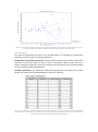
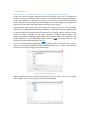
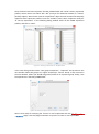
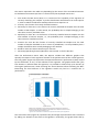
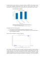
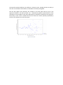
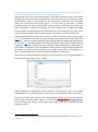
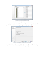
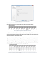
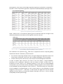
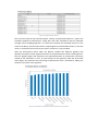
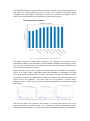
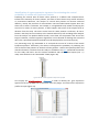
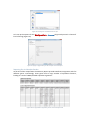
BioSignature – Discoverer User manual Table of Contents Introduction ............................................................................................................................... 3 What’s in a signature ................................................................................................................. 4 What’s in a model.................................................................................................................. 4 Plug-in installation ..................................................................................................................... 5 Biosignature – Discoverer functionalities ........................................................................ 6 Analysis specification............................................................................................................. 6 1. Select data ................................................................................................................. 6 2. Specify Analysis Type and Outcome .......................................................................... 7 3. Specify Analysis Options ............................................................................................ 8 4. Result handling .......................................................................................................... 9 Result reports ........................................................................................................................ 9 Summary Report................................................................................................................ 9 Detailed Report ............................................................................................................... 12 Functionalities across plugin versions ................................................................................. 13 Case Studies............................................................................................................................. 14 Identification of miRNA biomarkers for the early diagnosis of Alzheimer.......................... 14 Reporting Binary Classification Results ........................................................................... 16 Analysis of potato (solanum tuberosum) metabolic profiles for identifying pre-harvest biomarkers of black spot bruising susceptibility. ................................................................ 21 Reporting Multi-Class Classification Results.................................................................... 23 Identification of a gene expression signature for estimating the survival probability of mantle cell lymphoma patients ........................................................................................... 28 Reporting Survival Analysis Results ................................................................................. 30 References ............................................................................................................................... 33 Introduction The BioSignature – Discoverer plugin identifies molecular signatures in biological data, e.g. Next Generation Sequencing and micro-array gene-expression data, in a statistically robust, computationally efficient, and user-friendly way. We consider a molecular signature for an outcome of interest a minimal-size set of molecular quantities whose values, when considered in combination, best determine (predict, diagnose) the most probable value of the outcome A typical example is the identification of a set of gene expressions that discriminate between two different outcome conditions, e.g., Alzheimer vs. healthy subjects. Upon such a set of genes is then possible to build a statistical, machine learning, or data-mining model that given the signature values determines the most probable value of the outcome. BioSignature – Discoverer is designed to offer the following characteristics: Automation, requiring minimal input from the user and no data-analysis expertise Quality of results, employing state-of-the-art methods and analysis protocols that shield against methodological errors and are competitive against customized code by analysis experts Efficiency of computations, algorithmically optimizing the methods used Understanding of output, helping the user with the interpretation and visualization of results BioSignature – Discoverer is able to find signatures within several types of continuous biological data, such as (but not limited to): Transcription data Non-coding micro-RNA (miRNA) expression levels Methylation expressions Protein/Metabolite concentrations The plug-in is able to find signatures and models for classification tasks with groupmembership outcomes (e.g., diagnosing among four different cancer subtypes), regression tasks with continuous outcomes (e.g., predicting the level of a particular gene expression), and time-to-event outcomes (e.g., time to death, disease relapse, occurrence of a complication, survival analysis). These functionalities allow our plug-in to solve problems related to extremely different research areas, ranging from agriculture to human and cancer research. Three case studies are introduced in order to illustrate the versatility of the plug-in; each case study successfully analyzes a publicly available set of Next Generation Sequencing (NGS) or microarray data: 1. Identification of miRNA biomarkers for the early diagnosis of Alzheimer 2. Analysis of potato (solanum tuberosum) metabolic profiles for identifying early biomarkers of black spot bruising susceptibility. 3. Identification of a gene expression signature for estimating the survival probability of mantle cell lymphoma patients What’s in a signature In principle, any subset of the input quantities could be an optimal signature. When the number of input quantities ranges above the hundreds the number of probable signatures to consider becomes astronomical. BioSignature – Discoverer employs proprietary and stateof-the-art machine learning and statistical methods to solve the problem both efficiently and with high-quality results. Signatures output by the tool have the following characteristics: Minimality: Smaller signatures are easier to interpret biologically, verify experimentally, and less costly to measure. While certain quantities may carry information regarding the output when examined in isolation, they may be superfluous given the selected signatures. The tool tries to identify and remove such quantities from the output. Thus, a gene expression that is correlated with low p-value with an outcome may actually not be part of a signature. Collective Optimality: The tool attempts to identify the set of quantities that can optimally determine the most likely outcome through a statistical model collectively as a group. Thus, a gene expression that is not correlated (high p-value) with the outcome when considered in isolation may actually become predictive given the other selected quantities and included in a signature. Multiplicity of Signatures: The tool attempts to identify as many signatures as possible that are statistically indistinguishable. Any such signature could be employed to best determine the outcome value or be considered for providing biological insight to the data-generating mechanism. Non-Monotonicity: given more samples / measurements for training, the tool may include more or fewer quantities in a given signature. It may include additional quantities if the extra samples allow it to establish statistically significantly that they carry non-superfluous predictive information. It may decide to remove quantities if the extra samples allow it to determine statistically significantly that they are actually superfluous given the rest of the signature quantities. What’s in a model In order to determine how well a given signature predicts, discriminates, or classifies the outcome BioSignature – Discoverer tries several standard and state-of-the-art machine learning, data mining, and statistical model-learning algorithms. This takes place transparently to the user. Models are also employed to explain the multi-variate correlations between the signature quantities and the outcome and produce visualizations and explanations of the results. Plug-in installation The BioSignature – Discoverer plug-in can be installed as any other CLCBio plug-in. In the CLCbio Workbench, click the “Help” tab, “Plugins and resources…”, and then click on “Install from File”. Select the CPA file that fist your version of CLCbio Workbench and press “Install”. Please note: the plug-in is currently available for the Main and the Genomic Workbenches. Figure 1: installing the BioSignature Discoverer plugin Biosignature – Discoverer functionalities The functionalities of the plug-in are straightforward to use. Similarly to other CLCbio plugin, the user is required to specify the data to analyze and to configure the analysis to run. Once the computations are concluded the results are reported in a detailed report. Analysis specification 1. Select data When you first invoke BioSignature – Discoverer you are requested to specify the training samples and their outcome. There are two ways to specify the training samples, either as a list of individual samples or an Experiment object. Figure 2: selecting an Experiment object as input for the BioSignature Discoverer plug-in You can create an Experiment object with the standard CLCbio Workbench toolbox for “Expression Analysis” and the “Set up Experiment” option. In step 2 of the process, when you define the experiment type, choose “Unpair”; the current version of the plug-in is not designed for the analysis of paired samples. During the set-up of the experiment samples will be assigned to 2 or more groups. In addition, using the toolbox “Transformation and Normalization” you can preprocess the samples in the Experiment with various transformation and normalization methods. The normalized and/or transformed values of the samples become associated with the Experiment object. See the relevant CLCbio tutorial for further information on how to create an Experiment. Data can also be input as a list of samples you would like to include in the analysis. Notice that you cannot specify both an Experiment object and a list of samples at the same time. If an Experiment is already selected for analysis, then samples cannot be added to the selection and vice versa. The advantage of grouping your samples in an Experiment object is that BioSignature – Discoverer can make use of the group assignments to your samples and the preprocessing you have applied to the molecular profiles. Figure 3: selecting a set of samples as input for the BioSignature Discoverer plug-in 2. Specify Analysis Type and Outcome There are three ways to specify the outcome in the data: 1. Use the already defined Experiment groups. If you have selected an Experiment object to analyze this step is omitted and the analysis type is assumed to be Classification to the groups specified in the Experiment. 2. Use an existing feature (quantity, variable) that is measured in your samples. You can select this variable from the drop-down menu labeled “From the input features:”. Notice that if you select Classification as your type of analysis each different value of the feature will be considered as a different class / group. 3. Use a file to assign outcome values to your samples. The file must be in Comma Separated Values (.csv) format. Each row should contain a sample name and its outcome. In case of Survival Analysis there are two outcomes: the time-to-event (if known) and the status (censored or not) (see Section “Identification of a gene expression signature for estimating the survival probability of mantle cell lymphoma patients” below). Notice that this is the only available option for Survival Analysis; it is also useful for specifying clinical outcomes associated with the measurements. Figure 4: selecting the appropriate type of analysis and outcome 3. Specify Analysis Options In this form you specify options that guide the analysis. Which expression values to analyze? When an Experiment has been selected for the analysis, you have the option to analyze either the original values, or the values transformed or normalized with the “Transformation and Normalization” toolbox. Otherwise, these options are not selectable. Independently of the choice made at this step, the plug-in internally scales the data in order to have zero mean and unit variance. Choose the level of tuning effort for your analysis. The statistical and machine learning algorithms employed by the plug-in require tuning the values of several options, called hyper-parameters, just as a TV receiver needs to be tuned to show a clear picture. Tuning the algorithms typically requires searching for the best hyper-parameter combination. Optimizing the analysis may return better performing models and different signatures, but of course requires more computation time. The plug-in automatically searches for the best configuration of hyper-parameters in a transparent way to the user. The user is only required to specify how extensive the search should be. The plug-in offers three possible choices: Quick, Normal and Extensive – which correspond to increasing levels of optimization. Figure 5: windows for specifying the analysis options For a typical data analysis task (10 to 100 samples, 10,000 to 100,000 expression levels), a quick search should run for few minutes, while an extreme one may take hours. A good strategy in order to choose the most appropriate level of thoroughness is perform a quick or moderate search first, and then estimate the time for a more thorough analysis with the help of the coefficients shown in Table 1. Table 1: required computational time with respect to the Quick search. The left column reports the available thoroughness options, while the right column reports the required computational time. Times are scaled with respect to the Quick search; for example, if the Quick search runs for a minute, the user should expect the Normal search to run for 1.5-3 minutes and the Extensive one for 2-5 minutes. Level of tuning effort Quick Search Normal Search Extensive Search Computational time (Quick search = 1) 1 1.5 – 3 2–5 4. Result handling In this form you specify whether you prefer the output open in a new tab in the main CLC Workbench window or saved in a new file. This is it! Click Finish and find the molecular signatures. Figure 6: result handling options Result reports The results of the BioSignature – Discoverer computations are provided to the user in two different reports, the Summary Report and the Detailed Report. The first one contains the main findings of the analysis, while the latter shows detailed information about the retrieved signatures and their predictive performances. Summary Report The Summary Report is composed by three different types of information: (a) a description of the identified signatures, (b) performance estimation metrics, and (c) diagnostic plots. Figure 7: description of the retrieved signatures for an example classification analysis. From top to bottom the reference signature, the list of equivalent features and the effect sizes are reported. This specific example led to the discovery of only one signature. Description of the identified signatures: the first information provided to the user is the Reference Signature, which represents the first molecular signature found by the algorithm. The Stability value reported for each quantity indicates the probability of selecting the same feature if the analyses were repeated on an independent set of samples. The set of Equivalent Signatures is then reported. Each signature comprises of a quantity in the column named “Feature 1”, combined with a quantity in the column “Feature 2” and so on. The total set of equivalent signatures is all such possible combinations. Their number is shown below the table. The signatures reported in the table are statistically indistinguishable from the Reference one. Indeed, the choice of the Reference Signature is quite arbitrary, since the signatures are by definition equivalent. Finally, the Effect size of each element in the reference signature is provided. The effect size is a measure of the predictive strength of each element: the higher the effect size (in absolute value), the larger the expected variation in the outcome for a change in the value of the signature element. The way effect sizes are reported varies depending by type of outcome: log10 odds ratios for classification problem, linear regression standardized coefficients for regression problem, and log hazard ratios for survival analysis. Figure 8: performance metrics for an example classification problem. For each metric the average (expected) value and the 95% confidence interval are presented. Performance Estimation Metrics: these metrics provide a measure of the expected predictive performances of the selected signature(s) on an independent test set. The types of metrics that are reported vary depending by the type of outcome: for classification problem the Accuracy, Area Under the Curve (AUC, only for binary classification), along with Precision, Recall, Sensitivity and Specificity of each class are provided. For a regression task the out-of-sample R2, the mean absolute error and the mean squared error are displayed instead. The Concordance Index (CI) is reported for survival analysis. An estimation of the 95% confidence interval for each metric is provided as well. Furthermore, the contribution of each feature to the performance of the whole signature is calculated. Particularly, the impact of each feature is provided in terms of individual and cumulative contribution. The former is calculated as the loss in performance when each element of the signature is removed in turn (see Figure 9). Figure 9: example of individual contribution graph. The graph reports the percentage of performance metric (in this case accuracy) achieved by the reference signature when each element is removed in turn. The most important feature results in the largest reduction in performance when removed. The cumulative contribution shows the increase in predictive performance when the signature elements are added one after the other (following the order given by their individual contribution). Both the individual and cumulative contributions are reported as bar-graphs. Figure 10: example of cumulative contribution graph. The graph reports the percentage of performance metric (in this case accuracy) achieved by adding to the reference signature each element in the order show by the X-axis. Diagnostic plots: a set of diagnostic plots are provided in order to allow the user to identify possible anomalies in the data, for example outliers, unexpected trends and so on. The diagnostic plots to be shown depend by the problem at hand: for classification task, a Principal Component Analysis (PCA) plot of the data using only the Reference signature quantities is displayed along with the in-sample predicted probabilities of belonging to each class are reported. For regression task the diagnostic plots contrast the predicted values versus the residual and real values. For survival analyses the Deviance residual plot is reported instead. Such plots can reveal outlier samples that may be erroneously labeled, or hidden patters in the residuals that indicate bad fitting. Figure 11: example of PCA diagnostic plot for a classification problem. The two axes correspond to the first two principal components (in order of explained variance) of the reference signature data. Detailed Report Two types of information are given in the Detailed Report: an extended list of equivalent signatures and the full list of in-sample predictions. Extended list of equivalent signatures: for some specific problems the number of equivalent signatures can be quite high. For sake of clarity, the Summary Report shows only up to twenty equivalent signatures, while the remaining ones along with their respective effect sizes are reported in the Detailed Report. In-sample predictions: the predictions obtained by applying the final model on the whole dataset are reported in the Detailed Report, for the user’s perusal. Figure 12: example of in-sample predictions for a classification problem. For each sample the actual and predicted class are reported. Predictions are provided in terms of the probability of belonging to each class. The table shown in this example has been trimmed for representation purposes Functionalities across plugin versions The BioSignature – Discoverer plugin is released in three different versions (Basic, Professional and Full) with increasing level of functionalities, in order to better match the requirements of different users. Table 2 details the functionalities available in each version. The server edition of the plug-in is only available in the Full version. Table 2: plug-in functionalities across different versions Functionality Binary Classification Multi-class Classification Regression Time-to-Event Analysis Extended Hyper parameters optimization Multiple Signatures Basic Professional Full A trial version is also available for evaluation purposes. The trial version is fully functional, even though only problems up to 50 samples and 50 variables can be analyzed. Case Studies Identification of miRNA biomarkers for the early diagnosis of Alzheimer In this case study we further elaborate the previous example. This study is a prototypical example of binary classification, where the aim is to find NGS miRNA expression signatures for the early diagnosis of Alzheimer. In this case the outcome is dichotomous (Alzheimer cases vs. healthy controls) and each sample belongs in one of the two groups. The signatures found are the ones able to best discriminate between the two groups. Several studies have shown that non-coding micro RNAs can act as early diagnostic biomarkers for a number of diseases. A recent study [1] identified a 12 miRNA signature able to nearly perfectly discriminate between Alzheimer from healthy subjects. The data of this study are publicly available on the Gene Expression Omnibus (GEO) website. The preprocessed CSV file (GSE46579_NGS_miRNA_normalized.csv) ready to be imported in the CLCbio workbench can be downloaded directly from this link. The original data (in excel format) can be also downloaded from this link. Once you have saved/downloaded the GSE46579_NGS_miRNA_normalized.csv file, you can import it in the CLCbio Workbench with the Standard Import (Ctrl + i) utility. After selecting the CSV file, be sure of using the “Automatic import”. Figure 13: importing the miRNA data When prompted for selecting the location where to save the files, create a new folder “NGS_miRNA”. Press “Finish” and wait for the lad to be loaded. Figure 14: selecting the destination folder for the NGS miRNA data Once the data have been imported, the NGS_miRNA folder will contain seventy expression profiles, whose names start either with “AD” (acronym for Alzheimer Disease) or “control” (healthy subject). We will now create an ‘Experiment” object that will contain and compactly represent these expression profiles. From the “Toolbox” panel, select “Expression Analysis” “Set up experiment”. In the following dialog window select all the miRNA expression profiles, and click on “Next”. Figure 15: setting up the Control vs. AD experiment In the next dialog window select “Two-group comparison”, “Unpaired” and proceed to the next window. Name the groups as in Figure 16 (Group 1: Control. Group 2: AD). Proceed to the next window, where you should assign each profile to its respective group. Finally, save the experiment in the NGS_miRNA folder. Figure 16: naming the groups for the Control vs. AD experiment We are now ready for analyzing the “Control vs. AD” experiment with the BioSignature – Discoverer plugin. Start the plugin and select as input the “Control vs. AD” experiment. Figure 17: selecting the input for the BioSignature – Discoverer plugin For the present case study let’s set the plugin options as in Figure 18: original values and “Quick” as level of tuning. After clicking on “Next”, let’s select “Open” in the Result handling options window, and then let’s click “Finish” for starting the plugin. Figure 18: BioSignature – Discoverer plugin options Reporting Binary Classification Results At the end of the plugin computations a new Summary Report will be generated, containing several pieces of useful information. The first piece is shown at the top of the Report and is the “Reference Signature”: Figure 19: Reference Signature for the Control vs. AD experiment The signature comprises of three different miRNA expression levels: 1) hsa-mir-29c:hsa-miR29c-3p, 2) hsa-mir-30d:hsa-miR-30d-5p and 3) brain-mir-182:brain-mir-182. According to their stability levels, the two first components should be certainly retrieved if the same study were to be performed on an independent sample, while the first component has less chances to do so (80% probability). This is the only signature that has been identified, as reported in the subsequent “2 Lists of Equivalent Features” table: Figure 20: list of equivalent features. Only one signature was identified in this study The next table of the Report gives an indication about the strength of the relationship between each element of the signature and the outcome. Figure 21: effect size of each element of the signature expressed as AD vs. Control log10 odds variation In order to correctly interpret the percentages reported in table “3 Effect sizes”, we must consider that: 1. the effect sizes are quantified through a logistic regression model. Logistic regression models redefine the outcome in terms of “log10 odds”, i.e., the base-10 logarithm of the ratio between the probability of belonging to the first class (“AD”) over the probability of belonging to the second class (“Control”). 2. expression values have been standardized in order to have zero mean and unitary variance before fitting the logistic model. Given these premises, the coefficients can be interpreted as follow: for the brain-mir182:brain-mir-182 biomarker, an increment equal to its standard variation (std=3.254) implies that a diagnosis of Alzheimer (i.e., belonging to the class AD) is 10-3.93= 0.00011 times less probable. On the other hand, an increment of 37.954 in the expression value of the miRNA hsa-mir-29c:hsa-miR-29c-3p makes the Alzheimer odds 106.84= 7 ∙ 106 higher. The successive table of the Report, “3 Performance Metrics”, reports the estimated predictive performances, along with their 95% Confidence Interval estimated through a boot-strapping approach. Figure 22: performance metrics The metrics reported in this table vary depending by the nature of the considered outcome. For dichotomous outcome (AD class vs. Control class) the employed metrics are: 1. Area under the ROC Curve (AUC): it is a measure of the capability of the signature of correctly classifying the samples. A perfect classification would lead to an AUC equal to 1, while a random classification would produce an AUC equal to 0.5. 2. Accuracy: the fraction of correctly classified instances 3. Sensitivity for class AD: it is the fraction of correctly classified AD samples over the total number of AD samples. In other words, the probability that a sample belonging to the class AD is correctly classified as AD. 4. Specificity for class AD: it is the fraction of correctly classified Control samples over the total number of Control samples, i.e., the probability that a sample belonging to the class Control is classified correctly. 5. Precision for class AD: the fraction of correctly classified AD samples over the total number of samples classified as AD. In terms of probabilities, it is the probability that a sample classified as AD is actually belonging to the AD class. 6. Recall for class AD: same as Sensitivity for class AD. 7. Sensitivity/Specificity/Precision/Recall for class Control: as for the AD class. After the Performance metric table, the Reports includes two different graphics that quantify the impact of each signature element of the performances of the overall signature. The first graphic (Figure 23) represents the expected decrease in performance (AUC) caused by the elimination, in turn, of each element of the signature. The graphic shows that if the first element is removed from the signature, it is possible to achieve only up to the 87% of the original performances, while removing the second element allows achieving the 89%. Eliminating the third element of the signature would only lead to a minimal loss in performance. Figure 23: individual contribution of each element of the signature The second bar chart (Figure 23) represents the percentage of performance that is achieved by adding one element at the time to the signature. Particularly, the graph shows that by considering only the first element, it is possible to arrive to the 80% of the predictive power of the whole signature. Considering the first AND the second element, 98% of the performance is reached. Adding the last element brings to the full predictive power (100%). Figure 24: cumulative contribution of signature elements The Report shows two further graphics 1. the distribution of the predicted probability of belonging to class AD 2. the distribution of the samples in the first two components of the PCA space built on top of the signature elements. The first of the two graphics is shown in Figure 25. Figure 25: predicted probability of belonging to class AD Each sample is represented as a dot in the graph. The dots have different shapes according to their class. The x-axis represents the predicted probability of belonging to the class AD; samples belonging to class AD are represented on the top, marked as “diamonds”, while samples belonging to class Control are on the bottom, represented as simple dots. The ideal behavior would be to observe the entire AD sample on the rightmost – top corner, while all the Control samples should be in the leftmost – bottom corner. Samples that do not obey to this rule are somewhat misclassified, and should be carefully investigated. The last plot (Figure 26) represents the samples in the PCA space built on top of the signature elements. This plot provides a bi – dimensional graphical representation of the distribution of the samples in the space defined by the elements included into the signature. Particularly, in this case it is evident that the two classes are almost perfectly separated by the first two components of the PCA space. Figure 26: PCA plot Analysis of potato (solanum tuberosum) metabolic profiles for identifying preharvest biomarkers of black spot bruising susceptibility. Black spot bruising is the undesired formation of dark-blue to blackish melanin spots below the peel of potato tubers after being exposed to mechanical pressure [2]. Different harvests show different degree of susceptibility to this phenomenon, and black spots drastically reduce the commercial value of the tubers. A recent study [3] attempts to identify metabolic biomarkers able to discriminate, months ahead of the harvesting, potato crops highly susceptible to black spot bruising. The early identification of highly susceptible harvests allows the differentiation of the procedures for the collection and stock of the crops, in order to minimize both the deterioration of the tubers and the harvesting cost. Tuber metabolic profiles employed in the study are publicly available on the journal website (link). For the present case study the data have been formatted as Comma Separated Value (CSV file), in order to be easily imported in the CLCbio workbench. Please download the data file from this link. The data contain the metabolic profiles of a set of potato samples (growth in different soils and in different weather conditions) measured before the harvesting. For each profile an indication of the susceptibility to black spot bruising (as measured after the harvesting) is provided as well. Particularly, we consider three levels of susceptibility: 0, 1 and 2, corresponding to low, medium and high susceptibility, respectively1 Once you have saved/downloaded the CSV file, you can import it in the CLCbio Workbench with the “Automatic import” (Ctrl + i) utility. Figure 27: importing the metabolic profiles When prompted for selecting the location where to save the files, create a new folder “Steinfath2010” in the CLCbio workspace. Press “Finish” and wait for the data to be loaded. Once the data have been imported, the “Steinfath2010” folder will contain four hundred seventy eight metabolic profiles. We can now launch the BioSignature – Discoverer plugin for performing our analysis. In the “Select Data” panel, select all the metabolic profiles and click on “Next”. 1 We re-encode the nine levels (1 – 9) scale used in the original study as follows: 1 – 3 0, 4 – 6 1, 7 – 9 2. Figure 28: selecting the potato metabolic profiles The successive windows shows the “Specify Analysis Type and Outcome” options. In this study we want to classify the potato profiles according to their level of black spot bruising susceptibility. Thus, select “Classification” in the area named “What type of analysis to perform” and select “Blackspot Bruising” as target variable (see Figure 29). Click “Next”. Figure 29: selecting the type of analysis and the target variable For the present case study let’s set the plugin options as in Figure 30: original values and “Quick” as level of tuning. After clicking on “Next”, let’s select “Open” in the Result handling options window, and then let’s click “Finish” for starting the plugin. Figure 30: BioSignature – Discoverer plugin options Reporting Multi-Class Classification Results The “Reference Signature” is reported right on the top of the Summary Report: Figure 31: Reference Signature for potato black spot bruising The signature is composed by eleven different predictors. Notably, the type of soil and the weather condition are included as well (Feature 2 and 4). The stability values indicate that most of these predictors would have a high chance to be selected again if the analyses were repeated on a different, independent sample. The table “2 Lists of Equivalent Features” indicates that some element of the reference signature can be substitute by other signatures that are equivalent in terms of predictive capabilities. For example, this means that if we substitute the third element of the Reference Signature, namely the “Weather” variable, with the metabolite Docosane-n-A220001, then we obtain a second signature that is equivalent to the reference one. In general, an equivalent signature can be built by picking one (and only one) element from each of the column of table “2 Lists of Equivalent Features” (see Figure 32). Figure 32: list of equivalent features. Eight different signatures can be constructed in this particular case Consequently, in this case a total of eight equivalent signatures can be built, as reported in the table “1 Lists of equivalent signatures” reported in the Detailed Report (see Figure 33). Figure 33: list of equivalent signatures (Detailed Report) Table “3 Effect sizes” in the Summary Report gives an indication about the strength of the relationship between each element of the signature and the outcome. Figure 34: effect size of each element of the Reference Signature expressed log10 odds variation. Class 2 (corresponding to high susceptibility) is taken as reference The coefficients are reported as log10 odds ratio, as explained in Section “Reporting Binary Classification Results”. Moreover, please note that for outcomes comprising multiple classes, the Logistic Regression algorithm chooses one of the classes as baseline. In this case, class 2 (“high susceptibility”) acts as baseline all other classes (class 1 and class 0, in this case) are contrasted against the baseline In order to explain these concepts, let’s focus on the first feature, “Analyte-A281001”. According to the coefficients reported in the first column of table “3 Effect sizes”, an increment of 0.011 (equal to its standard deviation) in the value of Analyte-A281001 corresponds to (a) an increment of the probability of being assigned to class 1 (with respect to the probability of being assigned to class 2) of 100.03 = 1.07 times and (b) to a decrement of the probability of being assigned to class 0 (with respect to the probability of being assigned to class 2) of 10-0.49 = 0.32 times. In other words, the higher the value of AnalyteA281001, the most likely is for the potato sample to belong to class 1 (i.e., it has an average susceptibility to black spot bruising). Figure 35: performance metrics The successive table of the Summary Report, namely “4 Performance Metrics”, reports the estimated predictive performances, along with their 95% Confidence Interval estimated through a boot-strapping approach. For multi-class outcome the employed metrics are the same of the binary outcome (see Section “Reporting Binary Classification Results”). The AUC metric is not defined for more than two classes, and thus it is not provided. After the Performance metric table, the Reports includes two different graphics that quantify the impact of each signature element on the performances of the overall signature. The first graphic (Figure 36) represents the expected decrease in performance (Accuracy) caused by the elimination, in turn, of each element of the signature, while the second bar chart (Figure 37) represents the percentage of performance that is achieved by adding one element at the time to the signature. Figure 36: individual contribution of each element of the signature The individual contribution graph shows that the first variables have an important predictive role, while the remaining features have less impact. The cumulative contribution graph strengthens this interpretation, showing that the first four variables are enough in order to achieve more than the 90% of the performance of the whole signature. Figure 37: cumulative contribution of signature elements The Report shows two further types of graphics, for checking the correctness of the classification model: (a) the distribution of the predicted probability of belonging to class 0, 1 or 2 and (b) the distribution of the samples in the first two components of the PCA space built on top of the signature elements. Figure 38 shows the first type of graphics. Each plot shows the probability of belonging to class 0, 1 or 2 (left to right, respectively) against the probability of belonging to any other class. Each sample is represented as a dot in the graph. The dots have different shapes according to their class. The ideal behavior would be to observe all the dots clustered in two groups, one on the rightmost – top corner and one on the leftmost – bottom corner. Samples that do not obey to this rule are somewhat misclassified, and should be carefully investigated. Figure 38: predicted probability of belonging to class 0, 1, and 2 (from left to right, respectively). The last plot (Figure 39) represents the samples in the PCA space built on top of the signature elements. This plot provides a bi – dimensional graphical representation of the distribution of the samples in the space defined by the elements included in the signature. Particularly, in this case it is evident that the two classes are not perfectly separated by the first two components of the PCA space. This partly explains why the estimated accuracy is relatively low (accuracy = 0.755, see Figure 35). Figure 39: PCA plot Identification of a gene expression signature for estimating the survival probability of mantle cell lymphoma patients Predicting the survival time of breast cancer patients is a difficult task: multiple factors influence the mortality of cancer patients, and most of these factors may well be unknown or unmeasured. Moreover, the analysis of survival data presents an inherent technical difficulty, namely the presence of censored data. Censored observations appear when the exact time to event is unknown. For example, in a longitudinal study aimed at analyzing the survival of a cohort of cancer patients, it often happens that some of the subjects drop in advance from the study. The exact survival time for these patients is unknown; all that is known is that they have survived up to the moment when they left. Excluding these subjects from the analysis can produce biased results, since these are the patients that survive the longest. However, classical regression algorithms are not devised for dealing with censored data. Thus, specialized statistical methods must be employed for survival analysis [4]. In a pioneering study [5], Rosenwald et al. analyzed the survival of a cohort of 92 mantle lymphoma patients. Particularly, the authors investigated the possibility of predicting the time to death of the patients on the basis of their genome – wide transcriptome profiles and clinical information. The data from this study are available at this link. Download the CSV file for this study and load it into the CLCbio workbench with the Standard Import (Ctrl + i) utility. Save the data in the “Rosenwald” folder (Figure 40). Figure 40: the mantle lymphoma expression profiles Let’s employ the BioSignature – Discoverer in order to identify the gene expression signature that best predicts the survival time. Start the plugin, and select all the expression profiles as input (Figure 41). Figure 41: selecting gene expression profiles In the next dialog window, let’s select “Survival Analysis” for the type of analysis to perform (Figure 42). We are now required to “Choose the target variable”. This means that we should indicate the survival time of each subject, which is the target variable that we want to predict. Figure 42: setting up the survival analysis Survival times must be specified with a Comma Separated Value (CSV) file. An example file is shown in Figure 43. Each row of the file reports the survival information for a single subject, and it is formatted as <sample_name, time_to_event, event_status>, where: sample_name is the name of the expression profile the row refers to time_to_event is the time elapsed until the event or the censorship occurred event_status assumes value “1” if the time to event is known and “0” otherwise Figure 43: survival time example file For example, the patient corresponding to the expression profile sample_7 survived for 0.7778 years after the histological exam (time_to_event = 0.7778, event_status = 1). Conversely, the patient corresponding to sample_2 was still alive 3.2772 years after she underwent the histological exam, but no information are available after then (time_to_event = 3.2772, event_status = 0). The file “survivalOutcome.csv” with the survival information for the 251 expression profiles is available at this link. Press the “Load from file” button and locate the CSV file on your computer (Figure 44). Figure 44: loading the survivalOutcome.csv file Let’s set up the options for the BioSignature – Discoverer plugin analyses with a “Normal” level of tuning (Figure 45). Figure 45: plugin configuration for the example survival analysis Reporting Survival Analysis Results At the end of the computation the Summary Report provides a Reference Signature with five different genes. Interestingly, three genes have a large number of equivalent features, leading to a total of 10080 possible equivalent signatures. Figure 46: list of equivalent signature for the survival analysis task The Effect Size table (Figure 47) reports how the risk of death for mantle lymphoma changes according to variations in the values of the signature’s elements. Particularly, the effect sizes are reported as the natural logarithm of the hazard ratios, and all the predictors were standardized before the analysis. This means that a change in the AA743067-2 value equal to 2.855 (i.e., equal to its standard deviation) implies a decrease of the risk equal to e-0.949 = 0.387 times. Figure 47: effect sizes for the survival analysis signatures The Performance Metrics table shows only one metric, the Concordance Index (CI). This metric has an interpretation similar to the Area Under the ROC Curve, i.e., it represents the probability of correctly ranking, according to their respective risk, two randomly chosen subjects. Perfect predictions would grant a CI equal to 1, while a random ranking should achieve a 0.5 CI. In our case, CI is 0.662, indicating that the gene expressions carry some useful information in order to estimate the risk, but further information (e.g., clinical data) are necessary in order to provide better predictions. Figure 48: Performance Metrics for survival analysis The contribution of each feature to the predictive performance of the signature is reported in the Individual and Cumulative Contribution graphs (Figure 49 and , respectively). Both plots indicate that no variable has large predictive power, when considered in isolation, and that all variables should be considered together in order to achieve the 100% of the predictive power. Figure 49: individual contribution plots Figure 50: cumulative contribution plots Finally, the deviance residuals’ plot can be used for investigating the fit of the model. Deviance residuals indicate whether the model predictions depart from the real risk. They should ideally be randomly distributed around zero, without any identifiable pattern. In our case, there are some outliers with unusual high residual, indicating that the predictive model underestimated the risk for these subjects (the figure shows how to identify these outliers by hovering the mouse over the dots in the graph). Figure 51: Deviance residuals' plot References [1] P. Leidinger, C. Backes, S. Deutscher, K. Schmitt, S. C. Mueller, K. Frese, J. Haas, K. Ruprecht, F. Paul, C. Stähler, C. J. Lang, B. Meder, T. Bartfai, E. Meese, and A. Keller, “A blood based 12-miRNA signature of Alzheimer disease patients.,” Genome Biol., vol. 14, no. 7, p. R78, Jul. 2013. [2] P. E. Lærke, J. Christiansen, and B. Veierskov, “Colour of blackspot bruises in potato tubers during growth and storage compared to their discolouration potential,” Postharvest Biol. Technol., vol. 26, pp. 99–111, 2002. [3] M. Steinfath, N. Strehmel, R. Peters, N. Schauer, D. Groth, J. Hummel, M. Steup, J. Selbig, J. Kopka, P. Geigenberger, and J. T. Van Dongen, “Discovering plant metabolic biomarkers for phenotype prediction using an untargeted approach.,” Plant Biotechnol. J., vol. 8, no. 8, pp. 900–11, Oct. 2010. [4] V. Lagani and I. Tsamardinos, “Structure-based variable selection for survival data.,” Bioinformatics, vol. 26, no. 15, pp. 1887–1894, 2010. [5] A. Rosenwald, G. Wright, A. Wiestner, W. C. Chan, J. M. Connors, E. Campo, R. D. Gascoyne, T. M. Grogan, H. K. Muller-Hermelink, E. B. Smeland, M. Chiorazzi, J. M. Giltnane, E. M. Hurt, H. Zhao, L. Averett, S. Henrickson, L. Yang, J. Powell, W. H. Wilson, E. S. Jaffe, R. Simon, R. D. Klausner, E. Montserrat, F. Bosch, T. C. Greiner, D. D. Weisenburger, W. G. Sanger, B. J. Dave, J. C. Lynch, J. Vose, J. O. Armitage, R. I. Fisher, T. P. Miller, M. LeBlanc, G. Ott, S. Kvaloy, H. Holte, J. Delabie, and L. M. Staudt, “The proliferation gene expression signature is a quantitative integrator of oncogenic events that predicts survival in mantle cell lymphoma,” Cancer Cell, vol. 3, pp. 185– 197, 2003.