1
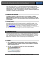
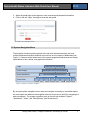
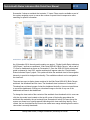
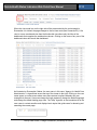
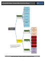
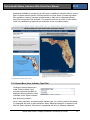
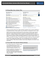
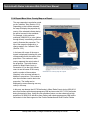
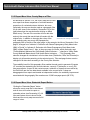
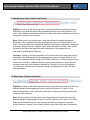
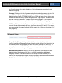
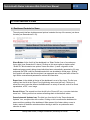
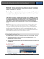
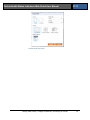
MED146 Deliverable 2.11
Updated Website User Manual
for Reporting Outcome Indicators
by Year, Geography, and Subgroup
Prepared for Florida Agency for Health Care
Administration
by
Final Report
December 23, 2014
FLORIDA HEALTH STATUS INDICATORS WEB PORTAL USER MANUAL
Table of Contents
1.0 GENERAL INFORMATION....................................................................................................................... 1
1.1 System Overview ...............................................................................................................1
1.2 Organization of the User’s Manual .....................................................................................1
1.3 System Environment ..........................................................................................................1
1.4 Authorized Use Permission ................................................................................................2
1.5 Point of Contact .................................................................................................................2
2.0 SYSTEM SUMMARY................................................................................................................................. 2
2.1 Logging In ..........................................................................................................................2
2.2 System Menu .....................................................................................................................3
2.3 Exiting the System .............................................................................................................6
3.0 USING THE WEBSITE .............................................................................................................................. 6
3.1 Dashboard Organization and Selection ..............................................................................6
3.2 Documentation Views ........................................................................................................9
3.3 Report Menu View..............................................................................................................9
3.3.1 Report Menu View: Indicator Type Filter ...................................................................10
3.3.2 Report Menu View: Indicator Filter ............................................................................11
3.3.3 Report Menu View: Dynamic Definition Window ........................................................11
3.3.4 Report Menu View: County Map as a Report ............................................................12
3.3.5 Report Menu View: County Map as a Filter.................................................................................. 13
3.3.6 Report Menu View: Statewide Report Button .............................................................................. 13
3.4 Distribution Views (Tables and Charts) ................................................................................................... 14
3.5 Rate Views (Tables and Charts) ................................................................................................................ 14
3.6 Financial Views ................................................................................................................................................. 15
4.0 CUSTOMIZING A VIEW .......................................................................................................................... 16
4.1 Dashboard Controls for Views .................................................................................................................... 16
4.2 Exporting the Dashboard View ................................................................................................................... 17
Family Data Center | College of Medicine | University of Florida
i
Florida Health Status Indicators Web Portal User Manual
2014
1.0 GENERAL INFORMATION
1.1 System Overview
The University of Florida, Family Data Center (UF FDC) annually produces the Florida
Medicaid Maternal and Child Health Status Indicators Report (HSI) chartbook for the Florida
Agency for Health Care Administration (Agency). The chartbook is a report that consists of a
fixed set of tables and charts describing the Florida population for 37 health indicators on
various demographic and programmatic characteristics useful to the Agency. The statewide
chartbook is effective in summarizing key information in ways that are actionable to the
Agency. However, the value created by the usability of the report naturally offsets the
benefits of scalability and portability of information collected by state government. To
address the needs of the Agency in having both usable and accessible information, UF FDC
developed a website capable of producing custom reports that extend the access to data
resources beyond information presented in the chartbook.
The major function of the website is to display and manipulate the latest available population
level trend data on outcome indicators available in the Maternal Child and Health (MCH)
data warehouse operated by UF FDC under contract with the Agency. It allows county
comparison of Medicaid status and eligibility subgroups, race ethnicity classifications,
Medicaid Length of Coverage and type of Medicaid Delivery System (Fee for Service, Health
Maintenance Organization, MediPass, Provider Service Network) for each outcome
indicator. In addition to health care costs per county for each outcome indicator, the
expanded functionality allows the website to report metrics on hospitalization charges and
length of stay.
The website is under continuous development. This user manual refers to the current
development build (November 2014). UF FDC is responsible for maintaining and updating
the website.
1.2 Organization of the User’s Manual
This Website User Manual describes:
• Basic functionality of the website
• How to access and navigate the website’s pages
• How information is displayed on the dashboards
1.3 System Environment
The web portal uses Tableau, a provider of business analytics software, as its software
platform. UF FDC uses a customized version of the software to create the interface between
Agency users and the data warehouse maintained by the UF FDC. The software provides
Family Data Center | College of Medicine | University of Florida
1
Florida Health Status Indicators Web Portal User Manual
2014
users with common controls (e.g., check boxes and drop down menus) and functionality
(e.g., tool tips and mouse clicks), which should be familiar to users of the Microsoft Windows
operating system. This User Manual assumes that a user has access to a computer with
internet connectivity, as well as some familiarity with navigating a website through employing
radio buttons, drop-down menus and check boxes.
1.4 Authorized Use Permission
Only Agency, Department of Health (DOH) and UF FDC staff members are currently
authorized to access the web portal. At any time the Agency can request UF FDC to create
additional access accounts. To obtain the username(s) and link please contact the Agency’s
contract manager.
1.5 Point of Contact
Mildred Maldonado-Molina, PhD, Principal Investigator for the MED146 contract, is the
primary point of contact for this project. She can be reached by phone at 352.294.5797, by
email at [email protected] or in writing at CTRB Building, 2004 Mowry Road, Suite 2250,
P.O. Box 100177,Gainesville, FL, 32610-0177. Dr. Maldonado-Molina may direct inquiries to
UF FDC staff members with knowledge of specific content areas of the website.
2.0 SYSTEM SUMMARY
The portal utilizes dashboards, which is a display format that assembles output data from a
variety of sources onto a single screen. The dashboards allow for interactivity on the part of
users. The web portal allows policymakers to query linked longitudinal health and financial
data to create custom tables, charts, and maps using a point and click interface.
2.1 Logging In
1. Open a web browser such as Internet Explorer, Firefox, or Google Chrome and copy
and paste the web address provided by the Agency contract manager into the address
window and press the enter key.
2. Click “OK,” “Yes,” “Continue,” or “Proceed” if any security warnings appear.
Screenshot 1. Security warning message
Family Data Center | College of Medicine | University of Florida
2
Florida Health Status Indicators Web Portal User Manual
2014
3. When the portal login screen appears, enter username and password information.
4. Click on the red “Login” rectangle to enter the web portal.
Screenshot 2. Portal login screen
2.2 System Navigation Menu
The navigation hierarchy places projects at the top level where each project can have
multiple workbooks and each workbook can have one or more views or dashboards (see
Figure 1). Views are at the lowest level of the system navigation hierarchy and can display
combinations of text, tabular, and graphical information.
Login
https://hsi.mch.peds.ufl.edu/
Select Project
Select Workbook
Florida Health Status Indicators Report
Web Portal 2008-2012 Birth Cohorts
Select View
Figure 1. Diagram of system navigation
By using the system navigation menu users can navigate a hierarchy of connected reports.
As more reports are added to the navigation structure, this menu is useful for navigating the
web environment. The system navigation menu on the left side includes “Projects”,
“Workbooks”, “Views”, and “Data Sources” (see Screenshot 3).
Family Data Center | College of Medicine | University of Florida
3
Florida Health Status Indicators Web Portal User Manual
2014
Screenshot 3 shows a workbook that contains 17 views. Filters are also available as part of
the system navigation menu to narrow the number of reports listed in response to users
searching for specific information.
Screenshot 3. System navigation menu
As of November 2014, the web portal contains one project, “Florida Health Status Indicators
(HSI) Report,” and has one workbook, “Web Portal 2008-2012 Birth Cohorts,” with a total of
17 views or dashboards as shown on Screenshot 3. Once the 2009-2013 birth cohorts web
portal is released in June 2015, another workbook will appear under the “Florida Health
Status Indicators Report” project. This update will allow the workbook level of the navigation
hierarchy to provide its designed functionality. The available workbook can be navigated at
the view level.
There are two ways to display views contained in the Web Portal 2008-2012 Birth Cohorts
workbook: the thumbnails and list views. The thumbnails view is shown on Screenshot 3.
Thumbnails are miniature images of what the dashboard looks like. Users must scroll down
to see all the dashboards. Clicking on a thumbnail image or the title of any one of the
dashboards will launch that dashboard.
To change the view mode of the contents of the workbook from thumbnails to list, users can
click the view mode icons located on the top left corner of the landing page below the
workbook title marked by the red rectangle (see Screenshot 4 below). As users hover the
mouse over these icons a tooltip appears indicating which view mode they identify. Once
clicked, the icon that identifies the current view mode turns orange indicating that the active
view mode is currently thumbnails.
Family Data Center | College of Medicine | University of Florida
4
Florida Health Status Indicators Web Portal User Manual
2014
Screenshot 4. View mode controls
When the view mode icon on the right side of the area marked by the red rectangle in
Screenshot 4 is clicked, the page changes to the list view mode (see Screenshot 5). A list
view is a more condensed view than the thumbnails view where only the titles of the
dashboards that comprise the workbook are shown. Clicking on the name of any one of the
dashboard views will launch that dashboard.
Screenshot 5. List view mode
As illustrated on Screenshot 6 below, the user name, in this case, “Agency for Health Care
Administration” is hyperlinked across the top of the screen to the right. Clicking on the user
name opens up a new screen where users have access to options whereby they can
manage their account. Users can change the login password, change the default language,
and change the default landing page view. The “Help” hyperlink to the immediate left of the
user name is context sensitive and displays basic topics that guide users for browsing and
searching the current page.
Family Data Center | College of Medicine | University of Florida
5
Florida Health Status Indicators Web Portal User Manual
2014
Screenshot 6. User account and help controls
2.3 Exiting the System
A header with the user name, in this case, “Agency for Health Care Administration” is always
visible at the top right of each screen (see Screenshot 6 above). When the user name
header is clicked, a drop down menu provides the option to log out or exit the system.
3.0 USING THE WEBSITE
When the web portal landing page opens, a total of 17 dashboards in the current workbook
are displayed in the center of the browser window (in either the list or thumbnail view) sorted
in ascending order by the “Sheet #” column (see Screenshot 5). It is important to keep the
ascending sheet number as the sorting parameter for the landing page to reflect the flow in
which the dashboards were designed.
3.1 Dashboard Organization and Selection
From the web portal landing page, clicking on a thumbnail image (see Screenshot 3) or in
the list view the name of any of the views in the column marked “Title” (see Screenshot 5)
will open the selected dashboard. Once a dashboard opens, a set of tabs appears across
the top for all available dashboards ordered from left to right based on “Sheet #” as on the
landing page (see Screenshot 7 below). Clicking on any tab will display the corresponding
dashboard.
Screenshot 7. Tab based view selection menu
UF FDC organized the views in the Web Portal to serve two types of users, those who are
not familiar with the structure of the HSI report and those who are. For users who access
the portal without previous familiarization with the layout of the HSI report, a set of seven
documentation views is available with narrative sections on “Overview”, “Methodology”,
“Structure”, “Definitions”, “Maternal Indicators” and “Infant Indicators”. These documentation
views are illustrated in Figure 2 using a blue color. For users who are either experienced
with the layout of the HSI report or feel ready to create a custom report after reviewing the
documentation, a “Report Menu” dashboard (yellow in Figure 2) provides selection menus
including interactive maps to define parameters used to customize the rest of the views
comprising tables and charts. There are a total of nine views that display combinations of
tabular and chart data based on selections made in the “Report Menu” view. These
quantitative views can be categorized in three groups: Distribution (orange), Rate (red), and
Family Data Center | College of Medicine | University of Florida
6
Florida Health Status Indicators Web Portal User Manual
2014
Financial (purple) (see Figure 2). Each of these groups of dashboards provides a different
perspective toward the selected outcome indicator or geography.
Family Data Center | College of Medicine | University of Florida
7
Florida Health Status Indicators Web Portal User Manual
2014
Cover Page
Overview
Methodology
Type of View:
Documentation
Structure
Definitions
Maternal
Indicators
Infant Indicators
Workbook: Web Portal
2008-2012 Birth
Cohorts
Distribution by
Eligibility
Type of View:
Distribution
Tables and Charts
Distribution by
Race
Distribution by
Coverage
Rate by Eligibility
Report Menu
Type of View:
Rate Tables and
Charts
Rate by Race
Rate by Coverage
Note: Green boxes are not elements of
the web site navigation. They are used
in the diagram to show conceptual
differences among views.
Rate by HMO Plan
Type of View:
Financial Tables
Hospitalization
Charges
Medicaid
Reimbursement
Family Data Center | College of Medicine | University of Florida
8
Florida Health Status Indicators Web Portal User Manual
2014
Figure 2. Diagram of views in the web portal
3.2 Documentation Views
Seven documentation views are designed to familiarize the user with the content and
structure of tabular and chart data generated by the web portal. They consist of narrative
sections addressing the way the reports are structured. Screenshot 8 below shows how
documentation tabs look across the top once any view is opened from the landing page.
Screenshot 8. Documentation tabs
Documentation views are described below:
Cover - Shows the cover of the HSI report that corresponds to the workbook.
Overview- Provides an introduction to categorical groupings used throughout the
report and a definition to Medicaid Status and nine Medicaid Eligibility Subgroups
[SOBRA, Non-SOBRA, CMS High Risk OB, Medically Needy, Medicaid SSI, Alien,
Medicaid <(less than) 8 days, or No PNC (Prenatal Care), Non-Medicaid, and
Temporarily Eligible].
Methodology- Lists the data sources used to construct the HSI report, describes data
suppression techniques used to mask cells with low counts, and addresses general
limitations of the HSI report.
Structure- Describes the layout of eight different types of tables used to stratify
information in the HSI report (Tables A through H).
Definitions- Provides definitions to additional categorical groupings [Medicaid Delivery
Systems, Length of Coverage, and Financial Benchmarks].
Maternal- Provides definitions to 18 maternal health indicators available for custom
reporting.
Infant- Provides definitions to 17 infant health indicators available for custom reports.
3.3 Report Menu View
Screenshot 9. Report menu tab
The report menu view (see Screenshot 10) is the starting point of report construction once
the documentation is reviewed. This view can be made active by clicking on the tab labeled
“Menu” (see Screenshot 9). This interactive page allows users to make selections on several
Family Data Center | College of Medicine | University of Florida
9
Florida Health Status Indicators Web Portal User Manual
2014
parameters available for customizing an HSI report. In addition to selection menus, such as
type of indicator and the specific outcome indicator, the view shows a Florida map where
color gradation is used to compare counties based on their rate of a selected indicator
during the time period of the workbook. The map also functions as a filter to other tabular
views in the workbook by responding to selections of one or multiple counties.
Screenshot 10. Report menu view
3.3.1 Report Menu View: Indicator Type Filter
Clicking on the drop down menu
under “Select Indicator Type”
provides users with the option of
displaying either maternal or infant
indicators on the “Select Indicator”
drop down menu below it.
Screenshot 11. Indicator type filter
When “Infant Indicators” is selected under indicator type, the “Select Indicator” filter below
it is populated with a list of infant indicators. When “Maternal Indicators” is selected in this
filter the “Select Indicator” filter below it is populated with a list of “Maternal Indicators”.
Family Data Center | College of Medicine | University of Florida
10
Florida Health Status Indicators Web Portal User Manual
2014
3.3.2 Report Menu View: Indicator Filter
Screenshot 12. Indicator filter values (Maternal)
Screenshot 13. Indicator filter values (Infant)
Clicking on the drop down menu “Select Indicator” populates a list of outcome indicators of
the type defined by the “Select Indicator Type” filter above it. Screenshots 12 and 13 (see
above) show the contents of the filter menu for both choices of indicator types maternal
indicators or infant indicators as defined in maternal and infant documentation views in
Section 3.2. When an indicator, infant or maternal, is selected from the list, the map in the
menu page will change to display corresponding proportions for the selected indicator. In
addition to changing the map, this filter changes the dynamic definition window (see Section
3.3.3) and the title of the indicator. Outside the menu page, this filter also changes all nine
tabular views to display data (distributions, rates, and financials) only for the selected
outcome indicator. Titles of the nine tabular views are also changed by the selection made
on this filter.
3.3.3 Report Menu View: Dynamic Definition Window
This window responds to a selection made
on the Indicator filter (Section 3.3.2).
Depending on the indicator selection, the
window will display its definition. The
definition displayed on Screenshot 14 (on
the right) indicates that “Indicator 8:
Deliveries with Obese Prepregnancy Body
Mass Index (BMI) in Florida” is the selected
outcome indicator.
Screenshot 14. Dynamic definition window
Family Data Center | College of Medicine | University of Florida
11
Florida Health Status Indicators Web Portal User Manual
2014
3.3.4 Report Menu View: County Map as a Report
The map responds to a selection made
on the “Indicator” filter (Section 3.3.2).
Depending on the indicator selected,
the map will display the proportion by
county of the selected indicator during
the period covered in the workbook.
For example, in this particular
workbook (2008-2012), a color (yellow
through brown) in ascending order was
used to illustrate this proportion. The
title of the map also responds to a
change made in the “Indicator” filter
(Section 3.3.2).
In the lower left corner of the map a
legend is displayed illustrating the color
correspondence with the values of the
proportions. The numbers in each
county represent the actual value of
the proportion. The tooltip feature,
shown for Miami-Dade county in
Screenshot 15 (on the right), allows
users to see the name of the county
Screenshot 15. County map as a report
and the number of observations
(Number) in the outcome indicator in
addition to proportions. This number is
also the numerator used to derive the
proportion. The tooltip can be
displayed by mouse hovering over any
county in the map.
In this map, we observe that 25,729 deliveries in Miami Dade County during 2008-2012
were from mothers with obese prepregnancy BMI and accounted for 17.8% of deliveries
during that period of time. Using the color gradation feature, we also observe that high
proportions of 2008-2012 deliveries from mothers with obese prepregnancy BMI tend to
concentrate in the West segment of the Florida Panhandle and South-Central Florida.
Family Data Center | College of Medicine | University of Florida
12
Florida Health Status Indicators Web Portal User Manual
2014
3.3.5 Report Menu View: County Map as a Filter
As described in Section 3.3.4, the county map can be used
as a report that allows comparison of counties based on
proportions of a selected outcome indicator, but more
importantly the map can also be used as a geography filter
for all other views in the workbook. Screenshot 16 (on the
right) shows how the map looks after clicking on Miami
Dade county. The rest of the counties will turn dark blue
and only the county that was clicked will remain with the
Screenshot 16. County map as a filter
original color. In addition to changing the colors of the
map, selecting only one county will propagate the
geography filter to the title of the menu page. In this example, the title on Screenshot 10 on
page 9, changes from “Indicator 8: Deliveries with Obese Prepregnancy Body Mass Index
(BMI) in Florida” to “Indicator 8: Deliveries with Obese Prepregnancy Body Mass Index
(BMI) in Miami Dade County”. Also, in the menu page, the footer, which previously read
“Florida Medicaid Maternal and Child Health Status Indicators …” changes to “Miami Dade
County Medicaid Maternal and Child Health Status Indicators …”. This geography filter
selection changes all calculations in all nine data views (Distribution, Rate, and Financial) to
display only information pertaining to the selected county. Titles and page footers are also
changed in all data views according to the County filter selection.
The scalability benefit of this geography filter enables the web portal to generate 68 reports
(67 counties plus statewide) per outcome indicator, currently 37 indicators, or over 2,500
nine-page reports. A report in this context means a collection of views that are modified by
the filter which are the nine data sheets available in the current build. If views are
disaggregated from reports and treated as independent entities, the scalability improvement
associated with the geography filter reaches over 22,600 one-page reports (68*37*9).
3.3.6 Report Menu View: Statewide Report Button
Clicking the “Statewide Report” button
allows the county map filter to be cleared
and all views to be reset to report on
statewide values (see Screenshot 15). All
titles and footers return to show Florida
labels and the county map recovers its full
range of colors.
Screenshot 17. Statewide report button
Family Data Center | College of Medicine | University of Florida
13
Florida Health Status Indicators Web Portal User Manual
2014
3.4 Distribution Views (Tables and Charts)
Screenshot 18. Tabs for distribution views
Eligibility- Clicking on this tab will generate a view that provides the number and percent
distribution of the selected indicator and geography per menu view filters (Sections 3.3.2
and 3.3.5) by Medicaid classification and by trend year. Each table is followed by two figures
that graph trend lines for the indicator.
Race- Clicking on this tab will generate a view that provides the number and percent
distribution of the selected indicator and geography per menu view filters (Sections 3.3.2
and 3.3.5) for Non-Medicaid and Medicaid women by the following race/ethnicity categories:
Caucasian, African-American, Hispanic, Asian, Native American, and Other. Each table is
followed by two figures that graph the relative distribution of the indicator among
race/ethnicity and Medicaid subgroups.
Coverage- Clicking on this tab will generate a view that provides the number and percent
distribution of the selected indicator and geography per menu view filters (Sections 3.3.2
and 3.3.5) by Medicaid Delivery System (FFS, HMO, MediPass, or PSN) and length of time
women were enrolled in a Medicaid Delivery System during pregnancy. “High Exposure”
includes women who had coverage in Medicaid for 180 days or more during pregnancy.
“Low Exposure” includes women who had coverage in Medicaid for less than 180 days
during pregnancy.
3.5 Rate Views (Tables and Charts)
Screenshot 19. Tabs for rate views
Eligibility- Clicking on this tab will generate a view that provides the number and rate of the
selected indicator and geography per menu view filters (Sections 3.3.2 and 3.3.5) by
Medicaid classification and by trend year. Each table is followed by two figures that graph
trend lines for the indicator.
Race- Clicking on this tab will generate a view that provides the number and rate of the
selected indicator and geography per menu view filters (Sections 3.3.2 and 3.3.5) for NonMedicaid and Medicaid women by the following race/ethnicity categories: Caucasian,
African-American, Hispanic, Asian, Native American, and Other. Each table is followed by
Family Data Center | College of Medicine | University of Florida
14
Florida Health Status Indicators Web Portal User Manual
2014
two figures that graph the relative distribution of the indicator among race/ethnicity and
Medicaid subgroups.
Coverage- Clicking on this tab will generate a view that provides the number and rate of the
selected indicator and geography per menu view filters (Sections 3.3.2 and 3.3.5) by
Medicaid Delivery System (FFS, HMO, MediPass, or PSN) and length of time women were
enrolled in a Medicaid Delivery System during pregnancy. “High Exposure” includes women
who had coverage in Medicaid for 180 days or more during pregnancy. “Low Exposure”
includes women who had coverage in Medicaid for less than 180 days during pregnancy.
HMO Plan- Clicking on this tab will generate a view that provides the number and rate of the
selected indicator and geography per menu view filters (Sections 3.3.2 and 3.3.5) for women
who were enrolled in the same Medicaid HMO for greater than 180 days or for at least 2/3 of
their pregnancy.
3.6 Financial Views
Screenshot 20. Tabs for financial views
Hospitalization Charges- Clicking on this tab will generate a view that provides mean
inpatient hospitalization charges and length of stay for mother (delivery) and infant (birth) of
the selected indicator and geography per menu view filters (Sections 3.3.2 and 3.3.5). To
answer questions about the financial impact of a certain health condition, these tables group
hospitalization charges and length of stay together for both mother and child.
Medicaid Reimbursement- Clicking on this tab will generate a view that provides mean
Medicaid Claims Reimbursement for delivery and birth hospitalizations by Medicaid
Subgroup. The Mean Total Claims Amount is the average sum that Medicaid paid for
mothers and infants who had the health condition represented by the selected indicator and
geography per Menu View Filters (Sections 3.3.2 and 3.3.5).
Family Data Center | College of Medicine | University of Florida
15
Florida Health Status Indicators Web Portal User Manual
2014
4.0 CUSTOMIZING A VIEW
4.1 Dashboard Controls for Views
The web portal interface includes several options located at the top of the screen, just above
the tabs (see Screenshots 21-23).
Screenshot 21. Dashboard controls
Share Button- At the far left of the dashboard is a “Share” button (icon of curved arrow
facing right) (see Screenshot 21 above). Clicking on this arrow opens a window called
“Share Viz” which contains two options: Users can either: 1) email a hyperlink to the
dashboard page currently being viewed which has been automatically generated or (2) copy
and paste the HTML code for the dashboard which can be added to a web page. Sharing
the hyperlink will require that the recipient is an approved user of the portal who will have to
login with a username and password to retrieve the information.
Export Icon- In the middle at the top of the dashboard is a set of four icons. The first one,
starting from the left is the “Export” icon [right facing arrow over half box]. Clicking on it
allows the user to save the data on the dashboard in a variety of formats, such as an Excel
spreadsheet, a PDF, or an image.
Revert All Icon- The second icon from the left is the “Revert All” icon, a counter-clockwise
arrow icon. Clicking on this icon restores all settings back to their default values.
Pause Automatic Updates Icon- The third icon from the left is the “Pause Automatic
Updates” icon, an open circle with a radius. Clicking on this icon allows the dashboard to
pause real-time updating of the dashboard. When paused, this feature allows a user to
make a series of checkbox selections without having to wait for an update after each
selection is made.
Family Data Center | College of Medicine | University of Florida
16
Florida Health Status Indicators Web Portal User Manual
2014
Refresh Icon- The fourth icon from the left is the “Refresh” icon, two semi-circular arrows,
one clockwise, and one counterclockwise. Clicking on this icon directs the computer to reestablish a connection to UF FDC server.
Download Button- On the far right of the dashboard is a rectangle marked “Download” with
an arrow pointing down. Clicking on this rectangle allows the dashboard (currently being
viewed) to be saved as a Tableau file. Tableau would need to be installed on the user’s
workstation for this utility to function.
Tool Tips- By hovering over a selected area on the map, a tool tip will appear. The details
for the tool tip were selected to show pertinent information for the current dashboard. Tool
tips dynamically change based on the selection criteria. If a tool tip disappears, a user may
reveal the tool tip again by moving the mouse away from the selection of interest and
positioning the mouse on top of the selection again. No clicking is necessary to display a
tool tip.
Map Controls- By hovering over the upper left corner of the map display, plus (+) and
minus (-) icons allow the map image to be enlarged or reduced. A “selection” tool [a
rectangular icon with a plus sign in the lower right corner] allows the user to draw a box
around a portion of a map image, and a “Home” icon restores the image to its default
display. Clicking on the water also restores the map to its default display. Clicking a point
and drawing a box is another method to select a group of counties.
4.2 Exporting the Dashboard View
Any dashboard can be exported in the following formats: Image, Data, Crosstab, and PDF.
1. Select “Export” from the left most of the four icons in the middle at the top of the
dashboard (see Screenshot 22 below).
2. Select your choices for page layout, paper size, and other options and click “Export” (see
Screenshot 23).
Screenshot 22. Export controls
Family Data Center | College of Medicine | University of Florida
17
Florida Health Status Indicators Web Portal User Manual
2014
Screenshot 23. PDF export
Family Data Center | College of Medicine | University of Florida
18