Download Visualforce Developer`s Guide
Transcript
Visualforce Developer’s Guide Version 35.0, Winter ’16 @salesforcedocs Last updated: December 3, 2015 © Copyright 2000–2015 salesforce.com, inc. All rights reserved. Salesforce is a registered trademark of salesforce.com, inc., as are other names and marks. Other marks appearing herein may be trademarks of their respective owners. CONTENTS Chapter 1: Introducing Visualforce . . . . . . . . . . . . . . . . . . . . . . . . . . . . . . . . . . . . . . . . 1 What is Visualforce? . . . . . . . . . . . . . . . . . . . . . . . . . . . . . . . . . . . . . . . . . . . . . . . . . . . . 2 Which Editions Support Visualforce? . . . . . . . . . . . . . . . . . . . . . . . . . . . . . . . . . . . . . . . . . 3 Which Permissions are Required for Visualforce Development? . . . . . . . . . . . . . . . . . . . . . . . 4 How is Visualforce Architected? . . . . . . . . . . . . . . . . . . . . . . . . . . . . . . . . . . . . . . . . . . . . 4 What are the Benefits of Visualforce? . . . . . . . . . . . . . . . . . . . . . . . . . . . . . . . . . . . . . . . . . 5 When Should I Use Visualforce? . . . . . . . . . . . . . . . . . . . . . . . . . . . . . . . . . . . . . . . . . . . . 6 How Do Visualforce Pages Compare to S-Controls? . . . . . . . . . . . . . . . . . . . . . . . . . . . . . . . 7 How is Visualforce Versioned? . . . . . . . . . . . . . . . . . . . . . . . . . . . . . . . . . . . . . . . . . . . . . 8 What’s New in Visualforce Version 35.0 . . . . . . . . . . . . . . . . . . . . . . . . . . . . . . . . . . . . . . . 9 Documentation Typographical Conventions . . . . . . . . . . . . . . . . . . . . . . . . . . . . . . . . . . . 10 Chapter 2: Tools for Visualforce Development . . . . . . . . . . . . . . . . . . . . . . . . . . . . . . 12 Using the Development Mode Footer . . . . . . . . . . . . . . . . . . . . . . . . . . . . . . . . . . . . . . . . 12 About the Visualforce Editor . . . . . . . . . . . . . . . . . . . . . . . . . . . . . . . . . . . . . . . . . . . . . . 14 Chapter 3: Getting a Quick Start with Visualforce . . . . . . . . . . . . . . . . . . . . . . . . . . . . 16 Compiling Visualforce Successfully . . . . . . . . . . . . . . . . . . . . . . . . . . . . . . . . . . . . . . . . . 16 Creating Your First Page . . . . . . . . . . . . . . . . . . . . . . . . . . . . . . . . . . . . . . . . . . . . . . . . . 16 Displaying Field Values with Visualforce . . . . . . . . . . . . . . . . . . . . . . . . . . . . . . . . . . . . . . 18 Using the Visualforce Component Library . . . . . . . . . . . . . . . . . . . . . . . . . . . . . . . . . . . . . 19 Overriding an Existing Page with a Visualforce Page . . . . . . . . . . . . . . . . . . . . . . . . . . . . . 21 Redirecting to a Standard Object List Page . . . . . . . . . . . . . . . . . . . . . . . . . . . . . . . . . . . . 24 Using Input Components in a Page . . . . . . . . . . . . . . . . . . . . . . . . . . . . . . . . . . . . . . . . . 24 Adding and Customizing Input Field Labels . . . . . . . . . . . . . . . . . . . . . . . . . . . . . . . . . . . 25 Setting the Tab Order for Fields in a Form . . . . . . . . . . . . . . . . . . . . . . . . . . . . . . . . . . . . . 27 Adding Dependent Fields to a Page . . . . . . . . . . . . . . . . . . . . . . . . . . . . . . . . . . . . . . . . 29 Creating Visualforce Dashboard Components . . . . . . . . . . . . . . . . . . . . . . . . . . . . . . . . . 32 Displaying Related Lists for Custom Objects . . . . . . . . . . . . . . . . . . . . . . . . . . . . . . . . . . . 33 Enabling Inline Editing . . . . . . . . . . . . . . . . . . . . . . . . . . . . . . . . . . . . . . . . . . . . . . . . . . 33 Converting a Page to a PDF File . . . . . . . . . . . . . . . . . . . . . . . . . . . . . . . . . . . . . . . . . . . 36 Building a Table of Data in a Page . . . . . . . . . . . . . . . . . . . . . . . . . . . . . . . . . . . . . . . . . 38 Editing a Table of Data in a Page . . . . . . . . . . . . . . . . . . . . . . . . . . . . . . . . . . . . . . . . . . 39 Using Query String Parameters in a Page . . . . . . . . . . . . . . . . . . . . . . . . . . . . . . . . . . . . 40 Getting Query String Parameters . . . . . . . . . . . . . . . . . . . . . . . . . . . . . . . . . . . . . . . 40 Setting Query String Parameters in Links . . . . . . . . . . . . . . . . . . . . . . . . . . . . . . . . . . 42 Getting and Setting Query String Parameters on a Single Page . . . . . . . . . . . . . . . . . . . 42 Using Ajax in a Page . . . . . . . . . . . . . . . . . . . . . . . . . . . . . . . . . . . . . . . . . . . . . . . . . . 43 Implementing Partial Page Updates with Command Links and Buttons . . . . . . . . . . . . . 43 Contents Providing Status for Asynchronous Operations . . . . . . . . . . . . . . . . . . . . . . . . . . . . . . 44 Applying Ajax Behavior to Events on Any Component . . . . . . . . . . . . . . . . . . . . . . . . . 45 Chapter 4: Customizing the Appearance and Output of Visualforce Pages . . . . . . . . 47 Styling Visualforce Pages . . . . . . . . . . . . . . . . . . . . . . . . . . . . . . . . . . . . . . . . . . . . . . . . 47 Using Salesforce Styles . . . . . . . . . . . . . . . . . . . . . . . . . . . . . . . . . . . . . . . . . . . . . 47 Extending Salesforce Styles with Stylesheets . . . . . . . . . . . . . . . . . . . . . . . . . . . . . . . 47 Using Custom Styles . . . . . . . . . . . . . . . . . . . . . . . . . . . . . . . . . . . . . . . . . . . . . . . 48 Suppressing the Salesforce User Interface and Styles . . . . . . . . . . . . . . . . . . . . . . . . . 49 Defining Styles for a Component’s DOM ID . . . . . . . . . . . . . . . . . . . . . . . . . . . . . . . . 50 Using Styles from Salesforce Stylesheets . . . . . . . . . . . . . . . . . . . . . . . . . . . . . . . . . . 50 Identifying the Salesforce Style Your Users See . . . . . . . . . . . . . . . . . . . . . . . . . . . . . . 51 HTML Comments and IE Conditional Comments . . . . . . . . . . . . . . . . . . . . . . . . . . . . . . . . 52 HTML Tags Added or Modified by Visualforce . . . . . . . . . . . . . . . . . . . . . . . . . . . . . . . . . . 53 Relaxed Tidying for the HTML5 Doctype . . . . . . . . . . . . . . . . . . . . . . . . . . . . . . . . . . 53 Manually Override Automatic <html> and <body> Tag Generation . . . . . . . . . . . . . . . 53 Creating an Empty HTML5 “Container” Page . . . . . . . . . . . . . . . . . . . . . . . . . . . . . . . 54 Using a Custom Doctype . . . . . . . . . . . . . . . . . . . . . . . . . . . . . . . . . . . . . . . . . . . . . . . . 55 Using a Custom ContentType . . . . . . . . . . . . . . . . . . . . . . . . . . . . . . . . . . . . . . . . . . . . . 56 Setting Custom HTML Attributes on Visualforce Components . . . . . . . . . . . . . . . . . . . . . . . . 57 Offline Caching Using the HTML5 manifest Attribute . . . . . . . . . . . . . . . . . . . . . . . . . . . . . . 59 Render a Visualforce Page as a PDF File . . . . . . . . . . . . . . . . . . . . . . . . . . . . . . . . . . . . . 60 Add a Save as PDF Feature to a Visualforce Page . . . . . . . . . . . . . . . . . . . . . . . . . . . . 61 Render a Visualforce Page as PDF from Apex . . . . . . . . . . . . . . . . . . . . . . . . . . . . . . 64 Fonts Available When Using Visualforce PDF Rendering . . . . . . . . . . . . . . . . . . . . . . . 69 Visualforce PDF Rendering Considerations and Limitations . . . . . . . . . . . . . . . . . . . . . . 71 Component Behavior When Rendered as PDF . . . . . . . . . . . . . . . . . . . . . . . . . . . . . . 72 Chapter 5: Standard Controllers . . . . . . . . . . . . . . . . . . . . . . . . . . . . . . . . . . . . . . . . 75 Associating a Standard Controller with a Visualforce Page . . . . . . . . . . . . . . . . . . . . . . . . . 75 Accessing Data with a Standard Controller . . . . . . . . . . . . . . . . . . . . . . . . . . . . . . . . . . . 75 Using Standard Controller Actions . . . . . . . . . . . . . . . . . . . . . . . . . . . . . . . . . . . . . . . . . . 76 Validation Rules and Standard Controllers . . . . . . . . . . . . . . . . . . . . . . . . . . . . . . . . . . . . 77 Styling Pages that Use Standard Controllers . . . . . . . . . . . . . . . . . . . . . . . . . . . . . . . . . . . 77 Checking for Object Accessibility . . . . . . . . . . . . . . . . . . . . . . . . . . . . . . . . . . . . . . . . . . . 78 Chapter 6: Standard List Controllers . . . . . . . . . . . . . . . . . . . . . . . . . . . . . . . . . . . . . 80 Associating a Standard List Controller with a Visualforce Page . . . . . . . . . . . . . . . . . . . . . . . 80 Accessing Data with List Controllers . . . . . . . . . . . . . . . . . . . . . . . . . . . . . . . . . . . . . . . . . 81 Using Standard List Controller Actions . . . . . . . . . . . . . . . . . . . . . . . . . . . . . . . . . . . . . . . 82 Pagination with a List Controller . . . . . . . . . . . . . . . . . . . . . . . . . . . . . . . . . . . . . . . . . . . 83 Using List Views with Standard List Controllers . . . . . . . . . . . . . . . . . . . . . . . . . . . . . . . . . 83 Editing Records with List Controllers . . . . . . . . . . . . . . . . . . . . . . . . . . . . . . . . . . . . . . . . . 85 Chapter 7: Custom Controllers and Controller Extensions . . . . . . . . . . . . . . . . . . . . . 87 Contents What are Custom Controllers and Controller Extensions? . . . . . . . . . . . . . . . . . . . . . . . . . . 87 Building a Custom Controller . . . . . . . . . . . . . . . . . . . . . . . . . . . . . . . . . . . . . . . . . . . . . 88 Building a Controller Extension . . . . . . . . . . . . . . . . . . . . . . . . . . . . . . . . . . . . . . . . . . . . 90 Building a Custom List Controller . . . . . . . . . . . . . . . . . . . . . . . . . . . . . . . . . . . . . . . . . . . 91 Controller Methods . . . . . . . . . . . . . . . . . . . . . . . . . . . . . . . . . . . . . . . . . . . . . . . . . . . 93 Controller Class Security . . . . . . . . . . . . . . . . . . . . . . . . . . . . . . . . . . . . . . . . . . . . . . . . 96 Working with Large Sets of Data . . . . . . . . . . . . . . . . . . . . . . . . . . . . . . . . . . . . . . . . . . . 97 Setting Read-Only Mode for an Entire Page . . . . . . . . . . . . . . . . . . . . . . . . . . . . . . . . 97 Setting Read-Only Mode for Controller Methods . . . . . . . . . . . . . . . . . . . . . . . . . . . . . 98 Considerations for Creating Custom Controllers and Controller Extensions . . . . . . . . . . . . . . 98 Order of Execution in a Visualforce Page . . . . . . . . . . . . . . . . . . . . . . . . . . . . . . . . . . . . . 99 Order of Execution for Visualforce Page Get Requests . . . . . . . . . . . . . . . . . . . . . . . . 100 Order of Execution for Visualforce Page Postback Requests . . . . . . . . . . . . . . . . . . . . 102 Examples of Visualforce Page Execution Order . . . . . . . . . . . . . . . . . . . . . . . . . . . . . 104 Testing Custom Controllers and Controller Extensions . . . . . . . . . . . . . . . . . . . . . . . . . . . . 111 Validation Rules and Custom Controllers . . . . . . . . . . . . . . . . . . . . . . . . . . . . . . . . . . . . . 114 Using the transient Keyword . . . . . . . . . . . . . . . . . . . . . . . . . . . . . . . . . . . . . . . . . . . . . 115 Chapter 8: Advanced Examples . . . . . . . . . . . . . . . . . . . . . . . . . . . . . . . . . . . . . . . . 117 Creating Your First Custom Controller . . . . . . . . . . . . . . . . . . . . . . . . . . . . . . . . . . . . . . . 117 Creating a Custom Controller Class . . . . . . . . . . . . . . . . . . . . . . . . . . . . . . . . . . . . . 117 Defining Getter Methods . . . . . . . . . . . . . . . . . . . . . . . . . . . . . . . . . . . . . . . . . . . . 118 Defining Action Methods . . . . . . . . . . . . . . . . . . . . . . . . . . . . . . . . . . . . . . . . . . . . 120 Defining Navigation Methods . . . . . . . . . . . . . . . . . . . . . . . . . . . . . . . . . . . . . . . . 122 Creating a Wizard . . . . . . . . . . . . . . . . . . . . . . . . . . . . . . . . . . . . . . . . . . . . . . . . . . . . 124 Advanced Visualforce Dashboard Components . . . . . . . . . . . . . . . . . . . . . . . . . . . . . . . . 131 Integrating Visualforce and Google Charts . . . . . . . . . . . . . . . . . . . . . . . . . . . . . . . . . . . 132 Mass-Updating Records with a Custom List Controller . . . . . . . . . . . . . . . . . . . . . . . . . . . 137 Chapter 9: Overriding Buttons, Links, and Tabs with Visualforce . . . . . . . . . . . . . . . . 140 Overriding Tabs Using a Standard List Controller . . . . . . . . . . . . . . . . . . . . . . . . . . . . . . . 141 Defining Custom Buttons and Links for Visualforce . . . . . . . . . . . . . . . . . . . . . . . . . . . . . . 141 Adding Custom List Buttons using Standard List Controllers . . . . . . . . . . . . . . . . . . . . . . . . 143 Displaying Record Types . . . . . . . . . . . . . . . . . . . . . . . . . . . . . . . . . . . . . . . . . . . . . . . 145 Chapter 10: Using Static Resources . . . . . . . . . . . . . . . . . . . . . . . . . . . . . . . . . . . . . 146 Creating a Static Resource . . . . . . . . . . . . . . . . . . . . . . . . . . . . . . . . . . . . . . . . . . . . . . 146 Referencing a Static Resource in Visualforce Markup . . . . . . . . . . . . . . . . . . . . . . . . . . . . 147 Chapter 11: Creating and Using Custom Components . . . . . . . . . . . . . . . . . . . . . . . 149 What are Custom Components? . . . . . . . . . . . . . . . . . . . . . . . . . . . . . . . . . . . . . . . . . . 149 Defining Custom Components . . . . . . . . . . . . . . . . . . . . . . . . . . . . . . . . . . . . . . . . . . . 150 Custom Component Markup . . . . . . . . . . . . . . . . . . . . . . . . . . . . . . . . . . . . . . . . . . . . . 151 Using Custom Components in a Visualforce Page . . . . . . . . . . . . . . . . . . . . . . . . . . . . . . 151 Managing Version Settings for Custom Components . . . . . . . . . . . . . . . . . . . . . . . . . . . . 152 Contents Custom Component Attributes . . . . . . . . . . . . . . . . . . . . . . . . . . . . . . . . . . . . . . . . . . . 152 Custom Component Controllers . . . . . . . . . . . . . . . . . . . . . . . . . . . . . . . . . . . . . . . . . . 153 Chapter 12: Dynamic Visualforce Bindings . . . . . . . . . . . . . . . . . . . . . . . . . . . . . . . . 156 Using Dynamic References with Standard Objects . . . . . . . . . . . . . . . . . . . . . . . . . . . . . . 157 Using Dynamic References with Custom Objects and Packages . . . . . . . . . . . . . . . . . . . . . 166 Referencing Apex Maps and Lists . . . . . . . . . . . . . . . . . . . . . . . . . . . . . . . . . . . . . . . . . 169 Working with Field Sets . . . . . . . . . . . . . . . . . . . . . . . . . . . . . . . . . . . . . . . . . . . . . . . . . 171 Dynamic References to Global Variables . . . . . . . . . . . . . . . . . . . . . . . . . . . . . . . . . . . . 174 Dynamic References to Static Resources Using $Resource . . . . . . . . . . . . . . . . . . . . . 174 Dynamic References to Action Methods Using $Action . . . . . . . . . . . . . . . . . . . . . . . . 177 Dynamic References to Schema Details Using $ObjectType . . . . . . . . . . . . . . . . . . . . 179 Chapter 13: Dynamic Visualforce Components . . . . . . . . . . . . . . . . . . . . . . . . . . . . . 183 Dynamic Components Restrictions . . . . . . . . . . . . . . . . . . . . . . . . . . . . . . . . . . . . . . . . . 183 Creating and Displaying Dynamic Components . . . . . . . . . . . . . . . . . . . . . . . . . . . . . . . . 184 Deferred Creation of Dynamic Components . . . . . . . . . . . . . . . . . . . . . . . . . . . . . . . . . . 187 Example Using a Related List . . . . . . . . . . . . . . . . . . . . . . . . . . . . . . . . . . . . . . . . . . . . 189 Chapter 14: Integrating Email with Visualforce . . . . . . . . . . . . . . . . . . . . . . . . . . . . . 195 Sending an Email with Visualforce . . . . . . . . . . . . . . . . . . . . . . . . . . . . . . . . . . . . . . . . . 195 Creating a Custom Controller with the Messaging Class . . . . . . . . . . . . . . . . . . . . . . 195 Creating an Email Attachment . . . . . . . . . . . . . . . . . . . . . . . . . . . . . . . . . . . . . . . . 198 Visualforce Email Templates . . . . . . . . . . . . . . . . . . . . . . . . . . . . . . . . . . . . . . . . . . . . 202 Creating a Visualforce Email Template . . . . . . . . . . . . . . . . . . . . . . . . . . . . . . . . . . 203 Using a Custom Stylesheet in a Visualforce Email Template . . . . . . . . . . . . . . . . . . . . 205 Adding Attachments . . . . . . . . . . . . . . . . . . . . . . . . . . . . . . . . . . . . . . . . . . . . . . 208 Using Custom Controllers within Visualforce Email Templates . . . . . . . . . . . . . . . . . . . 212 Chapter 15: Visualforce Charting . . . . . . . . . . . . . . . . . . . . . . . . . . . . . . . . . . . . . . . 214 Visualforce Charting Limitations and Considerations . . . . . . . . . . . . . . . . . . . . . . . . . . . . . 214 How Visualforce Charting Works . . . . . . . . . . . . . . . . . . . . . . . . . . . . . . . . . . . . . . . . . . 215 A Simple Charting Example . . . . . . . . . . . . . . . . . . . . . . . . . . . . . . . . . . . . . . . . . . 215 Providing Chart Data . . . . . . . . . . . . . . . . . . . . . . . . . . . . . . . . . . . . . . . . . . . . . . 216 Building a Complex Chart with Visualforce Charting . . . . . . . . . . . . . . . . . . . . . . . . . . . . . 220 Updating Charts with Refreshed Data . . . . . . . . . . . . . . . . . . . . . . . . . . . . . . . . . . . . . . 225 Refreshing Chart Data Using <apex:actionSupport> . . . . . . . . . . . . . . . . . . . . . . . . . 225 Refreshing Chart Data Using JavaScript Remoting . . . . . . . . . . . . . . . . . . . . . . . . . . 227 Controlling the Appearance of Charts . . . . . . . . . . . . . . . . . . . . . . . . . . . . . . . . . . . . . . 232 Chart Colors . . . . . . . . . . . . . . . . . . . . . . . . . . . . . . . . . . . . . . . . . . . . . . . . . . . . 232 Chart Layout and Annotation . . . . . . . . . . . . . . . . . . . . . . . . . . . . . . . . . . . . . . . . 233 Bar Charts . . . . . . . . . . . . . . . . . . . . . . . . . . . . . . . . . . . . . . . . . . . . . . . . . . . . . 234 Other Linear Series Charts . . . . . . . . . . . . . . . . . . . . . . . . . . . . . . . . . . . . . . . . . . 236 Pie Charts . . . . . . . . . . . . . . . . . . . . . . . . . . . . . . . . . . . . . . . . . . . . . . . . . . . . . 238 Gauge Charts . . . . . . . . . . . . . . . . . . . . . . . . . . . . . . . . . . . . . . . . . . . . . . . . . . 239 Contents Radar Charts . . . . . . . . . . . . . . . . . . . . . . . . . . . . . . . . . . . . . . . . . . . . . . . . . . . 240 Chapter 16: Creating Maps with Visualforce . . . . . . . . . . . . . . . . . . . . . . . . . . . . . . 242 Creating Basic Maps . . . . . . . . . . . . Adding Location Markers to a Map . . . Using Custom Marker Icons . . . . . . . . Adding Info Windows to Markers . . . . Example of Building Map Data in Apex . . . . . . . . . . . . . . . . . . . . . . . . . . . . . . . . . . . . . . . . . . . . . . . . . . . . . . . . . . . . . . . . . . . . . . . . . . . . . . . . . . . . . . . . . . . . . . . . . . . . . . . . . . . . . . . . . . . . . . . . . . . . . . . . . . . . . . . . . . . . . . . . . . . . . . . . . . . . . . . . . . . . . . . . . . . . . . . . . . . . . . . . . 243 244 246 248 250 Chapter 17: Render Flows with Visualforce . . . . . . . . . . . . . . . . . . . . . . . . . . . . . . . 254 Embed Flows in Visualforce Pages . . . . . . . . . . . . . . . . . . . . . . . . . . . . . . . . . . . . . . . . 255 An Advanced Example of Using <flow:interview> . . . . . . . . . . . . . . . . . . . . . . . . . . . . . . 256 Set Flow Variable Values from a Visualforce Page . . . . . . . . . . . . . . . . . . . . . . . . . . . . . . 258 Get Flow Variable Values to a Visualforce Page . . . . . . . . . . . . . . . . . . . . . . . . . . . . . . . 262 Control Whether Users Can Pause a Flow from a Visualforce Page . . . . . . . . . . . . . . . . . . 264 Customize How Users Resume Paused Flow Interviews . . . . . . . . . . . . . . . . . . . . . . . . . . 265 Configure the finishLocation Attribute in a Flow . . . . . . . . . . . . . . . . . . . . . . . . . . . . . . . . 266 Customize a Flow’s User Interface . . . . . . . . . . . . . . . . . . . . . . . . . . . . . . . . . . . . . . . . . 267 Chapter 18: Templating with Visualforce . . . . . . . . . . . . . . . . . . . . . . . . . . . . . . . . . 270 Defining Templates with <apex:composition> . . . . . . . . . . . . . . . . . . . . . . . . . . . . . . . . 270 Referencing an Existing Page with <apex:include> . . . . . . . . . . . . . . . . . . . . . . . . . . . . . 274 Chapter 19: Developing for Mobile Devices . . . . . . . . . . . . . . . . . . . . . . . . . . . . . . . 276 What is Salesforce Classic Mobile? . . . . . . . . . . . . . . . . . . . . . . . . . . . . . . . . . . . . . . . . 276 Developing Pages for iPhone and BlackBerry . . . . . . . . . . . . . . . . . . . . . . . . . . . . . . . . . 278 iPhone Considerations . . . . . . . . . . . . . . . . . . . . . . . . . . . . . . . . . . . . . . . . . . . . . 280 BlackBerry Considerations . . . . . . . . . . . . . . . . . . . . . . . . . . . . . . . . . . . . . . . . . . 281 Developing Cross-Platform Compatible Pages . . . . . . . . . . . . . . . . . . . . . . . . . . . . . 282 Using the JavaScript Library . . . . . . . . . . . . . . . . . . . . . . . . . . . . . . . . . . . . . . . . . 285 Mobilizing Visualforce Pages . . . . . . . . . . . . . . . . . . . . . . . . . . . . . . . . . . . . . . . . . . . . 287 Building a Visualforce Tab For Use in Salesforce Classic Mobile . . . . . . . . . . . . . . . . . 287 Adding Visualforce Tabs to Mobile Configurations . . . . . . . . . . . . . . . . . . . . . . . . . . 288 Testing Visualforce Mobile Pages . . . . . . . . . . . . . . . . . . . . . . . . . . . . . . . . . . . . . 290 Example: Building a Mapping Application for iPhone . . . . . . . . . . . . . . . . . . . . . . . . . . . . 291 Creating the Custom Controller . . . . . . . . . . . . . . . . . . . . . . . . . . . . . . . . . . . . . . . 292 Building the Map and List View . . . . . . . . . . . . . . . . . . . . . . . . . . . . . . . . . . . . . . . 293 Building the Detail Page . . . . . . . . . . . . . . . . . . . . . . . . . . . . . . . . . . . . . . . . . . . . 297 Chapter 20: Adding Visualforce to a Force.com AppExchange App . . . . . . . . . . . . . 299 Managing Package Version Settings for Visualforce Pages and Components . . . . . . . . . . . 300 Chapter 21: Using JavaScript in Visualforce Pages . . . . . . . . . . . . . . . . . . . . . . . . . . 301 Using $Component to Reference Components from JavaScript . . . . . . . . . . . . . . . . . . . . . . 301 Using JavaScript Libraries with Visualforce . . . . . . . . . . . . . . . . . . . . . . . . . . . . . . . . . . . 302 Contents JavaScript Remoting for Apex Controllers . . . . . . . . . . . . . . . . . . . . . . . . . . . . . . . . . . . . 303 What Is JavaScript Remoting? . . . . . . . . . . . . . . . . . . . . . . . . . . . . . . . . . . . . . . . . 303 When to Use JavaScript Remoting . . . . . . . . . . . . . . . . . . . . . . . . . . . . . . . . . . . . . 304 Adding JavaScript Remoting to a Visualforce Page . . . . . . . . . . . . . . . . . . . . . . . . . . 305 Declaring a Remote Method in Apex . . . . . . . . . . . . . . . . . . . . . . . . . . . . . . . . . . . 308 Handling the Remote Response . . . . . . . . . . . . . . . . . . . . . . . . . . . . . . . . . . . . . . . 311 Debugging JavaScript Remoting . . . . . . . . . . . . . . . . . . . . . . . . . . . . . . . . . . . . . . . 311 JavaScript Remoting Limits and Considerations . . . . . . . . . . . . . . . . . . . . . . . . . . . . 312 JavaScript Remoting Example . . . . . . . . . . . . . . . . . . . . . . . . . . . . . . . . . . . . . . . . 312 Visualforce Remote Objects . . . . . . . . . . . . . . . . . . . . . . . . . . . . . . . . . . . . . . . . . . . . . 314 A Simple Example of Remote Objects . . . . . . . . . . . . . . . . . . . . . . . . . . . . . . . . . . . 314 Using Remote Objects in JavaScript . . . . . . . . . . . . . . . . . . . . . . . . . . . . . . . . . . . . 316 An Example of Using Remote Objects with jQuery Mobile . . . . . . . . . . . . . . . . . . . . . . 331 Best Practices for Using Remote Objects . . . . . . . . . . . . . . . . . . . . . . . . . . . . . . . . . 336 Remote Objects Limits . . . . . . . . . . . . . . . . . . . . . . . . . . . . . . . . . . . . . . . . . . . . . 338 Chapter 22: Best Practices . . . . . . . . . . . . . . . . . . . . . . . . . . . . . . . . . . . . . . . . . . . 339 Best Practices for Improving Visualforce Performance . . . . . . . . . . . . . . . . . . . . . . . . . . . 339 Best Practices for Accessing Component IDs . . . . . . . . . . . . . . . . . . . . . . . . . . . . . . . . . . 340 Best Practices for Static Resources . . . . . . . . . . . . . . . . . . . . . . . . . . . . . . . . . . . . . . . . . 343 Best Practices for Controllers and Controller Extensions . . . . . . . . . . . . . . . . . . . . . . . . . . 344 Best Practices for Using Component Facets . . . . . . . . . . . . . . . . . . . . . . . . . . . . . . . . . . 345 Best Practices for Page Block Components . . . . . . . . . . . . . . . . . . . . . . . . . . . . . . . . . . . 347 Best Practices for Rendering PDF Files . . . . . . . . . . . . . . . . . . . . . . . . . . . . . . . . . . . . . . 347 Best Practices for <apex:panelbar> . . . . . . . . . . . . . . . . . . . . . . . . . . . . . . . . . . . . . . . 348 Chapter 23: Standard Component Reference . . . . . . . . . . . . . . . . . . . . . . . . . . . . . 349 analytics:reportChart . . . . . . . . . . . . . . . . . . . . . . . . . . . . . . . . . . . . . . . . . . . . . . . . . 349 apex:actionFunction . . . . . . . . . . . . . . . . . . . . . . . . . . . . . . . . . . . . . . . . . . . . . . . . . . 351 apex:actionPoller . . . . . . . . . . . . . . . . . . . . . . . . . . . . . . . . . . . . . . . . . . . . . . . . . . . 354 apex:actionRegion . . . . . . . . . . . . . . . . . . . . . . . . . . . . . . . . . . . . . . . . . . . . . . . . . . 355 apex:actionStatus . . . . . . . . . . . . . . . . . . . . . . . . . . . . . . . . . . . . . . . . . . . . . . . . . . . 357 apex:actionSupport . . . . . . . . . . . . . . . . . . . . . . . . . . . . . . . . . . . . . . . . . . . . . . . . . . 360 apex:areaSeries . . . . . . . . . . . . . . . . . . . . . . . . . . . . . . . . . . . . . . . . . . . . . . . . . . . . 362 apex:attribute . . . . . . . . . . . . . . . . . . . . . . . . . . . . . . . . . . . . . . . . . . . . . . . . . . . . . . 364 apex:axis . . . . . . . . . . . . . . . . . . . . . . . . . . . . . . . . . . . . . . . . . . . . . . . . . . . . . . . . . 366 apex:barSeries . . . . . . . . . . . . . . . . . . . . . . . . . . . . . . . . . . . . . . . . . . . . . . . . . . . . . 368 apex:canvasApp . . . . . . . . . . . . . . . . . . . . . . . . . . . . . . . . . . . . . . . . . . . . . . . . . . . . 371 apex:chart . . . . . . . . . . . . . . . . . . . . . . . . . . . . . . . . . . . . . . . . . . . . . . . . . . . . . . . . 374 apex:chartLabel . . . . . . . . . . . . . . . . . . . . . . . . . . . . . . . . . . . . . . . . . . . . . . . . . . . . 376 apex:chartTips . . . . . . . . . . . . . . . . . . . . . . . . . . . . . . . . . . . . . . . . . . . . . . . . . . . . . 378 apex:column . . . . . . . . . . . . . . . . . . . . . . . . . . . . . . . . . . . . . . . . . . . . . . . . . . . . . . 379 apex:commandButton . . . . . . . . . . . . . . . . . . . . . . . . . . . . . . . . . . . . . . . . . . . . . . . . 384 apex:commandLink . . . . . . . . . . . . . . . . . . . . . . . . . . . . . . . . . . . . . . . . . . . . . . . . . . 387 Contents apex:component . . . . . . . . . . . . . . . . . . . . . . . . . . . . . . . . . . . . . . . . . . . . . . . . . . . . 390 apex:componentBody . . . . . . . . . . . . . . . . . . . . . . . . . . . . . . . . . . . . . . . . . . . . . . . . 393 apex:composition . . . . . . . . . . . . . . . . . . . . . . . . . . . . . . . . . . . . . . . . . . . . . . . . . . . 395 apex:dataList . . . . . . . . . . . . . . . . . . . . . . . . . . . . . . . . . . . . . . . . . . . . . . . . . . . . . . 396 apex:dataTable . . . . . . . . . . . . . . . . . . . . . . . . . . . . . . . . . . . . . . . . . . . . . . . . . . . . 399 apex:define . . . . . . . . . . . . . . . . . . . . . . . . . . . . . . . . . . . . . . . . . . . . . . . . . . . . . . . 406 apex:detail . . . . . . . . . . . . . . . . . . . . . . . . . . . . . . . . . . . . . . . . . . . . . . . . . . . . . . . . 406 apex:dynamicComponent . . . . . . . . . . . . . . . . . . . . . . . . . . . . . . . . . . . . . . . . . . . . . 408 apex:emailPublisher . . . . . . . . . . . . . . . . . . . . . . . . . . . . . . . . . . . . . . . . . . . . . . . . . 409 apex:enhancedList . . . . . . . . . . . . . . . . . . . . . . . . . . . . . . . . . . . . . . . . . . . . . . . . . . . 411 apex:facet . . . . . . . . . . . . . . . . . . . . . . . . . . . . . . . . . . . . . . . . . . . . . . . . . . . . . . . . 413 apex:flash . . . . . . . . . . . . . . . . . . . . . . . . . . . . . . . . . . . . . . . . . . . . . . . . . . . . . . . . 414 apex:form . . . . . . . . . . . . . . . . . . . . . . . . . . . . . . . . . . . . . . . . . . . . . . . . . . . . . . . . . 415 apex:gaugeSeries . . . . . . . . . . . . . . . . . . . . . . . . . . . . . . . . . . . . . . . . . . . . . . . . . . . 419 apex:iframe . . . . . . . . . . . . . . . . . . . . . . . . . . . . . . . . . . . . . . . . . . . . . . . . . . . . . . . 420 apex:image . . . . . . . . . . . . . . . . . . . . . . . . . . . . . . . . . . . . . . . . . . . . . . . . . . . . . . . 421 apex:include . . . . . . . . . . . . . . . . . . . . . . . . . . . . . . . . . . . . . . . . . . . . . . . . . . . . . . 424 apex:includeScript . . . . . . . . . . . . . . . . . . . . . . . . . . . . . . . . . . . . . . . . . . . . . . . . . . . 425 apex:inlineEditSupport . . . . . . . . . . . . . . . . . . . . . . . . . . . . . . . . . . . . . . . . . . . . . . . . 426 apex:input . . . . . . . . . . . . . . . . . . . . . . . . . . . . . . . . . . . . . . . . . . . . . . . . . . . . . . . . 427 apex:inputCheckbox . . . . . . . . . . . . . . . . . . . . . . . . . . . . . . . . . . . . . . . . . . . . . . . . . 430 apex:inputField . . . . . . . . . . . . . . . . . . . . . . . . . . . . . . . . . . . . . . . . . . . . . . . . . . . . . 434 apex:inputFile . . . . . . . . . . . . . . . . . . . . . . . . . . . . . . . . . . . . . . . . . . . . . . . . . . . . . . 438 apex:inputHidden . . . . . . . . . . . . . . . . . . . . . . . . . . . . . . . . . . . . . . . . . . . . . . . . . . . 441 apex:inputSecret . . . . . . . . . . . . . . . . . . . . . . . . . . . . . . . . . . . . . . . . . . . . . . . . . . . . 442 apex:inputText . . . . . . . . . . . . . . . . . . . . . . . . . . . . . . . . . . . . . . . . . . . . . . . . . . . . . 444 apex:inputTextarea . . . . . . . . . . . . . . . . . . . . . . . . . . . . . . . . . . . . . . . . . . . . . . . . . . 447 apex:insert . . . . . . . . . . . . . . . . . . . . . . . . . . . . . . . . . . . . . . . . . . . . . . . . . . . . . . . . 450 apex:legend . . . . . . . . . . . . . . . . . . . . . . . . . . . . . . . . . . . . . . . . . . . . . . . . . . . . . . . 451 apex:lineSeries . . . . . . . . . . . . . . . . . . . . . . . . . . . . . . . . . . . . . . . . . . . . . . . . . . . . . 452 apex:listViews . . . . . . . . . . . . . . . . . . . . . . . . . . . . . . . . . . . . . . . . . . . . . . . . . . . . . 454 apex:logCallPublisher . . . . . . . . . . . . . . . . . . . . . . . . . . . . . . . . . . . . . . . . . . . . . . . . 455 apex:map . . . . . . . . . . . . . . . . . . . . . . . . . . . . . . . . . . . . . . . . . . . . . . . . . . . . . . . . 457 apex:mapInfoWindow . . . . . . . . . . . . . . . . . . . . . . . . . . . . . . . . . . . . . . . . . . . . . . . . 459 apex:mapMarker . . . . . . . . . . . . . . . . . . . . . . . . . . . . . . . . . . . . . . . . . . . . . . . . . . . 460 apex:message . . . . . . . . . . . . . . . . . . . . . . . . . . . . . . . . . . . . . . . . . . . . . . . . . . . . . 462 apex:messages . . . . . . . . . . . . . . . . . . . . . . . . . . . . . . . . . . . . . . . . . . . . . . . . . . . . 464 apex:milestoneTracker . . . . . . . . . . . . . . . . . . . . . . . . . . . . . . . . . . . . . . . . . . . . . . . . 466 apex:outputField . . . . . . . . . . . . . . . . . . . . . . . . . . . . . . . . . . . . . . . . . . . . . . . . . . . . 466 apex:outputLabel . . . . . . . . . . . . . . . . . . . . . . . . . . . . . . . . . . . . . . . . . . . . . . . . . . . 468 apex:outputLink . . . . . . . . . . . . . . . . . . . . . . . . . . . . . . . . . . . . . . . . . . . . . . . . . . . . 470 apex:outputPanel . . . . . . . . . . . . . . . . . . . . . . . . . . . . . . . . . . . . . . . . . . . . . . . . . . . 473 apex:outputText . . . . . . . . . . . . . . . . . . . . . . . . . . . . . . . . . . . . . . . . . . . . . . . . . . . . 475 apex:page . . . . . . . . . . . . . . . . . . . . . . . . . . . . . . . . . . . . . . . . . . . . . . . . . . . . . . . . 477 Contents apex:pageBlock . . . . . . . . . . . . . . . . . . . . . . . . . . . . . . . . . . . . . . . . . . . . . . . . . . . . 482 apex:pageBlockButtons . . . . . . . . . . . . . . . . . . . . . . . . . . . . . . . . . . . . . . . . . . . . . . . 485 apex:pageBlockSection . . . . . . . . . . . . . . . . . . . . . . . . . . . . . . . . . . . . . . . . . . . . . . . 488 apex:pageBlockSectionItem . . . . . . . . . . . . . . . . . . . . . . . . . . . . . . . . . . . . . . . . . . . . 490 apex:pageBlockTable . . . . . . . . . . . . . . . . . . . . . . . . . . . . . . . . . . . . . . . . . . . . . . . . 494 apex:pageMessage . . . . . . . . . . . . . . . . . . . . . . . . . . . . . . . . . . . . . . . . . . . . . . . . . 499 apex:pageMessages . . . . . . . . . . . . . . . . . . . . . . . . . . . . . . . . . . . . . . . . . . . . . . . . . 500 apex:panelBar . . . . . . . . . . . . . . . . . . . . . . . . . . . . . . . . . . . . . . . . . . . . . . . . . . . . . 501 apex:panelBarItem . . . . . . . . . . . . . . . . . . . . . . . . . . . . . . . . . . . . . . . . . . . . . . . . . . 503 apex:panelGrid . . . . . . . . . . . . . . . . . . . . . . . . . . . . . . . . . . . . . . . . . . . . . . . . . . . . . 506 apex:panelGroup . . . . . . . . . . . . . . . . . . . . . . . . . . . . . . . . . . . . . . . . . . . . . . . . . . . 509 apex:param . . . . . . . . . . . . . . . . . . . . . . . . . . . . . . . . . . . . . . . . . . . . . . . . . . . . . . . 511 apex:pieSeries . . . . . . . . . . . . . . . . . . . . . . . . . . . . . . . . . . . . . . . . . . . . . . . . . . . . . 512 apex:radarSeries . . . . . . . . . . . . . . . . . . . . . . . . . . . . . . . . . . . . . . . . . . . . . . . . . . . . 513 apex:relatedList . . . . . . . . . . . . . . . . . . . . . . . . . . . . . . . . . . . . . . . . . . . . . . . . . . . . . 515 apex:remoteObjectField . . . . . . . . . . . . . . . . . . . . . . . . . . . . . . . . . . . . . . . . . . . . . . . 517 apex:remoteObjectModel . . . . . . . . . . . . . . . . . . . . . . . . . . . . . . . . . . . . . . . . . . . . . . 517 apex:remoteObjects . . . . . . . . . . . . . . . . . . . . . . . . . . . . . . . . . . . . . . . . . . . . . . . . . . 518 apex:repeat . . . . . . . . . . . . . . . . . . . . . . . . . . . . . . . . . . . . . . . . . . . . . . . . . . . . . . . 519 apex:scatterSeries . . . . . . . . . . . . . . . . . . . . . . . . . . . . . . . . . . . . . . . . . . . . . . . . . . . 521 apex:scontrol . . . . . . . . . . . . . . . . . . . . . . . . . . . . . . . . . . . . . . . . . . . . . . . . . . . . . . 523 apex:sectionHeader . . . . . . . . . . . . . . . . . . . . . . . . . . . . . . . . . . . . . . . . . . . . . . . . . 524 apex:selectCheckboxes . . . . . . . . . . . . . . . . . . . . . . . . . . . . . . . . . . . . . . . . . . . . . . . 525 apex:selectList . . . . . . . . . . . . . . . . . . . . . . . . . . . . . . . . . . . . . . . . . . . . . . . . . . . . . 529 apex:selectOption . . . . . . . . . . . . . . . . . . . . . . . . . . . . . . . . . . . . . . . . . . . . . . . . . . . 533 apex:selectOptions . . . . . . . . . . . . . . . . . . . . . . . . . . . . . . . . . . . . . . . . . . . . . . . . . . 535 apex:selectRadio . . . . . . . . . . . . . . . . . . . . . . . . . . . . . . . . . . . . . . . . . . . . . . . . . . . . 537 apex:stylesheet . . . . . . . . . . . . . . . . . . . . . . . . . . . . . . . . . . . . . . . . . . . . . . . . . . . . . 541 apex:tab . . . . . . . . . . . . . . . . . . . . . . . . . . . . . . . . . . . . . . . . . . . . . . . . . . . . . . . . . 542 apex:tabPanel . . . . . . . . . . . . . . . . . . . . . . . . . . . . . . . . . . . . . . . . . . . . . . . . . . . . . 544 apex:toolbar . . . . . . . . . . . . . . . . . . . . . . . . . . . . . . . . . . . . . . . . . . . . . . . . . . . . . . 548 apex:toolbarGroup . . . . . . . . . . . . . . . . . . . . . . . . . . . . . . . . . . . . . . . . . . . . . . . . . . 552 apex:variable . . . . . . . . . . . . . . . . . . . . . . . . . . . . . . . . . . . . . . . . . . . . . . . . . . . . . . 554 apex:vote . . . . . . . . . . . . . . . . . . . . . . . . . . . . . . . . . . . . . . . . . . . . . . . . . . . . . . . . . 555 chatter:feed . . . . . . . . . . . . . . . . . . . . . . . . . . . . . . . . . . . . . . . . . . . . . . . . . . . . . . . 555 chatter:feedWithFollowers . . . . . . . . . . . . . . . . . . . . . . . . . . . . . . . . . . . . . . . . . . . . . . 556 chatter:follow . . . . . . . . . . . . . . . . . . . . . . . . . . . . . . . . . . . . . . . . . . . . . . . . . . . . . . 557 chatter:followers . . . . . . . . . . . . . . . . . . . . . . . . . . . . . . . . . . . . . . . . . . . . . . . . . . . . 557 chatter:newsfeed . . . . . . . . . . . . . . . . . . . . . . . . . . . . . . . . . . . . . . . . . . . . . . . . . . . 558 chatter:userPhotoUpload . . . . . . . . . . . . . . . . . . . . . . . . . . . . . . . . . . . . . . . . . . . . . . 558 chatteranswers:aboutme . . . . . . . . . . . . . . . . . . . . . . . . . . . . . . . . . . . . . . . . . . . . . . 559 chatteranswers:allfeeds . . . . . . . . . . . . . . . . . . . . . . . . . . . . . . . . . . . . . . . . . . . . . . . 559 chatteranswers:changepassword . . . . . . . . . . . . . . . . . . . . . . . . . . . . . . . . . . . . . . . . 560 chatteranswers:datacategoryfilter . . . . . . . . . . . . . . . . . . . . . . . . . . . . . . . . . . . . . . . . 560 Contents chatteranswers:feedfilter . . . . . . . . . . . . . . . . . . . . . . . . . . . . . . . . . . . . . . . . . . . . . . . 561 chatteranswers:feeds . . . . . . . . . . . . . . . . . . . . . . . . . . . . . . . . . . . . . . . . . . . . . . . . 562 chatteranswers:forgotpassword . . . . . . . . . . . . . . . . . . . . . . . . . . . . . . . . . . . . . . . . . 562 chatteranswers:forgotpasswordconfirm . . . . . . . . . . . . . . . . . . . . . . . . . . . . . . . . . . . . 563 chatteranswers:guestsignin . . . . . . . . . . . . . . . . . . . . . . . . . . . . . . . . . . . . . . . . . . . . 563 chatteranswers:help . . . . . . . . . . . . . . . . . . . . . . . . . . . . . . . . . . . . . . . . . . . . . . . . . 564 chatteranswers:login . . . . . . . . . . . . . . . . . . . . . . . . . . . . . . . . . . . . . . . . . . . . . . . . . 564 chatteranswers:registration . . . . . . . . . . . . . . . . . . . . . . . . . . . . . . . . . . . . . . . . . . . . 565 chatteranswers:searchask . . . . . . . . . . . . . . . . . . . . . . . . . . . . . . . . . . . . . . . . . . . . . 565 chatteranswers:singleitemfeed . . . . . . . . . . . . . . . . . . . . . . . . . . . . . . . . . . . . . . . . . . 566 flow:interview . . . . . . . . . . . . . . . . . . . . . . . . . . . . . . . . . . . . . . . . . . . . . . . . . . . . . . 567 ideas:detailOutputLink . . . . . . . . . . . . . . . . . . . . . . . . . . . . . . . . . . . . . . . . . . . . . . . . 568 ideas:listOutputLink . . . . . . . . . . . . . . . . . . . . . . . . . . . . . . . . . . . . . . . . . . . . . . . . . . 569 ideas:profileListOutputLink . . . . . . . . . . . . . . . . . . . . . . . . . . . . . . . . . . . . . . . . . . . . . . 571 knowledge:articleCaseToolbar . . . . . . . . . . . . . . . . . . . . . . . . . . . . . . . . . . . . . . . . . . 572 knowledge:articleList . . . . . . . . . . . . . . . . . . . . . . . . . . . . . . . . . . . . . . . . . . . . . . . . . 573 knowledge:articleRendererToolbar . . . . . . . . . . . . . . . . . . . . . . . . . . . . . . . . . . . . . . . . 574 knowledge:articleTypeList . . . . . . . . . . . . . . . . . . . . . . . . . . . . . . . . . . . . . . . . . . . . . . 575 knowledge:categoryList . . . . . . . . . . . . . . . . . . . . . . . . . . . . . . . . . . . . . . . . . . . . . . . 576 liveAgent:clientChat . . . . . . . . . . . . . . . . . . . . . . . . . . . . . . . . . . . . . . . . . . . . . . . . . . 577 liveAgent:clientChatAlertMessage . . . . . . . . . . . . . . . . . . . . . . . . . . . . . . . . . . . . . . . . 577 liveAgent:clientChatCancelButton . . . . . . . . . . . . . . . . . . . . . . . . . . . . . . . . . . . . . . . . . 578 liveAgent:clientChatEndButton . . . . . . . . . . . . . . . . . . . . . . . . . . . . . . . . . . . . . . . . . . . 579 liveAgent:clientChatFileTransfer . . . . . . . . . . . . . . . . . . . . . . . . . . . . . . . . . . . . . . . . . . 579 liveAgent:clientChatInput . . . . . . . . . . . . . . . . . . . . . . . . . . . . . . . . . . . . . . . . . . . . . . 580 liveAgent:clientChatLog . . . . . . . . . . . . . . . . . . . . . . . . . . . . . . . . . . . . . . . . . . . . . . . . 581 liveAgent:clientChatLogAlertMessage . . . . . . . . . . . . . . . . . . . . . . . . . . . . . . . . . . . . . . 582 liveAgent:clientChatMessages . . . . . . . . . . . . . . . . . . . . . . . . . . . . . . . . . . . . . . . . . . . 582 liveAgent:clientChatQueuePosition . . . . . . . . . . . . . . . . . . . . . . . . . . . . . . . . . . . . . . . . 583 liveAgent:clientChatSaveButton . . . . . . . . . . . . . . . . . . . . . . . . . . . . . . . . . . . . . . . . . . 583 liveAgent:clientChatSendButton . . . . . . . . . . . . . . . . . . . . . . . . . . . . . . . . . . . . . . . . . . 583 liveAgent:clientChatStatusMessage . . . . . . . . . . . . . . . . . . . . . . . . . . . . . . . . . . . . . . . 584 messaging:attachment . . . . . . . . . . . . . . . . . . . . . . . . . . . . . . . . . . . . . . . . . . . . . . . 584 messaging:emailHeader . . . . . . . . . . . . . . . . . . . . . . . . . . . . . . . . . . . . . . . . . . . . . . 586 messaging:emailTemplate . . . . . . . . . . . . . . . . . . . . . . . . . . . . . . . . . . . . . . . . . . . . . 587 messaging:htmlEmailBody . . . . . . . . . . . . . . . . . . . . . . . . . . . . . . . . . . . . . . . . . . . . . 589 messaging:plainTextEmailBody . . . . . . . . . . . . . . . . . . . . . . . . . . . . . . . . . . . . . . . . . . 591 site:googleAnalyticsTracking . . . . . . . . . . . . . . . . . . . . . . . . . . . . . . . . . . . . . . . . . . . . 592 site:previewAsAdmin . . . . . . . . . . . . . . . . . . . . . . . . . . . . . . . . . . . . . . . . . . . . . . . . . 593 social:profileViewer . . . . . . . . . . . . . . . . . . . . . . . . . . . . . . . . . . . . . . . . . . . . . . . . . . 594 support:caseArticles . . . . . . . . . . . . . . . . . . . . . . . . . . . . . . . . . . . . . . . . . . . . . . . . . 595 support:caseFeed . . . . . . . . . . . . . . . . . . . . . . . . . . . . . . . . . . . . . . . . . . . . . . . . . . . 597 support:caseUnifiedFiles . . . . . . . . . . . . . . . . . . . . . . . . . . . . . . . . . . . . . . . . . . . . . . . 597 support:clickToDial . . . . . . . . . . . . . . . . . . . . . . . . . . . . . . . . . . . . . . . . . . . . . . . . . . 598 Contents support:portalPublisher . . . . . . . . . . . . . . . . . . . . . . . . . . . . . . . . . . . . . . . . . . . . . . . 599 topics:widget . . . . . . . . . . . . . . . . . . . . . . . . . . . . . . . . . . . . . . . . . . . . . . . . . . . . . . 600 APPENDICES . . . . . . . . . . . . . . . . . . . . . . . . . . . . . . . . . . . . . . . . . . . . . . . . . . . . 602 Appendix A: Global Variables, Functions, and Expression Operators . . . 602 Global Variables . . . . . . . . . . . . . . . . . . . . . . . . . . . . . . . . . . . . . . . . . . . . . . . . . . . . 602 $Action . . . . . . . . . . . . . . . . . . . . . . . . . . . . . . . . . . . . . . . . . . . . . . . . . . . . . . . 604 $Api . . . . . . . . . . . . . . . . . . . . . . . . . . . . . . . . . . . . . . . . . . . . . . . . . . . . . . . . . 612 $Cache.Session . . . . . . . . . . . . . . . . . . . . . . . . . . . . . . . . . . . . . . . . . . . . . . . . . . 612 $Component . . . . . . . . . . . . . . . . . . . . . . . . . . . . . . . . . . . . . . . . . . . . . . . . . . . . 613 $ComponentLabel . . . . . . . . . . . . . . . . . . . . . . . . . . . . . . . . . . . . . . . . . . . . . . . . 614 $CurrentPage . . . . . . . . . . . . . . . . . . . . . . . . . . . . . . . . . . . . . . . . . . . . . . . . . . . 614 $FieldSet . . . . . . . . . . . . . . . . . . . . . . . . . . . . . . . . . . . . . . . . . . . . . . . . . . . . . . 615 $Label . . . . . . . . . . . . . . . . . . . . . . . . . . . . . . . . . . . . . . . . . . . . . . . . . . . . . . . . 615 $Label.Site . . . . . . . . . . . . . . . . . . . . . . . . . . . . . . . . . . . . . . . . . . . . . . . . . . . . . 616 $Network . . . . . . . . . . . . . . . . . . . . . . . . . . . . . . . . . . . . . . . . . . . . . . . . . . . . . . 618 $ObjectType . . . . . . . . . . . . . . . . . . . . . . . . . . . . . . . . . . . . . . . . . . . . . . . . . . . . 618 $Organization . . . . . . . . . . . . . . . . . . . . . . . . . . . . . . . . . . . . . . . . . . . . . . . . . . 623 $Page . . . . . . . . . . . . . . . . . . . . . . . . . . . . . . . . . . . . . . . . . . . . . . . . . . . . . . . . 624 $Permission . . . . . . . . . . . . . . . . . . . . . . . . . . . . . . . . . . . . . . . . . . . . . . . . . . . . 624 $Profile . . . . . . . . . . . . . . . . . . . . . . . . . . . . . . . . . . . . . . . . . . . . . . . . . . . . . . . 625 $Resource . . . . . . . . . . . . . . . . . . . . . . . . . . . . . . . . . . . . . . . . . . . . . . . . . . . . . 625 $SControl . . . . . . . . . . . . . . . . . . . . . . . . . . . . . . . . . . . . . . . . . . . . . . . . . . . . . . 626 $Setup . . . . . . . . . . . . . . . . . . . . . . . . . . . . . . . . . . . . . . . . . . . . . . . . . . . . . . . 626 $Site . . . . . . . . . . . . . . . . . . . . . . . . . . . . . . . . . . . . . . . . . . . . . . . . . . . . . . . . . 627 $System.OriginDateTime . . . . . . . . . . . . . . . . . . . . . . . . . . . . . . . . . . . . . . . . . . . 630 $User . . . . . . . . . . . . . . . . . . . . . . . . . . . . . . . . . . . . . . . . . . . . . . . . . . . . . . . . 630 $User.UITheme and $User.UIThemeDisplayed . . . . . . . . . . . . . . . . . . . . . . . . . . . . . 630 $UserRole . . . . . . . . . . . . . . . . . . . . . . . . . . . . . . . . . . . . . . . . . . . . . . . . . . . . . 631 Functions . . . . . . . . . . . . . . . . . . . . . . . . . . . . . . . . . . . . . . . . . . . . . . . . . . . . . . . . . 632 Expression Operators . . . . . . . . . . . . . . . . . . . . . . . . . . . . . . . . . . . . . . . . . . . . . . . . . 644 Appendix B: Security Tips for Apex and Visualforce Development . . . . . 647 Cross Site Scripting (XSS) . . . . . . . . . . . . . . . . . . . . . . . . . . . . . . . . . . . . . . . . . . . . . . . 647 Unescaped Output and Formulas in Visualforce Pages . . . . . . . . . . . . . . . . . . . . . . . . . . 649 Cross-Site Request Forgery (CSRF) . . . . . . . . . . . . . . . . . . . . . . . . . . . . . . . . . . . . . . . . . 650 SOQL Injection . . . . . . . . . . . . . . . . . . . . . . . . . . . . . . . . . . . . . . . . . . . . . . . . . . . . . . 651 Data Access Control . . . . . . . . . . . . . . . . . . . . . . . . . . . . . . . . . . . . . . . . . . . . . . . . . . 653 Appendix C: Apex Classes Used in Visualforce Controllers . . . . . . . . . . . 654 ApexPages Class . . . . . . . . . . . . . . . . . . . . . . . . . . . . . . . . . . . . . . . . . . . . . . . . . . . . 655 ApexPages Methods . . . . . . . . . . . . . . . . . . . . . . . . . . . . . . . . . . . . . . . . . . . . . . 655 Action Class . . . . . . . . . . . . . . . . . . . . . . . . . . . . . . . . . . . . . . . . . . . . . . . . . . . . . . . 657 Contents Action Constructors . . . . . . . . . . . . . . . . . . . . . . . . . . . . . . . . . . . . . . . . . . . . . . . 659 Action Methods . . . . . . . . . . . . . . . . . . . . . . . . . . . . . . . . . . . . . . . . . . . . . . . . . 659 Cookie Class . . . . . . . . . . . . . . . . . . . . . . . . . . . . . . . . . . . . . . . . . . . . . . . . . . . . . . . 660 Cookie Constructors . . . . . . . . . . . . . . . . . . . . . . . . . . . . . . . . . . . . . . . . . . . . . . 662 Cookie Methods . . . . . . . . . . . . . . . . . . . . . . . . . . . . . . . . . . . . . . . . . . . . . . . . . 663 IdeaStandardController Class . . . . . . . . . . . . . . . . . . . . . . . . . . . . . . . . . . . . . . . . . . . . 665 IdeaStandardController Methods . . . . . . . . . . . . . . . . . . . . . . . . . . . . . . . . . . . . . . 666 IdeaStandardSetController Class . . . . . . . . . . . . . . . . . . . . . . . . . . . . . . . . . . . . . . . . . . 667 IdeaStandardSetController Methods . . . . . . . . . . . . . . . . . . . . . . . . . . . . . . . . . . . . 669 KnowledgeArticleVersionStandardController Class . . . . . . . . . . . . . . . . . . . . . . . . . . . . . 670 KnowledgeArticleVersionStandardController Constructors . . . . . . . . . . . . . . . . . . . . . 672 KnowledgeArticleVersionStandardController Methods . . . . . . . . . . . . . . . . . . . . . . . 673 Message Class . . . . . . . . . . . . . . . . . . . . . . . . . . . . . . . . . . . . . . . . . . . . . . . . . . . . . 674 Message Constructors . . . . . . . . . . . . . . . . . . . . . . . . . . . . . . . . . . . . . . . . . . . . . 675 Message Methods . . . . . . . . . . . . . . . . . . . . . . . . . . . . . . . . . . . . . . . . . . . . . . . 676 PageReference Class . . . . . . . . . . . . . . . . . . . . . . . . . . . . . . . . . . . . . . . . . . . . . . . . . 678 PageReference Constructors . . . . . . . . . . . . . . . . . . . . . . . . . . . . . . . . . . . . . . . . . 681 PageReference Methods . . . . . . . . . . . . . . . . . . . . . . . . . . . . . . . . . . . . . . . . . . . 682 SelectOption Class . . . . . . . . . . . . . . . . . . . . . . . . . . . . . . . . . . . . . . . . . . . . . . . . . . . 687 SelectOption Constructors . . . . . . . . . . . . . . . . . . . . . . . . . . . . . . . . . . . . . . . . . . 689 SelectOption Methods . . . . . . . . . . . . . . . . . . . . . . . . . . . . . . . . . . . . . . . . . . . . . 690 StandardController Class . . . . . . . . . . . . . . . . . . . . . . . . . . . . . . . . . . . . . . . . . . . . . . . 693 StandardController Constructors . . . . . . . . . . . . . . . . . . . . . . . . . . . . . . . . . . . . . . 694 StandardController Methods . . . . . . . . . . . . . . . . . . . . . . . . . . . . . . . . . . . . . . . . . 695 StandardSetController Class . . . . . . . . . . . . . . . . . . . . . . . . . . . . . . . . . . . . . . . . . . . . . 699 StandardSetController Constructors . . . . . . . . . . . . . . . . . . . . . . . . . . . . . . . . . . . . 700 StandardSetController Methods . . . . . . . . . . . . . . . . . . . . . . . . . . . . . . . . . . . . . . . 701 Appendix D: Execution Governors and Limits . . . . . . . . . . . . . . . . . . . . . . . 709 GLOSSARY INDEX . . . . . . . . . . . . . . . . . . . . . . . . . . . . . . . . . . . . . . . . . . . . . . . . . . . . . . 717 . . . . . . . . . . . . . . . . . . . . . . . . . . . . . . . . . . . . . . . . . . . . . . . . . . . . . . . . . . 726 CHAPTER 1 Introducing Visualforce Over the past several years, Salesforce has created a comprehensive platform for building on-demand applications. Like other sophisticated application development platforms, the Force.com platform offers separate tools for defining: • The structure of the data—that is, the data model • The rules that detail how that data can be manipulated—that is, the business logic • The layouts that specify how that data should be displayed—that is, the user interface Note: Splitting up application development tools based on whether they affect the data model, business logic, or user interface is also known as the Model-View-Controller (MVC) application development pattern—the Model is the data model, the View is the user interface, and the Controller is the business logic. While the tools for building the data model and business logic for applications are powerful solutions that run natively on Force.com platform servers, the existing tools for defining user interfaces have had certain limitations: • Page layouts, the point-and-click tool that allows application developers to organize fields, buttons, and related lists on record detail pages, do not provide much flexibility in how sets of information are displayed. Fields must always appear above related lists, buttons must always appear above fields, and s-controls and custom links can only be placed in particular areas. • S-controls, the tool that allows application developers to display custom HTML in a detail page or custom tab, provide more flexibility than page layouts, but: – Execute from within a browser, causing poor performance if displaying or updating values from more than a few records at a time – Do not provide an easy way to give custom user interface elements the same look-and-feel as standard Salesforce pages – Require developers to enforce field uniqueness and other metadata dependencies on their own Important: Visualforce pages supersede s-controls. Organizations that haven’t previously used s-controls can’t create them. Existing s-controls are unaffected, and can still be edited. For these reasons, Salesforce has introduced Visualforce, the next-generation solution for building sophisticated custom user interfaces on the Force.com platform. SEE ALSO: How is Visualforce Architected? What are the Benefits of Visualforce? Which Editions Support Visualforce? How Do Visualforce Pages Compare to S-Controls? What is Visualforce? What’s New in Visualforce Version 35.0 1 Introducing Visualforce What is Visualforce? What is Visualforce? Visualforce is a framework that allows developers to build sophisticated, custom user interfaces that can be hosted natively on the Force.com platform. The Visualforce framework includes a tag-based markup language, similar to HTML, and a set of server-side “standard controllers” that make basic database operations, such as queries and saves, very simple to perform. In the Visualforce markup language, each Visualforce tag corresponds to a coarse or fine-grained user interface component, such as a section of a page, a related list, or a field. The behavior of Visualforce components can either be controlled by the same logic that is used in standard Salesforce pages, or developers can associate their own logic with a controller class written in Apex. Sample of Visualforce Components and their Corresponding Tags What is a Visualforce Page? Developers can use Visualforce to create a Visualforce page definition. A page definition consists of two primary elements: • Visualforce markup • A Visualforce controller Visualforce Markup Visualforce markup consists of Visualforce tags, HTML, JavaScript, or any other Web-enabled code embedded within a single <apex:page> tag. The markup defines the user interface components that should be included on the page, and the way they should appear. Visualforce Controllers A Visualforce controller is a set of instructions that specify what happens when a user interacts with the components specified in associated Visualforce markup, such as when a user clicks a button or link. Controllers also provide access to the data that should be displayed in a page, and can modify component behavior. A developer can either use a standard controller provided by the Force.com platform, or add custom controller logic with a class written in Apex: • A standard controller consists of the same functionality and logic that is used for a standard Salesforce page. For example, if you use the standard Accounts controller, clicking a Save button in a Visualforce page results in the same behavior as clicking Save on a standard Account edit page. 2 Introducing Visualforce Which Editions Support Visualforce? If you use a standard controller on a page and the user doesn't have access to the object, the page will display a insufficient privileges error message. You can avoid this by checking the user's accessibility for an object and displaying components appropriately. • A standard list controller enables you to create Visualforce pages that can display or act on a set of records. Examples of existing Salesforce pages that work with a set of records include list pages, related lists, and mass action pages. • A custom controller is a class written in Apex that implements all of a page's logic, without leveraging a standard controller. If you use a custom controller, you can define new navigation elements or behaviors, but you must also reimplement any functionality that was already provided in a standard controller. Like other Apex classes, custom controllers execute entirely in system mode, in which the object and field-level permissions of the current user are ignored. You can specify whether a user can execute methods in a custom controller based on the user's profile. • A controller extension is a class written in Apex that adds to or overrides behavior in a standard or custom controller. Extensions allow you to leverage the functionality of another controller while adding your own custom logic. Because standard controllers execute in user mode, in which the permissions, field-level security, and sharing rules of the current user are enforced, extending a standard controller allows you to build a Visualforce page that respects user permissions. Although the extension class executes in system mode, the standard controller executes in user mode. As with custom controllers, you can specify whether a user can execute methods in a controller extension based on the user's profile. Note: Although custom controllers and controller extension classes execute in system mode and thereby ignore user permissions and field-level security, you can choose whether they respect a user's organization-wide defaults, role hierarchy, and sharing rules by using the with sharing keywords in the class definition. For information, see “Using the with sharing or without sharing Keywords” in the Force.com Apex Code Developer's Guide. Where Can Visualforce Pages Be Used? Developers can use Visualforce pages to: • Override standard buttons, such as the New button for accounts, or the Edit button for contacts • Override tab overview pages, such as the Accounts tab home page • Define custom tabs • Embed components in detail page layouts • Create dashboard components or custom help pages • Customize, extend, or integrate the sidebars in the Salesforce console (custom console components) • Add menu items, actions, and mobile cards in Salesforce1 SEE ALSO: Building a Custom Controller Building a Controller Extension Which Editions Support Visualforce? Visualforce is available in Contact Manager, Group, Professional, Enterprise, Unlimited, Performance, and Developer Editions. 3 Introducing Visualforce Which Permissions are Required for Visualforce Development? Which Permissions are Required for Visualforce Development? Visualforce development requires various permissions, depending on the specific activity. User Permissions Needed To enable Visualforce development mode: “Customize Application” To create, edit, or delete Visualforce pages: “Customize Application” To create and edit custom Visualforce components: “Customize Application” To edit custom Visualforce controllers or Apex “Author Apex” To set Visualforce page security: “Manage Profiles and Permission Sets” To set version settings for Visualforce pages: “Customize Application” To create, edit, or delete static resources: “Customize Application” To create Visualforce Tabs: “Customize Application” How is Visualforce Architected? All Visualforce pages run entirely on the Force.com platform, both when a developer creates the page, and when an end user requests a page, as shown in the following architecture diagrams. Visualforce System Architecture - Development Mode 4 Introducing Visualforce What are the Benefits of Visualforce? When a developer finishes writing a Visualforce page and saves it to the platform, the platform application server attempts to compile the markup into an abstract set of instructions that can be understood by the Visualforce renderer. If compilation generates errors, the save is aborted and the errors are returned to the developer. Otherwise, the instructions are saved to the metadata repository and sent to the Visualforce renderer. The renderer turns the instructions into HTML and then refreshes the developer's view, thereby providing instantaneous feedback to the developer for whatever changes were made in the markup. The architecture diagram below shows the process flow when a non-developer user requests a Visualforce page. Because the page is already compiled into instructions, the application server simply retrieves the page from the metadata repository and sends it to the Visualforce renderer for conversion into HTML. Visualforce System Architecture - Standard User Mode Note: Your Visualforce pages may be run on one of the force.com servers instead of a salesforce.com server. SEE ALSO: What is Visualforce? What are the Benefits of Visualforce? How Do Visualforce Pages Compare to S-Controls? What are the Benefits of Visualforce? As a markup language, Visualforce provides the following benefits: User-friendly development Developers can edit their Visualforce markup in the same window that displays the resulting page. Consequently, developers can instantly verify the result of an edit just by saving their code. The Visualforce editor pane also includes auto-completion and syntax highlighting. 5 Introducing Visualforce When Should I Use Visualforce? Visualforce also supports “quick fixes” that allow developers to create supporting components on the fly. For example, a developer can define a new Visualforce page simply by logging in to Salesforce and then entering the name of the new page in a URL. Much like a wiki, if the page does not yet exist, the platform creates it for you. Integration with other Web-based user interface technologies Because Visualforce markup is ultimately rendered into HTML, designers can use Visualforce tags alongside standard HTML, JavaScript, Flash, or any other code that can execute within an HTML page on the platform, including Force.com platform merge fields and expressions. Model-View-Controller (MVC) style development Visualforce conforms to the Model-View-Controller (MVC) development pattern by providing a clear division between the view of an application (the user interface, defined by Visualforce markup), and the controller that determines how the application works (the business logic, defined by a Visualforce controller written in Apex). With this architecture, designers and developers can easily split up the work that goes with building a new application—designers can focus on the look and feel of the user interface, while developers can work on the business logic that drives the app. Concise syntax Visualforce pages can implement the same functionality as s-controls but with approximately 90% fewer lines of code. Data-driven defaults Visualforce components are rendered intelligently by the platform. For example, rather than forcing page designers to use different component tags for different types of editable fields (such as email addresses or calendar dates), designers can simply use a generic <apex:inputField> tag for all fields. The Visualforce renderer displays the appropriate edit interface for each field. Hosted platform Visualforce pages are compiled and rendered entirely by the Force.com platform. Because they are so tightly integrated, they display the same performance as standard Salesforce pages, regardless of the amount of data being displayed or edited. Automatically upgradeable Visualforce pages do not need to be rewritten when other parts of the Force.com platform are upgraded. Because the pages are stored as metadata, they are automatically upgraded with the rest of the system. When Should I Use Visualforce? The Salesforce prebuilt applications provide powerful CRM functionality. In addition, Salesforce provides the ability to customize the prebuilt applications to fit your organization. However, your organization may have complex business processes that are unsupported by the existing functionality. When this is the case, the Force.com platform includes a number of ways for advanced administrators and developers to implement custom functionality. These include Visualforce, Apex, and the SOAP API. Visualforce Visualforce consists of a tag-based markup language that gives developers a more powerful way of building applications and customizing the Salesforce user interface. With Visualforce you can: • Build wizards and other multistep processes. • Create your own custom flow control through an application. • Define navigation patterns and data-specific rules for optimal, efficient application interaction. Apex Use Apex if you want to: 6 Introducing Visualforce How Do Visualforce Pages Compare to S-Controls? • Create Web services. • Create email services. • Perform complex validation over multiple objects. • Create complex business processes that are not supported by workflow. • Create custom transactional logic (logic that occurs over the entire transaction, not just with a single record or object). • Attach custom logic to another operation, such as saving a record, so that it occurs whenever the operation is executed, regardless of whether it originates in the user interface, a Visualforce page, or from SOAP API. For more information, see the Force.com Apex Code Developer's Guide. SOAP API Use standard SOAP API calls if you want to add functionality to a composite application that processes only one type of record at a time and does not require any transactional control (such as setting a Savepoint or rolling back changes). For more information, see the SOAP API Developer's Guide. How Do Visualforce Pages Compare to S-Controls? Important: Visualforce pages supersede s-controls. Organizations that haven’t previously used s-controls can’t create them. Existing s-controls are unaffected, and can still be edited. Visualforce pages are considered the next-generation of s-controls and should be used instead of s-controls whenever possible, both for their increased performance and the ease with which they can be written. The following table outlines the differences between Visualforce pages and s-controls. Visualforce Pages S-Controls Required technical skills HTML, XML HTML, JavaScript, Ajax Toolkit Language style Tag markup Procedural code Page override model Assemble standard and custom components using tags Write HTML and JavaScript for entire page Standard Salesforce component library Yes No Access to built-in platform behavior Yes, through the standard controller No Data binding Yes No Developers can bind an input component (such as a text box) with a particular field (such as Account Name). If a user saves a value in that input component, it is also saved in the database. Developers can't bind an input component with a particular field. Instead, they must write JavaScript code that uses the API to update the database with user-specified field values. Yes No, must bring in Salesforce stylesheets manually Stylesheet inheritance 7 Introducing Visualforce How is Visualforce Versioned? Visualforce Pages S-Controls Respect for field metadata, such as uniqueness Yes, by default Yes, if coded in JavaScript using a describe API call Interaction with Apex Direct, by binding to a custom controller Indirect, by using Apex webService methods through the API Performance More responsive because markup is generated on the Force.com platform Less responsive because every call to the API requires a round trip to the server—the burden rests with the developer to tune performance Page container Native In an iFrame If a user attempts to save a record that violates uniqueness or requiredness field If a user attempts to save a record that attributes, an error message is automatically violates uniqueness or requiredness field displayed and the user can try again. attributes, an error message is only displayed if the s-control developer wrote code that checked those attributes. SEE ALSO: What is Visualforce? What are the Benefits of Visualforce? How is Visualforce Architected? How is Visualforce Versioned? Starting with the Summer '09 release, Visualforce pages and components are versioned. When a page or component has a version number, the functionality of older Visualforce elements does not change as new implementations are introduced. Visualforce versions start at 15.0. If you try to set the version of a Visualforce page to a version earlier than 15.0, it will automatically be changed to 15.0. To aid backwards-compatibility, each Visualforce page and custom component is saved with version settings for the specified version of the API as well as the specific version of Visualforce. If the Visualforce page or component references installed managed packages, the version settings for each managed package referenced by the page or component is saved too. This ensures that as Visualforce, the API, and the components in managed packages evolve in subsequent versions, Visualforce pages and components are still bound to versions with specific, known behavior. Custom components that are referenced in Visualforce pages always perform under their own version number. Thus, if a custom component is set at version 15.0, it always exhibits behavior from Visualforce version 15.0, whether running in a version 15.0 or a 16.0 page. The release notes list any changes between Visualforce versions. The component reference also lists which Visualforce version a standard component was introduced in, as well as whether a component or attribute was deprecated in a version. To set the Salesforce API and Visualforce version for a Visualforce page or custom component: 1. Edit a Visualforce page or component and click Version Settings. Note: You can only modify the version settings for a page or custom component on the Version Settings tab when editing the page or component in Setup. 8 Introducing Visualforce What’s New in Visualforce Version 35.0 2. Select the Version of the Salesforce API. This is also the version of Visualforce used with the page or component. 3. Click Save. SEE ALSO: Managing Version Settings for Custom Components Managing Package Version Settings for Visualforce Pages and Components What’s New in Visualforce Version 35.0 Review the current release notes for a summary of new and changed Visualforce features in the latest release. Past Releases Our archive of release notes includes details about features we introduced in previous releases. • Summer ’15 Release Notes • Spring ’15 Release Notes • Winter ’15 Release Notes • Summer ’14 Release Notes • Spring ’14 Release Notes • Winter ’14 Release Notes • Summer ’13 Release Notes • Spring ’13 Release Notes • Winter ’13 Release Notes • Summer ’12 Release Notes • Spring ’12 Release Notes • Winter ’12 Release Notes • Summer ’11 Release Notes • Spring ’11 Release Notes • Winter ’11 Release Notes • Summer ’10 Release Notes • Spring ’10 Release Notes • Winter ’10 Release Notes • Summer ’09 Release Notes • Spring ’09 Release Notes • Winter ’09 Release Notes • Summer ’08 Release Notes • Spring ’08 Release Notes • Winter ’08 Release Notes • Summer ’07 Release Notes • Spring ’07 Release Notes 9 Introducing Visualforce Documentation Typographical Conventions • Force.com Mobile 7.0 for BlackBerry Release Notes • Force.com Mobile 6.1 for Windows Mobile 5 Release Notes • Winter ’07 Release Notes • Summer ’06 Release Notes • Winter ’06 Release Notes • Force.com Mobile 6.0 Release Notes • Summer ’05 Release Notes • Winter ’05 Release Notes • Summer ’04 Release Notes Documentation Typographical Conventions Apex and Visualforce documentation uses the following typographical conventions. Convention Description Courier font In descriptions of syntax, monospace font indicates items that you should type as shown, except for brackets. For example: Public class HelloWorld Italics In descriptions of syntax, italics represent variables. You supply the actual value. In the following example, three values need to be supplied: datatype variable_name [ = value]; If the syntax is bold and italic, the text represents a code element that needs a value supplied by you, such as a class name or variable value: public static class YourClassHere { ... } Bold Courier font In code samples and syntax descriptions, bold courier font emphasizes a portion of the code or syntax. <> In descriptions of syntax, less-than and greater-than symbols (< >) are typed exactly as shown. <apex:pageBlockTable value="{!account.Contacts}" var="contact"> <apex:column value="{!contact.Name}"/> <apex:column value="{!contact.MailingCity}"/> <apex:column value="{!contact.Phone}"/> </apex:pageBlockTable> {} In descriptions of syntax, braces ({ }) are typed exactly as shown. <apex:page> Hello {!$User.FirstName}! </apex:page> 10 Introducing Visualforce Documentation Typographical Conventions Convention Description [] In descriptions of syntax, anything included in brackets is optional. In the following example, specifying value is optional: data_type variable_name [ = value]; | In descriptions of syntax, the pipe sign means “or”. You can do one of the following (not all). In the following example, you can create a new unpopulated set in one of two ways, or you can populate the set: Set<data_type> set_name [= new Set<data_type>();] | [= new Set<data_type{value [, value2. . .] };] | ; 11 CHAPTER 2 Tools for Visualforce Development Before you begin developing Visualforce pages and components, familiarize yourself with the different places to create them: • The best way to build Visualforce is by enabling Visualforce development mode. Visualforce development mode is only available for users with the “Customize Application” permission. Development mode provides you with: – A special development footer on every Visualforce page that includes the page’s view state, any associated controller, a link to the component reference documentation, and a page markup editor that offers highlighting, find-replace functionality, and auto-suggest for component tag and attribute names. – The ability to define new Visualforce pages just by entering a unique URL. – Error messages that include more detailed stack traces than what standard users receive. To enable Visualforce development mode: 1. From your personal settings, enter Advanced User Details in the Quick Find box, then select Advanced User Details. No results? Enter Personal Information in the Quick Find box, then select Personal Information. 2. Click Edit. 3. Select the Development Mode checkbox. 4. Optionally, select the Show View State in Development Mode checkbox to enable the View State tab on the development footer. This tab is useful for monitoring the performance of your Visualforce pages. 5. Click Save. • You can also develop Visualforce pages through the Salesforce user interface from Setup by entering Visualforce Pages in the Quick Find box, then selecting Visualforce Pages. For Visualforce components, from Setup, enter Components in the Quick Find box, then select Visualforce Components. • The Force.com IDE, a plug-in for the Eclipse IDE, offers capabilities not found elsewhere. The Force.com IDE provides a unified interface for building and deploying Force.com applications, and includes tools such as source code editors, project wizards, and integrated help. The IDE is designed for advanced developers and development teams. Using the Development Mode Footer With development mode enabled, you can view and edit the content of a page by navigating to the URL of the page. For example, if a page is named HelloWorld, and your Salesforce instance is na3.salesforce.com, enter https://na3.salesforce.com/apex/HelloWorld in your browser's address bar. Development mode also provides you with a special development footer to edit your Visualforce pages and custom controllers, as well as monitor Visualforce performance. After enabling development mode, all Visualforce pages display with the development mode footer at the bottom of the browser: • Click the tab with the name of the page to open the page editor to view and edit the associated Visualforce markup without having to return to the Setup area. Changes display immediately after you save the page. • If the page uses a custom controller, the name of the controller class is available as a tab. Click the tab to edit the associated Apex class. 12 Tools for Visualforce Development Using the Development Mode Footer • If the page uses any controller extensions, the names of each extension are available as tabs. Clicking on the tab lets you edit the associated Apex class. • If enabled in Setup, the View State tab displays information about the items contributing to the view state of the Visualforce page. • Click Save (just above the edit pane) to save your changes and refresh the content of the page. • Click Component Reference to view the documentation for all supported Visualforce components. • Click Where is this used? to view a list of all items in Salesforce that reference the page, such as custom tabs, controllers, or other pages. • Click the Collapse button ( ) to collapse the development mode footer panel. Click the Expand button ( ) to toggle it back open. • Click the Disable Development Mode button ( ) to turn off development mode entirely. Development mode remains off until you enable it again from your personal information page in your personal settings. About the View State Tab The view state of a web page is composed of all the data that's necessary to maintain the state of the controller during server requests (like sending or receiving data). Since the view state contributes to the overall size of your page, performance of a page can depend on efficiently managing the view state. The View State tab in the development mode footer provides information about the view state of your Visualforce page as it interacts with Salesforce. Note: The View State tab should be used by developers that understand the page request process. Familiarize yourself with the order of execution in a Visualforce page before using the tab. To enable the View State tab: 1. From your personal settings, enter Advanced User Details in the Quick Find box, then select Advanced User Details. No results? Enter Personal Information in the Quick Find box, then select Personal Information. 2. Click Edit. 3. Select the Development Mode checkbox if it isn't selected. 4. Select the Show View State in Development Mode checkbox. 5. Click Save. Note: Since the view state is linked to form data, the View State tab only appears if your page contains an <apex:form> tag. In addition, the View State tab displays only on pages using custom controllers or controller extensions. The View State tab is composed of folder nodes. If you click any folder, a pie chart with a Content tab appears. This chart displays the folder's child Visualforce custom controllers, Apex objects, or fields. You can see which elements contribute to the parent's overall size by hovering over pieces of the graph. This is the same information as the individual text nodes. The chart requires Flash version 6 or greater enabled on your browser. Salesforce allows Visualforce pages to have a maximum view state size of 135 KB. The View State tab shows you which elements on your page are taking up that space. A smaller view state size generally means quicker load times. To minimize your pages' view state, you can optimize your Apex controller code and remove any superfluous Visualforce components used. For example: • If you notice that a large percentage of your view state comes from objects used in controllers or controller extensions, consider refining your SOQL calls to return only data that's relevant to the Visualforce page. • If your view state is affected by a large component tree, try reducing the number of components your page depends on. For more information on how to improve Visualforce using the View State tab, see Best Practices for Improving Visualforce Performance on page 339. The View State tab contains the following columns (in alphabetical order): 13 Tools for Visualforce Development About the Visualforce Editor Column Description % of Parent The percent of the overall size that the custom controller, Apex object, or field contributes to the parent. Name The name of the custom controller, Apex object, or field. Size The view state size of the custom controller, Apex object, or field. Type The type of custom controller, Apex object, or field. Value The value of the field. The Name column contains nodes defining the various parts of your Visualforce page. They are (in alphabetical order): Node Description Component Tree This represents the overall structure of your page. Its size is affected by the number of components you have on the page. Generally, fewer components means a smaller component tree, which could result in faster load times. You can see how much of your view state size is made up from the component tree by clicking the View State folder. Internal This represents the internal Salesforce data used by your Visualforce page. This can't be controlled by developers. You can see how much of your view state size is made up from internal elements by clicking the State folder. Expressions This represents the data used by formula expressions defined in your Visualforce page. State This folder contains all the Visualforce custom controllers, Apex objects, or fields. By expanding the child Controller and Controller Extension folders, you can see each object that's on the page, its fields, and the value of those fields. Generally, these are dependent on your Apex controller logic. View State This folder contains all the nodes. By clicking on it, you can find overall information about your Visualforce page's view state. The Capacity tab tells you how much of your allotted view state size is being used. If you exceed that amount, the graph will also tell you how many kilobytes you've gone over. About the Visualforce Editor When editing Visualforce pages through the development mode footer or from Setup, an editor is available with the following functionality: Syntax highlighting The editor automatically applies syntax highlighting for keywords and all functions and operators. 14 Tools for Visualforce Development About the Visualforce Editor Search ( ) Search enables you to search for text within the current page, class, or trigger. To use search, enter a string in the Search textbox and click Find Next. • To replace a found search string with another string, enter the new string in the Replace textbox and click replace to replace just that instance, or Replace All to replace that instance and all other instances of the search string that occur in the page, class, or trigger. • To make the search operation case sensitive, select the Match Case option. • To use a regular expression as your search string, select the Regular Expressions option. The regular expressions follow JavaScript's regular expression rules. A search using regular expressions can find strings that wrap over more than one line. If you use the replace operation with a string found by a regular expression, the replace operation can also bind regular expression group variables ($1, $2, and so on) from the found search string. For example, to replace an <h1> tag with an <h2> tag and keep all the attributes on the original <h1> intact, search for <h1(\s+)(.*)> and replace it with <h2$1$2>. Go to line ( ) This button allows you to highlight a specified line number. If the line is not currently visible, the editor scrolls to that line. Undo ( ) and Redo ( ) Use undo to reverse an editing action and redo to recreate an editing action that was undone. Font size Select a font size from the drop-down list to control the size of the characters displayed in the editor. Line and column position The line and column position of the cursor is displayed in the status bar at the bottom of the editor. This can be used with go to line ( ) to quickly navigate through the editor. Line and character count The total number of lines and characters is displayed in the status bar at the bottom of the editor. The editor supports the following keyboard shortcuts: Tab Adds a tab at the cursor SHIFT+Tab Removes a tab CTRL+f Opens the search dialog or searches for the next occurrence of the current search CTRL+r Opens the search dialog or replaces the next occurrence of the current search with the specified replacement string CTRL+g Opens the go to line dialog CTRL+s Performs a quick save. CTRL+z Reverses the last editing action CTRL+y Recreates the last editing action that was undone 15 CHAPTER 3 Getting a Quick Start with Visualforce To showcase the essential elements of Visualforce, this chapter includes a set of examples that demonstrate features of the language. While the examples do not go into every detail, rule, or exception for every tag or controller, new Visualforce developers can use this tutorial to understand how Visualforce works before proceeding to the more detailed descriptions in the remainder of this guide. The examples are broken up into beginner and advanced sections. The beginner examples primarily use Visualforce markup. The advanced examples use Force.com Apex code in addition to Visualforce markup. Advanced examples that require Apex are in their own chapter. Compiling Visualforce Successfully You can't save your Visualforce pages and components unless they correctly compile. Here's a list of things to watch out for when creating Visualforce pages: • Verify that your component tags start with the correct namespace identifier like apex:—that is, apex followed by a colon. • Make sure that every opening quote and bracket has a closing one. • Verify that the controller or controller extension is named correctly. • Visualforce pages and components created using Salesforce API version 19.0 or higher must be written as well-formed XML. In general, this means that elements must be correctly nested, non-empty elements must have an end tag, empty elements must be terminated with a closing slash (“/”), and so on. The World Wide Web Consortium (W3C) provides an article on the specifications of well-formed XML. The following exceptions are allowed: – Code that violates well-formed XML is permitted inside JavaScript. For example, you don't need to use <![CDATA[]]> tags in Visualforce. – Code that violates well-formed XML is permitted inside expressions. For example, you don't need to escape quotation marks inside formulas. – XML directives that are normally required at the beginning of a page—such as <?xml version="1.0" encoding="UTF-8"?>—can occur inside top-level container tags, like <apex:page> and <apex:component>. Creating Your First Page With development mode enabled, you can create your first Visualforce page by entering a URL for the page in your browser's address bar as follows: https://Salesforce_instance/apex/myNewPageName For example, if you want to create a page called “HelloWorld” and your Salesforce organization uses na3.salesforce.com, enter http://na3.salesforce.com/apex/HelloWorld. 16 Getting a Quick Start with Visualforce Creating Your First Page Because the page does not yet exist, you are directed to an intermediary page from which you can create your new page. Click Create Page <myNewPageName> to create it automatically. Note: If you do not have Visualforce development mode enabled, you can also create a new page from Setup by entering Visualforce Pages in the Quick Find box, then selecting Visualforce Pages, and then clicking New. Visualforce pages can always be edited from this part of setup, but to see the results of your edits you have to navigate to the URL of your page. For that reason, most developers prefer to work with development mode enabled so they can view and edit pages in a single window. A New Visualforce Page You now have a Visualforce page that includes default text. To edit your new page, click the Page Editor bar that appears at the bottom of the browser. It expands to show you the following Visualforce markup: <apex:page> <!-- Begin Default Content REMOVE THIS --> <h1>Congratulations</h1> This is your new Apex Page: HelloWorld <!-- End Default Content REMOVE THIS --> </apex:page> This default markup includes the only required tag for any page— the <apex:page> tag that begins and ends any page markup. Embedded within the start and close <apex:page> tags is plain text, some of which is formatted with a standard HTML tag, <h1>. As long as you keep the required <apex:page> tag you can add as much plain text or valid HTML to this page as you want. For example, after entering the following code and clicking Save in the Page Editor, the page displays the text “Hello World!” in bold: <apex:page> <b>Hello World!</b> </apex:page> Tip: Pay attention to warnings—the Visualforce editor displays a warning if you save a page with HTML that does not include a matching end tag for every opened tag. Although the page saves, this malformed HTML might cause problems in your rendered page. 17 Getting a Quick Start with Visualforce Displaying Field Values with Visualforce Displaying Field Values with Visualforce Visualforce pages use the same expression language as formulas—that is, anything inside {! } is evaluated as an expression that can access values from records that are currently in context. For example, you can display the current user's first name by adding the {!$User.FirstName} expression to a page: <apex:page> Hello {!$User.FirstName}! </apex:page> $User is a global variable that always represents the current user record. All global variables are referenced with a $ symbol. For a list of global variables that you can use in Visualforce, see Global Variables on page 602. To access fields from a record that is not globally available, like a specific account, contact, or custom object record, you need to associate your page with a controller. Controllers provide pages with the data and business logic that make your application run, including the logic that specifies how to access a particular object's records. While you can define a custom controller for any page with Apex, Salesforce includes standard controllers for every standard and custom object. For example, to use the standard controller for accounts, add the standardController attribute to the <apex:page> tag, and assign it the name of the account object: <apex:page standardController="Account"> Hello {!$User.FirstName}! </apex:page> After you save your page, the Accounts tab is highlighted for the page, and the look-and-feel for the components on the page match the Accounts tab. Additionally, you can now access fields on the account record currently in context by using {!account.<fieldName>} expression syntax. For example, to display an account's name on a page, use {!account.name} in the page markup: <apex:page standardController="Account"> Hello {!$User.FirstName}! <p>You are viewing the {!account.name} account.</p> </apex:page> The {!account.name} expression makes a call to the getAccount() method in the standard Account controller to return the record ID of the account currently in context. It then uses dot notation to access the name field for that record. Note: You cannot access parent objects using this expression language. In other words, {!account.parent.name} will return an error. Note: When you save a page, the value attribute of all input components—<apex:inputField>, <apex:inputText>, and so on—is validated to ensure it’s a single expression, with no literal text or white space, and is a valid reference to a single controller method or object property. An error will prevent saving the page. To bring an account record into the current context, you must add a query parameter to the page URL that specifies the ID of the record. To do this: 1. Find the ID of an account by any means you wish. One easy way is to view the detail page of an account record and copy the character code at the end of the URL. For example, if you navigate to an account detail page with the following URL: https://na3.salesforce.com/001D000000IRt53 Then 001D000000IRt53 is the ID for the account. 18 Getting a Quick Start with Visualforce Using the Visualforce Component Library 2. Back on your page, add the account ID as a query string parameter to the URL in your browser's address bar. For example, if your page is located at: https://na3.salesforce.com/apex/HelloWorld2 Add ?id=001D000000IRt53 to the end of the URL: https://Salesforce_instance/apex/HelloWorld2?id=001D000000IRt53 Note: If you use the id parameter in a URL, it must refer to the same entity referred to in the standard controller. Once an account ID is specified in the URL, the page displays the appropriate account name, as shown in the following figure. Displaying Account Data in a Visualforce Page Using the Visualforce Component Library Up to this point, the only Visualforce tag that has been used in the examples is the mandatory <apex:page> tag that must be placed at the start and end of all Visualforce markup. However, just as you can insert images or tables into an HTML document with the <img> or <table> tags, respectively, you can add user interface components to your Visualforce pages using tags that are defined in the Visualforce component library. For example, to add a component that looks like a section on a detail page, use the <apex:pageBlock> component tag: <apex:page standardController="Account"> <apex:pageBlock title="Hello {!$User.FirstName}!"> You are viewing the {!account.name} account. </apex:pageBlock> </apex:page> 19 Getting a Quick Start with Visualforce Using the Visualforce Component Library The <apex:pageBlock> Component Tags also exist for other common Salesforce interface components, such as related lists, detail pages, and input fields. For example, to add the content of a detail page, use the <apex:detail> component tag: <apex:page standardController="Account"> <apex:pageBlock title="Hello {!$User.FirstName}!"> You are viewing the {!account.name} account. </apex:pageBlock> <apex:detail/> </apex:page> The <apex:detail> Component Without Attributes Without any specified attributes on the tag, <apex:detail> displays the complete detail view for the context record. If you want to modify properties such as which record details are displayed, or whether related lists or the title appear, you can use attributes on the tag. For example, the following markup displays the details of the context account's owner, without related lists or a colored title bar: <apex:page standardController="Account"> <apex:pageBlock title="Hello {!$User.FirstName}!"> 20 Getting a Quick Start with Visualforce Overriding an Existing Page with a Visualforce Page You are viewing the {!account.name} account. </apex:pageBlock> <apex:detail subject="{!account.ownerId}" relatedList="false" title="false"/> </apex:page> The <apex:detail> Component Without Related List or Title Elements To browse the component library, click Component Reference in the Page Editor. From this page you can drill down into any component to see the attributes that are available for each, including any custom components that you define. SEE ALSO: Standard Component Reference Overriding an Existing Page with a Visualforce Page Suppose you want to change the format of an existing page, such as the standard account detail page. All the information for an account displays on a single page. If there's a lot of information, you might end up doing a lot of scrolling. Using a Visualforce page you can make each section for an account display in a tab, such as contacts, opportunities, and so on. First, create a new Visualforce page using the quick fix. 1. In your browser, add the text /apex/tabbedAccount to the URL for your Salesforce instance. For example, if your Salesforce instance is https://na1.salesforce.com, the new URL would be https://na1.salesforce.com/apex/tabbedAccount. You will get the following error message: 21 Getting a Quick Start with Visualforce Overriding an Existing Page with a Visualforce Page 2. Click Create Page tabbedAccount to create the new page. 3. Click the Page Editor link in the bottom left corner of the page. This displays the code for the new page, which should look like this: <apex:page> <!-- Begin Default Content REMOVE THIS --> <h1>Congratulations</h1> This is your new Page: tabbedAccount <!-- End Default Content REMOVE THIS --> </apex:page> 4. Replace the existing code with the following and click Save: <apex:page standardController="Account" showHeader="true" tabStyle="account" > <style> .activeTab {background-color: #236FBD; color:white; background-image:none} .inactiveTab { background-color: lightgrey; color:black; background-image:none} </style> <apex:tabPanel switchType="client" selectedTab="tabdetails" id="AccountTabPanel" tabClass='activeTab' inactiveTabClass='inactiveTab'> <apex:tab label="Details" name="AccDetails" id="tabdetails"> <apex:detail relatedList="false" title="true"/> </apex:tab> <apex:tab label="Contacts" name="Contacts" id="tabContact"> <apex:relatedList subject="{!account}" list="contacts" /> </apex:tab> <apex:tab label="Opportunities" name="Opportunities" id="tabOpp"> <apex:relatedList subject="{!account}" list="opportunities" /> </apex:tab> <apex:tab label="Open Activities" name="OpenActivities" id="tabOpenAct"> <apex:relatedList subject="{!account}" list="OpenActivities" /> </apex:tab> <apex:tab label="Notes and Attachments" name="NotesAndAttachments" id="tabNoteAtt"> <apex:relatedList subject="{!account}" list="CombinedAttachments" /> </apex:tab> </apex:tabPanel> </apex:page> 5. Notice that there is no data in the Account page. You need to specify the ID of a particular account in the URL, as you've done with previous pages, for example, https://Salesforce_instance/apex/tabbedAccount?id=001D000000IRt53. After you add in an account ID, your page should display as follows: 22 Getting a Quick Start with Visualforce Overriding an Existing Page with a Visualforce Page Things to note about the page markup: • <style> is actually part of CSS markup, not Visualforce markup. It defines the styles for two types of tabs: activeTab and inactiveTab. • <apex:tabPanel> is used to generate the tabs. Notice how it uses the following attributes: – tabClass attribute: specifies the style class used to display a tab when it is active. – inactiveTabClass attribute: specifies the style class used to display a tab when it is inactive. • Within the definition of the tab panel, is the definition of each child tab component, <apex:tab>. The first tab uses the <apex:detail> tag to return that portion of the detail view for the page: <apex:tab label="Details" name="AccDetails" id="tabdetails"> <apex:detail relatedList="false" title="true"/> </apex:tab> While the rest of the tabs use the <apex:relatedList> to specify the different parts of the account page. The following is the tab for contacts. It uses an existing list of contacts. <apex:tab label="Contacts" name="Contacts" id="tabContact"> <apex:relatedList subject="{!account}" list="contacts" /> </apex:tab> Now that you've created a page to display an account with tabs, you can use this page to override the detail view for all accounts. 1. From the object management settings for accounts, go to Buttons, Links, and Actions. 2. Click Edit next to View. 3. For Override With select Visualforce Page. 4. From the Visualforce Page drop-down list, select tabbedAccount. 5. Click Save. 23 Getting a Quick Start with Visualforce Redirecting to a Standard Object List Page Click the Account tab, and select any account. The detail for the account is now displayed with tabs. SEE ALSO: Salesforce Help: Find Object Management Settings Redirecting to a Standard Object List Page For buttons or links that navigate a user to a standard tab, you can redirect the content to present a list of standard objects. Create a Visualforce page with the following markup: <apex:page action="{!URLFOR($Action.Account.List, $ObjectType.Account)}"/> The user will see a page that resembles the following: Overriding the Account Detail Page The Visualforce page can also refer to other standard objects, such as contacts, by changing the reference to the standard object. For example: <apex:page action="{!URLFOR($Action.Contact.List, $ObjectType.Contact)}"/> Using Input Components in a Page So far the examples in this quick start tutorial show ways that you can display data in a Visualforce page. To capture input from a user, use the <apex:form> tag with one or more input components and a <apex:commandLink> or <apex:commandButton> tag to submit the form. The input component tag that is most often used in a form is <apex:inputField>. This tag renders the appropriate input widget based on a standard or custom object field’s type. For example, if you use an <apex:inputField> tag to display a date field, a calendar widget displays on the form. If you use an <apex:inputField> tag to display a picklist field, a drop-down list displays instead. The <apex:inputField> tag can be used to capture user input for any standard or custom object field, and respects any metadata that is set on the field definition, such as whether the field is required or unique, or whether the current user has permission to view or edit it. For example, the following page allows users to edit and save the name of an account: Note: Remember, for this page to display account data, the ID of a valid account record must be specified as a query parameter in the URL for the page. For example: https://Salesforce_instance/apex/myPage?id=001x000xxx3Jsxb 24 Getting a Quick Start with Visualforce Adding and Customizing Input Field Labels Displaying Field Values with Visualforce on page 18 has more information about retrieving the ID of a record. <apex:page standardController="Account"> <apex:form> <apex:pageBlock title="Hello {!$User.FirstName}!"> You are viewing the {!account.name} account. <p/> Change Account Name: <p/> <apex:inputField value="{!account.name}"/> <p/> <apex:commandButton action="{!save}" value="Save New Account Name"/> </apex:pageBlock> </apex:form> </apex:page> Notice in the example that: • The <apex:inputField> tag is bound to the account name field by setting the tag’s value attribute. The expression contains the familiar {!account.name} dot-notation used to display the field’s value elsewhere in the page. • The <apex:commandButton> tag has an action attribute. The value for this attribute invokes the save action of the standard Account controller, which performs identically to the Save button on the standard Account edit page. Note: When you save a page, the value attribute of all input components—<apex:inputField>, <apex:inputText>, and so on—is validated to ensure it’s a single expression, with no literal text or white space, and is a valid reference to a single controller method or object property. An error will prevent saving the page. The <apex:form> Component with a Single Input Field The only fields that the <apex:inputField> tag cannot display are those defined as member variables of a custom controller class written in Apex. To gather data for these variables, use the <apex:inputCheckbox>, <apex:inputHidden>, <apex:inputSecret>, <apex:inputText>, or <apex:inputTextarea> tags instead. Adding and Customizing Input Field Labels When used inside of a <apex:pageBlockSection> component, Visualforce input components and some output components automatically display a form label for the field. For components that map to standard or custom object fields, the displayed label is the 25 Getting a Quick Start with Visualforce Adding and Customizing Input Field Labels object field label by default. To override the default value, and for components that aren’t mapped directly to object fields, you can set the label using the label attribute of the component. For example: <apex:page standardController="Contact"> <apex:form> <apex:pageBlock title="Quick Edit: {!Contact.Name}"> <apex:pageBlockSection title="Contact Details" columns="1"> <apex:inputField value="{!Contact.Phone}"/> <apex:outputField value="{!Contact.MobilePhone}" label="Mobile #"/> <apex:inputText value="{!Contact.Email}" label="{!Contact.FirstName + '’s Email'}"/> </apex:pageBlockSection> <apex:pageBlockButtons > <apex:commandButton action="{!save}" value="Save"/> </apex:pageBlockButtons> </apex:pageBlock> </apex:form> </apex:page> Note: For this page to display contact data, the ID of a valid contact record must be specified as a query parameter in the URL for the page. For example, https://Salesforce_instance/apex/myPage?id=003D000000Q513R Displaying Field Values with Visualforce on page 18 has more information about retrieving the ID of a record. The label attribute may be a string, or an expression that evaluates to a string. If you set label to an empty string, the form label for that field will be suppressed. The label attribute can be set on the following Visualforce components: • <apex:inputCheckbox> • <apex:inputField> • <apex:inputSecret> • <apex:inputText> • <apex:inputTextarea> • <apex:outputField> 26 Getting a Quick Start with Visualforce Setting the Tab Order for Fields in a Form • <apex:outputText> • <apex:selectCheckboxes> • <apex:selectList> • <apex:selectRadio> Custom Labels and Error Messages When set, the label attribute will be used for component-level error messages, for example, when a field is required or must be unique. Custom labels won't be used in custom error messages, and the default object field label will be used instead. If you set a label attribute to an empty string, the default object field label will be used in all error messages. Setting the Tab Order for Fields in a Form Visualforce forms have a “natural order” for tabbing through the input fields: left-to-right, top-to-bottom. For some forms, this may not be the most efficient or accessible arrangement. You can set the tabIndex attribute on input and other components in your page to change the tab order to anything you'd like. For example: <apex:page standardController="Account"> <apex:form> <apex:pageBlock title="Edit Account: {!Account.Name}"> <apex:pageBlockSection title="Account Details" columns="1"> <apex:inputField value="{!Account.Name}" tabIndex="4"/> <apex:inputField value="{!Account.Website}" tabIndex="3"/> <apex:inputField value="{!Account.Industry}" tabIndex="2"/> <apex:inputField value="{!Account.AnnualRevenue}" tabIndex="1"/> </apex:pageBlockSection> </apex:pageBlock> </apex:form> </apex:page> Note: Remember, for this page to display account data, the ID of a valid account record must be specified as a query parameter in the URL for the page. For example: https://Salesforce_instance/apex/myPage?id=001x000xxx3Jsxb Displaying Field Values with Visualforce on page 18 has more information about retrieving the ID of a record. Notice that when you display this page and press TAB, the active field changes in the reverse order than you would normally expect. The tabIndex attribute should be an integer between 0 and 32767, or an expression which evaluates to an integer value in the same range. The tab order begins with component 0 being the first component selected when a user presses TAB. The tabIndex attribute can be set on the following Visualforce components: • <apex:commandButton> • <apex:commandLink> • <apex:inputCheckbox> • <apex:inputField> • <apex:inputFile> • <apex:inputSecret> • <apex:inputText> 27 Getting a Quick Start with Visualforce Setting the Tab Order for Fields in a Form • <apex:inputTextarea> • <apex:outputLabel> • <apex:outputLink> • <apex:selectCheckboxes> • <apex:selectList> • <apex:selectRadio> Setting the tabIndex on Components Inside an Iteration You can set the tabIndex attribute on a component repeated by an iteration component, for example, inside a <apex:dataTable> or <apex:repeat>, but it requires a little more effort. The obvious solution, setting the tabIndex via an Apex getter method that automatically increments as it is accessed, will not work. Visualforce caches the results of getter methods, and does not guarantee they will be called for each use on a page. See Order of Execution in a Visualforce Page on page 99 for more details of how Visualforce getter methods should be implemented. Instead, you can provide the tabIndex value along with the object or field reference in each element in the collection being iterated over. Here's how this might look in your Visualforce page: <apex:page controller="OppsController"> <apex:form> <apex:dataTable value="{!OpportunitiesWithIndex}" var="oppWrapped"> <apex:column> <apex:facet name="header">Opportunity</apex:facet> <apex:outputField value="{!oppWrapped.opp.name}"/> </apex:column> <apex:column> <apex:facet name="header">Amount</apex:facet> <apex:inputField value="{!oppWrapped.opp.amount}" tabindex="{!oppWrapped.tabIndex}"/> </apex:column> </apex:dataTable> </apex:form> </apex:page> The <apex:dataTable> component does not iterate over a list of opportunity records, but a list of objects that wrap an opportunity, referenced as {!oppWrapped.opp}, with its tabIndex, referenced as {!oppWrapped.tabIndex}. Here's a controller that provides this collection: public class OppsController { // Get a set of Opportunities public ApexPages.StandardSetController setCon { get { if(setCon == null) { setCon = new ApexPages.StandardSetController(Database.getQueryLocator( [SELECT name, type, amount, closedate FROM Opportunity])); setCon.setPageSize(5); } return setCon; } set; } 28 Getting a Quick Start with Visualforce Adding Dependent Fields to a Page public List<Opportunity> getOpportunities() { return (List<Opportunity>) setCon.getRecords(); } public List<OppWrapper> getOpportunitiesWithIndex() { List<Opportunity> opps = this.getOpportunities(); List<OppWrapper> oppsWrapped = new List<OppWrapper>(); Integer idex = 1; for (Opportunity opp : opps) { oppsWrapped.add(new OppWrapper(opp, idex)); idex++; } return oppsWrapped; } public class OppWrapper { public Opportunity opp { get; set; } public Integer tabIndex { get; set; } public OppWrapper(Opportunity opp, Integer tabIndex) { this.opp = opp; this.tabIndex = tabIndex; } } } Notice the following: • The inner class OppWrapper combines a reference to an opportunity with an index number. • The getOpportunitesWithIndex method creates a list of OppWrappers, calculating the tabIndex position for each one. Adding Dependent Fields to a Page Dependent fields provide a way to filter the field values displayed on a Visualforce page. Dependent fields consist of two parts: a controlling field that determines the filtering, and a dependent field that has its values filtered. Dependent fields can dynamically filter values in fields such as picklists, multi-select picklists, radio buttons, and checkboxes. Dependent picklists can only be displayed on Visualforce pages with Salesforce API version 19.0 or higher. For more information, see Dependent Picklists in the Salesforce online help. For this example, we’ll be adding a dependent picklist, Subcategories, to a Visualforce page. First, create this custom picklist: 1. From the object management settings for accounts, go to the fields area, and then click New. 2. Choose Picklist, and then click Next. 3. Enter Subcategories for the Field Label. 4. Enter the following terms for the list of values: • Apple Farms • Cable • Corn Fields • Internet • Radio 29 Getting a Quick Start with Visualforce Adding Dependent Fields to a Page • Television • Winery 5. Click Next twice, then click Save. To define the field dependencies for Subcategories: 1. From the object management settings for accounts, go to the fields area. 2. Click Field Dependencies. 3. Click New. 4. Choose Industry as a controlling field, and Subcategories as a dependent field. 5. Click Continue. 6. Each value in the controlling field (from Industry) is listed in the top row and each value in the dependent field (from Subcategory) is displayed in the column below it. Set your field dependencies to match this image: The Field Dependency Matrix for Subcategories You can disregard any other Industry types that aren’t shown above. 7. Click Save. Now, create a Visualforce page called dependentPicklists that looks like this: <apex:page standardController="Account"> <apex:form > <apex:pageBlock mode="edit"> <apex:pageBlockButtons > <apex:commandButton action="{!save}" value="Save"/> </apex:pageBlockButtons> <apex:pageBlockSection title="Dependent Picklists" columns="2"> <apex:inputField value="{!account.industry}"/> <apex:inputField value="{!account.subcategories__c}"/> </apex:pageBlockSection> </apex:pageBlock> </apex:form> </apex:page> When you select Agriculture from the Industry picklist, the Subcategories picklist contains Apple Farms, Corn Fields, and Winery. If you select Communication, your Subcategories picklist contains all the Communication types defined earlier. Dependent Picklist Considerations Consider the following when using dependent picklists in Visualforce pages: • You can mix controlling and dependent fields across various field types, such as picklists, multi-picklists, radio buttons, and checkboxes. 30 Getting a Quick Start with Visualforce Adding Dependent Fields to a Page • There’s a limit of 10 dependent picklist pairs per page. This is totalled across all objects. Thus, you could have five dependent picklists on Account, and five on Contact, but no more. However, you can repeat the same pair of dependent picklists, such as in an iterative tag like <apex:repeat>, without counting more than once against your limit. • If the user viewing the page has read-only access to the controlling field, a dependent picklist might not behave as expected. In this case, the dependent picklist shows all possible values for the picklist, instead of being filtered on the read-only value. This is a known limitation in Visualforce. • Pages must include the controlling field for a dependent picklist. Failing to include the controlling field on the page causes a runtime error when the page displays. • Don’t mix inline edit-enabled fields with regular input fields from the same dependency group. For example, don’t mix a standard input field for a controlling field with an inline edit-enabled dependent field: <apex:page standardController="Account"> <apex:form> <!-- Don't mix a standard input field... --> <apex:inputField value="{!account.Controlling__c}"/> <apex:outputField value="{!account.Dependent__c}"> <!-- ...with an inline-edit enabled dependent field --> <apex:inlineEditSupport event="ondblClick" /> </apex:outputField> </apex:form> </apex:page> • If you combine inline edit-enabled dependent picklists with Ajax-style partial page refreshes, refresh all fields with dependent or controlling relationships to each other as one group. Refreshing fields individually isn’t recommended and might result in inconsistent undo/redo behavior. Here’s an example of the recommended way to partially refresh a form with inline edit-enabled dependent picklists: <apex:form> <!-- other form elements ... --> <apex:outputPanel id="locationPicker"> <apex:outputField value="{!Location.country}"> <apex:inlineEditSupport event="ondblClick" /> </apex:outputField> <apex:outputField value="{!Location.state}"> <apex:inlineEditSupport event="ondblClick" /> </apex:outputField> <apex:outputField value="{!Location.city}"> <apex:inlineEditSupport event="ondblClick" /> </apex:outputField> </apex:outputPanel> <!-- ... --> <apex:commandButton value="Refresh Picklists" reRender="locationPicker" /> </apex:form> All of the inline edit-enabled picklists are wrapped in the <apex:outputPanel> component. The <apex:outputPanel> rerenders when the <apex:commandButton> action method fires. SEE ALSO: Salesforce Help: Find Object Management Settings 31 Getting a Quick Start with Visualforce Creating Visualforce Dashboard Components Creating Visualforce Dashboard Components Visualforce pages can be used as dashboard components. A dashboard shows data from source reports as visual components, which can be charts, gauges, tables, metrics, or Visualforce pages. The components provide a snapshot of key metrics and performance indicators for your organization. Each dashboard can have up to 20 components. Visualforce pages that use the Standard Controller can’t be used in dashboards. To be included in a dashboard, a Visualforce page must have either no controller, use a custom controller, or reference a page bound to the StandardSetController Class. If a Visualforce page does not meet these requirements, it does not appear as an option in the dashboard component Visualforce Page drop-down list. Create a Visualforce page called VFDashboard. The following markup shows an example of a Visualforce page that uses a standard list controller and can be used within a dashboard. It displays a list of the cases associated with your organization: <apex:page standardController="Case" recordSetvar="cases"> <apex:pageBlock> <apex:form id="theForm"> <apex:panelGrid columns="2"> <apex:outputLabel value="View:"/> <apex:selectList value="{!filterId}" size="1"> <apex:actionSupport event="onchange" rerender="list"/> <apex:selectOptions value="{!listviewoptions}"/> </apex:selectList> </apex:panelGrid> <apex:pageBlockSection> <apex:dataList var="c" value="{!cases}" id="list"> {!c.subject} </apex:dataList> </apex:pageBlockSection> </apex:form> </apex:pageBlock> </apex:page> To create a dashboard that uses this Visualforce page: 1. View the dashboard and click Edit. 2. Click Add Component from the top of any column. 3. Choose a Visualforce Page as the component type. 4. Optionally, enter a header to display at the top of the dashboard component. 5. Optionally, enter a footer to display at the bottom of the dashboard component. 6. From the Visualforce Page drop-down list, select VFDash. 7. Click Save. 32 Getting a Quick Start with Visualforce Displaying Related Lists for Custom Objects Sample Visualforce Page Running in a Dashboard For a more complex example that uses a custom list controller, see Advanced Visualforce Dashboard Components on page 131. Displaying Related Lists for Custom Objects Displaying custom objects and their related lists with Visualforce is very simple. Suppose you have three custom objects: MyChildObject, MyMasterObject, and MyLookupObject. MyChildObject has a master-detail relationship with MyMasterObject (which is the master). MyLookupObject also has a Lookup relationship with MyChildObject. If you want to create a Visualforce page that displays the related list for MyMasterObject, use the following markup: <apex:page standardController="MyMasterObject__c"> <apex:relatedList list="MyChildObjects__r" /> </apex:page> For this page to display the related list data, the ID of a valid custom object record with a custom relationship must be specified as a query parameter in the URL for the page, for example, http://na3.salesforce.com/myCustomRelatedList?id=a00x00000003ij0. Although MyLookupObject uses a different type of relationship, the syntax is identical: <apex:page standardController="MyLookupObject__c"> <apex:relatedList list="MyChildObjects__r" /> </apex:page> Enabling Inline Editing Visualforce pages 21.0 and above support inline editing. Inline editing lets users quickly edit field values, right on a record’s detail page. Editable cells display a pencil icon ( ) when you hover over the cell, while non-editable cells display a lock icon ( ). The <apex:detail> component has an attribute that activates inline editing, while the <apex:inlineEditSupport> component provides inline editing functionality to several container components. To see the power of inline editing, create a page called inlineDetail with the following code: <apex:page standardController="Account"> <apex:detail subject="{!account.Id}" relatedList="false" /> </apex:page> 33 Getting a Quick Start with Visualforce Enabling Inline Editing Note: Remember, for this page to display account data, the ID of a valid account record must be specified as a query parameter in the URL for the page. For example: https://Salesforce_instance/apex/myPage?id=001x000xxx3Jsxb Displaying Field Values with Visualforce on page 18 has more information about retrieving the ID of a record. Try to double-click one of the fields, like Account Number. You’ll notice that nothing happens. Now, replace the page with the following code: <apex:page standardController="Account"> <apex:detail subject="{!account.Id}" relatedList="false" inlineEdit="true"/> </apex:page> Hover over any of the fields, and you’ll notice that you can now edit their contents directly. Clicking Save at the top of the section preserves all your changed information. Components that support inline editing must always be descendants of the <apex:form> tag. However, the <apex:detail> component doesn’t have to be a descendant of an <apex:form> to support inline editing. The <apex:inlineEditSupport> component must be a descendant of the following components: • <apex:dataList> • <apex:dataTable> • <apex:form> • <apex:outputField> • <apex:pageBlock> • <apex:pageBlockSection> • <apex:pageBlockTable> • <apex:repeat> Here’s a sample that demonstrates how you can create a page using <apex:pageBlockTable> that makes use of inline editing: <apex:page standardController="Account" recordSetVar="records" id="thePage"> <apex:form id="theForm"> <apex:pageBlock id="thePageBlock"> <apex:pageBlockTable value="{!records}" var="record" id="thePageBlockTable"> <apex:column > <apex:outputField value="{!record.Name}" id="AccountNameDOM" /> <apex:facet name="header">Name</apex:facet> </apex:column> <apex:column > <apex:outputField value="{!record.Type}" id="AccountTypeDOM" /> <apex:facet name="header">Type</apex:facet> </apex:column> <apex:column > <apex:outputField value="{!record.Industry}" id="AccountIndustryDOM" /> <apex:facet name="header">Industry</apex:facet> </apex:column> <apex:inlineEditSupport event="ondblClick" showOnEdit="saveButton,cancelButton" hideOnEdit="editButton" /> </apex:pageBlockTable> <apex:pageBlockButtons > <apex:commandButton value="Edit" action="{!save}" id="editButton" /> 34 Getting a Quick Start with Visualforce Enabling Inline Editing <apex:commandButton value="Save" action="{!save}" id="saveButton" /> <apex:commandButton value="Cancel" action="{!cancel}" id="cancelButton" /> </apex:pageBlockButtons> </apex:pageBlock> </apex:form> </apex:page> The following are cases when inline editing isn’t supported. • Inline editing isn’t available in: – Accessibility mode – Setup pages – Dashboards – Customer Portal – Descriptions for HTML solutions • The following standard checkboxes on case and lead edit pages are not inline editable: – Case Assignment (Assign using active assignment rules) – Case Email Notification (Send notification email to contact) – Lead Assignment (Assign using active assignment rule) • The fields in the following standard objects are not inline editable. – All fields in Documents and Price Books – All fields in Tasks except for Subject and Comment – All fields in Events except for Subject, Description, and Location – Full name fields of Person Accounts, Contacts, and Leads. However, their component fields are, for example, First Name and Last Name. • You can use inline editing to change the values of fields on records for which you have read-only access, either via field-level security or your organization's sharing model; however, Salesforce doesn't let you save your changes, and displays an insufficient privileges error message when you try to save the record. • Inline editing isn’t supported for standard rich text area (RTA) fields, such as Idea.Body, that are bound to <apex:outputField> when Visualforce pages are served from a separate domain, other than the Salesforce domain. By default, Visualforce pages are served from a separate domain unless your administrator has disabled this setting. Custom RTA fields aren’t affected by this limitation and support inline editing. • Inline editing is supported for dependent picklists that use <apex:outputField>. • Pages must include the controlling field for a dependent picklist. Failing to include the controlling field on the page causes a runtime error when the page displays. • Don’t mix inline edit-enabled fields with regular input fields from the same dependency group. For example, don’t mix a standard input field for a controlling field with an inline edit-enabled dependent field: <apex:page standardController="Account"> <apex:form> <!-- Don't mix a standard input field... --> <apex:inputField value="{!account.Controlling__c}"/> <apex:outputField value="{!account.Dependent__c}"> <!-- ...with an inline-edit enabled dependent field --> <apex:inlineEditSupport event="ondblClick" /> 35 Getting a Quick Start with Visualforce Converting a Page to a PDF File </apex:outputField> </apex:form> </apex:page> • If you combine inline edit-enabled dependent picklists with Ajax-style partial page refreshes, refresh all fields with dependent or controlling relationships to each other as one group. Refreshing fields individually isn’t recommended and might result in inconsistent undo/redo behavior. Here’s an example of the recommended way to partially refresh a form with inline edit-enabled dependent picklists: <apex:form> <!-- other form elements ... --> <apex:outputPanel id="locationPicker"> <apex:outputField value="{!Location.country}"> <apex:inlineEditSupport event="ondblClick" /> </apex:outputField> <apex:outputField value="{!Location.state}"> <apex:inlineEditSupport event="ondblClick" /> </apex:outputField> <apex:outputField value="{!Location.city}"> <apex:inlineEditSupport event="ondblClick" /> </apex:outputField> </apex:outputPanel> <!-- ... --> <apex:commandButton value="Refresh Picklists" reRender="locationPicker" /> </apex:form> All of the inline edit-enabled picklists are wrapped in the <apex:outputPanel> component. The <apex:outputPanel> rerenders when the <apex:commandButton> action method fires. Converting a Page to a PDF File You can render any page as a PDF by adding the renderAs attribute to the <apex:page> component, and specifying “pdf” as the rendering service. For example: <apex:page renderAs="pdf"> Visualforce pages rendered as PDFs will either display in the browser or download as a PDF file, depending on your browser settings. In the previous tutorial, you used a Visualforce page to change the name of a company. Suppose you wanted to generate an announcement of the new name as a PDF. The following example produces such a page, along with the current date and time. <apex:page standardController="Account" renderAs="pdf" applyBodyTag="false"> <head> <style> body { font-family: 'Arial Unicode MS'; } .companyName { font: bold 30px; color: red; } </style> </head> <body> <center> <h1>New Account Name!</h1> <apex:panelGrid columns="1" width="100%"> 36 Getting a Quick Start with Visualforce Converting a Page to a PDF File <apex:outputText value="{!account.Name}" styleClass="companyName"/> <apex:outputText value="{!NOW()}"></apex:outputText> </apex:panelGrid> </center> </body> </apex:page> Things to note about the page: • <style> is CSS markup, not Visualforce markup. It defines the font family used for the entire page, as well as a particular style for the company name. • Some of the output text is contained in an <apex:panelGrid> component. A panel grid renders as an HTML table. Each component found in the body of the <apex:panelGrid> component is placed into a corresponding cell in the first row until the number of columns is reached. As there is only a single cell, each output text is displayed in a separate row. A Visualforce Page Rendered as PDF Always verify the format of your rendered page before deploying it. SEE ALSO: Render a Visualforce Page as a PDF File Visualforce PDF Rendering Considerations and Limitations 37 Getting a Quick Start with Visualforce Building a Table of Data in a Page Building a Table of Data in a Page Some Visualforce components, such as <apex:pageBlockTable> or <apex:dataTable>, allow you to display information from multiple records at a time by iterating over a collection of records. To illustrate this concept, the following page uses the <apex:pageBlockTable> component to list the contacts associated with an account that is currently in context: <apex:page standardController="Account"> <apex:pageBlock title="Hello {!$User.FirstName}!"> You are viewing the {!account.name} account. </apex:pageBlock> <apex:pageBlock title="Contacts"> <apex:pageBlockTable value="{!account.Contacts}" var="contact"> <apex:column value="{!contact.Name}"/> <apex:column value="{!contact.MailingCity}"/> <apex:column value="{!contact.Phone}"/> </apex:pageBlockTable> </apex:pageBlock> </apex:page> Note: Remember, for this page to display account data, the ID of a valid account record must be specified as a query parameter in the URL for the page. For example: https://Salesforce_instance/apex/myPage?id=001x000xxx3Jsxb Displaying Field Values with Visualforce on page 18 has more information about retrieving the ID of a record. The <apex:pageBlockTable> Component Like other iteration components, <apex:pageBlockTable> includes two required attributes, value and var: • value takes a list of sObject records or values of any other Apex type. In the example above, {!account.Contacts} retrieves the ID of the account that is currently in context and then traverses the relationship to retrieve the list of the associated contacts. 38 Getting a Quick Start with Visualforce Editing a Table of Data in a Page • var specifies the name of the iteration variable. This variable is used within the body of the <apex:pageBlockTable> tag to access the fields on each contact. In this example, value="{!contact.Name}" is used on the <apex:column> tag to display the name of the contact. The <apex:pageBlockTable> component takes one or more child <apex:column> components. The number of rows in the table is controlled by the number of records returned with the value attribute. Note: The <apex:pageBlockTable> component automatically takes on the styling of a standard Salesforce list. To display a list with your own styling, use <apex:dataTable> instead. Editing a Table of Data in a Page In the last tutorial, you built a table of data. Using <apex:inputField> in the data table columns, you can create a table with editable fields. Using <apex:commandButton> you can save the data you change. Any message (such as Saving) is automatically displayed with the <apex:pageMessages> tag. The following page creates a page that enables you to edit a series of Industry types at the same time: <apex:page standardController="Account" recordSetVar="accounts" tabstyle="account" sidebar="false"> <apex:form> <apex:pageBlock > <apex:pageMessages /> <apex:pageBlockButtons> <apex:commandButton value="Save" action="{!save}"/> </apex:pageBlockButtons> <apex:pageBlockTable value="{!accounts}" var="a"> <apex:column value="{!a.name}"/> <apex:column headerValue="Industry"> <apex:inputField value="{!a.Industry}"/> </apex:column> </apex:pageBlockTable> </apex:pageBlock> </apex:form> </apex:page> Note: If you have an ID attribute in the URL, this page does not display correctly. For example, https://c.na1.visual.soma.force.com/apex/HelloWorld?id=001D000000IR35T produces an error. You need to remove the ID from the URL. Notice the following about the page markup: • This page takes advantage of standard set controllers to generate the data for the table. Use the recordSetVar attribute to specify the name of the set of data you want to use. Then, in the <apex:pageBlockTable> value, use the name of that set to populate the table with data. • The <apex:inputField> tag automatically generates the correct display for the field. In this case, as a drop-down list. • The page must be enclosed in an <apex:form> tag in order to use the <apex:commandButton> tag. A form specifies a portion of a Visualforce page that users can interact with. 39 Getting a Quick Start with Visualforce Using Query String Parameters in a Page Example of Editing a Table of Data Using Query String Parameters in a Page As shown in earlier examples, the default page context—that is, the record that provides the source of data displayed on the page—is controlled by a query string parameter named id in the page URL. You can also get and set query string parameters in the Visualforce markup. The following topics provide examples: • Getting Query String Parameters • Setting Query String Parameters in Links • Getting and Setting Query String Parameters on a Single Page Getting Query String Parameters You can reference query string parameters in Visualforce markup by using the $CurrentPage global variable. Using $CurrentPage, you can access the query string parameters for the page by specifying the parameters attribute, after which you can access each individual parameter: $CurrentPage.parameters.parameter_name For example, suppose you want to add detail information about a specific contact to an Account page. The account record ID is specified by the default id query string parameter, and the contact record ID is specified by the query string parameter named cid: <apex:page standardController="Account"> <apex:pageBlock title="Hello {!$User.FirstName}!"> You are displaying values from the {!account.name} account and a separate contact that is specified by a query string parameter. </apex:pageBlock> <apex:pageBlock title="Contacts"> <apex:dataTable value="{!account.Contacts}" var="contact" cellPadding="4" border="1"> <apex:column> <apex:facet name="header">Name</apex:facet> {!contact.Name} </apex:column> <apex:column> <apex:facet name="header">Phone</apex:facet> {!contact.Phone} </apex:column> </apex:dataTable> 40 Getting a Quick Start with Visualforce Getting Query String Parameters </apex:pageBlock> <apex:detail subject="{!$CurrentPage.parameters.cid}" relatedList="false" title="false"/> </apex:page> For this example to render properly, you must associate the Visualforce page with valid account and contact IDs in the URL. For example, if 001D000000IRt53 is the account ID and 003D000000Q0bIE is the contact ID, the resulting URL should be: https://Salesforce_instance/apex/MyFirstPage?id=001D000000IRt53&cid=003D000000Q0bIE Displaying Field Values with Visualforce on page 18 has more information about retrieving the ID of a record. Note: If you use the id parameter in a URL, it must refer to the same entity referred to in the standard controller. Using Query String Parameters in a Page 41 Getting a Quick Start with Visualforce Setting Query String Parameters in Links Setting Query String Parameters in Links You can set query string parameters in links to pages by constructing the link URL manually, or by using <apex:param> tags within the <apex:outputLink> tag. For example, both of the following examples create identical links to an external page: <apex:outputLink value="http://google.com/search?q={!account.name}"> Search Google </apex:outputLink> <apex:outputLink value="http://google.com/search"> Search Google <apex:param name="q" value="{!account.name}"/> </apex:outputLink> The latter method, which uses <apex:param> tags instead of manually creating the URL, is preferable for stylistic reasons. Note: In addition to <apex:outputLink>, use <apex:param> to set request parameters for <apex:commandLink>, and <apex:actionFunction>. Getting and Setting Query String Parameters on a Single Page Having seen examples of both getting and setting query string parameters, this example shows how the two actions can be combined on a single page to produce a more interesting result. Based on the example from Getting Query String Parameters, the following page makes the name of each contact in the list a hyperlink that controls the context of the detail component below it. This is possible by: • Wrapping the data table in an <apex:form> tag • Turning each contact name into an <apex:commandLink> that sets the cid parameter appropriately with an <apex:param> tag When used with a standard controller, command links always entirely refresh the current page with the new information added to the page—in this case, an updated cid that updates the contact detail component. <apex:page standardController="Account"> <apex:pageBlock title="Hello {!$User.FirstName}!"> You are displaying contacts from the {!account.name} account. Click a contact's name to view his or her details. </apex:pageBlock> <apex:pageBlock title="Contacts"> <apex:form> <apex:dataTable value="{!account.Contacts}" var="contact" cellPadding="4" border="1"> <apex:column> <apex:facet name="header">Name</apex:facet> <apex:commandLink> {!contact.Name} <apex:param name="cid" value="{!contact.id}"/> </apex:commandLink> </apex:column> <apex:column> <apex:facet name="header">Phone</apex:facet> {!contact.Phone} </apex:column> </apex:dataTable> 42 Getting a Quick Start with Visualforce Using Ajax in a Page </apex:form> </apex:pageBlock> <apex:detail subject="{!$CurrentPage.parameters.cid}" relatedList="false" title="false"/> </apex:page> After saving this markup, refresh your browser with the id query string parameter but without the cid parameter in the URL For example, https://Salesforce_instance/apex/MyFirstPage?id=001D000000IRt53 Initially the contact detail page is not rendered, but when you click a contact name the page renders the appropriate detail view. Note: If you use the id parameter in a URL, it must refer to the same entity referred to in the standard controller. SEE ALSO: Controller Methods Using Ajax in a Page Some Visualforce components are Ajax aware and allow you to add Ajax behaviors to a page without having to write any JavaScript. The following topics provide examples: • Implementing Partial Page Updates with Command Links and Buttons • Providing Status for Asynchronous Operations • Applying Ajax Behavior to Events on Any Component Implementing Partial Page Updates with Command Links and Buttons One of the most widely used Ajax behaviors is a partial page update, in which only a specific portion of a page is updated following some user action, rather than a reload of the entire page. The simplest way to implement a partial page update is to use the reRender attribute on an <apex:commandLink> or <apex:commandButton> tag to identify a component that should be refreshed. When a user clicks the button or link, only the identified component and all of its child components are refreshed. For example, consider the contact list example shown in Getting and Setting Query String Parameters on a Single Page on page 42. In that example, when a user clicks the name of a contact in the list to view the details for that contact, the entire page is refreshed as a result of this action. With just two modifications to that markup, we can change the behavior of the page so that only the area below the list refreshes: 1. First, create or identify the portion of the page that should be rerendered. To do this, wrap the <apex:detail> tag in an <apex:outputPanel> tag, and give the output panel an id parameter. The value of id is the name that we can use elsewhere in the page to refer to this area. It must be unique in the page. 2. Next, indicate the point of invocation (the command link) that we want to use to perform a partial page update of the area that we just defined. To do this, add a reRender attribute to the <apex:commandLink> tag, and give it the same value that was assigned to the output panel's id. The final markup looks like this: <apex:page standardController="Account"> <apex:pageBlock title="Hello {!$User.FirstName}!"> You are displaying contacts from the {!account.name} account. 43 Getting a Quick Start with Visualforce Providing Status for Asynchronous Operations Click a contact's name to view his or her details. </apex:pageBlock> <apex:pageBlock title="Contacts"> <apex:form> <apex:dataTable value="{!account.Contacts}" var="contact" cellPadding="4" border="1"> <apex:column> <apex:commandLink rerender="detail"> {!contact.Name} <apex:param name="cid" value="{!contact.id}"/> </apex:commandLink> </apex:column> </apex:dataTable> </apex:form> </apex:pageBlock> <apex:outputPanel id="detail"> <apex:detail subject="{!$CurrentPage.parameters.cid}" relatedList="false" title="false"/> </apex:outputPanel> </apex:page> After saving the page, click any contact and notice how the detail component displays without a complete page refresh. Note: You cannot use the reRender attribute to update content in a table. Providing Status for Asynchronous Operations Ajax behaviors, such as partial page updates, are asynchronous events that occur in the background while a page user continues to work. For good usability, designers often add a status element to alert the user of any background activity currently in progress. Visualforce supports status updates with the <apex:actionStatus> tag. This tag allows you to display text at the beginning or end of a background event with the startText or stopText attributes, or, for more advanced developers, allows you to display an image or other component. For this example, we'll add status text to the contact list page that we have been developing. After a user clicks the name of a contact, the detail area displays the text, “Requesting...” while the detail area is rendered. To implement the message, wrap <apex:actionStatus> around the <apex:detail> component, since that is the component being updated asynchronously. In between the two tags, add an <apex:facet> tag named “stop”. A facet consists of content in an area of a Visualforce component that provides contextual information about the data that is presented in the component. For example, <apex:dataTable> supports facets for the header, footer, and caption of a table, while <apex:column> only supports facets for the header and footer of the column. The <apex:facet> component allows you to override the default facet on a Visualforce component with your own content. Facets only allow a single child within the start and close tags. Note: Not all components support facets. Those that do are listed in the Standard Component Reference. In the following example, <apex:actionStatus> supports a facet named “stop” that contains the component that should be displayed as soon as the action completes—in this case, the detail area: <apex:page standardController="Account"> <apex:pageBlock title="Hello {!$User.FirstName}!"> You are displaying contacts from the {!account.name} account. Click a contact's name to view his or her details. 44 Getting a Quick Start with Visualforce Applying Ajax Behavior to Events on Any Component </apex:pageBlock> <apex:pageBlock title="Contacts"> <apex:form> <apex:dataTable value="{!account.Contacts}" var="contact" cellPadding="4" border="1"> <apex:column> <apex:commandLink rerender="detail"> {!contact.Name} <apex:param name="cid" value="{!contact.id}"/> </apex:commandLink> </apex:column> </apex:dataTable> </apex:form> </apex:pageBlock> <apex:outputPanel id="detail"> <apex:actionStatus startText="Requesting..."> <apex:facet name="stop"> <apex:detail subject="{!$CurrentPage.parameters.cid}" relatedList="false" title="false"/> </apex:facet> </apex:actionStatus> </apex:outputPanel> </apex:page> Remember when you visit this page, to include an ID as part of the URL. For example, https://Salesforce_instance/apex/ajaxAsyncStatus?id=001x000xxx3Jsxb Applying Ajax Behavior to Events on Any Component Using command links and buttons to implement a partial page update is relatively simple, but suppose you want to have the same page update occur just by hovering the mouse over a contact's name? To do this with the contact list example, remove the <apex:commandLink> tag from the data table and wrap the contact name in an <apex:outputPanel> tag instead. Within this output panel, add an <apex:actionSupport> element as a sibling of the contact's name: • The <apex:outputPanel> tag defines the area over in which we want the specialized behavior. • The <apex:actionSupport> tag defines the partial page update behavior that was implemented previously by the command link. – The event attribute specifies the DOM event that should trigger the update. Whereas <apex:commandLink> only executes during the “onclick” event, <apex:actionSupport> can execute on any valid event such as “onclick”, “ondblclick”, or, for this example, “onmouseover”. – The reRender attribute specifies which part of the page should refresh. – The <apex:param> tag sets the value of the cid query string parameter when the specified event occurs. The resulting markup looks like this: <apex:page standardController="Account"> <apex:pageBlock title="Hello {!$User.FirstName}!"> You are displaying contacts from the {!account.name} account. Mouse over a contact's name to view his or her details. </apex:pageBlock> 45 Getting a Quick Start with Visualforce Applying Ajax Behavior to Events on Any Component <apex:pageBlock title="Contacts"> <apex:form> <apex:dataTable value="{!account.Contacts}" var="contact" cellPadding="4" border="1"> <apex:column> <apex:outputPanel> <apex:actionSupport event="onmouseover" rerender="detail"> <apex:param name="cid" value="{!contact.id}"/> </apex:actionSupport> {!contact.Name} </apex:outputPanel> </apex:column> </apex:dataTable> </apex:form> </apex:pageBlock> <apex:outputPanel id="detail"> <apex:actionStatus startText="Requesting..."> <apex:facet name="stop"> <apex:detail subject="{!$CurrentPage.parameters.cid}" relatedList="false" title="false"/> </apex:facet> </apex:actionStatus> </apex:outputPanel> </apex:page> After saving the page, move the mouse over any contact and notice that the detail area refreshes appropriately without clicking on it. SEE ALSO: Using JavaScript in Visualforce Pages 46 CHAPTER 4 Customizing the Appearance and Output of Visualforce Pages Visualforce pages and components output HTML that’s sent to the browser for rendering. Visualforce’s HTML generation is sophisticated, automatically providing page structure, contents, and styling. Visualforce also provides a number of ways to alter Visualforce’s default HTML, substitute your own, or associate additional resources, such as CSS stylesheets or JavaScript files, with a page. Styling Visualforce Pages It’s easy to style a Visualforce page, either by mimicking the look and feel of a standard Salesforce page, or by using your own stylesheets or content types. Many Visualforce components have a style or styleClass attribute. Defining either of these attributes allows you to associate CSS code with the component. Custom CSS code enables you to change the default visual style of a component, including its width, height, color, and font. Using Salesforce Styles Many Visualforce components already have the look and feel of the same components in Salesforce, such as the related list in a detail page, or a section header. Part of the styling of these components, including the component’s color scheme, is based on the tab on which the component appears. You can specify the tab style that should be used to style a component by associating a page with a standard controller, or by setting the tabStyle attribute on the <apex:page> or <apex:pageBlock> tags. • When you use a standard controller with a Visualforce page, your new page takes on the style of the associated object’s standard tab in Salesforce. It also allows you to access the methods and records associated with the associated object. • When you use a custom controller, the tabStyle attribute of an <apex:page> tag allows you to mimic the look and feel of the associated Salesforce page. If you only want portions of the page to be similar to a Salesforce page, you can use the tabStyle attribute on the <apex:pageBlock> tag. For an example, see Defining Getter Methods on page 118. Extending Salesforce Styles with Stylesheets Use the <apex:stylesheet> tag to add additional stylesheets to a page. Use the style or styleClass attribute available on most Visualforce components to connect them to style definitions in your stylesheets. This technique lets you extend the Salesforce styles with your own. The following markup shows a very basic page. The <apex:stylesheet> tag references a CSS stylesheet that is saved as a static resource named TestStyles and listed on the Static Resources page. It’s referenced by the $Resource global variable in the <apex:stylesheet> tag’s value attribute. The styleClass attribute of the <apex:outputText> tag uses the sample style class defined in the style sheet. <apex:page> <apex:stylesheet value="{!$Resource.TestStyles}"/> 47 Customizing the Appearance and Output of Visualforce Pages Using Custom Styles <apex:outputText value="Styled Text in a sample style class" styleClass="sample"/> </apex:page> This is the style sheet used for this example. .sample { font-weight: bold; } Using Custom Styles Use the <apex:stylesheet> tag or static HTML to include your own style sheet or styles. For HTML tags, you can define inline CSS code, just like in a regular HTML page. <apex:page> <style type="text/css"> p { font-weight: bold; } </style> <p>This is some strong text!</p> </apex:page> This example references a style sheet that is defined as a static resource. First, create a style sheet and upload it as a static resource named customCSS. h1 { color: #f00; } p { background-color: #eec; } newLink { color: #f60; font-weight: bold; } Next, create a page that refers to this static resource. <apex:page showHeader="false"> <apex:stylesheet value="{!$Resource.customCSS}" /> <h1>Testing Custom Stylesheets</h1> <p>This text could go on forever...<br/><br/> But it won't!</p> <apex:outputLink value="http://www.salesforce.com" styleClass="newLink"> Click here to switch to www.salesforce.com </apex:outputLink> </apex:page> Tip: If you’re not using Salesforce styles, you can shrink your page size by preventing the standard Salesforce style sheets from loading. To prevent loading, set the standardStylesheets attribute on the <apex:page> component to false. <apex:page standardStylesheets="false"> <!-- page content here --> </apex:page> If you don’t load the Salesforce style sheets, components that require them don’t display correctly. Visualforce components that produce HTML have pass-through style and styleClass attributes. These attributes allow you to use your own styles and style classes to control the look and feel of the resulting HTML. style allows you to set styles directly on a 48 Customizing the Appearance and Output of Visualforce Pages Suppressing the Salesforce User Interface and Styles component, while styleClass lets you attach classes for styles defined elsewhere. For example, the following code sets the class of the <apex:outputText> and applies a style. <apex:page> <style type="text/css"> .asideText { font-style: italic; } </style> <apex:outputText style="font-weight: bold;" value="This text is styled directly."/> <apex:outputText styleClass="asideText" value="This text is styled via a stylesheet class."/> </apex:page> To apply a style using a DOM ID, use CSS attribute selectors for the style definition. See Defining Styles for a Component’s DOM ID on page 50. If you intend to use images in your style sheet, zip the images with the CSS file, and upload the file as a single static resource. For example, suppose your CSS file has a line like the following. body { background-image: url("images/dots.gif") } Combine the entire images directory and the parent CSS file into a single zip file. In this example, the zip file resource name is myStyles. <apex:stylesheet value="{!URLFOR($Resource.myStyles, 'styles.css')}"/> Warning: If a style sheet has an empty string in a url value, you can’t render that page as a PDF. For example, the style rule body { background-image: url(""); } prevents any page that includes the rule from being rendered as a PDF. Suppressing the Salesforce User Interface and Styles By default, Visualforce pages adopt the same visual styling and user interface “chrome” as the rest of Salesforce. This makes it easy for you to create pages that look like they’re built right into Salesforce. If you don’t want a page to have the Salesforce look and feel, you can suppress various aspects of the Salesforce page and visual design. It’s easy to create pages with a different look and feel. You can change the page-level user interface resources added by Visualforce using the following attributes on the <apex:page> component. • sidebar—Set to false to suppress the standard sidebar. Removing the sidebar gives your page a wider canvas. For example, you can show more columns in a table. This attribute doesn’t affect the rest of the Salesforce look and feel. You can continue to use components like <apex:pageBlock>, <apex:detail>, and <apex:inputField> that render with Salesforce user interface styling. • showHeader—Set to false to suppress the standard Salesforce page design. The header, tabs, and sidebar are removed, along with their associated style sheets and JavaScript resources. You have a blank page ready to fill in with your own user interface. It does not, however, suppress all the style sheets that provide the Salesforce visual design. Visualforce components that you add to the page continue to adopt the Salesforce visual design. • standardStylesheets—Set to false, along with setting showHeader to false, to suppress the inclusion of the style sheets that support the Salesforce visual design. When you suppress the standard style sheets, your page is completely unstyled, except for your own style sheets. 49 Customizing the Appearance and Output of Visualforce Pages Defining Styles for a Component’s DOM ID Note: If you don’t load the Salesforce style sheets, components that require them don’t display correctly. Setting this attribute to false has no effect if showHeader isn’t also set to false. Defining Styles for a Component’s DOM ID Use CSS attribute selectors for the style definition if you want to apply a style using a DOM ID. Attribute selectors rely on the definition of an attribute, rather than an HTML tag, to apply a CSS style. You can set the id value on any Visualforce component to set its DOM ID. However, the id in the rendered HTML is usually preprended with the id of parent components, as part of Visualforce’s automatic ID generation process. For instance, the actual HTML id of the following code is j_id0:myId: <apex:page> <apex:outputText id="myId" value="This is less fancy."/> </apex:page> Your CSS should take this into consideration by using an attribute selector: <apex:page> <style type="text/css"> [id*=myId] { font-weight: bold; } </style> <apex:outputText id="myId" value="This is way fancy !"/> </apex:page> This selector matches any DOM ID that contains “myId” anywhere within the ID, so the id you set on a Visualforce component should be unique on the page if you intend to use it for styling purposes. Using Styles from Salesforce Stylesheets Salesforce uses different stylesheets (.css files) throughout the application to ensure that every tab conforms to the Salesforce look and feel. These stylesheets are automatically included on a Visualforce page unless you specify false for the showHeader attribute of the <apex:page> tag. Warning: Salesforce stylesheets aren’t versioned, and the appearance and class names of components change without notice. Salesforce strongly recommends that you use Visualforce components that mimic the look-and-feel of Salesforce styles instead of directly referencing—and depending upon—Salesforce stylesheets. When you disable the inclusion of the Salesforce stylesheets, only your custom stylesheets affect the styling of the page. For the purposes of building up styles that partially or fully match the Salesforce look and feel, you might want to look at and use selected contents from the default stylesheets. The following stylesheets contain style classes you can reference. They are located in the /dCSS/ directory of your Salesforce instance. • dStandard.css – Contains the majority of style definitions for standard objects and tabs. • allCustom.css – Contains style definitions for custom tabs. Important: Salesforce doesn’t provide notice of changes to or documentation of the built-in styles. Use at your own risk. 50 Customizing the Appearance and Output of Visualforce Pages Identifying the Salesforce Style Your Users See Identifying the Salesforce Style Your Users See When you’re creating a Visualforce page, it’s often useful to know the Salesforce look and feel your user expects, in order to render a page that matches their style. For example, some users have the choice to customize their look and feel. You’ll need to design your Visualforce pages to take these differences into consideration. There are two global variables that can help you identify which style a user sees: $User.UITheme and $User.UIThemeDisplayed. The difference between the two variables is that $User.UITheme returns the look and feel the user is supposed to see, while $User.UIThemeDisplayed returns the look and feel the user actually sees. For example, a user may have the permissions to see the new user interface theme look and feel, but if they are using a browser that doesn’t support that look and feel, for example, older versions of Internet Explorer, $User.UIThemeDisplayed returns a different value. Both variables return one of the following values: • Theme1—Obsolete Salesforce theme • Theme2—Salesforce theme used before Spring ’10 • Theme3—Classic “Aloha” Salesforce theme, introduced in Spring ’10 • PortalDefault—Salesforce Customer Portal theme • Webstore—Salesforce AppExchange theme Suppose a developer has hard coded some CSS styles to resemble Salesforce. In order to preserve the same look and feel on the Visualforce page for new styles, the developer needs to select between several stylesheets to handle the preferences of the user. The following example shows one possible way of accomplishing this: <apex:page standardController="Account"> <apex:variable var="newUI" value="newSkinOn" rendered="{!$User.UIThemeDisplayed = 'Theme3'}"> <apex:stylesheet value="{!URLFOR($Resource.myStyles, 'newStyles.css')}" /> </apex:variable> <apex:variable var="oldUI" value="oldSkinOn" rendered="{!$User.UIThemeDisplayed != 'Theme3'}"> <apex:stylesheet value="{!URLFOR($Resource.myStyles, 'oldStyles.css')}" /> </apex:variable> <!-- Continue page design --> </apex:page> Notice in this example that: • Using the rendered attribute you can “toggle” which sections display. • Since the <apex:stylesheet> tag doesn't have a rendered attribute, you’ll need to wrap it in a component that does. Even if a new look and feel is enabled for your users, they may not be running the right browser or accessibility settings to see it. Here’s a code example that makes use of the $User.UITheme variable to present alternate information to the user: <apex:page showHeader="true" tabstyle="Case"> <apex:pageMessage severity="error" rendered="{!$User.UITheme = 'Theme3' && $User.UIThemeDisplayed != 'Theme3'}"> We've noticed that the new look and feel is enabled for your organization. However, you can't take advantage of its brilliance. Please check with your administrator for possible reasons for this impediment. </apex:pageMessage> <apex:ListViews type="Case" rendered="{!$User.UITheme = 'Theme3' && $User.UIThemeDisplayed = 'Theme3'}"/> </apex:page> 51 Customizing the Appearance and Output of Visualforce Pages HTML Comments and IE Conditional Comments Notice that although $User.UITheme equals Theme3, $User.UIThemeDisplayed doesn’t, and so the page won’t render to its full potential. HTML Comments and IE Conditional Comments Visualforce removes most HTML and XML comments from the page before rendering, without processing their contents. Internet Explorer conditional comments, however, won’t be removed, allowing you to include IE-specific resources and meta tags. Internet Explorer conditional comments are most commonly used to address browser compatibility issues, generally with older versions of IE. Although conditional comments work wherever they’re used on the page, they’re frequently placed inside the page’s <head> tags, where they can be used to include version-specific stylesheets or JavaScript compatibility “shims.” To place conditional comments inside a page’s <head> tag, disable the standard Salesforce header, sidebar, and stylesheets, and add your own <head> and <body> tags: <apex:page docType="html-5.0" showHeader="false" standardStylesheets="false"> <head> <!-- Base styles --> <apex:stylesheet value="{!URLFOR($Resource.BrowserCompatibility, 'css/style.css')}"/> <!--[if lt IE 7]> <script type="text/javascript" src="{!URLFOR($Resource.BrowserCompatibility, 'js/obsolete-ie-shim.js')}> </script> <link rel="stylesheet" type="text/css" href="{!URLFOR($Resource.BrowserCompatibility, 'css/ie-old-styles.css')}" /> <![endif]--> <!--[if IE 7]> <link rel="stylesheet" type="text/css" href="{!URLFOR($Resource.BrowserCompatibility, 'css/ie7-styles.css')}" /> <![endif]--> </head> <body> <h1>Browser Compatibility</h1> <p>It's not just a job. It's an adventure.</p> </body> </apex:page> Visualforce doesn’t support or evaluate Visualforce tags, for example, <apex:includeScript/>, within standard HTML comments. However, it will evaluate the following expressions within IE conditional comments: • Global variables, such as $Resource and $User • The URLFOR() function See Microsoft’s documentation for Internet Explorer conditional comments for further details of how to use them. 52 Customizing the Appearance and Output of Visualforce Pages HTML Tags Added or Modified by Visualforce HTML Tags Added or Modified by Visualforce By default, Visualforce automatically adds required HTML tags to a page to ensure the result is a valid HTML (and XML) document. You can relax and even override this behavior. For pages using this automatic behavior, Visualforce adds HTML tags in two contexts: a simpler GET request context, when a page is initially loaded and rendered; and a POSTBACK context, when an <apex:form> is submitted back, an Ajax request is made using an <apex:actionXXX> tag, and so on. In a GET context, the HTML rendered by Visualforce is somewhat relaxed. It adds <html> tags to wrap the page, <head> tags to wrap the page’s title and any stylesheets or scripts added to the page using <apex:stylesheet> or <apex:includeScript>, and <body> tags to wrap the page’s content. HTML generated by other Visualforce tags will be complete and valid HTML, and you can’t save a Visualforce page with invalid static XML. However, HTML added by expressions that access controller methods, sObject fields, and other non-Visualforce sources isn’t validated by Visualforce before it’s returned. It’s therefore possible to return an invalid XML document via a GET request. In a POSTBACK context, Visualforce is more strict. Because the contents of the request might need to be inserted into an existing DOM, the response HTML is post-processed to ensure it’s valid. This “tidying” fixes missing and unclosed tags, removes invalid tags or attributes, and otherwise cleans up invalid HTML so that it will insert cleanly into the DOM of any page it’s returned back to. This behavior is intended to ensure that tags that update an existing DOM, such as <apex:actionHandler>, work reliably. Relaxed Tidying for the HTML5 Doctype To relax the default HTML tidying for HTML5 applications where it causes problems, set the docType to “html-5.0” and the API version to 28.0 or greater. Beginning in API version 28.0, the tidying behavior for Visualforce pages with docType="html–5.0" changed for the POSTBACK context, so that HTML5 tags and attributes aren’t stripped away. Visualforce always validates the XML correctness of every page when it’s saved, and requires that the page be well-formed XML, but post-process tidying no longer removes unknown tags or attributes for POSTBACK requests. This should make it much easier to work with HTML5 and JavaScript frameworks that use HTML attributes extensively. It’s worth remembering that while modern browsers are very good at doing their own tidying, that behavior is less consistent than rendering valid markup. Reduced HTML tidying in html–5.0 mode represents a smaller safety net, in return for significantly increased flexibility. We recommend you use this relaxed tidying mode only on HTML5 pages that need it, and with HTML validation and debugging tools in hand. Note: In API version 28.0 or greater, the scope of how the docType is determined for a page is different. When child pages are added to a root page using <apex:include>, if any page in the hierarchy is set to docType="html–5.0" and the root page is set to API version 28.0 or later, the entire page hierarchy is rendered in html–5.0 mode. Manually Override Automatic <html> and <body> Tag Generation Use the applyHtmlTag and applyBodyTag attributes of the <apex:page> tag to suppress the automatic generation of <html> and <body> tags, in favor of static markup you add to the page yourself. Here’s an example that illustrates how to do this: <apex:page showHeader="false" sidebar="false" standardStylesheets="false" applyHtmlTag="false" applyBodyTag="false" docType="html-5.0"> <html> 53 Customizing the Appearance and Output of Visualforce Pages Creating an Empty HTML5 “Container” Page <body> <header> <h1>Congratulations!</h1> </header> <article> <p>This page looks almost like HTML5!</p> </article> </body> </html> </apex:page> The attributes act independently of each other; you can use them in any combination of true, false, or unset. When both attributes are set to true, the default, automatic generation of <html> and <body> tags is preserved. When either is set to false, you are fully responsible for adding the corresponding tags to your markup. In this mode, Visualforce won’t prevent you from creating nonsense tag combinations or attributes that give even modern browsers fits. Note: A <head> section is always generated if required, regardless of the values for applyHtmlTag and applyBodyTag. For example, a <head> tag is generated if you use <apex:includeScript> or <apex:stylesheet> tags, set the page title, and so on. There’s one exception to this rule. If applyHtmlTag is set to false and there are no other elements in the page except for <apex:includeScript>, no <head> is generated. For example, the following code automatically adds <body> tags, but doesn’t add a <head> section: <apex:page showHeader="false" applyHtmlTag="false"> <html> <apex:includeScript value="//ajax.googleapis.com/ajax/libs/jquery/1.9.1/jquery.min.js"/> </html> </apex:page> This behavior shouldn’t cause problems for real-world pages. The applyHtmlTag attribute is available on the <apex:page> tag for Visualforce pages set to API version 27.0 or higher. The applyBodyTag attribute is available on the <apex:page> tag for Visualforce pages set to API version 28.0 or higher. They both have the following additional restrictions: • The showHeader attribute must be set to false for the page, for example, <apex:page showHeader="false">. • The contentType attribute must be set to “text/html” (the default). • The values for the top level, or outermost, <apex:page> tag are used; applyHtmlTag and applyBodyTag attributes on pages added using the <apex:include> tag are ignored. Creating an Empty HTML5 “Container” Page Use an empty container page when you want to bypass most of Visualforce and add your own markup. A container page is especially useful for HTML5 and mobile development, and other web apps for which standard Visualforce output isn’t desired. You use Remote Objects, JavaScript remoting, or other Force.com APIs to make service requests and then render the results with JavaScript. The following code provides a sample container page to start with. <apex:page docType="html-5.0" applyHtmlTag="false" applyBodyTag="false" showHeader="false" sidebar="false" standardStylesheets="false" 54 Customizing the Appearance and Output of Visualforce Pages Using a Custom Doctype title="Unused Title"> <html> <head> <title>HTML5 Container Page</title> </head> <body> <h1>An Almost Empty Page</h1> <p>This is a very simple page.</p> </body> </html> </apex:page> The <apex:page> component and its attributes is the core of a container page’s definition. • docType="html-5.0" sets the page to use the modern HTML5 docType. • applyHtmlTag="false" and applyBodyTag="false" tell Visualforce that your markup supplies the <html> and <body> tags so that it doesn’t generate its own. Note: When you set applyHtmlTag or applyBodyTag to false, the title attribute of the <apex:page> component is ignored. • The showHeader="false", sidebar="false", and standardStylesheets="false" attributes suppress the standard header, sidebar, and style sheets that add the Salesforce user interface and visual design to Visualforce pages. The <head> tag isn’t required in a container page, but it’s a good idea to include it. If you need to add values to the <head> element, you must add the <head> tag yourself. In that case, Visualforce adds any of its required values to your <head>. Otherwise, Visualforce renders its own <head> to add any necessary values. You can use Visualforce components, such as <apex:includeScript>, <apex:stylesheet>, and <apex:image>, to reference static resources on the page. The output of <apex:includeScript> and <apex:stylesheet> is added to the <head> element. If you didn’t include one, Visualforce adds its own. The <apex:image> output is rendered wherever you place it on the page. Note: An “empty” Visualforce page renders the minimum amount of HTML markup, but it isn’t completely empty, or free of resources you don’t control. JavaScript code that’s essential for Visualforce, such as instrumentation, is still added. Visualforce also automatically adds resources required for markup you add. For example, references to Remote Objects or JavaScript remoting resources, if you use them in your code. Using a Custom Doctype You can specify a different “doctype” (document type, or DTD) for a Visualforce page by using the docType attribute on the <apex:page> tag. This changes the doctype declaration at the beginning of the page. This is particularly useful if you’re working with HTML5, and might also allow you to address browser compatibility issues. By default, Visualforce pages are served with a doctype of HTML 4.01 Transitional. Specifically, pages begin with this doctype declaration: <!DOCTYPE HTML PUBLIC "-//W3C//DTD HTML 4.01 Transitional//EN" "http://www.w3.org/TR/html4/loose.dtd"> You can specify a different doctype for a Visualforce page by using the docType attribute on the <apex:page> tag. 55 Customizing the Appearance and Output of Visualforce Pages Using a Custom ContentType The docType attribute takes a string representing the document type. The format of the string is: <doctype>-<version>[-<variant>] where • doctype is either html or xhtml • version is a decimal version number valid for the doctype • variant, if included, is: – strict, transitional, or frameset for all html document types and the xhmtl-1.0 document type, or – <blank> or basic for the xhmtl-1.1 document type If an invalid document type is specified, the default doctype is used. For more information about valid HTML doctypes, see the list at the W3C website. Note: In API 28.0 and greater, the scope of how the docType is determined for a page depends on the entire page hierarchy, not just the main page. When pages are added to the main page using the <apex:include> tag, if any page in the hierarchy is set to docType="html-5.0", the entire page hierarchy is rendered in that mode. Custom Doctype Example To create a Visualforce page with an XHTML 1.0 Strict document type, use the docType attribute on the <apex:page> tag, and specify a value of xhtml-1.0-strict: <apex:page docType="xhtml-1.0-strict" title="Strictly XHTML" showHeader="false" sidebar="false"> <h1>This is Strict XHTML!</h1> <p> Remember to close your tags correctly:<br/> <apex:image url="/img/icon-person.gif" alt="Person icon"/> </p> </apex:page> Note: Visualforce doesn’t alter markup generated by components to match the doctype, nor the markup for standard Salesforce elements such as the header and sidebar. Salesforce elements are valid for most doctypes and function properly with any doctype, but if you choose a strict doctype and wish to pass an HTML validation test, you might need to suppress or replace the standard Salesforce elements. Using a Custom ContentType You can specify a different format for a Visualforce page by using the ContentType attribute on the <apex:page> tag. This sets the Content-Type HTTP header for the response to the value of the page’s ContentType attribute. The ContentType attribute takes a Multipurpose Internet Mail Extension (MIME) media type as a value, such as application/vnd.ms-excel, text/csv, or image/gif. Note: Browsers can behave unpredictably if you set an invalid ContentType. For more information about valid MIME media types, see http://www.iana.org/assignments/media-types/. 56 Customizing the Appearance and Output of Visualforce Pages Setting Custom HTML Attributes on Visualforce Components Microsoft Excel ContentType Example To display Visualforce page data in a Microsoft Excel spreadsheet, use the contentType attribute on the <apex:page> tag, and specify a value of application/vnd.ms-excel. For example, the following page builds a simple list of contacts. It’s a simplified version of the example shown in Building a Table of Data in a Page on page 38. <apex:page standardController="Account"> <!-- This page must be accessed with an Account Id in the URL. For example: https://<salesforceInstance>/apex/myPage?id=001D000000JRBet --> <apex:pageBlock title="Contacts"> <apex:pageBlockTable value="{!account.Contacts}" var="contact"> <apex:column value="{!contact.Name}"/> <apex:column value="{!contact.MailingCity}"/> <apex:column value="{!contact.Phone}"/> </apex:pageBlockTable> </apex:pageBlock> </apex:page> To display this page in Excel, add the contentType attribute to the <apex:page> tag, as follows: <apex:page standardController="Account" contentType="application/vnd.ms-excel"> <apex:pageBlock title="Contacts"> <apex:pageBlockTable value="{!account.Contacts}" var="contact"> <apex:column value="{!contact.Name}"/> <apex:column value="{!contact.MailingCity}"/> <apex:column value="{!contact.Phone}"/> </apex:pageBlockTable> </apex:pageBlock> </apex:page> If the page doesn’t display properly in Excel, try a different MIME type, such as text/csv. Setting Custom HTML Attributes on Visualforce Components You can add arbitrary attributes to many Visualforce components that are “passed through” to the rendered HTML. This is useful, for example, when using Visualforce with JavaScript frameworks, such as jQuery Mobile, AngularJS, and Knockout, which use data-* or other attributes as hooks to activate framework functions. Pass-through attributes can also be used to improve usability with HTML5 features such as placeholder “ghost” text, pattern client-side validation, and title help text attributes. Important: The behavior of HTML5 features is determined by the user’s browser, not Visualforce, and varies considerably from browser to browser. If you want to use these features, test early and often on every browser and device you plan to support. To add a pass-through attribute to, for example, an <apex:outputPanel> component, prefix the attribute with “html-” and set the attribute value as normal. <apex:page showHeader="false" standardStylesheets="false" doctype="html-5.0"> <apex:outputPanel layout="block" html-data-role="panel" html-data-id="menu"> <apex:insert name="menu"/> 57 Customizing the Appearance and Output of Visualforce Pages Setting Custom HTML Attributes on Visualforce Components </apex:outputPanel> <apex:outputPanel layout="block" html-data-role="panel" html-data-id="main"> <apex:insert name="main"/> </apex:outputPanel> </apex:page> This produces the following HTML output. <!DOCTYPE HTML> <html> <head> ... </head> <div id="..." data-id="menu" data-role="panel"> <!-- contents of menu --> </div> <div id="..." data-id="main" data-role="panel"> <!-- contents of main --> </div> </html> Every attribute that begins with “html-” is passed through to the resulting HTML, with the “html-” removed. Note: Pass-through attributes that conflict with built-in attributes for the component generate a compilation error. Pass-through attributes are supported by the following Visualforce components. • <apex:column> • <apex:commandButton> • <apex:commandLink> • <apex:component> • <apex:dataTable> • <apex:form> • <apex:iframe> • <apex:image> • <apex:includeScript> • <apex:input> • <apex:inputCheckbox> • <apex:inputField> • <apex:inputHidden> • <apex:inputSecret> • <apex:inputText> • <apex:inputTextarea> • <apex:messages> • <apex:outputField> • <apex:outputLabel> • <apex:outputLink> 58 Customizing the Appearance and Output of Visualforce Pages Offline Caching Using the HTML5 manifest Attribute • <apex:outputPanel> • <apex:outputText> • <apex:page> • <apex:pageBlock> • <apex:pageBlockButtons> • <apex:pageBlockSection> • <apex:pageBlockSectionItem> • <apex:pageBlockTable> • <apex:panelBar> • <apex:panelBarItem> • <apex:panelGrid> • <apex:sectionHeader> • <apex:selectCheckboxes> • <apex:selectList> • <apex:selectOption> • <apex:selectOptions> • <apex:selectRadio> • <apex:stylesheet> • <apex:tab> • <apex:tabPanel> For additional information about individual components, including the specifics of where pass-through attributes are added to their rendered HTML, see Standard Component Reference on page 349. To create HTML markup that can’t be generated using components that support pass-through attributes, combine Visualforce tags with static HTML. For example, to create a jQuery Mobile listview, combine the <apex:repeat> tag with the HTML tags you need. <ul data-role="listview" data-inset="true" data-filter="true"> <apex:repeat value="{! someListOfItems}" var="item"> <li><a href="#">{! item.Name}</a></li> </apex:repeat> </ul> Pass-through attributes aren’t supported in dynamic Visualforce. Offline Caching Using the HTML5 manifest Attribute Use the manifest attribute of the <apex:page> tag to set an HTML5 cache manifest for offline caching of a page’s critical resources. The value of the manifest attribute is passed through to the generated HTML. For example: <apex:page showHeader="false" sidebar="false" standardStylesheets="false" docType="html-5.0" manifest="/apex/CacheManifest"> <header> <h1>Congratulations!</h1> </header> 59 Customizing the Appearance and Output of Visualforce Pages Render a Visualforce Page as a PDF File <article> <p>This page looks almost like HTML5!</p> </article> </apex:page> Renders the following <html> tag: <html manifest="/apex/CacheManifest"> The manifest attribute is available on the <apex:page> tag for Visualforce pages set to API version 28.0 or higher, and also requires that the applyHtmlTag is set to true (the default). You can use Visualforce to provide a page’s cache manifest. For example, the CacheManifest page referenced above might be: <apex:page contentType="text/cache-manifest" applyHtmlTag="false" standardStylesheets="false" showHeader="false"> CACHE MANIFEST index.html stylesheet.css images/logo.png scripts/main.js </apex:page> Render a Visualforce Page as a PDF File You can generate a downloadable, printable PDF file of a Visualforce page using the PDF rendering service. Convert a page to PDF by changing the <apex:page> tag. <apex:page renderAs="pdf"> A Visualforce page rendered as a PDF file displays either in the browser or is downloaded, depending on the browser’s settings. Specific behavior depends on the browser, version, and user settings, and is outside the control of Visualforce. The following page includes some account details and renders as a PDF file. <apex:page standardController="Account" renderAs="pdf"> <apex:stylesheet value="{!URLFOR($Resource.Styles,'pdf.css')}"/> <h1>Welcome to Universal Samples!</h1> <p>Thank you, <b><apex:outputText value=" {!Account.Name}"/></b>, for becoming a new account with Universal Samples.</p> <p>Your account details are:</p> <table> <tr><th>Account Name</th> <td><apex:outputText value="{!Account.Name}"/></td> </tr> <tr><th>Account Rep</th> <td><apex:outputText value="{!Account.Owner.Name}"/></td> </tr> <tr><th>Customer Since</th> 60 Customizing the Appearance and Output of Visualforce Pages Add a Save as PDF Feature to a Visualforce Page <td><apex:outputText value="{0,date,long}"> <apex:param value="{!Account.CreatedDate}"/> </apex:outputText></td> </tr> </table> </apex:page> A Visualforce Page Rendered as a PDF File Add a Save as PDF Feature to a Visualforce Page You can add a Save as PDF element to a page to dynamically toggle between rendering the page as HTML or as a PDF file. You can also set the name for the PDF file. The following page presents a list of contacts for an account. You can display it on screen, or download it as a PDF file by clicking the Save to PDF link. <apex:page showHeader="false" standardStylesheets="false" standardController="Account" extensions="SaveAsPdfExtension" contentType="{! renderedContentType }" renderAs="{! renderingService }"> 61 Customizing the Appearance and Output of Visualforce Pages Add a Save as PDF Feature to a Visualforce Page <!-This page must be called with an Account ID in the URL, e.g.: https://<salesforceInstance>/apex/AccountContactsPdf?id=001D000000JRBet --> <apex:form rendered="{! renderingService != 'PDF' }" style="text-align: right; margin: 10px;"> <apex:commandLink action="{! saveToPdf }" value="Save to PDF"> <apex:param assignTo="{! renderedFileName }" value="Contact-List.pdf"/> </apex:commandLink> <hr/> </apex:form> <h1>Contacts for {! Account.Name}</h1> <apex:dataTable value="{! Account.Contacts }" var="contact"> <apex:column headerValue="Name" value="{! contact.Name <apex:column headerValue="Title" value="{! contact.Title <apex:column headerValue="Phone" value="{! contact.Phone <apex:column headerValue="Email" value="{! contact.Email </apex:dataTable> }"/> }"/> }"/> }"/> <hr/> <!-- A little bit of info about the page's rendering; see how it changes when saved as a PDF. --> contentType: <apex:outputText value=" {! renderedContentType }"/><br/> renderingService: <apex:outputText value=" {! renderingService }"/><br/> </apex:page> This example has two important elements. First, the renderAs and contentType attributes of the <apex:page> component are set dynamically using expressions. The values of these expressions control into which format the page is rendered. The other element is the <apex:form>, which provides a user interface for saving the page to PDF. The form has one element, an <apex:commandLink> that calls the saveToPdf action method. An <apex:param> component provides a name for the PDF file, which is used in the controller code to set the file name. The form is only displayed when the page is rendered as HTML; it’s not visible in the PDF version. This display trick is accomplished by setting the rendered attribute on the <apex:form> component to false when the page is rendered as a PDF file. Here’s the controller extension, which you can easily reuse in your own pages. public class SaveAsPdfExtension { // Required extension constructor (empty, no-op) public SaveAsPDFExtension(ApexPages.StandardController controller) {} // Determines what kind of rendering to use for the page request public String renderingService { get; private set; } // Allow the page to set the PDF file name public String renderedFileName { get; set { renderedFileName = this.sanitizeFileName(value); } } 62 Customizing the Appearance and Output of Visualforce Pages Add a Save as PDF Feature to a Visualforce Page // Rendered content MIME type, used to affect HTTP response public String renderedContentType { get { String renderedContentType = 'text/html'; // the default if( ! this.renderingAsHtml() ) { // Provides a MIME type for a PDF document renderedContentType = 'application/pdf'; // Add a file name for the PDF file if( this.renderedFileName != null) { // This is supposed to set the file name, but it doesn't work renderedContentType += '#' + this.renderedFileName; // This is a work-around to set the file name ApexPages.currentPage().getHeaders().put( 'content-disposition', 'attachment; filename=' + this.renderedFileName); } } return renderedContentType; } } // Are we rendering to HTML or PDF? public Boolean renderingAsHtml() { return ( (renderingService == null) || ( ! renderingService.startsWith('PDF')) ); } // Action method to save (or "print") to PDF public PageReference saveToPdf() { renderingService = 'PDF'; return null; } // Private helper -- basic, conservative santization private String sanitizeFileName(String unsafeName) { String allowedCharacters = '0-9a-zA-Z-_.'; String sanitizedName = unsafeName.replaceAll('[^' + allowedCharacters + ']', ''); // You might also want to check filename length, // that the filename ends in '.pdf', etc. return(sanitizedName); } } The main part of the extension is simple. The renderingService property controls whether the page is rendered in HTML or PDF. Its value defaults to null when the page is loaded, and changes to “PDF” if the saveToPdf action method is called. The renderAs attribute of the <apex:page> component references renderingService. When it’s anything other than “PDF” the page renders normally as HTML. When it’s “PDF” the page—you guessed it—renders as a PDF file. 63 Customizing the Appearance and Output of Visualforce Pages Render a Visualforce Page as PDF from Apex The renderedContentType property provides a MIME type value that is used by the contentType attribute of the Visualforce <apex:page> component. Setting this value affects the server response. It adds an HTTP header that tells the client browser the format of the response—in this case, either HTML or PDF. The renderedContentType property also sets the file name for the downloaded PDF file. It gets the file name from the renderedFileName property, which is set using the <apex:param> component in the page. Although it’s documented that appending “#” and a file name to the contentType sets the file name that’s sent to the client browser, this convention doesn’t work. Therefore, a header is set to provide the file name. If you don’t need to set the file name for the PDF download, you can ignore the renderedContentType and renderedFileName properties. This simpler approach to adding a save to PDF function is demonstrated in Fonts Available When Using Visualforce PDF Rendering on page 69. Render a Visualforce Page as PDF from Apex You can use the PageReference.getContentAsPDF() method in Apex to render a Visualforce page as PDF data. Then use Apex code to convert that PDF data to an email attachment, a document, a Chatter post, and so on. The following example is a simple three element form that selects an account and a report format, and then sends the resulting report to the specified email address. <apex:page title="Account Summary" tabStyle="Account" controller="PdfEmailerController"> <apex:pageMessages /> <apex:form > <apex:pageBlock title="Account Summary"> <p>Select a recently modified account to summarize.</p> <p/> <apex:pageBlockSection title="Report Format"> <!-- Select account menu --> <apex:pageBlockSectionItem> <apex:outputLabel for="selectedAccount" value="Account"/> <apex:selectList id="selectedAccount" value="{! selectedAccount }" size="1"> <apex:selectOption /> <!-- blank by default --> <apex:selectOptions value="{! recentAccounts }" /> </apex:selectList> </apex:pageBlockSectionItem> <!-- Select report format menu --> <apex:pageBlockSectionItem > <apex:outputLabel for="selectedReport" value="Summary Format"/> <apex:selectList id="selectedReport" value="{! selectedReport }" size="1"> <apex:selectOptions value="{! reportFormats }" /> </apex:selectList> </apex:pageBlockSectionItem> <!-- Email recipient input field --> 64 Customizing the Appearance and Output of Visualforce Pages Render a Visualforce Page as PDF from Apex <apex:pageBlockSectionItem > <apex:outputLabel for="recipientEmail" value="Send To"/> <apex:inputText value="{! recipientEmail }" size="40"/> </apex:pageBlockSectionItem> </apex:pageBlockSection> <apex:pageBlockButtons location="bottom"> <apex:commandButton action="{! sendReport }" value="Send Account Summary" /> </apex:pageBlockButtons> </apex:pageBlock> </apex:form> </apex:page> This page is a simple user interface. When you’re generating a PDF file from Apex, all the action is in the Apex code. In this example, that code is in the PdfEmailerController class that’s specified as the page’s controller. public with sharing class PdfEmailerController { // Form fields public Id selectedAccount { get; set; } public String selectedReport { get; set; } public String recipientEmail { get; set; } // Account selected on Visualforce page // Report selected // Send to this email // Action method for the [Send Account Summary] button public PageReference sendReport() { // NOTE: Abbreviated error checking to keep the code sample short // You, of course, would never do this little error checking if(String.isBlank(this.selectedAccount) || String.isBlank(this.recipientEmail)) { ApexPages.addMessage(new ApexPages.Message(ApexPages.Severity.ERROR, 'Errors on the form. Please correct and resubmit.')); return null; // early out } // Get account name for email message strings Account account = [SELECT Name FROM Account WHERE Id = :this.selectedAccount LIMIT 1]; if(null == account) { // Got a bogus ID from the form submission ApexPages.addMessage(new ApexPages.Message(ApexPages.Severity.ERROR, 'Invalid account. Please correct and resubmit.')); return null; // early out } // Create email Messaging.SingleEmailMessage message = new Messaging.SingleEmailMessage(); 65 Customizing the Appearance and Output of Visualforce Pages Render a Visualforce Page as PDF from Apex message.setToAddresses(new String[]{ this.recipientEmail }); message.setSubject('Account summary for ' + account.Name); message.setHtmlBody('Here\'s a summary for the ' + account.Name + ' account.'); // Create PDF PageReference reportPage = (PageReference)this.reportPagesIndex.get(this.selectedReport); reportPage.getParameters().put('id', this.selectedAccount); Blob reportPdf; try { reportPdf = reportPage.getContentAsPDF(); } catch (Exception e) { reportPdf = Blob.valueOf(e.getMessage()); } // Attach PDF to email and send Messaging.EmailFileAttachment attachment = new Messaging.EmailFileAttachment(); attachment.setContentType('application/pdf'); attachment.setFileName('AccountSummary-' + account.Name + '.pdf'); attachment.setInline(false); attachment.setBody(reportPdf); message.setFileAttachments(new Messaging.EmailFileAttachment[]{ attachment }); Messaging.sendEmail(new Messaging.SingleEmailMessage[]{ message }); ApexPages.addMessage(new ApexPages.Message(ApexPages.Severity.INFO, 'Email sent with PDF attachment to ' + this.recipientEmail)); return null; // Stay on same page, even on success } /***** Form Helpers *****/ // Ten recently-touched accounts, for the Account selection menu public List<SelectOption> recentAccounts { get { if(null == recentAccounts){ recentAccounts = new List<SelectOption>(); for(Account acct : [SELECT Id,Name,LastModifiedDate FROM Account ORDER BY LastModifiedDate DESC LIMIT 10]) { recentAccounts.add(new SelectOption(acct.Id, acct.Name)); } } return recentAccounts; } set; } // List of available reports, for the Summary Format selection menu public List<SelectOption> reportFormats { 66 Customizing the Appearance and Output of Visualforce Pages Render a Visualforce Page as PDF from Apex get { if(null == reportFormats) { reportFormats = new List<SelectOption>(); for(Map <String,Object> report : reports) { reportFormats.add(new SelectOption( (String)report.get('name'), (String)report.get('label'))); } } return reportFormats; } set; } /***** Private Helpers *****/ // List of report templates to make available // These are just Visualforce pages you might print to PDF private Map<String,PageReference> reportPagesIndex; private List<Map<String,Object>> reports { get { if(null == reports) { reports = new List<Map<String,Object>>(); // Add one report to the list of reports Map<String,Object> simpleReport = new Map<String,Object>(); simpleReport.put('name', 'simple'); simpleReport.put('label', 'Simple'); simpleReport.put('page', Page.ReportAccountSimple); reports.add(simpleReport); // Add your own, more complete list of PDF templates here // Index the page names for the reports this.reportPagesIndex = new Map<String,PageReference>(); for(Map<String,Object> report : reports) { this.reportPagesIndex.put( (String)report.get('name'), (PageReference)report.get('page')); } } return reports; } set; } } This Apex controller can be conceptually divided into four parts. • The three public properties at the beginning capture the values submitted by the three input elements on the form. • The sendReport() action method fires when the Send Account Summary button is clicked. • The two public helper properties supply the values to use in the two select list input elements. • The private helpers at the end encapsulate the list of possible PDF report formats. You can add your own report by creating a Visualforce page and then adding an entry for it in this section. When the sendReport() action method fires, the code does the following. 67 Customizing the Appearance and Output of Visualforce Pages Render a Visualforce Page as PDF from Apex • It performs rudimentary error checking to ensure that the form fields have useful values. Note: This error checking is inadequate for a form that must survive contact with real people. In your production code perform more complete form validation. • Next it uses the value of the selected account to look up the name of that account. The account name is used in text that’s added to the email message. This lookup is also an opportunity to further validate the form value and ensure that a real account was selected. • It uses the Messaging.SingleEmailMessage class to assemble an email message, setting the To, Subject, and Body email message values. • The code creates a PageReference for the selected report format and then sets a page request parameter on it. The parameter is named “id”, and its value is set to the selected account’s ID. This PageReference represents a specific request to access this page in the context of the specified account. When getContentAsPdf() is called, the referenced Visualforce page has access to the specified account, and the page is rendered with that account’s details. • Finally, the PDF data is added to an attachment, and the attachment is added to the email message created earlier. The message is then sent. When using PageReference.getContentAsPdf(), the return type of the method call is Blob, which stands for “binary large object.” In Apex, the Blob data type represents untyped binary data. It’s only when the reportPdf variable is added to the Messaging.EmailFileAttachment with a content type of “application/pdf” that the binary data becomes a PDF file. In addition, the call to getContentAsPdf() is wrapped in a try/catch block. If the call fails, the catch replaces the hoped for PDF data with a Blob version of the exception’s message text. Rendering a Visualforce page as PDF data is treated semantically as a callout to an external service for various reasons. One reason is that the rendering service can fail in all the same ways that an external service can fail. For instance, the page references external resources that aren’t available. Another example is when the page contains too much data—usually in the form of images—or the rendering time exceeds a limit. For this reason, always wrap the getContentAsPdf() rendering call in a try/catch block when rendering a Visualforce page as PDF data in Apex. For completeness, here’s the report template page that’s rendered into PDF data by the Apex code. <apex:page showHeader="false" standardStylesheets="false" standardController="Account"> <!-This page must be called with an Account ID in the request, e.g.: https://<salesforceInstance>/apex/ReportAccountSimple?id=001D000000JRBet --> <h1>Account Summary for {! Account.Name }</h1> <table> <tr><th>Phone</th> <td><apex:outputText value="{! Account.Phone }"/></td></tr> <tr><th>Fax</th> <td><apex:outputText value="{! Account.Fax }"/></td></tr> <tr><th>Website</th><td><apex:outputText value="{! Account.Website }"/></td></tr> </table> <p><apex:outputText value="{! Account.Description }"/></p> </apex:page> 68 Customizing the Appearance and Output of Visualforce Pages Fonts Available When Using Visualforce PDF Rendering Fonts Available When Using Visualforce PDF Rendering Visualforce PDF rendering supports a limited set of fonts. To ensure that PDF output renders as you expect, use the supported font names. For each typeface, the first font-family name listed is recommended. Typeface font-family Values Arial Unicode MS • Arial Unicode MS Helvetica • sans-serif • SansSerif • Dialog Times • serif • Times Courier • monospace • Courier • Monospaced • DialogInput Note: • These rules apply to server-side PDF rendering. Viewing pages in a web browser can have different results. • Text styled with a value not listed here uses Times. For example, if you use the word “Helvetica,” it renders as Times, because that’s not a supported value for the Helvetica font. We recommend using “sans-serif”. • Arial Unicode MS is the only multibyte font available. It’s the only font that provides support for the extended character sets of languages that don’t use the Latin character set. • Web fonts aren’t supported when the page is rendered as a PDF file. You can use web fonts in your Visualforce pages when they’re rendered normally. Testing Font Rendering You can use the following page to test font rendering with the Visualforce PDF rendering engine. <apex:page showHeader="false" standardStylesheets="false" controller="SaveToPDF" renderAs="{! renderAs }"> <apex:form rendered="{! renderAs != 'PDF' }" style="text-align: right; margin: 10px;"> <div><apex:commandLink action="{! print }" value="Save to PDF"/></div> <hr/> </apex:form> <h1>PDF Fonts Test Page</h1> <p>This text, which has no styles applied, is styled in the default font for the 69 Customizing the Appearance and Output of Visualforce Pages Fonts Available When Using Visualforce PDF Rendering Visualforce PDF rendering engine.</p> <p>The fonts available when rendering a page as a PDF are as follows. The first listed <code>font-family</code> value for each typeface is the recommended choice.</p> <table border="1" cellpadding="6"> <tr><th>Font Name</th><th>Style <code>font-family</code> Value to Use (Synonyms)</th></tr> <tr><td><span style="font-family: Arial Unicode MS; font-size: 14pt; ">Arial Unicode MS</span></td><td><ul> <li><span style="font-family: Arial Unicode MS; font-size: 14pt;">Arial Unicode MS</span></li> </ul></td></tr> <tr><td><span style="font-family: Helvetica; font-size: 14pt;">Helvetica</span></td> <td><ul> <li><span style="font-family: sans-serif; font-size: 14pt;">sans-serif</span></li> <li><span style="font-family: SansSerif; font-size: 14pt;">SansSerif</span></li> <li><span style="font-family: Dialog; font-size: 14pt;">Dialog</span></li> </ul></td></tr> <tr><td><span style="font-family: Times; font-size: 14pt;">Times</span></td><td><ul> <li><span style="font-family: serif; font-size: 14pt;">serif</span></li> <li><span style="font-family: Times; font-size: 14pt;">Times</span></li> </ul></td></tr> <tr><td><span style="font-family: Courier; font-size: 14pt;">Courier</span></td> <td><ul> <li><span style="font-family: monospace; font-size: 14pt;">monospace</span></li> <li><span style="font-family: Courier; font-size: 14pt;">Courier</span></li> <li><span style="font-family: Monospaced; font-size: 14pt;">Monospaced</span></li> <li><span style="font-family: DialogInput; font-size: 14pt;">DialogInput</span></li> </ul></td></tr> </table> <p><strong>Notes:</strong> <ul> <li>These rules apply to server-side PDF rendering. You might see different results when viewing this page in a web browser.</li> <li>Text styled with any value besides those listed above receives the default font style, Times. This means that, ironically, while Helvetica's synonyms render as Helvetica, using "Helvetica" for the font-family style renders as Times. We recommend using "sans-serif".</li> <li>Arial Unicode MS is the only multibyte font available, providing support for the extended character sets of languages that don't use the Latin character set.</li> </ul> </p> </apex:page> The preceding page uses the following controller, which provides a simple Save to PDF function. public with sharing class SaveToPDF { // Determines whether page is rendered as a PDF or just displayed as HTML public String renderAs { get; set; } // Action method to "print" to PDF 70 Customizing the Appearance and Output of Visualforce Pages Visualforce PDF Rendering Considerations and Limitations public PageReference print() { renderAs = 'PDF'; return null; } } Visualforce PDF Rendering Considerations and Limitations When designing Visualforce pages intended to be rendered to PDF, take the following considerations into account. Always verify the formatting and appearance of the PDF version of your page before putting it into production. Limitations of the Visualforce PDF rendering service include the following. • PDF is the only supported rendering service. • The PDF rendering service renders PDF version 1.4. • Rendering a Visualforce page as a PDF file is intended for pages designed and optimized for print. • A Visualforce page rendered as a PDF file displays either in the browser or is downloaded, depending on the browser’s settings. Specific behavior depends on the browser, version, and user settings, and is outside the control of Visualforce. • The PDF rendering service renders the markup and data on your page, but it might not render formatting contained within the contents of rich text area fields added to the page. • Long lines of text that don’t have break points, such as a space or dash, can’t be wrapped by the PDF rendering service. This most commonly happens with very long URLs, registry entries, and so on. When these lines are wider than the page, they increase the width of the page’s content beyond the edge of the PDF page. This causes content to “flow” off the side of the page, cutting it off. • Don’t use standard components that aren’t easily formatted for print, or form elements such as inputs or buttons, or any component that requires JavaScript to be formatted. • PDF rendering doesn’t support JavaScript-rendered content. • PDF rendering isn’t supported for pages in Salesforce1. • The font used on the page must be available on the Visualforce PDF rendering service. Web fonts aren’t supported. • If the PDF file fails to display all the page’s text, particularly multibyte characters such as Japanese or accented international characters, adjust your CSS to use a font that supports them. For example: <apex:page showHeader="false" applyBodyTag="false" renderAs="pdf"> <head> <style> body { font-family: 'Arial Unicode MS'; } </style> </head> <body> これはサンプルページです。<br/> This is a sample page: API version 28.0 </body> </apex:page> “Arial Unicode MS” is the only font supported for extended character sets that include multibyte characters. • If you use inline CSS styles, set the API version to 28.0 or later. Also set <apex:page applyBodyTag="false">, and add static, valid <head> and <body> tags to your page, as in the previous example. 71 Customizing the Appearance and Output of Visualforce Pages Component Behavior When Rendered as PDF • The maximum response size when creating a PDF file must be less than 15 MB before being rendered as a PDF file. This limit is the standard limit for all Visualforce requests. • The maximum file size for a generated PDF file is 60 MB. • The maximum total size of all images included in a generated PDF is 30 MB. • PDF rendering doesn’t support images encoded in the data: URI scheme format. • The following components don’t support double-byte fonts when rendered as PDF. – <apex:pageBlock> – <apex:sectionHeader> These components aren’t recommended for use in pages rendered as PDF. • If an <apex:dataTable> or <apex:pageBlockTable> has no <apex:column> components that are rendered, rendering the page as PDF fails. To work around this issue, set the table component’s rendered attribute to false if none of its child <apex:column> components are rendered. Component Behavior When Rendered as PDF Understanding how Visualforce components behave when converted to PDF is essential to creating pages that render well. The Visualforce PDF rendering service renders static HTML and basic CSS that is explicitly provided by the page. As a rule, don’t use components that: • Rely on JavaScript to perform an action • Depend on Salesforce style sheets • Use assets such as style sheets or graphics that aren’t available in the page itself or in a static resource To check if your Visualforce page falls into one of these categories, right-click anywhere on the page and view the HTML source. If you see a <script> tag that refers to JavaScript (.js) or a <link> tag that refers to a style sheet (.css), verify that the generated PDF file displays as expected. Components That Are Safe When Rendering as PDF • <apex:composition> (as long as the page contains PDF-safe components) • <apex:dataList> • <apex:define> • <apex:facet> • <apex:include> (as long as the page contains PDF-safe components) • <apex:insert> • <apex:image> • <apex:outputLabel> • <apex:outputLink> • <apex:outputPanel> • <apex:outputText> • <apex:page> • <apex:panelGrid> • <apex:panelGroup> • <apex:param> 72 Customizing the Appearance and Output of Visualforce Pages Component Behavior When Rendered as PDF • <apex:repeat> • <apex:stylesheet> (as long as the URL isn’t directly referencing Salesforce style sheets) • <apex:variable> Components to Use with Caution When Rendering as PDF • <apex:attribute> • <apex:column> • <apex:component> • <apex:componentBody> • <apex:dataTable> Components That Are Unsafe to Use When Rendering as PDF • <apex:actionFunction> • <apex:actionPoller> • <apex:actionRegion> • <apex:actionStatus> • <apex:actionSupport> • <apex:commandButton> • <apex:commandLink> • <apex:detail> • <apex:enhancedList> • <apex:flash> • <apex:form> • <apex:iframe> • <apex:includeScript> • <apex:inputCheckbox> • <apex:inputField> • <apex:inputFile> • <apex:inputHidden> • <apex:inputSecret> • <apex:inputText> • <apex:inputTextarea> • <apex:listViews> • <apex:message> • <apex:messages> • <apex:outputField> • <apex:pageBlock> • <apex:pageBlockButtons> • <apex:pageBlockSection> 73 Customizing the Appearance and Output of Visualforce Pages Component Behavior When Rendered as PDF • <apex:pageBlockSectionItem> • <apex:pageBlockTable> • <apex:pageMessage> • <apex:pageMessages> • <apex:panelBar> • <apex:panelBarItem> • <apex:relatedList> • <apex:scontrol> • <apex:sectionHeader> • <apex:selectCheckboxes> • <apex:selectList> • <apex:selectOption> • <apex:selectOptions> • <apex:selectRadio> • <apex:tab> • <apex:tabPanel> • <apex:toolbar> • <apex:toolbarGroup> 74 CHAPTER 5 Standard Controllers A Visualforce controller is a set of instructions that specify what happens when a user interacts with the components specified in associated Visualforce markup, such as when a user clicks a button or link. Controllers also provide access to the data that should be displayed in a page, and can modify component behavior. The Force.com platform provides a number of standard controllers that contain the same functionality and logic that are used for standard Salesforce pages. For example, if you use the standard Accounts controller, clicking a Save button in a Visualforce page results in the same behavior as clicking Save on a standard Account edit page. A standard controller exists for every Salesforce object that can be queried using the Force.com API. The following topics include additional information about using standard controllers: • Associating a Standard Controller with a Visualforce Page • Accessing Data with a Standard Controller • Using Standard Controller Actions • Validation Rules and Standard Controllers • Styling Pages that Use Standard Controllers • Checking for Object Accessibility • Custom Controllers and Controller Extensions Associating a Standard Controller with a Visualforce Page To associate a standard controller with a Visualforce page, use the standardController attribute on the <apex:page> tag and assign it the name of any Salesforce object that can be queried using the Force.com API. For example, to associate a page with the standard controller for a custom object named MyCustomObject, use the following markup: <apex:page standardController="MyCustomObject__c"> </apex:page> Note: When you use the standardController attribute on the <apex:page> tag, you cannot use the controller attribute at the same time. Accessing Data with a Standard Controller Every standard controller includes a getter method that returns the record specified by the id query string parameter in the page URL. This method allows the associated page markup to reference fields on the context record by using {!object} syntax, where object is the lowercase name of the object associated with the controller. For example, a page that uses the Account standard controller can use {!account.name} to return the value of the name field on the account that is currently in context. 75 Standard Controllers Using Standard Controller Actions Note: For the getter method to succeed, the record specified by the id query string parameter in the URL must be of the same type as the standard controller. For example, a page that uses the Account standard controller can only return an account record. If a contact record ID is specified by the id query string parameter, no data is returned by the {!account} expression. As with queries in the Force.com API, you can use merge field syntax to retrieve data from related records: • You can traverse up to five levels of child-to-parent relationships. For example, if using the Contact standard controller, you can use {!contact.Account.Owner.FirstName} (a three-level child-to-parent relationship) to return the name of the owner of the account record that is associated with the contact. • You can traverse one level of parent-to-child relationships. For example, if using the Account standard controller, you can use {!account.Contacts} to return an array of all contacts associated with the account that is currently in context. Using Standard Controller Actions Action methods perform logic or navigation when a page event occurs, such as when a user clicks a button, or hovers over an area of the page. Action methods can be called from page markup by using {! } notation in the action parameter of one of the following tags: • <apex:commandButton> creates a button that calls an action • <apex:commandLink> creates a link that calls an action • <apex:actionPoller> periodically calls an action • <apex:actionSupport> makes an event (such as “onclick”, “onmouseover”, and so on) on another, named component, call an action • <apex:actionFunction> defines a new JavaScript function that calls an action • <apex:page> calls an action when the page is loaded The following table describes the action methods that are supported by all standard controllers. You can associate these actions with any Visualforce component that includes an action attribute. Action Description save Inserts a new record or updates an existing record if it is currently in context. After this operation is finished, the save action returns the user to the original page (if known), or navigates the user to the detail page for the saved record. quicksave Inserts a new record or updates an existing record if it is currently in context. Unlike the save action, this page does not redirect the user to another page. edit Navigates the user to the edit page for the record that is currently in context. After this operation is finished, the edit action returns the user to the page where the user originally invoked the action. delete Deletes the record that is currently in content. After this operation is finished, the delete action either refreshes the page or sends the user to tab for the associated object. cancel Aborts an edit operation. After this operation is finished, the cancel action returns the user to the page where the user originally invoked the edit. list Returns a PageReference object of the standard list page, based on the most recently used list filter for that object. For example, if the standard controller is contact, and the last filtered list that the user viewed is New Last Week, the contacts created in the last week are displayed. 76 Standard Controllers Validation Rules and Standard Controllers For example, the following page allows you to update an account. When you click Save, the save action is triggered on the standard controller, and the account is updated. <apex:page standardController="Account"> <apex:form> <apex:pageBlock title="My Content" mode="edit"> <apex:pageBlockButtons> <apex:commandButton action="{!save}" value="Save"/> </apex:pageBlockButtons> <apex:pageBlockSection title="My Content Section" columns="2"> <apex:inputField value="{!account.name}"/> <apex:inputField value="{!account.site}"/> <apex:inputField value="{!account.type}"/> <apex:inputField value="{!account.accountNumber}"/> </apex:pageBlockSection> </apex:pageBlock> </apex:form> </apex:page> Note: Remember, for this page to display account data, the ID of a valid account record must be specified as a query parameter in the URL for the page. For example: https://Salesforce_instance/apex/myPage?id=001x000xxx3Jsxb Displaying Field Values with Visualforce on page 18 has more information about retrieving the ID of a record. Note: Command buttons and links that are associated with save, quicksave, edit, or delete actions in a standard controller are only rendered if the user has the appropriate permissions. Likewise, if no particular record is associated with a page, command buttons and links associated with the edit and delete actions are not rendered. Validation Rules and Standard Controllers If a user enters data on a Visualforce page that uses a standard controller, and that data causes a validation rule error, the error can be displayed on the Visualforce page. If the validation rule error location is a field associated with an <apex:inputField> component, the error displays there. If the validation rule error location is set to the top of the page, use the <apex:pageMessages> or <apex:messages> component within the <apex:page> to display the error. Styling Pages that Use Standard Controllers Any page associated with a standard controller automatically inherits the style that is used for standard Salesforce pages associated with the specified object. That is, the tab for the specified object appears selected, and the associated color of the tab is used to style all page elements. You can override the styling of a page that uses a standard controller with the tabStyle attribute on the <apex:page> tag. For example, the following page uses the Account standard controller, but renders a page that highlights the Opportunities tab and uses the Opportunity tab's yellow coloring: <apex:page standardController="Account" tabStyle="Opportunity"> </apex:page> 77 Standard Controllers Checking for Object Accessibility To use the styling associated with MyCustomObject: <apex:page standardController="Account" tabStyle="MyCustomObject__c"> </apex:page> To use the styling associated with a custom Visualforce tab, set the attribute to the name (not label) of the tab followed by a double-underscore and the word tab. For example, to use the styling of a Visualforce tab with the name Source and a label Sources, use: <apex:page standardController="Account" tabStyle="Source__tab"> </apex:page> Alternatively, you can override standard controller page styles with your own custom stylesheets and inline styles. SEE ALSO: Styling Visualforce Pages Checking for Object Accessibility If a user has insufficient privileges to view an object, any Visualforce page that uses a controller to render that object will be inaccessible. To avoid this error, you should ensure that your Visualforce components will only render if a user has access to the object associated with the controller. You can check for the accessibility of an object like this: {!$ObjectType.objectname.accessible} This expression returns a true or false value. For example, to check if you have access to the standard Lead object, use the following code: {!$ObjectType.Lead.accessible} For custom objects, the code is similar: {!$ObjectType.MyCustomObject__c.accessible} where MyCustomObject__c is the name of your custom object. To ensure that a portion of your page will display only if a user has access to an object, use the render attribute on a component. For example, to display a page block if a user has access to the Lead object, you would do the following: <apex:page standardController="Lead"> <apex:pageBlock rendered="{!$ObjectType.Lead.accessible}"> <p>This text will display if you can see the Lead object.</p> </apex:pageBlock> </apex:page> It is good practice to provide an alternative message if a user cannot access an object. For example: <apex:page standardController="Lead"> <apex:pageBlock rendered="{!$ObjectType.Lead.accessible}"> <p>This text will display if you can see the Lead object.</p> </apex:pageBlock> <apex:pageBlock rendered="NOT({!$ObjectType.Lead.accessible})"> <p>Sorry, but you cannot see the data because you do not have access to the Lead object.</p> 78 Standard Controllers Checking for Object Accessibility </apex:pageBlock> </apex:page> 79 CHAPTER 6 Standard List Controllers Standard list controllers allow you to create Visualforce pages that can display or act on a set of records. Examples of existing Salesforce pages that work with a set of records include list pages, related lists, and mass action pages. Standard list controllers can be used with the following objects: • Account • Asset • Campaign • Case • Contact • Contract • Idea • Lead • Opportunity • Order • Product2 • Solution • User • Custom objects The following topics include additional information about using standard list controllers: • Associating a Standard List Controller with a Visualforce Page • Accessing Data with List Controllers • Using Standard List Controller Actions • Using List Views with Standard List Controllers • Overriding Tabs Using a Standard List Controller • Adding Custom List Buttons using Standard List Controllers SEE ALSO: Building a Custom Controller Associating a Standard List Controller with a Visualforce Page Using a standard list controller is very similar to using a standard controller. First you set the standardController attribute on the <apex:page> component, then you set the recordSetVar attribute on the same component. 80 Standard List Controllers Accessing Data with List Controllers For example, to associate a page with the standard list controller for accounts, use the following markup: <apex:page standardController="Account" recordSetVar="accounts"> Note: When you use the standardController attribute on the <apex:page> tag, you cannot use the controller attribute at the same time. The recordSetVar attribute not only indicates that the page uses a list controller, it can indicates the variable name of the record collection. This variable can be used to access data in the record collection. Accessing Data with List Controllers Once you have associated a page with a list controller, you can refer to the set of records using expression language syntax. For example, to create a simple table of accounts, create a page with the following markup: <apex:page standardController="Account" recordSetVar="accounts" tabstyle="account" sidebar="false"> <apex:pageBlock > <apex:pageBlockTable value="{!accounts}" var="a"> <apex:column value="{!a.name}"/> </apex:pageBlockTable> </apex:pageBlock> </apex:page> This results in a page that lists all the account names in your organization: Note: This page does not specify a filter in the request, so the page is displayed with the last used filter. For information on using filters with list controllers, see Using List Views with Standard List Controllers on page 83. As with queries in the Force.com API, you can use expression language syntax to retrieve data from related records. As with standard controllers, you can traverse up to five levels of child-to-parent relationships and one level of parent-to-child relationships. When using a standard list controller, the returned records sort on the first column of data, as defined by the current view, even if that column is not rendered. When using an extension or custom list controller, you can control the sort method. Note: No more than 10,000 records can be returned by a standard list controller. Custom controllers can work with larger results sets. See Working with Large Sets of Data on page 97. SEE ALSO: “Relationship Queries” in the Web Services API Developer’s Guide 81 Standard List Controllers Using Standard List Controller Actions Using Standard List Controller Actions Action methods perform logic or navigation when a page event occurs, such as when a user clicks a button, or hovers over an area of the page. Action methods can be called from page markup by using {! } notation in the action parameter of one of the following tags: • <apex:commandButton> creates a button that calls an action • <apex:commandLink> creates a link that calls an action • <apex:actionPoller> periodically calls an action • <apex:actionSupport> makes an event (such as “onclick”, “onmouseover”, and so on) on another, named component, call an action • <apex:actionFunction> defines a new JavaScript function that calls an action • <apex:page> calls an action when the page is loaded The following table describes the action methods that are supported by all standard list controllers. You can associate these actions with any Visualforce component that includes an action attribute. Action Description save Inserts new records or updates existing records that have been changed. After this operation is finished, the save action returns the user to the original page, if known, or the home page. quicksave Inserts new records or updates existing records that have been changed. Unlike the save action, quicksave does not redirect the user to another page. list Returns a PageReference object of the standard list page, based on the most recently used list filter for that object when the filterId is not specified by the user. cancel Aborts an edit operation. After this operation is finished, the cancel action returns the user to the page where the user originally invoked the edit. first Displays the first page of records in the set. last Displays the last page of records in the set. next Displays the next page of records in the set. previous Displays the previous page of records in the set. In the following example, the user specifies a filter for viewing account records. When the user clicks Go, the standard list page displays, using the selected filter. <apex:page standardController="Account" recordSetVar="accounts"> <apex:form> <apex:selectList value="{!filterid}" size="1"> <apex:selectOptions value="{!listviewoptions}"/> </apex:selectList> <apex:commandButton value="Go" action="{!list}"/> </apex:form> </apex:page> 82 Standard List Controllers Pagination with a List Controller Pagination with a List Controller You can add pagination to a page using a list controller by utilizing the next and previous actions. For example, if you create a page with the following markup: <apex:page standardController="Account" recordSetvar="accounts"> <apex:pageBlock title="Viewing Accounts"> <apex:form id="theForm"> <apex:pageBlockSection > <apex:dataList var="a" value="{!accounts}" type="1"> {!a.name} </apex:dataList> </apex:pageBlockSection> <apex:panelGrid columns="2"> <apex:commandLink action="{!previous}">Previous</apex:commandlink> <apex:commandLink action="{!next}">Next</apex:commandlink> </apex:panelGrid> </apex:form> </apex:pageBlock> </apex:page> By default, a list controller returns 20 records on the page. To control the number of records displayed on each page, use a controller extension to set the pageSize. For information on controller extensions, see Building a Controller Extension on page 90. Note: When you use pagination, an exception is thrown when there are modified rows in the collection. This includes any new rows added to the collection through an extension action. The handling of error messages in this case follows the standard behavior and can either be displayed upon the page. For example, you can use the <apex:pageMessages> or <apex:messages> component to display an error message to the user. Using List Views with Standard List Controllers Many Salesforce pages include list views that allow you to filter the records displayed on the page. For example, on the opportunities home page, you can choose to view a list of only the opportunities you own by selecting My Opportunities from the list view drop-down. On a page that is associated with a list controller, you can also use list views. For example, to create a simple list of accounts with a list view, create a page with the following markup: <apex:page standardController="Account" recordSetvar="accounts"> <apex:pageBlock title="Viewing Accounts"> <apex:form id="theForm"> <apex:panelGrid columns="2"> <apex:outputLabel value="View:"/> <apex:selectList value="{!filterId}" size="1"> <apex:actionSupport event="onchange" rerender="list"/> <apex:selectOptions value="{!listviewoptions}"/> </apex:selectList> </apex:panelGrid> <apex:pageBlockSection > <apex:dataList var="a" value="{!accounts}" id="list"> {!a.name} </apex:dataList> </apex:pageBlockSection> </apex:form> 83 Standard List Controllers Using List Views with Standard List Controllers </apex:pageBlock> </apex:page> When you open that page, you'll see something like the following: This page is associated with the standard account controller and the <apex:selectlist> component is populated by {!listviewoptions}, which evaluates to the list views the user can see. When the user chooses a value from the drop-down list, it is bound to the filterId property for the controller. When the filterId is changed, the records available to the page changes, so, when the <apex:datalist> is updated, that value is used to update the list of records available to the page. You can also use a view list on an edit page, like the following: <apex:page standardController="Opportunity" recordSetVar="opportunities" tabStyle="Opportunity" sidebar="false"> <apex:form> <apex:pageBlock> <apex:pageMessages/> <apex:pageBlock> <apex:panelGrid columns="2"> <apex:outputLabel value="View:"/> <apex:selectList value="{!filterId}" size="1"> <apex:actionSupport event="onchange" rerender="opp_table"/> <apex:selectOptions value="{!listviewoptions}"/> </apex:selectList> </apex:panelGrid> </apex:pageBlock> <apex:pageBlockButtons> <apex:commandButton value="Save" action="{!save}"/> </apex:pageBlockButtons> <apex:pageBlockTable value="{!opportunities}" var="opp" id="opp_table"> <apex:column value="{!opp.name}"/> <apex:column headerValue="Stage"> <apex:inputField value="{!opp.stageName}"/> </apex:column> <apex:column headerValue="Close Date"> <apex:inputField value="{!opp.closeDate}"/> </apex:column> </apex:pageBlockTable> </apex:pageBlock> 84 Standard List Controllers Editing Records with List Controllers </apex:form> </apex:page> Note: If the user changes the list view, an exception is thrown if there are modified rows in the collection. The handling of error messages in this case follows the standard behavior and can either be displayed upon the page. For example, you can use the <apex:pageMessages> or <apex:messages> component to display an error message to the user. Editing Records with List Controllers You can edit a set of records using list controllers, too. For example, if you create a page with the following markup: <apex:page standardController="Opportunity" recordSetVar="opportunities" tabStyle="Opportunity" sidebar="false"> <apex:form > <apex:pageBlock > <apex:pageMessages /> <apex:pageBlockButtons > <apex:commandButton value="Save" action="{!save}"/> </apex:pageBlockButtons> <apex:pageBlockTable value="{!opportunities}" var="opp"> <apex:column value="{!opp.name}"/> <apex:column headerValue="Stage"> <apex:inputField value="{!opp.stageName}"/> </apex:column> <apex:column headerValue="Close Date"> <apex:inputField value="{!opp.closeDate}"/> </apex:column> </apex:pageBlockTable> </apex:pageBlock> </apex:form> </apex:page> you see a page that allows you to update and save the Stage and Close Date on your opportunities, like the following: 85 Standard List Controllers Editing Records with List Controllers For more information, see Mass-Updating Records with a Custom List Controller on page 137. Note: Command buttons and links that are associated with save, quicksave, or edit actions in a list controller are not rendered if the user does not have the appropriate permissions. Likewise if no particular record is associated with a page, command buttons and links associated with the edit actions are not rendered. 86 CHAPTER 7 Custom Controllers and Controller Extensions Standard controllers can provide all the functionality you need for a Visualforce page because they include the same logic that is used for a standard page. For example, if you use the standard Accounts controller, clicking a Save button in a Visualforce page results in the same behavior as clicking Save on a standard Account edit page. However, if you want to override existing functionality, customize the navigation through an application, use callouts or Web services, or if you need finer control for how information is accessed for your page, you can write a custom controller or a controller extension using Apex: • What are Custom Controllers and Controller Extensions? • Building a Custom Controller • Building a Controller Extension • Controller Methods • Controller Class Security • Considerations for Creating Custom Controllers and Controller Extensions • Order of Execution in a Visualforce Page • Testing Custom Controllers and Controller Extensions • Validation Rules and Custom Controllers • Using the transient Keyword What are Custom Controllers and Controller Extensions? A custom controller is an Apex class that implements all of the logic for a page without leveraging a standard controller. Use custom controllers when you want your Visualforce page to run entirely in system mode, which does not enforce the permissions and field-level security of the current user. A controller extension is an Apex class that extends the functionality of a standard or custom controller. Use controller extensions when: • You want to leverage the built-in functionality of a standard controller but override one or more actions, such as edit, view, save, or delete. • You want to add new actions. • You want to build a Visualforce page that respects user permissions. Although a controller extension class executes in system mode, if a controller extension extends a standard controller, the logic from the standard controller does not execute in system mode. Instead, it executes in user mode, in which permissions, field-level security, and sharing rules of the current user apply. Note: Although custom controllers and controller extension classes execute in system mode and thereby ignore user permissions and field-level security, you can choose whether they respect a user's organization-wide defaults, role hierarchy, and sharing rules by using the with sharing keywords in the class definition. For information, see “Using the with sharing or without sharing Keywords” in the Force.com Apex Code Developer's Guide. 87 Custom Controllers and Controller Extensions Building a Custom Controller Building a Custom Controller A custom controller is an Apex class that uses the default, no-argument constructor for the outer, top-level class. You cannot create a custom controller constructor that includes parameters. To create a custom controller: 1. From Setup, enter Apex Classes in the Quick Find box, then select Apex Classes. 2. Click New. 3. Click Version Settings to specify the version of Apex and the API used with this class. If your organization has installed managed packages from the AppExchange, you can also specify which version of each managed package to use with this class. Use the default values for all versions. This associates the class with the most recent version of Apex and the API, as well as each managed package. You can specify an older version of a managed package if you want to access components or functionality that differs from the most recent package version. You can specify an older version of Apex and the API to maintain specific behavior. 4. In the class editor, enter the Apex code for the class. A single class can be up to 1 million characters in length, not including comments, test methods, or classes defined using @isTest. 5. Click Save to save your changes and return to the class detail screen, or click Quick Save to save your changes and continue editing your class. Your Apex class must compile correctly before you can save your class. The following class is a simple example of a custom controller: public class MyController { private final Account account; public MyController() { account = [SELECT Id, Name, Site FROM Account WHERE Id = :ApexPages.currentPage().getParameters().get('id')]; } public Account getAccount() { return account; } public PageReference save() { update account; return null; } } The following Visualforce markup shows how the custom controller above can be used in a page: <apex:page controller="myController" tabStyle="Account"> <apex:form> <apex:pageBlock title="Congratulations {!$User.FirstName}"> You belong to Account Name: <apex:inputField value="{!account.name}"/> <apex:commandButton action="{!save}" value="save"/> </apex:pageBlock> </apex:form> </apex:page> The custom controller is associated with the page because of the controller attribute of the <apex:page> component. 88 Custom Controllers and Controller Extensions Building a Custom Controller As with standard controllers and controller extensions, custom controller methods can be referenced with {! } notation in the associated page markup. In the example above, the getAccount method is referenced by the <apex:inputField> tag's value attribute, while the <apex:commandButton> tag references the save method with its action attribute. Note: Like other Apex classes, all custom controllers run in system mode. Consequently, the current user's credentials are not used to execute controller logic, and the user's permissions and field-level security do not apply. You can choose whether a custom controller respects a user's organization-wide defaults, role hierarchy, and sharing rules by using the with sharing keywords in the class definition. For information, see “Using the with sharing or without sharing Keywords” in the Force.com Apex Code Developer's Guide. A custom controller can also be used to create new records. For example: public class NewAndExistingController { public Account account { get; private set; } public NewAndExistingController() { Id id = ApexPages.currentPage().getParameters().get('id'); account = (id == null) ? new Account() : [SELECT Name, Phone, Industry FROM Account WHERE Id = :id]; } public PageReference save() { try { upsert(account); } catch(System.DMLException e) { ApexPages.addMessages(e); return null; } // After successful Save, navigate to the default view page PageReference redirectSuccess = new ApexPages.StandardController(Account).view(); return (redirectSuccess); } } The following Visualforce markup shows how the custom controller above can be used in a page: <apex:page controller="NewAndExistingController" tabstyle="Account"> <apex:form> <apex:pageBlock mode="edit"> <apex:pageMessages/> <apex:pageBlockSection> <apex:inputField value="{!Account.name}"/> <apex:inputField value="{!Account.phone}"/> <apex:inputField value="{!Account.industry}"/> </apex:pageBlockSection> <apex:pageBlockButtons location="bottom"> <apex:commandButton value="Save" action="{!save}"/> </apex:pageBlockButtons> </apex:pageBlock> </apex:form> </apex:page> 89 Custom Controllers and Controller Extensions Building a Controller Extension Building a Controller Extension A controller extension is any Apex class containing a constructor that takes a single argument of type ApexPages.StandardController or CustomControllerName, where CustomControllerName is the name of a custom controller you want to extend. The following class is a simple example of a controller extension: public class myControllerExtension { private final Account acct; // The extension constructor initializes the private member // variable acct by using the getRecord method from the standard // controller. public myControllerExtension(ApexPages.StandardController stdController) { this.acct = (Account)stdController.getRecord(); } public String getGreeting() { return 'Hello ' + acct.name + ' (' + acct.id + ')'; } } The following Visualforce markup shows how the controller extension from above can be used in a page: <apex:page standardController="Account" extensions="myControllerExtension"> {!greeting} <p/> <apex:form> <apex:inputField value="{!account.name}"/> <p/> <apex:commandButton value="Save" action="{!save}"/> </apex:form> </apex:page> The extension is associated with the page using the extensions attribute of the <apex:page> component. As with all controller methods, controller extension methods can be referenced with {! } notation in page markup. In the example above, the {!greeting} expression at the top of the page references the controller extension's getGreeting method. Because this extension works in conjunction with the Account standard controller, the standard controller methods are also available. For example, the value attribute in the <apex:inputField> tag retrieves the name of the account using standard controller functionality. Likewise, the <apex:commandButton> tag references the standard account save method with its action attribute. Multiple controller extensions can be defined for a single page through a comma-separated list. This allows for overrides of methods with the same name. For example, if the following page exists: <apex:page standardController="Account" extensions="ExtOne,ExtTwo" showHeader="false"> <apex:outputText value="{!foo}" /> </apex:page> with the following extensions: public class ExtOne { public ExtOne(ApexPages.StandardController acon) { } 90 Custom Controllers and Controller Extensions Building a Custom List Controller public String getFoo() { return 'foo-One'; } } public class ExtTwo { public ExtTwo(ApexPages.StandardController acon) { } public String getFoo() { return 'foo-Two'; } } The value of the <apex:outputText> component renders as foo-One. Overrides are defined by whichever methods are defined in the “leftmost” extension, or, the extension that is first in the comma-separated list. Thus, the getFoo method of ExtOne is overriding the method of ExtTwo. Note: Like other Apex classes, controller extensions run in system mode. Consequently, the current user's credentials are not used to execute controller logic, and the user's permissions and field-level security do not apply. However, if a controller extension extends a standard controller, the logic from the standard controller does not execute in system mode. Instead, it executes in user mode, in which the permissions, field-level security, and sharing rules of the current user apply. You can choose whether a controller extension respects a user's organization-wide defaults, role hierarchy, and sharing rules by using the with sharing keywords in the class definition. For information, see “Using the with sharing or without sharing Keywords” in the Force.com Apex Code Developer's Guide. Building a Custom List Controller A custom list controller is similar to a standard list controller. Custom list controllers can implement Apex logic that you define to show or act on a set of records. For example you can create the following custom list controller based on a SOQL query: public class opportunityList2Con { // ApexPages.StandardSetController must be instantiated // for standard list controllers public ApexPages.StandardSetController setCon { get { if(setCon == null) { setCon = new ApexPages.StandardSetController(Database.getQueryLocator( [SELECT Name, CloseDate FROM Opportunity])); } return setCon; } set; } // Initialize setCon and return a list of records public List<Opportunity> getOpportunities() { return (List<Opportunity>) setCon.getRecords(); } } 91 Custom Controllers and Controller Extensions Building a Custom List Controller Note: The list of sObjects returned by getRecords() is immutable. For example, you can’t call clear() on it. You can make changes to the sObjects contained in the list, but you can’t add items to or remove items from the list itself. The following Visualforce markup shows how the custom controller above can be used in a page: <apex:page controller="opportunityList2Con"> <apex:pageBlock> <apex:pageBlockTable value="{!opportunities}" var="o"> <apex:column value="{!o.Name}"/> <apex:column value="{!o.CloseDate}"/> </apex:pageBlockTable> </apex:pageBlock> </apex:page> You can also create a custom list controller that uses anti- and semi-joins as part of the SOQL query. The following code is implemented as an extension to the account standard controller: public with sharing class AccountPagination { private final Account acct; // The constructor passes in the standard controller defined // in the markup below public AccountPagination(ApexPages.StandardSetController controller) { this.acct = (Account)controller.getRecord(); } public ApexPages.StandardSetController accountRecords { get { if(accountRecords == null) { accountRecords = new ApexPages.StandardSetController( Database.getQueryLocator([SELECT Name FROM Account WHERE Id NOT IN (SELECT AccountId FROM Opportunity WHERE IsClosed = true)])); } return accountRecords; } private set; } public List<Account> getAccountPagination() { return (List<Account>) accountRecords.getRecords(); } } The page that displays these records uses a mix of standard list controller actions, but depends on iterating over the records returned from the custom list controller: <apex:page standardController="Account" recordSetVar="accounts" extensions="AccountPagination"> <apex:pageBlock title="Viewing Accounts"> <apex:form id="theForm"> <apex:pageBlockSection > <apex:dataList value="{!accountPagination}" var="acct" type="1"> {!acct.name} </apex:dataList> </apex:pageBlockSection> <apex:panelGrid columns="2"> <apex:commandLink action="{!previous}">Previous</apex:commandlink> 92 Custom Controllers and Controller Extensions Controller Methods <apex:commandLink action="{!next}">Next</apex:commandlink> </apex:panelGrid> </apex:form> </apex:pageBlock> </apex:page> Controller Methods Visualforce markup can use the following types of controller extension and custom controller methods: • Action • Getter • Setter Action Methods Action methods perform logic or navigation when a page event occurs, such as when a user clicks a button, or hovers over an area of the page. Action methods can be called from page markup by using {! } notation in the action parameter of one of the following tags: • <apex:commandButton> creates a button that calls an action • <apex:commandLink> creates a link that calls an action • <apex:actionPoller> periodically calls an action • <apex:actionSupport> makes an event (such as “onclick”, “onmouseover”, and so on) on another, named component, call an action • <apex:actionFunction> defines a new JavaScript function that calls an action • <apex:page> calls an action when the page is loaded For example, in the sample page in Building a Custom Controller on page 88, the controller's save method is called by the action parameter of the <apex:commandButton> tag. Other examples of action methods are discussed in Defining Action Methods on page 120. Getter Methods Getter methods return values from a controller. Every value that is calculated by a controller and displayed in a page must have a corresponding getter method, including any Boolean variables. For example, in the sample page in Building a Custom Controller on page 88, the controller includes a getAccount method. This method allows the page markup to reference the account member variable in the controller class with {! } notation. The value parameter of the <apex:inputField> tag uses this notation to access the account, and dot notation to display the account's name. Getter methods must always be named getVariable. Important: It’s a best practice for getter methods to be idempotent, that is, to not have side effects. For example, don’t increment a variable, write a log message, or add a new record to the database. Visualforce doesn’t define the order in which getter methods are called, or how many times they might be called in the course of processing a request. Design your getter methods to produce the same outcome, whether they are called once or multiple times for a single page request. 93 Custom Controllers and Controller Extensions Controller Methods Setter Methods Setter methods pass user-specified values from page markup to a controller. Any setter methods in a controller are automatically executed before any action methods. For example, the following markup displays a page that implements basic search functionality for Leads. The associated controller includes getter and setter methods for the search box input, and then uses the search text to issue a SOSL query when the user clicks Go!. Although the markup doesn’t explicitly call the search text setter method, it executes before the doSearch action method when a user clicks the command button: <apex:page controller="theController"> <apex:form> <apex:pageBlock mode="edit" id="block"> <apex:pageBlockSection> <apex:pageBlockSectionItem> <apex:outputLabel for="searchText">Search Text</apex:outputLabel> <apex:panelGroup> <apex:inputText id="searchText" value="{!searchText}"/> <apex:commandButton value="Go!" action="{!doSearch}" rerender="block" status="status"/> </apex:panelGroup> </apex:pageBlockSectionItem> </apex:pageBlockSection> <apex:actionStatus id="status" startText="requesting..."/> <apex:pageBlockSection title="Results" id="results" columns="1"> <apex:pageBlockTable value="{!results}" var="l" rendered="{!NOT(ISNULL(results))}"> <apex:column value="{!l.name}"/> <apex:column value="{!l.email}"/> <apex:column value="{!l.phone}"/> </apex:pageBlockTable> </apex:pageBlockSection> </apex:pageBlock> </apex:form> </apex:page> The following class is the controller for the page markup above: public class theController { String searchText; List<Lead> results; public String getSearchText() { return searchText; } public void setSearchText(String s) { searchText = s; } public List<Lead> getResults() { return results; } 94 Custom Controllers and Controller Extensions Controller Methods public PageReference doSearch() { results = (List<Lead>)[FIND :searchText RETURNING Lead(Name, Email, Phone)][0]; return null; } } While a getter method is always required to access values from a controller, it’s not always necessary to include a setter method to pass values into a controller. If a Visualforce component is bound to an sObject that is stored in a controller, the sObject's fields are automatically set if changed by the user, as long as the sObject is saved or updated by a corresponding action method. An example of this behavior is shown in the sample page in Building a Custom Controller on page 88. Setter methods must always be named setVariable. Important: It’s a best practice for setter methods to be idempotent, that is, to not have side effects. For example, don’t increment a variable, write a log message, or add a new record to the database. Visualforce doesn’t define the order in which setter methods are called, or how many times they might be called in the course of processing a request. Design your setter methods to produce the same outcome, whether they are called once or multiple times for a single page request. Getting and Setting Data with a Custom Extension or Controller There is no guaranteed order in which Apex methods and variables are processed by a controller extension or custom controller. Therefore, do not allow controller and extension classes to rely on another method being run, call that method directly. This applies specifically to setting variables and accessing data from the database. For example, in the following custom controller, the first method, getContactMethod1, always returns the correct value because it doesn’t assume that the contact variable c already exists. The second method, getContactMethod2, however, sometimes returns the correct value, but not every time if c hasn’t yet been set. public class conVsBad { Contact c; public Contact getContactMethod1() { if (c == null) c = [SELECT Id, Name FROM Contact LIMIT 1]; return c; } public Contact getContactMethod2() { return c; } } The following custom controller has the exact same methods. However, getContactMethod2 calls contactMethod1, so the variable c is always set, and always contains the correct value when returned. public class conVsGood { Contact c; public Contact getContactMethod1() { if(c == null) c = [SELECT Id, Name FROM Contact LIMIT 1]; return c; } public Contact getContactMethod2() { return getContactMethod1(); 95 Custom Controllers and Controller Extensions Controller Class Security } } The following markup shows two pages that call these controllers. The Visualforce markup is identical, only the controller name is changed: <apex:page controller="conVsGood"> getContactMethod2(): {!contactMethod2.name}<br/> getContactMethod1(): {!contactMethod1.name} </apex:page> <apex:page controller="conVsBad"> getContactMethod2(): {!contactMethod2.name}<br/> getContactMethod1(): {!contactMethod1.name} </apex:page> Controller Class Security Like other Apex classes, you can specify whether a user can execute methods in a custom controller or controller extension class based on the user's profile. Note: If you have installed a managed package in your organization, you can set security only for the Apex classes in that package that are declared as global, or for classes that contain methods declared as webService. If users have the “Author Apex” permission, they can access all Apex classes in the associated organization, regardless of the security setting for individual classes. Permission for an Apex class is checked at the top level only. For example, if class A calls class B, and a user profile has access only to class A but not class B, the user can still execute the code in class A. Likewise, if a Visualforce page uses a custom component with an associated controller, security is only checked for the controller associated with the page. The controller associated with the custom component executes regardless of permissions. To set Apex class security from the class list page: 1. From Setup, enter Apex Classes in the Quick Find box, then select Apex Classes. 2. Next to the name of the class that you want to restrict, click Security. 3. Select the profiles that you want to enable from the Available Profiles list and click Add, or select the profiles that you want to disable from the Enabled Profiles list and click Remove. 4. Click Save. To set Apex class security from the class detail page: 1. From Setup, enter Apex Classes in the Quick Find box, then select Apex Classes. 2. Click the name of the class that you want to restrict. 3. Click Security. 4. Select the profiles that you want to enable from the Available Profiles list and click Add, or select the profiles that you want to disable from the Enabled Profiles list and click Remove. 5. Click Save. SEE ALSO: Security Tips for Apex and Visualforce Development 96 Custom Controllers and Controller Extensions Working with Large Sets of Data Working with Large Sets of Data Visualforce custom controllers and controller extensions are subject to Apex governor limits. For more information about governor limits, see Execution Governors and Limits on page 709. Additionally, Visualforce iteration components, such as <apex:pageBlockTable> and <apex:repeat>, are limited to a maximum of 1,000 items in the collection they iterate over. Sometimes your Visualforce pages may need to work with or display larger sets of data, but not need to make modifications to that data; for example, if you are providing custom reporting and analytics. Visualforce offers developers a “read-only mode”, which relaxes the limit on the number of rows which can be queried in one request, and increases the limit on the number of collection items which can be iterated over within the page. You can specify read-only mode either for an entire page or, with certain limitations, on individual components or methods. Note: You can only iterate over large sets of data if you specify read-only mode for the entire page. SEE ALSO: Setting Read-Only Mode for an Entire Page Setting Read-Only Mode for Controller Methods Setting Read-Only Mode for an Entire Page To enable read-only mode for an entire page, set the readOnly attribute on the <apex:page> component to true. For example, here is a simple page that will be processed in read-only mode: <apex:page controller="SummaryStatsController" readOnly="true"> <p>Here is a statistic: {!veryLargeSummaryStat}</p> </apex:page> The controller for this page is also simple, but illustrates how you can calculate summary statistics for display on a page: public class SummaryStatsController { public Integer getVeryLargeSummaryStat() { Integer closedOpportunityStats = [SELECT COUNT() FROM Opportunity WHERE Opportunity.IsClosed = true]; return closedOpportunityStats; } } Normally, queries for a single Visualforce page request may not retrieve more than 50,000 rows. In read-only mode, this limit is relaxed to allow querying up to 1 million rows. In addition to querying many more rows, the readOnly attribute also increases the maximum number of items in a collection that can be iterated over using components such as <apex:dataTable>, <apex:dataList>, and <apex:repeat>. This limit increased from 1,000 items to 10,000. Here is a simple controller and page demonstrating this: public class MerchandiseController { public List<Merchandise__c> getAllMerchandise() { List<Merchandise__c> theMerchandise = [SELECT Name, Price__c FROM Merchandise__c LIMIT 10000]; return(theMerchandise); 97 Custom Controllers and Controller Extensions Setting Read-Only Mode for Controller Methods } } <apex:page controller="MerchandiseController" readOnly="true"> <p>Here is all the merchandise we have:</p> <apex:dataTable value="{!AllMerchandise}" var="product"> <apex:column> <apex:facet name="header">Product</apex:facet> <apex:outputText value="{!product.Name}" /> </apex:column> <apex:column> <apex:facet name="header">Price</apex:facet> <apex:outputText value="{!product.Price__c}" /> </apex:column> </apex:dataTable> </apex:page> While Visualforce pages that use read-only mode for the entire page can’t use data manipulation language (DML) operations, they can call getter, setter, and action methods which affect form and other user interface elements on the page, make additional read-only queries, and so on. Setting Read-Only Mode for Controller Methods Visualforce controller methods can, with some important limitations, use the Apex ReadOnly annotation, even if the page itself isn’t in read-only mode. Visualforce controller methods with the @ReadOnly annotation automatically take advantage of read-only mode. However, restrictions on the @ReadOnly annotation means that, for Visualforce controller methods, a read-only method must also have the @RemoteAction annotation. The @RemoteAction annotation requires that the method be: • Either global or public • static Enabling read-only mode by using the @ReadOnly annotation must be done on the top level method call. If the top level method call doesn’t have the@ReadOnly annotation, the normal restrictions on maximum queried rows are enforced for the entire request, even if secondary methods are annotated with @ReadOnly. Using the @ReadOnly annotation on a controller method allows you to retrieve a larger collection of records as the result of a Visualforce expression. However, it doesn’t increase the maximum number of items in a collection for iteration components. If you want to iterate over larger collections of results, you need to enable read-only mode for the entire page. SEE ALSO: Setting Read-Only Mode for an Entire Page "ReadOnly Annotation" in the Force.com Apex Code Developer's Guide Considerations for Creating Custom Controllers and Controller Extensions Note the following considerations when creating controller extensions and custom controllers: 98 Custom Controllers and Controller Extensions Order of Execution in a Visualforce Page • Unless a class has a method defined as webService, custom extension and controller classes and methods are generally defined as public. If a class includes a web service method, it must be defined as global. • Use sets, maps, or lists when returning data from the database. This makes your code more efficient because the code makes fewer trips to the database. • The Apex governor limits for Visualforce controller extensions and custom controllers are the same as the limits for anonymous block or WSDL methods. For more information about governor limits, see Execution Governors and Limits in the Appendix. • If you are building a custom controller or controller extension, be careful that you do not inadvertently expose sensitive data that would normally be hidden from users. Consider using the with sharing keywords on class definitions to enforce permissions. Also be careful using Web services, which are secured as top-level entry points by the profile, but execute in the system context once they are initiated. • Apex methods and variables are not instantiated in a guaranteed order. For more information, see Getting and Setting Data with a Custom Extension or Controller on page 95. • You can't use data manipulation language (DML) operations in a “getxxx” method in a controller. For example, if your controller had a getName method, you could not use insert or update in the method to create an object. • You can't use data manipulation language (DML) operations in a constructor method in a controller. • You can't use the @future annotation in a “getxxx” or “setxxx” method in a controller, or in the constructor for a controller. • Primitive Apex data types such as String or Integer are passed by value to the component's controller. • Non-primitive Apex data types such as lists and sObjects are passed by reference to component's controller. This means that if component's controller changes the name of an account, the changes are available in page's controller. • If your org uses person accounts – When referencing an account record's name field with a custom controller using the <apex:inputField> component you must specify isPersonAccount in your query. – If you create a new account and set name, the record will be a business account. If you create a new account and set lastname, it will be a person account. – As a best practice, create a custom name formula field that will render properly for both person accounts and business accounts, then use that field instead of the standard field in your Visualforce pages. – If you plan on including your Visualforce page in a Force.com AppExchange package, in your controller or controller extension, you cannot explicitly reference fields that exist only in a person account. Order of Execution in a Visualforce Page When a user views a Visualforce page, instances of the controller, extensions, and components associated with the page are created by the server. The order in which these elements are executed can affect how the page is displayed to the user. To fully understand the order of execution of elements on a Visualforce page, you must first understand the page's lifecycle–that is, how the page is created and destroyed during the course of a user session. The lifecycle of a page is determined not just by the content of the page, but also by how the page was requested. There are two types of Visualforce page requests: • A get request is an initial request for a page either made when a user enters an URL or when a link or button is clicked that takes the user to a new page. • A postback request is made when user interaction requires a page update, such as when a user clicks on a Save button and triggers a save action. For specific details of the two types of requests, examples illustrating the lifecycle of a page, and tips on how to handle execution order when writing your own custom controllers and controller extensions, see: • Order of Execution for Visualforce Page Get Requests 99 Custom Controllers and Controller Extensions Order of Execution for Visualforce Page Get Requests • Order of Execution for Visualforce Page Postback Requests • Examples of Visualforce Page Execution Order Note: The maximum response size from a Visualforce page request must be below 15 MB. Order of Execution for Visualforce Page Get Requests A get request is an initial request for a page either made when a user enters an URL or when a link or button is clicked that takes the user to a new page. The following diagram shows how a Visualforce page interacts with a controller extension or a custom controller class during a get request: 100 Custom Controllers and Controller Extensions Order of Execution for Visualforce Page Get Requests In the diagram above the user initially requests a page, either by entering a URL or clicking a link or button. This initial page request is called the get request. 1. The constructor methods on the associated custom controller or controller extension classes are called, instantiating the controller objects. 2. If the page contains any custom components, they are created and the constructor methods on any associated custom controllers or controller extensions are executed. If attributes are set on the custom component using expressions, the expressions are evaluated after the constructors are evaluated. 101 Custom Controllers and Controller Extensions Order of Execution for Visualforce Page Postback Requests 3. The page then executes any assignTo attributes on any custom components on the page. After the assignTo methods are executed, expressions are evaluated, the action attribute on the <apex:page> component is evaluated, and all other method calls, such as getting or setting a property value, are made. 4. If the page contains an <apex:form> component, all of the information necessary to maintain the state of the database between page requests is saved as an encrypted view state. The view state is updated whenever the page is updated. 5. The resulting HTML is sent to the browser. If there are any client-side technologies on the page, such as JavaScript, the browser executes them. As the user interacts with the page, the page contacts the controller objects as required to execute action, getter, and setter methods. Once a new get request is made by the user, the view state and controller objects are deleted. Note: If the user is redirected to a page that uses the same controller and the same or a proper subset of controller extensions, a postback request is made. When a postback request is made, the view state is maintained. If the user interaction requires a page update, such as when the user clicks a Save button that triggers a save action, a postback request is made. For more information on postback requests, see Order of Execution for Visualforce Page Postback Requests on page 102. For a specific example of a get request, see Examples of Visualforce Page Execution Order on page 104. Order of Execution for Visualforce Page Postback Requests A postback request is made when user interaction requires a page update, such as when a user clicks on a Save button and triggers a save action. The following diagram shows how a Visualforce page interacts with a controller extension or a custom controller class during a postback request: 102 Custom Controllers and Controller Extensions Order of Execution for Visualforce Page Postback Requests 1. During a postback request, the view state is decoded and used as the basis for updating the values on the page. Note: A component with the immediate attribute set to true bypasses this phase of the request. In other words, the action executes, but no validation is performed on the inputs and no data changes on the page. 2. After the view state is decoded, expressions are evaluated and set methods on the controller and any controller extensions, including set methods in controllers defined for custom components, are executed. These method calls do not update the data unless all methods are executed successfully. For example, if one of the methods updates a property and the update is not valid due to validation rules or an incorrect data type, the data is not updated and the page redisplays with the appropriate error messages. 103 Custom Controllers and Controller Extensions Examples of Visualforce Page Execution Order 3. The action that triggered the postback request is executed. If that action completes successfully, the data is updated. If the postback request returns the user to the same page, the view state is updated. Note: The action attribute on the <apex:page> component is not evaluated during a postback request. It is only evaluated during a get request. 4. The resulting HTML is sent to the browser. If the postback request indicates a page redirect and the redirect is to a page that uses the same controller and a proper subset of controller extensions of the originating page, a postback request is executed for that page. Otherwise, a get request is executed for the page. If the postback request contains an <apex:form> component, only the ID query parameter on a postback request is returned. Tip: You can use the setRedirect attribute on a pageReference to control whether a postback or get request is executed. If setRedirect is set to true, a get request is executed. Setting it to false does not ignore the restriction that a postback request will be executed if and only if the target uses the same controller and a proper subset of extensions. If setRedirect is set to false, and the target does not meet those requirements, a get request will be made. Once the user is redirected to another page, the view state and controller objects are deleted. For a specific example of a postback request, see Examples of Visualforce Page Execution Order on page 104. Examples of Visualforce Page Execution Order The following examples illustrate the lifecycle of a Visualforce page as a user interacts with it. The page used in the examples is designed to show information about an account, the value of the variables on the page, and allows the user to edit details of the account if the key value is set to anything except false. To set up the Visualforce page for the examples: 1. Create a controller for a custom component called componentController: public class componentController { public String selectedValue { get; set { editMode = (value != null); // Side effect here - don't do this! selectedValue = value; } } public Boolean editMode {get; private set;} } 2. Create a custom component called editMode: <apex:component controller="componentController"> <apex:attribute name="value" type="String" description="Sample component." assignTo="{!selectedValue}"/> <p> Value = {!value}<br/> selectedValue = {!selectedValue}<br/> EditMode = {!EditMode} </p> </apex:component> 104 Custom Controllers and Controller Extensions Examples of Visualforce Page Execution Order 3. Create a custom controller called myController: public with sharing class myController { private final Account account; public myController() { account = [select id, name, site, NumberOfEmployees, Industry from Account where id = :ApexPages.currentPage().getParameters().get('id')]; } public Account getAccount() { return account; } public PageReference save() { update account; return null; } public PageReference cancel() { return null; } } 4. Create a controller extension called lifecycle: public with sharing class lifecycle { private final Account acct; Integer EmpAdd; public lifecycle(myController controller) { this.acct = (Account)controller.getAccount(); } public String getGreeting() { return acct.name + ' Current Information'; } public void resetEmp() { acct.numberofemployees = 10; update acct; } } 5. Create a page called setEmps: <apex:page controller="myController" tabStyle="Account" extensions="lifecycle" action="{!resetEmp}"> <apex:messages /> <apex:pageBlock title="{!greeting}"> <apex:outputLabel value="{!$ObjectType.account.fields.Name.label}: " for="acctName"/> 105 Custom Controllers and Controller Extensions Examples of Visualforce Page Execution Order <apex:outputField value="{!account.name}" id="acctName"/> <br/> <apex:outputLabel value="{!$ObjectType.account.fields.NumberOfEmployees.label}: " for="emps"/> <apex:outputField value="{!account.NumberOfEmployees}" id="emps"/> <br/> </apex:pageBlock> <apex:pageBlock title="Variable values"> <c:editMode value="{!$CurrentPage.parameters.key}"/> </apex:pageBlock> <apex:form rendered="{!$CurrentPage.parameters.key = 'true'}"> <apex:pageBlock title="Update the Account" id="thePageBlock"> <apex:pageBlockSection columns="1"> <apex:inputField id="aName" value="{!account.name}"/> <apex:inputField value="{!account.NumberOfEmployees}"/> <apex:pageBlockSectionItem> <apex:outputLabel value="{!$ObjectType.account.fields.Industry.label}" for="acctIndustry"/> <apex:actionRegion> <apex:inputField value="{!account.Industry}" id="acctIndustry"> <apex:actionSupport event="onchange" rerender="thePageBlock" status="status"/> </apex:inputField> </apex:actionRegion> </apex:pageBlockSectionItem> </apex:pageBlockSection> <apex:pageBlockButtons location="bottom"> <apex:commandButton action="{!save}" value="Save"/> <apex:commandButton action="{!cancel}" value="Cancel" immediate="true"/> </apex:pageBlockButtons> </apex:pageBlock> </apex:form> </apex:page> Get Request Example One For the first example, visit the setEmps page using a URL of the form https://Salesforce_instance/apex/setEmps?id=recordId, where Salesforce_instance is the name of your instance (for example, na1) and recordID is the ID of an account record in your organization (for example, 001D000000IRt53). You'll see a page with content similar to the following: 106 Custom Controllers and Controller Extensions Examples of Visualforce Page Execution Order Let's trace the lifecycle to see why the page displays what it does. Since you've requested the page directly by entering a URL, this page is the result of a get request, not a postback request. 1. The first thing that happens in a get request is that constructor methods on the custom controller and controller extension are called. The myController method is the constructor on the controller and the lifecycle method is the constructor on the extension. Those are executed and the two objects now exist. The controller now has a variable, called account, that is the result of a query that uses the id parameter from the URL, to identify which account object to query. The extension now has a variable, called acct, that is created by calling the getAccount method on the controller. The getAccount method has no side-effects. 2. The next step in a get request is to create the custom components and execute constructor methods on associated controllers or controller extensions. The page includes one custom component: <c:editMode value="{!$CurrentPage.parameters.key}"/> This custom component has an associated controller, but the controller has no explicit constructor. As with all Apex objects without explicit constructors, the object is created using an implicit, no-argument, public constructor. As part of creating the custom component, the value attribute on the custom component is set. In this case, it is equal to the result of the expression {!$CurrentPage.parameters.key}. Since we did not specify the key attribute in the URL, value is set to null. 3. After custom components are created, all assignTo attributes on those custom components are executed. An assignTo attribute is a setter method that assigns the value of this attribute to a class variable in the associated custom component controller. The editMode custom component does have an assignTo method, so it is executed. The assignTo method sets selectedValue on the attribute to the value attribute. The value attribute is set to null, so selectedValue is set to null. 4. The next step in a get request is evaluation of the action attribute on the <apex:page> component , expressions, and the required getter and setter methods. Although we'll step through these below, remember that the order of these evaluations is indeterminate and may be different than the following: • The <apex:page> component has an action attribute which calls the resetEmp method on the extension. That method sets the numberofemployees field on the acct object to 10. • There are several expressions that evaluate on the page. Let's focus on three: – <apex:pageBlock title="{!greeting}"> The title attribute on <apex:pageblock> calls the getter method on the lifecycle extension getGreeting. This is rendered on the page as “Global Media Current Information.” – <apex:form rendered="{!$CurrentPage.parameters.key = 'true'}"> The rendered attribute on <apex:form> is set based on the value of the key parameter. We did not set key when calling the page, so the form is not rendered. – Value = {!value}<br/> selectedValue = {!selectedValue}<br/> EditMode = {!EditMode} This expression occurs in the custom component. We've already discussed that value and selectedValue are set to null, however, the value of EditMode is not yet known. EditMode is a boolean variable on the componentController. It is set based on the whether value is equal to null: set { selectedValue = value; // Side effect here - don't do this! editMode = (value != null); } 107 Custom Controllers and Controller Extensions Examples of Visualforce Page Execution Order Since value is null, EditMode is set to false. Note, however, that there is a side-effect in the setter method for EditMode. As part of setting editMode, we also setselectedValue to value. Since value is null, this doesn't change anything, but this behavior has an impact in a later example. • The other expressions and methods are evaluated in a similar manner. 5. Since the <apex:form> component isn't rendered, the view state isn't created. 6. The last step in the get request is to send the HTML to the browser, which renders the HTML. Get Request Example Two For the second example, visit the setEmps page using a URL of the form https://Salesforce_instance/apex/setEmps?id=recordId&key=false, where Salesforce_instance is the name of your instance (for example, na1) and recordID is the ID of an account record in your organization (for example, 001D000000IRt53). Unlike the first example, this example includes a second parameter, key=false. You'll see a page with content similar to the following: Let's trace the lifecycle again. This page is also the result of a get request: 1. The first thing that happens in a get request is that constructor methods on the custom controller and controller extension are called. The myController method is the constructor on the controller and the lifecycle method is the constructor on the extension. These are executed and the two objects now exist. The controller now has a variable, called account, that is the result of a query that uses the id parameter from the URL to identify which account record to query. The extension now has a variable, called acct, that is created by calling the getAccount method on the controller. 2. The next step in a get request is to create the custom components and execute constructor methods on associated controllers or controller extensions. The page includes one custom component: <c:editMode value="{!$CurrentPage.parameters.key}"/> This custom component has an associated controller without a constructor, so the controller object is created using an implicit, no-argument, public constructor. As part of creating the custom component, the value attribute on the custom component is set. In this case, it is equal to the result of the expression {!$CurrentPage.parameters.key}. We specified the key attribute as false, so value is set to false. 3. After custom components are created, all assignTo attributes on those custom components are executed. The assignTo method sets selectedValue on the attribute to the value attribute. The value attribute is set to false, so selectedValue is set to false. 4. The next step in a get request is evaluation of the action attribute on the <apex:page> component , expressions, and the required getter and setter methods. Although we'll step through these below, remember that the order of these evaluations is indeterminate and may be different than the following: • The <apex:page> component has an action attribute which calls the resetEmp method on the extension. That method sets the numberofemployees field on the acct object to 10. 108 Custom Controllers and Controller Extensions Examples of Visualforce Page Execution Order • Of the expressions on the page, let's see how our chosen three are evaluated: <apex:pageBlock title="{!greeting}"> The title attribute on <apex:pageblock> calls the getter method on the lifecycle extension getGreeting. It is rendered on the page as “Global Media Current Information.” <apex:form rendered="{!$CurrentPage.parameters.key = 'true'}"> The rendered attribute on <apex:form> is set based on the value of the key parameter. We set key to false when calling the page, so the form is not rendered. Value = {!value}<br/> selectedValue = {!selectedValue}<br/> EditMode = {!EditMode} This expression occurs in the custom component. Since value is not null, EditMode is set to true. At this point, selectedValue is set to null. Remember, however, that the setter method for EditMode has a side-effect. In this case, the side-effect sets selectedValue to the value attribute on the custom component. Since value is set to false, selectedValue is set to false. This illustrates why you should not use side-effects in your methods. If the evaluation order were different, and the value for selectedValue were determined before the setter for EditMode was evaluated, selectedValue would still be null. Execution order is not guaranteed, and the result for selectedValue could change the next time this page is visited. Warning: Do not use side-effects in your getters or setters! 5. Since the <apex:form> component isn't rendered, the view state isn't created 6. The last step in the get request is to send the HTML to the browser, which renders the HTML. Get Request Example Three For the third example, visit the setEmps page using a URL of the form https://Salesforce_instance/apex/setEmps?id=recordId&key=true, where Salesforce_instance is the name of your instance (for example, na1) and recordID is the ID of an account record in your organization (for example, 001D000000IRt53). Unlike the second example, this example sets key=true. You'll see a page with content similar to the following: Let's trace the get request lifecycle one more time: 1. The first thing that happens in a get request is that constructor methods on the custom controller and controller extension are called. The myController method is the constructor on the controller and the lifecycle method is the constructor on the extension. These are executed and the two objects now exist. The controller now has a variable, called account, that is the result of a query that uses the id parameter from the URL to identify which account record to query. The extension now has a variable, called acct, that is created by calling the getAccount method on the controller. 109 Custom Controllers and Controller Extensions Examples of Visualforce Page Execution Order 2. The next step in a get request is to create the custom components and execute constructor methods on associated controllers or controller extensions. The page includes one custom component: <c:editMode value="{!$CurrentPage.parameters.key}"/> This custom component has an associated controller without a constructor, so the controller object is created using an implicit, no-argument, public constructor. As part of creating the custom component, the value attribute on the custom component is set. In this case, it is equal to the result of the expression {!$CurrentPage.parameters.key}. We specified the key attribute as true, so value is set to true. 3. After custom components are created, all assignTo attributes on those custom components are executed. The assignTo method sets selectedValue on the attribute to the value attribute. The value attribute is set to true, so selectedValue is set to true. 4. The next step in a get request is evaluation of the action attribute on the <apex:page> component, expressions, and the required getter and setter methods. Although we'll step through these below, remember that the order of these evaluations is indeterminate and may be different than the following: • The <apex:page> component has an action attribute which calls the resetEmp method on the extension. That method sets the numberofemployees field on the acct object to 10. • Of the expressions on the page, let's see how our chosen three are evaluated: <apex:pageBlock title="{!greeting}"> The title attribute on <apex:pageblock> calls the getter method on the lifecycle extension getGreeting. It is rendered on the page as “Global Media Current Information.” <apex:form rendered="{!$CurrentPage.parameters.key = 'true'}"> The rendered attribute on <apex:form> is set based on the value of the key parameter. We set key to true when calling the page, so the form is rendered. Value = {!value}<br/> selectedValue = {!selectedValue}<br/> EditMode = {!EditMode} This expression occurs in the custom component. Since value is not null, EditMode is set to true. As in the previous example, selectedValue is set to null. The side-effect in the setter method for EditMode sets selectedValue to true. 5. Since the <apex:form> component is rendered, the view state is created. 6. The last step in the get request is to send the HTML to the browser, which renders the HTML. Postback Request Example Unlike the first two examples, the third example rendered a final page with editable fields clickable buttons. To understand how a postback request works, use the final page in Example 3 to change the account name to “Pan Galactic Media,” the employee count to 42,” and the industry to “Other.” Then click Save. This initiates a postback request: 1. The first thing that happens in a postback request is that the view state is decoded. The view state contains all the information required to render the page. If, during the postback request, an operation fails, the view state is used to display the page to the user. 2. Next, all expressions are evaluated and methods on controllers and controller extensions are executed. Of the expressions on the page, let's see how our chosen three are evaluated: <apex:pageBlock title="{!greeting}"> The title attribute on <apex:pageblock> calls the getter method on the lifecycle extension getGreeting. In our edit, we changed the value of the Account name. Thus, the value of greeting changes to “Pan Galactic Media Current Information.” 110 Custom Controllers and Controller Extensions Testing Custom Controllers and Controller Extensions <apex:form rendered="{!$CurrentPage.parameters.key = 'true'}"> The rendered attribute on <apex:form> is set based on the value of the key parameter. We have not changed the key parameter, so the value in the view state is used. Since the value was true when the view state was created, it is still true and the form is rendered. Value = {!value}<br/> selectedValue = {!selectedValue}<br/> EditMode = {!EditMode} We have not changed any of these values, so, for each expression, the value in the view state is used. 3. Lastly, the save action, the action that triggered the postback request, is evaluated. The save action is the following method on the controller: public PageReference save() { update account; return null; } This method updates the record with the new data. If this method fails, which it might do if the user does not have permission to update the record, or if there are validation rules that are triggered by the change, the page is displayed along with error messages describing the error. The values the user entered are not lost. They remain as they were when the user clicked the Save button. Assuming there are no errors, the data on the object is updated, the view state is updated, and, since the action that triggered the postback did not include a page redirect, the view state is updated. The resulting HTML is sent to the browser: SEE ALSO: Using the Development Mode Footer Testing Custom Controllers and Controller Extensions Controller extensions and custom controllers, like all Apex scripts, should be covered by unit tests. Unit tests are class methods that verify whether a particular piece of code is working properly. Unit test methods take no arguments, commit no data to the database, and are flagged with the testMethod keyword in the method definition. When writing unit tests for controller extension and custom controller classes, you can set query parameters that can then be used in the tests. For example, the following custom controller and markup is based on the example from Controller Methods on page 93, but 111 Custom Controllers and Controller Extensions Testing Custom Controllers and Controller Extensions has been extended to expect the following query parameter in the URL for the page: ?qp=yyyy. A test method class follows, which exercises the functionality of this page: public class thecontroller { private private private private private String String String String String firstName; lastName; company; email; qp; public thecontroller() { this.qp = ApexPages.currentPage().getParameters().get('qp'); } public String getFirstName() { return this.firstName; } public void setFirstName(String firstName) { this.firstName = firstName; } public String getLastName() { return this.lastName; } public void setLastName(String lastName) { this.lastName = lastName; } public String getCompany() { return this.company; } public void setCompany(String company) { this.company = company; } public String getEmail() { return this.email; } public void setEmail(String email) { this.email = email; } public PageReference save() { PageReference p = null; if (this.qp == null || !'yyyy'.equals(this.qp)) { p = Page.failure; p.getParameters().put('error', 'noParam'); } else { try { 112 Custom Controllers and Controller Extensions Testing Custom Controllers and Controller Extensions Lead newlead = new Lead(LastName=this.lastName, FirstName=this.firstName, Company=this.company, Email=this.email); insert newlead; } catch (Exception e) { p = Page.failure; p.getParameters().put('error', 'noInsert'); } } if (p == null) { p = Page.success; } p.setRedirect(true); return p; } } The controller calls two additional pages: a success page and a failure page. The text of those pages is not important for this example. They merely have to exist. The following markup uses the controller above: <apex:page controller="thecontroller" tabstyle="lead"> <apex:pageBlock> <apex:form> <h1>Test page for adding leads</h1> <p>This is a test page for adding leads.</p> <p>First name: <apex:inputText value="{!FirstName}"></apex:inputText></p> <p>Last name: <apex:inputText value="{!LastName}"></apex:inputText></p> <p>Company: <apex:inputText value="{!Company}"></apex:inputText></p> <p>Email address: <apex:inputText value="{!Email}"></apex:inputText></p> <apex:commandButton action="{!save}" value="Save New Lead"/> </apex:form> </apex:pageBlock> </apex:page> The following class tests the controller: @isTest public class thecontrollerTests { public static testMethod void testMyController() { PageReference pageRef = Page.success; Test.setCurrentPage(pageRef); thecontroller controller = new thecontroller(); String nextPage = controller.save().getUrl(); // Verify that page fails without parameters System.assertEquals('/apex/failure?error=noParam', nextPage); // Add parameters to page URL ApexPages.currentPage().getParameters().put('qp', 'yyyy'); 113 Custom Controllers and Controller Extensions Validation Rules and Custom Controllers // Instantiate a new controller with all parameters in the page controller = new thecontroller(); controller.setLastName('lastname'); controller.setFirstName('firstname'); controller.setCompany('acme'); controller.setEmail('[email protected]'); nextPage = controller.save().getUrl(); // Verify that the success page displays System.assertEquals('/apex/success', nextPage); Lead[] leads = [select id, email from lead where Company = 'acme']; System.assertEquals('[email protected]', leads[0].email); } } Tip: If you are testing your controller you may see the following error message: Method does not exist or incorrect signature: Test.setCurrentPage(System.PageReference) If this message appears, look to see if you have created a class called Test. If you have, rename the class. SEE ALSO: "Testing Apex" in the Force.com Apex Code Developer's Guide Validation Rules and Custom Controllers If a user enters data on a Visualforce page that uses a custom controller, and that data causes a validation rule error, the error can be displayed on the Visualforce page. Like a page that uses a standard controller, if the validation rule error location is a field associated with an <apex:inputField> component, the error displays there. If the validation rule error location is set to the top of the page, use the <apex:messages> component within the <apex:page> to display the error. However, to get the information to the page, the custom controller must catch the exception. For example, suppose you have the following page: <apex:page controller="MyController" tabStyle="Account"> <apex:messages/> <apex:form> <apex:pageBlock title="Hello {!$User.FirstName}!"> This is your new page for the {!name} controller. <br/> You are viewing the {!account.name} account.<br/><br/> Change Account Name: <p></p> <apex:inputField value="{!account.name}"/> <p></p> Change Number of Locations: <apex:inputField value="{!account.NumberofLocations__c}" id="Custom_validation"/> <p>(Try entering a non-numeric character here, then hit save.)</p><br/><br/> <apex:commandButton action="{!save}" value="Save New Account Name"/> </apex:pageBlock> </apex:form> </apex:page> Note: The ID of a valid account record must be specified as a query parameter in the URL for this page to render. For example, http://na3.salesforce.com/apex/myValidationPage?id=001x000xxx3Jsxb. 114 Custom Controllers and Controller Extensions Using the transient Keyword You need to write a custom controller like the following: public class MyController { Account account; public PageReference save() { try{ update account; } catch(DmlException ex){ ApexPages.addMessages(ex); } return null; } public String getName() { return 'MyController'; } public Account getAccount() { if(account == null) account = [select id, name, numberoflocations__c from Account where id = :ApexPages.currentPage().getParameters().get('id')]; return account; } } When the user saves the page, if a validation error is triggered, the exception is caught and displayed on the page as they are for a standard controller. Using the transient Keyword Use the transient keyword to declare instance variables that can't be saved, and shouldn't be transmitted as part of the view state for a Visualforce page. For example: Transient Integer currentTotal; You can also use the transient keyword in Apex classes that are serializable, namely in controllers, controller extensions, or classes that implement the Batchable or Schedulable interface. In addition, you can use transient in classes that define the types of fields declared in the serializable classes. Declaring variables as transient reduces view state size. A common use case for the transient keyword is a field on a Visualforce page that is needed only for the duration of a page request, but should not be part of the page's view state and would use too many system resources to be recomputed many times during a request. Some Apex objects are automatically considered transient, that is, their value does not get saved as part of the page's view state. These objects include the following: • PageReferences • XmlStream classes • Collections automatically marked as transient only if the type of object that they hold is automatically marked as transient, such as a collection of Savepoints • Most of the objects generated by system methods, such as Schema.getGlobalDescribe. 115 Custom Controllers and Controller Extensions Using the transient Keyword • JSONParser class instances. Static variables also don't get transmitted through the view state. The following example contains both a Visualforce page and a custom controller. Clicking the refresh button on the page causes the transient date to be updated because it is being recreated each time the page is refreshed. The non-transient date continues to have its original value, which has been deserialized from the view state, so it remains the same. <apex:page controller="ExampleController"> T1: {!t1} <br/> T2: {!t2} <br/> <apex:form> <apex:commandLink value="refresh"/> </apex:form> </apex:page> public class ExampleController { DateTime t1; transient DateTime t2; public String getT1() { if (t1 == null) t1 = System.now(); return '' + t1; } public String getT2() { if (t2 == null) t2 = System.now(); return '' + t2; } } 116 CHAPTER 8 Advanced Examples The examples in the quick start tutorial are considered beginning examples, and primarily use only Visualforce markup. Advanced examples use Force.com Apex code in addition to Visualforce markup. Creating Your First Custom Controller Up through this point, all of the examples in this tutorial have used the standard Account controller to define the underlying logic of each page. Visualforce, however, allows you to add your own logic and navigation controls to a page by defining a custom controller. The following topics walk through the basics of creating a custom controller class and defining class methods that can interact with Visualforce markup: • Creating a Custom Controller Class • Defining Getter Methods • Defining Action Methods • Defining Navigation Methods • Mass-Updating Records with a Custom List Controller Note: You can add, edit, or delete Apex using the Salesforce user interface only in a Developer Edition, a Salesforce Enterprise Edition trial organization, or a sandbox organization. In a Salesforce production organization, you can only make changes to Apex using either the Force.com Migration Tool or the Force.com API compileAndTest call. Creating a Custom Controller Class A custom controller is simply an Apex class. For example, the following code is a valid, though ineffective, controller class: public class MyController { } You can create a controller class and add it to your page in two different ways: • Add the controller attribute to your page and use a “quick fix” to create the controller class on the fly: 1. In the page editor, add the controller attribute to the <apex:page> tag. For example: <apex:page controller="MyController"> <apex:pageBlock title="Hello {!$User.FirstName}!"> This is your new page. </apex:pageBlock> </apex:page> 2. Use the quick fix option to automatically create a new Apex class named MyController. • Create and save the controller class in the Apex editor of your choice, and then reference it in your page: 117 Advanced Examples Defining Getter Methods 1. In the application, from Setup, enter “Apex Classes” in the Quick Find box, then select Apex Classes and click New to create a new class. 2. Return to your page and add the controller attribute to the <apex:page> tag as described in the example above. Note: A page can only reference one controller at a time. You can’t use both the standardController attribute and the controller attribute in an <apex:page> tag. As soon as you save a page that references a valid custom controller, a second Controller editor tab is available next to the Page Editor. This editor allows you to toggle back and forth between your page markup and the Apex that defines the page’s logic. The Custom Controller Editor Defining Getter Methods One of the primary tasks for a Visualforce controller class is to give developers a way of displaying database and other computed values in page markup. Methods that enable this type of functionality are called getter methods, and are typically named getIdentifier, where Identifier is the name for the records or primitive values returned by the method. For example, the following controller has a getter method for returning the name of the controller as a string: public class MyController { public String getName() { return 'MyController'; } } To display the results of a getter method in a page, use the name of the getter method without the get prefix in an expression. For example, to display the result of the getName method in page markup, use {!name}: <apex:page controller="MyController"> <apex:pageBlock title="Hello {!$User.FirstName}!"> This is your new page for the {!name} controller. </apex:pageBlock> </apex:page> 118 Advanced Examples Defining Getter Methods In earlier examples that used the standard Account controller, the pages displayed values from an account record specified in the URL (with the id query string parameter) by using an {!account.<fieldName>} expression. This was possible because the Account standard controller includes a getter method named getAccount that returns the specified account record. We can mimic this functionality in a custom controller with the following code: public class MyController { public String getName() { return 'MyController'; } public Account getAccount() { return [select id, name from Account where id = :ApexPages.currentPage().getParameters().get('id')]; } } Note: For this example to render properly, you must associate the Visualforce page with a valid account record in the URL. For example, if 001D000000IRt53 is the account ID, the resulting URL should be: https://Salesforce_instance/apex/MyFirstPage?id=001D000000IRt53 The getAccount method uses an embedded SOQL query to return the account specified by the id parameter in the URL of the page. To access id, the getAccount method uses the ApexPages namespace: • First the currentPage method returns the PageReference instance for the current page. PageReference returns a reference to a Visualforce page, including its query string parameters. • Using the page reference, use the getParameters method to return a map of the specified query string parameter names and values. • Then a call to the get method specifying id returns the value of the id parameter itself. A page that uses the MyController controller can display either the account name or id fields with an {!account.name} or {!account.id} expression, respectively. Only those fields are available to the page because those were the only fields returned by the SOQL query in the controller. To more closely mimic the standard Account controller, we can add the tabStyle attribute to the <apex:page> tag to give the page the same styling as other account pages. The markup for the page now looks like this: <apex:page controller="MyController" tabStyle="Account"> <apex:pageBlock title="Hello {!$User.FirstName}!"> This is your new page for the {!name} controller. <br/> You are viewing the {!account.name} account. </apex:pageBlock> </apex:page> 119 Advanced Examples Defining Action Methods Using a Custom Controller to Display Values on a Page Defining Action Methods Action methods perform logic or navigation when a page event occurs, such as when a user clicks a button, or hovers over an area of the page. Action methods can be called from page markup by using {! } notation in the action parameter of one of the following tags: • <apex:commandButton> creates a button that calls an action • <apex:commandLink> creates a link that calls an action • <apex:actionPoller> periodically calls an action • <apex:actionSupport> makes an event (such as “onclick”, “onmouseover”, and so on) on another, named component, call an action • <apex:actionFunction> defines a new JavaScript function that calls an action • <apex:page> calls an action when the page is loaded For example, in the sample page described in Using Input Components in a Page on page 24, a command button is bound to the save method in the Account standard controller. We can adapt that previous example so that it now uses the MyController custom controller: <apex:page controller="MyController" tabStyle="Account"> <apex:form> <apex:pageBlock title="Hello {!$User.FirstName}!"> You are viewing the {!account.name} account. <p/> Change Account Name: <p/> <apex:inputField value="{!account.name}"/> <p/> <apex:commandButton action="{!save}" value="Save New Account Name"/> </apex:pageBlock> </apex:form> </apex:page> 120 Advanced Examples Defining Action Methods Note: Remember, for this page to display account data, the ID of a valid account record must be specified as a query parameter in the URL for the page. For example: https://Salesforce_instance/apex/myPage?id=001x000xxx3Jsxb Displaying Field Values with Visualforce on page 18 has more information about retrieving the ID of a record. After saving the page above, the Visualforce editor offers a “quick fix” option to add the save method to the MyController class. If you click the quick fix link, MyController now looks like this: public class MyController { public PageReference save() { return null; } public String getName() { return 'MyController'; } public Account getAccount() { return [select id, name from Account where id = :ApexPages.currentPage().getParameters().get('id')]; } } The save method that is generated by the quick fix takes the standard signature for an action method: it is public, returns a PageReference, and contains no arguments. Ultimately, the save method definition must update the database with new account values, but first we must define a member variable to save the account information that is retrieved from the database. Without a member variable for the account, the record retrieved from the database does not persist after its values are used to render the page, and the user's updates to the record cannot be saved. To introduce this member variable, two parts of the controller code need to change: • The member variable must be added to the class • The member variable must be set when getAccount performs the initial query public class MyController { Account account; public PageReference save() { return null; } public String getName() { return 'MyController'; } public Account getAccount() { if(account == null) account = [select id, name, site from Account where id = :ApexPages.currentPage().getParameters().get('id')]; return account; } } 121 Advanced Examples Defining Navigation Methods Now that the member variable is in place, all that the save method needs to do is update the database: public class MyController { Account account; public PageReference save() { update account; return null; } public String getName() { return 'MyController'; } public Account getAccount() { if(account == null) account = [select id, name, site from Account where id = :ApexPages.currentPage().getParameters().get('id')]; return account; } } A more robust solution for save might catch various exceptions, look for duplicates, and so on. Since this is meant to be a simple example, those details have been left out. To test this page, change the value in the Change Account Name field and click Save New Account Name. As with the standard Account controller example, the page simply refreshes with the new account name. In the next example, we will extend the save action so that instead of refreshing the current page, it navigates the user to a different confirmation page. Note: For the page to render properly, you must specify a valid account ID in the URL. For example, if 001D000000HRgU6 is the account ID, use the following URL: https://Salesforce_instance/apex/MyFirstPage?id=001D000000HRgU6 Defining Navigation Methods In addition to performing database updates and other computations, custom controller action methods can navigate users to a different page by returning a PageReference object. A PageReference is a reference to an instantiation of a page. Among other attributes, PageReferences consist of a URL and a set of query parameter names and values. In a custom controller or controller extension, you can refer to or instantiate a PageReference in one of the following ways: 122 Advanced Examples • Defining Navigation Methods Page.existingPageName Refers to a PageReference for a Visualforce page that has already been saved in your organization. By referring to a page in this way, the platform recognizes that this controller or controller extension is dependent on the existence of the specified page and will prevent the page from being deleted while the controller or extension exists. • PageReference pageRef = new PageReference('partialURL'); Creates a PageReference to any page that is hosted on the Force.com platform. For example, setting 'partialURL' to '/apex/HelloWorld' refers to the Visualforce page located at http://mySalesforceInstance/apex/HelloWorld. Likewise, setting 'partialURL' to '/' + 'recordID' refers to the detail page for the specified record. This syntax is less preferable for referencing other Visualforce pages than Page.existingPageName because the PageReference is constructed at runtime, rather than referenced at compile time. Runtime references are not available to the referential integrity system. Consequently, the platform doesn't recognize that this controller or controller extension is dependent on the existence of the specified page and won't issue an error message to prevent user deletion of the page. • PageReference pageRef = new PageReference('fullURL'); Creates a PageReference for an external URL. For example: PageReference pageRef = new PageReference('http://www.google.com'); For this example, suppose you want to redirect a user to another page with a new URL after he or she clicks Save. To do this, first create a second page named mySecondPage by navigating to the following URL and using the quick fix: https://Salesforce_instance/apex/mySecondPage Then add the following markup to mySecondPage. For simplicity, just use the following standard-controller-based page that was defined earlier in the tutorial: <apex:page standardController="Account"> Hello {!$User.FirstName}! <p>You are viewing the {!account.name} account.</p> </apex:page> Now return to the original page that you built in Defining Action Methods on page 120 and make sure that you have specified an account id query parameter in the URL. Edit the save method in the controller so that it returns a PageReference to the new page you just created, “mySecondPage”: public class MyController { Account account; public PageReference save() { update account; PageReference secondPage = Page.mySecondPage; secondPage.setRedirect(true); return secondPage; } public String getName() { return 'MyController'; } 123 Advanced Examples Creating a Wizard public Account getAccount() { if(account == null) account = [select id, name, site from Account where id = :ApexPages.currentPage().getParameters().get('id')]; return account; } } Notice in the code above that the redirect attribute for the PageReference is set to true. If this attribute is not set, the PageReference is returned to the browser, but no navigation occurs—the URL for the original page remains the same. If you want to change the URL as a result of navigation, you have to set the redirect attribute. If you test the page now, clicking Save New Account Name navigates to mySecondPage, but the data context is lost—that is, no value is available for {!account.name}. The reason for this is that when a redirect occurs the controller clears the context state. Consequently we need to reset the id query string parameter in the PageReference's parameter map: public class MyUpdatedController { Account account; public PageReference save() { update account; PageReference secondPage = Page.mySecondPage; secondPage.setRedirect(true); secondPage.getParameters().put('id',account.id); return secondPage; } public String getName() { return 'MyController'; } public Account getAccount() { if(account == null) account = [select id, name, site from Account where id = :ApexPages.currentPage().getParameters().get('id')]; return account; } } Creating a Wizard Having learned about the essential features of Visualforce markup and controllers, this final example shows how they can be used together to create a custom, three-step wizard that allows users to create an opportunity at the same time as a related contact, account, and contact role: • The first step captures information related to the account and contact • The second step captures information related to the opportunity • The final step shows which records will be created and allows the user to save or cancel To implement this wizard, we must define three pages for each of the three steps in the wizard, plus a single custom controller that sets up navigation between each of the pages and tracks the data that the user enters. 124 Advanced Examples Creating a Wizard Important: Data that's used across several Visualforce pages must be defined within the first page, even if that page isn't using the data. For example, if a field is necessary on pages two and three of a three-step process, page one must also contain the field. You can hide this field from the user by setting the rendered attribute of the field to false. The code for each of these components is included in the sections below, but first you need to understand the best procedure for creating them because each of the three pages references the controller, and the controller references each of the three pages. In what appears to be a conundrum, you cannot create the controller without the pages, but the pages have to exist to refer to them in the controller. We can work out of this problem by first defining pages that are completely empty, then creating the controller, and then adding markup to the pages. Consequently, the best procedure for creating the wizard pages and controller is as follows: 1. Navigate to the URL for the first page, https://Salesforce_instance/apex/opptyStep1, and click Create Page opptyStep1. 2. Repeat the step above for the other pages in the wizard, opptyStep2 and opptyStep3. 3. Create the newOpportunityController controller by adding it as an attribute to the <apex:page> tag on one of your pages (for example, <apex:page controller="newOpportunityController">, and clicking Create Apex controller newOpportunityController. Paste in all of the controller code and click Save. 4. Now return to the editors for the three pages that you created and copy in their code. The wizard should now work as expected. Note: Although you can create an empty page, the reverse is not true—in order for a page to refer to a controller, the controller has to exist with all of its methods and properties. The Opportunity Wizard Controller The following Apex class is the controller for all three pages in the New Customer Opportunity wizard: public class newOpportunityController { // These four member variables maintain the state of the wizard. // When users enter data into the wizard, their input is stored // in these variables. Account account; Contact contact; Opportunity opportunity; OpportunityContactRole role; // The next four methods return one of each of the four member // variables. If this is the first time the method is called, // it creates an empty record for the variable. public Account getAccount() { if(account == null) account = new Account(); return account; } public Contact getContact() { if(contact == null) contact = new Contact(); return contact; } public Opportunity getOpportunity() { if(opportunity == null) opportunity = new Opportunity(); 125 Advanced Examples Creating a Wizard return opportunity; } public OpportunityContactRole getRole() { if(role == null) role = new OpportunityContactRole(); return role; } // The next three methods control navigation through // the wizard. Each returns a PageReference for one of the three pages // in the wizard. Note that the redirect attribute does not need to // be set on the PageReference because the URL does not need to change // when users move from page to page. public PageReference step1() { return Page.opptyStep1; } public PageReference step2() { return Page.opptyStep2; } public PageReference step3() { return Page.opptyStep3; } // This method cancels the wizard, and returns the user to the // Opportunities tab public PageReference cancel() { PageReference opportunityPage = new ApexPages.StandardController(opportunity).view(); opportunityPage.setRedirect(true); return opportunityPage; } // This method performs the final save for all four objects, and // then navigates the user to the detail page for the new // opportunity. public PageReference save() { // Create the account. Before inserting, copy the contact's // phone number into the account phone number field. account.phone = contact.phone; insert account; // Create the contact. Before inserting, use the id field // that's created once the account is inserted to create // the relationship between the contact and the account. contact.accountId = account.id; insert contact; // Create the opportunity. Before inserting, create // another relationship with the account. opportunity.accountId = account.id; 126 Advanced Examples Creating a Wizard insert opportunity; // Create the junction contact role between the opportunity // and the contact. role.opportunityId = opportunity.id; role.contactId = contact.id; insert role; // Finally, send the user to the detail page for // the new opportunity. PageReference opptyPage = new ApexPages.StandardController(opportunity).view(); opptyPage.setRedirect(true); return opptyPage; } } Step One of the Opportunity Wizard The following code defines the first page of the wizard (opptyStep1) in which data about the associated contact and account is gathered from the user: <apex:page controller="newOpportunityController" tabStyle="Opportunity"> <script> function confirmCancel() { var isCancel = confirm("Are you sure you wish to cancel?"); if (isCancel) return true; return false; } </script> <apex:sectionHeader title="New Customer Opportunity" subtitle="Step 1 of 3"/> <apex:form> <apex:pageBlock title="Customer Information" mode="edit"> <!-- The pageBlockButtons tag defines the buttons that appear at the top and bottom of the pageBlock. Like a facet, it can appear anywhere in a pageBlock, but always defines the button areas.--> <!-- The Next button contained in this pageBlockButtons area calls the step2 controller method, which returns a pageReference to the next step of the wizard. --> <apex:pageBlockButtons> <apex:commandButton action="{!step2}" value="Next"/> <apex:commandButton action="{!cancel}" value="Cancel" onclick="return confirmCancel()" immediate="true"/> </apex:pageBlockButtons> <apex:pageBlockSection title="Account Information"> <!-- Within a pageBlockSection, inputFields always display with their corresponding output label. --> 127 Advanced Examples Creating a Wizard <apex:inputField id="accountName" value="{!account.name}"/> <apex:inputField id="accountSite" value="{!account.site}"/> </apex:pageBlockSection> <apex:pageBlockSection title="Contact Information"> <apex:inputField id="contactFirstName" value="{!contact.firstName}"/> <apex:inputField id="contactLastName" value="{!contact.lastName}"/> <apex:inputField id="contactPhone" value="{!contact.phone}"/> </apex:pageBlockSection> </apex:pageBlock> </apex:form> </apex:page> Notice the following about the markup for the first page of the wizard: • The <apex:pageBlock> tag can take an optional <apex:pageBlockButtons> child element that controls the buttons that appear in the header and footer of the component. The order in which the <apex:pageBlockButtons> tag appears in the <apex:pageBlock> body does not matter. In this page of the wizard, the <apex:pageBlockButtons> tag includes the Next button that appears in the footer of the page block area. • The wizard relies on JavaScript code to display a dialog box asking if a user wants to navigate away when clicking the Cancel button. Although the example includes the JavaScript directly in the markup for simplicity, it is a better practice to put JavaScript code in a static resource and reference that resource instead. • In this page of the wizard, the Next button calls the step2 method in the controller, which returns a PageReference to the next step of the wizard: <apex:pageBlockButtons> <apex:commandButton action="{!step2}" value="Next"/> </apex:pageBlockButtons> Command buttons must appear in a form, because the form component itself is responsible for refreshing the page display based on the new PageReference. • An <apex:pageBlockSection> tag organizes a set of data for display. Similar to a table, an <apex:pageBlockSection> consists of one or more columns, each of which spans two cells—one for a field's label, and one for its value. Each component found in the body of an <apex:pageBlockSection> tag is placed into the next cell in a row until the number of columns is reached. At that point, the next component wraps to the next row and is placed in the first cell. Some components, including <apex:inputField>, automatically span both cells of a page block section column at once, filling in both a field's label and value. For example, in the Contact Information area of this page, the First Name field is in the first column, the Last Name field is in the second column, and the Phone field wraps to the first column of the next row: <apex:pageBlockSection title="Contact Information"> <apex:inputField id="contactFirstName" value="{!contact.firstName}"/> <apex:inputField id="contactLastName" value="{!contact.lastName}"/> <apex:inputField id="contactPhone" value="{!contact.phone}"/> </apex:pageBlockSection> • The value attribute on the first <apex:inputField> tag in the preceding code excerpt assigns the user's input to the firstName field of the contact record that's returned by the getContact method in the controller. Your page should look like this: 128 Advanced Examples Creating a Wizard Step 1 of the New Customer Opportunity Wizard Step Two of the Opportunity Wizard The following code defines the second page of the wizard (opptyStep2) in which data about the opportunity is gathered from the user: <apex:page controller="newOpportunityController" tabStyle="Opportunity"> <script> function confirmCancel() { var isCancel = confirm("Are you sure you wish to cancel?"); if (isCancel) return true; return false; } </script> <apex:sectionHeader title="New Customer Opportunity" subtitle="Step 2 of 3"/> <apex:form> <apex:pageBlock title="Opportunity Information" mode="edit"> <apex:pageBlockButtons> <apex:commandButton action="{!step1}" value="Previous"/> <apex:commandButton action="{!step3}" value="Next"/> <apex:commandButton action="{!cancel}" value="Cancel" onclick="return confirmCancel()" immediate="true"/> </apex:pageBlockButtons> <apex:pageBlockSection title="Opportunity Information"> <apex:inputField id="opportunityName" value="{!opportunity.name}"/> <apex:inputField id="opportunityAmount" value="{!opportunity.amount}"/> <apex:inputField id="opportunityCloseDate" value="{!opportunity.closeDate}"/> <apex:inputField id="opportunityStageName" value="{!opportunity.stageName}"/> <apex:inputField id="contactRole" value="{!role.role}"/> </apex:pageBlockSection> </apex:pageBlock> </apex:form> </apex:page> Notice that although the markup for placing the Close Date, Stage, and Role for Contact fields on the form is the same as the other fields, the <apex:inputField> tag examines the data type of each field to determine how to display it. For example, clicking in the Close Date text box brings up a calendar from which users can select the date. 129 Advanced Examples Creating a Wizard Your page should look like this: Step 2 of the New Customer Opportunity Wizard Step Three of the Opportunity Wizard The last block of code defines the third page of the wizard (opptyStep3) in which all inputted data is displayed. The user can decide to save the operation or return to the previous step: <apex:page controller="newOpportunityController" tabStyle="Opportunity"> <script> function confirmCancel() { var isCancel = confirm("Are you sure you wish to cancel?"); if (isCancel) return true; return false; } </script> <apex:sectionHeader title="New Customer Opportunity" subtitle="Step 3 of 3"/> <apex:form> <apex:pageBlock title="Confirmation"> <apex:pageBlockButtons> <apex:commandButton action="{!step2}" value="Previous"/> <apex:commandButton action="{!save}" value="Save"/> <apex:commandButton action="{!cancel}" value="Cancel" onclick="return confirmCancel()" immediate="true"/> </apex:pageBlockButtons> <apex:pageBlockSection title="Account Information"> <apex:outputField value="{!account.name}"/> <apex:outputField value="{!account.site}"/> </apex:pageBlockSection> <apex:pageBlockSection title="Contact Information"> <apex:outputField value="{!contact.firstName}"/> <apex:outputField value="{!contact.lastName}"/> <apex:outputField value="{!contact.phone}"/> <apex:outputField value="{!role.role}"/> </apex:pageBlockSection> <apex:pageBlockSection title="Opportunity Information"> <apex:outputField value="{!opportunity.name}"/> <apex:outputField value="{!opportunity.amount}"/> 130 Advanced Examples Advanced Visualforce Dashboard Components <apex:outputField value="{!opportunity.closeDate}"/> </apex:pageBlockSection> </apex:pageBlock> </apex:form> </apex:page> Notice that the third page of the wizard simply writes text to the page with <apex:outputField> tags. Your final page should look like this: Step 3 of the New Customer Opportunity Wizard Advanced Visualforce Dashboard Components Visualforce pages can be used as dashboard components. A dashboard shows data from source reports as visual components, which can be charts, gauges, tables, metrics, or Visualforce pages. The components provide a snapshot of key metrics and performance indicators for your organization. Each dashboard can have up to 20 components. Visualforce pages that use the Standard Controller can’t be used in dashboards. To be included in a dashboard, a Visualforce page must have either no controller, use a custom controller, or reference a page bound to the StandardSetController Class. If a Visualforce page does not meet these requirements, it does not appear as an option in the dashboard component Visualforce Page drop-down list. The following example shows a Visualforce page that can be used within a dashboard and that uses a custom list controller. It displays all of the open cases associated with a contact named “Babara Levy”: <apex:page controller="retrieveCase" tabStyle="Case"> <apex:pageBlock> {!contactName}'s Cases <apex:pageBlockTable value="{!cases}" var="c"> <apex:column value="{!c.status}"/> <apex:column value="{!c.subject}"/> </apex:pageBlockTable> </apex:pageBlock> </apex:page> 131 Advanced Examples Integrating Visualforce and Google Charts This code shows the custom list controller associated with the page: public class retrieveCase { public String getContactName() { return 'Babara Levy'; } public List<Case> getCases() { return [SELECT status, subject FROM Case WHERE Contact.name = 'Babara Levy' AND status != 'Closed' limit 5]; } } Sample of a Visualforce Page Running in a Dashboard SEE ALSO: Creating Visualforce Dashboard Components Integrating Visualforce and Google Charts Google Charts provides a way to dynamically render data through different visualizations. Combined with Visualforce, the Google Charts can offer more flexibility and distribution potential than using a dashboard. Since the charts are generated through a URL, the visualizations can be shared and embedded wherever images are permitted. There are two prerequisites before using the Google Charts API. The first is to determine how to encode the data. The Google Charts API has three data encoding types—text, simple, and extended. For this example, we'll only use the simple encoding. The second is to decide what type of chart to use. For this example, a user will choose between a bar graph or a line chart. The custom controller has two important functions—init() and create()—that correspond to the requirements above: • The function init() takes a numeric value and converts it to Google Chart's simple data encoding type. For more information, see Simple Encoding Data Format in the Google Charts API documentation. • The function create() constructs the URL that makes the request to the Google Charts API. The following code represents the controller for the Visualforce page: /* This class contains the encoding algorithm for use with the Google chartAPI. */ public class GoogleDataEncoding { // Exceptions to handle any erroneous data public class EncodingException extends Exception {} public class UnsupportedEncodingTypeException extends Exception {} 132 Advanced Examples Integrating Visualforce and Google Charts /* The encoding map which takes an integer key and returns the respective encoding value as defined by Google. This map is initialized in init() */ private Map<Integer, String> encodingMap { get; set; } /* The maximum encoding value supported for the given encoding type. This value is set during init() */ private Integer encodingMax { get; set; } /* The minimum encoding value supported for the given encoding type. This value is set during init() */ private Integer encodingMin { get; set; } /* The encoding type according to Google's API. Only SIMPLE is implemented. */ public enum EncodingType { TEXT, SIMPLE, EXTENDED } /* The minimum value to use in the generation of an encoding value. */ public Integer min { get; private set; } /* The maximum value to use in the generation of an encoding value. */ public Integer max { get; private set; } // The encoding type according to the API defined by Google public EncodingType eType { get; private set; } // Corresponds to the data set provided by the page public String dataSet { get; set; } // Corresponds to the type of graph selected on the page public String graph { get; set; } // The URL that renders the Google Chart public String chartURL { get; set; } // Indicates whether the chart should be displayed public Boolean displayChart { get; set; } public GoogleDataEncoding() { min = 0; max = 61; eType = EncodingType.SIMPLE; displayChart = false; init(); } public PageReference create() { String[] dataSetList = dataSet.split(',', 0); String mappedValue = 'chd=s:'; chartURL = 'http://chart.apis.google.com/chart?chs=600x300' + '&chtt=Time+vs|Distance&chxt=x,y,x,y' 133 Advanced Examples Integrating Visualforce and Google Charts + '&chxr=0,0,10,1|1,0,65,5' + '&chxl=2:|Seconds|3:|Meters'; if (graph.compareTo('barChart') == 0) { chartURL += '&cht=bvs'; } else if (graph.compareTo('lineChart') == 0) { chartURL += '&cht=ls'; } else { throw new EncodingException('An unsupported chart type' + 'was selected: ' + graph + ' does not exist.'); } for(String dataPoint : dataSetList) { mappedValue += getEncode(Integer.valueOf(dataPoint.trim())); } chartURL += '&' + mappedValue; displayChart = true; return null; } /* This method returns the encoding type parameter value that matches the specified encoding type. */ public static String getEncodingDescriptor(EncodingType t) { if(t == EncodingType.TEXT) return 't'; else if(t == EncodingType.SIMPLE) return 's'; else if(t == EncodingType.EXTENDED) return 'e'; else return ''; } /* This method takes a given number within the declared range of the encoding class and encodes it according to the encoding type. If the value provided fall outside of the declared range, an EncodingException is thrown. */ public String getEncode(Integer d) { if(d > max || d < min) { throw new EncodingException('Value provided ' + d + ' was outside the declared min/max range (' + min + '/' + max + ')'); } else { return encodingMap.get(d); } } /* This method initializes the encoding map which is then 134 Advanced Examples Integrating Visualforce and Google Charts stored for expected repetitious use to minimize statement invocation. */ private void init() { if(eType == EncodingType.SIMPLE) { encodingMax = 61; encodingMin = 0; encodingMap = new Map<Integer, String>(); encodingMap.put(0,'A'); encodingMap.put(1,'B'); encodingMap.put(2,'C'); encodingMap.put(3,'D'); encodingMap.put(4,'E'); encodingMap.put(5,'F'); encodingMap.put(6,'G'); encodingMap.put(7,'H'); encodingMap.put(8,'I'); encodingMap.put(9,'J'); encodingMap.put(10,'K'); encodingMap.put(11,'L'); encodingMap.put(12,'M'); encodingMap.put(13,'N'); encodingMap.put(14,'O'); encodingMap.put(15,'P'); encodingMap.put(16,'Q'); encodingMap.put(17,'R'); encodingMap.put(18,'S'); encodingMap.put(19,'T'); encodingMap.put(20,'U'); encodingMap.put(21,'V'); encodingMap.put(22,'W'); encodingMap.put(23,'X'); encodingMap.put(24,'Y'); encodingMap.put(25,'Z'); encodingMap.put(26,'a'); encodingMap.put(27,'b'); encodingMap.put(28,'c'); encodingMap.put(29,'d'); encodingMap.put(30,'e'); encodingMap.put(31,'f'); encodingMap.put(32,'g'); encodingMap.put(33,'h'); encodingMap.put(34,'i'); encodingMap.put(35,'j'); encodingMap.put(36,'k'); encodingMap.put(37,'l'); encodingMap.put(38,'m'); encodingMap.put(39,'n'); encodingMap.put(40,'o'); encodingMap.put(41,'p'); encodingMap.put(42,'q'); encodingMap.put(43,'r'); encodingMap.put(44,'s'); encodingMap.put(45,'t'); encodingMap.put(46,'u'); 135 Advanced Examples Integrating Visualforce and Google Charts encodingMap.put(47,'v'); encodingMap.put(48,'w'); encodingMap.put(49,'x'); encodingMap.put(50,'y'); encodingMap.put(51,'z'); encodingMap.put(52,'0'); encodingMap.put(53,'1'); encodingMap.put(54,'2'); encodingMap.put(55,'3'); encodingMap.put(56,'4'); encodingMap.put(57,'5'); encodingMap.put(58,'6'); encodingMap.put(59,'7'); encodingMap.put(60,'8'); encodingMap.put(61,'9'); } } } The Visualforce page needs two input elements: one for the chart type, and one for the data set. Below is a sample page that constructs the form to collect this information: <apex:page controller="GoogleDataEncoding"> <apex:form > <apex:pageBlock title="Create a Google Chart for Time and Distance"> <apex:outputLabel value="Enter data set, separated by commas: " for="dataInput"/><br/> <apex:inputTextArea id="dataInput" title="First Data Point" value="{!dataSet}" rows="3" cols="50"/><br/> <apex:selectRadio value="{!graph}" layout="pageDirection"> <apex:selectOption itemValue="barChart" itemLabel="Horizontal Bar Chart"/> <apex:selectOption itemValue="lineChart" itemLabel="Line Chart"/> </apex:selectRadio> <apex:commandButton action="{!create}" value="Create"/> </apex:pageBlock> </apex:form> <apex:image url="{!chartURL}" alt="Sample chart" rendered="{!displayChart}"/> </apex:page> For a sample, enter the following sequence of numbers: 1, 1, 2, 3, 5, 8, 13, 21, 34, 55. Your page should render the following: 136 Advanced Examples Mass-Updating Records with a Custom List Controller Mass-Updating Records with a Custom List Controller To create pages that perform mass updates, use the prototype object contained in the StandardSetController class. The list controller tracks two sets of records: a primary list containing all the records selected by the filter, and a secondary list containing those records the user selected. The secondary list is usually established on a standard listview page where the user can check boxes to select the records. The user can then click on a custom list button that navigates to your custom mass update page, which uses the prototype object to apply new field values to the user's selection. The prototype object operates on all the records in the user's selection. To retrieve the prototype object in your custom controller, use the StandardSetController's getRecord method. For example, to enable mass updates for Opportunities, use the singular term for its associated object (Opportunity) to set field values for all records in the selection: 1. Create a Visualforce page called massupdatestages. 2. Provide the following controller: public class selectedSizeWorkaround { ApexPages.StandardSetController setCon; public selectedSizeWorkaround(ApexPages.StandardSetController controller) { setCon = controller; } public integer getMySelectedSize() { return setCon.getSelected().size(); } public integer getMyRecordsSize() { return setCon.getRecords().size(); } } 137 Advanced Examples Mass-Updating Records with a Custom List Controller 3. Provide the following markup: <apex:page standardController="Opportunity" recordSetVar="opportunities" extensions="selectedSizeWorkaround" showHeader="false" id="muopp" > <apex:form id="muform"> <apex:pageMessage summary="Selected Collection Size: {!mySelectedSize}" severity="info" id="mupms" /> <apex:pageMessage summary="Record Set Size: {!myRecordsSize}" severity="info" id="mupmr" /> <apex:pageBlock title="Opportunity Mass-Update" mode="edit" id="mub1"> <apex:pageMessages /> <apex:pageBlockSection id="mus1"> <apex:inputField value="{!opportunity.stagename}" id="stagename"> <apex:actionSupport event="onchange" rerender="muselectedlist"/> </apex:inputField> </apex:pageBlockSection> <apex:pageBlockButtons location="bottom" id="mubut"> <apex:commandButton value="Save" action="{!save}" id="butsav"/> <apex:commandButton value="Cancel" action="{!cancel}" id="butcan"/> </apex:pageBlockButtons> </apex:pageBlock> <apex:pageBlock title="Selected Opportunities" id="muselectedlist"> <apex:pageBlockTable value="{!selected}" var="opp" id="mutab"> <apex:column value="{!opp.name}" id="oppname"/> <apex:column value="{!opp.stagename}" id="oppstage"/> </apex:pageBlockTable> </apex:pageBlock> </apex:form> </apex:page> 4. From the object management settings for opportunities, go to Buttons, Links, and Actions. 5. Click New Button or Link. 6. Set the Button Label to Mass Update Stages, and set the Name to MassUpdateStages. 7. Set the Display Type to List Button and ensure that Display Checkboxes (for Multi-Record Selection) is checked. Set the Behavior to Display in existing window with sidebar, and set the Content Source to Visualforce Page. Click the name of the page you just created to associate it with this button. 8. Click Save. 9. From the object management settings for opportunities, go to Search Layouts. Then click Edit next to Opportunities List View. 10. Under Custom Buttons, move the Mass Update Stages button to the Selected Buttons list. 11. Click Save. 138 Advanced Examples Mass-Updating Records with a Custom List Controller 12. Click the Opportunities tab. Select or create a filter that displays some existing opportunities you would like to change. 13. You will see checkboxes next to each of the results. Click any number of checkboxes and click the Mass Update Stages button to change the selected stages to any value you wish. 14. Click Save. While this example shows you how to update one field, any number of fields in the prototype object can be referenced and applied to the user's selection; any field in the prototype object that the user doesn't set doesn't affect the selected records. Remember that properties of fields, such as their requiredness, are maintained in the prototype object. For example, if you include an input field on the page for a required field such as Opportunity.StageName, the user must enter a value for the field. Note: You only need selectedSizeWorkaround if you want your page to either display or reference the sizes of the user selection or filtered set. Such a display is helpful since it gives the user information about the set that will be modified by the mass update. SEE ALSO: Salesforce Help: Find Object Management Settings 139 CHAPTER 9 Overriding Buttons, Links, and Tabs with Visualforce Salesforce lets you override the behavior of standard buttons on record detail pages. In addition, you can override the tab home page that displays when a user clicks a standard, custom, or external object tab. Important: Before you override a standard button, review the considerations for overriding standard buttons. To override a standard button or a tab home page: 1. Click Edit next to the button or tab home page you want to override. Note: Since events and tasks don't have their own tabs, you can only override their standard buttons and links. 2. Pick Visualforce Page as an override type. 3. Select the Visualforce page you want to run when users click the button or tab. When overriding buttons with a Visualforce page, you must use the standard controller for the object on which the button appears. For example, if you want to use a page to override the Edit button on accounts, the page markup must include the standardController="Account" attribute on the <apex:page> tag: <apex:page standardController="Account"> <!-- page content here --> </apex:page> When overriding tabs with a Visualforce page, only Visualforce pages that use the standard list controller for that tab, pages with a custom controller, or pages with no controller can be selected. When overriding lists with a Visualforce page, only Visualforce pages that use a standard list controller can be selected. When overriding the New button with a Visualforce page, you also have the option to skip the record type selection page. If selected, any new records you create won't be forwarded to the record type selection page, since it assumes that your Visualforce page is already handling record types. Tip: Use a controller extension when you need to add extra functionality to Visualforce page that you are using as an override. 4. Optionally, enter any comments to note the reason for making this change. 5. Click Save. Button overrides are global throughout Salesforce because overrides control the action behind the button. For example, if you override the New button on opportunities, your replacement action takes effect wherever that action is available. • The Opportunities home page. • Any opportunities related lists on other objects such as accounts. • The Create New drop-down list in the sidebar. • Any browser bookmarks for this Salesforce page. To remove an override: 140 Overriding Buttons, Links, and Tabs with Visualforce Overriding Tabs Using a Standard List Controller 1. From the appropriate object’s management settings, go to Buttons, Links, and Actions. 2. Click Edit next to the override. 3. Select No Override (default behavior). 4. Click OK. SEE ALSO: Salesforce Help: Find Object Management Settings Overriding Tabs Using a Standard List Controller Pages that use standard list controllers can be used to override tabs. For example, if you create a page named overrideAccountTab that is associated with the Account standard list controller: <apex:page standardController="Account" recordSetVar="accounts" tabStyle="account"> <apex:pageBlock > <apex:pageBlockTable value="{!accounts}" var="a"> <apex:column value="{!a.name}"/> </apex:pageBlockTable> </apex:pageBlock> </apex:page> Then, you can override the Account tab to display that page instead of the standard Account home page. 1. From the object management settings for accounts, go to Buttons, Links, and Actions. 2. Click Edit for the Accounts Tab. 3. From the Visualforce Page drop-down list, select the overrideAccountTab page. 4. Click Save. Note: Make sure you have made this page available to all your users by setting the page level security appropriately. SEE ALSO: Salesforce Help: Find Object Management Settings Defining Custom Buttons and Links for Visualforce Before creating a custom button or link, determine what action you want to occur when a user clicks it. 1. From the management settings for the appropriate object, go to Buttons, Links, and Actions. Custom buttons are not available on the user object or custom home pages. Custom buttons and links are available for activities in the object management settings for tasks and events. However, you can override a button that applies to both tasks and events from the object management settings for activities. 2. Click the button for creating a new button or link. 3. Enter the following attributes. 141 Overriding Buttons, Links, and Tabs with Visualforce Defining Custom Buttons and Links for Visualforce Attribute Name Description Label Text that displays on user pages for the custom button or link. Name The unique name for the button or link used when referenced from a merge field.This name can contain only underscores and alphanumeric characters, and must be unique in your organization. It must begin with a letter, not include spaces, not end with an underscore, and not contain two consecutive underscores. Namespace Prefix In a packaging context, a namespace prefix is a one to 15-character alphanumeric identifier that distinguishes your package and its contents from packages of other developers on AppExchange. Namespace prefixes are case-insensitive. For example, ABC and abc are not recognized as unique. Your namespace prefix must be globally unique across all Salesforce organizations. It keeps your managed package under your control exclusively. Protected Component Protected components can’t be linked to or referenced by components created in a subscriber org. A developer can delete a protected component in a future release without worrying about failing installations. However, once a component is marked as unprotected and is released globally, the developer can’t delete it. Description Text that distinguishes the button or link and is displayed when an administrator is setting up buttons and links. Display Type Determines where the button or link is available on page layouts. Detail Page Link Select this option to add the link to the Custom Links section of your page layouts. Detail Page Button Select this option to add the custom button to a record’s detail page. You can add detail page buttons to the Button section of a page layout only. List Button Select this option to add the custom button to a list view, search result layout, or related list. You can add list buttons to the Related List section of a page layout or the List View and Search Result layouts only. For list buttons, Salesforce automatically selects a Display Checkboxes (for Multi-Record Selection) option that includes a checkbox next to each record in the list, allowing users to select the records they want applied to the action on the list button. Deselect this option if your custom button does not require the user to select records. For example, a button that navigates to another page. Behavior Choose the outcome of clicking the button or link. When applicable, some settings have default values. For example, if you choose Display in new window, the default height of a new window is 600 pixels. Content Source To use a Visualforce page, select “Visualforce Page,” and choose the page from the drop-down list. Visualforce pages cannot be used as custom links on the home page. 4. Click Save when you are finished. Click Quick Save to save and continue editing. 142 Overriding Buttons, Links, and Tabs with Visualforce Adding Custom List Buttons using Standard List Controllers To view the specified URL, click Preview. To quit without saving your content, click Cancel. 5. Edit the page layout for the appropriate tab or search layout to display the new button or link. If you add a custom link for users, it is automatically added to the Custom Links section of the user detail page. Detail page buttons can be added to the Button section of a page layout only. 6. Optionally, set the window properties to open the button or link using settings other than the user’s default browser settings. SEE ALSO: Salesforce Help: Find Object Management Settings Adding Custom List Buttons using Standard List Controllers In addition to overriding standard buttons and links, you can also create custom list buttons that link to pages that use a standard list controller. These list buttons can be used on a list page, search results, and any related list for the object and allow you to take actions on a group of selected records. To indicate the set of records that have been selected, use the {!selected} expression. For example, to add a custom button to a related list for opportunities that allows you to edit and save the opportunity stage and close date on selected records: 1. Create the following Apex class: public class tenPageSizeExt { public tenPageSizeExt(ApexPages.StandardSetController controller) { controller.setPageSize(10); } } 2. Create the following page and call it oppEditStageAndCloseDate: <apex:page standardController="Opportunity" recordSetVar="opportunities" tabStyle="Opportunity" extensions="tenPageSizeExt"> <apex:form > <apex:pageBlock title="Edit Stage and Close Date" mode="edit"> <apex:pageMessages /> <apex:pageBlockButtons location="top"> <apex:commandButton value="Save" action="{!save}"/> <apex:commandButton value="Cancel" action="{!cancel}"/> </apex:pageBlockButtons> <apex:pageBlockTable value="{!selected}" var="opp"> <apex:column value="{!opp.name}"/> <apex:column headerValue="Stage"> <apex:inputField value="{!opp.stageName}"/> </apex:column> <apex:column headerValue="Close Date"> <apex:inputField value="{!opp.closeDate}"/> </apex:column> </apex:pageBlockTable> </apex:pageBlock> 143 Overriding Buttons, Links, and Tabs with Visualforce Adding Custom List Buttons using Standard List Controllers </apex:form> </apex:page> 3. Make the page available to all users. a. From Setup, enter Visualforce Pages in the Quick Find box, then select Visualforce Pages. b. Click Security for the oppEditStageAndCloseDate page. c. Add the appropriate profiles to the Enabled Profiles list. d. Click Save. 4. Create a custom button on opportunities. a. From the object management settings for opportunities, go to Buttons, Links, and Actions. b. Click the button for creating a new button or link. c. Set the Label to Edit Stage & Date. d. Set the Display Type to List Button. e. Set the Content Source to Visualforce Page. f. From the Content drop-down list, select oppEditStageAndCloseDate. g. Click Save. h. A warning will display notifying you that the button will not be displayed until you have updated page layouts. Click OK. 5. Add the custom button to an account page layout. a. From the object management settings for accounts, go to Page Layouts. b. Click Edit for the appropriate page layout. c. In the Related List Section, click on Opportunities, then click to edit the properties. d. In the Custom Buttons section, select Edit Stage & Date in the Available Buttons list and add it to the Selected Buttons list. e. Click OK. f. Click Save. Now, when you visit the account page, there is a new button in the opportunities related list. Example of New Button When you select an opportunity and click Edit Stage & Date, you are taken to your custom edit page. 144 Overriding Buttons, Links, and Tabs with Visualforce Displaying Record Types Example of Custom Edit Page SEE ALSO: Salesforce Help: Find Object Management Settings Displaying Record Types Visualforce pages with a Salesforce API version equal to or greater than 20.0 support record types. Record types let you offer different business processes, picklist values, and page layouts to different users. After creating a record type in Setup, enabling support for it in Visualforce requires no additional actions on your part. Visualforce pages for objects that use record types respect your settings. Record type field is named RecordTypeId. Your record type definitions affect the rendering of <apex:inputField> tags in the following ways: • If the <apex:inputField> tag refers to a picklist field that's filtered by a record type: – The rendered <apex:inputField> component only displays options compatible with that record type. – If the <apex:inputField> component is bound to a dependent picklist with a rendered and editable controlling field, only options compatible with both the record type and the controlling field value display. • If the <apex:inputField> tag refers to a record type field: – If the user can change the field’s record type, or select a record type for the new field, the <apex:inputField> component renders as a drop-down list. Otherwise, it renders as read-only text. – It's the developer's responsibility to either refresh the page or rerender filtered picklists when the list changes. In addition, the <apex:outputField> tag's support for record types is identical to a read-only implementation of the <apex:inputField> behavior. When overriding the New button with a Visualforce page, you also have the option to skip the record type selection page. If selected, any new records you create won't be forwarded to the record type selection page, since it assumes that your Visualforce page is already handling record types. 145 CHAPTER 10 Using Static Resources Static resources allow you to upload content that you can reference in a Visualforce page, including archives (such as .zip and .jar files), images, style sheets, JavaScript, and other files. Using a static resource is preferable to uploading a file to the Documents tab because: • You can package a collection of related files into a directory hierarchy and upload that hierarchy as a .zip or .jar archive. • You can reference a static resource by name in page markup by using the $Resource global variable instead of hard coding document IDs. Tip: In addition, using static resources to refer to JavaScript or cascading style sheets (CSS) is preferable to including the markup inline. Managing this kind of content using static resources allows you to have a consistent look and feel for all your pages and a shared set of JavaScript functionality. A single static resource can be up to 5 MB in size, and an organization can have up to 250 MB of static resources, total. IN THIS SECTION: Creating a Static Resource Referencing a Static Resource in Visualforce Markup Creating a Static Resource To create a static resource: 1. From Setup, enter Static Resources in the Quick Find box, then select Static Resources. 2. Click New. 3. In the Name text box, enter the text that should be used to identify the resource in Visualforce markup. This name can contain only underscores and alphanumeric characters, and must be unique in your organization. It must begin with a letter, not include spaces, not end with an underscore, and not contain two consecutive underscores. Note: If you reference a static resource in Visualforce markup and then change the name of the resource, the Visualforce markup is updated to reflect that change. 4. In the Description text area, specify an optional description of the resource. 5. Next to the File text box, click Browse to navigate to a local copy of the resource that you want to upload. A single static resource can be up to 5 MB in size, and an organization can have up to 250 MB of static resources, total. 6. Set the Cache Control: • Private specifies that the static resource data cached on the Salesforce server shouldn’t be shared with other users. The static resource is only stored in cache for the current user’s session. 146 Using Static Resources Referencing a Static Resource in Visualforce Markup Note: Cache settings on static resources are set to private when accessed via a Force.com site whose guest user's profile has restrictions based on IP range or login hours. Sites with guest user profile restrictions cache static resources only within the browser. Also, if a previously unrestricted site becomes restricted, it can take up to 45 days for the static resources to expire from the Salesforce cache and any intermediate caches. • Public specifies that the static resource data cached on the Salesforce server be shared with other users in your organization for faster load times. The W3C specifications on Header Field Definitions has more technical information about cache-control. Note: This feature only works for Sites—enabled organizations that use the static resource. 7. Click Save. Warning: If you are using WinZip be sure to install the most recent version. Older versions of WinZip may cause a loss of data. Referencing a Static Resource in Visualforce Markup The way you reference a static resource in Visualforce markup depends on whether you want to reference a stand-alone file, or whether you want to reference a file that is contained in an archive (such as a .zip or .jar file): • To reference a stand-alone file, use $Resource.<resource_name> as a merge field, where <resource_name> is the name you specified when you uploaded the resource. For example: <apex:image url="{!$Resource.TestImage}" width="50" height="50"/> or <apex:includeScript value="{!$Resource.MyJavascriptFile}"/> • To reference a file in an archive, use the URLFOR function. Specify the static resource name that you provided when you uploaded the archive with the first parameter, and the path to the desired file within the archive with the second. For example: <apex:image url="{!URLFOR($Resource.TestZip, 'images/Bluehills.jpg')}" width="50" height="50"/> or <apex:includeScript value="{!URLFOR($Resource.LibraryJS, '/base/subdir/file.js')}"/> • You can use relative paths in files in static resource archives to refer to other content within the archive. For example, in your CSS file, named styles.css, you have the following style: table { background-image: img/testimage.gif } When you use that CSS in a Visualforce page, you need to make sure the CSS file can find the image. To do that, create an archive (such as a zip file) that includes styles.css and img/testimage.gif. Make sure that the path structure is preserved in the archive. Then upload the archive file as a static resource named “style_resources”. Then, in your page, add the following component: <apex:stylesheet value="{!URLFOR($Resource.style_resources, 'styles.css')}"/> Since the static resource contains both the style sheet and the image, the relative path in the style sheet resolves and the image is displayed. 147 Using Static Resources Referencing a Static Resource in Visualforce Markup • Through a custom controller, you can dynamically refer to the contents of a static resource using the <apex:variable> tag. First, create the custom controller: global class MyController { public String getImageName() { return 'Picture.gif';//this is the name of the image } } Then, refer to the getImageName method in your <apex:variable> tag: <apex:page renderAs="pdf" controller="MyController"> <apex:variable var="imageVar" value="{!imageName}"/> <apex:image url="{!URLFOR($Resource.myZipFile, imageVar)}"/> </apex:page> If the name of the image changes in the zip file, you can just change the returned value in getImageName. 148 CHAPTER 11 Creating and Using Custom Components Salesforce provides a library of standard, pre-built components, such as <apex:relatedList> and <apex:dataTable>, that can be used to develop Visualforce pages. In addition, you can build your own custom components to augment this library. This chapter provides an overview of custom components and how to create them: • What are Custom Components? • Custom Component Markup • Using Custom Components in a Visualforce Page • Custom Component Attributes • Custom Component Controllers • Defining Custom Components What are Custom Components? Similar to the way you can encapsulate a piece of code in a method and then reuse that method several times in a program, you can encapsulate a common design pattern in a custom component and then reuse that component several times in one or more Visualforce pages. For example, suppose you want to create a photo album using Visualforce pages. Each photo in the album has its own border color, and a text caption that displays beneath it. Rather than repeating the Visualforce markup required for displaying every photo in the album, you can define a custom component named singlePhoto that has attributes for image, border color, and caption, and then uses those attributes to display the image on the page. Once defined, every Visualforce page in your organization can leverage the singlePhoto custom component in the same way as a page can leverage standard components such as <apex:dataTable> or <apex:relatedList>. Unlike page templates, which also enable developers to reuse markup, custom components provide more power and flexibility because: • Custom components allow developers to define attributes that can be passed in to each component. The value of an attribute can then change the way the markup is displayed on the final page, and the controller-based logic that executes for that instance of the component. This behavior differs from that of templates, which do not have a way of passing information from the page that uses a template to the template's definition itself. • Custom component descriptions are displayed in the application's component reference dialog alongside standard component descriptions. Template descriptions, on the other hand, can only be referenced through the Setup area of Salesforce because they are defined as pages. SEE ALSO: Defining Custom Components Using Custom Components in a Visualforce Page 149 Creating and Using Custom Components Defining Custom Components Defining Custom Components To define a custom component for use in a Visualforce page: 1. In Salesforce from Setup, enter Components in the Quick Find box, then select VisualforceComponents. 2. Click New. 3. In the Label text box, enter the text that should be used to identify the custom component in Setup tools. 4. In the Name text box, enter the text that should identify this custom component in Visualforce markup. This name can contain only underscores and alphanumeric characters, and must be unique in your organization. It must begin with a letter, not include spaces, not end with an underscore, and not contain two consecutive underscores. 5. In the Description text box, enter a text description of the custom component. This description appears in the component reference with other standard component descriptions as soon as you click Save. 6. In the Body text box, enter Visualforce markup for the custom component definition. A single component can hold up to 1 MB of text, or approximately 1,000,000 characters. 7. Click Version Settings to specify the version of Visualforce and the API used with this component. You can also specify versions for any managed packages installed in your organization. 8. Click Save to save your changes and view the custom component’s detail screen, or click Quick Save to save your changes and continue editing your component. Your Visualforce markup must be valid before you can save your component. Note: You can also create a custom component in Visualforce development mode by adding a reference to a custom component that does not yet exist to Visualforce page markup. After saving the markup, a quick fix link appears that allows you to create a new component definition (including any specified attributes) based on the name that you provided for the component. For example, if you haven’t yet defined a custom component named myNewComponent and insert <c:myNewComponent myNewAttribute="foo"/> into existing page markup, after clicking Save a quick fix allows you to define a new custom component named myNewComponent with the following default definition: <apex:component> <apex:attribute name="myattribute" type="String" description="TODO: Describe me"/> <!-- Begin Default Content REMOVE THIS --> <h1>Congratulations</h1> This is your new Component: mynewcomponent <!-- End Default Content REMOVE THIS --> </apex:component> You can modify this definition from Setup by entering Components in the Quick Find box, then selecting VisualforceComponents, and then clicking Edit next to the myNewComponent custom component. Once your component has been created, you can view it at http://mySalesforceInstance/apexcomponent/nameOfNewComponent, where the value of mySalesforceInstance is the host name of your Salesforce instance (for example, na3.salesforce.com) and the value of nameOfNewComponent is the value of the Name field on the custom component definition. The component is displayed as if it’s a Visualforce page. Consequently, if your component relies on attributes or on the content of the component tag’s body, this URL may generate results that you don’t expect. To more accurately test a custom component, add it to a Visualforce page and then view the page. 150 Creating and Using Custom Components Custom Component Markup Custom Component Markup All markup for a custom component is defined within an <apex:component> tag. This tag must be the top-level tag in a custom component definition. For example: <apex:component> <b> <apex:outputText value="This is my custom component."/> </b> </apex:component> Notice that the markup can be a combination of Visualforce and HTML tags, just like other Visualforce pages. For a more complex example, you could use a custom component to create a form that is used across multiple Visualforce pages. Create a new custom component named recordDisplay and copy the following code: <apex:component> <apex:attribute name="record" description="The type of record we are viewing." type="Object" required="true"/> <apex:pageBlock title="Viewing {!record}"> <apex:detail /> </apex:pageBlock> </apex:component> Next, create a page called displayRecords and use the following code: <apex:page > <c:recordDisplay record="Account" /> </apex:page> For this example to render properly, you must associate the Visualforce page with a valid account record in the URL. For example, if 001D000000IRt53 is the account ID, the resulting URL should be: https://Salesforce_instance/apex/displayRecords?id=001D000000IRt53 You should see a page with details about the account you passed in as an ID. Now, replace the code in displayRecords with the following sample: <apex:page> <c:recordDisplay record="Contact" /> </apex:page> Again, pass in the ID of a contact before refreshing the page. You should see the page display information about your Contact. Custom Component Attributes contains more information on using the <apex:attribute> component. Using Custom Components in a Visualforce Page The body of an <apex:component> tag is the markup that is added to a standard Visualforce page whenever the component is included. For example, the following Visualforce page uses the component defined in Custom Component Markup on page 151 (in this example, the component was saved with the name myComponent): <apex:page standardController="Account"> This is my <i>page</i>. <br/> 151 Creating and Using Custom Components Managing Version Settings for Custom Components <c:myComponent/> </apex:page> It results in the following output: This is my page. This is my custom component. To use a custom component in a Visualforce page you must prefix the component's name with the namespace in which the component was defined. For example, if a component named myComponent is defined in a namespace called myNS, the component can be referenced in a Visualforce page as <myNS:myComponent>. For ease of use, a component that is defined in the same namespace as an associated page can also use the c namespace prefix. Consequently, if the page and component from the sample above are defined in the same namespace, you can reference the component as <c:myComponent>. If you want to insert content into a custom component, use the <apex:componentBody> tag. SEE ALSO: What are Custom Components? Defining Custom Components Managing Version Settings for Custom Components To set the Salesforce API and Visualforce version for a Visualforce page or custom component: 1. Edit a Visualforce page or component and click Version Settings. Note: You can only modify the version settings for a page or custom component on the Version Settings tab when editing the page or component in Setup. 2. Select the Version of the Salesforce API. This is also the version of Visualforce used with the page or component. 3. Click Save. SEE ALSO: How is Visualforce Versioned? Managing Package Version Settings for Visualforce Pages and Components Custom Component Attributes Apart from standard Visualforce markup, the body of an <apex:component> tag can also specify the attributes that can be passed in to the custom component when it’s used in a Visualforce page. The values of such attributes can then be used directly in the component, or within the component’s controller, if applicable. Attributes are defined with the <apex:attribute> tag. For example, the following custom component definition specifies two required attributes named value and borderColor. Values for these attributes are referenced in the custom component definition using standard {! } Visualforce expression language syntax: <apex:component> <!-- Attribute Definitions --> 152 Creating and Using Custom Components Custom Component Controllers <apex:attribute name="myValue" description="This is the value for the component." type="String" required="true"/> <apex:attribute name="borderColor" description="This is color for the border." type="String" required="true"/> <!-- Component Definition --> <h1 style="border:{!borderColor};"/> <apex:outputText value="{!myValue}"/> </h1> </apex:component> Use this component in a Visualforce page with the following markup: <c:myComponent myValue="My value" borderColor="red"/> An <apex:attribute> tag requires values for the name, description, and type attributes: • The name attribute defines how the custom attribute can be referenced in Visualforce pages. names for attributes must be unique within a component. • The description attribute defines the help text for the attribute that appears in the component reference library once the custom component has been saved. The custom component is listed in the reference library with the standard components that are also available. • The type attribute defines the Apex data type of the attribute. Only the following data types are allowed as values for the type attribute: – Primitives, such as String, Integer, or Boolean. – sObjects, such as Account, My_Custom_Object__c, or the generic sObject type. – One-dimensional lists, specified using array-notation, such as String[], or Contact[]. – Maps, specified using type="map". You don’t need to specify the map’s specific data type. – Custom Apex classes. For information on additional <apex:attribute> attributes, see apex:attribute on page 364. Default Custom Component Attributes Two attributes are always generated for custom components. These attributes don’t need to be included in your component definition: id An identifier that allows the custom component to be referenced by other components in the page. rendered A Boolean value that specifies whether the custom component is rendered on the page. If not specified, this value defaults to true. Custom Component Controllers Similar to standard Visualforce pages, custom components can be associated with a controller written in Apex. This association is made by setting the controller attribute on the component to your custom controller. You can use the controller to perform additional logic before returning the component's markup to the associated page. 153 Creating and Using Custom Components Custom Component Controllers Accessing Custom Component Attributes in a Controller To access the value of a custom component attribute in an associated custom component controller: 1. Define a property in the custom component controller to store the value of the attribute. 2. Define a getter and setter method for the property. For example: public class myComponentController { public String controllerValue; public void setControllerValue (String s) { controllerValue = s.toUpperCase(); } public String getControllerValue() { return controllerValue; } } Notice that the setter modifies the value. 3. In the <apex:attribute> tag in your component definition, use the assignTo attribute to bind the attribute to the class variable you just defined. For example: <apex:component controller="myComponentController"> <apex:attribute name="componentValue" description="Attribute on the component." type="String" required="required" assignTo="{!controllerValue}"/> <apex:pageBlock title="My Custom Component"> <p> <code>componentValue</code> is "{!componentValue}" <br/> <code>controllerValue</code> is "{!controllerValue}" </p> </apex:pageBlock> Notice that the controllerValue has been upper cased using an Apex method. </apex:component> Note that when using the assignTo attribute, getter and setter methods, or a property with get and set values, must be defined. 4. Add the component to a page. For example, <apex:page> <c:simpleComponent componentValue="Hi there, {!$User.FirstName}"/> </apex:page> The output of the page will look something like the following: 154 Creating and Using Custom Components Custom Component Controllers Notice that the Apex controller method changes controllerValue so that it is displayed with uppercase characters. 155 CHAPTER 12 Dynamic Visualforce Bindings Dynamic Visualforce bindings are a way of writing generic Visualforce pages that display information about records without necessarily knowing which fields to show. In other words, fields on the page are determined at run time, rather than compile time. This allows a developer to design a single page that renders differently for various audiences, based on their permissions or preferences. Dynamic bindings are useful for Visualforce pages included in managed packages since they allow for the presentation of data specific to each subscriber with very little coding. Dynamic Visualforce binding is supported for standard and custom objects. Dynamic bindings take the following general form: reference[expression] where • reference evaluates to either an sObject, an Apex class, or a global variable • expression evaluates to a string that is the name of a field, or a related object. If a related object is returned, it can be used to recursively select fields or further related objects. Dynamic bindings can be used anywhere formula expressions are valid. Use them on a page like this: {!reference[expression]} Optionally, you can add a fieldname to the end of the whole dynamic expression. If the dynamic expression resolves to an sObject, the fieldname refers to a specific field on that object. If your reference is an Apex class, the field must be public or global. For example: {!myContact['Account'][fieldname]} Your dynamic Visualforce pages should be designed to use a standard controller for the object on your page, and implement any further customization through a controller extension. You can use the Apex Schema.SobjectType methods to get information for your dynamic references, in particular those that access the fields of an object. For example, Schema.SobjectType.Account.fields.getMap() returns a Map of the names of the Account fields in a format that your Apex controllers and extensions can understand. Important: Static references are checked for validity when you save a page, and an invalid reference will prevent you from saving it. Dynamic references, by their nature, can only be checked at run time, and if your page contains a dynamic reference that is invalid when the page is viewed, the page fails. It’s possible to create references to custom fields or global variables which are valid, but if that field or global value is later deleted, the page will fail when it is next viewed. Defining Relationships Both reference and expression can be complex expressions, such as those that evaluate to object relationships. For example, suppose that an object called Object1__c has a relationship to another object called Object2__c. The name of the relationship between these two objects is called Relationship__r. If Object2__c has a field called myField, then the following dynamically-cast lookups all return a reference to the same field: 156 Dynamic Visualforce Bindings Using Dynamic References with Standard Objects • Object1__c.Object2__c['myField'] • Object1__c['Object2__c.myField'] • Object1__c['Object2__c']['myField'] • Object1__c.Relationship__r[myField] • Object1__c[Relationship__r.myField] • Object1__c[Relationship__r][myField] SEE ALSO: Dynamic References to Global Variables Global Variables Using Dynamic References with Standard Objects Use dynamic Visualforce bindings to construct simple, reusable pages with a known set of fields you want to access. This approach has the advantage of easily customizing which fields are pertinent for a user to work with. The next two examples are deliberately simple for instructional purposes. See Using Dynamic References for a User-Customizable Page for a more advanced example that makes fuller use of dynamic Visualforce. A Simple Dynamic Form The following example demonstrates the simplest way to construct a Visualforce page that uses dynamic references. First, create a controller extension that provides a “dynamic” list of fields to display: public class DynamicAccountFieldsLister { public DynamicAccountFieldsLister(ApexPages.StandardController controller) { controller.addFields(editableFields); } public List<String> editableFields { get { if (editableFields == null) { editableFields = new List<String>(); editableFields.add('Industry'); editableFields.add('AnnualRevenue'); editableFields.add('BillingCity'); } return editableFields ; } private set; } } Next, create a page called DynamicAccountEditor that uses the above controller extension: <apex:page standardController="Account" extensions="DynamicAccountFieldsLister"> <apex:pageMessages /><br/> 157 Dynamic Visualforce Bindings Using Dynamic References with Standard Objects <apex:form> <apex:pageBlock title="Edit Account" mode="edit"> <apex:pageBlockSection columns="1"> <apex:inputField value="{!Account.Name}"/> <apex:repeat value="{!editableFields}" var="f"> <apex:inputField value="{!Account[f]}"/> </apex:repeat> </apex:pageBlockSection> </apex:pageBlock> </apex:form> </apex:page> Notice what’s going on in this sample: • The DynamicAccountFieldsLister controller extension creates a list of strings called editableFields. Each string maps to a field name in the Account object. • The editableFields list is hard-coded, but you can determine them from a query or calculation, read them from a custom setting, or otherwise providing a more dynamic experience. This is what makes dynamic references powerful. • DynamicAccountEditor markup uses an <apex:repeat> tag to loop through the strings returned by editableFields. • The <apex:inputField> tag displays each field in editableFields by referencing the f iteration element, which represents the name of a field on Account. The dynamic reference {!Account[f]} actually displays the value on the page. Ensuring that Fields in Dynamic References are Loaded by a Standard Controller Visualforce automatically optimizes the SOQL query performed by a page’s StandardController (or StandardSetController), loading only the fields which are actually used on a page. When you create a Visualforce page with static references to objects and fields, the fields and objects can be known in advance. When the page is saved, Visualforce is able to determine and save which objects and fields need to be added to the SOQL query that the StandardController will perform later, when the page is requested. Dynamic references are evaluated at runtime, after the SOQL query is run by the StandardController. If a field is only used via a dynamic reference, it won’t be automatically loaded. When that dynamic reference is later evaluated, it will resolve to data which is missing, the result of which is a SOQL error. You must provide some extra information to the controller, so that it knows what fields and related objects to load. You can add any number of additional fields to a StandardController query, by using the addFields() method on the page controller to pass in the list of additional fields to load. In the prior example, this is done in the controller extension’s constructor: public DynamicAccountFieldsLister(ApexPages.StandardController controller) { controller.addFields(editableFields); } The constructor uses the same property that the page markup does, editableFields, to add more fields to the controller’s list of fields to load. This works well for pages when the complete list of fields to load can be known when the controller extension is instantiated. If the list of fields can’t be determined until later in the request processing, you can call reset() on the controller and then add the fields. This will cause the controller to send the revised query. Using Dynamic References for a User-Customizable Page provides an example of this technique. 158 Dynamic Visualforce Bindings Using Dynamic References with Standard Objects Note: Adding fields to a controller is only required if you’re using the default query for a StandardController or StandardSetController. If your controller or controller extension performs its own SOQL query, using addFields() is unnecessary and has no effect. For more information on these methods, see the StandardController documentation. Dynamic References to Related Objects This example creates a Visualforce page for a case record, with certain fields that are editable. Some of the fields displayed are from a related object, showing how you can use dynamic references to traverse relationships. First, create an Apex controller extension called DynamicCaseLoader: public class DynamicCaseLoader { public final Case caseDetails { get; private set; } // SOQL query loads the case, with Case fields and related Contact fields public DynamicCaseLoader(ApexPages.StandardController controller) { String qid = ApexPages.currentPage().getParameters().get('id'); String theQuery = 'SELECT Id, ' + joinList(caseFieldList, ', ') + ' FROM Case WHERE Id = :qid'; this.caseDetails = Database.query(theQuery); } // A list of fields to show on the Visualforce page public List<String> caseFieldList { get { if (caseFieldList == null) { caseFieldList = new List<String>(); caseFieldList.add('CaseNumber'); caseFieldList.add('Origin'); caseFieldList.add('Status'); caseFieldList.add('Contact.Name'); // related field caseFieldList.add('Contact.Email'); // related field caseFieldList.add('Contact.Phone'); // related field } return caseFieldList; } private set; } // Join an Apex list of fields into a SELECT fields list string private static String joinList(List<String> theList, String separator) { if (theList == null) { return null; } if (separator == null) { separator = ''; } String joined = ''; Boolean firstItem = true; 159 Dynamic Visualforce Bindings Using Dynamic References with Standard Objects for (String item : theList) { if(null != item) { if(firstItem){ firstItem = false; } else { joined += separator; } joined += item; } } return joined; } } The corresponding page, DynamicCaseEditor, uses this extension to retrieve information about a particular case and its associated contact: <apex:page standardController="Case" extensions="DynamicCaseLoader"> <br/> <apex:form > <apex:repeat value="{!caseFieldList}" var="cf"> <h2>{!cf}</h2> <br/> <!-- The only editable information should be contact information --> <apex:inputText value="{!caseDetails[cf]}" rendered="{!IF(contains(cf, "Contact"), true, false)}"/> <apex:outputText value="{!caseDetails[cf]}" rendered="{!IF(contains(cf, "Contact"), false, true)}"/> <br/><br/> </apex:repeat> </apex:form> </apex:page> Access this page with the ID of a valid case record specified as the id query parameter. For example, https://Salesforce_instance/apex/DynamicCaseEditor?id=500D0000003ZtPy. Your page will display a form similar to this one: There are a number of things to note about this example: 160 Dynamic Visualforce Bindings Using Dynamic References with Standard Objects • In the controller extension, the constructor performs its own SOQL query for the object to display. Here it’s because the page’s StandardController doesn’t load related fields by default, but there are many different use cases for needing a customized SOQL query. The query result is made available to the page through the property caseFieldList. There’s no requirement to perform the query in the constructor—it can just as easily be in the property’s get method. • The SOQL query specifies the fields to load, so it’s not necessary to use addFields() which was needed in A Simple Dynamic Form. • The SOQL query is constructed at run time. A utility method converts the list of field names into a string suitable for use in a SOQL SELECT statement. • In the markup, the form fields are displayed by iterating through the field names using <apex:repeat>, and using the field name variable cf in a dynamic reference to get the field value. Each field is potentially written by two components—<apex:outputText> and <apex:inputText>. The render attribute on these tags controls which of the two actually displays: if the field name contains the string “Contact,” then the information is rendered in an <apex:inputText> tag, and if it doesn’t, it’s rendered in an <apex:outputText>. Using Dynamic References for a User-Customizable Page The full potential of Visualforce dynamic bindings is in building pages without knowing which fields are available on an object. The following example demonstrates this capability with a list of accounts that can be customized without knowing any of the fields on the Account object, except for the Name field required on all objects. This is made possible by using the Schema.SobjectType.Account.fields.getMap() to retrieve the list of fields that exist on the object, and Visualforce dynamic references. The functionality provided by this example is simple. The main list view initially displays only the account name, but a Customize List button allows the user to select which fields they’d like to add to the list. When they save their preferences, they return to the list view and will see a dynamically generated Visualforce page that presents those fields in additional columns. Note: You can also build a page without knowing the fields using dynamic references with Field Sets on page 171. First, create a controller extension called DynamicCustomizableListHandler: public class DynamicCustomizableListHandler { // Resources we need to hold on to across requests private ApexPages.StandardSetController controller; private PageReference savePage; // This private private private is the state for the list "app" Set<String> unSelectedNames = new Set<String>(); Set<String> selectedNames = new Set<String>(); Set<String> inaccessibleNames = new Set<String>(); public DynamicCustomizableListHandler(ApexPages.StandardSetController controller) { this.controller = controller; loadFieldsWithVisibility(); } // Initial load of the fields lists private void loadFieldsWithVisibility() { Map<String, Schema.SobjectField> fields = Schema.SobjectType.Account.fields.getMap(); for (String s : fields.keySet()) { if (s != 'Name') { // name is always displayed 161 Dynamic Visualforce Bindings Using Dynamic References with Standard Objects unSelectedNames.add(s); } if (!fields.get(s).getDescribe().isAccessible()) { inaccessibleNames.add(s); } } } // The fields to show in the list // This is what we generate the dynamic references from public List<String> getDisplayFields() { List<String> displayFields = new List<String>(selectedNames); displayFields.sort(); return displayFields; } // Nav: go to customize screen public PageReference customize() { savePage = ApexPages.currentPage(); return Page.CustomizeDynamicList; } // Nav: return to list view public PageReference show() { // This forces a re-query with the new fields list controller.reset(); controller.addFields(getDisplayFields()); return savePage; } // Create the select options for the two select lists on the page public List<SelectOption> getSelectedOptions() { return selectOptionsFromSet(selectedNames); } public List<SelectOption> getUnSelectedOptions() { return selectOptionsFromSet(unSelectedNames); } private List<SelectOption> selectOptionsFromSet(Set<String> opts) { List<String> optionsList = new List<String>(opts); optionsList.sort(); List<SelectOption> options = new List<SelectOption>(); for (String s : optionsList) { options.add(new SelectOption(s, decorateName(s), inaccessibleNames.contains(s))); } return options; } private String decorateName(String s) { return inaccessibleNames.contains(s) ? '*' + s : s; } // These properties receive the customization form postback data 162 Dynamic Visualforce Bindings Using Dynamic References with Standard Objects // Each time the [<<] or [>>] button is clicked, these get the contents // of the respective selection lists from the form public transient List<String> selected { get; set; } public transient List<String> unselected { get; set; } // Handle the actual button clicks. Page gets updated via a // rerender on the form public void doAdd() { moveFields(selected, selectedNames, unSelectedNames); } public void doRemove() { moveFields(unselected, unSelectedNames, selectedNames); } private void moveFields(List<String> items, Set<String> moveTo, Set<String> removeFrom) { for (String s: items) { if( ! inaccessibleNames.contains(s)) { moveTo.add(s); removeFrom.remove(s); } } } } Note: When you save the class, you may be prompted about a missing Visualforce page. This is because of the page reference in the customize() method. Click the “quick fix” link to create the page—Visualforce markup from a later block of code will be pasted into it. Some things to note about this class: • The standard controller methods addFields() and reset() are used in the show() method, which is the method that returns back to the list view. They are necessary because the list of fields to display may have changed, and so the query that loads data for display needs to be re-executed. • Two action methods, customize() and show(), navigate from the list view to the customization form and back again. • Everything after the navigation action methods deals with the customization form. These methods are broadly broken into two groups, noted in the comments. The first group provides the List<SelectOption> lists used by the customization form, and the second group handles the two buttons that move items from one list to the other. Now, create a Visualforce page called DynamicCustomizableList with the following markup: <apex:page standardController="Account" recordSetVar="accountList" extensions="DynamicCustomizableListHandler"> <br/> <apex:form > <!-- View selection widget, uses StandardController methods --> <apex:pageBlock> <apex:outputLabel value="Select Accounts View: " for="viewsList"/> <apex:selectList id="viewsList" size="1" value="{!filterId}"> <apex:actionSupport event="onchange" rerender="theTable"/> <apex:selectOptions value="{!listViewOptions}"/> </apex:selectList> </apex:pageblock> 163 Dynamic Visualforce Bindings Using Dynamic References with Standard Objects <!-- This list of accounts has customizable columns --> <apex:pageBlock title="Accounts" mode="edit"> <apex:pageMessages /> <apex:panelGroup id="theTable"> <apex:pageBlockTable value="{!accountList}" var="acct"> <apex:column value="{!acct.Name}"/> <!-- This is the dynamic reference part --> <apex:repeat value="{!displayFields}" var="f"> <apex:column value="{!acct[f]}"/> </apex:repeat> </apex:pageBlockTable> </apex:panelGroup> </apex:pageBlock> <br/> <apex:commandButton value="Customize List" action="{!customize}"/> </apex:form> </apex:page> This page presents a list of accounts in your organization. The <apex:pageBlock> at the top provides a standard drop-down list of the views defined for accounts, the same views users see on standard Salesforce account pages. This view widget uses methods provided by the StandardSetController. The second <apex:pageBlock> holds a <apex:pageBlockTable> that has columns added in a <apex:repeat>. All columns in the repeat component use a dynamic reference to account fields, {!acct[f]}, to display the user’s custom-selected fields. The last piece to this mini app is the customization form. Create a page called CustomizeDynamicList. You may have already created this page, when creating the controller extension. Paste in the following: <apex:page standardController="Account" recordSetVar="ignored" extensions="DynamicCustomizableListHandler"> <br/> <apex:form > <apex:pageBlock title="Select Fields to Display" id="selectionBlock"> <apex:pageMessages /> <apex:panelGrid columns="3"> <apex:selectList id="unselected_list" required="false" value="{!selected}" multiselect="true" size="20" style="width:250px"> <apex:selectOptions value="{!unSelectedOptions}"/> </apex:selectList> <apex:panelGroup > <apex:commandButton value=">>" action="{!doAdd}" rerender="selectionBlock"/> <br/> <apex:commandButton value="<<" action="{!doRemove}" rerender="selectionBlock"/> </apex:panelGroup> <apex:selectList id="selected_list" required="false" value="{!unselected}" multiselect="true" size="20" style="width:250px"> <apex:selectOptions value="{!selectedOptions}"/> </apex:selectList> </apex:panelGrid> 164 Dynamic Visualforce Bindings Using Dynamic References with Standard Objects <em>Note: Fields marked <strong>*</strong> are inaccessible to your account</em> </apex:pageBlock> <br/> <apex:commandButton value="Show These Fields" action="{!show}"/> </apex:form> </apex:page> This simple preferences page presents two lists, and the user moves fields from the list of available fields on the left to the list of fields to display on the right. Clicking Show These Fields returns to the list itself. Here are a few things to note about this markup: • This page uses the same standard controller as the list view, even though no accounts are being displayed. This is required to maintain the view state, which contains the list of fields to display. If this form saved the user’s preferences to something permanent, like a custom setting, this wouldn’t be necessary. • The first list is populated by a call to the getUnSelectedOptions() method, and when the form is submitted (via either of the two <apex:commandButton> components), the values in the list that are selected at time of form submission are saved into the selected property. Corresponding code handles the other list. • These “delta” lists of fields to move are processed by the doAdd() or doRemove() method, depending on which button was clicked. When you assemble the controller extension and these pages, and navigate to /apex/DynamicCustomizableList in your organization, you’ll see a sequence similar to the following: 1. View the customizable list in the default state, with only the account name field displayed. Click Customize List. 2. The display preferences screen is shown. 165 Dynamic Visualforce Bindings Using Dynamic References with Custom Objects and Packages Move some fields into the list on the right, and click Show These Fields. 3. The customized list view is displayed. Using Dynamic References with Custom Objects and Packages Package developers can use dynamic Visualforce binding to list only the fields a user can access. This situation might occur when you’re developing a managed package with a Visualforce page that displays fields on an object. Since the package developer doesn’t know which fields a subscriber can access, he or she can define a dynamic page that renders differently for each subscriber. The following example uses a custom object packaged with a page layout using a Visualforce page to demonstrate how different subscribing users view the same page. 1. Create a custom object called Book with the following fields and data types: • Title: Text(255) • Author: Text(255) • ISBN: Text(13) • Price: Currency(4, 2) • Publisher: Text(255) By default creating a new custom object will create a layout for that object. Call the layout Book Layout. 166 Dynamic Visualforce Bindings Using Dynamic References with Custom Objects and Packages 2. Modify the layout so it displays the custom fields above and removes the standard fields such as Created By, Last Modified By, Owner, and Name. 3. Create a new custom object tab. Set the object to Book, and the tab style to Books. 4. Switch to the Book tab and create a few Book objects. For this tutorial, the data inside the fields doesn’t actually matter. 5. Create a controller extension called bookExtension with the following code: public with sharing class bookExtension { private ApexPages.StandardController controller; private Set<String> bookFields = new Set<String>(); public bookExtension (ApexPages.StandardController controller) { this.controller = controller; Map<String, Schema.SobjectField> fields = Schema.SobjectType.Book__c.fields.getMap(); for (String s : fields.keySet()) { // Only include accessible fields if (fields.get(s).getDescribe().isAccessible() && fields.get(s).getDescribe().isCustom()) { bookFields.add(s); } } } public List<String> availableFields { get { controller.reset(); controller.addFields(new List<String>(bookFields)); return new List<String>(bookFields); } } } 6. Create a Visualforce page called booksView that uses the controller extension to show the values of the Book object: <apex:page standardController="Book__c" extensions="bookExtension" > <br/> <apex:pageBlock title="{!Book__c.Name}"> <apex:repeat value="{!availableFields}" var="field"> <h2><apex:outputText value="{!$ObjectType['Book__c'].Fields[field].Label}"/></h2> <br/> <apex:outputText value="{!Book__c[field]}" /><br/><br/> </apex:repeat> </apex:pageBlock> </apex:page> 167 Dynamic Visualforce Bindings Using Dynamic References with Custom Objects and Packages 7. Since the controller extension is going to be packaged, you’ll need to create a test for the Apex class. Create an Apex class called bookExtensionTest with this basic code to get you started: public with sharing class bookExtension { private ApexPages.StandardController controller; private Set<String> bookFields = new Set<String>(); public bookExtension (ApexPages.StandardController controller) { this.controller = controller; Map<String, Schema.SobjectField> fields = Schema.SobjectType.Book__c.fields.getMap(); for (String s : fields.keySet()) { // Only include accessible fields if (fields.get(s).getDescribe().isAccessible() && fields.get(s).getDescribe().isCustom()) { bookFields.add(s); } } controller.addFields(new List<String>(bookFields)); } public List<String> availableFields { get { controller.reset(); controller.addFields(new List<String>(bookFields)); return new List<String>(bookFields); } } } Note: This Apex test is only meant to be a sample. When creating tests that are included into packages, validate all behavior, including positive and negative results. 8. Create a package called bookBundle, and add the custom object, the Visualforce page, and the bookExtensionTest Apex class. The other referenced elements are included automatically. 9. Install the bookBundle package into a subscriber organization. 10. After the package is installed, from the object management settings for books, add a new field called Rating. 11. Create a new Book object. Again, the values for the record don’t actually matter. 12. Navigate to the booksView page with the package namespace and book ID appended to the URL. For example, if GBOOK is the namespace, and a00D0000008e7t4 is the book ID, the resulting URL should be https://Salesforce_instance/apex/GBOOK__booksView?id=001D000000CDt53. When the page is viewed from the subscribing organization, it should include all the packaged Book fields, plus the newly created Rating field. Different users and organizations can continue to add whatever fields they want, and the dynamic Visualforce page will adapt and show as appropriate. SEE ALSO: Salesforce Help: Find Object Management Settings 168 Dynamic Visualforce Bindings Referencing Apex Maps and Lists Referencing Apex Maps and Lists Visualforce pages that use dynamic bindings can reference the Apex Map and List data types in their markup. For example, if an Apex List is defined as follows: public List<String> people { get { return new List<String>{'Winston', 'Julia', 'Brien'}; } set; } public List<Integer> iter { get { return new List<Integer>{0, 1, 2}; } set; } It can be accessed in a Visualforce page like this: <apex:repeat value="{!iter}" var="pos"> <apex:outputText value="{!people[pos]}" /><br/> </apex:repeat> Similarly, if you have the following Apex Map: public Map<String,String> directors { get { return new Map<String, String> { 'Kieslowski' => 'Poland', 'del Toro' => 'Mexico', 'Gondry' => 'France' }; } set; } Your Visualforce page can show the values like this: <apex:repeat value="{!directors}" var="dirKey"> <apex:outputText value="{!dirKey}" /> -<apex:outputText value="{!directors[dirKey]}" /><br/> </apex:repeat> Use dynamic references to lists and maps in an <apex:inputText> tag to create forms using data that isn’t in your organization’s custom objects. Working with a single map can be much simpler than creating a series of instance variables in an Apex controller or creating a custom object just for the form data. Here’s a Visualforce page that uses a map to hold form data for processing by a custom controller: <apex:page controller="ListsMapsController"> <apex:outputPanel id="box" layout="block"> <apex:pageMessages/> <apex:form > 169 Dynamic Visualforce Bindings Referencing Apex Maps and Lists <apex:repeat value="{!inputFields}" var="fieldKey"> <apex:outputText value="{!fieldKey}"/>: <apex:inputText value="{!inputFields[fieldKey]}"/><br/> </apex:repeat> <apex:commandButton action="{!submitFieldData}" value="Submit" id="button" rerender="box"/> </apex:form> </apex:outputPanel> </apex:page> And here’s a simple controller that works with the form: public class ListsMapsController { public Map<String, String> inputFields { get; set; } public ListsMapsController() { inputFields = new Map<String, String> { 'firstName' => 'Jonny', 'lastName' => 'Appleseed', 'age' => '42' }; } public PageReference submitFieldData() { doSomethingInterestingWithInput(); return null; } public void doSomethingInterestingWithInput() { inputFields.put('age', (Integer.valueOf(inputFields.get('age')) + 10).format()); } } A Map can contain references to sObjects or sObject fields. To update those items, reference a field name in the input field: public with sharing class MapAccCont { Map<Integer, Account> mapToAccount = new Map<Integer, Account>(); public MapAccCont() { Integer i = 0; for (Account a : [SELECT Id, Name FROM Account LIMIT 10]) { mapToAccount.put(i, a); i++; } } public Map<Integer, Account> getMapToAccount() { return mapToAccount; } } <apex:page controller="MapAccCont"> <apex:form> <apex:repeat value="{!mapToAccount}" var="accNum"> 170 Dynamic Visualforce Bindings Working with Field Sets <apex:inputField value="{!mapToAccount[accNum].Name}" /> </apex:repeat> </apex:form> </apex:page> Unresolved Dynamic References Keep in mind the following issues that can arise at run time if a dynamic reference doesn’t resolve: • If there isn’t a value mapped to a particular key, the Visualforce page returns an error message. For example, with this controller: public class ToolController { public Map<String, String> toolMap { get; set; } public String myKey { get; set; } public ToolController() { Map<String, String> toolsMap = new Map<String, String>(); toolsMap.put('Stapler', 'Keeps things organized'); } } This page causes an error at run time: <apex:page controller="ToolController"> <!-- This renders an error on the page --> <apex:outputText value="{!toolMap['Paperclip']}" /> </apex:page> • If the key is null, the Visualforce page renders an empty string. For example, using the same controller as above, this page shows an empty space: <apex:page controller="ToolController"> <!-- This renders a blank space --> <apex:outputText value="{!toolMap[null]}" /> </apex:page> Working with Field Sets You can use dynamic bindings to display field sets on your Visualforce pages. A field set is a grouping of fields. For example, you could have a field set that contains fields describing a user's first name, middle name, last name, and business title. If the page is added to a managed package, administrators can add, remove, or reorder fields in a field set to modify the fields presented on the Visualforce page without modifying any code. Field sets are available for Visualforce pages on API version 21.0 or above. You can have up to 50 field sets referenced on a single page. 171 Dynamic Visualforce Bindings Working with Field Sets Working with Field Sets Using Visualforce Field sets can be directly referenced in Visualforce by combining the $ObjectType global variable with the keyword FieldSets. For example, if your Contact object has a field set called properNames that displays three fields, your Visualforce page can reference the field data through the following iteration: <apex:page standardController="Contact"> <apex:repeat value="{!$ObjectType.Contact.FieldSets.properNames}" var="f"> <apex:outputText value="{!Contact[f]}" /><br/> </apex:repeat> </apex:page> You can also choose to render additional information, such as field labels and data types, through the following special properties on the fields in the field set: Property Name Description DBRequired Indicates whether the field is required for the object FieldPath Lists the field’s spanning info Label The UI label for the field Required Indicates whether the field is required in the field set Type The data type for the field For example, you can access the labels and data types for the fields in properNames like this: <apex:page standardController="Contact"> <apex:pageBlock title="Fields in Proper Names"> <apex:pageBlockTable value="{!$ObjectType.Contact.FieldSets.properNames}" var="f"> <apex:column value="{!f}"> <apex:facet name="header">Name</apex:facet> </apex:column> <apex:column value="{!f.Label}"> <apex:facet name="header">Label</apex:facet> </apex:column> <apex:column value="{!f.Type}" > <apex:facet name="header">Data Type</apex:facet> </apex:column> </apex:pageBlockTable> </apex:pageBlock> </apex:page> If this Visualforce page is added to a managed package and distributed, subscribers can edit the properNames field set. The logic for generating the Visualforce page remains the same, while the presentation differs based on each subscriber’s implementation. To reference a field set from a managed package, you must prepend the field set with the organization’s namespace. Using the markup above, if properNames comes from an organization called Spectre, the field set is referenced like this: {!$ObjectType.Contact.FieldSets.Spectre__properNames} 172 Dynamic Visualforce Bindings Working with Field Sets Working with Field Sets Using Apex Fields in a field set are automatically loaded when your Visualforce page uses a standard controller. When using a custom controller, you need to add the required fields to the SOQL query for the page. Apex provides two Schema objects that allow you to discover field sets and the fields they contain, Schema.FieldSet and Schema.FieldSetMember. For information about these two system classes, see “FieldSet Class” in the Force.com Apex Code Developer's Guide. Sample: Displaying a Field Set on a Visualforce Page This sample uses Schema.FieldSet and Schema.FieldSetMember methods to dynamically get all the fields in the Dimensions field set for the Merchandise custom object. The list of fields is then used to construct a SOQL query that ensures those fields are available for display. The Visualforce page uses the MerchandiseDetails class as its controller. public class MerchandiseDetails { public Merchandise__c merch { get; set; } public MerchandiseDetails() { this.merch = getMerchandise(); } public List<Schema.FieldSetMember> getFields() { return SObjectType.Merchandise__c.FieldSets.Dimensions.getFields(); } private Merchandise__c getMerchandise() { String query = 'SELECT '; for(Schema.FieldSetMember f : this.getFields()) { query += f.getFieldPath() + ', '; } query += 'Id, Name FROM Merchandise__c LIMIT 1'; return Database.query(query); } } The Visualforce page using the above controller is simple: <apex:page controller="MerchandiseDetails"> <apex:form > <apex:pageBlock title="Product Details"> <apex:pageBlockSection title="Product"> <apex:inputField value="{!merch.Name}"/> </apex:pageBlockSection> <apex:pageBlockSection title="Dimensions"> <apex:repeat value="{!fields}" var="f"> <apex:inputField value="{!merch[f.fieldPath]}" required="{!OR(f.required, f.dbrequired)}"/> </apex:repeat> </apex:pageBlockSection> </apex:pageBlock> </apex:form> </apex:page> 173 Dynamic Visualforce Bindings Dynamic References to Global Variables One thing to note about the above markup is the expression used to determine if a field on the form should be indicated as being a required field. A field in a field set can be required by either the field set definition, or the field’s own definition. The expression handles both cases. Field Set Considerations Fields added to a field set can be in one of two categories: • If a field is marked as Available for the Field Set, it exists in the field set, but the developer hasn’t presented it on the packaged Visualforce page. Administrators can display the field after the field set is deployed by moving it from the Available column to the In the Field Set column. • If a field is marked as In the Field Set, the developer has rendered the field on the packaged Visualforce page by default. Administrators can remove the field from the page after the field set is deployed by removing it from the In the Field Set column. The order in which a developer lists displayed fields determines their order of appearance on a Visualforce page. As a package developer, keep the following best practices in mind: • Subscribers with installed field sets can add fields that your page didn’t account for. There is no way to conditionally omit some fields from a field set iteration, so make sure that any field rendered through your field set works for all field types. • We recommend that you add only non-essential fields to your field set. This ensures that even if a subscriber removes all fields in the field set, Visualforce pages that use that field set still function. Note: Field sets are available for Visualforce pages on API version 21.0 or above. SEE ALSO: $FieldSet Object Schema Details Available Using $ObjectType Dynamic References to Global Variables Visualforce pages can use dynamic bindings to reference global variables in their markup. Global variables allow you to access information about the current user, your organization, and schema details about your data. The list of global variables is available in the Global Variables, Functions, and Expression Operators appendix. Referencing a global variable is the same as referencing sObjects and Apex classes—you use the same basic pattern, where reference is a global variable: reference[expression] SEE ALSO: Global Variables Dynamic References to Static Resources Using $Resource Dynamic references to static resources can be very useful for providing support for themes or other visual preferences. 174 Dynamic Visualforce Bindings Dynamic References to Static Resources Using $Resource To reference a static resource using the $Resource global variable, provide the name of the static resource in an expression: {! $Resource[StaticResourceName] }. For example, if you have a getCustomLogo method that returns the name of an image uploaded as a static resource, reference it like this: <apex:image value="{!$Resource[customLogo]}"/>. This example illustrates how to switch between two different visual themes. First, create a controller extension named ThemeHandler with the following code: public class ThemeHandler { public ThemeHandler(ApexPages.StandardController controller) { } public static Set<String> getAvailableThemes() { // You must have at least one uploaded static resource // or this code will fail. List their names here. return(new Set<String> {'Theme_Color', 'Theme_BW'}); } public static List<SelectOption> getThemeOptions() { List<SelectOption> themeOptions = new List<SelectOption>(); for(String themeName : getAvailableThemes()) { themeOptions.add(new SelectOption(themeName, themeName)); } return themeOptions; } public String selectedTheme { get { if(null == selectedTheme) { // Ensure we always have a theme List<String> themeList = new List<String>(); themeList.addAll(getAvailableThemes()); selectedTheme = themeList[0]; } return selectedTheme; } set { if(getAvailableThemes().contains(value)) { selectedTheme = value; } } } } Notes about this class: • It has an empty constructor, because there’s no default constructor for controller extensions. • Add the name of your uploaded static resource files theme to the getAvailableThemes method. Using Static Resources on page 146 provides details of how to create and upload static resources, in particular, zipped archives containing multiple files. • The last two methods provide the list of themes and the selected theme for use in the Visualforce form components. Now create a Visualforce page that uses this controller extension: <apex:page standardController="Account" extensions="ThemeHandler" showHeader="false"> <apex:form > 175 Dynamic Visualforce Bindings Dynamic References to Static Resources Using $Resource <apex:pageBlock id="ThemePreview" > <apex:stylesheet value="{!URLFOR($Resource[selectedTheme], 'styles/styles.css')}"/> <h1>Theme Viewer</h1> <p>You can select a theme to use while browsing this site.</p> <apex:pageBlockSection > <apex:outputLabel value="Select Theme: " for="themesList"/> <apex:selectList id="themesList" size="1" value="{!selectedTheme}"> <apex:actionSupport event="onchange" rerender="ThemePreview"/> <apex:selectOptions value="{!themeOptions}"/> </apex:selectList> </apex:pageBlockSection> <apex:pageBlockSection > <div class="custom" style="padding: 1em;"><!-- Theme CSS hook --> <h2>This is a Sub-Heading</h2> <p>This is standard body copy. Lorem ipsum dolor sit amet, consectetur adipiscing elit. Quisque neque arcu, pellentesque in vehicula vitae, dictum id dolor. Cras viverra consequat neque eu gravida. Morbi hendrerit lobortis mauris, id sollicitudin dui rhoncus nec.</p> <p><apex:image value="{!URLFOR($Resource[selectedTheme], 'images/logo.png')}"/></p> </div><!-- End of theme CSS hook --> </apex:pageBlockSection> </apex:pageBlock> </apex:form> </apex:page> Note the following about this markup: • The page uses the Account standard controller, but has nothing to do with accounts. You have to specify a controller to use a controller extension. • The first <apex:pageBlockSection> contains the theme selection widget. Using <apex:actionSupport>, changes to the selection menu re-render the whole <apex:pageBlock>. This is so that the <apex:stylesheet> tag gets the updated selectedTheme for its dynamic reference. • The theme preference selected here is only preserved in the view state for the controller, but you could easily save it to a custom setting instead, and make it permanent. • The zip files that contain the graphics and style assets for each theme need to have a consistent structure and content. That is. there needs to be an images/logo.png in each theme zip file, and so on. There are only two dynamic references to the $Resource global variable on this page, but they show how to access both stylesheet and graphic assets. You could use a dynamic reference in every <apex:image> tag on a page and completely change the look and feel. $Label and $Setup are similar to $Resource, in that they allow you to access text values or saved settings that your organization administrator or users themselves can set in Salesforce: 176 Dynamic Visualforce Bindings Dynamic References to Action Methods Using $Action • Custom labels allow you to create text messages that can be consistently used throughout your application. Label text can also be translated and automatically displayed in a user’s default language. To learn more about how to use custom labels see “Custom Labels” in the Salesforce Help. • Custom settings allow you to create settings for your application, which can be updated by administrators or by users themselves. They can also be hierarchical, so that user-level settings override role- or organization-level settings. To learn more about how to use custom settings see “Custom Settings” in the Salesforce Help. SEE ALSO: Using Static Resources $Resource Dynamic References to Action Methods Using $Action The $Action global variable allows you to dynamically reference valid actions on an object type, or on a specific record. The most likely way to make use of this is to create a URL to perform that action. For example, you can use the expression {!URLFOR($Action[objectName].New)} in an <apex:outputLink>, with a controller method getObjectName() that provides the name of the sObject. Here’s an example that does exactly that. The controller extension queries the system to learn the names of all the custom objects accessible to the user, and presents a list of them, along with links to create a new record. First, create a controller extension named DynamicActionsHandler: public with sharing class DynamicActionsHandler { public List<CustomObjectDetails> customObjectDetails { get; private set; } public DynamicActionsHandler(ApexPages.StandardController cont) { this.loadCustomObjects(); } public void loadCustomObjects() { List<CustomObjectDetails> cObjects = new List<CustomObjectDetails>(); // Schema.getGlobalDescribe() returns lightweight tokens with minimal metadata Map<String, Schema.SObjectType> gd = Schema.getGlobalDescribe(); for(String obj : gd.keySet()) { if(obj.endsWith('__c')) { // Get the full metadata details only for custom items Schema.DescribeSObjectResult objD = gd.get(obj).getDescribe(); if( ! objD.isCustomSetting()) { // Save details for custom objects, not custom settings CustomObjectDetails objDetails = new CustomObjectDetails( obj, objD.getLabel(), objD.isCreateable()); cObjects.add(objDetails); } } } cObjects.sort(); this.customObjectDetails = cObjects; } 177 Dynamic Visualforce Bindings Dynamic References to Action Methods Using $Action public class CustomObjectDetails implements Comparable { public String nameStr { get; set; } public String labelStr { get; set; } public Boolean creatable { get; set; } public CustomObjectDetails(String aName, String aLabel, Boolean isCreatable) { this.nameStr = aName; this.labelStr = aLabel; this.creatable = isCreatable; } public Integer compareTo(Object objToCompare) { CustomObjectDetails cod = (CustomObjectDetails)objToCompare; return(this.nameStr.compareTo(cod.nameStr)); } } } There are a few things of interest in this extension: • The loadCustomObjects method uses Apex schema methods to get metadata information about available custom objects. The Schema.getGlobalDescribe method is a lightweight operation to get a small set of metadata about available objects and custom settings. The method scans the collection looking for items with names that end in “__c”, which indicates they are custom objects or settings. These items are more deeply inspected using getDescribe, and selected metadata is saved for the custom objects. • Using if(obj.endsWith('__c')) to test whether an item is a custom object or not may feel like a “hack”, but the alternative is to call obj.getDescribe().isCustom(), which is expensive, and there is a governor limit on the number of calls to getDescribe. Scanning for the “__c” string as a first pass on a potentially long list of objects is more efficient. • This metadata is saved in an inner class, CustomObjectDetails, which functions as a simple structured container for the fields to be saved. • CustomObjectDetails implements the Comparable interface, which makes it possible to sort a list of custom objects details by an attribute of each object, in this case, the custom object’s name. Now create a Visualforce page with the following markup: <apex:page standardController="Account" extensions="DynamicActionsHandler"> <br/> <apex:dataTable value="{!customObjectDetails}" var="coDetails"> <apex:column > <apex:facet name="header">Custom Object</apex:facet> <apex:outputText value="{!coDetails.labelStr}"/> </apex:column> <apex:column > <apex:facet name="header">Actions</apex:facet> <apex:outputLink value="{!URLFOR($Action[coDetails.nameStr].New)}" rendered="{!coDetails.creatable}">[Create]</apex:outputLink><br/> <apex:outputLink value="{!URLFOR($Action[coDetails.nameStr].List, $ObjectType[coDetails.nameStr].keyPrefix)}">[List]</apex:outputLink> </apex:column> </apex:dataTable> </apex:page> 178 Dynamic Visualforce Bindings Dynamic References to Schema Details Using $ObjectType On a page that hasn’t been assigned a specific record, the only two useful actions available are New and List. On a page that queries for a record, the $Action global variable provides methods such as View, Clone, Edit, and Delete. Certain standard objects have additional actions that make sense for their data types. SEE ALSO: $Action Valid Values for the $Action Global Variable Dynamic References to Schema Details Using $ObjectType The $ObjectType global variable provides access to a variety of schema information about the objects in your organization. Use it to reference names, labels, and data types of fields on an object, for example. $ObjectType is a “deep” global variable, and offers the opportunity to use it in a “double dynamic” reference, like so: $ObjectType[sObjectName].fields[fieldName].Type Here’s an example that uses dynamic globals to provide a general object viewer. First, create a new controller (not extension) named DynamicObjectHandler: public class DynamicObjectHandler { // This class acts as a controller for the DynamicObjectViewer component private String objType; private List<String> accessibleFields; public sObject obj { get; set { setObjectType(value); discoverAccessibleFields(value); obj = reloadObjectWithAllFieldData(); } } // The sObject type as a string public String getObjectType() { return(this.objType); } public String setObjectType(sObject newObj) { this.objType = newObj.getSObjectType().getDescribe().getName(); return(this.objType); } // List of accessible fields on the sObject public List<String> getAccessibleFields() { return(this.accessibleFields); } private void discoverAccessibleFields(sObject newObj) { this.accessibleFields = new List<String>(); Map<String, Schema.SobjectField> fields = 179 Dynamic Visualforce Bindings Dynamic References to Schema Details Using $ObjectType newObj.getSObjectType().getDescribe().fields.getMap(); for (String s : fields.keySet()) { if ((s != 'Name') && (fields.get(s).getDescribe().isAccessible())) { this.accessibleFields.add(s); } } } private sObject reloadObjectWithAllFieldData() { String qid = ApexPages.currentPage().getParameters().get('id'); String theQuery = 'SELECT ' + joinList(getAccessibleFields(), ', ') + ' FROM ' + getObjectType() + ' WHERE Id = :qid'; return(Database.query(theQuery)); } // Join an Apex List of fields into a SELECT fields list string private static String joinList(List<String> theList, String separator) { if (theList == null) { return null; } if (separator == null) { separator = ''; } String joined = ''; Boolean firstItem = true; for (String item : theList) { if(null != item) { if(firstItem){ firstItem = false; } else { joined += separator; } joined += item; } } return joined; } } There’s a number of things that are worth noting in this controller: • Visualforce components can’t use controller extensions, so this class is written as a controller instead. There is no constructor defined, so the class uses the default constructor. • To collect metadata for an object, the controller must know the object. Visualforce constructors can’t take arguments so there is no way to know what the object of interest is at the time of instantiation. Instead, the metadata discovery is triggered by the setting of the public property obj. • Several of the methods in this class use system schema discovery methods, in slightly different ways than prior examples. The next piece is a Visualforce component that displays schema information about an object, as well as the specific values of the record that is queried. Create a new Visualforce component named DynamicObjectViewer with the following code: <apex:component controller="DynamicObjectHandler"> <apex:attribute name="rec" type="sObject" required="true" description="The object to be displayed." assignTo="{!obj}"/> <apex:form > <apex:pageBlock title="{!objectType}"> <apex:pageBlockSection title="Fields" columns="1"> <apex:dataTable value="{!accessibleFields}" var="f"> 180 Dynamic Visualforce Bindings Dynamic References to Schema Details Using $ObjectType <apex:column > <apex:facet name="header">Label</apex:facet> <apex:outputText value="{!$ObjectType[objectType].fields[f].Label}"/> </apex:column> <apex:column > <apex:facet name="header">API Name</apex:facet> <apex:outputText value="{!$ObjectType[objectType].fields[f].Name}"/> </apex:column> <apex:column > <apex:facet name="header">Type</apex:facet> <apex:outputText value="{!$ObjectType[objectType].fields[f].Type}"/> </apex:column> <apex:column > <apex:facet name="header">Value</apex:facet> <apex:outputText value="{!obj[f]}"/> </apex:column> </apex:dataTable> </apex:pageBlockSection> <apex:pageBlockSection columns="4"> <apex:commandButton value="View" action="{!URLFOR($Action[objectType].View, obj.Id)}"/> <apex:commandButton value="Edit" action="{!URLFOR($Action[objectType].Edit, obj.Id)}"/> <apex:commandButton value="Clone" action="{!URLFOR($Action[objectType].Clone, obj.Id)}"/> <apex:commandButton value="Delete" action="{!URLFOR($Action[objectType].Delete, obj.Id)}"/> </apex:pageBlockSection> </apex:pageBlock> </apex:form> </apex:component> Notice the following: • Any page that uses this component must look up a record. To do so, use the standard controller for that object, and specify the Id of the record in the URL. For example, https://<Salesforce_instance>/apex/DynamicContactPage?id=003D000000Q5GHE. • The selected record is immediately passed into the component’s obj attribute. This parameter is used for all of the object metadata discovery. • The three double dynamic references, which start with $ObjectType[objectType].fields[f], display the metadata for each field, while the normal dynamic reference displays the actual value of the field. • For the data value, the value is {!obj[f]}, using a getter method in the controller, not the perhaps more natural {!rec[f]}, which is the parameter to the component. The reason is simple, the obj attribute has been updated to load data for all of the fields, while rec has remained unchanged from what was loaded by the standard controller, and so only has the Id field loaded. 181 Dynamic Visualforce Bindings Dynamic References to Schema Details Using $ObjectType Finally, the new component can be used to create any number of simple Visualforce pages that use the component to display a record detail and schema info page, such as these two pages: <apex:page standardController="Account"> <c:DynamicObjectViewer rec="{!account}"/> </apex:page> <apex:page standardController="Contact"> <c:DynamicObjectViewer rec="{!contact}"/> </apex:page> SEE ALSO: $ObjectType Field Schema Details Available Using $ObjectType Object Schema Details Available Using $ObjectType 182 CHAPTER 13 Dynamic Visualforce Components Visualforce is primarily intended to be a static, markup-driven language that lets developers create a user interface that matches the Salesforce look-and-feel. However, there are occasions when it’s necessary to programmatically create a page. Usually, this is to achieve complicated user interface behavior that’s difficult or impossible with standard markup. Dynamic Visualforce components offer a way to create Visualforce pages that vary the content or arrangement of the component tree according to a variety of states, such as a user’s permissions or actions, user or organization preferences, the data being displayed, and so on. Rather than using standard markup, dynamic Visualforce components are designed in Apex. A dynamic Visualforce component is defined in Apex like this: Component.Component_namespace.Component_name For example, <apex:dataTable> becomes Component.Apex.DataTable. Note: The Standard Component Reference contains the dynamic representation for all valid Visualforce components. Visualforce components that are dynamically represented in Apex behave like regular classes. Every attribute that exists on a standard Visualforce component is available as a property in the corresponding Apex representation with get and set methods. For example, you could manipulate the value attribute on an <apex:outputText> component as follows: Component.Apex.OutputText outText = new Component.Apex.OutputText(); outText.value = 'Some dynamic output text.'; Consider using dynamic Visualforce components in the following scenarios: • You can use dynamic Visualforce components inside complex control logic to assemble components in combinations that would be challenging or impossible to create using equivalent standard Visualforce. For example, with standard Visualforce components, you typically control the visibility of components using the rendered attribute with the global IF() formula function. By writing your control logic in Apex, you can choose to display components dynamically with a more natural mechanism. • If you know that you’ll be iterating over objects with certain fields, but not specifically which objects, dynamic Visualforce components can “plug in” the object representation by using a generic sObject reference. For more information, see Example Using a Related List on page 189. Warning: Dynamic Visualforce components are not intended to be the primary way to create new Visualforce pages in your organization. Existing Visualforce pages shouldn’t be rewritten in a dynamic manner and, for most use cases, standard Visualforce components are acceptable and preferred. You should only use dynamic Visualforce components when the page must adapt itself to user state or actions in ways that can’t be elegantly coded into static markup. Dynamic Components Restrictions Not every feature of Visualforce makes sense in a dynamic context, so some components aren’t available dynamically. • The following standard Visualforce components don’t have corresponding dynamic representations in Apex: – <apex:attribute> 183 Dynamic Visualforce Components Creating and Displaying Dynamic Components – <apex:component> – <apex:componentBody> – <apex:composition> – <apex:define> – <apex:dynamicComponent> – <apex:include> – <apex:insert> – <apex:param> – <apex:variable> • If a dynamic Visualforce component refers to a specific sObject field, and that field is later deleted, the Apex code for that field reference will still compile, but the page will fail when it is viewed. Also, you can create references to global variables such as $Setup or $Label, and then delete the referenced item, with similar results. Please verify such pages continue to work as expected. • Dynamic Visualforce pages and expressions check attribute types more strictly than static pages. • You can’t set “pass-through” HTML attributes on dynamic components. Creating and Displaying Dynamic Components Note: The examples in this section are deliberately simple for instructional purposes. For a more complete example of when you might benefit from dynamic Visualforce components, see Example Using a Related List on page 189. There are two parts to embedding dynamic Visualforce components on your page: 1. Adding an <apex:dynamicComponent> tag somewhere on your page. This tag acts as a placeholder for your dynamic component. 2. Developing a dynamic Visualforce component in your controller or controller extension. The <apex:dynamicComponent> tag has one required attribute—componentValue—that accepts the name of an Apex method that returns a dynamic component. For example, if you wanted to dynamically generate the title of a section header differently if the deadline for a submitting form has passed, you could use the following markup and controller code: <apex:page standardController="Contact" extensions="DynamicComponentExample"> <apex:dynamicComponent componentValue="{!headerWithDueDateCheck}"/> <apex:form> <apex:inputField value="{!Contact.LastName}"/> <apex:commandButton value="Save" action="{!save}"/> </apex:form> </apex:page> public class DynamicComponentExample { public DynamicComponentExample(ApexPages.StandardController con) { } public Component.Apex.SectionHeader getHeaderWithDueDateCheck() { date dueDate = date.newInstance(2011, 7, 4); boolean overdue = date.today().daysBetween(dueDate) < 0; Component.Apex.SectionHeader sectionHeader = new Component.Apex.SectionHeader(); if (overdue) { sectionHeader.title = 'This Form Was Due On ' + dueDate.format() + '!'; return sectionHeader; } else { 184 Dynamic Visualforce Components Creating and Displaying Dynamic Components sectionHeader.title = 'Form Submission'; return sectionHeader; } } } You can have multiple <apex:dynamicComponent> components on a single page. Each dynamic component has access to a common set of methods and properties. You can review this list in the Apex Developer's Guide in the chapter titled “Component Class”. Dynamic Custom Components Using custom components dynamically works exactly the same as the standard Visualforce components. Just change the namespace to that of the custom component. Your custom components are in the c namespace, so you can create one dynamically like this: Component.c.MyCustomComponent myDy = new Component.c.MyCustomComponent(); As a convenience for your own components, you can omit the namespace, like so: Component.MyCustomComponent myDy = new Component.MyCustomComponent(); If you are using components provided by a third party in a package, use the namespace of the package provider: Component.TheirName.UsefulComponent usefulC = new Component.TheirName.UsefulComponent(); Passing Attributes through the Constructor Instead of setting component attributes via their properties, you can simply pass in a list of one or more attributes through the constructor: Component.Apex.DataList dynDataList = new Component.Apex.DataList(id='myDataList', rendered=true); If an attribute isn’t defined in the constructor, the component's default values are used for that attribute. There are two components that must have an attribute defined in the constructor, rather than through a property: • Component.Apex.Detail must have showChatter=true passed to its constructor if you want to display the Chatter information and controls for a record. Otherwise, this attribute is always false. • Component.Apex.SelectList must have multiSelect=true passed to its constructor if you want the user to be able to select more than one option at a time. Otherwise, this value is always false. These values are Booleans, not Strings; you don’t need to enclose them in single quote marks. Warning: You can’t pass attributes through the class constructor if the attribute name matches an Apex keyword. For example, Component.Apex.RelatedList can’t pass list through the constructor, because List is a reserved keyword. Similarly, Component.Apex.OutputLabel can’t define the for attribute in the constructor, because it’s also a keyword. Defining Expressions and Arbitrary HTML You can add expression language statements with the expressions property. Append expressions before a property name to pass in an expression statement. As in static markup, expressions must be wrapped with the {! } syntax. Here’s an example: Component.Apex.Detail detail = new Component.Apex.Detail(); detail.expressions.subject = '{!Account.ownerId}'; 185 Dynamic Visualforce Components Creating and Displaying Dynamic Components detail.relatedList = false; detail.title = false; Valid expressions include those that refer to fields on standard and custom objects. Global variables and functions are also available, as demonstrated in this example: Component.Apex.OutputText head1 = new Component.Apex.OutputText(); head1.expressions.value = '{!IF(CONTAINS($User.FirstName, "John"), "Hello John", "Hey, you!")}'; Passing in values through expressions is valid only for attributes that support them. Using {! } outside of the expressions property will be interpreted literally, not as an expression. If you want to include plain HTML, you can do so by setting the escape property on Component.Apex.OutputText to false: Component.Apex.OutputText head1 = new Component.Apex.OutputText(); head1.escape = false; head1.value = '<h1>This header contains HTML</h1>'; Defining Facets Similar to the way expressions are defined, facets act as a special property available to dynamic components. Here’s an example: Component.Apex.DataTable myTable = new Component.Apex.DataTable(var='item'); myDT.expressions.value = '{!items}'; ApexPages.Component.OutputText header = new Component.Apex.OutputText(value='This is My Header'); myDT.facets.header = header; For more information on facets, see Best Practices for Using Component Facets on page 345. Defining Child Nodes You can add child nodes to a dynamic Visualforce component using the childComponents property. The childComponents property acts as a reference to a List of Component.Apex objects. Here’s an example of how you can use childComponents to construct a <apex:form> with child input nodes: public Component.Apex.PageBlock getDynamicForm() { Component.Apex.PageBlock dynPageBlock = new Component.Apex.PageBlock(); // Create an input field for Account Name Component.Apex.InputField theNameField = new Component.Apex.InputField(); theNameField.expressions.value = '{!Account.Name}'; theNameField.id = 'theName'; Component.Apex.OutputLabel theNameLabel = new Component.Apex.OutputLabel(); theNameLabel.value = 'Rename Account?'; theNameLabel.for = 'theName'; // Create an input field for Account Number Component.Apex.InputField theAccountNumberField = new Component.Apex.InputField(); theAccountNumberField.expressions.value = '{!Account.AccountNumber}'; theAccountNumberField.id = 'theAccountNumber'; Component.Apex.OutputLabel theAccountNumberLabel = new Component.Apex.OutputLabel(); 186 Dynamic Visualforce Components Deferred Creation of Dynamic Components theAccountNumberLabel.value = 'Change Account #?'; theAccountNumberLabel.for = 'theAccountNumber'; // Create a button to submit the form Component.Apex.CommandButton saveButton = new Component.Apex.CommandButton(); saveButton.value = 'Save'; saveButton.expressions.action = '{!Save}'; // Assemble the form components dynPageBlock.childComponents.add(theNameLabel); dynPageBlock.childComponents.add(theNameField); dynPageBlock.childComponents.add(theAccountNumberLabel); dynPageBlock.childComponents.add(theAccountNumberField); dynPageBlock.childComponents.add(saveButton); return dynPageBlock; } If your markup is defined as: <apex:form> <apex:dynamicComponent componentValue="{!dynamicForm}"/> </apex:form> Then your markup is equivalent to the following static markup: <apex:form> <apex:pageBlock> <apex:outputLabel for="theName"/> <apex:inputField value="{!Account.Name}" id="theName"/> <apex:outputLabel for="theAccountNumber"/> <apex:inputField value="{!Account.AccountNumber}" id="theAccountNumber"/> <apex:commandButton value="Save" action="{!save}"/> </apex:pageBlock> </apex:form> Notice that the order of elements in the equivalent static markup is the order in which the dynamic components were added to childComponents, not the order in which they were declared in the Apex code of the getDynamicForm method. Deferred Creation of Dynamic Components The Apex method that defines a dynamic component is by default executed at page load time, before any action method that’s defined for the page is run. Set the invokeAfterAction attribute of a dynamic component to true to wait for page actions to be completed before the method that creates the dynamic component runs. This enables you to design dynamic components that change depending on the result of, for example, a page initialization action or a callout. Here’s a page that has a single dynamic component, which is created after the page’s action method, pageActionUpdateMessage, is completed. <apex:page controller="DeferredDynamicComponentController" action="{!pageActionUpdateMessage}" showHeader="false"> <apex:dynamicComponent componentValue="{!dynamicComp}" invokeAfterAction="true"/> 187 Dynamic Visualforce Components Deferred Creation of Dynamic Components </apex:page> Here’s the associated controller that provides the dynamic component definition, and illustrates the effect of the invokeAfterAction attribute. public class DeferredDynamicComponentController { private String msgText { get; set; } public DeferredDynamicComponentController() { this.msgText = 'The controller is constructed.'; } public Component.Apex.OutputPanel getDynamicComp() { // This is the component to return Component.Apex.OutputPanel dynOutPanel= new Component.Apex.OutputPanel(); dynOutPanel.layout = 'block'; // Child component to hold the message text Component.Apex.OutputText msgOutput = new Component.Apex.OutputText(); msgOutput.value = this.msgText; dynOutPanel.childComponents.add(msgOutput); return dynOutPanel; } public Object pageActionUpdateMessage() { this.msgText= 'The page action method has been run.'; return null; } } With the default behavior for dynamic components, the msgText value that’s set in the constructor is displayed by the dynamic component. Setting invokeAfterAction="true" on the dynamic component changes that behavior. The page waits for the pageActionUpdateMethod to be completed and then creates the dynamic component, and so the component displays the value for msgText that’s set in the pageActionUpdateMessage action method instead. Note: The invokeAfterAction attribute is available for dynamic components in pages set to API version 31.0 or later. Deferred Creation of Dynamic Components and Other Actions invokeAfterAction="true" affects dynamic components immediately at page load time, because that’s when page actions run. Setting invokeAfterAction="true" reverses the order of component creation and any action method on the page. That is, the order of execution is changed for action methods on all of the following components. • <apex:actionFunction> • <apex:actionPoller> • <apex:actionSupport> • <apex:commandButton> • <apex:commandLink> 188 Dynamic Visualforce Components Example Using a Related List • <apex:page> • <apex:togglePanel> When invokeAfterAction="false" is set on a dynamic component, the order of execution is as follows. This is the default behavior for dynamic components. 1. Invoke the dynamic component’s creation method, which constructs the component. 2. Invoke the action method. 3. Rerender the page. When invokeAfterAction="true" is set on a dynamic component, the order of execution is as follows. 1. Invoke the action method. 2. Invoke the dynamic component’s creation method, which constructs the component. 3. Rerender the page. Note: In the second case, if the action method returns a PageReference, Visualforce will redirect the request to the new page, and the dynamic component’s creation method won’t be run. To avoid a possible order-of-execution bug, it’s a best practice that methods that create dynamic components don’t have side effects. Example Using a Related List Dynamic Visualforce components are best used when you don’t know the type of object you want to reference, as opposed to dynamic Visualforce bindings, which are best used when you don’t know the fields you want to access. The following scenario for using dynamic Visualforce constructs a simple, reusable page with a known set of fields you want to access. The page and its custom object are placed into an unmanaged package and distributed throughout the same organization. First, create a custom object called Classroom. Create two objects—one named Science 101 and another named Math 201, as this figure shows: Next, create two more custom objects called Student and Teacher. After you finish creating each object: 1. Click New under Custom Fields & Relationships. 2. Select Master-Detail Relationship, then click Next. 3. Select Classroom from the drop-down list, then click Next. 4. Continue to click Next, leaving all the default values intact. Create the following objects and matching relationships: • A new Student named Johnny Walker, and a new Teacher named Mister Pibb, both assigned to Science 101. • Another new Student named Boont Amber, and a new Teacher named Doctor Pepper, both assigned to Math 201. 189 Dynamic Visualforce Components Example Using a Related List Now, create a new Apex page called DynamicClassroomList and paste the following code: public class DynamicClassroomList { private private private private ApexPages.StandardSetController controller; PageReference savePage; Set<String> unSelectedNames; Set<String> selectedNames; public List<String> selected { get; set; } public List<String> unselected { get; set; } public String objId { get; set; } public List<String> displayObjs { get; private set; } boolean idIsSet = false; public DynamicClassroomList() { init(); } public DynamicClassroomList(ApexPages.StandardSetController con) { this.controller = con; init(); } private void init() { savePage = null; unSelectedNames = new Set<String>(); selectedNames = new Set<String>(); if (idIsSet) { ApexPages.CurrentPage().getParameters().put('id', objId); idIsSet = false; } } public PageReference show() { savePage = Page.dynVFClassroom; savePage.getParameters().put('id', objId); return savePage; } public List<SelectOption> displayObjsList { get { List<SelectOption> options = new List<SelectOption>(); List<Classroom__c> classrooms = [SELECT id, name FROM Classroom__c]; for (Classroom__c c: classrooms) { options.add(new SelectOption(c.id, c.name)); } return options; } 190 Dynamic Visualforce Components Example Using a Related List } public PageReference customize() { savePage = ApexPages.CurrentPage(); savePage.getParameters().put('id', objId); return Page.dynamicclassroomlist; } // The methods below are for constructing the select list public List<SelectOption> selectedOptions { get { List<String> sorted = new List<String>(selectedNames); sorted.sort(); List<SelectOption> options = new List<SelectOption>(); for (String s: sorted) { options.add(new SelectOption(s, s)); } return options; } } public List<SelectOption> unSelectedOptions { get { Schema.DescribeSObjectResult R = Classroom__c.SObjectType.getDescribe(); List<Schema.ChildRelationship> C = R.getChildRelationships(); List<SelectOption> options = new List<SelectOption>(); for (Schema.ChildRelationship cr: C) { String relName = cr.getRelationshipName(); // We're only interested in custom relationships if (relName != null && relName.contains('__r')) { options.add(new SelectOption(relName, relName)); } } return options; } } public void doSelect() { for (String s: selected) { selectedNames.add(s); unselectedNames.remove(s); } } public void doUnSelect() { for (String s: unselected) { unSelectedNames.add(s); selectedNames.remove(s); } } 191 Dynamic Visualforce Components Example Using a Related List public Component.Apex.OutputPanel getClassroomRelatedLists() { Component.Apex.OutputPanel dynOutPanel= new Component.Apex.OutputPanel(); for(String id: selectedNames) { Component.Apex.RelatedList dynRelList = new Component.Apex.RelatedList(); dynRelList.list = id; dynOutPanel.childComponents.add(dynRelList); } return dynOutPanel; } } After trying to save, you may be prompted about a missing Visualforce page. Click the link to create the page: the next blocks of code will populate it. Create a Visualforce page called dynVFClassroom and paste the following code: <apex:page standardController="Classroom__c" recordSetVar="classlist" extensions="DynamicClassroomList"> <apex:dynamicComponent componentValue="{!ClassroomRelatedLists}"/> <apex:form> <apex:pageBlock title="Classrooms Available" mode="edit"> <apex:pageMessages/> <apex:selectRadio value="{!objId}"> <apex:selectOptions value="{!displayObjsList}"/> </apex:selectRadio> </apex:pageBlock> <apex:commandButton value="Select Related Items" action="{!Customize}"/> </apex:form> </apex:page> Finally, create a page called DynamicClassroomList. If you’ve been following this tutorial from the beginning, you should have already created this page when constructing your controller extension. Paste in the following code: <apex:page standardController="Classroom__c" recordsetvar="listPageMarker" extensions="DynamicClassroomList"> <apex:messages/><br/> <apex:form> <apex:pageBlock title="Select Relationships to Display" id="selectionBlock"> <apex:panelGrid columns="3"> <apex:selectList id="unselected_list" required="false" value="{!selected}" multiselect="true" size="20" style="width:250px"> <apex:selectOptions value="{!unSelectedOptions}"/> </apex:selectList> <apex:panelGroup> <apex:commandButton value=">>" action="{!DoSelect}" reRender="selectionBlock"/> <br/> 192 Dynamic Visualforce Components Example Using a Related List <apex:commandButton value="<<" action="{!DoUnselect}" reRender="selectionBlock"/> </apex:panelGroup> <apex:selectList id="selected_list" required="false" value="{!unselected}" multiselect="true" size="20" style="width:250px"> <apex:selectOptions value="{!selectedOptions}"/> </apex:selectList> </apex:panelGrid> </apex:pageBlock> <br/> <apex:commandButton value="Show Related Lists" action="{!show}"/> </apex:form> </apex:page> This is the page that presents the user with the option of selecting which object relationships to display. Notice that the “selected” and “unselected” lists are populated through dynamic means. After assembling the controller extension and these pages, navigate to /apex/dynVFClassroom in your organization. You’ll see a sequence similar to the following: 193 Dynamic Visualforce Components Example Using a Related List 194 CHAPTER 14 Integrating Email with Visualforce Visualforce can be used to send email to any of your contacts, leads, or other recipients. It is also possible to create reusable email templates that take advantage of Visualforce's ability to iterate over your Salesforce records. The following topics explain how: • Sending an Email with Visualforce • Visualforce Email Templates Sending an Email with Visualforce It is possible to send email using Visualforce by creating a custom controller to deliver the message. The Apex Messaging.SingleEmailMessage class handles the outbound email functionality available to Salesforce. The following topics demonstrate a number of features available when sending email through Visualforce: • Creating a Custom Controller with the Messaging Class • Creating an Email Attachment Creating a Custom Controller with the Messaging Class At minimum, a custom controller that uses the Apex Messaging namespace needs a subject, a body, and a recipient for the email. You will need a page that acts as a form to fill out the subject and body and deliver the email. Create a new page called sendEmailPage and use the following code: <apex:page controller="sendEmail"> <apex:messages /> <apex:pageBlock title="Send an Email to Your {!account.name} Representatives"> <p>Fill out the fields below to test how you might send an email to a user.</p> <br /> <apex:dataTable value="{!account.Contacts}" var="contact" border="1"> <apex:column > <apex:facet name="header">Name</apex:facet> {!contact.Name} </apex:column> <apex:column > <apex:facet name="header">Email</apex:facet> {!contact.Email} </apex:column> </apex:dataTable> <apex:form > <br /><br /> <apex:outputLabel value="Subject" for="Subject"/>:<br /> 195 Integrating Email with Visualforce Creating a Custom Controller with the Messaging Class <apex:inputText value="{!subject}" id="Subject" maxlength="80"/> <br /><br /> <apex:outputLabel value="Body" for="Body"/>:<br /> <apex:inputTextarea value="{!body}" id="Body" rows="10" cols="80"/> <br /><br /><br /> <apex:commandButton value="Send Email" action="{!send}" /> </apex:form> </apex:pageBlock> </apex:page> Notice in the page markup that the account ID is retrieved from the URL of the page. For this example to render properly, you must associate the Visualforce page with a valid account record in the URL. For example, if 001D000000IRt53 is the account ID, the resulting URL should be: https://Salesforce_instance/apex/sendEmailPage?id=001D000000IRt53 Displaying Field Values with Visualforce on page 18 has more information about retrieving the ID of a record. The following code creates a controller named sendEmail that implements the Messaging.SingleEmailMessage class, and uses the contacts related to an account as recipients: public class sendEmail { public String subject { get; set; } public String body { get; set; } private final Account account; // Create a constructor that populates the Account object public sendEmail() { account = [select Name, (SELECT Contact.Name, Contact.Email FROM Account.Contacts) from Account where id = :ApexPages.currentPage().getParameters().get('id')]; } public Account getAccount() { return account; } public PageReference send() { // Define the email Messaging.SingleEmailMessage email = new Messaging.SingleEmailMessage(); String addresses; if (account.Contacts[0].Email != null) { addresses = account.Contacts[0].Email; // Loop through the whole list of contacts and their emails for (Integer i = 1; i < account.Contacts.size(); i++) { if (account.Contacts[i].Email != null) { addresses += ':' + account.Contacts[i].Email; } } } 196 Integrating Email with Visualforce Creating a Custom Controller with the Messaging Class String[] toAddresses = addresses.split(':', 0); // Sets the paramaters of the email email.setSubject( subject ); email.setToAddresses( toAddresses ); email.setPlainTextBody( body ); // Sends the email Messaging.SendEmailResult [] r = Messaging.sendEmail(new Messaging.SingleEmailMessage[] {email}); return null; } } Notice in the controller that: • The subject and body of the email are set through a separate Visualforce page and passed into the controller. • The method that sends the email is called send(). This name must match the name of the action for the Visualforce button that sends the email. • The recipients of the email, that is, the email addresses stored in toAddresses[], come from the addresses of the contacts available in an associated account. When compiling a list of recipients from contacts, leads, or other records, it is a good practice to loop through all the records to verify that an email address is defined for each. The account ID is retrieved from the URL of the page. 197 Integrating Email with Visualforce Creating an Email Attachment Example of the Form on sendEmailPage SEE ALSO: "Outbound Email" in the Force.com Apex Code Developer's Guide Creating an Email Attachment If you want to add an attachment to your email, you will need to add only a few lines of code to your custom controller. Email attachments are Blob file types. To create an attachment, you need to use the Apex Messaging.EmailFileAttachment class. You must define both the file name and the content of an EmailFileAttachment object. Adding a PDF Attachment The following example demonstrates how to transform a PageReference to a Visualforce page rendered as a PDF into an email attachment. First, create a page called attachmentPDF: <apex:page standardController="Account" renderAs="PDF"> <h1>Account Details</h1> 198 Integrating Email with Visualforce Creating an Email Attachment <apex:panelGrid columns="2"> <apex:outputLabel for="Name" value="Name"/> <apex:outputText id="Name" value="{!account.Name}"/> <apex:outputLabel for="Owner" value="Account Owner"/> <apex:outputText id="Owner" value="{!account.Owner.Name}"/> <apex:outputLabel for="AnnualRevenue" value="Annual Revenue"/> <apex:outputText id="AnnualRevenue" value="{0,number,currency}"> <apex:param value="{!account.AnnualRevenue}"/> </apex:outputText> <apex:outputLabel for="NumberOfEmployees" value="Employees"/> <apex:outputText id="NumberOfEmployees" value="{!account.NumberOfEmployees}"/> </apex:panelGrid> </apex:page> Note: See Best Practices for Rendering PDF Files on page 347 for details of which components are recommended for use in PDF attachments. Next, create the EmailFileAttachment object in the send() method of your custom controller. The following examples must be placed before calling Messaging.sendEmail: // Reference the attachment page, pass in the account ID PageReference pdf = Page.attachmentPDF; pdf.getParameters().put('id',(String)account.id); pdf.setRedirect(true); // Take the PDF content Blob b = pdf.getContent(); // Create the email attachment Messaging.EmailFileAttachment efa = new Messaging.EmailFileAttachment(); efa.setFileName('attachment.pdf'); efa.setBody(b); If your SingleEmailMessage object is named email, then you associate the attachment like this: email.setFileAttachments(new Messaging.EmailFileAttachment[] {efa}); Defining a Custom Component as an Attachment By creating a custom component and using it on the Visualforce email form and to render the PDF for the email, users can see a preview of the content they are trying to send. The following markup defines a custom component named attachment that represents the attachment for the email: <apex:component access="global"> <h1>Account Details</h1> <apex:panelGrid columns="2"> 199 Integrating Email with Visualforce Creating an Email Attachment <apex:outputLabel for="Name" value="Name"/> <apex:outputText id="Name" value="{!account.Name}"/> <apex:outputLabel for="Owner" value="Account Owner"/> <apex:outputText id="Owner" value="{!account.Owner.Name}"/> <apex:outputLabel for="AnnualRevenue" value="Annual Revenue"/> <apex:outputText id="AnnualRevenue" value="{0,number,currency}"> <apex:param value="{!account.AnnualRevenue}"/> </apex:outputText> <apex:outputLabel for="NumberOfEmployees" value="Employees"/> <apex:outputText id="NumberOfEmployees" value="{!account.NumberOfEmployees}"/> </apex:panelGrid> </apex:component> Replace your attachmentPDF page like this: <apex:page standardController="account" renderAs="PDF"> <c:attachment/> </apex:page> Then add the custom component to render at the bottom of your previous sendEmailPage: <apex:pageBlock title="Preview the Attachment for {!account.name}"> <c:attachment/> </apex:pageBlock> If you want to make changes to both the attachment and the preview, the attachment custom component needs to be modified in only one location. Example: Sending an Email with an Attachment The following example shows the previous sendEmail example with a custom component that adds a Visualforce page as an attachment. First, the controller: public class sendEmail { public String subject { get; set; } public String body { get; set; } private final Account account; // Create a constructor that populates the Account object public sendEmail() { account = [SELECT Name, (SELECT Contact.Name, Contact.Email FROM Account.Contacts) FROM Account WHERE Id = :ApexPages.currentPage().getParameters().get('id')]; } public Account getAccount() { return account; } 200 Integrating Email with Visualforce Creating an Email Attachment public PageReference send() { // Define the email Messaging.SingleEmailMessage email = new Messaging.SingleEmailMessage(); // Reference the attachment page and pass in the account ID PageReference pdf = Page.attachmentPDF; pdf.getParameters().put('id',(String)account.id); pdf.setRedirect(true); // Take the PDF content Blob b = pdf.getContent(); // Create the email attachment Messaging.EmailFileAttachment efa = new Messaging.EmailFileAttachment(); efa.setFileName('attachment.pdf'); efa.setBody(b); String addresses; if (account.Contacts[0].Email != null) { addresses = account.Contacts[0].Email; // Loop through the whole list of contacts and their emails for (Integer i = 1; i < account.Contacts.size(); i++) { if (account.Contacts[i].Email != null) { addresses += ':' + account.Contacts[i].Email; } } } String[] toAddresses = addresses.split(':', 0); // Sets the paramaters of the email email.setSubject( subject ); email.setToAddresses( toAddresses ); email.setPlainTextBody( body ); email.setFileAttachments(new Messaging.EmailFileAttachment[] {efa}); // Sends the email Messaging.SendEmailResult [] r = Messaging.sendEmail(new Messaging.SingleEmailMessage[] {email}); return null; } } Next, the Visualforce page that sends the email: <apex:page controller="sendEmail"> <apex:messages/> <apex:pageBlock title="Send an Email to Your {!account.name} Representatives"> <p>Fill out the fields below to test how you might send an email to a user.</p> <apex:dataTable value="{!account.Contacts}" var="contact" border="1"> <apex:column> 201 Integrating Email with Visualforce Visualforce Email Templates <apex:facet name="header">Name</apex:facet> {!contact.Name} </apex:column> <apex:column> <apex:facet name="header">Email</apex:facet> {!contact.Email} </apex:column> </apex:dataTable> <apex:form><br/><br/> <apex:outputLabel value="Subject" for="Subject"/>: <br/> <apex:inputText value="{!subject}" id="Subject" maxlength="80"/> <br/><br/> <apex:outputLabel value="Body" for="Body"/>: <br/> <apex:inputTextarea value="{!body}" id="Body" rows="10" cols="80"/> <br/><br/> <apex:commandButton value="Send Email" action="{!send}"/> </apex:form> </apex:pageBlock> <apex:pageBlock title="Preview the Attachment for {!account.name}"> <c:attachment/> </apex:pageBlock> </apex:page> SEE ALSO: "EmailFileAttachment Methods" in the Force.com Apex Code Developer's Guide Visualforce Email Templates Developers and administrators can use Visualforce to create email templates. The advantage of using Visualforce over standard HTML email templates is that Visualforce gives you the ability to perform advanced operations on data that is sent to a recipient. Although Visualforce email templates use standard Visualforce components, they are not created in the same way. Visualforce email templates always use components that are prefaced with the messaging namespace. In addition: • All Visualforce email templates must be contained within a single <messaging:emailTemplate> tag. This is analogous to regular Visualforce pages being defined within a single <apex:page> tag. • The <messaging:emailTemplate> tag must contain either a single <messaging:htmlEmailBody> tag or a single <messaging:plainTextEmailBody> tag. • Several standard Visualforce components are not available for use within <messaging:emailTemplate>. These include <apex:detail>, <apex:pageBlock> and all related pageBlock components, and all input components such as <apex:form>. If you attempt to save a Visualforce email template with these components, an error message displays. The following topics provide more details: • Creating a Visualforce Email Template • Using a Custom Stylesheet in a Visualforce Email Template 202 Integrating Email with Visualforce Creating a Visualforce Email Template • Adding Attachments • Using Custom Controllers within Visualforce Email Templates Creating a Visualforce Email Template 1. Do one of the following: • If you have permission to edit public templates, from Setup, enter Email Templates in the Quick Find box, then select Email Templates. • If you don’t have permission to edit public templates, go to your personal settings. Enter Templates in the Quick Find box, then select Email Templates or My Templates—whichever one appears. 2. Click New Template. 3. Choose Visualforce and click Next. You can’t send a mass email using a Visualforce email template. 4. Choose a folder in which to store the template. 5. To make the template available for use, select the Available For Use checkbox. 6. Enter a name in Email Template Name. 7. If necessary, change the Template Unique Name. This unique name refers to the component when you use the Force.com API. In managed packages, this unique name prevents naming conflicts in package installations. This name can contain only underscores and alphanumeric characters, and must be unique in your organization. It must begin with a letter, not include spaces, not end with an underscore, and not contain two consecutive underscores. With the Template Unique Name field, you can change certain components’ names in a managed package and the changes are reflected in a subscriber’s organization. 8. If desired, choose a different character set from the Encoding drop-down list. 9. Enter a description for the template. Both template name and description are for your internal use only. 10. Enter a subject line for your template in Email Subject. 11. In the Recipient Type drop-down list, select the type of recipient to receive email created from the template. 12. If desired, in the Related To Type drop-down list, select the object from which the template retrieves merge field data. 13. Click Save. 14. On the Viewing Email Templates page, click Edit Template. 15. Enter markup text for your Visualforce email template. Note: If you are including an image, we recommend uploading it to the Documents tab to reference the copy of the image on our server. For example: <apex:image id="Logo" value="https://na7.salesforce.com/servlet/servlet.ImageServer? id=015D0000000Dpwc&oid=00DD0000000FHaG&lastMod=127057656800" height="64" width="64"/> 16. To specify the version of Visualforce and the API used with this email template, click Version Settings. If you’ve installed managed packages from the AppExchange, you can also specify which version of each managed package to use with this email template. Generally, use the default value for all versions, to associate the email template with the most recent version of Visualforce, the API, and each managed package. To maintain specific behavior, you can specify an older version of Visualforce and the API. To access components or functionality that differ from the most recent package version, you can specify an older version of a managed package. 203 Integrating Email with Visualforce Creating a Visualforce Email Template 17. To view the details of the template, click Save. To continue editing your template, click Quick Save. Your Visualforce markup must be valid before you can save your template. Note: The maximum size of a Visualforce email template is 1 MB. You can’t send a mass email using a Visualforce email template. The {!Receiving_User.field_name} and {!Sending_User.field_name} merge fields work only for mass email and are unavailable in Visualforce email templates. The following example shows how you can define a Visualforce email template that displays all the cases associated with a contact. The example uses an <apex:repeat> tag to iterate through all the cases related to a contact and incorporate them into the body of the template: <messaging:emailTemplate recipientType="Contact" relatedToType="Account" subject="Case report for Account: {!relatedTo.name}" language="{!recipient.language__c}" replyTo="[email protected]"> <messaging:htmlEmailBody> <html> <body> <p>Dear {!recipient.name},</p> <p>Below is a list of cases related to {!relatedTo.name}.</p> <table border="0" > <tr> <th>Case Number</th><th>Origin</th> <th>Creator Email</th><th>Status</th> </tr> <apex:repeat var="cx" value="{!relatedTo.Cases}"> <tr> <td><a href = "https://na1.salesforce.com/{!cx.id}">{!cx.CaseNumber} </a></td> <td>{!cx.Origin}</td> <td>{!cx.Contact.email}</td> <td>{!cx.Status}</td> </tr> </apex:repeat> </table> <p/> <center> <apex:outputLink value="http://www.salesforce.com"> For more detailed information login to Salesforce.com </apex:outputLink> </center> </body> </html> </messaging:htmlEmailBody> </messaging:emailTemplate> Notice the following about the markup: 204 Integrating Email with Visualforce Using a Custom Stylesheet in a Visualforce Email Template • The attributes recipientType and relatedToType act as controllers for the email template. With them you can access the same merge fields that are available to other standard controllers. The recipientType attribute represents the recipient of the email. The relatedToType attribute represents the record to associate with the email. • The <messaging:htmlEmailBody> component can include a mix of Visualforce markup and HTML. The <messaging:plainTextEmailBody> component can only include Visualforce markup and plain text. • To translate Visualforce email templates based on recipients’ or related objects’ languages, use the <messaging:emailTemplate> tag's language attribute (valid values: Salesforce supported language keys, for example, “en-US”). The language attribute accepts merge fields from the email template's recipientType and relatedToType attributes. You create custom language fields for use in the merge fields. The Translation Workbench is required to translate email templates. The example uses a merge field to obtain a language attribute for the contact receiving the email. SEE ALSO: Using a Custom Stylesheet in a Visualforce Email Template Using a Custom Stylesheet in a Visualforce Email Template By default, Visualforce email templates always use the standard look and feel of other Salesforce components. However, you can extend or overwrite these styles by defining your own stylesheet. Unlike other Visualforce pages, Visualforce email templates cannot use referenced page styles or static resources. Although the CSS appears to render in the email template preview pane, it does not appear the same to the recipients of your email. You must define your style using CSS within <style> tags. The following example changes the font of your email to Courier, adds a border to the table, and changes the color of the table rows: <messaging:emailTemplate recipientType="Contact" relatedToType="Account" subject="Case report for Account: {!relatedTo.name}" replyTo="[email protected]"> <messaging:htmlEmailBody> <html> <style type="text/css"> body {font-family: Courier; size: 12pt;} table { border-width: 5px; border-spacing: 5px; border-style: dashed; border-color: #FF0000; background-color: #FFFFFF; } td { border-width: 1px; padding: 4px; border-style: solid; border-color: #000000; background-color: #FFEECC; } th { 205 Integrating Email with Visualforce Using a Custom Stylesheet in a Visualforce Email Template color: #000000; border-width: 1px ; padding: 4px ; border-style: solid ; border-color: #000000; background-color: #FFFFF0; } </style> <body> <p>Dear {!recipient.name},</p> <table border="0" > <tr> <th>Case Number</th><th>Origin</th> <th>Creator Email</th><th>Status</th> </tr> <apex:repeat var="cx" value="{!relatedTo.Cases}"> <tr> <td><a href = "https://na1.salesforce.com/{!cx.id}">{!cx.CaseNumber} </a></td> <td>{!cx.Origin}</td> <td>{!cx.Contact.email}</td> <td>{!cx.Status}</td> </tr> </apex:repeat> </table> </body> </html> </messaging:htmlEmailBody> </messaging:emailTemplate> 206 Integrating Email with Visualforce Using a Custom Stylesheet in a Visualforce Email Template Example of the Rendered Visualforce Email Template Defining Visualforce Stylesheets in a Custom Component Although you cannot reference an external stylesheet in a Visualforce email template, you can place the style definitions within a custom component that can be referenced in other places. For example, you can modify the previous example to place the style information in a component named EmailStyle: <apex:component access="global"> <style type="text/css"> body {font-family: Courier; size: 12pt;} table { border-width: 5px; border-spacing: 5px; border-style: dashed; border-color: #FF0000; background-color: #FFFFFF; } td { border-width: 1px; padding: 4px; border-style: solid; border-color: #000000; background-color: #FFEECC; } th { color: #000000; border-width: 1px ; 207 Integrating Email with Visualforce Adding Attachments padding: 4px ; border-style: solid ; border-color: #000000; background-color: #FFFFF0; } </style> </apex:component> Then, in the Visualforce email template, you can reference just that component: <messaging:htmlEmailBody> <html> <c:EmailStyle /> <body> <p>Dear {!recipient.name},</p> ... </body> </html> </messaging:htmlEmailBody> Note: Any <apex:component> tags used within a Visualforce email template must have an access level of global. Adding Attachments You have the ability to add attachments to your Visualforce email templates. Each attachment must be encapsulated within a single <messaging:attachment> component. Code within <messaging:attachment> can be a combination of HTML and Visualforce tags. The previous example shows how to create a Visualforce email template by iterating through some data and displaying it to an email recipient. This example shows how to modify that markup to display the data as an attachment: <messaging:emailTemplate recipientType="Contact" relatedToType="Account" subject="Case report for Account: {!relatedTo.name}" replyTo="[email protected]"> <messaging:htmlEmailBody> <html> <body> <p>Dear {!recipient.name},</p> <p>Attached is a list of cases related to {!relatedTo.name}.</p> <center> <apex:outputLink value="http://www.salesforce.com"> For more detailed information login to Salesforce.com </apex:outputLink> </center> </body> </html> </messaging:htmlEmailBody> <messaging:attachment> <apex:repeat var="cx" value="{!relatedTo.Cases}"> Case Number: {!cx.CaseNumber} Origin: {!cx.Origin} 208 Integrating Email with Visualforce Adding Attachments Creator Email: {!cx.Contact.email} Case Number: {!cx.Status} </apex:repeat> </messaging:attachment> </messaging:emailTemplate> This markup renders in an email as an attached data file, without any formatting. You can display the data in a more readable format by using one of the following options: • Changing the Filename • Changing the renderAs Attribute • Adding Styles and Images Changing the Filename The <messaging:attachment> tag has an attribute called filename that defines the name of the attached file. While it is good practice to define an easily identifiable name, it is not required. If you leave it undefined, Salesforce generates a name for you. A filename without an extension defaults to a text file. You can render an attached file as a CSV: <messaging:attachment filename="cases.csv"> <apex:repeat var="cx" value="{!relatedTo.Cases}"> {!cx.CaseNumber} {!cx.Origin} {!cx.Contact.email} {!cx.Status} </apex:repeat> </messaging:attachment> You can also render the data as an HTML file: <messaging:attachment filename="cases.html"> <html> <body> <table border="0" > <tr> <th>Case Number</th><th>Origin</th> <th>Creator Email</th><th>Status</th> </tr> <apex:repeat var="cx" value="{!relatedTo.Cases}"> <tr> <td><a href = "https://na1.salesforce.com/{!cx.id}">{!cx.CaseNumber} </a></td> <td>{!cx.Origin}</td> <td>{!cx.Contact.email}</td> <td>{!cx.Status}</td> </tr> </apex:repeat> </table> </body> </html> </messaging:attachment> 209 Integrating Email with Visualforce Adding Attachments Although you can only define one filename for every <messaging:attachment> component, you can attach multiple files to an email. Changing the renderAs Attribute Similar to other Visualforce pages, setting the renderAs attribute to PDF on a <messaging:attachment> component renders the attachment as a PDF. For example: <messaging:attachment renderAs="PDF" filename="cases.pdf"> <html> <body> <p>You can display your {!relatedTo.name} cases as a PDF:</p> <table border="0" > <tr> <th>Case Number</th><th>Origin</th> <th>Creator Email</th><th>Status</th> </tr> <apex:repeat var="cx" value="{!relatedTo.Cases}"> <tr> <td><a href = "https://na1.salesforce.com/{!cx.id}">{!cx.CaseNumber} </a></td> <td>{!cx.Origin}</td> <td>{!cx.Contact.email}</td> <td>{!cx.Status}</td> </tr> </apex:repeat> </table> </body> </html> </messaging:attachment> Limitations of the Visualforce PDF rendering service include the following. • PDF is the only supported rendering service. • The PDF rendering service renders PDF version 1.4. • Rendering a Visualforce page as a PDF file is intended for pages designed and optimized for print. • A Visualforce page rendered as a PDF file displays either in the browser or is downloaded, depending on the browser’s settings. Specific behavior depends on the browser, version, and user settings, and is outside the control of Visualforce. • The PDF rendering service renders the markup and data on your page, but it might not render formatting contained within the contents of rich text area fields added to the page. • Long lines of text that don’t have break points, such as a space or dash, can’t be wrapped by the PDF rendering service. This most commonly happens with very long URLs, registry entries, and so on. When these lines are wider than the page, they increase the width of the page’s content beyond the edge of the PDF page. This causes content to “flow” off the side of the page, cutting it off. • Don’t use standard components that aren’t easily formatted for print, or form elements such as inputs or buttons, or any component that requires JavaScript to be formatted. • PDF rendering doesn’t support JavaScript-rendered content. • PDF rendering isn’t supported for pages in Salesforce1. • The font used on the page must be available on the Visualforce PDF rendering service. Web fonts aren’t supported. 210 Integrating Email with Visualforce Adding Attachments • If the PDF file fails to display all the page’s text, particularly multibyte characters such as Japanese or accented international characters, adjust your CSS to use a font that supports them. For example: <apex:page showHeader="false" applyBodyTag="false" renderAs="pdf"> <head> <style> body { font-family: 'Arial Unicode MS'; } </style> </head> <body> これはサンプルページです。<br/> This is a sample page: API version 28.0 </body> </apex:page> “Arial Unicode MS” is the only font supported for extended character sets that include multibyte characters. • If you use inline CSS styles, set the API version to 28.0 or later. Also set <apex:page applyBodyTag="false">, and add static, valid <head> and <body> tags to your page, as in the previous example. • The maximum response size when creating a PDF file must be less than 15 MB before being rendered as a PDF file. This limit is the standard limit for all Visualforce requests. • The maximum file size for a generated PDF file is 60 MB. • The maximum total size of all images included in a generated PDF is 30 MB. • PDF rendering doesn’t support images encoded in the data: URI scheme format. • The following components don’t support double-byte fonts when rendered as PDF. – <apex:pageBlock> – <apex:sectionHeader> These components aren’t recommended for use in pages rendered as PDF. • If an <apex:dataTable> or <apex:pageBlockTable> has no <apex:column> components that are rendered, rendering the page as PDF fails. To work around this issue, set the table component’s rendered attribute to false if none of its child <apex:column> components are rendered. Adding Styles and Images Attachments can also use stylesheets to change the way your data is presented. Styles are associated with attachments the same way as they are in Visualforce email templates, either as inline code, or by using a custom component. Attachments rendered as PDFs can reference static resources through the $Resource global variable. This enables you to refer to an image or stylesheet within the body of the PDF. For example, the following attachment includes a logo in the PDF: <messaging:attachment renderAs="PDF" filename="cases.pdf"> <html> <body> <img src = "{!$Resource.logo}" /> ... </body> </html> </messaging:attachment> 211 Integrating Email with Visualforce Using Custom Controllers within Visualforce Email Templates This attachment references a stylesheet you have saved as a static resource: <messaging:attachment renderAs="PDF"> <html> <link rel='stylesheet' type='text/css' href='{!$Resource.EMAILCSS}' /> <body> ... </body> </html> </messaging:attachment> Warning: Referencing static resources on a remote server can increase the time it takes to render a PDF attachment. You can’t reference remote resources when creating PDF attachments in an Apex trigger; doing so will result in an exception. Using Custom Controllers within Visualforce Email Templates Visualforce email templates can leverage custom controllers to render highly customized content. To do so, include a custom component in a Visualforce email template that uses that custom controller. For example, suppose you want to display a list of all accounts beginning with the word “Smith” in an email template. To do this, first write a custom controller that uses a SOSL call to return a list of accounts that begin with “Smith”: public class findSmithAccounts { private final List<Account> accounts; public findSmithAccounts() { accounts = [select Name from Account where Name LIKE 'Smith_%']; } public List<Account> getSmithAccounts() { return accounts; } } Next, create a custom component named smithAccounts that uses this controller: <apex:component controller="findSmithAccounts" access="global"> <apex:dataTable value="{!SmithAccounts}" var="s_account"> <apex:column> <apex:facet name="header">Account Name</apex:facet> {!s_account.Name} </apex:column> </apex:dataTable> </apex:component> Tip: Remember that all custom components used in Visualforce email templates must have an access level of global. Finally, create a Visualforce email template that includes the smithAccounts component: <messaging:emailTemplate subject="Embedding Apex Code" recipientType="Contact" relatedToType="Opportunity"> <messaging:htmlEmailBody> <p>As you requested, here's a list of all our Smith accounts:</p> <c:smithAccounts/> <p>Hope this helps with the {!relatedToType}.</p> 212 Integrating Email with Visualforce Using Custom Controllers within Visualforce Email Templates </messaging:htmlEmailBody> </messaging:emailTemplate> Notice that although the relatedToType attribute is required by the emailTemplate component, it does not have any effect on this example. It has the value of "Opportunity" only to show that it can take an object value that is different than the object used in the custom component. Note: Sharing settings are enforced if your email templates use a standard controller. If your organization-wide default for the user object is set to Private and you need to access user information such as name and email address in your Visualforce email template, you can use a custom component or custom controller with the without sharing keywords. For information about sharing for the user object, see User Sharing Overview in the Salesforce online help. 213 CHAPTER 15 Visualforce Charting Visualforce charting is a collection of components that provide a simple and intuitive way to create charts in your Visualforce pages and custom components. What is Visualforce Charting? Visualforce charting gives you an easy way to create customized business charts, based on data sets you create directly from SOQL queries, or by building the data set in your own Apex code. By combining and configuring individual data series, you can compose charts that display your data in ways meaningful to your organization. Visualforce charts are rendered client-side using JavaScript. This allows charts to be animated and visually exciting, and chart data can load and reload asynchronously, which can make the page feel more responsive. Why Would You Use Visualforce Charting? Use Visualforce charting when the standard Salesforce charts and dashboards are insufficient, or when you wish to compose custom pages that combine charts and data tables in ways that are more useful to your organization. Alternatives to Visualforce Charting Salesforce provides a number of dashboards and reports, which support a variety of business charts. These charts can be simpler to create and customize because they do not require programming in Visualforce or Apex. See “Dashboards Help You Visualize Complex Information” in the Salesforce Help for more details about built-in charting and reporting. Visualforce charting is designed to be flexible, but also easy to use. It offers variations on bar, line, area, and pie charts commonly used in business graphics, as well as radar, gauge, and scatter charts for more specialized charting. If you need different chart types, or want to add advanced user or page interactions, you might want to investigate using a JavaScript charting library instead. This is more work, but allows greater customization. For example, see Integrating Visualforce and Google Charts on page 132. Using JavaScript in Visualforce Pages on page 301 provides more information about how to use JavaScript libraries with Visualforce. Visualforce Charting Limitations and Considerations This section lists considerations and known limitations for Visualforce Charting. • Visualforce charts only render in browsers which support scalable vector graphics (SVG). For more information, see WC3 SVG Working Group. • Visualforce charting uses JavaScript to draw the charts. Visualforce charts won’t display in pages rendered as PDFs. • Email clients do not usually support JavaScript execution in messages. Don’t use Visualforce charting in email messages or email templates. 214 Visualforce Charting How Visualforce Charting Works • Visualforce charting sends errors and messages to the JavaScript console. Keep a JavaScript debugging tool, such as Firebug, active during development. • Dynamic (Apex-generated) charting components are not supported at this time. How Visualforce Charting Works A Visualforce chart is defined using a series of charting components, which are then linked to a data source to be graphed on the chart. Create a chart with Visualforce by doing the following: 1. Write an Apex method that queries for, calculates, and wraps your chart data to send to the browser. 2. Define your chart using the Visualforce charting components. When the page containing the chart loads, the chart data is bound to a chart component, and the JavaScript that draws the chart is generated. When the JavaScript executes, the chart is drawn in the browser. A Simple Charting Example A Visualforce chart requires that you create a chart container component, which encloses at least one data series component. You can optionally add additional series components, chart axes, as well as labeling components such as a legend, chart labels, and tooltips for data points. Here is a simple pie chart and the markup that creates it: <apex:page controller="PieChartController" title="Pie Chart"> <apex:chart height="350" width="450" data="{!pieData}"> <apex:pieSeries dataField="data" labelField="name"/> <apex:legend position="right"/> </apex:chart> </apex:page> The <apex:chart> component defines the chart container, and binds the component to the data source, the getPieData() controller method. The <apex:pieSeries> describes the label and data fields to access in the returned data, to label and size each data point. Here’s the associated controller: public class PieChartController { public List<PieWedgeData> getPieData() { 215 Visualforce Charting Providing Chart Data List<PieWedgeData> data = new List<PieWedgeData>(); data.add(new PieWedgeData('Jan', 30)); data.add(new PieWedgeData('Feb', 15)); data.add(new PieWedgeData('Mar', 10)); data.add(new PieWedgeData('Apr', 20)); data.add(new PieWedgeData('May', 20)); data.add(new PieWedgeData('Jun', 5)); return data; } // Wrapper class public class PieWedgeData { public String name { get; set; } public Integer data { get; set; } public PieWedgeData(String name, Integer data) { this.name = name; this.data = data; } } } This controller is deliberately simple; you normally issue one or more SOQL queries to collect your data. These are the important points illustrated by the example: • The getPieData() method returns a List of simple objects, an inner class PieWedgeData used as a wrapper. Each element in the list is used to create a data point. • The PieWedgeData class is just a set of properties, and is essentially used as a name=value store. • The chart series component <apex:pieSeries> defines which properties from the PieWedgeData class to use to determine each point in the series. In this simple example there’s no mystery, but in charts with multiple series and axes this convention allows the efficient return of the entire data set in one List object. Providing Chart Data A Visualforce chart binds to the source of its data through the data attribute on the <apex:chart> component. Data can be provided several different ways: • As an expression that represents a controller method reference • As a string representing a JavaScript function • As a string representing a JavaScript array SEE ALSO: Providing Chart Data via a Controller Method Providing Chart Data Using a JavaScript Function Providing Chart Data via a JavaScript Array Chart Data Format 216 Visualforce Charting Providing Chart Data Providing Chart Data via a Controller Method The most straightforward way to provide data to a chart is using a Visualforce expression that references a controller method. Simply reference the controller in the <apex:chart> data attribute. On the server side, write a controller method that returns a List of objects, which can be your own Apex wrapper objects as in A Simple Charting Example on page 215, sObjects, or AggregateResult objects. The method is evaluated server-side, and the results serialized to JSON. On the client, these results are used directly by <apex:chart>, with no further opportunity for processing. To illustrate this technique with sObjects, here is a simple controller that returns a list of Opportunities, and a bar chart for their amounts: public class OppsController { // Get a set of Opportunities public ApexPages.StandardSetController setCon { get { if(setCon == null) { setCon = new ApexPages.StandardSetController(Database.getQueryLocator( [SELECT name, type, amount, closedate FROM Opportunity])); setCon.setPageSize(5); } return setCon; } set; } public List<Opportunity> getOpportunities() { return (List<Opportunity>) setCon.getRecords(); } } <apex:page controller="OppsController"> <apex:chart data="{!Opportunities}" width="600" height="400"> <apex:axis type="Category" position="left" fields="Name" title="Opportunities"/> <apex:axis type="Numeric" position="bottom" fields="Amount" title="Amount"/> <apex:barSeries orientation="horizontal" axis="bottom" xField="Name" yField="Amount"/> </apex:chart> <apex:dataTable value="{!Opportunities}" var="opp"> <apex:column headerValue="Opportunity" value="{!opp.name}"/> <apex:column headerValue="Amount" value="{!opp.amount}"/> </apex:dataTable> </apex:page> 217 Visualforce Charting Providing Chart Data There are two important things to notice about this example: • The Visualforce chart components access the data attributes from a List of Opportunity sObjects the same way as from the simple Data object used in A Simple Charting Example on page 215. • The object field names used as data attributes are case-sensitive in JavaScript while field names in Apex and Visualforce are case-insensitive. Be careful to use the precise field name in the fields, xField, and yField attributes of axes and data series components, or your chart will silently fail. SEE ALSO: Chart Data Format Refreshing Chart Data Using <apex:actionSupport> Providing Chart Data Using a JavaScript Function To access data using JavaScript remoting, or an external (non-Salesforce) data source, provide the <apex:chart> component with the name of a JavaScript function that provides the data. That JavaScript function must be defined in or linked from your Visualforce page. This function has the opportunity to manipulate the results before passing it to <apex:chart>, or to perform other user interface or page updates. The JavaScript function must take a callback function as a parameter, and invoke the callback with the function's data result object. The simplest working JavaScript function looks like this: <apex:page> <script> function getRemoteData(callback) { PieChartController.getRemotePieData(function(result, event) { if(event.status && result && result.constructor === Array) { callback(result); } }); } </script> <apex:chart data="getRemoteData" ...></apex:chart> </apex:page> 218 Visualforce Charting Providing Chart Data To support this chart, add the following controller method to the PieChartController class defined in A Simple Charting Example on page 215: @RemoteAction public static List<PieWedgeData> getRemotePieData() { List<PieWedgeData> data = new List<PieWedgeData>(); data.add(new PieWedgeData('Jan', 30)); data.add(new PieWedgeData('Feb', 15)); data.add(new PieWedgeData('Mar', 10)); data.add(new PieWedgeData('Apr', 20)); data.add(new PieWedgeData('May', 20)); data.add(new PieWedgeData('Jun', 5)); return data; } SEE ALSO: Chart Data Format JavaScript Remoting for Apex Controllers Refreshing Chart Data Using JavaScript Remoting Providing Chart Data via a JavaScript Array You can use Visualforce charting with non-Salesforce data sources by building a JavaScript array, in your own JavaScript code in your page, and providing the name of that array to <apex:chart>. The following trivial code illustrates this technique: <apex:page> <script> // Build the chart data array in JavaScript var dataArray = new Array(); dataArray.push({'data1':33,'data2':66,'data3':80,'name':'Jan'}); dataArray.push({'data1':33,'data2':66,'data3':80,'name':'Feb'}); // ... </script> <apex:chart data="dataArray" ...></apex:chart> </apex:page> When using this technique, if your data is coming from a non-Salesforce source, you might not need any server-side Apex code at all. SEE ALSO: Chart Data Format Chart Data Format Data provided to a Visualforce chart must meet some specific requirements. Every element in the data collection must contain all fields referenced in the <apex:chart> component hierarchy that is bound to that data source. If all fields aren’t provided, a client-side JavaScript error is thrown, which you can view in a JavaScript console such as Firebug. Chart data provided by an Apex method should be a List of uniform objects. These objects can be simple wrappers, sObjects, or AggregateResult objects. Data fields can be made accessible as public member variables or properties. 219 Visualforce Charting Building a Complex Chart with Visualforce Charting Chart data provided by JavaScript methods should be a JavaScript array of arrays. Each inner array represents a record or data point. Data fields are made accessible as name: value pairs. See Providing Chart Data via a JavaScript Array on page 219 for an example. SEE ALSO: Providing Chart Data via a JavaScript Array Building a Complex Chart with Visualforce Charting Use Visualforce charting to assemble a variety of chart components into a complex chart that represents multiple sets of related data. The end result can be quite sophisticated and attention getting. The Chart Controller The examples later in this topic use the following controller, which is a modest expansion of the controller in A Simple Charting Example. It includes more data, and methods that can be called by remote JavaScript invocation: public class ChartController { // Return a list of data points for a chart public List<Data> getData() { return ChartController.getChartData(); } // Make the chart data available via JavaScript remoting @RemoteAction public static List<Data> getRemoteData() { return ChartController.getChartData(); } // The actual chart data; needs to be static to be // called by a @RemoteAction method public static List<Data> getChartData() { List<Data> data = new List<Data>(); data.add(new Data('Jan', 30, 90, 55)); data.add(new Data('Feb', 44, 15, 65)); data.add(new Data('Mar', 25, 32, 75)); data.add(new Data('Apr', 74, 28, 85)); data.add(new Data('May', 65, 51, 95)); data.add(new Data('Jun', 33, 45, 99)); data.add(new Data('Jul', 92, 82, 30)); data.add(new Data('Aug', 87, 73, 45)); data.add(new Data('Sep', 34, 65, 55)); data.add(new Data('Oct', 78, 66, 56)); data.add(new Data('Nov', 80, 67, 53)); data.add(new Data('Dec', 17, 70, 70)); return data; } // Wrapper class public class Data { public String name { get; set; } public Integer data1 { get; set; } 220 Visualforce Charting Building a Complex Chart with Visualforce Charting public Integer data2 { get; set; } public Integer data3 { get; set; } public Data(String name, Integer data1, Integer data2, Integer data3) { this.name = name; this.data1 = data1; this.data2 = data2; this.data3 = data3; } } } Note: The @RemoteAction method isn’t used in the chart examples in this topic, but it illustrates how you can re-use your data generation method for both server-side and JavaScript remoting methods. Creating a Simple Line Chart Here is a simple line chart that graphs one of the three data series in the data set, “Opportunities Closed-Won,” over a calendar year: <apex:page controller="ChartController"> <apex:chart height="400" width="700" data="{!data}"> <apex:axis type="Numeric" position="left" fields="data1" title="Opportunities Closed" grid="true"/> <apex:axis type="Category" position="bottom" fields="name" title="Month of the Year"> </apex:axis> <apex:lineSeries axis="left" fill="true" xField="name" yField="data1" markerType="cross" markerSize="4" markerFill="#FF0000"/> </apex:chart> </apex:page> Things to note about this example: • Line and bar charts require you to define the X and Y axes for the chart. • The vertical axis is defined on the left side of the chart, and measures the dollar amount of the Opportunities closed in that month. • The horizontal axis is defined on the bottom of the chart, and represents the months of the calendar year. • The actual line chart, the <apex:lineSeries> component, is bound to a specific axis. 221 Visualforce Charting Building a Complex Chart with Visualforce Charting • There are a number of marker attributes that you can use to differentiate each line in the chart. Adding a Second Data Series Adding a second data series with the same unit of measure is simple. Here, the “Opportunities Closed-Lost” data set is added as a second line series: <apex:page controller="ChartController"> <apex:chart height="400" width="700" data="{!data}"> <apex:axis type="Numeric" position="left" fields="data1,data2" title="Opportunities Closed" grid="true"/> <apex:axis type="Category" position="bottom" fields="name" title="Month of the Year"> </apex:axis> <apex:lineSeries axis="left" fill="true" xField="name" yField="data1" markerType="cross" markerSize="4" markerFill="#FF0000"/> <apex:lineSeries axis="left" xField="name" yField="data2" markerType="circle" markerSize="4" markerFill="#8E35EF"/> </apex:chart> </apex:page> The important thing to note is how both data1 and data2 fields are bound to the vertical <apex:axis> by the fields attribute of that component. This allows the charting engine to determine appropriate scale and tick marks for the axis. Adding a Bar Chart Series with a Second Axis To add another data series, but charted against a different set of units, you need to add a second vertical axis. The following example shows a data series, “Revenue by Month,” added as a bar chart: 222 Visualforce Charting Building a Complex Chart with Visualforce Charting <apex:page controller="ChartController"> <apex:chart height="400" width="700" data="{!data}"> <apex:axis type="Numeric" position="left" fields="data1,data2" title="Opportunities Closed" grid="true"/> <apex:axis type="Numeric" position="right" fields="data3" title="Revenue (millions)"/> <apex:axis type="Category" position="bottom" fields="name" title="Month of the Year"/> <apex:lineSeries axis="left" fill="true" xField="name" yField="data1" markerType="cross" markerSize="4" markerFill="#FF0000"/> <apex:lineSeries axis="left" xField="name" yField="data2" markerType="circle" markerSize="4" markerFill="#8E35EF"/> <apex:barSeries orientation="vertical" axis="right" xField="name" yField="data3"/> </apex:chart> </apex:page> Notice the following: • To add a data series with a new unit of measure, you need to add a second vertical axis on the right side of the chart. • You can have up to four different axes, one for each edge of the chart. • The bar chart is set to a vertical orientation and bound to the right axis. Bind a horizontal bar chart to the top or bottom axis. Adding a Legend, Labels, and Chart Tips You can improve the comprehensibility of the chart by adding a chart legend, series labels, and by making sure that chart labels are readable: 223 Visualforce Charting Building a Complex Chart with Visualforce Charting <apex:page controller="ChartController"> <apex:chart height="400" width="700" data="{!data}"> <apex:legend position="right"/> <apex:axis type="Numeric" position="left" fields="data1" title="Opportunities Closed" grid="true"/> <apex:axis type="Numeric" position="right" fields="data3" title="Revenue (millions)"/> <apex:axis type="Category" position="bottom" fields="name" title="Month of the Year"> <apex:chartLabel rotate="315"/> </apex:axis> <apex:barSeries title="Monthly Sales" orientation="vertical" axis="right" xField="name" yField="data3"> <apex:chartTips height="20" width="120"/> </apex:barSeries> <apex:lineSeries title="Closed-Won" axis="left" xField="name" yField="data1" fill="true" markerType="cross" markerSize="4" markerFill="#FF0000"/> <apex:lineSeries title="Closed-Lost" axis="left" xField="name" yField="data2" markerType="circle" markerSize="4" markerFill="#8E35EF"/> </apex:chart> </apex:page> Note the following about the additions: • The order of the data series components determines the layering of the chart elements when drawn. In the prior example, the bar chart was in the foreground. In this example, the bar chart has been placed in the background because the <apex:barSeries> component is before the two <apex:lineSeries> components. • The <apex:legend> component can be in any of four positions: left, right, top, or bottom. The legend is placed within the boundary of the chart; in this example the legend has compressed the horizontal width of the chart itself. • Add legend titles using the data series component title attribute. • To rotate the labels for the bottom chart axis, the <apex:chartLabel> component is enclosed in the <apex:axis> component it affects. 224 Visualforce Charting Updating Charts with Refreshed Data • The <apex:chartTips> component enables rollover tool tips that provide additional information about each data point in the series that encloses it. SEE ALSO: How Visualforce Charting Works Updating Charts with Refreshed Data Redraw a chart with new or updated data by using the <apex:actionSupport> component, or by using JavaScript remoting and your own JavaScript code. <apex:actionSupport> allows you to update the chart using only Visualforce. JavaScript remoting requires you to write some JavaScript code, but provides more flexibility and smoother transitions. IN THIS SECTION: Refreshing Chart Data Using <apex:actionSupport> Update a Visualforce chart in response to a user’s actions by adding the <apex:actionSupport> component to Visualforce user interface elements that affect the chart’s data. Refreshing Chart Data Using JavaScript Remoting Update a Visualforce chart periodically, or in response to a user’s actions, using custom JavaScript. JavaScript code can respond to complex user activity or timer events, and use JavaScript remoting to retrieve new chart data whenever required. Refreshing Chart Data Using <apex:actionSupport> Update a Visualforce chart in response to a user’s actions by adding the <apex:actionSupport> component to Visualforce user interface elements that affect the chart’s data. The following markup displays a pie chart that can be updated by choosing a new year from a menu next to the chart: <apex:page controller="PieChartRemoteController"> <apex:pageBlock title="Charts"> <apex:pageBlockSection title="Standard Visualforce Charting"> <apex:outputPanel id="theChart"> <apex:chart height="350" width="450" data="{!pieData}"> <apex:pieSeries dataField="data" labelField="name"/> <apex:legend position="right"/> </apex:chart> </apex:outputPanel> <apex:form> <apex:selectList value="{!chartYear}" size="1"> <apex:selectOptions value="{!chartYearOptions}"/> <apex:actionSupport event="onchange" reRender="theChart" status="actionStatusDisplay"/> </apex:selectList> <apex:actionStatus id="actionStatusDisplay" startText="loading..." stopText=""/> </apex:form> 225 Visualforce Charting Refreshing Chart Data Using <apex:actionSupport> </apex:pageBlockSection> </apex:pageBlock> </apex:page> This markup attaches a chart component to its data source by setting the chart’s data attribute to the Visualforce expression {!pieData}. The expression calls the getPieData() controller method, which returns the data. The chart is wrapped in an <apex:outputPanel> with an id attribute of theChart. An <apex:form> component is used to submit a new year back to the page’s controller when the chart needs to be updated. The <apex:selectList> tag displays the years available to chart, and a child <apex:actionSupport> tag submits the form whenever the menu changes. The id of the chart’s <apex:outputPanel>, theChart, is used in the <apex:actionSupport> reRender attribute to limit updating to the chart, instead of reloading the whole page. Finally, an <apex:actionStatus> component provides a status message while the chart is refreshing. It’s easy to replace the minimal text message with an animated graphic or text effect. PieChartRemoteController The controller for this page is an expansion of the pie chart controller used in A Simple Charting Example on page 215. public class PieChartRemoteController { // The year to be charted public String chartYear { get { if (chartYear == Null) chartYear = '2013'; return chartYear; } set; } // Years available to be charted, for <apex:selectList> public static List<SelectOption> getChartYearOptions() { List<SelectOption> years = new List<SelectOption>(); years.add(new SelectOption('2013','2013')); years.add(new SelectOption('2012','2012')); years.add(new SelectOption('2011','2011')); years.add(new SelectOption('2010','2010')); return years; } public List<PieWedgeData> getPieData() { // Visualforce expressions can't pass parameters, so get from property return PieChartRemoteController.generatePieData(this.chartYear); } @RemoteAction public static List<PieWedgeData> getRemotePieData(String year) { // Remoting calls can send parameters with the call return PieChartRemoteController.generatePieData(year); } // Private data "generator" 226 Visualforce Charting Refreshing Chart Data Using JavaScript Remoting private static List<PieWedgeData> generatePieData(String year) { List<PieWedgeData> data = new List<PieWedgeData>(); if(year.equals('2013')) { // These numbers are absolute quantities, not percentages // The chart component will calculate the percentages data.add(new PieWedgeData('Jan', 30)); data.add(new PieWedgeData('Feb', 15)); data.add(new PieWedgeData('Mar', 10)); data.add(new PieWedgeData('Apr', 20)); data.add(new PieWedgeData('May', 20)); data.add(new PieWedgeData('Jun', 5)); } else { data.add(new PieWedgeData('Jan', 20)); data.add(new PieWedgeData('Feb', 35)); data.add(new PieWedgeData('Mar', 30)); data.add(new PieWedgeData('Apr', 40)); data.add(new PieWedgeData('May', 5)); data.add(new PieWedgeData('Jun', 10)); } return data; } // Wrapper class public class PieWedgeData { public String name { get; set; } public Integer data { get; set; } public PieWedgeData(String name, Integer data) { this.name = name; this.data = data; } } } This controller supports providing data to a Visualforce chart two different ways: • Using a Visualforce expression, {!pieData}, which calls the instance method getPieData(). • Using JavaScript remoting, by calling the @RemoteAction static method getRemotePieData() from a JavaScript method. SEE ALSO: Refreshing Chart Data Using JavaScript Remoting Providing Chart Data via a Controller Method apex:actionSupport apex:actionStatus Refreshing Chart Data Using JavaScript Remoting Update a Visualforce chart periodically, or in response to a user’s actions, using custom JavaScript. JavaScript code can respond to complex user activity or timer events, and use JavaScript remoting to retrieve new chart data whenever required. 227 Visualforce Charting Refreshing Chart Data Using JavaScript Remoting The following markup displays a pie chart that can be updated by choosing a new year from a menu next to the chart: <apex:page controller="PieChartRemoteController"> <script> function retrieveChartData(callback) { var year = document.getElementById('theYear').value; Visualforce.remoting.Manager.invokeAction( '{!$RemoteAction.PieChartRemoteController.getRemotePieData}', year, function(result, event) { if(event.status && result && (result.constructor === Array)) { callback(result); RemotingPieChart.show(); } else if (event.type === 'exception') { document.getElementById("remoteResponseErrors").innerHTML = event.message + '<br/>' + event.where; } else { document.getElementById("remoteResponseErrors").innerHTML = event.message; } }, { escape: true } ); } function refreshRemoteChart() { var statusElement = document.getElementById('statusDisplay'); statusElement.innerHTML = "loading..."; retrieveChartData(function(statusElement){ return function(data){ RemotingPieChart.reload(data); statusElement.innerHTML = ''; }; }(statusElement) ); } </script> <apex:pageBlock title="Charts"> <apex:pageBlockSection title="Visualforce Charting + JavaScript Remoting"> <apex:chart height="350" width="450" data="retrieveChartData" name="RemotingPieChart" hidden="true"> <apex:pieSeries dataField="data" labelField="name"/> <apex:legend position="right"/> </apex:chart> <div> <select id="theYear" onChange="refreshRemoteChart();"> <option value="2013">2013</option> <option value="2012">2012</option> <option value="2011">2011</option> 228 Visualforce Charting Refreshing Chart Data Using JavaScript Remoting <option value="2010">2010</option> </select> <span id="statusDisplay"></span> <span id="remoteResponseErrors"></span> </div> </apex:pageBlockSection> </apex:pageBlock> </apex:page> This markup attaches a chart component to its data source by setting the chart’s data attribute to the name of a JavaScript function, retrieveChartData, which returns the data. The name of the function is provided as a string. A static HTML <select> menu displays the years available to chart. The menu is not associated with a form element of any kind, and its value is never submitted directly back to the controller. Instead, the <select> menu’s onChange attribute calls a JavaScript function, refreshRemoteChart(), whenever the menu changes. There are two additional static HTML elements: two <span> tags with IDs. The <span> tags are empty when the page loads, and are updated via JavaScript to display status and error messages when necessary. The two JavaScript functions that precede the Visualforce markup are the glue between the Visualforce chart and the @RemoteAction controller method that provides the data. There are three links between the functions and the chart component: 1. The chart component’s data attribute is set to “retrieveChartData”, the name of the first JavaScript function. This tells the chart component to use the JavaScript function to load its data. The chart component invokes retrieveChartData() directly only once, when the chart is first created and the data is initially loaded. 2. Reloading happens when the second JavaScript function, refreshRemoteChart(), is called. This is the second link, from the theYear menu. When the year menu changes, refreshRemoteChart() is invoked, and it re-invokes the retrieveChartData() function to load a new set of data. 3. When refreshRemoteChart() invokes retrieveChartData(), it provides an anonymous function as a callback, which handles the result of the @RemoteAction call when it returns. This callback updates the chart by calling RemotingPieChart.reload(data). The chart itself is RemotingPieChart, named by setting the name attribute, and reload() is a JavaScript function available on Visualforce charts once created, which accepts new data and then redraws the chart. This diagram illustrates these links between the different components of the page: 229 Visualforce Charting Refreshing Chart Data Using JavaScript Remoting The sequence for the initial loading of the chart is simple: the <apex:chart> named RemotePieChart calls retrieveChartData() to get its initial data, and retrieveChartData() calls RemotePieChart.show() when it has the data. And, the chart appears. Updates are more complicated. When a new year is chosen from the theYear menu, the menu’s onChange event fires, which calls the refreshRemoteChart() function. refreshRemoteChart() in turn calls the retrieveChartData() function, and when the @RemoteAction returns new data, retrieveChartData() (via the callback provided by refreshRemoteChart()) calls RemotePieChart.reload(). And, the chart updates. Here are a couple of other items to note: • The <apex:chart> uses the hidden="true" attribute to prevent the chart from displaying before there’s data to display. The retrieveChartData() function calls RemotingPieChart.show() to display the chart once the chart data is loaded. This and RemotingPieChart.reload() provide for much smoother chart animations than can be achieved using <apex:actionSupport>. • The refreshRemoteData() function sets the statusElement HTML <span> to a “loading…” message before it attempts to update the data by calling retrieveChartData(), and then the anonymous callback function sets it to an empty string to hide the message once the data is returned and the chart updated. It’s a bit more work than using <apex:actionStatus>, for basically the same effect. You can easily show a “busy” animation or graphic using the same technique. PieChartRemoteController The controller for this page is an expansion of the pie chart controller used in A Simple Charting Example on page 215. public class PieChartRemoteController { // The year to be charted public String chartYear { get { 230 Visualforce Charting Refreshing Chart Data Using JavaScript Remoting if (chartYear == Null) chartYear = '2013'; return chartYear; } set; } // Years available to be charted, for <apex:selectList> public static List<SelectOption> getChartYearOptions() { List<SelectOption> years = new List<SelectOption>(); years.add(new SelectOption('2013','2013')); years.add(new SelectOption('2012','2012')); years.add(new SelectOption('2011','2011')); years.add(new SelectOption('2010','2010')); return years; } public List<PieWedgeData> getPieData() { // Visualforce expressions can't pass parameters, so get from property return PieChartRemoteController.generatePieData(this.chartYear); } @RemoteAction public static List<PieWedgeData> getRemotePieData(String year) { // Remoting calls can send parameters with the call return PieChartRemoteController.generatePieData(year); } // Private data "generator" private static List<PieWedgeData> generatePieData(String year) { List<PieWedgeData> data = new List<PieWedgeData>(); if(year.equals('2013')) { // These numbers are absolute quantities, not percentages // The chart component will calculate the percentages data.add(new PieWedgeData('Jan', 30)); data.add(new PieWedgeData('Feb', 15)); data.add(new PieWedgeData('Mar', 10)); data.add(new PieWedgeData('Apr', 20)); data.add(new PieWedgeData('May', 20)); data.add(new PieWedgeData('Jun', 5)); } else { data.add(new PieWedgeData('Jan', 20)); data.add(new PieWedgeData('Feb', 35)); data.add(new PieWedgeData('Mar', 30)); data.add(new PieWedgeData('Apr', 40)); data.add(new PieWedgeData('May', 5)); data.add(new PieWedgeData('Jun', 10)); } return data; } // Wrapper class public class PieWedgeData { 231 Visualforce Charting Controlling the Appearance of Charts public String name { get; set; } public Integer data { get; set; } public PieWedgeData(String name, Integer data) { this.name = name; this.data = data; } } } This controller supports providing data to a Visualforce chart two different ways: • Using a Visualforce expression, {!pieData}, which calls the instance method getPieData(). • Using JavaScript remoting, by calling the @RemoteAction static method getRemotePieData() from a JavaScript method. SEE ALSO: Refreshing Chart Data Using <apex:actionSupport> Providing Chart Data Using a JavaScript Function JavaScript Remoting for Apex Controllers Controlling the Appearance of Charts Visualforce charts are highly customizable. You can combine various types of data series, control the colors of most elements in a chart, and control the look of markers, lines, and so on. You can customize the following: • Line and fill colors for data series elements. • Opacity of fill colors and lines. • Marker shape and color for data points. • Line width for connecting lines. • Highlighting for data elements. • Tick and grid line styles for axes. • Legends, labels, and “tool tip”-style rollover annotations. Many of the components and attributes that provide this control are explained in the Standard Component Reference. Some effects require combinations of attributes and components, and are explained more completely in this document. Chart Colors By default, chart colors match those of the built-in reporting and analytics charts so that you can create visually-consistent dashboards. If you want to create your own color scheme you can customize the colors of most chart elements. To provide a set of color definitions to draw data series elements (bars, pie wedges, and so on), use the colorSet attribute. Set <apex:chart colorSet="..."> to specify the colors to be used for every data series in a chart. Set colorSet on a data series component to specify colors for that series only. A colorSet is a string that is a comma-delimited list of HTML-style hexadecimal color definitions. For example, colorSet="#0A224E,#BF381A,#A0D8F1,#E9AF32,#E07628". Colors are used in sequence. When the end of the list is reached, the sequence starts over at the beginning. 232 Visualforce Charting Chart Layout and Annotation Here’s a pie chart that uses a custom color scheme for the pie wedge colors: <apex:pageBlockSection title="Simple colorSet Demo"> <apex:chart data="{!pieData}" height="300" width="400" background="#F5F5F5"> <apex:legend position="left"/> <apex:pieSeries labelField="name" dataField="data1" colorSet="#37241E,#94B3C8,#4D4E24,#BD8025,#816A4A,#F0E68C"/> </apex:chart> </apex:pageBlockSection> Use the background attribute to set a background color for the entire chart. You can use a colorSet with all data series components except <apex:radarSeries>. Additional colorSet details and further options for configuring colors of other chart elements are described for specific data series components. Chart Layout and Annotation To make your chart more understandable, add a legend, meaningful axes ranges and labels, and tips or labels on data elements. By default all charts have a legend. To suppress the default legend, set <apex:chart legend="false">. To control the placement of the legend and the spacing of legend entries, add an <apex:legend> component to the chart. Place the legend on any of the four edges of a chart using the position attribute. Use the font attribute to control the text style used in the legend. The font attribute is a string specifying a CSS-style shorthand font property. For example, <apex:legend position="left" font="bold 24px Helvetica"/>. Appropriate axis scaling and labeling can mean the difference between a chart that is illegible or misleading and one that is clear and persuasive. By default, an <apex:axis type="Numeric"> component sets the scale automatically based on the data fields set in the fields attribute. Automatic scaling ensures that all data fits on the chart but the chart might not begin or end with meaningful numbers. Use the minimum and maximum attributes to override the automatic scaling. To set the interval for tick marks, use the steps attribute. This attribute is an integer that specifies the number of steps between the two ends of the axis. Use the dashSize, grid, and gridFill attributes to add lines or shading to the chart to make it easier to compare measurements to the scale. You can apply chart labels to axes and data series. When <apex:chartLabel> is a child of <apex:axis>, the labels are drawn on the outside of the axis. When <apex:chartLabel> is a child of a data series component, the labels are drawn on or near the data elements on the chart. Use the field attribute to set the text for the label. Use the display attribute to set where the label is drawn. Use the orientation and rotate attributes to adjust the text of the label so that it fits on the chart. Note: The orientation attribute has no effect when a <apex:chartLabel> component is used with a <apex:pieSeries> component. This sample chart uses many of these components and attributes to create a meaningful visual design: 233 Visualforce Charting Bar Charts <apex:chart data="{!data}" height="400" width="500"> <apex:legend position="left" font="bold 14px Helvetica"/> <apex:axis type="Numeric" position="left" title="Closed Won" grid="true" fields="data1,data2,data3" minimum="0" maximum="225" steps="8" dashSize="2"> <apex:chartLabel /> </apex:axis> <apex:axis type="Category" position="bottom" fields="name" title="2012"> <apex:chartLabel rotate="315"/> </apex:axis> <apex:barSeries orientation="vertical" axis="left" xField="name" yField="data1,data2,data3" stacked="true"/> </apex:chart> Bar Charts Bar charts are one of several linear data series charts available in Visualforce. Linear series charts are charts plotted against a standard rectangular grid. Each data element in a linear series is described by an X,Y coordinate. The data series defines how to draw the coordinate on the grid. The <apex:barSeries> charts draw bars stretching between an origin axis and the X,Y coordinates. The orientation attribute determines whether the origin axis is the left axis (Y) or the bottom axis (X). Set <apex:barSeries orientation="horizontal"> for bars that originate on the left side of the chart, and <apex:barSeries orientation="vertical"> for a column chart with bars that rise from the bottom of the chart. To plot multiple data points for each bar interval, group or stack the bars within a single <apex:barSeries> tag. Multiple <apex:barSeries> tags in a single chart draw on top of each other, obscuring all but the last data series. To create a vertical column chart, add all fields to be grouped or stacked to the yField attribute: <apex:barSeries orientation="vertical" axis="left" xField="name" yField="data1,data2,data3"/> By default, data fields in an <apex:barSeries> are grouped on a chart. To stack them on top of each other, set stacked="true". 234 Visualforce Charting Bar Charts Use the gutter attribute to adjust spacing between grouped bars. Use the groupGutter attribute to adjust spacing between groups. Use the xPadding and yPadding attributes to adjust the spacing between the chart axes and the bars themselves. By default, legend titles for stacked or grouped bar charts use the names of fields in the yField attribute. In the previous example, the default titles are “data1”, “data2”, and “data3”. To give the legend more meaningful titles, use the title attribute of the <apex:barSeries> component. Use commas to separate items. For example, title="MacDonald,Promas,Worle": <apex:chart data="{!data}" height="400" width="500"> <apex:legend position="left"/> <apex:axis type="Numeric" position="left" title="Closed Won" grid="true" fields="data1,data2,data3" dashSize="2"> <apex:chartLabel/> </apex:axis> <apex:axis type="Category" position="bottom" fields="name" title="Stacked Bars"> <apex:chartLabel rotate="315"/> </apex:axis> <apex:barSeries orientation="vertical" axis="left" stacked="true" 235 Visualforce Charting Other Linear Series Charts xField="name" yField="data1,data2,data3" title="MacDonald,Promas,Worle"/> </apex:chart> SEE ALSO: Chart Colors Chart Layout and Annotation Other Linear Series Charts Other linear data series charts include <apex:areaSeries>, <apex:lineSeries>, and <apex:scatterSeries>. You can combine linear data series charts on the same graph, but to create meaningful charts, keep the following in mind: • Data series charts draw on top of each other in the order you define them in Visualforce markup. • Define <apex:barSeries> charts first because they usually need to be in the background because they can’t be transparent. The <apex:areaSeries> components are similar to stacked bar charts, except that the chart is drawn as shaded areas defined by a line connecting the points of the series instead of as individual bars. To combine <apex:areaSeries> with other data series, use the opacity attribute to make the area chart partially transparent. The opacity attribute is a floating point number between 0.0 and 1.0, with 0.0 being fully transparent and 1.0 being fully opaque. Here’s an area series combined with a bar series: <apex:chart height="400" width="700" animate="true" data="{!data}"> <apex:legend position="left"/> <apex:axis type="Numeric" position="left" title="Closed Won" grid="true" fields="data1,data2,data3"> <apex:chartLabel /> </apex:axis> <apex:axis type="Numeric" position="right" fields="data1" title="Closed Lost" /> <apex:axis type="Category" position="bottom" fields="name" title="Month of the Year"> <apex:chartLabel rotate="315"/> </apex:axis> <apex:areaSeries axis="left" tips="true" opacity="0.4" xField="name" yField="data1,data2,data3"/> 236 Visualforce Charting Other Linear Series Charts <apex:barSeries orientation="vertical" axis="right" xField="name" yField="data1"> <apex:chartLabel display="insideEnd" field="data1" color="#333"/> </apex:barSeries> </apex:chart> By default, legend titles for area charts use the names of fields in the yField attribute. In the previous example, the default titles are “data1”, “data2”, and “data3”. To give the legend more meaningful titles, use the title attribute of the <apex:areaSeries> component. Use commas to separate items. For example, title="MacDonald,Promas,Worle": <apex:chart height="400" width="700" animate="true" data="{!data}"> <apex:legend position="left"/> <apex:axis type="Numeric" position="left" fields="data1,data2,data3" title="Closed Won" grid="true"> <apex:chartLabel /> </apex:axis> <apex:axis type="Category" position="bottom" fields="name" title="2011"> <apex:chartLabel rotate="315"/> </apex:axis> <apex:areaSeries axis="left" xField="name" tips="true" yField="data1,data2,data3" title="MacDonald,Picard,Worlex" /> </apex:chart> Like <apex:areaSeries> charts, <apex:lineSeries> charts use lines to connect a series of points. You can fill the area under the line. Unlike <apex:areaSeries> charts, <apex:lineSeries>charts don’t stack. When <apex:lineSeries>charts aren’t filled, you might choose to put several series in the same chart. Line series can display markers for the data points and you can define the color and size of both the markers and the connecting lines. Here’s a chart that combines three line series, one of which is filled: 237 Visualforce Charting Pie Charts <apex:chart height="400" width="700" animate="true" legend="true" data="{!data}"> <apex:legend position="left"/> <apex:axis type="Numeric" position="left" title="Volatility" grid="true" fields="data1,data2,data3"> <apex:chartLabel /> </apex:axis> <apex:axis type="Category" position="bottom" title="Month" grid="true" fields="name"> <apex:chartLabel /> </apex:axis> <apex:lineSeries axis="left" xField="name" yField="data1" strokeColor="#0000FF" strokeWidth="4"/> <apex:lineSeries axis="left" fill="true" xField="name" yField="data2" markerType="cross" markerSize="4" markerFill="#FF0000"/> <apex:lineSeries axis="left" xField="name" yField="data3" markerType="circle" markerSize="4" markerFill="#8E35EF"> <apex:chartTips height="20" width="120"/> </apex:lineSeries> </apex:chart> Note: An <apex:lineSeries> component might not fill as expected if a Numeric axis doesn’t increase in order as it moves up and to the right. The solution is to set the axis to type="Category" and sort the values manually before passing the data to the chart. The <apex:scatterSeries> charts are like <apex:lineSeries> charts without the connecting lines. By varying the marker size, type, and color, it’s easy to plot many scatter series on the same chart. SEE ALSO: Chart Colors Chart Layout and Annotation Pie Charts The most common customizations to <apex:pieSeries> charts is to colors and labels. Use the colorSet attribute and the <apex:chartLabel> component that were demonstrated in previous examples. 238 Visualforce Charting Gauge Charts To create a ring chart instead of a pie chart, set the donut attribute. The donut attribute is an integer between 0 and 100 and represents the percentage of the radius of the hole. Here’s a simple ring chart: <apex:chart data="{!pieData}" height="400" width="500" background="#F5F5F5"> <apex:legend position="left"/> <apex:pieSeries labelField="name" dataField="data1" donut="50"> <apex:chartLabel display="middle" orientation="vertical" font="bold 18px Helvetica"/> </apex:pieSeries> </apex:chart> SEE ALSO: Chart Colors Chart Layout and Annotation Gauge Charts Gauge charts show a single measurement against a defined axis or scale. Although it charts a single number, you can vary the axis and chart colors to communicate what that number means. Use the minimum and maximum attributes of the <apex:axis> tag to define the range of values. Use the colorSet attribute of the <apex:gaugeSeries> tag to indicate whether the current value is good or bad. Here’s a chart that indicates the metric is well within an acceptable range: 239 Visualforce Charting Radar Charts <apex:chart height="250" width="450" animate="true" data="{!data}"> <apex:axis type="Gauge" position="gauge" title="Transaction Load" minimum="0" maximum="100" steps="10"/> <apex:gaugeSeries dataField="data1" donut="50" colorSet="#78c953,#ddd"/> </apex:chart> Note: Gauge charts don’t support legends or labels. SEE ALSO: Chart Colors Chart Layout and Annotation Radar Charts Radar charts are like line charts but they use a circular axis instead of a linear grid. Use the markerType, markerSize, and markerFill attributes to set the style, size, and color of the markers. Use the strokeColor and strokeWidth attributes to set the color and thickness of the connecting lines. Optionally, set fill=true to fill the area enclosed by the series, and use opacity to make it transparent so that other series remain visible. The opacity attribute is a floating point number between 0.0 and 1.0, with 0.0 being fully transparent and 1.0 being fully opaque. Here’s an example of a radar chart, and the markup that creates it: 240 Visualforce Charting Radar Charts <apex:chart height="530" width="700" legend="true" data="{!data}"> <apex:legend position="left"/> <apex:axis type="Radial" position="radial"> <apex:chartLabel /> </apex:axis> <apex:radarSeries xField="name" yField="data1" tips="true" opacity="0.4"/> <apex:radarSeries xField="name" yField="data2" tips="true" opacity="0.4"/> <apex:radarSeries xField="name" yField="data3" tips="true" markerType="cross" strokeWidth="2" strokeColor="#f33" opacity="0.4"/> </apex:chart> SEE ALSO: Chart Colors Chart Layout and Annotation 241 CHAPTER 16 Creating Maps with Visualforce Maps communicate information more clearly than mere location data. Visualforce mapping components make it simple to create maps that use third-party mapping services. Visualforce maps are interactive, JavaScript-based maps, complete with zooming, panning, and markers based on your Salesforce or other data. Create standalone map pages, maps that you can insert into page layouts, and even mobile maps for Salesforce1. Visualforce provides a set of related mapping components. The <apex:map> component defines the map canvas, including size, type, center point, and initial zoom level. The <apex:mapMarker> child component defines the markers to place on the map by address or geolocation (latitude and longitude). You can use the <apex:mapInfoWindow> component to add customizable information panels that appear when a marker is clicked or tapped. Note: Visualforce mapping components aren’t available in Developer Edition organizations. Maps that you define in Visualforce markup generate JavaScript code to render onto the page. This JavaScript connects to a mapping service and builds the map by fetching map tiles and placing markers. If your items to be mapped don’t have a latitude and longitude, Visualforce maps can geocode their addresses. After the map renders, your users can interact with the map by panning and zooming, just like they’re used to with other map sites. The effect is as if you wrote your own custom JavaScript to interact with a third-party mapping service, but without actually needing to write it. You define the map in Visualforce and get the mapping JavaScript for free. Important: Visualforce mapping components add JavaScript to your page, and use third-party JavaScript code to draw the map. • JavaScript added by Visualforce uses industry-standard best practices to avoid conflicts with other JavaScript executing on the same page. If your own JavaScript doesn’t also use best practices, it could conflict with the mapping code. • Addresses that need geocoding—that is, locations that don’t include values for latitude and longitude—are sent to a third-party service for geocoding. These addresses aren’t associated with your organization, and no other data is sent other than what you provide in your Visualforce markup. However, if your organization requires strict control of data shared outside of Salesforce, don’t use the geocoding feature of Visualforce maps. IN THIS SECTION: Creating Basic Maps A basic map without markers requires only an <apex:map> component. This component defines the map’s basic canvas, including its dimensions, location, and initial zoom level. Adding Location Markers to a Map You can add markers to a map to represent specific locations using the <apex:mapMarker> component. You can include text that displays when a pointer hovers over the marker. Using Custom Marker Icons The Visualforce map marker icon is functional but plain. To differentiate markers and add detail or style to your maps, use custom map marker icons. Adding Info Windows to Markers Info windows allow you to show extra details on a map. Info windows appear when a user clicks or taps the marker. 242 Creating Maps with Visualforce Creating Basic Maps Example of Building Map Data in Apex Construct your location data in Apex to perform a custom query, search for nearby locations, filter or transform results, or when you can’t use the results returned by a Visualforce standard controller. Creating Basic Maps A basic map without markers requires only an <apex:map> component. This component defines the map’s basic canvas, including its dimensions, location, and initial zoom level. The center attribute defines the point around which the map is centered. You can provide center values in several formats. • A string that represents an address. For example, "1 Market Street, San Francisco, CA". The address is geocoded to determine its latitude and longitude. • A string that represents a JSON object with latitude and longitude attributes that specify location coordinates. For example, "{latitude: 37.794, longitude: -122.395}". • An Apex map object of type Map<String, Double>, with latitude and longitude keys to specify location coordinates. If <apex:map> doesn’t have child <apex:mapMarker> tags, the center attribute is required. This simple street map displays the neighborhood around Salesforce’s San Francisco headquarters. <apex:page > <h1>Salesforce in San Francisco</h1> <!-- Display the address on a map --> <apex:map width="600px" height="400px" mapType="roadmap" zoomLevel="16" center="One Market Street, San Francisco, CA"> </apex:map> </apex:page> This code produces the following map. 243 Creating Maps with Visualforce Adding Location Markers to a Map Notice the following in this example. • The mapped address has no marker. The <apex:map> component doesn’t, by itself, display map markers, even for the center point. To display up to 100 markers, add child <apex:mapMarker> components. • The map’s center location value is provided as a street address, not a geolocation. The mapping service looks up the latitude and longitude for the address. This process is called geocoding. You can include up to 10 geocoded addresses to a map, either as center attributes or as markers added with <apex:mapMarker> components. • The mapType value is “roadmap”, a standard street map. Other options are “satellite” and “hybrid”. Adding Location Markers to a Map You can add markers to a map to represent specific locations using the <apex:mapMarker> component. You can include text that displays when a pointer hovers over the marker. To place a marker on a map, add an <apex:mapMarker> component as a child of the associated <apex:map>. You specify the marker’s location with the position attribute. Optionally, use the title attribute to display text when the pointer hovers over the marker. You can add up to 100 markers to a map. Use an <apex:repeat> iteration component to add multiple markers from a collection or list. Note: Visualforce maps can be resource-intensive which can cause memory issues within mobile browsers and the Salesforce1 app. Maps with many markers or large images used as custom markers can further increase memory consumption. If you plan to deploy Visualforce maps in pages that are used in mobile contexts, be sure to test those pages thoroughly. The position attribute defines the point on the map to place the marker. You can provide position values in several formats. • A string that represents an address. For example, "1 Market Street, San Francisco, CA". The address is geocoded to determine its latitude and longitude. • A string that represents a JSON object with latitude and longitude attributes that specify location coordinates. For example, "{latitude: 37.794, longitude: -122.395}". 244 Creating Maps with Visualforce Adding Location Markers to a Map • An Apex map object of type Map<String, Double>, with latitude and longitude keys to specify location coordinates. Note: You can have up to 10 geocoded address lookups per map. Lookups for both the center attribute of the <apex:map> component and the position attribute of the <apex:mapMarker> component count against this limit. To display more markers, provide position values that don’t require geocoding. Locations that exceed the geocoding limit are skipped. Here’s a page that shows a list of contacts for an account, centered on the account’s address. <apex:page standardController="Account"> <!-- This page must be accessed with an Account Id in the URL. For example: https://<salesforceInstance>/apex/NearbyContacts?id=001D000000JRBet --> <apex:pageBlock > <apex:pageBlockSection title="Contacts For {! Account.Name }"> <apex:dataList value="{! Account.Contacts }" var="contact"> <apex:outputText value="{! contact.Name }" /> </apex:dataList> <apex:map width="600px" height="400px" mapType="roadmap" center="{!Account.BillingStreet},{!Account.BillingCity},{!Account.BillingState}"> <apex:repeat value="{! Account.Contacts }" var="contact"> <apex:mapMarker title="{! contact.Name }" position="{!contact.MailingStreet},{!contact.MailingCity},{!contact.MailingState}" /> </apex:repeat> </apex:map> </apex:pageBlockSection> </apex:pageBlock> </apex:page> This code produces the following map. 245 Creating Maps with Visualforce Using Custom Marker Icons Notice the following in this example. • The center and position attributes are passed as a Visualforce expression that concatenates address elements to provide an address string that can be geocoded. • Because this page uses geocoding for the addresses, it displays only the first nine contacts. The center attribute of <apex:map> uses one geocoding lookup as part of the 10 allowed. (In the illustration, the account has only three contacts.) Using Custom Marker Icons The Visualforce map marker icon is functional but plain. To differentiate markers and add detail or style to your maps, use custom map marker icons. To customize a marker’s icon, set the icon attribute to an absolute or fully qualified URL to the graphic to use. You can reference any image on the Web, for example, if your graphics are distributed in a CDN. You can also use graphics stored in a static resource. If you use images from a static resource, use the URLFOR() function to obtain the image URL. For example: <apex:mapMarker title="{! Account.Name }" position="{!Account.BillingStreet},{!Account.BillingCity},{!Account.BillingState}" icon="{! URLFOR($Resource.MapMarkers, 'moderntower.png') }" /> Use a common graphics format, such as PNG, GIF, or JPEG. The preferred marker size is 32 × 32 pixels. Other sizes are scaled, which doesn’t always produce ideal results. Note: Visualforce maps can be resource-intensive which can cause memory issues within mobile browsers and the Salesforce1 app. Maps with many markers or large images used as custom markers can further increase memory consumption. If you plan to deploy Visualforce maps in pages that are used in mobile contexts, be sure to test those pages thoroughly. This complete page illustrates using a custom marker to indicate an account’s location, and standard markers for the account’s contacts. <apex:page standardController="Account"> <!-- This page must be accessed with an Account Id in the URL. For example: https://<salesforceInstance>/apex/AccountContacts?id=001D000000JRBet --> 246 Creating Maps with Visualforce Using Custom Marker Icons <apex:pageBlock > <apex:pageBlockSection title="Contacts For {! Account.Name }"> <apex:dataList value="{! Account.Contacts }" var="contact"> <apex:outputText value="{! contact.Name }" /> </apex:dataList> <apex:map width="600px" height="400px" mapType="roadmap" center="{!Account.BillingStreet},{!Account.BillingCity},{!Account.BillingState}"> <!-- Add a CUSTOM map marker for the account itself --> <apex:mapMarker title="{! Account.Name }" position="{!Account.BillingStreet},{!Account.BillingCity},{!Account.BillingState}" icon="{! URLFOR($Resource.MapMarkers, 'moderntower.png') }"/> <!-- Add STANDARD markers for the account's contacts --> <apex:repeat value="{! Account.Contacts }" var="ct"> <apex:mapMarker title="{! ct.Name }" position="{! ct.MailingStreet },{! ct.MailingCity },{! ct.MailingState }"> </apex:mapMarker> </apex:repeat> </apex:map> </apex:pageBlockSection> </apex:pageBlock> </apex:page> This code produces the following map. 247 Creating Maps with Visualforce Adding Info Windows to Markers To use different icons for markers added inside an iteration like <apex:repeat>, use an expression related to the iteration variable to define the URL. One simple way is to use icons named for a lookup field on a record. Another approach is to provide the icon name in a custom formula field. Here’s the previous <apex:repeat> block with a variation that assumes the contact object has a custom field named “ContactType__c” and that each contact type has a correspondingly named icon. <!-- Add CUSTOM markers for the account's contacts --> <apex:repeat value="{! Account.Contacts }" var="ct"> <apex:mapMarker title="{! ct.Name }" position="{! ct.MailingStreet },{! ct.MailingCity },{! ct.MailingState }" icon="{! URLFOR($Resource.MapMarkers, ct.ContactType__c + '.png') }"> </apex:mapMarker> </apex:repeat> If you use a field to provide a critical part of the icon’s URL make sure that it always provides a usable value. For example, by making it a required field, or by ensuring a formula field provides a sensible default value. Adding Info Windows to Markers Info windows allow you to show extra details on a map. Info windows appear when a user clicks or taps the marker. The map marker title attribute lets you display a small amount of information when a user hovers over the marker. To display more information or have more control over how it’s formatted, use an info window instead of or in addition to the title attribute. For example, you can display complete details for a contact’s address, formatted for optimal display. You can add a clickable telephone link or even display a profile photo for objects that have one. To add an info window to a map marker, add an <apex:mapInfoWindow> component as a child component of the associated <apex:mapMarker>. The body of the <apex:mapInfoWindow> component is displayed in the info window when users click or tap the marker, and can be Visualforce markup, HTML and CSS, or plain text. This complete page uses Visualforce markup for the contents of the info window. <apex:page standardController="Account"> <!-- This page must be accessed with an Account Id in the URL. For example: https://<salesforceInstance>/apex/AccountContactsCustomMarker?id=001D000000JRBet --> <apex:pageBlock > <apex:pageBlockSection title="Contacts For {! Account.Name }"> <apex:dataList value="{! Account.Contacts }" var="contact"> <apex:outputText value="{! contact.Name }" /> </apex:dataList> <apex:map width="600px" height="400px" mapType="roadmap" center="{!Account.BillingStreet},{!Account.BillingCity},{!Account.BillingState}"> <!-- Add markers for account contacts --> <apex:repeat value="{! Account.Contacts }" var="ct"> <apex:mapMarker title="{! ct.Name }" position="{! ct.MailingStreet },{! ct.MailingCity },{! ct.MailingState }"> 248 Creating Maps with Visualforce Adding Info Windows to Markers <!-- Add info window with contact details --> <apex:mapInfoWindow > <apex:outputPanel layout="block" style="font-weight: bold;"> <apex:outputText>{! ct.Name }</apex:outputText> </apex:outputPanel> <apex:outputPanel layout="block"> <apex:outputText>{! ct.MailingStreet }</apex:outputText> </apex:outputPanel> <apex:outputPanel layout="block"> <apex:outputText>{! ct.MailingCity }, {! ct.MailingState }</apex:outputText> </apex:outputPanel> <apex:outputPanel layout="block"> <apex:outputLink value="{! 'tel://' + ct.Phone }"> <apex:outputText>{! ct.Phone }</apex:outputText> </apex:outputLink> </apex:outputPanel> </apex:mapInfoWindow> </apex:mapMarker> </apex:repeat> </apex:map> </apex:pageBlockSection> </apex:pageBlock> </apex:page> This code produces the following map. 249 Creating Maps with Visualforce Example of Building Map Data in Apex By default, only one info window displays at a time. When you click another marker, the first info window closes, and the new info window opens. To display multiple info windows at once, set showOnlyActiveInfoWindow to false on the containing <apex:map> component. Note: Consider carefully the effect of displaying multiple info windows at once, because it can create a cluttered map. Example of Building Map Data in Apex Construct your location data in Apex to perform a custom query, search for nearby locations, filter or transform results, or when you can’t use the results returned by a Visualforce standard controller. Apex code gives you complete control over the results that are returned and used for the map and markers. You can also use Apex to return results that are from outside Salesforce. This page displays up to 10 warehouses nearest the user’s location. <apex:page controller="FindNearbyController" docType="html-5.0" > <!-- JavaScript to get the user's current location, and pre-fill the currentPosition form field. --> <script type="text/javascript"> // Get location, fill in search field function setUserLocation() { if (navigator.geolocation) { navigator.geolocation.getCurrentPosition(function(loc){ var latlon = loc.coords.latitude + "," + loc.coords.longitude; var el = document.querySelector("input.currentPosition"); el.value = latlon; }); } } // Only set the user location once the page is ready var readyStateCheckInterval = setInterval(function() { if (document.readyState === "interactive") { clearInterval(readyStateCheckInterval); setUserLocation(); } }, 10); </script> <apex:pageBlock > <!-- Form field to send currentPosition in request. You can make it an <apex:inputHidden> field to hide it. --> <apex:pageBlockSection > <apex:form > <apex:outputLabel for="currentPosition">Find Nearby</apex:outputLabel> <apex:input size="30" html-placeholder="Attempting to obtain your position..." id="currentPosition" styleClass="currentPosition" value="{!currentPosition}" /> <apex:commandButton action="{!findNearby}" value="Go!"/> </apex:form> </apex:pageBlockSection> 250 Creating Maps with Visualforce Example of Building Map Data in Apex <!-- Map of the results --> <apex:pageBlockSection rendered="{!resultsAvailable}" title="Locations"> <apex:map width="600px" height="400px"> <apex:repeat value="{!locations}" var="pos"> <apex:mapMarker position="{!pos}"/> </apex:repeat> </apex:map> </apex:pageBlockSection> </apex:pageBlock> </apex:page> This code produces the following map. This page has three important sections. • The JavaScript block at the beginning illustrates how you can access the browser’s built-in ability to ask for the user’s current location. This code updates a visible form field. However, you can easily use a hidden form field instead to avoid showing the raw latitude and longitude with its unlikely level of precision. • The first <apex:pageBlockSection> contains a short form for submitting the user’s location in the POSTBACK request. For illustration purposes it’s visible and requires a click, but that’s not required. • In the second <apex:pageBlockSection>, the map itself is simple, requiring only five lines of code. All the complexity is in the {!locations} expression, which accesses a property in the Apex controller. 251 Creating Maps with Visualforce Example of Building Map Data in Apex Note the use of the rendered attribute, which takes the value of the {!resultsAvailable} expression. This expression is another Apex property, and using it with the rendered attribute hides the map section when locations aren’t available to place on the map. Here’s the Apex controller that supports the previous page. public with sharing class FindNearbyController { public List<Map<String,Double>> locations { get; private set; } public String currentPosition { get { if (String.isBlank(currentPosition)) { currentPosition = '37.77493,-122.419416'; // San Francisco } return currentPosition; } set; } public Boolean resultsAvailable { get { if(locations == Null) { return false; } return true; } } public PageReference findNearby() { String lat, lon; // FRAGILE: You'll want a better lat/long parsing routine // Format: "<latitude>,<longitude>" (must have comma, but only one comma) List<String> latlon = currentPosition.split(','); lat = latlon[0].trim(); lon = latlon[1].trim(); // SOQL query to get the nearest warehouses String queryString = 'SELECT Id, Name, Location__longitude__s, Location__latitude__s ' + 'FROM Warehouse__c ' + 'WHERE DISTANCE(Location__c, GEOLOCATION('+lat+','+lon+'), \'mi\') < 20 ' + 'ORDER BY DISTANCE(Location__c, GEOLOCATION('+lat+','+lon+'), \'mi\') ' + 'LIMIT 10'; // Run the query List <Warehouse__c> warehouses = database.Query(queryString); if(0 < warehouses.size()) { // Convert to locations that can be mapped locations = new List<Map<String,Double>>(); for (Warehouse__c wh : warehouses) { locations.add( new Map<String,Double>{ 252 Creating Maps with Visualforce Example of Building Map Data in Apex 'latitude' => wh.Location__latitude__s, 'longitude' => wh.Location__longitude__s } ); } } else { System.debug('No results. Query: ' + queryString); } return null; } } Take a few minutes to learn more about this controller and how it works with the Visualforce page. • The locations property is a list of Map<String,Double> elements. This list holds the location data in a format that’s directly usable by the <apex:mapMarker> component. • The currentPosition property captures the position information that’s submitted from the page’s form. This property also ensures that if the form submission is empty, a valid default value is provided. (A more robust implementation would do more error checking on the form input.) • The resultsAvailable property, noted in the earlier description of the Visualforce markup. • The findNearby action method is called when the Go! <apex:commandButton> is pressed. This method does all the work, executing a custom SOQL query and massaging the results into the locations property format. If you want to use the title attribute of <apex:mapMarker> to provide additional information (for example, the name of the warehouse), you have several options. If your method is returning sObjects, you can reference the appropriate fields in your Visualforce markup. If you’re creating new objects directly, as we are here, you can create an inner class that combines the location map object with the title string. You then return a collection of the inner class objects to the page. 253 CHAPTER 17 Render Flows with Visualforce The standard user interface for running a flow can’t be customized by using Visual Workflow. However, once you embed a flow in a Visualforce page, you can use Apex code and Visualforce markup to configure the flow at run time—such as to pass values between the Visualforce page and the flow or to customize the look and feel of the flow at run time. A flow is an application, built with Visual Workflow, that collects, updates, edits, and creates Salesforce information. The following topics demonstrate how to embed and configure flows in a Visualforce page. IN THIS SECTION: Embed Flows in Visualforce Pages To customize a flow’s look and feel or enhance its functionality, embed it in a Visualforce page. If your organization has flows enabled for sites and portals, use the Visualforce page to deliver the flow to your Force.com site, portal, or community. An Advanced Example of Using <flow:interview> The <flow:interview> component is designed to make it easy to develop complex Visualforce interactions. You can access additional features in your flow by creating a custom controller. With custom controllers, you can build a page with multiple components that can interact with each other. Any flow within your organization can be individually referenced by its own Apex type, and the variables in the flow can be accessed as member variables. Set Flow Variable Values from a Visualforce Page After you embed your flow in a Visualforce page, set the initial values of variables, sObject variables, collection variables, and sObject collection variables through the <apex:param> component. Get Flow Variable Values to a Visualforce Page Flow variable values can be displayed in a Visualforce page. Once you’ve embedded your flow in a Visualforce page, you can use Visualforce markup to get values for variables or sObject variables. To display values for a collection variable or an sObject collection variable, you can use Visualforce markup to get the individual values contained in the collection. Control Whether Users Can Pause a Flow from a Visualforce Page After you embed a flow in a Visualforce page with the <flow:interview> component, consider whether you want to let users pause flows from that page. Set the allowShowPause attribute to false to prevent users from pausing. Customize How Users Resume Paused Flow Interviews By default, users can resume their paused interviews from the Paused Interviews component on their home page. If you want to customize how and where users can resume their interviews, use the pausedInterviewId attribute on the <flow:interview> component. Configure the finishLocation Attribute in a Flow If finishLocation isn’t specified, users who click Finish start a new interview and see the first screen of the flow. You can shape what happens when a user clicks Finish on the final screen by using the URLFOR function, the $Page variable, or a controller. 254 Render Flows with Visualforce Embed Flows in Visualforce Pages Customize a Flow’s User Interface After you’ve embedded a flow in a Visualforce page, you can customize what the flow looks like at run time by applying custom styles using CSS. Using a combination of flow attributes and CSS classes, you can customize the individual parts of a flow, such as the button location, button style, background, and the look and feel of the screen labels. Embed Flows in Visualforce Pages To customize a flow’s look and feel or enhance its functionality, embed it in a Visualforce page. If your organization has flows enabled for sites and portals, use the Visualforce page to deliver the flow to your Force.com site, portal, or community. Note: Users can run only flows that have an active version. If the flow you embed doesn't have an active version, users see an error message. If the flow you embed includes a subflow element, the flow that is referenced and called by the subflow element must have an active version. To add a flow to a Visualforce page, embed it using the <flow:interview> component: 1. Find the flow's unique name: a. From Setup, enter Flows in the Quick Find box, then select Flows. b. Click the name of the flow that you want to embed. 2. Define a new Visualforce page or open one that you want to edit. 3. Add the <flow:interview> component, somewhere between the <apex:page> tags. 4. Set the name attribute to the unique name of the flow. For example: <apex:page> <flow:interview name="MyUniqueFlowName"/> </apex:page> Note: If the flow is from a managed package, the name attribute must be in this format: namespace.flowuniquename. 5. Restrict which users can run the flow by setting the page security for the Visualforce page that contains it. To run the flow, external users (such as on a community) need access to the Visualforce page. To run the flow, internal users need access to the Visualforce page and either: • The "Run Flows" permission • The Force.com Flow User field enabled on their user detail page 6. Specify what happens when a user clicks Finish in a flow screen by setting the flow finish behavior. Setting Variable Values in a Flow In this example, we'll build a simple flow to allow customer support agents to troubleshoot modem issues by creating a case. You can set the value of variables when starting a flow through the <apex:param> component. For our example, to set the case number variable called vaCaseNumber with the initial value 01212212 when the flow loads, use the following markup: <apex:page> <flow:interview name="ModemTroubleShooting"> <apex:param name="vaCaseNumber" value="01212212"/> </flow:interview> </apex:page> 255 Render Flows with Visualforce An Advanced Example of Using <flow:interview> You can also leverage standard Visualforce controllers to set variables. For example, if the Visualforce page is using the standardCase controller, you can enhance the page to pass in the data from the standard controller: <apex:page standardController="Case" tabStyle="Case" > <flow:interview name="ModemTroubleShooting"> <apex:param name="vaCaseNumber" value="{!Case.CaseNumber}"/> </flow:interview> </apex:page> For more examples of setting variable values, see Set Flow Variable Values from a Visualforce Page on page 258. For information about getting variable values from a flow to display in a Visualforce page, see Get Flow Variable Values to a Visualforce Page on page 262. Setting the finishLocation Attribute Building on our modem troubleshooting example, we'll also set the finishLocation attribute to redirect the user to the Salesforce home page when they click on the Finish button at the end of the flow: <apex:page standardController="Case" tabStyle="Case" > <flow:interview name="ModemTroubleShooting" finishLocation="{!URLFOR('/home/home.jsp')}"> <apex:param name="vaCaseNumber" value="{!case.CaseNumber}"/> </flow:interview> </apex:page> For more examples of setting finishLocation, see Configure the finishLocation Attribute in a Flow on page 266. An Advanced Example of Using <flow:interview> The <flow:interview> component is designed to make it easy to develop complex Visualforce interactions. You can access additional features in your flow by creating a custom controller. With custom controllers, you can build a page with multiple components that can interact with each other. Any flow within your organization can be individually referenced by its own Apex type, and the variables in the flow can be accessed as member variables. Note: You can set only variables that allow input access, and you can get only variables that allow output access. For each flow variable, input and output access is controlled by: • The Input/Output Type variable field in the Cloud Flow Designer • The isInput and isOutput fields on FlowVariable in the Metadata API For a variable that doesn’t allow input or output access, attempts to get the variable are ignored, and compilation may fail for the Visualforce page, its <apex:page> component, or the Apex class. For our next example, the flow with unique name “ModemTroubleShooting” is referenced as Flow.Interview.ModemTroubleShooting. The markup illustrates how to display a value of a flow variable in a different part of the page: <apex:page Controller="ModemTroubleShootingCustomSimple" tabStyle="Case"> <flow:interview name="ModemTroubleShooting" interview="{!myflow}"/> <apex:outputText value="Default Case Prioriy: {!casePriority}"/> </apex:page> Note: If the flow is from a managed package, the name attribute must be in this format: namespace.flowuniquename. 256 Render Flows with Visualforce An Advanced Example of Using <flow:interview> The controller for the above markup looks like this: public class ModemTroubleShootingCustomSimple { // You don't need to explicitly instantiate the Flow object; // the class constructor is invoked automatically public Flow.Interview.ModemTroubleShooting myflow { get; set; } public String casePriority; public String getCasePriority() { // Access flow variables as simple member variables with get/set methods if(myflow == null) return 'High'; else return myflow.vaCasePriority; } } If you’re using a custom controller, you can also set the initial values of the variables at the beginning of the flow in the constructor of the flow. Passing in variables using the constructor is optional and isn’t necessary if you’re using <apex:param> tags to set the value. Here’s an example of a custom controller that sets the values of flow variables in a constructor: public class ModemTroubleShootingCustomSetVariables { public Flow.Interview.ModemTroubleShooting myflow { get; set; } public ModemTroubleShootingCustomSetVariables() { Map<String, Object> myMap = new Map<String, Object>(); myMap.put('vaCaseNumber','123456'); myflow = new Flow.Interview.ModemTroubleShooting(myMap); } public String caseNumber { set; } public String getCaseNumber() { return myflow.vaCaseNumber; } } You can use the getVariableValue method in the Flow.Interview class to enable a Visualforce controller to access the value of a flow variable. The variable may be in the flow embedded in the Visualforce page or in a separate flow that is called by a subflow element. The returned variable value comes from whichever flow the interview is currently running. If the specified variable can’t be found in that flow, the method returns null. This method checks for the existence of the variable at run time only, not at compile time. The following sample uses the getVariableValue method to obtain breadcrumb (navigation) information from the flow embedded in the Visualforce page. If that flow contains subflow elements, and each of the referenced flows also contains a vaBreadCrumb variable, the Visualforce page can provide users with breadcrumbs regardless of which flow the interview is running. public class SampleController { //Instance of the flow public Flow.Interview.Flow_Template_Gallery myFlow {get; set;} public String getBreadCrumb() { String aBreadCrumb; if (myFlow==null) { return 'Home';} else aBreadCrumb = (String) myFlow.getVariableValue('vaBreadCrumb'); return(aBreadCrumb==null ? 'Home': aBreadCrumb); 257 Render Flows with Visualforce Set Flow Variable Values from a Visualforce Page } } The following table shows the differences in the naming of supported data types between the flow and Apex. Flow Apex Text String Number Decimal Currency Decimal Date Date, DateTime Boolean Boolean As it’s a good practice to write tests against your Apex code, the following is a trivial example of writing a test class for ModemTroubleShootingCustomSetVariables: @isTest private class ModemTroubleShootingCustomSetVariablesTest { static testmethod void ModemTroubleShootingCustomSetVariablestests() { PageReference pageRef = Page.ModemTroubleShootingSetVariables; Test.setCurrentPage(pageRef); ModemTroubleShootingCustomSetVariables mytestController = new ModemTroubleShootingCustomSetVariables(); System.assertEquals(mytestController.getcaseNumber(), '01212212'); } } Setting the reRender Attribute By using the reRender attribute, the <flow:interview /> component re-renders the flow without refreshing the whole page: <apex:page Controller="ModemTroubleShootingCustomSimple" tabStyle="Case"> <flow:interview name="ModemTroubleShooting" interview="{!myflow}" reRender="casePrioritySection"/> <apex:outputText id="casePrioritySection" value="Default Case Prioriy: {!casePriority}"/> </apex:page> Warning: If you don’t set the reRender attribute, when you click a button to navigate to a different screen in a flow, the entire Visualforce page refreshes, not just the <flow:interview> component. Set Flow Variable Values from a Visualforce Page After you embed your flow in a Visualforce page, set the initial values of variables, sObject variables, collection variables, and sObject collection variables through the <apex:param> component. 258 Render Flows with Visualforce Set Flow Variable Values from a Visualforce Page Note: You can set variables only at the beginning of an interview. The <apex:param> tags are evaluated only once, when the flow is launched. You can set only variables that allow input access. For each flow variable, input access is controlled by: • The Input/Output Type variable field in the Cloud Flow Designer • The isInput field on FlowVariable in the Metadata API If you reference a variable that doesn’t allow input access, attempts to set the variable are ignored. Compilation can fail for the Visualforce page, its <apex:page> component, or the Apex class. The following table lists the ways you can set a flow’s variable, sObject variable, and sObject collection variable values using Visualforce. Method Variables sObject Variables Collection Variables sObject Collection Variables Without a controller With a standard controller With a standard List controller With a custom Apex controller With an Interview Map Setting Variable Values without a Controller This example sets myVariable to the value 01010101 when the interview starts. <apex:page> <flow:interview name="flowname"> <apex:param name="myVariable" value="01010101"/> </flow:interview> </apex:page> Setting Variable Values with a Standard Controller You can use standard Visualforce controllers to set variables or sObject variables by passing in data from a record. This example sets the initial value of myVariable to the Visualforce expression {!account} when the interview starts. <apex:page standardController="Account" tabStyle="Account"> <flow:interview name="flowname"> <apex:param name="myVariable" value="{!account}"/> </flow:interview> </apex:page> 259 Render Flows with Visualforce Set Flow Variable Values from a Visualforce Page Setting an sObject Collection Variable Value with a Standard List Controller Because sObject collection variables represent an array of values, you must use a standard list controller or a custom Apex controller. This example sets myCollection to the value of {!accounts} when the interview starts. <apex:page standardController="Account" tabStyle="Account" recordSetVar="accounts"> <flow:interview name="flowname"> <apex:param name="myCollection" value="{!accounts}"/> </flow:interview> </apex:page> Setting Variable Values with a Custom Apex Controller For finer control over your Visualforce page than a standard controller allows, write a custom Apex controller that sets the variable value, and then reference that controller in your Visualforce page. This example uses Apex to set myVariable to a specific account’s Id when the interview starts. public class MyCustomController { public Account apexVar {get; set;} public MyCustomController() { apexVar = [ SELECT Id, Name FROM Account WHERE Name = ‘Acme’ LIMIT 1]; } } <apex:page controller="MyCustomController"> <flow:interview name="flowname"> <apex:param name="myVariable" value="{!apexVar}"/> </flow:interview> </apex:page> This example uses Apex to set an sObject collection variable myAccount to the Id and Name field values for every record with a Name of Acme. public class MyCustomController { public Account[] myAccount { get { return [ SELECT Id, Name FROM account WHERE Name = 'Acme' ORDER BY Id ] ; } set { myAccount = value; } } public MyCustomController () { 260 Render Flows with Visualforce Set Flow Variable Values from a Visualforce Page } } <apex:page id="p" controller="MyCustomController"> <flow:interview id="i" name="flowname"> <apex:param name="accountColl" value="{!myAccount}"/> </flow:interview> </apex:page> Setting Variable Values with an Interview Map This example uses an Interview map to set the value for accVar to a specific account’s Id when the interview starts. public class MyCustomController { public Flow.Interview.TestFlow myflow { get; set; } public MyCustomController() { Map<String, Object> myMap = new Map<String, Object>(); myMap.put('accVar', [SELECT Id FROM Account WHERE Name = 'Acme' LIMIT 1]); myflow = new Flow.Interview.ModemTroubleShooting(myMap); } } <apex:page controller="MyCustomController"> <flow:interview name="flowname" interview="{!myflow}"/> </apex:page> Here’s a similar example that sets the value for accVar to a new account when the interview starts. public class MyCustomController { public Flow.Interview.TestFlow myflow { get; set; } public MyCustomController() { Map<String, List<Object>> myMap = new Map<String, List<Object>>(); myMap.put('accVar', new Account(name = 'Acme')); myflow = new Flow.Interview.ModemTroubleShooting(myMap); } } <apex:page controller="MyCustomController"> <flow:interview name="flowname" interview="{!myflow}"/> </apex:page> This example uses a map to add two values to a string collection variable (stringCollVar) and two values to a number collection variable (numberCollVar). public class MyCustomController { public Flow.Interview.flowname MyInterview { get; set; } public MyCustomController() { String[] value1 = new String[]{'First', 'Second'}; Double[] value2 = new Double[]{999.123456789, 666.123456789}; Map<String, Object> myMap = new Map<String, Object>(); 261 Render Flows with Visualforce Get Flow Variable Values to a Visualforce Page myMap.put('stringCollVar', value1); myMap.put('numberCollVar', value2); MyInterview = new Flow.Interview.flowname(myMap); } } <apex:page controller="MyCustomController"> <flow:interview name="flowname" interview="{!MyInterview}" /> </apex:page> Get Flow Variable Values to a Visualforce Page Flow variable values can be displayed in a Visualforce page. Once you’ve embedded your flow in a Visualforce page, you can use Visualforce markup to get values for variables or sObject variables. To display values for a collection variable or an sObject collection variable, you can use Visualforce markup to get the individual values contained in the collection. Note: You can get only variables that allow output access. For each flow variable, output access is controlled by: • The Input/Output Type variable field in the Cloud Flow Designer • The isOutput field on FlowVariable in the Metadata API If you reference a variable that doesn’t allow output access, attempts to get the variable are ignored. Compilation can fail for the Visualforce page, its <apex:page> component, or the Apex class. The following example uses an Apex class to get an sObject variable value from a flow and then displays it in a Visualforce page. public class FlowController { public Flow.Interview.flowname myflow { get; set; } public Case apexCaseVar; public Case getApexCaseVar() { return myflow.caseVar; } } <apex:page controller="FlowController" tabStyle="Case"> <flow:interview name="flowname" interview="{!myflow}"/> <apex:outputText value="Default Case Priority: {!apexCaseVar.Priority}"/> </apex:page> This example uses an Apex class to get the values that are stored in a string collection variable (emailsCollVar) in the flow. Then it uses a Visualforce page to run the flow interview. The Visualforce page iterates over the flow’s collection variable and displays the values for each item in the collection. public class FlowController { public Flow.Interview.flowname myflow { get; set; } public List<String> getVarValue() { if (myflow == null) { return null; } else { return (List<String>)myflow.emailsCollVar; } 262 Render Flows with Visualforce Get Flow Variable Values to a Visualforce Page } } <apex:page controller="FlowController"> <flow:interview name="flowname" interview="{!myflow}" /> <apex:repeat value="{!varValue}" var="item"> <apex:outputText value="{!item}"/><br/> </apex:repeat> </apex:page> The following example uses an Apex class to set the flow to {!myflow} and then uses a Visualforce page to run the flow interview. The Visualforce page uses a data table to iterate over the flow’s sObject collection variable and display the values for each item in the collection. public class MyCustomController { public Flow.Interview.flowname myflow { get; set; } } <apex:page controller="MyCustomController" tabStyle="Account"> <flow:interview name="flowname" interview="{!myflow}" reRender="nameSection" /> <!-- The data table iterates over the variable set in the "value" attribute and sets that variable to the value for the "var" attribute, so that instead of referencing {!myflow.collectionVariable} in each column, you can simply refer to "account".--> <apex:dataTable value="{!myflow.collectionVariable}" var="account" rowClasses="odd,even" border="1" cellpadding="4"> <!-- Add a column for each value that you want to display.--> <apex:column > <apex:facet name="header">Name</apex:facet> <apex:outputlink value="/{!account['Id']}"> {!account['Name']} </apex:outputlink> </apex:column> <apex:column > <apex:facet name="header">Rating</apex:facet> <apex:outputText value="{!account['Rating']}"/> </apex:column> <apex:column > <apex:facet name="header">Billing City</apex:facet> <apex:outputText value="{!account['BillingCity']}"/> </apex:column> <apex:column > <apex:facet name="header">Employees</apex:facet> <apex:outputText value="{!account['NumberOfEmployees']}"/> </apex:column> </apex:dataTable> </apex:page> Depending on the contents of the sObject collection variable in your flow, here’s what that data table looks like. 263 Render Flows with Visualforce Control Whether Users Can Pause a Flow from a Visualforce Page Control Whether Users Can Pause a Flow from a Visualforce Page After you embed a flow in a Visualforce page with the <flow:interview> component, consider whether you want to let users pause flows from that page. Set the allowShowPause attribute to false to prevent users from pausing. Whether the Pause button appears depends on three settings. • Your organization’s Process Automation settings must have Let Users Pause Flows enabled. • For this <flow:interview>, allowShowPause must not be false. The default value is true. • Each screen must be configured to show the Pause button. Example: In a Visualforce page, you’ve embedded a flow that includes three screens. Screen 1 is configured to show the Pause button. Screens 2 and 3 are configured to not show the Pause button. Let Users Pause Flows allowShowPause Result Pause button (Process Automation setting) (Visualforce component) Enabled true or not set Pause button appears only on the first screen Enabled false Pause button doesn’t appear for any screens in this Visualforce page Not enabled true or not set Pause button doesn’t appear for any screens This example embeds the MyUniqueFlow flow in a Visualforce page and doesn’t allow the Pause button to appear. <apex:page> <flow:interview name="MyUniqueFlow" allowShowPause="false" /> </apex:page> 264 Render Flows with Visualforce Customize How Users Resume Paused Flow Interviews Customize How Users Resume Paused Flow Interviews By default, users can resume their paused interviews from the Paused Interviews component on their home page. If you want to customize how and where users can resume their interviews, use the pausedInterviewId attribute on the <flow:interview> component. The following example shows how you can resume an interview—or start a new one—from a button on a page layout. When users click Survey Customer from a contact record, the Visualforce page does one of two things, depending on whether the user has any paused interviews for the “Survey Customers” flow. • If the user does, it resumes the first one. • If the user doesn’t, it starts a new one. Create the Visualforce and Apex Controller Because the Visualforce page will be referenced in a contact-specific button, it must use that standard controller. Use a controller extension to add more logic to the page with Apex, which is where the page gets the ID of the interview to resume. <apex:page standardController="Contact" extensions="MyControllerExtension_SurveyCustomers"> <flow:interview name="Survey_Customers" pausedInterviewId="{!pausedId}"/> </apex:page> This Apex controller extension performs a SOQL query to get a list of paused interviews. If nothing is returned from the query, getPausedId() returns a null value, and the Visualforce page starts a new interview. If at least one interview is returned from the query, the Visualforce page resumes the first interview in that list. public class MyControllerExtension_SurveyCustomers { // Empty constructor, to allow use as a controller extension public MyControllerExtension_SurveyCustomers( ApexPages.StandardController stdController) { } // Flow support methods public String getInterviews() { return null; } public String showList { get; set; } public String getPausedId() { String currentUser = UserInfo.getUserId(); List<FlowInterview> interviews = [SELECT Id FROM FlowInterview WHERE CreatedById = :currentUser AND InterviewLabel LIKE '%Survey Customers%']; if (interviews == null || interviews.isEmpty()) { return null; // early out } // Return the ID for the first interview in the list return interviews.get(0).Id; } } 265 Render Flows with Visualforce Configure the finishLocation Attribute in a Flow Reference the Visualforce Page from a Page Layout To actually expose this Visualforce page to your users, make it available from the Contact page layout. Tip: If you embed the Visualforce page directly in a page layout, every time a user accesses a contact, they automatically resume the first of their paused interviews—possibly unintentionally. It’s better for the user to make the conscious choice to start or resume an interview, so let’s use a custom button. First create a custom button for the Contact object that links to the Visualforce page. Use these field values to create the button. Field Value Label Survey Customer Display Type Detail Page Button Content Source Visualforce Page Content YourVisualforcePage Finally, add the button to your Contact page layout. Configure the finishLocation Attribute in a Flow If finishLocation isn’t specified, users who click Finish start a new interview and see the first screen of the flow. You can shape what happens when a user clicks Finish on the final screen by using the URLFOR function, the $Page variable, or a controller. The following sections show the ways you can configure the <flow:interview> component’s finishLocation attribute. • Set finishLocation with the URLFOR Function • Set finishLocation with the $Page Variable • Set finishLocation with a Controller Set finishLocation with the URLFOR Function Note: You can't redirect flow users to a URL that’s external to your Salesforce organization. To route users to a relative URL or a specific record or detail page, using its ID, use the URLFOR function. This example routes users to the Salesforce home page. <apex:page> <flow:interview name="MyUniqueFlow" finishLocation="{!URLFOR('/home/home.jsp')}"/> </apex:page> This example routes users to a detail page with an ID of 001D000000IpE9X. <apex:page> <flow:interview name="MyUniqueFlow" finishLocation="{!URLFOR('/001D000000IpE9X')}"/> </apex:page> For more information about URLFOR, see Functions on page 632. 266 Render Flows with Visualforce Customize a Flow’s User Interface Set finishLocation with the $Page Variable To route users to another Visualforce page without using URLFOR, set finishLocation to the name of the destination page with the format {!$Page.pageName}. <apex:page> <flow:interview name="MyUniqueFlow" finishLocation="{!$Page.MyUniquePage}"/> </apex:page> For more information about $Page, see Global Variables on page 602. Set finishLocation with a Controller You can set finishLocation in a few ways with a custom controller. This sample controller configures a flow’s finish behavior in three different ways. • getPageA instantiates a new page reference by passing a string to define the location. • getPageB returns a string that is treated like a PageReference. • getPageC returns a string that gets translated into a PageReference. public class myFlowController { public PageReference getPageA() { return new PageReference('/300'); } public String getPageB() { return '/300'; } public String getPageC() { return '/apex/my_finish_page'; } } Here’s a sample Visualforce page references that controller and sets the flow finish behavior to the first option. <apex:page controller="myFlowController"> <h1>Congratulations!</h1> This is your new page. <flow:interview name="flowname" finishLocation="{!pageA}"/> </apex:page> If you use a standard controller to display a record on the same page as the flow, users who click Finish start a new flow interview and see the first screen of the flow, without the record. This is because the id query string parameter isn’t preserved in the page URL. If needed, configure the finishLocation to route users back to the record. Customize a Flow’s User Interface After you’ve embedded a flow in a Visualforce page, you can customize what the flow looks like at run time by applying custom styles using CSS. Using a combination of flow attributes and CSS classes, you can customize the individual parts of a flow, such as the button location, button style, background, and the look and feel of the screen labels. 267 Render Flows with Visualforce Customize a Flow’s User Interface Flow Button Attributes Use these attributes to change how the Next, Previous, Finish, Pause, and Don’t Pause buttons appear in your flow. Attribute Description buttonLocation Defines the location of the navigation buttons in the flow’s user interface. Available values are: • top • bottom • both For example: <apex:page> <flow:interview name="MyFlow" buttonLocation="bottom"/> </apex:page> Note: If unspecified, the buttonLocation value defaults to both. buttonStyle Assigns a style to the flow navigation buttons as a set. Can only be used for inline styling, not for CSS classes. For example: <apex:page> <flow:interview name="MyFlow" buttonStyle="color:#050; background-color:#fed; border:1px solid;"/> </apex:page> Flow-Specific CSS Classes You can override these predefined flow style classes with your own CSS styles. Flow Style Class Applies to... FlowContainer The <div> element containing the flow. FlowPageBlockBtns The <apex:pageBlockButtons> element containing the flow navigation buttons. Note: To prevent your CSS styling for flow navigation buttons from being overwritten by button styling applied elsewhere in the system, we recommend you specify this flow style class each time you apply CSS styling to flow navigation buttons. For example, instead of .FlowPreviousBtn {}, enter .FlowPageBlockBtns .FlowPreviousBtn {}. FlowCancelBtn The Don’t Pause button. FlowPauseBtn The Pause button. FlowPreviousBtn The Previous button. FlowNextBtn The Next button. 268 Render Flows with Visualforce Customize a Flow’s User Interface Flow Style Class Applies to... FlowFinishBtn The Finish button. FlowText A text field label. FlowTextArea A text area field label. FlowNumber A number field label. FlowDate A date field label. FlowCurrency A currency field label. FlowPassword A password field label. FlowRadio A radio button field label. FlowDropdown A drop-down list label. 269 CHAPTER 18 Templating with Visualforce Visualforce provides several strategies for reusing similar content across multiple Visualforce pages. The method you choose depends on how flexible you need your reused template to be. The more flexible a templating method is, the more any implementation of a template using that method can be modified. The following template methods are available, in order of most to least flexible: Defining Custom Components Similar to the way you can encapsulate a piece of code in a method and then reuse that method several times in a program, you can encapsulate a common design pattern in a custom component and then reuse that component several times in one or more Visualforce pages. Defining custom components is the most flexible templating method because they can contain any valid Visualforce tags and can be imported without restrictions into any Visualforce page. However custom components should not be used to define reusable Visualforce pages. If you want to reuse the content of an entire Visualforce page, choose one of the other two templating methods. Defining Templates with <apex:composition> If you want to define a base template that allows portions of the template to change with each implementation, use the <apex:composition> component. This templating method is best for situations when you want to maintain an overall structure to a page, but need the content of individual pages to be different, such as a website for news articles where different articles should appear with the same page layout. Through this technique, you can also define a template from a PageReference returned by a controller. Referencing an Existing Page with <apex:include> If you want the entire content of a Visualforce page inserted into another page, use the <apex:include> component. This templating method is best for situations when you want to replicate the same content in multiple areas, such as a feedback form that appears on every page of a website. Templates made with <apex:insert> and <apex:composition> should only be used when you want to reference an already existing Visualforce page. If you require only a set of components to be duplicated, use custom components. Defining Templates with <apex:composition> All templates defined using <apex:composition> must have one or more child <apex:insert> tags. An <apex:insert> tag indicates to pages that import the template that a section needs a definition. Any Visualforce page that imports a template using <apex:composition> must use <apex:define> to specify the content of each <apex:insert> section of the template. You can create a skeleton template that allows subsequent Visualforce pages to implement different content within the same standard structure. To do so, create a template page with the <apex:composition> tag. The following example shows how you can use <apex:composition>, <apex:insert>, and <apex:define> to implement a skeleton template. First, create an empty page called myFormComposition that uses a controller called compositionExample: <apex:page controller="compositionExample"> </apex:page> 270 Templating with Visualforce Defining Templates with <apex:composition> After saving the page, a prompt appears that asks you to create compositionExample. Use the following code to define that custom controller: public class compositionExample{ String name; Integer age; String meal; String color; Boolean showGreeting = false; public PageReference save() { showGreeting = true; return null; } public void setNameField(String nameField) { name = nameField; } public String getNameField() { return name; } public void setAgeField(Integer ageField) { age= ageField; } public Integer getAgeField() { return age; } public void setMealField(String mealField) { meal= mealField; } public String getMealField() { return meal; } public void setColorField(String colorField) { color = colorField; } public String getColorField() { return color; } public Boolean getShowGreeting() { return showGreeting; } } 271 Templating with Visualforce Defining Templates with <apex:composition> Next, return to myFormComposition and create a skeleton template: <apex:page controller="compositionExample"> <apex:form > <apex:outputLabel value="Enter your name: " for="nameField"/> <apex:inputText id="nameField" value="{!nameField}"/> <br /> <apex:insert name="age" /> <br /> <apex:insert name="meal" /> <br /> <p>That's everything, right?</p> <apex:commandButton action="{!save}" value="Save" id="saveButton"/> </apex:form> </apex:page> Notice the two <apex:insert> fields requiring the age and meal content. The markup for these fields is defined in whichever page calls this composition template. Next, create a page called myFullForm, which defines the <apex:insert> tags in myFormComposition: <apex:page controller="compositionExample"> <apex:messages/> <apex:composition template="myFormComposition"> <apex:define name="meal"> <apex:outputLabel value="Enter your favorite meal: " for="mealField"/> <apex:inputText id="mealField" value="{!mealField}"/> </apex:define> <apex:define name="age"> <apex:outputLabel value="Enter your age: " for="ageField"/> <apex:inputText id="ageField" value="{!ageField}"/> </apex:define> <apex:outputLabel value="Enter your favorite color: " for="colorField"/> <apex:inputText id="colorField" value="{!colorField}"/> </apex:composition> <apex:outputText id="greeting" rendered="{!showGreeting}" value="Hello {!nameField}. You look {!ageField} years old. Would you like some {!colorField} {!mealField}?"/> </apex:page> Notice the following about the markup: • When you save myFullForm, the previously defined <apex:inputText> tags and Save button appear. • Since the composition page requires age and meal fields, myFullForm defines them as text input fields. The order in which they appear on the page does not matter; myFormComposition specifies that the age field is always displayed before the meal field. • The name field is still imported, even without a matching <apex:define> field. • The color field is disregarded, even though controller code exists for the field. This is because the composition template does not require any field named color. 272 Templating with Visualforce Defining Templates with <apex:composition> • The age and meal fields do not need to be text inputs. The components within an <apex:define> tag can be any valid Visualforce tag. To show how you can use any valid Visualforce in an <apex:define> tag, create a new Visualforce page called myAgelessForm and use the following markup: <apex:page controller="compositionExample"> <apex:messages/> <apex:composition template="myFormComposition"> <apex:define name="meal"> <apex:outputLabel value="Enter your favorite meal: " for="mealField"/> <apex:inputText id="mealField" value="{!mealField}"/> </apex:define> <apex:define name="age"> <p>You look great for your age!</p> </apex:define> </apex:composition> <apex:outputText id="greeting" rendered="{!showGreeting}" value="Hello {!nameField}. Would you like some delicious {!mealField}?"/> </apex:page> Notice that the composition template only requires an <apex:define> tag to exist. In this example, age is defined as text. Dynamic Templates A dynamic template allows you to assign a template through a PageReference. The template name is assigned to a controller method that returns a PageReference containing the template you want to use. For example, create a page called myAppliedTemplate that defines the skeleton template: <apex:page> <apex:insert name="name" /> </apex:page> Next, create a controller called dynamicComposition with a method that will return a reference to this page: public class dynamicComposition { public PageReference getmyTemplate() { return Page.myAppliedTemplate; } } Last, create a page called myDynamicComposition that implements this controller and the dynamic template: <apex:page controller="dynamicComposition"> <apex:composition template="{!myTemplate}"> <apex:define name="name"> Hello {!$User.FirstName}, you look quite well. </apex:define> </apex:composition> </apex:page> 273 Templating with Visualforce Referencing an Existing Page with <apex:include> Referencing an Existing Page with <apex:include> Use the <apex:include> tag when you want to duplicate the entire content of another page without making any changes. You can use this technique to reference existing markup that will be used the same way in several locations. Note: You should not use <apex:include> if you are only duplicating components. Custom components are better suited for reusable segments of code. For example, suppose you want to create a form that takes a user's name and displays it back to them. First, create a page called formTemplate that represents a reusable form and uses a controller called templateExample: <apex:page controller="templateExample"> </apex:page> After you receive the prompt about templateExample not existing, use the following code to define that custom controller: public class templateExample{ String name; Boolean showGreeting = false; public PageReference save() { showGreeting = true; return null; } public void setNameField(String nameField) { name = nameField; } public String getNameField() { return name; } public Boolean getShowGreeting() { return showGreeting; } } Next, return to formTemplate and add the following markup: <apex:page controller="templateExample"> <apex:form> <apex:outputLabel value="Enter your name: " for="nameField"/> <apex:inputText id="nameField" value="{!nameField}"/> <apex:commandButton action="{!save}" value="Save" id="saveButton"/> </apex:form> </apex:page> Note that nothing should happen if you click Save. This is expected behavior. Next, create a page called displayName, which includes formTemplate: <apex:page controller="templateExample"> <apex:include pageName="formTemplate"/> 274 Templating with Visualforce Referencing an Existing Page with <apex:include> <apex:actionSupport event="onClick" action="{!save}" rerender="greeting"/> <apex:outputText id="greeting" rendered="{!showGreeting}" value="Hello {!nameField}"/> </apex:page> When you save this page, the entire formTemplate page is imported. When you enter a name and click Save the form passes a true value to the showGreeting field, which then renders the <apex:outputText> and displays the user's name. You can create another Visualforce page that uses formTemplate to display a different greeting. Create a page called displayBoldName and use the following markup: <apex:page controller="templateExample"> <style type="text/css"> .boldify { font-weight: bolder; } </style> <apex:include pageName="formTemplate"/> <apex:actionSupport event="onClick" action="{!save}" rerender="greeting"/> <apex:outputText id="greeting" rendered="{!showGreeting}" styleClass="boldify" value="I hope you are well, {!nameField}."/> </apex:page> Notice that although the displayed text changes, the templateExample logic remains the same. 275 CHAPTER 19 Developing for Mobile Devices Developers can use Visualforce and Apex to write sophisticated and powerful applications that run natively on the Force.com platform. To extend applications built on the Force.com platform to mobile devices, developers can use Visualforce Mobile. Visualforce Mobile combines the speed and reliability of Salesforce Classic Mobile, Salesforce’s native client application, with a fully customizable, browser-based user interface. Visualforce Mobile is a hybrid of client-side and on-demand programming that lets developers leverage the offline data access offered by Salesforce Classic Mobile along with the flexibility and rapid development offered by Visualforce and Apex. Salesforce Classic Mobile for BlackBerry and Salesforce Classic Mobile for iPhone can render Visualforce pages and web pages directly within the client application in an embedded browser. Visualforce Mobile pages can even execute JavaScript code that forces Salesforce Classic Mobile to synchronize data and close the embedded browser. What is Salesforce Classic Mobile? Salesforce Classic Mobile is a client application provided by Salesforce that allows users access to their data from a BlackBerry, iPhone, or Windows Mobile device. The Salesforce Classic Mobile client application exchanges data with Salesforce over wireless carrier networks, and stores a local copy of the user’s data in its own database on the mobile device. The data sent to the device is determined by a mobile configuration. Mobile configurations are sets of parameters that define a relevant subset of the user's Salesforce records. A separate Salesforce Classic Mobile license is required for each user who uses a mobile device to access Salesforce. For organizations using Performance, Unlimited, and Developer Editions, Salesforce provides one mobile license for each Salesforce license. Organizations using Professional or Enterprise Editions must purchase mobile licenses separately. Note: Mobile Lite, a free version of the mobile application, is available at no cost to Professional or Enterprise Edition customers who don't have mobile licenses. Mobile Lite does not support Visualforce Mobile. Which Devices Can Run Salesforce Classic Mobile and Visualforce Mobile? Salesforce Classic Mobile can run on BlackBerry, iPhone, and Windows Mobile devices; however, the Windows Mobile client application does not currently support Visualforce Mobile. BlackBerry and iPhone devices must meet the following requirements: BlackBerry The Salesforce Classic Mobile app can run on BlackBerry operating system versions 4.3 through 7.0. For optimum performance, however, Salesforce recommends running Visualforce Mobile on BlackBerry smartphones installed with versions 4.6 through 4.7. Upgrading to the latest version of the BlackBerry operating system can improve overall device performance. At a minimum, 5 MB of free memory should be available on the device. The mobile client application is supported on these BlackBerry smartphones providing that the operating system requirement has been met: • BlackBerry 8100 Series (Pearl) • BlackBerry 8300 Series (Curve) • BlackBerry 8800 Series • BlackBerry 8900 Series (Javelin) 276 Developing for Mobile Devices What is Salesforce Classic Mobile? • BlackBerry 9000 Series (Bold) • BlackBerry 9500 Series (Storm) iPhone Salesforce Classic Mobile requires the latest iPhone operating system available on iTunes. The device should have at least 5 MB of available memory before installing the mobile client application. The mobile client application is supported on these devices: • iPhone • iPhone 3G • iPhone 3GS • iPod Touch Note: Developers who do not own an iPhone or BlackBerry device can test their Visualforce Mobile pages using simulators. What are the Capabilities and Limitations of the Mobile Application? Salesforce Classic Mobile is a native client application with an embedded browser that can pass information between the client application and Visualforce pages. The embedded browser communicates with Salesforce using the device's internet connection; the native client application communicates with Salesforce asynchronously through the SOAP API. The embedded browser can execute JavaScript, but the native client application cannot. The following list outlines the capabilities and limitations of the native client application: Available Objects Administrators can mobilize accounts, assets, contacts, opportunities, leads, tasks, events, price books, products, cases, solutions, and custom objects. Custom links, s-controls, mashups, merge fields, and image fields cannot be mobilized. The following do not execute in the mobile client application but will run server-side after a record is saved and submitted to Salesforce: workflow rules, validation rules, formula fields, and Apex triggers. Permissions, Record Types, and Page Layouts User permissions, record types, and page layouts are inherited from Salesforce. Administrators can optionally change the properties of a mobilized object by further restricting permissions of mobile users or excluding unnecessary fields from mobile page layouts. Related Lists If administrators mobilize a related object—in other words, add a child data set to a parent data set—the object automatically becomes a related list on the mobile device. Dashboards and Reports Dashboards are available in the BlackBerry and iPhone client applications. Reports are available in the BlackBerry client application. Reports are sent to the device in Excel format and display in a basic table. The report viewer in the mobile application does not support sorting, summaries, subtotals, or grouping. Custom List Views BlackBerry users can create custom views in the mobile client application. BlackBerry and iPhone users can access custom views created by Salesforce administrators in the Mobile Administration Console. In the mobile application, custom views are limited to two columns. Visualforce Tabs and Web Tabs iPhone and BlackBerry users can access Visualforce tabs and web tabs in the mobile client application if the tabs have been mobilized by a Salesforce administrator. Although the native client application lets users access data offline, Visualforce tabs and web tabs require a connection to the wireless network because the tabs are launched in an embedded browser. 277 Developing for Mobile Devices Developing Pages for iPhone and BlackBerry When Should Visualforce Mobile Be Used? The majority of popular consumer and enterprise mobile applications are client-side applications that require installation and periodically connect to a server to send and receive data. There are two main reasons why mobile client applications are so prevalent over mobile on-demand applications: Connection Mobile devices do not maintain a constant network connection. With a client application, users can work offline and still have uninterrupted access to their data. Speed Wireless data networks are still very slow. Client applications are highly responsive. Visualforce Mobile provides a way to build custom interfaces and business logic for mobile devices, but developers should only turn to Visualforce Mobile when their needs cannot be met using the capabilities of the native client application. For example, developers might be able to replicate the same functionality in a Visualforce page by building custom objects, creating custom fields, and writing Apex triggers that run server-side when a record is updated. Until the speed and reliability of wireless networks improve, the best experience for mobile users is one where the client application performs the operations. There are situations, however, where the native client application cannot satisfy a customer's requirements. Use Visualforce Mobile to: • Mobilize a standard Salesforce object that the client application does not support. • Integrate with another Web API, such as Google Maps. • Reproduce Salesforce functionality that is not available in the client application, such as responding to approval requests or sending emails using an email template. • Integrate with a peripheral device, such as Bluetooth or embedded GPS. • Override the action of the standard buttons on record detail pages. When possible, write Apex triggers instead of overriding buttons with Visualforce. Developing Pages for iPhone and BlackBerry Developing Visualforce pages for Salesforce Classic Mobile is much different than developing pages for Salesforce. Designs that work in a desktop browser will likely not offer a good experience in a mobile browser. Follow these general best practices when building Visualforce Mobile pages for iPhone and BlackBerry: Controllers Standard controllers let you reproduce the data, styling, and actions of standard object pages. Salesforce Classic Mobile has support for custom objects and many common standard objects, and it's unlikely that you would use a standard controller to replace native functionality in the mobile application with a Visualforce page. Additionally, the layout and styling of a standard object page are usually too complex for the mobile browser. When developing for the mobile application, you may often write custom controllers for your pages. Controllers run server-side, not in the embedded browser. Controllers with highly complex business logic may cause the page to load more slowly. Header and Sidebar Phones have small screens, and there's often not enough space to display the user's row of tabs and the sidebar. Additionally, it would take a long time to load these components over a wireless network. Consider suppressing the header and sidebar in your Visualforce Mobile pages with the following attribute definition: <apex:page showHeader="false"> 278 Developing for Mobile Devices Developing Pages for iPhone and BlackBerry Page Styles The standard Salesforce stylesheets (CSS files) are too massive for the mobile browser. Not only will the Salesforce stylesheets cause the page to load very slowly, but the stylesheets do not display properly in the BlackBerry browser. Suppress the standard stylesheets in your Visualforce Mobile pages with the following attribute definition: <apex:page standardStylesheets="false"> The best approach to adding a stylesheet to your page is to include a <style> section just below the <apex:page> component. <apex:page standardStylesheets="false"> <style type="text/css"> <!-- the styles --> </style> </apex:page> To reuse styles between pages, create a separate Visualforce page that defines your styles. Then, use the <apex:include> tag to incorporate the styles page. For example, suppose you define a page called myStyles: <apex:page> <style type="text/css"> <!-- the styles --> </style> </apex:page> You would include these styles into another page like the following: <apex:page standardStylesheets="false"/> <apex:include pageName="myStyles" /> </apex:page> It is possible to save a mobile-optimized stylesheet as a static resource, and then reference it in your page. However, the stylesheet is paired with the Visualforce markup on the client-side to render the page, so you increase the page load time by adding a stylesheet as a static resource. Note: If you are building pages for the iPhone and want to mimic the standard iPhone UI, you can save time and development effort by using iUI, a third-party library that provides an iPhone-like interface to Web applications. Lookups The lookup field selector provided with <apex:inputField> doesn’t offer a good user experience on BlackBerry and doesn’t work on iPhone. You can work around this issue by writing an Apex trigger that validates the entry in the lookup field upon saving the record. You could also change the field type, if possible. The following topics include additional information about developing pages for iPhone and BlackBerry: • iPhone Considerations • BlackBerry Considerations • Developing Cross-Platform Compatible Pages • Using the JavaScript Library SEE ALSO: Styling Visualforce Pages Using Static Resources 279 Developing for Mobile Devices iPhone Considerations iPhone Considerations The mobile application launches Visualforce Mobile pages in an embedded browser. The iPhone embedded browser is the same full-featured Safari browser used for the default Web browser. It has excellent JavaScript support and performs well. When developing pages for the iPhone, these considerations apply: Page Zoom By default, the iPhone browser sets your page width to 980 pixels—a value chosen to maximize compatibility with a broad range of websites. Use a <meta> tag to let the iPhone browser know how wide to display the initial page: <meta name="viewport" content="width=device-width, initial-scale=1.0, maximum-scale=1.0, user-scalable=no" /> Other browsers ignore this tag. For iPhone-specific applications, you should set the page width to the width of the device. When providing multiple properties for the viewport meta key, use a comma-delimited list of assignment statements. The following table describes the viewport properties: Property Description width The width of the viewport in pixels. The default is 980. The range is from 200 to 10,000. Use the device_width value to set the page to the width of the device in pixels. height The height of the viewport in pixels. The default is calculated based on the value of the width property and the aspect ratio of the device. The range is from 223 to 10,000 pixels. Use the device_height value to set the page to the height of the device in pixels. initial-scale The initial scale of the viewport as a multiplier. The default is calculated to fit the web page in the visible area. The range is determined by the minimum-scale and maximum-scale properties. You can set only the initial scale of the viewport, which is the scale of the viewport the first time the web page is displayed. Thereafter, the user can zoom in and out unless you set user-scalable to no. Zooming by the user is also limited by the minimum-scale and maximum-scale properties. minimum-scale Specifies the minimum scale value of the viewport. The default is 0.25. The range is from >0 to 10.0. maximum-scale Specifies the maximum scale value of the viewport. The default is 1.6. The range is from >0 to 10.0. user-scalable Determines whether or not the user can zoom in and out. Set to yes to allow scaling and no to disallow scaling. The default is yes. Setting user-scalable to no also prevents a page from scrolling when entering text in an input field. Screen Rotation In the mobile application, rotating the screen will not cause the page to flip and re-size. 280 Developing for Mobile Devices BlackBerry Considerations URL Targets The embedded browser does not support the target="_blank" attribute. If you use it in your page, the URL target doesn’t load. File Access The embedded browser does not natively offer access to the file system, camera, location, or other device data. Static Resource Caching In the mobile application, static resources (such as imahes, JavaScript, or CSS) are not cached. This can have affect performance on slow connections. The embedded browser does support caching. As a general rule for mobile development, you shouldn't use components that: • Rely on JavaScript to perform an action • Depend on Salesforce.com stylesheets To check if your Visualforce Mobile page falls into one of these categories, you can view the HTML source of the page. If you see a <script> tag that refers to JavaScript (.js) or a <link> tag that refers to a stylesheet (.css), you should test that the page displays as expected. BlackBerry Considerations The mobile application launches Visualforce Mobile pages in an embedded browser. Research in Motion (RIM) upgraded the embedded browser with the release of BlackBerry operating system version 4.3, but the embedded browser still has limited JavaScript support. Although the BlackBerry Bold (version 4.6) and BlackBerry Storm (version 4.7) have more powerful standard browsers, the embedded browser has not sufficiently improved for full Visualforce Mobile support. When developing pages for BlackBerry smartphones, these considerations apply: JavaScript Support The embedded BlackBerry browser has very limited JavaScript support. Inline DOM events do not work at all. When possible, avoid using JavaScript in Visualforce Mobile pages for BlackBerry. Forms and View State Visualforce pages rely on a view state to maintain the state of the database between requests. If you use the <apex:form> tag in your Visualforce page, the view state variable is often too large for the BlackBerry embedded browser to deal with effectively, even for the simplest forms. If you need to create a form, try to use standard HTML forms. Parameters sent from the form can be retrieved with ApexPages.currentPage().getParameters() map in the controller. When using HTML forms, remember that: • Maintaining state between pages must be done manually. • Redirecting to another page must be done manually. • The <apex:commandLink> and <apex:commandButton> components are not available. For Visualforce Mobile pages that let users upload files, using the <apex:form> and <apex:inputFile> components is the best choice. The two components function properly in this limited use case. For example, to create an upload form, use the two tags in conjunction with Apex controller methods: <apex:form> <apex:inputFile value="{!attachment.body}"/> <apex:commandButton action="{!save}"/> </apex:form> 281 Developing for Mobile Devices Developing Cross-Platform Compatible Pages The implementation can benefit further from the use of transient variables. The transient keyword is used for data that doesn’t need to be saved on a postback. In the previous example, the attachment itself should be non-transient, but the attachment body can potentially be very large, and there's no reason to store the body in the view state. The solution is to change the value of <apex:inputFile> to retrieve a Blob file type: <apex:form> <apex:inputFile value="{!theBlob}"/> <apex:commandButton action="{!save}"/> </apex:form> Then, in your Apex controller for this page, define theBlob as transient: Transient Blob theBlob; Finally, in the save method, define the attachment using the value of theBlob: attachment.body = theBlob; upsert attachment; attachment.body = null. The attachment body will get updated with the correct data, but the data will not be preserved. Set attachment.body to null after save because the attachment itself is not transient. Misplaced Visualforce Tags Some Visualforce tags, upon compilation and resolution to HTML, are sometimes misinterpreted or not interpreted: • The <apex:facet> component is placed where it appears in the code. Be sure to place the <apex:facet> tag where it should display on the page; for example, place the <apex:facet name="footer"> component at the bottom of a section. • The standard Salesforce styles provided with the <apex:sectionHeader> and <apex:pageBlock> components are mangled or ignored. Use simpler tags, or write pure HTML. Page Styles Be sure to follow the best practices for styling your Visualforce Mobile pages. Additionally, be aware that the BlackBerry embedded browser ignores some common CSS properties, such as margin-left. Line Breaks The <br/> tag is ignored unless there is something on the line, such as a non-breaking space. Navigation The embedded browser in the BlackBerry client application does not have built-in navigation. If your Visualforce page is a wizard, you should provide navigation links that allow users to return to the previous page and advance to the next page. Additionally, the Visualforce page is embedded in a tab, so you should avoid using tabs for navigation in mobile Visualforce pages. Developing Cross-Platform Compatible Pages It can be challenging to build Visualforce Mobile pages that look good and perform well in both the BlackBerry and iPhone embedded browsers. Salesforce recommends using one of the following approaches: Separation and Redirection Build pages separately for BlackBerry and iPhone. When you create the tab for your Visualforce Mobile page, point the tab to the BlackBerry-optimized page. At the top of that Visualforce Mobile page, include JavaScript that automatically redirects to the iPhone page if the connecting device is not a BlackBerry smartphone: <apex:page> <language="javascript" type="text/javascript"> 282 Developing for Mobile Devices Developing Cross-Platform Compatible Pages if(!window.blackberry){ window.location.href='{!$Page.iPhoneOptimizedVersion}'; } </script> </apex:page> This approach offers the best user experience for all devices with the fewest long-term development headaches. However, it does require you to maintain two separate applications—one for each device type. Lowest Common Denominator Build to the lowest common denominator and include only minimal, unobtrusive JavaScript, avoiding scripts with inline events in the tags. Depending on the devices in the customer's organization, you might need to avoid JavaScript all together. On older BlackBerry smartphones, using any JavaScript at all can cause the page to malfunction. Conditional Code Build device-conditional code and styles. The user agent string, contained in the header passed by the browser to the server, identifies the connecting device as BlackBerry or iPhone. The code in your Visualforce Mobile page evaluates the user agent string and displays the content appropriate for the connecting device. The benefit of Visualforce is that the markup is interpreted server-side, and the client only receives the markup it can render based on the assessment of the conditional statements. Building with conditional code is the most sophisticated approach, but not necessarily the best long-term solution due to the added code complexity. Note: Dynamic References to Static Resources Using $Resource on page 174 illustrates an alternative approach to dynamically displaying different graphics based on characteristics of the request. For example, the following markup creates a custom component named mobileSample that simply displays an image stored within the mobileImages static resource. However, it determines which image to display at runtime based on the browser's reported user agent value as inspected in the component’s controller. <apex:component controller="mobileSampleCon"> <apex:image value="{!URLFOR($Resource.mobileImages, deviceType + '.jpg')}"/> </apex:component> // mobileSampleCon Controller code snippet ... public class mobileSampleCon { public String deviceType { get; set; } public MobileSampleCon() { String userAgent = ApexPages.currentPage().getHeaders().get('USER-AGENT'); if(userAgent.contains('iPhone')) { deviceType = 'iPhone'; } else if(userAgent.contains('BlackBerry')) { deviceType = 'BlackBerry'; } } } The following example loads different stylesheets based on the connecting application. First, you can create the page that you want displayed across multiple devices: <!-- Visualforce code snippet --> ... <head> 283 Developing for Mobile Devices Developing Cross-Platform Compatible Pages <linkrel="stylesheet" type="text/css" href="{!URLFOR($Resource.Global, '/inc/css/global.css')}"/> <c:conditionalStylesheets resource="{!$Resource.Global}" /> <linkrel="stylesheet" type="text/css" href="{!URLFOR($Resource.SendEmail, '/inc/css/local.css')}"/> <c:conditionalStylesheets resource="{!$Resource.SendEmail}" /> </head> ... The Global.zip and SendEmail.zip files are static resources that contain the referenced CSS files. For the conditionalStylesheets custom component, you can define multiple CSS declarations that are rendered based on the browser type: // Visualforce component code <apex:component controller="myConditionalController"> <apex:attribute name="resource" description="The resource name" type="String" required="true"/> // for a BlackBerry standard browser, e.g., Bold <apex:outputPanel layout="none" rendered="{!browserName = 'BlackBerry'}"> <linkrel="stylesheet" type="text/css" href="{!URLFOR(resource, '/inc/css/BBBrowser.css')}"/> </apex:outputPanel> // for a BlackBerry embedded browser in Salesforce Classic // the Apex code distinguished between the regular and embedded browsers <apex:outputPanel layout="none" rendered="{!browserName = 'Salesforce'}"> <linkrel="stylesheet" type="text/css" href="{!URLFOR(resource, '/inc/css/BBEmbedded.css')}"/> </apex:outputPanel> // for the iPhone Safari browser (inside Salesforce Classic or not) <apex:outputPanel layout="none" rendered="{!browserName = 'iPhone-Safari'}"> <meta name="viewport" content="width=320; initial-scale=1.0; maximum-scale=1.0; user-scalable=0;"> </meta> <linkrel="stylesheet" type="text/css" href="{!URLFOR(resource, '/inc/css/IPhone.css')}"/> </apex:outputPanel> </apex:component> Finally, the browserName value is determined in an Apex controller in a manner similar to the preceding example: Note: Salesforce Classic Mobile appends the text "Salesforce" to the end of the string for the embedded BlackBerry browser. Additionally, the user can change the user agent string on some BlackBerry smartphones. // Apex code snippet ... public static String getBrowserName() { String userAgent = ApexPages.currentPage().getHeaders().get('User-Agent'); if (userAgent.contains('iPhone')) return 'iPhone-Safari'; if (userAgent.contains('Salesforce')) 284 Developing for Mobile Devices Using the JavaScript Library return 'Salesforce'; if (userAgent.contains('BlackBerry')) return 'BlackBerry'; return 'other'; } ... Note: Commands in the JavaScript library for Salesforce Classic Mobile can be used for both iPhone and BlackBerry devices. Using the JavaScript Library When developing Visualforce Mobile pages, you can take advantage of the JavaScript library containing commands that trigger actions in Salesforce Classic Mobile, which helps provide a seamless user experience between Visualforce Mobile pages and the native client application. The actions in the JavaScript library can be used in any Visualforce page on JavaScript-enabled iPhone and BlackBerry devices that support Visualforce. There is no support for Visualforce JavaScript libraries on Android devices. When using the JavaScript library for pages that display on BlackBerry smartphones, Salesforce recommends that version 4.6 or later of the BlackBerry operating system is installed on the device. Tip: One of the benefits of using the shared JavaScript library is that the commands work on both iPhone and BlackBerry operating systems. To call the functions in the library, you need a small amount of JavaScript code. The functions are: mobileforce.device.sync() Forces the mobile client application to synchronize with Salesforce, which updates data records on the device. mobileforce.device.close() Closes the embedded browser containing the Visualforce page and returns the user to the originating tab or record. mobileforce.device.syncClose() Forces the mobile client application to synchronize with Salesforce and closes the embedded browser containing the Visualforce page. mobileforce.device.getLocation() Obtains the GPS coordinates of the device's current location. Note: You can also trigger the sync and close commands using HTML links, which is a good alternative for BlackBerry smartphones that have limited JavaScript support. To use HTML to trigger the commands, include the following string as the value of the href attribute inside an <a> tag: • To force the client to synchronize data, use mobileforce:///sync. • To force the embedded browser to close, use mobileforce:///close. • To force the embedded browser to close and the client to synchronize data, use mobileforce:///sync/close. In your Visualforce pages, use the following static resource to point to the JavaScript library: <script type="application/x-javascript" src="/mobileclient/api/mobileforce.js"></script> External websites must include the instance name in the src parameter: <script type="application/x-javascript" src="http://na1.salesforce.com/mobileclient/api/mobileforce.js"></script> 285 Developing for Mobile Devices Using the JavaScript Library The following code is an example of a Visualforce page that uses all of the commands available in the JavaScript library: <apex:page showheader="false"> <html xmlns="http://www.w3.org/1999/xhtml"> <head> <title>Visualforce Mobile Trigger Test</title> <meta name="viewport" content="width=device-width; initial-scale=1.0; maximum-scale=1.0; user-scalable=0;" /> <!-- Using static resource --> <script type="application/x-javascript" src="/mobileclient/api/mobileforce.js"></script> <script> function sync() { mobileforce.device.sync(); return false; } function doClose() { mobileforce.device.close(); return false; } function syncClose() { mobileforce.device.syncClose(); return false; } updateLocation = function(lat,lon) { document.getElementById('lat').value = lat; document.getElementById('lon').value = lon; } function getLocation() { mobileforce.device.getLocation(updateLocation); return false; } </script> </head> <body> <h2>Triggers:</h2> <p> <a href="#" onclick="return sync();">JS sync</a><br/> <a href="#" onclick="return doClose();">JS close</a><br/> <a href="#" onclick="return syncClose();">JS sync and close</a><br/> <a href="mobileforce:///sync">HTML sync</a><br/> <a href="mobileforce:///close">HTML close</a><br/> <a href="mobileforce:///sync/close">HTML sync and close</a><br/> </p> <h2>Location:</h2> 286 Developing for Mobile Devices Mobilizing Visualforce Pages <p>Latitude: <input type="text" disabled="disabled" id="lat" name="lat" value=""/></p> <p>Logitude: <input type="text" disabled="disabled" id="lon" name="lon" value=""/></p> <a href="#" onclick="return getLocation();">Get location</a><br/> </body> </html> </apex:page> Mobilizing Visualforce Pages After developing Visualforce pages that can run in a mobile browser, you need to perform some setup so that users can access the Visualforce pages in Salesforce Classic Mobile. The following topics explain how to mobilize Visualforce pages: • Building a Visualforce Tab • Adding Visualforce Tabs to Mobile Configurations • Testing Visualforce Mobile Pages Building a Visualforce Tab For Use in Salesforce Classic Mobile To mobilize your Visualforce page for use in Salesforce Classic Mobile, build a custom tab and define it as Salesforce Classic Mobile-ready so that you can add it to your Salesforce Classic Mobile mobile configurations. To create a Visualforce tab for Salesforce Classic Mobile: 1. From Setup, enter Tabs in the Quick Find box, then select Tabs. 2. Click New in the Visualforce Tabs related list. 3. Select the mobile-optimized Visualforce page to display in the custom tab. 4. Specify the label that displays on the tab. 5. Click the Tab Style lookup icon to display the Tab Style Selector. If a tab style is already in use, a number enclosed in brackets ([ ]) appears next to the tab style name. Hover your mouse over the style name to view the tabs that use the style. Click Hide styles which are used on other tabs to filter this list. 6. Click a tab style to select the color scheme and icon for the custom tab. 7. Select the Salesforce Classic Mobile Ready checkbox to indicate that the Visualforce page displays and functions properly in the Salesforce Classic Mobile app. Selecting the checkbox adds the tab to the list of available tabs for your Salesforce Classic Mobile mobile configurations. 8. Do not select a custom link to use as the introductory splash page. Salesforce Classic Mobile doesn’t support splash pages. 9. Enter a description of the tab, if desired, and click Next. 10. Choose the user profiles for which the new custom tab will be available: • Select Apply one tab visibility to all profiles and choose Default On, Default Off, or Tab Hidden from the drop-down list. 287 Developing for Mobile Devices Adding Visualforce Tabs to Mobile Configurations • Alternatively, select Apply a different tab visibility for each profile and choose Default On, Default Off, or Tab Hidden from the drop-down list for each profile. 11. Consider removing the new tab from all available apps so that the tab is not exposed to Salesforce desktop users. Because Visualforce Mobile pages are usually stripped of many standard Salesforce elements, it is unlikely that you want users to access the page from a desktop browser. • Deselect the checkboxes next to all of the available apps. • Deselect the Append tab to users' existing personal customizations checkbox. 12. Click Save. Adding Visualforce Tabs to Mobile Configurations To mobilize your Visualforce page, you have to add the Visualforce tab to a mobile configuration. Mobile configurations are sets of parameters that determine the data Salesforce transmits to users' mobile devices, and which users receive that data on their mobile devices. Organizations can create multiple mobile configurations to simultaneously suit the needs of different types of mobile users. For example, one mobile configuration might send leads and opportunities to the sales division, while another mobile configuration sends cases to customer support representatives. To set up a mobile configuration: • Create the Mobile Configuration • Define Data Sets • Edit Mobile Object Properties • Customize Mobile Tabs For detailed information about mobile configurations, refer to the Salesforce Classic Mobile Implementation Guide. If you have already created a mobile configuration in your organization, you can skip to the tab customization step. Create the Mobile Configuration Before creating the mobile configuration, verify that your user account has been assigned a mobile license. To find out, simply edit your user record. If the Mobile User checkbox is already selected, you don't need to do anything else. If the Mobile User checkbox is not selected, select it, then enable the “Manage Mobile Configurations” permission in your profile or a permission set. Note: In Developer, Unlimited, and Performance Edition organizations, every Salesforce user has an assigned mobile license by default. To create the mobile configuration: 1. From Setup, enter Salesforce Classic in the Quick Find box, then select Salesforce Classic Configurations to access the mobile configurations list page. 2. Click New Mobile Configuration. 3. Enter a name for the mobile configuration. 4. Select the Active checkbox. The mobile configuration does not work until you select this checkbox. 5. Optionally, enter a description for the mobile configuration. 6. Optionally, select the Mobilize Recent Items checkbox to mark recently used records in Salesforce for device synchronization. 7. If you select the Mobilize Recent Items checkbox, select a value from the Maximum Number of Recent Items drop-down list. 288 Developing for Mobile Devices Adding Visualforce Tabs to Mobile Configurations 8. Select your username in the Available Members box, and click the Add arrow to add your user account to the mobile configuration. You can add entire profiles or individual users to a mobile configuration. 9. To set the total data size limit, use the Don't sync if data size exceeds drop-down list to specify the amount of memory that is consistently available on the mobile devices of users who are assigned to this mobile configuration. If you're just testing your Visualforce Mobile pages, the default setting is an appropriate size. 10. Click Save. Define Data Sets The next step in setting up your mobile configuration is determining which objects and records automatically synchronize to the mobile device. If you're just testing your Visualforce Mobile pages, it's not necessary to define data sets. However, if you create links to Visualforce Mobile pages from an object's record detail page, you should mobilize that object so you can test the integration between the native records and the Visualforce Mobile pages. To find out how to create links from records to Visualforce Mobile pages, refer to the topic titled “Creating Mobile Links” in the Salesforce Classic Mobile Implementation Guide. To add data sets: 1. Open the detail page for your mobile configuration. 2. In the Data Sets related list, click Edit. 3. In the hierarchy, select Data Sets to create a parent data set, or select an existing data set to create a child data set. 4. Click Add.... 5. In the popup window, select the object you want to mobilize. When adding to an existing data set, the popup window displays any object with a relationship to the selected object. This includes child objects, and also parent objects with a master-detail or lookup relationship to the selected object. 6. Click OK. The data set you created appears in the hierarchy. 7. Optionally, use filters to restrict the records that a parent or child data set includes. You can mobilize an object without pushing any data to the device for that object. Selecting the Search Only option will make the object available to users but require them to search for records they want to synchronize to their mobile device. 8. Click Done when you are finished adding data sets. Tip: The utility at the bottom of the Data Sets page lets you test your data set filters against individual user accounts. This is useful if you have complex filters and want to model how the filters will affect users. It's important to make sure the data sets are lean enough not to exceed the size limit you set when creating the mobile configuration. Edit Mobile Object Properties You can optionally change the properties of standard and custom objects in the mobile application by restricting the permissions of mobile users or excluding unnecessary fields from an object's mobile page layout. Salesforce Classic Mobile inherits permissions and page layouts from Salesforce; however, there are occasions where you might want to further restrict what mobile users can do in the mobile application or which fields they see. To edit mobile object properties: 1. Open the detail page for your mobile configuration. 2. In the Mobile Object Properties related list, click Edit next to an object name. 289 Developing for Mobile Devices Testing Visualforce Mobile Pages Only objects you mobilized in the configuration's data set appear in the related list. 3. In the Permissions section, select which permissions to remove from mobile users for this object. Use the Deny Create, Deny Edit, or Deny Delete checkboxes to prevent users from creating, editing, or deleting records in the mobile application. 4. In the Excluded Fields section, select which fields to display on the mobile device for this object. To add or remove fields, select a field name, and click the Add or Remove arrow. Unnecessary fields consume memory and make it harder for users to scroll through pages on the mobile device, so it's a good idea to exclude fields from an object's mobile page layout when possible. 5. Click Save. Customize Mobile Tabs The final step in setting up your mobile configuration is mobilizing the Visualforce pages you want to test in the mobile application. To customize your tabs: 1. Open the detail page for your mobile configuration. 2. In the Mobile Tabs related list, click Customize Tabs to define mobile tabs for the first time. If you have already set up the mobile tabs, click Edit. 3. In the Available Tabs list, select the Visualforce tabs you want to mobilize and click the Add arrow to add them to the mobile configuration. If your Visualforce tab does not appear in the Available Tabs list, edit the tab and mark it as mobile-ready. If you mobilized standard or custom objects, don't forget to select those objects when customizing your tabs. Also, you must select the Dashboards tab in order for it to appear in the mobile application. 4. In the Selected Tabs list, choose tabs and click the Up and Down arrows to arrange the tabs in the order they should appear in the mobile application. Note: iPhone users can customize the order of their tabs in the mobile client application. If the user customizes their tab order, any administrator changes to the tab order in the mobile configuration are ignored by the client application, and any newly mobilized tabs are added below the user's existing tabs. 5. Click Save. Testing Visualforce Mobile Pages After developing your Visualforce Mobile pages, test them in the mobile application to be sure they display and function as expected. To find out how to install and run the mobile application on a BlackBerry smartphone or iPhone, refer to the topic titled “Installing Salesforce Classic Mobile” in the Salesforce Classic Mobile User Guide for BlackBerry or the Salesforce Classic Mobile User Guide for iPhone. If you don’t have an iPhone or BlackBerry smartphone that meets the Salesforce Classic Mobile device requirements, you can run the mobile application on an iPhone or BlackBerry simulator. To find out how to install and run the simulators, refer to the topic titled “Mobile Device Simulators” in the Salesforce Classic Mobile Implementation Guide. You might need to perform some of the following management tasks while testing your Visualforce Mobile pages: Synchronize Data The mobile application polls Salesforce for schema changes and new data every twenty minutes. In come cases, you might want to synchronize data after editing your mobile configuration or creating a record in Salesforce so that the changes show up in the application immediately. You can force the mobile application to synchronize with Salesforce. 290 Developing for Mobile Devices Example: Building a Mapping Application for iPhone To find out how to synchronize your data from an iPhone, refer to the topic titled “Synchronize Data” in the Salesforce Classic Mobile User Guide for iPhone. To find out how to synchronize your data from a BlackBerry smartphone, refer to the topic titled “Refreshing Data” in the Salesforce Classic Mobile User Guide for BlackBerry. Note: Remember, you can use commands from the JavaScript library in your Visualforce Mobile pages to force the mobile application to synchronize data. Test Different User Accounts Developers often have several active user accounts in their Salesforce organization. If you already activated a user account in Salesforce Classic Mobile, you have to deactivate it before you can register a different user account. If you're using a mobile device to test your Visualforce Mobile pages instead of a simulator, you can deactivate your account from the mobile application. To find out how to deactivate your Salesforce account from an iPhone, refer to the topic titled “Erase Data” in the Salesforce Classic Mobile User Guide for iPhone. To find out how to deactivate your account from a BlackBerry smartphone, refer to the topic titled “Removing Salesforce Data from Your Device” in the Salesforce Classic Mobile User Guide for BlackBerry. If you're using a simulator to test your Visualforce Mobile pages, you have to deactivate your account in Salesforce. To find out how to deactivate your account in Salesforce, refer to the topic titled “Deleting Mobile Devices” in the Salesforce Classic Mobile Implementation Guide. Test Sandbox Accounts By default, the mobile client application connects to the transport for your production organization; however, you might want to test in your sandbox organization. To find out how to activate a sandbox account, refer to the topic titled “Activating a Sandbox Account in Salesforce Classic Mobile” in the Salesforce Classic Mobile Implementation Guide. Example: Building a Mapping Application for iPhone To provide an introduction to mobile development, this chapter includes a set of examples that guide you through the process of building an application for iPhone. The application will use the Google Maps Web API to map hot accounts by customer priority. To follow along with these examples, be sure you meet the following requirements: • Developer Edition Organization: Sign up for a Developer Edition organization at Developer Force if you do not already have one. • Test Data: In your Developer Edition organization, be sure that your user account includes a valid address. Edit the billing addresses of the following two accounts so that the companies are in proximity to your address: – Edge Communications – United Oil & Gas Corp. Keeping the addresses near one another will make it easier to see all of the accounts on the map while you're testing your examples. • UI Library: Download iUI, a third-party library that lets Web applications easily mimic the standard iPhone UI. • Google Maps API: Sign up for the Google Maps API to obtain a Maps API key. • iPhone Simulator: Download the iPhone simulator so you can test your Visualforce pages in the mobile application. • Mobile Configuration: After completing the examples, remember to create a mobile configuration that mobilizes your Visualforce tab and the account object. The Visualforce Mobile examples for this chapter include: • Creating the Custom Controller • Building the Map and List View • Building the Detail Page 291 Developing for Mobile Devices Creating the Custom Controller Creating the Custom Controller To build the mapping application, we first need to create the custom controller referenced by the Visualforce page that displays the map and corresponding list of accounts. The controller retrieves the user's accounts with a rating of 'Hot' and builds a string array of delimited accounts for use in the mapping JavaScript routine on the Visualforce page. It also defines a getter method for the Maps API key, which is required in order to use Google Maps in our page. The following Apex class is the controller for the Visualforce page that maps the user's hot accounts: public class mapController { public String addrStr; public User usr; public String myKey; public Account[] getMyAccts() { String usrId = UserInfo.getUserId(); Account[] accts = [Select Id, Name, Rating, CustomerPriority__c, OwnerId, BillingStreet, BillingCity, BillingState, BillingPostalCode From Account where Rating = 'Hot' And OwnerId =: usrId ]; for(Account acct : accts) { addrStr = addrStr + acct.Name + ' : ' + acct.CustomerPriority__c + ':' + acct.Id + '~:~'+ acct.BillingStreet + '~:~' + acct.BillingCity + '~:~' + acct.BillingState + '~:~' + acct.BillingPostalCode + '~::~'; } return accts; } public String getmyKey() { // Set up google maps api key myKey = 'http://maps.google.com/maps?file=api&v=2&'; // In the following line, enter your google maps key // to get an api key, visit the Google Maps API site // http://code.google.com/apis/maps/signup.html myKey = myKey + 'key=<insert_google_maps_api_key_here>'; return myKey; } public String getAddrArStr(){ addrStr = ''; Account[] theRecs = getMyAccts(); return addrStr; } 292 Developing for Mobile Devices Building the Map and List View } SEE ALSO: Building a Custom Controller Building the Map and List View The next step in building the mapping application is creating the Visualforce page that displays the map and the corresponding list of accounts. The Visualforce page defines a panel for the Google Maps object, creates a group sub-panel to display the list of accounts, and uses JavaScript to retrieve the account addresses and populate the map with color-coded markers based on the customer's priority. The JavaScript sets up the map object by performing the following logic: • Get the addresses to map from the {!AddrArStr} string array • Unpack the address array by keying off the delimiters defined in the controller • Call doAddLocationToMap for all account addresses and the current user • Use Account.CustomerPriority__c as the key to determine which marker color to use—green, yellow, or red • Retrieve the custom image markers stored in the $Resource.markers static resource It's good practice to place any JavaScript code within a static resource, in case it needs to be referenced in multiple locations. Create a static resource named MobileListView: function addLoadEvent(func) { var oldonload = window.onload; if (typeof window.onload != 'function') { window.onload = func; } else { window.onload = function() { oldonload(); func(); } } } addLoadEvent( function() { if (GBrowserIsCompatible()) { var my_geocoder = new GClientGeocoder(); var map = new GMap2(document.getElementById("map")); var TC = new GMapTypeControl(); var bottomRight = new GControlPosition(G_ANCHOR_BOTTOM_RIGHT, new GSize(10,10)); var mCount =0; map.addControl(new GSmallMapControl()); // Small arrows map.addControl(TC, bottomRight); // Map type buttons function LTrim( value ) { var re = /\s*((\S+\s*)*)/; return value.replace(re, "$1"); } 293 Developing for Mobile Devices Building the Map and List View function RTrim( value ) { var re = /((\s*\S+)*)\s*/; return value.replace(re, "$1"); } // Remove leading and ending whitespaces function trim( value ) { return LTrim(RTrim(value)); } function doAddLocationToMap(SiteName, Street, City, State, Zip, typ) { var addr = Street + ", " + City + ", " + State + " " + Zip; my_geocoder.getLatLng (addr, function(point) { if (point) { var mTag = ''; var myIcon = new GIcon(G_DEFAULT_ICON); if(typ == 'self') { mTag = "<b>" + SiteName + "</b>" + "<br>" + City ; myIcon.image = "http://maps.google.com/mapfiles/arrow.png"; myIcon.iconSize=new GSize(32,32); } else { if(typ == 'acct') { mCount ++; var priAr = SiteName.split(":"); var compName = priAr[0]; // company name var pri = trim(priAr[1]); // priority var acctId = priAr[2]; //account id var index = ""; var imgName = "marker"; // default marker image var color = ""; mTag = "<b>" + compName + "</b>" + "<br>" + "Priority: " + pri + "<br>" + City ; // Set up marker colors based on priority if (pri == 'Medium') color="Yellow"; else if (pri == 'High') color="Red"; else if (pri == 'Low') color="Green"; if(mCount>10){ // use default marker myIcon.image = "http://maps.google.com/mapfiles/marker.png"; } else { // use custom marker 1-10 index = String(mCount); imgName = imgName + color + index + ".png"; myIcon.image = "{!URLFOR($Resource.markers, 'markers/" + imgName + "')}"; } document.getElementById(acctId).src = myIcon.image; myIcon.iconSize=new GSize(20,34); 294 Developing for Mobile Devices Building the Map and List View } } myIcon.shadowSize=new GSize(56,32); myIcon.iconAnchor=new GPoint(16,32); myIcon.infoWindowAnchor=new GPoint(16,0); markerOptions2 = { icon:myIcon }; var marker = new GMarker(point, markerOptions2); map.setCenter(point, 8); map.addOverlay(marker); // Set up listener action to show info on click event GEvent.addListener(marker, "click", function() { marker.openInfoWindowHtml(mTag); }) ; } } ); } //Get accts and draw address var arAllStr = ''; arAllStr = '{!AddrArStr}'; // Get all address recs var arLi = arAllStr.split("~::~"); // Split on line break delim for (var i = 0; i < arLi.length-1; i++) { var arLiStr =arLi[i]; var arCols =arLiStr.split("~:~"); //Split to get columns if(arCols[1].length >0) doAddLocationToMap(arCols[0],arCols[1],arCols[2], arCols[3],arCols[4],'acct'); } //Get user address and draw doAddLocationToMap('{!$User.FirstName} {!$User.LastName}' +' (Me)','{!$User.Street}','{!$User.City}',' {!$User.State}','{!$User.PostalCode}','self'); } } ); The following code defines the landing page of our mapping application: <apex:page controller="mapController" showHeader="false"> <apex:composition template="iuivf" /> <script src="{!myKey}" type="text/javascript"> </script> <apex:includeScript value="{!$Resource.MobileListView}"/> <ul title="Accounts" selected="true" id="home" > <!-- Draw user name at top of panel --> <li class="group"> User: {!$User.FirstName} {!$User.LastName} </li> 295 Developing for Mobile Devices Building the Map and List View <!-- Create panel for Google Maps object --> <div class="panel" style="padding: 10px;" > <div id="map" style="width: 300px; height: 300px;"> </div> </div> <!-- Create group sub-panel to display list --> <li class="group">Accounts</li> <!-- Draw accounts, one per row --> <apex:repeat value="{!MyAccts}" var="p" > <li> <a href="accountDetail?id={!p.Id}" > <img id="{!p.Id}" src="http://maps.google.com/mapfiles/marker.png"/> {!p.Name} </a> </li> </apex:repeat> </ul> </apex:page> The markup in our page uses the <apex:composition> component to reference a template. The template leverages the iUI framework, which lets us apply iPhone-like styling to our page. The iUI framework is included from the $Resource.IUI static resource. By defining a template, we can easily apply the same styling to all of the Visualforce pages we create for the iPhone platform. The following markup defines the iuivf page used as the template: <!-* Page definition: iuivf * Visualforce template for iUI includes needed for * using the iui framework <http://code.google.com/p/iui/> * in any Visualforce page. --> <apex:page> <meta name="viewport" content="width=320; initial-scale=1.0; maximum-scale=1.0; user scalable=0;"/> <apex:includeScript value="{!URLFOR($Resource.IUI, 'iui-0.13/iui/iui.js')}" /> <apex:styleSheet value="{!URLFOR($Resource.IUI, 'iui-0.13/iui/iui.css')}" /> <style> #home { position: relative; top: 0px; } </style> </apex:page> Note the following about the template: • The markup overrides the #home style from the iUI library. This ensures that our application will render in Salesforce Classic Mobile without any noticeable gap at the top of the page. 296 Developing for Mobile Devices Building the Detail Page • The markup avoids the use of the class="Toolbar" element. The embedded browser in Salesforce Classic Mobile has a navigation toolbar at the top of the page, so a second toolbar would likely confuse users. If you want to use the button styles provided in the iUI framework, don't use the Toolbar class to render the buttons. SEE ALSO: Using JavaScript in Visualforce Pages apex:composition Using Static Resources Building the Detail Page The last step in building our mapping application is creating a detail page for the accounts in the list view. First, we'll create a controller that retrieves the account information: public class customAccountController { private final Account account; public customAccountController() { account = [Select Id, Name, Rating, CustomerPriority__c, Description, Phone, BillingStreet, BillingCity, BillingState, BillingPostalCode from Account where id = :ApexPages.currentPage().getParameters().get('id')]; } public Account getAccount() { return account; } public PageReference save() { update account; return null; } } Next, we'll create a Visualforce page that displays the phone number and rating of the account the user selected from the list view. We'll use the <fieldset> and <row> classes from the iUI framework to apply iPhone-like styling to the page. The following code defines the account detail page of our mapping application: <apex:page showHeader="false" controller="customAccountController" title="My Account" > <apex:composition template="iuivf" /> <div class="panel" id="acctDetail" selected="true" style="padding: 10px; margin-top:-44px" title="Account Information" > <h2>{!Account.Name}</h2> <fieldset style="margin: 0 0 20px 0;"> <div class="row"> <label>Phone:</label> <input type="text" value="{!Account.Phone}" /> </div> 297 Developing for Mobile Devices Building the Detail Page <div class="row"> <label>Rating:</label> <input type="text" value="{!Account.Rating}" /> </div> </fieldset> </div> </apex:page> 298 CHAPTER 20 Adding Visualforce to a Force.com AppExchange App You can include Visualforce pages, components, or custom controllers in an app that you are creating for AppExchange. Unlike Apex classes, the content of a Visualforce page in a managed package is not hidden when the package is installed. However, custom controllers, controller extensions, and custom components are hidden. In addition, custom components can be restricted with the access attribute to run only in your namespace. Salesforce recommends that you only use managed packages to distribute any Visualforce or Apex components. This recommendation is because managed packages receive a unique namespace that is automatically prepended to the names of your pages, components, classes, methods, variables, and so on. This namespace prefix helps prevent duplicate names in the installer's organization. The following caveats should be taken into consideration when creating a package using a Visualforce page: • If the access attribute on a component that is included in a managed package is set to global, be aware of the following restrictions: – The access attribute on the component cannot be changed to public. – All required child <apex:attribute> components (those that have the required attribute set to true) must have the access attribute set to global. – If the default attribute is set on a required child <apex:attribute>, it cannot be removed or changed. – You cannot add new required child <apex:attribute> components. – If the access attribute on a child <apex:attribute> component is set to global, it cannot be changed to public. – If the access attribute on a child <apex:attribute> component is set to global, the type attribute cannot be changed. • When a package with a non-global component is installed, users that view the component in Setup see “Component is not global” instead of the content of the component. In addition, the component is not included in the component reference. • If advanced currency management is enabled for an organization that is installing a package, Visualforce pages that use <apex:inputField> and <apex:outputField> cannot be installed. • Any Apex that is included as part of Force.com AppExchange app must have at least 75% cumulative test coverage. When you upload your package to AppExchange, all tests are run to ensure that they run without errors. The tests are also run when the package is installed. • Beginning with version 16.0, if you have a managed global Apex class used as a Visualforce controller, it is also required that the access level be set to global for the following methods and properties for subscribers to use them: – Constructors for custom controllers – Getter and setter methods, including those for input and output components – Get and set attributes on properties Tip: If a custom label has translations, include the translations in a package by explicitly packaging the desired languages. 299 Adding Visualforce to a Force.com AppExchange App Managing Package Version Settings for Visualforce Pages and Components When a package containing Visualforce pages is installed into an organization, the pages are served from the visual.force.com domain instead of the Salesforce domain. This is to prevent malicious code in a package from affecting your data. SEE ALSO: Testing Custom Controllers and Controller Extensions Managing Package Version Settings for Visualforce Pages and Components If Visualforce markup references installed managed packages, the version settings for each managed package referenced by the Visualforce markup are saved to aid backwards-compatibility. This ensures that as the components in managed packages evolve in subsequent package versions, a page is still bound to versions with specific, known behavior. A package version is a number that identifies the set of components uploaded in a package. The version number has the format majorNumber.minorNumber.patchNumber (for example, 2.1.3). The major and minor numbers increase to a chosen value during every major release. The patchNumber is generated and updated only for a patch release. Publishers can use package versions to evolve the components in their managed packages gracefully by releasing subsequent package versions without breaking existing customer integrations using the package. Note: Package components and Visualforce custom component are distinct concepts. A package is comprised of many elements, such as custom objects, Apex classes and triggers, and custom pages and components. To configure the package version settings for a Visualforce page or custom component: 1. Edit a Visualforce page or component and click Version Settings. 2. Select a Version for each managed package referenced by the Visualforce page or component. This version of the managed package will continue to be used by the page or component if later versions of the managed package are installed, unless you manually update the version setting. To add an installed managed package to the settings list, select a package from the list of available packages. The list is only displayed if you have an installed managed package that isn’t already associated with the page or component. 3. Click Save. Note the following when working with package version settings: • If you save a Visualforce page or custom component that references a managed package without specifying a version of the managed package, the page or component is associated with the latest installed version of the managed package by default. • You can’t Remove a Visualforce page or component’s version setting for a managed package if the package is referenced by the page or component. Use Show Dependencies to find where the managed package is referenced. SEE ALSO: How is Visualforce Versioned? Managing Version Settings for Custom Components 300 CHAPTER 21 Using JavaScript in Visualforce Pages Using JavaScript in Visualforce pages gives you access to a wide range of existing JavaScript functionality, such as JavaScript libraries, and other ways to customize the functionality of your pages. Action tags, such as <apex:actionFunction> and <apex:actionSupport>, support Ajax requests. Warning: By including JavaScript in a page, you are introducing the possibility of cross-browser and maintenance issues that you do not have when using Visualforce. Before writing any JavaScript, you should be sure that there is not an existing Visualforce component that can solve your problem. The best method for including JavaScript in a Visualforce page is placing the JavaScript in a static resource, then calling it from there. For example, <apex:includeScript value="{!$Resource.MyJavascriptFile}"/> You can then use the functions defined within that JavaScript file within your page using <script> tags. Tip: When using JavaScript within an expression, you need to escape quotes using a backslash (\). For example, onclick="{!IF(false, 'javascript_call(\"js_string_parameter\")', 'else case')}" Using $Component to Reference Components from JavaScript Use the $Component global variable to simplify referencing the DOM ID that is generated for a Visualforce component, and reduce some of the dependency on the overall page structure. Every Visualforce tag has an id attribute. The id attribute for a tag can be used by another tag to bind the two tags together. For example, the <apex:outputLabel> tag’s for attribute can be used with the <apex:inputField> tag’s id attribute. The reRender and status attributes on <apex:actionFunction>, <apex:actionSupport>, and other action-oriented components also use the value of the id attribute from other components. In addition to being used to bind Visualforce components together, this ID is used to form part of the document object model (DOM) ID for the component when the page is rendered. To refer to a Visualforce component in JavaScript or another Web-enabled language, you must specify a value for the id attribute for that component. A DOM ID is constructed from a combination of the id attribute of the component and the id attributes of all components that contain the element. Component Access Example The following example uses the DOM ID for an <apex:outputPanel> tag. The page contains two panels: the first holds a checkbox that fires a DOM event, and the second contains some text that’s changed in response to the event. 301 Using JavaScript in Visualforce Pages Using JavaScript Libraries with Visualforce The top of the page includes JavaScript contained within the <script> HTML tag. It takes as arguments the element that triggered the event (input) and the DOM ID (textid) of the target panel containing the text to be affected. <apex:page id="thePage"> <!-- A simple function for changing the font. --> <script> function changeFont(input, textid) { if(input.checked) { document.getElementById(textid).style.fontWeight = "bold"; } else { document.getElementById(textid).style.fontWeight = "normal"; } } </script> <!-- This outputPanel calls the function, passing in the checkbox itself, and the DOM ID of the target component. --> <apex:outputPanel layout="block"> <label for="checkbox">Click this box to change text font:</label> <input id="checkbox" type="checkbox" onclick="changeFont(this,'{!$Component.thePanel}');"/> </apex:outputPanel> <!-- This outputPanel is the target, and contains text that will be changed. --> <apex:outputPanel id="thePanel" layout="block"> Change my font weight! </apex:outputPanel> </apex:page> The {!$Component.thePanel} expression is used to obtain the DOM ID of the HTML element generated by the <apex:outputPanel id="thePanel"> component. SEE ALSO: Best Practices for Accessing Component IDs $Component Using JavaScript Libraries with Visualforce You can include JavaScript libraries in your Visualforce pages to take advantage of functionality provided by these libraries. The best way to include JavaScript libraries is by creating a static resource, and then including the library by adding an <apex:includeScript> component to your page. For example, if you are using jQuery (https://jquery.org), create a static resource from the library called jquery, and then reference it in a page like this: <apex:page> <apex:includeScript value="{!$Resource.jquery}"/> </apex:page> You can then use it in a page by adding a <script> to call functions from the library. 302 Using JavaScript in Visualforce Pages JavaScript Remoting for Apex Controllers If you’re using a JavaScript library in a Visualforce page, and that library defines $ as a special character, you’ll need to modify your JavaScript to override this usage. For example, with jQuery you can override the definition of $ by using the jQuery.noConflict() function. <apex:page > <apex:includeScript value="{!$Resource.jquery}"/> <html> <head> <script> jQuery.noConflict(); jQuery(document).ready(function() { jQuery("a").click(function() { alert("Hello world, part 2!"); }); }); </script> </head> ... </apex:page> Note: • The use of third-party JavaScript libraries and frameworks is supported and encouraged by Salesforce. However, Salesforce can’t help you debug your JavaScript code, except as it specifically relates to Salesforce functionality. • Don’t use Ext JS versions less than version 3 on pages that use Chatter components, <apex:enhancedList>, <knowledge:articleCaseToolbar>, or <knowledge:articleRendererToolbar>. JavaScript Remoting for Apex Controllers Use JavaScript remoting in Visualforce to call methods in Apex controllers from JavaScript. Create pages with complex, dynamic behavior that isn’t possible with the standard Visualforce AJAX components. Features implemented using JavaScript remoting require three elements: • The remote method invocation you add to the Visualforce page, written in JavaScript. • The remote method definition in your Apex controller class. This method definition is written in Apex, but there are some important differences from normal action methods. • The response handler callback function you add to or include in your Visualforce page, written in JavaScript. What Is JavaScript Remoting? JavaScript remoting is a tool that front-end developers can use to make an AJAX request from a Visualforce page directly to an Apex controller. JavaScript remoting allows you to run asynchronous actions by decoupling the page from the controller and to perform tasks on the page without having to reload the entire page. In addition, JavaScript remoting can help alleviate view state issues while still executing in the context of the user viewing the page. JavaScript remoting is the most efficient way of calling the controller and passing data in from the page, because you can ensure that you’re passing only the data that you need each time that you make a call. 303 Using JavaScript in Visualforce Pages When to Use JavaScript Remoting When to Use JavaScript Remoting JavaScript remoting is optimized for use on mobile pages and on pages that use third-party JavaScript libraries. It enables dynamic, interactive pages that feel more responsive than traditional Visualforce pages. JavaScript remoting is an alternative to standard Visualforce AJAX components and Visualforce Remote Objects. It provides a more idiomatic way of interacting with the Force.com platform from JavaScript. JavaScript remoting allows you to use familiar JavaScript practices and structures and makes leveraging other JavaScript frameworks and tool kits easier for front-end developers. Remoting creates a more responsive experience that’s ideal for mobile pages or any other page where your use case requires maximum efficiency and performance. Because it’s asynchronous, you can load only the initial page and the data that you need to display the page, and then lazily load additional data that might not be used on the page immediately. You can even use this method to pre-load data for pages or views that the user hasn’t accessed. Although JavaScript remoting can provide an efficient, responsive, and optimized user experience, it’s not without limitations. It can take extra time to develop pages that use it, and you need to change how you develop and think about the flow of the page. Because you aren’t using forms and there’s no view state associated with the request, you have to manage the state of the page yourself, on the client side. On the other hand, there’s nothing that prevents you from combining JavaScript remoting with the standard Visualforce MVC design paradigm. As always, keep the problem that you’re trying to solve foremost when determining your design. JavaScript remoting is one of many tools available to you. Comparing JavaScript Remoting and <apex:actionFunction> The <apex:actionFunction> component also lets you call controller action methods through JavaScript. In general, <apex:actionFunction> is easier to use and requires less code, while JavaScript remoting offers more flexibility. Here are some specific differences between the two. • The <apex:actionFunction> tag: – lets you specify rerender targets – submits the form – doesn’t require you to write any JavaScript • JavaScript remoting: – lets you pass parameters – provides a callback – requires you to write some JavaScript Comparing JavaScript Remoting and Remote Objects JavaScript Remoting and Remote Objects offer similar features, and both are useful tools for creating dynamic, responsive pages. They have some important differences that you should consider before choosing which to use. In general, Remote Objects is well-suited to pages that need to perform only simple Create-Read-Update-Delete, or “CRUD”, object access. JavaScript Remoting is better suited to pages that access higher-level server actions. Remote Objects lets you get up and running quickly without a lot of ceremony, while JavaScript Remoting is suited for more complex applications that require some up front API-style design work. Visualforce Remote Objects: • Makes basic “CRUD” object access easy • Doesn’t require any Apex code 304 Using JavaScript in Visualforce Pages Adding JavaScript Remoting to a Visualforce Page • Supports minimal server-side application logic • Doesn’t provide automatic relationship traversals; you must look up related objects yourself JavaScript Remoting: • Requires both JavaScript and Apex code • Supports complex server-side application logic • Handles complex object relationships better • Uses network connections (even) more efficiently Adding JavaScript Remoting to a Visualforce Page To use JavaScript remoting in a Visualforce page, add the request as a JavaScript function call. A simple JavaScript remoting invocation takes the following form. [namespace.]controller.method( [parameters...,] callbackFunction, [configuration] ); Table 1: Remote Request Elements Element Description namespace The namespace of the controller class. This is required if your organization has a namespace defined, or if the class comes from an installed package. controller The name of your Apex controller. method The name of the Apex method you’re calling. parameters A comma-separated list of parameters that your method takes. callbackFunction The name of the JavaScript function that will handle the response from the controller. You can also declare an anonymous function inline. callbackFunction receives the status of the method call and the result as parameters. configuration Configures the handling of the remote call and response. Use this to change the behavior of a remoting call, such as whether or not to escape the Apex method’s response. The remote method call executes synchronously, but it doesn’t wait for the response to return. When the response returns, the callback function handles it asynchronously. See Handling the Remote Response on page 311 for details. Configuring a JavaScript Remoting Request Configure a remoting request by providing an object with configuration settings when you declare the remoting request. For example, the default configuration parameters look like this: { buffer: true, escape: true, timeout: 30000 } These configuration parameters aren’t ordered, and you can omit parameters you don’t want to change from the default. 305 Using JavaScript in Visualforce Pages Adding JavaScript Remoting to a Visualforce Page JavaScript remoting supports the following configuration parameters: Name Data Type Description buffer Boolean Whether to group requests executed close to each other in time into a single request. The default is true. JavaScript remoting optimizes requests that are executed close to each other in time and groups the calls into a single request. This buffering improve the efficiency of the overall request-and-response cycle, but sometimes it’s useful to ensure all requests execute independently. escape Boolean Whether to escape the Apex method’s response. The default is true. timeout Integer The timeout for the request, in milliseconds. The default is 30000 (30 seconds). The maximum is 120000 (120 seconds, or 2 minutes). The request timeout can also be configured for all requests made by a page, by setting the timeout using the Visualforce remoting object: <script type="text/javascript"> Visualforce.remoting.timeout = 120000; // Set timeout at page level function getRemoteAccount() { var accountName = document.getElementById('acctSearch').value; // This remoting call will use the page's timeout value Visualforce.remoting.Manager.invokeAction( '{!$RemoteAction.AccountRemoter.getAccount}', accountName, handleResult ); } function handleResult(result, event) { ... } </script> Override a page-level timeout configuration on a per-request basis by setting the timeout in the configuration object for that request, as described above. Namespaces and JavaScript Remoting You can use the $RemoteAction global to automatically resolve the correct namespace, if any, for your remote action. This makes it easier to work with namespaces, especially for pages that make remoting calls to methods provided in packages. To use this facility, you must explicitly invoke JavaScript remoting. The pattern for doing this is: Visualforce.remoting.Manager.invokeAction( 'fully_qualified_remote_action', 306 Using JavaScript in Visualforce Pages Adding JavaScript Remoting to a Visualforce Page invocation_parameters ); The fully qualified remote action is a string that represents the complete path to the remote action method, including namespace, base class, and so on: namespace[.BaseClass][.ContainingClass].ConcreteClass.Method. Use $RemoteAction in an expression to automatically resolve the namespace, for example {!$RemoteAction.MyController.getAccount}. Invocation parameters are the arguments used to perform the remote method invocation, and are the same arguments used to make a standard remoting call: • The parameters to send to the @RemoteAction method, if any. • The callback function, which handles the returned result. • Configuration details for the invocation, if any. For example, you might define a remote invocation to retrieve an account like this: <script type="text/javascript"> function getRemoteAccount() { var accountName = document.getElementById('acctSearch').value; Visualforce.remoting.Manager.invokeAction( '{!$RemoteAction.MyController.getAccount}', accountName, function(result, event){ if (event.status) { document.getElementById('acctId').innerHTML = result.Id document.getElementById('acctName').innerHTML = result.Name; } else if (event.type === 'exception') { document.getElementById("responseErrors").innerHTML = event.message; } else { document.getElementById("responseErrors").innerHTML = event.message; } }, {escape: true} ); } </script> This JavaScript remoting call doesn’t need to know the details of the namespace in which the controller is defined, whether it’s in your own namespace or something provided by an installed package. It also handles the situation where your organization doesn’t have a namespace defined. Note: Errors encountered when calling invokeAction are reported only in the JavaScript console. For example, if $RemoteAction finds matching @RemoteAction methods in multiple namespaces, it returns the first matching method and logs a warning to the JavaScript console. If a matching controller or action is not found, the call silently fails and an error is logged to the JavaScript console. OAuth 2.0 Authentication for JavaScript Remoting You can use OAuth 2.0 to authenticate JavaScript remoting requests, instead of requiring a standard username and password login process. OAuth allows cross-application and cross-organization integrations that aren’t possible to do securely with standard authentication. A Visualforce page that uses OAuth for authentication configures it at the page level, and uses OAuth for all JavaScript remoting requests. Other than configuration, using JavaScript remoting is exactly the same. 307 Using JavaScript in Visualforce Pages Declaring a Remote Method in Apex Configuring OAuth for JavaScript remoting from a Visualforce page takes the following form: <script type="text/javascript"> Visualforce.remoting.oauthAccessToken = <access_token>; // ... </script> Once oauthAccessToken is set, all JavaScript remoting requests use OAuth. The rest of your JavaScript remoting code can remain the same. oauthAccessToken is an OAuth authentication token obtained by your page’s code. Obtaining and updating an access token is straightforward OAuth, with one addition. JavaScript remoting OAuth authentication requests the “visualforce” scope, so your token must be generated with this or a scope that contains it, including “web” or “full”. Set scope=visualforce (or “web” or “full”) in your OAuth request. For information about obtaining access tokens, and using OAuth with the Force.com platform, see Authenticating Remote Access Applications in the Salesforce online help and developer.salesforce.com/page/Digging_Deeper_into_OAuth_2.0_on_Force.com. Declaring a Remote Method in Apex You can call almost any Apex method as a JavaScript remoting remote action. To do so, the method needs to conform to some simple rules. In your controller, your Apex method declaration is preceded with the @RemoteAction annotation like this: @RemoteAction global static String getItemId(String objectName) { ... } Apex @RemoteAction methods must be static and either global or public. Your method can take Apex primitives, collections, typed and generic sObjects, and user-defined Apex classes and interfaces as arguments. Generic sObjects must have an ID or sobjectType value to identify actual type. Interface parameters must have an apexType to identify actual type. Your method can return Apex primitives, sObjects, collections, user-defined Apex classes and enums, SaveResult, UpsertResult, DeleteResult, SelectOption, or PageReference. Methods used for JavaScript remoting must be uniquely identified by name and number of parameters; overloading isn’t possible. For instance, with the method above, you can’t also have a getItemId(Integer productNumber) method. Instead, declare multiple methods with different names: • getItemIdFromName(String objectName) • getItemIdFromProductNumber(Integer productNumber) Scope and Visibility of @RemoteAction Methods Apex @RemoteAction methods must be static and either global or public. Globally-exposed remote actions shouldn’t perform sensitive operations or expose non-public data. global remote actions may only call other global methods. public remote actions may not be used in global components, or otherwise used in a global scope. Scope escalation will result in a compiler error or, for references that are resolved at runtime, a runtime failure. The following table describes these restrictions in more detail: 308 Using JavaScript in Visualforce Pages Declaring a Remote Method in Apex Visualforce Page Non-Global Component Global Component iframe Global Remote Method Allowed Allowed Allowed Allowed Public Remote Method Allowed Allowed Error Error @RemoteAction Scope When remote actions are accessed via markup that is included indirectly, via components or the <apex:include> or <apex:composition> tags, the scope of the remote method is carried forward into the top level container, that is, the top level item in the inclusion hierarchy, which must abide by scope escalation rules: Top Level Container @RemoteAction Accessed From Visualforce Page Non-Global Component Global Component iframe Global Component Allowed Allowed Allowed Allowed Non-Global Component Allowed Allowed Allowed only if non-global component doesn't include public remote methods. Allowed only if non-global component doesn't include public remote methods. n/a Error <apex:include> Allowed within the same n/a <apex:composition> namespace; error if namespaces are different, and the included page or its child hierarchy contains public remote methods. Remote Methods and Inheritance You can call remote actions on your Apex controller that are inherited methods. When a @RemoteAction method is looked up or called, Visualforce inspects the page controller’s inheritance hierarchy and finds @RemoteAction methods in the controller’s ancestor classes. Here’s an example demonstrating this capability. The following Apex classes form a three-tier inheritance hierarchy: global with sharing class ChildRemoteController extends ParentRemoteController { } global virtual with sharing class ParentRemoteController extends GrandparentRemoteController { } global virtual with sharing class GrandparentRemoteController { @RemoteAction global static String sayHello(String helloTo) { return 'Hello ' + helloTo + ' from the Grandparent.'; } } 309 Using JavaScript in Visualforce Pages Declaring a Remote Method in Apex This Visualforce page simply calls the sayHello remote action. <apex:page controller="ChildRemoteController" > <script type="text/javascript"> function sayHello(helloTo) { ChildRemoteController.sayHello(helloTo, function(result, event){ if(event.status) { document.getElementById("result").innerHTML = result; } }); } </script> <button onclick="sayHello('Jude');">Say Hello</button><br/> <div id="result">[Results]</div> </apex:page> The remote method doesn’t exist in the ChildRemoteController class. Instead, it’s inherited from GrandparentRemoteController. Declaring a Remote Method with Interface Parameters You can declare @RemoteAction methods with interface parameters and return types, instead of being restricted to concrete classes. This, for example, allows a package provider to package a remote method and associated interface, which subscriber organizations can call from Visualforce pages, passing in their own class that implements the packaged interface. Here’s a brief example: public class RemoteController { public interface MyInterface { String getMyString(); } public class MyClass implements MyInterface { private String myString; public String getMyString() { return myString; } public void setMyString(String s) { myString = s; } } @RemoteAction public static MyInterface setMessage(MyInterface i) { MyClass myC = new MyClass(); myC.setMyString('MyClassified says "' + i.getMyString() + '".'); return myC; } } Objects sent from a JavaScript remoting call to a @RemoteAction that declares interface parameters must include an apexType value, which must be a fully-qualified path to the concrete class, that is, namespace[.BaseClass][.ContainingClass].ConcreteClass. For example, to make a JavaScript remoting call to the above controller: Visualforce.remoting.Manager.invokeAction( '{!$RemoteAction.RemoteController.setMessage}', {'apexType':'thenamespace.RemoteController.MyClass', 'myString':'Lumos!'}, handleResult ); 310 Using JavaScript in Visualforce Pages Handling the Remote Response If the class definition is within your organization, you can simplify the remoting call, and also use the default c namespace: RemoteController.setMessage( {'apexType':'c.RemoteController.MyClass', 'myString':'Lumos!'}, handleResult ); Handling the Remote Response Handle the response to a remote method call asynchronously in the callback function you provided in the remote method call. Your callback function will receive as parameters an event object representing the status of the remote call, and the result object returned by the remote Apex method. Your function can update information and user interface elements on the page based on the data returned. The event object provides values that let you act upon the success or failure of the remote call. Field Description event.status true on success, false on error. event.type The type of the response: rpc for a successful call, exception if the remote method threw an exception, and so on. event.message Contains any error message that is returned. event.where Contains the Apex stack trace, if one was generated by the remote method. Apex primitive data types returned by result—such as strings or numbers—are converted to their JavaScript equivalents. Apex objects that are returned are converted to JavaScript objects, while collections are converted to a JavaScript array. Keep in mind that JavaScript is case-sensitive, so id, Id, and ID are considered different fields. As part of a JavaScript remote call, if the Apex method response contains references to the same object, the object won’t be duplicated in the returned JavaScript object, and instead, the rendered JavaScript object will contain references to the same object. An example is an Apex method which returns a list that contains the same object twice. Debugging JavaScript Remoting Debugging pages that use JavaScript remoting requires you to debug Visualforce, Apex, and JavaScript. Important: Keep your JavaScript console open during development when using JavaScript remoting. Errors and exceptions encountered by JavaScript remoting are logged to the JavaScript console, if enabled, and are otherwise silently ignored. When a @RemoteAction method throws an exception due to a programming error or other failure, the Apex stack trace is returned to the browser within the event object. Inspect the stack trace in a JavaScript debugger console or use it in the error handling of your response callback function. Here’s a callback function that simply displays the stack trace when there’s an exception. <script type="text/javascript"> function getRemoteAccount() { var accountName = document.getElementById('acctSearch').value; Visualforce.remoting.Manager.invokeAction( 311 Using JavaScript in Visualforce Pages JavaScript Remoting Limits and Considerations '{!$RemoteAction.MyController.getAccount}', accountName, function(result, event){ if (event.status) { document.getElementById('acctId').innerHTML = result.Id document.getElementById('acctName').innerHTML = result.Name; } else if (event.type === 'exception') { document.getElementById("responseErrors").innerHTML = event.message + "<br/>\n<pre>" + event.where + "</pre>"; } else { document.getElementById("responseErrors").innerHTML = event.message; } } ); } </script> JavaScript Remoting Limits and Considerations Although JavaScript remoting isn’t subject to some resource limits, it does come with limits of its own. JavaScript remoting isn’t a way to avoid Salesforce service limits. JavaScript remoting calls aren’t subject to API limits, but Visualforce pages that use JavaScript remoting are subject to all standard Visualforce limits. By default, the response of the remote call must return within 30 seconds, after which the call will time out. If your request needs longer to complete, configure a longer timeout, up to 120 seconds. The response of the remote call has a maximum size of 15 MB. If your JavaScript remoting code is exceeding this limit, you have several options: • Reduce the size of the response for each request. Only return data that’s required. • Break up large data retrieval into requests that return smaller chunks. • Make batched requests more frequently, reducing the size of each individual batch. • Use non-batched requests. Set { buffer: false } in your remoting request configuration block. JavaScript Remoting Example Here’s a basic sample demonstrating how to use JavaScript remoting in your Visualforce pages. First, create an Apex controller called AccountRemoter: global with sharing class AccountRemoter { public String accountName { get; set; } public static Account account { get; set; } public AccountRemoter() { } // empty constructor @RemoteAction global static Account getAccount(String accountName) { account = [SELECT Id, Name, Phone, Type, NumberOfEmployees FROM Account WHERE Name = :accountName]; return account; } } 312 Using JavaScript in Visualforce Pages JavaScript Remoting Example Other than the @RemoteAction annotation, this looks like any other controller definition. To make use of this remote method, create a Visualforce page that looks like this: <apex:page controller="AccountRemoter"> <script type="text/javascript"> function getRemoteAccount() { var accountName = document.getElementById('acctSearch').value; Visualforce.remoting.Manager.invokeAction( '{!$RemoteAction.AccountRemoter.getAccount}', accountName, function(result, event){ if (event.status) { // Get DOM IDs for HTML and Visualforce elements like this document.getElementById('remoteAcctId').innerHTML = result.Id document.getElementById( "{!$Component.block.blockSection.secondItem.acctNumEmployees}" ).innerHTML = result.NumberOfEmployees; } else if (event.type === 'exception') { document.getElementById("responseErrors").innerHTML = event.message + "<br/>\n<pre>" + event.where + "</pre>"; } else { document.getElementById("responseErrors").innerHTML = event.message; } }, {escape: true} ); } </script> <input id="acctSearch" type="text"/> <button onclick="getRemoteAccount()">Get Account</button> <div id="responseErrors"></div> <apex:pageBlock id="block"> <apex:pageBlockSection id="blockSection" columns="2"> <apex:pageBlockSectionItem id="firstItem"> <span id="remoteAcctId"/> </apex:pageBlockSectionItem> <apex:pageBlockSectionItem id="secondItem"> <apex:outputText id="acctNumEmployees"/> </apex:pageBlockSectionItem> </apex:pageBlockSection> </apex:pageBlock> </apex:page> Notice the following about this markup: • The JavaScript uses the explicit invokeAction remoting call, and takes advantage of the $RemoteAction global to resolve the correct namespace for the remote action method. • The event.status variable is true only if the call was successful. The error handling illustrated by the example is deliberately simple and prints the error message and stack trace from the event.message and event.where values, respectively. You’re encouraged to implement more robust alternative logic for requests where your method call doesn’t succeed. • The result variable represents the object returned from the Apex getAccount method. 313 Using JavaScript in Visualforce Pages Visualforce Remote Objects • Accessing the DOM ID of a plain HTML element is simple, just use the ID of the item. • DOM IDs of Visualforce components are dynamically generated in order to ensure IDs are unique. The code above uses the technique illustrated in Using $Component to Reference Components from JavaScript to retrieve the component’s ID by accessing it via the $Component global variable. Visualforce Remote Objects JavaScript remoting is a popular, powerful, and efficient method for building Web apps with Visualforce, especially for creating pages for use in Salesforce1 or working with JavaScript libraries such as jQuery or AngularJS. Visualforce Remote Objects are proxy objects that enable basic DML operations on sObjects directly from JavaScript. Remote Objects remove some of the complexity from JavaScript remoting by reducing the need for @RemoteAction methods in an Apex controller or extension. Behind the scenes, the Remote Objects controller handles sharing rules, field level security, and other data accessibility concerns. Pages that use Remote Objects are subject to all the standard Visualforce limits, but like JavaScript remoting, Remote Objects calls don’t count toward API request limits. Using Visualforce Remote Objects consists of implementing two separate pieces of functionality on the same page. 1. Access definitions, written in Visualforce with the Remote Objects components. These components generate a set of JavaScript proxy objects that you can use in step 2. 2. Data access functions, written in JavaScript. These functions use the proxy objects that are made available by the access definitions to perform create, retrieve, update, and delete operations on your data. Your page then uses the data access functions to respond to user interaction, such as form submissions or controls changes, or to perform periodic actions in response to timers, or most anything that you can write in JavaScript. A Simple Example of Remote Objects This short example demonstrates the two pieces of functionality you need to implement to use Remote Objects. This Visualforce page retrieves a list of 10 Warehouse records and displays them on the page in response to the user clicking the Retrieve Warehouses button. <apex:page> <!-- Remote Objects definition to set accessible sObjects and fields --> <apex:remoteObjects > <apex:remoteObjectModel name="Warehouse__c" jsShorthand="Warehouse" fields="Name,Id"> <apex:remoteObjectField name="Phone__c" jsShorthand="Phone"/> </apex:remoteObjectModel> </apex:remoteObjects> <!-- JavaScript to make Remote Objects calls --> <script> var fetchWarehouses = function(){ // Create a new Remote Object var wh = new SObjectModel.Warehouse(); // Use the Remote Object to query for 10 warehouse records wh.retrieve({ limit: 10 }, function(err, records, event){ if(err) { alert(err.message); 314 Using JavaScript in Visualforce Pages A Simple Example of Remote Objects } else { var ul = document.getElementById("warehousesList"); records.forEach(function(record) { // Build the text for a warehouse line item var whText = record.get("Name"); whText += " -- "; whText += record.get("Phone"); // Add the line item to the warehouses list var li = document.createElement("li"); li.appendChild(document.createTextNode(whText)); ul.appendChild(li); }); } }); }; </script> <h1>Retrieve Warehouses via Remote Objects</h1> <p>Warehouses:</p> <ul id="warehousesList"> </ul> <button onclick="fetchWarehouses()">Retrieve Warehouses</button> </apex:page> Notice something unusual about this page—there is no controller or controller extension. All of the data access is handled by the Remote Objects components. The first part of this example is the Remote Objects components that specify which objects and fields to make accessible on the page. <apex:remoteObjects > <apex:remoteObjectModel name="Warehouse__c" jsShorthand="Warehouse" fields="Name,Id"> <apex:remoteObjectField name="Phone__c" jsShorthand="Phone"/> </apex:remoteObjectModel> </apex:remoteObjects> These components generate JavaScript model classes, one per sObject in the access specification, which you use to make data access calls directly from your JavaScript code. Notice the use of the jsShorthand attribute, which maps the full Salesforce API name to a simpler, shorter name to use in your JavaScript code. If you plan to package and distribute your code, setting jsShorthand is essential because it eliminates the use of your organization’s namespace in the packaged code. Using the shorthand does all the work. The second part of this example is a JavaScript function that uses the models that are generated by the access definition components to retrieve a set of records for display on the page. <!-- JavaScript to make Remote Objects calls --> <script> var fetchWarehouses = function(){ // Create a new Remote Object var wh = new SObjectModel.Warehouse(); // Use the Remote Object to query for 10 warehouse records 315 Using JavaScript in Visualforce Pages Using Remote Objects in JavaScript wh.retrieve({ limit: 10 }, function(err, records, event){ if(err) { alert(err.message); } else { var ul = document.getElementById("warehousesList"); records.forEach(function(record) { // Build the text for a warehouse line item var whText = record.get("Name"); whText += " -- "; whText += record.get("Phone"); // Add the line item to the warehouses list var li = document.createElement("li"); li.appendChild(document.createTextNode(whText)); ul.appendChild(li); }); } }); }; </script> The first line of the function creates a Warehouse object from the model. Notice that the call that creates it uses the jsShorthand for the sObject instead of the full API name of the object. Following this best practice decouples your JavaScript code from the specifics of your organization namespace, sObject and field names, and so on, and makes your code more succinct and clear. The second line uses the new Warehouse object, wh, to perform a query for Warehouse records. The call provides two arguments: a simple query specifier and an anonymous function to handle the results. The function is standard JavaScript. It iterates over the results and creates list items to append to the list of warehouses on the page. The page body is static HTML. <h1>Retrieve Warehouses via Remote Objects</h1> <p>Warehouses:</p> <ul id="warehousesList"> </ul> <button onclick="fetchWarehouses()">Retrieve Warehouses</button> Your code adds results to the warehousesList list. When the page loads, the list is empty. Clicking the button fires the JavaScript function that was defined earlier, which performs the query and adds the results. Using Remote Objects in JavaScript The JavaScript models that are generated by the Remote Objects components provide a JavaScript API to create functions for your app that read and save values back to Salesforce. Use the base model that is created by the <apex:remoteObjects> component to instantiate specific models for corresponding sObjects. Then use the specific models to perform actions on their sObjects, such as retrieving, creating, updating, and deleting. The base model for your Remote Objects is created by the <apex:remoteObjects> component. The base model provides a pseudonamespace for Remote Objects that you create with it. By default the base model is named SObjectModel, but you can set 316 Using JavaScript in Visualforce Pages Using Remote Objects in JavaScript the name by using the jsNamespace attribute. Use different base models to group related Remote Objects along functional or package lines. For example: <apex:remoteObjects jsNamespace="MyCorpModels"> <apex:remoteObjectModel name="Contact" fields="FirstName,LastName"/> </apex:remoteObjects> <apex:remoteObjects jsNamespace="TrackerModels"> <apex:remoteObjectModel name="Shipment__c" fields="Id,TrackNum__c"/> </apex:remoteObjects> Specific Models You don’t normally create a base model yourself but instead use the generated base model as a factory for creating specific models. For example, with the above declaration, instantiate a Contact model in JavaScript like this: var ct = new MyCorpModels.Contact(); Note that ct is a JavaScript model for the Contact object, not a specific Contact record. ct represents a specific object, Contact, and provides a connection between your page’s JavaScript and the Salesforce service. ct can be used to perform the basic “CRUD” operations—create, read, update, and delete—on contact objects in the database. In the following sections, examples are based on the following Remote Objects declaration, which uses all three Remote Objects components and shows how to add a custom field, Notes__c, with a “shorthand” name to make accessing it in JavaScript more natural. <apex:remoteObjects jsNamespace="RemoteObjectModel"> <apex:remoteObjectModel name="Contact" fields="Id,FirstName,LastName,Phone"> <apex:remoteObjectField name="Notes__c" jsShorthand="Notes"/> </apex:remoteObjectModel> </apex:remoteObjects> This declaration enables you to access five fields on Contact records. Instantiating Models and Accessing Fields Instantiate a model with or without field values set, depending on your intent. Generally, you’ll set fields when you want to write changes to the database and omit fields when you’re just reading. Field values are set by passing in a JSON string with values for the fields to set on the new model. To create a model without fields set, create it with an empty parameters list. var ct = new RemoteObjectModel.Contact(); To instantiate a model with fields set, typically to create a new record, pass in an object that contains field name and value pairs. For example: var ct = new RemoteObjectModel.Contact({ FirstName: "Aldo", LastName: "Michaels", Phone: "(415) 555-1212" }); 317 Using JavaScript in Visualforce Pages Using Remote Objects in JavaScript Remote Objects models use basic get() and set() methods to retrieve and set field values. For example: var ct = new RemoteObjectModel.Contact({ FirstName: "Aldo" }); ct.get('FirstName'); // 'Aldo' ct.get('Phone'); // <undefined> ct.set('FirstName', 'Benedict'); ct.set('Phone', '(415) 555-1212'); There’s no functional difference between setting field values with a properties list in the constructor and setting field values with set(). Creating Records with Remote Objects Create a record by calling create() on a Remote Objects model instance. create() accepts two arguments, both optional. RemoteObjectModel.create({field_values}, callback_function) The field_values block enables you to define and create a record in one statement. Set field values as you do when you create a model, using a JSON string. For example, the following two calls to create() are equivalent. var ctDetails = { FirstName: 'Marc', LastName: 'Benioff' }; // Call create() on an existing Contact model, with no arguments var ct = new RemoteObjectModel.Contact(ctDetails); ct.create(); // Call create() on an empty Contact model, passing in field values var ct = new RemoteObjectModel.Contact(); ct.create(ctDetails); create() doesn’t return a result directly. The callback function enables you to handle the server response asynchronously. Note: All server operations that use Remote Objects are performed asynchronously. Any code that depends on the request being completed, including handling returned results, must be placed in the callback function. Your callback function can accept up to three arguments. function callback(Error error, Array results, Object event) { // ... } See Remote Objects Callback Functions on page 325 for details about writing Remote Objects callback functions. The Id field is set on the Remote Object as part of a successful create() call. You can access this field in your callback function. var ctDetails = { FirstName: 'Marc', LastName: 'Benioff' }; var ct = new RemoteObjectModel.Contact(); ct.create(ctDetails, function(err) { if(err) { console.log(err); alert(err.message); } else { // this is the contact console.log(ct.log()); // Dump contact to log console.log(ct.get('Id')); // Id is set when create completes } }); 318 Using JavaScript in Visualforce Pages Using Remote Objects in JavaScript Note the use of the log() function; it’s the equivalent of toString() for Remote Objects. Note: For clarity, this example uses a global variable, ct, which isn’t a best practice. See Remote Objects Callback Functions on page 325 for better techniques. SEE ALSO: Remote Objects Callback Functions Retrieving Records with Remote Objects Retrieve records by calling retrieve() on a Remote Objects model instance. retrieve() requires two arguments, one for query criteria and one for a callback handler. RemoteObjectModel.retrieve({criteria}, callback_function) criteria can be a Remote Objects query object or a function that returns one. The following two calls are equivalent. var ct = new RemoteObjectModel(); // Empty callback functions for simplicity ct.retrieve({where: {FirstName: {eq: 'Marc' }}}, function() {}); // query object ct.retrieve(function(){ return({where: {FirstName: {eq: 'Marc' }}}); }, function() {}); // function returning query object See Format and Options for Remote Objects Query Criteria on page 323 for an explanation of the query object. retrieve() doesn’t return a result directly. The callback function enables you to handle the server response asynchronously. Note: All server operations that use Remote Objects are performed asynchronously. Any code that depends on the request being completed, including handling returned results, must be placed in the callback function. Your callback function can accept up to three arguments. function callback(Error error, Array results, Object event) { // ... } See Remote Objects Callback Functions on page 325 for details about writing Remote Objects callback functions. SEE ALSO: Format and Options for Remote Objects Query Criteria Remote Objects Callback Functions Updating Records with Remote Objects Update records by calling update() on a Remote Objects model instance. update() accepts three arguments, all optional, and can update one or many records at the same time, depending on the arguments that you provide. RemoteObjectModel.update([record_ids], {field_values}, callback_function) 319 Using JavaScript in Visualforce Pages Using Remote Objects in JavaScript record_ids is an array of strings, where the strings are the Ids of records to be deleted. If this parameter is omitted, the Id that is set on the Remote Object instance is used. The simplest way to update a record is to call update() on itself. ctDetails = {FirstName: "Marc", LastName: "Benioff"}; ct = new RemoteObjectModel.Contact(ctDetails); ct.create(); // Later, in response to a page event... ct.set('Phone', '555-1212'); ct.update(); More often, you might need to update a record in response to a form submission. Updating the record can be as simple as reading some form values, including the record’s Id, and passing the values to update(). For example: var record = new RemoteObjectModel.Contact(); record.update({ Id: $j('#contactId').val(), FirstName: $j('#fName').val(), LastName: $j('#lName').val(), Phone: $j('#phone').val(), Notes: $j('#notes').val() }); Robust code includes a callback to handle errors. The following code accomplishes the same as the previous sample, altered to use an event handler and a callback function. // Handle the Save button function updateContact(e){ e.preventDefault(); var record = new RemoteObjectModel.Contact({ Id: $jQuery('#contactId').val(), FirstName: $jQuery('#fName').val(), LastName: $jQuery('#lName').val(), Phone: $jQuery('#phone').val(), Notes: $jQuery('#notes').val() }); record.update(updateCallback); } // Callback to handle DML Remote Objects calls function updateCallback(err, ids){ if (err) { displayError(err); } else { // Reload the contacts with current list getAllContacts(); $jQuery.mobile.changePage('#listpage', {changeHash: true}); } } You can update many records at the same time, as long as the update to be performed is uniform, that is, the same for every record. For example, you might need to update a collection of checked items from a list, to change a status field to “Archived” or a current timestamp. 320 Using JavaScript in Visualforce Pages Using Remote Objects in JavaScript To update records in one request, pass an array of Ids to update(). The fields to be updated can be set as part of the Remote Object model itself, but it’s safer to pass them directly to update(), like this: var ct = new RemoteObjectModel.Contact(); ct.update( ['003xxxxxxxxxxxxxxx', '003xxxxxxxxxxxxxxx'], { FirstName: "George", LastName: "Foreman" }, function(err, ids) { if (err) { displayError(err); } else { // Reload the contacts with current list getAllContacts(); $jQuery('#status').html(ids.length + ' record(s) updated.'); $jQuery.mobile.changePage('#listpage', {changeHash: true}); } }); Note: When you update multiple records this way, all of the records are updated in the same server-side transaction. SEE ALSO: Remote Objects Callback Functions Upserting Records with Remote Objects Save a record by calling upsert() on a Remote Objects model instance. upsert() is a convenience function that updates a record if it exists and creates it if it doesn’t. Behind the scenes upsert() delegates to create() or update(). Use upsert() to write functions for your page or application that aren’t affected by whether a record is from a new input form or an edit record page. upsert() accepts two arguments, both optional. RemoteObjectModel.upsert({field_values}, callback_function) The field_values block enables you to set the values and save a record in one statement. Set field values as you do when you create a model, using a JSON string. For example, the following two calls to upsert() are equivalent. // Call upsert() on a Contact model, with no arguments // ct is a RemoteObjectModel.Contact that already has data ct.set('Phone', '(415) 777-1212'); ct.upsert(); // Call upsert() on a Contact model, passing in field values // ct is a RemoteObjectModel.Contact that already has data ct.upsert({Phone: '(415) 777-1212'}); In the preceding example, it’s not clear if the contact exists in the database or if it’s a new contact that’s coming from an input form. upsert() handles the details. If there’s an Id field set on the contact, the contact will be updated. If there’s no Id, a new contact is created. upsert() doesn’t return a result directly. The callback function enables you to handle the server response asynchronously. Note: All server operations that use Remote Objects are performed asynchronously. Any code that depends on the request being completed, including handling returned results, must be placed in the callback function. 321 Using JavaScript in Visualforce Pages Using Remote Objects in JavaScript Your callback function can accept up to three arguments. function callback(Error error, Array results, Object event) { // ... } See Remote Objects Callback Functions on page 325 for details about writing Remote Objects callback functions. SEE ALSO: Creating Records with Remote Objects Updating Records with Remote Objects Deleting Records with Remote Objects Delete records by calling del() on a Remote Objects model instance. del() accepts two arguments, both optional, and can delete one or many records, depending on the arguments that you provide. Note: Why del() instead of delete()? delete is a reserved word in JavaScript. RemoteObjectModel.del([record_ids], callback_function) record_ids is an array of strings, where the strings are the Ids of records to be deleted. If this parameter is omitted, the Id that is set on the Remote Object instance is used. The simplest way to delete a record is to call del() on itself. ctDetails = {FirstName: "Tobe", LastName: "Ornottobe"}; ct = new RemoteObjectModel.Contact(ctDetails); ct.create(); // After some though, and the async operation completes... // It's not to be; delete the contact ct.del(); More often, you might need to delete a record in response to a button click. Deleting the record is as simple as getting the record’s Id from the page and then passing the Id to del(). For example: var id = $jQuery('#contactId').val(); var ct = new RemoteObjectModel.Contact(); ct.del(id); Robust code includes a callback to handle errors. The following code accomplishes the same as the previous sample, altered to use an event handler and a callback function. // Handle the delete button click function deleteContact(e){ e.preventDefault(); var ct = new RemoteObjectModel.Contact(); ct.del($jQuery('#contactId').val(), updateCallback); } // Callback to handle DML Remote Objects calls function updateCallback(err, ids){ if (err) { displayError(err); } else { // Reload the contacts with current list getAllContacts(); 322 Using JavaScript in Visualforce Pages Using Remote Objects in JavaScript $jQuery.mobile.changePage('#listpage', {changeHash: true}); } } To delete multiple records in one request—for example, checked items from a list—pass an array of Ids to del(). var ct = new RemoteObjectModel.Contact(); ct.del(['003xxxxxxxxxxxxxxx', '003xxxxxxxxxxxxxxx'], function(err, ids) { if (err) { displayError(err); } else { // Reload the contacts with current list getAllContacts(); $jQuery('#status').html(ids.length + ' record(s) deleted.'); $jQuery.mobile.changePage('#listpage', {changeHash: true}); } }); Note: When you delete multiple records this way, all of the records are deleted in the same server-side transaction. SEE ALSO: Remote Objects Callback Functions Format and Options for Remote Objects Query Criteria Remote Objects uses an object to specify criteria for retrieve() operations. Use this object to specify where, limit, and offset conditions for your queries. The structured format of the query object enables Visualforce to validate the criteria at save time, reducing the likelihood of runtime errors. The format is straightforward. var ct = new RemoteObjectModel.Contact(); ct.retrieve( { where: { FirstName: {eq: 'Marc'}, LastName: {eq: 'Benioff'} }, orderby: [ {LastName: 'ASC'}, {FirstName: 'ASC'} ], limit: 1 }, function(err, records) { if (err) { alert(err); } else { console.log(records.length); console.log(records[0]); } } ); The query criteria find a contact named Marc Benioff and limit the query to a single result. 323 Using JavaScript in Visualforce Pages Using Remote Objects in JavaScript where Conditions where conditions enable you to filter the results of a retrieve operation, much the same way that a WHERE condition in a SOQL query does. The operators that are available for where conditions are: • eq: equals • ne: not equals • lt: less than • lte: less than or equals • gt: greater than • gte: greater than or equals • like: string matching. As with SOQL, use “%” as a wildcard character. • in: in, used for finding a value that matches any of a set of fixed values. Provide values as an array, for example, ['Benioff', 'Jobs', 'Gates']. • nin: not in, used for finding a value that matches none of a set of fixed values. Provide values as an array, for example, ['Benioff', 'Jobs', 'Gates']. • and: logical AND, used for combining conditions • or: logical OR, used for combining conditions Within the where object, add field name and condition pairs to create complex criteria. Multiple conditions by default are treated as AND conditions. You can use and and or to create other criteria conditions. For example: { where: { or: { FirstName: { like: "M%" }, Phone: { like: '(415)%' } } } } orderby Conditions orderby enables you to set a sort order for your results. You can sort on up to three fields. Specify your orderby conditions as an array of JavaScript objects that contain name-value pairs. The field to sort on is the name, and the sort description is the value. The sort description enables you to sort ascending or descending and to sort null values first or last. For example: orderby: [ {Phone: "DESC NULLS LAST"} , {FirstName: "ASC"} ] limit and offset Conditions limit and offset enable you to retrieve a specific number of records at a time and to page through an extended set of results. Use limit to specify how many records to return in one batch of results. The default value is 20. The maximum is 100. Use offset to specify how many records to skip in the overall result set before adding records to the returned results. The minimum is 1. There is no maximum. 324 Using JavaScript in Visualforce Pages Using Remote Objects in JavaScript Remote Objects Callback Functions Remote Objects sends all requests to the Salesforce service asynchronously. Your code handles responses to Remote Objects operations in a callback function that you provide. Callback functions handle updating the page with the results of the operation and errors that are returned. Callback functions are a standard technique in JavaScript for handling events and asynchronous operations. Remote Objects uses this pattern to handle the response of its asynchronous operations. When you invoke a Remote Objects operation, you provide the parameters of the operation and, optionally, a callback function. Your JavaScript code continues uninterrupted after you invoke the operation. When the remote operation is completed and results are returned, your callback function is invoked and receives the results of the operation. Remote Objects callback functions can be written to receive up to three arguments. function callback(Error error, Array results, Object event) { // ... } Name Type Description error JavaScript Error object A standard JavaScript Error object. If the operation succeeded, error is null. Use error.message to retrieve the reason for a failure. results JavaScript array An array that contains the results of the operation. If the operation was a retrieve(), the results are instances of the appropriate Remote Objects. Otherwise, the array contains strings that represent the Ids of affected records. event JavaScript object A JavaScript object that provides the details of the JavaScript remoting event transporting the Remote Objects operation. Most callback functions check for errors and then take an action with the results. The event object is typically used only in debugging and sophisticated error management. Example: Here’s a straightforward callback function, which handles the results of a retrieve() operation. function getAllContacts() { $j.mobile.showPageLoadingMsg(); var c = new RemoteObjectModel.Contact(); c.retrieve({ limit: 100 }, function (err, records) { // Handle errors if (err) { displayError(err); } else { // Add the results to the page var list = $j(Config.Selectors.list).empty(); $j.each(records, function() { var newLink = $j('<a>'+this.get('FirstName')+' '+this.get('LastName')+'</a>'); newLink.appendTo(list).wrap('<li></li>'); }); $j.mobile.hidePageLoadingMsg(); 325 Using JavaScript in Visualforce Pages Using Remote Objects in JavaScript list.listview('refresh'); } }); } In this sample, getAllContacts() calls retrieve() and passes an anonymous function as the callback. The callback function checks for errors and then uses jQuery to iterate through the array of result records, adding them to the page. Some details are omitted to focus on the callback structure. See An Example of Using Remote Objects with jQuery Mobile on page 331 for the complete page source code. SEE ALSO: An Example of Using Remote Objects with jQuery Mobile Overriding Default Remote Objects Operations Override the default Remote Objects operations with your own Apex code to extend or customize the behavior of Remote Objects. Behind the scenes of Remote Objects, the basic operations—create(), retrieve(), update(), and del()—use a Remote Objects controller that’s the equivalent of the standard controller for normal Visualforce pages. You can override Remote Objects operations to extend or replace the built-in behavior of this controller. Overrides of Remote Objects operations are written in Apex and take effect by adding them to your page’s Remote Objects definitions. Note: You can’t override the upsert() operation. It’s just a convenience function, and behind the scenes it delegates to either create() or update(). When you override either of those methods, the overridden method is automatically used by upsert() as appropriate. Remote Objects Access Definitions for Method Overrides To override a Remote Objects operation with a remote method, set the attribute for the operation to the method that replaces the default method. For example, here’s how to override the create() operation for contacts with a remote method. <apex:remoteObjectModel name="Contact" fields="FirstName,LastName,Phone" create="{!$RemoteAction.RemoteObjectContactOverride.create}"/> The attribute takes a Visualforce expression that references the @RemoteAction method to use as the override for the built-in create() operation. The expression takes the form of $RemoteAction.OverrideClassName.overrideMethodName, where the $RemoteAction global handles your organization namespace, as it does for JavaScript remoting. Note that the class that contains the @RemoteAction method needs to be set as the page’s controller or as a controller extension for the page. With this declaration, whenever your page’s JavaScript code calls the create() function for a contact Remote Object, instead of using the Remote Objects controller, your remote method will be called. Remote Objects Override Methods Remote Objects override methods are written as @RemoteAction methods in an Apex class, which you add to your page as a controller or controller extension. The method signature for an override method is: @RemoteAction public static Map<String,Object> methodName(String type, Map<String,Object> fields) 326 Using JavaScript in Visualforce Pages Using Remote Objects in JavaScript The type parameter is the sObject type that’s being acted upon, and the fields map is a collection that contains the values that were set on the Remote Object before the overridden method was called. The return value is a map that represents the result of a Remote Objects operation. This map typically include the results of the call, the status, and any custom data that you want to provide as part of your custom method. The simplest way to construct a valid return map is to use the RemoteObjectController. This is the standard controller that provides the built-in functionality for Remote Objects, and you can delegate data manipulation language (DML) operations to it by passing along your method’s parameters. For example, here’s a create() method that does nothing more than the built-in version of create() does: @RemoteAction public static Map<String, Object> create(String type, Map<String, Object> fields) { Map<String, Object> result = RemoteObjectController.create(type, fields); return result; } This method is effectively a no-op; that is, this method does exactly the same thing the built-in version would have done, nothing more and nothing less. Your override methods can execute whatever additional Apex you need to, including logging, additional DML, other method calls, and so on. For a more complete example of a Remote Objects override method, and the page that uses it, see An Example of Using Remote Method Overrides in Remote Objects on page 327. Important: The RemoteObjectController standard controller automatically handles sharing rules, ownership, and other security concerns for Remote Objects. In contrast, methods in a custom controller or controller extension operate in system mode by default, which allows full access to all data in the organization. This behavior is the same as for standard Visualforce pages that use custom controllers or controller extensions. When you write the controller code, you need to handle access rights and other concerns yourself. As a best practice, use the with sharing keyword for your controller or controller extension class, and delegate as much as you can to the RemoteObjectController. SEE ALSO: Creating Records with Remote Objects Deleting Records with Remote Objects Retrieving Records with Remote Objects Updating Records with Remote Objects An Example of Using Remote Method Overrides in Remote Objects This sample code illustrates how to create remote method overrides for Remote Objects operations. The example presents a sorted list of contacts and a simple form to enter a new contact. The new contact action overrides the built-in Remote Objects create() operation. The sample also illustrates blending Remote Objects with several Web development libraries to present a mobile-friendly user interface. This example uses the jQuery, Bootstrap, and Mustache tool kits, loading them from an external content distribution network (CDN). 327 Using JavaScript in Visualforce Pages Using Remote Objects in JavaScript Here’s the Visualforce page, with the remote override declaration in bold. <apex:page showHeader="false" standardStylesheets="false" docType="html-5.0" title="Contacts—RemoteObjects Style" controller="RemoteObjectContactOverride"> <!-- Include in some mobile web libraries --> <apex:stylesheet value="//netdna.bootstrapcdn.com/bootswatch/3.1.1/superhero/bootstrap.min.css"/> <apex:includeScript value="//ajax.googleapis.com/ajax/libs/jquery/1.11.0/jquery.min.js"/> <apex:includeScript value="//cdnjs.cloudflare.com/ajax/libs/mustache.js/0.7.2/mustache.min.js"/> <!-- Set up Remote Objects, with an override for create() method --> <apex:remoteObjects jsNamespace="$M"> <apex:remoteObjectModel name="Contact" fields="FirstName,LastName,Phone" create="{!$RemoteAction.RemoteObjectContactOverride.create}"/> </apex:remoteObjects> <!-- Page markup --> <div class="container"> <div class="row"> <div class="col-md-2"></div> <div class="col-md-8"> <table id="myTable" class="table table-bordered table-striped table-condensed"> <colgroup> <col class="col-md-3" /> <col class="col-md-3" /> <col class="col-md-3" /> </colgroup> <caption> Contact Data Order ([ {LastName: 'ASC'}, {FirstName: 'DESC'} ]) 328 Using JavaScript in Visualforce Pages Using Remote Objects in JavaScript <button id="bRefresh" class="btn btn-success btn-sm" type="button">Refresh</button> </caption> <caption id="msgBox" class="alert alert-danger hidden"></caption> <thead> <tr><td>FirstName</td><td>LastName</td><td>Phone</td></tr> </thead> <tbody></tbody> <tfoot> <tr> <td><input type="text" name="FirstName" id="iFirstName" placeholder="John" class="form-control" /></td> <td><input type="text" name="LastName" id="iLastName" placeholder="Doe" class="form-control" /></td> <td> <div class="input-group"> <input type="text" name="Phone" id="iPhone" placeholder="(123) 456-7890" class="form-control" /> <span class="input-group-btn"> <button id="bAdd" class="btn btn-primary" type="button">Save</button> </span> </div> </td> </tr> </tfoot> </table> <div class="panel panel-default"> <div class="panel-heading">Log</div> <div class="panel-body" id="log"> </div> </div> </div> <div class="col-md-2"></div> </div> </div> <!-- Results template (table rows of Contacts) --> <script id="tmpl" type="x-tmpl-mustache"> <tr><td>{{FirstName}}</td><td>{{LastName}}</td><td>{{Phone}}</td></tr> </script> <!-- Page functionality --> <script> var table = $('#myTable tbody'); var template = $('#tmpl').html(); Mustache.parse(template); // Retrieve all contacts and add to results table on page var fetchContacts = function() { (new $M.Contact()).retrieve({ orderby: [ {LastName: 'ASC'}, {FirstName: 'DESC'} ], }, function(err, records) { if (!err) { 329 Using JavaScript in Visualforce Pages Using Remote Objects in JavaScript // Add some status messages to the log panel $('#log') .append('<p>Fetched contact records.</p>') .append('<p>Records Size: '+ records.length + '!</p>'); // Update the table of contacts with fresh results table.empty(); records.forEach(function(rec) { table.append(Mustache.render(template, rec._props)); }); } else { $('#msgBox').text(err.message).removeClass('hidden'); } }); }; var addContact = function() { // Create a new Remote Object from form values (new $M.Contact({ FirstName: $('#iFirstName').val(), LastName: $('#iLastName').val(), Phone: $('#iPhone').val() })).create(function(err, record, event) { // New record created... if (!err) { // Reset the New Record form fields, for the next create $('input').each(function() { $(this).val(''); }); // Add some status messages to the log panel $('#log') .append('<p>Contact created!</p>') // Custom data added to event.result by override function .append('<p>Got custom data: ' + event.result.custom + '</p>'); // Redraw the results list with current contacts fetchContacts(); } else { $('#msgBox').text(err.message).removeClass('hidden'); } }); }; // Bind application functions to UI events $('#bRefresh').click(fetchContacts); $('#bAdd').click(addContact); // Initial load of the contacts list fetchContacts(); </script> </apex:page> 330 Using JavaScript in Visualforce Pages An Example of Using Remote Objects with jQuery Mobile The key line of code in the preceding sample is in the Remote Objects access definition. Adding a single attribute to the contact Remote Object definition sets up the override: create="{!$RemoteAction.RemoteObjectContactOverride.create}" The attribute takes a Visualforce expression that references the @RemoteAction method to use as the override for the built-in create() operation. In this case, the referenced method is in an Apex class that’s the page’s controller. The code for the override method is straightforward. public class with sharing RemoteObjectContactOverride { @RemoteAction public static Map<String, Object> create(String type, Map<String, Object> fields) { System.debug(LoggingLevel.INFO, 'Before calling create on: ' + type); // Invoke the standard create action // For when you want mostly-normal behavior, with a little something different Map<String, Object> result = RemoteObjectController.create(type, fields); System.debug(LoggingLevel.INFO, 'After calling create on: ' + type); System.debug(LoggingLevel.INFO, 'Result: ' + result); // Here's the little something different, adding extra data to the result Map<String, Object> customResult = new Map<String, Object> {'custom' => 'my custom data' }; customResult.putAll(result); return customResult; } } This method logs the @RemoteAction call and then uses the standard RemoteObjectController.create() call to perform the create. It’s performing the same data manipulation language (DML) commands to create the record that the built-in version would, because it’s using the built-in version. After performing the create, the method does a little more logging. Finally it adds some extra data to the return payload that will be received by the JavaScript callback function on the Visualforce page. It’s adding the extra data that’s interesting and makes overriding the built-in method useful. The extra data that’s added by the preceding controller is trivial, for the purposes of illustration only. A real-world override can include more complex logic—the result of a calculation, other method calls, and so on. What’s important to understand is that the new custom override method can do additional things behind the scenes, and can return extra data that the built-in version can’t. An Example of Using Remote Objects with jQuery Mobile Visualforce Remote Objects is designed to “blend” well with JavaScript frameworks. This extended but simple example shows how to use Remote Objects with jQuery Mobile to view a list of contacts and to add, edit, and delete them. This example uses jQuery Mobile from the Salesforce Mobile Packs and is based on sample code that is included with the Mobile Pack for jQuery. Remote Objects and jQuery Mobile make it easy to create a simple contact manager page for a phone. A Simple Contact Editor with Remote Objects and jQuery Mobile <apex:page docType="html-5.0" showHeader="false" sidebar="false"> 331 Using JavaScript in Visualforce Pages An Example of Using Remote Objects with jQuery Mobile <!-- Include jQuery and jQuery Mobile from the Mobile Pack --> <apex:stylesheet value="{!URLFOR($Resource.MobilePack_jQuery, 'jquery.mobile-1.3.0.min.css')}"/> <apex:includeScript value="{!URLFOR($Resource.MobilePack_jQuery, 'jquery-1.9.1.min.js')}"/> <apex:includeScript value="{!URLFOR($Resource.MobilePack_jQuery, 'jquery.mobile-1.3.0.min.js')}"/> <!-- Remote Objects declaration --> <apex:remoteObjects jsNamespace="RemoteObjectModel"> <apex:remoteObjectModel name="Contact" fields="Id,FirstName,LastName,Phone"> <!-- Notes is a custom field added to the Contact object --> <apex:remoteObjectField name="Notes__c" jsShorthand="Notes"/> </apex:remoteObjectModel> </apex:remoteObjects> <head> <title>Contacts</title> <meta name="viewport" content="width=device-width, initial-scale=1.0, maximum-scale=1.0, user-scalable=no" /> <script type="text/javascript"> var $j = jQuery.noConflict(); // Config object with commonly used data // This keeps some hard-coded HTML IDs out of the code var Config = { Selectors: { list: '#cList', detailFields: "#fName #lName #phone #notes #error #contactId".split(" ") }, Data: { contact: 'contact' } }; // Get all contacts, and display them in a list function getAllContacts() { $j.mobile.showPageLoadingMsg(); var c = new RemoteObjectModel.Contact(); // Use the 'limit' operator to increase the default limit of 20 c.retrieve({ limit: 100 }, function (err, records) { // Handle any errors if (err) { displayError(err); } else { // Empty the current list var list = $j(Config.Selectors.list).empty(); // Now add results records to list $j.each(records, function() { var newLink = $j('<a>'+ this.get('FirstName')+ ' ' + 332 Using JavaScript in Visualforce Pages An Example of Using Remote Objects with jQuery Mobile this.get('LastName')+ '</a>'); newLink.data(Config.Data.contact, this.get('Id')); newLink.appendTo(list).wrap('<li></li>'); }); $j.mobile.hidePageLoadingMsg(); list.listview('refresh'); } }); } // Handle the Save button that appears on both // the Edit Contact and New Contact pages function addUpdateContact(e){ e.preventDefault(); var record = new RemoteObjectModel.Contact({ FirstName: $j('#fName').val(), LastName: $j('#lName').val(), Phone: $j('#phone').val(), Notes: $j('#notes').val() // Note use of shortcut 'Notes' in place of Notes__c }); var cId = $j('#contactId').val(); if( !cId ) { // new record record.create(updateCallback); } else { // update existing record.set('Id', cId); record.update(updateCallback); } } // Handle the delete button function deleteContact(e){ e.preventDefault(); var ct = new RemoteObjectModel.Contact(); ct.del($j('#contactId').val(), updateCallback); } // Callback to handle DML Remote Objects calls function updateCallback(err, ids){ if (err) { displayError(err); } else { // Reload the contacts with current list getAllContacts(); $j.mobile.changePage('#listpage', {changeHash: true}); } } // Utility function to log and display any errors function displayError(e){ console && console.log(e); 333 Using JavaScript in Visualforce Pages An Example of Using Remote Objects with jQuery Mobile $j('#error').html(e.message); } // Attach functions to the buttons that trigger them function regBtnClickHandlers() { $j('#add').click(function(e) { e.preventDefault(); $j.mobile.showPageLoadingMsg(); // empty all the clic handlers $j.each(Config.Selectors.detailFields, function(i, field) { $j(field).val(''); }); $j.mobile.changePage('#detailpage', {changeHash: true}); $j.mobile.hidePageLoadingMsg(); }); $j('#save').click(function(e) { addUpdateContact(e); }); $j('#delete').click(function(e) { deleteContact(e); }); } // Shows the contact detail view, // including filling in form fields with current data function showDetailView(contact) { $j('#contactId').val(contact.get('Id')); $j('#fName').val(contact.get('FirstName')); $j('#lName').val(contact.get('LastName')); $j('#phone').val(contact.get('Phone')); $j('#notes').val(contact.get('Notes')); $j('#error').html(''); $j.mobile.changePage('#detailpage', {changeHash: true}); } // Register click handler for list view clicks // Note: One click handler handles the whole list function regListViewClickHandler() { $j(Config.Selectors.list).on('click', 'li', function(e) { // show loading message $j.mobile.showPageLoadingMsg(); // get the contact data for item clicked var id = $j(e.target).data(Config.Data.contact); // retrieve latest details for this contact var c = new RemoteObjectModel.Contact(); c.retrieve({ where: { Id: { eq: id } } 334 Using JavaScript in Visualforce Pages An Example of Using Remote Objects with jQuery Mobile }, function(err, records) { if(err) { displayError(err); } else { showDetailView(records[0]); } // hide the loading message in either case $j.mobile.hidePageLoadingMsg(); }); }); } // And, finally, run the page $j(document).ready(function() { regBtnClickHandlers(); regListViewClickHandler(); getAllContacts(); }); </script> </head> <!-- HTML and jQuery Mobile markup for the list and detail screens --> <body> <!-- This div is the list "page" --> <div data-role="page" data-theme="b" id="listpage"> <div data-role="header" data-position="fixed"> <h2>Contacts</h2> <a href='#' id="add" class='ui-btn-right' data-icon='add' data-theme="b">Add</a> </div> <div data-role="content" id="contactList"> <ul id="cList" data-filter="true" data-inset="true" data-role="listview" data-theme="c" data-dividertheme="b"> </ul> </div> </div> <!-- This div is the detail "page" --> <div data-role="page" data-theme="b" id="detailpage"> <div data-role="header" data-position="fixed"> <a href='#listpage' id="back2ContactList" class='ui-btn-left' data-icon='arrow-l' data-direction="reverse" data-transition="flip">Back</a> <h1>Contact Details</h1> </div> <div data-role="content"> <div data-role="fieldcontain"> <label for="fName">First Name:</label> <input name="fName" id="fName" /> </div> <div data-role="fieldcontain"> 335 Using JavaScript in Visualforce Pages Best Practices for Using Remote Objects <label for="lName">Last Name:</label> <input name="lName" id="lName" /> </div> <div data-role="fieldcontain"> <label for="phone">Phone:</label> <input name="phone" id="phone"/> </div> <div data-role="fieldcontain"> <label for="notes">Notes:</label> <textarea name="notes" id="notes"/> </div> <h2 style="color:red" id="error"></h2> <input type="hidden" id="contactId" /> <button id="save" data-role="button" data-icon="check" data-inline="true" data-theme="b" class="save">Save</button> <button id="delete" data-role="button" data-icon="delete" data-inline="true" class="destroy">Delete</button> </div> </div> </body> </apex:page> Note that although all four Remote Objects operations are demonstrated, there are only three callback handlers. • getAllContacts() calls retrieve() to load a list of contacts and provides an anonymous function for the callback. The callback checks for errors and then iterates through the results, adding them to the page. • Similarly, showDetailView() calls retrieve() to load a single contact for the detail page, and the results are also handled by an anonymous function. • addUpdateContact() and deleteContact() handle adding, updating, and deleting contacts. Both methods pass updateCallback() as the callback function. updateCallback() doesn’t use the results of the Remote Objects operation. It only checks for errors, logs them to the console, and then calls getAllContacts() to refresh the page. Best Practices for Using Remote Objects Visualforce Remote Objects is an effective tool for quickly adding simple data operations to Visualforce pages. Remote Objects is easy to use, with lightweight components that don’t require Apex code to implement reading and writing data to the Salesforce service. Remote Objects isn’t always the right tool for the job, though, so it’s important to understand how Remote Objects works and when to use a different tool, such as JavaScript remoting. Field Level Security Remote Objects respects your organization’s field level security settings. Keep this in mind when you create pages that use Remote Objects. Fields that aren’t accessible to the person viewing the page appear blank. Actions that modify field data (create(), update(), and upsert()) fail with an error if they include inaccessible fields in the request. Transaction Boundaries Remote Objects removes control of transaction boundaries from your code. Each Remote Objects operation (create(), update(), and so on) is a separate transaction. Each operation succeeds or fails on its own, which can be a problem when you need to create or 336 Using JavaScript in Visualforce Pages Best Practices for Using Remote Objects modify multiple related objects as part of a business process. For example, if you create an invoice record and related line-item records, each record is saved in a separate transaction. If some Remote Objects operations fail and some succeed, your data can be left in an inconsistent state. Note that this issue isn’t related to service reliability. In this example, if some of the line items fail a validation rule, they won’t be created, which leaves an incomplete invoice. Your code must clean up and try again. In contrast, JavaScript remoting transaction boundaries are on the Apex @RemoteAction method. It’s easy to create the invoice and related line-item records inside one method, where automatic Apex transactions ensure that all records are created together or not at all. Appropriate Placement and Testing of Business Logic Consider carefully where you’re putting your application’s business logic, especially when it’s complex. When you are creating straightforward pages that enable creation, editing, and deletion of individual objects, as in An Example of Using Remote Objects with jQuery Mobile on page 331, the business logic is minimal. Putting this business logic on the client side, in Remote Objects and JavaScript, can be entirely appropriate. When you have more complex business rules and processes, though, it might be more effective to remove that logic from the client layer and build it on the server side. Consider the following points when you’re deciding where to put your organization’s business logic. • Security and consistency: Remember that users can lose their network connection in mid-transaction, or alter the way that your page’s JavaScript executes with Firebug and other tools. Remote Objects enforces your validation rules, triggers, sharing rules, field level security, and other data access restrictions, but if you put business rules in JavaScript instead of Salesforce, those can be interrupted, altered, or bypassed. • Testability: Business logic on the server side can use the many tools that Salesforce provides for testing. For this reason, we encourage you to put complex behavior in Apex and use the Apex test framework to verify that it works as you intend. • Performance: If your processing needs to look at many records as part of a transaction, but won’t display them in the browser, we recommend you avoid sending that data to the client, and instead process the data “locally” on the server. Think about what data your page needs to do its work, and make sure you’re not needlessly copying it over the wire. Handling Complexity Applications need to manage complexity carefully. Simple contact manager or store locator pages don’t have much complexity to manage, but many business processes do. Remote Objects pairs well with JavaScript frameworks such as jQuery and AngularJS, and those can help with the complexity of your application’s user interface. Always consider separating the concerns of your application into multiple layers and keeping them as discrete as possible. This is called “separation of concerns,” and it’s a classic software pattern and best practice. Consider placing your data integrity rules in triggers and validation rules. Also consider encapsulating your business process rules in Apex code that you make accessible via @RemoteAction methods that you can use with JavaScript remoting or with SOAP or REST services that you can use from anywhere. Alternatives to Remote Objects Remote Objects is a useful tool for quickly creating pages with basic data operations. When the job that your page needs to do is bigger than that, consider that Salesforce offers many alternatives to Force.com developers. • Standard Visualforce can be used to implement a wide range of application functionality. Visualforce provides much automatic functionality when using the standard controllers and supports completely custom functionality with your own Apex code. • JavaScript remoting also works well with third-party JavaScript frameworks and enables you to access custom business logic in Apex. • Salesforce1 allows you to build mobile applications quickly and often by using declarative tools instead of code. 337 Using JavaScript in Visualforce Pages Remote Objects Limits Think carefully about what your page or application needs to do, and then choose the right tool for the job. Sometimes that tool is Remote Objects, and sometimes it’s something else. Remote Objects Limits Visualforce Although Remote Objects isn’t subject to some resource limits, it comes with limitations of its own. Remote Objects is subject to the following limits. • Remote Objects isn’t a way to avoid Salesforce service limits. Remote Objects calls aren’t subject to API limits, but Visualforce pages that use Remote Objects are subject to all standard Visualforce limits. • You can retrieve a maximum of 100 rows in a single request. To display more rows, submit additional requests by using the OFFSET query parameter. • Remote Objects doesn’t support Blob fields. You can’t retrieve or set the value of object fields of type Blob. • Setting the rendered attribute to false on Remote Objects components disables the generation of the JavaScript for those Remote Objects. Any page functionality that depends on unrendered Remote Objects should also be disabled. 338 CHAPTER 22 Best Practices The following best practices can be used in your Visualforce pages: • Best Practices for Improving Visualforce Performance • Best Practices for Accessing Component IDs • Best Practices for Static Resources • Best Practices for Controllers and Controller Extensions • Best Practices for Using Component Facets • Best Practices for Page Block Components • Best Practices for Rendering PDF Files • Best Practices for <apex:panelbar> Best Practices for Improving Visualforce Performance Visualforce was designed to provide developers with the ability to match the functionality, behavior, and performance of standard Salesforce pages. If your users experience delays, unexpected behavior, or other issues specifically around Visualforce, there are several actions you can take to not only improve their experience, but to also make for improved coding. First, determine whether Visualforce is the problem by ensuring that: • The problems aren’t confined to a single user’s computer by testing expected Visualforce functionality on other machines as well as using different browsers. • Slow load times aren’t the result of a network issue by checking the load time of other Salesforce pages. If they’re also slow, it could be the result of bandwidth or latency issues to Salesforce. To check on the status of the Salesforce servers, visit trust.salesforce.com. You should also check the status of your network connections and ensure they’re functioning properly. • You’re following general Web design best practices, such as the minification of JavaScript and CSS, optimizing images for the Web, and avoiding iframes whenever possible. • You’ve used the Developer Console to step through the request and determine which items in the request used the most system resources. See “Using the Developer Console” in the Salesforce online help. The following is a list of commonly encountered Visualforce performance issues and their possible solutions: View State Size The view state size of your Visualforce pages must be under 135 KB. By reducing your view state size, your pages can load quicker and stall less often. You can monitor view state performance through the View State tab in the development mode footer and take the following actions: • Use the transient keyword in your Apex controllers for variables that aren’t essential for maintaining state and aren’t necessary during page refreshes. • If you notice that a large percentage of your view state comes from objects used in controllers or controller extensions, consider refining your SOQL calls to return only data that's relevant to the Visualforce page. 339 Best Practices Best Practices for Accessing Component IDs • If your view state is affected by a large component tree, try reducing the number of components your page depends on. Load Times Large page sizes directly affects load times. To improve Visualforce page load times: • Cache any data that is frequently accessed, such as icon graphics. • Avoid SOQL queries in your Apex controller getter methods. • Reduce the number of records displayed on a page by: – Limiting the data coming back from SOQL calls in your Apex controllers. For example, using AND statements in your WHERE clause, or removing null results – Taking advantage of pagination with a list controller to present fewer records per page • “Lazy load” Apex objects to reduce request times. • Consider moving any JavaScript outside of the <apex:includeScript> tag and placing it into a <script> tag right before your closing <apex:page> tag. The <apex:includeScript> tag places JavaScript right before the closing <head> element; thus, Visualforce attempts to load the JavaScript before any other content on the page. However, you should only move JavaScript to the bottom of the page if you’re certain it doesn’t have any adverse effects to your page. For example, JavaScript code snippets requiring document.write or event handlers should remain in the <head> element. In all cases, Visualforce pages must be under 15 MB. Multiple Concurrent Requests Concurrent requests are long-running tasks that could block other pending tasks. To reduce these delays: • Action methods used by <apex:actionPoller> should be lightweight. It’s a best practice to avoid performing DML, external service calls, and other resource-intensive operations in action methods called by an <apex:actionPoller>. Carefully consider the effect of your action method being called repeatedly by an <apex:actionPoller> at the interval you specify, especially if it’s used on a page that will be widely distributed, or open continuously. • Increase the time interval for calling Apex from your Visualforce page. For example, when using the <apex:actionPoller> component, you could adjust the interval attribute to 30 seconds instead of 15. • Move non-essential logic to an asynchronous code block using Ajax. Queries and Security By using the with sharing keyword when creating your Apex controllers, you have the possibility of improving your SOQL queries by only viewing a data set for a single user. Preventing Field Values from Dropping Off the Page If your page contains many fields, including large text area fields, and has master-detail relationships with other entities, it may not display all data due to limits on the size of data returned to Visualforce pages and batch limits. The page displays this warning: “You requested too many fields to display. Consider removing some to prevent field values from being dropped from the display.” To prevent field values from being dropped from the page, remove some fields to reduce the amount of data returned. Alternatively, you can write your own controller extensions to query child records to be displayed in the related lists. Best Practices for Accessing Component IDs To refer to a Visualforce component in JavaScript or another Web-enabled language, you must specify a value for the id attribute for that component. A DOM ID is constructed from a combination of the id attribute of the component and the id attributes of all components that contain the element. Use the $Component global variable to simplify referencing the DOM ID that is generated for a Visualforce component, and reduce some of the dependency on the overall page structure. To reference a specific Visualforce component’s DOM ID, add a component path specifier to $Component, using dot notation to separate each level in the component hierarchy of the page. For example, use 340 Best Practices Best Practices for Accessing Component IDs $Component.itemId to reference a component at the same level in the Visualforce component hierarchy, or use $Component.grandparentId.parentId.itemId to specify a more complete component path. A $Component path specifier is matched against the component hierarchy: • At the current level of the component hierarchy where $Component is used; and then • At each successive higher level in the component hierarchy, until a match is found, or the top-level of the component hierarchy is reached. There is no backtracking, so if the ID you’re trying to match requires a traversal up and then back down, it won’t match. The following example illustrates several uses of $Component: <apex:page > <style> .clicker { border: 1px solid #999; cursor: pointer; margin: .5em; padding: 1em; width: 10em; text-align: center; } </style> <apex:form id="theForm"> <apex:pageBlock id="thePageBlock" title="Targeting IDs with $Component"> <apex:pageBlockSection id="theSection"> <apex:pageBlockSectionItem id="theSectionItem"> All the alerts refer to this component. <p>The full DOM ID resembles something like this:<br/> j_id0:theForm:thePageBlock:theSection:theSectionItem</p> </apex:pageBlockSectionItem> <!-- Works because this outputPanel has a parent in common with "theSectionItem" component --> <apex:outputPanel layout="block" styleClass="clicker" onclick="alert('{!$Component.theSectionItem}');"> First click here </apex:outputPanel> </apex:pageBlockSection> <apex:pageBlockButtons id="theButtons" location="bottom"> <!-- Works because this outputPanel has a grandparent ("theSection") in common with "theSectionItem" --> <apex:outputPanel layout="block" styleClass="clicker" onclick="alert('{!$Component.theSection.theSectionItem}');"> Second click here </apex:outputPanel> <!-- Works because this outputPanel has a distant ancestor ("theForm") in common with "theSectionItem" --> <apex:outputPanel layout="block" styleClass="clicker" onclick="alert(' {!$Component.theForm.thePageBlock.theSection.theSectionItem}');"> Third click here </apex:outputPanel> </apex:pageBlockButtons> </apex:pageBlock> 341 Best Practices Best Practices for Accessing Component IDs <!-- Works because this outputPanel is a sibling to "thePageBlock", and specifies the complete ID path from that sibling --> <apex:outputPanel layout="block" styleClass="clicker" onclick="alert('{!$Component.thePageBlock.theSection.theSectionItem}');"> Fourth click here </apex:outputPanel> <hr/> <!-- Won't work because this outputPanel doesn't provide a path that includes a sibling or common ancestor --> <apex:outputPanel layout="block" styleClass="clicker" onclick="alert('{!$Component.theSection.theSectionItem}');"> This won't work </apex:outputPanel> <!-- Won't work because this outputPanel doesn't provide a path that includes a sibling or common ancestor --> <apex:outputPanel layout="block" styleClass="clicker" onclick="alert('{!$Component.theSectionItem}');"> Won't work either </apex:outputPanel> </apex:form> </apex:page> Using Unique IDs Within each hierarchy segment in a page, the component id must be unique. However, Salesforce recommends you use an id that is unique on the page for every component you need to reference, and any components above it in the component hierarchy that are needed to reference it. For example, suppose you had two data tables in a single page. If both data tables are contained in the same page block, they must have unique id attributes. If each is contained in a separate page block, it’s possible to give them the same component id. If you do so, however, the only way to reference a specific data table is to assign an id to every component and then reference the data table component using the complete hierarchy, rather than letting Visualforce do it automatically. If the page hierarchy ever changes, your program will no longer work. Iterating with Component IDs Some components, such as tables and lists, support iteration over a collection of records. After you assign an ID for these types of components, the system assigns a unique “compound ID” to each iteration of the component based on the initial ID. For example, the following page contains a data table with an ID set to theTable. <apex:page standardController="Account" recordSetVar="accounts" id="thePage"> <apex:dataTable value="{!accounts}" var="account" id="theTable"> <apex:column id="firstColumn"> <apex:outputText value="{!account.name}"/> </apex:column> <apex:column id="secondColumn"> <apex:outputText value="{!account.owner.name}"/> 342 Best Practices Best Practices for Static Resources </apex:column> </apex:dataTable> </apex:page> When the page is rendered, the <apex:dataTable> component results in the following HTML: <table id="thePage:theTable" border="0" cellpadding="0" cellspacing="0"> <colgroup span="2"/> <tbody> <tr class=""> <td id="thePage:theTable:0:firstColumn"> <span id="thePage:theTable:0:accountName">Burlington Textiles</span> </td> <td id="thePage:theTable:0:secondColumn"> <span id="thePage:theTable:0:accountOwner">Vforce Developer</span> </td> </tr> <tr class=""> <td id="thePage:theTable:1:firstColumn"> <span id="thePage:theTable:1:accountName">Dickenson</span> </td> <td id="thePage:theTable:1:secondColumn"> <span id="thePage:theTable:1:accountOwner">Vforce Developer</span> </td> </tr> </table> Each table cell has a unique ID based on the ID value of the containing components. The first table cell in the first row has the ID thePage:theTable:0:firstColumn, the second cell in the first row has the ID thePage:theTable:0:secondColumn, the first cell in the second row has the ID thePage:theTable:1:firstColumn, and so on. To refer to all entries in a column, you have to iterate across the table rows, referring to each <td> element that has an ID following the format of the column. The same type of ID generation is done for elements within the table cells. For example, the account name in the first row is generated as a span with the ID thePage:theTable:0:accountName. Notice that ID does not include the value of the ID for the column it’s in. Best Practices for Static Resources Displaying the Content of a Static Resource with the action Attribute on <apex:page> You can use the action attribute on a <apex:page> component to redirect from a Visualforce page to a static resource. This functionality allows you to add rich, custom help to your Visualforce pages. For example, to redirect a user to a PDF: 1. Upload the PDF as a static resource named customhelp. 2. Create the following page: <apex:page sidebar="false" showHeader="false" standardStylesheets="false" action="{!URLFOR($Resource.customhelp)}"> </apex:page> Notice that the static resource reference is wrapped in a URLFOR function. Without that, the page does not redirect properly. 343 Best Practices Best Practices for Controllers and Controller Extensions This redirect is not limited to PDF files. You can also redirect a page to the content of any static resource. For example, you can create a static resource that includes an entire help system composed of many HTML files mixed with JavaScript, images, and other multimedia files. As long as there is a single entry point, the redirect works. For example: 1. Create a zip file that includes your help content. 2. Upload the zip file as a static resource named customhelpsystem. 3. Create the following page: <apex:page sidebar="false" showHeader="false" standardStylesheets="false" action="{!URLFOR($Resource.customhelpsystem, 'index.htm')}"> </apex:page> When a user visits the page, the index.htm file in the static resource displays. SEE ALSO: Using Static Resources Best Practices for Controllers and Controller Extensions Enforcing Sharing Rules in Controllers Like other Apex classes, custom controllers and controller extensions run in system mode. Typically, you want a controller or controller extension to respect a user’s organization-wide defaults, role hierarchy, and sharing rules. You can do that by using the with sharing keywords in the class definition. For information, see “Using the with sharing or without sharing Keywords” in the Force.com Apex Code Developer's Guide. Note: If a controller extension extends a standard controller, the logic from the standard controller doesn’t execute in system mode. Instead, it executes in user mode, in which the permissions, field-level security, and sharing rules of the current user apply. Controller Constructors Evaluate Before Setter Methods Do not depend on a setter method being evaluated before a constructor. For example, in the following component, the component's controller depends on the setter for selectedValue being called before the constructor method: <apex:component controller="CustCmpCtrl"> <apex:attribute name="value" description="" type="String" required="true" assignTo="{!selectedValue}"> </apex:attribute> //... //... </apex:component> public class CustCmpCtrl { // Constructor method public CustCmpCtrl() { if (selectedValue != null) { EditMode = true; } } 344 Best Practices Best Practices for Using Component Facets private Boolean EditMode = false; // Setter method public String selectedValue { get;set; } } Since the constructor is called before the setter, selectedValue will always be null when the constructor is called. Thus, EditMode will never be set to true. Methods may evaluate more than once — do not use side-effects Methods, including methods in a controller, action attributes, and expressions, may be called more than once. Do not depend on evaluation order or side-effects when creating custom methods in a controller or controller extension. Best Practices for Using Component Facets A facet consists of content in an area of a Visualforce component that provides contextual information about the data that is presented in the component. For example, <apex:dataTable> supports facets for the header, footer, and caption of a table, while <apex:column> only supports facets for the header and footer of the column. The <apex:facet> component allows you to override the default facet on a Visualforce component with your own content. Facets only allow a single child within the start and close tags. Note: Not all components support facets. Those that do are listed in the Standard Component Reference. When defining an <apex:facet>, it is always used as the child of another Visualforce component. The name attribute on the facet determines which area of the parent component is overridden. Example: Using Facets with <apex:dataTable> The following markup shows how the <apex:dataTable> component can be modified with <apex:facet>: <apex:page standardController="Account"> <apex:pageBlock> <apex:dataTable value="{!account}" var="a"> <apex:facet name="caption"><h1>This is {!account.name}</h1></apex:facet> <apex:facet name="footer"><p>Information Accurate as of {!NOW()}</p></apex:facet> <apex:column> <apex:facet name="header">Name</apex:facet> <apex:outputText value="{!a.name}"/> </apex:column> <apex:column> <apex:facet name="header">Owner</apex:facet> <apex:outputText value="{!a.owner.name}"/> </apex:column> </apex:dataTable> </apex:pageBlock> </apex:page> 345 Best Practices Best Practices for Using Component Facets Note: For this page to display account data, the ID of a valid account record must be specified as a query parameter in the URL for the page. For example: https://Salesforce_instance/apex/facet?id=001D000000IRosz The page displays as follows: Extending <apex:dataTable> with a Facet Using Facets with <apex:actionStatus> Another component that can use a facet is <apex:actionStatus>. The <apex:actionStatus> component can be extended to display an indicator whenever a page is being refreshed. For example, you can define a progress wheel with the following markup: <apex:page controller="exampleCon"> <apex:form > <apex:outputText value="Watch this counter: {!count}" id="counter"/> <apex:actionStatus id="counterStatus"> <apex:facet name="start"> <img src="{!$Resource.spin}"/> <!-- A previously defined image --> </apex:facet> </apex:actionStatus> <apex:actionPoller action="{!incrementCounter}" rerender="counter" status="counterStatus" interval="7"/> </apex:form> </apex:page> The associated controller updates the counter: public class exampleCon { Integer count = 0; public PageReference incrementCounter() { count++; return null; } public Integer getCount() { return count; } } The page displays as follows: 346 Best Practices Best Practices for Page Block Components Extending <apex:actionStatus> with a Facet SEE ALSO: Using Static Resources Best Practices for Page Block Components Adding More than Two Child Components to <apex:pageBlockSectionItem> An <apex:pageBlockSectionItem> component can only have up to two child components. Sometimes, though, you want to add an extra child component. For example, you may want to add an asterisk before an <apex:outputLabel> and still display the associated input text field. You can do this by wrapping the asterisk and output label in an <apex:outputPanel> component, as follows: Note: For this page to display account data, the ID of a valid account record must be specified as a query parameter in the URL for the page. For example: https://Salesforce_instance/apex/myPage?id=001D000000IRosz <!-- Page: --> <apex:page standardController="Account"> <apex:form > <apex:pageBlock title="My Content" mode="edit"> <apex:pageBlockSection title="My Content Section" columns="2"> <apex:pageBlockSectionItem > <apex:outputPanel> <apex:outputText>*</apex:outputText> <apex:outputLabel value="Account Name" for="account__name"/> </apex:outputPanel> <apex:inputText value="{!account.name}" id="account__name"/> </apex:pageBlockSectionItem> </apex:pageBlockSection> </apex:pageBlock> </apex:form> </apex:page> Best Practices for Rendering PDF Files Rendering a Visualforce page as a PDF file is a great way to share information about your Salesforce organization. Here are some best practices for you to consider. For better performance when rendering Visualforce pages, reference static image and style sheet resources through the $Resource global variable. Warning: Referencing static resources on a remote server increases the time it takes to render a Visualforce page as a PDF file. Add remote servers to your permitted Remote Sites list: From Setup, enter Remote Sites Settings in the Quick Find 347 Best Practices Best Practices for <apex:panelbar> box, then select Remote Sites Settings. You can’t reference remote resources when using Visualforce to render PDF files in an Apex trigger. Doing so results in an exception. SEE ALSO: Render a Visualforce Page as a PDF File Visualforce PDF Rendering Considerations and Limitations Best Practices for <apex:panelbar> Adding a Collection of Child <apex:panelBarItem> Components to an <apex:panelBar> Component An <apex:panelBar> component can only have <apex:panelBarItem> child components. Sometimes, though, you want to add a collection of child components. For example, you may want to add an item for each contact associated with an account. You can do this by wrapping <apex:panelBarItem> in an <apex:repeat> component, as follows: Note: For this page to display account data, the ID of a valid account record must be specified as a query parameter in the URL for the page. For example: https://Salesforce_instance/apex/myPage?id=001D000000IRosz <apex:page standardController="account"> <apex:panelBar > <apex:repeat value="{!account.contacts}" var="c"> <apex:panelBarItem label="{!c.firstname}">one</apex:panelBarItem> </apex:repeat> </apex:panelBar> </apex:page> 348 CHAPTER 23 Standard Component Reference A full list of the standard Visualforce components can be accessed through the table of contents or in the index of this guide. analytics:reportChart Use this component to add Salesforce report charts to a Visualforce page. You can filter chart data to show specific results. The component is available in API version 29.0 or later. Before you add a report chart, check that the source report has a chart in Salesforce app. Attributes Attribute Name Attribute Type Description Required? API Access Version body Component[] The body of the component. In markup, this is everything in the body of the tag. 29.0 global cacheAge Long The length of time that an embedded chart can cache data, in milliseconds (for example, 24 hours = 86,400,000 ms). The maximum length of time is 24 hours. 29.0 global cacheResults Boolean A Boolean indicating whether to use cached data when displaying the chart. When the attribute is set to true, data is cached for 24 hours, but you can modify the length of time with the cacheAge attribute. If the attribute is set to false, the report is run every time the page is refreshed. 29.0 global developerName String The unique developer name of the report. You can get a report’s developer name from the report properties in the Report Builder. This attribute can be used instead of reportId. It can't be included if reportId has been set and vice versa. One of the two is required. 29.0 global String Filter a report chart by fields in addition to field filters already in the report to get specific data. Note that a report can have up to 20 field filters. A filter has these attributes in the form of a JSON string: 29.0 global filter • column: The API name of the field that you want to filter on. 349 Standard Component Reference Attribute Name Attribute Type analytics:reportChart Description Required? API Access Version • operator: The API name of the condition you want to filter a field by. For example, to filter by "not equal to," use the API name "notEqual." • value: The filter criteria. For example, [{column:'STAGE_NAME',operator:'equals', value:'Prospecting'}, {column:'EXP_AMOUNT',operator:'greaterThan', value:'75000'}]. To get the API name of the field and the operator, make a describe request via the Analytics REST API or Analytics Apex Library as shown in these examples: Analytics API /services/data/v29.0/analytics/reports/00OD0000001ZbNHMA0/describe Analytics Apex Library 1. First, get report metadata from a describe request: Reports.ReportManager.describeReport(00OD0000001ZbNHMA0) 2. Next, get operators based on the field’s data type using this method: Reports.ReportManager.getDatatypeFilterOperatorMap() hideOnError Boolean Use the attribute to control whether users see a chart that has an error. When there’s an error and this attribute is not set, the chart will not show any data except the error. 29.0 global An error can happen for many reasons, for example, when a user doesn’t have access to fields used by the chart or a chart has been removed from the report. Set the attribute to true to hide the chart from a page. rendered Boolean A Boolean value that specifies whether the component is rendered on the page. If not specified, this value defaults to true. 14.0 global reportId String The unique ID of the report. You can get a report’s ID from the report URL in Salesforce, or request it through the API. 29.0 global A Boolean indicating whether to add a refresh button to the chart. 29.0 global Specify a chart’s size with one of these values: 29.0 global showRefreshButton Boolean size String • tiny 350 Standard Component Reference Attribute Name Attribute Type apex:actionFunction Description Required? API Access Version • small • medium • large • huge When not specified, the chart size is medium. apex:actionFunction A component that provides support for invoking controller action methods directly from JavaScript code using an AJAX request. An <apex:actionFunction> component must be a child of an <apex:form> component. Unlike <apex:actionSupport>, which only provides support for invoking controller action methods from other Visualforce components, <apex:actionFunction> defines a new JavaScript function which can then be called from within a block of JavaScript code. Note: Beginning with API version 23 you can't place <apex:actionFunction> inside an iteration component — <apex:pageBlockTable>, <apex:repeat>, and so on. Put the <apex:actionFunction> after the iteration component, and inside the iteration put a normal JavaScript function that calls it. Example <!-- Page: --> <apex:page controller="exampleCon"> <apex:form> <!-- Define the JavaScript function sayHello--> <apex:actionFunction name="sayHello" action="{!sayHello}" rerender="out" status="myStatus"/> </apex:form> <apex:outputPanel id="out"> <apex:outputText value="Hello "/> <apex:actionStatus startText="requesting..." id="myStatus"> <apex:facet name="stop">{!username}</apex:facet> </apex:actionStatus> </apex:outputPanel> <!-- Call the sayHello JavaScript function using a script element--> <script>window.setTimeout(sayHello,2000)</script> <p><apex:outputText value="Clicked? {!state}" id="showstate" /></p> <!-- Add the onclick event listener to a panel. When clicked, the panel triggers the methodOneInJavascript actionFunction with a param --> <apex:outputPanel onclick="methodOneInJavascript('Yes!')" styleClass="btn"> Click Me </apex:outputPanel> <apex:form> 351 Standard Component Reference apex:actionFunction <apex:actionFunction action="{!methodOne}" name="methodOneInJavascript" rerender="showstate"> <apex:param name="firstParam" assignTo="{!state}" value="" /> </apex:actionFunction> </apex:form> </apex:page> /*** Controller ***/ public class exampleCon { String uname; public String getUsername() { return uname; } public PageReference sayHello() { uname = UserInfo.getName(); return null; } public void setState(String n) { state = n; } public String getState() { return state; } public PageReference methodOne() { return null; } private String state = 'no'; } Attributes Attribute Name Attribute Type Description Required? API Access Version action ApexPages.Action The action method invoked when the actionFunction is called by a DOM event elsewhere in the page markup. Use merge-field syntax to reference the method. For example, action="{!save}" references the save method in the controller. If an action is not specified, the page simply refreshes. 12.0 global focus String The ID of the component that is in focus after the AJAX request completes. 12.0 global id String An identifier that allows the actionFunction component to be referenced by other components in the page. 12.0 global 352 Standard Component Reference Attribute Name Attribute Type apex:actionFunction Description Required? API Access Version immediate Boolean A Boolean value that specifies whether the action associated with this component should happen immediately, without processing any validation rules associated with the fields on the page. If set to true, the action happens immediately and validation rules are skipped. If not specified, this value defaults to false. 12.0 global name String The name of the JavaScript function that, when invoked Yes elsewhere in the page markup, causes the method specified by the action attribute to execute. When the action method completes, the components specified by the reRender attribute are refreshed. 12.0 global namespace String The namespace to use for the generated JavaScript function. The namespace attribute must be a simple string, beginning with a letter, and consisting of only letters, numbers, or the underscore ("_") character. For example, "MyOrg" and "Your_App_Name_v2" are supported as namespaces. If not set, no namespace is added to the JavaScript functions generated by <apex:actionFunction>, preserving existing behavior. 12.0 global onbeforedomupdate String The JavaScript invoked when the onbeforedomupdate event occurs--that is, when the AJAX request has been processed, but before the browser's DOM is updated. 12.0 global oncomplete String The JavaScript invoked when the result of an AJAX update request completes on the client. 12.0 global rendered Boolean A Boolean value that specifies whether the component is rendered on the page. If not specified, this value defaults to true. 12.0 global reRender Object The ID of one or more components that are redrawn when the result of the action method returns to the client. This value can be a single ID, a comma-separated list of IDs, or a merge field expression for a list or collection of IDs. 12.0 global status String The ID of an associated component that displays the status of an AJAX update request. See the actionStatus component. 12.0 global timeout Integer The amount of time (in milliseconds) before an AJAX update request should time out. 12.0 global 353 Standard Component Reference apex:actionPoller apex:actionPoller A timer that sends an AJAX request to the server according to a time interval that you specify. Each request can result in a full or partial page update. An <apex:actionPoller> must be within the region it acts upon. For example, to use an <apex:actionPoller> with an <apex:actionRegion>, the <apex:actionPoller> must be within the <apex:actionRegion>. Considerations When Using <apex:actionPoller> • Action methods used by <apex:actionPoller> should be lightweight. It's a best practice to avoid performing DML, external service calls, and other resource-intensive operations in action methods called by an <apex:actionPoller>. Consider carefully the effect of your action method being called repeatedly by an <apex:actionPoller> at the interval you specify, especially if it's used on a page that will be widely distributed, or left open for long periods. • <apex:actionPoller> refreshes the connection regularly, keeping login sessions alive. A page with <apex:actionPoller> on it won't time out due to inactivity. • If an <apex:actionPoller> is ever re-rendered as the result of another action, it resets itself. • Avoid using this component with enhanced lists. Example <!-- Page --> <apex:page controller="exampleCon"> <apex:form> <apex:outputText value="Watch this counter: {!count}" id="counter"/> <apex:actionPoller action="{!incrementCounter}" reRender="counter" interval="15"/> </apex:form> </apex:page> /*** Controller: ***/ public class exampleCon { Integer count = 0; public PageReference incrementCounter() { count++; return null; } public Integer getCount() { return count; } } 354 Standard Component Reference apex:actionRegion Attributes Attribute Name Attribute Type Description Required? API Access Version action ApexPages.Action The action method invoked by the periodic AJAX update request from the component. Use merge-field syntax to reference the method. For example, action="{!incrementCounter}" references the incrementCounter() method in the controller. If an action is not specified, the page simply refreshes. 10.0 global enabled Boolean A Boolean value that specifies whether the poller is active. If not specified, this value defaults to true. 10.0 global id String An identifier that allows the component to be referenced by other components in the page. 10.0 global interval Integer The time interval between AJAX update requests, in seconds. This value must be 5 seconds or greater, and if not specified, defaults to 60 seconds. Note that the interval is only the amount of time between update requests. Once an update request is sent to the server, it enters a queue and can take additional time to process and display on the client. 10.0 global oncomplete String The JavaScript invoked when the result of an AJAX update request completes on the client. 10.0 global onsubmit String The JavaScript invoked before an AJAX update request has been sent to the server. 10.0 global rendered Boolean A Boolean value that specifies whether the component is rendered on the page. If not specified, this value defaults to true. 10.0 global reRender Object The ID of one or more components that are redrawn when the result of an AJAX update request returns to the client. This value can be a single ID, a comma-separated list of IDs, or a merge field expression for a list or collection of IDs. 10.0 global status String The ID of an associated component that displays the status of an AJAX update request. See the actionStatus component. 10.0 global timeout Integer The amount of time (in milliseconds) before an AJAX update request should time out. 10.0 global apex:actionRegion An area of a Visualforce page that demarcates which components should be processed by the Force.com server when an AJAX request is generated. Only the components in the body of the <apex:actionRegion> are processed by the server, thereby increasing the performance of the page. 355 Standard Component Reference apex:actionRegion Note that an <apex:actionRegion> component only defines which components the server processes during a request—it does not define what area(s) of the page are re-rendered when the request completes. To control that behavior, use the rerender attribute on an <apex:actionSupport>, <apex:actionPoller>, <apex:commandButton>, <apex:commandLink>, <apex:tab>, or <apex:tabPanel> component. See also: Using the transient keyword Example <!-- For this example to render properly, you must associate the Visualforce page with a valid opportunity record in the URL. For example, if 001D000000IRt53 is the opportunity ID, the resulting URL should be: https://Salesforce_instance/apex/myPage?id=001D000000IRt53 See the Visualforce Developer's Guide Quick Start Tutorial for more information. --> <apex:page standardController="Opportunity"> <apex:form > <apex:pageBlock title="Edit Opportunity" id="thePageBlock" mode="edit"> <apex:pageBlockButtons > <apex:commandButton value="Save" action="{!save}"/> <apex:commandButton value="Cancel" action="{!cancel}"/> </apex:pageBlockButtons> <apex:pageBlockSection columns="1"> <apex:inputField value="{!opportunity.name}"/> <apex:pageBlockSectionItem> <apex:outputLabel value="{!$ObjectType.opportunity.fields.stageName.label}" for="stage"/> <!-Without the actionregion, selecting a stage from the picklist would cause a validation error if you hadn't already entered data in the required name and close date fields. It would also update the timestamp. --> <apex:actionRegion> <apex:inputField value="{!opportunity.stageName}" id="stage"> <apex:actionSupport event="onchange" rerender="thePageBlock" status="status"/> </apex:inputField> </apex:actionRegion> </apex:pageBlockSectionItem> <apex:inputfield value="{!opportunity.closedate}"/> {!text(now())} </apex:pageBlockSection> </apex:pageBlock> </apex:form> </apex:page> 356 Standard Component Reference apex:actionStatus Attributes Attribute Name Attribute Type Description Required? API Access Version id String An identifier that allows the component to be referenced by other components in the page. 10.0 global immediate Boolean A Boolean value that specifies whether the action associated with this component should happen immediately, without processing any validation rules associated with the fields on the page. If set to true, the action happens immediately and validation rules are skipped. If not specified, this value defaults to false. 11.0 global rendered Boolean A Boolean value that specifies whether the component is rendered on the page. If not specified, this value defaults to true. 10.0 global renderRegionOnly Boolean A Boolean value that specifies whether AJAX-invoked behavior outside of the actionRegion should be disabled when the actionRegion is processed. If set to true, no component outside the actionRegion is included in the AJAX response. If set to false, all components in the page are included in the response. If not specified, this value defaults to true. 10.0 global apex:actionStatus A component that displays the status of an AJAX update request. An AJAX request can either be in progress or complete. Example <!-- Page: --> <apex:page controller="exampleCon"> <apex:form> <apex:outputText value="Watch this counter: {!count}" id="counter"/> <apex:actionStatus startText=" (incrementing...)" stopText=" (done)" id="counterStatus"/> <apex:actionPoller action="{!incrementCounter}" rerender="counter" status="counterStatus" interval="15"/> </apex:form> </apex:page> /*** Controller: ***/ public class exampleCon { Integer count = 0; public PageReference incrementCounter() { 357 Standard Component Reference apex:actionStatus count++; return null; } public Integer getCount() { return count; } } Attributes Attribute Name Attribute Type Description Required? API Access Version dir String The direction in which the generated HTML component should be read. Possible values include "RTL" (right to left) or "LTR" (left to right). 10.0 global for String The ID of an actionRegion component for which the status indicator is displaying status. 10.0 global id String An identifier that allows the actionStatus component to be referenced by other components in the page. 10.0 global lang String The base language for the generated HTML output, for example, "en" or "en-US". For more information on this attribute, see the W3C specifications. 10.0 global layout String The manner with which the actionStatus component should be displayed on the page. Possible values include "block", which embeds the component in a div HTML element, or "inline", which embeds the component in a span HTML element. If not specified, this value defaults to "inline". 10.0 global onclick String The JavaScript invoked if the onclick event occurs--that is, if the component is clicked. 10.0 global ondblclick String The JavaScript invoked if the ondblclick event occurs--that is, if the component is clicked twice. 10.0 global onkeydown String The JavaScript invoked if the onkeydown event occurs--that is, if the user presses a keyboard key. 10.0 global onkeypress String The JavaScript invoked if the onkeypress event occurs--that is, if the user presses or holds down a keyboard key. 10.0 global onkeyup String The JavaScript invoked if the onkeyup event occurs--that is, if the user releases a keyboard key. 10.0 global onmousedown String The JavaScript invoked if the onmousedown event occurs--that is, if the user clicks a mouse button. 10.0 global onmousemove String The JavaScript invoked if the onmousemove event occurs--that is, if the user moves the mouse pointer. 10.0 global 358 Standard Component Reference Attribute Name Attribute Type apex:actionStatus Description Required? API Access Version onmouseout String The JavaScript invoked if the onmouseout event occurs--that is, if the user moves the mouse pointer away from the component. 10.0 global onmouseover String The JavaScript invoked if the onmouseover event occurs--that is, if the user moves the mouse pointer over the component. 10.0 global onmouseup String The JavaScript invoked if the onmouseup event occurs--that is, if the user releases the mouse button. 10.0 global onstart String The JavaScript invoked at the start of the AJAX request. 10.0 global onstop String The JavaScript invoked upon completion of the AJAX request. 10.0 global rendered Boolean A Boolean value that specifies whether the component is rendered on the page. If not specified, this value defaults to true. 10.0 global startStyle String The style used to display the status element at the start of an AJAX request, used primarily for adding inline CSS styles. 10.0 global startStyleClass String The style class used to display the status element at the start of an AJAX request, used primarily to designate which CSS styles are applied when using an external CSS stylesheet. 10.0 global startText String The status text displayed at the start of an AJAX request. 10.0 global stopStyle String The style used to display the status element when an AJAX request completes, used primarily for adding inline CSS styles. 10.0 global stopStyleClass String The style class used to display the status element when an AJAX request completes, used primarily to designate which CSS styles are applied when using an external CSS stylesheet. 10.0 global stopText String The status text displayed when an AJAX request completes. 10.0 global style String The style used to display the status element, regardless of the state of an AJAX request, used primarily for adding inline CSS styles. 10.0 global styleClass String The style class used to display the status element, regardless of the state of an AJAX request, used primarily to designate which CSS styles are applied when using an external CSS stylesheet. 10.0 global title String The text to display as a tooltip when the user's mouse pointer hovers over this component. 10.0 global 359 Standard Component Reference apex:actionSupport Facets Facet Name Description API Version start The components that display when an AJAX request begins. Use this facet as an alternative 10.0 to the startText attribute. Note that the order in which a start facet appears in the body of an actionStatus component does not matter, because any facet with the attribute name="start" controls the appearance of the actionStatus component when the request begins. stop The components that display when an AJAX request completes. Use this facet as an 10.0 alternative to the stopText attribute. Note that the order in which a stop facet appears in the body of an actionStatus component does not matter, because any facet with the attribute name="stop" controls the appearance of the actionStatus component when the request completes. apex:actionSupport A component that adds AJAX support to another component, allowing the component to be refreshed asynchronously by the server when a particular event occurs, such as a button click or mouseover. See also: <apex:actionFunction>. Example <!-- Page: --> <apex:page controller="exampleCon"> <apex:form> <apex:outputpanel id="counter"> <apex:outputText value="Click Me!: {!count}"/> <apex:actionSupport event="onclick" action="{!incrementCounter}" rerender="counter" status="counterStatus"/> </apex:outputpanel> <apex:actionStatus id="counterStatus" startText=" (incrementing...)" stopText=" (done)"/> </apex:form> </apex:page> /*** Controller: ***/ public class exampleCon { Integer count = 0; public PageReference incrementCounter() { count++; return null; } 360 Standard Component Reference apex:actionSupport public Integer getCount() { return count; } } Attributes Attribute Name Attribute Type Description Required? API Access Version action ApexPages.Action The action method invoked by the AJAX request to the server. Use merge-field syntax to reference the method. For example, action="{!incrementCounter}" references the incrementCounter() method in the controller. If an action is not specified, the page simply refreshes. 10.0 global disabled Boolean A Boolean value that allows you to disable the component. When set to "true", the action is not invoked when the event is fired. 16.0 disableDefault Boolean A Boolean value that specifies whether the default browser processing should be skipped for the associated event. If set to true, this processing is skipped. If not specified, this value defaults to true. 10.0 global event String The DOM event that generates the AJAX request. Possible values include "onblur", "onchange", "onclick", "ondblclick", "onfocus", "onkeydown", "onkeypress", "onkeyup", "onmousedown", "onmousemove", "onmouseout", "onmouseover", "onmouseup", "onselect", and so on. 10.0 global focus String The ID of the component that is in focus after the AJAX request completes. 10.0 global id String An identifier that allows the component to be referenced by other components in the page. 10.0 global immediate Boolean A Boolean value that specifies whether the action associated with this component should happen immediately, without processing any validation rules associated with the fields on the page. If set to true, the action happens immediately and validation rules are skipped. If not specified, this value defaults to false. 11.0 global The JavaScript invoked when the onbeforedomupdate event occurs--that is, when the AJAX request has been processed, but before the browser's DOM is updated. 11.0 global The JavaScript invoked when the result of an AJAX update request completes on the client. 10.0 global onbeforedomupdate String oncomplete String 361 Standard Component Reference Attribute Name Attribute Type apex:areaSeries Description Required? API Access Version onsubmit String The JavaScript invoked before an AJAX update request has been sent to the server. 10.0 global rendered Boolean A Boolean value that specifies whether the component is rendered on the page. If not specified, this value defaults to true. 10.0 global reRender Object The ID of one or more components that are redrawn when the result of an AJAX update request returns to the client. This value can be a single ID, a comma-separated list of IDs, or a merge field expression for a list or collection of IDs. 10.0 global status String The ID of an associated component that displays the status of an AJAX update request. See the actionStatus component. 10.0 global timeout Integer The amount of time (in milliseconds) before an AJAX update request should time out. 10.0 global apex:areaSeries A data series to be rendered as shaded areas in a Visualforce chart. It's similar to a line series with the fill attribute set to true, except that multiple Y values for each X will "stack" as levels upon each other. At a minimum you must specify the fields in the data collection to use as X and Y values for each point along the line that defines the amount of area each point represents, as well as the X and Y axes to scale against. Add multiple Y values to add levels to the chart. Each level takes a new color. Note: This component must be enclosed within an <apex:chart> component. You can have multiple <apex:areaSeries> components in a single chart, and you can add <apex:barSeries>, <apex:lineSeries>, and <apex:scatterSeries> components, but the results might not be very readable. An area chart with three Y values to plot as levels on the chart. <apex:chart height="400" width="700" animate="true" legend="true" data="{!data}"> <apex:legend position="left"/> <apex:axis type="Numeric" position="left" fields="data1,data2,data3" title="Closed Won" grid="true"> <apex:chartLabel/> </apex:axis> <apex:axis type="Category" position="bottom" fields="name" title="Month of the Year"> <apex:chartLabel rotate="315"/> </apex:axis> <apex:areaSeries axis="left" xField="name" yField="data1,data2,data3" tips="true"/> </apex:chart> 362 Standard Component Reference apex:areaSeries Attributes Attribute Name Attribute Type axis String Description Required? API Access Version Which axis this chart series should bind to. Must be one of the four edges of the chart: Yes 26.0 • left • right • top • bottom The axis bound to must be defined by a sibling <apex:axis> component. colorSet String A set of color values used, in order, as level area fill colors. Colors are specified as HTML-style (hexadecimal) colors, and should be comma separated. For example, #00F,#0F0,#F00. 26.0 highlight Boolean A Boolean value that specifies whether each level should be highlighted when the mouse pointer passes over it. If not specified, this value defaults to true. 23.0 highlightLineWidth Integer An integer that specifies the width in pixels of the line that surrounds a level when it's highlighted. 26.0 highlightOpacity String A decimal number between 0 and 1 representing the opacity of the color overlayed on a level when it's highlighted. 26.0 highlightStrokeColor String A string that specifies the HTML-style color of the line that surrounds a level when it's highlighted. 26.0 id String An identifier that allows the chart component to be referenced by other components on the page. 26.0 opacity String A decimal number between 0 and 1 representing the opacity of the filled area for this level of the series. 26.0 rendered Boolean A Boolean value that specifies whether the chart series is rendered in the chart. If not specified, this value defaults to true. 26.0 rendererFn String A string that specifies the name of a JavaScript function that augments or overrides how each data point is rendered. Implement to provide additional styling or to augment data. 26.0 showInLegend Boolean A Boolean value that specifies whether this chart series should be added to the chart legend. If not specified, this value defaults to true. 26.0 Boolean A Boolean value that specifies whether to display a tooltip for each data point marker when the mouse pointer passes over 26.0 tips 363 global Standard Component Reference Attribute Name Attribute Type apex:attribute Description Required? API Access Version it. The format of the tip is xField: yField. If not specified, this value defaults to true. title String The title of this chart series, which is displayed in the chart legend. 26.0 For stacked charts with multiple data series in the yField, separate each series title with a comma. For example: title="MacDonald,Picard,Worle". xField String The field in each record provided in the chart data from which Yes to retrieve the x-axis value for each data point in the series. This field must exist in every record in the chart data. 26.0 yField String The field in each record provided in the chart data from which Yes to retrieve the y-axis value for each data point in the series. This field must exist in every record in the chart data. 26.0 apex:attribute A definition of an attribute on a custom component. The attribute tag can only be a child of a component tag. Note that you cannot define attributes with names like id or rendered. These attributes are automatically created for all custom component definitions. Example <!-- Page: --> <apex:page> <c:myComponent myValue="My component's value" borderColor="red" /> </apex:page> <!-- Component:myComponent --> <apex:component> <apex:attribute name="myValue" description="This is the value for the component." type="String" required="true"/> <apex:attribute name="borderColor" description="This is color for the border." type="String" required="true"/> <h1 style="border:{!borderColor}"> <apex:outputText value="{!myValue}"/> </h1> </apex:component> 364 Standard Component Reference apex:attribute Attributes Attribute Name Attribute Type Description Required? API Access Version access String Indicates whether the attribute can be used outside of any page in the same namespace as the attribute. Possible values are "public" (default) and "global". Use global to indicate the attribute can be used outside of the attribute's namespace. If the access attribute on the parent apex:component is set to global, it must also be set to global on this component. If the access attribute on the parent apex:component is set to public, it cannot be set to global on this component. NOTE: Attributes with this designation are subject to the deprecation policies as described for managed packages in the appexchange. 14.0 assignTo Object A setter method that assigns the value of this attribute to a class variable in the associated custom component controller. If this attribute is used, getter and setter methods, or a property with get and set values, must be defined. 12.0 global default String The default value for the attribute. 13.0 global description String A text description of the attribute. This description is included in the component reference as soon as the custom component is saved. 12.0 global encode Boolean This is a temporary option to address an issue affecting some package installations. It will be removed in the next release. Do not use unless advised to do so by Salesforce. 15.0 id String An identifier that allows the attribute to be referenced by other tags in the custom component definition. 12.0 global name String The name of the attribute as it is used in Visualforce markup Yes when the associated custom component includes a value for the attribute. The name must be unique from all other attributes in the component definition. Note that you cannot define attributes named id, rendered, or action. These attributes are either automatically created for all custom component definitions, or otherwise not usable. 12.0 global required Boolean A Boolean value that specifies whether a value for the attribute must be provided when the associated custom component is included in a Visualforce page. If set to true, a value is required. If not specified, this value defaults to false. 12.0 global type String Yes The Apex data type of the attribute. If using the assignTo attribute to assign the value of this attribute to a controller class variable, the value for type must match the data type of 12.0 global 365 Standard Component Reference Attribute Name Attribute Type apex:axis Description Required? API Access Version the class variable. Only the following data types are allowed as values for the type attribute: • Primitives, such as String, Integer, or Boolean. • sObjects, such as Account, My_Custom_Object__c, or the generic sObject type. • One-dimensional lists, specified using array-notation, such as String[], or Contact[]. • Maps, specified using type="map". You don't need to specify the map's specific data type. • Custom Apex types (classes). apex:axis Defines an axis for a chart. Use this to set the units, scale, labeling, and other visual options for the axis. You can define up to four axes for a single chart, one for each edge. Note: This component must be enclosed within an <apex:chart> component. Example <!-- Page: --> <apex:chart height="400" width="700" data="{!data}"> <apex:axis type="Numeric" position="left" fields="data1" title="Opportunities Closed" grid="true"/> <apex:axis type="Numeric" position="right" fields="data3" title="Revenue (millions)"/> <apex:axis type="Category" position="bottom" fields="name" title="Month of the Year"> <apex:chartLabel rotate="315"/> </apex:axis> <apex:barSeries title="Monthly Sales" orientation="vertical" axis="right" xField="name" yField="data3"/> <apex:lineSeries title="Closed-Won" axis="left" xField="name" yField="data1"/> </apex:chart> Attributes Attribute Name Attribute Type dashSize Integer Description Required? API Access Version The size of the dash marker, in pixels. If not specified, this value defaults to 3. 366 23.0 Standard Component Reference Attribute Name Attribute Type apex:axis Description Required? API Access Version fields String The field(s) in each record of the chart data from which to retrieve axis label values. You can specify more than one field, to increase the range of the axis scale to include all values. Fields must exist in every record in the chart data. 23.0 grid Boolean A Boolean value specifying whether to draw gridlines in the background of the chart. If true for a vertical axis, vertical lines are drawn, and likewise for horizontal axis. A proper grid can be drawn by setting grid to true on both a horizontal and a vertical axis of a chart. If not specified, this value defaults to false. 23.0 gridFill Boolean A Boolean value specifying whether to fill in alternating grid intervals with a background color. If not specified, this value defaults to false. 23.0 id String An identifier that enables the chart component to be referenced by other components on the page. 23.0 margin Integer An integer value that specifies the distance between the outer edge of the chart and the baseline of the axis label text. Negative values are permitted, and move the labels inside the chart edge. Valid only when the axis type (and chart) is Gauge. If not specified, this value defaults to 10. 26.0 maximum Integer The maximum value for the axis. If not set, the maximum is calculated automatically from the values in fields. 23.0 minimum Integer The minimum value for the axis. If not set, the minimum is calculated automatically from the values in fields. 23.0 position String The edge of the chart to which to bind the axis. Valid options Yes are: 23.0 • left • right • top • bottom • gauge • radial The first four positions correspond to the edges of a standard linear chart. "gauge" is specific to an axis used by <apex:gaugeSeries>, and "radial" is specific to an axis used by <apex:radarSeries>. rendered Boolean A Boolean value that specifies whether the axis elements are rendered with the chart. If not specified, this value defaults to true. 367 23.0 global Standard Component Reference Attribute Name Attribute Type apex:barSeries Description Required? API Access Version steps Integer An integer value that specifies the number of tick marks to places on the axis. If set, it overrides the automatic calculation of tick marks for the axis. Valid only when the axis type is Numeric. 26.0 title String The label for the axis. 23.0 type String Specifies the type of the axis, which is used to calculate axis Yes intervals and spacing. Valid options are: 23.0 • "Category" for non-numeric information, such as names or types of items, and so on. • "Numeric" for quantitative values. • "Gauge" is used only with, and required by, <apex:gaugeSeries>. • "Radial" is used only with, and required by, <apex:radarSeries>. apex:barSeries A data series to be rendered as bars in a Visualforce chart. At a minimum you must specify the fields in the data collection to use as X and Y values for each bar, as well as the X and Y axes to scale against. Add multiple Y values to add grouped or stacked bar segments to the chart. Each segment takes a new color. Note: This component must be enclosed within an <apex:chart> component. You can have multiple <apex:barSeries> and <apex:lineSeries> components in a single chart. You can also add <apex:areaSeries> and <apex:scatterSeries> components, but the results might not be very readable. Example <!-- Page: --> <apex:chart height="400" width="700" data="{!data}"> <apex:axis type="Numeric" position="left" fields="data1" title="Opportunities Closed" grid="true"/> <apex:axis type="Numeric" position="right" fields="data3" title="Revenue (millions)"/> <apex:axis type="Category" position="bottom" fields="name" title="Month of the Year"/> <apex:barSeries title="Monthly Sales" orientation="vertical" axis="right" xField="name" yField="data3"> <apex:chartTips height="20" width="120"/> </apex:barSeries> <apex:lineSeries title="Closed-Won" axis="left" xField="name" yField="data1"/> </apex:chart> 368 Standard Component Reference apex:barSeries Attributes Attribute Name Attribute Type axis String Description Required? API Access Version Which axis this chart series should bind to. Must be one of the four edges of the chart: Yes 23.0 • left • right • top • bottom The axis bound to must be defined by a sibling <apex:axis> component. colorSet String colorsProgressWithinSeries Boolean A set of color values used, in order, as bar fill colors. Colors are specified as HTML-style (hexadecimal) colors, and should be comma separated. For example, #00F,#0F0,#F00. 26.0 A Boolean value that specifies how to progress through the values of the colorSet attribute. 26.0 • When set to true, the first color in the colorSet is used for the first bar (or bar segment, when the <apex:barSeries> is stacked) in an <apex:barSeries>, the second color for the second bar, and so on. Colors restart at the beginning for each <apex:barSeries>. • When set to false, the default, the first color in the colorSet is used for all bars in the first <apex:barSeries>, the second color is used for bars in the second <apex:barSeries>, and so on. groupGutter Integer An integer specifying the spacing between groups of bars, as a percentage of the bar width. 26.0 gutter Integer An integer specifying the spacing between individual bars, as a percentage of the bar width. 26.0 highlight Boolean A Boolean value that specifies whether each bar should be highlighted when the mouse pointer passes over it. If not specified, this value defaults to true. 23.0 highlightColor String A string that specifies the HTML-style color overlayed on a bar when it's highlighted. 26.0 highlightLineWidth Integer An integer that specifies the width in pixels of the line that surrounds a bar when it's highlighted. 26.0 highlightOpacity String A decimal number between 0 and 1 representing the opacity of the color overlayed on a bar when it's highlighted. 26.0 369 Standard Component Reference apex:barSeries Attribute Name Attribute Type Description Required? API Access Version highlightStroke String A string that specifies the HTML-style color of the line that surrounds a bar when it's highlighted. 26.0 23.0 id String An identifier that allows the chart component to be referenced by other components on the page. orientation String The direction of the bars in the chart. Valid options are: Yes 23.0 • horizontal • vertical rendered Boolean A Boolean value that specifies whether the chart series is rendered in the chart. If not specified, this value defaults to true. 23.0 rendererFn String A string that specifies the name of a JavaScript function that augments or overrides how each bar is rendered. Implement to provide additional styling or to augment data. 26.0 showInLegend Boolean A Boolean value that specifies whether this chart series should be added to the chart legend. If not specified, this value defaults to true. 23.0 stacked Boolean A Boolean value that specifies whether to group or stack bar values. 26.0 tips Boolean A Boolean value that specifies whether to display a tool tip for each bar when the mouse pointer passes over it. The format of the tip is <xField>: <yField>. If not specified, this value defaults to true. 23.0 title String The title of this chart series, which is displayed in the chart legend. 23.0 For stacked charts with multiple data series in the yField, separate each series title with a comma. For example: title="MacDonald,Picard,Worle". xField String The field in each record provided in the chart data from which Yes to retrieve the x-axis value for each data point in the series. This field must exist in every record in the chart data. 23.0 xPadding Integer An integer specifying the padding in pixels between the left and right axes and the chart's bars. 26.0 yField String The field in each record provided in the chart data from which Yes to retrieve the y-axis value for each data point in the series. This field must exist in every record in the chart data. 23.0 yPadding Integer An integer specifying the padding in pixels between the top and bottom axes and the chart's bars. 26.0 370 global Standard Component Reference apex:canvasApp apex:canvasApp Renders a canvas app identified by the given developerName/namespacePrefix or applicationName/namespacePrefix value pair. The developerName attribute takes precedence if both developerName and applicationName are set. Requirements: • Force.com Canvas should be enabled in the organization. Keep the following considerations in mind when using the <apex:canvasApp> component: • A development organization is an organization in which a canvas app is developed and packaged. • An installation organization is an organization in which a packaged canvas app is installed. • The <apex:canvasApp> component usage in a Visualforce page isn't updated if a canvas app's application name or developer name is changed. • A canvas app can be deleted even if there's a Visualforce page referencing it via <apex:canvasApp> . This example renders a canvas app by using only the developer name. If your organization doesn't have a namespace prefix, then the namespacePrefix attribute shouldn't be used. Note: The canvas app is rendered within a div element, the div element id can be retrieved by {!$Component.genContainer}. <apex:page showHeader="false"> <apex:canvasApp developerName="canvasAppDeveloperName"/> </apex:page> This example renders a canvas app by using only the application name. <apex:page showHeader="false"> <apex:canvasApp applicationName="canvasAppName"/> </apex:page> This example renders a canvas app by using the developer name and namespace prefix from the organization in which the canvas app was created. <apex:page showHeader="false"> <apex:canvasApp developerName="canvasAppDeveloperName" 371 Standard Component Reference apex:canvasApp namespacePrefix="fromDevOrgNamespacePrefix"/> </apex:page> This example renders a canvas app by using the application name and namespace prefix from the organization in which the canvas app was created. <apex:page showHeader="false"> <apex:canvasApp applicationName="canvasAppName" namespacePrefix="fromDevOrgNamespacePrefix"/> </apex:page> This example renders a canvas app in a specific output panel. <apex:page showHeader="false"> <apex:outputPanel layout="block" id="myContainer"> <apex:canvasApp developerName="canvasAppName" namespacePrefix="fromDevOrgNamespacePrefix" containerId="{!$Component.myContainer}"/> </apex:outputPanel> </apex:page> Attributes Attribute Name Attribute Type Description Required? API Access Version applicationName String Name of the canvas app. Either applicationName or developerName is required. 35.0 border String Width of the canvas app border, in pixels. If not specified, defaults to 0 px. 35.0 canvasId String Unique ID of the canvas app window. Use this attribute when targeting events to the canvas app. 35.0 containerId String An HTML element ID in which the canvas app is rendered. If not specified, defaults to null. The container specified by this can't appear after the <apex:canvasApp> component. 35.0 developerName String Developer name of the canvas app. This name is defined when the canvas app is created and can be viewed in the Canvas 35.0 372 Standard Component Reference Attribute Name Attribute Type apex:canvasApp Description Required? API Access Version App Previewer. Either developerName or applicationName is required. entityFields String Specifies the fields returned in the signed request Entity object when the component appears on a Visualforce page placed on an object. If this attribute isn’t specified or is blank, then only Id and type information is provided. Valid attribute values include: 35.0 • Comma-separated list of field names. For example, to return the Account Phone and Fax fields, the attribute would look like: entityFields="Phone,Fax" • Asterisk “*” to return all fields from the associated object. height String Canvas app window height, in pixels. If not specified, defaults to 900 px. 35.0 id String An identifier that allows the component to be referenced by other components in the page. 14.0 maxHeight String The maximum height of the Canvas app window in pixels. Defaults to 2000 px; 'infinite' is also a valid value 35.0 maxWidth String The maximum width of the Canvas app window in pixels. Defaults to 1000 px; 'infinite' is also a valid value 35.0 namespacePrefix String Namespace value of the Developer Edition organization in which the canvas app was created. Optional if the canvas app wasn’t created in a Developer Edition organization. If not specified, defaults to null. 35.0 onCanvasAppError String Name of the JavaScript function to be called if the canvas app fails to render. 35.0 onCanvasAppLoad String Name of the JavaScript function to be called after the canvas app loads. 35.0 parameters String Object representation of parameters passed to the canvas app. This should be supplied in JSON format or as a JavaScript object literal. Here’s an example of parameters in a JavaScript object literal: {param1:'value1',param2:'value2'}. If not specified, defaults to null. 35.0 rendered Boolean A Boolean value that specifies whether the component is rendered on the page. If not specified, this value defaults to true. 14.0 scrolling String Specifies whether the canvas app window should use scroll bars. Valid values are auto|yes|no. If not specified or set to an invalid value, it will default to no. 35.0 373 global global Standard Component Reference Attribute Name Attribute Type width String apex:chart Description Required? API Access Version Canvas app window width, in pixels. If not specified, defaults to 800 px. 35.0 apex:chart A Visualforce chart. Defines general characteristics of the chart, including size and data binding. Example <!-- Page: --> <apex:chart data="{!pieData}"> <apex:pieSeries labelField="name" dataField="data1"/> </apex:chart> Attributes Attribute Name Attribute Type Description Required? API Access Version animate Boolean A Boolean value that specifies whether to animate the chart when it is first rendered. If not specified, this value defaults to true. 23.0 background String A string that specifies the color to use for the background of the chart, as an HTML-style (hexadecimal) color. If not specified, charts use a plain white background. 26.0 colorSet String A set of colors to be used by each child series. Colors are specified as HTML-style (hexadecimal) colors, and should be comma separated. For example, #00F,#0F0,#F00. These colors override the default colors used by Visualforce charts. These colors can in turn be overridden by colorSets provided to individual data series. 26.0 data Object Specifies the data binding for the chart. This can be a Yes controller method reference in an expression, a JavaScript function, or a JavaScript object. In all cases, the result must be an array of records, and every record must contain all fields referenced in child data series components. 23.0 floating Boolean A Boolean value that specifies whether to float the chart outside the regular HTML document flow using CSS absolute positioning. 23.0 height String The height of the chart rectangle, in pixels when given as an Yes integer, or as a percentage of the height of the containing 23.0 374 Standard Component Reference Attribute Name Attribute Type apex:chart Description Required? API Access Version HTML element, when given as a number followed by a percent sign. Use pixels for consistent behavior across browsers and data sets. Use a percentage when dealing with varying data sets that can produce very tall and short charts. It's most useful for horizontal bar charts with many bars. Note: It's a known issue that percentage heights don't work in Firefox. hidden Boolean A Boolean value that specifies whether to show or hide the chart initially. Set to true to render the chart but hide it when the page is first displayed. 23.0 id String An identifier that allows the chart component to be referenced by other components on the page. 23.0 legend Boolean A Boolean value that specifies whether to display the default chart legend. Add an <apex:legend> component to the chart for more options. If not specified, this value defaults to true. 23.0 name String Name of generated JavaScript object used to provide additional configuration, or perform dynamic operations. Name must be unique across all chart components. If the encompassing top-level component (<apex:page> or <apex:component>) is namespaced, the chart name will be prefixed with the namespace, for example, MyNamespace.MyChart. 23.0 rendered Boolean A Boolean value that specifies whether the component is rendered on the page. If not specified, this value defaults to true. 23.0 renderTo String A string to specify the ID of the DOM element to render the chart into. 23.0 resizable Boolean A Boolean value that specifies whether or not the chart is resizable after rendering. 23.0 theme String A string specifying the name of the chart theme to use. Themes provide pre-defined sets of colors. Available themes are: 26.0 • Salesforce • Blue • Green • Red • Purple • Yellow 375 global Standard Component Reference Attribute Name Attribute Type apex:chartLabel Description Required? API Access Version • Sky • Category1 • Category2 • Category3 • Category4 • Category5 • Category6 The default, "Salesforce", provides colors which match charts in Salesforce reports and analytics. Use colorSet to define your own colors for charting components. width String The width of the chart rectangle, in pixels when given as an Yes integer, or as a percentage of the width of the containing HTML element, when given as a number followed by a percent sign. Use pixels for consistent behavior across browsers and data sets. Use a percentage when you want the chart to stretch with the width of the browser window. 23.0 apex:chartLabel Defines how labels are displayed. Depending on what component wraps it, <apex:chartLabel> gives you options for affecting the display of data series labels, pie chart segment labels, and axes labels. Note: This component must be enclosed by a data series component or an <apex:axis> component. Example <!-- Page: --> <apex:chart height="400" width="700" data="{!data}"> <apex:axis type="Numeric" position="left" fields="data1" title="Opportunities Closed" grid="true"/> <apex:axis type="Category" position="bottom" fields="name" title="Month of the Year"> <apex:chartLabel rotate="315"/> </apex:axis> <apex:lineSeries title="Closed-Won" axis="left" xField="name" yField="data1"/> <apex:lineSeries title="Closed-Lost" axis="left" xField="name" yField="data2"/> </apex:chart> 376 Standard Component Reference apex:chartLabel Attributes Attribute Name Attribute Type Description Required? API Access Version color String The color of the label text specified as an HTML-style (hexadecimal) color. If not specified, this value defaults to "#000" (black). 23.0 display String Specifies the position of labels, or disables the display of labels. Valid options are: 23.0 • rotate • middle • insideStart • insideEnd • outside • over • under • none (to hide labels) If not specified, this value defaults to "middle". field String The field in each record provided in the chart data from which to retrieve the label for each data point in the series. This field must exist in every record in the chart data. If not specified, this value defaults to "name". 23.0 font String The font to use for the label text, as a CSS-style font definition. If not specified, this value defaults to "11px Helvetica, sans-serif". 23.0 id String An identifier that allows the chart component to be referenced by other components on the page. 23.0 minMargin Integer Specifies the minimum distance from a label to the origin of the visualization, in pixels. If not specified, this value defaults to 50. 23.0 orientation String Display the label text characters normally, or stacked vertically. Valid options are: 23.0 • horizontal • vertical If not specified, this value defaults to "horizontal" for normal left-to-right text. rendered Boolean A Boolean value that specifies whether the chart label is rendered with the chart. If not specified, this value defaults to true. 377 23.0 global Standard Component Reference Attribute Name Attribute Type apex:chartTips Description Required? API Access Version rendererFn String A string that specifies the name of a JavaScript function that augments or overrides label rendering for axis or series labels. 26.0 rotate Integer Degrees to rotate the label text. If not specified, this value defaults to 0. 23.0 apex:chartTips Defines tooltips which appear on mouseover of data series elements. This component offers more configuration options than the default tooltips displayed by setting the tips attribute of a data series component to true. Note: This component must be enclosed by a data series component. Example <!-- Page: --> <apex:chart height="400" width="700" data="{!data}"> <apex:axis type="Numeric" position="left" fields="data1" title="Millions" grid="true"/> <apex:axis type="Category" position="bottom" fields="name" title="Month of the Year"/> <apex:barSeries title="Monthly Sales" orientation="vertical" axis="left" xField="name" yField="data1"> <apex:chartTips height="20" width="120"/> </apex:barSeries> </apex:chart> Attributes Attribute Name Attribute Type Description Required? API Access Version height Integer The height of the tooltip, in pixels. 23.0 id String An identifier that allows the chart component to be referenced by other components on the page. 23.0 labelField String The field in each record of the chart data to use as the label for the tooltip for each data point in the series. Tooltips will be displayed as <label>: <value>. This field must exist in every record in the chart data. If not specified, this value defaults to the labelField for pie and gauge series, and the xField for other data series. 23.0 rendered Boolean A Boolean value that specifies whether the tooltips for the data series are rendered with the chart. If not specified, this value defaults to true. 23.0 378 global Standard Component Reference Attribute Name Attribute Type apex:column Description Required? API Access Version rendererFn String A string that specifies the name of a JavaScript function that augments or overrides tooltip rendering for chart tips. 26.0 trackMouse Boolean A Boolean value that specifies whether the chart tips should follow the mouse pointer. If not specified, this value defaults to true. 23.0 valueField String The field in each record of the chart data to use as the value for the tooltip for each data point in the series. Tooltips will be displayed as <label>: <value>. This field must exist in every record in the chart data. If not specified, this value defaults to the dataField for pie and gauge series, and the yField for other data series. 23.0 width Integer The width of the tooltip, in pixels. 23.0 apex:column A single column in a table. An <apex:column> component must always be a child of an <apex:dataTable> or <apex:pageBlockTable> component. Note that if you specify an sObject field as the value attribute for an <apex:column>, the associated label for that field is used as the column header by default. To override this behavior, use the headerValue attribute on the column, or the column's header facet. This component supports HTML pass-through attributes using the "html-" prefix. Pass-through attributes are attached to the generated <td> tag for the column in every row of the table. Example <!-- For this example to render properly, you must associate the Visualforce page with a valid account record in the URL. For example, if 001D000000IRt53 is the account ID, the resulting URL should be: https://Salesforce_instance/apex/myPage?id=001D000000IRt53 See the Visualforce Developer's Guide Quick Start Tutorial for more information. --> <apex:page standardController="Account"> <apex:pageBlock title="My Content"> <apex:pageBlockTable value="{!account.Contacts}" var="item"> <apex:column value="{!item.name}"/> <apex:column value="{!item.phone}"/> </apex:pageBlockTable> </apex:pageBlock> </apex:page> 379 Standard Component Reference apex:column Attributes Attribute Name Attribute Type Description Required? API Access Version breakBefore Boolean A Boolean value that specifies whether the column should begin a new row in the table. If set to true, the column begins a new row. If not specified, this value defaults to false. 10.0 global colspan Integer The number of columns that this column spans in the table. Note that this value does not apply to the header and footer cells. 10.0 global dir String The direction in which text in the generated column should be read. Possible values include "RTL" (right to left) or "LTR" (left to right). Note that this value does not apply to the header and footer cells. 10.0 global footerClass String The style class used to display the column footer, if defined. This attribute is used primarily to designate which CSS styles are applied when using an external CSS stylesheet. 10.0 global footercolspan String This attribute was deprecated in Salesforce API version 16.0 and has no effect on the page. 10.0 global footerdir String This attribute was deprecated in Salesforce API version 16.0 and has no effect on the page. 10.0 global footerlang String This attribute was deprecated in Salesforce API version 16.0 and has no effect on the page. 10.0 global footeronclick String This attribute was deprecated in Salesforce API version 16.0 and has no effect on the page. 10.0 global footerondblclick String This attribute was deprecated in Salesforce API version 16.0 and has no effect on the page. 10.0 global footeronkeydown String This attribute was deprecated in Salesforce API version 16.0 and has no effect on the page. 10.0 global footeronkeypress String This attribute was deprecated in Salesforce API version 16.0 and has no effect on the page. 10.0 global footeronkeyup String This attribute was deprecated in Salesforce API version 16.0 and has no effect on the page. 10.0 global footeronmousedown String This attribute was deprecated in Salesforce API version 16.0 and has no effect on the page. 10.0 global footeronmousemove String This attribute was deprecated in Salesforce API version 16.0 and has no effect on the page. 10.0 global footeronmouseout String This attribute was deprecated in Salesforce API version 16.0 and has no effect on the page. 10.0 global 380 Standard Component Reference apex:column Attribute Name Attribute Type Description Required? API Access Version footeronmouseover String This attribute was deprecated in Salesforce API version 16.0 and has no effect on the page. 10.0 global footeronmouseup String This attribute was deprecated in Salesforce API version 16.0 and has no effect on the page. 10.0 global footerstyle String This attribute was deprecated in Salesforce API version 16.0 and has no effect on the page. 10.0 global footertitle String This attribute was deprecated in Salesforce API version 16.0 and has no effect on the page. 10.0 global footerValue String The text that should be displayed in the column footer. If you specify a value for this attribute, you cannot use the column's footer facet. 12.0 global headerClass String The style class used to display the table header, if defined. This attribute is used primarily to designate which CSS styles are applied when using an external CSS stylesheet. 10.0 global headercolspan String The number of columns that the header column spans in the table, if defined. This attribute cannot be used in Visualforce page versions 16.0 and above. 10.0 global headerdir String This attribute was deprecated in Salesforce API version 16.0 and has no effect on the page. 10.0 global headerlang String This attribute was deprecated in Salesforce API version 16.0 and has no effect on the page. 10.0 global headeronclick String This attribute was deprecated in Salesforce API version 16.0 and has no effect on the page. 10.0 global headerondblclick String This attribute was deprecated in Salesforce API version 16.0 and has no effect on the page. 10.0 global headeronkeydown String This attribute was deprecated in Salesforce API version 16.0 and has no effect on the page. 10.0 global headeronkeypress String This attribute was deprecated in Salesforce API version 16.0 and has no effect on the page. 10.0 global headeronkeyup String This attribute was deprecated in Salesforce API version 16.0 and has no effect on the page. 10.0 global headeronmousedown String This attribute was deprecated in Salesforce API version 16.0 and has no effect on the page. 10.0 global headeronmousemove String This attribute was deprecated in Salesforce API version 16.0 and has no effect on the page. 10.0 global headeronmouseout String This attribute was deprecated in Salesforce API version 16.0 and has no effect on the page. 10.0 global 381 Standard Component Reference apex:column Attribute Name Attribute Type Description Required? API Access Version headeronmouseover String This attribute was deprecated in Salesforce API version 16.0 and has no effect on the page. 10.0 global headeronmouseup String This attribute was deprecated in Salesforce API version 16.0 and has no effect on the page. 10.0 global headerstyle String This attribute was deprecated in Salesforce API version 16.0 and has no effect on the page. 10.0 global headertitle String This attribute was deprecated in Salesforce API version 16.0 and has no effect on the page. 10.0 global headerValue String The text that should be displayed in the column header. If you specify a value for this attribute, you cannot use the column's header facet. Note also that specifying a value for this attribute overrides the default header label that appears if you use an inputField or outputField in the column body. 12.0 global id String An identifier that allows the column component to be referenced by other components in the page. 10.0 global lang String The base language for the generated HTML output, for example, "en" or "en-US". For more information on this attribute, see the W3C specifications. 10.0 global onclick String The JavaScript invoked if the onclick event occurs in the column --that is, if the column is clicked. Note that this value does not apply to the header and footer cells. 10.0 global ondblclick String The JavaScript invoked if the ondblclick event occurs in the column--that is, if the column is clicked twice. Note that this value does not apply to the header and footer cells. 10.0 global onkeydown String The JavaScript invoked if the onkeydown event occurs in the column --that is, if the user presses a keyboard key. Note that this value does not apply to the header and footer cells. 10.0 global onkeypress String The JavaScript invoked if the onkeypress event occurs in the column--that is, if the user presses or holds down a keyboard key. Note that this value does not apply to the header and footer cells. 10.0 global onkeyup String The JavaScript invoked if the onkeyup event occurs in the column--that is, if the user releases a keyboard key. Note that this value does not apply to the header and footer cells. 10.0 global onmousedown String The JavaScript invoked if the onmousedown event occurs in the column--that is, if the user clicks a mouse button. Note that this value does not apply to the header and footer cells. 10.0 global onmousemove String The JavaScript invoked if the onmousemove event occurs in the column--that is, if the user moves the mouse pointer. 10.0 global 382 Standard Component Reference Attribute Name Attribute Type apex:column Description Required? API Access Version Note that this value does not apply to the header and footer cells. onmouseout String The JavaScript invoked if the onmouseout event occurs in the column--that is, if the user moves the mouse pointer away from the column. Note that this value does not apply to the header and footer cells. 10.0 global onmouseover String The JavaScript invoked if the onmouseover event occurs in the column--that is, if the user moves the mouse pointer over the column. Note that this value does not apply to the header and footer cells. 10.0 global onmouseup String The JavaScript invoked if the onmouseup event occurs in the column--that is, if the user releases the mouse button. Note that this value does not apply to the header and footer cells. 10.0 global rendered Boolean A Boolean value that specifies whether the component is rendered on the page. If not specified, this value defaults to true. 10.0 global rowspan Integer The number of rows that each cell of this column takes up in the table. 10.0 global style String The style used to display the column, used primarily for adding inline CSS styles. Note that this value does not apply to the header and footer cells. 10.0 global styleClass String The style class used to display the column, used primarily to designate which CSS styles are applied when using an external CSS stylesheet. Note that this value does not apply to the header and footer cells. 10.0 global title String The text to display as a tooltip when the user's mouse pointer hovers over this component. 10.0 global value String The text that should be displayed in every cell of the column, other than its header and footer cells. If you specify a value for this attribute, you cannot add any content between the column's opening and closing tags. 12.0 global width String The width of the column in pixels (px) or percentage (%). If not specified, this value defaults to 100 pixels. 10.0 global 383 Standard Component Reference apex:commandButton Facets Facet Name Description API Version footer The components that appear in the footer cell for the column. Note that the order in 10.0 which a footer facet appears in the body of a column component does not matter, because any facet with name="footer" will control the appearance of the final cell in the column. If you use a footer facet, you cannot specify a value for the column's footerValue attribute. header The components that appear in the header cell for the column. Note that the order in 10.0 which a header facet appears in the body of a column component does not matter, because any facet with name="header" will control the appearance of the first cell in the column. If you use a header facet, you cannot specify a value for the column's headerValue attribute. Note also that specifying a value for this facet overrides the default header label that appears if you use an inputField or outputField in the column body. apex:commandButton A button that is rendered as an HTML input element with the type attribute set to submit, reset, or image, depending on the <apex:commandButton> tag's specified values. The button executes an action defined by a controller, and then either refreshes the current page, or navigates to a different page based on the PageReference variable that is returned by the action. An <apex:commandButton> component must always be a child of an <apex:form> component. See also: <apex:commandLink> This component supports HTML pass-through attributes using the "html-" prefix. Pass-through attributes are attached to the generated <input> tag. Example <apex:commandButton action="{!save}" value="Save" id="theButton"/> The example above renders the following HTML: <input id="thePage:theForm:theButton" type="submit" name="thePage:theForm:theButton" value="Save" /> Attributes Attribute Name Attribute Type Description Required? API Access Version accesskey String The keyboard access key that puts the command button in focus. When the command button is in focus, pressing the Enter key is equivalent to clicking the button. action ApexPages.Action The action method invoked by the AJAX request to the server. Use merge-field syntax to reference the method. For example, 384 10.0 global 10.0 global Standard Component Reference Attribute Name Attribute Type apex:commandButton Description Required? API Access Version action="{!save}" references the save method in the controller. If an action isn't specified, the page simply refreshes. Note that command buttons associated with the save, edit, or delete actions in a standard controller are rendered only if the user has the appropriate permissions. Likewise, command buttons associated with the edit and delete actions are rendered only if a record is associated with the page. alt String An alternate text description of the command button. 10.0 global dir String The direction in which the generated HTML component should be read. Possible values include "RTL" (right to left) or "LTR" (left to right). 10.0 global disabled Boolean A Boolean value that specifies whether this button should be displayed in a disabled state. If set to true, the button appears disabled. If not specified, this value defaults to false. 10.0 global id String An identifier that allows the commandButton component to be referenced by other components in the page. 10.0 global image String The absolute or relative URL of the image displayed as this button. If specified, the type of the generated HTML input element is set to "image". 10.0 global immediate Boolean A Boolean value that specifies whether the action associated with this component should happen immediately, without processing any validation rules associated with the fields on the page. If set to true, the action happens immediately and validation rules are skipped. If not specified, this value defaults to false. 11.0 global lang String The base language for the generated HTML output, for example, "en" or "en-US". For more information on this attribute, see the W3C specifications. 10.0 global onblur String The JavaScript invoked if the onblur event occurs--that is, if the focus moves off of the command button. 10.0 global onclick String The JavaScript invoked if the onclick event occurs--that is, if the user clicks the command button. 10.0 global oncomplete String The JavaScript invoked when the result of an AJAX update request completes on the client. 10.0 global ondblclick String The JavaScript invoked if the ondblclick event occurs--that is, if the user clicks the command button twice. 10.0 global onfocus String The JavaScript invoked if the onfocus event occurs--that is, if the focus is on the command button. 10.0 global 385 Standard Component Reference Attribute Name Attribute Type apex:commandButton Description Required? API Access Version onkeydown String The JavaScript invoked if the onkeydown event occurs--that is, if the user presses a keyboard key. 10.0 global onkeypress String The JavaScript invoked if the onkeypress event occurs--that is, if the user presses or holds down a keyboard key. 10.0 global onkeyup String The JavaScript invoked if the onkeyup event occurs--that is, if the user releases a keyboard key. 10.0 global onmousedown String The JavaScript invoked if the onmousedown event occurs--that is, if the user clicks a mouse button. 10.0 global onmousemove String The JavaScript invoked if the onmousemove event occurs--that is, if the user moves the mouse pointer. 10.0 global onmouseout String The JavaScript invoked if the onmouseout event occurs--that is, if the user moves the mouse pointer away from the command button. 10.0 global onmouseover String The JavaScript invoked if the onmouseover event occurs--that is, if the user moves the mouse pointer over the command button. 10.0 global onmouseup String The JavaScript invoked if the onmouseup event occurs--that is, if the user releases the mouse button. 10.0 global rendered Boolean A Boolean value that specifies whether the component is rendered on the page. If not specified, this value defaults to true. 10.0 global reRender Object The ID of one or more components that are redrawn when the result of an AJAX update request returns to the client. This value can be a single ID, a comma-separated list of IDs, or a merge field expression for a list or collection of IDs. 10.0 global status String The ID of an associated component that displays the status of an AJAX update request. See the actionStatus component. 10.0 global style String The style used to display the commandButton component, used primarily for adding inline CSS styles. 10.0 global styleClass String The style class used to display the commandButton component, used primarily to designate which CSS styles are applied when using an external CSS stylesheet. 10.0 global tabindex String The order in which this button is selected compared to other page components when a user presses the Tab key repeatedly. This value must be a number between 0 and 32767, with component 0 being the first component that is selected when a user presses the Tab key. 10.0 global 386 Standard Component Reference Attribute Name Attribute Type apex:commandLink Description Required? API Access Version timeout Integer The amount of time (in milliseconds) before an AJAX update request should time out. 10.0 global title String The text to display as a tooltip when the user's mouse pointer hovers over this component. 10.0 global value Object The text displayed on the commandButton as its label. 10.0 global apex:commandLink A link that executes an action defined by a controller, and then either refreshes the current page, or navigates to a different page based on the PageReference variable that is returned by the action. An <apex:commandLink> component must always be a child of an <apex:form> component. To add request parameters to an <apex:commandLink>, use nested <apex:param> components. See also: <apex:commandButton>, <apex:outputLink>. This component supports HTML pass-through attributes using the "html-" prefix. Pass-through attributes are attached to the generated <a> tag. Example <apex:commandLink action="{!save}" value="Save" id="theCommandLink"/> The example above renders the following HTML: <a id="thePage:theForm:theCommandLink" href="#" onclick="generatedJs()">Save</a> Attributes Attribute Name Attribute Type Description Required? API Access Version accesskey String The keyboard access key that puts the command link in focus. When the command link is in focus, pressing the Enter key is equivalent to clicking the link. 10.0 global action ApexPages.Action The action method invoked by the AJAX request to the server. Use merge-field syntax to reference the method. For example, action="{!save}" references the save() method in the controller. If an action isn't specified, the page simply refreshes. Note that command links associated with the save, edit, or delete actions in a standard controller are rendered only if the user has the appropriate permissions. Likewise, command links associated with the edit and delete actions are rendered only if a record is associated with the page. 10.0 global 387 Standard Component Reference Attribute Name Attribute Type apex:commandLink Description Required? API Access Version charset String The character set used to encode the specified URL. If not specified, this value defaults to "ISO-8859-1". 10.0 global coords String The position and shape of the hot spot on the screen used for the command link (for use in client-side image maps). The number and order of comma-separated values depends on the shape being defined. For example, to define a rectangle, use coords="left-x, top-y, right-x, bottom-y". To define a circle, use coords="center-x, center-y, radius". To define a polygon, use coords="x1, y1, x2, y2, ..., xN, yN", where x1 = nN and y1 = yN. Coordinates can be expressed in pixels or percentages, and represent the distance from the top-left corner of the image that is mapped. See also the shape attribute. 10.0 global dir String The direction in which the generated HTML component should be read. Possible values include "RTL" (right to left) or "LTR" (left to right). 10.0 global hreflang String The base language for the resource referenced by this command link, for example, "en" or "en-US". For more information on this attribute, see the W3C specifications. 10.0 global id String An identifier that allows the commandLink component to be referenced by other components in the page. 10.0 global immediate Boolean A Boolean value that specifies whether the action associated with this component should happen immediately, without processing any validation rules associated with the fields on the page. If set to true, the action happens immediately and validation rules are skipped. If not specified, this value defaults to false. 11.0 global lang String The base language for the generated HTML output, for example, "en" or "en-US". For more information on this attribute, see the W3C specifications. 10.0 global onblur String The JavaScript invoked if the onblur event occurs--that is, if the focus moves off of the command link. 10.0 global onclick String The JavaScript invoked if the onclick event occurs--that is, if the user clicks the command link. 10.0 global oncomplete String The JavaScript invoked when the result of an AJAX update request completes on the client. 10.0 global ondblclick String The JavaScript invoked if the ondblclick event occurs--that is, if the user clicks the command link twice. 10.0 global onfocus String The JavaScript invoked if the onfocus event occurs--that is, if the focus is on the command link. 10.0 global 388 Standard Component Reference Attribute Name Attribute Type apex:commandLink Description Required? API Access Version onkeydown String The JavaScript invoked if the onkeydown event occurs--that is, if the user presses a keyboard key. 10.0 global onkeypress String The JavaScript invoked if the onkeypress event occurs--that is, if the user presses or holds down a keyboard key. 10.0 global onkeyup String The JavaScript invoked if the onkeyup event occurs--that is, if the user releases a keyboard key. 10.0 global onmousedown String The JavaScript invoked if the onmousedown event occurs--that is, if the user clicks a mouse button. 10.0 global onmousemove String The JavaScript invoked if the onmousemove event occurs--that is, if the user moves the mouse pointer. 10.0 global onmouseout String The JavaScript invoked if the onmouseout event occurs--that is, if the user moves the mouse pointer away from the command link. 10.0 global onmouseover String The JavaScript invoked if the onmouseover event occurs--that is, if the user moves the mouse pointer over the command link. 10.0 global onmouseup String The JavaScript invoked if the onmouseup event occurs--that is, if the user releases the mouse button. 10.0 global rel String The relationship from the current document to the URL specified by this command link. The value of this attribute is a space-separated list of link types. For more information on this attribute, see the W3C specifications. 10.0 global rendered Boolean A Boolean value that specifies whether the component is rendered on the page. If not specified, this value defaults to true. 10.0 global reRender Object The ID of one or more components that are redrawn when the result of an AJAX update request returns to the client. This value can be a single ID, a comma-separated list of IDs, or a merge field expression for a list or collection of IDs. 10.0 global rev String The reverse link from the URL specified by this command link to the current document. The value of this attribute is a space-separated list of link types. For more information on this attribute, see the W3C specifications. 10.0 global shape String The shape of the hot spot in client-side image maps. Valid values are default, circle, rect, and poly. See also the coords attribute. 10.0 global status String The ID of an associated component that displays the status of an AJAX update request. See the actionStatus component. 10.0 global 389 Standard Component Reference Attribute Name Attribute Type apex:component Description Required? API Access Version style String The style used to display the commandLink component, used primarily for adding inline CSS styles. 10.0 global styleClass String The style class used to display the commandLink component, used primarily to designate which CSS styles are applied when using an external CSS stylesheet. 10.0 global tabindex String The order in which this link is selected compared to other page components when a user presses the Tab key repeatedly. This value must be an integer between 0 and 32767, with component 0 being the first component that is selected when a user presses the Tab key. 10.0 global target String The name of the frame where the resource retrieved by this command link should be displayed. Possible values for this attribute include "_blank", "_parent", "_self", and "_top". You can also specify your own target names by assigning a value to the name attribute of a desired destination. 10.0 global timeout Integer The amount of time (in milliseconds) before an AJAX update request should time out. 10.0 global title String The text to display as a tooltip when the user's mouse pointer hovers over this component. 10.0 global type String The MIME content type of the resource designated by this command link. Possible values for this attribute include "text/html", "image/png", "image/gif", "video/mpeg", "text/css", and "audio/basic". For more information, including a complete list of possible values, see the W3C specifications. 10.0 global value Object The text that is displayed as the commandLink label. Note that you can also specify text or an image to display as the command link by embedding content in the body of the commandLink tag. If both the value attribute and embedded content are included, they are displayed together. 10.0 global apex:component A custom Visualforce component. All custom component definitions must be wrapped inside a single <apex:component> tag. This component supports HTML pass-through attributes using the "html-" prefix. Pass-through attributes are attached to the generated container tag, <div> or <span>, depending on the layout attribute. Example <!-- Page: --> 390 Standard Component Reference apex:component <apex:page> <c:myComponent myValue="My component's value" borderColor="red" /> </apex:page> <!-- Component:myComponent --> <apex:component> <apex:attribute name="myValue" description="This is the value for the component." type="String" required="true"/> <apex:attribute name="borderColor" description="This is color for the border." type="String" required="true"/> <h1 style="border:{!borderColor}"> <apex:outputText value="{!myValue}"/> </h1> </apex:component> Attributes Attribute Name Attribute Type Description Required? API Access Version access String Indicates whether the component can be used outside of any page in the same namespace as the component. Possible values are "public" (default) and "global". Use global to indicate the component can be used outside of the component's namespace. If the access attribute is set to global, the access attribute on all required child apex:attributes must also be set to global. If the access attribute is set to public, the access attribute on child apex:attributes cannot be set to global. Note: Components with this designation are subject to the deprecation policies as described for managed packages. 14.0 allowDML Boolean If this attribute is set to "true", you can include DML within the component. The default is "false". Allowing DML can cause side-effects that could be problematic for consumers using the component with partial page updates. When allowing DML within a component, you should include rerender attributes so the consumer can appropriately refresh their 13.0 391 global Standard Component Reference Attribute Name Attribute Type apex:component Description Required? API Access Version page. In addition, you should detail, in the description of the component, what data is manipulated by the DML so that consumers of the component are aware of potential side-effects. controller String The name of the Apex controller used to control the behavior of this custom component. 12.0 global extensions String The name of one or more controller extensions that add additional logic to this custom component. 12.0 global id String An identifier that allows the component to be referenced by other tags in the component definition. 12.0 global language String The language used to display labels that have associated translations in Salesforce. This value overrides the language of the user viewing the component. Possible values for this attribute include any language keys for languages supported by Salesforce, for example, "en" or "en-US". 12.0 global layout String The HTML layout style for the component. Possible values are "block" (which wraps the component with an HTML div tag), "inline" (which wraps the component with an HTML span tag), and "none" (which does not wrap the component with any generated HTML tag). If not specified, this value defaults to "inline". 12.0 global rendered Boolean A Boolean value that specifies whether the custom component is rendered. If not specified, this value defaults to "true". 12.0 global selfClosing Boolean A Boolean value that specifies how the Visualforce editor closes this component. If this attribute is set to "true", the Visualforce editor auto-completes the component as a self-closing tag. If not, it auto-completes the component with open and close tags. For example, if this attribute is set to "true" on a component called myComponent, the editor will auto-complete it as <c:myComponent/>. If it's set to "false", it will auto-complete it as <c:myComponent></c:myComponent>. If the component includes a componentBody, the default for this attribute is "false". If the component doesn't include a componentBody, the default for the attribute is "true". 15.0 392 Standard Component Reference apex:componentBody apex:componentBody This tag allows a custom component author to define a location where a user can insert content into the custom component. This is especially useful for generating custom iteration components. This component is valid only within an <apex:component> tag, and only a single definition per custom component is allowed. Simple Example <!-- Page: --> <apex:page> <apex:outputText value="(page) This is before the custom component"/><br/> <c:bodyExample> <apex:outputText value="(page) This is between the custom component" /> <br/> </c:bodyExample> <apex:outputText value="(page) This is after the custom component"/><br/> </apex:page> <!-- Component: bodyExample --> <apex:component> <apex:outputText value="First custom component output" /> <br/> <apex:componentBody /> <apex:outputText value="Second custom component output" /><br/> </apex:component> Advanced Example <!-- Page: --> <apex:page > <c:myaccounts var="a"> <apex:panelGrid columns="2" border="1"> <apex:outputText value="{!a.name}"/> <apex:panelGroup > <apex:panelGrid columns="1"> <apex:outputText value="{!a.billingstreet}"/> <apex:panelGroup > <apex:outputText value="{!a.billingCity}, {!a.billingState} {!a.billingpostalcode}"/> </apex:panelGroup> </apex:panelGrid> </apex:panelGroup> </apex:panelGrid> </c:myaccounts> </apex:page> <!-- Component: myaccounts--> <apex:component controller="myAccountsCon"> <apex:attribute name="var" type="String" description="The variable to represent a single account in the iteration."/> <apex:repeat var="componentAccount" value="{!accounts}"> <apex:componentBody > <apex:variable var="{!var}" value="{!componentAccount}"/> 393 Standard Component Reference apex:componentBody </apex:componentBody> </apex:repeat> </apex:component> /*** Controller ***/ public class myAccountsCon { public List<Account> accounts { get { accounts = [select name, billingcity, billingstate, billingstreet, billingpostalcode from account where ownerid = :userinfo.getuserid()]; return accounts; } set; } } The example above renders the following HTML: <table width="100%" cellspacing="0" cellpadding="0" border="0" id="bodyTable" class="outer"> <!-- Start page content table --> <tbody><tr><td id="bodyCell" class="oRight"> <!-- Start page content --> <a name="skiplink"><img width="1" height="1" title="Content Starts Here" class="skiplink" alt="Content Starts Here" src="/s.gif"/></a><span id="j_id0:j_id1"> <table border="1"> <tbody> <tr> <td>sForce</td> <td><table> <tbody> <tr> <td>The Land's Mark @ One Market</td> </tr> <tr> <td>San Francisco, CA 94087</td> </tr> </tbody> </table> </td> </tr> </tbody> </table> <table border="1"> <tbody> <tr> <td>University U</td> <td> <table> <tbody> 394 Standard Component Reference apex:composition <tr> <td>888 N Euclid Hallis Center, Room 501 Tucson, AZ 85721 United States</td> </tr> <tr> <td>Tucson, AZ </td> </tr> </tbody> </table> </td> </tr> </tbody> </table> </span> </td> </tr> </tbody> </table> Attributes Attribute Name Attribute Type Description Required? API Access Version id String An identifier that allows the component to be referenced by other components in the page. 13.0 global rendered Boolean A Boolean value that specifies whether the component is rendered on the page. If not specified, this value defaults to true. 13.0 global apex:composition An area of a page that includes content from a second template page. Template pages are Visualforce pages that include one or more <apex:insert> components. The <apex:composition> component names the associated template, and provides body for the template's <apex:insert> components with matching <apex:define> components. Any content outside of an <apex:composition> component is not rendered. See also: <apex:insert>, <apex:define> Example <!-- Page: composition --> <!-- This page acts as the template. Create it first, then the page below. <apex:page> <apex:outputText value="(template) This is before the header"/><br/> 395 --> Standard Component Reference apex:dataList <apex:insert name="header"/><br/> <apex:outputText value="(template) This is between the header and body"/><br/> <apex:insert name="body"/> </apex:page> <!-- Page: page --> <apex:page> <apex:composition template="composition"> <apex:define name="header">(page) This is the header of mypage</apex:define> <apex:define name="body">(page) This is the body of mypage</apex:define> </apex:composition> </apex:page> The example above renders the following HTML: (template) This is (page) This is the (template) This is (page) This is the before the header<br/> header of mypage<br/> between the header and body<br/> body of mypage Attributes Attribute Name Attribute Type Description Required? API Access Version rendered String template ApexPages.PageReference The template page used for this component. For this value, Yes specify the name of the Visualforce page or use merge-field syntax to reference a page or PageReference. This attribute has no effect on the display of this component. If you wish to conditionally display a <apex:component> wrap it inside a <apex:outputPanel> component, and add the conditional expression to its rendered attribute. 10.0 global 10.0 global apex:dataList An ordered or unordered list of values that is defined by iterating over a set of data. The body of the <apex:dataList> component specifies how a single item should appear in the list. The data set can include up to 1,000 items. Example <!-- Page: --> <apex:page controller="dataListCon"> <apex:dataList value="{!accounts}" var="account"> <apex:outputText value="{!account.Name}"/> </apex:dataList> </apex:page> 396 Standard Component Reference apex:dataList /*** Controller: ***/ public class dataListCon { List<Account> accounts; public List<Account> getAccounts() { if(accounts == null) accounts = [SELECT Name FROM Account LIMIT 10]; return accounts; } } The example above renders the following HTML: <ul id="thePage:theList"> <li id="thePage:theList:0">Bass Manufacturing</li> <li id="thePage:theList:1">Ball Corp</li> <li id="thePage:theList:2">Wessler Co.</li> </ul> Attributes Attribute Name Attribute Type Description Required? API Access Version dir String The direction in which the generated HTML component should be read. Possible values include "RTL" (right to left) or "LTR" (left to right). 10.0 global first Integer The first element in the iteration that is visibly rendered in the list, where 0 is the index of the first element in the set of data specified by the value attribute. For example, if you did not want to display the first two elements in the set of records specified by the value attribute, set first="2". 10.0 global id String An identifier that allows the dataList component to be referenced by other components in the page. 10.0 global lang String The base language for the generated HTML output, for example, "en" or "en-US". For more information on this attribute, see the W3C specifications. 10.0 global onclick String The JavaScript invoked if the onclick event occurs--that is, if the user clicks the list. 10.0 global ondblclick String The JavaScript invoked if the ondblclick event occurs--that is, if the user clicks the list twice. 10.0 global onkeydown String The JavaScript invoked if the onkeydown event occurs--that is, if the user presses a keyboard key. 10.0 global onkeypress String The JavaScript invoked if the onkeypress event occurs--that is, if the user presses or holds down a keyboard key. 10.0 global 397 Standard Component Reference Attribute Name Attribute Type apex:dataList Description Required? API Access Version onkeyup String The JavaScript invoked if the onkeyup event occurs--that is, if the user releases a keyboard key. 10.0 global onmousedown String The JavaScript invoked if the onmousedown event occurs--that is, if the user clicks a mouse button. 10.0 global onmousemove String The JavaScript invoked if the onmousemove event occurs--that is, if the user moves the mouse pointer. 10.0 global onmouseout String The JavaScript invoked if the onmouseout event occurs--that is, if the user moves the mouse pointer away from the list. 10.0 global onmouseover String The JavaScript invoked if the onmouseover event occurs--that is, if the user moves the mouse pointer over the list. 10.0 global onmouseup String The JavaScript invoked if the onmouseup event occurs--that is, if the user releases the mouse button. 10.0 global rendered Boolean A Boolean value that specifies whether the component is rendered on the page. If not specified, this value defaults to true. 10.0 global rows Integer The maximum number of items to display in the list. If not specified, this value defaults to 0, which displays all possible list items. 10.0 global style String The style used to display the dataList component, used primarily for adding inline CSS styles. 10.0 global styleClass String The style class used to display the dataList component, used primarily to designate which CSS styles are applied when using an external CSS stylesheet. 10.0 global title String The text to display as a tooltip when the user's mouse pointer hovers over this component. 10.0 global type String The type of list that should display. For ordered lists, possible values include "1", "a", "A", "i", or "I". For unordered lists, possible values include "disc", "square", and "circle". If not specified, this value defaults to "disc". 10.0 global value Object The collection of data displayed in the list. Yes 10.0 global var String The name of the variable that should represent one element Yes in the collection of data specified by the value attribute. You can use this variable to display the element in the body of the dataList component tag. 10.0 global 398 Standard Component Reference apex:dataTable apex:dataTable An HTML table that is defined by iterating over a set of data, displaying information about one item of data per row. The body of the <apex:dataTable> contains one or more column components that specify what information should be displayed for each item of data. The data set can include up to 1,000 items. For Visualforce pages running Salesforce.com API version 20.0 or higher, an <apex:repeat> tag can be contained within this component to generate columns. See also: <apex:panelGrid> This component supports HTML pass-through attributes using the "html-" prefix. Pass-through attributes are attached to the generated table's <tbody> tag. Example <!-- For this example to render properly, you must associate the Visualforce page with a valid account record in the URL. For example, if 001D000000IRt53 is the account ID, the resulting URL should be: https://Salesforce_instance/apex/myPage?id=001D000000IRt53 See the Visualforce Developer's Guide Quick Start Tutorial for more information. --> <!-- Page: --> <apex:page controller="dataTableCon" id="thePage"> <apex:dataTable value="{!accounts}" var="account" id="theTable" rowClasses="odd,even" styleClass="tableClass"> <apex:facet name="caption">table caption</apex:facet> <apex:facet name="header">table header</apex:facet> <apex:facet name="footer">table footer</apex:facet> <apex:column> <apex:facet name="header">Name</apex:facet> <apex:facet name="footer">column footer</apex:facet> <apex:outputText value="{!account.name}"/> </apex:column> <apex:column> 399 Standard Component Reference apex:dataTable <apex:facet name="header">Owner</apex:facet> <apex:facet name="footer">column footer</apex:facet> <apex:outputText value="{!account.owner.name}"/> </apex:column> </apex:dataTable> </apex:page> /*** Controller: ***/ public class dataTableCon { List<Account> accounts; public List<Account> getAccounts() { if(accounts == null) accounts = [select name, owner.name from account limit 10]; return accounts; } } The example above renders the following HTML: <table class="tableClass" id="thePage:theTable" border="0" cellpadding="0" cellspacing="0"> <colgroup span="2"></colgroup> <caption>table caption</caption> <thead> <tr> <td colspan="2" scope="colgroup">table header</td> </tr> <tr> 400 Standard Component Reference apex:dataTable <td scope="col">Name</td> <td scope="col">Owner</td> </tr> </thead> <tfoot> <tr> <td scope="col">column footer</td> <td scope="col">column footer</td> </tr> <tr> <td colspan="2" scope="colgroup">table footer</td> </tr> </tfoot> <tbody> <tr class="odd"> <td>Bass Manufacturing</td> <td>Doug Chapman</td> </tr> <tr class="even"> <td>Ball Corp</td> <td>Alan Ball</td> </tr> <tr class="odd"> <td>Wessler Co.</td> <td>Jill Wessler</td> </tr> </tbody> 401 Standard Component Reference apex:dataTable </table> Attributes Attribute Name Attribute Type Description Required? API Access Version align String The position of the rendered HTML table with respect to the page. Possible values include "left", "center", or "right". If left unspecified, this value defaults to "left". 10.0 global bgcolor String The background color of the rendered HTML table. 10.0 global border String The width of the frame around the rendered HTML table, in pixels. 10.0 global captionClass String The style class used to display the caption for the rendered HTML table, if a caption facet is specified. This attribute is used primarily to designate which CSS styles are applied when using an external CSS stylesheet. 10.0 global captionStyle String The style used to display the caption for the rendered HTML table, if a caption facet is specified. This attribute is used primarily for adding inline CSS styles. 10.0 global cellpadding String The amount of space between the border of each table cell and its contents. If the value of this attribute is a pixel length, all four margins are this distance from the contents. If the value of the attribute is a percentage length, the top and bottom margins are equally separated from the content based on a percentage of the available vertical space, and the left and right margins are equally separated from the content based on a percentage of the available horizontal space. 10.0 global cellspacing String The amount of space between the border of each table cell and the border of the other cells surrounding it and/or the table's edge. This value must be specified in pixels or percentage. 10.0 global columnClasses String A comma-separated list of one or more classes associated with the table's columns, used primarily to designate which CSS styles are applied when using an external CSS stylesheet. If more than one class is specified, the classes are applied in a repeating fashion to all columns. For example, if you specify columnClasses="classA, classB", then the first column is styled with classA, the second column is styled with classB, the third column is styled with classA, the fourth column is styled with classB, and so on. 10.0 global The number of columns in this table. 10.0 global columns Integer 402 Standard Component Reference apex:dataTable Attribute Name Attribute Type Description Required? API Access Version columnsWidth String A comma-separated list of the widths applied to each table column. Values can be expressed as pixels (for example, columnsWidth="100px, 100px"). 10.0 global dir String The direction in which the generated HTML component should be read. Possible values include "RTL" (right to left) or "LTR" (left to right). 10.0 global first Integer The first element in the iteration visibly rendered in the table, where 0 is the index of the first element in the set of data specified by the value attribute. For example, if you did not want to display the first two elements in the set of records specified by the value attribute, set first="2". 10.0 global footerClass String The style class used to display the footer (bottom row) for the rendered HTML table, if a footer facet is specified. This attribute is used primarily to designate which CSS styles are applied when using an external CSS stylesheet. 10.0 global frame String The borders drawn for this table. Possible values include "none", "above", "below", "hsides", "vsides", "lhs", "rhs", "box", and "border". If not specified, this value defaults to "border". 10.0 global headerClass String The style class used to display the header for the rendered HTML table, if a header facet is specified. This attribute is used primarily to designate which CSS styles are applied when using an external CSS stylesheet. 10.0 global id String An identifier that allows the dataTable component to be referenced by other components in the page. 10.0 global lang String The base language for the generated HTML output, for example, "en" or "en-US". For more information on this attribute, see the W3C specifications. 10.0 global onclick String The JavaScript invoked if the onclick event occurs--that is, if the user clicks the data table. 10.0 global ondblclick String The JavaScript invoked if the ondblclick event occurs--that is, if the user clicks the data table twice. 10.0 global onkeydown String The JavaScript invoked if the onkeydown event occurs--that is, if the user presses a keyboard key. 10.0 global onkeypress String The JavaScript invoked if the onkeypress event occurs--that is, if the user presses or holds down a keyboard key. 10.0 global onkeyup String The JavaScript invoked if the onkeyup event occurs--that is, if the user releases a keyboard key. 10.0 global onmousedown String The JavaScript invoked if the onmousedown event occurs--that is, if the user clicks a mouse button. 10.0 global 403 Standard Component Reference Attribute Name Attribute Type apex:dataTable Description Required? API Access Version onmousemove String The JavaScript invoked if the onmousemove event occurs--that is, if the user moves the mouse pointer. 10.0 global onmouseout String The JavaScript invoked if the onmouseout event occurs--that is, if the user moves the mouse pointer away from the data table. 10.0 global onmouseover String The JavaScript invoked if the onmouseover event occurs--that is, if the user moves the mouse pointer over the data table. 10.0 global onmouseup String The JavaScript invoked if the onmouseup event occurs--that is, if the user releases the mouse button. 10.0 global onRowClick String The JavaScript invoked if the onRowClick event occurs--that is, if the user clicks a row in the data table. 10.0 global onRowDblClick String The JavaScript invoked if the onRowDblClick event occurs--that is, if the user clicks a row in the data table twice. 10.0 global onRowMouseDown String The JavaScript invoked if the onRowMouseDown event occurs--that is, if the user clicks a mouse button in a row of the data table. 10.0 global onRowMouseMove String The JavaScript invoked if the onRowMouseMove event occurs--that is, if the user moves the mouse pointer over a row of the data table. 10.0 global onRowMouseOut String The JavaScript invoked if the onRowMouseOut event occurs--that is, if the user moves the mouse pointer away from a row in the data table. 10.0 global onRowMouseOver String The JavaScript invoked if the onRowMouseOver event occurs--that is, if the user moves the mouse pointer over a row in the data table. 10.0 global onRowMouseUp String The JavaScript invoked if the onRowMouseUp event occurs--that is, if the user releases the mouse button over a row in the data table. 10.0 global rendered Boolean A Boolean value that specifies whether the component is rendered on the page. If not specified, this value defaults to true. 10.0 global rowClasses String A comma-separated list of one or more classes associated with the table's rows, used primarily to designate which CSS styles are applied when using an external CSS stylesheet. If more than one class is specified, the classes are applied in a repeating fashion to all rows. For example, if you specify columnRows="classA, classB", then the first row is styled with classA, the second row is styled with classB, the third row is styled with classA, the fourth row is styled with classB, and so on. 10.0 global 404 Standard Component Reference apex:dataTable Attribute Name Attribute Type Description Required? API Access Version rows Integer The number of rows in this table. 10.0 global rules String The borders drawn between cells in the table. Possible values include "none", "groups", "rows", "cols", and "all". If not specified, this value defaults to "none". 10.0 global style String The style used to display the dataTable component, used primarily for adding inline CSS styles. 10.0 global styleClass String The style class used to display the dataTable component, used primarily to designate which CSS styles are applied when using an external CSS stylesheet. 10.0 global summary String A summary of the table's purpose and structure for Section 508 compliance. 10.0 global title String The text to display as a tooltip when the user's mouse pointer hovers over this component. 10.0 global value Object The collection of data displayed in the table. Yes 10.0 global var String The name of the variable that represents one element in the Yes collection of data specified by the value attribute. You can then use this variable to display the element itself in the body of the dataTable component tag. 10.0 global width String The width of the entire table, expressed either as a relative percentage to the total amount of available horizontal space (for example, width="80%"), or as the number of pixels (for example, width="800px"). 10.0 global Facets Facet Name Description API Version caption The components that appear in the caption for the table. Note that the order in which a 10.0 caption facet appears in the body of a dataTable component does not matter, because any facet with name="caption" will control the appearance of the table's caption. footer The components that appear in the footer row for the table. Note that the order in which 10.0 a footer facet appears in the body of a dataTable component does not matter, because any facet with name="footer" will control the appearance of the final row in the table. header The components that appear in the header row for the table. Note that the order in which 10.0 a header facet appears in the body of a dataTable component does not matter, because any facet with name="header" will control the appearance of the first row in the table. 405 Standard Component Reference apex:define apex:define A template component that provides content for an <apex:insert> component defined in a Visualforce template page. See also: <apex:composition>, <apex:insert> Example <!-- Page: composition --> <!-- This page acts as the template. Create it first, then the page below. --> <apex:page> <apex:outputText value="(template) This is before the header"/><br/> <apex:insert name="header"/><br/> <apex:outputText value="(template) This is between the header and body"/><br/> <apex:insert name="body"/> </apex:page> <!-- Page: page --> <apex:page> <apex:composition template="composition"> <apex:define name="header">(page) This is the header of mypage</apex:define> <apex:define name="body">(page) This is the body of mypage</apex:define> </apex:composition> </apex:page> The example above renders the following HTML: (template) This is (page) This is the (template) This is (page) This is the before the header<br/> header of mypage<br/> between the header and body<br/> body of mypage Attributes Attribute Name Attribute Type name String Description Required? API Access Version The name of the insert component into which the content of this define component should be inserted. Yes 10.0 global apex:detail The standard detail page for a particular object, as defined by the associated page layout for the object in Setup. This component includes attributes for including or excluding the associated related lists, related list hover links, and title bar that appear in the standard Salesforce application interface. 406 Standard Component Reference apex:detail Example <!-- For this example to render properly, you must associate the Visualforce page with a valid account record in the URL. For example, if 001D000000IRt53 is the account ID, the resulting URL should be: https://Salesforce_instance/apex/myPage?id=001D000000IRt53 See the Visualforce Developer's Guide Quick Start Tutorial for more information. --> <apex:page standardController="Account"> <apex:detail subject="{!account.ownerId}" relatedList="false" title="false"/> </apex:page> Attributes Attribute Name Attribute Type Description Required? API Access Version id String An identifier that allows the detail component to be referenced by other components in the page. 10.0 inlineEdit Boolean Controls whether the component supports inline editing. 20.0 global See also: <apex:inlineEditSupport> oncomplete String The JavaScript invoked if the oncomplete event occurs--that is, when the tab has been selected and its content rendered on the page. 20.0 This attribute only works if inlineEdit or showChatter are set to true. Boolean A Boolean value that specifies whether the related lists are included in the rendered component. If true, the related lists are displayed. If not specified, this value defaults to true. 10.0 global relatedListHover Boolean A Boolean value that specifies whether the related list hover links are included in the rendered component. If true, the related list hover links are displayed. If not specified, this value defaults to true. Note that this attribute is ignored if the relatedList attribute is false, or if the "Enable Related List Hover Links" option is not selected under Setup | Customize | User Interface. 10.0 global rendered Boolean A Boolean value that specifies whether the component is rendered on the page. If not specified, this value defaults to true. 10.0 global rerender Object The ID of one or more components that are redrawn when the result of an AJAX update request returns to the client. This value can be a single ID, a comma-separated list of IDs, or a merge field expression for a list or collection of IDs. 20.0 relatedList 407 Standard Component Reference Attribute Name Attribute Type apex:dynamicComponent Description Required? API Access Version This attribute only works if inlineEdit or showChatter are set to true. showChatter Boolean A Boolean value that specifies whether to display the Chatter information and controls for the record. 20.0 If this is true, and showHeader on <apex:page> is false, then the layout looks exactly as if the <chatter:feedWithFollowers> is being used. If this is true, and showHeader on <apex:page> is true, then the layout looks like the regular Chatter UI. subject String The ID of the record that should provide data for this component. 10.0 global title Boolean A Boolean value that specifies whether the title bar is included in the rendered component. If true, the title bar is displayed. If not specified, this value defaults to true. 10.0 global apex:dynamicComponent This tag acts as a placeholder for your dynamic Apex components. It has one required parameter—componentValue—which accepts the name of an Apex method that returns a dynamic component. The following Visualforce components do not have dynamic Apex representations: • <apex:attribute> • <apex:component> • <apex:componentBody> • <apex:composition> • <apex:define> • <apex:dynamicComponent> • <apex:include> • <apex:insert> • <apex:param> • <apex:variable> Example <apex:page controller="SimpleDynamicController"> <apex:dynamicComponent componentValue="{!dynamicDetail}" /> </apex:page> /* Controller */ 408 Standard Component Reference apex:emailPublisher public class SimpleDynamicController { public Component.Apex.Detail getDynamicDetail() { Component.Apex.Detail detail = new Component.Apex.Detail(); detail.expressions.subject = '{!acct.OwnerId}'; detail.relatedList = false; detail.title = false; return detail; } // Just return the first Account, for example purposes only public Account acct { get { return [SELECT Id, Name, OwnerId FROM Account LIMIT 1]; } } } Attributes Attribute Name Attribute Type Description componentValue UIComponent Accepts the name of an Apex method that returns a dynamic Yes Visualforce component. 22.0 An identifier that allows the attribute to be referenced by other tags in the custom component definition. 22.0 invokeAfterAction Boolean A Boolean value that, when true, specifies that componentValue's Apex method is called after the page's or submit's action method is invoked. 31.0 Boolean A Boolean value that specifies whether the component is rendered on the page. If not specified, this value defaults to true. 22.0 id rendered String Required? API Access Version global apex:emailPublisher The email publisher lets support agents who use Case Feed compose and send email messages to customers. You can customize this publisher to support email templates and attachments. This component can only be used in organizations that have Case Feed and Email-to-Case enabled. Ext JS versions less than 3 should not be included on pages that use this component. This example displays the email publisher. <apex:page standardController="Case" showHeader="true"> <apex:emailPublisher id="myEmailPublisher" entityId="{!case.id}" width="600px" title="Send an Email" 409 Standard Component Reference apex:emailPublisher expandableHeader="false" autoCollapseBody="false" showAdditionalFields="false" fromVisibility="selectable" toVisibility="editable" bccVisibility="hidden" ccVisibility="hidden" emailBody="" subject="" toAddresses="" onSubmitFailure="alert('failed');" fromAddresses="[email protected],[email protected]" /> </apex:page> Attributes Attribute Name Attribute Type Description autoCollapseBody Boolean A Boolean value that specifies whether the email body will be collapsed to a small height when it is empty. 25.0 bccVisibility String The visibility of the BCC field can be 'editable', 'editableWithLookup', 'readOnly', or 'hidden'. 25.0 ccVisibility String The visibility of the CC field can be 'editable', 'editableWithLookup', 'readOnly', or 'hidden'. 25.0 The default text value of the email body. 25.0 emailBodyFormat String The format of the email body can be 'text', 'HTML', or 'textAndHTML'. 25.0 emailBodyHeight String The height of the email body in em. 25.0 enableQuickText Boolean If the quick text autocomplete functionality will be available in the publisher. 25.0 Entity ID of the record for which to display the email publisher. Yes In the current version only Case record ids are supported. 25.0 expandableHeader Boolean A Boolean value that specifies whether the header is expandable or fixed. 25.0 fromAddresses String A restricted set of from addresses. 25.0 fromVisibility String The visibility of the From field can be 'selectable' or 'hidden'. 25.0 String An identifier that allows the component to be referenced by other components in the page. 14.0 The JavaScript invoked if the email failed to be sent. 25.0 emailBody entityId id String id onSubmitFailure String Required? API Access Version 410 global Standard Component Reference apex:enhancedList Attribute Name Attribute Type Description Required? API Access Version onSubmitSuccess String The JavaScript invoked if the email was successfully sent. 25.0 rendered Boolean A Boolean value that specifies whether the component is rendered on the page. If not specified, this value defaults to true. 14.0 reRender Object The ID of one or more components that are redrawn when the email was successfully sent. This value can be a single ID, a comma-separated list of IDs, or a merge field expression for a list or collection of IDs. 25.0 sendButtonName String The name of the send button in the email publisher. 25.0 showAdditionalFields Boolean A Boolean value that specifies whether the additional fields defined in the publisher layout should be displayed. 25.0 showAttachments Boolean A Boolean value that specifies whether the attachment selector should be displayed. 25.0 showSendButton Boolean A Boolean value that specifies whether the send button should be displayed. 25.0 showTemplates Boolean A Boolean value that specifies whether the template selector should be displayed. 25.0 The default value of the Subject. 25.0 subjectVisibility String The visibility of the Subject field can be 'editable', 'readOnly', or 'hidden'. 25.0 submitFunctionName String The name of a function that can be called from JavaScript to send the email. 25.0 subject String title String The title displayed in the email publisher header. 25.0 toAddresses String The default value of the To field. 25.0 toVisibility String The visibility of the To field can be 'editable', 'editableWithLookup', 'readOnly', or 'hidden'. 25.0 verticalResize Boolean A Boolean value that specifies whether the publisher allows vertical resizing. 30.0 The width of the email publisher in pixels (px) or percentage (%). 25.0 width String global apex:enhancedList The list view picklist for an object, including its associated list of records for the currently selected view. In standard Salesforce applications this component is displayed on the main tab for a particular object. This component has additional attributes that can be specified, such as the height and rows per page, as compared to <apex:listView>. 411 
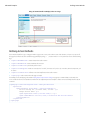
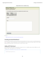
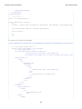
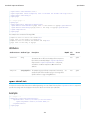
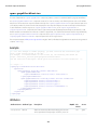
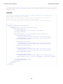
Standard Component Reference apex:enhancedList Note: When an <apex:enhancedList> is rerendered through another component's rerender attribute, the <apex:enhancedList> must be inside of an <apex:outputPanel> component that has its layout attribute set to "block". The <apex:enhancedList> component is not allowed on pages that have the attribute showHeader set to false. You can only have five <apex:enhancedList> components on a single page. Ext JS versions less than 3 should not be included on pages that use this component. See also: <apex:listView>. Example <apex:page> <apex:enhancedList type="Account" height="300" rowsPerPage="10" id="AccountList" /> <apex:enhancedList type="Lead" height="300" rowsPerPage="25" id="LeadList" customizable="False" /> </apex:page> Attributes Attribute Name Attribute Type Description Required? API Access Version customizable Boolean A Boolean value that specifies whether the list can be customized by the current user. If not specified, the default value is true. If this attribute is set to false, the current user will not be able to edit the list definition or change the list name, filter criteria, columns displayed, column order, or visibility. However, the current user's personal preferences can still be set, such as column width or sort order. 14.0 height Integer An integer value that specifies the height of the list in pixels. Yes This value is required. 14.0 id String The database ID of the desired list view. When editing a list view definition, this ID is the 15-character string after 'fcf=' in the browser's address bar. This value is required if type is not specified. 14.0 listId String The Salesforce object for which views are displayed. This value is required if type is not specified. 14.0 oncomplete String The JavaScript that runs after the page is refreshed in the browser. Note that refreshing the page automatically calls this JavaScript, while an inline edit and subsequent save does not. 14.0 rendered Boolean A Boolean value that specifies whether the component is rendered on the page. If not specified, this value defaults to true. 14.0 reRender Object The ID of one or more components that are redrawn when the result of an AJAX update request returns to the client. This value can be a single ID, a comma-separated list of IDs, or a 14.0 412 global Standard Component Reference Attribute Name Attribute Type apex:facet Description Required? API Access Version merge field expression for a list or collection of IDs. Note: When an enhancedList is rerendered through another component's rerender attribute, the enhanceList must be inside of an apex:outputPanel component that has layout attribute set to "block". rowsPerPage Integer An integer value that specifies the number of rows per page. The default value is the preference of the current user. Possible values are 10, 25, 50, 100, 200. Note: If you set the value for greater than 100, a message is automatically displayed to the user, warning of the potential for performance degradation. 14.0 type String The Salesforce object for which views are displayed, for example, type="Account" or type="My_Custom_Object__c". 14.0 width Integer An integer value that specifies the width of the list in pixels. The default value is the available page width, or the width of the browser if the list is not displayed in the initially viewable area of the viewport. 14.0 apex:facet A placeholder for content that's rendered in a specific part of the parent component, such as the header or footer of an <apex:dataTable>. An <apex:facet> component can only exist in the body of a parent component if the parent supports facets. The name of the facet component must match one of the pre-defined facet names on the parent component. This name determines where the content of the facet component is rendered. The order in which a facet component is defined within the body of a parent component doesn't affect the appearance of the parent component. See <apex:dataTable> for an example of facets. Note: Although you can't represent an <apex:facet> directly in Apex, you can specify it on a dynamic component that has the facet. For example: Component.apex.dataTable dt = new Component.apex.dataTable(); dt.facets.header = 'Header Facet'; <!-- For this example to render properly, you must associate the Visualforce page with a valid account record in the URL. For example, if 001D000000IRt53 is the account ID, the resulting URL should be: https://Salesforce_instance/apex/myPage?id=001D000000IRt53 See the Visualforce Developer's Guide Quick Start Tutorial for more information. --> <!-- Shows a two column table of contacts associated with the account. The account column headers are controlled by the facets.--> <apex:page standardController="Account"> <apex:pageBlock title="Contacts"> 413 Standard Component Reference apex:flash <apex:dataTable value="{!account.Contacts}" var="contact" cellPadding="4" border="1"> <apex:column > <apex:facet name="header">Name</apex:facet> {!contact.Name} </apex:column> <apex:column > <apex:facet name="header">Phone</apex:facet> {!contact.Phone} </apex:column> </apex:dataTable> </apex:pageBlock> </apex:page> Attributes Attribute Name Attribute Type name String Description Required? API Access Version The name of the facet to be rendered. This name must match Yes one of the pre-defined facet names on the parent component and determines where the content of the facet component is rendered. For example, the dataTable component includes facets named "header", "footer", and "caption". 10.0 global apex:flash A Flash movie, rendered with the HTML object and embed tags. Example <apex:page sidebar="false" showheader="false"> <apex:flash src="http://www.adobe.com/devnet/flash/samples/drawing_1/1_coordinates.swf" height="300" width="100%" /> </apex:page> Attributes Attribute Name Attribute Type flashvars String Description Required? API Access Version The flashvars attribute can be used to import root level variables to the movie. All variables are created before the 414 14.0 Standard Component Reference Attribute Name Attribute Type apex:form Description Required? API Access Version first frame of the SWF is played. The value should consist of a list of ampersand-separated name-value pairs. height String The height at which this movie is displayed, expressed either Yes as a relative percentage of the total available vertical space (for example, 50%) or as a number of pixels (for example, 100). 14.0 id String An identifier that allows the component to be referenced by other components in the page. 14.0 loop Boolean A Boolean value that specifies whether the flash movie plays repeatedly or just once. If set to true, the flash movie plays repeatedly. If not specified, this value defaults to false. 14.0 play Boolean A Boolean value that specifies whether the flash movie automatically begins playing when displayed. If set to true, the flash movie automatically begins playing. If not specified, the value defaults to false. 14.0 rendered Boolean A Boolean value that specifies whether the component is rendered on the page. If not specified, this value defaults to true. 14.0 src String The path to the movie displayed, expressed as a URL. Note that a flash movie can be stored as a static resource in Salesforce. Yes 14.0 width String The width at which this movie is displayed, expressed either Yes as a relative percentage of the total available horizontal space (for example, 50%) or as a number of pixels (for example, 100). 14.0 global global apex:form A section of a Visualforce page that allows users to enter input and then submit it with an <apex:commandButton> or <apex:commandLink>. The body of the form determines the data that is displayed and the way it's processed. It's a best practice to use only one <apex:form> tag in a page or custom component. As of API version 18.0, this tag can't be a child component of <apex:repeat>. This component supports HTML pass-through attributes using the "html-" prefix. Pass-through attributes are attached to the generated <form> tag. Example <!-- For this example to render properly, you must associate the Visualforce page with a valid case record in the URL. For example, if 001D000000IRt53 is the case ID, the resulting URL should be: https://Salesforce_instance/apex/myPage?id=001D000000IRt53 See the Visualforce Developer's Guide Quick Start Tutorial for more information. --> 415 Standard Component Reference apex:form <apex:page standardController="Case" recordSetVar="cases" tabstyle="case"> <apex:form id="changeStatusForm"> <apex:pageBlock > <apex:pageMessages /> <apex:pageBlockButtons> <apex:commandButton value="Save" action="{!save}"/> </apex:pageBlockButtons> <apex:pageBlockTable value="{!cases}" var="c"> <apex:column value="{!c.casenumber}"/> <apex:column value="{!c.account.name}"/> <apex:column value="{!c.contact.name}"/> <apex:column value="{!c.subject}"/> <apex:column headerValue="Status"> <apex:inputField value="{!c.Status}"/> </apex:column> </apex:pageBlockTable> </apex:pageBlock> </apex:form> </apex:page> The example above renders the following HTML: <!-- allows you to change the status of your cases --> <form id="j_id0:changeStatusForm" name="j_id0:changeStatusForm" method="post" action="/apex/sandbox" enctype="application/x-www-form-urlencoded"> <!-- opening div tags --> <table border="0" cellpadding="0" cellspacing="0"> <tr> <td class="pbTitle"> </td> <td id="j_id0:changeStatusForm:j_id1:j_id29" class="pbButton"> <input type="submit" name="j_id0:changeStatusForm:j_id1:j_id29:j_id30" value="Save" class="btn"/> </td> </tr> </table> <div class="pbBody"> <table class="list" border="0" cellpadding="0" cellspacing="0"> <colgroup span="5"/> <thead> <tr class="headerRow "> <th class="headerRow " scope="col">Case Number</th> <th class="headerRow " scope="col">Account Name</th> <th class="headerRow " scope="col">Name</th> <th class="headerRow " scope="col">Subject</th> <th class="headerRow " scope="col">Status</th> </tr> </thead> <tbody> <tr class="dataRow even first "> <td class="dataCell"><span>00001000</span></td> 416 Standard Component Reference apex:form <td class="dataCell"><span>Edge Communications</span></td> <td class="dataCell"><span>Rose Gonzalez</span></td> <td class="dataCell"><span>Starting generator after electrical failure</span></td> <td class="dataCell"> <select> <option value="">--None--</option> <option value="New">New</option> <option value="Working" selected="selected">Working</option> <option value="Escalated">Escalated</option> <option value="Closed">Closed</option> </select> </td> </tr> <tr class="dataRow odd last "> <td class="dataCell"><span>00001027</span></td> <td class="dataCell"><span>Joyce Bookings</span></td> <td class="dataCell"><span>Andy Young</span></td> <td class="dataCell"><span>Checking paper jam</span></td> <td class="dataCell"> <select> <option value="">--None--</option> <option value="New">New</option> <option value="Working" selected="selected">Working</option> <option value="Escalated">Escalated</option> <option value="Closed">Closed</option> </select> </td> </tr> </tbody> </table> </div> <!-- closing div tags --> </form> Attributes Attribute Name Attribute Type Description Required? API Access Version String A comma-separated list of content types that a server processing this form can handle. Possible values for this attribute include "text/html", "image/png", "image/gif", "video/mpeg", "text/css", and "audio/basic". For more information, including a complete list of possible values, see the W3C specifications. 10.0 global acceptcharset String A comma-separated list of character encodings that a server processing this form can handle. If not specified, this value defaults to "UNKNOWN". 10.0 global accept 417 Standard Component Reference Attribute Name Attribute Type apex:form Description Required? API Access Version dir String The direction in which the generated HTML component should be read. Possible values include "RTL" (right to left) or "LTR" (left to right). 10.0 global enctype String The content type used to submit the form to the server. If not specified, this value defaults to "application/x-www-form-urlencoded". 10.0 global forceSSL Boolean The form will be submitted using SSL, regardless of whether the page itself was served with SSL. The default is false. If the value is false, the form will be submitted using the same protocol as the page. If forceSSL is set to true, when the form is submitted, the page returned will use SSL. 14.0 id String An identifier that allows the form component to be referenced by other components in the page. 10.0 global lang String The base language for the generated HTML output, for example, "en" or "en-US". For more information on this attribute, see the W3C specifications. 10.0 global onclick String The JavaScript invoked if the onclick event occurs--that is, if the user clicks the form. 10.0 global ondblclick String The JavaScript invoked if the ondblclick event occurs--that is, if the user clicks the form twice. 10.0 global onkeydown String The JavaScript invoked if the onkeydown event occurs--that is, if the user presses a keyboard key. 10.0 global onkeypress String The JavaScript invoked if the onkeypress event occurs--that is, if the user presses or holds down a keyboard key. 10.0 global onkeyup String The JavaScript invoked if the onkeyup event occurs--that is, if the user releases a keyboard key. 10.0 global onmousedown String The JavaScript invoked if the onmousedown event occurs--that is, if the user clicks a mouse button. 10.0 global onmousemove String The JavaScript invoked if the onmousemove event occurs--that is, if the user moves the mouse pointer. 10.0 global onmouseout String The JavaScript invoked if the onmouseout event occurs--that is, if the user moves the mouse pointer away from the form. 10.0 global onmouseover String The JavaScript invoked if the onmouseover event occurs--that is, if the user moves the mouse pointer over the form. 10.0 global onmouseup String The JavaScript invoked if the onmouseup event occurs--that is, if the user releases the mouse button. 10.0 global onreset String The JavaScript invoked if the onreset event occurs--that is, if the user clicks the reset button on the form. 10.0 global 418 Standard Component Reference Attribute Name Attribute Type apex:gaugeSeries Description Required? API Access Version onsubmit String The JavaScript invoked if the onsubmit event occurs--that is, if the user clicks the submit button on the form. 10.0 global prependId Boolean A Boolean value that specifies whether or not this form should prepend its ID to the IDs of its child components during the clientid generation process. If not specified, the value defaults to true. 10.0 global rendered Boolean A Boolean value that specifies whether the component is rendered on the page. If not specified, this value defaults to true. 10.0 global style String The style used to display the form component, used primarily for adding inline CSS styles. 10.0 global styleClass String The style class used to display the form component, used primarily to designate which CSS styles are applied when using an external CSS stylesheet. 10.0 global target String The name of the frame that displays the response after the form is submitted. Possible values for this attribute include "_blank", "_parent", "_self", and "_top". You can also specify your own target names by assigning a value to the name attribute of a desired destination. 10.0 global title String The text to display as a tooltip when the user's mouse pointer hovers over this component. 10.0 global apex:gaugeSeries A data series that shows progress along a specific metric. At a minimum you must specify the fields in the data collection to use as label and value pair for the gauge level to be shown. The readability of a gauge chart benefits when you specify meaningful values for the minimum and maximum along the associated <apex:axis>, which must be of type "gauge". Note: This component must be enclosed within an <apex:chart> component. You should put only one <apex:gaugeSeries> in a chart. Example <!-- Page: --> <apex:chart height="250" width="450" animate="true" legend="true" data="{!data}"> <apex:axis type="gauge" position="left" margin="-10" minimum="0" maximum="100" steps="10"/> <apex:gaugeSeries dataField="data1" highlight="true" tips="true" donut="25" colorSet="#F49D10, #ddd"> <apex:chartLabel display="over"/> </apex:gaugeSeries> </apex:chart> 419 Standard Component Reference apex:iframe Attributes Attribute Name Attribute Type Description Required? API Access Version colorSet String A set of color values used as the gauge level fill colors. Colors are specified as HTML-style (hexadecimal) colors, and should be comma separated. For example, #00F,#0F0. 26.0 dataField String The field in the records provided in the chart data from which Yes to retrieve the data value for the gauge level. Only the first record is used. 26.0 donut Integer An integer representing the radius of the hole to place in the center of the gauge chart, as a percentage of the radius of the gauge. The default of 0 creates a gauge chart with no hole, that is, a half-circle. 26.0 highlight Boolean A Boolean value that specifies whether each gauge level should be highlighted when the mouse pointer passes over it. If not specified, this value defaults to true. 26.0 id String An identifier that allows the chart component to be referenced by other components on the page. 26.0 labelField String The field in the records provided in the chart data from which to retrieve the label for the gauge level. Only the first record is used. If not specified, this value defaults to "name". 23.0 needle Boolean A Boolean value that specifies whether to show the gauge needle or not. Defaults to false, don't show the needle. 26.0 rendered Boolean A Boolean value that specifies whether the chart series is rendered in the chart. If not specified, this value defaults to true. 26.0 rendererFn String A string that specifies the name of a JavaScript function that augments or overrides how gauge elements are rendered. Implement to provide additional styling or to augment data. 26.0 tips Boolean A Boolean value that specifies whether to display a tooltip for the gauge level when the mouse pointer passes over it. The format of the tip is <labelField>: <dataField>. If not specified, this value defaults to true. 26.0 global apex:iframe A component that creates an inline frame within a Visualforce page. A frame allows you to keep some information visible while other information is scrolled or replaced. This component supports HTML pass-through attributes using the "html-" prefix. Pass-through attributes are attached to the generated <iframe> tag. 420 Standard Component Reference apex:image Example <apex:iframe src="http://www.salesforce.com" scrolling="true" id="theIframe"/> The example above renders the following HTML: <iframe height="600px" id="theIframe" name="theIframe" src="http://www.salesforce.com" width="100%"></iframe> Attributes Attribute Name Attribute Type Description Required? API Access Version frameborder Boolean A Boolean value that specifies whether a border should surround the inline frame. If not specified, this value defaults to false. 10.0 global height String The height of the inline frame, expressed either as a percentage of the total available vertical space (for example height="50%"), or as the number of pixels (for example, height="300px"). If not specified, this value defaults to 600px. 10.0 global id String An identifier that allows the inline frame component to be referenced by other components in the page. 10.0 global rendered Boolean A Boolean value that specifies whether the component is rendered on the page. If not specified, this value defaults to true. 10.0 global scrolling Boolean A Boolean value that specifies whether the inline frame can be scrolled. If not specified, this value defaults to true. 10.0 global src String The URL that specifies the initial contents of the inline frame. This URL can either be an external website, or another page in the application. 10.0 global title String The text to display as a tooltip when the user's mouse pointer hovers over this component. 10.0 global width String The width of the inline frame, expressed either as a percentage of the total available horizontal space (for example width="80%"), or as the number of pixels (for example, width="600px"). 10.0 global apex:image A graphic image, rendered with the HTML <img> tag. This component supports HTML pass-through attributes using the "html-" prefix. Pass-through attributes are attached to the generated <img> tag. 421 Standard Component Reference apex:image Example <apex:image id="theImage" value="/img/myimage.gif" width="220" height="55"/> The example above renders the following HTML: <img id="theImage" src="/img/myimage.gif" width="220" height="55"/> Resource Example <apex:image id="theImage" value="{!$Resource.myResourceImage}" width="200" height="200"/> The example above renders the following HTML: <img id="theImage" src="<generatedId>/myResourceImage" width="200" height="200"/> Zip Resource Example <apex:image url="{!URLFOR($Resource.TestZip, 'images/Bluehills.jpg')}" width="50" height="50" /> The example above renders the following HTML: <id="theImage" src="[generatedId]/images/Bluehills.jpg" width="50" height="50"/> Attributes Attribute Name Attribute Type Description Required? API Access Version alt String An alternate text description of the image, used for Section 508 compliance. 10.0 global dir String The direction in which the generated HTML component should be read. Possible values include "RTL" (right to left) or "LTR" (left to right). 10.0 global height String The height at which this image should be displayed, expressed either as a relative percentage of the total available vertical space (for example, height="50%") or as a number of pixels (for example, height="100px"). If not specified, this value defaults to the dimension of the source image file. 10.0 global id String An identifier that allows the image component to be referenced by other components in the page. 10.0 global ismap Boolean A Boolean value that specifies whether this image should be used as an image map. If set to true, the image component must be a child of a commandLink component. If not specified, this value defaults to false. 10.0 global 422 Standard Component Reference Attribute Name Attribute Type apex:image Description Required? API Access Version lang String The base language for the generated HTML output, for example, "en" or "en-US". For more information on this attribute, see the W3C specifications. 10.0 global longdesc String A URL that links to a longer description of the image. 10.0 global onclick String The JavaScript invoked if the onclick event occurs--that is, if the user clicks the image. 10.0 global ondblclick String The JavaScript invoked if the ondblclick event occurs--that is, if the user clicks the image twice. 10.0 global onkeydown String The JavaScript invoked if the onkeydown event occurs--that is, if the user presses a keyboard key. 10.0 global onkeypress String The JavaScript invoked if the onkeypress event occurs--that is, if the user presses or holds down a keyboard key. 10.0 global onkeyup String The JavaScript invoked if the onkeyup event occurs--that is, if the user releases a keyboard key. 10.0 global onmousedown String The JavaScript invoked if the onmousedown event occurs--that is, if the user clicks a mouse button. 10.0 global onmousemove String The JavaScript invoked if the onmousemove event occurs--that is, if the user moves the mouse pointer. 10.0 global onmouseout String The JavaScript invoked if the onmouseout event occurs--that is, if the user moves the mouse pointer away from the image. 10.0 global onmouseover String The JavaScript invoked if the onmouseover event occurs--that is, if the user moves the mouse pointer over the image. 10.0 global onmouseup String The JavaScript invoked if the onmouseup event occurs--that is, if the user releases the mouse button. 10.0 global rendered Boolean A Boolean value that specifies whether the component is rendered on the page. If not specified, this value defaults to true. 10.0 global style String The style used to display the image component, used primarily for adding inline CSS styles. 10.0 global styleClass String The style class used to display the image component, used primarily to designate which CSS styles are applied when using an external CSS stylesheet. 10.0 global title String The text to display as a tooltip when the user's mouse pointer hovers over this component. 10.0 global url String The path to the image displayed, expressed either as a URL or as a static resource or document merge field. 10.0 global 423 Standard Component Reference Attribute Name Attribute Type apex:include Description Required? API Access Version usemap String The name of a client-side image map (an HTML map element) for which this element provides the image. 10.0 global value Object The path to the image displayed, expressed either as a URL or as a static resource or document merge field. 10.0 global width String The width at which this image is displayed, expressed either as a relative percentage of the total available horizontal space (for example, width="50%") or as a number of pixels (for example, width="100px"). If not specified, this value defaults to the dimension of the source image file. 10.0 global apex:include A component that inserts a second Visualforce page into the current page. The entire page subtree is injected into the Visualforce DOM at the point of reference and the scope of the included page is maintained. If content should be stripped from the included page, use the <apex:composition> component instead. Example <!-- Page: --> <apex:page id="thePage"> <apex:outputText value="(page) This is the page."/><br/> <apex:include pageName="include"/> </apex:page> <!-- Page: include --> <apex:page id="theIncludedPage"> <apex:outputText value="(include) This is text from another page."/> </apex:page> The example above renders the following HTML: (page) This is the page.<br/> <span id="thePage:include">(include) This is text from another page.</span> Attributes Attribute Name Attribute Type id String Description Required? API Access Version An identifier that allows the inserted page to be referenced by other components in the page. 424 10.0 global Standard Component Reference Attribute Name Attribute Type apex:includeScript Description Required? API Access Version pageName ApexPages.PageReference The Visualforce page whose content should be inserted into Yes the current page. For this value, specify the name of the Visualforce page or use merge-field syntax to reference a page or PageReference. 10.0 global rendered Boolean 10.0 global A Boolean value that specifies whether the component is rendered on the page. If not specified, this value defaults to true. apex:includeScript A link to a JavaScript library that can be used in the Visualforce page. When specified, this component injects a script reference into the <head> element of the generated HTML page. Multiple references to the same script are de-duplicated, making this component safe to use inside an iteration component. This might occur if, for example, you use an <apex:includeScript> inside a custom component, and then use that component inside an <apex:repeat> iteration. For performance reasons, you may simply want to use a JavaScript tag before your closing <apex:page> tag, rather than this component. This component supports HTML pass-through attributes using the "html-" prefix. Pass-through attributes are attached to the generated <script> tag. Example <apex:includeScript value="{!$Resource.example_js}"/> The example above renders the following HTML: <script type='text/javascript' src='/resource/1233160164000/example_js'> Attributes Attribute Name Attribute Type Description Required? API Access Version id String An identifier that allows other components in the page to reference the component. 13.0 loadOnReady Boolean Specify whether the script resource is loaded immediately, or after the document model is constructed. The default value of "false" loads the script immediately. Set to "true" to cause JavaScript referenced by the component to wait to be loaded until the page is "ready." 29.0 Scripts loaded this way will be added to the DOM after the onload event is triggered, instead of immediately. This 425 global Standard Component Reference Attribute Name Attribute Type apex:inlineEditSupport Description Required? API Access Version event occurs after the DOM is constructed, but might be before child frames or external resources, such as images, have finished loading. value Object The URL to the JavaScript file. This can be a reference to a static resource, a best practice, but can also be a plain URL. Yes 13.0 global apex:inlineEditSupport This component provides inline editing support to <apex:outputField> and various container components. In order to support inline editing, this component must also be within an <apex:form> tag. The <apex:inlineEditSupport> component can only be a descendant of the following tags: • <apex:dataList> • <apex:dataTable> • <apex:form> • <apex:outputField> • <apex:pageBlock> • <apex:pageBlockSection> • <apex:pageBlockTable> • <apex:repeat> See also: the inlineEdit attribute of <apex:detail> Example <!-- For this example to render properly, you must associate the Visualforce page with a valid contact record in the URL. For example, if 001D000000IRt53 is the contact ID, the resulting URL should be: https://Salesforce_instance/apex/myPage?id=001D000000IRt53 See the Visualforce Developer's Guide Quick Start Tutorial for more information. --> <apex:page standardController="Contact"> <apex:form > <apex:pageBlock mode="inlineEdit"> <apex:pageBlockButtons > <apex:commandButton action="{!edit}" id="editButton" value="Edit"/> <apex:commandButton action="{!save}" id="saveButton" value="Save"/> <apex:commandButton onclick="resetInlineEdit()" id="cancelButton" value="Cancel"/> </apex:pageBlockButtons> 426 Standard Component Reference apex:input <apex:pageBlockSection > <apex:outputField value="{!contact.lastname}"> <apex:inlineEditSupport showOnEdit="saveButton, cancelButton" hideOnEdit="editButton" event="ondblclick" changedStyleClass="myBoldClass" resetFunction="resetInlineEdit"/> </apex:outputField> <apex:outputField value="{!contact.accountId}"/> <apex:outputField value="{!contact.phone}"/> </apex:pageBlockSection> </apex:pageBlock> </apex:form> </apex:page> Attributes Attribute Name Attribute Type Description Required? API Access Version changedStyleClass String The name of a CSS style class used when the contents of a field have changed. 21.0 disabled Boolean A Boolean value that indicates whether inline editing is enabled or not. If not specified, this value defaults to true. 21.0 event String The name of a standard DOM event, such as ondblclick or onmouseover, that triggers inline editing on a field. 21.0 hideOnEdit Object A comma-separated list of button IDs. These buttons hide when inline editing is activated. 21.0 id String An identifier that allows the component to be referenced by other components in the page. 10.0 rendered Boolean A Boolean value that specifies whether the component is rendered on the page. If not specified, this defaults to true. 21.0 resetFunction String The name of the JavaScript function that is called when values are reset. 21.0 Object A comma-separated list of button IDs. These buttons display when inline editing is activated. 21.0 showOnEdit global apex:input An HTML5-friendly general purpose input component that adapts to the data expected by a form field. It uses the HTML type attribute to allow client browsers to display type-appropriate user input widgets, such as a date picker or range slider, or to perform client-side formatting or validation, such as with a numeric range or a telephone number. Use this component to get user input for a controller property or method that does not correspond to a field on a Salesforce object. This component doesn't use Salesforce styling. Also, since it doesn't correspond to a Salesforce field, or any other data on an object, custom code is required to use the value the user enters. 427 Standard Component Reference apex:input This component supports HTML pass-through attributes using the "html-" prefix. Pass-through attributes are attached to the generated <input> tag. Example <apex:input value="{!inputValue}" id="theTextInput"/> The example above renders the following HTML: <input id="theTextInput" type="text" name="theTextInput" /> Attributes Attribute Name Attribute Type Description Required? API Access Version accesskey String The keyboard access key that puts the field in focus. When the text box is in focus, a user can select or deselect the field value. 29.0 alt String An alternate text description of the field. 29.0 dir String The direction in which the generated HTML component should be read. Possible values include "RTL" (right to left) or "LTR" (left to right). 29.0 disabled Boolean A Boolean value that specifies whether this text box should be displayed in a disabled state. If set to true, the text box appears disabled. If not specified, this value defaults to false. 29.0 id String An identifier that allows the field component to be referenced by other components in the page. 29.0 label String A text value that allows to display a label next to the control and reference the control in the error message 29.0 lang String The base language for the generated HTML output, for example, "en" or "en-US". For more information on this attribute, see the W3C specifications. 29.0 list Object A list of auto-complete values to be added to an HTML <datalist> block associated with the input field. 29.0 The list attribute is specified as either a comma-delimited static string or a Visualforce expression. An expression can resolve to either a comma-delimited string, or a list of objects. List elements can be any data type, as long as that type can be coerced to a string, either as an Apex language feature or via a toString() method. onblur String The JavaScript invoked if the onblur event occurs--that is, if the focus moves off of the field. 428 29.0 global Standard Component Reference Attribute Name Attribute Type apex:input Description Required? API Access Version onchange String The JavaScript invoked if the onchange event occurs--that is, if the user changes the content of the field. 29.0 onclick String The JavaScript invoked if the onclick event occurs--that is, if the user clicks the field. 29.0 ondblclick String The JavaScript invoked if the ondblclick event occurs--that is, if the user clicks the field twice. 29.0 onfocus String The JavaScript invoked if the onfocus event occurs--that is, if the focus is on the field. 29.0 onkeydown String The JavaScript invoked if the onkeydown event occurs--that is, if the user presses a keyboard key. 29.0 onkeypress String The JavaScript invoked if the onkeypress event occurs--that is, if the user presses or holds down a keyboard key. 29.0 onkeyup String The JavaScript invoked if the onkeyup event occurs--that is, if the user releases a keyboard key. 29.0 onmousedown String The JavaScript invoked if the onmousedown event occurs--that is, if the user clicks a mouse button. 29.0 onmousemove String The JavaScript invoked if the onmousemove event occurs--that is, if the user moves the mouse pointer. 29.0 onmouseout String The JavaScript invoked if the onmouseout event occurs--that is, if the user moves the mouse pointer away from the field. 29.0 onmouseover String The JavaScript invoked if the onmouseover event occurs--that is, if the user moves the mouse pointer over the field. 29.0 onmouseup String The JavaScript invoked if the onmouseup event occurs--that is, if the user releases the mouse button. 29.0 rendered Boolean A Boolean value that specifies whether the component is rendered on the page. If not specified, this value defaults to true. 29.0 required Boolean A Boolean value that specifies whether this field is a required field. If set to true, the user must specify a value for this field. If not selected, this value defaults to false. 29.0 size Integer The width of the input field, as expressed by the number of characters that can display at a time. 29.0 style String The style used to display the input component, used primarily for adding inline CSS styles. 29.0 styleClass String The style class used to display the input component, used primarily to designate which CSS styles are applied when using an external CSS stylesheet. 29.0 429 Standard Component Reference Attribute Name Attribute Type apex:inputCheckbox Description Required? API Access Version tabindex String The order in which this field is selected compared to other page components when a user presses the Tab key repeatedly. This value must be an integer between 0 and 32767, with component 0 being the first component that is selected when a user presses the Tab key. 29.0 title String The text to display as a tooltip when the user's mouse pointer hovers over this component. 29.0 type String The HTML5 type attribute to add to the generated <input> element. Valid type values are: 29.0 • auto • date • datetime • datetime-local • month • week • time • email • number • range • search • tel • text • url value Object An expression that references the controller class variable that is associated with this field. For example, if the name of the associated variable in the controller class is myTextField, use value="{!myTextField}" to reference the variable. 29.0 apex:inputCheckbox An HTML input element of type checkbox. Use this component to get user input for a controller method that does not correspond to a field on a Salesforce object. This component supports HTML pass-through attributes using the "html-" prefix. Pass-through attributes are attached to the generated <input> tag. 430 Standard Component Reference apex:inputCheckbox Example <!-- For this example to render properly, you must associate the Visualforce page with a valid opportunity record in the URL. For example, if 001D000000IRt53 is the opportunity ID, the resulting URL should be: https://Salesforce_instance/apex/myPage?id=001D000000IRt53 See the Visualforce Developer's Guide Quick Start Tutorial for more information. --> <apex:page standardController="Opportunity" recordSetVar="opportunities" tabstyle="opportunity"> <apex:form id="changePrivacyForm"> <apex:pageBlock > <apex:pageMessages /> <apex:pageBlockButtons> <apex:commandButton value="Save" action="{!save}"/> </apex:pageBlockButtons> <apex:pageBlockTable value="{!opportunities}" var="o"> <apex:column value="{!o.name}"/> <apex:column value="{!o.account.name}"/> <apex:column headerValue="Private?"> <apex:inputCheckbox value="{!o.isprivate}"/> </apex:column> </apex:pageBlockTable> </apex:pageBlock> </apex:form> </apex:page> The example above renders the following HTML: <!-- allows you to change the privacy option of your opportunity --> <form id="j_id0:changePrivacyForm" name="j_id0:changeStatusForm" method="post" action="/apex/sandbox" enctype="application/x-www-form-urlencoded"> <!-- opening div tags --> <table border="0" cellpadding="0" cellspacing="0"> <tr> <td class="pbTitle"> </td> <td id="j_id0:changePrivacyForm:j_id1:j_id29" class="pbButton"> <input type="submit" name="j_id0:changePrivacyForm:j_id1:j_id29:j_id30" value="Save" class="btn"/> </td> </tr> </table> <div class="pbBody"> <table class="list" border="0" cellpadding="0" cellspacing="0"> <colgroup span="3"/> <thead> <tr class="headerRow "> <th class="headerRow " scope="col">Opportunity Name</th> <th class="headerRow " scope="col">Account Name</th> <th class="headerRow " scope="col">Privacy?</th> </tr> </thead> 431 Standard Component Reference apex:inputCheckbox <tbody> <tr class="dataRow even first "> <td class="dataCell"><span>Burlington Textiles Weaving Plant Generator</span></td> <td class="dataCell"><span>Burlington Textiles Corp of America</span></td> <td class="dataCell"><input type="checkbox" name="j_id0:changePrivacyForm:j_id1:j_id31:0:j_id35" checked="checked" /></td> </tr> <tr class="dataRow odd last "> <td class="dataCell"><span>Edge Emergency Generator</span></td> <td class="dataCell"><span>Edge Communications</span></td> <td class="dataCell"><input type="checkbox" name="j_id0:changePrivacyForm:j_id1:j_id31:0:j_id35" checked="checked" /></td> </tr> </tbody> </table> </div> <!-- closing div tags --> </form> Attributes Attribute Name Attribute Type Description Required? API Access Version accesskey String The keyboard access key that puts the checkbox in focus. When the checkbox is in focus, a user can select or deselect the checkbox value. 10.0 global dir String The direction in which the generated HTML component should be read. Possible values include "RTL" (right to left) or "LTR" (left to right). 10.0 global disabled Boolean A Boolean value that specifies whether this checkbox should be displayed in a disabled state. If set to true, the checkbox appears disabled. If not specified, this value defaults to false. 10.0 global id String An identifier that allows the checkbox component to be referenced by other components in the page. 10.0 global immediate Boolean A Boolean value that specifies whether the action associated with this component should happen immediately, without processing any validation rules associated with the fields on the page. If set to true, the action happens immediately and validation rules are skipped. If not specified, this value defaults to false. 11.0 global label String A text value that allows to display a label next to the control and reference the control in the error message 23.0 432 Standard Component Reference Attribute Name Attribute Type apex:inputCheckbox Description Required? API Access Version lang String The base language for the generated HTML output, for example, "en" or "en-US". For more information on this attribute, see the W3C specifications. 10.0 global onblur String The JavaScript invoked if the onblur event occurs--that is, if the focus moves off of the checkbox. 10.0 global onchange String The JavaScript invoked if the onchange event occurs--that is, if the user changes the content of the checkbox field. 10.0 global onclick String The JavaScript invoked if the onclick event occurs--that is, if the user clicks the checkbox. 10.0 global ondblclick String The JavaScript invoked if the ondblclick event occurs--that is, if the user clicks the checkbox twice. 10.0 global onfocus String The JavaScript invoked if the onfocus event occurs--that is, if the focus is on the checkbox. 10.0 global onkeydown String The JavaScript invoked if the onkeydown event occurs--that is, if the user presses a keyboard key. 10.0 global onkeypress String The JavaScript invoked if the onkeypress event occurs--that is, if the user presses or holds down a keyboard key. 10.0 global onkeyup String The JavaScript invoked if the onkeyup event occurs--that is, if the user releases a keyboard key. 10.0 global onmousedown String The JavaScript invoked if the onmousedown event occurs--that is, if the user clicks a mouse button. 10.0 global onmousemove String The JavaScript invoked if the onmousemove event occurs--that is, if the user moves the mouse pointer. 10.0 global onmouseout String The JavaScript invoked if the onmouseout event occurs--that is, if the user moves the mouse pointer away from the checkbox. 10.0 global onmouseover String The JavaScript invoked if the onmouseover event occurs--that is, if the user moves the mouse pointer over the checkbox. 10.0 global onmouseup String The JavaScript invoked if the onmouseup event occurs--that is, if the user releases the mouse button. 10.0 global onselect String The JavaScript invoked if the onselect event occurs--that is, if the user selects the checkbox. 10.0 global rendered Boolean A Boolean value that specifies whether the component is rendered on the page. If not specified, this value defaults to true. 10.0 global 433 Standard Component Reference Attribute Name Attribute Type apex:inputField Description Required? API Access Version required Boolean A Boolean value that specifies whether this checkbox is a required field. If set to true, the user must specify a value for this checkbox. If not selected, this value defaults to false. 10.0 global selected Boolean A Boolean value that specifies whether this checkbox should be rendered in its "checked" state. If not selected, this value defaults to false. 10.0 global style String The style used to display the inputCheckbox component, used primarily for adding inline CSS styles. 10.0 global styleClass String The style class used to display the inputCheckbox component, used primarily to designate which CSS styles are applied when using an external CSS stylesheet. 10.0 global tabindex String The order in which this checkbox is selected compared to other page components when a user presses the Tab key repeatedly. This value must be an integer between 0 and 32767, with component 0 being the first component that is selected when a user presses the Tab key. 10.0 global title String The text to display as a tooltip when the user's mouse pointer hovers over this component. 10.0 global value Object A merge field that references the controller class variable that is associated with this checkbox. For example, if the name of the associated variable in the controller class is myCheckbox, use value="{!myCheckbox}" to reference the variable. 10.0 global apex:inputField An HTML input element for a value that corresponds to a field on a Salesforce object. The <apex:inputField> component respects the attributes of the associated field, including whether the field is required or unique, and the user interface widget to display to get input from the user. For example, if the specified <apex:inputField> component is a date field, a calendar input widget is displayed. When used in an <apex:pageBlockSection>, <apex:inputField> tags always display with their corresponding output label. Note that if custom help is defined for the field in Setup, the field must be a child of an <apex:pageBlock> or <apex:pageBlockSectionItem>, and the Salesforce page header must be displayed for the custom help to appear on your Visualforce page. To override the display of custom help, use the <apex:inputField> in the body of an <apex:pageBlockSectionItem>. Consider the following when using DOM events with this tag: • For lookup fields, mouse events fire on both the text box and graphic icon • For multi-select picklists, all events fire, but the DOM ID is suffixed with _unselected for the left box, _selected for the right box, and _right_arrow and _left_arrow for the graphic icons • For rich text areas, no events fire. 434 Standard Component Reference apex:inputField Note: • Read-only fields, and fields for certain Salesforce objects with complex automatic behavior, such as Event.StartDateTime and Event.EndDateTime, don't render as editable when using <apex:inputField>. Use a different input component such as <apex:inputText> instead. • An <apex:inputField> component for a rich text area field can't be used for image uploads in Site.com sites or Force.com Sites due to security constraints. If you want to enable users to upload image files in either of those contexts, use an <apex:inputFile> component. • If custom help is defined for the field in Setup, the field must be a child of an <apex:pageBlock> or <apex:pageBlockSectionItem>, and the Salesforce page header must be displayed for the custom help to appear on your Visualforce page. To override the display of custom help, use the <apex:inputField> in the body of an <apex:pageBlockSectionItem>. Beginning with API version 20.0, an inputField matched to a field with a default value has the default value prepopulated on the Visualforce page. This component supports HTML pass-through attributes using the "html-" prefix. Pass-through attributes are attached to the generated <input> tag. <!-- For this example to render properly, you must associate the Visualforce page with a valid account record in the URL. For example, if 001D000000IRt53 is the account ID, the resulting URL should be: https://Salesforce_instance/apex/myPage?id=001D000000IRt53 See the Visualforce Developer's Guide Quick Start Tutorial for more information. --> <apex:page standardController="Account"> <apex:form> <apex:pageBlock title="My Content" mode="edit"> <apex:pageBlockButtons> <apex:commandButton action="{!save}" value="Save"/> </apex:pageBlockButtons> <apex:pageBlockSection title="My Content Section" columns="2"> <apex:inputField value="{!account.name}"/> <apex:inputField value="{!account.site}"/> <apex:inputField value="{!account.type}"/> <apex:inputField value="{!account.accountNumber}"/> </apex:pageBlockSection> </apex:pageBlock> </apex:form> </apex:page> Attributes Attribute Name Attribute Type id String Description Required? API Access Version An identifier that allows the inputField component to be referenced by other components in the page. 435 10.0 global Standard Component Reference Attribute Name Attribute Type apex:inputField Description Required? API Access Version label String A text value that allows you to override the default label that is displayed for the field. You can set label to an empty string to hide the label on forms. Setting it to null is an error. 23.0 list Object A list of auto-complete values to be added to an HTML <datalist> block associated with the input field. 29.0 The list attribute is specified as either a comma-delimited static string or a Visualforce expression. An expression can resolve to either a comma-delimited string, or a list of objects. List elements can be any data type, as long as that type can be coerced to a string, either as an Apex language feature or via a toString() method. onblur String The JavaScript invoked if the onblur event occurs--that is, if the focus moves off of the field. 12.0 global onchange String The JavaScript invoked if the onchange event occurs--that is, if the user changes the content of the field. 12.0 global onclick String The JavaScript invoked if the onclick event occurs--that is, if the user clicks the field. 12.0 global ondblclick String The JavaScript invoked if the ondblclick event occurs--that is, if the user clicks the field twice. 12.0 global onfocus String The JavaScript invoked if the onfocus event occurs--that is, if the focus is on the field. 12.0 global onkeydown String The JavaScript invoked if the onkeydown event occurs--that is, if the user presses a keyboard key. 12.0 global onkeypress String The JavaScript invoked if the onkeypress event occurs--that is, if the user presses or holds down a keyboard key. 12.0 global onkeyup String The JavaScript invoked if the onkeyup event occurs--that is, if the user releases a keyboard key. 12.0 global onmousedown String The JavaScript invoked if the onmousedown event occurs--that is, if the user clicks a mouse button. 12.0 global onmousemove String The JavaScript invoked if the onmousemove event occurs--that is, if the user moves the mouse pointer. 12.0 global onmouseout String The JavaScript invoked if the onmouseout event occurs--that is, if the user moves the mouse pointer away from the field. 12.0 global onmouseover String The JavaScript invoked if the onmouseover event occurs--that is, if the user moves the mouse pointer over the field. 12.0 global onmouseup String The JavaScript invoked if the onmouseup event occurs--that is, if the user releases the mouse button. 12.0 global 436 Standard Component Reference Attribute Name Attribute Type apex:inputField Description Required? API Access Version onselect String The JavaScript invoked if the onselect event occurs--that is, if the user selects a checkbox associated with this field. 12.0 global rendered Boolean A Boolean value that specifies whether the component is rendered on the page. If not specified, this value defaults to true. 10.0 global required Boolean A Boolean value that specifies whether this inputField is a required field. If set to true, the user must specify a value for this field. If not selected, this value defaults to false. Note that if this input field displays a custom object name its value can be set to nil and will not be required unless you set this attribute to true. The same does not apply to standard object names, which are always required regardless of this attribute. 10.0 global Whether to use the Visualforce date picker for this field, or suppress it in favor of a browser-based date picker. 29.0 showDatePicker Boolean This attribute only affects date and datetime fields, and activating a browser-based type-appropriate selection widget requires the type attribute be set to one of these date- or time-compatible types: • date • datetime • datetime-local • month • week • time style String The CSS style used to display the inputField component. This attribute may not work for all values. If your text requires a class name, use a wrapping span tag. 12.0 global styleClass String The CSS style class used to display the inputField component. This attribute may not work for all values. If your text requires a class name, use a wrapping span tag. 12.0 global A hint to indicate the relative order in which this field is selected compared to other page components when a user presses the Tab key repeatedly. This value must be an integer between 1 and 3276, with component 1 being the first component that is selected when a user presses the Tab key. 23.0 The HTML5 type attribute to add to the generated <input> element. Valid type values are: 29.0 taborderhint Integer type String • auto • date 437 Standard Component Reference Attribute Name Attribute Type apex:inputFile Description Required? API Access Version • datetime • datetime-local • month • week • time • email • number • range • search • tel • text • url value Object A merge field that references the Salesforce field that is associated with this inputField. For example, if you want to display an input field for an account's name field, use value="{!account.name}". You can't associate this inputField with a formula merge field of type currency if your organization is using dated exchange rates. 10.0 apex:inputFile A component that creates an input field to upload a file. Note: The maximum file size that can be uploaded via Visualforce is 10 MB. Example <!-- Upload a file and put it in your personal documents folder--> <!-- Page: --> <apex:page standardController="Document" extensions="documentExt"> <apex:messages /> <apex:form id="theForm"> <apex:pageBlock> <apex:pageBlockSection> <apex:inputFile value="{!document.body}" filename="{!document.name}"/> <apex:commandButton value="Save" action="{!save}"/> </apex:pageBlockSection> </apex:pageBlock> </apex:form> </apex:page> /*** Controller ***/ 438 global Standard Component Reference apex:inputFile public class documentExt { public documentExt(ApexPages.StandardController controller) { Document d = (Document) controller.getRecord(); d.folderid = UserInfo.getUserId(); //this puts it in My Personal Documents } } Attributes Attribute Name Attribute Type Description Required? API Access Version accept String Comma-delimited set of content types. This list can be used by the browser to limit the set of file options that is made available for selection. If not specified, no content type list will be sent and all file types will be accessible. 14.0 accessKey String The keyboard access key that puts the component in focus. 14.0 alt String An alternate text description of the component. 14.0 contentType String String property that stores the uploaded file's content type. 14.0 dir String The direction in which the generated HTML component should be read. Possible values include "RTL" (right to left) or "LTR" (left to right). 14.0 disabled Boolean A Boolean value that specifies whether this component should be displayed in a disabled state. If set to true, the component appears disabled. If not specified, this value defaults to false. 14.0 fileName String String property that stores the uploaded file's name. 14.0 fileSize Integer Integer property that stores the uploaded file's size. 14.0 id String An identifier that allows the component to be referenced by other components in the page. 14.0 lang String The base language for the generated HTML output, for example, "en" or "en-US". For more information, see the W3C specification on this attribute: http://www.w3.org/TR/REC-html40/struct/dirlang.html 14.0 onblur String The JavaScript invoked if the onblur event occurs--that is, if the focus moves off of the component. 14.0 onchange String The JavaScript invoked if the onchange event occurs--that is, if the user changes the content of the component field. 14.0 onclick String The JavaScript invoked if the onclick event occurs--that is, if the user clicks the component. 14.0 ondblclick String The JavaScript invoked if the ondblclick event occurs--that is, if the user clicks the component twice. 14.0 439 global Standard Component Reference Attribute Name Attribute Type apex:inputFile Description Required? API Access Version onfocus String The JavaScript invoked if the onfocus event occurs--that is, if the focus is on the component. 14.0 onkeydown String The JavaScript invoked if the onkeydown event occurs--that is, if the user presses a keyboard key. 14.0 onkeypress String The JavaScript invoked if the onkeypress event occurs--that is, if the user presses or holds down a keyboard key. 14.0 onkeyup String The JavaScript invoked if the onkeyup event occurs--that is, if the user releases a keyboard key. 14.0 onmousedown String The JavaScript invoked if the onmousedown event occurs--that is, if the user clicks a mouse button. 14.0 onmousemove String The JavaScript invoked if the onmousemove event occurs--that is, if the user moves the mouse pointer. 14.0 onmouseout String The JavaScript invoked if the onmouseout event occurs--that is, if the user moves the mouse pointer away from the component. 14.0 onmouseover String The JavaScript invoked if the onmouseover event occurs--that is, if the user moves the mouse pointer over the component. 14.0 rendered Boolean A Boolean value that specifies whether the component is rendered on the page. If not specified, this value defaults to true. 14.0 required Boolean A Boolean value that specifies whether this component is a required field. If set to true, the user must specify a value for this component. If not selected, this value defaults to false. 14.0 size Integer Size of the file selection box to be displayed. 14.0 style String The style used to display the component, used primarily for adding inline CSS styles. 14.0 styleclass String The style class used to display the component, used primarily to designate which CSS styles are applied when using an external CSS stylesheet. 14.0 tabindex Integer The order in which this component is selected compared to other page components when a user presses the Tab key repeatedly. This value must be an integer between 0 and 32767, with component 0 being the first component that is selected when a user presses the Tab key. 14.0 title String The text displayed next to the component when the mouse hovers over it. 14.0 value Blob A merge field that references the controller class variable that Yes is associated with this component. For example, if the name 14.0 440 global Standard Component Reference Attribute Name Attribute Type apex:inputHidden Description Required? API Access Version of the associated variable in the controller class is myInputFile, use value="#{myInputFile}" to reference the variable. apex:inputHidden An HTML input element of type hidden, that is, an input element that is invisible to the user. Use this component to pass variables from page to page. This component supports HTML pass-through attributes using the "html-" prefix. Pass-through attributes are attached to the generated <input> tag. Example <apex:inputHidden value="{!inputValue}" id="theHiddenInput"/> The example above renders the following HTML: <input id="theHiddenInput" type="hidden" name="theHiddenInput" /> Attributes Attribute Name Attribute Type Description Required? API Access Version id String An identifier that allows the inputHidden component to be referenced by other components in the page. 10.0 global immediate Boolean A Boolean value that specifies whether the action associated with this component should happen immediately, without processing any validation rules associated with the fields on the page. If set to true, the action happens immediately and validation rules are skipped. If not specified, this value defaults to false. 11.0 global rendered Boolean A Boolean value that specifies whether the component is rendered on the page. If not specified, this value defaults to true. 10.0 global required Boolean A Boolean value that specifies whether this inputHidden field is a required field. If set to true, the a value must be specified for this field. If not selected, this value defaults to false. 10.0 global value Object A merge field that references the controller class variable that is associated with this hidden input field. For example, if the name of the associated variable in the controller class is myHiddenVariable, use value="{!myHiddenVariable}" to reference the variable. 10.0 global 441 Standard Component Reference apex:inputSecret apex:inputSecret An HTML input element of type password. Use this component to get user input for a controller method that does not correspond to a field on a Salesforce object, for a value that is masked as the user types. This component supports HTML pass-through attributes using the "html-" prefix. Pass-through attributes are attached to the generated <input> tag. Example <apex:inputSecret value="{!inputValue}" id="theSecretInput"/> The example above renders the following HTML: <input id="theSecretInput" type="password" name="theSecretInput" value="" /> Attributes Attribute Name Attribute Type Description Required? API Access Version accesskey String The keyboard access key that puts the field in focus. When the field is in focus, a user can enter a value. 10.0 global alt String An alternate text description of the field. 10.0 global dir String The direction in which the generated HTML component should be read. Possible values include "RTL" (right to left) or "LTR" (left to right). 10.0 global disabled Boolean A Boolean value that specifies whether this field should be displayed in a disabled state. If set to true, the field appears disabled. If not specified, this value defaults to false. 10.0 global id String An identifier that allows the checkbox component to be referenced by other components in the page. 10.0 global immediate Boolean A Boolean value that specifies whether the action associated with this component should happen immediately, without processing any validation rules associated with the fields on the page. If set to true, the action happens immediately and validation rules are skipped. If not specified, this value defaults to false. 11.0 global label String A text value that allows to display a label next to the control and reference the control in the error message 23.0 lang String The base language for the generated HTML output, for example, "en" or "en-US". For more information on this attribute, see the W3C specifications. 10.0 442 global Standard Component Reference Attribute Name Attribute Type apex:inputSecret Description Required? API Access Version maxlength Integer The maximum number of characters that a user can enter for this field, expressed as an integer. 10.0 global onblur String The JavaScript invoked if the onblur event occurs--that is, if the focus moves off of the field. 10.0 global onchange String The JavaScript invoked if the onchange event occurs--that is, if the user changes the content of the field. 10.0 global onclick String The JavaScript invoked if the onclick event occurs--that is, if the user clicks the field. 10.0 global ondblclick String The JavaScript invoked if the ondblclick event occurs--that is, if the user clicks the field twice. 10.0 global onfocus String The JavaScript invoked if the onfocus event occurs--that is, if the focus is on the field. 10.0 global onkeydown String The JavaScript invoked if the onkeydown event occurs--that is, if the user presses a keyboard key. 10.0 global onkeypress String The JavaScript invoked if the onkeypress event occurs--that is, if the user presses or holds down a keyboard key. 10.0 global onkeyup String The JavaScript invoked if the onkeyup event occurs--that is, if the user releases a keyboard key. 10.0 global onmousedown String The JavaScript invoked if the onmousedown event occurs--that is, if the user clicks a mouse button. 10.0 global onmousemove String The JavaScript invoked if the onmousemove event occurs--that is, if the user moves the mouse pointer. 10.0 global onmouseout String The JavaScript invoked if the onmouseout event occurs--that is, if the user moves the mouse pointer away from the field. 10.0 global onmouseover String The JavaScript invoked if the onmouseover event occurs--that is, if the user moves the mouse pointer over the field. 10.0 global onmouseup String The JavaScript invoked if the onmouseup event occurs--that is, if the user releases the mouse button. 10.0 global onselect String The JavaScript invoked if the onselect event occurs--that is, if the user selects text in the field. 10.0 global readonly Boolean A Boolean value that specifies whether this field is rendered as read-only. If set to true, the field value cannot be changed. If not selected, this value defaults to false. 10.0 global redisplay Boolean A Boolean value that specifies whether a previously entered password is rendered in this form. If set to true, the previously entered value is displayed with its mask. If not specified, this value defaults to false. 10.0 global 443 Standard Component Reference Attribute Name Attribute Type apex:inputText Description Required? API Access Version rendered Boolean A Boolean value that specifies whether the component is rendered on the page. If not specified, this value defaults to true. 10.0 global required Boolean A Boolean value that specifies whether this field is a required field. If set to true, the user must specify a value for this field. If not selected, this value defaults to false. 10.0 global size Integer The width of the field, as expressed by the number of characters that can display at a time. 10.0 global style String The style used to display the inputSecret component, used primarily for adding inline CSS styles. 10.0 global styleClass String The style class used to display the inputSecret component, used primarily to designate which CSS styles are applied when using an external CSS stylesheet. 10.0 global tabindex String The order in which this field is selected compared to other page components when a user presses the Tab key repeatedly. This value must be an integer between 0 and 32767, with component 0 being the first component that is selected when a user presses the Tab key. 10.0 global title String The text to display as a tooltip when the user's mouse pointer hovers over this component. 10.0 global value Object A merge field that references the controller class variable that is associated with this field. For example, if the name of the associated variable in the controller class is myPasswordField, use value="{!myPasswordField}" to reference the variable. 10.0 global apex:inputText An HTML input element of type text. Use this component to get user input for a controller method that does not correspond to a field on a Salesforce object. This component doesn't use Salesforce styling. Also, since it doesn't correspond to a field, or any other data on an object, custom code is required to use the value the user enters. This component supports HTML pass-through attributes using the "html-" prefix. Pass-through attributes are attached to the generated <input> tag. Example <apex:inputText value="{!inputValue}" id="theTextInput"/> 444 Standard Component Reference apex:inputText The example above renders the following HTML: <input id="theTextInput" type="text" name="theTextInput" /> Attributes Attribute Name Attribute Type Description Required? API Access Version accesskey String The keyboard access key that puts the field in focus. When the text box is in focus, a user can select or deselect the field value. 10.0 global alt String An alternate text description of the field. 10.0 global dir String The direction in which the generated HTML component should be read. Possible values include "RTL" (right to left) or "LTR" (left to right). 10.0 global disabled Boolean A Boolean value that specifies whether this text box should be displayed in a disabled state. If set to true, the text box appears disabled. If not specified, this value defaults to false. 10.0 global id String An identifier that allows the field component to be referenced by other components in the page. 10.0 global label String A text value that allows to display a label next to the control and reference the control in the error message 23.0 lang String The base language for the generated HTML output, for example, "en" or "en-US". For more information on this attribute, see the W3C specifications. 10.0 list Object A list of auto-complete values to be added to an HTML <datalist> block associated with the input field. 29.0 global The list attribute is specified as either a comma-delimited static string or a Visualforce expression. An expression can resolve to either a comma-delimited string, or a list of objects. List elements can be any data type, as long as that type can be coerced to a string, either as an Apex language feature or via a toString() method. maxlength Integer The maximum number of characters that a user can enter for this field, expressed as an integer. 10.0 global onblur String The JavaScript invoked if the onblur event occurs--that is, if the focus moves off of the field. 10.0 global onchange String The JavaScript invoked if the onchange event occurs--that is, if the user changes the content of the field. 10.0 global onclick String The JavaScript invoked if the onclick event occurs--that is, if the user clicks the field. 10.0 global 445 Standard Component Reference Attribute Name Attribute Type apex:inputText Description Required? API Access Version ondblclick String The JavaScript invoked if the ondblclick event occurs--that is, if the user clicks the field twice. 10.0 global onfocus String The JavaScript invoked if the onfocus event occurs--that is, if the focus is on the field. 10.0 global onkeydown String The JavaScript invoked if the onkeydown event occurs--that is, if the user presses a keyboard key. 10.0 global onkeypress String The JavaScript invoked if the onkeypress event occurs--that is, if the user presses or holds down a keyboard key. 10.0 global onkeyup String The JavaScript invoked if the onkeyup event occurs--that is, if the user releases a keyboard key. 10.0 global onmousedown String The JavaScript invoked if the onmousedown event occurs--that is, if the user clicks a mouse button. 10.0 global onmousemove String The JavaScript invoked if the onmousemove event occurs--that is, if the user moves the mouse pointer. 10.0 global onmouseout String The JavaScript invoked if the onmouseout event occurs--that is, if the user moves the mouse pointer away from the field. 10.0 global onmouseover String The JavaScript invoked if the onmouseover event occurs--that is, if the user moves the mouse pointer over the field. 10.0 global onmouseup String The JavaScript invoked if the onmouseup event occurs--that is, if the user releases the mouse button. 10.0 global rendered Boolean A Boolean value that specifies whether the component is rendered on the page. If not specified, this value defaults to true. 10.0 global required Boolean A Boolean value that specifies whether this field is a required field. If set to true, the user must specify a value for this field. If not selected, this value defaults to false. 10.0 global size Integer The width of the input field, as expressed by the number of characters that can display at a time. 10.0 global style String The style used to display the inputText component, used primarily for adding inline CSS styles. 10.0 global styleClass String The style class used to display the inputText component, used primarily to designate which CSS styles are applied when using an external CSS stylesheet. 10.0 global tabindex String The order in which this field is selected compared to other page components when a user presses the Tab key repeatedly. This value must be an integer between 0 and 32767, with component 0 being the first component that is selected when a user presses the Tab key. 10.0 global 446 Standard Component Reference Attribute Name Attribute Type apex:inputTextarea Description Required? API Access Version title String The text to display as a tooltip when the user's mouse pointer hovers over this component. 10.0 global value Object A merge field that references the controller class variable that is associated with this field. For example, if the name of the associated variable in the controller class is myTextField, use value="{!myTextField}" to reference the variable. 10.0 global apex:inputTextarea A text area input element. Use this component to get user input for a controller method that does not correspond to a field on a Salesforce object, for a value that requires a text area. This component supports HTML pass-through attributes using the "html-" prefix. Pass-through attributes are attached to the generated <textarea> tag. Example <!-- For this example to render properly, you must associate the Visualforce page with a valid contract record in the URL. For example, if 001D000000IRt53 is the contract ID, the resulting URL should be: https://Salesforce_instance/apex/myPage?id=001D000000IRt53 See the Visualforce Developer's Guide Quick Start Tutorial for more information. --> <apex:page standardController="Contract"> <apex:form id="changeDescription"> <apex:pageBlock> <p>Current description: {!contract.description}</p> <p>Change description to:</p> <apex:inputTextarea id="newDesc" value="{!contract.description}"/><p/> <apex:commandButton value="Save" action="{!save}"/> </apex:pageBlock> </apex:form> </apex:page> The example above renders the following HTML: <!-- changes the value of {!contract.description} on save --> <form id="j_id0:changeDescription" name="j_id0:changeDescription" method="post" action="/apex/sandbox" enctype="application/x-www-form-urlencoded"> <input type="hidden" name="j_id0:changeDescription" value="j_id0:changeDescription" /> <!-- opening div tags --> <p>Current description: To facilitate better deals</p> <p>Change description to:</p> <textarea id="j_id0:changeDescription:j_id1:newDesc" name="j_id0:changeDescription:j_id1:newDesc"/> <input type="submit" name="j_id0:changeDescription:j_id1:j_id4" value="Save" 447 Standard Component Reference apex:inputTextarea class="btn" /> <!-- closing div tags --> </form> Attributes Attribute Name Attribute Type Description Required? API Access Version accesskey String The keyboard access key that puts the text area in focus. When the text area is in focus, a user can enter a value. 10.0 global cols Integer The width of the field, as expressed by the number of characters that can display in a single row at a time. 10.0 global dir String The direction in which the generated HTML component should be read. Possible values include "RTL" (right to left) or "LTR" (left to right). 10.0 global disabled Boolean A Boolean value that specifies whether this text area should be displayed in a disabled state. If set to true, the text area appears disabled. If not specified, this value defaults to false. 10.0 global id String An identifier that allows the checkbox component to be referenced by other components in the page. 10.0 global label String A text value that allows to display a label next to the control and reference the control in the error message 23.0 lang String The base language for the generated HTML output, for example, "en" or "en-US". For more information on this attribute, see the W3C specifications. 10.0 global onblur String The JavaScript invoked if the onblur event occurs--that is, if the focus moves off of the text area. 10.0 global onchange String The JavaScript invoked if the onchange event occurs--that is, if the user changes the content of the text area. 10.0 global onclick String The JavaScript invoked if the onclick event occurs--that is, if the user clicks the text area. 10.0 global ondblclick String The JavaScript invoked if the ondblclick event occurs--that is, if the user clicks the text area twice. 10.0 global onfocus String The JavaScript invoked if the onfocus event occurs--that is, if the focus is on the text area. 10.0 global onkeydown String The JavaScript invoked if the onkeydown event occurs--that is, if the user presses a keyboard key. 10.0 global onkeypress String The JavaScript invoked if the onkeypress event occurs--that is, if the user presses or holds down a keyboard key. 10.0 global 448 Standard Component Reference Attribute Name Attribute Type apex:inputTextarea Description Required? API Access Version onkeyup String The JavaScript invoked if the onkeyup event occurs--that is, if the user releases a keyboard key. 10.0 global onmousedown String The JavaScript invoked if the onmousedown event occurs--that is, if the user clicks a mouse button. 10.0 global onmousemove String The JavaScript invoked if the onmousemove event occurs--that is, if the user moves the mouse pointer. 10.0 global onmouseout String The JavaScript invoked if the onmouseout event occurs--that is, if the user moves the mouse pointer away from the text area. 10.0 global onmouseover String The JavaScript invoked if the onmouseover event occurs--that is, if the user moves the mouse pointer over the text area. 10.0 global onmouseup String The JavaScript invoked if the onmouseup event occurs--that is, if the user releases the mouse button. 10.0 global onselect String The JavaScript invoked if the onselect event occurs--that is, if the user selects text in the text area. 10.0 global readonly Boolean A Boolean value that specifies whether this text area should be rendered as read-only. If set to true, the text area value cannot be changed. If not selected, this value defaults to false. 10.0 global rendered Boolean A Boolean value that specifies whether the component is rendered on the page. If not specified, this value defaults to true. 10.0 global required Boolean A Boolean value that specifies whether this text area is a required field. If set to true, the user must specify a value for this text area. If not selected, this value defaults to false. 10.0 global richText Boolean A Boolean value that specifies whether this text area should save as rich text or plain text. If set to true, the value saves as rich text. If not selected, this value defaults to false. 10.0 global rows Integer The height of the text area, as expressed by the number of rows that can display at a time. 10.0 global style String The style used to display the text area component, used primarily for adding inline CSS styles. 10.0 global styleClass String The style class used to display the text area component, used primarily to designate which CSS styles are applied when using an external CSS stylesheet. 10.0 global tabindex String The order in which this text area is selected compared to other page components when a user presses the Tab key repeatedly. This value must be an integer between 0 and 32767, with 10.0 global 449 Standard Component Reference apex:insert Attribute Name Attribute Type Description Required? API Access Version component 0 being the first component that is selected when a user presses the Tab key. title String The text to display as a tooltip when the user's mouse pointer hovers over this component. 10.0 global value Object A merge field that references the controller class variable that is associated with this text area. For example, if the name of the associated variable in the controller class is myLongDescription, use value="{!myLongDescription}" to reference the variable. 10.0 global apex:insert A template component that declares a named area that must be defined by an <apex:define> component in another Visualforce page. Use this component with the <apex:composition> and <apex:define> components to share data between multiple pages. Example <!-- Page: composition --> <!-- This page acts as the template. Create it first, then the page below. --> <apex:page> <apex:outputText value="(template) This is before the header"/><br/> <apex:insert name="header"/><br/> <apex:outputText value="(template) This is between the header and body"/><br/> <apex:insert name="body"/> </apex:page> <!-- Page: page --> <apex:page> <apex:composition template="composition"> <apex:define name="header">(page) This is the header of mypage</apex:define> <apex:define name="body">(page) This is the body of mypage</apex:define> </apex:composition> </apex:page> The example above renders the following HTML: (template) This is (page) This is the (template) This is (page) This is the before the header<br/> header of mypage<br/> between the header and body<br/> body of mypage 450 Standard Component Reference apex:legend Attributes Attribute Name Attribute Type name String Description Required? API Access Version The name of the matching define tag that provides the content to be inserted into this Visualforce page. Yes 10.0 global apex:legend Defines a chart legend. This component offers additional configuration options beyond the defaults used by the legend attribute of the <apex:chart> component. Note: This component must be enclosed within an <apex:chart> component. Example <!-- Page: --> <apex:chart height="400" width="700" data="{!data}"> <apex:legend position="right"/> <apex:axis type="Numeric" position="left" fields="data1,data2" title="Opportunities Closed" grid="true"/> <apex:axis type="Category" position="bottom" fields="name" title="Month of the Year"/> <apex:lineSeries title="Closed-Won" axis="left" xField="name" yField="data1"/> <apex:lineSeries title="Closed-Lost" axis="left" xField="name" yField="data2"/> </apex:chart> Attributes Attribute Name Attribute Type Description Required? API Access Version font String The font to be used for the legend text, as a CSS-style font definition. If not specified, this value defaults to "12px Helvetica". 23.0 id String An identifier that allows the chart component to be referenced by other components on the page. 23.0 padding Integer The amount of spacing between the legend border and the contents of the legend, in pixels. 23.0 position String The position of the legend, in relation to the chart. Valid options are: • left • right • top 451 Yes 23.0 global Standard Component Reference Attribute Name Attribute Type apex:lineSeries Description Required? API Access Version • bottom rendered Boolean A Boolean value that specifies whether the chart legend is rendered with the chart. If not specified, this value defaults to true. 23.0 spacing Integer The amount of spacing between legend items, in pixels. 23.0 apex:lineSeries A data series to be rendered as connected points in a linear Visualforce chart. At a minimum you must specify the fields in the data collection to use as X and Y values for each point, as well as the X and Y axes to scale against. Note: This component must be enclosed within an <apex:chart> component. You can have multiple <apex:barSeries> and <apex:lineSeries> components in a single chart. You can also add <apex:areaSeries> and <apex:scatterSeries> components, but the results might not be very readable. Example <!-- Page: --> <apex:chart height="400" width="700" data="{!data}"> <apex:axis type="Numeric" position="left" fields="data1,data2" title="Opportunities Closed" grid="true"/> <apex:axis type="Category" position="bottom" fields="name" title="Month of the Year"/> <apex:lineSeries title="Closed-Won" axis="left" xField="name" yField="data1" fill="true" markerType="cross" markerSize="4" markerFill="#FF0000"/> <apex:lineSeries title="Closed-Lost" axis="left" xField="name" yField="data2" markerType="circle" markerSize="4" markerFill="#8E35EF"/> </apex:chart> Attributes Attribute Name Attribute Type axis String Description Required? API Access Version Which axis this chart series should bind to. Must be one of the four edges of the chart: Yes • left • right • top • bottom The axis bound to must be defined by a sibling <apex:axis> component. 452 23.0 Standard Component Reference Attribute Name Attribute Type apex:lineSeries Description Required? API Access Version fill Boolean A Boolean value that specifies whether the area under the line should be filled or not. If not specified, this value defaults to false. 23.0 fillColor String A string that specifies the color to use to fill the area under the line, specified as an HTML-style (hexadecimal) color. If not specified, the fill color matches the line color. Only used if fill is set to true. 26.0 highlight Boolean A Boolean value that specifies whether each point of the series line should be highlighted when the mouse pointer passes over it. If not specified, this value defaults to true. 23.0 highlightStrokeWidth String A string that specifies the width of the line that is drawn over the series line when it's highlighted. 26.0 id String An identifier that allows the chart component to be referenced by other components on the page. 23.0 markerFill String The color of data point markers for this series, specified as an HTML-style (hexadecimal) color. If not specified, the marker color matches the line color. 23.0 markerSize Integer The size of each data point marker for this series. If not specified, this value defaults to "3". 23.0 markerType String The shape of each data point marker for this series. Valid options are: 23.0 • circle • cross If not specified, the marker shape is chosen from a sequence of shapes. opacity String A decimal number between 0 and 1 representing the opacity of the filled area under the line for the series. If not specified, defaults to "0.3". Only used if fill is set to true. 26.0 rendered Boolean A Boolean value that specifies whether the chart series is rendered in the chart. If not specified, this value defaults to true. 23.0 rendererFn String A string that specifies the name of a JavaScript function that augments or overrides how each data point is rendered. Implement to provide additional styling or to augment data. 26.0 A Boolean value that specifies whether this chart series should be added to the chart legend. If not specified, this value defaults to true. 23.0 showInLegend Boolean 453 global Standard Component Reference Attribute Name Attribute Type apex:listViews Description Required? API Access Version smooth Integer An integer specifying the amount of smoothing for the line, with lower numbers applying more smoothing. 0 (zero) disables smoothing, and uses straight lines between the points in the series. 26.0 strokeColor String A string specifying the color of the line for this series, specified as an HTML-style (hexadecimal) color. If not specified, colors are used in sequence from the chart colorSet or theme. 26.0 strokeWidth String An integer specifying the width of the line for this series. 26.0 tips Boolean A Boolean value that specifies whether to display a tooltip for each data point marker when the mouse pointer passes over it. The format of the tip is <xField>: <yField>. If not specified, this value defaults to true. 23.0 title String The title of this chart series, which is displayed in the chart legend. 23.0 xField String The field in each record provided in the chart data from which Yes to retrieve the x-axis value for each data point in the series. This field must exist in every record in the chart data. 23.0 yField String The field in each record provided in the chart data from which Yes to retrieve the y-axis value for each data point in the series. This field must exist in every record in the chart data. 23.0 apex:listViews The list view picklist for an object, including its associated list of records for the currently selected view. In standard Salesforce applications this component is displayed on the main tab for a particular object. See also: <apex:enhancedList>. Example <apex:page showHeader="true" tabstyle="Case"> <apex:ListViews type="Case" /> <apex:ListViews type="MyCustomObject__c" /> </apex:page> 454 Standard Component Reference apex:logCallPublisher Attributes Attribute Name Attribute Type Description Required? API Access Version id String An identifier that allows the listViews component to be referenced by other components in the page. 10.0 global rendered Boolean A Boolean value that specifies whether the component is rendered on the page. If not specified, this value defaults to true. 10.0 global type String The Salesforce object for which list views are displayed, for Yes example, type="Account" or type="My_Custom_Object__c". 10.0 global Facets Facet Name Description API Version body The components that should appear in the body of the displayed list of records. Note 10.0 that the order in which a body facet appears in a listViews component does not matter, because any facet with name="body" will control the appearance of the body of the displayed list. Also note that if you define a body facet, it replaces the list of records that would normally display as part of the list view. footer The components that should appear in the footer of the displayed list of records. Note 10.0 that the order in which a footer facet appears in the body of a listViews component does not matter, because any facet with name="footer" will control the appearance of the bottom of the displayed list. header The components that should appear in the header of the displayed list of records. Note 10.0 that the order in which a header facet appears in the body of a listViews component does not matter, because any facet with name="header" will control the appearance of the top of the displayed list. apex:logCallPublisher The Log a Call publisher lets support agents who use Case Feed create logs for customer calls. This component can only be used in organizations that have Case Feed, Chatter, and feed tracking on cases enabled. This example displays the Log a Call publisher. <apex:page standardController="Case" showHeader="true"> <apex:logCallPublisher id="myLogCalllPublisher" entityId="{!case.id}" title="Log a Call" 455 Standard Component Reference apex:logCallPublisher width="500px" autoCollapseBody="false" /> </apex:page> Attributes Attribute Name Attribute Type Description Required? API Access Version autoCollapseBody Boolean A Boolean value that specifies whether the Log a Call body will be collapsed to a small height when it is empty. 25.0 entityId id Entity ID of the record for which to display the Log a Call publisher. In the current version, only Case record ids are supported. Yes 25.0 id String An identifier that allows the component to be referenced by other components in the page. 14.0 logCallBody String The initial text value of the Log a Call body when the publisher is rendered. 25.0 logCallBodyHeight String The height of the Log a Call body in em. 25.0 onSubmitFailure String The JavaScript invoked if the call failed to be logged. 25.0 onSubmitSuccess String The JavaScript invoked if the call was successfully logged. 25.0 rendered Boolean A Boolean value that specifies whether the component is rendered on the page. If not specified, this value defaults to true. 14.0 reRender Object The ID of one or more components that are redrawn when the call was successfully logged. This value can be a single ID, a comma-separated list of IDs, or a merge field expression for a list or collection of IDs. 25.0 showAdditionalFields Boolean A Boolean value that specifies whether the additional fields defined in the publisher layout should be displayed. 25.0 showSubmitButton Boolean A Boolean value that specifies whether the submit button should be displayed. 25.0 submitButtonName String The name of the submit button in the Log a Call publisher. 25.0 submitFunctionName String The name of a function that can be called from JavaScript to publish the call log. 25.0 title String The title displayed in the Log a Call publisher header. 25.0 width String The width of the publisher in pixels (px) or percentage (%). 25.0 456 global global Standard Component Reference apex:map apex:map Display an interactive, JavaScript-based map, complete with zooming, panning, and markers based on your Salesforce or other data. <apex:map> doesn't, by itself, display map markers, even for the center point. To display up to 100 markers, add child <apex:mapMarker> components. Street Map Showing an Account Location <apex:page standardController="Account"> <!-- This page must be accessed with an Account Id in the URL. For example: https://<salesforceInstance>/apex/AccountLocation?id=001D000000JRBet --> <apex:pageBlock > <apex:pageBlockSection title="{! Account.Name } Location"> <!-- Display the text <apex:outputPanel > <apex:outputField <apex:outputField <apex:outputField <apex:outputField <apex:outputField </apex:outputPanel> version of the address --> value="{!Account.BillingStreet}"/><br/> value="{!Account.BillingCity}"/>, value="{!Account.BillingState}"/> value="{!Account.BillingPostalCode}"/><br/> value="{!Account.BillingCountry}"/> <!-- Display the address on a map --> <apex:map width="600px" height="400px" mapType="roadmap" zoomLevel="17" center="{!Account.BillingStreet},{!Account.BillingCity},{!Account.BillingState}"> </apex:map> </apex:pageBlockSection> </apex:pageBlock> </apex:page> Attributes Attribute Name Attribute Type center Object Description Required? API Access Version Specifies the location of the map center. There are several ways to define the center: • A string representing an address. For example, "1 Market Street, San Francisco, CA". The address is automatically geocoded to determine its actual latitude and longitude. • A string representing a JSON object with latitude and longitude attributes that specify location coordinates. For example, "{latitude: 37.794, longitude: -122.395}". 457 32.0 Standard Component Reference Attribute Name Attribute Type apex:map Description Required? API Access Version • An Apex map object of type Map<String, Double>, with latitude and longitude keys to specify location coordinates. This attribute is required if <apex:map> doesn't have any child <apex:mapMarker> tags. When center isn't set, the map is centered to display all the markers. height String The height of the map, expressed either as a percentage of Yes the available vertical space (for example, height="50%"), or as a number of pixels (for example, height="200px"). 32.0 Note: This value is passed through to the generated HTML for the map. If you provide an invalid value, your map might not render. id String An identifier that allows other components in the page to reference this component. 32.0 mapType String The type of map to display. Must be one of the following: 32.0 • hybrid • roadmap • satellite If not specified, this value defaults to roadmap. Boolean A Boolean value that specifies whether the component is rendered on the page. If not specified, this value defaults to true. 32.0 showOnlyActiveInfoWindow Boolean A Boolean value that specifies whether multiple info windows can be displayed on the map at the same time. If not specified, this value defaults to true and only one info window is displayed at a time. That is, when you click another marker, the first info window disappears and the new info window appears. 34.0 The width of the map, expressed either as a percentage of Yes the available horizontal space (for example, width="50%"), or as a number of pixels (for example, width="200px"). 32.0 rendered width String Note: This value is passed through to the generated HTML for the map. If you provide an invalid value, your map might not render. 458 global Standard Component Reference Attribute Name Attribute Type zoomLevel Integer apex:mapInfoWindow Description Required? API Access Version The initial map zoom level, defined as integer from 0 to 18. Higher values are more completely zoomed in. 32.0 When child <apex:mapMarker> tags are present and zoomLevel isn't set, the map is zoomed and centered to display all of the markers. If not specified and there are no markers, the default value is 15. apex:mapInfoWindow Defines an info window for the marker displayed at a location on an <apex:map>. The body of the <apex:mapInfoWindow> component is displayed in the info window when users click or tap the marker. The body of the <apex:mapInfoWindow> can be Visualforce markup, HTML and CSS, or even plain text. By default only one info window displays at a time. That is, when you click another marker, the first info window disappears and the new info window appears. To display multiple info windows at once, set showOnlyActiveInfoWindow to false on the containing <apex:map> component. Note: This component must be enclosed within an <apex:mapMarker> component. Map of Contacts for an Account <apex:page standardController="Account"> <!-- This page must be accessed with an Account Id in the URL. For example: https://<salesforceInstance>/apex/NearbyContacts?id=001D000000JRBet --> <apex:pageBlock > <apex:pageBlockSection title="Contacts For {! Account.Name }"> <apex:dataList value="{! Account.Contacts }" var="contact"> <apex:outputText value="{! contact.Name }" /> </apex:dataList> </apex:pageBlockSection> </apex:pageBlock> <apex:map width="600px" height="400px" mapType="roadmap" center="{!Account.BillingStreet},{!Account.BillingCity},{!Account.BillingState}"> <apex:repeat value="{! Account.Contacts }" var="contact"> <apex:mapMarker title="{! contact.Name }" position="{!contact.MailingStreet},{!contact.MailingCity},{!contact.MailingState}"> <apex:mapInfoWindow> <apex:outputPanel layout="block" style="font-weight: bold;"> <apex:outputText>{! contact.Name }</apex:outputText> </apex:outputPanel> <apex:outputPanel layout="block"> 459 Standard Component Reference apex:mapMarker <apex:outputText> {!contact.MailingStreet},{!contact.MailingCity},{!contact.MailingState} </apex:outputText> </apex:outputPanel> </apex:mapInfoWindow> </apex:mapMarker> </apex:repeat> </apex:map> </apex:page> Attributes Attribute Name Attribute Type Description Required? API Access Version id String An identifier that allows other components in the page to reference this component. 34.0 maxWidth Integer Maximum width of the info window, regardless of content's width. 34.0 rendered Boolean A Boolean value that specifies whether the component is rendered on the page. If not specified, this value defaults to true. 34.0 global apex:mapMarker Defines a marker to be displayed at a location on an <apex:map>. Note: This component must be enclosed within an <apex:map> component. You can add up to 100 <apex:mapMarker> components to a single map. Map of Contacts for an Account <apex:page standardController="Account"> <!-- This page must be accessed with an Account Id in the URL. For example: https://<salesforceInstance>/apex/NearbyContacts?id=001D000000JRBet --> <apex:pageBlock > <apex:pageBlockSection title="Contacts For {! Account.Name }"> <apex:dataList value="{! Account.Contacts }" var="contact"> <apex:outputText value="{! contact.Name }" /> </apex:dataList> </apex:pageBlockSection> </apex:pageBlock> 460 Standard Component Reference apex:mapMarker <apex:map width="600px" height="400px" mapType="roadmap" center="{!Account.BillingStreet},{!Account.BillingCity},{!Account.BillingState}"> <apex:repeat value="{! Account.Contacts }" var="contact"> <apex:mapMarker title="{! contact.Name }" position="{!contact.MailingStreet},{!contact.MailingCity},{!contact.MailingState}" /> </apex:repeat> </apex:map> </apex:page> Attributes Attribute Name Attribute Type Description Required? API Access Version icon String An absolute or fully qualified URL of the icon to be displayed for this marker. If you use images from a static resource, use the URLFOR() function to obtain the image URL. 34.0 id String An identifier that allows other components in the page to reference this component. 32.0 position Object Specifies the location of the marker. There are several ways to define the location: Yes 32.0 • A string representing an address. For example, "1 Market Street, San Francisco, CA". The address is automatically geocoded to determine its actual latitude and longitude. • A string representing a JSON object with latitude and longitude attributes that specify location coordinates. For example, "{latitude: 37.794, longitude: -122.395}". • An Apex map object of type Map<String, Double>, with latitude and longitude keys to specify location coordinates. Note: You can have up to 10 geocoded address lookups per map. Lookups for both the center attribute of the <apex:map> component and the position attribute of the <apex:mapMarker> component count against this limit. To display more markers, provide position values that don't require geocoding. Locations that exceed the geocoding limit are skipped. rendered Boolean A Boolean value that specifies whether the component is rendered on the page. If not specified, this value defaults to true. 461 32.0 global Standard Component Reference Attribute Name Attribute Type String title apex:message Description Required? API Access Version Text to display when the user's cursor moves over the marker. That is, when the marker's mouseover event is triggered. 32.0 apex:message A message for a specific component, such as a warning or error. If an <apex:message> or <apex:messages> component is not included in a page, most warning and error messages are only shown in the debug log. Example <!-- For this example to render properly, you must associate the Visualforce page with a valid account record in the URL. For example, if 001D000000IRt53 is the account ID, the resulting URL should be: https://Salesforce_instance/apex/myPage?id=001D000000IRt53 See the Visualforce Developer's Guide Quick Start Tutorial for more information. --> <!-- Page: --> <apex:page controller="MyController" tabStyle="Account"> <style> .locationError { color: blue; font-weight: strong;} .employeeError { color: green; font-weight: strong;} </style> <apex:form > <apex:pageBlock title="Hello {!$User.FirstName}!"> This is your new page for the {!name} controller. <br/> You are viewing the {!account.name} account. <p>Number of Locations: <apex:inputField value="{!account.NumberofLocations__c}" id="Location_validation"/> (Enter an alphabetic character here, then click Save to see what happens.) </p> <p>Number of Employees: <apex:inputField value="{!account.NumberOfEmployees}" id="Employee_validation"/> (Enter an alphabetic character here, then click Save to see what happens.) </p> <p /> <apex:commandButton action="{!save}" value="Save"/> <p /> <apex:message for="Location_validation" styleClass="locationError" /> <p /> <apex:message for="Employee_validation" styleClass="employeeError" /> <p /> </apex:pageBlock> </apex:form> </apex:page> /*** Controller ***/ public class MyController { Account account; 462 Standard Component Reference apex:message public PageReference save() { try{ update account; } catch(DmlException ex){ ApexPages.addMessages(ex); } return null; } public String getName() { return 'MyController'; } public Account getAccount() { if(account == null) account = [select id, name, numberofemployees, numberoflocations__c from Account where id = :ApexPages.currentPage().getParameters().get('id')]; return account; } } Attributes Attribute Name Attribute Type Description Required? API Access Version dir String The direction in which the generated HTML component should be read. Possible values include "RTL" (right to left) or "LTR" (left to right). 10.0 global for String The ID of the component with which the message should be associated. 10.0 global id String An identifier that allows the message component to be referenced by other components in the page. 10.0 global lang String The base language for the generated HTML output, for example, "en" or "en-US". For more information on this attribute, see the W3C specifications. 10.0 global rendered Boolean A Boolean value that specifies whether the component is rendered on the page. If not specified, this value defaults to true. 10.0 global style String The style used to display the message, used primarily for adding inline CSS styles. 10.0 global styleClass String The style class used to display the message, used primarily to designate which CSS styles are applied when using an external CSS stylesheet. 10.0 global 463 Standard Component Reference Attribute Name Attribute Type String title apex:messages Description Required? API Access Version The text to display as a tooltip when the user's mouse pointer hovers over this component. 10.0 global apex:messages All messages that were generated for all components on the current page. If an <apex:message> or <apex:messages> component is not included in a page, most warning and error messages are only shown in the debug log. This component supports HTML pass-through attributes using the "html-" prefix. Pass-through attributes are attached to the generated <ul> tag. (Each message is contained in a list item.) Example <!-- For this example to render properly, you must associate the Visualforce page with a valid account record in the URL. For example, if 001D000000IRt53 is the account ID, the resulting URL should be: https://Salesforce_instance/apex/myPage?id=001D000000IRt53 See the Visualforce Developer's Guide Quick Start Tutorial for more information. --> <!-- Page: --> <apex:page controller="MyController" tabStyle="Account"> <apex:messages /> <apex:form > <apex:pageBlock title="Hello {!$User.FirstName}!"> This is your new page for the {!name} controller. <br/> You are viewing the {!account.name} account. <p>Number of Locations: <apex:inputField value="{!account.NumberofLocations__c}" id="Location_validation"/> (Enter an alphabetic character here, then click save to see what happens.) </p> <p>Number of Employees: <apex:inputField value="{!account.NumberOfEmployees}" id="Employee_validation"/> (Enter an alphabetic character here, then click save to see what happens.) </p> <p /> <apex:commandButton action="{!save}" value="Save"/> <p /> </apex:pageBlock> </apex:form> </apex:page> /*** Controller ***/ public class MyController { Account account; public PageReference save() { 464 Standard Component Reference apex:messages try{ update account; } catch(DmlException ex){ ApexPages.addMessages(ex); } return null; } public String getName() { return 'MyController'; } public Account getAccount() { if(account == null) account = [select id, name, numberofemployees, numberoflocations__c from Account where id = :ApexPages.currentPage().getParameters().get('id')]; return account; } } Attributes Attribute Name Attribute Type Description Required? API Access Version dir String The direction in which the generated HTML component should be read. Possible values include "RTL" (right to left) or "LTR" (left to right). 10.0 global globalOnly Boolean A Boolean value that specifies whether only messages that are not associated with any client ID are displayed. If not specified, this value defaults to false. 10.0 global id String An identifier that allows the message component to be referenced by other components in the page. 10.0 global lang String The base language for the generated HTML output, for example, "en" or "en-US". For more information on this attribute, see the W3C specifications. 10.0 global layout String The type of layout used to display the error messages. Possible values for this attribute include "list" or "table". If not specified, this value defaults to "list". 10.0 global rendered Boolean A Boolean value that specifies whether the component is rendered on the page. If not specified, this value defaults to true. 10.0 global style String The style used to display the messages, used primarily for adding inline CSS styles. 10.0 global 465 Standard Component Reference Attribute Name Attribute Type apex:milestoneTracker Description Required? API Access Version styleClass String The style class used to display the messages, used primarily to designate which CSS styles are applied when using an external CSS stylesheet. 10.0 global title String The text to display as a tooltip when the user's mouse pointer hovers over this component. 10.0 global apex:milestoneTracker Displays the milestone tracker. This example displays the milestone tracker. <apex:page standardController="Case" showHeader="true"> <apex:milestoneTracker entityId="{!case.id}"/> </apex:page> Attributes Attribute Name Attribute Type Description Required? API Access Version Yes entityId String Entity ID of the record for which to display the milestones. 29.0 id String An identifier that allows the component to be referenced by other components in the page. 14.0 global rendered Boolean A Boolean value that specifies whether the component is rendered on the page. If not specified, this value defaults to true. 14.0 global apex:outputField A read-only display of a label and value for a field on a Salesforce object. An <apex:outputField> component respects the attributes of the associated field, including how it should be displayed to the user. For example, if the specified <apex:outputField> component is a currency field, the appropriate currency symbol is displayed. Likewise, if the <apex:outputField> component is a lookup field or URL, the value of the field is displayed as a link. Note that if custom help is defined for the field in Setup, the field must be a child of an <apex:pageBlock> or <apex:pageBlockSectionItem>, and the Salesforce page header must be displayed for the custom help to appear on your 466 Standard Component Reference apex:outputField Visualforce page. To override the display of custom help, use the <apex:outputField> in the body of an <apex:pageBlockSectionItem>. The Rich Text Area data type can only be used with this component on pages running Salesforce.com API versions greater than 18.0. This component supports HTML pass-through attributes using the "html-" prefix. Pass-through attributes are attached to the generated container <span> tag. Example <!-- For this example to render properly, you must associate the Visualforce page with a valid opportunity record in the URL. For example, if 001D000000IRt53 is the opportunity ID, the resulting URL should be: https://Salesforce_instance/apex/myPage?id=001D000000IRt53 See the Visualforce Developer's Guide Quick Start Tutorial for more information. --> <apex:page standardController="Opportunity" tabStyle="Opportunity"> <apex:pageBlock> <apex:pageBlockSection title="Opportunity Information"> <apex:outputField value="{!opportunity.name}"/> <apex:outputField value="{!opportunity.amount}"/> <apex:outputField value="{!opportunity.closeDate}"/> </apex:pageBlockSection> </apex:pageBlock> </apex:page> Attributes Attribute Name Attribute Type Description Required? API Access Version dir String The direction in which the generated HTML component should be read. Possible values include "RTL" (right to left) or "LTR" (left to right). 10.0 global id String An identifier that allows the output field component to be referenced by other components in the page. 10.0 global label String A string value to be used as component label. 23.0 lang String The base language for the generated HTML output, for example, "en" or "en-US". For more information on this attribute, see the W3C specifications. 10.0 global rendered Boolean A Boolean value that specifies whether the component is rendered on the page. If not specified, this value defaults to true. 10.0 global style String The style used to display the output field component, used primarily for adding inline CSS styles. This attribute may not work for all values. If your text requires a class name, use a wrapping span tag. 10.0 global 467 Standard Component Reference Attribute Name Attribute Type apex:outputLabel Description Required? API Access Version styleClass String The style class used to display the output field component, used primarily to designate which CSS styles are applied when using an external CSS stylesheet. This attribute may not work for all values. If your text requires a class name, use a wrapping span tag. 10.0 global title String The text to display as a tooltip when the user's mouse pointer hovers over this component. 10.0 global value Object A merge field that references the Salesforce field that is associated with this output field. For example, if you want to display an output field for an account's name field, use value="{!account.name}". You cannot associate this output field with a currency merge field if that field value is calculated using dated exchange rates. 10.0 global apex:outputLabel A label for an input or output field. Use this component to provide a label for a controller method that does not correspond to a field on a Salesforce object. This component supports HTML pass-through attributes using the "html-" prefix. Pass-through attributes are attached to the generated <label> tag. Example <apex:outputLabel value="Checkbox" for="theCheckbox"/> <apex:inputCheckbox value="{!inputValue}" id="theCheckbox"/> The example above renders the following HTML: <label for="theCheckbox">Checkbox</label> <input id="theCheckbox" type="checkbox" name="theCheckbox" /> Attributes Attribute Name Attribute Type Description Required? API Access Version accesskey String The keyboard access key that puts the label and its associated field in focus. 10.0 global dir String The direction in which the generated HTML component should be read. Possible values include "RTL" (right to left) or "LTR" (left to right). 10.0 global 468 Standard Component Reference Attribute Name Attribute Type apex:outputLabel Description Required? API Access Version escape Boolean A Boolean value that specifies whether sensitive HTML and XML characters should be escaped in the HTML output generated by this component. If not specified, this value defaults to true. For example, the only way to add a ">" symbol to a label is by using the symbol's character escape sequence and setting escape="false". If you do not specify escape="false", the character escape sequence displays as written. 10.0 global for String The ID of the component with which the label should be associated. When the label is in focus, the component specified by this attribute is also in focus. 10.0 global id String An identifier that allows the label component to be referenced by other components in the page. 10.0 global lang String The base language for the generated HTML output, for example, "en" or "en-US". For more information on this attribute, see the W3C specifications. 10.0 global onblur String The JavaScript invoked if the onblur event occurs--that is, if the focus moves off of the label. 10.0 global onclick String The JavaScript invoked if the onclick event occurs--that is, if the user clicks the label. 10.0 global ondblclick String The JavaScript invoked if the ondblclick event occurs--that is, if the user clicks the label twice. 10.0 global onfocus String The JavaScript invoked if the onfocus event occurs--that is, if the focus is on the label. 10.0 global onkeydown String The JavaScript invoked if the onkeydown event occurs--that is, if the user presses a keyboard key. 10.0 global onkeypress String The JavaScript invoked if the onkeypress event occurs--that is, if the user presses or holds down a keyboard key. 10.0 global onkeyup String The JavaScript invoked if the onkeyup event occurs--that is, if the user releases a keyboard key. 10.0 global onmousedown String The JavaScript invoked if the onmousedown event occurs--that is, if the user clicks a mouse button. 10.0 global onmousemove String The JavaScript invoked if the onmousemove event occurs--that is, if the user moves the mouse pointer. 10.0 global onmouseout String The JavaScript invoked if the onmouseout event occurs--that is, if the user moves the mouse pointer away from the label. 10.0 global onmouseover String The JavaScript invoked if the onmouseover event occurs--that is, if the user moves the mouse pointer over the label. 10.0 global 469 Standard Component Reference Attribute Name Attribute Type apex:outputLink Description Required? API Access Version onmouseup String The JavaScript invoked if the onmouseup event occurs--that is, if the user releases the mouse button. 10.0 global rendered Boolean A Boolean value that specifies whether the component is rendered on the page. If not specified, this value defaults to true. 10.0 global style String The style used to display the label component, used primarily for adding inline CSS styles. 10.0 global styleClass String The style class used to display the label component, used primarily to designate which CSS styles are applied when using an external CSS stylesheet. 10.0 global tabindex String The order in which this label is selected compared to other page components when a user presses the Tab key repeatedly. This value must be an integer between 0 and 32767, with component 0 being the first component that is selected when a user presses the Tab key. 10.0 global title String The text to display as a tooltip when the user's mouse pointer hovers over this component. 10.0 global value Object The text displayed as the label. 10.0 global apex:outputLink A link to a URL. This component is rendered in HTML as an anchor tag with an href attribute. Like its HTML equivalent, the body of an <apex:outputLink> is the text or image that displays as the link. To add query string parameters to a link, use nested <apex:param> components. See also: <apex:commandLink> This component supports HTML pass-through attributes using the "html-" prefix. Pass-through attributes are attached to the generated <a> tag. Example <apex:outputLink value="https://www.salesforce.com" id="theLink">www.salesforce.com</apex:outputLink> The example above renders the following HTML: <a id="theLink" name="theLink" href="https://www.salesforce.com">www.salesforce.com</a> 470 Standard Component Reference apex:outputLink Attributes Attribute Name Attribute Type Description Required? API Access Version accesskey String The keyboard access key that puts the link in focus. When the link is in focus, pressing the Enter key is equivalent to clicking the link. 10.0 global charset String The character set used to encode the specified URL. If not specified, this value defaults to ISO-8859-1. 10.0 global coords String The position and shape of the hot spot on the screen used for the output link (for use in client-side image maps). The number and order of comma-separated values depends on the shape being defined. For example, to define a rectangle, use coords="left-x, top-y, right-x, bottom-y". To define a circle, use coords="center-x, center-y, radius". To define a polygon, use coords="x1, y1, x2, y2, ..., xN, yN", where x1 = nN and y1 = yN. Coordinates can be expressed in pixels or percentages, and represent the distance from the top-left corner of the image that is mapped. See also the shape attribute. 10.0 global dir String The direction in which the generated HTML component is read. Possible values include "RTL" (right to left) or "LTR" (left to right). 10.0 global disabled Boolean A Boolean value that specifies whether this link is displayed in a disabled state. If set to true, the field appears disabled because an HTML span tag is used in place of the normal anchor tag. If not specified, this value defaults to false. 10.0 global hreflang String The base language for the resource referenced by this command link, for example, "en" or "en-US". For more information on this attribute, see the W3C specifications. 10.0 global id String An identifier that allows the outputLink component to be referenced by other components in the page. 10.0 global lang String The base language for the generated HTML output, for example, "en" or "en-US". For more information on this attribute, see the W3C specifications. 10.0 global onblur String The JavaScript invoked if the onblur event occurs--that is, if the focus moves off of the output link. 10.0 global onclick String The JavaScript invoked if the onclick event occurs--that is, if the user clicks the output link. 10.0 global ondblclick String The JavaScript invoked if the ondblclick event occurs--that is, if the user clicks the output link twice. 10.0 global onfocus String The JavaScript invoked if the onfocus event occurs--that is, if the focus is on the output link. 10.0 global 471 Standard Component Reference Attribute Name Attribute Type apex:outputLink Description Required? API Access Version onkeydown String The JavaScript invoked if the onkeydown event occurs--that is, if the user presses a keyboard key. 10.0 global onkeypress String The JavaScript invoked if the onkeypress event occurs--that is, if the user presses or holds down a keyboard key. 10.0 global onkeyup String The JavaScript invoked if the onkeyup event occurs--that is, if the user releases a keyboard key. 10.0 global onmousedown String The JavaScript invoked if the onmousedown event occurs--that is, if the user clicks a mouse button. 10.0 global onmousemove String The JavaScript invoked if the onmousemove event occurs--that is, if the user moves the mouse pointer. 10.0 global onmouseout String The JavaScript invoked if the onmouseout event occurs--that is, if the user moves the mouse pointer away from the output link. 10.0 global onmouseover String The JavaScript invoked if the onmouseover event occurs--that is, if the user moves the mouse pointer over the output link. 10.0 global onmouseup String The JavaScript invoked if the onmouseup event occurs--that is, if the user releases the mouse button. 10.0 global rel String The relationship from the current document to the URL specified by this command link. The value of this attribute is a space-separated list of link types. For more information on this attribute, see the W3C specifications. 10.0 global rendered Boolean A Boolean value that specifies whether the component is rendered on the page. If not specified, this value defaults to true. 10.0 global rev String The reverse link from the URL specified by this command link to the current document. The value of this attribute is a space-separated list of link types. For more information on this attribute, see the W3C specifications. 10.0 global shape String The shape of the hot spot in client-side image maps. Valid values are default, circle, rect, and poly. See also the coords attribute. 10.0 global style String The style used to display the output link component, used primarily for adding inline CSS styles. 10.0 global styleClass String The style class used to display the output link component, used primarily to designate which CSS styles are applied when using an external CSS stylesheet. 10.0 global tabindex String The order in which this link is selected compared to other page components when a user presses the Tab key repeatedly. 10.0 global 472 Standard Component Reference Attribute Name Attribute Type apex:outputPanel Description Required? API Access Version This value must be an integer between 0 and 32767, with component 0 being the first component that is selected when a user presses the Tab key. target String The name of the frame where the resource retrieved by this command link is displayed. Possible values for this attribute include "_blank", "_parent", "_self", and "_top". You can also specify your own target names by assigning a value to the name attribute of a desired destination. 10.0 global title String The text to display as a tooltip when the user's mouse pointer hovers over this component. 10.0 global type String The MIME content type of the resource designated by this output link. Possible values for this attribute include "text/html", "image/png", "image/gif", "video/mpeg", "text/css", and "audio/basic". For more information, including a complete list of possible values, see the W3C specifications. 10.0 global value Object The URL used for the output link. 10.0 global apex:outputPanel A set of content that is grouped together, rendered with an HTML <span> tag, <div> tag, or neither. Use an <apex:outputPanel> to group components together for AJAX refreshes. This component supports HTML pass-through attributes using the "html-" prefix. Pass-through attributes are attached to the generated container tag, <div> or <span>, depending on the value of the layout attribute. Span Example <!-- Spans do not add any additional formatting to the body of the outputPanel. <apex:outputPanel id="thePanel">My span</apex:outputPanel> --> The example above renders the following HTML: <span id="thePanel">My span</span> Div Example <!-- Divs place the body of the outputPanel within the equivalent of an HTML paragraph tag. --> <apex:outputPanel id="thePanel" layout="block">My div</apex:outputPanel> The example above renders the following HTML: <div id="thePanel">My div</div> 473 Standard Component Reference apex:outputPanel Attributes Attribute Name Attribute Type Description Required? API Access Version dir String The direction in which the generated HTML component should be read. Possible values include "RTL" (right to left) or "LTR" (left to right). 10.0 global id String An identifier that allows the outputPanel component to be referenced by other components in the page. 10.0 global lang String The base language for the generated HTML output, for example, "en" or "en-US". For more information on this attribute, see the W3C specifications. 10.0 global layout String The layout style for the panel. Possible values include "block" (which generates an HTML div tag), "inline" (which generates an HTML span tag), and "none" (which does not generate an HTML tag). If not specified, this value defaults to "inline". 10.0 global Note: If layout is set to "none", for each child element with the rendered attribute set to "false", the outputPanel generates a span tag with the ID of the child, and a style attribute set to "display:none". While the content isn't visible, JavaScript can still access the elements through the DOM ID, making it possible to update the child elements. onclick String The JavaScript invoked if the onclick event occurs--that is, if the user clicks the output panel. 10.0 global ondblclick String The JavaScript invoked if the ondblclick event occurs--that is, if the user clicks the output panel twice. 10.0 global onkeydown String The JavaScript invoked if the onkeydown event occurs--that is, if the user presses a keyboard key. 10.0 global onkeypress String The JavaScript invoked if the onkeypress event occurs--that is, if the user presses or holds down a keyboard key. 10.0 global onkeyup String The JavaScript invoked if the onkeyup event occurs--that is, if the user releases a keyboard key. 10.0 global onmousedown String The JavaScript invoked if the onmousedown event occurs--that is, if the user clicks a mouse button. 10.0 global onmousemove String The JavaScript invoked if the onmousemove event occurs--that is, if the user moves the mouse pointer. 10.0 global onmouseout String The JavaScript invoked if the onmouseout event occurs--that is, if the user moves the mouse pointer away from the output panel. 10.0 global onmouseover String The JavaScript invoked if the onmouseover event occurs--that is, if the user moves the mouse pointer over the output panel. 10.0 global 474 Standard Component Reference Attribute Name Attribute Type apex:outputText Description Required? API Access Version onmouseup String The JavaScript invoked if the onmouseup event occurs--that is, if the user releases the mouse button. 10.0 global rendered Boolean A Boolean value that specifies whether the component is rendered on the page. If not specified, this value defaults to true. 10.0 global style String The style used to display the outputPanel component, used primarily for adding inline CSS styles. 10.0 global styleClass String The style class used to display the outputPanel component, used primarily to designate which CSS styles are applied when using an external CSS stylesheet.. 10.0 global title String The text to display as a tooltip when the user's mouse pointer hovers over this component. 10.0 global apex:outputText Displays text on a Visualforce page. You can customize the appearance of <apex:outputText> using CSS styles, in which case the generated text is wrapped in an HTML <span> tag. You can also escape the rendered text if it contains sensitive HTML and XML characters. This component does take localization into account. Use with nested param tags to format the text values, where {n} corresponds to the n-th nested param tag. The value attribute supports the same syntax as the MessageFormat class in Java. See the MessageFormat class JavaDocs for more information. Warning:Encrypted custom fields that are embedded in the <apex:outputText> component display in clear text. The <apex:outputText> component doesn't respect the View Encrypted Data permission for users. To prevent showing sensitive information to unauthorized users, use the <apex:outputField> tag instead. This component supports HTML pass-through attributes using the "html-" prefix. Pass-through attributes are attached to the generated container <span> tag. Basic formatting example <apex:page> <apex:outputText style="font-style:italic" value="This is {0} text with {1}."> <apex:param value="my"/> <apex:param value="arguments"/> </apex:outputText> </apex:page> The example above renders the following HTML: <span id="theText" style="font-style:italic">This is my text with arguments.</span> 475 Standard Component Reference apex:outputText Date formatting example <apex:page> <apex:outputText value="The unformatted time right now is: {!NOW()}" /> <br/> <apex:outputText value="The formatted time right now is: {0,date,yyyy.MM.dd G 'at' HH:mm:ss z}"> <apex:param value="{!NOW()}" /> </apex:outputText> </apex:page> The example above renders the following HTML: The unformatted time right now is: 11/20/2004 3:49 PM <br /> The formatted time right now is: 2004.11.20 AD at 23:49:02 GMT Currency formatting example <!-- For this example to render properly, you must associate the Visualforce page with a valid account record in the URL. For example, if 001D000000IeChM is the account ID, the resulting URL should be: https://Salesforce_instance/apex/myPage?id=001D000000IeChM See the Visualforce Developer's Guide Quick Start Tutorial for more information. --> <apex:page standardController="Account"> It is worth: <apex:outputText value="{0, number, 000,000.00}"> <apex:param value="{!Account.AnnualRevenue}" /> </apex:outputText> </apex:page> The example above renders the following HTML: It is worth: 500,000,000.00 Attributes Attribute Name Attribute Type Description Required? API Access Version dir String The direction in which the generated HTML component is read. Possible values include "RTL" (right to left) or "LTR" (left to right). 10.0 global escape Boolean A Boolean value that specifies whether sensitive HTML and XML characters should be escaped in the HTML output generated by this component. If you do not specify escape="false", the character escape sequence displays as written. Be aware that setting this value to "false" may be a security risk because it allows arbitrary content, including JavaScript, that could be used in a malicious manner. 10.0 global 476 Standard Component Reference Attribute Name Attribute Type apex:page Description Required? API Access Version id String An identifier that allows the outputText component to be referenced by other components in the page. 10.0 global label String A text value that allows to display a label next to the output text 23.0 lang String The base language for the generated HTML output, for example, "en" or "en-US". For more information on this attribute, see the W3C specifications. 10.0 global rendered Boolean A Boolean value that specifies whether the component is rendered on the page. If not specified, this value defaults to true. 10.0 global style String The style used to display the outputText component, used primarily for adding inline CSS styles. 10.0 global styleClass String The style class used to display the outputText component, used primarily to designate which CSS styles are applied when using an external CSS stylesheet. 10.0 global title String The text to display as a tooltip when the user's mouse pointer hovers over this component. 10.0 global value Object The text displayed when this component is rendered. This value supports the same syntax as the MessageFormat class in Java. For more information on the MessageFormat class, see http://java.sun.com/j2se/1.4.2/docs/api/java/text/MessageFormat.html. 10.0 global apex:page A single Visualforce page. All pages must be wrapped inside a single page component tag. This component supports HTML pass-through attributes using the "html-" prefix. Pass-through attributes are attached to the generated <html> tag. Example <!-- Page: --> <apex:page renderAs="pdf"> <style> body { font-family: 'Arial Unicode MS'; } </style> <h1>Congratulations</h1> <p>This is your new PDF</p> </apex:page> 477 Standard Component Reference apex:page Attributes Attribute Name Attribute Type Description Required? API Access Version action ApexPages.Action The action method invoked when this page is requested by the server. Use expression language to reference an action method. For example, action="{!doAction}" references the doAction() method in the controller. If an action is not specified, the page loads as usual. If the action method returns null, the page simply refreshes. This method will be called before the page is rendered and allows you to optionally redirect the user to another page. This action should not be used for initialization. 10.0 global apiVersion double The version of the API used to render and execute the page. 10.0 global applyBodyTag Boolean A Boolean value that specifies whether or not Visualforce should automatically add a <body> tag to the generated HTML output. Set to false to disable adding the <body> tag to the response, for example, when the <body> tag is statically set in your markup. If not specified, this value defaults to the value of the applyHtmlTag attribute if it's set, or true, if applyHtmlTag isn't set. 27.0 applyHtmlTag Boolean A Boolean value that specifies whether or not Visualforce should automatically add an <html> tag to the generated HTML output. Set to false to disable adding the <html> tag to the response, for example, when the <html> tag is statically set in your markup. If not specified, this value defaults to true. 27.0 cache Boolean A Boolean value that specifies whether the browser should cache this page. If set to true, the browser caches the page. If not specified, this value defaults to false. For Force.com Sites pages, if this attribute is not specified, this value defaults to true. For details on caching site pages, see "Caching Force.com Sites Pages" in the Salesforce online help. 10.0 global contentType String The MIME content type used to format the rendered page. Possible values for this attribute include "text/html", "image/png", "image/gif", "video/mpeg", "text/css", and "audio/basic". For more information, including a complete list of possible values, see the W3C specifications. 10.0 global You can also define the filename of the rendered page by appending a "#", followed by the file name to the MIME type. For example, "application/vnd.ms-excel#contacts.xls". Note: some browsers will not open the resulting file unless you specify the filename and set the cache attribute on the page to "true". 478 Standard Component Reference Attribute Name Attribute Type controller String deferLastCommandUntilReady Boolean docType String apex:page Description Required? API Access Version The name of the custom controller class written in Apex used to control the behavior of this page. This attribute cannot be specified if the standardController attribute is also present. 10.0 A Boolean value that specifies whether to prevent premature clicking on command buttons and links. If true, the last click on a button or link will be enqueued and processed when page is ready. This value defaults to false. 26.0 The HTML document type definition (DTD), or doctype, that describes the structure of the rendered page. If not specified, this value defaults to "html-4.01-transitional", which results in a doctype of <!DOCTYPE HTML PUBLIC 23.0 global "-//W3C//DTD HTML 4.01 Transitional//EN" "http://www.w3.org/TR/html4/loose.dtd">. Possible values for this attribute include "html-4.01-strict", "xhtml-1.0-transitional", "xhtml-1.1-basic", and "html-5.0", among others. For more information about HTML doctype declarations, see the W3C specifications. expires Integer The expiration period for the cache attribute in seconds. If the cache attribute is set to true, but this attribute is not specified, this value defaults to zero. For Force.com Sites pages, if cache is not set to false, this value defaults to 600 seconds. For details on caching site pages, see "Caching Force.com Sites Pages" in the Salesforce online help. 14.0 extensions String The name of one or more custom controller extensions written in Apex that add additional logic to this page. 11.0 global id String An identifier for the page that allows it to be referenced by other components in the page. 10.0 global label String The label that is used to reference the page in Salesforce setup tools. 10.0 global language String The language used to display labels that have associated translations in Salesforce. This value overrides the language of the user viewing the page. Possible values for this attribute include any language keys for languages supported by Salesforce, for example, "en" or "en-US". 10.0 global manifest String Adds a manifest attribute to the generated <html> tag, which references a cache manifest file for offline use. Setting a manifest attribute requires also setting docType="html-5.0", and applyHtmlTag to not be set to "false". 27.0 479 Standard Component Reference Attribute Name Attribute Type apex:page Description Required? API Access Version name String The unique name that is used to reference the page in the Force.com API. 10.0 global pageStyle String The pageStyle attribute was deprecated in Salesforce API version 16.0 and has no effect on the page. 10.0 global readOnly Boolean A Boolean value that enables read-only mode for a Visualforce page. In read-only mode, a page may not execute any DML operations, but the limit on the number of records retrieved is relaxed from 50,000 to 1 million rows. It also increases the number of items in a collection that can be handled by iteration components, from 1,000 to 10,000. If not specified, this value defaults to false. 23.0 recordSetName String The recordSetName attribute was deprecated in Salesforce API version 16.0 and has no effect on the page. Use recordSetVar instead. 14.0 recordSetVar String This attribute indicates that the page uses a set-oriented standard controller. The value of the attribute indicates the name of the set of records passed to the page. This record set can be used in expressions to return values for display on the page or to perform actions on the set of records. For example, if your page is using the standard accounts controller, and recordSetVar is set to "accounts", you could create a simple pageBlockTable of account records by doing the following: 14.0 <apex:pageBlockTable value="{!accounts}" var="a"><apex:column value="{!a.name}"/></apex:pageBlockTable> renderAs String The name of any supported content converter. Currently PDF is the only supported content converter. Setting this attribute to "pdf" renders the page as a PDF. Rendering a Visualforce page as a PDF is intended for pages that are designed and optimized for print. Standard components that aren't easily formatted for print or contain form elements like inputs, buttons, any component that requires JavaScript to be formatted, shouldn't be used. This includes but is not limited to, any component that requires a form element. Verify the format of your rendered page before deploying it. If the PDF fails to display all the characters, adjust the fonts in your CSS to use a font that supports your needs. For example, add the following style definition to your page's styles: 480 13.0 global Standard Component Reference Attribute Name Attribute Type apex:page Description Required? API Access Version body { font-family: 'Arial Unicode MS'; } Note that the pageBlock and sectionHeader components don't support double-byte fonts when rendered as a PDF. rendered Boolean A Boolean value that specifies whether the page is rendered. If not specified, this value defaults to true. 10.0 global setup Boolean A Boolean value that specifies whether the page should use the style of a standard Salesforce setup page. If true, setup styling is used. If not specified, this value defaults to false. 10.0 global showChat Boolean A Boolean value that specifies whether the Chatter Messenger chat widget is included in the page. If true, the chat widget is displayed. If not specified, the value defaults to the Visualforce Settings selected from Setup in Customize | Chatter | Chat Settings. 10.0 global showHeader Boolean A Boolean value that specifies whether the Salesforce tab header is included in the page. If true, the tab header is displayed. If not specified, this value defaults to true. 10.0 global Note: In Lightning Experience and Salesforce1 the value of this attribute is overridden, and is always false. showQuickActionVfHeader Boolean A Boolean value that specifies whether the header of the quick action that calls this page should display. If true, the action header is displayed. If not specified, this value defaults to true. This attribute isn’t supported in communities. 34.0 Boolean A Boolean value that specifies whether the standard Salesforce sidebar is included in the page. If true, the sidebar is displayed. If not specified, this value defaults to true. 10.0 global sidebar Note: In Lightning Experience and Salesforce1 the value of this attribute is overridden, and is always false. standardController String The name of the Salesforce object that is used to control the behavior of this page. This attribute cannot be specified if the controller attribute is also present. 10.0 global standardStylesheets Boolean A Boolean value that specifies whether the standard Salesforce stylesheets are added to the generated page header if the showHeader attribute is set to false. If set to true, the standard stylesheets are added to the generated page header. If not specified, this value defaults to true. By setting this to false, components that require Salesforce.com CSS may not display correctly, and their styling may change between releases. 11.0 global 481 Standard Component Reference Attribute Name Attribute Type tabStyle String apex:pageBlock Description Required? API Access Version The Salesforce object or custom Visualforce tab that controls the color, styling, and selected tab for this page. If using a custom object, the attribute must be specified with the developer name for the object. For example, to use the styling associated with MyCustomObject, use tabStyle="MyCustomObject__c". If a standard controller is specified, this defaults to the style of the associated controller; if a custom controller is defined, this defaults to the Home tab (if a custom controller). 10.0 global 10.0 global 10.0 global To use a custom Visualforce tab, set the attribute to the name (not label) of the tab followed by a double-underscore and the word tab. For example, to use the styling of a Visualforce tab with the name Source and a label Sources, use tabStyle="Source__tab". title String A string value that specifies the contents of the HTML <title> element added to the page by Visualforce. Use it to set the window or tab title for the page. In pages set to API 30.0 or later, the <apex:page> title attribute generates an HTML <title> element inside the Visualforce-generated <head> element, if there is one. Visualforce generates an HTML <head> element unless other attributes of <apex:page> are set in such a way that one won't be generated. For example, if either applyHtmlTag or applyBodyTag is false, the value of the title attribute is ignored. These tags are used to take full control of the HTML generated by the page, and it's assumed that your page contains full and complete HTML markup, including your desired <title> element. In pages set to API 29.0 or lower, if the showHeader attribute of <apex:page> is set to false, no <title> element is generated. Note: When you are editing a page in Developer Mode, the page title won't be displayed. wizard Boolean A Boolean value that specifies whether the page should use the style of a standard Salesforce wizard page. If true, wizard styling is used. If not specified, this value defaults to false. apex:pageBlock An area of a page that uses styling similar to the appearance of a Salesforce detail page, but without any default content. 482 Standard Component Reference apex:pageBlock This component supports HTML pass-through attributes using the "html-" prefix. Pass-through attributes are attached to the generated container <div> tag. Example <!-- For this example to render properly, you must associate the Visualforce page with a valid account record in the URL. For example, if 001D000000IRt53 is the account ID, the resulting URL should be: https://Salesforce_instance/apex/myPage?id=001D000000IRt53 See the Visualforce Developer's Guide Quick Start Tutorial for more information. --> <!-- Page: --> <apex:page standardController="Account"> <apex:form> <apex:pageBlock title="My Content" mode="edit"> <apex:pageBlockButtons> <apex:commandButton action="{!save}" value="Save"/> </apex:pageBlockButtons> <apex:pageBlockSection title="My Content Section" columns="2"> <apex:inputField value="{!account.name}"/> <apex:inputField value="{!account.site}"/> <apex:inputField value="{!account.type}"/> <apex:inputField value="{!account.accountNumber}"/> </apex:pageBlockSection> </apex:pageBlock> </apex:form> </apex:page> Attributes Attribute Name Attribute Type Description Required? API Access Version dir String The direction in which the generated HTML component should be read. Possible values include "RTL" (right to left) or "LTR" (left to right). 10.0 global helpTitle String The text that displays when a user hovers the mouse over the help link for the page block. If specified, you must also provide a value for helpURL. Note that if a value for a header facet is included in the pageBlock, this attribute is ignored. 12.0 global helpUrl String The URL of a webpage that provides help for the page block. When this value is specified, a help link appears in the upper right corner of the page block. If specified, you must also provide a value for helpTitle. Note that if a value for a header facet is included in the pageBlock, this attribute is ignored. 12.0 global id String An identifier that allows the pageBlock component to be referenced by other components in the page. 10.0 global 483 Standard Component Reference Attribute Name Attribute Type apex:pageBlock Description Required? API Access Version lang String The base language for the generated HTML output, for example, "en" or "en-US". For more information on this attribute, see the W3C specifications. 10.0 global mode String The default user mode for the pageBlock component's child elements. This value determines whether lines are drawn separating field values. Possible values are: 10.0 global • detail -- data is displayed to the user with colored lines. • maindetail -- data is displayed to the user with colored lines and a white background, just like the main detail page for records. • edit -- data is displayed to the user without field lines. • inlineEdit -- data is displayed as in detail mode, but child components that support it are enabled for inline editing. Displayed lines have nothing to do with requiredness, they are merely visual separators, which make it easier to scan a detail page. If not specified, this attribute defaults to detail. onclick String The JavaScript invoked if the onclick event occurs--that is, if the user clicks the page block. 10.0 global ondblclick String The JavaScript invoked if the ondblclick event occurs--that is, if the user clicks the page block twice. 10.0 global onkeydown String The JavaScript invoked if the onkeydown event occurs--that is, if the user presses a keyboard key. 10.0 global onkeypress String The JavaScript invoked if the onkeypress event occurs--that is, if the user presses or holds down a keyboard key. 10.0 global onkeyup String The JavaScript invoked if the onkeyup event occurs--that is, if the user releases a keyboard key. 10.0 global onmousedown String The JavaScript invoked if the onmousedown event occurs--that is, if the user clicks a mouse button. 10.0 global onmousemove String The JavaScript invoked if the onmousemove event occurs--that is, if the user moves the mouse pointer. 10.0 global onmouseout String The JavaScript invoked if the onmouseout event occurs--that is, if the user moves the mouse pointer away from the page block. 10.0 global onmouseover String The JavaScript invoked if the onmouseover event occurs--that is, if the user moves the mouse pointer over the page block. 10.0 global onmouseup String The JavaScript invoked if the onmouseup event occurs--that is, if the user releases the mouse button. 10.0 global 484 Standard Component Reference apex:pageBlockButtons Attribute Name Attribute Type Description Required? API Access Version rendered Boolean A Boolean value that specifies whether the component is rendered on the page. If not specified, this value defaults to true. 10.0 global tabStyle String The Salesforce object or custom Visualforce tab that controls the color scheme of the page block. If not specified, this value defaults to the style of the page. If using a Salesforce object, the attribute must be specified with the developer name for the object. For example, to use the styling associated with MyCustomObject, use tabStyle="MyCustomObject__c". To use a custom Visualforce tab, set the attribute to the name (not label) of the tab followed by a double-underscore and the word tab. For example, to use the styling of a Visualforce tab with the name Source, use tabStyle="Source__tab". 10.0 global title String The text displayed as the title of the page block. Note that if a header facet is included in the body of the pageBlock component, its value overrides this attribute. 10.0 global Facets Facet Name Description API Version footer The components that appear at the bottom of the page block. If specified, the content 10.0 of this facet overrides any pageBlockButton components in the pageBlock. Note that the order in which a footer facet appears in the body of a pageBlock component does not matter, because any facet with name="footer" will control the appearance of the bottom block. header The components that appear in the title bar of the page block. If specified, the content 10.0 of this facet overrides the pageBlock title tab, any pageBlockButton components, and the value of the helpTitle and helpURL attributes in the pageBlock. Note that the order in which a header facet appears in the body of a pageBlock component does not matter, because any facet with name="header" will control the appearance of the title. apex:pageBlockButtons A set of buttons that are styled like standard Salesforce buttons. This component must be a child component of an <apex:pageBlock>. Note that it is not necessary for the buttons themselves to be direct children of the <apex:pageBlockButtons> component—buttons that are located at any level within an <apex:pageBlockButtons> component are styled appropriately. 485 Standard Component Reference apex:pageBlockButtons This component supports HTML pass-through attributes using the "html-" prefix. Pass-through attributes are attached to the generated <td> tag that contains the buttons. This <td> tag can be at the top or bottom, or both, of the <apex:pageBlock>, depending on the value of the location attribute of the <apex:pageBlockButtons> component. Example <!-- For this example to render properly, you must associate the Visualforce page with a valid account record in the URL. For example, if 001D000000IRt53 is the account ID, the resulting URL should be: https://Salesforce_instance/apex/myPage?id=001D000000IRt53 See the Visualforce Developer's Guide Quick Start Tutorial for more information. --> <!-- Page: --> <apex:page standardController="Account"> <apex:form> <apex:pageBlock title="My Content" mode="edit"> <apex:pageBlockButtons> <apex:commandButton action="{!save}" value="Save"/> </apex:pageBlockButtons> <apex:pageBlockSection title="My Content Section" columns="2"> <apex:inputField value="{!account.name}"/> <apex:inputField value="{!account.site}"/> <apex:inputField value="{!account.type}"/> <apex:inputField value="{!account.accountNumber}"/> </apex:pageBlockSection> </apex:pageBlock> </apex:form> </apex:page> Attributes Attribute Name Attribute Type Description Required? API Access Version dir String The direction in which the generated HTML component should be read. Possible values include "RTL" (right to left) or "LTR" (left to right). 11.0 global id String An identifier that allows the pageBlockButtons component to be referenced by other components in the page. 11.0 global lang String The base language for the generated HTML output, for example, "en" or "en-US". For more information on this attribute, see the W3C specifications. 11.0 global location String The area of the page block where the buttons should be rendered. Possible values include "top", "bottom", or "both". If not specified, this value defaults to "both". Note that if a pageBlock header facet is defined, the facet overrides the buttons that would normally appear at the top of the page 11.0 global 486 Standard Component Reference Attribute Name Attribute Type apex:pageBlockButtons Description Required? API Access Version block. Likewise if a pageBlock footer facet is defined, the facet overrides the buttons that would normally appear at the bottom of the page block. onclick String The JavaScript invoked if the onclick event occurs--that is, if the user clicks anywhere in the pageBlockButtons component 11.0 global ondblclick String The JavaScript invoked if the ondblclick event occurs--that is, if the user clicks the pageBlockButtons component twice. 11.0 global onkeydown String The JavaScript