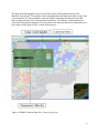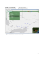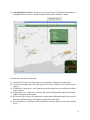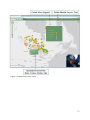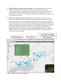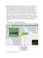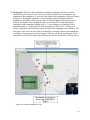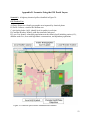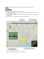
1
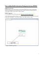
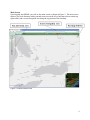
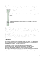
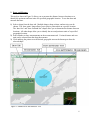
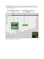
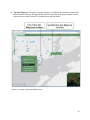
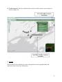
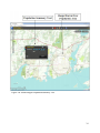
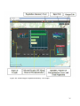
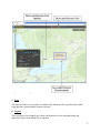
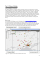
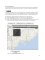
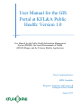
User Manual for the GIS
Portal at KFL&A Public
Health: Version 1.0
User Manual for the Public Health Information Management
System (PHIMS), the Social Determinants of Health
(SDOH) Mapper and the Tobacco Module Applications
Nicole Andruszkiewicz
MPH Candidate
Kingston, Frontenac and Lennox &
Addington Public Health
August 2013
Table of Contents
Overview ...................................................................................................................1
Vision .............................................................................................................................................. 1
Mission ............................................................................................................................................ 1
GIS and Public Health .................................................................................................................... 2
Units of Geography ......................................................................................................................... 2
Part 1: Public Health Information Management System (PHIMS)....................3
PHIMS User Interface .................................................................................................................... 3
Logging In ....................................................................................................................................... 3
Screen Navigation Area .................................................................................................................. 5
Layer List Tools .............................................................................................................................. 7
Public Health Information Tools .................................................................................................. 12
KFL&A Operational Activities Tools ........................................................................................... 23
Part 2: Social Determinants of Health (SDOH) Mapper ...................................28
SDOH Mapper User Interface ...................................................................................................... 28
SDOH Layers ................................................................................................................................ 29
Screen Navigation Area ................................................................................................................ 31
Population Summary Tool ............................................................................................................ 33
Part 3: Tobacco Module ...................................................................................................... 38
Tobacco Module User Interface ................................................................................................... 38
Screen Navigation Area ................................................................................................................ 40
Tobacco Tool ................................................................................................................................ 43
References ...............................................................................................................44
Contact Information ..............................................................................................46
Appendices ..............................................................................................................47
Appendix A Statistics Canada Hierarchy of Standard Geographic Units .................................... 47
Appendix B Table of Indicators for the INSPQ Deprivation Index .............................................. 48
Appendix C Table of Indicators for the Ontario Marginalization Index ...................................... 49
Appendix D Data Sources for GIS Applications ........................................................................... 50
Appendix E Scenarios Using the GIS Portal Layers .................................................................... 52
Overview
There are three main Geographic Information System (GIS) applications being developed at
Kingston, Frontenac and Lennox & Addington (KFL&A) Public Health which include the Public
Health Information Management System (PHIMS), the Social Determinants of Health (SDOH)
Mapper, and the Tobacco Module. PHIMS was developed by the Health Informatics team at
KFL&A Public Health in 2011. Presently, PHIMS contains health data focused on
environmental health and emergency preparedness. The SDOH Mapper consists of layers of
information related to deprivation and marginalization across dissemination areas in Ontario.
The Tobacco Module visualizes information related to health inspections of tobacco retailers in
the KFL&A region. The health informatics team at KFL&A Public Health intend to combine
these GIS applications into a single GIS portal with graduated levels of access and security
depending on the user entering the portal.
This user manual is divided into three main sections, with each section devoted to one of the GIS
applications - PHIMS, the SDOH Mapper, and the Tobacco Module. Each section explains how
to navigate the current user interface of the specified GIS application and describes how to use
their various functions.
Vision
The public health informatics team at KFL&A Public Health is working to develop, in an
ongoing systematic manner, a single access point to the GIS portal which will visualize multiple
environmental and population based data sets in real time. The GIS portal will be used to
provide public health situational awareness and assist with evidence informed decision making to
protect the health of Ontarians.
Mission
The public health informatics team intends to provide available real-time data from multiple
partners into the GIS portal in order to assist with identifying health events earlier than through
traditional public health methods. The GIS portal aims to visualize environmental data with
underlying population based indicators. This includes incorporating information related to
vulnerable populations with the use of both age and social determinants of health data into the
GIS portal. The social determinants of health data are derived from the Deprivation Index for
Health developed by the Quebec Public Health Institute (INSPQ) and the Ontario
Marginalization Index (ON-Marg) by the Centre for Research on Inner City Health.
1
GIS and Public Health
In broad terms a Geographic Information System (GIS) is a technology that can display and
examine spatial data. This is accomplished through the creation of computerized maps, graphs,
and tables of geographic data to assist with identifying observations, trends, and relationships
(Cromley & McLafferty, 2012). GIS therefore provides visual tools that can assist with problem
solving and informing decision making. The increased uptake of GIS applications in public
health in recent years is attributed to changes in technology and data sharing. Developments in
hardware, software, and spatial databases have made GIS more affordable and user-friendly.
This includes the development of electronic medical records which has led to increased data
sharing between various agencies and research communities (Joyce, 2009).
Units of Geography
There are different units of geography which can be used to report data within a GIS application
as identified in the figure from Statistics Canada in Appendix A. The GIS applications at
KFL&A Public Health currently use dissemination areas which are the smallest geographic areas
for which all census data are disseminated and have population sizes of 400-700 individuals
(Matheson et al., 2011). The next largest unit of geography which dissemination areas are linked
to are census tracts which comprise of areas with population sizes of 2,500-8,000 individuals.
Dissemination areas are also linked to census subdivisions which are defined by municipalities
and municipal equivalents such as Aboriginal Reserves or townships. These are followed by
census divisions which are comprised of geographic areas that include counties or regional
districts which are followed by provincial or territorial boundaries (Statistics Canada, 2013).
For more information about the current research projects being developed by the public health
informatics team at KFL&A Public Health and for links to additional resources go to
www.kflaphi.ca.
2
Part 1: Public Health Information Management System (PHIMS)
PHIMS User Interface
PHIMS includes various tools related to environmental health and emergency preparedness.
Specific tool functions include identifying extreme weather conditions and the locations of
various public health services such as warm up centres.
PHIMS Login Page
To access PHIMS use the following website: http://www.phimskfla.appspot.com.
On the login page (as shown in Figure 1) you will see an area to enter a UserID and a Password
to gain entry into PHIMS. The current UserID is: ‘kfla’ and Password is: ‘qphi’.
Figure 1: PHIMS Login Page
3
Main Screen
Upon logging into PHIMS, you will see the main screen as shown in Figure 2. The main screen
shows a gray scale basemap with a pan and zoom area on the left, a basemap selector on the top
right corner, and a screen navigation area along the top portion of the basemap.
Figure 2: PHIMS Main Screen
4
Pan and Zoom Area
The pan and zoom functions allow you to change the view of the basemap with single-click
actions.
The circular pan function allows you to move the basemap by a fixed amount in
the specified direction.
The middle zoom function allows you to zoom in or out of the basemap by a fixed
amount.
The bottom rectangular pan function allows you to zoom into or out of a preselected area.
Basemap Selector
The basemap selector allows you to choose from nine different maps to use as your basemap.
Each map identifies different geographic features such as topography, streets, or public venues.
To select a map click once on the chosen map, then double click the top right corner of the map
to display it as a basemap.
Screen Navigation Area
The PHIMS screen navigation area has nine main tools which include: Bookmarks, Draw and
Measure, Print, Find Places, Layer List, Street View, Public Health Information, KFL&A
Operational Activities, and Legend. Each tool is described in detail below.
1. Bookmarks
The bookmarks function is the first tool from the left side of the toolbar. This function allows
you to save an exact geographic area under a specified name that can be accessed upon your
subsequent return to PHIMS. To use the bookmarks tool:
1)
2)
3)
4)
Identify the geographic location you would like to save on the basemap.
On the ‘add bookmark’ tab enter a name for your chosen geographic location.
Click the ‘add bookmark’ button to save the chosen geographic location.
To return to the bookmarked location upon your subsequent return to PHIMS, click on its
specified name in the ‘bookmarks’ tab for the location to appear on the basemap.
5
2. Draw and Measure
This tool (as shown in Figure 3) allows you to measure the distance between locations or to
identify the perimeter and area units of a specified geographic location. To use the draw and
measure function:
1) Select a shape from the draw tab. Multiple shapes, shape colours, and text sizes can be
chosen. The ‘draw point’ shape allows you to place a point maker on a specific location.
The ‘draw line’ and ‘draw freehand line’ shapes allow you to determine the distance between
locations. All other shapes allow you to identify the area and perimeter units of a specified
geographic location.
2) Select whether to show measurements on the measurements tab. Various distance and area
units can be selected from the drop-down menus.
3) Click and drag the pointer over the desired geographic area on the basemap to draw the
selected shape.
Figure 3: PHIMS Draw and Measure Tool
6
3. Print
The print tool allows you to print a screenshot of the basemap with a specified title and subtitle.
4. Find Places
This tool can display a specified geographic location on the basemap by entering a specified
address or geographic coordinates.
5. Layer List
The layer list tool provides visualizations of health data related to demographics, environmental
information, and Aboriginal Reserve locations. Refer to Appendix D for links to data sources for
the layers in the layer list. These layers include:
1) Demographic layers related to age, deprivation, and marginalization.
Age Layers: These include visualizations of seniors (65+ years of age) and children under
five years of age across dissemination areas within Ontario (as shown in Figure 4) and are
derived from the 2006 Census of Canada.
Deprivation Layers: These include social and material deprivation layers and are obtained
from the Deprivation Index for Health developed by the Quebec Public Health Institute
(INSPQ). Social and material deprivation information is acquired from 6 main indicators
from the 2001 Census of Canada. Refer to Appendix B for a description of the indicators
that make up the deprivation layers. The table identifies that material deprivation is
associated with differences in education, income, and employment while social deprivation is
prevalent among those who live alone, live in single-parent families, and are separated,
divorced, or widowed (Pampalon et al., 2009).
Marginalization Layers: These layers include residential instability, material deprivation,
ethnic concentration, and dependency which are derived from the Ontario Marginalization
Index (ON-Marg). These four dimensions were created based on 18 indicators reflecting
inequality and marginalization in Canada from both the 2001 and 2006 Census of Canada.
Refer to Appendix C for a table describing the various marginalization layers. The table
identifies that residential instability is based on seven indicators related to place of residence,
number of household dwellers, and marital status. Material deprivation has six indicators
related to education, single-parent families, income, employment, and housing conditions.
Dependency has three main indicators which includes the proportion of the population that is
aged 65+, a reverse coded indicator for the proportion of the population that is aged 15+ and
not participating in the labour force, as well as a dependency ratio indicator which is the total
population aged 0-14 and those aged 65+ divided by the total population aged 15-64.
Ethnic concentration has two indicators related to immigration status and identifying as a
visible minority (Matheson et al., 2011).
7
The data for the demographic layers are sorted into colour coded quintiles which can be
identified in the legend. The quintiles for the marginalization and deprivation indices range from
1 (least unstable) to 5 (most unstable) with each quintile containing dissemination areas that
make up approximately 20% of the population in Ontario. For instance, a dissemination area
with a social deprivation ranking of 1 on the quintile scale indicates that the dissemination area is
in the least socially deprived 20% of areas in the province.
Figure 4: PHIMS Children Under Five Years of Age Layer
8
2) Environmental layers related to weather radar data, weather conditions, stream gauges, and
heat information.
Weather Radar Layer: This layer identifies cloud and precipitation data for Ontario and is
obtained from Environment Canada’s National Climate Data and Information Archive.
Weather Layer: This layer shows local weather conditions across Ontario by displaying
visualizations of precipitation and cloud coverage occurring in various cities across the
province.
Stream Gauge Layer: This layer identifies the locations of stream gauges across Canada
and the measurements of bodies of water. The data is obtained from Environment Canada
and the Water Survey of Canada.
Real-Time Heat Layer: This layer includes the locations of 12 Wet Bulb Globe
Temperature (WBGT) sensors across four health units in Ontario as identified in Figure 5.
The WBGT sensors examine heat stress by taking into account factors such as ambient air
temperature, wind, and cloud cover (NOAA, 2011).
9
Figure 5: PHIMS Real-Time WBGT Sensors Layer
10
3) Aboriginal Reserve Layer: This layer (as shown in Figure 6) identifies the locations of
Aboriginal Reserves across Canada with data obtained from Statistics Canada.
Figure 6: PHIMS Aboriginal Reserves Layer
In order to use the layer list function:
1) Check the box next to the chosen layer you would like to display on the basemap.
2) Click on the triangle to the left of the layer selected for a drop-down list of specific layer
options.
3) If applicable, repeat steps 1 and 2 until no more drop-down lists are available and a final
layer is chosen.
4) If applicable, once a final layer is chosen, the colour coded quintiles and their percentile
ranges will appear on the legend.
5) Reveal one layer at a time for appropriate visualizations, although multiple layers can be
selected simultaneously by checking their equivalent check boxes.
6) The transparency of each layer can be adjusted by using the slide bar next to the selected
layers.
11
6. Street View
This tool allows you to view a selected geographic location on the basemap through street level
imagery from external websites which include Bing Maps and Google Maps. The various
functions of this tool are currently under development.
7. Public Health
This function consists of 11 different layers which visualize pertinent public health data. Refer
to Appendix D for links to data sources for the layers described and Appendix E for scenarios
using the PHIMS public health layers. These layers include:
1) Forest Fires: This layer can display the status of various forest fires occurring in Ontario.
As shown in Figure 7, the forest fires are classified into five main categories. A fire that is
defined as ‘under control’ means that it has been established that the fire will no longer
spread. A forest fire is classified as ‘not under control’ during the period prior to any
attempt to prevent the spread of the fire. For a fire to be defined as ‘being observed’ means
that the spread of the fire is not currently being prevented. A fire is ‘being held’ when it is
probable that the fire will no longer spread but efforts are made to manage the fire (MNR,
2009). Each of these five classifications of forest fires can be displayed on the basemap
separately by checking their equivalent check boxes or they can be viewed simultaneously by
checking the box to the left of the ‘all’ option.
12
Figure 7: PHIMS Forest Fires Layer
13
2) Wildfire Smoke Forecasts for Eastern Canada: This layer displays hourly forecasts of
smoke from wildfires in Eastern Canada. Smoke levels are colour coded based on
concentrations of particulate matter that are 2.5 micrometres or smaller in diameter (PM2.5).
Small particulate matter can be lodged in the lungs and lead to respiratory and cardiac
problems (B.C Air Quality, 2013). The layer can display the wildfire smoke forecasts for up
to two days into the future.
3) Well Water Uranium: This layer identifies the levels of uranium in well water across
Ontario. The information displayed for each well includes the concentration of micrograms
of uranium per litre of water, the well depth, and the date the well water was last sampled.
The layer also allows you to search for wells containing a specified concentration of uranium
under the ‘filter results’ tab to the left of the ‘show all’ tab as shown in Figure 8. The current
maximum acceptable concentration of uranium levels in drinking water in Canada is 0.02
milligrams or 20 micrograms per litre of water. Long-term exposure to high levels of
uranium in drinking water can lead to negative health effects such as damage to kidney cells
(Health Canada, 2011). Clicking on a well name in the list allows you to zoom in on the
well’s location on the basemap.
Figure 8: PHIMS Well Water Uranium Layer
14
4) Nuclear Stations: This layer identifies the locations of various nuclear reactor stations in
both Canada and the United States. The layer identifies four nuclear power plants in Ontario
and six across Michigan, New York, and Ohio. This layer is useful for emergency
preparedness purposes as it has the ability to visualize three main geographical zones
surrounding a nuclear station to use while planning a nuclear emergency as shown in Figure
9. The size of each of these zones can be modified to identify at risk populations. The
contiguous zone is the area closest to the nuclear reactor where the primary evacuations
occur due to the area’s proximity to the nuclear power plant. The primary zone is the area
around the nuclear power plant where measures are taken to avoid exposure to radioactive
plume. The secondary zone is the largest area around the nuclear power plant where steps
are taken to avoid ingestion of radioactive matter (MCSCS, 2009). The nuclear stations layer
in PHIMS also has the ability to identify at risk populations under the ‘at risk tab’ to the right
of the ‘zones tab’ with data from the 2006 Census of Canada. The at risk population
estimates will be updated with the most recent Census of Canada data when it becomes
available.
Figure 9: PHIMS Nuclear Stations Layer
15
5) Earthquakes: This layer shows information related to earthquakes that have occurred
around the world in the past week. The layer identifies the locations of earthquakes, the
magnitude of the earthquakes, as well as the date and time the earthquakes occurred as shown
in Figure 10. Earthquake magnitude is most commonly measured using the Moment
Magnitude Scale (MMS) which measures the size of the earthquake based on the energy
released. Earthquakes with a magnitude under 3.0 are classified as small earthquakes,
earthquakes with a magnitude ranging from 3.0-7.0 are medium sized, and those with a
magnitude rating of 7.0 and greater are large earthquakes (USGS, 2012). Clicking on a
specific earthquake in the list zooms into the location of the earthquake on the basemap. The
main goal for this tool is to have alerts for earthquakes occurring in Ontario and earthquakes
occurring in close proximity to nuclear stations. More specific details regarding the chosen
earthquake can be found by following the link provided to the United States Geology Survey.
Figure 10: PHIMS Earthquake Layer
16
6) Air Quality Index (AQI): This layer shows the AQI for cities in Ontario which was created
by the Ministry of Environment (MOE) to inform the public on air quality based on levels of
ambient air pollution as shown in Figure 11. This layer is useful as it identifies sensor data in
real-time from the MOE. The AQI is measured approximately every hour in cities across
Ontario and designates a score for air quality which ranges from 0 to 100+. The index is
calculated by first assigning scores to various air pollutants based on their concentration
levels. These air pollutants include fine particulate matter (PM2.5), ozone (O3), sulphur
dioxide (SO2), nitrogen dioxide (NO2), carbon monoxide (CO), and total reduced sulphur
(TRS). The score for the highest ranking pollutant is used as the final AQI score for the
specified location and time period (Chen & Copes, 2013). As identified in the ‘legend tab’ in
Figure 9, scores are categorized as follows: 0-15 indicate very good air quality, 16-31
indicate good air quality, 32-49 indicate moderate air quality, 50-99 indicate poor air quality,
and 100+ indicate very poor air quality. The ‘symbols’ tab allows you to change the shape of
the symbol used to mark the various locations where the AQI is identified. Hovering the
cursor over one of the symbols on the basemap allows you to view the AQI score for the
chosen location as well as the date and time the AQI was last measured. A symbol will begin
to flash if there is a change in its AQI score. The layer also identifies whether the AQI for a
particular area is increasing, remaining stagnant, or decreasing with colour coded triangles.
17
Figure 11: PHIMS AQI Layer
18
7) Air Quality Health Index (AQHI): This layer identifies the AQHI for cities in Ontario and
Manitoba as shown in Figure 12. The AQHI was developed by Environment Canada to
inform the public about health risks associated with air pollution. The AQHI is measured
across Canadian cities using a scale from 1 to 10+. Scores which range from 1-3 indicate a
low health risk, 4-6 indicate a moderate health risk, 7-10 indicate a high health risk, and 10+
indicate a very high health risk. The index is calculated using a formula to determine the
“daily change in mortality risk” based on three main air pollutants known to be detrimental to
human health (Environment Canada, 2013). These pollutants include fine particulate matter
(PM2.5), ozone (O3), and nitrogen dioxide (NO2). The resulting index score is combined with
specific health messages related to outdoor activity for both the general public and at risk
populations. Hovering the cursor over one of the symbols on the basemap allows you to
view the AQHI score for the chosen location as well as the date and time the AQHI was last
measured. The colour coded triangle indicates whether a location’s AQHI score is
increasing, decreasing, or remaining stagnate. A location’s symbol on the basemap will
begin to flash to indicate a change in its AQHI score.
Figure 12: PHIMS AQHI Layer
19
8) U.S Weather Service and Canadian Weather Service: These two layers identify weather
information obtained from weather sensors across locations in Canada and the United States.
Both of the layers have a ‘legend’ tab which describes the symbols used. The arrow symbol
faces the direction in which the wind is travelling and the length of the arrow symbol
signifies the force of the wind with a longer arrow indicating a stronger wind. The colour
coded triangles to the right of the arrow symbol identify whether the temperature is
remaining stagnant, increasing, or decreasing. The ‘symbol’ tab allows you to change the
shape of the symbol that marks the locations of the weather sensors on the basemap and the
‘colour’ tab allows you to change the colour of these symbols.
As shown in Figure 13, hovering the cursor over a chosen weather sensor on the basemap
allows you to identify detailed weather information for the specified location. This
information includes the current temperature, humidity, visibility, wind direction, wind
speed, air pressure, dew point, time weather measurements were taken, and the temperature
from the preceding measurement. A symbol on the basemap will momentarily flash to
indicate that a change in weather conditions such as temperature or wind direction for that
area has occurred.
Figure 13: PHIMS U.S Weather Service Layer
20
9) Plume Dispersion: This layer as shown in Figure 14 allows you to visualize a simulated
dispersion of air pollutants or toxins into the atmosphere due to factors such as a chemical
spill from an industrial plant. To use the plume dispersion tool:
1) Specify where the plume dispersion occurs by clicking on the location on the basemap. It
is also possible to identify the location of the plume dispersion by checking the box
labelled as ‘use coordinates’ and entering the location’s coordinates into the boxes
labelled as ‘longitude’ and ‘latitude’. To ensure that the coordinates entered are correct,
click ‘validate’ for the location to be identified with a cross symbol on the basemap.
2) To define the plume dispersion, values must be entered into the fields marked with a red
asterisk. These include the ‘emission rate (grams/second)’, the ‘release height (metres)’,
and the ‘wind speed (km/h)’.
3) Other optional variables that can be defined for the plume dispersion are the ‘wind
direction (degrees)’, ‘use wind sensors’, and the ‘number of sensors’.
4) Upon entering the values into their appropriate fields, click ‘draw’ to display the plume
dispersion on the basemap.
Figure 14: PHIMS Plume Dispersion Layer
21
10) Routing/Evacuation: This layer allows you to create a travel route between two specified
locations with the use of vehicle transportation as identified in Figure 15. The tool has some
limitations since it does not include information related to traffic flow, weather conditions, or
road accidents. To use this tool:
1) Under the ‘route’ tab click the ‘select origin’ button.
2) Click the location on the basemap where you would like the travel route to begin. The
longitude and latitude coordinates of your location should automatically appear in their
labelled boxes along the left side of the ‘route’ tab. A red square outlined in green will
appear on your specified location on the basemap.
3) Click the ‘select destination’ button.
4) Click the location on the basemap where you would like the travel route to end. The
longitude and latitude coordinates of your location should automatically appear in their
labelled boxes along the right side of the ‘route’ tab. A blue circle outlined in red will
appear on your specified location on the basemap.
5) Select the ‘distance’ option for a travel route that has the shortest course or the ‘time’
option for a travel route that is the most time efficient.
6) Click the solve button for a travel route outlined in red from your origin to your
destination to appear on the basemap.
7) Click the ‘directions’ tab to find detailed travel route directions including the total
distance and time travelled.
Figure 15: PHIMS Routing/Evacuation Layer
22
8. KFL&A Operational Activities
This function consists of five different layers related to KFL&A Public Health operational
activities.
1) Immunization Clinics: This layer identifies (as shown in Figure 16) the locations of clinics
within the KFL&A Public Health region that offer free seasonal influenza vaccinations to the
general public during specific periods throughout the year.
Figure 16: PHIMS Immunization Clinics Layer
23
2) Cool Down Centres: This layer identifies air conditioned locations within the KFL&A
Public Health region (as identified in Figure 17) that are open to the general public for respite
from extreme heat and humid weather.
Figure 17: PHIMS Cool Down Centres Layer
24
3) Warm Up Places: This layer (as shown in Figure 18) identifies the locations of centres in
the KFL&A Public Health region that the general public can access for relief from extreme
cold weather conditions.
Figure 18: PHIMS Warm Up Places Layer
25
4) Tap into Kingston: This layer (as shown in Figure 19) identifies the locations of businesses
and restaurants in the city of Kingston that offer free tap water to the general public in order
to promote an accessible alterative to bottled water and soft drinks.
Figure 19: PHIMS Tap into Kingston Layer
26
5) Traffic Cameras: This layer identifies the locations of traffic cameras across Ontario as
shown in Figure 20.
Figure 20: PHIMS Traffic Control Layer
9. Legend
This tool allows you to identify the colour coded quintiles for the marginalization and
deprivation layers in the layer list function.
27
Part 2: Social Determinants of Health (SDOH) Mapper
SDOH Mapper User Interface
The SDOH Mapper visualizes data related to marginalization and deprivation within the
province of Ontario. Marginalization data is obtained from the Ontario Marginalization Index
(On-Marg) and deprivation data is obtained from the Deprivation Index for Health developed by
the Quebec Public Health Institute (INSPQ) (Matheson et al., 2011; Pampalon et al., 2009).
Main Screen
To access the SDOH Mapper use the following website: http://www.kflaphi.ca/sdoh/.
You will be directed to the main screen of the SDOH Mapper as identified in Figure 21.
The main screen shows a topographic basemap with a pan and zoom area on the left, the
basemap selector in the top right corner, a list of the SDOH layers to the left of the basemap
selector, and a screen navigation area along the top portion of the basemap.
The ‘more information’ box along the right side of the basemap indicates that clicking on a
geographic area within Ontario will display marginalization and deprivation scores for the
closest dissemination area.
Figure 21: SDOH Mapper Main Screen
28
Pan and Zoom Area
The pan and zoom functions allow you to change the view of the basemap with single-click
actions.
The circular pan function allows you to move the basemap by a fixed amount in a
specified direction.
The middle zoom function allows you to zoom in or out of the basemap by a fixed
amount.
The bottom rectangular pan function allows you to zoom into or out of a pre-selected
area.
Basemap Selector
The basemap selector allows you to choose from nine different maps to use as your basemap.
Each map identifies different geographic features such as topography, streets, or public venues.
SDOH Layers
This function gives you access to seven layers which identify deprivation and marginalization
information for dissemination areas across Ontario as shown in Figure 22. Deprivation layers
are derived from the Deprivation Index of Health by the Quebec Public Health Institute
(INSPQ). The deprivation layers include social deprivation, material deprivation, as well as
material and social deprivation combined. The data for the deprivation layers are acquired from
six main indicators from the 2001 Census of Canada. Refer to the table in Appendix B for
information related to the indicators for the deprivation layers. The table identifies that material
deprivation is associated with differences in education, income, and employment while social
deprivation is prevalent among those who live alone, live in single-parent families, and are
separated, divorced, or widowed (Pampalon et al., 2009).
Marginalization layers are derived from the Ontario Marginalization Index (ON-Marg)
developed by the Centre for Research on Inner City Health. The marginalization layers include
residential instability, material deprivation, dependency, and ethnic concentration which are
29
derived from 18 indicators reflecting inequality and marginalization in Canada from both the
2001 and 2006 Census of Canada. Refer to the table in Appendix C for a description of the
indicators used to create the marginalization layers. The table identifies that residential
instability is based on seven indicators related to place of residence, number of household
dwellers, and marital status. Material deprivation has six indicators related to education, singleparent families, income, employment, and housing conditions. Dependency has three main
indicators which includes the proportion of the population that is aged 65+, a reverse coded
indicator for the proportion of the population that is aged 15+ and not participating in the labour
force, as well as a dependency ratio indicator which is the total population aged 0-14 and those
aged 65+ divided by the total population aged 15-64. Ethnic concentration has two indicators
related to immigration status and identifying as a visible minority (Matheson et al., 2011).
Figure 22: SDOH Mapper ON-Marg Deprivation Layer
30
To create the indices the data for each marginalization and deprivation layer was sorted into
quintiles. These quintiles range from 1 (least unstable) to 5 (most unstable) with each quintile
containing dissemination areas that make up approximately 20% of the population in Ontario.
For instance, a dissemination area with a social deprivation ranking of 1 on the quintile scale
indicates that the dissemination area is in the least socially deprived 20% of areas in the province
while a dissemination area with a residential instability ranking of 5 on the quintile scale means
that it is in the most residentially unstable 20% of areas in the province (Matheson et al., 2011;
Pampalon et al., 2009). The SDOH Mapper displays each of these layers with colour coded
quintiles. To use the SDOH layers function:
1) Check the box next to the chosen layer you would like to display on the basemap.
2) Click on the triangle to the right of the layer selected for a drop-down list of options to adjust
the selected layer. These options include the ‘zoom to’ tool which allows you to zoom away
from the current basemap location; the ‘transparency’ tool which allows you to adjust the
transparency of the selected layer; the ‘move up’ and ‘move down’ options which allow you
to change the order in which the six layers are displayed in the SDOH layer tool.
3) Reveal one layer at a time for appropriate visualizations, although multiple layers can be
selected simultaneously by checking the equivalent check boxes.
4) The classifications of the colour coded quintiles will appear in the ‘legend’ along the bottom
right corner of the basemap.
Screen Navigation Area
The SDOH Mapper screen navigation area has six main tools (as shown in Figure 21) which
include: Bookmarks, Find an Address, Population Summary, Draw and Measure, Print, and
Legend. Each tool is described in detail below.
1. Bookmarks
The bookmarks function is the first tool from the left side of the toolbar. This function allows
you to save an exact geographic area under a specified name that can be accessed upon your
subsequent return to the SDOH Mapper. To use the bookmarks tool:
1)
2)
3)
4)
Identify the geographic location you would like to save on the basemap.
On the ‘add bookmark tab’ enter a name for your chosen geographic location.
Click the ‘add bookmark button’ to save the chosen geographic location.
To return to the bookmarked location click on its specified name in the ‘bookmarks’ tab for
the location to appear on the basemap.
31
2. Find an Address
This tool displays a geographic location on the basemap by entering a specified address or
geographic coordinates as shown in Figure 23.
Figure 23: SDOH Mapper Find an Address Tool
32
3. Population Summary
This tool allows you to visualize graphs related to the marginalization and deprivation layers for
a specified population. This tool is useful for observing trends in marginalization and
deprivation across dissemination areas in Ontario and for examining health inequities in an area
over time. To use this tool:
1) Select a shape to define your chosen population area.
2) Click and drag the cursor over your chosen population area to draw the selected shape on the
basemap as shown in Figure 24a. The placement of the drawing can be adjusted by clicking
and dragging it to the desired position. The drawing can be erased by clicking the ‘clear’
option.
3) Once the drawing is in the appropriate position on the basemap, click the ‘submit’ button to
display the marginalization and deprivation graphs for the selected area as shown in Figure
24b.
4) There are three different types of graphs that can be used to display the marginalization and
deprivation data which include a vertical bar graph, a horizontal bar graph, and a pie chart.
To change the type of graph being used click on the image of the chosen graph type
displayed along the left side of the population summary tool.
5) A graph for each of the marginalization and deprivation layers can be enlarged by clicking on
the graph’s name along the bottom of the population summary tool or by clicking on the
compressed image of the chosen graph along the top portion of the tool.
6) The quintile values for the enlarged graph are displayed along the bottom right portion of the
tool. A quintile value can be displayed by hovering the cursor over the chosen quintile on the
enlarged graph.
7) The population summary tool can be minimized by clicking the ‘input’ tab and enlarged by
clicking the ‘output’ tab.
33
Figure 24a: SDOH Mapper Population Summary Tool
34
Figure 24b: SDOH Mapper Population Summary Tool Graphs
35
4. Draw and Measure
This tool allows you to measure the distance between locations or to identify the perimeter and
area units of a specified geographic location as identified in Figure 25. To use the draw and
measure function:
1) Select a shape from the draw and measure tool. The ‘draw point’ shape allows you to place a
marker on a specific location. The ‘draw line’ and ‘draw freehand line’ shapes allow you to
determine the distance between locations. All other shapes allow you to identify the area and
perimeter units of a specified geographic location.
2) Options to define your selected shape will appear within the draw and measure tool. These
options include ‘fill colour’ which allows you to change the colour of the selected shape; the
‘style’ option allows you to choose a fill pattern for the selected shape; and the ‘alpha’ option
allows you to adjust the transparency of the selected shape.
3) Check the ‘show measurements’ box along the bottom of the draw and measure tool to show
perimeter and area measurements. Various distance and area units can be selected from the
drop-down menus.
4) Click and drag the pointer over the desired geographic area on the basemap to draw the
selected shape.
36
Figure 25: SDOH Mapper Draw and Measure Tool
5. Print
The print tool allows you to print a screenshot of the basemap with a specified title, author,
copyright date, layout template, format, and scale.
6. Legend
This tool allows you to identify the colour coded quintiles for the marginalization and
deprivation layers in the SDOH layers function.
37
Part 3: Tobacco Module
Tobacco Module User Interface
The Tobacco Module is currently under development with aims to examine tobacco retailers
within the KFL&A region and their compliance with the Smoke-Free Ontario Act. The module
will identify through colour coding whether the retail locations are low, medium, or high risk
with regards to underage youth access to Tobacco products. The risk categories are based on
scores from a risk assessment questionnaire being developed by the Ontario Tobacco Research
Unit. The questionnaire addresses factors such as tobacco retailer enforcement history and their
proximity to schools (Dubray et al., 2013). Information for each tobacco retailer will be
provided in the module which includes details related to premise maintenance and inspection
history.
Main Screen
To access the SDOH Mapper use the following website: http://www.kflaphi.ca/Tobacco.
You will be directed to the main screen of the Tobacco Module as identified in Figure 26.
The main screen shows a gray scale basemap with a pan and zoom area on the left, the basemap
selector in the top right corner of the basemap, the Tobacco tool minimized to the right of the
pan and zoom area, and a screen navigation area along the top portion of the basemap.
Figure 26: Template of the Tobacco Module Main Screen
38
Pan and Zoom Area
The pan and zoom functions allow you to change the view of the basemap with single-click
actions.
The circular pan function allows you to move the basemap by a fixed amount in a
specified direction.
The middle zoom function lets you to zoom in or out of the basemap by a fixed amount.
The bottom rectangular pan function allows you to zoom into or out from a pre-selected
area.
Basemap Selector
The basemap selector allows you to choose from nine different maps to use which include
topographic and aerial maps. Each map specifies different types of geographic data such as the
locations and names of roads, parks, and bodies of water.
39
Screen Navigation Area
The Tobacco Module screen navigation area has four main tools which include: Bookmarks,
Find an Address, Draw and Measure, and Tobacco. Each tool is described in detail below.
1. Bookmarks
The bookmarks function is the first tool from the left side of the toolbar as shown in Figure 27.
This function allows you to save an exact geographic area under a specified name that can be
accessed upon your subsequent return to the Tobacco Module. To use the bookmarks tool:
1)
2)
3)
4)
Identify the geographic location you would like to save on the basemap.
On the ‘add bookmark tab’ enter a name for your chosen geographic location.
Click the ‘add bookmark button’ to save the chosen geographic location.
To return to the bookmarked location upon your return to the Tobacco Module, click on its
specified name in the ‘bookmarks’ tab for the location to appear on the basemap.
Figure 27: Tobacco Module Bookmarks Tool
40
2. Find an Address
This tool displays a specified geographic location on the basemap by entering a specified address
or geographic coordinates.
3. Draw and Measure
This tool allows you to measure the distance between locations or to identify the perimeter and
area units of a specified geographic location as identified in Figure 28. To use the draw and
measure function:
1) Select a shape from the draw and measure tool. The ‘draw point’ shape allows you to place a
marker on a specific geographic location. The ‘draw line’ and ‘draw freehand line’ shapes
allow you to determine the distance between locations. All other shapes allow you to
identify the area and perimeter units of a specified geographic location.
2) Options to define your selected shape will appear within the draw and measure tool. These
options include ‘fill colour’ which allows you to change the colour of the selected shape; the
‘style’ option allows you to choose a fill pattern for the selected shape; and the ‘alpha’ option
allows you to adjust the transparency of the selected shape.
3) Check the ‘show measurements’ box along the bottom of the draw and measure tool to show
perimeter and area measurements. Various distance and area units can be selected from the
drop-down menus.
4) Click and drag the pointer over the desired geographic area on the basemap to draw the
selected shape.
41
Figure 28: Tobacco Module Draw and Measure Tool
42
4. Tobacco
Once the Tobacco Module is fully developed this tool will allow you to identify the locations and
addresses of Tobacco retailers in the KFL&A Public Health region as the template displays in
Figure 29. Each of the Tobacco retailers are colour coded according to their compliance with the
Smoke-Free Ontario Act. To use the Tobacco tool:
1) Click on a tobacco retailer location listed in the Tobacco tool to identify it on the basemap.
2) Double-click on the symbol identifying the tobacco retailer on the basemap in order to
display more detailed information about the retailer in a new window. The new window
includes an ‘overview’ tab which displays a photo, address, and phone number of the
selected premise. The ‘premise maintenance’ tab identifies store information including the
retailer’s tobacco permit number. The ‘summary statistics’ tab displays inspection
information including the date of the previous inspection, next inspection, and total number
of charges laid. The ‘inspection history’ tab displays information regarding previous
inspections including youth access to tobacco products.
Figure 29: Template of the Tobacco Module Tobacco Tool
43
References
B.C Air Quality. (2013). Wildfire smoke forecasts for eastern Canada. Province of British
Columbia. Retrieved from http://www.bcairquality.ca/bluesky/east/
Chen, H. & Copes, R. (2013). Review of air quality index and air quality health index.
Ontario Agency for Health Protection and Promotion. Retrieved from http://www.
cleanair.hamilton.ca/downloads/AQI-AQHI%20Report%20Jan%202013%20Final.pdf
Cromley, E. K., & McLafferty, S. L. (2012). GIS and public health. New York: Guilford
Publication.
Dubray J, Kirst M, Yates E, Schwartz R. (2013). Evaluation of the Risk-Based
Enforcement Pilot: A Risk-Categorization Model for Youth Access to Tobacco Interim
Report. Toronto: Ontario Tobacco Research Unit. Retrieved from http://otru.org/wpcontent/uploads/2013/06/special_enforcement.pdf
Environment Canada. (2013). Frequently asked questions about the air quality health index.
Retrieved from http://www.ec.gc.ca/cas-aqhi/default.asp?lang=En&n=3E3FDF68-1
Health Canada. (2011). Environment and workplace health: Water talk-Uranium in drinking
water. Retrieved from http://www.hc-sc.gc.ca/ewh-semt/pubs/water-eau/uranium-eng.php
Joyce, K. (2009). “To me it’s just another tool to help understand the evidence”: Public health
decision-makers’ perceptions of the value of geographical information systems (GIS). Health
& Place, 15(3), 831-840.
Matheson, F., Dunn, J., Smith, K., Moineddin, R., & Glazier, R. (2011). Canadian
marginalization index user guide: Version 1.0. Toronto: Centre for Research on Inner City
Health. Retrieved from http://www.torontohealthprofiles.ca/test/onmarg/userguide_data/ONMarg_user_guide_1.0_FINAL_MAY2012.pdf
Ministry of Community Safety & Correctional Services (MCSCS). (2009). Emergency response
plans. Provincial nuclear emergency response plan. Retrieved from
http://www.emergencymanagementontario.ca/english/emcommunity/response_resources/pla
ns/provincial_nuclear_emergency_response_plan.html
Ministry of Natural Resources (MNR). (2009). How we fight fire. Retrieved from
http://www.mnr.gov.on.ca/en/Business/AFFM/ 2ColumnSubPage/ STEL02_165808.html
National Oceanic and Atmospheric Association (NOAA). (2011.) WetBulb globe temperature.
Retrieved from http://www.srh.noaa.gov/tsa/?n=wbgt
Pampalon, R., Hamel, D., Gamache, P., & Raymond, G. (2009). A deprivation index for health
planning in Canada. Chronic Diseases in Canada, 29(4), 178-191.
44
Statistics Canada. (2013). Census reference material: Census dictionary. Retrieved from
http://www12.statcan.gc.ca/census-recensement/2011/ref/dict/index-eng.cfm
U.S Geological Survey (USGS). (2012). USGS earthquake magnitude policy.
Retrieved from http://earthquake.usgs.gov/aboutus/docs/020204mag_policy.php
45
Contact Information
___________________________
Dr. Kieran Moore (QPHI Director)
(613) 549-1232 x1121
[email protected]
46
Appendices
Appendix A: Statistics Canada Hierarchy of Standard Geographic Units
Statistics Canada. (2012). Hierarchy of standard geographic units for dissemination. (Figure 1).
2011 Census. Retrieved from https://www12.statcan.gc.ca/census-recensement/2011/ref/
overview-apercu/pop9-eng.cfm
47
Appendix B: Table of Indicators for the INSPQ Deprivation Index
Pampalon, R., Hamel, D., Gamache, P., & Raymond, G. (2009). A deprivation index for health
planning in Canada. [Table 2. Principal components of the deprivation index in Canada].
Chronic Diseases in Canada, 29(4), 178-191.
48
Appendix C: Table of Indicators for the Ontario Marginalization Index
Matheson, F., Dunn, J., Smith, K., Moineddin, R., & Glazier, R. (2011). Canadian
marginalization index user guide: Version 1.0. Centre for Research on Inner City Health.
[Table 1. Dimensions of marginalization and their respective indicators]. Retrieved from
http://www.torontohealthprofiles.ca/test/onmarg/userguide_data/ON-Marg_user_guide_
1.0_FINAL_MAY2012.pdf
49
Appendix D: Data Sources for GIS Applications
Data Name
Aboriginal
Reserves
Data Source Links
Statistics Canada: 2006 Aboriginal Population Profile:
http://www12.statcan.ca/census-recensement/2006/dp-pd/prof/92594/index.cfm?Lang=E&fpv=10000
Ontario Data:
http://www12.statcan.ca/census-recensement/2006/dp-pd/prof/92-594/searchrecherche/lst/page.cfm?Lang=E&GeoCode=35
Air Quality
(AQHI) & (AQI)
Environment Canada: Air Quality Health Index (AQHI):
http://www.ec.gc.ca/cas-aqhi/default.asp?Lang=En
Ministry of the Environment: Ontario Air Quality Index (AQI) readings:
http://www.airqualityontario.com/history/locations.php?pol=250
Canadian
Weather
Environment Canada: National Climate Data and Internet Archive:
http://www.climate.weatheroffice.gc.ca/climateData/canada_e.html
Earthquakes
U.S Geological Survey (USGS): Interactive Earthquake Map:
http://earthquake.usgs.gov/earthquakes/map/
Forest Fires
Ministry of Natural Resources: Current Fire Locations: Interactive Map:
http://www.affes.mnr.gov.on.ca/Maps/Fire/FireMap.html
KFL&A Cool
Down Centres
List of Kingston Cool Down Centres:
http://www.kflapublichealth.ca/News.aspx?NId=264
Interactive Map of Kingston Cool Down Centres:
https://maps.google.com/maps/ms?ie=UTF8&oe=UTF8&msa=0&msid=21437
7109322786524857.00048214254f1d43064f6
KFL&A Warm
Up Places
Interactive Map of Kingston Warm Up Places:
https://maps.google.com/maps/ms?ie=UTF8&hl=en&msa=0&msid=21437710
9322786524857.00049a38ee2085d0ce55f&ll=44.563077,76.758728&spn=1.254338,2.128601&z=9
Nuclear Stations
Canadian Nuclear Safety Commission: Nuclear Power Plants:
http://www.nuclearsafety.gc.ca/eng/licenseesapplicants/powerplants/#NNPP
United States Nuclear Registry Commission: Nuclear Reactors:
http://www.nrc.gov/reactors.html
50
Data Name
Data Source Links
Ontario
Marginalization
Index (ONMarg)
Radar
(Weather)
Centre for Research on Inner City Health: ON-Marg User Guide:
http://www.torontohealthprofiles.ca/test/onmarg/userguide_data/ONMarg_user_guide_1.0_FINAL_MAY2012.pdf
Real-Time
(WBGT) Heat
Sensors
Routing/
Evacuation
KFL&A Public Health Report on Eastern Ontario Heat Sensor Network:
http://www.quesst.ca/publications/Heat-System.2009.09.14.ISDS_Abstract.pdf
Tap into
Kingston
KFL&A Public Health Tap into Kingston Q&As and Interactive Map:
http://www.kflapublichealth.ca/motiv8/swap/TapIntoKingston.aspx
Traffic Cameras
Ministry of Transportation: COMPASS Traffic Cameras:
http://www.mto.gov.on.ca/english/traveller/compass/camera/camhome1.shtml
Environment Canada: Canadian Historical Weather Radar:
http://www.climate.weatheroffice.gc.ca/radar/index_e.html
Microsoft Developer Network: Bing Maps:
http://msdn.microsoft.com/en-us/library/dd877180.aspx
http://www.mto.gov.on.ca/english/traveller/trip/traffic_cameras.shtml
Stream Gauges
Environment Canada: Real-Time Hydrometric Data:
http://www.wateroffice.ec.gc.ca/index_e.html
United States
Weather
National Oceanic and Atmospheric Association (NOAA): National Weather
Service: http://www.weather.gov/
Well Water
Uranium
Ministry of the Environment: Well Record Data:
http://www.ene.gov.on.ca/environment/en/mapping/wells/index.htm
Wildfire Smoke
Forecasts for
Eastern Ontario
B.C Air Quality: Smoke Forecasts for Eastern Canada:
http://www.bcairquality.ca/bluesky/east/
51
Appendix E: Scenarios Using the GIS Portal Layers
Scenario 1: A highway chemical spill as identified in Figure 30.
GIS Tools to Use:
A) Plume Dispersion: identify geographic areas impacted by chemical plume
B) Traffic Cameras: visualize the incident area
C) Air Quality Index (AQI): identify local air quality in real-time
D) Canadian Weather: identify wind direction and wind speed
E) Layer List: identify vulnerable populations near the chemical spill including seniors (65+),
children under five, areas with high ethnic concentrations, and dependent populations
Figure 30: Chemical Spill Scenario Demonstrated in PHIMS
52
Scenario 2: Heavy forest fire activity in Northern Ontario communities as shown in Figure 31.
GIS Tools to Use:
A) Radar Weather & Canadian Weather: identify wind speed, wind direction, and precipitation
forecasts
B) Aboriginal Reserve: identify geographic proximity of the forest fire to Aboriginal Reserve
locations
C) Air Quality Health Index (AQHI) and Air Quality Index (AQI): identify local air quality in
real-time
D) Forest Fire & Smoke Forecasts for Eastern Ontario: identify locations of forest fires and the
anticipated geographic distribution of smoke and particulate matter for up to two days into
the future
E) Demographics: identify vulnerable populations in surrounding areas
Figure 31: Forest Fire Scenario Demonstrated in PHIMS
53
Scenario 3: Local flooding due to heavy precipitation as demonstrated in Figure 32.
GIS Tools to Use:
A) Stream Gauges: identify local water stream levels
B) Aerial Basemap & Street View: visualize local infrastructure and locations of nearby venues
such as hospitals and schools
C) Canadian Weather & Radar Weather: identify local precipitation forecasts, wind speed, and
wind direction
D) Traffic Cameras: visualize flood impact on local road conditions
Figure 32: Flooding Scenario Demonstrated in PHIMS
54