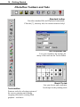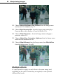
1
PhotoPlus 5.0
Companion
For Windows
©1999 Serif, Inc. All rights reserved. No part of this publication may be reproduced in any form
without the express written permission of Serif, Inc.
All Serif product names are trademarks of Serif, Inc. Microsoft, Windows and the Windows logo are
registered trademarks of Microsoft Corporation. All other trademarks acknowledged.
Serif PhotoPlus 5.0 ©1999 Serif, Inc.
Companies and names used in samples are fictitious.
Portions clipart and graphic content ©1999 Nova Development Corporation and its licensors. All
rights reserved.
Portions graphics import/export technology Eastman Kodak Company & LEAD Technologies, Inc.
Software License Agreement
This Software License Agreement (“License Agreement”) is a legal agreement between you (either
an individual or a single entity) and Serif, Inc. (“Serif”) for the accompanying software product,
which includes computer software and may include associated media, printed materials, and
“online” or electronic documentation (the “Software Product”). By installing, copying, or otherwise
using the Software Product, you agree to be bound by the terms of this License Agreement. If you do
not agree to the terms and conditions of this License Agreement, do not install or use the Software
Product; you may, however, return it to your place of purchase for a full refund.
THANK YOU FOR LICENSING THE USE OF THE SOFTWARE PRODUCT. IT IS
IMPORTANT THAT YOU (THE “LICENSEE”) READ THIS NOTICE CAREFULLY. THESE
ARE THE ONLY TERMS AND CONDITIONS APPLICABLE TO YOUR RIGHTS WITH
RESPECT TO THE SOFTWARE PRODUCT. THE SOFTWARE PRODUCT IS PROTECTED BY
COPYRIGHT LAWS AND INTERNATIONAL COPYRIGHT TREATIES, AS WELL AS OTHER
INTELLECTUAL PROPERTY LAWS AND TREATIES. THE SOFTWARE PRODUCT IS
LICENSED, NOT SOLD.
1. GRANT OF LICENSE
Serif hereby grants to Licensee a personal, non-exclusive, nontransferable license (a “License”) to use one (1) copy of the
Software Product, including any updates thereto, and
accompanying documentation, if any, provided by Serif,
according to the terms set forth below. If the Software Product is
being provided to Licensee as an update or upgrade to software
which Licensee has previously licensed (such software referred to
as the “Prior Software”), then Licensee agrees to destroy all
copies of the Prior Software within thirty (30) days after opening
this package except for one backup copy of the Prior Software.
2. SCOPE OF USE
You may install and use one copy of the Software Product, on a
single computer. The primary user of the computer on which the
Software Product is installed may make a second copy for his or
her exclusive use on a portable computer. Licensee may also store
or install a copy of the Software Product on a storage device,
such as a network server, used only to install or run the Software
Product on other computers over an internal network; however,
you must acquire and dedicate a license for each separate
computer on which the Software Product is installed or run from
the storage device. A license for the Software Product may not be
shared or used concurrently on different computers.
3. LICENSE PAK
If you have acquired this LICENSE AGREEMENT in a Serif
License Pak, you may make the number of additional copies of
the computer software portion of the Software Product as
authorized in the Serif License Pak, and you may use each copy in
the manner specified above. You are also entitled to make a
corresponding number of secondary copies for portable computer
use as specified above.
4. PROHIBITIONS
You may not: modify, prepare derivative works from, translate,
reverse engineer, decompile, disassemble or otherwise derive
source code from the Software Product (except to the extent that
such acts are expressly permitted by applicable law
notwithstanding this limitation); copy the Software Product
(except as provided above) or the accompanying documentation;
rent, transfer, disclose, make available or grant any rights in the
Software Product (including any accompanying documentation)
in any form to any person without the prior written consent of
Serif; remove any proprietary notices, labels, or marks on the
Software Product (including any accompanying documentation);
use the Software Product in any manner that infringes the
intellectual property or other rights of another party; or use the
Software Product to provide on-line or other database services to
any other person.
5. RETENTION OF RIGHTS; TERMINATION
This License Agreement does not constitute a sale. All title, trade
secrets, copyrights, patents and other intellectual rights to the
Software Product, its accompanying documentation and any copy
made by Licensee remain with Serif, and Licensee hereby agrees
to preserve and acknowledges the foregoing. Licensee further
agrees and acknowledges that the Software Product and all
copies thereof are Serif’s exclusive property and constitute a
valuable trade secret of Serif. Licensee further agrees and
acknowledges that unauthorized copying of the Software Product
or the accompanying documentation, or failure to comply with
any of the provisions hereof (each, a “Terminable Event”), will
result in automatic termination of this License. In the event of a
violation of this License by Licensee, Serif reserves and shall have
available all legal remedies.
6. TERM OF LICENSE FOR TRIAL VERSION
SOFTWARE
The License pertaining to a trial version of the Software Product
(a “Trial Version”) shall expire in accordance with the terms as
set forth in the installation process for the Trial Version along
with the designated trial period as set forth in the trial program.
7. LIMITED WARRANTY AND DISCLAIMER
Serif warrants that, for a period of ninety (90) days after delivery,
the diskettes or CD-ROMs on which the software included in the
Software Product is furnished will, under normal use, be free
from defects that prevent Licensee from loading the Software
Product on a computer. Serif’s entire liability and Licensee’s
exclusive remedy under this warranty will be, at Serif’s option, to
(a) use reasonable commercial efforts to attempt to correct or
work around errors, or (b) to replace the Software Product with
functionally equivalent Software Product, on diskettes or CDROM, as applicable or (c) return the price paid for the Software
Product, in each case upon return of the Software Product to
Serif together with a copy of your receipt for the purchase
thereof. This Limited Warranty is void if failure of the Software
Product or hardware has resulted from accident, abuse, or
misapplication. Any replacement Software Product will be
warranted for the remainder of the original warranty period or
thirty (30) days, whichever is longer. Outside the United States,
neither these remedies nor any product support services offered
by Serif are available without proof of purchase from an
authorized non-U.S. source. The Software Product is licensed to
you on an “as is” basis without any warranty of any nature.
8. NO OTHER WARRANTIES
EXCEPT FOR THE ABOVE EXPRESS LIMITED
WARRANTIES, SERIF AND ITS SUPPLIERS MAKE AND
LICENSEE RECEIVES NO WARRANTIES OR
CONDITIONS, OR TERMS, EXPRESS, IMPLIED,
STATUTORY, OR IN ANY COMMUNICATION WITH
LICENSEE. TO THE MAXIMUM EXTENT PERMITTED BY
APPLICABLE LAW, SERIF AND ITS SUPPLIERS
DISCLAIM ALL OTHER WARRANTIES AND
CONDITIONS, EITHER EXPRESS OR IMPLIED,
INCLUDING, BUT NOT LIMITED TO, IMPLIED
WARRANTIES OF MERCHANTABILITY, FITNESS FOR A
PARTICULAR PURPOSE, TITLE AND NONINFRINGEMENT, WITH REGARD TO THE SOFTWARE
PRODUCT AND THE PROVISION OF OR FAILURE TO
PROVIDE SUPPORT SERVICES. LICENSEE SHALL BE
SOLELY RESPONSIBLE FOR THE SELECTION, USE,
EFFICIENCY AND SUITABILITY OF THE SOFTWARE
PRODUCT AND SERIF SHALL HAVE NO LIABILITY
THEREFOR. SERIF SHALL HAVE NO LIABILITY FOR,
NOR OBLIGATION TO INDEMNIFY LICENSEE
REGARDING ACTIONS ALLEGING THE INFRINGEMENT
OF PROPRIETARY RIGHTS BY THE SOFTWARE
PRODUCT. SERIF DOES NOT WARRANT THAT THE
OPERATION OF THE SOFTWARE PRODUCT WILL BE
UNINTERRUPTED OR ERROR FREE OR THAT THE
SOFTWARE PRODUCT WILL MEET LICENSEE’S
SPECIFIC REQUIREMENTS. The Limited Warranty gives you
specific legal rights. You may have others, which vary from
state/jurisdiction to state/jurisdiction.
9. LIMITATION OF LIABILITY
IN NO EVENT WILL SERIF OR ITS SUPPLIERS BE LIABLE
FOR LOSS OF DATA, CORRUPTION, LOST PROFITS,
COST OF COVER, OR OTHER SPECIAL, INCIDENTAL,
PUNITIVE, CONSEQUENTIAL, OR INDIRECT DAMAGES
ARISING FROM THE USE OF THE SOFTWARE PRODUCT
(INCLUDING ANY ACCOMPANYING
DOCUMENTATION), HOWEVER CAUSED AND ON ANY
THEORY OF LIABILITY. THIS LIMITATION WILL APPLY
EVEN IF SERIF OR AN AUTHORIZED DISTRIBUTOR HAS
BEEN ADVISED OF THE POSSIBILITY OF SUCH
DAMAGE. IN NO EVENT WILL SERIF’S LIABILITY
EXCEED THE AMOUNT PAID FOR THE SOFTWARE
PRODUCT. LICENSEE ACKNOWLEDGES THAT THE
AMOUNTS PAID BY LICENSEE FOR THE SOFTWARE
PRODUCT REFLECT THIS ALLOCATION OF RISK. Some
states or other jurisdictions do not allow the exclusion or
limitation of liability for incidental or consequential damages, so
the above limitations and exclusions may not be applicable in
certain instances. None of the above affects the statutory rights of
licensees residing in the United Kingdom.
10. NOT FOR RESALE SOFTWARE
If the Software Product is labeled “Not for Resale” or “NFR,”
then, notwithstanding section 1 of this License, your use of the
Software Product is limited to use for demonstration, test, or
evaluation purposes.
11. NO RENTAL; OTHER TRANSFERS
You may transfer this License to another computer or
workstation only on a permanent basis (that is, with no intent to
transfer again) provided the computer, workstation, or other
digital electronic device from which you have transferred this
License no longer accesses or otherwise utilizes the Software
Product, and the Software Product is used in accordance with the
terms of this License Agreement.
12. TERMINATION
You may terminate this License Agreement at any time. Serif may
terminate this License Agreement if you fail to comply with the
terms and conditions of this License Agreement. In either event,
you must destroy all copies of the Software Product.
13. UPGRADE
If this License is an “Upgrade,” you must have a valid license for
the Prior Software for this License Agreement to be valid, and
this License Agreement must be used to replace such license for
the Prior Software. The total number of license “Upgrades” you
may acquire may not exceed the total number of computers,
workstations, or other digital electronic devices that were
licensed to access or otherwise utilize the Software Product at the
time you upgraded the Software Product.
14. MISCELLANEOUS
This Agreement shall not be governed by the 1980 U. N.
Convention on Contracts for the International Sale of Goods;
rather, this Agreement shall be governed by the laws of the State
of New Jersey, of the United States of America, including the
Uniform Commercial Code of the State of New Jersey, without
reference to conflicts of law principles. This Agreement is the
entire Agreement between Serif and Licensee and supersedes any
other communications or advertising with respect to the Software
Product. If any provision of this Agreement is held invalid or
unenforceable, such provision shall be revised to the extent
necessary to cure the invalidity or non-enforceability, and the
remainder of this Agreement shall continue in full force and
effect. If the Software Product is acquired by the United States
Government or on its behalf, the Software is furnished with
restricted rights.
The use, duplication, or disclosure by the United States
Government and parties acting on its behalf is governed by, and
subject to restrictions as set forth in subdivision (c) (1) (ii) of the
Rights in Technical Data and Computer Software clause at
DFARS 252.227-7013, the subparagraphs (c)(1) and (2) of the
Commercial Computer Software - Restricted Rights at 48 CFR
52.227-19, or other comparable regulations of other government
agencies, as applicable. Licensee agrees not to allow the Software
Product to be sent to or used in any other country except in
compliance with applicable United States laws and regulations.
This Agreement shall constitute the entire agreement between
Serif and Licensee and supersedes all prior agreements,
understandings, communications, proposals or representations,
oral or written, by either party. This Agreement shall be amended
only by an executed writing by authorized representatives of both
parties.
How to contact us
Our main office (USA, Canada):
The Software Center
PO Box 803, Nashua NH 03061 USA
Main
Registration
Single Unit Sales
Technical Support
Customer Service
General Fax
(603) 889-8650
(800) 232-2897
(800) 55-SERIF or 557-3743
(603) 886-6642
(800) 489-6720
(603) 889-1127
Technical Support E-mail [email protected]
European office (UK, Europe):
The Software Centre
PO Box 2000, Nottingham, NG11 7GW, UK
Main
Registration (UK only)
Registration (International)
Sales
Technical Support (UK only)
Technical Support (International)
Customer Service
General Fax
(0115) 914 2000
(0870) 727 3379
+44 (115) 914 5471
(0800) 376 7070
(0870) 727 3380
+44 (115) 914 5472
(0115) 914 9090
(0115) 914 2020
Technical Support E-mail [email protected]
Online
Visit us on the Web at
http://www.serif.com
International
Please contact your local distributor/dealer. For further details please
contact us at one of our phone numbers above.
Comments or other feedback
We want to hear from you! E-Mail [email protected] with your
ideas and comments!
Contents
1 ♦ Welcome
Introduction ................................................................................................3
About the Companion................................................................................3
Key PhotoPlus features .............................................................................4
Registration, Upgrades, and Support ........................................................5
Installation..................................................................................................5
PhotoPlus system requirements ........................................................5
What you need to know .....................................................................6
First-time install..................................................................................6
Manual install/re-install ......................................................................6
2 ♦ Getting Started
Seven Key Concepts .................................................................................9
1 Image size and canvas size...........................................................9
2 Interacting tools and tabs...............................................................9
3 Making a selection .......................................................................10
4 Foreground and background colors.............................................10
5 Layers ..........................................................................................10
6 Opacity and transparency............................................................11
7 Saving and exporting ...................................................................12
Starting PhotoPlus ...................................................................................12
Getting your bearings ..............................................................................15
Introducing the interface ..................................................................15
Setting preferences..........................................................................18
Setting the view................................................................................18
How to Get an Image into PhotoPlus ......................................................19
Saving and Exporting Files ......................................................................20
Printing.....................................................................................................21
Getting Help.............................................................................................22
3 ♦ Manipulating Images
HANDS ON: Captioning a Cat .................................................................27
Cropping the image .........................................................................28
Adjusting brightness and contrast....................................................28
Adding a caption ..............................................................................30
Making Selections ...................................................................................31
Selection options..............................................................................31
Modifying the selection ....................................................................33
Using the Move tool .................................................................................34
Cut, Copy, Paste, Delete .........................................................................35
Cropping ..................................................................................................35
Flipping and Rotating...............................................................................36
Adjusting Image Colors ...........................................................................37
Applying Effect Filters..............................................................................39
HANDS ON: Photo-painting.............................................................39
Multiple effects.................................................................................40
HANDS ON: Antiquing a Photo ...............................................................41
4 ♦ Working with Paint and Text
Choosing Colors ......................................................................................45
HANDS ON: Step into the Sandbox! .......................................................46
Painting and Drawing ..............................................................................47
Using the basic Paintbrush tool .......................................................48
Choosing and customizing brush tips..............................................48
Setting tool properties......................................................................49
Using the Airbrush tool ....................................................................50
Using the Eraser tool .......................................................................51
Using the Smudge tool ....................................................................51
Using the Clone tool ........................................................................52
Creating Lines and Shapes .....................................................................53
Filling Regions .........................................................................................55
Working with Text....................................................................................55
HANDS ON: Creating Filled Text ....................................................57
5 ♦ Using Layers and Masks
Layers......................................................................................................61
Kinds of layers .................................................................................61
Basic layer operations .....................................................................62
Manipulating layers..........................................................................63
Moving the contents of one or more layers..................................63
Clipboard operations involving layers ..........................................64
Rearranging standard layers in the stack ....................................64
Merging layers..............................................................................64
HANDS ON: Making a Montage ......................................................65
Masks ......................................................................................................68
Mask-making ...................................................................................69
1 Creating the Mask....................................................................69
2 Editing on the Mask .................................................................70
3 Applying changes to the layer ..................................................71
HANDS ON: Vignetting....................................................................71
6 ♦ Preparing Web Graphics
Formats for the Web................................................................................77
.GIF format.......................................................................................77
Recommended .GIF export settings ............................................78
.JPG format......................................................................................79
PNG format......................................................................................79
Producing Web Animations .....................................................................80
Layers and frames ...........................................................................80
HANDS ON: Follow the Bouncing Ball.............................................82
Notes on animation..........................................................................84
Image Slicing ...........................................................................................85
Slicing an image ..............................................................................85
Image Maps.............................................................................................86
Creating hotspots.............................................................................87
7 ♦ Color and Input/Output Options
Color Concepts ........................................................................................91
Bitmaps............................................................................................91
Bit depth...........................................................................................92
Bit depth in PhotoPlus......................................................................93
Resolution ........................................................................................93
Color modes ....................................................................................93
Color mode tips................................................................................95
Optimizing images ...................................................................................96
Palettes ............................................................................................96
Dithering...........................................................................................97
Compression....................................................................................98
File Formats.....................................................................................98
Tips for Scanning.....................................................................................99
Advanced Printing..................................................................................100
Scaling and tiling............................................................................100
Including printer marks ..................................................................102
CMYK color separations ................................................................102
PhotoPlus as an OLE Server.................................................................103
PhotoPlus Keyboard Shortcuts..............................................................105
1
Welcome
Welcome
3
Introduction
Welcome to Serif PhotoPlus 5.0—the best value in image creation and
editing software for any home, school, organization, or growing
business. PhotoPlus is your number one choice for working with
photographs and paint-type images, whether for the Web, multimedia,
or the printed page.
PhotoPlus has the features you’ll need... from importing or creating
pictures and animations, through manipulating colors and effects all the
way to final export. Built-in support for TWAIN scanners and cameras
makes it easy to bring in your own photos, while comprehensive import
filters let you open just about any standard bitmap image.
Once you’ve got your image into PhotoPlus, you can enhance and alter
its on-screen appearance with a diverse toolkit of functions and effects.
A full range of export options (with special attention to Web graphics),
plus powerful optimization capabilities, round out this high-performing
package.
About the Companion
This Companion is your guide to getting started and getting results with
PhotoPlus—from the basics to advanced techniques. The chapter
sequence begins with basic concepts and proceeds gradually through
various tools and features. Hands-on Projects are integrated each step of
the way. We hope you’ll take your time and enjoy the learning process.
Here’s a quick summary of chapter contents:
1
Welcome. There, we’ve said it again!
2
Getting Started. Will have you up and running in no time with
an overview of key concepts and the PhotoPlus interface.
3
Manipulating Images. A rundown of basic techniques for
selecting and operating on all or just part of an image.
4
Working with Paint and Text. How to proceed from the
proverbial blank slate, using the PhotoPlus creation tools.
5
Using Layers and Masks. Understanding and mastering the
creative possibilities of these more advanced features.
6
Preparing Web Graphics. A review of Web image formats and
step-by-step guidance on animation and image preparation.
7
Color and Output Options. Combines essential background
material and terminology with helpful tips to improve your
images.
4
Welcome
Key PhotoPlus features
PhotoPlus brings professional image editing to everyone—with features
like these:
♦
Powerful Image Export Optimizer
The Export Optimizer lets you see how your image will look (and
how much space it will take up) before you save it! Its multiwindow display provides side-by-side WYSIWYG previews of
image quality at various output settings, so you can make the best
choice every time.
♦
Web Animation Tools
Now it’s easy and fun to create or edit animations for the Web.
You can import and export animated GIFs, and even let PhotoPlus
create entire animations for you automatically.
♦
Editable Text
Add formatted color text to an image, reposition and scale it,
integrate it with your design. Text layers keep the contents separate
so you can go back and alter the words or formatting at any time!
♦
Image Enhancement
Apply professional, darkroom-style color and histogram
adjustments to your images.
♦
Unique Selection Options
PhotoPlus goes well beyond the basic rectangle and lasso tools,
adding more than a dozen completely customizable selection
shapes like polygons, spirals, and stars. Or define a selection
shaped like text—using any font and style! Advanced options let
you fine-tune the selection and its properties for precise effects.
♦
Smart Shapes
Choose from a panoply of fully adjustable filled shapes to produce
chevrons, hearts, badges, teardrops, moons, zigzags, and many
more. Just drag sliders to control each shape’s appearance!
♦
Image Slicing and Image Maps
Now it’s not just the pros who can use these techniques to add links
to Web graphics! Simply click to divide images into segments—
each with its own hyperlink and popup text—or add hotspots to
specific regions. PhotoPlus outputs the HTML code and lets you
preview the results directly in your Web browser.
♦
Advanced Tools and Features
Built-in support for most pressure-sensitive graphics tablets. RGB,
CMYK, HSV, and Grayscale color modes. Robust and convenient
layer management with pop-up preview and masking support.
Welcome
5
♦
Professional Output Options
Output using CMYK separations or print directly to your desktop
printer with powerful controls. Include registration marks, crop
marks, file information, grayscale and color bars, and tile or scale
your output if required.
♦
Productive MDI Interface
Open and view multiple images and edit them simultaneously.
Dockable, floating tab windows work in conjunction with
convenient toolbars. The Layer Manager provides full control over
all regions and planes. Each document stores a massive Undo range
with dynamic memory and disk management, compressing
information for optimized performance. And PhotoPlus remembers
your preferred export settings, so your creative flow is undisturbed.
And that’s only part of the story! The PhotoPlus feature set includes
all the standard capabilities you’d expect in a photo editor. Tools like
Paintbrush, Airbrush, Clone, Smudge, and Erase. Customizable brush
tips and opacity settings. Flip, rotate, and crop. Anti-aliasing. TWAIN
support for scanner and digital camera input. A full range of supported
file formats for both import and export. In short, more features for the
price than allowed by law in some jurisdictions (but don’t tell anyone)...
Registration, Upgrades, and Support
If you see the Registration Wizard when you launch PhotoPlus, please
take a moment to complete the registration process. Just call Serif and
provide the installation number and code shown. We’ll give you a
personalized registration number in return. Remember, if you need
technical support please contact us. We aim to provide fast, friendly
service and knowledgeable help.
Installation
PhotoPlus system requirements
PhotoPlus runs with Windows 95 or later, so you’ll need a PC setup
which runs Windows adequately. If you need help installing Windows,
or setting up your printer, see Windows documentation and help.
♦
IBM compatible Pentium PC with CD-ROM drive and mouse (or
other Microsoft compatible pointing device)
♦
Microsoft Windows® 95, 98, 98 SE, 2000, or Windows NT® 4.0
or later operating system
6
Welcome
♦
16MB (Windows 95/98), 24MB (Windows 98 SE), 32MB
(Windows NT), or 64MB (Windows 2000) RAM
♦
20MB (minimum install) free hard disk space.
♦
SVGA display (16-bit color or higher)
Additional disk resources and memory required when editing large
and/or complex images
Optional:
♦
Windows-compatible printer
♦
TWAIN-compatible scanner and/or digital camera
♦
Stylus or other input device, including pressure sensitive pens
♦
Internet account and connection required for accessing online
resources.
What you need to know
PhotoPlus is very easy to use, and you don’t need to have any prior
design experience. However, if you’re new to Windows computing, you
will find it much easier if, before installing and using PhotoPlus, you
spend a little time becoming familiar with the Windows operating
environment.
q From the Windows desktop, click the Start button at the lower left
and choose Help.
First-time install
To install PhotoPlus, simply insert the Program CD-ROM into your
CD-ROM drive. The AutoRun feature automatically starts the Setup
process and all you need to do is select the PhotoPlus Install option and
answer the on-screen questions. If the AutoRun does not start the
install, use the manual install instructions below.
Manual install/re-install
To re-install the software or to change any part of the installation at a
later date, select Settings/Control Panel from the Windows Start
menu and then click on the Add/Remove Programs icon. Make sure
the correct CD-ROM is inserted into your CD-ROM drive, click the
Install… button, and then simply follow the on-screen instructions. To
install just one particular component to your hard drive, choose the
Custom option and check only that component.
2
Getting Started
Getting Started
9
Seven Key Concepts
If you’re new to photo editing programs, or perhaps have only worked
with a basic painting program like Microsoft Paint, a number of the
concepts in PhotoPlus may be new to you. Don’t be daunted! Many
thousands of artists have made the leap—the rewards are well worth it!
This section collects in one place some background material that will
hopefully provide a concise introduction and save you some “headscratching” later on. We recommend you read through it before racing
ahead to the rest of the chapter.
1 Image size and canvas size
Sometimes a tricky distinction if you haven’t encountered it before, it’s
an important one when working with digital pictures. You probably
know that image dimensions are given in pixels (think of pixels as the
“dots of paint” that comprise a screen image)—say, 640 wide by 480
high. If you want to change these dimensions, there are two ways to go
about it, and that’s where image and canvas come into
play. Changing the image size (I) means scaling the
whole image or just a selected region up or down.
Changing the canvas size (C) means adding or taking
away pixels at the edges of the image—rather like
adding a border around a mounted photo, or taking a
pair of scissors and cropping the photo to a smaller size. Either way,
after resizing, the image and canvas dimensions are once again identical.
2 Interacting tools and tabs
The Tools toolbar (see the PhotoPlus Toolbars and Tabs diagram later
in this chapter) is at the heart of PhotoPlus. Among its many offerings
you’ll find several basic painting/drawing tools, plus tools for erasing,
filling a region, and cloning a region (all covered in detail in Chapter 4).
As you try each of these tools, keep in mind that
the Tool Properties tab and Brush Tip tab
extend each tool’s functionality by letting you
customize its settings. Only with the aid of the
tabs can you choose a wide brush as opposed to a pencil point, or
experiment with the full range of effects each tool can command.
10
Getting Started
3 Making a selection
In any photo editing program, the selection
tools (see Chapter 3) are as significant as any
of the basic brush tools or commands. The
basic principle is simple: quite often you’ll
want to perform an operation on just a portion
of the image. The wide range of selection options in PhotoPlus lets you:
♦
Define just about any selection shape
♦
Modify the extent or properties of the selection
♦
Carry out various manipulations on the selected pixels, including
cut, copy, paste, rotate, adjust colors, etc.
Although the techniques for using each selection tool vary a bit, the end
result of making a selection is always the same: a portion of the image
has been roped off from the rest of the image. The boundary is visible as
a broken line or marquee around the selected region.
4 Foreground and background colors
At any given time, PhotoPlus allows you to work
with just two colors—a foreground color and a
background color. These are always visible as
two swatches on the Color tab. Electronic artists
expend much of their creative energy deciding which of the millions of
available colors should fill those two slots. The actual steps involved,
however, can be quite simple (see Chapter 4).
5 Layers
If you’re accustomed to thinking of
pictures as flat illustrations in books,
or photographic prints, the concept of
image layers may take some getting
used to. In a typical PhotoPlus image—for example, a photograph
you’ve scanned in, a new picture file you’ve just created, or a bitmap file
you’ve opened—there is one layer that behaves like a conventional “flat”
image. This is called the Background layer, and you can think of it as
having paint overlaid on an opaque, solid color surface.
Getting Started
11
On top of the Background layer, you can create any number of new
layers in your image. Each new one appears on top of another,
comprising a stack of layers that you can view and manipulate with the
Layer Manager tab. We call these additional layers standard layers to
differentiate them from the Background layer. Standard layers behave
like transparent sheets through which the underlying layers are visible.
There’s a third kind of layer, called a text layer (see Chapter 4), which
resembles a standard transparent layer but can only contain text. Text
layers keep blocks of text editable so you can go back and change the
font or retype characters.
With few exceptions, you will work on just one layer at any given time,
clicking in the Layer Manager tab to select the current or active layer.
Selections (see above) and layers are related concepts. Whenever there’s
a selection, certain tools and commands operate only on the pixels inside
the selection—as opposed to a condition where nothing is selected, in
which case those functions generally affect the entire active layer.
If your image has multiple layers, and you switch to another layer, the
selection doesn’t stay on the previous layer—it follows you to the new
active layer. This makes sense when you realize that the selection doesn’t
actually include image content—it just describes a region with
boundaries. And following the old advice “Don’t confuse the map with
the territory,” you can think of the selection as a kind of outline map, and
the active layer as the territory.
We’ll first encounter layers later in this chapter. Chapter 5 provides indepth coverage.
6 Opacity and transparency
Opacity and transparency are complementary—
two sides of the same coin. They both refer to the
degree to which a particular pixel’s color
contributes to the overall color at that point in the
image. (Pixels again are the “screen dots” that comprise a bitmap image
in PhotoPlus.) Varying opacity is rather like lighting a stage backdrop
(scrim) in a theater: depending on how you light the fine gauze sheet,
you can render the backdrop either visible or invisible. Fully opaque
pixels contribute their full color value to the image. Fully transparent
pixels are invisible: they contribute nothing to the image.
12
Getting Started
You’ll primarily encounter these terms in one of two contexts. First, as a
property of the pixels laid down by individual paint tools, which can be
more or less opaque, depending on the tool’s opacity setting. Second, as
a property of individual layers, where opacity works like a “master
setting” that you can vary after paint has been laid down.
7 Saving and exporting
Saving a file in PhotoPlus means storing the
image in the native PhotoPlus file format, using
the .SPP extension. This format preserves image
information, such as multiple layers, masks, or
image map data, that would be lost in conversion
to another graphic format. On the other hand, suppose you’ve opened a
.BMP or .JPG file and want to save it back to its original format. In this
case, use the Save Original command.
In yet another instance, you may be ready to save an .SPP file (or convert
some other image type) to one of the standard graphics formats. In
PhotoPlus, this is known as exporting. PhotoPlus includes a powerful
Export Optimizer that serves as your “command center” for exporting
images to various formats. It not only provides a variety of options for
each supported format, but also lets you compare image quality using
different settings and even retains your preferred settings for each
format!
There’s more on saving and exporting later in this chapter, and Chapter 7
includes details on file formats and optimizing images.
Starting PhotoPlus
Enough boring lecture—on to the demonstrations! (We’ll skip the quiz.)
It’s time to begin exploring PhotoPlus.
F
NOTE: Throughout the Companion, we’ll use q checkbox
bullets to mark actual the ongoing tutorial thread: steps we’d like
you to complete as you follow along with the text. You’ll come
across many other descriptions and examples of commands, tools,
and procedures (and of course you’re encouraged to experiment).
But remember—unless a step has a checkbox, it’s entirely
optional!
The Setup routine adds a Serif PhotoPlus item to the Programs
submenu of the Windows Start menu.
Getting Started
13
q Use the Windows Start button to pop up the Start Menu and click on
the PhotoPlus item.
PhotoPlus launches and displays the Startup Wizard, with a variety of
choices:
♦
Open Saved Work displays a browser that lets you preview and
open saved image files—pictures in any supported format as well as
animated GIFs (see Chapter 3).
♦
Create New Picture opens a new image window using a size and
background color you specify (see Chapter 4).
♦
Create New Animation opens a new image window and displays
the Animation tab, with controls for creating animation frames (see
Chapter 6).
♦
Import from TWAIN lets you bring in pictures from devices like
scanners and digital cameras (see Chapters 3 and 7).
♦
View Samples opens the gallery of PhotoPlus images.
♦
Online Resources offers direct access to productivity tools and
reference sources, including VisualCities.com.
If you don’t care to see the Startup Wizard again, uncheck the “Use the
Startup Wizard next time” box. However, we suggest you leave it
checked until you’re familiar with the equivalent PhotoPlus commands.
q Click Open Saved Work and then click the Browse button in the
dialog.
14
Getting Started
q PhotoPlus is set to initially display the contents of the PhotoPlus
PROJECTS folder, located on your hard disk. If the Open dialog
displays a different folder, browse to PROGRAM
FILES\SERIF\PHOTOP50\PROJECTS.
F
NOTE: Whether or not you use the Projects folder to store your
own work, remember its location so you’ll know where to find
Companion source files when they’re needed later on.
q Select the file CAT.JPG in the Projects folder and click Open.
The cat photograph opens in a new image window (your precise screen
layout may vary somewhat from the illustration).
Getting Started
15
Getting your bearings
Now that you’ve got an image open, and the PhotoPlus menus and tools
are available, let’s take a quick look around the PhotoPlus environment.
Even if you’re in a rush to start working, don’t skip the rest of the
chapter! At the very least, take note of what’s here so you’ll know where
to find the information when you need it later.
Introducing the interface
PhotoPlus is an MDI application. MDI stands for Multiple Document
Interface and it means that you can have multiple documents—images, in
PhotoPlus terms—open at the same time. Each image window contains
one image, with the image’s name shown in the window’s titlebar. At any
given time, one image window will be active in front of any others, with
its name shown in the main PhotoPlus titlebar.
You can use commands from the Window menu to arrange the image
windows. If you have more than one image open, then you can switch to
another window using the Window menu or the keyboard shortcut
Ctrl+Tab. Double-click on an image window’s titlebar to maximize it.
The PhotoPlus toolbars and tab windows (tabs for short) are essential
features of the PhotoPlus environment. The PhotoPlus Toolbars and
Tabs diagram identifies each tab and provides an overview of what it
does.
To display the related online help topic for any tab, first click the
Help button on the top toolbar, then click the tab.
When you first launch PhotoPlus, it opens with the PhotoPlus toolbars
and tabs all visible in default positions, with
certain tabs “docked” or joined together. You
can hide, show, or move them individually as
needed, and dock or undock the tabs. Chances
are you’ll want to keep the Tools toolbar
visible, but if your display area is large enough
you might consider moving it to a horizontal position alongside the top
(Standard) toolbar—or “floating” it as a separate palette. Remember,
there’s nothing fixed about the PhotoPlus interface, so feel free to try
different arrangements until you’re satisfied.
16
Getting Started
PhotoPlus Toolbars and Tabs
Standard toolbar
Provides standard file and Clipboard commands.
Click the [?], then any tab, for context-sensitive help!
Tool Properties tab
Lets you customize the settings for
many of the tools on the Tools toolbar
Tools toolbar
Features tools for selecting regions of
the screen, painting and erasing,
cropping selections, creating Web
graphics... and more
Brush Tip tab
Lets you choose and customize
brush tips for the painting tools
Getting Started
17
Color tab
Lets you select foreground and
background colors and change
the color mode
Layer Manager tab
Includes controls for creating, deleting,
arranging, merging, and setting properties
of layers in the image
Animation tab
Provides controls for
editing animation
files (only appears
in Animation mode)
18
Getting Started
To turn off a tab, click the Close button in its titlebar. To turn a tab or
toolbar off or on, uncheck or check its name on the View menu. If you
need more room on-screen for a particular operation, press the Tab key
to turn all the visible tabs off, and again to turn them back on.
To dock or undock a tab, click on its label and drag to the new position,
either floating independently or docked in a window next to another tab.
It’s easy to get online help in PhotoPlus. For a summary, see the “Getting
Help” section at the end of this chapter.
Setting preferences
To specify the ruler units, grid interval, and other preferences, choose
Preferences… from the File menu to open the Preferences dialog. Select
the appropriate options on the Undo, Transparency, Layout and/or
Startup tab of the dialog.
When you have made your choices, click the OK button to save your
changes or click Cancel to abandon them.
Setting the view
Zooming (changing the relative size of the image in relation to its
window) and panning (moving the image in relation to its window) are
essential when you're operating at different levels of detail, or on
different portions or an image. PhotoPlus provides standard Zoom and
Pan tools.
To change the image scale, choose the Zoom tool from the Tools
toolbar. To zoom in, left-click on the image. To zoom out, right-click on
the image. The current zoom ratio appears in the titlebar of the image
window, next to the file name.
You can also set a specific zoom ratio by choosing Zoom In or Zoom
Out from the View menu, then selecting a ratio from the submenu. To
restore a 1:1 viewing ratio, choose Normal Viewing from the View
menu.
To pan, Choose the Pan tool from the Tools toolbar and drag the
image to move it in relation to its window.
Getting Started
19
How to Get an Image into PhotoPlus
Before you can manipulate an image, you’ll need something to work
with! PhotoPlus can open images saved in a wide variety of industrystandard file formats, and acquire images from your TWAIN-compliant
digital camera or scanner.
To get a saved image into PhotoPlus, you select Open Saved Work
from the Startup Wizard. The dialog displays image files you’ve recently
worked on; select a file or click the Browse button to locate other saved
files. As an alternative to using the Startup Wizard, you can select the
name of a recently opened file from the File menu or choose
File/Open… to display the Open dialog.
The Open dialog shows dimensions and bit depth (see Chapter 7)
information for each selected image. To display a thumbnail of the
image, check Show preview (this may slow down the display
somewhat).
If your scanner or digital camera supports the industry-wide TWAIN
standard, you can bring pictures from these devices directly into
PhotoPlus. (To set up your TWAIN device for importing, see the
documentation supplied with the device for operating instructions.)
To begin scanning a picture into PhotoPlus, either select the Import
From TWAIN option in the Startup Wizard, or, if the program is already
running, choose Import from the File menu and then select Acquire. (If
PhotoPlus is running but there’s no image window open, choose New
from the File menu to display the Startup Wizard.) If you have more than
one TWAIN-compatible device installed, you may be prompted to select
one as the source—or you can specify a different source by choosing
Import/Select Source from the File menu.
The acquisition software for the selected device will start up and display
its window, and you can then carry out the scan, possibly having made a
few basic adjustments. Note that the features available in image
acquisition software vary widely and are not under the control of
PhotoPlus. Usually, you will at least be able to adjust settings for the
image source (such as a color photograph, black and white photograph,
or color halftone) and the resolution at which the image is to be scanned.
For color theory and tips on scanning, see Chapter 7.
20
Getting Started
Whether you import the image via the Open dialog or the TWAIN
interface, it will appear in a new image window in PhotoPlus. Assuming
the image is not in the native PhotoPlus (.SPP) format, it will always
have just a single layer, called the Background layer (see “Seven Key
Concepts” earlier in the chapter). Chapter 5 will explore layers in
considerable detail; until then we’ll be focusing on techniques that work
perfectly well on one—or at most two—layers.
Saving and Exporting Files
PhotoPlus can save images in its own .SPP format, or export them to any
standard format (again, see “Seven Key Concepts”).
Use File/Save (or click the Save button) to save images in
PhotoPlus’s own .SPP format. Only .SPP images preserve information
such as multiple layers, masks, or image map data that would be lost in
conversion to another graphic format.
Use File/Save As… to save the image
as an .SPP file under a different path
or name. You can store files anywhere
on your system. It’s a good idea to
group your images, for example into
project-oriented or thematic folders.
Suppose you've opened a .BMP or .JPG file, done some editing (without
adding layers), and now wish to save it back to its original format. In this
case, you can use the File/Save Original or File/Save Original As...
commands. Using the former will overwrite the original file—so be sure
that’s what you want to do.
In many situations, you’ll want to save a file to one of the standard
graphics formats. In PhotoPlus, this is known as exporting. You can use
the Export Optimizer to preview image quality before at various settings
before going ahead with the export.
The File menu offers two ways of accessing the Optimizer. Either choose
File/Export Optimizer... to display it
directly, or choose File/Export... and then
click the Optimize button in the dialog.
The Export dialog itself is a standard file
dialog where you can specify the path,
name, and format for the image file.
Getting Started
21
The Export Optimizer consists of a left-hand settings region and a righthand preview display, with additional buttons along the bottom of the
dialog. In animation mode, there's an extra tab for changing output
settings.
To display a different portion of the image, drag the image in the
preview pane. To change the display scale, click the Zoom In or Zoom
Out buttons at the lower left.
To adjust the preview display, click one of the View buttons at the lower
left to select Single, Double, or Quad display. The illustration above
shows Single view. The multi-pane (Double and Quad) settings let you
compare different export settings for one or more file formats. Just click
one of the display panes to select it as the active pane, and then use the
Options panel at the left to choose an export format and specific settings.
Each time you make a new choice, the active pane updates to show the
effect of filtering using the new settings, as well as the estimated file
size!
When you’ve picked the optimum export settings, click the dialog’s
Export or OK button to proceed to the Export dialog.
For details on image file formats and optimization, see Chapter 7.
Printing
Printing is controlled from the Print dialog, which you can access by
choosing Print… from the File menu, clicking the Print button on the
Standard toolbar, or pressing Ctrl+P.
22
Getting Started
Choose the printer to use from the drop-down list. If necessary, click the
Properties... button to set up the printer for the correct page size, etc.
It’s very important to set up your printer correctly to get the best results.
Click the Options... button if you need to set special print options such
as scaling, tiling, or CMYK color separations. (The various print options
are detailed in Chapter 7.)
After setting the printer properties and the print options, click on OK in
the main print dialog to send the image to the printer. Depending on the
size and complexity of the image, and the printer you’re using, it may
take several minutes before the printed page emerges.
Getting Help
The PhotoPlus online help system is designed to work for you. Whatever
your background, you’ll find it easy to navigate.
♦
To begin learning about PhotoPlus tools and menus, just move the
mouse pointer around the screen. Watch the HintLine at the lower
right for capsule descriptions of each feature. Event Tips pop up as
you try new tools and actions.
♦
For help on interface elements like toolbars and tab windows, click
the
Help button on the top toolbar, then click on an element.
♦
For help on dialog boxes, click their internal Help button.
Several Help menu choices take you to key features of online help:
♦
Choose Contents to display the main help menu screen, including
links to the Welcome and Support pages.
♦
Choose Index to pop up the alphabetical list of help topics.
Getting Started
♦
23
Choose Effects Gallery to display a visual sampler of color
adjustments and special effects — cross-referenced to help topics
(see Chapter 3 for more).
Once inside online help, choose Visual Reference or How To to peruse
help information using either a graphical or step-by-step approach—
whichever you prefer. Each section displays its own table of contents in
the main window, while help topics appear in a second window.
Extensive cross-references make sure all the information is interlinked.
3
Manipulating Images
Manipulating Images
27
This chapter will focus on ways of manipulating existing pictures,
especially photos. We’ll begin with a Hands-on Project using the “cat”
image you briefly opened in the previous chapter. Note that all of the
techniques described here can also be applied to images created from
scratch, and to animations.
There are many reasons why you might want to manipulate a photo,
including:
♦
Cleaning up an old, damaged photo
♦
Removing an unwanted item or slogan from the background
♦
Preparing an image for printing, use on the World Wide Web or in
another package
If you agree that it’s time to do something about that smug-looking cat
from the previous chapter, here’s a Hands-on Project that provides an
introduction to manipulating images. Remember, the bullet checkboxes
denote the actual steps you should complete; anything else is optional.
HANDS ON: Captioning a Cat
q Open CAT.JPG in the PhotoPlus PROJECTS folder, if it’s not
already open. (See the section “Starting PhotoPlus.”)
28
Manipulating Images
Cropping the image
Cropping is one of the easiest ways to improve the appearance of a
photograph—by creating a more pleasing composition of its main
elements. In this particular photo, there’s just one main element, and it
fills the whole image! However, there are a couple of problems with
leaving the image uncropped. One is the rather boring curtain in the
background; the other is the large blurry tail in front. So let’s crop away
everything except the cat’s face.
PhotoPlus offers two basic ways of cropping an image. You can either
select a region of pixels, using any of the various selection tools, and
then use the Image/Crop to Selection command. We’ll cover this
method later in the chapter. If you’re cropping to a rectangular shape its
generally easier to use the Crop tool.
q
Choose the Crop tool from the
Tools toolbar and drag out a crop
selection around the cat’s head, as
in the illustration. Start at one
corner and drag to the other. Once
you release the mouse button, you
can adjust the selection rectangle by
dragging its edges or corners, or
from the center to move it.
q Once you’ve selected the correct
area, double-click within the
selection rectangle to complete the
cropping.
By the way, if you make a mistake, don’t worry. Most actions in
PhotoPlus can be undone using Undo from the Edit menu, the Undo
button on the Standard toolbar, or the keyboard shortcut Ctrl+Z. You
can even undo an “undo”—use Redo on the Edit menu, the Standard
toolbar, or with Ctrl+Y. (The File/Preferences... dialog lets you set
options for the Undo function.)
Adjusting brightness and contrast
You may have noticed that this image is a little dark. No problem.
We’ll use one of the PhotoPlus image adjustment filters to improve it.
q Choose Adjust>Brightness/Contrast… from the Image menu to
open the Brightness and Contrast Filter dialog.
Manipulating Images
29
q Experiment with the Brightness and Contrast sliders. Each time
you “upclick” after dragging a slider, the image updates.
Alternatively, you can type values directly into the fields at the
right.
Although you may not achieve perfection with just the Brightness/
Contrast adjustment, try to obtain solid “bottom” and “top” (shadow
and highlight) regions without obscuring details or washing out the
image. The Brightness slider tends to move all the tones in the image
one way or the other; Contrast compresses or expands the spread
between bottom and top. Try the values shown—but remember that
monitor settings and room lighting can make a difference.
q When the picture looks good, click OK. (If you click Cancel, the
photo returns to its previous state.)
q At this point, you may wish to save the picture as a PhotoPlus
(.SPP) file using File/Save….
30
Manipulating Images
Adding a caption
Finally, we’ll venture into uncharted territory. Adding a caption to the
photo is easy, but it will introduce several new operations: choosing a
color, using the Text tool, and working with more than one layer. Don’t
worry—it will be a very mild introduction!
q Locate the Color tab, which is
probably still open at the right
side of the screen—but if it’s
hidden, check its item on the
View menu to display it. Click the
tab so it comes to the front and
you can see all of it.
The Color tab includes (among other things) two color swatches that
show the current foreground and background color (another of those
“Key Concepts”), and a spectrum box that lets you change them.
q Move the cursor over the spectrum box and you’ll see a preview
swatch (not shown in the illustration) appear, showing the exact
color under the cursor. Find a very light color that you like, and
left-click. You’ll see the foreground swatch update. If you want to
choose a different color, move the cursor and click again.
q Now choose the
Text tool from the Tools toolbar. Notice there
are two text tools on the flyout. Pick the first one, which is for solid
text (the other is for creating selections in the shape of text).
q Once your cursor has changed to an “A,” click it on the picture in
the approximate position where you want the text to be. This opens
the Add Text window.
q Type the caption text (on two lines, if you’re using our example)
and choose a font, pointsize, and style (we used Arial 14pt Bold).
Note that the formatting is applied to all the text in the window (no need
to select it first), and that the text is black (for visibility) rather than the
foreground color at this point. The dialog also has an Adjust Color
button—but let’s leave that for later.
q Click OK to insert the caption.
Manipulating Images
31
The text appears (in the foreground color) on a new text layer above the
Background layer that has the photo. The text layer is now the active
layer. Because it’s on a separate layer, the text is editable and can be
repositioned independently of any other image layers. (Chapter 4 will
have more on working with text.)
q Choose the
Move tool from the Tools
toolbar and drag the text around until it is
in the right position on the image.
Finally, save the modified image again and/or
export it to another format, such as .BMP or
.JPG. Since exporting “flattens” the image into
a single layer, you’ll probably want to retain an
.SPP image with the layers intact, in case you
decide to do some more editing later.
Making Selections
Before you can apply effects or filters, or copy parts of a picture to the
Clipboard, you must define an active selection area.
Selection options
In the example just completed, you adjusted brightness and contrast in
the image as a whole, and dragged an entire text layer around. Many
times, however, you’ll want to select just a subset of the image (or
layer) to work on. Selecting, you may recall, was one of the “Key
Concepts” presented in Chapter 2. Understanding what you can do with
selections opens up exciting creative possibilities.
Whenever there's a selection, certain tools and commands operate only
on the pixels inside the selection—as opposed to a condition where
nothing is selected, in which case those functions generally affect the
entire active layer. For example, when there's a selection, the brush
tools only work inside the selection; the color simply doesn't affect
outside pixels. If you apply an adjustment or special effect from the
Image menu, it only affects the selected region.
Clicking a layer’s name on the Layer Manager tab makes it the active
layer. To select the whole active layer, choose Select All from the
Select menu or press Ctrl+A.
32
Manipulating Images
PhotoPlus offers a very wide range of selection tools, and a variety of
commands for modifying the extent or properties of the selected pixels.
The standard selection tools are located on the Standard
Selection Tools flyout on the Tools toolbar. There you can choose from
the Rectangle, Ellipse, Freehand, or Polygon tools.
To select a rectangular or elliptical area, select the
Rectangle or
Ellipse tool from the flyout and drag to define a region on the image.
Rectangle / Square
Ellipse / Circle
The selected region is bounded by a broken line or marquee, and the
cursor over the selection changes to the Move Marquee cursor, which
lets you reposition just the marquee as needed without affecting the
underlying pixels.
Holding down the Ctrl key during dragging constrains the selection
shape to either a square or a circle.
To select a freehand (irregular) area, select the Freehand selection
tool and just drag to draw around the area to be selected, making a
closed area.
Or use the Polygon selection tool to draw a series of line segments
(double-click to close the polygon).
Freehand
Polygon
Manipulating Images
33
The Adjustable Selection Tools flyout, a unique
PhotoPlus feature, offers 16 different variable
selection shapes, including pie, star, arrow, heart,
spiral, wave, and so on.
Here’s how the adjustable selection tools work.
We’ll use the regular polygon selection shape as
an example. Choose a tool from the flyout and drag out a shape on the
image. You can hold down the Shift key to constrain the selection's
aspect ratio.
The regular polygon appears as a blue outline with
two slider tracks bounding it. Each of the slider
tracks has a square handle, and when you move the
cursor on to the handle it will change to a small +
sign. As you drag the sliders, the shape’s
properties change. In the case of the polygon, one
slider varies the number of sides, while the other rotates the shape. As
with standard selections, you can move the whole selection around by
dragging from its center.
Once you’re satisfied with the selection, double-click in the center (just
as you did with the Crop tool) to create the selection marquee.
Using the Color Selection tool, you can select a region based on
the color similarity of adjacent pixels.
To make a selection in this way, choose the tool from the Tools toolbar
and then click on a starting pixel. This selects the pixel you clicked, and
any adjacent pixels that are similar in color, as measured by the
tolerance value shown on the Tool Properties tab. You can raise or
lower the tolerance setting to include more or fewer pixels.
PhotoPlus also offers a Text Selection tool that lets you create a textshaped selection region and vary its size or font (see the next chapter).
Modifying the selection
Once you've used a selection tool to select a region, you can carry out a
number of additional steps to fine-tune the selection before you actually
apply an effect or manipulation to the selected pixels.
Any time you're using one of the selection tools, the cursor over a
selected region changes to the Move Marquee cursor, which lets you
drag the marquee outline to reposition it. In this case you’re only
moving the selection outline—not the image content inside it. You'd use
the Move tool (see below) to drag the selection plus its image content.
34
Manipulating Images
If the selection you've made isn't quite the right shape, or doesn't quite
include all the necessary pixels (or perhaps includes a few too many),
you can continue to use the selection tools to add to, or subtract from,
the selected region. To add to the existing selection, drag with the
selection tool while holding down the Shift key. To subtract, drag while
holding down the Alt key. Pressing the Ctrl key changes the tool
temporarily to the Move tool (see below), so you can move the
selection’s content.
The Modify item on the Select menu provides a submenu with several
functions that can save you the trouble of hand-drawing to change the
selection boundaries. Choose Contract... to shrink the borders of the
selection, or Expand... to extend its borders.
Grow and Similar both expand the selection by seeking out pixels
close (in color terms) to those in the current selection. Grow only adds
pixels adjacent to the current selection, while Similar extends the
selection to any similar pixels in the active layer. Both of these use the
current tolerance value entered for the Color Selection tool (see above).
To remove the current selection, choose Deselect from the Select
menu, or use the keyboard shortcut Ctrl+D.
The Invert command on the Select menu (shortcut Ctrl+Shift+I) selects
the portion of the active layer outside the current selection. Unselected
pixels become selected, and vice versa.
Once you have selected precisely the pixels you want to work on (as
covered so far in this chapter), the question arises, what can you do with
the selection—or technically speaking, with the pixels you've outlined?
This rest of the chapter will survey the many possible manipulations
you can carry out.
Using the Move tool
The Move tool (unlike the Move Marquee cursor associated with
the selection tools) is for pushing actual pixels around. With it, you can
drag the content of a selection from one place to another, rather than
just moving the selection outline. To use it, simply click on the
selection and drag to the new location. The selected part of the image
moves also.
If nothing is selected, dragging with the Move tool moves the entire
active layer. Moving image content on the Background layers exposes a
“hole” that appears in the current background color; on standard layers,
exposed region is transparent.
Manipulating Images
35
To duplicate the contents of the selection on the active layer, press the
Alt key and click, then drag with the Move tool.
As a shortcut if you’re working with any one of the selection tools, you
can press the Ctrl key to switch temporarily to the Move tool. Press
Ctrl+Alt to duplicate. Release the key(s) to revert to the selection tool.
Cut, Copy, Paste, Delete
These operations work pretty much as you’d expect. You can use the
buttons on the Standard toolbar, choose commands from the Edit menu,
or use conventional keyboard shortcuts.
As with the Move tool, “holes” appear as either the current background
color or transparent, depending which layer you’re working on. Also
keep in mind the handy Alt+Move tool operation (above) for quickly
duplicating selected pixels.
When pasting from the Clipboard, PhotoPlus offers several options.
The standard paste (Ctrl+V) operation creates a new, untitled image
window. You can use other Edit menu choices to paste the Clipboard
contents as a new layer, or centered into the current selection (if there is
one).
Cropping
Cropping is the electronic equivalent of taking a pair of scissors to a
photograph, except of course with a pair of scissors there is no second
chance! Cropping deletes all of the pixels outside the crop selection
area, and then resizes the image canvas so that only the area inside the
crop selection remains.
If you tried the captioning project earlier in the chapter, you’ve
already used the Crop tool to reduce an image to a regular, rectangular
area. Just select the Crop tool from the Tools toolbar and drag out a
rectangular crop selection area on the image. (Hold down the Ctrl key
while dragging to constrain the selection to a square.) Adjust the
selection rectangle as needed, then double-click to complete cropping.
36
Manipulating Images
You can also crop an image to any selection region, no matter what
shape, as defined with one of the selection tools (see above).
Make a selection using one of the selection tools and then choose Crop
to Selection from the Image menu. For example, here’s cropping
applied to a marquee drawn with the Freehand Selection tool:
PhotoPlus always crops to a rectangular image. If the selection region is
non-rectangular, the left-over surrounding region will be either
transparent (on a standard layer) or the background color (on the
Background layer).
Tip: To convert the Background layer to a standard layer, right-click
Background on the Layer Manager tab and choose Promote to Layer.
Now operations on the layer’s content (such as moving, cutting, or
irregular cropping) will leave transparent “holes.”
Flipping and Rotating
Flipping and rotating are standard manipulations that you can carry out
on the whole image, the active layer, or just on a selection.
To flip, choose either Flip Horizontally or Flip Vertically from the
Image menu, then select Image, Layer, or Selection from the
submenu. If you flip an image horizontally, be careful not to
accidentally reverse things like text, numbers, and so on.
To rotate, choose Rotate… from the Image menu to open the Rotate
dialog. Set the rotation angle (90, 180, or 270 degrees, or enter a
custom angle) and the direction (clockwise or counter-clockwise).
Select Image, Layer, or Selection and click OK.
Manipulating Images
37
The image will rotate about the center point.
Original image
15° counter-clockwise
10° clockwise
Adjusting Image Colors
The Image/Adjust menu provides a number of different adjustment
filters that you can apply to a selection or to a non-text layer (the
commands are grayed out if the active layer is a text layer).
Each of the Adjustment options works in a similar way. At the top of
most of the dialogs there is a preview area. Zoom in or out by clicking
on the magnifier below the preview image. Alter the values by dragging
on a slider, moving it to the left to decrease the value, or the right to
increase the value, or enter a value in the field at the right of the slider.
Tip: Instead of dragging the slider with the mouse, you can click on it
and then jog it with the left or right cursor arrow keys.
For an overview of image adjustments, take a look at the Effects
Gallery, a component of PhotoPlus online help. It’s a great way to get
an overview of what Adjustments and Effects do.
To access the Effects Gallery, choose Effects Gallery... from the Help
menu, or click Effects Gallery on the main help Contents menu.
The Effects Gallery provides illustrations of all the Image Menu
adjustments and effects. For each category, there’s a list of names.
Clicking on the name shown in red text displays an example, and then
clicking the name again (now in green text) displays the corresponding
help topic in an adjacent window. This way you can browse the
illustrations and read about them at the same time.
38
Manipulating Images
Click on the View Original button above each illustration to view the
image as it appeared before the filter was applied. Click on the Apply
Effect button to see the after state.
Here’s a quick summary of the PhotoPlus image adjustments.
♦
Brightness/Contrast: Brightness refers to overall lightness or
darkness, while contrast describes the tonal range, or spread
between lightest and darkest values.
♦
Hue/Saturation/Lightness: Hue refers to the color's tint—what
most of us think of as rainbow or spectrum colors with name
associations, like "blue" or "magenta." Saturation describes the
color's purity—a totally unsaturated image has only grays.
Lightness is what we intuitively understand as relative darkness or
lightness—ranging from full black at one end to full white at the
other.
♦
Replace Color lets you “tag” one or more ranges of the full color
spectrum that require adjustment in the image, then apply
variations in hue, saturation, and/or brightness to just those color
regions.
♦
Gamma adjusts the red, green and blue in an image to compensate
for the way the monitor displays colors.
♦
Threshold creates a monochromatic (black and white) rendering.
You can set the threshold, that is the lightness or gray value above
which colors are inverted.
♦
Equalization evenly distributes the lightness levels between
existing bottom (darkest) and top (lightest) values.
♦
Stretch establishes new bottom and top values and spreads out the
existing lightness levels between them.
Manipulating Images
♦
Negative Image inverts the colors in a selected area, giving the
effect of a photographic negative.
♦
Grayscale reduces a color picture to 256 shades of gray.
39
Applying Effect Filters
The PhotoPlus Image menu includes a number of commands that apply
special effects to the active layer or selection. As with the image
adjustment filters you can use these effects to improve the image, but
more often the emphasis here is on the wild and wacky (or perhaps we
should say “creative”) possibilities.
You can even define your own custom filters (see online help for
details).
The Effects Gallery, as mentioned earlier,
includes examples of all the special effects,
cross-referenced to explanatory text for each
effect.
To access a group of effects, select one of the
commands.
At the top of most of the dialogs there is a
preview window that updates as you adjust the
sliders or enter new values. To see a different
part of the image, drag it with the hand cursor.
Click the Zoom buttons to zoom in or out. To
view the current layer only, check Preview Current Layer Only.
HANDS ON: Photo-painting
This fun project will apply a series of experimental manipulations that
make a photograph of a Paris street scene look more like an abstract
painting.
q Open the file FRANCE.JPG in the PhotoPlus PROJECTS folder.
40
Manipulating Images
q Choose Adjust>Brightness and Contrast from the Image menu
and increase the brightness by 17.
q Choose Blur>Gaussian Blur from the Image menu and apply a
Gaussian Blur with a Radius of 5 and a Falloff of 5%.
q Choose Other>Posterize… from the Image menu and apply a
posterize value of 13.
q Choose Adjust>Hue, Saturation, Lightness from the Image menu
and boost the saturation to 200.
q Choose Edge>Enhance from the Image menu, then Blur>Soften
from the image menu. Et voilà!
Multiple effects
It’s quite possible to apply several effects to the same image, and,
depending on the order in which they are applied, to end up with a
different final result.
Manipulating Images
The original image
Blurred by 20
Embossed by 70
Original
Embossed by 70
Blurred by 20
41
HANDS ON: Antiquing a Photo
This sequence will show you how to make a new color photo look like
an old sepia-toned image, and will also introduce some new layer
techniques—a preview of Chapter 5’s in-depth coverage.
q Open the file HOUSE.JPG in the PhotoPlus PROJECTS folder.
q Choose Adjust>Brightness &
Contrast… from the Image menu and
increase both the brightness and contrast
by 10 to make the picture look a bit
faded.
q Next, add some grain to the image by
choosing Noise/Add… from the Image
menu. Increase the value to about 15.
q Choose Adjust>Grayscale from the Image menu to make the
photograph black and white.
42
Manipulating Images
To create the sepia look, we will be adding a semi-transparent color
layer above the photo.
q Choose New… from the Layers menu. In the dialog, call the new
layer “Sepia” and set its Opacity to 40. Click OK and you’ll see the
new layer’s name appear on the Layer Manager tab (although the
image won’t look any different).
q Using the Color tab, set the foreground color to be an orange hue
(suggested values: R=255, G=166, B=0).
q
Select the Flood Fill tool and click on the image to fill the
active layer (“Sepia”) with the foreground color. (The next chapter
will look at fills in more detail.)
The last step is to add a simple frame.
q On the Color tab, define black as the background color, either by
right-clicking in the spectrum or clicking the background swatch
and setting its RGB value to “0,0,0.”
q Choose Canvas Size... from the Image menu.
Add 40 to each value shown in the Width and
Height boxes. Click the center Anchor point so
that the existing image will be centered with
respect to the edge pixels being added. Click OK.
The result? A black border around the sepia-toned photo. If the results
don’t look quite right to you, feel free to retrace your steps using Undo,
and try new toning values, transparency, or canvas adjustments.
4
Working with
Paint and Text
Working with Paint and Text
45
The previous chapter described a variety of ways of working with
existing images—especially photographs, and usually on a single layer.
Now it’s time to look at creating elements from scratch, using the range
of PhotoPlus paint and text tools. Perhaps you need to add text to a
photo, along the lines of Chapter 2’s “cat” Hands-on Project. Or
perhaps you’re starting out with a blank canvas and want to try some
interesting graphic shapes and color combinations for a logo or custom
Web button.
Whatever your creative goals, all of the functions described in this
chapter can be applied to photographic images or images opened from
file as well as to new work!
Choosing Colors
At any given time, PhotoPlus allows you to work with any two colors—
called the foreground color and the background color. These are
always visible as two swatches on the Color tab. In this example, the
foreground color is set to black and the background color to white.
Here are some things to remember about how these colors are used:
♦
Cutting, deleting, or erasing an area on the
Background layer exposes the background color.
On other layers, removing an area exposes
transparency.
♦
To swap foreground and background colors, click
the double arrow next to the Color tab swatches.
There are a several simple ways to set the foreground or background
color.
46
Working with Paint and Text
One is to use the Color Pickup tool on the Tools toolbar. Leftclick with the tool anywhere on an image to “pick up” the color at that
point as the new foreground color, and right-click to define a new
background color. As a shortcut if you’re working with one of the
drawing tools (paintbrush, line, etc.), you can press the Alt key to
switch temporarily to the Color Pickup tool. Release the key to switch
back once you’ve left- or right-clicked to make a color selection.
Another way is to use the Color tab. To
quickly select foreground or background
color, move the mouse pointer (dropper cursor) around the tab’s Color
Spectrum. As you do so, a preview swatch pops up showing the color
at the cursor position. Left-click in the spectrum to set a new
foreground color, and right-click to set a new background color.
Yet another way is to click either the foreground or the background
swatch (a white border around either box tells you it’s selected), then
use the sliders or enter numeric values in the boxes to define a specific
color. The selected swatch updates instantly.
Double-clicking either a foreground or background color swatch on the
Color tab brings up the more complex Adjust Color dialog, which lets
you define and store a set of custom colors interactively, using a color
wheel. See the “Choosing colors” topic in online help for details.
The Color tab also makes it possible to set the working color mode to
any one of the following: RGB (Red, Green, Blue); HSL (Hue,
Saturation, Lightness); CMYK (Cyan, Magenta, Yellow, Black); or
Grayscale. (For lots of useful terms and theory relating to color
definition and color modes, see Chapter 7.)
HANDS ON: Step into the Sandbox!
Our approach in exploring the various painting and drawing tools is
going to be decidedly freeform! Rather than prescribe step-by-step
sequences, we’ll let you follow your own muse as you experiment with
each tool. As you read through the descriptions, watch for the checkbox
bullets that will offer suggestions. No one is expecting a masterpiece—
perhaps just some inspired doodling!
q To begin the session, choose New from the File menu and (on the
Startup Wizard) click Create New Picture.
Working with Paint and Text
47
q In the New Image dialog, set the image dimensions large enough to
give yourself plenty of white space. 500x500 should be about right.
Leave the resolution at 96 pixels per inch (that’s standard screen
resolution). The background type should be set to White.
q Click OK, and the new image window opens. The image initially
has a single Background layer.
q Choose New... from the Layers menu, then click OK in the dialog.
You’ve just created a new standard (transparent) layer named Layer 1.
You’ll see its name on the Layer Manager tab, above the Background
layer. As we move through the tools, you should try them out on both
the Background layer and the standard layer, to see the difference.
q To begin with, click “Background” on the Layer Manager tab, so it
becomes the active layer for painting on.
Painting and Drawing
PhotoPlus’s basic tools for painting and drawing are located, like the
selection tools, on the Tools toolbar (initially at the left of the main
window).
If you wish to display the related online help topic, choose the
Context Help button and then click the Tools toolbar. (The same goes
for any tab or toolbar.)
Note that if there is currently a selection, the brush tool will only work
inside the selected region. If you try to paint over the edge of a
selection, the cursor will continue moving but the line will come to an
abrupt halt at the edge of the selection. Or if you’ve forgotten that
there’s a selection (perhaps you hid the marquee) and the brush doesn’t
seem to work—you’re probably just painting outside a selected region.
48
Working with Paint and Text
Using the basic Paintbrush tool
The Paintbrush tool is used for freehand drawing. Successful
freehand drawing requires practice and a steady hand! You might find it
easier if you use a graphics tablet, rather than a mouse.
To paint a line using the Paintbrush tool, select it from the Tools
toolbar. When you move the Paintbrush tool over the image the cursor
will change into a paintbrush.
q Select “Background” on the Layer Manager tab, so you will start
out painting on the bottom layer.
q Choose the Paintbrush tool. Left-click and drag to draw a freehand
line. Then draw some more lines.
q If you don’t like what you drew, press Ctrl+Z to undo (but
remember, this is all experimental—the more paint you get on the
screen, the better!).
q Your lines appear in the currently selected foreground color. To
paint with the background color, click the arrow on the Color tab to
switch the two colors. Now might be a good time to try various
techniques for selecting different foreground and background
colors, as described earlier in the chapter.
Choosing and customizing brush tips
All of the paint tools work in conjunction with the Brush Tip and/or
Tool Properties tabs, so let’s see how they work with the basic
Paintbrush tool.
Brush Tips determine the basic size and shape of the mark the brush
tools make on-screen. The lines you’ve drawn so far with the
Paintbrush tool may be thick or thin, depending which brush is
currently selected.
q Display the Brush tip tab and note which tip is selected. Click a
different one. To draw a “pencil” line, choose a single-pixel brush.
Working with Paint and Text
49
You’ll notice that some brushes have hard edges, while others appear
fuzzy, with soft edges. The hardness of a brush is expressed as a
percentage of its outer diameter. If less than 100%, the brush has a soft
edge region within which the opacity of applied color falls off
gradually.
q To see what this means, try using a medium-sized hard-edge brush,
and then switch to a soft-edge brush. You’ll note the difference
immediately.
To customize a brush tip’s properties, double-click it on the Brush Tip
tab (or right-click it and use the popup menu) to open the Brush
Options dialog. As you vary the controls, you can see the effect of each
change in the preview window. Note there are five brush properties in
all. (See the tab’s Visual Reference entry in online help for details.)
Right-clicking a brush tip’s square on the Brush Tip tab provides
several other choices, including deleting a brush tip or creating a new
one.
Setting tool properties
The Tool Properties tab is really an
extension of each tool’s functionality.
Use it to customize the way each tool
affects pixels on the screen, and (if
you’re using a pressure-sensitive
drawing tablet) how the tool responds to pressure variations you apply
with the pen.
For the basic Paintbrush tool and most other creation tools, you can
alter the Opacity and number of Fade steps.
50
Working with Paint and Text
♦
Opacity is basically the same concept as “transparency”—they’re
just different ends of the same scale (0% opaque is 100%
transparent). Thus a lower opacity value produces paint that’s more
transparent, with less effect on existing pixels on the layer—more
of the underlying paint “shows through.” A fully opaque stroke
completely replaces all pixels in its path.
♦
Fade simulates a realistic brush stroke, with less paint applied over
a longer stroke. The more steps, the longer the stroke takes to fade
out. For a continuous flow, with no fade-out, use a setting of 0.
q Take a few moments to experiment with varying the opacity and
fade settings. With opacity, note how different settings affect the
way the foreground color gets painted over existing color.
q Click “Layer 1” in the Layer Manager tab and try painting on the
upper, transparent layer. Using semi-transparent brush strokes,
you’ll begin to see how you can combine and overlap colors on
different layers.
If you have a pressure-sensitive stylus, checking the Size box causes the
brush size to vary according to pressure. A light application of the pen
makes for a very thin brush stroke, and full pressure allows the brush
size to expand up to the defined size. (If your brush tip is defined as 35
pixels wide, that’s how wide it would be at full pressure.) You can also
turn on the Opacity option so that faint pressure then correlates to a
fainter brush stroke.
Using the Airbrush tool
Like the Paintbrush tool, the Airbrush tool is used for freehand
drawing in the foreground color, but it behaves like a spray-can.
Holding the tool over one spot with the left mouse button held down
“sprays” more paint.
The choices for Brush Tip and Tool Properties tab settings for the
Airbrush are the same as for the Paintbrush. Note that PhotoPlus
“remembers” your custom settings for each individual tool.
To paint a line using the Airbrush tool, select it from the Tools toolbar
and drag over the image area.
q Choose the Airbrush tool and experiment with it, noting how it
differs from the Paintbrush.
q Try airbrushing on both the Background and the standard
(transparent) layer while varying properties, particularly opacity.
Working with Paint and Text
51
Using the Eraser tool
The Eraser tool works very much like the preceding brush tools,
with the same range of Brush Tip and Tool Properties tab options. But
it is used instead to rub out pixels and replace them with whichever
color is selected as the background color.
To erase, select the tool from the Tools toolbar and drag over the image
area. On the Background layer, erased pixels are replaced by the current
background color. On other layers, they are replaced by transparency.
q Try erasing and experiment with varying the opacity setting on the
Tool Properties tab. You’ll see that erasing is by no means an “allor-nothing” proposition. Some wonderfully creative effects are
possible using a semi-transparent eraser to reduce the contribution
of existing pixels to the overall image.
q Again, switch between the Background and standard layers to see
the results.
q By now, you may be getting inspired to create something
“interesting” instead of just scribbling. Perhaps it’s time to get a
beverage, make a few phone calls, and while you’re at it (if you
haven’t already) save this masterpiece-in-progress. We’d suggest
SANDBOX.SPP.
Using the Smudge tool
Smudging may sound silly, but the Smudge tool can be quite
useful for blending pixels the way an artist might hand-blend pastels. It
comes in handy when retouching photos—along with the Clone tool,
which we’ll look at next. Now that you have a trial image with lots of
painted and overlapping lines, let’s briefly try out the Smudge tool.
To use the tool, select it from the Tools toolbar and drag to pick up
color from the initial click point and “push” it in the direction of the
brush stroke.
Smudge tool properties are the same as for the Paintbrush and Airbrush,
except that there’s no Fade setting.
52
Working with Paint and Text
q Try using the tool to smear a painted line outward, or create a mix
of two colors (using a semi-transparent setting). Experiment with
the effects of both a hard-edge and a soft-edge brush tip.
q For best results when using extended strokes, set the brush tip’s
Spacing property to 1.
Using the Clone tool
Like the preceding tools, the Clone tool uses a brush, but it’s
really a high-tech version of a pantograph—that
device with two connected stylus points, one that
traces an original drawing, the other that draws an
exact duplicate somewhere else. For example, you
can use the Clone tool to brush away skin
blemishes by cloning some “good skin” over them, or remove an
unwanted object from an image by extending some foliage to cover it.
Or you can easily clone a sheep...
To clone a region, select the tool from the Tools toolbar and set its
properties. Then Shift-click where you want to begin copying; we’ll call
this the “pickup point.” Click and begin dragging somewhere else—
even in another image window—where you want to begin placing the
copied pixels; let’s term this the “putdown point.” You’ll see a
crosshair cursor appear back at the pickup point. As you drag, pixels
from the pickup region are cloned in the putdown region by the tool’s
brush tip. The crosshair and brush tip cursors move in sync. The result?
A perfect copy.
q You really should try this firsthand. Choose the Clone tool and
(working on either layer), follow the procedures just described.
You’ll see the best results if you clone a region that’s well painted
over, rather than just a thin line. Remember: Shift-click to pick up,
click and drag to put down. Watch the cursors and what’s
happening will be evident.
Working with Paint and Text
53
In addition to the usual settings, the Clone tool has an Aligned option
on the Tool Properties tab. This affects what happens if you use more
than one brush stroke. There are two possibilities when you click to
begin a second stroke: either (upper view) the
crosshair resets itself at a fixed distance from
the brush tip—maintaining the same
separation between the cursors as on the first
stroke, or (lower view) the crosshair resets
itself to the original pickup point. In the first
case (called “aligned” because the two cursors
remain in alignment), subsequent brush
strokes extend the cloned region rather than producing multiple copies.
In the second you begin cloning the same pixels all over again from the
original pickup point.
q Again, experience is the best teacher. Repeat the cloning
procedures you tried a moment ago—but this time reverse the
Aligned setting. You’ll see the difference.
Creating Lines and Shapes
In addition to the various brush tools, the PhotoPlus Tools toolbar
includes the Line tool for drawing straight lines, and the Shape Tools
flyout featuring an assortment of tools for creating rectangles, ellipses,
polygons, and other shapes. Each shape is adjustable, so you can
experiment before committing to a particular figure—with innumerable
possibilities!
To draw a straight line, select the Line tool from the Tools toolbar
and drag the tool on the image.
Hold down the Shift key while dragging to constrain the line to 15º
angles.
54
Working with Paint and Text
The Tool Properties tab provides the
familiar Opacity setting for the Line tool.
You can also set the Weight (thickness) of
the drawn line, and turn Anti-aliasing on
or off. Anti-aliasing produces smooth
edges by making the selection’s edge
pixels semi-transparent. It’s great for
avoiding “jaggies” on diagonal lines.
q
Go ahead and experiment a bit with the Line
tool—trying various weights and turning antialiasing on and off.
Shapes in PhotoPlus are pre-designed, filled contours that work just
like the Adjustable Selection tools—you can instantly add them to your
page, then adjust and vary them using control handles.
The Shape Tools flyout contains a wide variety of
commonly used shapes, including boxes, ovals,
arrows, polygons, and stars. Each shape has its own
built-in “intelligent” properties, which you can use
to customize the basic shape.
When you draw an adjustable shape, it displays as a
blue outline with one or more sliding handles which are used to control
shape properties. The number of handles varies according to the shape;
for example, the rectangle has just one control, the polygon has two,
and the star has four.
Hold down the Shift key while drawing a shape to constrain its aspect
ratio. To adjust a shape, simply drag one of its handles (the tool
changes to a “+” when it is above a handle).
When you’ve finished editing a shape, double-click inside the blue
outline to fix it and fill it with the foreground color as shown on the
Color tab.
Working with Paint and Text
55
q You’ll have fun with these! Try building up a pile of shapes, each
using a different color with partial transparency so you can see
through to the shapes below. Or just play around with the
adjustable handles to create zany designs or meaningful symbols.
Often, forms like these can communicate quite a lot in a small
space—think about the possibilities for Web buttons or icons.
Lots of possibilities arise using shapes with the fill tool described in the
next section. Because it’s easy to create multiple shapes with subtly
different proportions, shapes lend themselves to animation, too.
(Chapter 6 has a Hands-on example.)
Filling Regions
The Flood Fill Tool replaces an existing color region with the
foreground color. As with the paint tools, if there is a selection, the
Flood Fill tool only affects pixels within the selected region. How large
a region is “flooded” with the fill color depends on the difference
between the color of the pixel you initially click and the color of
surrounding pixels.
You can use the Tool Properties tab to set a tolerance value—how
much of a color difference the tool looks for. With a low tolerance
setting, the tool gives up easily and only fills pixels very close in color
to the one you click (a setting of 0 would fill only pixels of the same
color; 255 would fill all pixels). As the tolerance increases, so does the
tool’s effect on pixels further in color from the original pixel, so a
larger region is flooded.
To apply a flood fill using the foreground color, select the tool from the
toolbar, and set tolerance and layer fill options. Then just click with the
tool where you want to start the flood!
q Try flood-filling some existing color regions in your image.
Working with Text
Use the Text Tools flyout on the Tools toolbar to select from two text
tools—one for entering solid, colorful text on a new layer, and the other
for creating a selection in the shape of text with which to manipulate
content on an existing layer.
To create new solid text, choose the standard Text tool from the
flyout. Click with the tool where you want to insert text (it can be
moved later). The Add Text window opens.
56
Working with Paint and Text
Type your text and use the formatting options at the top of the dialog.
Formatting is applied to all the text in the window, so you don’t need to
select the text first. To apply semi-transparent edges to the characters,
check the Anti-Alias box. (Anti-aliasing is generally recommended with
text sizes 14pt or larger.)
To set text color, click the Adjust Color button and use the dialog. You
won’t see the effect of the new color until you close the Add Text
window. (For details on using the Adjust Color dialog, see the
“Choosing colors” topic in online help.)
When you’re done, click OK. The text appears on a new transparent
layer in the image. You can now use the Move tool or other tools and
commands to manipulate it, just like the contents of any layer.
The Layer Manager tab designates text layers with a
symbol. Solid
text in PhotoPlus is editable: as long as it remains on a separate text
layer, you can go back and change its properties at any time. To edit
existing text, either double-click the text layer’s name on the Layer
Manager tab, or select the layer and—using the standard Text tool—
move the cursor over the text until it changes to an I-beam, then click
on the text. The Add Text window appears, with the text ready for
editing.
In order to keep text editable, only one block of text can occupy a text
layer, and various functions—such as painting functions or the Paste
Into Layer command—are disabled on text layers. To convert any text
layer to a standard layer, right-click on the layer name and choose
Render Text Layer from the menu.
Text selections work like standard or adjustable selections, except that
(you guessed it) they’re shaped like text! This opens up a number of
creative possibilities, such as using the text selections to “pick up”
patterns or filling the region with unusual fills.
To create a text selection, choose the Text Selection tool from the
Text Tools flyout and click in the image to display the Add Text
window. Type your text and apply formatting just as when creating
solid text. Click OK when you’re done. Instead of solid text on a
separate layer, you’ll see a selection region on the active layer. Now
you can cut, copy, move, modify, and apply various effects to it, just as
with the other types of selection. (Note that text selections, unlike solid
text, cannot be edited with the Add Text window.)
Working with Paint and Text
57
HANDS ON: Creating Filled Text
This sequence shows you how to create some text and fill it with a
pattern. One image will serve as a fill for the text created in another.
q Open WATER.JPG (our fill image) in the PhotoPlus PROJECTS
folder.
Next, create a new empty image to use for the text.
q Choose New from the File menu to open the New Picture dialog.
Make the size 500×100, with a transparent background.
q Now choose the Text Selection tool and click it in the new image
window to open the Add Text window. Select Cairo SF and 72
points from the formatting options.
q Type the word “water” in the box and click OK to drop the text on
the blank image. Use the Move tool to reposition the selection if
necessary.
q Now, use Ctrl+Tab to go back to WATER.JPG. Select an area
from that image and copy the selection to the Clipboard.
q Toggle back to the new image and paste the Clipboard contents
into the selection by choosing Paste>Paste into Selection from the
Edit menu.
5
Using Layers and
Masks
Using Layers and Masks
61
Layers
If you’re accustomed to thinking of pictures as flat illustrations in
books, or photographic prints, the concept of image layers may take
some getting used to. In fact, layers are hardly unique to electronic
images. The emulsion of photographic film has separate layers, each
sensitive to a different color—and we’ve all noticed multiple-image
depth effects like shop window reflections or mirrored interiors. There
is still something magical about being able to build up an image in a
series of planes, like sheets of electronic glass, each of which can vary
in transparency and interact with the layers below to produce exciting
new images and colors.
Kinds of layers
In a typical PhotoPlus image—for
example, a photograph you’ve scanned in,
a new picture file you’ve just created, or a
standard bitmap file you’ve opened—there
is one layer that behaves like a
conventional “flat” image. This is called
the Background layer, and you can think
of it as having paint overlaid on an
opaque, solid color surface.
You can create any number of new layers in your image. Each new one
appears on top of the rest, comprising a stack of layers that you can
view and manipulate with the Layer Manager tab. We call these
additional layers standard layers to differentiate them from the
Background layer. Standard layers behave like transparent sheets
through which the underlying layers are visible.
Then there are text layers, which are essentially standard layers but
much more limited—their main job is to hold blocks of text separately
from the other layers so that the text remains editable.
A key distinction is that pixels on the Background layer, once laid
down, are fully opaque, while those on standard layers can vary in
opacity (or transparency, which is really the same thing). That’s
because standard layers have a “master” Opacity setting that you can
change at any time, while the Background layer does not. A couple of
examples will show how this rule is applied in PhotoPlus:
62
Using Layers and Masks
Suppose you are creating a new picture image. The New Image dialog
provides three choices for Background: White, Background Color,
and Transparent. If you pick White or Background Color, the Layer
Manager shows a single layer named “Background.” If you pick
Transparent, however, the single layer is named “Layer 1”—in this
case, the image (typically an animation file) has no Background layer.
If you cut, delete, or move a selection on the
Background layer, the “hole” that’s left is
filled with the current background color (as
shown on the Color tab). The same operations
on a standard layer leave a transparent hole.
Many standard operations, such as painting, selecting and moving,
Clipboard actions, adjusting colors, applying effects, and so on, are
possible on both the Background layer and standard layers.
Others, such as rearranging the order of layers in the stack, varying
layer opacity (transparency), masking, or creating animation frames,
only work with standard layers.
Once an image has more than just a background layer, the layer
information can only be preserved by saving the image in the native
PhotoPlus (.SPP) format. Multiple layers are merged when you export
an image to a standard “flat” bitmap format like .JPG or .BMP. In
general, we recommend that you save your work-in-progress as .SPP
files, and only export to a different file format as the final step.
Basic layer operations
To select a layer, left- or right-click on its name in the Layer Manager
tab. The selected layer is now the active layer.
To create a new standard layer above the active layer, click the
New Layer button on the Layer Manager tab, or right-click a layer
name and choose New…. To clone the active layer and its contents as a
new standard layer, choose Duplicate... from the Layers menu.
To convert the Background layer to a standard (transparent) layer,
right-click “Background” on the Layer manager tab and choose
Promote to Layer. The layer’s name changes from “Background” to
“Layer <number>.”
To remove the active layer, click the Delete button on the Layer
Manager tab. (You can delete the Background layer, as long as it’s not
the last layer.)
Using Layers and Masks
63
To make a layer’s contents visible or invisible, click the
Hide/Show Layer button next to its name on the Layer Manager tab.
The icon switches between an open and closed eye. Shortcut: Left- or
right-click a hidden layer’s name to make the layer visible again.
To prevent further editing of transparent regions on a standard layer,
click the Protect Transparency button next to its name on the Layer
Manager tab.
For a visual preview of layers (including hidden
layers) in the image, pause the mouse pointer over a
layer name and the Layer Preview window
appears. It’s especially handy if you’re working
with many similar layers, image fragments, and/or
hidden layers.
Manipulating layers
Control over layers means control over a great variety of creative
possibilities. This section will review some of the manipulations you
should know about.
Note that commands on the Image menu, such as color adjustments and
special effects, typically are applied to the current selection (if one
exists). Otherwise they affect the active layer (the one currently selected
in the Layer Manager tab).
Moving the contents of one or more layers
To move the contents of the entire active layer, make sure nothing
is selected, then drag with the Move tool. Note that layer content
moved in this way outside the image window (canvas area) survives—
you can drag it back inside the window later if desired.
You can link one or more layers to the active layer so that when
you drag with the Move tool, the contents of all linked layers move
together. Click the Link Layer button next to the layer’s name on the
Layer Manager tab. The link button is always “down” (as shown) for
the active layer. You can see which others are linked to it by checking
to see which other link buttons are also down. Once layers are linked,
they remain so regardless of which layer in a linked group is active.
To unlink a layer from the active layer, click its link button again (so
it’s now “up,” with an open-link icon).
64
Using Layers and Masks
Clipboard operations involving layers
To copy (or cut) the contents of the entire active layer to the Clipboard,
select nothing and use the standard Ctrl+C or Ctrl+X commands. Cut or
deleted pixels are replaced (on the Background layer) with the current
background color, or (on standard layers) with transparency.
You can paste the copied or cut layer into another PhotoPlus image
window, using the Paste>As New Layer command on the Edit menu.
Note that text layers become standard layers when pasted.
Rearranging standard layers in the stack
To move a standard layer up or down in the layer stack, click on the
layer name in the Layer Manager tab and drag up or down. A black line
“drop target” appears between layers as you drag. Drop the layer on a
target to relocate it in the stack.
Another method is to select the layer and choose
Arrange from the Layers menu, then choose
one of the following:
• Bring to Top places the layer on the top of the
stack.
• Move Up moves the layer up one in the stack.
• Move Down moves the layer down one in the stack.
• Send to Bottom places the layer just above the Background layer (if
present) in the stack
Merging layers
Merging layers combines multiple layers into one, decreasing the
memory required to store the image. Once layers have been merged,
they become a single layer and their previous contents are no longer
separately editable.
To merge the active layer with the layer below it, choose Merge Down
from the Layers menu. To merge just the currently visible layers into a
single layer, choose Merge Visible from the Layers menu.
To merge all image layers into a single layer, choose Merge All from
the Layers menu. This is called flattening the image because the result
is a “flat” file with just a Background layer.
To copy the selection (or image, if there’s no selection) to the
Clipboard in flattened form without physically merging its layers,
choose Copy Merged from the Edit menu.
Using Layers and Masks
65
HANDS ON: Making a Montage
Now we’ll put several layers from several files together to create one
image (in this case an ad for a music event) using a base image, text,
and backgrounds. We’re going to use an image of a musical score as the
main background for our composite.
q Open the file SCORE.JPG in the PhotoPlus PROJECTS folder.
q Save the image under the name MONTAGE.SPP. This will
become the primary working window (we’ll refer to it as the
“Montage window”).
q Now open the file PIANO.JPG in the PROJECTS folder. Copy the
image to the Clipboard and then close the image window without
saving.
q In the Montage window, choose Paste>As New Layer from the
Edit menu to paste the piano image as a new layer (Layer 1).
q Choose Adjust>Hue/Saturation/Lightness… from the Image
menu and boost the layer’s Lightness by 25.
q Open the file STATUE.JPG in the PROJECTS folder.
66
Using Layers and Masks
q Choose Image Size from the Image menu. In Pixel Size, change
Width from 416 pixels to 600. Move the Resampling Method slider
completely to the right, where it is labelled Quality: the description
will change to Bicubic Interpolation. Then click OK.
q Carefully select around the statue, using the “Ellipse” Adjustable
Selection tool to make a circular selection including just the
statue’s head.
q Copy the selected area to the Clipboard and close the image
window. Then in the Montage window, choose Paste>As New
Layer from the Edit menu to paste another new layer (Layer 2).
q Save the work-in-progress at this point (and every so often for the
rest of the project).
Now, we’ll add some text.
q Make the foreground color red on the Color tab, and then select the
Text tool. Click the Text tool on the image, and in the Add Text
window type the words “Liberty Concert.” Use Basic Sans Heavy
SF, (or Arial, bold) 60 points, with centered alignment and a line
break after “Liberty.” Click OK to place the text as a new text
layer.
Using Layers and Masks
67
q Select Rotate from the Image Menu. Select Custom and enter an
angle of 11 degrees. Select Layer in the Apply To box and ensure
that Direction is set to Counter-Clockwise. Re-position the text
with the Move tool if necessary.
q Select the piano layer (Layer 1) on the Layer Manager tab. Adjust
the Opacity for that layer to 85% .
q Select Adjust>Brightness/Contrast from the Image Menu. Reduce
Brightness by 20%.
q Open MOON.JPG in the PROJECTS folder and use the “Crescent”
Adjustable Selection tool to select a portion of the moon about one
Inch high. (Select Rulers from the View Menu if necessary.)
q Copy the selected region to the Clipboard, then close the image
window. In the Montage window, choose Paste>As New Layer
from the Edit menu.
68
Using Layers and Masks
q Make the foreground color in the Color tab white, and select the
Text tool. Add the text “Music By Moonlight” in Basic Sans, bold
(or Arial), size 14 points, on three lines, and drag it next to the
crescent moon using the Move tool.
q Select the Text tool again, and add the text “Independence Day” in
Handscript SF (or Times New Roman), 24 points. Drag the text to
the top of the image using the Move tool.
q You can save the image as an .SPP if you want to preserve the
layers, or choose Merge All from the Layers menu to flatten the
file and conserve some disk space.
Masks
Masking in a program like PhotoPlus is a wee bit more complicated
than applying masking tape to the screen! But fundamentally the
concept is the same: you can hide certain parts of an image—in this
case by rendering them transparent, hence invisible. To do that, you
create a mask on a standard layer.
By changing the grayscale values
on the mask (using the paint tools
and other devices), you can effect
corresponding changes in the
opacity of the underlying layer’s
pixels. For example, by “blacking out” on the mask, you render the
layer’s underlying pixels transparent, and they disappear from the
image. Because you’re working with 256 levels of gray (i.e. opacity),
tremendous variations are achievable.
Using Layers and Masks
69
Besides the creative possibilities, ranging from vignetting to multi-layer
montage to gradient masking and beyond, a great feature of working on
a mask is that it is “temporary”—if you don’t like the way things are
going, you can abandon your changes and start over without ever
having affected the actual pixels on the layer!
Each standard layer can have one mask at any given time. (The
Background layer can’t have one because it doesn’t support
transparency.) Mask information, like layer information, can only be
preserved by saving the image in the native PhotoPlus (.SPP) format.
Mask-making
Here are the three basic steps in using a mask:
1
Create the mask on a layer.
2
Edit the mask itself to “preview” changes to the layer.
3
Merge the mask with the layer to make the changes permanent, or
delete the mask without applying changes.
1 Creating the Mask
Before you can use a mask, you have to create it on a particular layer.
The mask can start out as all transparent (revealing the whole layer) or
all opaque (hiding the whole layer)—or you can create a mask from a
selection, in which case part of the mask will be transparent and the rest
opaque. The choice depends on how you want to work with the layer’s
contents. By darkening portions of a clear mask, you can selectively
fade underlying layer pixels. By lightening an opaque mask, you
selectively reveal layer pixels.
To create a mask, first select the layer where you want to create the
mask, and select specific region(s) if desired. Choose Add Mask from
the Layers menu and then one of the following from the submenu:
Reveal All for a transparent mask over the whole layer
Hide All for an opaque mask over the whole layer
Reveal Selection for an opaque mask with transparent “holes” over
the selected region(s)
• Hide Selection for a transparent mask with opaque “blocks” over the
selected region(s)
•
•
•
On the Layer Manager tab, a little mask icon appears next to the layer
name, to indicate the layer now has a mask.
70
Using Layers and Masks
2 Editing on the Mask
In Edit Mask mode, you can use the full range of painting tools,
selection options, and effects to alter the mask’s grayscale values.
These manipulations cause corresponding changes in opacity, which in
turn changes the appearance of the pixels on the layer itself.
Remember, as long as you are editing the mask, you’re only seeing a
preview of changes on the layer. No permanent changes will be applied
until you actually merge the mask with the layer. You can switch out of
Edit Mask mode at any time to work directly on the layer (or any other
part of the image), then switch back to resume work on the mask.
To edit the active layer’s mask, check Edit Mask on the Layers menu.
(Uncheck to discontinue editing the mask.)
The image window’s titlebar shows “[MASK],”
indicating that a mask is currently being edited.
The Color tab switches to Grayscale mode when
you’re editing a mask, and reverts to the previous
setting when you exit Edit Mask mode. This
means anything you paste from the Clipboard
onto the mask will automatically be converted to
grayscale.
In Edit Mask mode, you’re normally viewing not the mask, but rather
the effects of changes “as if” you were making them on the layer below.
Adding a Reveal All mask can be a bit confusing, because there’s
initially no evidence the mask is there at all (i.e. the layer appears
exactly the same as it did before you added the mask)! It’s sometimes
helpful to switch on the View Mask setting (on the Layers menu),
which hides the layer and lets you see only the mask, in all its black,
white, or grayscale glory. For example, a Reveal All mask appears pure
white in View Mask mode (as at right).
This represents a clear mask with no
effect on the underlying pixels’ opacity.
View Mask can also be useful in the
latter stages of working on a mask, to
locate any small regions that may have
escaped your attention.
You can disable the mask (check Disable Mask on the Layers menu)
to see how the layer looks without the mask’s effects. Note that
disabling the mask is not the same as cancelling Edit Mask mode—it
only affects your view of the layer, not which plane (i.e. mask or layer)
you’re working on.
Using Layers and Masks
71
3 Applying changes to the layer
Once you’re satisfied with the appearance of the layer as seen with the
mask enabled, you can choose Merge Mask from the Layers menu to
make the changes permanent.
Of course, you may choose to delete the mask (choose Delete Mask
from the Layers menu) without applying changes... perhaps to try again.
In either case, whether merged or deleted, the old mask is no longer
present and the layer is ready to accept a new mask.
Merging masks reduces clutter and file size, but note that the effects of
masking appear in exported images whether or not you’ve merged
masks.
HANDS ON: Vignetting
q Open BRIDGE.JPG in the PhotoPlus PROJECTS folder.
q Right-click the Background layer and choose Promote to Layer.
Now that the layer (renamed “Layer 1”) is transparent, we can
make a mask on it.
q Select the “Ellipse” Adjustable Selection tool and drag out an
elliptical selection on the image. Move the selection marquee if
necessary so that the bridge is exactly centered within it, and
double-click to confirm your selection.
72
Using Layers and Masks
The region within the oval
selection is our area of interest. To
create a vignette effect—a gradual
fade-in from the edges—we’ll want
to make the pixels at the edge
transparent, grading in to opaque
pixels in the part of the picture we
want to keep. Feathering the
selection will produce this effect.
Feathering proceeds outwards from
the edges of a selection, so to
feather within the region we’ve
defined, we’ll first contract the
selection and then feather out from
there.
q Choose Modify>Contract... from the Select menu, and type in 20
as the number of pixels. Click OK.
q Now choose Modify>Feather... from the Select menu, and again
enter 20.
There’s no immediately visible effect on the image, but we have altered
the selection, as you’ll see...
q Choose Add Mask>Reveal Selection from the Layers menu.
Right away the effect of the mask created from
the selection becomes clear—literally! The grayand-white checkerboard pattern shows the
transparent regions of this single-layer image.
You can see where the feathering has produced a
gradation of opacity.
q Merge the mask with the underlying layer by
choosing Merge Mask from the Layers
menu.
Now let’s put a mat around the image.
q Choose New... from the Layers menu and
click OK to create a new layer.
q On the Layer Manager tab, drag the new layer down below the first
one so that it’s on the bottom. (You still won’t see any change in
the image.) Make the new bottom layer the active layer, and press
Ctrl+D to remove the selection (if there still is one).
Using Layers and Masks
q Pick a neutral beige or pastel
foreground color, and click with the
Flood Fill tool on the active bottom
layer.
q As a finishing touch, you can drag the
“bridge” layer slightly with the Move
tool to center it with respect to the
mat.
q You can now save the image as an
.SPP, export it to another format,
print it, or perform more
manipulations.
73
6
Preparing Web
Graphics
Preparing Web Graphics
77
One of the main uses for PhotoPlus is to produce graphics for use on
the World Wide Web. This chapter looks at the prevalent Web graphics
file formats, techniques for creating and editing .GIF animations, and
two specialized techniques (image slicing and image maps) used to
extend the performance of Web images.
“Performance” may seem like an odd aspect of graphic design, but it’s
actually one of the key factors in designing for the Web. Among other
things, it means load time: how long it takes for your whole page,
including text and graphics, to display completely in a Web browser. In
practice, it’s hard to measure. Things like connection bandwidth, server
speed, and modem rating all play a part.
Load time is a function of the total size of all the page objects that need
to load; and graphics usually take up the lion’s share. Is there anything
you can do to reduce the total size of your graphics, aside from using
fewer graphics? An obvious suggestion is not to make them any larger
than they need to be to get your point across. Since file size increases as
the square of each dimension, shrinking both height and width by half
reduces the file size by 75%.
The PhotoPlus Export Optimizer will greatly help you in reducing file
sizes as far as possible while maintaining image quality. For related
background material, be sure to consult the “Color concepts” and
“Optimizing images” sections of Chapter 7.
Formats for the Web
Here are some general notes on the principal file formats used for Web
pictures and animation—.GIF, .JPG, and .PNG—and details on the
options you’ll encounter in the PhotoPlus Export Optimizer.
q The details will make a lot more sense if you have the Export
Optimizer open. Try using Double or Quad view (see Chapter 3)
for side-by-side quality comparisons at different settings.
.GIF format
The .GIF (Graphics Interchange Format) file format is universally
supported in Web browsers for both static and animated Web graphics.
It’s a lossless format (there’s no image degradation) with excellent
compression but a limitation of 256 colors. Use it for non-photographic
images with sharp edges and geometrics—for example buttons, bursts,
decorative elements, and text graphics. It’s suitable for grayscale photos
as well.
78
Preparing Web Graphics
The .GIF format supports binary transparency. That is, any portion of
the image may be either fully opaque or fully transparent. Typically,
this is used to eliminate the box-shaped frame around the graphic that
would otherwise be present. Elements with rounded edges, such as
characters or shapes, preserve their contours over any background color
or pattern.
If you’re producing transparent GIFs, try to avoid anti-aliasing and
feathering (i.e. turn them off in the Tool Properties tab). The semitransparency these functions impart may look fine in PhotoPlus, but
remember that .GIF wants “all or nothing.” Pixels that aren’t 100%
transparent will end up opaque, and the exported graphic will display
sharp or even ragged edges when viewed over a Web page background.
GIF is also a multi-part format, which means one file can store multiple
images. As such, it’s the preferred format for Web animations.
Recommended .GIF export settings
Format (Bits per pixel): 8-bit (256 colors) is the only available setting
for animations, and the maximum supported by the format. For pictures,
4-bit (16-color) and 1-bit (2-color) exports are also possible.
Dithering (None, Ordered, Error diffusion): Dithering schemes
substitute pixel patterns for original colors to preserve apparent
coloration when the actual number of colors in the image is being
reduced. Choose Ordered (not available for animations) for a more
regular dot pattern, and Error diffusion for a more adaptive dot pattern.
Palette (Web-safe, Optimized): Choose Optimized to let the
PhotoPlus export filter determine the best colors to apply, but without
regard for standard colors. Choose Web-safe to reduce the colors to
only those found in the 216-color palette used by Web browsers. This
will ensure that an image you place on a Web page won’t change its
appearance when viewed by users of most other systems or browsers.
GIF Options (Transparent, Interlaced): .GIF files support
transparency—one reason they’re commonly used over backgrounds
on Web pages. PhotoPlus gives you the option of exporting GIFs with
or without a transparent background. Check Transparent to turn clear
“checkerboard” regions of your graphic (those with no pixels or 0%
opacity) into transparent regions in the GIF. All other regions will
become opaque. If unchecked, transparent regions will become white.
Check Interlaced to use an image format that will display
“progressively” in a browser: first a low-quality image will display,
followed by an improved image as the complete GIF is loaded.
Preparing Web Graphics
79
.JPG format
The .JPG or JPEG (Joint Photographic Experts Group) file format,
like .GIF, is universally supported in Web browsers. Unlike .GIF, it
encodes 24-bit images and is a lossy format (i.e. it discards some image
information) with variable compression settings. JPG is clearly the
format of choice for full-color photographic images. For “black and
white” (256-level, 8-bit grayscale) photos, it has no particular
advantages over .GIF.
The unique aspect of exporting as a JPG is in fact the slider control you
use to choose one setting from 10 possible levels. At one end of the
scale, the export applies maximum compression and produces an
extremely small (but quite ugly) image. At the other end, there is
effectively no loss of quality, but file sizes are relatively much larger,
although still compact compared to BMPs, for example.
When choosing a quality setting for .JPG export, keep in mind the
number of times you expect to be re-exporting a particular image. A
photograph may look fine in the Export Optimizer the first time you
export it at .JPG level 6, but after several such saves, you’ll really see a
cumulative quality loss.
PNG format
For Web graphics, the newer .PNG (Portable Network Graphics,
pronounced “ping”) format has a number of advantages over .GIF—the
main ones, from an artist’s perspective, being “lossless” 24-bit images
and support for variable transparency. Whereas .GIF supports simple
binary (“on-off”) transparency, .PNG allows up to 254 levels of partial
transparency for normal images.
The image file includes an “alpha channel” that directs pixels in the
foreground image to merge with those in a background image. Most
commonly used with 24-bit images, anti-aliasing creates the illusion of
smooth curves by varying pixel colors-—for rounded images that look
good against any background, not just against a white background. It’s
especially useful for the small graphics commonly used on Web pages,
such as bullets and fancy text.
.PNG’s most obvious drawback at the present time is that the major
Web browsers don’t yet provide full .PNG support—but this will
change, we hope, as more graphic artists become aware of the format’s
advantages.
80
Preparing Web Graphics
Producing Web Animations
Animation creates an illusion of motion or change by displaying a series
of still pictures, rapidly enough to fool the eye—or more accurately, the
brain. With PhotoPlus, it’s easy to create and edit images with multiple
frames, then export them as animated GIFs that a Web browser can play
back. You use exactly the same tools and interface as for creating
standard, multi-layer PhotoPlus images, with an extra tab window that
includes all the additional controls you need to set up frames, add
special effects, and preview the animation. Once you’re satisfied, use
the Export Optimizer to output to the .GIF file format.
The .GIF format is what makes Web animation possible, for a couple
of reasons. First, it’s universally supported by Web browsers. Second,
it’s a multi-part format, capable of encoding not just one image but
multiple images in the same file. A GIF animation player or Web
browser can display these images in sequence, in accordance with
certain settings (looping, frame delay, etc.) included in the file. The
result—it moves!
PhotoPlus gives you the choice of either creating your animations from
scratch, then exporting to .GIF, or starting out by importing a .GIF
animation and then editing it. Either way, once PhotoPlus detects an
animation file, it switches on the Animation tab. If the image file is
new, you’ll see a single, blank frame, labeled “Frame 1.” If you’ve
imported an animation, the tab displays each frame separately.
Animation files can have one layer, or many (see below), but all their
layers are standard (transparent) layers; there’s no Background layer. (If
you need to brush up on the concept of layers, see Chapter 5.)
Layers and frames
Animations are defined by the Animation tab working together with
the Layer Manager tab. Let’s look at a little animated GIF of a
rotating spiral.
q Open the file SWIRL1.GIF in the PhotoPlus PROJECTS folder.
When the image opens, the Animation tab appears.
Preparing Web Graphics
81
Notice the playback control buttons on the right, below the frames.
q Click the
Play button to preview the animation, and click
Stop to freeze it. Try the other playback buttons, while you're
at it!
To display the Visual Reference topic describing the various features of
button and then click anywhere on the
the Animation tab, click the
tab.
Let’s examine the Swirl animation more closely.
In this file (as in any imported GIF animation) the
individual frames each have been assigned one
layer in the PhotoPlus image.
On the Layer Manager tab, the layer stack for this
animation corresponds nicely with the frame
sequence, with default names—in this case,
“Frame 1 of 6” through “Frame 6 of 6.”
q Select Frame 1 on the Animation tab.
Notice that on the Layer Manager only the “Frame 1” layer is marked
as shown, with an open-eye button; the other layers are all hidden, with
closed-eye buttons.
q Now select Frame 2 on the Animation tab.
This time, only the “Frame 2” layer will be shown, and the rest will be
hidden. And so on with the other frames.
The above example, with its one-to-one correspondence between
frames and layers, is easy to grasp but deceptively simple. Don’t make
the mistake of thinking that a “frame” is just another name for a “layer.”
Frames in PhotoPlus are actually much more versatile!
Key point: A so-called “frame” is really just a particular state or
snapshot of the various layers in the image, in terms of three layer
properties:
1
Shown/Hidden: Which layers are shown and which are hidden
2
Position: The position of the contents of each “shown” layer
3
Opacity: The opacity setting of each “shown” layer
82
Preparing Web Graphics
As you switch between frames, you are switching between states of the
image. In the simple example above, the six frames define six states in
terms of Property 1—each of the six frames defines a different layer as
“shown.” We could rearrange the stacking order of the layers, or
rename them—and the animation itself wouldn’t change.
Thus, when you create a new frame on the Animation tab, you’re not
adding a new layer. The new frame merely enables you to define a new
state of the layers that already exist. Of course, you could go on and
create an additional layer, but then all your frames would need to take
that layer into account—in other words, hide it when it wasn’t needed.
HANDS ON: Follow the Bouncing Ball
To demonstrate single-layer animation, let’s create an example with a
bouncing ball—created with four frames but on just one layer. In this
animation, the four frames will define four states in terms of Property
2—the position of the layer contents.
q Close the Swirl animation window (we’re done with it). To begin
creating a new animation, choose New… from the File menu. If
the Startup Wizard is enabled, click on Create an Animation to
open the New Image dialog. You’ll notice that the Animation
option box is checked.
q Specify dimensions (100x100 is fine), set the Background to
“Transparent,” and click OK.
A new, untitled image window will open, and the Animation tab will
now look something like this:
q
For this project, make sure the Endless Loop button is down.
Preparing Web Graphics
83
The Show/Hide Captions button should be up (captions
hidden) so that each frame’s image content is easier to see.
q Working in the image window,
choose the “Ellipse” Shape tool
and Ctrl-drag to draw a small,
dark circle at the left side of the
square canvas. (The color doesn’t
matter, as long as it shows up.)
New Frame button on the Animation tab three
q Now click the
times to add three clones of Frame 1.
q On the Animation tab, click on the second dot (Frame 2) to select
it. In the image window, choose the Move tool and (with nothing
selected) drag the whole layer so the ball is now at the top of the
canvas. When you release the mouse, you’ll see Frame 2 on the
Animation tab update to show the new “state” of the image.
q Click Frame 3 and drag the layer so the ball is at the right of the
window, and finally in Frame 4 put the ball at the bottom of the
window. The Animation tab will show the four frames like this:
q Click the
Play button. Not bad for a few minutes’ work!
q If the animation runs too fast, you can increase the frame delay.
Each frame has its own delay factor, but here’s how to set one
factor for all frames. Just click all four frames while holding down
the Shift key (that selects them all), then enter the new number in
the Frame Delay box. Try playing the animation again.
84
Preparing Web Graphics
q Click the Fixed Loop button and try entering a specific number of
repeats in the box. (The most common setting here would be “1,”
for example with a longer sequence that only needed to play once.)
q We suggest that besides saving your creation as an .SPP file, you
also export it as a .GIF. You’ll notice that the Export Optimizer has
a special tab for previewing and setting final animation options
before exporting to the .GIF format. On the Optimizer’s main
Options tab, you can check or uncheck the Transparent box. Since
this little example has only an opaque dot on a clear background, it
should export well as a transparent animation.
q You can also choose Preview in Browser from the File menu to
preview your animation in your Web browser.
We’ll leave it to you to create another example, varying only opacity on
a single layer, perhaps some text (like “CLICK HERE”) blinking on
and off. Two frames could accomplish that—in one, the layer set to 0%
opacity, and in the other, to 100%.
Notes on animation
♦
In practice, you can use one, two, or even all three of the layer
properties when creating a given piece of animation. Just remember
that a separate layer is only required for each element that moves
independently, or each differently-drawn state of a given element.
An element that doesn’t change its shape or color, but merely
moves about or changes opacity (appears or disappears), can be
animated on a single layer.
♦
With a little forethought and sketching, you can figure out in
advance how many layers you’ll need. Then you can set up the
image with the right number of layers to begin with.
♦
To preserve layer properties, be sure to save the image in the native
PhotoPlus (.SPP) format. You can reopen an image you’ve
exported as a GIF, but it will have lost PhotoPlus layer properties
like opacity and position.
♦
Although .SPP animations and .SPP pictures share the same file
extension, there’s no direct conversion option—a file either has
animation properties, or it doesn’t. To convert an .SPP picture file
to an animation, or extract a single frame from an animation to a
picture, first create a new image window and then use conventional
copy/paste commands to copy elements and/or layers from one file
to the other.
Preparing Web Graphics
♦
85
Use animations sparingly on Web pages. Like all attention
grabbers, they can lose their impact if overused. Also, animated
.GIFs (because of the additional image information) are
substantially larger than a static graphics, a consideration if you
expect people to view your pages over a slow Internet connection.
Image Slicing
Image slicing and image maps are two convenient ways to create
navigation bars and clickable graphics for Web pages. With image
slicing, a graphic is carved up into smaller graphics—each of which can
have its own link, like any Web graphic—and PhotoPlus saves the
sections as separate files when you export the image. The process also
exports HTML tags describing a table containing the separate graphics,
allowing a Web browser to reassemble them seamlessly. The result
appears as a single larger graphic, but with different regions linked to
different targets.
For example, this menubar graphic...
...can be sliced into four separate graphics, each linked to a different
Web page.
The Image Slice tool lets you divide the image into sections, which can
be exported using the .GIF or .JPG format. You can specify alternate
text and URL links for each of the image sections individually.
Slicing an image
The Image Slice tool looks like a small, black-handled knife.
When it is selected, the cursor also changes to a small knife.
To slice an image horizontally (left to right) select the image slice tool
and left-click on the image. Shift-click to slice an image vertically (top
to bottom). Repeat as many times as necessary. Each click inserts a red
slice guide. You can move a guide up or down by dragging it, or delete
a guide by dragging it out of the image window.
To specify the alternate text and/or URL link for an image slice, rightclick it and enter the information into the dialog, then click OK.
86
Preparing Web Graphics
When exporting a sliced image, check the Create Image Slices box on
the Export dialog. Specify a name and folder for the files as usual, and
choose either .GIF or .JPG as the export file type. We recommend using
.GIF for non-photographic images and .JPG for photo-quality images.
This will create multiple files in the specified folder, depending on how
many slices you have defined. There will be a series of image files (for
example, MYFILEH0V0.GIF, MYFILEH0V1.GIF, etc.) and a single
HTML file (for example, MYFILE.HTM). The HTML file contains the
tags for the set of image slices, ready to be pasted into the source code
for the Web page.
Image Maps
Whereas image slicing subdivides an entire graphic into smaller
graphics and exports them separately, image maps consist of hotspots
that you draw with special tools over selected parts of an image. When
a visitor passes their mouse cursor over the hotspot, a small caption is
displayed and the pointer will change to a pointing hand. Clicking the
mouse while the cursor is over the hotspot will invoke a hyperlink to a
specified URL.
You assign each hotspot its own target—for example, the URL of a
Web page. Hotspots aren't attached to a particular image, but become
part of a larger “map” that gets exported along with an image and turns
into HTML code. It's then up to you or your Web developer to embed
the image map code properly into the Web page.
Creating image maps by hand can be difficult and time-consuming, but
PhotoPlus makes it easy. The Image Map Tools flyout on the Tools
toolbar displays a flyout menu of tools for creating and editing image
maps.
There are four image map tools
♦
Selection tool, used to modify the area drawn with one of
The
the other tools and to actually set the image map properties;
♦
The
Rectangle tool, used to draw a rectangular hotspot;
♦
The
Circle tool, used to draw a circular hotspot;
♦
The
Polygon tool, used to draw a polygonal hotspot.
Preparing Web Graphics
87
Creating hotspots
Click the Image Map Tools flyout and choose the Rectangle, Ellipse,
or Polygon tool. Use the tool to draw a hotspot on the active layer. To
draw a polygon, drag and release the mouse button to define each line
segment; double-click to close the polygon. Hotspot outlines appear in
red.
To edit a hotspot, Click the Image Map Tools flyout and choose the
Selection tool. To resize the hotspot, drag from an edge. To move the
hotspot, drag from the center.
Right-click the hotspot with the Selection tool to delete it, set layer
options, or access hotspot properties.
In the Image Map dialog, enter the text which will pop up when the
cursor moves over the hotspot, and
the full URL for the hotspot to link
to. Previously-used URLs are saved
and can be selected from the dropdown list by clicking on the arrow at
the end of the box.
Normally you will export the image for which you have created the
image map as a .GIF (for non-photographic images) or a .JPG (for
photographic images). We recommend that you use the Export
Optimizer (choose Export Optimizer… from the File menu) to
compare the quality and file size which results from various settings.
Make sure that the Create HTML for Image Maps box is checked in
the Export dialog, then click Save. This will create identically named
.HTM and image files. The HTML file contains the tags for the image
map, ready to be pasted into the source code for the Web page.
If you’re looking for a powerful yet easy-to-use tool for Web page
design, look no further than Serif PagePlus, which lets you create your
own Web site from scratch or with Web Page Wizards (using its Design
CD-ROM). PagePlus now supports HTML 4.0 for better WYSIWYG
Web page design—and you can incorporate the animations, sliced
images, and image maps you’ve created with PhotoPlus.
7
Color and Input/Output
Options
Color and Input/Output Options
91
This chapter ties together a variety of loose ends... mindful of the fact
that every PhotoPlus user will arrive with different needs and prior
experience. The other Companion chapters focus on step-by-step
procedures to build familiarity with tools and functions. Much of the
important theory that underlies the program’s workings has had to take
a back seat.
As you read through the topics here—all dealing in one way or another
with different ways of representing pictures as on-screen bits and
bytes—you’ll realize how indispensable these underlying concepts are.
Although this is the final chapter, it can make a good starting point, too.
Color Concepts
It’s always difficult to draw a line between concepts you should
understand before you get started, and those that can wait until you
absolutely need them. Here we’ve collected a few key terms and
concepts relating to color, and presented them roughly in order of
priority, trying to keep it simple without oversimplifying. So we suggest
you just begin at the beginning, and treat this as a reference section you
can revisit at any time.
Bitmaps
First of all, PhotoPlus is all of the following things and more: a “photo
editor,” a “paint program,” a “bitmap editor.” It lets you create
manipulate images called “bitmaps,” “paint-type” images,” or “raster
graphics.” Don’t be overwhelmed by the jargon—all these terms
communicate a single concept! Bitmaps (let’s settle on that term) are
digital pictures (which may or may not be photographs) represented by
lots of colored dots (“pixels”) on a computer screen (“raster”). You
create these images by “painting” or filling in regions on the screen,
regions that can be as small as a single pixel or as large as the whole
screen (or larger).
92
Color and Input/Output Options
Bit depth
A bitmap is basically a bunch (literally a “map”) of numbers that tell
each dot (pixel) on a computer monitor what color it should be. And
since computer numbers consist of binary digits (1’s and 0’s, or “bits”),
each pixel in effect has one or more bits backing it up, telling it what to
do. From this fact arises the concept of bit depth (also known as “pixel
depth”), one of the essential attributes of any bitmap image. Bitmaps
not only have height and width, they have depth. The more bits
assigned to each pixel, the more possible color states the pixel can be
told to take—the greater its “color depth.”
For example: If you’re only using 1 bit per pixel, the pixel can only be
ON or OFF, in other words “1” or “0,” the two states of the bit—hence
white or black (monochrome). By comparison, a bit depth of 4 bits per
pixel can store 16 values; 8 bits per pixel, 256, and so on. 16-bit images
have roughly “thousands” of values to describe each pixel’s color, and
24-bit images have “millions.” Not
surprisingly, the file size of an image is
basically the product of its linear
dimensions (number of pixels) times its bit
depth, so a picture saved as a 24-bit image
would take up three times as much disk
space as an 8-bit version.
Of course, the appearance of a bitmap on a screen depends not only on
the bit depth of the picture but on that of the computer screen displaying
it. Just a few years ago (in the “old days”), many monitors were limited
to 16 colors, and 256 was a big deal. There were “VGA” and “SVGA,”
and today the choices include “High Color” (16 bit) and “True Color.”
Just because you may have a higher-end system, don’t forget that many
others do not. A 24-bit image with millions of colors may look abysmal
on a 256-color monitor—a key consideration when it comes to creating
graphics for the Web, as opposed to CMYK separations for a print
publication. In print publishing, designers must worry about whether the
colors specified in their electronic images will produce “true” output
when reproduced in ink, under standard lighting conditions. In Web or
CD-ROM publishing, the main worry is how to optimize or reduce the
file size as far as possible, while maintaining some semblance of quality
in the image (more about optimizing below). Fortunately, PhotoPlus
includes tools to support all these needs.
Color and Input/Output Options
93
Bit depth in PhotoPlus
One of the main differences between PhotoPlus and most other paint
programs is that we’ve put aside the restrictive notion of working with a
limited number of colors. You can work on any image in 24-bit mode,
accessing the full color spectrum via the Color tab. Native format
(.SPP) images are stored in this mode. When and if the time comes to
save in a different format, and reduce colors, PhotoPlus provides the
Export Optimizer for maximum quality control.
While novices will appreciate the ease of use this approach brings,
more experienced users may at first need to adjust to the absence of
color swatches and the constraints of working in 256-color mode. Still,
we’re confident that the benefits of concentrating on image production
first, and color reduction last, will soon become apparent!
Tip: You can use the Open dialog to browse images on your system.
The dialog displays the bit depth and dimensions (as well as an optional
preview thumbnail) of any selected image in a supported format.
Resolution
Bitmaps are created at a fixed resolution, measured in dpi (dots per
inch) and hence lose quality if resized upwards. Resizing downwards is
a different matter, which is why it’s always a good idea to scan pictures
at higher dpi settings and scale down later (see the “Scanning Tips”
section later in this chapter). The reproduction quality of bitmaps can
vary dramatically, and depends on factors such as the dpi stored in the
original file, the dpi used for reproduction (printing), the bit depth, and
the scaling factor used in reproduction.
High resolution bitmaps compensate for quality problems, but tend to
be very large files.
Color modes
The PhotoPlus Color tab includes a control that lets you select one of
four color modes: RGB, HSL, CMYK, or
Grayscale. You should know something about
these modes, even if you only have occasion to
work in one or two of them. Much of the
terminology overlaps. Let’s consider these,
starting with the simplest.
94
Color and Input/Output Options
A grayscale image looks like what we would call a “black and white”
photograph, which properly speaking has many levels of black and
white (not just two, as in a monochrome line drawing). On computers,
Grayscale mode stores 256 shades of gray or levels of lightness. A
value of 0 represents pure black, a value of 255 pure white. Sometimes
we speak of the “tones” in a grayscale image—it’s just another word for
the different “values” or “lightness levels.”
To understand HSL, imagine the difference between watching a TV
program on a black and white set as opposed to a color set. It’s the
same color signal, right? But the black and white set doesn’t reproduce
the color. What it does pick up is the grayscale or lightness channel of
the signal. In the same way, any color image in PhotoPlus has a channel
that stores lightness information. The “L” in HSL stands for Lightness.
To repeat—and this is important when it comes to understanding topics
like masking—lightness and grayscale values (and for that matter tones,
luminance, and brightness) all refer to the same thing.
The additional Hue and Saturation channels in HSL mode together
store the color information that’s missing from a simple grayscale
image. Like Lightness/Grayscale values, Hue and Saturation channel
values are expressed in numbers, ranging from 0 to 255. (If you’re alert,
you’ll note that 256 is equivalent to 8 bits of information, so H+S+L
has three 8-bit channels totalling 24 bits—which is where the “24” in
“24-bit” comes from.
Hue refers to the color’s tint—what most of us think of as rainbow or
spectrum colors with name associations, like “blue” or “magenta.” A
color wheel (like the one in the PhotoPlus
Adjust Color dialog) is useful for representing
the spectrum of hues as a continuous cycle, like
a clock. The hue “red” is arbitrarily assigned
the value 0 at a certain position, and the values
run around the circle. Saturation describes the
color’s purity—a totally unsaturated image has
only grays.
Color and Input/Output Options
95
RGB mode is much less intuitive than HSL as a method of mixing
colors, but it’s the standard way of describing colors the way they’re
displayed on computer monitors—as mixtures of separate Red, Green,
and Blue components. Anyone who’s seen (in a museum, perhaps) a
demonstration of three projector beams in a dark room, one of each
color, merging to produce a pool of white light, has seen a primitive
version of the RGB system. Turn all the elements off and you get black.
On computers, as with the HSL system, 8 bits are used to encode each
of the three channels, for a total of 24 bits, and with 256 possible levels
(0-255) for each channel. An RGB value of “0,0,0” represents pure
black, while a value of “255,255,255” represents pure white.
To quickly get a feel for the HSL and RGB color mode variables,
double-click either the foreground or background color swatch on the
Color tab and try mixing your own colors using the Adjust Color
dialog. (See online help for details.)
Finally, CMYK is a color model used for preparing printed work,
where ink on paper is the medium that determines color reproduction.
It’s based on the “subtractive” principle by which our perception of a
pigment’s color depends on the light wavelengths it absorbs and
reflects. Traditional process color printing creates colors by mixing inks
and absorbing light, so that your eyes can mix the reflected light.
The four process inks are Cyan, Magenta, Yellow, and Black (Black is
referred to as Key). Mix the four process inks, and you get black. No
ink gives you white (or the color of the paper). In PhotoPlus, the C, M,
Y, and K channel values are given as percentages, from 0 to 100%.
PhotoPlus supports CMYK output of process color separations (see the
section later in this chapter).
Color mode tips
♦
The color mode setting (on the Color tab) determines how image
data gets pasted from the Windows Clipboard—in other words, as
grayscale values in Grayscale mode, or as full 24-bit color in any of
the other modes.
♦
If you start editing a layer mask (which represents opacity values
by shades of gray), the Color tab switches temporarily to Grayscale
mode. Applying the Image/Adjust/Grayscale filter, however,
doesn’t affect the color mode.
96
Color and Input/Output Options
♦
You can use the Color Pickup tool as a probe to read component
values in an image. Move the tool around the image and watch the
HintLine. Depending on the color mode, you’ll see a readout of
values (R, G, B, H, S, L, O, etc.) under the current cursor position.
By the way, the “O” represents Opacity.
Optimizing images
In a perfect world, there would be just one digital picture format that
everybody used. Infinite storage capacity and bandwidth would allow
full-color images to be stored and transmitted instantly, uncompressed...
but let’s leave that for a sci-fi novel! The reality is that at least hundreds
of picture formats have been created, with more ever on the way. A
dozen or so are currently in widespread use among computer
professionals. The tradeoff between image quality and file size will
remain a fact of life. Hence the need to optimize images—that is,
achieve the best quality in the least file size, and within whatever other
constraints (such as number of colors) the job may impose.
PhotoPlus features a powerful Export Optimizer (introduced in
Chapter 2) that serves as your “command center” for exporting images
to various formats. It not only provides a variety of options for each
supported format, but lets you compare image quality using different
settings and even retains your preferred settings for each format. You
can access the Export Optimizer at any time—not just at export time—
to take advantage of its comparison capabilities. While the visual
comparisons speak for themselves, some of the available settings may
need some explanation.
Palettes
The PhotoPlus Export Optimizer offers two standard Palette options
when you export using 8 bits or less. A color palette (no relation to a
“floating” palette) is a table of color values that gets stored with any
image having 256 colors or less. This could mean a .BMP, .GIF, .PCX,
or .WMF image—plus quite a few more. Computer users with highcolor monitors may not give it much thought, but in the realm of 256color displays, palettes can make a great deal of difference. Windows
itself reserves “slots” for its own “system” colors, and each application
must “declare” a palette while the graphics system tries to ensure
peaceful coexistence. When several colorful applications are in use, and
you switch from one you another, you sometimes see the ghastly result
of palettes clashing as neither application wants to relinquish its hold on
a scarce system resource.
Color and Input/Output Options
97
To avoid that kind of calamity when displaying Web pages, both
Netscape and Microsoft browsers use the same Web-safe palette of 216
colors to display images. Since you’ve gotten this far, you may be
interested to know that the Web-safe palette is based on RGB values
that are either 0, or divisible by 51. Permissible values are in the series
0, 51, 102, 153, 204, 255. So, for example, the RGB definition
“0,102,51” would be a safe Web color, while “0,102,52” would not.
If you’re exporting at 256 colors or less, and Web display is not an
issue, there’s no question you should choose the Optimized setting—as
a quick side-by-side comparison in the preview window will always
confirm. The program will always do a better job when it’s allowed to
select a range of color values that best match those in the 24-bit version,
rather than having to apply the same 216 colors every time.
Note: When you open an image that already has an associated palette,
PhotoPlus doesn’t attempt to hold on to the palette—it always reoptimizes, even if you use the Save Original command. Usually this
yields the best possible results; but if keeping exactly the same image
palette is essential to your particular application, our advice would be to
export from PhotoPlus in 24-bit mode and use a third-party program to
apply the palette.
Dithering
Dithering (not to be confused with “showing flustered excitement or
fear”) comes into play with images being reduced to 256 colors or less.
It’s a method of approximating colors outside the actual image palette—
for example, by alternating pixels of red and blue from within the palette
to produce the visual impression of a purple color that’s not in the
palette. Applications (including Web browsers) use dithering in 256color mode if the images being displayed include colors outside the
application palette. This can degrade solid-color areas and is one of the
main reasons to export Web-bound images using the Web-safe palette.
When you’re exporting to 256 colors or less, PhotoPlus lets you choose
whether or not to use dithering. If you have an image with few colors,
and preserving areas of solid color is essential, you should opt for no
dithering—and the export filter will pick “nearest-match” color values
from the palette being applied. You may see some color shifting, but the
solid color areas will be preserved. For photographic images, on the
other hand, dithering is clearly the best choice. With the “optimized
palette” option, you can choose either ordered or error diffusion
dithering. The former produces a discernibly patterned effect, while the
latter tends to average away the patterns for a more natural result.
98
Color and Input/Output Options
Compression
Compression schemes, which apply different algorithms to encode the
image information with fewer total bits and bytes, are used in many
formats. With some, like .BMP and .TIF, the Export Optimizer gives
you a choice of compression scheme. In general, use the default setting
unless you know for a fact that some other scheme is called for.
The .JPG format, widely used for photographs (and detailed in Chapter
6), is unusual in that you can set the level of quality desired using a
slider. As you might expect, the highest-quality setting uses least
compression, with no loss of image quality but the largest file size. The
lowest-quality setting applies maximum compression for smallest size,
but yields rather poor quality. With the aid of the Export Optimizer, you
can judge for yourself—but another factor to keep in mind is the
number of times you expect to be re-exporting a particular image. A
photograph may look fine the first time you export it at JPG level 6, but
after several such saves, you’ll really see the quality loss. As a rule,
keep images in the native .SPP format, or export them using only
lossless compression schemes, until it’s time for the final export.
File Formats
PhotoPlus can import and export most types of graphics file which
you’re likely to encounter. In order to use PhotoPlus images in other
programs, you will have to export them into one of the widely used
formats.
For pictures and animations intended for use on the World Wide Web,
the two prevalent formats are .GIF (for both) and .JPG (just for photos).
A newer format, .PNG, has some advantages but isn’t yet as widely
supported. See Chapter 6 for details on the features and options of each
format.
For print use, we recommend that you use .TIF or .BMP as most other
programs allow you to import files in that format.
If you’re exporting an image so that it can be used in four-color process
printing, then it is essential that you enable the CMYK option in the
Export Optimizer. The other export formats use the RGB color model
(see the section on “Color modes” earlier in this chapter), which is not
suitable for use in process printing.
Color and Input/Output Options
99
Tips for Scanning
Scanning hardware and software varies considerably. One myth is that
the higher the resolution of your scanner, the better results you’ll
achieve. While that’s true in theory, the real limit to quality is how the
image will ultimately be reproduced. Will it end up on the printed page
or on-screen? Either way, the real issue is how many “extra pixels”
you’ll need in the original scan.
If the image will be professionally printed, will that be onto a sheet of
newsprint or a glossy coated stock? Paper itself puts a ceiling on
reproduction quality. Lower-grade paper tends to spread ink around
more easily, so the dots of ink used to print a picture need to be larger.
This means a wider halftone screen with fewer lines per inch (lpi).
If you’ll generate your output on a desktop printer, the device will be
putting bits of toner or droplets of ink on the paper. On a laser printer,
shades of gray result from variations in toner coverage. Desktop color
printers create color by laying down dots of cyan, magenta, yellow, and
black ink. Again, printer resolution and paper type are quite variable.
Dpi (dots per inch) is the most common measure of print quality.
♦
As a general rule, the optimal scanning resolution for print work (in
dpi) is about twice the output setting on the printer or other device
that will be used.
Or will your image end up on-screen instead of in print? If so, it will no
doubt be viewed at standard screen resolution of 96 dpi. (That’s why
this is the default resolution in PhotoPlus.) If you’re producing Web
images, it makes more sense to regard resolution as a fixed factor, and
think in terms of image dimensions instead.
This means that, for an image that will end up on a Web page, it’s just
possible you can get great results scanning at 100dpi, at exactly the
screen dimensions you need. But that’s cutting it close, especially if
you’ll be editing the image at all.
For either print or screen images, you must always take into account
what kinds of manipulations you plan to carry out on the image in your
photo editor, i.e. PhotoPlus. Color adjustments, resizing (with
resampling), blurring, and other effects tend to disturb the arrangement
of pixels in the original scanned image. So let’s add another guideline:
100
Color and Input/Output Options
♦
If preserving detail is a consideration—as it almost always is—and
you plan to manipulate the image, then give yourself enough pixels
to work with! Scan at a higher resolution (or higher size) and scale
the image down later.
Of course, file size and the capacity of your system are also factors in
choosing scanner settings. It makes little sense to work slowly on a
20MB file, if you’d get the same final quality working quickly with a
5MB file.
Depending on your scanner software, your may be able to perform
initial adjustments right at the source. For example, you can use the
controls to get a true black on one end and true white on the other.
Often you can de-screen images to eliminate possible moiré patterns
(interference between the regular dot patterns in printed images and the
scanner’s path).
♦
If your scanner software doesn’t provide de-screening, try using the
PhotoPlus Gaussian Blur filter to remove moiré. Make sure you’ve
scanned at higher resolution (or size) so that you can then scale
down the image to regain detail.
Some other tips:
♦
If you’re scanning a number of pictures, you may find it’s faster to
save scanned images to disk rather than bringing them directly into
PhotoPlus.
♦
In PhotoPlus, you can rotate an image if necessary to correct for
any mis-alignment in the scan, then crop to remove any unwanted
border pixels. Use the Brightness/Contrast, Hue/Saturation/
Lightness, Gamma, Equalization, and/or Stretch adjustments to
improve image quality.
Advanced Printing
Click the Options… button from the Print dialog to access additional
printer settings.
Scaling and tiling
The Layout tab is where you can specify Scaling and Tiling options.
Color and Input/Output Options
101
Scaling is usually set to 100%, but you might reduce it to proof a large
image on one page or increase it to blow up a small image to fit a whole
page. Choose the Reduce to fit option to make sure that your image
will fit on the page.
Tiling allows you to print a large image on several sheets to be stuck
together later.
The Preview area shows where on the page the image will be printed. It
changes according to whether the printer driver is set to portrait (wide)
or landscape (tall) orientation.
After specifying options, click one of the other tabs to set more options,
or click OK to return to the main Print dialog and save any changes.
Click Cancel to abandon changes.
102
Color and Input/Output Options
Including printer marks
On the Output tab, you can specify whether the program is to print
various marks as well as the image.
Marks and file information can only be printed if the physical paper
size is one inch or more larger all round than the image.
After specifying options, click one of the other tabs to set more options,
or click OK to return to the main Print dialog and save any changes.
Click Cancel to abandon changes.
CMYK color separations
An offset press needs one independent plate for each color that will
print on the job. PhotoPlus will let you choose to print either a
composite copy or color separations which are used when printing the
job to an imagesetter.
If the job is created properly, you then get, for each page, one complete
negative for each color. If you were working on a flyer, you could print
out a composite copy on your laser or ink jet printer which would give
you one piece of paper with the whole flyer, or seps, which would give
you four sheets of paper.
The Separations tab controls the printing of color separations.
Color and Input/Output Options
103
If you are using a PostScript® output device, checking the Print
Separations box on the Separations tab allows you to choose whether
to print separations for process printing and if selected, which
separations to print. This box will be grayed out if you are not using a
PostScript® printer driver.
Normally, separations are not enabled. On a color printer (e.g. an ink
jet), if separations are not enabled you will get a single composite color
page and on a mono printer (e.g. a laser printer) it will give a single
grayscale page.
After specifying options, click one of the other tabs to set more options,
or click OK to return to the main Print dialog and save any changes.
Click Cancel to abandon changes.
PhotoPlus as an OLE Server
Finally, PhotoPlus can act as an OLE server. This means that you can
embed PhotoPlus images as objects in other programs, such as Serif
PagePlus, then just double-click them for editing using the PhotoPlus
tools.
104
Color and Input/Output Options
To embed a PhotoPlus object into a document in another program (in
this case PagePlus), copy the image to the Clipboard by choosing Copy
Merged (or Copy, for singlelayer images) from the Edit
menu.
Switch to the other program
and choose Paste Special…
from its Edit menu. The
cursor will change to the
insert picture cursor. Click
once to insert the image.
PhotoPlus Keyboard Shortcuts
Tool shortcuts
Press...
Shift
With...
-------
-------
Selection tools
Add to current selection
Alt
-------
Selection tools
Subtract from current selection
Ctrl
Selection tools
Move selection contents
Alt
Ctrl
Selection tools
Duplicate selection contents
Alt
-------
Move tool
Duplicate selection contents
Ctrl
Adjustable
Selection tools,
Crop tool, Shape
tools, Image Map
rectangle
Constrain aspect ratio when
dragging to define shape or
region
Shift
Shift
To...
Line tool
Constrain to 15° angle intervals
Left-click to pick up foreground
color; right-click to pick up
background color
Alt
-------
Text, Paintbrush,
Airbrush, Fill,
Line, Shape tools
------
-------
Clone tool
Define pickup origin point
Menu command shortcuts
Press...
Shift
Shift
Shift
With...
To...
Ctrl
Z
Undo last action
Ctrl
Y
Redo last undone action
Ctrl
L
Paste from Clipboard as new layer
Ctrl
L
Paste from Clipboard into selection
Ctrl
C
Copy selection or layer to Clipboard
Ctrl
C
Copy merged (all layers as one layer) to
Clipboard
Ctrl
X
Cut selection to Clipboard
Ctrl
V
Paste from Clipboard as new image
Ctrl
D
Deselect pixels
Ctrl
I
Invert selection
Ctrl
A
Select all
Ctrl
N
New image
Ctrl
O
Open file
Ctrl
P
Print
Ctrl
S
Save
Ctrl
Tab
Switch between image windows
Ctrl
F4
Close current image window
Alt
-------
F4
Close PhotoPlus
Alt
-------
-------
Activate menus
Tab
Hide/show active tab windows
-------
-------
-------
Index
A
active layer, 47, 62
Add Mask command, 69
Add Text window, 30, 55, 66
Adjust Color dialog, 46, 56
Adjustable Selection tools, 33
adjustment filters. See filters
Airbrush tool, 50
animation
.GIF format for Web, 78, 80
creating, 80
Animation tab, 17, 80
anti-aliasing, 54, 56, 78
arranging layers, 64
arrow
drawing, 54
selecting shape, 33
aspect ratio, constraining, 33, 54
B
background color, 10, 30, 45, 51
Background layer, 20, 45, 61
bit depth, 78, 92
bitmap, 91
blur filters. See filters
box, drawing, 54
Brightness/Contrast (adjustment filter),
28, 38
browser, previewing images in, 84
Brush Tip tab, 9, 16, 48
C
canvas, resizing, 9, 35, 42
captions, adding, 27, 30
circle
drawing, 54
placing hotspot, 86
selecting shape, 33
Clipboard operations, 35, 64, 95
Clone tool, 52
CMYK
color separations, 102
mode, 46, 95
color
modes, 46, 93
palettes, 96
replacing, 38
separations, 102
theory, 91
wheel, 94
Color Pickup tool, 46, 96
Color Selection tool, 33
Color tab, 10, 17, 30, 45
colors
adjusting, 37
choosing, 30, 46
replacing, 38
Windows system, 96
compression, 77, 79, 98
Context Help button, 22, 47
contrast, adjusting, 28, 38
Copy command, 35, 64, 104
Copy Merged command, 104
Create HTML for Image Maps setting,
87
Create Image Slices setting, 86
Crop to Selection command, 28, 36
Crop tool, 28, 35
custom filters, 39
Cut command, 35, 64
D
Delete command, 35
Delete Mask command, 71
Deselect command, 34
diameter (of brush), 49
digital camera (TWAIN) input, 19
Disable Mask command, 70
distortion filters. See filters
dithering, 78, 97
dpi (dots per inch), 93, 99
drawing. See tools
hotspots (image maps), 86
lines, 48, 53
shapes, 54
drawing tablet, 49, 50
Duplicate Layer command, 62
duplicating a selection, 35
E
edge filters. See filters
Edit Mask mode, 70
effect filters. See filters
Effects Gallery, 37, 39
ellipse
drawing, 54
selecting shape, 33
Emboss (effect filter), 40
Enhance Edges (effect filter), 40
Equalization (adjustment filter), 38
Eraser tool, 51
Export Optimizer, 12, 20, 84, 96
exporting files, 12, 20
animation, 84
image maps, 87
image slices, 86
optimization, 96
F
Fade property, 50
feathering, 72, 78
features, key, 4
file formats
.GIF, 77
.JPG, 79
.PNG, 79
.SPP, 12, 20, 62, 69, 84, 93
for Web graphics, 77
filters
blur, 40
Brightness/Contrast, 28, 38
custom, 39
edge, 40
effects, 39
Emboss, 40
Equalization, 38
Gamma, 38
Gaussian Blur, 100
Grayscale, 39, 41
Hue/Saturation/Lightness, 38, 40
Negative Image, 39
Posterize, 40
Replace Color, 38
Stretch, 38
Threshold, 38
flattening an image, 31, 64
Flip command, 36
Flood Fill tool, 42
foreground color, 10, 30, 45, 48, 50, 54
formatting text, 56
frames (animation), 81
G
Gamma (adjustment filter), 38
Gaussian Blur (effect filter), 40, 100
GIF file format, 77
GIF options (when exporting), 78
Grayscale (adjustment filter), 39, 41
Grayscale mode, 46, 94, 95
Grow Selection command, 34
H
halftone screen, 99
hardness (of brush), 49
heart, selecting shape, 33
help, getting in PhotoPlus, 22
HintLine, 22, 96
hotspots (for image maps), 86
HSL mode, 46, 94
HTML
for image maps, 87
for image slices, 86
hue, defined, 94
Hue/Saturation/Lightness (adjustment
filter), 38, 40
hyperlinks
for image maps, 87
for image slices, 85
I
image formats. See file formats
Image Map tools, 86
Image Slice tool, 85
image, resizing, 9
importing from TWAIN source, 19
installation, 5
Invert Selection command, 34
J
JPEG (.JPG) file format, 79
L
Layer Manager tab, 17, 61, 64, 80
layers, 10, 61
active layer, 11, 47, 62
and animation frames, 81, 84
arranging, 64
Background layer, 10, 20, 45, 61
Clipboard operations, 64
creating, 42, 47, 62
deleting, 62
hiding and showing, 63
linking and unlinking, 63
merging, 64
moving, 63
opacity, 36, 81
Promote to Layer, 36, 62
protecting, 63
standard layers, 11, 61
text layers, 11, 31, 56, 61
lighting (render) filters. See filters
lightness
adjusting, 38
defined, 94
Line tool, 53
looping (animation), 82, 84
M
manipulating photos, 27, 39, 41
marquee, 10, 32, 36
masking, 68
Merge command (layers), 64
Merge Mask command, 71
moiré patterns, 100
monochrome, 92, 94
montage, creating, 65
Move Marquee cursor, 33, 34
Move tool, 31, 34, 63
N
Negative Image (adjustment filter), 39
New Frame button, 83
noise filters. See filters
O
OLE, PhotoPlus as server, 103
opacity, 11, 36, 49, 50, 61, 81
opening an existing file, 19
optimizing images, 96
oval, drawing, 54
P
Paintbrush tool, 48
painting. See tools
palette, Web-safe, 78, 97
palettes, color, 78, 96
Pan tool, 18
Paste command, 35, 56, 64
PhotoPlus
.SPP file format, 12, 20, 62, 69, 84,
93
key concepts, 9
key features, 4
shortcuts, 105
pie, selecting shape, 33
pixels, 9, 33, 34, 51, 55, 61, 91
PNG file format, 79
polygon
drawing, 54
placing hotspot, 86
Posterize (effect filter), 40
preferences, setting, 18, 28
Preview in Browser command, 84
printer marks, including, 102
printing, 21, 100
Promote to Layer command, 36, 62
properties, setting for tools, 49
Protect Transparency, 63
Q
quality
adjustments for, 100
in exported images, 77
quality, in exported images, 79
R
rectangle
drawing, 54
placing hotspot, 86
selecting shape, 33
Reduce to fit option, 101
registration, 5
render filters. See filters
Render Text Layer command, 56
Replace Color (adjustment filter), 38
resizing, 9, 35, 42
resolution, 93, 99
retouching photos, 51
RGB mode, 46, 95
Rotate command, 36
S
saturation
adjusting, 38
defined, 94
saving, 20
saving files, 12, 97
scaling, 100
scanning, 19, 99
Select Similar command, 34
selection, 10, 31
creating, 31
deselecting, 34
duplicating, 34
feathering, 72
inverting, 34
modifying, 33
Text Selection tool, 56
separations, CMYK color, 102
sepia tone, adding to photo, 41
Shape tools, 54
shortcuts, table of, 105
Smudge tool, 51
Soften filter, 40
solid fill. See flood fill
special effects filters. See filters
spiral, selecting shape, 33
SPP file format, 12, 20, 62, 69, 84, 93
square
drawing, 54
selecting shape, 33
Standard Selection tools, 32, 36
Standard toolbar, 16
star
drawing, 54
selecting shape, 33
Starting PhotoPlus, 12
Startup Wizard, 13
Stretch (adjustment filter), 38
support, technical, 5
system requirements, 5
T
tab windows, 9
Animation tab, 17, 80
Brush Tip tab, 9, 16, 48
Color tab, 10, 17, 30, 45
docking and undocking, 15
Layer Manager tab, 17, 61, 64, 80
Tool Properties tab, 9, 16, 33, 49
technical support, 5
text
adding, 30, 55
creating selection in shape of, 56
editing, 56
text layers, 56
Text Selection tool, 56
Text tool, 30, 55
Threshold (adjustment filter), 38
tiling, 100
tolerance setting, 33, 55
Tool Properties tab, 9, 16, 33, 49
toolbars
Standard, 16
Tools, 9, 16
tools, 9
Adjustable Selection tools, 33
Airbrush tool, 50
Clone tool, 52
Color Pickup tool, 46, 96
Color Selection tool, 33
Crop tool, 28, 35
Eraser tool, 51
Flood Fill tool, 42
Image Map tools, 86
Image Slice tool, 85
Line tool, 53
Move tool, 31, 34, 63
Paintbrush tool, 48
Smudge tool, 51
Standard Selection tools, 32, 36
Text Selection tool, 56
Text tool, 55
Tools toolbar, 9, 16
transparency. See also opacity
in exported images, 78, 79
TWAIN input, 19
U
Undo options, 28
URLs
for image maps, 87
for image slices, 85
V
View Mask setting, 70
view, setting, 18
vignetting, 71
wave, selecting shape, 33
W
Web images
animations, 80
file formats for, 77
performance issues, 77
previewing in browser, 84
Web-safe palette, 78, 97
weight (line thickness), 54
Windows system colors, 96
Z
Zoom tool, 18
zoom view, setting, 18