1
Operation/Reference Guide
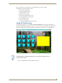
TPDesign4
Touch Panel Design/Programming Software
(v3.2 or higher)
Development Tools
Last Revised: 1/09/2012
AMX Software License and Warranty Agreement
•
LICENSE GRANT. AMX grants to Licensee the non-exclusive right to use the AMX Software in the manner described in this
License. The AMX Software is licensed, not sold. This license does not grant Licensee the right to create derivative works of the
AMX Software. The AMX Software consists of generally available programming and development software, product documentation, sample applications, tools and utilities, and miscellaneous technical information. Please refer to the README.TXT file on
the compact disc or download for further information regarding the components of the AMX Software. The AMX Software is subject to restrictions on distribution described in this License Agreement. AMX Dealer, Distributor, VIP or other AMX authorized
entity shall not, and shall not permit any other person to, disclose, display, loan, publish, transfer (whether by sale, assignment,
exchange, gift, operation of law or otherwise), license, sublicense, copy, or otherwise disseminate the AMX Software. Licensee
may not reverse engineer, decompile, or disassemble the AMX Software.
•
ACKNOWLEDGEMENT. You hereby acknowledge that you are an authorized AMX dealer, distributor, VIP or other AMX authorized entity in good standing and have the right to enter into and be bound by the terms of this Agreement.
•
INTELLECTUAL PROPERTY. The AMX Software is owned by AMX and is protected by United States copyright laws, patent
laws, international treaty provisions, and/or state of Texas trade secret laws. Licensee may make copies of the AMX Software
solely for backup or archival purposes. Licensee may not copy the written materials accompanying the AMX Software.
•
TERMINATION. AMX RESERVES THE RIGHT, IN ITS SOLE DISCRETION, TO TERMINATE THIS LICENSE FOR ANY REASON UPON WRITTEN NOTICE TO LICENSEE. In the event that AMX terminates this License, the Licensee shall return or
destroy all originals and copies of the AMX Software to AMX and certify in writing that all originals and copies have been
returned or destroyed.
•
PRE-RELEASE CODE. Portions of the AMX Software may, from time to time, as identified in the AMX Software, include PRERELEASE CODE and such code may not be at the level of performance, compatibility and functionality of the GA code. The
PRE-RELEASE CODE may not operate correctly and may be substantially modified prior to final release or certain features may
not be generally released. AMX is not obligated to make or support any PRE-RELEASE CODE. ALL PRE-RELEASE CODE IS
PROVIDED "AS IS" WITH NO WARRANTIES.
•
LIMITED WARRANTY. AMX warrants that the AMX Software (other than pre-release code) will perform substantially in accordance with the accompanying written materials for a period of ninety (90) days from the date of receipt. AMX DISCLAIMS ALL
OTHER WARRANTIES, EITHER EXPRESS OR IMPLIED, INCLUDING, BUT NOT LIMITED TO IMPLIED WARRANTIES OF
MERCHANTABILITY AND FITNESS FOR A PARTICULAR PURPOSE, WITH REGARD TO THE AMX SOFTWARE. THIS LIMITED WARRANTY GIVES LICENSEE SPECIFIC LEGAL RIGHTS. Any supplements or updates to the AMX SOFTWARE,
including without limitation, any (if any) service packs or hot fixes provided to Licensee after the expiration of the ninety (90) day
Limited Warranty period are not covered by any warranty or condition, express, implied or statutory.
•
LICENSEE REMEDIES. AMX's entire liability and Licensee's exclusive remedy shall be repair or replacement of the AMX Software that does not meet AMX's Limited Warranty and which is returned to AMX in accordance with AMX's current return policy.
This Limited Warranty is void if failure of the AMX Software has resulted from accident, abuse, or misapplication. Any replacement AMX Software will be warranted for the remainder of the original warranty period or thirty (30) days, whichever is longer.
Outside the United States, these remedies may not available. NO LIABILITY FOR CONSEQUENTIAL DAMAGES. IN NO
EVENT SHALL AMX BE LIABLE FOR ANY DAMAGES WHATSOEVER (INCLUDING, WITHOUT LIMITATION, DAMAGES
FOR LOSS OF BUSINESS PROFITS, BUSINESS INTERRUPTION, LOSS OF BUSINESS INFORMATION, OR ANY OTHER
PECUNIARY LOSS) ARISING OUT OF THE USE OF OR INABILITY TO USE THIS AMX SOFTWARE, EVEN IF AMX HAS
BEEN ADVISED OF THE POSSIBILITY OF SUCH DAMAGES. BECAUSE SOME STATES/COUNTRIES DO NOT ALLOW
THE EXCLUSION OR LIMITATION OF LIABILITY FOR CONSEQUENTIAL OR INCIDENTAL DAMAGES, THE ABOVE LIMITATION MAY NOT APPLY TO LICENSEE.
•
U.S. GOVERNMENT RESTRICTED RIGHTS. The AMX Software is provided with RESTRICTED RIGHTS. Use, duplication, or
disclosure by the Government is subject to restrictions as set forth in subparagraph ©(1)(ii) of The Rights in Technical Data and
Computer Software clause at DFARS 252.227-7013 or subparagraphs ©(1) and (2) of the Commercial Computer Software
Restricted Rights at 48 CFR 52.227-19, as applicable.
•
SOFTWARE AND OTHER MATERIALS FROM AMX.COM MAY BE SUBJECT TO EXPORT CONTROL. The United States
Export Control laws prohibit the export of certain technical data and software to certain territories. No software from this Site may
be downloaded or exported (i) into (or to a national or resident of) Cuba, Iraq, Libya, North Korea, Iran, Syria, or any other country to which the United States has embargoed goods; or (ii) anyone on the United States Treasury Department's list of Specially
Designated Nationals or the U.S. Commerce Department's Table of Deny Orders. AMX does not authorize the downloading or
exporting of any software or technical data from this site to any jurisdiction prohibited by the United States Export Laws.
This Agreement replaces and supersedes all previous AMX Software License Agreements and is governed by the laws of
the State of Texas, and all disputes will be resolved in the courts in Collin County, Texas, USA. For any questions concerning this Agreement, or to contact AMX for any reason, please write: AMX License and Warranty Department, 3000 Research
Drive, Richardson, TX 75082.
Table of Contents
Table of Contents
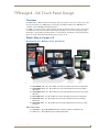
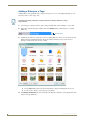
TPDesign4 - G4 Touch Panel Design ..................................................................1
Overview .................................................................................................................. 1
What's New in Version 3.2........................................................................................ 1
New Panel Devices: Modero X Series Touch Panels........................................................ 1
Other New Panels ........................................................................................................... 1
Scrolling Regions............................................................................................................. 2
Popup Pages - Popup Types ........................................................................................... 2
Sub-Page Sets ................................................................................................................. 2
Sub-Page View Buttons ................................................................................................... 2
Two-Finger Gestures ....................................................................................................... 2
Supported Windows Platforms and PC Requirements .............................................. 3
Supported Operating Systems ........................................................................................ 3
Supported Languages .................................................................................................... 3
PC Requirements/Recommendations .............................................................................. 3
Supported Touch Panels ........................................................................................... 3
Supported Screen Resolutions ........................................................................................ 4
Screen Resolutions By Panel Type................................................................................... 6
Video Capabilities for Modero Panels ............................................................................. 7
Video Capabilities for Enhanced Modero Panels ............................................................ 7
Intercom Capabilities for Modero Panels ........................................................................ 8
AMX Touch Panels that Support Dynamo Resource Images ........................................... 8
True Type Font Support .................................................................................................. 8
Related AMX Software Applications......................................................................... 8
NetLinx Studio ................................................................................................................ 8
AMX WebUpdate ............................................................................................................ 8
G4 PanelBuilder .............................................................................................................. 8
G4 PanelPreview ............................................................................................................. 9
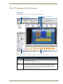
The TPDesign4 Work Area .................................................................................1
Overview .................................................................................................................. 1
Menus ....................................................................................................................... 2
File Menu ........................................................................................................................ 2
Edit Menu........................................................................................................................ 3
Panel Menu ..................................................................................................................... 5
Page Menu ...................................................................................................................... 6
Button Menu ................................................................................................................... 6
States Menu .................................................................................................................... 7
Layout Menu ................................................................................................................... 7
TPDesign4 (v3.2 or higher)
i
Table of Contents
Transfer Menu ................................................................................................................. 7
View Menu ...................................................................................................................... 8
Tools Menu...................................................................................................................... 9
Window Menu ................................................................................................................. 9
Help Menu....................................................................................................................... 9
Align Options sub-menu................................................................................................ 10
Make Same Size sub-menu ............................................................................................ 10
Horizontal Spacing Options sub-menu .......................................................................... 10
Vertical Spacing Options sub-menu............................................................................... 10
Size For Border Options sub-menu ............................................................................... 11
Toolbars .................................................................................................................. 11
Show/Hide Toolbars ...................................................................................................... 11
Main Toolbar ................................................................................................................. 11
Transfer Toolbar ............................................................................................................ 13
View Toolbar ................................................................................................................. 14
Selection/Drawing Tools Toolbar .................................................................................. 14
Button Display Toolbar.................................................................................................. 15
Zoom Toolbar................................................................................................................ 15
Drawing Tools Toolbar .................................................................................................. 16
Order Assist Toolbar ..................................................................................................... 17
Position Assist Toolbar .................................................................................................. 17
Size Assist Tools Toolbar ............................................................................................... 18
List Box Tools Toolbar ................................................................................................... 19
Design View Windows ............................................................................................ 19
Design View Window context menu.............................................................................. 20
Design View Window MDI Tab Controls ....................................................................... 22
Using the Zoom Controls .............................................................................................. 22
Button Magnifier Window ............................................................................................. 23
External Controls View ........................................................................................... 23
Workspace Window ................................................................................................ 25
Workspace Window- Pages Tab .................................................................................... 25
Opening Pages/Popup Pages Via the Workspace Window ............................................ 26
Workspace Window- Function Maps Tab ...................................................................... 26
Properties Window ................................................................................................. 27
Properties Window - General Tab ................................................................................. 28
Properties Window - Programming Tab ........................................................................ 28
Properties Window - States Tab .................................................................................... 29
State Manager Window .......................................................................................... 30
State Manager Context Menu ....................................................................................... 30
State Manager Drag-and-Drop Menu ............................................................................ 31
ii
TPDesign4 (v3.2 or higher)
Table of Contents
Transfer Status Window.......................................................................................... 32
Transfer Status Context Menu ...................................................................................... 32
Button Preview Window ......................................................................................... 32
Print Preview Window ............................................................................................ 33
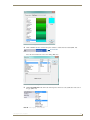
Working With Project (*.TP4) Files ...................................................................37
Overview ................................................................................................................ 37
Creating a New Project........................................................................................... 37
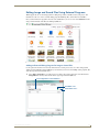
Using the New Project Wizard ................................................................................ 38
New Project Wizard - Step 1 ......................................................................................... 38
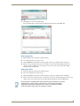
New Project Wizard - Step 2 ......................................................................................... 39
New Project Wizard - Final Step ................................................................................... 40
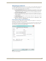
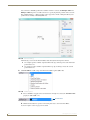
Setting Project Properties ...................................................................................... 41
Project Properties dialog - Project Information tab ...................................................... 41
Applying Password Protection to Your Project File ......................................................... 43
Project Properties dialog - Panel Setup Information tab............................................... 44
Setting a Power Up Page ................................................................................................ 45
Setting Power Up Popup Pages ...................................................................................... 45
Setting an Inactive Page Flip ........................................................................................... 46
Project Properties dialog - Sensors tab ......................................................................... 47
Project Properties dialog - IR Emitters and Receivers tab............................................. 48
Using the Selection Tool ......................................................................................... 49
Edit Focus ............................................................................................................... 50
Drag and Drop Support .......................................................................................... 50
Cutting, Copying and Pasting ................................................................................. 51
Cutting Objects ............................................................................................................. 51
Paste Controls dialog ...................................................................................................... 51
Quick Input ............................................................................................................. 52
Undo/Redo ............................................................................................................. 52
Using G4 PanelPreview........................................................................................... 53
Generating the Programmer's Report .................................................................... 54
Working With Multiple Projects .............................................................................. 55
Copying/Pasting Across Projects................................................................................... 55
Copying/Pasting Pages, Popup Pages and Buttons Across Projects.............................. 55
Converting a Project to a Different Panel Type ...................................................... 56
Errors and Warnings Report dialog ............................................................................... 57
Converting TPD3 files to TPD4 ............................................................................... 58
Via File > Open ............................................................................................................. 58
Using the TPD Conversion Wizard ................................................................................ 58
TPDesign4 (v3.2 or higher)
iii
Table of Contents
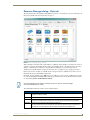
Resource Manager ............................................................................................61
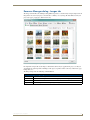
Overview ................................................................................................................ 61
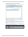
Resource Manager dialog ....................................................................................... 61
Resource Manager Toolbar ........................................................................................... 62
Resource Manager dialog - Images tab................................................................... 63
Resource Manager dialog - Dynamic Images tab .................................................... 64
Resource Manager dialog - Slots tab ...................................................................... 65
Resource Manager dialog - Sounds tab .................................................................. 66
Working With Images ............................................................................................. 67
Supported Image File Types.......................................................................................... 67
Bitmaps vs. Icons ........................................................................................................... 67
Bitmaps............................................................................................................................ 67
Icons ................................................................................................................................ 67
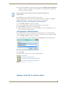
Importing Image Files Into The Project ......................................................................... 68
Notes On Importing Image Files ...................................................................................... 68
Exporting Image Files From The Project ....................................................................... 68
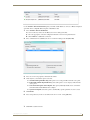
Assigning Images To Slot Positions ............................................................................... 69
Renaming Image Files ................................................................................................... 70
Deleting Image Files From the Project .......................................................................... 70
Working With Dynamic Images ............................................................................... 71
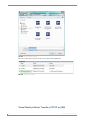
Adding Dynamic Image Files To Your Project ............................................................... 71
Assigning Dynamic Images to Slot Positions ................................................................. 72
Adding a Dynamic Image To The Project - Example ............................................... 73
Applying a Dynamic Image to a Page, Popup Page or Button - Example...................... 76
Editing Dynamic Images ................................................................................................ 77
Deleting Dynamic Image Files From the Project ........................................................... 77
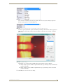
DynaMo™ Dynamic Images .................................................................................... 77
Adding a Dynamo Image To The Project....................................................................... 77
Motion JPEG Cameras and Servers that provide Motion JPEG streaming output ........ 78
Network Path Information............................................................................................. 78
Dynamic Image Settings - Example 1: Axis ................................................................... 79
Dynamic Image Settings - Example 2: Panasonic .......................................................... 79
Dynamic Image Settings - Example 3: Vivotek ............................................................. 80
Working With Trendnet IP Cameras .............................................................................. 80
DynaMo™ Resource Images ................................................................................... 81
Adding an Dynamo Resource Image To The Project ..................................................... 81
Scaling and Cropping of Dynamo Resource Images ...................................................... 82
Copy/Paste Operations on Dynamo Resource Images .................................................. 82
Working With Slots ................................................................................................. 83
iv
TPDesign4 (v3.2 or higher)
Table of Contents
Icons ....................................................................................................................... 83
Assigning Images to Slot Positions................................................................................ 83
Assigning Dynamic Images to Slot Positions ................................................................. 83
Moving Slot Assignments.............................................................................................. 83
Duplicating Slot Assignments........................................................................................ 84
Swapping Slot Assignments .......................................................................................... 84
Deleting Slot Assignments From The Project ................................................................ 85
Working With Sounds ............................................................................................. 85
Importing Sound Files Into The Project ......................................................................... 85
Sorting Sound Files ....................................................................................................... 86
Previewing Sound Files ................................................................................................. 86
Editing Image and Sound Files Using External Programs ....................................... 87
Adding an External Editing Program for Image or Sound Files..................................... 87
Changing the Default External Image or Sound Editor Program .................................. 88
Editing Image Files........................................................................................................ 89
Editing Sound Files ....................................................................................................... 89
Working With Video Fills ........................................................................................ 90
Streaming Video Fills .................................................................................................... 90
Displaying a Video Source on a Page............................................................................ 90
Displaying a Video Source on a Popup Page ................................................................ 90
Displaying a Video Source on a Button ......................................................................... 90
Working With Pages .........................................................................................91
Overview ................................................................................................................ 91
Adding a Page ........................................................................................................ 92
Setting Page Properties.......................................................................................... 93
Setting General Properties: Pages ................................................................................ 93
Setting Programming Properties: Pages ....................................................................... 93
Setting States Properties: Pages................................................................................... 94
Renaming a Page .................................................................................................... 94
Opening a Page ...................................................................................................... 95
Adding a Fill Color to a Page.................................................................................. 95
Adding a Bitmap to a Page..................................................................................... 96
Displaying a Video Fill on a Page............................................................................ 98
Adding an Icon to a Page ....................................................................................... 99
Adding Text to a Page.......................................................................................... 100
True Type Font Support .............................................................................................. 103
Foreign Language Support for Text ............................................................................ 103
Copying/Pasting Pages ......................................................................................... 103
Copying Pages ............................................................................................................ 103
TPDesign4 (v3.2 or higher)
v
Table of Contents
Pasting Pages .............................................................................................................. 103
Renaming a Page .................................................................................................. 104
Deleting a Page From the Project......................................................................... 104
Exporting Pages as Image Files ............................................................................ 105
Printing Pages....................................................................................................... 106
Popup Pages ...................................................................................................107
Overview .............................................................................................................. 107
Standard Popups ......................................................................................................... 107
Sub-Page Popups (Sub-Pages)..................................................................................... 108
Creating a Standard Popup Page ......................................................................... 108
Via the Add Popup Page Dialog.................................................................................. 108
Using the Popup Draw Tool ........................................................................................ 109
Drawing Assist Support for Popup Pages ................................................................... 110
Setting Standard Popup Page Properties ............................................................. 110
Setting General Properties: Popup Pages ................................................................... 111
Setting Programming Properties: Popup Pages .......................................................... 112
Setting States Properties: Popup Pages...................................................................... 112
Popup Page Groups.............................................................................................. 113
Creating Popup Page Groups...................................................................................... 113
Via the Add Popup Page dialog..................................................................................... 114
Via the Properties Window ............................................................................................ 114
Adding Popup Pages To a Popup Page Group............................................................ 114
Removing Popup Pages From a Popup Page Group ................................................... 115
Naming Popup Pages ........................................................................................... 115
Renaming a Popup Page....................................................................................... 115
Opening a Popup Page via the Workspace Window............................................. 116
Show/Hide Popup Pages ...................................................................................... 116
Adding a Fill Color To a Popup Page .................................................................... 117
Adding a Bitmap to a Popup Page ....................................................................... 117
Displaying a Video Source on a Popup Page ........................................................ 117
Adding an Icon to a Popup Page .......................................................................... 117
Adding Text to a Popup Page .............................................................................. 117
Copying/Pasting Popup Pages.............................................................................. 117
Copying Popup Pages ................................................................................................. 117
Pasting Popup Pages................................................................................................... 117
Deleting Popup Pages From a Project .................................................................. 118
Exporting Popup Pages as Image Files ................................................................. 118
vi
TPDesign4 (v3.2 or higher)
Table of Contents
Sub-Pages .......................................................................................................119
Overview .............................................................................................................. 119
More Information.................................................................................................. 120
Working With Buttons ....................................................................................121
Overview .............................................................................................................. 121
Button Types ........................................................................................................ 121
Creating New Buttons .......................................................................................... 122
Button Draw Tools ................................................................................................ 122
Button Draw Tool ........................................................................................................ 122
Drawing a Button.................................................................................................. 123
Using the Drawing Assist Features ....................................................................... 124
Alignment & Sizing Dialog .......................................................................................... 124
Specifying the Button Type .................................................................................. 125
Setting Default New Button Parameters .............................................................. 126
Editing Button Properties ..................................................................................... 127
Editing Multiple Selections ......................................................................................... 127
Using the Apply To All option............................................................................... 127
Button State Properties ........................................................................................ 128
Button States - Properties Window (States tab).......................................................... 128
Button States - State Manager .................................................................................... 129
Generated Button Names ..................................................................................... 129
Page Flips ............................................................................................................. 130
Creating a Page Flip.................................................................................................... 130
Page Flip Actions ........................................................................................................ 132
Drag & Drop To Set Page Flips ................................................................................... 132
Creating Page Flip Animations.................................................................................... 133
Copying/Pasting Buttons ...................................................................................... 134
Copying Buttons: ........................................................................................................ 134
Pasting Buttons: .......................................................................................................... 135
Searching For Button Properties .......................................................................... 135
Searching and Replacing Button Properties ................................................................ 136
Adding a Fill Color To a Button ............................................................................ 137
Adding a Bitmap to a Button ................................................................................ 137
Adding an Icon to a Button................................................................................... 137
Adding Text to a Button ....................................................................................... 137
Displaying a Video Source on a Button................................................................. 137
Previewing a Button ............................................................................................. 138
Button Preview window .............................................................................................. 138
Button Preview context menu..................................................................................... 138
TPDesign4 (v3.2 or higher)
vii
Table of Contents
Date and Time Buttons ......................................................................................... 139
Creating a Date Button ............................................................................................... 139
Creating a Time Button ............................................................................................... 140
General Buttons .................................................................................................... 140
Creating General Buttons............................................................................................ 140
Setting Button Properties: General Buttons................................................................ 141
Multi-State General Buttons ................................................................................. 142
Creating Multi-State General Buttons ......................................................................... 142
Setting Button Properties: Multi-State General Buttons ............................................. 142
Bargraph Buttons.................................................................................................. 143
Creating Bargraph Buttons.......................................................................................... 143
Setting Button Properties: Bargraph Buttons.............................................................. 144
Slider Types................................................................................................................. 145
Formatting Codes ....................................................................................................... 145
Multi-State Bargraph Buttons ............................................................................... 146
Creating Multi-State Bargraph Buttons ....................................................................... 146
Setting Button Properties: Multi-State Bargraph Buttons ........................................... 146
Creating a Custom Slider ............................................................................................ 147
Working With Touch Maps .......................................................................................... 150
Joystick Buttons.................................................................................................... 151
Creating Joystick Buttons............................................................................................ 151
Setting Button Properties: Joystick Buttons................................................................ 151
Text Input Buttons ................................................................................................ 152
Creating Text Input Buttons ........................................................................................ 152
Setting Button Properties: Text Input Buttons ............................................................ 153
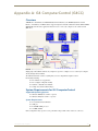
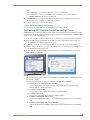
Computer Control Buttons ................................................................................... 153
Creating Computer Control Buttons ........................................................................... 154
Setting Button Properties: Computer Control Buttons ............................................... 155
TakeNote Buttons................................................................................................. 156
Creating TakeNote Buttons......................................................................................... 156
Setting Button Properties: TakeNote Buttons............................................................. 156
Sub-Page View Buttons......................................................................................... 157
Creating Sub-Page View Buttons ................................................................................ 158
Setting Button Properties: Sub-Page View Buttons .................................................... 158
List Box Buttons.................................................................................................... 159
Creating List Box Container Buttons ........................................................................... 159
External Controls (Buttons/LEDs) ...................................................................161
Overview .............................................................................................................. 161
External Button Options ....................................................................................... 161
Copying/Converting External Controls Between Panels ....................................... 162
viii
TPDesign4 (v3.2 or higher)
Table of Contents
Setting Global Properties for External Controls ................................................... 162
Setting Global General Properties: External Pushbuttons .......................................... 162
Setting Global Programming Properties: External Pushbuttons ................................. 163
Setting Global Properties for External LEDs ............................................................... 163
Setting Global General Properties: External LEDs ...................................................... 163
Setting Global Programming Properties: External LEDs ............................................. 164
Setting Page-Specific Properties for External Controls ........................................ 164
Setting Page-Specific General Properties: External Pushbuttons................................ 164
Setting Page-Specific Programming Properties: External Pushbuttons....................... 165
Setting Page-Specific General Properties: External LEDs ........................................... 165
Setting Page-Specific Programming Properties: External LEDs .................................. 166
Gesture Controls ............................................................................................167
Overview .............................................................................................................. 167
Single-Finger Gestures (MVP-9000i and MX Series Panels):........................................ 167
Two-Finger Gestures (MX Series Panels Only) ........................................................... 167
Single-Finger Gestures.......................................................................................... 168
Using Single-Finger Gestures ...................................................................................... 168
Two-Finger Gestures............................................................................................. 169
Using Two-Finger Gestures ......................................................................................... 169
Setting Properties for Gesture Controls ............................................................... 169
Accessing Global Properties for Gesture Controls ...................................................... 170
Accessing Page-Specific Properties for Gesture Controls ........................................... 170
Gestures - General Properties .............................................................................. 171
Gestures - Programming Properties ..................................................................... 171
Scrolling Regions ............................................................................................173
Overview .............................................................................................................. 173
Creating a Scrolling Region - Overview ................................................................ 174
Sub-Pages ............................................................................................................. 175
Creating a Sub-Page ................................................................................................... 176
Via the Add Popup Page Dialog .................................................................................... 176
Via the Popup Draw Tool............................................................................................... 177
Setting Sub-Page Properties ....................................................................................... 178
Setting General Properties: Sub-Pages ........................................................................ 178
Setting Programming Properties: Sub-Pages................................................................ 178
Setting States Properties: Sub-Pages ........................................................................... 178
Sub-Page Sets....................................................................................................... 179
Creating Sub-Page Sets............................................................................................... 179
Sub-Page Sets - Slot Sizes ........................................................................................... 182
Editing Sub-Page Sets ................................................................................................. 183
Deleting Sub-Page Sets............................................................................................... 183
TPDesign4 (v3.2 or higher)
ix
Table of Contents
Sub-Page View Buttons......................................................................................... 183
Sub-Page View Buttons - Design View ........................................................................ 184
Creating Sub-Page View Buttons ................................................................................ 184
Assigning a Sub-Page Set to the Sub-Page View Button............................................. 186
Setting Sub-Page View Button Properties................................................................... 186
Setting General Properties: Sub-Page View Buttons .................................................... 186
Setting Programming Properties: Sub-Page View Buttons ........................................... 187
Setting State Properties: Sub-Page View Buttons......................................................... 187
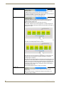
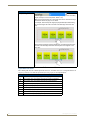
Creating a Scrolling Region - Example.................................................................. 188
Step 1 - Create Sub-Pages........................................................................................... 188
Step 2 - Create a Sub-Page Set ................................................................................... 189
Step 3 - Create a Sub-Page View Button..................................................................... 191
Step 4 - Assign the Sub-Page Set to the Sub-Page View Button................................. 192
Step 5 - Set Other Scrolling-Related Properties for the Sub-Page View Button.......... 192
Set Remaining Button Properties for the Sub-Page View Button................................ 193
List Box Buttons ..............................................................................................195
Overview .............................................................................................................. 195
Using the Drawing Tools Toolbar With List Box Buttons............................................. 196
List Box Toolbar .......................................................................................................... 196
List Box Buttons - Resizing.................................................................................... 196
List Box Buttons: Managed Mode......................................................................... 197
Creating List Box Buttons (Managed Mode)................................................................ 198
Adding Rows and Columns to a List Box (Managed Mode)......................................... 199
Deleting Rows and Columns from a List Box (Managed Mode)................................... 200
Cutting, Copying and Pasting a List Box (Managed Mode) ......................................... 200
Unmanaged Mode ................................................................................................ 201
List Box Buttons: Unmanaged Mode ........................................................................... 201
Creating List Box Buttons (Unmanaged Mode) ........................................................... 202
Rules for Unmanaged List Box Buttons ....................................................................... 202
List Box Buttons - Z-Order........................................................................................... 203
List Box Buttons - Container Button ..................................................................... 203
Setting List Box Container Button Properties ............................................................. 204
List Box Container Properties vs. Column Properties (Managed Mode) ............... 205
Setting General Properties: List Box Container Buttons ............................................. 205
Setting Programming Properties: List Box Container Buttons .................................... 206
Setting State Properties: List Box Container Buttons.................................................. 206
List Box Buttons - Subordinate Buttons ................................................................ 207
List Box Buttons - Columns.......................................................................................... 208
x
TPDesign4 (v3.2 or higher)
Table of Contents
Setting List Box Button Column Properties .......................................................... 209
Setting General Properties: List Box Button Columns................................................. 209
Setting Programming Properties: List Box Button Columns........................................ 209
Setting State Properties: List Box Button Columns ..................................................... 210
Subordinate Button Placement ................................................................................... 210
Subordinate Buttons - Drag and Drop Capability........................................................ 210
List Box Buttons - Navigation Buttons .................................................................. 211
Creating List Box Navigation Buttons ......................................................................... 212
Creating a List Box Navigation Scroll Bar.................................................................... 212
Creating a List Box Feedback Scroll Bar...................................................................... 213
Scroll bar components................................................................................................. 214
Navigation Buttons - Channel Code values ................................................................. 214
List Data Tables .................................................................................................... 215
List Data Table Properties........................................................................................... 215
Static List Box Data ..................................................................................................... 215
Dynamic List Box Data ................................................................................................ 215
Changing Port and Address Assignments for a List Data Table .................................. 216
Attaching a List Data Table to a List Box Button .................................................. 217
Working With Static List Box Data........................................................................ 218
Creating a Static List Data Table ................................................................................. 218
Editing Cell Data ......................................................................................................... 219
List Data Table Column Types ..................................................................................... 219
Attaching a Static List Data Table to a List Box Button............................................... 219
Deleting a List Data Table ........................................................................................... 219
Working With Dynamic List Box Data ................................................................... 220
List Box Commands .............................................................................................. 220
Data List Commands .................................................................................................. 220
^LDN .......................................................................................................................................220
^LDA .......................................................................................................................................220
^LDR .......................................................................................................................................221
^LDC .......................................................................................................................................221
^LDD .......................................................................................................................................221
^LDT ........................................................................................................................................221
^LDL ........................................................................................................................................222
Command Structure List View Commands ................................................................. 223
^LVO .......................................................................................................................................223
^LVL ........................................................................................................................................223
^LVP ........................................................................................................................................223
^LVM .......................................................................................................................................224
^LVS ........................................................................................................................................224
^LVC ........................................................................................................................................224
^LVF ........................................................................................................................................224
Creating a Dynamic List Data Table ...................................................................... 225
^LVU .......................................................................................................................................225
TPDesign4 (v3.2 or higher)
xi
Table of Contents
Attaching a Dynamic List Data Table to a List Box Button .......................................... 227
Example: Creating a Static List Box for a MIO-R4................................................. 227
Step 1 - Select the List Box Draw Tool ........................................................................ 227
Step 2 - Draw a List Box .............................................................................................. 227
Step 3 - Set the Properties of the Elements In Your List Box ...................................... 228
Step 4 - Enable the “List Box Tools” Toolbar .............................................................. 228
Step 5 - Create a List Table ......................................................................................... 229
Step 6 - Provide a name for the Table......................................................................... 229
Step 7 - Set the Properties Of Each Column In the List Table. .................................... 230
Step 8 - Link the List Table to the List Box .................................................................. 231
Working With Properties ................................................................................233
Overview .............................................................................................................. 233
Drag and Drop support ........................................................................................ 233
Grab Properties and Paint Properties Tools ......................................................... 233
Grabbing Properties (via the Grab Properties Tool).................................................... 234
Painting Properties (via the Paint Properties Tool)...................................................... 235
Saving a Properties Set ............................................................................................... 235
Using the Apply To All Option .............................................................................. 235
Using the Prev and Next Buttons.......................................................................... 236
Searching For Properties ...................................................................................... 236
Searching and Replacing Properties ..................................................................... 237
General Properties................................................................................................ 238
Above Popups ........................................................................................................................ 238
Allow Dynamic Reordering ..................................................................................................... 238
Anchor Position ....................................................................................................................... 239
Animation Time ....................................................................................................................... 239
Animate Time Down ............................................................................................................... 239
Animate Time Up .................................................................................................................... 240
Auto-Repeat ............................................................................................................................ 240
Border Style ............................................................................................................................ 240
Color Depth ............................................................................................................................ 240
Column Display Order ............................................................................................................. 240
Column Sort Order ................................................................................................................. 241
Compression ........................................................................................................................... 241
Cursor Color ............................................................................................................................ 241
Cursor Name ........................................................................................................................... 241
Description ............................................................................................................................. 241
Disabled .................................................................................................................................. 241
Display Type ........................................................................................................................... 241
Flyout Text .............................................................................................................................. 241
Group ...................................................................................................................................... 242
Height ..................................................................................................................................... 242
Hidden .................................................................................................................................... 242
Hide Effect .............................................................................................................................. 242
Hide Effect Time ..................................................................................................................... 242
Hide Effect X/Y Pos ................................................................................................................ 242
Input Mask .............................................................................................................................. 243
Left ......................................................................................................................................... 243
List Column ............................................................................................................................. 243
List Column Padding ............................................................................................................... 243
List Display .............................................................................................................................. 243
xii
TPDesign4 (v3.2 or higher)
Table of Contents
List Table Port .........................................................................................................................244
List Table Address ...................................................................................................................244
List Table Wrap .......................................................................................................................244
List Filter Column ....................................................................................................................244
List Managed ...........................................................................................................................244
List Offset Enabled ..................................................................................................................245
List Preferred Row ...................................................................................................................245
List Preferred Row Height .......................................................................................................245
List Row ...................................................................................................................................245
List Row Height .......................................................................................................................246
List Row Padding .....................................................................................................................246
List Selectable .........................................................................................................................246
Lock Button Name ...................................................................................................................246
Max Text Length .....................................................................................................................246
Modal ......................................................................................................................................246
Name .......................................................................................................................................246
Orientation ..............................................................................................................................246
Override Global Settings .........................................................................................................247
Page Flip .................................................................................................................................247
Page Flip Animation ................................................................................................................247
Password .................................................................................................................................247
Password Character .................................................................................................................247
Password Protection ...............................................................................................................247
Popup Type .............................................................................................................................247
Remote Host ...........................................................................................................................247
Remote Port ............................................................................................................................247
Reset Pos. On Show ................................................................................................................248
Reset View On Show ...............................................................................................................248
Scale To Fit ..............................................................................................................................248
Show Effect .............................................................................................................................249
Show Effect Time ....................................................................................................................249
Show Effect X/Y Pos ................................................................................................................249
Show Sub-Pages ......................................................................................................................249
Slider Color .............................................................................................................................249
Slider Name .............................................................................................................................249
Spacing (%) ..............................................................................................................................249
State Count .............................................................................................................................250
Sub-Page Set ...........................................................................................................................250
TakeNote Enabled ...................................................................................................................250
TakeNote Host ........................................................................................................................250
TakeNote Port .........................................................................................................................250
Timeout ...................................................................................................................................250
Top ..........................................................................................................................................250
Touch Map ..............................................................................................................................250
Touch Style ..............................................................................................................................251
Type ........................................................................................................................................251
Value Direction ........................................................................................................................251
Width .......................................................................................................................................251
Input Mask Characters................................................................................................. 252
Wrap Sub-Pages ......................................................................................................................252
Input Mask Ranges ...................................................................................................... 253
Input Mask Next Field Characters ............................................................................... 253
Input Mask Operators ................................................................................................. 253
Working With Touch Styles and Active Touch ............................................................. 253
Programming Properties....................................................................................... 254
Address Code ..........................................................................................................................254
Address Port ...........................................................................................................................254
Channel Code ..........................................................................................................................254
Channel Port ............................................................................................................................254
Command Output ...................................................................................................................255
Command Port ........................................................................................................................255
TPDesign4 (v3.2 or higher)
xiii
Table of Contents
Feedback ................................................................................................................................ 255
Level Aux ................................................................................................................................ 255
Level Code .............................................................................................................................. 255
Level Control Repeat Time ...................................................................................................... 255
Level Control Type .................................................................................................................. 256
Level Control Value ................................................................................................................. 256
Level Function ......................................................................................................................... 256
Level Port ................................................................................................................................ 256
Range Aux Inverted ................................................................................................................ 256
Range Drag Increment ............................................................................................................ 256
Range Low .............................................................................................................................. 256
Range High ............................................................................................................................. 256
Range Inverted ....................................................................................................................... 256
Address Codes...................................................................................................... 257
Range Time Up ....................................................................................................................... 257
Range Time Down ................................................................................................................... 257
String Output .......................................................................................................................... 257
String Output Port .................................................................................................................. 257
Basic Address Codes ................................................................................................... 258
Date Display ........................................................................................................................... 258
Intercom .................................................................................................................................. 259
Time Display ........................................................................................................................... 259
Creating a Date Button ............................................................................................... 260
Creating an Intercom Button ....................................................................................... 261
Creating a Time Button ............................................................................................... 262
Advanced Address Codes ........................................................................................... 264
Battery Base ............................................................................................................................ 264
Battery Base Setup ................................................................................................................. 264
Battery Setup .......................................................................................................................... 264
Calibration .............................................................................................................................. 264
Color Picker ............................................................................................................................ 264
Confirmation Dialog ................................................................................................................ 264
Diagnostics ............................................................................................................................. 264
Docking ................................................................................................................................... 264
Download ............................................................................................................................... 264
G4 WebControl ....................................................................................................................... 265
Image Cache ........................................................................................................................... 265
Image NV Cache ..................................................................................................................... 265
Image RAM Cache ................................................................................................................... 265
Keyboard ................................................................................................................................ 265
Master ..................................................................................................................................... 265
Panel ID .................................................................................................................................. 266
Panel Info ................................................................................................................................ 266
Panel Setup ............................................................................................................................. 267
Primary Network Interface ...................................................................................................... 268
RGB ......................................................................................................................................... 268
SIP ........................................................................................................................................... 268
Secondary Network Interface ................................................................................................. 269
Site Survey .............................................................................................................................. 269
TakeNote ................................................................................................................................ 270
Time Set .................................................................................................................................. 270
Warning Message ................................................................................................................... 270
Wireless .................................................................................................................................. 270
Video ...................................................................................................................................... 270
VideoRGB ............................................................................................................................... 270
Video Streaming ..................................................................................................................... 270
xiv
TPDesign4 (v3.2 or higher)
Table of Contents
Channel Codes...................................................................................................... 271
Navigation Buttons - Channel Code values ................................................................. 271
NXP-PLV Reserved Channel Codes (1-7) ..................................................................... 272
MIO R-4 Channel Codes .............................................................................................. 272
Basic Channel Codes ................................................................................................... 273
Page Flip .................................................................................................................................273
Panel Setup .............................................................................................................................273
Advanced Channel Codes ........................................................................................... 274
Battery Base Setup ..................................................................................................................274
Cache ......................................................................................................................................274
Calibration ...............................................................................................................................274
Color Picker .............................................................................................................................274
Computer Control ...................................................................................................................274
Confirmation Dialog ................................................................................................................275
Diagnostics ..............................................................................................................................275
G4 Web Control ......................................................................................................................275
Image Cache ............................................................................................................................275
Image NV Cache ......................................................................................................................275
Keyboard .................................................................................................................................275
Master .....................................................................................................................................275
Panel ID ...................................................................................................................................276
Panel Setup .............................................................................................................................276
Primary Network Interface ......................................................................................................277
RGB .........................................................................................................................................277
SIP ...........................................................................................................................................277
Secondary Network Interface ..................................................................................................278
Streaming ................................................................................................................................278
System Recovery .....................................................................................................................278
TakeNote .................................................................................................................................278
Time ........................................................................................................................................279
Video .......................................................................................................................................279
Video RGB ...............................................................................................................................279
Video RGB Streaming ..............................................................................................................279
Virtual Keyboard .....................................................................................................................279
Level Codes .......................................................................................................... 280
NXP-PLV Reserved Level Codes (1-11)........................................................................ 281
Basic Level Codes........................................................................................................ 281
Panel Setup .............................................................................................................................282
Time Level ...............................................................................................................................282
Advanced Level Codes ................................................................................................ 283
Battery Base Setup ..................................................................................................................283
Calibration ...............................................................................................................................283
Color Picker .............................................................................................................................283
Confirmation Dialog ................................................................................................................283
Diagnostics ..............................................................................................................................283
Download ................................................................................................................................283
Keyboard .................................................................................................................................283
Panel Setup .............................................................................................................................283
Primary Network Interface ......................................................................................................283
Secondary Network Interface .................................................................................................283
TakeNote .................................................................................................................................283
Video .......................................................................................................................................283
Level Control Parameters............................................................................................ 284
TPDesign4 (v3.2 or higher)
xv
Table of Contents
State Properties.................................................................................................... 285
Bitmap .................................................................................................................................... 285
Bitmap Justification ................................................................................................................ 285
Bitmap X Offset ...................................................................................................................... 285
Bitmap Y Offset ...................................................................................................................... 285
Border Color ........................................................................................................................... 285
Border Name .......................................................................................................................... 285
Chameleon Image ................................................................................................................... 285
Draw Order ............................................................................................................................. 286
Fill Color ................................................................................................................................. 286
Font ........................................................................................................................................ 286
Icon Justification ..................................................................................................................... 286
Icon Slot .................................................................................................................................. 286
Icon X Offset ........................................................................................................................... 286
Icon Y Offset ........................................................................................................................... 287
Marquee Direction .................................................................................................................. 287
Marquee Repeat ..................................................................................................................... 287
Overall Opacity ....................................................................................................................... 287
Scale Bitmap To Fit ................................................................................................................. 288
Sound ...................................................................................................................................... 288
Streaming Source .................................................................................................................... 288
Sub-Page Layout Color ........................................................................................................... 289
Text ......................................................................................................................................... 289
Text Color ............................................................................................................................... 289
Text Effect .............................................................................................................................. 290
Text Effect Color ..................................................................................................................... 290
Text Justification ..................................................................................................................... 290
Text X Offset .......................................................................................................................... 290
Text Y Offset ........................................................................................................................... 290
Video Cropping ...................................................................................................................... 290
Supported Image File Types........................................................................................ 291
Video Fill ................................................................................................................................. 291
Video Touch Pass-Thru ............................................................................................................ 291
Word Wrap ............................................................................................................................. 291
True Type Font Support .............................................................................................. 292
Complex Script Support .............................................................................................. 292
Formatting Codes ....................................................................................................... 292
Working With States .......................................................................................293
Overview .............................................................................................................. 293
State Manager Window ........................................................................................ 293
Adding States To a Multi-State Button ................................................................. 294
Add States................................................................................................................... 294
Insert States ................................................................................................................ 294
Copying/Pasting States ............................................................................................... 295
Adding States via Drag-and-Drop ............................................................................... 295
State Manager Drag-and-Drop Menu .......................................................................... 295
Replacing States ................................................................................................... 296
Replacing States From the Clipboard.......................................................................... 296
Replacing States via Drag-and-Drop ........................................................................... 296
Setting the Maximum Active State For a Button .................................................. 296
Setting State Properties ....................................................................................... 297
Using the All States Option .................................................................................. 297
xvi
TPDesign4 (v3.2 or higher)
Table of Contents
Removing States From A Button .......................................................................... 297
Deleting States............................................................................................................ 297
Cutting States To the Clipboard ................................................................................. 297
Reordering States On A Button ............................................................................ 298
Reordering States Through the Clipboard .................................................................. 298
Reordering States Through Drag-and-Drop ................................................................ 298
State Draw Order ................................................................................................. 298
Changing the State Draw Order for Selected States .................................................. 299
Working With Function Codes ........................................................................301
Overview .............................................................................................................. 301
Show/Hide Function Codes & State Overlay ........................................................ 301
Function Codes - Limitations................................................................................. 301
Function Code Map .............................................................................................. 302
0- setup port......................................................................................................... 303
Using Power Assign .............................................................................................. 304
The Power Assign dialog ...................................................................................... 304
Step One - Clear Channels .................................................................................... 305
Step Two - Assign Codes ...................................................................................... 307
Function Code Assignment Options ..................................................................... 307
Begin Assignment At................................................................................................... 307
Ensure Contiguous Code Assignment ......................................................................... 307
Code Assignments - Wrap Within Port ID ................................................................... 308
Working With Colors and Palettes .................................................................309
Overview .............................................................................................................. 309
Working With Palettes .......................................................................................... 311
Working With Multiple Color Palettes......................................................................... 311
Creating New Palette Entries...................................................................................... 311
Creating Custom Palettes ........................................................................................... 312
Renaming Palettes ...................................................................................................... 312
Changing the Active Palette ....................................................................................... 312
Importing Palette (*.PAL) Files .................................................................................... 312
Exporting Palette (*.PAL) Files .................................................................................... 313
Copying Palettes ......................................................................................................... 313
Copying Palette Entries .............................................................................................. 313
Working With Transparent Backgrounds .............................................................. 313
Using Custom Palettes to Enable Color Schemes in VisualArchitect ........................... 314
Using the Microsoft® Paint Utility Program.......................................................... 314
TPDesign4 (v3.2 or higher)
xvii
Table of Contents
Animation Effects ...........................................................................................315
Overview .............................................................................................................. 315
Animation Wizard ................................................................................................. 315
Tweening .............................................................................................................. 317
Creating Color Transition Effects .......................................................................... 319
Creating Animated Bitmap Effects ....................................................................... 320
Creating Animated Text Effects............................................................................ 321
Tweeners sub-menu .................................................................................................... 321
Chameleon Images................................................................................................ 322
Color Channels for Chameleon Images........................................................................ 322
Requirements for Chameleon Images.......................................................................... 323
Working With Chameleon Images ............................................................................... 323
Chameleon Images, Custom Palettes and VisualArchitect........................................... 324
Working With Templates ................................................................................325
Overview .............................................................................................................. 325
Importing Template (*.VAT or *.TPT) Files ............................................................ 325
Exporting Your Project as a VisualArchitect Template.......................................... 325
VA Templates - Navigations as Pages ......................................................................... 327
VA Templates - Logical Page Scroll Bar Elements ....................................................... 327
VA Templates - Logical Page Info Element.................................................................. 327
VA Templates - Logical Page Up and Down Elements................................................. 327
VA Templates - List Box Page Up and Down Elements ............................................... 327
Creating VisualArchitect Templates ...................................................................... 327
Required Template Elements ...................................................................................... 328
Optional Template Elements ....................................................................................... 329
Rules for Navigating a Template ................................................................................. 332
Info Buttons................................................................................................................. 332
Template Wide Conventions ....................................................................................... 332
Creating Navigation Elements .............................................................................. 332
Creating Placeholder Elements ............................................................................. 333
Creating Preview Images ...................................................................................... 335
Chameleon Images and Custom Palettes .............................................................. 336
Working With the System Page Template ............................................................ 337
Copying/Pasting Entire System Pages into a Project .................................................. 339
Copying/Pasting System Page Elements into a Project page ...................................... 339
Working with System Page Keyboards and Keypads .................................................. 340
keyboard: ................................................................................................................................ 340
keyboardPrivate: ..................................................................................................................... 340
keypad: ................................................................................................................................... 340
keypadExtend: ........................................................................................................................ 340
keypadPrivate: ........................................................................................................................ 340
xviii
TPDesign4 (v3.2 or higher)
Table of Contents
keypadTele: .............................................................................................................................340
Warning Message: ...................................................................................................................340
System Page Template Reference............................................................................... 340
Battery: ...................................................................................................................................340
Calibrate: .................................................................................................................................340
Calibrate Test: .........................................................................................................................340
Panel: ......................................................................................................................................340
Progress: .................................................................................................................................341
Project: ....................................................................................................................................341
Protected: ...............................................................................................................................341
Protected ID: ...........................................................................................................................341
Protected Password: ...............................................................................................................341
Protected Secondary ID: .........................................................................................................341
Protected Sensors: ..................................................................................................................341
Resolution: ..............................................................................................................................341
Setup: ......................................................................................................................................341
Time: .......................................................................................................................................341
RGB Full Screen: ......................................................................................................................341
RGB Setup: ..............................................................................................................................341
Video Setup: ............................................................................................................................341
Volume: ...................................................................................................................................341
File Transfer Operations .................................................................................343
Overview .............................................................................................................. 343
Defining and Saving Connection Configurations .................................................. 343
Configuring a New TCP/IP Connection ....................................................................... 344
Configuring a New Serial Connection ......................................................................... 344
Editing the Settings on an Existing Connection Configuration ................................... 345
Connecting to a NetLinx Master ........................................................................... 345
Sending a Panel File To a NetLinx Master ............................................................ 345
Receiving a Panel File From a NetLinx Master...................................................... 346
Virtual NetLinx Master Transfers (TCP/IP or USB)................................................. 348
Virtual NetLinx Master TCP/IP Transfers ..................................................................... 349
Configuring the Touch Panel for Virtual NetLinx Master TCP/IP Transfers ................. 349
Configuring TPD4 for Virtual NetLinx Master TCP/IP Transfers .................................. 349
Transferring Files Using a Virtual NetLinx Master TCP/IP Connection ........................ 350
Powering Up and Connecting the Panel (via TCP/IP) .................................................. 350
Virtual NetLinx Master USB Transfers................................................................... 350
Installing the AMX USB Driver for G4 Touch Panels ................................................... 350
Configuring the Touch Panel for Virtual NetLinx Master USB Transfers...................... 350
Configuring TPD4 for Virtual NetLinx Master USB Transfers ...................................... 351
Transferring Files Using a Virtual NetLinx Master USB Connection............................. 351
Powering Up and Connecting the Panel (via USB)....................................................... 351
MVP-5200i USB Driver.......................................................................................... 352
Program Preferences ......................................................................................355
Setting Program Preferences................................................................................ 355
Quick Input ........................................................................................................... 355
Undo/Redo Support.............................................................................................. 355
TPDesign4 (v3.2 or higher)
xix
Table of Contents
Preferences Dialog - Application tab ................................................................... 356
Startup ........................................................................................................................ 356
Miscellaneous .............................................................................................................. 357
Warning Messages ...................................................................................................... 357
Preferences Dialog - Appearance tab .................................................................. 357
Window ....................................................................................................................... 358
Grid ............................................................................................................................. 358
Transparency ............................................................................................................... 359
Preferences Dialog - Directories tab .................................................................... 359
Default Directories ...................................................................................................... 359
Preferences Dialog - Editor Selection tab ............................................................. 360
Preferences Dialog - Undo/Redo tab ................................................................... 361
Undo / Redo Support .................................................................................................. 361
Adding an External Editing Program for Image Files .................................................. 362
Adding an External Editing Program for Sound Files .................................................. 363
Changing the Default External Image or Sound Editor Program................................. 363
Working with Dockable Windows ......................................................................... 364
Moving, Docking and Resizing Dockable Windows ..................................................... 364
Toggling the Windows ................................................................................................ 364
Customizing the Toolbars ..................................................................................... 365
Adding Buttons To Existing Toolbars .......................................................................... 365
Removing Buttons From Existing Toolbars.................................................................. 365
Associating an Icon With a New Command ................................................................. 366
Creating a New Custom Toolbar ................................................................................. 366
Renaming Custom Toolbars......................................................................................... 366
Deleting Custom Toolbars........................................................................................... 367
Customizing the Menus ........................................................................................ 367
Adding Commands To Existing Menus ........................................................................ 367
Removing Commands From Existing Menus ............................................................... 367
Creating a New Custom Menu .................................................................................... 368
Adding a Shortcut To an Application In the Tools Menu ............................................. 369
Hotkeys (Keyboard Accelerators) ......................................................................... 369
Setting Custom Hotkeys.............................................................................................. 369
Appendix A: G4 ComputerControl (G4CC) .....................................................371
Overview .............................................................................................................. 371
System Requirements for G4 ComputerControl ................................................... 371
Supported Operating Systems .................................................................................... 371
System Requirements.................................................................................................. 371
Setting Up G4 ComputerControl .......................................................................... 372
1: TPD4 Touch Panel File:............................................................................................ 372
xx
TPDesign4 (v3.2 or higher)
Table of Contents
2: Source Code:........................................................................................................... 372
3: G4CC (Computer Control) Configuration: ............................................................... 373
Configuring G4 ComputerControl via configCC.exe............................................. 373
Running G4 ComputerControl .............................................................................. 374
Creating Computer Control Buttons..................................................................... 374
Setting Button Properties: Computer Control Buttons......................................... 374
Appendix B: TakeNote ...................................................................................375
Overview .............................................................................................................. 375
System Requirements for TakeNote ..................................................................... 375
Supported Operating Systems: ................................................................................... 375
System Requirements:................................................................................................. 375
Using TakeNote .................................................................................................... 376
Step 1: Updating AMX Hardware and Software ......................................................... 376
Step 2: Developing a TPD4 project with G4CC and TakeNote Support ..................... 376
Step 3: Modifying the Source Code on your Master ................................................... 377
Step 4: Configuring G4 Computer Control ................................................................. 378
Step 5: Running the G4 Computer Control Application .............................................. 378
Step 6: Running the TakeNote Application ................................................................. 378
Exiting TakeNote .................................................................................................. 378
TakeNote Commands .......................................................................................... 379
Appendix C: Text Effects and Border Styles ..................................................381
Text Effects........................................................................................................... 381
Text Effects - Glow...................................................................................................... 381
Text Effects - Hard Drop Shadow................................................................................ 382
Text Effects - Hard Drop Shadow with Outline ........................................................... 382
Text Effects - Medium Drop Shadow .......................................................................... 383
Text Effects - Medium Drop Shadow with Outline ...................................................... 383
Text Effects - Outline .................................................................................................. 384
Text Effects - Soft Drop Shadow ................................................................................. 384
Text Effects - Soft Drop Shadow with Outline ............................................................ 385
Border Styles ........................................................................................................ 386
Border Styles - 2D Standard........................................................................................ 386
Border Styles - AMX Elite............................................................................................ 386
Border Styles - Bevel ................................................................................................... 387
Border Styles - Circles ................................................................................................. 387
Border Styles - Cursor Controls................................................................................... 387
Border Styles - Diamonds............................................................................................ 388
Border Styles - Double Bevel ...................................................................................... 388
Border Styles - Fuzzy................................................................................................... 388
Border Styles - Glow ................................................................................................... 389
TPDesign4 (v3.2 or higher)
xxi
Table of Contents
Border Styles - Menu Rounded-Bottom....................................................................... 389
Border Styles - Menu Rounded-Left ............................................................................ 389
Border Styles - Menu Rounded-Right .......................................................................... 390
Border Styles - Menu Rounded-Top ............................................................................ 390
Border Styles - Menu Rounded Spacers ...................................................................... 390
Border Styles - Misc..................................................................................................... 391
Border Styles - Neon ................................................................................................... 391
Border Styles - News Header ...................................................................................... 391
Border Styles - Ovals -Horizontal................................................................................. 392
Border Styles - Ovals -Vertical ..................................................................................... 392
Border Styles - Popups ................................................................................................ 392
Border Styles - Smart Button Bubbled ........................................................................ 393
Border Styles - Smart Button Squared ........................................................................ 393
xxii
TPDesign4 (v3.2 or higher)
TPDesign4 - G4 Touch Panel Design
TPDesign4 - G4 Touch Panel Design
Overview
The TPDesign4 (or "TPD4") Touch Panel Design program is designed to assist you in creating a state-of-theart touch panel interface for AMX's G4 Level touch panels (including the Modero line, MIO-R4 remote
controllers, and the NXP-TPI/4 Touch Panel Interface).
Use TPD4 to create Project Files (*.TP4) containing all of the information required to define a user-interface
to be utilized on a G4 touch panel. This includes Pages, Popup Pages and associated navigation/page-flip
information, as well as buttons (including function code information), and all image and sound-related files
that are used in the design (including dynamic images and video feeds).
What's New in Version 3.2
New Panel Devices: Modero X Series Touch Panels
FIG. 1 Modero X Series Touch Panels
MXT-2000XL-PAN - 20.3" Modero® X Series Panoramic Tabletop Touch Panel - FG5968-01
MXD-2000XL-PAN - 20.3" Modero® X Series Panoramic Wall Touch Panel: Portrait Mode -
FG5968-05
MXD-2000XL-PAN - 20.3" Modero® X Series Panoramic Wall Touch Panel: Landscape Mode FG5968-11
MXT-1900L-PAN - 19.4" Modero® X Series Panoramic Tabletop Touch Panel - FG5968-02
MXD-1900L-PAN - 19.4" Modero® X Series Panoramic Wall Touch Panel: Portrait Mode FG5968-06
MXD-1900L-PAN - 19.4" Modero® X Series Panoramic Wall Touch Panel: Landscape Mode FG5968-12
Other New Panels
NXD-700i - 7" Modero® Wall/Flush Mount Touch Panel with Intercom (FG2258-10)
NXT-CA7 - 7" Modero® Tabletop Touch Panel (FG2258-09)
TPDesign4 (v3.2 or higher)
1
TPDesign4 - G4 Touch Panel Design
Scrolling Regions
Scrolling Regions represent a powerful new method of presenting functions on AMX Modero X Series Touch
Panels. A Scrolling Region is a specific area on a touch panel page that contains a set of elements that scroll as
a group.
The illustration in FIG. 2 below shows a basic example of a touch panel page with two Scrolling Regions - one
vertical and one horizontal. The red borders represent the boundaries of the Scrolling Regions, and the items
labelled "SubPage <x>" scroll within the boundaries of the Scrolling Region (either vertically or
horizontally). End-users use swipes to scroll through the items in the Scrolling Region.
All of the items within the Scrolling Region move as a group.
Each item within the Scrolling Region can be pressed like traditional buttons
End-users swipe vertically or horizontally (inside the Scrolling Region)
to scroll through the items within the Scrolling Region
FIG. 2 Example of Scrolling Regions on a Touch Panel Page
Scrolling Regions and related features (including Sub-Pages, Sub-Page Sets and Sub-Page View
buttons) are supported only by Modero X Series Touch Panels.
See the Scrolling Regions section on page 173 for details.
Popup Pages - Popup Types
Popup Pages are now sub-divided into two types: Standard Popup Pages and Sub-Pages.
Sub-Pages are used with the new Sub-Page View button type (see below), in order to create
Scrolling Regions.
Sub-Pages must be added to a Sub-Page Set (see below) for use with a Sub-Page View button.
See the Sub-Pages section on page 119 for details.
Sub-Page Sets
Sub-Page Sets are an ordered collection of Sub-Pages that can be assigned to one or more Sub-Page View
buttons to create Scrolling Regions.
See the Sub-Page Sets section on page 179 for details.
Sub-Page View Buttons
Sub-Page View buttons are a new button type that contains a Sub-Page Set.
See the Sub-Page View Buttons section on page 157 for details.
Two-Finger Gestures
Modero X Series Touch Panels support both single- and two-finger gestures.
These can be programmed as external buttons.
See the Two-Finger Gestures section on page 169 for details.
2
TPDesign4 (v3.2 or higher)
TPDesign4 - G4 Touch Panel Design
Supported Windows Platforms and PC Requirements
Supported Operating Systems
Windows 7 Business (32/64-bit)
You must have Power User (or Administrator) rights to install and run all required
System files.
Supported Languages
• English
• Italian
• Portuguese
• French
• Russian
• Flemish (Dutch)
• German
• Chinese (Classic, HK)
• Greek
• Spanish
• Chinese (Simplified, PRC) • Turkish
• Japanese • Arabic
PC Requirements/Recommendations
Pentium III 750MHZ processor (minimum requirement); 1.5GHz or faster recommended.
700 MB of free disk space (minimum requirement)
512 MB of RAM (minimum - SQL Server 2005 Express Edition requires 512MB)
Minimum (VGA) screen resolution of 800x600.
Windows-compatible mouse (or other pointing device).
If the mouse wheel on your Microsoft® IntelliMouse® doesn't work with VA, try
downloading the latest IntelliMouse drivers from Microsoft.
Supported Touch Panels
TPDesign4 (v3.2 or higher) supports the following AMX (G4) touch panel types:
Supported Touch Panels
MXT-2000XL-PAN
20.3" Modero® X Series Panoramic Tabletop
FG5968-01
MXD-2000XL-PAN
20.3" Modero® X Series Panoramic Wall: Portrait Mode
FG5968-05
MXD-2000XL-PAN
20.3" Modero® X Series Panoramic Wall: Landscape Mode
FG5968-11
MXT-1900L-PAN
19.4" Modero® X Series Panoramic Tabletop
FG5968-02
MXD-1900L-PAN
19.4" Modero® X Series Panoramic Wall: Portrait Mode
FG5968-06
MXD-1900L-PAN
19.4" Modero® X Series Panoramic Wall: Landscape Mode
FG5968-12
MVP-5100
5.2" Modero ViewPoint IR
FG5966-08
MVP-5150
5.2" Modero ViewPoint Wi-Fi
FG5966-07
MVP-5200i:
5.2" Modero ViewPoint with Intercom
FG5966-01
MVP-7500
7.5" Modero ViewPoint
FG5965-01
MVP-8400i
8.4" Modero ViewPoint with Intercom
FG5965-04
MVP-8400
8.4" Modero ViewPoint
FG5965-05
MVP-9000i
9" Modero ViewPoint with Intercom
FG5967-01
NXD-430
4.3" Modero Wall/Flush Mount
FG2262-01
NXD-435
4.3" Modero Wall/Flush Mount
FG2262-03
NXD-CV5
5" Modero Wall/Flush Mount
FG2261-01
NXD-500i
5" Modero Wall/Flush Mount
FG2261-02
TPDesign4 (v3.2 or higher)
3
TPDesign4 - G4 Touch Panel Design
Supported Touch Panels (Cont.)
NXD/NXT-CV7
7" Modero Wall/Flush Mount & Table Top
FG2258-02K,
FG2258-01K
NXD-700vi
7" Modero Wall/Flush Mount with Intercom
FG2258-04K
NXD/NXT-CV10
10" Modero Wall/Flush Mount & Table Top
FG2259-02K,
FG2259-01K
NXT-CV10/PB
10" Modero Table Top with Pushbuttons
FG2259-03K
NXD-1000vi
10" Modero Wall/Flush Mount with Intercom
FG2259-04K
NXD/NXT-CA12
12" Flush Mount & Table Top
FG2251-10,
FG2250
NXD/NXT-CV12
12" Flush Mount & Table Top Video
FG2251-12K,
FG2250-11K
NXD/NXT-1200V
12" Modero Video Wall/Flush Mount & Table Top
FG2251-60K,
FG2250-60K
NXD/NXT-1200VG
12" Modero VG Series Wall/Flush Mount & Table Top with RGB
FG2251-61RGB,
FG2250-61V
NXD/NXT-CA15
15" Flush Mount & Table Top
FG2253-10,
FG2252
NXD/NXT-CV15
15" Flush Mount & Table Top Video
FG2253-12K,
FG2252-11K
NXD/NXT-1500VG
15" Modero VG Series Wall/Flush Mount & Table Top
FG2253-61V,
FG2252-61V
NXD/NXT-CV17
17" Flush Mount & Table Top Color Video
FG2256K,
FG2257K
NXD/NXT-1700VG
17" Modero VG Series Wall/Flush Mount & Table Top
FG2256-61V,
FG2257-61V
NXP-PLV
Modero PosiTrack Pilot Camera Controller
FG630-100
NXP-TPI4
NetLinx Touch Panel Interface
FG2275-01
NXV-300
Modero Virtual Touch Panel
FG2263-01
TPI-PRO
Total Presentation Interface, 2/4 Source Input
FG2275-102,
FG2275-104
TPI-PRO-DVI
Total Presentation Interface with DVI, 2/4 Source Input
FG2275-112,
FG2275-114
R-4
Mio R-4 Remote
FG148-04
Supported Screen Resolutions
While many touch panels support a single screen resolution, several support multiple resolutions, selectable in
the New Project Wizard - Step 1 dialog.
The screen resolution setting for these panel devices can be changed later via the Screen Size option in the
Save As Different Panel Type dialog.
TPD4 provides scrolling if a Design View is larger than the available visible work area.
Supported panel types per screen resolution:
Supported Screen Resolutions
4
Resolution
Panel Type(s)
1920 x 1200
TPI-PRO
1920 x 1080 VESA/CEA
TPI-PRO-DVI
1920 x 1080
TPI-PRO
1920 x 800
MXT/D-2000XL-PAN
800 x 1920
MXD-2000XL-PAN
1920 x 530
MXT/D-1900L-PAN
530 x 1920
MXD-1900L-PAN
TPI-PRO-DVI
TPDesign4 (v3.2 or higher)
TPDesign4 - G4 Touch Panel Design
Supported Screen Resolutions (Cont.)
Resolution
Panel Type(s)
1680 x 1050
TPI-PRO
TPI-PRO-DVI
1600 x 1200
TPI-PRO
TPI-PRO-DVI
1440 x 900
TPI-PRO
TPI-PRO-DVI
1360 x 768
TPI-PRO
TPI-PRO-DVI
1280 x 1024
TPI-PRO
TPI-PRO-DVI
NXP-TPI4
1280 x 768
TPI-PRO
1700VG
TPI-PRO-DVI
CV17
1280 x 720 VESA/CEA
TPI-PRO-DVI
1280 x 720
TPI-PRO
1024 x 768
TPI-PRO
NXP-TPI4
TPI-PRO-DVI
1500VG
iPad (TPC)
CV15
CA15
768 x 1024 (Portrait Mode)
iPad (TPC)
800 x 600
MVP-8400i
CA12
MVP-8400
CV12
1200V
NXP-TPI4
1200VG
TPI-PRO
TPI-PRO-DVI
800 x 480
MVP-9000i
NXV-300
MVP-5150
CV5
MVP-5200i
CV7
NXD-1000Vi
CV10
NXD-700Vi
CV10/PB
NXD-500i
NXP-PLV
480 x 800 (Portrait Mode)
MVP-9000i
NXD-500i
720 x 576 CEA
TPI-PRO-DVI
720 x 480 CEA
TPI-PRO-DVI
640 x 480
MVP-7500
TPI-PRO
NXP-TPI4
TPI-PRO-DVI
480 x 320
iPhone (TPC)
iPod touch (TPC)
320 x 480 (Portrait Mode)
iPhone (TPC)
iPod touch (TPC)
480 x 272
NXD-430
NXV-300
NXD-435
272 x 480 (Portrait Mode)
NXD-430
240 x 320
R-4
TPDesign4 (v3.2 or higher)
NXD-435
5
TPDesign4 - G4 Touch Panel Design
Screen Resolutions By Panel Type
While many touch panels support a single screen resolution, several support multiple resolutions, selectable in
the New Project Wizard - Step 1 dialog.
The screen resolution setting for these panel devices can be changed later via the Screen Size option in the
Save As Different Panel Type dialog.
PD4 provides scrolling if a Design View is larger than the available visible work area.
Supported screen resolutions per panel type:
Supported Screen Resolutions Per Panel Type
6
Touch Panel
Supported Screen Resolution(s)
MVP-5150
800 x 400
MVP-5200i
800 x 400
MVP-7500
640 x 480
MVP-8400i
800 x 600
MVP-8400
800 x 600
MVP-9000i
800 x 480
480 x 800
NXD-430
480 x 272
272 x 480
NXD-435
480 x 272
272 x 480
NXD-500i
800 x 480
480 x 800
NXD-CV5
800 x 480
NXD-700Vi
800 x 480
NXD/T-CV7
800 x 480
NXD-1000Vi
800 x 480
NXD/T-CV10
800 x 480
NXT-CV10/PB
800 x 480
NXD/T-1200V
800 x 600
NXD/T-1200VG
800 x 600
NXD/T-CA12
800 x 600
NXD/T-CV12
800 x 600
NXD/T-1500VG
1024 x 768
NXD/T-CA15
1024 x 768
NXD/T-CV15
1024 x 768
NXD/T-1700VG
1024 x 768
NXD/T-CV17
1024 x 768
MXT-1900L-PAN
1920 x 530
MXD-1900L-PAN
1920 x 530
MXT-2000XL-PAN
1920 x 800
MXD-2000XL-PAN
1920 x 800
NXP-PLV
800 x 480
NXP-TPI4
640 x 480
1024 x 768
800 x 600
1280 x 1024
530 x 1920
800 x 1920
TPDesign4 (v3.2 or higher)
TPDesign4 - G4 Touch Panel Design
Supported Screen Resolutions Per Panel Type (Cont.)
Touch Panel
Supported Screen Resolution(s)
TPI-PRO
640 x 480
1360 x 768
800 x 600
1440 x 900
1024 x 768
1600 x 1200
1280 x 720
1680 x 1050
1280 x 768
1920 x 1080
1280 x 800
1920 x 1200
1280 x 1024
TPI-PRO-DVI 2/4
640 x 480
1280 x 1024
720 x 480 CEA
1360 x 768
720 x 576 CEA
1440 x 900
800 x 600
1600 x 1200
1024 x 768
1680 x 1050
1280 x 720 VESA 1920 x 1080 VESA
1280 x 720 CEA
1920 x 1080 CEA
1280 x 768
1920 x 1200
1280 x 800
NXV-300
480 x 272
R-4
240 x 320
800 x 480
iPhone (TPC)
480 x 320
320 x 480
iPhone4 (TPC)
480 x 320
320 x 480
iPod Touch (TPC)
480 x 320
320 x 480
iPad
1024 x 768
768 x 1024
Video Capabilities for Modero Panels
Video Capable Modero Panels all support Composite video inputs. These include:
NXT/NXD-CV7
NXD/NXT-CV10
NXD/NXT-CV10/PB
NXT/NXD-CV12
NXT/NXD-CV15
NXT/NXD-CV17
Video Capabilities for Enhanced Modero Panels
Video capable Enhanced Modero Panels all support Composite, Component/RGB and Streaming video inputs.
These include:
NXT/NXD-1500VG
NXT/NXD-1700VG
NXT/NXD-1200VG
NXT/NXD-1200V (Composite only)
While the NXT/NXD-1200V panel is considered to be part of the enhanced Modero
family of Panels, it also supports Composite video (only).
TPDesign4 (v3.2 or higher)
7
TPDesign4 - G4 Touch Panel Design
Intercom Capabilities for Modero Panels
Intercom-equipped Modero Panels support 2-way full-duplex intercom capabilities. These panels include:
MVP-5200i
MVP-8400i
MVP-9000i
NXD-1000vi
NXD-700vi
AMX Touch Panels that Support Dynamo Resource Images
The following list indicates the AMX Touch Panels that support Dynamo Resource Images (at the time of this
TPDesign4 release). This list will be updated as support for Dynamo Resource Images is added to new and
existing panels:
Modero X Series Touch Panels
NXD-1000Vi
MVP-8400i
MVP-8400
MVP-5200i
NXD-700Vi
NXD-500i
True Type Font Support
Since G4 panels have the ability to decode and display Windows True Type Font files (TTF), TPD4 directly
utilizes TTF files.
Fonts are presented in the Properties window (States tab), as well as the Button Selection/Draw
toolbar and the Add Page and Add Popup Page dialogs.
The TTF files listed represent those TTF files installed in Windows with their available point sizes.
Related AMX Software Applications
The related AMX software applications described in the following sections are available to download from
www.amx.com.
NetLinx Studio
NetLinx Studio is a full featured Integrated Development Environment (IDE) for NetLinx and Axcess Control
Systems.
NetLinx Studio is available for free download from www.amx.com.
Refer to the NetLinx Studio online help and Instruction Manual for instructions.
AMX WebUpdate
The AMX WebUpdate program is a stand-alone application that communicates with the AMX website, allows
a user to select from a list of available AMX Software programs to choose for updating, determines the latest
version of the selected applications, returns a listing of available updates, allows a user to download the
selected installation files, and upon request, launches the installation of those downloads.
The WebUpdate application is not installed by TPD4, and must be installed
separately. If not found, TPD4 will prompt you to download the application from
www.amx.com.
G4 PanelBuilder
G4 PanelBuilder is a stand-alone application (installed separately) from AMX that allows you to quickly
create TPD4 projects for G4 Touchpanels, using either pre-fabricated templates from AMX, or user-designed
templates. The G4 PanelBuilder application is designed to do the bulk of the basic layout and navigational
design of a touch panel design. TPD4 is required to complete the project by specifying channel mapping
information, and to generally fine-tune the project as needed.
Although G4 PanelBuilder is installed separately, it is fully integrated with TPD4. For example, the File >
New From G4 PanelBuilder option (available only if G4 PanelBuilder is installed) launches the G4
PanelBuilder application to allow you to create a new TPD4 project.
8
TPDesign4 (v3.2 or higher)
TPDesign4 - G4 Touch Panel Design
Use the set of options in the File menu to access the key functions of the G4 PanelBuilder application:
Click File > New From G4 Panel Builder to create a new TP4 panel project using G4
PanelBuilder.
Click File > Import Touch Panel Template to import an existing PanelBuilder (*.TPT) or Visual
Architect template file (*.VAT) into TPD4 as a starting point for your panel design.
Click File > Export G4 PanelBuilder Template to export the active TP4 project as a PanelBuilder
Template file (*.TPT).
For details on using G4 PanelBuilder to generate G4 PanelBuilder project files
(*.PB4), refer to the G4 PanelBuilder online help.
G4 PanelPreview
G4 PanelPreview is a stand-alone application (installed separately) from AMX that allows you to preview
TPD4 projects for G4 Touchpanels. To preview your panel project, select Panel > Send To G4 PanelPreview
(or click the toolbar button) to launch the G4 PanelPreview application, where you can preview the project and
simulate push and release of buttons, (including multi-state and bar graph buttons) via the mouse and keyboard
on your PC.
The G4 PanelPreview application is available from www.amx.com, and must be
installed in order to activate this menu option.
Refer to the G4 PanelPreview online help file for details.
TPDesign4 (v3.2 or higher)
9
TPDesign4 - G4 Touch Panel Design
10
TPDesign4 (v3.2 or higher)
The TPDesign4 Work Area
The TPDesign4 Work Area
Overview
The TPDesign4 work area consists of several main components (FIG. 1):
Workspace Window
Properties Window
Design View Windows
State Manager Window
FIG. 1 TPDesign4 Work Area
In its default configuration, from top to bottom, left to right, the main components are:
TPDesign4 Work Area Components
Title Bar
Lists the name of the active Project file.
Menu Bar
Contains the main menu options (File, Edit, Panel, Page, Button, States, Layout, Transfer,
View, Tools, Window, and Help).
See the Menus section on page 2 for details.
Toolbars
You can choose which toolbars to show in the workspace via the View > Toolbars sub-menu.
Click View, then click in the checkboxes to select/de-select the listed toolbars (including
custom toolbars). If a toolbar has a check next to it in the sub-menu, then it is displayed.
These settings are saved, so they'll apply the next time the application is launched.
See the Toolbars section on page 11 for details.
TPDesign4 (v3.2 or higher)
1
The TPDesign4 Work Area
TPDesign4 Work Area Components (Cont.)
Design View
Windows
Each tabbed Design View window represents a Touch Panel page or popup page. Note that a
MDI tab is displayed for each opened page. Use the View > MDI Page Tabs option to toggle
the page tabs. When this option is enabled, a tab is displayed for each open page.
These tabs normally appear along the bottom edge of the Design View window area, but can
be moved, toggled or modified via the MDI tabs context menu (right-click inside any of the
tabs to open - see the Design View Window MDI Tab Controls section on page 22 for details).
See the Design View Windows section on page 19 for details.
Workspace
Window
Contains two tabs:
• The Pages tab contains a tree structure representing all open projects, and their pages and
popup pages. Use the Pages tabs to open/edit the pages / popup pages in each project.
See the Workspace Window- Pages Tab section on page 25 for details.
• The Function Maps tab allows you to view/edit the function codes associated with each
page.See the Workspace Window- Function Maps Tab section on page 26 for details.
Properties
Window
Contains three tabs:
• The General tab allows you to view/edit general (non-state oriented) button properties. See
the Properties Window - General Tab section on page 28 for details.
• The Programming tab allows you view/edit programming-oriented properties. See the
Properties Window - Programming Tab section on page 28 for details.
• The States tab allows you to view/edit button state information. See the Properties Window
- States Tab section on page 29 for details.
State Manager
Window
Displays each state of the selected button as a thumbnail image in this window. The State
Manager allows you to view/edit the various states of a selected button.
See the State Manager Window section on page 30 for details.
Status Bar
By default, the Status Bar shows the current XY cursor position, and (for the button the
mouse is over): Channel code, Address code, Level code, button size, panel revision,
Feedback and Initial page file target information.
The Status Bar also indicates the status of your connection to the NetLinx Master.
Menus
File Menu
Contains typical File menu options (Save, Save As, Print, Exit), plus several options relating to file conversion
and file transfer:
File Menu
New
Launches the New Project Wizard which will guide you through the process of
setting up a new TPD4 project, including the initial page settings (including page
color, and font color/characteristics).
The settings specified for the initial page will be the default settings for all
subsequent new pages that are added to the project. These settings can be customized for each page at any time.
See the Using the New Project Wizard section on page 35 for details.
New From G4 PanelBuilder Use this option to create new TPD4 project using the G4 PanelBuilder
application (installed separately). See the G4 Panel online help for details.
Open
Invokes the Open dialog, where you can locate/open existing TPD4 (*.TP4) files.
Close
Closes the active project. The program will prompt you to save any unsaved
changes to the project before closing.
Open System Page
Template
Opens the System Page Template - a pre-fabricated set of touch pages, popup
pages and buttons that allow you to configure/adjust various aspects of the
Touch Panel running a G4 touch panel file. This option is only available if you
have a TPD4 project open.
See the Working With the System Page Template section on page 337 for
details.
Project Properties
Opens the Project Properties dialog, where you can view/edit project/panel and
panel setup information.
See the Setting Project Properties section on page 41 for details.
2
TPDesign4 (v3.2 or higher)
The TPDesign4 Work Area
File Menu (Cont.)
Save
Saves the active project. The first time you save the project, the Save As dialog
is invoked, to allow you to specify the file name/target directory. By default, all
project files are saved to AMX Control Disc\TPD4\Panels folder.
The target directory that you set here becomes the default target directory for all
subsequent project files.
Save As
Opens the Save As dialog to allow you to specify a new file name and target
directory.
Save As Different
Panel Type
Opens the Save As Different Panel Type dialog, containing options that allow you
to save the active project, configured for a different panel type than was specified
when the project was created.
See the Converting a Project to a Different Panel Type section on page 56 for
details.
Import Touch Panel
Template
Opens the Import Touch Panel Template dialog, where you can select a Touch
Panel template file (*.VAT, *.TPT) to import.
See the Importing Template (*.VAT or *.TPT) Files section on page 325 for
details.
Export As VisualArchitect
Template
Opens the Export As VisualArchitect Template dialog, where you can export the
active Project as a VisualArchitect template file (*.VAT).
Note: The VisualArchitect application is available for purchase from
www.amx.com, and must be installed in order to activate this menu option.
See the Exporting Your Project as a VisualArchitect Template section on
page 325 for details.
Export As G4 PanelBuilder
Template
Opens the Export As G4 PanelBuilder Template dialog, where you can exports
the active Project as a G4 PanelBuilder template file (*.TPT).
Note: The (free) G4 PanelBuilder application is available from www.amx.com,
and must be installed in order to activate this menu option.
See the G4 PanelBuilder online help for details.
TPD Conversion Wizard
Launches the TPD Conversion Wizard, which guides you through the process of
converting pre-G4 (TPDesign3-generated) panel files to TPD4-compatible files.
Print
Opens the Print dialog. Use the options in this dialog to select and configure the
target printer. The options in this dialog vary, depending on the printer(s) installed
on your PC.
See the Using the TPD Conversion Wizard section on page 58 for details.
See the Printing Pages section on page 106 for details.
Print Preview
Opens the Print Preview window, which displays a preview of how the file will
appear on the printed page, based on your printer settings (see Print Setup). See
the Print Preview Window section on page 33 for details.
Print Setup
Opens the Print Setup dialog, where you can select and configure the target
printer. The options in this dialog vary, depending on the printer(s) installed on
your PC.
Exit
Exits TPD4. The program will prompt you to save any unsaved changes before
quitting.
Edit Menu
TPDesign4 (v3.2 or higher)
3
The TPDesign4 Work Area
Contains typical Edit menu options plus tool options, and access to the Preferences dialog:
Edit Menu
Selection Tool
Activates the Selection tool. Use this tool to select objects in the Design View windows.
Button Draw Tool
Activates the Button Draw tool. Use this tool to create buttons within the Design View
Windows.
Popup Draw Tool
Activates the Popup Draw tool. Use this tool draw Popup Pages directly onto a Page.
See the Button Draw Tools section on page 122 for details.
See the Using the Popup Draw Tool section on page 109 for details.
List Box Draw Tool
Activates the List Box Draw tool. Use this tool to create List Box buttons within the
Design View Windows.
See the Using the Drawing Tools Toolbar With List Box Buttons section on page 196 for
details.
Grab Properties Tool
Activates the Grab Properties tool. The Grab Properties tool takes a "snapshot" of the
properties and values of the Button or Page that is clicked on and open the Property
Painter dialog (also accessible through the View menu).
See the Grab Properties and Paint Properties Tools section on page 233 for details.
Paint Properties Tool
The Grab Properties and Paint Properties tools work together to allow you to grab
(copy) the properties and values of a selected Button or Page and apply them to
another Button or Page.
Show Grid
Enables the grid display on the Design View windows, based on the Grid Style and Grid
Color preferences set in the Appearance tab of the Preferences dialog.
See the Grab Properties and Paint Properties Tools section on page 233 for details.
See the Preferences Dialog - Appearance tab section on page 357 for details.
Snap To Grid
Click to automatically snap objects in the Design View windows to the nearest grid lines
based on the Grid Size and Snap Tolerance preferences set in the Appearance tab of
the Preferences dialog.
See the Preferences Dialog - Appearance tab section on page 357 for details.
Note: Pressing the Ctrl + an arrow key combination will move the selected button onegrid section at a time, regardless of grid visibility or grid snap status. Use Shift + Ctrl +
arrow key combinations to resize a button one-grid section at a time.
Quick Input
Click to open the Quick Input sub-menu, where you can select how the Quick Input
feature works (Current Property, Text or Disabled).
Use Quick Input to make fast edits to various page and button elements and properties.
See the Quick Input section on page 52 for details.
Undo/Redo
Click to undo/redo the last action. TPD4 lists the action to be undone in this menu item.
See the Undo/Redo section on page 52 for details.
Cut/Copy/Paste
Click to cut/copy/paste the selected item to/from clipboard memory.
See the Cutting, Copying and Pasting section on page 51.
Replace
Click to replace state settings for a Page, Popup Page or Button.
Delete
Click to delete the selected object(s).
Rename
Opens the Rename dialog, where you can rename the selected Page or Popup Page.
See the Renaming a Page section on page 94 and Renaming a Popup Page section on
page 115 for details.
Find
Click to open the Find dialog. Use the options in this dialog to search for a set of properties and values in the current Page or across the entire Panel.
Find & Replace
Click to open the Find & Replace dialog. The options in this dialog allow property values
to be replaced in Buttons or Pages that match the search criteria.
Select All
This option selects all buttons on the active Page.
See the Searching For Properties section on page 236 for details.
See the Searching and Replacing Properties section on page 237 for details.
Edit Menu (Cont.)
4
TPDesign4 (v3.2 or higher)
The TPDesign4 Work Area
Apply To All
This option allows you to set button properties to edit multiple buttons simultaneously.
Click once to toggle it on, click it again to turn it off (default = off).
The icon shown in the Edit menu indicates whether this option is active (depressed =
active). This setting affects the Edit Previous and Edit Next buttons (see below).
See the Using the Apply To All Option section on page 235 for details.
Edit Previous/Next
The Edit Previous and Edit Next options are activated only when more than one button
is selected on a page, and the Apply To All button is off (not depressed).
These buttons allow you to quickly edit the selected buttons individually. Hold down the
Shift key and click to select multiple buttons.
Note that when you have multiple buttons selected, only one of them has the edit focus
at any given time. Use the Edit Previous and Edit Next options to cycle through the
selected buttons to view each button's properties in the Properties window.
The button represented in the Properties window is the one with edit focus. All modifications are always done on the button with the edit focus.
See the Edit Focus section on page 50 for details.
Preferences
Opens the Preferences dialog, where you can set configure various aspects of the
TPD4 program.
See the Program Preferences section on page 355 for details.
Panel Menu
Contains options for panel-level operations such as page flip verification, access to the System Page template,
and page-flip verification:
Panel Menu
Add Page
Opens the Add Page dialog which allows you to add a new page to the project.
Add Popup Page
Opens the Add Popup Page dialog which allows you add a new popup page to the
project.
Edit Sub-Page Sets
Opens the Edit Sub-Page Sets dialog which allows you to define new Sub-Page
Sets or edit existing sets.
Resource Manager
Opens the Resource Manager dialog. This dialog allows you to organize images
and sounds in your project, and the image slots on the target panel.
Refresh Dynamic Images
Click to refresh all dynamic images. Dynamic images are image files that exist on
an HTTP server or FTP server, external to the panel.
Set Maximum Icon Slots
Opens the Maximum Number of Image Slots for Panel dialog. Image slots
represent placeholders in panel memory reserved for image files.
Edit Palettes
Opens the Edit Palettes dialog. Use this dialog to create custom palettes.
See the Adding a Page section on page 92 for details.
See the Creating a Standard Popup Page section on page 108 for details.
See the Sub-Page Sets section on page 179 for details.
See the Resource Manager section on page 61 for details.
See the Working With Dynamic Images section on page 71 for details.
See the Working With Slots section on page 83 for details.
See the Working With Colors and Palettes section on page 309 for details.
Edit List Tables
Opens the Edit List Tables dialog. Use the options in this dialog to define List Data
Tables, to support List Box Buttons.
See the List Box Buttons section on page 195 for details.
Export Page Images
Opens the Export Page Images dialog which allows one or more Pages in the
project to be output as images files. Options for output include filename template,
file format (and compression if applicable), exporting the currently displayed state
or the “off” state for buttons, and exporting any Popup Pages shown on reference
Pages or not.
See the Exporting Pages as Image Files section on page 105 for details.
Panel Menu (Cont.)
TPDesign4 (v3.2 or higher)
5
The TPDesign4 Work Area
Verify Function Maps
Click to automatically verify that the Function Map for the active project is
synchronized with the Project. Any problems that are identified in the Function
Map are automatically fixed.
Verify Page Flips
Click to automatically check the active project for invalid page flips (i.e. a page flip
that targets a page that doesn't exist).
Generate Programmers
Report
Click to generate a Programmers report that summarizes various aspects of the
active Project, in a specified file format.
See the Function Code Map section on page 302 for details.
See the Generating the Programmer's Report section on page 54 for details.
Send To G4 PanelPreview Click to launch the G4 PanelPreview application (installed separately) where you
can preview the project and simulate push and release of buttons, (including
multi-state and bar graph buttons) via the mouse and keyboard on your PC.
Note: The G4 PanelPreview application is available from www.amx.com, and must
be installed in order to activate this menu option.
See the G4 PanelPreview on-line help for details.
Page Menu
Contains options for adding/deleting pages and popup pages from the project:
Page Menu
Show Popup Page
With a Popup Page selected in the Workspace Navigator (Pages tab), click the
option to display the selected Popup Page in the Design View.
Hide Popup Page
Hides the active popup page.
Hide All Popup Pages
Click to hide all popup pages.
Show External Controls
Click to display external controls (pushbuttons) in the Design View.
See the External Controls View section on page 23 for details.
Copy Image to Clipboard Click to copy an image snapshot of the current Design View to the clipboard. This
will always include any shown popup pages and will reflect the current display state
of buttons.
Create Template
Preview Image
Click to open the Create Template Preview Image dialog. Use the options in this
dialog to create the preview image that is required by G4 PanelBuilder.
Button Menu
Contains options for adding/inserting states on multi-state buttons and for accessing the Power Assign,
Animation Wizard and Paste Controls features:
Button Menu
Reset Display
Resets the button display to the default Off state for the selected button(s) in the
Design View.
Display Previous State Displays the previous state of the selected button (relative to the state currently displayed) in the Design View.
Display Next State
Displays the next state of the selected button (relative to the state currently displayed)
in the Design View.
Choose Display State
This option opens the Choose Display State dialog, which allows you to select which
state of the selected button to display in the Design View.
Add States
This option opens the Add States dialog, which allows you to add multiple states to the
selected button (up to a total of 255 states).
Insert States
This option opens the Insert States dialog, which allows you to insert multiple states to
the selected button. This option inserts the specified number of states directly after the
selected (highlighted) state.
Animation Wizard
This option launches the Animation Wizard. The Animation Wizard guides you through
the process of creating an animated button.
See the Animation Effects section on page 315 for details.
Button Menu (Cont.)
6
TPDesign4 (v3.2 or higher)
The TPDesign4 Work Area
Make Unmanaged
(Listbox)
This option switches a Managed Listbox to an Unmanaged Listbox (available only if a
Listbox button has been selected).
See the List Box Buttons section on page 195 for details.
Power Assign
Opens the Power Assign dialog. Use the options in this dialog to automatically assign
function codes.
See the Using Power Assign section on page 304 for details.
Paste Controls
Opens the Paste Control Options dialog, where you can control how the Edit > Paste
command works when pasting buttons.
See the Cutting, Copying and Pasting section on page 51
Preview
Click to show/hide the Button Preview window.
States Menu
Contains options for setting the maximum active state on multi-state buttons, and tweening options:
States Menu
Reverse States
This option reverses the order of states selected in the State Manager window. The
selected state do no have to be contiguous.
Set As Display State This option sets the selected button state as the state to be displayed on a button push/
release. The Display State is treated just like the last state in the sequence. All states
beyond the Display State can only be displayed via send commands.
Note: All states beyond the designated Display State are displayed in the State Manager
window with hash marks across the labels, indicating that they will not be displayed on a
button push.
Tweeners
Click to open the Tweeners sub-menu where you can select from several types of
tweeners to use (for animation purposes).
Layout Menu
Contains options for layout/design control (send to front/back, alignment, spacing, etc):
Layout Menu
Bring to Front
Click to place the selected object(s) on the top layer of the page. The selected objects
appear to be in "front" of the other elements on the page.
Send to Back
Click to place the selected object(s) on the bottom layer of the page. The selected objects
appear to be in "behind" the other elements on the page.
Shift Button Up
Click to shift the selected objects(s) one layer up on the page. Depending on the degree
of layering being used on the page, this may not put the selected objects on the top layer.
Shift Button Down
Click to shift the selected objects(s) one layer down on the page. Depending on the
degree of layering being used on the page, this may not put the selected objects on the
bottom layer.
Align
Click to view the Align Options sub-menu, containing several types of object alignment
tools.
Center in Page
Click to center the selected object(s) on the page.
Make Same Size
Click to view the Make Same Size sub-menu, containing several sizing options.
Size to Image
Click to automatically resize the button to fit the bitmap image.
Size For Video
Click to open the Size for Video sub-menu, where you can select to size the selected button to be either a 4:3, 16:9, 1.85:1, or 2.35:1 aspect ratio. These selections automatically
apply the associated Video Cropping value to the states of the buttons.
Horizontal Spacing Click to view the Horizontal Spacing Options sub-menu, containing several spacing
options.
Vertical Spacing
Click to view the Vertical Spacing Options sub-menu, containing several spacing options.
Size For Border
Click to view the Size For Border Options sub-menu, containing several auto-sizing
options.
Alignment & Sizing (enabled only if two or more buttons are selected on a page). Click to open the Alignment
& Sizing dialog.
Transfer Menu
TPDesign4 (v3.2 or higher)
7
The TPDesign4 Work Area
Contains options for establishing a connection to the NetLinx Master and panels, and for transferring TP4 files
to the panels:
Transfer Menu
Connect
Click to open the Connect dialog, where you can select an established connection
to a NetLinx Master, or configure and save a new one.
Disconnect From Master
Click to terminate the current connection to the Master.
Send To Panel
Click to send a panel file to a target panel. This option open the Send To Panel dialog, where you can specify the target panel for the transfer.
Send File To Panel
Click to send any TP4 project file (including locked projects), to a panel without the
need to open it first. This option opens the Send File To Panel dialog, where you
can select a TP4 project file to send.
Once you have selected a file, specify a target panel (in the Send To Panel dialog)
and transfer the file, without ever actually opening it in TPD4.
Receive From Panel
Click to receive a panel file from a specified source panel. This option open the
Receive From Panel dialog, where you can specify the source panel for the transfer.
Redo Last Transfer
Click to re-execute that last completed transfer.
Cancel Transfer
Select a transfer (in the Transfer Status Window), and select this option to cancel
the current selected transfer.
Cancel All Pending
Transfers
Click to cancel all pending transfers.
Clear Transfer
Select a complete transfer (in the Transfer Status Window), and select this option
to clear the selected transfer.
Clear All Completed
Transfers
Click to clear all complete transfers.
Close Status When Empty Select a complete transfer (in the Transfer Status Window), and select this option
to automatically clear the transfer information when the transfer is complete.
View Menu
Contains options for configuring the TPD4 workspace (i.e. toggle toolbars and windows and program
customization options):
View Menu
Toolbars
Click to open the Toolbars sub-menu. containing a list of all of the TPD4 toolbars.
Select/de-select to show/hide the toolbars.
Workspace
Click to show/hide the Workspace window.
Properties
Click to show/hide the Properties window.
State Manager
Click to show/hide the State Manager window.
Button Preview
Click to show/hide the Button Preview window.
Magnifier
Click to show/hide the Magnifier window.
Transfer Status
Click to show/hide the Transfer Status window.
Status Bar
Click to show/hide the Status Bar.
Dock All Floating Windows Click to re-dock any floating toolbars and/or control bars within the main work
area.
Property Painter
Click to open the Property Painter dialog.
Display Function Codes
& State Overlay
Click to show/hide the function codes and state overlay (indicating the display
state) associated with each button in the Design View.
View Menu (Cont.)
8
TPDesign4 (v3.2 or higher)
The TPDesign4 Work Area
Errors & Warnings Report
Click to view the Errors and Warnings reports that result from the process of converting a TPDesign3 project to a TPD4 project via the TPD Conversion Wizard.
These reports are displayed in the Error and Warnings Report dialog.
MDI Page Tabs
Click to show/hide the page tabs that indicate each page in the Project (displayed
along the bottom edge of the design window).
Customize
Opens the Customize dialog, where you can customize the TPD4 GUI to best suit
your specific preferences and needs.
Tools Menu
Allows access to the Microsoft® Paint utility program, and any other external applications that have been
added via the options in the Tools tab of the Customize dialog.
Tools Menu
View Readme
Click to open the Readme.TXT file associated with this version of TPDesign4.
Window Menu
Contains options for window control (stack/cascade/put most recent on top):
Window Menu
Zoom
Click to open the Zoom Control sub-menu, containing options that allow to you control the
zoom factor on any pages and popup pages in the workspace. Zoom controls do not affect
the size of these elements (in pixels), just the size of their visual representation on the TPD4
work area.
• Zoom Out/Zoom In: Use these options to zoom in or out in 25% increments (until you get to
100%, then the increments follow those listed below, up to 400% max).
• Fit Page: Zooms in or out on the selected page or popup page, so that it fits the available
workspace area (width/height).
• Fit Width: Zooms in or out on the selected page or popup page so that it fits horizontally in
the available workspace area.
• Fit Height: Zooms in or out on the selected page or popup page so that it fits vertically in
the available workspace area.
• Actual Zoom: This option allows you to see how large a page will appear when displayed
on the target panel type. To use this option, you must first specify the monitor's visible size
(in the Monitor Size field of the Appearance tab of the Preferences dialog. The monitor
size should represent the diagonal measurement of the visible portion of the monitor or of
the space occupied by a full-screen image, as opposed to the monitor’s overall diagonal
size. For example, most 21” monitors typically have between a 19.5” and 20” viewable
area.
• 25%, 50%, 75%, 100%, 150%, 200%, or 400%: These options allow you to select the
desired zoom factor manually.
• Custom: Click to open the Custom Window Zoom dialog, where you can specify any zoom
percentage, from 25% to 400%.
All of these Zoom Control options are also available via the Zoom Toolbar.
Stack
Click to stack all open Design View windows directly on top of the last selected window, so
that only the active window is visible.
Cascade
Click to cascade all open Design View windows, with the active window on top.
Open Pages list
At the bottom of the Window menu is a list of all open Design View windows. The active window is indicated by a checkmark. Select a file from this list to make it the active window, and
bring it to the front.
Help Menu
TPDesign4 (v3.2 or higher)
9
The TPDesign4 Work Area
Contains options to access the on-line help program, the Readme.TXT file and the About TPD4 splash-screen
as well as access to the Keyboard Map and the WebUpdate application:
Help Menu
Contents
Launches the on-line help system.
Keyboard Map
Opens the Help Keyboard dialog, which displays the current hotkey assignments (keyboard accelerators) in the application (read-only).
Web Update
Launches the WebUpdate application. WebUpdate keeps your version of
TPD4 (and other AMX applications) up-to-date by automatically checking the
AMX website for updates.
Note: The WebUpdate application is not be installed by TPD4, and must by
installed separately. If not found, TPD4 will prompt you to download the application from www.amx.com.
About TPD4
Opens the TPD4 splash screen, showing the version number of the program.
Align Options sub-menu
Select Layout > Align to open the Align Options sub-menu:
Align Options sub-menu
Left
Select two or more objects and select Left to align the left edges of the selected objects.
Horizontal Center Select two or more objects and select Horizontal Center to align the center points of the
selected objects in a horizontal line.
Right
Select two or more objects and select Right to align the right edges of the selected objects.
Top
Select two or more objects and select Top to align the top edges of the selected objects.
Vertical Center
Select two or more objects and select Vertical Center to align the center points of the
selected objects in a vertical line.
Bottom
Select two or more objects and select Bottom to align the bottom edges of the selected
objects.
Make Same Size sub-menu
Select Layout > Make Same Size to open the Make Same Size sub-menu:
Make Same Size sub-menu
Width
Makes the secondary selection match the primary selection in width only.
Height Makes the secondary selection match the primary selection in height only.
Both
Makes the secondary selection match the primary selection in width and height. Use this option to replicate the dimensions of an existing button.
Horizontal Spacing Options sub-menu
Select Layout > Horizontal Spacing to open the Horizontal Spacing Options sub-menu:
Horizontal Spacing Options sub-menu
Equal
Click to apply an equal amount of horizontal space between all selected objects.
Increase
Click to increase the amount of horizontal space between all selected objects.
Decrease Click to decrease the amount of horizontal space between all selected objects.
Remove
Click to remove all horizontal space between selected objects.
Vertical Spacing Options sub-menu
10
TPDesign4 (v3.2 or higher)
The TPDesign4 Work Area
Select Layout > Vertical Spacing to open the Vertical Spacing Options sub-menu:
Vertical Spacing Options sub-menu
Equal
Click to apply an equal amount of vertical space between all selected objects.
Increase
Click to increase the amount of vertical space between all selected objects.
Decrease Click to decrease the amount of vertical space between all selected objects.
Remove
Click to remove all vertical space between selected objects.
You must have at least three objects selected to use the automatic spacing options.
Size For Border Options sub-menu
Select Layout > Size For Border to open the Size For Border sub-menu:
Size For Border Options sub-menu
Ideal
Click to automatically optimize the selected button's border size.
Increase Width By Increment
Click to increase the selected button's border width by a small increment.
Decrease Width By Increment
Click to decrease the selected button's border width by a small increment.
Increase Height By Increment
Click to increase the selected button's border height by a small increment.
Decrease Height By Increment Click to decrease the selected button's border height by a small increment.
These options are also available via buttons in the Position Assist Toolbar.
Toolbars
The toolbars in TPDesign4 are dockable, so they can be arranged within the application window.
To undock any toolbar, double-click anywhere inside the toolbar (but not on a toolbar button).
Double-click again to dock the toolbar.
To move the toolbar, click and drag using the handle (the single vertical bar) at the far-left side of
the toolbar.
To view a brief description of each toolbar button, place the mouse cursor directly over a button,
without clicking.
Choose which toolbars to show in the workspace via the View > Toolbars sub-menu.
Click View, then click in the checkboxes to select/de-select the listed toolbars (including custom
toolbars). If a toolbar has a check next to it in the sub-menu, then it is displayed. These settings are
saved, so they'll apply the next time the application is launched.
Try placing the Main toolbar vertically, along the right side of the Workspace Window.
This configuration is especially efficient in terms of cursor movement back and forth
between the toolbar buttons and the Design View Window(s).
Show/Hide Toolbars
You can choose which toolbars to show in the workspace via the View > Toolbars sub-menu.
Click View, then click in the checkboxes to select/de-select the listed toolbars (including custom toolbars). If a
toolbar has a check next to it in the sub-menu, then it is displayed. These settings are saved, so they'll apply the
next time the application is launched.
Main Toolbar
TPDesign4 (v3.2 or higher)
11
The TPDesign4 Work Area
The Main toolbar contains shortcuts to many of the basic features of the program.
FIG. 2 Main Toolbar
Main Toolbar
New File:
Click to launch the New Project Wizard. See the Using the New Project
Wizard section on page 35 for details.
Open File:
Click to open an existing TPD4 Project file.
Save File:
Click to save the active project file.
Send To Panel
Preview:
Launches the G4 PanelPreview application (installed separately), where you
can preview any version TPD4 panel file, simulate push and release of
buttons, including multi-state and bar graph buttons via the mouse and
keyboard on your PC. See the Previewing a Button section on page 138 for
details.
Cut:
Click to cut the selected object(s) to clipboard memory.
Copy:
Click to copy the selected object(s) to clipboard memory.
Paste:
Click to paste the contents of clipboard memory to the active page, at the
cursor's location.
Delete:
Click to delete the selected object(s) from the page.
Find:
Click to open the Find dialog. See the Searching For Button
Properties section on page 135 for details.
Find and Replace:
Click to open the Find & Replace dialog. See the Searching For Button
Properties section on page 135 for details.
Undo:
Click to undo the last action. Click the down-arrow to view a list of recent
actions that can be undone. See the Undo/Redo section on page 52 for
details.
Note: Undo/Redo support can be configured via options in the
Preferences dialog - Undo/Redo tab - see the Undo / Redo Support section
on page 361 for details.
Redo:
Click to redo the last action. Click the down-arrow to view a list of recent
actions that can be redone. See the Undo/Redo section on page 52 for
details.
Note: Undo/Redo support can be configured via options in the
Preferences dialog - Undo/Redo tab - see the Undo / Redo Support section
on page 361 for details.
Add Page:
Click to add a new page to the active project. See the Adding a Page section
on page 92 for details.
Add Popup Page:
Click to add a new popup page to the active project. See the Creating a
Standard Popup Page section on page 108 for details.
Show Popup Pages: Click to display a selected popup page. See the Show/Hide Popup
Pages section on page 116 for details.
12
Hide Popup Pages:
Click to hide a selected popup page. See the Show/Hide Popup
Pages section on page 116 for details.
Hide All Popup
Pages:
Click to hide all popup pages. See the Show/Hide Popup Pages section on
page 116 for details.
Edit Sub-Page Sets
Click to open the Edit Sub-Page Sets dialog. See the Sub-Page Sets section
on page 179 for details.
TPDesign4 (v3.2 or higher)
The TPDesign4 Work Area
Main Toolbar (Cont.)
Show External
Controls:
Click to show external controls (pushbuttons/LEDs) in the Design View. This
feature allows to select pushbuttons for editing purposes.
See the External Controls (Buttons/LEDs) section on page 161 for details.
Edit List Tables:
Click to open the Edit List Tables dialog. Use the options in this dialog to
define List Data Tables, to support List Box Buttons.
See the List Data Tables section on page 215 for details.
Resource Manager:
Click to open the Resource Manager dialog. See the Resource
Manager section on page 61 for details.
Refresh Dynamic
Images:
Click to refresh all dynamic images. Dynamic images are image files that
exist on an HTTP server or FTP server, external to the panel.
See the Working With Dynamic Images section on page 71 for details.
Edit Palettes:
Click to open the Edit Palettes dialog. Use the options in this dialog to
customize color palettes (by adding new named colors), and create
custom palettes.
See the Working With Colors and Palettes section on page 309 for details.
Print:
Click to print all pages in the active project, or any subset thereof (via the
Print Range option).
See the Printing Pages section on page 106 for details.
Try placing the Main toolbar vertically, along the right side of the Workspace
Navigator. This configuration is especially efficient in terms of cursor movement back
and forth between the toolbar buttons and the Design View Window(s).
Transfer Toolbar
The Transfer toolbar contains shortcuts to the transfer controls (also available via the Transfer menu).
FIG. 3 Transfer Toolbar
Transfer Toolbar
Connect to
Master:
Click to connect to a NetLinx Master, to send TP4 panel files to a target panel.
This option opens the Connect dialog, where you can select an established
connection to a NetLinx Master, or configure and save a new one.
See the Connecting to a NetLinx Master section on page 345 for details.
Disconnect From
Master:
Click to terminate the connection to the NetLinx Master.
Send To Panel:
Click to send a panel file to a target panel. This option open the Send To Panel
dialog, where you can specify the target panel for the transfer.
See the Sending a Panel File To a NetLinx Master section on page 345 for details.
Receive From
Panel:
Click to receive a panel file from a specified source panel. This option open the
Receive From Panel dialog, where you can specify the source panel for the
transfer.
See the Receiving a Panel File From a NetLinx Master section on page 346 for
details.
Redo Last
Transfer:
Click to re-execute that last completed transfer.
Cancel Transfer:
Click to cancel the current transfer.
See the File Transfer Operations section on page 343 for details.
See the File Transfer Operations section on page 343 for details.
TPDesign4 (v3.2 or higher)
13
The TPDesign4 Work Area
View Toolbar
The View toolbar contains shortcuts to the view controls (also available via the View menu).
FIG. 4 View Toolbar
View Toolbar
Toggle Workspace:
Click to show/hide the Workspace window (page 25).
Toggle Properties:
Click to show/hide the Properties window (page 27).
Toggle State Manager:
Click to show/hide the State Manager window (page 30).
Toggle Button Preview:
Click to show/hide the Button Preview window (page 32).
Toggle Button Magnifier:
Click to show/hide the Button Magnifier window (page 23).
Toggle Information Overlay: Click to show/hide the Function Codes associated with each button.
See the Working With Function Codes section on page 301 for details.
Selection/Drawing Tools Toolbar
The Select/Drawing Tools toolbar contains shortcuts to the Selection and Button Draw tools.
Selection/Drawing Tools Toolbar
Selection/Drawing Tools Toolbar
Selection Tool:
Click to activate the Selection tool, which allows you to pick/select objects.
Button Draw Tool:
Click to activate the Button Draw tool, which allows you to "draw" new
buttons.
Click and hold the Button Draw tool toolbar button to open the drop-down
toolbar containing the Popup Draw tool and List Box Draw tool (see below).
See the Button Draw Tools section on page 122 for details.
Popup Draw Tool:
Click and hold the Button Draw button to open the drop-down toolbar and
select the Popup Draw tool, which allows you to "draw" new popup pages.
See the Using the Popup Draw Tool section on page 109 for details.
List Box Draw Tool:
Click and hold the Button Draw button to open the drop-down toolbar and
select the List Box Draw tool, which allows you to draw new List Box buttons.
See the List Box Buttons section on page 195 for details.
Grab Properties Tool: Click to activate the Grab Properties tool, which allows you to copy the
properties and values from a Button or Page to the Property Painter dialog.
Use the Paint Properties tool (see below) to apply these properties/values to
another Button or Page.
See the Grab Properties and Paint Properties Tools section on page 233 for
details.
Paint Properties Tool: Click to activate the Paint Properties tool, which allows you to apply the
Button or Page properties and values that were copied from another Button or
Page (via the Grab Properties tool) to a target Button or Page.
See the Grab Properties and Paint Properties Tools section on page 233 for
details.
Toggle Grid:
Click to toggle a grid display on the Design View windows. The grid style,
size, snap tolerance and color preferences are set in the Appearance tab of
the Preferences dialog.
See the Grid section on page 358 for details.
14
TPDesign4 (v3.2 or higher)
The TPDesign4 Work Area
Selection/Drawing Tools Toolbar (Cont.)
Snap To Grid:
This feature automatically snaps objects in the Design View windows to the
nearest grid lines (based on the Grid Size and Snap Tolerance settings in the
Appearance tab of the Preferences dialog - see the Preferences Dialog Appearance tab section on page 357).
• Pressing Ctrl + an arrow key combination will move the selected button onegrid section at a time, regardless of grid visibility or grid snap status.
• Use Shift + Ctrl + arrow key combinations to resize a button one-grid
section at a time.
Note that the grid does not necessarily have to be displayed in order to
activate this feature.
Button Display Toolbar
The Button Display toolbar contains shortcuts to the button display controls (also available via the Button
menu and the Design View context menu).
FIG. 5 Button Display Toolbar
Button Display Toolbar
Reset Display:
Resets the button display to the default Off state for the
selected button(s).
Display Previous State: Displays the previous state of the selected button (relative to
the state currently displayed; default = Off).
Display Next State:
Displays the next state of the selected button (relative to the
state currently displayed; default = Off).
Display State:
Click the down-arrow to select which state to display for the
selected button.
If multiple buttons are selected that have a varying number of
states, the Display State drop-down will represent the logical
intersection of the states for the selected buttons.
Zoom Toolbar
The Zoom toolbar contains shortcuts to the Zoom Controls. Use these options (also available via the Window
> Zoom sub-menu) to control the zoom factor on the selected page or popup page. The Zoom controls do not
affect the actual size of the selected object, only the way it is represented in the workspace area.
FIG. 6 Zoom Toolbar
Zoom Toolbar
Full Page:
Automatically adjusts the zoom to show the entire page at 100% size.
Fit Page:
Automatically adjusts the zoom to fit inside the Design View window.
Actual Size:
Automatically adjusts the zoom to represent how large a page will appear
when actually displayed on the target panel type.
To use this option, you must first specify the monitor’s visible size in the
Monitor Size field of the Appearance tab of the Preferences dialog - see
page 357 for details.
The monitor size should represent the diagonal measurement of the visible
portion of the monitor or of the space occupied by a full-screen image, as
opposed to the monitor’s overall diagonal size. For example, most 21”
monitors typically have between a 19.5” and 20” viewable area.
Zoom Out:
TPDesign4 (v3.2 or higher)
With a page or popup page selected, click the Zoom Out toolbar button to
reduce the display size of the selected object, in the increments listed in
the Zoom Control drop-down.
15
The TPDesign4 Work Area
Zoom Toolbar (Cont.)
Zoom In:
With a page or popup page selected, click the Zoom In toolbar button to
increase the display size of the selected object, in the increments listed in
the Zoom Control drop-down.
Zoom Control
Drop-down:
Click the down-arrow to open the Zoom control options list. Use this list to
manually set the zoom to by incremental percentages (25%, 50%, 75%,
100%, 150%, 200% or 400%), or by Fit Page, Fit Width or Fit Height.
The Custom option opens the Custom Window Zoom dialog, where you
can specify any zoom percentage within the range of 25 - 400%.
Drawing Tools Toolbar
The Drawing Tools toolbar contains shortcuts to several of the main drawing tools that control the button type,
border style, font, font size, button fill color, border color and text color.
Note that the selections made n the Drawing Tools Toolbar will apply to all newly created buttons. See the
Setting Default New Button Parameters section on page 126 for details.
FIG. 7 Drawing Tools Toolbar
Drawing Tools Toolbar
On/Off State: Click to view and select the state-specific button
property settings for buttons that are to be created.
Button Style
drop-down:
Click the down arrow to view a list of all available
button types. The selected button style will apply to
all newly created buttons.
Border Style
drop-down:
Click the down arrow to view a list of all available
border styles. The selected border style will apply
to all newly created buttons.
Font type
drop-down:
Click the down arrow to view a list of all available
fonts. The selected font will apply to all newly
created buttons.
Font size
drop-down:
Click the down arrow to view a list of all available
fonts sizes. The selected font size will apply to all
newly created buttons.
Border color
palette:
Click to select a border color to apply to buttons to
be created.
Fill color
palette:
Click to select a fill color to apply to buttons to be
created.
Text color
palette:
Click to select a text color to apply to buttons to be
created.
The options in this toolbar are enabled only when a Drawing tool is selected.
Because the RGB Color palette supports more colors than the Palette Index, you
might see some slight variation in some colors if you switch from the RGB Color
palette to Palette Index. In most cases, any variation that occurs in the translation is
subtle, since TPD4 tries to match the color exactly.
16
TPDesign4 (v3.2 or higher)
The TPDesign4 Work Area
Order Assist Toolbar
The Order Assist Tool toolbar contains shortcuts to control options for controlling the layering order of
existing buttons.
FIG. 8 Order Assist Toolbar
Order Assist Toolbar
Send to Front: Click to bring the selected object(s) to the front (or top) layer, so that they appear to be
in "front" of the other objects on the page.
Send to Back: Click to send the selected object(s) to the back (or bottom) layer, so that they appear
to be "behind" the other objects on the page.
Shift Up:
Click to shift the selected object(s) one layer up on the page. Depending on the
amount of layering, this may or may not place the object(s) on the "Front" or top level
of the page.
Shift Down:
Click to shift the selected object(s) one layer down on the page. Depending on the
amount of layering, this may or may not place the object(s) on the "Back" or bottom
level of the page.
Position Assist Toolbar
The Position Assist toolbar contains shortcuts to many layout control options for controlling various placement
elements of existing buttons.
FIG. 9 Position Assist Toolbar
Position Assist Toolbar
Align Left:
With two or more objects selected, click to align the left edges of the selected
objects.
Align Horizontal
Center:
With two or more objects selected, click to distribute the center points of the
selected objects in a horizontal line.
Align Right:
With two or more objects selected, click to align the right edges of the selected
objects.
Align Top:
With two or more objects selected, click to align the top edges of the selected
objects.
Align Vertical
Center:
With two or more objects selected, click to distribute the center points of the
selected objects in a vertical line.
Align Bottom:
With two or more objects selected, click to align the bottom edges of the
selected objects.
Center Horizontal:
With one or more objects selected, click to center the object horizontally,
relative to the page.
With multiple objects selected, click to center the objects horizontally as a
group.
Center Vertical:
With one or more objects selected, click to center the object vertically, relative
to the page.
With multiple objects selected, click to center the objects vertically as a group.
Equal Horizontal
Spacing:
With three or more objects selected, use this option to automatically distribute
the objects with an equal amount of horizontal space between them.
Increase Horizontal
Spacing:
With three or more objects selected, use this option to increase the amount of
horizontal space between them.
Use this option in conjunction with the Equal Horizontal Spacing option to
quickly align and distribute objects horizontally on the page.
TPDesign4 (v3.2 or higher)
17
The TPDesign4 Work Area
Position Assist Toolbar (Cont.)
Decrease Horizontal
Spacing:
With three or more objects selected, use this option to decrease the amount of
horizontal space between them.
Use this option in conjunction with the Equal Horizontal Spacing option to
quickly align and distribute objects horizontally on the page.
Remove Horizontal
Spacing:
With three or more objects selected, use this option to remove all horizontal
space between them.
Equal Vertical
Spacing:
With three or more objects selected, use this option to automatically distribute
the objects with an equal amount of vertical space between them.
Increase Vertical
Spacing:
With three or more objects selected, use this option to increase the amount of
vertical space between them.
Use this option in conjunction with the Equal Vertical Spacing option to quickly
align and distribute objects horizontally on the page.
Decrease Vertical
Spacing:
With three or more objects selected, use this option to decrease the amount of
vertical space between them.
Use this option in conjunction with the Equal Vertical Spacing option to quickly
align and distribute objects horizontally on the page.
Remove Vertical
Spacing:
With three or more objects selected, use this option to remove all vertical
space between them.
Size Assist Tools Toolbar
The Size Assist Tools toolbar contains shortcuts to many layout control options for controlling various size
elements of existing buttons.
FIG. 10 Size Assist Tools Toolbar
Size Assist Tools Toolbar
Make Same
Width:
With two or more objects selected, click to adjust the objects to match the
width of the first object selected.
Select the object with the desired width first, then select the object(s) that you
want to resize to match.
Make Same
Height:
With two or more objects selected, click to adjust the objects to match the
height of the first object selected.
Select the object with the desired width first, then select the object(s) that you
want to resize to match.
Make Same
Size:
With two or more objects selected, click to adjust the objects to match the size
(height/width) of the first object selected.
Select the object with the desired size first, then select the object(s) that you
want to resize to match.
Size To Fit
Image:
This option automatically resizes the selected button(s) to accommodate the
largest bitmap or icon contained within the selected button(s).
Size for
Video:
When using a video fill button, use this option to specify an aspect ratio to
apply to the selected button.
Make Ideal
For Border:
This option automatically resizes the selected object(s) to the optimal size relative to the border style that is applied.
For example, a thick complex border requires more space to be rendered than
a thin line border. This option would automatically stretch a small button to a
the smallest size that is required to render the selected border style.
18
Increase Width
For Border:
This option incrementally increases the width of the selected object.
Decrease Width
For Border:
This option incrementally decreases the width of the selected object.
TPDesign4 (v3.2 or higher)
The TPDesign4 Work Area
Size Assist Toolbar (Cont.)
Increase Height
For Border:
This option incrementally increases the height of the selected object.
Decrease Height This option incrementally decreases the height of the selected object.
For Border:
List Box Tools Toolbar
The List Box Tools toolbar contains shortcuts to the Add Row/Column and Delete Row/Column tools, to assist
with List Box Buttons. See the List Box Buttons section on page 195 for details.
FIG. 11 List Box Tools Toolbar
List Box Tools Toolbar
Add Row:
Click to add a row to the selected List Box Button.
Add Column:
Click to add a column to the selected List Box Button.
Delete Row:
Click to delete the last row from a selected List Box Button.
Delete Column: Click to delete the selected column from a selected List Box Button.
Design View Windows
Design View windows represent pages or popup pages in the panel file you are creating. They provide a canvas
upon which you may place and arrange buttons (FIG. 12).
FIG. 12 Design View Windows
TPDesign4 (v3.2 or higher)
19
The TPDesign4 Work Area
Since Design View windows represent the pages on the panel themselves, Design Views that
represent pages are not resizable. Use the Zoom and Magnifier Window features to control the size
of the view.
Popup pages are resizable through the Properties Window by adjusting their Left, Top, Width or
Height properties. Alternatively, you can set their size and dimensions manually by first enabling
the Show Popup Page option in the Page menu. Once the Popup is displayed on the page, you can
click and drag to resize and position it manually.
Select the Toggle Information Overlay toolbar button (in the View toolbar) to display function
codes associated with each button (see the Working With Function Codes section on page 301 for
details).
Use the View > MDI Page Tabs option to toggle the page tabs. When this option is enabled, a tab
is displayed for each open page. The page tabs normally appear along the bottom edge of the
Design View window area, but can be moved, toggled or modified via the MDI tabs context menu
(right-click inside any of the tabs).
TPD4 will display up to a maximum of 15 page tabs. If you open more than 15 pages, only the most
recently opened 15 pages will remain open (the others will be automatically closed). No data will
be lost, only the view is closed. See the Design View Window MDI Tab Controls section on page 22
for details.
Right mouse click anywhere within a Design View window to open the Design View context menu.
This context menu contains shortcuts to many key design tools. See Design View Windows section
on page 19.
Select Display from the Design View context menu to access the Display sub-menu, containing
options that allow you to select which state of a selected button to display in the Design View.
Select Layout from the Design View context menu to access the Layout sub-menu, containing
options for layout/design control (send to front/back, align, center, etc). This menu is identical to
the Layout menu, accessible from the main menu bar.
Right mouse click anywhere within a Design View window to open the Design View context menu.
This context menu contains shortcuts to many key design tools.
Design View Window context menu
Right mouse click anywhere within a Design View window to open the Design View context menu. This
context menu contains shortcuts to many key design tools:
Design View Window context menu
Selection Tool
Activates the Selection tool. Use this tool to select objects in the Design View windows.
Button Draw Tool
Activates the Button Draw tool. Use this tool to draw buttons in the current Design View
Window.
Popup Draw Tool
Activates the Popup Draw tool. Use this tool draw Popup Pages in the current Design
View Window.
List Box Draw Tool
Activates the List Box Draw tool. Use this tool draw Popup Pages in the current Design
View Window.
Grab Properties Tool
Activates the Grab Properties tool. The Grab Properties tool takes a "snapshot" of the
properties and values of the Button or Page that is clicked on and open the Property
Painter dialog (also accessible through the View menu).
Paint Properties Tool
The Grab Properties and Paint Properties tools work together to allow you to grab
(copy) the properties and values of a selected Button or Page and apply them to
another Button or Page.
Show Grid
Enables the grid display on the Design View windows, based on the Grid Style and Grid
Color preferences set in the Appearance tab of the Preferences dialog (see page 357).
Snap To Grid
Click to automatically snap objects in the Design View windows to the nearest grid
lines.
Quick Input
Click to open the Quick Input sub-menu, where you can specify how to use the Quick
Input feature works (Current Property, Text or Disabled). Use Quick Input to make fast
edits to various page and button elements and properties.
See the Quick Input section on page 52 for details.
Cut/Copy/Paste
20
Click to cut/copy/paste the selected item to/from clipboard memory.
TPDesign4 (v3.2 or higher)
The TPDesign4 Work Area
Design View Window context menu (Cont.)
Delete
Click to delete the selected object(s).
Find
Click to open the Find dialog. Use the options in this dialog to search for a set of properties and values in the current Page or across the entire Panel.
See the Searching For Properties section on page 236 for details.
Find and Replace
Click to open the Find & Replace dialog. The options in this dialog allow property values
to be replaced in Buttons or Pages that match the search criteria.
See the Searching and Replacing Properties section on page 237 for details.
Select All
This option selects all buttons on the active Page.
Apply To All
This option allows you to set button properties to edit multiple buttons simultaneously.
Click once to toggle it on, click it again to turn it off (default = off).
The icon shown in the Edit menu indicates whether this option is active
(depressed = active).
This setting affects the Edit Previous and Edit Next buttons (see below).
See the Using the Apply To All Option section on page 235 for details.
Edit Previous/Next
The Edit Previous and Edit Next options are activated only when more than one button
is selected on a page, and the Apply To All button is off (not depressed).
These buttons allow you to quickly edit the selected buttons individually. Hold down the
Shift key and click to select multiple buttons.
Note: When you have multiple buttons selected, only one of them has the edit focus at
any given time. Use the Edit Previous and Edit Next options to cycle through the
selected buttons to view each button's properties in the Properties window. The button
represented in the Properties window is the one with edit focus. All
modifications are always done on the button with the edit focus.
Display
Click to access the Display sub-menu, containing options that allow you to select which
state of a selected button to display in the Design View:
• Reset Display- This option resets the Display View to show only the first state on all
buttons (the default view).
• Display Previous State - This option displays the previous state of the selected button.
The state displayed depends on the state currently displayed. This option is disabled
if the first state of the button is being displayed.
• Display Next State - This option displays the next state of the selected button. The
state displayed depends on the state currently displayed. This option is disabled if the
last state of the button is being displayed.
• Choose Display State - This option opens the Choose Display State dialog, where you
can select which state to display from a list of available states for a selected button.
Layout
Click to access the Layout sub-menu, which is identical to the Layout menu (see
page 7).
Hide Popup Page
Hides the popup page selected in the Pages tab of the Workspace Navigator.
Hide All Popup
Pages
Select to hide all popup pages in the Design View.
Show External
Controls
Click to display external controls (pushbuttons) in the Design View.
Copy Image To
Clipboard
Click to copy an image snapshot of the current Design View to the clipboard.
Create Template
Preview Image
Click to open the Create Template Preview Image dialog. Use the options in this dialog
to create the preview image that is required by G4 PanelBuilder.
TPDesign4 (v3.2 or higher)
This will always include any shown popup pages and will reflect the current display
state of buttons.
21
The TPDesign4 Work Area
Design View Window context menu (Cont.)
Zoom
Click to access the Zoom sub-menu (which contains the same functionality as the
Zoom toolbar):
• Zoom Out/In: With a page or popup page selected, select Zoom Out or Zoom In to
reduce or increase the display size of the selected object, in the increments listed in
the Zoom sub-menu.
• Fit Page/Width/Height: With a page or popup page selected, select Fit Page, Fit Width
or Fit Height to adjust zoom setting. Fit Page adjusts the zoom setting to show the
entire Page. Fit Width adjusts the zoom setting to show the entire width of the
selected item, and Fit Height shows the entire height of the selected item.
• Zoom Increments: Select a zoom increment to specify the zoom setting
• Custom: Click to open the Custom Window Zoom dialog, where you can specify any
zoom percentage within the range of 25 - 400%.
Design View Window MDI Tab Controls
Each panel page that you open is shown in its own Design View window for editing. By default, each of these
windows has its own page tab (normally appearing along the bottom edge of the Design View window area)
that shows the Page name (FIG. 13). Use these tabs to easily flip from page to page, once you have several
pages open.
FIG. 13 Design View Windows - MDI tabs
In TPD4, these page tabs are referred to as "MDI tabs", and they can be toggled on/off via the View
> MDI Page Tabs option.
TPD4 displays a maximum of 10 page tabs.
Right-click inside any of the page tabs to access the following context menu:
Design View Window MDI Tab Context Menu Options
Close Page
Click to close only the page associated with the page tab that the context menu was
opened from (this does not close the active page).
Close All Pages in Panel Click to close all open pages in the panel file.
Close All Pages
Click to close every open page.
Close All Pages in Panel Click to close all open pages in this panel, except the page that currently has edit
Except
focus.
Close All Pages Except
Click to close all open pages except the page that currently has edit focus.
Tab Icons
Click to hide/show the icons that appear in the tabs by default. These page icons
match the color of the icon associated with the parent project in the Workspace Navigator (Pages tab). Use them as a quick visual indication of which project each open
page belongs to.
Show Panel Name
Click to display the panel name prior to the page name on the tab.
Tabs on Top
Click to move the page tabs to the top of the Design View windows area.
Tabs at Bottom
Click to move the page tabs to the bottom of the Design View windows area (default
position).
Hide Tabs
Click to hide the page tabs.
Using the Zoom Controls
The Zoom toolbar contains shortcuts to the main Zoom Controls (FIG. 14). Use these options to control the
zoom factor on the selected page or popup page.
Actual Size
Fit page
Full Page
Zoom Out
Zoom In
Zoom Control Drop-down
FIG. 14 Zoom toolbar
22
TPDesign4 (v3.2 or higher)
The TPDesign4 Work Area
Zoom controls do not affect the actual size of the selected object, only the way it is represented in the
workspace area. See the Zoom Toolbar section on page 15 for descriptions of all Zoom Control options.
Additional Zoom options are available via the Window > Zoom submenu:
Zoom SubMenu Controls
Fit Width
Automatically adjusts the zoom to accommodate the width of the selected object inside the
Design View window.
Fit Height
Automatically adjusts the zoom to accommodate the height of the selected object inside the
Design View window.
Custom
Opens the Custom Window Zoom dialog, where you can specify any zoom percentage within
the range of 25 - 400% (in 1-percent increments).
Button Magnifier Window
The Button Magnifier window allows you to magnify a given area of a design view for temporary viewing in a
separate floating window, without zooming the entire design view (FIG. 15):
FIG. 15 Button Magnifier WIndow
Select View > Magnifier Window (or click the toolbar button) to access the Magnifier Window.
Right-click inside the Magnifier window to access the Magnify Control context menu, where you
can select a zoom factor from 2 to 8 times actual size.
This floating window is resizable and dockable.
External Controls View
With a Panel selected in the Workspace window, double-click on the External Controls option to display a
Design View window that includes the External Buttons present on that panel or remote (FIG. 16):
FIG. 16 Workspace (Pages tab) - External Controls
If a panel that does not have external controls is selected, this option is not presented.
For panels that support Gestures, the External Control view indicates any external button/LEDs as
well as a series of Gesture Control buttons along the top of the Design View window (according to
the selected panel type).
TPDesign4 (v3.2 or higher)
23
The TPDesign4 Work Area
Gesture Control buttons allow you to specify button properties to Gestures, in a way that is similar
to that of setting properties for other button types. See the Gesture Controls section on page 167 for
more information.
FIG. 17 shows that the MVP-9000i and the MXT-1900L-PAN indicate a row of Gesture Control
buttons above the image of the panel:
Gesture Control buttons
MVP-9000i
Gesture Control buttons
MXT-1900L-PAN
FIG. 17 Design View Windows - External Controls View
24
TPDesign4 (v3.2 or higher)
The TPDesign4 Work Area
Workspace Window
The Workspace Window is used to open the pages / popup pages in the file (establishing edit focus), and to
view/edit the function codes associated with each page.
The Workspace Window contains two tabs: Pages and Function Maps.
Workspace Window- Pages Tab
Click the Pages tab (at the bottom of the Workspace window) to view the pages/popup pages contained within
each open Project, in the Workspace window. Use the Pages tab of the Workspace window to view/open and
rename panel pages.
The top-level entry indicates the Project name and target Panel type
The External Controls item links to the External Controls
Design View - available only for panels that have External
Controls (Pushbuttons/LEDs) and/or support for Gesture
Controls (if supported by the panel type).
The Pages folder contains links to all Pages in the project
(all projects)
The Popup Pages folder contains links to all Standard
Popup Pages in the project (all projects)
The Popup Group <x> folder contains links to all Standard
Popup Pages contained within defined Popup Groups
in the project (when present)
The Sub-Pages folder contains links to all Sub-Page
Popup Pages in the project (when present)
Edit Focus is indicated by a green arrow next to the Page or Popup Page icon
FIG. 18 Workspace Window- Pages Tab
Workspace Window- Pages Tab
Project folder
The top-level entry for each open project is the Project Name and [Panel Type]
entry. Each open Project is represented by a separate folder (each one with a
different colored panel icon).
• Project- level information can be edited via the Project Properties dialog (see the
Project Properties dialog - Project Information tab section on page 41).
• See the Working With Project (*.TP4) Files section on page 37.
External Controls
This item links to the External Controls Design View for the panel - available only
for panel types that support External Controls (Pushbuttons/LEDs) and/or
Gestures.
• See the External Controls (Buttons/LEDs) section on page 161 for details.
• See the Gesture Controls section on page 167 for details.
Pages folder
Contains links to all Pages defined in the project.
See the Working With Pages section on page 91 for details.
Popup Pages folder
Contains links to all Standard Popup Pages defined in the project.
See the Popup Pages section on page 107 for details.
Popup Group <x> folder Each folder represents a Popup Group that has been defined in the project.
See the Popup Page Groups section on page 113 for details.
Sub-Pages folder
Contains links to all Sub-Page Popup Pages defined in the project.
• See the Sub-Pages section on page 119 for details.
• Sub-Page Popups are used to create Scrolling Regions. See the Scrolling
Regions section on page 173 for details.
TPDesign4 (v3.2 or higher)
25
The TPDesign4 Work Area
Edit focus is indicated by a small arrow at the lower-left corner of the icon for the selected panel,
page or popup page ("Sub-Page A" in FIG. 18).
Right-click anywhere within the Pages tab to access the Workspace Navigator context menu.
There are several actions that you can do simply by selecting an item in the tree and choosing the
appropriate command or toolbar button:
Opening Pages/Popup Pages Via the Workspace Window (see Opening a Page on page 95).
Renaming a Page (see Renaming a Page on page 94)
Drag and Drop Support (see the Drag and Drop Support section on page 50).
Opening Pages/Popup Pages Via the Workspace Window
You can open a page or popup page in the active Project by double-clicking on the Page or Popup Page in the
Workspace Window (Pages tab).
Workspace Window- Function Maps Tab
Click the Function Maps tab (at the bottom of the Workspace Window) to view the Function Code Map
(FIG. 19).
The top-level entry indicates the Project name and target Panel type
The Channel Codes folder contains subfolders for
or each Port, each of which lists the Channel Code
assignments defined for each port
The Port <x> subfolders contain links to the
Code assignments defined for each Port
The Address Codes folder contains subfolders for
for each Port, each of which lists the Address Code
assignments defined for each Port
The Level Codes folder contains subfolders for
for each Port, each of which lists the Level Code
assignments defined for each Port
The String Output folder contains subfolders for
for each Port, each of which lists the String Output
assignments defined for each Port
The Command Output folder contains subfolders for
for each Port, each of which lists the Command Output
assignments defined for each Port
FIG. 19 Workspace Window - Function Maps Tab
The Function Code Map is a representation of the Channel codes, Address codes, Level codes, String Outputs
and Command Outputs utilized in the panel file, displayed in a hierarchical tree format in the Function Map
tab of the Workspace Window.
This list is sorted by Port, and within Port by Code.
See the Working With Function Codes section on page 301 for details.
26
TPDesign4 (v3.2 or higher)
The TPDesign4 Work Area
Properties Window
The Properties Window is used to view/edit page, popup page and button properties, and to view/edit the states
information associated with each element in your project.
Select View > Properties (or click the toolbar button) to display the Properties window (FIG. 20).
FIG. 20 Properties Window - General, Programming and States tabs
The Properties Window contains three tabs: General, Programming and States. Use these tabs to view and edit
properties for the selected Page, Popup Page or Button.
To edit properties, select a Page, Popup Page or Button either in the Workspace window or in a Design View
window to populate the Properties window with properties specific to the selected element. Edit the property
by selecting from a drop-down menu, or by entering a value in to the property field, depending on the property
type.
The title bar of the Properties window indicates which element of the workspace is currently
selected.
If one or more buttons are selected in the Workspace, the title bar of the Properties window
indicates the number of buttons selected.
Button names and types are displayed in the text box above the tabs (in the example below, the
selected button is named "Home", and the button type is general. Click the down arrow next to this
field to view a list of all buttons on the active page.
Selecting a button from this list is the same as selecting it in a Design View window: the edit focus
shifts to the selected button, and the Properties window reflects the properties of the newly selected
button.
TPDesign4 (v3.2 or higher)
27
The TPDesign4 Work Area
Properties Window - General Tab
Click the General tab (at the top of the Properties Window) to set/edit general properties for all button types.
The General tab contains a table that lists the button properties for the selected button type (FIG. 21).
FIG. 21 Properties Window - General Tab
The General properties presented will depend on the type of element selected (i.e. Page, Standard
Popup page, Sub-Page Popup Page, External Control Button, Gesture Control Button, or other
supported Button Type).
To edit General properties, select an element either in the Workspace window or in a Design View
window to populate the General tab with properties specific to the selection. Edit the property by
selecting from a drop-down menu, or by entering a value in to the property field, depending on the
property type.
See the General Properties section on page 238 for descriptions of all General properties.
Properties Window - Programming Tab
Click the Programming tab (at the top of the Properties Window) to view/edit programming-related
information for the selected button. This information is displayed in a table format, similar to the General tab
(FIG. 22).
FIG. 22 Properties Window - Programming Tab
The Programming properties presented will depend on the type of element selected (i.e. Page,
Standard Popup page, Sub-Page Popup Page, External Control Button, Gesture Control Button, or
other supported Button Type).
28
TPDesign4 (v3.2 or higher)
The TPDesign4 Work Area
To edit Programming properties, select an element either in the Workspace window or in a Design
View window to populate the Programming tab with properties specific to the selection. Edit the
property by selecting from a drop-down menu, or by entering a value in to the property field,
depending on the property type.
See the Programming Properties section on page 254 for descriptions of all Programming
properties.
Properties Window - States Tab
Click the States tab (at the top of the Properties Window) to view/edit the state information for each state
associated with the selected button. This information is displayed in a table that lists the properties for each
state for the selected button (FIG. 23).
FIG. 23 Properties Window - States Tab
All position (X-Y) values in TPD4 are zero-based (measured in pixels), meaning that
the upper-left corner of each page is represented by the X-Y value of 0, 0.
The State properties presented will depend on the type of element selected (i.e. Page, Standard
Popup page, Sub-Page Popup Page, External Control Button, Gesture Control Button, or other
supported Button Type).
To edit State properties, select an element either in the Workspace window or in a Design View
window to populate the General tab with properties specific to the selection. Edit the property by
selecting from a drop-down menu, or by entering a value in to the property field, depending on the
property type.
See the State Properties section on page 285 for descriptions of all General properties.
For more information on using the Properties window, see the Working With Properties section on page 233.
TPDesign4 (v3.2 or higher)
29
The TPDesign4 Work Area
State Manager Window
The State Manager is typically located along the bottom edge of the screen (although it is a dockable window
and you may move it anywhere you like) and is used to view/edit the various states of a selected button. Each
state of the selected button is displayed as a thumbnail image in this window. To display the State Manager
window, select View > State Manager (FIG. 24).
FIG. 24 State Manager Window
The State Manager interacts with the Properties window to allow the visual aspects of a page, popup page or
button to be set. Select a Page, Popup page or button to view the state or states associated with it. Double-click
on any thumbnail in the State Manager window to view/edit the properties for the selected state, in the
Properties window (States tab).
The State Manager window allows the viewing and modification of individual states, and supports full Cut,
Copy, Delete, Insert, Replace and Paste as well as drag and drop capabilities.
Right mouse click on any thumbnail to open the State Manager context menu, which includes options to Add
single or multiple states, Replace states, Insert single or multiple states and Remove states.
For Multi-General buttons, the different states (up to 256) are used to animate a button from Off to
On (Range Time Up in the States tab), and back again to Off (Range Time Down in the States
tab). When the button is turned on it will display all the assigned states from first to last with a
specified time interval between each state’s display. When the button is turned back off, the states
will be displayed in reverse order. The interstate time intervals are user definable in 1/10th second
increments. A zero entry will automatically advance / retreat to the ending / beginning state
without displaying any intervening states.
For Multi-Bargraph buttons, the level will directly reflect the displayed state. The user will be able
to set an allowable range within a bargraph that has states. Anything outside of that range will not
be represented by a state.
For buttons with multiple states, Send Commands can set the state number provided it is not a level
type button.
Note that because the thumbnails displayed in the State Manager window are scaled versions of the button
images, some visual distortion may occur. This is only a result of the scaling, and does not represent distortion
on the button itself.
State Manager Context Menu
Right mouse click on any thumbnail in the State Manager window to open the State Manager context menu,
which includes options to add single or multiple states, replace states, insert single or multiple states, and
remove states.
State Manager Context Menu
Right mouse click on any thumbnail in the State Manager window to open the State Manager context menu,
which includes options to add single or multiple states, replace states, insert single or multiple states, and
remove states.
Use Ctrl+click to select multiple individual button states.
Use Shift+click to select a range of states (between two selections).
Use Ctrl+A to select all button states.
The items in this context menu include:
30
TPDesign4 (v3.2 or higher)
The TPDesign4 Work Area
State Manager Context Menu
Size
This option sets the size of the button thumbnail views as they appear in the State
Manager window.
Add States
This option opens the Add States dialog, which allows you to add multiple states to
the selected button (up to a total of 255 states). See the Add States section on
page 294 for details.
Insert States
This option opens the Insert States dialog, which allows you to insert multiple states to
the selected button. This option inserts the specified number of states directly after the
selected (highlighted) state. See the Insert States section on page 294 for details.
Quick Input
Click to open the Quick Input sub-menu, where you can specify how to use the Quick
Input feature (Current Property, Text or Disabled). Use Quick Input to make fast edits
to various page and button elements and properties.
Cut/Copy/Paste
Use these options to either cut, copy or paste a selected button state to/from clipboard
memory. See the Copying/Pasting States section on page 295 for details.
Replace
Use this option to replace the selected button state with the contents of clipboard
memory. See the Replacing States section on page 296 for details.
Delete
Use this option to delete the selected button state(s) from the button. See the Deleting
States section on page 297 for details.
Select All
This option selects all states associated with the selected button.
Reverse States
This option reverses the order of states selected in the State Manager window. The
selected states do no have to be contiguous.
Set As Display State
This option sets the state that is currently being displayed in the Design View as the
display state for the button.
Image/Text Positioning This option opens the Text/Image Position dialog, which allows you to specify the
position of images and/or text on the selected button state(s).
Animation Wizard
This option launches the Animation Wizard. The Animation Wizard guides you
through the process of creating an animated button. See the Animation
Effects section on page 315 for details.
Tweeners
Click to open the Tweeners sub-menu where you can select from several types of
tweeners to use (for animation purposes). See the Tweening section on page 317 for
details.
State Manager Drag-and-Drop Menu
To access the State Manager Drag-and-Drop menu, select a button state (thumbnail view), and hold the left
mouse button down while dragging the selected state to another location in the State Manager window. The
options in the State Manager Drag-and-Drop menu are described below:
State Manager Drag-and-Drop Menu
Copy over State <#>
Select to replace the target (highlighted) State with the source (selected) State.
This option is only presented if the Source (selected) State is dragged directly
above the target (highlighted) State.
Insert copy before State <#>
Select to insert a copy of the Source (selected) State directly before the target
(highlighted) State. In this case, the original Source State is left in place.
Move before State <#>
Select to move the Source (selected) State directly before the target
(highlighted) State.
Cancel
Select to cancel the drag-and-drop operation.
Refer to the Working With States section on page 293 for details.
TPDesign4 (v3.2 or higher)
31
The TPDesign4 Work Area
Transfer Status Window
The Send To Panel and Receive From Panel dialogs place the requested transfer into a queue, the status of
which is displayed in the Transfer Status window, which may be docked/undocked from the main application
window (FIG. 25).
FIG. 25 Transfer Status Window
This window displays the following data for each transfer:
Status - The status bars indicate the progress of each file in the transfer, and the overall status of the
transfer.
Device - This column gives the Device # and a description of the target/source device.
Project - This column indicates the name of the Project to which the files belong.
Transfer Status Context Menu
Right mouse click anywhere in the Transfer Status Window to open the Transfer Status context menu,
containing options for establishing a connection to the NetLinx Master and panels, and for transferring TP4
files to the panels. Note that this context menu is identical to the Transfer Menu, accessible through the main
menu bar.
Refer to the File Transfer Operations section on page 343 for details.
Button Preview Window
Select View > Button Preview to open the Button Preview window (FIG. 26):
FIG. 26 Button Preview Window
The Button Preview window displays a preview of the selected button. Initially the button is shown in its Off
state. Right-click inside the preview area of the Button Preview window to access the Button Preview context
menu, which provides options for Size (zoom settings) as well Background settings for the Button Preview
window.
Like the other windows in TPD4, the Button Preview window is fully dockable, but initially it opens
undocked. Double-click inside the title bar to dock the window.
Button Preview is not available for Joystick or Listbox Buttons.
This window includes three command buttons:
Disable: Click the disable button to disable the button preview, but not close the Button Preview
window. Click again to enable the preview.
Mute: Click to Mute any sounds associated with this button.
32
TPDesign4 (v3.2 or higher)
The TPDesign4 Work Area
Push: Click the Push button to simulate a push on the selected button. This allows you to visually
preview the On/Off states (and all states in between, for multi-state buttons). Alternatively, click on
the button in the Button Preview window to "push" the button.
The Button Preview menu is also available in the Button menu (as the Preview submenu). If the options under Button > Preview are disabled, then open the Preview
window via the View menu, and click the Disable button to enable button preview.
Print Preview Window
Select File > Print Preview to display a preview of the pages and popup pages in the active project, as they
will appear when printed (FIG. 27).
FIG. 27 Print Preview Window
Each page and popup page in the project is printed one per page. The printed output maintains a constant
scaling factor across all pages, with the image centered on the printed page.
The options in the Print Preview window toolbar include:
Print Preview Window - Toolbar Options
Print
Prints the current page view
Next Page
Displays the next page of the selected file
Prev Page
Displays the previous page of the selected file
One Page/Two Page Toggles the page view to one or two pages. This option is enabled only if the active file
is longer than one page.
Print Preview Window - Toolbar Options (Cont.)
Zoom In
Zooms in on the page view
Zoom Out
Zooms out from the page view
Close
Closes the Print Preview window
TPDesign4 (v3.2 or higher)
33
The TPDesign4 Work Area
If you don't have a printer installed on your PC, the File > Print and File > Print
Preview options will invoke a message alerting you to install a printer.
34
TPDesign4 (v3.2 or higher)
The TPDesign4 Work Area
TPDesign4 (v3.2 or higher)
35
The TPDesign4 Work Area
36
TPDesign4 (v3.2 or higher)
Working With Project (*.TP4) Files
Working With Project (*.TP4) Files
Overview
TP4 Project (or Panel) files are created in the folder specified in the application preferences, unless you
explicitly choose to save them in another location.
Project Files contain all of the information required to define the user-interface that is displayed on the touch
panel, including pages and popup pages and associated navigation/page-flip information, buttons including
function code information, and all image and sound-related files that are used in the design.
Each page / popup page name must be unique within their respective panel files in order to be
accepted by the program.
All name collision checks in the program are case insensitive.
When creating a new Project file, avoid using inappropriate file name characters.
Inappropriate File Name Characters
|
Vertical Bar
?
Question Mark
*
Asterisk
<
Less Than Sign
>
Greater Than Sign
/
Forward Slash
\
Back Slash
"
Double Quotes
:
Colon
.
Period
TPD4 has a limit of 59 characters for the project name/filename. If you try to save with a longer
name, TPD4 will automatically truncate the name to 59 characters.
Creating a New Project
TPD4 includes a New Project Wizard, to quickly guide you through the process of setting up a new project. To
launch the New Project Wizard, select File > New, or click the toolbar button.
The New Project Wizard is designed to be simple and intuitive. Simply fill in the fields in each New Project
Wizard dialog, and click Next to proceed to the next dialog.
Click the Finish button in the last dialog in the wizard to close the wizard. At this point, the project is created
with one generic page, and is ready for you to start adding pages, popup pages and buttons and configuring
External Controls and Gestures, if the selected panel type supports these features.
TPDesign4 (v3.2 or higher)
37
Working With Project (*.TP4) Files
Using the New Project Wizard
The New Project Wizard steps you through the process of creating a new Project file (also known as a Panel
file), complete with a start page. Use the New Project Wizard as a shortcut to starting new TPD4 projects.
To launch the New Project Wizard, select File > New.
To cancel the wizard at any point in the process, click Cancel.
The New Project Wizard is by its nature self-explanatory and intuitive, and consists of up to three dialogs:
New Project Wizard - Step 1
The first dialog to appear (New Project Wizard - Step 1) contains fields to allow you to set up the basic of
your new project (FIG. 28):
FIG. 28 New Project Wizard - Step One dialog
New Project Wizard - Step 1 dialog Options
Job Name
Enter a name for your Project. Avoid using inappropriate file name characters:
| - Vertical Bar
? - Question Mark
* - Asterisk
< - Less Than Sign
> - Greater Than Sign
/ - Forward Slash
\ - Back Slash
" - Double Quotes
: - Colon
. - Period
• All name collision checks in the program are case insensitive.
• TPD4 has a limit of 59 characters for the project name/filename. If you try to save
with a longer name, TPD4 will automatically truncate the name to 59 characters.
Panel Type
Click the down arrow to view a list of supported panel types.
Resolution
If the Panel Type selected supports multiple screen resolutions, click the downarrow to select a target resolution for the project.
If the selected panel type supports resolution extensions (VESA, CEA etc.), the
extension is provided with the associated resolution (not all resolutions require an
extension).
Note that for most panels, this setting is fixed once the panel type is selected.
38
TPDesign4 (v3.2 or higher)
Working With Project (*.TP4) Files
New Project Wizard - Step 1 dialog Options (Cont.)
External Button
Options
MIO-R4 remotes support multiple external button options, to support transport and
Teletext keypads. Select the desired external button layout from the drop-down list:
External Button
Options
The External Button Option selected here is represented in the Panel Setup
Information tab of the Project Properties dialog:
Use System-Generated Click this checkbox to use a system-generated file name for this Project (see Step 2
File Name
below).
Fill out this information and click Next to proceed.
You can click Finish to close the wizard at this point. If you close the wizard after step 1, you will
have created a project with a single page. Every project created has at least one page.
You can add pages manually via the Panel > Add Page command.
The Panel Type, External Button Options and Panel Resolution selections cannot be modified
once the panel project has been created. To change either of these, use the Save As Different Panel
Type option (File Menu).
See the Converting a Project to a Different Panel Type section on page 56 for details.
New Project Wizard - Step 2
The New Project Wizard - Step 2 dialog collects the information that is used for System-Generated File
Names. If the Use System Generated File Names option (in the Step 1 dialog) is not selected, this dialog is
skipped since the information entered here would not apply.(FIG. 29):
FIG. 29 New Project Wizard - Step Two dialog
TPDesign4 (v3.2 or higher)
39
Working With Project (*.TP4) Files
When you utilize System-Generated File Names, the resulting filename for this project file consists of each of
these entries separated by commas.
These fields are all optional.
If you leave any of the fields blank, they are simply omitted from the file name.
Fill out this information and click Next to proceed.
New Project Wizard - Final Step
The last dialog in the wizard (New Project Wizard - Final Step) contains fields for setting up the initial touch
panel page for this Project (FIG. 30):
FIG. 30 New Project Wizard - Final Step dialog
New Project Wizard - Final Step dialog Options
Name:
Enter a name for the page.
Colors
(Page Background
and Text):
Click the browse button (...) to open the Colors dialog, where you can select the colors
for the Page Background and Page Text.
Font:
Click the down arrow to select the Page Font, from a list of all available fonts on your PC.
Font Size:
Click the down arrow to select the Page Font size.
TPDesign4 supports custom palettes. See the Working With Colors and Palettes section
on page 309 for details.
Fill out this information and click Finish to exit the New Project Wizard.
When you finish the New Project Wizard, note that the new project appears in the Workspace
Navigator window (Pages tab).
The initial page is listed under the Pages folder, and has the edit focus.
40
TPDesign4 (v3.2 or higher)
Working With Project (*.TP4) Files
Setting Project Properties
Select File > Project Properties to open the Project Properties dialog. This is a multi-tab dialog allowing you
to view and edit the target touch panel’s properties. Depending upon the panel selected, each panel will
support all or part of the following properties at the panel level:
Project Information tab: Includes basic project information such as Job Name, Designer, Dealer
ID, Sales Order, Purchase Order, Revision, Creation Date, Revision Date, Last save date, Created
with Build Number, File Name, Job Comments, the Use system generated filenames option and
Protection options with Password fields.
Panel Setup Information tab: Includes touch panel setup options including Refresh Frequency,
Marquee Speed, Panel Strings (Startup, Wakeup and Sleep), Power-up and Inactivity Settings and
Feedback Blink Rate.
Sensors tab: Includes Channel/Level and Port settings for Light Sensors, Motion Sensors, Battery
Levels and Cradle Sensors.
IR Emitters and Receivers tab: Includes Channel Port information for AMX IR Emitters, AMX
IR Receivers and User (non-AMX) IR Emitters.
Project Properties dialog - Project Information tab
Use the options in the Project Information tab of the Project Properties dialog (FIG. 31) to view/edit project
information associated with the active project/panel file.
The information in this tab was set up when the project was created, in the New Project Wizard. These items
represent the various components of the System-Generated File Name. If the Use System-Generated File
Names option was not selected, these fields will be blank.
FIG. 31 Project Properties dialog - Project Information tab
The options in this tab include:
TPDesign4 (v3.2 or higher)
41
Working With Project (*.TP4) Files
Project Properties dialog - Project Information tab
Job Name
This editable field displays the current Job Name associated with this project
(included in the system-generated file name, if enabled).
Designer ID
This editable field displays the current Designer associated with this project
(included in the system-generated file name, if enabled).
Dealer ID
This editable field displays the current Dealer ID (identifier) associated with this
project (included in the system-generated file name, if enabled).
Sales Order
This editable field displays the current Sales Order (identifier) associated with this
project (included in the system-generated file name, if enabled).
Purchase Order
This editable field displays the current Purchase Order (identifier) associated with
this project (included in the system-generated file name, if enabled).
Created
This read-only field displays the creation date for this project, and the build number
of the TPD4 used to create this project.
Modified
This read-only field displays the last date on which this project was saved (and the
build number of the TPD4 used to create this project).
File Revision
This editable field displays the current Revision (identifier) associated with this
project (included in the system-generated file name, if enabled).
Revision Date
This read-only field displays the date of the current revision of this project.
File Name
This read-only field displays the full path and disc filename of the project.
Job Comments
This editable field displays any comments that were added in the New Project
Wizard.
Protection
Click the down-arrow to select one of three levels of password protection for this
project file:
• none - this is the default setting (no password protection).
• read-only - the next time this panel file is opened, the Enter Access Password
dialog appears, prompting the user to enter the correct password in order to gain
write access to the file. To simply view the file (as read-only), click on the ReadOnly command button (in the Enter Access Password dialog).
If the file opened in read-only mode, the word "[Locked]" appears immediately to
the right of the project name in the Workspace Navigator, and no edits are
allowed. Also, files opened as read-only cannot be saved to another file name.
• locked - the next time the panel file is selected to open; the Enter Access
Password dialog appears, prompting the user to enter the correct password to
open the file.
Note: These protection options are not Windows file attributes, and are only
relevant within the context of the TPD4 application.
Password
Use this text field to enter the password (1 - 259 characters) to use if the file is set
as either read-only or locked.
Once the password has been typed, it must be re-typed in the Confirm text field.
Confirm
Use this text field to confirm the password by re-typing the password exactly as it
was entered in the Password field.
If the passwords don't match, a “Passwords do not match” message box is
displayed.
Use System Generated
File Names for This
Project
Click this option to apply system-generated filenames to this project.
• If the project was originally set up to use system-generated file names, then
selecting this option will replace the original information with the updated
information from this dialog.
• If system-generated file names were not used for the project, this information will
be added on the next save.
42
TPDesign4 (v3.2 or higher)
Working With Project (*.TP4) Files
Applying Password Protection to Your Project File
TPD4 supports two levels of password protection for Project (.TP4) files:
Read-only - the next time this Project file is opened, the Enter Access Password dialog appears,
prompting the user to enter the correct password in order to gain write access to the file. The
password is not required to open and view the file. Note that if a read-only file is opened without
using the password, it cannot be saved under a new file name.
Locked - the next time the panel file is selected to open; the Enter Access Password dialog appears,
prompting the user to enter the correct password to open the file. If the password is not entered
correctly, the file will not be opened at all.
These protection options are not Windows file attributes, and are only relevant within
the context of the TPD4 application.
To apply password protection to the open Project file:
1. Select File > Project Properties to open the Project Properties dialog - Project Information tab (see
FIG. 31 on page 41).
2. Click the down-arrow next to Protection to select a level of password protection from the drop-down list:
read-only, locked or none:
FIG. 32 Project Properties dialog (Project Information tab) - Protection options
3. Enter the password in the Password field. Passwords can be from 1 to 259 characters in length.
4. Re-type the password in the Confirm field. If the passwords don't match, a "Passwords do not match"
message box is displayed, in which case you'll need to re-enter the password, or re-confirm the password,
or both.
5. Click Apply to save the changes and apply the specified password to the Project file.
TPDesign4 (v3.2 or higher)
43
Working With Project (*.TP4) Files
Project Properties dialog - Panel Setup Information tab
Use the options in the Panel Setup Information tab of the Project Properties dialog (FIG. 33) to view/edit setup
information associated with the active project/panel file. This dialog identifies the panel for which this project
is designed, and indicates it's screen resolution. In the case of MIO R-4 remotes, the External Button Option
selected is indicated as well.
FIG. 33 Project Properties dialog - Panel Setup Information tab
The options in this tab include:
Project Properties dialog - Panel Setup Information tab
Refresh Frequency
Select the desired refresh frequency for the selected panel, from the drop-down list
of supported refresh frequencies (based on the selected panel/resolution).
Marquee Speed
Sets the speed of motion for Marquee text.
Panel Strings
Use these three fields to specify text strings to appear on the panel, during these
conditions (Startup, Wakeup, Sleep, Stand-By and Shutdown).
For example, if you entered "Hello!" for the Wakeup string, the panel will send this
string to the NetLinx Master on wakeup.
Note: In order to receive strings from a device, the programmer typically creates a
buffer or adds a DATA_EVENT/STRING: handler for the device. This will cause an
RXON command to be sent to the device, then the master will pass the strings
from the device.
44
TPDesign4 (v3.2 or higher)
Working With Project (*.TP4) Files
Project Properties dialog - Panel Setup Information tab (Cont.)
Power Up/Inactivity
Settings
• Power up page - Click the down-arrow to view a drop-down list of all pages
currently saved in this project. Click to select the initial startup page for the
panel.
• Power up popups - This field indicates the Power-Up popup pages that will
appear over the Power up page.
• Inactivity page - Click the down arrow to select which page to flip to after the
specified period of inactivity (set on the touch panel).
• Feedback blink rate (10th of second) - If you are using blinking button feedback
in your project, use this field to specify the blink frequency, in 1/10th-second
increments (default = 5).
Device Port/Channel
Allocation
The use of dynamic list tables with channel codes may require the designer to
specify the ports and/or channels to be allocated on the panel, if the ports/channels
utilized in the dynamic table(s) will exceed those declared in the project.
These options include:
• Automatically calculate port allocation - select to have TPDesign4 calculate
the maximum ports required (default setting).
• Specify port allocation - select to supply a specific port number to be allocated
to dynamic list tables. When this option is selected, a text field is provided for
you to manually enter the port number to be allocated.
• Automatically calculate channel allocation - select to have TPDesign4
calculate the maximum channels required (default setting).
• Specify channel allocation - select to supply a specific channel number to be
allocated to dynamic list tables. When this option is selected, a text field is
provided for you to manually enter the channel number.
Setting a Power Up Page
Use the Power-up page option in the Panel Setup Information tab to specify a particular page in your project
to be displayed when the panel is turned on:
1. Select File > Project Properties to open the Project Properties dialog - Panel Setup Information tab
(FIG. 33 on page 44).
2. Click the down arrow next to the Power up page field to display a list of all of the pages in this project
(FIG. 34):
FIG. 34 Power-up Page drop-down list
3. Select the page that you want to be used as the Power-up page from this list.
Setting Power Up Popup Pages
Use the Power-up Popups option in the Panel Setup Information tab to specify one or more popup pages in
your project to be displayed over the Power up page when the panel is turned on:
1. Select File > Project Properties to open the Project Properties dialog - Panel Setup Information tab
(FIG. 33 on page 44).
2. Click the green Plus sign icon below the Power up Popups field to invoke the Add Power Up Popup
dialog, presenting a list of all popup pages in the active Project (FIG. 35):
TPDesign4 (v3.2 or higher)
45
Working With Project (*.TP4) Files
FIG. 35 Add Power Up Popup dialog
3. Select a popup page that you want to be displayed over the Power-up page from this list and click OK.
4. The selected popup page is indicated in the Power up Popups field.
To display multiple Popups over the Power up page, repeat steps 2 and 3 to select another popup. If
you select more than one popup page, you can specify the display order via the up/down arrow
buttons below the Power up Popups field. The popup at the top of the list is the first to be displayed.
To remove a popup from the Power up Popups list, click the Remove Popup (X) button below the
Power up Popups field.
5. Click Apply to apply this change.
Setting an Inactive Page Flip
Use the Inactive Page Flip option in the Panel Setup Information tab to specify a particular page in your
project to be displayed when the panel is inactive for a specified period of time:
1. Select File > Project Properties to open the Project Properties dialog - Panel Setup Information tab
(FIG. 33 on page 44).
2. Click the down arrow next to the Inactive page flip field to display a list of all of the pages in this project
(FIG. 36).
FIG. 36 Inactivity Page drop-down list
3. Select the page that you want the panel to flip to when the panel is inactive for the amount of time
specified on the panel.
You can use the Inactivity Page Flip option to create a "screen-saver" for the panel as
part of your project.
46
TPDesign4 (v3.2 or higher)
Working With Project (*.TP4) Files
Project Properties dialog - Sensors tab
Use the options in the Sensors tab of the Project Properties dialog (FIG. 37) to view/edit Channel/Level and
Port settings for sensors associated with the active panel file:
FIG. 37 Project Properties dialog - Sensors tab
Project Properties dialog - Sensors tab
Light Sensor
Use these fields to specify the Level and Channel port/code assignments for the on-board
light sensor.
Motion Sensor
Use these fields to specify the Channel port/code assignments for the on-board motion
sensor.
Battery Levels
Use these fields to specify the Level port/code assignments for the on-board battery
charger.
Voice Over IP
Use this field to specify the command port to be used for VoIP ((intercom-enabled panels
only, default = 1).
Cradle Sensor
Use these fields to set the Channel port/code assignments for the Cradle Sensor on MVP
panels.
The channel will be turned on when the panel is docked (either in the tabletop docking
station or in the wall cradle).
Some of these options may be disabled, depending on the capabilities of the target
touch panel.
TPDesign4 (v3.2 or higher)
47
Working With Project (*.TP4) Files
Project Properties dialog - IR Emitters and Receivers tab
Use the options in the IR Emitters and Receivers tab of the Project Properties dialog (FIG. 38) to view/edit port
information associated with the active panel file for AMX 38KHz & 455KHz IR emitting and receiving, and
user-defined ports for IR emitting using custom IR files:
FIG. 38 Project Properties dialog - IR Emitters and Receivers tab
The options in this tab include:
Project Properties dialog - IR Emitters and Receivers tab
• AMX IR Emitters
These options allow you to specify the IR Channel port (either 38KHz or
455KHZ) to be used for standard AMX IR emission.
• User IR Emitters
These options allow you to specify the IR Channel port to be used for userdefined IR emitters. The User IR Emitters table displays a grid of user IR
ports and their respective values in two columns: Port (read-only) and Value.
• The value associated with each port can be modified in-place (range = 0100). The default value for each port is zero (not used).
• All port values entered will be validated against other existing IR emitter or
receiver port values to ensure that all non-zero IR port values are unique.
• AMX IR Receivers
These options allow you to specify the IR Channel port (either 38KHz or
455KHZ) to be used for receiving AMX IR.
Some of these options may be disabled, depending on the capabilities of the target
touch panel.
48
TPDesign4 (v3.2 or higher)
Working With Project (*.TP4) Files
Using the Selection Tool
To activate the Selection tool, select Edit > Selection Tool, or click the toolbar button in the Selection/Button
Draw Toolbar (FIG. 39).
Selection Tool
Edit Menu
Selection / Drawing Tools toolbar
FIG. 39 Selection Tool
Use the Selection tool to pick/select objects in the Design View window(s). You can also select multiple
buttons, using any of the following techniques:
1. Left click on the remaining desired buttons while simultaneously depressing the Shift key on your
keyboard.
2. You may perform a marquis selection by holding down the left mouse button outside the boundaries of
the desired buttons and drawing a selection box around the desired buttons.
3. In the Properties window, you may turn the Apply To All toggle button (located at the bottom of the
Properties window) On, then individually select each desired button.
4. To select all available buttons on a page or popup page you may either use the Ctrl+A hotkey, or select
Edit > Select All from the main menu.
Although you may select and retain the selection of buttons on multiple pages, you
may only act on the selected buttons on one page / popup page at a time.
When using the Selection Tool, hold down the ALT key while clicking and dragging in a Design
View window to move the current selections without selecting anything new on the mouse press
(useful for moving popup pages whose entire area is filled with buttons).
When using the Selection Tool, hold down the CTRL key while clicking and dragging to force a
"lasso" selection to occur (even if the mouse was clicked over a button or Popup Page shown on the
Page). Lasso selection forces you to draw a square around the outside of the item to select it, as
opposed to clicking on the item.
With an item selected in a Design View window, hold down the CTRL key while moving the item
with the keyboard arrow keys to move by the grid size instead of a single pixel (regardless of the
grid visibility or snap to grid setting). Holding the CTRL key while resizing the selected items with
the keyboard will resize by the grid size.
To de-select a button, either select another button, or left-click on the background of the page or
popup page.
TPDesign4 (v3.2 or higher)
49
Working With Project (*.TP4) Files
Edit Focus
The page, popup page, or button(s) that are the target for change actions are said to have the Edit Focus.
For pages and popup pages, edit focus is indicated in the Workspace Navigator (Pages tab) by a small arrow at
the lower-left corner of the icon for the selected page or popup page. FIG. 40 shows that "Page 1" in the
"TPD4" project has the edit focus:
FIG. 40 Edit Focus (Workspace Navigator (Pages tab)
For buttons, edit focus is indicated in the Design View window with small red squares (with yellow outlines)
on the edges of the selected button (FIG. 41):
FIG. 41 Edit Focus (Workspace Navigator (Design View window)
The Cut, Copy and Paste functions in TPD4 always work on the element which has the current edit focus. This
means the last thing selected (not necessarily a button displayed in the Design View windows) has the edit
focus. For example, if you have selected an item in the Properties window (let's say you've selected "Channel
Port", and you perform a "Copy", then you will have copied only the Channel Port entry in the Properties
window, and not the associated button (even though it is selected in the Design View window). You can then
paste the Channel Port number anywhere else in the Properties window (where the copied data is considered to
be a valid entry).
If for example you had copied the value "410" from the Left (position) field in the Properties window, you are
not allowed to paste it to the Address Port field, since it is not a valid Address Port number - these errors are
indicated by an error dialog.
Drag and Drop Support
Project Files: Drag and drop TPDesign4 project files (*.TP4) from a Windows Explorer window
onto the TPDesign4 workspace to open the project.
You can also drag and drop TPDesign3 (*.TPD) project files into the workspace, to
open the file via the TPD Conversion Wizard.
Popup Pages: Popup Pages can be dragged from the Pages tab and dropped on a Design View as an
alternate method of displaying the Popup Page on the full sized Page.
Page Flips: TPDesign4 supports a shortcut for adding page flips: Simply select the target page or
popup page for the flip in the Workspace window (Pages tab), drag it into a Design View window
and drop it onto a button to create a flip to that page or popup page.
Dragging a Popup Page onto another Popup Page is not supported.
States: Copies of states can be added within the same button via drag-and-drop. See the Adding
States via Drag-and-Drop section on page 295 for details.
50
TPDesign4 (v3.2 or higher)
Working With Project (*.TP4) Files
Cutting, Copying and Pasting
There are several items that can be cut, copied or pasted in TPD4. The ability to utilize these features
effectively can greatly increase your productivity.
The Copy and Paste functions in TPD4 always work on the element (including buttons, bitmaps, even
individual button properties displayed in the Properties window) which has the current Edit Focus. This means
the last thing selected, which is not always necessarily a button displayed in the Design View windows, has the
edit focus.
For example, if you have selected an item in the Properties window (let's say you've selected "Channel Port",
and you perform a "Copy", then you will have copied only the Channel Port entry in the Properties window,
and not the associated button (even though it is selected in the Design View window). You can then paste the
Channel Port number anywhere else in the Properties window (where the copied data is considered to be a
valid entry).
If for example you had copied the value "410" from the Left (position) field in the Properties window, you are
not allowed to paste it to the Address Port field, since it is not a valid Address Port number (these errors are
indicated by an error dialog).
Cutting Objects
Cutting an object or objects is similar in nature to copying, with the exception that the selected object or
objects will be removed.
You may cut by selecting Edit > Cut from the main menu, using the Ctrl + X hotkey, or by clicking the Cut
toolbar button (FIG. 42).
FIG. 42 Cut toolbar button
Paste Controls dialog
Select Button > Paste Control to open the Paste Control Options dialog (FIG. 43).
FIG. 43 Paste Control Options dialog
Use the options in this dialog to specify exactly which elements of copied elements you want to retain when
they are pasted back to the project. The options in this dialog include:
Function Codes: Click these options to select which aspects of function codes (Address Codes,
Channel Codes, and Level Codes) will be retained when the button is pasted from clipboard
memory. By default, all three options are checked, and all function codes are retained when pasting
the button.
Page flip options: Click this option to retain page flip references (if any) when pasting the button
(default = enabled).
TPDesign4 (v3.2 or higher)
51
Working With Project (*.TP4) Files
Images, slots and sounds: Click these options to select which collateral information (Image
references, Slot references, and Sound references) will be retained when the button is pasted from
clipboard memory. By default, all collateral information is pasted with the button.
You can also select whether to overwrite image names, occupied slots and utilized sounds, in case
you are pasting over existing buttons that have their own image/slot/sound associations. By default,
all "overwrite" options are disabled.
See Also:
Copying/Pasting Pages - page 103
Copying/Pasting Popup Pages - page 117
Copying/Pasting Buttons - page 134
Copying/Pasting States - page 295
Copying/Pasting Across Projects - page 55
Quick Input
Select Quick Input from the Edit menu or Design View context menu to access the Quick Input sub-menu
(FIG. 44).
FIG. 44 Quick Input sub-menu
The Quick Input setting determines how typing directly into a Design View or into the State Manager will be
handled:
Current Property - This setting redirects keyboard input to the currently selected property on the
currently visible tab of the Properties Window (assuming one is selected).
For example, if you select the Name property (in the General tab of the Properties window), any
time you select a button in the Design View, you can just type and press the Enter key to enter a
new button name for the selected button. The result of the keystroke will depend on the property
selected.
Text - This setting redirects keyboard input to the button Text property for all selected button states
(in the States tab of the Properties window).
For example, if you select several states on a Multi-State button (in the State Manager window),
you can type and press the Enter key to enter new button text for the selected states. If no states are
selected, the text will be applied to all states of the button selected in the Design View.
Disabled - Disables the Quick Input option.
Undo/Redo
TPD4 supports full Undo / Redo functionality at the panel level. This means that each panel file that is open in
the program maintains a separate undo/redo stack and manages this for the user. You may either click the Undo
or Redo toolbar icons, or click Edit > Undo or Edit > Redo.
Click the down-arrows to view a history list that lists up to 25 of the most recent actions (FIG. 45).
FIG. 45 Undo List
Click to select one or more actions to be undone/redone.
The commands alter their text dynamically to indicate which action is next in the undo/redo list. Selecting
either option will immediately undo/redo the last action. These actions are independent of any file saves,
therefore you may undo past a save if you so desire.
52
TPDesign4 (v3.2 or higher)
Working With Project (*.TP4) Files
Once a panel file is closed, it’s undo/redo stack is flushed and is no longer available.
The following actions may be undone/redone:
Button Property Changes
Page / Popup Page Renames
Button Deletions / Cuts
Button Creations / Pastes
Page / Popup Page Deletions / Cuts
Page / Popup Page Creations / Pastes
State Deletions / Cuts
State Creations / Pastes
Copying/Cutting/Pasting images and sounds
Using G4 PanelPreview
To preview your panel project, select Panel > Send To G4 PanelPreview (or click the toolbar button) to
launch the G4 PanelPreview application, where you can preview the project and simulate push and release of
buttons, (including multi-state and bar graph buttons) via the mouse and keyboard on your PC (FIG. 46).
FIG. 46 G4 PanelPreview application,
G4 PanelPreview is available from www.amx.com, and must be installed in order to
activate this menu option.
Refer to the G4 PanelPreview online help file for details.
TPDesign4 (v3.2 or higher)
53
Working With Project (*.TP4) Files
Generating the Programmer's Report
Select Panel> Generate Programmers Report to generate a Programmers report on the selected Page that
summarizes various aspects of the active Project.
This selection invokes the Generate Programmer's Report sub-menu, where you can select a file format for the
generated file:
Comma Separated Format - This option produces a .CSV file (compatible with most spreadsheet
applications, including Microsoft Excel).
Text Only Format - This option produces a .TXT file (compatible with most text editor
applications, including Microsoft Notepad).
Web Page Format - This option produces a .HTML file (compatible with most web browser
applications, including Internet Explorer).
When you select a format option, TPD4 generates the Programmer's Report and opens it in the default
application according to the file type (FIG. 47).
Comma-Separated Format (CSV)
Text-Only Format (TXT)
Web Page Format (HTML)
FIG. 47 Example Programmers Reports
54
TPDesign4 (v3.2 or higher)
Working With Project (*.TP4) Files
Working With Multiple Projects
TPD4 supports working on multiple projects simultaneously, with a few limitations:
Opening Multiple Projects Simultaneously:
Each project page has its own tab along the bottom of the Design View window (known as MDI
Page Tabs). TPD4 will display up to a maximum of 15 page tabs. If you open more than 15 pages,
only the most recently opened 15 pages will remain open (the others will be automatically closed).
Use the View > MDI Page Tabs option to toggle the page tabs. When this option is enabled, a tab
is displayed for each open page. The page tabs normally appear along the bottom edge of the
Design View window area, but can be moved, toggled or modified via the MDI tabs context menu
(right-click inside any of the tabs).
Copying/Pasting Across Projects
TPD4 allows you to copy and paste pages, popup pages and buttons, including all of their various attributes
across projects. This can obviously be a major time saver, and there are a few key points to keep in mind in
doing so:
Use the Paste Control Options dialog to specify wether to retain Function Codes (Address, Channel and Level
codes), Page Flip Options, and Images/Slots/Sounds when the page, popup page or buttons are pasted into a
separate project. This a powerful tool. Give some thought to which elements of the page, popup page or button
you want to retain in the target project.
When you copy/paste across projects, if the selected pages, popup pages and/or buttons contain bitmaps, icons
and/or sounds, those elements are copied into the target project along with the page, popup page or button
(assuming that Retain image references, Retain slot references and Retain sound references are all selected in
the Paste Control dialog). Once the buttons are pasted into the target project, the bitmaps, icons and sounds
that came over with the pasted buttons are available in the Resource Manager for the target project.
If you copy/paste a page or popup page containing buttons, the buttons are copied along with the page.
Copying/Pasting Pages, Popup Pages and Buttons Across Projects
1. Open the Paste Control Options dialog (Button > Paste Controls) to specify wether to retain Function
Codes (Address, Channel and Level codes), Page Flip Options, and Images/Slots/Sounds when the copied
buttons are pasted into a page in a separate project (FIG. 48):
FIG. 48 Paste Control Options dialog
2. Click to select the source page or popup page (the one that you want to copy to another project), in the
Workspace Navigator window (Pages tab). and Copy (use Ctrl+C, Edit > Copy, the Copy toolbar button,
or select Copy from the Workspace Navigator context window).
TPDesign4 (v3.2 or higher)
55
Working With Project (*.TP4) Files
It is not necessary to open a page to copy it: simply select the desired page with a
single click in the Workspace Navigator window and copy the page.
3. In the Workspace Navigator (Pages tab), click to select the target project (the one that you want to paste
the page or popup page into), and Paste (use Ctrl+V, Edit > Paste, the Paste toolbar button, or select Paste
from the Workspace Navigator context window).
Pages and Popup pages are automatically pasted into the correct folders.
Converting a Project to a Different Panel Type
TPD4 allows you to save the active panel project to be compatible with a different panel type than was
specified when the file was created (in the New Project Wizard).
1. Open the Project (.TP4) file that you want to convert (File > Open).
The panel that this project was designed for is indicated in the Panel Setup
Information tab of the Project Properties dialog.
2. Select File > Save As Different Panel Type to open the Save As Different Panel Type dialog (FIG. 49).
FIG. 49 Save As Different Panel Type dialog
3. Click the down arrow next to Panel Type to access the drop-down list of supported panel types. Note that
this field initially shows the panel type currently associated with this project.
4. Select a the desired panel type from the list.
Since each panel type has its own specific resolution, the Screen size field is readonly, unless you select the NXP-TPI/4, TPI-PRO or TPI-PRO-DVI, which support
multiple resolution settings. In this case, move the slider to select the desired
resolution.
5. Use the Scale Elements in relation to the target panel size set of options to specify how to scale various
elements of the project to fit the target panel (Scale Buttons & Popup Pages, Scale Fonts and/or Scale
Images). These options may be enabled/disabled independently of each other.
56
TPDesign4 (v3.2 or higher)
Working With Project (*.TP4) Files
By default, the program scales all elements of the panel file, which should produce
the best overall effect. Note that scaling an image to a greater size produces more
artifacts in the final image than reducing the image.
6. Use the New Filename field to rename the project file, if desired. Use the Browse button to navigate to a
different target directory if necessary.
TPD4 will convert any Sub-Pages to Standard Popups on a Save As Different Panel Type operation
from a panel that supports the sub-page view feature to a legacy panel-type that doesn’t
If there are elements in the project that are not supported by the new panel type, they are presented
in the Errors & Warning Reports dialog.
Errors and Warnings Report dialog
When you convert a TPDesign3 project to a TPD4 project, or save the project as a different panel type, TPD4
generates a report that lists errors and warnings relating to the conversion process. The Errors and Warnings
reports are displayed in the Error and Warnings Report dialog (XXXXXXXXXXX).
FIG. 50 Error and Warnings Report dialog
Neither errors or warnings will prevent the file from being compiled, but will probably require that the issues
be resolved in order to have buttons and pages that look and function as expected.
Errors are issues that result in unexpected button borders, usually because there are button or
buttons in the project that are smaller than the minimum size of the selected border.
Warnings are issues that represent potential visual/formatting problems, like minor shifts in shape
and size on some buttons. The bottom text box lists all Warnings encountered during the conversion
process.
Double-click on any item (with a few exceptions) to open the page or popup page, with edit focus on the
selected item so you can quickly fix the indicated problem.
TPD4 will convert any Sub-Pages to Standard Popups on a Save As Different Panel
Type operation from a panel that supports the sub-page view feature to a legacy
panel-type that doesn’t
Click the Finished button to close the Errors and Warnings Report dialog. As long as the project file is not
closed, you can access the error and warnings reports in this dialog by selecting View > Errors and Warnings
Report (or by pressing the F10 hotkey).
TPDesign4 (v3.2 or higher)
57
Working With Project (*.TP4) Files
Converting TPD3 files to TPD4
TPDesign4 is backward-compatible with TPDesign3. However, project files that were created in TPDesign3
must be converted in order to be compatible with TPDesign4, for use with G4 panels.
Via File > Open
1. Simply open a TPD3 file via the File > Open command.
2. In the Open dialog, set the File Types selector to TPDesign3 Files (TPD):
FIG. 51 Open dialog - File Types selector set to TPDesign3 Files (TPD)
In this case, TPD4 automatically launches the TPD Conversion Wizard (see below) and populates the first
dialog to indicate the selected file.
When the TPD file is converted and opened in TPD4, the pages and popup pages
may appear in a different order than they occurred in TPDesign3, since TPD4 sorts
the page and popup pages alphabetically.
Using the TPD Conversion Wizard
TPDesign4 includes a TPD Conversion Wizard tool that makes it easy to convert your existing TPDesign3 files
for use with TPDesign4.
1. Select File > Save As Different Panel Type to launch the TPD Conversion Wizard. The TPD
Conversion Wizard steps you through the conversion process in three dialogs:
2. Step 1 of 3 (Select Source and Destination): In the TPD Conversion Wizard - Select a Source &
Destination (Step 1 of 3) dialog (FIG. 52), select the TPD project file that you want to convert (use the
browse button to navigate to the desired file, via the Open dialog).
FIG. 52 TPD Conversion Wizard - Select a Source & Destination (Step 1 of 3) dialog
Click the down arrows next to Panel Type and Resolution to specify the target G4 panel for the
project file.
If you selected a panel that supports multiple resolutions (i.e. NXP-TPI4, TPI-PRO, TPI-PRO-
DVI), you can specify the target resolution for the project. A description and image of the selected
panel is displayed.
Click Next to proceed.
58
TPDesign4 (v3.2 or higher)
Working With Project (*.TP4) Files
3. Step 2 of 3 (View Warnings and Substitute Fonts): The TPD Conversion Wizard - Warnings & Font
Substitution (Step 2 of 3) dialog (FIG. 53) contains two read-only text fields:
FIG. 53 TPD Conversion Wizard - Warnings & Font Substitution (Step 2 of 3) dialog
The Pre-Conversion Warnings list box alerts you to any possible conflicts that will exist in the
selected file, once the conversion process is applied.
For example, if the target panel/resolution differs from the original target of the TPDesign3 file,
you will see a Pre-Conversion warning message indicating that scaling will occur. The conversion
wizard handles most of these issues for you automatically.
The lower list box indicates any fonts that were specified in the original TPDesign3 file, but that are
not available to TPDesign4 (i.e. are not currently installed on your PC). For each unmatched font
listed, you can select a substitute font to use instead. If all fonts used in the original file are still
available, the message "No unmatched fonts" is displayed.
Click Next to proceed.
4. Step 3 of 3 (Finish): The TPD Conversion Wizard - Finish (Step 3 of 3) dialog (FIG. 54) lists the selected
file, the original panel/resolution association, and the target panel/resolution.
FIG. 54 TPD Conversion Wizard - Finish (Step 3 of 3) dialog
When you convert a TPDesign3 project to a TPDesign4 project via the TPD Conversion Wizard,
TPDesign4 generates a report that lists errors and warnings relating to the conversion process.
TPDesign4 (v3.2 or higher)
59
Working With Project (*.TP4) Files
Errors and warnings are displayed in the Errors and Warnings Report dialog.
Neither errors nor warnings will prevent the file from being compiled, but will probably require that the
issues be resolved in order to have buttons and pages that look and function as expected. See Errors and
Warnings Report dialog on page 57.
Click Filter Warnings to select which warning messages to display or suppress via the Filter
Conversion Warnings dialog (FIG. 55).
FIG. 55 Filter Conversion Warnings dialog
Click Finish to launch the conversion process and open the Errors and Warnings Report dialog
where you can view/fix the resulting warnings (FIG. 56).
FIG. 56 Errors and Warnings Report dialog
When the TPD file is converted and opened in TPD4, the pages and popup pages
may appear in a different order than they occurred in TPDesign3, since TPD4 sorts
the page and popup pages alphabetically.
60
TPDesign4 (v3.2 or higher)
Resource Manager
Resource Manager
Overview
TPDesign4 manages all image and sound on a project level via the Resource Manager. The Resource Manager
provides the ability to import image and sound files so that they can be applied to various panel elements
(Pages, Popup Pages and Buttons) in the active Project.
Once a image or sound file has been added to the Resource Manager, it is available to be applied to any panel
element, and is available to share among any number of elements.
All Image and Sound files must be imported into the Resource Manager before they
can be used in the Project.
Resource Manager dialog
Select Panel > Resource Manager (or click the toolbar button) to open the Resource Manager dialog
(FIG. 57).
FIG. 57 Resource Manager dialog (Images tab)
This dialog contains features and options that allow you to easily organize and manage Images, Slots and
Sounds for your project, organized into four tabs:
Images: This tab provides a convenient way to import and preview all image files to be used in your
project. TPD4 supports most popular image formats. See Resource Manager dialog - Images tab
on page 63.
Dynamic Images: This tab allows you to manage images that exist on an HTTP server or FTP
server, external to the panel. Dynamic images can be refreshed at specified regular intervals or via
the Panel > Refresh Dynamic Images option. See Resource Manager dialog - Dynamic Images
tab on page 64.
TPDesign4 (v3.2 or higher)
61
Resource Manager
Slots: This tab allows you to manage slot assignments for images and icons. See Resource Manager
dialog - Slots tab on page 65.
Sounds: This tab provides a convenient way to import and preview all sound files (.WAV or .MP3)
to be used in your project. See Resource Manager dialog - Sounds tab on page 66.
Resource Manager Toolbar
The Resource Manager contains its own toolbar above the tabs (FIG. 58):
FIG. 58 Resource Manager dialog toolbar
Depending on what you are doing with the listed Image, Dynamic Image or Sound files, one or more of the
following options will be available:
Resource Manager Toolbar Options
Cut/Copy/Paste:
Use these controls primarily to move images files to and from the Slots tab.
They work in the typical way, and support selected multiple files.
Note that if you copy or cut multiple files to clipboard memory, you must select
at least the same number of slots (in the Slots tab) in order to paste all of the
files. If you only select one slot, when you paste the multiple images, you'll only
see the first one that you selected.
Note: You can also cut/copy/paste within any of the tabs.
Delete:
Select one or more files and click Delete to delete them from the collection.
The files are not deleted from the hard drive, just from this project.
If any of the files selected for deletion are used by the active project, the
Resource(s) In Use dialog is displayed, with a listing of all files targeted for
deletion, as well as the Page(s) on which each file is used.
By default, the Resource(s) In Use dialog is set to display any time a used
resource is deleted. However, you can toggle the display of this dialog either by
selecting the Don’t show me again checkbox in the dialog, or by selecting
When deleting resources in use in the Application tab of the Preference
dialog.
Rename:
Select an image file and click Rename to open the Rename dialog, containing
two fields: Old Name (read-only, displays the current file name), and New
Name (enter the new file name in this field). Click OK to rename the file.
Undo/Redo:
All actions in the Resource Manager can be undone and/or redone.
Import:
Click to invoke the Open dialog. Use this dialog to locate and select image and
sound files to import into this tab.
Note: When images of any (supported) file type except PNG are imported into
a project, the files are automatically converted to JPGs. For this reason, if you
import (or paste) a file that has the same name as a previously imported file
(even if it has a different extension), TPD4 automatically adds the "copy of"
prefix to the file. PNGs are not converted because they are already sufficiently
compressed.
New:
This option is available only on the Dynamic Images tab (and replaces the
Import button that is on the other tabs).
Click to open the Create Dynamic Image dialog, which allows you to add
dynamic images to your project.
Export:
Use this option to export one or more files to a specified directory. Use the
Choose Directory dialog to pick the target directory.
List Style:
Click the down-arrow to open a drop-down list of the available display options
for this tab:
• Small Icons - lists the files in columns, with small file icons.
• List - lists the files in a single column, with small file icons.
• Details - lists the files with file size and image dimension descriptions.
• Thumbnails - displays a thumbnail image of each file.
62
TPDesign4 (v3.2 or higher)
Resource Manager
Resource Manager dialog - Images tab
The Images tab of the Resource Manager dialog (FIG. 59) provides a convenient way to import and preview all
image files to be used in your project. Use this tab as a "library" of every image file that will be used in your
project (for pages, popup pages, buttons and icons).
FIG. 59 Resource Manager dialog - Images tab
It is important to import all of your images to this tab first, before they are applied in the project, so that you
can maintain an organized profile of all images in the project, regardless of their context (i.e. button state, page
background, etc).
The Images tab provides the following command buttons:
Resource Manager dialog - Images tab
Select All:
Click to select all images.
Sort:
Click to sort the image files either in ascending (A-Z) or descending (Z-A) order.
Edit:
Click to edit the file name of the selected item.
Assign To Slot: Click to assign the selected image file(s) to slot(s).
TPDesign4 (v3.2 or higher)
63
Resource Manager
Resource Manager dialog - Dynamic Images tab
The Dynamic Images tab of the Resource Manager dialog (FIG. 60) provides a convenient way to import and
preview all dynamic image files to be used in your project.
FIG. 60 Resource Manager dialog - Dynamic Images tab
Dynamic Images are images that exist on an HTTP server or FTP server, external to the panel. This feature
requires you to specify a URL in place of image file.
Use this tab as a "library" of every dynamic image file that will be used in your project (for pages, popup
pages, buttons and icons). It is important to import all of your dynamic images to this tab first, before they are
applied in the project, so that you can maintain an organized profile of all images in the project, regardless of
their context (i.e. button state, page background, etc).
Dynamic images can be refreshed at specified regular intervals or via the Panel > Refresh Dynamic Images
option.
The Dynamic Images tab provides the following command buttons:
Resource Manager dialog - Dynamic Images tab
Select All:
Click to select all images.
Sort:
Click to sort the image files either in ascending (A-Z) or descending (Z-A) order.
Assign To Slot: Click to assign the selected Image file(s) to slot(s).
Get Live File:
64
Click to update the dynamic image.
TPDesign4 (v3.2 or higher)
Resource Manager
Resource Manager dialog - Slots tab
The Slots tab of the Resource Manager dialog (FIG. 61) provides a convenient way to preview and manage all
image and sound files that are being used in your project.
FIG. 61 Resource Manager dialog - Slots tab
Where the Images and Sounds tabs contain "libraries" of all Image and Sound files (even if they have not been
assigned to a slot), the Slot tab lists only those image and sound files that are currently assigned to a slot. Once
a Image or Sound has been assigned to a slot in the Resource Manager, it is considered to be an Icon.
All image and sound files must be assigned to a slot before they can applied to pages, popup pages and/or
buttons as Icons. Once an image or sound file has been assigned a slot, it is available for selection as an icon
through the Properties Control Window (States tab).
By default, the program limits you to 2000 slots per panel. However, you can use up to 9900 slots per panel if
necessary by changing the maximum number of slots per panel. This is done vis the Maximum Number of Slots
Per Panel dialog (Panel > Set Maximum Icon Slots).
If you don't intend to use a image or sound file as an Icon, there is no need to assign
it to a slot (see Bitmaps vs. Icons).
The toolbar button in this tab contains several command options:
Resource Manager dialog - Slots tab
Overwrite: If this option is selected, slots will be overwritten in cases where an icon is already present in the
target slot for a Move or Swap.
Select All: Click to select all slots.
Move:
Use this option to move a slot assignment. First select a file / slot assignment, then click on the
target slot for the selected file and click Move. The selected file is moved to the selected slot.
Duplicate: Use this option to duplicate a selected file to another slot.
First select the file that you want to duplicate, then select the slot that you want to target for the
duplicated file, and click Duplicate. The selected file is duplicated in the targeted slot.
TPDesign4 (v3.2 or higher)
65
Resource Manager
Resource Manager dialog - Slots tab (Cont.)
Swap:
Use this option to swap two file / slot assignments.
Ctrl + click to select two files, and click Swap. The two file / slot assignments are swapped.
Assign:
This command assigns the selected Image or Sound file(s) to slot(s).
Cancel:
Click to cancel the assignment process.
Resource Manager dialog - Sounds tab
The Sounds tab of the Resource Manager dialog (FIG. 62) provides a convenient way to import and preview all
sound files to be used in your project.
FIG. 62 Resource Manager dialog - Sounds tab
TPD4 supports .WAV and .MP3 files.
The Slots tab provides the following command buttons:
Resource Manager dialog - Sounds tab
Select All:
66
Click to select all sound files.
Sort:
Click to sort the sound files either in ascending (A-Z) or descending (Z-A) order.
Edit:
Click to edit the file name of the selected item.
Assign To Slot:
Click to assign the selected sound file(s) to slot(s).
TPDesign4 (v3.2 or higher)
Resource Manager
Working With Images
Bitmap Images can be any supported image type. Images are applied to Pages, Popup Pages and Buttons via
the Bitmap (State) Property.
By default, bitmaps are drawn beneath Icons and Text. See the State Draw Order section on
page 298 for details.
Static Bitmap Images that have been imported into the Project are listed in the Images tab of the
Resource Manager (see FIG. 59 on page 63).
Dynamic Images that have been imported into the Project are listed in the Dynamic Images tab of
the Resource Manager (see FIG. 60 on page 64).
Supported Image File Types
TPD4 supports the following image file types:
BMP (Windows bitmap)
IFF (Interchange File Format)
JPG (Joint Photographic Expert Group)
PCT (Macintosh Pict)
PCX (PC (Zsoft) Paintbrush)
PNG (Portable Network Graphic)
PSD (Photoshop)
TGA (TrueVision Targa)
WMF (Windows Meta File)
EPS (Encapsulated Post Script)
FPX (FlashPix)
Notes:
Of all the image file formats supported by TPD4, only one accommodates transparency as a color:
PNGs.
For the transparent color to be interpreted correctly by TPD4, the PNG file must be saved with RGB
colors.
Unless you are actually using transparency, JPGs are recommended over PNGs, since they are
usually slightly smaller in size.
Bitmaps vs. Icons
TPD4 uses two concepts of image files: Bitmaps and Icons. There are important differences in the way each
type is treated:
Bitmaps
The term Bitmap is a generic term that describes any pixel-based image file. In TPD4, a Bitmap can be any
supported image type (not limited to BMP files). Bitmaps and Dynamic Images are applied to Pages, Popup
Pages and Buttons via the Bitmap (State) Property.
Icons
The term Icon refers to any image file that has been imported into the Project and assigned to a Slot position in
the Resource Manager. Icons are different than Bitmaps in several ways:
All imported images are considered to be Bitmaps, but an image cannot also be referenced as an
Icon until it is assigned to a slot in the Resource Manager. Having an image assigned to a slot
allows you to reference the same image as either a Bitmap or an Icon.
When an image's slot position assignment is deleted from the Project, the image is still available as
a Bitmap (and remains in any other slot it is assigned to), however, when a Bitmap is deleted, that
image is removed from the project, including all slots to which it was assigned.
Icons are drawn after Bitmaps, and are always appear on top of the Bitmap layer. See the State
Draw Order section on page 298 for details.
Icon Slot Assignments that have been specified in the Project are listed in the Slots tab of the
Resource Manager.
See the Icons section on page 83 for details.
TPDesign4 (v3.2 or higher)
67
Resource Manager
Importing Image Files Into The Project
1. Select Panel > Resource Manager (or click the toolbar button) to open the Resource Manager dialog.
2. Open the Images tab.
3. Click the Import button to invoke the Open dialog (FIG. 63).
FIG. 63 Open dialog - Overwrite resources with duplicate names checkbox
Click the Overwrite resources with duplicate names checkbox (at the bottom of
the dialog) to automatically overwrite any existing files that have the same filename.
If this option is selected, anytime a file with a duplicate name is imported, it will
replace the original file on every button or page that referenced that filename in the
Project.
4. Locate and select the file(s) to import.
5. Click Open to import the files to the Images tab.
Notes On Importing Image Files
When images of any supported file type (except PNG) are imported into a project, the files are
automatically converted to JPGs. For this reason, if you import (or paste) a file that has the same
name as a previously imported file (even if it has a different extension), TPD4 automatically adds
the "copy of" prefix to the file. PNGs are not converted because they are already compressed.
The largest image size supported on the panels is 1280x1024. Any image files that are imported to
the project that are larger are automatically scaled down to fit.
Consider assigning Slot positions to image files that you expect to use multiple times in the Project.
See Assigning Images to Slot Positions for details.
If you import an image file that has already been imported to the Images tab, the
filename is changed to include the prefix "Copy of...". This is true even if the second
version of the image file you have imported is of a different file type with a different
extension.
Exporting Image Files From The Project
To export image files from Resource Manager dialog to a specified directory:
1. Select Panel > Resource Manager (or click the toolbar button) to open the Resource Manager dialog.
2. Open the Images tab.
3. Select one or more files to export (Ctrl + click to select multiple files individually, or Shift + click to
select a range of files).
4. Click the Export button. This opens the Choose Directory dialog (FIG. 64):
FIG. 64 Choose Directory dialog
5. Use the Browse button to locate a target directory for the files.
6. Click OK.
The program prompts you when the export is finished.
68
TPDesign4 (v3.2 or higher)
Resource Manager
Assigning Images To Slot Positions
Once an image file is imported into the Project (via the Resource Manager), it can be assigned to a Slot
position. Once an image is assigned to a Slot, it can be used as an Icon in your Project.
Icons are applied to Pages, Popup Pages or Buttons via the Icon Slot (States) property.
By default, Icons are displayed on top of bitmap images. The Draw Order can be changed in the
State Draw Order dialog, accessed via the Draw Order (State Property).
TPD4 supports up to 500 icon slot assignments.
To assign Slot positions to image files to be used as Icons in the Project:
1. Select Panel > Resource Manager (or click the toolbar button) to open the Resource Manager dialog.
2. Open the Images tab.
3. Select one or more files (Ctrl + click to select multiple files individually, or Shift + click to select a range
of files).
4. Click Assign To Slot. This open the Slots tab.
FIG. 65 Resource Manager - Images tab
5. If there are no images assigned to slots (the Slots tab is empty), click Assign (in the Slots tab) to assign
the file to slot 1. If you selected multiple files, they will be assigned in the order in which they were
selected.
If there are already some slot assignments present (in the Slots tab), the other slot assignments are
shifted to accommodate the new assignments.
If you are assigning a single file to a slot, click to select the slot to which you want to apply the
image file.
If you are assigning multiple files to multiple slots, click the slot where you want to begin pasting
the set of images. The files will be pasted consecutively, in the order in which they were selected.
Use the Overwrite checkbox to automatically overwrite any pre-existing file assignments in the
affected slots.
FIG. 66 Resource Manager - Slots tab
When pasting multiple image files to the Slots tab, you must select the same number
of slots as the number of images copied. For example, if you selected ten files to
assign to slots, select ten slots before assigning the files. If you select just one slot,
only the first file selected will be assigned. If you select five slots, only the first five
files will be assigned.
TPDesign4 (v3.2 or higher)
69
Resource Manager
Renaming Image Files
1. Select Panel > Resource Manager (or click the toolbar button) to open the Resource Manager dialog.
2. Open the Images tab.
3. Click the Rename button to invoke the Rename dialog (FIG. 67).
FIG. 67 Rename dialog
4. Enter the new file name in the New Name text field.
5. Click OK to close the Rename dialog.
Deleting Image Files From the Project
Select Panel > Resource Manager (or click the toolbar button) to open the Resource Manager dialog.
Open the Images tab.
Select one or more files to delete (Ctrl + click to select multiple files individually, or Shift + click to select a
range of files).
Click the Delete button.
The files are not deleted from the hard drive, just from this project.
If any of the files selected for deletion are used by the active project, the Resource(s) In Use dialog is
displayed, with a listing of all files targeted for deletion, as well as the Page(s) on which each file is used
(FIG. 68):
FIG. 68 Resource(s) In Use dialog
By default, the Resource(s) In Use dialog is set to display any time a used resource is deleted.
However, you can toggle the display of this dialog either by selecting the Don’t show me again checkbox in
the dialog, or by selecting When deleting resources in use in the Application tab of the Preference dialog
(FIG. 69):
FIG. 69 Preference dialog - Application tab: Warning Messages option
70
TPDesign4 (v3.2 or higher)
Resource Manager
Working With Dynamic Images
Use the Dynamic Images tab of the Resource Manager (see FIG. 60 on page 64) to manage dynamic image
files.Dynamic Images are images that exist on an HTTP server or FTP server, external to the panel.
To use dynamic images in your project, specify a URL rather than a directory path to a static image file.
Dynamic images can be applied to all button types except Computer Control and Text Area buttons.
The Dynamic Images tab of the Resource Manager dialog provides a convenient way to import and
preview all dynamic image files to be used in your project.
Dynamic images can be refreshed at specified regular intervals or via the Panel > Refresh
Dynamic Images option.
Use the Scale Bitmap To Fit state property to automatically scale (down only) the dynamic image to
fit the button in which it is being displayed.
In addition to Dynamic Images, TPDesign4 also supports DynaMo Dynamic Images
(motion-JPEG), as well as DynaMo Resource Images (enhanced Dynamo images).
Adding Dynamic Image Files To Your Project
To add dynamic image files to the Dynamic Images tab of the Resource Manager dialog:
1. Select Panel > Resource Manager (or click the toolbar button) to open the Resource Manager dialog.
2. Open the Dynamic Images tab.
3. Click the New button to invoke the Create Dynamic Image dialog (FIG. 70):
FIG. 70 Create Dynamic Image dialog
4. Fill in the fields provided:
Create Dynamic Image dialog options
Name:
Enter a name for the dynamic image resource.
Protocol:
Select the desired protocol (HTTP / FTP).
Host:
Enter the host name, which must be a fully qualified DNS or IP address.
Path:
The path must be a valid HTTP URL minus the protocol and host.
Note: The only exception to this is the inclusion of special escape sequences and in the
case of the FTP protocol, regular expressions.
File:
Enter a file name that must be the full path to the location of the file or program that will
return the resource.
User:
Enter the user name for authentication.
Password:
Enter the password for authentication.
TPDesign4 (v3.2 or higher)
71
Resource Manager
Create Dynamic Image dialog options (Cont.)
Confirm:
Retype the password to confirm.
Note: To allow other users to access the files via FTP without password protection, leave
the User and Password fields blank. The user must type either "Anonymous" or "Guest"
to access the specified FTP site.
Refresh Rate:
Use the up/down arrows to adjust the number of seconds between refreshes in which the
resource is downloaded again. Refreshing resources will cause the button displaying that
resource to refresh as well. The default value is 0, which means that the resource is only
downloaded once.
Refresh only at
Panel Startup:
This option is only available if the Refresh Rate is set to zero, and causes the dynamic
image to refresh only upon restart of the panel, as opposed to upon each visit to the page
(as is the default).
Dynamo Resource: TPDesign4, and many AMX Touch Panels support "enhanced" or "accelerated" Dynamo
images. In TPDesign4, these are referred to as Dynamo Resource images, as opposed
to Dynamic (static) or Dynamo (non-accelerated) images.
Dynamo Resource images are essentially the same as standard Dynamo images with
one key difference: the playback of Dynamo Resource images is accelerated to up to 30
frames-per-second.
Note: The Dynamo Resource option is only displayed if the currently selected panel-type
supports Dynamo Resource images.
5. Click OK to add the file to the Dynamic Images tab.
Assigning Dynamic Images to Slot Positions
To assign Slot positions to dynamic images that you expect to use multiple times in the Project:
1. Select Panel > Resource Manager (or click the toolbar button) to open the Resource Manager dialog.
2. Open the Dynamic Images tab.
3. Select one or more files (Ctrl + click to select multiple files individually, or Shift + click to select a range
of files).
4. Click Assign To Slot. This open the Slots tab.
FIG. 71 Resource Manager - Images tab
5. If there are no images assigned to slots (the Slots tab is empty), click Assign (in the Slots tab) to assign
the file to slot 1. If you selected multiple files, they will be assigned in the order in which they were
selected.
If there are already some slot assignments present (in the Slots tab), the other slot assignments are
shifted to accommodate the new assignments.
If you are assigning a single file to a slot, click to select the slot to which you want to apply the
image file.
If you are assigning multiple files to multiple slots, click the slot where you want to begin pasting
the set of images. The files will be pasted consecutively, in the order in which they were selected.
Use the Overwrite checkbox to automatically overwrite any pre-existing file assignments in the
affected slots.
72
TPDesign4 (v3.2 or higher)
Resource Manager
FIG. 72 Resource Manager - Slots tab
When pasting multiple image files to the Slots tab, you must select the same number
of slots as the number of images copied. For example, if you selected ten files to
assign to slots, select ten slots before assigning the files. If you select just one slot,
only the first file selected will be assigned. If you select five slots, only the first five
files will be assigned.
Adding a Dynamic Image To The Project - Example
The following example steps you through the process of adding a dynamic image to the Resource Manager:
1. In your browser, locate the Dynamic Image that you want to use (FIG. 73).
http://www.opentopia.com/images/data/cams/14263/big.jpg
FIG. 73 Example Dynamic Image
2. Copy the Dynamic Image’s URL to the clipboard. In this example the image URL is:
http://www.opentopia.com/images/data/cams/14263/big.jpg
The specific method will depend on your browser. For example Google Chrome provides the option to
right-click on the image and select Copy Image URL, while IE provides the option to right-click on the
image and select Properties to view the image properties including the URL in the Properties dialog
(FIG. 74):
TPDesign4 (v3.2 or higher)
73
Resource Manager
Google Chrome - Copy Image URL
IE - Properties (opens the Properties dialog)
FIG. 74 Dynamic Image - Copy Image URL to clipboard
3. In the Dynamic Images tab of the Resource Manager, click New to open the Create Dynamic Image
dialog (FIG. 75).
FIG. 75 Create Dynamic Image dialog
4. In the Name field, enter a descriptive name for this Dynamic Image (in this example - "Union Station").
5. Paste the copied URL into the Host field. Note that the pasted URL consists of not only the Host address
information, but also protocol and path information as well, so it necessary to separate it into the different
elements represented in the Create Dynamic Image dialog.
Here is the full string provided by the image source for this image (FIG. 76):
Protocol (specified via the Protocol drop-down menu)
Host (cut and paste into the Host field)
http://www.opentopia.com/images/data/cams/14263/big.jpg
Path (cut and paste into the Path field)
Path (cut and paste into the Path field)
FIG. 76 Full URL string for example Dynamic Image
74
TPDesign4 (v3.2 or higher)
Resource Manager
a.
b.
c.
d.
Cut the file portion off the end of the URL and paste it into the File field (excluding the backslash).
Cut the path portion off the end of the URL and paste it into the Path field (excluding the backslash).
Cut the host portion off the end of the URL and paste it into the Host field.
Since HTTP is already selected (by default) as the protocol (via the Protocol drop-down), it is not
required as part of the host information. Verify that HTTP is selected as the Protocol, and delete
"HTTP://" from the pasted string.
e. The User and Password fields are left blank, since no credentials are required by the Host to access
the webcam in this example.
f. The Refresh Rate should be left to zero (default setting), to allow the image to update automatically
based on the source’s refresh rate.
When the Refresh Rate is set to zero, the Refresh Only at Panel Startup option is
available. This option directs the panel to refresh this image only when the panel is
rebooted.
At this point, the Host field should include the host information only, and the other fields should be filled
in respectively (FIG. 77):
FIG. 77 Create Dynamic Image dialog - Example Image URL information entered
6. Click OK to close the Create Dynamic Image dialog and add the new image to the Dynamic Images tab
of the Resource Manager (FIG. 78):
FIG. 78 Resource Manager - Dynamic Images tab
7. Click Get Live File to update the dynamic image icon with a preview image (FIG. 79):
TPDesign4 (v3.2 or higher)
75
Resource Manager
FIG. 79 Resource Manager - Dynamic Images tab (Get Live File)
Now that the dynamic resource has been added to the Resource Manager, it is available to be applied to Pages,
Popup Pages or Buttons (as a bitmap image).
Applying a Dynamic Image to a Page, Popup Page or Button - Example
1. Select a Page, Popup Page or Button.
2. In the Properties window (States tab) - Bitmap property, click the Browse (...) button to open the Select
Resource dialog (FIG. 80).
FIG. 80 Properties Window (States tab) - Bitmap
3. Open the Dynamic Images tab and select the dynamic image created above (FIG. 81)
FIG. 81 Select Resource dialog (dynamic Images tab) - Example Dynamic Image selected
4. Click OK.
5. The image is applied to the selected Page, Popup Page or Button (FIG. 82):
Example Dynamic Image
applied to a Popup Page
Example Dynamic Image
applied to a Button
FIG. 82 Example Dynamic Image applied to a Popup Page and a Button
76
TPDesign4 (v3.2 or higher)
Resource Manager
Editing Dynamic Images
1. Select Panel > Resource Manager (or click the toolbar button) to open the Resource Manager dialog.
2. Open the Dynamic Images tab.
3. Click the Edit button to invoke the Edit Dynamic Image dialog (FIG. 83):
FIG. 83 Edit Dynamic Image dialog
4. Edit the image information as desired.
5. Click OK to close the Edit Dynamic Image dialog.
Deleting Dynamic Image Files From the Project
1. Select Panel > Resource Manager (or click the toolbar button) to open the Resource Manager dialog.
2. Open the Dynamic Images tab.
3. Select one or more files to delete (Ctrl + click to select multiple files individually, or Shift + click to select
a range of files).
4. Click the Delete button.
DynaMo™ Dynamic Images
DynaMo™ is an extension of the Dynamic images that provides playback of M-JPEG images. Dynamo
images are motion-JPEG (or "M-JPEG") images that exist on an HTTP server or FTP server, external to the
panel.
Dynamo images can include streaming webcam images, which can be displayed on a page, popup or button.
Like Dynamic images, this feature requires you to specify a URL or IP Address in place of image file.
The process of creating Dynamo images is identical to that for setting up other Dynamic images (see the
Adding Dynamic Image Files To Your Project section on page 71. The difference is simply in the accelerated
rate at which Dynamo images refresh.
Adding a Dynamo Image To The Project
The process of creating Dynamo images is identical to that for setting up other Dynamic images.
See the Adding Dynamic Image Files To Your Project section on page 71 for details.
TPDesign4 (v3.2 or higher)
77
Resource Manager
Motion JPEG Cameras and Servers that provide Motion JPEG streaming output
A number of leading manufacturers are offering a variety of equipment that provides Motion JPEG streaming
output. Below is a sample list of the most popular manufacturers and models:
Motion JPEG Cameras and Servers
Manufacturer
Network camera
Network video server
Axis
205 Network Camera
241Q Video Server 4 Inputs
2100 Network Camera
241S Video Server 1 Input
2120 Network Camera
2420 Network Camera
Panasonic
KX-HCM280 Color Pan Tilt Zoom
KX-HCM10 Indoor Pan Tilt
KX-HCM250 Wireless Pan Tilt
KX-HCM230 Outdoor Pan Tilt
Sony
SCN-RZ30N Pan/Tilt/25x Zoom
Trendnet
TV-IP301
Vivotek
IP2111 Network Camera
VS2402 Video Server
IP2112 Network Camera
Network Path Information
While AMX strives to bring to the market innovative features such as support for Motion JPEG, at points we
have to work through the different ways manufacturers implement standards. In the case of streaming network
cameras/servers, manufacturers are using somewhat different syntax for requesting Motion JPEG streams from
their networked cameras and servers.
For example, many networked cameras/servers are accessed using a regular HTML browser, and the camera/
server is serving up an HTML page with a video window being a part of the page.
For Dynamo, however, the panel needs to access only the M-JPEG stream, not the entire HTML page served
by the camera/server by default.
Depending on the camera/network video server type you are using, you may need to consult product
documentation, or if necessary, contact manufacturer's technical support. In general, however, what is being
sent to the camera/server in the path is a CGI call that may have additional parameters based on the feature set
of the camera/server and the syntax the manufacturer requires. What follows are examples for some of most
popular manufacturers.
Like with any other type of equipment AMX controls, manufacturer's documentation
and customer support are the most reliable ways of obtaining information on the
device's communication protocol/syntax. This can also help you fully utilize optional
features available on that specific device.
However, at times it can be difficult to get the needed information with respect to the protocol/syntax of a
particular camera/server. One way to work around this is connecting to your networked camera or video server
using an Internet browser that captures the location or path to the stream.
An example of such browser is Mozilla FireFox. Using the browser you can go to your network device's IP
address, left click on the streaming image and select Copy Image Location.
78
TPDesign4 (v3.2 or higher)
Resource Manager
Dynamic Image Settings - Example 1: Axis
FIG. 84 Dynamic Image Settings - Example 1: Axis
Manufacturer: Axis
Model: 2100 (camera)
Path: axis-cgi/mjpg/video.cgi?camera=&resolution=320x240
Axis equipment supports a number of resolutions, and therefore requires that the
target resolution be indicated. Each camera can also have a camera ID number but
that is optional, just as a number of other features that can be indicated in the path.
Dynamic Image Settings - Example 2: Panasonic
FIG. 85 Dynamic Image Settings - Example 2: Panasonic
Manufacturer: Panasonic
Model: BL-C10A (camera)
Path: nphMotionJpeg?resolution=320x240&Quality=Standard
TPDesign4 (v3.2 or higher)
79
Resource Manager
Dynamic Image Settings - Example 3: Vivotek
FIG. 86 Dynamic Image Settings - Example 3: Vivotek
Manufacturer: Vivotek
Model: 2111 (camera)
Path: cgi-bin/ video.jpg?cam=1&quality=3&size=2
Working With Trendnet IP Cameras
To get a streaming image from the TV-IP301 Trendnet IP camera on to a dynamic image window of a touch
panel:
1. Configure the camera for JPEG and 15fps. The default settings of "640x480" and "Highest Quality"
should be OK.
2. In TPD4, set the dynamic image properties to:
Protocol: HTTP (default)
Host: (the default IP of this camera is 192.168.1.30)
Path: goform
File: video2
user & password are blank
Refresh Rate: 1 (or more)
80
TPDesign4 (v3.2 or higher)
Resource Manager
DynaMo™ Resource Images
TPDesign4, and a select number of AMX Touch Panels support "enhanced" or "accelerated" Dynamo images.
In TPDesign4, these are referred to as Dynamo Resource images, as opposed to Dynamic (static) or Dynamo
(non-accelerated) images.
Dynamo Resource images are essentially the same as standard Dynamic or Dynamo images with one key
difference: the playback of Dynamo Resource images is accelerated to up to 30 frames-per-second.
The process of adding a Dynamo Resource image to the Resource Manager is identical to that of adding a
standard Dynamic (or Dynamo) image, with one exception: select the Dynamo Resource option at the bottom
of the Create Dynamic Image dialog (FIG. 87):
FIG. 87 Create Dynamic Image dialog
Adding an Dynamo Resource Image To The Project
The process of adding a Dynamo Resource image to the Resource Manager is identical to that of adding a
standard Dynamic (or Dynamo) image, with one exception: select the Dynamo Resource option at the bottom
of the Create Dynamic Image dialog.
This option is only displayed if the selected panel-type supports Dynamo Resource Images.
If there are multiple Dynamo images displayed on a single page, only one of them
should be set as a Dynamo Resource image. While TPDesign4 will allow you to place
more than one Dynamo Resource image on a page, the frame-rate on all Dynamo
Resource images may be reduced as a result.
Dynamic images that have the Dynamo Resource property set are displayed with a modified icon, which
resembles the standard Dynamic Image icon but features a lightning bolt (FIG. 88):
FIG. 88 Resource Manager - Dynamo Resource Image icon
TPDesign4 (v3.2 or higher)
81
Resource Manager
Scaling and Cropping of Dynamo Resource Images
Dynamo Resource Images have specific scaling/cropping options available via the Scale Bitmap to Fit (State)
property for any state that has a Dynamo Resource image assigned to the "Bitmap" property.
The Scale Bitmap To Fit options presented here depend on the panel type selected:
No - The Dynamo Resource image will not be scaled at all, and the image will be arbitrarily
centered on the container button, popup or page. If the Dynamo Resource image is larger than it’s
container, the image will be cropped on all sides by equal amounts.
This is the default setting.
Use the Bitmap Justification (State) property to position the dynamic image bitmap within the
button borders.
2x - The Dynamo Resource image is doubled in size.
Note that this option is only available for Dynamo Resource Images (not for Dynamo Dynamic
Images).
If the resulting image is larger than it’s container, the image will be cropped on all sides by equal
amounts.
Scale To Fit - This option automatically resizes the Dynamo Resource image to fit the container
button, popup or page.
Copy/Paste Operations on Dynamo Resource Images
Paste operations on a button with a Dynamo Resource image from a panel-type that supports
Dynamo Resource images, with a Scale Bitmap to Fit setting of 2x, into a panel-type that doesn't
support Dynamo Resource images results in the Scale Bitmap to Fit property value being set to No
in the pasted button for all states.
Paste operations of a button with a Dynamo Resource image from an OMAP panel-type that
supports Dynamo acceleration with a Scale Bitmap to Fit property value of Scale to Fit, into an
FPGA panel-type that supports Dynamo acceleration results in the Scale Bitmap to Fit value being
set to No in the pasted button for all states.
Any paste operation that causes a Dynamo Resource image to be imported into a target panel
project that does not support Dynamo Resource images will cause the Scale Bitmap to Fit property
value to be reset on the imported resource.
82
TPDesign4 (v3.2 or higher)
Resource Manager
Working With Slots
Once an image file is imported into the Project (via the Resource Manager), it can be assigned to a Slot
position in the Slots tab of the Resource Manager dialog (see FIG. 61 on page 65).
Once an image is assigned to a Slot, it can be used as an Icon in your Project (see below).
Icons are applied to Pages, Popup Pages or Buttons via the Icon Slot (States) property.
By default, Icons are displayed on top of bitmap images. The Draw Order can be changed in the
State Draw Order dialog, accessed via the Draw Order (State Property). See the Changing the State
Draw Order for Selected States section on page 299 for details.
TPD4 supports up to 500 icon slot assignments.
Icons
The term Icon refers to any image file that has been imported into the Project and assigned to a Slot position in
the Resource Manager. Icons are different than Bitmaps in several ways:
All imported images are considered to be Bitmaps, but an image cannot also be referenced as an
Icon until it is assigned to a slot in the Resource Manager. Having an image assigned to a slot
allows you to reference the same image as either a Bitmap or an Icon.
When an image's slot position assignment is deleted from the Project, the image is still available as
a Bitmap (and remains in any other slot it is assigned to), however, when a Bitmap is deleted, that
image is removed from the project, including all slots to which it was assigned.
Icons occupy slots in the Resource Manager; Bitmaps cannot.
By default, Icons are drawn on top of Bitmaps - see State Draw Order section on page 298for
details.
Icon Slot Assignments that have been specified in the Project are listed in the Slots tab of the
Resource Manager.
Assigning Images to Slot Positions
See the Assigning Images To Slot Positions section on page 69.
Assigning Dynamic Images to Slot Positions
See the Assigning Dynamic Images to Slot Positions section on page 72.
Moving Slot Assignments
To move (change) a slot assignment position:
1. Select Panel > Resource Manager (or click the toolbar button) to open the Resource Manager.
2. Open the Slots tab.
3. Select the Slot assignment that you want to move.
4. Ctrl + click on the desired target slot.
5. Click the Move button (FIG. 89):
FIG. 89 Resource Manager (Slots tab) - Moving Slot Assignments
The Slot Assignment is moved to the selected slot position.
TPDesign4 (v3.2 or higher)
83
Resource Manager
Duplicating Slot Assignments
To duplicate a slot assignment:
1. Select Panel > Resource Manager (or click the toolbar button) to open the Resource Manager.
2. Open the Slots tab.
3. Select the Slot assignment that you want to duplicate.
4. Ctrl + click on the slot in which the duplicate will be added.
5. Click the Duplicate button (FIG. 90):
FIG. 90 Resource Manager (Slots tab) - Duplicating Slot Assignments
The selected icon is duplicated in the selected target slot.
Swapping Slot Assignments
To swap two slot assignment positions:
1. Select Panel > Resource Manager (or click the toolbar button) to open the Resource Manager.
2. Open the Slots tab.
3. Select a Slot assignment.
4. Ctrl + click on a second slot.
5. Click the Swap button (FIG. 91):
FIG. 91 Resource Manager (Slots tab) - Swapping Slot Assignments
The two Slot Assignments are swapped - they replace each others original position.
84
TPDesign4 (v3.2 or higher)
Resource Manager
Deleting Slot Assignments From The Project
1. Select Panel > Resource Manager (or click the toolbar button) to open the Resource Manager.
2. Open the Slots tab.
3. Select one or more slot assignments to delete (Ctrl + click to select multiple files individually, or Shift +
click to select a range of slots).
4. Click the Delete button (FIG. 92):
FIG. 92 Resource Manager (Slots tab) - Deleting Slot Assignments
When an image's slot position assignment is deleted from the Project, the image is still available as a Bitmap
(and remains in any other slot it is assigned to), however, when a Bitmap is deleted, that image is removed
from the project, including all slots to which it was assigned. See the Deleting Image Files From the
Project section on page 70 for details.
Working With Sounds
Sounds can be either WAV or MP3 sound files.
Sounds are applied to Pages, Popup Pages and Buttons via the Sound (State) Property.
Sound files that have been imported into the Project are listed in the Sounds tab of the Resource
Manager.
Importing Sound Files Into The Project
1. Select Panel > Resource Manager (or click the toolbar button) to open the Resource Manager.
2. Open the Sounds tab.
3. Click the Import button to invoke the Open dialog (FIG. 63).
FIG. 93 Open dialog - Overwrite resources with duplicate names checkbox
Click the Overwrite resources with duplicate names checkbox (at the bottom of
the dialog) to automatically overwrite any existing files that have the same filename.
If this option is selected, anytime a file with a duplicate name is imported, it will
replace the original file on every button or page that referenced that filename in the
Project.
4. Locate and select the file(s) to import.
5. Click Open to import the files to the Sounds tab.
TPDesign4 (v3.2 or higher)
85
Resource Manager
If you import an sound file that has already been imported to the Sounds tab, the
filename is changed to include the prefix "Copy of...". This is true even if the second
version of the file you have imported is of a different file type with a different
extension.
Sorting Sound Files
1. Select Panel > Resource Manager (or click the toolbar button) to open the Resource Manager.
2. Open the Sounds tab.
3. Click the Sort A-Z button to sort the sound files in descending alphabetical order.
4. Click the Sort Z-A button to sort the sound files in ascending alphabetical order.
FIG. 94 Resource Manager (Sounds tab) - Sorting Sound Files
Previewing Sound Files
1. Select Panel > Resource Manager (or click the toolbar button) to open the Resource Manager.
2. Open the Sounds tab.
3. Select a Sound file.
4. Click the Play button.
FIG. 95 Resource Manager (Sounds tab) - Playing a Sound File
86
TPDesign4 (v3.2 or higher)
Resource Manager
Editing Image and Sound Files Using External Programs
TPD4 supports the use of external programs for editing image and/or sound files used in your project. You
must first associate one or more external editing programs with Image files, and another for Sound files.
Once you have indicated a program to be used as the default editor, you can access it via the Edit button in the
Images and Sounds tabs of the Resource Manager (FIG. 96):
FIG. 96 Resource Manager (Images tab) - Edit button
Adding an External Editing Program for Image or Sound Files
Use the options in the Editor Selection tab of the Preferences dialog to associate one or more image/sound
editing programs with image files in TPD4 projects. Note that you can associate multiple editor programs, but
only one is specified as the default editor:
1. Select Edit > Preferences to open the Preferences dialog, and open the Editor Selection tab. Note that
Image Editors is already selected in the Editor Type drop-down menu (FIG. 97).
Select Image Editors or Sound Editors
Add Editor button
Delete Editor button
FIG. 97 Preferences dialog (Editor Selection tab)
TPDesign4 (v3.2 or higher)
87
Resource Manager
2. Click the Add Editor (+) button to access the Choose Editor dialog (FIG. 98).
Browse button
FIG. 98 Choose Editor dialog
3. Click the Browse button (...) to locate and select the desired program's executable (.EXE) file, in the Open
dialog.
The first program added to the Editors list is automatically designated as the default image editor.
If you add additional programs to the list, you have the option (in the Choose Editor dialog) to set
the default image editor.
4. Click OK in the Choose Editor dialog to add the selected program to the Editors list (FIG. 99).
FIG. 99 Choose Editor dialog (Editors list)
The Default column in the Editor Selection tab indicates which program is the current
default (TRUE = current default).
Changing the Default External Image or Sound Editor Program
You can change the default image or sound editor program via the Editor Selection tab of the Preferences
dialog:
1. Select Edit > Preferences to open the Preferences dialog, and open the Editor Selection tab.
2. Select the Editor Type that you want to change the default program for (Image Editors or Sound Editors)
from the drop-down menu.
This selection populates the Editors table with a listing of all editing programs that have been
added.
The Default column indicates which program is the current default (TRUE = current default).
3. Double-click on any program in the list (other than the current default) to access the Choose Editor
dialog.
4. Check the Default Editor checkbox to set the selected program as the default editor (FIG. 100).
88
TPDesign4 (v3.2 or higher)
Resource Manager
FIG. 100 Choose Editor dialog
5. Click OK to close the Choose Editor dialog.
The new default editor is indicated in the Default column of the Editors table (FIG. 101).
FIG. 101 Editors list
Editing Image Files
1. Open the Images tab of the Resource Manager dialog.
2. Select the image file that you want to edit.
3. Click the Edit button to launch the external program specified as the default editor for image files.
4. When the edit session begins, the image or sound file is opened in the default editing program, and
control is returned to TPD4. Any saved changes to the resource made in the external editor will be
immediately reflected in TPD4.
Editing Sound Files
1. Open the Sounds tab of the Resource Manager dialog.
2. Select the sound file that you want to edit.
3. Click the Edit button to launch the external program specified as the default editor for sound files.
4. When the edit session begins, the image or sound file is opened in the default editing program. Any saved
changes to the resource made in the external editor will be immediately reflected in TPDesign4.
Any action taken in TPDesign4 that would change the state of the image or sound file
being edited (e.g., delete, rename, undo/redo, etc.) will cause the link between
TPDesign4 and the external application to be broken. Any subsequent changes
made in the external editor will not be reflected nor applied.
TPDesign4 (v3.2 or higher)
89
Resource Manager
Working With Video Fills
If you are designing a project targeted at a video-capable panel, you can assign a "video fill" to a page, popup
page or button.
The NXP-TPI/4, TPI-PRO and TPI-PRO-DVI accommodate up to 4 video source
inputs, and you can select any available video source (1-4) as the source for a video
fill.
Streaming Video Fills
If the project specifies a touch panel that supports streaming video (NXD/NXT-1200VG, NXD/NXT-1500VG,
and NXD/NXT-1700VG only), Streaming Source is available as a video fill option.
The NXP-TPI/4 and TPI-PRO accommodate up to four video source inputs, and you can select any available
video source (1-4) as the source for a video fill.
If Streaming Source is selected from the drop-down list of Video Fill options (in the States tab of the
Properties Window), then Streaming Source is added to the list of state properties.
Enter the URL or IP Address of the server that will provide the video stream in the Streaming Source field.
Displaying a Video Source on a Page
TPD4 allows you to assign a video source as the background image on a Page, Popup Page or Button.
To apply a video fill to a Page:
1. Select (or a create) a Page in your project.
2. In the Properties window - States Tab, click
3. Video Fill to activate the drop-down list of available video sources. The Video Fill options available will
depend on the video capabilities of the panel type selected (FIG. 102).
FIG. 102 Video Fill Property drop-down menu
4. Select a video source from the list to apply the video fill to the Page.
Displaying a Video Source on a Popup Page
TPD4 allows you to assign a video source as the background image on a Page, Popup Page or Button.
To apply a video fill to a Popup Page:
1. Select (or a create) a Popup Page in your project.
2. In the Properties window - States Tab, click Video Fill to activate the drop-down list of available video
sources (Source 1-4).
3. Select a video source from the list to apply the video fill to the Popup Page.
Displaying a Video Source on a Button
TPD4 allows you to assign a video source as the background image on a Page, Popup Page or Button.
To apply a video fill to a Button:
1. Select (or a create) a Button in your project.
2. In the Properties window - States Tab, click Video Fill to activate the drop-down list of available video
sources (Source 1-4). Since this is a state-oriented setting, be sure to consider all of the button states when
applying the video fill. To apply the video fill across all states, use the All States option in the Properties
window (States tab). Alternatively, you can use Ctrl+A to select all states in the State Manager window.
3. Select a video source from the list to apply the video fill to the button.
90
TPDesign4 (v3.2 or higher)
Working With Pages
Working With Pages
Overview
Pages are not only containers for buttons, but can also have up to one address port / address code and up to one
channel port / channel code combination (FIG. 103).
Page
FIG. 103 Example Page (with text applied) in Design View window
Pages cannot have borders and possess only one state.
You may place text directly on a page outside the context of a button.
You can select the name for the page, the page background color, the text color for text applied
directly to the page, and a font for any text specified (including the font size and settings). If you
change any of these properties (except the name) your changes will be saved and future page
creations will carry those selections forward.
Each page must be uniquely named within its respective panel file in order to be accepted by the
program; all name collision checks in the program are case insensitive.
The maximum number of pages in a panel file = 500.
The active project/page is indicated in the Workspace Window by a green wedge to the left of the panel and
page icons. Double-click on any page contained in any open project to set it as the active project.
In FIG. 104, "MXT-1900" is the active project, and "Page 2" is the active page in the project:
FIG. 104 Workspace Window - Pages
Page Flips (which provide the ability to "flip" from one page to another via a button
press) are a button-oriented function - see Creating a Page Flip section on page 130
for details.
TPDesign4 (v3.2 or higher)
91
Working With Pages
Adding a Page
Use the options in the Add Page dialog to define a new Page to add to the active Project (FIG. 105):
FIG. 105 Add Page dialog
There are several ways to open the Add Page dialog:
Select Panel > Add Page
Click the Add Page toolbar button
Right-click on the Pages folder (or on any individual Page) in the Workspace Window and select
Add Page.
To add a new Page to your Project:
1. Open the Add Page dialog.
2. Fill in the information in this dialog to specify the basic properties for the new Page.
Name: Enter a name for the new Page here.
By default, the pages are named Page 2, Page 3, etc.. You can edit the page name at any time
directly via the Workspace Window (Pages tab).
Note the name assigned to the Page appears in the Workspace, but is not displayed in the Page
itself. Any text that is to be displayed on the Page is entered via the Text property in the Workspace
Window (Pages tab).
Colors: Set the Page background and Text colors for the new Page.
Click on the palette buttons (...) to open the Colors dialog, where you can select the desired colors.
See the Working With Colors and Palettes section on page 309 for details.
Font: Select a Font and Size for any text that will be displayed on this Page.
Note that the actual text is entered via the Text property in the Workspace Window (Pages tab). This
is also where you can specify the Text Justification as well as apply a Text Effect and Text Effect
Color as desired.
3. Click OK to add the new Page to the active Project.
The new Page is added to the Workspace Window (Pages tab), under the Project to which the Page was added.
Note that once the page has been created, all Page Properties can be viewed/edited via the Properties window.
92
TPDesign4 (v3.2 or higher)
Working With Pages
Setting Page Properties
Panel Pages have a set of Page Properties that can be configured via the fields in the Properties Window.
To set Page-level properties, click on the Page area in the Design View (as opposed to a button on the page).
With the Page selected, the Properties window displays the properties available for the Page, separated into
three tabs (General, Programming and States).
Setting General Properties: Pages
Use the General tab of the Properties window to set/edit page properties. The General tab contains a table that
lists the page properties for the active page (FIG. 106).
FIG. 106 Properties Window - General tab (with a Page selected)
To edit any of the listed properties, click on an item in the right-hand column to activate the field. Depending
on the item selected, you can either set the item manually, select from a drop-down menu, or both.
The following general properties are supported at the page level:
Name - see page 246
Description - see page 241
Setting Programming Properties: Pages
Use the Programming tab of the Properties window to set/edit page programming properties. The
Programming tab contains a table that lists the programming properties for the active page (FIG. 107).
FIG. 107 Properties Window - Programming tab (with a Page selected)
To edit any of the listed properties, click on an item in the right-hand column to activate the field. Depending
on the item selected, you can either set the item manually, select from a drop-down menu, or both.
The following programming properties are supported at the page level:
Address Port - see page 254
Address Code - see page 254
Channel Port - see page 254
Channel Code - see page 254
TPDesign4 (v3.2 or higher)
93
Working With Pages
Setting States Properties: Pages
Use the State tab of the Properties window to set/edit page state properties. The State tab contains a table that
lists the page state properties for the active page (FIG. 108).
FIG. 108 Properties Window - States tab (with a Page selected)
To edit any of the listed properties, click on an item in the right-hand column to activate the field. Depending
on the item selected, you can either set the item manually, select from a drop-down menu, or both.
The following state properties are supported at the page level:
Draw Order - see page 286
Fill Color - see page 286
Text Color - see page 289
Text Effect Color - see page 290
Video Fill - see page 291
Video Touch Pass-Thru - see page 291
Bitmap - see page 285
Bitmap Justification - see page 285
Icon Slot - see page 286
Icon Justification - see page 286
Font - see page 286
Text - see page 289
Text Justification - see page 290
Text Effect - see page 290
Word Wrap - see page 291
Sound - see page 288
Renaming a Page
To rename any Page in the active project, simply click on a Page entry in the Workspace and type directly into
the text field (FIG. 109).
FIG. 109 Renaming a Page (Workspace WIndow)
94
TPDesign4 (v3.2 or higher)
Working With Pages
Opening a Page
Double-click on any page or popup page in the Workspace window (Pages tab) to open the selected page in a
Design View window.
Adding a Fill Color to a Page
The method for adding a fill color to a Page is identical for adding a fill color to a
Popup Page or Button.
1. Select the page to which you want to add or change the Fill Color (via the Workspace - Pages tab).
2. In the States tab of the Properties window, click on the Fill Color field to enable the browse (...) button
(FIG. 110).
Browse button
FIG. 110 Properties window (States tab) - Fill Color property
3. Click the browse button to open the Colors dialog, and select the color that you want to apply to the page
(FIG. 111):
FIG. 111 Colors dialog
4. Click OK to close the Colors dialog.
See the Working With Colors and Palettes section on page 309 for more information
on using the Colors dialog and managing custom palettes.
TPDesign4 (v3.2 or higher)
95
Working With Pages
Adding a Bitmap to a Page
A bitmap image can be applied directly to a Page in your project, to serve as the background image (see the
State Draw Order section on page 298).
The method for adding a bitmap to a Page is identical for adding a bitmap to a Popup
Page or Button.
1. Select the page to which you want to add or change a bitmap image (via the Workspace - Pages tab).
2. In the States tab of the Properties window, click on the Bitmap field to enable the browse (...) button
(FIG. 112).
Browse button
FIG. 112 Properties window (States tab) - Bitmap property
3. Click the browse button to open the Select Resource dialog (FIG. 113), where you can select the desired
bitmap. Note that only bitmaps that have already been imported into the project (via the Resource
Manager) are listed in the Select Resource dialog.
FIG. 113 Select Resource dialog
Use the Import button (at the lower-left of this dialog) to import new bitmaps into the project.
See the Resource Manager section on page 61 for details.
4. Click Bitmap Justification (also in the States tab of the Properties window) to set the justification of the
image on the page (FIG. 114).
96
TPDesign4 (v3.2 or higher)
Working With Pages
FIG. 114 Properties window (States tab) - Bitmap Justification property
Select Absolute to manually position the image. When Absolute is selected, the Bitmap X Offset and
Bitmap Y Offset properties are enabled (FIG. 115):
FIG. 115 Properties window (States tab) - Bitmap X Offset and Bitmap Y Offset properties
Use these to specify in pixels the position of the bitmap on the Page. Click on either of these properties to
invoke the Image Offset dialog, which provides the ability to position the image visually, or manually
(FIG. 116):
FIG. 116 Image Offset dialog
Alternatively, you can enter the X and Y Offset values directly into the Properties window:
Bitmap X Offset specifies a number of pixels from the left edge of the Page and sets the horizontal
position of the image.
Bitmap Y Offset specifies a number of pixels from the top edge of the Page and sets the vertical
position of the image.
5. Click OK to close the Select Resource dialog.
TPDesign4 (v3.2 or higher)
97
Working With Pages
TPD4 does not automatically scale or stretch images to fit the Page. To scale an
image to fit a target Page, Popup or Button, open the image in any graphics editor
program, and scale the image to the exact size (in pixels) of the Page. To check the
size of Pages, Popups or Buttons in your project, check the Width and Height values
in the Properties window (General tab). Match the image size (in pixels) to the size
indicated there.
Displaying a Video Fill on a Page
TPDesign4 allows you to assign a video source as the background image on a Page, Popup Page or Button via
the Video Fill (State) property.
To apply a video fill to a Page:
The method for adding a Video Fill to a Page is identical for adding a Video Fill to a
Popup Page or Button.
1. Select the page on which you want to display a video fill (via the Workspace - Pages tab).
2. In the Properties window (States tab), click Video Fill to activate the drop-down list of available video
sources (FIG. 117).
FIG. 117 Properties window (States tab) - Video Fill property
The Video Fill property is only available if the target panel for the active Project supports video.
The Video Fill options available will depend on the video capabilities of the panel type selected
3. Select a video source from the list to apply the video fill to the Page.
When a Video Fill has been applied to a Page, the video fill is represented in the Design View as shown in
FIG. 118:
FIG. 118 Video Fill applied to a Page
98
TPDesign4 (v3.2 or higher)
Working With Pages
Adding an Icon to a Page
You can apply an image Icon directly to a Page in your project, to serve as the foreground image (see the State
Draw Order section on page 298).
In order to apply Bitmaps and/or Icons to Pages, Popup Pages or Buttons, the image
files must be pre-loaded in the Resource Manager. See the Resource
Manager section on page 61for details.
1. Select the page to which you want to add or change an image icon (via the Workspace - Pages tab).
2. In the States tab of the Properties window, click on the Icon Slot field to enable the browse (...) button
(FIG. 119).
Browse button
FIG. 119 Properties window (States tab) - Icon Slot property
3. Click the browse button to open the Select Resource dialog, where you can select the desired icon.
Icons are managed via the Slots tab of the Resource Manager.
If you don't see the desired image icon file listed in the Select Resource dialog, you need to import
the image file into the project and assign it to a slot position.
See the Assigning Images To Slot Positions section on page 69 for details.
4. Click Icon Justification (also in the States tab of the Properties window) to set the justification of the
image icon on the page (FIG. 120).
FIG. 120 Properties window (States tab) - Icon Justification property
Select Absolute to manually position the icon. When Absolute is selected, the Icon X Offset and Icon Y
Offset properties are enabled (FIG. 121):
FIG. 121 Properties window (States tab) - Icon X Offset and Icon Y Offset properties
Use these to specify in pixels the position of the bitmap on the Page. Click on either of these properties to
invoke the Image Offset dialog, which provides the ability to position the image visually, or manually (see
FIG. 116 on page 97).
Alternatively, you can enter the X and Y Offset values directly into the Properties window:
Bitmap X Offset specifies a number of pixels from the left edge of the Page and sets the horizontal
position of the image.
Bitmap Y Offset specifies a number of pixels from the top edge of the Page and sets the vertical
position of the image.
5. Click OK to close the Select Resource dialog.
TPDesign4 (v3.2 or higher)
99
Working With Pages
Adding Text to a Page
Since G4 panels utilize address and channel port/address codes (and possess a single state), you can display
text directly on a Page in your project.
The method for adding Text to a Page is identical for adding Text to a Popup Page or Button.
According to the default State Draw Order, Text is drawn in top of all other fill properties. See the
State Draw Order section on page 298 for details.
1. Select the page to which you want to add or change a text (via the Workspace - Pages tab).
2. In the States tab of the Properties window, click on the Text field to enable the browse (...) button
(FIG. 122).
Browse button
FIG. 122 Properties window (States tab) - Text property
Click the browse button to open the Enter Text dialog (FIG. 123), and type the page text as desired (up to
4096 characters). Alternatively, you can type directly into the Text field.
FIG. 123 Enter Text dialog
In fact, the Enter Text dialog is only necessary for entering multiple lines of text.
Also use the Enter Text dialog to edit existing page text, if any exists.
3. Select Text Color in the States tab of the Properties window to enable the browse button (FIG. 124).
Browse button
FIG. 124 Properties window (States tab) - Text Color property
Click the browse button to open the Colors dialog where you can select a color for the Page text
(FIG. 125):
100
TPDesign4 (v3.2 or higher)
Working With Pages
FIG. 125 Colors dialog
4. Click on Font in the States tab of the Properties window to enable the browse button (FIG. 126).
Browse button
FIG. 126 Properties window (States tab) - Font property
Select the desired font in the Choose Font dialog (FIG. 127):
FIG. 127 Choose Font dialog
5. Click Text Justification in the States tab of the Properties window to set the justification of the text on
the page (FIG. 128).
FIG. 128 State Property - Text Justification
TPDesign4 (v3.2 or higher)
101
Working With Pages
Select Absolute to manually position the text. When Absolute is selected, the Bitmap X Offset and
Bitmap Y Offset Properties are enabled. Use these to specify in pixels the position of the text on the
Page. Click the Browse (...) button on either of these properties to invoke a dialog that allows you to
position the text visually, or manually (FIG. 129).
FIG. 129 Text Position dialog
Alternatively, you can enter the X and Y Offset values directly into the Properties window:
Text X Offset specifies a number of pixels from the left edge of the Page and sets the horizontal
position of the text.
Text Y Offset specifies a number of pixels from the top edge of the Page and sets the vertical
position of the text.
6. Click Text Effect to enable a drop-down menu of Text Effect options (FIG. 130):
FIG. 130 Text Effect options
a. Select a Text Effect to apply to the text. Note that if a Text Effect is selected, the Text Effect Color
property is enabled (FIG. 131):
Browse button
FIG. 131 Properties window (States tab) - Text Effect Color property
b. Click the browse button to open the Colors dialog and select a color for the Text Effect.
See the Text Effects section on page 381 for details.
102
TPDesign4 (v3.2 or higher)
Working With Pages
7. Click Word Wrap, and select wether to wrap text that doesn't fit on a single line on the selected Page
(FIG. 132).
FIG. 132 State Property - Word Wrap
If you select No, any text that won't fit on the selected Page may not be visible, depending on the text
justification setting and the size of the Page.
True Type Font Support
Since G4 panels have the ability to decode and display Windows True Type Font files (TTF), TPD4 directly
utilizes TTF files.
Fonts are presented in the Properties window (States tab), as well as the Button Selection/Draw
toolbar and the Add Page and Add Popup Page dialogs.
The TTF files listed represent those TTF files installed in Windows with their available point sizes.
Foreign Language Support for Text
For page and button state text properties, TPD4 supports non-complex scripts (those that can be printed
correctly without the use of a rendered script) to the extent that the True Type font currently selected for that
state supports the language in question.
The size of the font required to support the language (particularly in the case of East
Asian languages that utilize ideograms) might be prohibitive due to limits of available
memory on the target device. If the size of the font exceeds the memory available on
the device, the panel designer may be forced to use a pre-rendered graphic to
display the desired text.
TPD4 and G4 firmware do not provide explicit support for languages that utilize complex scripts. These
languages include (but are not limited to) Arabic, Hebrew, and Devangari.
In order to display such languages on a page or button state, the panel designer must create a pre-rendered
graphic of the desired text (using a suitable graphics application) that can then be imported into the TPD4
panel project as a graphic (icon or bitmap).
Once imported into the panel project, the graphic can be assigned to one or more page or button states.
Copying/Pasting Pages
Copying Pages
In the Workspace Navigator (Pages tab), at the top most level are Panel Names. Immediately below the panel
names is a Pages folder (containing Pages), and a Popup Pages folder (containing Popup pages).
You can copy a page either by selecting a Page only (ensuring that no buttons are selected) in an active Design
View window, or by single-clicking on a page in the Workspace Navigator (Pages tab) then clicking Edit >
Copy from the main menu (or the Copy button in the main toolbar).
Pasting Pages
You may paste (by either clicking Edit > Paste from the main menu or the Paste button in the main toolbar) a
previously copied page onto:
1. An active Design View window
2. The panel name in the Workspace Navigator
3. The folder named Pages
Pasting a Page onto the Popup Pages folder (which is for popup pages only) is not
allowed.
TPDesign4 (v3.2 or higher)
103
Working With Pages
Renaming a Page
To rename any Page in the active Project, simply click on a Page entry in the Workspace and type directly into
the text field (FIG. 133):
FIG. 133 Renaming a Page
Deleting a Page From the Project
To delete a page from the active project, select the page to delete in the Workspace window - Pages tab, and
select Edit > Delete.
The program will prompt you to verify the page deletion first (FIG. 134):
FIG. 134 Confirm deleting a Page from the Project
All panels must include at least one page, therefore, deleting the last remaining page
is not allowed.
104
TPDesign4 (v3.2 or higher)
Working With Pages
Exporting Pages as Image Files
Use the options in the Export Page Images dialog to export one or more Pages (and/or Popup Pages) in the
current Project as image files:
1. Select Panel > Export Page Images to open the Export Page Images dialog (FIG. 135).
FIG. 135 Export Page Images dialog
2. Use the checkboxes in the Pages and Popups lists to select which Pages and Popup Pages to export.
3. Specify a target directory for the exported image files in the Export Directory field. Use the browse button
(...) to navigate to a target directory via the Browse For Folder dialog.
4. Specify a template for the resulting filenames in the Filename Template field. By default, the template is
set to include the Panel file name and the Page name into the generated image's file name.
As described on the dialog, use $P to insert the Panel name and $p to insert the Page name into the
exported file's name. The file extension is automatically, based on the File Format selection.
5. Use the Scale% up and down arrows indicate a percentage to down-scale the exported images. The
default setting is 100% (no scaling).
6. Select a image file type (JPG, PNG or BMP) for the resulting image files from the File Format dropdown. If JPG is selected, you can select the desired level of image compression
7. Select Export current display state for buttons to capture the Pages as they are currently displayed in
the Design View, with the button's current display state.
If this option is not selected, it will export the buttons in the (default) Off state. By default, this option is
enabled.
8. Select Export popup pages shown on pages to include any Popup Pages that are being displayed on the
Design View at the time of selection in the exported Page image file.
If this option is not selected, only the Page underneath any currently viewed Popup Pages will be
exported. By default, this option is enabled.
9. Select Export information overlay to include any function code information this is currently being
displayed on the Design View at the time of selection in the exported Page image file.
If this option is not selected, only the Page underneath any currently displayed function codes will be
exported. By default, this option is disabled.
10. Click Export.
TPDesign4 (v3.2 or higher)
105
Working With Pages
Printing Pages
Select File > Print Preview to display a preview of the pages and popup pages in the active project, as they
will appear when printed in the Print Preview window (FIG. 136).
FIG. 136 Print Preview window
Each page and popup page in the project is printed one per page. See the Print Preview Window section on
page 33 for details.
If you don't have a printer installed on your PC, the File > Print and File > Print Preview options invoke a
message alerting you to install a printer.
106
TPDesign4 (v3.2 or higher)
Popup Pages
Popup Pages
Overview
Generally, Popup Pages provide a mode of sub-navigation for the panel's UI by presenting a set of options that
sit on top of a main Page. Popup Pages are similar to Pages in some respects as they are a container for
Buttons, they may have up to one address and channel port code assignments, and contain only one state.
Otherwise, Popup Pages have many typically Button specific properties, as well as some special properties that
apply only to Popup Pages. For example, Popup pages (unlike Pages) can be assigned a border style and border
color, as well as left, top, width or height values.
As of TPDesign4 v3.2, Popup Pages are sub-divided into two types: Standard Popups and Sub-Page
Popups.
Standard Popups
Standard Popups are the basic Popup Page that has always been supported in TPD4. FIG. 137 shows an
example of a Standard Popup Page that provides navigation to a set of display options, on top of a main Page:
Main Page
Standard
Popup Page
FIG. 137 Example Standard Popup Page in Design View window
Standard Popups are represented in the Workspace Window (Pages tab) within the Popup Pages folder
(FIG. 138):
FIG. 138 Workspace Window (Pages tab) - Popup Pages folder
Standard Popup Pages can be organized in to Popup Page Groups. Popup Page Groups provide a mechanism
to group Standard Popup Pages into mutually exclusive groups for display purposes (see the Popup Page
Groups section on page 113).
TPDesign4 (v3.2 or higher)
107
Popup Pages
See:
Creating a Standard Popup Page on page 108
Setting Standard Popup Page Properties on page 110
Popup Page Groups on page 113
Sub-Page Popups (Sub-Pages)
Sub-Page Popups (usually simply referred to as Sub-Pages) are a special type of popup page used to create
Scrolling Regions (TPD4 v3.2 or higher, supported only by Modero X Series Touch Panels). Sub-Pages
represent the scrolling elements that are displayed within the Scrolling Region (FIG. 139):
FIG. 139 Standard Popup Page Example
Scrolling Regions require Sub-Pages, Sub-Page View Buttons, and Sub-Page Sets. see the
Scrolling Regions section on page 173 for details.
See the Sub-Pages section on page 119 for details on Sub-Pages.
Creating a Standard Popup Page
There are two ways to add a new Standard Popup Page to your Project:
Via the Add Popup Page Dialog
1. Select Panel > Add Popup Page (or select Add Popup Page from the Workspace Context Menu, or click
the toolbar icon) to open the Add Popup Page dialog (FIG. 140).
FIG. 140 Add Popup Page dialog
By default, the Type property is set to Standard. This indicates that the new Popup Page will be a
Standard Popup, as opposed to a Sub-Page Popup.
2. Fill in the information in this dialog to specify the basic properties for the new Popup Page.
108
TPDesign4 (v3.2 or higher)
Popup Pages
There are some specifics to understand regarding naming Popup Pages (see the Naming Popup
Pages section on page 115 for details).
The minimum size for popup pages is 15 pixels in height or width.
3. Click OK to add the new Popup Page to the active project. The new popup page will be appear in the
Workspace window (Pages folder), under the project to which the page was added (as the active page see "Popup Page 4" below):
FIG. 141 Workspace window (Pages tab) - Popup Pages folder
4. Set the Popup Page Properties as desired. See the Setting Standard Popup Page Properties section on
page 110 for details.
Using the Popup Draw Tool
1. Select Edit > Popup Draw Tool (or click the toolbar button) to activate the Popup Draw tool.
To access the Popup Draw toolbar button, click and hold the Button Draw tool (in the Selection/Drawing
Tools toolbar) for one second to open the drop-down menu containing the Popup Draw tool (FIG. 142):
FIG. 142 Selection/Drawing Tools Toolbar - Popup Draw tool
2. Left-click inside the desired page (in the active Design View window), and while holding the left mouse
button down, drag to draw the popup page to the desired size and shape (FIG. 143).
FIG. 143 Drawing a Popup Page
The minimum popup page size is 15 pixels in height or width.
When using the Button Draw or Popup Draw tools, hold down the SHIFT key while drawing to
constrain the item to a square.
When using the Selection tool, hold down the ALT key while clicking and dragging in a Design
View window to move the current selections without selecting anything new on the mouse press
(useful for moving popup pages whose entire area is filled with buttons).
When using the Selection tool, hold down the CTRL key while clicking and dragging to force a
"lasso" selection to occur (even if the mouse was clicked over a button or Popup Page shown on the
Page). Lasso selection forces you to draw a square around the outside of the item to select it, as
opposed to clicking on the item.
With an item selected in a Design View window, hold down the CTRL key while moving the item
with the keyboard arrow keys to move by the grid size instead of a single pixel (regardless of the
TPDesign4 (v3.2 or higher)
109
Popup Pages
grid visibility or snap to grid setting). Holding the CTRL key while resizing the selected items with
the keyboard will resize by the grid size.
3. In the Properties window (General tab), verify that the PopupType property is set to Standard
(FIG. 144):
FIG. 144 PopupType property - Standard
4. Set the other properties as desired - see the Setting Standard Popup Page Properties section on page 110
for details.
There are some specifics to understand regarding naming Popup Pages (see the
Naming Popup Pages section on page 115 for details).
5. Select File > Save to save your changes.
Drawing Assist Support for Popup Pages
Once a popup page is displayed on a main Page in the Design View, you can utilize several of the Drawing
Assist tools (available via the Position and Size Assist toolbars and the Layout menu) to edit the size and
position of the popup page.
With only the popup page selected, you can use the Center Horizontal and Center Vertical, the Size to Image
tool (if an image has been placed on the popup page), all five Border tools (if a border has been applied to the
popup page), as well as apply any of the options from the Aspect Ratio tool.
Order Assist toolbar
Position Assist toolbar
Size Assist toolbar
FIG. 145 Position and Size Assist toolbars
With the selection of one or more buttons on the page in conjunction with a popup page selection, all of the
existing Drawing Assist tools are available to allow you to size and align their popup page(s) with existing
buttons on the page.
Setting Standard Popup Page Properties
Standard Popup Pages have Standard, Programming and States Properties that can be configured in the
Properties window. To set Standard Popup Page properties, click on the Popup Page in the Design View, or
select a Popup Page in the Workspace window (Pages tab). With the Popup Page selected, the Properties
window displays the properties available for the Popup, separated into three tabs (General, Programming and
States).
To edit any of the listed properties, click on an item in the right-hand column to
activate the field. Depending on the item selected, you can either set the item
manually, select from a drop-down menu, or both.
110
TPDesign4 (v3.2 or higher)
Popup Pages
Setting General Properties: Popup Pages
Use the General tab to set/edit Popup Page properties (FIG. 146):
FIG. 146 Properties Window - General Tab (Standard Popup Page)
The following General properties are supported for Standard Popup Pages:
Standard Popup Pages - General Properties
Property Name
Page Reference
Popup Type
page 247
Name
page 246. Also see the Naming Popup Pages section on page 115.
Description
page 241
Left
page 243
Top
page 250
Width
page 251
Height
page 242
Reset Pos On Show
page 248
Group
page 242
Timeout
page 250
Modal
page 246
Show Effect
page 249
Show Effect X/Y Pos
page 249
Show Effect Time
page 249
Hide Effect
page 242
Hide Effect X/Y Pos
page 242
Hide Effect Time
page 242
TPDesign4 (v3.2 or higher)
111
Popup Pages
Setting Programming Properties: Popup Pages
Use the Programming tab to set/edit Popup Page properties. The Programming tab contains a table that lists
program-related properties (Address assignments) for the active Popup (FIG. 147).
FIG. 147 Properties Window - Programming Tab (Standard Popup Page)
The following Programming properties are supported for Standard Popup Pages:
Standard Popup Pages - Programming Properties
Property Name
Page Reference
Address Port
page 254
Address Code
page 254
Channel Port
page 254
Channel Code
page 254
Setting States Properties: Popup Pages
Use the States tab to set/edit Popup Page State properties (FIG. 148):
FIG. 148 Properties Window - States Tab (Standard Popup Page)
Note that Popups have only one State (Off).
The following State properties are supported for Standard Popup Pages:
Standard Popup Pages - State Properties
Property Name
112
Page Reference
Draw Order
page 286. Also see the State Draw Order section on page 298.
Border Name
page 285.
Border Color
page 285
TPDesign4 (v3.2 or higher)
Popup Pages
Standard Popup Pages - State Properties (Cont.)
Property Name
Page Reference
Fill Color
page 286
Text Color
page 289
Text Effect Color
page 290
Overall Opacity
page 287
Video Fill
page 291. Also see the XXXXX.
Streaming Source
page 288
Bitmap
page 285
Bitmap Justification
page 285
Bitmap X Offset
page 285
Bitmap Y Offset
page 285
Icon Slot
page 286. Also see the Icons section on page 83.
Icon Justification
page 286
Icon X Offset
page 286
Icon Y Offset
page 287
Font
page 286
Text
page 289
Text Justification
page 290
Text X Offset
page 290
Text Y Offset
page 290
Text Effect
page 290
Word Wrap
page 291
Sound
page 288
Popup Page Groups
Standard Popup Pages can be organized in to Popup Page Groups. Popup Page Groups provide a mechanism to
group popup pages into mutually exclusive groups for display purposes.
Popup Page Groups are represented in the Workspace Navigator (Pages tab) in a Popup Page Group folder,
nested within the Popup Pages folder for each Project that includes Popup Page Groups (see Popup Group 1 in
the example below).
FIG. 149 Workspace Window - Example Popup Page Groups folder
Creating Popup Page Groups
Popup Page Groups provide a mechanism to group Standard Popup Pages into mutually exclusive groups for
display purposes.
There are two ways to create a new Popup Page Group:
Via the Add Popup Page dialog
Via the Properties Window
TPDesign4 (v3.2 or higher)
113
Popup Pages
Via the Add Popup Page dialog
To create a new Popup Page Group via the Add Popup Page dialog, as part of creating a new Popup Page:
1. Select Panel > Add Popup Page to open the Add Popup Page dialog (see FIG. 140 on page 108).
2. Enter a name for the new Popup Page Group in the Group text field (FIG. 150).
FIG. 150 Add Popup Page dialog - Group field
Note that if any Popup Page Groups have been defined previously, they are available for selection via the
Group drop-down menu.
3. Fill in the remaining information in this dialog to specify the basic properties for the new Popup Page (see
the Creating a Standard Popup Page section on page 108 for details).
4. Click OK to add the new Popup Page and Popup Page Group to the active project.
Via the Properties Window
To create a new Popup Page Group via the Group Property, for an existing Popup Page:
1. Select a Popup Page in the Workspace window (Pages tab) to open the popup page and populate the
Properties window.
2. In the Group property, type a name for the new Popup Page Group (Example - "Popup Group 1").
FIG. 151 Properties Window (General tab) - Group property
3. Press Enter to add the new Popup Page Group to the active project.
The new Popup Page Group will be appear in the Workspace Navigator (Pages tab) within the Popup
Pages folder, under the project to which the page was added (as the active page - see Popup Group 1 in
FIG. 152):
FIG. 152 Workspace Navigator (Pages tab) - Popup Page Group folder
Adding Popup Pages To a Popup Page Group
There are two ways to add Standard Popup Pages to a Popup Page Group:
1. Drag-and-drop popup page(s) from the Popup Pages folder into the desired group folder (FIG. 153):
FIG. 153 Drag-and-Drop Popup Pages Into Popup Page Group folder
2. Set the group association via the Group property in the Properties window - General tab (FIG. 154):
114
TPDesign4 (v3.2 or higher)
Popup Pages
FIG. 154 Properties Window (General tab) - Group Property
Removing Popup Pages From a Popup Page Group
There are two ways to remove Standard Popup Pages from a Popup Page Group:
1. Drag-and-drop popup page(s) from the Popup Page Group folder into the Popup Pages folder (FIG. 155):
FIG. 155 Drag-and-Drop Popup Pages Out of Popup Page Group folder
2. Set the Group property to None in the Properties window - General tab (FIG. 156):
FIG. 156 Properties Window (General tab) - Group Property
Naming Popup Pages
If the popup page (Standard or Sub-Page) name starts with an underscore (ex: " _sources"), it will
be always be displayed on top.
If you rename the popup page without the underscore, it will act normally.
If you call two popups with the underscore, the last one called will be on top.
System Template Pages always use a double underscore prefix.
A copied template page will have a single underscore prefix.
Note that the single underscore applies the effect of "always on top".
Renaming a Popup Page
To rename any Standard Popup Page or Sub-Page Popup Page in the active project, simply click on a Popup
Page or Sub-Page Popup entry in the Workspace window (Pages tab) and type directly into the text field
(FIG. 157):
FIG. 157 Renaming a Standard Popup Page and a Sub-Page
TPDesign4 (v3.2 or higher)
115
Popup Pages
Opening a Popup Page via the Workspace Window
Double-click on any Standard Popup Page or Sub-Page in the Workspace Navigator (Pages tab) to open the
selected popup page in a Design View window (FIG. 158).
FIG. 158 Popup Page - Design View window
Use the Show/Hide Popup Pages functions to display the selected Popup on the
active Design View window (for a Page).
Show/Hide Popup Pages
The Show Popup Page and Hide Popup Page options can be selected via the Page menu, the Workspace
Navigator context menu or the toolbar buttons (contained in the Main toolbar).
The Hide All Popup Pages toolbar button is available on the Main toolbar only (FIG. 159).
Show selected Popup Page (Standard or Sub-Page)
Hide selected Popup Page (Standard or Sub-Page)
Hide All Popup Pages (Standard or Sub-Page)
FIG. 159 Show/Hide Popup Pages toolbar buttons
This option deals with showing a selected Standard Popup Page on a page that is currently open in the Design
View (FIG. 160):
Show Popup Page
Hide Popup Page
Standard Popup Page
FIG. 160 Design View windows - Show/Hide Popup Pages
To show a Popup Page: Select a Standard Popup Page in the Workspace Window (Popup Pages
folder), and select Show Popup Page (or click the toolbar button).
To hide a selected Popup Page: Select a Standard Popup Page in the Workspace Window (Popup
Pages folder), and select Hide Popup Page (or click the toolbar button).
To hide all Popup Pages: Select Hide All Popup Pages in the Page menu, Design View context
menu, or click the Hide All Popup Pages toolbar button.
116
TPDesign4 (v3.2 or higher)
Popup Pages
Additionally, you can drag and drop a Popup Page from the Workspace Window onto
a Design View window to show the selected Popup Page.
Adding a Fill Color To a Popup Page
The method for adding a fill color to a Popup Page is identical for adding a fill color to a Page or Button. See
the Adding a Fill Color to a Page section on page 95 for instructions. The only difference is that you will
select a Popup Page rather than a Page before following the steps provided.
Adding a Bitmap to a Popup Page
The method for adding a bitmap to a Popup Page is identical for adding a bitmap to a Page or Button. See the
Adding a Bitmap to a Page section on page 96 for instructions. The only difference is that you will select a
Popup Page rather than a Page before following the steps provided.
Displaying a Video Source on a Popup Page
The method for adding a video source to a Popup Page is identical for adding a video source to a Page or
Button. See the Displaying a Video Fill on a Page section on page 98 for instructions. The only difference is
that you will select a Popup Page rather than a Page before following the steps provided.
Adding an Icon to a Popup Page
The method for adding an icon to a Popup Page is identical for adding an icon to a Page or Button. See the
Adding an Icon to a Page section on page 99 for instructions. The only difference is that you will select a
Popup Page rather than a Page before following the steps provided.
Adding Text to a Popup Page
The method for adding text to a Popup Page is identical for adding text to a Page or Button. See the Adding
Text to a Page section on page 100 for instructions. The only difference is that you will select a Popup Page
rather than a Page before following the steps provided.
Copying/Pasting Popup Pages
Copying Popup Pages
You can copy a popup page (Standard or Sub-Page Popup) either by selecting a Popup Page only (ensuring that
no buttons are selected) in an active Design View window, or by single-clicking on a page in the Workspace
Navigator (Pages tab) then clicking Edit > Copy from the main menu (or the Copy button in the Main toolbar).
Pasting Popup Pages
You can paste (by either clicking Edit > Paste from the main menu or the Paste button in the main toolbar) a
previously copied popup page onto:
1. An active Design View
2. The panel name in the Workspace window (Pages tab)
3. The Popup Pages folder, or the Sub-Pages folder in the Workspace window (Pages tab)
TPDesign4 (v3.2 or higher)
117
Popup Pages
Deleting Popup Pages From a Project
To delete a popup page from the active project, select the popup page to delete in the Workspace Navigator
(Pages tab), and select Edit > Delete.
The program will prompt you to verify the popup page deletion first (FIG. 161):
FIG. 161 Confirm deleting a Popup Page from the Project
Exporting Popup Pages as Image Files
Use the options in the Export Page Images dialog to export one or more Popup Pages (and/or Pages) in the
current Project as image files. See the Exporting Pages as Image Files section on page 105 for instructions.
118
TPDesign4 (v3.2 or higher)
Sub-Pages
Sub-Pages
Overview
A Sub-Page is a specific type of Popup Page that is used to represent an individual item within a Scrolling
Region. Each item displayed with a Scrolling Region is a separate Sub-Page (FIG. 162):
FIG. 162 Sub-Pages
Sub-Pages must be grouped into a Sub-Page Set in order to be displayed in a
Scrolling Region. See the Sub-Page Sets section on page 179 for details.
Sub-Pages are represented in the Workspace Window (Pages tab) within the Sub-Pages folder (FIG. 163):
FIG. 163 Workspace Window (Pages tab) - Sub-Pages folder
Sub-Pages are created in the same way as Standard Popup Pages (either via the Popup Draw Tool, or via the
Add Popup Page dialog) - see the Creating a Sub-Page section on page 176 for details.
Sub-Pages are differentiated from Standard Popups via the Popup Type (General) property for Popup Pages.
Sub-Pages can only be displayed within a Sub-Page View button, as members of a Sub-Page Set.
Sub-Page Sets are used to define an ordered group of Sub-Pages. Sub-Pages must be added to a
Sub-Page Set to be displayed in a Sub-Page View button. See the Sub-Page Sets section on
page 179 for details.
Unlike Standard Popup Pages, Sub-Pages do not appear in Page Flip lists.
Unlike Standard Popup Pages, Sub-Pages do not have Top, Left, or Group properties, since their
position within the Sub-Page View button is determined by button properties set for the Sub-Page
View button. See the Setting Sub-Page View Button Properties section on page 186 for details.
The Address Port and Address Code assignments for Sub-Pages are provided only for use in
SEND-COMMANDS (not to trigger actions).
Unlike Standard Popup Pages, Sub-Pages do not utilize Channel Port/Code addresses.
TPDesign4 (v3.2 or higher)
119
Sub-Pages
TPD4 will convert any Sub-Pages to Standard Popups on a Save As Different Panel
Type operation from a panel that supports the sub-page view feature to a legacy
panel-type that doesn’t.
More Information
Refer to the Scrolling Regions section on page 173 for information on using Sub-Pages to create a Scrolling
Region:
For details on creating Sub-Pages, see the Creating a Sub-Page section on page 176.
For details on setting General, Programming and States properties for Sub-Pages, see the Setting
Sub-Page Properties section on page 178.
For details on creating a Sub-Page Set (a grouping of two or more Sub-Pages to be displayed in a
Scrolling Region), see the Creating Sub-Page Sets section on page 179.
120
TPDesign4 (v3.2 or higher)
Working With Buttons
Working With Buttons
Overview
Buttons represent the primary functionality of the panel. They can be assigned various program-related
properties such as Address and Channel Port/Code assignments, Level Control as well as String and Command
Outputs that provide specific functionality based on NetLinx code (FIG. 164):
Buttons
FIG. 164 Example Buttons
Like Pages and Popup Pages, Button properties (General, Programming and States) are managed via the
Properties window. TPDesign4 provides various Button Types to accommodate different types of functions.
Button Types
TPDesign4 supports the following button types:
Supported Button Types
General:
Basic dual-state buttons that can be used for most touch panel functions, not associated with any specific functionality (see the General Buttons section on page 140).
Multi-State General:
Basic multi-state buttons that can also be used for most touch panel functions, and
support up to 256 states. Multi-state buttons are used to create animation effects (see
the Multi-State General Buttons section on page 142)
Bargraph:
Level monitors and adjustable level controls that can be configured to monitor or adjust
audio outputs and lighting levels (see the Bargraph Buttons section on page 143)
Multi-State Bargraph:
Level monitors and adjustable level controls that can be configured to monitor or adjust
audio outputs and lighting levels, and support up to 256 states.
Multi-state bargraph buttons also allow you to create custom bargraph sliders (see the
Multi-State Bargraph Buttons section on page 146).
Joystick:
Vertical and horizontal direction controllers that can be used for pan and tilt control
(typically for camera operation).
Because Joystick buttons don't work in the same way as the other button types (in that
they don't generate pushes/releases), there is no On state associated with them. Joystick buttons only use the Off state (see the Joystick Buttons section on page 151).
Text Input:
TPDesign4 (v3.2 or higher)
Intended only to display (non-interactive) text on the panel (see the Text Input
Buttons section on page 152).
121
Working With Buttons
Supported Button Types (Cont.)
Computer Control:
Allow you to connect to a PC running a VNC server for remote control applications
(see the Computer Control Buttons section on page 153).
TakeNote:
Allow you to use a G4 panel to annotate to either a windows desktop or on other G4
panels (see the TakeNote Buttons section on page 156).
List Box:
Utilizes a collection of subordinate buttons to display either dynamic or static data as a
scrollable list. List box buttons can be used to allow end-users to view data in list form,
and select from the list (see the List Box Buttons section on page 159).
Sub-Page View:
Displays a set of Sub-Pages (called a Sub-Page Set). Sub-Page View buttons provide
the ability to create Scrolling Regions on the panel (see the Sub-Page View
Buttons section on page 157 for details).
See the Scrolling Regions section on page 173 for details.
Creating New Buttons
In the Workspace window (Pages tab), double-click the Page or Popup Page to which the button will be added.
This opens the target Page or Popup Page in a Design View window for editing.
There are two ways to create new buttons:
Draw a button using the Button Draw Tool - click and drag on the active Design View window (see
the Drawing a Button section on page 123).
The Button Draw Tool is used to create all button types except List Box Buttons.
Copy and paste an existing button, and edit the new button properties as desired (see the Copying/
Pasting Buttons section on page 134).
Button Draw Tools
Within the Selection/Drawing Tools toolbar is the Button Draw Tools drop-down menu (FIG. 165):
Button Draw tool
Popup Draw tool
List Box Draw tool
FIG. 165 Button Draw Tool drop-down menu
Click and hold the Button Draw Tool to select from the other types of Draw Tools:
Button Draw Tool
Popup Draw Tool
List Box Draw Tool
Button Draw Tool
Click to activate the Button Draw tool in the Selection/Drawing Tools Toolbar (see the Selection/Drawing
Tools Toolbar section on page 14):
FIG. 166 Button Draw Tool
The Button Draw tool allows you to draw new Buttons in the active Design View window.
Within the Selection/Drawing Tools toolbar select the Button Draw Tool.
Alternatively, select Edit > Button Draw Tool from the main menu.
122
TPDesign4 (v3.2 or higher)
Working With Buttons
Drawing a Button
1. Select the Button Draw Tool.
2. Open the Page (or Popup page) that the button will be added to, and place your cursor within the
boundaries of an open Design View.
3. Hold down the left mouse button and drag the cursor diagonally. You will see a sizing rectangle as you
drag the mouse, indicating the size of the button you are drawing (FIG. 167):
FIG. 167 Drawing a Button - Click and Drag
Hold down the SHIFT key while drawing to constrain the button to a square.
With an item selected in a Design View window, hold down the CTRL key while moving the item
4.
with the keyboard arrow keys to move by the grid size instead of a single pixel (regardless of the
grid visibility or snap to grid setting). Holding the CTRL key while resizing the selected items with
the keyboard will resize by the grid size.
Minimum button size is 4 x 4 pixels.
To complete the button draw action, release the left mouse button (FIG. 168):
FIG. 168 Drawing a Button - Release
5.
Upon the creation of a button on a page (or popup page) you will see red selection handles appear on the
outsides of the button indicating edit focus.
The button will be drawn on-screen showing the current default button properties.
Buttons are always drawn in the Off State.
The maximum number of buttons per page / popup page = 500.
Use the fields and options in the General, Programming and States tabs of the Properties Window to
specify properties for the selected button. See the Editing Button Properties section on page 127 for
details.
The Button Type is set via the Type property in the Properties window (General tab).
Select Type to select from a drop-down menu of Supported Button Types.
6. Select File > Save to save your changes.
Select View > Button Preview to preview the button (click Push to simulate a button
press) in the Button Preview window. See the Previewing a Button section on
page 138 for details.
TPDesign4 (v3.2 or higher)
123
Working With Buttons
Using the Drawing Assist Features
The Order Assist, Position Assist and Size Assist toolbars contain shortcuts to many layout and design control
options for controlling various elements of existing button(s) size and position.
See the Order Assist Toolbar section on page 17.
See the Position Assist Toolbar section on page 17.
See the Size Assist Tools Toolbar section on page 18.
Alignment & Sizing Dialog
To access the Alignment & Sizing dialog (FIG. 169), select two or more button in the Design View, and select
Layout > Alignment and Sizing.
FIG. 169 Alignment & Sizing dialog
Use the options in this dialog to align and/or resize the selected buttons.
Select Layout > Alignment & Sizing to access this dialog.
The Alignment options allow you to align the selected buttons horizontally, vertically (or both)
along either the centers of the buttons, or along any edge (top, bottom, left or right). Note that the
order in which the buttons are selected in the Design View window controls how several of these
options work.
The Sizing options allow you to resize the selected buttons to make them match in width, height or
both. Note that the order in which the buttons are selected in the Design View window controls how
several of these options work.
The options in this dialog include:
Alignment & Sizing Dialog options
Alignment
124
Horizontal
Select the type of horizontal alignment to apply to the selected buttons:
• none
No alignment (default setting).
• left edges
Aligns the left edges of all selected buttons.
• centers
Aligns the centers of all selected buttons.
• right edges
Aligns the right edges of all selected buttons.
• left edges to right
Aligns the left edges of selected buttons to the right edge of the button that was
selected first.
• right edges to left
Aligns the right edges of selected buttons to the left edge of the button that was
selected first.
• left to right spacing
Aligns the left edge of the first selected button to the right edge of the next selected
button. All selected buttons are aligned this way in the order in which they were
selected.
• right to left spacing
Aligns the right edge of the first selected button to the left edge of the next selected
button. All selected buttons are aligned this way in the order in which they were
selected.
TPDesign4 (v3.2 or higher)
Working With Buttons
Alignment & Sizing Dialog options (Cont.)
• Offset
The horizontal alignment values may be offset either absolutely or incrementally.
Indicate the number of pixels to offset the alignment options (range = 0 - the
horizontal measurement of the selected panel in pixels).
• Default = 0.
• Positive values offset the selections to the right, negative values offset them to the
left.
Vertical
Select the type of vertical alignment to apply to the selected buttons:
• none
No alignment (default setting).
• top edges
Aligns the top edges of all selected buttons.
• centers
Aligns the centers of all selected buttons.
• bottom edges
Aligns the bottom edges of all selected buttons.
• top edges to bottom
Aligns the top edges of selected buttons to the bottom edge of the button that was
selected first.
• bottom edges to top
Aligns the bottom edges of selected buttons to the top edge of the button that was
selected first.
• top to bottom spacing Aligns the top edge of the first selected button to the bottom edge of the next selected
button. All selected buttons are aligned this way in the order in which they were
selected.
• bottom to top spacing Aligns the bottom edge of the first selected button to the top edge of the next selected
button. All selected buttons are aligned this way in the order in which they were
selected.
• Offset
The vertical alignment values may be offset either absolutely or incrementally.
• Indicate the number of pixels to offset the alignment options (range = 0 - the vertical
measurement of the selected panel in pixels).
• Default = 0.
Sizing
Make Same Width
Change
Resizes all selected buttons to match the width of the button that was selected first.
Specify a number of pixels to add or subtract from the selections width (positive
values add pixels, negative values subtract).
Specify whether to adjust the sizing values absolutely or incrementally.
Make Same Height
Change
Resizes all selected buttons to match the height of the button that was selected first.
Specify a number of pixels to add or subtract from the selections height (positive
values add pixels, negative values subtract).
Specify whether to adjust the sizing values absolutely or incrementally.
Specifying the Button Type
To specify the button type for any button:
1. Select or a create a button.
2. In the General tab of the Properties Window, select Type to access the drop-down menu of supported
button types (FIG. 170).
FIG. 170 Properties WIndow (General tab) - Button Type drop-down menu
3. Select the desired button type.
TPDesign4 (v3.2 or higher)
125
Working With Buttons
See the Button Types section on page 121 for details.
Setting Default New Button Parameters
The Drawing Tools toolbar (FIG. 171) contains shortcuts to several of the main drawing tools that control the
button type, border style, font, font size, button fill color, border color and text color.
The selections made in the Drawing Tools Toolbar will apply to all newly created buttons.
Press to toggle the On / Off State
FIG. 171 Drawing Tools Toolbar
See the Drawing Tools Toolbar section on page 16 for details.
The options in this toolbar are enabled only when a Drawing tool is selected.
The settings that are specified in this toolbar become the default settings for all new buttons, until the settings
are changed. This way, you can quickly create sets of buttons that are visually consistent.
This toolbar is normally at the top of your screen and provides you with a mechanism for controlling various
elements of future button creation.
This toolbar can either be free floating or docked, but cannot be docked in a vertical fashion, as the drop down
lists contained on the toolbar do not support this type of docking.
On the extreme left side of the toolbar, you will see a button that will allow you to toggle the default choices
for both the Off and the On state of a button. You can control the button type, border family, font, font size,
button fill color, border color and text color.
To set new button parameters:
1. Select the Button Draw tool from the Button Selection/Draw toolbar (see the Button Draw Tools section
on page 122).
Buttons are always drawn in the Off state. The Drawing toolbar (shown above) allows
you to control certain new button creation properties for both the Off and the On state
of a button.
2. Click the down-arrow on the first drop-down menu to the right of the State button to select the type of
button you want to create (default = general). This selection becomes the default for all subsequent
buttons, until the Button Type selection is changed (FIG. 172):
Select default Button Type
Select default Border Style
Select default Font
FIG. 172 Drawing Tools Toolbar - Button Type Drop-down
3. Click the down-arrow on the second drop-down menu (to the right of the Button Type drop-down) to
select a Border Style for the button. This selection becomes the default for all subsequent buttons, until
the Border Style selection is changed.
126
TPDesign4 (v3.2 or higher)
Working With Buttons
4. Use the next two drop-down menus to specify a Font and Font Size as the default text attributes for new
buttons. These selections become the default text settings for all subsequent buttons, until the Font and
Font Size specifications are changed.
a. Click the down-arrow on the first palette button to set the Border Color for the button. Again, this
selection becomes the default for all subsequent buttons, until the Border Color setting is changed.
b. Click the down-arrow on the second palette button to set the Fill Color for the button. This selection
becomes the default for all subsequent buttons, until the Fill Color setting is changed.
c. Click the down-arrow on the third palette button to set the Text Color for the button. Of course, this
selection becomes the default for all subsequent buttons, until the Text Color setting is changed.
Editing Button Properties
To edit Button Properties via the Properties Window, select the button property that you wish to modify, and
enter (type or select) a new value in the corresponding field.
Once a property has been modified, either press the Enter key, the Prev or Next button, or left click the mouse
in any box other than the current box to apply the change.
If the value is inappropriate for the selected object, you will be notified via a message,
and the previous value will be replaced in the box.
Editing Multiple Selections
Buttons may be acted upon individually by clicking the Selection tool from the toolbar or selecting Edit >
Selection Tool from the main menu, then clicking on the desired button.
You can also select multiple buttons, using any of the following techniques:
Hold the Shift key and left-click.
Click and drag outside the boundaries of the desired buttons to perform a marquis selection.
To select all available buttons on a page or popup page you may either use the Ctrl+A hotkey, or
select Edit > Select All from the main menu. Although you may select and retain the selection of
buttons on multiple pages, you may only act on the selected buttons on one page / popup page at a
time.
You can de-select a button by either selecting another button, or by left-clicking on
the background of the page or popup page.
Using the Apply To All option
The Apply To All toggle button is located at the bottom of the Properties window (FIG. 173). Use the Apply to
All option to set button properties to edit multiple buttons simultaneously.
If the Apply To All button is not depressed, and you select more than one button to act on, the Prev
or Next buttons will activate on the Properties window. Also note that while you have multiple
buttons selected, only one of them has the edit focus at any given time. Use the Prev and Next
buttons to cycle through the selected buttons to view each button's properties in the Properties
window. The button represented in the Properties window is the one with edit focus. All
modifications are always on the button with the edit focus.
If the Apply To All button is depressed and you select more than one button to act on, the Prev or
Next buttons are unavailable and every selected button has the edit focus. You may also notice that
one or more (if not all) of the property values in the grid are blank. The only values that will
display in the grid while the Apply To All button is depressed are those values that are common
among all selected items. Typing in or changing a value in any property box will immediately
affect all selected buttons, provided that the change can be applied to them all. In the event that a
value is appropriate for one (or more) buttons but inappropriate for others, you will see a message
that states that the value was only applied to those buttons for which it was valid.
TPDesign4 (v3.2 or higher)
127
Working With Buttons
FIG. 173 Apply To All button
This Apply To All button works on multiple button selections, but not on multiple
states for a single button. To make state-oriented changes across multiple states,
select the states that you want to edit and they will appear listed in the States tab of
the Properties window.
To make changes that affect all states on a button at once, use the All States option in
the States tab (located directly above the other listed states for the selected button).
Button State Properties
Use the States tab of the Properties window to set/edit state-oriented button properties. To edit any of the listed
button properties, click on an item in the right-hand column to activate the field. Depending on the item
selected, you can either set the item manually, select from a drop-down menu, or both.
The State tab of the Properties window works in conjunction with the State Manager window. Note that if the
State Manager is not displayed, or if no state(s) are selected in the State Manager, the States tab shows a list of
all states associated with the selected button.
Button States - Properties Window (States tab)
Each state represented in the States tab is a collapsed folder containing the state properties for that particular
state. Click the + symbol to expand each folder. Use the All States option to apply any changes you make to all
states on the selected button (FIG. 174).
FIG. 174 Properties window (States tab) - All States
Note that if you have multiple buttons selected (Shift+click to select multiple buttons a page), the All States
option only affects states for the button that has Edit Focus.
128
TPDesign4 (v3.2 or higher)
Working With Buttons
The button with edit focus would be the last one selected, and is indicated by having red-colored square
handles, as opposed to the black squares that indicate that a button is selected, but does not currently have edit
focus (FIG. 175):
Selected
Selected and has Edit Focus
FIG. 175 Selected Button and Selected Button with Edit Focus
Button States - State Manager
FIG. 176 shows an example of a General button (which has two states) displayed in the State Manager
window:
FIG. 176 State Manager window - General Button
FIG. 177 shows an example of a Multi-State General button (with 12 states) displayed in the State Manager
window:
FIG. 177 State Manager window - Multi-State General Button
See the Working With States section on page 293 for details.
Generated Button Names
When new buttons are created, by default the buttons are automatically given a sequential name composed of
the button number (relative to the number of buttons already created in the Project).
However, TPD4 goes further in automatically generating a descriptive name for the button, based on the text
and/or bitmap applied to the button:
If you apply text to the button, the button text is substituted for the button number. For example if
you create a new button (which is automatically named "Button 9"), then add the text "Welcome",
note that the button is automatically renamed to "Welcome". Note that this name change occurs on
the fly, and does not require a Save operation.
Text on a button always overrides the presence of a bitmap. If there is text associated with a button,
and you add a bitmap, the button name will not change. However, if the button has no text, when
you apply a bitmap to the button, the button is automatically renamed to reflect the bitmap file
name (i.e. "Background").
Additionally, if there is text associated with a button and you add an icon, the button name will not
change. However, if the button has no text, when you apply an icon to the button, the button is
automatically renamed to reflect the icon's name.
Note that if you change the text, the button is again renamed to reflect the updated text.
Furthermore, any time you change the bitmap or the text on the button, the button name is
automatically updated with either the latest text or bitmap assignment.
TPDesign4 (v3.2 or higher)
129
Working With Buttons
This is where the Lock Button Name option (General tab of the Properties Window) comes into play. By
default, the Lock Button Name option is set to Off. At any point in the design process, click Lock Button
Name and select Yes to prevent the button from being automatically renamed by the program when you edit
the text or bitmap assignment(s).
However, Lock Button Name does not prevent you from manually renaming the button, via the Name field.
Page Flips
A basic touch panel page design concept is the Page Flip. A page flip is a button attribute that allows the user
to press a button to "flip" through different panel pages.
A basic example would be a button labeled "DVD Player" on a main page that when touched, opens a DVD
Player page, containing only buttons that control the DVD player.
Typically you would set up a different control page for each piece of equipment. Organization of device
controls is essential to good touch panel design, and page flips allow you to separate, organize and cross-link
your control pages.
Page Flips are defined via the Page Flip (General) button property.
The MVP-9000i 9" Modero ViewPoint Touch Panel with Intercom supports several
Page Flip Animations and Page Gestures.
Creating a Page Flip
1. Select a (or create a new) button.
2. In the Properties window (General tab), click on Page Flip to enable the editable field (FIG. 178):
Browse button
FIG. 178 Properties window (General tab) - Page Flip Property
3. Click the browse button (...) to open the Button Page Flip Actions dialog (FIG. 179):
FIG. 179 Button Page Flip Actions dialog
4. Click the Add command button to create a new page flip for this button, and access a drop-down list of
Page Flip Actions (FIG. 180):
130
TPDesign4 (v3.2 or higher)
Working With Buttons
FIG. 180 Button Page Flip Actions dialog - Page Flip Actions drop-down
5. Depending on the type of page flip action selected, you may need to also specify the target page, popup
6.
page or popup group to open. Click the down arrow in the Target column to select the target of the
selected Page Flip Action. See Page Flip Actions below for details.
Repeat this process as desired to create multiple page flips on the button (FIG. 181):
FIG. 181 Button Page Flip Actions dialog
You can apply multiple page flips to any button.
Use the up and down arrows to re-arrange the order of the page flips if necessary.
TPD4 supports a shortcut for adding page flips: Simply select the target page or popup page for the flip in the
Workspace window (Pages tab), drag it into a Design View window and drop it onto a button to create a flip to
that page or popup page. Alternatively, you can also drag and drop a page or popup page from the Workspace
window onto the Page Flip property in the Properties window (General tab).
By default, dropping a page will add a ‘standard page’ flip action, and dropping a popup will add a
‘show popup’ flip action to that button.
If dragged with the right mouse button, the drop will offer a list of all applicable page flip actions.
TPDesign4 (v3.2 or higher)
131
Working With Buttons
Page Flip Actions
With a button selected in a Design View window, click Page Flip in the Properties window (General tab) to
open the Button Page Flip Actions dialog, where you can set the type of page flip to apply to the selected
button, and specify the target page for the page flip (see FIG. 179 on page 130).
Click the Add command button to access the Page Flip Actions drop-down list which allows you to select
from a list of available page flip actions:
Page Flip Actions
• Standard Page
This selection populates the Target list box with a list of standard pages in your
project. Select a target page for the page flip.
Multiple Standard page flips are allowed.
• Previous Page
This selection sets the page flip to go to the previous page (relative to the order of
existing page flips) when the button is touched.
• Show Popup
This selection populates the Target list box with a list of popup pages in your project.
Select a target popup page for the page flip (to show when the button is touched).
• Hide Popup
This selection populates the Target list box with a list of popup pages in your project.
Select a target popup page for the page flip (to hide when the button is touched).
• Toggle Popup
This selection populates the Target list box with a list of popup pages in your project.
Select a target popup page for the page flip (to toggle hide/show when the button is
touched).
• Hide Popup Group
This selection populates the Target list box with a list of popup page groups in your
project. Select a target popup page group for the page flip (to hide when the button is
touched).
• Hide Popups on Page This selection populates the Target list box with a list of standard pages in your
project. Select the page that you want to hide the Popups on when the button is
touched.
• Hide All Popups
This selection sets the page flip to clear all popup pages when the button is touched.
• Page Flip Forget
This selection flips to the page specified, but does not retain the source page in the
page flip stack (which is used to execute previous page flips).
Use this option when you do not wish to return to the page that initiated the page flip
when a subsequent previous page flip action is performed. This allows the user start
on page one, flip to page two, flip to page three, then with a page flip go directly back
to page one.
• Standard Animated
(MVP-9000i only)
This selection populates the Target list box with a list of standard pages in your
project. Select a target page for the page flip. Multiple Standard page flips are
allowed.
• Previous Animated
(MVP-9000i only)
This selection sets the page flip to go to the previous page (relative to the order of
existing page flips) when the button is touched.
Note that Page Flip Animations work with Pages only, not with Popup Pages. When this option is
selected, the selected Page Flip Animation settings are used as the Page Flip Action for this page flip.
Multiple Popup actions like Toggle popup, Show Popup and Hide Popup for the same
Popup Page are allowed on the same button.
Drag & Drop To Set Page Flips
TPD4 supports a shortcut for adding page flips: Simply select the target page or popup page for the flip in the
Workspace window (Pages tab), drag it into a Design View window and drop it onto a button to create a flip to
that page or popup page.
Alternatively, you can also drag and drop a page or popup page from the Workspace window onto the Page
Flip property in the Properties Window (General tab):
132
TPDesign4 (v3.2 or higher)
Working With Buttons
Drag-and-drop a Page or Popup Page frm
the Workspace Window (Pages tab) oto
a button in the Design View window
Drag-and-drop a Page or Popup Page from
the Workspace Window (Pages tab) onto
the Page Flip (General) button property
FIG. 182 Setting Page Flips via Drag and Drop
Creating Page Flip Animations
The MVP-9000i 9" Modero ViewPoint Touch Panel with Intercom supports several Page Flip Animations.
Page Flip Animations provide animated transition effects that are used for a Page Flips to further enhance the
touch panel UI.
Page Flip Animations are not supported for showing/hiding Popup Pages.
1. With a button selected in a Design View window, click in the Page Flip row of the Properties window
(General tab) to enable the Browse (...) button (FIG. 183):
Browse button
FIG. 183 Properties window (General tab) - Page Flip property
2. Click the Browse button to open the Button Page Flip Actions dialog (see FIG. 179 on page 130).
3. Click the Add button, and select Standard Animated from the drop-down list. This adds a new entry to
the Button Page Flip table (FIG. 184):
FIG. 184 Button Page Flip Actions dialog - Standard Animated action
4. In the Target column, click the down arrow to select the target page for this page flip.
5. Click OK to close the Button Page Flip Actions dialog. The selected Page Flip Action (in this case
Standard Animated) and the target Page are indicated in the Page Flip row of the Properties table
(FIG. 185):
FIG. 185 Properties window (General tab) - Page Flip property (indicating Standard Animated Page Flip Action)
6. Click in the Page Flip Animation property to enable the Browse (...) button (FIG. 186):
TPDesign4 (v3.2 or higher)
133
Working With Buttons
FIG. 186 Properties window (General tab) - Page Flip Animation property
7. Click the Browse button to open the Page Flip Animation dialog (FIG. 187). Note that this option is only
available for panels that support Page Flip Animations (i.e. MVP-9000i):
FIG. 187 Page Flip Animation dialog
8. Select a animation effect from the Page Flip Animations list on the left side of the dialog.
Note that depending on the Animation selected, a set of Animation Options may also be presented
on the right side of the dialog.
Select an Animation Option button to define either the Direction or Origin of the selected transition
effect, as applicable.
9. Click OK to close the Page Flip Animation dialog. The selected Page Flip Animation is indicated in the
Page Flip Animation row of the Properties table.
10. Specify the amount of time the transition effect will take to complete, in .10 second increments, via the
Animation Time (tenths/sec) property (FIG. 188):
FIG. 188 Properties window (General tab) - Animation Time property
For example, a setting of "5" indicates a that the animation will take a half-second to complete.
Copying/Pasting Buttons
The Copy and Paste functions in TPD4 always work on the element (including buttons, bitmaps, even
individual button properties displayed in the Properties window) which has the current Edit Focus. This means
the last thing selected, which is not always necessarily a button displayed in the Design View windows.
For example, if you have selected an item in the Properties window (let's say you've selected "Channel Port",
and you perform a "Copy", then you will have copied only the Channel Port entry in the Properties window,
and not the associated button (even though it is selected in the Design View window). You can then paste the
Channel Port number anywhere else in the Properties window (where the copied data is considered to be a
valid entry).
If for example you had copied the value "410" from the Left (position) field in the Properties window, you are
not allowed to paste it to the Address Port field, since it is not a valid Address Port number.
Copying Buttons:
Copying a button or buttons from a page or popup page is possible by selecting the desired buttons in an active
Design View window then either selecting Edit > Copy from the main menu or by clicking the Copy button in
the main toolbar.
134
TPDesign4 (v3.2 or higher)
Working With Buttons
Pasting Buttons:
You can paste (by either clicking Edit > Paste from the main menu or the Paste button in the main toolbar) a
previously copied button or buttons onto:
1. A page or popup page name in the Workspace Navigator window - Pages tab (no open Design View
window required) or
2. The active Design View window.
When you copy a button from one project into another project that is using a different palette, the
pasted button will use the palette that is currently active in the project that the button is copied into
(as opposed to the palette that was used to create the button). Depending on the differences between
the palette in the button's source project and the palette in the target project, this can cause color
shifting on the button.
If, when copying buttons from a page to a popup page, the location or dimensions of the copied
buttons exceeds the boundaries of the target popup page, the pasted items will attempt to maintain
their size, only adjusting the properties required for them to properly fit on the target popup page.
Searching For Button Properties
Use the Find dialog to search for any button property value either within the currently open Page, or across the
entire Project (FIG. 189).
FIG. 189 Find dialog
Use the options in this dialog to search for specific General, Programming, or State button property. For
example, you can perform a search based on button type, name, border style, and state count (among many
others), or any combination of search criteria.
To search for button properties:
1. Select Edit > Find (or click the toolbar button) to open the Find dialog.
2. In the Search Criteria table, select the button properties to use as the search criteria. You can include any
3.
General or State button property as search criteria. General and State properties are separated into two
sections (labeled as General and States).
Scroll down to view all of the available button properties that can be used as search criteria.
Click the minus symbol (-) next to the General and States headings to collapse the sections. Click
the plus symbol (+) to expand the views.
To select all General button properties, click in the checkbox next to the General heading; to select
all State-oriented button properties, click in the checkbox next to the States heading.
In the Search Scope area, select either Entire Panel or Current Page.
If the scope of the search is set to Entire Panel, the Select All button is disabled, in which case you
can use the Find Next button to cycle through the pages that contain buttons whose values match
the search criteria.
If the scope of the search is set to Current Page, use the Find Next button to search the current page
only, based on the specified criteria and scope.
TPDesign4 (v3.2 or higher)
135
Working With Buttons
4. When the first instance of the criteria is found, the Find In Page dialog is compressed to only show the
buttons that satisfy the search criteria, and the first button found that satisfies the search criteria is selected
in the Design View.
Select Find Next to continue the search.
Select Select All to close the Find dialog and select every button that meets the criteria.
The program will inform you if no buttons are found that match the search criteria.
When you select a General as well as a State-oriented search criteria, only buttons
that match the General criteria, and within that set, the states that match the State
criteria will be candidates for the replace operation. For example, if you set the
search criteria to include both the Glow-S border style (a General property) and
yellow as the Fill Color (a State property), only those buttons with a Border Style of
Glow-S are candidates, and within that set of candidates, only those states whose
Fill Color is set to yellow satisfy the search criteria.
Searching and Replacing Button Properties
Use the Find and Replace dialog to find and (optionally) replace any property value with another value of your
choosing (FIG. 190):
FIG. 190 Find and Replace dialog
Specify the scope of the search to include either the currently open Page only, or across the entire Project.
To search and replace button properties:
1. Select Edit > Find & Replace (or click the toolbar button) to open the Find and Replace dialog.
2. In the Search Criteria table, select the button properties to use as the search criteria. You can include any
3.
4.
136
General or State button property as search criteria. General and State properties are separated into two
sections (labeled as General and States).
Scroll down to view all of the available button properties that can be used as search criteria.
Click the minus symbol (-) next to the General and States headings to collapse the sections. Click
the plus symbol (+) to expand the views.
To select all General button properties, click in the checkbox next to the General heading; to select
all State-oriented button properties, click in the checkbox next to the States heading.
In the Search Scope area, select either Entire Panel or Current Page.
If the scope of the search is set to Entire Panel, the Select All button is disabled, in which case you
can use the Find Next button to cycle through the pages that contain buttons whose values match
the search criteria.
If the scope of the search is set to Current Page, use the Find Next to search the current page only,
based on the specified criteria and scope.
In the Replace Values table, select the button properties to use as the replace values. The Replace Values
do not necessarily have to match the Search Criteria (although they may). It is also possible to replace
multiple values or establish multiple search criteria.
TPDesign4 (v3.2 or higher)
Working With Buttons
5.
For example, to change the Border Style on one or more buttons, select Border Style in the Search
Criteria table, then select the particular border style to search for from the drop-down list. Then, select
Border Style in the Replace Values table, and select the desired replacement border style from the dropdown list. Repeat this process for as many other button properties as needed.
When the first instance of the criteria is found, the Find In Page dialog is displayed, listing the buttons
that satisfy the search criteria, and the first button found that satisfies the search criteria is selected in the
Design View.
Select Find Next to continue the search.
Select Replace All to close the Find dialog select every button that meets the criteria. The program
informs you of the number of buttons affected by this change.
All replace actions support full Undo / Redo capabilities.
The program will inform you if no buttons are found that match the search criteria.
Adding a Fill Color To a Button
The method for adding a fill color to a Button is identical for adding a fill color to a Page or Popup. See the
Adding a Fill Color to a Page section on page 95 for instructions. The only difference is that you will select a
Button rather than a Page before following the steps provided.
Adding a Bitmap to a Button
The method for adding a bitmap to a Button is identical for adding a bitmap to a Page or Popup See the Adding
a Bitmap to a Page section on page 96 for instructions. The only difference is that you will select a Button
rather than a Page before following the steps provided.
Button bitmaps are state-specific, so keep in mind wether you want the bitmap to occur on all states,
or only on specific states. Each state of the selected button is represented individually in the States
tab of the Properties window, so use the Bitmap field in the state that you want to change, or use the
Bitmap field under All States to add the bitmap to every state in the button.
See the Working With States section on page 293 for details.
Adding an Icon to a Button
The method for adding an icon to a Button is identical for adding an icon to a Page or Popup. See the Adding
an Icon to a Page section on page 99 for instructions. The only difference is that you will select a Button rather
than a Page before following the steps provided.
Button icons are state-specific, so keep in mind wether you want the icon to occur on all states, or
only on specific states. Each state of the selected button is represented individually in the States tab
of the Properties window, so use the Icon Slot field in the state that you want to change, or use the
Icon Slot field under All States to add the icon to every state in the button.
See the Working With States section on page 293 for details.
Adding Text to a Button
The method for adding text to a Button is identical for adding text to a Page or Popup. See the Adding Text to a
Page section on page 100 for instructions. The only difference is that you will select a Button rather than a
Page before following the steps provided.
Button text is state-specific, so keep in mind wether you want the text to occur on all states, or only
on specific states. Each state of the selected button is represented individually in the States tab of
the Properties window, so use the Text field in the state that you want to change, or use the Text field
under All States to add the text to every state in the button.
See the Working With States section on page 293 for details.
Displaying a Video Source on a Button
The method for adding a video source to a Button is identical for adding a video source to a Page or Popup.
See the Displaying a Video Fill on a Page section on page 98 for instructions. The only difference is that you
will select a Button rather than a Page before following the steps provided.
TPDesign4 (v3.2 or higher)
137
Working With Buttons
Previewing a Button
The Button Preview window allows you to preview a button so you can check size, border, text and color
settings on a Push and Release of the button (FIG. 191).
FIG. 191 Button Preview Window
Button Preview window
Select View > Button Preview to open the Button Preview window.
The Button Preview window displays a preview of the selected button. Initially the button is shown
in its Off state.
Click on the button in the Button Preview window to "push" the button in an identical fashion to
utilizing the Push command button.
Button Preview is not available for Joystick or Listbox Buttons.
This window includes three command buttons:
Disable - Click the disable button to disable the button preview, but not close the Button Preview
window. Click again to enable the preview.
Mute - Click to Mute any sounds associated with this button.
Push - Click the Push button to simulate a push on the selected button. This allows you to visually
preview the On/Off states (and all states in between, for multi-state buttons).
Right-click inside the preview area of the Button Preview window to access the Button Preview context menu.
Like the other windows in TPD4, the Button Preview window is fully dockable, but initially it opens
undocked. Double-click inside the title bar to dock the window.
Button Preview context menu
Right-click inside the preview area of the Button Preview window to access the Button Preview context menu:
Button Preview context menu
Size
Click to open the Size fly-out menu, where you can specify the size of the preview image (25%,
50%, 75%, 100%, or Auto).
The default size setting is Auto, which automatically scales the preview image to fit the Button
Preview window (which is also scalable).
These options only affect the size of the preview image, not the button itself.
Background Click to open the Background fly-out menu, where you can specify the way that the background
color in the button preview windows appears.
Depending on the colors used, you may want to experiment with these options to help you view
the various aspects of the button (text, icon and/bitmap).
• None - no background color is displayed (so it appears white).
• Checkerboard - renders the background in a checkerboard pattern (helpful when dealing with
transparent buttons).
• Page Fill Color - renders the background in the same color as was assigned to the page
containing the selected button.
138
TPDesign4 (v3.2 or higher)
Working With Buttons
To preview a button:
1. Select the button that you want to preview.
2. Select View > Button Preview to open the Button Preview window.
Like the other windows in TPD4, the Button Preview window is fully dockable, but initially it
opens undocked. Double-click inside the title bar to dock the window.
The Button Preview window displays a preview of the selected button. Initially the button is shown
in its Off state.
3. Click on the Push button.
Button Preview is not available for Joystick buttons.
Button Preview for List Box Buttons is only supported for a selected child button in unmanaged
mode, but will not have any data linkage. In this case, Button Preview functions the same as for a
General button with no text or graphics.
Date and Time Buttons
Creating a Date Button
A Date Button is a button that displays the current date on the panel. It is a read-only (non-interactive) button.
To create a date button:
1. Create a new button. The button can be of any type, but normally you would use the General button type.
2. In the Programming tab of the Properties window, click the Address Port field to enable the drop-down
menu.
3. Select 0-setup port from the drop-down menu (FIG. 192):
FIG. 192 Properties window (Programming tab) - Address Port = 0 - setup port
4. Click the Address Code field to enable the drop-down menu (none, Date Display, Time Display):
FIG. 193 Properties window (Programming tab) - Address Code menu
5. Click the plus (+) symbol next to Date Display to expose a drop-down menu of time display formats
(FIG. 194):
FIG. 194 Properties window (Programming tab) - Date Display menu
TPDesign4 (v3.2 or higher)
139
Working With Buttons
6. Select the desired display format.
Creating a Time Button
A Time Button is a button that displays the current time on the panel. It is a read-only (non-interactive) button.
To create a time button:
1. Create a new button. The button can be of any type, but normally you would use the General button type.
2. In the Programming tab of the Properties window, click the Address Port field to enable the drop-down
3.
4.
5.
menu.
Select 0-setup port from the drop-down menu (see FIG. 192 on page 139).
Click the Address Code field to enable the drop-down menu (none, Date Display, Time Display).
Click the plus (+) symbol next to Time Display to expose a drop-down menu of time display formats
(FIG. 195):
FIG. 195 Properties window (Programming tab) - Time Display menu
6. Select the desired display format (24-hour, Standard or Standard AM/PM).
Time and Date buttons do not display any text when viewed in TPD4. The time or
date is only visible once the project is loaded on a touch panel.
General Buttons
General buttons are basic dual-state buttons that can be used for most touch panel functions, and are not
associated with a specific functionality.
On State
Off State
FIG. 196 Example - General button
Creating General Buttons
1. Open the Page or Popup page that the button will be added to (double-click on the page in the Workspace
2.
3.
140
window (Pages tab) to open the page and bring it into edit focus).
Use the Button Draw tool to create a new button in the active Design View window.
See the Drawing a Button on page 123 for details.
In the General tab of the Properties window, select General as the Type property (FIG. 197).
This selection updates the Properties window, Design View window and State Manager window to
represent the properties specific to this button type.
TPDesign4 (v3.2 or higher)
Working With Buttons
FIG. 197 Properties window (General tab) - Type Property (General)
4. Edit the button's General, Programming and States properties as necessary (in the Properties window).
5.
See the Setting Button Properties: General Buttons section on page 141 for details.
Select File > Save to save your changes.
Setting Button Properties: General Buttons
Once you have created a General button, you can use the General, Programming and States tabs of the
Properties window to set/edit the button properties. The following button properties are supported for General
buttons:
Button Properties - General Buttons
General Properties
Programming Properties
State Properties
• Type - page 251
• Feedback - page 255
• Draw Order - page 286
• Name - page 246
• Address Port - page 254
• Border Name - page 285
• Lock Button Name -page 246
• Address Code - page 254
• Chameleon Image - page 285
• Description - page 241
• Channel Port - page 254
• Border Color - page 285
• Left - page 243
• Channel Code - page 254
• Fill Color - page 286
• Top - page 250
• Level Control Type - page 256
• Text Color - page 289
• Width - page 251
• String Output Port - page 257
• Text Effect Color - page 290
• Height - page 242
• String Output - page 257
• Overall Opacity - page 287
• Above Popups - page 238
• Command Port - page 255
• Video Fill - page 291
• Touch Style - page 251
• Command Output - page 255
• Video Cropping - page 290
• Border Style - page 240
• Disabled - page 241
• Hidden - page 242
• Password Protection - page 247
• Page Flip Animation - page 247
• Video Touch Pass-Thru - page 291
Note: Maximum command,
string and text length = 4096
characters.
• Streaming Source - page 288
• Bitmap - page 285
Note: See the Level Control
• Bitmap Justification - page 285
Parameters section on page 284.
• Bitmap X Offset - page 285
• Animation Time - page 239
• Bitmap Y Offset - page 285
• Page Flip - page 247
• Scale Bitmap To Fit - page 288
• Icon Slot - page 286
• Icon Justification - page 286
• Icon X Offset - page 286
• Icon Y Offset - page 287
• Font - page 286
• Text - page 289
• Text Justification - page 290
• Text X Offset - page 290
• Text Y Offset - page 290
• Text Effect - page 290
• Word Wrap - page 291
• Sound - page 288
TPDesign4 (v3.2 or higher)
141
Working With Buttons
Multi-State General Buttons
Multi-State General buttons are basic multi-state buttons that can be used for most touch panel functions, and
that support up to 256 states. Use multi-state buttons when you want to utilize animation effects (FIG. 198).
On State
Off State
FIG. 198 Example - Multi-State General button
Creating Multi-State General Buttons
1. Open the Page or Popup page that the button will be added to (double-click on the page in the Workspace
window (Pages tab) to open the page and bring it into edit focus).
2. Use the Button Draw tool to create a new button in the active Design View window.
See the Drawing a Button on page 123 for details.
3. In the General tab of the Properties window, select Multi-State General as the Type property
(FIG. 199 on page 142).
FIG. 199 Properties window (General tab) - Type Property (Multi-State General)
4.
5.
This selection updates the Properties window, Design View window and State Manager window to
represent the properties specific to this button type.
Edit the button's General, Programming and States properties as necessary (in the Properties window).
See the Setting Button Properties: Multi-State General Buttons section on page 142 for details.
Select File > Save to save your changes.
Setting Button Properties: Multi-State General Buttons
Once you have created a Multi-State General button, you can use the General, Programming and States tabs of
the Properties window to set/edit button properties for the selected button. The following button properties are
supported for Multi-State General buttons:
Button Properties - Multi-State General Buttons
142
General Properties
Programming Properties
State Properties
• Type - page 251
• Feedback - page 255
• Draw Order - page 286
• Name - page 246
• Address Port - page 254
• Border Name - page 285
• Lock Button Name -page 246
• Address Code - page 254
• Chameleon Image - page 285
• Description - page 241
• Channel Port - page 254
• Border Color - page 285
• Left - page 243
• Channel Code - page 254
• Fill Color - page 286
• Top - page 250
• Level Control Type - page 256
• Text Color - page 289
• Width - page 251
• String Output Port - page 257
• Text Effect Color - page 290
• Height - page 242
• String Output - page 257
• Overall Opacity - page 287
• Above Popups - page 238
• Command Port - page 255
• Video Fill - page 291
• Touch Style - page 251
• Command Output - page 255
• Video Cropping - page 290
TPDesign4 (v3.2 or higher)
Working With Buttons
Button Properties - Multi-State General Buttons (Cont.)
General Properties
Programming Properties
State Properties
• Border Style - page 240
Note: Maximum command,
string and text length = 4096
characters.
• Streaming Source - page 288
• State Count - page 250
• Animate Time Up - page 240
• Animate Time Down - page 239
• Video Touch Pass-Thru - page 291
• Bitmap - page 285
Note: See the Level Control
Parameters section on page 284. • Bitmap Justification - page 285
• Disabled - page 241
• Bitmap X Offset - page 285
• Hidden - page 242
• Bitmap Y Offset - page 285
• Password Protection - page 247
• Scale Bitmap To Fit - page 288
• Page Flip Animation - page 247
• Icon Slot - page 286
• Animation Time - page 239
• Icon Justification - page 286
• Page Flip - page 247
• Icon X Offset - page 286
Note: The maximum number of
states for Multi-State type buttons =
256.
• Icon Y Offset - page 287
• Font - page 286
• Text - page 289
• Text Justification - page 290
• Text X Offset - page 290
• Text Y Offset - page 290
• Text Effect - page 290
• Word Wrap - page 291
• Sound - page 288
Bargraph Buttons
Bargraph buttons are level monitors and adjustable level controls that can be configured to monitor or adjust
audio outputs and lighting levels.
FIG. 200 Example - Bargraph button
Creating Bargraph Buttons
1. Open the Page or Popup page that the button will be added to (double-click on the page in the Workspace
2.
3.
window (Pages tab) to open the page and bring it into edit focus).
Use the Button Draw tool to create a new button in the active Design View window.
See the Drawing a Button on page 123 for details.
In the General tab of the Properties window, select Bargraph as the Type property (FIG. 201).
FIG. 201 Properties window (General tab) - Type Property (Bargraph)
4.
This selection updates the Properties window, Design View window and State Manager window to
represent the properties specific to this button type.
Edit the button's General, Programming and States properties as necessary (in the Properties window).
See the Setting Button Properties: Bargraph Buttons section on page 144 for details.
TPDesign4 (v3.2 or higher)
143
Working With Buttons
5. Select File > Save to save your changes.
Setting Button Properties: Bargraph Buttons
Once you have created a Bargraph button, you can use the General, Programming and States tabs of the
Properties window to set/edit button properties for the selected button. The following general button properties
are supported for Bargraph buttons:
Button Properties - Bargraph Buttons
General Properties
Programming Properties
State Properties
• Type - page 251
• Address Port - page 254
• Draw Order - page 286
• Name - page 246
• Address Code - page 254
• Border Name - page 285
• Lock Button Name -page 246
• Channel Port - page 254
• Chameleon Image - page 285
• Description - page 241
• Channel Code - page 254
• Border Color - page 285
• Left - page 243
• Level Port - page 256
• Fill Color - page 286
• Top - page 250
• Level Code - page 255
• Text Color - page 289
• Width - page 251
• Level Function - page 256
• Text Effect Color - page 290
• Height - page 242
• Range Low - page 256
• Overall Opacity - page 287
• Above Popups - page 238
• Range High - page 256
• Video Fill - page 291
• Touch Style - page 251
• Range Drag Increment - page 256
• Video Cropping - page 290
• Border Style - page 240
• Range Inverted - page 256
• Video Pass-Thru - page 291
• Disabled - page 241
• Range Time Up - page 257
• Streaming Source - page 288
• Hidden - page 242
• Range Time Down - page 257
• Bitmap - page 285
• Value Direction - page 251
• String Output Port - page 257
• Bitmap Justification - page 285
• Slider Name - page 249
• String Output - page 257
• Bitmap X Offset - page 285
• Slider Color - page 249
• Command Port - page 255
• Bitmap Y Offset - page 285
• Page Flip Animation - page 247
• Command Output - page 255
• Scale Bitmap To Fit - page 288
• Animation Time - page 239
Note: Maximum command, string and •
text length = 4096 characters.
•
Note: See the Level Control
•
Parameters section on page 284.
•
• Page Flip - page 247
Icon Slot - page 286
Icon Justification - page 286
Icon X Offset - page 286
Icon Y Offset - page 287
• Font - page 286
• Text - page 289
• Text Justification - page 290
• Text X Offset - page 290
• Text Y Offset - page 290
• Text Effect - page 290
• Word Wrap - page 291
• Sound - page 288
144
TPDesign4 (v3.2 or higher)
Working With Buttons
Slider Types
There are several slider types available for use with Bargraph buttons, selectable via the Slider Name (General)
property (FIG. 202):
FIG. 202 Properties window (General tab) - Type Property (Bargraph)
Ball
Smart Button
Bubbled Large
Circle-L
Circle-M
Smart Button
Bubbled Small
Circle-S
Windows
Precision
Rectangle-L
Rectangle-M Rectangle-S
Windows Active
FIG. 203 Slider Types
When using the circle, oval or diamond border types, you may notice the slider bar appearing
partially outside of the button border. This is a result of scaling the button smaller than what the
selected border requires to accommodate the slider bar. If you see this, try using a "smaller" border
(i.e. try using "Circle 50" rather than "Circle 100"). Experiment with different border types to get
the results you're after.
Slider types are not available for Multi-State Bargraph buttons.
Formatting Codes
Formatting codes can be used in the Text for Bargraph and Multi-State Bargraph buttons. The following
formatting codes will be replaced with the identified values:
$P - level percentage
$V - raw level value
$L - range low
$H - range high
$A - adjusted level value (raw level value - range low)
$R - range (range high - range low)
$$ - $ character
TPDesign4 (v3.2 or higher)
145
Working With Buttons
Multi-State Bargraph Buttons
Multi-State Bargraph buttons are level monitors and adjustable level controls that can be configured to monitor
or adjust audio outputs and lighting levels, and that (like Multi-State General buttons) support up to 256 states.
Use multi-state buttons when you want to utilize animation effects. Multi-State Bargraph buttons also allow
you to create a custom bargraph slider (using an image icon).
Creating Multi-State Bargraph Buttons
1. Open the Page or Popup page that the button will be added to (double-click on the page in the Workspace
window (Pages tab) to open the page and bring it into edit focus).
2. Use the Button Draw tool to create a new button in the active Design View window.
See the Drawing a Button on page 123 for details.
3. In the General tab of the Properties window, select Multi-State Bargraph as the Type property
(FIG. 204).
FIG. 204 Properties window (General tab) - Type Property (Multi-State Bargraph)
4.
5.
This selection updates the Properties window, Design View window and State Manager window to
represent the properties specific to this button type.
Edit the button's General, Programming and States properties as necessary (in the Properties window).
See the Setting Button Properties: Multi-State Bargraph Buttons section on page 146 for details.
Select File > Save to save your changes.
Setting Button Properties: Multi-State Bargraph Buttons
Once you have created a Bargraph button, you can use the General, Programming and States tabs of the
Properties window to set/edit button properties for the selected button.
The following general button properties are supported for Multi-State Bargraph buttons:
Button Properties - Multi-State Bargraph Buttons
146
General Properties
Programming Properties
State Properties
• Type - page 251
• Address Port - page 254
• Draw Order - page 286
• Name - page 246
• Address Code - page 254
• Border Name - page 285
• Lock Button Name -page 246
• Channel Port - page 254
• Chameleon Image - page 285
• Description - page 241
• Channel Code - page 254
• Border Color - page 285
• Left - page 243
• Level Port - page 256
• Fill Color - page 286
• Top - page 250
• Level Code - page 255
• Text Color - page 289
• Width - page 251
• Level Function - page 256
• Text Effect Color - page 290
• Height - page 242
• Range Low - page 256
• Overall Opacity - page 287
• Above Popups - page 238
• Range High - page 256
• Video Fill - page 291
• Border Style - page 240
• Range Drag Increment - page 256
• Video Cropping - page 290
• State Count - page 250
• Range Inverted - page 256
• Video Pass-Thru - page 291
• Disabled - page 241
• Range Time Up - page 257
• Streaming Source - page 288
• Hidden - page 242
• Range Time Down - page 257
• Bitmap - page 285
• Value Direction - page 251
• String Output Port - page 257
• Bitmap Justification - page 285
TPDesign4 (v3.2 or higher)
Working With Buttons
Button Properties - Multi-State Bargraph Buttons (Cont.)
General Properties
Programming Properties
State Properties
• Page Flip Animation - page 247
• String Output - page 257
• Bitmap X Offset - page 285
• Animation Time - page 239
• Command Port - page 255
• Bitmap Y Offset - page 285
• Page Flip - page 247
• Command Output - page 255
• Scale Bitmap To Fit - page 288
Note: The maximum number of
states for Multi-State type buttons
= 256.
Note: Maximum command, string and • Icon Slot - page 286
text length = 4096 characters.
• Icon Justification - page 286
Note: See the Level Control
• Icon X Offset - page 286
Parameters section on page 284.
• Icon Y Offset - page 287
• Font - page 286
• Text - page 289
• Text Justification - page 290
• Text X Offset - page 290
• Text Y Offset - page 290
• Text Effect - page 290
• Word Wrap - page 291
• Sound - page 288
Creating a Custom Slider
Multi-State Bargraph buttons work differently than regular Bargraph buttons. Note that when you draw a
Multi-State Bargraph button, that there is no slider indicated on the button (in the Design View window).
Also note that unlike regular bargraph buttons, there are no slider-oriented settings to make in the Properties
window. This is because multi-state bargraph buttons, like multi-state General buttons, use up to 255 states to
animate the button action. In the case of Bargraph buttons, you'll be animating a change in levels as opposed to
a push/release, as on Multi-State General buttons. Rather than assign a prepared slider, like you would for a
normal Bargraph button, you can animate an icon across the states to serve as a custom slider.
Custom sliders on Multi-state Bargraph Buttons work on the panel basically the same as regular sliders. You
adjust a level, you touch the bargraph button and move the slider up and down (or side to side on a horizontal
Bargraph button).
To create a custom slider:
1. Create a Multi-State Bargraph button (FIG. 205):
FIG. 205 Multi-State Bargraph button
2. Select State 1 in the State Manager window (FIG. 206):
FIG. 206 Multi-State Bargraph button - State 1 selected (State Manager window)
3. Apply a Icon Slot assignment to State 1 (FIG. 207):
Icon (default Icon Justification = center-middle)
FIG. 207 Multi-State Bargraph button - Icon applied
TPDesign4 (v3.2 or higher)
147
Working With Buttons
4. Set the Icon Justification to Absolute (FIG. 208):
Icon (Icon Justification = absolute)
FIG. 208 Multi-State Bargraph button - Icon with Absolute Justification set
5. In the Icon X Offset state property, click the Browse button (...) to open the Image and Text Positioning
dialog.
6. In the Image and Text Positioning dialog, move the icon into the position that you want to be the "start
position" for the bargraph slider (FIG. 209):
FIG. 209 Image and Text Positioning dialog - First State
7.
8.
The start (State 1) position for Multi-State Bargraph buttons is always the bottom or left side of the
bargraph, depending on the Orientation setting (representing the minimum level setting).
Click OK to close the Image and Text Positioning dialog.
Select Button > Insert States to insert states to the button (up to 255 total), duplicating State 1
(containing the icon). In this example, 12 States were inserted, for a total of 13 states.
Generally, you'll want to delete the "extra" state at the end of the sequence, which does not contain the
icon (FIG. 210):
FIG. 210 State Manager window - delete the last State (the original State 2)
In this example, that leaves a total of 12 states.
148
TPDesign4 (v3.2 or higher)
Working With Buttons
Keep in mind that the more states used to animate the movement of the icon, the
smoother and more accurate the slider will be. The range of motion (i.e. the size of
the button that the icon will travel across) needed for the slider should be taken in to
consideration as well. A "short" bargraph button would require less states to create a
smooth motion than a "long" one (that for example spans the entire touch panel
page).
9. Select the last State in the Properties Window (States tab), or in the State Manager window (FIG. 211):
FIG. 211 Multi-State Bargraph button - Last State (State 12) selected (State Manager window)
10. In the Image and Text Positioning dialog, move the icon into the position that you want to be the "end
position" for the bargraph slider (FIG. 212):
FIG. 212 Image and Text Positioning dialog - Last State
The end position for Multi-State Bargraph buttons is always the top or right-side of the bargraph,
depending on the Orientation setting (representing the maximum level setting).
11. In the State Manager window, Ctrl+click to select just the first and last states.
12. Right-click on either of the selected states and select Icon Position from the Tweeners sub-menu
(FIG. 213):
TPDesign4 (v3.2 or higher)
149
Working With Buttons
FIG. 213 Tweeners sub-menu - Icon Position selected
13. The results of the tweening are displayed in the State Manager window.
To preview the custom slider in action, open the Button Preview window, and click and drag the cursor up and
down within the button to move the slider up and down (FIG. 214)
FIG. 214 Button Preview window
Remember, you can also utilize the other tweeners in conjunction with the custom
slider to create complex color transition effects. See the Animation Effects section on
page 315 for details.
Working With Touch Maps
TPD4 supports Touch Maps for Multi-State Bargraph buttons. Touch Map images allow you to use irregular
shapes for active bargraph buttons.
If you select Touch Map as the Value Direction (State property), an additional state property is enabled
(displayed directly below the Value Direction property) called Touch Map (FIG. 215):
FIG. 215 Button Preview window
Click the browse button (...) next to Touch Map to select an image to use as a Touch Map (via the Resource
Manager).
The alpha values in the selected image represent the areas where touch will be registered, and the red-channel
values represent the overall value to change the control to.
150
TPDesign4 (v3.2 or higher)
Working With Buttons
Joystick Buttons
Joystick buttons are vertical and horizontal direction controllers that can be used for pan and tilt control
(typically for camera operation).
Joystick buttons only use one state: Off.
Because Joystick buttons don't work in the same way as the other button types (in
that they don't generate pushes/releases), there is no On state associated with them.
Joystick buttons only use the Off state, as reflected in the State tab of the Properties
window.
Creating Joystick Buttons
1. Open the Page or Popup page that the button will be added to (double-click on the page in the Workspace
window (Pages tab) to open the page and bring it into edit focus).
2. Use the Button Draw tool to create a new button in the active Design View window.
See the Drawing a Button on page 123 for details.
3. In the General tab of the Properties window, select Joystick as the Type property (FIG. 204).
FIG. 216 Properties window (General tab) - Type Property (Joystick)
4.
5.
This selection updates the Properties window, Design View window and State Manager window to
represent the properties specific to this button type.
Edit the button's General, Programming and States properties as necessary (in the Properties window).
See the Setting Button Properties: Joystick Buttons section on page 151 for details.
Select File > Save to save your changes.
Setting Button Properties: Joystick Buttons
Once you have created a Joystick button, you can use the General, Programming and States tabs of the
Properties window to set/edit button properties for the selected button.
The following general button properties are supported for Joystick buttons:
Button Properties - Joystick Buttons
General Properties
Programming Properties
State Properties
• Type - page 251
• Address Port - page 254
• Draw Order - page 286
• Name - page 246
• Address Code - page 254
• Border Name - page 285
• Lock Button Name -page 246
• Channel Port - page 254
• Chameleon Image - page 285
• Description - page 241
• Channel Code - page 254
• Border Color - page 285
• Left - page 243
• Level Port - page 256
• Fill Color - page 286
• Top - page 250
• Level Code - page 255
• Text Color - page 289
• Width - page 251
• Level Aux - page 255
• Text Effect Color - page 290
• Height - page 242
• Level Function - page 256
• Overall Opacity - page 287
• Above Popups - page 238
• Range Low - page 256
• Video Fill - page 291
• Border Style - page 240
• Range High - page 256
• Video Cropping - page 290
• Disabled - page 241
• Range Drag Increment - page 256
• Video Pass-Thru - page 291
TPDesign4 (v3.2 or higher)
151
Working With Buttons
Button Properties - Joystick Buttons (Cont.)
General Properties
Programming Properties
State Properties
• Hidden - page 242
• Range Inverted - page 256
• Streaming Source - page 288
• Cursor Name - page 241
• Range Aux Inverted
• Bitmap - page 285
• Cursor Color - page 241
• String Output Port - page 257
• Bitmap Justification - page 285
• Page Flip Animation - page 247
• String Output - page 257
• Bitmap X Offset - page 285
• Animation Time - page 239
• Command Port - page 255
• Bitmap Y Offset - page 285
• Page Flip - page 247
• Command Output - page 255
• Scale Bitmap To Fit - page 288
Note: Maximum command, string and • Icon Slot - page 286
text length = 4096 characters.
• Icon Justification - page 286
Note: See the Level Control
• Icon X Offset - page 286
Parameters section on page 284.
• Icon Y Offset - page 287
• Font - page 286
• Text - page 289
• Text Justification - page 290
• Text X Offset - page 290
• Text Y Offset - page 290
• Text Effect - page 290
• Word Wrap - page 291
• Sound - page 288
Text Input Buttons
Text Input buttons are intended for user-input (using the on-screen keyboards) on the panel.
Text Input buttons are not supported on R-4 remote controllers.
Creating Text Input Buttons
1. Open the Page or Popup page that the button will be added to (double-click on the page in the Workspace
window (Pages tab) to open the page and bring it into edit focus).
2. Use the Button Draw tool to create a new button in the active Design View window.
See the Drawing a Button on page 123 for details.
3. In the General tab of the Properties window, select Text Input as the Type property (FIG. 204).
FIG. 217 Properties window (General tab) - Type Property (Text Input)
4.
5.
152
This selection updates the Properties window, Design View window and State Manager window to
represent the properties specific to this button type.
Edit the button's General, Programming and States properties as necessary (in the Properties window).
See the Setting Button Properties: Text Input Buttons section on page 153 for details.
Select File > Save to save your changes.
TPDesign4 (v3.2 or higher)
Working With Buttons
Setting Button Properties: Text Input Buttons
Once you have created a Text Input button, you can use the General, Programming and States tabs of the
Properties window to set/edit button properties for the selected button. To edit any of the properties, click on an
item in the right-hand column to activate the field. Depending on the item selected, you can either set the item
manually, select from a drop-down menu, or both.
The following button properties are supported for Text Input buttons:
Button Properties - Text Input Buttons
General Properties
Programming Properties
State Properties
• Type - page 251
• Feedback - page 255
• Border Name - page 285
• Name - page 246
• Address Port - page 254
• Border Color - page 285
• Lock Button Name -page 246
• Address Code - page 254
• Fill Color - page 286
• Description - page 241
• Channel Port - page 254
• Text Color - page 289
• Left - page 243
• Channel Code - page 254
• Text Effect Color - page 290
• Top - page 250
• Overall Opacity - page 287
• Width - page 251
• Font - page 286
• Height - page 242
• Text - page 289
• Above Popups - page 238
• Text Effect - page 290
• Touch Style - page 251
• Border Style - page 240
• Disabled - page 241
• Hidden - page 242
• Password Character - page 247
• Display Type - page 241
• Max Text Length - page 246
• Input Mask - page 243
• Page Flip Animation - page 247
• Animation Time - page 239
• Page Flip - page 247
Computer Control Buttons
Computer Control buttons provide a remote desktop to an attached PC running a VNC server, allowing you to
control the PC via the Touch Panel interface (for remote control purposes (FIG. 218).
FIG. 218 Computer Control button
Computer Control buttons are constrained to one of three predefined sizes (640x480, 800x600 or
1024x768).
Computer Control buttons support password protection separate from any additional username/
password credentials that the user may require to access the remote system once the connection has
been made.
Computer Control buttons are not supported on R-4 remote controllers.
TPDesign4 (v3.2 or higher)
153
Working With Buttons
Creating Computer Control Buttons
1. Open the Page or Popup page that the button will be added to (double-click on the page in the Workspace
window (Pages tab) to open the page and bring it into edit focus).
2. Use the Button Draw tool to create a new button in the active Design View window.
See the Drawing a Button on page 123 for details.
3. In the General tab of the Properties window, select Computer Control as the Type property (FIG. 204).
FIG. 219 Properties window (General tab) - Type Property (Computer Control)
4.
5.
This selection updates the Properties window, Design View window and State Manager window to
represent the properties specific to this button type.
Edit the button's General properties as necessary (General tab of the Properties window).
In the Programming tab of the Properties window:
a. To set properties for logging on/off, left, right, or double mouse clicks, etc., click Channel Port and
select 0 - setup port.
b. Click the down arrow in the Channel Code row to access the Channel Codes menu, showing Basic
Channel Codes (FIG. 220):
FIG. 220 Channel Code Property - Advanced Codes
c. Click on Advanced Codes to show the Advanced Channel Code menu (click Basic Codes in this view
to return to the Basic Codes menu (FIG. 221):
FIG. 221 Channel Code Property - Basic Codes
d. Click Computer Control and the '+' sign out beside Computer Control to expand the Computer
Control Basic Codes menu showing the available functions (FIG. 222):
154
TPDesign4 (v3.2 or higher)
Working With Buttons
FIG. 222 Channel Code Property - Advanced Codes (Computer Control)
6. Edit the button's Programming properties as necessary (Programming tab of the Properties window).
7. Edit the button's States properties as necessary (States tab of the Properties window).
8. Select File > Save to save your changes.
Setting Button Properties: Computer Control Buttons
Once you have created a Computer Control button, you can use the General, Programming and States tabs of
the Properties window to set/edit button properties for the selected button.
Computer Control buttons only use one state: Off.
The following button properties are supported for Computer Control buttons:
Button Properties - Computer Control Buttons
General Properties
Programming Properties
State Properties (OFF only)
• Type - page 251
• Address Port - page 254
• Draw Order - page 286
• Name - page 246
• Address Code - page 254
• Border Name - page 285
• Description - page 241
• Channel Port - page 254
• Chameleon Image - page 285
• Left - page 243
• Channel Code - page 254
• Border Color - page 285
• Top - page 250
• Level Control Type - page 256
• Fill Color - page 286
• Width - page 251
• String Output Port - page 257
• Text Color - page 289
• Height - page 242
• String Output - page 257
• Overall Opacity - page 287
• Above Popups - page 238
• Command Port - page 255
• Disabled - page 241
• Command Output - page 255
• Hidden - page 242
Note: Maximum command,
string and text length = 4096
characters.
• Remote Host- page 247
• Remote Port- page 247
• Password- page 247
Note: See the Level Control
Parameters section on page 284.
• Color Depth - page 240
• Compression - page 241
• Scale To Fit - page 248
• TakeNote Enabled - page 250
• TakeNote Port - page 250
To access the advanced channel codes that can be used with Computer Control buttons:
1. Click on Channel Port (in the Programming tab of the Properties window) and select 0 - setup port.
2. Then, click on Channel Code to view the Basic Channel Codes.
3. Next, click on Advanced Codes to access the advanced channel codes representing advanced functions
that can be assigned to the button.
TPDesign4 (v3.2 or higher)
155
Working With Buttons
TakeNote Buttons
TakeNote buttons work in conjunction with G4 Computer Control to provide a remote desktop to an attached
PC running a VNC server, allowing you to use a G4 panel to annotate to either a windows desktop or on other
G4 panels.
See Appendix B: TakeNote on page 375 for details.
TakeNote buttons are not supported on R-4 remote controllers.
Creating TakeNote Buttons
1. Open the Page or Popup page that the button will be added to (double-click on the page in the Workspace
window (Pages tab) to open the page and bring it into edit focus).
2. Use the Button Draw tool to create a new button in the active Design View window.
See the Drawing a Button on page 123 for details.
3. In the General tab of the Properties window, select TakeNote as the Type property (FIG. 204).
FIG. 223 Properties window (General tab) - Type Property (TakeNote)
4.
5.
This selection updates the Properties window, Design View window and State Manager window to
represent the properties specific to this button type.
Edit the button's General, Programming and States properties as necessary (in the Properties window).
See the Setting Button Properties: TakeNote Buttons section on page 156 for details.
Select File > Save to save your changes.
Setting Button Properties: TakeNote Buttons
Once you have created a TakeNote button, you can use the General, Programming and States tabs of the
Properties window to set/edit button properties for the selected button. To edit any of the properties, click on an
item in the right-hand column to activate the field. Depending on the item selected, you can either set the item
manually, select from a drop-down menu, or both.
TakeNote buttons only use one state: Off.
The following button properties are supported for TakeNote buttons:
Button Properties - TakeNote Buttons
156
General Properties
Programming Properties
State Properties (OFF only)
• Type - page 251
• Address Port - page 254
• Draw Order - page 286
• Name - page 246
• Address Code - page 254
• Border Name - page 285
• Lock Button Name
• Channel Port - page 254
• Border Color - page 285
• Description - page 241
• Channel Code - page 254
• Fill Color - page 286
• Left - page 243
• String Output Port - page 257
• Text Color - page 289
TPDesign4 (v3.2 or higher)
Working With Buttons
Button Properties - TakeNote Buttons (Cont.)
General Properties
Programming Properties
State Properties (OFF only)
• Top - page 250
• String Output - page 257
• Text Effect Color - page 290
• Width - page 251
• Command Port - page 255
• Overall Opacity - page 287
• Height - page 242
• Command Output - page 255
• Bitmap - page 285
• Above Popups - page 238
Note: Maximum command,
string and text length = 4096
characters.
• Bitmap Justification - page 285
• Border Style- page 240
• Disabled - page 241
• Bitmap X Offset - page 285
• Bitmap Y Offset - page 285
• Hidden - page 242
• Scale Bitmap To Fit - page 288
• TakeNote Host - page 250
• Icon Slot - page 286
• TakeNote Port - page 250
• Icon Justification - page 286
• Icon X Offset - page 286
• Icon Y Offset - page 287
• Font - page 286
• Text - page 289
• Text Justification - page 290
• Text X Offset - page 290
• Text Y Offset - page 290
• Text Effect - page 290
• Word Wrap - page 291
• Marquee Direction - page 287
• Marquee Repeat - page 287
Sub-Page View Buttons
Sub-Page View buttons are provided to support the Scrolling Regions feature (v3.2 or higher).
Scrolling Regions and related features (including Sub-Pages, Sub-Page Sets and
Sub-Page View Buttons) are supported only by Modero X Series Touch Panels.
See the Scrolling Regions section on page 173 for details.
This Sub-Page View button type serves as a "container" for a set of Sub-Page Popup Pages called a Sub-Page
Set.
The Sub-Page View button can be set to either Vertical or Horizontal orientation via (General) button
properties. Sub-Page View buttons support several button properties that further define the behavior of the
Scrolling Region, including Spacing, Anchor Position, Wrapping, etc.
The main functions of a Sub-Page View button are:
1. Establish the display order of the Sub-Pages contained in the Sub-Page Set associated with the Sub-Page
View button.
2. Process the scrolling motion of the Sub-Pages displayed.
3. Clip the Sub-Pages as they move out of the boundaries of the Sub-Page View button.
Sub-Page View buttons are created like any other button, but use button properties that are specific to
configuring a Scrolling Region (see the Creating Sub-Page View Buttons section on page 184 for details).
Sub-Page Set
Orientation
Spacing (%)
Anchor Position
Wrap Sub-Pages
Show Sub-Pages
Allow Dynamic Reordering
TPDesign4 (v3.2 or higher)
157
Working With Buttons
Creating Sub-Page View Buttons
To create a new Sub-Page View button:
1. Open the Page or Popup page that the button will be added to (double-click on the page in the Workspace
window (Pages tab) to open the page and bring it into edit focus).
2. Use the Button Draw tool to create a new button in the active Design View window.
See the Drawing a Button on page 123 for details.
3. In the General tab of the Properties window, select Sub-Page View as the Type property (FIG. 224).
FIG. 224 Properties window (General tab) - Type Property (Sub-Page View)
4.
5.
This selection updates the Properties window, Design View window and State Manager window to
represent the properties specific to this button type.
Edit the button's General, Programming and States properties as necessary (in the Properties window).
See the Setting Button Properties: Sub-Page View Buttons section on page 158 for details.
Select File > Save to save your changes.
See the Creating Sub-Page View Buttons section on page 184 for details.
Setting Button Properties: Sub-Page View Buttons
Once you have created a Sub-Page View button, you can use the General, Programming and States tabs of the
Properties window to set/edit button properties for the selected button.
Sub-Page View buttons only use one state: Off.
Refer to the Setting Sub-Page View Button Properties section on page 186 for details.
158
TPDesign4 (v3.2 or higher)
Working With Buttons
List Box Buttons
TPD4 supports adding "List Box" buttons to projects created from panel types that support List Box buttons.
The List Box button is a special-purpose button type for G4 devices/panels which utilizes a collection of
subordinate buttons to display either dynamic or static data as a scrollable list (referred to as a “list box view”).
List box buttons can be used to allow the end-user to view data in list form, and make selections from the list.
The data displayed in List Box buttons comes from an associated List Data Table. List Box buttons are visible
in TPD4, but do not have any visible properties on the panel.
The primary role of the (hidden) list box button is to retain the properties of the list box view. The role of the
subordinate buttons is to display the data in the list box view.
Creating List Box Container Buttons
List Box buttons are not created like the other button types: List Box (Container) Buttons are created with the
List Box Draw Tool. The List Box Draw Tool is one of the options in the Selection/Drawing Tools toolbar
(FIG. 225):
FIG. 225 List Box Draw Tool (Selection/Drawing Tools toolbar)
Use the List Box Button draw tool to draw list box buttons on the design view as you would any other button
type. Refer to the List Box Buttons section on page 195 for details.
TPDesign4 (v3.2 or higher)
159
Working With Buttons
160
TPDesign4 (v3.2 or higher)
External Controls (Buttons/LEDs)
External Controls (Buttons/LEDs)
Overview
TPD4 supports editing the properties for programmable external controls for panels that feature external
pushbuttons and LEDs (including R-4 remote controllers). You can edit external control properties on both a
panel-wide basis and on a page specific button-by-button basis:
Global (panel-wide) settings for external controls can be accessed and edited through the External
Controls entry in the Pages tab of the Workspace Navigator Window (FIG. 226). Double-click this
entry to access a Design View Window representing the size and placement of the external buttons
and LEDs, which may be selected like any other button for editing.
FIG. 226 Workspace Navigator Window (Pages tab) - External Controls
Page-specific settings are accessed via each page's Design View. With a page active, select Page >
Show External Controls, or click Ctrl + B (FIG. 227):
FIG. 227 Page Menu - Show External Controls
TPD4 supports copying and converting external controls between panels: When copying a page between
panels, or when converting between panel types that both support external buttons, the configuration of the
source external controls are copied to the destination controls according to the type of control (general, LED,
cursor up, cursor down, cursor left, cursor right, or cursor select).
External Button Options
The first dialog in the New Project Wizard includes an option for selecting External Button Options. This
option allows you to select from multiple external button layouts.
The choices available depend on the type of panel selected in the Panel Type drop-down:
If you have selected a panel without external pushbuttons, the External Button Options list is empty,
i.e. "<none>".
If you have selected any touch panel that is equipped with external pushbuttons, the only available
option is "
Default Configuration" (and cannot be changed).
If you have selected the MIO R-4 remote, the options include:
Default Configuration - for use with a standard MIO R-4.
TPDesign4 (v3.2 or higher)
161
External Controls (Buttons/LEDs)
Keypad with Transport Functions - for use with a MIO R-4 with transport keys.
Teletext keypad - for use with a Teletext MIO R-4.
Teletext Keypad with Transport Functions - for use with a Teletext MIO R-4 with transport
keys.
As with the panel resolution, this selection cannot be modified once the panel project
has been created.
Copying/Converting External Controls Between Panels
TPD4 supports copying and converting the properties for programmable external controls (external
pushbuttons and LEDs).
The global, panel-wide settings for external controls can be accessed and edited through the
External Controls entry in the Pages tab of the Workspace Navigator Window. Double-click this
entry to access a Design View Window representing the size and placement of the external buttons
and LEDs, which may be selected like any other button for editing.
Page specific external controls settings are accessed via each page's Design View (with the Page >
Show External Controls option enabled).
When copying a page between panels, or when converting between panel types that both support external
buttons, the configuration of the source panel's external controls are copied to the destination panel's controls
according to the type of control (general, LED, cursor up, cursor down, cursor left, cursor right, or cursor
select.
Setting Global Properties for External Controls
TPD4 allows you to set Global or Page-Specific properties for external controls (for projects targeted at panel
types that have external buttons/LEDs).
Global settings are panel-wide settings that apply to the external controls, regardless of the page
currently showing on the panel.
Page-specific properties are external control properties that change according to the specific page
showing on the panel. See Setting Page-Specific Properties for External Controls for details.
Global (panel-wide) settings for external controls are accessed through the External Controls entry in the
panel’s tree displayed in the Pages tab of the Workspace Navigator Window (see FIG. 226 on page 161):
Double-click on the External Controls entry to display a Design View Window representing the layout of the
external controls on the target panel, which may be selected like any other button to edit their properties.
Note that are no State properties to configure for external controls.
Setting Global General Properties: External Pushbuttons
Global (panel-wide) settings for external controls (pushbuttons and LEDs) are accessed through the External
Controls entry in the panel’s tree (displayed in the Pages tab of the Workspace Navigator Window).
1. Double-click on the External Controls entry to display the External Controls View for the target panel.
2. Use the Selection Tool to pick the external control that you want to configure (in the Design View
Window).
3. Once you have selected an external button, you can use the General tab of the Properties window to set/
edit general external control properties. To edit any of the properties in the table, click on an item in the
right-hand column to activate the field. Depending on the item selected, you can either set the item
manually, select from a drop-down menu, or both.
The following global, general button properties are supported for external pushbuttons (some options are only
available for specific devices, based on it's functionality):
Name
Disabled
Password Protection
Flyout Text
Page Flip Animation
162
TPDesign4 (v3.2 or higher)
External Controls (Buttons/LEDs)
Animation Time (tenths/sec)
Page Flip
Setting Global Programming Properties: External Pushbuttons
Global (panel-wide) settings for external controls (pushbuttons and LEDs) are accessed through the External
Controls entry in the panel’s tree (displayed in the Pages tab of the Workspace Navigator Window).
1. Double-click on the External Buttons entry to display a Design View Window representing the layout of
the external buttons on the target panel, which may be selected like any other button to edit their
properties.
Use the Selection Tool to pick the external control that you want to configure (in the Design View Window).
Once you have selected an external control, you can use the Programming tab of the Properties window to set/
edit programming-oriented button properties. To edit any of the properties in the table, click on an item in the
right-hand column to activate the field. Depending on the item selected, you can either set the item manually,
select from a drop-down menu, or both.
The following global programming properties are supported for external pushbuttons:
Address Port
Address Code
Channel Port
Channel Code
Level Control Type
String Output Port
String Output
Command Port
Command Output
Maximum command, string and text length = 4096 characters.
Setting Global Properties for External LEDs
TPD4 allows you to set Global or Page-Specific properties for external controls (for projects targeted at panel
types that have external pushbuttons and LEDs). Global settings are panel-wide settings that apply to the
external controls regardless of the page currently showing on the panel. Page-specific properties are external
control properties that change according to the specific page showing on the panel.
Global (panel-wide) settings for external controls are accessed through the External Controls entry in the
panel’s tree (displayed in the Pages tab of the Workspace Navigator Window).
Double-click on the External Controls entry to display a Design View Window representing the layout of the
external controls (buttons and LEDs) on the target panel, which may be selected like any other button to edit
their properties.
Note that are no State properties to configure for external controls.
Setting Global General Properties: External LEDs
Global (panel-wide) settings for external LEDs are accessed through the External Controls entry in the
panel’s tree (displayed in the Pages tab of the Workspace Navigator Window).
1. Double-click on the External Controls entry to display a Design View Window representing the layout
of the external controls (buttons and LEDs) on the target panel, which may be selected like any other
button to edit their properties.
2. Use the Selection Tool to pick the external LED or group of LEDs that you want to configure (in the
Design View Window).
3. Once you have selected an external LED, you can use the General tab of the Properties window to set/edit
general external control properties. To edit any of the properties in the table, click on an item in the righthand column to activate the field. Depending on the item selected, you can either set the item manually,
select from a drop-down menu, or both.
The following general properties are supported for External LEDs:
TPDesign4 (v3.2 or higher)
163
External Controls (Buttons/LEDs)
Name
Disabled
Setting Global Programming Properties: External LEDs
Global (panel-wide) settings for external LEDs are accessed through the External Controls entry in the
panel’s tree (displayed in the Pages tab of the Workspace Navigator Window).
1. Double-click on the External Buttons entry to display a Design View Window representing the layout of
the external buttons and LEDs on the target panel, which may be selected like any other button to edit
their properties.
2. Use the Selection Tool to pick the LED (or group of LEDs) that you want to configure (in the Design
View Window).
3. Once you have selected an LED, you can use the Programming tab of the Properties window to set/edit
programming-oriented LED properties. To edit any of the properties in the table, click on an item in the
right-hand column to activate the field. Depending on the item selected, you can either set the item
manually, select from a drop-down menu, or both.
The following programming properties are supported for External LEDs:
Feedback
Address Port
Address Code
Channel Port
Channel Code
Setting Page-Specific Properties for External Controls
TPD4 allows you to set Global or Page-Specific properties for external controls (for projects targeted at panel
types that have external buttons/LEDs).
Global settings are panel-wide settings that apply to the external controls, regardless of the page
currently showing on the panel. See Setting Global Properties for External Pushbuttons for details.
Page-specific properties are external control properties that change according to the specific page
showing on the panel.
Page-specific settings are accessed via each page's Design View. With a page active, select Page > Show
External Controls or click Ctrl + B (see FIG. 227 on page 161).
To override the global property settings for an external control on a specific page:
1. Open a page (in a Design View Window).
2. Select Page > Show External Controls (or click the toolbar button) to display a graphical representation
of the panel around the page indicating the layout of the external controls for the target panel type.
3. Use the selection tool to select an external control for editing (via the
4. General and Programming tabs of the Properties Control Window.
Note that are no State properties to configure for external controls.
Setting Page-Specific General Properties: External Pushbuttons
Page-specific settings for external controls (pushbuttons and associated LEDs) which may override any Global
settings are set via the Design View of the page that you want to associate the external controls with.
1. Double-click on a Page entry (in the Pages tab of the Workspace Navigator Window) to display the
selected page in a Design View Window.
2. Select Pages > Show External Controls to change the Design View to represent the layout of the
external buttons on the target panel.
3. Use the Selection Tool to pick the external control that you want to configure (in the Design View
Window).
4. Once you have selected an external control, you can use the General tab of the Properties window to set/
edit general button properties. To edit any of the properties in the table, click on an item in the right-hand
column to activate the field. Depending on the item selected, you can either set the item manually, select
from a drop-down menu, or both.
The following page-specific, general button properties are supported for external pushbuttons:
164
TPDesign4 (v3.2 or higher)
External Controls (Buttons/LEDs)
Override Global Settings
Name
Disabled
Password Protection
Page Flip Animation
Animation Time (tenths/sec)
Page Flip
Setting Page-Specific Programming Properties: External Pushbuttons
Page-specific settings for external controls (pushbuttons and associated LEDs) which may override any Global
settings are set via the Design View of the page that you want to associate the external controls with.
1. Double-click on a Page entry (in the Pages tab of the Workspace Navigator Window) to display the
selected page in a Design View Window.
2. Select Pages > Show External Controls to change the Design View to represent the layout of the
external controls on the target panel.
3. Use the Selection Tool to pick the external control that you want to configure (in the Design View
Window).
4. Once you have selected an external control, you can use the Programming tab of the Properties window to
set/edit general button properties. To edit any of the properties in the table, click on an item in the righthand column to activate the field. Depending on the item selected, you can either set the item manually,
select from a drop-down menu, or both.
The following page-specific programming properties are supported for external pushbuttons:
Address Port
Address Code
Channel Port
Channel Code
Level Control Type
String Output Port
String Output
Command Port
Command Output
Maximum command, string and text length = 4096 characters.
Setting Page-Specific General Properties: External LEDs
Page-specific settings for external controls (pushbuttons and associated LEDs) which may override any Global
settings are set via the Design View of the page that you want to associate the external controls with.
1. Double-click on a Page entry (in the Pages tab of the Workspace Navigator Window) to display the
selected page in a Design View Window.
2. Select Pages > Show External Controls to change the Design View to represent the layout of the
external buttons and LEDs on the target panel.
3. Use the Selection Tool to pick the LED (or group of LEDs) that you want to configure (in the Design
View Window).
4. Once you have selected an LED, you can use the General tab of the Properties window to set/edit general
LED properties. To edit any of the properties in the table, click on an item in the right-hand column to
activate the field. Depending on the item selected, you can either set the item manually, select from a
drop-down menu, or both.
The following general properties are supported for external LEDs:
Override Global Settings
Name
TPDesign4 (v3.2 or higher)
165
External Controls (Buttons/LEDs)
Disabled
Setting Page-Specific Programming Properties: External LEDs
Page-specific settings for external LEDs are accessed through the new External Controls entry in the panel’s
tree (displayed in the Pages tab of the Workspace Navigator Window).
1. Double-click on the External Buttons entry to display a Design View Window representing the layout of
the external buttons and LEDs on the target panel, which may be selected like any other button to edit
their properties.
2. Use the Selection Tool to pick the LED (or group of LEDs) that you want to configure (in the Design
View Window).
3. Once you have selected an LED, you can use the Programming tab of the Properties window to set/edit
programming-oriented LED properties. To edit any of the properties in the table, click on an item in the
right-hand column to activate the field. Depending on the item selected, you can either set the item
manually, select from a drop-down menu, or both.
The following programming properties are supported for external LEDs:
Feedback
Address Port
Address Code
Channel Port
Channel Code
166
TPDesign4 (v3.2 or higher)
Gesture Controls
Gesture Controls
Overview
The MX Series panels as well as the MVP-9000i panel support Gestures for on-screen navigation. Gestures
can be used (in addition to buttons) to define Page Flips for navigating the panel UI.
Gestures represent a way to define functionality (in addition to Buttons and External Controls) in a way that
adds navigation options of the panel UI that go beyond pressing buttons on the screen. For example, use a
"Swipe" gesture to invoke a page flip when the user swipes a finger across the screen.
Gestures are presented in TPDesign4 as a set of Gesture Control buttons displayed across the top of the page
on the External Controls view for the panel.
For example, the Gesture Control buttons for the MXT-2000XL-PAN are shown below (FIG. 228):
Gesture Control Buttons
FIG. 228 Gesture Control Buttons - MXT-2000XL-PAN
Gesture Control buttons allow you to specify button properties to Gestures in a way that is similar to that of
setting properties for other button types: select a Gesture Control button in the Design View window, and set
the General and Programming properties in the Properties window.
Note that Gesture Control buttons do not have State properties, since they are single-state "buttons".
Also note that the General and Programming Properties available for each Gesture Control button
are identical - they all use the same set of Button Properties.
TPDesign4 (v3.2 or higher) supports Single-Finger and Two-Finger Gestures. Note that depending on the
capabilities of the selected panel type, some or all of these Gesture Control buttons may be presented:
Single-Finger Gestures (MVP-9000i and MX Series Panels):
FIG. 229 Single-Finger Gesture Control Buttons
Two-Finger Gestures (MX Series Panels Only)
FIG. 230 Two-Finger Gesture Control Buttons
TPDesign4 (v3.2 or higher)
167
Gesture Controls
In the Design View window, Gesture Control buttons may be selected like any other button for editing
(FIG. 231):
FIG. 231 Gesture Control button selected for editing
Single-Finger Gestures
Supported Single-Finger Gestures include:
Single-Finger Gestures
Left Swipe
A swipe across the touch panel in the left direction causes a Page Flip
(as defined in the Properties window - General tab).
Right Swipe
A swipe across the touch panel in the right direction causes a Page
Flip (as defined in the Properties window - General tab).
Upward Swipe
An upward swipe across the touch panel causes a Page Flip (as
defined in the Properties window - General tab).
Downward Swipe
A downward swipe across the touch panel causes a Page Flip (as
defined in the Properties window - General tab).
Clockwise
A clockwise swipe across the touch panel causes a Page Flip (as
defined in the Properties window - General tab).
Counter-Clockwise
A counter-clockwise swipe across the touch panel causes a Page Flip
(as defined in the Properties window - General tab).
Double-Tap
A double-tap on the touch panel causes a Page Flip (as defined in the
Properties window - General tab).
Using Single-Finger Gestures
1. Place one finger on the panel.
2. Swipe (slide) the finger left or right for horizontal navigation
3. (Left, Right Swipes), up or down for vertical navigation (Two-finger Upward, Two-Finger Downward
Swipes), in a circular motion (Clockwise and Counterclockwise).
4. The Gesture ends when the finger is lifted from panel.
168
TPDesign4 (v3.2 or higher)
Gesture Controls
Two-Finger Gestures
Supported Two-Finger Gestures include:
Two-Finger Gestures
Two-Finger
Left Swipe
A two-finger swipe across the touch panel in the left direction causes a
Page Flip (as defined in the Properties window - General tab).
Two-Finger
Right Swipe
A two-finger swipe across the touch panel in the right direction causes a
Page Flip (as defined in the Properties window - General tab).
Two-Finger
Upward Swipe
An two-finger upward swipe across the touch panel causes a Page Flip
(as defined in the Properties window - General tab).
Two-Finger
A two-finger downward swipe across the touch panel causes a Page
Downward Swipe Flip (as defined in the Properties window - General tab).
Using Two-Finger Gestures
1. Place two fingers slightly separated on the panel.
2. Swipe (slide) both fingers in unison left or right for horizontal navigation
3. (Two-finger Left, Two-Finger Right Swipes), or up or down for vertical navigation (Two-finger Upward,
Two-Finger Downward Swipes).
4. The Gesture ends when both fingers are lifted from panel.
Setting Properties for Gesture Controls
Gesture Control buttons allow you to specify button properties to Gestures in a way that is similar to that of
setting properties for other button types: select a Gesture Control button in the Design View window, and set
the General and Programming properties in the Properties window.
Gesture Control Properties can be set at either a Global Level, or at a Page-Specific Level:
See the Accessing Global Properties for Gesture Controls section on page 170
See the Accessing Page-Specific Properties for Gesture Controls section on page 170.
Note that Gesture Control buttons do not have State properties, since they are single-state "buttons".
Also note that the General and Programming Properties available for each Gesture Control button are identical
- they all use the same set of Button Properties.
TPDesign4 (v3.2 or higher)
169
Gesture Controls
Accessing Global Properties for Gesture Controls
Global (panel-wide) settings for Gesture Controls are accessed and edited through the External Controls
entry in the Pages tab of the Workspace Window (FIG. 232):
FIG. 232 Workspace Window (Pages tab) - External Controls
Double-click this entry to access a Design View window representing the size and placement of the external
buttons and LEDs, as well as the supported Gesture Controls, which may be selected like any other button for
editing.
When accessed through the Workspace window, the Properties presented in the Properties window for the
selected Gesture Control button represent Global (panel-wide) properties.
Any changes made to the Gesture Control properties at this level are global changes that will affect the
behavior of the Gesture Controls, regardless of which page is currently active.
See the Accessing Global Properties for Gesture Controls section (below) for details.
Accessing Page-Specific Properties for Gesture Controls
Page-Specific settings for Gesture Controls are accessed and edited via the Show External Controls option in
the Page menu (FIG. 233):
FIG. 233 Page Menu - Show External Controls
With a Page selected in the Workspace window (Pages tab), select Page > Show External Controls (or click
the toolbar button, or click Ctrl+B) to access a Design View window representing the size and placement of the
external buttons and LEDs, as well as the supported Gesture Controls, which may be selected like any other
button for editing.
When accessed through the Page menu, the Properties presented in the Properties window for the selected
Gesture Control button represent Page-Specific properties (specific to the currently active Page). Any changes
made to the Gesture Control properties at this level will only affect the behavior of the Gesture Controls for the
active Page.
See the Accessing Page-Specific Properties for Gesture Controls section on page 170 for details.
The External Controls view also provides access to External Control buttons (if
supported by the target Touch Panel). External Control buttons are treated basically
like Gesture Control buttons - they are selectable and are configured via the
Properties window.
170
TPDesign4 (v3.2 or higher)
Gesture Controls
Gestures - General Properties
Override Global Settings - This option is only available when editing Page-Specific Gesture
properties. Click in this row to enable the drop-down menu (Yes / No).
Select Yes to override the default global settings for the selected Gesture.
By default, this option is set to No, in which case none of the properties for the selected Gesture are
editable. See the Setting Global Properties for External Controls section on page 162 for details.
When Yes is selected, all fields in the General and Programming tabs of the Properties Window are
editable.
Name - page 246
Disabled - page 241
Password Protection - page 247
Page Flip Animation - page 247
Animation Time (tenths/sec) - page 239
Page Flip - page 247
Gestures - Programming Properties
Address Port - page 254
Address Code - page 254
Channel Port - page 254
Channel Code - page 254
Level Control Type - page 256
String Output Port - page 257
String Output - page 257
Command Port - page 255
Command Output - page 255
Note that Gestures do not support State properties or Feedback.
TPDesign4 (v3.2 or higher)
171
Gesture Controls
172
TPDesign4 (v3.2 or higher)
Scrolling Regions
Scrolling Regions
Overview
Scrolling Regions represent a powerful new method of presenting functions on AMX Modero X Series Touch
Panels. A Scrolling Region is a specific area on a touch panel page that contains a set of elements that scroll as
a group.
The illustration in FIG. 234 below shows a basic example of a touch panel page with two Scrolling Regions one vertical and one horizontal. The red borders represent the boundaries of the Scrolling Regions, and the
items labelled "SubPage <x>" scroll within the boundaries of the Scrolling Region (either vertically or
horizontally). End-users use swipes to scroll through the items in the Scrolling Region.
All of the items within the Scrolling Region move as a group.
Each item within the Scrolling Region can be pressed like traditional buttons
End-users swipe vertically or horizontally (inside the Scrolling Region)
to scroll through the items within the Scrolling Region
FIG. 234 Example of Scrolling Regions on a Touch Panel Page
Scrolling Regions require three elements, all of which are new concepts in TPDesign4 (v3.2):
Sub-Pages - these are the items that are displayed within the Scrolling Region (see page 175)
Sub-Page Sets - a grouped set of Sub-Pages (see page 179)
Sub-Page View Buttons - a container button that defines the size and shape of the Scrolling Region
(see page 183)
Scrolling Regions present a set of Sub-Pages called a Sub-Page Set that scroll as a group within a container
button called a Sub-Page View button (FIG. 235).
FIG. 235 Basic Elements of Scrolling Regions
TPDesign4 (v3.2 or higher)
173
Scrolling Regions
Since the touch panels that support Scrolling Regions also support Gestures at the page level, it is important to
understand that finger gestures used on the page are separate from the swipes used within Scrolling Regions.
For example, if a page uses a swipe gesture to trigger a Page Flip, the page flip will only occur if the swipe
gesture is used on the Page, and not within a Scrolling Region (FIG. 236):
Swipe gestures made on
the Page (outside of a
defined Scrolling Region)
affect the Page.
FIG. 236 Example: Swipe Gesture applied to the Page triggers a Page Flip
When the User swipes (or selects) within a Scrolling Region, it only affects the Scrolling Region (FIG. 237):
Swipe gestures made
within a Scrolling Region
do not affect the Page.
FIG. 237 Example: Swipe within the Scrolling Region
See the Gesture Controls section on page 167 for details on using gestures outside of Scrolling Regions.
Creating a Scrolling Region - Overview
The basic process of creating a Scrolling Region involves three basic steps (each described in the following
sub-sections). Technically, these steps can be performed in any order. However there are fundamental
dependencies between the three basic elements that comprise a Scrolling Region (Sub-Page View Button,
Sub-Page Set and Sub-Pages) that must be understood before starting:
A Sub-Page View Button can only be used as a container for a Sub-Page Set. Therefore it makes
sense to define a Sub-Page Set before creating the Sub-Page View button, so that there is a SubPage Set available to associate to the Sub-Page View Button once it is created.
In order to create a Sub-Page Set, two or more Sub-Pages must be available in the project to add to
the set. Therefore, it is necessary to define the Sub-Pages that will be grouped into a set before a
Sub-Page Set can be defined.
If a series of Sub-Pages are created as the first step, they can be grouped into a Sub-Page Set as the second
step, and applied to a Sub-Page View button as the final step. The instructions for creating a Scrolling Region
are presented in the following order to follow these basic dependencies:
1. Create Sub-Pages
2. Create a Sub-Page Set
3. Create a Sub-Page View Button
Depending on the context of your work, you may find it advantageous to create a
Sub-View Button first to define the visual boundaries of the Scrolling Region, then
define the Sub-Pages that will be displayed as a Sub-Page Set within the Sub-Page
View button. Again, these steps can be performed in any order.
See the Creating a Scrolling Region - Example section on page 188.
174
TPDesign4 (v3.2 or higher)
Scrolling Regions
Sub-Pages
A Sub-Page is a specific type of Popup Page that is used to represent an individual item within a Scrolling
Region. Each item displayed with a Scrolling Region is a separate Sub-Page (FIG. 238):
FIG. 238 Sub-Pages
Sub-Pages must be grouped into a Sub-Page Set in order to be displayed in a
Scrolling Region. See the Sub-Page Sets section on page 179 for details.
Sub-Pages are represented in the Workspace Window (Pages tab) within the Sub-Pages folder (FIG. 239):
FIG. 239 Workspace Window (Pages tab) - Sub-Pages folder
Sub-Pages are created in the same way as Standard Popup Pages (either via the Popup Draw Tool, or via the
Add Popup Page dialog) - see the Creating a Sub-Page section on page 176 for details.
Sub-Pages are differentiated from Standard Popups via the Popup Type (General) property for Popup Pages.
Sub-Pages can only be displayed within a Sub-Page View button, as members of a Sub-Page Set.
Sub-Page Sets are used to define an ordered group of Sub-Pages. Sub-Pages must be added to a
Sub-Page Set to be displayed in a Sub-Page View button. See the Sub-Page Sets section on
page 179 for details.
Unlike Standard Popup Pages, Sub-Pages do not appear in Page Flip lists.
Unlike Standard Popup Pages, Sub-Pages do not have Top, Left, or Group properties, since their
position within the Sub-Page View button is determined by button properties set for the Sub-Page
View button. See the Setting Sub-Page View Button Properties section on page 186 for details.
The Address Port and Address Code assignments for Sub-Pages are provided only for use in
SEND-COMMANDS (not to trigger actions).
Unlike Standard Popup Pages, Sub-Pages do not utilize Channel Port/Code addresses.
TPD4 will convert any Sub-Pages to Standard Popups on a Save As Different Panel
Type operation from a panel that supports the sub-page view feature to a legacy
panel-type that doesn’t.
TPDesign4 (v3.2 or higher)
175
Scrolling Regions
Creating a Sub-Page
There are two ways to add a new Sub-Page to your Project:
Via the Add Popup Page Dialog
1. Select Panel > Add Popup Page (or click the toolbar icon) to open the Add Popup Page dialog
(alternatively, select Add Popup Page from the Workspace Context Menu).
2. Set the Type option to Sub-Page (FIG. 240).
FIG. 240 Add Popup Page dialog - Sub-Page Selected for Type
3. Fill in the information in this dialog to specify the basic properties for the new Sub-Page.
4. Click OK to add the new Sub-Page to the project.
The new Sub-Page is added to the Sub-Pages folder, in the Workspace Navigator (FIG. 241):
FIG. 241 Workspace Navigator - Sub-Pages folder
5. Set the Sub-Page properties as desired (FIG. 242):
FIG. 242 Properties window (General tab) - Sub-Page Selected
6. Select File > Save to save your changes.
176
TPDesign4 (v3.2 or higher)
Scrolling Regions
Via the Popup Draw Tool
TPD4 also features the Popup Draw tool, which allows you to quickly create new popup pages in a way that is
similar to drawing new buttons.
1. Select Edit > Popup Draw Tool (or click the toolbar button) to activate the Popup Draw tool.
To access the Popup Draw toolbar button, click and hold the Button Draw tool (in the Selection/Drawing
Tools toolbar) for one second to open the drop-down menu containing the Popup Draw tool (FIG. 243).
FIG. 243 Selection/Drawing Tools toolbar - Popup Draw Tool
2. Left-click inside the desired page (in the active Design View window), and while holding the left mouse
button down, drag to draw the popup page to the desired size and shape.
FIG. 244 Drawing a Popup Page
The minimum popup page size is 15 pixels in height or width.
3. In the Properties window (General tab), verify that the PopupType property is set to Sub-Page
(FIG. 245).
FIG. 245 Properties window (General tab) - Popup Type set to Sub-Page
4. Set the other properties as desired - see the Setting Sub-Page Properties section on page 178 for details.
5. Select File > Save to save your changes.
TPDesign4 (v3.2 or higher)
177
Scrolling Regions
Setting Sub-Page Properties
Sub-Pages have a set of Page Properties that can be configured via the fields in the Properties Window.
To set Sub-Page properties, click on the Sub-Page area in the Design View (as opposed to a button on the
page). With the Sub-Page selected, the Properties window displays the properties available for the Sub-Page,
separated into three tabs: General, Programming and States.
Edit any of the listed properties by clicking on an item in the right-side column to activate the field. Depending
on the item selected, you can either set the item manually, select from a drop-down menu, or both.
Setting General Properties: Sub-Pages
The General tab of the Properties window contains a table that lists general properties for the active Sub-Page:
General Properties: Sub-Pages
Popup Type
See page 247
Name
See page 246
Description
See page 241
Width
See page 251
Height
See page 242
Setting Programming Properties: Sub-Pages
The Programming tab contains a table that lists program-related properties (Address assignments) for the
active Sub-Page:
Programming Properties: Sub-Pages
Address Port
See page 254
Address Code
See page 254
The combination of Address Port and Address Code must be unique.
The Address Port and Code assignments for Sub-Pages are provided only for use in
SEND-COMMANDS (not to trigger actions).
Unlike Standard Popup Pages, Sub-Pages do not utilize Channel Port/Code addresses.
Setting States Properties: Sub-Pages
Use the States tab of the Properties window to set/edit state properties for the active Sub-Page. Note that SubPages have only one State (Off):
States Properties: Sub-Pages
Draw Order
178
See page 286
Icon Slot
See page 286
Border Name
See page 285
Icon Justification
See page 286
Border Color
See page 285
Icon X Offset
See page 286
Fill Color
See page 286
Icon Y Offset
See page 287
Text Color
See page 289
Font
See page 286
Text Effect Color
See page 290
Text
See page 289
Overall Opacity
See page 287
Text Justification
See page 290
Video Fill
See page 291
Text X Offset
See page 290
Streaming Source
See page 288
Text Y Offset
See page 290
Bitmap
See page 285
Text Effect
See page 290
Bitmap Justification
See page 285
Word Wrap
See page 291
Bitmap X Offset
See page 285
Sound
See page 288
Bitmap Y Offset
See page 285
TPDesign4 (v3.2 or higher)
Scrolling Regions
Sub-Page Sets
A Sub-Page Set represents an ordered list of Sub-Pages that are to be displayed within a Sub-Page View
button, to create a Scrolling Region (FIG. 246).
FIG. 246 Sub-Page Set
Sub-Pages must be assigned to a Sub-Page Set to be used in a Scrolling Region.
A Sub-Page Set defines the following:
The name of the Sub-Page Set
A listing of Sub-Pages to be included in the set
The order in which they will be displayed within the Scrolling Region
The size (dimensions) at which each Sub-Page will be displayed within the Scrolling Region (based
on the overall dimensions of the first Sub-Page in the set - see the Sub-Page Sets - Slot Sizes section
on page 182 for details).
Sub-Page Sets are created in the Create Sub-Page Set dialog and edited via the Edit Sub-Page Sets dialog. See
the Creating Sub-Page Sets section (below) for details.
A panel project must contain at least one Sub-Page Set to implement the scrolling region feature.
Note that the size of all Sub-Pages in a Sub-Page Set is determined by the first Sub-Page in the set.
See the Sub-Page Sets - Slot Sizes section on page 182 for details.
Creating Sub-Page Sets
The options in the Edit Sub-Page Sets dialog allow you to create new Sub-Page Sets (FIG. 247):
Click New to open the
Create Sub-Page Set dialog
FIG. 247 Edit Sub-Page Sets dialog
1. Select Panel > Edit Sub-Page Sets to open the Edit Sub-Page Sets dialog.
2. Click New to open the Create Sub-Page Set dialog (FIG. 248).
TPDesign4 (v3.2 or higher)
179
Scrolling Regions
FIG. 248 Create Sub-Page Set dialog
3. Enter a unique name for the new Sub-Page Set in the Set Name field.
4. Click OK to save your changes and close the Create Sub-Page Set dialog, and return to the Edit Sub-Page
Sets dialog. The new Sub-Page Set is indicated in the Sub-Page Sets list on the left-side of the dialog
(FIG. 249):
FIG. 249 Edit Sub-Page Sets dialog - "Sub-Page Set 1" added to the Sub-Page Sets list
5. Add Sub-Pages to the new Sub-Page Set:
a. Select a Sub-Page from the Sub-Pages list on the right-side of the dialog (FIG. 250).
FIG. 250 Select a Sub-Page from the Sub-Pages list
b. Click Add (or double-click the Sub-Page) to add it to the selected Sub-Page Set list, in the center
window (FIG. 251):
180
TPDesign4 (v3.2 or higher)
Scrolling Regions
FIG. 251 "Sub-Page A" added to the Sub-Page Set list for "Sub-Page Set 1"
c. Repeat this process to add other Sub-Pages to the selected Sub-Page Set (FIG. 252):
FIG. 252 Sub-Pages "A-D" added to "Sub-Page Set 1"
Sub-Pages can be added to multiple Sub-Page Sets. However, only one instance of a
Sub-Page can be added to any Sub-Page Set. Also, only one instance of any
Sub-Page can only be displayed on a touch panel page at a time (as is the case with
Standard Popup Pages).
6. Specify the order that the Sub-Pages will display via the Move Up and Move Down buttons.
Note that the dimensions of all of the Sub-Pages in the Set are determined by the dimensions of the first
Sub-Page in the list. See the Sub-Page Sets - Slot Sizes section on page 182 for details.
7. Click Close to save your changes and close the Edit Sub-Page Sets dialog.
At this point, the new Sub-Page Set has been added to the active project. Once a Sub-Page Set has been
saved, it is available for selection via the Sub-Page Set (General) button property for Sub-Page View
buttons (FIG. 253):
FIG. 253 "Sub-Page Set 1" in the Sub-Page Set button property drop-down
See the Setting Sub-Page View Button Properties section on page 186 for details.
An entry for the new Sub-Page Set will be added to the Sub-Page Sets list (on the left side of the
Edit Sub-Page Sets dialog).
TPDesign4 (v3.2 or higher)
181
Scrolling Regions
Sub-Page Sets - Slot Sizes
The Slot Size fields (Width and Height) in the Edit Sub-Page Sets dialog are automatically populated with the
Slot Size for the selected Sub-Page Set (in pixels). These values are based on the dimensions of the first SubPage in the list. This is to ensure that all Sub-Pages with a scrolling region are of a consistent size.
For example, consider a list of four Sub-Pages, each with different dimensions (FIG. 254):
Note the dimensions for "Sub-Page A" - 200 x 200
FIG. 254 Sub-Pages A-D each have different dimensions
When we add all four to "Sub-Page Set 1" with "Sub-Page A" in the first position, the Slot Size fields indicate
200 x 200, the dimensions of "Sub-Page A" (FIG. 255):
FIG. 255 "Sub-Page Set 1" with "Sub-Page A" in the first position
Note that since the following Sub-Pages are of larger dimensions that Sub-Page A, they will be cropped to
match the 200 x 200 dimension. Ideally, Sub-Pages that will be grouped into a Sub-Page Set should be
designed with this in mind.
If we select "Sub-Page D" (the dimensions of which are 350 x 350 as indicted in FIG. 254), and move it to the
first position (via the Move Up button), the Slot Size fields change to reflect it's dimensions (FIG. 256):
FIG. 256 "Sub-Page Set 1" with "Sub-Page A" in the first position
In this case, the Sub-Pages following "Sub-Page D" in the list are smaller in size, and will therefore have the
appropriate amount of empty space added to them to make them match the 350 x 350 dimension.
182
TPDesign4 (v3.2 or higher)
Scrolling Regions
Again, try to keep these factors in mind as you design scrolling regions.
Editing Sub-Page Sets
The options in the Edit Sub-Page Sets dialog allow you to edit existing Sub-Page Sets.
1. Select Panel > Edit Sub-Page Sets to open the Edit Sub-Page Sets dialog (FIG. 247 on page 179).
2. Select a Sub-Page Set in the Sub-Page Sets list box (left list box).
3. Edit the Set Name as desired.
4. Use the Add and Remove buttons to add or remove Sub-Pages from the list.
5. Use the Move Up and Move Down buttons to reorder the Sub-Pages in the list.
6. Click Close to save your changes and close the Edit Sub-Page Sets dialog.
Deleting Sub-Page Sets
The options in the Edit Sub-Page Sets dialog allow you to delete existing Sub-Page Sets.
1. Select Panel > Edit Sub-Page Sets to open the Edit Sub-Page Sets dialog.
2. Select a Sub-Page Set in the Sub-Page Sets list box (left list box).
3. Click Delete.
4. Click Close to save your changes and close the Edit Sub-Page Sets dialog.
Sub-Page View Buttons
The Sub-Page View button type serves as a "container" for the Sub-Pages, and defines the area of the scrolling
region (FIG. 257):
FIG. 257 Sub-Page View Button
The main functions of a Sub-Page View button are to:
1. Establish the display order of the Sub-Pages contained in the Sub-Page Set associated with the Sub-Page
View button.
2. Process the scrolling motion of the Sub-Pages displayed.
3. Clip the Sub-Pages as they move out of the boundaries of the Sub-Page View button.
Note that Sub-Page 4 in FIG. 257 is shown to be clipped as it leaves the right-side boundary of the
Sub-Page View button.
Sub-Page View buttons are created like any other button, but utilize button properties that are specific to
configuring a scrolling region. Properties are set for Sub-Page View buttons via the Properties window, just
like other button types.
The orientation of the scrolling region is set via the Orientation (General) button property.
The spacing between each of the Sub-Pages is defined via the Spacing (%) button property.
Other properties specific to Sub-Page View buttons include Anchor Position, Wrapping, Allow
Dynamic Reordering and Reset View on Show. See the Setting Sub-Page View Button
Properties section on page 186 for details.
TPDesign4 (v3.2 or higher)
183
Scrolling Regions
Sub-Page View Buttons - Design View
Sub-Page View buttons are displayed in the Design View with placeholders that indicate the relative positions
of the Sub-Page Set that it contains, to represent the Size, Placement, Spacing and Anchor Position options
currently assigned to the Sub-Page Set.
FIG. 258 shows an example of a Sub-Page View button in the Design View - the Sub-Page Placeholders
indicate that five Sub-Pages will be visible within the Sub-Page View Button:
Sub-Page
View button
Sub-Page Placeholders
FIG. 258 Sub-Page View button in the Design View
FIG. 258 shows a Sub-Page View button that has been assigned a Sub-Page Set containing five Sub-Pages. The
Sub-Pages have been centered (via the Anchor Position property), and have a small amount of spacing applied
(via the Spacing property).
These placeholders provide a preview of how the Sub-Pages will appear on the touch panel page. Use them to
quickly visualize how changes made to various Sub-Page View button properties will affect the arrangement of
Sub-Pages within a Sub-Page View button (FIG. 259):
Anchor Position set to Left
Spacing set to 0
Anchor Position set to Center
Spacing set to 50
Anchor Position set to Right
Spacing set to 25
FIG. 259 Sub-Page View button in the Design View - indicating various Spacing and Anchor Position settings
Creating Sub-Page View Buttons
To create a new Sub-Page View button:
1. Open the Page or Popup page that the button will be added to - double-click on the page in the Workspace
Navigator (Pages tab) to open the page and bring it into edit focus.
2. Select the Button Draw tool from the Button Selection/Draw toolbar (FIG. 260).
184
TPDesign4 (v3.2 or higher)
Scrolling Regions
FIG. 260 Selection/Drawing Tools toolbar - Button Draw Tool
When the Button Draw tool is selected, the Drawing toolbar becomes activated. By
default, the options in the Drawing toolbar retain their most recent settings.
Once you set these options (button type, border, font type/size, border/fill/text colors),
the same settings will automatically apply to all consequent new buttons, until they
are explicitly changed.
3. With the Button Draw tool still selected, left-click inside the desired page (in the active Design View
window), and while holding the left mouse button down, drag to draw the button to the desired size and
shape (FIG. 261).
FIG. 261 Drawing a Button
The minimum button size is 4 pixels in height or width.
Upon the creation of a button on a page (or popup page) you will see selection handles appear on
the outsides of the button that are small yellow squares with red interiors. This is a visual indication
that the newly created button has the Edit Focus.
4. In the General tab of the Properties window - Type property, set Sub-Page View as the button type
(FIG. 262).
FIG. 262 Button Type Property - "sub-page view"
This selection is not limited by the panel-type of the active project. If the firmware of a
given panel does not support this button type, it will be disregarded on the panel.
This selection updates the Properties window, and the Design View window to represent the properties
specific to this button type.
5. Edit the button's General properties as necessary (General tab of the Properties window).
6. Edit the button's Programming properties as necessary (Programming tab of the Properties window).
7. Edit the button's States properties as necessary (States tab of the Properties window).
8. Select File > Save to save your changes.
TPDesign4 (v3.2 or higher)
185
Scrolling Regions
Assigning a Sub-Page Set to the Sub-Page View Button
Once you created a series of Sub-Pages and added them to a Sub-Page Set, the final step is to assign the SubPage Set to the Sub-Page View button. This is accomplished via the Sub-Page Set (General) button property
for the Sub-Page View button.
1. Select a Sub-Page View button.
2. In the General tab of the Properties window, select a Sub-Page set from the Sub-Page Set drop-down
menu. This menu lists all Sub-Page Sets that have been defined for this project (FIG. 263):
FIG. 263 Sub-Page Set (General) button property for Sub-Page View buttons
Setting Sub-Page View Button Properties
Sub-Page View buttons have a set of button properties that can be configured via the fields in the Properties
Window.
To set Sub-Page View button properties, click on the Sub-Page View button in the Design View. With the SubPage View button selected, the Properties window displays the properties available for the button, separated
into three tabs (General, Programming and States).
To edit any of the listed properties, click on an item in the right-hand column to activate the field. Depending
on the item selected, you can either set the item manually, select from a drop-down menu, or both.
Setting General Properties: Sub-Page View Buttons
The following general button properties are supported for Sub-Page View buttons. The properties that are
highlighted and in bold type are specific to Sub-Page View buttons and relate to controlling how the scrolling
region will look and behave:
General Properties: Sub-Page View Buttons
Type
See page 251
Name
See page 246
Lock Button Name
See page 246
Description
See page 241
Left
See page 243
Top
See page 250
Width
See page 251
Height
See page 242
Border Style
See page 240
Disabled
See page 241
Hidden
See page 242
Sub-Page Set
See page 250
Note: Refer to the Sub-Page Sets section on page 179 for instructions on
creating a Sub-Page set.
186
Orientation
See page 246
Spacing (%)
See page 249
Anchor Position
See page 239
Wrap Sub-Pages
See page 252
Show Sub-Pages
See page 249
Allow Dynamic Reordering
See page 238
Reset View on Show
See page 248
TPDesign4 (v3.2 or higher)
Scrolling Regions
Setting Programming Properties: Sub-Page View Buttons
The following programming properties are supported for Sub-Page View buttons:
Programming Properties: Sub-Page View Buttons
Address Port
See page 254
Address Code
See page 254
String Output Port
See page 257
String Output
See page 257
Command Port
See page 255
Command Output
See page 255
Note: Maximum command, string and text length = 4096 characters.
The Address Port and Code assignments for Sub-Page View buttons are provided
only for use in SEND-COMMANDS (not to trigger actions). Sub-Page View buttons
do not utilize Channel Port/Code addresses.
Setting State Properties: Sub-Page View Buttons
Once you have created a Sub-Page View button, you can use the States tab of the Properties window to set/edit
state-oriented button properties. To edit any of the listed button properties, click on an item in the right-hand
column to activate the field. Depending on the item selected, you can either set the item manually, select from
a drop-down menu, or both.
Sub-Page View buttons use only one State - Off.
The following button state properties are supported for Sub-Page View buttons. Note that depending on the
Panel associated with your project some of these options may not be available. For example if you have
specified a non-video capable panel in your project, the Video Fill option(s) will not appear:
States Properties: Sub-Page View Buttons
Draw Order
See page 286
Icon Slot
See page 286
Border Name
See page 285
Icon Justification
See page 286
Chameleon Image
See page 285
Icon X Offset
See page 286
Border Color
See page 285
Icon Y Offset
See page 287
Fill Color
See page 286
Font
See page 286
Text Color
See page 289
Text
See page 289
Text Effect Color
See page 290
Text Justification
See page 290
Overall Opacity
See page 287
Text X Offset
See page 290
Video Fill
See page 291
Text Y Offset
See page 290
Video Cropping
See page 290
Text Effect
See page 290
Video Pass-Thru
See page 291
Word Wrap
See page 291
Streaming Source
See page 288
Sound
See page 288
Bitmap
See page 285
Marquee Direction
See page 287
Bitmap Justification
See page 285
Marquee Repeat
See page 287
Bitmap X Offset
See page 285
Bitmap Y Offset
See page 285
Scale Bitmap To Fit
See page 288
TPDesign4 (v3.2 or higher)
187
Scrolling Regions
Creating a Scrolling Region - Example
Step 1 - Create Sub-Pages
The first step in creating a scrolling region is to create the Sub-Pages that will display within the scrolling
region:
1. Select Panel > Add Popup Page to open the Add Popup Page dialog (FIG. 264).
FIG. 264 Add Popup Page dialog
2. Select Sub-Page as the Type.
3. Enter a Name for the new Sub-Page and set the Size, Colors, Border and Font settings, just as you would
for a Standard Popup Page.
For this example:
Name = Sub-Page A
Size = 100x100
4. Click OK to save your changes and close the Add Popup Page dialog.
5. The newly created Sub-Page is listed in the Workspace Window - Pages Tab, in the Sub-Pages folder
(FIG. 265).
FIG. 265 Workspace Window - Pages tab - "Sub-Page A" added
6. Repeat steps 1 - 5 to create four additional Sub-Pages, named "Sub-Page B" - "Sub-Page E" (FIG. 266).
188
TPDesign4 (v3.2 or higher)
Scrolling Regions
FIG. 266 Workspace WIndow - Pages tab - "Sub-Page A" - "Sub-Page E" added
As with Standard Popup Pages, you can always copy a Sub-Page and paste it into
the Project. The copy will initially be named "Copy Of <Page Name>". Double-click
on the pasted entry in the Workspace Window to edit the name as desired. In this
example, you could copy "Sub-Page A", and rename the pasted copies to "Sub-Page
B", then "Sub-Page C", etc.
Once you have created a total of five Sub-Pages, you are ready to proceed to the next step - adding the
Sub-Pages to a Sub-Page Set (next step).
Keep in mind that are no hard limitations to the number of Sub-Pages that can be
used in a scrolling region, five is simply an easy number to use for our example.
Step 2 - Create a Sub-Page Set
The second step in creating a scrolling region is to define a Sub-Page Set to group the Sub-Pages together so
that they can be associated as a set to the horizontal scrolling region:
1. Select Panel > Edit Sub-Page Sets to open the Edit Sub-Page Sets dialog (FIG. 267).
FIG. 267 Edit Sub-Page Sets dialog
Note the Sub-Pages that have been created (Sub-Page A - Sub-Page E) are indicated in the Sub-Pages list
on the left-side of the dialog.
2. Under Sub-Page Sets, click New. This invokes the Create Sub-Page Set dialog (FIG. 268).
TPDesign4 (v3.2 or higher)
189
Scrolling Regions
FIG. 268 Create Sub-Page Set dialog
3. Enter a Set Name (in this example, "Sub-Page Set 1").
4. Click OK to save the new Sub-Page Set and close the Create Sub-Page Set dialog.
5. The new Sub-Page Set is indicated in the Sub-Page Sets list in the Edit Sub-Page Sets dialog (FIG. 269):
FIG. 269 Edit Sub-Page Sets dialog
6. Select a Sub-Page in the Sub-Pages list (on the right side of the dialog), and click Add to add each SubPage to Sub-Page Set 1 (FIG. 270).
FIG. 270 Edit Sub-Page Sets dialog - "Sub-Page A" added to "Sub-Page Set 1"
Alternatively, you can simply double-click on a Sub-Page to add it to the selected Sub-Page Set.
Repeat this action until all of the Sub-Pages have been added to Sub-Page Set 1 (FIG. 271):
190
TPDesign4 (v3.2 or higher)
Scrolling Regions
FIG. 271 Edit Sub-Page Sets dialog - "Sub-Page A" - "Sub-Page E" added to "Sub-Page Set 1"
The Sub-Pages will be displayed in the order that they are listed. Use the Move Up and Move Down
buttons to set the order as necessary.
7. Click Close to save your changes and close the Edit Sub-Page Sets dialog.
Now that a Sub-Page Set has been defined to contain the new Sub-Pages, the Sub-Page Set (in this example,
"Sub-Page Set 1") is available to be associated with a Sub-Page View button (next step).
Step 3 - Create a Sub-Page View Button
The third step of the basic workflow required to create a scrolling region is to create a Sub-Page View button
which will serve as the container (or display area) for the specified Sub-Page Set.
For this example, we will create a Sub-Page View button to serve as a horizontal scrolling region. Sub-Page
View buttons are created like any other button, but use button properties that are specific to configuring a
scrolling region:
1. Select the Button Draw tool from the Button Selection/Draw toolbar and draw a button in the shape of a
horizontal rectangle (FIG. 272).
FIG. 272 Sub-Page View button
2. In the General tab of the Properties window - Type property, set sub-page view as the button type
(FIG. 273).
FIG. 273 Properties window (General tab) - Type property set to "sub-page view"
TPDesign4 (v3.2 or higher)
191
Scrolling Regions
Step 4 - Assign the Sub-Page Set to the Sub-Page View Button
The Sub-Page Set that was defined in Step 2 must now be assigned to the Sub-Page View button:
1. In the Design View, select the Sub-Page View button.
2. In the General tab of the Properties window, select "Sub-Page Set 1" from the Sub-Page Set drop-down
menu (FIG. 274).
FIG. 274 Assign "Sub-Page Set 1" to the Sub-Page View button
3. Once the Sub-Page Set has been assigned to the Sub-Page View button, the Sub-Pages that will be
displayed on the touch panel page are represented with placeholders (FIG. 275):
FIG. 275 Sub-Page View button with placeholders indicating "Sub-Page Set 1"
These placeholders provide a visual indication of the current settings for Size, Anchor Position and
Spacing of the Sub-Page Set contained by the Sub-Page View button.
Note that by default, the Spacing (%) property is set to 0 (no spacing between the Sub-Pages), and
Anchor Position is set to left (as represented in FIG. 275).
See the Sub-Page View Buttons - Design View section on page 184 for details.
Step 5 - Set Other Scrolling-Related Properties for the Sub-Page View Button
Set the scrolling region-related (General) button properties for the Sub-Page View button:
Sub-Page Set - Click the down arrow to select from a listing of all Sub-Page Sets that have been
defined via the Edit Sub-Page Sets dialog. In this example, select Sub-Page Set 1.
Orientation - Click the down arrow to select the orientation for the selected Sub-Page View button
(Horizontal/Vertical, default = Horizontal). In this example, Orientation should be set to
Horizontal.
Spacing (%) - Enter an Integer (percentage) value to specify the amount of spacing between SubPages when they are displayed within a Sub-Page View button (0-100, default = 0).
This value represents the percentage of the Sub-Page's width (for Horizontal Sub-Page View
buttons) or height (for Vertical Sub-Page View buttons) defined by the first Sub-Page in the SubPage Set associated with this Sub-Page View button.
For example, 0 (the default setting) will result in no spacing between the Sub-Pages displayed
within a scrolling region. A value of 100 will insert a space that is equal to either the horizontal or
vertical dimension (depending on wether the scrolling region is set to Horizontal or Vertical
orientation) of the first Sub-Page in the Sub-Page Set.
Anchor Position - Select a Anchor Position option to determine how the Sub-Page Sets associated
with the selected Sub-Page View button are initially displayed, and justified within the Sub-Page
View button.
The options in this menu depend on the Orientation setting of the selected Sub-Page View button:
For Horizontal orientation:
Left: First Sub-Page is displayed aligned to the left side of the Sub-Page View button.
Middle: The middle Sub-Page is displayed positioned in the center of the Sub-Page View
button (default setting).
Right: Last Sub-Page is displayed aligned to the right side of the Sub-Page View button.
192
TPDesign4 (v3.2 or higher)
Scrolling Regions
For Vertical orientation:
Top: First Sub-Page is displayed aligned to the top of the button.
Center: The middle Sub-Page is displayed positioned in the center of the button (default
setting).
Bottom: Last Sub-Page is displayed aligned to the bottom of the button.
Wrap Sub-Pages - This setting specifies wether or not the Sub-Pages displayed within a scrolling
region will wrap on a full scroll (Yes/No, default = No).
Show Sub-Pages - This setting determines wether or not the Sub-Pages contained within a
scrolling region are displayed on-screen (select Yes or No, default = Yes).
If this property is set to No, then the Sub-Page View button will initially be displayed without subpages.
Allow Dynamic Reordering - This option determines wether the Sub-Pages contained within a
scrolling region can be re-arranged by an end-user (Yes/No, default = No).
Note that with this property enabled (the default setting), the order in which the user last left the
Sub-Pages will be saved to the panel.
The new order is maintained across reboots and power cycles. Downloading a new project will
reset Sub-Page ordering to the settings in the new project.
Reset View On Show - This property determines wether to reset the positioning of the Sub-Pages
displayed within a scrolling region (Yes/No, default = No), the next time the scrolling region is
displayed.
Set Remaining Button Properties for the Sub-Page View Button
Finally, set the remaining button properties for the Sub-Page View Button, as you would for any other singlestate button:
Setting General Properties: Sub-Page View Buttons section on page 186
Setting Programming Properties: Sub-Page View Buttons section on page 187
Setting State Properties: Sub-Page View Buttons section on page 187
The result as it will appear on the Touch Panel will be a horizontal scrolling region with five Sub-Pages,
similar to the illustration in FIG. 276:
All Sub-Pages belong to "Sub-Page Set 1"
Sub-Page
Sub-Page
Sub-Page
Sub-Page
Sub-Page
Sub-Page View button
Touch Panel Page
FIG. 276 Example - Horizontal Scrolling Region with five Sub-Pages
Keep in mind that each Sub-Page can be configured like any other (Standard) Popup Page.
The motion of the Sub-Page Set is defined via the General button properties for the Sub-Page View
button.
The "clipping" of each Sub-Page as it enters and leaves the scrolling region is handled by the Sub-
Page View button.
TPDesign4 (v3.2 or higher)
193
Scrolling Regions
194
TPDesign4 (v3.2 or higher)
List Box Buttons
List Box Buttons
Overview
TPD4 supports adding "List Box" buttons to projects created from panel types that support List Box buttons.
The List Box button is a special-purpose button type for G4 devices/panels which utilizes a collection of
subordinate buttons to display either dynamic or static data as a scrollable list (referred to as a “list box view”).
List box buttons can be used to allow the end-user to view data in list form, and make selections from the list.
The data displayed in List Box buttons comes from an associated List Data Table. List Box buttons are visible
in TPD4, but do not have any visible properties on the panel. The primary role of the (hidden) list box button
is to retain the properties of the list box view. The role of the subordinate buttons is to display the data in the
list box view.
One example usage for List Box buttons might be to display a scrollable list of music playlists for the end-user
to select and playback. In this case, the song titles displayed in the list box buttons are provided by a server,
such as a MAX Home Theater server. Unlike other button types where you specify the text to be displayed on
the button (via the Text button state property), the text that is displayed in a List Box button comes from a List
Data Table. Each List Box button is associated to a List Data table, and you can specify how the List Box
button displays the data (via General and State Button Properties).
In many ways, List Box buttons are set up like tables in TPD4, in that they use Rows and Columns to organize
the data to be displayed. Think of a table where each cell is a button, and every button is populated with data
coming from the List Data Table associated with the List Box button.
There are three main aspects to List Box buttons: the Container button, Subordinate buttons and the List Data
table:
The main List Box button is referred to as the Container. Select the List Box Container to set button
properties for the entire list box button (affecting all subordinate buttons within the container).
The List Box Container wraps around the Subordinate buttons which represent the display fields for
data populated by the List Data Table. You can select subordinate buttons by the column to set
button properties that affect only the affected column. Note that you cannot select individual "cells"
(or buttons), since subordinate buttons only operate as a display of list data, not as individually
customizable buttons.
The List Data Table provides the data to be displayed in the List Box button. Every List Box button
must be associated to a List Data Table. The List Data Table provides the data to be displayed in the
List Box button. Every List Box button must be associated to a List Data Table. List Data Tables are
created in TPD4, via options in the Edit List Tables dialog. The List Data Table is the data source
for list box buttons, and can be defined statically or dynamically.
Further, TPD4 supports two modes for List Box buttons - Managed and Unmanaged:
Managed Mode: In managed mode TPD4 treats the List Box button as a Container for the
Subordinate buttons. It also presents properties for the list box button and properties for each
column. Subordinate buttons appear in a grid fashion. Strict alignment and spacing rules are
forced both by the view and in the properties the user may edit. For example, individual button
properties are not accessible. Instead, managed mode presents properties by column. Subordinate
buttons are created by adding columns and/or rows to the list box container button.
Once in Unmanaged mode the only way to put the list box back in the managed
mode is by using the Undo feature.
Unmanaged Mode: You can choose to place a List Box button in Unmanaged mode by selecting
Button > Make Unmanaged (Listbox). When a list box button is in Unmanaged mode the
subordinate buttons are no longer managed by the List Box Container button. In Unmanaged mode,
you can select, move and edit the properties of the individual subordinate buttons, but you cannot
add or delete them.
TPDesign4 (v3.2 or higher)
195
List Box Buttons
The use of Unmanaged mode is typically limited to special circumstances where
moving or modifying individual subordinate buttons is absolutely necessary, and
should be considered an advanced mode for seasoned programmers only.
Using the Drawing Tools Toolbar With List Box Buttons
When the List Box Draw Tool is selected, the Drawing Tools toolbar can be used to set the border, fill and text
color for the List Box button's subordinate buttons, at the time that the button is created.
When you draw a List Box button with the List Box Draw Tool, you can use the Drawing Tools
Toolbar to specify the border type, font, border color, fill color and text color for the On and Off
states of the subordinate buttons, when the List Box Button is created.
When you add columns and rows (with the List Box Button Container selected), the colors are
defined via the Drawing Tools Toolbar; the width of the new column is defined based on the last
column in the list box.
If you select a column, then click the Add Column button (in the List Box Toolbar), the properties
(including width) of the new column are taken from the selected column.
List Box Toolbar
The List Box toolbar contains shortcuts to the Selection and Button Draw tools (FIG. 277).
Add Row
Add Column
Delete Column
Delete Row
FIG. 277 List Box Toolbar
All toolbars in TPD4 are dockable, so they can be arranged within the application window.
To undock any toolbar, double-click anywhere inside the toolbar (but not on a toolbar button).
Double-click again to dock the toolbar.
To move the toolbar, click and drag using the handle (the single vertical bar) at the far-left side of
the toolbar.
Select View > Toolbars > List Box Toolbar to show/hide this toolbar:
List Box Buttons - Resizing
When a List Box Container is resized by dragging the center handles, the change in size is split evenly between
each row by adding/subtracting the change in size to the Row Height and Preferred Row Height properties of
the Container (FIG. 278):
FIG. 278 List Box Buttons - Resizing (Container)
If the change in size specified by the drag is not equally divisible by the number of rows, the
remainder is applied to the Preferred Row Height. If Preferred Row is 0, the remainder is dropped.
The minimum height for each row is 4 pixels, plus the offset of the parent if the List Offset Enabled
(General) property is set to “yes”.
196
TPDesign4 (v3.2 or higher)
List Box Buttons
Use the corner resize handles to do a combination what the center handles do by resizing one of the
corners.
If the List Preferred Row is set to a non-zero value (i.e. 1), up to the number of rows present in the
list box, resizing maintains the size ratio of the preferred row vs. the other rows.
When a List Box Column is selected, only the right center handle is enabled for resizing
(FIG. 279):
FIG. 279 List Box Buttons - Resizing (Column)
When a single column is selected (not including the last column) resizing is limited to the width of
the selected column and the next column to the right. After resizing the column, the next column to
the right will resize to reflect the change.
If the last column is selected, resizing is limited to the size of the last column plus the width left on
the right hand side of the list box to the right edge of the page or popup. This allows you to change
the overall width of the list box.
When two or more columns are selected, the maximum width allowed per column is the amount of
width from the right-hand side of the list box to the right edge of the page or popup divided by the
number columns selected. When resized in this way, the new width is applied from right-to-left
until the maximum width is met.
When resizing the width of a column, the minimum allowed is 4 pixels.
List Box Buttons: Managed Mode
When a List Box button is in managed mode, its subordinate buttons are managed strictly via edits performed
on the list box button or its columns. In managed mode, you cannot individually select, create, or delete
individual subordinate buttons.
To create subordinate buttons, add columns and/or rows to the list box button.
To delete subordinate buttons, remove columns and/or rows.
Changing any properties such as colors, borders, or fonts for subordinate buttons are done on a
column-by-column basis.
In managed mode, you cannot move the subordinate buttons around individually, or modify their Z-Order.
You also cannot access the channel port and code properties of the subordinate buttons.
You can choose to place a List Box button in unmanaged mode by selecting Button >
Make Unmanaged (Listbox). When a list box button is in Unmanaged mode the
subordinate buttons are no longer managed by the List Box Container button. In
unmanaged mode, you can select, move and edit the properties of the individual
subordinate buttons. The use of Unmanaged mode is typically limited to special
circumstances where moving or modifying individual subordinate buttons is
absolutely necessary.
TPDesign4 (v3.2 or higher)
197
List Box Buttons
Creating List Box Buttons (Managed Mode)
By default, List Box buttons are in managed mode when first created.
To create a list box button:
1. Select the List Box Draw Tool from the Selection/Drawing Tools toolbar (FIG. 280):
FIG. 280 List Box Draw Tool (Selection/Drawing Tools toolbar)
Use the List Box Button draw tool to draw list box buttons on the design view as you would any other
button type.
2. Create a list box button by holding down the right mouse button on the view and dragging the mouse.
This will create a list box button with one subordinate button (FIG. 281):
FIG. 281 List Box Button With One Subordinate Button
By default the list box container is created with a transparent background and a white border. If the
background color of the page is white, you will not see the container. You can select the container and
change the border color to black. This property is only visible in TPD4 and will not appear on the panel.
This way you can see the container (FIG. 282):
Container
FIG. 282 List Box Button With One Subordinate Button - Container Selected
3. In managed mode you add subordinate buttons by adding columns or rows to the list box. Select the List
Box Container button and click the Add Column or Add Row buttons from the List Box Toolbar
(FIG. 283):
198
TPDesign4 (v3.2 or higher)
List Box Buttons
FIG. 283 Added Columns and Rows
When the List Box Draw Tool is selected, the Drawing Tools toolbar can be used to
set the border type, font, border color, fill color and text color for the on and off states
of the subordinate buttons, when the List Box Button is created.
Adding Rows and Columns to a List Box (Managed Mode)
Adding Rows:
1. Select a List Box button in the Diagram Area (FIG. 284).
FIG. 284 List Box button selected
2. Click the Add Row toolbar button. This function adds a row to the bottom of the list box container
(FIG. 285).
FIG. 285 Row Added
The height of the row will be equal to the List Row Height (general) property of the list box
container.
The number of buttons added will be equal to the List Column (general) property.
The width of each button is equal to the Column Width (general) property of each column in the list
box.
When a new row is added, each button will have the same state properties (i.e. Fill Color, Border
Color etc.) as the button above it.
TPDesign4 (v3.2 or higher)
199
List Box Buttons
Adding Columns:
1. Select a List Box button in the Diagram Area (FIG. 286).
FIG. 286 List Box button selected
2. Click the Add Column toolbar button. This function adds a column to the right-hand side of the list box
container (FIG. 287).
FIG. 287 Column Added
The width of the last column is used for the new column.
If a column is selected, the new column will have the same width as the selected column.
A column of buttons will appear on the right-hand side of the list and will contain the number of
buttons equal to the List Row (general) property.
The maximum number of column allowed in a List Box Button is 20.
Deleting Rows and Columns from a List Box (Managed Mode)
Deleting Columns:
1. Select the List Box button in the Diagram Area.
2. Click the Delete Column toolbar button to delete the right-most column in the list box container.
After deletion the container will be resized.
If only one column exists, this function is disabled.
If a column is deleted, and is part of the Column Display Order field of the parent, the
Column Display Order field will be reset to "empty".
Deleting Rows:
1. Select the List Box button in the Diagram Area.
2. Click the Delete Row toolbar button to delete the bottom-most row in the list box container.
If the preferred row is deleted, the preferred row property should be set back to 1.
If only one row exists, this function is disabled.
Cutting, Copying and Pasting a List Box (Managed Mode)
Cutting, copying and pasting a managed list box works only when the list box container is selected by itself or
when the list box container is selected along with other non-subordinate buttons.
200
TPDesign4 (v3.2 or higher)
List Box Buttons
When one or more of the subordinate buttons are also selected, these features are no longer
available.
TPD4 takes care of copying, pasting and deleting all the subordinate buttons for you. All you have
to do is select the container.
TPD4 does not support copying and/or pasting individual columns of a managed list
box.
Unmanaged Mode
List Box Buttons: Unmanaged Mode
When a List Box button is created, it always defaults to Managed mode. You can choose to place a selected
List Box button in unmanaged mode by selecting Button > Make Unmanaged (Listbox). Note that once a
List Box button has been moved to unmanaged mode, the only way to get the unmanaged list box back to a
managed state is via Edit > Undo.
When a list box button is in Unmanaged mode the subordinate buttons are no longer managed by the List Box
Container button. In unmanaged mode, you can select, move and edit the properties of the individual
subordinate buttons, but you cannot add or delete them.
The use of Unmanaged mode is typically limited to special circumstances where moving or modifying
individual subordinate buttons is absolutely necessary.
When a List Box button is put into Unmanaged mode:
The Container, and individual subordinate buttons can be selected, moved and resized.
If the Container is deleted, all of the subordinate buttons will be deleted as well. However,
individual (or multiple selection) subordinate buttons can not be deleted.
Rows and Columns cannot be removed nor added.
The Z-Order of an unmanaged list box Container/Subordinate buttons cannot be changed.
Only certain button properties are available to edit in unmanaged mode:
Editable Button Properties of an
unmanaged List Box Container button
Editable Button Properties of an
unmanaged List Box Subordinate button
General Properties:
General Properties:
Name
Lock Button Name
Description
Left
Top
Width
Height
List Table Port
TPDesign4 (v3.2 or higher)
List Table Address
List Display
Column Sort Order
List Filter Column
List Selectable
List Table Wrap
List Preferred Row
Name
Lock Button Name
Description
Left
Top
Width
Height
Border Style
Programming Properties:
Programming Properties:
Address Port
Address Code
Feedback
Address Port
Address Code
Channel Port
Channel Code
String Output Port
String Output
Command Port
Command Output
State Properties: Off only:
State Properties: All States, Off, On
Border Color
Fill Color
Draw Order
Border Name
Border Color
Fill Color
Text Color
Text Effect Color
Overall Opacity
Bitmap Justification
Overall Opacity
Scale Bitmap To Fit
Icon Justification
Font
Text Justification
Text Effect
Word Wrap
Marquee Direction
Marquee Repeat
201
List Box Buttons
Creating List Box Buttons (Unmanaged Mode)
By default, List Box buttons are in managed mode when first created.
To create a list box button:
1. Select the List Box Draw Tool from the Selection/Drawing Tools toolbar:
Use the List Box Button draw tool to draw list box buttons on the design view as you would any other
button type.
2. Create a list box button by right clicking on the view and dragging the mouse. This will create a list box
button with one subordinate button (FIG. 288):
FIG. 288 List Box Button
3. Select the List Box Container button and click the Add Column or Add Row buttons from the List Box
Toolbar. The example below shows a list box button with two columns and three rows (FIG. 289):
FIG. 289 List Box Button - two columns / three rows
4. Select Button > Make Unmanaged (Listbox).
5. The program displays a warning message concerning the rules concerning unmanaged mode.
6. Click Yes to convert the List Box Button to unmanaged mode.
Rules for Unmanaged List Box Buttons
The following rules apply to List Box Buttons in Unmanaged Mode:
Must be constructed from a Managed List Box (create a Managed List Box Button and change it to
Unmanaged mode via the Button > Make Unmanaged (Listbox) option).
Unmanaged transition is one-way. The only way to get the unmanaged list box back to a managed
state is to use the Undo feature.
Parent and individual child buttons can be selected.
Parent and individual child buttons can be moved and resized.
The parent can be deleted -> all children will be deleted as well.
Individual (or multiple selection) child buttons can not be deleted.
202
TPDesign4 (v3.2 or higher)
List Box Buttons
Rows can not be removed nor added.
Columns can not be removed nor added.
If the user tries to delete one or more list box child buttons, a message box is given stating the
reason it can not be deleted.
Changing Z-Order of an unmanaged list box Parent/Child is not available.
When changing the Z-Order of a non-list box button, the Z-Order can only be placed in front of or
behind the entire list box collection. In other words, the Z-Order of the unmanaged list box must
remain in order without gaps in the sequence. This logic is present for managed list boxes. By
removing the check for whether the list box is managed or not, this functionality should carry over
to unmanaged list boxes.
State properties of individual unmanaged list box button can be changed.
The High Port of a parent can not be changed via properties.
The Channel Port/Code of a child can not be changed via properties.
List Box Buttons - Z-Order
In order for a list box to function correctly on a panel, the Z-Order (or State Draw order) of the subordinate
buttons must follow the list box container’s Z-Order in row-column sequential order.
For managed list boxes the Z-Order is managed for you when rows and/or columns are added,
deleted, pasted, or when the list box layout is changed (bring-to-front, send-to-back, etc.). A
managed list box’s Z-Order cannot be interrupted by another buttons Z-Order (i.e. a button separate
from the list box cannot be behind some of the subordinate buttons of the list box and on top of the
rest of the subordinate buttons – it is either behind or on top of the entire list box).
For unmanaged list boxes, you can manipulate each subordinate button of an unmanaged list box.
Even though you can individually select buttons in unmanaged mode, Z-Order placement remains
managed by the list box. Only experienced programmers who fully understand list box construction
and the logic of Z-Order placement should use the list box in unmanaged mode.
List Box Buttons - Container Button
In Managed mode, TPD4 treats a List Box button as a Container for the subordinate buttons that constitute the
columns and/or rows of the List Box button (FIG. 290).
The outside border of the List Box button
is the Container button. Select it to set
properties for the entire button.
FIG. 290 List Box Buttons - Container Button
Select the Container to set button properties for the entire button (affecting all subordinate buttons within the
container). Alternatively, you can select individual columns within the Container button to set button
properties at the column level.
Click on the outside edge of the List Box button to select the Container. The (red) handles indicate that the
entire button is selected, as shown below (FIG. 291):
TPDesign4 (v3.2 or higher)
203
List Box Buttons
FIG. 291 List Box Button - Container Selected
Setting List Box Container Button Properties
Once you have created a List Box button, you can use the General, Programming, States tabs of the Properties
window to set/edit button properties for the container button.
1. Select the Container to set button properties for the entire button (affecting all subordinate buttons within
the container). Click on the outside edge of the List Box button to select the Container. The (red) handles
indicate that the entire button is selected, as shown below (FIG. 292):
FIG. 292 List Box Button - Container Selected
2. To edit any of the properties in the table, click on an item in the right-hand column to activate the field.
Depending on the item selected, you can either set the item manually, select from a drop-down menu, or
both.
There are additional properties that can be applied to a selected column within the
Container button. See Setting List Box Button Column Properties for details.
204
TPDesign4 (v3.2 or higher)
List Box Buttons
List Box Container Properties vs. Column Properties
(Managed Mode)
In Managed mode, properties are split into two perspectives:
1. The List Box button that contains all the subordinate buttons (called the List Box Container button)
presents properties that deal with the list box as a whole. These properties are viewed by selecting the list
box container (FIG. 293):
FIG. 293 List Box Button - Container Selected
2. The other perspective is based on columns of the list box. Managed mode will not allow you to select or
move buttons outside of the container. Instead, you select columns of the list box to change properties for
all the buttons in that column such as button width, border type, fill color etc (FIG. 294).
FIG. 294 List Box Button - Middle Column Selected
Setting General Properties: List Box Container Buttons
Once you have created a List Box button, you can use the General tab of the Properties window to set/edit
general (non-state oriented) button properties. To edit any of the properties in the table, click on an item in the
right-hand column to activate the field. Depending on the item selected, you can either set the item manually,
select from a drop-down menu, or both.
When a List Box container is selected the following General Properties will appear in the List Box General
Properties toolbar.
Type
Name
Description
Left
Top
Width
Height
Above Popups
Hidden
TPDesign4 (v3.2 or higher)
205
List Box Buttons
List Table Port
List Table Address
Column Display Order
Column Sort Order
List Table Wrap
List Row
List Column
List Row Height
List Preferred Row
List Preferred Row Height
List Column Padding
List Row Padding
List Offset Enabled
List Managed
Setting Programming Properties: List Box Container Buttons
Once you have created a List Box button, you can use the Programming tab of the Properties window to set/edit
programming-oriented button properties. To edit any of the properties, click in the right-hand table cell to
activate the field. Depending on the item selected, you can either set the item manually, select from a dropdown menu, or both.
The following programming properties are supported for List Box buttons:
Address Port
Address Code
Setting State Properties: List Box Container Buttons
Once you have created a List Box button, you can use the States tab of the Properties window to set/edit stateoriented button properties. To edit any of the listed button properties, click on an item in the right-hand column
to activate the field. Depending on the item selected, you can either set the item manually, select from a dropdown menu, or both.
The State tab of the Properties window works in conjunction with the State Manager window. Note that if the
State Manager is not displayed, or if no state(s) are selected in the State Manager, the States tab shows a list of
all states associated with the selected button. Each state represented in the States tab is a collapsed folder
containing the state properties for that particular state. Click the + symbol to expand each folder. If you select
a state (or multiple states) in the State Manager, then the States tab only represents the selected state(s).
Use the All States option to apply any changes you make to all states on the selected button. Note that if you
have multiple buttons selected (Shift+click to select multiple buttons a page), the All States option only affects
states for the button that has Edit Focus. The button with edit focus would be the last one selected, and is
indicated by having red-colored square handles (as opposed to the black squares that indicate that a button is
selected, but does not currently have edit focus).
If you select the List Box Container, only the Off state is indicated, since List Box Container buttons do not
support multiple states.
If you select a List Box Button container, the following state properties are supported:
Border Color
Fill Color
Overall Opacity
However, List Box button columns do support multiple states (FIG. 295).
206
TPDesign4 (v3.2 or higher)
List Box Buttons
The cells inside the Container are
Subordinate buttons. Select a column
to set properties for the selected column
of Subordinate buttons.
FIG. 295 List Box Button Column
If you select a List Box Button column, additional state properties are supported.
Draw Order
Border Name
Border Color
Fill Color
Text Color
Text Effect Color
Overall Opacity
Bitmap Justification
Scale Bitmap To Fit
Icon Justification
Font
Text
Text Justification
Text Effect
Word Wrap
Marquee Direction
Marquee Repeat
List Box Buttons - Subordinate Buttons
List box buttons and subordinate buttons have a special kind of relationship to keep track of which buttons
belong to the list box button.
The Z-Order of all subordinate buttons must follow list box button container and continue in
sequential order from left to right, top to bottom.
Each subordinate button’s Channel Port must be set to the High Port of the list box button.
The Channel Code of each subordinate button is set in sequential order starting with 1000 from left
to right, top to bottom.
The list box button’s Row and Column properties are set to the total number of rows/columns.
The subordinate button’s Row and Column property is set to their row/column position.
The List Box Button’s Address Port and Code must be set to an Address Port/Code of a List Data
Table.
The list Box Button’s Data Display property is a string surrounded by parenthesis.
The string is a comma-delimited list of List Table Column Values.
For example, if the list box’s 1st 2nd and 3rd columns are assigned to columns 3, 4 and 1 then this
property would be set to 3,4,1 (FIG. 296):
TPDesign4 (v3.2 or higher)
207
List Box Buttons
FIG. 296 List Box Button Columns (example)
List Box Buttons - Columns
In Managed mode, TPD4 treats a List Box button as a Container for the subordinate buttons that constitute the
columns and/or rows of the List Box button.
You can select individual columns within the Container button to set button properties at the column level.
Alternatively, select the Container to set button properties for the Container List Box button, affecting all
subordinate buttons within the container (FIG. 297).
The outside border of the List Box button
is the Container button. Select it to set
properties for the entire button.
FIG. 297 List Box Buttons - Container Button
Click inside the Container to select a column.
The (blue) handles indicate that a single column is selected, as shown below (FIG. 298):
FIG. 298 List Box Button - Middle Column Selected
208
TPDesign4 (v3.2 or higher)
List Box Buttons
Setting List Box Button Column Properties
Once you have created a List Box button, you can use the General, Programming, States tabs of the Properties
window to set/edit button properties for a selected column (within the List Box button container).
Properties applied to a column will affect all buttons in that column.
List Box buttons consist of a container and subordinate buttons that are created with Columns and Rows.
If you select a column within the container (as opposed to the List Box button container itself), you can set
button properties that apply specifically to the selected column.
There are additional properties that can be applied to the List Box button container.
See the Setting List Box Button Properties topic for details.
To edit any of the properties in the table, click on an item in the right-hand column to activate the field.
Depending on the item selected, you can either set the item manually, select from a drop-down menu, or both.
Setting General Properties: List Box Button Columns
By selecting a column within a List Box button, you can use the General tab of the Properties window to set/
edit general (non-state oriented) button properties.
To edit any of the properties in the table, click on an item in the right-hand column to activate the field.
Depending on the item selected, you can either set the item manually, select from a drop-down menu, or both.
When a column is selected within a List Box Container, the following General Properties will appear in the
General tab:
Type
Name
Description
Width
Above Popups
Border Style
Setting Programming Properties: List Box Button Columns
By selecting a column within a List Box button, you can use the Programming tab of the Properties window to
set/edit programming (non-state oriented) button properties. To edit any of the properties in the table, click on
an item in the right-hand column to activate the field. Depending on the item selected, you can either set the
item manually, select from a drop-down menu, or both.
When a column is selected within a List Box container, the following Programming Properties will appear in
the List Box Programming Properties toolbar.
Feedback
Address Port
Address Code
String Output Port
String Output
Command Port
Command Output
All of the above are available only for unmanaged list boxes. Managed list boxes do
not have any programming properties available.
TPDesign4 (v3.2 or higher)
209
List Box Buttons
Setting State Properties: List Box Button Columns
By selecting a column within a List Box button, you can use the State tab of the Properties window to set/edit
state-oriented button properties. To edit any of the properties in the table, click on an item in the right-hand
column to activate the field. Depending on the item selected, you can either set the item manually, select from
a drop-down menu, or both.
The State tab of the Properties window works in conjunction with the State Manager window. Note that if the
State Manager is not displayed, or if no state(s) are selected in the State Manager, the States tab shows a list of
all states associated with the selected button. Each state represented in the States tab is a collapsed folder
containing the state properties for that particular state. Click the + symbol to expand each folder. If you select
a state (or multiple states) in the State Manager, then the States tab only represents the selected state(s).
Use the All States option to apply any changes you make to all states on the selected button. Note that if you
have multiple buttons selected (Shift+click to select multiple buttons a page), the All States option only affects
states for the button that has Edit Focus. The button with edit focus would be the last one selected, and is
indicated by having red-colored square handles (as opposed to the black squares that indicate that a button is
selected, but does not currently have edit focus).
When a column is selected within a List Box container, the following State Properties will appear in the List
Box States Properties toolbar:
Draw Order
Border Name
Border Color
Fill Color
Text Color
Text Effect Color
Overall Opacity
Bitmap Justification
Scale Bitmap To Fit
Icon Justification
Font
Text Justification
Text Effect
Word Wrap
Marquee Direction
Marquee Repeat
Subordinate Button Placement
In managed mode, the placement of subordinate buttons in a list box is automatic and controlled by the
location of the list box container and laid out in a grid fashion.
Rows are added to the bottom of a list box and columns are added to the right-hand side of a list box.
When a row or column is added, the list box container is resized automatically to fit the new region of
subordinate buttons added.
Subordinate Buttons - Drag and Drop Capability
Full drag and drop capability is supported for Subordinate List Box buttons:
You can drag a column property of a list box and drop it on another column of a list box. The list box column
will highlight when dragged on top of the column in the Design View and when dropped the property will
change to the value dragged from the properties window.
You can also drag and drop one to two states in the State Manager window on a column of a List Box.
210
TPDesign4 (v3.2 or higher)
List Box Buttons
List Box Buttons - Navigation Buttons
General buttons can be used to provide a means for the user to control a List Box button. These buttons are
referred to as List Box Navigation buttons.
Here are the actions that a list box navigation button can perform (selectable via the Channel Code property).
Up - Move list up one entry.
Down - Move list down one entry.
Page Up - Move list up one page.
Page Down - Move list down one page.
Home - Move list to top of page.
End - Move list to end of page.
Sort Column (1-20) - Sort the specified column. On first press, the specified column is sorted
alpha-numerically in descending order. Press again for an ascending re-sort.
The figure below (FIG. 299) illustrates a List Box (in white), five navigation buttons (in cyan) and a scroll bar
(in yellow):
FIG. 299 List Box Buttons - Navigation Buttons
To construct a list box navigation button, add a general button to the page and set the Channel Port to the List
Box and set the Channel Code to the desired function.
For example, the three large cyan buttons in the figure above could be used to sort columns of the list box. All
three button’s Channel Port should be set to the List Box.
The first button’s Channel Code would be set to “Sort Column 1”.
The second button’s Channel Code would be set to “Sort Column 2”.
The third button’s Channel Code would be set to “Sort Column 3”.
The smaller cyan buttons, one above and one below the yellow button could be set to scroll the list box up and
down.
Simply set both button’s Channel Port to the List Box.
Set the top button’s Channel Code to “Up” and the bottom button’s Channel Code to “Down”.
Alternatively you could leave these buttons out and program the external buttons (R4) to move the list up and
down.
TPDesign4 (v3.2 or higher)
211
List Box Buttons
Creating List Box Navigation Buttons
To create a list box navigation button:
1. Add a general button to the page and set the Channel Port to the List Box and set the Channel Code to the
desired function.
For example, the three large cyan button in the figure above could be used to sort columns of the list box.
2. All three button’s Channel Port should be set to the List Box (via the Properties Control - Programming
Tab - assuming that at least one List Box button is defined in the project).
3. The first button’s Channel Code would be set to “Sort Column 1”.
4. The second button’s Channel Code would be set to “Sort Column 2”.
5. The third button’s Channel Code would be set to “Sort Column 3”.
The smaller cyan buttons, one above and one below the yellow button could be set to scroll the list box up
and down:
6. Simply set both button’s Channel Port to the List Box.
7. Set the top button’s Channel Code to “Up” and the bottom button’s Channel Code to “Down”.
Alternatively you could leave these buttons out and program the external buttons (R4) to move the list up and
down.
If you haven't renamed any of the List Box buttons that have been added to this
project, they will be listed as "List Box 1", "List Box 2", etc. See Generated Button
Names for details.
Creating a List Box Navigation Scroll Bar
One option for List Box Navigation Buttons is to link a single bargraph button to a Listbox for navigating the
list data up and down.
Set the Level Port of the bargraph to the list box and set the Level Code to “Scroll”. Now you have two visual
options:
The first is depicted below (FIG. 300):
FIG. 300 List Box Navigation Scroll Bar (fill color indicates slider position)
The Off state fill color is set to white and the On state fill color is set to green.
The user can drag the bargraph at runtime to scroll the list up and down.
The second option (shown below) uses the slider property to indicate position (FIG. 301):
212
TPDesign4 (v3.2 or higher)
List Box Buttons
FIG. 301 List Box Navigation Scroll Bar (slider property indicates slider position)
Both state fill colors for On and Off are set to white.
Again, the user can drag the bargraph at runtime to scroll the list.
These bargraphs depict position only. The size of the list is not represented.
Creating a List Box Feedback Scroll Bar
The yellow button in the figure below serves as visual feedback to indicate the list size and position. It does not
have any navigation capability (FIG. 302):
FIG. 302 List Box Buttons - Navigation Buttons
TPDesign4 (v3.2 or higher)
213
List Box Buttons
Scroll bar components
The figure below (FIG. 303) shows that the yellow bargraph is actually made up of 3 bargraph buttons labeled
bg1, bg2 and bg3:
FIG. 303 List Box Buttons - Scroll bar components
Buttons bg1 and bg2 are called Mask buttons. They mask portions of button bg3 to visually indicate slider
position and size.
To set these buttons up as a list box scroll bar set the button properties as follows:
Button bg1 properties:
Level Port: set to List Box
Level Code: bottom mask
Off Button State: Fill color set to Transparent
On Button State: Fill color set to yellow
Button bg2 properties:
Level Port: set to List Box
Level Code: top mask
Off Button State: Fill color set to yellow
On Button State: Fill color set to Transparent
Button bg3 is not connected to the list box. It is located behind buttons bg1 and bg2 and it’s color will show
through the transparent parts of bg1 and bg2 to represent the slider of the scroll bar. Button bg3 is not really
needed. It could have been left out leaving the background color to show through as the slider.
Navigation Buttons - Channel Code values
Channel Code values that can be applied to Navigation buttons (via the Channel Code Programming property)
include:
none - no navigation command will be associated with this button.
Up - Move up one entry
Down - Move down one entry
Page Up - Move up one page
Page Down - Move down one page
Home - Move to Top of page
End - Move to bottom of page
Sort Column (1-20) - Enter the number of the column to use for alpha-numeric sorting (1-20).
The Sort Column entries contain the column titles (up to 20 columns, supplied by the List Data Table).
Once applied to a Navigation Button, the button will sort the list box based on this column selection.
It is up to you to make sure a column exists in the table when defining a "Sort Column #".
214
TPDesign4 (v3.2 or higher)
List Box Buttons
TPD4 displays these list values regardless of the panel type. However, TPD4 will
save the "List" or "Selection" version of "Up, Down,..." automatically, based on
whether the PPF says the panel type supports "Selection" (i.e. a panel without a
touch overlay, such as the MAX AVP).
List Data Tables
TPD4 supports the ability to create, edit and delete List Data Tables in support of List Box buttons. List Data
Tables provide the information that is displayed on List Box Buttons.
Since the purpose of List Box Buttons is to present data, a list data table is used to manage the data of a List
Box Button and can be designated through a property of the List Box Button. This separates the data from the
view so that List Data Table can be created statically or dynamically:
TPD4 presents a list table view to create and define a static List Data Table. Once created, the table
can be designated for a list box through a property of the List Box Button.
You can also designate dynamic List Data Table data for a List Box Button that is created at runtime
by the panel firmware.
List Data Tables are created via options in the Edit List Table dialog, and it's associated dialogs:
Create New Table dialog
Column Types dialog
Change Port/Addr (New Table Name) dialog
List Data Table Properties
The following list data table properties are editable:
Table Name - The Name is a character value used to identify the list table data.
Table Address Port - The Address Port property is an integer value representing the port of the list
data table.
Table Address Code - The Address Code property is an integer value representing the address
code of the list data table.
Table Type - The user has the ability to select either a static or a dynamic table type. A dynamic
table type is updated dynamically from the master with data. Therefore, no raw data will be
entered by the user.
Static List Box Data
A static list box populates button information based on data stored on the panel.
Note that unlike Dynamic List Box data, the device cannot display current state information provided by the
master.
Conversely, the device will resume the last known static table event should power be cycled.
Dynamic List Box Data
Dynamic List Box data populates button information based upon communications between the panel and a
NetLinx Master. Opposed to static data, the information displayed on the device is on the master and not the
device.
Dynamic List data must be included in the NetLinx code running on the NetLinx Master in order to be
available for use on List Box Buttons.
Dynamic tables are great for creating parameters for displaying changing options, i.e., date, time or
temperature; however, if the device loses power it will not be able to display the last known states.
TPDesign4 (v3.2 or higher)
215
List Box Buttons
Changing Port and Address Assignments for a List Data Table
1. Open the Edit List Tables dialog (Panel > Edit List Tables, or click the toolbar button).
FIG. 304 Edit List Tables dialog
2. Select a List Data Table (in the Tables list).
3. Click the Port/Addr command button (FIG. 305).
FIG. 305 Edit List Tables dialog - Port/Addr command button
This opens the Change/Port Addr dialog, showing the current Port/Address assignments for the selected
table (FIG. 306).
216
TPDesign4 (v3.2 or higher)
List Box Buttons
FIG. 306 Change Port Address dialog
4. Enter the new Port and Address assignments for this List Data Table in the Table Port and Table Address
fields at the bottom of this dialog.
5. Click OK to save the changes and close this dialog.
You can use the Power Assign feature in the Edit List Tables dialog to quickly assign Port and Channel
information for multiple columns in the List Data Table, via the List Table Power Assign dialog.
Attaching a List Data Table to a List Box Button
Once you have created a list Box Button, as well as a List Data Table, you are ready to associate the List Data
Table to the List Box Button. It is this association that allows the data in the List Data Table to be displayed on
the List Box Button.
There are two variations on this concept:
Static List Box Data, which populates the associated List Box Button with the data entered into a
List Data Table via the Edit List Tables dialog.
and
Dynamic List Box Data, which populates the List Box Button dynamically, with data defined in
NetLinx Code.
TPDesign4 (v3.2 or higher)
217
List Box Buttons
Working With Static List Box Data
Creating a Static List Data Table
To create a Static List Data Table and associate it to a List Box Button, so that the data in the List Data Table is
displayed in the List Box button:
1. If you haven't already done so, create a new List Box button, with enough rows and columns to
accommodate the data that you will enter into the List Data Table.
2. Select Panel > Edit List Tables (or click the toolbar button) to open the Edit List Tables dialog.
3. Click New to open the Create New Table dialog, where you will specify basic properties for the new
table.
Name of Table: Type a unique name for the table.
Number of Columns: Enter the number of columns to include in the table.
Number of Rows: Enter the number of rows to include in the table.
Port: Assign a Port and Address for the table. See Working With Function Codes for more
information on Ports and Addresses.
Address: Assign a Port and Address for the table.
See the Working With Function Codes section on page 301 for more information on
Ports and Addresses.
4. Click OK to save your changes and proceed to the Column Types dialog. Use the options in this dialog to
assign a name and type to each column in the table.
5. Click OK to save your changes and return to the Edit List Tables dialog.
Note that the Table Data display reflects the columns/rows and column names that you specified.
Also note that the table you just created is listed in the Tables list box (left side of the dialog). As you
create more new tables, each one is added to the Tables list. You can select any table from the list to edit
its properties.
6. At this point, use the command buttons along the top of this dialog to add/delete rows and columns from
the active table, resize the table, and specify a Port and Address to the table:
Add Row - Click to add a row to the table.
Delete Row - Click to delete one or more selected rows from the table.
Add Column - Click to add a column to the table. This option invokes the Column Types dialog.
Use the options in this dialog to assign a name and type to each column in the table.
Delete Column - Click to delete the column that currently has focus.
Fit Table - Click to resize the table to fit inside the Table Data window.
Expand Columns - Click to expand each column by equal amounts. Note that this option is
disabled once the table reaches the maximum allowed width.
Shrink Columns - Click to shrink each column by equal amounts. Note that this option is disabled
once the table reaches the minimum allowed width.
Port/Addr - Click to assign a unique Port and Address combination for the table. This option
invokes the Change Port/Addr dialog. Use the Table Port and Table Address fields to specify the
port/address combination.
Rename Column - This option allows you to rename the column label at the top of a column.
Power Assign - Click to open the List Table Power Assign dialog. Use the options in this dialog to
set button-level actions, channel/variable text, and code parameters to one or more selected buttons.
7. Edit the cell data as desired: When you click inside a particular cell:
If column is of the type "Text", the user will be able to enter data.
If the column is of the type "Page Flip", then a drop-down list of available pages is displayed.
If the type is of the type "Channel Code", then you will need to enter a channel port/code
combination value.
218
TPDesign4 (v3.2 or higher)
List Box Buttons
If the column is of the type "Bitmap", you will be able to select a bitmap that has already been
defined in the project.
If the column is of the type "Icon", you will be able to select an icon that has already been defined
in the project.
8. Now you will attach the List Data Table to a List Box Button - see Attaching a Static List Data Table to a
List Box Button for details.
Editing Cell Data
When you click inside a particular cell:
If column is of the type "Text", the end-user will be able to enter data.
If the column is of the type "Page Flip", then a drop-down list of available pages is displayed.
If the type is of the type "Channel Code", then you will need to enter a channel port/code
combination value.
If the column is of the type "Bitmap", you will be able to select a bitmap that has already been
defined in the project.
If the column is of the type "Icon", you will be able to select an icon that has already been defined
in the project.
To move rows, select one or more rows and click and drag them to another spot in
the table.
List Data Table Column Types
The following are the available column types to select from:
Text - The column will contain a variable length text value.
Icon - The column will display icons from a table of icon references.
Bitmap - The column will display bitmap images from a table of bitmap references.
Page Flip - The column will display valid page names that will be activated as page flips. This
column is hidden from the user on the display and is used as navigation.
Port/Channel Code - This column will contain a port/channel code combination that is sent to the
master upon activation of a particular row.
Attaching a Static List Data Table to a List Box Button
Once you have created a list Box Button, as well as a Static List Data Table, you are ready to associate the List
Data Table to the List Box Button. It is this association that allows the data in the List Data Table to be
displayed on the List Box Button.
1. In the Design View window, select the List Box Button that you want to associate with a List Data Table.
2. In the General tab of the Properties Control Window, click inside either the List Table Port or the List
Table Address fields. Clicking inside these fields enables the browse (...) button. Click this button to
access the Attach Table To List Box dialog.
3. This dialog lists all Static List Data Tables in your project. Select the table that you want to attach to the
selected List Box Button.
Note that once a table is selected, the Table Port and Table Address fields are automatically updated with
that table's port/address assignments.
4. Click OK to save your changes and close the dialog.
Deleting a List Data Table
To delete a List Data Table from your project:
1. Select Panel > Edit List Tables to open the Edit List Tables dialog.
2. Select the table that you want to delete, in the Tables list.
3. Click the Delete command button.
4. The program will prompt you to verify this action before the table deleted. Click OK to proceed.
TPDesign4 (v3.2 or higher)
219
List Box Buttons
Working With Dynamic List Box Data
List Box Commands
There are two types of List Box Commands that can be used to define List Box Data in your NetLinx Code:
Data List Commands
Command Structure List View Commands
Data List Commands
Data List Commands
^LDN Creates a new data list. Unique list addresses and names are handled programmatically.
Syntax:
"'^LDN-<list port>,<list address>,<column count>,<list name>'"
Variables:
• list port = port where data resides
• list address = address where data resides
• column count = the number of data columns (includes hidden columns)
• list name = User specified name for the data list
Example:
SEND_COMMAND Keypad, "'^LDN-5,1,4,my songs'"
Creates a data list of 4 columns named "my songs" and places it at port 5, address 1.
^LDA Adds a new row to an existing data list. Primary data is required.
List box commands contain comma-delimited fields, but you can use commas within the fields. Use
double-quotes to surround fields in which commas are needed.
Syntax:
"'^LDA-<list address>,<uniflag>,<primary data>,<data2>,...'"
Variables:
• list address = address where data resides
• uniflag = indicates UniCode; 0 - No UniCode, 1 - Uses UniCode
• primary data = the "key" data column. The information in this column provides each row with its
uniqueness.
• data2 = variable, column data information. The number of data fields is limited only to the number of
columns in the data list.
Example:
SEND_COMMAND Keypad, "'^LDA-1,0,Entry5,Meatloaf,Best of,Anything for Love'"
Adds a text row to the data list located at address 1. The primary data is set as Entry5. Meatloaf, Best
of, and Anything for Love are all cells within the new row.
Note the following rules apply:
• Leading and trailing spaces are ignored before and after opening and closing double quotes.
• Double quotes must be the first non-space character after the previous delimiter (,) and the last nonspace character before the following delimiter (or end of command).
• Within double quotes, the backslash (\) is used as an escape character. This is to allow double quote
literals within the string bounded by double quotes. When a backslash is parsed, the next character
is read as a literal value and the backslash is discarded. There are 2 cases in which you would use
the backslash to escape a double quote literal within the field, to escape another backslash (commas
do not need to be escaped).
• Any data field that has a double quote literal as its first character MUST use double quotes to delimit
the field, then use the backslash to escape the double quote literal.
220
TPDesign4 (v3.2 or higher)
List Box Buttons
Data List Commands (Cont.)
^LDR Removes a row from an existing data list
Syntax:
"'^LDR-<list address>,<uniflag>,<primary data>'"
Variables:
• list address = address where data resides
• uniflag = indicates UniCode; 0 - No UniCode, 1 - Uses UniCode
• primary data = the "key" data column. The information in this column provides each row with its
uniqueness.
Example:
SEND_COMMAND Keypad, "'^LDR-1,0,Entry5'"
Removes the text row Entry5 from an existing data list at address 1.
Note the following rules apply:
• Leading and trailing spaces are ignored before and after opening and closing double quotes.
• Double quotes must be the first non-space character after the previous delimiter (,) and the last nonspace character before the following delimiter (or end of command).
• Within double quotes, the backslash (\) is used as an escape character. This is to allow double quote
literals within the string bounded by double quotes. When a backslash is parsed, the next character
is read as a literal value and the backslash is discarded. There are 2 cases in which you would use
the backslash to escape a double quote literal within the field, to escape another backslash (commas
do not need to be escaped).
• Any data field that has a double quote literal as its first character MUST use double quotes to delimit
the field, then use the backslash to escape the double quote literal.
• List box commands contain comma-delimited fields, but you can use commas within the fields. Use
double-quotes to surround fields in which commas are needed.
^LDC Clears all rows in a given list.
Syntax:
"'^LDC-<list address>'"
Variables:
• list address = address where data resides
Example:
SEND_COMMAND Keypad, "'^LDC-1'"
Clears all rows in data list located at address 1.
^LDD Deletes the data list.
Syntax:
"'^ LDD-<list address>'"
Variables:
• list address = address where data resides
Example:
SEND_COMMAND Keypad, "'^LDD-1'"
Deletes the data list located at address 1.
^LDT Sets the column type for a data list. Column is the index of the first type to set, additional types sent are
set in order.
Syntax:
"'^LDT-<list address>,<column>,<type>,<type>,...'"
• Variables:
• list address = address where data resides
• column = the starting column number
• type = subsequent columns. 0 - Text; 3 - Channel; 4 - Page
Example:
SEND_COMMAND Keypad, "'^LDT-1,1,0,0,0'"
Sets the column type for the data list located at address 1. The column type starts at column 1, the first
column is Text, the second and third columns are also Text.
TPDesign4 (v3.2 or higher)
221
List Box Buttons
Data List Commands (Cont.)
^LDL Modifies the data in a single column field. This can be used to load a data list that has long text fields.
Syntax:
"'^LDL-<list address>,<column>,<uniflag>,<primary data>,<new cell data>'"
• Variables:
• list address = address where data resides
• column = the starting column number; numbering starts at 1
• uniflag = indicates UniCode; 0 - No UniCode, 1 - Uses UniCode
• primary data = the "key" data column. The information in this column provides each row with its
uniqueness.
• new cell data = data information for a single field or "cell"
Example:
SEND_COMMAND Keypad, "'^LDL-1,1,0,Entry5,Music'"
The field located in column 1, in the row with the primary data "Entry5" and in the data list located at the
address of 1 is a text value of Music.
Note the following rules apply:
• Leading and trailing spaces are ignored before and after opening and closing double quotes.
• Double quotes must be the first non-space character after the previous delimiter (,) and the last nonspace character before the following delimiter (or end of command).
• Within double quotes, the backslash (\) is used as an escape character. This is to allow double quote
literals within the string bounded by double quotes. When a backslash is parsed, the next character
is read as a literal value and the backslash is discarded. There are 2 cases in which you would use
the backslash to escape a double quote literal within the field, to escape another backslash (commas
do not need to be escaped).
• Any data field that has a double quote literal as its first character MUST use double quotes to delimit
the field, then use the backslash to escape the double quote literal.
• List box commands contain comma-delimited fields, but you can use commas within the fields. Use
double-quotes to surround fields in which commas are needed.
222
TPDesign4 (v3.2 or higher)
List Box Buttons
Command Structure List View Commands
Command Structure List Commands
^LVO
Syntax:
"'^LVO-<view address>,<sort>'"
Variables:
• view address = the address of the view definition
• sort:
Bit 0x0001 - Sort
Bit 0x0002 - Reverse
Bit 0x0040 - Filter
Reverse bit (0x0002) reverses the list from whatever order it is currently in. When used on a sorted
list, it results in a reverse sort. When used on a reverse sorted list, it results in a forward sorted list. In
most cases, the reverse bit should not be used alone, but should be used in combination with the sort
bit (0x0003) such that it always results in a reverse sorted list.
Possible values for the sort field:
• 0 = None
• 1 = Forward Sort
• 2 = Reverse the current list ordering (may or may not be sorted)
• 3 = Reverse Sort
• 4 = Filter
• 5 = Forward Sort + Filter
• 6 = Reverse current + filter
• 7 = Reverse sort + filter
Example:
SEND_COMMAND Keypad, "'^LVO-1,7'"
Displays the data list according to the view definitions located at address 1 and filters and reverse sorts
the list.
^LVL
Data list; set the data list displayed.
Syntax:
"'^LVL-<view address>,<list port>,<list address>'"
Variables:
• view address = the address of the view definition
• list port = port where list resides
• list address = address where data resides
Example:
SEND_COMMAND Keypad, "'^LVL-5,2,1'"
Sets the data list viewed to the information located at port 2, address 1 and displays it according to the
view definitions located at address 5.
^LVP
Set position; display a new position.
Syntax:
"'^LVP-<view address>,<index>'"
Variables:
• view address = the address of the view definition
• index = the row number in sequential order; numbering starts at 1
Example:
SEND_COMMAND Keypad, "'^LVP-5,3'"
Sets the display position starting at the third row and displays it according to the view definitions
located at address 5.
TPDesign4 (v3.2 or higher)
223
List Box Buttons
Command Structure List Commands (Cont.)
^LVM Move; display a new position.
Syntax:
"'^LVM-<view address>,<offset>'"
Variables:
• view address = the address of the view definition
• offset = + / - numeric display shift
Example:
SEND_COMMAND Keypad, "'^LVM-2,-4'"
Shifts the display -4 and displays the list according to the view definitions located at address 2.
^LVS
Sort; sets column order for sorting. Update must be called for changes to take effect.
Syntax:
"'^LVS-<view address>,<column>,<column>,...'"
Variables:
• view address = the address of the view definition
• column = the starting column number
Example:
SEND_COMMAND Keypad, "'^LVS-3,5,2,1'"
Sets the column sort order to column 5 first, then column 2 and then column 1. The data list is displayed according to the view definitions located at address 3.
^LVC
Column display order; sets the table column each view column displays.
Syntax:
"'^LVC-<view address>,<column>,<column>,...'"
Variables:
• view address = the address of the view definition
• column = the column number to display
Example:
SEND_COMMAND Keypad, "'^LVC-3,5,2,1'"
Sets the column display order to column 5 first, then column 2 and then column 1. The data list is displayed according to the view definitions located at address 3.
^LVF
Filter; sets what column to use and what string to compare.
Setting column to 1 or data to none makes the filtered ordering the same as sorted ordering. Update
must be called for changes to take effect.
Syntax:
"'^LVF-<view address>,<uniflag>,<column>,<search data>'"
Variables:
• view address = the address of the view definition
• uniflag = indicates UniCode; 0 - No UniCode, 1 - Uses UniCode
• column = the starting column number; numbering starts at 1
• search data = the data on which to filter
Example:
SEND_COMMAND Keypad, "'LVF-1,0,2,Smith'"
• Filters list based on column 2 such that only those rows whose column 2 contains Smith are
displayed.
• The data is displayed according to the view definitions located at address 1.
• Filter is case sensitive.
224
TPDesign4 (v3.2 or higher)
List Box Buttons
Command Structure List Commands (Cont.)
^LVU
Update; this will update the view to any sort, filter, or list data changes.
Syntax:
"'^LVU-<view address>'"
Variables:
• view address = the address of the view definition
Example:
SEND_COMMAND Keypad, "'LVU-3'"
Updates the data list and displays it according to the view definitions located at address 3.
Note: This must be called after changes to list data.
Creating a Dynamic List Data Table
Dynamic List Data is provided to the associated List Box Button by the NetLinx Code running on the NetLinx
Master that the panel is connected to.
1. Use Data List Commands to define List Data in your NetLinx Code.
2. Attach the Dynamic List Data Table to a List Box Button
The following code example illustrates using Data List Commands to define a listing of music tracks to display
on the associated List Box Button:
DEFINE_DEVICE
Keypad = 11001:1:4
Keypad2 = 11001:2:4
KeypadMusic = 11001:10:4
DEFINE_EVENT
BUTTON_EVENT[Keypad,5]
{
PUSH:
{
//Deletes any existing data list at address 1
SEND_COMMAND Keypad, "' ^LDD-1'"
//Creates new 5-column data list at port 1, address 1 named "my music"
SEND_COMMAND Keypad, "' ^LDN-1,1,5,my music'"
//Specifies column types for the data list at address 1 starting at column 1
SEND_COMMAND Keypad, "' ^LDT-1,1,0,0,0,0,3'"
//Adds rows to the data list at address 1
SEND_COMMAND Keypad, "' ^LDA-1,0,01,The Shins, Chutes Too Narrow, "Kissing the Lipless",
"10,1"'"
SEND_COMMAND Keypad, "' ^LDA-1,0,02,The Shins, Chutes Too Narrow, "Mine''s Not a High
Horse",
"10,2"'"
SEND_COMMAND Keypad, "' ^LDA-1,0,03,The Shins, Chutes Too Narrow, So Says I,"10,3"'"
SEND_COMMAND Keypad, "' ^LDA-1,0,04,The Shins, Chutes Too Narrow, Young Pilgrim, "10,4"'"
SEND_COMMAND Keypad, "' ^LDA-1,0,05,The Shins, Chutes Too Narrow, Saint Simon, "10,5"'"
SEND_COMMAND Keypad, "' ^LDA-1,0,06,The Shins, Chutes Too Narrow, Fighting in a Sack,
"10,6"'"
SEND_COMMAND Keypad, "' ^LDA-1,0,07,The Shins, Chutes Too Narrow, Pink Bullets, "10,7"'"
SEND_COMMAND Keypad, "' ^LDA-1,0,08,The Shins, Chutes Too Narrow, Turn a Square,"10,8"'"
SEND_COMMAND Keypad, "' ^LDA-1,0,09,The Shins, Chutes Too Narrow, Gone for Good, "10,9"'"
SEND_COMMAND Keypad, "' ^LDA-1,0,10,The Shins, Chutes Too Narrow, Those to Come,"10,10"'"
//Sets the column number (4) to display in the view with address 2
SEND_COMMAND Keypad, "' ^LVC-2,4'"
TPDesign4 (v3.2 or higher)
225
List Box Buttons
//Updates the view at address 2
SEND_COMMAND Keypad, "' ^LVU-2'"
}
}
//Sort the list by title instead of Track number
BUTTON_EVENT[Keypad,6]
{
PUSH:
{
//Set the sort order for view address 2. The 1 indicates forward sort.
SEND_COMMAND Keypad, "' ^LVO-2,1'"
//Set the column of the list on which to base the sort of the data displayed
//at view address 2 (in this case column 4 which contains titles)
SEND_COMMAND Keypad, "' ^LVS-2,4'"
//Updates the view at address 2
SEND_COMMAND Keypad, "' ^LVU-2'"
}
}
//Sort the list by Track number instead of title
BUTTON_EVENT[Keypad,7]
{
PUSH:
{
//Set the sort order for view address 2. The 1 indicates forward sort.
SEND_COMMAND Keypad, "' ^LVO-2,1'"
//Set the column of the list on which to base the sort of the data displayed
//at view address 2 (in this case column 1 which contains track numbers)
SEND_COMMAND Keypad, "' ^LVS-2,1'"
//Updates the view at address 2
SEND_COMMAND Keypad, "' ^LVU-2'"
}
}
BUTTON_EVENT[KeypadMusic,1]
BUTTON_EVENT[KeypadMusic,2]
BUTTON_EVENT[KeypadMusic,3]
BUTTON_EVENT[KeypadMusic,4]
BUTTON_EVENT[KeypadMusic,5]
BUTTON_EVENT[KeypadMusic,6]
BUTTON_EVENT[KeypadMusic,7]
BUTTON_EVENT[KeypadMusic,8]
BUTTON_EVENT[KeypadMusic,9]
BUTTON_EVENT[KeypadMusic,10]
{
PUSH:
{
SEND_COMMAND Keypad2, "'^TXT-1,0,[Track ',itoa(BUTTON.INPUT.CHANNEL),']'"
226
TPDesign4 (v3.2 or higher)
List Box Buttons
Attaching a Dynamic List Data Table to a List Box Button
Once you have created a List Box Button, and defined List Data in your NetLinx Code (with Data List
Commands), you are ready to associate the List Data Table to the List Box Button. It is this association that
allows the data in the List Data to be displayed on the List Box Button.
1. In the Design View window, select the List Box Button that you want to associate with a List Data Table.
2. In the General tab of the Properties Control Window, click inside either the List Table Port or the List
Table Address fields. Clicking inside these fields enables the browse (...) button. Click this button to
access the Attach Table To List Box dialog.
3. Enter the Table Port and Table Address of the dynamic List Table.
4. Click OK to save your changes and close the dialog.
Example: Creating a Static List Box for a MIO-R4
To begin, a few rules/recommendations when using list boxes:
One list box per page.
Do not use list boxes on popup pages.
List Box items do not support feedback. They provide a channel push and/or generate a page flip.
Step 1 - Select the List Box Draw Tool
Select the “List Box Draw Tool” from the Edit menu (FIG. 307):
FIG. 307 Edit > List Box Draw Tool
Step 2 - Draw a List Box
This will represent the first element in your list box. In this example, the first row is drawn (FIG. 308):
FIG. 308 Draw a List Box
TPDesign4 (v3.2 or higher)
227
List Box Buttons
Step 3 - Set the Properties of the Elements In Your List Box
The important thing to pay attention to is the “List Row Height”, and the width of the first element if you plan
on displaying multiple rows and columns.
The R4 display is 320 x 240. When designing the list box you must decide how many rows to display, and
calculate what height is appropriate, for that number of rows.
Example: If you want to display 5 rows at a time, you can have the height of each row at a maximum of 64.
If you use “List Row Padding” (the space between rows), that number also must be added to each “List Row
Height” when calculating the overall height. List Row Padding is set to 7, List Row Height is 64. Total height
of each row, in the image below, is 71. This means that the maximum number of rows, that will fit, is 4
(FIG. 309).
FIG. 309 Set the Properties of the Elements In Your List Box
Step 4 - Enable the “List Box Tools” Toolbar
With the “List Box Tools” toolbar, you can add, or remove, rows and columns in the list box (FIG. 310):
FIG. 310 View > Toolbars > List Box Tools
228
TPDesign4 (v3.2 or higher)
List Box Buttons
Step 5 - Create a List Table
Now it's time to create a List Table. A List Table contains the static data that will populate the list box
(FIG. 311).
FIG. 311 Panel > Edit List Tables & Edit List Tables dialog
Step 6 - Provide a name for the Table
1. Set the number of columns (2 is the default, as column 1 is required and list the row #).
2. Set the number of rows.
3. Give the List Table a port # and address #. This will be used when referencing which List Table will
populate the list box.
All of these settings can be edited once the List Table is created (FIG. 312).
TPDesign4 (v3.2 or higher)
229
List Box Buttons
FIG. 312 Create New Table dialog
Step 7 - Set the Properties Of Each Column In the List Table.
There can be multiple columns set to type “Text”, but there can only be one of each of the other 4 types:
Bitmap, Icon Slot, Channel Code, Page Flip (FIG. 313).
FIG. 313 Column Types dialog
230
TPDesign4 (v3.2 or higher)
List Box Buttons
Step 8 - Link the List Table to the List Box
Once the List Table is finished, the final step is to link the List Table to the list box.
1. Set the “List Table Port” and “List Table Address” to the port/address of the List Table that was created in
Step 6.
2. Set the “Column Display Order”. This tells the list box what columns need to be displayed and in what
order. In the image below we are displaying column 4, of the List Table, in column 1 of the list box and
column 2, of the List Table, in column 2 of the list box (FIG. 314).
FIG. 314 Link the List Table to the List Box
TPDesign4 (v3.2 or higher)
231
List Box Buttons
232
TPDesign4 (v3.2 or higher)
Working With Properties
Working With Properties
Overview
The Properties Window is typically located on the right side of the screen (although you may move it
anywhere you like) and is used to view/edit page, popup page and button properties, and to view/edit the states
information associated with each element in your project.
Select View > Properties (or click the toolbar button) to display the Properties window.
The Properties Window contains three tabs: General, Programming and States (FIG. 315).
FIG. 315 Properties Window - General, Programming and States tabs
Drag and Drop support
Properties from the General tab and states from the States tab can be dragged and dropped onto the Design
View (to Buttons on the main Page, or the Page itself). The selected property is automatically applied to all
states of the drop target (whether a button or the page itself). General and State properties can also be copied
and pasted to a Design View using standard copy/paste menu and keyboard mechanisms.
Another feature of the Properties window (all tabs) is that you can click on any value in the right column, and
drag it to another field. When you release the mouse button, the value is copied to the new location. With an
item selected, the cursor will change to indicate any fields that cannot accept the selected value, and if the
selected value is out of the acceptable range for a target field, TPD4 alerts you with an error dialog, and the
original value is left unchanged.
Grab Properties and Paint Properties Tools
The Grab Properties and Paint Properties tools work together with the Property Painter dialog to allow you to
grab (copy) the properties of a selected Button, Page or Popup Page, and paint (copy) them onto another
Button, Page or Popup Page:
Grab Properties tool
Paint Properties tool
FIG. 316 Grab Properties and Paint Properties toolbar buttons
TPDesign4 (v3.2 or higher)
233
Working With Properties
Grabbing Properties (via the Grab Properties Tool)
Use the Grab Properties function to copy a specific set of properties from a selected design element (Button,
Page or Popup Page). Once a property set has been Grabbed, it can be applied (Painted) to another design
element in the project. This technique can save time as well as promote consistency in the TPDesign4 project.
1. Select Grab Properties Tool from the Edit menu, the Design View context menu, or click the toolbar
button (see FIG. 316) to activate the Grab Properties tool. Note that the cursor icon changes to reflect this
tool selection (FIG. 317).
FIG. 317 Grab Properties Tool
2. Click on a design element in a Design View window to grab the properties and settings of the selected
design element. This action invokes the Property Painter dialog (also accessible via the View menu).
The following example (FIG. 318) shows the Property Painter dialog invoked as a result of selecting a
Multi-State General button with 12 states:
Click ’+’ to expand the view of
each state to see all supported
state properties
FIG. 318 Property Painter dialog
3. Select the Properties of the selected design element that you want to grab:
Select one of the pre-defined Property Sets from the Property Set drop-down menu:
Select <Appearance> to grab all appearance-oriented properties.
Select <Border, Fill and Text Colors> to grab only the color settings for border, fill and text colors.
Manually click to select or se-select properties. Note that custom Property Sets can be saved via the
Save As button.
4. With a set of properties selected (and with the design element selected), click Grab Selected.
Once a Property Set has been grabbed, it can be applied (Painted) to another design element, via the Paint
Properties tool.
234
TPDesign4 (v3.2 or higher)
Working With Properties
Painting Properties (via the Paint Properties Tool)
1. With a Property Set selected in the Property Painter dialog (see the Grabbing Properties (via the Grab
Properties Tool) section on page 234), select Paint Properties Tool from the Edit menu, the Design View
context menu, or click the toolbar button (see FIG. 316 on page 233) to activate the Paint Properties tool.
Note that the cursor icon changes to reflect this tool selection (FIG. 321).
FIG. 319 Paint Properties Tool
2. Click on each design element that you want to Paint using the active Property Set in the Property Painter
dialog.
FIG. 320 shows three buttons being Painted with the Border, Fill and Text Colors from the button shown
in FIG. 317 on page 234:
FIG. 320 Paint Properties Tool - Example Usage
Saving a Properties Set
Use the Save As option under Property Set in the Property Painter dialog to save a set of Properties (but not
their values) that can be recalled later.
Using the Apply To All Option
The Apply To All toggle button is located at the bottom of the Properties window (FIG. 321).
FIG. 321 Properties Window - Apply To All button
Use the Apply to All option to set button properties to edit multiple buttons simultaneously.
This option works on multiple button selections, but not on multiple states for a single button.
To make state-oriented changes across multiple states, select the states that you want to edit and
they will appear listed in the States tab of the Properties window.
To make changes that affect all states on a button at once, use the All States option in the States tab
(located directly above the other listed states for the selected button).
TPDesign4 (v3.2 or higher)
235
Working With Properties
Using the Prev and Next Buttons
The Prev and Next buttons, located at the bottom of the Properties window (next to the Apply to All button) are
activated only when more than one button is selected on a page, and the Apply To All button is not depressed
(in its active state). These buttons allow you to quickly edit the selected buttons individually. Hold down the
Shift key and click to select multiple buttons (FIG. 322).
FIG. 322 Properties Window - Prev and Next buttons
If the Apply To All button is not depressed, and you select more than one button to act on, the Prev
or Next buttons will activate on the Properties window.
Also note that while you have multiple buttons selected, only one of them has the edit focus at any
given time. Use the Prev and Next buttons to cycle through the selected buttons to view each
button's properties in the Properties window. The button represented in the Properties window is the
one with edit focus. All modifications are always on the button with the edit focus.
If the Apply To All button is depressed and you select more than one button to act on, the Prev or
Next buttons are unavailable and every selected button has the edit focus. You may also notice that
one or more (if not all) of the property values in the grid are blank. The only values that will
display in the grid while the Apply To All button is depressed are those values that are common
among all selected items. Typing in or changing a value in any property box will immediately
affect all selected buttons, provided that the change can be applied to them all. In the event that a
value is appropriate for one (or more) buttons but inappropriate for others, you will see a message
that states that the value was only applied to those buttons for which it was valid.
When you have multiple buttons selected, only one of them has the edit focus at any
given time. Use the Prev and Next buttons to cycle through the selected buttons to
view each button's properties in the Properties window. The button represented in the
Properties window is the one with edit focus. All modifications are always done on the
button with the edit focus.
Searching For Properties
Use the Find dialog to search for any button property value either within the currently open Page, or across the
entire Project. You can specify to search for any General or State button property.
To search for properties:
1. Select Edit > Find (or click the toolbar button) to open the Find dialog (FIG. 323).
FIG. 323 Find dialog
2. In the Search Criteria table, select the button properties to use as the search criteria. You can include any
General or State button property as search criteria. General and State properties are separated into two
sections (labeled as General and States).
236
TPDesign4 (v3.2 or higher)
Working With Properties
Scroll down to view all of the available button properties that can be used as search criteria.
Click the minus symbol (-) next to the General and States headings to collapse the sections. Click
the plus symbol (+) to expand the views.
To select all General button properties, click in the checkbox next to the General heading; to select
all State-oriented button properties, click in the checkbox next to the States heading.
3. In the Search Scope area, select either Entire Panel or Current Page.
If the scope of the search is set to Entire Panel, the Select All button is disabled, in which case you
can use the Find Next button to cycle through the pages that contain buttons whose values match
the search criteria.
If the scope of the search is set to Current Page, use the Find Next button to search the current page
only, based on the specified criteria and scope.
4. When the first instance of the criteria is found, the Find In Page dialog is compressed to only show the
buttons that satisfy the search criteria, and the first button found that satisfies the search criteria is selected
in the Design View.
Select Find Next to continue the search.
Select Select All to close the Find dialog and select every button that meets the criteria.
The program will inform you if no buttons are found that match the search criteria.
When you select a General as well as a State-oriented search criteria, only buttons
that match the General criteria, and within that set, the states that match the State
criteria will be candidates for the replace operation. For example, if you set the
search criteria to include both the Glow-S border style (a General property) and
yellow as the Fill Color (a State property), only those buttons with a Border Style of
Glow-S are candidates, and within that set of candidates, only those states whose
Fill Color is set to yellow satisfy the search criteria.
Searching and Replacing Properties
Use the Find and Replace dialog to find and (optionally) replace any property value with another value of your
choosing. You can specify the scope of the search to either the currently open Page only, or across the entire
Project.
To search and replace properties:
1. Select Edit > Find & Replace (or click the toolbar button) to open the Find and Replace dialog
(FIG. 324).
FIG. 324 Find and Replace dialog
2. In the Search Criteria table, select the button properties to use as the search criteria. You can include any
General or State button property as search criteria. General and State properties are separated into two
sections (labeled as General and States).
Scroll down to view all of the available button properties that can be used as search criteria.
TPDesign4 (v3.2 or higher)
237
Working With Properties
Click the minus symbol (-) next to the General and States headings to collapse the sections. Click
the plus symbol (+) to expand the views.
To select all General button properties, click in the checkbox next to the General heading; to select
all State-oriented button properties, click in the checkbox next to the States heading.
3. In the Search Scope area, select either Entire Panel or Current Page.
If the scope of the search is set to Entire Panel, the Select All button is disabled, in which case you
can use the Find Next button to cycle through the pages that contain buttons whose values match
the search criteria.
If the scope of the search is set to Current Page, use the Find Next to search the current page only,
based on the specified criteria and scope.
4. In the Replace Values table, select the button properties to use as the replace values. The Replace Values
do not necessarily have to match the Search Criteria (although they may). It is also possible to replace
multiple values or establish multiple search criteria.
For example, to change the Border Style on one or more buttons, select Border Style in the Search
Criteria table, then select the particular border style to search for from the drop-down list. Then, select
Border Style in the Replace Values table, and select the desired replacement border style from the dropdown list. Repeat this process for as many other button properties as needed.
5. When the first instance of the criteria is found, the Find In Page dialog is displayed, listing the buttons
that satisfy the search criteria, and the first button found that satisfies the search criteria is selected in the
Design View.
Select Find Next to continue the search.
Select Replace All to close the Find dialog select every button that meets the criteria. The program
informs you of the number of buttons affected by this change.
All replace actions support full Undo / Redo capabilities.
The program will inform you if no buttons are found that match the search criteria.
General Properties
The following table describes all General Properties, accessible in the General tab of the Properties window:
General Properties
Above Popups
This option allows you the selected button(s) on a Main page to always remain
on top of any popup pages (Yes/No, default = No).
Note: This option is not available for buttons on a popup page.
Allow Dynamic Reordering
This option determines wether the Sub-Pages contained within a Scrolling
Region can be re-arranged by an end-user (Yes/No, default = No).
Note that with this property enabled, the order in which the user last left the
Sub-Pages will be saved to the panel.
The new order is maintained across reboots and power cycles. Downloading a
new project will reset Sub-Page ordering to the settings in the new project.
Note: This property applies only to Sub-Page View buttons. See the Sub-Page
View Buttons section on page 183 for details.
238
TPDesign4 (v3.2 or higher)
Working With Properties
General Properties (Cont.)
Anchor Position
Select an Anchor Position option to determine how the Sub-Pages are initially
displayed and justified within the Sub-Page View button.
Note: This property applies only to Sub-Page View buttons. See the Sub-Page
View Buttons section on page 157 for details.
The options in this menu depend on the Orientation setting of the selected SubPage View button:
For Horizontal orientation:
• Left: First sub-page is displayed aligned to the left side of the button.
• Middle: The middle sub-page is displayed positioned in the center of the
button (default setting).
• Right: Last sub-page is displayed aligned to the right side of the button.
For Vertical orientation:
• Top: First sub-page is displayed aligned to the top of the button.
• Center: The middle sub-page is displayed positioned in the center of the
button (default setting).
• Bottom: Last sub-page is displayed aligned to the bottom of the button.
Note: See the Scrolling Regions section on page 173 for more on Scrolling
Regions.
Animation Time
Enter an integer value representing the Page Flip Animation duration in tenths
of seconds.
Range = 0 to 30 (three second max).
Note: This property is available for Panels that support Page Flip Animations.
See the Animation Effects section on page 315 for details.
Animate Time Down
The timer intervals between states as the button animates from the On to the Off
state.
This value is in 1/100th second increments (default = 2).
Note: This property is available for Multi-State General buttons only.
See the Animation Effects section on page 315 for details.
TPDesign4 (v3.2 or higher)
239
Working With Properties
General Properties (Cont.)
Animate Time Up
The time intervals between states as the button animates from the Off to the On
state.
This value is in 1/100th second increments (default = 2).
Note: This property is available for Multi-State General buttons only.
See the Animation Effects section on page 315 for details.
Auto-Repeat
Select wether to apply auto-repeat to the button.
Auto-repeat causes the button to constantly cycle through its states (Yes/No,
default = No).
Note: This property is available for Multi-State buttons only.
Border Style
To change the Border Style for the selected button, click Border Style, and
select the desired style from the drop-down list
There are several types of border styles to choose from, and they all can all be
assigned to both popup pages and buttons.
Note: If you don't want a border on the button, select "none" as the border style.
See the Border Styles section on page 386 for details.
Color Depth
Select the color depth to be applied to the button. The options are high-color
(16-bit) or true color (24-bit).
Default = high-color (16-bit)
This setting should match that of the host PC.
Note: This button property is available for Computer Control buttons only.
Column Display Order
Enter a string of space-delimited integers to specify the order in which the
columns in the List Data Table are displayed in the List Box button, from left to
right.
For example, using a List Data Table that contains 5 columns, you could enter
(without quotes) "3 4 5 2 1" to populate the List Box Button as follows:
•
•
•
•
•
Column 1 on the List Box Button will display column 3 from the List Data Table.
Column 2 on the List Box Button will display column 4 from the List Data Table.
Column 3 on the List Box Button will display column 5 from the List Data Table.
Column 4 on the List Box Button will display column 2 from the List Data Table.
Column 5 on the List Box Button will display column 1 from the List Data Table.
Note: This property is enabled only for List Box Buttons, when a List Data Table
is assigned, and a List Table Address and Port is assigned.
See the List Box Buttons section on page 195 for details.
240
TPDesign4 (v3.2 or higher)
Working With Properties
General Properties (Cont.)
Column Sort Order
Specifies the column sort order for the list table data before populating the list
box control.
The value is a space delimited string of integers representing columns in the List
Data Table.
One or more columns can be specified.
For example, if the user wishes to sort the table based on column 1, the value
would be "1". If however the user wishes the table data to be sorted by column
3, then column 1, and finally column 5, the value would be (without quotes, with
a space between each number) "3 1 5".
Multiple column sorting is useful when a column contains duplicates or more
than one cell is empty.
Note: This property is enabled only for List Box Buttons, when a List Data Table
is assigned, and a List Table Address and Port is assigned.
See the List Box Buttons section on page 195 for details.
Compression
Select wether to compress the image on the button (Yes/No, default = No).
Note: This button property is available for Computer Control buttons only.
Cursor Color
Specify a color for the Joystick cursor. Click the browse (...) button to select a
color from the Colors dialog.
Note: This button property is available for Joystick buttons only.
Cursor Name
Select the desired visual style for the joystick cursor. Click the down arrow to
select from the list of available cursor types.
Note: This button property is available for Joystick buttons only.
Description
Use this text field to enter a general or functional description for this button.
Click the browse (...) button to open the Enter Text dialog, where you can type
the description.
Disabled
Indicates how the selected button will be rendered.
If the button is set as Disabled (select Yes from the drop-down), the button will
be rendered by the panel in a subdued state (default = No).
Display Type
Click to select the display type to be invoked by this Text Input button (single line
or multiple lines).
The default is single line.
Note: This button property is available for Text Input buttons only.
Flyout Text
Click to enter the text to be displayed by this Flyout (external) button. Text
entered here will appear in the corresponding flyout menu tab.
This button property is available for specific external pushbuttons only, and only
as a Global Setting. For example, at the time of this writing, only the four
external buttons along the left side of the MVP-9000i support Flyout Text.
Note that the Flyout Text property is only presented when one of these buttons
is selected in the Global External Controls view (double-click External Controls
in the Workspace Window).
See the Setting Global Properties for External Controls section on page 162 for
details.
TPDesign4 (v3.2 or higher)
241
Working With Properties
General Properties (Cont.)
Group
Use this field to add the selected Popup Page to a specific Popup Page Group.
Note: This property is available for Standard Popup Pages only.
• To add a group, type any value in the Group field. This will create a
corresponding folder under the Popup Pages folder in the Workspace
Navigator (Pages tab).
• To place a popup page in a particular popup group, simply drag the desired
popup pages into the desired group folder.
• Click the browse (...) button to open the Enter Text dialog, where you can type
the description.
Height
Size values. The Height rows indicate the vertical dimensions of the selected
button, in pixels.
• You can edit these fields to apply specific dimension info for the button.
• Note that if you select the button and manually resize it on the page, these
values constantly update to indicate the current dimensions.
Hidden
Indicates wether or not the selected button is displayed on the panel.
If the button is set as Hidden (select Yes from the drop-down), the button will
disappear when transferred to the panel (default = No).
Hide Effect
This property allows you to apply a transition effect to the popup page, to be
invoked when the popup is closed (hidden).
Note: This property is available for Popup Pages only.
Hide Effect Time
This property allows you to specify the total amount of time it will take to execute
the selected Hide effect, measured in 1/10th-second increments. Use this option
to synchronize your popup page transition effects.
Note: This property is available for Popup Pages only.
Hide Effect X/Y Pos
Measured in pixels, the Hide Effect X/Y Pos (position) fields allow you to specify
the starting point on the page for the selected Slide Hide Effect. Depending on
the Slide Hide Effect selected, the Hide Effect X Pos. or Hide Effect Y Pos.
option may become available:
Note: This property is available for Popup Pages only.
• If you have selected a left or right slide effect (including slide/fade effects), you
can set the X position for the start of the hide effect (range = 0 - 9999).
The default is 0 (the left edge of the page).
In some cases, depending on the page design and graphics, you may decide
to start the slide at some other point than the absolute left edge of the page.
• If you have selected a top or bottom slide effect (including slide/fade effects),
you can set the Y position for the start of the hide effect (range = 0 - 9999).
The default setting is 0 (top edge of the page).
242
TPDesign4 (v3.2 or higher)
Working With Properties
General Properties (Cont.)
Input Mask
This field allows you apply a mask to user input on the panel.
Note: This button property is available for Text Input buttons only.
An input mask allows you to force the user to enter the correct type of
characters (numbers vs. characters), suggest a proper format with fixed
characters, to change or force character case, to create multiple logical fields
that act as a single field, to specify a range of characters / numbers for each
field, to set the input as required or optional, and/or fill the field from the right or
the left.
The following sections describe the various types of input masks that can be
used:
•
•
•
•
Input Mask Characters - page 252
Input Mask Ranges - page 253
Input Mask Next Field Characters - page 253
Input Mask Operators - page 253
To define a literal, enter any character other than those shown in the topics
above, including spaces and symbols.
A back-slash (‘\’) causes the character that follows to be displayed as the literal
character. For example, \A is displayed as just A.
Left
Position values. The Left and Top rows indicate the position of the selected
button, in pixels, relative to the upper-left corner of the Design View window.
• You can edit these fields to apply specific positioning info for the button.
• Note that if you select the button and manually move it around on the page,
these values constantly update to indicate the button's current position.
List Column
An integer value representing the total number of columns in the List Box
button.
Note: This property is available for List Box buttons only.
Note: This property is read-only and cannot be edited. In unmanaged mode
this property is visible (but still read-only) for the unmanaged subordinate buttons. This way you can keep track of which row the button is identified with.
A list box column contains one or more subordinate buttons of the same width,
justified vertically. The number of subordinate buttons in a column depends on
the number of rows defined for the list box. The width of the first column is
determined at creation by the width of the list box control.
• At creation, one subordinate button is created automatically.
• The maximum number of columns that can be set/created is
• 10, and the minimum is 1.
See the List Box Buttons section on page 195 for details.
List Column Padding
List Column Padding - An integer value indicating the number of pixels
between columns of buttons.
Note: This property is present only when the List Box is in Managed Mode.
See the List Box Buttons section on page 195 for details.
List Display
A string formatted as a space-delimited list of table column numbers in a List
Box Button that the columns of the List Data Table are assigned to.
Note: This button property is available for List Box buttons only, and only when
a List Table Port is assigned.
See the List Box Buttons section on page 195 for details.
TPDesign4 (v3.2 or higher)
243
Working With Properties
General Properties (Cont.)
List Table Port
An integer value representing the port of the List Data Table that the List Box
button is attached to.
Note: This button property is available for List Box buttons only.
There are two ways to define this property:
• One is to edit the property directly by typing the Table Port number of a data
table (static or dynamic).
• The other way is to press the Browse button (click inside this field to enable),
to open the Attach Table To List Box dialog.
The options in this dialog allow you to select a static table that has already
been created for in the project. This dialog will populate both the "List Table
Port" and "List Table Address" properties when finished.
You may alternatively enter the port/address manually (in the Table Port and
Table Address text fields in the dialog).
See the List Box Buttons section on page 195 for details.
List Table Address
An integer value representing the address of the List Data Table that the List
Box button is attached to.
There are two ways to define this property:
• One is to edit the property directly by typing the Table Address number of a
data table (static or dynamic).
• The other way is to press the Browse button (click inside this field to enable),
to open the Attach Table To List Box Dialog. The options in this dialog allow
you to select a static table that has already been created for in the project.
This dialog will populate both the "List Table Port" and "List Table Address"
properties when finished. You may alternatively enter the port/address
manually (in the Table Port and Table Address text fields in the dialog).
Note: This button property is available for List Box buttons only.
See the List Box Buttons section on page 195 for details.
List Table Wrap
This property specifies a behavior for a list box when attached to two or more
pages of table data.
Note: This button property is available for List Box buttons only.
If the user presses the scroll bar down button, the next page of data will show up
in the list box.
• When set to "yes", List Table Wrap specifies that the list box will "wrap around"
and start at the beginning again if the user presses the next page button when
the list is at the end of the table data. The same goes for scrolling up. Scrolling
past the beginning would wrap back around to the end of the list. In this way,
the list becomes cyclical.
• If set to "no" (default setting), beginning and end limits are present for the list
box, therefore scrolling would go no further than the beginning or end of the
table data.
See the List Box Buttons section on page 195 for details.
List Filter Column
This property sets the column order for filtering data.
Note: This property is enabled only when a List Table Address and Port are
assigned.
Note: This button property is available for List Box buttons only.
See the List Box Buttons section on page 195 for details.
List Managed
This display-only field indicates wether the selected List Box Button is in
Managed or Unmanaged mode.
Note: This button property is available for List Box buttons only.
See the List Box Buttons section on page 195 for details.
244
TPDesign4 (v3.2 or higher)
Working With Properties
General Properties (Cont.)
List Offset Enabled
A flag (yes/no) indicating whether an offset of five pixels is applied to the List
Box Container all the way around the subordinate buttons of the list box
(default = on).
It is used so that the List Box Container can be selected via the Design View.
When set to no, the subordinate buttons will completely cover the list box
container (unless List Row Padding and/or List Column Padding is set to a value
greater than 0).
This button property is available for List Box buttons only.
Note: This property is present only when the List Box button is in Managed
Mode.
See the List Box Buttons section on page 195 for details.
List Preferred Row
An integer value designating a particular row in the list box as the preferred row.
The List Preferred Row value has the range from 0 to Row Count (default = 0).
Zero "0" disables the preferred row functionality.
If a row is specified (greater than 0) then the row has some special properties.
• First, it can have a different height specification than all the other rows through
the Preferred Row Height property. This is useful for Panels like the R4 where
the screen is very small. The height of one row bigger than the rest is needed
for easy thumb access via the touch screen.
• Second, by enabling preferred row all marquee state properties (Marquee
Direction and Marquee Repeat) defined for each column are now exclusive to
the preferred row. Marquee state properties are column-based properties.
So even though a column's state has marquee enabled, only the cell in the
preferred row implements the marquee feature on the panel.
Note: This button property is available for List Box Container buttons only.
See the List Box Buttons section on page 195 for details.
List Preferred Row Height
An integer value indicating the height of the preferred row in the list box.
Only the preferred row can have a separate height specification. All other rows
are specified the same height.
Note: This button property is available for List Box buttons only.
Note: This property is present only when the List Box is in Managed Mode, and
the Preferred Row is greater than zero "0".
See the List Box Buttons section on page 195 for details.
List Row
An integer value representing the total number of rows in the List Box button.
A list box row contains one or more subordinate buttons of the same height,
justified horizontally.
The number of subordinate buttons in a row depends on the number of columns
defined for the list box. The height of the first row is determined at creation by
the width of the list box control.
Note: This button property is available for List Box buttons only.
• At creation, one subordinate button is created automatically.
• The maximum number of rows that can be set/created is 50, and the minimum
is 1.
• This button property is available for List Box buttons only.
Note: This property is read-only and cannot be edited. In unmanaged mode
this property is visible (but still read-only) for the unmanaged subordinate buttons. This way you can keep track of which row the button is identified with.
See the List Box Buttons section on page 195 for details.
TPDesign4 (v3.2 or higher)
245
Working With Properties
General Properties (Cont.)
List Row Height
An integer value indicating the height (in pixels) of all the rows in the list box (i.e.
the height of all the buttons) excluding the preferred row.
Note: This button property is available for List Box buttons in Managed Mode
only.
See the List Box Buttons section on page 195 for details.
List Row Padding
An integer value indicating the number of pixels between rows of buttons.
This button property is available for List Box buttons only.
Note: This property is present only when the List Box button is in Managed
Mode.
See the List Box Buttons section on page 195 for details.
List Selectable
This property is a value representing the current selection type: single or multi.
Note: This button property is available for List Box buttons only.
See the List Box Buttons section on page 195 for details.
Lock Button Name
This option controls how the name of the selected button is managed by the
program (Yes/No, default = No).
When new buttons are created, by default the buttons are automatically given a
sequential two-part name composed of the button number (relative to the
number of buttons already created in the Project) and button type, separated by
a colon (i.e. "Button 1: general", "Button 2: multi-state general", etc).
See Generated Button Names section on page 129 for details.
Max Text Length
Use this field to specify the maximum number of characters allowed to be
entered via this button.
The range is 0-2000 (default = 0).
Note: This button property is available for Text Input buttons only.
Modal
This setting (Yes/No) controls the user’s ability to press a button outside the
boundaries of the popup page when the popup page is visible.
Note: This property is available for Popup Pages only.
Name
To give the button a specific name other than the default Button/Popup 1, Button/Popup 2, Button/Popup 3 etc., click Name in the Properties Control Window
(General tab) to activate the text field, where you can type the new name.
Note: You must use a unique name for each button, page and popup page, and
you cannot apply the Job name (set in the New Project Wizard) to a page.
Notes on naming Popup Pages:
If the popup page name starts with an underscore (ex: " _sources"), it will be
always be displayed on top.
• If you rename the popup page without the underscore, it will act normally.
• If you call 2 popups with the underscore, the last one called will be on top.
System Template Pages always use a double underscore prefix.
• A copied template page will have a single underscore prefix.
• Note that the single underscore applies the effect of "always on top".
Orientation
Select the orientation for the selected Sub-Page View button (Horizontal/
Vertical, default = Horizontal).
Note: This property applies only to Sub-Page View buttons.
246
TPDesign4 (v3.2 or higher)
Working With Properties
General Properties (Cont.)
Override Global Settings
This option (Yes/No) determines if the button (or Gesture) performs the global
action defined for the button, or if its behavior is specific to this page.
If set to Yes, the remainder of the external buttons (or Gesture) properties will
indicate their global values as read-only (default = No).
Note: This option is only available when editing Page-Specific properties for an
External Control or Gesture.
• If the External Controls View is accessed by clicking on the External Controls
entry in the Workspace Window, the settings made apply globally.
• If the External Controls View is accessed by selecting Page > Show External
Controls (or clicking Ctrl+B) with a page active, the settings made apply only
to the active page.
See the Setting Global Properties for External Controls section on page 162 for
details.
Page Flip
Page Flip – Use this option to assign a page flip (type and target page) to the
selected button(s).
Click the browse button (...) to open the Button Page Flip Actions dialog.
Page Flip Animation
The MVP-9000i 9" Modero ViewPoint Touch Panel with Intercom supports
several Page Flip Animations. Page Flip Animations provide animated transition
effects that are used for a Page Flips to further enhance the touch panel UI.
Note: Page Flip Animations are not supported for showing/hiding Popup Pages.
Click to open the Page Flip Animation dialog. Use this option to specify a Page
Flip Animation to apply to the selected button.
Password
The password supplied by the designer.
Note: This button property is available for Computer Control buttons only.
This password must match the password entered into the PC remote desktop
server.
Password Character
Type a single character to be used as the password to access this Text Input
button on the panel.
Note: This button property is available for Text Input buttons only.
Password Protection
This option allows you to apply password protection to the selected button(s).
You can set up to four passwords per panel; use this drop-down list to select
which of four possible passwords to apply to the selection (none, password 1,
password 2, password 3, or password 4).
Popup Type
This setting (Standard/Sub-Page) sets the Type for the selected Popup Page.
This property is available for Popup Pages only.
Note: Sub-Page Popups are supported only by Modero X Series panels.
Remote Host
The IP or DNS resolvable address of the PC whose desktop is to be displayed.
Note: This button property is available for Computer Control buttons only.
Remote Port
The port to be used on the PC whose desktop is to be displayed. Default =
5900.
Note: This button property is available for Computer Control buttons only.
TPDesign4 (v3.2 or higher)
247
Working With Properties
General Properties (Cont.)
Reset Pos. On Show
If this option is turned on, the popup page will always appear at the position
established during popup page design each time it is displayed.
This might be desirable if the popup page contains a button which provides the
end user with the ability to move the popup page at will.
Note: This property is available for Popup Pages only.
Reset View On Show
This property determines wether to reset the positioning of the Sub-Pages
displayed within a Scrolling Region the next time the Scrolling Region is
displayed (Yes/No, default = No).
Note: This property applies only to Sub-Page View buttons.
For example, imagine a set of 10 Sub-Pages within a Scrolling Region that is
large enough to display 5 Sub-Pages simultaneously. By design, Sub-Pages 1-5
will appear on-screen:
When a user scrolls the Sub-Pages to access Sub-Pages 9 and 10, the overall
view within the Scrolling Region will have changed:
With Reset View On Show enabled (the default setting), the Sub-Pages in the
Scrolling Region will be displayed in their last positions the next time the
Scrolling Region is displayed.
With Reset View On Show disabled, the Sub-Pages in the Scrolling Region will
be displayed in their default positions the next time the Scrolling Region is displayed. In other words, the Sub-Pages will always appear in the position established during design each time it is displayed. This might be desirable if the
popup page contains a button which provides the end user with the ability to
move the popup page at will.
See the Scrolling Regions section on page 173 for details.
Scale To Fit
Select wether to automatically scale the image to fit the button (Yes/No,
default = No).
Note: This button property is available for Computer Control buttons only.
By default, scaling is disabled.
248
TPDesign4 (v3.2 or higher)
Working With Properties
General Properties (Cont.)
Show Effect
This property allows you to apply a transition effect to the popup page, to be
invoked when the popup is opened (shown).
Note: This property is available for Popup Pages only.
Show Effect Time
This property allows you to specify the total amount of time it will take to execute
the Fade Hide effect, measured in 1/10th-second increments. Use this option to
synchronize your popup page transition effects.
Note: This property is available for Popup Pages only.
Show Effect X/Y Pos
Measured in pixels, the Show Effect X/Y Pos (position) fields allow you to specify the starting point on the page for the selected Slide Show Effect. Depending
on the Slide Show Effect selected, either the Show Effect X Pos. or Show
Effect Y Pos. option may become available:
Note: This property is available for Popup Pages only.
• If you have selected a left or right slide effect, you can set the X position for the
start of the slide transition effect (range = 0 - 9999).
The default is 0 (the left edge of the page).
In some cases, depending on the page design and graphics, you may decide
to start the slide at some other point than the absolute left edge of the page.
• If you have selected a top or bottom slide effect, you can set the Y position for
the start of the slide transition effect (range = 0 - 9999).
The default setting is 0 (top edge of the page).
Show Sub-Pages
Select Yes or No from the drop-down menu (default = Yes).
• Yes - Sub-Pages will be initially displayed.
• No - The Sub-Page View button will initially be displayed without sub-pages.
Note: This property applies only to Sub-Page View buttons.
Slider Color
Select a color to apply to the bargraph slider. Click the browse button (...) to
open the Colors dialog.
Note: This property is available for Bargraph buttons only.
Slider Name
Select the desired visual style for the bargraph slider from the list of Slider
types.
Note: This property is available for Bargraph buttons only.
Spacing (%)
Enter an Integer (percentage) value to specify the amount of spacing between
Sub-Pages when they are displayed within a Sub-Page View button (0-100,
default = 0).
Note: This property applies only to Sub-Page View buttons.
This value represents the percentage of the Sub-Page Popup's width (for
Horizontal Sub-Page View buttons) or height (for Vertical Sub-Page View buttons) defined by the first Sub-Page in the Sub-Page Set associated with this
Sub-Page View button.
For example, 0 (the default setting) will result in no spacing between the SubPages displayed within a Scrolling Region. A value of 100 will insert a space
that is equal to either the horizontal or vertical dimension (depending on wether
the Scrolling Region is set to Horizontal or Vertical orientation) of the first SubPage in the Sub-Page Set.
See the Scrolling Regions section on page 173 for details.
TPDesign4 (v3.2 or higher)
249
Working With Properties
General Properties (Cont.)
State Count
This field indicates the number of states currently associated with the selected
button.
Note: This property is available for Multi-State (General and Bargraph) buttons
only.
To change the state count for the selected button, click inside the text field and
enter the desired number.
• If the state count is increased, new states are added to the end of the set as a
duplicate of the last existing state. If the count is decreased, states are
removed from the end of the set.
• This feature allows the state count to be changed via Edit > Find & Replace
and with the Paint Properties tool.
Sub-Page Set
Click the down arrow to select from a listing of all Sub-Page Sets that have been
defined via the Edit Sub-Page Sets dialog (default = None).
Note: This property applies only to Sub-Page View buttons. Sub-Page View
Buttons, Sub-Pages and Scrolling Regions are supported only by the MX-Series
panels.
TakeNote Enabled
Select wether to enable TakeNote functionality on the selected Computer Control button (Yes/No, default = No).
Note: This button property is available for Computer Control buttons only.
TakeNote Host
Enter the IP or DNS resolvable address of the PC whose desktop is to be displayed on this TakeNote button.
Note: This button property is available for TakeNote buttons only.
TakeNote Port
Enter the port to be used on the PC whose desktop is to be displayed on this
TakeNote button (default = 1541).
Note: This button property is available for TakeNote buttons only.
Timeout
This property allows you to specify the Popup Page Timeout, in 1/10th second
increments.
Popup Page Timeout specifies how long a popup page will remain open and
active without a button press (default = 0).
Note: This property is available for Popup Pages only.
Top
Position values. The Left and Top rows indicate the position of the selected button, in pixels, relative to the upper-left corner of the Design View window.
• You can edit these fields to apply specific positioning info for the button.
• Note that if you select the button and manually move it around on the page,
these values constantly update to indicate the button's current position.
Touch Map
Click the browse button (...) to select an image to use as the Touch Map image,
via the Select Resource dialog.
Note: This button property is available for Multi-State Bargraph buttons only if
the Value Direction is set to Touch Map).
250
TPDesign4 (v3.2 or higher)
Working With Properties
General Properties (Cont.)
Touch Style
This selection drop-down allows you to set a "touch style" for the selected
button(s). Touch style describes the way buttons behave when pressed, in
terms of the shape and border style used. For example, by using transparencies
you could create a button that appears to be round (although the actual shape
of the
button is rectangular), in which case you may not the button to respond if the
user presses outside of the circular border.
See the Working With Touch Styles and Active Touch section on page 253 for
details.
Type
The Type (button type) defaults to the button type (see Supported Button Types)
that was set when the button was created.
Value Direction
Click the down arrow to select the orientation of the bargraph:
Note: This property is available for Bargraph and Multi-State Bargraph buttons
only.
• For non-multi state Bargraph buttons, the options are Vertical or Horizontal.
• For Multi State Bargraph buttons, the options are Vertical, Horizontal, or Touch
Map.
Width
Size value. This property indicates the horizontal width in pixels of every button
in the column.
You can edit this field to apply specific dimension info for the button.
Note that if you select the button and manually resize it on the page, these
values constantly update to indicate the current dimensions.
TPDesign4 (v3.2 or higher)
251
Working With Properties
General Properties (Cont.)
Wrap Sub-Pages
This setting specifies wether or not the Sub-Pages displayed within a Scrolling
Region will wrap on a full scroll (Yes/No, default = No).
Note: This property applies only to Sub-Page View buttons. See the Sub-Page
View Buttons section on page 157 for details.
For example, with the Wrap Sub-Pages property disabled (the default setting No), the Sub-Pages will scroll to the limits of the Sub-Page View button and
stop:
With the Wrap Sub-Pages property enabled (Yes), the Sub-Pages will scroll to
the limits of the Sub-Page View button and wrap around to reappear on the
other side:
See the Scrolling Regions section on page 173 for details.
Input Mask Characters
The following table lists the available input mask characters, and which characters each input mask allows in
any given position (for use with the Input Mask (General) property for Text Input buttons):
Input Mask Characters
252
0
Digit (0 to 9, entry required, plus [+] and minus [–] signs not allowed).
9
Digit or space (entry not required, plus and minus signs not allowed).
#
Digit or space (entry not required; plus and minus signs allowed).
L
Letter (A to Z, entry required).
?
Letter (A to Z, entry optional).
A
Letter or digit (entry required).
a
Letter or digit (entry optional).
&
Any character or a space (entry required).
C
Any character or a space (entry optional).
TPDesign4 (v3.2 or higher)
Working With Properties
Input Mask Ranges
Input Mask Ranges allow a user to specify the minimum and maximum numeric values for a given field. Only
one range is allowed per field and the use of a range implies numeric entry only.
The following table lists the available input mask ranges, for use with the Input Mask (General) property for
Text Input buttons:
Input Mask Ranges
[
Start Range
]
End Range
|
Range Separator
Input Mask Next Field Characters
Input Mask Next Field characters allow the user to specify a list of characters that caused the keyboard to
advance the focus to the next field when pressed instead of inserting the test into the text input area.
The following table lists the available Input Mask Next Field characters, for use with the Input Mask (General)
property for Text Input buttons:
Input Mask Next Field Characters
{
Start Next Field List
}
End Next Field List
Input Mask Operators
Input Mask Operators change the behavior of the field in various ways.
The following table lists the available Input Mask Operators, for use with the Input Mask (General) property
for Text Input buttons:
Input Mask Operators
<
Causes all characters to be converted to lowercase.
>
Causes all characters to be converted to uppercase.
^
Sets the overflow flag for this field.
Working With Touch Styles and Active Touch
TPD4 supports Active Touch technology, which allows you to control the way buttons behave when pressed in
terms of the shape and border style used. For example, by using transparencies you could create a button that
appears to be round (although the actual shape of the button is rectangular), in which case you may not the
button to respond if the user presses outside of the circular border.
The use of Active Touch is set via the Touch Style button property (in the General tab of the Properties Control
Window). There are three touch styles to choose from:
Active touch: This touch style limits the active touch area to the visible area of the button. Areas of
the button that are totally transparent will not respond to a press. For example, if you created a
totally transparent button with no border and an icon, only the icon would respond to a press.
Similarly, if a transparent button has a visible border but no icon, only the border will respond to a
press. Touching the transparent areas of the button does not active the button.
Active Touch requires total transparency on the button in order to work. To make a
button totally transparent, set the Overall Opacity (state) setting to 0. If Overall
Opacity is set to any other value (for partial transparency), Active Touch will not work.
Bounding box: This touch style forces the panel to respond to a press anywhere within the
rectangular boundaries of the button (regardless of transparencies or border styles).
Pass through: This style allows the user to press "through" one button to press another button
underneath. If there is no other button underneath the pass through button, the user simply presses
the page (with no resulting action).
TPDesign4 (v3.2 or higher)
253
Working With Properties
Programming Properties
The following table describes all Programming Properties, accessible in the Programming tab of the Properties
window:
Programming Properties
Address Code
Select or enter the address code sent to the master on the selected port.
Note: The combination of Address Port and Address Code must be unique.
• The Address Port and Code assignments for Sub-Pages are provided only for use
in SEND-COMMANDS (not to trigger actions).
• Note that (unlike Standard Popup Pages) Sub-Pages do not utilize Channel Port/
Code addresses. See the Sub-Pages section on page 119 for details.
Address Port
Select or enter the port to which the selected button's address code will be
associated.
Note: The combination of Address Port and Address Code must be unique.
• The Address Port and Code assignments for Sub-Pages are provided only for use
in SEND-COMMANDS (not to trigger actions).
• Note that (unlike Standard Popup Pages) Sub-Pages do not utilize Channel Port/
Code addresses. See the Sub-Pages section on page 119 for details.
Channel Code
Select or enter the channel code sent to the master on the selected port.
If the Channel Port is set to 0 = Setup Port, you can click on Channel Code to open
the Basic Codes options, then click on Advanced Codes to access the advanced
codes menu:
Click the '+' sign beside Computer Control, to expand the Advanced Codes menu
to show the available functions.
Note: The NXP-PLV (PosiTrack Video Touch Panel) uses a set of reserved channel
and level codes that are reserved for hardware functionality. These codes cannot be
re-assigned to other pages or buttons in the panel project.
Channel Port
Select or enter the port to which the selected button's channel code will be applied.
Note: The combination of Channel Port and Channel Code must be unique.
254
TPDesign4 (v3.2 or higher)
Working With Properties
Programming Properties (Cont.)
Command Output
Specify the command string sent to the master on button push.
• Click the browse button (...) to open the Enter Text dialog.
• Enter the command output and click
• OK (or Cancel to exit without saving).
Command Port
Select or enter the port to which the command string output will be applied.
Feedback
Select the type of feedback to associate with this button (channel, inverted channel,
always on, momentary, blink, or none).
• none - the button will always display the Off state (and will not indicate a
Push/Release)
• channel - the button will change states (Off to On) on a Push/Release to indicate a
channel event
• inverted channel - the button will change states (On to Off) on a Push/Release to
indicate a channel event
• always on - the button will always display the On state (and will not indicate a
Push/Release)
• momentary - the button will change states, only while the button is being pressed.
• blink - the button will "blink" (switch between On and Off states) on a Push/
Release
Level Aux
This (read-only) field indicates the auxiliary level sent to the Master on the selected
port.
Note: This button property is available for Joystick buttons only, and only if a Level
Code has been assigned.
Level Code
Select or enter the level code sent to the Master on the selected port (none, 1, 2 or
auto-assign).
Select Auto-Assign to automatically assign a level code to this button.
Note: The NXP-PLV (PosiTrack Video Touch Panel) uses a set of reserved channel
and level codes that are reserved for hardware functionality. These codes cannot be
re-assigned to other pages or buttons in the panel project.
Level Control Repeat
Time
This value determines the repeat time (in 1/10th-second increments) for relative level
control.
Note: This option is only available if the Level Control Type is set to Relative.
For example, if this value is set to 10, the user can hold the button down for one second to cause the level to raise or lower repeatedly (according to the specified Level
Control Value) without having to press the button each time.
TPDesign4 (v3.2 or higher)
255
Working With Properties
Programming Properties (Cont.)
Level Control Type
These options allow General buttons to directly control a level without the need for
NetLinx code. Select a level control type for the selected button (Absolute, Relative
or None).
These options require additional Level Control parameters to be defined.
• Absolute: The button acts like a preset and sets the level to the desired value.
• Relative: The button increments or decrements the current level value by a fixed
amount.
Level Control Value
• For Absolute level control, this value determines the level value that will be recalled
by this button.
• For Relative level control, this value determines the amount of adjustment relative
to the current level resulting from this button. For relative level control, this value
can be entered as a positive integer (to raise the relative level setting) or a
negative integer (to lower the relative level setting).
Level Function
Select the desired level function:
• Display Only: This option creates a bargraph or joystick button that only displays
level information (but cannot be used to control levels).
• Active: This option creates a bargraph or joystick button for controlling levels
according the other button parameters set here.
• Active Centering: This option creates an active bargraph or joystick button that
returns to it's center position when released.
• Drag: This option creates an active bargraph or joystick button that responds to a
relative touch distance on the button after the initial touch, to allow for glide-point
style controls. When set to Drag, the user can touch anywhere inside the joystick
button and move the level (according to the Range Drag Increment setting).
• Drag Centering: This option creates an active drag bargraph or joystick button that
returns to it's center position when released.
Note: This option is only available for Bargraph, Multi-State Bargraph and Joystick
buttons.
Level Port
Select or enter the port to which the Level Code will be applied.
Select 0 (Setup port) or 1 as the level port for this button.
Range Aux Inverted
If set to Yes, only the Level Aux range is inverted (default = No).
Note: This button property is available for Joystick buttons only.
Range Drag Increment
This field allows you to specify the amount of change that will be registered by one
full drag across the control, to allow for fine/coarse adjustments.
Note: This property is available for Bargraph, Multi-State Bargraph and Joystick
buttons only, and only if Drag is selected as the Level Function.
Range Low
Set the bottom of the level range (0-255).
Range High
Set the top of the level range (0-255).
Range Inverted
If set to Yes, the range is inverted, so that the top of the level range is 0 and the
bottom of the range is 255 on both the X and Y axis (default = No).
Note: This button property is available for Bargraph, Multi-State Bargraph and
Joystick buttons only.
256
TPDesign4 (v3.2 or higher)
Working With Properties
Programming Properties (Cont.)
Range Time Up
Specify the amount of time (in 1/10th seconds) it will take for the bargraph to go from
the bottom to the top of the specified range (default = 2).
This button property is available for General buttons, if a Level Control Type (other
than "none") has been selected.
This button property is available for Bargraph and Multi-State Bargraph buttons, and
only if one of a specific set of Level Functions was selected. These are:
•
•
•
•
Active
Active Centering
Drag
Drag Centering
Note: It is not applicable if the Level Function property is set to "display only".
Range Time Down
Specify the amount of time (in 1/10th seconds) it will take for the bargraph to go from
the top to the bottom of the specified range (default = 2).
This button property is available for General buttons, if a Level Control Type (other
than "none") has been selected.
This button property is available for Bargraph and Multi-State Bargraph buttons, and
only if one of a specific set of Level Functions was selected. These are:
•
•
•
•
Active
Active Centering
Drag
Drag Centering
Note: It is not applicable if the Level Function property is set to "display only".
String Output
Specify the output string sent to the master on button push, on the specified String
Output Port.
Click the browse button (...) to open the Enter Text dialog. Enter the output string and
click OK (or Cancel to exit without saving).
String Output Port
Select or enter the port to which the String Output will be applied.
Address Codes
When a button, page or popup page's Address Port is set to 0 - setup port, then various address code options
are made available. Click the down arrow next to Address Codes in the Programming tab of the Properties
window to view the address code options (FIG. 325).
Basic Address Codes view
Advanced Address Codes view
FIG. 325 Properties window (Programming tab) - Basic & Advanced Address Codes
TPDesign4 (v3.2 or higher)
257
Working With Properties
These address code options are separated into two main categories: Basic and Advanced, and the options
available depend on what type of element is selected (page, popup page or button). Furthermore, different
button types support different address codes. By default, the Address Codes item in the Programming tab
displays the Basic Address Codes.
To switch the view to Advanced Address Codes, click on Advanced Codes at the bottom of the code list
window.
Basic Address Codes
With the Address Port property set to 0 - setup port (in the Programming tab of the Properties window),
several Basic Address Codes options are available (click the + sign to expand each category):
FIG. 326 Properties window (Programming tab) - Advanced Address Codes
Basic Address Codes
Date Display
With Address Port set to 0 - setup port (in the Programming tab of the
Properties window), several Date Display options are available (as Basic
address codes):
•
•
•
•
•
•
•
•
258
Weekday: Displays the current date. Example: “Monday”.
dd month, yyyy: Displays the current date. Example: “29 March, 2005”
dd/mm: Displays the current date. Example: “29/04”
dd/mm/yyyy: Displays the current date. Example: “29/05/2005”
mm/dd: Displays the current date. Example: “05/29”
mm/dd/yyyy: Displays the current date. Example: “05/29/2005”
month dd, yyyy: Displays the current date. Example: “March 29, 2005”
yyyy-mm-dd: Displays the current date. Example: “2005-05-29”
TPDesign4 (v3.2 or higher)
Working With Properties
Basic Address Codes (Cont.)
Intercom
With Address Port set to 0 - setup port (in the Programming tab of the
Properties window), several Intercom options are available (as Basic address
codes):
Use these options to create buttons that display various intercom-related
settings:
•
•
•
•
•
•
•
•
•
•
•
•
Time Display
Background
Header
Mic Background
Mic Header
Mic Level
Mic Mute
Mic Up / Down
Volume Background
Volume Up / Down
Volume Header
Volume Level
Volume Mute
With Address Port set to 0 - setup port (in the Programming tab of the
Properties window), several Time Display options are available (as Basic
address codes):
Use these options to create buttons that display the current time. Select a
format to use for the time display:
• 24-hour: Displays the current time. Example: “13:30”
• Standard: Displays the current time. Example: “1:30”
• Standard AM/PM: Displays the current time. Example: “1:30 PM”
TPDesign4 (v3.2 or higher)
259
Working With Properties
Creating a Date Button
A Date Button is a button that displays the current date on the panel. It is a read-only (non-interactive) button.
To create a date button:
1. Create a new button. The button can be of any type, but normally you would use the General button type.
2. In the Programming tab of the Properties window, click the Address Port field to enable the drop-down
menu.
3. Select 0-setup port from the drop-down menu (FIG. 327).
FIG. 327 Programming tab - Address Port = "0 - Setup Port"
4. Click the Address Code field to enable the drop-down menu (none, Date Display, Intercom, Time
Display):
FIG. 328 Programming tab - Address Code drop-down menu
5. Click the plus (+) symbol next to Date Display to expose a drop-down menu of time display formats to
choose from (FIG. 329).
260
TPDesign4 (v3.2 or higher)
Working With Properties
FIG. 329 Address Code = Date Display drop-down menu
6. Select the desired display format (Weekday, dd/mm/ yyyy, yyyy-mm-dd, etc).
Time and Date buttons do not display any text when viewed in TPD4. The time or
date is only visible once the project is loaded on a touch panel.
Creating an Intercom Button
An Intercom Button is a button that displays intercom functionality on the panel. It is a read-only (noninteractive) button.
To create an intercom button:
1. Create a new button. The button can be of any type, but normally you would use the General button type.
2. In the Programming tab of the Properties window, click the Address Port field to enable the drop-down
menu.
3. Select 0-setup port from the drop-down menu (FIG. 327).
FIG. 330 Programming tab - Address Port = "0 - Setup Port"
4. Click the Address Code field to enable the drop-down menu (none, Date Display, Intercom, Time
Display):
TPDesign4 (v3.2 or higher)
261
Working With Properties
FIG. 331 Programming tab - Address Code drop-down menu
5. Click the plus (+) symbol next to Intercom to expose a drop-down menu of intercom functions to choose
from (FIG. 332).
FIG. 332 Address Code = Intercom drop-down menu
6. Select the desired function (Background, Header, Mic Background, etc).
Creating a Time Button
A Time Button is a button that displays the current time on the panel. It is a read-only (non-interactive) button.
To create a time button:
1. Create a new button. The button can be of any type, but normally you would use the General button type.
2. In the Programming tab of the Properties window, click the Address Port field to enable the drop-down
menu.
3. Select 0-setup port from the drop-down menu (FIG. 327).
262
TPDesign4 (v3.2 or higher)
Working With Properties
FIG. 333 Programming tab - Address Port = "0 - Setup Port"
4. Click the Address Code field to enable the drop-down menu (none, Date Display, Intercom, Time
Display):
FIG. 334 Programming tab - Address Code drop-down menu
5. Click the plus (+) symbol next to Time Display to expose a drop-down menu of time display formats to
choose from (FIG. 335).
FIG. 335 Address Code = Date Display drop-down menu
6. Select the desired display format (24-hour, Standard or Standard AM/PM).
TPDesign4 (v3.2 or higher)
263
Working With Properties
Time and Date buttons do not display any text when viewed in TPD4. The time or
date is only visible once the project is loaded on a touch panel.
Advanced Address Codes
With the Address Port property set to 0 - setup port (in the Programming tab of the Properties window),
several Advanced Address Codes options are available via the Advanced Codes option (click the + sign to
expand each category):
FIG. 336 Properties window (Programming tab) - Advanced Address Codes
Advanced Address Codes
Battery Base
Battery Base Setup
Battery Setup
Calibration
Color Picker
These functions are intended for internal use only, no custom settings are required.
Confirmation Dialog
Diagnostics
Docking
Download
264
TPDesign4 (v3.2 or higher)
Working With Properties
Advanced Address Codes (Cont.)
G4 WebControl
With Address Port set to 0 - setup port (Programming tab of the Properties window),
the following G4 WebControl options are available (under Advanced address codes).
Use these options to create buttons that allow you to view/edit the following G4 WebControl configuration settings, directly from the panel:
• Display Number Current Connections: Displays the current number of users
connected to the target panel via the web.
• Enable/Disable: Toggles G4 WebControl functionality on the target touch panel:
Enable- activates the G4 Web Control feature on the panel and allows an external PC
running a VNC client to access the panel (after the remaining fields are configured).
Disable- deactivates the G4 Web Control feature on the panel.
• Inactivity Timeout: Displays the current inactivity timeout setting for the panel.
Inactivity Timeout represents the length of time (in minutes) that the panel can
remain idle (no cursor movements) before the WebControl session is closed and the
user is disconnected.
• Network Interface Select: Displays the method of communication to the web
specified for the panel (Wired or Wireless):
Wired – a direct Ethernet connection is being used for communication to the web.
This is a default setting if no wireless interface card is detected by the panel.
Wireless – a wireless card is detected in the rear PCMCIA slot. This method provides
an indirect communication to the web via a pre-configured Wireless Access Point.
• Password: Allows you to enter the G4 Authentication session password associated
for VNC web access for the target panel.
• Server Name: Displays the name of the panel as specified for WebControl.
• Server Port: Displays the port on the NetLinx Master currently assigned to the VNC
Web Server (default = 5900).
• Set Maximum Number of Connections: Displays the maximum number of users
that can be connected to the target panel via the web (default = 1).
Image Cache
These functions are intended for internal use only, no custom settings are required.
Image NV Cache
These functions are intended for internal use only, no custom settings are required.
Image RAM Cache
These functions are intended for internal use only, no custom settings are required.
Keyboard
These functions are intended for internal use only, no custom settings are required.
Master
With Address Port set to 0 - setup port (in the Programming tab of the Properties window), several Master options are available (under Advanced address codes).
Use these options to create buttons that display certain communication settings for the
NetLinx Master that the panel is connected to:
• IP Address: Displays the IP Address for the NetLinx Master that the panel is
connected to.
• Mode: Displays the connection modes currently set for the NetLinx Master (URL,
Listen, or Auto). These options only apply to ETHERNET connections.
• Port Number: Displays the port on the NetLinx Master assigned to the panel.
• System ID: Displays the System ID for the NetLinx Master that the panel is
connected to.
TPDesign4 (v3.2 or higher)
265
Working With Properties
Advanced Address Codes (Cont.)
Panel ID
With Address Port set to 0 - setup port (Programming tab of the Properties window),
several Panel ID options are available (under Advanced address codes).
Use these options to create buttons that allow you to view/edit the following identification criteria for the panel, directly from the panel:
•
•
•
•
•
•
•
•
•
•
•
Panel Info
DHCP / Static: Displays the mode of addressing used by this panel (DHCP or Static).
Device Domain: Displays the Device Domain the panel is assigned to.
Device Number: Displays the Device number assigned to the panel.
Gateway Address: Displays the Gateway Address assigned to the panel.
Host Name: Displays the Host Name assigned to the panel.
ICSNet: Displays the current communication setting for the NetLinx Master (ICSNet,
Ethernet or USB).
IP Address: Displays the IP Address assigned to the panel.
MAC Address: Displays the MAC Address assigned to the panel.
Primary DNS Address: Displays the Primary DNS Address assigned to the panel.
Secondary DNS Address: Displays the Secondary DNS Address assigned to the
panel.
Subnet Mask: Displays the Subnet Mask assigned to the panel.
With Address Port set to 0 - setup port (in the Programming tab of the Properties
window), several Panel Info options are available (under Advanced address codes).
Use these options to create buttons that allow you to view the following panel information, directly from the panel itself:
• Blink Rate: Displays the blink rate for blinking feedback, in .10-second increments
(default = 5). This setting can be changed in the Panel Setup Information tab of the
Project Properties dialog.
• Build Number: Displays the build number information of the TPD4 software used to
create the project file.
• Connection Status: Displays the panel’s current connection status (i.e. “Connected
via Ethernet”).
• Creation Date: Displays the project creation date.
• Dealer ID: Displays the dealer ID number.
• Designer ID: Displays the designer information.
• Draw Version: TBD
• File Name: Displays the name of the TPD4 project file downloaded to the panel.
• File Revision: Displays the revision number of the file.
• File System: Displays the amount of Compact Flash memory available on the panel.
• File Version: TBD
• Firmware Version 1: Displays the G4 firmware version being used by the panel.
• Firmware Version 2: TBD
• Inactivity Page: Displays the name of the page currently set as the inactivity page.
• Job Comment: Displays any comments associated to the job. These comments are
taken from the TPD4 project file.
• Job Name: Displays the job name associated with the project.
• Last Save Date: Displays the last date the project was saved.
• Light Sensor Channel Code: Displays the channel code number assigned to the
panel’s light sensor.
• Light Sensor Channel Port: Displays the channel port number assigned to the
panel’s light sensor.
• Light Sensor Level Code: Displays the channel level code number assigned to the
panel’s light sensor.
• Light Sensor Level Port: Displays the level port number assigned to the panel’s light
sensor.
• Motion Sensor Channel Code: Displays the channel code number assigned to the
panel’s motion sensor.
• Motion Sensor Channel Port: Displays the channel port number assigned to the
panel’s motion sensor.
266
TPDesign4 (v3.2 or higher)
Working With Properties
Advanced Address Codes (Cont.)
Panel Info (Cont.)
• Panel Type: Displays the model of the panel being used.
• Purchase Order: Displays the purchase order information associated with the
project.
• RAM: Displays the available RAM (or Extended Memory module) on the panel.
• Revision Date: Displays the last revision date for the project.
• Sales Order: Displays the sales order information associated with the project.
• Serial Number: Displays the serial number assigned to the panel.
Panel Setup
With Address Port set to 0 - setup port (Programming tab of the Properties window),
several Panel Setup options are available (as Advanced address codes).
Use these options to create buttons that allow you to view the following panel information, directly from the panel:
•
•
•
•
•
•
•
•
•
•
•
•
•
•
•
•
•
•
•
•
•
•
•
•
•
TPDesign4 (v3.2 or higher)
Address Count: Displays the high address (address count) value for the panel.
Brightness: Displays the panels’ current brightness setting (1-100).
Channel Count: Displays the high channel value (channel count) for the panel.
Connection Status: Displays the panel’s current connection status (i.e. “Connected
via Ethernet”).
Display Timeout: Displays the current Display Timeout setting (in minutes). This
represents the length of time that the panel can remain idle (no cursor movements)
before the panels enters Sleep Mode (the panel LCD is powered-down).
Internal Volume: Displays the current volume setting for the panels’ internal speaker
(range = 0 - 100).
Level Count: Displays the high level (level count) value being used by the panel.
Light Sensor Dim Mode Status: Displays the current setting of the Modero panel’s
light sensor for Dim Mode (range = 1-100). This number represents the light level at
which the panel switches to DIM mode (for use in a dark room).
Light Sensor Status: Displays the current reading of the panel’s light sensor.
Line In Volume: Displays the current line-in volume level (being received from the
NXA-AVB Breakout Box).
Master Volume: Displays the current master volume level setting for the panel.
Mic Output Volume: Displays the current microphone volume level (being routed
through the NXA-AVB A/V Breakout Box).
Motion Sensor Panel Wake Status: Displays the current motion sensitivity setting
for waking the panel from it’s timeout state.
Password: Displays the password, in a secured view (showing only asterisks).
Port Count: Displays the high port (port count) value for the panel.
Power Up Page: Displays the first touch panel page assigned for display after the
device is powered-up.
Screen Height: Displays the pixel height being used to display the incoming video
signal on the panel.
Screen Refresh: Displays the video refresh rate applied to the incoming video signal
from the panel.
Screen Rotate: Displays the degree of rotation applied to the on-screen image.
Screen Width: Displays the pixel width being used to display the incoming video
signal on the panel.
Setup Port: Displays the setup port information/value being used by the panel.
Sleep String: Displays the sleep string used during a panel’s sleep mode.
Start Up String: Displays the start-up string.
User Name: Displays the Username currently associated with the panel (as
specified in the Security area of the Master’s web interface.
Wake Up String: Displays the wake up string used after an activation from a
timeout.
267
Working With Properties
Advanced Address Codes (Cont.)
Primary Network
Interface
With Address Port set to 0 - setup port (in the Programming tab of the Properties window), several Primary Network Interface options are available (as Advanced address
codes).
Use these options to create buttons that allow you to view the following Primary Network Interface information, directly from the panel:
•
•
•
•
•
•
DHCP/Static: Displays the panels’ current communication mode (DHCP or Static).
Domain: Displays the name of the DNS Domain that the panel belongs to.
Gateway Address: Displays the gateway value currently assigned to the panel.
Host Name: Displays the host name of the panel.
IP Address: Displays the primary IP Address assigned to the panel.
MAC Address: Displays the panels’ MAC address (factory set by AMX for the builtin Ethernet interface).
• Primary DNS Address: Displays the address of the primary DNS server being used
by the panel for host name lookups.
• Secondary DNS Address: Displays the address of the secondary DNS server
being used by the panel for host name lookups.
• Subnet Mask: Displays the subnetwork address mask assigned to the panel.
RGB
With Address Port set to 0 - setup port (in the Programming tab of the Properties window), several RGB options are available (as Advanced address codes).
Use these options to create buttons that display the following values for the RGB video
source:
• Blue Brightness: Displays the current blue color brightness setting for the incoming
RGB video source.
• Blue Contrast: Displays the current blue color contrast setting for the incoming RGB
video source.
• Green Brightness: Displays the current green color brightness setting for the
incoming RGB video source.
• Green Contrast: Displays the current green color contrast setting for the incoming
RGB video source.
• Horizontal Position: Displays the current horizontal position setting for the incoming
RGB video source.
• Horizontal Size: Displays the current horizontal size setting for the incoming RGB
video source.
• Phase: Displays the current tracking/signal level for the incoming RGB video source.
• Red Brightness: Displays the current red color brightness setting for the incoming
RGB video source.
• Red Contrast: Displays the current red color contrast setting for the incoming RGB
video source.
• Status: Displays the input signal properties of the selected TP4-RGB card (H-pixel x
V-pixel @ Hz).
• Version: Displays the Firmware version currently being used by the selected TP4RGB card.
• Vertical Position: Displays the vertical position level setting for the incoming RGB
video source.
SIP
268
These functions are intended for internal use only, no custom settings are required.
TPDesign4 (v3.2 or higher)
Working With Properties
Advanced Address Codes (Cont.)
Secondary Network
Interface
With Address Port set to 0 - setup port (in the Programming tab of the Properties window), several Secondary Network Interface options are available (as Advanced
address codes).
Use these options to create buttons that display the following wireless connection
parameters for the Wireless Interface Card (WIC) used by Modero panels:
• Access Point MAC Address: Displays the MAC address of the Wireless Access
Point (WAP) used with the WIC (this value is factory set by the WAP manufacturer).
• Channel: Displays the RF channel being used for connection to the WAP.
• Current Key: Displays the WEP key currently in use.
• DHCP/Static: Displays the current communication mode (DHCP or Static) of the
WIC.
• Domain: Displays the name of the DNS Domain that the WIC belongs to.
• Encryption: Displays the current encryption setting (Clear Text, WEP64, or
WEP128).
• Gateway Address: Displays the gateway value currently assigned to the WIC.
• Generate Passphrase: Pressing the Generate button displays an on-screen
keyboard which allows you to enter a passphrase and then automatically generate all
four WEP keys which are compatible only among Modero panels.
• Host Name: Displays the host name of the WIC.
• IP Address: Displays the primary IP Address assigned to the WIC.
• MAC Address: Displays the WICs’ MAC address (factory set).
• Primary DNS Address: Displays the address of the primary DNS server being used
by the WIC for host name lookups.
• Secondary DNS Address: Displays the address of the secondary DNS server being
used by the WIC for host name lookups.
• Subnet Mask: Displays the subnetwork address mask assigned to the WIC.
• Wireless Authentication: Displays the current authentication mode setting (Open
System or Shared Key) for the WIC.
• Wireless Default WEP Key: Displays the WEP key identifier that is currently set as
the default WEP key.
• Wireless SSID: Displays the Service Set Identifier (SSID), used by the panel in
order to join the wireless network. The SSID is the unique name used on the WAP
and assigned to all panels in a wireless network that are communicating to the same
target WAP.
• Wireless WEP Key 1: Displays the WEP key identifier that currently set as WEP
Key 1.
• Wireless WEP Key 2: Displays the WEP key identifier that currently set as WEP
Key 2.
• Wireless WEP Key 3: Displays the WEP key identifier that currently set as WEP
Key 3.
• Wireless WEP Key 4: Displays the WEP key identifier that currently set as WEP Key
4.
Site Survey
TPDesign4 (v3.2 or higher)
These functions are intended for internal use only, no custom settings are required.
269
Working With Properties
Advanced Address Codes (Cont.)
TakeNote
With Address Port set to 0 - setup port (in the Programming tab of the Properties window), several TakeNote options are available (as Advanced address codes).
Use these options to create buttons that allow you to adjust the following options for
TakeNote annotations, directly from the panel.
• Font Size: Sets the size of the font used by the text tool in TakeNote.
• Overall Opacity: This slidebar allows a user to change the overall opacity of the
TakeNote (annotations) canvas from Less Opaque (less transparent/solid) to More
Opaque (More transparent/solid) and several points in between.Opacity only applies
to transparent mode, it does not work in the blackboard and whiteboard mode.
• Pen Width: Sets the width of the lines drawn with the pen tool in TakeNote.
• Shape Side Count: Sets the number of sides to use to draw shapes in TakeNote.
High side counts will result in smoother curves.
Time Set
With Address Port set to 0 - setup port (in the Programming tab of the Properties window), several Time Set options are available (as Advanced address codes):
Use these options to create buttons that allow you to adjust the Master’s calendar date
and time, directly from the panel:
•
•
•
•
•
•
Warning Message
Day: Use the UP/DN buttons to alter the day value. Range = 1 – 31.
Hour: Use the UP/DN buttons to alter the hour value. Range = 1 – 24.
Minute: Use the UP/DN buttons to alter the minute value. Range = 1 – 60.
Month: Use the UP/DN buttons to alter the month value. Range = 1 – 12.
Second: Use the UP/DN buttons to alter the second value. Range = 1 – 60.
Year: Use the UP/DN buttons to alter the year value. Range = 2000 – 2037.
These functions are intended for internal use only, no custom settings are required.
Wireless
These functions are intended for internal use only, no custom settings are required.
Video
With Address Port set to 0 - setup port (in the Programming tab of the Properties window), several Video options are available (as Advanced address codes).
Use these options to create buttons that allow you to adjust the following values for the
video source, directly from the panel:
• Brightness: Use the UP/DN buttons to alter the brightness level of the incoming
signal. Range = 0 - 255, default = 128.
• Contrast: Use the UP/DN buttons to alter the contrast level of the incoming signal.
Range = 0 - 255, default = 128.
• Hue: Use the UP/DN buttons to alter the hue level of the incoming signal. Range = 0
- 255, default = 128.
• Input: Allows you to cycle through a choice of available video inputs (either
Composite or S-Video). Default = Composite.
• Saturation: Use the UP/DN buttons to alter the color saturation level of the incoming
signal. Range = 0 - 255, default = 128.
• Status: Displays whether or not a video-sync signal is detected.
• Version: Displays the Firmware version being used by the selected TP4-VID card.
VideoRGB
With Address Port set to 0 - setup port (in the Programming tab of the Properties window), several VideoRGB options are available (as Advanced address codes):
Use these options to create buttons that allow you to adjust the following values for the
RGB video source, directly from the panel.
• Slot 1: Selects the TP4 card connected to slot number 1, and displays the
corresponding setup page.
• Slot 2: Selects the TP4 card connected to slot number 2, and displays the
corresponding setup page.
• Slot 3: Selects the TP4 card connected to slot number 3, and displays the
corresponding setup page.
• Slot 4: Selects the TP4 card connected to slot number 4, and displays the
corresponding setup page.
Video Streaming
270
These functions are intended for internal use only, no custom settings are required.
TPDesign4 (v3.2 or higher)
Working With Properties
Channel Codes
When a button, page or popup page's Channel Port is set to 0 - setup port, then various channel code options
are made available.
Click the down arrow next to Channel Codes in the Programming tab of the Properties window to view the
channel code options (FIG. 337).
Basic Channel Codes view
Advanced Channel Codes view
FIG. 337 Properties window (Programming tab) - Basic & Advanced Channel Codes
These channel code options are separated into two main categories: Basic and Advanced, and the options
available depend on what type of element is selected (page, popup page or button). Furthermore, different
button types support different channel codes. By default, the Channel Codes item in the Programming tab
displays the Basic Channel Codes.
To switch the view to Advanced Channel Codes, click on Advanced Codes at the bottom of the code list
window.
Navigation Buttons - Channel Code values
Channel Code values that can be applied to Navigation buttons (via the Channel Code Programming property)
include:
none - no navigation command will be associated with this button.
Up - Move up one entry
Down - Move down one entry
Page Up - Move up one page
Page Down - Move down one page
Home - Move to Top of page
End - Move to bottom of page
Sort Column (1-20) - Enter the number of the column to use for alpha-numeric sorting (1-20).
The Sort Column entries contain the column titles (up to 20 columns, supplied by the List Data Table). Once
applied to a Navigation Button, the button will sort the list box based on this column selection.
It is up to you to make sure a column exists in the table when defining a "Sort Column #".
TPD4 displays these list values regardless of the panel type. However, TPD4 will
save the "List" or "Selection" version of "Up, Down,..." automatically, based on
whether the PPF says the panel type supports "Selection" (i.e. a panel without a
touch overlay, such as the MAX AVP).
TPDesign4 (v3.2 or higher)
271
Working With Properties
NXP-PLV Reserved Channel Codes (1-7)
The NXP-PLV will define a set of Channel codes (1-7) and Level codes (1-11) on Port 1 that are reserved for
hardware functionality.
These codes are considered reserved for the device and cannot be re-assigned to other pages or buttons in the
panel project.
The following table lists the reserved Channel Codes for the NXP-PLV:
NXP-PLV Reserved Channel Codes (1-7)
Port
Code
Description
1
1
1 Joystick - East Quadrant
1
2
2 Joystick - West Quadrant
1
3
3 Joystick - North Quadrant
1
4
4 Joystick - South Quadrant
1
5
5 Joystick - Twisted Clockwise
1
6
6 Joystick - Twisted Counter-Clockwise
1
7
7 Joystick - External Footswitch Port
MIO R-4 Channel Codes
The following Channel Codes are specific to the MIO R-4 Teletext remotes (Standard or with Transports):
Teletext Channel Codes
Button
272
Channel
PLAY
1
STOP
PAUSE
Button
Channel
CH+
22
2
CH-
23
3
VOL +
24
FFW
4
VOL -
25
REW
5
MUTE
26
S.FFD
6
INPUT
29
S.REV
7
MENU
31
REC
8
32
Power Symbol
9
33
0
10
34
1
11
35
2
12
SELECT
36
3
13
EXIT
37
4
14
GUIDE
38
5
15
INFO
39
6
16
LAST
none
7
17
A (Macro 1)
250
8
18
B (Macro 2)
251
9
19
C (Macro 3)
252
ENTER
21
TPDesign4 (v3.2 or higher)
Working With Properties
Basic Channel Codes
With the Channel Port property set to 0 - setup port (in the Programming tab of the Properties window),
several Basic Channel Codes options are available (click the + sign to expand each category):
Basic Channel Codes
Page Flip
With Channel Port set to 0 - setup port (in the Programming tab of the Properties window), the following Page Flip options are available (as Basic channel
codes):
•
•
•
•
•
•
•
Panel Setup
Calibrate: Creates a page flip to the Calibration page.
Keyboard: Invokes the on-screen keyboard.
Keypad: Invokes the on-screen numeric keypad.
Protected Setup: Creates a page flip to the Protected Setup page.
Setup: Creates a page flip to the Setup page.
Time/Date: Creates a page flip to the Time and Date Setup page.
Virtual Keyboard: Invokes the on-screen virtual keyboard.
With Channel Port set to 0 - setup port (in the Programming tab of the Properties window), the following Page Flip options are available (as Basic channel
codes):
• Popup Drag
TPDesign4 (v3.2 or higher)
273
Working With Properties
Advanced Channel Codes
With the Channel Port property set to 0 - setup port (in the Programming tab of the Properties window),
several Advanced Channel Codes options are available via the Advanced Codes option (click the + sign to
expand each category):
FIG. 338 Properties window (Programming tab) - Advanced Channel Codes
Advanced Channel Codes
Battery Base Setup
These functions are intended for internal use only, no custom settings are required.
Cache
These functions are intended for internal use only, no custom settings are required.
Calibration
These functions are intended for internal use only, no custom settings are required.
Color Picker
These functions are intended for internal use only, no custom settings are required.
Computer Control
With Channel Port set to 0 - setup port (in the Programming tab of the Properties
window), the following Computer Control options are available (as Advanced channel codes):
• Center Mouse Button: Sets mouse mode to center mouse button such that any
subsequent touches are translated to center mouse clicks. Clears any previously
set mouse mode.
• Host Entry: Brings up keyboard for entry of the target PC’s hostname or IP
address.
• Jump To BottomLeft Corner: Sends the mouse cursor to the bottom-left corner of
the screen when pressed.
• Jump To BottomRight Corner: Sends the mouse cursor to the bottom-right corner
of the screen when pressed.
• Jump To TopLeft Corner: Sends the mouse cursor to the top-left corner of the
screen when pressed.
• Jump To TopRight Corner: Sends the mouse cursor to the top-right corner of the
screen when pressed.
• Left Mouse Button: Sets mouse mode to left mouse button such that any
subsequent touches are translated to left mouse clicks. Clears any previously set
mouse mode.
• Logoff: Logs-On the computer control connection.
• Logon: Logs-Off the computer control connection.
• Mouse Double Click: Emulates a double-click on the mouse (right-button) when
pressed.
• Mouse Move Only: Sets mouse mode to move only such that any subsequent
touches and movements are translated to mouse movements only (not clicks).
Clears any previously set mouse mode.
274
TPDesign4 (v3.2 or higher)
Working With Properties
Advanced Channel Codes (Cont.)
Computer Control
(Cont.)
• Password Entry: Brings up keyboard for entry of the target PC’s Computer Control
password.
• Port Entry: Brings up keyboard for entry of the target PC’s Computer Control port
(typically 5900).
• Right Mouse Button: Sets mouse mode to right mouse button such that any
subsequent touches are translated to right mouse clicks. Clears any previously set
mouse mode.
• Scroll Down: Scrolls the Computer Control view down.
• Scroll Left: Scrolls the Computer Control view left.
• Scroll Right: Scrolls the Computer Control view right.
• Scroll Up: Scrolls the Computer Control view up.
Confirmation Dialog
These functions are intended for internal use only, no custom settings are required.
Diagnostics
These functions are intended for internal use only, no custom settings are required.
G4 Web Control
With Channel Port set to 0 - setup port (in the Programming tab of the Properties
window), the following G4 Web Control options are available (as Advanced channel
codes):
• Display Number Current Connections: TBD
• Enable/Disable: Creates a button that allows you toggle G4 Web Control on/off
(On = enabled, Off = disabled).
• Inactivity Timeout Down: TBD
• Inactivity Timeout Up:
• TBD
• Network Interface Select: TBD
• Password: TBD
• Server Name: TBD
• Server Port: TBD
Image Cache
These functions are intended for internal use only, no custom settings are required.
Image NV Cache
These functions are intended for internal use only, no custom settings are required.
Keyboard
These functions are intended for internal use only, no custom settings are required.
Master
With Channel Port set to 0 - setup port (in the Programming tab of the Properties
window), the following Master options are available (as Advanced channel codes):
Use these options to create buttons that display certain communication settings for
the NetLinx Master that the panel is connected to:
• IP Address: Displays the IP Address for the NetLinx Master that the panel is
connected to.
• Mode: Displays the connection modes currently set for the NetLinx Master (URL,
Listen, or Auto). These options only apply to ETHERNET connections.
• Port Number: Displays the port on the NetLinx Master assigned to the panel.
• System ID: Displays the System ID for the NetLinx Master that the panel is
connected to.
TPDesign4 (v3.2 or higher)
275
Working With Properties
Advanced Channel Codes (Cont.)
Panel ID
With Channel Port set to 0 - setup port (in the Programming tab of the Properties
window), several Panel ID options are available (as Advanced channel codes).
Use these options to create buttons that allow you to view/edit the following identification criteria for the panel, directly from the panel:
• DHCP / Static: Displays the mode of addressing used by this panel (DHCP or
Static).
• Device Domain: Displays the Device Domain the panel is assigned to.
• Device Number: Displays the Device number assigned to the panel.
• Gateway Address: Displays the Gateway Address assigned to the panel.
• Host Name: Displays the Host Name assigned to the panel.
• ICSNet: Displays the current communication setting for the NetLinx Master
(ICSNet, Ethernet or USB).
• IP Address: Displays the IP Address assigned to the panel.
• MAC Address: Displays the MAC Address assigned to the panel.
• Primary DNS Address: Displays the Primary DNS Address assigned to the panel.
• Secondary DNS Address: Displays the Secondary DNS Address assigned to the
panel.
• Subnet Mask: Displays the Subnet Mask assigned to the panel.
Panel Setup
With Channel Port set to 0 - setup port (in the Programming tab of the Properties
window), several Panel Setup options are available (as Advanced channel codes):
Use these options to create buttons that allow you to view the following panel information, directly from the panel:
•
•
•
•
•
•
•
•
•
•
•
•
•
•
•
•
•
•
•
•
•
•
•
•
•
•
276
Baud Rate Down: Adjusts the current baud rate setting down.
Baud Rate Up: Adjusts the current baud rate setting up
Button Hit: TBD
Button Miss: TBD
Connection Status: Displays the panel’s current connection status
(i.e. “Connected via Ethernet”).
Display Timeout Down: Adjusts the current Display Timeout setting down (in
one-minute increments).
Display Timeout Up: Adjusts the current Display Timeout setting up (in one-minute
increments).
Function Show: TBD
Inactivity Page Time Down: Adjusts the amount of time allowed before the panel
flips to the Inactivity Page down (in one-minute increments).
Inactivity Page Time Up: Adjusts the amount of time allowed before the panel flips
to the Inactivity Page up (in one-minute increments).
Page Tracking: TBD
Password: TBD
Password 1 Set: TBD
Password 2 Set: TBD
Password 3 Set: TBD
Password 4 Set: TBD
Password 5 Set: TBD
Reboot: Reboots the panel.
Resolution Select: TBD
Telnet: TBD
Touch Select: TBD
Update Local Info: TBD
Username: Displays the Username currently associated with the panel (as
specified in the Security area of the Master’s web interface).
Volume Down: Adjusts the panel's master volume level down.
Volume Mute: Mutes the panel's master volume.
Volume Up: Adjusts the panel's master volume level up.
TPDesign4 (v3.2 or higher)
Working With Properties
Advanced Channel Codes (Cont.)
Primary Network
Interface
With Channel Port set to 0 - setup port (in the Programming tab of the Properties
window), several Primary Network Interface options are available (as Advanced
channel codes).
Use these options to create buttons that allow you to view the following Primary Network Interface information, directly from the panel:
•
•
•
•
•
•
•
DHCP/Static: Displays the panels’ current communication mode (DHCP or Static).
Domain: Displays the name of the DNS Domain that the panel belongs to.
Ethernet Mode: TBD
Gateway Address: Displays the gateway value currently assigned to the panel.
Host Name: Displays the host name of the panel.
IP Address: Displays the primary IP Address assigned to the panel.
Primary DNS Address: Displays the address of the primary DNS server being
used by the panel for host name lookups.
• Secondary DNS Address: Displays the address of the secondary DNS server
being used by the panel for host name lookups.
• Setup Primary Network Interface: TBD
• Subnet Mask: Displays the subnetwork address mask assigned to the panel.
RGB
With Channel Port set to 0 - setup port (in the Programming tab of the Properties
window), several RGB options are available (as Advanced channel codes).
Use these options to create buttons that allow you to adjust the following values for
the RGB video source directly from the panel:
•
•
•
•
•
•
•
•
•
•
•
•
•
•
•
•
•
•
•
•
•
•
•
•
•
SIP
TPDesign4 (v3.2 or higher)
All Brightness Dn: Adjusts all RGB brightness levels down.
All Brightness Up: Adjusts all RGB brightness levels up.
All Contrast Dn: Adjusts all RGB contrast levels down.
All Contrast Up: Adjusts all RGB contrast levels up.
Blue Brightness Dn: Adjusts the Blue brightness level down.
Blue Brightness Up: Adjusts the Blue brightness level up.
Blue Contrast Dn: Adjusts the Blue contrast level down.
Blue Contrast Up: Adjusts the Blue contrast level up.
Default: Resets all RGB values (brightness, contrast, horizontal/vertical position
values) to factory default settings.
Green Brightness Dn: Adjusts the Green brightness level down.
Green Brightness Up: Adjusts the Green brightness level up.
Green Contrast Dn: Adjusts the Green contrast level down.
Green Contrast Up: Adjusts the Green contrast level up.
Horizontal Position Down: Adjusts the horizontal position of the video image
down.
Horizontal Position Up: Adjusts the horizontal position of the video image up.
Phase Down: TBD
Phase Up: TBD
Red Brightness Dn: Adjusts the Red brightness level down.
Red Brightness Up: Adjusts the Red brightness level up.
Red Contrast Dn: Adjusts the Red contrast level down.
Red Contrast Up: Adjusts the Red contrast level up.
Sync On Green: TBD
Undo: Undoes the last change.
Vertical Position Down: Adjusts the vertical position of the video image down.
Vertical Position Up: Adjusts the vertical position of the video image up.
These functions are intended for internal use only, no custom settings are required.
277
Working With Properties
Advanced Channel Codes (Cont.)
Secondary Network
Interface
With Channel Port set to 0 - setup port (in the Programming tab of the Properties
window), several Secondary Network Interface options are available (as Advanced
channel codes).
Use these options to create buttons that allow you to view the following Primary Network Interface information, directly from the panel:
•
•
•
•
•
•
•
•
•
•
•
•
•
•
•
•
•
•
Streaming
These functions are intended for internal use only, no custom settings are required.
System Recovery
These functions are intended for internal use only, no custom settings are required.
TakeNote
With Channel Port set to 0 - setup port (in the Programming tab of the Properties
window), the following TakeNote options are available (as Advanced channel codes):
•
•
•
•
•
•
•
•
•
•
•
•
•
•
•
•
•
•
•
•
•
•
•
278
DHCP/Static: Displays the panels’ current communication mode (DHCP or Static).
Domain: Displays the name of the DNS Domain that the panel belongs to.
Encryption: TBD
Gateway Address: Displays the gateway value currently assigned to the panel.
Generate Passphrase: TBD
Host Name: Displays the host name of the panel.
IP Address: Displays the primary IP Address assigned to the panel.
Primary DNS Address: Displays the address of the primary DNS server being
used by the panel for host name lookups.
Secondary DNS Address: Displays the address of the secondary DNS server
being used by the panel for host name lookups.
Setup Secondary Network Interface: TBD
Subnet Mask: Displays the subnetwork address mask assigned to the panel.
Wireless Authentication: TBD
Wireless Default WEP Key: TBD
Wireless SSID: TBD
Wireless WEP Key 1: TBD
Wireless WEP Key 2: TBD
Wireless WEP Key 3:TBD
Wireless WEP Key 4:TBD
Canvas - Blackboard: Changes the canvas area to an opaque black background.
Canvas - None: Changes the canvas area to transparent.
Canvas - Whiteboard: Changes the canvas area to an opaque white background.
Clear: Clears the canvas on the source panel only.
Clear From All Panels: Clears the canvas on the source panel as well as all
communicating target panels.
Clear From All and Clear Undo: Undo last Clear and/or Clear From All actions.
Print: Prints the canvas area.
Redo: Redo the last action.
Save Image: Saves a screen capture of the canvas area.
Style - Dashed Line: Sets the dashed line style for all annotations
Style - Dotted Line: Sets the dotted line style for all annotations
Style - Solid Line: Sets the solid line style for all annotations
Toggle/Activate Annotation: Activates (toggles on/off) the TakeNote canvas.
Tool - Draw: Freehand draw tool.
Tool - Ellipse: Ellipse draw tool.
Tool - Line: Line draw tool.
Tool - Pointer: Pointer draw tool.
Tool - Rectangle: Rectangle draw tool.
Tool - Select/Grab: Select/grab tool
Tool - Shape: Shape draw tool
Tool - Text (No Keyboard): Places a text cursor in the canvas area to allow you to
type letter using your PC keyboard.
Tool - Text (Shows Keyboard): Allows you to enter text in the canvas area using
an on-screen keyboard.
Undo: Undo the last action.
TPDesign4 (v3.2 or higher)
Working With Properties
Advanced Channel Codes (Cont.)
Time
With Channel Port set to 0 - setup port (in the Programming tab of the Properties
window), the following Time options are available (as Advanced channel codes):
•
•
•
•
•
•
•
•
•
•
•
•
•
•
Video
With Channel Port set to 0 - setup port (in the Programming tab of the Properties
window), the following Video options are available (as Advanced channel codes):
•
•
•
•
•
•
•
•
•
•
•
•
•
•
Video RGB
Get Time: TBD
Set Day Down: TBD
Set Day Up: TBD
Set Hour Down: TBD
Set Hour Up: TBD
Set Minute Down: TBD
Set Minute Up: TBD
Set Month Down: TBD
Set Month Up: TBD
Set Second Down: TBD
Set Second Up: TBD
Set Time: TBD
Set Year Down: TBD
Set Year Up: TBD
Black and White: TBD
Brightness Down: Adjusts the current brightness level down.
Brightness Up: Adjusts the current brightness level up.
Contrast Down: Adjusts the current contrast level down.
Contrast Up: Adjusts the current contrast level up.
Default: Resets all video settings to their default values.
Hue Down: Adjusts the current hue level down.
Hue Up: Adjusts the current hue level up.
Input: TBD
Interlace: TBD
Saturate Down: Adjusts the current saturation level down.
Saturate Up: Adjusts the current saturation level up.
Standard: TBD
Undo: Undoes the last video setting change.
With Channel Port set to 0 - setup port (in the Programming tab of the Properties
window), the following Video RGB options are available (as Advanced channel
codes):
•
•
•
•
•
•
•
•
•
•
Active Slot: TBD
Save: TBD
Slot 1 Select: TBD
Slot 1 Setup: TBD
Slot 2 Select: TBD
Slot 2 Setup: TBD
Slot 3 Select: TBD
Slot 3 Setup: TBD
Slot 4 Select: TBD
Slot 4 Setup: TBD
Video RGB Streaming These functions are intended for internal use only, no custom settings are required.
Virtual Keyboard
TPDesign4 (v3.2 or higher)
These functions are intended for internal use only, no custom settings are required.
279
Working With Properties
Level Codes
If the Level Control Type is set to either Relative or Absolute (in the Programming tab of the Properties
window), then the Level Port and Level Code fields are enabled (FIG. 339).
FIG. 339 Properties window (Programming tab) - Level Control Type
When a button, page or popup page's Level Port is set to 0 - setup port, then various level code options are
made available.
Click the down arrow next to Level Code in the Programming tab of the Properties window to view the level
code options (FIG. 340).
Basic Level Codes view
Advanced Level Codes view
FIG. 340 Properties window (Programming tab) - Basic & Advanced Level Codes
These level code options are separated into two main categories: Basic and Advanced, and the options
available depend on what type of element is selected (page, popup page or button). Furthermore, different
button types support different level codes. By default, the Level Codes item in the Programming tab displays
the Basic Level Codes.
To switch the view to Advanced Level Codes, click on Advanced Codes at the bottom of the code list window.
280
TPDesign4 (v3.2 or higher)
Working With Properties
NXP-PLV Reserved Level Codes (1-11)
The NXP-PLV will define a set of Channel codes (1-7) and Level codes (1-11) on Port 1 that are reserved for
hardware functionality.
These codes are considered reserved for the device and cannot be re-assigned to other pages or buttons in the
panel project.
The following table lists the reserved Level Codes for the NXP-PLV:
reserved Level Codes for the NXP-PLV
Port
Code
Description
1
1
1 Pan (Joystick - Left/Right)
1
2
2 Tilt (Joystick - Up/Down)
1
3
3 Zoom (Joystick - Twist - Positional)
1
4
4 Focus (Knob - Near - Positional)
1
5
5 Iris (Knob - Middle - Positional)
1
6
6 Speed (Knob - Far)
1
7
7 Pan (Compensated)
1
8
8 Tilt (Compensated)
1
9
9 Zoom (Joystick - Twist - Speed)
1
10
10 Focus (Knob - Near - Speed)
1
11
11 Iris (Knob - Middle - Speed)
Basic Level Codes
With the Level Port property set to 0 - setup port (in the Programming tab of the Properties window), several
Basic Level Codes options are available (click the + sign to expand each category):
FIG. 341 Properties window (Programming tab) - Basic Level Codes
TPDesign4 (v3.2 or higher)
281
Working With Properties
Basic Level Codes
Panel Setup
With Level Port set to 0 - setup port (in the Programming tab of the Properties
window), the following Panel Setup options are available (as Basic level
codes):
•
•
•
•
•
Time Level
With Level Port set to 0 - setup port (in the Programming tab of the Properties
window), the following Time Level options are available (as Basic level codes):
•
•
•
•
•
282
Brightness
Internal Volume
Line In Volume
Master Volume
Mic Output Volume
Day
Hour
Minute
Month
WeekDay
TPDesign4 (v3.2 or higher)
Working With Properties
Advanced Level Codes
With the Level Port property set to 0 - setup port (in the Programming tab of the Properties window), several
Advanced Level Codes options are available via the Advanced Codes option (click the + sign to expand each
category):
FIG. 342 Properties window (Programming tab) - Advanced Level Codes
Advanced Level Codes
Battery Base Setup
Calibration
Color Picker
Confirmation Dialog
Diagnostics
Download
Keyboard
These functions are intended for internal use only, no custom settings are
required.
Panel Setup
Primary Network Interface
Secondary Network Interface
TakeNote
Video
TPDesign4 (v3.2 or higher)
283
Working With Properties
Level Control Parameters
The Level Control Type options (set in the Programming tab of the Properties Control Window) allow
General and Multi-State General buttons to directly control a level without the need for NetLinx code. Select a
level control type for the selected button (Absolute, Relative or None):
Absolute: The button acts like a preset and sets the level to the desired value.
Relative: The button increments or decrements the current level value by a fixed amount.
These options require the following additional parameters to be defined:
Level Control Parameters
• Level Port:
Select or enter the port to which the Level code will be applied. Select 0
(Setup port) or 1 as the level port for this button.
• Level Code:
Select or enter the level code sent to the master on the selected port. Select
Auto-Assign to automatically assign the level code to this button.
• Level Control Value:
For Absolute level control, this value determines the level value that will be
recalled by this button.
For Relative level control, this value determines the amount of adjustment
relative to the current level resulting from this button. For relative level control, this value can be entered as a positive integer (to raise the relative level
setting) or a negative integer (to lower the relative level setting).
• Range Low:
Set the bottom of the level range (0-255).
• Range High:
Set the top of the level range (0-255).
• Level Control Repeat
This value determines the repeat time (in 1/1000th-second increments) for
(Relative Level Control only): relative level control. For example, if this value is set to 1000, the user can
hold the button down for one second to cause the level to raise or lower
repeatedly (according to the specified Level Control Value) without having to
press the button each time.
284
• Range Time Up:
Set the time (in 1/10th-second increments) that it takes to ramp from the bottom to the top of the specified range (default = 2).
• Range Time Down:
Set the time (in 1/10th-second increments) that it takes to ramp from the top
to the bottom of the specified range (default = 2).
TPDesign4 (v3.2 or higher)
Working With Properties
State Properties
The following table describes all State Properties, accessible in the States tab of the Properties window:
State Properties
Bitmap
To apply an image file as the background image to the selected state(s), click the
browse button (...) to open the Select Resource dialog, where you can select an
image file from among those imported into the project.
If pairs of image resources exist that end in *off/*on, * f/*n, *0/*1, *1/*2 (case insensitive), and the first in the pair is applied to the Off state of a General button, the second will be automatically applied to the On state to make it easier to set up images
on a General button.
Bitmap Justification
To set or reset the justification setting for the bitmap (on the selected state(s)), click
the down-arrow and select an option from the list.
Note: For List Box buttons, this property applies to all the buttons in the selected
column.
Bitmap X Offset
Available only if the Bitmap Justification State property has been set to Absolute).
• To apply an X and/or Y offset to the bitmap (on the selected state(s)), enter the
value for the desired offset (in pixels) in these text fields.
• Alternatively, you can click the browse button (...) to open the Image/Text
Positioning dialog where you can make several alignment adjustments to the
bitmap, icon and text elements of the button, for each state.
Bitmap Y Offset
Available only if the Bitmap Justification State Property has been set to Absolute).
• To apply an X and/or Y offset to the bitmap (on the selected state(s)), enter the
value for the desired offset (in pixels) in these text fields.
• Alternatively, you can click the browse button (...) to open the Image/Text
Positioning dialog where you can make several alignment adjustments to the
bitmap, icon and text elements of the button, for each state.
Border Color
To change the border color for the selected state(s), click the browse button (...) to
open the Colors dialog.
Note: For List Box buttons, this property applies to all the buttons in the selected
column.
Border Name
To change the Border Name for the selected button, click Border Name, and select
the desired border from the drop-down list.
• If a Border Style was specified (in the General tab), then the borders listed here
are limited to those contained in the selected Border Style.
• If no Border Style was specified (none), then all border names are available in the
provided list.
• See page 386 for details on Border Styles.
Note: For List Box buttons, this property applies to all the buttons in the selected
column.
Chameleon Image
This field allows you to apply a Chameleon Image to the selected state(s).
Note: This property is only available only if the Border Name has been set to None.
• Chameleon Images can be used to create special effects such animated glow and
drop-shadows.
• Click the browse button (...) to open the Select Resource dialog, where you can
select an image to apply as a Chameleon Image.
• See page 322 for details on Chameleon Images.
TPDesign4 (v3.2 or higher)
285
Working With Properties
State Properties (Cont.)
Draw Order
This field allows you to specify the order in which the elements of a button, page or
popup page are drawn.
• By default, the draw order is: 1) fill, 2) bitmap,3) icon, 4) text, 5) border.
• Click the browse button (...) to access the State Draw Order dialog to change the
draw order.
Note: For List Box buttons, this property applies to all the buttons in the selected
column (see the List Box Buttons section on page 195 for details).
Fill Color
To change the fill color for the selected state, click the browse button (...) to open
the Colors dialog.
For bargraph buttons, the preview image in the State Manager works differently
than for the other button types. For bargraph buttons, the on and off states are used
to indicate a level setting rather than a push/release.
As a result, the button image in the Design View window will indicate the bargraph
button as it will appear on the touch panel, but the thumbnails in the State Manager
window indicate each state as a separate preview image.
For example, the bargraph button shown below uses yellow as the On state fill
color, and green as the Off state fill color. In the State Manager window you would
see the On state (yellow) and the Off state (green) as individual thumbnails.
The Button Preview window works differently for bargraph buttons than for the other
button types. Rather than using the Push button to view the different states, click
and drag on the slider with your mouse cursor (in the Button Preview window) to
preview the feedback.
Note: For List Box buttons, this property applies to all the buttons in the selected
column.
Font
To change the font used for text on the selected state(s), click the browse button (...)
to open the Font dialog, where you can select a Font, Style and Size for the button
text.
Note: For List Box buttons, this property applies to all the buttons in the selected
column.
Icon Justification
To set or reset the justification setting for the icon (on the selected state(s)), click the
down-arrow and select an option from the list.
Note: For List Box buttons, this property applies to all the buttons in the selected
column.
Icon Slot
To apply an icon to the selected state(s), click the browse button (...) to open the
Select Resource dialog, where you can select a slot assignment (icon) to apply.
Icon X Offset
To apply an X and/or Y offset to the icon (on the selected state(s)), enter the value
for the desired offset (in pixels) in these text fields.
Alternatively, you can click the browse button (...) to open the Image/Text Positioning dialog where you can make several alignment adjustments to the bitmap, icon
and text elements of the button.
Note: This property is only available only if the Icon Justification State property has
been set to Absolute.
286
TPDesign4 (v3.2 or higher)
Working With Properties
State Properties (Cont.)
Icon Y Offset
To apply an X and/or Y offset to the icon (on the selected state(s)), enter the value
for the desired offset (in pixels) in these text fields.
Alternatively, you can click the browse button (...) to open the Image/Text
Positioning dialog where you can make several alignment adjustments to the bitmap, icon and text elements of the button.
Note: This property is only available only if the Icon Justification State property has
been set to Absolute.
Marquee Direction
This field allows you to specify the direction in which marquee text will move.
By default, this property is set to Disabled. Click inside the field to activate the down
arrow, to select from the other marquee direction options:
The marquee direction options include:
• Disabled - When this property is set to Disabled, the text on the button will not be
treated as marquee text.
• Scroll left - Text scrolls horizontally to the left.
• Scroll right - Text scrolls horizontally to the right.
• Ping-pong - Text "bounces" back and forth horizontally between the left and right
boundaries of the button area.
• Scroll up - Text scrolls vertically upward.
• Scroll down - Text scrolls vertically downward.
Note: Both Marquee Direction and Marquee Repeat are disabled if Word Wrap is
set to Yes.
Marquee Repeat
This field allows you to specify whether the marquee text element on a button will
appear to repeat the text string once it has moved all the characters beyond the
boundaries of the button.
The movement of marquee text is specified by the Marquee Direction button state
property.
By default, this property is set to No. To enable repeat marquee text, click inside the
field to activate the down arrow to change to Yes.
Note: Both Marquee Direction and Marquee Repeat are disabled if Word Wrap is
set to Yes.
Overall Opacity
Use this field to specify the level of opacity for the selected button (0 - 255, where 0
is totally transparent, and 255 is totally opaque). The default is 255.
Note: For List Box buttons, this property applies to all the buttons in the selected
column.
TPDesign4 (v3.2 or higher)
287
Working With Properties
State Properties (Cont.)
Scale Bitmap To Fit
Available only if the Bitmap selected for this button/state is a dynamic image.
The options available for Scale Bitmap To Fit depend on the panel type associated
with your project:
• No - The Dynamo Resource image will not be scaled at all, and the image will be
arbitrarily centered on the container button, popup or page. If the Dynamo
Resource image is larger than it’s container, the image will be cropped on all
sides by equal amounts.
This is the default setting.
Use the Bitmap Justification State property to position the dynamic image bitmap
within the button borders.
• 2x - This option doubles the size of the Dynamo Resource image.
Note that this option is only available for Dynamo Resource Images (not for
Dynamo Dynamic Images).
If the resulting image is larger than it’s container, the image will be cropped on all
sides by equal amounts.
• Scale To Fit - This option automatically resizes the Dynamo Dynamic image,
maintaining the aspect ratio of the image.
Note that this option is available only for Dynamo Dynamic Images (not for
Dynamo Resource Images)
This option scales the Dynamo Dynamic Image down to fit the container button,
popup or page. It will not scale Dynamo Dynamic Images up to fit.
Note: To automatically scale the dynamic image (down only) to fit the button, click
the down-arrow and select Scale To Fit (default = No).
Sound
To change or apply a new sound file to the selected state(s), click the browse button
(...) to open the Select Resource dialog, where you can select a sound file (WAV or
MP3) from among those imported into the project.
Note: Sub-Pages and Sub-Page View buttons do not support the Sound property.
Streaming Source
Enter the URL or IP Address of the server that will provide the video stream.
Note: This property is available only if Streaming Video is selected as the Video
Fill). Streaming Video is only available as a Video Fill option if the project specifies a
touch panel that supports streaming video.
288
TPDesign4 (v3.2 or higher)
Working With Properties
State Properties (Cont.)
Sub-Page Layout Color
This property is available only for Sub-Page View buttons.
It provides the ability to change the color of the Sub-Page placeholders for
Sub-Page View buttons in the Design View. Use this feature in situations where the
Sub-Page View button uses a fill color or bitmap that provides too little contrast to
make the Sub-Page placeholders readily visible on-screen.
For example, the Sub-Page placeholders are difficult to see in white on a Sub-Page
View button with a light yellow fill:
Using this property, the Sub-Page Layout color could be changed to a darker color
to provide enough contrast:
Note: This color setting does not affect the color settings of the Sub-Page View
button, or any other element of the Scrolling Region when it is displayed on the
touch panel. It only affects the Design View in TPDesign4.
Text
To change or enter the text to be displayed on the selected state(s), click the browse
button (...) to open the Enter Text dialog, where you can type the new button text.
Use the Preview Using Font option to view the text as it will appear in the selected
font, style and size (on by default).
• Unicode characters may be entered via the Enter Text dialog only (not through inplace editing in the States tab of the Properties window).
• When Unicode text is input, the name of the button will not match it’s Off state text.
Note: Formatting codes can be used in the state text for Bargraph and Multi-State
Bargraph buttons.
Note: For page and button state text properties, TPD4 (v3.1 or higher) supports
complex script languages (to the extent that the True Type font currently selected
for that state supports the language in question). See the True Type Font
Support section on page 103 for details.
Text Color
To change the text color for the selected state, click the browse button (...) to open
the Colors dialog.
Note: For List Box buttons, this property applies to all the buttons in a selected
column.
TPDesign4 (v3.2 or higher)
289
Working With Properties
State Properties (Cont.)
Text Effect
Text effects are graphic effects that can applied to button/page/popup text (for
example, the Glow effect applies a neon glow or halo effect to the text on the
selected button/states(s).
Each text effect is available in several variations ((i.e. Small, Medium, Large or
XtraLarge).
To apply a text effect to the button text, click the browse button (...) to access the
Text Effect sub-menu. This sub-menu presents all available text effects, sorted by
type.
• Click the + symbol next to any effect type in the sub-menu to see all of the
variations on that effect.
• Once you have selected a text effect, use the Text Effect Color field to specify a
color for the effect.
Note: For List Box buttons, this property applies to all the buttons in the selected
column.
Text Effect Color
If you have selected to apply a text effect, use this field to specify the color of the
selected effect. Click the browse button (...) to open the Colors dialog.
Note: For List Box buttons, this property applies to all the buttons in the selected
column.
Text Justification
To set or reset the justification setting for the button text (on the selected state(s)),
click the down-arrow and select an option from the list.
Note: For List Box buttons, this property applies to all the buttons in the selected
column.
Text X Offset
To apply an X and/or Y offset to the text (on the selected state(s)), enter the value
for the desired offset (in pixels) in these text fields.
Alternatively, you can click the browse button (...) to open the Image/Text Positioning dialog where you can make several alignment adjustments to the bitmap, icon
and text elements of the button.
Note: This property is available only if the Text Justification State property has been
set to Absolute).
Text Y Offset
To apply an X and/or Y offset to the text (on the selected state(s)), enter the value
for the desired offset (in pixels) in these text fields.
Alternatively, you can click the browse button (...) to open the Image/Text Positioning dialog where you can make several alignment adjustments to the bitmap, icon
and text elements of the button.
Note: This property is available only if the Text Justification State property has been
set to Absolute).
Video Cropping
Use this field to specify the number of scan lines to be removed from both the top
and bottom of the video signal.
For best results, set the video button’s aspect ratio to match the video input aspect
ratio.
Note: This property is only available if the Video Fill State property is set to either
Composite Video or Component/RGB Video.
290
TPDesign4 (v3.2 or higher)
Working With Properties
State Properties (Cont.)
Video Fill
This option is only available for video-capable panels).
Click the down arrow to select from a drop-down list of video formats that are supported by the touch panel specified in your project.
Note: Video-capable Modero panels support Composite video, and Enhanced
Modero panels support Composite, Component/RGB and Streaming video formats.
• If you have specified the NXP-TPI4, click the down-arrow to select from the list of
available video slots on the TPI4 (video slot 1,2,3 or 4) to use as the source for
this video fill.
• If you select Streaming Video as the Video Fill, then the Streaming Source state
property is made available. Enter the URL or IP Address of the server that will
provide the video stream.
Video Touch Pass-Thru
Select Yes from the drop-down menu to enable video pass-thru (disabled by
default).
Note: This property is enabled only if the Video Fill State property has been set to
either Composite Video or Component/RGB Video.
• Video pass-thru allows you to pass touch/control information from a touch input
device (touch panel, mouse or keyboard) through a NXP-TPI/4 to a controlled
device with video-out capabilities.
• This feature is also used in conjunction with the MPS (mouse pass-thru) and KPS
(keyboard pass-thru) commands.
Word Wrap
Use this option to enable the wrapping of text strings that are too long to be
displayed across the page on one line.
Note: Wrapping takes place only at a space. it will not wrap in the middle of
continuous text.
Click the down-arrow and select Yes or No from the drop-down list (default = No).
Note that both Marquee Direction and Marquee Repeat are disabled if Word Wrap
is set to Yes.
Note: For List Box buttons, this property applies to all the buttons in the selected
column.
Supported Image File Types
TPD4 supports the following image file types:
BMP (Windows bitmap)
IFF (Interchange File Format)
JPG (Joint Photographic Expert Group)
PCT (Macintosh Pi ct
PCX (PC (Zsoft) Paintbrush)
PNG (Portable Network Graphic)
PSD (Photoshop)
TGA (TrueVision Targa)
WMF (Windows Meta File)
EPS (Encapsulated Post Script)
FPX (FlashPix)
Notes:
Of all the image file formats supported by TPD4, only one accommodates transparency as a color:
PNGs.
For the transparent color to be interpreted correctly by TPD4, the PNG file must be saved with RGB
colors.
Unless you are actually using transparency, JPGs are recommended over PNGs, since they are
usually slightly smaller in size.
TPDesign4 (v3.2 or higher)
291
Working With Properties
True Type Font Support
Since G4 panels have the ability to decode and display Windows True Type Font files (TTF), TPD4 directly
utilizes TTF files.
Fonts are presented in the Properties window (States tab), as well as the Button Selection/Draw toolbar and
the Add Page and Add Popup Page dialogs.
The TTF files listed represent those TTF files installed in Windows with their available point sizes.
Complex Script Support
For page and button state text properties, TPDesign4 supports complex script languages (to the extent that the
True Type font currently selected for that state supports the language in question).
These languages include (but are not limited to) Arabic, Hebrew, Thai and Devangari.
Complex-script rendering is supported on the following panel types:
MX-Series panels
MVP-9000i
MVP-5150/5100
MVP-5200i
NXD-430/435
NXD-500i
Most languages can be entered into the state property field via the Windows
language bar.
However, some languages (notably Hindi and Tamil) are not supported by codepages. These languages will display ??? for characters entered via the language bar,
even if the selected font supports the language.
However, text in these languages can still be pasted via the clipboard or via the
Alt-<Scan Code> method.
Formatting Codes
Formatting codes can be used in the text for Bargraph and Multi-State Bargraph buttons. The following
formatting codes will be replaced with the identified values:
$P - level percentage
$V - raw level value
$L - range low
$H - range high
$A - adjusted level value (raw level value - range low)
$R - range (range high - range low)
$$ - $ character
292
TPDesign4 (v3.2 or higher)
Working With States
Working With States
Overview
All G4 panel entities (Pages, popup pages and buttons) have at least one state.
Pages, Standard Popup Pages and Sub-Pages have only one state.
General, Bargraph and Text Input buttons have only two states (on/off).
Joystick, Computer Control, TakeNote and Sub-Page View buttons only use one state (Off).
Multi-State General and Multi-State Bargraph buttons can have up to 256 states.
States start at 1.
The State Manager window allows you to view and modify individual states. The State Manager window
supports full Cut, Copy, Delete, Insert, Replace and Paste as well as drag and drop capabilities. The State
Manager context window (open via right mouse click on any thumbnail in the State Manager) support allows
the user to Add single or multiple states, Replace states, Insert single or multiple states and Remove states.
For Multi-State General buttons the different states are used to animate a button from Off to On
(Range Time Up) and back again to Off (Range Time Down). When the button is turned on it will
display all the assigned states from first to last with a specified time interval between each state’s
display. When the button is turned back off, the states will be displayed in reverse order. The
interstate time intervals are user definable in 1/10th second increments. A zero entry will
automatically advance / retreat to the ending / beginning state without displaying any intervening
states.
For Multi-State Bargraph buttons, the level will directly reflect the displayed state. You can set an
allowable range within a bargraph that has states. Anything outside of that range will not be
represented by a state.
For buttons with multiple states, Send Commands can set the state number, provided it is not a level
type button.
State Manager Window
The State Manager window is typically located along the bottom edge of the screen (although it is a dockable
window and you may move it anywhere you like) and is used to view/edit the various States of a selected
button. Each state of the selected button is displayed as a thumbnail image in this window (FIG. 343):
FIG. 343 State Manager Window
To display the State Manager window, select View > State Manager.
See the State Manager Window section on page 30 for details.
TPDesign4 (v3.2 or higher)
293
Working With States
Adding States To a Multi-State Button
There are several ways in which new states can be added to a multi-state button:
Add States
The Add States option provides a method of adding states to a multi-state button by duplicating an existing
state a specified number of times:
To add States to a Multi-State button, via the Add States dialog:
1. Select a Multi-State Button in the Design View.
2. Select a State in the State Manager window.
3. Select Button > Add States to open the Add States dialog (FIG. 344).
FIG. 344 Add States dialog
4. In the Number of States to Add (1-254) field, enter the number of states that you want to add to this
button (max = 254). Alternatively, you can use the up and down arrows to change the number.
5. In the State to Duplicate (1-<#>), enter the number of the state that you want to duplicate.
By default, the selected state is set as the state to be duplicated.
The state specified here will be used for all new states added via this dialog until this value is
changed.
6. Click OK to close the Add States dialog. The new States are added after the last state of the button (in the
State Manager window).
Insert States
The Insert States option provides a method of inserting states into a multi-state button by duplicating an
existing state a specified number of times:
To insert States into a Multi-State button, via the Insert States dialog:
1. Select a Multi-State Button in the Design View.
2. Select a State in the State Manager window.
3. Select Button > Insert States to open the Insert States dialog (FIG. 345):
FIG. 345 Insert States dialog
4. In the Number of States to Insert (1-254) field, enter the number of states that you want to insert into
this button (max = 254). Alternatively, you can use the up and down arrows to change the number.
5. In the State to Duplicate (1-<#>), enter the number of the state that you want to duplicate.
By default, the selected state is set as the state to be duplicated.
The state specified here will be used for all states inserted via this dialog until this value is changed.
6. Click OK to close the Insert States dialog. The new States are inserted after the selected state (in the State
Manager window).
294
TPDesign4 (v3.2 or higher)
Working With States
Copying/Pasting States
States may be copied and pasted via clipboard memory:
1. Select the button from which the states will be copied.
2. In the State Manager window, select one or more states.
Hold down the Ctrl key while left-clicking to add states to the selection.
Left-click + Shift to select a range of states.
3. Press Ctrl-C to copy the selected states to the clipboard (or select Edit > Copy from the main menu or
click on the Copy button from the main toolbar, or right click and select Copy from the context menu).
4. Select a multi-state button as a target for the paste operation.
5. In the State Manager, select the state prior to which the new states will be inserted.
To add the copied states to the end of the series, ensure that no states are currently
selected in the State Manager (or select the last state in the series).
6. Press Ctrl-V to paste the states from the clipboard (or select Edit > Paste from the main menu or click on
the Paste button from the main toolbar, or right click and select Paste from the State Manager context
menu).
Adding States via Drag-and-Drop
States can be added to a multi-state button via drag-and-drop in the State Manager window:
1. Select a multi-state button in the Design View.
2. In the State Manager window, right-click on the State that you want to duplicate.
3. Holding the right mouse button, drag the selected State to the desired position. This will highlight a
second (target) State in the State Manager window.
4. Release the right-mouse button to invoke the State Manager Drag-and-Drop Menu (see below).
5. Select Insert copy before State <#> .
State Manager Drag-and-Drop Menu
To access the State Manager Drag-and-Drop menu, select a button state (thumbnail view), and hold the left
mouse button down while dragging the selected state to another location in the State Manager window (see
FIG. 343 on page 293).
The options in the State Manager Drag-and-Drop menu are described below:
Copy over State <#> - Select to replace the target (highlighted) State with the source (selected)
State. This option is only presented if the Source (selected) State is dragged directly above the
target (highlighted) State (FIG. 346):
FIG. 346 State Manager Window - Replacing a State (dragging onto another State Preview)
The remaining options are available if the cursor is placed either directly above the target (highlighted)
State, or between two States (FIG. 347):
Insert copy before State <#> - Select to insert a copy of the Source (selected) State directly before
the target (highlighted) State. In this case, the original Source State is left in place.
Move before State <#> - Select to move the Source (selected) State directly before the target
(highlighted) State.
Cancel - Select to cancel the drag-and-drop operation.
TPDesign4 (v3.2 or higher)
295
Working With States
FIG. 347 State Manager Window - Replacing a State (dragging between two State Previews)
Replacing States
There are two ways to replace states in a multi-state button:
Replacing States From the Clipboard
1. Select a multi-state button in the Design View.
2. In the State Manager window, select the source state(s).
Hold down the Ctrl key while left-clicking to add states to the selection.
Hold down the Shift key while left-clicking to add a range of states to the selection.
3. Select Copy from the Edit menu or the State Manager Context Menu, or press Ctrl-C.
4. Select the multi-state button whose states will be replaced.
5. Select the destination states.
6. Select Paste from the Edit menu or the State Manager Context Menu, or press Ctrl-V.
If the number of destination states is equal to the number of source states, the destination states are
replaced one-for-one from the clipboard.
If the number of destination states is less than the number of source states, the destination states are
replaced one-for-one until all have been replaced, with remaining source states being unused.
If the number of destination states is greater than the number of source states, the destination states
are replace one-for-one until all source states have been used, at which point replacing will start
again at the beginning of the source states until all destination states have been replaced.
Replacing States via Drag-and-Drop
1. Select a multi-state button in the Design View.
2. In the State Manager window, select the source state(s).
3. Press and hold the right mouse button, and drag the mouse over the first state to be replaced.
Beginning at the state the drop occurred over, states will be replaced one-for-one until either the number of
source states have been used or the end of the states collection is reached.
The same operation can be performed with a left mouse button drag-and-drop,
selecting Copy over State <#> from the State Manager Drag-and-Drop Menu.
Setting the Maximum Active State For a Button
You can set the maximum active state on a multi-state button by selecting the last state in a sequence (in the
State Manager window) and selecting the States > Set As Max Active State option. The state tagged as the
max active state will be the last one included in the multi-state sequence.
All states beyond the max active state are ignored when the button is pushed.
Note that the states that occur after the max active state in the sequence are displayed with crosshatching
across the labels on the thumbnails in the State Manager window, to indicate which states will not be included
in the multi-state sequence.
296
TPDesign4 (v3.2 or higher)
Working With States
Setting State Properties
The ability to set the State Properties (including border name, border color, fill color, text color, video fill,
bitmap, bitmap justification, icon assignment, icon justification, font, text, text justification, word wrap
preference and sound) is provided at the state level, via the Properties Window - States Tab. See the following
sections for details:
Setting State Properties: General buttons - page 141
Setting State Properties: Multi-State General buttons - page 142
Setting State Properties: Bargraph buttons - page 144
Setting State Properties: Multi-State Bargraph buttons - page 146
Setting State Properties: Joystick buttons - page 151
Setting State Properties: Text Input buttons - page 153
Setting State Properties: Computer Control Buttons - page 155
Setting State Properties: TakeNote buttons - page 156
Setting State Properties: List Box Container Buttons - page 206
Setting State Properties: List Box Button Columns - page 210
Setting State Properties: Sub-Page View Buttons - page 158
Using the All States Option
Use the All States option (in the States tab of the Properties window) to apply any changes you make to all
states on the selected button.
Note that if you have multiple buttons selected (Shift+click to select multiple buttons a page), the All States
option only affects states for the button that has Edit Focus.
The button with edit focus would be the last one selected, and is indicated by having red-colored square
handles (as opposed to the black squares that indicate that a button is selected, but does not currently have edit
focus).
Removing States From A Button
States can be removed from a Multi-State General or Multi-State Bargraph button (the number of states is
fixed for the other button types) by either deleting them from the collection, or by cutting them to the
clipboard.
Multi-General or Multi-Bargraph buttons must have at least two states. Actions that
would cause the number of states to drop below two are not allowed.
Deleting States
1. Select the states to be deleted. Hold down the Ctrl key while left-clicking to add states to the selection.
Hold down the Shift key while left-clicking to add a range of states to the selection.
2. Delete the selected states by selecting the Edit > Delete, State Manager Context Menu > Delete, or the
Del key.
Cutting States To the Clipboard
1. Select the states to be cut. Hold down the Ctrl key while left-clicking to add states to the selection. Hold
down the Shift key while left-clicking to add a range of states to the selection.
2. Cut the selected states to the clipboard by selecting Edit > Cut, State Manager Context Menu > Cut, or
the Ctrl-X keyboard accelerator.
TPDesign4 (v3.2 or higher)
297
Working With States
Reordering States On A Button
Changing the order of states in a Multi-State General or Multi-State Bargraph button can be accomplished
either through the clipboard or by drag-and-drop:
Reordering States Through the Clipboard
1. In the State Manager window, select the states to be moved.
Ctrl + click to select multiple states individually.
Shift + click to select a range of states.
2. Cut the selected states to the clipboard (Ctrl-X).
3. If the states are to be moved to the end of the collection, ensure that no states are currently selected in the
State Manager (click anywhere outside of a state thumbnail, or press ESC). Then, paste the states from
the clipboard by selecting
4. Edit > Paste, State Manager Context Menu > Paste, or the Ctrl-V keyboard accelerator.
5. If the states are to be moved elsewhere in the collection, first left-click to select the state prior to which
the new states will be inserted. Then insert the states from the clipboard by selecting Edit > Insert, State
Manager Context Menu > Insert, or the Ctrl-V keyboard accelerator.
Reordering States Through Drag-and-Drop
A simplified alternative to using the clipboard to reorder states is to use drag-and-drop.
1. Select the states to be moved.
Ctrl + click to select multiple states individually.
Shift + click to select a range of states.
2. Press and hold the left mouse button while over one of the selected states. While continuing to press the
left mouse button, move the mouse to the location where the states will be moved. If the states are to be
moved to the end of the collection, drag the states beyond the last state. If they are to be moved elsewhere
in the collection, drag the states over the space between state thumbnails where they will be moved.
3. Release the left mouse button (the same operation can also be performed with a right mouse button dragand-drop, selecting "Move…" from the drag-and-drop menu).
State Draw Order
State Draw Order refers to the order in which the various visual elements of a Page, Popup Page or Button are
drawn on the screen.
The element at the top of the state draw order overlaps all other elements. The top of the state draw
order is like the top layer in a multi-layer drawing.
The element at the bottom of the state draw order is overlapped by all other elements. The bottom
of the state draw order is like the bottom layer in a multi-layer drawing.
By default, the state draw order is:
1. fill
2. bitmap
3. icon
4. text
5. border
You can change the draw order via the options in the State Draw Order dialog (see below).
An example of a button with the default state draw order (FIG. 348):
An example of a button with the state draw order altered to draw the icon over the text (FIG. 349):
298
TPDesign4 (v3.2 or higher)
Working With States
FIG. 348 Example button with default state draw order
FIG. 349 Example button with altered state draw order
Changing the State Draw Order for Selected States
Use the State Draw Order dialog to specify the draw order for selected states:
1. Select a button, page or popup page.
2. Click the Browse button (...) in the Draw Order State property to access the State Draw Order dialog
(FIG. 350).
FIG. 350 Draw Order State Property & State Draw Order dialog
3. Select an element in the list, and use the Move Up and Move Down buttons to move the element up or
down in the list.
4. Repeat with the other elements in the list to rearrange the order as desired.
5. Click OK to close the dialog.
Note that the new draw order is indicated in the Draw Order state property.
TPDesign4 (v3.2 or higher)
299
Working With States
300
TPDesign4 (v3.2 or higher)
Working With Function Codes
Working With Function Codes
Overview
In terms of designing buttons that interact with and control the various devices on the control system, TPD4
uses Function Codes. In TPD4, the term Function Codes refers to all three of the code types that can be
assigned to buttons:
Channel Codes: Displayed in the upper-left corner of the button, the channel codes indicate the
port number and the channel code associated with the button. The channel codes represent
communication out of the panel to the master controller.
Address Codes: Displayed in the lower-right corner of the button, address codes in TPD4 are
similar to the Variable Text Codes in TPDesign3. The address code represents communication from
the master controller to the panel, causing the panel to do something (i.e. indicate feedback, display
a text string, etc).
Level Codes: Displayed in the lower-left corner of the button, level codes represent bi-directional
communication between the panel and the master controller (i.e. the panel can cause a change in a
level setting, and a changed level setting generates feedback on the panel).
The easiest way to handle function codes is to create and finalize your touch panel
pages and buttons (with function codes) before generating the supporting NetLinx
code. That way, in case you have to change any aspect of the project (i.e. add/
remove controlled equipment, test strings, graphics, etc), you can update the function
code assignments in TPD4, rather than having to re-write your code.
Show/Hide Function Codes & State Overlay
To display function codes, as well as the current display state of buttons in the Design View window, select
View > Display Function & State Overlay (or the toolbar button, or press F7).
The function codes and current display state assigned to each button are displayed in the Design View window,
as shown in FIG. 351:
Channel Codes
Level Codes
Display State
Address Codes
FIG. 351 Button with Display Function & State Overlay enabled
Each function code is a two-part number separated by a colon:
Port Number:Channel/Address/Level Number
If Display Function Codes & State Overlay is enabled, they will also be included in
printed output.
Function Codes - Limitations
The maximum number of channel codes per port is 4000.
The maximum number of address codes per port is 4000.
The maximum number of level codes per port is 600.
The maximum number of ports in TPD4 is 100.
TPDesign4 (v3.2 or higher)
301
Working With Function Codes
Function Code Map
Click the Function Maps tab (at the bottom of the Workspace window) to view the Function Code Map
(FIG. 352).
FIG. 352 Workspace Window - Function Maps tab
The Function Code Map is a representation of the Channel codes, Address codes, Level codes, String Outputs
and Command Outputs utilized in the panel file, displayed in a hierarchical tree format. This list is sorted by
Port, and within Port by Code.
If codes have been assigned to any of the panel’s sensors (light, motion, battery, and/or cradle), they
will now appear in the Function Map and can be modified there just like button function codes.
You can use the Function Code Map to delete codes as well as drag and drop items from one port to
another, within the primary folder the selected item belongs to (i.e. Channel Codes, Address Codes,
Level Codes). For example, you cannot drag and drop an Address Code (regardless of the port
folder that contains it) into any port folder contained in either the Channel or Level folders.
Neither String or Command Outputs support any type of drag and drop operations.
Selecting an item in the tree and then left clicking again will provide an in-place edit of the code
value.
While you can (in-place) edit the Channel, Address and Level codes via these
folders, you cannot edit String or Command Outputs the same way. These can only
be edited via the Programming tab of the Properties window.
A double-click action on the item will open the associated page (or popup page) and place the edit
focus on that item.
Setting the Address, Channel or Level port to the setup port provides a list of predefined actions.
Select Panel > Verify Function Codes to automatically verify the active project's Function Code
Map, and fix any problems that are found.
302
TPDesign4 (v3.2 or higher)
Working With Function Codes
0- setup port
Setting the Address, Channel or Level Port to the setup port ("0") provides a list of predefined actions in the
corresponding Code field (FIG. 353):
Address Port set to "0 - setup port"
Actions available for Address Port "0 - setup port)
Click to access the Advanced Codes for this port
FIG. 353 Address Port set to "0 - setup port"
Some of the actions may be hardware dependent. Therefore, ensure that the codes selected apply to your
particular panel type.
In the event that an inappropriate code is selected for a given panel type, that code will be ignored.
Click the Advanced Codes option at the bottom of the Code drop-down menu to access a listing of Advanced
Codes (FIG. 354):
Click to access the Basic Codes for this port
FIG. 354 Address Port set to "0 - setup port" - Advanced Codes
TPDesign4 (v3.2 or higher)
303
Working With Function Codes
Using Power Assign
One of the big time-eating factors of creating a touch panel file is correctly setting up the channel, address and
level function codes for any given button, and other properties that depend on button type. Use Power Assign
to streamline this process.
The Power Assign feature can operate on a single button, or on a group of selected buttons.
Power Assign works only at the button level, and does not affect pages or popup pages.
One valuable use of this feature is to establish a contiguous range of channel / address codes on a set of
buttons. To accomplish this, left-click on the button in the set that should receive the first channel / address
code, then by holding down the CTRL key, select each of the remaining buttons in the set in the order in which
you want the channel / address codes to be assigned.
By following the instructions below and utilizing the Begin Assignment At and Ensure Contiguous Code
Assignment options, one can assign channel / address codes to every button in the set with significantly fewer
mouse clicks and keystrokes than would otherwise be possible.
The Power Assign dialog
Select Button > Power Assign (or press F8) to open the Power Assign dialog, where you can set button-level
actions, channel/variable text, and code parameters one or more selected buttons (FIG. 355):
FIG. 355 Power Assign dialog
Power Assign Dialog Options
Function Code Action
Clear
Clears the button group's channel or address code, based on the option you select in
the What to change area.
Choose Channel to clear the channel codes or Address to clear the address codes in
the button group.
Assign
Sets the button group's channel or variable text assignments based on the option you
select in the What to change area.
Choose Channel to set the channel codes or Address to set the address codes in the
button group.
Function Code Type
304
Channel:
Sets the button group's channel codes (if you select the Function Code Action/Assign
option).
Address:
Sets the button group's address codes (if you select the Function Code Action/Assign
option).
Level:
Sets the button group's level codes (if you select the Function Code Action/Assign
option).
TPDesign4 (v3.2 or higher)
Working With Function Codes
Power Assign Dialog Options (Cont.)
Function Code Assignment Options
Begin Assignment At: Sets the button group's starting device and channel codes (if you select the Function
Code Action/Assign option).
Port:
Sets the button group's port numbers (if you select the Function Code Action/Assign
option).
Function Code:
Sets the button group's function codes (if you select the Function Code Action/Assign
option).
Ensure Contiguous
Code Assignment:
Sets the button group's device and channel code assignments to be contiguous (i.e.
1, 2, 3, etc).
Reuse Previously
Assigned Codes:
Sets the codes, starting at either port 1/channel 1 or what you specify in the Start At
field without regard to previously utilized codes.
Code Assignments
Split Across Port IDs:
Tells the program that if the power assignment causes the generated codes to
exceed the allowable range, that it should then continue the code generation at
channel 1 of the next port.
For example, if the set contained two buttons and the first button started at
port 1/channel 4000, then the second button would be assigned to port 2/channel 1,
since only 4000 channel codes are available per port.
Wrap Within Port ID:
Tells the program that if the power assignment causes the generated codes to
exceed the allowable range, that it should then continue the code generation at
channel 1 of the current port.
For example, if the set contained two buttons and the first button started at
port 1/channel 4000, then the second button would be assigned to port 1/channel 1,
since only 4000 channel codes are available per port.
Step One - Clear Channels
It is good practice to clear the function codes before any Assign Codes operations. If you don't clear the codes
first, and any of the buttons in the group you are assigning already have codes assigned, they will show up as
used when Power Assign does its’ checks. In some cases, this may be what you want to have happen, but
usually you will want to clear them before assigning.
One powerful feature of Power Assign is the ability to clear the various function codes from the buttons:
1. In the Design View window, select the buttons that you want to include in this Power Assign (FIG. 356):
FIG. 356 Group of buttons selected in the Design View window
2. Select Button > Power Assign (or press F8) to open the Power Assign dialog.
3. Under Function Code Action, select Clear (FIG. 357).
TPDesign4 (v3.2 or higher)
305
Working With Function Codes
FIG. 357 Power Assign dialog - Function Code Action set to Clear (Channels)
4. Under Function Code Type, select Channel.
5. Click Assign. FIG. 358 shows the same group of buttons, with their Channel Codes cleared:
FIG. 358 Group of buttons in the Design View window - Channel Codes cleared
6. Repeat this process for Address and Level codes.
Note that the Power Assign dialog is a floating dialog - you can leave it open after clicking Assign
to do the next action: Simply select Address (under Function code type) and Assign. Then select
Level and click Assign.
FIG. 359 shows the same group of buttons, with their Channel, Address and Level codes cleared:
FIG. 359 Group of buttons in the Design View window - Channel, Address and Level Codes cleared
306
TPDesign4 (v3.2 or higher)
Working With Function Codes
Step Two - Assign Codes
Next assign new function codes:
1. Select one or buttons in the Design View window
2. Under Function Code Action, select Assign.
3. Under Function Code Type, select Channel.
4. Select one or more Function Code Assignment options. These options are described in the Function Code
Assignment Options section below.
5. Click Assign.
6. Repeat this process for Address and Level codes.
Since the selection is retained after any operation, if you make a mistake, it’s easy to select Clear
and click the Assign button to clear the codes. One can also simply undo the action if desired.
Power Assign processes the function code assignments based on the order in the selection.
Therefore, if the order is important, make sure to create the selection using CTRL-Select.
Function Code Assignment Options
To use take full advantage of Power Assign, you should understand the following Function Code Assignment
options:
Begin Assignment At
Select Begin Assignment At (under Function Code Assignment Options) to specify the starting value of the
Port and Function (Channel, Address, or Level) code (FIG. 360):
FIG. 360 Power Assign dialog - Begin Assignment At option selected
If you don’ t check the Begin Assignment At option, the assign operation begins at the
first available channel, just like standard Auto Assign.
The Begin Assignment At function is particularly useful for setting up things like numeric keypads, where you
need the channel codes to begin at a specific value, since you might be using offset math in your code to
process the button pushes.
Ensure Contiguous Code Assignment
Select Ensure Contiguous Code Assignment (under Function Code Assignment Options) to assign all codes
in unbroken numerical order (FIG. 361):
This is used when the channel codes have to be in order, with no breaks between them, as in a numeric keypad.
In these cases, since the order is important, use CTRL-select to select the buttons in the order you want to
assign the channels.
If you don’ t care what channels are assigned, uncheck this option, and TPD4 will find the next available free
channels, skipping used channels and continuing on until all available channels have been assigned.
The values used will be subject to whether or not you have set the Begin Assignment At checkbox.
TPDesign4 (v3.2 or higher)
307
Working With Function Codes
FIG. 361 Power Assign dialog - Ensure Contiguous Code Assignment option selected
Code Assignments - Wrap Within Port ID
Select Wrap Within Port ID (under Code Assignments) to assign all codes within a single port (FIG. 362):
FIG. 362 Power Assign dialog - Wrap Within Port ID option selected
Since touch panels support more than one port, you're not limited to 256 channel and address codes.
However, things like SYSTEM_CALLS are based upon all the channels coming from a single device (port). If
the channels are split across ports, the feedback part of the System Call will not work.
Another thing that comes into play with being able to use multiple ports is that you may need to confine certain
ranges of channel codes to a single port to take advantage of the DEFINE_MUTUALLY_EXCLUSIVE
channel grouping in the code. Since MUTUALLY EXCLUSIVE works on a particular port, one must ensure
that the group of buttons is entirely within a single port.
In either of these cases, check the Wrap Within Port ID option, which ensures that all channel codes assigned
fall within a single port.
308
TPDesign4 (v3.2 or higher)
Working With Colors and Palettes
Working With Colors and Palettes
Overview
A key feature of TPD4 is it's ability to utilize the full 32-bit RGB color palette, which allows you to specify
RGB (Red, Blue and Green) values, plus Hue, Saturation, Brightness and Opacity. The RGB palette offers
millions of possible colors that can be applied to fills (pages, popup pages, and buttons), transparencies (popup
pages and buttons), and text (pages, popup pages and buttons).
TPD4 also allows you to save or load custom palettes. Every color element that is not assigned either directly
via an RGBA selection or the named color table will reference this palette and be affected by any changes
made to it. Palettes are saved as part of the panel file.
Additionally, TPD4 supports the importing of either a JASC® formatted palette file, a Microsoft® formatted
palette file, or a custom palette file previously saved from within the application.
Because the RGB Color palette supports more colors than the Palette Index, you
might see some slight variation in some colors if you switch from the RGB Color
palette to Palette Index. In most cases, any variation that occurs in the translation is
extremely subtle, since TPD4 tries to match the color exactly.
Color assignments are made through the Colors dialog. There are several ways to open the Colors dialog
(FIG. 363):
Border Color
Text Color
Fill Color
FIG. 363 Color Assignment toolbar buttons
When setting new button parameters, click on the Border Color, Fill Color or Text Color toolbar
icons to open the base palette, then click More Colors.
Click to select an existing page, popup page or button, and click
Fill Color in the States tab of the Properties Control Window.
The Colors dialog supports three ways to select colors from the RGB color palette:
1. RGB Color: a full-feature RGB palette that allows you specify RGB (plus Hue, Saturation, Brightness
and Opacity) values numerically, or by dragging the cursor around the palette. The RGB palette offers
millions of possible colors (FIG. 364):
FIG. 364 Colors dialog - RGB Colors
TPDesign4 (v3.2 or higher)
309
Working With Colors and Palettes
2. Palette Index: a default palette that provides the Base 88 colors (which the can be modified if desired).
The Palette Index offers a maximum of 255 colors (FIG. 365):
FIG. 365 Colors dialog - Palette Index
Because the RGB Color palette supports more colors than the Palette Index, you
might see some slight variation in some colors if you switch from the RGB Color
palette to Palette Index. In most cases, any variation that occurs in the translation is
extremely subtle, since TPD4 tries to match the color exactly.
3. Color Name: a named color selection dialog based on the Base 88 color scheme. These Base 88 colors
are identical to those provided in previous versions of TPDesign3, and include the transparent color in
position 255 (FIG. 366):
FIG. 366 Colors dialog - Color Name
Neither JASC nor Microsoft palette files support transparency in the same manner
that TPD4 utilizes transparency, so once imported, custom palettes cannot be
reopened in another graphics package.
310
TPDesign4 (v3.2 or higher)
Working With Colors and Palettes
Working With Palettes
TPD4 supports creating and saving multiple custom color palettes within a project.
Use the options in the Edit Palettes dialog to create and save custom palettes.
Custom Palettes can be saved as *.PAL files, which can then be imported/exported for use in other TPD4
projects.
When you copy a button from one project into another project that is using a different
palette, the pasted button will use the palette that is currently active in the project that
the button is copied into (as opposed to the palette that was used to create the
button). Depending on the differences between the palette in the button's source
project and the palette in the target project, this can cause color shifting on the
button.
Custom palettes can be used to enable the Color Schemes feature in the G4 PanelBuilder application. Color
Schemes allow you to apply different color schemes to an entire template (in G4 PanelBuilder), without having
to edit the buttons directly.
For example, you could create a single template file with four different color palettes that would allow you to
use the same template to quickly produce four different variations on the design - one color scheme for each
season. Refer to the Chameleon Images and Custom Palettes section on page 336 for details.
Working With Multiple Color Palettes
TPDesign4 supports multiple color palettes to allow easy switching between color schemes, and named palette
entries. Use the options in the Edit Palettes dialog to create custom palettes and save them as *.PAL files that
can then be imported/exported for use in other projects.
Creating New Palette Entries
1. Select Panel > Edit Palettes (or click the toolbar button) to open the Edit Palettes dialog (FIG. 367).
FIG. 367 Edit Palettes dialog
By default, the palette that is currently being used for the active Project is selected. Note that it is tagged
as (active) in the palette selection drop-down list (in the upper-left corner of this dialog).
Each color that is listed in the palette is considered to be a palette entry, and each palette entry is
represented by an index number (1-256).
The index numbers correlate to the slot in the palette that this color occupies.
2. Select the palette to which you want to add a new palette entry (color), in the palette selection drop-down
list in the upper-left corner of the dialog.
TPDesign4 (v3.2 or higher)
311
Working With Colors and Palettes
3. Select a palette entry:
To add a new palette entry to the palette, select a slot with no color assignment.
To edit an existing palette entry, select an existing color.
4. Use the cursor in the Color Value chart, in conjunction with the Hue/Sat/Bright, Red/Blue/Green, opacity
(and/or Hex value) to specify the color that you want to add to the palette.
5. Enter a description of the new palette entry in the Name text field. This is optional, but highly
recommended since this is the name that will appear with the color in the palette when the view option is
set to details.
6. Click on the Commit button to add the selected color and color name (if applicable) to the selected slot in
the palette.
Creating Custom Palettes
1. Select Panel > Edit Palettes (or click the toolbar button) to open the Edit Palettes dialog. By default, the
palette that is currently being used for the active Project is selected. Note that it is tagged as (active) in the
drop-down list.
2. Click the New button to clear the palette index of all entries. By default, the new palette is titled
Unnamed, as indicated in the palette selection drop-down list in the upper-left corner of this dialog.
3. To add palette entries (colors) to this palette, use the cursor in the Color Value chart, in conjunction with
the
4. Hue/Sat/Bright, Red/Blue/Green, opacity (and/or Hex value) to specify the color that you want to add to
the palette.
5. Enter a description of the new palette entry in the
6. Name text field. This is optional, but highly recommended since this is the name that will appear with the
color in the palette when the view option is set to details.
7. Click on the Commit button to add the selected color (and color name if applicable) to the selected slot in
the palette.
8. Repeat steps 3 - 5 to add as many additional colors to this palette as needed.
Renaming Palettes
1. Select Panel > Edit Palettes (or click the toolbar button) to open the Edit Palettes dialog. By default, the
palette that is currently being used for the active Project is selected. Note that it is tagged as (active) in the
drop-down list.
2. Select the palette that you want to rename from the palette selection drop-down list, in the upper-left
corner of this dialog.
3. Click the Rename button to open the Rename dialog.
4. Enter the new name for this palette in the text field and select OK.
5. The new name of the palette is indicated in the palette selection drop-down list. Note that the new name
overwrites the previous name (removing the previous name from the list).
Changing the Active Palette
To select a different palette to use, select Panel > Edit Palettes (or click the toolbar button) to access the Edit
Palettes dialog, and select from the listing of available palettes in the palette selection drop-down list, in the
upper-left corner of the dialog.
Importing Palette (*.PAL) Files
1. Select Panel > Edit Palettes to open the Edit Palettes dialog.
2. Click the Import button to access the Open dialog. Use this dialog to locate and select the desired *.PAL
file.
3. Click Open to import the selected palette file and close the Open dialog.
4. To make the imported palette the active palette, you must select Set Active at the top of the dialog.
312
TPDesign4 (v3.2 or higher)
Working With Colors and Palettes
Exporting Palette (*.PAL) Files
Use this feature to save and distribute custom palettes that can be imported back into TPD4 via the Import
option:
1. Select Panel > Edit Palettes to open the Edit Palettes dialog.
2. Click the Export button to access the Save As dialog. Use this dialog to save the palette to a specified
directory, as a *.PAL file.
Copying Palettes
Use the Copy and Paste buttons at the top of the Edit Palettes dialog to copy and paste entire palettes:
1. Select Panel > Edit Palettes (or click the toolbar button) to open the Edit Palettes dialog.
2. Select the palette that you want to copy from the palette selection drop-down list (in the upper-left corner
of the dialog).
3. Click the Copy button.
4. Click the Paste button to paste the contents of the source palette into the new (target) palette.
Alternatively, you could open an existing palette and paste over the existing palette entries.
Copying Palette Entries
Use the Copy Entry and Paste Entry buttons at the bottom of the Edit Palettes dialog to copy and paste
individual palette entries (colors):
1. Select Panel > Edit Palettes (or click the toolbar button) to open the Edit Palettes dialog.
2. Select the palette that contains the color(s) that you want to copy from the palette selection drop-down
list (in the upper-left corner of the dialog).
3. Click to select the palette entry that you want to copy.
4. Click the Copy Entry button.
5. Click the New button to open a new (empty palette) or select an existing one from the drop-down list.
6. Select the slot that you want to paste the copied palette entry into and click Paste Entry.
If you select a slot that already has a palette entry, the copied color will overwrite the original.
Working With Transparent Backgrounds
When you are applying an icon, you can take advantage of transparency support in TPD4. Typically
transparency is used in images for the background color, to accommodate layering of images without trying to
match colors across layers.
Raster images are always created in the shape of a rectangle. However, by making the background color
transparent, you can effectively change the shape of the image. For example, if you have a button using a
background image and you apply an icon that doesn't use transparent as the background color, you'll wind up
with an unwanted border around the icon image.
Edit the icon's fill color and change the background color to transparent. With a transparent background color,
the icon actually retains its original rectangular shape, but will display without the background (FIG. 368):
Button using a background
image (no icon applied)
Button with icon that does not
not use a transparent
background color
Button with icon that uses
a transparent background color
FIG. 368 Working With Transparent Backgrounds
TPDesign4 (v3.2 or higher)
313
Working With Colors and Palettes
Check the documentation for your image-editing program to learn about applying transparency to your
images. Generally speaking, you will apply a fill to the areas that you want to appear transparent (in most cases
the background), and select transparent as the fill color, just like you would for any other color in the palette.
When using images with transparencies in TPD4, there are a few key concepts to understand:
Of all the image file formats supported by TPD4, only PNGs accommodate transparency as a color.
For the transparent color to be interpreted correctly by TPD4, the PNG file must be saved with RGB
colors.
Unless you are actually using transparency, JPGs are recommended over PNGs, since they are
usually slightly smaller in size.
Using Custom Palettes to Enable Color Schemes in VisualArchitect
TPDesign4 supports creating and saving multiple custom color palettes within a project. Custom palettes can
be used to enable the Color Schemes feature in the VisualArchitect application.
Color Schemes allow you to apply different color schemes to an entire template (in VisualArchitect), without
having to edit the buttons directly. For example, you could create a single template file with four different color
palettes that would allow you to use the same template to quickly produce four different variations on the
design - one color scheme for each design.
Using custom palettes to create Color Schemes requires the use of both TPDesign4 and VisualArchitect:
Custom palettes are created in TPDesign4, and saved as part of the TPD4 project. TPDesign4 is also required
to export the project as a VisualArchitect Template (*.VAT). However, the Color Schemes feature is applied
via the Project menu in VisualArchitect.
Not all TPD4 projects support the Color Schemes feature in VisualArchitect. In order to utilize Color Schemes
in VisualArchitect, the TPD4 project must meet several requirements before being exported as a
VisualArchitect template file:
The project must include at least one custom palette (in addition to the default palette).
The project must include one preview image for each of the custom palettes that are included.
These preview images are used to display the color schemes that are available for this template in
VisualArchitect.
Note that if the exported project does not meet these requirements, the Color Schemes feature in
VisualArchitect will be disabled for this template.
While it is not an enforced requirement, in order for the project to actually make use of multiple
palettes in VisualArchitect, the buttons in the project must use the border types that come with
TPD4 (as opposed to a custom image that defines the button's look).
When a valid TPD4 project file is exported as a VisualArchitect template, and then opened in the G4
PanelBuilder application, the Project > Color Schemes option (in the VisualArchitect application) allows you
to apply different color schemes to the template with a single click.
You can also use Chameleon Images in conjunction with custom palettes to further
enhance the use of Color schemes in VisualArchitect. See the Chameleon Images
and Custom Palettes section on page 336 for details.
Using the Microsoft® Paint Utility Program
Select Tools > Paint to launch the Microsoft Paint Utility program.
Refer to the Paint online help for instructions on using Microsoft® Paint.
314
TPDesign4 (v3.2 or higher)
Animation Effects
Animation Effects
Overview
TPD4 utilizes three main concepts for supporting animation effects in your projects:
Animation Wizard
Tweening
Chameleon Images
Animation Wizard
The Animation Wizard is a powerful tool included with TPD4. It guides you through the steps of generating an
animation sequence that can be applied to a multi-state button to apply impressive visual effects to your
buttons. Multi-state buttons can have up to 256 states, all of which are available to be used as "frames" in an
animation.
You can create an animation sequence for a multi-state button manually, by creating a series of states and
applying a different bitmap or icon to each state and treating each state as an individual frame. This however,
would be a very tedious and time-intensive process. The Animation Wizard automates most of the process and
makes the task easy.
If you select a General (two-state) button to use with the animation wizard, the wizard
will allow you to add the necessary number of states to the button to accommodate
the animation sequence (and automatically change the button type to Multi-State
General).
To create a simple button animation using the Animation Wizard:
1. Select Button > Animation Wizard to start the wizard. This opens the first of six dialogs (Animation
Wizard - Select Type (Step 1 of 6). Use the radio buttons in this dialog to specify the type of animation to
create (Bitmap, Icon or Chameleon Image).
FIG. 369 Animation Wizard - Select Type (Step 1 of 6)
Select Bitmap to use bitmaps in the animation.
Select Icon to use icons in the animation.
Select Chameleon Image to use (32-bit PNG) chameleon images in the animation.
TPDesign4 (v3.2 or higher)
315
Animation Effects
2. Click Next to proceed to the Animation Wizard - Create Sequence (Step 2 of 6) dialog. Use this dialog to
specify the images to be included in the animation, and set the sequence of the images.
The Sequence selection is set to "[custom]" by default, and there are no other options in this dropdown list until at least one sequence has been created. Once you import a series of images with
identical names except for a post-fixed numeric indicator, they will be available via this drop-down
list.
To add the images that will comprise the animation sequence, click the Add button. This opens the
Select Resource dialog, where you can select which images to include in the animation. Ctrl+click
to select multiple files, or Shift+click to select the range of files between two selections. Note that
the only images that are available to choose from are those that have been imported into the project,
through the File > Import Resources option, or via the Import button on the Resource Manager
dialog (see Importing Images and Sounds to Your Project for details).
In order for images to appear in the Sequence drop down for selection, the images that you use to
create the animation must be named in sequence (i.e. cool_button_spin01.jpg,
cool_button_spin02.jpg, cool_button_spin03.jpg, cool_button_spin04.jpg, etc...). Also, make sure
the numbering convention used for the files is consistent (i.e. don't mix "1" and "01" or "001").
Although you can edit the sequence of the images in the animation manually, it makes things easier
if you take naming into consideration before importing the files.
You can bring existing animated GIF files into your project via a third-party application (for
example JASC® 's Animation Shop which comes bundles with Paint Shop Pro - version 7 or
higher; there are also many freeware applications available). The general concept is that you start
with an existing animated GIF image, and save each frame in the animation out as an individual
image file (resulting in a series of image files). Once extracted, these files can be imported into your
TPD4 project, and the original GIF animation can be simulated. Note that since TPD4 does not
support the (proprietary) GIF file type, you will have to save the frames out to a supported file type.
Click OK in the Select Resource dialog to return to the Animation Wizard - Create Sequence (Step 2
of 6) dialog. The image files you selected now appear in alpha-numeric order in the preview window of
this dialog. If the images were named consecutively, you shouldn't have to modify the sequence at all.
Use the Move Left and Move Right buttons to re-arrange the image sequence (if necessary).
Use the Add and Remove buttons to add/remove selected images from the sequence (if necessary).
3. Click Next to proceed to the Animation Wizard - Size & Position (Step 3 of 6) dialog. Use this dialog to
specify the size and position of the animation relative to the button that will contain it.
This dialog tells you two important pieces of information: the size of the animated image, and the
size of the button that will contain it. Use the radio buttons in the top-half of the dialog to specify
wether to scale the button to fit the animated image, or to simply apply the animation to the button
at its current size. If you are applying an animation that is bigger than the containing button, a
warning message is displayed along the bottom of the dialog, and the animated image will be
clipped (cropped) to fit in the button.
Use the options in the lower-half of this dialog to specify the positioning of the animated image
relative to the button containing it. Select the desired position option from the drop-down list. If
you select Absolute, use the X and Y fields to indicate the desired position.
All position (X-Y) values in TPD4 are zero-based (measured in pixels), meaning that
the upper-left corner of each button is represented by the X-Y value of 0, 0.
4. Click Next to proceed to the Animation Wizard - Assign Frames (Step 4 of 6) dialog. Use this dialog to
create enough states to accommodate the number of frames in the animation sequence. For example, if
you create a multi-state button, and open the Animation Wizard before adding any states, you have only
two states on the button. Obviously, the animation sequence will have more than two frames. Lets say that
your sequence has ten frames. The options in this dialog allow you to automatically detect the number of
frames in the animation sequence, and the number of states available on the button to which the animation
is to be applied. So, for a ten-frame animation, you'll have to add at least eight states to the button (one
frame per button state).
Use the first field to indicate which state to start the animation on (default = 1, the first state).
316
TPDesign4 (v3.2 or higher)
Animation Effects
Use the next field to indicate which of the existing states to duplicate, if more states are required for
the animation.
If button states exist beyond the end of the animation, use the radio buttons to indicate how to
handle them (Leave Alone or Remove).
5. Click Next to proceed to the Animation Wizard - Appearance (Step 5 of 6) dialog. Use this dialog to
specify how treat the Button Border Style, and Button Fill Color on the resulting button.
If creating a bitmap animation, these options default to no border (Set to "none") and transparent fill
(Set to "transparent").
If creating a icon animation, these options default to leave both border an fill color alone (Leave
alone).
6. Click Next to proceed to the Animation Wizard - Finish (Step 5 of 6) dialog. This dialog lists the actions
to be taken to generate the button animation, including:
The number of states to be added to the button, and which state to duplicate.
The position of the animation on the button.
The starting state for the animation, the number of frames in the animation, and the animation type
(Bitmap or Icon).
A listing of each state and the image file associated with it.
7. Click Finish to generate the animation.
Note that the animation is displayed in the State Manager window (if it is open).
Use the Button Preview window to view the animation (select
View > Button Preview, and click Push).
Remember, many other animation effects can be achieved via the Tweening tools of TPD4.
Tweening
Short for in-betweening, "tweening" is the process of altering the display properties of intermediate frames
between two images to give the appearance that the first image evolves smoothly into the second image.
Tweening is a common concept in all sorts of animation software.
TPD4 supports multi-state buttons, which can have up to 256 states which are used to animate a button push
from Off to On and back again to Off. In TPD4, each state of a multi-state button can be thought of as an
individual frame. So, if you create a multi-state button with 256 states, you might say that you have 256 frames
available for the animation.
When the multi-state button is turned On it will display all the assigned states from first to last within a
specified time interval. This is called "Animate Time Up", and is definable in 1/10th second increments. When
the button is turned back Off, the states will be displayed in reverse order. This is called "Animate Time
Down", also definable in 1/10th second increments. The Animate Time Up and Animate Time Down values
are set in the General tab of the Properties window.
Provided you are not creating an image-based animation, the tweening process greatly simplifies the process
of generating each state individually by automatically creating a gradual transition across all states based on
the state properties of the first and last states.
Beyond simplifying the process of creating motion animations, tweening also generates very smooth color
transition effects that would be difficult or impossible to do any other way. When used in combination with
TPD4's ability to handle RGB colors (including the opacity setting), it is also possible to use tweening to make
buttons fade in and out on the page.
Since transparent borders are not supported in this version of TPD4, to make a
button fade completely in/out on a page, you would have to create the button without
borders.
To illustrate, here's an example of how to create a simple button animation using just some of the tweening
options available in TPD4:
1. Create a new multi-state button. Note that even multi-state buttons initially have only two states, as
indicated by the State Manager window (FIG. 370).
TPDesign4 (v3.2 or higher)
317
Animation Effects
FIG. 370 State Manager (2 States indicated)
2. Select Button > Add States, and add 10 states, for a total of 12 (FIG. 371).
FIG. 371 State Manager (12 States indicated)
3. Change the Fill and Border colors on the last state in the series (in this case State 12), via the Properties
window (States tab). In this example, text was also added to the first and last states in the series - "ON"
was applied to the first state in white, "OFF" was applied in black to the last state (FIG. 372).
FIG. 372 State Manager (Tweening Fill and Border colors)
Ctrl + click to select only the first and last states in the series to select a contiguous
range of states to tween across.
4. Right-click on either of the highlighted states to open the State Manager context menu.
5. Select Tweeners to open the Tweeners sub-menu, and apply each of the top three tween options (Border
Color, Fill Color and Text Color).
The Bitmap Position, Icon Position and Text Position tween options only work when
the Bitmap, Icon and Text Justification settings are set to Absolute positioning for the
two states selected in the tweening operation (via the States tab of the Properties
window).
6. The thumbnails in the State Manager change to show the results of the tween options applied. Notice the
gradual transition in border and fill colors (FIG. 373).
FIG. 373 State Manager (Fill and Border colors tweened)
7. To preview the animation as it appears when the button is pushed, select View > Button Preview to open
the Button Preview window, and click Push.
318
TPDesign4 (v3.2 or higher)
Animation Effects
Creating Color Transition Effects
Use the Border Color, Fill Color and Text Color tweeners to easily apply color transition effects to multi-state
buttons. The color tweeners can be used individually, or in combinations to create smooth fades from one color
to another when the button is pressed. With 256 states available to use as "frames" in a tweened animation,
these effects can be made to be very subtle and smooth. However, most color transition effects don't require
that many frames to produce a very smooth fade.
When used in combination with TPD4's ability to handle RGB colors (including the opacity setting), it is also
possible to use tweening to make buttons fade in and out on the page. Note that to make buttons fade in/out
completely, you would have to create the button without a border assignment, since transparent borders are not
supported in this version of TPD4.
When the button is turned On it will display all the assigned states from first to last within a specified time
interval. This is called "Animate Time Up", and is definable in 1/10th second increments. When the button is
turned back Off, the states will be displayed in reverse order. This is called "Animate Time Down", also
definable in 1/10th second increments. The Animate Time Up and Animate Time Down values are set in the
General tab of the Properties window.
To create a color transition effect:
The following steps apply to all three button color attributes (Border Color, Fill Color,
Text Color and Text Effect Color):
1. Select (or create a new) multi-state button with at least three states. Note that the more states you use, the
smoother the transitions will appear (FIG. 374).
FIG. 374 State Manager (4 States indicated)
2. Apply a color (Fill Color, Border Color, Text Color, Text Effect Color or any combination) to the last state
that is different from that of the first state (FIG. 375).
FIG. 375 State Manager (Last State selected)
To create a fade effect, leave the colors the same for the first and last states, but
change the opacity on one of them to zero (via the Colors dialog, set to RGB colors).
An opacity setting of zero makes the button totally transparent.
An opacity setting of 255 (max) makes the button totally opaque.
3. Ctrl+click to select two states in the State Manager window that are separated by at least one state (do not
select the intermediate states). The color tweener(s) will generate a transition effect that fades the first
color into the second (FIG. 376).
TPDesign4 (v3.2 or higher)
319
Animation Effects
FIG. 376 State Manager (All States selected)
The most basic type of color transition effect starts at the first state (or frame) and
ends at the last. However, the TPD4 tweening tools are not limited to one tween
effect per multi-stage button press. Experiment with applying multiple color tweens to
the same button, and with different combinations of tweeners.
4. Right-click on one of the highlighted states in the State Manager window, and select Tweeners from the
context menu to open the Tweeners sub-menu.
5. Select one or more of the color tweeners to apply effects. The results are displayed immediately in the
State Manager window (FIG. 377).
FIG. 377 State Manager (Color Transition indicated)
Use the All Colors Tweener to tween all colors applied to the button.
Creating Animated Bitmap Effects
Use the Icon Position and Bitmap Position tweeners to apply animated bitmap effects to multi-state buttons.
The Icon Position tweener allows you to cause an icon to move around the button area when it is
pressed.
The Bitmap Position tweener allows you to cause a bitmap to move around the button area when it
is pressed.
Animated bitmap effects can be used alone or in conjunction with the other tweeners to create all sorts of eyecatching visual effects.
To create animated bitmap effects with an icon:
1. Select (or create a new) multi-state button.
2. Add an icon to the button (via the Icon field in the Properties window - States tab).
3. Set the Icon Justification field to Absolute.
4. Move the icon into it's starting position for the animation via the Image/Text Positioning dialog (select
Image/Text Positioning from the State Manager context menu).
5. Insert at least one state (tweeners require at least three states to work).
6. Duplicate the state that the tweening should begin across all states to be included in the tween.
7. In the last state included in the tween, place the icon in its end position in the animation via the Image/
Text Positioning dialog (select Image/Text Positioning from the State Manager context menu).
8. Ctrl+click to select just the two states containing the icon start and end positions in the State Manager
window. They must be separated by at least one stage, and you should not select the intermediate states).
To create animated bitmap effects with a bitmap image, follow the steps outlined above. The only difference is
that you will select and apply a bitmap rather than an icon to the button.
320
TPDesign4 (v3.2 or higher)
Animation Effects
In order to apply motion tweening to an icon, bitmap or text, the justification for the
icon, bitmap or text must be set to Absolute.
Creating Animated Text Effects
Use the Text Position tweener to apply animated text effects to multi-state buttons. The text position tweener
allows you to have the button text move around the button area when it is pressed. Animated text effects can be
used alone or in conjunction with the other tweeners to create all sorts of eye-catching visual effects.
To create animated text effects:
1. Select (or create a new) multi-state button.
2. Add text to the button (via the Text field in the Properties window - States tab).
3. Set the Text Justification field to Absolute.
4. Move the text into it's starting position for the animation via the Image/Text Positioning dialog (select
5. Image/Text Positioning from the State Manager context menu).
6. Insert at least one state (tweeners require at least three states to work).
7. Copy the text from the first state to the last state to be tweened, and move it to its end position in the
animation via the Image/Text Positioning dialog (select Image/Text Positioning from the State Manager
context menu).
8. Ctrl+click to select just the two states containing the text start and end positions in the State Manager
window. They must be separated by at least one stage, and you should not select the intermediate states).
The Text Position tweener will generate a motion effect that moves the text across the button.
In order to apply motion tweening to an icon, bitmap or text, the justification for the
icon, bitmap or text must be set to Absolute.
Tweeners sub-menu
Select Tweeners from the States Menu or the State Manager context menu to open the Tweeners sub-menu.
This menu allows you to select a type of tweener to use in creating animations on multi-state buttons. Note that
depending on the elements of the selected buttons, some of these options may not be available. For example,
the Bitmap Position option is only available if the selected buttons use a bitmap. The options in this menu
include:
Border Color - This option tweens the Border color (only) between two selected button states.
Fill Color - This option tweens the Fill color (only) between two selected button states.
Text Color - This option tweens the Text color (only) between two selected button states.
Text Effect Color - This option tweens the Text Effect Color (only) between two selected button
states.
All Colors - This option tweens the Border, Fill, Text, and Text Effect colors between two selected
states all at once.
Overall Opacity - This option tweens the Overall Opacity (only) between two selected button
states.
Bitmap Position - This option tweens the position of a bitmap applied to two selected button states.
Icon Position - This option tweens the position of an icon applied to two selected button states.
Text Position - This option tweens the position of text applied to two selected button states.
All Positions - This option will tween the Bitmap, Icon, and Text positions applied to two selected
button states all at once.
Text Size - This option tweens the size of text applied to two selected button states.
TPDesign4 (v3.2 or higher)
321
Animation Effects
The position-oriented tweener options only work when the selected elements are set
to use absolute positioning.
Chameleon Images
TPD4 supports a button state property called Chameleon Image. A chameleon image is a PNG image file
that, when applied to a button/state, uses the Fill and Border colors assigned to the button/state to determine
the colors in the image. In other words, it is an image that can have its colors changed on the panel itself (at
run-time).
Color Channels for Chameleon Images
Chameleon images utilize the 4 color channels that are utilized by PNG (32-bit) images (Red, Blue, Green and
Alpha) to determine the colors used in the image as follows:
The Alpha channel of the Chameleon image defines the overall shape mask for the state.
The Red channel defines the area that will be filled with the state’s Fill Color.
The Green channel defines the area that will be filled with the state’s Border Color.
The Blue channel is not used.
As a result, if the Fill and/or Border colors are changed, then the colors used in the chameleon image will
change accordingly (FIG. 378).
FIG. 378 Color Channels for Chameleon Images
One possible benefit of using chameleon images is that, when used in conjunction with custom palettes, they
enable the ability to create multiple color schemes that can be applied to a single template in the G4
PanelBuilder application.
When creating an image to be used as a Chameleon image in TPD4, set the image
properties to RGB Color and 32 Bits/Channel.
322
TPDesign4 (v3.2 or higher)
Animation Effects
For an example of a chameleon image, refer to the "Chameleon Demo" TPD4 file attached to Tech Note
TN733. This file can be viewed in G4 PanelPreview or on an actual G4 panel. To access AMX Tech Notes,
you must be logged into www.amx.com as a dealer.
Requirements for Chameleon Images
Chameleon images can be applied to buttons to create animated highlighting, glow and drop-shadow effects.
When used with multi-state buttons, chameleon images can also take advantage of TPD4's tweening tools to
easily create color transition effects. Furthermore, chameleon images may also use a companion bitmap which,
when placed on top (via the Draw Order state property), can add highlighting and shadow effects to
convincingly create an illusion of depth.
The basic requirements that allow an image file to be recognized as a chameleon image in TPD4 are:
It is a PNG image file
It uses RGB color (32 bits/channel)
It has an alpha channel defined
In order for a chameleon image to be applied to buttons or popup pages, the Border Name state property must
be set to none. When the border name is set to none, then the Chameleon Image property becomes available.
The Chameleon Image state property is available for all button types except Text Input, Computer Control and
TakeNote buttons.
Note that chameleon images are not necessarily different from any other PNG image file. Ideally, the image to
be used is one that either was created or was selected specifically with the concept of colorizable regions that
could be changed to suit different design needs. That is, while virtually any PNG file could be applied as a
chameleon image, some images make more sense and would give better results than others.
The characteristics that define any image as a chameleon image are:
1.
It meets the technical requirements for a chameleon image (see above).
2.
It has been applied to a button as the Chameleon Image (via the Chameleon Image state property).
Working With Chameleon Images
Here's an example of creating a simple chameleon image, for the purpose of illustrating the basic concepts
used:
1. Use an image editing program to create an image to use as the chameleon image:
Use the alpha channel to define the overall desired shape of the button (see Working with
Transparent Backgrounds for more information).
When creating an image to be used as a chameleon image, keep in mind that the Red and Green
color channels will be replaced by the colors specified as the Fill and Border colors in TPD4 for
each state of the button. The Blue color channel is not used for chameleon buttons.
2. Export the image as a PNG file. The exported file must be a 32-bit RGB Color (8 Bits/Channel) file in
order to be interpreted correctly by TPD4 as a chameleon image.
3. Import the image file into TPD4 (via the Import button on the Images tab of the Resource Manager
dialog).
4. In a Design View window, create or select a button to which you wish to apply the chameleon image.
Keep in mind that the Chameleon Image state property is not available for Text Input, Computer Control
or TakeNote button types.
5. In the States tab of the Properties window, set the button's Border Name to None. Note that at this point,
the Chameleon Image property becomes available (directly beneath Border Name).
6. In the Chameleon Image property, click the browse button (...) to access the Resource Manager dialog.
Select the chameleon image (in the Image tab) and click OK to apply it to the selected button.
Now that the image has been applied as a chameleon image, note that any portion of the image that exists on
the Red color channel now matches the color specified in the Fill Color state property.
Similarly, any portion of the image that exists on the Green color channel now matches the color specified in
the Border Color state property.
A few examples of color changes resulting from changing the Fill and Border colors for the button/state with
the chameleon image (FIG. 379):
TPDesign4 (v3.2 or higher)
323
Animation Effects
FIG. 379 Chameleon Images - Fill and Border colors
Since chameleon buttons rely on the Border and Fill color settings, you can use the Fill Color and Border
Color Tweening tools to quickly create color transition effects for each of the color channels (FIG. 380):
FIG. 380 Chameleon Images - Fill and Border colors tweened
In fact, the Chameleon images can by used in conjunction with any of the other Tweening tools, depending on
what elements (Bitmaps, Icons, Text) make up your button.
Chameleon Images, Custom Palettes and VisualArchitect
Chameleon images can be used in conjunction with custom palettes to create VisualArchitect template files
that, when opened in the VisualArchitect application, are capable of switching from one color scheme to
another without having to edit the buttons directly.
For example, you could create a single template file with four different color palettes that would allow you to
use the same template to quickly produce four different variations on the design - one color scheme for each
design. The Color Schemes feature in VisualArchitect allow you to apply different "color skins" to a single
template.
Refer to the Chameleon Images and Custom Palettes section on page 336 for details.
324
TPDesign4 (v3.2 or higher)
Working With Templates
Working With Templates
Overview
TPDesign4 allows you to import VisualArchitect (VA) template files (*.VAT) as well as TPD4 template files
(*.TPT).
*.VAT template files are created and exported using the VisualArchitect application.
*.TPT template files are created and saved as templates in TPD4.
Importing Template (*.VAT or *.TPT) Files
TPD4 allows you to import VisualArchitect (VA) template files (*.VAT) as well as TPD4 template files
(*.TPT).
*.VAT template files are created and exported using the VisualArchitect application.
*.TPT template files are created and saved as templates in TPD4.
To import a touch panel template file into TPD4:
1. Select File > Import Touch Panel Template to open the Import Touch Panel Template dialog.
2. Locate and select a Touch Panel Template file (*.VAT or *.TPT) to import into TPD4 for editing
(FIG. 381).
FIG. 381 Import Touch Panel Template dialog (detail)
When a VAT or TPT template file is imported, a Status dialog indicates the progress as the various component
files are loaded. Depending on the size of the template, this could take several minutes.
Once the template has been loaded, it is opened in TPD4 as a project file. The buttons and pages can be edited,
copied and pasted just like any other TPD4 project.
Exporting Your Project as a VisualArchitect Template
Select File > Export As VisualArchitect Template to open the Export As VisualArchitect Template dialog.
This dialog indicates errors and warnings relating to the VisualArchitect Template (*.VAT) file that will be
created from this project (FIG. 382).
FIG. 382 Export As VisualArchitect Template dialog
TPDesign4 (v3.2 or higher)
325
Working With Templates
A VisualArchitect template is a TPD4 file complete with pages, popups and buttons, named in a manner that
VisualArchitect will understand the relationship between all of the elements. Then, based on the established
elements, VisualArchitect customizes the TPD4 file based on the navigation flow you designed.
TPD4 does not support the creation of VisualArchitect templates for R-4 remote
devices (since R-4 remotes must implement navigation elements in the form of pages
in order for the Back and Up/Down buttons on the remote to function correctly).
On the other hand, VisualArchitect requires that navigation elements in a template be
implemented as pop-ups. The menu option to export a project as a VisualArchitect
template is disabled for R-4 projects.
Any number of template files (*.TPT) can be created to constitute a template family, it is suggested you create
one for each resolution totaling 6. Refer to the following sections for listings of Touch Panels and Supported
Resolutions:
Supported Screen Resolutions section on page 4
Screen Resolutions By Panel Type section on page 6
In some cases, several different panel types share the same resolution. You only
need one template per resolution, but you should consider instances such as the
MVP-8400, where the Pixels Per Inch is higher than the CV12 and the MVP-7500's
limited color depth. Both examples are situations where you might consider making
specific templates for those panel types.
You should spend some time deciding what you want the panel to do.
What navigation model are you going to use?
You know you're going to have the required template elements but are some of your menus so
complex they will require sub-menus?
What devices and features will the template include? Consider using some optional template
elements.
Careful consideration will reveal the type of navigation you will need.
Things to remember:
You must have a minimum of one Navigation element. See the Creating Navigation
Elements section on page 332 for details.
You must have a minimum of one Placeholder element. See the Creating Placeholder
Elements section on page 333 for details.
You must have a Main Preview Image. See the Creating Preview Images section on page 335 for
details.
You cannot create a "drill-down" style of navigation with VisualArchitect
Your navigation menus will always be on top of your Devices. Make sure they do not conflict with
each other.
3. Start with the Device and Navigation elements first and the Placeholder elements last. The key for
creating your own elements is in the naming conventions.
VisualArchitect looks for navigations with the name, [nav#navName]pageName.
4. Create the preview images for the elements.
5. After you have completed the template design, select File > Export as VisualArchitect Template. A
.VAT file is created and a list of errors and warnings are displayed at this time, if applicable.
6. Repeat the design for other resolutions.
Things to remember:
You can use TPD4's Save As Other Panel Type when appropriate or as a starting point.
Leave the "Job Name" in the Panel Properties the same for all related TPD4 files, this is the basis of
a template family.
Not all resolutions have to be done at once. If necessary you can build the ones you currently need
and address the other resolutions as they present themselves.
326
TPDesign4 (v3.2 or higher)
Working With Templates
VA Templates - Navigations as Pages
TPD4 modifies the export of panel projects as VisualArchitect templates to allow navigation elements to be
implemented as pages instead of popup pages for panel projects of device class "remote".
Also, TPD4 limits navigation elements of device class "panel" to pop-up pages only.
VA Templates - Logical Page Scroll Bar Elements
Logical pages contain two button elements that are used to implement a scrollbar.
These two buttons are named [scrollbartop] and [scrollbarbottom].
VA Templates - Logical Page Info Element
Logical pages must contain a [logicalinfobtn] button element that will be used to identify the first page of a
logical page group.
This button should contain the list of individual logical pages belonging to the logical page
collection, starting with itself.
A logical page that is itself the only page of a logical page group must still contain a
[logicalinfobtn] button element containing at least one page flip (to itself).
There should be one and only one [logicalinfobtn] button element for each logical page group.
A [logicalinfobtn] button element must be present in addition to a [info] button
element that might be required to indicate that the logical page belongs to a device,
feature, or placeholder implementation.
VA Templates - Logical Page Up and Down Elements
Logical pages contain two button elements that will be used to implement page flips within the logical page
group.
These two buttons are named [logicalupbtn] and [logicaldownbtn].
Each logical page must contain one of each of these elements.
VA Templates - List Box Page Up and Down Elements
List box pages contain two button elements that will be used to implement list box single up/down operations.
These two buttons are named [listboxupbtn] and [listboxdownbtn].
Each list box page must contain one of each of these elements.
Creating VisualArchitect Templates
You can use TPD4 to create custom VisualArchitect template (*.VAT) files.
A template is essentially just a TPD4 project (*.TP4) file with pages, popup pages and buttons named in a
specific way that allows VisualArchitect to recognize the elements in the project, and understand the
relationships between these elements.
Once a TP4 project file is exported as a VisualArchitect Template (*.VAT) file, it can be used as a starting point
for panel design in the VisualArchitect application.
The basics of this operation are simple: once you have created or opened a TP4 file, select File > Export As
VisualArchitect Template. Assuming that the project adheres to the various rules required by VisualArchitect
for a valid template file, the file is exported with the TPT file extension.
There are certain basic requirements that must be met by the TP4 file before it can be exported as a
VisualArchitect Template file:
The project must contain at least one Navigation Element. A Navigation element consists of at least
one popup (may contain multiple Popups), and represents the place where you make most
navigation selections (i.e. a main menu page). See the Creating Navigation Elements section on
page 332 for details.
The project must contain at least one Placeholder Element. A Placeholder element is a blank or
empty device/feature element that allows you to include items in the project that are not specifically
included in the template. See the Creating Placeholder Elements section on page 333 for details.
The project must contain at least one main Preview image. A Preview image is the image that is
used for thumbnail representation of the template within the VisualArchitect application. See the
TPDesign4 (v3.2 or higher)
327
Working With Templates
Creating Preview Images section on page 335 for details.
Projects that utilize custom palettes must also contain one preview image for each
color palette that will be available for selection in VisualArchitect (via the Color
Schemes option). See the Chameleon Images and Custom Palettes section on
page 336 for details.
Required Template Elements
When designing a template it is important to remember the rules that govern elements and their relation with
the templates. The chart below demonstrates these rules (FIG. 383):
FIG. 383 VisualArchitect Templates - Required Template Elements
The template must have at least one of each of the following elements:
VisualArchitect Templates - Required Template Elements
Navigation Elements
This is the main menu where most of your navigation selections are made.
• Consists of at least one popup but can contain multiple Popups.
• Cannot contain any pages
• Only one can be displayed at a time.
[ nav#navName] pageName
• navName
• The name of the Navigation as it will appear within VisualArchitect.
• pageName
• The base page name that will be used in the generated TP4 project.
Only one of the pages or Popups in A Navigation element can contain an Info button. The Info button contains
the page flip information for displaying the Navigation element and can contain an optional icon image.
[info]buttonName
• buttonName
This is unused and the button is deleted in the generated TP4 project.
The Popups in the Navigation element must contain at lest one item button that will be filled with navigation
information. Item buttons are ordered within the Navigation element in order of left to right then top to bottom.
VisualArchitect Templates - Required Template Elements (Cont.)
Navigation Elements (Cont.)
328
TPDesign4 (v3.2 or higher)
Working With Templates
[item]buttonName
• buttonName
This is the button name used in the generated TP4 project.
Popups in a Navigation element can contain one or more Title buttons. The text will be replaced with the name
given to the Navigation in the generated TP4 project.
[title]buttonName
• buttonName
This is the button name used in the generated TP4 project.
Placeholder Elements
This is a blank device element that allows you to represent unique items in the diagram area.
• Is one page and may have optional Popups.
• Only one Placeholder element can be displayed at a time.
[placeholder#placeholderName]pageName
• placeholderName
The name of the Placeholder element as it appears in VisualArchitect.
• pageName
The base page name used in the generated TP4 project.
Only one page or popup within a Placeholder element can contain an Info button. The Info button contains the
page flip information for displaying the Placeholder element and can also contain an optional icon image.
[info]buttonName
• buttonName
This is unused and the button is deleted in the generated TP4 project.
The pages and pops in a Placeholder element can contain one or more Title buttons. The text is replaced with
the name given to the Placeholder element in the generated TP4 project.
[title]buttonName
• buttonName
The button name will be used in the generated TP4 project.
Optional Template Elements
There are required elements when developing templates but VisualArchitect also supports a series of optional
elements that will make your templates more robust.
There are rules that govern all template elements (see FIG. 383 on page 328). Your templates can have any of
the following:
VisualArchitect Templates - Optional Template Elements
Mode Elements
This element is generally used for designating "modes" your system will work in, i.e., "Video Conference Mode"
or "Presentation Mode." Additionally, Mode elements can be associated with rooms.
• Consists of a single page and can contain multiple Popups.
• Only one Mode element can be displayed at a time.
[mode#modeName]pageName
• modeName
The name of the Mode as it will appear in VisualArchitect.
• pageName
The base page name used in the generated TP4 project.
Only one page in a Mode element can contain an Info button. The Info button contains the page flip information
for displaying the Mode element and can also contain an optional icon image.
[info]buttonName
This text is used to populate the mouseover element description in the toolbox.
• buttonName
Unused; the button is deleted in the generated TP4 project.
The page in the Mode element must contain at least one Item button that contains the navigation information.
Item buttons are ordered within the Mode element by left-to-right then top-to-bottom.
VisualArchitect Templates - Optional Template Elements (Cont.)
Mode Elements (Cont.)
[item]buttonName
TPDesign4 (v3.2 or higher)
329
Working With Templates
• buttonName
The button name used in the generated TP4 project.
Popups in a Mode element can contain one or more Title buttons, whose text is replaced with the name given
to the Mode in the generated TP4 project.
[title]buttonName
• buttonName
The button name used in the generated TP4 project.
Sub-Navigation Elements
This element is a submenu and can occur on screen with Navigation elements.
• Consists of at least one popup and can contain multiple Popups.
• Cannot contain pages.
[subnav#navName]pageName
• navName
The name of the Sub-Navigation element as it appears in VisualArchitect.
• pageName
The base page name that is used in the generated TP4 project.
Only one of the Popups in a Sub-Navigation element can contain an Info button, which contains the page flip
information for displaying the Sub-Navigation element and can also contain an optional icon image.
[info]buttonName
This text is used to populate the mouseover element description in the toolbox.
• buttonName
Unused; the button is deleted in the generated TP4 project.
Popups in the Sub-Navigation element must contain at least one Item button that will contain navigation information. Item buttons are ordered in the Navigation element left-to-right then top-to-bottom.
[item]buttonName
• buttonName
The button name used in the generated TP4 project.
The Popups in a Sub-Navigation element can contain one or more Title buttons. The text within the Title buttons are replaced with the name given to the Sub-Navigation in the generated TP4 project.
[title]buttonName
• buttonName
The button name used in the generated TP4 project.
Splash Elements
This element is a popup that can contain an image, i.e., corporate logo.
• Consists of at least one popup and can contain multiple Popups.
• Cannot contain pages.
[splash#splashName]pageName
• splashName
The name of the Splash element as it appears in VisualArchitect.
• pageName
The base page name that is used in the generated TP4 project.
Only one of the popups in a Splash element can contain an Info button, which contains the page flip information for displaying the Splash element and can also contain an optional icon image.
[info]buttonName
This text is used to populate the mouseover element description in the toolbox.
• buttonName
Unused; this button is deleted in the generated TP4 project.
Popups in a Splash element can contain one or more Title buttons. The text within the buttons is replaced with
the name given to the Splash element in the generated TP4 project.
[title]buttonName
• buttonName
The button name used in the generated TP4 project.
VisualArchitect Templates - Required Template Elements (Cont.)
Device Elements
330
TPDesign4 (v3.2 or higher)
Working With Templates
This element is the actual device used. For reference, consult AMX templates where we list the most commonly used devices.
• Consists of one page and can contain multiple Popups.
• Only one Device element can be displayed at a time.
[device#deviceName]pageName
• deviceName
The name of the Device as it appears in VisualArchitect.
• pageName
The base page name used in the generated TP4 project.
Only one page or popup in a Device element can contain an Info button which contains the page flip information for displaying the Device element and can also contain an optional icon image.
[info]buttonName
This text is used to populate the mouseover element description in the toolbox.
• buttonName
Unused; the button is deleted in the generated TP4 project.
Pages and popups in a Device element can contain one or more Title buttons. The text within the buttons is
replaced with the name given to the Device element in the generated TP4 project.
[title]buttonName
• buttonName
The button name used in the generated TP4 project.
Feature Elements
This element resembles the Device element. However, there can only be one Feature element in a panel
design, i.e., the "Clean Panel" feature.
• Consists of one page and can contain multiple popups.
• Only one Feature element can be displayed at a time.
[feature#featureName]pageName
• featureName
The name of the feature as it appears in VisualArchitect.
• pageName
The base page name that is used in the generated TP4 project.
Only one page or popup in a Feature element can contain an Info button, which contains the page flip information for displaying the Feature element and can also contain an optional icon image.
[info]buttonName
This text is used to populate the mouseover element description in the toolbox.
• buttonName
Unused; the button is deleted in the generated TP4 project.
The pages and popups in the Feature element can contain one or more Title buttons, whose text is replaced
with the name given to the Feature in the generated TP4 project.
[title]buttonName
• buttonName
The button name that is used in the generated TP4 project.
Sub-Feature Elements
This element represents the "universal" features that appear on many pages, i.e., "volume."
• Consists of at least one popup and can contain multiple popups.
• Cannot contain pages.
[subFeature#subFeatureName]pageName
• subFeatureName
The name of the Sub-Feature element as it appears in VisualArchitect.
• pageName
The base page name that is used in the generated TP4 project.
Only one of the pages or popups in a Sub-Feature element can contain an Info button, which contains the page
flip information for displaying the Sub-Feature element and can also contain an optional icon image.
VisualArchitect Templates - Required Template Elements (Cont.)
Sub-Feature Elements (Cont.)
TPDesign4 (v3.2 or higher)
331
Working With Templates
[info]buttonName
This text is used to populate the mouseover element description in the toolbox.
• buttonName
Unused; the button is deleted in the generated TP4 project.
Popups in a Sub-Feature element can contain one or more Title buttons, whose text is replaced with the name
given to the Sub-Feature element in the generated TP4 project.
[title]buttonName
• buttonName
The button name that is used in the generated TP4 project.
Rules for Navigating a Template
In addition to the template requirements and required elements, there are rules for navigating the templates and
template wide conventions that must be followed. When navigating to a Device, Feature or Placeholder
element from a Navigation element:
Hide all Popups on the page for that element.
Perform the standard page flip to the page for that element.
Show any Popups for the element.
Show any Popups for the linked Sub-Feature, when applicable.
Show the Navigation element that is linked to the element.
Any Sub-Navigation elements that may have been currently displayed will be hidden.
When navigating to a Device, Feature or Placeholder element from a Sub-Navigation element:
Hide all Popups on the page for that element.
Perform the standard page flip to the page for that element.
Show any Popups for the element.
Show any Popups for the linked Sub-Feature, when applicable.
Show the Navigation element that is linked to the Sub-Navigation element or chain.
For Sub-Navigations the user must set "Hide On Action" to No, then show the Sub-Navigation
element that is linked to the element. Otherwise, the Sub-Navigation is not shown.
Info Buttons
Info buttons are optional and only have to be included within an element if the order the popup pages is shown
is important, if not all popup pages should be initially shown, or if an icon is used on the corresponding
Navigation or Sub-Navigation button.
If the Info button is omitted, popup pages are shown in alphabetical order.
Template Wide Conventions
Text Replacement - The string "[text]" is required on the button wherever text is to be replaced in
the output file. The string "[text]" allows you to prepend/ postpend text with characters. If the text
on a button to be replaced does not contain '[text]" then it is unchanged.
Panel Title - A template can contain as many buttons named "[panelTitle]" as necessary, they are
replaced with the "Job Name" of the panel.
Preview Images - A template must contain a main preview image and can also contain a preview
image for each element. The main preview image should be named '[preview].JPG" (or .PNG).
The element previews should follow the same naming conventions as their page prefixes, i.e.,
"[device#DVD].JPG." There can only be one preview image per element.
Creating Navigation Elements
332
TPDesign4 (v3.2 or higher)
Working With Templates
In order for a TP4 file to be successfully exported as a VisualArchitect Template file, the TP4 project file must
contain at least one Navigation Element.
A Navigation element consists of at least one popup (may contain multiple Popups), and represents the place
where you make most navigation selections (i.e. a main menu page).
To create a basic Navigation element, create a new Standard Popup Page (Panel > Add Popup Page), and
name it according to the naming convention required by VisualArchitect for Navigation elements:
[nav#navName] pageName
navName - The name of the Navigation as it will appear in VisualArchitect
pageName - The base page name that will be used in the generated TP4 project.
The following example illustrates the implementation of a Navigation popup, as seen in the "graphiclySoundOrange" template (available from AMX). Note that the template includes several variations on the same
Navigation theme, offering different numbers of buttons.
The example shown in FIG. 384 is for the Navigation popup named "[nav#3 Selections]Navigation 3", which
as the name implies, contains three buttons:
FIG. 384 Properties window - Navigation popup - "[nav#3 Selections]Navigation 3"
FIG. 385 shows example Navigation Popups in the Workspace Window - these represent the variations on the
Navigation theme for different numbers of buttons:
FIG. 385 Workspace window - Example Navigation Popups
FIG. 386 shows the "[nav#3 Selections]Navigation 3" popup as it appears in the Workspace:
Creating Placeholder Elements
TPDesign4 (v3.2 or higher)
333
Working With Templates
FIG. 386 [nav#3 Selections]Navigation 3" popup
In order for a TP4 file to be successfully exported as a VisualArchitect Template file, the TP4 project file must
contain at least one Placeholder Element.
A Placeholder element is basically a blank device/feature element that allows you add items to the
project in VisualArchitect that are not included in the template.
Placeholder elements consist of one page, and may contain multiple Popups. Only one Placeholder
element can be displayed at a time
To create a basic Placeholder element, create a new Page (Panel > Add Page), and name it according to the
naming convention required by VisualArchitect for Placeholder elements:
[placeholder#placeholderName] pageName
placeholderName - The name of the Placeholder element as it will appear in VisualArchitect.
pageName - The base page name that will be used in the generated TP4 project.
FIG. 387 provides an example implementation of a Placeholder element, as seen in the " graphiclySoundOrange" template (available from AMX):
FIG. 387 Example (General) properties for a Placeholder page
FIG. 388 shows an example Placeholder page in the Workspace Window:
334
TPDesign4 (v3.2 or higher)
Working With Templates
FIG. 388 Example Placeholder page in the Workspace Window
FIG. 389 shows the "[ placeholder#Placeholder]Placeholder" page as it appears in the Design View:
FIG. 389 [ placeholder#Placeholder]Placeholder" page
Creating Preview Images
In order for a TP4 file to be successfully exported as a VisualArchitect Template file, the TP4 project file must
contain at least one Main Preview Image. However, you can create multiple preview images to represent
various elements in the project.
Preview Images are used in VisualArchitect for both the thumbnail images displayed in the Template
Manager, as well as the icons in the toolbox.
Preview Images cannot be used within the panel design itself.
They must be either JPG or PNG files.
If you have created multiple color palettes as part of your TP4 project, and intend to
use them to enable the Color Schemes feature in VisualArchitect you must create a
separate preview image for each custom palette that you want to be available for
application (via the Project > Color Schemes option in VisualArchitect). See the FIG.
for details.
To create preview images for your VisualArchitect template:
1. Open a page in a Design View window.
2. Select Page > Create Template Preview Image to open the Create Template Preview Image dialog. The
preview image will be created using the page that currently has edit focus (FIG. 390):
3. Click on Element Type to access the drop-down menu (FIG. 391):
TPDesign4 (v3.2 or higher)
335
Working With Templates
FIG. 390 Create Template Preview Image dialog
FIG. 391 Create Template Preview Image dialog - Element Type drop-down menu
This menu lists all of the types of project elements that are recognized by VisualArchitect. Pick the one
that best describes the type of element you are creating a preview image for.
4. Select Main Preview.
If you have selected any element other than the Main Preview element, then you can enter an
alternative name for it in the Element Name text field.
For all element types other than the Main Preview element, the name represents the element name
for which the preview is being created. For example, if you have created a DVD Device element,
the preview image for this would need to be created as Device element type, and DVD as the name.
Default values for these fields are pulled from the name of the page being displayed. For example,
if the DVD page mentioned above is named "[device#VCR]Main", then the dialog will be repopulated with "Device" as the element type and "VCR" as the name.
5. Use the up and down arrows next to the Scale % field to scale the image, if desired. For example, in order
to minimize the file size of the template, you may decide to reduce the zoom on your preview image(s) to
25%.
6. In the File Format drop-down, select either JPG or PNG as the file format for the image file.
If you select JPG, you can specify the compression setting using the Compression slider bar.
The Size side of the bar optimizes the file size of the image file (typically at the expense of image quality).
Conversely, the Quality side of the bar optimizes the file for image quality, which usually results in a
larger file size.
7. Click OK to create the preview image.
Once the preview image has been generated, it appears in the Resource Manager (Images tab). If you created a
Main Preview image, it will be named [preview].JPG or [preview] .PNG. Otherwise, it will be named
according to the name specified above.
Select the image and click the Export button to export the image to another directory, if desired.
Chameleon Images and Custom Palettes
336
TPDesign4 (v3.2 or higher)
Working With Templates
Chameleon images can be used in conjunction with custom palettes to create VisualArchitect template files
that, when opened in the VisualArchitect application, are capable of switching from one color scheme to
another without having to edit the buttons directly.
For example, you could create a single template file with four different color palettes that would allow you to
use the same template to quickly produce four different variations on the design - one color scheme for each
design. The Color Schemes feature in VisualArchitect allow you to apply different "color skins" to a single
template.
Since the Fill and Border colors are in turn associated with a particular color palette (which is saved as part of
the TPD4 project), the colors used to render the chameleon image will change if and when a different color
palette is applied to the template in the VisualArchitect application.
Chameleon images utilize the 4 color channels that comprise 32-bit PNG images to define separate colorizable
regions.
Using chameleon images coupled with custom palettes to create Color Schemes requires the use of both TPD4
and VisualArchitect. Chameleon images are imported and applied to buttons (or popup pages) in TPD4.
Custom palettes are created in TPD4, and saved as part of the TPD4 project. TPD4 is also required to export
the project as a VisualArchitect Template (*.TPT). However, the primary benefits of these features are realized
in the VisualArchitect application (via the Project > Color Schemes feature).
Not all TPD4 projects support the Color Schemes feature in VisualArchitect. In order to utilize Chameleon
Images and Color Schemes in VisualArchitect, the TPD4 project must meet several requirements before being
exported as a VisualArchitect template file:
The project must utilize at least one chameleon image (meaning that a chameleon image has been
applied to at least one button in the project). There are also several requirements for images to
allow them to be recognized as chameleon images by TPD4.
The project must include at least one custom palette (in addition to the default palette).
The project must include one preview image for each of the custom palettes that are included.
These preview images are used to display the color options that are available for this template in
VisualArchitect.
Note that if the exported project does not meet these requirements, the Color Schemes feature in
VisualArchitect will be disabled for this template.
When a valid TPD4 project file is exported as a VisualArchitect template, and then opened in the
VisualArchitect application, the Touch Panel > Color Schemes option (in the VisualArchitect application)
allows you to apply different color schemes to the template with a single click.
See Also:
For instructions on creating new palettes in TPD4 (and related topics), refer to the Working With
Palettes section on page 311
For instructions on creating chameleon images, refer to the Chameleon Images section on
page 322.
For instructions on exporting TPD4 projects as VisualArchitect Templates, refer to the Creating
VisualArchitect Templates section on page 327.
For instructions on using the Color Schemes feature in VisualArchitect to apply different color
schemes to a panel builder project, refer to the VisualArchitect online help.
Working With the System Page Template
TPDesign4 (v3.2 or higher)
337
Working With Templates
The System Page Template is a set of pages, popup pages and buttons that are pre-defined with functions that
allow you to view/edit various panel and system parameters. When you open the System Page Template, TPD4
automatically selects the template that matches the panel and resolution specified for the active project.
Select File > Open System Page Template to open the system page template. You will see the System Page
Template open in the Workspace Navigator as a separate project folder, containing a set of system pages and
popup pages.
The System Page template is a resource that you can use to copy/paste entire System Pages into your project,
or copy/paste selected elements from a System Page into a page in your project. For example, you may want to
include the entire RGB Setup page in your project. Once you copy the System Page into your project, it is
treated like any other page in your project. You can edit or modify the page and contained buttons, just like you
would for any other page in the Project.
Alternatively, you may decide that rather than pasting an entire system page into your project, you only want to
use some of the features on a System Page. In this case, you can copy/paste just the buttons you want out of a
System Page, and paste them into any page in your project.
The System Page Template Pages are all intentionally locked. The pages and the buttons they contain are not
editable until they are copied out of the System Page Template folder, and pasted into a Project. Note that the
System Page Templates all have names that begin with two underscores (i.e. "__ RGBsetup"). When these
pages are pasted into a Project, the name is automatically changed to a single underscore (i.e. "_RGB setup").
This is to protect the original System Page Template pages from being edited. TPD4 will not allow you to
create and save a page with the two underscore prefix.
Again, once the System Page Template is copied into a Project, and the name is (automatically) changed to use
a single-underscore prefix, it is fully editable, just like any other page in the Project.
Note that if you click on a button on a System Page, the Address and Channel Port/Code assignments work
differently than the buttons you create. System Page buttons always use these settings:
Address Port: System Page buttons which require communication from the master controller to the
panel, are always set to the reserved setup port (0 - setup port) by default.
Address Code: System Page buttons are each assigned a descriptive name as the Address Code for
easy identification.
Channel Port: Since System Page buttons require communication out of the panel to the master
controller, the Channel Port is always set to the reserved setup port (0 - setup port) by default.
Channel Code: System Page buttons are each assigned a descriptive name as the Channel Code for
easy identification.
The pages that make up the template cannot be modified directly. You can open the
System Page Template (via the File menu) and copy entire pages or particular
elements from a page, and them paste them into your Project, and once these pages
or buttons exist within your Project they can be modified as needed. However, TPD4
treats the System File Template as a password-protected file to avoid accidentally
modifying the template pages directly.
Keep in mind that if the System Page Template was opened as part of the
Workspace, the Reload last workspace option (in the Application tab of the
Preferences dialog) will cause the application to attempt to open the (protected)
System Page Template as part of the last opened workspace. In this case you will be
presented with the Enter Access Password dialog. Since there is not a password to
unlock the file, the only option is to open the System Page Template as a Read-Only
file.
338
TPDesign4 (v3.2 or higher)
Working With Templates
Copying/Pasting Entire System Pages into a Project
You can add System Pages to your project by copying and pasting. System Pages and the buttons they contain
will remain fully functional when they are copied into your project, since they always retain their function
codes. Once the System Page is pasted into your project, you can edit function codes (and all other page and
button parameters), if necessary.
To copy an entire System Page out of the System Page Template folder and paste it into a project:
Select File > System Page Template to open the System Page Template folder as a separate project folder in
the Workspace Navigator window (Pages tab). The pages and popup pages included in the System Page
Template are displayed in the Pages tab. Note that each System Template page has a descriptive name that
begins with two underscores (i.e. "__RGB setup"). The double-underscore prefix indicates that the System
Pages are intentionally locked. To avoid potential conflicts with the System Page Template, TPD4 will not
allow you to save any Page using the double-underscore prefix.
1. Select the System Page (or pages) that you want to copy (in the Pages tab of the Workspace Navigator).
2. Select Edit > Copy (or use the Copy toolbar button.
You cannot cut a System Page out of the System Page Template.
3. Select the target project and select Edit > Paste (or use the Paste toolbar button. Note that once the
System Page is pasted into the project, the System Page name automatically changes from a double- to a
single-underscore prefix (i.e. "_ RGBsetup"). This indicates that the page will be treated like a "normal"
project page from this point on. Double-click the copied System Page to open it in a Design View
window, and edit the page and contained buttons like you would any other page in the project.
Copying/Pasting System Page Elements into a Project page
In some cases, you may have a need for a particular element or set of elements in one of the System Page
Templates in your project. In addition to copying/pasting entire System Page Template pages into your project,
TPD4 allows you to copy/paste specific items from a System Page into an existing page in your project.
For example, while you may not necessarily want to include the entire RGBsetup System Page as a page in
your project, you may want to use just the Red, Green and Blue Level bargraphs into a page. In this case, you
would simply select and copy that set of bargraph buttons from the RGBsetup System Page and paste them
right into an existing page in your project.
System Page buttons will remain fully functional when they are copied into your project, since they always
retain their function codes. Once the System Page button(s) are pasted into your project, you can edit the
associated function codes (and all other button parameters), if necessary.
The pages in the System Page Template, and the buttons they contain are locked for editing. However, once the
copied buttons are pasted into a page in your project, they can be modified just like any other button in the
project.
TPDesign4 (v3.2 or higher)
339
Working With Templates
Working with System Page Keyboards and Keypads
One of the most helpful features of the System Page Template is the set of keyboard and keypad System Popup
Pages it contains. You can use these keyboards and keypads in your Project without having to build the keys or
assign the function codes. Simply copy/paste these popup pages into your Project, and they will be fully
functional, allowing text/numeric entries on the panel.
Like the other System Pages in the System Page Template, these popup pages and their contained buttons are
locked to editing, until they are pasted into a Project. Once you bring the keyboard/keypad popup pages into
your Project, the popup pages and all of their buttons can be edited just like any other popup pages and buttons
in your Project.
The System Popup Pages include:
System Popup Pages
keyboard:
This is a full 63-key keyboard, including Caps Lock, Shift, and International functionality.
This is generally used as the primary standard keyboard, for text/numeral entries made
on the panel.
keyboardPrivate:
This is a more secure version of the keyboard popup page, where only asterisks are
displayed when you type.
keypad:
This is standard 10-key numeric keypad (also includes Backspace, Clear, Abort and
Done buttons).
keypadExtend:
Similar to the keypad popup page, but with several additional symbols (-, /, ., :, ').
keypadPrivate:
This is a more secure version of the keypad popup page, where only asterisks are
displayed when you type.
keypadTele:
Similar to the keypadExtend popup page, but includes asterisk and pound symbols
additional symbols, for use with telephone connections.
Warning Message:
This is the Battery Base warning message.
Use the keyboard and keypad System Popup Pages anytime you need to add text/numeric entry functions to
your Project.
There are two ways to add a keyboard or keypad to your Project:
1. Copy and Paste the entire Keyboard or Keypad Popup Page into an existing project: Select the
appropriate System Template Popup Page in the Workspace Navigator (Pages tab), select Edit > Copy,
then select the target Project in the Workspace Navigator and select Edit > Paste. The pasted popup page
is automatically pasted to the Popup Pages folder for the target Project.
2. Copy and Paste only selected elements from a Keyboard or Keypad Popup Page into an existing
project: Open a Keyboard or Keypad Popup Page, and copy only the buttons/keys that you plan to use
into an existing page in a Project.
Either way, you won't have to do any additional work to make the keyboard/keypad work on the panel.
However, remember that once pasted into your Project, these popup pages and buttons are fully editable.
System Page Template Reference
The System Page Template is a set of pages, popup pages and buttons that are pre-defined with functions that
allow you to view/edit various panel and system parameters. When you open the System Page Template, TPD4
automatically selects the template that matches the panel and resolution specified for the active project.
Select File > Open System Page Template to open the system page template. You will see the System Page
Template open in the Workspace Navigator as a separate project folder, containing the following pages.
System Page Template Reference
340
Battery:
The Battery Base page allows you to configure various battery and power related
options.
Calibrate:
The elements on this page allow you to reset the vertical and horizontal touch
points on the LCD.
Calibrate Test:
The elements on this page allow you to confirm that the calibration was done properly.
Panel:
Use the elements in this page to store information specific to the target panel for
this Project.
TPDesign4 (v3.2 or higher)
Working With Templates
System Page Template Reference (Cont.)
Progress:
This page contains a Progress Bar, used to indicate the progress of file transfer
operations.
Project:
This is the Project Information page. Use the elements in this page to store information specific to your Project (File Name, Version, Revision, Dealer ID, Job
Name, etc).
Protected:
This is the Protected Setup page, which contains various setup options that are
not usually exposed to the end-user (Device Number, Touch Input Select, Baud
Rate, etc).
Protected ID:
This is the Protected ID page, containing options for various system identification
information (IP Settings, Master Connection, Panel Information, etc).
Protected Password:
This page contains options to allow you change any passwords associated with
this Project, including one protected password (which only displays asterisks when
the password is being entered for additional security).
Protected Secondary ID: This page contains options to allow you to apply password protection to a secondary (wireless) connection.
Protected Sensors:
This page contains options to allow you to configure light and motion sensors on
the panel.
Resolution:
This page allows you to match the outgoing screen resolution on an NXP-TPI/4 to
the connected touch panel.
Setup:
The Setup page allows you to set several basic setup options (Panel Timeout, Bus
Blink, Panel Volume and Default Panel Sounds - single or double-beep). This
page also contains buttons that have page flips to other related System Pages
(Project Information, Panel Information, Time Adjustment, Video/RGB Adjustment,
Protected Setup).
Time:
Use the Time page to set the system clock, and to specify how time and date values will be displayed on the panel.
RGB Full Screen:
This page contains options to allow you to adjust various aspects of the RGB signal (Red, Green and Blue levels, Horizontal and Vertical Size/Position and Tracking). This page also contains a clock adjust button for setting the system clock.
RGB Setup:
This page contains all of the items in the RGB Full Screen System Page, plus buttons to indicate video source slot assignments (which relate to video sources coming from the NXP-TPI/4), and several other buttons to allow a return to the Default
RGB values, Undo changes, Save Settings, Full Screen Edit, Version and Status
text-area buttons.
Video Setup:
The Video Setup page contains options for setting/adjusting the video sources
coming from the NXP-TPI/4 (Brightness, Contrast, Saturation and Hue), plus buttons for returning to default settings, undo changes, save changes and other textarea buttons relating to video sources (Version, Status, Input and Format).
Volume:
The options in this page allow you to configure the master volume settings for the
panel.
The System Page Template also includes several popup pages (see the System
Popup Pages table on page 340).
To use these pages in your project, copy/paste the system page (or just those elements that you want to use in
your project) into your Project, then enter the text for each button in the States tab of the Properties window.
TPDesign4 (v3.2 or higher)
341
Working With Templates
342
TPDesign4 (v3.2 or higher)
File Transfer Operations
File Transfer Operations
Overview
In TPDesign4, all file transfer operations are routed through the NetLinx Master to which the target/source
touch panels are connected (either via TCP/IP or Serial connection). While all file transfer operations to touch
panels are managed by the Master, the files themselves are routed to the panels, where they will reside (touch
panel files never reside on the Master).
There are three types of file transfer operations in TPD4 (accessible via the Transfer menu):
Send To Panel: Sends the currently open project (*.TP4) file to a specified Master.
Send File To Panel: Sends a selected project file to a specified Master, without opening the file in
TPD4.
Receive From Panel: Receives a project file from a Master.
Defining and Saving Connection Configurations
Connection information is maintained separate from the transfer itself, so it does not need to be established/
dropped each time a transfer is performed.
Use the Connection Settings dialog (accessed via the New button in the Connect dialog - see below)
to define and save one or more connection settings (FIG. 392).
FIG. 392 Connection Settings dialog
Use the Connect dialog (Transfer > Connect) to select a pre-defined connection setting
(FIG. 393).
FIG. 393 Connect dialog
Anytime you establish a new communication connection configuration (via the New button in the Connect
dialog), the program requires you to enter a name (as well as the User Name and Password for secured
NetLinx Masters).
The configuration you specify under that name can then be accessed via the Connection drop-down list in the
Connect dialog.
To recall a saved communication configuration, select Transfer > Connect to open the Connect
dialog, and select the desired configuration from the Connection drop-down list.
To delete a saved configuration, select a configuration (in the Connect dialog) and click the Delete
command button.
TPDesign4 (v3.2 or higher)
343
File Transfer Operations
Configuring a New TCP/IP Connection
1. Select Transfer > Connect (or click the toolbar button) to open the Connect dialog.
2. Click New to open the Connection Settings dialog.
3. In the Name field, enter a unique name for this connection configuration.
4. Select TCP/IP from the Transport drop-down list (FIG. 394).
FIG. 394 Connection Settings dialog - TCP/IP Connection example
5. Enter the IP Address of the target NetLinx Master in the IP Address/DNS Name field.
The IP Port should always be set to 1319 (default). Do not change this number.
6. If the target NetLinx Master has authentication enabled, click the Connection requires authentication
checkbox to enable the User and Password text fields. Enter the User Name/Password combination to
save them as part of this configuration.
Refer to the NetLinx Studio online help for details on enabling authentication on
NetLinx Masters.
7. Click OK to save these settings and return to the Connect dialog.
Once this configuration has been saved, it can be selected from the Connection dialog (press Connect to
establish the connection). See Connecting To a NetLinx Master via TCP/IP for details.
Configuring a New Serial Connection
1. Select Transfer > Connect (or click the toolbar button) to open the Connect dialog.
2. Click New to open the Connection Settings dialog.
3. In the Name field, enter a unique name for this connection configuration.
4. Select Serial from the Transport drop-down list (FIG. 395).
FIG. 395 Connection Settings dialog - Serial Connection example
344
TPDesign4 (v3.2 or higher)
File Transfer Operations
5. If the target NetLinx Master has authentication enabled, click the Connection requires authentication
checkbox to enable the User and Password text fields. Enter the User Name/Password combination to
save them as part of this configuration.
Refer to the NetLinx Studio online help for details on enabling authentication on
NetLinx Masters.
6. Click OK to save these settings and return to the Connect dialog.
Once this configuration has been saved, it can be selected from the Connection dialog (press Connect to
establish the connection). See Connecting To a NetLinx Master via Serial for details.
Editing the Settings on an Existing Connection Configuration
1. Select Transfer > Connect to open the Connect dialog.
2. Select the configuration that you want to edit from the Connection drop-down list.
3. Click Properties to invoke the Connection Settings dialog.
4. Edit the communication settings for the selected configuration as needed, and click OK to save your
changes and return to the Connect dialog.
Connecting to a NetLinx Master
Once a TCP/IP or Serial connection configuration has been defined and saved (see Defining and Saving
Connection Configurations section on page 343), the process of actually connecting to the Master is simple:
1. Select Transfer > Connect to open the Connect dialog.
2. Select the appropriate connection configuration from the Connection drop-down menu (FIG. 396):
FIG. 396 Connect dialog
3. Click Connect.
The status bar reflects the status of the connection as follows (FIG. 397):
Not Connected
Connected to an Unsecured Master
Connected to an Secured but Unencrypted Master
Connected to an Secured and Encrypted Master
FIG. 397 Status Bar - Connection Status Icons
Sending a Panel File To a NetLinx Master
TPDesign4 (v3.2 or higher)
345
File Transfer Operations
1. Select Transfer > Send To Panel.
Use the Send File To Panel option to send a project file without having to open it in
TPD4.
If you are not already connected to the Master, the Connect dialog is invoked:
a. Select the appropriate connection configuration from the Connection drop-down list and
b. Click Connect to establish the connection.
2. Once communication is established, the Send To Panel dialog is invoked (FIG. 398):
FIG. 398 Send To Panel dialog
3. Select one or more target panels to include in the transfer.
4. Under Options, select transfer options as desired:
Smart transfer (updated panel files only): Select to utilize the Smart Transfer feature, which
reduces the transfer time by only replacing those panel files that have been updated (relative to the
files already loaded in the panel). Any bitmaps, sound files and fonts that all already resident on
the target panel, or in your panel file on your PC (for uploads) are not included in the transfer.
Normal transfer (all panel files): This option sends all panel files.
Full clean transfer (all panel & system graphic files): Select this option to automatically wipe
out any existing project files resident in the target panel before loading the new panel file.
If you are simply sending a panel file to a panel, you don't need to use the Full Clean
option, since any existing panel files on the target panel will be wiped out anyway.
The Full Clean option adds considerable time to the transfer, since it involves sending
many more files, and is not necessary in most cases.
Clear from status queue when complete: This option (enabled by default) clears each transfer
from the Transfer Status Window when complete.
5. Click Send.
The status of the Transfer is indicated in the Transfer Status window (FIG. 399):
Receiving a Panel File From a NetLinx Master
346
TPDesign4 (v3.2 or higher)
File Transfer Operations
FIG. 399 Transfer Status window
Use the Transfer > Receive From Panel option (or click the toolbar button) to connect to a Master and upload
a panel file from a compatible G4 touch panel on that Master's bus.
1. Select Transfer > Receive From Panel.
If you are not already connected to the Master, the Connect dialog is invoked:
a. Select the appropriate connection configuration from the Connection drop-down list and
b. Click Connect to establish the connection.
2. Once communication is established, the Receive From Panel dialog is invoked (FIG. 400):
FIG. 400 Receive From Panel dialog
3. Select one or more target panels to include in the transfer.
4. Under Options, select transfer options as desired:
Normal transfer (panel files only): This option receives only panel files from the source panel.
Full transfer (all files in panel directory): Select this option to receive all project files from the
source panel.
Clear from status queue when complete: This option (enabled by default) clears each transfer
from the Transfer Status Window when complete.
Open received panel: Select this option to automatically open the panel file once it is received.
5. Click Receive.
6. Select a target directory for the received files in the Receive From... dialog (FIG. 401).
7. Click Save to start the transfer.
TPDesign4 (v3.2 or higher)
347
File Transfer Operations
FIG. 401 Receive From Panel dialog
The status of the Transfer is indicated in the Transfer Status window (FIG. 402):
FIG. 402 Transfer Status window
Virtual NetLinx Master Transfers (TCP/IP or USB)
348
TPDesign4 (v3.2 or higher)
File Transfer Operations
TPD4 supports direct connection to G4 panels for situations where the target panel is not connected to a
NetLinx Master. In this situation, you can use your PC's Ethernet connection to connect directly to the panel,
using your PC as a Virtual NetLinx Master.
This feature is primarily intended for use by designers, to allow them to create panel files and then test them on
a panel without necessarily having access to a Master.
Virtual NetLinx Master TCP/IP Transfers
In this situation, you can use your PC's Ethernet connection to connect directly to the panel, using your PC as
a Virtual NetLinx Master.
There are three basic steps to Virtual NetLinx Master TCP/IP file transfers:
1. Configuring the Touch Panel for Virtual NetLinx Master TCP/IP Transfers
2. Configuring TPD4 for Virtual NetLinx Master TCP/IP Transfers
3. Transferring Files Using a Virtual NetLinx Master TCP/IP Connection
Configuring the Touch Panel for Virtual NetLinx Master TCP/IP Transfers
If it is not already powered up and connected, apply power to the touch panel and
verify that it is connected to the LAN via the TCP/IP connector on the rear (or side) of
the panel (G4 panels only).
To configure the panel for Virtual NetLinx Master transfers via TCP/IP:
1. On the Touch Panel, press and hold the Setup Access button (on the front panel, below the touch screen)
for 3 seconds to access the Setup page.
2. Press the Protected Setup button to access the Protected Setup page.
3. Use the on-screen keyboard to enter the password (the default password is 1988).
4. Press the System Connection button to access the System Connection Setup page.
5. Select Ethernet as the Master Connection.
6. Select URL as the Connection Mode.
7. Set the System Number to 0 (zero).
8. Select the Master URL / IP input box and enter the IP address of your PC (displayed in the Virtual
NetLinx Master Properties dialog).
9. Press the Back button to return to the Protected Setup page and press the Reboot button to reboot the
panel.
10. After several seconds, the panel should appear in the online device tree, listed as Virtual NetLinx Master.
Once you can see the device online, you may transfer panel files to and from the G4 device without the
need for an intermediate NetLinx master.
Configuring TPD4 for Virtual NetLinx Master TCP/IP Transfers
1. Select Transfer > Connect to open the Connect dialog (or click the toolbar button).
2. Select <Virtual NetLinx Master>[] from the Connection drop-down list.
The Virtual NetLinx Master connection allows G4 devices to directly connect to
TPDesign4 instead of a physical NetLinx master for transfers.
3. Click the Properties button to access the Virtual NetLinx Master Properties dialog, which displays the
Host Name and IP address for your PC.
4. Write down the IP address.
a. Enter this IP address as the Master's URL/IP on the System Connection Setup page on the touch
panel.
b. Once you have entered the IP address of the PC (acting as a Virtual NetLinx Master), press the
Reboot button on the System Connection Setup page to reboot the panel.
TPDesign4 (v3.2 or higher)
349
File Transfer Operations
5. Select Transfer > Send to Panel to open the Send To Panel dialog. The panel should appear in the list of
Online Devices.
Once you can see the panel online, you may transfer the files.
To receive files from the panel, select Transfer > Receive From Panel.
Allow several seconds after the panel is rebooted for it to appear in the Online Device
list in the Send To Panel or Receive From Panel dialogs.
Transferring Files Using a Virtual NetLinx Master TCP/IP Connection
Once you have configured both the touch panel and TPD4 for Masterless TCP/IP Transfers, you are ready to
transfer files to/from the panel without the need for an intermediate master:
Sending Files To the Panel:
1. Select Transfer > Send to Panel to open the Send to Panel dialog.
2. Select any Options (Smart Transfer, Normal Transfer or Full Clean) as desired.
3. Click the Send button to initiate the transfer. The progress of the transfer is indicated in the Status column
of the Transfer Status Window.
Receiving Files From The Panel:
1. Select Transfer > Receive from Panel to open the Receive from Panel dialog.
2. Select any Options (Smart Transfer, Normal Transfer or Full Clean) as desired.
3. Click the Receive button to initiate the transfer. The progress of the transfer is indicated in the Status
column of the Transfer Status Window.
Powering Up and Connecting the Panel (via TCP/IP)
1. Verify that an Ethernet cable is connected from either the rear (NXT models) or side (NXD models) of the
panel to a valid Ethernet Hub.
2. Connect the terminal end of the PSN6.5 power cable to the 12 VDC power connector on the rear/side of
the touch panel.
3. Verify the green Ethernet LED (on the rear Ethernet port) is illuminated (indicating a proper connection).
Virtual NetLinx Master USB Transfers
TPD4 supports direct connection to G4 panels via USB, for situations where the target panel is not connected
to a NetLinx Master.
There are three basic steps to Virtual NetLinx Master USB file transfers:
1. Configuring the Touch Panel for Virtual NetLinx Master USB Transfers
2. Configuring TPD4 for Virtual NetLinx Master USB Transfers
3. Transferring Files Using a Virtual NetLinx Master USB Connection
Installing the AMX USB Driver for G4 Touch Panels
After installation of TPD4, please follow the steps below to ensure a valid USB connection to the G4 panels:
1. Power up the Panel without the USB cable connected to the panel.
2. Plug in the USB cable into the G4 panel - an USB icon is displayed in the System Tray.
3. Double click on the icon to bring up the list of USB devices - you should see the AMX USB LAN LINK
device in the list). If the Install Driver dialog doesn't appear automatically, select the Properties button
and then the Update Driver button.
4. When the Install Driver dialog opens, click on the Next buttons, accepting all the default prompts.
5. The OS will complain about the fact that the driver you are installing/updating does not have a digital
signature. This is acceptable; select to continue the installation.
6. After installation is complete, you are ready to connect to the USB port of the G4 panel. This is done via
the Virtual NetLinx Master connection in the Connect dialog (Transfer > Connect).
Configuring the Touch Panel for Virtual NetLinx Master USB Transfers
350
TPDesign4 (v3.2 or higher)
File Transfer Operations
If it is not already powered up and connected, apply power to the touch panel and
verify that it is connected to the LAN via the TCP/IP connector on the rear (or side) of
the panel (G4 panels only).
To configure the panel for Virtual NetLinx Master transfers via USB:
1. Press and hold the grey Front Setup Access button (below the touch screen) for 3 seconds to access the
Setup page.
2. Press the Protected Setup button to access the Protected Setup page.
3. Use the on-screen keyboard to enter the password (the default password is 1988).
4. Press the System Connection button to access the System Connection Setup page.
5. Select USB as the Master Connection (this selection causes all other fields in the Master Connection
section become read-only).
6. Press the Back button to return to the Protected Setup page and press the Reboot button to reboot the
panel.
7. After several seconds, the panel should appear in the online device tree, listed as Virtual NetLinx Master.
in the Send To Panel or Receive From Panel dialog
8.
Once you can see the device online, you may transfer panel files to and from the G4 device without the
need for an intermediate NetLinx master.
Configuring TPD4 for Virtual NetLinx Master USB Transfers
1. Select Transfer > Connect to open the Connect dialog (or click the toolbar button).
2. Select <Virtual NetLinx Master>[] from the Connection drop-down list.
The Virtual NetLinx Master connection allows G4 devices to directly connect to
TPDesign4 instead of a physical NetLinx master for transfers.
3. Select Transfer > Send to Panel to open the Send To Panel dialog. The panel should appear in the list of
Online Devices.
Once you can see the panel online, you may transfer panel files.
To receive files from the panel, select Transfer > Receive From Panel.
Allow several seconds after the panel is rebooted for it to appear in the Online Device
list in the Send To Panel or Receive From Panel dialogs.
Transferring Files Using a Virtual NetLinx Master USB Connection
Once you have configured both the touch panel and TPD4 for Masterless USB Transfers, you are ready to
transfer files to/from the panel without the need for an intermediate master:
Sending Files To the Panel:
1. Select Transfer > Send to Panel to open the Send to Panel dialog.
2. Select any Options (Smart Transfer, Normal Transfer or Full Clean) as desired.
3. Click the Send button to initiate the transfer. The progress of the transfer is indicated in the Status column
of the Transfer Status Window.
Receiving Files From The Panel:
1. Select Transfer > Receive from Panel to open the Receive from Panel dialog.
2. Select any Options (Smart Transfer, Normal Transfer or Full Clean) as desired.
3. Click the Receive button to initiate the transfer. The progress of the transfer is indicated in the Status
column of the Transfer Status Window.
Powering Up and Connecting the Panel (via USB)
TPDesign4 (v3.2 or higher)
351
File Transfer Operations
1. Connect the terminal end of the PSN6.5 power cable to the 12 VDC power connector on the rear or side
(depending on the model) of the touch panel.
2. Use a (type-A) USB cable to connect the panel to an available USB port on your PC.
First plug the USB cable into the PC, then connect to the panel.
MVP-5200i USB Driver
The MVP-5200i utilizes a native RNDIS USB driver. This driver utilizes Ethernet-over-USB.
When the MVP-5200i device is connected to the computer, it should create a new LAN connection (see My
Computer | My Network Places | View network connections).
It is necessary to supply a static IP address for this LAN connection.
To enter a static IP address for the connection, you must edit the properties of the TCP/IP interface of the
connection itself, via Windows Network Connections settings:
1. To launch the Network Connections dialog, select Start > Programs > Accessories > Communications
> Network Connections (FIG. 403).
FIG. 403 Network Connections dialog
2. Right-click on the Network Connection that indicates "AMX USB Device Link" (FIG. 404), and select
Properties from the context menu.
FIG. 404 Network Connection - AMX USB Device Link
This invokes the Local Area Connection Properties dialog (FIG. 405).
3. Select Internet Protocol (TCP/IP), and click on Properties. This invokes the Internet Protocol (TCP/
IP) Properties dialog (FIG. 406).
4. Select Use the following IP address, and enter the desired IP Address and Subnet Mask for the panel.
5. Click OK to save your changes.
352
TPDesign4 (v3.2 or higher)
File Transfer Operations
FIG. 405 Local Area Connection Properties dialog
FIG. 406 Internet Protocol (TCP/IP) Properties dialog
The static IP assigned to this connection should be on the same subnet as the IP
address entered on the device Setup Pages (Protected Setup | System Settings | IP
Settings | IP Address).
TPDesign4 (v3.2 or higher)
353
File Transfer Operations
354
TPDesign4 (v3.2 or higher)
Program Preferences
Program Preferences
Setting Program Preferences
Select Edit > Preferences to open the Preferences dialog, where you can set general program preferences for
TPD4. This dialog contains four tabs:
Application: The items in this tab relate to Startup, Undo/Redo Support and Miscellaneous program
settings.
Appearance: The items in this tab relate to the Design View window.
Directories: The items in this tab allow you to specify default directories for Panel files, Backup
copies and the image library directory.
Editor Selection: The items in this tab allow you associate external editing programs with image
and sound files that can be accessed through TPD4.
Use the Customize dialog to customize the TPD4 GUI.
Quick Input
Select Quick Input from the Edit menu or Design View context menu to access the Quick Input sub-menu.
The Quick Input setting determines how typing directly into a Design View or into the State Manager will be
handled:
Current Property - This setting redirects keyboard input to the currently selected property on the
currently visible tab of the Properties Window (assuming one is selected).
For example, if you select the Name property (in the General tab of the Properties control window),
any time you select a button in the Design View, you can just type and press the Enter key to enter a
new button name for the selected button.
The result of the keystroke will depend on the property selected.
Text - This setting redirects keyboard input to the button Text property for all selected button states
(in the States tab of the Properties window).
For example, if you select several states on a Multi-State button (in the State Manager window),
you can type and press the Enter key to enter new button text for the selected states. If no states are
selected, the text will be applied to all states of the button selected in the Design View.
Disabled - Disables the Quick Input option.
Undo/Redo Support
TPD4 supports full Undo / Redo functionality at the panel level. This means that each panel file that is open in
the program maintains a separate undo/redo stack and manages this for the user. You may either click the Undo
or Redo toolbar icons, or click Edit > Undo or Edit > Redo.
Click the down-arrows to view a history list that lists up to 25 of the most recent actions. Click to select one or
more actions to be undone/redone.
The commands alter their text dynamically to indicate which action is next in the undo/redo list. Selecting
either option will immediately undo/redo the last action. These actions are independent of any file saves,
therefore you may undo past a save if you so desire.
Once a panel file is closed, it’s undo/redo stack is flushed and is no longer available.
The following actions may be undone/redone:
Button Property Changes
Page / Popup Page Renames
TPDesign4 (v3.2 or higher)
355
Program Preferences
Button Deletions / Cuts
Button Creations / Pastes
Page / Popup Page Deletions / Cuts
Page / Popup Page Creations / Pastes
State Deletions / Cuts
State Creations / Pastes
Copying/Cutting/Pasting images and sounds
Preferences Dialog - Application tab
FIG. 407 Preferences Dialog - Application tab
The items in the Application tab include:
Startup
Prompt for system generated name: This option will default the checkbox for system generated
filenames (in the New Project Wizard) to the checked position. With this option unchecked, system
generated filenames are not generated, although the data that makes them up is still saved.
Reload last workspace: This option will reopen the last panel file and the pages (including popup
pages) that were open when the application was closed (assuming that a panel file was open when
the application was closed).
If the System Page Template was opened as part of the Workspace, the Reload last
workspace option will cause the application to attempt to open the (passwordprotected) System Page Template as part of the last opened workspace.
In this case you will be presented with the Enter Access Password dialog. Since there is not a
password to unlock the file, by design the only option is to open the System Page Template as a
Read-Only file.
Expand Workspace Navigator: This option will expand the tree structure (in the Workspace
Navigator - Pages tab) on application startup. Note that this option does not take effect immediately
on pressing Apply, but will take effect the next time you open a project file.
356
TPDesign4 (v3.2 or higher)
Program Preferences
Miscellaneous
Flush Closed Pages on Save: When enabled, this option flushes system memory of any pages that
were previously opened but now closed, when the project is saved successfully (default = enabled).
Create backup copy: This option saves a backup copy of the panel file to the backup folder every
time you perform a save operation.
Use "Copy of" prefixes: This option automatically adds the prefix "Copy of" to any pasted pages
and popup pages, if a name conflict occurs. With this option unchecked, the user will be asked to
resolve the name conflict.
Retain selected tool: This option locks the selected tool (Selection Tool or Button Draw Tool).
With this option unchecked, the tool is reverted to the Selection Tool at the completion of every
button draw operation.
Image Cache Size (MB): Use the up and down arrows to adjust the size of the image cache
(default = 8 MB). The image cache size value specifies the amount of memory allocated for images
used in displaying buttons (in the Design View, State Manager, and Button Preview). If an image is
not found in the in-memory cache, it must be loaded again from disc, which is a much slower
operation. Increase the cache size to keep more images in memory (potentially, depending on their
size) to speed up loading and displaying those images.
Warning Messages
When deleting resources in use: Click to receive a warning from TPD4 when you attempt to
delete resources that are currently being used by the open project.
Reset: Click to reset all options in this tab to their default settings.
Reset All: Click to reset all options in all tabs to their default settings.
Click Apply to apply any changes.
Click OK to save your changes and close the Preferences dialog.
Click Cancel to close the Preferences dialog, without saving any changes.
Preferences Dialog - Appearance tab
FIG. 408 Preferences Dialog - Application tab
The items in the Appearance tab include:
TPDesign4 (v3.2 or higher)
357
Program Preferences
Window
Initial Zoom: Click the down arrow to open a drop-down list of the zoom settings that can be
applied as the default initial zoom setting for all new Design View windows.
This setting does not affect the zoom setting for pages that are already open. You can also manually
set the zoom factor on any page or popup page by selecting the page and using the Zoom Toolbar,
where you can either use the zoom in and out icons to zoom in/out (in 25% increments), or select
the zoom setting (including Fit Page, Fit Width, Fit Height) from the drop-down list.
Once of the Initial Zoom options is called Actual Size. Because there are variations in
dots per inch measurements among panels and among computer monitors, this
option allows you to see how large a page will appear when actually displayed on the
panel. To use this option, you must first specify their monitor’s visible size (in the
Monitor Size field - see below). This number should represent the diagonal
measurement of the visible portion of the monitor or of the space occupied by a fullscreen image, as opposed to the monitor’s overall diagonal size. For example, most
21” monitors typically have between a 19.5” and 20” viewable area.
Monitor Size: Use this field to specify the size of the visible portion of the monitor that your pages
will actually be displayed on (see Initial Zoom and Note above).
Gutter Color: The Gutter is the area around the outer edge of the Design View windows. Click the
down arrow to open a palette used to set the default color for the gutter on all new Design View
windows.
Auto Stack New Windows: This setting causes all page windows to stack directly on top of the last
active (selected) page window. Use this option if you are working on a resolution or zoom setting
that takes up most or all of your screen area, and you want to work with multiple pages without
cascading them (which could result in part of the page window being outside of the viewable area).
Default = enabled.
The Auto Stack and Initial Zoom settings are retained the next time you launch the
program.
Grid
Grid Style: Select from the drop-down list of styles that the grid can be displayed in (Line, Dashed
Line or Dots).
Grid Size: Use the up/down arrows to set the default grid size (measured in pixels). The range is 4
- 255, the default setting is 8.
Snap Tolerance: Use the up/down arrows to specify the snap tolerance for the grid. The snap
tolerance represents the number of pixels within which objects in the Design View window will
"snap" to the nearest grid line (applicable only when the Snap To Grid option is enabled, via the
Button Selection/Drawing Tools toolbar).
Grid Color: Click the down arrow to open a palette used to set the default color for the grid (if
enabled) on all new Design View windows.
358
TPDesign4 (v3.2 or higher)
Program Preferences
Transparency
Transparent colors in TPDesing4 are represented by a checkerboard pattern. This set of options allow you to
modify the way that the transparency checkerboard appears. In certain situations, changing the checkerboard
style to different sizes, shades and/or colors can facilitate viewing and working with graphics.
The Transparency checkerboard is visible on pages and popup pages that are
transparent, in the State Manager when a state is transparent, and in the Button
Preview when a state is transparent.
Style: Click the down arrow to open a drop-down list of available checkerboard styles that can be
used to represent transparency. The options are Light, Medium, Dark and Custom. If Custom is
selected, the Custom Colors option is enabled (see below).
Size: Click the down arrow to open a drop-down list of available checkerboard sizes. The options
are Tiny, Small, Medium and Large.
Custom Colors: If Custom was selected as the Style (see above), then you can specify a custom
color combination for the checkerboard by selecting from these two drop-down lists.
Reset: Click to reset all options in this tab to their default settings.
Reset All: Click to reset all options in all tabs to their default settings.
Click Apply to apply any changes.
Click OK to save your changes and close the Preferences dialog.
Click Cancel to close the Preferences dialog, without saving any changes.
Preferences Dialog - Directories tab
FIG. 409 Preferences Dialog - Directories tab
The items in the Directories tab include:
Default Directories
Panels: This text box displays the directory that is currently set as the default directory for all Panel
(or project) files (*.TP4). Click the browse button (...) to open the Browse For Folder dialog, where
you can navigate to an alternative folder.
Backup copies: This text box displays the directory that is currently set as the default directory for
all *.TP4 Backup files. Click the browse button (...) to open the Browse For Folder dialog, where
you can navigate to an alternative folder.
TPDesign4 (v3.2 or higher)
359
Program Preferences
Temp folder location: Use this field to set the location of the folder TPD4 uses for any temp files.
This feature accommodates the potential for large projects which need an especially large amount
of temporary disk space.
If you either have a panel open or a transfer in progress the Temp Folder Location
field is disabled. In these situations the Temp folder cannot be changed since it is
being actively used. This field is re-enabled once all panels are closed and transfers
are completed.
Reset: Click to reset all options in the Directories tab to their default settings.
Reset All: Click to reset all options in all tabs to their default settings.
Click Apply to apply any changes.
Click OK to save your changes and close the Preferences dialog.
Click Cancel to close the Preferences dialog, without saving any changes.
Preferences Dialog - Editor Selection tab
The options in the Editor Selection tab allow you to associate external programs of your choice with image and
sound files, to accommodate in-place editing of the images and sounds used in your Project (FIG. 410).
Add Editor button
Remove Editor button
FIG. 410 Preferences Dialog - Editor Selection tab
Once you have associated an external program to image and/or sound editor, you can edit image and files by
selecting the file in either the Images or Sounds tab of the Resource Manager and clicking the Edit button.
The items in the Editor Selection tab include:
Editor Type menu: Click the down arrow to select either Image Editors or Sound Editors from the
drop-down list.
Add Editor button: Click to add either an image or a sound editing program to the Editors list
(depending on the Editor Type selected).
Remove Editor button: With an editor selected (in the Editors list), click this button to remove it
from the list, and disassociate it from image or sound files in TPD4.
Editors table: Lists all external image or sound editing programs (depending on the Editor Type
selected) that have been added, by filename (*.EXE and file path. The Default column indicates
which of the programs is currently set as the default editor.
360
TPDesign4 (v3.2 or higher)
Program Preferences
Preferences Dialog - Undo/Redo tab
FIG. 411 Preferences Dialog - Undo/Redo tab
Undo / Redo Support
Enable the Undo system: This option enables/disables the ability to undo actions. By default, this
option is selected.
Pressing OK or Accept after enabling/disabling the undo system will result in a
clearing of the undo/redo history.
Number of Undo Levels: Use the up/down arrows to change the number of undo actions allowed
(default = 500).
Show affected pages on Undo: With this option enabled, the program will always display the
page(s) affected by an undo operation, even they have been closed since that action was performed.
For example, if you changed a button property on a button that exists on a page that has been
closed, that page will automatically be reopened to show the button that was affected at the point
that the Undo is performed.
Change selection on Undo: When enabled, this option will automatically change the selection so
that the item(s) affected by the Undo / Redo action are selected.
Enable the Redo system: This option enables/disables the ability to redo actions. By default, this
option is selected.
Reset: Click to reset all options in this tab to their default settings.
Reset All: Click to reset all options in all tabs to their default settings.
Click Apply to apply any changes.
Click OK to save your changes and close the Preferences dialog.
Click Cancel to close the Preferences dialog, without saving any changes.
TPDesign4 (v3.2 or higher)
361
Program Preferences
Adding an External Editing Program for Image Files
Use the options in the Editor Selection tab of the Preferences dialog to associate one or more image editing
programs with image files in TPD4 projects. Note that you can associate multiple editor programs with image
files, but one is specified as the default image editor:
1. Select Edit > Preferences to open the Preferences dialog, and open the Editor Selection tab. Note that
Image Editors is already selected in the Editor Type drop-down menu.
2. Click the Add Editor button (see FIG. 410 on page 360) to access the Choose Editor dialog (FIG. 412).
FIG. 412 Choose Editor dialog
3. Click the Browse button (...) to locate and select the desired program's executable (.EXE) file, in the Open
dialog.
4. The first program added to the Editors list is automatically designated as the default image editor. If you
add additional programs to the list, you have the option (in the Choose Editor dialog) to set the default
image editor (FIG. 413):
"TRUE" indicates the default
editor program
FIG. 413 Preferences dialog (Editor Selection tab) - Editor added
5. Click OK in the Choose Editor dialog to add the selected program to the Editors list.
362
TPDesign4 (v3.2 or higher)
Program Preferences
Adding an External Editing Program for Sound Files
1. Select Edit > Preferences to open the Preferences dialog, and open the Editor Selection tab.
2. Click the down arrow and select Sound Editors from the Editor Type drop-down menu.
3. Click the Add Editor button (see FIG. 410 on page 360) to access the Choose Editor dialog (FIG. 412).
FIG. 414 Choose Editor dialog
4. Click the Browse button (...) to locate and select the desired program's executable (.EXE) file, in the Open
dialog.
5. The first program added to the Editors list is automatically designated as the default image editor. If you
add additional programs to the list, you have the option (in the Choose Editor dialog) to set the default
image editor (FIG. 413):
"TRUE" indicates the default
editor program
FIG. 415 Preferences dialog (Editor Selection tab) - Editor added
6. Click OK in the Choose Editor dialog to add the selected program to the Editors list.
Changing the Default External Image or Sound Editor Program
You can change the default image or sound editor program via the Editor Selection tab of the Preferences
dialog:
1. Select Edit > Preferences to open the Preferences dialog, and open the Editor Selection tab (see
FIG. 410 on page 360).
2. Select the Editor Type that you want to change the default program for (Image Editors or Sound Editors)
from the drop-down menu.
This selection populates the Editors table with a listing of all editing programs that have been
added.
The Default column indicates which program is the current default (TRUE = current default).
3. Double-click on any program in the list (other than the current default) to access the Choose Editor
dialog.
4. Check the Default Editor checkbox to set the selected program as the default editor (FIG. 416).
TPDesign4 (v3.2 or higher)
363
Program Preferences
FIG. 416 Choose Editor dialog -Default Editor checked
5. Click OK to close the Choose Editor dialog.
6. The new default editor is indicated in the Default column of the Editors table (FIG. 417).
"TRUE" indicates the default
editor program
FIG. 417 Preferences dialog (Editor Selection tab) - Default Editor
Working with Dockable Windows
All windows in TPD4 are fully dockable. Dockable windows can be re-arranged within the application
window. They automatically snap to the top, bottom, right or left side of the application window, or along the
edges of other docked windows. To dock/undock a window, double-click inside the window's title bar.
The dockable windows in TPD4 are:
Design View
Properties Control
Workspace Navigator
State Manager
Transfer Status Window
Button Preview
Magnifier Window
Moving, Docking and Resizing Dockable Windows
To move the windows, click on the title bar and drag and drop the window into place. Dockable
windows automatically snap into place once they are positioned near an available docking area
(along the edges of the application window, or along the edge of another dockable window.
To dock these windows, drag the window to reposition it next to any border or window frame and
the window will automatically snap to the nearest border.
To stretch the windows, click on any border and drag the border either vertically or horizontally.
To resize the windows, click on the bottom-left corner of the window border in the area shaded with
parallel diagonal lines and drag the corner in any direction.
Toggling the Windows
Each of the dockable windows (Design View, Properties Control, Workspace Navigator, State Manager and
Button Preview windows) can be toggled on/off via the options in the View menu. Select or de-select each
window to toggle by checking or un-checking the window listings in this menu (checked = window is on/
displayed).
364
TPDesign4 (v3.2 or higher)
Program Preferences
Customizing the Toolbars
Adding Buttons To Existing Toolbars
1. Open the Customize dialog (select View > Customize), to the Commands tab (FIG. 418).
FIG. 418 Customize dialog (Commands tab)
2. Select a command category (under Categories). The commands included in the selected category are
displayed (under Commands), along with their associated toolbar icon, if one exists. Alternatively, select
All Commands to view a full list of all commands, regardless of category.
3. Click to highlight a command/icon under Commands.
4. While holding the mouse-button down, drag the command/icon to a toolbar. Note that the cursor symbol
indicates that it is not allowed to be placed anywhere except inside the area of a toolbar (any toolbar).
5. Position the command/icon right where you want to drop it in the toolbar, and release the mouse button.
6. The command/icon is placed as a button in the toolbar (FIG. 419).
New toolbar button added
FIG. 419 Adding a toolbar button
Removing Buttons From Existing Toolbars
1. Open the Customize dialog (select View > Customize).
2. Click to select a toolbar button from an existing toolbar.
3. While holding the mouse button down, drag the button to any area outside of a toolbar. Note that the
cursor symbol changes to an "x" when the button is dragged outside of the toolbars.
4. Release the mouse button to delete the button from the toolbar.
TPDesign4 (v3.2 or higher)
365
Program Preferences
Alternatively, as long as the Customize dialog is open, you can simply right-click on any button to open the
New Command context menu. Select Delete to delete the button.
Associating an Icon With a New Command
Once you have added a new command to a Toolbar or Menu, you can associate an icon with the command:
1. Open the Customize dialog (select View > Customize).
2. For toolbar buttons, right-click on the select the button that you want to associate an icon with to open the
context menu. For menu items, right-click on a menu item (FIG. 420).
Editing a command
(toolbar button selected)
Editing a command
(menu item selected)
FIG. 420 Editing Commands
3. Select Button Appearance to open the Button Appearance dialog.
4. In the Button Appearance dialog, select Image Only or Image and Text (the Text Only option does not
allow you to associate an icon).
5. Select an icon from the User-Defined Image field.
6. Click OK.
Creating a New Custom Toolbar
1. Open the Customize dialog (select View > Customize), open to the Toolbars tab.
2. Click the New button. This opens the Toolbar Name dialog.
3. Enter a name for the new toolbar in the text field and click OK.
4. The new toolbar name appears in the Toolbars list, along with an empty new toolbar icon.
5. Click and drag to move the new toolbar icon into position, in an empty area near the other toolbars.
6. With the empty toolbar in place, open the Commands tab of the Customize dialog.
7. Select a command category (under Categories) to display a list of commands (under Commands).
8. Click and drag commands from the Commands list and drop them inside the area of the new toolbar.
Repeat this process to add as many commands as you like to your custom toolbar(s).
Renaming Custom Toolbars
1. To rename a custom toolbar, select View > Customize to open the Customize dialog, and open the
Toolbars tab.
2. Select the toolbar you want to rename from the list, and click
3. Rename to open the Toolbar Name dialog.
4. Enter the new name in the
5. Toolbar Name text field and click OK to save the change.
366
TPDesign4 (v3.2 or higher)
Program Preferences
Deleting Custom Toolbars
To delete custom (user-added) toolbars from the TPD4 workspace:
1. Click View > Customize to open the Customize dialog.
2. Open the Toolbars tab.
3. Click to select a custom toolbar.
4. Click Delete to permanently delete the selected toolbar.
The standard TPD4 toolbars cannot be deleted.
Customizing the Menus
Adding Commands To Existing Menus
1. Open the Customize dialog (select View > Customize), to the Commands tab.
2. Open the menu to which you want to add a command.
3. Select a command category (under Categories). The commands included in the selected category are
displayed (under Commands), along with their associated toolbar icon, if one exists. Alternatively, select
All Commands to view a full list of all commands, regardless of category.
4. Click to highlight a command/icon (under Commands).
5. While holding the mouse-button down, drag the command/icon to the open menu.
6. Position the command/icon right where you want to drop it in the menu, and release the mouse button.
7. The command/icon is placed as a new option in the menu (FIG. 421).
New menu item added
FIG. 421 Adding a menu item
Removing Commands From Existing Menus
1. Open the Customize dialog (select View > Customize).
2. Click to select a menu item from an existing menu.
3. While holding the mouse button down, drag the menu item to any area outside of a menu. Note that the
cursor symbol changes to an "x" when the menu item is dragged outside of the menus.
4. Release the mouse button to delete the item from the menu.
TPDesign4 (v3.2 or higher)
367
Program Preferences
Alternatively, as long as the Customize dialog is open, you can simply right-click on any menu item to open
the Command context menu. Select Delete to delete the button.
Creating a New Custom Menu
1. Open the Customize dialog (select View > Customize).
2. In the Commands tab, Select New Menu from the Categories list. This places the "New Menu" entry in
the Commands list (FIG. 422).
FIG. 422 Customize dialog - New Menu selected
This item represents a new "empty" menu.
3. While holding the mouse button down, drag the New Menu icon to a location within the Menu Bar
(FIG. 423).
FIG. 423 Drag the New Menu icon to a location within the Menu Bar
4. Release the mouse button to create the new (empty) menu at the cursor location (FIG. 424).
FIG. 424 New Menu
5. To name the new menu, right-click on the menu to open the New Command context menu, and select
Button Appearance. This opens the Button Appearance dialog. Type the name for the new menu in the
Button Text field and press OK.
6. Select a command category (under Categories) to display a set of commands (under Commands).
7. Add commands to the new menu by clicking and dragging commands from the Commands list to the
new menu (FIG. 425).
FIG. 425 Adding commands to the New Menu
8. Release the mouse button to place the selected command in the new menu.
368
TPDesign4 (v3.2 or higher)
Program Preferences
Adding a Shortcut To an Application In the Tools Menu
Use the options on the Tools tab of the Customize dialog to add/remove shortcuts to external applications in
the Tools menu:
1. Select View > Customize to open the Customize dialog.
2. In the Tools tab, click the New (Insert) button to create an empty text field in the Menu Contents list
(FIG. 426).
New (Insert) button
New entry (enter
application name)
FIG. 426 Customize dialog (Tools tab) - New Entry
3. Enter a name for the application, as you want it to appear in the Tools menu.
4. Next to the Command field, click the browse button (...) to locate and select the application's .EXE file in
the Open dialog.
5. The directory path is displayed in the Command text box.
6. Specify any Arguments, if necessary.
7. Specify an Initial Directory, if necessary.
8. Click Close to close the Customize dialog.
9. The new shortcut should appear at the bottom of the Tools menu.
Hotkeys (Keyboard Accelerators)
Hotkeys, sometimes referred to as "Keyboard Accelerators" (such as CTRL+C for the "Copy" command) can
be customized in TPD4.
You can view all of the current hotkey assignments in the Help Keyboard dialog (Help
> Keyboard Map). The information in this dialog is read-only.
Setting Custom Hotkeys
Use the Keyboard tab of the Customize dialog to create new Hotkeys (Keyboard Accelerators), or to modify
existing ones:
1. Choose View > Customize to open the Customize dialog, and open the Keyboard tab.
2. Choose a command category in the Category drop-down menu.
3. Choose a command in the Commands list.
4. Enter the new hotkey(s) in the Select New Shortcut Key field.
TPDesign4 (v3.2 or higher)
369
Program Preferences
If you assign the minus key (-), always use the number pad on your keyboard, as
opposed to the minus key in the main key set.
5. Click Assign to assign the key(s) to the selected menu item.
To remove a hotkey assignment, select the command in the Commands list, then highlight the
command’s hotkey assignment in the Current Keys list, and click Remove.
To reset all hotkey assignments to their default settings, click Reset All.
Multiple hotkeys can be assigned to the same command, but only the first one will be
displayed next to the item in the menu after this type of change.
Select Help > Keyboard Map to view a listing of all current hotkey assignments in the Help Keyboard dialog.
370
TPDesign4 (v3.2 or higher)
Appendix A: G4 ComputerControl (G4CC)
Appendix A: G4 ComputerControl (G4CC)
Overview
AMX Modero Touch Panels, the NXP-TPI/4 (Touch Panel Interface), the TPI-PRO (Total Presentation
Interface - Pro Edition), and TPD4 software support Computer Control.In combination with the NXA-USBTN
(FG070-603), this innovative application allows the user to connect any computer to the control network
(FIG. 427).
FIG. 427 G4 ComputerControl
Simply plug in the USBCC stick into any computer to experience complete access to control your computer
directly through the Touch Panel.
The USB Control Stick contains everything that you need to implement Computer Control
functionality including:
The AmxCC server application
The configCC configuration utility
NetLinx cc-GuestPC Code Module
Sample Code and Touch Panel Pages
System Requirements for G4 ComputerControl
Supported Operating Systems
Windows 2000 (Service Pack 4 or greater)
Windows XP (Service Pack 1 or greater)
System Requirements
Latest G4 Touch Panel firmware
USB port
Pentium® 1 GHZ processor
256 MB of RAM
Other configurations may experience some performance impact while remote clients are connected.
TPDesign4 (v3.0 or higher)
371
Appendix A: G4 ComputerControl (G4CC)
Setting Up G4 ComputerControl
1: TPD4 Touch Panel File:
1. Create a new button, and select Computer Control as the button type (in the General tab of the
Properties Control window). Nothing should be entered in the Remote Host and Password fields
(FIG. 428):
FIG. 428 Computer Control Button - Properties window
2. In the Programming tab of the Properties window, set the Channel Code to 0 - setup port.
3. Click the down arrow next to Channel Code to access the options window (for Basic Codes), and click on
Advanced Codes. All functions listed in the Computer Control sub-menu are for computer control
functionality (FIG. 429).
FIG. 429 Channel Codes - Computer Control sub-menu
4. Select the function that you want to assign to the new button.
2: Source Code:
1. A Telnet device connection must be added to your device definitions.
Example:
vdvGuestPC = 0:5:0
Module Definition:
DEFINE_MODULE ' cc-GuestPCMod' < mdlGuestPC > (< vdvGuestPC >)
372
TPDesign4 (v3.0 or higher)
Appendix A: G4 ComputerControl (G4CC)
where:
< mdlGuestPC > - local name for this instance of the cc-GuestPC module
< vdvGuestPC > - device for cc-GuestPC to use for internal data events; this should be a
DEFINE_DEVICE for the events to work properly
2. cc-GuestPC.tko is located in the module folder on the USB stick. The cc-GuestPC.tko file needs to be
added to your workspace in Studio to compile with source code.
3. Compile and load source code to NetLinx master.
3: G4CC (Computer Control) Configuration:
Launch configCC.exe (on the USB stick). Use this application to configure G4CC.
Configuring G4 ComputerControl via configCC.exe
configCC.exe is the Configuration Utility for G4 Computer Control (included on the same USB stick as G4
Computer Control). Use this application to designate up to four Modero panels, NXP-TPI/4s or TPI-PROs that
will be allowed to control this computer.
1. Connect the computer to an Ethernet Network that can communicate with the NetLinx Control System.
2. Insert the USB Computer Control Stick into the USB port on the computer that is being controlled. A
series of USB driver installation popup windows appear.
3. Confirm that a new USB detection icon appears in the lower-right taskbar of the display window.
4. Use the computer’s file browser to navigate to the USB stick’s drive location and open the Config folder
on the USB Control Stick drive directory.
5. Double-click the configCC executable to run the G4 Computer Control Configuration Utility from the
NXA-USBTN drive (FIG. 430).
FIG. 430 G4 Computer Control Configuration Utility
This application allows you to designate up to four Modero panels, NXP-TPI/4s or TPI-PROs with rights
to control this computer.
The following information is needed for each Modero panel, NXP-TPI/4 or TPI-PRO:
NetLinx Master IP Address/DNS (Fixed IP/URL)____.____.____.____
(Acquire the IP address of the NetLinx master by using NetLinx Studio 2.1 Diagnostics Tab /
Network Addresses / Get IP Information).
G4 Touch Panel Device ID: _______
(Acquire the panel device number in the online tree of NetLinx Studio).
G4 Touch Panel System: _______
(Acquire the system number in the online tree of NetLinx Studio).
Computer Control Button Address Port: _______
(Acquire this number from the TPD4 touch panel file under the Button Properties / Programming
Tab).
Computer Control Button Address Code (Channel): _______
(Acquire this number from the TPD4 touch panel file under the Button Properties / Programming
Tab).
TPDesign4 (v3.0 or higher)
373
Appendix A: G4 ComputerControl (G4CC)
6. Press the OK button when finished adding a panel. This action creates the configuration file.
7. Add multiple panels using the next button on the PC (maximum of four).
8. Press the OK button when finished adding a panel. This action creates the configuration file in the main
USB stick directory.
Once the USB Control Stick has been configured, it can be used on any computer residing on the Ethernet
Network that can communicate with the NetLinx Control System.
Running G4 ComputerControl
Once the configuration file has been created:
Double-click to launch the amxCC.exe application located in the root directory of the USB Control Stick to
begin your G4CC (G4 Computer Control) session.
The G4CC icon will appear in the tool tray (FIG. 431):
FIG. 431 G4CC Icon
The icon will turn green when a Modero panel, NXP-TPI/4 or TPI-PRO is connected to the computer
(FIG. 432):
FIG. 432 G4CC Icon - connected
Upon opening this file, your PC should now be displayed on the touch panel.
To terminate your G4CC session, right click on the tool try icon and select Close Computer Control.
Creating Computer Control Buttons
Computer Control buttons are constrained to one of three predefined sizes (640x480, 800x600 or
1024x768).
Computer Control buttons support password protection separate from any additional username/
password credentials that the user may require to access the remote system once the connection has
been made.
Computer Control buttons are not supported on R-4 remote controllers.
See the Creating Computer Control Buttons section on page 154 for details.
Setting Button Properties: Computer Control Buttons
Once you have created a Computer Control button, you can use the General, Programming and States tabs of
the Properties window to set/edit button properties for the selected button.
Computer Control buttons only use one state: Off.
See the Setting Button Properties: Computer Control Buttons section on page 155 for details.
374
TPDesign4 (v3.0 or higher)
Appendix B: TakeNote
Appendix B: TakeNote
Overview
TakeNote is an AMX application that works in conjunction with Modero panels/NXP-TPI/4/TPI-PRO, TPD4
and G4 Computer Control (G4CC) to allow you to use a G4 panel to annotate to either a windows desktop or
on other G4 panels. Using TakeNote, presenters can use a stylus to directly draw onto a G4 panel's LCD screen
and then have those annotations immediately displayed on both the target PC and up to up to 4 separate
Modero touch panels simultaneously. TakeNote also supports annotated text entry from both an on-screen
virtual keyboard or an externally connected keyboard (both on the PC and G4 panel).
TakeNote is packaged (along with G4 Computer Control) on the NXA-USBTN USB stick (FG070-603).
FIG. 433 TakeNote System Diagram
If you are not using a direct RGB connection (such as on a NXP-TPI/4 or TPI-PRO), G4CC must be running in
order for TakeNote to function. TakeNote should be considered to be a counterpart application to G4CC.
There are several steps involved in setting up and using TakeNote:
1. Transfer the most current product firmware to your Touch Panels and NetLinx Masters.
2. Develop and upload a TPD4 panel project with at least some basic TakeNote function buttons.
3. Modify the Master Source Code using NetLinx Studio v 2.2 or higher.
4. Launch the configCC.exe file to configure the G4CC application.
5. Launch the amxCC.exe file and begin communication to the target PC.
6. Launch the TakeNote.exe file to allow annotations on the panel.
System Requirements for TakeNote
Do not use the video output from the on-board (built-in) motherboard video.
Supported Operating Systems:
Windows 2000 (Service Pack 4 or greater)
Windows XP (Service Pack 1 or greater)
System Requirements:
Latest Modero Touch Panel G4 firmware (version 2.13.53 or greater)
USB port
Pentium® 1 GHz processor (minimum, 2 GHz recommended)
75 MB of free disk space (minimum, 150 MB recommended)
TPDesign4 (v3.0 or higher)
375
Appendix B: TakeNote
Disk space usage is dependant on the number and size of the annotations stored on
the hard drive (by default, they are stored on the USB unless the directory location is
changed.
256 MB of RAM
VGA screen resolution of 800 x 600 pixels (minimum, 1024 x 768 recommended)
Using TakeNote
The TakeNote application represents an additional interactive layer placed above an active G4 Computer
Control (G4CC) button on your panel. TakeNote should be considered to be a counterpart application to
G4CC.
In order to use TakeNote, it must first be set up and configured according to the steps described in the
following sections:
Step 1: Updating AMX Hardware and Software
Transfer the most current product firmware to your Touch Panels and NetLinx Masters. Visit www.amx.com
for the latest firmware files.
1. Connect the PC to an Ethernet Network that can communicate with the NetLinx Control System.
2. Update all AMX hardware (G4 compatible devices and NetLinx Masters) with the latest firmware files.
3. Use WebUpdate to update the applications if necessary. Alternatively, you could navigate to
www.amx.com and download the latest versions of the programs.
Step 2: Developing a TPD4 project with G4CC and TakeNote Support
Develop and upload a TPD4 panel project with at least some basic TakeNote function buttons.
1. Launch TPD4 and open an existing project, or create a new one. If you already have a TPD4 project that
utilizes G4CC, then open the Computer Control page in that project and skip to step 5.
2. Draw a button that covers most or all of the panel page.
3. In the General tab of the Properties Control Window, set the button’s Type to Computer Control.
4. Enter the IP Address of the target PC in the Remote Host field. To determine the IP Address of your PC:
a. Click Start > Run to open the Run dialog.
b. Enter cmd into the Open field and click OK to open the command DOS prompt.
c. From the C:\> command line, enter ipconfig to display the IP address of the PC. This information is
then entered into the Remote Host field.
5. Toggle the Scale To Fit and TakeNote Enabled fields to yes.
6. In the Programming tab of the Properties Window, verify that the Address Port field = 1.
7. Double-click within the Address Code field and enter a value specific to the G4CC functionality within
this TPD4 project (example: 123).
8. Create TakeNote functionality buttons (such as Toggle/Annotation, Clear Screen, Undo, and Color) as
needed:
a. Draw a General-type button on top of the new Computer Control button.
b. In the States tab of the Properties Window, change the fill in color and label the button Annotation.
When complete, navigate to the Programming tab.
c. In the Channel Port field, select 0-setup port.
d. In the Channel Code field, select Advanced Codes > TakeNote > Toggle/Activate Annotation.
Repeat these steps to add more TakeNote function buttons to the project as needed.
9. Select Transfer > Connect > New to connect the PC to the Master that is communicating to the target
panel.
a. Enter a Name for the connection and specify the IP address of the Master in the Connection Settings
dialog. Click OK to create the new connection type and return to the Connect dialog.
b. Click Connect to establish the connection to the Master.
10. Select Transfer > Send to Panel to locate your specific panel.
376
TPDesign4 (v3.0 or higher)
Appendix B: TakeNote
11. Determine your transfer options and click Send to begin the upload process to the target panel.
If the configCC application has not yet been used to configure G4CC, the panel
displays a message stating it cannot connect to the target PC. Once configCC has
been run and G4CC is configured, this message will disappear and the target PC
image will be reflected on the panel.
Step 3: Modifying the Source Code on your Master
Before you can use either the Computer Control or TakeNote applications, you must first modify the NetLinx
Master Source Code to support the new (G4CC) functionality:
1. Insert the NXA-USBTN stick into a USB port on the PC that is being controlled. Confirm that a new USB
detection icon appears in the windows taskbar.
2. Launch NetLinx Studio, select File > Open, navigate to the assigned USB stick drive and open the
cc-GuestPC Test.axs file.
This file acts as a source for the various communication parameters needed by the Master to allow the
initial communication between the panel and the PC.
3. Scroll through the code in the cc-GuestPC TEST.axs file, and add the following information into your
Master Source Code:
a. Add a Telnet device connection to your device definitions by copying the following information from
the DEFINE_DEVICE section (of the cc-GuestPC TEST.axs file) and pasting it into your source
code:
vdvGuestPC = 0:5:0
b. Add the entire Module Definition:
DEFINE_MODULE ' cc-GuestPCMod' < mdlGuestPC > (< vdvGuestPC >)
where:
< mdlGuestPC > = local name for this instance of the cc-GuestPC module.
< vdvGuestPC > = device for cc-GuestPC to use for internal data events; this should be a
DEFINE_DEVICE for the events to work properly.
4. Save and close the cc-GuestPC Test.axs file.
5. Right-click the Module folder (in the Workspace containing your current Project), and select Add
Existing Module File.
6. Navigate to the Module folder on the USB stick, and select *. TKO from the Files of type field.
7. Select the cc-GuestPC.tko file and click Open > OK. This file needs to be added to your Workspace and
compiled with the source code.
8. Save your Workspace, and press F7 to begin compiling your Master Source Code and Module file. This
process creates the .TKN file that will be transferred to the Master.
Verify that your Master is online and communicating. Also verify that your source
code is designated as the Master source code file.
9. Select Tools > File Transfer to open the File Transfer dialog.
10. Click the Add button to open the Select Files for File Transfer dialog, open to the Current Workspace tab.
11. Locate the compiled *. TKN file and select it for transfer.
12. Click OK to return to the File Transfer dialog.
13. Click Send to transfer the selected tkn file to the target Master.
TPDesign4 (v3.0 or higher)
377
Appendix B: TakeNote
Step 4: Configuring G4 Computer Control
configCC.exe (included on the USB stick) is the Configuration Utility for G4CC. Use this application to
designate up to four Modero panels, NXP-TPI/4s or TPI-PROs that will be allowed to control this computer.
1. Use the computer’s file browser to navigate to the assigned USB stick drive location and open the
Computer Control > Config folder.
2. Use the configCC.exe application (on the USB stick) to configure the G4CC application.
3. Double-click the configCC.exe to run the configuration utility. The following information is needed by
the Computer Control Configuration Utility for each G4 panel, NXP-TPI/4 or TPI-PRO interface:
NetLinx Master IP Address/DNS (Fixed IP/URL):____.____.____.____
(To acquire the IP Address of the Master via NetLinx Studio, select Diagnostics > Network
Addresses > Get IP Information).
G4 Touch Panel Device ID: _______
(Acquire the panel device number in the online tree of NetLinx Studio).
G4 Touch Panel System: _______
(Acquire the system number in the online tree of NetLinx Studio).
Computer Control Button Address Port: _______
(Acquire this number via TPD4, in the Programming Tab of the Button Properties window).
Computer Control Button Address Code (Channel): _______
(Acquire this number via TPD4, in the Programming Tab of the Button Properties window). This
information was previously entered into the Address Code field for the Computer Control button.
4. Press the OK button when finished adding a single panel.
This action modifies the amxCC.cfg file and stores your settings until the values within the configCC.exe
file are altered.
Once the USB Control Stick has been configured, it can be used on any computer residing on the Ethernet
Network that can communicate with the NetLinx Control System.
5. Add multiple panels using the next button on the configuration utility screen (maximum of four panels).
Step 5: Running the G4 Computer Control Application
1. Once the configuration file has been created, double-click the AmxCC.exe file, located in the Computer
Control folder, to begin your G4CC session and display the G4CC icon in the taskbar. The icon turns
green when a Modero panel, NXP-TPI/4 or TPI-PRO is connected to the computer.
2. Upon opening this file, your PC will be displayed on the touch panel.
3. To terminate your Computer Control session, right-click on the G4CC icon and select Close Computer
Control from the menu.
Step 6: Running the TakeNote Application
If you are not using a direct RGB connection (such as on a NXP-TPI/4 or TPI-PRO), G4CC must be running in
order for TakeNote to function. Use the following steps to setup and implement TakeNote:
1. Use the computer’s file browser to navigate to the USB stick drive and double-click the TakeNote
executable to run the application.
2. The TakeNote icon appears in the taskbar.
Double-click this icon to open the TakeNote Configuration page.
Right-mouse click opens the TakeNote Context menu. Refer to the TakeNote Help file (F1) for
more detailed information.
Exiting TakeNote
You can exit TakeNote through either the Context menu (in the Windows System tray) or via the Exit
TakeNote button (located in the Configuration dialog).
378
TPDesign4 (v3.0 or higher)
Appendix B: TakeNote
TakeNote Commands
TakeNote Commands
StartAnnowidth, height
This command activates a session (if the connection is accepted) and enters the
annotation mode for the clients IP. The first client to connect brings the annotation window
to the forefront.
Width and height are the dimensions of the client panel and TakeNote uses these
dimensions to handle point translation while annotating.
Return: 0 if OK to continue and 1 if not.
ClearAll
This command sends a clear to all client sessions.
ClearAnno
This command clears annotations from a given client.
Down-
This command starts a drawing segment at point x, y.
x, y
EndAnno
This command lets TakeNote know that the client is done annotating. When the last client
finishes annotating, the Canvas is hidden again.
Flush
This command removes all annotations from all sessions and memory.
Movex, y
This command (issued while moving around the client) sends points to TakeNote to build
up a segment of small lines as a single annotation.
It occurs between the Down and Up commands.
X and Y are translated via the dimensions specified in StartAnno command.
PrintAnno
This command will send a snapshot of the current desktop to the default printer.
SaveAnno
This command saves the current desktop snapshot (annotations and all).
SendTexttext
In text mode, this command sends characters across to TakeNote from the down point.
SetCanvas<mode: 0,1,2>
This command sets the canvas mode for all annotations.
0 = transparent
1= “White Board”
2 = “Black Board”
SetColorR,G,B,A
This command sets the color and alpha (not implemented) of the annotating pen for the
client.
SetFontNamefont name
This command sets the font for the text elements.
SetFontSize#
This command sets the font size of the text element.
SetMode<mode: 0-7, sides
(only for poly)>
This command sets the drawing mode.
0 - Freehand lines
1 - laser pointer
2 - two point straight line
3 - rectangle
4 - ellipse
5 - n sided polygons
6 - text
7 - grab mode
SetPenR, G, B, A,
Width, Style
This command sets the color, alpha (not implemented), width and style of the annotating
pen for the client.
SetStyle<style: 0,1,2>
This command sets the style of the annotating pen for the client.
0 = solid line
1= dotted line
2 = dashed
TPDesign4 (v3.0 or higher)
379
Appendix B: TakeNote
TakeNote Commands (Cont.)
380
SetWidthWidth
This command sets the width of the annotating pen for the client.
Redo
This command redoes the last undo of a given client.
Undo
This command undoes the previous annotation of the given client.
UndoAll
This command sends an undo on all client sessions.
Up
This command ends a segment and enables the session to save the current annotation as
one anatomical unit for future reference.
TPDesign4 (v3.0 or higher)
Appendix C: Text Effects and Border Styles
Appendix C: Text Effects and Border Styles
Text Effects
The following topics provide previews of each Text Effect, selectable via the Text Effect drop-down menu in
the States tab of the Properties window (FIG. 434):
FIG. 434 Properties window (States tab) - Text Effect drop-down menu
For List Box buttons, this property applies to all the buttons in the selected column.
Text Effects - Glow
The following Text Effects are contained in the "Glow" group (FIG. 435):
Glow -S
Glow -M
Glow -L
Glow -X
FIG. 435 Text Effects - Glow
TPDesign4 (v3.2 or higher)
381
Appendix C: Text Effects and Border Styles
Text Effects - Hard Drop Shadow
The following Text Effects are contained in the "Hard Drop Shadow" group (FIG. 436):
Hard Drop Shadow 1 Hard Drop Shadow 2 Hard Drop Shadow 3
Hard Drop Shadow 4 Hard Drop Shadow 5 Hard Drop Shadow 6
Hard Drop Shadow 7 Hard Drop Shadow 8
FIG. 436 Text Effects - Hard Drop Shadow
Text Effects - Hard Drop Shadow with Outline
The following Text Effects are contained in the "Hard Drop Shadow with Outline" group (FIG. 437):
Hard Drop Shadow
with Outline 1
Hard Drop Shadow
with Outline 2
Hard Drop Shadow
with Outline 3
Hard Drop Shadow
with Outline 4
Hard Drop Shadow
with Outline 5
Hard Drop Shadow
with Outline 6
Hard Drop Shadow
with Outline 7
Hard Drop Shadow
with Outline 8
FIG. 437 Text Effects - Hard Drop Shadow with Outline
382
TPDesign4 (v3.2 or higher)
Appendix C: Text Effects and Border Styles
Text Effects - Medium Drop Shadow
The following Text Effects are contained in the "Medium Drop Shadow" group (FIG. 438):
Medium Drop
Shadow 1
Medium Drop
Shadow 2
Medium Drop
Shadow 3
Medium Drop
Shadow 4
Medium Drop
Shadow 5
Medium Drop
Shadow 6
Medium Drop
Shadow 7
Medium Drop
Shadow 8
FIG. 438 Text Effects - Medium Drop Shadow
Text Effects - Medium Drop Shadow with Outline
The following Text Effects are contained in the "Medium Drop Shadow with Outline" group (FIG. 439):
Medium Drop Shadow
with Outline 1
Medium Drop Shadow
with Outline 2
Medium Drop Shadow
with Outline 3
Medium Drop Shadow
with Outline 4
Medium Drop Shadow
with Outline 5
Medium Drop Shadow
with Outline 6
Medium Drop Shadow
with Outline 7
Medium Drop Shadow
with Outline 8
FIG. 439 Text Effects - Medium Drop Shadow with Outline
TPDesign4 (v3.2 or higher)
383
Appendix C: Text Effects and Border Styles
Text Effects - Outline
The following Text Effects are contained in the "Outline" group (FIG. 440):
Outline -S
Outline -M
Outline -L
Outline -X
FIG. 440 Text Effects - Outline
Text Effects - Soft Drop Shadow
The following Text Effects are contained in the "Soft Drop Shadow" group (FIG. 441):
Soft Drop
Shadow 1
Soft Drop
Shadow 2
Soft Drop
Shadow 3
Soft Drop
Shadow 4
Soft Drop
Shadow 5
Soft Drop
Shadow 6
Soft Drop
Shadow 7
Soft Drop
Shadow 8
FIG. 441 Text Effects - Soft Drop Shadow
384
TPDesign4 (v3.2 or higher)
Appendix C: Text Effects and Border Styles
Text Effects - Soft Drop Shadow with Outline
The following Text Effects are contained in the "Soft Drop Shadow with Outline" group (FIG. 442):
Soft Drop Shadow
with Outline 1
Soft Drop Shadow
with Outline 2
Soft Drop Shadow
with Outline 3
Soft Drop Shadow
with Outline 4
Soft Drop Shadow
with Outline 5
Soft Drop Shadow
with Outline 6
Soft Drop Shadow
with Outline 7
Soft Drop Shadow
with Outline 8
FIG. 442 Text Effects - Soft Drop Shadow with Outline
TPDesign4 (v3.2 or higher)
385
Appendix C: Text Effects and Border Styles
Border Styles
The following topics provide previews of each Border Style, selectable via the Border Name drop-down menu
in the States tab of the Properties window (FIG. 443):
FIG. 443 Properties window (States tab) - Border Name drop-down menu
If a Border Style was specified (in the General tab), then the borders listed here are limited to those
contained in the selected Border Style.
If no Border Style was specified (none), then all border names are available in the provided list.
For List Box buttons, this property applies to all the buttons in the selected column.
Border Styles - 2D Standard
The following Border Styles are contained in the "2D Standard" group (FIG. 444):
Single Line
Double Line
Quad Line
Picture Frame
FIG. 444 Border Group - 2D Standard
Border Styles - AMX Elite
The following Border Styles are contained in the "AMX Elite" group (FIG. 445):
AMX Elite - L
AMX Elite - M
AMX Elite - S
FIG. 445 Border Styles - AMX Elite
386
TPDesign4 (v3.2 or higher)
Appendix C: Text Effects and Border Styles
Border Styles - Bevel
The following Border Styles are contained in the "Bevel" group (FIG. 446):
Bevel - L
Bevel - M
Bevel - S
FIG. 446 Border Styles - Bevel
Border Styles - Circles
The following Border Styles are contained in the "Circles" group. Note that the Circles borders are provided in
many sizes, listed from smallest to largest. Pick a Circles border that best fits your button size. The figures
below provide previews of several (not all) available Circles border styles: (FIG. 447):
Circle 15
Circle 45
Circle 95
Circle 125
FIG. 447 Border Styles - Circles
Note that as the size of the Circles border is increased, the arcs that form the rounded corners of the
(rectangular) button increase. Depending on the size of the button, these arcs may begin to overlap.
Border Styles - Cursor Controls
The following Border Styles are contained in the "Cursor Controls" group (FIG. 448):
Cursor Top
Cursor Right
Cursor Left
Cursor Bottom
Cursor Top
with Hole
Cursor Right
with Hole
Cursor Left
with Hole
Cursor Bottom
with Hole
FIG. 448 Border Styles - Cursor Controls
TPDesign4 (v3.2 or higher)
387
Appendix C: Text Effects and Border Styles
Border Styles - Diamonds
The following Border Styles are contained in the "Diamonds" group (FIG. 449). Note that the Diamonds
borders are provided in many sizes, listed from smallest to largest. Pick a Diamonds border that best fits your
button size. The figures below provide previews of several (not all) available Diamonds border styles:
Diamond 15
Diamond 45
Diamond 95
Diamond 125
FIG. 449 Border Styles - Diamonds
Note that as the size of the Diamond border is increased, the 45° angles that form the corners of the
(rectangular) button increase. Depending on the size of the button, these angles may begin to overlap.
Border Styles - Double Bevel
The following Border Styles are contained in the "Double Bevel" group (FIG. 450):
Double Bevel Inset-L
Double Bevel Raised-L
Double Bevel Inset-M
Double Bevel Raised-M
Double Bevel Inset-S
Double Bevel Raised-S
FIG. 450 Border Styles - Double Bevel
Border Styles - Fuzzy
The following Border Style is contained in the "Fuzzy" group (FIG. 451):
FIG. 451 Border Styles - Fuzzy
388
TPDesign4 (v3.2 or higher)
Appendix C: Text Effects and Border Styles
Border Styles - Glow
The following Border Styles are contained in the "Glow" group (FIG. 452):
Glow - S
Glow - L
FIG. 452 Border Styles - Glow
Border Styles - Menu Rounded-Bottom
The following Border Styles are contained in the "Menu Rounded-Bottom" group (FIG. 453). Note that the
Menu Bottom Rounded borders are provided in many sizes, listed from smallest to largest. Pick a Menu
Bottom Rounded border that best fits your button size. The figure below provides previews of several (not all)
available Menu Bottom Rounded Bottom border styles:
Menu Bottom Rounded 15
Menu Bottom Rounded 45
Menu Bottom Rounded 95
Menu Bottom Rounded 155
FIG. 453 Border Styles - Menu Rounded-Bottom
Note that as the size of the Menu Bottom Rounded border is increased, the arcs that form the rounded corners
of the (rectangular) button increase. Depending on the size of the button, these arcs may begin to overlap.
Border Styles - Menu Rounded-Left
The following Border Styles are contained in the "Menu Rounded-Left" group (FIG. 454). Note that the Menu
Rounded Left borders are provided in many sizes, listed from smallest to largest. Pick a Menu Rounded Left
border that best fits your button size. The figure below provides previews of several (not all) available Menu
Rounded Left border styles:
Menu Left Rounded 15
Menu Left Rounded 45
Menu Left Rounded 95
Menu Left Rounded 155
FIG. 454 Border Styles - Menu Rounded-Left
Note that as the size of the Menu Left Rounded border is increased, the arcs that form the rounded corners of
the (rectangular) button increase. Depending on the size of the button, these arcs may begin to overlap.
TPDesign4 (v3.2 or higher)
389
Appendix C: Text Effects and Border Styles
Border Styles - Menu Rounded-Right
The following Border Styles are contained in the "Menu Rounded-Right" group (FIG. 455). Note that the
Menu Rounded Right borders are provided in many sizes, listed from smallest to largest. Pick a Menu
Rounded Right border that best fits your button size. The figures below provide previews of several (not all)
available Menu Rounded Right border styles:
Menu Right Rounded 15
Menu Right Rounded 45
Menu Right Rounded 95
Menu Right Rounded 155
FIG. 455 Border Styles - Menu Rounded-Right
Note that as the size of the Menu Right Rounded border is increased, the arcs that form the rounded corners of
the (rectangular) button increase. Depending on the size of the button, these arcs may begin to overlap.
Border Styles - Menu Rounded-Top
The following Border Styles are contained in the "Menu Rounded-Top" group (FIG. 456). Note that the Menu
Rounded Top borders are provided in many sizes, listed from smallest to largest. Pick a Menu Rounded Top
border that best fits your button size. The figure below provides previews of several (not all) available Menu
Rounded Top border styles:
Menu Top Rounded 15
Menu Top Rounded 45
Menu Top Rounded 95
Menu Top Rounded 155
FIG. 456 Border Styles - Menu Rounded-Top
Note that as the size of the Menu Top Rounded border is increased, the arcs that form the rounded corners of
the (rectangular) button increase. Depending on the size of the button, these arcs may begin to overlap.
Border Styles - Menu Rounded Spacers
The following Border Styles are contained in the "Menu Rounded Spacers" group (FIG. 457):
Menu Rounded Vertical
Menu Rounded Horizontal
FIG. 457 Border Styles - Menu Rounded Spacers
390
TPDesign4 (v3.2 or higher)
Appendix C: Text Effects and Border Styles
Border Styles - Misc
The following Border Styles are contained in the "Misc" group (FIG. 458):
Custom Frame
Help Down
Help Down Reversed
FIG. 458 Border Styles - Misc
Border Styles - Neon
The following Border Styles are contained in the "Neon" group (FIG. 459):
Neon Inactive - S
Neon Inactive - L
Neon Active On - S
Neon Active Off - S
Neon Active On - L
Neon Active Off - L
FIG. 459 Border Styles - Neon
Border Styles - News Header
The following Border Styles are contained in the "News Header" group (FIG. 460):
News Header
News Header Right
News Header Left
FIG. 460 Border Styles - News Header
TPDesign4 (v3.2 or higher)
391
Appendix C: Text Effects and Border Styles
Border Styles - Ovals -Horizontal
The following Border Styles are contained in the "Ovals -Horizontal" group (FIG. 461):
Oval H 60x30
Oval H 100x50
Oval H 150x75
Oval H 200x100
FIG. 461 Border Styles - Ovals -Horizontal
Note that Oval border styles are intended to allow you to make (rectangular) buttons appear as ovals on-screen.
Once you apply these border styles, you may need to resize the button to adjust the borders.
Border Styles - Ovals -Vertical
The following Border Styles are contained in the "Ovals -Vertical" group (FIG. 462):
Oval V 60x30 Oval V 100x50 Oval V 150x75 Oval V 200x100
FIG. 462 Border Styles - Ovals -Vertical
Note that Oval border styles are intended to allow you to make (rectangular) buttons appear as ovals on-screen.
Once you apply these border styles, you may need to resize the button to adjust the borders.
Border Styles - Popups
The following Border Styles are contained in the "Popups" group (FIG. 463):
Windows Style Popup
Windows Style Popup (Status Bar)
FIG. 463 Border Styles - 2D Standard
392
TPDesign4 (v3.2 or higher)
Appendix C: Text Effects and Border Styles
Border Styles - Smart Button Bubbled
The following Border Styles are contained in the "Smart Button Bubbled" group (FIG. 464):
Smart Button Bubbled Very Large
Smart Button Bubbled Large
Smart Button Bubbled Medium
Smart Button Bubbled Small
FIG. 464 Border Styles - Smart Button Bubbled
The images above use Red as the border color and Orange as the fill color, to illustrate the transparent/
reflective effects of the Smart Button color scheme. Experiment with using different complimentary colors for
the border and fill colors - many combinations will produce interesting glow effects (FIG. 465):
FIG. 465 Smart Button Bubbled - Example Color Variations
Border Styles - Smart Button Squared
The following Border Styles are contained in the "Smart Button Squared" group (FIG. 466):
Smart Button Bubbled Medium
Smart Button Squared Large
Smart Button Bubbled Small
FIG. 466 Border Styles - Smart Button Squared
The images above use Red as the border color and Orange as the fill color, to illustrate the transparent/
reflective effects of the Smart Button color scheme. Experiment with using different complimentary colors for
the border and fill colors - many combinations will produce interesting glow effects (FIG. 467):
FIG. 467 Smart Button Squared - Example Color Variations
TPDesign4 (v3.2 or higher)
393
Appendix C: Text Effects and Border Styles
394
TPDesign4 (v3.2 or higher)
Program Preferences
TPDesign4 (v3.2 or higher)
395
In the ever-changing AV industry, continual education is key to success. AMX University is
dedicated to ensuring that you have the opportunity to gather the information and
experience you need to deliver strong AMX solutions. Plus, AMX courses also help you
earn CEDIA, NSCA, InfoComm, and AMX continuing education units (CEUs).
1/12
©2012
Visit AMX University online for 24/7/365 access to:
- Schedules and registration for any AMX University course
- Travel and hotel information
- Your individual certification requirements and progress
AMX. All rights reserved. AMX and the AMX logo are registered trademarks of AMX. AMX reserves the right to alter specifications without notice at any time.
Increase Your Revenue
through education + knowledge
3000 RESEARCH DRIVE, RICHARDSON, TX 75082 USA • 800.222.0193 • 469.624.8000 • 469-624-7153 fax • 800.932.6993 technical support • www.amx.com