1
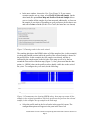
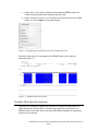
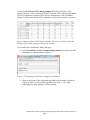
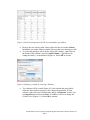
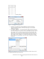
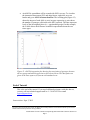
Visualizations of Next Generation Sequencing Data in Partek® Genomics Suite™ 6.6 This tutorial will illustrate how to: Visualize RPKM values for each sample in RNA-Seq workflow Visualize allele-specific expression This tutorial assumes the user is familiar with the hierarchy of spreadsheets and analysis in Partek® Genomics Suite™ (PGS). More details about customizing plots can be found in Chapter 6 of the Partek On-line Documentation available from Help > User’s Manual from the main toolbar. The data for visualizations in PGS comes from a spreadsheet. If you only wish to include certain rows or columns in a plot, you should apply a filter and/or clone the spreadsheet or select only certain rows or columns. There is no specific dataset for this tutorial; you may use one of your own next generation sequencing (NGS) experiments or use the data from another tutorial. Visualize RPKM Values in RNA-Seq Workflow By default, the chromosome view invoked on RNA-Seq data shows raw read counts (for more information, please consult the RNA-Seq Tutorial as well as the Chromosome View User Guide). To show the RPKM values instead, take the following steps: First invoke the Chromosome View (showing raw reads) Delete all the Bam Profile tracks by selecting them in the list of tracks in the upper right corner and selecting Remove Track Select New Track to invoke the Track Wizard. In the Wizard, please select the option Add a Track From Spreadsheet and use the drop-down list to specify the spreadsheet containing RPKM values (Figure 1). To proceed, select Next> Figure 1: Selecting a spreadsheet with RPKM values in the track wizard Visualizations of Next Generation Sequencing Data in Partek® Genomics Suite™ 6.6 Page 1 In the next window, choose the View Type (Figure 2). If you want to examine samples one at a time, select Profile of Selected Sample. On the other hand, the option Heat Map and Profile of Selected Sample allows you to visualize all the samples by a heat map and, additionally, to focus on the sample of your choice. Depending on your preference please choose one and select Create to finish (for this User Guide, the latter one was chosen) Figure 2: Choosing tracks in the track wizard The resulting plot shows the RPKM values of all the samples (four, in this example) as a heat map (middle section) while the profile of the selected sample is shown in the profile below. In this example, the first sample was selected, and this is indicated by the sample name on the left side of the map as well as by the box around the first section of the heat map (Figure 3). Also, please note that the data points, i.e., RPKM values in the profile track are hardly visible due to the scale of the y-axis. To configure the y-axis scale, do the following: Figure 3: Chromosome view showing RPKM values: heat map represents all the samples in the original spreadsheet, while the profile track represents the selected sample (in this example: the top sample in the heat map) Select the profile track in the list of tracks in the upper left corner. The configuration options will appear in the pane in the lower left Visualizations of Next Generation Sequencing Data in Partek® Genomics Suite™ 6.6 Page 2 Set the Max y-axis value according to the maximum RPKM count (also visible from the legend of the heatmap) and Min to 0 Set the Unsmoothed point size to 3 and leave the Smoothing window blank (Figure 4). Select Apply to accept the changes Figure 4: Configuring the profile track in the chromosome view Each dot on the plot now corresponds to the RPKM value of the respective transcript (Figure 5). Figure 5: RPKM values now visible Visualize Allele-Specific Expression Allele-specific expression enables the researcher to explore the association of a single nucleotide variation (SNV) with transcript expression. Specifically, are different alleles at the same locus associated with different number of sequencing reads across the groups? Visualizations of Next Generation Sequencing Data in Partek® Genomics Suite™ 6.6 Page 3 To start, perform Detect SNVs among samples (RNA-Seq workflow: AlleleSpecific Analysis > Detect Single Nucleotide Variations). The resulting spreadsheet (SNVsAcrossSamples) will have SNVs on rows and genotype calls on columns (Figure 6). Please note that the SNV coordinates are given in column #1 (position). Figure 6: Result of Detect SNVs across samples. Each row is a single nucleotide variation (SNV) while genotype calls are on columns To proceed to the visualization, follow the steps: Select Transform > Create Transposed Spreadsheet and choose the SNV coordinates as column headers (Figure 7). Figure 7: Transposing the SNVsAcrossSamples spreadsheet Observe the layout of the transposed spreadsheet (an example is shown in Figure 8): SNVs are on columns, log-odds ratio in the 1st row, while remaining rows show genotype calls per sample. Visualizations of Next Generation Sequencing Data in Partek® Genomics Suite™ 6.6 Page 4 Figure 8: Result of transposition of SNVsAcrossSamples spreadsheet. Remove the row with log-odds values (right-click the row header, Delete). In addition, you might want to consider removing the rows showing no-calls To extract the genotype calls from the cells in the column 1, right-click on the header of the column 1 and select Split Column… Split the text by setting the colon (:) as the delimiter (Figure 9). Select OK to execute Figure 9: Splitting a column by choosing a delimiter Two columns will be created (Figure 10). One contains the group labels, while the other contains genotype calls. Change the properties of both columns: right-click on a column header and go to Properties. Set the Type to categorical and Attribute to factor. In addition, feel free to change the Column Label (Figure 11). Select OK to continue Visualizations of Next Generation Sequencing Data in Partek® Genomics Suite™ 6.6 Page 5 Figure 10: Result of column splitting Figure 11: Changing column properties Annotate your samples by inserting additional columns and entering appropriate labels (not shown). The idea of this step is to create factor columns for ANOVA Go to Stat > ANOVA… to invoke the ANOVA dialog. Enter the factors in the model and make sure to enter the factor containing the genotype calls (in this example “call”) as well as the interaction between the genotype calls and the factor whose interaction with the genotype needs to be assessed (in this example: “tissue”) (Figure 12). To learn more about ANOVA setup, please consult our documentation. Once the setup is completed, select OK to proceed Figure 12: Setting up interaction between genotype calls and other factors which are hypothesized to drive gene expression Visualizations of Next Generation Sequencing Data in Partek® Genomics Suite™ 6.6 Page 6 An ANOVA spreadsheet will be created with SNVs on rows. To visualize the interaction between an SNV and other factors, right-click on a row header and go to ANOVA Interaction Plot. The resulting plot (Figure 12) shows the impact of each allele (x-axis) on gene expression (y-axis shows the number of genotype calls/reads at the SNV position). The lines represent levels of the investigated factor (i.e., experimental groups). In this example, the G allele drives the difference in mRNA expression between the two tissue types Figure 13: ANOVA interaction plot showing the association of genotype between the two groups and mRNA expression at the selected locus. The data points are given as the least-squares (LS) mean with standard error End of Tutorial This is the end of the tutorial. If you need additional assistance with this data set, you may call our technical support staff at +1-314-878-2329 or email [email protected]. Last revision: Sept. 5, 2012 Copyright 2012 by Partek Incorporated. All Rights Reserved. Reproduction of this material without express written consent from Partek Incorporated is strictly prohibited. Visualizations of Next Generation Sequencing Data in Partek® Genomics Suite™ 6.6 Page 7