1
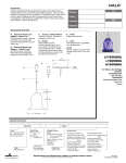
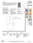
4 - H
A F T E R S C H O O L
I D E N T I T Y
S T A N D A R D S
Logo Size and Proportions
The logo with tagline is the preferred version, but it should not
be used smaller than 2.5” wide.
2.5”
The version without the tagline can be used smaller, but should
not be less than 1.5” wide.
You may not alter the proportions of the logo or its components.
You may not move elements within the logo. Please be careful to
scale the logo proportionally and be sure to keep it intact.
1.5”
Logo Color Options
BLUE AND GREEN WITH SHADED DOTS
This is the preferred color format. The 4-H Afterschool Pantone
colors are PMS 347 (green) and PMS 289 (blue). The approved
CMYK formulas are 100c80y (green) and 100c60m75k (blue).
BLUE AND GREEN WITH SOLID DOTS
This variation may be needed for screen-printing or other
specialty applications.
BLACK WITH GRAY DOTS
Though it is not permissible to print the 4-H Afterschool logo
entirely in blue or green, a one-color version in black is allowed.
BLACK WITH SOLID DOTS
Again, this version may be needed for screen-printing or other
specialty applications.
WHITE
This option should be used when it is necessary to place the
logo on a dark background, including screen-printing or other
specialty applications. Please note that this is not the preferred
application of the logo, but may be used occasionally.
It is recommended that the logo appear on white or very light
background colors (unless using the white version). Regardless
of background color, the H’s in the 4-H Clover must be white
(except when using the white logo, in which case the H’s may
assume the background color).
These are the only acceptable color variations.
1
4 - H
A F T E R S C H O O L
The 4-H Afterschool Logo is available for
download at www.4hafterschool.org. Go
to the Marketing Tools section and click
the link for additional tools. If you are not
a registered user, you must register in
order to access these files.
I D E N T I T Y
S T A N D A R D S
Logo Files Available Online
Please see page one for size requirements and color options.
LOGO WITH TAGLINE = 4HAS1
LOGO WITHOUT TAGLINE = 4HAS2
Color Formats
The logo is provided in Pantone and CMYK
formats. You may convert to RGB format, if
desired, for web or multimedia applications.
The Pantone colors are the same for both
coated and uncoated paper, and may also
be used for some specialty processes. You
may want to contact your printer or vendor
to determine which format to use.
Depending on your software and/or
printing method, the white logo may be
achieved by using the BLACK WITH SOLID
DOTS version printed in white ink.
File Formats and Resolution
Files are provided in both JPEG and EPS
formats. Although you may not be able to
open these files directly, most programs
that allow you to import or place graphics
should be compatible with these formats.
The EPS files can be scaled to any size. The
JPEG files are 300dpi (suitable for printing
at 100% size or smaller) and may need to
be reduced in size and/or resolution
depending on the usage.
BLUE AND GREEN WITH SHADED DOTS
4HAS1-CMYK.JPG
4HAS2-CMYK.JPG
4HAS1-CMYK.EPS
4HAS2-CMYK.EPS
4HAS1-PMS.EPS
4HAS2-PMS.EPS
BLUE AND GREEN WITH SOLID DOTS
4HAS1-SOLID-CMYK.JPG
4HAS2-SOLID-CMYK.JPG
4HAS1-SOLID-CMYK.EPS
4HAS2-SOLID-CMYK.EPS
4HAS1-SOLID-PMS.EPS
4HAS2-SOLID-PMS.EPS
BLACK WITH GRAY DOTS
4HAS1-GRAY.JPG
4HAS2-GRAY.JPG
4HAS1-GRAY.EPS
4HAS2-GRAY.EPS
BLACK WITH SOLID DOTS
Please note that it is not possible to provide
the PMS or white version as JPEG files; they
are only available in the EPS file format.
4HAS1-BLACK.JPG
4HAS2-BLACK.JPG
4HAS1-BLACK.EPS
4HAS2-BLACK.EPS
An attempt has been made to provide the logo in
WHITE
the most convenient and widely applicable formats,
but a certain familiarity with your individual software
applications, resolution, and color issues may be
4HAS1-WHITE.EPS
4HAS2-WHITE.EPS
required. Please consult the user manual for your
software for more information.
2
4 - H
A F T E R S C H O O L
I D E N T I T Y
S T A N D A R D S
Font Usage
This font
is Spumoni.
THIS FONT
I S AV E N I R .
This font is AGaramond, which is used for
body text in the 4-H Afterschool materials.
The type in the logo files has all been converted to outlines,
so you will not need the font files to use the logo.
However, if you would like to match the fonts used in the logo,
they are: Spumoni and Avenir. Also, AGaramond is used for body
text in the 4-H Afterschool materials.
You may not change the type in the logo itself. The fonts are
listed here for situations in which you would like to match other
elements of your project to the 4-H Afterschool identity. (For
example: ads, posters, sidebars, etc.)
Spumoni is unique and we recommend that you do not use any
other decorative font with the logo. Do not use Spumoni for body
text; it is suitable for small amounts of type such as headlines.
If Avenir is not available to you, substitute a sans serif font such
as Futura, Avant Garde, or Arial. HINTS FOR SUBSTITUTE FONTS :
look for line thickness consistent within each letter, and letters
like o, c, b and p that are very round.
Using another text font in place of AGaramond is fine, though
we recommend a fairly standard serif typeface.
Authorization for Logo Usage
Brief reminders for proper use:
• Use only an official logo obtained
from www.4HAfterschool.org or other
authorized source.
• Maintain the proper height and width
proportions of the image. See page 1.
• The official 4-H Afterschool colors are
PMS 347 and PMS 289. Regardless of
background color, the H’s in the 4-H
Clover must be white (except when using
the white version of the logo). See page 1.
• Text or graphics should never cross the
clover emblem or 4-H Afterschool logo.
Use as a desktop wallpaper or web page
background is inappropriate.
The 4-H Name and Emblem are protected under federal statute,
and the 4-H Afterschool logo has the same protection. Fraudulent
use is punishable by fines up to $10,000 and imprisonment up to
six months, or both. For more information, please go to
http://www.national4-hheadquarters.gov/4h_name.htm.
At this website you may download the 4-H Name and Emblem
Guidelines, application forms to request authorization, the
official 4-H Emblem graphics, and more.
Authorization for all uses of the 4-H Afterschool logo must be
granted by the following:
Interstate (two or more states): U.S. Department of Agriculture
Intrastate (within one state boundary): Cooperative Extension
System Directors and Administrators at the state land-grant
universities located in the state in which the logo is to be used.
Within one county: Cooperative Extension System staff located
in the county in which the logo is to be used.
3
4 - H
A F T E R S C H O O L
SAM PLE STATE U N I V E R S ITY
EXAMPLE COUNTY EXTENSION
I D E N T I T Y
S T A N D A R D S
Add Your Extension Program
At left, please see examples of how extension program names
may be formatted. Use these samples as a reference.
SAM PLE STATE U N I V E R S ITY
LONGER EXAMPLE COUNTY EXTENSION
First, select a font for the program name. Ideally you would use
Avenir, which is used in the logo. Other options are Futura or
Avant Garde. Arial is a widely-available typeface that will work.
HINTS : use a sans serif font, look for line thickness consistent within
each letter and letters like o, c, b and p that are very round.
The size of the type for the program name should be about the
same as the words “extraordinary learning opportunities.”
U N I V E R S ITY O F E XAM PLE STATE
SAMPLE COUNTY
Type your program name in all caps. Insert a space between each
letter and use three spaces between words. (You may be able to
adjust letter spacing more efficiently in certain programs, but this
method is available to anyone!)
Create guides as shown below; a vertical line between the leaves
of the clover and a horizontal line touching the top dot. Position
the text as indicated; aligned with the vertical guide on the left
and with the baseline of the bottom text on the horizontal guide.
U N I V E R S ITY O F LO N G E R E XAM PLE STATE
SAMPLE COUNTY EXTENSION
If the bottom line of text touches or is too close to the dot, create
another horizontal guide above the first. The space between them
should be the same as the height of the top dot (see diagram at
bottom of page). Move the text up to the top guideline as shown.
SAM PLE STATE U N I V E R S ITY
EXAMPLE COUNTY EXTENSION
SHORT EXAMPLE EXTENSION
SAM PLE STATE U N I V E R S ITY
LONGER EXAMPLE COUNTY EXTENSION
4