1
STATA 8 for surveys manual
By
Sandro Leidi, Brigid McDermott,
Roger Stern, Savitri Abeyasekera
May 2005
ISBN 0-7049-9838-6
Contents
Preface ........................................................................................................................................ 3
Chapter 0 Getting started ...................................................................................................... 4
Chapter 1 Menus and dialogues ........................................................................................... 9
Chapter 2 Some basic commands...................................................................................... 22
Chapter 3 Data input and output......................................................................................... 35
Chapter 4 Housekeeping ..................................................................................................... 40
Chapter 5 Good Working practice ...................................................................................... 54
Chapter 6 Graphs for Exploration....................................................................................... 63
Chapter 7 Tables for exploration and summary................................................................ 84
Chapter 8 Graphs for Presentation..................................................................................... 98
Chapter 9 Tables for Presentation.................................................................................... 120
Chapter 10
Data Management ......................................................................................... 127
Chapter 11
Multiple responses........................................................................................ 134
Chapter 12
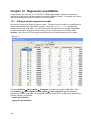
Regression and ANOVA ............................................................................... 140
Chapter 13
Frequency and analytical weights............................................................... 147
Chapter 14
Computing Sampling Weights ..................................................................... 158
Chapter 15
Standard errors for totals and proportions ................................................ 168
Chapter 16
Statistical modelling ..................................................................................... 179
Chapter 17
Tailoring Stata ............................................................................................... 190
Chapter 18
Much to ADO about....................................................................................... 201
Chapter 19
How Stata is organised................................................................................. 217
Chapter 20
Your verdict ................................................................................................... 227
References .............................................................................................................................. 231
2
Preface
This guide is designed to support the use of Stata for the analysis of survey data. We envisage
two sorts of reader. Some may already be committed to using Stata, while others may be
evaluating Stata, in comparison to other software.
The original impetus for this guide was from the Central Bureau of Statistics (CBS) in Kenya. In
an internal review in July 2002, they recommended that Stata be considered as one of the
statistics packages they could use for their data processing. The case for Stata was based on
Version 7, which was the current version when their review was undertaken. This case was
strengthened by the introduction of Version 8, where the inclusion of menus, and the revision of
the graphics were both particularly relevant. It was therefore agreed that Stata be introduced to
their staff on training courses in 2004. These courses were planned jointly by them, together
with the SSC, Reading and the Biometry Unit, (BUCS) University of Nairobi.
Originally we planned to prepare notes and practical work for a 3-day course on Stata. This is to
be followed by a 2-week course on data analysis, that will use Stata throughout. The idea to
make the notes into a book came from Hills and Stavola (2004). The latest version of their book
is called "A Short Introduction to STATA 8 for biostatistics". We found the organisation of the
materials to be exactly what we needed for teaching surveys. We therefore suggested that we
would try to have the same structure for this book, and that this consistency in approach might
indeed help readers who might wish to use materials from the two books. We are most grateful
to the authors and publishers of Hills and Stavola, for agreeing to our request, and for sending a
preprint of the Version 8 book, so we could start our work early.
The look of the two books is different, even though we have kept to the same overall structure.
They envisage readers who are sitting in front of a computer and running version 8 of Stata at
the same time. So they rarely provide output, because that would duplicate what is on the
screen. We have tried to make this book usable even for those who do not yet have Stata, and
have therefore included more screen shots of the dialogues and the output.
We have used five datasets to illustrate the analyses, and these are all included on the CD,
together with supporting information. The main four are from a Young-lives survey in Ethiopia, a
livestock survey in Swaziland, a population study in Malawi and a socio-economic survey in
Kenya. The fifth is a survey "game", based on a crop-cutting survey in Sri Lanka. We are very
grateful to the staff who have encouraged us to provide this information, and we hope that
readers will find that the datasets to be of interest in their own right. They are described in
Chapter 0.
The course notes for the 3-day Stata course are also included on the CD, so readers can see
how the course relates to the chapters of the book. The final chapter of the book is the
participants and our evaluation of Stata, following this course.
3
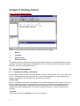
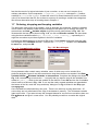
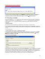
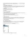
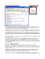
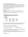
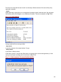
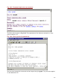
Chapter 0 Getting started
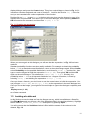
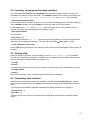
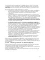
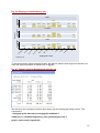
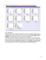
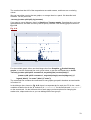
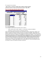
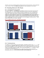
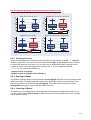
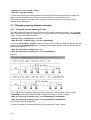
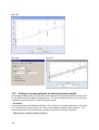
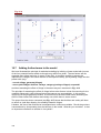
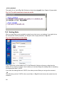
Fig. 0.1 The four Stata windows
When you start Stata you will see the four windows shown in Fig 0.1.
•
Review
•
Variables
•
Stata Results
•
Stata Command
The working directory, that is the directory where Stata expects to find the data when no path is
specified, is shown at the bottom left of Fig 0.1. There it is C:\data, which is the default working
directory, unless you specified otherwise.
0.1 General information
0.1.1 Typing and editing commands
Commands are typed into the command window. Stata is case sensitive, so ‘A’ is not the same
as ‘a’. To edit a previous command, click on it in the review window, or use the Page-Up key,
perhaps repeatedly, if the command was not the last one typed.
Stata prompt
When a command is executed, it will appear in the results window with a dot in front. The dot is
there to distinguish between commands and results and is referred to as the Stata prompt. In
this book we indicate those commands that you need to type into the command window by
starting them with a Stata prompt. You should not type the prompt – only the command. For
example,
. describe
means you should type describe in the command window.
4
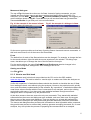
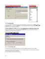
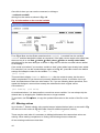
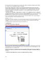
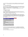
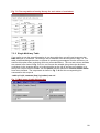
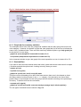
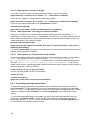
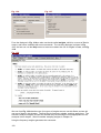
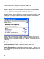
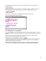
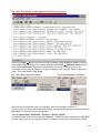
Menus and dialogues
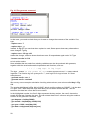
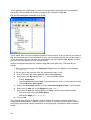
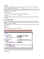
The top of Fig 0.1 shows the main menu for Stata. Instead of typing commands, you can
instead use the pull-down menus and then complete the dialogue boxes that follow. For
example if you use Data ⇒ Describe data ⇒ Describe variables in memory, see Fig 0.2, you
get the dialogue shown in Fig 0.3. Press OK and you will see that Stata has generated the
command describe for you and put it in the review window.
Fig. 0.2 An example of the menus in Stata
Fig.0 3 An example of a dialogue in Stata
So the menu system provides a visual way of getting Stata to issue and execute commands. In
this book we will use a mix of the menus and commands.
Fonts
The default font for each of the Stata windows can be changed. For example, to change the font
for the results window, right click with the mouse anywhere in the window. This brings up a
menu, that allows you to change the size of the font and the font style.
For the results window, the menu Prefs ⇒ General Preferences permits changes in the
colours of the foreground, background, error messages and so on.
Getting out of Stata
Use File ⇒ Exit.
0.1.2 How to read this book
All the datasets used in this book are provided on the CD, and on the SSC website,
www.ssc.rdg.ac.uk. The book is written in ‘tutorial style’ so readers can follow the analyses as
they are described.
Users with ‘experience’ of statistical software should also be able to visualise the use of Stata,
from reading the book, even without trying the analyses. However, the practical work is quickly
done, and will enhance understanding of the software. By ‘experience’, of statistical software we
mean those who are familiar with the use of commands for an analyses, and not just clicking
and pointing with menus. If you have only used statistical software through menus and
dialogues, then it is important to try the practical work.
At the other extreme, there are some who only use commands. They started with statistical
software before the menus and dialogues were available, and scorn them now. We suggest
they try some of the menus and dialogues. They are missing out, at least with software like
Stata, where the dialogues are easily called and generate reasonably structured commands.
The menus and dialogues often provide quick information on what is possible with a command,
they provide easy access to relevant help, and they generate a working command. So, for new
analyses, they can quicken the process of preparing the command files for an analysis.
5
0.2 Files with this book
The data files for the five surveys are an integral part of this book. They need to be installed in a
convenient folder. For example you could make a folder called surveys, within the C:\data
folder. Choose any name you wish, but change the instructions below accordingly, if need be.
To load the files from the CD-ROM, (assumed to be drive D:) start Stata and type the following
commands in the command window.
. cd C:\data\surveys
. net from D:\
. net install survey8
. net get survey8
If your CD drive is referred to by another letter, such as E, instead of D, then change the above
accordingly. The data files are also on the SSC web site, www.ssc.reading.ac.uk. If you
download them from there onto your hard disc, then change the D: above to the name of the
directory where you copied them.
Watch for error messages. If files with the same names have already been installed, Stata will
display an error message and will not install the new files. To overwrite the old files with the new
ones you need to add the option replace, to the last two commands, i.e.
. net install survey8, replace
. net get survey8, replace
The datasets are provided both in their original formats and in Stata format with the extension
*.dta. Chapter 3 deals with the input of data that is not in the form for Stata.
As well as data files, we have included some program files. They are installed by the same
process used to copy the data files. Indeed the installation process is mainly because of the
program files. The data files could alternatively just be copied into your current working directory
In addition to these files, we have included further background information on each of the
surveys described below. This extra information does not need to be transferred to your
computer.
0.2.1 The 1997 Kenyan welfare monitoring survey
Carried out by the Kenyan Central Bureau of Statistics, (CBS) the welfare monitoring survey is
an ongoing study to provide information on the extent of poverty among different socioeconomic groups. It provides indicators of living standards derived, for example, from estimating
consumption and expenditure by households. It is provided in STATA format as Kcombined.dta plus an informatively labelled version in K-combined_labelled.dta.
The dataset used here is from a single district and has 321 records and 326 variables. This
dataset is used in various chapters to illustrate simple data handling, tabulation and graphics. A
cut down version is also provided as K-combined_short.dta. The CD includes the
questionnaires as well as the reports. The full datasets from the 9000 respondents are also
included, though a password is required. CBS welcomes requests from users who would wish
to conduct further analyses, subject to conditions that are explained on the CD. Those wishing
to access the full data should therefore contact CBS for the key.
0.2.2 The Young lives survey
Young Lives is an international research project that is recording changes in child poverty over
15 years. Its objective is to reveal the links between international and national policies and
children's day-to-day lives, http://www.younglives.org.uk. Details of the project and a copy of the
web page as of early 2004 are on the CD.
6
Here we use data from the survey carried out in Ethiopia. Data are supplied in 3 separate
comma-delimited files with the extension *.csv [comma-separated variables] to illustrate
how STATA imports spreadsheet files in Chapter 3. These are:
E_HouseholdComposition.csv and E_SocioEconomicStatus.csv, which both
contain the characteristics of the relationships within the household, with 2,000 records and
about 17 variables. Data in the 2 files come from different parts of the questionnaire.
E_HouseholdRoster.csv has data for each member of the household, so each household
has many records in this file. There are 10 variables and over 9,000 records.
All 3 files include the variable CHILDID, which is used to identify the household and link the
data in the different files.
Because these data are collected at different levels, the same filenames in STATA format
(*.dta) are used in Chapter 10 to illustrate data management, particularly appending, merging
and match merging. These files are also used in teaching at The University of Reading to
illustrate the use of Excel and Access for data management tasks. Copies of the practical
exercises are included on the CD.
0.2.3 The Swaziland farm animal genetic resources survey
The objective of this survey is to estimate the livestock population and determine management,
production and socio-economic practices employed by farmers in raising animals. The data is
collected at different levels [province>district>ward>village>household>species>breed] and is
stored in a purpose-built Access database. The database also has tables with results from
queries and summary data. The Access system is called BREEDSURV, and one table with
primary data at the household level is provided in Stata format as
S_MultipleResponses.dta. Each household may keep several species of animals, so
this dataset is used in Chapter 11 to illustrate how Stata deals with multiple responses
questions.
This is also one of a set of case studies being collected in a project, funded by Rockefeller, to
support improved teaching of statistics, both to agriculture students and to those who specialise
in biometry. The full Access database is supplied, as are further documents concerned with
both this survey, and with the teaching project.
0.2.4 The rice survey
This dataset contains the results of a sampling exercise of a fictitious rice-producing district from
a computerised survey game. There are 6 variables, each with 36 records, are provided as a
single sheet Excel workbook in the files paddyrice.xls and paddyrice.dta.
The objectives of this survey are to estimate the total production of rice in the district and to
examine the relationship between yield and cultural practices, particularly the type of rice grown
and amount of fertiliser applied. This dataset is used in Chapters 15 and 16 to illustrate the use
of Stata for regression modelling.
The paddy game simulates the design and analysis of a multi-stage survey. The game allows
users to collect the data in a wide variety of ways, and hence can illustrate the way in which
weighted or self-weighting designs can be used. It is produced by the School of Applied
Statistics, Reading University, UK, http://www.personal.rdg.ac.uk/~snsbarah/statgames/. The
computerised game and handouts that describe its use are supplied on the CD.
0.2.5 Malawi population study 1999
The Malawi census in 1998 calculated that the country has 1.95 million households and 8.5
million people, living in rural areas. In 1999 it was decided to give a “starter-pack” of seed and
fertliser to each rural household in the country. The registration process found there were 2.89
7
million households, with therefore an estimated population of 12.6 million people. A small
survey of 60 villages was therefore conducted to check the adequacy of the registration process
and hence also to estimate the rural population of the country.
The data provided in the file M_village.dta are the results of this survey. We also provided
the datafile M_allvillages.dta which stores a complete list of all the vilages in Malawi.
This was used as the sampling frame for the selection of the sampled 60 villages. For this
survey, data at the household level is provided too in the datafile M_household.dta.
Reports are also given on the CD, including Wingfield-Digby (2000) that show how the results
were weighted to provide estimates at a national level. Further information on
www.ssc.rdg.ac.uk and on the CD is also on the success of the targeted input program (TIP)
that was conducted in 2001 and 2002, to provide packs to the poorest half (2001) and one-third
(2002) of the families.
8
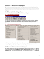
Chapter 1 Menus and dialogues
We introduce menus and dialogues below. They help new users to start using Stata quickly.
They also generate the Stata commands, and hence can indicate how the commands can later
be used. We use menus in this Chapter and then repeat the same analyses using commands in
Chapter 2.
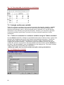
1.1 Where to find the dialogue boxes
At the top of the Stata screen you see the toolbar shown in Fig. 1.1.
Fig. 1.1 The Stata menus and toolbar
The three most important menus are Data (for organising and managing the data), Graphics,
and Statistics. Choosing these tabs gives the menus in Fig. 1.2. Selecting one of these
choices produces more menus, where there is a ► symbol. Otherwise it produces a dialogue
box .
Fig. 1.2 The three most important menus
In this Chapter and Chapters 2 to 5 we will use dialogues that are accessed from the Data
menu. Graphics is described in Chapters 6 and 8, while the Statistics menu is used for
tabulation in Chapters 7 and 9, and for other aspects in Chapters 13 to 16.
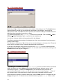
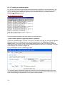
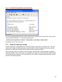
1.2 Common features of menus of dialogues
We use the dialogue box in Fig. 1.3 to describe some aspects that are common to all dialogues.
Produce this dialogue using Data ⇒ Other utilities ⇒ Hand calculator and type 2+3 into the
Expression box. Then press the Submit button. You should see the answer, 5, in the Results
Window.
9
Fig. 1.3 The display dialogue
Notice that in Fig. 1.3 there are 5 buttons at the bottom of the dialogue box. The Submit button
instructs Stata to execute the command that corresponds to the dialogue, and leave the
dialogue box visible. The OK button does the same, but closes the dialogue. Cancel closes the
dialogue without submitting instructions to Stata.
Try a different expression, say (2+3+4)/7, and this time press OK. Then use Data ⇒ Other
Utilities ⇒ Hand Calculator again to go back to the dialogue box.
You will see it returns with the old expression still in the dialogue.
Thus Stata remembers the settings of a dialogue box, often very convenient if you just want to
make a small change.
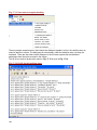
The R button at the bottom of Fig. 1.3 is used to reset the dialogue to its empty form. Finally the
button with ? gives help on the command associated with this dialogue.
At the top of the dialogue in Fig. 1.3 you see the word “display” and this indicates that the
dialogue box will generate a display command. You can also tell the command by looking in the
Results window, see top part of Fig. 1.4.
Fig. 1.4 Results from the dialogue
Press OK again, or Cancel, and then type db display into the Command window, as shown
in Fig. 1.4. When you press <Enter> you will see that the display dialogue returns. In the
command you typed, db stands for dialogue box. This shows that once you know the
command associated with a menu, you can get back to any menu just by typing db in front of
the command name. Sometimes this is quicker than clicking repeatedly with the mouse.
Some buttons are special to particular dialogues, and the Create button is an example with the
display dialogue box. To illustrate its use we will build the expression ln(10). Return to the
10
display dialogue and press the Create button. This gives a sub-dialogue, shown in Fig. 1.5. It
includes a calculator keyboard and a set of functions. Look for the function ln( ) in the list
and you are rewarded with a short explanation of the function.
Double click on ln( ) to put ln(x) in the box at the top, then use the keypad, or type 10 to
replace the x and press OK. This returns you to the main dialogue, where pressing Submit or
OK will execute the command, and show that ln(10) = 2.30.
Fig. 1.5 Creating an expression
When you return again to this dialogue you will see that the expression, in Fig. 1.5 has been
retained.
Standard probability functions are also readily available. For example to obtain the probability
below 1.96 in a standard normal distribution, return to the main dialogue again. Select Create,
select Probability to view possible distributions, scroll down for norm( ), double click , then
type or use the keypad to build the expression norm(1.96). Then press OK and then OK
again on the main dialogue. This shows that norm(1.96) = 0.975. Similarly, the
probability below 3.84 in a chi-squared distribution on 1 degree of freedom, is found by
selecting chi2( ) and building the expression chi2(1 , 3.84).
Once you know a formula, you don’t have to use the create button to build the expression. You
can just type norm(1.96), or chi2(1, 3.84) as the expression in the main dialogue box.
Once you are at that stage, you might find it even simpler to ignore the dialogue completely and
type
display norm(1.96)
as a Stata command.
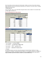
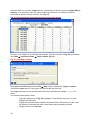
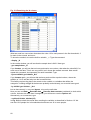
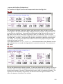
1.3 Looking at a data set
In this Section we use the data set from the Kenyan survey, which is available as a Stata file.
Use File ⇒ Open and you will see a list of the Stata data files in the working directory. Highlight
the file called K_combined_short.dta and open it by pressing Open.
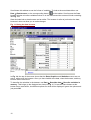
You will now see that the Variables window is filled with the names of the columns in the
dataset, Fig. 1.6.
11
Scroll down this window to see the full set of variables. To look at the actual data either use
Data ⇒ Data browser, or the corresponding button
on the toolbar. Scroll across the Stata
browser window to look at variables further on in the data set and the screen will look something
like Fig. 1.6.
Stata includes both a data browser and an editor. The browser is safer to just look at the data,
because it does not allow you to make changes.
Fig. 1.6 Using the data browser
In Fig. 1.6, the top of the screen shows that the Data, Graphics and Statistics menus are not
active, when using the browser. Once you have looked at the data, close the browser, and they
become active once more.
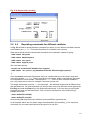
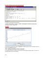
To describe the variables in the dataset, use Data ⇒ Describe data ⇒ Describe variables in
memory. This brings up the dialogue box shown in Fig. 1.7. It has the same buttons at the
bottom as we saw before, but different options for what will be displayed. Ignore the options and
just press OK.
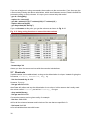
12
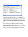
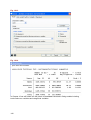
Fig. 1.7
The results include the fact that the dataset has 321 observations and 153 variables. Then there
is one line of description about each variable, namely its name and how it will be displayed, etc.
At the bottom of the results window there is a message
--more--
You can get the next page of output by pressing the green GO button (see Fig. 1.8), or the
spacebar on your keyboard. Alternatively you can stop the display by pressing the red ⊗
button, or by pressing the letter q on your keyboard.
Fig. 1.8
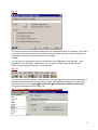
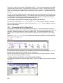
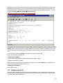
You may have expected that the results from the describe dialogue would include a summary of
the data values themselves, as is common in some other statistics packages. One way to get
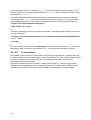
such a summary is to use Data ⇒ Describe data ⇒ Describe data contents (code book).
This gives the dialogue shown in Fig. 1.9.
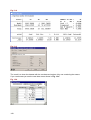
Fig. 1.9 The codebook dialogue gives a summary of the data
13
This time we specify which variables we would like to describe. Click in the Variables field, in
the dialogue box, and then click on the variables age, marital_c and literacy_c
from the Variables window, to complete the dialogue as shown in Fig. 1.9. Press OK. This
gives the results as shown in Fig. 1.10.
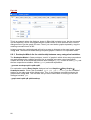
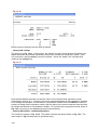
Fig. 1.10 Results from the codebook dialogue
We see that for numeric variables, such as age, the summary includes the range, to indicate
the minimum and maximum values, plus the number of unique values and a few other
summary statistics (e.g. mean and standard deviation). For string variables the summary
includes a one-way table of frequencies. This shows, for example, that 15 out of the 321 people
were divorced or separated.
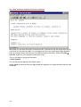
We saw earlier that the browser can be used to look at individual values. An alternative is to use
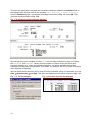
Data ⇒ Describe data ⇒ List data. This gives the dialogue part of which is shown in Fig. 1.11.
Fig. 1.11 The list dialogue
14
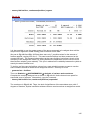
Fig. 1.12 Results from the list dialogue
Select the same three variables as were used earlier, see Fig. 1.11. The top of this dialogue
has a set of tab buttons that is found on many of the others that will be used. Click on the
by/if/in tab and limit the listing of the data to just the observations 1 to 5, by checking Obs. in
range and filling 1 to 5 (you can type 5 or use the control with two arrows, see Fig. 1.13).
Press OK to give a listing as shown in Fig. 1.12.
1.4 Restricting to data subsets
The example in Fig. 1.12 showed one way that the output from submitting a dialogue box could
be restricted. There we just listed the data for observations 1 to 5. This is a general feature in
Stata, which corresponds to the idea of using a filter in spreadsheet packages, such as Excel.
We provide another example
Use Data ⇒ Describe data ⇒ List data again, or type
. db list
<Enter>
to bring up the dialogue box. The same three variables as shown in Fig. 1.11 should still be in
the Variables field. Select the by/if/in tab and uncheck the Obs in range option. Then
enter
age > 60
in the if box, see Fig. 1.13. Press Submit (rather than OK) to list just those records that satisfy
this condition. Part of the results are in Fig. 1.14.
Fig. 1.13 List dialogue using the if condition
Fig. 1.14 Results
The by/if/in conditions can be used together. Check the Obs in range box again and
change the 5 to 25. Press Submit again, to just get the first 4 rows of the data from Fig. 1.14.
It is often useful to process data in groups. For illustration, first uncheck the Obs. In range box,
and then check the box labelled Repeat command for groups defined by. Click on the
variable called rurban and press OK. The results are now listed separately for rural and urban
households. You can have more than one variable to define the groups. So, if you add the
variable sex, then the information will be listed (or in general analysed) separately for males
and females in rural and urban households.
15
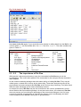
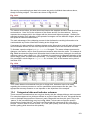
1.5 Generating new variables
In Section 1.2 we looked at Stata as a simple calculator. Now we extend the idea, and see how
Stata can be used as a “column calculator”.
Use Data ⇒ Create or change variable ⇒ Create new variable. Start with the trivial
calculation shown in Fig. 1.15. We have given the name as con, because we are calculating a
column that has just constant values. You can use any name, as long as it has not already been
used. We have given it the value 5, and we have said that it will be a variable of type byte (see
Chapter 3 for an explanation of this feature).
Now press Submit, rather than OK, because we have another calculation.
Fig. 1.15 Calculating new columns
Fig. 1.6 The resulting columns
For the next calculation, we generate a column, called obs, that goes from 1 to 321 as we list
the data. In Fig. 1.15 change the name to obs, change the 5 to _n (type underscore, which is
above the – and then n). This is a built-in variable in Stata. Press OK.
Now use Data ⇒ Describe data ⇒ List data, or type
. db list
to see what you have done. List just con and obs, for the first 10 rows, as described in the
previous section. The results are in Fig. 1.16. We see that con is not a single number, but a
column of numbers, equal in length to all the other columns in our dataset.
We have seen here how to generate new variables, but sometimes you need to change one
that already exists. Use Data ⇒ Create or change variable ⇒ Change contents of variable.
This gives an identical-looking dialogue to the one that is partly shown in Fig. 1.15. Complete it
as shown in Fig. 1.15, but change the value of the contents to ln(10). You can just type the
expression, but an alternative is to click on the Create button, which gives the calculator, as
seen earlier in Section 1.2. We show it again in Fig. 1.17. Click OK and then OK again.
Now list variables con and obs, again for the first 10 rows to view the outcome.
16
Fig. 1.17 Building an expression
1.6 Logical calculations
The calculator keyboard in Fig 1.17 is identical to the one used in Section 1.2, Fig. 1.5, where
we showed some simple calculations on numbers. Hence, once we have mastered the use of
calculations with numbers, we can immediately do all the same operations on whole columns of
data.
With a statistics package we often have to do logical calculations. We have already used one in
Section 1.4, when we chose to display data only for the records where age>60.
The expression age>60 is called a logical calculation, because it evaluates to either True (1
in Stata) or False (0 in Stata). In the keyboard shown in Fig. 1.17 the keys
labelled ==, >, <, >=, <=,!=, & and | are all to support logical calculations.
To practice, where the results are obvious, we start with calculations on numbers. Use Data ⇒
Other utilities ⇒ Hand calculator. Then click on Create to give the expression-builder as
shown in Fig. 1.17.
Either use the keypad, or type (3<4). Press OK to return to the main dialogue, and then
Submit (rather than OK), because we have more calculations to do.
The result is shown in Fig. 1.18. We see that the expression (3<4) evaluates to 1, while
(3>4), which is untrue, evaluates to zero. The logical operator for “equals” is “==”, while
“not-equal” has the operator “!=”. So we see from Fig. 1.18 that (3==4) is not true, while
(3!=4) is true.
17
Fig. 1.18 Logical calculations
The final two examples in Fig. 1.18 are compound expressions. The first uses the symbol “|”,
which is “or” in Stata, while “&” is “and”. So the first compound expression asks whether
“(3==4), or (4==4)”, which is true.
To see the value of these ideas when the calculations involve columns, use Data ⇒ Create or
change variable ⇒ Create new variable. Make a new variable called old, which has the
formula (age>60). Press OK .
Fig. 1.19 Generate
Fig. 1.20 Results from logical calculations
As a second example make a new variable called agegroup, with the formula
1+(age>24)+(age>60), see Fig. 1.19. Then press OK and use the dialogue Data ⇒
Describe data ⇒ List data or type
. db list
and list the three variables age, old and agegroup to see what you have done. The results
are in Fig. 1.20. Looking at the column called old you see that the condition (age>60) is
sometimes true and sometimes false. The second calculation has taken advantage of the
18
fact that the result of a logical calculation is just a number, so we can use it as part of an
ordinary calculation. So the expression 1+(age>24)+(age>60) evaluates to 1 if neither
condition is true, i.e. for age≤24. It takes the value 2 for those between 25 and 60, and the
value 3 for those older than 60. So we have a neat way of recoding a variable into categories.
We will see alternative ways of recoding data in Chapter 4.
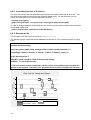
1.7 Ordering, dropping and keeping variables
The dialogues used earlier in the chapter, such as describe and codebook, listed the variables
in their order in the dataset. Stata has three dialogues that permit you to change this order. To
access them use Data ⇒ Variable utilities to give the menu partly shown in Fig. 1.21. We
illustrate with the last option shown in Fig. 1.21, so click on Relocate variable. We have been
using the three variables called age, marital_c and literacy_c repeatedly so it
might be convenient to put them together in the list of variables.
Complete the move dialogue as shown in Fig. 1.22 . Press Submit, and watch how the order
has changed in the Variables window. Then put the literacy_c variable in the Variables
to move box, and press OK.
Fig. 1.21 Data⇒ Variable utilities
Fig. 1.22 More dialogue
Survey datasets often contain many variables, some of which may not be needed for a
particular analysis. Hence it may be convenient to drop those that are not needed. Use Data ⇒
Variable Utilities ⇒ Eliminate variables or observations. Complete the dialogue as shown in
Fig. 1.23, remembering to include the “-“ to signify that you want to drop all the variables from
marital to job12_c, which is the last variable in the data file. Press OK and the list of variables
should now be as shown in Fig. 1.24. If not, and the newly created variables are appended at
the bottom of the list, recall the “drop and keep” dialog box in Fig. 1.23 and in the Drop type
con-agegroup.
Once variables are eliminated they are gone. There is no undo key to bring them back. Of
course they are only eliminated in the copy of the dataset in memory. The full dataset remains
intact on the disc. If you want to keep the changed dataset for use on future occasions then use
File ⇒ Save as and give it a new name. You will probably not wish to overwrite the original
data.
19
Fig. 1.23 Dropping unwanted variables
Fig. 1.24 New list
1.8 Sorting data
To sort the data according to the ages of the respondents, (youngest first), use Data ⇒ Sort ⇒
Sort data. Enter age into the Variables box and press OK. Check using the browser that the
data are now in increasing age order.
To sort on marital status within age, close the browser, return to the Sort dialogue box, and
enter the variables age and marital_c in the Variables box, in that order, see Fig. 1.25.
We have also ticked the box labelled Perform Stable Sort. If you want to know why we
suggest this, practice help by clicking on ?
Fig. 1.25 Data ⇒ Sort ⇒ Sort data
1.9 1.9 An Exercise
This final section provides some practice on STATA facilities introduced in this chapter.
(a) Open the data file paddyrice.dta and use the data browser to look at the data. How many
observations are there in the data file?
(b) The variables in the file are as follows:
20
•
yield:
rice yield in bushels/acre
•
village:
name of village sampled
•
field:
code for the sampled field
•
size:
size of the field in acres
•
fertiliser:
amount of fertiliser applied (cwt/acre)
•
variety:
rice variety grown (New improved, Old improved, Traditional)
Obtain a summary of the contents of all these variables. (Hint: Use Data, Describe Data,
Describe data contents (codebook)).
From the results, can you determine (i) the mean rice yield across all sampled fields; (ii) the
number of villages represented in the data file; (iii) maximum size of the sample fields; and (iv)
the number of fields under each rice variety?
Do you have any comments on summaries that STATA produced for field and fertiliser?
(c) Generate a new variable called totyield to represent the total rice yield from each field,
obtained by multiplying the yield variable by the size variable. Also create a new variable called
fertcode so that it has value 1 when the amount of applied fertiliser is less than 2 cwt/acre and
0 otherwise.
Check that you have created these variables correctly by listing the variables yield, size,
totyield, fertiliser and fertcode.
How would you restrict your list to just the fields where the field size is 5 acres?
Can you also further restrict your list to just the OLD variety? (Hint: Use by/if/in tab in the list
dialogue. Note that since variety is a text variable, OLD should be specified within double
quotations).
(d) Sort the data according to the total rice yield.
(e) Finally drop the variable fertcode from your data set.
21
Chapter 2 Some basic commands
In this chapter we repeat most of the topics introduced in Chapter 1, but using Stata commands,
rather than the menus and dialogue boxes. We hope you will be pleasantly surprised that this is
an easy step to take, particularly if this is the first time you have used commands in any
software.
2.1 Using Stata as a calculator
The display command can be used to carry out simple calculations, see Fig. 2.1. For example
the command
. display 2 + 3
will display the answer 5 and
. display 2 ^ 3
will display the answer 8. The command
. display ln(10)
displays the natural logarithm of 10, which is 2.30, and
. display sqrt(25)
will display the square root of 25. See Fig. 2.1 for some of the results.
Fig. 2.1 The command and results windows
Text can also be displayed, as in:
. display “The natural logarithm of 10 is ” ln(10)
The result can be colour-coded as in:
. display as text “The natural logarithm of 10 is ” as result ln(10)
The keywords here are as text and as result, and these determine the colours. For example,
when the background is black, then as text displays as green and as result displays as yellow.
Other display colours with a black background are as input (white) and as error (red)
Standard probability functions are available. For example, the probability below 1.96 in a
standard normal distribution is given by
. display norm(1.96)
22
while
. display 1 – norm(1.96)
gives the probability above 1.96.
Similarly
. display 1 – chi2(1,3.84)
gives the probability above the value 3.84 in a chi-squared distribution with 1 degree of
freedom. Type
. help function
to view information on the different functions that are available, see Fig. 2.2. This is the same
list of types of function that was given with the dialogue in Fig. 1.5.
Fig. 2.2 Types of function for calculations
Click on probfun in Fig. 2.2 (or type help probfun in the first place), to get a list of all the
available probability functions.
2.2 Looking at a data set
In Chapter 1 we used the familiar File ⇒ Open to load the data file called K_combined.dta.
You can do the same by just typing
. use K_combined_short, clear
If you get the error message “Dataset not found” it means that you are in the wrong directory,
or you have mistyped the name of the dataset. In this case try
. dir
to list all the datasets in the current working directory. Check you typed the name correctly. If
the file is not there, try
. cd
23
to display the current directory. You can also use cd\ to go to the root directory. If necessary
try
. cd C:\data (or the name of the directory with the data) to move to the right directory. Then
repeat the use command.
If you cannot open the file this way, then use the same File ⇒ Open way that you used in
Chapter 1.
Once the data are loaded you can browse the contents by clicking on the data browser icon, or
by typing
. browse
in the command window The view of the data was shown earlier in Fig. 1.6. Close this window
when you have finished browsing.
Using a command you can also browse through just a subset of the data. This is currently not
possible from the menu. Try
. browse if age>70
to look just at the records that satisfy this condition. Alternatively, a subset of variables may be
selected for browsing. Try
. browse region-age if age>70
This will show just the specified variables, again with the age condition.
You can see the names of all the variables in the variables window, which was shown in Fig.
1.6, but more details are given by typing
. describe
in the command window.
The codebook command is useful to summarise the contents of the specified variables. Try
. codebook age marital_c literacy_c
to produce a summary of the three variables. If you type the command without the list of
variables, then it will produce a summary of all the columns.
The list command is an alternative to the browser for looking at all or parts of the data, but in the
results window.
. list age
will list all the data for the variable age. As there are more than 300 records you will have to
page down using the space bar, or use the GO icon at the top of the Stata window. To cancel
the output use the red Break icon or press <Cntl> <Break> or type q. If you type
. list age in 1/5
then just the first 5 rows of data are listed.
2.3 Restricting to data subsets
Restricting the data to a specified subset is like using a filter in a spreadsheet package. We
combine the idea with a typing aid, because you may now be bored by typing each command.
You may have noticed that the commands you have been typing have disappeared from the
command window, when they were executed, but have been collected in Stata’s Review
window, see Fig. 2.3.
24
Fig. 2.3 Copying from the review to the command window
If you want to repeat a command, or change a previous command slightly, then click on the
command in the review window, to copy it back into the command window.
As an example we show the command in Fig. 2.3 to list three of the columns, but just for those
who are literate. Notice the condition is given with two equal signs. This is not a mistake, but is
to distinguish between the logical “==” which is either true or false, from the
“literacy = 1” in a calculation, which would assign the value 1 to the variable called
literacy.
As a second example, either type, or use your new editing facilities to produce the command
. list age marital_c literacy_c if age>70
Another way of recovering previous commands is to use the <Page Up> key, when in the
command window. You can use it repeatedly to step back through the commands. The <Page
Down> key steps in the other direction.
If the command above were to be typed for the first time, one common source of errors is to
mistype one of the variable names. Instead you can click on the name in the Variables
window. It is then copied into the command line. Try typing the list command again, where you
make use of this facility.
It is often useful to process data in groups. The command is about to get more complicated and
we therefore also take the opportunity to see how Stata reacts when we make mistakes.
We assume that it would be useful, as in Chapter 1, to list the data separately for rural and
urban households. Looking at the structure above we could try
. list age marital_c literacy_c if age>70 by rurban
Fig. 2.4 Incorrect use of the list command
Stata’s response is shown in Fig. 2.4. We could try
. help list
25
to try to understand what we have done wrong. If you can correct the command then please do
so. Otherwise one way to proceed is to return to the menus and dialogue boxes. We did after all
succeed in Chapter 1, using that approach. So use Data ⇒ Describe Data ⇒ List data to give
the list dialogue box. Complete the main tab by copying the variables age marital_c
literacy_c and then press the by/if/in tab. Complete the dialogue as shown in Fig. 2.5 and
press OK. Part of the output is shown in Fig. 2.6. The top line indicates that we need to type the
“by” part at the beginning of the command and not at the end, as we had supposed.
Fig. 2.5 The list dialogue
Fig 2.6The correct form of the command
There is another bonus from our use of the dialogue box. This command is copied to the
Review window and so can be edited. In Chapter 1 we showed that the groups could use more
than one factor. To repeat that step here, click on the command in the review window, and
change the first part to add the second factor, i.e. the first part should be:
. bysort rurban sex:
This example shows the value of being able to mix the use of the dialogues and the commands.
The initial use of the dialogue box has identified how the command should be used. Then it is
an easy process to add to the command in the command window.
Restricting the data to a subset uses the logical operators, that were described in Section 1.6.
They may be combined with most of Stata’s commands. For example
. count if age <60 & sex == 1
reports that there were 154 males who are aged under 60.
. count if age <25 | age >65
reports that there are 65 respondents who are either under 25 or over 65, see Fig. 2.7.
Fig. 2.7 Examples of the count command
26
2.4 Ordering, dropping and keeping variables
The commands like describe and codebook have listed the variables in their current order.
Sometimes we need to change this order. The variables window shows the first 6 columns are
region, district, cluster, household, day and rurban. The command
. order household day rurban
will move these three variables to be first. You can check by seeing that the order has changed
in the variables window. Or type browse to look at the order of the data columns.
In this dataset the region and district are just a single value. If the variables are not
needed, then they can be dropped from the dataset, using
. drop region district
The command
. drop if sex == 1
will drop all records with sex == 1. Once data are dropped there is no way to get them back,
other than by re-loading the dataset. To do this, either use File ⇒ Open again, or type
. use K_combined_short, clear
where clear gives permission for the memory to be cleared of the existing data, before the file is
reloaded.
2.5 Sorting data
Stata can sort the records in a file according to values (numeric or string) of a variable.
The file is not physically rearranged – instead a key is created which tells Stata commands the
order in which the records should be processed. Try
. sort age
. browse
You should see that the records are now sorted in increasing age of the respondents. If you try
. sort age marital
. browse
the records are now in order of marital status within the age categories.
2.6 Generating new variables
Stata has two commands to make new variables. Use the command generate if the variable
name does not already exist. Use replace to change the contents of a variable that is already
there.
Try the simple commands to generate essentially the same variables as in Chapter 1:
. generate con = 7
. gen obs = _n
If Stata gives an error, then it may be as shown in Fig. 2.8, namely that the variable already
exists.
27
Fig. 2.8 The generate command
In that case, you need to check that you do want to change the contents of the variable. If so,
type
. replace con = 7
. replace obs = _n
instead. In Fig. 2.7 you see that when replace is used, Stata reports how many observations
were changed. Typing
. replace con = 2 if age <30
makes the change, and also shows that there were 38 respondents aged under 30. Type
. browse con obs in 1/10
to look at the results.
New variables that are made from existing variables can also be produced with generate,
together with the usual mathematical operations and functions, such as:
+ - * / ^ exp sqrt ln log log10
The sign ^ means ‘to the power of’, sqrt means square root and ln means natural
logarithm. The function log is a synonym for ln, and log10 is for logs to base 10. Some
examples are:
. generate con2 = con - 1
. generate con3 = con/con2
We now try a more complex calculation involving a date column, see column called day in Fig.
2.9.
The number highlighted in Fig. 2.9 is 210497, which could be written as 21/04/97. It is the date
21st April 1997. Now Stata can cope with dates, but not when entered like this. We will
transform the data into a form that is more useful.
In the highlighted number, the first 2 digits represent the day number, the next 2 denote the
month and the last 2 denote the year. We can extract these into 3 columns using the modulus
function of the generate command. Type
. gen daynum = int(day/10000)
. gen month = int(mod(day,10000)/100)
. gen year = 1900 + mod(day,100)
. gen date = mdy(month,daynum,year)
28
Now check what you have produced in the browser. Initially you seem to have made matters
worse, because you have a seemingly inexplicable set of numbers in the date column, see Fig.
2.10. But if you now type
. format date %d
Then look again, and you see that Stata recognises these values as dates. We consider dates
in Stata again in Section 4.5.
Fig. 2.9 Calculations for a date column
Fig. 2.10
We emphasise that we are here using this example to illustrate Stata’s facilities for doing
calculations. In Chapter 19 we show that the situation of “run-together-numbers, e.g. 250497” to
represent dates has been met before, and there is a user-contributed program that makes it
easy (one line!) to produce the dates in Stata in a nicely formatted way.
29
If you are a beginner in using commands, then continue to the next section. If not, then we give
a second way of doing the above calculations, which also illustrates some of Stata’s facilities for
processing string (or text) columns. It is up to you to unravel why this works!
. gen d = string(day)
. replace d = reverse(d)
. gen dd = substr(d,1,2)+"/"+substr(d,3,2)+"/"+substr(d,5,.)
. replace dd=reverse(dd)
. gen days=date(dd,"dm19y")
If you use browse at this point, you get the columns as shown in Fig. 2.11.
Fig. 2.11 Using string functions to unravel the date column
Then
. format days %d
shows you have the same result as with the numerical calculations.
2.7 Shortcuts
Variable names can be abbreviated, as long as the abbreviation is unique. Instead of typing the
full names, cluster, household, day, try
. list clus househ day in 1/10
However, if you try
. list age mar lit in 1/10
then Stata will refuse and say the abbreviation is not unique. In this case we don’t really need
the column called literacy as well as literacy_c so type
. drop marital literacy
. list age mar lit in 1/10
Consecutive names can be given easily, for example
. list clus - lit in 1/10
will list all the columns between and inclusive of the two that are specified. Or
. list house* in 1/10
to list all variables that start with house.
30
Similarly command names can usually be abbreviated, for example
. li house* in 1/10
. br
2.8 Stata syntax
The word syntax here refers to the rules that govern how a Stata command is constructed. The
heart of all Stata commands is of the form
prefix: command varlist
if_expression
in-range , options
For example try
. list age mar if sex == 1 in 1/10
and then add the option
. list age mar if sex == 1 in 1/10, noobs
In these examples, the command is list, the varlist is age mar, the if_expression is if
sex ==1, the in-range is in 1/10 and the option is noobs.
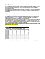
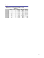
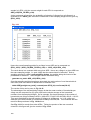
In Table 2.1 we give more examples of the list command to explain the syntax of Stata
commands in more detail
Table 2.1 The structure of Stata commands
Prefix
bysort sex:
Command
Varlist
list
list
li
_all
age sex
list
list
list
list
day-age
r*
age sex
age
list
age
Qualifiers
Options
if sex==1
, noobs
Comments
No varlist: all variables
_all: all variables
Two variables, command
abbreviated
Sequence of variables
All variables beginning with r
Two variables for males only
Without giving the
observations number
Separate list for each
category of variable sex
The layout of Table 2.1 is taken from Juul (2004) who gives an example using the summarize
command.
To follow the sequence in Table 2.1 note the following:
•
•
•
•
•
•
The prefix is separated by a colon (:) from the main command, e.g. bysort sex: is a
common prefix.
The command can often be abbreviated, so li may be used for list.
The variable list (varlist) calls one or more variables to be processed. Sometimes
giving nothing is the same as giving _all. Variable names can be abbreviated, and
day-age signifies all the variables from day to age.
In commands that have a dependent variable, it is the first in the varlist. For example
regression y x1 x2.
The most common qualifier is if, for example list _all if rurban < 2.
Options depend on the command used, and the help on the command lists them all.
For example list _all, noobs. They are separated from the main command by a
comma.
31
2.9 Using help
The Help tab is, as usual, the last on the Windows menu. Use Help ⇒ Stata Command, see
Fig. 2.12 and a small dialogue appears in which the name of the command can be entered. For
example, enter list and press OK to give the information shown in Fig. 2.13.
Fig. 2.12 Help menu
Fig. 2.13 Help for a command
Close this window. Then try an alternative route, which is via the dialogue boxes. Use Data ⇒
Describe data ⇒ List data. Click on the ? button that is in the bottom left-hand corner of the
dialogue box. This takes you to the same help screen shown in Fig. 2.12.
The amount of information about each command can be a bit overwhelming, but one useful part
is the line showing the syntax. From Fig. 2.12 this is
list [varlist] [if exp] [in range] [, options]
Those parts of the syntax that are not essential are shown inside square brackets [ ]. The
syntax for list shows that it can be given just by itself. Scrolling down the help screen you will
see that the allowable options are described. Further down is an examples section, where you
are shown some common ways in which the command is used.
An alternative to searching for help on a particular command is to look for help on an operation
that you need to do. Tabulation is important when analysing surveys. To see how Stata
responds to this sort of query, use Help ⇒ Search. Type the word tables and press OK. You
are now shown a list of Stata documentation and commands that support the construction of
tables, see Fig. 2.14.
Finally you can use the help command. Type
. help list
to give the information in the results window or
.whelp list
to give the help in the Stata viewer, as shown in Fig. 2.13.
32
Fig. 2.14 Searching for help on a topic
2.10 Commands, or menus and dialogues?
In this chapter we have mainly used commands, while Chapter 1 showed how to use Stata’s
menus and dialogue boxes. What should you use? We suggest both!
If you usually use dialogues, then this is probably how you should start using Stata.
It is difficult to use just the dialogues. For example, the help, associated with the dialogues is
meaningless if you know nothing about the Stata commands. Also you will spend a long time on
repetitive tasks that would be very easy using commands.
In Chapter 5 we will see that using the commands will help you to keep a record of exactly what
analyses you have done. This record may be vital if there are queries about a particular table or
graph. It is also very useful if you have to repeat the analysis on a similar dataset in the future.
If you usually use commands, you will still probably find that the dialogues are sometimes useful
to show how a particular command can be used. We saw an example in Section 2.3. If you wish
to explain an analysis to someone who is not so familiar with the software, then they will follow
what you are doing much more easily, if you use the menus, than from the commands.
Sometimes you may have a well-defined task, but you are not sure whether Stata has a
command or dialogue that corresponds to your needs. The obvious way to check is via the help
in Stata, or by browsing through the guides. Sometimes an alternative is to look quickly through
the menus and dialogues boxes that correspond to the area of your problem. At the least, this is
an appropriate way of looking for the relevant parts of Stata’s help system.
How you balance your use of the menus and commands will depend largely on how frequently
you use the software. Regular users will tend towards the commands, and only use menus for
analyses they do more rarely. Occasional users would be slowed by having to remember the
language and will make more use of the menus.
33
2.11 Practice Exercise
You have been introduced to many STATA commands in this chapter. They are listed below.
Can you describe the function of each?
•
display
•
help
•
list
•
dir
•
by sort
•
generate
•
browse
•
drop
•
replace
•
codebook
•
sort
34
Chapter 3 Data input and output
This chapter describes how to enter data from the keyboard, how to import data from external
data files created by spreadsheets or databases, and how to output Stata data to other
packages.
3.1 Typing data from the keyboard
Only rarely would one type data directly into Stata from the keyboard, though this is useful for
small datasets. It’s best to do it in the Data Editor after clearing any data from the memory with
. clear
Suppose you had to type a subset of 3 observations and 4 columns from the survey dataset
paddyrice described in Chapter 0. Start by clicking on the Data Editor icon
to open a
blank Data Editor window. To type the data shown in Fig. 3.1 do not type the variable names in
the first row – just type the values, column by column, as shown in Fig. 3.2.
Fig. 3.1 Data to enter
Fig. 3.2 Typing directly into Stata’s data editor
After typing each value press the Enter key. Stata automatically names each column as var1,
var2, as shown in Fig. 3.2. To change these names, double click on the relevant column to
open a pop-up dialog box.
Once completed, close the Data Editor and check your editing by listing the data [use the list
command]; any mistakes can be corrected by recalling the data editor. You are now ready to
save the data in Stata format by using the command
. save survey
This command saves the data file survey.dta in Stata format in the current working
directory.
You can also save data by selecting File ⇒ Save as from the menu.
3.2 Importing data
3.2.1 Small datasets
It is possible to copy and paste small-sized datasets from a single Excel spreadsheet directly
into the Data Editor.
For instance, while in Excel, highlight the rectangle of data [including the variables names] in
the survey sheet of the paddyrice.xls workbook and click the Copy icon on the menu.
Then in Stata, clear the existing data, open a fresh Data Editor and choose Edit ⇒ Paste.
35
3.2.2 Large datasets
When importing large datasets from Excel workbooks (or Access databases), the first step is to
save the dataset as a text file. While in Excel, select File ⇒ Save as; change the selection in
the Save as type: box to csv (comma delimited) or text (tab delimited).
Make sure that in the Excel sheet:
•
missing values are left as blank cells and
•
variable names do not include spaces; use underscores instead.
Excel automatically saves comma delimited files with the extension *.csv and tab delimited
files with the extension *.txt. These files do not support the multiple sheets of Excel
workbooks, so each sheet must be saved in a separate file.
Now proceed as described in the following section.
3.2.3 Import data from a text [or ASCII] file
In Stata, use File ⇒ Import for importing data in several ASCII formats as shown in Fig. 3.3:
Fig. 3.3 Import menu
Fig. 3.4 Browse to find the file
Suppose we import one of the Ethiopian datasets described in chapter 0, namely
E_HouseholdComposition.csv [created in Excel as explained in the previous section].
From the menu select File ⇒ Import ⇒ ASCII data created by a spreadsheet and complete
the dialog box as shown in Fig. 3.4 by specifying the folder where the file is stored and comma
as the character delimiter for values in columns.
Note that a tab or any other user-specified delimited character can be specified in the dialog
box.
Clicking the Submit button imports the data, after clearing the data in memory as requested in
the bottom tick box in Fig 3.4.
The Results window shows that the command produced is:
. insheet using "folder path\E_HouseholdComposition.csv", comma clear
The insheet command is intended for importing files created by spreadsheet or database
programs.
36
3.2.4 The ODBC utility: Open Data Base Connectivity
Data from a survey often has a multistage structure, made up by tables of data at different
levels such as region, district, village and household. It is good practice that such complex data
be organised in a hierarchical structure and tables linked and stored in a relational database
such as Microsoft Access. Additional tables are usually created by running queries to extract
subsets of the data to feed into analyses specified in the study protocol.
Stata’s odbc command enables access to data stored in relational database, both tables and
queries, so data do not need to be written out by the database source in ASCII format prior to
importing. However, this utility is not directly accessible from the menu and requires a link to the
data file to be set up outside Stata (see Reference manual) so it is more difficult to use
compared to those of other mainstream statistical packages such as SPSS. We hope that odbc
will be easier and more functional in the next releases of Stata.
We assume that a Data Source Name (DSN) has been already set up in Windows, linking to the
file paddy.xls, described in Section 0.2.4
To list which drivers and DSN are available, use:
. odbc list
Note that the list comprises all those odbc drivers that are supplied by default with the Windows
Operating System.
To list all data tables stored in this Excel workbook, use
. odbc query “paddyrice”
The output from this command lists all named ranges (if any have been defined) and worksheet
names (these are followed by a dollar sign $) stored in the Excel workbook.
Prior to importing datasets, it is possible to check the content of variables stored in specific
tables with:
. odbc describe “survey$” dsn (“paddyrice”)
The output from the above command shows a live link called load to the table in question.
If you click on the load live link, all variables stored in the named table are imported into Stata.
This action corresponds to typing the following command:
. odbc load, table (“survey$”)
3.2.5 Stat/transfer
An alternative to odbc is a separate program called Stat/Transfer. This is a general-purpose
program for importing data from other statistical package that Stata users favour. See
www.stattransfer.com for more details.
StatTransfer can convert datafiles of many different formats to Stata datafile format and vice
versa. This is useful for transferring data between many packages, including Stata and SPSS.
Variable and value labels (see chapter 4) are preserved, so none of the formatting is lost.
By default the transferred file goes into the original folder and inherits the original name with the
new format, but users can change this by pressing on the Browse button, as shown in Fig. 3.5.
37
Fig. 3.5 The menu from the StatTransfer program
3.3 Using a special data entry system
Surveys are often large and hence a separate data entry and checking package is used, prior to
the data analysis. Two packages that offer extensive facilities for data entry are EpiInfo,
(www.cdc.gov/epiinfo), developed by the US Centre for Disease Control, and CSPro
(www.census.gov/ipc/www/cspro), developed by the US Census Bureau. These are both free
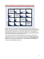
software. Part of the Help with CSPro is shown in Fig. 3.6.
We see, from Fig. 3.6 that CSPro exports data in a number of formats, including a form that
reads directly into Stata. CSPro is designed to cope with surveys that are hierarchical, for
example with data collected at both household and person levels. In such situations the export
to Stata can provide separate files for each level of the hierarchy, and leave Stata to merge the
files where necessary. We discuss how this is done in Chapter 10. Or it can merge the
information, and provide a single file. The Help for CSPro gives details.
Hence one option for Stata users is to do the data entry and checking, plus simple tabulations of
the data using software such as CSPro. Then transfer the data to Stata for the analysis.
For users who are tempted to try CSPro, it is provided with a simple tutorial, which is easy to
follow. Most readers of this guide will not need a special course to understand how to use the
software. A copy is on the CD with this book, but we suggest that anyone who has an internet
connection should instead download the latest version from the CSPro web site.
38
Fig. 3.6 Help from the CSPro data entry system
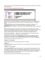
3.4 Output of data
To export small datasets to Excel, first highlight the block of data in the Data Editor of Stata,
then use Edit ⇒ Copy. Then in Excel, choose Edit ⇒ Paste.
When exporting large datasets, it is preferable to save them as text files formatted in
spreadsheet style with separators. Use the menu selection File ⇒ Export or the outsheet
command as follow:
. outsheet using survey
By default the outsheet command saves the current Stata dataset in a tab-separated text file
with the extension .out in the current working directory. We can specify a more meaningful
extension like .tab by explicitly typing it.
The only other format available for output is comma-separated; try
. outsheet using survey.csv, comma
The comma-separated format is a safe way of exchanging data between Stata and SPSS.
39
Chapter 4 Housekeeping
By housekeeping we mean the small jobs, mainly concerned with organising the data, that may
be a nuisance at the time, but make life easier later. We describe how to label and add notes to
datasets; how to label variables and their values; how to recode variables and deal with codes
for missing values; how to manage dates, calculate indices and how to use log files.
As an example, we use the file on household composition from the Young Lives survey in
Chapter 0. It has 17 columns of data and we use the Stata version of the file, called
E_HouseholdComposition.dta.
4.1 Labels and notes
In Stata a label may be attached to a dataset, or to a variable, or to an integer value taken by a
variable. These options are shown in the submenu in Fig. 4.1 and follow from Data ⇒ Labels.
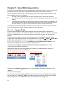
Fig. 4.1 Submenu from Data ⇒ Labels
If we choose to label the dataset we get a simple dialogue to complete, as shown in Fig. 4.2.
Fig. 4.2 Adding a label to the dataset
Pressing OK adds the label, and the results window shows that the dialogue generated the
command:
. label data "Young Lives Study: Questions taken from enrolment part, Sections 2 and 9"
We also choose to label two of the variables, sex and relcare using the label command, by
typing:
. label variable sex "Is the child male or female?"
. label variable relcare "What is your relationship to the child?"
40
Labelling the values in a column is a two-stage process. We first define a new label column, and
then attach it to the variable. To label values in the column called sex, we give a command as
follows: (though with a spelling mistake)
. label define sex 1 "male" 2 "femle"
The column called relcare has six options, and typing those is even more likely to involve
errors, so we use the menus. Use Data ⇒ Labels ⇒ Labels values ⇒ Define or modify value
labels, to bring up the dialogue shown in Fig. 4.3 (Note: the name carer and its labels will not
be seen until you set it up with the instructions below).
Fig. 4.3 Defining a label column
In this dialogue we can define further label names and assign their values. We can also edit the
labels for existing names. So we first correct the typing error in the label for sex. We assume
you will work out how to do this.
We now need to enter a new label called carer, with the six labels shown in Fig. 4.3. To enter
this new label, first click on Define in Fig. 4.3 and type carer, then click OK.
This brings up a new dialogue box. Type 1 under Value and Biological Mother under Text
and click OK. Continue similarly to give appropriate labels to values 2, 3, 4, 5 and 6. Then
close the Add Value dialogue box. Also close the Define value labels dialogue box.
The second stage is to assign the labels to the appropriate variables, either using the menu
sequence Data ⇒ Labels ⇒ Labels values ⇒ Assign value labels to variable, shown in Fig.
4.1, or by typing:
. label values sex sex
. label values relcare carer
As is indicated by the two examples, we may choose to give the same name to the label column
as the variable, but this is not necessary. We can also attach the same label column to many
variables if we wish. For example in the file from the same survey, called
E_socioeconomicstatus.dta, there are 9 questions with a Yes/No response. In this
case we just need to define a single yesno label column, and then attach it to each of the
variables.
Use
. describe
to see the results of labelling, Fig. 4.4.
41
Fig. 4.4 Details of variables after labelling
Stata also allows notes to be added to either the dataset or to a variable, see Fig. 4.5, which
results from Data ⇒ Notes ⇒ Add notes. They may be used to keep a record of analyses, or
other actions.
Fig. 4.5 Notes may be added to the dataset
Listing the notes may be done, either from the menus Data ⇒ Notes ⇒ List notes, or by the
command
. notes list
as shown in Fig. 4.6. You may have a series of notes (up to 9999) on either the dataset as a
whole, or on a variable. You would usually just have a few, partly because Stata does not (yet)
have a system for editing or changing the order of the notes.
42
Fig. 4.6 Listing the notes for a dataset
Once you have made these changes, use File ⇒ Save to update the version of the file that is
on the disc. If there is already a Stata file with this name then Stata will ask if you wish to
overwrite the previous version. Either respond yes, or use File ⇒ Save As instead.
4.2 Recoding a variable
One of the variables, seedad, records how often the child has seen their father in the past six
months. It is coded from 1 to 5 ranging from daily to never, though there are relatively few
values coded 2, 3, or 4. Look at the number of responses in each category by using the
command
.codebook seedad
We therefore simplify tabulation by recoding those three values as a single code.
There are also some values coded 8, which usually corresponds to “not applicable” though this
is not mentioned in the list of codes for this variable. We will therefore recode those values to be
missing.
As a command use
. recode seedad (2/4 = 2) (8 = .), generate (seedad1)
This generates a new variable with the recoded values. Alternatively, from the menu use Data
⇒ Create or change variables ⇒ Other variable transformation commands ⇒ Recode,
categorical variable see Fig. 4.7.
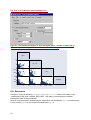
Fig. 4.7 The recode dialogue
In the dialogue shown in Fig. 4.7, the button labelled Examples is useful, and takes you straight
to the help on the different options for using recode. We see it is possible to label the recoded
variable directly, as is shown in Fig. 4.7. Before pressing OK, you need to use the Options tab
to ensure the recoded variable is copied to a new column, perhaps called seedad2.
Otherwise you will overwrite the existing column, which is not usually desirable.
43
Once this is done you can use the command, or dialogue
. codebook seedad2
which gives the results as shown in Fig. 4.8
Fig. 4.8 Information on the recoded variable
From Fig. 4.8 we see that Stata remembers that seedad2 is recoded from the variable
seedad, and has attached the labels as requested. If the label column needs to be edited later,
then one way is to use Data ⇒ Labels ⇒ Label values ⇒ Define or modify value labels,
which brings up the same dialogue as shown in Fig. 4.3, but with the new label column added
to the display.
Care needs to be taken if you recode a variable to itself, when labels have already been added.
For example if you use the recode dialogue again as in Fig. 4.7, press R to reset to the default
settings and swap the codes for the variable sex, using
(2=1) (1=2)
This would be to display females before males, then the codes do swap, but the same
labels are attached. So you have now incorrectly labelled the column. It would be nice to go
back, but Stata does not have an undo feature. So, if you are following these operations, then
repeat this dialogue a second time to swap the codes back to their original values.
One solution is
(2=1 female) (1=2 male)
As mentioned above, it is always safer to recode into a new variable. You can always tidy the
dataset later, by dropping the variables that are no longer needed.
To conclude, use File ⇒ Save, to copy the updated information to the version of the file on the
disc.
4.3 Missing values
Up to Version 7, Stata’s missing value symbol was an isolated decimal point, as we used in Fig.
4.7 and saw in the results in Fig. 4.8. Stata 8 has 26 additional symbols, namely
.a
.b
.c
…
.z
These may be used when it is necessary to distinguish between the reasons that values are
missing. When making comparisons or sorting, the following rules are observed:
All non-missing numbers are less than .
44
. is less than .a
.a is less than .b, and so on, up to .z
In Fig. 4.7 we recoded the variable, seedad, that gave the number of times the child saw the
father. There we changed the code 8 into the missing value code. A closer examination of the
data showed that a code of 8 corresponds to children whose father has died, which is not at all
the same as a missing value.
We can therefore improve on the recoding given in Fig. 4.7 by changing
(8 = .) into (8 = .a “Father dead”)
As shown, we can also label the missing values, .a, .b, which is not possible with the standard
missing value code.
With most commands, Stata automatically excludes records with missing values from the
calculations. Care is needed when using > when there are missing values, because all missing
values are treated as large numbers. For example to give the number of children who have
never seen their father in the past 6 months
. count if seedad2 > 4
returns 233, which includes all the missing values. To avoid them use
. count if seedad2 > 4 & seedad2 < .
which returns the value 171.
In some datasets missing values are identified by a code like 9 or –1. To treat them as missing,
use Data ⇒ Create or change variables ⇒ Other variable transformation commands ⇒
Change numeric values to missing, see Fig. 4.9.
Fig. 4.9 Changing –1 to missing in a dataset
In Fig. 4.9 we have used the special name _all to signify we want to change all the variables.
This generates the command
. mvdecode _all, mv(-1)
which could be used instead. Similarly we could use
. mvdecode seedad, mv(8 = .a)
to change the code 8 into the missing value .a.
4.4 Memory and data types
With Intercooled Stata you can have up to 2000 variables in a dataset. Stata keeps all the data
in memory, and this might become a limitation with very large datasets.
The initial memory with Intercooled Stata is 1 megabyte, but this can be changed in a variety of
ways. Once In Stata use clear first, if you are currently using a dataset, then for example:
45
. set memory 20m
to increase the current memory to 20 megabytes. If you always want to start with this amount,
then use
. set memory 20m, permanently
To get an idea of the amount of memory that Stata needs, you can always type the command
. memory
and it reports how much is used by a given dataset.
As an example, the full datatset from the expenditure survey has 10,000 observations and 246
variables, mostly simple numeric ones. This needed about 6 megabytes.
If you do have problems processing large datasets then the following procedures may help:
•
•
There is a compress command. See whelp compress if you need more information.
This will attempt to change the amount of memory used for each variable. For example
you may be storing a variable coded as 0 and 1 in an integer variable, when Stata can
store it in a single byte.
Increase the amount of memory on your machine. For example if you have 1 gigabyte
of memory, then you could set memory to 800 megabytes.
4.5 Dates
The household composition dataset includes two typical problems concerned with dates. The
variable giving the date of the interview, dint, has been imported as a string, with the first
value given as October 27, 2002. The date of birth of the child is in 3 columns, with the
variables dobd, dobm and doby, giving the day, month and year. The intention in this
project was to interview families with a child between 6 months and 18 months on the day of the
interview. It would be useful to check how many children were outside this range, for example,
from Fig. 4.10 we see that the first child was only two months old.
Fig. 4.10 Date columns
To compare dates it is necessary to convert them into time since some fixed date. Stata uses
the convention that dates are coded as days since 1/1/1960, so dates before then are negative
numbers.
The date of birth may be transformed using the function mdy( ), for example
. generate dob = mdy(dobm,dobd,doby)
46
Similarly the date function may be used to transform the string, dint, into a day number. We
need to describe the format of the string. In Europe it is usually day month, year, so we
might try
. generate dateint = date(dint,”dmy”)
This appears to work, in that there is no error message. But Stata notes that it generated 1999
missing values, so clearly there was something wrong. Fig. 4.10 shows the problem, in that
dint has been given in the form month, day, year. So:
. drop dateint
. generate dateint = date (dint,”mdy”)
For a full list of available date functions, try
. help datefun
We can now use something like
. count if (dateint-dob)<180
to find that 78 children were younger than 6 months. Similarly we find that 97 were older than 18
months. The two conditions can be considered together, as in:
. count if (dateint-dob)<180 | (dateint-dob)>540
to indicate that 175 children were outside the proposed age range.
Using
. codebook dateint dob
will show that the new columns, are integer values of about 15000. We can still do calculations
as above, and the data would look neater if the data were formatted as dates. Stata allows
many date formats, but the simplest is given by
. format dateint dob %d
4.6 Generating indices
In many surveys some of the questions are used primarily to calculate an index, rather than
individually. This may be an index of wealth, expenditure, income and so on.
We illustrate using a second file from the Young Lives study, called
E_SocioEconomicStatus.dta. Open this file.
Fig. 4.11
The last nine questions in this file Fig. 4.11 are as follows:
47
Does anyone in the household own a working radio (radio), refrigerator (fridge), bicycle (bike),
(tv), (motor), (car), (mobphone), (phone), (sewing).
We calculate a simple index, called cd, for consumer duarables, which is the count of the
number owned, divided by 9, to give a value between 0 and 1. This would be very easy if the
data for these variables were coded 1 for yes and 0 for no, but no has the code 2. We could
recode the variables, as described in Section 4.2, or use a slightly different formula for the
calculation, possibly:
. generate cd = (18-(radio+ fridge+ bike+ tv+ motor+ car+ mobphone+ phone+ sewing)/9
In doing this calculation, remember to have the variables window open, so you can click on the
variable names to transfer them into the formula. Otherwise you may type one wrongly.
Even if you did type this formula correctly as above, we have made an error, by just having a
single closing bracket. Stata responded by noting
too few ')' or ']'
and so did not do the calculation. You should not want to type the whole formula again, so use
<PgUp> to recall the command and correct the mistake. Now the calculation should work.
It is always useful to check that the results are sensible. Try
. codebook cd
to give the results shown in Fig. 4.12
Fig. 4.12 Displaying the results from generating an index
Most of the values in Fig. 4.12 are sensible. There are 1200 zeros, indicating that 1200 of the
households have none of the appliances. Then 614 households have a single appliance, and
hence the value 0.1111 which is 1/9.
However, one value is –1/9 and this should be impossible. Either we have made a mistake in
the formula, or there is at least one error in the codes for the variables. To check the data you
could try
. codebook radio fridge bike tv motor car mobphone phone sewing
48
This is very quick to type, if you are in the habit of clicking from the variables window, because
Stata even inserts the space between the names for you. The results indicate that there was an
error on entry of the variable radio, where one value is coded 3. Call up the editor, but use a
command, so you just get the line you want, i.e.
. edit if radio>2
This just gives the data for record number 1289, where you can replace the value 3 for radio, by
a missing value, i.e. by a full-stop.
Now you need to repeat the calculation of the index. Stata is not like a spreadsheet, where the
results would automatically update. So press <PgUp> repeatedly, until you get back to the
correct formula and change the generate command to replace,
. replace cd = (18-(radio+ fridge+ bike+ tv+ motor+ car+ mobphone+ phone+ sewing))/9
Then check again, that the index no longer has negative values.
Finally save the changed file to the disc.
4.7 Formats
Variables can be formatted. For example
. format cd %7.2f
This displays the index in a field of 7 characters, with 2 after the decimal place.
For dates we used the simplest formatting in Section 4.5. Another possibility is:
. format dateint %dD/M/Y
to display dates in the form 27/04/97. Use whelp dfmt for more possibilities.
4.8 Extended calculations
The commands generate and replace are very powerful, because the formulae can also
involve functions such as ln, and sqrt, as described in Sections 1.5 and 2.7. Sometimes,
however, you may have a calculation that is still difficult to do with these functions. For example,
the index described in Section 4.6 was made up from 9 variables. The formulae above would be
tedious to construct if instead you had 90 variables on household expenditure, and needed to
calculate the sum.
Stata has another command, called egen, for “extended generation” of variables. Type
. db egen
or use Data ⇒ Create or change variables ⇒ Create new variable (extended) to see the list
of functions with this command. One option, shown in Fig. 4.13, is to calculate row sums, and
this could be used in the calculation of the index. The dialogue in Fig. 4.13 generates roughly
the command
. egen cd2 = rsum(radio-sewing)
where the minus sign in (radio-sewing) signifies all the variables from radio to sewing, rather
than a subtraction.
49
Fig. 4.13 The egen function allows a further range of calculations
This is not quite the end of the calculation, because the command egen cannot be used as part
of an expression. What we would like to do is perhaps
. egen cd2 = (18-rsum(radio-sewing))/9
which is not allowed. Instead, having calculated the variable cd2, we then can do
. replace cd2=(18-cd2)/9
Also, while the generate command has replace, there is no equivalent for egen. So, if you need
to repeat the egen command, then you must first use drop to remove the variable.
4.9 Grouping the values of a variable
When a variable has many values, often the case with variables age, or expenditure or
yield or area, then it is often useful to group the values and create a new variable that
codes the groups. We illustrate by grouping the values for the consumer durables index that we
calculated above. This has values between 0 and 0.6.
The egen command can be used for this, with the function called cut.
50
Fig. 4.14 Grouping the values of a continuous variable
The dialogue shown in Fig. 4.14 is a convenient way of showing the different options of the cut
function. In its simplest form, as shown in Fig. 4.14, it is equivalent to the command
. egen cdgroup = cut(cd), at (0, 0.1(0.2)0.7)
where the abbreviation of 0.1, 0.3, 0.5, 0.7 by 0.1(0.2)0.7 is an example of what Stata calls a
number list.
Then use
. codebook cdgroup
to see what the variable looks like. Now try the other options in turn, as follows:
. drop cdgroup
. egen cdgroup = cut(cd), at (0, 0.1(0.2)0.7) icodes
. codebook cdgroup
then
. drop cdgroup
. egen cdgroup = cut(cd), at (0, 0.1(0.2)0.7) icodes label
. codebook cdgroup
This last combination produces the result shown in Fig. 4.15. If you use Data ⇒ Labels ⇒
Label values ⇒ Define or modify value label, you will see that Stata has added a value label
for this new variable. This could be edited into labels, such as “none”, etc.
51
Fig. 4.15 Grouping must cover the range of the data
4.10 Log files
To keep a record of the results obtained while using Stata you can open a log file by clicking on
the Log icon, Fig. 4.16. If the log file is a new one, you will be asked to name it. Choose
younglives perhaps. By default the log file will be saved in your working directory with the
name younglives.smcl. The extenstion .smcl stands for Stata markup and control
language
Fig 4.16 Beginning a log file
If younglives.smcl already exists in your working directory, Stata will ask whether to
append the new results to the existing file or to overwrite it. Once the log file is open, produce a
few results, for example
. describe
. codebook
To look at the log file while you are still working in Stata, click on the Log icon again and select
View snapshot, see Fig. 4.12. If you keep this viewing window open while you work you will
need to click on its Refresh button to view your latest results. Otherwise open and close it as
you go along.
52
Fig. 4.17 Viewing the log file
Log files record both commands and output. Their main purpose is to enable the user to record
the important parts of the output, so it can later be copied into a word processor for eventual
printing and publication. Of course if you keep a log file open for the whole of a session it will
contain a long record of everything that happened during the session. This is not an efficient
way of working. We describe an alternative in the next chapter.
In other statistical packages the term log file is used for a file that keeps a record of just the
commands, rather than also the results. This is available in Stata, though currently (Version 8.2)
not from the menus. See
. help log
for further details of the use of log files and also for how to use cmdlog files that just record the
commands. They can be used simultaneously.
4.11 In conclusion
At the start of this chapter we stated that the housekeeping tasks are mainly concerned with
organising the data, before you start on the analysis. You may then have been surprised at the
length of this chapter, but that is typical of real analysis. Although the housekeeping is boring,
you need to allow sufficient time to do it properly.
It is often the unforeseen complications that take the time, and this is just like real
housekeeping. You might have a simple task of sweeping the floor, but then get sidetracked,
because the family have left their clutter all over. So now you have to clear the floor before you
can sweep it!
Similarly, in Section 4.6 you had a simple calculation to do, but were sidetracked, because you
uncovered a problem in the data. In Section 4.6 we simply made the obvious error into a
missing value, but in a real survey you should go back to the data sheets to see whether this
impossible code was a transcription error, or whether the problem was there when the data
were recorded.
In addition, you may have been led to believe that the data were clean and might now be
concerned that you have found such an obvious error. Perhaps it indicates that there are more
problems in the data that may slow down the whole process of analysis. We return to these
problems in the next chapter, and look specifically at Stata’s facilities for data checking in
Chapter 10.
53
Chapter 5 Good Working practice
In Chapter 4 we described the common housekeeping tasks that usually precede the analysis of
the data. Following the changes to the data file we saved the new version to the disc.
There is a problem with this way of working, particularly with the large datasets that often arise
when analysing surveys. For example:
•
We may uncover problems with the data. Later we are sent a new set, with some
corrections made. We now have to repeat all the housekeeping tasks again on this new
version
•
Following the housekeeping, we analyse the data and send a report for publication. We
also supply the data. Later a referee comments that he does not get the same table as
we have shown in the report. Could we therefore confirm exactly what we did?
In this chapter we introduce Do file and show how they enable us to work in a more systematic
way. For illustration we largely repeat the tasks from the last chapter.
5.1 5.1
Using a Do file
So far we have sometimes used Stata’s dialogues, and sometimes typed commands into
Stata’s command window. The command window is used when we want to issue one command
at a time. A Do file allows us to write more than one command, and then use the whole set
together.
To show how this might be used, we first look again at one of the data files that we used in
Chapter 4. We start with the original comma-separated file, so use File ⇒ Import ⇒ ASCII data
created by a spreadsheet. Change the filetype to csv and look for the file called
E_SocioEconomicStatus.csv. Also tick the option to replace data in memory. This
generates the insheet command which will be something like:
. insheet using "C:\My Documents\Stata Guide\SocioEconomicStatus.csv", clear
Your directory will probably be different.
Stata has an editor into which commands can be written. The simplest way to invoke it is
through the task bar, as shown in Fig. 5.1.
Fig. 5.1 Calling the do file editor
Fig. 5.2 Another route
Alternatively use Window ⇒ Do-file editor, or press <Cntl> 8, as shown in Fig. 5.2, or type
. doedit
into the command window.
Any of these routes opens Stata’s Do file editor. Now we open a command file that is supplied
with the data files.. Use File ⇒ Open, from within the editor and look for the file called Chapter
4 housekeeping.do. Once opened the editor should look as shown in Fig. 5.3.
54
Fig. 5.3 Loading a file into the editor
Fig. 5.4 Running the file
Some the commands in Fig. 5.3 should be familiar from Chapter 4. Now click on the button
shown in Fig. 5.3 to execute all these commands. Browse through the results window, which
should have the same results as shown in Sections 4.6 to 4.8.
An alternative way to run the commands is to use Tools ⇒ Do, see Fig. 5.4. The menu shown
in Fig. 5.4 also permits a selection of the commands to be executed, rather than the whole file.
In the results window you should see a copy of the command that was generated when you
imported the data file, before executing these commands. Copy this command and paste it into
the file shown in Fig. 5.3, just under the comment line, which is the one preceded by an asterisk
(*).
This command is likely to be quite long, so you may have to edit it to put it on a single line. Run
the commands again.
This program is now reasonably complete in that it imports the data file and then does some of
the housekeeping tasks. Save this file using File ⇒ Save, from within the editor, Fig. 5.3.
Alternatively use File ⇒ Save As to make your own version. Note this is not the same as the
overall File ⇒ Save on the main Stata menu, which is used to save the data file, rather than the
file of commands.
5.2 5.2
Making a Do file
In this section we show that it is very easy to make your own Do file. You can proceed
interactively just as in Chapter 4, using whatever mixture of menus and commands that you find
convenient. Before you start, open a new Do file, and copy the corresponding commands into
this file as you proceed.
In Chapter 4 we reminded you to save the revised data file at the end of each piece of
housekeeping. Now you will no longer have to do this. Instead you should save the Do file
periodically. It is keeping a record of all your housekeeping tasks.
For illustration we use the third file associated with the Young Lives survey. It is called
E_HouseholdRoster.csv and contains data from all the people in the household, except
55
the index child, i.e. the baby. Import this file, remembering to tick the option to replace data in
memory. You should see from the results window that there are 10 variables and 9431
observations. Browse through the data, see Fig. 5.5.
Fig. 5.5 The household roster data from the Young Lives survey
We start, as in Chapter 4, by labelling the variables. The first is shown in Fig. 5.6, and follows
from Data ⇒ Labels and notes ⇒ Label variable, Fig. 5.6.
Fig. 5.6 Labelling variables
Now open the Do file editor and use File ⇒ New to begin a blank file. Copy the Insheet
command to open the file. Then type a comment at the top of the file.
Now copy the lines from the results window where you labelled the variable, agegrp as
above.
Then attach further labels, either:
♦
♦
♦
56
Using the dialogue as in Fig. 5.6 repeatedly. Press Submit each time, and the
dialogue will stay open.
Typing the command into the Stata command window. Remember you can recall
the previous command and edit it, rather than typing everything yourself.
Typing directly into the Do file.
The labels are shown in the Do file, see Fig. 5.7.
Fig. 5.7 Building a do file
Unless you are an experienced typist you may find that using the dialogue is the quickest. This
is partly because you can copy the variable names into the dialogue, from the window that
contains the list of variables rather than typing them. Then you can’t make mistakes. And you
don’t have to worry about adding the quotes yourself.
In Fig. 5.7 we have added extra spaces in the lines to make them more readable. We have also
turned the insheet command into a comment, by adding an asterisk in front. Then we will not
import the file every time we test our file of commands.
In Fig. 5.7 we have also added the command set more off so that the results window does not
always stop and ask whether we want more of the output.
Finally add the command, describe, to the file and run the file to test what you have done so
far.
Once the commands work, use File ⇒ Save As, to save the commands in the Do file.
The next step is to add value labels as described in Section 4.1. Four of the questions have a
Yes/No answer, so we define this value label first. Again the simplest is probably to use Data
⇒ Labels and notes ⇒ Define value labels, and define a label called yesno, with 1 labelled
Yes and 2 labelled No.
Then use Data ⇒ Labels and notes ⇒ Assign value labels to attach the label variable
repeatedly. In Fig. 5.8 we show part of the resulting Do file after copying the commands from
the results window. Alternatively they can be typed straight into the Do file.
57
Fig. 5.8 A simple do file
Now save the Do file again. If you would like more practice in adding labels into the Do file, the
column called sex can be labelled with 1 for male and 2 for female. The other variables are
given in Table 5.1.
Table 5.1 Codes for the household roster data
agegrp
relate
Code Label
Code
Label
Biological parent
1
<5yrs
1
Partner of biological parent
2
6 to 15yrs
2
Grandparent
3
16 to 30yrs
3
Uncle/Aunt
4
31 to 45yrs
4
Brother/Sister
5
46 to 60yrs
5
Cousin
6
61yrs or over
6
Labourer/Tenant/Servant
7
?
8
?
13
Not known
99
5.3 5.3
yrschool
Code Label
None
1
Primary
2
Secondary
3
Tertiary
4
Not known
99
The importance of Do files
With practice it becomes quite easy to copy the commands into Do files as you do the
housekeeping. This routine also applies to the commands for the analyses that we describe in
later chapters.
All the common statistics packages have this same facility of making Do files. They may be
called syntax, or batch files, but they do the same thing. Those who analysed surveys in the
pre-windows era used commands and Do files as the obvious way of working. They often find it
difficult to take advantage of the menus and dialogue boxes.
In contrast, the use of Do files may be new to those who are used to spreadsheets, and for
whom Stata is their first statistics package. As we have seen above, the existence of Do files
does not prevent you from taking full advantage of the menus and dialogues. And, for large
surveys in particular, the extra step of collecting the steps in your housekeeping and other
routine analyses into a Do file is a key part of “good practice”.
58
One problem with real housekeeping chores is that they are never-ending. But in our Stata
housekeeping we see the extra effort of building the Do file is like building a housekeeping
robot. The next time we need to do the same tasks we just switch on the robot, and it works
automatically.
We give some example to explain why this step is so important.
•
•
•
•
•
In a large survey the data entry is often done, over a period of weeks. The Do file can
be constructed as soon as the first data are available, or even from the pilot study.
Then, once the full data are available, the housekeeping tasks are virtually
instantaneous.
Good data management emphasises that you should have only a single copy of the
data file. In Chapter 4 we progressively changed the data file as we proceeded through
the chapter. We also found some problems, such as a code of 3 in a column where this
had to be an error. With a large survey there will inevitably be some problems.
The Do file always works on the original data. It includes the commands to make the
corrections, and these can be sent to those responsible for data entry and checking, or
as reference for ourselves, if we have this responsibility too. Then, once a corrected file
is supplied, we can continue our work.
We are halfway through our work on a survey and are absent, either though sickness,
a conference, or leave. A colleague is to continue our work while we are away. To
summarise where we have reached, we simply send the original data, plus the Do files
we have made. Ideally they should include comments, to explain the steps we have
taken. On our return, we are sent the changed Do files and continue our work.
We issue a draft report. Reviewers request minor changes to the labelling and layout of
some tables and graphs. Without the Do file we would have to remember exactly how
the original results were produced, so the changes can be made. The Do file is a
record of what we have done, so the changes can be made easily.
A year after the results from the survey have been published there are queries on the
precise definitions and hence the conclusions arising from some of the tables and
graphs. The conclusions contradict a similar health study done by a different agency. It
is important to know whether the apparent contradictions can be explained by
differences in coding the health categories.
The staff responsible for the survey have now left the organisation, but the archive
contains the data and the Do files that describe all that was done. This issue is
therefore easy to resolve.
Many surveys need mainly graphs and tables for the analysis, and these can be done by the
common spreadsheet packages. This facility to provide readable Do files is one reason we
strongly recommend that (large) surveys be analysed with a statistics package, rather than just
with a spreadsheet.
5.4 5.4
Repeating commands for different subgroups
Stata has a powerful facility for processing records by groups. We illustrate with a task that is
easy to specify, but probably initially not so obvious how you should proceed.
The task is to find how many people live in households of the different sizes? In particular how
many live in households with 10 people or more?
Browsing the data, Fig. 5.9 we see that the first household has 12 people (plus the baby), the
second has 2 and the third has 6.
59
Fig. 5.9 Examining the id column
What we need is a new column that takes the value 12 for each person in the first household, 2
for each in the second, and so on.
To show the method, we use the built-in variable, _N. Type the command
. display _N
In the results window, you will see that the sample size is 9431. Now type
. gen samplesize =_N
If you browse, you will see that we have produced a new column, that takes the value 9431 for
each row of the data. This is not very useful, but it shows the method we need. Now we will
repeat this command, but separately for each household. Type
. bysort childid: gen hhsize=_N+1
If you browse again, you will see that we have produced the required column, where the
addition of 1 is to add the baby into the household size.
This facility requires the data to be sorted on the variable, or variables that define the
categories. Looking at Fig 5.9, the data are probably sorted already, so we could have typed:
. by childid: gen hhsize = _N+1
but we have sorted, i.e. we used bysort, to be on the safe side.
Now you can use Data ⇒ Describe data ⇒ Describe data contents (codebook) to look at this
column. As there are more than 9 categories, you will have to use the Options tab.
Alternatively, as a command, type:
. codebook hhsize, tabulate(15)
In Fig. 5.10 we show the results after recoding the variable, as described in Section 4.2. We
see that 1213 people live in households where there are 10 or more people.
60
Fig. 5.10 Results after recoding
5.5 5.5
Repeating commands for different variables
In Fig. 5.8 we had to repeat the same command four times, for four different variables, that are
each labelled as Yes/No. This would be tedious if we had 40 such columns.
Stata has a special structure that allows commands to be repeated. Instead of typing:
. label values still yesno
. label values disabled yesno
. label values care yesno
. label values support yesno
We could have written:
. foreach var of varlist still disabled care support {
. label values `var’ yesno /* pay attention to the two different single quotes!*/
.}
Here the foreach command first defines the list of variables that are to be used in sequence,
using the keyword varlist. Then it gives all the commands, within curly brackets, that need
to be repeated for each variable. The expression `var’ refers to each of these variables in
turn. Any name can be used, for example X would do just as well.
The single quotes that surround var are important – the left hand single quote is different from
the right hand one. On most keyboards you will find them on the top left-hand corner (below the
Esc key) and near the Enter key of the keyboard respectively. If you are using a non-English
keyboard you may not find these keys. Then it is best to allocate two of the function keys,
perhaps as follows:
. macro define F4=char(96)
. macro define F5-char(39)
Now pressing F4 will produce the left-hand quote and F5 the right hand one.
In the example above we only had a single command within the brackets { }. You may have
more than one, but each command must be typed on a new line.
61
In the commands above, the keyword varlist is used to indicate existing variables. If you
want to create new variables, then the keyword is newlist, and if the list is of numbers, then
the keyword is numlist.
Using this syntax enables Stata to carry out some simple checks of the commands you type.
For example, with varlist, it would check that the variables all exist. You can use a looser
syntax with any kind of list. For example the above commands could have been written as:
. foreach var in still disabled care/support {
. label values `var’ yesno
.}
This more general list can also be used for file names. For example, with the three files for the
Young Lives survey:
. for each f in E_HouseholdComposition E_SocioEconomicStatus E_HouseholdRoster {
. use `f’ , clear
. describe
}
Each of the data files is loaded and described in turn. Note that the keyword of was used for
the tighter syntax of variables and numbers, but in is used for the more general syntax.
5.6 5.6
In conclusion
Using Stata for the analysis of survey data is not like using a spreadsheet. Typically there will
be some staff who become more expert in using the software. They will write the command files
to do the housekeeping, and these can then be supplied to others who may be more
comfortable using just the menus.
We return to this theme in later chapters, starting from Chapter 17. There we propose that
individuals and organisations produce a strategy for their use of the software. Efficient use of
Stata can assist greatly in the ease with which data can be analysed to a high standard.
62
Chapter 6 Graphs for Exploration
In the next four chapters we look at how to explore the data and present the results using tables
and graphs. Many surveys are processed in a purely descriptive manner and hence these are
the ways the statistics are reported.
We distinguish between exploration and presentation, though we use similar tools. Data
exploration is for the person analysing the data. It is at the early stages in the data processing,
and combines data checking with the search for patterns and for simplicities in the data.
Graphs are powerful tools for exploring your data. You can literally see your data and get a
“feel” for it that is seldom possible with numerical summary statistics alone. Graphs allow you to
spot errors, examine distributions in single variables, and assess relationships between two or
more variables.
All the graph commands were upgraded in Stata 8 and menus were added. They now allow you
easy access to high-quality graphs and to arrange the layout in virtually any way you want.
6.1 Types of Graphs
There is a wide variety of graph types and formatting options. Indeed, the standard Graphics
menu and dialogue boxes rather overwhelm you with choice and complexity. Fortunately Stata
has responded to this problem in the update to Stata, version 8.2, with a set of “Easy Graph”
dialogue boxes that are simpler to use, see Fig. 6.1.
Fig. 6.1 Easy Graph Menu
There are seven main families of graphs under the graph command in Stata. Type help graph
for a listing of families. The first family, twoway, is the largest. Twoway plots associate a
numeric y with a numeric x variable. The scatterplot and the histogram used in this chapter are
twoway family plots. There is a wide variety of plot types available with graph twoway including
facilities for creating bar plots and box plots but with less control and fewer formatting options
than the families, graph bar and graph box. Why would Stata have two methods of creating
63
essentially the same type of plot? It is possible to overlay twoway plots as shown in Section
6.5 and 8.7 and explained further in Section 8.8. This provides an almost limitless capacity to
create some very informative graphs by combining graph types. Nevertheless, there are
sometime specific options available only in the other families, like the stack option with the
graph bar command, that make that graph command just the tool for the job. In this chapter we
present our recommendations for exploratory graphs for different types of variables and variable
combinations. Doubtless as you continue to work with Stata’s powerful graphing facilities you
will develop your own favourites.
In preparing the graphs below we found the most convenient way was to use a mixture of the
dialogues and commands. Depending on your operating system (Windows 98 and ME) you
may get the following message when using the full graphics dialogues.
Fig. 6.2
Stata suggests you can then use the command
. set smalldlg on
The resulting dialogues are often more convenient, even when you were not forced to use them.
6.2 Housekeeping
In this chapter we use the data from the Kenyan survey, K_combined.dta. Open this file.
You will see that we need to do some housekeeping, as described in Chapters 4 and 5, before
preparing the graphs and tables. Either run the Do file called K_data labels.do, or open
the data file called K_combined_labeled.dta instead. That is the file that results from our initial
housekeeping. We show part of this file in Fig. 6.3.
64
Fig. 6.3 Data after initial housekeeping
In the housekeeping file we have chosen to leave the (uninformative) variable names as they
stand, but have added value labels for all the variables that we use in this Chapter. We have
also included variable labels, so results are displayed more clearly.
6.3 Simple bar charts (histograms)
The majority of variables in surveys are often categorical. The basic information of-- how many
in each value or level of the categorical variable-- can be expressed as a raw count, or as a
percentage of the total. The main tool for this type of exploration is usually the frequency table
discussed in Chapter 7. Nevertheless, bar charts labelled with the number of observations in
each category value become “visual” frequency tables making this type of bar chart particularly
good for comparing a number of variables simultaneously.
Fig 6.4 Main page of histogram dialogue box (dialogue box now white in 8.2 recapture
screen shot
65
An easy way to produce a frequency bar chart is to use Stata’s histogram command with the
discrete and frequency option. As an example we look at the main sources of drinking water
during the dry season, q34, in the Kenyan survey dataset. To be able to label the bars you will
have to use the full dialogue box, as shown in Fig 6.4. Use Graphics ⇒ Histogram and then
enter q34 in the variable text box and check the button labelled discrete. Still on the dialogue
shown in Fig. 6.4 check the button labelled frequency. This produces bars whose heights are
equal to the number of observations in each category value. Also check the box labelled gap
between bars (percent) and scroll to 30. The completed main page is shown in Fig. 6.4.
Finally click on the tab called “Bar labels” and check the box “Add label heights to bar”. You
can leave the rest of the settings at the defaults.
Alternatively, you can enter the command
. hist q34, discrete frequency addlabels gap(30)
The resulting graph is shown in Fig. 6.5. You can quickly see that the large majority of
households get their dry season drinking water from rivers, lakes or ponds, while the categories
values, vendor and other, have only a single observation each and could be excluded from
further consideration.
200
Fig 6.5 Discrete histogram bar chart of dry season drinking water sources
Frequency
100
150
184
50
58
43
22
12
1
0
1
0
2
4
water
6
8
In you find it difficult to relate the value codes to the actual water sources you can add the
value labels to the X axis. We use the xlabel option, and as q34 already has labels attached we
can use the sub-option valuelabel to add the labels.
. histogram q34, discrete frequency addlabels gap(30) xlabel( 1 2 3 4 5 6 7 ,valuelabel)
If there were no labels, or we wanted shorter ones, then they can be specified in the command,
for example:
. histogram q34, discrete frequency gap(30) addlabels xlabel(1 "pipe" 2 "pub" 3 "well" 4
"well2" 5 "river " 6 "vendor" 7 "other")
6.4 Cross-tabulations with bar charts
With the histogram command, the by( ) option is used to get a type of cross-tabulation of
frequencies or percentages. Look at the category of worker (q130) by sex (q11). We show what
we are aiming for, in Fig. 6.6.
66
Fig. 6.6 Employee classification by sex
0 20406080
Male
46.11
11.92
1.036
6.218
5.181
18.13
8.808
1.554
1.036
0 20406080
59.38
23.44
3.906
4.688
.7813
6.25
1.563
Total
0 20406080
51.4
20.25
k
on
er
1.246
Pe
ns
i
de
nt
St
u
Fa
m
i ly
.9346
Si
c
7.788
n
3.427
R
eg
_s
ki
ll e
d
R
eg
_u
ns
ki
ll
C
as
_s
ki
ll e
d
C
as
_u
ns
ki
ll
Em
oy
ed
U
ne
m
pl
5.607
O
w
8.723
.6231
pl
oy
er
Percent
Female
employment class
Graphs by sex
To show how these results resemble a table, but with the added visual support of the bars, we
show the same information in tabular form in Fig 6.7.
Fig. 6.7 Tabular ouput for Employment class by sex
We start from the command and then show how to get the same graph using a menu. The
command is,
. histogram q130, discrete percent gap(40) addlabels ///
xlabel(1(1)11, valuelabel angle(forty_five)) yscale(range(0 75)) ///
by(q11, total rows(3) legend(off))
67
This is getting quite complicated to construct as a command, particularly as it is intended for
exploration. One possibility is to make a simple do file, as shown in Fig. 6.8.
Fig. 6.8 The histogram command in a do file
This is easier than using the command window for three reasons. It can be laid out, as shown in
Fig. 6.8, so the structure of the command is clear. You can keep trying the file until the graph is
as you would like, and you can save the command file (we have called it hist_by.do), so when
you need a similar display you can just edit this file.
Using the histogram dialogue box, shown in Fig. 6.4 is also quite easy. The steps are as
follows:
1 Return to the main page of the histogram dialogue box, see Fig. 6.4, and exchange
q130 for q34.
2 On the right of the main tab, edit the “gap between bars” to 40
3 Also on the main tab, check percent, rather than frequency.
4 Now move to the By tab and enter q11 in the Variables textbox
•
•
Check “Graph total”
Check Layout and choose rows from drop down list, enter 3 as the number of rows
Choose No from “Use legend”
Move to the Bar labels tab and verify the “Add label heights to bars” is still checked
Move to the Y Axis tab, check Range and enter 0 to 75
•
5
6
7
Move to the X Axis tab, enter 1(1)11 in the “Rule” textbox on the right hand side.
•
Also check the box to give Value labels,
•
and set the Angle to 45 degrees.
8
Click on OK
The resulting three graphs, in Fig. 6.6, show, a smaller percentage of female workers are
employed as skilled workers, whether regular or casual, or even as regular unskilled workers,
and a larger percentage classify themselves as self employed, compared to male household
heads.
68
In Fig. 6.6 the by( ) option has created the multiple plots, the sub-option total gives the
third plot, and rows(3)stacks the male, female and total plots. The xlabel option is not
necessary for exploration but helps identify the bars while the yscale(range) option increases
the graph height so that the label on the highest bar is not cropped. The legend is not useful
here so it is turned off within the by()option.
Until you become experienced with Stata commands, we suggest that the dialogues are a good
way to produce the graphs initially. Then transfer the working commands into a do file for
further use.
6.5 More exploration with multiple plots
The last example demonstrated the value of viewing a number of plots in a single graph. You
can display two or more plots of any type as a single graph in Stata using the graph combine
command. The graphs to be combined must first be saved either in the memory or on disk.
6.5.1 Saving graphs
When you make a graph in Stata, for example
. histogram q311, discrete frequency addlabels gap(40) xlabel(1/7)
it is stored in memory under the name graph. If you then issue another graphing command
. histogram q11, discrete frequency addlabels gap(40)
the graph in memory is over-written and the earlier graph is lost.
If you want to save multiple plots in memory then use the option, name( ) to save them under
different names. For example
. histogram q311, discrete frequency addlabels gap(40) xlabel(1/7) name(graph1)
. histogram q11, discrete frequency addlabels gap(40) name(graph2)
To redisplay a graph use,
. graph display graph2
In the dialogue boxes the option to name the graph, and thus save it in memory, is generally
found on the last tab of the dialogue, called Overall.
Graphs stored in memory are lost when you exit Stata or issue clear or discard commands,
however, you can save a graph to a drive with the command
. graph save graph1
or with the saving( ) option
. histogram q311, discrete frequency addlabels gap(40) xlabel(1/7) saving(graph1)
You can use the graph files by issuing a graph use command, for example
. graph use graph1
You can also call them with the graph combine command, that we describe below, but in that
case you must add the gph extension as in
. graph combine graph1.gph graph2.gph
Our suggestion, however, is that you save the do file you use to create the graphs, rather than
the individual graphs themselves. We give an example in the next section.
69
6.5.2 Creating a combined graph
Let us look at the time to public transport and medical care facilities for the householders. We
create each component graph and save it in memory. We show these commands in a do file,
Fig. 6.9, but they could equally be typed into the command window, or produced with the
Graphics ⇒ Histogram menu.
Fig. 6.9 Do-file for Fig 6.11
Once the individual graphs have been saved, use the command
. graph combine graph312 graph316 graph317 graph318
to give the combined graph. This can, of course, be included in the do file, as shown in Fig. 6.9.
Alternatively there is a dialogue box for combining graphs from the Graphics ⇒ Table of
Graphs menu. If you have saved the individual graphs either to disk or to memory there is a
drop down list from which you can click and add the graphs to the list to be combined. This part
of the dialogue box is shown in Fig. 6.10.
Fig 6.10 Dialogue box for combining graphs
The resulting graph in Fig. 6.11 shows that two-thirds of the householders appear fairly well
served by public transport and medical clinics but at least one-half of the householders would
have trouble getting prompt attention to an urgent medical problem.
70
Fig 6.11 Combined graph of time to public transport and medical facilities
6.6 Line graphs
Can we put the information from Fig. 6.11 all on one graph? By using the ability of two-way
graphs to overlay plots on the same axes and the recast()option we can produce a line
graph consolidating the information. The recast(plotype) option takes the numbers
passed to it from the main graph command and plots them using the plot-type argument. Thus
in the do-file below the histogram command calculates the numbers of households at each time
category and then recast plots this information as a connected line. We enclose each plot
and its options within a separate set of brackets and add over-all graphing options after the final
comma. The resulting graph is shown if fig 6.12
*Do file for connected line plot of time to facilities
twoway (hist q312, clcolor(red) clpattern(solid)discrete freq gap(40) recast(connected))
///
(hist q316, clcolor(green)clpattern(dash) discrete freq gap(40) recast(connected))
///
(hist q317, clcolor(blue) clwidth(*1.5) clpattern(dot) discrete freq gap(40) recast(connected)) ///
(hist q318, clcolor(black) clpattern(longdash_dot) discrete freq gap(40) recast(connected)), ///
title(Time to facility) legend(label(1 transport) label(2 doctor) label(3 outpatient)
///
label(4 inpatient)) xlabel(1/7, valuelabels)
71
Fig 6.12 Connected line graph of Time to facility
0
50
Frequency
100
150
200
250
Time to facility
near
10
20
30
transport
outpatient
40
50
60
doctor
inpatient
6.7 Histograms and boxplots for continuous variables
Graphing is the premier tool for exploring continuous variables. The shape of the distribution,
unusual values and possible errors are all more conspicuous with a graph than with a set of
numerical summary statistics.
6.7.1 Histograms
We again use the histogram command but this time for continuous, variables. Try Graphics ⇒
Easy Graphs ⇒ Histogram and enter q14 (age of household head) in the “Variables” textbox
on the main page. Produce the default graph by clicking on OK.
By default the histogram is of the type “density” with the bars scaled so that their total area
sums to one. You may be more used to the relative frequency histogram where the heights of
the bars sum to 100. If you want this type of histogram return to the dialogue box and click on
the last tab “Options”. In the bottom left-hand corner check the button beside “percent” and
click on OK. This produced the upper histogram in Fig. 6.13, which is also produced from the
command,
. histogram q14, percent
You can overlay the histogram with a normal curve by checking the add normal density plot
on the Options page of the histogram dialogue box. The curve allows you to compare the
distribution of your data to a normal distribution with the same mean and standard deviation as
your data. However, the visual comparison will depend somewhat on the size of the bins (width
of bars) so you may wish to experiment with changing these. In the dialogue box this is done
on the same Options page in the middle of the left hand side in the group titled Bins. You can
change either the number of bins or the width, scaled in the variables units, but not both.
Kernel density estimates also help you interpret the distribution of your continuous variable. This
option overlays your histogram with a smooth curve suggesting the shape of the probability
density function for your data.
72
Use the command lines,
. histogram q14, percent normal
. histogram q14, percent kdensity
to get the normal and kernel density overlays.
Not all variables have such a symmetrical distribution as age. Look at the variable q46, acres of
land managed for crops and grazing. Recall the dialogue box for histogram and substitute q46
for q14. Click OK and examine the output. What has happened? Why have we such a huge
maximum value? If we go back to the notes for this variable we will see that 999.9 is used to
code missing values. We could code 999.9 as a missing value for this variable. An alternative
is to use the “if” facility to filter out these values. Return to the dialogue box and click of the
“If/in” tab. Enter q46<900 in the “ if” textbox and click on OK. This creates the lower histogram
in Fig. 6.13 and can also be created with the command line,
. histogram q46 if q46<900, percent
Even with the missing values removed we can see that the distribution of acres of managed
land is far from symmetrical. From the lower histogram in Fig. 6.13 we can see that more than
eighty percent of the households manage less than 2.5 acres while a few have more than 10
and one household farms approximately 20 acres. It might be misleading if you described this
variable with its mean of 1.7 and standard deviation of 2.2 only. See Section 6.7.3 for a better
way to describe the distribution of this variable.
0
5
Percent
10
15
Fig. 6.13 Relative frequency histograms for age of household head (q14) and (q46)
acres of land managed by household
40
0
5
60
age
80
100
0
10
Percent
20
30
40
50
20
10
land
15
20
6.7.2 Using histograms for indices
We can use a combination of discrete histograms and continuous histograms to look at the
distribution of an index and the factors used to construct it. Consider the consumer durable
index made in Section 4.6. You could make the graph shown in Fig. 6.14 by using the Easy
73
Graph Histogram dialogue box and saving the graphs to memory using name on the
“Options” tab as described in Section 6.4.1. After a while you will find this method tedious and
want to continue with do files. An example is given below, for the socio-economic variables
from the Young Lives survey, and could be edited as necessary for graphing a similar index.
The code below is also in the do file called K_histindex.do
insheet using E:\E_SocioEconomicStatus.csv,clear
/* bring in the data to Stata. You may have to change the directory name*/
replace radio=. in 1289; /* fix error found earlier*/
/* now need to make separate histograms for each item saving each histogram into
memory. This is done here with the foreach command */
foreach var of varlist radio-sewing {
hist `var', freq discrete addlabels addlabopts(mlabsize(medlarge)) ///
name(`var',replace) xlabel( 1 "yes" 2"no") gap(80)
}
drop if missing(radio-sewing) /* no info available */
egen cd = rsum(radio-sewing)
replace cd = (18-cd)/g
histogram cd, freq discrete addlabels addlabopts(mlabsize(medlarge)) ///
name(index, replace) xlabel(0(.1).5)
/* here we used the discrete option for the index, because it has so few categories, but a
more complex index could be graphed as a continuous variable*
graph combine radio fridge bike tv motor car mobphone phone sewing index , ///
iscale(0.6) ycommon
74
Fig. 6.14 Combined histograms for consumer durables variables aad index
6.7.3 Box plots
Box plots also provide an image of the distribution of continuous variables. Use a box plot to
examine the ages of the household heads. From the menu choose Graphics ⇒ Easy Graphs
⇒ Box plot. On the first page of the resulting dialogue box enter q14 in the single textbox for
Variable(s). Click OK to produce the box plot on the left of Fig. 6.15.
The bottom of the box gives the 25th percentile and the top marks the 75th percentile while the
line in the center marks the median (the 50th percentile). Thus the box marks the interquartile
range. The vertical lines, called whiskers extend out two thirds the width of the box. Data values
more extreme than this are indicated by point markers. Use the dialogue box again to create a
box plot for q46, acres of managed land, remembering to use if q46<900 on the “if/in” tab to
remove the missing values. The q46 variable is graphed on the right in Fig. 6.15.
75
0
20
5
40
age
60
land
10
15
80
20
100
Fig. 6.15
The age variable, q14, is slightly positively skewed, the land variable, q46, much more so.
Compare the box plots to the histograms of the same variables in Fig. 6.13. You can see why
quoting the 25th and 75th percentiles and median would give a better description of q46 than
presenting the mean and standard deviation for this variable. The commands for these graphs
are
. graph box q14
. graph box q46 if q46<900
6.8 Comparing continuous variables by values of a categorical
variable
Does expenditure on maize differ by location? How does expenditure on newspapers differ
between men and women and is the difference just related to the differing literacy rate between
the sexes? These are questions that require us to compare the distribution of continuous
variables by values of categorical variables.
6.8.1
Using the option over() with box plots.
Continuous by categorical variable relationships are most often explored with tables of
numerical summaries as described in Chapter 7. However, the use of side-by-side box plots
gives a striking presentation enabling you to catch skewed distributions and outliers you might
miss in a table of means and standard deviations. Let’s look at food expenditure per adult
equivalent (food) by rural/urban location (rurban).
Return to the easy graphs box plot dialogue box described in Section 6.7.3.
On the main page enter food in the variable textbox.
Click on the over tab and enter rurban in the first variable text box.
Finally it is good practice to include missing categories explicitly when you are exploring data so
click on the Options tab and check “include categories for missing variables”.
Click on OK.
From the graph in Fig. 6.16 you can see the median and the interquartile range of food
expenditure is slightly higher in the urban group. However, there are a number of outlying
76
observations indicating some households that have made large expenditures on food in the
rural group. The far outliers deserve checking. Perhaps these families have recently hosted a
wedding or similar event and their expenditure should not be included in an analysis of regular
household food expenditure.
0
FOOD
5,000
10,000
Fig. 6.16 Expenditure on maize in urban clusters
rural
urban
If you wanted to look at food expenditure over all the clusters it would be better to display the
boxes horizontally which can be done with the main menu Graphics ⇒ Horizontal box plot or
with the code,
•
graph hbox food, over(cluster, label(labsize(vsmall))) missing
Fig. 6.17 Expenditure on food in all clusters
61
62
63
64
65
66
67
68
69
70
71
72
73
74
75
76
77
78
79
80
81
82
83
84
85
86
87
88
89
90
91
92
93
94
95
96
1181
1182
0
5,000
FOOD
10,000
77
From the output in Fig. 6.17 we can see that there is considerable variation in food expenditure
between clusters but some clusters have very few observations. It would be useful if we could
label the boxes with the number of observations in each cluster. (We have not found how to do
this.)
6.8.2 Exploring the relationship between two continuous variables
The relationship between two continuous variables is best explored with a scatter plot. To
explore the association between fertilizer expenditure (qd44) and acreage managed by
household (q46) open the easy scatter plot dialogue box with Graphics ⇒ Easy Graphs ⇒
Scatter plot.
Enter q46 in the X variable box and qd44 in the Y variable box
Click the if/in tab and enter q46<900 to control for missing values.
Click on OK. The resulting plot is shown in Fig. 6.17
0
5000
10000
fert
15000
20000
25000
Fig 6.18 Scatter plot of fertilizer expenditure against land managed in acres.
0
5
10
land
15
20
That is all you need for a basic scatter plot. The corresponding command is equally simple, i.e.
. scatter qd44 q46 if q46<900
The resulting graph in Fig. 6.18 shows as tendency for fertilizer expenditure to rise as land
managed increases but this tendency certainly doesn’t hold for all households. We will examine
a further plot with q46 below, and so prepare by recoding the 999.9 values to missing. Use
. mvdecode q46, mv(999.9)
We could ask whether this relationship differs between cattle owners and non-cattle owner by
comparing the two plots. We will create a cattle ownership variable from q48, the number of
cattle owned.
. generate cowown=1
. replace cowown =0 if q48==0
. codebook cowown
78
The results show that 193 of the respondents are cattle-owners, and there are no missing
values.
We can now either overlay the two graphs, or arrange them in a panel. We describe both
methods. For the panel use
. twoway (scatter qd44 q46), by(cowown)
If you want to use a dialogue, then it is Graphics > Twoway graphs. Complete the y and x as
described above, and then use the by tab to specify cowown. The resulting graph is shown in
Fg. 6.19
Fig. 6.19
1
0
10000
fert
20000
30000
0
0
5
10
15
20
0
5
10
15
20
land
Graphs by cowown
For the overlaid graph, either use the dialogue box from Graphics ⇒ Overlaid twoway
graphs, or use the command line code, given below, or put the commands into a do file:
. twoway (scatter qd44 q46 if cowown==0, msymbol(plus) mcolor(blue)) ///
(scatter qd44 q46 if cowown==1, msymbol(triangle) mcolor(dkgreen)) ,///
legend( label(1 "no cows") label (2 "cows"))
The command line contains the commands for two graphs grouped in brackets as used earlier
in Section 6.6.
In the dialogue box, shown in Fig. 6.20, there is a separate tab for each plot. Fill in the X and Y
variables as before but in the “if” textbox fill in “cowown==0” for the first tab and “cowown==1”
on the second tab. On the left hand side of each page you have options for changing the
marker size, shape and color so you can distinguish the two groups.
79
Fig 6.20
This is an example where the dialogue, shown in Fig. 6.19, is simple to use, but the command
is a little daunting. Hence we suggest that the normal routine in such cases will be to use the
dialogues first to get the graph you want. Then if you need similar graphs repeatedly, copy the
resulting command into a do file.
In large surveys the combined graph will not be as easy to interpret as the panel graph, shown
in Fig. 6.19. The ease with which Stata gives panel graphs is useful in our exploration tasks.
6.8.3 Scatterplot Matrix for the relationship between many categorical variables.
The Scatterplot Matrix in Stata provides a “matrix” of graphs in which all two-way comparisons
are made between the variables specified. As an example we create a seed expenditure
variable and look at the relationship between land managed (q46) , number of cattle (q48), and
the farm expenditure variables: fertilizer (qd48) and seed expenditure.
. generate seedexp=qd41+qd42+qd43
For exploration use the Easy Graphs dialogue box from Graphics ⇒ Easy Graphs ⇒
Scatterplot matrix. Enter a list of variables (q46 q48 qd44 seedexp) in the “Variables”
textbox on the main page of the dialogue box. This, or the following command produces the
graph shown in Fig. 6.21 This assumes that you have coded 999.9 as missing for the land
managed variable, q46.
. graph matrix q46 q48 qd44 seedexp
80
Fig. 6.21 Scatterplot matrix of land managed (q4.6) , number of cattle (q4.8)
Fertilizer expenditure (qd4.8) and seed expenditure (seedexp)
0
5
10
0
2000 4000 6000
20
land
10
0
10
no_cow
5
0
20000
fert
10000
0
6000
4000
seedexp
2000
0
0
10
20
0
10000
20000
Identifying the axes is just a matter of tracing back to the diagonal where the variables are
identified. Thus the top right hand box is the relationship between farm size (q46) on the Y-axis
and seed expenditure on the X-axis. From this matrix of graphs we can see that the number of
cows (q48), mainly ranging between zero and six with a maximum of 10, has no particular
relationship with farm size (q46) or fertiliser expenditure (qd44). Fertilizer expenditure tends to
rise with increasing farm size, as we saw before, but, interestingly, seed expenditure seems to
be inversely related to fertilizer expenditure and farm size.
As you examine the scatter plot matrix in Fig. 6.21 you will note that each combination of
variables appears twice. This is a waste of space and we could get the same information from
half the matrix. This option is only available on the full dialogue box Graphics ⇒ Scatterplot
matrix, by checking the “lower triangular half only” check box as shown in Fig. 6.22 or simply
adding the “half “ option to the command line code. The half matrix is shown in Fig. 6.23
. graph matrix q46 q48 qd44 seedexp, half
81
Fig. 6.22 Full Scatterplot matrix dialogue box
Fig 6.23 Half Scatterplot matrix of land managed (q4.6) , number of cattle (q4.8)
Fertilizer expenditure (qd4.8) and seed expenditure (seedexp)
land
10
no_cow
5
0
20000
fert
10000
0
6000
4000
seedexp
2000
0
0
10
200
5
100
10000
20000
6.9 Exercises
Using the “Young Lives Study, HouseholdComposition” create a bar chart of the
“relationship to the child” variable, RELCARE. How many in each category consider
themselves head of the household?
What is more important in determining the expenditure on newspapers (qc16) in the Kenyan
survey, literacy (q16) or sex of the household head (q11)?
82
Using the “time to amenities” questions in the Kenya survey (q311-q318) create an index to
reflect isolation from amenities and use a combined graph of histograms to show the
contribution of each variable to the index.
83
Chapter 7 Tables for exploration and summary
Like graphs, tables can be used for exploration and presentation. They can also be used to
summarize the detailed information to an intermediate level that may then be used in further
analyses. Here, as in Chapter 6, too we emphasize an easy, interactive approach for
exploration and also show how summary results can be saved for subsequent processing. We
look at tables for presentation in Chapter 9
In this chapter, we concentrate on the tabulate dialogue, see Fig. 7.1. and the related
commands of tab1, tab2 and tabdisp. We also use tabstat, and touch upon the use of the
table command for multi-way tables. More formatting options are available with the table
command which is described further in Chapter 9. The tabulation and tabstat commands allow
summary statistics to be saved as matrices while the table command can output the table
values as a new dataset. The contract and collapse commands, described in Sections 7.6.1.
and 7.6.2., also create new datasets containing summary statistics.
Unless indicated otherwise, the examples described in this chapter use the Kenyan welfare
monitoring survey of 1997 dataset, K_combined.dta. As in Chapter 6, you will need to run
the Chapter 6 Kenya data labels.do file or use the K_combined_labeled.dta to label the
variables and values for more informative output.
Weights are often required when tabulating survey data. This is described in Chapter 12.
Fig. 7.1 The Stata dialogues for tabulation, from Statistics ⇒ Tables
Command
Table
Tabstat
Tabsum
Tabulate
Tab1
Tabulate2
Tab2
Tabi
7.1 Single Categorical Variable
The majority of variables in a survey data set are usually categorical and a major part of the
information is just the number of observations that fall into each category. How many children
are there of school age? How many people get their water from rivers, wells, or boreholes?
These questions are simply and directly answered with a frequency table. A frequency table
lists the codes or labels of the category variable and the counts of observations that fall in each
category. Frequency tables often include additional columns with cumulative totals and the
percentages of the total observations in each category value.
Codebook gives a summary of the category values codes and number of observations in each
category value, as shown in Sections 1.3 and 2.3. Moving from the Data Menu to the
Statistics menu, we access commands that allow us to go further with this information. We
can calculate totals and percentages, compare variables, and output the data for further
calculations.
7.1.1 Frequency tables
The main tool in Stata for creating frequency tables is the tabulate command. From the menu,
use Statistics ⇒ Summaries, tables & tests ⇒ Tables ⇒ One-way tables as shown in Fig.
7.1 to produce the dialogue box in Fig. 7.2
84
Fig. 7.2 Dialogue for Tabulate: one way tables
On the main page of the tabulate dialogue box in Fig. 7.2 the variable q31, has been entered.
This variable gives the types of material used to build the walls of respondent’s homes. During
data exploration it is a good idea to check the options “Treat missing values like other
values” so that missing is explicitly listed as a category. The last option in Fig. 7.2 sorts the
categories so you can see at a glance which types of building materials are most common and
which types are less common.
The command for the dialogue box in Fig. 7.2 is
. tabulate q31, missing sort
Either the dialogue in Fig. 7.2 or the command above produces the output show in Fig. 7.3
If you have put value labels on the values of q31 then the left-most column in Fig. 7.3 will
display “mud/cowdung” instead of 1 and “stone” instead of 2 and so on. From the frequency
table we can quickly see the total number of observations, the numbers that fall into each value
category and the percentage of the total contributed by each category. We know there are no
missing values in variable q31, since we used the missing option.
Fig. 7.3: Output from Tabulate Dialogue Box in Fig 7.2
7.1.2 Lists of Frequency tables
Frequency tables give the basic information contained in categorical variables so you may wish
to scan these tables for a number of variables in your data set. Select Multiple one-way tables
from the list as shown in Fig. 7.1 and enter the variable names, q126 q127,q128, q129 in
the Categorical variable(s) textbox in the resulting dialogue box. If you prefer to type
commands, use the tab1 command followed by your variable list.
. tab1 q126 q127 q128 q129 , missing sort
85
or, with less typing
. tab1 q126-q129, missing sort
7.1.3 Comparing two categorical variables
Having found the numbers of observations in each value of our single categorical variables we
may wish to refine our questions. Are different types of materials used for housing in rural
areas compared to urban areas? Which district has the most unemployment? Are more men
than women able to read? The answers to these questions can be obtained from crosstabulation tables. When two variables are cross tabulated these tables are often called two-way
tables.
7.1.4 Two-way Cross-tabulation tables.
Let us look at that relationship between sex and literacy. In this example we will assume that we
have already added value labels to variable q11, sex, and q16, literacy. We can again
use the menu as shown in Fig. 7.1 but now we choose the Two-way tables with measures of
association which results in the dialogue box in Fig. 7.4. Enter q11 as the row variable and
q16 as the column variable as shown.
Under the windows for identifying the row and column variables you will see two groups of
options. Those titled “Test statistics” refer to a number of statistical tests of the strength and
significance of the association between the two variables and we will not consider these further
in our discussion of data exploration. In the second group of options “Cell contents” are options
that produce percentages that we consider below.
Again, check the Treat missing values like other values button. If you click OK in the
dialogue box or submit the command
. tabulate q11 q16, missing
you obtain the table given in Fig. 7.5
Fig. 7.4 Tabulate dialogue box for two-way table
86
Fig. 7.5 Cross tabulation of sex and literacy
7.2 Percentages
The results in Fig. 7.5 begin to answer our question but we can go further. There are more
literate men (160) than literate women (74) but there are also more men in our data set than
women. What we want is to compare the percentage of men who are literate to the percentage
of women who are literate. Check the Within row relative frequencies option in the dialogue
box in Fig. 7.4 and submit, or type the command
. tabulate q11 q16, row
to obtain the output in Fig. 7.6
Fig. 7.6 Cross tabulation of sex and literacy with row percentages.
Now you have a clear answer; 160/193=82.9% of male household heads are literate while only
74/128=57.8% of female household heads are literate. Choose your percentage option to
answer the correct question. You would choose Within column relative frequencies to
answer “Among those household heads whom are literate, what percentage are women?” If you
want to ask, “Out of all household heads interviewed, what percentage are both female and
literate, then use the relative frequencies option to get the percentage of total observations in
each cell. The corresponding line commands for these options are:
. tabulate q11 q16, col
. tabulate q11 q16, cell
7.2.1 Checking the coding
One useful application of the tabulate command is to check a recoded variable to see if you
have achieved the new coding that you desire. Consider making a new variable that recodes
“highest level of education”, variable q113, into primary, secondary and above, or “otherwise
missing” using the command.
. recode q113 (1/10=1 primary) (11/21=2 " secondary or more") ( *=.), gen(schlevel)
. tabulate q113 schlevel, missing
87
In the resulting table you can check if the values of schlevel are associated with the correct
levels of q113. It is a good practice to run this check every time you recode a categorical
variable.
7.2.2 Lists of two-way tables.
You can obtain tables of all two-way combinations of a list of categorical variables using the
tab2 command. Select the All possible two-way tabulations from the tables menu as shown
in Fig. 7.1 for the tab2 dialogue box. To try this command enter q11, q127 q126, (sex,
looking for work, employment status) in the Categorical variable(s): window or give the
command
. tab2 q11 q126 q127, missing
7.3 Multi-way Tables
We can extend the ideas in the last section to look at the cross-tabulation of three or more
variables. In practice, it is difficult to assimilate the information from a cross-tabulation of more
than three variables, though Stata allows up to seven!
7.3.1 Multiple two-way tables by a third variable
Let us explore the question, Does the relationship between sex and literacy differ between
urban and rural households? We could use a bysort command with our tabulate command to
get two separate two-way table for each area. Reopen the dialogue box shown in Fig. 7.4 and
click on the second tab, by/if/in of the dialogue box . Enter rurban in the first textbox as
shown in Fig. 7.7
Fig. 7.7 Using the By page in the tabulate dialogue box
This produces the output shown in Fig. 7.8 when we use the Suppress cell contents key
option on the main tab shown in Fig. 7.4. When the by variable has many values, as in the
cluster variable, a series of two by two tables is the best way to proceed. The command line for
the output in Fig. 7.8 is
bysort rurban: tabulate q11 q16, nokey row
88
Fig. 7.8 Two-way tables of sex by literacy for each value of rural-urban.
7.3.2 Single Multi-way Table
If you prefer to see the same information in one large table then you will need to move to the
table dialogue or command. The dialogue box is obtained from the first option in Fig. 7.1. The
table command/dialogue box has no options for producing percentages from the counts so you
sacrifice this option when producing multi-way cross-tabulations. The row and column variables
are entered in as shown in Fig. 7.9. You can choose the variable giving the major divisions,
rural/urban in the example above, to be shown either on the left as a super-row variable or at
the top as a super-column variable. On the options tab the options for row and column totals
have been checked. The output table is shown in Fig. 7.10 and the corresponding line
command for this output is
. table q11 q16, contents( freq ) by(rurban) row col
Fig. 7.9 Main page of table dialogue box
89
Fig. 7.10 Three-way table of rural-urban, sex and literacy
7.4 A single continuous variable
Tables for continuous variables give numerical summaries that describe “usual” or “middle”
values, the spread of the values, and how the values tend to be distributed between the
minimum and maximum values. We have already seen in Sections 6.6.7 and 6.8 that this
information is very efficiently conveyed with box plots. However, you may wish to generate
numerical summaries, particularly if you wish to use the numerical measures in further
calculations.
7.4.1 Tables of summaries for continuous variables using the Tabstat command
Use the tabstat command or dialogue to get detailed summaries in tabular format. It gives more
statistics and formatting options than other related commands like summarize. Choose the
second option in Fig. 7.1 to obtain the dialogue box shown in Fig. 7.11 and choose your
variables and summary statistics. The default is to have the statistics form the row and the
variable the columns. If you prefer to have the statistics form the columns choose Statistics in
the option, “Use as columns” under the Options tab of the dialogue box. The output is shown
in Fig. 7.12 and the corresponding line command is,
. tabstat qb51-qb56, stat( count p10 median mean p90 ) missing col(statistics)
Fig. 7.11 Dialogue box for tabstat
90
Fig. 7.12 Summary of expenditure on vegetables in the previous week
The output from tabstat is easy to scan. Here we can see quickly that the data on expenditure
on vegetables must have many zeros, especially for variables qb51 and qb54-qb56 as the
medians are zero. Most households did not purchase vegetables in the week prior to the survey
and a few households purchased relatively large amounts. Unusually for Stata, the output uses
the variable names and not the variable labels. Renaming the variables, cabbage, kale…etc.
seems the only way to produce more informative table labelling automatically.
7.5 Continuous variables summarized by values of a categorical
variable
Many interesting questions are addressed by summarizing continuous variables by values of
categorical variables. How do house rents vary by construction material? How do salaries vary
by job classification? How does expenditure on agricultural inputs vary by location?
7.5.1 Continuous variable summarized by one categorical variable.
Let us look at the last question above by summarizing two indicators of agricultural expenditure
at each of the cluster locations in the data set. Create the variable seedexp with the
command
. gen seedexp=qd41+qd42+qd43
You can again use the tabstat command. Enter seedexp in the Variables textbox. Check
the button for Group statistics by variable and enter cluster in the textbox immediately
beneath. Rather than examining all the clusters we will look at clusters 61-70. Click on the next
tab, “by/if/in” and in the “Restrict to observations” box enter in the textbox next to if:
(cluster>60 & cluster <71). The main dialogue and the by/if/in sub-dialogue of
tabstat are shown in Fig. 7.13a and Fig. 7.13b and the resulting output is shown in Fig. 7.14.
The command to produce the same output is,
. tabstat seedexp if cluster >60 & cluster <71, statistics( count min median mean max )
by(cluster) missing columns(statistics)
91
Fig. 7.13a
Fig 7.13b
Fig. 7.14 Output from Fig 7.13, Expenditure on seed by clusters 61-70
You can, of course, ask for summaries of more than one variable. Just enter in the continuous
variables for which you want summary statistics in the Variables textbox shown in Fig. 7.11. If
the variable names are long add the option, longstub or varwidth(8), so there is room for the
names in the left hand column.
. tabstat qd44 qd45 seedexp if cluster>60 & cluster<71, ///
statistics( count mean median sd) by(cluster) ///
missing columns(statistics) longstub
Fig. 7.15 Partial output from tabstat command for three continuous variables by cluster.
92
7.5.2 Summary of continuous variables by two categorical variables
If you look at a summary of meat consumption by sex of household heads you will see that
women headed households appear to consume less meat than those with male heads. If you
look at meat consumption by marital status, perhaps with a box plot, you will see that meat
consumption also differs by marital status. But checking further with tabulate you will see that
fewer female household heads are married than male household heads. Is it sex or marital
status that most influences meat consumption? To answer this question you will want to look at
meat consumption cross tabulated by sex and marital status.
First create the meat expediture variable
. egen meat=rsum(qb61-qb67)
We could get a pair of tabstat tables for meat expenditure by marital status, one for each sex
with the command
. bysort q11: tabstat meat, statistic(count p25 p50 p75) by(q15)
If we want one large table giving the summary statistics for meat consumption cross-tabulated
by sex and marital status then we must use the table command. The dialogue box is opened by
choosing the first option in Fig. 7.1. In the dialogue box, pictured in Fig. 7.16, enter q11 in
the row variable and below that enter q15 as the super-row variable. In the lower half of the
dialogue box choose your summary statistics. It is important to choose frequency so that you
know how many non-missing observations are in each cell. We know from earlier exploration
that the expenditure variables are highly skewed with many zeros so we summarize meat
expenditure with the 25th, 50th, and 75th percentiles.
Fig. 7.16 Dialogue Box for table command
The output for the dialogue box in Fig. 7.16, or from the line command below, is given in Fig.
7.17
. table q11 , by(q15) contents( freq p25 meat median meat p75 meat )
93
It would appear that households headed by married men do consume more meat (as measured
by the past seven days consumption) than households headed by married women (q15=1/2). It
also appears that households headed by divorced/separated (q12=3) and single women
(q12=5) consume more meat than household headed by men in the same marital categories.
However, these last two interpretations are based on very few observations.
Fig. 7.17 Output from table command dialogue box in Figure 7.16
7.6 Datasets from tabulations and summaries.
Perhaps you want to do more with your frequency tabulations and numerical summaries than
just look at them. Maybe you are interested in creating bar graphs with the “asis” format or you
wish to export the tabulated or summarized data to another package for further processing. In
these cases you will need to create a dataset containing your frequency or summary data.
7.6.1 Dataset from tabulations created using the contract command
The contract command replaces the dataset in memory with a dataset containing the counts of
observations for all combinations of categorical data in the variable list. Before you issue the
contract command be sure to save the dataset presently in the memory if you have made any
changes you want to keep. Once you have saved your dataset you can issue the command
preserve which will make it possible to restore the present dataset after you are finished with
the contract dataset.
Suppose we want a dataset containing the cross-tabulation of rurban, sex and literacy.
Open the dialogue box with the Data ⇒ Create or change variable ⇒ Other variable
transformation commands ⇒ Make dataset of frequencies. Fill in the categorical variables
to be tabulated. In the example we have named the variable containing the frequencies,
count, and specified that we wish to explicitly keep cross-tabulations with zero observations.
The filled dialogue box is shown in Fig. 7.18 and the browser view of the data in Fig. 7.19 The
corresponding line command is
. contract rurban q11 q16, freq(count) zero
94
Fig. 7.18 The contract dialogue box
Fig. 7.19 The browser view of data from Figure 7.16 contract command.
To output this or another dataset as a table use the tabdisp (table display) command. There is
no dialogue box for this command as it is primarily a programming command. To use the data in
Fig. 7.17 use the command
. tabdisp rurban q11, by(q16) cellvar(count)
When you have finished with your contracted dataset, you can regain your earlier dataset if you
used preserve with the command restore.
7.6.2 Datasets from variable summaries using collapse
The collapse command does for continuous variables what the contract command does for
categorical variables. The collapse command replaces the dataset in memory with a dataset
which has statistical summaries: means, medians, percentiles etc., for continuous variables,
usually by values of one or more categorical variables.
To bring up the dialogue box for collapse use Data ⇒ Create or change variable ⇒ Other
variable transformation commands ⇒ Make dataset of means, median etc., Fill in the
Collapse List textbox as shown in Fig. 7.20. Note here that we referred to the variable
seedexp twice for two different statistics, count and median, and thus we had to give two
different names to the two new variables. While doing this we renamed the other summary
95
variables also. The by variable is entered on the last tab of the dialogue box Options in the
textbox for Grouping variable. Here we entered cluster. The first page of the dialogue box
is shown in Fig. 7.20 and the corresponding command is,
. collapse (count) seed=seedexp (median) seedexp fert=qd44 labour=qd45, by(cluster)
A portion of the new dataset created by collapse is shown is Fig. 7.21
Fig. 7.20 Dialogue box for collapse command
Fig. 7.21 Part of dataset created by dialogue box shown in Figure 7.20
You can use the preserve, restore set of commands to return to your original data but never
rely totally on this technique. Always make sure your work is saved.
7.6.3 Datasets from the table command
You can also output summary statistics directly from the table command. Use the option,
replace, and the option name() to supply a prefix for naming your summary statistics.
96
For example, the command,
. table cluster, contents( median qd44 median seedexp) replace
replaces the data in memory with the dataset shown in Fig. 7.22
Fig. 7.22 Data output from the table command
7.7 In conclusion
In this chapter we have seen how tables can be used to:
o
check existing and recoded variables, to summarize continuous variables,
o
and begin to explore answers to interesting questions.
Stata’s family of tabulate commands is the main tool for exploring categorical variables. The
tabstat and table commands provide summaries of continuous variables. While tabstat can
produce summaries by values of a single categorical variable, the table command can produce
summaries of continuous variables by combinations of categorical variables. The contract and
collapse commands allow you to create new summary datasets from your primary data and you
can create tables directly from the new datasets with the tabdisp command while having the
option to do further calculations on the summarized data. Both the dialogue boxes and the
commands for tables are fairly straightforward in Stata making tabular data exploration and
summary easy. In chapter 9 we discuss how to move tables to a word processing document
and explore further the available formatting commands.
97
Chapter 8 Graphs for Presentation
A good graph tells a story about the data clearly, cleanly and as simply as possible. During
your data exploration you will discover some graphs that convey your information particularly
well. These you will want to format for presentation. Stata supports a wide range of graph types
and associated options that allow you to fine tune your plot to achieve this. It even permits
combinations of graph types. Perhaps the main difficulty with graphing in Stata is that the large
number of options make the graphics dialogue and commands appear overly complicated.
An attempt to explain all the plotting options, even for a limited number of plot types would be a
book in itself. In fact, it is; you can refer to the Graphics manual included with your Stata
documentation. Instead, in this chapter we first introduce two common types of presentation
graphs: bar graphs and pie charts and then review the main formatting options for these and the
other types of graphs introduced in Chapter six.
You will note too, that we drop the use of dialogue boxes and move to line commands and dofiles. Learning to use do-files makes the job of fine-tuning your graph easier. More importantly,
if your data should be modified in any way later, you can easily redo the graph with the click of a
button. You also have a permanent record of how you made the graph to assist you with similar
graphs in the future. Using the dialogue boxes is still a useful way to see what options are
available and learn the command syntax. Unless otherwise specified the examples use the
Kenyan welfare monitoring survey with the Chap6.do do-file.
We also highly recommend using the “click to run” examples available in Stata’s Help ⇒
Contents ⇒ Graphics help files to learn about graphing in Stata. Stata provides do files using
the system datasets that illustrate the points being discussed. You may have to scroll past the
initial presentation of the topics to find the “click to run” examples.
The syntax for graphing options in Stata follows the same pattern as regular commands. A few
options consist of a single word but most have their own arguments and sub-options. The option
is followed by its arguments, then a comma, followed by the option’s own sub-options. The
arguments and sub-options are grouped together within brackets to make it clear that they
belong to that particular option. Thus the general form of a graphing command is
graph command variables if_expression in_range,
option(arguments,sub-options) option(arguments, sub-options) ….
This grouping within brackets is continued for the syntax for multiple plots on the same axes
available in graph twoway
twoway(plot1 variables if/in, options for plot1)
(plot2 variables if/in, options for plot2) , options for the graph as a whole
You can see that the graphing commands quickly become quite long and so we recommend
entering them as do files where each option can be placed on a separate line and modified as
necessary.
8.1 Making bar charts with the Graph Bar command
While “histogram, discrete” is easy for exploration, the graph bar command is more versatile
and has more formatting options. When using the graph bar command for categorical variables
the variable must be split into multiple variables, one for each code value. Thus new variables
for male and female are created from the sex variable, q11. This is easily done with the
separate command
. rename q11 sex
. separate sex, by(sex)
98
This creates the variables sex1 , which equals 1 where sex==1 and sex2, which equals 2
where sex==2 and both have missing values elsewhere. In this dataset it is necessary to
rename q11 as sex since q112 already exists. For an introduction to making bar graphs you
can use the dialogue box from the menu Graphics ⇒ Easy Graphs ⇒ Bar chart but the line
command is also quite simple,
. graph bar (count) sex1 sex2
8.1.1 Using the over option with graph bar
The option over allows you to graph the statistics for one or more variables over the values of a
categorical variable. For example, we might want to know how many male and female
household heads are in each marital status category. To look at men and women at each
marital category try:
. graph bar (count) sex1 sex2, over(q15)
From the dialogue box you can see that you are not limited to one over. It might be
interesting to look at literacy(q16) by employee category (q130) and sex (q11 ). With the large
number of category values for employee category the results will fit better using a horizontal bar
chart. You will need again to use separate to get individual variables for the category values
of literacy.
. separate q16, by(q16)
Start with Graphics ⇒ Easy Graphs ⇒ Horizontal Bar chart and fill in main page and click the
Over tab and fill in q130 for the first over group and q11(sex) for the second over
group. On a regular basis you can use the line command
. graph hbar (count) q161 q162, over(q130) over(sex)
Assuming we added value labels we added to the variables the following do-file should give the
graph shown in Fig 8.1
. #delimit ;
. separate q16, by(q16);
. graph hbar (count) q161 q162, bar(2, bfcolour(white))
over(q130) over(sex)
legend(label(1 "can read") label(2 "cannot read"));
99
Fig. 8.1 Horizontal bar chart of literacy by employee category and sex
8.1.2 Graph bar for summary statistics
The examples above have used only categorical variables with the bars giving the count in the
value category. However, the default in graph bar (and graph hbar) is for the bar to indicate the
mean of the y-variables listed. There are other summary statistics options; type help graph_bar
to see the list. You can enter,
. graph bar (sum) tea=qb72 if cluster>60 & cluster<71,///
over(cluster) title(total tea expenditure in clusters 61-70)
in the command window to get a bar graph of the total expenditure on tea in clusters 61 to 70.
8.1.3 Stacked Bars
If you want to have the bars stacked rather than side by side write the bar command for multiple
y-variables and add the option stack. Looking at sex by literacy we enter:
. rename q11 sex
. separate sex, by(sex)
. graph bar (count) sex1 sex2, over(q16) stack
This plot could be misleading since there with fewer women than men in the dataset so there
will always tend to be fewer women in any over category. One alternative is to have Stata
produce bars of equal heights for both sex groups that are shaded according to the percentage
of literacy. To achieve this use the commands,
. separate q16, by(q16)
. graph bar (count) q161 q162, over(sex) stack percentage bar(2, bfcolour(white))
The two types of stacked bars are shown in Fig. 8.2
100
Fig. 8.2 Two types of stacked bar graph showing sex and literacy
8.1.4 Using contract() with graph bar
If you regularly make graphs using MS Excel you are probably used to creating your frequency
table as a pivot table and creating the bar chart from the information in the table. Similarly, in
Stata you can use the command, contract, to create a new dataset containing the counts for
each value of a categorical variable, or combinations of values for several categorical variables,
and graph the results with the asis option in graph bar. See Section 7.6.1 on the contract. For
example, if you want to graph sex by literacy (q11 by q16) use the following code
. preserve
/* this saves your current dataset*/
. contract sex q16
/* makes a new data set with counts in a variable called _freq*/
. graph bar (asis) _freq, over(sex) asyvars over(q16)
colours for male and female bars*/
/* the asyvars option gives different
. restore
/* this brings back the original data but never do this without saving a copy
of your dataset first*/
8.1.5 Using collapse with graph bar.
You can use the collapse command together with the (asis) argument to graph bar to produce
graphs of the summary statistics in a collapsed dataset, (see Section 7.6.2). After earlier
analysis you may have a data set containing the medians of vegetable expenditure by location.
We will simulate this by graphing total expenditure on cabbage and kale for clusters 60-71 from
a summary dataset.
. preserve
. collapse (median) qb51-qb52 (sum) cabbage=qb51 kale=qb52 if cluster>60 & ///
cluster<71, by(cluster)
. graph bar (asis) cabbage kale, over(cluster)
. restore
101
The graph could be improved with the addition of titles and legend labels. Naturally, the data
sets created with the contract and collapse commands could be used to make other types of
graphs also.
8.2 Pie Charts
Pie charts are a common way of presenting categorical data, especially when the percentages
making up the total are of main interest. Stata can produce the standard pie chart of a
categorical variable with the command,
. graph pie, over(sex)
where the over() variable is either a numeric or string categorical variable. The slices
correspond to the number of observations in each category value.
You can also produce pie charts for the proportions of a continuous variable by the values of a
categorical variable. For example, we can look at the proportion of total expenditure on loans,
qd70, made by men and women. To do this we either use the separate command as in,
. separate qd70, by(sex)
. graph pie qd701 qd702
or directly using the over() option
. graph pie qd70, over(sex)
In each case the first slice relates to the sum of the loans made by men and the second slice
the sum of the loans made by women.
Try the following for a breakdown of household expenditure on vegetables in the previous week.
. graph pie qb51-qb56, plabel(_all sum, size(medlarge)) sort
Fig. 8.3 Total Expenditure in Kenyan Shillings on vegetables by households in the past
week.
2171839
2004
7493
4662
5590
fr.beans
onions
cabbage
102
carrots
tomatoes
kale
8.3 Common Graphing Options.
There are many graphing options that are common to all, or most, of the graph types. The
principle of these are summarized in Table 8.1 and explained further in this section.
Table 8.1 Common Graphing Options
From Table 5.2 in Hills, and Stavola, (2004)
Group
Option
Graph title
title(text, size())
subtitle(text, size())
caption(text, size())
note(text, size())
Axes
xtitle(text, size())
ytitle(text, size())
xlabel(numlist, labsize() angle())
ylablel(numlist, labsize() angle())
xscale(range(numlist) log)
yscale(range(numlist) log)
Added line
xline(#, lpattern( ) lcolor( ))
yline(#, lpattern( ) lcolor( ))
Marker symbols
msymbol() msize() mcolor() mlabel()
Connect style
connect()
Legends
legend(label(# “text”) label(# “text”) …)
legend(order(# “text” # “text”) …)
8.3.1 Titles
Titles, subtitles, captions and notes can be added to all the graph types discussed in this text.
Within the brackets you can add other sub-options that affect the placement and appearance of
your text. Type help title_options to get a list of the possible sub-options. For example the
graphing option,
. title(Marital Status of Respondents, position(11) size(*1.5) )
sets the title at “11 o’clock” or to the top left hand side of graph and makes the size of the text
one and half times bigger than the default.
8.3.2 Axes
8.3.2.1 Axis Titles
You can override the default axes titles with the ytitle and xtitle options. If you do not
want an axis title use empty quotes as in, xtitle
8.3.2.2 Axis Labels
The axis label options refer to the text associated with the tick marks on the plot. By default
about five tick marks are drawn and labeled on each axis. You can specify directly the labeling
of the tick mark as in, ylabel(0(500)2500) which labels the ticks on the y axis from 0 to
2500 with a label every 500 units. For help with available options type help axis_options on
the command line.
103
8.3.2.3
Axis scale
The range and scale of the axes can be controlled with yscale() and xscale(). The entry
log will change the axis to a logarithmic scale. The scale argument, range(), extends the
minimum and maximum values of the axis The option, yscale(range(-100 2500) )
makes the yaxis extend from -100 to 2500. Note that range cannot be used to make the axis
shorter than the default. If you want the range of your axes to be smaller you must subset the
range of the data used in plotting with an “if” or “in” statement in the graph command. For more
options use help axis_scale_options.
8.3.3 Adding Lines
You can add horizontal line to your graph with yline(…) where … is replaced by a specified y
value, or values, in the range of the Y axis and vertical lines can be similarly added using
xline(…) where … is replace by a value or values on the X axis. For example you could add
a vertical line on your plot at x=10 and x=90 with the option
xline(10 90) You can add as sub-options to this option any of the line appearance options
as in, xline(10 90,lpattern(dash)) to add a dashed line. To find out more about the
available line options enter help line_options in the command window
8.3.4 Marker Options
There are really only three marker options you are likely to use:
msymbol()—to change the symbol character, mcolor()—to change the marker colour and
msize()—to change the marker size. Add the following options to change the graph’s markers
to black, hollow circles of large size.
scatter qb61 adulteq , msymbol(Oh) mcolor(black) msize(large)
Enter help marker_options in the command window to get a listing of all the marker options
and sub-options.
8.3.5 Legend Options
Legends appear by default in Stata graphs whenever there is more than one y-variable, or more
than one symbol, being plotted. Within the legend one symbol, or line, together with its label is
called a key. You can override the default positioning, ordering and labeling of the keys within
the legend and the position of the legend in the graph region (see help legend_option).
You will most often wish to change the labeling of the keys. This is done with the label
suboption as in,
legend( label(1 “maize consumption”) label(2 “vegetable consumption”) label(3 “meat
consumption”))
The ordering option changes the order of the keys within the legend so that order(2 1
3)places the key for the second item first followed by the first and the third.
You can remove the legend with the legend(off) option or turn it on even when there is
only one plotting symbol by using legend(on)
8.3.6 Added Text
Text can be added to the plot area with the option, text(y x “text”,sub-options).
The “y” and “x” are numbers specifying the point in the plot where the text is to be located.
The default is usually to center the text over the point but you can control this with the
placement(compassdirstyle) sub-option. In this sub-option you give a compass
104
direction, such as se (southeast) which positions the point at the south-east, or lower right-hand
corner of the text. Enter help added_text_options for further explanation of this option.
8.4 Graphing Options for Bar Charts
8.4.1 Controlling the Over() Option
The options over(), ascategory and asyvar control the way the bars are grouped on
the category axis. The results of combinations of these options can be a bit confusing and
some experimentation may be necessary to achieve a desired result. The y-variables in the
variable list , without other options, will appear as different coloured bars that touch and by
default they will be identified in a legend. If you use the ascategory option this will display the yvariables as separate bars of the same colour and identify the bars on the category axis. By
default, a single y-variable is shown as separate bars according to the values in the over group
but the asyvar plan will cause the over groups to touch and appear in different colours. These
different combinations are shown in Fig. 8.4.
Fig. 8.4 Different options for controlling bar grouping
200
graph bar (count) sex1 sex2, ascategory
count of sex1
count of sex2
count of sex1
count of sex2
50
graph bar (mean) q14,over(sex) asyvars
0
0
10
10
20
30
mean of q14
20 30 40
40
50
graph bar (mean) q14, over(sex)
0
0
50
50
100
150
100 150
200
graph bar (count) sex1 sex2
Male
Female
Male
Female
8.4.2 Ordering the bars
The default is to order the bars in the order that the y-variables are given in the varlist. If the
command begins, graph bar (stat) yvar1 yvar2 the first bar displays the statistic for yvar1 and
the second, the statistic for yvar2. The order of the over() grouping follows the order of the value
codes for the over() categorical variable. Thus, if the order variable is q129, employer, which
is coded with associated labels as 1 “Public” 2 ”Semi-public” 3 “Private” 4
“Private informal” then the bars for the public group will appear first followed by the
semi-public and so on. You can override the default in the following ways.
105
8.4.2.1 Ordering bars according to height.
If you wish to order the bars by height, shortest to largest, use the sort option.
graph hbar food if cluster> 60 & cluster < 71 , over(cluster, sort(food))
If you want the longest to shortest add the descending option.
graph hbar food if cluster> 60 & cluster < 71 , over(cluster, sort(food) descending)
If you are not using an over option use yvaroptions as follows,
separate q129, by(q129)
graph bar (count) q1291 - q1294, yvaroptions(sort(1)) ascategory
8.4.2.2 Ordering the Bars according to a Separate variable
Suppose you would like to look at the two variables making up maize expenditure, qb11,
expenditure on maize grain, and qb12 expenditure on maize flour. You would like to stack the
bars to show how they total for maize expenditure and you want to order the bars on the total
maize expenditure for a subset of clusters.
generate maizeexp=qb11+qb12
graph bar (sum) qb11 qb12 if cluster>60 & cluster<71, stack over(cluster, sort(( sum) ///
maizeexp) descending)
You add the descending sub-option to the over option to have the bars ordered from cluster of
highest maize expenditure to lowest.
8.4.2.3 Ordering Bars to a Prescribed Ordering Variable
Suppose you wish to display the number of females in each employer category in the variable
q129. This variable has value codes and labels 1 “Public” 2 ”Semi-public” 3
“Private” 4 “Private informal”. You decide that you would like the bars displayed in
the order “Public” “Private” “Private informal” “Semi-public” To do this you
create a new numeric valued categorical variable with the new order mapped onto the values of
the old categorical variable as follows:
recode q129 (3 = 2) (4 = 3), gen (new order)
and use the new variable in the sort command
rename q11 sex
separate sex,by(sex)
graph bar (count) sex2, over(q129, sort(neworder))
8.4.3 Controlling spacing between Bars
To adjust the spacing between bars specified by the y-variables in the variable list use the
option bargap(#). The # is replaced by a number representing a percentage of the bar width.
Thus, bargap(25) separates the bars by a quarter of their width. An appealing effect is often
created by using a negative barwidth, for example bargap(-25), which causes the bars to
overlap.
To control the spacing between over groups use option gap inside the brackets of the over
option as in, over(q126, gap(#)) . Again, the # is replaced by a number representing the
percentage of the barwidth. You can also use the “times default” notation gap(*#) where
*0.5 would reduce the default spacing by half.
106
8.4.4 Controlling the Appearance of bars
There are many sub-options for changing the color, linestyle and areastyle of the bars. You can
type, help barlook_options in the command window to see a listing of the syntax for the suboptions for changing the visual attributes of the bars. Each bar can have its attributes adjusted
separately with the option, bar (#, …) as in, bar(1, bcolor(black)) Using the bar tab on the
dialogue box for bar charts on the graphics menu makes adjusting the bar appearance easy
with drop-down menus for the options.
8.4.5 Labelling the Bars
The separate y-variables are usually identified with a legend in which you can edit the text with
the label sub-option as explained in Section 8.3.5. If you wish to label the yariable bars on the
category axis instead of using a legend use the showyvars option together with legend(off)
. separate q16,by(q16)
. graph bar (count) q161 q162 , showyvars legend(off) bargap(40) yvaroptions(relabel(1
"literate" 2 "illiterate"))
If you wish to override the default labelling of the over() categories use the relabel sub-option
relabel(# “text”)
graph bar (count) q161 q162, over(q126, relabel( 1 "employed" 2 "unemployed"))
You can place labels on the bars themselves with heights, cumulative heights, or names with
blabel(). The following command labels the bars with their heights.
. graph bar (count) q161 q162, blabel(bar)
8.4.6 Example do file
#delimit;
recode q113 (0=1 "no formal")(1/6=2 "early primary") (7/10=3 "primary grad.")
(11/15=4 "secondary") (16/19=5 "secondary grad.") (20=6 "university")
(21=7 "technical") (22=0 "no formal") (else=.), generate(educ);
separate q126,by(q126);
graph bar (count) employed = q1261 unemployed= q1262,
over(educ, label(angle(forty_five))) bargap(-40)
title("Count of Employment Status by" "Highest Level of Schooling",
size(large) position(2) ring(0) )
legend(order(1 "employed" 2 "unemployed") position(5))
note("extract from Welfare Monitoring Survey III 1997" "Kenyan Bureau of Statistics")
bar(2, bfcolour)(white));
107
Fig. 8.5 Count of Employment Status by Education Level
8.5 Pie Chart Options
8.5.1 Ordering of the slices
By default the graph pie command draws the slices in a clockwise direction starting at 12
o’clock if you image the pie as a clock face. The slices are drawn in the order the y-variables
are given or the order of the category values of the over variable. If you use the option, sort,
then the slices are ordered from smallest to largest as is shown in Fig. 8.3. You can also use
the options, sort(ordervariable), to sort the slices in a specified order as is done with the bars
in Section 8.4.2.3
8.5.2 Labelling the slices
The option plabel will put labels on the slices. You can label the sliced with the sum, with the
percentage of the total sum, with the variable name, or with text you type. The label can be
directed to a specific slice as in, plabel(1 “ provisional data”), or to all the slices as in
plabel(_all, percent)
8.5.3 Look of the slices
The sub-options for the control of the look of the slices are contained in the option pie(#,...)
where # is the number of the slice on the graph and … are the sub-options, like color(), that
control the look of the slice. The sub-option explode causes the slice to be cut from the pie for
emphasis. See the do-file below for examples of these options.
108
Fig. 8.6 Different variable specification for the Pie Chart command using sex
(q11) and loans provided (qd70)
graph pie, over(q11)
graph pie qd701 qd702
2050
7300
Male
Female
loans by men
loans by women
graph pie qd70,over(q11)sort
loans by women
loans by men
8.5.4 Example do file
# delimit;
graph pie, over(q49) pie( 1, explode color(stone))//
pie( 2, color(gold))pie( 3, color(ltblue))pie( 4, color(brown))//
plabel(_all percent, size(medlarge) format(%9.1f)) ///
title("How does today's numbers of cattle owned" "compare with one year ago?") ///
subtitle(" ") legend(textfirst) legend(span);
109
Fig. 8.7 Pie chart from do file displaying responses to question q49
How does today's numbers of cattle owned
compare with one year ago?
16.5%
34.6%
34.6%
14.3%
less now
more now
the same
no cattle
8.6 Boxplot Options
8.6.1 Grouping of boxes
The grouping options: over, ascategory, and asyvars have much the same effect on the
boxes in graph box as they do on bars in graph bar. The boxes for individual y-variables are
different colours and are identified in a legend whereas the boxes in over groups are the same
colour and identified on the category axis. See Fig. 8.8 to see how these options work.
110
Fig. 8.8 Boxplot grouping options using q11(sex) and q14 (age)
100
graph box q14,over(q11)asyvars
20
20
40
40
age
60
age
60
80
80
100
graph box q14,over(q11)
Male
Male
Female
100
graph box q141 q142, ascategory
20
20
40
40
60
60
80
80
100
graph box q141 q142
Female
q14, q11 == Male
q14, q11 == Female
q14, q11 == Male
q14, q11 == Female
8.6.2 Ordering of boxes
There are two options for sorting the boxes and both are sub-options of over() or asyvars
options in graph bar. You can sort on the median with sort(#) where # refers to the y-variable
on which the sorting is to be done. You can also sort on a specified order by created a new
variable on which to sort as explained in Section 8.4.2.3. If you created the variable
neworder from that earlier section try,
. graph box q14, over(q129)
. graph box q14, over(q129, sort( neworder ))
8.6.3 Spacing of boxes
The spacing between boxes can be controlled with boxgap(#) where # is the percentage of the
default box width. The gap between the edge of the plot and the first box and the edge of the
plot and the last box is controlled with outergap(#) where # is defined as before so that
outergap(50) would give a gap of half the width of the box
8.6.4 Labelling of Boxes
The labelling of the categorical axis and legend box is the same as explained in section 8.4.5.
You can use the option blabel(name) to label the boxes with the variable name but it is usually
not an attractive effect.
111
8.6.5 Controlling the look of the boxes.
The look of the boxes can be controlled with the same sub-options that control bars look. The
are most easily explored using the graph box-plot dialogue box. As with the bars you can
control the look options for each box separately as with
. separate q14, by(q11)
. graph hbox q141 q142 , over(q15) box(1, bcolor(gs3)) box(2, bcolor(gs9))
In order to change attributes of the whiskers you need to use the option cwhiskers first and then
give a lines option as in,
. graph box q141 q142, cwhiskers lines(lwidth(thick))
8.6.6 Example do file
This example uses the rice survey data in paddyrice.dta.
The following graph command uses a scheme (see Section 8.10) to create the graph in a grey
scale.
#delimit;
separate yield,by(variety);
graph box yield1 yield2 yield3, medtype(cline) medline( lwidth(medthick) ) ///
over(village, relabel(1 "Kensen" 2 "Nanda" 3 "Niko" 4 "Sabey") sort(1)) \\\
box(2, bfcolor(gs14)) ///
ytitle(Rice Yield ) title(Rice Yield for Variety and Village)
subtitle(" ") scheme(s2manual);
/* The second box in each combination (variety old) is colored differently since with the
default on the scheme “s2manual” the grayscale does not differ enough from first box*/
Fig. 8.9 Rice yield box plot
20
30
Rice Yield
50
40
60
Rice Yield for Variety and Village
Kensen
Niko
yield, variety == NEW
yield, variety == TRAD
112
Sabey
Nanda
yield, variety == OLD
8.7 More Two-way Options
All the options given in Table 8.1 apply to two-way graphs and are the options you will
commonly use. However, to assist in the construction of more complex graphs for overlay and
graph combine we consider graph sizing options and creating line plots from data summaries
created with the collapse command.
8.7.1 Graph Sizing Options
In two-way plots you often wish to control the aspect ratio, that is the height versus the width of
the graph. The most direct way to do this is with the ysize(#) and xsize(#) options
where # is a number in inches.
Try the following two plots after coding the missing values in q46, acres of managed land.
. mvdecode q46, mv(999.9)
. scatter qd44 q46
. scatter qd44 q46, ysize(4) xsize(4)
Another way of controlling your graph size is through the use of the graphregion option
together with the margin(marginstyle) argument. This option is respected by graph combine
while the xsize(#) and ysize(#) are ignored. The graph region refers to the boarder around the
plot and the plot region to the area enclosed by the axes. The marginstyle argument is given
as a word, margin(small), or with left (l), right (r), top (t) , bottom (b) specified as a
percent of the minimum of the height or width of the graph. Thus graphregion(margin(l+5))
increases the left graph margin by 5% of the height or width of the graph, whichever is the
smallest.
Use a simple graph and try large changes in the margin options to see the effect as is shown in
Fig. 8.7. See help region_options and help marginstyle to get more help with these options.
Fig. 8.10 Different margin options with scatterplot
QD4.4
0 500010000
15000
20000
25000
scatter qd44 q46
scatter qd44 q46,
graphregion(margin(vlarge))
0
0
5
10
Q4.6
15
5
10
Q4.6
15
10
Q4.6
15
20
20
scatter qd44 q46,
plotregion(margin(vlarge))
0
5
20
scatter qd44 q46,
graphregion(margin(l+30 r+30))
0 5 101520
Q4.6
113
8.7.2 Connecting lines
The relationship between Y and X numeric variables in survey data like the Kenyan welfare
monitoring survey is seldom simple enough to warrant connecting the observation markers with
lines. However, after summarizing your data you may find a line graph useful. Line graphs are
actually a type of scatter plot but can be created with either the connect() option of twoway
scatter or twoway line or twoway connected plot types. You can control the look of the lines
with such options as connection style, connect(connectstyle) and pattern, clpattern(). See
help connect_options for a complete listing.
8.7.3 Example do file
#delimit;
preserve ;
collapse (count) n=q43 (mean) mean=q43 (sd) sd=q43, by(members);
sort members ;
generate se=sd/sqrt(n) ;
generate ci1=mean+(1.96*se);
generate ci2=mean-(1.96*se);
twoway
(connected mean members, clcolor(red))
(rcap ci1 ci2 members if members<10),
text(4.5 10.1 "Too few obs. to construct" "confidence intervals", placement(se))
text(2.7 8.9 "95% conf. interval",placement(sw)) legend(off)
title("Mean number of rooms by number of household members",size(*0.8))
ytitle(number of rooms) ylabel(2(.5)5)xtitle(members)
;
114
Fig. 8.11 Graph from 8.7.3 do-file
4.5
5
Mean number of rooms by number of household members
number of rooms
3
3.5
4
Too few obs. to construct
confidence intervals
2
2.5
95% conf. interval
0
5
members
10
15
8.8 Overlaying Plots
A number of two-way family plots can be plotted in the same plot region. The two-way family
has a large variety of plots and as you gain experience you will want to explore more of the
available plot types. The clearest syntax for overlay has each separate plot enclosed in
brackets after the twoway statement. The point to remember is that options for a particular plot
should be enclosed in the brackets with that plot and options that apply to the graph as a whole
come after the bracketed plot statement.
Usually you work with only one Y and X axis. However, when working with overlaid plots it is
common to use two Y axes, one for each Y-variable specified. In this case you need to inform
Stata which axis your options refer to. For example the commands,
. mvdecode q46, mv(999.9)
. twoway (scatter qd44 q46, yaxis(1)) (scatter q48 q46, yaxis(2)), ylabel(0(10000)25000,
axis(1)) ylabel(0(1)10, axis(2))
produce a rather poor plot of expenditure on fertilizer and number of cows by
land managed but it does illustrate the control over each Y-axis.
Consider the following do file. Here we have overlaid plots using two y axes with the same
scale but differently labelled to assist the viewer to interpret the two line plots. The resulting plot
is show in Fig. 8.12
#delimit ;
preserve;
generate maize=qa11+qa12+qb11+qb12 ;
egen meatcons=rsum(qa61-qa67);
egen meatexp=rsum(qb61-qb67);
115
generate meat=meatcons+meatexp ;
collapse (count) n=maize (mean) maize meat, by(members);
sort members;
twoway (scatter maize members, connect(l) yaxis(1 2)) msymbol(oh)
(scatter meat members, connect(l) yaxis(1 2)), /*axis(1,2) gives 2 axes on same scale*/
ylabel(0 100 200,axis(2))
ytick(0(50)400, grid axis(2))
ytitle(Consumption in Ksh, axis(2))
title("Mean consumption of maize and meat" "by number of people in household",
position(11))
legend(label(1 "maize") label(2 "meat"))
note("from 1997 Welfare monitoring survey" "Central Bureau of Statistics, Kenya")
;
Fig. 8.12 Graph using two differently labelled Y axes from do-file section 8.8
8.9 Combining Graphs
The procedure for making combined graphs is given in Section 6.4.2. The row(#) and col(#)
options specify the number of columns and rows and thus the layout of the graphs within the
combined graph. The iscale(#) option scales the text and markers on the individual graphs.
The # is a number between 0 and 1 with 1 representing the original size of the text. Stata
recommends that you use iscale(0.5) making the text half the size of the text on the original
graphs but you may want to adjust this in some circumstances. The ycommon and xcommon
options put individual twoway graphs on the same Y and X axes respectively but the xcommon
option has no effect on the categorical axes of bar, box and dot graphs. We have mentioned the
use of graphregion(margin()) for sizing the individual graphs within graph combine in Section
8.7.1. Other options for graph sizing within graph combine can be found under help
graph_combine.
116
The following do-file combines a two-way line plot and a graph bar stacked bar graph. In this
case the use of xcommon is not possible so graphregion(margin()) was used to size the line
graph to line up the years on the two X axes.
# delimit ;
/*following information adapted from Economic Survey of Kenya 2002 and 2003 used for
graph example only and total receipts are modified figures and 2002 visitors numbers are
provisional*/
input year holiday business transit other receipts;
1999 746.9 94.4 107.4 20.6 21307 ;
2000 778.2 98.3 138.5 21.5 19593 ;
2001 728.8 92.1 152.6 20.1 24256 ;
2002 732.6 86.6 163.3 19.0 21734 ;
end ;
/*first a stacked bar to show proportion of visitors falling into various categories */
graph bar (asis) holiday business transit other , over(year, gap(*2)) stack
ytick(0(100)1000,grid)
subtitle("Number of visitors") ytitle(1000's) ylabel(200 600 1000)
graphregion(margin(t-10)) name(visitors) ;
/* line graph showing receipts*/
graph twoway line receipts year, name(returns)
ylabel(19000 "19" 21000 "21" 23000 "23" 25000 "25")
graphregion(margin(l+10 r+15)) subtitle("Receipts from Tourism")
ytitle("thousand million Ksh") xtitle(" ");
graph combine returns visitors, col(1) note(" adapted from Republic of Kenya
Economic Survey 2001 2003""Central Bureau of Statistics") ;
117
Fig. 8.13 Receipts from tourism compared to visitor numbers from do-file
Section 8.9
thousand million Ksh
17 19 21 23 25
Receipts from Tourism
1999
2000
2001
2002
0
2
100,000's
4 6 8
10
Number of visitors
1999
2000
2001
holiday
business
transit
other
2002
adapted from Republic of Kenya Economic Survey 2001 2003
Central Bureau of Statistics
8.10 Schemes
Graph schemes control everything about the appearance of the graphs that Stata constructs.
All of the appearance options that we have talked about in this chapter, and many more, are
controlled by the scheme. The default graph scheme when you first install Stata is s2color. For
a list of available schemes type graph query, schemes in the command window. The scheme
for any particular graph can be specified with the option scheme(). Try
scatter qd44 q46 if q46<900
and then try,
scatter qd44 q46 if q46<900, scheme(economist)
One useful application of scheme is to produce graphs in grey-scale for black and white
printing. See the example do-file for Fig. 8.9 in Section 8.6.6
8.11 Moving your Graph to a Document.
To move your presentation graph to a word processing document you need to export your
graph using the correct file type. For example, to place your graph in an MS Word document
you can export your graph as a “windows enhanced metafile” file type and then insert it into
your document. Each file type has an associated extension for the graph name and you can get
a list of supported file types and extension by typing help graph_export in the Commands
window. To export a graph as a windows metafile use one of two methods
Method 1.
1. Display the graph
2. Click on the File button on the menu bar
3. Select Save Graph from the drop down list
118
4. Enter a file name and choose the appropriate Save as type from the drop down list.
Method 2
1. Display the graph
2. Enter the graph export command in the Commands window as in
graph export c:\my files\mygraph, as(emf)
For details about the graph export options for the different file types see help graph_export.
To include the graph in your MS Word document.
1.
2.
3.
4.
5.
6.
7.
Open the document
Place your cursor where you want to put the graph
Click on Insert on the main menu
Choose picture
Browse in the dialogue box to the folder in which the exported graph is located
Select the graph you want
Click OK
If you want to export a graph saved in memory use the graph display command first and
similarly if you want to use a graph saved on a drive use the graph use command first (See
Section 6.4)
You can print your graph directly from Stata with the graph print command. Using the graph
print command is very like using the export graph command. You display your graph and then
either
1) Click on the File button of the main menu and choose Print Graph
or
2) enter graph print in the command window
Of course, if you have saved your graph in memory or on a disk drive you can call the graph
with graph use or graph display and then issue the graph print command. The advantage of
using the graph commands is that they can be included in do and ado files.
8.12 In Conclusion
Stata’s graphing facilities are extensive and it will take practice to feel comfortable with the
many options for graph presentation. We recommend that, having read this and chapter six for
an overview, you start by using the graphics dialogue boxes to construct some graphs. As you
submit your completed dialogue boxes you can cut and paste the resulting commands into a dofile to keep a record of the options you have tried. Use the Stata help files to learn more options
and sub-options to fine-tune your graphs and the “click and run” demonstrations in the help files
to learn about more graph types and combinations. We think you will enjoy producing first-class
graphics with Stata.
119
Chapter 9 Tables for Presentation
In Chapter 7 we were not particularly concerned with the appearance of our tables. We were
working interactively with dialogues and commands to explore information in our data. After
such exploration we may decide we want to share this information with others and publish our
tables. In that case we need to consider formatting.
Some packages, such as MS Excel, allow you to do a lot of formatting after you have produced
the table but before you export it to your word processing document. In Stata you format your
table as much as possible, before creating the table, using the command line or the dialogue
box, and export the table as text or as an html table. You then use the facilities available in your
word processing package for further editing. The examples in this chapter use the extract from
Kenyan Welfare Monitoring survey stored in the Stata datafile K_combined_labeled.
In Stata the tabulate command is essentially for data exploration and contains few formatting
options. The tabstat command has more formatting options while the table command gives
you the most control over presentation. However, compared to the graphics formatting facilities
in Stata 8, the formatting available for tables is still very limited. All tabular output can be copied
from the results window or imported from a log file “as is” and edited in the document file. See
Section 9.4 for details on moving your tables into a document.
9.1 Hiding rows and columns
Row and columns of tables can be easily hidden using the if statement in any of the table
producing commands. Set the if to exclude the number of the value you wish to hide in the
categorical variable. For example the command,
. tabulate q31 if q31!=3 & q31!=8, missing sort
will hide the two least frequent values of the wall materials variable, q13, as shown in
Fig. 9.1.
Fig. 9.1
9.1.1 Combining /Collapsing rows or columns
The only way to collapse or combine rows or columns is to recode the variable into a new
variable and use the new variable to construct the table. If you do not re-label the new variable,
the label shown will be the largest of the combined values. Try the following commands.
. tabulate q15
. recode q15 (3/5=3 single) , copyrest gen(status2)
. tabulate status2
. tabulate q15 status2
/*check your recoding*/
120
always check that the recode command has worked as you intended. Here it did, as shown in
Fig 9.2.
Fig. 9.2
9.2 Sorting and Reordering rows and columns
It is not always easy to reorder the rows and columns in Stata. In the command, tabulate, you
can order your rows according to descending frequency with the option, sort. But what if you
want to display: mud,grass/stick and stone before the other categories in your wall
material table? There are many reasons you may want to present the values of a categorical
variable in a different order than that given by the coding or by the order of the frequencies.
By default, when the categorical variable is numeric, Stata orders the values in the columns
or rows according to the ascending order of the value codes not the label. Therefore sex coded
1=male and 2=female will appear in any simple table with male in the first row and female in
the second even though “f” comes before “m”. If you want the output to show females first
you will need to recode a new variable with female having a smaller number than male. In
this case it is relatively easy, although value labels are lost, as shown in Fig. 9.3.
. tab q11 /* the original table*/
. gen sex2=1-q11 /* make new variable –1 female , 0 male*/
. tab q11 sex2
/* make sure of your coding*/
. tab sex2
/* new table but value labels are lost*/
Fig. 9.3
However, you may have a much more difficult reordering problem. You might be able to use a
“by” variable or super-row option to come closer to the ordering you want. Take the problem of
ordering the wall materials table with local materials first and purchased materials second.
. generate local=2
. replace local=1 if q31==1 | q31==2 | q31==4 | q31==5
121
. tabulate q31 local /*check coding*/
. table q31, by(local) concise
You are still left with a formatting problem of removing the unwanted rows after you paste the
table to a word processor but it’s less of a problem than moving the lines around.
Stata does not appear to have an easy solution to the task of custom reordering of row or
column values and labels.
9.3 Changing spacing between columns
9.3.1 Changing column spacing in Table
The table function provides the most control over the spacing between columns. On a two-way
table, like that comparing sex and literacy, the column width is controlled with the csepwidth(#)
option. Compare the following tables:
. table q11 q16 , contents( freq ) row col
. table q11 q16 , contents( freq ) row col csepwidth(6)
If you use “employment”, q126 as a super column you can control the spacing between the two
groups with the scsepwidth(#) option. Compare the two tables shown in fig 9.4, created by the
following commands:
. table q11 q16 q126, contents( freq ) col
. table q11 q16 q126, contents( freq ) col scsepwidth(10)
Fig. 9.4
If you change the cell width this will effectively change the column widths. Use the option
cellwidth(#), where # indicates the width in digits to a maximum of 20. Compare
. table q11 q16 q126, contents( freq ) col scsepwidth(10) cellwidth(6)
. table q11 q16 q126, contents( freq ) col scsepwidth(10) cellwidth(10)
with the tables shown in Fig. 9.4.
The main formatting commands for table are summarized in Table 1 below.
122
9.3.2 Changing stub spacing in Tabstat
In tabstat you only have width control over the left hand column, known as the stub. Use
labelwidth(#) to allow room for labels of the by() variable. But first, we need to rename the
variables with informative names, because the tabstat command ignores variable labels in its
output tables. Do this with:
. #delimit ;
. rename qb51 cabbage ;
. rename qb52 kale ;
. rename qb53 tomatoes ;
. rename qb54 carrots ;
. rename qb55 onions;
. rename qb56 beans;
Then use longstub or varwidth(#) as in the command below to allow space for variable names.
The resulting table is as shown in Fig. 9.5.
. tabstat cabbage - beans, by(rurban)///
statistics(count p10 median mean p90) ///
missing columns(statistics) varwidth(10)
Fig. 9.5
The main formatting commands for tabstat are summarized in Table 2 below.
9.3.3 Changing the format of cell contents
The default numeric format in Stata is (%9.0g) meaning a right justified display of up to nine
characters including the decimal with the number of digits after the decimal allowed to vary. If
you want a fixed number of decimals placed use the format %(#.#f), as in (%9.2f). For a listing
of available format types “help format” in the command window. Both table and tabstat use
the option format(%#.#) to control the overall display of numbers in the table.
Compare the alignment of summary statistics in the two tables in Fig. 9.6, created with:
. egen seedexp=rsum(qd41-qd43)
123
. table cluster if rurban==1 & cluster>89, ///
contents( freq mean qd44 median qd44 mean seedexp median seedexp )
. table cluster if rurban==1 & cluster>89, format(%9.2f)///
contents( freq mean qd44 median qd44 mean seedexp median seedexp )
Fig. 9.6
The tabstat command has an option format that causes the display of the statistics for a
particular variable to be the same as the display format for that variable. The table commands
have specific options for justification, see Table 1.
Table 1 Main Formatting Options in Table
(adapted from Stata help files)
format(%#.#g/f)
specifies the display of the numbers in the table
center
centers the numbers in the table cells, often used with format
left
left justifies the number in the table cell, right justify is default
concise
specifies that rows with all missing not be displayed
cellwidth(#)
specifies the cell width in “digit” units so that a cellwidth(10) has a width of 10 digits
csepwidth(#)
specifies the separation between columns in digit width
scsepwidth(#) specifies the separation between supercolums in digit width
stubwidth(#)
specifies the width of the left most area of a table that displays
the value number or value labels, given in digit width
(note that the formatting options for tabdisp are essentially the same as those for table)
124
Table 2 Main Formatting Options in Tabstat
(adapted from Stata help files)
nototal
removes totals included when by() statement used
noseparator
removes the separator line between the by() categories
column(statistics)
put the statistics on the columns and variables form the rows
longstub
used only with by(), it makes the left stub larger so the by variable name
appears in the stub
labelwidth(#)
specifies the maximum width to be used in the left stub to display labels
of the by() variable
varwidth(#)
specifies the maximum width to be used to display names of variables,
used only with column(statistics)
format
specifies that for each variable its statistics are to be formatted with that
variable’s display format
format(%#.#g/f)
specifies the format be used for all statistics, maximum width 9 characters
9.4 Moving your table to a document
Output in Stata is transferred to documents as text. For a few small tables you can use cut and
paste. You may have to change the font type to a mono-spaced font like “Courier New” for the
table in your document so that the numbers line up properly. When you use simple copy and
paste the elements of the table are separated by spaces in your document. If you select a table
for copy in the results window or log snapshot then there is an option on the Edit menu called
Copy Table. When you paste a table into your document that has been copied with Copy
Table then the elements of the table are separated with tabs. You can use the Copy Table
Options, also on the Edit menu, to control if your copy will include all, some, or none of the
vertical lines in the table.
There is a third option on the Edit menu, Copy Table as HTML, that allows you to copy the
table with html formatting. If you then paste the table into MS Word, the table will be formatted
as a table in the document. Be careful to copy the table from the beginning of the first line or
your copied table will be misaligned. The html copy process does not always produce a perfect
copy of the Stata table. Blank columns within rows in the Stata results window can sometimes
cause missing columns and solid lines in the Stata table appear as blank rows in the MS Word
table. However, these problems are easily edited in the Word document.
When you are creating multiple tables you can use commands in your do file to open and close
a log file containing the tables. If you name the log file with a log extension, filename.log,
then the log file will be a simple ASCII text file. This file can be inserted into your word
processing document.
1. Open MS Word.
2. Select Insert from the menu and click on File.
3. Select “All files (*.*)” in “File of type” drop down list
4. In the dialogue box browse to the location of your log file and select it. Click on Insert.
You will need to edit away any addition lines around your table from the do or ado file. In the
example do file below a table is created and saved in a log file for insertion. If you want to try it
you will need to edit the location of the log file for your computer.
125
Example do file:
#delimit ;
egen meatexp=rsum(qb61-qb67) ;
log using c:\my directory\table1.log, replace ; /* edit location */
table q129, by(q11) contents(freq p25 meatexp median meatexp p75 meatexp)
format(%9.0f) cellwidth(12) concise;
/*followed by commands for other tables*/
log close ;
126
Chapter 10 Data Management
This chapter shows how to clean data, how to find duplicates, how to convert string variables,
how to append one data file to another, how to merge data files and how to update one file with
information from another. We use the 3 data files from the Young lives survey in Ethiopia:
E_HouseholdComposition.dta, E_cioEconomicStatus.dta,
E_useholdRoster.dta.
10.1
Cleaning data
Cleaning data means eliminating errors that occurred while the data were being computerised
and it involves running checks on the values allowed for the variables. Stata provides a number
of menus and commands for common checks, like finding duplicate rows and checking if a
unique identifier is really so, see Fig. 10.1.
For example, in the E_useholdComposition file; the string variable dint [interview date]
should have no missing values. To check this, try the menu selection Data ⇒ Variable Utilities
⇒ Count observation satisfying condition, and fill in the resulting box as shown in Fig. 10.2:
Fig. 10.1
Fig. 10.2
Pressing OK produces the following code:
. count if missing(dint)
and the Results window shows that there are 2 observations with missing values for the variable
dint. To print which records have a missing value in the variable dint, use:
. list childid dint dobd if missing(dint)
Note that missing values are represented by a blank in string variables, as shown in Fig. 10.3.
127
Fig. 10.3
Once an error has been detected, it can be corrected in the Data Editor, going to records 885
and 1600, or by using the replace command as follows:
. replace dint = “not recorded” if missing(dint)
Next you can check the command above has worked with:
. list childid dint if dint==“not recorded”
10.2
Finding duplicates
Often survey data are stored in separate tables linked by unique identifiers, so it is important to
check for duplicates. For example, in the HouseholdComposition file, the variable linking
this table to others is the identifier childid. To check for its uniqueness, use:
. duplicates browse childid
which gives no duplicates, so childid is unique, i.e. no two household share the same child
identification number.
Next use
. duplicates browse dint dobd dobm doby hhsize if hhsize>7
which gives a set of 3 pairs of records that share the same interview date [dint] and date of
birth of the interviewed child [day,month,year] for households with more than 7
people.
To generate a tag variable of 1’s for duplicates and 0’s for all unique records, use:
. duplicates tag dint dobd dobm doby hhsize if hhsize>7, generate(same)
. browse if same==1
shows the full set of variables for the 3 pairs of duplicates: only the value for sex and
childid are different between the pairs.
Type help duplicates for more details on this command, whose options include, for example,
drop and force for dropping all but the first occurrence of a group of duplicated observations.
10.3
Converting string variables
For some commands where a string variable is not allowed, it is useful to create a numeric
variable which takes the value 1 for the first combination of string characters, 2 for the second
and so on. Identical strings are coded with the same number. The command to do this for the
variable dint is
. encode dint, gen(dintcode)
. codebook dint dintcode
128
The results from the codebook command indicate that dint and dintcode are different:
dint is a string, while dintcode is numeric with value labels. Note that the codes have been
allocated in alphabetical order of the interview dates.
Often string variables contain numbers as strings, just like the childid variable in the
HouseholdComposition dataset seen in Fig. 10.3. Let us now extract the numeric part of
childid with:
. generate childnum=substr(childid,3,8)
. destring childnum, replace
The destring command converts the extracted numerical string to numbers.
If characters are interspersed among numbers, the option ignore of the destring command
can be used as follows:
. destring stringvar, generate(numericvar) ignore(characters to removed)
For more information about string functions try
. help strfun
or see the Stata User Guide Chapter 16.3.5.
Finally, a useful command for subsetting string variables is split. The interview date is stored in
the string variable dint as follows: month day, year, e.g “October 27, 2002” for
the first record. You can split the variable dint into its 3 parts with:
. split dint
by default the command splits the string using blank as separator and reuses the original
variable name plus an integer for default naming of the newly created variables. To check the
result of splitting, use:
. list dint dint1-dint3 in 1/10
Fig. 10.4
Note that both dint2 and dint3 are still string variables, as shown in Fig. 10.4, but can be
converted to numeric with:
. destring dint2 dint3, generate(intday intyear) ignore(, “”) force
Check the results of this command with:
.codebook intday intyear
10.4
Appending to add more records
Data are often entered separately and stored in different files, which are then appended to each
other into a single file. To illustrate the append command, clear the existing data, open a fresh
Data Editor and enter the two new records for the variables childid and dint shown in the
129
table below:
childid
ET3
ET4
Dint
January 31, 2004
February 3, 2004
Then save the new file with some meaningful name like E_newHousehold.
Next append this small dataset to the E_HouseholdComposition dataset with:
. use E_HouseholdComposition, clear
. append using E_newHousehold
. list childid dint dobd in 1995/2001
Observe that the appended new data was entered for the first 2 variables only, so the 2 new
observations have missing values for all remaining variables in the
HouseholdComposition dataset.
10.5
One-to-one match merging
Another way of collecting data is to store different kinds of information in different files and then
to merge the files. For example, both the E_HouseholdComposition and
E_SocioEconomicStatus files contain data collected at the household level; the former
characterizes the relationships in the household, the latter describes the house and its
belongings. To make sure that the information is merged correctly we need a variable with is
common to both files and which uniquely identifies the records. The common variable which
identifies the household is childid. To merge the files matching on childid, both files
must be in Stata format and sorted on childid. Do this using
. desc using E_HouseholdComposition
. desc using E_SocioEconomicStatus
At the bottom of the table describing the variables in each dataset you should see the caption:
Sorted by: childid, as shown in Fig.10.5
Fig. 10.5
130
Now try
. use E_HouseholdComposition, clear
. merge childid using E_SocioEconomicStatus
. sort childid
. tabulate _merge
The data file opened before the merge command (HouseholdComposition) is called the
master file, while the file to be merged (SocioEconomicStatus) is called the using file.
The final sort childid is only there for presentation purposes, because after a merge the
records are often left in a different order from the order before the merge.
The tabulate command shows a new variable called _merge, which is created by Stata
whenever the command merge is used: it takes the values
•
when the observation is only from the master file
•
when the observation is from the using file only
•
when the observation is from both files.
In this case the value is 3 for all records because there are no unmatched records. Always use
. tabulate _merge
after merging to check for unmatched records, represented by 1’s and 2’s. To eliminate
unmatched records you can use
. keep if _merge ==3
When you are merging an additional file, you must first use
. drop _merge
otherwise an error message will appear.
Now the two datasets are match-merged: use the describe commands to check that the new
dataset has still 2,000 records but 34 variables and is sorted by the childid variable. Stata
reminds us that the dataset has changed, so you may want to save the merged dataset using
. save newfilename
10.6
One-to-many match merging
Match merging is especially useful when combining files of data collected at different levels, like
Householdcomposition and HouseholdRoster, with the latter containing information
about each individual in a household.
Again, make sure that both files are sorted by the childid variable and drop any _merge
variable inherited from previous merges. Additionally, it may be necessary to increase the
amount of memory allocated to the data.
Now try
. use E_HouseholdComposition, clear
. merge childid using E_HouseholdRoster
. sort childid id
. tabulate _merge
. list childid dint id agegrp in 1/15
Use describe to check that the resulting merged file has 25 variables and 9,431 records.
131
The tabulation of _merge should give only the value 3 because there are no unmatched
records.
Sorting by id within childid and listing the first 15 records shows that the data in the master
file has been duplicated as many times as necessary to match the record in the using file: the
first household has 12 people in it, the second household has 2 people and so on, as shown in
Fig. 10.6.
Fig. 10.6
Another use of merge is to update the information on some of the variables in a dataset. We
saw in Section 7.1 that there were two children whose interview date was missing in the
E_HouseholdComposition datafile. Suppose this information is now available in a
separate file. Clear the existing data, open a new Data Editor and enter the data as shown in
the table below:
childid
dint
ET090085
ET170001
January 5, 2002
February 6, 2002
Then use
. sort childid
. save E_InterviewDate
Assuming both files are already sorted on childid, try;
. use E_HouseholdComposition, clear
. merge childid using E_InterviewDate, update
. sort childid
. list childid dint in 885
You will see that the missing values for dint have been replaced by its updated dates. If you
leave out the update option in the merge command nothing is updated: Stata guards the master
file against changes unless specifically authorized by the option update.
Now try
. tabu _merge
132
To check that its codes are 1 and 4. When the option update is used, the variable _merge
takes values from 1 to 5, normally
•
for an observation from the master file only
•
for an observation from the using file only
•
for an observation from both files, master agrees with using
•
for an observation from both files, missing in master updated
•
for an observation from both files, master disagrees with using file
when _merge is equal to 5 the master file is not updated; only when the master value is
missing is it updated. If you want to update the master value despite the disagreement, use the
options update and replace together.
133
Chapter 11 Multiple responses
Multiple responses are a common feature of survey data when, to answer a single question, the
respondent is allowed to “tick all boxes that apply” from a predetermined set of answers. We
use data in the file S_MultipleResponses.dta described in Chapter 0.
11.1
Description of multiple responses questions
In the Swaziland livestock household questionnaire, question 9 asked if the household kept any
livestock of 6 main species: cattle, sheep, goats, chickens, pigs and donkeys. Thus an
individual could have kept up to six species of livestock. The interviewer had to fill in as many
boxes as applied to the household and put zero for the species not kept and a number of
animals for those species that were kept. For example, the entry for household number 2 is:
Q9. Livestock kept
Cattle
Sheep
Goats
Chickens
Pigs
Donkeys
(enter numbers in box)
14
0
46
30
0
0
If a household kept none of the 6 species mentioned, all the value recorded would be zero: such
households are omitted from the dataset.
As shown in Fig. 11.1, the S_MultipleResponses dataset has the following 8 variables:
hhold [household unique identifier], sex [sex of the household head], chk_no [number of
chickens], cat_no [number of cattle], gt_no [number of goats], pig_no [number of pigs],
shp_no [number of sheep] and don_no [number of donkeys]. Open the Stata dataset with:
. use S_MultipleResponses, clear
Fig. 11.1
This dataset in unusual because each variables is storing two pieces on information: if the
livestock in question is kept and how many animals there are. This type of storage would
require recoding to multiple dichotomous variables in most packages, like SPSS, but it is not an
issue in Stata.
Multiple dichotomies variables is a much more common way of storing answers from multiple
responses questions. It requires storing information as a set of 6 indicator variables, one for
each major livestock species, with 0 if the species in question was not kept, or 1 if it was, see
Fig. 11.2.
134
Fig. 11.2
You can read a document on the Stata website under the Data management FAQ link: “how do
I deal with multiple responses?” http://www.stata.com/support/faqs/data/multresp.html for a
more detailed discussion about this topic.
11.2
The special nature of multiple responses
Suppose we want to know which percentage of households kept which animal: the 6 columns
storing information from a single question, they must be summarized together in the same table.
So we need a table that tallies only values larger than 0, and for computing percentages there
are two denominators: one is the total number of respondents [cases, in Stata parlance], which
is the length of each single column, here 454 rows, and the other is the total number of
responses, which is the total number of non-zero values over the 6 columns [1,411 here]. The
latter corresponds to the total number of responses given by all respondents.
It is intuitive that if a household can keep more than one type of livestock, then the sum of
percentages over the 6 species can be larger than 100%: actually here it’s 1411/454=310%.
This means that if a household has livestock, it keeps 3 species on average.
11.3
Using an ADO file
There is no specific menu in Stata 8.2 to deal with multiple responses, but fortunately, a user
contributed ADO file can be downloaded both from the CD provided [and from
http://econpapers.hhs.se/software/bocbocode/S437201.htm]. Download both the mrtab.ado
and mrtab.hlp files and save them in the ADO/updates/m folder of Stata [wherever it is
installed in your PC]. Then run the ADO file from within the DO Editor window to compile the
mrtab command. Next time you reload Stata, the mrtable command will be already available.
Note that the earliest working for this command in version is 8.2.
If your STATA installation is set up correctly to update from the web [see Section 19.3] you can
simply type:
. ssc install mrtab
This downloads and installs both ADO and HELP files.
For quick tabulation of multiple response questions it is advantageous to attach a common
prefix to all 6 variables so they can be referred to collectively by using a wildcard: here we use
q9. We also spell out in full the animal names.
. rename chk_no q9_chickens
. rename cat_no q9_cattle
And so on.
135
11.4
One-way tabulation
Assuming you have done this, we are ready for tabulating the 6 variables together with:
. mrtab q9*, response(1/500) name(livestock kept)
whose output is shown in Fig. 11.3
Fig. 11.3
The response(range) option enables us to tally values larger than zero in a single group: the
upper limits of the range should be set to the largest number across the 6 columns, found with:
. summarize q9*
The table in Fig. 11.2 already has percentages for both denominators of responses and cases.
So, those households that keep livestock have 3 species on average, mainly chickens, cattle
and goats, which are kept by 90%, 85% and 80% of the households respectively. Less than a
third of households keep pigs and only 10% keep donkeys.
11.5
Two-way tabulation
Suppose it is of interest to investigate if the sex of the household head makes a difference as to
which species of livestock is kept.
This can be done with
. mrtab q9*, response(1/500) by(sex) name(livestock kept)
which tallies the counts separately for the two sexes, as shown in Fig. 11.4.
136
Fig. 11.4
Unfortunately the mrtab command does not (yet) carry the value labels of 1=male and
2=female which were attached to the variable sex.
Note that there is one less valid case in Fig. 11.3 than in the one-way table in Fig. 11.3; this is
because household number 30 had a missing value for sex. You can check this with:
. list if missing(sex)
Though the two totals at the bottom of the two-way table in Fig. 11.4 are a useful reminder of
the two denominators, the frequency counts in the body of the table are not that helpful for
comparing males and females. For a more and informative tabulation omit the frequencies and
give the column percentages with:
. mrtab q9*, response(1/500) by(sex) name(livestock kept) nofreq column
Whose output is shown in Fig. 11.5.
Fig. 11.5
Fig. 11.5 shows that more households whose head is female (sex=2) keep chickens and pigs
than households whose head is male (sex=1). The opposite is true for cattle and goats. Hardly
any difference is seen in percentage of households keeping sheep and donkeys.
137
11.6
Final remarks
The 6 variables making up the multiple responses set have been explicitly rearranged in order
of decreasing frequency in the dataset. It would be useful to have an option in the mrtab
command for the sorting.
Notice that although value labels had been assigned to the values of sex as 1=male, 2=female,
the mrtab command does not carry these. A possible way round this is to make sex a string
variable with:
. decode sex, generate(sexstring)
This inherits the value labels of sex, but the mrtab command still does not carry the variable
label. We hope both features will be available in future updates of the mrtab command.
The mrtab command includes the option poly for dealing with another type of coding multiple
responses, known as polytomous variables. This format is especially useful when the
number of responses is limited to a subset of all possible answers.
This questionnaire had also asked in question 9 to rank up to 3 most important species among
the 6 mentioned. Each response is usually represented by a variable storing values from all
available codes. For example, here there would be three variables ( ), each one with possible
values 1 to 6, from cattle to donkeys, as shown in Fig. 11.6.
Problem with this dataset is that species ranks were not stored as polytomous variables! So this
table is reworked from the raw data
Fig. 11.6
Notice that households 3 and 13 only kept 2 of the main species.
It is also more informative to attach value labels to all numeric codes as shown in Fig. 11.7
138
Fig. 11.7
139
Chapter 12 Regression and ANOVA
In this chapter, we show the use of STATA for fitting simple models, namely a simple linear
regression model and a one-way analysis of variance (ANOVA) model. To illustrate, we use the
rice survey example described in section 0.2.4 of this guide.
12.1
Fitting a simple regression model
We start by looking at a simple regression model. The aim of such a model is to investigate the
relationship between two quantitative variables. Open the paddyrice.dta datafile and
browse the data (see Fig. 12.1). You will see that the rice yields are in a variable called yield,
and the fertiliser amount used in the field that gave rise to this yield is in a variable called
fertiliser. We will use STATA to explore how the amount of fertiliser affects the rice yields.
Fig. 12.1
First use Graphics ⇒ Easy graphs ⇒ Scatterplot to produce the graph in Fig. 12.2. Then
use Statistics ⇒ Linear regression and related ⇒ Linear regression and complete the
dialogue as shown in Fig. 12.3. Pressing OK gives the output shown in Fig. 12.4. Alternatively
type the following commands:
. scatter yield fertiliser
. regression yield fertiliser
140
Fig. 12.2
Fig. 12.3
Fig. 12.4
From results of Fig. 12.4 we see that the equation of the fitted regression line is:
yield = 27.7 + 8.9 * fertiliser
The fitted (predicted) yield values from this line can be saved in a variable called fitted using:
. predict fitted
The fitted line can then be displayed along with the raw data (see Fig. 12.5) using:
. scatter yield fertiliser || line fitted fertiliser
An alternative is to use Graphics ⇒ Easy graphs ⇒ Regression fit and complete the dialogue
as shown in Fig. 12.6. Pressing OK gives the graph shown in Fig. 12.7. The command
generated by this menu sequence is:
. twoway (lfitci yield fertiliser) (scatter yield fertiliser)
The lfitci in the command above indicates that the fitted line should be shown along with the
95% confidence interval for the true value of the predicted mean yield.
141
Fig. 12.5
Fig. 12.6
12.2
Fig. 12.7
Fitting a one-way analysis of variance (anova) model
In the paddy example above, it would also be of interest to investigate whether the mean yield
of rice varies across the different varieties used. Try the following command to see how many
varieties are grown by farmers visited during this survey.
. tab variety
In the output shown in the Results Window, “new” refers to a new improved variety, “old” refers
to an old improved variety, while “trad” refers to the traditional variety used by farmers. The
mean yields under each of these three varieties can be seen using the command:
. table variety, contents (mean yield freq)
142
The results are shown in Fig. 12.8. Clearly the mean yield of the new variety is much higher
than the mean yield of the other two varieties. But we would like to confirm that this is a real
difference and not a chance result.
A statistical test, i.e. the one-way analysis of variance (anova) can be used for this purpose. Try
. oneway yield variety
The output from the above command is shown in Fig. 12.9. The F-probability 0.0000 indicates
clear evidence of a significant difference amongst the three variety means.
Fig. 12.8
Fig. 12.9
12.3
Using the anova command
Another way to get the same results as from the oneway command above, is to use the anova
command. However, this requires variety to be a numeric variable since in the data file, variety
currently exists as a text variable. We can make variety into a new numerical variable using:
. encode variety, generate(varietyn)
. codebook varietyn
See Fig. 12.10 to see the result.
143
Fig. 12.10
Now the anova command can be used as follows:
. anova yield varietyn
The output is in Fig. 12.11. In this output, the “Model” line will contain all terms included in the
anova command as potential explanatory factors that contribute to variability in yields. Here
only one factor, namely variety, has been included. Hence the “Model” line coincides with
results in the varietyn line.
Fig. 12.11
Note that the anova command can also be used to fit the simple linear regression model
considered in section 12.1. However, the anova command expects all the explanatory variables
to be categorical variables, and therefore if a quantitative variable such as fertiliser is used (to
produce a simple linear regression model), then an option to the anova command must be used
to indicate that fertiliser is a quantitative variable. So to produce the regression results shown in
Fig. 12.4, we must use the anova command as shown below.
. anova yield fertiliser, continuous(fertiliser)
The results are shown in Fig. 12.12. The results coincide with those shown in Fig. 12.4. The
exact output in Fig. 12.4 can also be produced using:
144
. anova yield fertiliser, continuous(fertiliser) regress
Fig. 12.12
It is also possible to use the greater power of the anova command to investigate how well the
simple linear regression model relating yield to fertiliser fits the data.
We saw in Fig. 12.5 and Fig. 12.7 that there were only 7 possible values for the amount of
fertiliser applied, ranging from 0 to 3. This was because fertiliser had been measured to the
nearest half-sack. The repeated observations at the same fertiliser level allow a check of the
adequacy of the straight-line model, by seeing whether the departures from the line are more
than random variation (pure residual). This ‘pure’ residual is the variability between the yields at
exactly the same fertiliser level.
To do this, we first copy the fertiliser column into a new variable because we want to use the
same numbers as both a variate and a categorical column. One way is to use
. generate fert = fertiliser
Then use Statistics ⇒ ANOVA/MANOVA ⇒ Analysis of variance and covariance.
Complete the resulting dialogue box as shown in Fig. 12.13. Notice that we have opted for
sequential sums of squares. Alternatively, type the command:
. anova yield fertiliser fert, continuous(fertiliser) sequential
The results are in Fig. 12.14. There, the lack of significance of the extra fert term, with 5
degrees of freedom, implies insufficient evidence that we need more than a straight-line model.
145
Fig. 12.13
Fig. 12.14
In Chapter 16 we will further see the power of the anova command in fitting models including
both continuous variables and categorical variables.
146
Chapter 13 Frequency and analytical weights
A key feature of Stata is the facility for using weights. One instance where weighting is needed
for an analysis is when the data have already been summarised. In this chapter we illustrate
the use of frequency weights for a regression analysis. In the next chapter we discuss the use
of sampling weights.
We again return to a simple linear regression model here, but it is primarily the data
manipulation and general facilities in Stata for dealing with frequency weights that will be
emphasised.
13.1
An example using a regression model
Begin by opening the paddyrice.dta file again, and as in Chapter 12, consider a
simple regression model relating the rice yields to fertiliser inputs. Typing the following
command will produce the output shown in Fig. 13.1
. twoway (lfitci yield fertiliser) (scatter yield fertiliser)
Fig. 13.1
The equation of the fitted line is obtained using:
. regress yield fertiliser
The results window (seen in Fig. 13.2) gives the fitted line as
yield = 27.7 + 8.9 * fertiliser
13.2
Working with summarised data
Sometimes we may not have access to the individual data, and just have the means. We
illustrate by generating the mean yields at each fertiliser level. Use Data ⇒ Create or change
variables ⇒ Other variable transformation commands ⇒ Make dataset of means,
medians, etc. Complete as shown in Fig. 13.3. Also use the Options tab and specify that the
data are to be collapsed over each level of the fertiliser. This generates the command:
. collapse (mean) yield (count) freq = yield, by(fertiliser)
147
Fig 13.2
Fig 13.3
The result is to clear the dataset with the raw data and replace it by one containing the means.
If you use browse you see the new data are as shown in Fig. 13.4.
Fig. 13.4
148
Suppose you were not supplied with the raw data, but were given these summary values.
Could you still estimate the effect of the fertiliser as above? We use the same route to examine
the similarities and differences.
Again type the commands:
. twoway (lfitci yield fertiliser) (scatter yield fertiliser)
. regress yield fertiliser
Do you get the same line and the same confidence bounds as before?
The answer is no, in both cases. The line (see the first pane of Fig. 13.5) is not the same,
because the analysis using the means has not taken any account of the different numbers of
observations at the different fertiliser levels. The line would be the same if the replication had
been equal at each fertiliser level.
We can rectify this aspect, though not from the menu. Recall the last twoway command and
edit it to:
. twoway (lfitci yield fertiliser [fweight = freq]) (scatter yield fertilizer)
where the output is shown in the second pane of Fig. 13.5.
Fig. 13.5
The change has been to do a weighted analysis, with the frequencies making up the weights.
The equation of the fitted line is now the same as from the original data. We can check this by
using the regression dialogue, i.e. using Statistics ⇒ Linear regression and related ⇒ Linear
regression, and filling the resulting dialogue box as shown in Fig. 13.6.
149
Fig. 13.6
Fig. 13.7
From the dialogue in Fig. 13.6 we also use the tab called weights, which is on most of Stata’s
menus, and hence available with most commands. The resulting dialogue is shown in Fig.
13.7, and we can use the Help button to learn more about the use of weights in Stata, see Fig.
13.8.
Fig. 13.8
We see from Fig. 13.8 that there are four types of weights we can use with Stata, and we will
use two of these in this chapter. The first type is frequency weights, and they apply here. The
second is analytic weights, and we will see that they are actually the most appropriate for the
analyses in this chapter. We will consider sampling weights in Chapter 14.
Using the frequency weights generates the command:
150
. regress yield fertiliser [fweight=freq ]
The results are in Fig. 13.9, and can be compared with those from Fig. 13.2.
Fig. 13.9
The equation is the same as we gave earlier, using the full set of data, and that is a key result.
So the graph on the right-hand side of Fig. 13.5 gives the same equation, using the means, as
we get from the original data. Comparing the ANOVA table in Fig. 13.9, with the one given in
Fig. 13.2, we see that the model sum of squares is 2993.7 in both cases. So far, so good.
But the total sum of squares, of 3476, in Fig. 13.9, with 35 degrees of freedom, is not the same
as in Fig. 13.2. It is lower. This is giving us a spurious impression of precision, which we can
see visually, by comparing the width of the confidence band in the graph on the right of Fig.
13.5, with the graph on the left.
If you replace the term fweight, by weight, in the command above, then Stata will use the
type of weights that are usually most appropriate for a particular command. The results are in
Fig. 13.10.
Fig. 13.10
We see that Stata assumes analytic weights. The analysis shows that the equation of the line is
as before, which is a relief. The degrees of freedom in the Analysis of Variance table, are now
what we would expect. We have 7 data points and hence a total of 6 degrees of freedom. The
regression line is estimating a single slope, and therefore has one degree of freedom. This
leaves five degrees of freedom for the residual.
151
The sum of squares for the model in Fig. 13.10 is 582.1. To see the correspondence with Fig.
13.2, note that we have here 7 observations, and each one is a mean. Earlier there were 36
individual observations. Multiply 582.1 by 36/7 gives 2993.7, as before (see Fig.13.9 and Fig.
13.2.). The residual term 93.855, when multiplied by 36/7, gives 482.7. The same applies to
the total.
So, with the analytic weights we get the right equation, and test the goodness of fit against the
variability of the means about the line. This is the best we can do with the means, because we
no longer have the raw data to provide the pure error term. Hence to complete the analysis,
you may wish to redo the graph with the changed weights, i.e.
. twoway (lfitci yield fertiliser [aweight = freq]) (scatter yield fertiliser)
If you wish, you can replace aweight by just weight, in the command, because Stata will
then assume analytic weights are needed. We will use aweight for the weighted analysis in
the rest of this chapter.
13.3
Summaries at the village level
Sometimes the raw data are not provided for the analyses. The volume may be too great, or
the individual records may not respect the confidentiality that was promised when the data were
collected. Instead summaries are given at a higher level. We illustrate with the rice survey
dataset again. We look first at the individual observations and then summarise to the village
level.
Open the paddyrice.dta file, and summarise the yields and quantities of fertiliser applied.
The results are in Fig. 13.11.
Fig. 13.11
The results are simple to interpret. For example we see that the mean yield was 40.6, and the
best farmer had a yield of 62.1. (These are in 1/10 of a ton.)
Now we summarise to the village level, prior to making the summary data available. We can
use the menus as described before, or type:
. collapse (mean) yield fertiliser (count) freq=yield, by(village)
The resulting summaries are shown in Fig. 13.12. They are the data we want to use for further
analyses.
Fig. 13.12
152
We start by summarising these data in the same way as the individual observations above,
though including weights. The results are shown in Fig. 13.13.
Fig, 13.13
The means are as before, but how should we interpret the standard deviation, and the minimum
and maximum. Here 30.6 is the minimum of the means and 45.3 is the maximum. So they
represent the average yield in the villages with the lowest and highest averages. Similarly the
standard deviation is an indication of the spread of averages over the different villages, and not
the spread of individual observations.
The main advantage of the collapsing process is that it allows the resulting information to be
combined with any further information existing at the village level.
If necessary it is also possible to collapse the data to the village-level, and still retain information
about individual farmers, but we must request this information when we summarise the data.
To illustrate, open the original paddyrice.dta file again. The same collapse command or
dialogue, used earlier, can be used to produce summaries other than the mean. For example in
Fig. 13.14 we show the village-level information that includes the mean yield again, but also the
minimum value in each village (e.g. 19.1 for Kesen), the maximum, the standard deviation of the
within-village yields, and also some percentiles. For example, in Fig. 13.14 we have named the
20th percentile in each village as loyield. So, in Kesen, 20% of the farmers had a yield of
less than 25.8.
Fig. 13.14
Thus, when data are summarised from plot to village level, decisions have to be made
regarding the summary measure to use for quantitative measurements like the yield. The
appropriate summary measure to use depends on the objectives of the analysis.
13.4
Categorical data and indicator columns
There are some summaries that are not given directly with the collapse dialogue and command.
For example suppose a low yield was defined as a yield of less than 30 units. We would like the
count or perhaps the proportion of farmers in each village with less than this yield. This is the
‘partner’ to the percentiles that are given in Fig. 13.14. In that case we fixed the specific
percentile we needed (the 20th percentile) and found that this value was 25.8 in one of the
villages. Now we wish to do the reverse, i.e. fix the yield quantity, and find the percentage of
farmers getting yields lower than this quantity.
153
Re-open the paddyrice.dta file again. As usual, if what is required cannot be done in
one step, then it usually requires an additional command. Type
. gen under30=(yield<30)
Browse the data to see what the variable under30 looks like. You will notice it is an “indicator”
column, i.e. it has the value 1 when the corresponding yield is < 30, and zero otherwise.
Now use the dialogue as shown in Fig. 13.15, or type the command directly as:
. collapse (mean) yield under30 (sum) freq30=under30 (count) freq=under30, by(village)
Fig.13.15
The results are shown in Fig. 13.16. As can be seen from the third column, the mean of an
indicator column gives the proportion of times the value is true, i.e. the yield is under 30. For
illustration we have chosen to give both the count and the proportion. In practice we would
usually just give the count, see the column freq30 in Fig. 13.16, because the proportion can
then be calculated later. For example, in the first row of Fig. 13.16 we see that 0.57 = 4 / 7.
Fig. 13.16
13.5
Collapsing and use of anova
In Sections 13.4 and 13.2 we have concentrated largely on summarising the yields at the village
level. But there is also other information. Open the paddyrice.dta file again, and this time
look also at the information on the variety of rice used. This information may be of interest in its
own right, or because we feel the yields might depend to some extent on the variety grown.
These two aspects may be linked, in that if there is no effect of variety on yields, then we do not
wish to consider this aspect further. If there is an effect, then we would like to know the
number, or proportion of farmers in each village that grow the improved varieties.
154
Use Statistics ⇒ ANOVA/MANOVA ⇒ One-way analysis of variance and complete the
dialogue as shown in Fig. 13.17. Include ticking the option to produce a summary table.
Alternatively type
. oneway yield variety, tabulate
Fig. 13.17
The results are in Fig. 13.18 and indicate a clear difference between the three varieties.
Fig. 13.18
Suppose you now wish to summarise the data to the village level. We can just include a
summary of the number of farmers in each village who grow each variety. For example
. gen trad=(variety==”TRAD”)
. gen old=(variety==”OLD”)
. gen new=(variety==”NEW”)
. collapse yield (sum) new old trad (count) freq=yield, by (village)
155
Fig. 13.19
The resulting summary information allows some discussion still of the possible effect of variety.
For example the two villages with higher mean yields are those where the new variety is used
and where a smaller proportion of the farmers use the variety TRAD. But the clear message
from Fig. 13.18 is now very diluted.
An alternative is to keep the information separate for the different levels of the categorical
column. Instead of the commands above, return to the main paddyrice.dta file, and try
. collapse yield (count) freq=yield, by (village variety)
The new feature is that we are collapsing by two category columns, namely both village and
variety. As there are four villages and three varieties, you might expect there to be 12 rows of
data. However, if you now use browse, you find there are only 10 rows. This is because two of
the villages have no farmers who use the variety NEW.
If you would like the 12 rows, then use the following two commands, or use the menu options,
Data ⇒ Create or change variables ⇒ Other variable transformation commands ⇒
Rectangularize dataset and ‘Change missing values to numeric’.
. fillin village variety
. mvencode freq if _fillin==1, mv(0)
The results are in Fig. 13.20
Fig. 13.20
To show that this has still kept some of the information on the effect of the different varieties, we
repeat the oneway analysis of variance on the summary data, using the frequencies as the
weights, i.e.
156
. oneway yield variety [aweight=freq ], tabulate
The output is in Fig. 13.21. We see the means are as before, see Fig. 13.18. The terms in the
analysis of variance table are interpreted in exactly the same way as for the regression,
described in Section 12.1. For example if we take the sum of squares for the groups, of 979.9,
in Fig. 13.21 and calculate 979.9*36/10, we get 3528, i.e. the “Between groups” SS shown in
Fig. 13.18.
Fig. 13.21
13.6
In conclusion
In this chapter we have seen that it is easy to move data up a level from the plot to the village
level. This is a common requirement in processing survey data and applies over many levels in
real surveys. For example a national survey may include information at region, district, village
and household level.
Whether summaries are effective depends on the objectives. Often we will find that objectives
related to estimating totals or counts can safely be summarised, while those related to
examining relationships need to be considered more carefully.
For example, with the survey considered in this chapter, suppose we also have information on
the support to farmers by extension staff, and this is supplied at a village level, then it would be
useful to summarise some of the individual data to the same village level in order to assess the
impact of the support from extension staff.
Of course four villages is too few, but questions about how much difference an extension worker
has made would naturally be assessed at the village level. Unravelling the effect of these
differences from the farmers’ point of view, for example in variety and fertiliser use, would still be
done at the individual level. Thus, when looking at relationships, we will often find that our
problem needs to be tackled at multiple levels, depending on the question.
Moving up from the individual to the village level has implied that subsequent analyses may
have to be weighted. We have seen that Stata handles weighted analyses with ease. This is
one of the strengths of the software. In the next chapter we will look at the facilities in Stata for
handling sampling (probability) weights.
We have also looked at two simple models to start our understanding of how the rice yields
relate to the inputs. In Sections 12.1 and 12.2 we examined the relationship between yields and
fertiliser, and in Section 12.4 we looked at the relationship between yields and variety. Both
aspects seem important. This is only the start of the modelling, because the two aspects may
not be independent. For example the farmers who use the NEW variety all apply fertiliser, so we
have to unravel the way both aspects, and possibly other variables interact. This is considered
further in Chapter 16.
157
Chapter 14 Computing Sampling Weights
In this chapter we show how sampling weights, which aim account of the sampling structure,
can be used to estimate population characteristics in household and other surveys. We use
data from the Malawi Ground Truth Investigation Study (GTIS) for this purpose. One of the
objectives of this study was to estimate the size of the rural population of Malawi. The
background to this study is as follows.
The census in 1998 estimated the rural population of Malawi as 1.95 million households and
8.5 million people. An update of this estimate was needed because registration of rural
households for receiving a “started-pack” of seed and fertiliser (SPLU) in 1999 gave an
unrealistic estimate of 2.89 million households, and hence about 12.6 million people. The
GTIS survey aimed to provide an independent estimate of the size of Malawi’s rural
population.
14.1
The GTIS sampling scheme and the data
The GTIS covered all 8 Agricultural Development Divisions (ADDs) of Malawi. A minimum of
3 Extension Planning Areas (EPAs) were visited in each ADD (with one or two more EPAs
added to the larger ADDs), giving a total of 30 EPAs. Two villages were selected in each
EPA, resulting in a total of 60 villages. The selection of EPAs within ADD and of villages
within EPA were done at random. This was thus a two-stage stratified sampling scheme,
with ADD as strata, EPA as primary sampling units and villages as secondary sampling
units.
Data concerning the number of households enumerated by GTIS, and additional information
about the ADDs, EPAs and villages, are found in the file M_village.dta. We describe
variables in this dataset with the following STATA commands:
. use M_village
. describe
These commands give the results shown in Fig. 14.1. A list of the ADDs, the number of
EPAs in each ADD, and the numbers visited, are shown in Fig. 14.2, produced by using the
command:
. table ADD if village==1, contents(mean ADD_EPA mean EPA_visit freq)
There are two points to note with respect to results shown in Fig. 14.2.
(a) The last two columns differ because there are missing values for one EPA in Blantyre
ADD, and two EPAs in Shire Valley ADD. So in total, only 54 EPAs were enumerated
although the original sampling scheme expected 60.
(b) Once the number of households in each selected EPA in the ADD has been determined,
the results have to be scaled to ADD level. For each ADD, this will be done by taking the
average number of households per EPA (using results from the selected EPAs) and scaling
the result by the total number of EPAs in the ADD.
14.2
Scaling-up results from village to EPA and EPA to ADD
We consider here how the numbers of households enumerated in each of the two selected
villages per EPA can be scaled to that EPA. The following command is used to illustrate the
process, restricting attention to Blantyre ADD.
. table EPA if ADD==1, contents(mean EPA_vill freq)
The resulting table (see Fig. 14.3) shows the number of villages in each of the five EPAs in
Blantyre ADD, and the number of villages (variable Freq) selected from each EPA.
158
Fig. 14.1
Fig. 14.2
159
Fig. 14.3
Browsing the data in M_village.dta shows that, in the EPA named Masambanjati (first
EPA sampled in Blantyre ADD), there are 400 households found by the GTIS in the first
village sampled, and 297 households found in the second village. The average number of
households per village for this EPA is therefore (400+297)/2 = 348.5.
Since this EPA has 75 villages (see Fig. 14.3), the total number of households in this EPA
may be estimated as being 348.5 * 75 = 26137.5.
Similarly, for the remaining EPAs in this ADD (apart from Ntonda for whom results were
missing), the average numbers of households are 106 (for EPA Mulanje Boma), 94.5 (for
Tamani) and 216 (for EPA Waruma). Hence the number of households in these 3 EPAs can
be estimated by multiplying each estimate by the number of villages in that EPA (from Fig.
14.3) to give values 6678.0, 6142.5 and 12960.
The average number of households per EPA can now be calculated as:
(26137.5 + 6678.0 + 6142.5 + 12960)/4 = 51918/4 = 12979.5.
But there are 27 EPAs in this ADD (see Fig 14.2), and we have results only for 4 of these
EPAs. Hence the total number of households in Blantyre ADD can be estimated as:
(51918 / 4) * 27 = 350446.5
A procedure similar to the above, gives the total number of households in the 8 ADDs as
shown below, which adds up to 2,020,041 households in rural Malawi.
Blantyre
Karonga
Kasungu
Lilongwe
Machinga
Mzuzu
Salima
Shire Valley
160
= 350447
= 77172
= 177856
= 390058
= 239382
= 295730
= 330997
= 158400
14.3
Calculating the sampling weights
We have shown in the simple example above, how a population total can be determined
using a straightforward scaling up procedure. This involved multiplying values in the data
variable named GTIS_hh by certain scaling up factors, in a way that allowed data from
village level to be scaled to EPA level, and then scaling up the EPA results to the ADD
(strata) level. The steps involved were the following:
Step 1. Average the number of households in each pair of villages (within one EPA), i.e.
multiple the variable GTIS_hh by 0.5.
Step 2. Scale up the average figures from above to EPA level by multiplying these figures
by variable EPA_vill.
Step 3. Scale up the EPA level figures to ADD level by taking the average across EPA (i.e.
dividing by the number of EPAs in ADD for which data are available – variable EPA_visit),
and then multiplying the result by variable ADD_EPA, i.e. the number of EPAs in the ADD.
The STATA commands for this process are:
. egen villhhmn=sum(GTIS_hh/2), by(EPA)
. recode villhhmn (0=.)
This is step 1
Missing village values recoded back to missing after averaging
. generate EPAhh=villhhmn*EPA_vill
. egen ADDhhmn=mean(EPAhh*ADD_EPA), by(ADD)
Scaling up to ADD level.
Taking the mean is equivalent to
multiplying by variable EPA_visit.
This is step 3
. table ADD, contents(mean ADDhhmn) replace name(stat)
. table ADD, contents(sum stat1) row
Results from the last two statements above can be seen in Fig. 14.4. It is seen that the
above commands give an estimate of the rural population size as 2.02 million households.
This is a more reasonable estimate than that produced by SPLU, compared to the 1998
census figure of 1.95 million.
Important: You will have observed that the datafile M_village.dta has been replaced by
a new data file. Recall the previous data file by using the menu sequence File, Open… to
obtain data in M_village.dta. Alternatively use:
. use M_village, clear
We also note from the STATA commands above that the overall scaling up factor for each
village (to ADD level) is computed by:
. generate w_total = (EPA_vill/2) * (ADD_EPA/EPA_visit)
The variable w_total is called the sampling weight.
161
Fig. 14.4
14.4
Estimating population totals
Although the process of calculating sampling weights for a simple sampling structure was
explained in several steps in the previous section, in practice it would only be necessary to
compute a variable (w_total above) to hold the sampling weights appropriate for the
sampling scheme used.
Once the sampling weights have been computed for each sampling unit, estimating the
population total is quite straightforward. The STATA command for this is:
. table ADD [pweight=w_total], contents(sum GTIS_hh) row format(%9.0f)
The results from this are shown in Fig. 14.5. This is identical to results produced in Fig.
14.4. The effect of the pweight option has been to multiply each row of GTIS_hh by
w_total prior to summing up.
We can also use the SPLU data on the number of households in the selected villages to
generate an estimate of the population total using the same sampling weights. The
command below produces the results shown in Fig. 3.6. The population total is here
estimated as being approximately 2.6 million households.
. table ADD [pweight=w_total], contents(sum village_hh) row format(%9.0f)
162
Fig. 14.5
Fig. 14.6
It does not seem possible to get just the grand total using the Stata table command.
Instead, it can be obtained using:
tabstat GTIS_hh[aweight=w_total], statistics(sum)
tabstat village_hh[aweight=w_total], statistics(sum)
The results are shown in Fig. 14.7.
163
Fig. 14.7
The tabstat command does not have the option pweight, but the option aweight can be used
instead. Stata defines analytical weights as “inversely proportional to the variance of an
observation”. So here they serve the same purpose as probability weights. Hence a table
with the same figures as those in Fig. 14.5 can be obtained using:
tabstat GTIS_hh[aweight=w_total], statistics(sum) by(ADD) format(%9.0f)
Try this and see whether it works!!
14.5 What to do with missing values
In using the STATA commands in section 14.4, you may have noticed that that an error
message appeared in the Results window as follows:
(6 missing values generated).
This is because there were 6 selected villages (i.e. 3 EPAs), in which no interviews were
conducted.
Check this with (see Fig. 14.8):
. list GTIS_hh village village_hh EPA EPA_hh if GTIS_hh==.
One possible approach is to completely ignore villages 5, 6, 55, 56, 59 and 60 in the
estimation process. Alternatively, we could try making adjustments, because these are
informative missing values (Wilson 2001, Approaches to Analysis of Survey Data) in the
sense that we know the size, i.e. the number of households, in these villages and in the
corresponding EPAs from the SPLU registration, as shown in Fig 14.8.
Here a pragmatic approach was taken, of adding more weight to the pair of non-missing
villages (in the same ADD), whose characteristics matched closely to those of the missing
pair of villages. The characteristics of villages 5 and 6 were matched to villages 3 and 4 in
ADD 1, and villages 55, 56, 59 and 60 were matched to villages 57 and 58 in ADD 8. It is
not ideal to use just 2 villages to represent the other 4 missing villages in ADD 8, but this
method allows for the use of the inflation factor within the same ADD.
164
Fig. 14.8
Then the SPLU figures for missing villages contribute one more multiplier to the weights of
non-missing villages. For example, villages 5 and 6 contribute the ratio
(EPA_hh[3]+EPA_hh[5])/EPA_hh[3] =(23965+46777)/23965=2.95 to the weights for villages
3 and 4.
This can be done by using explicit subscripting for the EPA_hh variable:
. generate missed=1
. replace missed in 3/4 = (EPA_hh[3]+EPA_hh[5])/EPA_hh[3]
. replace missed in 57/58 = (EPA_hh[56]+EPA_hh[58]+EPA_hh[60])/EPA_hh[58]
Finally recalculate the sampling weights:
. gen w_total2 = (EPA_vill/2)*(ADD_EPA/EPA_visit)*missed
We can now re-calculate the population total as before using the new sampling weights.
Use
. table ADD [pweight=w_total2], contents(sum GTIS_hh) row format(%9.0f)
14.6 A self-weighting sampling scheme
The GTIS adopted a simple random sampling scheme for its two stages and decided to
sample 3 to 5 EPAs per ADD, and 2 villages per EPA.
Let us now suppose that the total number of villages in all EPAs was known and that, within
each ADD, the EPAs were chosen with probability proportional to size (PPS) sampling.
Here “size” of the EPA will be taken as the number of villages in the EPA. We will keep the
next stage of sampling the same, i.e. selecting 2 villages with simple random sampling.
Let us also suppose that the above sampling procedure led to the same EPAs available in
the dataset M_village.dta.
Considering the data shown in Fig. 14.9, we can then see that the probability of selecting the
first EPA in Blantyre ADD is 75/3119. The inverse of this probability gives the contribution to
the sampling weight from this EPA. However, since PPS sampling is essentially sampling
with replacement, this weight (i.e. 3119/75) is an estimate of the total number of households
in Blantyre. Since several EPAs are being chosen in Blantyre (exact number entering the
165
sample is in EPA_visit) the correct weight for each EPA is computed as:
ADD_vill/(EPA_vill*EPA_visit).
At the next stage of sampling, the probability of selecting 2 villages from all villages in a
selected EPA = 2/EPA_vill. Hence the contribution to the sampling weight here is given by
(EPA_vill/2).
Fig. 14.9
Hence the overall sampling weight for a village in one ADD can be computed as:
(EPA_vill/2) * (ADD_vill/(EPA_vill*EPA_visit) = ADD_vill/(2*EPA_visit)
The result above is a constant within any given ADD. Hence any village in a given ADD has
the same sampling weight, i.e. each village has the same chance of selection. Such a
sampling scheme is called a self-weighting design, the weights being the inverse of the
probabilities of selection. These weights can be calculated using:
. generate sw_total= ADD_vill/(2*EPA_visit)
Once the sampling weights have been generated, the total number of rural households in
each ADD, and in the whole of Malawi can be obtained from:
. table ADD [pweight=sw_total], contents(sum GTIS_hh) row format(%9.0f)
The results of this can be seen in Fig. 14.10.
The advantage of the self-weighting scheme is that the mean number of households per
village can be computed for any given ADD as the simple average of the household
numbers from the sampled villages. So for example, the simple average of the number of
households per village in Blantyre ADD = (400+297+172+40+125+64+280+152)/8 = 191.25.
This result multiplied by the total number of villages in all Blantyre, i.e. 3119, gives and
estimate of the total number of households in Blantyre as 596,509. This coincides with the
result for Blantyre shown in Fig. 14.10 above.
See Fig. 14.11 for results from other ADDs. Taking the product of the two numerical
columns in this figure will give the results of Fig. 14.10.
166
Fig. 14.10
Fig. 14.11
14.7 Keeping a record of the analysis
When analyses are weighted it may be harder for other staff and particularly readers, to
check the results. This is risky. Also if further analyses give different results it may not be
clear whether this is due to differences in the data or in the way the weighting was done.
In chapter 5 we stressed the importance of using DO files to record an audit trail of the
analyses. The same applies here, to clarify exactly how a weighted analysis was conducted.
We therefore provide the DO file named
Chapter 14 weights.do
167
where the analyses conducted in this chapter were recorded.
Chapter 15 Standard errors for totals and
proportions
In Chapter 14 we showed how sampling weights can be used to derive an estimate of the
population total for the Malawi Ground Truth Investigation Study (GTIS) survey. We got a point
estimate of 2,020,041 for the total number of rural households in Malawi. It is also important to
quantify the precision of our estimate, by deriving the standard error of the sample estimate.
In this chapter we use STATA to compute standard errors of means and totals. We also give
confidence intervals for the true value of population parameters. We do this in two contexts:
first we assume that the sampling scheme of the GTIS is simple random, then we take into
account the stratified multistage sampling scheme of the GTIS.
In Chapter 14 we saw that the GTIS survey data from 60 villages is available in the datafile
M_village.dta. Recall that 6 villages could not be located, so only 54 villages provide
information. This may be checked with:
. use M_village, clear
. desc
. list GTIS_hh if GTIS_hh==.
15.1
Motivation of the standard error of the sample mean
Assume we were asked: what is the true average number of households per village in Malawi
from the GTIS?
To reflect the sampling variability of our estimate, we can quantify its precision with its standard
error, which is a function of the variability in the number of households in the sampled villages
and the number of villages sampled. The greater the number of villages surveyed, the smaller
is the standard error, so the more precise our estimate will be and the narrower our confidence
interval.
Initially we ignore the stratification of the survey design and assume that the 54 villages were
drawn as a simple random sample of the 25,540 villages in Malawi: standard theory sets the
standard error of the sample mean to s/√n, where s=sample standard deviation and n=number
of villages sampled, assuming that the sample size n is very small relative to the size of the
population.
We can combine our estimate with its measure of precision to give a range which is highly likely
to contain the true value of the population parameter. This range is known as a confidence
interval. Conventionally 95% confidence limits are calculated, i.e. we can be 95% certain that
the confidence limits include the true population parameter.
Assuming that the sample mean is normally distributed, the 95% confidence limits are
approximately given by
sample mean ± t * standard error of the sample mean
The t multiplier comes from the t-distribution with degrees of freedom (d.f.) equal to the number
of villages sampled –1, i.e. 53. When the sample size is large (say > 50 d.f.), the t-multiplier is
about 2.
This is the default method inbuilt in the Stata ci command. Try it with:
. ci GTIS_hh
This gives a mean of 117.15 households per village with a standard error of 13.04 households,
and a 95% confidence interval for the true population mean of households per village of 91 to
143 households.
168
15.2
The finite population correction factor (fpc)
The method used above assumes that the villages are sampled from an infinite number of
villages. But this is not the case, because we know the total number of villages in Malawi as
being 25,540 villages, and we also have a sampling frame with the total number of registered
households from the SPLU.
Hence we know the proportion of sampled villages, i.e. 54/25,540=0.00211. The way of
including this knowledge into the estimation process is to multiply the standard error of the
mean by (1-f), where f is n/N, or the proportion of units sampled for survey work. The factor
√(1-f) is known in survey work as the finite population correction or FPC.
Now check what summary data is temporarily stored in Stata with:
. return list
this shows that the standard error has been saved in the scalar named r(se), so use
. display (sqrt(1-54/25540))*r(se)
to get a revised estimate of the standard error as 13.026. This is hardly a change from the
previous value of 13.04, because the finite population correction factor is 0.9979 since we
sampled a tiny proportion of all households in Malawi. Nevertheless, this illustrates the principle
that the larger the proportion of sampled units in the population, the more precise our estimate
will be. In theory, if a census provided complete coverage of a population, a standard error will
not be necessary since there is no sampling variability.
The 95% confidence interval for the true value of the population mean could now be
recalculated with the more correct standard error of 13.026, although here it makes hardly any
difference, especially after rounding to integer numbers.
15.3
The standard error of the sample total
To estimate the average number of households per village is purely a technical exercise,
because there is no such thing as an “average” village. Recall from Chapter 14 that a primary
objective of the GTIS was to estimate the total number of rural households in Malawi. If we
assume that the 54 villages have been sampled at random from the population of all villages,
then the total number of households in Malawi can be estimated by multiplying the mean we
obtained earlier, i.e. 117.148, by the number of villages, i.e. 25,540, to give the result 2,991,960
households.
How do we now get a standard error for this estimated total? First recognise that the total was
calculated by using the result that T=Σx=N , where N=25,540 and = 117.148.
The following commands will display the answer:
. tabstat GTIS_hh, stat(mean count)
. display 25540*117.148
We already know the standard error, i.e. s.e( ). We know N is a fixed quantity as it does not
vary, i.e. it has no standard error. Hence:
s.e.(T) = N * s.e( ) = 25540 * s.e( ) = 25540 * 13.04 = 333042
Thus the estimate of the total number of households in Malawi is 2,991,960 households with a
standard error of 333,042.
We could now use the standard method to compute a 95% confidence interval for the true total
number of households in Malawi, as
estimate(country total) ± t on 53 d.f. * s.e.(country total).
169
However, it is simpler to multiply by the factor N the results of the 95% CI for the mean stored
by STATA and seen by the first two commands below.
. ci GTIS_hh
. return list /*to see what STATA temporarily stores*/
display _newline "estimate of total number of households " %12.0fc 25540*r(mean), ///
_newline "lower bound of 95% confidence interval" %12.0fc 25540*r(lb), ///
_newline "upper bound of 95% confidence interval" %12.0fc 25540*r(ub)
The corresponding output from the last 3 statements above is shown in Fig. 15.1.
Fig. 15.1
Thus this simple method, which considers the surveyed villages as a simple random sample
and ignores the survey design, gives the range 2,323,963 to 3,659,965 as a 95% confidence
interval for the true total number of households in Malawi from the GTIS survey.
A confidence interval of plus or minus over half a million households should not be surprising,
because such wide confidence intervals are common when estimating totals.
15.4
Using STATA’s special commands for survey work
STATA has powerful features to deal with estimation in the context of survey work, starting with
the command svyset, which is used to specify the survey design. So, we can quickly
reproduce the calculations in section 3 by setting the same weight for all 54 villages. The
probability of selecting a village, when using simple random sampling, is 54/25540. Hence a
weight variable for the analysis can be generated using:
. gen weight = 25540/54 /* this is the inverse of the probability of selection */
and specifying the survey design as a simple random sample (option srs) with:
. svyset [pweight=weight], srs clear
The clear option removes any pre-existing design specifications.
Finally estimate the total number of households and its a 95% confidence interval with:
. svytotal GTIS_hh
whose output is shown in Fig. 15.2.
Observe that all estimates in the table output in Fig. 15.2 are the same as those derived from
first principles in Fig. 15.1. This is because when using the svyset command we specified the
survey design as a simple random sample.
The table of results in Fig. 15.2 also shows the number 1 for a quantity called Deff, which
stands for design effect. Deff is the ratio of the design-based variance estimate to the estimate
of variance from treating the survey design as a simple random sample (page 348 of STATA
user manual [U]). Here we have specified the survey design as a simple random sample.
Hence the Deff ratio equals 1.
170
Fig. 15.2
15.5
Considering the survey design
As seen in chapter 14, ignoring the stratification and clustering of the survey design is not the
most the most efficient use of the available information. We saw that by taking into account the
survey design we were able to compute different probabilities of selection for selecting EPAs
within ADDs, and for selecting villages within EPAs. We then used these to derive sampling
weights (in a variable called w_total), which were different for each sampled EPA.
Now check if the data file M_village.dta that you have opened includes the variable
w_total. If not, generate this (as was done in Chapter 14) using:
. generate w_total = (EPA_vill/2) * (ADD_EPA/EPA_visit)
Note that there is a clear motivation for considering the 3 elements of a survey design (sampling
weights, clustering and stratification). In the STATA User manual page 345: the effects of these
are described as follows:
1. Including sampling weights in the analysis gives estimators that are much less biased
than otherwise. Sampling weights are described as the inverse of the probability of a
unit to be sampled. However, post-sampling adjustments are often done using weights
that correspond to the number of elements in the population that a sampled unit
represents.
2. Villages were not sampled independently but from within each selected EPA. Ignoring
this non-independence within clusters results in artificially small standard errors.
3. Sampling of groups of clusters is done independently across all strata, whose definition
is determined in advance. In the Malawi GTIS study, the strata were represented by the
8 ADD into which the country is divided. Usually, samples are drawn from all strata and,
because of the independence across strata, this produces smaller standard errors.
Basically, we use sampling weights to get the right point estimate, and we consider clustering
and stratification to get the right standard errors.
171
When the survey design was taken into consideration, we saw the estimate of the total number
of households to be about 2.02 million households (Section 14.4). We would expect the
standard error of this estimate to be different from that obtained assuming simple random
sampling - generally it should increase. For details of the methodology for computing standard
errors of complex survey designs, see the Survey Data reference manual [SVY].
In the Malawi GTIS survey, the design was a stratified 2-stage cluster sample with ADD as
strata, EPA as primary sampling units (clusters). The sampling weights could be specified
using the dialog box from the menu selection Statistics ⇒ Survey Data Analysis ⇒ Setup &
Utilities ⇒ Set variables for survey data, and filled as shown in Fig. 15.3.
Fig. 15.3
The ‘clear’ option deletes any pre-existing specifications of the survey design. Clicking OK
produces the commands shown below
. svyset [pweight=w_total], strata(ADD) psu(EPA) clear
. svydes
Note that we are not providing information about the secondary sampling units, i.e. the villages,
because STATA uses methods for computing standard errors at the PSU level only. See User
manual p.346.
We can now revise the estimate of the total and its 95% confidence interval with:
. svytotal GTIS_hh
This produces an error message, because STATA detects, via the svyset command, that ADD
8 has only a single PSU, which is EPA number 29. It would be tempting to omit ADD 8 with
. svytotal GTIS_hh if ADD!=8
However, the help file for the svy command warns:
“warning: use of if or in restrictions will not produce correct variance estimates for
subpopulations in many cases. To compare estimates for subpopulations, use the by( ) or
subpop ( ) options.”
Here we use the subpop( ) option to remove a category from the point estimate, but keep its
sampling information for the variance estimates as follows:
172
. svytotal GTIS_hh, subpop (if ADD! = 8)
The corresponding output is shown in Fig. 15.4.
Fig. 15.4
The point estimate of 1,861,641 households in Fig. 15.4 is different from that shown in Fig.
14.5 because here one ADD has been omitted. The difference corresponds to the (rather
imprecise) estimate shown for Shire Valley in Fig. 14.5.
The svy commands of STATA can also compute standard errors and confidence intervals for
each stratum separately. Try this with:
. svytotal GTIS_hh subpop (if ADD! = 8) by (ADD)
The output is shown in Fig. 15.5. Notice that the ADD estimates coincide with figures shown in
the previous chapter in Fig. 14.5 (apart from the missing ADD). The benefit of using svy
commands is the inclusion of standard errors for the ADD estimates of the size of Malawi’s rural
population.
15.6
Standard errors for other parameters
Stata can also estimate standard errors from complex survey designs for other non-model
based estimates like means, proportions and ratios. The respective commands are svymean,
svyprop and svyratio. Dialog boxes for these estimators are accessible from the selection
Statistics ⇒ Survey Data Analysis ⇒ Univariate Estimators in the main menu, as shown in
Fig. 15.6.
173
Fig. 15.5
Fig. 15.6
174
15.7
Standard errors for proportions
It was of interest to estimate the proportion of households that had registered for the Starter
Pack distribution in the 1999/2000 season, out of all those from the GTIS village mapping.
Information is available on how many members of each household had registered. Households
were then grouped into 3 categories depending on how many members had registered: zero,
one, two or more. This is because officially only one member per household could register.
Data at the household level are stored in the file M_household.dta.
Open the dataset and look at its variables with:
. use M_household, clear
. desc
We start by simply tabulating the information, on numbers of registered members, with:
. tabu register
The results are shown in Fig. 15.7. It may be observed that in the villages mapped by the
GTIS, about 7% of households had not registered, about 65% had registered correctly, and
about 28% of households had multiple members registered.
Fig. 15.7
The proportions given in Fig. 15.7 assume that the sample of 54 villages was drawn completely
at random. But we know that this is not the case, so let’s re-use the sampling weights
computed earlier and define the stratified multistage sampling scheme adopted by the GTIS
with:
. svyset [pweight=w_total], clear strata(ADD) psu(EPA)
Then, to incorporate this information into the estimation process use:
. svyprop register, subpop (if ADD!=8)
*/recall ADD 8 only had 1 EPA */
The output from svyprop in Fig. 15.8 does not give confidence intervals, nor is there an option
to do so. Instead, since the number of households is very large, we can use the simpler method
of the normal approximation employed by the svymean command.
But first, we must convert the categorical variable register into three binary (indicator) variables,
one for each category of register. This is done using the generate option of the tabu
command:
. tabu register, gen(reg_)
175
Fig. 15.8
STATA adds a numeric suffix to the name specified in brackets, so for example, reg_1 refers to
a column variable with value=1 when register = zero, and value=0 otherwise. Use
. list register reg_1 reg_2 reg_3
or
. desc reg_*
to understand what’s going on.
It is now possible to use the svymean command, i.e.
. svymean reg_*, subpop (if ADD!=8) complete
The option complete excludes missing values from the computation, so the point estimates and
their standard errors from svymean in Fig. 15.9 now matche those of svyprop, in Fig. 15.8.
Unfortunately the svymean command does not allow the format option, so the given output is
not ideal for presentation purposes.
Finally, both svymean and svyprop can be used to obtain estimates at the strata level by
adding the by(ADD) option. Try
. svyprop register, by(ADD) subpop(if ADD! = 8) complete
. svymean reg_*, by(ADD) subpop(if ADD! = 8) complete
176
Fig. 15.9
15.8
The use of the svytab command
The normal approximation works well with this large dataset. However, with smaller datasets
and fewer observations, the standard errors will be larger. Then, if the point estimate of the
proportion is very close to 0 or 1, the normal approximation may well give confidence limits
outside the range 0 to 1.
Fortunately, STATA provides the svytab command, which computes confidence intervals using
odds ratios. This ensures the confidence bounds are always between 0 and 1. The following
commands provide an illustration.
. set matsize 100 /* needed for the display */
. svytab ADD register, row se ci format(%4.1f) percent subpop(if ADD! = 8)
As shown in Fig. 15.10, the output from svytab can be customised to make it more readable for
presentation purposes. Compare the output for the last row entry in Fig. 15.10 to the output in
Fig. 15.9. The only thing svytab does not do is present just the margins, i.e. the last row entry
named “Total”, without a breakdown by ADD.
177
Fig. 15.10
178
Chapter 16 Statistical modelling
This chapter proposes a systematic approach to statistical modelling, using a regression
example. We use the data file from the rice survey paddyrice.dta described in Section
0.2.4. In this chapter we begin by ignoring the survey design, i.e. we assume that data was
collected as a simple random sample. Then we extend these ideas to take into account the
survey design.
16.1
A systematic approach to statistical modelling
One of the two objectives of the rice survey was to examine the relationship between rice yield
and the different cultivation practices. If we ignore the field variable that is just a numeric
identifier, there are four variables providing information about cultivation practices, as shown in
Fig. 16.1. These are: village, size (of field), (bags of) fertiliser and variety (grown). To draw an
analogy with designed experiments, village and size are the equivalent of blocks and cannot be
modified, whereas fertiliser and variety are the equivalent of treatments and can be modified by
the farmer to influence the rice yield.
Fig. 16.1
Moreover, just as important for statistical modelling work, is that size and fertiliser are numeric
variables, whereas village and variety are categorical variables. This is obvious in Fig. 16.1
where text has been stored for village and variety.
All four factors represent cultivation practices and could be assessed together for their influence
on rice yield by including them all in the same statistical modelling process. However, for sake
of simplicity here we only include two factors: fertiliser and variety.
When assessing only numerical variables, we can use:
. regress yield fertiliser
When assessing only categorical variables we can use:
. oneway yield variety
179
But as we intend to assess the influence on yield of both factors together, we choose a linear
model instead, a generalisation that allows considering both numeric and categorical variables
in the same model. In Stata, this corresponds to using the anova command.
So we recommend starting the data analysis with an exploratory stage using plots of the
observed data that represent the structure in the data.
A systematic approach to statistical modelling is to go through 5 steps: exploratory stage,
comparing competing models, fitting the chosen model, checking assumptions, presenting
results. The emphasis here is on exploring relationships as in Section 12, rather than on
estimating ideas covered in chapters 14 and 15.
16.2
Exploratory stage
Structure behind the data are level of fertiliser and variety grown: start with a scatterplot of the
variable yield against fertiliser split by each type of variety, using
. scatter yield fertiliser, by(variety, rows(1))
which creates a scatterplot split into 3 separate panels as shown in Fig. 16.2:
Fig. 16.2
Fig. 16.2 is for exploratory purposes, so it does not need extra customising. It shows that all 3
varieties seem to have roughly the same response to fertiliser application but average yields are
higher for the NEW variety and lowest for the TRAD variety. The change in yield for a unit
increase in fertiliser amounts seems constant at all levels of fertiliser. Translated into a
statistical model, this means the same slope (i.e. same rate of increase) and a different
intercept (or constant) for each variety, i.e. a set of 3 parallel straight lines.
180
16.3
Model comparison and selection
We need a formal way of deciding if the 3 intercepts are different and instead the 3 slopes are
not. We do this by comparing competing models using the linear model framework as:
Data = pattern + residual
Linear does not necessarily mean a straight line, but that the terms are included into the pattern
one after the other, i.e. terms are additive. In the pattern part of the statistical model here we
assess 2 terms for inclusion: fertiliser and variety. In increasing level of complexity:
•
•
•
fertiliser represents a single common straight line for all 3 varieties,
adding variety makes a set of 3 parallel straight lines and
adding the interaction of fertiliser by variety allows the slopes to change, so making a
set of 3 separate straight lines.
The mixing of numeric and categorical variables is achieved by using a linear model. The
rationale of comparing models is to select the model giving the simplest yet adequate summary
of the observed data. Ideally the simplest model here is a single regression, as it has only
fertiliser in the pattern.
In Stata we first make a copy of the variety categorical variable as a new numeric variable
named varietyn with:
. encode variety, generate(varietyn)
. codebook varietyn
The codebook command reveals that numerical values have inherited the value labels of the
original string variable, so 1=NEW, 2=OLD, 3=TRAD. This extra step is necessary to obtain
the breakdown of the ANOVA table into a hierarchical order of the competing models.
Now fit all 3 models at once by:
. anova yield fertiliser varietyn fertiliser*varietyn, category(varietyn) sequential
This gives the output shown in Fig. 16.3
Fig. 16.3
The rightmost column of the ANOVA table in Fig. 16.3 tests the effect of a term for its inclusion
in the pattern. Proceeding downwards from the simplest to the most complex model: there is a
strong effect of fertiliser and over and above it there is a strong effect of varieties, but the two
terms do not seem to interact, which leads us to choose the model with a set of 3 parallel
straight lines. This model is the simplest, yet adequate enough summary, of the observed data.
181
16.4
Fitting the chosen model
Having used hypothesis tests to select between competing models, we now fit the chosen
model, that is, we omit the interaction between fertiliser and variety from the pattern:
. anova yield fertiliser varietyn, category(varietyn) sequential
You see that the residual mean squares in the ANOVA table do not change much because
although the sums of squares explained by the interaction is now reabsorbed into the residual
part, this is offset by the 2 extra residual degrees of freedom.
16.5
Checking the assumptions
Before presenting estimates and their measures of precision [standard errors] we must make
sure that the assumptions upon which our linear model is based are sound. Else we risk
interpreting parameters of a flawed model. Note that in general, no model is perfect. What we
require is an adequate enough description of the data.
The modelling paradigm we adopted of data = pattern + residual requires the residual term to
be normally distributed with constant variance. The really stringent assumption is that of
constant variance.
Checks are done graphically as follows: as Stata stores the results of the last model we can use
these immediately with:
. rvfplot
producing the scatterplot in Fig. 16.4
Fig 16.4
For the residual term to have constant variance the plot of residuals against fitted/predicted
values should show no obvious departures from a random scatter. Fig. 16.4 shows no
recognisable pattern, so the assumptions behind our model appear tenable and interpretation of
its results is safe. We can now proceed to present estimates and their standard errors.
182
16.6
Reporting the results
Now to obtain the estimates of the 4 parameters of the regression lines, i.e. 3 separate
intercepts and one common slope use:
. anova yield fertiliser varietyn, category(varietyn) regress noconstant
Which gives the output in Fig. 16.5: ignore the ANOVA table with a single row for the combined
model and focus on the table of parameter estimates with their 95% confidence intervals.
Note the use of the regression and noconstant options: while the former prints the table of
parameter estimates of the linear model, the latter gives these parameters as absolute values
instead of differences from the reference level. Absolute values are useful to present 3
predictive equations, one for each variety.
Fig 16.5
From Fig 16.5, the equations for predicting yield of each variety are:
yield of NEW variety = 47.75 + 5.26x
yield of OLD variety = 35.68 + 5.26x
yield of TRAD variety = 25.96 + 5.26x
where x is a set amount of fertiliser in the observed range of 0 to 3 units.
The intercept is the estimated yield of each variety at x=0, i.e. when no fertiliser is applied. The
increase in yield for each 1 extra unit of fertiliser applied is estimated at 5.26 yield units. Finally,
we are 95% confident that the range 3.3 to 7.2 yield units contains the true value of the rate of
increase, which is common to all 3 varieties.
Now we make a new variable fitted which stores the predicted values of yield according to the
parallel lines model above: as Stata stores the last model fitted, it is as simple as:
. predict fitted
Finally, we create Fig. 16.6 which illustrates the fitted model with:
. scatter yield fertiliser || line fitted fertiliser , by(variety, rows(1))
or using the more explicit commands for over laying plots:
. twoway (scatter yield fertiliser) (line fitted fertiliser), by (variety, rows(1))
183
Fig. 16.6
16.7
Adding further terms to the model
We have illustrated the principle of statistical modelling by building a linear model with just two
of the four potential factors which we thought may affect rice yields. The two factors we disregarded were village and size (in acres) of the field. It would be possible to assess the
importance of village in the same manner as we explored variety, just by adding village into the
pattern with (say):
. encode village, generate(villagen)
. anova yield villagen fertiliser varietyn, category(varietyn villagen) sequential
and then assessing the effect of village in the same way as it was done in Fig. 16.2.
The principle of assessing the effect of village before other factors is that of accounting for the
variability observed in yield of those factors that cannot are uncontrollable. In this context,
village is just the geographical location, so its effect must be discounted before assessing the
effect of other factors like fertiliser and variety over which there is some control.
The output from the above command (see Fig. 16.7) shows that fertiliser and variety still have
an effect on yield after allowing for variability between villages.
Likewise, the size of the field can be investigated as a continuous variable. Recall the previous
command and try incorporating it as the last term in the model. What do you conclude? Is size
an important contributor to variation in rice yields?
184
Fig 16.7
16.8
Use of regress as an alternative to anova
It is possible to reproduce an equivalent analysis to the one above with the regress command
instead, using the xi command to create indicator variables for categorical columns:
. xi: regress yield fertiliser i.variety i.variety*fertiliser
However, the output of the regress command is different from that of the anova command in
that the ANOVA table is not broken down into rows testing the effect of adding one extra term in
the pattern over and above those already present, as illustrated in Fig. 16.3 and Fig. 16.7. Nor
is it possible to obtain the absolute value of the parameter estimates as shown in Fig. 16.5. To
illustrate, we present in Fig. 16.8, the results of the model fitted in Fig. 16.7 using:
. xi: regress yield i.village fertiliser i.variety
These results show the correct overall Model SS, but not the SS separately for village, fertiliser
and variety. To obtain these, it is necessary to use the test command as follows:
. test _Ivariety_2 _Ivariety_3
The results are shown in Fig. 16.9. They coincide with results for variety shown in Fig. 16.7
above.
Why introduce the regress command here? Because in Stata, the anova command does not
allow for sampling weights, i.e. the pweight option is not allowed, only aweight and
fweight. Hence if the regression analysis is to be done properly using the appropriate
sampling weights, then the regress command above has to be used. This is discussed in the
following section.
185
Fig 16.8
Fig 16.9
16.9
Using sampling weights in regression
We illustrate the use of sampling weights in regression using the same paddy survey data, but
now taking account of the sampling structure. The 36 observations in the data file
paddyrice.dta were the results of a crop-cutting survey undertaken in a small district
having 10 villages. The 10 villages had (respectively) 20, 10, 8, 30, 11, 24, 18, 21, 6 and 12
farmers, each with one field on which to grow rice. Thus there were a total of 160 farmers
(fields) in the district.
Let us first suppose that the 36 fields for which information is available in paddyrice.dta
were selected at random from the 160 fields available. The sampling weight for each of the 36
fields is then 160/36 = 4.444, this being the inverse of the probability of selecting a field. Open
the data file named paddy_weights.dta. This data file has weights already included.
The following command allows this sampling weight to be incorporated in the regression model
fitted in Fig. 16.8.
. xi: regress yield i.village fertiliser i.variety [pweight=srs_wt]
186
The results are shown in Fig. 16.10 below and demonstrates that the model parameters (coef.)
do not change. This is because the unweighted analysis also assumes simple random
sampling, but from an infinite population. However, the standard errors are different, and these
have taken account of the sampling weights.
Now let’s suppose that the sample was selected in the following way.
•
First, 4 villages were selected from the 10 villages with simple random sampling. The
villages selected were village numbers 1, 2, 4 and 10 having 20, 10, 30, 12 fields
respectively.
•
At the next stage of sampling, 10, 5, 14 and 7 fields were selected from each of these
villages with simple random sampling.
The sampling weights resulting from the scheme above are found in the variable called
multi_wt in the data file paddy_weights.dta. Recall the previous regress command, and
change the weight variable to be multi_wt as in the following command.
. xi: regress yield i.village fertiliser i.variety [pweight=multi_wt]
The results are shown in Fig. 16.11. Notice now that both the estimates as well as the standard
errors differ. The differences in this particular example are however very minor.
Fig 16.10
187
Fig 16.11
16.10 Extending the modelling approach to non-normal data
A common example of non-normal data is proportions, e.g. in this dataset, the proportion of
farmers who have planted the NEW variety of rice.
Stata can be used to extend the modelling approach to data that are non-normal by using the
Generalised Linear Models (GLM) framework.
Currently, Stata features 5 non-normal distributions, as shown in Fig. 16.12. Note that
Gaussian is a synonym of “normal”.
188
Fig 16.12
189
Chapter 17 Tailoring Stata
In the next three chapters we consider possible strategies for using Stata.
With spreadsheets we often find that everyone uses them, but no one is a real expert. In contrast, if an
organisation uses data management software, then there will usually be a team with more expertise
who construct the databases. Then the rest of the staff make use of them, and perhaps write reports.
With Stata in an organisation it would be sensible if there were a similar split, with a small group
developing the expertise to support effective use of the software. Other staff need to understand the
minimum of this type of expertise, so they know what to ask for. In this guide we provide this minimum.
There is a 470 page guide on programming in Stata for those who wish to learn more.
If you are using Stata alone, then you will find there is an active group of Stata enthusiasts round the
world, who could help if you require advice about facilities that are not in the current version. This
guide is designed to give you the understanding so you could communicate with this group, and take
advantage of their suggestions.
In this chapter we outline how users can add to the Stata’s menu system and also how they can add
their own help files. These are both easy steps, that illustrate the philosophy of Stata. Stata is a very
open system that encourages users to tailor the software so it becomes convenient for their
applications.
17.1
Adding to the menus
Stata is unusual among statistics packages, in including a menu called User, see Fig. 17.1.
Fig. 17.1 Stata’s User menu
It includes three items, called Data, Graphics and Statistics, that parallel the main menus in Stata, see
Fig. 17.1. However, nothing happens when you click on the items in the user menu. It is easy to
change this, and add your own menus.
We can choose either to extend the User menu itself, or to add submenus. For illustration, we
consider the facilities in Stata to find duplicate observations in a dataset. They are available under the
Data ⇒ Variable utilities menu, which gives the options shown in Fig. 17.2.
190
Fig. 17.2 Data ⇒ Variable Utilities
Fig. 17.3 Facilities for duplicates
Clicking on the item to Check for duplicate observations does not give a dialogue directly. Instead it
loads the viewer, shown in Fig. 17.3. We can click on any of these items to provide the appropriate
dialogue.
If we often use these facilities, then perhaps they could be made more accessible, via the User menu.
Adding to the user menu is easy. For example, type the command:
. window menu append item “stUser” “Report duplicates” “db dup_report”
Now the user menu is as shown in Fig. 17.4, and clicking on the item we have added, produces the
dialogue directly, also shown in Fig. 17.4.
191
Fig. 17.4 User menu with one item added
The structure of the command we have given, is as follows. We append an item to the existing menu,
called stUser. (The other menus are called stUserData, stUserGraphics, and stUserStatistics.) The
text we want to appear is the phrase “Report Duplicates”, as shown in Fig. 17.4. When this item is
clicked it generates the action, “db dup_report”, which is the instruction to load the duplicates report
dialogue, see Fig. 17.4.
We use a do file to construct the full menu for duplicates. One possibility is as shown in Fig. 17.5
192
Fig. 17.5 Do file to add to the User menu
The commands are simpler to follow, when you see what it has done. The menu, after running this file
is as shown in Fig. 17.6.
The first command in Fig. 17.5 clears any existing menu items. Then we add a separator, followed by
a submenu, that we call Duplicates, see Fig. 17.6. We now append items to this submenu. The first
gives the Stata help on duplicates, as shown in Fig. 17.7. The remaining items give the alternative
dialogues to examine duplicate observations.
193
Fig. 17.6 New User menu
Fig. 17.7 Help on duplicates from the user menu
Fig. 17.8 and 17.9 show other layouts for the menu items. Only two changes are needed to the do file
in Fig. 17.5, to produce the layout in Fig. 17.8. The first is to delete or comment-out the second line,
that gives the separator. The second is to replace stUser in line 3, with stUserData.
The menu layout in Fig. 17.8 makes it clear that duplicates is a data-type utility, but there are more
clicks to make. The opposite extreme is shown in Fig. 17.9, which puts all the items on the main User
menu.
Fig. 17.8 Alternative layout for User menu
17.2
Fig. 17.9 Another layout
Adding help files
Help files are usually to give information on Stata’s commands, but they can be used more generally
as we show in this section. We propose to give some information on Stata’s facilities for checking
data. We need to give the file a name, and it must have the extension hlp. We propose the name
check.hlp.
194
First we must verify that the name check is not already a Stata command. We can do this just by
typing the command
. check
Stata responds by saying this is an unrecognised command, which is what we want. We type some
text into any editor, like notepad, or use Stata’s do-file editor. The text we started is in Fig. 17.10.
Fig. 17.10 A new help file
Having saved the file we can type either:
. help check
to see the contents in the output window. Or type
. whelp check
to see them in Stata’s viewer.
If this does not work, it may be that Stata does not recognise the current working directory. In that
case you would get a message such as is shown in Fig. 17.11.
Fig. 17.11 Stata response if it cannot find the help file
195
In that case type the Stata cd command (for change directory). When we did:
. cd
Stata responded with C:\DATA, which was certainly not our current directory. In Chapter 19 we will
show how to change the working directory permanently, but for now just use the cd command again
with your current directory. For us it was as follows:
. cd "C: \Administrator\My documents\Stata guide\Files\
Then try the help, or whelp commands again.
As usual with Stata, you may want to go a little further, and make the help file more impressive. In Fig.
17.12 we show the text from Fig. 17.10, but displayed in roughly the same way as other Stata help.
Fig. 17.12 Making the help file consistent with other Stata help
For those who are curious how to do this, the route is to use the command {smcl}, on the first line of
the help file. The letters smcl stands for Stata Markup and Control Language. This allows you to put
commands with the text in curly brackets, as we have done in Fig. 17.13. Briefly, we have used some
of the following:
{.-} to give a line of dashes
{Title: …} to format the remaining text in the curly brackets however Stata chooses to format titles. In
Fig. 17.12 we see that they are in bold and underlined.
{cmd: any command} to format the text as Stata does for commands, namely in bold.
{it: any text} to format the text as italic
{help any Stata command} to give a hypertext link to the help on that command. In Fig. 17.12, if you
click on the word count, (which is underlined in blue on colour screens) Stata provides the help on the
count command.
196
Fig. 17.12 Help file using Stata’s smcl commands
The only remaining problem is that we have to inform users of the name of the help file. One way is to
use the ideas from Section 17.1 and type something like:
. window menu append item “stUser” “Information on checking” “whelp check”
this adds the item to the User menu.
17.3
Stata on training courses
Statistics packages are designed primarily for data analysis, rather than as teaching tools. They are
often used in support of training courses, and the facilities in Stata for adding to the menu and help
systems can enhance the ease with which effective training can be provided.
Prior to training on the use of Stata for survey analysis, we planned to review the basic concepts of
inferential statistics. We use this topic as an example of the type of menu that could be added to Stata.
We first prepared two help files, one to describe the use of Stata for single-sample problems, and the
other for two-sample problems.
197
Fig. 17.13 User menu to support teaching
Then we prepare a special menu, that collects the dialogues together, and is in line with the way we
intend to teach our course. The dialogues all exist already, under the statistics menu, but they are
scattered. There are also other similar dialogues in the full menu system that could distract
participants from the topics covered in the course.
The do file we wrote to produce the menu in Fig. 17.13 is given in Fig. 17.14.
Fig. 17.14 Do file for the teaching menu
198
17.4
In conclusion
We suspect that some readers will have been surprised at how easily they can add to Stata’s menus
and help files. They would have assumed that such changes require a “real programmer”.
Our aim remains one of alerting Stata users as to what is possible, rather than changing them into
programmers. We continue to show how Stata can be tailored in the next chapter.
To finish this chapter we describe two further applications of the topics covered here. The first is to
add documentation that could support training courses, or be for reference purposes. As an example
we consider some good-practice guides that were prepared at Reading, to support researchers
involved in conducting surveys or experiments. We prepared 19 such guides, covering design, data
management, analysis and presentation of the results. They can be downloaded from our web site,
www.rdg.ac.uk/ssc.
They are available as “pdf” files, and can therefore be read using the Acrobat reader, available free of
charge from adobe, on www.adobe.com.
Fig. 17.15Adding good-practice guides to Stata’s menus
We have added the call to these guides to Stata’s user menu, using the same ideas are were
explained in Section 17.2. We merely added the appropriate commands to the file prepared earlier,
see Fig. 17.5.
Fig. 17.16 Part of one of the good-practice guides
199
Providing access to key information can be of general use, but is particularly helpful on training
courses.
The second development was to look for an improved editor to use with Stata. We are quite happy
with the do-file editor provided within Stata, but sometimes found that a more powerful editor would be
useful. The Stata user community has an article titled “Some notes on text editors for Stata users”.
This is available at http://ideas.repec.org/c/boc/bocode/. From this list we found and downloaded a
free editor, called ConTEXT. This editor can also be called from our Stata menu, see Fig. 17.15.
There are three ways in which a more powerful editor may be of use. The first is to write do files, or
the ado files that we introduce in Chapter 18. The second is to edit ASCII data files. These may be
large, and modern editors can handle files of 10’s of megabytes. ConTEXT can, for example, mark
and copy columns within a file, which is sometimes useful. Thirdly we could edit the results, for
example tables, prior to passing them to a Word processor. There are options to export files from the
editor in either HTML, or in RTF formats.
The commands to access these items and to add them to the menu were not difficult, but were not
trivial either. (We provide them in the file called menu3.do, and explain the commands in Chapter 19.)
We stated at the start of this chapter that, where Stata is used by an organisation, it is of benefit if
some users, or a group, develop expertise to streamline the use of the software for everyone. These
two additions provide examples of the value of an organised approach. Often an institute, or a training
course will have a small set of documents that could useful be added to the menu, as shown in Fig.
17.15. It would be simple if they were in the same directories on each machine, or centrally on the
network. Then the same do file can be used to add them to each user. Similarly, if an organisation
decides to use a more powerful editor, then work would be simpler, if they agree on one that
particularly suits their needs.
200
Chapter 18 Much to ADO about
In Chapter 5 we explained why it is important for survey analysis to keep do files as a record of
the analyses, rather than just working from the menus. In this chapter we generalise the do file
into an ado file.
One of the strengths of Stata is the ease with which do files can be constructed and then
generalised into ado files. An ado file is a set of Stata commands that can be passed to
someone else.
Those who are more comfortable with menus than do files might wonder why they need to read
this chapter. Our answer is that it will help you to see how Stata can be used fully. We are not
trying to turn you into programmers. But we are trying to make it easier for you to communicate
with programmers, or with the Stata enthusiasts, who have developed programs (ado files)
themselves. When you discuss whether a feature can easily be changed, then it is useful if you
have some idea whether you are suggesting work that will take perhaps an hour, or might be
three months.
Also, as with the last chapter, we suspect that some users will be surprised how easy it is to
make modest changes themselves.
18.1
Starting with a do file
We follow the same process as Hills and Stavola (2004), by starting with a simple do file that
adds a straight line to a scatter plot. Open the survey.dta worksheet and construct the do
file shown in Fig. 18.1.
Fig. 18.1 A simple do file
Use Tools ⇒ Do, from the menu in Fig. 18.1. You should get the graph shown in Fig. 18.2
201
Fig. 18.2 Results from the do file in Fig. 18.1
If instead, you get an error, check the code and make a correction. Then before running the do
file again also type
. drop p
as a command. Otherwise the program cannot run, because p cannot be created twice.
18.2
Making the do file into an ado file
Take the code in Fig. 18.1 and add the commands shown in Fig. 18.3.
Fig. 18.3 A simple ado file
Here the first line is a comment. The second states that a new command, called lgraph1 is
defined by these commands. The third line is optional, but states which version of Stata was
used to create this program.
The last line is the end of the program.
202
When you have typed these lines, save the file, and call it lgraph1.ado. The name of the file
must be the same as the name used in the second line of Fig. 18.3, which defines the program.
Notice that the extension you are giving to the file name is ado and not just do.
Before you run the program type the command
. drop p
Then type the command
. lgraph1
It should run and give you the same result as before.
Now we improve the program in stages. The first annoyance is that you continually have to type
the command drop p between runs of the program. This is rectified in Fig. 18.4.
Fig. 18.4 First improvement to the ado file
The extra line is the 4th one, where we say that p is a temporary variable. We also give this
command a new name, so change the second line to lgraph2, and save the file as
lgraph2.ado.
Now try the command by typing
. lgraph2
If it works, then try again, typing
. lgraph2
You no longer have to worry about dropping the variable between runs.
In summary an ado file, Fig. 18.3 and Fig. 18.4 does not look that different from a do file, Fig.
18.1. The difference is however caused by the two lines
. program define <name of command>
…
. end
With these two lines the program defines a new command that you can use, rather than just
running the set of commands. Both do files and ado files are useful, but they are different.
18.3
Cutting out unwanted output
The output that comes with the regress command may not be wanted, because regress is
mainly used to get the predicted values. The prefix quietly before a command prevents all
203
output except error messages. We have made this change in Fig 18.5, and also changed the
name of the file to lgraph3.
Fig. 18.5 Peventing output
This time try running the program file before saving it. You do this, as with a do file, by using
Tools ⇒ Do. results will not be a graph, but the results window might look roughly as in Fig.
18.6.
Fig. 18.6 Results window after summary on ado file
What Stata has done is to define the new command, called lgraph3. This is now available for
this session of Stata. So you can now type
. lgraph3
to get the graph, hopefully without the regression output in the results window.
If you need to correct, or improve the command, then you can make corrections in the editor in
the usual way. But try Tools ⇒ Do again, and you will see that Stata gives an error. It says
lgraph3 already defined
What you must do is drop the program from Stata’s memory, using
. program drop lgraph3
204
Once you are happy that the new program works, save this file as lgraph3.ado. Then try the
new command again by typing:
. lgraph3
18.4
Making the program accept arguments
The program is currently only able to plot yield against fertiliser. So it is not yet useful
as a general tool. It would become much more useful if the command allowed us to name the
variables in the command line. We would like to type something like:
. lgraph3 yield fertiliser
. lgraph3 yield size
and so on.
This is the next improvement that we do in lgraph4, see Fig. 18.7.
Fig. 18.7 Making the command more general
We have changed the name to lgraph4 on the second line. Then we have a new 4th line that
starts args (short for arguments). We now use these temporary variables, y and x, just as we
have used p earlier. As with p they have to go in the special quotes that were introduced in
Section 5.5.
Now use Tools ⇒ Do again, and then test the program by trying a new graph, namely
. lgraph4 yield size
If you copied the changes exactly as in Fig. 18.7, then the graph looks odd, see Fig. 18.8. The
mistake is the extra `y’ in the line part of the twoway command. Correct this mistake, then type:
. program drop lgraph4
Then do not bother with Tools ⇒ Do, but just save the file, giving it the name lgraph4.ado.
Then try the command again. The extra lines should have disappeared.
205
Fig. 18.8 Results from running lgraph4
If you run a new command, like lgraph4 straight from a file, then it first copies the command to
memory, and then executes it.
But suppose you then find a mistake in the command that is in the file. You could correct the file
in the usual way and then save it, and run it again. But it will NOT run the new version, because
it already has a copy of the command in memory. To make it run the new version you must still
drop the old command, by typing
. program drop lgraph4
Try this by adding another two lines to the program above, see Fig. 18.9
Fig. 18.9 Checking the syntax with the command
In Fig. 18.9 the syntax command states that lgraph4 expects a list of exactly two variable
names (min and max both 2), and it places them in the local macro, called varlist.
The tokenise command breaks `varlist’ into the individual variable names and puts them into
local macros 1 and 2 (called tokens). Then the args command copies the contents of these
tokens into local macros y and x. Use File ⇒ Save to copy the improved file back with the
same name.
206
To see the advantage of this version, try the command with an error, before deleting the
previous version:
. lgraph4 yield size,
where you have added a comma at the end, as though you will give an option, but have not.
Stata responds with an incomprehensible error message, see Fig. 18.10. Now type
. program drop lgraph4
. lgraph4 yield size,
There is now a clear message, see Fig. 18.10, that options are not allowed.
Fig. 18.10 Results when errors are made
18.5 Allowing if, in and options
The command lgraph4 is now sufficiently general to be a useful personal program. To make it
more widely available it should also respond to other aspects of the Stata command line, like if
and in.
Part of the power of Stata is the ease with which these aspects can be added. The key
component is also done through the syntax command.
Edit the file as shown in Fig. 18.11 and name it as lgraph5.
In Fig. 18.11 the syntax command states that the lgraph5 command must be followed by two
variables, and that if and in are optional. The * after the comma, also in square brackets
indicates that any options can be included.
Then the options to permit if’ or in have been added to the regress, predict and twoway
commands. Finally the options have been added to the end of the twoway command.
207
Fig. 18.11 Adding if and in to the new command
So now you could give the command as
. lgraph5 yield fertiliser if variety ==”TRAD”, title(Graph for traditional variety only)
The result is shown in Fig. 18.12.
Fig. 18.12
Of course you could give any option to lgraphs, but Stata will give an error message unless it is
valid for the twoway command.
18.6 Adding flexibility to the command
The final improvement we make to the command involves adding another option. This time it is
a specific name of our own choosing.
208
We argued earlier that if all we want is the fitted line, then we can avoid having the output from
the regression command. That is why we added the prefix, quietly, in front of the regress and
predict commands. The result is now similar to the output from the graph in Chapter 12, when
we used Graphics ⇒ Easy graphs ⇒ Regression fit.
Fig. 18.13 Adding our own option to the command
Suppose we would sometimes like the regression output with the graph, and on other occasions
we would just like the graph. We do this by adding a specific option that we have chosen to call
Quietly, when giving the syntax, see Fig. 18.13. Then we have added a conditional part of the
code so that we execute some lines if the option quietly has been set, and other lines if it has
not.
Also change the name to lgraph6, and save the code as lgraph6.ado.
Now if you type the command as
. lgraph6 yield fertiliser
you should get the regression output as well as the graph. Typing
. lgraph6 yield fertiliser, quietly
should just give the graph. In the syntax line we gave just the Q of Quietly as a capital letter.
This is then the minimum abbreviation, so
. lgraph yield fertiliser, q
could also be given.
18.7 Adding a help file
Now you have a working program that could be distributed in your organisation. But you also
need to distribute information on how the command can be used. An easy way is to add a help
file, as we described in Chapter 17.
209
Fig. 18.14 Adding a help file to the run command
With Stata you can write the help in a simple text file. Then save it with the same name as the
command, but the extension hlp. You can prepare the file in any editor and in Fig. 18.14 we
show an example where we have just used Stata’s usual do-file editor. When using File ⇒
Save As, make sure you change the extension to hlp.
Then try the help by giving the command
. whelp lgraph6
The text should now appear in the Stata viewer.
In Fig. 18.15 we show the text from Fig. 18.14, but displayed in roughly the same way as other
Stata help.
210
Fig. 18.15 Formatted help for the run command
The file for this is shown in Fig. 18.16. The explanations of the features enclosed in { } were
given in Section 17.2.
Fig. 18.16 File to give the formatted help
We have also renamed the command and the help as being for lgraph. They are both supplied
on the distribution CD.
211
18.8 Making a dialogue
If you would like to distribute your command in a way that is easy for inexperienced users, then
you might add a dialogue for the command. This is shown in Fig. 18.17. This can be called up
in the usual way, by typing the command:
. db lgraph
This looks just like a standard Stata dialogue. Try it in a variety of ways. The help button should
work, and bring up the help file, shown earlier in Fig. 18.15. Try as shown in Fig. 18.17 and you
generate the command
. lgraph yield fertiliser
If you tick the box labelled “Omit results from regression”, then it gives
. lgraph yield fertiliser, quietly
There is also a tab for the if or in options. Try with the condition “if (size>4) to look at the graph
for only the large fields. This corresponds to the command
. lgraph yield fertiliser if (size>4)
Fig. 18.17 Adding a dialogue for the new command
This dialogue results from yet a third file that you need to program. We already have
lgraph.ado with the command and lgraph.hlp with the help information. Now you need to write
a file called lgraph.dlg. The code is shown in Fig. 18.18.
If reading this chapter was your first experience in programming, then you might feel that we are
attempting the impossible to show you the commands in Fig. 18.18 that add a dialogue to the
lgraph command. But reflect first on your objectives from this chapter. If you are not a
programmer yourself, then our aim is for you to understand what is possible, rather than teach
you programming.
We hope therefore that you are surprised that a small amount of code in Fig. 18.8 has produced
such a neat-looking dialogue. That this dialogue looks just like the ordinary Stata dialogues that
we introduced in Chapter 1. So the main message is that it does not take long for someone with
experience to add a dialogue to an existing command.
212
For those who wish to learn more about the code itself, we explain some of the components of
Fig. 18.18 briefly.
There are four lines that start with the INCLUDE command. They each call standard dialogue
files that the Stata programmers have written, that are already used to construct other
dialogues. So the line INCLUDE _std _small includes the code to make a small dialogue of
standard type. Then the command INCLUDE header, adds the standard OK, Cancel and
Submit buttons, see Fig. 18.17. The next two lines add the standard HELP and RESET
buttons. With the HELP button we have also stated which help file is to be activated, if that
button is pressed.
Then the part of the code between BEGIN and END provides the information on the dialogue
seen in Fig. 18.17. There are 5 elements there, namely two bits of text, two boxes into which
the variables are entered, and one check-box.
Fig. 18.18 Program to make a new Stata dialogue
213
The line INCLUDE ifin, is very good value. It is all we need do to add the standard tab, see Fig.
18.17 so you can add this feature to the command.
Finally we have to collect all the information from the dialogue, and construct the command. We
have made the lgraph6 command, but it could equally be lgraph.
18.9 Adding to the menu
Finally it would be good if we didn’t have to type
. db lgraph
or
. db lgraph6
to get the dialogue. In Section 17.1 we showed how to add to the menu system. We briefly
review the ideas here.
In the command window type:
. window menu append item "stUserGraphics" "Regression with graph" " db lgraph"
Fig. 18.19 Adding the regression command to the menu
Then, when you use the User menu, see Fig. 18.19, there is an item under graphics. When you
click on this item it gives the dialogue shown in Fig. 18.17.
This was a long command to type, so you would usually put it in a Do file. As it is so easy to
add to this menu, it can be used for other purposes. In Fig. 18.20 we have added to Fig. 17.5.
We show the commands in Fig. 18.20
214
Fig. 18.20 Commands to add regression facilities to the menu
After using Tools ⇒ Do the user menu is now as shown in Fig. 18.21 and 18.22. In the first
commands in Fig. 18.19 we have made a submenu of the User ⇒ Statistics menu, that we
have called Regression. Under this we have three sub-menus, consisting of our own
command, the one used in Chapter 12 to plot confidence limits, and the ordinary regression
menu. This is as shown in Fig. 18.21.
Fig. 18.21 New regression menu
Fig.18.22 Duplicate menu also
We have also included the menu on duplicates, that we described in Section 17.1.
There is one minor improvement we have made in the commands that have led to the menus in
Fig. 18.22, For example in the command line
. win m append item "Duplicates" "&Report" "db dup_report"
we have inserted an & in front of the word “Report”. The R is therefore underlined in Fig. 18.21
and this means you can use keyboard options, instead of the mouse to give the menu items.
215
You can anyway press<Alt>U to give the user menu, or even <Alt>W to give the Windows
menu, etc. If you have the menu as in Fig. 18.22 you can then proceed to press U to give the
Duplicates submenu (notice what you need to press is underlined), and then R to give the
Report Duplicates dialogue.
18.10
216
In conclusion
Chapter 19 How Stata is organised
In this chapter we learn about the structure of Stata. We learn how to update Stata over the internet,
or locally, how to install commands contributed by users and how to use the Stata FAQs.
19.1 The structure of Stata
Stata does not come as a huge monolithic program that the user is unable to modify. Instead the
philosophy is to allow the user as much control as possible. There is a relatively small compiled file
that carries out the task of organising and interpreting the rest of the software, including the data input.
With Version 8.2. This file, called wstat.exe, for our version of Stata, was roughly 2.5 mbytes, which
is very small by modern standards.
Fig. 19.1 Structure of Stata’s files
Most of Stata comes as independent files to which the user can gain access. These are called ado
files, which stands for automatically loaded do files. They have the extension ado, so for example
the program code for the codebook command is in the file codebook.ado. There are many hundreds
of ado files, and as we indicate in Fig. 19.1, they are installed in a subdirectory of the Stata8 directory.
Because there are so many files, they are each put in a directory that corresponds to the first letter of
the command.
Many of these commands were written by users, and adopted by the Stata Corporation after careful
checking.
As we saw in Chapter 18, each ado file itself consists of Stata commands. These files now often come
in threes, as we show in Fig. 19.2. For the codebook command there is codebook.ado, then there is
217
codebook.dlg, which gives the dialogue, and codebook.hlp that gives the help information. So when
you type
. codebook
then Stata loads and runs the file codebook.ado. If you type
. db codebook
then Stata runs the file codebook.dlg, which displays the dialogue. And typing
. help codebook
or
. whelp codebook
is an instruction to Stata to load and display the file codebook.hlp.
In Fig. 19.2 Windows explorer has indicated that the file codebook.hlp is a Windows-style help file. It
makes this assumption, just because the extension to the filename is hlp. It is not a Windows help file,
as you will be told if you click on it. Instead each of these three files are simple ASCII files that you can
examine in Notepad, or using the do file editor in Stata.
Fig. 19.2 Some of the ado, hlp and dlg files
So, Stata is a very open system. Although few will want to change the standard commands, you do
have access to the code, and so could make changes if you wish. What is likely is that users or
organisations may wish to add trilogies of their own, as we did in Chapter 18, when we added
lgraph.ado, lgraph,hlp and lgraph.dlg.
An important command to understand how Stata is organised is adopath. Try
. adopath
218
The result we found is shown in Fig. 19.3. Note that Stata accepts either forward slash or a backward
slash in path names.
Fig. 19.3 Directions used by Stata to find comands
What you find on your machine will depend on where Stata was installed. If it is on a network server,
then the first three directories might have a drive letter, for example N: instead of C:\PROGRAM
FILES\.
The paths in Fig. 19.3 are listed in the order in which they are searched. For example, to find
codebook.ado, Stata first looks in the UPDATES directory, to see whether the original
codebook.ado has been updated. If it is not there it looks in the BASE directory, and so on, down the
list.
Stata ignores directories that are non-existent. For example, on our machine there was no SITE
directory. But the availability of this directory shows the potential for a site using Stata to produce extra
commands and making them available to everyone. They just have to be copied to the correct
directory, perhaps one that is shared over a network, or copied to each individual machine.
The fourth entry in Fig. 19.3, “.” Stands for your current working directory. This was where Stata
looked to pick up the file for the command we wrote in Chapter 18.
The rest of the list is to help you in customising Stata. For example you may have some personal
commands that you choose to store in C:\ado\personal/ or you may have downloaded some
commands from the internet, or been sent extra commands that you have installed in C:\ado\plus/.
Additional paths can be added to the search list, as in
. adopath + C:\courses\ado/
Similarly paths can be removed, most easily by number. For example:
. adopath –3
will remove the SITE directory and re-number the rest. It is sometimes useful to add a path to the start
of the search list. Try
. adopath ++ C:\courses\ado
to add C:\courses\ado/ to the start of the search list. The main reason for doing this would be if you
have altered some of the standard commands in Stata, and would like your own version to be used.
You should not change the version in the UPDATES or BASE directories, because any changes here
may be destroyed, when you next update Stata. Instead copy the improved version to a different
directory, and instruct Stata to use that version.
To find which directory a particular command has been used from, type
219
. which codebook
The results, for us, are in Fig. 19.4. Similarly we found where lgraph6 (from Chapter 18) was called.
Fig. 19.4 The which command to locate an ado file
19.2 Starting Stata
When you start Stata, you are probably running from a short-cut on your desktop. If you right-click on
the icon and then choose properties, you will get a menu roughly as shown in Fig. 19.5.
Fig. 19.5 Tailoring how you start Stata
In the Target field, we have added /m10, to start Stata with 10mbytes of memory, rather than the
default (for our version) of 1mbyte. Here is where you can also change the starting folder to something
more appropriate than C:\DATA.
If you leave the starting folder as C:\DATA, then when you start Stata you can type the command
. cd
This will inform you that C:\DATA is the current folder. In Fig. 19.3, which shows the results from the
command
220
. adopath
the 4th directory was labelled “.”. This also corresponds to this folder, C:\DATA. You can always use
the cd command to change this folder.
When you start Stata, it looks for an initial file called profile.do. If it finds this file, then it runs it, before
handing control to you. That is another way of changing the initial memory for Stata, for example by
making this file with the command:
. set memory 10m
You may also wish to open a file to log commands, in profile.do as in
. cmdlog using c:\temp\cmdlog.txt, append
The append option here, keeps the command log from previous sessions, so you can examine past
commands.
19.3 Updating Stata
The way Stata is organised makes it important to update the package regularly. How you do this
depends on whether you have a direct connection to the internet, or are using Stata over a network, or
perhaps on a stand-alone machine.
It is very easy if you have an internet connection, and in any case you will use the update command.
Start by typing:
. update
For us this gave the summary shown in Fig. 19.6.
Fig. 19.6 Update command reports on the current version of Stata on your
machine
If you follow their recommendation, in Fig. 19.6, then (do not do this yet) you type
. update query
221
This will connect you to www.stata.com, where your version is checked against the current executable
and ado files.
If this works, then you will get a report of your system, and advice on whether it needs updating. The
advice may be to update the executable (the Stata core program), or the ado files, or both. In
response to the advice type one of
. update exec
. update ado
. update all
A typical update may take 15 minutes on a reasonable internet connection. Stata write confidently that
there will be no problems if the connection goes down during the copying, and you need to restart the
procedure on a later date.
If you cannot connect to www.stata.com, but would like to connect directly in the future, then open the
General Preference dialogue box.
Go to Prefs ⇒ General Preferences ⇒ Internet Prefs tab and fill in each text box: in the HTTP proxy
host box type something like wwwcache.rdg.ac.uk (or similar, find out from your internet
administrator). In the HTTP proxy port type 8080 and specify your user name and password. Then
click OK. Now try the update query command again.
If it still does not work, you need to update as has to be done on machines with no direct access to
internet.
You need to find a machine with an internet connection. Then go directly to the Stata site, see Fig.
19.7.
222
Fig. 19.7 The main Stata page on www.stata.com
Choose the option for user support, and then updates, or start by going straight to
www.stata.com/support/updates/stata8.html
This will provide instructions on how to copy and then install the updated exec file and the ado files.
The information also shows the dates that these files were last changed, see Fig. 19.8 for an example.
So this can be compared with the results from the update command on your machine, Fig. 19.6, to
see if a more recent version is available.
223
Fig. 19.8 Information from Stata on the most recent version
If you copy both the exe and the ado files, the first stage in the procedure we followed was as follows.
•
•
•
We copied the wstata.bin file into the Stata program directory.
We renamed the previous exe file, which for our version was called wstata.exe, into
wstata.old.
We renamed the wstata.bin file we had just copied into wstata.exe.
That is all you need to do to update the exe file. The ado files are changed more often, so you may do
this second stage, without needing to update the exe file.
•
•
•
•
•
224
Unzip the ado file which you probably copied into a temporary directory.
Go into Stata. You can check that the exe file has been updated by typing update again.
Type the command such as:
. update ado, from (“c:\temp\stata”)
Choose the directory where you unzipped the ado.zip file.
If you have a site licence, and are updating over a network, then just give the network
directory with the files instead.
If the command works, then you will see on the screen that it is copying lots of files. (For us, it
worked almost every time. The only time it failed, was when it said we were up-to-date
already, when this was clearly untrue. On closer investigation, the zip file had not been
copied over correctly. We therefore downloaded again, and the updating worked ok.)
19.4 Adding user contributed commands
User-contributed commands are supplied without any guarantee that they will work, but they are
usually of a high standard. We used one such command in Chapter 11, because Stata does not yet
have any built-in facilities for tabulating multiple responses.
In Chapter 18 we prepared our own command, to show how user commands can be written.
Providers of commands usually make them available in what Stata calls a package. This is just the
files themselves, plus some index files, so Stata can recognise which files to install. Just as when
Stata itself is updated, these files can be installed directly from the internet, if you have web access, or
they can be downloaded to a CD, or directory, and installed from there.
Once you know the name of a package, then Stata’s net command is used to handle the installation.
For example, on the CD with this book we described all the files to install in a special file, called
survey8.pkg. Once you know this name, then use
. net from D:
to move to the drive or directory where the package is available. Then
. net install survey8
to install al the program and help files. Then
. net get survey8
to add all the data and other ancillary files. Of course, in this case, if you really tried the net install and
net get commands as above they may not to have worked, because the files were already there from
earlier, see Chapter 0. If you add the replace option, i.e.
. net install survey8, replace
. net get survey8, replace
then this should work.
19.5 Support when using Stata
Apart from the Help, the main sources of information about Stata are the User’ Guide and the
Reference Manuals. Stata also has a special manual on the commands for processing surveys. In
addition Stata Corporation and the agents in different countries offer internet-based courses.
Stata has a technical support group that will sort out any problems for registered users, but before
contacting them you are advised to check the FAQs and other sources of documentation. See the
Stata web page, under User Support and Technical Support for more details.
A number of useful books have been published for learning more about statistics while using Stata.
See the Stata webpage under Bookstore for more details.
The Statalist is a useful resource for both beginners and experienced users of Stata. This is a
listserver that distributes messages to all subscribers, and subscription is free. This is independent of
Stata, though it is monitored by the Stata Corporation for problems with the current version of the
software and suggestions for the next release.
To join the list, follow the instructions given on the Stata site, www.stata.com/support/statalist/. See
Fig. 19.9 for further information. There is even a digest version of the list, which may be needed for
those who have slow e-mail access.
225
The list is mainly to share information, rather than as a resource for help in the use of Stata. The Stata
community is generous with its help. You can ask for help over the list, but first check the manuals and
the FAQs at the Stata website.
There is also a Stata journal that you can subscribe to. This is not free, but is modestly priced.
Information is on the Stata web site, including instructions for authors. Abstracts of papers can be
viewed without subscribing, and any ado files are available freely.
Fig. 19.9 Information about the Stata list
226
Chapter 20 Your verdict
One reason for writing this guide was to help those who would like to evaluate Stata as a statistics
package for the analysis of survey data.
The examples we have used are mainly from Africa, and this is because the first group who are using
this guide to help in their evaluation is the Central Bureau of Statistics, (CBS) based in Nairobi. In this
section we give our opinion of Stata, having written the guide, plus the views of CBS staff, following a
pilot 3-day Stata workshop.
To some extent a “verdict” is “do we use Stata?”, or “Do we use an alternative package?”. For
individuals the decision might be this simple, but organisations can have more general solutions to
satisfy their needs. For example they might decide on a strategy of continuing with a spreadsheet for
most people, but suggesting a statistics package for some headquarters staff, and here allowing staff
to choose between SPSS and Stata on an individual basis.
In giving our own verdict we do not attempt to compare Stata with other software directly. We find that
such comparisons need to be made by the individuals concerned and they change quickly as the
different statistics packages advance. For example until 2003 a major limitation of SPSS was that it
had no special facilities for calculating standard errors for surveys (the material we described in
Chapters 14 and 16). This is available in SPSS Version 12.
Instead, what we do is to describe what we consider to be strengths and weaknesses of Stata, for
processing survey data. It is then up to the reader to assess whether other packages are more
appropriate, or perhaps that we are not using all the key criteria.
20.1 Getting Stata and keeping it up-to-date
Stata is not free software, but it is very reasonably priced. In addition, the suppliers were prepared to
allow government organisations in developing countries, to be provided with Stata at the same price
as the local University. At least this was allowed for Kenya. This aspect reflects the fact that
government agencies in many developing are partially dependent on donors for buying and upgrading
software.
In addition it is very useful that Stata is bought, rather than leased. We bought a perpetual licence for
Version 8.0 in early 2003. This has now been updated to Version 8.2, in early 2004, by downloading
files from the suppliers. Each version appears to be made available for a number of years. If, and
when, Version 9 is produced, then this would have to be bought. But if funds are not available staff
can still continue with their analyses using Version 8. This is not the case with software that is leased
on an annual basis.
We also like the fact that Stata comes (more or less) complete. We do not have to make decisions on
whether we can justify particular components.
Stata was provided with all the 13 printed manuals. And delivery was excellent. Within one week of
deciding on the purchase, the software and manuals was delivered to Nairobi.
High on our wish list is for the manuals also to be available as pdf files, in the help that is with the
software. We had 3 licences but a single copy of the printed manuals and were continually scouring
the buildings for a particular guide.
We very much appreciate the support we received from enthusiasts we contacted. In addition to the
Stata developers themselves, there is clearly an active group of users who help others and provide
new features. For example, the lack of facilities for processing multiple response data, see Chapter
11, was one potential failing. This was resolved by an ado file provided by two users, who also
responded immediately to our queries about possible further features.
227
20.2 Improvements in version 8
The two main developments from Version 7 to Version 8 were the new graphics, and the system of
using menus and dialogues. The graphics are very impressive; see Chapters 6 and 8.
The production of the graphs lacks the interactivity that other software provides. But for the graphs
from large surveys we feel this is outweighed by the value of having the command files associated
with the finished graphs. Hence they can be reproduced or the scheme changed at ease.
Many graphics packages provide a very wide range of pseudo-three dimensional graphs and this is
thankfully absent from the Stata system. Instead there is a comprehensive guide and system for the
types of graphs we feel are needed. The facilities include combining multiple graphs on a single frame.
Our views on the menus and dialogues are more mixed. Initially we did not find them as intuitive as
some other packages. Broadly each menu corresponds to a Stata command, so when there is a mix
of overlapping commands for a given task, then we are now presented with a similar mix of
overlapping menus. The menu system may improve in future versions, or perhaps even in upgrades to
Version 8. For example Version 8.2 has added a much needed system of Easy graphs.
The help on the menus is also very rudimentary. It merely provides the help on the associated
command and there is nothing on how to complete the menu.
The limitations of the current menus are not a particularly serious problem for us. The analysis of
surveys will require users to understand something about the commands, for the reasons we give in
Chapters 2 and 5. If we view the menus as a simple way that users can start with their analyses, then
they do provide this gentle route. They also generate usable commands and so help in the production
of the do files we described in Chapter 5.
Once we became more used to the menu system we did like the consistency of the structure of the
dialogues. Then we found that the ease with which users can add their own dialogues and menus, as
described in Chapters 17 and 18, is particularly impressive.
Version 8 also added ODBC as a way of importing data. Stata is particularly limited in reading directly
from other software, and is the only standard statistics package that we use, that cannot read
spreadsheet files directly. Getting the Stat-transfer program can solve this, as we describe in Chapter
3. However, a powerful ODBC facility is exactly what is needed for survey data processing. The
weakness of the existing ODBC (Version 8.2) is a disappointment and we hope it will be improved in a
further updating of Version 8.
20.3 General points
If you use a spreadsheet for data processing, then you keep everything in a single workbook. With
Stata you will have many files, each with a simple structure. Even just the data will be in a range of
different files, see for example Chapter 12, where each use of the contract, or collapse commands
produces another file, with summary values. Graphs are in individual files, as are the do files. So you
probably need to use a different directory for each survey. Some statistical software allows all files
associated with a project to be collected together, but this feature is absent in Stata.
Windows users will initially find that some standard features are absent from Stata. For example there
is no list of recently used files when using the File menu. Nor is there a button or option to undo the
past few commands, at least not on the main menu.
Set against this is a considerable “comfort factor” for those organisations who wonder if they might at
some stage move from Windows to Unix, or perhaps be provided with some Macintosh computers.
We are told that Stata is used in just about the same way on these systems.
228
20.4 What of the statistics?
In the end, the test of Stata should be on whether it enables users to analyse their survey data
effectively and completely. In considering the statistical aspects, we can perhaps differentiate between
the simple analyses, of the type described in Chapters 6 to 9, and the more complex analyses
considered in later chapters.
We have already stated that the new graphics are impressive and these are illustrated in Chapters 6
and 8. Stata’s system for tables is reasonably complete, in that we could produce any table we
needed. But it lacks a system for pivoting and manipulating tables that is in Excel for example. And
there are no facilities for formatting tables for a report that parallels their system for making a graph
presentable.
This limitation on tables is linked to our view that Stata is awkward, compared to other packages, in
the way it deals with value labels for categorical data. The value labels are reasonably easy to attach,
but not so simple to manipulate, in ways that would make tables more presentable.
For more complex surveys you may require good facilities for data manipulation and organisation.
Stata has these in abundance, as we describe in Chapters 10 and 12 for example. Surveys often need
a weighted analysis, to scale results from the sample to the population level. We know of no other
statistics package that deals with different systems of weighting as completely as Stata, see for
example Chapters 12 and 13.
Stata has a clear chapter in their user guide (Chapter 30), on the reasons that surveys need to have
special commands to combine weights with correct measures of precision that reflect the design. It
also has a special guide on these commands and menus. This area is important and well handled.
For general (advanced) statistics we find that everyone has a favourite package. We illustrate some
analyses in Chapter 15, and there are many other possible ways of processing the data. We found
that Stata “grows on you”. It has a wide, and ever expanding range of facilities for analysis.
20.5
Overall
Overall Stata favourably impressed us for survey data analysis. Many research groups and others who
have surveys to process should find that Stata is a strong option.
However, our main reason for preparing this guide was for a Central Statistical Office, not for a
research group. Initially this is for CBS in Kenya, but their needs are fairly typical of government
statistical offices in many countries. For them we are still undecided. This is perhaps just as well,
because the decision is not ours to make.
Our hesitation centres round the fact that much of routine survey analysis seems to consist of the
endless production of tables. We describe what we were able to do in Chapter 7 and Chapter 9, and
found Stata was not as strong or flexible as we would like. The facilities in Excel’s pivot tables would
be nice. A full wish list might finish with the new CTABLES command and the tabulation wizard
produced in SPSS from Version 12. The SPSS tutorial outlines their facilities. We would like
interactive table production and editing, presentation table production, and then easy routines to move
the resulting tables into reports.
If users need more than Stata currently provides, then what are the options? One is to ask Stata
themselves, and also Stata users what might be possible in the future. A second option is to use
different software for routine tables, and Stata for everything else. An obvious package for tabulation is
CSPRO, which is free, and also provides excellent data capture facilities. It has a range of exporting
formats and these include export to Stata. When Stata’s tabulation is not enough, it is likely to be a
large survey, so CSPRO plus Stata is an attractive option. Currently CSPRO’s tabulation does not
have the flexibility we would need, but this may change.
229
Another possibility is to use anther statistics package, in addition to Stata. Presumably SAS and SPSS
would be the front-runners? This could imply either that some at CBS become Stata users, while
others use SPSS, say. Or perhaps everyone would be able to use both. We are doubtful about the
latter. If it is decided that all Stata users in a national statistical office also need to add SPSS, then
they must check whether the converse applies. What advantage would SPSS users gain from adding
Stata? That is a different book!
20.6
The training workshop
A pilot workshop was for 3 half-day sessions and was on Stata, rather than on the analysis of survey
data. This was in February 2004, to six staff, who already had experience of other statistics packages.
The conclusions were sufficiently positive that the plans for further training using Stata will continue.
These are for a 3-day Stata course, in June 2004, followed by a two-week course on survey data
analysis.
The idea is to permit the analysis course to concentrate primarily on statistics, rather than on
mastering the software. Some of the participants are beginners in using statistical software, and hence
CBS decided it was important to separate learning the software from data analysis.
The June course is also to continue the evaluation. Between March and June 2004, a key issue is the
possible strengthening of Stata for the production of presentation tables. In parallel, there will also be
an investigation of alternative solutions for presentation tables.
230
References
Juul S., Take good care of your data. Aarhus, 2003. (download from
www.biostat.au.dk/teaching/software, or from www.stata.com)
Juul S., Introduction to Stata 8, Aarhus, 2004. download from
www.biostat.au.dk/teaching/software, or from www.stata.com)
Hills M. and De Stavola B. A Short Introduction to Stata 8 for Biostatistics, 2003.
231
232