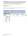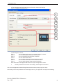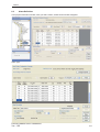
1
FlexiSoft for Tri PLCs
Reference Manual
Ver.: 1.00
Contents
BEFORE YOU BEGIN..................................................................................... 4
1.1
1.2
1.3
1.4
1.5
Connecting the FP4030MR unit to your computer ............................................ 5
Installing FlexiSoft configuration software: ........................................................ 5
Steps for starting FlexiSoft® Software ............................................................. 8
Uninstalling FlexiSoft Software ......................................................................... 8
Setting network configuration ........................................................................... 8
WORKSPACE TOUR .................................................................................... 14
2.1
2.1.1
2.1.2
2.1.3
2.1.4
2.1.5
2.1.6
2.2
2.2.1
2.2.2
2.2.3
2.2.4
2.2.5
2.3
2.4
2.6
FlexiSoft Configuration software application window ...................................... 15
Menu Bar ....................................................................................................... 16
Project Menu ................................................................................................. 17
View Menu .................................................................................................... 18
Define Menu .................................................................................................. 19
Tools Menu .................................................................................................... 20
Help Menu ..................................................................................................... 20
Exploring toolbars .......................................................................................... 21
Project Toolbar .............................................................................................. 21
Layout Toolbar ............................................................................................... 22
Draw Toolbar ................................................................................................. 24
Font Toolbar .................................................................................................. 28
Global Toolbar ............................................................................................... 28
Creating New Project ..................................................................................... 29
Creating a sample project .............................................................................. 31
Tag Database ................................................................................................ 33
REPRESENTING DATA BY OBJECTS AND WIZARDS ............................. 38
3.1
3.1.1
3.1.2
3.1.3
3.1.4
3.1.5
3.2
3.2.1
3.2.2
3.2.3
3.2.4
3.2.5
3.3
3.3.1
3.3.2
3.3.3
3.3.4
3.3.5
3.4
Alphanumeric Objects .................................................................................... 39
Text Object :- .................................................................................................. 42
Data Entry Object :- ....................................................................................... 43
Display Data Object :- .................................................................................... 47
Date Object:- ................................................................................................. 51
Time Object:- ................................................................................................. 52
Graphical Objects .......................................................................................... 53
Line ............................................................................................................... 53
Rectangle ...................................................................................................... 54
Ellipse ........................................................................................................... 55
Rounded Rectangle ....................................................................................... 56
Pictures ......................................................................................................... 57
Wizards ......................................................................................................... 58
Bit lamp ......................................................................................................... 59
Word Lamp:- ................................................................................................. 62
Bargraph ....................................................................................................... 65
Multiple Bargraph .......................................................................................... 67
Analog Meter ................................................................................................. 70
Import & Export Multilingual Text Objects ........................................................ 73
3.4.1
3.4.2
3.5
3.5.1
3.5.2
3.5.3
Export Text object .......................................................................................... 73
Import Text object ........................................................................................... 76
Multi-language text wizard .............................................................................. 77
Configure Language ...................................................................................... 77
Displaying Multiple Languages in Unit ............................................................ 80
List of text objects which used multiple languages .......................................... 80
TASK MANAGEMENT ................................................................................. 81
4.1
4.2
4.3
Background Task ........................................................................................... 82
Various Tasks:- .............................................................................................. 86
Description of Tasks:- .................................................................................... 93
DOWNLOADING AND UPLOADING FROM UNIT ....................................... 98
5.1
5.2
5.3
Upload........................................................................................................... 99
Download .................................................................................................... 101
Device Information ....................................................................................... 103
ALARMS ......................................................................................................104
6.1
6.2
6.3
6.4
6.4.1
6.5
Define Alarms .............................................................................................. 105
Alarm at Project Configuration ..................................................................... 105
Alarm Definition ........................................................................................... 107
Steps to be followed to create an alarm ....................................................... 110
If Discrete / Conditional alarm is selected .................................................... 110
Alarm Window ............................................................................................. 110
TRENDING .................................................................................................. 112
7.1
Data Logger Printing ................................................................................... 113
PRINTING .................................................................................................... 119
8.1
8.2
8.3
Printing from the unit .................................................................................... 120
Printer Port Setup ........................................................................................ 121
Printing from FlexiSoft configuration software............................................... 122
MISCELLANEOUS .....................................................................................123
9.1
9.2
9.3
9.4
9.6
9.7
Application Memory Status .......................................................................... 124
Real Time Clock (RTC) ................................................................................ 126
Templates .................................................................................................... 128
USB Driver Installation Guide ....................................................................... 130
Visibility Animation ...................................................................................... 136
Color combination of tricolor backlite ........................................................... 138
REVISION HISTORY ...................................................................................139
Before you begin
BEFORE YOU BEGIN
In this chapter. . . .
♦
Connecting FP unit to a computer
♦
Starting FlexiSoft Configuration Software
♦
Setting Network Configuration
Doc No: UMAN/TriPLC-Reference
Ver.: 1.00
4
Before you begin
1.1
Connecting the FP4030MR unit to your computer
Before you start your first project, the unit should be connected to the computer so that the project can be
downloaded after creating it.
To connect your unit to the computer
1) Connect a +24VDC power supply to the unit.
2) Connect the programming cable to the computer and FP4030MR.
Connect programming cable to the communication port of the unit.
Download Firmware i.e. driver for the PLC. The unit cannot communicate with PLC till the
required driver is downloaded.
3) Apply power to the unit.
To connect your PLC to unit
A unit can communicate with any PLC without any change in the FP4030MR unit hardware. To communicate
with a PLC, the unit needs:
1) Proper Communication Driver for the PLC
Each PLC has a defined protocol for communicating with any device. The communication driver is
down loaded into the unit along with the firmware. The communications driver varies from PLC
to PLC. This driver enables the unit to talk to a specific PLC.
2) FP4030MR unit - PLC communication cable
A proper FP4030MR unit - PLC cable is required for error free communication with any PLC.
1.2
Installing FlexiSoft configuration software:
To install FlexoSoft configuration Software:
1. Open Microsoft® Windows.
2. Select Run and Pop up window appears. Type the path for installing the Setup.
This will install FlexiSoft Configuration Setup Software.
3. When you click on OK, Welcome window appears on the screen. Click on Next.
Doc No: UMAN/TriPLC-Reference
Ver.: 1.00
5
Before you begin
4. Select the destination folder where setup will install the files.
5. Click on “NEXT”, installation starts. A dialog box indicating the status of progress of installation will
display.
Doc No: UMAN/TriPLC-Reference
Ver.: 1.00
6
Before you begin
6. A screen is displayed to inform you when installation is completed.
This procedure installs FlexiSoft® Software in start menu (in selected folder).
Doc No: UMAN/TriPLC-Reference
Ver.: 1.00
7
Before you begin
1.3
Steps for starting FlexiSoft® Software
1.
2.
3.
4.
5.
6.
In Windows click the Start button.
Select Programs.
Select “FlexiSoft for TriPLCs”.
Select FlexiSoft for TriPLCs
Select New Application either from Tool station or from File Menu.
Select the model and product type that you would like to set by clicking on picture of the product in the
list.
7. Define the Unit Settings.
8. Next step is to define Tag Database and then define the screens according to your application.
1.4
Uninstalling FlexiSoft Software
1. In Windows click the Start button.
2. Select Programs.
3. Select FlexiSoft.
4. Select UnInstall.
Following screen will display. The screen will ask you for the confirmation for uninstalling FlexiSoft® configuration software.
1.5
Setting network configuration
You can communicate between unit with any PLC without any changes in the hardware. To communicate with
PLC you needs proper communication driver to be available with unit. Each PLC has a defined protocol for
communicating with any device. PLC driver is downloaded into unit along with the firmware. This driver enables
the unit to talk to a specific PLC.
Using this configuration screen you can set the node address (0 to 255), node name for each port. You can
change default values generated by editing these two fields.
When you are working on “Nodes” section from project information area; right click on the application window.
You will find “Add” option there; which shows a Protocol selection box as shown below:
Doc No: UMAN/TriPLC-Reference
Ver.: 1.00
8
Before you begin
Step -1
Step -2
Go to “Network configuration”
Right click on the working application window
Step -3
Select protocol from protocol list
Doc No: UMAN/TriPLC-Reference
Ver.: 1.00
9
Before you begin
By clicking this selection box you can see list of Model Numbers in PLC Model selection Box. Select PLC
Name from Protocol drop down list and PLC Model name from Model drop down list.
PLC specific data button is activated only if selected PLC has Special PLC specific data to be set.
Unit can be configured in following ways:
1. For Serial Printing
2. For PLC Communication
**
Either of the ports can be configured for the ways mentioned above. Depending on the type of communication,
the user may be required to define certain parameters.
Doc No: UMAN/TriPLC-Reference
Ver.: 1.00
10
Before you begin
1. For Serial Printing:
Doc No: UMAN/TriPLC-Reference
Ver.: 1.00
11
Before you begin
The user can use either of the ports for serial printing. This is done by selecting Protocol as “Serial Printer”. In
the above example, the user has configured COM1 for serial printing. However, when this port is not being used
for printing, it can be used for IBM communication.
The user can change the serial printing parameters by selecting the “Port Settings” option. Before that you
must select port option from “Select” window as shown below:
The following parameters can be modified for serial printing:
Baud Rate:
Supported baud rates are 1200, 2400, 4800, 9600, 19.2K, 38.4K, 57.6K, 115.2K,
and 187.5
Parity:
Parity can be None, Even or Odd.
Number of bits:
Number of bits can be 7 or 8.
Number of Columns:
Number of columns can be minimum 1 to maximum 256.
Terminating Character:
Can be None, CR (Carriage Return), LF (Line Feed) or CR+LF.
Number of characters
to print:
Can be from minimum 1 to maximum 256.
Click “Ok” to set printer setting.
Doc No: UMAN/TriPLC-Reference
Ver.: 1.00
12
Before you begin
2. For PLC Communication:
1. Protocol -
You can select desired PLC from the list of available drivers. In the example shown above, user
has selected Tri PLCs at COM1.
2. Port Settings You can set PLC communication parameters like Baud Rate, Parity, Data Bits and Stop Bits.
The PLC Communication parameters are:
i. Baud Rate: Baud Rate is the measure of number of times per second a signal in a communication channel changes state.
ii. Parity: Parity bit is included to check that data has been transmitted accurately.
Parity bits are None, Odd and Even.
iii. Data Bits: Data bits are number of bits used to represent one character of data. For
FP4030MR units, Data bits are either 7 or 8.
iv. Stop Bits: Stop bits are inserted into the data frame to inform the receiving end that the
transmission of byte of data is complete. For FP unit, Stop bits are either 1 or 2.
3. Address:
Enter a unique PLC node address ( 0 to 255)
4. Name:
Specify a name for the node name up to 15 characters in length.
5. Inter Frame Delay:
Inter Frame Delay is the delay between the response received of last query and the next query
that is to be transmitted.
6. Response timeout:
Response time out is the maximum time in which slave should respond to a master query. If
slave does not respond to a master query within this time, the master will declare that the
slave has been timed out.
7. Retry Count: Retrycount is the number of retry queries master will send to slave, if slave is timed out. When
all retries are finished, the master will declare a communication break and will show “!!!!”.
8. Add Node: This will add the node to the network.
9. Change Node: The user can change PLC or PLC related information. This is done by highlighting the node,
changing the information and finally clicking the button ‘Change a Node’.
Doc No: UMAN/TriPLC-Reference
Ver.: 1.00
13
Workspace Tour
WORKSPACE TOUR
In this chapter. . . .
♦
FlexiSoft configuration software application window
♦
Standard toolbar
♦
Creating New Project
♦
Tag Database
Doc No: UMAN/TriPLC-Reference
Ver.: 1.00
14
Workspace Tour
2.1
FlexiSoft Configuration software application window
When you launch FlexiSoft Configuration software, the application window opens with standard toolbars and
working platform. The rectangle in the center of the window is the working space where you create your
application. Although more than one drawing window can be opened, you can apply commands to the active
drawing window only.
The FlexiSoft configuration software application window appears below. A description of its parts follows:
Title Bar
Menu Bar
Tool Bars
Project
Information
Property Grid
Status Bar
Font Toolbar Global Toolbar
Part
Description
Menu bar
The area containing pull-down menu options
Toolbar
A detachable bar that contains shortcuts to menu and other commands
Title bar
The area displaying the title of the currently open drawing
Status bar
An area at the bottom of the application window that contains information
about current running application e.g. current menu string OR if mouse is on
application screen; this will show current operation property
Project Information
An area at the left of the application window that contains information of the
application going on.
Property Grid
An are at the right side of the application window which appears after clicking
on screen or working with object. This is a navigator for creating screen
application.
Doc No: UMAN/TriPLC-Reference
Ver.: 1.00
15
Workspace Tour
2.1.1
Menu Bar
The menu bar operates like any standard Windows Menu bar. To open a particular Menu, click it with the
mouse or use key along with the ALT key. When no application is opened, the menu bar shown above will be
displayed.
Here we can select either create new project or Open project.
To drop down:
Use mouse OR
Alt+P, Alt+V, Alt+T, Alt+H
accordingly
These can be achieve by right clicking on “toolbar”.
Doc No: UMAN/TriPLC-Reference
Ver.: 1.00
16
Workspace Tour
2.1.2
Project Menu
Click this button
To
Start a new application
Open a application
Close a application
Save a application
Save a application with different name.
Open a project configuration window , where user can report details about the project
Import a text data associated with the wizards (on/off text,labels etc.)
Export a data from projects and put it into a user specified file.
Download a application project from FlexiSoft Software to the unit.
Upload a application project from unit to PC FlexiSoft Software.
Print a current application information such as Project information, Unit settings, FP
nodes, tags, screens, application tasklist, screen tasklist, alarms either by
selecting ‘All’ or selecting specific attributes.
Compile a application project with Warning or Error message
Simulate a application project.
Exit from FlexiSoft Software.
Doc No: UMAN/TriPLC-Reference
Ver.: 1.00
17
Workspace Tour
2.1.3
View Menu
Click this button
To
To view device data or to initialize unit memory data
To detect the information such as model name, bootblock, H/W, F/W versions
of the base and expansion models as well as can upgrade firmware of
expansion models.
Shows screen previews.
Shows all available screen list.
Shows screen details
Arranged screen list by numbers or name or destination or type or task & or
by description
Gives screen information in terms of name, type, no of objects present,
task etc.
After compilation, if error occure, gives details of the error.
Refresh the containts of the screen.
Shows “Project Information” explorer to the left side of the application window.
Doc No: UMAN/TriPLC-Reference
Ver.: 1.00
18
Workspace Tour
2.1.4
Define Menu
Click this button
To
To switch to data logger setting parameter window
To switch to Global Key’s Tasks.
To switch to “Node” section
To switch to list of all Tags present in the project
To switch to “Alalrm Project Configuration Properties” window
To switch to “Languages” section from “Project Information” explorer.
To launch “Define System Parameters” window. Here “Keep Memory Area” is
seen. This is user defined Memory Area which is retained even after Power
Cycle. User can declare specific registers from List of Device registers
provided under system parameter List as keep Memory.
Addition of BW, T, C and D should not exceed 100.
Doc No: UMAN/TriPLC-Reference
Ver.: 1.00
19
Workspace Tour
2.1.5
Tools Menu
Click this button
To
Displays memory status (memory distribution)
Displays total logger memory allotted by user for data logging
Displays number of alarms stored in history
Convert application of lower version product to the higher version product or
similar
2.1.6
Help Menu
Click this button
To
Display a table of content of help file
Display a index of help file
Display a search of content of help file
Display copyrite message with version and version date of the configuration
software
Doc No: UMAN/TriPLC-Reference
Ver.: 1.00
20
Workspace Tour
2.2
Exploring toolbars
2.2.1
Project Toolbar
Tools
Tool
Description
The NewProject tool lets you start with new application
The Open tool lets you open a saved / already created application
The Save tool lets you save a running application
The Upload tool lets you upload a application project from unit to PC FlexiSoft Software
The Download tool lets you upload a application project from unit to PC FlexiSoft Software
The Toggle Properties tool lets you hide or un-hide the Screen Properties that appears on the right
side of the configuration software window
The Zoom In Screen tools lets you increase the magnification level in the running window
The Zoom Out Screen tools lets you decrease the magnification level in the running window
The Zoom Factor (%) tools lets you set a zoom level
The Run tool lets you simulate a application project
The Compile tool lets you compile a application project with Warning or Error message
The Help tool lets you run a help file induced in setup software
The Refresh tool lets you refresh the objects from running window
The Cut tool lets you cut selected object/s to the clipboard
The Copy tool lets you copy selected object/s to the clipboard
The Paste tool lets you paste the Clipboard contents on a screen
The Previous Object tool lets you select the last selcted/modified/created object on screen
The Next Object tool lets you select the next modified/created object on screen
The Undo tool lets you undo an action
The Redo tool lets you restore an action that was undone
The Large Icons tool lets you showed the screen in large thumbnail format
The Small Icons tool lets you showed the screen in small thumbnail format
The List tool lets you display a list of screens available in running application
The Details tool lets you display a list of screens with preview available in running application
Doc No: UMAN/TriPLC-Reference
Ver.: 1.00
21
Workspace Tour
2.2.2
Layout Toolbar
Tools
Tool
Description
The Selector tool lets you select and size objects
The New Base Screen tool lets you open a blank new screen for creating application
The New Popup Screen tool lets you open a new popup (particularly sized window) screen
The Delete Screen tool lets you delete the selected screen
The Open tool lets you open a desire screen from a docker window which lists the screens along with
screen preview
The Open tool lets you switch to “Nodes” docker of application where you can add / delete / edit the
tags
The Show Screen tool lets you display all the screens on application window
The Tag Database tools lets you open a list of tags used in application
The Alarm Database tools lets you open a list of alarm tags used in application
The Add Bookmark tools lets you define a particular screen/s as a bookmark
The Clear Bookmark tools lets you clear the bookmark defined to screen
The Clear All Book Marks tools lets you clear all the defined bookmarks in the application
The Next Bookmark tools lets you switch to next bookmarked screen directly
The Previous Bookmark tools lets you switch to previous bookmarked screen directly
The Next Screen tools lets you switch to next screen from working screen
The Previous Screen tools lets you switch to previous screen from working screen
The First Screen tools lets you switch to first screen
The Last Screen tools lets you switch to last screen
The Bring To Front tools lets you move the selected object to the front of all other objects
The Bring To Back tools lets you move the selected object to the behind of all other objects
The Align Left tools lets you align the active objects left with respect to left most point of object
The Align Right tools lets you align the active objects right with respect to right most point of object
The Align Top tools lets you align the active objects top with respect to top most point of object
The Align Bottom tools lets you align the active objects bottom with respect to bottom most point
of object
Doc No: UMAN/TriPLC-Reference
Ver.: 1.00
22
Workspace Tour
The Align Middle Horizontal tools lets you align the centers of active objects to screen horizontally
The Align Middle Vertical tools lets you align the centers of active objects to screen vertically
The Align middle horizontal wrt shape tool lets you align the centers of active objects horizontally
The Align middle vertical wrt shape tool lets you align the centers of active objects vertically
The Place Eqaul Horizontal tool lets you equal the width between all active objects
The Place Eqaul Vertical tool lets you equal the vertical distance between all active objects
The Make Equal Width tool lets you change a width of oject equal to a first drawn object.
The Make Equal Height tool lets you change a height of oject equal to a first drawn object.
The Make Equal size tool lets you change dimension (length x width) of object equal to a first
drawn object
The Make Group tool lets you group the active objects and act as a single object
The Break Group tool lets you un-group the grouped objects and act as a separate object on screen
Doc No: UMAN/TriPLC-Reference
Ver.: 1.00
23
Workspace Tour
2.2.3
Draw Toolbar
Tools
Flyouts open to display a set of related DRAW tools. A small arrow in the middle, right corner of a toolbox
button indicates a flyout
. Clicking and dragging the grab handles at the end of the flyout sets the
flyout in its expanded form.
This toolbar is devided into various sub-catagories described as below:
Drawing Tools:
Tool
Description
The Selector tool lets you select an object
The Line tool lets you draw a line
The Rectangle tool lets you draw a filled rectangle
The Ellipse tool lets you draw a ellipse
The Multilingual Text tool lets you enable text box
The Picture tool lets you insert a picture from the defined destination
The Text tool lets you type a word
Quick Buttons:
Doc No: UMAN/TriPLC-Reference
Ver.: 1.00
24
Workspace Tour
The GoToScreen tool lets you jump to any available screen from list of screens
The Go To Next Screen tool lets you jump to next available screen
The Go To Previous Screen tool lets you jump to previous available screen
The Open popup Screen Button tool lets you open a selected screen from available popup screen
in touch screen products only
The Set Bit Button tool lets you switch the PLC coil or register bit to on state
The Reset Bit Button tool lets you switch the PLC coil or register bit to off state
The Toggle Bit Button tool lets you toggle a state of PLC coil (read/write) or register bit (read/write).
The Write Value To Tag Button tool lets you write a constant value to a tag
The Add Value To Tag Button tool lets you add a constant value to the current value of the tag
The Subtract Value From Tag Button tool lets you subtract a constant value from the current
value of a tag
The Add TagB To TagA Button tool lets you add two PLC tags
The Subtract TagB From TagA Button tool lets you subtract two PLC tag
Show Data:
The Numerical Data displays only numeric data register value. (Can’t be editable)
The Message Data displays only text data register value. (Can’t be editable)
The Bit Data displays only bit text data register value. (Can’t be editable)
Edit Data:
The Bit can edit bit data
The Numerical can edit numeric data register value.
Doc No: UMAN/TriPLC-Reference
Ver.: 1.00
25
Workspace Tour
Advanced Objects:
Tools
Description
The Advanced Bit Button displays wizard having list of various pre-defined tasks & can be
performed through it.
The Word Button displays multiple states and perform respective multiple tasks action on
different value ranges os a single numeric tag.
The Bit Lamp displays ON state and OFF state of a coil type tag.
The Word Lamp displays multiple states of different value ranges of a single numerical tag
The Bargraph lets you change bar height and width according to the value in the register
The Multiple Bargraph lets you change bar height and width according to the value in the
register (upto 4) simultaneously
The Analog Meter lets you represent the parameter values viz.: temparature or pressure from
FP unit or PLC tag
The Trend displays a graphical representation of a tag’s value
The Historical Trend displays a graphical representation of a tag’s value
The Alarm lets you define alarms in the application
The Keypad lets you enter the data in a touch screen product
The ASCII Keypad lets you enter the data in ASCII format
The Custom Keypad lets you set
Doc No: UMAN/TriPLC-Reference
Ver.: 1.00
26
Workspace Tour
Clock Objects & Alrms:
Tools
Description
The Time tool lets you display system time
The Date tool lets you display system date
The Alarm acknowledge tool lets you acknowledge the top alarm displayed in Display
Alarm object. Provided any particular / all alarms are not set / defined to be acknowledged by
any specific bit in Alarm Configurator Dialog
The Acknowledge All tool lets you acknowledge all alarms at a time from display Alarm
object. Provided any particular / all alarms are not set / defined to be acknowledged by any
specific bit in Alarm Configurator Dialog
The Next Alarm tool lets you to switch to next alarm from list of the alarms displayed in
Alarm Display Window
The Previous Alarm tool lets you to switch to previous alarm from list of the alarms dis
played in Alarm Display Window
Doc No: UMAN/TriPLC-Reference
Ver.: 1.00
27
Workspace Tour
2.2.4
Font Toolbar
Tool
Description
The Font List tool lets you define a text style (i.e. font type).
For example, you can creat a text style that applies a AvantGrade Bk BT font.
The Font Size List tool lets you define a text style (i.e. font size).
For example, you can creat a text style that applies a 36 point font size.
The Bold tool lets you change an appearance of a font from normal to bold
The Italics tool lets you change an appearance of a font from normal to Italics
The Underline tool lets you underlines a defined font
The Line color tool lets you change a color of a outlineline of a text box
The Fill Color tool lets you change a background color of a textbox
The Font Color tool lets you change a text color
The Pattern tool lets you define a text style (i.e. fill pattern)
For example, you can fill a text style with defined pattern
The Pattern Color tool lets you define a text style (i.e. fill color pattern)
For example, you change color of a text with filled pattern
2.2.5
Tool
Global Toolbar
Description
The On State tool lets you display the parameters of bit button defined in on status
The Off State tool lets you display the parameters of bit button defined in off status
The Previous State tool lets you jump to previous available state applicable for
word button only
The Next State tool lets you jump to next available state applicable for word
button only
The State tool lets you defined the current state of word buttons on the screen
The Language tool lets you display the list of languages added in project
Doc No: UMAN/TriPLC-Reference
Ver.: 1.00
28
Workspace Tour
2.3
Creating New Project
You can creat a new application either from “Project” menu bar or from tool bar.
♦
Creating a new application from menu bar:
To creat a new application either choose Project->New option or click on New Application icon as
shown below:
or
Following screen will appear:
This screen shows a list of FP4030MR models. Select the product FP4030MR by clicking
on the product part in the list. Then then model will appear in the following string.
Doc No: UMAN/TriPLC-Reference
Ver.: 1.00
29
Workspace Tour
On clicking “Ok” button project configuration screen will appear as shown below:
Steps for creating a new application are as follows:
1) Start a new project using either Project Menu or Tool section NewProject command.
2) Define unit’s settings from Project configuration docker window.
3) Define Network Configuration for selected unit and PLCs.
4) Define tags required for the application in the Tag Database.
5) Define screens.
6) Define Power-on, Global and Screen tasks.
7) Save your application.
8) Download firmware to the unit.
9) Download your application into the unit.
Doc No: UMAN/TriPLC-Reference
Ver.: 1.00
30
Workspace Tour
2.4
Creating a sample project
This section explains you a creation of sample project once downloaded to the unit, this basic configuration
allows the unit to connect to the PLC, display a startup screen, and display a screen containing one PLC
register monitor when a switch on the startup screen is pressed.
Although we strongly recommend that you perform the following steps to create this sample project.
Setting the system parameters:
Whenever you begin a new project, you should always set the system parameters before you creat any
windows. System parameters define the basic operating conditions of the FP unit such as what type of PLC it
is connecting to.
To edit system parameters:
1. Click the “NewProject” button. “Click “OK”; the “Project Configuration” dialog box appears.
Doc No: UMAN/TriPLC-Reference
Ver.: 1.00
31
Workspace Tour
2. The dialog box has five (3) tabs: Project Information, Alarm and, Settings.
Select the Project Information tab.
1
2
3
4
5
6
7
In this dialoge box section:
Point 1:
You can define project name or can keep “Untitle” as default.
Point 2:
You can define path for the project to be saved.
Point 3:
You can mention any special note; if required.
Point 4:
You can define author name.
Point 5:
You can define “password” for the project you created.
Point 6:
You can see the information of the model selected.
Point 7:
You can see the image of the model you selected.
Note: Point 6 and 7 will appear with all tabs of “Project Configuration” docker.
3.
Set the parameters from “Alarm” and “Setting” tabs and press “OK” button.
You can see a application window listing information as Screens, nodes, tags and users.
After setting macro level parameters from these project items, your application is ready for downloading.
Doc No: UMAN/TriPLC-Reference
Ver.: 1.00
32
Workspace Tour
2.6
Tag Database
This is the central database for the tags that need to be used in the application. Once the tags are defined (as
register or coils) and their attributes selected, the tags can be used in the application on screens, tasks,
alarms etc. This screen helps you to define Tags associated with defined Nodes. A tag is a register, coil or an
individual bit of a register. Select the type of tag from the Tag Type field.
If the type of tag selected is a register then the number of bytes required can also be selected. For displaying
or editing a floating point data number, the number of bytes must be 4. The Tag Name field is user definable. A
tag is not added to the tag list unless a tag name is defined. Once these fields are defined, click on the Add
button. The Block field in the tag database defines the starting address of the tag block followed by the block
size.
For example : Tag M0214 is within a block ( M0214 : 1 ) whose starting address is M0214 and block size is 1.
This block size is optimized automatically depending on the address of PLC Tag.
Default block size is either 1 or 16. This setting varies from PLC to PLC.
The attributes of existing tag can be changed by highlighting the tag, making the changes, and clicking the
Change Tag button. An existing tag can be removed from tag list by clicking on Delete Tag button. Note that
removal of tags is possible only if they are not used in any screen.
Add - Use this button to add a tag. After clicking this button, the user has to define the following:
1. Node : Where the tag is located.
2. Register, coil or a bit within a register. Registers can be read only or read/write.
3. The address limits are shown and vary from PLC model to model.
4. Tag name : Each tag needs to have a unique name. The name can be up to 40 characters in length.
5. Byte(s) : If the selected tag is a register, the tag can be defined as a 1 byte ( either high or low byte), a 2
byte, or a 4 byte tag.
Edit – Select the tag. Edit the information and then click on the Update button.
Delete - Select the tag and click on Delete button to delete the tag. Before deleting any tag, the user must
delete any references to the tag in screens and tasks. Otherwise it can not be deleted.
Doc No: UMAN/TriPLC-Reference
Ver.: 1.00
33
Workspace Tour
Default System Tags
System Registers:
Register / Coil
Tag Name
SW0001
Language
SW0002
SW0003_00
SW0003_01
SW0003_02
SW0003_14
SW0004
SW0005
SW0007_00
SW0010
SW0011
SW0012
SW0013
SW0014
SW0015
SW0016
SW0017
SW0018
SW0024
SW0025
SW0026
SW0027
SW0034
SW0048
SW0060
SW0062
Read / Write Description
Read / Write Writing a value will changes languages used in
wizards
Logger Memory % Usage
Read only
Shows percentage use of logger memory.
(0 to 100)
Logger Memory full Status
Read only
1 = Memory full
Logger Memory clear Status Read only
1 = Memory clear routing being executed
RTC Status
Read only
RTC fail
COM1 Status
Read only
0 = Communication Error; 1= Communicating
with PLC
Historical Alarm count
Read only
Shows no of alarm stored in history
Screen Trigger Register
Read / Write Shows active screen no. You can change
screen by writing any valid screen no in this
register
RTC Battery Status
Read only
Indicates battery voltage in #.# format
RTC Day of Month
Read only
RTC day in integer format
RTC Month
Read only
RTC month in integer format
RTC Year
Read only
RTC year in integer format
RTC Hour
Read only
RTC hour in integer format
RTC Min
Read only
RTC minute in integer format
RTC Sec
Read only
RTC sec in integer format
RTC Day of week
Read only
RTC Day of week in integer format
Scan time register
Read only
Shows time required to execute Screen, Screen
task and global task in millisecond
Use ####.# format for display
COM1 failed node reconnect Read / write Shows time in sec recover the communication
time (Sec)
with failed nodes for port1.the default value is
60Sec
Status Word1 for Siemens
Read
Displays the status word1 of the drive
micromaster
Status Word2 for Siemens
Read
Displays the status word1 of the drive
micromaster
Control Word1 for Siemens Read / Write Displays the Control word1 of the drive
micromaster
Control Word2 for Siemens Read / Write Displays the control word1 of the drive
micromaster
HMI download Port
Read Only
HMI download Port
S48 (Ana Type selection)
Read / Write Used for Calibration Application So hardcoded in
Runtime code & Firmware
S60( room Temp)
Read / Write Used for Calibration Application So hardcoded in
Runtime code & Firmware
S62 (Out Ch Select)
Read / Write Used for Calibration Application So hardcoded in
Runtime code & Firmware
SW0063
S63 (In)ChSelect)
SW64-S65
Node Status Registers
for COM1
SW66-S79
Node Status Registers for
COM1
SW116
Factory Application 1
Doc No: UMAN/TriPLC-Reference
Ver.: 1.00
Read / Write Used for Calibration Application So hardcoded in
Runtime code & Firmware
Read only
Shows the status of the node, whether node is
present or not. Total 2 word Register are mapped
for 32 nodes.
Read only
Shows the status of the node, whether node is
present or not. Total 14 word Register are
mapped for 224 nodes.
Read / Write Reserved for factory application
34
Workspace Tour
SW117
SW118
SW119
SW120
SW121
Factory Application 2
Factory Application 3
Factory Application 4
Factory Application 5
Contrast Set Register
(Retentive)
Read / Write
Read / Write
Read / Write
Read / Write
Read / Write
SW122
Brightness Set Register
(Retentive)
Read / Write
SW123
SW124
SW125
SW126
Factory Application 6
Factory Application 7
Factory Application 8
Factory Application 9
Read / Write
Read / Write
Read / Write
Read / Write
Doc No: UMAN/TriPLC-Reference
Ver.: 1.00
Reserved for factory application
Reserved for factory application
Reserved for factory application
Reserved for factory application
To adjust the contrast of LCD. It is retentive
system register. Value can be between 0 to 100
only.
This register is implemented as retentive register
in firmware and used for controlling the bright
ness of unit.
Reserved for factory application
Reserved for factory application
Reserved for factory application
Reserved for factory application
35
Workspace Tour
System Bit / Coil
Register / Coil
Tag Name
Read / Write Description
S0001
S0003
S0004
S0005
S0006
S0007
S0009
High speed timer control bit
Minute Change status
Hour Change status
Date Change status
Month Change status
Year Change status
Beeper Control
Read/write
Read only
Read only
Read only
Read only
Read only
Read/Write
S0010*
RTC Battery status
Read only
S0014
Acknowledge all alarms
Read only
S0019
S0021
Invalid RTC date entry
Read only
COM1 failed node reconnect Read/write
control
S0023
COM3 failed node reconnect Read/write
control
S0024
Start/Stop Calibration
Read/Write
S0025
Min/Max Clibration Value
Read/Write
S0026
Save Calibration Data
Read/Write
S0027
Read/Write
S0032
Static Data Entry Focus
Control
Data Entry Lock Control
S0033
Data Entry Key Selection
Read/Write
S0035
Real and Historical Alarm
Control
Rea/Write
S0036
RUN LED Control
Rea/Write
S0039
Backlite Colour Control-Red Read/Write
(Retentive)
Backlite Color Control-Green Read/Write
(Retentive)
Backlite Colour Control-Blue Read/Write
(Retentive)
S0040
S0041
Read/Write
Enable bit to start high speed timer
1 for every change in minute for one scan cycle
1 for every change in hour for one scan cycle
1 for every change in date for one scan cycle
1 for every change in month for one scan cycle
1 for every change in year for one scan cycle
1: Enable Beeper; 0: Disable Beeper
Runtime you can change this bit
0: Battery voltage is OK (i.e. above 2.2 V)
1: Low battery (I.e. below 2.2 V)
0: All alarms are acknowledged; 1: All alarms are
not acknowledged in the Real and Historical
alarms
0=valid date
1= Invalid date
If this bit is set communication with the failed
nodes is detected after scan time S0018 for
port1. By default : ON
If this bit is set communication with the failed
nodes is detected after scan time S0022 for
port3. By default : ON
Used for Calibration Application So hardcoded in
Runtime code & Firmware
Used for Calibration Application So hardcoded in
Runtime code & Firmware
Used for Calibration Application So hardcoded in
Runtime code & Firmware
User can enable focus for static data entry
using this bit.
User can Lock / Unlock the data entry.
1 = Data_Entry Lock, 0 = Data_Entry unlock.
User can chose the mode of data entry using
this bit.
1= Start data entry only through 'Enter' key.
0= Start data entry through 'Enter' key or
Numeric key.
If the selected coil is one the unit will not
monitoring(Ignoring) any alarm. After reseting the
coil unit will again start to monitor the alarm.
0: LED functionality works for upload/RUN/
Communication status 1: LED OFF
To control the RED Color backlite operation
To control the GREEN Color backlite operation
To control the BLUE Color backlite operation
Note: S0010*: If battery fails, in models FP4035, FP4057 series and FP5 series models, only RTC will fail. But
in case of FP4020 series, FP4030 series and in FP4030MT, all data will erase.
Doc No: UMAN/TriPLC-Reference
Ver.: 1.00
36
Workspace Tour
Config Registers:
Register / Coil
Tag Name
Read / Write Description
MW0000
PLC Operation Mode
Read/Write
MW0003
RUN/STOP Switch Control
(Retentive)
Digital Filter constant
(0 to 15 mS)
Read/Write
MW0005
Doc No: UMAN/TriPLC-Reference
Ver.: 1.00
Read/Write
Bit0-3: 0: Initialization; 1: HALT Mode; 2: RUN
Mode; 3: RUN-F Mode; 4: HOLD Mode;
6: ERROR Mode. Invaild value: Previous value
will be retained.
1: HALT, 0: RUN. Only LSB is used. MSB bits (1
to 15) will be ignored.
Entered Value is multiple of 10 ms. Enabled
when MW10 bit 16 is ON.
37
Representing Data
REPRESENTING DATA BY OBJECTS AND WIZARDS
In this chapter. . . .
♦
Alphanumeric Objects
♦
Graphic Objects
♦
Wizards
♦
Import & Export Multilungual text objects
Doc No: UMAN/TriPLC-Reference
Ver.: 1.00
38
Representing Data
3.1
Alphanumeric Objects
Alphanumeric objects are objects with certain properties or attributes. By using various attributes, the designer
can emphasize the importance of a particular object. The alphanumeric objects in models with a graphics
display have some additional attributes.
Or
The Alphanumeric object types are
1. Text Object
2. Data Entry
3. Display Data
4. Time
5. Date
Select the object and the corresponding properties which can be assigned to object are shown in property
window. Some of the common properties from proeprty grid window , which can be set to these alphanumeric
objects are Animation and Layout.
Animation :- Select the object and observe the property grid window. The object can be animated in various
individual or in combination forms. Types through which an object can be animated are
a) Flash Aniamation
:- Object is Flashed at various speed (Slow, Med, High)
b) Visibility Animation
:- Object is shown / hidden as per the Tag value.
To select any type user needs to change the status in corresponding cell as ‘Yes’. By default the text in this
cell is ‘No’ representing the animation is disabled. Following window shows the parameters to be defined for
animation
Doc No: UMAN/TriPLC-Reference
Ver.: 1.00
39
Representing Data
Flash Animation :To perform Flash Animation , this cell has to be defined as ‘Yes’. Defining Yes , few more cells
with Flash Animation Properties are enabled. Flash animation is dependent on the internal or PLC tag. This tag
can be either coil type or Numeric Type. As per the selection of tag type used for animation , other cell property
ranges of Flash animation are defined.
Flash When:-
Designer can see following text in this cell
-Within Range/Out of range (If tag Selected is of Numeric type)
-On/Off (If tag selected is of Bit/Coil type)
If the tag is numeric type then designer can define to flash the object within some
range of values of the tag or to flash the object out of range of the values of the tag.
If the Tag is Coil/Bit type then designer can define to flash the object at the On state
of the tag or to flash the object at Off state of the tag.
Speed:-
Three various speeds at which the object can be flashed are Slow, Medium and Fast.
Tag List:-
To define the tag either Numeric type or Coil type,on whose condition object embedded on screen will be defined for Flash Animation.If the tag is numeric type then ‘Flash
when’ cell will be with within range option or Out of range option.Even two more cells
with High range and Low range is enabled, in which the low limit and high limit value
has to be defined by the designer. According to the value in the tag and flash when
option selected by designer, object will flash. If the tag is Coil type then object can be
flashed on the On state of the tag or on the Off state of the tag. Flyout to this cell will
show the list of already defined tags from tag database.
Note:i) Value that can be defined in Low range and high range cell is from 0-65535 only.
ii) This feature can be tested and confirmed through Offline simulation / Run mode also
iii) If Flash animation is selected in Animation section, then Flash Cell from Appearance section is
disabled.
Visibility Animation :To show or hide the object embedded on unit screen can be
performed with defining this cell as ‘Yes’. The important parameters to be set to enable Show/ Hide Animation
are ‘Show When’ (with Low Range value, high range value or On State , Off State) and tag list(with register type
tag or Bit type tag).
Doc No: UMAN/TriPLC-Reference
Ver.: 1.00
40
Representing Data
If the tag defined in tag list is numeric type then two more cells will be displayed with high range and low range.
The value in this low range or high range cell can be set from 0-65535.
If designer defines ‘Within range’ option in ‘show When’ cell then Object embedded on screen will be Shown/
Displayed on screen only when value of the numeric tag selected in tag list is Within low limit and high limit
range. If the designer defines ‘out of range’ option then object embedded on screen will be shown/Displayed on
screen only when value of tag is Out of range of the low limit and high limit range.
If designer defines the coil type tag in taglist then, the object will be shown/displayed on screen only when the
coil type tag is On or Off state.
Note:i) This feature can be tested and confirmed through Offline simulation / Run mode also
Layout:To embed the Object on screen at desired location with its coordinates position from
Top left corner of the screen. Moving the object on screen with mouse cursor will show the corrsponding pixel
position of the placed object.
Bottom Right:Display the End point pixel position of the object from Top left corner of the screen.
X-> Display the X Coordinate position of End point of object from Top left corner of the sceen.
Y-> Display the Y Coordinate position of End point of object from Top left corner of the sceen.
Top Left:Display the Start point pixel position of the Text object from Top left corner of the screen.
X-> Display the X Coordinate position of Start point of object from Top left corner of the screen.
Y-> Display the Y Coordinate position of start point of object from Top left corner of the sceen.
Doc No: UMAN/TriPLC-Reference
Ver.: 1.00
41
Representing Data
3.1.1
Text Object :-
To display the message for the operator on unit screen. Designer can define the size, flashing properties to
this Text object. All such display properties for the text object can be set through the Property grid Window
from right side of the software screen. Plain text objects do not depend on the PLC, but can be made dependent on PLC tag by defining animation cells from property grid window.
Animation:Text object can be animated in various forms such as Changing the Text Color or background
color , Flashing the Text object at various speed depending on the tag value either internal tag or PLC tag,
Visibility (Show / hide) the Text object depending on the value of internal or PLC tag.
For more details please refer to the Animation section.
Appearance :Background color :- Background color of the text object can be changed through this cell. The flyout will
display color dialog box, with supported colors for the product. By default the background color for the product
is white.
Border:- Border for Text object can be set through this cell. By default the object has No Border. To set border
select the desired border from Flyout.The border can be Single line border or double line border.
Flash:- To flash the Text object on unit screen can also be set through this cell. This cell is enabled only if
Flash Animation cell from Animation Section is Disabled or selected as ‘NO’. In this cell Designer needs to
define the Flash Speed to be assigned to the Text object embedded on Screen.
Flash speed are defined as Flash-Slow, Flash-Medium or Flash-Fast. Object with all properties defined (Border,
backgroundetc) gets flashed.
Font:- To display the Text Object on unit screen in various sizes. The text object supports only the software
defined sizes.The available sizes in which this Text object can be set are 5x7,10x14,20x28,7x14.
Text:- To write the message which designer needs to display it on unit screen. Designer can write any alphanumeric characters in this cell.
Text Color:- To set the color to the Text object in order to display the Text message on screen in desired color
by designer. Default text color for any product is selected as Black.
Layout:- To embed the time object on screen at desired location with its coordinates
position from Top left corner of the screen. Moving the object on screen with mouse cursor will show the
corrsponding pixel position of the placed object. For more details please refer Layout section in start of this
document.
Doc No: UMAN/TriPLC-Reference
Ver.: 1.00
42
Representing Data
3.1.2
Data Entry Object :-
This object is useful to display and edit the value of internal or PLC tag. The tag data type can be either Bit
type or Numeric type. The tag type should be Read/Write. The edit the object on unit screen , designer can
define either the use of Popupkeypad or Numeric Keypad.
Select the Bit type or Numeric type data object from Flyout.
3.1.2.1 Bit Type Data Entry Object:Select Bit/Coil type object from Data Entry object flyout, embed it on screen and edit the desired properties of
it from Property grid window.
Appearance:Background Color :Background color of the data entry object can be changed through this cell.The flyout will display color dialog
box, with supported colors for the product. By default the background color for any product is White.
Border:- Border for data entry object can be set through this cell. By default the object has No Border. To set
border select the desired border from Flyout.The border can be Single line border or double line border.
Font:- To display the data entry object on unit screen in various sizes. The data entry object supports only the
software defined sizes.The available sizes in which this object can be set are 5x7,10x14,20x28,7x14.
Off text :- To display the Off state condition through Text message for the coil tag defined for Coil type data
entry object is to be defined in this cell. Designer can use any alphanumeric characters or special characters
to display the off text in unit.
On text :- To display the ON state condition through Text message for the coil tag defined for Coil type data
entry object is to be defined in this cell. Designer can use any alphanumeric characters or special characters
to display the off text in unit.
Text Color:- To set the color to the data entry object in order to display the value of coil type tag on screen in
desired color by designer. Default data entry object color for any product is selected as Black.
Data Entry Properties:Keypad:- To edit the Coil type tag’s status on unit screen , user needs to have the keypad on screen. This
keypad can be made available in two ways, either with Popup screen with numeric keypad embedded in it or
with Numeric keypad embedded on the Screen near the data entry object.This keypad function is optional with
‘Yes’ or ‘No’. If ‘Yes’ is defined then popup screen with numeric keypad embedded on it will be displayed on
screen to enter the data. And if ‘No’ is defined then user will have to enter data through a static numeric keypad
embedded on screen near the data entry object.
Doc No: UMAN/TriPLC-Reference
Ver.: 1.00
43
Representing Data
Data Entry Properties continue.....
Screen Name:- If the popup keypad option is defined in above cell , then only this Screen name cell is
displayed.This cell shows the name of the popup screen defined for editing Data entry object. List of popup
keypad with name available in the application project can be selected from flyout of this cell. Editing this cell
will show the corrsponding screen number in following screen number cell.
Screen Number:- If the popup keypad option is defined in above cell , then only this Screen number cell is
displayed.This cell shows the number of the popup screen defined for editing Data entry object. List of popup
keypad numbers available in the application project can be selected from flyout of this cell. Editing this cell will
show the corrsponding screen name in above screen name cell cell.
Tag address:- Type tag on which data entry operation is to be performed is to be defined in this cell. Flyout
from this cell will display the list of defined internal and PLC bit type tags from tag data base. Selecting particular tag will display the respective tag in following Tag name cell.
Tag Name:- Name of the bit type tag on which data entry operation is to be performed is to be defined in this
cell. Flyout from this cell will display the list of Tag names already defined in Tag Data base for Internal or PLC
Tags. Selecting particular tag name will display the respective Tag address in above Tag Address cell.
Layout:- To embed the data entry object on screen at desired location with its coordinates position from Top
left corner of the screen. Moving the data entry object on screen with mouse cursor will show the corrsponding
pixel position of the placed object. For more details please refer Layout section in start of this document.
Doc No: UMAN/TriPLC-Reference
Ver.: 1.00
44
Representing Data
3.1.2.1 Numeric Type Data Entry Object:Select numeric type object from Data Entry object flyout, embed it on screen and edit the desired properties
of it from Property grid window.
Appearance:Background Color :Background color of the data entry object can be changed through this cell.The flyout will display color dialog
box, with supported colors for the product.By default the background color for any product is White.
Border:- Border for data entry object can be set through this cell. By default the object has No Border. To set
border select the desired border from Flyout. The border can be Single line border or double line border.
Font:- To display the data entry object on unit screen in various sizes. The data entry object supports only the
software defined sizes.The available sizes in which this object can be set are 5x7,10x14,20x28,7x14.
Text Color:- To set the color to the data entry object in order to display the value of numerical type tag on
screen in desired color by designer. Default data entry obkect color for any product is selected as Black.
Format :- Digit format to be used for Numerical data entry object Can be defined.
The total digits that can be displayed on unit screen are 1 to 10.
Decimal Point from Right:- To define the decimal point position from right side of the digits.The value
for this cell can vary from 0 to 10. The format that can be defined will be from ‘.#’ to ‘#########.#’
Number of Digits:- Total number of digits to be used to display the numerical data entry object. Digits
to be displayed after decimal point are also included in it. Range of total number of digits to be displayed varies from 0 to10.
Doc No: UMAN/TriPLC-Reference
Ver.: 1.00
45
Representing Data
Data Entry Properties:Data Type:List of data type and its ranges to be used to display the selected tag in numerical data entry
object is displayed in this cell. Various Data type supported are Unsigned,Signed, Hexadecimal, BCD, Binary, Ascii, ASCII Numeric, float. Data types and its range is displayed as per the
bytes defined for the tag in tag data base. If tag is 2 byte,the data type available are with
range 0 to 65535 and if tag is 4 byte, with the range of 0 to 4294967295, even Float data type
is also displayed if 4 byte tag is selected in tag list cell. The ranges are set automatically
depending upon the tag selected.
Maximum Value:-Maximum limit of selected Tag in Data Entry object is to defined in this cell. The best use of
this high limit can be made to limit any data entry for the tag to upto certain value.By default
this high limit is the highest limit of 2 byte word / 4 byte word. i.e if 2 byte word then High
limit is 65535 and if 4 byte word then high limit is 4294967295.
Minimum Value:-Minimum limit of selected tag in Data Entry object can be defined in this cell. The best use of
this limit can be made to limit the tag value upto certain value. By default the low limit vaue
is 0.
Hide data:This cell information is optional. Designer will have to define ‘Yes’ to hide data on unit screen
and defines ‘No’ to display the data on screen as it is. If Hide data is selected, then Data entry
object on unit screen will show ‘***’. Even editing it will display in *** format ,and will not
display the value.
Tag address:- Numerical type tag on which data entry operation is to be performed is to be defined in this
cell. Flyout from this cell will display the list of defined internal and PLC bit type tags from tag
data base. Selecting particular tag will display the respective tag in following Tag name cell.
Tag Name:Name of the numerical type tag on which data entry operation is to be per formed is to be
defined in this cell. Flyout from this cell will display the list of Tag names already defined in
Tag Data base for Internal or PLC Tags. Selecting particular tag name will display the respec
tive Tag address in above Tag Address cell.
Layout:-
To embed the data entry object on screen at desired location with its coordinates position from
Top left corner of the screen. Moving the data entry object on screen with mouse cursor will
show the corrsponding pixel position of the placed object. For more details please refer Layout
section.
Operations:- Some of the mathematical operations that can be performed over the tag selected in data entry
object are add,sub,Mul,Divide.these operations with some operand value can be performed
with simultaneous entry of the value in Tag. Two different operations can be performed on one
tag.
First Operation:- The designer can have a math operations performed on the data. The default selection is NOP
or no Operations. Operations which can be performed are add,Sub,Multiply and Divide. When
any of the mathematical operation is selected , First Operand Cell is enabled, where user
needs to enter the oper and value.
Second Operation :- The designer can have a second math operations performed on on the same numerical
Data Entry object Tag. The default selection is NOP or no operation Operations which can be
performed are addition ,Substraction, Multiply and Divide. When any of the mathematical
operation is selected, second Operand Cell is enabled, where user needs to enter the operand
value.
Doc No: UMAN/TriPLC-Reference
Ver.: 1.00
46
Representing Data
3.1.3 Display Data Object :Any read only register or coil tag from the units internal memory or PLC memory can be embedded on unit
screen to display the value.The tag data type can be either Bit type, Numerical type or with numerical text
type. The tag type should be Read/Write.Editing the value of Display data tag is not possible.
Bit Type Display data Object:Select Bit/Coil type object from display object flyout,embed it on screen and edit the desired properties of it
from Property grid window.
Animation:-
Display data object can be animated invarious forms such as Changing the text Color or
background color, Flashing the display data object at various speed depending on the tag
value either internal tag or PLC tag, Show / hide (visibility) the display data object depending
on the value of internal or PLC tag. Refer to the above page for more details of Animation.
Appearance:Background Color :- Background color of the display data object can be changed through this cell.The flyout
will display color dialog box, with supported colors of the product. By default the background
color for any product is White.
Border:Border for display data object can be set through this cell. By default the object has No
Border. To set border select the desired border from Flyout.The border can be Single line
border or double line border.
Font:To display the display data object on unit screen in various sizes. The display data object
supports only the software defined sizes.The available sizes in which this object can be set
are 5x7,10x14,20x28,7x14.
Text Color:To set the color to the data entry object in order to display the value of coil type tag on screen
in desired color by designer. Default data entry obkect color for any product is selected as
Black.
Dispay data properties:Tag address:- Bit/Coil type tag which is to be defined for Display Data objects are displayed in this cell. Flyout
from this cell will display the list of defined internal and PLC bit type tags from tag data base. Selecting particular tag will display the respective tag in following Tag name cell.
Tag Name:- Name of the Bit/Coil type tag which is to be defined for Display Data objects are displayed in this
cell. Flyout from this cell will display the list of Tag names already defined in Tag Data base for Internal or PLC
Tags. Selecting particular tag name will display the respective Tag address in above Tag Address cell.
Layout:- To embed the display data object on screen at desired location with its coordinates position from Top
left corner of the screen. Moving the text object on screen with mouse cursor will show the corrsponding pixel
position of the placed object. For more details please refer Layout section in start of this document.
Doc No: UMAN/TriPLC-Reference
Ver.: 1.00
47
Representing Data
Numerical Type Display Data Object:Select numerical data type from display data object flyout,embed it on screen and edit the desired properties of
it from Property grid window.
Appearance:Background Color :- Background color of the display data object can be changed through this cell.The flyout
will display color dialog box, with supported colors.By default the background color for any
product is White.
Border:Border for display data object can be set through this cell. By default the object has No
Border. To set border select the desired border from Flyout.The border can be Single line
border or double line border.
Flash:To flash the numerical display data object on unit screen can also be set through this cell.
This cell is enabled only if Flash Animation cell from Animation Section is Disabled or selected
as ‘NO’.In this cell Designer needs to define the Flash Speed to be assigned to the numerical
display data object embedded on Screen. Flash speed are defined as Flash-Slow, FlashMedium or Flash-Fast. Object with all properties defined (Border,backgroundetc) gets flashed.
Font:To display the display data object on unit screen in various sizes. The numerical display data
object supports only the software defined sizes.The available sizes in which this object can be
set are 5x7,10x14,20x28,7x14.
Format :Digit format to be used for Numerical display data object can be defined.The total digits that
can be displayed on unit screen are 1 to 10.
Decimal Point from Right:- To define the decimal point position from right side of the digits.The
value for this cell can vary from 0 to 10. The format that can be defined will be from ‘.#’ to
‘#########.#’
Number of Digits:- Total number of digits to be used to display the numerical display data
object. Digits to be displayed after decimal point are also included in it. Range of total number
of digits to be displayed varies from 0 to10.
Text Color:To set the color to the display data object in order to display the value of coil type tag on
screen in desired color by designer. Default data entry object color for any product is
selected as Black.
Display Data Properties:Data Type:List of data type and its ranges to be used to display the selected tag in numerical display
data object is displayed in this cell. Various Data type supported are Unsigned, Signed,
Hexadecimal, BCD, Binary, Ascii, ASCII Numeric, float. Data types and its range is displayed
as per thebytes defined for the tag in tag data base. If tag is 2 byte,the data type available are
with range 0 to 65535 and if tag is 4 byte, then Float data type is also displayed which
requires to be 4 byte and with the be 0 to 4294967295. The ranges are set automatically
depending upon the tag selected.
Hide data:This cell information is optional. Designer defines ‘Yes’ to hide data on unit screen and defines
‘No’ to display the data on screen as it is. If Hide data is selected , then display data object
on unit screen will show ‘***’.
Leading Zero Blank::- This is an optional cell , to be decided by designer whether to display the Zero or Blank
space in front of the Tag value.If the display data object is selected with “#####” format , and
the value displayed on unit screen is with 3 digits(say 123) , then with leading zero blank
option enabled”Yes” then Value displayed on screen will be “__123” and if disabled by saying
“NO” then the same data will be displayed as “00123”. By default Leading zero blank cell will
display “Yes”, i.e unit will always display blank space in front of the display data object tag
value.
Tag address:- Numerical type tag which is to be defined for Display Data objects are displayed in this cell.
Flyout from this cell will display the list of defined internal and PLC tags from tag data base.
Selecting particular tag will display the respective tag in following Tag name cell.
Tag Name:Name of the numerical type tag which is to be defined for Display Data objects are displayed
in this cell. Flyout from this cell will display the list of Tag names already defined in Tag Data
base for Internal or PLC Tags. Selecting particular tag name will display the respective Tag
address in above Tag Address cell.
Doc No: UMAN/TriPLC-Reference
Ver.: 1.00
48
Representing Data
Layout:-
To embed the display data object on screen at desired location with its coordinates position
from Top left corner of the screen. Moving the object on screen with mouse cursor will show
the corrsponding pixel position of the placed object. For more details please refer Layout
creation in start of this document.
Operations:-
Some of the mathematical operations that can be performed over the tag selected in display
data object are add,sub,Mul,Divide.these operations with some operand value canbe performed
with simultaneous entry of the value in Tag. Two different operations can be performed on one
tag.
First Operation:- The designer can have a math operations performed on the data. The default
selection is NOP or no Operations. Operations which can be performed are add,Sub,Multiply
and Divide. When any of the mathematical operation is selected , First Operand Cell is
enabled, where user needs to enter the oper and value.
Second Operation :- The designer can have a second math operations performed on on the
same numerical Data Entry object Tag. The default selection is NOP or no operation Operations which can be performed are addition ,Substraction, Multiply and Divide. When any of the
mathematical operation is selected, second Operand Cell is enabled, where user needs to
enter the operand value.
Message data Display Object:Select Message Data from Display Data object flyout. Place Display data object on screen and edit the
desired properties of Register text display data object from Property grid window.
Animation:- Message display data object can be animated invarious forms such as Flashing the display data
object at various speed depending on the tag value either internal tag or PLC tag, Visible (Show / hide) the
display data object depending on the value of internal or PLC tag. Refer to the above page for more details of
Animation.
Appearance:Background Color :- Background color of the message display data object can be changed through this
cell. The flyout will display color dialog box, with supported colors of the product. By default
the background color of the product is White.
Doc No: UMAN/TriPLC-Reference
Ver.: 1.00
49
Representing Data
Appearance continue...:Border:Border for message display data object can be set through this cell. By default the object has
No Border. To set border select the desired border from Flyout.The border can be Single line
border or double line border.
Flash:To flash the message display data object on unit screen can also be set through this cell.
This cell is enabled only if Flash Animation cell from Animation Section is disabled or selected
as ‘NO’.In this cell Designer needs to define the Flash Speed to be assigned to the numerical
display data object embedded on Screen. Flash speed are defined as Flash-Slow, FlashMedium or Flash-Fast. Object with all properties defined (Border, background etc) gets
flashed.
Font:To display the message display data object on unit screen in various sizes. The message
display data object supports only the software defined sizes. The available sizes in which this
object can be set are 5x7, 10x14, 20x28, 7x14.
Text Color:To set the color to the message data display object in order to display the message for
corresponding type tag on screen in desired color by designer. Default data entry obkect
color for any product is selected as Black.
Name:- Display the name of the selected Display data object as “Register Text Display Data”
Layout:- To embed the display data object on screen at desired location with its coordinates position
from Top left corner of the screen. Moving the object on screen with mouse cursor will show the
corrsponding pixel position of the placed object. For more details please refer Layout scetion in start of
this document.
Note:- Here one more option with Size is also enabled. Here the designer can define the desired size
and accordingly the Coordinates will be changed.
Ranges:- Designer needs to define the tag from either Tag Address or Tag Name cell. From this cell designer
has to define the ranges of the value for which message has to be displayed. Accordingly for each
range of values message will have to be defined in the popup window of ranges.e.g: Total Value ranges
for say data register tag D00 are defined as 3 as follows
Ranges
Text Message
1) 0-4
=Low,
2) 5-7
=Medium,
3) 8-10
=High
Hence if value of D00 varies within this range , then Message data display object embedded on unit
screen will display corresponding Message.
Tag address (Yet not Implemented):- Message data type tag which is to be defined for Message Data display
objects are displayed in this cell. Flyout from this cell will display the list of defined internal and PLC
tags from tag data base. Designer will have to select the tag on whose values ranges Text message is
to be displayed.Selecting particular tag will display the respective tag name in following Tag name cell.
Tag Name:- Name of the numerical type tag which is to be defined for Message Display Data objects are
displayed in this cell. Flyout from this cell will display the list of Tag names already defined in Tag
Data base for Internal or PLC Tags. Designer will have to select the tag on whose values ranges Text
message is to be displayed.Selecting particular tag name will display the respective Tag address in
above Tag Address cell.
Doc No: UMAN/TriPLC-Reference
Ver.: 1.00
50
Representing Data
3.1.4 Date Object:To Display the Date from RTC on unit screen. Embed the Date object on Unit Screen.
On right side of the software screen, display parameters of the object can be defined from Property grid window.
On software screen designer will observe the current dynamic time of PC. After downloading the application
project in unit, if the unit does not have RTC then Date object on screen will show “??” marks.
Animation:-
Date object can be animated invarious forms such as Changing the text Color or flashing the
display data object at various speed depending on the tag value either internal tag or PLC tag,
Show/hide (visibility) the display data object depending on the value of internal or PLC tag.
Refer to the above page for more details of Animation.
Appearance:Background Color :- Background color of the Date object can be changed through this cell. The flyout will
display color dialog box, with supported colors of the product. By default the background color
for any product is White.
Border:Border for date object can be set through this cell. By default the object has No Border. To set
border select the desired border from Flyout. The border can be Single line border or double
line border.
Date Format:- The desired date format can be set through this cell. By default the date format is DD/MM/YY.
User can change the format to MM/DD/YY from flyout to this cell.
Display Day:- To display the day of the week in combination with the date . This Day of week is displayed in
front of the Date.By default Day of week is disabled(No) , to set user needs to select Yes from
the flyout. The day of week is displayed with only first 3 characters of the day.
Flash:To flash the date object on unit screen can also be set through this cell. This cell is enabled
only if Flash Animation cell from Animation Section is Disabled or selected as ‘NO’. In this cell
Designer needs to define the Flash Speed to be assigned to the numerical display data object
embedded on Screen. Flash speed are defined as Flash-Slow, Flash-Medium or Flash-Fast.
Object with all properties defined (Border,backgroundetc) gets flashed.
Font:To display the date object on unit screen in various sizes. The message display data object
supports only the software defined sizes.The available sizes in which this object can be set
are 5x7,10x14,20x28,7x14.
Text Color:To set the text color to the date object. Default data entry object color for any product is
selected as Black.
Name:- Display the name of the selected Date object as “Date”
Layout:- To embed the date object on screen at desired location with its coordinates position from Top left
corner of the screen. Moving the object on screen with mouse cursor will show the corrsponding pixel position
of the placed object. For more details please refer Layout section in start of this document.
Doc No: UMAN/TriPLC-Reference
Ver.: 1.00
51
Representing Data
3.1.5 Time Object:To Display the Time from RTC on unit screen. Embed the Time object on Unit Screen.
On right side of the software screen, display parameters of the object can be defined from Property grid window.
On software screen designer will observe the current dynamic time of PC. After downloading the application
project in unit, if the unit does not have RTC then Time object on screen will show “??” marks.
Animation:-
Time object can be animated invarious forms such as changing the text Color or background
color, flashing the display data object at various speed depending on the tag value either
internal tag or PLC tag, Show/hide (visibility) the display data object depending on the value of
internal or PLC tag.Refer to the above page for more details of Animation.
Appearance:Background Color :- Background color of the Time object can be changed through this cell. The flyout will
display color dialog box, with supported colors of the product. By default the background color
for any product is White.
Border:Border for Time object can be set through this cell. By default the object has No Border. To set
border select the desired border from Flyout. The border can be Single line border or double
line border.
Flash:To flash the Time object on unit screen can also be set through this cell. This cell is enabled
only if Flash Animation cell from Animation Section is Disabled or selected as ‘NO’.
In this cell Designer needs to define the Flash Speed to be assigned to the numerical display
data object embedded on Screen. Flash speed are defined as Flash-Slow, Flash-Medium or
Flash-Fast. Object with all properties defined (Border,backgroundetc) gets flashed.
Font:To display the Time object on unit screen in various sizes. The time object supports only the
software defined sizes.The available sizes in which this object can be set are 5x7, 10x14,
20x28, 7x14.
Text Color:To set the text color to the Time object. Default data entry obkect color for any product is
selected as Black.
Time Format::- The desired time format can be set through this cell. By default the Time format is HH:MM:SS.
User can change the format to HH:MM from flyout to this cell.
Name:- Display the name of the selected time object as “Time”
Layout:- To embed the time object on screen at desired location with its coordinates position from Top left
corner of the screen. Moving the object on screen with mouse cursor will show the corrsponding pixel position
of the placed object. For more details please refer Layout section in start of this document.
Doc No: UMAN/TriPLC-Reference
Ver.: 1.00
52
Representing Data
3.2 Graphical Objects
Graphics objects can be used to make the screen more user friendly by drawing pictures.
These objects can be used for representing some pictures, tags, logos etc..on user screen to enhance the GUI
of application project.
Graphical
Objects
Following are the graphical objects:
1. Line
2. Rectangle
3. Ellipse
4. Rounded Rectangle
5. Picture
3.2.1 Line
To draw the line of desired length on unit screen at any location and in any direction. This line can be drawn
with the help of Mouse pointer. In software screen, display parameters required to draw line can be set in
Property window .
Doc No: UMAN/TriPLC-Reference
Ver.: 1.00
53
Representing Data
Animation:- Line object can be animated in various forms such as Flashing the line object at various speed
depending on the tag value either internal tag or PLC tag, Show/hide (visibility) the line object depending on the
value of internal or PLC tag. Refer to the Animation section for more details.
Appearance:Flash:- To flash the Line object on unit screen can also be set through this cell. This cell is enabled only if
Flash Animation cell from Animation Section is Disabled or selected as ‘NO’.
In this cell designer needs to define the Flash Speed to be assigned to the Line object embedded on
Screen. Flash speed are defined as Flash-Slow, Flash-Medium or Flash-Fast.
Line Color:- To set the color to the Line object. Default color for the Line object is Black.
Name:- Display the name of the selected object as “Line”.
Layout:- To embed the line object on screen at desired location with its coordinates
position from Top left corner of the screen. Moving the object on screen with mouse cursor will show the
corrsponding pixel position of the placed object.
3.2.2 Rectangle
To embed the rectangle of desired size on unit screen at any location and in any direction. Rectangle object
can be drawn with the help of Mouse pointer. In software screen, display parameters required to draw rectangle
can be set in Property window.
Animation:- Rectangle object can be animated in various forms such as Changing the border line and background Color of rectangle object, Flashing the object at various speed depending on the tag value either internal
tag or PLC tag, Show/hide the Rectangle object depending on the value of internal or PLC tag.Refer to the
Animation section for more details.
Appearance:Background Color :- Background color of the Rectangle object can be changed through this cell.The flyout will
display color dialog box, with supported colors of the product. By default the background color for
rectangle object is Grey (19).
Flash:- To flash the rectangle object on unit screen can be set through this cell. This cell is enabled only if
Flash Animation cell from Animation Section is Disabled or selected as ‘NO’.
In this cell Designer needs to define the Flash Speed to be assigned to the Line object embedded on
Screen. Flash speed are defined as Flash-Slow, Flash-Medium or Flash-Fast.
Doc No: UMAN/TriPLC-Reference
Ver.: 1.00
54
Representing Data
Appearance continue:Line Color:- To set the color to the border Line of rectangle object. Default color of line of rectangle object for
any product is selected as Grey (19).
Pattern:- Different fill pattern of the rectangul object can be set through this cell. The availble patterns from
flyout are selected from this cell. Some of the available patterns are as shown in figure. By default the
fill pattern defined is white
Pattern color:- To set the color to the patterns selected in above cell for Rectangle object. Default color of line
of rectangle object for any product is selected as Black (0).
Name:- Display the name of the selected object as “Rectangle”.
Layout:- To embed the rectangle object on screen at desired location with its coordinates position from Top left
corner of the screen. Moving the text object on screen with mouse cursor will show the corrsponding pixel
position of the placed object. For more details please refer Layout scetion.
3.2.3 Ellipse
To draw the ellipse of desired size on unit screen at any location and in horizontal or vertical direction. This
ellipse can be drawn with the help of Mouse pointer. In software screen, display parameters required to draw
ellipse can be set in Property window.
Animation:- Ellipse object can be animated invarious forms such as Changing the line and background Color
of ellipse, Flashing the ellipse object at various speed depending on the tag value either internal tag or PLC tag,
Show/hide (visibility) the ellipse object depending on the value of internal or PLC tag.Refer to the Animation
section for more details.
Appearance:Background Color :- Background color of the Ellipse object can be changed through this cell. The flyout will
display color dialog box, with supported colors of the product.By default the background color
for any product is White.
Flash:- To flash the ellipse object on unit screen can also be set through this cell. This cell is enabled only if
Flash Animation cell from Animation Section is Disabled or selected as ‘NO’.
In this cell Designer needs to define the Flash Speed to be assigned to the Line object embedded on
Screen. Flash speed are defined as Flash-Slow, Flash-Medium or Flash-Fast.
Doc No: UMAN/TriPLC-Reference
Ver.: 1.00
55
Representing Data
Appearance continue..:Line Color:- To set the line color to the Ellipse object. Default line object color for any product is selected as
Black.
Name:- Display the name of the selected object as “Ellipse”.
Layout:- To embed the line object on screen at desired location with its coordinates
position from Top left corner of the screen. Moving the object on screen with mouse cursor will show the
corrsponding pixel position of the placed object.
3.2.4 Rounded Rectangle
To draw the ellipse of desired size on unit screen at any location and in horizontal or vertical direction. This
ellipse can be drawn with the help of Mouse pointer. In software screen, display parameters required to draw
ellipse can be set in Property window.
Animation:- Rounded rectangle object can be animated invarious forms such as Changing the line and background Color of rounded rectangle, Flashing the rounded rectangle object at various speed depending on the tag
value either internal tag or PLC tag, Show/hide (visibility) the rounded rectangular object depending on the value
of internal or PLC tag.Refer to the Animation section for more details.
Appearance:Background Color :- Background color of the Rounded rectangle object can be changed through this cell. The
flyout will display color dialog box, with supported colors of the product.By default the background
color for any product is White.
Flash:- To flash the Rounded rectangle object on unit screen can also be set through this cell. This cell is
enabled only if Flash Animation cell from Animation Section is Disabled or selected as ‘NO’. In this cell
Designer needs to define the Flash Speed to be assigned to the Line object embedded on Screen.
Flash speed are defined as Flash-Slow, Flash-Medium or Flash-Fast.
Line Color:- To set the line color to the Rounded rectangle object. Default line object color for any product is
selected as Black.
Name:- Display the name of the selected object as “Rounded Rectangle”.
Layout:- To embed the line object on screen at desired location with its coordinates
position from Top left corner of the screen. Moving the object on screen with mouse cursor will show the
corrsponding pixel position of the placed object
Doc No: UMAN/TriPLC-Reference
Ver.: 1.00
56
Representing Data
3.2.5 Pictures
A bitmap can be drawn on the unit screen display. The bitmap cannot be larger than the display size of the
unit’s graphics display. The maximum size bitmap depends on the product.
To embedd the real picture photographs of Logo, icons, picture of process plant etc. The bitmap object that can
be embdded in picture object are “*.bmp”, “*.jpg”.
Animation:- For picture object embedded on unit screen can be animated only for Hide/Show animation i.e
this picture object can be hidden or shown at the value range of assigned tag. This tag can be either internal or
PLC tag. PLease refer the Show/Hide animation from Animation section.
Name:- Display the name of the selected object as “Bitmap”.
Layout:- To embed the Picture object on screen at desired location with its coordinates position from Top left
corner of the screen. Moving the object on screen with mouse cursor will show the corrsponding pixel position
of the placed object. Maximum size of the picture should not exceed the graphic display size of the unit
screen.
Picture Properties:Picture name:- To select the name of the picture or bitmap to be embedded on screen from either picture
library or from picture folder. In this cell block with shortcut to browser window is available to select the
picture needed to be embedded on unit screen. Browser window will either ask for the path from local
disk or will display the picture library availbale with the FlexiSoft Software, this depends upon the
option selected in Picture Type Cell flyout.
Picture Type:- In this cell , designer has two option to select the picture. Either from local disk or from picture
library already available with the FlexiSoft software.Selecting Picture browser will popup the browser
window from picture name cell with path for local disk and selecting Picture library will display the
available pictures from FlexiSoft softwares picture library
Doc No: UMAN/TriPLC-Reference
Ver.: 1.00
57
Representing Data
3.3
Wizards
Following are the graphical wizards used for an application project:
1. Lamp Object:
a) Bit Lamp
b) Word Lamp
2. Analog Meter
3. Bargraph
4. Multiple Bargraph
Doc No: UMAN/TriPLC-Reference
Ver.: 1.00
58
Representing Data
3.3.1 Bit lamp
This object is used to display the on state and Off state of a coil type tag.This object can be defined in various
user defined style.To set the display properties for bit lamp object can be set through property grid window.
Bit Lamp Properties:Visibility Animation:- User can show or hide the bit lamp object using this property. Refer section 11.8 for
detailed operation.
Appearance:Language:- This section has to be defined for the language desired by the designer to diplay the text of the
lamp tate in respective language. This cell will display the list of languages defined in project configuration for
particular project application. By default the language defined in this cell is English (United States).
Name:- Display the name of the selected Button object as”Bit Lamp”.
Doc No: UMAN/TriPLC-Reference
Ver.: 1.00
59
Representing Data
Lamp Properties:Simulation:- Through this cell preview of the defined On state and Off state can be seen/reconfirmed. This cell
has two otions On /Off. Setting it On will always show the defined On State on screen in software(i.e.
for preview). Setting it OFF will display the defined off state on screen in software for preview.
Style:- To display the various states of the bit lamp objects in different shapes and style. This cell has some of
the predefined shapes which can be defined for particular states of bit lamp object . Even designer can
define there user defined images or bitmaps to display the state of the bit lamp object.
Tag Address:-Type tag whose state has to be displayed in defined bit lamp object can be defined in this cell.
Flyout from this cell will display the list of defined internal and PLC bit type tags from tag data base.
Selecting particular tag will display the respective tag name in following Tag name cell.
Tag Name:- Name of the bit type tag state is to be displayed in bit lamp object is to be set in this cell. Flyout
from this cell will display the list of Tag names already defined in Tag Data base for Internal or PLC
Tags. Selecting particular tag name will display the respective Tag address in above Tag Address cell.
Off Text Properties:This property grid is to be used to configure the display properties for Off condition state of the defined tag.
Off text Background color:- To Set the background color for the bit lamp object. By default the background color
of button object is white.
Off Text Border Style:- To set the Border to the bit lamp object to have a better look to the button object .
various border style that can be set through Flyout of this cell are as Follows:
a. Raised
b. Etched
c. Bump
d. Sunken
e. Frame
f. None
g. Flat
Observe the object on screen and corresponding Border style is set through property grid window.
By default the border style defined is “Etched” , designer can change it to any desired color from
available color pallets for the selected product display.
Off Text Color:-Off text color on the bit lamp object can be changed through this cell. The flyout will display
color dialog box, with supported colors of the product. By default the background color for any product
is Black.
Off Text Font:- Properties related to font of text is listed. This Off text font cell has a button to enhance with the
list of font related system properties or a ‘+’ button which will list out the properties for font of text,
which can be edited from following cell.
Name:- To define the font name to be assigned for Text of the Button object. flyout to this cell will list
out the availbale font type in your system OS. Default is ‘Arial’.
Size:- To define the the font size to be assigned to the text of the button object.Here the designer
needs to enter the number to define the desired font size. Default font size in this cell is ‘9’.
Bold:- To define the Font of the text in button object in normal form or in Bold Form. This cell is
optional, by default this cell has ‘False’ information , i.e. font selected is with ‘Normal’ type. If
this cell information is defined to be ‘True’ then font form selected will be ‘Bold’.
Italic:- To define the font of text in button object in normal or in Italic form. By default this cell has
‘False’ information i.e text in this object is in ‘Normal’ form, if this cell information is changed
to ‘True’ then Text in object is in ‘Italic’ form
Strikeout:- The text in the button object can be striked out. By default this cell has informaion as
‘False’ i.e the text is in ‘Normal’ form. If the cell information is changed to ‘True’ the text
displayed is with ‘Strikeout’ form.
Underline:- The text in the button object can be underlined. By default this cell has informaion as
‘False’ i.e the text is in ‘Normal’ form. If the cell information is changed to ‘True’ the text
displayed is with “Underline’ form.
Off Text Pattern:- The various patterns to the buttons that can be assigned are shown in pattern dialog box. by
Default the button pattern is White.
On Text Pattern color:- On text pattern color can be changed through this cell. The flyout will display color
dialog box, with supported colors of the product. By default the background color for any product is
Black.
Text:- Text on the button object can be changed. Any alphanumeric characters can be written on the button
object.
Doc No: UMAN/TriPLC-Reference
Ver.: 1.00
60
Representing Data
On Text Properties:- This property grid is to be used to configure the display properties for Off condition state
of the defined tag.
On text Background color:- To Set the background color for the bit lamp object. By default the background color
of button object is white.
On Text Border Style:- To set the Border to the bit lamp object to have a better look to the button object .
various border style that can be set through Flyout of this cell are as Follows:
a. Raised
b.Etched
c.Bump
d.Sunken
e.Frame
f.None
g.Flat
Observe the object on screen and corresponding Border style is set through property grid window.
By default the border style defined is “Etched”, designer can change it to any desired color from
available color pallets for the selected product display.
On Text Color:-On text color on the bit lamp object can be changed through this cell. The flyout will display
color dialog box, with supported colors of the product By default the background color for any product
is Black.
On Text Font:- Properties related to font of text is listed. This On text font cell has a button to enhance with
the list of font related system properties or a ‘+’ button which will list out the properties for font of text ,
which can be edited from following cell.
Name:- To define the font name to be assigned for Text of the Button object. flyout to this cell will list
out the availbale font type in your system OS. Default is ‘Arial’.
Size:- To define the the font size to be assigned to the text of the button object.Here the designer
needs to enter the number to define the desired font size. Default font size in this cell is ‘9’.
Bold:- To define the Font of the text in button object in normal form or in Bold Form. This cell is
optional, by default this cell has ‘False’ information , i.e. font selected is with ‘Normal’ type. If
this cell information is defined to be ‘True’then font form selected will be ‘Bold’; changed to
‘True’ the text displayed is with ‘Strikeout’ form.
Underline:- The text in the button object can be underlined. By default this cell has informaion as
‘False’ i.e the text is in ‘Normal’ form. If the cell information is changed to ‘True’ the text
displayed is with “Underline’ form.
Italic:- To define the font of text in button object in normal or in Italic form. By default this cell has
‘False’ information i.e text in this object is in ‘Normal’ form, if this cell information is changed
to ‘True’ then Text in object is in ‘Italic’ form
Strikeout:- The text in the button object can be striked out. By default this cell has informaion as
‘False’ i.e the text is in ‘Normal’ form. If the cell information is changed to ‘True’ the text
displayed is with ‘Strikeout’ form.
On Text Pattern:- The various patterns to the buttons that can be assigned are shown in pattern dialog box. by
Default the button pattern is White.
On Text Pattern color:- On text pattern color can be changed through this cell.The flyout will display color
dialog box, with supported colors of the product. By default the background color for any product is
Black.
Text:- Text on the button object can be changed. Any alphanumeric characters can be written on the button
object.
Doc No: UMAN/TriPLC-Reference
Ver.: 1.00
61
Representing Data
3.3.2 Word Lamp:To display Multiple States of the different value ranges of a single numerical tag is possible through Word lamp
object wizard.
As per the value ranges of a numerical tag , display state can be varied. This wizard is same as that of Word
button with difference of only display and not able to perform any task with touch button on this object.
Required properties for setting Word lamp object can be done through , property grid window from right side
column of the Software.
Word Lamp Properties:
Appearance:Border:- Border for Word lamp object can be set through this cell. By default the object has No Border. To set
border select the ‘Yes’ from Flyout.
Label:- Label to define the text message for Word lamp object. This label can be defined at the top or bottom
side of the Word lamp object. This is an optional when selected ‘Yes’ , the following cell with
functionalities gets enabled :
Label Position:- To label the object either on Top side or Bottom side of the Object.BY Default the position of
the label is at Top.
Label Text :- Designer can define his/her own text to define the label for an object. Designer can use alphanumeric characters for the same. By Default the Text is ‘Label’.
Label Text Color :- Text of the Label can be changed to differnet colors. By default the Text color of Label of
button object is Black.
Label Text Font :- Properties related to font of text to be emntered in Label for word lamp object is listed. This
Label Text Font cell has a button to enhance with the list of font related system properties or a ‘+’
button which will list out the properties for font of text , which can be edited from the cells. Here
designer can edit Font ,Font Script,Style,Size,Effects from this cell information.
Label Background Color :- Background color of the Label Text of Word lamp can be changed to differnet colors.
By default the background color of button object is White.
Language:- This cell will display the list of languages defined in project configuration for particular project
application. By default the language defined in this cell is English (United States).To set the desired
language to the text of word lamp object from the list of languages defined in Language settings of
application project.
Doc No: UMAN/TriPLC-Reference
Ver.: 1.00
62
Representing Data
Name:- Display the name of the selected object as ”WordLamp”.
Layout:To embed the word button object on screen at desired location with its coordinates position from Top left corner
of the screen. Moving the button object on screen with mouse cursor will show the corrsponding pixel position
of the placed object. For more details refer Layout section.
State Properties:Description of States defined in word lamp objects are described in these cells.
Current State:- To Display the format defined in state properties window for each state. With selecting the
particular State number respective display format will be displayed in the screen.
State Properties:- To define the properties of individual states, the button in this cell provided to popup the state
properties window , with further details of State. Text written in this cell is [Collection] with button to
collect the properties for setting the States to Word lamp object. Following are the details of this
property window:
State Text:- To determine the name to State of the object lamp. The Text for this cell can be any
alphanumeric or special characters.By default the text is ‘Word Lamp’.
High Limit:- The high limit value to be defined for the tag used for multiple state word lamp object for
respective state. When the value for the same tag is within this High limit and more than the low limit
defined in following cell , then only the respective State of the word lamp is displayed on unit screen.
Style:- To display the various states of the word lamp objects in different shapes and style. This cell
has some of the predefined shapes which can be defined for particular states of word button object .
Even designer can define there user defined images or bitmaps to display the state of the word lamp
object.
Low Limit:- The low limit value to be defined for the tag used for multiple state word lamp object for
respective state. When the value for the same tag is same or above this and upto the high limit defined,
then only the respective State of the lamp is displayed on unit screen.
Doc No: UMAN/TriPLC-Reference
Ver.: 1.00
63
Representing Data
Text Color:- Text of the state of lamp object can be changed to differnet colors. To Set the text color for
the state of word lamp object,designer can define the any availbale color as per the product display
type seletced.By default the Text color of word lamp object is Black.
Text Background Color:- Background color for the state Text of Word lamp object can be changed to
differnet colors. To Set the background color for the word lamp object,designer can define the any
availbale color as per the product display type seletced. By default the background color of button
object is White.
Font:- Properties related to font of text to be entered in state properties in word lamp object is listed.
This Text Font cell has a button to enhance with the list of font related system properties or a ‘+’
button which will list out the properties for font of text , which can be edited from the cells. Here
designer can edit Font, Font Script, Style, Size, Effects from this cell information.
Text Check :- If any of the particular state of word lamp object is to be displayed without Text , it can
be defined through this cell by defining this cell as ‘No’. Defining ‘No’ will disbale the State Text
Cell, Text Color cell and Font cell.
Tag Address:-Type tag whose state has to be displayed in defined word lamp object can be defined in this cell.
Flyout from this cell will display the list of defined internal and PLC numerical type tags from tag data base.
Selecting particular tag will display the respective tag name in following Tag name cell.
Tag Name:- Name of the numerical type tag to be used to display the state of word lamp object is to be set
in this cell. Flyout from this cell will display the list of Tag names already defined in Tag Data base for Internal
or PLC Tags. Selecting particular tag name will display the respective Tag address in above Tag Address cell
Doc No: UMAN/TriPLC-Reference
Ver.: 1.00
64
Representing Data
3.3.3 Bargraph
To display the graphical representation of value of any numerical tag can be done through Bargraph object.
Bargraph object of desired length and width can be drawn with the help of Mouse pointer. In software screen ,
display parameters required to draw bargraph can be set in Property window .
Animation:- Bargraph object can be animated in various forms such as Changing the line and background
Color of bargraph object, Show/hide the bargraph object depending on the value of internal or PLC tag.Refer to
the Animation section for more details.
Appearance:Fill Color :- Fill color of the bargraph object can be changed through this cell.The flyout will display color dialog
box, with supported colors for the product. If product is with Monochrome display then available colors
are 16 Grey scale and if product is with Color display then available colors are 256 RGB Colors. By
default the background color for rectangle object is Black (0).
Line Color:- To set the color to the border Line of bargraph object. Default color of line of bargraph object for
any product is defined as Black (0).
Pattern:- Different fill pattern of the bargraph object can be set through this cell. The availble patterns from
flyout are selected from this cell. Some of the available patterns are as follows.By default the fill pattern
defined is white.
Doc No: UMAN/TriPLC-Reference
Ver.: 1.00
65
Representing Data
Pattern color:- To set the color to the patterns selected in above cell for bargraph object. Default color of line of
rectangle object for any product is selected as Black (0).
Layout:- To embed the bargraph object on screen at desired location with its coordinates position from Top left
corner of the screen. Moving the text object on screen with mouse cursor will show the corrsponding pixel
position of the placed object. For more details please refer Layout scetion.
Graph Operation:To set the parameters required for the bargraph object. Differnet parameters are such as to define direction in
which bar is to be moved , Low limit and high limit value upto which bar is to be moved, defining the Tag on
whose value the bar is going to be moved.
Data type:- The data type of tag which is to be configured for the bargraph object is to defined in this
cell. The data types which can be supported to the Bargraph object are Unsigned Integer, Signed
integer, Hexadecimal, BCD, Float same are also listed in Flyout to the cell.
Direction:- Direction to move the bargraph as per the change in value of assigned tag to bargraph
object can be set through this cell. This direction can be either Left to Right, Right to Left, Bottom to
Top or Top to Bottom.
HIgh Limit:- High limit value for the defined tag is to be set , that will be the limit for the Bargraph
object to move the bar upto it.
Low Limit:- low limit value is to be set to limit the bar moving in lower direction upto it.
Tag Address:-Numerical Type tag whose value is to be represented in bargraph object is to be defined
in this cell. .Flyout from this cell will display the list of defined internal and PLC numerical type tags
from tag data base. Selecting particular tag will display the respective tag name in following Tag name
cell.
Tag Name:- Name of the numerical type tag to be used to display the value of it in graphical form in
Bargraph object is to be set here.Flyout from this cell will display the list of Tag names already defined
in Tag Data base for Internal or PLC Tags. Selecting particular tag name will display the respective Tag
address in above Tag Address cell.
Doc No: UMAN/TriPLC-Reference
Ver.: 1.00
66
Representing Data
3.3.4 Multiple Bargraph
Multiple bargraph object can be used to display the graphical representation of 4 differnt Tag values. With the
help of this object user can compare 4 tag values. Multiple bargraph object of desired length and width can be
drawn with the help of Mouse pointer. In software screen,display parameters required to draw bargraph can be
set in Property window .
Animation:- Multiple bargraph object can be animated only for Show or Hide. Refer to the Animation section for
more details.
Appearance:Bargap:- The desired distance between the two bars drawn in Multiple bargraph object is to be set through this
cell. The bargap is represented with respect to the number of pixels space between two bars.The total
distance between one bar and gap between two consecutive bars is of 68 number of Pixels.Hence
maximum allowable bargap number depends upon the assigned barwidth. By default this space is 18.
BarWidth:- The width of the bar is defined through this cell. Width is represented in number of pixels space.The
total distance between one bar and gap between two consecutive bars is of 68 number of Pixels.
Hence maximum allowable barwidth depends upon the assigned bargap in above cell. By default
barwidth is 15.
Bargraph Background Color :- Background color of the multiple bargraph object can be changed through this
cell. By default the background color for multibargraph object is White.
Border:- To set the border to the multibargraph object is selected through this cell. If designer selects ‘No’ then
Border is not drawn for the multibargraph object.
Label:- This cell is to define if designer needs to specify some heading to the multibargraph object. Text
heading with different color, background, font size can be defined to multibargraph object at its Top or
Bottom position. If selected as ‘Yes’ further following cells related to label properties are enabled. By
default Label for object is not assigned. This cell has ‘No’ information.
Label Background Color :- Background color of the Label Text for multibargraph object can be changed to
differnet colors. By default the background color of button object is White.
Label Font :- Properties related to font of text to be entered in Label for multibargraph object is listed. This
Label Text Font cell has a button to enhance with the list of font related system properties or a ‘+’
button which will list out the properties for font of text , which can be edited from the cells. Here
designer can edit Font ,Font Script,Style,Size,Effects from this cell information.
Label Position:- To label the object either on Top side or Bottom side of the Object. By Default the position of
the label is at Top.
Label Text :- Designer can define his/her own text to define the label for an object. Designer can use alphanumeric characters for the same. By Default the Text is ‘Label’.
Label Text Color :- Text of the Label can be changed to differnet colors. By default the Text color of Label of
button object is Black.
Language:- To set the desired language to the text of multibargraph object from the list of languages defined in
Language settings of application project. This is the common button object properties, for more details
refer section of 3.3.1.
Style:- The bar graphs can be moved in 4 different styles, from top to bottom, bottom to top, Left to Right,
Right to Left.
Doc No: UMAN/TriPLC-Reference
Ver.: 1.00
67
Representing Data
Axis Attributes:
Axis:-
It is needed to display the measuring correspondence for the values of tag represented in graphical
format. Used to display the coordinate positional axis in X and Y direction for multigraph objects. This
is optional for designer , if designer selects ‘Yes’ then following properties are enabled and Axis is
displayed. By default Axis is Enabled.
Axis Color:- To change the axis color. By default the axis color for multibargraph object is ‘Black’.
Display Division properties:- Division of Y axis can be made with some Major and minor divisions. First digit
displays the major divisions defined and second digit . Major division is the number of equal parts made
in between Low limit value and High limit Value. Minor divisions are the equal part division in between 2
major divisions. By default this division is 5,2. This cell is enabled only if following Display division cell
is enabled with ‘Yes’.
Disaply Division:- To display the divisions to vertical Y axis. By default it is enabled with ‘yes’ hence divisions
can be observed in multibargraph object. If this cell is defined with ‘No’ , then vertical scale will not be
displayed.
Display Range:- Optional to decide whether to display the numerical value ranges on Y axis. By default the
display range is enabled.
Display Range-Maximum:-Maximum range for Y axis value is to be displayed.Value in this cell represents the
maximum value upto which bar is to be moved.By default this value is ‘100’.
Display Range-Minimum:-Minimum range for Y axis value is to be displayed. Value in this cell represents the
minimum value upto which bar is to be moved.By default this value is ‘0’.
Label:- Label to Y axis is assigned through this cell. If this label cell is disabled with ‘No’ then following cells
with its properties of Text color,Text Font,Background color will be disabled. By default Label is
Enbaled for Multibargraph object with all following property cells enabled.
Label Background Color :- Background color of the Label Text for Y axis in multibargraph object can be
changed to differnet colors. By default the background color for label for Y axis in multibargraph object
is White.
Label Text:- Text to be assigned to label to represent Y axis.User can write any alphanumeric and special
characters to write Label. By Default it is ‘Axis’.
Label Text Color :- Text of the Label can be changed to differnet colors. By defaultLabel Text Color is ‘Black’.
Doc No: UMAN/TriPLC-Reference
Ver.: 1.00
68
Representing Data
Bar Attributes:To set the tag to differnet bar with different colors,differnet name,different labels,different Minimum-Maximum
value ranges for each bar can be set through this section. User can select maximum of 4 bars.
Number of Bars:- Designer can select the number of desired bars to be compared through one multibargraph
object. By default the name assigned to all bars is Bar1, Bar2, Bar3, Bar4. Bydefault selected number
of bars are 4.
BarSelected:- The desired bar whose attributes needed to be defined can be selected from this cell. Selecting
the desired bar , will display the corresponding properties in following cell.By default selected bar is
‘Bar1’.
Bar Value:- The bar position at which it is to be displayed by default is to be defined in this cell. By default the
value in this cell is ‘100’.
Data Type:- The data type of tags to be used to display its graphical representation in Multibargraph object is
defined in this cell. This data type selected for one bar is setted common for all other defined bars from
one multibargraph object.The flyout to this cell will list out the data type supported by the object. By
default the data type is unsigned integer.
Fill Line Color:- Border line of each bar can be changed through this cell. By default the assigned color in this
cell is ‘Black’.
Fill Color:- Fill color for each bar can be assigned through this cell. Default colors assigned for Bars is Black.
Label:- Name to the bar can be assigned in this cell. This is the label assigned to bar names to be displayed
in X axis. The assigned color in this cell will represent to the respective bar defined in ‘Bar Selected’
cell. By default the assigned color in this cell is ‘Black’. The name in this cell will represent to the bar
which isselected in ‘Bar Selected’Cell. Designer can enter any alphanumeric or special characters.
By default name to the multiple bars is Bar1 for first bar, Bar2 for second bar, Bar3 to third bar, Bar4 to
fourth bar.
Label Background:- Background color for label displayed on X axis of the multiple bargraph object can be set
from this cell. By default the background color is ‘White’.
Label Text:- Designer can rename the name of the bars from the default ones assigned through software. User
can use any alphanumeric characters and special character to rename the name of bar. Text changed
to rename the bar in this cell will represent to the bar selected in ‘Bar Selected’ cell.By default this cell
has folowing text as Bar1, Bar2, Bar3 and Bar4 representing corresponding first, second, third and
fouth bar from multiple bargraph object.
Label Text Color:- Text color for the text used for individual Bar in X Axis can be define in this cell. The assigned
color in this cell will represent to the respective bar defined in ‘Bar Selected’ cell. By default the label
text color is ‘Black’
Maximum Tag Value:- The maximum value upto which repective bar is to be moved can be defined in this cell.
By default it is 100.
Maximum Tag Value:- The minimum value upto which repective bar is to be moved can be defined in this cell.
By default it is 0.
Tag Address:- Numerical Type tag to be assigned to individual bar from multiple bargraph object is to be defined
in this cell. Flyout from this cell will display the list of defined internal and PLC numerical type tags
from tag data base.Selected tag from flyout will represent to the Bar defined in “Bar Selected” Cell.
Selecting particular tag will display the respective tag name in following Tag name cell.
Tag Address:- Name of Numerical Type tag to be assigned to individual bar from multiple bargraph object is to
be defined in this cell. Flyout from this cell will display the list of names of defined internal and PLC
numerical type tags from tag data base.Selected name of tag from flyout will represent to the Bar
defined in “Bar Selected” Cell. Selecting particular tag name will display the respective Tag address in
above Tag Address cell.
Layout:- To embed the multiple bargraph object on screen at desired location with its coordinates position from
Top left corner of the screen. Moving the text object on screen with mouse cursor will show the corrsponding
pixel position of the placed object. For more details please refer Layout scetion.
Doc No: UMAN/TriPLC-Reference
Ver.: 1.00
69
Representing Data
3.3.5 Analog Meter
This wizard provides view for any tag, which is analogous in nature. This wizard can be very useful to represent
parameters values like Temperature, Pressure etc, which are stored either in a unit tag or PLC tag. Analog
meter object of desired length and width can be drawn with the help of Mouse pointer. In software screen,
display parameters required to use analog meter object can be set in Property window.
Animation:- Analog meter object can be animated only for Show or Hide. By default it is disabeled “NO”. Refer
to the Animation section for more details.
Appearance:Border:- To set the border to the analog meter object is selected through this cell. If designer selects ‘No’ then
Border is not drawn for the analog meter object. By default it is selected as’Yes’ to draw the Border to
the object.
Color Patch Properties:- Analog meter dial can be set in color patched to elaborate the view of Tag Value can
be set through this cell. By default Text in this cell is [collection] , the button provided in this cell will
popup with color patch browser window. Maximum of 5 color patches can be defined to the analog
meter object. By default object shows 5 color patches as shown in figure.
Color Patch Browser: Designer can change and define the number of color patches desired to display, with
desired color and value ranges through this popup window. By default the analog meter object is
defined in 5 patches.Designer can define it in 1/2/3/4 patches also.
Color Range Properties:- Select the color patch which needed to be assigned with Low and High Limit
and separate patch color.
Patch Color:- Individual patch can be assigned with separate color from the flyout to the cell.
The color will get assigned to the range with Low and High limit values.
Doc No: UMAN/TriPLC-Reference
Ver.: 1.00
70
Representing Data
Patch High Limit:- The high limit for which the particular selected patch is to be colored is to be defined here.
By Default the high limit for patch 1 to 5 is 100, 200, 300, 400 and 500 respectively.
Patch Low Limit:- The low limit for which the particular selected patch is to be colored is to be defined here. By
Default the low limit for patch 1 to 5 is 0, 100, 200, 300 and 400 respectively.
Color patches:- This cell is greyed out, but displays the total number of patches being defined for analog meter
object.
Color Range:- This cell is optional to display Analog meter object with either Color patch display enabled or
disabled. If color range cell is having ‘Yes’ then color patches will be made available else with ‘No’ then
analog meter object will display white dial. By default color range cell is enabled with ‘Yes’.
Label:- This cell is to define if designer needs to specify some heading to the analog meter object.Text heading
with different color,background,font size can be defined to the object at its Top or Botton position.If this
cell is selected as ‘Yes’ further following cells related to label properties are enabled.By default Label
for object is not assigned.This cell has ‘No’ information.
Label Background Color :- Background color of the Label Text for analog meter object can be changed to
differnet colors. To Set the background color for label of this object,designer can define the any
availbale color as per the product display type seletced. By default the background color of button
object is White.
Label Position:- To label the object either on Top side or Bottom side of the Object. By Default the position of
the label is at Top.
Label Text :- Designer can define his/her own text to define the label for an object. Designer can use alphanumeric characters for the same. By Default the Text is ‘Label’.
Label Text Color :- Text of the Label can be changed to differnet colors. To Set the text color for the label of
analog meter object , designer can define the any availbale color as per the product display type
seletced. By default the Text color of Label of button object is Black.
Label Text Font:-Properties related to font of text to be entered in Label for analog meter object is listed. This
Label Text Font cell has a button to enhance with the list of font related system properties or a ‘+’
button which will list out the properties for font of text , which can be edited from the cells. Here
designer can edit Font ,Font Script,Style,Size,Effects from this cell information.
Language:- To set the desired language to the text of multibargraph object from the list of languages defined in
Language settings of application project. This is the common button object properties, for more details
refer section of 5.3.1.
Needle Simulation Value:- The simulation value at which needle of analog meter object is to be displayed is to
be defined in this cell.
Appearance Meter Background:The details of meter background appearance parameters such as meter dial display option,change in Background color, Fill color Meter style and needle color are to be set through this section.
Meter Background:- This cell information is optional. Designer needs to define whether dial for Analog meter
object is to be displayed. By default it is enabled. If enabled then only following background and fill
color cells are enabled .But if it disbaled then Analog meter object will show only border and Needle for
meter object.
Meter Background Color:- Background color for the analog meter object can be defined in this cell. This is the
color at the background of Dial of Analog meter object.By default this color is ‘White’.
Meter Fill Color:- To fill the analog meter object with color is to be done through this cell. This is the color which
is filled inside the dial. By default the fill color is white.
MeterStyle:- Option in which designer can choose the style in which the Analog meter object is to be
displayed.Two styles in which analog meter can be displayed are Custom Meter or D-Meter with
difference of angle.Custom meter can be drawn with any angle within 0-360 degree. D style meter is
drawn in D Shape facing up with Start angle as 0 and End angle as 180. Dial Scale border is not drawn
in D Style analog meter object.
Needle Color:- Color of the needle can be set through this cell. By default needle color is Black.
Doc No: UMAN/TriPLC-Reference
Ver.: 1.00
71
Representing Data
Appearance Meter Foreground:Foreground appearance of analog meter object such as display range, major and minor divisions,min and max
display range are to be set through this section.
Display Range:- This is optional if designer needs to display the scale for displaying ranges , then this cell has
to be Enabled. By default it is enabled “Yes”. Disabling this cell will also disable the following min max
display range scale.
Divisions:- Dial of the analog meter object can be divided in to the scales with Maximum divisions and minor
divisions within two Max divisions.
Maximum Display Range:- The maximum range upto which the needle of an analog meter is to be moved is to
be defined in this cell. By default this range value is ‘500’.
Minimum Display Range:-The minimum range upto which the needle of an analog meter is to be moved is to be
defined in this cell. By default this range value is ‘0’.
Layout:- To embed the analog meter object on screen at desired location with its coordinates position from Top
left corner of the screen. Moving the text object on screen with mouse cursor will show the corrsponding pixel
position of the placed object. For more details please refer Layout scetion.
Operation:Details of data type tag to be used for moving the value across analog meter object, Tag to be assigned for
Analog meter,Its start and end value and angle in which meter is to moved is to be defined in this section.
Angle-End:- End Angle of the analog meter object is to be defined here.By default it is ‘180’. Designer can move
it from 0-360 degree.Only the difference between Start and End angle should bw more than 10.
Angle-Start:- Start Angle of the analog meter object is to be defined here.By default it is ‘0’. Designer can move
it from 0-360 degree.Only the difference between Start and End angle should bw more than 10.
Meter Data Type:- Data type of the tag which can be used for Analog Meter object are listed in this cell. Designer can select the data type to be used from flyout of this cell. by default data type selected is
Unsigned Integer.
Tag Address:- Numerical Type tag to be assigned to analog meter object is to be defined in this cell. Flyout
from this cell will display the list of defined internal and PLC numerical type tags from tag data
base.The value of this tag will be moved in analog meter within the angle and within its defined start
and end tag value.Selecting particular tag will display the respective tag name in following Tag name
cell.
Tag Name:- Name of Numerical Type tag to be assigned to analog meter object is to be defined in this cell.
Flyout from this cell will display the list of names of defined internal and PLC numerical type tags from
tag data base.Selecting particular tag name will display the respective Tag address in above Tag
Address cell.
Value-End Tag:- End value to be assigned for Analg meter object to make the analog meter needle displacement limit upto this.By default this value is ‘500’.
Value-Start Tag:- Start value to be assigned for Analg meter object to make the analog meter needle displacement limit upto this in reverse direction.By default this value is ‘0’.
Doc No: UMAN/TriPLC-Reference
Ver.: 1.00
72
Representing Data
3.4
Import & Export Multilingual Text Objects
This exporting & importing object utility is useful for all text objects which contains text in multiple language.
(e.g. button wizards, multilingual text etc.). The information will be stored in “*.csv” format. So it will be easy for
user to change the text for the properties for differenet languages. This change in the “*.csv” file can be import
in the project.
3.4.1 Export Text object
Step-1 After creating FP application for language conversion; launch “Export text object” wizard from “Project”
menu as shown below:
Doc No: UMAN/TriPLC-Reference
Ver.: 1.00
73
Representing Data
In the “Export Object” dialog box:
1. Format
Choose the format of the language conversion.
Note: Format may be kept as “Unicode” by default; provided that, importing text should be in “Unicode”
format only.
ASCII format is that language format, which employs a 7-bit coding scheme, supporting 128 (2 7 ) characters,
which is quite satisfactory for both upper case and lower case letters of the English alphabet and similarly
simple Roman alphabets, Arabic numerals, punctuation marks, a reasonable complement of special characters, and a modest number of control characters.
The Unicode format developed the original coding scheme to support multiple complex alphabets such as
Chinese, Devanagri (Hindi), Japanese, and Korean. In the Japanese language, for example, even the abbreviated Kanji writing system contains well over 2,000 written ideographic characters; the Hirigana and Katakana
alphabets add considerably to the complexity. As 7- and 8-bit coding schemes cannot accommodate such
complex alphabets, computer manufacturers traditionally have taken proprietary approaches to this problem
through the use of two linked 8-bit values. This “UNICODE” format supports 65,536 (2 16 ) characters, which
accommodates the most complex alphabets. Unicode accommodates pre-existing standard coding schemes,
using the same byte values for consistency. Unicode encodes all characters in byte sequences varying from
one to five bytes.
2. Output Range
Here you can select whole project or selected screens that are requires conversion.
3. Select Screen
Here list of screens are seen.
4. File Name & Browse
Here, you can specify the file name to exported CSV format file. And from “Browse” tab, you can select path for
saving on PC.
Step -2. Now press “Export”. It gives information about exporting text object as shown below:
Step -3. After that, you can open this “*.csv” file in “*.xls” sheet; where you can find information about text
object/s such as Screen number, Screen Name, Shape Type, Shape object ID and languages used in application as shown below:
Doc No: UMAN/TriPLC-Reference
Ver.: 1.00
74
Representing Data
Here you can change name in other language you want & then save as file in again “*.csv” foamt.
Please note that, we can use the “*.csv” file prepared in project for the same project only. Because while
exporting text object; it gives screen numbers & shape ID etc.
Doc No: UMAN/TriPLC-Reference
Ver.: 1.00
75
Representing Data
3.4.2 Import Text object
Step-1 Once, you change the desire changes in exported “*.csv” file, you can import the same in the project as
shown below:
Here again choose a format and select path; where exported csv file is saved. Then press “Import”.
If during this exporting & importing text object, any operation is done e.g.; if any language is added or any text
button is added or deleted; it gives error in notepad as shown below:
Doc No: UMAN/TriPLC-Reference
Ver.: 1.00
76
Representing Data
3.5
Multi-language text wizard
The Multi-Language Text Wizard allows the designer to configure text objects for use in a multiple language
project.
Text properties
Appearance:
1. Background Color : Sets the Background text color from the palette.
2. Border : If enabled, the text object will have a border.
3. Border Color : Sets the color of the border from the palette.
4. Font : Selects Windows® Font, Font Style and Font size.
5. Language : Displays the list of languages configured in the Unit Settings.
6. Text : The object can have a maximum of 150 characters.
7. Text color : Sets the text color from the palette.
8. TextAlignment : Sets the text alignment.
3.5.1 Configure Language
The FlexiPanels products can be configured for a different languages from configure language wizard. To enable
multilanguage support, the user has to add the languages he wants to use in the application here.
Doc No: UMAN/TriPLC-Reference
Ver.: 1.00
77
Representing Data
The list box on the left side shows which languages are installed on your computer. The list box on the right
side lists the languages to be used in the project. The languages must be installed on your computer to appear
in the installed languages list. Languages can be installed on a computer by using the Windows task “Add
other languages”. This task is located in the Regional and Language Options selection of the Control Panel
menu as shown on the following page.
Doc No: UMAN/TriPLC-Reference
Ver.: 1.00
78
Representing Data
Language installation uses the following screen.
Doc No: UMAN/TriPLC-Reference
Ver.: 1.00
79
Representing Data
Note: Parameters not supported for the product are grayed out.
3.5.2 Displaying Multiple Languages in Unit
System Register S0001 controls the language to be displayed at run time. User can use ‘Write value to tag’
task for changing value in system register.
Note : If SW0001 has value other than 1 to 9 then English language is displayed.
Example:
If user has configured project for 3 different languages namely English, Korean, Japanese then following tasks
can be used to change language at run time.
English - Write value to Tag SW0001 with value 1
Korean - Write value to Tag SW0001 with value 2
Japanese - Write value to Tag SW0001 with value 3
In this way different languages can be displayed in unit at run time.
3.5.3 List of text objects which used multiple languages
Objects
Multilingual Text
Goto Screen
Goto Next Screen
Goto Prev Screen
Goto Popup Screen
Set
Reset
Toggle
Hold On
Hold Off
Write Value to tag
Sub Value from tag
Add Value to Tag
Add Tag A to Tag B
Sub Tag B from Tag A
Bit Button
Word Button
Bit Lamp
Word Lamp
Multiple Bargraph
Trend
Historical Trend
Analog Meter
Keypad
Ascii Keypad
Property
Text
ON text, OFF text
ON text, OFF text
ON text, OFF text
ON text, OFF text
ON text, OFF text
ON text, OFF text
ON text, OFF text
ON text, OFF text
ON text, OFF text
ON text, OFF text
ON text, OFF text
ON text, OFF text
ON text, OFF text
ON text, OFF text
ON text, OFF text, Label
Text for 1-32 States, Label
ON text, OFF text, Label
Text for 1-32 States, Label
Label, Bar label, Axis label
Label
Label
Label
Label, Keys (text)(max keys 24 dependent on keypad style)
Label
Doc No: UMAN/TriPLC-Reference
Ver.: 1.00
80
Task Management
TASK MANAGEMENT
In this chapter. . . .
♦
Background Task
♦
Tasks
- PowerOn Tasks
- Global Tasks
♦
Screen Tasks
- Before Showing Tasks
- While Showing Tasks
- After Hiding Tasks
Doc No: UMAN/TriPLC-Reference
Ver.: 1.00
81
Task Management
4.1
Background Task
If the following PLC tasks are present in while showing screen task list or in the global task list , these task are
executed in the background loop.
Recipe Tasks:
1. Copy RTC to PLC block
2. Copy HMI block to PLC block
3. Copy PLC block to HMI block
Other Tasks:
1. Write Values to tag (if tag is PLC tag)
2. Copy Tag B to Tag A (if Tag A is PLC tag)
3. Turn Bit ON (if Bit is PLC bit)
4. TURN Bit OFF (if Bit is PLC bit)
Example of “While Showing” task is as follows
Doc No: UMAN/TriPLC-Reference
Ver.: 1.00
82
Task Management
Example of global task is as below:
Number of tasks supported in background loop:
Type
FP4030 Models
Recipe Tasks 16
Other Tasks
16
Enable Control for background tasks: The enable control is activated for the background task by clicking yes for
enable control. If enable control is activated, the Enable tag, Done tag and Error tag will be activated as shown
below:
Doc No: UMAN/TriPLC-Reference
Ver.: 1.00
83
Task Management
Enable tag:
The task will be executed only when the value of the enable tag is made ON.
Done Tag:
The value of this tag will be made ON by HMI, when the task is executed by Background loop successfully.
This value will be automatically reset by main loop, when the next time the task has to be executed.
Error Tag:
The value of this tag will be made ON by HMI, when the task is not executed successfully in background
loop.This value will be automatically reset by main loop, when the next time the task has to be executed. There
can be multiple reasons for error tag to set.
Example : if the task used is write value to any PLC tag, error tag can be set in following cases:
If this tag is not present in PLC
If write is not allowed to that PLC tag
If Plc returns some exception for write of that PLC tag etc.
The following coils can be used as Enable tag,Done Tag,Error Tag:
Doc No: UMAN/TriPLC-Reference
Ver.: 1.00
84
Task Management
Sr. No. Coils
1
Data Register coil accesses as bit addressed register
2
Input Coils
3
Internal Coils
4
IO configuration Coils
5
IO configuration register accesed as bit addressed register
6
Output coils
7
System coils
8
System Register bits accesses as bit addressed register
9
Timer coils
10
Counter coils
Please note that if the Retentive register is used in any task mentined in above list, then that task will not be
executed in backgound. Instead that task will be execute in main loop.
Example : If task Copy Tag B to Tag A is used in global task, Tag B is Retentive register tag and Tag A is PLC
tag,then that task will be executed from mail loop.
How does Background loop work?
From the above figure it is clear that task table is created by the main loop and the task table is updated in
each main loop. The background loop executed each task in the task table sequentially.
The main loop does not wait for the PLC task to be completed.
Doc No: UMAN/TriPLC-Reference
Ver.: 1.00
85
Task Management
4.2
Various Tasks:-
Various list of tasks that can be performed on internal or PLC Tags at various desired instants after power on/off
of the unit. The instants of these tasks are Poweron of Unit, Global Tasks with respect to particular screen
tasks i.e. Before showing, While showing or After hiding respective screens Task, with respect to the pressing
of Key task are at Press Task, Pressed Task and Release task. Key task can be performed through the
hardware keys or through the button objects embedded through FlexiSoft Software.
Various Tasks through which we can perform list of operations at various Instants are:
1) PowerOn Task
2) Global Task
3) Screen Task
- Hardware Keys(Press,Pressed,Released)
- Screen showing Tasks(Before Showing, While Showing,After Hiding)
4) Global Keys (Press,Pressed,Pressed)
Tasklist which can be performed through all those above tasks are as shown in the Figure.
Some of the task operations are task specific, hence enabled in task list, only when particular task is selected.
Doc No: UMAN/TriPLC-Reference
Ver.: 1.00
86
Task Management
Tasks:
As shown in above figure, Tasks folder with option of Poweron Task and Global task can be configured from left
side winodw of Recent Project Sections from Software. Through selection of this folder following screen can be
observed.
Through Selection of Radio button , designer can select the task in which task operation is to be operated/
performed.
4.1.1
Poweron Task
List of task operations that can be performed at the Poweron of the unit is to be selected in this section from
the selected task. Figure shows the operation tasks that are supported for Poweron Task. Defined number of
tasks in Poweron task will be executed sequentially.
Step-1
Step-4
Step-2
Step-6
Step-3
Step-5
Doc No: UMAN/TriPLC-Reference
Ver.: 1.00
87
Task Management
1) Select the task which is to be assigned at poweron of the unit.
2) Fill the corresponding Screen / Tag operation section and
3) Click on the ADD button.
4) The selected task will be displayed in right hand side section of Tasks-> Power On task
5) Press OK.
6) Number of Tasks selected in Poweron task, are executed sequentially. So if designer needs to change the
sequence of the operation then designer can select the operation whose sequence is to be changed and then
press “UP Arrow” or “Down Arrow ”. If designer wish to delete the defined task then designer needs to select the
task operation and Press “Cancel/Delete button. Designer needs to press the OK button after final addition/
changes to the task opearations are being made.
4.1.2
Global Task
List of task operations that can be performed at the every instance of the unit in poweron stage are selected in
this section from the selected task. Figure shows the operation tasks that are supported to get executed in
global Task. Defined number of tasks in Poweron task will be executed sequentially.
Step-1
Step-4
Step-2
Step-6
Step-3
Step-5
1) Select the task which is to be executed globally at running condition of the unit.
2) Fill the corresponding Screen / Tag operation section and
3) Click on the ADD button.
4) The selected task will be displayed in right hand side section of Tasks-> Power On task
5) Press OK.
6) Number of Tasks selected in Poweron task, are executed sequentially. So if designer needs to change the
sequence of the operation then designer can select the operation whose sequence is to be changed and then
press “UP Arrow” or “Down Arrow ”. If designer wish to delete the defined task then designer needs to select the
task operation and Press “Cancel/Delete button. Designer needs to press the OK button after final addition/
changes to the task operations are being made.
Doc No: UMAN/TriPLC-Reference
Ver.: 1.00
88
Task Management
Key Task:
The key specific task can be derived either as Screen Specific key task or as global key task.
Hence the hardware keys can perform two operations one at if defined for specific screen key and other at if
being defined as Global Key task. Preference to the task is given for Screen Specific Keys than to the Global
Keys.
E.g:- Application project with 2 Screens defined with Data Reg D000 Embedded on Screen 1 as well as
Screen 2.
Screen 1 F1 Key :- Defined as Write Value 45 to Tag D000
Screen 2 F1 Key :- Is undefined.
Global F1 Key :- Defined as Write Value 5555 to Tag D000
Now if , Unit displays Screen 1 and user press F1 then Value displayed will be 45 (giving preference to Screen
Specific Key) and if unit displays Screen 2 and user press F1 then value displayed is 5555 (as no screen
Specific key task defined, hence perform Global key task).
Two types of Key task are : 1) Screen Key Task
2) Global Key Task.
The tasks related to any of the keys (Screen Key or Global keys) can be operated in 3 ways
1) Press Task:- Perform defined operation once at the press of key. The list of task which can be operated at
one touch of Key are as shown in Fig.Various list of tasks related to screen or Tag can be defined in this “Press
Task”. All these tasks in one key press will get executed sequentially, i.e. first task will get executed first and
last one at last.
2) Pressed Task:-Perform defined operation with key being kept pressed continuously.
Various list of tasks related to Tag or group of tags(i.e. Blocks) can be defined in this “Pressed Task”. All these
tasks will be repetatively getting executed sequentially at key being kept pressed, i.e. first task will get
executed first and last one at last.
3) Released Task:-Perform defined operation once after the release of key.Various list of tasks related to
screen,Tag or group of tags (Blocks) can be defined in this “Released Tasks”. All these tasks will get executed
sequentially at the instant of release of touched key.
Doc No: UMAN/TriPLC-Reference
Ver.: 1.00
89
Task Management
4.1.3
Screen Key Task
The key task which are desired to be performed at the display of specific screen are defined as Screen Key
task. This can be set through Keys folder being shown in particular Screen folder (i.e. Screen 1 Screen 2 or
any user defined screen name).
Select Key Type:User can perform the key task operation either by selecting the single key press or with Two simultaneous key
press.
Single Key:- Any single key can be selected to define the list of operations desired to be performed at different
tasks to be executed at its press. The selected key will be highlighted and will display the list of already
defined task in specific Task windows but these tasks are specific to particular key defined for particular Screen
only. Same key with same/Different task desired to be used at display of different screen , will have to be
defined separately.
Two Simultaneous Keys:- Any two simultaneous keys can be defined to execute the defined list of operation in
task. User will have to press the defined two keys simultaneously. The tasks defined for two simultaneous keys
will be displayed only if proper combination of defined keys are selected. One key can be used/shared in
multiple combination of any two two keys ,i.e.
F1 + F2, F1+F3, F1+F5 ....).
Following steps can be used to define any Key Specific task.
Step 1 :- Select the key type (Single key or Two Simultaneous keys).
Step 2 :- Select the Specific key to which the task operation is to be defined.
Step 3 :- Select the task (Press,Pressed or Released) , where desired task operation is to
be defined.
Step 4 :- Select the task operation either tag related or screen related from the list of operations displayed from flyout to this cell.
Step 5 :- Press Add to get the task opertion defined in Desired tasks Cell.
Doc No: UMAN/TriPLC-Reference
Ver.: 1.00
90
Task Management
Step 6 :- Press OK to get desired operation task stored permanently in desired Task Cell.
If Ok is not pressed and Designer switch to any other tasks or Screen , then the operation task
added by pressing ADD button will not be stored in Tasks Cell.
Tasks:- The other way in which list of tasks that can be executed / operated without any pressing of key are
defined as Screen Tasks.The tasks which gets executed at the display of particular screen.Screen Tasks Can
be defined through Application FOlder->Particular screen (Say Screen1) ->Tasks Folder as shown in figure.The
Task operation defined in tasks folder will get executed only on the display of particular screen on unit
Executing the list of operational task on display of particular screens can be done in three ways:
1) Before showing the Screen:
Task operation defined in this cell gets executed just before showing the selected defined key. The list of task
operations supported in this cell are as follows
2) While showing the screen:
Task operation defined in this cell gets executed while showing (or on display of screen) the selected defined
screen. The list of task operations supported in this cell are as follows
3) After hiding the screen:
Task operation defined in this cell gets executed just after the selected defined screen is closed. The list of
task operations supported in this cell are as follows
Doc No: UMAN/TriPLC-Reference
Ver.: 1.00
91
Task Management
Selecting the tasks folder will display the following screen
Screen Task List Information Screen:- Will display the overall information related to the screen tasks defined for
respective screen. First Column defines the screen number which is being selected. Rest 3 columns defines
the number of task operations defined in various screen tasks(either or else Before Showing,While showing and
After hiding).
Following steps should be followed by Designer to define the task operations desired to be executed in various
task of display of screen
Step 1:- Select the Tasks cell in which list of operations are to be defined.
Step 2:- Select the task operation to be performed. Define the particular Tag or screen infor
mation in tag or screen opearation cell.
Step 3:- Press add button to get added the task operation in desired Tasks Cell
Step 4:- Press OK , to confirm and store the desired task operations added in tasks cell.
Editing Sequence :- The buttons with Up Key, Down Key or Cancel Key. These Up/Down keys are used to
change the sequence of list of operation tasks defined in Tasks Cell. Cancel key is used to delete the operation
task defined in Tasks cell.
Doc No: UMAN/TriPLC-Reference
Ver.: 1.00
92
Task Management
4.3
Description of Tasks:-
1) Goto Screen:- The task operation is used to switch from one screen to another. Through this task operation
user can switch to any screen from any of the existing screens by defining it in Power on Task, Press Task of
Key, Released task of Key, Before showing screen Task, After hiding Screen task.
2) Next Screen:- The task operation is used to switch to next screen from the existing displayed screen. This
task operation can be used through Power on Task, Press Task of Key, Released task of Key, Before showing
screen Task, After hiding Screen task.
3) Previous Screen:- The task operation is used to switch to previous screen from the existing displayed
screen. This task operation can be used through Power on Task, Press Task of Key, Released task of Key,
Before showing screen Task, After hiding Screen task.
4) Write Value to Tag:- The task operation is used to write an constant value in internal tag or PLC Tag
defined in tag data base. This task operation can be executed through all Tasks, Tasks (Poweron and Global),
Key Tasks with local keys or global keys with (Press/Pressed/Released) and through screen tasks (Before
Showing, While Showing and After hiding Screen).
5) Add a constant Value to a Tag:- The task operation is used to add a constant value continuously in
internal tag or PLC Tag defined in tag data base. This task operation can be executed through all Tasks, Tasks
(Poweron and Global), Key Tasks with local keys or global keys with (Press/Pressed/Released) and through
screen tasks (Before Showing ,While Showing and After hiding Screen). The constant value number range
selection limits, depends upon the bytes defined for the selected Tag defined in Tag Data base. If tag is 2 byte
then number range will be 0-65535 and if Tag is 4 byte then number range will be 0-4294967295.
6) Substract a constant Value to a Tag:- The task operation is used to substract a constant value continuously from internal tag or PLC Tag defined in tag data base. This task operation can be executed through all
Tasks , Tasks(Poweron and Global),Key Tasks with local keys or global keys with (Press/Pressed/Released)
and through screen tasks (Before Showing ,While Showing and After hiding Screen).The constant value
number range selection limits , depends upon the bytes defined for the selected Tag defined in Tag Data base.
If tag is 2 byte then number range will be 0-65535 and if Tag is 4 byte then number range will be 0-4294967295.
7) Add Tag B to Tag A:- The task operation is used to add a value from particular tag to a value of another tag.
Value of tag which is to be added is to be defined as Tag B, and the value of tag in which it is to be added is to
be defined as Tag A , the result of adding both tag is stored in Tag A. So mathematical operation formed through
this task operation is Tag A=Tag A + Tag B. These A or B tag can be either Internal tag or PLC tags defined in
Tag Database. This task operation can be executed through all Tasks , Tasks(Poweron and Global),Key Tasks
with local keys or global keys with (Press/Pressed/Released) and through screen tasks (Before Showing
,While Showing and After hiding Screen).
8) Substract Tag B from Tag A:- The task operation is used to substract a value of particular tag from a value
of another tag. Value of tag which is to be substracted is to be defined as Tag B, and the value of tag from
which it is to be substracted is to be defined as Tag A , the result of substracting values from tag is stored in
Tag A. So mathematical operation formed through this task operation is Tag A=Tag A - Tag B. These A or B tag
can be either Internal tag or PLC tags defined in Tag Database. This task operation can be executed through all
Tasks , Tasks(Poweron and Global),Key Tasks with local keys or global keys with (Press/Pressed/Released)
and through screen tasks (Before Showing ,While Showing and After hiding Screen).
9) Turn Bit ON:- The task operation is used to Turn On the bit from its previous off state. This task can be
executed only on the Bit type/Coil type tag. The tag can be either Internal tag or PLC tag. This task operation
can be executed through all Tasks , Tasks(Poweron and Global),Key Tasks with local keys or global keys with
(Press/Pressed/Released) and through screen tasks (Before Showing ,While Showing and After hiding
Screen).
10) Turn Bit OFF:- The task operation is used to Turn Off the bit from its previous on state. This task can be
executed only on the Bit type/Coil type tag. The tag can be either Internal tag or PLC tag. This task operation
can be executed through all Tasks , Tasks(Poweron and Global),Key Tasks with local keys or global keys with
(Press/Pressed/Released) and through screen tasks (Before Showing ,While Showing and After hiding
Screen).
Doc No: UMAN/TriPLC-Reference
Ver.: 1.00
93
Task Management
11) Toggle Bit :- The task operation is used to change the state of bit from its previous state.
This task operation toggles the earlier state. E.g if Bit/Coil is in Off State then this Task operation will turn it on
or vice a versa. This task can be executed only on the Bit type/Coil type tag. The tag can be either Internal tag
or PLC tag. This task operation can be executed through all Tasks, Tasks(Poweron and Global), Key Tasks
with local keys or global keys with (Press/Pressed/Released) and through screen tasks (Before Showing,
While Showing and After hiding Screen).
12) Copy Tag B to Tag A:- The task operation is used to copy a value from particular tag to an another tag.
Value of tag which is to be copied is to be defined as Tag B, and the tag in which it is to be copied is to be
defined as Tag A , the result of copying is stored in Tag A. These A or B tag can be either Internal tag or PLC
tags defined in Tag Database. This task operation can be executed through all Tasks, Tasks (Poweron and
Global),Key Tasks with local keys or global keys with (Press/Pressed/Released) and through screen tasks
(Before Showing, While Showing and After hiding Screen).
13) Swap Tag A to Tag B:- The task operation is used to interchange the values from two tags. Through this
task operation “Swap Tag B to Tag A” , the value from Tag A and Tag B gets interchanged ,i.e Value in Tag A is
displayed in Tag B and Value from Tag B is displayed in Tag A.These A or B tag can be either Internal tag or
PLC tags defined in Tag Database. This task operation can be executed through all Tasks , Tasks(Poweron and
Global),Key Tasks with local keys or global keys with (Press/Pressed/Released) and through screen tasks
(Before Showing ,While Showing and After hiding Screen).
14) Copy FP Block to FP/PLC Block:- The task operation is used to copy the values of Consecutive set of
unit (Internal) tags to consecutive set of unit (INternal)/ PLC Tag. This task operation is useful to copy number
of Blocks at a time instead of copying each tag one by one. Through this task operation either Internal tags can
be copied to Inernal Tags or in to PLC Tags.The internal tags start address to be mentioned is Tag B and
Internal Tag / PLC tags whose start address is Tag A. No of blocks which needs to be get copied at a time is
to be defined in “No of Tag Cells”. There fore the Tag A Can be internal or PLC Tag and Tag B can be only
Internal Tag. This task operation can be executed through all Tasks , Tasks(Poweron and Global),Key Tasks
with local keys or global keys with (Press/Pressed/Released) and through screen tasks (Before Showing
,While Showing and After hiding Screen).
15) Copy FP/PLC Block to FP Block:- The task operation is used to copy the values of consecutive set of unit
(Internal)/ PLC tags to consecutive set of unit (Internal) Tag. This task operation is useful to copy number of
Blocks at a time instead of copying each tag one by one. Through this task operation either Internal tags can
be copied to Inernal Tags or PLC tag can be copied to unit (Internal) Tags.The internal tags start address to be
mentioned is Tag A and Internal Tag / PLC tags whose start address is Tag B. No of blocks which needs to be
get copied at a time is to be defined in “No of Tag Cells”. There fore the Tag A Can be internal or PLC Tag and
Tag B can be only Internal Tag. This task operation can be executed through all Tasks , Tasks(Poweron and
Global),Key Tasks with local keys or global keys with (Press/Pressed/Released) and through screen tasks
(Before Showing ,While Showing and After hiding Screen).
16) Print Data:- This task operation is used to print the alphanumeric data displayed on current unit screen.
To execute this task operation user needs to define the port as Serial Printer. This task operation can be
executed through Key tasks only. Either through Press Key Task or Released Key Task.
17) SET RTC:- This task operation is used to set the Real Time Clock of the Unit. This task operation can be
performed through Key task at Key Press or Key release. Designer will need to define whether to Increment /
decrement the Date or time parameters. These parameters gets incremented / decremented by 1. RTC counts
Doc No: UMAN/TriPLC-Reference
Ver.: 1.00
94
Task Management
all parameters with reference to Leap year compensation. Designer needs to click Add as Well as OK , so as
to define the Key task to particular key.
19) Key Specific Task:- This task operation can be performed through Key Task only. i.e either at Key
press,Key Pressed or Key released. These tasks can be defined to either Global Keys or Function keys.The
list of key specific task is as shown in following figure. Key Specific task operations from following list gets
enabled or Disabled depending upon the Key task selected.
Doc No: UMAN/TriPLC-Reference
Ver.: 1.00
95
Task Management
1. Clear Data Entry:
2. Cancel Data Entry:
3. Accept Data Entry:
This task clears active data entry value to Zero.
This task desabled data entry.
Accepts edited data for current data entry and cursor jumps to next
data entry object.
4. Switch to Next Data Entry: Disables previous data entry object and switch to next Data entry object.
5. Increase value by 1:
Adds 1 to Tag value in data entry object.
6. Decrease value by 1:
Substracts 1 to Tag value in data entry object.
7. Increase Digit by 1:
This task is executed only on a single digit shown by cursor. The digit scrolls
between 0 to 9.
8. Decrease Digit by 1:
This task is executed only on single digit shown by cursor. The digit scrolls
between 0 to 9.
9. Shift Value to Left:
This task shifts value to left by adding 0’s from right side.
10. Move Cursor to Left:
This task moves cursor to left . This task is not scrolling type so cursor moves
up to no. of digits in the data entry object.
11. Move Cursor to Right:
This task moves cursor to right . This task is not scrolling type so cursor
moves up to no of digits in the data entry object.
12. Sign Key(+/-):
This task operates only on Signed data. On each event sign toggles between
+ and -.
13. Sign Key(+/-) and 0:
For first iteration this task acts as Sign key. Then for each following iteration, it
acts as Numeric Key 0.
14. Numeric Key 0:
This task allows user to enter ‘0’ at cursor location , if selected tag is register
type. For coil/ bit type, this task acts as ‘Edit Bit Off’.
15. Numeric Key 1:
This task allows user to enter ‘1’ at cursor location , if selected tag is register
type. For coil/ bit type, this task acts as ‘Edit Bit On’.
16. Numeric Key 2:
This task allows user to enter ‘2’ at cursor location.
17. Numeric Key 3:
This task allows user to enter ‘3’ at cursor location.
18. Numeric Key 4:
This task allows user to enter ‘4’ at cursor location.
19. Numeric Key 5:
This task allows user to enter ‘5’ at cursor location.
20. Numeric Key 6:
This task allows user to enter ‘6’ at cursor location.
21. Numeric Key 7:
This task allows user to enter ‘7’ at cursor location.
22. Numeric Key 8:
This task allows user to enter ‘8’ at cursor location.
23. Numeric Key 9:
This task allows user to enter ‘9’ at cursor location.
24. Numeric Key A:
This task allows user to enter ‘A’ at cursor location.
25. Numeric Key B:
This task allows user to enter ‘B’ at cursor location.
26. Numeric Key C:
This task allows user to enter ‘C’ at cursor location.
27. Numeric Key D:
This task allows user to enter ‘D’ at cursor location.
28. Numeric Key E:
This task allows user to enter ‘E’ at cursor location.
29. Numeric Key F:
This task allows user to enter ‘F’ at cursor location.
Note Numeric keys A to F are appllicable for HEX data entry only.
30. Edit Bit On:
This task operates only on coil/ bit tags. coil/bit is set to 1 from this task.
31. Edit Bit Off:
This task operates only on coil/ bit tags. coil/bit is set to 0 from this task.
32. Acknowledge Alarm:
This task will acknowledge the first alarm (in top position in the real time alarm
window).
33. Acknowledge all Alarm: Unlike the Acknowledge Alarm task this task will acknowledge all active
alarms.
34. Previous Alarm:
The alarm display position in the real time alarm container is shifted one
position up.
35. Next Alarm:
The alarm display position in the real time alarm container is shifted one
position down.
36. Previous Historical Alarm: The alarm display position in the historical alarm container is shifted one
position up.
37. Next Historical Alarm:
The alarm display position in the historical alarm container is shifted one
position down.
38. Refresh all Trend:
It refreshes the historical trend for the new values.
39. Start Logger for all groups: Start the data logger for all the four groups.
40. Stop Logger for all groups: Stop the data logger for all the four groups.
41. Start Logger of groups:
Start the data logger for the specific groups (in the range of 1 to 4 groups)
42. Stop Logger of groups:
Stop the data logger for the Specific groups (in the range of 1 to 4 groups)
Doc No: UMAN/TriPLC-Reference
Ver.: 1.00
96
Task Management
43. Clear Log Memory:
Clear data logger memory.
The time require to erase the flash is:
Flash Size (KB) Approx.
Time to Erase (Seconds)
256
2
512
4
1024
8
2048
16
44. Clear Historical Alarm Memory:
Clear all displayed historical alarm from memory.
44. Move to Latest Historical Alarm:
Alarm display window will show the latest historical Alarm page.
45. Move to Oldest Historical Alarm:
Alarm display window will show the oldest historical Alarm page.
46. Move to Latest Alarm:
Alarm display window will show the latest real Alarm page.
47. Move to Oldest Alarm:
Alarm display window will show the oldest real Alarm page.
48. Start Printing of Group: To start printing the desired value and information of logged data tag . This
section is enabled only if Tag to be printed is defined in Print properties of Data
Logger section.
49. Stop Printing of Group:
To stop printing the desired value and information of logged data tag. This
section is enabled only if Tag to be printed is defined in Print properties of Data
Logger section.
50. Clear Historical Alarm Memory:
Clear all displayed historical alarm from memory.
Doc No: UMAN/TriPLC-Reference
Ver.: 1.00
97
Downloading and Uploading from unit
DOWNLOADING AND UPLOADING FROM UNIT
In this chapter. . . .
♦
Upload an application
♦
Download an application
♦
Device Information
Doc No: UMAN/TriPLC-Reference
Ver.: 1.00
98
Downloading and Uploading from unit
5.1
Upload
An application can be uploaded from the FlexiPanels unit. To upload an application first select the appropriate
communication port (serial or USB) for your computer by choosing “Communication | Comm Port” menu
option. To reach this “Communication” docker window; choose “Project | Transfer | Upload”. Attach a computer to unit cable. From the “Communication” menu, click on the “Upload...” selection.
OR
In the Upload dialog, check the “Application” radio button and press the “Upload” button to begin uploading
the application.
The user has to define which communication port to use for uploading / downloading.
Doc No: UMAN/TriPLC-Reference
Ver.: 1.00
99
Downloading and Uploading from unit
In uploading, the application and the application plus logged data uploads can be performed.
1. Application
If this option is selected, only the application will be uploaded from the unit.
Note that tag and screen names can be uploaded only if the “Download tag names” option in “Project Configuration | Settings” was originally selected as shown below:
If this option was not selected, then the tag names and screen names are uploaded with default names such
as Tag1, Tag2 and Tag3.
2. Application + Logged data
This option is selected if user wants to upload application and logger data. The application is uploaded first and
then the logger data.
The logged data is displayed in a csv format. The data can be viewed by selecting the “Display Logged
Data” menu option located under “Tools” as shown below:
The following errors may occur during uploading:
1 Device not responding
This error indicates that no communication has been established between the computer and the FP® unit. The
probabilities for this situations will be:
(i)
Unit is not connected to PC.
(ii)
Unit is not connected to selected port (Serial & USB)
(iii)
Selected port is not working
(iv)
Unit power is off.
(v)
Connecting cable (Serial &/or USB is not working)
Doc No: UMAN/TriPLC-Reference
Ver.: 1.00
100
Downloading and Uploading from unit
2 Port is either busy or not exist
This error occurs if you try to upload in unit while serial port is busy.
5.2
Download
To download an application into the unit, either click on “Download” button from the Toolstation or choose
“Project | Tranfer” menu option as shown below:
OR
After linking, the following window will display:
Doc No: UMAN/TriPLC-Reference
Ver.: 1.00
101
Downloading and Uploading from unit
Comm Port – Used to select which communication port to use for downloading. By default Com1 is selected.
Any changes are stored with the FP program.
Download Options
1. Application
Select this option to download the application to the unit.
2. Firmware
Firmware needs to be downloaded when:
1. Before downloading the application for the first time.
2. If a new PLC node is either added or deleted in the Network configuration.
3. Upgrading firmware in the unit to newer version.
4. Before downloading applications created in older versions of software.
3. Font
Select this option to download fonts to unit. This option needs to be selected if the default fonts have been
modified.
Note:
At Power Cycle Only the User specified Keep memory Area is retained and other device Registers are initialized to Zero. Download options are applicable only at the time of Download of Program.
Download Button - Click this button to start the downloading.
Abort Button - Click on this button to stop the downloading.
The following errors may occur during Downloading:
1 Product mismatch
This error occurs if you, prepare an application for FP5 & download it to FP3.
2 Port is either busy or not exist
This error occurs if you try to upload in unit while serial port is busy.
3. Device not responding
This error indicates that no communication has been established between the computer and the unit. The
probabilities for this situations will be:
(i)
Unit is not connected to PC.
(ii)
Unit is not connected to selected port (Serial & USB)
(iii)
Selected port is not working
(iv)
Unit power is off.
(v)
Connecting cable (Serial &/or USB is not working)
Doc No: UMAN/TriPLC-Reference
Ver.: 1.00
102
Downloading and Uploading from unit
5.3
Device Information
Device information is used to detect the information such as model name, bootblock / hardware / firmware
version of base and expansion models as well as user can upgrade firmware of expansion modules.
User can select device information from menu View -> Device Information:
Expansion Formware Upgrade Scheme:
If the firmware version present in connected expansion module is lower as compared to the one present in
latest FlexiSoft Built, the user if required can upgrade the firmware version of the connected expansion module.
Steps to upgrade the Expansion Module Firmware:
Step 1: Click View -> Device Information.
Step 2: On the expansion module you need to upgrade, click on respective Upgrade button. (Upgrade is only
applicable to Expansion Modules by this utility, to upgrade the base firmware use download button).
Step 3: Select proper download mode i.e. automatically put unit in HALT mode before download, so that
download can be done successfully.
Step 4: If Automatically put unit in run mode after download is ticked, than the unit will be in RUN mode when
unit gets soft-restart after expansion download is completed and if it is not enabled, the unit will be in
HALT mode after download is completed.
Step 5: Download is possible only when the expansion firmware in modules is of lower version as compared to
expansion firmware version present in FlexiSoft®.
Step 6: After successful download the device information needs to be reopened again to view updated
information.
Note:
Once the firmware of expansion is upgraded the older version cannot be installed.
Device Information and Expansion firmware upgrade is applicable on USB port only.
User can not find the Device information through the view menu if USB cable not connected to the unit.
Doc No: UMAN/TriPLC-Reference
Ver.: 1.00
103
Alarms
ALARMS
In this chapter. . . .
♦
Defining Alarms
♦
Using the Alarm Window
Doc No: UMAN/TriPLC-Reference
Ver.: 1.00
104
Alarms
6.1
Define Alarms
Alarm will be displayed in the alarm window only if it is defined from the ‘Define Alarm’ menu.
There are two categories of alarm
1. Real time alarms: Stored & displayed as long as unit power is ON.
2. Historical alarms: Stores alarms in memory with battery back up.
In case of historical alarms the alarms defined with “Historical attribute” are logged till the unit is ON. Then even
though you turn the unit OFF & then back ON after few days you can still view the alarms that were present
when the unit was ON earlier.
The alarm object displays the alarm text when the alarm occurs. First triggered alarm is on top. Alarm condition
for alarm should be cleared. Each alarm has to be acknowledged. ‘Acknowledge Alarm’ key acknowledges the
alarm. The alarm text is cleared when the alarm condition is cleared and the alarm is acknowledged. Alarm text
for unacknowledged or uncleared alarm will not be cleared. Any tag can be continuously monitored by defining
alarms for each bit of that tag. To display an alarm on the screen as soon as it is triggered, alarm object has to
be placed on the screen. An alarm is triggered for each bit in a tag. If the value of the particular tag becomes
nonzero, corresponding alarm is displayed in the alarm object.
An alarm is a bit in a particular 2-byte tag. This two-byte tag is defined as a particular group in the alarm
definition table. Since a two-byte tag contains 16 bits one such tag can generate 16 alarms. So to define 64
alarms we need to create 4 groups with 4 different two byte tags & define one alarm per bit in that. In total you
can define up to 256 real time and can store 6000 historical alarms.
6.2
Alarm at Project Configuration
At project configuration; when you select “Alarm” tab, below shown window is seen:
Doc No: UMAN/TriPLC-Reference
Ver.: 1.00
105
Alarms
Step-1: We can defined alarms for following type:
16 random words: Each bit of each word is an alarm:
There must be 2 byte tag present in the tag database.
Step-2: Auto Acknowledge Option
You can select this option when alarm get activated and user acknowledge it. This is Bit/Coil tag. Purpose is to
handle the alarm in the mutual way. It means system generates alarm and user acknowledge it. In this system
user can acknowledge all alarms at once or acknowledge each alarm differently.
Right now alarms can be acknowledge through tag only. User has to write value to the Acknowledge Tag. The
tag list is provided at the Alarm definition level.
Acknowledge All: Define tag which is used for acknowledge to all alarms at once. This is default option.
Selectable: On each created alarm, user can assigned acknowledge tag. This is an optional for each alarm.
Step-3: When Buffer is Full:
This is applicable only for historical alarm memory in the unit. It allows to store 600 alarms in the memory.
FIFO: This option will continue to erase logged historical alarms, when specified memory limit will be
filled. It will overwrite the old data. This option doesn’t wait for commands from the user nor to define
the button “Clear Historical Alarms”.
Stop Logging: In this case, if allocated space gets full, then it stops logging the records. For clearing
all records from memory, you must define “Clear Historical Alarm” button.
Stop Logging_Display error message: In this case, if allocated space gets full, then it stops logging the
records & display error message that you set.
Doc No: UMAN/TriPLC-Reference
Ver.: 1.00
106
Alarms
6.3
Alarm Definition
In the project Information window, when you select “Alarm”; below shown window will appear:
Alarm Type:
Doc No: UMAN/TriPLC-Reference
Ver.: 1.00
107
Alarms
Change PropertiesAssign:
This button is always used to assign the selected tag to the alarms. In the Consecutive case, the tag list
shows the first word of the alarm and after assigning, it starts from first word to the last 16th word.
In the Discrete Alarm, it assigns tag to the particular selected alarm. Same tag can be assigned to the more
than one alarms.
Accept:
This button enables after assigning the tags to the alarms (that could be seen in the data-grid view list) and
Alarm Assign column is No. Before that, user should confirm about the following properties:
Alarm Text, Selected Multi-language, Print, Alarm Severity, History (If selected then Check the Acknowledge
box and select the acknowledge tag from list). After Accept, alarm is created and Alarm Assign column shows
Yes.
Update:
The accept button changes to update button when if already alarm is created. This updates all properties to the
selected alarms.
Delete:
This button delete the selected alarm and reset all the column values in the list view. Before performing this
operation, it asks confirmation from the user.
Reset All Alarms:
This will be delete all alarms and reset it to the default values. Before that it asks confirmation.
Export:
This becomes enable after creating the alarm database. This exports the alarm database into the CSV format.
CSV file includes Alarm Project configuration properties, list of alarms. This displays Save File dialog as:
Import:
This allows to import the CSV file alarm database.
Before that, please ensure for the following:
a) Project configuration properties must be same.
b) Tag should be exist in the tag database.
c) No negative values allowed to enter.
d) Alarm number is not allowed to change.
e) Language should be installed.
f) Open File dialog allow to select the CSV file.
g) Import all alarms and it’s properties and update it accordingly in the existing the database.
Doc No: UMAN/TriPLC-Reference
Ver.: 1.00
108
Alarms
Multi-language Support:
Alarms supports to the multi-language text. Only that language should be added to the language list. Language
list shows the added language and user is able to define alarm text for that language. After writing alarm text for
particular alarm, the language Column is added in the data-grid view list. User can write Alarm Text up to 40
characters.
Severity:
This can be defined for each alarm to show the alarms in the different alarm window/object. (Alarm window/
object will display only those alarms having equal or grater severity). Range is 0 to 9 and default it is set to 0.
(Priority decreases with ascending numbers)
Print:
This provides alarm notification for printing of real time alarms at runtime. After checked, it shows Yes in Print
column.
History:
History enable to store alarms in the defined memory.
History without Acknowledge: - Tag can add in historical container when event occur on that alarm. And it
moves position of alarm in the historical container when more than one events occur. In this type adding all
events on same alarms in historical container without using acknowledge.
History with Acknowledge: - Tag can add in historical container when event occur on that alarm. And it over
write the same alarm position in the container when more than one events occur. In this type use acknowledge
for adding all events on same alarms in historical container.
Doc No: UMAN/TriPLC-Reference
Ver.: 1.00
109
Alarms
6.4
Steps to be followed to create an alarm
1. Go to Project configuration dialog.
2. Acknowledge:
Acknowledge All
Selectable
3. If Buffer is full:
Erase previous and start from beginning
6.4.1
Stop Logging.
If Discrete / Conditional alarm is selected
1.
2.
3.
4.
5.
6.
7.
8.
Discrete / word tag must be present in the tag database.
If required add multi languages at language tab.
Also define Bit/Coil tag for Acknowledge tag.
In alarm definition ( Alarm list view), select first acknowledge tag.
Select First word tag from tag list, which is used for alarms.
Select tag from tag list, comparison operator and compare with either select tag or constant value.
Constant value should not exceed more than 65535.
Press Assign button. The selected tag, comparison operator and compare with parameter form one
condition string and also shown in the column “Alarm Condition”.
9. Press Accept button to create the alarms, the Alarm Assign column shows “Yes”.
10.Change the properties and also write alarm text in different languages (if defined).
11. Press Update button to update the properties for selected alarms.
12.If Delete button is pressed then it delete the selected alarm.
13.If Reset All Alarms button is pressed then it delete all the alarms.
14.Export button export the alarm database to the CSV file.
6.5
Alarm Window
In the creating “Screen” application, you can create alarm using
button.
General Attributes:
Active and Acknowledge Alarm Color:
You can defined alarm color if it is active & acknowledged.
Active and Unacknowledge Alarm Color:
You can defined alarm color if it is active & unacknowledged.
Doc No: UMAN/TriPLC-Reference
Ver.: 1.00
110
Alarms
Note: These two attributes are applicable to “Real time” alarm type only.
Alarm Order:
You can defined preferences to alarm
Alarm Severity: You can defined severity to specific alarm from 0 to 9
Alarm Type:
You can specified type of alarm here.
Background:
Border:
You can defined backgound color for the alarm on screen.
You can select the border as:
Font Color:
You can defined the color of the font.
InActive and Unacknowledge Alarm Color:
You can defined the alarm color if it is InActive & Unacknowledged.
Note: This attribute is not applicable to “Historical Alarm”.
Inter Coloumn Distance:
You can defined distance between two columns.
Scroll Bar Style: You can set scroll bar appearance to alarm window.
Select Display Field:
This list contains the available columns that can be viewed in an alarm display Text Browser:
1. Alarm Text – Text defined for the alarm.
2. Alarm Number – Number defined for the alarm.
3. On time – The time at which the alarm made transition from OFF to ON state.
4. Off time - The time at which the alarm made transition from ON to OFF state.
5. Active – The present status of the alarm [Active/inactive].
6. Acknowledge - The status of the acknowledge attribute for the alarm.
7. On date – The date at which the alarm made transition from OFF to ON state.
8. Off date – The date at which the alarm made transition from ON to OFF state.
Note: The active and acknowledge attributes are not applicable for historical alarms.
Doc No: UMAN/TriPLC-Reference
Ver.: 1.00
111
Trending
TRENDING
In this chapter. . . .
♦
Data Logging
Doc No: UMAN/TriPLC-Reference
Ver.: 1.00
112
Trending
7.1
Data Logger Printing
User can use this feature only if data logging is added in application.
To use this feature please go through following steps :
Example is given for single group. Log data printing for multiple group is also possible.
Step 1: In Group Information
Select “Group1”:
Select logging mode.
Make a list of tags to be logged. Here all tags should be of same size. Now user can go for “ Print Properties”.
Note: This logging mode “Logging with run time Frequency” is only supported for “Group1” .
After click on “Print properties” below shown window will appear:
Doc No: UMAN/TriPLC-Reference
Ver.: 1.00
113
Trending
1. Logged tags: User can select any tag with any order from the Logged tag list for printing.
2. Tags to be printed: User can set the table properties by Column heading, column width and printing
format of tag.
3. General:
Paper size is fixed to A4.
If unit is switched off for some duration, for that many intervals power failure message will print.
Power up characters will print with the first logged data after the unit gets power.
Communication break characters will print only with PLC tags. If there is no communication between
PLC and unit then previously logged value is repeated for next time intervals with communication
break character.
4. Time column: If user want to add time column in table , he can add it by selecting the check box.
Enter sufficient column width to display Hr:Mn:sec.(00:00:00)
5.Margin (characters): This is related to paper margin for four sides in printer character size.
6. Header: User can give maximum 4 line header for each page. He can add Date of log data in header.
Doc No: UMAN/TriPLC-Reference
Ver.: 1.00
114
Trending
7. Footer: User can give maximum 4 line footer for each page. He can add Date and time of printing in
footer.
8. Print Preview: User can see the print preview as shown below.
Doc No: UMAN/TriPLC-Reference
Ver.: 1.00
115
Trending
Step 2: In Group Information
For other three groups:
Select group. Select Logging mode. Add defined tags to be logged and go to print properties.
Select logged tags to be printed. Select Data type.
Note: For 2 byte integer & 4 byte integer, user can select any type of data except “Float”.
For “Float” type interger, user can select only “Float” type data.
Step 3: In “Start / End Time Tags for Printing” tag
Select Printing duration.
If user selects “ Single day “ option, then user can take printout for selected day only.
User can enter date (DD) , month(MM) and year(YY) in selected tags at run time. Here default time is from
00:00:00 to 23:59:59.
Doc No: UMAN/TriPLC-Reference
Ver.: 1.00
116
Trending
If user selects “ More than 1 day “ option, then user has to enter start date / time and End date / time in
appropriate tags as given below.
Doc No: UMAN/TriPLC-Reference
Ver.: 1.00
117
Trending
To print Log data user has to add button task as shown below:
User can take group wise printing by giving the group number and the print port . But while processing this,
please ensure that selected port should be defined as a serial printing port.
User can stop printing at any instance of printing by giving stop printing of group task to button.
Doc No: UMAN/TriPLC-Reference
Ver.: 1.00
118
Printing
PRINTING
In this chapter. . . .
♦
Printing from unit
♦
Printing Port Setup
♦
Printing from FlexiSoft Configuration software
Doc No: UMAN/TriPLC-Reference
Ver.: 1.00
119
Printing
8.1
Printing from the unit
Configure printing port by selecting Baud rate, Parity and Number of Bits from Node Information window.
1. Presentation of screen on printer page decided by No of Columns, Terminating Char and Max chars per
screen.
2. Number Of Columns: By default this field is set to 80. But user can set any value upto column width of
printer. Maximum limit is 255.
3. Terminating Char: By default this char is NONE, Options are given below –
NONE :
No char.
CR :
Carriage returns.
LF :
Line Feed.
CR + LF: Carriage return + Line Feed
FP unit will send selected terminating character after completion of number of characters decided in No of
column field.
4. Max Chars per screen: By default this field shows, max 5x7 font chars present in one screen. User can
select how many characters he want to print from screen. Please note that user cant select starting location for printing, it is always considered as a top left of the screen.
Examples:
Considering Printer column width is 80.
1.
No Of Columns - 80
Terminating Char - NONE
Result - After printing 80 chars, carriage of printer comes to next New line automatically.
2.
No Of Columns - 50
Terminating Char - NONE
Result - As there is no terminating char , printer will print continuous 80 char from screen and then
carriage of printer comes to next new line automatically.
3.
No Of Columns - 50
Terminating Char - CR
Result - After printing 50 chars carriage will return to starting location of same line.
Doc No: UMAN/TriPLC-Reference
Ver.: 1.00
120
Printing
4.
No Of Columns - 50
Terminating Char - LF
Result - After printing 50 chars, printer will insert 1 blank line of column width. And from same
location next 50 chars will print.
5.
No Of Columns - 50
Terminating Char – CR + LF
Result - After printing 50 chars , printer will insert 1 blank line of column width and carriage will
return to home position.
Note: Printer can print 5x7 font in same proportion. But if user select higher font size, then number of spaces
will be inserted in two characters as per font size.
8.2
Printer Port Setup
A printer port can be set through Node Information.
Select Serial Printer in the Node Information and when you click on Comm Settings, following window appears.
The parameters for setting up the printer are:
1. Baud Rate: Supported Baud Rates are 2400, 4800, 9600, 19.2K, 38.4K, 57.6K, 115.2K & 187.5K.
2. Parity: Parity can be None, Even or Odd.
3. Number of bits: Number of bits can be 7 or 8.
4. Terminating Character: Terminating character can be None, CR (Carriage Return), LF (Line Feed) or
CR+LF.
5. Printer columns: Number of columns can be minimum 1 to maximum 255.
Doc No: UMAN/TriPLC-Reference
Ver.: 1.00
121
Printing
8.3
Printing from FlexiSoft configuration software
Select the Project | Print menu option to print the FP application.
Select the items that user wants to print.
Doc No: UMAN/TriPLC-Reference
Ver.: 1.00
122
Miscellaneous
MISCELLANEOUS
In this chapter. . . .
♦
Application Memory Status
♦
RTC
♦
Templates
♦
USB Driver Installation
♦
Visibility Animation
♦
Tricolor backlite Color
Doc No: UMAN/TriPLC-Reference
Ver.: 1.00
123
Miscellaneous
9.1
Application Memory Status
User can see the memory status of his application from Memory Configuration Wizard. It gives information
about the available memory of the application, the used memory in the application and the free memory in
terms of Bytes, KB and percentage.
Memory Configuration Wizard can be opened from Tools | Application Memory Status... menu.
After Selecting “Application Memory Status...” following window will be displayed:
The above window displays the information about overall memory, Logger memory details and application
details.
Over all Memory Details: Shows total available memory, used memory and free memory in Bytes, MB and in
percentage.
Logger Memory Details: Shows total logger memory alloted by designer for Data Logging.
Doc No: UMAN/TriPLC-Reference
Ver.: 1.00
124
Miscellaneous
Application Details: Shows details about the overall application The detail information of Application with
Defination Type(of objects/Tasks), Total number of (Objects/Tasks) and Bytes (memory information utilised by
object/Task).The detail information displayed are as follows
a) Nodes:Displays information of total number of nodes configured in “Nodes” section , with its memory
information in Bytes. Operator Panel FP® is also one node.
b) Screens:Total number of Screens defined in application project, with its memory information in
Bytes.Popup Keypad are also included this.
c) Keys:Total number of Global Keys used to execute some task, with its memory information
in Bytes. Two Simultaneous Keys used is also considered as single key.
d) Alarms:Total number of alarms defined in Alarm Section of application project, with its memory
information in Bytes.
e) Poweron Task:- Total number of Tasks assigned in Poweron Task Section in particular application
project, with its memory information in Bytes.
f) Global Tasks:- Total number of Tasks assigned in Global Task Section in particular application
project, with its memory information in Bytes.
g) Data Logger:- Information of memory in bytes used for selection of information used in Data Logger
Section.
h) Blocks to be Read:- Total number of blocks used in application, with its memory information in
Bytes
i) Tag Names:- Memory information in Bytes required for name of the tags assigned in Tag Data base.
j) Historical Alalrm Memory:- Maximum memory in bytes allocated for historical alarm.
k) Other Bytes:- Information of memory in application other than above features.
Doc No: UMAN/TriPLC-Reference
Ver.: 1.00
125
Miscellaneous
9.2 Real Time Clock (RTC)
The unit has built in Real Time Clock (RTC). This clock has battery backup.
In the absence of power, the battery will retain the clock settings.
The time and date information is available through Default System Tags defined in Tag Database.
The tags assigned for RTC are as follows:
Sr. No.
1.
2.
3.
4.
5.
6.
7.
Bytes
2
2
2
2
2
2
2
Tag Name
RTC-Date
RTC-Month
RTC-Year
RTC-Hour
RTC-Min
RTC-Sec
RTC-Day of Week
Permission
Read Only
Read Only
Read Only
Read Only
Read Only
Read Only
Read Only
An application can make use of these Default System Tags for displaying and for decision making.
These default system registers are Read only (as shown in table), so you can not write anything to these
registers.
RTC Task present in Tasklist
Set RTC :- User can edit RTC (Real Time Clock) registers of the FP unit. This task increments selected RTC
register at a time for one instance. User can edit Year / Month / Date / Hour / Minutes / Seconds / Day of the
week. User must place a Time / Date object on the screen for editing the RTC. This task is supported in key
tasks only.This task is available in Task lists with Key Task(either Function Key or Global Key) only. These
tasks either can be assigned to Hardware key or Bit Button key. RTC counts all parameters with leap year
compensation so no miss of any Date / time with change in leap Year.
Copy RTC to PLC:- This task is supported only in Global task-list. This task copies sequentially 7 RTC
parameters from selected tag after every specified RTC Download Time. If this time is specified as 0 seconds
then it means this task will be executed as per
Global task-list execution time. Click ‘OK’ to add task in task list.
Doc No: UMAN/TriPLC-Reference
Ver.: 1.00
126
Miscellaneous
7 RTC parameters are copied in the PLC Tags starting from the First PLC Tag (IR00000 as shown above)
following sequence:
1st Tag - Hours
2nd Tag - Minutes
3rd Tag - Seconds
4th Tag - Date
5th Tag - Month
6th Tag - Year
7th Tag - Day of week
Doc No: UMAN/TriPLC-Reference
Ver.: 1.00
127
Miscellaneous
9.3
Templates
Template screen is the screen which has to be associated to base screen to share the information on it with
one/various base screens. Any screen can be associated with another screen. This association of the objects
of one screen to one/multiple base screens can be done with “Template” Screen.
To make use of these Template screen, Open project, go to Project information window. and follow the
following Steps
Step 1:- Select the Template folder, Right Click on this Templates Folder and click to create new Teplate
Screen.
Designer can create maximum upto 10 Template Screens.
Opening this Template folder will show the list of Template screens being defined . These template Screens can
also be Renamed with Desired Alphanumeric characters by Designer.
Selecting respective Screen will display the screen with information / Objects that are/or can be embedded on
particular screen.
Step 2:- After defining the desired template screens , switch to the base screen to which these template
screens are to be associated.
Step 3:- Open the Base screen and observe the last section of templates in Property grid Window
Doc No: UMAN/TriPLC-Reference
Ver.: 1.00
128
Miscellaneous
Step 4:-This templates section has one cell of Use template:
Use template:- This cell is to define whether the selected base screen is to be associated with the content of
Template screen. By default it is “No”. Selecting “Yes” from Flyout will display more information to be defined for
Template screen
Step 5:- Selecting “Use Template” screen as “Yes” , “No of Templates” Cell is enabled. In this cell designer can
define about the number of template screens to be associated to the particular selected Base screen. User can
enter only the number upto the total number of defined template screen or 10. Maximum 10 template screens
can be defined and hence can be associated through this “No of Templates”.
Step 6:- Selecting the number of template screens to be associated to particular base screen , will enable the
cells for individual Template.Where user will have to select the Template screen from flyout of respective
template cell.
So when any of the template screen is being assigned to particular base screen, then at the display of this
particular base screen on unit, content/information embedded on template screen will be displayed on base
screen with same position as on that of template Screen .
So with the use of template screen, any recurring information to be shared on each base screen can be
displayed with help of template screen.
Doc No: UMAN/TriPLC-Reference
Ver.: 1.00
129
Miscellaneous
9.4
USB Driver Installation Guide
Please follow the steps to install the USB driver for HMI.
1.
Power on the HMI without connecting USB cable to it.
2.
Use USB A to B cable to connect HMI to PC.
3.
Connect B type end of cable to HMI
2
1
3
4
4.
Connect A type end of cable to PC
5.
After connecting cable, PC will detect the HMI and will show pop up message on system tray.
6.
Windows will automatically open a Found New Hardware Wizard
7.
(To avoid search for windows updater to search for this driver on Web)
8.
Click
1 2 3 4
to continue.
Doc No: UMAN/TriPLC-Reference
Ver.: 1.00
130
Miscellaneous
9.
Following window will appear:
10.
Select
11.
Click
12.
Following window will appear:
to continue.
Doc No: UMAN/TriPLC-Reference
Ver.: 1.00
131
Miscellaneous
13.
Select the
14.
Following screen will appear:
15.
Select “Show All Devices” and click
16.
Following screen will appear:
Doc No: UMAN/TriPLC-Reference
Ver.: 1.00
option and click
to continue.
.
132
Miscellaneous
17.
Select
button, which will open a dialogue box as shown below:
18.
The USB drivers are provided in the TR PGM software. Click on
…\Installed Directory\USBDrivers
19.
Click
20.
Following window will appear:
Doc No: UMAN/TriPLC-Reference
Ver.: 1.00
and select the path
133
Miscellaneous
21.
Select
from Model and Click
to continue.
22.
The driver installation will start with following warning:
23.
Click on
24.
Windows will automatically creat a system restore point and will install the driver.
25.
After complete installation following window will appear:
26.
Click on
to continue installation.
to end installation.
Doc No: UMAN/TriPLC-Reference
Ver.: 1.00
134
Miscellaneous
27.
Following popup window will appear on system tray to indicate successful installation.
Note: Windows might skip some of the windows, while installing the driver on USB ports.
Doc No: UMAN/TriPLC-Reference
Ver.: 1.00
135
Miscellaneous
9.6
Visibility Animation
Visibility animation for data and button object :
User can animate data entry register and data entry coil using this feature in terms of show or hide.Below given
example will elaborate the working of this feature in detail.
If user select “Visibility Animation” as “Yes”, then below said parameters will display:
(i) Select “Yes” if wants to show or hide the data.
(ii) Define “High Limit” or “Low Limit”.
(iii) Define “Show When”: Within range or Out of Range.
(iv) Define tag register.
Example is given below:
1. A bit lamp object is taken on the screen and select visibility animation as “Yes”. Defined the parameters as
shown below:
2. Now taken a numeric data entry object to control the bit lamp object. Defined the tag register for this numeric
data entry object same as that of bit lamp as shown below:
Doc No: UMAN/TriPLC-Reference
Ver.: 1.00
136
Miscellaneous
3. Compiled and run the application. A numeric data entry object will display on the screen. When user will
click on this a keypad will pop-up. If the data enteres is within range 5 - 10, then a bit lamp object will be seen.
(Here for better explanation, offline simulation screens are shown).
4. If user selects “Show When” tab as out of range and the numeric data entered is not within range 5 - 10, the
application will show a bit lamp object. If user selects the data within range (i.e. say 6), the application will not
show the object.
Thus user can set the limit extrems as 0 to 65535. Beyond this, application will not support. Also please note
that, at the values defined as limits, the animation will not seen.
Doc No: UMAN/TriPLC-Reference
Ver.: 1.00
137
Miscellaneous
9.7
Color combination of tricolor backlite
User can change the backlite color of the unit, by setting system registers: S39, S40 and S41.
The color combination is given below:
Sr. No.
RED
S39
GREEN
S40
BLUE
S41
Backlite Color
1
0
0
0
Backlite OFF
2
1
0
0
RED
3
0
1
o
GREEN
4
0
0
1
BLUE
5
1
1
0
YELLOW
6
0
1
1
CYAN
7
1
0
1
MAGENTA
8
1
1
1
WHITE
Doc No: UMAN/TriPLC-Reference
Ver.: 1.00
138
REVISION HISTORY
A manual revision code appears to the bottom of this manual and on the front cover of the
manual.
/i
Doc. No.: UMAN/TriPLC-Reference
Ver.: 1.00
The following table outlines the changes made to the manual during each revision. The page
numbers of a revision refer to the previous version.
/i
Revision code
Date
Revised content
1.00
18.10.12
First Draft.