1
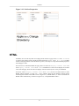
Elixir Dashboard Designer User Manual
Release 2.5.0
Elixir Technology Pte Ltd
Elixir Dashboard Designer User Manual: Release 2.5.0
Elixir Technology Pte Ltd
Published 2013
Copyright © 2013 Elixir Technology Pte Ltd
All rights reserved.
Solaris, Java and all Java-based trademarks and logos are trademarks or registered trademarks of Sun Microsystems, Inc. Microsoft and Windows
are trademarks of Microsoft Corporation.
Table of Contents
1. About Elixir Dashboard Designer ................................................................................... 1
Introduction .......................................................................................................... 1
Contents ....................................................................................................... 2
Views .......................................................................................................... 2
Actions ........................................................................................................ 2
The Dashboard Toolbar ........................................................................................... 2
Dashboard Dimension ............................................................................................. 3
Case Study ........................................................................................................... 3
2. Contents .................................................................................................................. 10
Introduction ........................................................................................................ 10
Dynamic DataSources ........................................................................................... 10
Filtering, Sorting and Extracting .............................................................................. 12
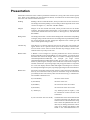
Presentation ........................................................................................................ 13
Initial Selection .................................................................................................... 14
Chart .................................................................................................................. 16
Cube Table .......................................................................................................... 18
Glint .................................................................................................................. 18
Grid ................................................................................................................... 19
HTML ............................................................................................................... 21
Image ................................................................................................................. 22
Map ................................................................................................................... 23
Report ................................................................................................................ 23
SWF .................................................................................................................. 24
SWF Chart .......................................................................................................... 24
Table .................................................................................................................. 24
Case Study 1 - Filter, Sort and Extract Data ............................................................... 27
Case Study 2 - Chart Drilldown ............................................................................... 29
Case Study 3 - Explicit Dependencies ...................................................................... 30
Case Study 4 - SWF Content .................................................................................. 32
Case Study 5 - SWF Chart ..................................................................................... 33
Case Study 6 - SWF Slider with Chart ...................................................................... 34
3. Views ...................................................................................................................... 36
Introduction ........................................................................................................ 36
Card .................................................................................................................. 36
Layout ....................................................................................................... 36
Split View ........................................................................................................... 37
Content View ....................................................................................................... 37
Maximize ........................................................................................................... 38
Drag and Drop ..................................................................................................... 38
4. Actions ................................................................................................................... 39
Introduction ........................................................................................................ 39
Content Events ..................................................................................................... 39
Available Actions ................................................................................................. 40
Maximize Action .......................................................................................... 40
Refresh Action ............................................................................................. 40
Show Action ................................................................................................ 40
Show Card Action ........................................................................................ 40
Reset Action ................................................................................................ 40
Render Report Action .................................................................................... 40
Generate Data Action .................................................................................... 41
Generate Excel Cube Action ........................................................................... 41
Script Action ............................................................................................... 41
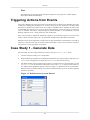
Triggering Actions from Events ............................................................................... 42
Case Study 1 - Generate Data ................................................................................. 42
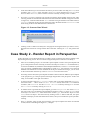
Case Study 2 - Render Report in Perspective .............................................................. 43
iii
Elixir Dashboard Designer User
Manual
5. Script Reference ....................................................................................................... 46
Introduction ........................................................................................................ 46
Parameters .......................................................................................................... 46
State .................................................................................................................. 46
Individual States ................................................................................................... 47
6. Map Designer ........................................................................................................... 50
Introduction ........................................................................................................ 50
Overview .................................................................................................... 50
Getting Started ............................................................................................. 50
Map Creation ....................................................................................................... 50
Step 1 : Store the Shapefiles in the Repository ................................................... 50
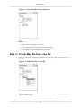
Step 2 : Create Map file from .shp file .............................................................. 51
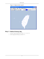
Step 3 : Define Primary Key ........................................................................... 52
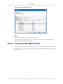
Step 4 : Customise Base Map Format ............................................................... 53
Step 5 : Add Map Layer(s) to the Base Map ....................................................... 55
Step 6 : Final Format to Show a Complete Map .................................................. 56
Data Integration ................................................................................................... 59
Converted to .ds file ...................................................................................... 59
Designer Features ................................................................................................. 59
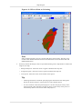
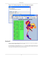
Types of Colouring Algorithm ......................................................................... 59
Legend ....................................................................................................... 66
Map Layers ................................................................................................. 68
Primary key ................................................................................................. 70
Index ......................................................................................................................... 71
iv
List of Figures
1.1. A Sample Dashboard ................................................................................................ 1
1.2. Cards, Views and Contents ......................................................................................... 2
1.3. The Dashboard Toolbar ............................................................................................. 2
1.4. Dashboard Dimension ............................................................................................... 3
1.5. Add Perspective ....................................................................................................... 4
1.6. Table on Perspective ................................................................................................. 5
1.7. Placement of Intended Content ................................................................................... 6
1.8. Chart and Table on Perspective ................................................................................... 7
1.9. Grid, Chart and Table on Perspective ............................................................................ 8
1.10. Completed Perspective ............................................................................................ 9
2.1. View URL ............................................................................................................. 11
2.2. Dynamic Datasource ............................................................................................... 11
2.3. Datasource Parameters ............................................................................................. 12
2.4. The W3C CSS Box Model ........................................................................................ 14
2.5. Initial Selection Dialog ............................................................................................ 15
2.6. Chart on Perspective ............................................................................................... 16
2.7. Mouse Roll Over Pie Chart ....................................................................................... 17
2.8. Pie Chart Explode Slice ........................................................................................... 17
2.9. Cube Table on Perspective ........................................................................................ 18
2.10. Glint on Perspective .............................................................................................. 19
2.11. Add Content Wizard .............................................................................................. 20
2.12. Grid on Perspective ............................................................................................... 21
2.13. HTML Editor ....................................................................................................... 22
2.14. Completed HTML codes ........................................................................................ 22
2.15. Image on Perspective ............................................................................................. 23
2.16. Report on Perspective ............................................................................................ 24
2.17. Set view options ................................................................................................... 25
2.18. Table on Perspective .............................................................................................. 26
2.19. Format wizard ...................................................................................................... 27
2.20. Initial Selection Wizard .......................................................................................... 28
2.21. Results of Case Study ............................................................................................ 29
2.22. Results of Case Study 2 .......................................................................................... 30
2.23. Final Result ......................................................................................................... 32
2.24. SWF Chart .......................................................................................................... 33
2.25. SWF Chart .......................................................................................................... 34
2.26. SWF Range Slider ................................................................................................ 35
3.1. Layout .................................................................................................................. 36
3.2. Split View ............................................................................................................. 37
4.1. Default screen of Action Wizard ................................................................................ 42
4.2. Generate Data Wizard .............................................................................................. 43
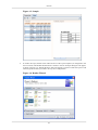
4.3. Sample ................................................................................................................. 44
4.4. Render Wizard ....................................................................................................... 44
5.1. Script Action ......................................................................................................... 46
6.1. Store Shapefiles in the Repository .............................................................................. 51
6.2. Define .shp file as .map file ...................................................................................... 51
6.3. Display default .map file .......................................................................................... 52
6.4. Select Primary Key ................................................................................................. 53
6.5. Select Appropriate Colouring Algorithm ..................................................................... 54
6.6. Format Title ........................................................................................................... 54
6.7. Format Legend ....................................................................................................... 55
6.8. Format Map Layer .................................................................................................. 56
6.9. Enable Map Layer .................................................................................................. 56
6.10. Map After Show Data ............................................................................................ 57
6.11. Effect of Data on Colouring .................................................................................... 58
6.12. Define DBF DataSource ......................................................................................... 59
v
Elixir Dashboard Designer User
Manual
6.13. Colouring Algorithm - Array (with few regions) ..........................................................
6.14. Colouring Algorithm - Array (with numerous regions) .................................................
6.15. Colouring Algorithm - Gradient 2 ............................................................................
6.16. Colouring Algorithm - Gradient 3 ............................................................................
6.17. Colouring Algorithm - Image ..................................................................................
6.18. Colouring Algorithm - Lookup ................................................................................
6.19. A Sample of Continuous Legend ..............................................................................
6.20. A Sample of Continuous Legend without Start At Zero Option ......................................
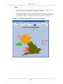
6.21. Example of Base Map without Map Layer .................................................................
6.22. Example of a Base Map with Map Layers ..................................................................
vi
60
61
62
64
65
66
67
68
69
70
Chapter 1
About Elixir Dashboard Designer
Introduction
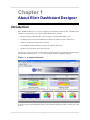
Elixir Dashboard Designer is a tool for navigating and visualizing enterprise data. A dashboard can
assemble a comprehensive view of the available information. It provides:
•
Seamless navigation between data, cube, and reports with user-customizable views
•
On-demand cube creation and modification of dimensions and measures for data analysis
•
Graphical visualization of data and OLAP cube
•
User-definable linking and filtering of data from disparate data sources
•
Dynamic report generation from view selections
A Perspective is the set of views, contents and actions that together form a dashboard. Dashboards are
stored in files with the extension .pml, which stands for Perspective Markup Language.
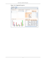
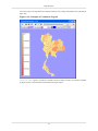
Figure 1.1. A Sample Dashboard
To achieve this powerful and flexible solution, Elixir Dashboard Designer defines Content, Views and
Actions.
1
About Elixir Dashboard Designer
Contents
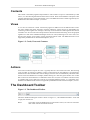
The content is the underlying data and presentation. This could be a report or cube backed by a data
source, or a chart showing data derived from other Contents. Each content added to a Perspective has
a unique name allowing it to be referenced by views. The different kinds of content supported by in a
dashboard are described in Chapter 2, Contents.
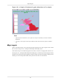
Views
A view acts as a frame for content. Content may appear in different views at different times. Views
may have titlebars that allow interaction with the underlying content and act as placeholders for
connecting content together. For example, a chart may receive it's data for rendering from the selection
in another view. All views also have unique names to allow this kind of referencing. Views are grouped
together into cards. Elixir Dashboard Designer shows one card (containing one or more views) at a
time and user actions can be used to trigger navigation between cards. The different kinds of view
supported by dashboards are described in Chapter 3, Views.
Figure 1.2. Cards, Views and Contents
Actions
Actions are invoked in response to events . Typically these are user interaction events, like selecting
a row in a table, or clicking on a detail in a report. Certain actions are preconfigured - if a chart shows
the data from a table and the table contents changes, then the chart is automatically refreshed. Other
actions can be user-defined. For example, double-clicking on a chart may open another view on that
data. Actions are chosen based on a combination of the user event, the view and the content involved,
so a double-click on two charts may result in two completely different actions - it is completely userdefinable. The different kinds of actions supported by a dashboard are described in Chapter 4, Actions.
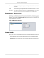
The Dashboard Toolbar
Figure 1.3. The Dashboard Toolbar
The Elixir Dashboard Designer toolbar is shown in Figure 1.3, “The Dashboard Toolbar”. From left
to right, the contents are:
Home
This button resets the dashboard to it's initial state. That is, all views are restored to
their initial contents and initial selection.
2
About Elixir Dashboard Designer
Back
Just like a browser, this button reverts to the previous dashboard state. This can undo
any undesirable change, or navigate back to a previous position to allow further
exploration.
Forward
Again, just like a browser, this button takes you forward again, redoing any action
that was undone by pressing Back.
Card Combo
This combo box shows all of the cards in the dashboard and allows you to choose
one to view. Actions can also be used to change the card as a result of events.
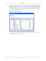
Dashboard Dimension
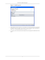
The dimension of a dashboard can be specified by selecting the Perspective root of the view tree as
shown in Figure 1.4, “Dashboard Dimension”. The dimensions are measured in pixels. If the Dynamic
HTML Size option is enabled, the HTML view will auto-scale with the browser window size, and fill
the browser window entirely. The Dynamic HTML Size option will override all custom card size
settings in the dashboard when enabled.
Figure 1.4. Dashboard Dimension
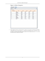
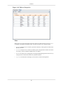
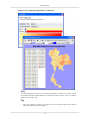
Case Study
This case study will create a simple dashboard built upon the /ElixirSamples/DataSource/FruitSales.ds
datasource.
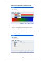
1.
Select a FileSystem. Right-click to select Add->Perspective from the filesystem popup menu.
2.
When the Add Perspective window appears, enter a unique name and description for the Perspective
and click Finish.
3
About Elixir Dashboard Designer
Figure 1.5. Add Perspective
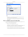
3.
Drag FruitSales.ds from the repository to the workspace. On releasing of the mouse, a popup with
four different options will appear. It's for the user to select the element to add to the Perspective.
In this case, we will add a Table element by selecting Add Table.
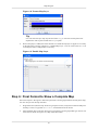
4.
On clicking, a table with all the data from FruitSales.ds will be displayed. The Table element will
appear.
4
About Elixir Dashboard Designer
Figure 1.6. Table on Perspective
5.
Drag FruitSales.ds into the workspace again. A blue box will be shown to indicate the placement
of intended content, as shown in Figure 1.7, “Placement of Intended Content”. Over here, we will
be placing it on the left of the table. When the mouse-click is released, select Add Chart and
the content will be created on that region.
5
About Elixir Dashboard Designer
Figure 1.7. Placement of Intended Content
6.
In the Add Content Wizard, change the name to "FruitSales_Chart" for easy reference.
7.
In this example, we will create a Column Chart with Fruit as the key and 1997, 1998, 1999 and
2000 as the values.
6
About Elixir Dashboard Designer
Figure 1.8. Chart and Table on Perspective
8.
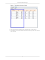
Now we will try creating a Grid element in the Perspective. Repeat step 1 to 3, but place the
element on top of FruitSales_Chart, select Add Grid and change the name to FruitSales_Grid.
9.
At the next page of the wizard, select a field for the Grid element to display. Select Company
then click on Finish.
10. Repeat step 9 and 10, place the element above FruitSales and change the name to FruitSales_DropDown.
11. In the Add Content Wizard, select Fruit as the field and check the checkbox that says Show as
Drop-Down List. In the Label field, enter Fruit : .
7
About Elixir Dashboard Designer
Figure 1.9. Grid, Chart and Table on Perspective
12. Repeat step 1 and 2. Place the blue region on the right of FruitSales_DropDown and select Add
Cube.
13. Click through the wizard without changing any settings.
14. You can adjust the height and width of each element by dragging the sides.
15. At the end of this, the whole Perspective should look something as shown in Figure 1.10,
“Completed Perspective”
8
About Elixir Dashboard Designer
Figure 1.10. Completed Perspective
9
Chapter 2
Contents
Introduction
Elixir Dashboard Designer provides different kinds of content from which you can compose your
views. Every content must have a unique name within the Perspective so that it can be referenced.
Each kind of content reads data and renders it into a view. The views then provide the ability to interact
with the content.
Most kinds of content read from a datasource. There are two kinds of datasource available, the .ds files
in the repository (which can be JDBC, XML, etc.) and dynamic datasources where the data records
are extracted from other views. The first kind of datasource will be identified with a repository:
URL, whereas the dynamic data will be accessed with a view: URL. When the datasource is defined
in the repository, a schema is associated with it and is available to the content designer. When the
datasource is defined by a view, there is no explicit schema available - it depends on the content of
the view, which can itself be dynamic. The solution is to allow view-based datasources to explicitly
load a schema. When a datasource has been chosen for a content, the subsequent page in the wizard
will show the schema of that datasource if one is available. If no schema is available, the Load
Schema button will be available to allow one to be explicitly loaded.
The data schema needs to be available in order to support options like filtering. Each content that reads
from a datasource is allowed to filter the records before rendering them. The filtering options allow
records to be selected based on criteria such as "Equals","Greater Than","In Range","In DataSet" etc.
These are discussed in the Filter Processor description of the Elixir Data Designer User Manual.
In addition, slice: URL1&URL2&URL3 shows the intersection of selected records as the result.
The syntax is a slice: prefix followed by view names separated by ampersands. All these named
views must be grids from a common datasource. It can simplify the data operation by providing a
workaround of filter.
Dynamic DataSources
Dynamic datasources allow a content to read it's data from another view, rather than from a fixed
datasource. This allows the user to select an item in one view and see related items appear automatically
in another view. A dynamic datasource is identified by a URL with the protocol view:. The next part
of the URL is the name of the view. For example, view:Top-Left would use the data supplied by
the view called Top-Left. Many views support selection and it is often useful to show information
related to the selected records of another view. This can be accomplished by adding the suffix
.selected onto the URL. Similarly, .unselected will use those records that are not selected.
Taking the previous example, the URL view:Top-Left.selected would get the selected data
records only from the Top-Left view.
10
Contents
Figure 2.1. View URL
The tool will manage the connection between views so that any view that depends on another is
automatically updated when the dependent view changes. There is usually no need to define explicit
actions to enable this behaviour. If you use scripts to extend the dependency mechanism - for example
changing the dependency dynamically - then you can explicitly define the dependency on the last page
of the content wizard. It is important to note that datasources can only be read from views, not from
contents. This is because each content may be filtered and selected differently within different views
at the same time. The benefit of selecting through views is that the same view may show different
contents at different times and the dynamic data connection is still maintained.
For each kind of content, described below, there is an indication of Available datasources: that
indicates what options each supports. Support for All, means the view name can be used to get the
entire datasource of the view. Support for Selected means the view name followed by .selected can be
used to get the selected records from the view. Support for Unselected means the view name followed
by .unselected can be used to get the unselected records from the view. The figure below, Figure 2.2,
“Dynamic Datasource”, shows the screen where a user selects a dynamic datasource to use.
Figure 2.2. Dynamic Datasource
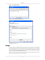
If a datasource has a parameter, there will be a page in the wizard for specifying the value of the
parameter as shown in Figure 2.3, “Datasource Parameters”.
11
Contents
Figure 2.3. Datasource Parameters
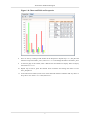
Filtering, Sorting and Extracting
Data from a datasource or another view can be filtered and sorted before being passed to the view.
Certain records can also be extracted, for example the top ten or bottom five can be retained and the
rest discarded (this extraction operation occurs after any filtering and sorting).
Filtering allows you to define rules that each record is tested against. A typical rule might be: Country
Equals "Singapore" or Salary Greater Than 2000. Only those records that pass all the rules are allowed
to proceed. The filter criteria used here are the same as those used in the Filter Processor in the Data
Designer User Manual. Please see that discussion for full details on the options available.
Sorting allows you to sort the records into ascending or descending order based on the values in fields.
Multi-level sorting is supported, so you can sort by Country and then City and the tool will ensure that
the Cities are sorted within their respective Countries. Contents such as Chart, Grid, Table and Cube
have sorting capabilities now. Sorting within the view will override any earlier sorting, but will occur
after any extraction. For example, you can sort sales people by performance, extract the top ten and
then show them in a chart sorted in alphabetical order. Two variants of sort are supported, regular
Ascending and Descending and Simple Ascending and Simple Descending. The Simple options are
very fast, but don't take into account complex character differences, for example letters with accents
produced by merged Unicode character combinations. The regular Ascending and Descending use the
full Unicode algorithms. Further, the Simple variants treat whitespace as significant, whereas the
Unicode algorithms don't (just like a dictionary).
Extraction is the retention of certain records based on their position in the data set. You might choose
to extract those records at the top or the bottom of the set (presumably the order is significant, probably
because they have just been sorted). You can choose to retain either a fixed number or a percentage
of all the records. If a percent value is chosen, then the value will be "rounded up" to include partial
records. For example, if you choose 1%, you will still get one record, even if there are only twenty
records in the set.
12
Contents
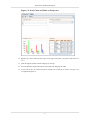
Presentation
Each kind of content has some common presentation characteristics, along with some content-specific
ones. These are all editable from the Presentation Wizard, accessible from the Presentation popup
menu item. The common characteristics are:
Padding
Padding is the area inside the border, which provides insets for the content area.
The background of the padding is set according to the background colour of the
content. See Figure 2.4, “The W3C CSS Box Model”.
Margins
Margins is the area outside the border, which provides insets for the border
rectangle. The background of the margins is set according to the background
colour of the card that the content is shown on. See Figure 2.4, “The W3C CSS
Box Model”.
Background
The background colour is used to fill the background of the border and padding
rectangles, along with the content area. If no background is specified then usually
the card background will show though (this depends on the content type and
other content-specific backgrounds).
Title Bar Tip
Title Bar Tip is a field for entering some text for the tooltip. The tooltip will
appear when a cursor is placed over the top bar of the element's content border.
You will need to enter some text under Title Bar Tip and apply border to the
element before any tooltip can be seen.
Border Name
A Border is a set of images in a repository folder that are used to construct a
frame around the content (and padding). To select a border, you need to select
the folder that contains the images. There are a number of samples provided in
/ElixirSamples/Resources/Borders, for example you might choose
/ElixirSamples/Resources/Borders/Lavender. You can create your own custom
borders by following the examples. Your borders don't need to have images on
all sides of the frame. Any missing images will just appear blank. It is important
for correct web display that the widths and heights of all images are consistent.
For example the heights of topleft, top and topright images must be the identical.
Border Title
If a border is chosen that supports titles (if there is a title.xml in the border folder),
then any text entered here will be placed on the border using the information
provided by the title.xml. You may either use a fixed text string, or substitutions.
The available substitutions are:
${ContentName}
the name of the content
${ViewName}
the name of the view
${ShortDate}
the short form of the current date
${ShortTime}
the short form of the current time
${=JavaScript}
Any JavaScript (after an equals (=) will
be evaluated at runtime and the result
substituted.
${view:ViewName.Selection:Field}
The field name of the selected/unselected
record in a particular view. However, the
element must be refreshed before being
able to show the updated border title. An
ideal way of utilising this feature will be
using on an element that displays data
based on the selected/unselected of a
13
Contents
view. This will be discussed later in the
case study.
You can mix these, for example "${ContentName} : ${ShortDate}" will show
both the content name and short date in the title. For other titles, you can use
script substitutions, like this: ${=java.lang.System.getProperty("java.version")}.
Any JavaScript syntax (which can call Java, as shown) inside a ${=JavaScript}
substitution will be evaluated when the title is shown.
Figure 2.4. The W3C CSS Box Model
Initial Selection
When the dashboard is first loaded, it is often useful for contents to be given initial selections, so that
the user isn't presented with a blank page. No initial selection is provided by default, but you can use
the Initial Selection dialog, available on the popup menu of each content (or if you prefer, each view
of the content). The dialog is shown in Figure 2.5, “Initial Selection Dialog”.
14
Contents
Figure 2.5. Initial Selection Dialog
The choices for initial selection are:
None
The default - no items are initially selected.
All
All items are initially selected.
First
The first item is selected (depending on sort order, if any).
Last
The last item is selected (depending on sort order, if any).
Values
This option requires a field name and one or more constant or
dynamic values to compare against the records. All records that
contain values of the chosen field that match the value strings
will be selected. Note that if the values are constant, they must
be strings and any other data types will be formatted into strings
if necessary, for comparison purposes. If the values are dynamic
parameters, they must be defined in the Parameters tab page
in Perspective. The parameter value follows the syntax
below:
${Parameter_Name#choice(option_1,option_2,
option_3,...,option_n)}
After adding ${Parameter_Name} as a value, each time you click
the Home button to refresh, the Dynamic Parameters window
will display a dropdown list with pre-defined options for your
selection.
Select All on Refresh
All items are selected and the selection is updated each time the
view is refreshed.
Select First on Refresh
The first item is selected and the selection is updated each time
the view is refreshed.
15
Contents
Chart
A chart reads data from a datasource and renders it as a graphical display which sizes to fill the view
it is placed in. The datasource chosen may be identified by a repository URL, in which case the content
is fixed, or the datasource may be reading from another view, in which case the chart will be updated
automatically each time the other view is modified.
There are many parameters that can be used to configure the presentation of the chart, most importantly
what type of chart is required. The chart wizard and range of available charts and options is described
in the Elixir Report Designer User Manual.
Figure 2.6. Chart on Perspective
Bar, column, area and pie charts have selectable regions corresponding to the chart shapes. For example,
clicking on a bar will select all records that contributed to that bar. You can create another view which
uses this selection as a filter to control its display. You can also attach actions, so that clicking on a
bar will show a new view or card which is mapped to the selection made. This is an easy method of
creating a drill-down chart.
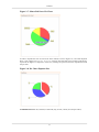
Pie Chart supports mouse-over and explode slices. In order for the Pie Chart to display the containing
values when the mouse rolls over, the following scripts are required to be inserted under the Script tab
of the Edit Content Wizard :
importClass(Packages.org.jfree.chart.labels.
StandardPieToolTipGenerator);
plot.setToolTipGenerator(new StandardPieToolTipGenerator());
After the changes are being applied, the value of the particular slice of the pie will display its value
when the mouse rolls over, as shown in Figure 2.7, “Mouse Roll Over Pie Chart”
16
Contents
Figure 2.7. Mouse Roll Over Pie Chart
In order to explode the slice of a Pie Chart when clicked, as seen in Figure 2.8, “Pie Chart Explode
Slice”, enter a figure in Explode Percent in the Pie tab of the Edit Content Wizard. This figure
represents the degree of "explosion" of the slice, meaning the space between the exploded slice and
the pie chart.
Figure 2.8. Pie Chart Explode Slice
Available datasources: All, Selected, Unselected (only for bar, column, area and pie charts).
17
Contents
Cube Table
A cube table reads data from a datasource and renders a two-dimensional table showing the values
derived from those records that form the intersection of the two dimensions. There are two ways in
which a cube table can be designed. The Cube Table wizard provides a step-by-step dialog to guide
the design process. This is identical to the wizard used in Elixir Report Designer and is described in
that User Manual. The other approach is to create an empty cube table using the wizard (just click
Finish after choosing a datasource) and designing the cube interactively. This approach is usually
preferred because each change to the cube is immediately reflected in the view.
Similar to a Cube element in report template and Cube processor, Cube Table in a dashboard is able
to Show Row Grand Totals, Show Column Grand Totals, Row Totals After Details and Column Totals
After Details. To change the settings of the Cube Table in a dashboard, click on the arrowhead pointing
downwards. The respective settings can be found in Row Options and Column Options. More
information about Cube can be found in Elixir Data Designer.pdf, Chapter 4. Composite Datasource,
the section on Cube Processor.
If the cube data is required for subsequent processing, it is possible to save the cube table contents into
a CSV, DataSource, Excel or XML file.
Available datasources: All, Selected, Unselected.
Figure 2.9. Cube Table on Perspective
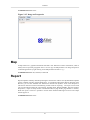
Glint
The glint content type renders a glint file to produce a graphical view. Glint is Elixir's native vector
graphics format. It is designed to be extremely compact to minimize network traffic and reduce memory
requirements on low-end machines. Instructions on generating a glint file can be found in the Report
Designer documentation.
18
Contents
This is useful for displaying fixed content and pre-rendered output. For example, a view could be based
on a FileSystem DataSource to show a list of glint files. Selecting a file would load it and display it
in another view, allowing quick creation of a customized interface to access pre-rendered reports.
Available datasources: None.
A glint file can be opened from the Perspective tab by right-clicking on the glint file and select Open
Glint.
Figure 2.10. Glint on Perspective
Grid
The grid content type is a special kind of table. The grid renders one field from each record and allows
for a more compact representation, where the fields may be displayed in a grid layout.
Before rendering, any duplicate fields are removed and the values can optionally be sorted. When you
select a field in the grid, you are actually selecting all records in the datasource that have that selected
value. For example, with a grid showing the Field "Month", selecting "April" will select all records
where Month=April.
When designing a grid, you can choose a direction, Across, then Down or Down, then
Across, and either length in that direction. For example, a "4 Across, then Down" grid will place the
cells like this:
1
5
2
6
3
7
4
There will be four cells in each horizontal row, and the fields will be added across then down. Alternatively, a "3 Down, then Across" grid would look like this:
19
Contents
1
2
3
4
5
6
7
In this case there are four cells vertically and the fields are added down then across.
A grid can also be displayed as a Drop-Down list. This can be done on the second page of the Add
Content wizard. The second page of Add Content wizard is shown in Figure 2.11, “Add Content
Wizard”. The normal behaviour of grid selection is to turn off other selections each time a new selection
is made (unless Control is held down). The grid also includes a Toggle Selection option which changes
the behaviour so that the first click selects an item and a subsequent click on the same item is required
to deselect it. This behaviour is often preferred as it prevents accidentally losing a set of existing
selections by forgetting to press Control.
Check on the checkbox that says "Show as Drop-Down List" to create a Drop-Down list. Enter a name
for the Label so a name will be displayed beside the Drop-Down list in the Dashboard. See Figure 2.11,
“Add Content Wizard”. Note that the Sort in Figure 2.11, “Add Content Wizard” overrides the Sort
in the earlier page of the wizard.
Checking on the checkbox that says "Show as Radio/Check Boxes" will create checkboxes. To create
radio buttons, check the Single-Select option.
Checking on the checkbox that says "Show as Tag Cloud" will create a Tag Cloud, which consists of
tags in different font sizes, depending on their frequency shown in the records. Upon your selection
of the tags, corresponding records would be displayed in the view of the related table. Multiple selections
are supported.
Figure 2.11. Add Content Wizard
Available datasources: All, Selected, Unselected.
20
Contents
Figure 2.12. Grid on Perspective
HTML
In HTML, user can enter any URL of a webpage and in a frame or page. If Embed HTML in Frame
is selected, the webpage will be displayed within the frame. Embed HTML in a Page is seldom
used for a webpage as there will be too much to process, since they are scripts from both the perspective
and webpage to load.
If user chooses to embed the HTML in a page, there is a choice of Display content from URL
and Display content from HTML text. The difference is that one will display the contents
of the selected page, while the other will display contents entered by user in the provided field.
If the user selects Display content from HTML text, the user can either choose to enter
HTML coding manually, or click Edit HTML whereby when the user finishes entering and/or
formatting the contents in the field as seen in Figure 2.13, “HTML Editor”, it will be converted into
HTML codes automatically, as shown in Figure 2.14, “Completed HTML codes”.
21
Contents
Figure 2.13. HTML Editor
Figure 2.14. Completed HTML codes
Available datasources: None
Image
An Image element is a rectangular region which picture files can be loaded into. Elixir Dashboard
Designer supports image formats such as jpg, png and gif. As jpg and png file formats are supported
across all implementations, they will be a best choice. The Image element, together with any drawings
on it, can be copied to user's desired application. This is similar to Chart and Map. Bmp and tiff image
formats are not supported for Elixir Dashboard Designer.
Similar to glint files, image files can also be opened in the Perspective tab, following the same steps.
Right-click on the image file, and select the correct option.
22
Contents
Available datasources: None.
Figure 2.15. Image on Perspective
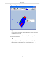
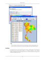
Map
A Map element is a graphical framework that adds a new dimension to data visualisation, which is
usually used to represent geographic areas. User can copy the Map element as an image and paste it
in desired application by right-clicking on the Map element and select Copy.
Available datasources: All, Selected, Unselected
Report
Report templates created by Elixir Report Designer can be shown within a view. By default the templates
will be rendered with their original datasources, as if rendered within Elixir Report Designer itself.
However, you can also substitute new datasources derived from dynamic views in the Perspective.
This allows interactive selection and filtering of data values for reporting. The report can be saved
into any Elixir Report Designer output format, including Glint, PDF and HTML. Note that within a
Perspective, a report is always shown in Streamed mode (no page breaks, page headers or footers).
When the report is saved it is possible to choose either Streamed and Paged versions if the output
format supports it.
Available datasources: None.
23
Contents
Figure 2.16. Report on Perspective
SWF
SWF element uses .swf files which cannot be created using Repertoire, but is required for creating a
SWF element. User will need to create their own .swf file. In the section called “Case Study 4 - SWF
Content”, it demonstrates the use of SWF element in a simplified way.
Available datasources: All, Selected, Unselected
SWF Chart
SWF Chart displays a Chart element in a more attractive and vibrant manner compared to JFreeChart.
Moreover, the user will be able to see the change in action when viewing the chart in the web interface
of Repertoire Server. In the section called “Case Study 5 - SWF Chart”, it explains the way to create
a SWF Chart.
Available datasources: All, Selected, Unselected
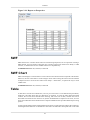
Table
A table shows records from a datasource, one row per record. This is a one-dimensional presentation,
unlike the cube table which has two dimensions of variation. As with the other datasource-based
contents, the records can be filtered before showing, and in the case of table, columns can also be
discarded. This means the user can focus on just the few fields that are important. Of course, for even
more control then table can be backed with a Composite DataSource that provides additional processing
options.
A table provides Single-Select and Toggle Selection options. Toggle Selection changes the commonlyused Single-Select behaviour so that the first click selects an item and a subsequent click on the same
24
Contents
item is required to deselect it. This behaviour is often preferred as it prevents accidentally losing a set
of existing selections by forgetting to press Control. To choose from the Single-Select and Toggle
Selection option, click on the Perspective tab, right-click on a table name. A pop-up menu opens.
Select Properties. The Edit Content Wizard opens. Click 4 times on Next, and then you can set the
view options. Depending on your needs, select the Single-Click or Toggle Selection checkbox, as
shown in Figure 2.17, “Set view options”.
Figure 2.17. Set view options
Table data can be saved into a CSV, DataSource, Excel or XML file for subsequent processing.
Available datasources: All, Selected, Unselected.
25
Contents
Figure 2.18. Table on Perspective
Note
When user tries to right-click within a particular column of a Table element, an option Format
is available. The Format wizard has 4 tabs, as shown in Figure 2.19, “Format wizard”.
•
Header tab allows user to rename a particular column by entering the new name in the
Header Text field.
•
Format tab allows user to select the format type for that particular column. The choice
of Currency, Percent, Number and Date/Time is available.
•
Render tab allows user to change the icon, background and foreground colour of row(s)
in the particular column that satisfies the specified condition.
•
Options tab determines the display of text and icon and also the alignment.
26
Contents
Figure 2.19. Format wizard
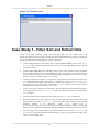
Case Study 1 - Filter, Sort and Extract Data
In this case study, filtering, sorting and extracting data from the wizard and using
${view:ViewName.Selection} will be covered. The idea of this dashboard is to select a product_id
from a Grid element and a Table element will display records with the selected product_id. The border
title for the Table element will display the product_id selected.
1.
Create a JDBC datasource and name it Sales using MondrianFoodMart. Click on the Query
Builder button and use the table named sales_fact_1997. Select all the fields. Infer the schema
and end the wizard.
2.
Create another JDBC datasource and name it Sales_param. Then, follow the steps mentioned
above except in the SQL Query, enter WHERE sales_fact_1997.product_id=${id} after the line
that says FROM sales_fact_1997. Infer the schema. When prompted for the id, enter 1 and exit
from the wizard by clicking on the Finish button.
3.
Create a new Perspective and give it a unique name. Drag Sales.ds to the perspective. Select Add
Grid. When the wizard appears, click on the Next button twice. In the Expression Builder,
enter 100 in the Amount field. Then, click on the Set Value button. This will extract the top
100 data from the datasource. Click on Next twice.
4.
At this screen of the wizard, the user will need to select the field for the Grid element to display.
In the drop-down list, select product_id. Finally, exit from the wizard by clicking on the
Finish button.
5.
The Grid element will be displayed on the perspective with Sales as the border title.
6.
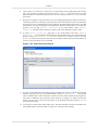
Drag Sales_Param.ds into the perspective. Place it on the right of the Grid element. On release
of the mouse-click, select Add Table. At the second page of the wizard, you will see the
parameter defined in the datasource. Under Value, change ${id} to
${view:Sales.selected:product_id}. This will pass in the value selected by the user from the Grid
element to Sales_param.ds as a parameter. The Table element will display the respective results.
7.
At the next page of the wizard, add a Sort by clicking on the Add icon. Select product_id and
Ascending for the Name and Sort Order respectively. This will sort the data according to the
product_id in ascending order.
27
Contents
8.
Click on the Next button twice. Over here, you will be able to do some filtering of data. Under
When of promotion_id, select Not Equals. As for the Condition, enter the value 0. This will
filter away all the records where the promotion_id is zero. Finally, click on Finish to exit from
the wizard.
9.
When an error appears saying that there is an error building the datasource table for repository
caused by a syntax error in the query expression, this is the correct behavior. This is because when
the perspective tries to load the data in all the elements, the Table element doesn't have any data
to load. There is no value being passed to the parameter, therefore causing the error. To solve this
problem, you can add Initial Selection to the Grid element. With Initial
Selection, the Table element will have a value to pass to the datasource when it loads.
10. To add Initial Selection, right-click on the Grid element and select Initial
Selection.... You will then see the Initial Selection Wizard like Figure 2.20, “Initial Selection
Wizard”. Select Select First on Refresh. For the Field, select customer_id. Click
on Finish. With this setting, the first record of the Sales element will be selected (based on
customer_id) each time the view is refreshed.
Figure 2.20. Initial Selection Wizard
11. In order for the border title of the Table element to display the product_id selected in the Grid
element, right-click anyway on the Table element. Select Presentation.... The default
value for Border Title is ${ContentName}, which is the name of the element in the perspective.
This name is editable at the properties of the element. To change it to reflect the selected
product_id, enter ${view:Sales.selected:product_id} in the Border Title field. Click on Finish
to exit from the wizard.
12. Try clicking on some of the values under Sales. The value selected will also be the border title
of the Table element, which is similar to Figure 2.21, “Results of Case Study”
28
Contents
Figure 2.21. Results of Case Study
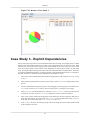
Case Study 2 - Chart Drilldown
In this case study, we will demonstrate how to use the Chart element drilldown function.
1.
The first element to create, needless to say will be the Chart element. Drag FruitSales.ds into the
Perspective and select Add Chart. After clicking on Next 4 times, you will need to select a
chart type. Select Pie followed by Pie chart then Next.
2.
For the Key tab, select Fruit. For Value tab, select 2000. Exit the wizard by clicking on Finish.
3.
Next, drag FruitSales.ds again into the Perspective and place it on the right. This time, select Add
Table. On the first page of Add Content Wizard, click on the View tab and select FruitSales
then Selected. Exit the wizard by clicking on Finish.
4.
On the Perspective workspace, try clicking on the different slices on the Pie Chart. Since the Key
of the Pie Chart is Fruit, when the user clicks on the different slice, the Table element will display
the records with the selected Fruit, which is similar to Figure 2.22, “Results of Case Study 2”.
29
Contents
Figure 2.22. Results of Case Study 2
Case Study 3 - Explicit Dependencies
The use of Explicit Dependencies will be demonstrated in this case study. For example, there is a Table
element and a Chart element that has its column colour changed based on the selection in the Table
element. This will require some scripting in the Chart element. In this case, using view.selected will
not work as the perspective will not know of the dependency by the parsing of scripts. In some other
cases, the scripts might be calling some other codes which decides where to read data from. Therefore,
we explicitly added the dependency so that the element will be updated whenever there is a change in
the other element. It is useful only if the dependencies are hidden in scripts.
1.
First of all, create a Tabular datasource named CompanyName, with Company as Name, String
as Type.
2.
Add 3 columns and name them A, B and C respectively. Click on Finish to complete the creation
process.
3.
Create a Grid element using CompanyName.ds by dragging it into the perspective and select Add
Grid. After 4 clicks on Next button, user will reach Choose grid display options page.
4.
Select Company from the dropdown list. Check on Single-Select so that only one selection
can be done at a time. Click on Finish to complete the creation of the Grid element.
5.
Then, create a Chart element by dragging the same datasource into the perspective and place it
below the Grid element. This time, select Add Chart. Create a Column Chart using Company
as the Key. As for the Values, add 2000, 1999, 1998 and 1997.
6.
In the Script tab, enter the following script which will change the colour of the columns based
on the respective selection:
30
Contents
importClass(Packages.com.elixirtech.chart2.custom.
CustomDrawingSupplier);
var paints = null;
if (cxt!=null)
{
var select = cxt.getPerspectiveState().getState
("CompanyName");
if (select.getSelectedValue() == "A")
{
paints = ["rgb(228,54,0)","rgb(245,121,111)"];
}
else if (select.getSelectedValue() == "B")
{
paints = ["rgb(35,119,47)","rgb(99,179,143)"];
}
else if (select.getSelectedValue() == "C")
{
paints = ["rgb(47,18,152)", "rgb(147,130,182)"];
}
if (paints!=null)
{
var cds = new CustomDrawingSupplier();
cds.setPaintNames(paints);
plot.drawingSupplier = cds;
}
}
7.
Click on Next. This is the page where the user can select the explicit dependencies. Select
CompanyName. This will let the Chart element know that it will be depending on the Grid
element. Click on Finish to create the Chart successfully.
8.
Try clicking on the options in the Grid element. The Chart element below will change its colour
according to the colours specified in the script, as seen in Figure 2.23, “Final Result”.
31
Contents
Figure 2.23. Final Result
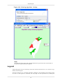
Case Study 4 - SWF Content
The purpose of this case study is to demonstrate the way to use a SWF element as a table and displaying
the data selected.
1.
In a newly created perspective, drag FruitSales.ds into the blank space and select Add Table.
2.
After clicking on Next once, click on Finish.
3.
Next, drag the Table.swf to the bottom of the table. This file can be found in
ElixirSamples/Dashboard/SWF Dashboard/swfs/.
4.
The Add Content window will appear. Click on the View tab and select FruitSales and
Selected. This will mean that the SWF element will display according to the data selected
from the table created using FruitSales.ds.
5.
After 5 clicks on Next, user needs to enter the respective names for the columns. Enter a parameter
name, for example, columns for the Name field. For Value, enter the following
Company|Fruit|{Year:4}|1997|1998|1999|2000
The above line will split the table into 6 different columns, with names Company, Fruit, 1997,
1998, 1999 and 2000. Rows 1997, 1998, 1999 and 2000 are split into 4 columns, with Year as
the heading.
6.
Click on Finish to complete the creation.
32
Contents
7.
To see the SWF element, it has to be opened from Repertoire Server web interface. When the
Perspective is opened, it will look like Figure 2.24, “SWF Chart”.
Figure 2.24. SWF Chart
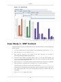
Case Study 5 - SWF Chart
A SWF Chart is very similar to the Chart used in Report Designer. The only difference is only the
appearance and the variety of chart types available.
1.
In a newly created perspective, drag FruitSales.ds into the blank space and select Add Table.
2.
After clicking on Next once, click on Finish.
3.
Next, drag FruitSales.ds to the right of the Table and select Add SWF Chart.
4.
In the View tab, click on FruitSales, then select the option Selected. This will mean that the
SWF Chart will display data according to the selected row.
5.
On the next screen, sorting can be done according to requirements. This case study is to illustrate
the creation of a simple SWF Chart, so we will skip that.
6.
After 3 clicks on the Next button, choose a desired chart type. We will use a Column Chart in
this case study. It can be seen that the variety of charts available is lesser compared to the usual
chart variety. This is because SWF Charts can only be applied to few particular types of charts.
7.
On the next page of the wizard, select Company under the Key tab.
8.
In the Values tab, check all the available checkboxes.
9.
In the Group tab, select On Value for the Group on drop-down list and select Sum for the
Operation drop-down list. Then click on Finish.
10. In order to see the SWF Chart, it has to be opened from Repertoire Server web interface. When
the Perspective is opened, it will look like Figure 2.25, “SWF Chart”. SWF Chart itself will
display data of a particular column on a mouse rollover.
33
Contents
Figure 2.25. SWF Chart
11. Try clicking on other rows in the Table element. The SWF Table will react based on the data
selected and you will be able to see the chart in action.
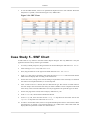
Case Study 6 - SWF Slider with Chart
The prerequisite for this case study is to have a .swf file that has the design of a slider. As a reminder,
the slider wouldn't be seen in the Designer. The only way to see the slider work is to view the dashboard
over the server.
1.
In a newly created Perspective, drag the RangeSlider.swf file with range slider design into the
blank space.
2.
Select the datasource to be used. In this case study, we'll be using FruitSales.ds.
3.
Click on Next 5 times. The skipped pages are for sorting and filtering of data.
4.
This page of the wizard is for the user to enter parameter values to be passed to the .swf file.
•
nameField (mandatory) : the field that the slider represents
•
x (optional) : the X location within the SWF rectangle. The default value is 0, which is about
5px from the edge due to SWF having 5px padding.
•
y (optional) : the Y location within the SWF rectangle. The default value is 0, which is about
5px from the edge due to SWF having 5px padding.
•
width (optional) : the width of the slider. The default is set to 100%. However, when entering
a figure, do not use percentages. The unit of measurement for width is pixel.
•
height (optional) : the height of the slider. The default is set to 100%. However, when entering
a figure, do not use percentages. The unit of measurement for height is pixel.
•
grouping (optional) : Three different values can be entered. None, Ordered and Sorted.
The default value is None. Ordered will list the figures in the order that it is in the datasource.
Sorted will list the numbers in ascending order.
34
Contents
•
labels (optional) : words to show on the slider. This is only applicable when grouping is None.
•
snapInterval (optional) : the number of units moved with each click on the slider.
•
tickInterval (optional) : the incremental value of each marker on the slider.
For this case study, have 2000 as the value for nameField and Sorted for grouping.
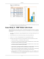
5.
Click on Finish.
6.
Next, drag FruitSales.ds to the right of the SWF.
7.
In the View tab, select ElxRangeSlider, which is the .swf file, then the selected option.
8.
Click on Finish.
9.
Save the dashboard and go into the web interface of the server.
10. Try dragging the slider to different figures. The table on the right will reflect records ranging
between the chosen value, as in Figure 2.26, “SWF Range Slider”.
Figure 2.26. SWF Range Slider
35
Chapter 3
Views
Introduction
Elixir Dashboard Designer provides a hierarchy of views to control the layout of content. The topmost
view is the Card. There may be many cards in a dashboard, but only one card is visible at a time and
switches between cards can be done either manually, using the combo box on the titlebar, or based on
actions. For example, a double-click on a chart could switch to a card that contains a breakdown of
the information in that chart.
Within a card, there may be two kinds of view. One kind is split views, which divide the available
space amongst their children, and the other kind is content views, which render content such as a chart
or table.
Card
The card is the top level view. As mentioned in the introduction a dashboard can contain many cards,
but only one can be visible at a time. Every card must have a unique name, allowing it to be selected
in response to user actions. A card is implemented as a kind of split view. So the discussion of split
view below also applies to card (except for setting custom size). Cards can also define a background
colour, which will fill the whole background of the dashboard. Individual contents can set their own
background colours, which only affects their individual view rectangles. The default background colour
is white.
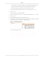
Layout
When the Card is selected, the layout of the views will be displayed accordingly in the Card panel.
Also, right-clicking on the Card then "Default Layout" shows options available for setting the layout
of the Card, as shown in Figure 3.1, “Layout”. The name, background colour, custom size (width and
height in pixels) and direction of the Card can be changed from here.
Figure 3.1. Layout
Single View: A Single View, as seen from the name, will only 1 view can be seen.
36
Views
Horizontal Split: A Horizontal Split will split the dashboard into 2 halves and each view placed beside
each other. Only 2 views can be seen in the dashboard.
Vertical Split: A Vertical Split will split the dashboard into half and 1 view will be on top of the other.
Like the Horizontal Split, only 2 views can be seen in the dashboard.
Quartered View: A Quartered View will split the dashboard into 4 equal squares.
Name: Set a unique name for the card.
Background: Set a colour to fill the whole background of the dashboard.
Direction: Set the direction of the card to be Horizontal or Vertical.
Custom Size: Each card can have a custom width and custom height. A custom size of 0 means to use
the perspective size. You can set the width or height on a card-by-card basis. However, when the
Dynamic HTML Size option for Perspective is enabled, it will override the custom card size settings.
After setting the Default Layout, a user can still add view(s) to the dashboard manually.
Split View
A split view will present it's child views (which may be content views or more splits) in a sequence,
either left to right (horizontal mode) or top to bottom (vertical mode). The amount of space given to
each child depends on the weight attribute of the child. Each child is given a space proportional to it's
weight divided by the sum of all child weights. The default weight is 100, and unless changed will
give equal spacing to each child.
In a split view that is a card, you can set the custom size in pixels, as discussed in the section called
“Layout”. In a split view that is not a card, weights are used rather than explicit sizes, in pixels or
inches etc. so that the Perspective output can scale properly to be shown on devices in different sizes.
Editing can be done in the screen as shown below.
Figure 3.2. Split View
Splits can also be resized manually by dragging the gap between views. Resizing varies the weights
of the cells on either side of the gap being dragged. This is a useful option for direct manipulation of
the views themselves, in conjunction with drag and drop described in the section called “Drag and
Drop”.
Content View
Each content view identifies a content by name to be shown within it. The content can be changed
dynamically by the user, explicitly choosing a new content, or through an action which can trigger the
37
Views
content change. Each content view should have a unique name so that it can be referenced as part of
a view: URL to link records to other contents.
If the content is dependent on a datasource, instead of another content, right-clicking on that particular
content will allow the user to open the datasource as one of the options.
Maximize
A single content view can be maximized to fill the entire Perspective. The view can be maximized by
choosing the Maximize option from the titlebar, or by double-clicking on the titlebar. Similarly the
view can be restored to it's original size by choosing the Restore option from the titlebar, or by doubleclicking again on the titlebar.
It is also possible to maximize and restore a view with a user action, such as double-clicking. In this
case, the view to be maximized might not even be on the current card. In this situation, the chosen
view will be maximized as expected, and on restoration the original card will remain visible. This
approach means it is easy to use other cards to hold a number of "popup" views and maximize them
based on different user actions. Actions can also be used to restore views to their normal size, which
has the effect of returning to the original card.
Drag and Drop
As well as populating cards using the wizard, it is possible to create views dynamically. Dragging and
dropping glint files, report templates and datasources from the repository onto a card enables interactive
positioning. With this approach, the tool will automatically insert the split views necessary to support
the content views that are dropped.
When dragging over a view, a blue box is shown to indicate the current drop region. When near to the
edge of a view, any drop will create a new content view on that side, introducing a split view if
necessary. When dropping directly over a view, the old view will be replaced by a new one showing
the new content. Note that when creating views this way, the content and view names are initialized
automatically by the tool to ensure they are unique. It is possible to adjust the names later if desired.
38
Chapter 4
Actions
Introduction
Many kinds of content can fire events when the user interacts with them. These events may in turn
trigger actions that manipulate or update the views being shown. This chapter describes the events that
each kind of content can generate, what kinds of actions can be performed and then explores how to
handle those events in order to trigger actions.
Content Events
Users interacting with content generate events that consist of three pieces of information
<content,view,event>. The content attribute is the name of the content that the event occurred on. The
view attribute is the name of the view the event occurred on. The event attribute is the name of the
event. An example event might be: <Employees,LeftTable,doubleClick>. In this section we will
describe the events that each kind of content can generate.
Chart
click:{key}[:{value}], doubleClick:{key}[:{value}], refresh, select
Cube Table
click, doubleClick, refresh, select
Glint
click[:{url}], doubleClick[:{url}], refresh
Report
click[:{url}], doubleClick[:{url}], refresh
Table
refresh, select
Grid
click:{key}[:{value}], doubleClick:{key}[:{value}], refresh, select
Map
click:{key}[:{value}], doubleClick:{key}[:{value}], refresh, select
HTML
click:{key}[:{value}], doubleClick:{key}[:{value}], refresh
Elements written in braces like this: {xxx} are substituted by dynamic values depending on where the
event occurs. These are usually preceded by a colon symbol (:). Elements written in square brackets
like this [yyy] are optional, and may not be present if the information is not available. For example, a
bar chart will have both a key and value string available, whereas a pie chart will only offer a key.
Here's a description of when each event is sent:
click
A click event is sent whenever a user clicks on a supporting view. The click may
include extra information after the event name, for example click:{url} if the click
occurs over a mouse-sensitive region in a glint or report, or click:{key}[:{value}]
if the click occurs over a chart.
doubleClick
A doubleClick event is sent whenever a user clicks twice on the same view within
a short period of time and without moving the mouse. A click event will always
precede a doubleClick event.
39
Actions
refresh
A refresh event is sent each time a view is rendered because the underlying data
has changed. It is not necessary to respond to this event to update dependent views,
this is handled internally.
select
A select action occurs when a user changes the selection state of those contents that
maintain a selection (e.g. table). It is not necessary to respond to this event to update
dependent views (e.g. those that depend on view:XXX.selected), this is handled
internally.
Available Actions
When an event is received, it can trigger zero or more actions. The available actions are:
Maximize Action
The maximize action controls the maximized state of a named view. There are three types of action
possible: Maximize, Restore and Toggle. Note that it is possible to maximize a view from a different
card and it will show over the current card until it is restored or toggled off. The current card will not
be affected by the action.
Refresh Action
The refresh action forces a named view to render it's content. The refresh action is usually handled
internally for dependent views, but may be useful if the data is changed from outside Perspective, for
example through JavaScript or because of a timed change.
Show Action
The show action replaces the current content of a named view with a different content.
Show Card Action
The show card action shows a named card in place of the current one.
Reset Action
The Reset action reverts the dashboard back to the default contents and initial selections. This action
is particularly useful for web-based dashboards where the server session remembers the current state
throughout the user session. Add a button image with a Reset action to your dashboard so that the user
can easily reset the dashboard to its original state without having to logoff and logon again.
Render Report Action
The Render Report action will render the selected report in the perspective with the renderer selected
by the user. The output is identical to the rendering in the Report Designer. Often dashboards will be
created so that the user can dynamically construct the report contents by navigating through the data
views. You can then provide a button image so that the final report can be preserved.
You have the option to control which section(s) in the report will display in a dashboard and which
section(s) will be rendered. Open the report template. Click the Functions tab. Type the following
function in the Function Definitions tab pane:
function isInDashboard()
{
var mimeType = Renderer.getMimeType();
40
Actions
var rd = Renderer.getRawReport().getRenderDetails(mimeType);
return (rd!=null && rd.getParameterValue("elx.dashboard.reportview"
)=="Yes");
}
To make sure the function works on the selected sections(s), you also need to use script. Double-click
a section. The Section Wizard opens. Click the Scripts tab. Type the following script in the Render
If field, and repeat the steps on all the selected section(s):
isInDashboard();
When you render the report, you will find out whether the function and script works as anticipated.
It is useful to know whether a report is being run on its own, or as part of a dashboard. This information
can be extracted from the render details available from the Renderer object. The parameter
"elx.dashboard.reportview" will have the value "Yes" if the report is being rendered as part of a
dashboard. Under these circumstances, you might make adjustments to the report content or access
information from the dashboard so that the report shows more appropriate contextual information.
Generate Data Action
The Generate Data action can generate data in the selected element to 4 different formats. They are
XML, Excel, Comma Separated Data (CSV) and Datasource. This action outputs the data as records,
so any formatting of the display is not preserved. If you need to preserve the format of a dashboard
cube then use the Generate Excel Cube Action below.
Generate Excel Cube Action
The Generate Excel Cube action can generate data in the selected cube as an Excel spreadsheet. Unlike
the Generate Data Action, this action preserves the cube structure and cell rendering that you see on
the dashboard.
Script Action
The Script action is the most powerful, because it can interact with the Perspective views, contents
and even actions directly. This action is intended for power users and developers.
The JavaScript code executes in the context of the Perspective application itself, which provides some
useful helper functions to access content and views.
•
Content getContent(contentName);
•
Panel getPanel(panelName);
•
void refresh(panelName);
In addition, some context objects are available:
•
Parameters: Use Parameters.get("Name") to access any dynamic parameter values.
•
State: The overall dashboard state - from here you can navigate and interact with all parts of the
dashboard.
•
thisState: The state on which the event was triggered
•
thisEvent: The event (String) that was triggered
41
Actions
Note
The full Perspective scripting API is described in Chapter 5, Script Reference and the separate
PML Object Model documentation.
Triggering Actions from Events
Actions are defined using the Actions table on the Perspective tab. Each action identifies the trigger
conditions by defining the combination of <content,view,event> that it responds to. An empty value
means that it matches all possible events. For example <CubeData,select> matches the select event
on CubeData (the content) in any view. For event name matching, only the text string up to the first
colon is matched. This allows <MyChart,MyView,click:SomeURL> to be matched by an action
defining <MyView,click> - which means any click on MyView.
Only actions which are marked as enabled are eligible to be invoked in response to an event. This
allows a subset of actions and events to be tested and verified without side-effects from others.
Multiple actions can be triggered by a single event, if they all match the event attributes. The order of
invocation is based on the order of actions in the Actions table. Actions can be raised or lowered in
the action list to control the order of execution.
Case Study 1 - Generate Data
This case study will do a simple illustration on how to use the Generate Data action.
1.
Create a Perspective and give it a unique name.
2.
Drag FruitSales.ds (available in /ElixirSamples/DataSource) into the perspective and select Add
Table. Click through the wizard and click on Finish to exit from the wizard.
3.
The Table element will be created on the perspective. To add an action to generate data, go to the
Perspective tab. At the bottom of the screen, click on the Action tab, then click on the Add
icon and the Action Wizard will appear, as shown in Figure 4.1, “Default screen of Action Wizard”.
With this action, on double-clicking on FruitSales (the Table element), you will be able to generate
the data in FruitSales.
Figure 4.1. Default screen of Action Wizard
42
Actions
4.
In the Action Wizard, you can customize the actions you want. In this case study, for View, select
FruitSales. For Content, select FruitSales. For Event, select doubleClick. For Type, select
Generate Data. For View, select FruitSales. Exit the wizard by clicking on the Ok button.
5.
Go to the View tab. Try selecting a few records in FruitSales while holding on the Ctrl key. After
selecting, double-click within the Table element and Generate Data Wizard will appear as shown
in Figure 4.2, “Generate Data Wizard”. All will mean saving all the data in the Table element.
Selected will mean saving only the selected records in the Table element. Unselected will
mean saving all the records other than the selected ones.
Figure 4.2. Generate Data Wizard
6.
Clicking on the OK button will lead you to the page for selecting the format you wish to save to,
designate the location for saving and the name of the file. Clicking on Save will generate the
file.
Case Study 2 - Render Report in Perspective
In this case study, we will demonstrate how to render a report in a Perspective which is similar to the
Report Designer using Action. We can continue using the Perspective created in Case Study 1.
1.
Since we are rendering a report, we will need a report template. Create a new report template and
give it a unique name. In this case study, we name it Fruit Report. Click Next. For the datasource,
we will use FruitSales.ds (available in /ElixirSamples/DataSource). Click Next. As for the report
type, we will use a Standard Report, Tabular Report. Click Next. For simplicity, we will use all
the fields in FruitSales.ds. To move the fields to the Report column all at one go, you can click
on the second button from the top. Click on Finish to exit from the wizard.
2.
On exiting of the wizard, the report template would have been created. To add this report template
to the perspective, go to the perspective and simply drag the file to the perspective. In this case
study, we will add it to the right of FruitSales.
3.
At the second page of the Edit Content wizard, click on the empty field under Mapping,
then click on the ... button. In the DataSet Chooser wizard, click on the View tab. Select
FruitSales, then Selected. Exit the DataSet Chooser wizard by clicking on Ok. Exit the
Edit Content wizard by clicking on Finish.
4.
To add an action to generate the report template, go to the Perspective tab. At the Action
tab, click on the Add icon and the Action Wizard will appear. For the View and Content, select
Fruit Report. For the Event, select doubleClick. For the Type, select Render Report. For the
View, select Fruit Report. Exit the wizard by clicking on the Ok button. With this, the report
template will display records selected from FruitSales, and you can render the report by doubleclicking.
5.
Now, try selecting some records from FruitSales. The report template will show the selected
records, which is something like Figure 4.3, “Sample”.
43
Actions
Figure 4.3. Sample
6.
To render the report, double-click within the area of the report template (as configured in the
Action wizard). The Render Wizard which is similar to the one in Report Designer will appear,
as shown in Figure 4.4, “Render Wizard”. Select the format you wish to render the report to and
run through the wizard if you need to do any extra configurations.
Figure 4.4. Render Wizard
44
Actions
7.
The report will be generated to your desired format after clicking on Finish.
45
Chapter 5
Script Reference
Introduction
Dashboards are scriptable using JavaScript Script Actions. This chapter will introduce the essential
APIs for controlling the Dashboard through scripts. Each view that is positioned on a card in the
dashboard is accessible through a state object. The view itself is not accessible, because it may be a
graphical view (i.e. in the Designer) or it may be an HTML view in a browser. The states can be
identified by the name of the view they represent. To create a JavaScript action, choose the Perspective
tab on the designer and add a new Action to the Action table at the bottom right. Choose Script as your
Action type and proceed to add your script in the available field. The dialog is shown in Figure 5.1,
“Script Action”
Figure 5.1. Script Action
Parameters
The Parameters object holds the dynamic parameters the user has entered.
•
String get(String name)
This is equivalent to using ${name} in other parts of the dashboard. Within scripts ${substitution}
will work, but Parameters.get("name") should be preferred because it is more efficient.
State
The State object represents the dashboard as a whole. It provides a set of useful services and acts as a
container for the named states which link the contents and views that you define. To access a particular
state, you need to append the name to the State object. For example, if you have a view named
"MyCube", you can access the state of that view like this:
46
Script Reference
State.MyCube
If your view name contains spaces, then you need to use an alternate JavaScript syntax:
State.["My Cube"]
to achieve the same effect.
We will start by reviewing the API of the State object itself. Note that most of these services are
available through the Action mechanism, so you don't have to use scripts to perform these commands
- these services are only for situations where you want to chain a few actions together in a certain
order, or maybe add some additional scripted logic.
void excelCube(String cubeName)
Generate the presentation of a cube as an Excel spreadsheet.
The user will be prompted to enter a filename.
void generate(String contentName)
Generate the data shown by a particular content as a file. The
user will be prompted to enter a filename and output type (e.g.
XML, CSV, XLS etc.)
String getCurrentCard()
Get the name of the current card
String getParameterValue(String
name)
Get the value associated with the parameter name, or null if the
parameter is not found.
Perspective getPerspective()
Get the Perspective object which represents the whole
dashboard. See the PML Object Model documentation for full
details on the dashboard object model.
IState getState(String name)
This provides another mechanism for getting the individual state
objects, it is synonymous with State.name as described above.
void maximize(String viewName)
Maximize the named view, which need not be on the current
card. The current card does not change, on restore the original
card will show again.
void render(String reportName)
Render the named report. The user will be prompted to enter
the render type and destination.
void reset()
Reset the current dashboard state back to the initial default view
states and selections.
void restore()
Restore any maximized view back to the normal position.
void show(String view, String
content)
Show the named content in the named view.
void showCard(String perspective,
String card)
Replaces the current card with a new one, which could come
from the same dashboard file, or jump to another dashboard.
The perspective parameter should contain the full URL of a pml
file (e.g. "repository:/User/jane/mydash.pml") or null, if the
card is located in the current dashboard.
Individual States
All state objects support the refresh() service, to force a refresh of the view. In most cases this is handled
automatically by the dashboard when it detects that the display needs to be updated. All state objects
also provide a getName() service, which will return the name of the state. Further to this, states which
support selection allow scripted access to the selection values as described below:
47
Script Reference
CubeState
GridState
TableState
•
DataTable getDataSource()
•
List<DataRecord> getSelectedRecords()
•
BitSet getSelection()
•
boolean hasSelection()
•
void setSelection(BitSet sel)
•
boolean allSelected()
•
DataTable getDataSource()
•
List<DataRecord> getSelectedRecords()
•
String getSelectedValue()
•
BitSet getSelection()
•
String[] getValues()
•
boolean hasSelection()
•
void setSelection(BitSet sel)
•
DataTable getDataSource()
•
List<DataRecord> getSelectedRecords()
•
BitSet getSelection()
•
boolean hasSelection()
•
void setSelection(BitSet sel)
The infrastructure objects exposed by these APIs are DataTable and DataRecord, DataSchema and
DataType. These are all in the com.elixirtech.data2 package. The useful services of these classes
include:
DataTable
DataRecord
DataSchema
•
int getRecordCount()
•
DataRecord getRecord(int idx)
•
DataRecord[] getRecords()
•
DataSchema getSchema()
•
Object getData(int idx)
•
Object[] getData()
•
DataSchema getSchema()
•
int getColumnIndex(String columnName)
•
String getColumnName(int idx)
•
DataType getColumnType(int idx)
The following DataType constants are defined:
•
BLOB
48
Script Reference
•
BOOLEAN
•
BYTE
•
BYTE_ARRAY
•
CHAR
•
CLOB
•
DATE
•
DOUBLE
•
FLOAT
•
INTEGER
•
LONG
•
OBJECT
•
SHORT
•
STRING
•
TIME
•
TIMESTAMP
•
UNKNOWN
•
XML
49
Chapter 6
Map Designer
Introduction
Overview
Elixir Repertoire Map Designer provides a graphical framework that adds a new dimension to data
visualisation. Maps can be created that represent geographic areas, such as countries or regions, shops
within a shopping mall or even the different departments in your office. The areas of the map are
sensitive to mouse clicks, so you can use them to navigate through or filter relevant data. The areas
can also be connected to data values, highlighting which sales regions performed best last quarter or
which shops have the highest footfall.
Once a map has been designed, it is available in the Elixir Repository as a reusable component. This
helps you ensure a consistent style and reduces maintenance across all of the analysis services that
you deploy.
Getting Started
Before you can start creating maps, you need map data for the location you want to see. This data
consists of two files, a shapefile (.shp) and a database file (.dbf). The pair of files should have the same
name, for example Singapore.shp and Singapore.dbf. The shapefile format was defined by ESRI.
The shapefile holds both the shapes and coordinates of the map, whereas the database file holds the
meaning of those shapes and points. Both are essential for rendering the map. As the file format for
shapefiles has been published, and is a de-facto standard, you can create your own shapefiles if you
can't find one that exactly matches your requirements.
Tip
Useful link:
•
Download of shapefiles [http://wwwn.cdc.gov/epiinfo/script/shapefiles.aspx].
Important
While there are a number of shapefiles available on the Internet, you need to verify that the
license allows you to incorporate them in your applications.
Map Creation
Step 1 : Store the Shapefiles in the Repository
1.
Save the .shp and .dbf files in a repository location where all users of the map will have read
access to them.
50
Map Designer
Figure 6.1. Store Shapefiles in the Repository
Note
•
In order for the map to render successfully,
•
The shapefiles must be kept together in the same folder.
•
The naming of .shp and .dbf files must be the same.
Step 2 : Create Map file from .shp file
1.
Select the .shp file that will form the background of your map, right-click and select Define
As Map.
Figure 6.2. Define .shp file as .map file
2.
A default .map file will be created and displayed in the Elixir Workspace as shown in Figure 6.3,
“Display default .map file”.
51
Map Designer
Figure 6.3. Display default .map file
Step 3 : Define Primary Key
1.
Select the .map file and right-click to select Open Properties
2.
Select an appropriate Primary key and click Next.
52
Map Designer
Figure 6.4. Select Primary Key
Tip
Why is ADMIN_NAME a more appropriate primary key?
If the base map has many regions, it may be a better choice to show as a hovering legend
when the cursor is placed over each region.
Step 4 : Customise Base Map Format
1.
You will see the Map Configuration page is where user can customise the appearance of the map.
2.
Under the Colouring tab, select the type of colouring algorithm desired for the respective
regions of the map.
53
Map Designer
Figure 6.5. Select Appropriate Colouring Algorithm
3.
Under the Title Tab,
•
Text option : (Optional) Enter a title that will appear on your map.
•
Font option : (Optional) Select the size and colour of the title.
•
Position option : (Optional) Place the title at the top (north), bottom (south), east (right) or
west (left) of the map.
Figure 6.6. Format Title
4.
Under the Legend Tab, select the characteristics of the map legend.
54
Map Designer
Figure 6.7. Format Legend
Tip
•
If you select None, user still be able to see a tooltip based on the map primary key when
hovering the mouse cursor over a particular region.
•
If there is handful of coloured regions on the map, user can consider showing colours
derived from numeric data, you should consider by enabling the Continuous option
(refer to Legend)
Step 5 : Add Map Layer(s) to the Base Map
If you have Map Layers that you wish to add on to the base map, they can be configured here. If not,
click on Finish button to complete the creation process.
1.
Click the Add icon and enter the details as follows:
•
Name option : Enter a meaningful name for the map layer.
•
Shapes option : (As an example shown in Figure 6.8, “Format Map Layer”) Enter the URL
of the shapefile, for example, repository:/MyMaps/Taiwan/tw_shoppingmalls.shp .
•
Fill option : (Optional) Select the colour to appear in the area of the map layer.
•
Line option : (Optional) Select the colour for the outline of map layer, which is especially
useful when representing railroad or highway routes which are usually represented by lines.
55
Map Designer
Figure 6.8. Format Map Layer
Tip
User can select the layer map .shp file and select Copy to store the location path to the
clipboard in order to paste it under the Shapesoption.
2.
When a map layer is added, check the check box to enable the map layer to appear as an overlay
on the base map, as shown in Figure 6.9, “Enable Map Layer”. User can click on the Edit icon
to modify the earlier configurations if necessary.
Figure 6.9. Enable Map Layer
Step 6 : Final Format to Show a Complete Map
If the base map has “fill-regions” data and a particular Colouring Algorithm has already been setup,
user can now preview the map with data.
1.
Drag a datasource (the base map .ds file is a good place to start) to anywhere within the Map view
and drop it. This is to populate Show Data:with the data from the .ds file.
2.
Select the field name in the drop down list to activate the Colouring Algorithm type chosen. The
result will be similar to Figure 6.10, “Map After Show Data”.
56
Map Designer
Figure 6.10. Map After Show Data
Tip
If a “text” legend is required, user can use GMI_ADMIN as the next best option to
describe all regions on the map.
3.
When the mouse cursor hovers over any one region, the region's name will appear, as seen in
Figure 6.10, “Map After Show Data”. User can select any field name to experiment how the map
will appear with each selection.
Tip
In this example, an interesting field name, TYPE_ENG, shows a group of regions under
a specific category. Thus, when selecting this field name, user can see that a number of
regions are classified under the same colouring tone instead. In this case, Legend is
best used to display in order to identify all the categories for each region.
57
Map Designer
Figure 6.11. Effect of Data on Colouring
Note
GMI_ADMIN and TYPE_ENG are common field names found in many .dbf files. There
are also some .dbf files which do not have such field names or have the same data with
different field names.
4.
On the top of Elixir Workspace, there are optional formatting tools to help further to enhance the
image of your map.
•
Background option : Select the colour to appear outside the base map area.
•
Foreground option : Select the colour to appear inside the base map area.
•
Lines option : Select the colour for the outline of the regions
Tip
•
The foreground colour is useful for specifying regions which do not have "fill-regions"
data in the .ds file. It helps to contrast the rest of the coloured regions.
•
It is also useful for a base map whose purpose is to show map layers clearly. Thus,
the foreground colour should be one that can bring out the clarity of the points on
the base map. (Refer to the section called “Map Layers”).
58
Map Designer
Data Integration
Convert .dbf file into .ds file
To show colours on a map, user need to choose a set of data and a colouring algorithm to describe how
to convert the data into colours for display. The simplest source of data is the .dbf file that accompanies
the .shp file. This contains the name of each region on the map, and often contains useful information
such as area which can be used as sample data for testing. In order to use the .dbf, .dbf file will be to
be converted to a .ds file.
1.
Select a .dbf file and right-click to select Define as a DBF DataSource, as seen in
Figure 6.12, “Define DBF DataSource”.
Figure 6.12. Define DBF DataSource
2.
A default .ds file will be created
3.
Click on the Load Data button to view data.
Note
Some shape files contain layer information, for example roads or hospitals. The .dbf files that
accompany these shape files may not contain any useful region information for colouring.
Using the Elixir data source tools, it is easy to review the contents of the .dbf files.
Designer Features
Colouring Algorithm
This algorithm decides the colour scheme that will be used to fill each region of the base map.
Array
The Array algorithm allows user to specify a number of colours and use each in turn for a data item.
This works best when the number of colours chosen is greater than or equal to the number of unique
data values. Else, there will be some repetition of the colours.
For the field name selected in Show Data, the first region will take the first colour and so on until
the 6th colour is utilised by the 6th region. The 7th region will have the same colour as the 1st region.
59
Map Designer
Note
•
It is useful to apply in a map with only a few regions to fill the colour scheme as shown
in Figure 6.13, “Colouring Algorithm - Array (with few regions)”.
•
An example of inappropriate usage of this colouring algorithm is shown in Figure 6.14,
“Colouring Algorithm - Array (with numerous regions)”. This colour scheme can still be
used if specific colour type is important but not critical to differentiate each region.
Figure 6.13. Colouring Algorithm - Array (with few regions)
60
Map Designer
Figure 6.14. Colouring Algorithm - Array (with numerous regions)
Gradient 2
A range of colours will be blended from the first colour specified to the second colour specified as
shown in the Map Configuration page, Colouring tab.
For the field name you selected under the Show Data combo box, the first region will take on the
first colour specified, subsequent regions will take on the increasing colour tone down the line until
the last region will usually take on the second colour specified.
61
Map Designer
Figure 6.15. Colouring Algorithm - Gradient 2
Note
The legend displayed in Figure 6.15, “Colouring Algorithm - Gradient 2” is for the purpose
of explaining the effect of the Gradient 2 on the colouring of the regions. There is no need to
display such legend on map.
Tip
•
This colour scheme is useful if user wishes to see an increasing colour tone in data to
reflect the gradual effect of the regions.
62
Map Designer
•
An example like in Figure 6.15, “Colouring Algorithm - Gradient 2”POP_ADMIN is
selected to show the regions of increasing population size compared to the size of the
regions.
•
There are many lighter tone coloured regions as compared to the darker ones, which
indicates that 'small-sized populations' regions are very prominent in the base map.
Gradient 3
Gradient 3 is similar to Gradient 2, but the range of colour will be blended from first colour to second
colour (median) to third colour instead.
This colour scheme is useful if user wishes to see a increasing colour tone for data reflect the gradual
effects of the regions, especially to highlight regions that fall in the median range.
An example like in Figure 6.16, “Colouring Algorithm - Gradient 3”, SQMI_ADMIN is selected to
show the regions of increasing area in square miles. Select a totally different colour tone as the median
so as to differentiate from the first and third colour. At a glance, user will be able to see the green tone
regions which indicates that they are about the same size each.
63
Map Designer
Figure 6.16. Colouring Algorithm - Gradient 3
Image
User can create their own images to choose exactly the gradient that they want. For example, user can
create a “4-gradient” image with a dark green to medium green to light blue and then to white. Before
using this option, ensure that the image file is available in the Repository.
In the Map Configuration wizard, in Colouring tab, select Image from the drop down list. Enter
the URL of the image in Image URL: field.
64
Map Designer
Figure 6.17. Colouring Algorithm - Image
Tip
•
If user requires each region to have its own unique colour, then a spectrum image which
has a wide range of blended colours will be able to differentiate all the individual regions.
Lookup
•
It is useful if user only wants some of the regions to appear coloured and the rest can follow the
foreground colour of the base map. In Figure 6.13, “Colouring Algorithm - Array (with few
regions)”, all categories are coloured. Thus if the user only needs a few particular categories to be
coloured, this option can be used.
65
Map Designer
Figure 6.18. Colouring Algorithm - Lookup
Note
The labels entered for each colour specified under the key option must tally with the data of
the particular region's field name required.
Legend
Legend will appear as a box on the map, to show the contents (in the form of text or continuous range
format) of all the regions.
In the case of Figure 6.15, “Colouring Algorithm - Gradient 2”, the population size of all the regions
are shown in the Legend box. Therefore, the map might not look presentable. By enabling the
66
Map Designer
Continuous option, the legend becomes smaller and shows only a range of blended colours with default
major tabs.
Figure 6.19. A Sample of Continuous Legend
Start At Zero option is a preference whether to show the range from zero or from the a rounded
up figure nearest to the minimum and maximum 'fill-regions' data.
67
Map Designer
Figure 6.20. A Sample of Continuous Legend without Start At Zero Option
Note
•
The Continuous and Start At Zero option can only be used when you select a numeric
field name.
•
The Start At Zero option will only be effective when the Continuous option is enabled
too.
Map Layers
They are the add-on maps over the base map (the first map that user wants to appear as the outline
first, as shown in Figure 6.21, “Example of Base Map without Map Layer”.
These add-on maps can be additional graphics like canals, road routes, shopping malls, libraries, etc.
From Figure 6.21, “Example of Base Map without Map Layer”, the blue strips are the Singapore canals,
the black line represent the major highways and the red dots represent the hospitals and polyclinics
whereby you can see the specific names when you hover the cursor over the red dots.
68
Map Designer
Figure 6.21. Example of Base Map without Map Layer
69
Map Designer
Figure 6.22. Example of a Base Map with Map Layers
Primary key
This key is a fieldname with non-duplicate data. It is necessary to select which key you intend to use
as a primary key in order to show as meaningful “hovering legends” when you place your cursor over
any region. By default, it will select the first fieldname (Column 1) as the primary key.
70
T
Index
table, 24
toolbar, 2
A
V
action, 2
view, 2
C
X
card, 36
chart, 16
content, 2, 10, 37
csv, 18, 25
cube table, 18
xml, 18, 25
D
datasource, 10, 18, 25
drag and drop, 38
E
events, 2
excel, 18, 25
F
filter, 10
G
glint, 18, 23
grid, 19
H
html, 21
I
image, 22
M
map, 23
maximize, 38
P
pdf, 23
R
report, 23
S
slice, 10
split, 37
swf, 24
swfChart, 24
71