1
S+ARRAYANALYZER 1.1
User’s Guide
April 2003
Insightful Corporation
Seattle, Washington
Proprietary
Notice
Insightful Corporation owns the S+ARRAYANALYZER software
program, and its documentation. Both the program and
documentation are copyrighted with all rights reserved by Insightful
Corporation.
S+ARRAYANALYZER provides access to the Bioconductor R packages
for microarray analysis, which are free software. The affy, annodata,
annotate, biobase, edd, geneplotter, genefilter, LPETest,
marrayClasses, marrayInput, marrayNorm, marrayPlots, multtest,
and ROC libraries are copyrighted © 2003 by Insightful
Corporation. These libraries are free software that are redistributed
and modified under the terms of the GNU Lesser General Public
License as published by the Free Software Foundation; version 2.1 of
the License. The S+ARRAYANALYZER software is covered by a
separate license agreement.
The correct bibliographical reference for this document is as follows:
S+ARRAYANALYZER 1.1 User’s Guide, Insightful Corporation, Seattle,
WA.
Printed in the United States.
Copyright Notice Copyright © 1987-2003, Insightful Corporation. All rights reserved.
Insightful Corporation
1700 Westlake Avenue N, Suite 500
Seattle, WA 98109-3044
USA
Trademarks
ii
S-PLUS is a registered trademark, and StatServer, S-PLUS Analytic
Server, S+ARRAYANALYZER, S+FINMETRICS, S+SDK,
S+SPATIALSTATS, S+DOX, S+GARCH, S+SEQTRIAL, and
S+WAVELETS are trademarks, of Insightful Corporation; S and New S
are trademarks of Lucent Technologies, Inc.; Intel is a registered
trademark, and Pentium a trademark, of Intel Corporation; Microsoft,
Windows, MS-DOS, and Excel are registered trademarks, and
Windows NT is a trademark, of Microsoft Corporation. Other brand
and product names referred to are trademarks or registered
trademarks of their respective owners.
ACKNOWLEDGMENTS
The Insightful ArrayAnalyzer uses Bioconductor packages that
represent state-of-the-art work from a collection of leading
statisticians. Insightful would like to recognize these contributors:
affy - Rafael A. Irizarry, Laurent Gautier, and Leslie M. Cope
AnnBuilder - Jianhua Zhang
annotate - Robert Gentleman
Biobase - Robert Gentleman and Vincent Carey
edd - Vincent Carey
genefilter - Robert Gentleman and Vincent Carey
geneplotter - Robert Gentleman
marrayNorm - Sandrine Dudoit, Yee Hwa ( Jean) Yang
marrayClasses - Sandrine Dudoit, Yee Hwa ( Jean) Yang
marrayInput - Sandrine Dudoit, Yee Hwa ( Jean) Yang
marrayPlots - Sandrine Dudoit, Yee Hwa ( Jean) Yang
multtest - Yongchao Ge, Sandrine Dudoit
rhdh5 - Byron Ellis, Robert Gentleman
ROC - Vincent Carey
iii
iv
CONTENTS
Acknowledgments
Chapter 1 Welcome to S+ARRAYANALYZER
iii
1
Welcome!
2
Supported Platforms and System Requirements
4
Chapter 2
Introduction To Microarray Data
Genomics and Differential Expression
Microarray Data
Chapter 3
GUI Overview
7
8
10
15
The S+ARRAYANALYZER Interface
16
Import Data
18
AffyMetrix Expression Summary
22
Normalization
23
Differential Expression Analysis
24
Annotation
25
Chapter 4 An Example: Affymetrix MAS Data
27
Affymetrix Data Analysis Workflow
28
Importing Data
30
Normalization
38
Differential Expression Testing
42
v
Contents
From the Command Line
49
References
61
Chapter 5 An Example: Affymetrix Probe-Level Data63
Affymetrix Probe-Level Data Analysis Workflow
64
Importing Data
65
Normalization of Probe-Level Data
72
Expression Summaries
74
Differential Expression Testing
79
References
87
Chapter 6 An Example: Two-Color cDNA Data
cDNA Data Analysis Workflow
90
Importing Data
92
Normalization
102
Differential Expression Testing
106
Annotation
111
From The Command Line
114
Chapter 7 Pre-Processing and Normalization
vi
89
131
Introduction
133
Normalization
134
Ideas in Normalization
139
Diagnostic Plots
142
Normalization Methods for cDNA Data
144
Pre-Processing And Normalization for
Affymetrix Probe-Level Data
154
Normalization Methods for Affymetrix MAS Data
170
References
174
Contents
Chapter 8
Differential Expression Testing
177
Introduction
178
Statistical Tests
179
Controlling Type I Error Rates
183
GUI for Multiple Comparisons Testing
188
GUI for LPE Testing
193
Differential Expression Analysis Plots
197
Differential Expression Summary Table Output
204
References
208
Chapter 9 Using the S-PLUS Command Line to
Analyze Microarray Data
211
Introduction
212
Clustering Microarray Data using S-PLUS
214
Annotation of Microarray Data using S-PLUS
225
Differential Expression Analysis for Experiments
with More than Two Experimental Conditions
234
References
251
Appendix: S+ARRAYANALYZER Data Libraries
255
Index
261
vii
Contents
viii
WELCOME TO
S+ARRAYANALYZER
1
Welcome!
Features
Libraries
2
2
3
Supported Platforms and System Requirements
Installing and Running S+ARRAYANALYZER
Online Help
Online Reference
Technical Support
4
4
4
5
5
1
Chapter 1 Welcome to S+ARRAYANALYZER
WELCOME!
-4
-6
-8
-12
-10
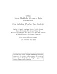
Log10(LPE p-value)
-2
0
S+ARRAYANALYZER is an S-PLUS module that provides you with a
powerful tool for analyzing Affymetrix MAS and CEL data, and
cDNA microarray data. Using either the graphical user interface
(GUI) dialogs or the Commands window, you can perform statistical
analysis to determine differential gene expression in microarrays,
fundamental to the rapidly growing field of functional genomics. In
S+ARRAYANALYZER, you can access functions in a collection of
libraries based on the Bioconductor project, a repository for current
microarray and genomics research developed by leading statisticians.
-5
0
5
10
Fold.Change
Figure 1.1: Sample volcano plot using LPE.func in S+ARRAYANALYZER. This plot
was generated using Affymetrix data.
Features
2
The S+ARRAYANALYZER module helps you analyze microarray data
using these built-in features:
•
Microarray data import (Affymetrix MAS and CEL, and
cDNA chip data).
•
Data normalization.
Welcome!
•
Differential expression analysis, using the LPEtest and
multtest libraries.
•
Chromosome plot creation.
•
S-PLUS Graphlets™ for annotation and exchanging
information among researchers.
For the latest information and support on S+ARRAYANALYZER, go to
http://www.insightful.com/support/ArrayAnalyzer
This contains information regarding Insightful efforts in the genomics
and bioinformatics space.
Libraries
There are 13 S-PLUS libraries in S+ARRAYANALYZER to assist in your
analysis: affy, annotate, Biobase, edd, geneplotter, genefilter, LPEtest,
marrayClasses, marrayInput, marrayNorm, marrayPlots, multtest,
and ROC. These are loaded automatically when you load
S+ARRAYANALYZER. The following shows a few examples of how
S+ARRAYANALYZER can process your data:
•
Analysis of Affymetrix data uses the Biobase and affy libraries
for reading and normalizing data.
•
Differential expression analysis uses the multtest and LPEtest
libraries, and annotation is completed using the genefilter,
geneplotter, and annotate libraries.
•
Input and normalization of custom cDNA data uses the
marrayClass, marrayInput, marrayNorm, and Biobase
libraries.
12 of the S-PLUS libraries in S+ARRAYANALYZER are based on the
Bioconductor libraries, and information on these libraries is located at
http://www.bioconductor.org
The other library, LPEtest, is provided by Insightful.
3
Chapter 1 Welcome to S+ARRAYANALYZER
SUPPORTED PLATFORMS AND SYSTEM REQUIREMENTS
S+ARRAYANALYZER is supported on the following platforms:
•
Windows NT 4.0 Service Pack 6 or later
•
Windows 2000
•
Windows XP Professional
•
Windows ME
•
Windows 98
The minimum recommended system configuration is a Pentium II/
300 processor, at least 512MB of RAM, and an SVGA or better
graphics card and monitor. You must have at least 225MB of free disk
space for the typical installation (and, even if not installing on drive
C:\, an additional 2MB of free disk space on drive C:\ to unpack the
distribution).
Installing and
To install S+ARRAYANALYZER, insert the S+ARRAYANALYZER CD,
double-click
the setup.exe file in the CD-ROM drive of Microsoft
Running
Windows Explorer, and follow the step-by-step installation
S+ARRAYANALYZER
instructions.
In S-PLUS, load the S+ARRAYANALYZER module from the command
line by entering
> module(ArrayAnalyzer)
You can also load S+ARRAYANALYZER by choosing File 䉴 Load
Module and selecting ArrayAnalyzer from the menu.
To detach or unload S+ARRAYANALYZER, type
> detach("ArrayAnalyzer")
Online Help
S+ARRAYANALYZER also includes an online HTML Help system for
all the available functions. After you have loaded the
S+ARRAYANALYZER module, you can get help for any command by
using the ? or help function. For example, if want help on the
maDotsMatch function, simply type
> help(maDotsMatch)
at the command line.
4
Supported Platforms and System Requirements
HTML Help
HTML Help in S-PLUS is based on Microsoft Internet Explorer and
uses an HTML window to display the help files. You can access help
on any function or GUI dialog in S+ARRAYANALYZER from the main
menu by selecting Help 䉴 Available Help 䉴 arrayanalyzer. The
HTML Help system includes a table of contents (organized by
library), an index, and a Search button.
You can also get help on any S-PLUS function from either the
command line or from Help 䉴 Available Help 䉴 Language
Reference. If you need help on the S-PLUS GUI, click the Help
button at the bottom of any dialog or navigate to Help 䉴 Available
Help 䉴 S-PLUS Help.
Online
Reference
In addition to the online help, you can access a pdf of the User’s
Guide by going to Help 䉴 Online Manuals 䉴 ArrayAnalyzer
User’s Guide. The S+ARRAYANALYZER User’s Guide is particularly
helpful for those new to S-PLUS and microarray analysis.
You can also access versions of the Bioconductor library pdfs in
S+ARRAYANALYZER. The individual library pdfs are located at the
top level of each library; for example, the Biobase library pdf is
available at
splus61\library\Biobase\Biobase.pdf
Just double-click the file to launch the pdf.
Note these pdfs are current only up to this release. For updated
information, please visit the Bioconductor Web site.
Technical
Support
North, Central, and South America
Contact Technical Support at Insightful Corporation:
Telephone: 206.283.8802 or 1.800.569.0123, ext. 235,
Monday-Friday, 6:00 a.m. PST (9:00 a.m. EST) to 5:00 p.m.
PST (8:00 p.m. EST)
Fax: 206.283.8691
E-mail: [email protected]
Web: http://www.insightful.com/support
5
Chapter 1 Welcome to S+ARRAYANALYZER
All Other Locations
Contact the European Headquarters of Insightful Corporation:
Christoph Merian-Ring 11, 4153 Reinach, Switzerland
Telephone: +41 61 717 9340
Fax: +41 61 717 9341
E-mail: [email protected]
6
INTRODUCTION TO
MICROARRAY DATA
Genomics and Differential Expression
Microarray Data
Affymetrix Arrays
Custom cDNA Arrays
2
8
10
12
13
7
Chapter 2 Introduction To Microarray Data
GENOMICS AND DIFFERENTIAL EXPRESSION
DNA microarrays are the most widely used tools in the analysis of
gene expression and the study of functional genomics. Microarrays
comprise gene-specific sequences (probes), immobilized to a solid
state matrix, which are queried with mRNA from biological samples
under study. Since many changes in cells are related to changes in
mRNA levels for some genes, microarrays can be effectively used in a
wide variety of applications including identification and validation of
drug targets, characterization and screening of drug toxicities,
exploration of biological pathways and development of molecular
diagnostics.
Figure 2.1: Once data is obtained from a microarray experiment, several steps are
required to prepare and analyze differential expression intensities and annotate the
results with gene descriptions available in public databases like LocusLink or
UniGene. This workflow shows the steps incorporated into the workflow of
S+ARRAYANALYZER when doing differential expression analysis.
Microarray technology is complex, and experiments using
microarrays are resource-intensive. As such, there is an urgent need
for rigorous statistical design and analysis of microarray experiments.
8
Genomics and Differential Expression
Statistical issues in microarray experiments include:
·
Experimental design.
·
Pre-processing (e.g., normalization).
·
Differential expression testing.
·
Clustering and prediction.
·
Annotation.
All of these issues may be addressed with the use of modern statistical
methods. Care is required however, and detailed collaborations
between biologists and statisticians are a sound recipe for successful
use of microarrays.
Insightful is pleased to offer the S+ARRAYANALYZER module for
microarray data analysis. S+ARRAYANALYZER provides off-the-shelf
functionality for microarray data analysis as well as a toolkit and
development environment for custom microarray analysis solutions.
Key packages are included from the Bioconductor project, located at
http://www.bioconductor.org
Reports from microarray analysis such as summary gene lists and
volcano plots are presented using S-PLUS Graphlets™, which facilitate
interactive annotation of result summaries, and allow you to share
results via the Web.
9
Chapter 2 Introduction To Microarray Data
MICROARRAY DATA
DNA microarrays are now widely used as a key experimental
platform in drug discovery (e.g., functional genomics) and drug
candidate evaluation (e.g., toxicogenomics). Their utility lies in the
ability to simultaneously quantify the relative activity (or differential
expression) of many genes under different biological conditions.
Some common uses of microarray experiments are to
•
Classify diseases and their subtypes.
•
Identify and validate new targets for drug discovery.
•
Improve understanding of biological processes.
•
Evaluate drug candidates against drugs with known toxic side
effects.
•
Develop personalized treatment plans tailored to genotypes.
It is not our intention to discuss in depth the biology of microarrays. If
you are new to this area, you should investigate the references listed
at the end of the chapters in this manual, as most chapters provide
references with detailed information. We give here a brief overview
for those new to the area.
A microarray consists of a slide with genes (or active segments of
genes) attached at spots on a regularly spaced grid. There may be
anywhere from a few to tens of thousands of genes spotted on a single
microarray which may occupy one or more slides. At each spot, one
gene or an active segment of a gene is represented tens of thousands
of times by cloning it and fixing all the duplicates to the spot on the
slide.
10
Microarray Data
Figure 2.2: Microarray experiments produce gene expression images like the one
pictured here. These images must be converted to numbers, the quantification step,
before analysis can proceed. Scanners like those from GenePix and Agilent produce
raw intensity data files which form the starting point for differential expression
analysis in S+ARRAYANALYZER.
A gene expression experiment entails “washing” microarrays with
concentrated cellular material and quantifying how much cellular
substance binds to the gene spots. Lots of binding at a spot indicates
that gene is active in the cell, that is, the gene is being expressed in that
cell or tissue. Knowing which genes are being expressed (or not
expressed) and how that expression changes under different
experimental conditions is of great importance in functional
genomics and in developing new diagnostics, therapeutics or
treatment strategies.
S+ARRAYANALYZER is designed to work with data from different
commercial microarrays. In particular it works with data from
Affymetrix microarrays and from custom cDNA microarrays
available through several suppliers. We describe in more detail the
11
Chapter 2 Introduction To Microarray Data
differences between these two basic types of microarrays in the User’s
Guide. Here we introduce them briefly to aid in understanding the
examples that follow.
Affymetrix
Arrays
®
®
Affymetrix GeneChip microarrays represent each gene with an
oligonucleotide (25-mer) probe spotted at typically 11-20 pairs of
spots (22-40 spots in all). Each probe pair consists of a spot for the
probe, called a perfect match (PM) and a spot for a slight alteration of
the probe, called a miss match (MM). Non-specific binding may be
accounted for by adjusting PM intensities to account for MM
expression intensities.
Figure 2.3: Affymetrix's GeneChip® is a one-color oligonucleotide array. Mass
produced, reliable, standardized microarrays like the GeneChip have fueled the
bioinformatics revolution.
Affymetrix has revolutionized bioinformatics with its GeneChip
technology.
To analyze Affymetrix expression data, all the expression values for
each probe pair are first summarized by a single value. There are
numerous ways to do this. Affymetrix provides methods for such
probe-level summarization in their MAS4 and MAS5 software.
S+ARRAYANALYZER provides other methods for probe-level analysis
which are discussed in depth in the User’s Guide. Our example in
Chapter 3 uses Affymetrix MAS4 summary data.
12
Microarray Data
Custom cDNA
Arrays
cDNA or two-color microarrays are designed to compare two
different samples (the experimental conditions) on each slide. Each
sample is treated with a different color before it is added to the slide.
Differential expression is computed as the difference between the
color intensities of the two samples.
Figure 2.4: Custom two-color cDNA microarrays compare treatments on each array
by tagging them with different colors. This two-color design provides a way of
estimating differential expression independent of chip to chip variability.
cDNA microarrays may be customized, both gene content and
layout, by the experimenter. Consequently the layout and gene
content must be provided at the time of the analysis. This makes data
import more complex than for Affymetrix chips for which there are
many standard fixed layout descriptions. We provide a cDNA
example in Chapter 4 to illustrate the steps involved in the analysis.
13
Chapter 2 Introduction To Microarray Data
14
GUI OVERVIEW
3
The S+ARRAYANALYZER Interface
16
Import Data
Import Affymetrix Data
Import cDNA Data
18
18
20
AffyMetrix Expression Summary
22
Normalization
23
Differential Expression Analysis
24
Annotation
25
15
Chapter 3 GUI Overview
THE S+ARRAYANALYZER INTERFACE
S+ARRAYANALYZER provides the basic steps of differential
expression analysis in an intuitive graphical user interface (GUI).
There are dialogs for each of the following:
•
Importing
•
Summarizing
•
Normalizing
•
Differential expression testing
At each step of the analysis an S-PLUS object is saved which becomes
the starting point for the next step. You can return to any step as much
as you wish to try different options while refining your analysis.
In addition, HTML output tables and graphics are hyperlinked to
annotation information in NCBI GenBank or LocusLink databases.
The normalization and testing dialogs include options for plotting.
The GUI includes most of the functionality of the Bioconductor
project but not all. The following is a partial list included in S-PLUS
but not presented through the GUI:
•
Receiver-operating characteristic curves
•
Variance stabilization
•
Hexbinning
Also, many standard S-PLUS functions can be used for microarray
data. Some examples include the following:
•
16
Clustering of various types
•
Hierarchical
•
Partitioning
•
Model based
•
ANOVA models
•
Linear mixed effects models
The S+ARRAYANALYZER Interface
In the User’s Guide, we detail examples of many of these additional
techniques from the command line so you can get a better
understanding of what is possible in S-PLUS when analyzing
microarray data.
S+ARRAYANALYZER has a GUI which extends the S-PLUS GUI.
When you load the module, a new ArrayAnalyzer item on the main
S-PLUS menu bar is added. Clicking ArrayAnalyzer opens the dropdown menu, where you can select any of the following menu items:
•
Import Data
•
Affymetrix Expression Summary
•
Normalization
•
Differential Expression Analysis
Figure 3.1: Loading S+ARRAYANALYZER from the command line or the GUI adds
an ArrayAnalyzer menu item to the main S-PLUS menu bar.
The ArrayAnalyzer menu reflects the usual order of microarray data
analysis. The results of each menu item can be used as input to the
remaining analysis tasks. By breaking down the data analysis into
these steps, it is possible to break the work session and return where
you left off. It is also possible that not all the steps are necessary for
your data (e.g., normalization).
We briefly describe each of the S+ARRAYANALYZER dialogs in the
following sections.
17
Chapter 3 GUI Overview
IMPORT DATA
Import
Affymetrix
Data
The Import Affymetrix Data dialog is multi-tabbed. On the first
page, you specify the experimental design, associate data files with
®
®
each design point, and input the Affymetrix GeneChip name.
Figure 3.2: The File Selection page of the Import Affymetrix Data dialog allows
you to specify the design and data files for each design point.
18
Import Data
The second page is for data collected from MIAME (Minimal
Information About a Microarray Experiment). This information is
used as the default labeling on plots and other output.
Figure 3.3: The MIAME page of the Import Affymetrix Data dialog contains
information describing the experiment.
19
Chapter 3 GUI Overview
The third page is Variable Selection & Filtering, which allows you
to choose the columns to use for gene expression and gene names.
You can also adjust filtering options to eliminate rows (genes) which
have too few good spots in the summary calculations and to eliminate
control spots.
Figure 3.4: The Variable Selection & Filtering page in the Import Affymetrix
Data dialog allows you to choose columns for gene expression and gene name. For
Affymetrix MAS4/5 data these fields are filled automatically.
20
Import Data
Import cDNA
Data
The Import cDNA Data dialog for cDNA data is similar to the
Import Affymetrix Data dialog in Figures 3.2, 3.3 and 3.4,
providing many of the same options. In addition for cDNA data there
is a dialog for specifying the microarray layout.
Figure 3.5: The Create Layout dialog for cDNA arrays allows you to specify the
layout of the chip and select columns containing control information and probe names.
21
Chapter 3 GUI Overview
AFFYMETRIX EXPRESSION SUMMARY
If you work with Affymetrix probe-level data (.CEL files) you can
apply various normalization and correction methods to the raw
intensities and then summarize the intensities across all the spots for a
given probe before proceeding to differential expression testing. The
summarization dialog provides numerous options for normalization,
background correction, PM/MM correction and summarization of
the expression intensities.
Figure 3.6: The Affymetrix Expression Summary dialog allows you to normalize
for systematic biases in the measurements of the raw probe-level intensities, correct for
background noise and differences in PM and MM spots and summarize expression
intensities across all the spots for a given probe.
22
Normalization
NORMALIZATION
Regardless of whether you work with Affymetrix probe-level data,
Affymetrix MAS4/5 data or data from custom cDNA microarrays,
you will likely apply normalization method(s) to eliminate systematic
measurement errors and biases from the expression intensity
measurements. This step is accomplished through the Normalization
dialog.
Figure 3.7: The Normalization dialog allows you to adjust for systematic biases in
the measurements of expression intensities for probe-level or summarized expression
intensity values.
There are many methods available for normalization including printtip specific methods for custom cDNA arrays and methods for
Affymetrix probe-level data.
23
Chapter 3 GUI Overview
DIFFERENTIAL EXPRESSION ANALYSIS
Tests for differential expression are implemented in two dialogs:
1. Standard statistical testing procedures such as the t-test for
equal and unequal variances, paired t-test and Wilcoxon’s
signed rank sum test.
2. Local pooled error (LPE) test designed for low replicate
studies.
Both of these procedures provide numerous methods for adjusting the
raw p-values to account for the hundreds or thousands of statistical
tests computed for any given experiment. You can control the familywise error rate or the false discovery rate by specifying an overall
error rate and a raw p-value adjustment procedure.
Figure 3.8: The Multiple Comparisons Test dialog implements standard
statistical methods with p-value adjustments to maintain the user-specified overall
family-wise error rate or false discovery rate.
24
Annotation
ANNOTATION
Interactive annotation to public databases such NCBI’s LocusLink or
GenBank is provided through S-PLUS graphlets. These interactive
graphs are hyperlinked to the databases so information about a
differentially expressed gene is truly only a click away.
Figure 3.9: Volcano plots of log10(adjusted p-value) vs. average log2 (fold change).
The points below the horizontal line correspond to genes which are significantly
differentially expressed and are automatically hyperlinked to public annotation
databases.
25
Chapter 3 GUI Overview
Figure 3.10: Annotation page from LocusLink providing information on
differentially expressed genes.
26
AN EXAMPLE: AFFYMETRIX
MAS DATA
4
Affymetrix Data Analysis Workflow
Swimming Mice MAS Data Set
28
28
Importing Data
Import Affymetrix Data Dialog
30
30
Normalization
Normalization Dialog
38
38
Differential Expression Testing
Multiple Comparisons Test Dialog
42
42
From The Command Line
Importing Data
Data Manipulation
Normalization
Differential Expression Testing
49
49
51
54
57
References
61
27
Chapter 4 An Example: Affymetrix MAS Data
AFFYMETRIX DATA ANALYSIS WORKFLOW
The entire process of analyzing gene expression data with Affymetrix
MAS 4/5 or .cel file data can be done through the
S+ARRAYANALYZER menu and dialogs. To obtain differential
expression information from probe level (.cel file) microarray data,
we perform the following five steps:
1. Importing and filtering the data.
2. Adjusting for background noise.
3. Summarizing the data.
4. Normalizing the data.
5. Differential expression analysis.
MAS 4/5 data has already been corrected for background noise and
summarized, so we can skip steps 2 and 3. However, if chips have
been analyzed together with MAS 4/5 software, only simple
normalization has been done, i.e., multiplying all expression values
on a chip by a single scalar such that the scaled mean expression
values on each chip are the same. This simple normalization is not
enough to account for much extraneous variability (see Bolstad et. al.,
2002).
Swimming
Mice MAS Data
Set
In this chapter, we step through the analysis of an experiment
designed to improve understanding of the effect of chronic
conditioning on the mass build-up of the left ventricular muscle of the
heart. A study was conducted on mice which were regularly exercised
by swimming. Over the course of 10 days, exercise was increased
from 10 minutes twice a day to 90 minutes twice a day. Conditioning
of the mice continued for 4 weeks. For more details see
http://cardiogenomics.med.harvard.edu/groups/proj1/
pages/swim_home.html
This simple experimental design thus involved one-factor (amount of
conditioning) at two levels (0 and 4 weeks); with expression being
measured six times (replicate arrays) at each time point. The main
hypothesis of interest involves discovering genes showing differential
expression between the two time points because these genes are
believed to be relevant to the enlargement of ventricular mass during
chronic conditioning. The chips and data files are listed in Table 4.1.
28
Affymetrix Data Analysis Workflow
.
Table 4.1: Experimental design and file association for the melanoma cancer study.
Experimental
Condition
Replicate
chip label
File Name
0 weeks
1
s01
s01.txt
0 weeks
2
s02
s02.txt
0 weeks
3
s03
s03.txt
0 weeks
4
s04
s04.txt
0 weeks
5
s05
s05.txt
0 weeks
6
s06
s06.txt
4 weeks
1
s4w1
s4w1.txt
4 weeks
2
s4w2
s4w2.txt
4 weeks
3
s4w3
s4w3.txt
4 weeks
4
s4w4
s4w4.txt
4 weeks
5
s4w5
s4w5.txt
4 weeks
6
s4w6
s4w6.txt
These data have been obtained from the CardioGenomics PGA
Public Data Web site located at
http://cardiogenomics.med.harvard.edu/public-data#
and are used here for the purpose of this example only. The data are
available for free public download but have also been included with
the distribution of S+ARRAYANALYZER.
29
Chapter 4 An Example: Affymetrix MAS Data
IMPORTING DATA
To import Affymetrix data, from the main S-PLUS menu, select
ArrayAnalyzer 䉴 Import Data 䉴 From Affymetrix.
Figure 4.1: Menu selection to import Affymetrix data.
Import
Affymetrix
Data Dialog
Figure 4.2 shows the Import Affymetrix Data dialog with the File
Selection page displayed. The primary task of the import process
associates data files with experimental conditions and selects the
variable columns that are used in subsequent analysis.
Figure 4.2: The Import Affymetrix Data dialog.
30
Importing Data
The Import Affymetrix Data dialog has three pages:
File Selection
Page
•
File Selection This page must be completed in order to
create a data object for continued analysis.
•
MIAME Completing this page is optional but highly
recommended because information on the MIAME tab is
used for labeling tables and graphs.
•
Variable Selection & Filtering This page has default
settings depending on the type of data files (e.g., MAS4or
MAS5) you select.
Before we can begin to associate data files with experimental
conditions, we need to set up the experimental conditions in
S+ARRAYANALYZER. We start by setting the replications in the
experiment.
Setting the Replications (Reps)
The swimming mice experiment has six replicates. Click the up arrow
(or enter the number in the field) so that six replicates show, then
click the Reset Grid button. This generates the experimental design
points that populate the grid in the center of the dialog. You see the
grid control (Factor1 column) change to include factor levels (e.g., A1,
A2) repeated as many times as there are replications.
31
Chapter 4 An Example: Affymetrix MAS Data
Setting the Factor Levels
You set the factor level names by clicking one of the factor level fields
in the right column of the file association box (Factor1) and typing in
the new name. Note that changing the factor level name in one place
changes all the factor level names with the same name.
Enter 0weeks for the s01.txt file and enter 4weeks for the s4w1.txt
(the seventh row) file, as shown in Figure 4.3.
Figure 4.3: Setting the factor levels to 0weeks and 4weeks.
32
Importing Data
Selecting Files
To associate data files with the design points, right-click a Filename
field and then click the Browse for File button, as in Figure 4.4.
Figure 4.4: Browsing for data files.
You can find the swimming mice example data by navigating to your
splus61/module/ArrayAnalyzer/examples directory and selecting
the s01.txt file. Repeat for the other eleven .txt files, entering one file
per cell.
File Type
Note that the File Type (e.g., MAS5 Summary Data) listed in the
bottom left corner of the dialog is automatically detected once a file is
selected. The dialog is designed to prohibit mixing file types.
Selecting the Chip Name
The chip name is a required field. You must select the name that
corresponds to the Affymetrix chip name you used for your
experiment. Some common examples are hgu133a and hgu95a. Click
the drop-down button and select mgu74av2, as shown in Figure 4.5.
33
Chapter 4 An Example: Affymetrix MAS Data
Figure 4.5: Selecting mgu74av2 as the Affymetrix chip name.
S+ARRAYANALYZER has pre-loaded the gene annotation information
for chips hgu95a, hgu95av2 and hgu133a. If you are using other chips
you may want to refer to the Appendix: S+ARRAYANALYZER Data
Libraries to see how to load the annotation information for your chip.
Saving the Data Object
To save the data object, type a name in the Save As field in the lower
right corner of the dialog. Remember this name, as it is used in the
next step to normalize the expression data. For our example, enter
MouseSwimExprSet as object name.
Figure 4.6: Saving the imported data as MouseSwimExprSet.
Saving the Design
Once you’ve entered all the information on this tab you can save it
for later use by clicking the Save Design button at the top of the
dialog. A .txt file is written to the directory of your choice with
number of factors, number of levels, repetitions and the full path file
names and their associated factor levels.
Reading Designs
This design file can be reused for another experiment with the same
design by modifying the file locations and names and factor levels as
needed. In fact, if you have many chips in your experiment you can
create a file with all the design content and read it with the Read
Design button which will set the reps indicator and fill the file name
fields and their associated factor levels.
34
Importing Data
MIAME Page
MIAME is an acronym for Minimal Information About a Microarray
Experiment, and this information can be entered on the second page
of the Import Affymetrix Data dialog. This information is not
required, but it is used in table output and graphics, and thus it is to
your advantage to complete the information in this page. Once
you’ve entered MIAME information for any experiment, the first
three fields are saved and are filled automatically the next time you
open this dialog. This dialog is shown in Figure 4.7.
Figure 4.7: Entering chip information in the MIAME page.
35
Chapter 4 An Example: Affymetrix MAS Data
Variable Selection The third page in the Import Affymetrix Data dialog is for variable
& Filtering Page and row selection. When reading MAS 4/5 data, this page is
automatically filled. The Probe Name and Expr. Intensities dropdown fields are for selecting the columns in the data files
corresponding to the probe names and expression intensities,
respectively. Although it is possible to change the variables in the
Probe Name and Expr. Intensities fields in this dialog, it is not
recommended. These fields correspond to the columns read from the
files and are used in subsequent analyses. The dialogs that follow in
the data analysis, e.g., normalization and differential expression
testing, expect expression data without control rows. .
Figure 4.8: The Variable Selection & Filtering page of the Import Affymetrix
Data dialog.
Note the Apply Log (Base 2) check box which, by default, takes log2
of the expression intensities before saving them in the resulting
object. The actual computation is log 2( E ) if E > 1 and 0 if E ≤ 1 .
One field that you may be interested in changing is in the Remove
Rows group. By default the Remove Rows/Column Name is set to
Stat Paris Used (MAS5) or Min Pairs Matched (MAS4) and the If
Less Than field is set to 7. When the MAS 4/5 software computes the
36
Importing Data
expression summary data, it counts the number of probe pairs that
are used in the computations. The Remove Rows group is
implemented to let you specify the minimum number of pairs the
summaries should be based on in order to be included in the resulting
expression object. The more pairs included in the expression
summary, the better. The maximum is all of the probe pair sets,
typically 11, 16 or 20. The default value for If Less Than is 7.
Press OK when you have completed the dialog and the data are
imported. It is now ready for use in S+ARRAYANALYZER.
37
Chapter 4 An Example: Affymetrix MAS Data
NORMALIZATION
Now that the data has been imported, we are ready to move to the
next step of the analysis procedure: Normalization. The
Normalization dialog is designed to remove artifacts and systematic
variation resulting from the measurement process. The goal is to
remove variability not due to differential expression so that
differential expression is estimated accurately for each gene. Note that
we need to be careful not to normalize so aggressively as to wash out
signal. Typically this is accomplished by normalizing within
experimental conditions, although some forms of normalization may
be comfortably applied across experimental conditions. For our
swimming mouse example, this translates to normalizing within each
level of our treatment (0 and 4 weeks) separately.
Normalization
Dialog
To normalize the data, select ArrayAnalyzer 䉴 Normalization
from the main menu.
Figure 4.9: Selecting the Normalization menu item.
38
Normalization
The Data Group
Show data of type
The Normalization dialog requires you to select the type of data you
are working with. Click the drop-down button on the Show Data of
Type field and select one of the choices. For the melanoma example,
select Affymetrix.Summary.
Figure 4.10: Selecting the data type for normalization.
Data
Click the drop-down button to right of the Data field and select the
expression object created during the import step,
MouseSwimExprSet.
Save As
Enter the object name for saving the normalized expression data in
the Save As field. By default this is set to
MouseSwimExprSet.norm, the name of the object you select in the
Data field with .norm attached as a suffix.
Normalization
In the Normalization group, set the Normalization field to
medianIQR, select the MvA plot check box, select the Box Plot
check box and click the radio button to select Before & After for preand post-normalization boxplots.
The normalization procedures for MAS 4/5 summary data are
described in greater detail in Chapter 4, An Example: Affymetrix
MAS Data. For this example we select the default setting as
medianIQR, which adjusts the location and scale of the data so
expression values on all chips have equal medians and equal inter-
39
Chapter 4 An Example: Affymetrix MAS Data
quartile ranges (i.e., the spread between the 25th and 75th percentiles
is the same). The data normalization plots can be viewed before and
after normalization or just after by selecting the appropriate choice.
Note that the Probe Set radio buttons are disabled for Affymetrix
MAS data. These will be discussed in Chapter 5, An Example:
Affymetrix Probe-Level Data.
Click OK or Apply to produce the normalized data and generate the
pre- and post-normalization MvA pairs plots and box plots, as shown
in Figures 4.11 and 4.12.
0weeks After medianIQR Normalization
s01.txt
s02.txt
0.768
0.728
s03.txt
0.895
0.984
0.916
s04.txt
1.03
0.893
0.997
0.878
s05.txt
0.843
0.777
0.812
0.694
0.732
M
0.911
A
s06.txt
Figure 4.11: MvA scatter plot matrix. Each plot is M vs. A for two chips. To
determine which chips are used for each plot, go down vertically and left horizontally
from the plot to the first chip names you encounter. The numbers in the boxes below the
diagonal are values of the interquartile range of M for the pair of chips obtained by
going up vertically and right horizontally to the first chip names you encounter.
40
Normalization
After medianIQR Normalization
s06.txt
s4w1.txt
s4w2.txt
s4w3.txt
s4w4.txt
s4w5.txt
s4w6.txt
s01.txt
s02.txt
s03.txt
s04.txt
s05.txt
0
s4w4.txt
s4w5.txt
s4w6.txt
s03.txt
s04.txt
s05.txt
s06.txt
s4w1.txt
s4w2.txt
s4w3.txt
s01.txt
s02.txt
0
5
5
10
10
15
15
Before medianIQR Normalization
Figure 4.12: Pre- and post-normalized boxplots of the swimming mice data.
Additional MvA plots are generated for the other chips both before
and after normalization but they are not displayed here.
41
Chapter 4 An Example: Affymetrix MAS Data
DIFFERENTIAL EXPRESSION TESTING
Multiple
Comparisons
Test Dialog
We are now ready to compute the differential expression tests. From
the main menu, open the testing dialog by clicking ArrayAnalyzer
䉴 Differential Expression Analysis 䉴 Multiple Comparisons
Test. The procedures implemented in this dialog provide traditional
testing methods (e.g., Student’s t-test, Welch’s t-test, Wilcoxon test)
with a host of correction methods to control the Type I Error rate. For
more details on the Multiple Comparisons Test dialog as well as the
testing procedures and Type I Error correction procedures see
Chapter 8, Differential Expression Testing
To set up the Multiple Comparisons Test dialog, follow these steps:
1. In the Show data of type field, select Affymetrix.
2. In the Data field, select MouseSwimExprSet.norm.
3. The Chip Name field should be automatically updated to
mgu74av2.
4. Enter MultTestSumm in the Save Summary As for saving
the test result object.
Figure 4.13: The Multiple Comparisons Test dialog.
42
Differential Expression Testing
Options
The Options group allows you to set the family-wise error rate
(FWER) and false discovery rate (FDR) to control the overall Type I
error (false positive) rate based on adjusting individual test p-values to
account for multiple tests. In our swimming mice example there are
12,422 genes so the Type I error is substantial without adjusting the pvalues.
You can chose the type of test you want to perform: Welch’s t for
unequal variance (the default), an equal variance t and the
nonparametric Wilcoxon test. For the swimming mice example, leave
the setting as the default t-test (Welch’s).
There are many options for adjusting the p-values to achieve the
FWER. Here we leave the default setting as Bonferroni.
There are three options in the Graph Options group:
1. Volcano plot
2. Heat map
3. Normal Quantile-Quantile plot (QQ Norm plot)
Note that chromosome plots are not available for chips other than
hgu95a.
Figure 4.14 displays the volcano plot with Bonferroni FWER
correction. Most of the p-values for the genes have been adjusted to
one.
Let’s try a less conservative adjustment procedure. We’ll use the
Benjamini and Hochberg FDR procedure which maintains a small
percentage of false positives amongst only those genes which are
significant. Select BH from the Adjustment drop-down list. The
resulting volcano plot is displayed in Figure 4.15. There are about 50
significant genes in the plot resulting from the BH correction
compared to 6 for the Bonferroni correction. Even with an 8-fold
increase in significant genes, the BH correction maintains a low false
positive rate of 5% amongst the significant genes. This translates to,
on average, about 2-3 genes not really differentially expressed
amongst those genes tagged as significant by the correction
procedure.
43
Chapter 4 An Example: Affymetrix MAS Data
Figure 4.14: Volcano plot resulting from Bonferroni FWER correction. The
Bonferroni correction is very conservative and most of the p-value have been pushed to
one.
44
Differential Expression Testing
Volcano Plot
A volcano plot displays the logarithm of p-value versus fold change, as
shown in Figure 4.15. The vertical lines indicate fold change values of
plus or minus two, and the horizontal line indicates a significant LPE
Test p-value after doing the Bonferroni correction. Points located in
the lower, outer sextants are those with large absolute fold change
and small (significant) p-value. Each of those points is active so you
can click an individual point to access annotation information from
Locus Link or GenBank.
Figure 4.15: A volcano plot, which is the logarithm of p-value versus fold change.
The Benjamini-Hochberg FDR correction method was used for the swimming mouse
data at an FDR of 0.05. The BH correction is less conservative than the Bonferroni
procedure, yet maintains a small proportion of false positives amongst those genes
tagged as significant.
45
Chapter 4 An Example: Affymetrix MAS Data
Heat Map
A heat map plot, shown in Figure 4.16, shows a two-way layout of the
most differentially expressed genes along the vertical axis versus the
experimental conditions on the horizontal axis. This graph is also
hyperlinked to the annotation information.
Figure 4.16: A heat map plot shows differentially expressed genes as a function of
experimental conditions.
46
Differential Expression Testing
Q-Q Norm Plot
Figure 4.17: Normal quantiles plot
The Q-Q Norm plot displays the test statistics for all genes versus the
standard normal quantiles. This plot gives some sense of the
distribution of the test statistics and is used primarily for diagnostic
purposes.
47
Chapter 4 An Example: Affymetrix MAS Data
Annotation
Clicking one of the hyperlinked points in either the volcano plot or
the heat map pops up a menu for selecting the database to query for
annotation information. Selecting either one opens an HTML page in
your default web browser displaying a brief description of the gene
with a hyperlink to more detailed information. Figure 4.18 shows an
example page from LocusLink with annotation for one of the
differentially expressed genes in the melanoma example.
h
Figure 4.18: Annotation information from LocusLink.
48
From The Command Line
FROM THE COMMAND LINE
All of the analysis done through the GUI can be done from the
S-PLUS command line. Having access to the command line adds great
flexibility to the set of features available through the
S+ARRAYANALYZER GUI and opens the door to additional analyses.
The flexibility and feature-rich S-PLUS language make it an ideal
platform for exploratory analysis, statistical testing and modeling of
gene expression data.
This section is designed to expose you to the critical functions for
differential expression testing of microarray data. If you have no
interest in running your analyses from the command line, you can
skip this section.
Importing
Data
S-PLUS has several command line functions for importing data as well
as a very general facility for importing data through the GUI. It is
worth spending a little time importing data through the S-PLUS GUI
because the facility is quite general and easy to use.
General GUI
Import
To import a data file though the GUI go to File 䉴 Import Data 䉴
From File. When the dialog opens, select the File Format and then
browse for files. Figure 4.19 shows the Data Specs page of the S-PLUS
Import From File dialog. You specify the name of the saved data
object in the To, Data Set field.
If there is any header information in the file you need to specify Start
row so the header information is skipped. You do that on the
Options page of the Import From File dialog. Figure 4.20 shows the
location of the Start row field (See the position of the mouse cursor.)
49
Chapter 4 An Example: Affymetrix MAS Data
Figure 4.19: Importing data through the S-PLUS GUI.
Command Line
Import
The command line equivalent to the Import From File dialog is the
importData function. The critical arguments are:
file a character string specifying the name of the file to import.
type a character string specifying the type of file to import. Possible
values are listed here; the case of the character string is ignored.
startRow an integer specifying the first row to be imported from the
data file. This argument is available only when importing data from a
spreadsheet.
To see descriptions of other arguments check the help file.
> help(importData)
50
From The Command Line
For the melanoma data, we do a series of four importData
commands to read the four files:
Figure 4.20: Setting the Start row option of the Import From File dialog.
>
>
>
>
cga <- importData("OhA.xls", type = "Excel")
cgb <- importData("OhB.xls", type = "Excel")
cg24a <- importData("24hA.xls", type = "Excel")
cg24a <- importData("24hB.xls", type = "Excel")
The resulting objects are data frames so you can do whatever you
want to do in the way of data summaries and exploratory plots. First
we’ll take care of some organizational details such as converting all
column names to lower case to make typing easier:
Data
Manipulation
### Change column names to all lower case
> names(cga) <- casefold(names(cga))
> names(cgb) <- casefold(names(cgb))
> names(cg24a) <- casefold(names(cg24a))
> names(cg24b) <- casefold(names(cg24b))
Now lets find the control spots. All the chips are the same so we can
work off one of the data sets.
51
Chapter 4 An Example: Affymetrix MAS Data
Extracting Probe
Names and
Finding Controls
### Extract probe names
> cg.probes <- cga$probe.set.name
### Find control spots
> prefix <- substring(cg.probes, 1, 4)
> controls <- prefix == "AFFX"
You can eliminate genes with few spots used in their summarization
by a simple subset operation. We repeat it for each chip object.
Removing Genes
With Few Good
Spots
### Set avg.diff to missing wherever pairs.used < 7
> cga$avg.diff <- ifelse(cga$pairs.used<7,NA,cga$avg.diff)
> cgb$avg.diff <- ifelse(cgb$pairs.used<7,NA,cgb$avg.diff)
< same for the other two chips >
One example exploratory plot is the comparison of control and noncontrol spots. We can generate boxplots as follows:
Comparing
Controls and
Non-controls
> par(mfrow = c(2,2))
> boxplot(list(controls = logb(cga$avg.diff[controls], 2),
noncontrols = logb(cga$avg.diff[!controls], 2)),
ylab = "Log 2 Expression Intensities")
> title("0 hr, Replicate A")
The above expression creates a pair of boxplots for the first 0-hour
replicate. By repeating the commands for the other three chips we
produce the remaining plots in Figure 4.21.
52
From The Command Line
controls
0
5
10
0 hr, Replicate B
Log 2 Expression Intensities
10
5
0
Log 2 Expression Intensities
0 hr, Replicate A
noncontrols
controls
24 hr, Replicate A
noncontrols
5
10
15
controls
0
Log 2 Expression Intensities
10
5
0
Log 2 Expression Intensities
15
24 hr, Replicate A
noncontrols
controls
noncontrols
Figure 4.21: Boxplots of control versus noncontrol spots for the melanoma data.
Creating an
Expression
Intensity Data
Frame
Now extract the expression intensities from each chip in preparation
to normalization and differential expression testing. Extract the
avg.diff column and add it to a data frame named CG. For MAS5
data this is the signal column.
> CG <- data.frame(CGa = cga$avg.diff, CGb = cgb$avg.diff,
CG24a = cg24a$avg.diff, CG24b = cg24b$avg.diff)
53
Chapter 4 An Example: Affymetrix MAS Data
Logging
Expression
Intensities
Compute the base 2 log transformation of the intensity values as
follows. Any intensity values less than one will be negative or missing
after taking logs so we set them explicitly to one in the ifelse
function call.
### Threshold and log adjusted average differences
> LCG <- CG
> for (i in names(LCG)) LCG[[i]] <logb(ifelse(CG[[i]] <= 1, 1, CG[[i]]), base = 2)
Removing
Controls
Now remove the control rows from the expression data frame.
Normalization
We normalize the intensity values by adjusting within chip expression
values to a common median and inter-quartile range using the
medianIQR.norm function
### Remove controls
> LCG <- LCG[!controls,]
> LCG.N <- data.frame(medianIQR.norm(LCG))
Compute a summary of the resulting logged and normalized
expression intensities as follows:
### Summarize Non-controls
> summary(LCG.N)
CGa
CGb
Min.: 0.5415185
Min.: 0.000000
1st Qu.: 3.2774186 1st Qu.: 3.277464
Median: 6.6429682
Median: 6.642968
Mean: 6.0522140
Mean: 5.964245
3rd Qu.: 8.8044455 3rd Qu.: 8.804491
Max.:14.6903453
Max.:15.151559
NA's: 8.0000000
NA's: 8.000000
CG24b
Min.: 0.5725788
1st Qu.: 3.1813881
Median: 6.6429682
Mean: 5.9970227
3rd Qu.: 8.7084150
Max.:15.1399289
NA's: 8.0000000
54
CG24a
Min.: 0.5071245
1st Qu.: 3.2121624
Median: 6.6429682
Mean: 6.0087211
3rd Qu.: 8.7391893
Max.:15.1604125
NA's: 8.0000000
From The Command Line
Note the missing values in the summary output. We’ll have to take
care of those before doing differential expression testing, but first let’s
plot normalized and unnormalized data for comparison.
### Before and after normalization boxplots
> par(mfrow = c(1,2))
> boxplot(LCG, style.bxp = "att")
> title("Before Normalization")
> boxplot(LCG.N, style.bxp = "att")
> title("After Normalization")
The resulting boxplots are displayed in Figure 4.22.
After Normalization
0
0
2
4
5
6
8
10
10
12
14
15
Before Normalization
CGa
CGb
CG24a
CG24b
CGa
CGb
CG24a
CG24b
Figure 4.22: Before and after normalization plots for the Melanoma data logged
expression intensities.
55
Chapter 4 An Example: Affymetrix MAS Data
M vs. A Plots
We can do an M vs. A plot of the logged expression intensities in
LCG.N with the mva.pairs function. For MAS4/5 data this function
plots all pairwise scatter plots of M vs. A for each treatment condition
and replicate combination. Because there are over 12,000 probes on
each chip we randomly sample 2,000 of them before plotting, and
because the intensities have already been logged we turn that off in
the plotting function.
> mva.pairs(LCG.N[sample(dim(LCG.N)[1], 2000), ], log = F)
The resulting plots are displayed on the following page in Figure 4.23.
56
From The Command Line
0
-5
0
-5
4
6
8
10 12 14
0
2
4
6
8
10 12 14
2
4
6
8
10 12 14
6
8
10 12 14
0
2
4
6
8
10 12 14
0
2
4
6
8
10 12 14
5
-5
0
1.12
CG24a
-5
1.15
0
5
M
4
0
5
0
-5
CGb
-10
0.838
2
10
2
10
0
-10
-5
CGa
0
5
5
5
10
10
MVA plot
1.08
1.17
0.523
CG24b
A
Figure 4.23: M versus A plots for the Melanoma experiment. For each graph the
vertical axis is M and the horizontal axis is A. M is computed from the two chips
found by going horizontally left and vertically down to the first chip name you come to.
For example, for the upper left scatterplot, just right of the CGa label, M is computed
as the difference in (logged) intensities from the CGa and CGb chips. A is the average
of the same (logged) intensities.
Differential
Expression
Testing
The cone-shaped MvA plot shows that variance decreases as a
function of the log average expression intensity. Given this pattern,
we will use the LPE test for differential expression since it allows
variance to be modeled as a function of the average expression
intensity. We first have to create a couple of objects that are
arguments to the LPE test function.
57
Chapter 4 An Example: Affymetrix MAS Data
LPE Test
The LPE test function requires baseline variance estimates before
computing test statistics. We compute the baseline variance (or error)
estimate with the baseOLIG function as follows:
OLIGgrp0 <- baseOLIG(LCG.N[, 1:2])
OLIGgrp24 <- baseOLIG(LCG.N[, 3:4])
The required argument to baseOLIG is the expression intensities for
all replicates of a given treatment condition. An optional second
argument, number.bins, sets the number of the bins for the partition
used to compute local error estimates. The default value for
number.bins is 100 implying that 1% of the intensity values will be in
each bin.
We are now ready to compute the LPE test. The function used is
lpeOLIG, which takes three arguments, the baseline variance objects
for each treatment condition and the size of the sample (i.e., number
of chips) for each treatment condition. For the Melanoma data the call
is
> LPEObj <- lpeOLIG(OLIGgrp0, OLIGgrp24, sample = c(2,2))
lpeOLIG computes raw p-values, but you can adjust them to control
the family-wise error rate (FWER) or False Discovery Rate (FDR)
with the mt.rawp2adjp function. mt.rawp2adjp takes the vector of
raw p-values plus a character string indicating the adjustment
procedure. The function call is
> adjpObj <- mt.rawp2adjp(LPEObj@pvalue, proc =
"Bonferroni")
Plotting
Differential
Expression
Results
58
We can plot the results in a Graphlet similar to what is obtained from
the GUI. We compute fold change first and then call the graphlet
function.
> foldChange <- rowMeans(LCG.N[,1:2])-rowMeans(LCG.N[,3:4])
> LPESumm <lpetest.graphlet(LCG.N, adjpObj@adjp[,2], LPEObj@pvalue,
adjpObj@index, foldChange, procedure=procedure,
chip.name="hgu95a", volcano.plot=T, heatmap.plot=T,
chromosome.plot=T, html.output=F, variance.plot=T,
smoother.df=10, trim=5, OLIGgrp1=OLIGgrp0,
OLIGgrp2=OLIGgrp24, var.xlabs=c("A for cg",
"A for cg24"))), summary.name="LPESumm", open.browser=F)
From The Command Line
The first six critical arguments to lpetest.graphlet are
1. the expression set object (e.g, LCG.N)
2. the vector of adjusted p-values
3. the vector of raw p-values
4. the order vector from mt.rawp2adjp for sorting from most
differentially expressed to least
5. vector of fold change values
6. family wise error rate (default = 0.05)
7.
p-value adjustment procedure
8. chip name (e.g., hgu95a)
The rest of the arguments are mostly for controlling output: which
plots are created, whether it should be HTML output or not, the
smoothing parameters for the loess smoother used in the variance
plots, etc. See the help file for lpetest.graphlet for more detail.
The resulting plot is a java graphlet in an S-PLUS graphics device.
Note that HTML output is turned off (html.output = F). The
graphlet displayed in S-PLUS and the browser are the same except
that points are not linked to annotation databases in the S-PLUS
display.
The Output Table The output of the lpetest.graphlet function contains information for
annotation and for ranking the genes based on the magnitude of
differential expression.
> LPESumm[1:10,-c(1,5)]
foldChange rawp adjp Locus.Link Acc.Num
31498_f_at -3.804011
0
0
2578
U19147
31609_s_at -1.440115
0
0
5118
L33799
31682_s_at -3.623148
0
0
1462
D32039
31953_f_at -3.927491
0
0
2575
U19144
31954_f_at -4.242013
0
0
2579 AA447559
31960_f_at -3.908833
0
0
2574
U19143
32395_r_at
1.786837
0
0
9349
X55954
33671_f_at -3.577786
0
0
2576
U19145
33680_f_at -3.323057
0
0
2579 AF058988
32314_g_at
3.720782
0
0
7169
M12125
59
Chapter 4 An Example: Affymetrix MAS Data
The p-values have been sorted from smallest to largest so printing the
first 10 rows prints the 10 most (statistically) differentially expressed
genes.
It’s worth noting that fold change values less than two in absolute
value are significant if their standard errors are relatively small. In the
top 10 list of this experiment there are two genes with very significant
differential expression but with absolute fold change less than two.
These genes would have not made the cut using a straight fold-change
approach to gene discovery.
60
References
REFERENCES
Fox J.W., Dragulev B., Fox N., Mauch C. and Nischt R. (2001).
“Identification of ADAM9 in human melanoma: Expression,
regulation by matrix and role in cell-cell adhesion.” Proceedings of
International Protelysis Society Meeting.
Lee, JK and O'Connell M. (2003). “An S-PLUS Library for the
Analysis of Differential Expression.” To appear in The Analysis of Gene
Expression Data: Methods and Software. Edited by G Parmigiani, ES
Garrett, RA Irizarry and SLZeger. Published by Springer, New York.
61
Chapter 4 An Example: Affymetrix MAS Data
62
AN EXAMPLE: AFFYMETRIX
PROBE-LEVEL DATA
5
Affymetrix Probe-Level Data Analysis Workflow
Melanoma Probe-Level Data Set
64
64
Importing Data
Import Affymetrix Data Dialog
65
65
Normalization of Probe-Level Data
Normalization Dialog
72
72
Expression Summaries
RMA Summary
RMA Output
Logging Expression Intensities
74
74
75
75
Differential Expression Testing
Local Pooled Error Test
79
79
References
87
63
Chapter 5 An Example: Affymetrix Probe-Level Data
AFFYMETRIX PROBE-LEVEL DATA ANALYSIS WORKFLOW
The process of analyzing Affymetrix probe-level gene expression data
can be done through the S+ARRAYANALYZER menu. To obtain
differential expression information from probe level microarray data,
we perform the following six steps:
1. Import and filter the data.
2. Adjust for background noise.
3. Mis-match correction.
4. Summarize.
5. Normalize.
6. Differential expression analysis.
Melanoma
Probe-Level
Data Set
In this chapter, we step through the analysis of an experiment using
an MM5 melanoma cell-line in which a gel matrix that simulates the
in vivo cellular condition (and progression) of melanoma was added
for 0 and 24 hours later (Fox et al., 2001). This simple experimental
design thus involved one-factor (matrix condition) at two levels (0 and
24 hours); with expression being measured twice (duplicated arrays)
for each time point. The main hypothesis of interest involves
discovering genes showing differential expression at the two time
points because these genes are believed to be relevant to tumor
invasion and metastasis. The chips and data files are in Table 5.1.
Table 5.1: Experimental design and file association for the melanoma cancer study.
64
Experimental
Condition
Repetition
chip label
File Name
0 hours
1
cga
cg2a.CEL
0 hours
2
cgb
cg2b.CEL
24 hours
1
cg24a
cg24a.CEL
24 hours
2
cg24b
cg24b.CEL
Importing Data
IMPORTING DATA
To import Affymetrix data, from the main S-PLUS menu, select
ArrayAnalyzer 䉴 Import Data 䉴 From Affymetrix.
Figure 5.1: Menu selection to import Affymetrix data.
Import
Affymetrix
Data Dialog
Figure 5.2 shows the Import Affymetrix Data dialog with the File
Selection page displayed. The primary task of the import process
associates data files with experimental conditions and selects the
variable columns that are used in subsequent analysis.
Figure 5.2: The Import Affymetrix Data dialog.
65
Chapter 5 An Example: Affymetrix Probe-Level Data
The Import Affymetrix Data dialog has three pages:
File Selection
Page
•
File Selection This page must be completed in order to
create a data object for continued analysis.
•
MIAME Completing this page is optional but highly
recommended because information on the MIAME tab is
used for labeling tables and graphs.
•
Variable Selection & Filtering This page has default
settings depending on the type of data (e.g., MAS4 or MAS5)
you select.
Before associating data files with experimental conditions, we set up
the experimental conditions in S+ARRAYANALYZER. We start by
setting the replications in the experiment.
Setting the Replications (Reps)
The melanoma experiment has two replicates, which is the default
setting for the Reps indicator. If your experimental data does not
have two replicates, click the up and down arrows (or enter the
number in the field) to match the number of replicates you have and
then click the Reset Grid button. This generates the experimental
design points that populate the grid in the center of the dialog. You
see the grid control (Factor1 column) change to include factor levels
(e.g., A1, A2) repeated as many times as there are replications.
For this experiment, there are two replicates, so you can leave the
Reps field at the default setting.
66
Importing Data
Setting the Factor Levels
You set the factor level names by clicking one of the factor level fields
in the right column of the file association box (Factor1) and typing in
the new name. Note that changing the factor level name in one place
changes all the factor level names with the same name.
Enter 0hr for one of the A1 levels and enter 24hr for the A2 (the
third or fourth row) level, as shown in Figure 5.3.
Figure 5.3: Setting the factor levels to 0hr and 24hr.
67
Chapter 5 An Example: Affymetrix Probe-Level Data
Selecting Files
To associate data files with the design points, right-click in a
Filename field and then click the Browse for File button, as in
Figure 5.4.
Figure 5.4: Browsing for data files.
You can find the melanoma example CEL data by navigating to your
splus61/module/ArrayAnalyzer/examples directory and selecting
the cg2a.CEL file. Repeat for the other three .CEL files, entering one
file per cell.
File Type
Note that the File Type (e.g., Probe Level (.CEL)) listed in the
bottom left corner of the dialog is automatically detected from the
first file selected. The dialog is designed to prohibit mixing file types.
68
Importing Data
The Chip Name
For a .CEL data file the chip name is automatically detected. You
typically don’t need to change this selection. S+ARRAYANALYZER
has pre-loaded the chip definition files (CDF) and the gene
annotation information for chips hgu95a, hgu95av2 and hgu133a. If
you are using other chips you may want to refer to the Appendix:
S+ARRAYANALYZER Data Libraries to see how to load the CDF and
annotation information for your chip.
Figure 5.5: File Type and Chip Name are auto-detected and filled for Affy .CEL
files. The Save As field specifies the name for the resulting S-PLUS object.
Saving the Data Object
To save the data objectAppendix Appendix:, type a name in the Save
As field in the lower right corner of the dialog. Remember this name,
as it is used in the next step to summarize and or normalizae the
expression data. For our example, enter CGAffyBatch as the object
name.
Saving the Design
Once you’ve entered all the information on this tab you can save it
for later use by clicking the Save Design button at the top of the
dialog. A .txt file is written to the directory of your choice with
number of factors, number of levels, repititions and the full path file
names and their associated factor levels.
Reading Designs
This design file can be reused for another experiment with the same
design by modifying the file locations and names and factor levels as
needed. In fact, if you have many chips in your experiment you can
create a file with all the design content and read it with the Read
Design button which will set the reps indicator and fill the file name
fields and their associated factor levels.
69
Chapter 5 An Example: Affymetrix Probe-Level Data
MIAME Page
MIAME is an acronym for Minimal Information About a Microarray
Experiment, and this information can be entered on the second page
of the Import Affymetrix Data dialog. This information is not
required, but it is used in table output and graphics, and thus it is to
your advantage to complete the information in this page. Once
you’ve entered MIAME information for any experiment, the first
three fields are saved and are filled automatically the next time you
open this dialog. This dialog is shown in Figure 5.6.
Figure 5.6: Entering experiment information in the MIAME page.
70
Importing Data
Variable Selection The third page in the Import Affymetrix Data dialog is for variable
& Filtering Page and row selection for Affymetrix MAS data. It is inactive and not
used when importing probe-level data. Ignore this page for.CEL data.
Once all the pages of the Import Affymetrix Data have been
completed, press OK and data is imported and ready for use in
S+ARRAYANALYZER.
71
Chapter 5 An Example: Affymetrix Probe-Level Data
NORMALIZATION OF PROBE-LEVEL DATA
Normalization procedures may be applied to both raw probe-set
intensities and to summarized expression intensities. For examples of
normalizing expression summary data see An Example: Affymetrix
MAS Data and the Normalization chapter. In this section we focus on
normalizing probe-set data without summarizing it.
Normalization
Dialog
Open the Normalization dialog by selecting Normalization from
the ArrayAnalyzer drop-down menu.
Figure 5.7: The Normalization dialog.
Select Affymetrix CEL from the Show Data of Type drop-down list
and choose the CGAffyBatch data object. Explore the normalization
procedures available in the Normalization drop-down list. The
quantiles procedure allows you to normalize only the PM intensities
or both PM and MM intensities.
Save As
The Save As field takes an object name for saving the normalized
affyBatch (probe-level) object.
Clicking OK creates the normalized affyBatch object and plots preand post-normalization boxplots for comparison. The plot is on a log2
scale but the expression intensities are saved on the original (raw)
intensity scale.
72
Normalization of Probe-Level Data
v
After quantiles Normalization
6
6
8
8
10
10
12
12
14
14
Before quantiles Normalization
cg2a.CELcg2b.CELcg24a.CEL
cg24b.CEL
cg2a.CELcg2b.CELcg24a.CEL
cg24b.CEL
Figure 5.8: Pre- and post-normalized probe-level data. The normalized intensities
are plotted on the log2 scale.
73
Chapter 5 An Example: Affymetrix Probe-Level Data
EXPRESSION SUMMARIES
Once we’ve imported the data files we need to covert the raw probelevel expression intensities to expression summaries before testing for
differential expression. This is usually done in a series of steps
including some combination of the following:
•
Background correction
•
Normalization
•
Probe-specific background correction, e.g. subtracting MM
•
Summarizing the probe set values into one expression
measure and sometimes a standard error for this measure.
An assortment of procedures are available for completing these steps.
You can find much more detail in the Normalization chapter.
In addition to normalization in the context of summarizing raw
intensities you can also normalize without the summarization step.
For more detail see Pre-Processing and Normalization.
RMA Summary
In this chapter we will focus on one sequence of steps referred to as
robust multichip analysis or RMA for short. This procedure
completes the following steps:
1. Probe specific correction of the PM probes using a model
based on observed intensity being the sum of signal and
(background) noise,
2. Normalization of corrected PM probes using quantile
normalization Bolstad et al. (2002),
3. Calculation of expression measures using median polish.
This sequence of steps is available by simply checking the RMA
checkbox in the upper right corner of the Affymetrix Expression
Summary dialog. Open the dialog by selecting the Affymetrix
Expression Summary selection from the ArrayAnalyzer menu
item. Then select the CGAffyBatch object in the CEL Data dropdown list and check the RMA Composite checkbox. The result of
the computation is an expression summary object. We set the name to
be CGExprSet.rma by typing it into the Save As field.
74
Expression Summaries
RMA Output
A sequence of graphs is produced as output by the RMA procedure.
Figure 5.10 displays the M vs A plot for the two samples taken at 0
hours. The value 0.0338 in the lower left panel is the inter-quartile
range (IQR) of the values of M across all (summarized) expression
values. A small value indicates there is little difference (on the log2
scale) for the middle 50% of the expression values for the two chips.
For replicate chips there is no real differential expression so the IQR
is expected to be small.
Figure 5.9: Specifying Robust Multichip Analysis with a single checkbox.
Figure 5.11 displays the M vs A plot for the 24 hour samples. The
interpretation is the same as that for Figure 5.10.
Figure 5.12 displays boxplots of logged expression summaries for
each sample chip. Visual inspection shows the distributions are well
aligned at their centers and quartiles. Although normalization may be
repeated sequentially to summarized expression intensities there is
little need to apply more normalization to CGExprSet.rma.
Logging
Expression
Intensities
After applying normalization and summarization procedures to the
raw expression intensities a log base 2 transformation is applied.
Consequently, the returned summarized object contains expression
intensities on a logged scale. The log transformation is computed as
log2(E) if E > 1
0 if E less than or equal to 1.
75
Chapter 5 An Example: Affymetrix Probe-Level Data
:
-0.1
-0.2
cg2a.CEL
0.0
0.1
MvA for 0hr
M
2.0
0.0338
2.5
3.0
3.5
cg2b.CEL
A
Figure 5.10: M versus A plot for the two replicate samples measured at 0 hours. The
value in the lower left panel of the plot is the interquartile range of M.
76
Expression Summaries
-0.1
cg24a.CEL
0.0
0.1
0.2
MvA for 24hr
M
2.0
0.0468
2.5
3.0
3.5
cg24b.CEL
A
Figure 5.11: M versus A plot for the two replicate samples measured at 24 hours.
The value in the lower left panel of the plot is the interquartile range of M.
77
Chapter 5 An Example: Affymetrix Probe-Level Data
2.0
2.5
3.0
3.5
Expression Summaries
cg2a.CEL
cg2b.CEL
cg24a.CEL
cg24b.CEL
Figure 5.12: Boxplot of log2 expression intensities for the four samples after applying
the composite RMA procedure.
78
Differential Expression Testing
DIFFERENTIAL EXPRESSION TESTING
After summarizing the probe-level data we are now ready to compute
differential expression tests. From the main menu, open the testing
dialog by clicking ArrayAnalyzer 䉴 Differential Expression
Analysis 䉴 LPE Test.
Figure 5.13: Selecting LPE test to open the Local Pooled Error Test dialog.
Figure 5.14: The LPE Test dialog.
Local Pooled
Error Test
To set up the Local Pooled Error Test dialog, follow these steps:
1. In the Show data of type field, select Affymetrix.
2. In the Data field, select CGExprSet.rma.
3. The Chip Name field should be automatically updated to
hgu95av2.
79
Chapter 5 An Example: Affymetrix Probe-Level Data
4. Enter LPESumm in the Save Summary As file for saving
the test result object.
Options
The Options group allows you to set the family-wise error rate
(FWER) or the false discovery rate (FDR) to control the overall Type
I error rate (false positive rate) based on adjusting individual test pvalues to account for multiple tests. In our melanoma example there
are 12,558 genes so the increase in Type I error is substantial without
adjusting the p-values.
There are many options for adjusting the p-values to achieve the
FWER. We describe them in more detail in Differential Expression
Testing. Here we leave the default setting as Bonferroni.
There are four options in the Graph Options group:
1. Volcano plot
2. Heat map
3. Chromosome plot
4. Variance plots
In addition a summary table is output to the graphlet with the 10 most
differentially expressed genes.
80
Differential Expression Testing
Top 10 Summary The first page of the output is the Top 10 gene list. Included in the
table is the raw p-value, the adjusted p-value and fold change. When
Table
the output is to HTML and annotation data is available for the chip,
each gene identifier at the beginning of each row of the table is
hyperlinked to one or more annotation databases.
Figure 5.15: Summaryu of top 10 differentially expressed genes. Each gene is
hyperlinked to annotation databases.
81
Chapter 5 An Example: Affymetrix Probe-Level Data
Volcano Plot
A volcano plot displays the logarithm of adjusted p-value versus fold
change, as shown in Figure 5.16. The vertical lines indicate fold
change values of plus or minus two, and the horizontal line indicates a
significant test p-value after doing the Bonferroni correction. Points
located in the lower, outer sextants are those with large absolute fold
change and small (significant) p-value. Each of those points is active
so you can click on a point to access annotation information from
Locus Link or GenBank.
Figure 5.16: A volcano plot, which is the logarithm of p-value versus fold change.
Points below the horizontal line are hyperlinked to annotation databases.
82
Differential Expression Testing
Heat Map Plot
A heat map plot, shown in Figure 5.17, shows a two-way layout of the
most differentially expressed genes along the vertical axis versus the
experimental conditions on the horizontal axis. This graph is also
hyperlinked to the annotation information.
Figure 5.17: A heatmap plot shows differentially expressed genes as a function of
experimental conditions. The map is hyperlinked to annotation databases.
83
Chapter 5 An Example: Affymetrix Probe-Level Data
Chromosome Plot
A chromosome plot displays the entire chromosome with differential
expression marked (up for positive, down for negative) for each gene
represented on the chip. The top 10 differentially expressed genes are
highlighted with color (orange) to indicate their location on the
chromosome. Hovering the mouse over one of the colored (active)
points displays the gene ID in the upper right-hand corner of the
graph, as shown in Figure 5.18.
Figure 5.18: The chromosome plot displays the entire chromosome with differential
expression marked (up for positive, down for negative) for each gene on the chip. The
orange color indicates the location of the top 10 most significant differentially
expressed genes.
84
Differential Expression Testing
Variance Plots
The variance plots display the variance estimates used for the LPE test
as a function of differential expression for each treatment condition.
In this example, the plot shows the variance decreasing dramatically
as differential expression increases, as shown in Figure 5.19.
Figure 5.19: Variance plots for the 0-hour and 24-hour data.
85
Chapter 5 An Example: Affymetrix Probe-Level Data
Annotation
Clicking one of the hyperlinked points in one of the Top 10 Summary,
the volcano plot or the heat map pops up a menu for selecting the
database to query for annotation information. Selecting either one
opens an HTML page in your default web browser displaying a brief
description of the gene with a hyperlink to more detailed information.
Figure 5.20 shows an example page from LocusLink with annotation
for one of the differentially expressed genes in the melanoma
example.
Figure 5.20: Annotation information from LocusLink.
86
References
REFERENCES
Fox J.W., Dragulev B., Fox N., Mauch C. and Nischt R. (2001).
“Identification of ADAM9 in human melanoma: Expression,
regulation by matrix and role in cell-cell adhesion.” Proceedings of
International Protelysis Society Meeting.
Lee, JK and O'Connell M. (2003). “An S-PLUS Library for the
Analysis of Differential Expression.” To appear in The Analysis of Gene
Expression Data: Methods and Software. Edited by G Parmigiani, ES
Garrett, RA Irizarry and SLZeger. Published by Springer, New York.
87
Chapter 5 An Example: Affymetrix Probe-Level Data
88
AN EXAMPLE: TWO-COLOR
CDNA DATA
cDNA Data Analysis Workflow
Swirl cDNA Data Set
6
90
90
Importing Data
Import cDNA Data Dialog
Create Layout Dialog
Other Data Formats
92
92
96
101
Normalization
The Normalization Dialog
102
102
Differential Expression Testing
The Options Group
106
106
Annotation
111
From The Command Line
Importing Data
Normalization
Differential Expression Testing
114
114
123
127
89
Chapter 6 An Example: Two-Color cDNA Data
CDNA DATA ANALYSIS WORKFLOW
The entire process of analyzing differential expression for custom
cDNA arrays can be done through the S+ARRAYANALYZER menu
and dialogs. To obtain differential expression test results from twocolor cDNA microarray data, we go through four steps:
1. Importing and filtering the data.
2. Adjusting for background noise.
3. Normalizing the data.
4. Performing differential expression analysis.
The cDNA data we use is summarized (means and medians) across all
spots with identical probes. When we import the data, we specify
background intensity value as a preliminary to normalization and
testing.
Swirl cDNA
Data Set
90
In this chapter, we examine two-color microarray data from a
developmental biology experiment. The data are included with the
Bioconductor distribution and were originally provided by Katrin
Wuennenberg-Stapleton from the Ngai Lab at UC Berkeley. The
experiment was designed to study the early development of
vertebrates using zebra fish as a model organism. Zebra fish embryos
from two genetic strains were used - a swirl mutant and a normal wildtype. The goal was to identify genes with differential expression
between the two strains. Refer to the swirl help file for more details.
cDNA Data Analysis Workflow
The experiment consisted of two sets of dye-swap experiments
resulting in a total of four replicates. Each pair of experiments
swapped the color labels between the swirl and wild-type samples.
Table 6.1 details the experimental conditions and the associated data
files.
Table 6.1: Experimental design and file association for the swirl cDNA experiment.
Cy3
Cy5
Replicate
File Name
swirl
wild-type
1
swirl.1.spot
wild-type
swirl
2
swirl.2.spot
swirl
wild-type
3
swirl.3.spot
wild-type
swirl
4
swirl.4.spot
91
Chapter 6 An Example: Two-Color cDNA Data
IMPORTING DATA
To import cDNA data, go to the main S-PLUS menu and select
ArrayAnalyzer 䉴 Import Data 䉴 From cDNA Array.
Figure 6.1: Menu selection to import cDNA data.
Import cDNA
Data Dialog
This launches the Import cDNA Data dialog, with the File
Selection page displayed. The primary task of the import process is
to associate data files with experimental conditions and select the
variables and corresponding columns that are used in the data
analysis.
Figure 6.2: The Import cDNA Data dialog.
92
Importing Data
The Import cDNA Data dialog has three pages:
File Selection
Page
•
File Selection This page must be completed in order to
create a data object for continued analysis.
•
MIAME Completing this page is optional but highly
recommended because information on the MIAME page is
used for labeling tables and graphs.
•
Variable Selection & Filtering Red and green foreground
colors and (optionally) background colors must be selected on
this page.
Before we can begin to associate data files with experimental
conditions, we need to set up the experimental conditions in
S+ARRAYANALYZER. We start by setting the replications in the
experiment.
Setting the Replications (Reps)
The swirl experiment has four replicates, which is the default setting
for the Reps indicator. If your experimental design has more or less
than four replications, click the up and down arrows to match the
number of replicates you have and then click the Reset Grid button.
This generates the experimental design points that populate the grid
in the center of the dialog. You see the grid control change to include
factor levels (e.g., A1, A2) repeated as many times as there are
replicates.
Note that this dialog assumes two-color cDNA arrays with dye
swapping. Hence, the factor level associated with the dye color
alternates with each replicate. If your experiment has no dye
swapping, don’t associate any data files with the dye-swapped rows,
and specify twice as many replications as you have data files.
93
Chapter 6 An Example: Two-Color cDNA Data
Setting the Factor Levels
Set the factor level names by clicking a cell in one of the factor
columns (the default column names are Cy3 and Cy5, respectively)
and typing in the new factor level name. Note that changing the factor
level name in one place changes all the factor level names with the
same name, and that the factor level names alternate for each gene.
This approach is used for any dye-swapping experiment, and we
increase the number of rows proportionate to the number of colors.
In the Cy3 column, enter swirl in the top cell and wild-type in the
second cell. Note that all the associated factor level names change
accordingly, due to the dye swapping as shown in Figure 6.3.
Figure 6.3: Selecting the factor level names.
94
Importing Data
Selecting Files
To associate data files with the design points, right-click the
uppermost File Name field and select Browse for File.
You can find the swirl example data by navigating to your splus61/
module/ArrayAnalyzer/examples directory, selecting SPOT
(*.spot) as the Files of type, and selecting swirl.1.spot. Repeat for
the other three .spot files, entering one file per cell, as shown in
Figure 6.4.
Figure 6.4: Selecting files for import.
Saving the Data Object
Enter swirlMarrayRaw as the object name in the Save As field in
the lower right corner of the dialog. Remember this name, as it is
used for normalizing the expression data. The object resulting from
the import step is of class marrayRaw.
95
Chapter 6 An Example: Two-Color cDNA Data
Saving the Design
Once you’ve entered all the information on this tab you can save it
for later use by clicking the Save Design button at the top of the
dialog. A .txt file is written to the directory of your choice with
number of factors, number of levels, repetitions and the full path file
names and their associated factor levels.
Reading Designs
This design file can be reused for another experiment with the same
design by modifying the file locations and names and factor levels as
needed. In fact, if you have many chips in your experiment you can
create a file with all the design content and read it with the Read
Design button which will set the reps indicator and fill the file name
fields and their associated factor levels.
Create Layout
Dialog
Now that you have set the import parameters, you need to create or
find a layout file to complete the data import. To specify the chip
layout for a cDNA array, you need to select a layout that has been
previously created or create a new one. Create one for the swirl
example by clicking the Create Layout button on the bottom of the
Import cDNA Data dialog. This displays the Create Layout dialog,
as shown in Figure 6.5.
Figure 6.5: The Create/Modify Layout dialog.
The Create/Modify Layout dialog requires you to fill in the
following information:
96
Importing Data
•
Layout File A layout file name. Enter the path in the Layout
File field or click the Browse button to locate the layout file.
The file should be a text file with columns for the gene names
and control indicator.
In the example, navigate to the fish.gal file located in your
splus61\modules\ArrayAnalyzer\examples directory.
•
Saved Chip Layout A name for the saved layout object. You
need to name the layout object which can be reused for all
arrays with the same layout.
Enter swirlLayout as the object name in the Save Chip
Layout field, which you can use when we return to the
Import cDNA Data dialog.
•
Grid The print-tip group grid size in rows and columns. The
schematic in Figure 6.6 represents a cDNA array. The spots
are arranged in large blocks or print-tip groups. Within each
print-tip group are spots where the cDNA is fixed. To specify
the array layout, you must specify the size and arrangement of
both the print-tip groups (the grid) and the spot matrix within
each group. It is assumed that the spot matrix size is the same
in each print-tip group.
Figure 6.6: Schematic of a cDNA array layout
The print-tip grid refers to the layout of the print-tip groups.
You specify this layout in terms of rows and columns. In the
schematic in Figure 6.6, there are two rows and three columns
of print-tip groups. In the swirl example, there are four rows
and four columns. Enter 4 for both the Grid rows and Grid
columns in the Create Layout dialog.
97
Chapter 6 An Example: Two-Color cDNA Data
•
Spots The spot matrix size in rows and columns. The spot
matrix refers to the layout of the spots within a print-tip group.
In the schematic in Figure 6.6, there are four rows and six
columns of spots within each print-tip group. In the swirl
example, there are 22 rows and 24 columns of spots.
Enter 22 for the Spot rows and 24 for the Spot columns in
the Create Layout dialog.
•
Control Column A column indicating which spots are
control spots. Enter ID in this example.
•
Gene Name Col A column with the gene names. Enter
Name for this example.
Figure 6.7: The completed layout for the swirl example.
When you finish entering layout information in the dialog, your input
should look like what is shown in Figure 6.7.
Click OK to create and save the layout object. This returns you to the
Import cDNA Data dialog, where you can finish the import dialog.
98
Importing Data
MIAME Page
MIAME is an acronym for Minimal Information About a Microarray
Experiment, and this information can be entered on the second page
of the Import cDNA Data dialog. This information is not required,
but it is used in table output and graphics, and thus it is to your
advantage to complete the information in this page. Once you’ve
entered MIAME information for any experiment, the first three fields
are saved and are filled automatically the next time you open this
dialog. This dialog is shown in Figure 6.8.
Figure 6.8: Entering chip information in the MIAME page.
99
Chapter 6 An Example: Two-Color cDNA Data
Variable Selection The third page in the Import cDNA Data dialog is for variable and
& Filtering Page row selection. There are two required fields on this page, Red
Foreground and Green Foreground, where you must select the
columns containing red and green foreground intensities,
respectively. Select the columns from the drop-down list of variable
names, which is populated using the column headers in the imported
data files.
Figure 6.9: The Variable Selection & Filtering page allows you to set the
variable and row selections.
In this example, select Gmean as the Green Foreground and
Rmean as the Red Foreground, to complete the required fields.
Optionally select bgGmean as the Green Background and
bgRmean for the Red Background.
The Weights field is for specifying a column of spot quality weights.
These weights are used in subsequent computations to down-weight
poor quality spots during normalization. See Chapter 7, PreProcessing and Normalization for more detail.
100
Importing Data
Figure 6.10: Selecting the Red Foreground and Red Background intensities. The
foreground intensities for red and green are both required.
Clicking OK
Once you have completed the Variable Selection & Filtering page,
click OK to begin importing the files. The object resulting from the
import step is of class marrayRaw, which is saved as an S-PLUS object
with the name you entered on the first page of the Import cDNA
Data dialog, swirlmarrayRaw.
Other Data
Formats
Some scanning equipment generates layout information as part of the
data file. For example, some scanners generate expression intensity
files with columns containing “Row” and “Column” layout
information for the spots on the array. When your data files are
organized this way, you should be able to read the data through the
GUI by selecting one of the (data) files as the layout file for the
Create Layout dialog and then reusing that same file on the File
Selection page of the Import cDNA Data dialog. The Create
Layout dialog will only pick up the layout, probe names and control
information. When you use the file the second time on the File
Selection page the import operation will pick up the expression
intensity columns.
Single Grid
Arrayers
Some arrayers don’t have a double grid layout as we describe in the
swirl example. Agilent with its Inkjet technology for printing arrays
produces one large spot matrix. In this case set the Grid Rows and
Grid Columns to one on the Create Layout dialog.
101
Chapter 6 An Example: Two-Color cDNA Data
NORMALIZATION
Normalization is designed to remove artifacts and systematic
variation resulting from the preparation and measurement process.
The goal is to remove variability not due to differential expression so
that differential expression is estimated accurately for each gene. Note
that we need to be careful not to normalize so aggressively as to wash
out signal. For cDNA data, normalization corrects for various types of
dye bias as well as print-tip and substratum irregularities. Some
examples include the following:
1. Different labeling efficiencies and scanning properties of the
Cy3 and Cy5 dyes.
2. Print-tip effects.
3. Spatial (within-slide) effects.
4. Between slide effects.
Furthermore, normalization allows for the use of control spots on the
array or spiked into the mRNA samples. In Chapter 7, Pre-Processing
and Normalization we provide more detail on different methods of
normalization. Here we list them briefly and work through a simple
example.
The
Normalization
Dialog
To normalize cDNA data, go to the main S-PLUS menu and select
ArrayAnalyzer 䉴 Normalization.
Figure 6.11: Selecting Normalization from the main S-PLUS menu.
102
Normalization
Show data of type
Select the type of data you are normalizing. In this example, select
cDNA in the Show data of type field for the swirl example, as
shown in Figure 6.12.
Figure 6.12: Selecting cDNA before selecting for a list of cDNA data.
Data
In the Data field, select swirlMarrayRaw from the drop-down list as
the object of class marrayRaw created during the import step.
Save As
In the Save As field, the name swirlMarrayRaw.norm will be
generated by default. You can edit the name in this field if you wish.
Our example uses the default object name for the normalized
expression data.
Normalization
Now set the other options on the right side of the Normalization
dialog. The normalization methods are listed in the Normalization
drop-down list:
•
median
•
loess
•
twoD
•
printTipLoess
•
scalePrintTipMAD
103
Chapter 6 An Example: Two-Color cDNA Data
•
global MAD
•
printTipMAD
In this example, select median as the normalization method. Select
the Box Plot check box, the MvA check box and the Before & After
radio button for pre- and post-normalization plots.
Click OK or Apply to produce the normalized data and create the
pre- and post-normalization plots, shown in Figures 6.13 and 6.14.
After median Normalization
0
swirl.3.spot
5
10
15
swirl.4.spot
5
0
M
-5
swirl.1.spot
swirl.2.spot
5
0
-5
0
5
10
15
A
Figure 6.13: MvA plot of normalized data.
104
Normalization
After Normalization
M
-5
-5
0
0
M
5
5
Before Normalization
swirl.1.spot
swirl.2.spot
swirl.3.spot
swirl.4.spot
swirl.1.spot
swirl.2.spot
swirl.3.spot
swirl.4.spot
Figure 6.14: Before and after median-normalized swirl data
105
Chapter 6 An Example: Two-Color cDNA Data
DIFFERENTIAL EXPRESSION TESTING
The Multiple Comparisons Test dialog provides traditional testing
methods (e.g., paired-t test t-test, Wilcoxon test) with a host of
correction methods to control the family-wise error rate and false
discovery rate (Type I Error).
To set up the Multiple Comparisons Test dialog, follow these steps:
1. In the Show data of type field, select cDNA.
2. In the Data field, select swirlMarrayRaw.norm
3. The Chip Name field should be automatically updated to
<undetermined>.
4. Enter MultTestSumm in the Save Summary As for saving
the test result object.
Figure 6.15: The Multiple Comparisons Test dialog for the SwirlMarrayRaw
expression object.
The Options
Group
106
The Options group allows you to specify, the statistical test and
alternative hypothesis, a procedure for controlling the family-wise
error rate (FWER) or the false discovery rate (FDR) and the
maximum error rate. Additionally certain procedures estimate
Differential Expression Testing
statistical tests and p-values by permutation sampling. For these
procedures you can also set the maximum number of permutations
and a random seed for reproducibility and testing.
FWER
FWER and FDR The Options group allows you to set the familywise error rate (FWER) or the false discovery rate (FDR) to maintain
an overall Type I error rate (false positive rate) based on adjusting
individual test p-values to account for multiple tests. In our swirl/
mutant example there are 8448 genes so the increase in Type I error
is substantial without adjusting the p-values.
Tests
You can chose the type of test you want to perform: paired-t (the
default for two color arrays), Welch’s t for unequal variance, an equal
variance t and the nonparametric Wilcoxon test. For the swirl
example, leave the setting as the default paired-t test.
Alternative
Hypothesis
The Alternative Hypothesis drop-down list provides three options:
1. Greater than
2. Less than
3. Not equal (default)
These hypotheses refer to the alternative to the Null Hypothesis for
the statistical tests that there is no differential expression. Significant
differential expression for any given gene means that factor level 1
(A1) is greater than, less than or not equal to factor level 2 (A2).
Adjustment
There are many options for adjusting the p-values to achieve the
FWER. We describe them in more detail in the Differential
Expression Testing chapter. Typically we start with the default
Bonferroni procedure but instead we select the BH (BenjaminiHochberg) procedure which is less conservative than Bonferroni and
controls the false discovery rate rather than the family wise error rate.
See Chapter 8, Differential Expression Testing for more detail.
There are three options in the Graph Options group to display any
of the following: a volcano plot, a heat map, or a normal QuantileQuantile plot (QQ Norm plot)
Clicking OK or Apply produces the output plots, which are
discussed in the following section.
107
Chapter 6 An Example: Two-Color cDNA Data
Volcano Plot
A volcano plot displays the logarithm of p-value versus fold change, as
shown in Figure 6.16. The vertical lines indicate fold change values of
plus or minus two, and the horizontal line indicates a significant LPE
Test p-value after doing the Bonferroni correction. Points located in
the lower, outer sextants are those with large absolute fold change
and small (significant) p-value. Each of those points is active so you
can click an individual point to access annotation information from
LocusLink or GenBank.
Figure 6.16: A volcano plot, which is the logarithm of p-value versus fold change.
108
Differential Expression Testing
Heat Map
A heat map plot shows a two-way layout of the most differentially
expressed genes along the vertical axis versus the experimental
conditions on the horizontal axis. This graph is also hyperlinked to
the annotation information.
Figure 6.17: A heat map plot shows differentially expressed genes as a function of
experimental conditions.
109
Chapter 6 An Example: Two-Color cDNA Data
QQ Normal
Quantiles Plot
Figure 6.18: QQ Normal quantiles plot.
The QQ Normal quantiles plot displays the test statistics for all genes
versus the standard normal quantiles. This plot gives some sense of
the distribution of the test statistics and is used primarily for
diagnostic purposes. This particular plot shows an extreme test
statistic, about 1200. The other statistics are less than 100.
110
Annotation
ANNOTATION
Annotation for cDNA arrays is not automatic the way it is for
Affymetrix chips. In order to produce volcano and heat map plots
with interactive annotation you need to create a couple of S-PLUS
objects first. With the current release you will need to do this through
the command line. Once this is done the annotation graphics will use
the objects to link directly to either GenBank or LocusLink databases.
To create the annotation objects proceed as follows. Create a data
frame that links the probe names with GenBank’s Accession Number
and LocusLink’s ID. The data frame should look as follows:
> annoDF[1:10,]
all
an
probes
1 12502
M18228
100001_at
2 16426
X70393
100002_at
3 20190
D38216
100003_at
4 77065 AW120890
100004_at
5 22032
X92346
100005_at
6 12552
D21253
100006_at
7 272359 AI837573
100007_at
8 20674
X94127 100009_r_at
9 16599
U36340
100010_at
10 16599 AI851658
100011_at
Creating the data frame is not difficult to do and can even be read
from an existing Excel file or text file through the dialog generated by
File 䉴 Import Data 䉴 From File from the main menu bar of
S-PLUS or by using S-PLUS’ read.table function from the command
line. If you read the data frame from either the GUI or the
read.table function be sure to specify no conversion of strings to
factors. This option is available on the Options tab of the import
dialog (Strings as factors check box should be unchecked) or as an
argument to the read.table function (stringsAsFactors =F).
Once you’ve created the annotation data frame, you need to create
two objects. The object name will be a concatenation of the chip or
array name and the strings LOCUSID and ACCNUM.
111
Chapter 6 An Example: Two-Color cDNA Data
For the swirl example I would have swirlLayoutLOCUSID and
swirlLayoutACCNUM for names These two objects are created as
follows:
### Create LocusLink named list
> swirlLayoutLOCUSID <- as.list(annoDF$ll)
> names(swirlLayoutLOCUSID) <- annoDF$probes
### Create GenBank Accession Number named list.
> swirlLayoutACCNUM <- as.list(annoDF$an)
> names(swirlLayoutACCNUM) <- annoDF$probes
The resulting objects are named lists that look as follows:
> swirlLayoutACCNUM[1:5]
$"100001_at":
[1] "M18228"
$"100002_at":
[1] "X70393"
$"100003_at":
[1] "D38216"
$"100004_at":
[1] "AW120890"
$"100005_at":
[1] "X92346"
is similar. The probe names are the component
names of the list and the Accession Numbers (or LocusLink ID’s) are
the values of the components of the list.
swirlLayoutLOCUSID
Now to hook this up to the graphics set the Chip Name field on the
testing dialogs to the base name (swirlLayout in this example) used
for naming the annotation named list objects. Once the graphics are
generated and displayed in HTML, they will be hyperlinked to the
annotation databases. You will be able to access the annotation
databases from the Top 10 gene list, the volcano plot or the heat map
plot.
112
Annotation
Note that there isn’t anything magical about using the name of the
layout object in this process. We do it here because by doing so we tie
the annotation objects to the layout object that contains the probe
names. Any additional experiments you do using the same layout
(and probes) will be able to use these same annotation objects.
113
Chapter 6 An Example: Two-Color cDNA Data
FROM THE COMMAND LINE
All of the analysis done through the GUI can be done from the
S-PLUS command line. Having access to the command line adds great
flexibility to the set of features available through the ArrayAnalyzer
GUI and opens the door to additional analyses. The flexibility and
feature-rich S-PLUS language make it an ideal platform for
exploratory analysis, statistical testing and modeling of gene
expression data.
This section is designed to expose you to the critical functions for
differential expression testing of microarray data. If you have no
interest in running your analyses from the command line, you can
skip this section.
Importing
Data
The relevant information for a cDNA microarray is
1. layout of the chip
2. experimental design
3. gene ID’s
4. expression intensities
All of this information must be read into S-PLUS and assembled into a
single object for further analysis. The primary convenience of
importing data through the GUI is the coordination of the following
three functions which read the above information.
read.marrayLayout This function creates objects of class
marrayLayout to store layout parameters for two-color cDNA
microarrays.
read.marrayInfo This function creates objects of class marrayInfo.
The marrayInfo class is used to store information regarding the target
mRNA samples co-hybridized on the arrays or the spotted probe
sequences (e.g. data frame of gene names, annotations, and other
identifiers).
read.marrayRaw This function reads in cDNA microarray data from
a directory and creates objects of class marrayRaw from spot
quantification data files obtained from image analysis software or
databases.
114
From The Command Line
We’ll step through an example using each of the functions to give you
a flavor of their use. They are listed in typical order of use.
Reading Layout
Information
Layout files describe the structure of the microarray. They include
information on the arrangement of the spots (e.g., number of rows
and columns) on the array, where each gene is located, which spots
are control spots, etc. A typical layout file is the file, fish.gal,
provided as an example for the swirl data. It has 21 lines of header
information and then starts a data table. The file is located in the
examples directory of the ArrayAnalyzer module. You can find the
location of the file by doing:
> AApath <- file.path(getenv("SHOME"), "module",
"ArrayAnalyzer", "examples")
> AApath
"C:/PROGRAM FILES/INSIGHTFUL/
splus61\\module\\ArrayAnalyzer\\examples"
By scanning the file in Notepad or Wordpad you can see that the
spots are arranged in 16 blocks (a 4 x 4 grid) of 22 rows and 24
columns. Note that the ID column (column 4) has indicates which
spots are controls. We are now ready to read in the layout file.
> swirl.layout <read.marrayLayout(file.path(AApath,"fish.gal"), ngr = 4,
ngc = 4, nsr = 22, nsc = 24, skip = 21, ctl.col = 4)
> swirl.layout
Array layout: Object of class marrayLayout.
Total number of spots: 8448
Dimensions of grid matrix: 4 rows by 4 cols
Dimensions of spot matrices: 22 rows by 24 cols
Currently working with a subset of 8448 spots.
Control spots:
There are
7681 types of controls :
control fb16a01 fb16a02 fb16a03 fb16a04 fb16a05 fb16a06
768
1
1
1
1
1
1
...
Notes on layout:
115
Chapter 6 An Example: Two-Color cDNA Data
C:/PROGRAM FILES/INSIGHTFUL/
splus61\module\ArrayAnalyzer\examples\fish.gal
Note that the column that had control indicators also had gene ID’s
we need to correct that in the swirl.layout object. We do that by
using a couple of utility functions, maNspots and maControls.
> controls <- rep("Control", maNspots(swirl.layout))
> controls[maControls(swirl.layout) != "control"] <- "N"
> maControls(swirl.layout) <- factor(controls)
> swirl.layout
Array layout: Object of class marrayLayout.
Total number of spots:8448
Dimensions of grid matrix:4 rows by 4 cols
Dimensions of spot matrices:22 rows by 24 cols
Currently working with a subset of 8448 spots.
Control spots:
There are
2 types of controls :
Control
N
768 7680
Notes on layout:
C:/PROGRAM FILES/INSIGHTFUL/
splus61\module\ArrayAnalyzer\examples\
fish.gal
The functions, maControls and maNspots, return the control vector
and the number of spots, respectively, for an object of class
marrayLayout.
Reading
Experiment
Information
This step reads the file with the experiment information. It’s
contained in the file SwirlSample.txt located in the examples
directory of the ArrayAnalyzer module.
> swirl.samples <- read.marrayInfo(file.path(AApath,
"SwirlSample.txt"))
The resulting object show the information stored in a rectangular
array.
> swirl.samples
Object of class marrayInfo.
116
From The Command Line
1
2
3
4
maLabels # of slide
Names experiment Cy3
81
81 swirl.1.spot
swirl
82
82 swirl.2.spot
wild type
93
93 swirl.3.spot
swirl
94
94 swirl.4.spot
wild type
1
2
3
4
experiment Cy5
wild type
swirl
wild type
swirl
date comments
2001/9/20
NA
2001/9/20
NA
2001/11/8
NA
2001/11/8
NA
Number of labels: 4
Dimensions of maInfo matrix:
4
rows by
6
columns
Notes:
C:/PROGRAM FILES/INSIGHTFUL/
splus61\module\ArrayAnalyzer\examples\SwirlSample.txt
Reading Gene ID’s We are now ready to read the gene ID’s.
> swirl.gnames <- read.marrayInfo(file.path(AApath,
"fish.gal"),info.id = 4:5, labels = 5, skip = 21)
> swirl.gnames
Object of class marrayInfo.
maLabels
1
geno1
2
geno2
3
geno3
4
3XSSC
5
3XSSC
6
EST1
7
geno1
8
geno2
9
geno3
10
3XSSC
...
ID
control
control
control
control
control
control
control
control
control
control
Name
geno1
geno2
geno3
3XSSC
3XSSC
EST1
geno1
geno2
geno3
3XSSC
Number of labels: 8448
Dimensions of maInfo matrix:
8448
rows by
2
columns
117
Chapter 6 An Example: Two-Color cDNA Data
Notes:
C:/PROGRAM FILES/INSIGHTFUL/
splus61\module\ArrayAnalyzer\examples\fish.gal
The additional arguments to read.marrayInfo are
info.id
gene ID numbers and associated labels
labels the column number in fname which contains the names that
the user would like to use to label spots or arrays (e.g. for default titles
in maPlot
skip the number of lines of the data file to skip before beginning to
read data.
Reading the Raw
Data
We can now read in the data. The four swirl files are located in the
examples directory of the ArrayAnalyzer module like the other file
read in the previous section. The function read.marrayRaw takes the
following arguments:
fnames a vector of character strings containing the file names of
each spot quantification data file. These typically end in .spot for the
software Spot or .gpr for the software GenePix.
a character string representing the data directory. By default this
is set to the current working directory ("."). In the case where fnames
contains the full path name, path should be set to NULL.
path
character string for the column header for green foreground
intensities.
name.Gf
character string for the column header for green background
intensities.
name.Gb
character string for the column header for red foreground
intensities.
name.Rf
character string for the column header for red background
intensities.
name.Rb
name.W
character string for the column header for spot quality
weights.
object of class marrayLayout, containing microarray layout
parameters.
layout
118
From The Command Line
object of class marrayInfo containing probe sequence
information.
gnames
object of class marrayInfo containing target sample
information.
targets
Note that besides file names and location and the columns indicating
foreground and background intensities, we need to supply the objects
we just created, swirl.layout, swirl.gnames and swirl.samples.
The command line call for reading the four data files is as follows:
> fnames <- paste("swirl", 1:4, "spot", sep = ".")
> swirl.raw <- read.marrayRaw(fnames, path = AApath,
name.Gf = "Gmean", name.Gb = "morphG",
name.Rf = "Rmean", name.Rb = "morphR",
layout = swirl.layout, gnames = swirl.gnames,
targets = swirl.samples)
> swirl.raw
Pre-normalization intensity data: Object of class marray
Raw.
Number of arrays: 4 arrays.
A) Layout of spots on the array:
Array layout: Object of class marrayLayout.
Total number of spots:8448
Dimensions of grid matrix:4 rows by 4 cols
Dimensions of spot matrices:22 rows by 24 cols
Currently working with a subset of 8448 spots.
Control spots:
There are
2 types of controls :
Control
N
768 7680
Notes on layout:
C:/PROGRAM FILES/INSIGHTFUL/
splus61\module\ArrayAnalyzer\examples\fish.gal
B) Samples hybridized to the array:
119
Chapter 6 An Example: Two-Color cDNA Data
Object of class marrayInfo.
1
2
3
4
maLabels # of slide
Names experiment Cy3
81
81 swirl.1.spot
swirl
82
82 swirl.2.spot
wild type
93
93 swirl.3.spot
swirl
94
94 swirl.4.spot
wild type
1
2
3
4
experiment Cy5
wild type
swirl
wild type
swirl
date comments
2001/9/20
NA
2001/9/20
NA
2001/11/8
NA
2001/11/8
NA
Number of labels: 4
Dimensions of maInfo matrix:
4
rows by
6
columns
Notes:
C:/PROGRAM FILES/INSIGHTFUL/
splus61\module\ArrayAnalyzer\examples\SwirlSample.txt
C) Summary statistics for log-ratio distribution:
Min. 1st Qu. Median Mean 3rd Qu. Max.
swirl.1.spot -2.74
-0.79 -0.58 -0.48
-0.29 4.42
swirl.2.spot -2.72
-0.15
0.03 0.03
0.21 2.35
swirl.3.spot -2.29
-0.75 -0.46 -0.42
-0.12 2.65
swirl.4.spot -3.21
-0.46 -0.26 -0.27
-0.06 2.90
D) Notes on intensity data: Normalization
Examining the
Controls
We can extract the controls with the subsetting method for marrayRaw
objects as follows:
### Extract controls
> swirl.raw.controls <- swirl.raw[controls, ]
> swirl.raw <- swirl.raw[!controls, ]
Comparative plots are produced with maPlot and maBoxplot. We can
create the plots either within print-groups for a single chip or for all
chips, disregarding print-tip groups.
### Boxplots of controls vs noncontrols by print-tip group
> graphsheet()
120
From The Command Line
> par(mfrow = c(1,2))
> maBoxplot(swirl.raw.controls[, 3],
main = "Controls by Print-Tip Group", srt = 90)
> maBoxplot(swirl.raw.[, 3],
main = "Non-controls by Print-Tip Group", srt = 90)
Figure 6.19 displays the resulting graph.
Non-controls
by Print-Tip
M
(1,1)
(1,2)
(1,3)
(1,4)
(2,1)
(2,2)
(2,3)
(2,4)
(3,1)
(3,2)
(3,3)
(3,4)
(4,1)
(4,2)
(4,3)
(4,4)
(1,1)
(1,2)
(1,3)
(1,4)
(2,1)
(2,2)
(2,3)
(2,4)
(3,1)
(3,2)
(3,3)
(3,4)
(4,1)
(4,2)
(4,3)
(4,4)
-2
-1
-1
0
0
M
1
1
2
2
Controls
by Print-Tip
PrintTip
PrintTip
Figure 6.19: Controls versus noncontrols by print-tip group.
121
Chapter 6 An Example: Two-Color cDNA Data
We can also plot controls versus noncontrols with a boxplot for each
chip as follows:
### Boxplots of controls vs noncontrols
> graphsheet()
> par(mfrow = c(1,2))
> maBoxplot(swirl.raw.controls,
main = "Controls by Print-Tip Group", srt = 90)
> maBoxplot(swirl.raw,
main = "Non-controls by Print-Tip Group", srt = 90)
Figure 6.20 displays the resulting graph.
Non-controls Across Chips
M
-2
-2
-1
0
0
M
1
2
2
4
3
Controls Across Chips
81
82
93
94
81
Figure 6.20: Controls versus noncontrols across chips.
122
82
93
94
From The Command Line
Normalization
The swirl.raw object resulting from the call to read.marrayRaw is an
object of class marrayRaw. Removing the controls does not effect the
class of the object. The normalization function we use for marrayRaw
objects is maNorm. It’s arguments are listed here.
Object of class marrayRaw, containing intensity data for the
batch of arrays to be normalized. An object of class marrayNorm may
also be passed if normalization is performed in several steps.
mbatch
Character string specifying the normalization procedures. The
options to the norm argument are:
norm
none
no normalization
median
global median location normalization
global intensity or A-dependent location normalization
using the loess function
loess
twoD
2D spatial location normalization using the loess function
within-print-tip-group intensity dependent location
normalization using the loess function
printTipLoess
within-print-tip-group intensity dependent
location normalization followed by within-print-tip-group scale
normalization using the median absolute deviation (MAD).
scalePrintTipMAD
The default normalization method is printTipLoess. To normalize
swirl.raw with the scalePrintTipMAD method the function call is
> swirl.norm <-
maNorm(swirl.raw, norm = “s”)
Note that only the first letter of the method, “s” in this case, is
needed.
We can do a series of plots to compare before and after normalization
First we do a pair of M vs A plots. The maPlot function handles all the
details. We pick off one of the arrays (the third one) for simplicity.
> maPlot(swirl.raw[,3], main =“Pre-normalization MvA Plot”)
> maPlot(swirl.norm[,3], main =”Post-normalization MvA”)
123
Chapter 6 An Example: Two-Color cDNA Data
Pre-normalization MvA Plot
-2
-1
0
M
1
2
(1,1)
(2,1)
(3,1)
(4,1)
(1,2)
(2,2)
(3,2)
(4,2)
(1,3)
(2,3)
(3,3)
(4,3)
(1,4)
(2,4)
(3,4)
(4,4)
6
8
10
12
14
A
Figure 6.21: Pre-normalized M vs A plot for the swirl data.
124
From The Command Line
Post-normalization MvA Plot
Scale Print-Tip MAD
-1
0
M
1
2
3
(1,1)
(2,1)
(3,1)
(4,1)
(1,2)
(2,2)
(3,2)
(4,2)
(1,3)
(2,3)
(3,3)
(4,3)
(1,4)
(2,4)
(3,4)
(4,4)
6
8
10
12
14
A
Figure 6.22: Post-normalized M vs A plot for the swirl data.
We can also do boxplots as a function of print-tip groups as follows:
> par(mfrow = c(1,2)
> maBoxplot(swirl.raw[,3], main =“Pre-normalization”)
> maBoxplot(swirl.norm[,3], main =“Post-normalization”)
The resulting graph is display is shown in Figure 6.23.
125
Chapter 6 An Example: Two-Color cDNA Data
Post-normalization
Scale Print-Tip MAD
M
PrintTip
(1,1)
(1,2)
(1,3)
(1,4)
(2,1)
(2,2)
(2,3)
(2,4)
(3,1)
(3,2)
(3,3)
(3,4)
(4,1)
(4,2)
(4,3)
(4,4)
(1,1)
(1,2)
(1,3)
(1,4)
(2,1)
(2,2)
(2,3)
(2,4)
(3,1)
(3,2)
(3,3)
(3,4)
(4,1)
(4,2)
(4,3)
(4,4)
-2
-1
-1
0
0
M
1
1
2
2
3
Pre-normalization
PrintTip
Figure 6.23: Before and after scale print-tip MAD normalization of the swirl data.
Before we move onto differential expression testing, note that the
slots of the marrayRaw object are:
> getSlots(swirl.raw)
maRf
maGf
maRb
maGb
maW
"matrix" "matrix" "matrix" "matrix" "matrix"
maLayout
maGnames
maTargets
maNotes
"marrayLayout" "marrayInfo" "marrayInfo" "character"
126
From The Command Line
Each of the first four slots are raw intensity matrices with dimensions
equal to number of genes x number of chips after controls have been
removed. For this example 7680 x 4.
> dim(swirl.raw@maRf)
[1] 7680
4
Once we apply the normalization procedures, background correction
is done, the raw intensities are converted to M and A values, and the
and the normalized object has different slot names.
> getSlots(swirl.norm)
maA
maM
maMloc maMscale
maW
maLayout
"matrix" "matrix" "matrix" "matrix" "matrix""marrayLayout"
maGnames
maTargets
maNotes maNormCall
"marrayInfo" "marrayInfo" "character"
"call"
Differential
Expression
Testing
Given that we have a dye-swapped cDNA experiment we’ll use a
traditional paired t-test to test for differences in expression. We first
have to create a couple of objects that are arguments to the
aa.teststat function.
Paired t-test
First extract M, the logged intensity ratios.
### Extract M's = log2(R/G) for each chip
M <- maM(swirl.norm)
Now compute fold change in preparation to doing a paired t-test. See
code for aa.teststat for details on how this is done in general.
### Compute fold change - prep to a paired t-test.
foldChange <- rowMeans(M[,c(1,3)] - M[,c(2,4)])
Get gene names and label the rows of the M matrix
### extract gene names
sw.probes <- maLabels(maGnames(swirl.norm))
dimnames(M)[[1]] <- sw.probes
Set up a factor which indicates which cell type is colored red.
### Set the factors - factor indicates which cell type is
colored Red
gfac <- factor(c("swirl", "wild-type", "swirl", "wildtype"))
127
Chapter 6 An Example: Two-Color cDNA Data
### Compute test statistics
testStat <- aa.teststat(M, gfac, test = "pairt")
Adjusted p-values Compute adjusted p-values for both Bonferroni and Benjamini and
Hochberg methods.
### Compute adjusted p-values
rawp <- testStat[, "pValue"]
testObj <- mt.rawp2adjp(rawp, proc = c("Bonferroni", "BH"))
We can now print the top 10 genes
> testObj@adjp[1:10,]
rawp Bonferroni
[1,] 0.0002952891
1
[2,] 0.0004345541
1
[3,] 0.0005307666
1
[4,] 0.0005736545
1
[5,] 0.0006389848
1
[6,] 0.0007114647
1
[7,] 0.0007657569
1
[8,] 0.0009233798
1
[9,] 0.0009371951
1
[10,] 0.0010859229
1
Graphics
BH
0.6673955
0.6673955
0.6673955
0.6673955
0.6673955
0.6673955
0.6673955
0.6673955
0.6673955
0.6673955
We create several objects that get passed to the plotting functions
adjp <- testObj$adjp
index <- testObj$index
### Set up for Bonferroni adjustment plot
testDF<- data.frame(gName= sw.probes,testStat= testStat[,
"testStat"], foldChange= foldChange, stringsAsFactors= F)
row.names(testDF) <- sw.probes
testDF<- testDF[index, ]
testDF[,"rawp"]<- rawp[index]
testDF[,"adjp"]<- adjp[, "Bonferroni"]
### Setup for BH adjustment plot
testDFBH<- data.frame(gName= sw.probes,testStat= testStat[,
"testStat"], foldChange= foldChange, stringsAsFactors= F)
row.names(testDFBH) <- sw.probes
testDFBH <- testDFBH[index, ]
128
From The Command Line
testDFBH[,"rawp"]<- rawp[index]
testDFBH[,"adjp"]<- adjp[, "BH"]
Volcano plots
Graphlets
volcanoPlot(testDF, fwer = .5)
volcanoPlot(testDFBH, fwer = .5)
Now the Graphlets. The diffExpr object contain raw p-values and
adjusted p-values for each procedure.
diffExpr <- data.frame(adjp)
row.names(diffExpr) <- sw.probes[index]
### Bonferroni adjustment
MultSumm <- multtest.graphlet(M, diffExpr[,2],
diffExpr[,1], index,
testStat[,1], foldChange, fwer=0.05,
procedure="Bonferroni", chip.name=NULL,
volcano.plot=T, heatmap.plot=T,
chromosome.plot = F, html.output=F, qqnorm.plot=T,
summary.name="MultSumm", open.browser=F)
### BH adjustment
MultSumm <- multtest.graphlet(M, diffExpr[,3],
diffExpr[,1], index,
testStat[,1], foldChange, fwer=1,
procedure="BH", chip.name=NULL,
volcano.plot=T, heatmap.plot=T,
chromosome.plot=F, html.output=F, qqnorm.plot=T,
summary.name="MultSumm", open.browser=F)
129
Chapter 6 An Example: Two-Color cDNA Data
130
PRE-PROCESSING AND
NORMALIZATION
7
Introduction
133
Normalization
Technical Sources of Variability
Why do We Normalize Data?
Normalizing in S+ArrayAnalyzer
134
134
135
137
Ideas in Normalization
Normalizing to One Point
Normalizing to Many Points
Cautions in Normalizing
Workflow
139
139
140
141
141
Diagnostic Plots
Box Plots
MVA Scatter Plots
Chip Specific Plots
142
142
142
143
Normalization Methods for cDNA Data
Normalizing With the GUI
Notes For Command Line Users
cDNA Diagnostic Plots
Location and Scale Normalization
maNormMain Function
Normalization Functions: maNorm, maNormScale
144
144
144
145
148
149
Pre-Processing And Normalization For Affymetrix
Probe-Level Data
CDF Libraries
Affymetrix Diagnostic plots
Background Correction
PM correct methods
Normalization
151
154
155
155
158
160
161
131
Chapter 7 Pre-Processing and Normalization
Summarization Methods
132
166
Normalization Methods for Affymetrix MAS Data
Normalization Methods
Diagnostic Plots for Summarized Affymetrix Data
170
171
172
References
174
Introduction
INTRODUCTION
Before differential expression testing can be performed, microarray
data must be pre-processed and normalized. Pre-processing refers to
the process of correcting the measured spot intensities for background
signal and non-specific binding and, for probe-level data,
summarizing the multiply cloned gene expression measurements into
one expression measure. As described in Parmigiani et al (2003), data
from microarrays are subject to many sources of extraneous
variability including manufacturing; preparation of mRNA from
experimental samples; hybridization; scanning; and imaging. These
sources of variability are often called technical sources of variability. The
removal and balancing of extraneous, technical variability before
analysis allows for more confident interpretation of the estimated
differential expression effects as true differential expression and not a
result of systematic experimental artifacts.
Pre-processing of probe-level data primarily involves summarizing
1
data from probe sets into a single measure per gene/transcript. The
Affymetrix MAS software provides a way of doing this based on a
one-step Tukey biweight procedure. Other approaches including the
MBEI method of Li and Wong (2001) and the RMA method of
Irizarry et al. (2003b), have been shown to provide improved
extraction of biological information from probe-level data (Irizarray
et al., 2002, 2003b).
This chapter address the variety of methods available in
S+ARRAYANALYZER for correcting, normalizing and summarizing
(probe-level) microarray data. The S-PLUS script splus61/module/
ArrayAnalyzer/examples/scripts/normalization_chapter.ssc
includes the example code presented in this chapter.
™
1. Affymetrix GeneChip microarrays represent each gene with an
oligonucleotide (25-mer) probe spotted at typically 16-20 pairs of
spots (32-40 spots in all). Each probe pair consists of a spot for the
probe, called a perfect match (PM) and a spot for a slight alteration of
the probe, called a missmatch (MM). The collection of the PM and
MM spots for a specific gene are called a probe set.
133
Chapter 7 Pre-Processing and Normalization
NORMALIZATION
Many factors can modify spot intensity other than differential gene
expression. And each type of microarray chip has its own inherent
systematic variations that need to be taken into account.
Normalization can be thought of as a series of corrections for these
systematic effects. In general, normalization is needed to ensure that
observed differences in fluorescence intensities are due to differential
expression and not experimental artifacts, and should be done before
any analysis that compares gene expression levels within or between
arrays.
Effects that have been consistently removed by normalization include
differential (nonlinear) hybridization of the two channels in two-color
cDNA arrays; biases in DNA spotting due to eroded print tips; and
spatial variability of signal in regions of an array.
Technical
Sources of
Variability
cDNA Data
cDNA microarrays developed within research organizations are
subject to variability in all of the preparation phases e.g.
amplification, purification and concentration of DNA clones; the
amount of DNA spotted, the binding of the DNA to the array, the
shape/size of the spot and dye quality and labeling. There are several
environmental factors at play during hybridization and scanning
including temperature, humidity, non-specific binding and washing
conditions. The scanning process is complex, with higher intensities
giving higher signals but leading to saturation at the high end, while
lower intensities remove saturation but miss signal on the low end.
Imaging algorithms are likewise complex, with significant
segmentation issues involved in the separation of signal from
background (see Yang et al., 2001).
Affymetrix Data
Commercially manufactured oligonucleotide arrays have their own
variability issues including those described above. Affymetrix, the
market leader, has made a considerable effort to minimize and track
variability in their arrays. As in many assay formats, the vendors of
134
Normalization
microarray technology compete based on how well their
manufacturing and deployment processes control extraneous
variability and provide reproducible results.
Why do We
Normalize
Data?
Let’s look at the swirl data set that has already been discussed in
section Swirl cDNA Data Set on page 90. Figure 7.1 and Figure 7.2
shows a box plot for each chip in the experiment and an M vs. A plot
of one of the chips. Figure 7.1 shows that there are significant
differences in the median log-intensity differences. If the probes are
placed randomly on the slide, and the experimental conditions are
well controlled we would expect the medians of each print-tip group
to be similar. However, the experimental conditions are not perfectly
controlled, as shown by the negative values for all of the print-tip
groups in Figure 7.1. The log-ratio of intensities is a measure of the
difference between the red and green fluorescence. The fact that this
quantity is always negative suggests an imbalance in intensities of the
two dyes, Cy3 and Cy5.
135
-2
0
2
4
Chapter 7 Pre-Processing and Normalization
swirl.1.spot
swirl.2.spot
swirl.3.spot
swirl.4.spot
Figure 7.1: Box plot for swirl experiment before normalization
Figure 7.2 is an M vs. A plot for one chip in the swirl set. The loess
curves for each print-tip are superimposed on the scatter plot. The
plot shows a non-linear dependence of the log-ratio of red to green
intensity (M) on the average log intensity (A). In section
136
Normalization
Normalization Methods for cDNA Data on page 144 we examine a
number of normalization methods for this dataset to correct this
systematic variation.
swirl.1.spot
-2
0
M
2
4
(1,1)
(2,1)
(3,1)
(4,1)
(1,2)
(2,2)
(3,2)
(4,2)
(1,3)
(2,3)
(3,3)
(4,3)
(1,4)
(2,4)
(3,4)
(4,4)
6
8
10
12
14
A
Figure 7.2: MvA plot for chip 81 of swirl dataset before normalization with loess
curves for each print-tip group.
Normalizing in
S+ArrayAnalyz
er
S+ARRAYANALYZER provides a wide variety of normalization
methods depending on the form of the data prior to normalization.
For cDNA chips the scanning software typically accounts for
background noise and adjusts for control information. For Affymetrix
probe-level data (.CEL files) the analyst needs to account for
background noise and may make use of controls (often the mismatch
probes, MM, are used for this) to correct for random, non-specific
binding. The analyst must also summarize the probe-level data into a
single value per gene/transcript. Affymetrix summarized data
(e.g.,.chp files output from MAS 4/5 software) has already been
background adjusted and perhaps mildly normalized; and the probelevel data have been summarized into a single intensity value per
gene/transcript.
137
Chapter 7 Pre-Processing and Normalization
Because of the inherent differences in cDNA data versus Affymetrix
data, the specifics of the normalization methods differ between data
types. However, normalization in general can be thought of as either
normalization to a point (location normalization) or scaling of the
variability of the data (scale normalization). Having a visual
representation of the data is very useful in the normalization process.
S+ARRAYANALYZER includes a variety of diagnostic plots and the
sections that follow discuss the diagnostic plots and specific methods
for normalizing cDNA and Affymetrix data.
138
Ideas in Normalization
IDEAS IN NORMALIZATION
Normalization typically involves adjusting distributional summaries
of data from each chip to common reference values. Sometimes
reference values are supplied by the user. Alternatively, some
methods assume one chip is the reference chip and the other chips in
the set are then normalized to the target chip's reference values.
A median is a robust estimate of the center of the data distribution
where just under 50% of the data on either side of the median can be
moved to infinity and the median value will not be affected. It is a
quantity that defines the center of the data - 50% of the data are above
the median and 50% are below the median. Consequently, the
median is often used as a reference value. The inter-quartile range
(IQR) estimates the spread or variability of the data and is computed
as the range of the middle 50% of the data. The IQR is a robust
estimator of spread in that you can move just under 25% of the data at
either end of the distribution to infinity and the IQR remains
unchanged. The robust properties of the median and IQR make them
good reference values in normalization procedures.
There are also methods which do not require a target, or reference
chip. These methods use the information from the chip set to be
normalized to create average reference values for the chip set.
Normalizing to
One Point
We can think of normalizing groups of data to a reference point - that
is, bringing the median of a data group to a fixed reference point
through a shift of the values. This reference point can be as simple as
a given constant intensity value (constant or median normalization) or
as complicated as fitting a locally-weighted least squares regression
(loess normalization) through the data. We call this type of
normalization location normalization. Location normalization is
necessary to correct for spatial variation, e.g. such as when the slide is
slightly tilted during hybridization, which results in more mRNA
available for binding at different locations on the slide.
Normalization
Using Loess
One of the most common location normalization methods for
microarray data is to normalize the data to a loess curve fit through
the MvA plot. The loess method fits a curve to the data using robust
locally weighted regression as discussed in Cleveland (1979); Yang et
al. (2001, 2002) and the S-PLUS 6 Guide to Statistics. Local regression
139
Chapter 7 Pre-Processing and Normalization
is a smoothing method for summarizing multivariate data using
general curves and surfaces. The smoothing is achieved by fitting a
linear or quadratic function of the predictor variables locally to the
response data (M in this case). The loess procedure fits polynomials
over contiguous subsets (intervals in one dimension) of the predictor
values using iteratively weighted least squares. Yang and Dudoit
(2003) write that, in the context of microarray experiments, robust
local regression allows us to capture the non-linear dependence of the
intensity log-ratio, M, on the overall average intensity, A, while at the
same time ensuring that computed normalization values are not
driven to a small number of differentially expressed genes with
extreme log-ratios.
Normalizing to
Many Points
Expression data may be variable between chips not only in the
median of the data, but also in its spread around that median value.
Variability may be due to such things as scanning settings and
different concentrations of mRNA across slides. In order to compare
expression across slides, these extraneous effects must be minimized.
The spread of the data in some range can be scaled to be the same
between groups by specifying that the data between groups match at
more than one point. For example we could specify that the IQR of
the data be the same. This requires that the data be scaled so that the
spread of the middle 50% of the data is identical across the groups.
We can extend this idea of normalization so that the data matches at a
sequence of points, not just one or two points. For example, deciles
(10th, 20th, 30th, ..., 90th percentiles) may be aligned via this type of
normalization.
Normalization
Using Quantiles
140
The quantiles method in S+ARRAYANALYZER extends the many
point approach described above to a fine-scale granularity such that
each ordered individual gene expression value is aligned. The
method assumes there is an underlying common distribution of
intensities across all chips in the set, and disparate datasets can be
transformed to the same distribution by transforming the quantiles (at
the level of individual values) of each to have the same value. Details
of this transformation can be found in the normalize.quantiles help
file references. The draw back of this method is that extreme values in
the tails are normalized to the same values, thus possibly loosing the
differential expression information. Empirical evidence, however,
suggests that this is not a problem (see Bolstad et. al. (2002)).
Ideas in Normalization
Cautions in
Normalizing
Some care is required when normalizing across treatment groups to
not wash out signal, particularly for aggressive normalization
approaches such as the quantile method. This is not much of an issue
with mild normalization approaches such as lining up medians and
IQR's. In the S+ARRAYANALYZER GUI, normalization is performed
for the set of chips provided, i.e., all those read into one object during
the data import phase. Thus, if the whole experiment is supplied,
normalization will be done across treatment groups. From the
command line, the user has more control. For example, the user may
choose to normalize within experimental conditions and merge the
resulting normalized data.
When chips are normalized to an average reference, it is assumed that
there is a common underlying intensity distribution on each chip.
For this reason, pairwise normalization, where one chip is a target
chip, may be preferable when there are just 2 chips. But pairwise
normalization when there are more than two chips has been shown to
give variable results depending on which chip is chosen to be the
reference chip (Bolstad, et. al., 2002).
Normalization of microarray data is currently an active research
topic. We leave it to the researcher to decide the best approach for
their data. Examples shown in this chapter are for demonstration purposes
only.
Workflow
Data corrections and normalizations can be done in series. The
suggested work flow is as follows:
For Affymetrix probe level data:
•
Background correcting
•
Probe-level summary (Summarizing the 11-20 probe pair
sets into a single value for each transcript)
•
Location/scale normalization
Affymetrix summary data e.g. .CHP file data from Affymetrix 4/5;
and cDNA summary data e.g. .GPR file data from GenePix, are
typically normalized to location and possibly scale before differential
expression analysis.
141
Chapter 7 Pre-Processing and Normalization
DIAGNOSTIC PLOTS
Diagnostic plots of intensity data can help identify printing,
hybridization, scanning artifacts and other sources of unwanted
variability which can removed before analysis of differential gene
expression. The S+ARRAYANALYZER GUI provides box plots and
scatter plots to help identify such unwanted variability and guide
subsequent adjustments and modeling procedures. Histograms,
spatial image plots and RNA degradation plots are also available
from the S+ARRAYANALYZER command line.
Box Plots
Boxplots show side-by-side graphical summaries of intensity
information from each array. The summary consists of the median
and the upper and lower quartiles (75th and 25th percentiles,
respectively) of the data. The central box in the plot represents the
inter-quartile range (IQR), which is defined as the difference between
the 75th percentile and the 25th percentile. The median is
represented by a line or a dot in the middle of the box. By default, the
upper and lower whiskers on the box plots are placed at the most
extreme observation not exceeding plus and minus 1.5 times the IQR
from the quartiles. Data outside the whiskers are plotted separately.
The y-axis is typically the intensity log-ratios and the x-axis is the
grouping variable. Figure 7.1 on page 136 shows an example of a
typical box plot for an experiment with two replicate slides for each
dye-swap condition.
MVA Scatter
Plots
Scatter plots of spot statistics allow the user to highlight and annotate
subsets of points on the plot, and assess patterns of differences in
intensities between channels or chips. Such patterns may be
visualized via fitted curves from robust local regression or other
smoothing procedures. The MvA plot shows the log-ratio of the
intensities (difference of the log intensities usually termed M) between
channels or chips to the average of the log intensities (usually termed
A) for the channels/chips. Figure 7.2 shows an MvA plot for one chip
in the swirl dataset (cDNA data) with loess curves overlaid for each
print-tip group.
142
Diagnostic Plots
Note
MvA plots from the GUI plot a maximum of 2000 genes. If there are more than 2000 genes in
the experiment, then only 2000 randomly sampled genes are plotted.
Chip Specific
Plots
Detailed information about these plots for the different chips types are
available in the following sections. The sections that follow will also
describe other types of plots that are available from the command
line.
143
Chapter 7 Pre-Processing and Normalization
NORMALIZATION METHODS FOR CDNA DATA
There are often systemic variation and imbalances of the red and
green fluorescence intensities in cDNA data. This variation is usually
not constant across the spots within or between arrays, and can vary
according to overall spot intensity, location on the array, plate origin,
and possibly other variables. Some causes of the imbalances may be
the following:
•
Labeling efficiencies and scanning properties of the Cy3
and Cy5 dyes.
•
Amounts of Cy3- and Cy5-labeled mRNA.
•
Scanning parameters, such as PMT settings.
•
Print-tip, spatial, and plate effects.
Normalizing
With the GUI
The GUI performs default setting normalization for a batch of arrays.
The GUI includes the methods listed in Table 7.3 and Table 7.4.
Please refer to the section Normalization for examples showing how
to use the GUI to produce diagnostic plots and normalize cDNA
data.
Notes For
Command Line
Users
The normalization and plotting functions for cDNA data make heavy
use of the accessor methods for the different marray classes. The input
parameters to the functions are labeled x, y and z. Each function uses
the x, y and z parameters differently, refer to the help files for
specifics. In general, these parameters give the accessor methods for
the marrayRaw or marrayNorm class objects. These accessor methods
are then used to extract the desired information from the data object
for use in the normalization computation or plotting function. Useful
methods are: maM and maA for obtaining the intensity log-ratios and
average log-intensities respectively and the maPrintTip method,
which computes the print-tip grid coordinates for the spots.
maPrintTip and maPlate are used to stratify the data by print-tip
groups or by chips. Please refer to the marrayClasses documentation
(splus61/library/marrayClasses/marrayClasses.pdf) or the
marrayRaw and marrayNorm help files for additional options.
144
Normalization Methods for cDNA Data
cDNA
Diagnostic
Plots
Normalization usually begins with exploratory data analysis and
diagnostic plots. cDNA data typically includes two treatment
conditions on one chip. Dudoit et al (2002) and Yang et al. (2001)
suggest that the most useful way to view such data in order to identify
spot artifacts, and for normalization purposes, is via an M vs A plot of
R
the intensity log-ratio M = log ---- vs. the mean log-intensity
G
2
A = log 2 RG . This amounts to a 45 degree counter-clockwise
rotation of the (log2G, log2R)-coordinate system, followed by a
scaling of the coordinates. This plot highlights the difference between
the red and green channels as a function of average intensity across
the two channels. Figure 7.2 on page 137 shows an example of an
MvA plot for cDNA data.
Box plots are also available from the normalization dialog. The y-axis
typically shows the intensity log-ratio (M). The x-axis shows the
grouping (chip or print-tip). Please see section Box Plots on page 142
for additional information on box plots. From the command line we
can create a box plot by print-tip groups for chip 93 of the swirl
dataset discussed in section Swirl cDNA Data Set on page 90 as
follows (Information on the swirl data set is also available in the swirl
help file, type help(swirl))
> maBoxplot(swirl[,3], main =”Swirl array 93:
normalized”)
pre-
145
Chapter 7 Pre-Processing and Normalization
-2
-1
0
1
2
Swirl array 93: pre-normalized
(1,1) (1,2) (1,3) (1,4) (2,1) (2,2) (2,3) (2,4) (3,1) (3,2) (3,3) (3,4) (4,1) (4,2) (4,3) (4,4)
PrintTip
Figure 7.3: Box plot for chip 93 of swirl dataset before it is normalized.
Plots for cDNA data are available from the command line using the
functions in Table 7.1. Following are examples of how to use these
functions. Please refer to the marrayPlots library pdf (splus61/
library/marrayPlots/marrayPlots.pdf) and the marrayPlots library
help files for detailed descriptions of the function arguments. The
section Notes For Command Line Users on page 144 discusses the
meaning of the x, y and z parameters used in the plotting functions.
146
Normalization Methods for cDNA Data
Table 7.1: Plotting functions available for cDNA data.
Plotting
Function
Default Parameter
Settings
maPlots
x="maA", y="maM",
z="maPrintTip"
Produces scatter-plots of
microarray spot statistics for
the classes marrayRaw,
marrayNorm and marrayTwo.
Creates plot for first chip
given.
maBoxPlot
x="maPrintTip",
y="maM"
Produces box plots of
microarray spot statistics for
the classes marrayRaw,
marrayNorm and marrayTwo.
Plots by print-tip groups if
given one chip. Creates one
box plot for each chip if given
more than one.
maImage
x="maM",
subset=TRUE, col,
contours=FALSE,
bar=TRUE
Creates spatial images of
shades of gray or colors that
correspond to the values of a
statistic for each spot on the
array. The statistic can be the
intensity log-ratio M, a spot
quality measure (e.g. spot size
or shape), or a test statistic.
This function can be used to
explore whether there are any
spatial effects in the data, for
example, print-tip or cover-slip
effects. Creates plot for first
chip given.
maDotPlots
data, x =
list("maA"), id =
"ID", pch, col,
nrep = 3
A dot plot showing the values
of replicated control genes
Description
147
Chapter 7 Pre-Processing and Normalization
#
#
#
#
>
#
Additional examples of diagnostic plots
#
#
>
+
+
Boxplots of pre-normalization red foreground intensities
for each grid row for the Swirl 81 array.
maBoxplot(swirl[,1], x="maGridRow", y = "maRf",
main = "Swirl array 81: pre-normalization red
foreground intensity")
Boxplots of all chips in swirl dataset
- pre-normalized swirl dataset
maBoxplot(swirl)
# MvA plot of chip 93, overlaid with
#
loess curves for each print-tip group (default)
> maPlot(swirl[,3])
# Image plots of chip 81, the first chip in the object
> maImage(swirl, x="maGf") # green foreground plot
> maImage(swirl, x="maM") # log-intensity ratio plot
Location and
Scale
Normalization
Loess
Normalization
S+ARRAYANALYZER supports both location and scale normalization
for cDNA data. One of the most common location normalization
methods is loess normalization. This method normalizes the data to
the loess curve on the MvA plot. (Please refer to the section
Normalization Using Loess on page 139 for more details about loess
R
curves.) For cDNA data the intensity log-ratio M = log 2 ---- and
G
the overall intensity A = log 2 RG , are most commonly used to
create the loess regression curve. Like the median normalization
which shifts the median of each chip to zero, the loess normalization
effectively shifts the loess curve of the data to zero. The spatial 2D
normalization fits a loess surface to the intensities at the x and y spot
148
Normalization Methods for cDNA Data
coordinates. This surface is then subtracted from the pre-normalized
values to center the data. This procedure is often used separately on
each print-tip group on a chip.
Median Absolute
Deviation
Normalization
(MAD)
Scale normalization attempts to align the variability of the expression
intensity across chips. Yang et al (2001, 2002) suggest that for scale
normalization a robust estimate such as median absolute deviation
(MAD) may be used. For a collection of numbers x1, ..., xn, the MAD
is the median of their absolute deviations from the median
m=median{x1,...,xn}, MAD = median{ |x1-m|, ... ,|xn-m| }.
maNormMain
The main function for location and scale normalization of cDNA
microarray data is maNormMain. Normalization is performed for each
chip (independently) in a given batch of arrays using location and
scale normalization procedures specified by the lists of functions
f.loc and f.scale. Typically, only one function is given in each list,
otherwise composite normalization is performed using the weights
computed by the functions a.loc and a.scale. When both location
and scale normalization functions ( f.loc and f.scale) are passed,
location normalization is performed before scale normalization. That
is, scale values are computed for the location normalized log-ratios.
maNormMain operates on an object of class marrayRaw (or possibly
marrayNorm, if normalization is performed in several steps) and
returns an object of class marrayNorm.
Function
Default
Normalization
Parameters For
maNormMain
accepts any of the normalization methods listed in Table
7.2. The default parameters for these methods are also listed. The
default normalization parameters can be changed by supplying the
parameters as arguments in the normalization method call as follows:
maNormMain
#
#
#
#
>
+
cDNA normalization
Within-print-tip-group loess location normalization
of swirl dataset
- Default normalization
swirl.norm <- maNormMain(swirl,
f.loc=list(maNormLoess()))
# Change the default span parameter of the loess
# normalization
149
Chapter 7 Pre-Processing and Normalization
> swirl.norm <- maNormMain(swirl,
+ f.loc=list(maNormLoess(span=.5)) )
Table 7.2: cDNA scale and location normalization methods performed through
maNormMain
Normalization Method and
Default Settings
maNormMed
Defaults: x=NULL, y="maM",
subset=TRUE
maNormLoess
Defaults: x="maA", y="maM",
Description
Location normalization using the
global median of intensity logratios for a group of spots.
Location normalization to a fitted
loess curve (usually for M vs. A).
z="maPrintTip", w=NULL,
subset=TRUE, span=0.4
maNormMAD
Defaults: x=NULL, y="maM",
geo=TRUE, subset=TRUE
maNorm2D
Defaults: x="maSpotRow",
y="maSpotCol", z="maM",
g="maPrintTip", w=NULL,
subset=TRUE, span=0.4
Examples With
maNormMain
Scale normalization using the
median absolute deviation (MAD)
of intensity log-ratios for a group of
spots.
2D spatial location normalization.
Normalizes to the smoothed
intensity surface (loess surface) by
print-tip group at each x, y
coordinate.
Let’s normalize the swirl data using a variety of methods in the
maNormMain function. The normalization methods will be applied to
the set of chips given. If you don’t want to normalize across treatment
conditions, then the marrayRaw objects can be subset as shown below.
# The swirl dataset. For description type ?swirl
# or help(swirl)
> swirl
# Global median normalization for arrays 81 and 82
# (first two chips in set)
> swirl.normGmed <- maNormMain(swirl[,1:2],
+ f.loc=list(maNormMed(x=NULL,y="maM")))
150
Normalization Methods for cDNA Data
# Global median normalization over all chips in swirl
> swirl.normGmed <- maNormMain(swirl,
+ f.loc=list(maNormMed(x=NULL,y="maM")))
# 2D spatial location normalization of array 93
> swirl.norm2D <- maNormMain(swirl[,3],
+ f.loc=list(maNorm2D()))
#
#
#
>
+
+
+
A normalization that is a weighted average
of the loess normalization over the chip and
the loess normalization over the print-tip groups
swirl.norm <- maNormMain(swirl[,1],
f.loc=list(maNormLoess(x="maA",y="maM",z=NULL, span=.5),
maNormLoess(x="maA",y="maM",z="maPrintTip")),
a.loc=maCompNormA())
Normalization Simple wrapper functions to marrayNormMain are provided by
maNorm and maNormScale. These wrappers send default accessor
Functions:
methods and settings to marrayNormMain as outlined in Table 7.3 and
maNorm,
Table 7.4. cDNA normalization from the S+ARRAYANALYZER
maNormScale
normalization dialog uses these functions and associated method
names.
151
Chapter 7 Pre-Processing and Normalization
.
Table 7.3: The norm parameter of maNorm results in the following normalization methods and settings being
passed to maNormMain
Normalization
Method
f.loc Value
Summary
median
f.loc = list(maNormMed(x =
NULL, y = "maM", subset =
subset))
Median normalization by chip.
loess
f.loc = list(maNormLoess(x
= "maA", y = "maM", z =
NULL, w = NULL, subset =
subset, span = span))
Normalization to loess curve of
chip’s M vs A.
twoD
f.loc = list(maNorm2D(x =
"maSpotRow", y =
"maSpotCol", z = "maM", g =
"maPrintTip", w = NULL,
subset = subset, span=
span))
2D spatial location normalization.
Normalizes to the smoothed
intensity surface (loess surface) by
print-tip group at each x, y
coordinate.
printTipLoess
f.loc = list(maNormLoess(x
= "maA", y = "maM", z =
"maPrintTip", w = NULL,
subset = subset, span=
span))
Normalizes to the loess curve of M
vs A within each print-tip group on
each chip in the object.
scalePrintTipMAD
f.loc = list(maNormLoess(x
= "maA", y = "maM", z =
"maPrintTip", w = NULL,
subset = subset, span=
span)), f.scale =
list(maNormMAD(x =
“maPrintTip", y = "maM",
geo = TRUE, subset =
subset))
Normalizes to the loess curve of M
vs A within each print-tip group,
followed by within-print-group
scale normalization using the
median absolute deviation.
152
Normalization Methods for cDNA Data
Table 7.4: The norm parameter of maNormScale results in the following normalization methods and settings
being passed to maNormMain
Normalization
Method
Examples With
maNorm and
maNormScale
f.loc Value
Summary
globalMAD
f.loc = NULL,
f.scale =
list(maNormMAD(x =
NULL, y = "maM", geo
= geo, subset =
subset))
Scale normalization over each
chip using the median absolute
deviation (MAD), this allows
between slide scale
normalization.
printTipMAD
f.loc = NULL,
f.scale =
list(maNormMAD(x =
"maPrintTip", y =
"maM", geo = geo,
subset = subset))
Within-print-tip-group scale
normalization using the
median absolute deviation.
Let’s look at some examples using maNorm and maNormScale.
#
#
>
+
scalePrintTipMAD performs both location and scale
normalization.
swirl.PrintTipMAD <- maNorm(swirl,
norm="scalePrintTipMAD")
# print tip loess
> swirl.ptloess <- maNorm(swirl, norm="printTipLoess")
#
>
>
+
globalMAD
swirl.gMAD <- maNormScale(swirl, norm="globalMAD")
swirl.gMADS <- maNormScale(swirl[,c(2,4)],
norm="globalMAD")
# printTipMAD
> swirl.ptMAD <- maNormScale(swirl, norm="printTipMAD")
153
Chapter 7 Pre-Processing and Normalization
PRE-PROCESSING AND NORMALIZATION FOR
AFFYMETRIX PROBE-LEVEL DATA
Affymetrix data typically arrives as .DAT, .CEL and .CHP files. The
.DAT files contain the raw images as processed by the scanner. The
.CEL files contain expression measures for each individual probe on
the chip. The .CHP files contain summaries of the individual probelevel data for each gene/transcript. This section discusses methods
for analyzing (correcting, summarizing and normalizing) the .CEL
probe-level data. Examples of these procedures from the GUI can be
found in Chapter 5, An Example: Affymetrix Probe-Level Data.
The key task is to convert probe-level data to one expression value
for each gene/transcript which can then be used to test for differential
gene expression. This is typically achieved through the following
sequence of steps:
1. exploratory data analysis and diagnostics.
2. background correction.
3. probe specific background correction, e.g. subtracting MM.
4. normalization.
5. summarizing the probe set values into one expression
measure and, in some cases, a standard error for this
summary.
As discussed in the section Workflow on page 141, normalization can
be done before and/or after summarizing probe-level data.
Steps 2-5 above can be done using separate functions or together
using functions such as expresso and express. These functions as
well as functions for plotting probe-level data for exploratory data
analysis are discussed in the next sections.
In S+ARRAYANALYZER, the expresso function provides many
options to handle the tasks in steps 2-5 above. Examples are given in
section Summarization in S+ARRAYANALYZER on page 167.
154
Pre-Processing And Normalization For Affymetrix Probe-Level Data
CDF Libraries
In order to compute expression summaries and/or normalization of
Affymetrix probe-level data you will need to have the Affymetrix
CDF information available. In R this CDF information is stored in an
R environment. In S-PLUS the information is stored in a named list.
Each CDF library contains a single named list, the name of the list is
the same as the name of the library. The list contains the locations on
the chip for the perfect and mismatch probes. S+ARRAYANALYZER
functions will need to access this named list when doing probe-level
operations. If the list is not available, S+ARRAYANALYZER will
attempt to load the library, if it cannot find the library an error will
occur.
S+ARRAYANALYZER includes three of these named lists in the
S+ArrayAnalyzer affy library - hgu95acdf, hgu95av2cdf and
hgu133acdf. If you are working with these chips (hgu95a, hgu95av2
or hgu133a) then you do not need to do anything, the
S+ARRAYANALYZER functions that operate on the CEL data will find
the named lists.
The CDF information for other Affymetrix chips is available on the
S+ARRAYANALYZER CD under DataLibs\CDFLibs. There is a zip
file for each chip and each zip file unpacks to create a library. Please
refer to the Appendix: S+ARRAYANALYZER Data Libraries for more
details on loading additional CDF libraries.
Affymetrix
Diagnostic
plots
Both MvA plots and box plots are available from the expression
summary and normalization dialogs under the S+ARRAYANALYZER
menu. Affymetrix data uses one treatment condition per chip.
Comparisons can be made between treatments and within treatments.
155
Chapter 7 Pre-Processing and Normalization
To compare expression within treatment conditions the intensity logratio (M) and the average intensity (A) are commonly defined as
follows:
M = log 2( Trt 1 Rep i ⁄ Trt 1 Rep j )
log 2( ( Trt 1 Rep i ) ( Trt 1 Rep j ) )
A = ----------------------------------------------------------------------2
for i ≠ j ; i, j =1, ..., #reps in treatment 1.
To compare expression between treatment conditions the intensity logratio (M) and the average intensity (A) are commonly defined as
follows:
M = log 2( Trt 1 Rep i ⁄ Trt 2 Rep j )
log 2( ( Trt 1 Rep i ) ( Trt 2 Rep j ) )
A = ----------------------------------------------------------------------2
for i=1, ..., #reps in treatment 1; j =1, ..., #reps in treatment 2.
Box Plots
156
Since Affymetrix probe level data is on the raw scale, box plots from
the GUI will plot the log2 of the intensities. Please refer to section
Box Plots on page 142 for a general discussion of box plots.
Pre-Processing And Normalization For Affymetrix Probe-Level Data
The function mva.pairs, or the MvA plots from the GUI, show
pairwise graphical comparisons, e.g. between replicates of a treatment
condition. The axes of these plots are the log-ratio intensities (M)
between a replicate chip pair vs. the average log sum (A) intensities of
the chip pair.
The pairwise scatter plots are shown on the top right half of the graph
and the inter-quartile range (IQR) of the log ratios is shown on the
bottom left half of the graphs. The chip labels are given on the
diagonal. These plots can be particularly useful in diagnosing
problems in replicate sets of arrays. Figure 7.4 shows an MvA plot for
one treatment condition of the Dilution experiment (there are two
replicates of this condition). Please refer to the help files for
information about the Dilution dataset. Plots from the GUI show one
pairs plot per treatment condition. From the GUI a maximum of
2000 genes are plotted. If the chips have more than 2000 genes, then
a random sample of 2000 genes are plotted.
4
6
MVA plot
-2
0
2
20A
6
M
MvA plots
0.22
8
10
12
14
20B
A
Figure 7.4: MvA plot of one treatment group of Dilution experiment.
157
Chapter 7 Pre-Processing and Normalization
Plots From The
Command Line
Table 7.5 lists the diagnostic plots available in S+ARRAYANALYZER
from the command line. The functions boxplot, hist, and image
work on AffyBatch objects. The input to mva.pairs is the matrix of
expression measures (usually the log-intensity matrix is used).
Table 7.5: Exploratory data analysis plots available from the command line for
Affymetrix probe-level data.
Function Name
Description
boxplot
Box plot of log base 2 of intensity
matrix.
hist
(Calls plotDensity)
Plots the non-parametric density
estimates of the given matrix.
mva.pairs
MvA plots
image
Raw image plots - can be used to
detect spatial artifacts.
plotAffyRNAdeg
(Requires object returned from
AffyRNAdeg.)
RNA degradation plots - aid in
assessment of RNA quality.
Background
Correction
Expression intensity measurements are summaries of the fluorescence
intensities for the pixels contained within each chip spot. The
background of the chip contributes to this signal and the background
noise levels may not be consistent over the chip. Background
correction aims to quantify and subtract this background signal from
the expression intensities. S+ARRAYANALYZER provides two
methods through the function bg.correct for correcting Affymetrix
probe-level chips for background signal and inconsistencies.
The available background correct methods can be obtained by typing
> bgcorrect.methods
[1] "mas" "none" "rma"
158
Pre-Processing And Normalization For Affymetrix Probe-Level Data
rma
The rma background adjustment assumes the PMs are a convolution
of the normal and exponential distributions. According to Bolstad
(2002a) we can write this as O=S+N where N is the background and
S is the signal. It is assumed that S is distributed exp(α) and N is
2
distributed N(µ,σ ). The background corrected PM values returned
for each chip in the object are then E[s|O=o]. This expectation is
equal to
a
(o – a)
b φ --- – φ ----------------
b
b
a + -------------------------------------------------------------a
(o – a)
Φ --- + Φ ---------------- – 1
b
b
2
where a = s – µ – σ α, b = σ , and φ and Φ are the normal density
and cumulative distribution function respectively.
Caution
The rma method adjusts the PM values but leaves the MM values intact. This is problematic if a
PM correction is done after the background correction using MM values which have not been
background corrected.
mas
The mas background method performs the noise correction described
in the “Statistical Algorithms Description Document (SADD)”, a
white paper from Affymetrix. This method divides the chip into a
given number of zones and uses the lowest 2% of the intensity values
to compute the background intensity within each zone. Smoothing
across zones is done by computing a zone weight which is based on
the distances of spots to zone centers. The background at each cell
location (x,y) is computed using these weights. A similar computation
is made for the noise at each cell.
159
Chapter 7 Pre-Processing and Normalization
The background corrected value is computed as a function of the
background at (x,y), noise at (x,y), and the threshold and floor noise
values at each (x,y) cell location (based on the noise at (x,y)) such that
the cell intensity remains positive.
An Example With
bg.correct
bg.correct takes an AffyBatch object and returns an AffyBatch
object. Following are some examples of background correcting a
sample extracted from the Dilution experiment. Please refer to the
Dilution help file for more details on the data.
> tmp <- bg.correct(Dilution, method= “mas”)
> tmp <- bg.correct.rma(Dilution)
> tmp <- bg.correct.mas(Dilution)
PM correct
methods
1
One may wish to correct the PM intensities in a ProbeSet for nonspecific binding, hybridization that occurred at random. Affymetrix
chips provide a mechanism for measuring non-specific binding
through the mismatch probes (MM). The amount of binding that
occurs at these spots is a measure of the amount of random binding
that is occurring in the experiment.
The available methods can be obtained by typing
> pmcorrect.methods
[1] "mas"
"pmonly"
"subtractmm"
These are the pm correction methods performed by Affymetrix MAS
4.0 (subtractmm) and MAS 5.0 (mas) software.
subtractmm simply returns the difference between the PM and MM
intensity values. This can lead to negative values for the intensity.
pmonly
simply returns the PM intensity values from the ProbSet PM
slot.
correction allows for the possibility that the MM intensity is
larger than the PM intensity for a particular probe pair within a probe
set. The mas method is described in the Affymetrix “Statistical
Algorithms Description Document (SADD)” available from
Affymetrix.
mas
1.
160
A ProbeSet object is the collection of cloned PM and MM spot
intensities for one gene.
Pre-Processing And Normalization For Affymetrix Probe-Level Data
An Example With The input to the pm.correct functions can be either a ProbeSet or
pmcorrect
object and the return value is a matrix of corrected PM
values for each chip in the input object. An object of class ProbSet
contains the PM and MM data for a probe set from one or more
samples. ProbeSet objects can be created by applying the method
probeset to instances of AffyBatch. We illustrate the procedure using
the example data, affybatch.example, in the affy library data
directory. This data set gives a subset of the values read from a
HU6800 CEL file.
AffyBatch
> ps <- probeset(affybatch.example,
+
geneNames(affybatch.example)[1:2])[[1]]
> pps.subtractmm <- pmcorrect.subtractmm(pps)
If no subsetting is desired we can simply use the AffyBatch object in
the correction procedure.
> pmCor.mas <- pmcorrect.mas(affybatch.example)
We can replace the original PM values with the corrected PM values,
by typing
> affybatch.example.tmp <- affybatch.example
> pm(affybatch.example.tmp) <- pmCor.mas
Normalization
Like cDNA arrays, the spot intensities on Affymetrix arrays include
variations due to sample preparation, manufacturing of the arrays and
array processing (labeling, hybridization, and scanning). Many
researchers have pointed out the need for normalizing Affymetrix
arrays. See for example Bolstad et al. (2002) and Irizarry et al.
(2003a). S+ARRAYANALYZER provides a variety of normalization
methods for cell-level data.
Location normalization methods:
•
constant
•
contrasts
•
invariantset
•
loess
Scale normalization methods:
•
qspline
•
quantiles
161
Chapter 7 Pre-Processing and Normalization
•
quantiles.robust
The main function for normalizing AffyBatch objects is normalize.
The normalize function accepts AffyBatch objects and returns
AffyBatch objects. AffyBatch objects store the experimental
information about the probe level data. Please refer to the affy library
documentation (splus61/library/affy/affy.pdf) or the AffyBatchclass and exprSet-class help files for more details.
normalize
Function
The normalize function is a generic wrapper which calls the
normalize.AffyBatch.(method) functions. These functions extract
the intensity columns for the given set of chips and pass each intensity
column (or matrix, depending on whether the normalization is over a
chip or across a group of chips) to the functions normalize.(method).
The normalize.(method) functions can be called directly by the user
by passing in the appropriate intensity vector or matrix.
You can obtain a list of normalization methods for an object by typing
> normalize.methods(Dilution)
This list of methods for AffyBatch objects can also be obtained by
typing
> normalize.AffyBatch.methods
[1] "constant"
"contrasts"
[4] "loess"
"qspline"
[7] "quantiles.robust"
162
"invariantset"
"quantiles"
Pre-Processing And Normalization For Affymetrix Probe-Level Data
The normalization methods available in S+ARRAYANALYZER for
Affymetrix CEL files (AffyBatch objects) are shown in Table 7.6.
Table 7.6: Normalization methods available through the normalize function
Normalization
Methods
Default Function Values
Description
constant
ref =1, FUN = mean na.rm = T
Normalizes one chip to a have a
given mean or median value or
normalizes a set of chips ( if the
object is an AffyBatch object) to
have the same mean or median as a
given reference chip.
contrasts
span = 2/3, choose.subset =
T, subset.size = 5000,
verbose = T, family =
"symmetric"
Performs a modified loess
normalization using contrasts to
create a linear combination of all
pairwise combinations of chips.
invariantset
prd.td = c(0.003, 0.007)
The chip with the median mean
intensity for the set is chosen as the
reference chip. Based on the rank
of the intensities, a group of
invariant genes is chosen for each
chip. A smooth spline is fit to this
invariant set of genes. This is a
pairwise normalization for each
chip in the set to the reference chip.
loess
subset =
sample(1:(dim(mat)[2]),
5000), epsilon = 10^2,
maxit = 1, log.it = T,
verbose = T, span = 2/3,
family.loess = "symmetric"
Normalizes the chips with respect
to each other by forcing log ratios
to be scattered around the same
constant curve. This is
accomplished on more than two
arrays by averaging the pairwise
loess curves.
Location
Normalization
Methods
163
Chapter 7 Pre-Processing and Normalization
Table 7.6: Normalization methods available through the normalize function
Normalization
Methods
Default Function Values
Description
target = NULL, samples =
NULL, fit.iters = 5,
min.offset = 5,
spline.method = "natural",
smooth = TRUE, spar = 0,
p.min = 0, p.max = 1.,
incl.ends = TRUE, converge
= FALSE, verbose = TRUE,
na.rm = FALSE
The quantiles from each array and
the target are used to fit a system of
cubic splines to normalize the data.
ScaleNormalization
Methods
qspline
Assuming an underlying common
distribution, the set of chips are
normalized so that their quantiles
have the same value.
quantiles
quantiles.robust
x,weights = NULL,
remove.extreme =
"variance", n.remove=1,
approx.meth = FALSE
Quantile normalization with
options to:
Eliminate chips with high
variability.
Eliminate chips with means too
disparate from others.
Down weight particular chips in
the computation of the mean.
An Example with Below we use the melanoma data set (Fox et al. (2001)) to
normalize
demonstrate various normalization procedures. The melanoma
dataset is discussed in section Melanoma Probe-Level Data Set on
page 64. We first read in the data. This can be done through the GUI
as shown in section Importing Data on page 65 of Chapter 5, An
Example: Affymetrix Probe-Level Data.
> directory<-paste(getenv("SHOME"),"module/ArrayAnalyzer/
examples",sep="/")
> NCImelanoma <- ReadAffy(celfile.path=directory)
164
Pre-Processing And Normalization For Affymetrix Probe-Level Data
The data should be corrected for specific binding and background
noise. One way to do this is to simulate the Affymetrix MAS 5.0
software as follows:
# correct melanoma CEL data
# background correct
> NCImelanoma <- bg.correct(NCImelanoma, method="mas")
# Correct using MM as controls
> tmp <- pmcorrect.mas(NCImelanoma)
# Add the correct PM values back into melanoma object
> pm(NCImelanoma) <- tmp
The default method for normalize is quantiles. In this next example
we subset the AffyBatch object by treatment (0 and 24 hours),
normalize each subset, then merge the objects into a single,
normalized AffyBatch object.
> mel.norm.quantiles <+ merge(normalize(NCImelanoma[1:2]),
+ normalize(NCImelanoma[3:4]))
We can normalize each replicate set to the median of one of the chips
by typing
> mel.norm.constant <- merge(normalize(NCImelanoma[1:2],
+ method=“constant”), normalize(NCImelanoma[3:4],
+ method=“constant” ))
Arguments to the normalization methods can be passed through
normalize as optional arguments. This example normalizes all four
chips in the melanoma experiment.
> mel.norm.loess <- normalize(NCImelanoma,
+ method="loess", span=.5)
The corrections and normalization can be done in one step using the
expresso function. This function also summarizes the probe-level
data. The resulting object is of class exprSet.
> melanoma.exprSet <- expresso(NCImelanoma,
+ bgcorrect.method="mas", pmcorrect.method="mas",
+ normalize.method=“constant”, summary.method="mas").
165
Chapter 7 Pre-Processing and Normalization
Summarization
Methods
Affymetrix and some other high density oligonucleotide arrays
include multiple spots per gene/transcript. In Affymetrix arrays there
are 11, 16 or 20 probe pairs in a probe pair set, with each probe pair
consisting of a perfect match (PM) and mismatch (MM) probe. The
oligos are 25-mers and the MM probe uses the Watson-Crick
complement at the 13th position.
A key data operation is the summary of the 1-20 probe pair set
intensities into a single value for each gene/transcript that faithfully
represents the expression of that gene/transcript. The Affymetrix
MAS4.0 software did a poor job at this summarization, by simply
taking the average difference of the PM and MM values for each
probe pair set. Affymetrix MAS5.0 software does a better job of this
summarization; this is described below. Several other summary
methods for probe pair sets have emerged most notably those of Li
and Wong (2001) and Irizarry et al. (2003b). This is an active area of
research and as stated by Parmigiani et al (2003), “there is mounting
evidence that alternative summarization to the defaults currently
implemented by Affymetrix may provide improved ability to detect
biological signal.”
The available summary methods can be obtained by typing
> express.summary.stat.methods
[1] "avgdiff" "liwong" "mas" "medianpolish" "playerout"
Note that avgdiff and mas methods refer to the methods described in
the Affymetrix manual versions 4.0 and 5.0 and the Affymetrix
“Statistical Algorithms Description Document (SADD)” available
from Affymetrix.
avgdiff
The avgdiff method implements an approach similar to that of the
MAS4.0 software. This involves forming the differences PM-MM for
each probe pair; calculating the mean and standard deviation (sd) of
these differences, removing pairs with a difference of greater than 3
standard deviations from the mean; and recalculating the mean from
the trimmed set.
liwong
The liwong method fits the model described in LI and Wong (2001a,
2001b). The default setting gives the current PM-only default. The
reduced model (previous default) can be obtained using
pmcorrect.method="subtractmm".
166
Pre-Processing And Normalization For Affymetrix Probe-Level Data
mas
The mas method implements an approach similar to that of the
MAS5.0 software. This includes forming the differences PM-MM for
each probe pair and then condensing these within a probe pair set in
a “robust” manner. Outlier probe pairs are not dropped as in the
avgdiff calculation, they are down-weighted. The median of the
probe pair differences within a probe pair set is calculated, and each
probe pair difference is down-weighted as a function of its distance
from the median. The probe pair differences are then combined in a
one-step version of the Tukey biweight procedure.
medianpolish
The medianpolish algorithm works by alternately removing the row
and column medians, and continues until the proportional reduction
in the sum of absolute residuals is less than eps or until there have
been maxiter iterations. In combination with the bg.correct.rma
background correction method and the quantiles normalization
method, this forms the RMA probe-level analysis method of Irizarry
et al. (2002, 2003b).
playerout
The playerout method computes a weighted mean of the PM values,
based on the method described by Lazaridris et al. (2002).
Summarization in Summarization in S+ARRAYANALYZER can be done through the
S+ARRAYANALYZER Affymetrix Expression Summary dialog as demonstrated in
Chapter 5, An Example: Affymetrix Probe-Level Data. From the
command line, summarization can be done as a separate step using
the wrapper function computeExprSet on an AffyBatch object or
through the functions generateExprVal.method.(method). These
functions require a matrix of probe intensities with rows representing
probes and columns representing samples. Examples and details of
using these functions can be found in the help files (for example type
> ?generateExprVal.method.avgdiff ).
The correcting, normalization and summarization steps can be done
in one step using the express and expresso functions. Details on
these functions can be found in the help files ( >?express and
>?expresso).
Summarization Examples
In these examples we correct the data for background signals and
noise, normalize the data at the probe-level, and summarize the
probe-level data into one value per gene/transcript. We do this all
using the expresso function.
167
Chapter 7 Pre-Processing and Normalization
Affymetrix MAS 5.0
To obtain a summary similar to MAS 5.0 use
>
+
+
+
>
eset <- expresso(affybatch.example, normalize=FALSE,
bgcorrect.method="mas",
pmcorrect.method="mas",
summary.method="mas")
eset <- affy.scalevalue.exprSet(eset)
Notice that, in this case, we normalize after we obtain summarized
expression measures. The function affy.scalevalue.exprSet
performs a normalization similar to that described in the MAS 5.0
manual (see section affy.scalevalue.exprSet on page 172).
This is a simple global scaling in which the user enters a target value
(TGT value). The average signal (across all probes on each chip) is
calculated for each chip and a scale factor (SF) is determined for each
chip such that chip.mean*SF = TGT. Thus the signals on each chip
are scaled by a single number for each chip - a crude form of
normalization.
Li and Wong (2001) MBEI
To obtain a probe-level normalized summary similar to Li and
Wong's MBEI one can use (This is computationally intensive)
>
+
+
+
+
eset <- expresso(Dilution,
normalize.method="invariantset",
bg.correct=FALSE,
pmcorrect.method="pmonly",
summary.method="liwong")
This gives the current PM-only default. The reduced model (previous
default) can be obtained using pmcorrect.method="subtractmm".
RMA method of Irizarry et al. (2002)
The RMA method of Irizarry et al. (2002) can be obtained using
expresso as follows:
>
+
+
+
+
168
eset <- expresso(affybatch.example,
normalize.method="quantiles",
bg.correct=”rma”,
pmcorrect.method="pmonly",
summary.method="medianpolish")
Pre-Processing And Normalization For Affymetrix Probe-Level Data
Equivalently, the rma function can be used and is faster for this series
of operations.
> eset <- rma(affybatch.example)
169
Chapter 7 Pre-Processing and Normalization
NORMALIZATION METHODS FOR AFFYMETRIX MAS DATA
Affymetrix data typically arrives as .DAT, .CEL and .CHP files. The
.DAT files contain the raw images as processed by the scanner. The
.CEL files contain expression measures for each individual probe on
the chip - analysis of these probe-level data is described in Chapter 5,
An Example: Affymetrix Probe-Level Data and in this chapter in
section Pre-Processing And Normalization For Affymetrix ProbeLevel Data. The .CHP files contain summaries of the individual
probe-level data for each gene/transcript. Analysis of these
summarized data is described in this section. These data have been
background adjusted and summarized into a single expression value
per gene/transcript using the Affymetrix MAS software.
Affymetrix version 5.0 software has adjusted the probe-level intensity
values as follows:
•
Global background signal and noise have been subtracted
and thresholded as described in the Affymetrix “Statistical
Algorithms Description Document (SADD)” available
from Affymetrix. This method is also described in section
mas on page 159.
•
The 11-20 mismatch (MM) and perfect match (PM) values
have been summarized using a Tukey biweight procedure
as described in the Affymetrix document “Statistical
Algorithms Description Document (SADD)” and section
mas on page 167.
•
If requested by the user, the software scales the signal
using a trimmed mean (2% of the data at either end is
trimmed away before the mean is computed.)
The output intensity for MAS 5.0 data is termed Signal
Affymetrix version 4.0 software adjusts the probe level data by:
•
Subtracting the global background signal and noise as
described in section mas on page 167.
•
Summarizing the 11-20 mismatch (MM) and perfect
match (PM) values using a simple trimmed average
difference procedure (see section avgdiff on page 166).
The output intensity for MAS 4.0 data is termed Avg Diff.
170
Normalization Methods for Affymetrix MAS Data
The summarized Affymetrix data from both MAS4 and MAS5 have
not been suitably normalized for differential expression testing. Note
that the MAS software allows a very simple global scaling in which
the user enters a target value (TGT value). With this method the
average signal (across all probes on each chip) is calculated for each
chip and a scale factor (SF) is determined for each chip such that
chip.mean*SF = TGT. Thus the signals on each chip are scaled by a
single number for each chip - a crude form of normalization.
S+ARRAYANALYZER provides two methods for normalizing this
summarized data, medianIQR and affy.scalevalue.exprSet.
Normalization
Methods
1
Dilution.exprSet is a sample exprSet object available in the
S+ARRAYANALYZER database. Dilution.exprSet is a summarized
version of the Dilution experiment object, Dilution. Please refer to
the help files for more details. We use Dilution.exprSet to
demonstrate normalization of summarized microarray data.
medianIQR
medianIQR normalization scales the summarized chip data so that they
have the same inter-quartile range as the maximum IQR for the set
and the median of each chip’s data is shifted to the maximum median
of the chip set. medianIQR takes as input an expression intensity
matrix (each column is one chip’s values) and returns a matrix of the
same dimensions - one column for each chip in the set.
medianIQR
can be used from the command line as follows:
# Normalizing each treatment group separately
> DilutionEsetNormTmt1 <+ medianIQR.norm(Dilution.exprSet[,1:2]@exprs )
> DilutionEsetNormTmt2 <+ medianIQR.norm(Dilution.exprSet[,3:4]@exprs)
1.
An object of class exprSet contains information for experiments
where the probe-level data has already been summarized into one
expression value for each gene. Please refer to the Biobase
documentation for more details (splus61/library/Biobase/
Biobase.pdf) or the exprSet-class help file.
171
Chapter 7 Pre-Processing and Normalization
The data can be plotted by typing the following:
#
#
>
+
#
>
+
+
pre-normalized data box plot
log transform the data for nicer plots
boxplot(data.frame(log2(Dilution.exprSet@exprs)),
ylim=c(0,15), style.bxp =”att")
post-normalized data
boxplot(data.frame(log2(
cbind(DilutionEsetNormTmt1,DilutionEsetNormTmt2)))
style.bxp ="att", ylim=c(0,15))
Note: When creating box plots from the normalization dialog,
the log-intensity is used on the y-axis.
To continue working with an exprSet object, we can create a new
exprSet object which has the normalized intensity information.
# normalize the data without subsetting
> DilutionEsetNorm.matrix <+ medianIQR.norm(Dilution.exprSet@exprs)
# create new exprSet object with normalized intensities
> DilutionEsetNorm <- Dilution.exprSet
> DilutionEsetNorm@exprs <- DilutionEsetNorm.matrix
affy.scalevalue.
exprSet
shifts the mean intensity value of the chips
to the same specified point. The default reference value is 500. The
function accepts exprSet objects and returns an exprSet object.
affy.scalevalue.exprSet
Similar to medianIQR, affy.scalevalue.exprSet can be used to
normalize summarized data as follows:
>
+
>
+
Diagnostic
Plots for
Summarized
Affymetrix
Data
172
DilutionEsetScaleTmt1 <affy.scalevalue.exprSet(Dilution.exprSet[,1:2],sc=100)
DilutionEsetScale <affy.scalevalue.exprSet(Dilution.exprSet, sc=100)
MvA and box plots for Affymetrix summarized data are available
through the Normalization dialog of S+ARRAYANALYZER GUI
menu. An example of an MvA plot can be seen in section Affymetrix
Diagnostic plots on page 155. Other plots such as histograms and
qqplots can be obtained for any summarized data (data of class
exprSet) by extracting the exprs slot values from the exprSet object.
Normalization Methods for Affymetrix MAS Data
We demonstrate this using the previously medianIQR normalized data.
The expression values are extracted, and the log2 transform is taken
before the box plot is created.
>
>
+
>
+
par(mfcol=c(1,2)) # two box plots on one page
boxplot(data.frame(log2(Dilution.exprSet@exprs)),
ylim=c(0,15), style.bxp = "att")
boxplot(data.frame(log2(cbind(DilutionEsetNormTmt1,
DilutionEsetNormTmt2))), style.bxp ="att", ylim=c(0,15))
From the plots in Figure 7.5 we can see that after normalization there
are differences in the average expression levels between the two
treatment groups.
5
10
15
Intensity Distribution - After Normalization
0
0
5
10
15
Intensity Distribution - Before Normalization
X20A
X20B
X10A
X10B
X20A
X20B
X10A
X10B
Figure 7.5: Before and after normalization box plots of summarized Dilution
dataset.
Please refer to Chapter 9, Using the S-PLUS Command Line to
Analyze Microarray Data for more command line plotting examples.
173
Chapter 7 Pre-Processing and Normalization
REFERENCES
Affymetrix. (2002). Statistical Algorithm Description Document.
Affymetrix, Santa Clara, CA.
Affymetrix. ( 2001). Affymetrix MicroArray Suite, Version 5.0 User’s
Guide. Santa Clara, CA.
Bolstad, B. M. (2002a) Comparing the effects of background,
normalization and summarization on gene expression estimates.
Unpublished Manuscript.
Bolstad, B. M. Irizarry, R. A., Astrand M. and Speed T. P. (2002). A
comparison of normalization methods for high density
oligonucleotide array data based on variance and bias. Bioinformatics
19(2): 185-193.
Cleveland, W. S. (1979). Robust locally weighted regression and
smoothing scatterplots. Journal of the American Statistical Association,
74(368):829-836.
Dudoit, S. and Yang Y. H. (2003). Bioconductor R packages for
exploratory analysis and normalization of cDNA microarray data. In
The Analysis of Gene Expression Data: Methods and Software. G.
Parmigiani, E. S. Garrett, R. A. Irizarry, and S. L. Zeger, editors.
Springer, New York.
Dudoit, S.,Yang Y. H., Callow, M. J. and Speed, T. P. (2002).
Statistical methods for identifying differentially expressed genes in
replicated cDNA microarray experiments. Statistica Sinica, 12(1): 111139. 3,4.
Fox J.W., Dragulev B., Fox N., Mauch C. and Nischt R. (2001).
Identification of ADAM9 in human melanoma: Expression,
regulation by matrix and role in cell-cell adhesion. Proceedings of
International Protelysis Society Meeting.
Irizarry, R. A., Gautier, L., and Cope, L. P. (2003a). Analysis of
Affymetrix Prove-level Data. In The Analysis of Gene Expression Data:
Methods and Software. Edited by G. Parmigiani, E. S. Garrett, R. A.
Irizarry and S. L. Zeger. Published by Springer Verlag, New York.
174
References
Irizarry, R. A., Hobbs, B., Collin, F., Beazer-Barclay, Y. D.,
Antonellis, K. J., Scherf, U., Speed, T. P. (2003b). Exploration,
Normalization, and Summaries of High Density Oligonucleotide
Array Probe Level Data. Accepted for publication in Biostatistics.
Irizarry, R. A., Bolstad B. M., Collin, F., Cope, L. M., Hobbs, B., and,
Speed, T. P. (2002). Summaries of Affymetrix GeneChip Probe Level
Data. Nucleic Acids Research. Vol. 31, No. 4 e15
Lazaridis, E., Sinibaldi, D., Bloom, G., Mane, S. and Jove, R. (2002).
A simple method to improve probe set estimates from
oligonucleotide arrays, Mathematical Biosciences, Volume 176, 1: 5358
Lee J. K. and O'Connell M. (2003). An S-PLUS library for the
analysis of differential expression. In The Analysis of Gene Expression
Data: Methods and Software. Edited by G. Parmigiani, E. S. Garrett, R.
A. Irizarry and S. L. Zeger. Published by Springer, New York.
Li, C., Wong, W. (2001a). Model-based analysis of oligonucleotide
arrays: Expression index computation and outlier detection.
Proceedings of the National Academy of Science U S A 98:31-36.
Li, C. and Wong, W. (2001b) Model-based analysis of oligonucleotide
arrays: model validation, design issues and standard error
application, Genome Biology 2(8): research0032.1-0032.11.
Parmigiani, G., Garrett, E. S., Irizarry, R. A., and Zeger, S. L. (2003).
The analysis of gene expression data: an overview of methods and
software. In The Analysis of Gene Expression Data: Methods and Software.
Edited by G. Parmigiani, E. S. Garrett, R. A. Irizarry and S. L. Zeger.
Published by Springer, New York.
S-PLUS 2000 Guide to Statistics, Volume 1, Data analysis Products
Division, MathSoft, Seattle, WA.
Yang, Y. H., Dudoit, S., Luu, P., Lin, D. M., Peng, V., Ngai, J. and
Speed, T. P. (2002). Normalization for cDNA microarray data: a
robust composite method addressing single and multiple slide
systematic variation. Nucleic Acids Research, 20(4).
Yang, Y. H., Dudoit, S., Luu, P., and Speed, T. P. (2001).
Normalization for cDNA microarray data. In M. L. Bittner, Y. Chen,
A. N. Dorsel, and E. R. Dougherty, editors, Microarrays: Optical
Technologies and Informatics, volume 4266 of Proceedings of SPIE. May
2001.
175
Chapter 7 Pre-Processing and Normalization
Yang, Y. H., Dudoit, S. (2003). Bioconductor’s marrayNorm Package.
Bioconductor marrayNorm library documentation. January 23,
2003. p 3.
176
DIFFERENTIAL EXPRESSION
TESTING
8
Introduction
178
Statistical Tests
Within-Gene Two-Sample Comparisons
Local Pooled-Error Test
Raw P-Values
179
179
180
182
Controlling Type I Error Rates
Controlling The False Positive Rate
183
184
GUI for Multiple Comparisons Testing
Multiple Comparisons Testing Dialog Input
188
188
GUI for LPE Testing
LPE Testing Dialog Input
193
193
Differential Expression Analysis Plots
Common Plots
197
197
Differential Expression Summary Table Output
Top 10 List
Complete Gene List
204
204
204
References
208
177
Chapter 8 Differential Expression Testing
INTRODUCTION
Differential expression testing in S+ARRAYANALYZER is defined as
statistical testing of the difference in expression intensities between
the treatment conditions under study. Effectively, this means that a
separate hypothesis test is computed for each gene or probe on the
chip. In two sample problems (e.g., two tissue types, treatment vs
control), this boils down to a t-test (or other two sample test) for each
gene. When computing tests for chips with many probes, setting a
usual Type I Error (false positive) rate for individual tests will result in
many false positives.
One key ingredient to good expression testing is controlling the
family-wise error rate (FWER) or false discovery rate (FDR). There is
a rich historical literature on this topic in statistical journals and texts
(see, for example, Hochberg and Tamhane (1987), Westfall and Young
(1993) or Hsu (1996)). The net effect of poor FWER control is wasted
time and money in discovering many genes that really aren’t
differentially expressed. This topic is discussed in more detail in the
section Controlling The False Positive Rate.
Another key ingredient to good statistical testing is obtaining good
estimates of the standard error of differential expression for each
gene. In some studies (e.g., with few replicates), specialized methods
may be required to improve the power of the statistical test. We
describe one approach to doing this in the section GUI for LPE
Testing.
178
Statistical Tests
STATISTICAL TESTS
The S-PLUS environment is rich in methods for statistical modeling
and hypothesis testing. Virtually all the traditional modeling and
testing methodology is available in S-PLUS through either its GUI or
its Command line, and many through both. Furthermore, because of
the ease of programming S-PLUS, many new methods quickly find
their way into the S-PLUS environment. This makes S-PLUS ideal for
doing microarray analysis where many traditional methods (e.g., ttest, Wilcoxon test, ANOVA) are used but where the advantage of
using cutting-edge methods (loess normalization, invariant set
normalization, local pooled-error test) may provide a big pay-off by
reducing false positives and negatives.
The focus of this chapter is on methods primarily supported through
the GUI for differential expression testing. However, there are many
techniques not covered here that are accessible through other sections
of the GUI or through the Command line. See the Chapter 9, Using
the S-PLUS Command Line to Analyze Microarray Data, for
examples on clustering and mixed effects models.
Within-Gene
Two-Sample
Comparisons
The focus of the S+ARRAYANALYZER GUI is two-sample problems.
For two-sample problems it is quite easy to do the following:
1. Read the data
2. Summarize (probe-level Affy data)
3. Normalize
4. Test differential expression, and
5. Annotate differentially expressed genes from the GUI.
The within-gene two-sample comparisons implemented through the
GUI include the following methods:
•
paired.t: Paired t-test
•
t: Welch’s t-test (unequal variance)
•
t.equalvar: Student’s t-test (equal variance)
•
wilcoxon: Wilcoxon signed-rank sum (non-parametric) test
179
Chapter 8 Differential Expression Testing
•
t-permute: Welch’s t-test null distribution (and p-value)
estimated by permutation
•
t.equalvar-permute: Student’s t-test with null distribution
(and p-value) estimated by permutation.
•
wilcoxon-permute: Wilcoxon signed-rank test with null
distribution (and p-value) estimated by permutation.
The method names listed in bold are used in the GUI for specifying a
particular testing method. All the basic methods (paired t, Welch’s t,
student’s t, wilcoxon) are described in standard introductory statistical
textbooks, such as Moore and McCabe (1999) or Snedecor and
Cochran (1980).
The permute versions of the test procedures are based on permuting
the intensity scores across treatment conditions repeatedly, recomputing the test statistic each time, to form a null distribution of the
test statistic. The p-value is then obtained by quantifying the
frequency of seeing a test statistic as extreme or more so than the one
observed for the data. Using permutation methods for reasonable
samples sizes (10 or more per experimental condition) can produce
more accurate p-value estimates for data which may not satisfy the
assumptions of the test procedure. In particular, tests for skewed
intensity values may benefit from computing p-values by permutation
rather than from the theoretical (symmetrical) distribution.
Cautionary Note
The permute versions of the tests should be used with caution for
low replicate studies since the p-values are based on the total number
of possible test statistics for permuted data. For example, in a twosample study with two replicates (four arrays) the total number of
different test statistics is at most six. This means that the smallest
possible p-value for a two-sided alternative is 0.333! When the number
of replicates increases to 10 per sample the minimum p-value drops to
0.00001 and when there are 20 arrays per sample the minimum pvalue drops to 0.00000000001 (10
Local PooledError Test
180
-11
).
The local pooled-error (LPE) test is an experimental procedure
designed for low replicate studies. When there are few replicates in a
study, the degrees of freedom for estimating the standard error of
differential expression within-genes may be as low as one or two. In
this context, estimates of within-gene standard errors are imprecise,
resulting in increased Type I and Type II errors. In particular, with the
Statistical Tests
large number of genes on the chip, there will always be genes with
low within-gene error estimates by chance, so that some signal-tonoise ratios will be large regardless of mean expression intensities and
fold-change. The local pooled error test attempts to avert this by
combining within-gene error estimates with those of genes with
similar expression intensity. In this sense, the LPE approach is similar
to the SAM method of Tusher et al. (2001) and the B-statistic of
Lonnstedt and Speed (2002).
LPE estimates used for differential expression testing are formed by
pooling variance estimates for genes with similar expression
intensities.
The LPE is derived by first estimating the baseline variance function
for each of the compared experimental conditions, say U and V. For
example, when duplicated arrays (U1, U2) are used for condition U,
the variance of M (expressed as U1-U2) on each percentile range of A
(expressed as U1+U2) is evaluated. When there are more than
duplicates, all pairwise comparisons are pooled together for such
estimation. A non-parametric local regression curve is then fit to the
variance estimates on the percentile subintervals (refer to Figure 8.15
as an example). The baseline variance function for condition V is
similarly derived, and the LPE test statistic for comparison of median
log-intensities between the two samples is
z = ( Med 1 – Med 2 ) ⁄ ( s LPE )
where
s
2
LPE
2
2
= 1.57 ( s 1 ( Med 1 ) ⁄ 2n 1 + s 2 ( Med 2 ) ⁄ n 2 )
n1 and n2 = numbers of replicates for the samples compared.
2
s i ( Med i ), i = 1, 2 is the error estimate from the i-th LPE
baseline-error distribution at each median Medi.
For more details, see Lee and O’Connell (2003).
Note that the LPE statistic (based on medians) is robust to outliers if
there are three or more replicates.
181
Chapter 8 Differential Expression Testing
Raw P-Values
182
Running any of the above statistical procedures produces raw pvalues, the p-values associated with the individual statistical tests. To
make confident statements about differential expression for the entire
experiment, you need to compute adjusted p-values which control the
family-wise error rate or false discovery rate. See the section
Controlling The False Positive Rate for more details.
Controlling Type I Error Rates
CONTROLLING TYPE I ERROR RATES
When testing for differential expression across many genes
simultaneously, numerous genes may be identified as significantly
differentially expressed by chance alone even if there is no real
differential expression. For example, if you test 10,000 genes for
differential expression at a significance level of 0.05, you can expect
to misidentify about 500 genes as significant, even when there is no
real difference in gene expression. Multiple testing corrections adjust
the individual p-values to account for the inflated false positive rate
due to multiple testing.
Because there are typically many genes represented in a microarray
experiment, managing the side effects of multiple statistical tests is
important in differential expression testing. Consequently, a number
of procedures have been implemented in S+ARRAYANALYZER for
controlling family-wise error rate (FWER) and false discovery rate
(FDR).
Table 8.1: Errors in statistical testing.
Truth
Significant Test
Not Significant Test
Differentially
Expressed
S
FN = False Negative
Type II Error
Not Differentially
Expressed
FP = False Positive
Total
S + FP
Type I Error =
NS
α
NS + FN
183
Chapter 8 Differential Expression Testing
Controlling
The False
Positive Rate
Suppose the significance level of the test procedure is A and the
number of genes being tested is N. A procedure is said to control the
family-wise error rate (FWER) if it adjusts the significance level so
that the overall error rate is, at most, A. Without adjusting the
significance level, there may be as many as N false positives. For
arrays with many genes, the number of false positives, without
correcting for multiple tests, can be quite large.
Consequently, a number of procedures have been implemented in
S+ARRAYANALYZER for controlling FWER and FDR. The results of
the procedures are summarized using adjusted p-values, which reflect
for each gene the overall Type I error rate when genes with a smaller
p-value are declared differentially expressed.
Notation
Define p ( i ) ,i = 1, …, N
where
N = number of comparisons (genes tested), as the ordered pvalues (from smallest to largest) resulting from the statistical
tests
t ( i ) = ordered test statistics from largest to smallest
i = 1, …, N
H 0 = Null hypothesis - no differential expression
Then the p-value adjustment procedures are defined below.
FWER Procedures Bonferroni: The Bonferroni correction is
p* = min(p(i)N, 1) for each i.
All genes with adjusted p-values, p*, less than α are significant with
an overall FWER of at most α. Note that the raw p-values have
simply been multiplied by the number of comparisons.
Hochberg: The Hochberg (1988) step-down correction is
p(i)* = mink= i...N{min((N-k+1)p(k), 1)}
The procedure sequentially computes
p(1)* = min {Np(1), (N-1)p(2) , ... , p(N), 1}
184
Controlling Type I Error Rates
p(2)* = min {(N-1)p(2), (N-2)p(3), ... , p(N), 1}
...
p(N-1)* = min {2p(N-1), p(N), 1}
p(N)* = min{p(N), 1}
and stops at the first adjusted p-value, p(k)*, that exceeds α.
Holm: The Holm (1979) step-down correction is
p(i)* = maxk=1...i{min((N-k+1)p(k), 1)}
The procedure sequentially computes
p(1)* = max {min (Np(1), 1)}
p(2)* = max {min (Np(1), 1), min ((N-1)p(2), 1)}
...
and stops at the first adjusted p-value, p(k)*, that exceeds α.
Sidak SS: The Sidak single-step (SS) correction is
N
p* = 1 - (1 - p)
All genes with adjusted p-value, p*, less than α are significant with
an overall FWER of at most α.
Sidak SD: The Sidak free step-down (SD) correction is
pi* = 1 - (1 - p(i))
(N-i+1)
All genes with adjusted p-value, pi*, less than α are significant with
an overall FWER of at most α.
minP: The Westfall and Young (1993) minP step-down procedure is
computed as
p(i)* = maxk=1...i{Pr(minj in {k...N}Pj <= p(k )| H0)}
For each p(i), p(i)* is the resampling-based probability of obtaining a pvalue no larger than p(i) from simulated probability distributions
generated by the decreasing sets {p(1),..., p(N)}, {p(2),..., p(N)},..., {p(i),...,
p(N)}.
185
Chapter 8 Differential Expression Testing
maxT: The Westfall and Young (1993) maxT step-down procedure is
computed as
p(i)* = maxk=1...i{Pr(maxj in {k...N}|Tj| >= |t(k)| | H0)}
For each p(i), p(i)* is the resampling-based probability of obtaining a test
statistic at least as large as t(i) from simulated distributions of the test
statistics generated by the decreasing sets {t(1),..., t(N)}, {t(2),..., t(N)},...,
{t(i),..., t(N)}.
The minP and maxT procedures are only available for the permute
versions of the test procedures (t-permute, t.equalvar-permute,
wilcoxon-permute). Furthermore, the permute versions of the test
statistics only have access to these two procedures for p-value
adjustment.
The other adjustment procedures are implemented for all the nonpermutation testing procedures described in the section Statistical
Tests. The results of the procedures are summarized using adjusted pvalues, which reflect for each gene the overall experiment Type I
error rate when genes with a smaller p-value are declared
differentially expressed. Adjusted p-values may be obtained either
from the nominal distribution of the test statistics or by permutation.
FDR Procedures
The false discovery rate (FDR) is defined as the proportion of genes
expected to be identified by chance relative to the total number of
genes with significant tests of difference. That is, FDR = FP/(IS + FP)
in Table 8.1. Controlling the FDR has the advantage of maintaining a
small number of false positives amongst only those tests which are
significant.
BH: The Benjamini and Hochberg procedure computes
p(i)* = mink=i...N{min((N/k)p(k), 1)}
Any p(i)* < α is significant with an overall FDR for the experiment not
greater than α. This procedure provides a good balance between
discovery of significant genes and protection against false positives,
since occurrence of the latter is held to a small proportion of the
significant gene list.
BY: The Benjamini and Yekutieli procedure computes
p(i)* = mink=i...N{min(Nsumj((1/j)/k)p(k), 1)}
186
Controlling Type I Error Rates
Any p(i)* < α is significant with an overall FDR for the experiment not
greater than α.
187
Chapter 8 Differential Expression Testing
GUI FOR MULTIPLE COMPARISONS TESTING
Multiple
Comparisons
Testing Dialog
Input
Data
The dialog for Multiple Comparisons testing is displayed in Figure
8.1. Open the dialog from the main S-PLUS menu by clicking
ArrayAnalyzer 䉴 Differential Expression Analysis 䉴 Multiple
Comparisons Test.
The dialog is arranged in four main groups:
•
Data
•
Options
•
Graph Options
•
Output
The Data group allows you to select the expression object for testing.
You start by selecting the data type in Show Data of Type as one of
Affymetrix or cDNA and then selecting a data object (an expression
object created by importing, expression summarization (for Affy
CEL), and normalization) from the Data drop-down list box.
Figure 8.1: The Multiple Comparisons Test dialog.
Once a data object is selected, the chip name is filled in the Chip
Name field. For custom 2-color cDNA or non-Affymetrix
oligonucleotide chips, the chip name may be <undetermined>.
188
GUI for Multiple Comparisons Testing
Options
The Options group, displayed in Figure 8.2, allows you to specify
various options for the statistical tests:
1. Select the statistical test (default is Welch’s t-test)
2. Specify the alternative (default is Not equal)
3. Input the FWER or FDR
4. Select the p-value adjustment procedure
5. Specify the number of iterations along with a random seed if
you select one of the permutation methods.
Figure 8.2: The Options group of the Multiple Comparisons Test dialog.
Statistical Tests
The statistical tests and p-value adjustment procedures are all
described in the section Statistical Tests and the section Controlling
Type I Error Rates. The key words or phrases used to select one of
these options match those used in the descriptive text.
Figure 8.3: Selecting a statistical test procedure in the Options group.
FWER and FDR Control
The procedures for controlling the FWER and FDR are shown in the
drop-down list of Figure 8.4. The procedures correspond to those
described in the section Controlling The False Positive Rate and the
section FDR Procedures. Both FWER and FDR procedures are
189
Chapter 8 Differential Expression Testing
included in the drop-down list. For something other than the default
Bonferroni correction with FWER = 0.05, select an adjustment
procedure from the drop-down list and input the overall error rate in
the FWER editable field.
Figure 8.4: Procedures for controlling Type I Error rates.
Note that the minP and maxT procedures are only available for the
permute versions of the test statistics. When you use the permutation
methods, you can specify the number of permutations used in the pvalue estimation and provide a seed to the random number generator
for repeatability of results in testing or validation studies.
Cautionary Note
The permutation and minP and maxT adjustment procedures should
not be used in the context of few replicates; the results may be
misleading. For more information, see the cautionary note in the
section Within-Gene Two-Sample Comparisons of section Statistical
Tests.
Graph Options
The Graph Options group is a list of check boxes for selecting which
graphs you want as output.
Figure 8.5: The Graph Options group in the Multiple Comparisons Test dialog.
Each of these options is described in detail in the section Differential
Expression Analysis Plots.
190
GUI for Multiple Comparisons Testing
Output
The Output group controls where the graphs are displayed and the
gene list table is saved after the testing step is complete.
Figure 8.6: The Output group of the Multiple Comparisons Test dialog.
•
Display Output in S-PLUS: Displays the selected graphics
in an S-PLUS graphic device.
•
Save Output as HTML: Saves the S-PLUS Graphlet with
selected graphs and the significant gene list to HTML files to
view later.
•
Display HTML Output: View the S-PLUS Graphlet with
selected graphs in a browser. The displayed Graphlet has a
hyperlink to the significant genes table. Points on the
Graphlet and entries in the significant gene list are
automatically hyperlinked to LocusLink and UniGene
annotation databases.
•
Save Summary As: Name used for saving the S-PLUS data
frame containing the complete gene list including test statistics
and p-values. The default name is MultTestSumm.
Output Files
There are two output files generated when you select Save Output
as HTML:
1. A significant genes summary table. The name of the this table
is generated by taking the name supplied in the Save
Summary As field and then adding MultOutSumm.html.
The default supplied name is MultTestSumm, so the default
output table name is MultTestSummMultOutSumm.html.
2. An S-PLUS Graphlet with selected graphs. The name of the
output files is generated by the name supplied in the Save
Summary As field and then adding MultOut.html. The
default Graphlet name is MultTestSummMultOut.html.
191
Chapter 8 Differential Expression Testing
Location of Output Files
The location of these output files is determined by your S-PLUS
working directory. To determine your working directory, just type
> getenv("S_WORK")
"D:\\arrayanalyzer\\users\\lenk\\test"
The location of “dumped” files in general is the default S-PLUS
working directory. If you specify no project folder when you start
S-PLUS, your cmd directory is the default working directory:
> getenv("S_WORK")
"D:\\Program Files\\Insightful\\splus61\\cmd"
You should see two HTML files in your working directory when
S-PLUS has finished generating the output: one for the summary table
and the another for the Graphlet.
192
GUI for LPE Testing
GUI FOR LPE TESTING
LPE Testing
Dialog Input
The dialog for LPE testing is displayed in Figure 8.7. Open the dialog
from the main S-PLUS menu by clicking ArrayAnalyzer 䉴
Differential Expression Analysis 䉴 LPE Test.
The dialog is arranged in five main groups:
1. Data
2. Options
3. Variance Estimator
4. Graph Options
5. Output
Data
The Data group allows you to select the expression object for testing.
You start by selecting the data type (Show Data Type) as one of
Affymetrix or cDNA and then selecting a data object (an expression
object created by importing, expression summarization (for Affy
CEL), and normalization) from the Data drop-down list box.
Figure 8.7: The Local Pooled Error Test or LPE test dialog.
193
Chapter 8 Differential Expression Testing
Once a data object is selected the chip name is filled in the Chip
Name field. For custom 2-color cDNA or non-Affymetrix
oligonucleotide chips, the chip name may be <undetermined>..
Options
The Options group contains the procedures for controlling the
FWER and FDR, as shown in the drop-down list in Figure 8.8. The
procedures correspond to those described in section Controlling The
False Positive Rate and section FDR Procedures. Both FWER and
FDR procedures are included in the drop-down list. Select one and
specify the family-wise error rate (for either an FWER or FDR
procedure in the FWER editable field.
Figure 8.8: Setting the p-value adjustment procedure for controlling the FWER.
Variance
Estimation
The Variance Estimation group in the upper right-hand corner of
the dialog controls optional settings for the LPE estimator. The
options are:
Smoother D.F.: The degrees of freedom used by the spline smoother
to estimate the baseline variance function for each group. Default is
10.
194
GUI for LPE Testing
Number of Bins: Number of bins to compute variance estimates.
These variance estimates along with an associated average expression
intensity is the data used by the loess smoother to estimate the
baseline variance function.
Trim (%): Percent of pooled variances to trim from the low end of
expression intensity prior to running the loess smoother.
Graph Options
The Graph Options group is a list of check boxes for selecting which
graphs you want as output. The options are described in detail in the
Figure 8.9: The Graph Options group in the LPE test dialog.
section Differential Expression Analysis Plots.
Output
The Output group controls where the graphs are displayed and the
gene list table is saved after the testing step is complete.
•
Display Output in S-PLUS: Displays the selected graphics
in an S-PLUS graphic device.
•
Save Output as HTML: Saves the S-PLUS graphlet with
selected graphs and the significant gene list to HTML files to
view later.
•
Display HTML Output: View the S-PLUS Graphlet with
selected graphs in a browser. The displayed Graphlet has a
hyperlink to the significant genes table. Points on the
Graphlet and entries in the significant gene list are
automatically hyperlinked to LocusLink and UniGene
annotation databases.
•
Save Summary As: Name used for saving the S-PLUS data
frame containing the complete gene list including test statistics
and p-values. The default name is LPESumm.
195
Chapter 8 Differential Expression Testing
Output Files
There are two output files generated when you select Save Output
as HTML:
1. A significant genes summary table. The name of the this table
is generated by taking the name supplied in the Save
Summary As field and then adding LPEOutSumm.html.
The default supplied name is LPESumm, so the default
output table name is LPESummLPEOutSumm.html.
2. An S-PLUS Graphlet with selected graphs. The name of the
output files is generated by the name supplied in the Save
Summary As field and then adding LPEOut.html. The
default Graphlet name is LPESummLPEOut.html.
Location of Output Files
The location of these output files is determined by your S-PLUS
working directory. To determine your working directory, just type
> getenv("S_WORK")
"D:\\arrayanalyzer\\users\\lenk\\test"
The location of “dumped” files in general is the default S-PLUS
working directory. If you specify no project folder when you start
S-PLUS, your cmd directory is the default working directory:
> getenv("S_WORK")
"D:\\Program Files\\Insightful\\splus61\\cmd"
You should see two HTML files in your working directory when
S-PLUS has finished generating the output: one for the summary table
and the another for the Graphlet.
196
Differential Expression Analysis Plots
DIFFERENTIAL EXPRESSION ANALYSIS PLOTS
Common Plots
The differential expression summary plots are designed to give you
easy access to annotation data in public databases. Two of the plots,
the volcano plot and the heat map, have embedded hyperlinks so you
can click on a point and bring up annotation from NCBI databases.
There are three plots common to both testing dialogs:
•
Volcano plot
•
Heat map
•
Chromosome plot
Each of the dialogs optionally produces one additional plot. The
Multiple Comparisons Test dialog produces a Q-Q Normal
Probability plot of the test statistics and the LPE Test dialog produces
a Variance plot displaying a graph of the baseline variance estimates
as a function of the average expression intensity for each
experimental condition.
Each of these types of plots is discussed in the following sections.
197
Chapter 8 Differential Expression Testing
Volcano Plot
A volcano plot displays the logarithm of adjusted p-value versus
average fold change. The vertical lines indicate average fold change
values of plus or minus two, and the horizontal line indicates a
significant adjusted p-value. Points located in the lower, outer sextants
are those with large absolute fold change and small (significant) pvalue. Each of those points is active so you can click an individual
point to access annotation from LocusLink or UniGene databases.
Figure 8.10: A volcano plot shows the logarithm of the adjusted p-value vs. average
fold change. This is displayed using an S-PLUS Java graphics device. It may also be
displayed in the browser.
An example of the The volcano plot complete with hyperlinks can be
sent to an HTML file for later viewing. It can also be sent to an
S-PLUS graphics window. Figure 8.10 shows a typical volcano plot
with the interactive menu generated by clicking a point in the
differential expression region of the plot.
198
Differential Expression Analysis Plots
When the plot is viewed in an S-PLUS graphics window the active
points are not hyper-linked to the annotation databases. However
hovering the mouse over active points shows the gene name ID in the
upper right corner of the graphic as it does for the HTML display., as
shown in Figure 8.11.
Figure 8.11: Finding the gene name on the graph for differentially expressed genes.
199
Chapter 8 Differential Expression Testing
Heat map
A heat map plot shows a 2-D image plot of the 300 genes with lowest
p-values (by default) along the vertical axis versus the experimental
conditions on the horizontal axis. See Figure 8.12. This graph is also
hyperlinked to public annotation databases and displays the gene
identifier in the upper right corner of the plot. Left-clicking in a
colored rectangle exposes the menu for making an annotation
database choice.
The left and top margins of the graph contain a dendrogram resulting
from applying hierarchical clustering to the expression intensity
values and treatment conditions, respectively.
Figure 8.12: Heat map plot for differentially expressed genes. This graphlet may be
displayed through a Web browser or an S-PLUS Java graphics device. Pixels colored
red signify positive expression values; those colored green signify negative expression
values. The brighter the color, the larger the intensity in absolute value.
200
Differential Expression Analysis Plots
Chromosome Plot A chromosome plot displays the human genome for Affymetrix’s HGU95A chip. Differential expression is marked for up-regulation and
down-regulation for each gene represented on the chip. The top 10
differentially expressed genes are highlighted with color (orange) to
indicate their location on the chromosome. Hovering the mouse over
one of the colored (active) points displays the gene ID in the upper
right-hand corner of the graph, as shown in Figure 8.13.
Figure 8.13: Chromosome plot of the human genome for Affymetrix’s HG-U95A
chip with the 10 most differentially expressed genes displayed in color. Hovering the
mouse over the colored spots displays the gene ID in the upper right corner.
201
Chapter 8 Differential Expression Testing
Multiple
Comparisons
Specific Plots
For the Multiple Comparisons Test dialog, in addition to the
volcano, heat map and chromosome plots, you may also generate a
Q-Q Normal Probability plot of the test statistics. This plot provides a
visual assessment of the distribution of the test statistics relative to the
standard normal distribution, as shown in Figure 8.14.
Figure 8.14: Q-Q Normal Probability plots of the test statistics generated by the
Multiple Comparisons Test dialog.
202
Differential Expression Analysis Plots
LPE Specific Plots For the LPE Test dialog, in addition to the volcano, heat map and
chromosome plots, you may also generate plots of the local pooled
error variance versus the overall intensity within experimental
conditions. Two plots are produced, one for each experimental
condition, as shown in Figure 8.15.
Figure 8.15: Plots of the local pooled error variance within treatments versus the
overall intensity within treatments.
203
Chapter 8 Differential Expression Testing
DIFFERENTIAL EXPRESSION SUMMARY TABLE OUTPUT
In addition to graphical output, the differential expression testing
functions generate summary tables ordering the gene list from most to
least differentially expressed. The graphical (Graphlet) output
provides a list of the top 10 genes, but you get the complete gene list
as well.
Top 10 List
The 10 genes with the lowest p-values are displayed in the Graphlet
with the volcano plot, heat map and other plots.
Figure 8.16: 10 most differentially expressed genes.
Complete Gene
List
The complete gene list is saved in an S-PLUS object. For more details
see section Output in section Multiple Comparisons Testing Dialog
Input and in section LPE Testing Dialog Input in this chapter. You can
access the gene list in three different ways:
1. The Data 䉴 Select Data menu item on the main S-PLUS
menu bar.
2. Through the S-PLUS Object Explorer.
204
Differential Expression Summary Table Output
3. The Command line.
From The Data
Menu Item
Open the Select Data dialog by selecting Data 䉴 Select Data from
the main S-PLUS menu bar and select the test summary objects from
the Existing Data Name drop-down list.
Figure 8.17: Selecting the complete gene list from the Select Data dialog.
Clicking OK opens a data sheet containing the summary information.
Figure 8.18: The first few rows of the gene list summary table generated by the
Multiple Comparisons Test dialog.
From The Object
Explorer
Open the S-PLUS Object Explorer by clicking the Object Explorer
tool bar button displayed in Figure 8.19.
Figure 8.19: S-PLUS Object Explorer tool bar button.
205
Chapter 8 Differential Expression Testing
Under the Data tree in the Object Explorer, double-click the
summary object of your choice. See Figure 8.20.
Figure 8.20: The Object Explorer in S-PLUS allows you to browse your data files
and open them in a grid for viewing.
From the
Command Line
To access the gene list from the Command line, you need the object
name. The default output names for the Multiple Comparison Test
and LPE Test dialogs are MultTestSumm and LPESumm,
respectively. For an object with FDR set to 0.20 and BenjaminiHochberg adjustment, the first 5 rows of one object (named
BHMultTestSumm) looks as follows:
> BHMultTestSumm[1:5,]
gName mean.0hr mean.24hr
35704_at
35704_at 9.237412 0.5398517
37023_at
37023_at 8.742761 0.5398517
33532_at
33532_at 7.777717 10.9035727
37712_g_at 37712_g_at 8.466196 0.5398517
31979_at
31979_at 7.211200 0.5398517
35704_at
206
foldChange
8.697560
testStat
rawp
188.0414 0.00002828013
Differential Expression Summary Table Output
37023_at
33532_at
37712_g_at
31979_at
35704_at
37023_at
33532_at
37712_g_at
31979_at
8.202909
174.8744 0.00003290512
-3.125856 -3621.5378 0.00003708125
7.926344
163.3330 0.00004028347
6.671348
142.7131 0.00004926020
adjp signif.p Locus.Link Acc.Num
0.1135119
T
11145 X92814
0.1135119
T
3936 J02923
0.1135119
T
8092 U31986
0.1135119
T
4208 S57212
0.1135119
T
5210 D49818
207
Chapter 8 Differential Expression Testing
REFERENCES
Benjamini, Y., Hochberg, Y. (1995). Controlling the false discovery
rate: a practical and powerful approach to multiple testing. Journal of
the Royal Statistical Society, Series B 57: 289-300.
Benjamini, Y., Yekutieli, D. (2001). The control of the false discovery
rate in multiple hypothesis testing under dependency. Annals of
Statistics 29(4): 1165-1188.
Dudoit, S., Shaffer, J. P., and Boldrick, J. C. (2002). Multiple
hypothesis testing in microarray experiments. U.C. Berkeley Division of
Biostatistics Working Paper Series. Working Paper 110.
Dudoit, S., Yang, Y., Callow, M., and Speed, T. (2002). Statistical
methods for identifying differentially expressed genes in replicated
cDNA microarray experiments. Statistica Sinica, 12:111-139.
Efron, B., Tibshirani, R., Storey, J. D. and Tusher V. (2001). Empirical
Bayes analysis of a microarray experiment. Journal of the American
Statistical Association 96: 1151-1160.
Hochberg, Y. (1988). A sharper Bonferroni procedure for multiple
tests of significance. Biometrika. Vol. 75: 800-802.
Hochberg, Y. and Tamhane, A. C. (1987). Multiple Comparison
Procedures. New York: Wiley.
Holm, S. (1979). A simple sequentially rejective multiple test
procedure. Scand. J. Statist. Vol. 6: 65-70.
Hsu, J. C. (1996). Multiple Comparisons: Theory and Methods. London:
Chapman and Hall.
Lee, J. K., and O’Connell, M. (2003). An S-PLUS library for the
analysis of differential expression. In The Analysis of Gene Expression
Data: Methods and Software. Edited by G. Parmigiani, E.S. Garrett,
R.A. Irizarry and S.L. Zeger. Springer, New York.
Moore, D. S. and McCabe, G. P. (1999). Introduction to the Practice of
Statistics, 3rd ed. New York: W. H. Freeman and Company.
Snedecor, G. W. and Cochran, W. G. (1980). Statistical Methods, 7th
ed. Ames, Iowa: Iowa State University Press.
Storey J. D. (2002). A direct approach to false discovery rates. Journal
of the Royal Statistical Society, Series B 64: 479-498.
208
References
Westfall, P. H. and Young, S. S. Resampling-based multiple testing:
Examples and methods for p-value adjustment. John Wiley & Sons, 1993.
209
Chapter 8 Differential Expression Testing
210
USING THE S-PLUS
COMMAND LINE TO
ANALYZE MICROARRAY
DATA
9
Introduction
212
Clustering Microarray Data using S-PLUS
Example: Lymphoma Classification
214
217
Annotation of Microarray Data using S-PLUS
Annotation examples
225
227
Differential Expression Analysis for Experiments
with More than Two Experimental Conditions
234
References
251
211
Chapter 9 Using the S-PLUS Command Line to Analyze Microarray Data
INTRODUCTION
S+ARRAYANALYZER is designed as an add-on module to S-PLUS. It
has a rich set of cutting edge methodologies for loading microarray
data, pre-processing (e.g., normalization and expression intensity
summarization), differential expression analysis and annotation. Most
of these methods have been implemented through the GUI installed
with the module. However, there are times when you need to go
beyond the GUI to get a job done.
One key advantage of S+ARRAYANALYZER is that it sits on top of
S-PLUS. S-PLUS is the richest environment available today for
statistics, graphical data analysis and enterprise deployment of best
analytic practices. Fundamental to the S-PLUS environment is the S
programming language. The S language is the reason that virtually all
new statistical methodology is developed in S-PLUS or it’s freeware
clone R before any other environment. By taking advantage of the
S-PLUS programming environment you can extend the capabilities
currently offered through the GUI. Some typical examples of
extensions that our customers count on are:
1. Create script files for repeated use, batch processing or simply
documenting your analysis. Loading data, normalization and
summarization can all be done as a BATCH process in
S-PLUS.
2. Develop general programs (functions) which extend the
functionality of S+ARRAYANALYZER or even S-PLUS for that
matter. You will see an example of creating a function for
combining a heat map of differential expression with a
hierarchical clustering of the most differentially expressed
genes.
3. Data manipulation at the command line is richer than through
the GUI. The GUI may not have implemented everything
you might ever want to do with microarray data. We will show
you an example in a few lines of S-PLUS code how to create
new annotation objects for custom microarrays so the
graphics generated during differential expression testing are
hyperlinked to annotation data bases.
212
Introduction
4. By working at the command line you can keep up with the
latest trends in microarray analysis by coding them yourself
or by getting them from colleagues or collaborative projects
such as Bioconductor. This is exactly what we have done in
implementing S+ARRAYANALYZER.
In addition to the examples in this chapter we also provide command
line examples for each of the example chapters: Chapter 4, An
Example: Affymetrix MAS Data and Chapter 6, An Example: TwoColor cDNA Data. You can find the command line example scripts
by navigating to your splus61/module/ArrayAnalyzer/examples
directory and selecting one of the .ssc files located there.
213
Chapter 9 Using the S-PLUS Command Line to Analyze Microarray Data
CLUSTERING MICROARRAY DATA USING S-PLUS
Clustering approaches have been widely applied to the analysis of
gene expression data (Eisen et al., 1998; Scherf et al., 2000). In
particular, the method of visualizing gene expression data based on
cluster order, or cluster image map analysis using hierarchical clustering,
has been found to be an efficient approach for summarizing
thousands of gene expression values and assisting in the identification
of interesting gene expression patterns. Partitioning clustering methods
such as K-means are used to identify candidate subgroups in
experiments involving multiple samples and/or experimental
conditions. Both hierarchical and partitioning clustering have been
used, for example, in the identification of novel sub-types of cancers.
Additional gene information is also extremely useful for discovering
meaningful clustering patterns. Prior to clustering, it is also
recommended to triage genes based on their statistical significance in
differential expressions and to confirm consistent expression patterns
within replicates (e.g. Ross et al., 2000).
A variety of partitioning and hierarchical cluster analysis methods are
available in S-PLUS 6.1, including a library of algorithms described in
Kaufman and Rousseeuw (1990). The partitioning methods include
K-means, partitioning around medoids, and a fuzzy clustering
method in which probability of membership of each class is
estimated. A method for large datasets, clara, is also included, which
is based on pam. The key difference between kmeans and pam is that
kmeans uses a mean as the center of each cluster and pam uses an
actual data point as the center. The hierarchical methods include
agglomerative methods (which start from individual points and
successively merge clusters until one cluster representing the entire
dataset remains) and divisive methods (which consider the whole
dataset and split it until each object is separate). The available
agglomerative methods are agnes, mclust, and hclust. The available
divisive methods are diana and mona.
The agglomerative hierarchical methods agnes and hclust use
several measures for defining between-cluster dissimilarity, including a
group average, nearest neighbor (or single linkage), and farthest
neighbor (complete linkage). These methods proceed by merging the
two clusters with the smallest between-cluster variability, based on the
chosen between-cluster dissimilarity measure, at each stage of the
214
Clustering Microarray Data using S-PLUS
process. The mclust method assumes that data are generated from an
underlying mixture of probability distributions (e.g., Gaussian
distributions) and provides insight into the number of clusters, a
quantity that is derived from a model selection process in its
probability framework. The divisive method diana starts by finding
the most disparate object and splitting it into a splinter group.
All cluster methods are very sensitive to the choice of distance or
dissimilarity between points (i.e., samples or genes). S-PLUS includes
two commonly used functions for creating distances or dissimilarities
between points, namely dist and daisy. The correlation function,
cor, may also be used, and 1 - cor(x) produces a matrix representing
the dissimilarities between columns (samples) of a matrix x = ( x ijk ) .
The dist function simply constructs distances between rows as
Euclidean, Manhattan, maximum, and binary. If the data are
normalized with mean zero and variance one prior to calling dist,
the resulting matrix is equivalent to a dissimilarity matrix produced
using cor.
Hierarchical methods like agnes and hclust have been widely used
for the cluster analysis of microarray data. Yeung et al. (2001) discuss
the benefits of model-based clustering for microarray analysis. Results
from the hierarchical methods are typically represented with a
dendrogram showing the hierarchy from all samples to individual
samples or from all genes to individual genes. Genes with obviously
non-significant expression values should be omitted from the
clustering analyses. Genes included in the clustering analyses may be
chosen using the statistical hypothesis tests for differential expression
described earlier.
It is important to understand that hierarchical approaches do not
directly provide any reliable measure of confidence for clustered
expression patterns. A hierarchical clustering method heuristically
reorganizes the genes based on its predefined as association distance
and allocation algorithm, which only aids us in discerning coexpression patterns visually.
Therefore, a validation step is required for such hierarchical
clustering discoveries before further inference can be drawn. For
example, a bootstrapping method can be used for assessing reliability
of clustering classifications of a fixed, known number of groups (Kerr
and Churchill, 2001).
215
Chapter 9 Using the S-PLUS Command Line to Analyze Microarray Data
Hierarchical clustering results are typically summarized with a
dendrogram, in which samples (or genes) are joined in a tree structure
where the leaves/branches successively join samples (or genes) that
are most similar. We note that this needs to be interpreted with care
since hierarchical clustering imposes structure (whether it is there or
not) and dendrograms then reflect that imposed structure. There are
at least a couple of ways that the value of such analyses can be
assessed.
The cophenetic distance between two observations i and j is defined to
be the intergroup distance at which observations are first put into the
same cluster. The extent to which cophenetic distances reflect the true
distances relates to the usefulness of the dendrogram as a tool for
visualization. This agreement can be assessed by the cophenetic
correlation coefficient or the correlation between the true distances
and the cophenetic distances.
The silhouette distance measures how well individual samples are
classified into a discrete set of classes. This is a particularly relevant
measure in assessing the value of a partitioning cluster analysis but
can be applied to a hierarchical analysis by cutting the tree at some
point and classifying samples into the groups defined by the cut. This
is described further below.
The partitioning methods, primarily kmeans and pam, are appropriate
when distinct sets of subpopulations are hypothesized. Results from
using the partitioning methods are typically represented with cluster
biplots and silhouette plots. Cluster biplots show the subpopulations
separated in the first two principal component dimensions, whereas
silhouette plots show how well individual samples are classified.
In silhouette plots, for each object i (a sample or experimental
condition typically), the silhouette value s ( i ) is computed and then
represented in the plot as a bar of s ( i ) . If A denotes the cluster to
which object i belongs, we define
a ( i ) = average dissimilarity of i to all other objects of A
Now consider any cluster C different from A and define
d ( i, C ) = average dissimilarity of i to all objects of C
After computing d ( i, C ) for all clusters C not equal to A, we take the
smallest of them:
216
Clustering Microarray Data using S-PLUS
b ( i ) = min C ≠ A d ( i, C )
The cluster B that attains this minimum, namely d ( i, B ) = b ( i ) , is
called the neighbor of object i . This is the second-best cluster for object
i.
The value s ( i ) can now be defined:
b(i) – a(i) s ( i ) = --------------------------------------max { a ( i ), b ( i ) }
(9.1)
We see that s ( i ) always lies between -1 and 1. The value s ( i ) may be
interpreted as follows:
s(i) ≈ 1 ⇒ object i is well classified
s(i) ≈ 0 ⇒ object i lies between two clusters
s(i) ≈ -1 ⇒ object i is badly classified
The silhouette of a cluster is a plot of the s ( i ) ranked in decreasing
order. The silhouette plot shows the silhouettes of all clusters next to
each other so the quality of the clusters can be compared. The average
silhouette width of a partitioning cluster analysis is the average of all the
s ( i ) from every cluster. This is a measure of quality, or goodness, of
the cluster analysis.
One typically runs pam several times, using a different number of
clusters within a specified range appropriate for the number of
samples, and compares the resulting silhouette plots. One can then
select the number of clusters yielding the highest average silhouette
width. If the highest average silhouette width is small (e.g., below 0.2),
one may conclude that no substantial structure has been found.
Example:
Lymphoma
Classification
In cancer diagnostics, there is considerable interest in subpopulations
of cancer tissue samples. For example, distinct subpopulations
identified within the collection of samples may have different
etiologies and may be candidates for different clinical interventions.
Alizadeh et al. (2000) characterized variability in gene expression
among tumors in lymphoma patients using a customized cDNA
lympho-chip. This chip included genes expressed in lymph cells and
217
Chapter 9 Using the S-PLUS Command Line to Analyze Microarray Data
genes that play an important role in cancer. They ran samples from
the three most common adult lymphomas on the lympho-chip:
namely diffuse large B-cell lymphoma (DLBCL), follicular lymphoma
(FL), and chronic lymphocytic leukemia (CLL), and a variety of other
lymphoma and leukemia cell lines. Each chip had a reference sample,
with cy5 labeling used for the experimental samples and cy3 for the
reference samples. Alizadeh et al. (2000) identified two distinct
subtypes of DLCBL from a hierarchical cluster analysis of the
resulting data; the relevant heat map and dendrogram from this
analysis are given in Figure 3a of Alizadeh et al. (2000).
Note that Alizadeh et al. (2000) focused their attention on B cell
differentiation genes based on visual examination of hierarchical
cluster analysis and heat map visualization of 96 samples run on
arrays of more than 10,000 genes. We do not recommend this
qualitative approach; rather, we suggest genes be included in cluster
analyses based on their differential expression according to a reliable
statistical hypothesis-testing procedure.
We provide two analyses of the subset of data presented in Figure 3a
of Alizadeh et al. (2000) using hierarchical and partitioning cluster
routines. We actually use the data as summarized by Cluster (Eisen et
al., 1998) and prepared for viewing in TreeView (Eisen et al., 1998).
Note that this is not the actual raw data. We treat it as raw data to
show the cluster methods in S-PLUS, but the resulting output should
not be directly compared with fig3a of Alizadeh et al. (2000).
Our hierarchical cluster method (hclust) uses a group average
between-cluster dissimilarity measure. The partitioning method uses
the partitioning around medoids method (pam).
We begin by importing the data described above. The data can be
downloaded from
http://llmpp.nih.gov/lymphoma/data.shtml
218
Clustering Microarray Data using S-PLUS
From the Figure 3 link, download the file named figure3a.cdt into
the splus61/module/ArrayAnalyzer/examples directory. The first
two lines in the following code will import the data and create a data
frame, which we call mat3a.
Figure 9.1: Imported data from Figure 3a of Alizadeh et al. (2000). Note that this
is not the actual raw data, but rather data as summarized by Cluster (Eisen et al.,
1998) and prepared for viewing in TreeView (Eisen et al., 1998). We treat it as raw
data to show the cluster methods in S-PLUS, but the resulting output should not be
directly compared with fig3a of Alizadeh et al. (2000).
We then standardize this data frame, calculate the distances between
points in the column and row spaces, and fit the hierarchical cluster
models. Note that since the data are normalized with mean zero and
variance one prior to calling dist, the resulting matrix is equivalent to
a dissimilarity matrix produced using cor.
> module(ArrayAnalyzer)
> fileName <- file.path(getenv("SHOME"),
"module","ArrayAnalyzer","examples","figure3a.cdt")
> mat3a <- importData(fileName, rowNamesCol=1,
colNameRow=1, drop=c(2:4), startRow=3, type=”ASCII”)
> stand.norm <- function(x)
{
(x- mean(x, na.rm=T))/
sqrt(var(x,na.method="available"))
}
219
Chapter 9 Using the S-PLUS Command Line to Analyze Microarray Data
> aliz.cmat <- apply(mat3a,1,stand.norm)
# cluster rows
> aliz.dist1 <- dist(t((aliz.cmat)))
> aliz.hclust1 <- hclust(dist=aliz.dist1,method="average")
# cluster cols
> aliz.dist2 <- dist(as.matrix(aliz.cmat))
> aliz.hclust2 <- hclust(dist=aliz.dist2,method="average")
# color 6 = GC B like; color 5 = Activated B like;
# color 1 = GC centroblasts
> array3a.colors <c(rep(6,16),rep(1,2),rep(6,6),rep(5,23))
# plot heatmap and dendrograms
> par(mai=c(0,0,0,0),omi=c(0,2.7,1.4,1.1))
image(aliz.cmat[aliz.hclust2$order,aliz.hclust1$order],
axes=F,bty="n")
> par(new=T,omi=c(6.55,2.75,0,1.15))
> plclust2.fn(aliz.hclust2,cex=1,rotate.me=F,lty=1,
colors=array3a.colors[aliz.hclust2$order])
> par(new=T,omi=c(0.02,0.95,1.42,7.75))
> plclust2.fn(aliz.hclust1,cex=1,rotate.me=T,lty=1)
The cluster analysis can also be done from the S-PLUS menu system
using Statistics 䉴 Cluster Analysis 䉴 Agglomerative
Hierarchical, although this does not produce the heat map with
overlaid dendrograms as visual output like the above code snippet.
Note that the above code snippet can be easily saved as an S-PLUS
function for repeated use as follows:
> cluster.heat <- function(cluster.data,
sample.colors = rep(1,dim(cluster.data[,1])))
{
stand.norm <- function(x)
{ (x - mean(x, na.rm=T))/
sqrt(var(x, na.method="available"))
}
cmat <- apply(cluster.data,1,stand.norm)
# cluster rows
dist1 <- dist(t(as.matrix(cmat)))
220
Clustering Microarray Data using S-PLUS
hclust1 <- hclust(dist=dist1,method="average")
# cluster cols
dist2 <- dist(as.matrix(cmat))
hclust2 <- hclust(dist=dist2,method="average")
# plot heatmap and dendrograms
par(mai=c(0,0,0,0),omi=c(0,2.7,1.4,1.1))
image(cmat[hclust2$order,hclust1$order], axes=F,bty="n")
par(new=T,omi=c(6.55,2.75,0,1.15))
plclust2.fn(hclust2,cex=1,rotate.me=F,lty=1,
colors=sample.colors[hclust2$order])
par(new=T,omi=c(0.02,0.95,1.42,7.75))
plclust2.fn(aliz.hclust1,cex=0.1,rotate.me=T,lty=1)
}
This function could then be called to analyze the Alizadeh data as
follows. Of course, the function could do with some error checking if
it were planned to be used by others!
> cluster.heat(mat3a, sample.colors = c(rep(6,16),
rep(1,2), rep(6,6), rep(5,23)))
Note that this function and the function plclust2.fn, which allows a
dendrogram to be rotated and easily laid next to a heat map, are
included in the S+ARRAYANALYZER module.
Results of the hierarchical cluster analysis are presented below in
Figure 9.2. Overall, we produce a clustering result similar to that of
Alizadeh et al. (2000). Note that the data we worked with are not the
actual raw data. We treat it as raw data to show the cluster methods in
S-PLUS, but the resulting output should not be directly compared with
figure 3a of Alizadeh et al. (2000).
We have ordered the columns based on the default rule in S-PLUS,
namely that, at each merge, the subtree with the tightest cluster is
placed to the left. This is the opposite of the ordering used by the
package Cluster (Eisen et al., 1998), which was used by Alizadeh et al.
(2000). The columns of our heatmap are thus in approximately
reverse order to those presented in Alizadeh et al. (2000). Also note
that individuals within nodes are paired by their original order in
S-PLUS, while this ordering is at random in the package Cluster (Eisen
et al., 1998). Further, Alizadeh et al. (2000) use a weighting function
that is not well documented in the Cluster (Eisen et al., 1998) manual.
221
Chapter 9 Using the S-PLUS Command Line to Analyze Microarray Data
Figure 9.2: Heat map and dendrogram based on data from Alizadeh et al. (2000).
Note that this is not the actual raw data, but rather data as summarized by Cluster
(Eisen et al., 1998) and prepared for viewing in TreeView (Eisen et al., 1998). We
treat it as raw data to show the cluster methods in S-PLUS, but the resulting output
should not be directly compared with fig3a of Alizadeh et al. (2000).
Since Alizadeh et al. (2000) were interested in identifying two specific
subpopulations within the DLBCL samples, they may have used a
partitioning clustering method. We use the partitioning around
medoids method (pam). This analysis provides some evidence for the
existence of two subpopulations rather than three, four or five
subpopulations based on average silhouette width. The average
silhouette width for two subpopulations is 0.19 compared to 0.15 and
0.08 for three and four subpopulations. However, absolute values of
the average silhouette width are fairly small in all cases.
222
Clustering Microarray Data using S-PLUS
The partitioning around medoids analysis and graphical summaries
are presented in Figure 9.3 and Figure 9.4. Figure 9.3 shows the two
clusters projected onto biplot of the first two principal components. A
silhouette plot for two subpopulations is provided in Figure 9.4:
# partitioning - 2 classes (compare to 3 and up)
mat3a.2.pam <- pam(t(mat3a),2)
plot(mat3a.2.pam)
Figure 9.3: Partitioning around medoids analysis summary for the Alizadeh et al.
(2000) lymphoma data. The two clusters are projected onto a biplot of the first two
principal components.
223
Chapter 9 Using the S-PLUS Command Line to Analyze Microarray Data
Figure 9.4: Silhouette plot for the two subpopulation partitioning around medoids
clustering for the Alizadeh et al. (2000) lymphoma data.
224
Annotation of Microarray Data using S-PLUS
ANNOTATION OF MICROARRAY DATA USING S-PLUS
The results of the hierarchical analysis of the Alizadeh et al. (2000)
data may also be displayed as an S-PLUS Graphlet created through
the S-PLUS 6.1 Java graphics device (java.graph). This
implementation produces a lightweight interactive applet (typically
less than 30KB in size) in a browser with mouseover metadata
showing gene and sample information and expression intensity for
each spot on the set of arrays. Genes are shown as rows and samples
as columns. By clicking on a particular spot, the gene's accession
number is sent to the NCBI UniGene database, and annotation
information regarding that gene is returned in a lower browser frame.
A screen shot showing the heatmap, dendrogram, and analysis of the
gene TNFRSF7 is shown in Figure 9.5.
225
Chapter 9 Using the S-PLUS Command Line to Analyze Microarray Data
Figure 9.5: Heat map and dendrogram for DLBCL samples corresponding to Figure
3a of Alizadeh et al. (2000). The gene highlighted is TNFRSF7, tumor necrosis
factor receptor super family member 7. The heat map and dendrogram are drawn
using an S-PLUS graphlet produced using the java.graph device in S-PLUS 6.1. This
features interactive metadata in the top right-hand corner of the graph and links to
UniGene annotation information for genes (rows) via clicking on the heat map.
S-PLUS Graphlets are typically deployed using a simple Web user
interface with the S-PLUS engine on a server (e.g., the Insightful
Analytic Server™ on UNIX platforms and the Insightful StatServer™
on Windows platforms). In these server solutions, the data are read
from a database or some other source (e.g., a Microsoft Excel file).
Code snippets for StatServer and Analytic Server deployment are
available from the Insightful Web site at
http://www.insightful.com/products/demos.asp
226
Annotation of Microarray Data using S-PLUS
Annotation of genes in S+ARRAYANALYZER analyses is handled
primarily through the library annotate. This package is designed to
provide experiment level annotation data suitable for the analysis of
individual experiments (or combinations of experiments). A
microarray experiment typically involves a set of known identifiers
corresponding to the probes used. These identifiers are typically
unique (for any manufacturer). This holds true for any of the standard
databases such as LocusLink. Note that when the identifiers from one
source are linked to the identifiers from another there does not need
to be a one-to-one relationship. For example, several different
Affymetrix accession numbers correspond to a single LocusLink
identifier. Thus, when going one direction (Affymetrix to LocusLink)
we have no problem, but when going the other we need some
mechanism for dealing with the multiplicity of matches.
There is a great deal of annotation data available for any given gene.
Examples include LocusLink, UniGene, chromosome number,
chromosomal location (cytoband or bp), KEGG pathway information
and the Gene Ontology (GO) categorizations. Other information such
as syntenic regions or orthologous grouping can also be obtained. We
provide some data with the annotate library, and we have added the
hgu133aAnnoData and hgu95aAnnoData libraries, which contains
some of the annotation access points. The DataLibs directory at the
top level of the S+ARRAYANALYZER CD-ROM provides additional
annotation data. We also provide data for downloading from the
S+ARRAYANALYZER Web site:
http://www.insightful.com/support/ArrayAnalyzer
Researchers with special needs should feel free to contact Insightful or
the Bioconductor project regarding the production of annotation data
specialized to their needs.
Annotation
examples
In the following example, we show how to produce a simple Web
page with links to LocusLink, UniGene, and Pubmed (at NCBI) for
genes that were selected according to some criteria. This example
uses the Melanoma data (Fox et. al., 2001) and picks up after the data
have been read in through the GUI and analyzed for differential
expression. The object melanoma.LPESumm in the S+ARRAYANALYZER
database was created by reading in the summarized data files and
normalizing the data using medianIQR and then performing
227
Chapter 9 Using the S-PLUS Command Line to Analyze Microarray Data
differential expression testing using LPEtest. Please refer to Chapter
4, An Example: Affymetrix MAS Data and Chapter 5, An Example:
Affymetrix Probe-Level Data for details on this process.
There are three sections in this analysis:
1. Setup the data for the melanoma experiment; we use data that
has been read in at the GUI and analyzed for differential
expression.
2. Filter the genes to identify interesting genes for annotation;
we use a filter based on fold change and LPE p-value below,
but this could use any of the functions in the genefilter
library).
3. Annotate these genes using functions from the annotate
library.
### Load libraries for annotation
> module(arrayanalyzer)
> library(hgu95aAnnoData)
### 1. Setup the data for analysis
###
Make a copy of the ExprSet object created by
###
reading in the
###
Melanoma data from the GUI - and analyzing
###
for differential expression using LPE
> summObj <- melanoma.LPESumm
### 2. Filter the data to identify interesting
###
genes with fold change greater
###
than 10 and LPE p-value less than 0.001
> foldChange.Ls.001.10 <- summObj[summObj$adjp <
0.001 & summObj$foldChange > 10, ]
> mel.gnames <- foldChange.Ls.001.10$gName
## 3. Get LocusLink ID numbers and make a call to locuslink
> llnames <- as.numeric(unlist(hgu95aLOCUSID[mel.gnames]))
> locuslinkByID(llnames)
228
Annotation of Microarray Data using S-PLUS
In this example, two genes were identified in the filtering and the
LocusLink information was obtained using the S-PLUS function
locuslinkByID. This returns the Web page shown in Figure 9.6. Note
that the View field in LocusLink is populated with the two genes
identified in the analysis.
Figure 9.6: LocusLink annotation for two genes identified in the gene filtering
analysis described above. Note that the View field in LocusLink is populated with the
two genes identified in the analysis.
There are several other ways to annotate these genes simply by using
the gene list that we are holding in the S-PLUS variable mel.gnames.
We illustrate by obtaining UniGene information, Pubmed articles and
ontology information from the Gene Ontology consortium, GO.
S-PLUS code for this annotation follows, and results from the queries
are presented in Figures 9.6 and 9.7.
229
Chapter 9 Using the S-PLUS Command Line to Analyze Microarray Data
## get unigene accession id numbers and make a call to
## Unigene
> uids <- unlist(hgu95aACCNUM[foldChange.Ls.001.10$gName])
> genbank(uids, type="accession",disp="browser")
## get Pubmed accession id number and make a call to Pubmed
for articles on the
## second gene
> pmedids <- hgu95aPMID[mel.gnames[1]]
> pubmed(pmedids, disp="browser")
## get GO accession id numbers; need to cut and paste these
into GO search
## e.g. Amigo
> goids <- hgu95aGO[mel.gnames]
> goids
$"41214_at":
[1] "GO:0003735" "GO:0003723" "GO:0006412" "GO:0005843"
$"38749_at":
[1] "GO:0004930" "GO:0007186" "GO:0005887"
230
Annotation of Microarray Data using S-PLUS
Figure 9.7: UniGene annotation for the two genes identified in the gene filtering
analysis described above.
231
Chapter 9 Using the S-PLUS Command Line to Analyze Microarray Data
Figure 9.8: Pubmed articles for the first gene identified in the gene filtering analysis
described above, i.e. Gene M58459, Human ribosomal protein (RPS4Y) isoform
mRNA.
Note that in searching the Gene Ontology databases (http://
www.geneontology.org/) we need to cut and paste the ID's obtained
from the hgu95aGO[mel.gnames] vector into a GO search engine (e.g.,
Amigo, http://www.godatabase.org/cgi-bin/go.cgi). If the
Advanced Query option on the Amigo page is chosen, multiple GO
accession id numbers can be entered at one time into the search field.
In this case each gene is placed on a separate line (with carriage
return in between). For example, the four GO ID's for Gene M58459,
Human ribosomal protein (RPS4Y) isoform mRNA are shown below
and pasted in to Amigo with results shown in the Amigo search page
in Figure 9.9:
GO:0003735
GO:0003723
GO:0006412
GO:0005843
232
Annotation of Microarray Data using S-PLUS
Figure 9.9: Results of searching the Gene Ontology (GO) site with GO ID's for the
first gene identified in the gene filtering analysis described above, i.e. Gene M58459,
Human ribosomal protein (RPS4Y) isoform mRNA.
Figure 9.10: Tree view of the results of searching the Gene Ontology (GO) site with
GO ID's for the first gene identified in the gene filtering analysis described above, i.e.
Gene M58459, Human ribosomal protein (RPS4Y) isoform mRNA.
233
Chapter 9 Using the S-PLUS Command Line to Analyze Microarray Data
DIFFERENTIAL EXPRESSION ANALYSIS FOR EXPERIMENTS
WITH MORE THAN TWO EXPERIMENTAL CONDITIONS
The S+ARRAYANALYZER GUI provides simple workflows for
identification of genes that are differentially expressed across two
experimental conditions. Similar analyses of experiments with
multiple conditions may be done at the S-PLUS command line.
Examples include time course experiments where conditions are
multiple time points, and factorial designs, where the effects of
multiple factors, interactions and contrasts between factors and levels
are explored simultaneously. Standard ideas from analysis of variance
and mixed models can be used in this context to incorporate
randomness in the spots and in the arrays. These models have been
suggested by Churchill and coworkers (e.g., Kerr and Churchill,
2001b), and by Wolfinger et al. (2001), who fit these models using
SAS.
We illustrate the analysis of experiments with multiple conditions
with a cDNA two-channel microarray experiment with a 2x2 factorial
+ control structure. The experiment was designed to explore
differential expression of two strains of yeast (mutants deleted for a
gene encoding one conserved (Snf2) or one un-conserved (Swi1)
component) in minimal and rich media. The experiment is described
in Sudarasanam et al. (2001) and the data are available at
http://genome-www.stanford.edu/swisnf/
In each chip, the yeast wildtype was run as reference channel on each
array, and there were three replicates of each experimental condition
for a total of 12 chips and 24 channels of gene expression data.
The analysis we present mainly follows that presented by Wolfinger et
al. (2001). The two-stage analysis comprises a simple normalization
model (simple ANOVA removal of overall mean) and a mixed model
fit using lme to model gene expression. All 10 contrasts of wildtype v
each combination of media*strain (4) and contrasts among the
media*strain (6) are investigated and p-values for each contrast with
respect to each gene obtained using within-gene error (8 d.f.).
234
Differential Expression Analysis for Experiments with More than Two Experimental Conditions
To run this analysis you first need to download all 12 datasets (*.txt
files) from the URL listed above to a directory. These datasets are
snf2ypda.txt, snf2ypdc.txt, snf2ypdd.txt, snf2mina.txt,
sf2minc.txt, snf2mind.txt, swi1ypda.txt, swi1ypdc.txt,
swi1ypdd.txt, swi1mina.txt, swi1minc.txt, and swi1mind.txt.
We use the function readScanAlyzeData to read in the data. This is
available once you load the S+ARRAYANALYZER module. We need to
create the helper functions sudarsanamArrayFun,
sudarsanamChannel1Fun, and sudarsanamChannel2Fun to define
aspects of the data needed for the read.
# 1. Read in data
# 1.1 Create helper functions
> sudarsanamArrayFun <- function(file, prefix, suffix)
{
match(file,
c("snf2ypda.txt", "snf2ypdc.txt", "snf2ypdd.txt",
"snf2mina.txt", "snf2minc.txt", "snf2mind.txt",
"swi1ypda.txt", "swi1ypdc.txt", "swi1ypdd.txt",
"swi1mina.txt", "swi1minc.txt", "swi1mind.txt"))
}
> sudarsanamChannel1Fun <- function(array)
{
ifelse(array <= 3, "snf2rich",
ifelse(array <= 6, "snf2mini",
ifelse(array <= 9, "swi1rich",
"swi1mini")))
}
> sudarsanamChannel2Fun <- function(array)
{
rep("wildtype", length(array))
}
# 1.2 Set data file location variable (dataFileLocation)
# to directory where files have been downloaded
> dataFileLocation <- ".\\data\\sudarsanam"
# 1.3 Read data
#
Note that you need to load the ArrayAnalyzer module
235
Chapter 9 Using the S-PLUS Command Line to Analyze Microarray Data
#
in order to access the function readScanAlyzeData
> yeastData <- readScanAlyzeData(path = dataFileLocation,
prefix = "", suffix = ".txt",
arrayFUN = sudarsanamArrayFun,
channel1FUN = sudarsanamChannel1Fun,
channel2FUN = sudarsanamChannel2Fun)
# 1.4 Remove rows with missing values in log intensity
> yeastData <- dropUnusedLevels(
yeastData[!is.na(yeastData[["logi"]]), ])
Now that the data are read in, we fit a simple normalization model as
in Wolfinger et al. (2001) in which the individual gene expression data
on each chip are adjusted by an overall ANOVA mean for each chip.
There are two approaches that can be used in S-PLUS to fit such a
model: a linear mixed effects (lme) approach and a variance
components (varcomp) approach. Note that these two-channel data
would be more appropriately normalized using the non-linear
smoother (loess) methods as described by Yang et al. (2002) and
Dudoit et al. (2002).
The normalization ANOVA model is
Y ijk = µ + A i + T j + ( AT ) ij + ε ijk
where
µ represents an overall mean value
A is the main effect for arrays (random effect)
T is the main effect for treatments
AT is the interaction effect of arrays and treatments (random
effect)
ε is stochastic error.
We assume
2
A i ∼ N (O,σ A)
( AT ) ij ∼ N ( O, σ
236
2
AT )
Differential Expression Analysis for Experiments with More than Two Experimental Conditions
2
e ijk ∼ N (O,σ ε)
As pointed out by Wolfinger et al. (2001), the AT term models a
channel effect which is often necessary because of the arbitrary
manual intensity scaling done with programs like ScanAlyze (Eisen et
al., 1998). Also, note that there is no main effect for dyes in the model
since wild-type was always labeled with Cy5 and therefore the
treatment effect T is already accounting for differences between dyes.
#
#
#
>
2. Normalization of microarray data
2.1 May like to set contrasts to match
SAS (controversial in some circles e.g. the U.K.)
options(contrasts = c(factor = "contr.SAS",
ordered = "contr.poly"))
# 2.2(a) Linear mixed effects normalization model
> normalizationModelLME <- lme(fixed = logi ~ strain,
data = yeastData,
random = ~ 1 | array/strain,
method = "REML")
Estimates from the linear mixed effects model lme are provided
below. This model provides a simple global scaling normalization and
is formulated and parameterized similarly to that described in
Wolfinger et al. (2001). A faster way of fitting the same model in
S-PLUS is to use the varcomp function. Code and output from this
model are also provided below. In either case, the result from this step
is the residuals from the normalization model. These are used as input
to the gene expression model, also fit by lme as described below.
# Variance Component Estimates
> VarCorr(normalizationModelLME)
Variance
StdDev
array = pdSymm(~ 1)
(Intercept) 1.86985604 1.3674268
strain = pdSymm(~ 1)
(Intercept) 0.02984196 0.1727483
Residual 4.22194776 2.0547379
# 2.2(b) Variance components normalization model is faster
# First specify array as a random component
> is.random(yeastData)
237
Chapter 9 Using the S-PLUS Command Line to Analyze Microarray Data
array gene name strain
F
F
F
F
> is.random(yeastData) <- c(T,F,F,F)
> is.random(yeastData)
array gene name strain
T
F
F
F
> normalizationModelVarComp <varcomp(logi ~ strain + array + array * strain,
data = yeastData,
method = "reml")
> normalizationModelVarComp$variances
array array:strain Residuals
1.869852
0.02984192 4.221948
# 2.3 Save the residuals for the gene model fits
> yeastData[["Residuals"]] <residuals(normalizationModelLME)
The gene model is then fit to the residuals from the normalization
model as
r ijk = µ k + S ik + T jk + ϒ ijk
where
r ijk denotes the residuals from the normalization model
µ represents an overall mean value
S is the main effect for spots (random effect)
T is the main effect for treatments
ϒ is stochastic error
We assume
S ik ∼ N (O,σ
2
ϒ ijk ∼ N (O,σ
238
Sk)
2
ϒk)
Differential Expression Analysis for Experiments with More than Two Experimental Conditions
The spot effect (array by gene interaction) models spot-to-spot
variability. Note that the normalization and gene models have their
own stochastic error components, e and g. In the normalization
model, the e's are assumed to have a constant variance, while in the
gene model the genes represent within-gene variances. While
specifying separate within-gene variances is a safe assumption
biologically, in many real-world situations there may not be enough
replicates, and hence degrees of freedom (d.f.) on error, to provide
reliable estimates of within-gene variances. In this case, there are 8
d.f. on error, 11 d.f. for spots and 4 d.f. for treatments. Inference
based on t-tests and F-tests described below are thus based on 8 d.f.
for error which is minimally acceptable. Note however that the wildtype is replicated on each chip, so that inference regarding wildtype is
more informative than that for the other treatments.
Note that the array and channel effects A and AT may be considered
as random effects in the normalization model. Similarly, the spot
effects S can be considered random in the gene model since they
represent random amounts of hybridization on each spot. The two
channel cDNA array is actually an incomplete block design with
blocks of size 2. While this particular experimental design does not
exploit this in a balanced manner, recovery of interblock information
is automatic in the lme model fitting, and this is important with the
small (2) block sizes. Using residual maximum likelihood estimation
(REML), informative estimates of the treatment effects, T are
obtained in this mixed model formulation.
Note that REML on more than 6000 gene models requires a fair
amount of computation!
As such, you may want to fit the gene models in batch mode. To do
this, write your S-PLUS commands in a text file and then use the /
BATCH (Windows) or BATCH (UNIX) command to indicate a batch
process.
In Windows, create a text file with the job, and save it as myjob.txt.
Then right-click the S-PLUS shortcut and select Properties from the
context menu. In the resulting dialog box, go to the Shortcut page
and find the field labeled Target. After the command that executes
S-PLUS (that is, splus.exe), leave a space after the quote and type
/BATCH a:\TextData\myjob.txt output.txt error.txt
239
Chapter 9 Using the S-PLUS Command Line to Analyze Microarray Data
Click OK to close the dialog box and then restart S-PLUS by doubleclicking the shortcut. After the batch processing finishes, check the
project folder where S-PLUS was working. To find what this directory
is type
> getenv("S_PROJ")
The file output.txt will contain text of the commands listed in
myjob.txt, and the file error.txt contains error messages for any
commands that failed to execute.
# 3. Fit GENE models
# 3.1 Remove non-important gene information
#
Note that you need to load the ArrayAnalyzer module
#
in order to access the function dropUnusedLevels
> yeastData <- dropUnusedLevels(yeastData[!is.element(
yeastData[["gene"]],c("EMPTY","NORF")), ])
# 3.2 Create a variable for spot within array
> yeastData[["spotInArray"]] <factor(paste(as.character(yeastData[["spot"]]),
as.character(yeastData[["array"]]),
sep = "%in%"))
# 3.3 Create a data object to store the results
#
of the model fitting
> yeastResults <data.frame(gName = character(0),
comparison = character(0),
foldChange = double(0),
pValue = double(0),
adjp = double(0),
signif.p = logical(0))
# 3.4 Obtain the gene names
> genes <- levels(yeastData[["gene"]])
# 3.5 Fit a gene model for each gene and estimate
#
the pairwise
#
contrasts between experimental conditions
#
This is a computationally intensive
240
Differential Expression Analysis for Experiments with More than Two Experimental Conditions
#
#
#
procedure that could take
some time to finish depending on the hardware.
May want to run in BATCH mode
> geneModelFun <function(gene) {
# Fit the gene model
geneModel <try(lme(fixed = Residuals ~ strain - 1,
data =
dropUnusedLevels(yeastData[
yeastData[["gene"]] == gene,
c("Residuals", "strain", "spotInArray")]),
random = ~ 1 | spotInArray,
method = "REML"))
# Check if a model was fit and if there are enough
# degrees of freedom for testing
if((class(geneModel) != "Error") &&
(geneModel$fixDF$X[1] > 0)) {
# Obtain the degrees of freedom for the t-test+
fixDF <- geneModel$fixDF$X[1]
#
Construct the all-pairwise comparisons contrast matrix
p <- length(fixef(geneModel))
Lmat <- matrix(0, p, p * (p-1)/2)
for(i in 1:(p-1)) {
Lmat[i, (i-1)*p - (i*(i+1)/2) + (i+1):p] <- 1
Lmat[(i+1):p, (i-1)*p - (i*(i+1)/2) + (i+1):p] <- diag(p-i)
}
# Determine which comparisons can be made
comparison <t(outer(names(fixef(geneModel)),
names(fixef(geneModel)),
paste, sep="-"))[lower.tri(matrix(0,p,p))]
# Compute the estimated fold changes
foldChange <- t(Lmat) %*% fixef(geneModel)
241
Chapter 9 Using the S-PLUS Command Line to Analyze Microarray Data
# Compute the standard errors for those
#
estimated differences
stderr <- sqrt(diag(t(Lmat) %*% geneModel$varFix
%*% Lmat))
# Compute the p-values using a two-sided t-test
# Correct for 0s in p-values
tValue <- foldChange/stderr
pValue <- 2 * (1 - pt(abs(tValue), fixDF))
pValue[pValue == 0] <- min(c(1e-17,
pValue[pValue > 0]), na.rm=T)
data.frame(gName = genes[index],
comparison = comparison,
foldChange = foldChange,
pValue = pValue,
adjp = pValue,
signif.p = {pValue <= 0.5})
}
else
{
data.frame(gName = character(0),
comparison = character(0),
foldChange = double(0),
pValue = double(0),
adjp = double(0),
signif.p = logical(0))
}
}
> for(index in 1:length(genes)) {
cat("Gene #", index, ": ", genes[index],"\n")
yeastResults <- rbind(yeastResults,
geneModelFun(genes[index]))
}
# Determine the p-value Bonferroni adjusted cutoff
> critPValue <- 0.05/nrow(yeastResults)
> yeastResults[["adjp"]] <- yeastResults[["pValue"]] *
nrow(yeastResults)
> yeastResults[["signif.p"]] <-
242
Differential Expression Analysis for Experiments with More than Two Experimental Conditions
{yeastResults[["pValue"]] <= critPValue}
# Count the number of significant fold changes
# and tabulate the significant genes
> numSignif <- sum(yeastResults[["pValue"]] <=
critPValue, na.rm=T)
> signif.out < - yeastResults[yeastResults[["signif.p"]],]
In the analysis outlined above, the ten pairwise contrasts between the
five treatment levels (conserved/unconserved, rich/minimal,
wildtype) are estimated and hypotheses re. significance of these are
tested. We represent these contrasts as a linear sum with estimates:
Sˆ k = ΣjL j Tˆ jk
and standard errors
σ Sˆ k =
Σj 1 Σj 2 L j1 LCˆ j1 ,j2 ,k L j2
ˆ
where C
j1 ,j2 ,k is the element of the estimated variance-covariance
matrix of T jk .
t-statistics are formed from these estimates as
t k = sˆ k ⁄ σˆ sk
The t-statistics need to be adjusted for control of family wise error rate
(FWER) or false discovery rate (FDR). In this case we present a
Bonferroni adjustment in accordance with the analysis of Wolfinger et
al. (2001).
We also plot the p-values versus fold-change for the individual
contrasts in a trellis display of volcano plots. Gene lists for each
contrast are also readily displayed as output. Better adjustments of the
p-values may be obtained in S+ARRAYANALYZER using the function
mtrawp2adjp. Options for control of FWER in this function are:
•
Bonferroni
•
Holm: based on Holm (1979)
•
Hochberg: based on Hochberg (1988)
•
SidakSS and SidakSD
243
Chapter 9 Using the S-PLUS Command Line to Analyze Microarray Data
Options for control of FDR in this function are:
#
#
>
>
•
BH, based on Benjamini and Hochberg (1995)
•
BY, based on Benjamini and Yekutieli (2001)
Create non-interactive volcano plots of the results
All pairwise comparisons
graphsheet()
print(xyplot(log10(pValue) ~ foldChange,
data = yeastResults,
panel = function(x, y, critPValue,...) {
panel.xyplot(x, y,...)
abline(h = -log10(critPValue),
col = 4, lwd = 3)
abline(v = -1, col = 3, lwd = 3)
abline(v = 1, col = 3, lwd = 3)
},
critPValue = critPValue,
xlab = "log2(fold change)", ylab = "-log10(p)",
main =
list("All Pairwise Comparisons For Each Gene",
cex = 1.5)))
# All pairwise comparisons in separate plot
> print(xyplot(-log10(pValue) ~ foldChange | comparison,
data = yeastResults,
panel = function(x, y, critPValue,...) {
panel.xyplot(x, y,...)
abline(h = -log10(critPValue),
col = 4, lwd = 1)
abline(v = -1, col = 3, lwd = 1)
abline(v = 1, col = 3, lwd = 1)
},
critPValue = critPValue,
layout = c(5, 2),
xlab = "log2(fold change)", ylab = "-log10(p)",
main =
list("All Pairwise Comparisons For Each Gene",
cex = 1.5)))
> print(xyplot(-log10(pValue) ~ foldChange,
data = yeastResults,
244
Differential Expression Analysis for Experiments with More than Two Experimental Conditions
subset = signif.p,
panel = function(x, y, critPValue,...) {
panel.xyplot(x, y,...)
abline(v = -1, col = 3, lwd = 3)
abline(v = 1, col = 3, lwd = 3)
},
xlab = "log2(fold change)", ylab = "-log10(p)",
main = list(paste("The", numSignif,
"Significant Comparisons"),
cex = 1.5)))
Figure 9.11: Volcano plot of all genes for all contrasts.
245
Chapter 9 Using the S-PLUS Command Line to Analyze Microarray Data
Figure 9.12: Volcano plots of genes, trellised on the contrasts. This plot allows the
user to examine each contrast separately and to identify genes which show significant
differential expression for a given contrast of interest.
246
Differential Expression Analysis for Experiments with More than Two Experimental Conditions
Figure 9.13: Volcano plot of genes for just the significant contrasts. These 227 genes
are explored further below.
Note that these plots can also be created interactively from the S-PLUS
GUI. We illustrate this with the data frame containing the significant
genes for each of the contrasts as held in the object signif.out
created above. Simply click this object in the Object Explorer to
view the data frame. Create an additional column by right-clicking
any column and selecting Insert Column. Use the expression
log10(adjp) for the new column. Now highlight the two columns:
foldChange and the new column (we have called this log10adjp). You
can highlight two columns by holding down the CTRL key. Then click
the scatter plot in the 2-D graph palette (top left-hand corner). Results
from this are shown below.
247
Chapter 9 Using the S-PLUS Command Line to Analyze Microarray Data
Figure 9.14: . Interactive volcano plot for the 227 significant genes. The plot can be
interactively changed as described in the text.
Now just drag the comparison column on top of this graph. First
highlight the comparison column then grab it in the body of the
column and drag it onto the graph of log10p v foldChange. You will
see a dotted square on the top of the graph (see screen shot below).
Release your mouse in this square, and you have a trellis plot showing
log10p v foldChange for each of the contrasts in separate panels.
The resulting trellis plot is interactive. For example, when you hover
over points you see their gene name, and you can highlight points for
filtering or additional analysis. By clicking on any point, you can
change the appearance of most details of the graphical presentation.
In this plot we change the Data Tips and Point Labels to show the
gene name, fold change and log10adjp value.
If the data frame had identifiers for annotation databases, it would be
a simple matter to annotate genes of interest. Please refer to the
annotation section in this chapter to see how this can be done.
248
Differential Expression Analysis for Experiments with More than Two Experimental Conditions
The trellis plot showing the significant genes for each of the contrasts
is shown below. We are hovering over the single gene that was found
to be significant for the contrast of strains in the rich media. The
metadata shows the gene name, fold change and log10adjp value for
this gene.
Figure 9.15: Creating the interactive trellised volcano plot for the 227 significant
genes; trellising on the 10 contrasts.
249
Chapter 9 Using the S-PLUS Command Line to Analyze Microarray Data
Figure 9.16: The interactive trellised volcano plots for the 227 significant genes;
trellising on the 10 contrasts. The mouse is over the single significant gene from the
contrasts between strains within the rich media. The Tooltip metadata shows the gene
name, fold change and log10(adjusted p-value). The plot can be interactively changed
as described in the text.
In closing, we note that many complex designs can be analyzed in the
mixed model formulation described above. This includes time course
experiments and multi-factorial experiments. Additional random
effects may be included to model additional error strata (e.g.,
technical and biological replicates). Also, more general covariance
structures can be readily accommodated in this modeling framework
(e.g., random coefficient models and correlated error structures).
The contrast structure is likewise rich and can be exploited to capture
information regarding expression patterns between levels of
experimental factors and test-related hypotheses. For example, with
drug treatments in known pathways, expected effects of inhibition
and efficacy can be set up as contrasts, and genes whose expression
patterns match such contrasts can be accurately identified.
All of this depends, of course, on the microarray experiment having
enough replicates (chips) to support estimation of random and fixed
effects; and an experimental design that provides enough degrees of
freedom on error for informative estimation of the treatment effects
and comparisons of treatment levels.
250
References
REFERENCES
Alizadeh A.A., Eisen M.B., Davis R.E., Ma C., Lossos I.S., Rosenwald
A., Boldrick J.C., Sabet H., Tran T., Yu X., Powell J.I., Yang L., Marti
G.E., Moore T., Hudson T. Jr., Lu L., Lewis D.B., Tibshirani R.,
Sherlock G., Chan W.C., Greiner T.C., Weisenburger D.D., Armitage
J.O., Warnke R., Levy R., Wilson W., Grever M.R., Byrd J.C.,
Botstein D., Brown P.O., Staudt L.M. (2000). Distinct types of diffuse
large B-cell lymphoma identified by gene expression profiling.
Nature, 403:503-511.
Benjamini Y, Hochberg Y (1995). Controlling the false discovery rate:
A practical and powerful approach to multiple testing. Journal of the
Royal Statistical Society, Series B, Methodological 57:289-300.
Benjamini, Y. and Yekutieli, D. The control of the false discovery rate
in multiple hypothesis testing under dependency. Annals of Statistics,
2001.
Do K, Broom, Wen (2003). GeneClust. To appear in The Analysis of
Gene Expression Data: Methods and Software. Edited by G Parmigiani,
ES Garrett, RA Irizarry and SL Zeger. Published by Springer, New
York.
S. Dudoit, Y. H. Yang, P. Luu, D. M. Lin, V. Peng, J. Ngai, and T. P.
Speed (2002). Normalization for cDNA microarray data: a robust
composite method addressing single and multiple slide systematic
variation. Nucleic Acids Research, Vol. 30, No. 4, e15.
Eisen M.B., Spellman P.T., Brown P.O., Botstein D. (1998). Cluster
analysis and display of genome-wide expression patterns.
Proceedings of National Academic Sciences USA, 95(25):1486314868.
Fox J.W., Dragulev B., Fox N., Mauch C., Nischt R. (2001).
Identification of ADAM9 in human melanoma: Expression,
regulation by matrix and role in cell-cell adhesion. Proceedings of
International Proteolysis Society Meeting.
Fraley C. and Raftery A. E. (2002). MCLUST: Software for Model-Based
Clustering, Discriminant Analysis and Density Estimation. Technical
Report no. 415, Department of Statistics, University of Washington.
251
Chapter 9 Using the S-PLUS Command Line to Analyze Microarray Data
Golub T.R., Slonim D.K., Tamayo P., Huard C., Gaasenbeek M.,
Mesirov J.P., Coller H., Loh M.L., Downing J.R., Caligiuri M.A.,
Bloomfield C.D., Lander E.S. (1999). Molecular classification of
cancer: Class discovery and class prediction by gene expression
monitoring. Science, 286(5439):531-537.
Hastie T, Tibshirani R, Eisen MB, Alizadeh A, Levy R, Staudt L,
Chan WC, Botstein D, Brown P (2000). “Gene Shaving” as a method
for identifying distinct sets of genes with similar expression patterns.
Genome Biology 1:research0003.1-research0003.21.
Hochberg, Y. A sharper Bonferroni procedure for multiple tests of
significance. Biometrika, 75: 800-802, 1988.
Holm, S. A simple sequentially rejective multiple test procedure.
Scand. J. Statist., 6:65-70, 1979.
Kaufman, L., Rousseeuw, P.J. (1990). Finding Groups in Data: An
Introduction to Cluster Analysis. John Wiley & Sons: New York.
Kerr M.K., Churchill G.A. (2001). Bootstrapping cluster analysis:
Assessing the reliability of conclusions from microarray experiments.
Proceedings of National Academic Sciences USA, 98:8961-8965.
Kerr M.K., Churchill GA (2001b). Statistical design and the analysis
of gene expression microarray data. Genetic Research 77:123-128.
Ross D.T., Scherf U., Eisen M.B., Perou C.M., Rees C., Spellman P.,
Iyer V., Jeffrey S.S., Van de Rijn M., Waltham M., Pergamenschikov
A., Lee J.C., Lashkari D., Shalon D., Myers T.G., Weinstein J.N.,
Botstein D., Brown PO (2000). Systematic variation in gene
expression patterns in human cancer cell lines. Nature Genetics 24(3):
227-35.
Scherf U., Ross D.T., Waltham M., Smith L.H., Lee J.K., Kohn K.W.,
Reinhold W.C., Myers T.G., Andrews D.T., Scudiero D.A., Eisen
M.B., Sausville E.A., Pommier Y., Botstein D., Brown P.O., Weinstein
J.N. (2000). A cDNA microarray gene expression database for the
molecular pharmacology of cancer. Nature Genetics 24(3):236-244.
Storey JD. (2002). A direct approach to false discovery rates. Journal of
the Royal Statistical Society, Series B, 64: 479-498.
Sudarsanam, P., Vishwanath, R.I., Brown, P.O., and Winston, F.
(2000) Whole-genome expression analysis of snf/swi mutants in
Saccaromyces cerevisiae, Proc. Natl. Acad. Sci., 97, 3364-3369.
252
References
Tibshirani R, Hastie T, Narashiman and Chu (2002): Diagnosis of
multiple cancer types by shrunken centroids of gene expression.
PNAS 2002 99:6567-6572.
P. H. Westfall and S. S. Young. Resampling-based multiple testing:
Examples and methods for p-value adjustment. John Wiley & Sons, 1993.
Wolfinger RD, Gibson G, Wolfinger E, Bennett L, Hamadeh H,
Bushel P, Afshari C, Paules RS (2001). Assessing gene significance
from cDNA microarray expression data via mixed models. Journal of
Computational Biology 8:625-637.
Yang YH, Dudoit S, Luu P, Lin DM, Peng V, Ngai J, Speed T (2002).
Normalization for cdna microarray data: a robust composite method
addressing single and multiple slide systematic variation. Nucleic Acids
Research 30(4):e15.
Yeung, K.Y., Fraley, C., Murua, A., Raftery, A., Ruzzo, W.L. (2001).
Model-Based Clustering and Data Transformations for Gene Expression
Data. Technical Report #396, Department of Statistics, University of
Washington: Seattle, WA.
253
Chapter 9 Using the S-PLUS Command Line to Analyze Microarray Data
254
APPENDIX: S+ARRAYANALYZER
DATA LIBRARIES
When working with probe-level (CEL) data from Affymetrix
microarrays, the chip definition format (CDF) information for the
particular chip is required. This information is auto-detected for
Affymetrix MAS and cDNA data, but it is not for probe-level data.
S+ARRAYANALYZER stores the CDF information in individual data
libraries, and it also stores annotation information for Affymetrix
chips in individual libraries. This annotation information is used in
S+ARRAYANALYZER when you click a data point in a graph, as these
data points are linked to genetic databases (e.g., LocusLink and
UniGene) on the Web.
The CDF and annotation information for Affymetrix chips is
available on the on S+ARRAYANALYZER CD under DataLibs. An
up-to-date collection of libraries can be found on the
S+ARRAYANALYZER Web site:
http://www.insightful.com/support/ArrayAnalyzer
Click the data libraries link on the right side of the page.
CDF Libraries
In order to compute expression summaries and/or normalization of
Affymetrix probe-level data, you need to have the Affymetrix CDF
information available. In R, this CDF information is stored in an R
environment; in S-PLUS, the information is stored in a named list.
In S+ARRAYANALYZER, the CDF library that matches the Affymetrix
chip you are analyzing must be loaded. The name of each library is
the chip name in all lower case letters (with no hyphens or
underscores) and the suffix cdf added. For example, if you are
working with mgu74av2 chips, you need to have the library
mgu74av2cdf available.
255
Appendix: S+ARRAYANALYZER Data Libraries
Each CDF library contains a single named list, and the name of the
list is the same as the name of the library. The list contains the
locations on the chip for the perfect and mismatch probes.
S+ARRAYANALYZER functions need to access this named list when
doing probe-level operations. If the list is not available,
S+ARRAYANALYZER attempts to load the library; if it cannot find the
library, an error occurs.
S+ARRAYANALYZER includes three of these named lists in the
S+ARRAYANALYZER affy library - hgu95acdf, hgu95av2cdf and
hgu133acdf. If you are working with these chips (hgu95a, hgu95av2
or hgu133a) then you do not need to do anything, as the
S+ARRAYANALYZER functions that operate on the CEL data finds the
named lists.
The CDF information for other Affymetrix chips is available on the
S+ARRAYANALYZER CD under DataLibs\CDFLibs. There is a zip
file for each chip and each zip file unpacks to create a library.
Loading a CDF
library
The libraries can be installed in the library directory under the top
level S-PLUS installation directory (run getenv("SHOME") at the
S-PLUS command line to find your S-PLUS installation directory.)
Alternatively, you can install the libraries in any location and use the
lib.loc argument to the library function when attaching them.
Example 1:
For example, if you are working with the mgu74a chip:
1. Find the file mgu74acdf.zip under DataLibs\CDFLibs on
the S+ARRAYANALYZER CD (or from the
S+ARRAYANALYZER Web site above) and copy it to your
computer.
2. Unzip mgu74acdf.zip into $SHOME/library. The directory
contains the files README.txt, DESCRIPTION and a
.Data folder.
3. In S-PLUS, before working with your mgu74a files, type
> library(mgu74acdf)
Note that you can attach the CDF library once and make a local copy
of the CDF named list. As long as that named list is in your path
when working with that CEL data, you don't need to attach the CDF
library.
256
Example 2:
Get the CDF library mgu74acdf and install it in directory C:/
CDFLIB:
> library(mgu74acdf, lib.loc="C:/CDFLIB")
Make a local copy of the mgu74a CDF list so you don't need to attach
the library any more:
> mgu74acdf <- mgu74acdf
Annotation
Libraries
The annotation libraries contain named lists of annotation
information for various genome databases. Each chip has its own
1
annotation library , and the name of each library is the chip name in
all lower case letters (with no hyphens or underscores) and the suffix
AnnoData added on. Within each library are named lists, the names
of these lists are the chip name with a suffix related to the annotation
data. Table A.1 shows the annotation data that is available in each
library.
Table A.1: Information contained in an annotation library
Suffix
Description
ACCNUM
GenBank accession number
SYMBOL
The symbol used for gene reports
GENENAME
The gene description used for
genes
UNIGENE
UniGene cluster ids
1.
In some cases, chips can share annotation information. For
example, the chips hgu95a and hgu95av2 can use the same
annotation library, hgu95aAnnoData. But annotation data on 26
genes that are on the hgu95a chip (but not on the hgu95av2 chip)
will be missing. Other chips may have more differences in genes
between the original and the “V2” version.
257
Appendix: S+ARRAYANALYZER Data Libraries
Table A.1: Information contained in an annotation library (Continued)
258
Suffix
Description
LOCUSID
Unique integer id for locus
MAP
The chromosome assignment
CHR
Chromosome number
PMID
A sub set of PubMed unique ids
GRIF
PubMed unique identifier
SUMFUNC
Summary of the function of genes
GO
Gene ontology id
CHRLOC
Chromosomal location of genes
CHRORI
Chromosomal orientation of genes
ENZYME
Enzyme Commission identifier
(EC)
PATH
Pathway name
AFFYCOUNTS
Total number of Affymetrix ids
ENZYME2AFFY
Mapping from EC to Affymetrix
probe id
GO2AFFY
Mapping from GO id to
Affymetrix id
Table A.1: Information contained in an annotation library (Continued)
Suffix
Description
PATH2AFFY
Mapping from pathway name to
Affymetrix id
PMID2AFFY
Mapping from PubMed id to
Affymetrix id
GO2ALLAFFY
Mapping from GO id to
Affymetrix id counts
The GenBank accession number and LocusLink annotation
information is used by S+ARRAYANALYZER when doing differential
expression testing using the dialogs. If HTML is selected as the
output, the resulting plots contain links to GenBank and LocusLink
annotation information on the Web. To create the links, the
annotation library for the chip being used must be installed.
The annotation libraries are not attached when the
S+ARRAYANALYZER module is loaded. However, if you request plots
that need the annotation data, the plotting functions attempt to load a
library: it pastes AnnoData on to the chip name and tries to attach a
library with that name if it exists. If it cannot find a library with that
name and the chip name ends in v2, then it attempts to attach the
library with the chip name minus the v2 pasted with AnnoData. If
both of those fail, a message that the annotation data cannot be found
is printed.
Loading an
Annotation
Library
If the libraries are installed in the library directory under the top level
S-PLUS installation directory (type getenv("SHOME") at the S-PLUS
command line to find your S-PLUS installation directory), then they
are automatically loaded when needed by S+ArrayAnalyzer.
Example 1
For example, if you are working with the mgu74a chip:
1. Find the file mgu74aAnnoData.zip under
DataLibs\AnnotationLibs on the S+ARRAYANALYZER CD
(or from the S+ARRAYANALYZER Web site above) and copy it
to your computer.
259
Appendix: S+ARRAYANALYZER Data Libraries
2. Unzip mgu74aAnnoData.zip into $SHOME/library. The
directory contains the files README.txt, DESCRIPTION
and a .Data folder.
When annotation information is requested in plots, this library is
automatically loaded.
260
INDEX
A
L
Amigo 230, 232
annotate library 3, 227, 228
ANOVA 16, 234, 236
LocusLink 8, 16, 25, 26, 86, 108,
111, 112, 227, 229
B
BATCH 212, 239, 241
BH 107, 128, 244
Bonferroni 80, 82, 107, 108, 128,
243
Box Plot 104
C
cDNA normalization
median 103, 104, 105, 123
Chromosome Plot 84
Chromosome plot 80
M
medianIQR 227
MIAME 19, 66, 70, 93, 99
MvA Plot 123
O
Object Explorer 247
P
paired-t 106, 107
platforms, supported 4
Q
F
QQ Norm Plot 110
FDR 80, 106, 107, 243, 244
FWER 80, 106, 107, 243
R
G
requirements, system 4
GenBank 16, 25, 82, 108, 111
S
H
supported platforms 4
system requirements 4
heat map 86, 107, 111, 112, 212,
218, 220
261
Index
T
technical support 5, 6
V
Variance plot 80
Volcano Plot 108
262
volcano plot 2, 82, 112, 243, 248,
249, 250
W
Wilcoxon test 106, 107