1
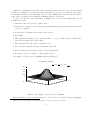
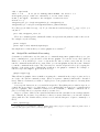
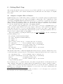
gnuplot 3.5∗ User’s Guide† Andy Liaw Department of Statistics, Texas A&M University [email protected] Dick Crawford Logicon RDA, Los Angeles, CA [email protected] February 27, 1995 Contents 1 Introduction 1 2 Starting gnuplot 2 3 Basics 3 4 Working in the gnuplot Environment 4.1 Online Help . . . . . . . . . . . . . . . 4.2 Command Line Editing and History . 4.3 User-Defined Constants and Functions 4.4 Script File and Batch Processing . . . . . . . 4 4 4 5 7 . . . . 7 8 9 10 12 5 More on Plotting 5.1 Two-dimensional Plots . 5.2 Three-dimensional Plots 5.3 Plotting Data Files . . . 5.4 Customizing Your Plot . . . . . . . . . . . . . . . . . . . . . . . . . . . . . . . . . . . . . . . . . . . . . . . . . . . . . . . . . . . . . . . . . . . . . . . . . . . . . . . . . . . . . . . . . . . . . . . . . . . . . . . . . . . . . . . . . . . . . . . . . . . . . . . . . . . . . . . . . . . . . . . . . . . . . . . . . . . . . . . . . . . . . . . . . . . . . . . . . . . . . . . . . . . . . . . . . . . . . . . . . . . . . . . . . . . . . . . . . . . . . . . . . . . . . . . . . 6 Getting Hard Copy 14 6.1 Output to Graphic Files or Printers . . . . . . . . . . . . . . . . . . . . . . . . . . . 14 6.2 Including Plots in A LATEX document . . . . . . . . . . . . . . . . . . . . . . . . . . . 15 7 Other Sources of Information 1 17 Introduction This document is written for you, the new user of gnuplot. Its goal is to show you how to use gnuplot to produce a variety of plots. For full details on commands and options, you are referred to the gnuplot manual. See also Section 7 for other sources of information. ∗ † Original software written by Thomas Williams, et al. Version 1 revision 15, February 27, 1995. 1 gnuplot is a command-line driven interactive plotting program. It is very easy to use (it actually has only two commands for creating plots: plot and splot), yet it is very powerful. It can produce several different kinds of plots with many options for customizing them, and can send the result to a wide range of graphic devices (graphics terminals, printers, or plotters). To give you some idea of the capabilities of gnuplot, here are some of the things that one can do with the program: • Univariate data series plots (e.g. time series) • Simple plots of built-in or user-defined functions (including step functions) in either Cartesian or polar coordinates • Scatter plots of bivariate data, with errorbar options • Bar graphs • Three-dimensional surface plots of functions like z = f (x, y), with options for hidden line removal, view angles, and contour lines • Three-dimensional scatter plots of trivariate data • Two- and three-dimensional plots of parametric functions • Plot data directly from tables created by other applications • Re-generate plots on a variety of other graphic devices An example of a plot created in gnuplot is shown in Figure 1.1 A Bivariate Density 1 2π 0.2 z exp[− 21 (x2 + y 2 )] 0.15 0.1 0.05 0 −4 −3 −2 −1 x 0 1 2 3 4 4 2 3 1 0 y −2 −1 −4 −3 Figure 1: An example of plot produced by gnuplot. In the following sections, you will learn how to do all of the above (and some more) in gnuplot. 1 This plot was created with the terminal type eepic. See Section 6.2 for more details. 2 2 Starting gnuplot gnuplot is available for a large number of computers using a variety of operating systems, including IBM-PCs and compatibles, many Unix workstations, Vax/VMS, Atari ST, and Amiga. For the purposes of this document, it is assumed that you are using either a PC (running MS-DOS, MSWindows 3.1, or OS/2 2.x) or a Unix workstation (running X Windows). It is also assumed that you have gnuplot properly installed on your system. Please refer to the README files included in the distribution for installation instructions. To start gnuplot under MS-DOS or Unix, just type the command gnuplot You will see the opening message and the gnuplot> prompt. If you get an error message like “command not found”, make sure that the directory where gnuplot resides is listed in the PATH statement in the file autoexec.bat (for DOS) or the initialization file (for Unix). To start gnuplot under MS Windows, double-click on the gnuplot icon. The gnuplot window will pop up with menus and buttons along the top, the opening message and the gnuplot> prompt inside the window. To start gnuplot under OS/2, open the folder where gnuplot is located, and double click on the gnuplot icon. The gnuplot window will pop up with the opening message and the gnuplot> prompt. The last line of the opening message tells you the “terminal type” currently set. For Unix it should be X11, for MS-DOS vgalib (if you have a VGA monitor), for MS Windows windows, and for OS/2 pm. Note: If you are on a PC running Kermit to connect to Unix via a modem, you can type the command: set terminal kc_tek40xx if you have a color monitor, or set terminal km_tek40xx if you have a monochrome monitor. This will enable you to see the high resolution plot on your PC screen. To restore the screen to text mode, set the terminal type to dumb. To exit gnuplot, you can type either exit, quit, or simply q. 3 Basics To start exploring gnuplot, try the following commands: plot cos(x) plot [-pi:pi] sin(x**2),cos(exp(x)) splot [-3:3] [-3:3] x**2*y The first plot command produces a plot of cos x. The second plot command produces a plot of the functions sin x2 and cos ex on the same graph, with x in the range (−π, π). The third command produces a three-dimensional surface plot of the function f (x, y) = x2 y. Note that you have used gnuplot’s built-in functions sin(), cos(), and exp(), as well as the built-in constant pi. There are many more. Please refer to the gnuplot manual for a complete list. Here are explanations of the above commands. The plot command tells gnuplot that you want to create a two-dimensional plot. In the first example, the range of x is not specified, so gnuplot 3 use its default range of (−10, 10). In the second example, the phrase [-pi:pi] following plot tells gnuplot to produce the plot with x in the range (−π, π). There are two functions specified, separated by a comma. This tells gnuplot to plot both functions on the same plot. Note that on a color screen, gnuplot uses different colors for the functions. On a monochrome display, the functions are plotted with different line styles. The third command tells gnuplot to create a three-dimensional plot (well, actually a two-dimensional projection of a three-dimensional plot, but you know that). The two pairs of brackets following splot set the range of the x-axis (first set of brackets) and the range of y-axis (second set of brackets). Note that the ranges are optional in both plot and splot. If ranges are not specified, gnuplot uses the ranges previously set. The ranges of y-axis in plot and the z-axis in splot are autoscaled by default, if not specified. If you want to specify the y-range but not the x-range, put in both sets of brackets but leave the first set empty, like plot [] [0:2] 1/(1+x**2) The same trick works with splot. The command set is used to control many options available in gnuplot (you have already seen set terminal). Many of the options control the appearance of the plot. In the previous examples, you saw that the ranges of the axes can be specified in the plotting command. The ranges can also be set before plotting, with the commands set xrange, set yrange, and set zrange. For example: set xrange [-.3:3.5] set yrange [:pi**2] set zrange [exp(3.66)/sin(1.2*pi):] Note that you can omit either the upper or lower limits. The limits can be either numbers, predefined constants , or expressions as complicated as in the third example. The difference between setting the ranges with plot (or splot) and with set xrange (or yrange or zrange) is that in the former case the ranges apply only to that single plot, whereas in the latter case they apply to all subsequent plots – until the ranges are reset, of course. (If the ranges are set both ways, the ones on the plot command will be used.) This is the case for all set commands. If you have set a range and want to return to gnuplot’s automatic range selection, the command is set autoscale haxisi, where haxisi is some combination of x, y, and z and, if you omit it, all axes will be autoscaled. You can also add axis labels and a title to the plot by the commands set xlabel, set ylabel, set zlabel, and set title. For example: set xlabel ’x’ set ylabel "Power Function" set zlabel ’Time (sec)’ set title ’Some Examples’ replot Note that both single quote and double quote are acceptable (but they must match). The replot command does what its name suggests; it redraws the previous plot, incorporating whatever changes have been introduced by intervening set commands. You’ll be using replot a lot when you are customizing a plot (which you’ll learn how to do in Section 5). You can also add another curve to the previous plot. Try 4 plot [-2*p1:2*pi] sin(x) replot tan(x) Note that the y-range adjusts itself. You cannot specify new ranges for the plot on the replot command (use the set commands), but you can do everything else that you can do with plot. 4 Working in the gnuplot Environment gnuplot’s interactive environment has many features that make it easy to use. In this section you will learn about some of these features. 4.1 Online Help gnuplot provides very detailed online help for all commands. The entries in the online help are identical to those you find in the gnuplot manual. To access the help facility, simply type a question mark (?) or help at the gnuplot> prompt. To get help on a particular command, type ? hcommandi. If you are using the DOS version and can not access the online help, please read the README file and check to make sure that gnuplot is properly installed on your PC. 4.2 Command Line Editing and History gnuplot has a mechanism that allows you to recall previous commands and edit them. On the PC, the up/down arrow keys are used to get the previous/next commands. The Home, End, and left/right arrow keys are used to move the cursor around (the Home and End keys move the cursor to the beginning and end of the line, respectively.). On Unix, the arrow keys can be used if you have the correct terminal setting. Otherwise the Emacs control sequence can be used (e.g., ^p for previous command, ^n for next command, ^b to move left one character, ^f to move right one character, ^d to delete a character, etc.). Another nice feature of gnuplot’s command line is that it will accept abbreviations of commands and keywords as long as they are not ambiguous. For example, replot can be abbreviated as rep, parametric as par, linespoints as linesp, etc. While this is handy for interactive gnuplot sessions, it may not be a good idea to abbreviate commands in script files (to be discussed later) because it make the commands less comprehensible. 4.3 User-Defined Constants and Functions You should familiarize yourself with the arithmetic and logical expressions in gnuplot. Basically, they are similar to Fortran and C expressions, e.g. ** for exponentiation, && for logical AND, || for logical OR, etc. For details on the complete set of operators, refer to the gnuplot manual. If you use some constants or functions repeatedly in your work, you might find it convenient to give them names that are easier to remember. For example, if you use the constants µ = 10.98765 and σ = 6.43321 very often, you can name them in gnuplot by mu=10.98765 sigma=6.43321 Now suppose you want to plot the function f (x) = √1 2πσ plot 1/(sqrt(2*pi)*sigma)*exp(-(x-mu)**2/(2*sigma**2)) 5 2 exp{ −(x−µ) 2σ2 }. You can now do You may find typing the above function cumbersome, especially if you need to use it several times. gnuplot lets you do this: f(x,mu,sigma)=1/(sqrt(2*pi)*sigma)*exp(-(x-mu)**2/(2*sigma**2)) (You could leave the mu and sigma out of the argument list if you don’t need to vary them.) You can now do things like plot [-5:15] f(x,6,1),f(x,3.5,2) Numbers without decimal points are treated as integers rather than as reals. Expressions using only integers are evaluated by integer arithmetic. Thus 1./4. = 0.25, but 1/4 = 0. This can lead to wrong results if you are not careful. Being able to define custom functions has a few advantages other than saving typing. Here is a handy trick: suppose you have the following function: f (x) = x(1 − x) x < −1 x−1 √x + 1 −1 ≤ x ≤ 4 x > 4. Defining this function in gnuplot can be done by stringing a few functions together: f1(x)=(x<-1) ? x*(1-x) : x-1 f2(x)=(x<=4) ? f1(x) : sqrt(x)+1 These function definitions may look strange to you if you are not familiar with the ternary operator hconditioni ? hexpression1 i : hexpression2 i in C. Here is what it means: if hconditioni is true, hexpression1 i is evaluated, otherwise hexpression2 i is evaluated. In the above example, if x < −1, f1(x) gets the value of x*(1-x), otherwise it gets the value of x-1. If x ≤ 4, f2(x) gets the value of f1(x) (where the condition x < −1 is tested and appropriate value is returned), or else f2(x) gets the value of sqrt(x). Go ahead and plot this function and see if you get what you have expected. Note that although the function above is defined differently in three intervals, it is continuous at the boundaries of those intervals. If the function is not continuous at the end points of the intervals, gnuplot will still connect the endpoints. If you want to plot a discontinuous function, you’ll need to define it in separate pieces and plot them together. The trick is to set the unwanted sections equal to something unprintable (no, this isn’t x-rated), such as f(x)=(x<0) ? cos(x) : sqrt(-1) g(x)=(x<0) ? x/0 : sin(x) This obviously would work for a continuous function as well. (It wouldn’t work at all if gnuplot were unfriendly enough to crash upon encountering mathematical no-no’s.) One other interesting use of the ternary operator is that it can be used to approximate the definite integral of some function. The example below is taken from the demo file bivariat.dem which is included in the gnuplot distribution. # integral2_f(x,y) approximates the integral from x to y. # define f(x) to be any single variable function # # the integral is calculated as the sum of f(x_n)*delta # do this (y-x)/delta times (from y down to x) 6 f(x) = exp(-x**2) delta = 0.02 # If you’re running under MS-DOS, use delta = 0.2 # integral2_f(x,y) takes two variables; x is the lower limit, # and y the upper. Calculate the integral of function f(t) # from x to y integral2_f(x,y) = (x<y)?integral2(x,y):-integral2(y,x) integral2(x,y) = (x>y)?0:(integral2(x+delta,y)+delta*f(x)) Note that f (x) is defined as exp{−x2 }. To plot the function and its integral can just do Rx −10 exp{−x 2 } dx, you plot f(x),integral2_f(-10,x) There is a command, print, which will evaluate an expression and print the result on the screen. For example, try the following: print cos(pi) print exp(-0.5*(1.96)**2)/sqrt(2*pi) One implication of this is that you can use gnuplot as a calculator.2 4.4 Script File and Batch Processing Sometimes you will want to use the same set of commands many times. gnuplot allows you to put those commands in a script file and load the file into gnuplot. You can use a text editor (such as Emacs, vi, or Norton Editor) to create or edit such a file. Once you have created the file, you can run the commands in that file in two ways. First, you can run gnuplot and use the load command to run the commands in the script. The other way is to run the script in batch mode by typing the filename of the script as the command line argument to the gnuplot command. For example, to run the script called myplot.gp in batch mode, type gnuplot myplot.gp This will invoke gnuplot. After it finishes executing the commands in the script, it exits, and you are back to the system command prompt. (There is a pause command, which will be discussed later.) This is convenient if you want to output plots to some graphics file instead of viewing them on the screen. A few special characters are very useful in script files. Everything after a number sign, #, on a single line in a script (or, for that matter, on a command line) is treated as a comment and is ignored by gnuplot. The continuation character is the backslash, \. Multiple commands can be placed on a single line if you separate them by a semicolon, ;. Suppose you have defined some variables and functions and customized some settings with the set command. If you want to keep all these so that you can use them later, you can write all these (along with all of the default values you have not set and the last plot or splot command) to a file by save ’mystuff.gp’ 2 Actually, there is a terminal type table in gnuplot which, when you plot or splot a function, prints a table of values (x and f (x) for plot, and x, y, and f (x, y) for splot). 7 The filename and extension are arbitrary, of course. If you only want to save the functions you have defined, you can use save function ’myfunc.gp’ The same applies to variable and set. To load the file into gnuplot, use the load command. For example: load ’mystuff.gp’ Included in the gnuplot distribution, along with demo files, is a file named stat.inc, which contains definitions of many cumulative distribution functions and probability density (or mass) functions for many continuous and discrete distributions. To access these functions, you can do load ’stat.inc’. The demo files prob.dem and prob2.dem show how these functions can be used. 5 More on Plotting You have already seen the basic plotting commands in Section 2. In this section, you will learn how to create several different kinds of plots with gnuplot. 5.1 Two-dimensional Plots gnuplot can create two types of two-dimensional plots. The first is the usual y = f (x) in Cartesian coordinates or r = f (θ) in polar coordinates. The other type is a parametric curve (e.g. x = t2 , y = cos t). Plotting y = f (x) should be a trivial task after going through the previous sections. To plot r = f (θ) in polar coordinates, you first tell gnuplot to switch to polar coordinates by the command set polar. The syntax for plotting functions in the polar coordinates is exactly the same as that for Cartesian coordinates, except that x is the angle and the value of the function is the radius. For example, to plot the function r = cos1 x , you can do the following: set polar plot 1/cos(x) Note that the default unit for the angle is radians. You can change the unit to degrees by set angle degree. You can change the name of the dummy variable from x to theta by set dummy theta plot 1/cos(theta) To switch back to Cartesian coordinates, use the command set nopolar. Parametric curves are very handy. If you define the x- and y-coordinates as functions of a dummy variable, t, you can plot things like circles, ellipses, and other curves that cannot be expressed in the functional form y = f (x). Try the following examples: set parametric plot sin(t), cos(t) plot 3*sin(t-3), 2*cos(t+2), cos(3*t), sin(2*t) set noparametric 8 The first command tells gnuplot that you want to plot parametric curves. The first plot is a circle (with aspect ratio distortion). The second plot shows an ellipse (the functions x = 3 sin(t − 3), y = 2 cos(t + 2)), and a strange-looking curve (the functions x = cos 3t, y = sin 2t). Note that up to three ranges can be specified on the plot command, in the order t, x, and y. The command set noparametric switches back to ordinary y = f (x) mode. You can also plot parametric curves in polar coordinates. In this case you define r = r(t) and θ = θ(t). Try the following: set parametric; set polar plot sin(t),cos(t) Did you guess what the curve will look like? In parametric polar mode, rrange sets the distance from the origin to the edge, xrange sets the angle, and yrange sets the extent of the plot, which will be square. For instance, try: set parametric; set polar set rrange [-1:1]; set yrange [-2:2] plot t,0 Note that under parametric mode, the range of t can be specified by the set trange command. The syntax is the same as set xrange. You can set the number of points where each function is to be evaluated by the command set samples. For example: set samples 100; plot f(x) set xrange [0:-10]; set samples 11; plot g(x) The first example tells gnuplot to plot f (x) at 100 points equally-spaced in the default x-range. The second example tells gnuplot to plot g(x) at integer-valued x from 0 to −10 (yes, you can reverse the direction that an axis increases just by specifying the endpoints appropriately). By now you have noticed that each function is listed in the key in the upper right-hand corner of the plot. Perhaps you’d like to specify a title other than the one gnuplot gives you by default. The option is simply title ’hcurve-namei’. Similarly you can control how the curve is shown by adding the option with hstylei where hstylei can be lines, points, impulses, etc. The gnuplot manual has the complete list. If you have several curves on your plot and they are plotted with the same style, gnuplot has several versions of each style which it cycles through. You can override its selections by adding the integral style codes (line, then point) after with hstylei. (You can see all of the available options by entering the command test.) Try set samples n+1; set xrange [0:n] mu=5; n=15; p=0.4 i(x)=int(x+.1) pd(x)=mu**x*exp(-mu)/i(x)! bd(x)=n!/(i(x)!*(n-i(x))!)*p**x*(1-p)**(n-x) plot bd(x) title ’binomial distribution, p=0.4’ with linespoints,\ pd(x) title ’Poisson distribution, mu=5’ with impulses You can leave a function out of the key entirely by replacing title ’...’ with notitle, and you can eliminate the key completely by the command set nokey. If you want to plot a bargraph, use with boxes. The width of the bars are controlled by the set boxwidth command. Without any argument, set boxwidth tells gnuplot to calculate the width so that successive bars are adjacent to each other (as in a histogram). 9 5.2 Three-dimensional Plots For three-dimensional plots, gnuplot supports only Cartesian coordinates. Therefore you can only plot surfaces of the type z = f (x, y) or x = x(u, v), y = y(u, v), z = z(u, v). Try the following: set hidden3d f(x,y)=x**2+x*y-y**2 splot f(x,y) set parametric splot u-v**2, u**2*v, exp(v) set noparametric The command set hidden3d turns on the hidden-line removal, which means lines “behind” other lines are not drawn. This feature is not available in the MS-DOS version due to memory limitations. The Windows, OS/2 and Unix versions do support this feature, however. gnuplot can generate contour lines on the xy-plane, on the surface itself, or both. The command is set contour hplacei, where hplacei is either base, surface, or both. You can control the contour levels by the command set cntrparm hoptionsi. Here are a few examples: set cntrparam levels auto 5 # set 5 automatic levels set cntrparam levels incr 0,.1,1 # 11 levels from 0 to 1 set cntrparam levels disc .1,.2,.4,.8 # 4 discrete levels Please refer to the online help or the gnuplot manual for more advanced options for set cntrparam. Note that on a color output device, contour lines at different levels are drawn with different colors. On a monochrome display or non-color printer, they are shown in different line styles. Also note that if you specify contours on the surface and turn on the hidden-line removal, the contour lines will not be shown. This is because contour lines are drawn “underneath” the surface, not on top of the surface. You can specify set nosurface to plot only the contour lines. gnuplot cannot generate a contour plot from parametric functions. The number of values of each coordinate for which the function is evaluated (and hence the number of lines on the surface) is set by the command set isosamples hx-number i, hy-number i, where hx-number i and hy-number i are the number of lines to draw along the x- and y-axes. set samples (discussed above) sets the number of points evaluated along each isosample. Sometimes you may want to look at the three-dimensional surface plot from another direction. This is accomplished by the set view command. The first number following set view changes the rotation angle around the x-axis and the second changes the rotation around the z-axis. The default view is 60 degrees about the x-axis and 30 degrees about the z-axis. For example, try set xlabel ’x’; set ylabel ’y’ splot [0:1] [0,1] x**2*y*(1-y) set view 15,75 replot Try a few other rotations. You can make a two-dimensional contour map of a surface by using the settings set nosurface set contour set view 0,0 replot 10 but the y-axis is labeled on the right. Different rotations around the z axis may come closer to what you want. 5.3 Plotting Data Files gnuplot can produce plots from tabulated data. In this section, you will see how to handle different kinds of data with gnuplot. Note that you can put comments in a data file the same way you can in a gnuplot script file; gnuplot ignores everything on the line after the # symbol. The essential rule of data organization is that gnuplot reads one data point per line. Perhaps the simplest data to plot are a series. Suppose you have the data for a variable stored in a column in a plain text file. The command plot ’hdata-filenamei’ will plot the values of the variable as the y-coordinates – the first value with x-coordinate 0, the second value with x-coordinate 1, etc. This is useful for plotting time series data. If your data really are a time series, you may want a plot where the x-axis is either the dayof-the-week or the month. The commands set xdtics and set xmtics will do these for you. For xdtics, 0 is treated as Sunday, 1 as Monday and so on. Numbers larger than 6 are converted modulo 7. For xmtics, 1 is treated as January, 2 as February and so on. Numbers larger than 12 are converted modulo 12 plus 1. You can also plot series from a bivariate data set. In this case the first column in the data file is taken as the x-coordinate and the second column is taken as the y-coordinate. This allows you to plot data with scattered x’s or series data with a variable step size. The data file can have many columns. You can tell gnuplot which columns to plot by the using keyword following ’hdata-filenamei’ on the plot command. For example, suppose your data set is stored in the file reg.dat and contains ten columns. Consider the following commands: plot ’reg.dat’ using 1:2 plot ’reg.dat’ using 2:3, ’reg.dat’ using 2:6,\ ’reg.dat’ using 8:4 with lines The first command plots the first column in the file as x and the second column as y (which is the default). The second command overlays three plots: third column (y) versus second column (x), sixth column (y) versus second column (x), and fourth column (y) versus eighth column (x). The first two are plotted with points, and the third with a line. With the using option, you can now plot data directly from labeled tables prepared by some other program, as long as you remember to put the # at the beginning of each heading line. When you plot a data set with style lines, a null line (a line of zero length – not a line of spaces) in the data file breaks the line in the plot. If you wish to put error bars on your plotted data, you need to give gnuplot the error data in either a three-column (x, y, ∆y) or a four-column (x, y, ylow , yhigh ) format. You then specify with errorbars. There is also a style boxerrorbars, which requires a fifth column of data containing the box width. If you want to have control over the width of the bars in a bar graph, the bar width data must be in the fifth column of the data file (or the fifth item in the using list, e.g. using 1:2:2:2:3 for a three-column file) or defined by the command set boxwidth. If you have lots of data and only want to put error bars on some of them, there is no way to do so directly in gnuplot. You’ll need to make a separate file with the subset, or you could edit the data file, setting the errors to zero for those points to be plotted without error bars. If you’re running under Unix, you could use a filter like awk to do the same thing. 11 One nice feature of gnuplot is that it can transform the y values of the data with the thru option of the plot command. For example, plot ’reg.dat’ thru sqrt(x) √ produces the same plot as the first example above, except that the y data are transformed to y. The function doesn’t have to be one built into gnuplot; you can define one yourself. Just remember that the syntax is a bit odd; you plot thru f(x) even though you’re really plotting f (y). A transformation can only be applied to the y data in a two-dimensional plot; currently there is no built-in mechanism in gnuplot to transform the x data, nor is there any transformation available for three-dimensional plots. A short discussion of thru can be found in the manual or online help, under plot data-file, which also mentions how to transform both x and y with awk under Unix. If you are interested in fitting a curve to a set of x-y data, there are several programs (fudgit and gnufit3 , for example) that perform nonlinear least squares fits. Each of these couples easily to gnuplot. If you are looking for more extensive features, check out Octave4 (available for Unix only). Octave is a Matlab-like program that performs many numerical computations. It uses gnuplot as its plotting tool. Thus you can do curve fitting to your data and then pass the result to gnuplot from Octave, for instance. You can create three-dimensional scatter plots as easily as two-dimensional ones. Suppose the data file 3d.dat contains five columns of numerical data. The commands splot ’3d.dat’ splot ’3d.dat’ using 1:4:3 first plot the points (x, y, z) with first column as x, second as y, and third column as z, and then first column as x, fourth column as y, and third column as z. The file 3d.dat can even contain more than one set of data. If you separate the sets with two null lines, gnuplot will refer to the first set as index 0, the second as index 1, and so on. You tell gnuplot which one to plot by placing index and the number immediately after hdata-filenamei. (It is a pity that plot doesn’t have this option, too.) If you want to make a contour plot from a three-dimensional data set, the number of isosamples is set by the data. Your data set must be organized as rasters, i. e., x(1) x(1) x(1) y(1) y(2) y(3) z(1,1) z(1,2) z(1,3) y(1) y(2) y(3) z(2,1) z(2,2) z(2,3) .. . x(2) x(2) x(2) .. . and so on. Each raster of constant x-index is terminated by a null line. (The data can be a single column of z’s, but the null lines will still be needed.) There must be the same number of points in each raster, but the x and y values don’t have to be the same! 3 4 gnufit can be found at dartmouth.edu. fudgit can be found at prep.ai.mit.edu. Octave is written by J. W. Eaton. It is available from ftp.che.utexas.edu. 12 If you have data that are not defined in the tidy grid fashion shown above and you want to draw contours anyway, gnuplot has a command set dgrid3d which does the necessary interpolations for you. The options on the plot and splot commands are order-dependent. The proper sequences are plot ranges data-file thru using title style plot ranges functions title style splot ranges data-file index using title style splot ranges functions title style where we have listed only the options for clarity. 5.4 Customizing Your Plot In this section you will see how your plots can be customized further with the set command. Note that you can check the settings of all the options that the command set controls by the show command. For example, to check the current x range, use the command show xrange. set logscale makes the specified axis logarithmic. It takes one or two arguments. The first argument can be x, y, xy, or z. The second argument specifies the base of the logarithms and is optional (the default is base 10). set nologscale turns off logarithmic scaling. set zeroaxis causes the x- and y-axes to be plotted, if the plotting range contains either axis. set nozeroaxis turns off plotting of the axes. The commands set xzeroaxis, set yzeroaxis, set noxzeroaxis and set noyzeroaxis work similarly. set key tells gnuplot where to put the legend of the plot. For a two-dimensional plot, set key x,y says to put the legend at the point (x, y) in the plot. For a three-dimensional surface plot, the z-coordinate can be specified. The units for x and y are the same as for the plotted data or functions. x and y are Cartesian coordinates even in polar mode. set label lets you add text to the plot. For example, set label 1 ’Max’ at .5, 2.3 center set label 2 ’Min’ at 1.3, -.3 right set label 2 at 1.3, .3 put the text “Max” centered at the point (0.5, 2.3), and the text “Min” right-justified at the point (1.3, −0.3). The number after the keyword label is the identifier for that label. The third sample shows that you can move an identified label to a different position (or change its justification) without retyping the label. The same comments about the position that were made in reference to set key apply here. To turn off label number two, use set nolabel 2. To turn off all labels, use set nolabel. set arrow can be used to draw arrows or line segments in a plot. For example, set arrow 1 from 1,2 to -.5,3 set arrow 2 to 4,4 nohead The first command draws an arrow from the point (1, 2) to the point (−0.5, 3). The second command draws a line segment (no arrow head) from the origin (since the from is omitted) to the point (4, 4). The same comments about the position that were made in reference to set key once again apply here. The command set noarrow can be used to turn off one or all arrows, like set nolabel. The identifier works the same way as in set label, too. 13 set grid causes grid lines to be drawn (in dotted lines) on the plot. For a three-dimensional surface plot, the grid lines are drawn at the base of the plot. set nogrid turns off the grid lines. set border causes a box to be drawn around the plot (the default setting). To get rid of the box, use set noborder. set data hoptionsi and set function hoptionsi can be used to control the default line or point style for plotting data files and functions. These are similar to the with option on plot and splot, but apply to more than one plot. For example, set data style points set function style lines plot f1(x),f2(x),’data1’,’data2’ would produce a plot with lines (one solid, one dashed) representing the functions f 1 (x) and f2 (x) and with two different symbols representing the data in the two files. set tics takes one argument: either in or out. This indicates whether the tic marks are to be plotted inside the box or outside the box. set xtics gives you control over which x-values are to be given tic marks and how these are to be labeled. There are two syntaxes: set xtics 0,.5,10 set xtics (’5’ 1, ’ ’ 2, ’Hi, Mom’ 4) The first example will produce labeled tics at 0, .5, 1, 1.5, ..., 9.5, 10. The second will produce three tic marks, one of which will be unlabeled. If no label is specified, the tic mark will be labeled with its x-value. set noxtics does precisely what you think it does. set ytics and set ztics work the same way. set ticslevel sets the “height” of the surface when doing splot. set tickslevel 0 causes the surface to be drawn from the base. Giving a positive argument to set ticslevel “elevates” the surface. Negative arguments are not allowed. set size hheighti,hwidthi changes the size of the plot. The argument hheighti and hwidthi are multiples of the default size (which is different for each terminal type). For example, the terminal type postscript has default size 10 inches wide and 7 inches high. The command set size 5./10., 5./7. changes the size to 5 inches by 5 inches. This command is useful for controlling the size of your plot when printing it on paper. But it doesn’t scale the plot quite like you’d expect, because size actually scales an area larger than the plot to include the exterior labels. So if you want a plot of a specific size on the paper (for overlays, perhaps), you’ll have to experiment. If you are using a windowing system, (e.g. MS-Windows, OS/2, X Windows, etc.) you can change the size of the plot simply by changing the size of the plot window. The pause command is useful when you are creating several plots with a script file and viewing them on the screen. The commands plot f(x) pause -1 ’Hit <return> for next plot’ plot g(x) plot f (x), and then show the message “Hit <return> for next plot” on the screen. After you hit the return key, g(x) is plotted. A positive argument to the pause command is taken as the number of seconds to wait before going on to the next command. 14 6 Getting Hard Copy After going through the previous sections, you probably would like to get your plots printed on paper or imported into your document. In this section you will learn some of the ways to accomplish these tasks. 6.1 Output to Graphic Files or Printers gnuplot has support for a rather large variety of printers. To see the list of supported printers (and other graphic formats), type set term at the gnuplot command line. The command set term hterm-typei tells gnuplot that the subsequent plots are to be generated on hterm-typei. If you are using a Laserjet II compatible printer, you can use hpljii5 . If you are printing on a PostScript printer, you can use postscript. There are options for controlling the orientation, fonts, font sizes, etc. For the details, check the online help or the gnuplot manual. Once you have set the terminal type to the correct device, you need to tell gnuplot where you want to send the output. This is done by set output ‘hfilenamei’, where hfilenamei is the name of file where the plot is to be stored. On Unix systems, you can do set term ‘| lpr -Php1’ to send the plot directly to the printer (the -Php1 is the lpr option for selecting the printer). However, the plot won’t be printed until you exit gnuplot. 2 2 1 exp[ −(x 2+y ) ] to the file bivnorm.ps Here is an example for plotting the function f (x, y) = 2π and then printing it out: f(x,y)=exp(-.5*(x**2+y**2))/(2*pi) set title ’Bivariate Normal Density’ set xlabel ’x’ set ylabel ’y’ splot [-4:4] [-4:4] f(x,y) # check the plot on screen set term post # set terminal type to postscript set output ’bivnorm.ps’ # set the output file to bivnorm.ps replot # regenerate last plot set term x11 # reset terminal type to the screen !lpr -Php1 bivnorm.ps The last line starts with !, which tells gnuplot that what follows is a system command. If you are on a PC and want to generate the plot to the Laserjet format, the last five lines can be replaced by set term hpljii 150 set output ’bivnorm.hp’ replot set term vgalib !copy bivnorm.hp prn /b # # # # set terminal type to Laserjet II set the output file to bivnorm.hp regenerate last plot reset terminal type to the screen If you want the plot to be printed directly to the printer, use prn instead of a filename in the set term command. Just typing set output without any argument sets output to standard output. If you want to generate several plots in the same file, you can use the clear command to tell gnuplot to go to a new page. If you set terminal to a screen device, the clear command will clear the graphics screen/window. 5 If your printer has less than one megabyte of RAM, you will have to do set term hpljii 150 to generate the plot at 150 dpi so it won’t overflow the printer’s memory. 15 1 An Example of Plotting in LATEX with gnuplot 2 sin ex2 cos ex 0.8 0.6 0.4 0.2 0 −0.2 −0.4 −0.6 −0.8 −1 π −2 − π4 0 π 4 π 2 Figure 2: This the example plot generated with the latex terminal type in gnuplot. There are several ways to put multiple plots on the same page, none of which is trivial. If you are using a word processor or desktop publishing program that can import one of the graphics formats supported by gnuplot, (e.g. pbm, eps, aifm, hpgl, dxf, etc.) this should not be a problem. If you are using dvips to produce TEX/LATEX output, you can use the psfig macros to put multiple PostScript files on the same page. If you are using LATEX, the instructions in Section 6.2 should help you achieve this. 6.2 Including Plots in A LATEX document There is a latex terminal type in gnuplot, which lets you generate plots in LATEX’s picture environment format. Here’s an example: f(x)=sin(exp(x**2)) g(x)=cos(exp(x**2)) set term latex set samples 500 set output ’example.tex’ set title ’An Example of Plotting in \LaTeX\ with {\sf gnuplot}’ set format y ’$%g$’ set xtics (’$-\frac{\pi}{2}$’ -pi/2, ’$-\frac{\pi}{4}$’ -pi/4,\ ’0’ 0, ’$\frac{\pi}{4}$’ pi/4, ’$\frac{\pi}{2}$’ pi/2) set xrange[-pi/2:pi/2] plot f(x) title ’$\sin e^{x^2}$’, g(x) title ’$\cos e^{x^2}$’ Then in the LATEX document, where you want to insert the plot, do the following: \begin{figure} \begin{center} \input{example.tex} 16 \end{center} \caption{This the example plot generated with the \cmd{latex} terminal type in {\sf gnuplot}.} \end{figure} You should get the plot shown in Figure 2. Note that the number of points to be evaluated is set to 500. This is done to improve the appearance of the curves on paper. gnuplot’s default setting of 100 points may be sufficient for viewing on the screen, but the resolutions of printers are usually much higher than that of screen. For more details, please refer to the document LATEX and the GNUPLOT Plotting Program by David Kotz, which is included with the gnuplot distribution. If you are using a PostScript device for LATEX output, there is a pslatex terminal type, which uses LATEX to typeset the title, labels, etc. and PostScript \specials for the plot. The quality of the plot is better than the plain LATEX’s native picture environment. The output from gnuplot with the pslatex terminal type can be inserted into your LATEX document the same way as described above. However, most dvi previewers don’t support the PostScript specials. Thus you won’t be able to preview the plot with the rest of the document. There are a few drawbacks of using the latex terminal type. For one, the plot is drawn with commands in LATEX’s picture environment. Lines can only be drawn in certain slopes. Thus the appearance of the plot can be less than satisfying. For another, it is almost impossible to import a three-dimensional surface plot into LATEX with it because it will almost always exceed LATEX’s capacity. Using pslatex instead of latex usually doesn’t help. An alternative is the eepic terminal type. eepic is an extended picture environment for LATEX. Figure 1 was created with the eepic terminal type. To use eepic, you need the files epic.sty and eepic.sty (available from any Comprehensive TEX Archive Network sites, e.g., pip.shsu.edu). You need to load these two style files as options in the documentstyle statement. Then you can import the output from gnuplot as described above. 7 Other Sources of Information If you have questions that are not answered in this guide, there are several places to look for help. The first place you should look is the gnuplot manual or the online help facility. These contain the same information. The manual has fairly detailed explanations of all the commands and their options6 . However, the commands are listed in alphabetical order. This is fine if you want to know what a command does or what options go with it, but it’s not so useful if you don’t know how to do something at all. The online help is menu-driven, but still isn’t particularly helpful if you don’t know what to look for. (This is one of the motivations for this User’s Guide.) There are many demo gnuplot scripts included in the distribution. They are in the DEMO subdirectory on your PC. There are a great many tips and tricks you can learn from these scripts, so check them out. Also included with the distribution is a file 0FAQ. This file contains frequently asked questions related to gnuplot and their answers. The most updated version of the FAQ is posted to the newsgroup comp.graphics.gnuplot every two weeks. If you cannot find an answer to your question in the above mentioned documents, you can check out the newsgroup comp.graphics.gnuplot. It may very well be that someone has asked the same question and the answer was posted. If not, you can post your question there. 6 There are also bits and pieces of tips and tricks in the manual, buried under the related commands. E.g. you can find instructions to save a plot to Metafont format and import it into TEX, in the entry set terminal mf detailed. 17 The official distribution site of gnuplot is ftp.dartmouth.edu. You can find the source of the latest version there via anonymous ftp. There is a contrib section, which contains many extensions/modifications to gnuplot. The Macintosh version of gnuplot is also contained in the contrib section. The latest version of this document can be obtained by anonymous ftp to picard.tamu.edu in the directory /pub/gnuplot. 18