1
AT&T Bell Laboratories
Murray Hill, New Jersey 07974
Computing Science Technical Report No. 114
Grap — A Language for Typesetting Graphs
Tutorial and User Manual
Jon L. Bentley
Brian W. Kernighan
Revised, May 1991
Grap — A Language for Typesetting Graphs
Tutorial and User Manual
Jon L. Bentley
Brian W. Kernighan
AT&T Bell Laboratories
Murray Hill, New Jersey 07974
ABSTRACT
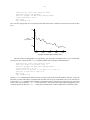
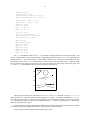
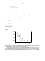
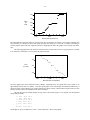
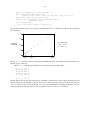
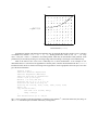
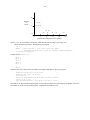
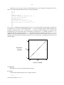
Grap is a language for describing plots of data. This graph of the 1984 age distribution in
the United States
5
4
Population
(in millions)
3
2
1
0
0
20
40
1984 Age
60
80
is produced by the grap commands
coord x 0,89 y 0,5
label left "Population" "(in millions)"
label bottom "1984 Age"
draw solid
copy "agepop.d"
(Each line in the data file agepop.d contains an age and the number of Americans of that age
alive in 1984; the file is sorted by age.)
The grap preprocessor works with pic [4] and troff [5]. Most of its input is passed through
untouched, but statements between .G1 and .G2 are translated into pic commands that draw
graphs.
Revised, May 1991
Grap — A Language for Typesetting Graphs
Tutorial and User Manual
Jon L. Bentley
Brian W. Kernighan
AT&T Bell Laboratories
Murray Hill, New Jersey 07974
1. Introduction
Grap is a language for describing graphical displays of data. It provides such services as automatic scaling
and labeling of axes, and for statements, if statements, and macros to facilitate user programmability. Grap is
intended primarily for including graphs in documents prepared on the UNIX operating system, and is only marginally useful for elementary tasks in data analysis.
Section 2 of this document is a tutorial introduction to grap; readers who find it slow going may wish to skim
ahead. The examples in Section 3 illustrate the various kinds of graphs that grap can produce and some common
grap idioms. Mundane matters about using grap are discussed in Section 4, and Section 5 contains a brief reference
manual.
We have tried to illustrate good principles of statistics and graphical design in the graphs we present. In several places, though, good taste has lost to the necessity of illustrating grap capabilities. Readers interested in statistical integrity and taste should consult the literature, for example [2], [6], [3].
2. Tutorial
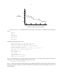
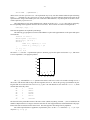
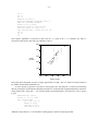
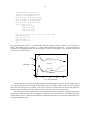
The following is a simple grap program†
.G1
54.2
49.4
49.2
50.0
48.2
...
43.87
.G2
The single number on each line is the winning time in seconds for the men’s 400 meter run, from the first modern
Olympic Games (1896) to the twenty-first (1988). If the file olymp.g contains the text above, then typing the command
grap olymp.g | pic | troff > junk
creates a troff output file junk that contains the picture
__________________
† Throughout this document we will show only the first five lines and the last line of data files; omitted lines are indicated
by ‘‘...’’.
-2-
•
50
• •
•
•
•
• •
•
• • • •
45
• •
•
0
5
10
• • • •
•
15
20
The graph shows the decrease in winning times from 54.2 seconds to 43.87 seconds. If the times are contained in
the file 400mtimes.d, we could produce the same graph with the shorter program
copy "400mtimes.d"
Writing copy fname"" in a grap program is equivalent to including the contents of file fname at that point in the
file. (In the interests of compatibility with other programs, include is a synonym for copy.)
Each line in the file 400mpairs.d contains two numbers, the year of the Olympics and the winning time:
1896
1900
1904
1908
1912
...
1988
54.2
49.4
49.2
50.0
48.2
43.87
If we plot this data with the program
copy "400mpairs.d"
the bottom (x) axis represents the year of the Olympics.
•
50
••
•
•
•
••
••
••
45
•
••
•
1900
••••
•
1950
The ‘‘holes’’ in x-values reflect the fact that the 1916, 1940, and 1944 Olympics were cancelled due to war. Because
the previous data (in 400mtimes.d) had just one number per line, grap viewed it as a ‘‘time series’’ and supplied
x-values of 1 , 2 , 3 , . . . before plotting the data as y-values. The input to the second program has two values per
line, so they are interpreted as (x,y) pairs.
-3-
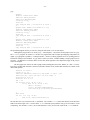
Rather than a scatter plot of points, we might prefer to see the winning times connected by a solid line. The
program
draw solid
copy "400mpairs.d"
produces the graph
50
45
1900
1950
Eric Liddell of Great Britain won his gold medal in Paris in 1924 with a time of 47.6 seconds. (Remember ‘‘Chariots of Fire’’?)
We can make the graph more attractive by modifying its frame and adding labels.
frame invis ht 2 wid 3 left solid bot solid
label left "Time" "(in seconds)"
label bot "Olympic 400 Meter Run: Winning Times"
draw solid
copy "400mpairs.d"
The frame command describes the graph’s bounding box: the overall frame (which has four sides) is invisible, it is
2 inches high and 3 inches wide (which happen to be the default height and width), and the left and bottom sides are
solid (they could have been dashed or dotted instead). The labels appear on the left and bottom, as requested.
50
Time
(in seconds)
45
1900
1950
Olympic 400 Meter Run: Winning Times
To set the range of each axis, grap examines the data and pads both dimensions by seven percent at each end.
The coord (‘‘coordinates’’) command allows you to specify the range of one or both axes explicitly; it also turns
off automatic padding.
-4-
frame invis ht 2 wid 3 left solid bot solid
label left "Time" "(in seconds)"
label bot "Olympic 400 Meter Run: Winning Times"
coord x 1894,1990 y 42,56
draw solid
copy "400mpairs.d"
The y-axis now ranges from 42 to 56 seconds (a little more than before), and the x-axis from 1894 to 1990 (a little
less).
55
Time 50
(in seconds)
45
1900
1920
1940
1960
1980
Olympic 400 Meter Run: Winning Times
The ticks in the preceding graphs were generated by grap guessing at reasonable values. If you would rather
provide your own, you may use the ticks command, which comes in the flavors illustrated below.
frame invis ht 2 wid 3 left solid bot solid
label left "Time" "(in seconds)" left .2
label bot "Olympic 400 Meter Run: Winning Times"
coord x 1894,1990 y 42, 56
ticks left out at 44 "44", 46, 48 "48", 50, 52 "52", 54
ticks bot in from 1900 to 1980 by 20
draw solid
copy "400mpairs.d"
The first ticks command deals with the left axis: it puts the ticks facing out at the numbers in the list. Grap puts
labels only at values with strings, except that when no labels at all are given, each number serves as its own label, as
in the second ticks command. That command is for the bottom axis: it puts the ticks facing in at steps of 20 from
1900 to 1980. The command ticks off turns off all ticks. Grap does its best to place labels appropriately, but it
sometimes needs your help: the left .2 clause moves the left label 0.2 inches further left to avoid the new ticks.
-5-
52
Time
(in seconds)
48
44
1900
1920
1940
1960
1980
Olympic 400 Meter Run: Winning Times
The file 400wpairs.d contains the times for the women’s 400 meter race, which has been run only since
1964.
1964
1968
1972
1976
1980
...
1988
52
52
51.08
49.29
48.88
48.65
To add these times to the graph, we use
frame invis ht 2 wid 3 left solid bot solid
label left "Time" "(in seconds)" left .2
label bot "Olympic 400 Meter Run: Winning Times"
coord x 1894,1990 y 42, 56
ticks left out at 44 "44", 46, 48 "48", 50, 52 "52", 54
ticks bot in from 1900 to 1980 by 20
draw solid
copy "400mpairs.d"
new dotted
copy "400wpairs.d"
"Women" size -3 at 1958,52
"Men" size -3 at 1910,47
The new command tells grap to end the old curve and to start a new curve (which in this case will be drawn with a
dotted line). Text is placed on the graph by commands of the form
"string" at xvalue, yvalue
The size clauses following the quoted strings tell grap to shrink the characters by three points (absolute point sizes
may also be specified). Strings are usually centered at the specified position, but can be adjusted by clauses to be
illustrated shortly.
-6-
52
Time
(in seconds)
Women . . . . .
..
..
..
..
......
48
...
Men
44
1900
1920
1940
1960
1980
Olympic 400 Meter Run: Winning Times
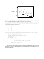
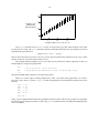
The file phone.d records the number of telephones in the United States from 1900 to 1970.
00 1.3
01 1.8
02 2.3
03 2.8
04 3.3
...
70 120.2
Each line gives a year and the number of telephones present in that year (in millions, truncated to the nearest hundred thousand). The simple grap program
copy "phone.d"
produces the simple graph
100
50
0
•
•
•
•
•
•
•
••
•
•
••
•
••
••
•
••
••
•
••
•••••
•
•••
••
•
•
•
•
•
•
••
••
••••••••
•••••••••
•
•
•
••
••
0
20
40
60
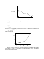
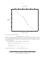
The number of telephones appears to grow exponentially; to study that we will plot the data with a logarithmic
y-axis by adding log y to the coord command. We will also add cosmetic changes of labels, more ticks, and a
solid line to replace the unconnected dots.
-7-
label left "Millions of" "Telephones" "(log scale)" left .5
coord x 0,70 y 1,130 log y
ticks left out at 1, 2, 5, 10, 20, 50, 100
ticks bot out at 0 "1900", 70 "1970"
ticks bot out from 10 to 60 by 10 "’%g"
draw solid
copy "phone.d"
The third ticks command provides a string that is used to print the tick labels. C programmers will recognize it as
a printf format string; others may view the %g as the place to put the number and anything else (in this case just
an apostrophe) as literal text to appear in the labels. To suppress labels, use the empty format string (""). The program produces
100
50
Millions of
Telephones
(log scale)
20
10
5
2
1
1900
’10
’20
’30
’40
’50
’60
1970
The number of telephones grew rapidly in the first decade of this century, and then settled down to an exponential
growth rate upset only by a decrease in the Great Depression and a post-war growth spurt to return the curve to its
pre-Depression line.
Our presentation so far has been to start with a simple grap program that illustrates the data, and then refine it.
Later in this document we will ignore the design phase, and present rather complex graphs in their final form.
Beware.
All the examples so far have placed data on the graph implicitly by copying a file of numbers (either a time
series with one number per line or pairs of numbers). It is also possible to draw points and lines explicitly. The
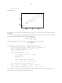
grap commands to draw on a graph are illustrated in the following fragment.
-8-
frame ht 2 wid 2
coord x 0,100 y 0,100
grid dotted bot from 20 to 80 by 20
grid dotted left from 20 to 80 by 20
"Text above"
above at 50,50
"Text rjust " rjust at 50,50
bullet at 80,90
vtick at 80,80
box
at (80,70)
times at 80, 60
circle at 50,50
circle at 50,80 radius .25
line dashed from 10,90 to 30,90
arrow from 10,70 to 30,90
draw
draw
next
next
next
next
next
next
A
B
A
B
A
A
B
B
solid
dashed delta
at 10,10
at 10,20
at 50,20
at 90,10
at 50,30
at 90,30
The grid command is similar to the ticks command, except that grid lines extend across the frame. The
next few commands plot text at specified positions. The plotting characters (such as bullet) are implemented as
predefined macros — more on that shortly. Unlike arbitrary characters, the visual centers of the markers are near
their plotting centers. The circle command draws a circle centered at the specified location. A radius in inches
may be specified; if no radius is given, then the circle will be the small circle shown at the center of the graph. The
line and arrow commands draw the obvious objects shown at the upper left.
.
.
.
.
.
.
.
.
.
.
.
.
.
.
.
.
.
.
.
.
•
.
.
.
.
.
.
.
.
.
.
.
.
.
.
.
.| . . . . . . . .
.
.
.
.
.
.
.
.
.
.
.
.
.
.
.
.
.
.
.
.
.
.
.
.
.
.
.
.
.
80
.
.
.
.
.
.
.
.
.
.
.
.
.
.
.
.
.
.
.
.
.
.
.
.
.
.
.
.
60 . . . . . . . . .. . . . . . . . .. . . . . . . . .. . . . . . . . ×.. . . . . . . . .
.
.
.
.
Text
above
.
.
.
.
.Text rjust
.
.
.
.
.
.
.
.
.
.
.
.
.
.
.
40 . . . . . . . . .. . . . . . . . .. . . . . . . . .. . . . . . . . .. . . . . . . . .
.
.
.
.
.
.
.
.
.
.
.
.
∆
∆
.
.
.
.
.
.
.
.
.
.
.
.
.
.
.
.
.
.
.
.
.
.
.
.
.
.
.
.
.
.
.
.
.
.
.
.
.
.
.
.
.
.
.
.
.
.
.
.
.....
20 ∆ .
.
.
.
.
.
.
.
.
.
.
.
.
.
.
.
.
.
.
.
.
.
.
.
.
.
.
.
.
.
.
.
20
40
60
80
This figure also illustrates the combined use of the draw and next commands. Saying draw A solid
defines the style for a connected sequence of line fragments to be called A. Subsequent commands of next A at
point add point to the end of A. There are two such sequences active in the above example (A and B); note that their
next commands are intermixed. Because the predefined string delta follows the specification of B, that string is
plotted at each point in the sequence.
Grap has numeric variables (implemented as double-precision floating point numbers) and the usual collection
of arithmetic operators and mathematical functions; see the reference section for details.
Grap provides the same rudimentary macro facility that pic does:
-9-
define name
{ replacement text }
defines name to be the replacement text. The replacement may be any text that contains balanced open and closing
braces { }. (Alternatively, the replacement text may be quoted by any single character that does not appear in the
replacement; the string is terminated by the next occurrence of that character.) Any subsequent occurrence of name
will be replaced by replacement text.
The replacement text of a macro definition may contain occurrences of $1, $2, etc.; these will be replaced by
the corresponding actual arguments when the macro is invoked. The invocation for a macro with arguments is
name(arg1, arg2, ...)
Non-existent arguments are replaced by null strings.
The following grap program uses macros and arithmetic to plot crude approximations to the square and square
root functions.
frame ht 1.5 wid 1.5
define square { ($1)*($1) }
define root { ($1ˆ0.5) }
define P {
times at i, square(i); i = i+1
circle at j, root(j); j = j+5
}
i = 1; j = 5
P; P; P; P; P
The macro root uses the ˆ exponentiation operator. (Because grap has the square root function sqrt, that macro
is in fact superfluous.) The program produces
×
25
20
×
15
10
×
5
0
×
×
0
5
10 15 20 25
The copy command has a thru parameter that allows each line of a file to be treated as though it were a
macro call, with the first field serving as the first argument, and so on. This is the typical grap mechanism for plotting files that are not stored as time series or as (x,y) pairs. We will illustrate its use on the file states.d, which
contains data on the fifty states.
AK
WY
VT
DE
ND
...
CA
1
1
1
1
1
401851
469557
511456
594338
652717
45
23667902
The first field is the postal abbreviation of the state’s name (Alaska, Wyoming, Vermont, ...), the second field is the
number of Representatives to Congress from the state after the 1981 reapportionment, and the third field is the population of the state as measured in the 1980 Census. The states appear in increasing order of population.
We will first plot this data as population, representative pairs. (In the coord statement, log log is a synonym for log x log y.)
- 10 -
label left "Representatives" "to Congress" left .3
label bot "Population (Millions)"
coord x .3,30 y .8,50 log log
define PlotState { circle at ($3/1e6,$2) }
copy "states.d" thru PlotState
Although the population is given in persons, the PlotState macro plots the population in millions by dividing the
third input field by one million (written in exponential notation as 1e6, for 1×10 6 ).
50
20
10
Representatives
to Congress
5
2
1
1
10
Population (Millions)
Using circle as a plotting symbol displays overlapping points that are obscured when the data is plotted with bullets. The representation of a state is roughly proportional to its population, except in the very small states.
Our next plot will use the state’s rank in population as the x-coordinate and two different y-coordinates: population and number of representatives. We will use two coord commands to define the two coordinate systems pop
and rep. We then explicitly give the coordinate system whenever we refer to a point, both in constructing axes and
plotting data.
frame ht 3 wid 3.5
label left "Population" "in Millions" "(Plotted as \(bu)"
label bot "Rank In Population" up .2
label right "Representatives" "(Plotted as \(sq)"
coord pop x 0,51 y .2,30 log y
coord rep x 0,51 y .3,100 log y
ticks left out at pop .3, 1, 3, 10, 30
ticks bot out at pop 1, 50
ticks right out at rep 1, 3, 10, 30, 100
thisrank = 50
copy "states.d" thru {
bullet at pop thisrank,$3/1e6
square at rep thisrank,$2
thisrank = thisrank - 1
}
The copy statement in the program uses an immediate macro enclosed in curly brackets and thus avoids having to
name a macro for this task. Because the program assumes that the states are sorted in increasing order of population,
it generates thisrank internally as a grap variable. The program produces
- 11 -
30
•
10
Population
in Millions
(Plotted as •)
100
•
•
•• •
••
30
•
•• •••
3
•• •
• • • ••
•
10
• ••• •
•••
••
•
Representatives
(Plotted as )
••
1
•
•
3
••• •
••
••
•
••
1
•
0.3
Rank In Population
1
50
The plotting symbols were chosen for contrast in both shape and shading. This graph also indicates that representation is proportional to population. Once we see this graph, though, we should realize that we don’t really need
two coordinate systems: we can relate the two by dividing the population of the U.S. — about 226,000,000 — by the
number of representatives — 435 — to see that each representative should count as 520,000 people. If the purpose
of this graph were to tell a story about American politics rather than to illustrate multiple coordinate systems, it
should be redrawn with a single coordinate system.
Many graphs plot both observed data and a function that (theoretically) describes the data. There are many
ways to draw a function in grap: a series of next commands is tedious but works, as does writing a simple program
to write a data file that is subsequently read and plotted by grap. The for statement often provides a better solution.
This grap program
frame ht 1 wid 3
draw solid
pi = atan2(0,-1)
for i from 0 to 2*pi by .1 do { next at i, sin(i) }
produces
1
0.5
0
–0.5
–1
0
2
4
6
The for statement uses the same syntax as the ticks statement, but the from keyword can be replaced by ‘‘=’’,
which will look more familiar to programmers. It varies the index variable over the specified range and for each
value executes all statements inside the delimiter characters, which use the same rules as macro delimiters. It is, of
course, useful for many tasks beyond plotting functions.
The if statement provides a simple mechanism for conditional execution. If a file contains data on both cities
and states (and lines describing states have ‘‘S’’ in the first field), it could be plotted by statements like
- 12 -
if "$1" == "S" then {
PlotState($2,$3,$4)
} else {
PlotCity($2,$3,$4,$5,$6)
}
The else clause is optional; delimiters use the same rules as macros and for statements.
3. A Collection of Examples
The previous section covered the grap commands that are used in common graphs. In this section we’ll spend
less time on language features, and survey a wider variety of graphs. These examples are intended more for browsing and reference than for straight-through reading. Be prepared to refer to the manual in Section 5 when you stumble over a new grap feature.
The file cars.d contains the mileage (miles per gallon) and the weight (pounds) for 74 models of automobiles sold in the United States in the 1979 model year.
22
17
22
17
23
...
17
2930
3350
2640
2830
2070
3170
The trivial grap program
copy "cars.d"
produces
5000
••
•
•
•• • •
•
•• • • •
• ••
•
• •• •••
• •• •
• ••• •
•
• •• • •
•
•
••
•
•
•
•
• •
•••
••
•
• •
4000
3000
2000
10
20
30
•
•
•
40
This graph shows that weights bottom out somewhat below 2000 pounds and that heavier cars get worse mileage; it
is hard to say much more about the relationship between weight and mileage.
The next graph provides labels, uses circles to expose data hidden in the clouds of bullets, and re-expresses the
x-axis in gallons per mile. It also changes the point size and vertical spacing to a size appropriate for camera-ready
journal articles and books; the size changes should be made outside the grap program. The .ft command changes
to a Helvetica font, which some people prefer for graphs.
- 13 -
.ft H
.ps -2
.vs -2
frame ht 2.5 wid 2.5
label left "Weight" "(Pounds)" left .3
label bot "Gallons per Mile"
coord x 0,.10 y 0,5000
ticks left from 0 to 5000 by 1000
ticks bot from 0 to .10 by .02
copy "cars.d" thru { circle at 1/$1, $2 }
.vs +2
.ps +2
.ft
Grap supports logarithmic re-expression of data with the log clause in the coord statement; any other reexpression of data must be done with grap arithmetic, as above.
5000
4000
3000
Weight
(Pounds)
2000
1000
0
0
0.02
0.04
0.06
0.08
0.1
Gallons per Mile
This graph shows that gallons per mile is roughly proportional to weight. (The two outliers near 4000 pounds are
the Cadillac Seville and the Oldsmobile 98.)
In Visual Display of Quantitative Information, Tufte proposes the ‘‘dot-dash-plot’’ as a means for maximizing
data ink (showing the two-dimensional distribution and the two one-dimensional marginal distributions) while minimizing what he calls ‘‘chart junk’’ — ink wasted on borders and non-data labels. His preference is easy to express
in grap:
frame invis ht 3 wid 3
coord x 0, .10 y 0, 5000
copy "cars.d" thru {
tx = 1/$1; ty = $2
bullet at tx,ty
tick bot at tx ""
tick left at ty ""
}
Although visually attractive, we do not find the resulting graph as useful for interpreting the data.
- 14 -
•
•
•
•
• ••
• ••
•• • • •
•• • •
•
• • •• • •
• • •
••• •••• •
•
•
• •
••• •••• •
• • • •• •
• ••
•
•
Tufte’s graph does point out two facts that are not obvious in the previous graphs: there is a gap in car weights near
3000 pounds (exhibited by the hole in the y-axis ticks), and the gallons per mile axis is regularly structured (the ticks
are the reciprocals of an almost dense sequence of integers). The reader may decide whether those insights are
worth the decrease in clarity.
Throughout the twentieth century, horses, cars and people have gotten faster; let’s study those improvements.
For horses, we’ll consider the winning times of the Kentucky Derby from 1909 to 1988, in the file
speedhorse.d:
126.2
126.4
125.0
129.4
124.8
...
122.2
The program
label left "Winning Time" "(seconds)" left .3
label bot "Kentucky Derby, 1909 to 1988"
bestsofar = 1000 # Greater than first time
year = 09
copy "speedhorse.d" thru {
bullet at year, $1
bestsofar = min(bestsofar, $1)
line from year, bestsofar to year+1, bestsofar
year = year+1
}
produces the graph
- 15 -
130
•
• ••
••
• •
Winning Time
(seconds)
125
120
•••
•
••
•
•••• ••• • • •• •
•
• • • •• ••• •
•
•
•
•
••
•
••
•
•
• ••• •
•
•
•
•
•
•
•
•••• ••• • • •••••
•
•• •
•
•
20
40
60
80
Kentucky Derby, 1909 to 1988
Each race is recorded with a bullet and record times are marked by horizontal lines. Secretariat is the only horse to
have run the one-and-a-quarter-mile race in under two minutes; he won in 1973 in 1:59.4.
For automobiles we will study the world land speed record (even though those vehicles are by now just lowflying airplanes). The file speedcar.d lists years in which speed records were set and the record set in that year,
in miles per hour averaged over a one-mile course.
06
10
11
19
20
...
83
127
131
141
149
155
633
We will plot the data with the following grap program, which uses nested braces in the copy and if statements.
label bot "World Land Speed Record"
label left "Miles" "per" "Hour" left .4
ticks bot out from 10 to 70 by 10 ""
ticks bot out at 0 "1900", 40 "1940", 80 "1980"
firstrecord = 1
copy "speedcar.d" thru {
if firstrecord == 1 then {
firstrecord = 0
} else {
line from lastyear, lastrec to $1, lastrec
}
lastyear = $1; lastrec = $2
}
line from lastyear, lastrec to 84, lastrec
Each record line is drawn after the next record is read, because the program must know when the record was
broken to draw its line. The if statement handles the first record, and the extra line command extends the last
record out to the current date.
- 16 -
600
500
Miles
per
Hour
400
300
200
100
1900
1940
World Land Speed Record
1980
The horizontal lines reflect the nature of world records: they last until they are broken. The records could also have
been plotted by a scatterplot in which each point represents the setting of a record, but it would be misleading to
connect adjacent points with line segments (which we inappropriately did in the graphs of the Olympic 400 meter
run).
The following graph shows the world record times for the one mile run; because its grap program is so similar
to its automotive counterpart, we won’t show the program or data.
250
Time
(seconds)
240
230
1900
1940
1980
World Record One Mile Run
The three graphs show three different kinds of changes. Although horses are getting faster, they appear to be
approaching a barrier near two minutes. Cars show great jumps as new technologies are introduced followed by a
plateau as limits of the technology are reached. Milers have shown a fairly consistent linear improvement over this
century, but there must be an asymptote down there somewhere.
The next file gives the median heights of boys in the United States aged 2 to 18, together with the fifth and
ninety-fifth percentiles.
2 82.5
3 89.0
4 95.8
5 102.0
6 107.7
...
18 165.7
86.8
94.9
102.9
109.9
116.1
94.4
102.0
109.9
117.0
123.5
176.8 187.6
The heights are given in centimeters (1 foot = 30.48 centimeters). The trivial program
- 17 -
copy "boyhts.d"
displays the data as
• •
• •
• • •
•
•
•
•
•
• •
•
•
•
•
•
•
•
•
•
•
•
• •
•
•
• • • • •
•
• •
• • • •
• • •
• • •
• •
•
•
150
100
5
10
15
Because there are four numbers on each input line, the first is taken as an x-value and the remaining three are plotted
as y-values.
The three curves appear to be roughly straight (at least up to age 16), so it makes sense to fit a line through
them. We will use the standard least squares regression in which
nΣxy − ΣxΣy
slope = _____________
nΣx 2 − (Σx) 2
(where the summations range over all n x and y values in the data set) and the y-intercept is
− slope× Σx
_Σy
_____________
n
The following grap program boldly (and rather foolishly) implements that formula.
label left "Heights in Feet" "(Median and" "fifth percentiles)"
label bot "Heights of Boys in U.S., ages 2 to 18"
cmpft = 30.48 # Centimeters per foot
minx = 1e12; maxx = -1e12
n = sigx = sigx2 = sigy = sigxy = 0
copy "boyhts.d" thru {
line from $1, $2/cmpft to $1, $4/cmpft
ty = $3/cmpft
bullet at $1,ty
n = n+1
sigx = sigx+$1; sigx2 = sigx2+$1*$1
sigy = sigy+ty; sigxy = sigxy+$1*ty
minx = min(minx,$1); maxx = max(maxx,$1)
}
# Calculate least squares fit and draw it
slope = (n*sigxy - sigx*sigy) / (n*sigx2 - sigx*sigx)
inter = (sigy - slope*sigx) / n
line from minx, slope*minx+inter to maxx, slope*maxx+inter
It plots the extreme fifth percentiles as a bar through the median, which is plotted as a bullet. All heights are converted to feet before plotting and calculating the regression line.
- 18 -
6
5
Heights in Feet
(Median and
fifth percentiles) 4
3
•
•
•
•
•
•
•
•
•
•
•
•
•
•
• • •
5
10
15
Heights of Boys in U.S., ages 2 to 18
Grap print statements write on stderr as they are processed by grap; their single argument can be either
an expression or a string. The print statements (which are commented out in the above grap program) at one time
showed that the regression line is
Height in Feet = 2. 61 + .19×Age
Thus for most American boys between 3 and 16, you may safely assume that they started out life at 2 feet 7 inches
and grew at the rate of two and a quarter inches per year.
This program probably misapplies grap; if you really want to perform least squares regressions on data, you
should usually use a simple awk program like
awk ’
END
’ $*
{ x+=$1; x2+=$1*$1; y+=$2; xy+=$1*$2 }
{ slope=(NR*xy-x*y)/(NR*x2-x*x); print (y-slope*x)/NR, slope }
(Be warned, though, that this program is not numerically robust.)
While we’re on the subject of fitting straight lines to data, we’ll redraw three graphs from J. W. Tukey’s
Exploratory Data Analysis. The file usapop.d records the population of the United States in millions at ten-year
intervals.
1790
3.93
1800
5.31
1810
7.24
1820
9.64
1830 12.87
...
1950 150.7
Tukey’s first two graphs indicate that the later population growth was linear while the early growth was exponential.
The following grap program plots them as a pair, using graph commands to place internally unrelated graphs adjacent to one another.
- 19 -
graph Linear
coord x 1785,1955 y 0,160
label left "Population" "in Millions" left .2
label right "Linear Scale," "Linear Fit"
ticks bot off
copy "usapop.d"
define fit { 35 + 1.4*($1-1870) }
line from 1850,fit(1850) to 1950,fit(1950)
graph Exponential with .Frame.n at Linear.Frame.s -(0,.05)
coord x 1785,1955 y 3,160 log y
label left "Population" "in Millions" left .2
label right "Logarithmic Scale," "Exponential Fit"
copy "usapop.d"
define fit { exp(0.75 + .012*($1-1800)) }
line from 1790,fit(1790) to 1920,fit(1920)
The statements defining each graph are indented for clarity. The second graph has the northern point of its frame
0.05 inch below the southern point of the frame of the first graph; the with clause is passed directly through to pic
without being evaluated for macros or expressions. The names of both graphs begin with capital letters to conform
to pic syntax for labels.
•
150
•
100
•
Population
in Millions
50
0
•
• •
• • •
•
•
•
•
•
100
50
Population
in Millions
20
10
5
•
•
1800
•
•
•
•
•
1850
•
•
•
•
•
•
Linear Scale,
Linear Fit
•
•
• •
•
• •
Logarithmic Scale,
Exponential Fit
1900
1950
Polynomial functions lie between the linear and exponential functions; Tukey shows how a seventh-degree
polynomial provides a better (and longer) fit to the early population growth.
- 20 -
label left "Population" "in Millions" left .2
label right "$x$ re-expressed as" "" \
"$space 0 left ( {date - 1600} over 100 right ) sup 7$" left 1.2
define newx { exp(7*(log(($1-1600)/100))) }
ticks bot out at newx(1800) "1800", newx(1850) "1850",\
newx(1900) "1900"
copy "usapop.d" thru {
if $1 <= 1900 then { bullet at newx($1),$2 }
}
This program re-expresses the x-axis with grap arithmetic and uses an if statement to graph only part of the data
file. It produces
80
•
•
60
•
Population
in Millions
40
•
20
••
0
••
•
•
1800
x re-expressed as
•
_date
− 1600
_________
100
•
1850
7
1900
The eqn space 0 clause is necessary to keep eqn from adding extra space that would interfere with positions computed by grap; see Section 4.
The file army.d contains four related time series describing the United States Army.
40 16
42 190
43 521
44 692
45 772
...
83 80
.9
12
36
47
62
249 1
2867 1
6358 55
7144 71
7283 90
9
606 67
The first field is the year; the next four fields give the number of male officers, female officers, enlisted males and
enlisted females, each in thousands. (Actually, there were no female enlisted personnel in the Army until 1943; the
value 1 in 1940 and 1942 is just a placeholder, since grap has no mechanism for handling missing data.) The following grap program draws the four series with four different sets of draw and next commands.
- 21 -
coord x 38,85 y .8,10000 log y
label bot "U.S. Army Personnel"
label left "Thousands" left .3
draw of solid
# Officers Female
draw ef dashed # Enlisted Female
draw om dotted # Officers Male
draw em solid
# Enlisted Male
copy "army.d" thru {
next of at $1,$3
next ef at $1,$5
next om at $1,$2
next em at $1,$4
}
copy thru { "$1 $2" size -3 at 60,$3 } until "XXX"
Enlisted Men 1200
Male Officers 140
Enlisted Women 12
Female Officers 2.5
XXX
The program labels the lines by copying immediate data; the program is therefore shorter to write and easier to
change. The delimiter string XXX in the until clause could be deleted in this graph: the .G2 line also denotes the
end of data. Even though that string is enclosed in quotes, it may not contain spaces. The y-positions of the labels
are the result of several iterations.
1000
Thousands
100
10
Enlisted Men
. .
. . ..
.
..
.
.
..
.
..
Male Officers
..
...
...........
.. . . . . . . . . . . . . . . . . . . . .
... .. ......
..
..
...
.
..
Enlisted Women
Female Officers
1
40
50
60
70
U.S. Army Personnel
80
This data can tell many stories: the buildup during the Second World War is obvious, as is the exodus after the
war; increases during Korea and Vietnam are also apparent. We will consider a different story: the ratio of enlisted
men to the three other classes of personnel. There are several ways to plot this data (the most obvious graph uses
three time series showing how the ratios change over time, and is left as an exercise for the reader).
We will instead construct a graph that gives little insight into this data, but illustrates a general method that is
quite useful in conjunction with grap. The graph is a ‘‘scatterplot vector’’ that shows how one variable (the number
of enlisted men) varies as a function of the other three. Breaking with tradition, we first show the final graphs, all of
which have logarithmic scales.
- 22 -
43
45
44
4445
43
42
42
46
Enlisted_Men
55
6065
75
80
83
50
42
46
70
40
46
70
55
65
60
75 8083
50
40
Male_Officers
4445
43
70
55
65
60
50
75 80
83
40
Female_Officers
Enlisted_Women
The number of enlisted men is almost linearly related to the number of male officers, it is somewhat related to the
number of female officers, and it varies widely as a function of the number of enlisted women.
Much more interesting than the graph itself is the method we used to produce it. We wrote a miniature ‘‘compiler’’ that accepts as its ‘‘source language’’ a description of a scatterplot vector and produces as ‘‘object code’’ a
grap program to draw the graph. The source program for the above example is
file "army.d"
log x log y
symbol "\s-3$1\s+3"
y $4 Enlisted_Men
x $2 Male_Officers
x $3 Female_Officers
x $5 Enlisted_Women
The program lists several global attributes of the graph, the y-variable to be plotted, and as many x-variables as are
desired; with each variable is its field in the file and a descriptive string. The language is ‘‘compiled’’ by the following awk program.
awk ’
# Parse all commands
$1 == "file"
{ fname = $2 }
$1 == "log"
{ logtext = $0 }
$1 == "symbol" { symtext = $2 }
$1 == "y"
{ yfield = $2; ylabel = $3 }
$1 == "x"
{ n++; xfield[n] = $2; xlabel[n] = $3 }
# Generate n graphs
END {
print ".G1"
for (i = 1; i <= n; i++) {
if (s != "") print "#"
print "graph A" s
s = " with .Frame.w at A.Frame.e +(.1,0)"
print "frame ht " 5/n " wid " 5/n
print "label bot \"" xlabel[i] "\""
if (i == 1) print "label left \"" ylabel "\""
if (logtext != "") print "coord " logtext
print "ticks off"
print "copy " fname " thru { " symtext\
" at " xfield[i] "," yfield " }"
}
print ".G2"
}
’ $1
Running this program on the above description produces the following output, which is typically piped directly to
- 23 -
grap.
graph A
frame ht 1.66667 wid 1.66667
label bot "Male_Officers"
label left "Enlisted_Men"
coord log x log y
ticks off
copy "army.d" thru { "\s-3$1\s+3" at $2,$4 }
#
graph A with .Frame.w at A.Frame.e +(.1,0)
frame ht 1.66667 wid 1.66667
label bot "Female_Officers"
coord log x log y
ticks off
copy "army.d" thru { "\s-3$1\s+3" at $3,$4 }
#
graph A with .Frame.w at A.Frame.e +(.1,0)
frame ht 1.66667 wid 1.66667
label bot "Enlisted_Women"
coord log x log y
ticks off
copy "army.d" thru { "\s-3$1\s+3" at $5,$4 }
The generated program uses the pic trick of re-using the same name (A) for several objects.
Although the program above is merely a toy, ‘‘minicompilers’’ can produce useful preprocessors for grap.
The scatmat program, for instance, is a 90-line awk program that reads a simple input language and produces as
output a grap program to produce a ‘‘scatterplot matrix’’, which is a handy graphical device for spotting pairwise
interactions among several variables. If grap lacks a feature you desire, consider building a simple preprocessor to
provide it. An alternative is to define macros for the task; which approach is best depends strongly on the job you
wish to accomplish.
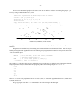
The next graph uses iterators to make a graph without reading data from a file. Rather, its ‘‘data’’ is a function of two variables that describes a derivative field and a function of one variable that describes one solution to the
differential equation.
frame ht 2.5 wid 2.5
coord x 0,1 y 0,1
label bot "Direction field is $y sup prime = x sup 2 / y$"
label left "$y = sqrt {(2x sup 3 +1)/3}$" right .3
ticks left in 0 at 0,1
ticks bot in 0 at 0,1
len = .04
for tx from .01 to .91 by .1 do {
for ty from .01 to .91 by .1 do {
deriv = tx*tx/ty
scale = len/sqrt(1+deriv*deriv)
line from tx,ty to tx+scale,ty+scale*deriv
}
}
draw solid
for tx = 0 to 1 by .05 do {
next at tx, sqrt((2*tx*tx*tx+1)/3)
}
The left label uses eqn text between the $$ delimiters. The variable scale ensures that all lines in the direction
field are the same length. The in clauses in the ticks statements specify that the ticks go in zero inches to avoid
overprinting. The variables tx and ty are so named because x and y are reserved words for the coord statement.
- 24 -
1
y =√
( 2x 3 + 1 )/3
0
0
1
Direction field is y ′ = x 2 / y
Programmers familiar with floating point arithmetic may be surprised that the above graph is correct. Because
of roundoff error, iteration ‘‘from 0 to 1 by .05’’ usually produces the values 0 , .05 , .10 , ... , .95. Grap
uses a ‘‘fuzzy test’’ in the for statement to avoid that problem, which may in turn introduce other problems. Such
problems may be avoided by iterating over an integer range and incrementing a non-integer value within the loop.
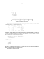
Most of the data we have seen so far is inherently two (or more) dimensional. As an example of onedimensional data, we will return to the populations of the fifty states, which is the third field in the file states.d
introduced earlier; the file is sorted in increasing order of population. Our first graph takes the most space, but it also
gives the most information.
frame ht 4 wid 5
label left "Rank in" "Population"
label bot "Population (Millions)"
label top "$log sub 2$ (Population)"
coord x .3,30 y 0,51 log x
define L { (2.0ˆ$1)/1e6 "$1" }
ticks bot out at .5, 1, 2, 5, 10, 20
ticks left out from 10 to 50 by 10
ticks top out at L(19), L(20), L(21), L(22), L(23), L(24)
thisy = 50
copy "states.d" thru {
"$1" size -4 at ($3/1e6, thisy)
thisy = thisy-1
}
line dotted from 15.3,1 to .515,50
The L macro (for Label) with input parameter X evaluates to the number 2 X /1 , 000 , 000 followed by the string "X"
(the ticks command expects a number followed by a string label).
- 25 -
log 2 (Population)
19
50
AK
20
21
22
23
24
..
WY . .
VT . . .
DE . .
ND. .
SD. .
..
MT
NV. .
40
..
NH
..
ID
.
RI . .
HI . .
ME. .
..
NM
. .UT
. .NE
..
. . WV
AR
..
KS
..
MS
..
. . OR
. . AZ
. . CO
. . IA
. . OK
. .CT
..
SC
. . KY
. . AL
..
MN
..
WA
.
LA. .
30
Rank in
Population
20
MD . .
TN . . .
WI . .
MO . .
VA . .
..
GA
..
IN
..
MA
..
NC
..
NJ
..
MI
.
FL. .
..
OH
..
IL
PA. . .
10
0.5
1
2
5
Population (Millions)
.TX
..
. . NY
10
CA
20
The dotted line is the least squares regression
log 10 Population = 7. 214 − .03×Rank
which gives 15.3 million as the population of the largest state and .515 million as the population of the smallest
state. It says that population drops by a factor of two every ten states (compare the top and left scales). As sloppy as
the exponential fit is, though, it is a much better fit to this data than a Zipf’s Law curve is (drawing that curve is left
as an exercise for the reader).
The next graph is a more standard representation of one-dimensional data.
frame invis ht .3 wid 5 bottom solid
label bot "Populations (in Millions) of the 50 States"
coord x .3,30 y 0, 1 log x
ticks bot out at .5, 1, 2, 5, 10, 20
ticks left off
copy "states.d" thru { vtick at ($3/1e6,.5) }
The markers were chosen to be vticks because they denote only an x-value.
|
| | | | | || ||||
0.5
1
| | ||
|
| | | | | | |||
| | ||| || | || ||
|
| | | ||
2
5
10
Populations (in Millions) of the 50 States
|
|
|
20
- 26 -
The next one-dimensional graph uses the state’s name as its marker; to reduce overprinting the graph is ‘‘jittered’’ by using a random number as a y-value.
frame invis ht 1 wid 5 bottom solid
label bot "Populations (in Millions) of the 50 States"
coord x .3,30 y 0,1000 log x
ticks bot out at .5, 1, 2, 5, 10, 20
ticks left off
copy "states.d" thru { "$1" size -4 at ($3/1e6,100+900*rand()) }
The function rand() returns a pseudo-random real number chosen uniformly over the interval [0,1).
RI
DE
AK
AR
VT
UT
NM NE
NV
SD
WY
0.5
ND
WV
ID
HI
MT NH
1
OK
SC
IA
KS
AZ
MS
OR CT
CO
ME
GA
MA
NC
WA
MN
AL WI
MD
VA
IN
MO
NJ
NY
MI
LA
KY
TN
CA
IL
PA
FL
TX
OH
2
5
10
Populations (in Millions) of the 50 States
20
This graph is too cluttered; circles would have been a better choice as a plotting symbol (bullets, once again, would
hide data).
Histograms are a standard way of presenting one-dimensional data in two-dimensional form. Our first step in
building a histogram of the population data is the following awk program, which counts how many states are in each
‘‘bin’’ of a million people.
awk ’
BEGIN
{ bzs=0; bw=1e6 } # bin zero start; bin width
{ count[int(($3-bzs)/bw)]++ }
END
{ for (i in count) print i, count[i] }
’ <states.d | sort -n >states2.d
The variable bzs tells where bin zero starts; although it is zero in this graph, it might be 95 in a histogram of human
body temperatures in degrees Fahrenheit. The program produces the following output in states2.d:
0 12
1 5
2 7
3 5
4 7
...
23 1
There are 12 states with population between 0 and 999,999, 5 states with population between 1,000,000 and
1,999,999, and so on.
This grap program uses three line commands to plot each rectangle in the histogram.
- 27 -
frame invis bot solid
label bot "Populations (in Millions) of the 50 States"
label left "Number" "of" "States" left .3
ticks bot out from 0 to 25 by 5
coord x 0, 25 y 0, 13
copy "states2.d" thru {
line from $1, 0 to $1, $2
line from $1, $2 to $1+1, $2
line from $1+1, $2 to $1+1 , 0
}
It produces
10
Number
of
States
5
0
0
5
10
15
20
Populations (in Millions) of the 50 States
The same file can be plotted in a more attractive (and more useful) form by
frame invis bot solid left solid
label bot "Populations (in Millions) of the 50 States"
label left "Number" "of" "States" left .3
ticks bot out from 0 to 25 by 5
coord x 0, 25 y 0, 13
copy "states2.d" thru {
line dotted from $1+.5, 0 to $1+.5, $2
"\(bu" size +3 at $1+.5, $2
}
which produces one of Bill Cleveland’s ‘‘dot charts’’ or ‘‘lolliplots’’:
25
- 28 -
•...
.
.
.
.
.
.
.
.
.
..
.
.
.
.
.
.
.
.
..
.
.
.
.
.
.
.
.
.
.
.
.
.
.
10
Number
of
States
5
0
0
•... •...
..
..
•... .... •... .... •...
.
.
.
.
.
.
.
.
.
.
.
.
.
..
..
..
..
..
..
.
.
.
.
.
.
.
.
.
.
.
.
.
.
.
..
..
..
..
..
..
.
.
.
.
.
.
.
.
.
.
.
.
.
.
.
•...
.
•... •...
. •
. .
. . .
. . .
. . .
•...
.
•...
.
5
10
15
20
Populations (in Millions) of the 50 States
•...
.
25
(We use \(bu, the troff character for a bullet, rather than the built-in string to get a larger size.)
Other histograms are possible. The following awk program
awk ’
BEGIN
{ bzs=0; bw=1e6 } # bin zero start; bin width
{ thisbin=int(($3-bzs)/bw); print $1, thisbin, count[thisbin]++ }
’ <states.d >states3.d
produces the file states3.d
AK 0 0
WY 0 1
VT 0 2
DE 0 3
ND 0 4
...
CA 23 0
which lists the state’s abbreviation, bin number, and height within the bin. The grap program
frame invis wid 4 ht 2.5 bot solid
ticks bot out from 0 to 25 by 5
ticks left off
label bot "Populations (in Millions) of the 50 States"
coord x 0,25 y 0,13
copy "states3.d" thru { "$1" size -4 at $2+.5, $3+.5 }
reads that file to make the following histogram, in which the state names are used to display the heights of the bins.
In each bin, the states occur in increasing order of population from bottom to top.
- 29 -
HI
RI
ID
NH
NV
MT
IA
MO
SD
CO
WI
ND WV AZ AL TN NC
DE NE OR KY MD MA
VT UT MS SC LA IN
WY NM KS CT WA GA
AK ME AR OK MN VA
0
5
FL
NJ
PA
MI OH IL
TX
NY
10
15
20
Populations (in Millions) of the 50 States
CA
25
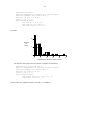
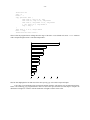
The next data set is a run-time profile of an early version of grap, created by compiling the program with the
-p option and running prof after the program executed.
%time
21.1
11.2
9.3
9.1
...
0.0
cumsecs
11.02
16.89
21.75
26.52
#call
26834
30
ms/call
0.41
195.60
52.19
170
0.00
name
_yylook
_yyparse
__doprnt
_write
_tickside
Although there were more than fifty procedures in the program, the top four time-hogs accounted for more than half
of the run time. This file is difficult for grap to deal with: even though if statements would allow us to extract lines
2 through 11 of the file, we could not remove the leading _ from a routine name or access the last field in a record.
We will therefore process it with the following awk program.
awk ’
NR==2, NR==11 { print $1, substr($NF,2) }
’ <prof1.d >prof2.d
The program produces
21.1 yylook
11.2 yyparse
9.3 _doprnt
9.1 write
5.9 input
...
2.0 nextchar
We could even use the sh statement to execute the awk program from within grap, which would make the latter
entirely self-contained (see the reference manual for details).
We will display the data with this program.
- 30 -
ticks left off
cury = 0
barht = .7
copy "prof2.d" thru {
line from 0, cury to $1, cury
line from $1, cury to $1, cury-barht
line from 0, cury-barht to $1, cury-barht
" $2" ljust at 0, cury-barht/2
cury = cury-1
}
line from 0, 0 to 0, cury+1-barht
bars = -cury
frame invis ht bars/3 wid 3
Observe that the program knows nothing about the range of the data. It uses default ticks and a frame statement
with a computed height to achieve total data independence.
yylook
yyparse
_doprnt
write
input
print
sprintf
unput
yylex
nextchar
0
5
10
15
20
This bar chart highlights the fact that most of the time spent by grap is devoted to input and output.
J. W. Tukey’s box and whisker plots represent the median, quartiles, and extremes of a one-dimensional distribution. The following grap program defines a macro to draw a box plot, and then uses that shape to compare the
distribution of heights of volcanoes with the distribution of heights of States of the Union.
- 31 -
frame invis ht 4 wid 3 bot solid
ticks off
coord x .5,3.5 y 0,25
define Ht { "- $1,000 -" size -3 at 2,$1 }
Ht(5); Ht(10); Ht(15); Ht(20)
"Highest Point" "in 50 States" at 1,23
"Heights of" "219 Volcanoes" at 3,23
"Feet" at 2,21.5; arrow from 2,22.5 to 2,24
define box { #(x, min, 25%, median, 75%, max, minname, maxname)
xc = $1; xl = xc-boxwidth/2; xh = xc+boxwidth/2
y1 = $2; y2 = $3; y3 = $4; y4 = $5; y5 = $6
bullet at xc,y1
" $7" size -3 ljust at (xc,y1)
line from (xc,y1) to (xc,y2) # lo whisker
line from (xl,y2) to (xh,y2) # box bot
line from (xl,y3) to (xh,y3) # box mid
line from (xl,y4) to (xh,y4) # box top
line from (xl,y2) to (xl,y4) # box left
line from (xh,y2) to (xh,y4) # box right
line from (xc,y4) to (xc,y5) # hi whisker
bullet at xc,y5
" $8" size -3 ljust at (xc,y5)
}
boxwidth = .3
box(1, .3, 2.0, 4.6, 11.2, 20.3, Florida, Alaska)
box(3, .2, 3.7, 6.5, 9.5, 19.9, Ilhanova, Guallatiri)
Boxes are one of many shapes used for the graphical representation of several quantities. If you use such shapes frequently then you should make a library file of their macros to copy into your grap programs. The above program
produces
Highest Point
in 50 States
Heights of
219 Volcanoes
Feet
•
Alaska
- 20,000 -
•
Guallatiri
•
Ilhanova
- 15,000 -
- 10,000 -
- 5,000 -
•
Florida
Even though the extreme heights are the same, state heights have a lower median and a greater spread.
- 32 -
Someday you may use grap to prepare overhead transparencies, only to find that everything comes out too
small. The following program illustrates some ways to get larger graphs.
.ps 14
.vs 18
.G1 4
frame ht 2 wid 2
label left "Response" "Variable" left .5
label bot "Factor Variable"
line from 0,0 to 1,1
line dotted from .5,0 to .5,1
define blob X "\v’.1m’\(bu\v’-.1m’" X
blob at 0,.5; blob at .5,.5; blob at 1,.5
.G2
.ps
.vs
The ps and vs commands preceding the graph set the text size to 14 points and the vertical spacing to 18 points; the
two quantities are reset by the commands following the .G2. Such size changes should be made outside the grap
program, as mentioned earlier. The 4 following the .G1 stretches the graph (including grap’s estimate of the
accompanying text) to be four inches wide; it is an alternative to altering the frame command. The macro blob is
a plotting symbol that is much larger than bullet; the different name ensures that later references to bullet are
unaffected. The troff commands within the blob string move the character down one-tenth of an em to center its
plotting position (determined experimentally) and then reset the vertical position. The program produces this trivial
(but large) graph.
..
..
..
..
..
..
..
..
.
•...
..
..
..
..
..
..
..
..
1
Response
Variable
0.5
•
0
0
0.5
Factor Variable
4. Using Grap
Following are a few day-to-day matters about using grap.
4.1. Errors
Grap attempts to pinpoint input errors; for example, the input
.G1
i = i + 1
results in this message on stderr:
•
1
- 33 -
grap: syntax error near line 1, file context is
i = i >>> + <<< 1
The error was noticed at the +. Unfortunately, pinpointing is not the same as explaining: the real error is that the
variable i was not initialized.
The ‘‘words’’ x and y are reserved (for the coord statement); you will get an equally inexplicable syntax
error message if you use them as variable names. (This design is bad, but not nearly so bad as having the log and
exp functions use base 10.)
Grap tries to load a file of standard macro definitions (/usr/lib/grap.defines) for terms like
bullet, plus, etc. It doesn’t complain if that file isn’t found, but if you later use one of these words, you’ll get a
syntax error message.
Certain constructs suggested by analogy to pic do not work. For example, .GS and .GE would have been
nicer than .G1 and .G2, but they were already taken. The pic construct
.PS <file
has been superseded by grap’s copy command (which in turn has been retrofitted into pic).
4.2. Troff issues
You may use troff commands like .ps or .ft to change text sizes and fonts within a graph, or use balanced
\s and \f commands within a string. Do not, however, add space (.sp) or change the line spacing (.vs, .ls)
within a graph. Some defined terms like bullet contain embedded size changes; further qualifying them with
grap size commands may not always work.
Because grap is built on top of pic, the following quote from the pic manual is relevant: ‘‘There is a subtle
problem with complicated equations inside pic pictures — they come out wrong if eqn has to leave extra vertical
space for the equation. If your equation involves more than subscripts and superscripts, you must add to the beginning of each such equation the extra information space 0’’. This feature was illustrated in the graph of the United
States population in Section 3.
4.3. Alternatives
Besides grap and your local draftsperson, what other choices are there?
The S system [1] provides a host of tools for statistical analysis, but somewhat fewer tools than grap for producing document-quality graphs. S produces graphs on the screen of a DMD 5620 terminal much more quickly than
grap (often in seconds rather than minutes), but it takes somewhat longer to learn (at least for us). If you expect to
do a lot of interactive data analysis, then S is probably the right tool for you. S may be used to generate pic commands.
The standard UNIX program graph provides many of the basic features of grap, though with quite a bit less
control over details, particularly text. It produces output only in the UNIX plot(5) language, which may be processed
by a variety of filters for a variety of output devices.
The original UNIX typesetter graphics programs are pic and ideal; you may be able to do as well without using
grap as an intermediary. In particular, ideal provides shading and clipping, which are useful in presentation-quality
bar charts and the like, but are well beyond the capabilities of pic.
5. References
1. Becker, R.A. and Chambers, J.M. S, An Interactive Environment for Data Analysis and Graphics. Wadsworth,
1984.
2. Chambers, J.M., Cleveland, W.S., Kleiner, B., and Tukey, P.A. Graphical Methods in Data Analysis. Wadsworth, 1976.
3. Cleveland, W.S. The Elements of Graphing Data. Wadsworth, 1985.
4. Kernighan, B.W. Pic — A Graphics Language for Typesetting. In Unix Programmer’s Manual, Tenth Edition,
AT&T Bell Laboratories, 1989.
- 34 -
5. Kernighan, B.W. and Ossanna, J.F. Troff User’s Manual. In Unix Programmer’s Manual, Tenth Edition,
AT&T Bell Laboratories, 1989.
6. Tufte, E.R. Visual Display of Quantitative Information. Graphics Press, Box 430, Cheshire, CT 06410, 1983.
6. Reference Manual
In the following, italic terms are syntactic categories, typewriter terms are literals, parenthesized constructs are optional, and ... indicates repetition. In most cases, the order of statements, constructs and attributes is
immaterial.
grap program:
.G1 (width in inches)
grap statement
...
.G2
A width on the .G1 line overrides the computed width, as in pic.
grap statement:
frame | label | coord | ticks | grid | plot | line | circle | draw | new | next
| graph | numberlist | copy | for | if | sh | pic | assignment | print
The frame statement defines the frame that surrounds the graph:
frame:
frame (ht expr) (wid expr) ((side) linedesc) ...
side:
linedesc:
top | bot | left | right
solid | invis | dotted (expr) | dashed (expr)
Height and width default to 2 and 3 inches; sides default to solid. If side is omitted, the linedesc applies to the entire
frame. The optional expressions after dotted and dashed change the spacing exactly as in pic.
The label statement places a label on a specified side:
label:
label side strlist ... shift
shift:
strlist:
left | right | up | down expr ...
str ... (rjust | ljust | above | below) ... (size (±) expr) ...
str:
"..."
Lists of text strings are stacked vertically. In any context, string lists may contain clauses to adjust the position or
change the point size. Each clause applies to the string preceding it and all following strings. Labels may also have
a width attribute, to override grap’s default computation.
Normally the coordinate system is defined by the data, with 7 percent extra on each side. (To change that to 5
percent, assign 0.05 to the grap variable margin, which is reset to 0.07 at each .G1 statement.) The coord statement defines an overriding system:
coord:
coord (name) (x expr,expr) (y expr,expr) (log x | log y | log log)
Coordinate systems can be named; ranges, logarithmic scaling, etc., are done separately for each.
The ticks statement places tick marks on one side of the frame:
- 35 -
ticks:
ticks side (in | out (expr)) (shift) (tick-locations)
tick-locations:
at (name) expr (str), expr (str), ...
| from (name) expr to expr (by (op) expr) str
If no ticks are specified, they will be provided automatically; ticks off suppresses automatic ticks. The optional
expression after in or out specifies the length of the ticks in inches. The optional name refers to a coordinate system. If str contains format specifiers like %f or %g, they are interpreted as by printf. If no str is supplied, the
tick labels will be the values of the expressions.
If the by clause is omitted, steps are of size 1. If the by expression is preceded by one of +, -, * or /, the
step is scaled by that operator, e.g., *10 means that each step is 10 times the previous one.
The grid statement produces grid lines along (i.e., perpendicular to) the named side.
grid:
grid side (linedesc) (shift) (tick-locations)
Grids are labeled by the same mechanism as ticks. It is possible to draw grids without ticks by placing the phrase
ticks off after the side name and before the iterator.
Plot statements place text at a point:
plot:
strlist at point
plot expr (str) at point
point:
(name) expr,expr
As in the label statement, the string list may contain position and size modifiers. The plot statement uses the
optional format string as in C’s printf statement — it may contain a %f or %g. The optional name refers to a
coordinate system.
The line statement draws a line or arrow from here to there:
line:
(line | arrow) from point to point (linedesc)
The circle statement draws a circle:
circle:
circle at point (radius expr)
The radius is in inches; the default size is small.
The draw statement defines a sequence of lines:
draw:
draw (name) linedesc (str)
Subsequent data for the named sequence will be plotted as a line of the specified style, with the optional str plotted
at each point. The next statement continues a sequence:
next:
next (name) at point (linedesc)
If a line description is specified, it overrides the default display mode for the line segment ending at point. The new
statement starts a new sequence; it has the same format as the draw statement.
A line consisting of a set of numbers is treated as a family of points x, y 1 , y 2 , etc., to be plotted at the single x
value.
numberlist:
number ...
If there is only one number it is treated as a y value, and x values of 1, 2, 3, ... are supplied automatically.
- 36 -
Grap provides arithmetic with the operators +, -, *, /, and ˆ. Variables may be assigned to; assignments are
expressions. Built-in functions include log, exp (both base 10 — beware!), int (truncates towards zero), sin,
cos (both use radians), atan2(dy,dx), sqrt, min (two arguments only), max (ditto), and rand() (returns a
real number random on [0,1)).
The for statement provides a modest looping facility:
for:
for var from expr to expr (by (op) expr) do { anything }
The string may contain internally balanced braces. Alternatively, any other character may appear immediately after
the word do, and the string is terminated by the next occurrence of that character. The text anything (which may
contain newlines) is repeated as var takes on values from expr1 to expr2. As with tick iterators, the by clause is
optional, and may proceed arithmetically or multiplicatively. In a for statement, the from may be replaced by
‘‘=’’.
The if-then-else statement provides conditional evaluation:
if:
if expr then { anything } else { anything }
The else clause is optional. Relational operators include ==, !=, >, >=, <, <=, !, ||, and &&. Strings may be
compared with the operators == and !=.
It is possible to convert numeric expressions to formatted strings:
sprintf("format", expr, expr, ...)
is equivalent to a quoted string in any context. Variants of %f and %g are the only sensible format conversions.
Grap provides the same macro processor that pic does:
define macro-name { anything }
Subsequent occurrences of the macro name will be replaced by the string, with arguments of the form $n replaced
by corresponding actual arguments. Macro definitions persist across .G2 boundaries, as do values of variables.
The copy statement is somewhat overloaded:
copy "filename"
includes the contents of the named file at that point;
copy "filename" thru macro-name
copies the file through the macro; and
copy thru macro-name
copies subsequent lines through the macro; each number or quoted string is treated as an argument. In each case,
copying continues until end of file or the next .G2. The optional clause until str causes copying to terminate
when a line whose first field is str occurs. In all cases, the macro can be specified inline rather than by name:
copy thru { macro body }
The sh command passes text through to the UNIX shell.
sh:
sh { anything }
The body of the command is scanned for macros. The built-in macro pid is a string consisting of the process
identification number; it can be used to generate unique file names.
The pic command passes text through to pic with the ‘‘pic’’ removed; variables and macros are not evaluated. Lines beginning with a period (that are not numbers) are passed through literally, under the assumption that
they are troff commands.
The graph statement
- 37 -
graph:
graph Picname (pic-text)
defines a new graph named Picname, resetting all coordinate systems. If any graph commands are used in a grap
program, then the statement after the .G1 must be a graph command. The pic-text can be used to position this
graph relative to previous graphs by referring to their Frames, as in
graph First
...
graph Second with .Frame.w at First.Frame.e + (0.1,0)
Macros and expressions in pic-text are not evaluated. Picnames must begin with a capital letter to satisfy pic syntax.
The print statement
print:
print (expr | str)
writes on stderr as grap processes its input; it is sometimes useful for debugging.
Many reserved words have synonyms, such as thru for through, tick for ticks, and bot for
bottom.
The # introduces a comment, which ends at the end of the line. Statements may be continued over several
lines by preceding each newline with a backslash character. Multiple statements may appear on a single line separated by semicolons. Grap ignores any line that is entirely blank, including those processed by copy thru commands.
When grap is first executed it reads standard macro definitions from the file /usr/lib/grap.defines.
The definitions include bullet, plus, box, star, dot, times, htick, vtick, square, and delta.