1
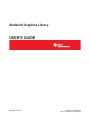
Stellaris® Graphics Library
USER’S GUIDE
SW-GRL-UG-9453
Copyright © 2008-2012
Texas Instruments Incorporated
Copyright
Copyright © 2008-2012 Texas Instruments Incorporated. All rights reserved. Stellaris and StellarisWare are registered trademarks of Texas Instruments.
ARM and Thumb are registered trademarks and Cortex is a trademark of ARM Limited. Other names and brands may be claimed as the property of
others.
Please be aware that an important notice concerning availability, standard warranty, and use in critical applications of Texas Instruments semiconductor products and disclaimers thereto appears at the end of this document.
Texas Instruments
108 Wild Basin, Suite 350
Austin, TX 78746
Main: +1-512-279-8800
Fax: +1-512-279-8879
http://www.ti.com/stellaris
Revision Information
This is version 9453 of this document, last updated on September 05, 2012.
2
September 05, 2012
Table of Contents
Table of Contents
Copyright . . . . . . . . . . . . . . . . . . . . . . . . . . . . . . . . . . . . . . . . . . . . . . . . . . . . .
2
Revision Information . . . . . . . . . . . . . . . . . . . . . . . . . . . . . . . . . . . . . . . . . . . . . . .
2
1
Introduction . . . . . . . . . . . . . . . . . . . . . . . . . . . . . . . . . . . . . . . . . . . . . . . . .
5
2
2.1
2.2
Display Driver . . . . . . . . . . . . . . . . . . . . . . . . . . . . . . . . . . . . . . . . . . . . . . . .
Introduction . . . . . . . . . . . . . . . . . . . . . . . . . . . . . . . . . . . . . . . . . . . . . . . . . .
Definitions . . . . . . . . . . . . . . . . . . . . . . . . . . . . . . . . . . . . . . . . . . . . . . . . . .
9
9
9
3
3.1
3.2
3.3
Graphics Primitives . .
Introduction . . . . . . . .
Fonts and Text Handling .
Definitions . . . . . . . .
.
.
.
.
15
15
19
27
4
4.1
4.2
Widget Framework . . . . . . . . . . . . . . . . . . . . . . . . . . . . . . . . . . . . . . . . . . . . .
Introduction . . . . . . . . . . . . . . . . . . . . . . . . . . . . . . . . . . . . . . . . . . . . . . . . . .
Definitions . . . . . . . . . . . . . . . . . . . . . . . . . . . . . . . . . . . . . . . . . . . . . . . . . .
85
85
85
5
5.1
5.2
Canvas Widget . . . . . . . . . . . . . . . . . . . . . . . . . . . . . . . . . . . . . . . . . . . . . . .
Introduction . . . . . . . . . . . . . . . . . . . . . . . . . . . . . . . . . . . . . . . . . . . . . . . . . .
Definitions . . . . . . . . . . . . . . . . . . . . . . . . . . . . . . . . . . . . . . . . . . . . . . . . . .
97
97
97
6
6.1
6.2
Checkbox Widget . . . . . . . . . . . . . . . . . . . . . . . . . . . . . . . . . . . . . . . . . . . . . . 115
Introduction . . . . . . . . . . . . . . . . . . . . . . . . . . . . . . . . . . . . . . . . . . . . . . . . . . 115
Definitions . . . . . . . . . . . . . . . . . . . . . . . . . . . . . . . . . . . . . . . . . . . . . . . . . . 115
7
7.1
7.2
Container Widget . . . . . . . . . . . . . . . . . . . . . . . . . . . . . . . . . . . . . . . . . . . . . . 131
Introduction . . . . . . . . . . . . . . . . . . . . . . . . . . . . . . . . . . . . . . . . . . . . . . . . . . 131
Definitions . . . . . . . . . . . . . . . . . . . . . . . . . . . . . . . . . . . . . . . . . . . . . . . . . . 131
8
8.1
8.2
Image Button Widget . . . . . . . . . . . . . . . . . . . . . . . . . . . . . . . . . . . . . . . . . . . 145
Introduction . . . . . . . . . . . . . . . . . . . . . . . . . . . . . . . . . . . . . . . . . . . . . . . . . . 145
Definitions . . . . . . . . . . . . . . . . . . . . . . . . . . . . . . . . . . . . . . . . . . . . . . . . . . 145
9
9.1
9.2
ListBox Widget . . . . . . . . . . . . . . . . . . . . . . . . . . . . . . . . . . . . . . . . . . . . . . . 163
Introduction . . . . . . . . . . . . . . . . . . . . . . . . . . . . . . . . . . . . . . . . . . . . . . . . . . 163
Definitions . . . . . . . . . . . . . . . . . . . . . . . . . . . . . . . . . . . . . . . . . . . . . . . . . . 164
.
.
.
.
.
.
.
.
.
.
.
.
.
.
.
.
.
.
.
.
.
.
.
.
.
.
.
.
.
.
.
.
.
.
.
.
.
.
.
.
.
.
.
.
.
.
.
.
.
.
.
.
.
.
.
.
.
.
.
.
.
.
.
.
.
.
.
.
.
.
.
.
.
.
.
.
.
.
.
.
.
.
.
.
.
.
.
.
.
.
.
.
.
.
.
.
.
.
.
.
.
.
.
.
.
.
.
.
.
.
.
.
.
.
.
.
.
.
.
.
.
.
.
.
.
.
.
.
.
.
.
.
.
.
.
.
.
.
.
.
.
.
.
.
.
.
.
.
.
.
.
.
.
.
.
.
.
.
.
.
.
.
.
.
10 Push Button Widget . . . . . . . . . . . . . . . . . . . . . . . . . . . . . . . . . . . . . . . . . . . . 179
10.1 Introduction . . . . . . . . . . . . . . . . . . . . . . . . . . . . . . . . . . . . . . . . . . . . . . . . . . 179
10.2 Definitions . . . . . . . . . . . . . . . . . . . . . . . . . . . . . . . . . . . . . . . . . . . . . . . . . . 179
11 Radio Button Widget . . . . . . . . . . . . . . . . . . . . . . . . . . . . . . . . . . . . . . . . . . . . 201
11.1 Introduction . . . . . . . . . . . . . . . . . . . . . . . . . . . . . . . . . . . . . . . . . . . . . . . . . . 201
11.2 Definitions . . . . . . . . . . . . . . . . . . . . . . . . . . . . . . . . . . . . . . . . . . . . . . . . . . 202
12 Slider Widget . . . . . . . . . . . . . . . . . . . . . . . . . . . . . . . . . . . . . . . . . . . . . . . . 217
12.1 Introduction . . . . . . . . . . . . . . . . . . . . . . . . . . . . . . . . . . . . . . . . . . . . . . . . . . 217
12.2 Definitions . . . . . . . . . . . . . . . . . . . . . . . . . . . . . . . . . . . . . . . . . . . . . . . . . . 218
13
13.1
13.2
13.3
13.4
13.5
Utilities . . .
Introduction .
ftrasterize . .
lmi-button . .
pnmtoc . . .
mkstringtable
14
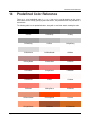
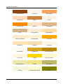
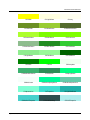
Predefined Color Reference . . . . . . . . . . . . . . . . . . . . . . . . . . . . . . . . . . . . . . . 249
September 05, 2012
.
.
.
.
.
.
.
.
.
.
.
.
.
.
.
.
.
.
.
.
.
.
.
.
.
.
.
.
.
.
.
.
.
.
.
.
.
.
.
.
.
.
.
.
.
.
.
.
.
.
.
.
.
.
.
.
.
.
.
.
.
.
.
.
.
.
.
.
.
.
.
.
.
.
.
.
.
.
.
.
.
.
.
.
.
.
.
.
.
.
.
.
.
.
.
.
.
.
.
.
.
.
.
.
.
.
.
.
.
.
.
.
.
.
.
.
.
.
.
.
.
.
.
.
.
.
.
.
.
.
.
.
.
.
.
.
.
.
.
.
.
.
.
.
.
.
.
.
.
.
.
.
.
.
.
.
.
.
.
.
.
.
.
.
.
.
.
.
.
.
.
.
.
.
.
.
.
.
.
.
.
.
.
.
.
.
.
.
.
.
.
.
.
.
.
.
.
.
.
.
.
.
.
.
.
.
.
.
.
.
.
.
.
.
.
.
.
.
.
.
.
.
.
.
.
.
.
.
.
.
.
.
.
.
.
.
.
.
.
.
.
.
.
.
.
.
.
.
.
.
.
.
.
.
.
.
.
.
.
.
.
.
.
.
.
.
.
.
.
.
.
.
.
.
.
.
.
.
.
.
.
.
.
.
.
.
.
.
.
.
.
.
.
.
241
241
241
245
245
246
3
Table of Contents
15
Font Reference . . . . . . . . . . . . . . . . . . . . . . . . . . . . . . . . . . . . . . . . . . . . . . . 255
IMPORTANT NOTICE . . . . . . . . . . . . . . . . . . . . . . . . . . . . . . . . . . . . . . . . . . . . . . . 266
4
September 05, 2012
Introduction
1
Introduction
The Texas Instruments® Stellaris® Graphics Library provides a set of graphics primitives and a widget set for creating graphical user interfaces on Stellaris microcontroller-based boards that have a
graphical display. The graphics library consists of three layers (with each subsequent layer building
upon the previous layer to provide more functionality):
The display driver layer. This must be supplied by the application since it is specific to the
display in use.
The graphics primitives layer. This provides the ability to draw individual items on the display,
such as lines, circles, text, and so on.
The widget layer. This provides an encapsulation of one or more graphics primitives to draw
a user interface element on the display, along with the ability to provide application-defined
responses to user interaction with the element.
An application can call APIs in any of the three layers, which are non-exclusive (in other words, it
is valid to use widgets and also directly use graphics primitives). The choice of the layer to use
depends upon the needs and requirement of the application.
The capabilities and organization of the graphics library are governed by the following design goals:
They are written entirely in C except where absolutely not possible.
They are easy to understand.
They are reasonably efficient in terms of memory and processor usage.
They are as self-contained as possible.
Where possible, computations that can be performed at compile time are done there instead
of at run time.
They can be built with more than one tool chain.
Some consequences of these design goals are:
The graphics primitives are not necessarily as efficient as they could be (from a code size
and/or execution speed point of view). While the most efficient piece of code for drawing any
graphics primitive would be written in assembly and custom tailored to the specific display in
use, further size optimizations of the graphics primitives would make them more difficult to
understand.
The widget set provides “super-widgets” that have more capabilities than may be used in a
particular application. While it would be more efficient to have a widget that performed just
what the application required, this would require each widget to become multiple widgets with
the same basic function but a mixture of the capabilities. A specific-function widget can be
derived from one of the existing widgets if required.
The APIs have a means of removing all error checking code. Since the error checking is
usually only useful during initial program development, it can be removed to improve code size
and speed.
The following tool chains are supported:
Keil™ RealView® Microcontroller Development Kit
CodeSourcery Sourcery G++ for Stellaris EABI
September 05, 2012
5
Introduction
IAR Embedded Workbench®
Code Red Technologies tools
Texas Instruments Code Composer Studio™
Source Code Overview
The following is an overview of the organization of the graphics library source code, along with
references to where each portion is described in detail.
6
Makefile
The rules for building the graphics library.
canvas.c
The source code for the canvas widget, which is described in chapter 5.
canvas.h
The header containing prototypes for the canvas widget.
ccs/
The directory containing the Code Composer Studio project files.
charmap.c
The source code for the text codepage mapping functions, which are described in chapter 3.
checkbox.c
The source code for the check box widget, which is described in chapter 6.
checkbox.h
The header containing prototypes for the checkbox widget.
circle.c
The source code for the circle primitives, which are described in chapter 3.
container.c
The source code for the container widget, which is described in chapter 7.
container.h
The header containing prototypes for the container widget.
context.c
The source code for the drawing context, which is described in chapter 3.
fonts/
The source files containing the font structures for the fonts provided with the
graphics library. A list of the fonts, along with a sample string rendered in
each font, is provided in chapter 15.
ftrasterize/
The source code for the ftrasterize program, which is described in chapter
13.
grlib.Opt
The Keil uVision project options file used for building the graphics library.
grlib.Uv2
The Keil uVision project file used for building the graphics library.
grlib.ewd
The IAR Embedded Workbench project options file used for building the
graphics library.
grlib.ewp
The IAR Embedded Workbench project file used for building the graphics
library.
grlib.h
The header containing prototypes for the graphics primitives.
September 05, 2012
Introduction
image.c
The source code for the image primitives, which are described in chapter 3.
line.c
The source code for the line primitives, which are described in chapter 3.
offscr1bpp.c
The source code for the 1 BPP off-screen buffer display driver, which is described in chapter 3.
offscr4bpp.c
The source code for the 4 BPP off-screen buffer display driver, which is described in chapter 3.
offscr8bpp.c
The source code for the 8 BPP off-screen buffer display driver, which is described in chapter 3.
pnmtoc/
The source code for the pnmtoc program, which is described in chapter 13.
pushbutton.c
The source code for the push button widget, which is described in chapter
10.
pushbutton.h
The header containing prototypes for the push button widget.
radiobutton.c The source code for the radio button widget, which is described in chapter
11.
radiobutton.h The header containing prototypes for the radio button widget.
readme.txt
A short file describing the highlights of the graphics library.
rectangle.c
The source code for the rectangle primitives, which are described in chapter
3.
slider.c
The source code for the slider widget, which is described in chapter 12.
slider.h
The header containing prototypes for the slider widget.
string.c
The source code for the string primitives, which are described in chapter 3.
widget.c
The source code for the widget framework, which is described in chapter 4.
widget.h
The header containing prototypes for the widget framework.
September 05, 2012
7
Introduction
8
September 05, 2012
Display Driver
2
Display Driver
Introduction . . . . . . . . . . . . . . . . . . . . . . . . . . . . . . . . . . . . . . . . . . . . . . . . . . . . . . . . . . . . . . . . . . . . . . . . . . . . . . . . . . . . . . . . . . . . . . . 9
Definitions . . . . . . . . . . . . . . . . . . . . . . . . . . . . . . . . . . . . . . . . . . . . . . . . . . . . . . . . . . . . . . . . . . . . . . . . . . . . . . . . . . . . . . . . . . . . . . . . 9
2.1
Introduction
A display driver is used to allow the graphics library to interface with a particular display. It is
responsible for dealing with the low level details of the display, including communicating with the
display controller and understanding the commands required to make the display controller behave
as required.
The display driver must provide two things; the set of routines required by the graphics library to
draw onto the screen and a set of routines for performing display-dependent operatins. The display
dependent operations will vary from display to display, but will include an initialization routine, and
may include such things as backlight control and contrast control.
The routines required by the graphics library are organized into a structure that describes the display driver to the graphics library. The tDisplay structure contains these function pointers, along
with the width and height of the screen. An instantiation of this structure should be supplied by the
display driver, along with a prototype for that structure in a display driver-specific header file.
For some displays, it may be more efficient to draw into a buffer in local memory and copy the
results to the screen after all drawing operations are complete. This is usually true of 4 BPP
displays, where there are two pixels in each byte of display memory (where writing a single pixel
would require a display memory read followed by a display memory write). In this case, the Flush()
operation is used to indicate that the local display buffer should be copied to the display.
If the display driver uses a buffer in local memory, it may be advantageous for the display driver to
track dirty rectangles (in other words, portions of the buffer that have been changed and therefore
must be updated to the display) to accelerate the process of copying the local memory to the display
memory. However, dirty rectangle tracking is optional, and is entirely the responsibility of the display
driver if it is used (in other words, the graphics library will not provide dirty rectangle information to
the display driver).
2.2
Definitions
Functions
unsigned long ColorTranslate (void ∗pvDisplayData, unsigned long ulValue)
void Flush (void ∗pvDisplayData)
void LineDrawH (void ∗pvDisplayData, long lX1, long lX2, long lY, unsigned long ulValue)
void LineDrawV (void ∗pvDisplayData, long lX, long lY1, long lY2, unsigned long ulValue)
void PixelDraw (void ∗pvDisplayData, long lX, long lY, unsigned long ulValue)
void PixelDrawMultiple (void ∗pvDisplayData, long lX, long lY, long lX0, long lCount, long lBPP,
const unsigned char ∗pucData, const unsigned char ∗pucPalette)
void RectFill (void ∗pvDisplayData, const tRectangle ∗pRect, unsigned long ulValue)
September 05, 2012
9
Display Driver
2.2.1
Function Documentation
2.2.1.1
ColorTranslate
Translates a 24-bit RGB color to a display driver-specific color.
Prototype:
unsigned long
ColorTranslate(void *pvDisplayData,
unsigned long ulValue)
Parameters:
pvDisplayData is a pointer to the driver-specific data for this display driver.
ulValue is the 24-bit RGB color. The least-significant byte is the blue channel, the next byte is
the green channel, and the third byte is the red channel.
Description:
This function translates a 24-bit RGB color into a value that can be written into the display’s
frame buffer in order to reproduce that color, or the closest possible approximation of that color.
Returns:
Returns the display-driver specific color.
2.2.1.2
Flush
Flushes any cached drawing operations.
Prototype:
void
Flush(void *pvDisplayData)
Parameters:
pvDisplayData is a pointer to the driver-specific data for this display driver.
Description:
This function flushes any cached drawing operations to the display. This is useful when a local
frame buffer is used for drawing operations, and the flush would copy the local frame buffer to
the display. If there are no cached operations possible for a display driver, this function can be
empty.
Returns:
None.
2.2.1.3
LineDrawH
Draws a horizontal line.
Prototype:
void
LineDrawH(void *pvDisplayData,
10
September 05, 2012
Display Driver
long lX1,
long lX2,
long lY,
unsigned long ulValue)
Parameters:
pvDisplayData is a pointer to the driver-specific data for this display driver.
lX1 is the X coordinate of the start of the line.
lX2 is the X coordinate of the end of the line.
lY is the Y coordinate of the line.
ulValue is the color of the line.
Description:
This function draws a horizontal line on the display. The coordinates of the line are assumed
to be within the extents of the display.
Returns:
None.
2.2.1.4
LineDrawV
Draws a vertical line.
Prototype:
void
LineDrawV(void *pvDisplayData,
long lX,
long lY1,
long lY2,
unsigned long ulValue)
Parameters:
pvDisplayData is a pointer to the driver-specific data for this display driver.
lX is the X coordinate of the line.
lY1 is the Y coordinate of the start of the line.
lY2 is the Y coordinate of the end of the line.
ulValue is the color of the line.
Description:
This function draws a vertical line on the display. The coordinates of the line are assumed to
be within the extents of the display.
Returns:
None.
2.2.1.5
PixelDraw
Draws a pixel on the screen.
September 05, 2012
11
Display Driver
Prototype:
void
PixelDraw(void *pvDisplayData,
long lX,
long lY,
unsigned long ulValue)
Parameters:
pvDisplayData is a pointer to the driver-specific data for this display driver.
lX is the X coordinate of the pixel.
lY is the Y coordinate of the pixel.
ulValue is the color of the pixel.
Description:
This function sets the given pixel to a particular color. The coordinates of the pixel are assumed
to be within the extents of the display.
Returns:
None.
2.2.1.6
PixelDrawMultiple
Draws a horizontal sequence of pixels on the screen.
Prototype:
void
PixelDrawMultiple(void *pvDisplayData,
long lX,
long lY,
long lX0,
long lCount,
long lBPP,
const unsigned char *pucData,
const unsigned char *pucPalette)
Parameters:
pvDisplayData is a pointer to the driver-specific data for this display driver.
lX is the X coordinate of the first pixel.
lY is the Y coordinate of the first pixel.
lX0 is sub-pixel offset within the pixel data, which is valid for 1 or 4 bit per pixel formats.
lCount is the number of pixels to draw.
lBPP is the number of bits per pixel; must be 1, 4, or 8.
pucData is a pointer to the pixel data. For 1 and 4 bit per pixel formats, the most significant
bit(s) represent the left-most pixel.
pucPalette is a pointer to the palette used to draw the pixels.
Description:
This function draws a horizontal sequence of pixels on the screen, using the supplied palette.
For 1 bit per pixel format, the palette contains pre-translated colors; for 4 and 8 bit per pixel
formats, the palette contains 24-bit RGB values that must be translated before being written to
the display.
12
September 05, 2012
Display Driver
Returns:
None.
2.2.1.7
RectFill
Fills a rectangle.
Prototype:
void
RectFill(void *pvDisplayData,
const tRectangle *pRect,
unsigned long ulValue)
Parameters:
pvDisplayData is a pointer to the driver-specific data for this display driver.
pRect is a pointer to the structure describing the rectangle.
ulValue is the color of the rectangle.
Description:
This function fills a rectangle on the display. The coordinates of the rectangle are assumed to
be within the extents of the display, and the rectangle specification is fully inclusive (in other
words, both sXMin and sXMax are drawn, along with sYMin and sYMax).
Returns:
None.
September 05, 2012
13
Display Driver
14
September 05, 2012
Graphics Primitives
3
Graphics Primitives
Introduction . . . . . . . . . . . . . . . . . . . . . . . . . . . . . . . . . . . . . . . . . . . . . . . . . . . . . . . . . . . . . . . . . . . . . . . . . . . . . . . . . . . . . . . . . . . . . . 15
Fonts and Text Handling . . . . . . . . . . . . . . . . . . . . . . . . . . . . . . . . . . . . . . . . . . . . . . . . . . . . . . . . . . . . . . . . . . . . . . . . . . . . . . . . . 19
Definitions . . . . . . . . . . . . . . . . . . . . . . . . . . . . . . . . . . . . . . . . . . . . . . . . . . . . . . . . . . . . . . . . . . . . . . . . . . . . . . . . . . . . . . . . . . . . . . . 27
3.1
Introduction
The graphics primitives provide a set of low level drawing operations. These operations include
drawing lines, circles, text, and bitmap images. A means of drawing into an off-screen buffer is
also available, allowing multiple drawing operations to be performed into an off-screen buffer and
the final result copied to the screen at once (which will eliminate flickering if a complex display with
many overlapping entities is utilized).
Color is represented as 24-bit RGB, regardless of the display in use. The display driver will translate
the provided 24-bit RGB value into the closest approximation available; this may be “on” and “off”
for a monochrome display, a 16-bit 5-6-5 RGB color for a color display, or many other possible
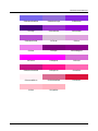
translations. A set of predefined colors are provided in grlib/grlib.h that can be used if desired;
a list of these colors and a corresponding color swatch can be found in chapter 14.
A display driver may draw into a local buffer and then copy the final results to the display once
complete (this is typically the case for display formats that have more than one pixel in a byte since
it is more efficient to store the display data in SRAM than to read from the display itself). GrFlush()
is used to indicate that the drawing operations are complete and that the screen should be updated.
It is important to call GrFlush() to ensure that all drawing operations have been refllected onto the
screen.
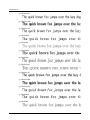
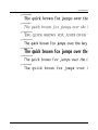
A large set of fonts are provided, based on the Computer Modern typeface defined by Professor
Donald E. Knuth for the TEX typesetting system. Serif and san-serif fonts are provided in regular,
bold, and italic styles in even sizes from 12 to 48 point, and a small caps font is provided in even
sizes from 12 to 48 point. Additionally, a custom designed 6x8 fixed-point is provided. The fonts are
stored in the grlib/fonts directory, which each font residing in its own file. A list of these fonts
and a sample string rendered in each font can be found in chapter 15.
Note:
The Computer Modern typeface does not provide glyphs for the “<”, “>”, “\”, “∧ ”, “_”, “{”, “|”,
“}”, or “∼” characters, instead providing different glyphs for these characters.
The code for the graphics primitives are contained in grlib/circle.c, grlib/context.c,
grlib/image.c,
grlib/line.c,
grlib/offscr1bpp.c,
grlib/offscr4bpp.c,
grlib/offscr8bpp.c, grlib/rectangle.c, and grlib/string.c, with grlib/grlib.h
containing the API definitions for use by applications.
3.1.1
Drawing Context
All drawing operations take place in terms of a drawing context. This context describes the display
to which the operation occurs, the color and font to use, and the region of the display to which the
operation should be limited (the clipping region).
A drawing context must be initialized with GrContextInit() before it can be used to perform drawing
September 05, 2012
15
Graphics Primitives
operations. The other GrContext...() functions are used to modify the properties of the drawing
context.
The colors in a drawing context are typically set with GrContextForegroundSet() and GrContextBackgroundSet(), which utilizes the color translation capabilities of the context’s display driver
to convert the 24-bit color to a display-appropriate value. For applications that frequently switch
between colors, it may be more efficient to use DpyColorTranslate() to perform the 24-bit RGB color
translation once per color and then use GrContextForegroundSetTranslated() and GrContextBackgroundSetTranslated() to change between colors.
3.1.2
Off-screen Buffers
Off-screen buffers provide a mechanism for drawing into a buffer in memory instead of directly to
the screen. The resulting buffer is in the Graphics Library image format, so the off-screen buffer
can be copied to a display at any time using GrImageDraw().
The off-screen buffers appear as separate display drivers that draw into memory. Unlike a normal
display driver that draws into memory, performing a flush on an off-screen buffer does nothing.
Off-screen buffer display drivers are provided in 1 bit-per-pixel (BPP) format, 4 BPP format, and
8 BPP format. The image buffers that they produce are always in uncompressed format (since it
would be far too computationally expensive to try to keep them in compressed format).
3.1.3
Image Format
Images are stored as an array of unsigned characters. Ideally, they would be in a structure, but
the limitations of C prevents an efficient definition of a structure for an image while still allowing
a compile-time declaration of the data for an image. The effective definition of the structure is as
follows (with no padding between members):
typedef struct
{
//
// Specifies the format of the image data; will be one of
// IMAGE_FMT_1BPP_UNCOMP, IMAGE_FMT_4BPP_UNCOMP, IMAGE_FMT_8BPP_UNCOMP,
// IMAGE_FMT_1BPP_COMP, IMAGE_FMT_4BPP_COMP, or IMAGE_FMT_8BPP_COMP. The
// xxx_COMP varieties indicate that the image data is compressed.
//
unsigned char ucFormat;
//
// The width of the image in pixels.
//
unsigned short usWidth;
//
// The height of the image in pixels.
//
unsigned short usHeight;
//
// The image data. This is the structure member that C can not handle
// efficiently at compile time.
//
unsigned char pucData[];
}
16
September 05, 2012
Graphics Primitives
tImage;
The format of the image data is dependent upon the number of bits per pixel and the use of compression. When compression is used, the uncompressed data will match the data that would appear
in the image data for non-compressed images.
For 1 bit per pixel images, the image data is simply a sequence of bytes that describe the pixels in
the image. Bits that are on represent pixels that should be drawn in the foreground color, and bits
that are off represent pixels that should be drawn in the background color. The data is organized in
row major order, with the first byte containing the left-most 8 pixels of the first scan line. The most
significant bit of each byte corresponds to the left-most pixel, and padding bits are added at the end
each scan line (if required) in order to ensure that each scan line starts at the beginning of a byte.
For 4 bits per pixel images, the first byte of the image data is the number of actual palette entries
(which is actually stored as N - 1; in other words, an 8 entry palette will have 7 in this byte. The
next bytes are the palette for the image, which each entry being organized as a blue byte followed
by a green byte followed by a red byte. Following the palette is the actual image data, where each
nibble corresponds to an entry in the palette. The bytes are organized the same as for 1 bit per
pixel images, and the most significant nibble of each byte corresponds to the left-most pixel.
For 8 bits per pixel images, the format is the same as 4 bits per pixel images with a larger palette
and each byte containing exactly one pixel.
When the image data is compressed, the Lempel-Ziv-Storer-Szymanski algorithm is used to compress the data. This algorithm was originally published in the Journal of the ACM, 29(4):928-951,
October 1982. The essence of this algorithm is to use the N most recent output bytes as a dictionary; the next encoded byte is either a literal byte (which is directly output) or a dictionary reference
of up to M sequential bytes. For highly regular images (such as would be used for typical graphical
controls), this works very well.
The compressed data is arranged as a sequence of 9 byte chunks. The first byte is a set of flags
that indicate if the next 8 bytes are literal or dictionary references (one bit per byte). The most
significant bit of the flags corresponds to the first byte. If the flag is clear, the byte is a literal; if it
is set, the byte is a dictionary reference where the upper five bits are the dictionary offset and the
lower three bits are the reference length (where 0 is 2 bytes, 1 is 3 bytes, and so on). Since a one
byte dictionary reference takes one byte to encode, it is always stored as a literal so that length is
able to range from 2 through 9 (providing a longer possible dictionary reference). The last 9 byte
chunk may be truncated if all 8 data bytes are not required to encode the entire data sequence.
A utility (pnmtoc) is provided to assist in converting images into this format; it is documented in
chapter 13.
3.1.4
Font Glyph Data Format
The graphics library supports three distinct bitmap font formats offering a variety of features depending upon the needs of an application. All three formats encode individual characters in the
same way but use different headers and character glyph lookup methods. Information on these
formats can be found in chapter 3.2.
Font data is stored with a scheme that treats the rows of the font glyph as if they were connected
side-by-side. Therefore, pixels from the end of one row can be combined with pixels from the
beginning of the next row when storing. Fonts may be stored in an uncompressed format or may
be compressed with a simple pixel-based RLE encoding. For either format, the format of the data
for a font glyph is as follows:
September 05, 2012
17
Graphics Primitives
The first byte of the encoding is the number of bytes within the encoding (including the size
byte).
The second byte is the width of the character in pixels.
The remaining bytes describe the pixels within the glyph.
For the uncompressed format, each 8-pixel quantity from the font glyph is stored as a byte in the
glyph data. The most significant bit of each bit is the left-most pixel. So, for example, consider the
following font glyph (for a non-existant character from a 14x8 font):
..............
..............
..............
......xx......
.....xxxx.....
...xxxxxxxx...
...xxxxxxxx...
..............
This would be stored as follows:
0x10, 0x0e, 0x00, 0x00, 0x00, 0x00, 0x00, 0x00
0xc0, 0x07, 0x80, 0x7f, 0x81, 0xfe, 0x00, 0x00
Compression of the font data is via a per-glyph pixel RLE scheme. The encoded format of the font
data is as follows:
A non-zero byte encodes up to 15 consecutive off pixels followed by up to 15 consecutive on
pixels. The upper nibble contains the number of off pixels and the lower nibble contains the
number of on pixels. So, for example, 0x12 means that there is a single off pixel followed by
two on pixels.
A zero byte indicates repeated pixels. The next byte determines the size and type of the
repeated pixels. The lower seven bits of the next byte specifies the number of bytes in the
literal encoding (referred to as N). If the upper bit of the next byte is set, then there are N ∗ 8
on pixels. If the upper bit is not set, then there are N ∗ 8 off pixels.
The repeated pixel encoding is very useful for the several rows worth of off pixels that are present
in many glyphs.
For the same glyph as above, the the compressed would be as follows, with an explanation of each
byte or byte sequence:
0x0a: There are 10 bytes in the encoding of this glyph, including this byte.
0x0e: This glyph is 14 pixels wide.
0x00 0x06: The glyphs starts with 48 off pixels (6 bytes).
0x02: The fourth row has no addition off pixels before the two on pixels.
0xb4: The fourth row ends with 6 off pixels and the fifth row starts with 5 off pixels, making 11
off pixels. This is followed by 4 on pixels.
18
September 05, 2012
Graphics Primitives
0x88: The fifth row ends with 5 off pixels, and the sixth row starts with 3 off pixels, making 8
off pixels. This is followed by 8 on pixels.
0x68: The sixth row ends with 3 off pixels, and the seventh row starts with 3 off pixels, making
6 off pixels. This is followed by 8 on pixels.
0xf0: The seventh row ends with 3 off pixels, and the eighth row has 14 off pixels. Since the
maximum that can be encoded is 15, fifteen of the off pixels are here.
0x20: The remaining two off pixels, ending the glyph.
This results in a ten byte compressed font glyph, compared to the sixteen bytes required to describe
the glyph without compression.
While being simplistic, this encoding method provides very effective results. Since the ASCII character set has a small number of strokes per character, the non-zero byte encoding format can
effectively encode most occurrences of non-zero pixels and the repeated pixel encoding format can
effectively encode the large run of zero pixels at the top and/or bottom of many glyphs.
A utility (ftrasterize) is provided to assist in converting fonts into these formats; it is documented in
chapter 13.
/∗!
3.2
Fonts and Text Handling
3.2.1
Definitions
Understanding the Stellaris graphics library text handling functions will be easier if the following
terminology is known.
ASCII
American Standard Code for Information Interchange. ASCII is a 7 bit codepage with codepoints in the range 0x00 to 0x7F. It contains the basic upperand lower-case Latin alphabet, numeric digits, common punctuation marks
and terminal control codes. It is in common use in English-speaking countries but offers no way to encode accented characters or non-Latin alphabets.
codepage
A character encoding scheme mapping between codepoints and glyphs
within a font. The codepage determines which character a given codepoint
(character number) represents. For example, when using the ASCII codepage, codepoint 0x20 represents the space character.
codepoint
A single entry in a codepage. A number identifying a character in a font.
Knowing the codepage in use, the codepoint (or character code) defines a
single character.
glyph
A graphical representation of a single character in a font.
font
A collection of character glyphs in a particular typeface and size each represented by a codepoint.
September 05, 2012
19
Graphics Primitives
3.2.2
ISO8859
A set of codepages containing characters identified by an 8 bit codepoint. Each ISO8859 variant identifies a different codepage. For example ISO8859-1 contains ASCII + Latin accented characters and ISO8859-5
contains ASCII + Cyrillic characters.
Unicode
An international standard defining a universal, 32 bit character encoding
encompassing all writing systems. Unicode effectively does away with the
complications ssociated with codepages by defining a unique code for every possible character in every world writing system.
UTF-8
Unicode Transformation Format (8). A variable length encoding system for
Unicode text where any given character can be represented by 1 to 6 bytes
depending upon the character. UTF-8 has the advantage that it is backwards compatible with ASCII and is commonly used in text file processing.
UTF-16
Unicode Transformation Format (16). A variable length encoding system for
Unicode text where any given character can be represented by either one or
two 16-bit words depending upon the character. UTF-16 is compatible with
UCS-2 for codepoints in the 0-0xFFFF range. UTF-16 is also the native
internal text format used by Windows (since Win2K), MacOS X and Java
but text files typically do not use this format.
Font Formats
Four structures are used to describe a font to graphics library functions. Each of these share a
common first field, ucFormat, allowing the graphics library font functions to accept a tFont pointer
in all cases and to determine which underlying structure is in use and parse the data appropriately.
The graphics library header and font headers under third_party/fonts define macros which
provide tFont ∗ pointers for all included fonts. This prevents users from having to include explicit
pointer casts when passing font parameters to grlib functions. It is, however, perfectly acceptable
(and expected) to cast a tFontEx, tFontWide or tFontWrapper pointer to a tFont pointer for
use with API functions that require a font parameter.
3.2.2.1
tFont
The tFont structure allows encoding of fonts containing the printable subset of the 7-bit ASCII
encoding, characters 32 (space) to 126 (tilde). It offers the smallest font size for applications requiring use of the alphanumeric characters offered by ASCII. Since this encoding always contains 95
characters, applications which use only a subset of ASCII, for example the numeric digits, may find
that the tFontEx structure offers a better alternative.
The header of a tFont structure contains information on the font character cell size and baseline
along with a 96 entry glyph offset table and a pointer to an array of data containing the compressed
or uncompressed font glyph data.
20
September 05, 2012
Graphics Primitives
3.2.2.2
tFontEx
The tFontEx increases text rendering capabilities somewhat to allow the use of full 8 bit encodings
rather than the 7 bit encodings supported by tFont. The structure allows encoding of any arbitrary
subset of characters with codepoints 0 through 255 and may be used to support any ISO8859
variant, allowing the use of, for example Western European accented characters in addition to the
basic Latin alphabet. This format is also useful when only a subset of characters from a given font
are needed. For example, an application requiring only digits from a 44 point font can encode only
these 10 characters using a tFontEx structure and save the memory that would be required if
using tFont instead.
While this format can support any 8 bit character encoding, no codepage information is stored
with the font itself so applications making use of such fonts must be careful to ensure that the
source text rendered using the font makes use of the same codepage as the font that is rendering
it. For example, if you have created an ISO8859-5 compatible font containing western and Cyrillic
alphabets but pass it a string containing ISO8859-1 text with accented Latin characters, you will
see incorrect characters rendered.
If your application intends to support multiple languages and either multiple source text codepages
or an encoding standard such as UTF8, a tFontEx font may not offer the flexibility required and a
tFontWide may be more appropriate. If supporting a subset of languages which can be rendered
using one of the ISO8859 variants, however, tFontEx is a good choice since the additional header
overhead compared to tFont is only 8 bytes.
3.2.2.3
tFontWide
The tFontWide structure allows use of international fonts with multiple alphabets and clean handling of source and font codepages. This format adds the ability to support multi-byte character
encodings such as UTF8, UTF16 and UTF32 and removes the 95 or 256 character restrictions
imposed by the tFont and tFontEx structures. This format of font is encoded without the need
for absolute data pointers and so is suitable for use from non-linear-access storage via a wrapper
module and the tFontWrapper structure.
Glyphs in a tFontWide font are encoded in blocks where a block contains a single, contiguous set
of codepoints. Each block starts with its own glyph data offset table followed by the compressed or
uncompressed data for each of the glyphs in the block.
A font is structured with a header indicating the structure format and cell size along with the codepage used by the font and the number of blocks the font contains. Following this is a table providing
information on each of the blocks - start codepoint number, number of glyphs in the block and the
offset to the block glyph table. The block glyph tables follow immediately after the block table with
each block glyph table padded to a multiple of 4 bytes if necessary.
Graphically, the structure is as follows:
0
September 05, 2012
-----------------------------| tFontWide header
|
| ulNumBlocks = n
|
-----------------------------| tFontBlock[0]
|
| ulStartCodepoint = S0
|
| ulNumCodepoints = N0
|
| ulGlyphTableOffset = OF0
|
-----------------------------|
...
|
------------------------------
First block describes characters from
codepoint S0 to (S0 + N0 - 1). Offset
to glyph table is OF0 bytes from the
start of the tFontWide header struct.
21
Graphics Primitives
|
|
|
|
tFontBlock[n-1]
|
ulStartCodepoint = S(n-1)
|
ulNumCodepoints = N(n-1)
|
ulGlyphTableOffset = OF(n-1) |
-----------------------------Start of Block 0 Offset Table
-----------------------------OF0 | ulGlyphOffset = GO0
|
|
|
-----------------------------| ulGlyphOffset = GO1
|
|
|
-----------------------------|
...
|
|
|
-----------------------------| ulGlyphOffset = GO(N0 - 1)
|
|
|
-----------------------------Start of Block 0 Glyph Data
-----------------------------GO0 | Glyph data for codepoint
|
| S0 from block 0
|
-----------------------------GO1 | Glyph data for codepoint
|
| S0 + 1 from block 0
|
-----------------------------|
...
|
-----------------------------GO | Glyph data for codepoint
|
(N-1)| (S0 + N0 - 1) from block 0
|
-----------------------------| Padding to align OF1 on a 4 |
| byte boundary (if necessary) |
-----------------------------Start of Block 1 Offset Table
-----------------------------OF1 | ulGlyphOffset = G10
|
|
|
-----------------------------| ulGlyphOffset = G11
|
|
|
-----------------------------|
...
|
|
|
-----------------------------| ulGlyphOffset = G1(N1 - 1)
|
|
|
-----------------------------Start of Block 1 Glyph Data
-----------------------------G10 | Glyph data for codepoint
|
| S1 from block 1
|
-----------------------------G11 | Glyph data for codepoint
|
| S1 + 1 from block 1
|
-----------------------------|
...
|
-----------------------------G1 | Glyph data for codepoint
|
(N-1)| (S1 + N1 - 1) from block 1
|
-----------------------------GO0 | Glyph data for codepoint
|
| S0 from block 0
|
-----------------------------Start of Block 2 Offset Table
22
Final block describes characters from
codepoint S(n-1) to (S(n-1) + N(n-1)
- 1).
Offset from OF0 to glyph S0 data.
Offset from OF0 to glyph (S0 + 1) data.
Offset from OF0 to glyph (S0 + N0 - 1)
Offset from OF1 to glyph S1 data.
Offset from OF1 to glyph (S1 + 1) data.
Offset from OF1 to glyph (S1 + N1 - 1)
September 05, 2012
Graphics Primitives
-----------------------------| ...continued for remaining
|
| font blocks.
|
------------------------------
Wide font files generated by the ftrasterize tool contain the structure defined as a constant
array of unsigned characters but a pointer to this array can be cast to (tFont ∗) type and passed
to any graphics library call requiring a font pointer. The graphics library headerfile, grlib.h , and
the various headers under third_party/fonts contain macro definitions for each font which
provide this cast for you.
3.2.2.4
tFontWrapper
The tFontWrapper structure does not, technically define a font but it does provide a mechanism
allowing applications to access tFontWide format binary fonts stored in memory which is not
directly visible to the CPU such as in a file system or stored on a serial flash device. Like all
other font structures, a tFontWrapper pointer may be cast to a tFont pointer and used with any
graphics library function which expects a font pointer as a parameter.
Unlike the other font formats where the graphics library code parses the font data directly, a
wrapped font is accessed via five function pointers stored in a tFontAccessFuncs structure within
tFontWrapper. These functions mirror similar functions in the grlib API and allow the graphics
library code to query information about the wrapped font and extract data for particular glyphs.
Font wrapper modules will implement the five functions required to populate the
tFontAccessFuncs table and two others, a FontLoad function whose prototype is wrapperspecific but which prepares a font for use and returns a pointer that grlib will pass on all calls
to the access functions, and a FontUnload function which tidies up and releases any resources
associated with accessing the font (closes files, frees buffers, etc.). Applications making use of
wrapped fonts call the wrapper’s FontLoad function to initialize the font to be used then populate
the three fields of their tFontWrapper structure. After this, the tFontWrapper pointer may be
used exactly as any other font pointer, casting it to a (const tFont ∗) type before passing it to
any graphics library function which requires a font pointer.
Since font wrappers are board and application specific, none are included in the graphics library
itself. The fontview example application included in Stellarisware releases for DK-LM3S9B96,
DK-LM3S9D96 and the various Intelligent Display Modules (IDMs) does, however, offer a simple
FAT file system wrapper and illustrates how to use a font stored on an SDCard.
3.2.3
Codepage Handling
The term “codepage” refers to a mapping of character numbers as stored in a file or string to
specific displayable characters. When an application is dealing with ASCII text alone, codepage
issues seldom occur since most of the common codepages in use are backwards compatible with
ASCII, including the ASCII character set at the same position in their codespace in each case.
When non-Western languages are to be used, however, the situation becomes more complex and
an understanding and awareness of codepages becomes critical to ensure that text is displayed as
expected.
The Stellaris graphics library supports the concept of both source text codepages and font codepages and supplies functions necessary to set the codepage in use for strings passed to GrLib
functions, to query the codepage supported by a font and to convert between the two. Older fonts
September 05, 2012
23
Graphics Primitives
encoded using the tFont and tFontEx formats do not contain information defining their codepages and are assumed to contain ISO8859-1 (a standard western European codepage containing
ASCII and a collection of accented characters). Fonts encoded in tFontWide format, however,
contain a codepage specifier allowing applications to generate fonts indexed using different codepages and have these correctly handled when rendering strings encoded in a different codepage.
Source text codepage and encoding information can be set at two levels. A global default setting
which will be used in all graphics contexts created by the application can be provided in a call to
GrLibInit(). Alternatively, an application can set or change the source codepage at the context level
using GrStringCodepageSet(). Note that the source codepage definitions actually include several
“codepages” that are not strictly codepages at all but are encoding formats for Unicode text. UTF-8
(identified by CODEPAGE_UTF_8) and UTF-16 (CODEPAGE_UTF_16) are popular, variable length
encoding methods supported by many editors. Pure Unicode CODEPAGE_UNICODE using a 32 bit
character encoding is supported but is inefficient compared to UTF-8 and UTF-16 when encoding
most text strings.
To allow the correct font glyphs to be displayed for each source character, applications must also
provide GrLib with an array defining functions that can be used to convert between the chosen
source text codepage or encoding and the codepage used by the chosen font. This is accomplished
by means of the codepage mapping table, each entry of which defines a source and destination
codepage and contains a pointer to the function used to convert a codepoint in the source codepage
to one in the destination codepage. The function GrCodepageMapTableSet() allows the codepage
mapping table to be set for a specific graphics context or, alternatively, a default table that will apply
to all created contexts may be provided in a call to GrLibInit(). GrLib exports several codepage
mapping functions for common codepages (UTF-8, UTF32 and ISO8859 variants 1 through 5) so
these may be used to populate the mapping table if your application will be making use of one of
these codepages.
Although it may seem cumbersome to have the application generate and provide this mapping
table when GrLib already has knowledge of the common codepage conversions, it makes sense
for two main reasons. Firstly, an application which does not need to use a particular codepage may
leave its conversion function out of the table and avoid the sometimes significant code overhead
of including the conversion function and secondly, it allows the possibility of application- specific
custom code pages and fonts.
The codepage mapping function that is used is set each time the application changes either the
font attached to a context or the source codepage in use so the mapping table array need only be
provided to GrLib once during initialization.
3.2.4
Language Rendering Hooks
The Stellaris graphics library provides support for rendering characters from international character
sets but, in its shipped form, does not support the following language-specific features:
1. Rendering directions other than left-to-right
2. Combining diacritics
3. Ligatures
4. Codepoint decomposition/recomposition
Each of these limitations can, however, be solved by using a hook provided by the graphics library
that allows the main string rendering function to be replaced. This function is called in response
to any call to GrStringDraw() or GrStringDrawCentered() and can be set on a context-by-context
24
September 05, 2012
Graphics Primitives
basis. By default, the function GrDefaultStringRenderer is used and this supports left-to-right text
rendering. Applications can, however, replace this function with one which complies with the text
formatting rules required by their desired language. Low level functions are provided by the graphics
library to allow characters to be extracted from source strings, glyph data to be extracted from fonts
and individual glyphs to be written to a given position on the display and these may be used to
simplify development of the replacement string renderer function.
3.2.4.1
Text Rendering Direction
Left-to-right text rendering is used by all western European languages and is also supported for
Chinese, Japanese and Korean. Other languages, notably Hebrew and Arabic, require right-to-left
text rendering with the ability to insert left-to-right strings within the base left-to-right text. While
such languages could be rendered by reformatting the source text into display order and rendering
it left-to-right, the base Stellaris graphics library does not currently support the ability to render
strings stored in reading order in these languages.
To support different rendering directions, a replacement string renderer could be modeled on GrDefaultStringRenderer() but update the rendering coordinates for each character differently to provide
right-to-left rather than left-to-right text.
3.2.4.2
Combining Diacritics
The graphics library supports only precomposed diacritical characters (accents) where a single,
unique codepoint defines both the character and its diacritical mark or marks. Some text encodings
support the concept of combining diacritics. In these cases, the accented character is encoded
using two or more distinct codepoints, one for the base character and one or more following it
indicating the diacritical marks which must be added on top of the basic glyph.
A replacement text renderer with knowledge of codepoints representing diacritical characters could
be written to ensure that diacritics are correctly rendered on top of the preceding character rather
than in their own character cell as would be the case when using the default string renderer.
3.2.4.3
Ligatures
Ligatures are characteristics of a glyph which change depending upon the glyphs which either
follow or precede it. This is seen when using cursive fonts, for example, where the join position
between characters may differ depending upon the characters that are adjacent to one another. It
is also commonly seen in Arabic where the appearance of one character is frequently affected by
other characters around it.
Common ligatures in various languages have precomposed Unicode characters defined for them
so, using a font which encodes these characters, an application could use a custom codepage mapping function to extract the precomposed characters from the string passed to GrStringDraw() or,
alternatively, use a custom string rendering function which looked ahead in the string to determine
which of a number of ligatures should be used.
September 05, 2012
25
Graphics Primitives
3.2.4.4
Codepoint Composition or Decomposition
The default string render assumes that there is a 1-to-1 mapping between a character extracted
from the string and a font glyph that represents it. This is typically true but in some cases, notably
Korean Hangul, it is possible to decode the Unicode value for a single ideograph into several other
codepoints representing pieces of the character to be drawn and then render these individually to
display the intended character. Using this approach, a very large number of ideographs can be
generated from a relatively small alphabet of symbols and, as a result, a great deal of font storage
could be saved.
Such a system could be implemented by using a font containing the relevant partial character
alphabet glyphs and replacing the default string rendering function with one which understood how
to decompose and recompose characters based on these glyphs.
3.2.5
Using Custom Fonts & Codepages
When working on applications which require support for multiple languages using different alphabets, the size of storage required to hold font glyphs can quickly become a concern. This problem
is especially apparent when dealing with Chinese, Japanese or Korean (CJK) text where many
thousand possible glyphs exist. To help overcome some of these problems, the Stellaris Graphics
Library and the mkstringtable and ftrasterize tools provide some helpful features to aid in minimizing
the amount of storage required to store glyph data and string tables.
In many cases, an application will not need to be able to display any arbitrary character from a
given alphabet but, instead, requires only to display a number of fixed strings in one of several
languages. In this case, a custom font containing only the required character glyphs can be used,
thus removing the need to store all possible characters many of which will never be used. Building
such a font is made straightforward by the character map table feature of the ftrasterize tool and
options provided by the mkstringtable tool.
To generate an application-specific custom font, first ensure that all strings the application will need
to display are stored in a single string table .csv file then invoke the mkstringtable tool and include
the “-t” option. This will create an additional output text file which contains a list of all codepoints
used in the string table and this can, in turn, be passed to ftrasterize using its “-c” and “-r” parameters to tell the tool to generate a font containing only glyphs for those specific codepoints. This font
can then be used in the application, knowing that all characters that are required will be available.
This method has the advantage that the strings in the string table are still stored using the same
codepage as the original string table so, when viewed in a debugger, for example, the strings are
still readable (assuming your debugger supports the codepage that you used to create your original
strings). As a side effect, it is also easy to add other blocks of characters into the output font
merely by editing the character map file and adding blocks of characters that you know you will
need but which may not necessarily exist in the string table. For example, an application which
needs to display label strings for various controls and needs to be able to display decimal digits
within those controls could have a block added to the character map which includes all the decimal
digit characters to ensure that they are available for use.
One downside of this approach, however, is that the fonts generated are typically rather larger than
they could be. The tFontWide structure can encode multiple blocks of characters but characters
within a given block must represent contiguous codepoints. In a sparse string table, and especially
when using ideographic alphabets such as Chinese, Japanese and Korean, this approach usually
means you end up with a large number of single character blocks in the font and this has two
problems. Firstly, there is a 12 byte overhead associated with each block definition and secondly
26
September 05, 2012
Graphics Primitives
the code required to find a given glyph in the font must do a lot more searching since each individual
block header must be read to determine whether a given character falls into that block or not.
To prevent these problems, a second option can be used when creating the custom font and string
table. This option, known as codepage remapping, recodes the string table such that the characters
stored use a single, contiguous block of codepoints. Further, the codepoints are set up such that
the most frequently used characters appear first in the new codepage and this, coupled with a
variable length encoding scheme based on UTF-8, allows the strings to be stored very efficiently.
To make use of codepage remapping, substitute the “-t” switch passed to mkstringtable.c with “-r”
and add the “-c” switch to select an identifier for the custom codepage. This identifier must be in the
range 0x8000 - 0xFFFF set aside in the graphics library header file, grlib.h, as the range available
for application use. This will encode the string table using the new custom codepage and also
write a tag into the output character map file to tell ftrasterize to do the same when it generates the
custom font. When using the character map file with ftrasterize, be careful to include the “-z” switch
and pass the same custom codepage number as you passed to mkstringtable. After running the
two tools, you will end up with string table and font source files and a string table header file. The
string table header contains some helpful macros that can be used when initializing the graphics
library to use the custom font and string table.
If using codepage remapping, remember that the numbers used to represent the characters in your
strings no longer conform to any standard codepage so you will not be able to read the string if
viewed in a debugger memory window and you will not be able to make use of functions such as
usprintf to format text for display using the new font since no remapping from ASCII, Unicode or
ISO8859 to the custom codepage is supplied. As a result, codepage remapping is most useful
when an application needs to display ONLY a set of fixed strings and will never need to manipulate
arbitrary strings for display. If some string manipulation is required, tricks can be performed by
encoding partial strings into the string table and constructing an output string by piecing these
together via usprintf() as long as only the “s” formatting insert is used.
For a practical example of using custom fonts both with and without codepage remapping, see
the “lang_demo” example application included in the dk-lm3s9b96, dk-lm3s9d96 and rdk-idml35 releases of StellarisWare. The custom font used by these applications and a Makefile
showing the steps necessary to create it and the associated string table can be found in the
third_party/fonts/lang_demo directory of your StellarisWare installation.
3.3
Definitions
Data Structures
tCodePointMap
tContext
tDisplay
tFont
tFontAccessFuncs
tFontEx
tFontWide
tFontWrapper
tGrLibDefaults
tRectangle
September 05, 2012
27
Graphics Primitives
Defines
CODEPAGE_ISO8859_1
DpyColorTranslate(pDisplay, ulValue)
DpyFlush(pDisplay)
DpyHeightGet(pDisplay)
DpyLineDrawH(pDisplay, lX1, lX2, lY, ulValue)
DpyLineDrawV(pDisplay, lX, lY1, lY2, ulValue)
DpyPixelDraw(pDisplay, lX, lY, ulValue)
DpyPixelDrawMultiple(pDisplay, lX, lY, lX0, lCount, lBPP, pucData, pucPalette)
DpyRectFill(pDisplay, pRect, ulValue)
DpyWidthGet(pDisplay)
FONT_EX_MARKER
FONT_FMT_EX_PIXEL_RLE
FONT_FMT_EX_UNCOMPRESSED
FONT_FMT_PIXEL_RLE
FONT_FMT_UNCOMPRESSED
FONT_FMT_WIDE_PIXEL_RLE
FONT_FMT_WIDE_UNCOMPRESSED
FONT_FMT_WRAPPED
FONT_WIDE_MARKER
GrContextBackgroundSet(pContext, ulValue)
GrContextBackgroundSetTranslated(pContext, ulValue)
GrContextDpyHeightGet(pContext)
GrContextDpyWidthGet(pContext)
GrContextForegroundSet(pContext, ulValue)
GrContextForegroundSetTranslated(pContext, ulValue)
GrFlush(pContext)
GrImageColorsGet(pucImage)
GrImageHeightGet(pucImage)
GrImageWidthGet(pucImage)
GrOffScreen1BPPSize(lWidth, lHeight)
GrOffScreen4BPPSize(lWidth, lHeight)
GrOffScreen8BPPSize(lWidth, lHeight)
GrPixelDraw(pContext, lX, lY)
GrRectContainsPoint(pRect, lX, lY)
GrStringBaselineGet(pContext)
GrStringDrawCentered(pContext, pcString, lLength, lX, lY, bOpaque)
GrStringHeightGet(pContext)
GrStringMaxWidthGet(pContext)
IMAGE_FMT_1BPP_COMP
IMAGE_FMT_1BPP_UNCOMP
IMAGE_FMT_4BPP_COMP
IMAGE_FMT_4BPP_UNCOMP
IMAGE_FMT_8BPP_COMP
IMAGE_FMT_8BPP_UNCOMP
28
September 05, 2012
Graphics Primitives
Functions
void GrCircleDraw (const tContext ∗pContext, long lX, long lY, long lRadius)
void GrCircleFill (const tContext ∗pContext, long lX, long lY, long lRadius)
void GrCodepageMapTableSet (tContext ∗pContext, tCodePointMap ∗pCodePointMapTable,
unsigned char ucNumMaps)
void GrContextClipRegionSet (tContext ∗pContext, tRectangle ∗pRect)
void GrContextFontSet (tContext ∗pContext, const tFont ∗pFnt)
void GrContextInit (tContext ∗pContext, const tDisplay ∗pDisplay)
void GrDefaultStringRenderer (const tContext ∗pContext, const char ∗pcString, long lLength,
long lX, long lY, unsigned long bOpaque)
unsigned long GrFontBaselineGet (const tFont ∗pFont)
unsigned short GrFontCodepageGet (const tFont ∗pFont)
const unsigned char ∗ GrFontGlyphDataGet (const tFont ∗pFont, unsigned long ulCodePoint,
unsigned char ∗pucWidth)
void GrFontGlyphRender (const tContext ∗pContext, const unsigned char ∗pucData, long lX,
long lY, unsigned long bCompressed, unsigned long bOpaque)
unsigned long GrFontHeightGet (const tFont ∗pFont)
void GrFontInfoGet (const tFont ∗pFont, unsigned char ∗pucFormat, unsigned char
∗pucMaxWidth, unsigned char ∗pucHeight, unsigned char ∗pucBaseline)
unsigned long GrFontMaxWidthGet (const tFont ∗pFont)
unsigned short GrFontNumBlocksGet (const tFont ∗pFont)
void GrImageDraw (const tContext ∗pContext, const unsigned char ∗pucImage, long lX, long
lY)
void GrLibInit (const tGrLibDefaults ∗pDefaults)
void GrLineDraw (const tContext ∗pContext, long lX1, long lY1, long lX2, long lY2)
void GrLineDrawH (const tContext ∗pContext, long lX1, long lX2, long lY)
void GrLineDrawV (const tContext ∗pContext, long lX, long lY1, long lY2)
unsigned long GrMapISO8859_10_Unicode (const char ∗pcSrcChar, unsigned long ulCount,
unsigned long ∗pulSkip)
unsigned long GrMapISO8859_11_Unicode (const char ∗pcSrcChar, unsigned long ulCount,
unsigned long ∗pulSkip)
unsigned long GrMapISO8859_13_Unicode (const char ∗pcSrcChar, unsigned long ulCount,
unsigned long ∗pulSkip)
unsigned long GrMapISO8859_14_Unicode (const char ∗pcSrcChar, unsigned long ulCount,
unsigned long ∗pulSkip)
unsigned long GrMapISO8859_15_Unicode (const char ∗pcSrcChar, unsigned long ulCount,
unsigned long ∗pulSkip)
unsigned long GrMapISO8859_16_Unicode (const char ∗pcSrcChar, unsigned long ulCount,
unsigned long ∗pulSkip)
unsigned long GrMapISO8859_1_Unicode (const char ∗pcSrcChar, unsigned long ulCount,
unsigned long ∗pulSkip)
unsigned long GrMapISO8859_2_Unicode (const char ∗pcSrcChar, unsigned long ulCount,
unsigned long ∗pulSkip)
unsigned long GrMapISO8859_3_Unicode (const char ∗pcSrcChar, unsigned long ulCount,
unsigned long ∗pulSkip)
unsigned long GrMapISO8859_4_Unicode (const char ∗pcSrcChar, unsigned long ulCount,
unsigned long ∗pulSkip)
September 05, 2012
29
Graphics Primitives
unsigned long GrMapISO8859_5_Unicode (const char ∗pcSrcChar, unsigned long ulCount,
unsigned long ∗pulSkip)
unsigned long GrMapISO8859_6_Unicode (const char ∗pcSrcChar, unsigned long ulCount,
unsigned long ∗pulSkip)
unsigned long GrMapISO8859_7_Unicode (const char ∗pcSrcChar, unsigned long ulCount,
unsigned long ∗pulSkip)
unsigned long GrMapISO8859_8_Unicode (const char ∗pcSrcChar, unsigned long ulCount,
unsigned long ∗pulSkip)
unsigned long GrMapISO8859_9_Unicode (const char ∗pcSrcChar, unsigned long ulCount,
unsigned long ∗pulSkip)
unsigned long GrMapUnicode_Unicode (const char ∗pcSrcChar, unsigned long ulCount, unsigned long ∗pulSkip)
unsigned long GrMapUTF16BE_Unicode (const char ∗pcSrcChar, unsigned long ulCount, unsigned long ∗pulSkip)
unsigned long GrMapUTF16LE_Unicode (const char ∗pcSrcChar, unsigned long ulCount, unsigned long ∗pulSkip)
unsigned long GrMapUTF8_Unicode (const char ∗pcSrcChar, unsigned long ulCount, unsigned long ∗pulSkip)
unsigned long GrMapWIN1250_Unicode (const char ∗pcSrcChar, unsigned long ulCount, unsigned long ∗pulSkip)
unsigned long GrMapWIN1251_Unicode (const char ∗pcSrcChar, unsigned long ulCount, unsigned long ∗pulSkip)
unsigned long GrMapWIN1252_Unicode (const char ∗pcSrcChar, unsigned long ulCount, unsigned long ∗pulSkip)
unsigned long GrMapWIN1253_Unicode (const char ∗pcSrcChar, unsigned long ulCount, unsigned long ∗pulSkip)
unsigned long GrMapWIN1254_Unicode (const char ∗pcSrcChar, unsigned long ulCount, unsigned long ∗pulSkip)
void GrOffScreen1BPPInit (tDisplay ∗pDisplay, unsigned char ∗pucImage, long lWidth, long
lHeight)
void GrOffScreen4BPPInit (tDisplay ∗pDisplay, unsigned char ∗pucImage, long lWidth, long
lHeight)
void GrOffScreen4BPPPaletteSet (tDisplay ∗pDisplay, unsigned long ∗pulPalette, unsigned
long ulOffset, unsigned long ulCount)
void GrOffScreen8BPPInit (tDisplay ∗pDisplay, unsigned char ∗pucImage, long lWidth, long
lHeight)
void GrOffScreen8BPPPaletteSet (tDisplay ∗pDisplay, unsigned long ∗pulPalette, unsigned
long ulOffset, unsigned long ulCount)
void GrRectDraw (const tContext ∗pContext, const tRectangle ∗pRect)
void GrRectFill (const tContext ∗pContext, const tRectangle ∗pRect)
long GrRectIntersectGet (tRectangle ∗psRect1, tRectangle ∗psRect2, tRectangle
∗psIntersect)
long GrRectOverlapCheck (tRectangle ∗psRect1, tRectangle ∗psRect2)
long GrStringCodepageSet (tContext ∗pContext, unsigned short usCodepage)
void GrStringDraw (const tContext ∗pContext, const char ∗pcString, long lLength, long lX, long
lY, unsigned long bOpaque)
unsigned long GrStringGet (long lIndex, char ∗pcData, unsigned long ulSize)
unsigned long GrStringLanguageSet (unsigned short usLangID)
30
September 05, 2012
Graphics Primitives
unsigned long GrStringNextCharGet (const tContext ∗pContext, const char ∗pcString, unsigned long ulCount, unsigned long ∗pulSkip)
void GrStringTableSet (const void ∗pvTable)
long GrStringWidthGet (const tContext ∗pContext, const char ∗pcString, long lLength)
void GrTransparentImageDraw (const tContext ∗pContext, const unsigned char ∗pucImage,
long lX, long lY, unsigned long ulTransparent)
3.3.1
Data Structure Documentation
3.3.1.1
tCodePointMap
Definition:
typedef struct
{
unsigned short usSrcCodepage;
unsigned short usFontCodepage;
unsigned long (*pfnMapChar)(const char *pcSrcChar,
unsigned long ulCount,
unsigned long *pulSkip);
}
tCodePointMap
Members:
usSrcCodepage The codepage used to describe the source characters.
usFontCodepage The codepage into which source characters are to be mapped.
pfnMapChar A pointer to the conversion function which will be used to translate input strings
into codepoints in the output codepage.
Description:
A structure used to define a mapping function that converts text in one codepage to a different
codepage. Typically this is used to translate text strings into the codepoints needed to retrieve
the appropriate glyphs from a font.
3.3.1.2
tContext
Definition:
typedef struct
{
long lSize;
const tDisplay *pDisplay;
tRectangle sClipRegion;
unsigned long ulForeground;
unsigned long ulBackground;
const tFont *pFont;
void (*pfnStringRenderer)(const struct _tContext *,
const char *,
long,
long,
long,
September 05, 2012
31
Graphics Primitives
unsigned long);
const tCodePointMap *pCodePointMapTable;
unsigned short usCodepage;
unsigned char ucNumCodePointMaps;
unsigned char ucCodePointMap;
unsigned char ucReserved;
}
tContext
Members:
lSize The size of this structure.
pDisplay The screen onto which drawing operations are performed.
sClipRegion The clipping region to be used when drawing onto the screen.
ulForeground The color used to draw primitives onto the screen.
ulBackground The background color used to draw primitives onto the screen.
pFont The font used to render text onto the screen.
pfnStringRenderer A pointer to a replacement string rendering function. Applications can use
this for language-specific string rendering support. If set, this function is passed control
whenever GrStringDraw is called.
pCodePointMapTable A table of functions used to map between the various supported source
codepages and the codepages supported by fonts in use.
usCodepage The currently selected source text codepage.
ucNumCodePointMaps The number of entries in the pCodePointMapTable array.
ucCodePointMap The index of the codepoint map table entry which is currently in use based
on the selected source codepage and the current font.
ucReserved Reserved for future expansion.
Description:
This structure defines a drawing context to be used to draw onto the screen. Multiple drawing
contexts may exist at any time.
3.3.1.3
tDisplay
Definition:
typedef struct
{
long lSize;
void *pvDisplayData;
unsigned short usWidth;
unsigned short usHeight;
void (*pfnPixelDraw)(void *pvDisplayData,
long lX,
long lY,
unsigned long ulValue);
void (*pfnPixelDrawMultiple)(void *pvDisplayData,
long lX,
long lY,
long lX0,
long lCount,
long lBPP,
32
September 05, 2012
Graphics Primitives
const unsigned char *pucData,
const unsigned char *pucPalette);
void (*pfnLineDrawH)(void *pvDisplayData,
long lX1,
long lX2,
long lY,
unsigned long ulValue);
void (*pfnLineDrawV)(void *pvDisplayData,
long lX,
long lY1,
long lY2,
unsigned long ulValue);
void (*pfnRectFill)(void *pvDisplayData,
const tRectangle *pRect,
unsigned long ulValue);
unsigned long (*pfnColorTranslate)(void *pvDisplayData,
unsigned long ulValue);
void (*pfnFlush)(void *pvDisplayData);
}
tDisplay
Members:
lSize The size of this structure.
pvDisplayData A pointer to display driver-specific data.
usWidth The width of this display.
usHeight The height of this display.
pfnPixelDraw A pointer to the function to draw a pixel on this display.
pfnPixelDrawMultiple A pointer to the function to draw multiple pixels on this display.
pfnLineDrawH A pointer to the function to draw a horizontal line on this display.
pfnLineDrawV A pointer to the function to draw a vertical line on this display.
pfnRectFill A pointer to the function to draw a filled rectangle on this display.
pfnColorTranslate A pointer to the function to translate 24-bit RGB colors to display-specific
colors.
pfnFlush A pointer to the function to flush any cached drawing operations on this display.
Description:
This structure defines the characteristics of a display driver.
3.3.1.4
tFont
Definition:
typedef struct
{
unsigned char ucFormat;
unsigned char ucMaxWidth;
unsigned char ucHeight;
unsigned char ucBaseline;
unsigned short pusOffset[96];
const unsigned char *pucData;
}
tFont
September 05, 2012
33
Graphics Primitives
Members:
ucFormat The format of the font. Can be one of FONT_FMT_UNCOMPRESSED or
FONT_FMT_PIXEL_RLE.
ucMaxWidth The maximum width of a character; this is the width of the widest character in
the font, though any individual character may be narrower than this width.
ucHeight The height of the character cell; this may be taller than the font data for the characters (to provide inter-line spacing).
ucBaseline The offset between the top of the character cell and the baseline of the glyph.
The baseline is the bottom row of a capital letter, below which only the descenders of the
lower case letters occur.
pusOffset The offset within pucData to the data for each character in the font.
pucData A pointer to the data for the font.
Description:
This structure describes a font used for drawing text onto the screen. Fonts in this format may
encode ASCII characters with codepoints in the range 0x20 - 0x7F. More information on this
and the other supported font structures may be found in the “Font Format” section of the user’s
guide.
3.3.1.5
tFontAccessFuncs
Definition:
typedef struct
{
void (*pfnFontInfoGet)(unsigned char *pucFontId,
unsigned char *pucFormat,
unsigned char *pucWidth,
unsigned char *pucHeight,
unsigned char *pucBaseline);
const unsigned char * (*pfnFontGlyphDataGet)(unsigned char
*pucFontId,
unsigned long
ulCodePoint,
unsigned char
pucWidth);
*
unsigned short (*pfnFontCodepageGet)(unsigned char *pucFontId);
unsigned short (*pfnFontNumBlocksGet)(unsigned char *pucFontId);
unsigned long (*pfnFontBlockCodepointsGet)(unsigned char
pucFontId,
*
unsigned short
usBlockIndex,
unsigned long
pulStart);
*
}
tFontAccessFuncs
Members:
pfnFontInfoGet A pointer to the function which will return information on the font. This is used
to support GrFontInfoGet.
pfnFontGlyphDataGet A pointer to the function used to retrieve data for a particular font
glyph. This function returns a pointer to the glyph data in linear, random access memory. If a buffer is required to ensure this, that buffer must be owned and managed by the
34
September 05, 2012
Graphics Primitives
font wrapper function. It is safe to assume that this function will not be called again until
any previously requested glyph data has been used so a single character buffer should
suffice. This is used to support GrFontGlyphDataGet.
pfnFontCodepageGet A pointer to the function used to determine the codepage supported
by the font.
pfnFontNumBlocksGet A pointer to the function used to determine the number of blocks of
codepoints supported by the font.
pfnFontBlockCodepointsGet A pointer to the function used to determine the codepoints in a
given codepoints in a given font block.
Description:
The jump table used to access a particular wrapped (offline) font. This table exists for each
type of wrapped font in use with the functions dependent upon the storage medium holding the
font.
3.3.1.6
tFontEx
Definition:
typedef struct
{
unsigned char ucFormat;
unsigned char ucMaxWidth;
unsigned char ucHeight;
unsigned char ucBaseline;
unsigned char ucFirst;
unsigned char ucLast;
const unsigned short *pusOffset;
const unsigned char *pucData;
}
tFontEx
Members:
ucFormat The format of the font. Can be one of FONT_FMT_EX_UNCOMPRESSED or
FONT_FMT_EX_PIXEL_RLE.
ucMaxWidth The maximum width of a character; this is the width of the widest character in
the font, though any individual character may be narrower than this width.
ucHeight The height of the character cell; this may be taller than the font data for the characters (to provide inter-line spacing).
ucBaseline The offset between the top of the character cell and the baseline of the glyph.
The baseline is the bottom row of a capital letter, below which only the descenders of the
lower case letters occur.
ucFirst The codepoint number representing the first character encoded in the font.
ucLast The codepoint number representing the last character encoded in the font.
pusOffset A pointer to a table containing the offset within pucData to the data for each character in the font.
pucData A pointer to the data for the font.
Description:
This is a newer version of the structure which describes a font used for drawing text onto the
screen. This variant allows a font to contain an arbitrary, contiguous block of codepoints from
the 256 basic characters in an ISO8859-n font and allows support for accented characters in
September 05, 2012
35
Graphics Primitives
Western European languages and any left-to-right typeface supported by an ISO8859 variant.
Fonts encoded in this format may be used interchangeably with the original fonts merely by
casting the structure pointer when calling any function or macro which expects a font pointer
as a parameter. More information on this and the other supported font structures may be found
in the “Font Format” section of the user’s guide.
3.3.1.7
tFontWide
Definition:
typedef struct
{
unsigned char ucFormat;
unsigned char ucMaxWidth;
unsigned char ucHeight;
unsigned char ucBaseline;
unsigned short usCodepage;
unsigned short usNumBlocks;
}
tFontWide
Members:
ucFormat The format of the font. Can be one of FONT_FMT_WIDE_UNCOMPRESSED or
FONT_FMT_WIDE_PIXEL_RLE.
ucMaxWidth The maximum width of a character; this is the width of the widest character in
the font, though any individual character may be narrower than this width.
ucHeight The height of the character cell; this may be taller than the font data for the characters (to provide inter-line spacing).
ucBaseline The offset between the top of the character cell and the baseline of the glyph.
The baseline is the bottom row of a capital letter, below which only the descenders of the
lower case letters occur.
usCodepage The codepage that is used to find characters in this font. This defines the
codepoint-to-glyph mapping within this font.
usNumBlocks The number of blocks of characters described by this font where a block contains a number of contiguous codepoints.
Description:
——————————
This variant of the font structure supports Unicode and other multi-byte character sets. It is
intended for use when rendering such languages as traditional and simplified Chinese, Korean
and Japanese. The font supports multiple blocks of contiguous characters and includes a codepage identifier to allow GrLib to correctly map source codepoints to font glyphs in cases where
the codepages may differ. More information on this and the other supported font structures
may be found in the “Font Format” section of the user’s guide.
3.3.1.8
tFontWrapper
Definition:
typedef struct
{
unsigned char ucFormat;
36
September 05, 2012
Graphics Primitives
unsigned char *pucFontId;
const tFontAccessFuncs *pFuncs;
}
tFontWrapper
Members:
ucFormat The format of the font. Will be FONT_FMT_WRAPPED.
pucFontId A pointer to information required to allow the font access functions to find the font
to be used. This value is returned from a call to the FontLoad function for the particular
font wrapper in use.
pFuncs Access functions for this font.
Description:
This is a wrapper used to support fonts which are stored in a file system or other non-random
access storage. The font is accessed by means of access functions whose pointers are described in this structure. The pucFontId field is written with a handle supplied to the application
by the font wrapper’s FontLoad function and is passed to all access functions to identify the
font in use. Wrapped fonts may be used by any GrLib function that accepts a font pointer as a
parameter merely by casting the pointer appropriately.
3.3.1.9
tGrLibDefaults
Definition:
typedef struct
{
void (*pfnStringRenderer)(const struct _tContext *,
const char *,
long,
long,
long,
unsigned long);
tCodePointMap *pCodePointMapTable;
unsigned short usCodepage;
unsigned char ucNumCodePointMaps;
unsigned char ucReserved;
}
tGrLibDefaults
Members:
pfnStringRenderer The default string rendering function to use. This will normally be GrDefaultStringRenderer but may be replaced when supporting languages requiring mixed rendering directions such as Arabic or Hebrew.
pCodePointMapTable The default codepoint mapping function table. This table contains information allowing GrLib to map text in the source codepage to the correct glyphs in the
fonts to be used. The field points to the first element of an array of ucNumCodePointMaps
structures.
usCodepage The default source text codepage encoding in use by the application.
ucNumCodePointMaps The number of entries in the pCodePointMapTable array.
ucReserved Reserved for future expansion.
September 05, 2012
37
Graphics Primitives
Description:
This structure contains default values that are set in any new context initialized via a call to
GrContextInit. This structure is passed to the graphics library using the GrLibInit function.
3.3.1.10 tRectangle
Definition:
typedef struct
{
short sXMin;
short sYMin;
short sXMax;
short sYMax;
}
tRectangle
Members:
sXMin The minimum X coordinate of the rectangle.
sYMin The minimum Y coordinate of the rectangle.
sXMax The maximum X coordinate of the rectangle.
sYMax The maximum Y coordinate of the rectangle.
Description:
This structure defines the extents of a rectangle. All points greater than or equal to the minimum
and less than or equal to the maximum are part of the rectangle.
3.3.2
Define Documentation
3.3.2.1
CODEPAGE_ISO8859_1
Definition:
#define CODEPAGE_ISO8859_1
Description:
Identifiers for codepages and source text encoding formats.
3.3.2.2
DpyColorTranslate
Translates a 24-bit RGB color to a display driver-specific color.
Definition:
#define DpyColorTranslate(pDisplay,
ulValue)
Parameters:
pDisplay is the pointer to the display driver structure for the display to operate upon.
ulValue is the 24-bit RGB color. The least-significant byte is the blue channel, the next byte is
the green channel, and the third byte is the red channel.
38
September 05, 2012
Graphics Primitives
Description:
This function translates a 24-bit RGB color into a value that can be written into the display’s
frame buffer in order to reproduce that color, or the closest possible approximation of that color.
Returns:
Returns the display-driver specific color.
3.3.2.3
DpyFlush
Flushes cached drawing operations.
Definition:
#define DpyFlush(pDisplay)
Parameters:
pDisplay is the pointer to the display driver structure for the display to operate upon.
Description:
This function flushes any cached drawing operations on a display.
Returns:
None.
3.3.2.4
DpyHeightGet
Gets the height of the display.
Definition:
#define DpyHeightGet(pDisplay)
Parameters:
pDisplay is a pointer to the display driver structure for the display to query.
Description:
This function determines the height of the display.
Returns:
Returns the height of the display in pixels.
3.3.2.5
DpyLineDrawH
Draws a horizontal line on a display.
Definition:
#define DpyLineDrawH(pDisplay,
lX1,
lX2,
lY,
ulValue)
September 05, 2012
39
Graphics Primitives
Parameters:
pDisplay is the pointer to the display driver structure for the display to operate upon.
lX1 is the starting X coordinate of the line.
lX2 is the ending X coordinate of the line.
lY is the Y coordinate of the line.
ulValue is the color to draw the line.
Description:
This function draws a horizontal line on a display. This assumes that clipping has already been
performed, and that both end points of the line are within the extents of the display.
Returns:
None.
3.3.2.6
DpyLineDrawV
Draws a vertical line on a display.
Definition:
#define DpyLineDrawV(pDisplay,
lX,
lY1,
lY2,
ulValue)
Parameters:
pDisplay is the pointer to the display driver structure for the display to operate upon.
lX is the X coordinate of the line.
lY1 is the starting Y coordinate of the line.
lY2 is the ending Y coordinate of the line.
ulValue is the color to draw the line.
Description:
This function draws a vertical line on a display. This assumes that clipping has already been
performed, and that both end points of the line are within the extents of the display.
Returns:
None.
3.3.2.7
DpyPixelDraw
Draws a pixel on a display.
Definition:
#define DpyPixelDraw(pDisplay,
lX,
lY,
ulValue)
40
September 05, 2012
Graphics Primitives
Parameters:
pDisplay is the pointer to the display driver structure for the display to operate upon.
lX is the X coordinate of the pixel.
lY is the Y coordinate of the pixel.
ulValue is the color to draw the pixel.
Description:
This function draws a pixel on a display. This assumes that clipping has already been performed.
Returns:
None.
3.3.2.8
DpyPixelDrawMultiple
Draws a horizontal sequence of pixels on a display.
Definition:
#define DpyPixelDrawMultiple(pDisplay,
lX,
lY,
lX0,
lCount,
lBPP,
pucData,
pucPalette)
Parameters:
pDisplay is the pointer to the display driver structure for the display to operate upon.
lX is the X coordinate of the first pixel.
lY is the Y coordinate of the first pixel.
lX0 is sub-pixel offset within the pixel data, which is valid for 1 or 4 bit per pixel formats.
lCount is the number of pixels to draw.
lBPP is the number of bits per pixel; must be 1, 4, or 8.
pucData is a pointer to the pixel data. For 1 and 4 bit per pixel formats, the most significant
bit(s) represent the left-most pixel.
pucPalette is a pointer to the palette used to draw the pixels.
Description:
This function draws a horizontal sequence of pixels on a display, using the supplied palette.
For 1 bit per pixel format, the palette contains pre-translated colors; for 4 and 8 bit per pixel
formats, the palette contains 24-bit RGB values that must be translated before being written to
the display.
Returns:
None.
September 05, 2012
41
Graphics Primitives
3.3.2.9
DpyRectFill
Fills a rectangle on a display.
Definition:
#define DpyRectFill(pDisplay,
pRect,
ulValue)
Parameters:
pDisplay is the pointer to the display driver structure for the display to operate upon.
pRect is a pointer to the structure describing the rectangle to fill.
ulValue is the color to fill the rectangle.
Description:
This function fills a rectangle on the display. This assumes that clipping has already been
performed, and that all sides of the rectangle are within the extents of the display.
Returns:
None.
3.3.2.10 DpyWidthGet
Gets the width of the display.
Definition:
#define DpyWidthGet(pDisplay)
Parameters:
pDisplay is a pointer to the display driver structure for the display to query.
Description:
This function determines the width of the display.
Returns:
Returns the width of the display in pixels.
3.3.2.11 FONT_EX_MARKER
Definition:
#define FONT_EX_MARKER
Description:
A marker used in the ucFormat field of a font to indicates that the font data is stored using the
new tFontEx structure.
42
September 05, 2012
Graphics Primitives
3.3.2.12 FONT_FMT_EX_PIXEL_RLE
Definition:
#define FONT_FMT_EX_PIXEL_RLE
Description:
Indicates that the font data is stored using a pixel-based RLE format and uses the tFontEx
structure format.
3.3.2.13 FONT_FMT_EX_UNCOMPRESSED
Definition:
#define FONT_FMT_EX_UNCOMPRESSED
Description:
Indicates that the font data is stored in an uncompressed format and uses the tFontEx structure
format.
3.3.2.14 FONT_FMT_PIXEL_RLE
Definition:
#define FONT_FMT_PIXEL_RLE
Description:
Indicates that the font data is stored using a pixel-based RLE format.
3.3.2.15 FONT_FMT_UNCOMPRESSED
Definition:
#define FONT_FMT_UNCOMPRESSED
Description:
Indicates that the font data is stored in an uncompressed format.
3.3.2.16 FONT_FMT_WIDE_PIXEL_RLE
Definition:
#define FONT_FMT_WIDE_PIXEL_RLE
Description:
Indicates that the font data is stored using a pixel-based RLE format and uses the tFontWide
structure format.
September 05, 2012
43
Graphics Primitives
3.3.2.17 FONT_FMT_WIDE_UNCOMPRESSED
Definition:
#define FONT_FMT_WIDE_UNCOMPRESSED
Description:
Indicates that the font data is stored in an uncompressed format and uses the tFontWide structure format.
3.3.2.18 FONT_FMT_WRAPPED
Definition:
#define FONT_FMT_WRAPPED
Description:
Indicates that the font data is stored in offline storage (file system, serial memory device, etc)
and must be accessed using wrapper functions. Fonts using this format are described using a
tFontWrapper structure.
3.3.2.19 FONT_WIDE_MARKER
Definition:
#define FONT_WIDE_MARKER
Description:
A marker used in the ucFormat field of a font to indicates that the font data is stored using the
new tFontWide structure.
3.3.2.20 GrContextBackgroundSet
Sets the background color to be used.
Definition:
#define GrContextBackgroundSet(pContext,
ulValue)
Parameters:
pContext is a pointer to the drawing context to modify.
ulValue is the 24-bit RGB color to be used.
Description:
This function sets the background color to be used for drawing operations in the specified
drawing context.
Returns:
None.
44
September 05, 2012
Graphics Primitives
3.3.2.21 GrContextBackgroundSetTranslated
Sets the background color to be used.
Definition:
#define GrContextBackgroundSetTranslated(pContext,
ulValue)
Parameters:
pContext is a pointer to the drawing context to modify.
ulValue is the display driver-specific color to be used.
Description:
This function sets the background color to be used for drawing operations in the specified
drawing context, using a color that has been previously translated to a driver-specific color (for
example, via DpyColorTranslate()).
Returns:
None.
3.3.2.22 GrContextDpyHeightGet
Gets the height of the display being used by this drawing context.
Definition:
#define GrContextDpyHeightGet(pContext)
Parameters:
pContext is a pointer to the drawing context to query.
Description:
This function returns the height of the display that is being used by this drawing context.
Returns:
Returns the height of the display in pixels.
3.3.2.23 GrContextDpyWidthGet
Gets the width of the display being used by this drawing context.
Definition:
#define GrContextDpyWidthGet(pContext)
Parameters:
pContext is a pointer to the drawing context to query.
Description:
This function returns the width of the display that is being used by this drawing context.
Returns:
Returns the width of the display in pixels.
September 05, 2012
45
Graphics Primitives
3.3.2.24 GrContextForegroundSet
Sets the foreground color to be used.
Definition:
#define GrContextForegroundSet(pContext,
ulValue)
Parameters:
pContext is a pointer to the drawing context to modify.
ulValue is the 24-bit RGB color to be used.
Description:
This function sets the color to be used for drawing operations in the specified drawing context.
Returns:
None.
3.3.2.25 GrContextForegroundSetTranslated
Sets the foreground color to be used.
Definition:
#define GrContextForegroundSetTranslated(pContext,
ulValue)
Parameters:
pContext is a pointer to the drawing context to modify.
ulValue is the display driver-specific color to be used.
Description:
This function sets the foreground color to be used for drawing operations in the specified drawing context, using a color that has been previously translated to a driver-specific color (for
example, via DpyColorTranslate()).
Returns:
None.
3.3.2.26 GrFlush
Flushes any cached drawing operations.
Definition:
#define GrFlush(pContext)
Parameters:
pContext is a pointer to the drawing context to use.
Description:
This function flushes any cached drawing operations. For display drivers that draw into a local
frame buffer before writing to the actual display, calling this function will cause the display to be
updated to match the contents of the local frame buffer.
46
September 05, 2012
Graphics Primitives
Returns:
None.
3.3.2.27 GrImageColorsGet
Gets the number of colors in an image.
Definition:
#define GrImageColorsGet(pucImage)
Parameters:
pucImage is a pointer to the image to query.
Description:
This function determines the number of colors in the palette of an image. This is only valid for
4bpp and 8bpp images; 1bpp images do not contain a palette.
Returns:
Returns the number of colors in the image.
3.3.2.28 GrImageHeightGet
Gets the height of an image.
Definition:
#define GrImageHeightGet(pucImage)
Parameters:
pucImage is a pointer to the image to query.
Description:
This function determines the height of an image in pixels.
Returns:
Returns the height of the image in pixels.
3.3.2.29 GrImageWidthGet
Gets the width of an image.
Definition:
#define GrImageWidthGet(pucImage)
Parameters:
pucImage is a pointer to the image to query.
Description:
This function determines the width of an image in pixels.
Returns:
Returns the width of the image in pixels.
September 05, 2012
47
Graphics Primitives
3.3.2.30 GrOffScreen1BPPSize
Determines the size of the buffer for a 1 BPP off-screen image.
Definition:
#define GrOffScreen1BPPSize(lWidth,
lHeight)
Parameters:
lWidth is the width of the image in pixels.
lHeight is the height of the image in pixels.
Description:
This function determines the size of the memory buffer required to hold a 1 BPP off-screen
image of the specified geometry.
Returns:
Returns the number of bytes required by the image.
3.3.2.31 GrOffScreen4BPPSize
Determines the size of the buffer for a 4 BPP off-screen image.
Definition:
#define GrOffScreen4BPPSize(lWidth,
lHeight)
Parameters:
lWidth is the width of the image in pixels.
lHeight is the height of the image in pixels.
Description:
This function determines the size of the memory buffer required to hold a 4 BPP off-screen
image of the specified geometry.
Returns:
Returns the number of bytes required by the image.
3.3.2.32 GrOffScreen8BPPSize
Determines the size of the buffer for an 8 BPP off-screen image.
Definition:
#define GrOffScreen8BPPSize(lWidth,
lHeight)
Parameters:
lWidth is the width of the image in pixels.
lHeight is the height of the image in pixels.
48
September 05, 2012
Graphics Primitives
Description:
This function determines the size of the memory buffer required to hold an 8 BPP off-screen
image of the specified geometry.
Returns:
Returns the number of bytes required by the image.
3.3.2.33 GrPixelDraw
Draws a pixel.
Definition:
#define GrPixelDraw(pContext,
lX,
lY)
Parameters:
pContext is a pointer to the drawing context to use.
lX is the X coordinate of the pixel.
lY is the Y coordinate of the pixel.
Description:
This function draws a pixel if it resides within the clipping region.
Returns:
None.
3.3.2.34 GrRectContainsPoint
Determines if a point lies within a given rectangle.
Definition:
#define GrRectContainsPoint(pRect,
lX,
lY)
Parameters:
pRect is a pointer to the rectangle which the point is to be checked against.
lX is the X coordinate of the point to be checked.
lY is the Y coordinate of the point to be checked.
Description:
This function determines whether point (lX, lY) lies within the rectangle described by pRect.
Returns:
Returns 1 if the point is within the rectangle or 0 otherwise.
September 05, 2012
49
Graphics Primitives
3.3.2.35 GrStringBaselineGet
Gets the baseline of a string.
Definition:
#define GrStringBaselineGet(pContext)
Parameters:
pContext is a pointer to the drawing context to query.
Description:
This function determines the baseline position of a string. The baseline is the offset between
the top of the string and the bottom of the capital letters. The only string data that exists below
the baseline are the descenders on some lower-case letters (such as “y”).
Returns:
Returns the baseline of the string, in pixels.
3.3.2.36 GrStringDrawCentered
Draws a centered string.
Definition:
#define GrStringDrawCentered(pContext,
pcString,
lLength,
lX,
lY,
bOpaque)
Parameters:
pContext is a pointer to the drawing context to use.
pcString is a pointer to the string to be drawn.
lLength is the number of characters from the string that should be drawn on the screen.
lX is the X coordinate of the center of the string position on the screen.
lY is the Y coordinate of the center of the string position on the screen.
bOpaque is true if the background of each character should be drawn and false if it should
not (leaving the background as is).
Description:
This function draws a string of test on the screen centered upon the provided position. The
lLength parameter allows a portion of the string to be examined without having to insert a NULL
character at the stopping point (which would not be possible if the string was located in flash);
specifying a length of -1 will cause the entire string to be rendered (subject to clipping).
Returns:
None.
50
September 05, 2012
Graphics Primitives
3.3.2.37 GrStringHeightGet
Gets the height of a string.
Definition:
#define GrStringHeightGet(pContext)
Parameters:
pContext is a pointer to the drawing context to query.
Description:
This function determines the height of a string. The height is the offset between the top of the
string and the bottom of the string, including any ascenders and descenders. Note that this will
not account for the case where the string in question does not have any characters that use
descenders but the font in the drawing context does contain characters with descenders.
Returns:
Returns the height of the string, in pixels.
3.3.2.38 GrStringMaxWidthGet
Gets the maximum width of a character in a string.
Definition:
#define GrStringMaxWidthGet(pContext)
Parameters:
pContext is a pointer to the drawing context to query.
Description:
This function determines the maximum width of a character in a string. The maximum width is
the width of the widest individual character in the font used to render the string, which may be
wider than the widest character that is used to render a particular string.
Returns:
Returns the maximum width of a character in a string, in pixels.
3.3.2.39 IMAGE_FMT_1BPP_COMP
Definition:
#define IMAGE_FMT_1BPP_COMP
Description:
Indicates that the image data is compressed and represents each pixel with a single bit.
3.3.2.40 IMAGE_FMT_1BPP_UNCOMP
Definition:
#define IMAGE_FMT_1BPP_UNCOMP
September 05, 2012
51
Graphics Primitives
Description:
Indicates that the image data is not compressed and represents each pixel with a single bit.
3.3.2.41 IMAGE_FMT_4BPP_COMP
Definition:
#define IMAGE_FMT_4BPP_COMP
Description:
Indicates that the image data is compressed and represents each pixel with four bits.
3.3.2.42 IMAGE_FMT_4BPP_UNCOMP
Definition:
#define IMAGE_FMT_4BPP_UNCOMP
Description:
Indicates that the image data is not compressed and represents each pixel with four bits.
3.3.2.43 IMAGE_FMT_8BPP_COMP
Definition:
#define IMAGE_FMT_8BPP_COMP
Description:
Indicates that the image data is compressed and represents each pixel with eight bits.
3.3.2.44 IMAGE_FMT_8BPP_UNCOMP
Definition:
#define IMAGE_FMT_8BPP_UNCOMP
Description:
Indicates that the image data is not compressed and represents each pixel with eight bits.
3.3.3
Function Documentation
3.3.3.1
GrCircleDraw
Draws a circle.
Prototype:
void
GrCircleDraw(const tContext *pContext,
long lX,
long lY,
long lRadius)
52
September 05, 2012
Graphics Primitives
Parameters:
pContext is a pointer to the drawing context to use.
lX is the X coordinate of the center of the circle.
lY is the Y coordinate of the center of the circle.
lRadius is the radius of the circle.
Description:
This function draws a circle, utilizing the Bresenham circle drawing algorithm. The extent of the
circle is from lX - lRadius to lX + lRadius and lY - lRadius to lY + lRadius, inclusive.
Returns:
None.
3.3.3.2
GrCircleFill
Draws a filled circle.
Prototype:
void
GrCircleFill(const tContext *pContext,
long lX,
long lY,
long lRadius)
Parameters:
pContext is a pointer to the drawing context to use.
lX is the X coordinate of the center of the circle.
lY is the Y coordinate of the center of the circle.
lRadius is the radius of the circle.
Description:
This function draws a filled circle, utilizing the Bresenham circle drawing algorithm. The extent
of the circle is from lX - lRadius to lX + lRadius and lY - lRadius to lY + lRadius, inclusive.
Returns:
None.
3.3.3.3
GrCodepageMapTableSet
Provides GrLib with a table of source/font codepage mapping functions.
Prototype:
void
GrCodepageMapTableSet(tContext *pContext,
tCodePointMap *pCodePointMapTable,
unsigned char ucNumMaps)
Parameters:
pContext is a pointer to the context to modify.
pCodePointMapTable points to an array of structures each defining the mapping from a
source text codepage to a destination font codepage.
September 05, 2012
53
Graphics Primitives
ucNumMaps provides the number of entries in the pCodePointMapTable array.
Description:
This function provides GrLib with a set of functions that can be used to map text encoded in a
particular codepage to one other codepage. These functions are used to allow GrLib to parse
text strings and display the correct glyphs from the font. The mapping function used by the
library will depend upon the source text codepage set using a call to GrStringCodepageSet()
and the context’s font, set using GrContextFontSet().
If no conversion function is available to map from the selected source codepage to the font’s
codepage, GrLib use the first conversion function provided in the codepoint map table and the
displayed text will likely be incorrect.
If this call is not made, GrLib assumes ISO8859-1 encoding for both the source text and font to
maintain backwards compatibility for applications which were developed prior to the introduction of international character set support.
Returns:
None.
3.3.3.4
GrContextClipRegionSet
Sets the extents of the clipping region.
Prototype:
void
GrContextClipRegionSet(tContext *pContext,
tRectangle *pRect)
Parameters:
pContext is a pointer to the drawing context to use.
pRect is a pointer to the structure containing the extents of the clipping region.
Description:
This function sets the extents of the clipping region. The clipping region is not allowed to
exceed the extents of the screen, but may be a portion of the screen.
The supplied coordinate are inclusive; sXMin of 1 and sXMax of 1 will define a clipping region
that will display only the pixels in the X = 1 column. A consequence of this is that the clipping
region must contain at least one row and one column.
Returns:
None.
3.3.3.5
GrContextFontSet
Sets the font to be used.
Prototype:
void
GrContextFontSet(tContext *pContext,
const tFont *pFont)
54
September 05, 2012
Graphics Primitives
Parameters:
pContext is a pointer to the drawing context to modify.
pFont is a pointer to the font to be used.
Description:
This function sets the font to be used for string drawing operations in the specified drawing
context.
Returns:
None.
3.3.3.6
GrContextInit
Initializes a drawing context.
Prototype:
void
GrContextInit(tContext *pContext,
const tDisplay *pDisplay)
Parameters:
pContext is a pointer to the drawing context to initialize.
pDisplay is a pointer to the tDisplayInfo structure that describes the display driver to use.
Description:
This function initializes a drawing context, preparing it for use. The provided display driver will
be used for all subsequent graphics operations, and the default clipping region will be set to
the extent of the screen.
Returns:
None.
3.3.3.7
GrDefaultStringRenderer
The default text string rendering function.
Prototype:
void
GrDefaultStringRenderer(const tContext *pContext,
const char *pcString,
long lLength,
long lX,
long lY,
unsigned long bOpaque)
Parameters:
pContext is a pointer to the drawing context to use.
pcString is a pointer to the string to be drawn.
lLength is the number of characters from the string that should be drawn on the screen.
lX is the X coordinate of the upper left corner of the string position on the screen.
September 05, 2012
55
Graphics Primitives
lY is the Y coordinate of the upper left corner of the string position on the screen.
bOpaque is true of the background of each character should be drawn and false if it should
not (leaving the background as is).
Description:
This function acts as the default string rendering function called by GrStringDraw() if no
language-specific renderer is registered. It draws a string of text on the screen using the
text orientation currently set in the graphics context. The lLength parameter allows a portion
of the string to be examined without having to insert a NULL character at the stopping point
(which would not be possible if the string was located in flash); specifying a length of -1 will
cause the entire string to be rendered (subject to clipping).
Applications are not expected to call this function directly but should call GrStringDraw() instead. This function is provided as an aid to language-specific renders which may call it to
render parts of a string at particular positions after dealing with any language-specific layout
issues such as, for example, inserting left-to-right numbers within a right-to-left Arabic string.
Returns:
None.
3.3.3.8
GrFontBaselineGet
Gets the baseline of a font.
Prototype:
unsigned long
GrFontBaselineGet(const tFont *pFont)
Parameters:
pFont is a pointer to the font to query.
Description:
This function determines the baseline position of a font. The baseline is the offset between the
top of the font and the bottom of the capital letters. The only font data that exists below the
baseline are the descenders on some lower-case letters (such as “y”).
Returns:
Returns the baseline of the font, in pixels.
3.3.3.9
GrFontCodepageGet
Returns the codepage supported by the given font.
Prototype:
unsigned short
GrFontCodepageGet(const tFont *pFont)
Parameters:
pFont points to the font whose codepage is to be returned.
56
September 05, 2012
Graphics Primitives
Description:
This function returns the codepage supported by the font whose pointer is passed. The codepage defines the mapping between a given character code and the glyph that represents it.
Standard codepages are identified by labels of the form CODEPAGE_xxxx. Fonts may also
be encoded using application specific codepages with values of 0x8000 or higher.
Returns:
Returns the font codepage identifier.
3.3.3.10 GrFontGlyphDataGet
Retrieves a pointer to the data for a specific font glyph.
Prototype:
const unsigned char *
GrFontGlyphDataGet(const tFont *pFont,
unsigned long ulCodePoint,
unsigned char *pucWidth)
Parameters:
pFont points to the font whose glyph is to be queried.
ulCodePoint idenfities the specific glyph whose data is being queried.
pucWidth points to storage which will be written with the width of the requested glyph in pixels.
Description:
This function may be used to retrieve the pixel data for a particular glyph in a font. The pointer
returned may be passed to GrFontGlyphRender to draw the glyph on the display. The format
of the data may be determined from the font format returned via a call to GrFontInfoGet().
Returns:
Returns a pointer to the data for the requested glyph or NULL if the glyph does not exist in the
font.
3.3.3.11 GrFontGlyphRender
Renders a single character glyph on the display at a given position.
Prototype:
void
GrFontGlyphRender(const tContext *pContext,
const unsigned char *pucData,
long lX,
long lY,
unsigned long bCompressed,
unsigned long bOpaque)
Parameters:
pContext points to the graphics context in use.
pucData points to the first byte of data for the glyph to be rendered.
lX is the X coordinate of the top left pixel of the glyph.
September 05, 2012
57
Graphics Primitives
lY is the Y coordinate of the top left pixel of the glyph.
bCompressed is true if the data pointed to by pucData is in compressed format or false if
uncompressed.
bOpaque is true of background pixels are to be written or false if only foreground pixels are
drawn.
Description:
This function is included as an aid to language-specific string rendering functions. Applications
are expected to render strings and characters using calls to GrStringDraw or GrStringDrawCentered and should not call this function directly.
A string rendering function may call this low level API to place a single character glyph on the
display at a particular position. The rendered glyph is subject to the clipping rectangle currently
set in the passed graphics context. Rendering colors are also taken from the context structure.
Glyph data pointed to by pucData should be retrieved using a call to GrFontGlyphDataGet().
Returns:
None.
3.3.3.12 GrFontHeightGet
Gets the height of a font.
Prototype:
unsigned long
GrFontHeightGet(const tFont *pFont)
Parameters:
pFont is a pointer to the font to query.
Description:
This function determines the height of a font. The height is the offset between the top of the
font and the bottom of the font, including any ascenders and descenders.
Returns:
Returns the height of the font, in pixels.
3.3.3.13 GrFontInfoGet
Retrieves header information from a font.
Prototype:
void
GrFontInfoGet(const tFont *pFont,
unsigned char *pucFormat,
unsigned char *pucMaxWidth,
unsigned char *pucHeight,
unsigned char *pucBaseline)
Parameters:
pFont points to the font whose information is to be queried.
58
September 05, 2012
Graphics Primitives
pucFormat points to storage which will be written with the font format.
pucMaxWidth points to storage which will be written with the maximum character width for
the font in pixels.
pucHeight points to storage which will be written with the height of the font character cell in
pixels.
pucBaseline points to storage which will be written with the font baseline offset in pixels.
Description:
This function may be used to retrieve information about a given font. The pFont parameter may
point to any supported font format including wrapped fonts described using a tFontWrapper
structure (with the pointer cast to a tFont pointer).
Returns:
None.
3.3.3.14 GrFontMaxWidthGet
Gets the maximum width of a font.
Prototype:
unsigned long
GrFontMaxWidthGet(const tFont *pFont)
Parameters:
pFont is a pointer to the font to query.
Description:
This function determines the maximum width of a font. The maximum width is the width of the
widest individual character in the font.
Returns:
Returns the maximum width of the font, in pixels.
3.3.3.15 GrFontNumBlocksGet
Returns the number of blocks of character encoded by a font.
Prototype:
unsigned short
GrFontNumBlocksGet(const tFont *pFont)
Parameters:
pFont is a pointer to the font which is to be queried.
Description:
This function may be used to query the number of contiguous blocks of codepoints (characters)
encoded by a given font. This is primarily of use to applications which wish to parse fonts
directly to, for example, display all glyphs in the font. It is unlikely that applications which wish
to display text strings would need to call this function.
September 05, 2012
59
Graphics Primitives
The pFont parameter may point to any supported font format including wrapped fonts described
using the tFontWrapper structure (assuming, of course, that the structure pointer is cast to a
tFont pointer).
Returns:
Returns the number of blocks of codepoints within the font.
3.3.3.16 GrImageDraw
Draws a bitmap image.
Prototype:
void
GrImageDraw(const tContext *pContext,
const unsigned char *pucImage,
long lX,
long lY)
Parameters:
pContext is a pointer to the drawing context to use.
pucImage is a pointer to the image to draw.
lX is the X coordinate of the upper left corner of the image.
lY is the Y coordinate of the upper left corner of the image.
Description:
This function draws a bitmap image. The image may be 1 bit per pixel (using the foreground
and background color from the drawing context), 4 bits per pixel (using a palette supplied in
the image data), or 8 bits per pixel (using a palette supplied in the image data). It can be uncompressed data, or it can be compressed using the Lempel-Ziv-Storer-Szymanski algorithm
(as published in the Journal of the ACM, 29(4):928-951, October 1982).
Returns:
None.
3.3.3.17 GrLibInit
Initializes graphics library default text rendering values.
Prototype:
void
GrLibInit(const tGrLibDefaults *pDefaults)
Parameters:
pDefaults points to a structure containing default values to use.
Description:
This function allows an application to set global default values that the graphics library will
use when initializing any graphics context. These values set the source text codepage, the
rendering function to use for strings and mapping functions used to allow extraction of the
correct glyphs from fonts.
60
September 05, 2012
Graphics Primitives
If this function is not called by an application, the graphics library assumes that text strings are
ISO8859-1 encoded and that the default string renderer is used.
Returns:
None.
3.3.3.18 GrLineDraw
Draws a line.
Prototype:
void
GrLineDraw(const tContext *pContext,
long lX1,
long lY1,
long lX2,
long lY2)
Parameters:
pContext is a pointer to the drawing context to use.
lX1 is the X coordinate of the start of the line.
lY1 is the Y coordinate of the start of the line.
lX2 is the X coordinate of the end of the line.
lY2 is the Y coordinate of the end of the line.
Description:
This function draws a line, utilizing GrLineDrawH() and GrLineDrawV() to draw the line as
efficiently as possible. The line is clipped to the clippping rectangle using the Cohen-Sutherland
clipping algorithm, and then scan converted using Bresenham’s line drawing algorithm.
Returns:
None.
3.3.3.19 GrLineDrawH
Draws a horizontal line.
Prototype:
void
GrLineDrawH(const tContext *pContext,
long lX1,
long lX2,
long lY)
Parameters:
pContext is a pointer to the drawing context to use.
lX1 is the X coordinate of one end of the line.
lX2 is the X coordinate of the other end of the line.
lY is the Y coordinate of the line.
September 05, 2012
61
Graphics Primitives
Description:
This function draws a horizontal line, taking advantage of the fact that the line is horizontal to
draw it more efficiently. The clipping of the horizontal line to the clipping rectangle is performed
within this routine; the display driver’s horizontal line routine is used to perform the actual line
drawing.
Returns:
None.
3.3.3.20 GrLineDrawV
Draws a vertical line.
Prototype:
void
GrLineDrawV(const tContext *pContext,
long lX,
long lY1,
long lY2)
Parameters:
pContext is a pointer to the drawing context to use.
lX is the X coordinate of the line.
lY1 is the Y coordinate of one end of the line.
lY2 is the Y coordinate of the other end of the line.
Description:
This function draws a vertical line, taking advantage of the fact that the line is vertical to draw
it more efficiently. The clipping of the vertical line to the clipping rectangle is performed within
this routine; the display driver’s vertical line routine is used to perform the actual line drawing.
Returns:
None.
3.3.3.21 GrMapISO8859_10_Unicode
Maps an ISO8859-10 encoded character to its Unicode equivalent.
Prototype:
unsigned long
GrMapISO8859_10_Unicode(const char *pcSrcChar,
unsigned long ulCount,
unsigned long *pulSkip)
Parameters:
pcSrcChar is a pointer to a string containing ISO8859-10 encoded text.
ulCount is the number of bytes in the buffer pointed to by pcSrcChar.
pulSkip points to storage that will be written with the number of bytes to skip in pcSrcChar to
get to the next character in the buffer.
62
September 05, 2012
Graphics Primitives
Description:
This function may be passed to GrCodepageMapTableSet() in a tCodePointMap structure to
map source text in ISO8859-10 format into 32 bit Unicode typically used by wide character
fonts. Character codes 0xA0 and below map directly to the same code in Unicode and those
from 0xA1 to 0xFF are converted using a global data table.
See http://unicode.org/Public/MAPPINGS/ISO8859/8859-10.TXT for more information.
Returns:
Returns the Unicode character code for the first character in the pcSrcChar string passed.
3.3.3.22 GrMapISO8859_11_Unicode
Maps an ISO8859-11 encoded character to its Unicode equivalent.
Prototype:
unsigned long
GrMapISO8859_11_Unicode(const char *pcSrcChar,
unsigned long ulCount,
unsigned long *pulSkip)
Parameters:
pcSrcChar is a pointer to a string containing ISO8859-11 encoded text.
ulCount is the number of bytes in the buffer pointed to by pcSrcChar.
pulSkip points to storage that will be written with the number of bytes to skip in pcSrcChar to
get to the next character in the buffer.
Description:
This function may be passed to GrCodepageMapTableSet() in a tCodePointMap structure to
map source text in ISO8859-11 format into 32 bit Unicode typically used by wide character
fonts. This conversion is straightforward since character codes 0xA0 and below map directly to
the same code in Unicode and those from 0xA1 to 0xFF map to the Unicode by adding 0xD60
to the ISO8859-11 code.
See http://unicode.org/Public/MAPPINGS/ISO8859/8859-11.TXT for more information.
Returns:
Returns the Unicode character code for the first character in the pcSrcChar string passed.
3.3.3.23 GrMapISO8859_13_Unicode
Maps an ISO8859-13 encoded character to its Unicode equivalent.
Prototype:
unsigned long
GrMapISO8859_13_Unicode(const char *pcSrcChar,
unsigned long ulCount,
unsigned long *pulSkip)
September 05, 2012
63
Graphics Primitives
Parameters:
pcSrcChar is a pointer to a string containing ISO8859-13 encoded text.
ulCount is the number of bytes in the buffer pointed to by pcSrcChar.
pulSkip points to storage that will be written with the number of bytes to skip in pcSrcChar to
get to the next character in the buffer.
Description:
This function may be passed to GrCodepageMapTableSet() in a tCodePointMap structure to
map source text in ISO8859-13 format into 32 bit Unicode typically used by wide character
fonts. Character codes 0xA0 and below map directly to the same code in Unicode and those
from 0xA1 to 0xFF are converted using a global data table.
See http://unicode.org/Public/MAPPINGS/ISO8859/8859-13.TXT for more information.
Returns:
Returns the Unicode character code for the first character in the pcSrcChar string passed.
3.3.3.24 GrMapISO8859_14_Unicode
Maps an ISO8859-14 encoded character to its Unicode equivalent.
Prototype:
unsigned long
GrMapISO8859_14_Unicode(const char *pcSrcChar,
unsigned long ulCount,
unsigned long *pulSkip)
Parameters:
pcSrcChar is a pointer to a string containing ISO8859-14 encoded text.
ulCount is the number of bytes in the buffer pointed to by pcSrcChar.
pulSkip points to storage that will be written with the number of bytes to skip in pcSrcChar to
get to the next character in the buffer.
Description:
This function may be passed to GrCodepageMapTableSet() in a tCodePointMap structure to
map source text in ISO8859-9 format into 32 bit Unicode typically used by wide character fonts.
This character set is similar to ISO8859-1 but substitutes several characters to offer support for
various Celtic languages.
See http://unicode.org/Public/MAPPINGS/ISO8859/8859-14.TXT for more information.
Returns:
Returns the Unicode character code for the first character in the pcSrcChar string passed.
3.3.3.25 GrMapISO8859_15_Unicode
Maps an ISO8859-15 encoded character to its Unicode equivalent.
64
September 05, 2012
Graphics Primitives
Prototype:
unsigned long
GrMapISO8859_15_Unicode(const char *pcSrcChar,
unsigned long ulCount,
unsigned long *pulSkip)
Parameters:
pcSrcChar is a pointer to a string containing ISO8859-15 encoded text.
ulCount is the number of bytes in the buffer pointed to by pcSrcChar.
pulSkip points to storage that will be written with the number of bytes to skip in pcSrcChar to
get to the next character in the buffer.
Description:
This function may be passed to GrCodepageMapTableSet() in a tCodePointMap structure to
map source text in ISO8859-15 format into 32 bit Unicode typically used by wide character
fonts. This character set is similar to ISO8859-1 differing from that codepage in only 8 positions.
See http://unicode.org/Public/MAPPINGS/ISO8859/8859-15.TXT for more information.
Returns:
Returns the Unicode character code for the first character in the pcSrcChar string passed.
3.3.3.26 GrMapISO8859_16_Unicode
Maps an ISO8859-16 encoded character to its Unicode equivalent.
Prototype:
unsigned long
GrMapISO8859_16_Unicode(const char *pcSrcChar,
unsigned long ulCount,
unsigned long *pulSkip)
Parameters:
pcSrcChar is a pointer to a string containing ISO8859-16 encoded text.
ulCount is the number of bytes in the buffer pointed to by pcSrcChar.
pulSkip points to storage that will be written with the number of bytes to skip in pcSrcChar to
get to the next character in the buffer.
Description:
This function may be passed to GrCodepageMapTableSet() in a tCodePointMap structure to
map source text in ISO8859-16 format into 32 bit Unicode typically used by wide character
fonts. Character codes 0xA0 and below map directly to the same code in Unicode and those
from 0xA1 to 0xFF are converted using a global data table.
See http://unicode.org/Public/MAPPINGS/ISO8859/8859-16.TXT for more information.
Returns:
Returns the Unicode character code for the first character in the pcSrcChar string passed.
September 05, 2012
65
Graphics Primitives
3.3.3.27 GrMapISO8859_1_Unicode
Maps an ISO8859-1 encoded character to its Unicode equivalent.
Prototype:
unsigned long
GrMapISO8859_1_Unicode(const char *pcSrcChar,
unsigned long ulCount,
unsigned long *pulSkip)
Parameters:
pcSrcChar is a pointer to a string containing ISO8859-1 encoded text.
ulCount is the number of bytes in the buffer pointed to by pcSrcChar.
pulSkip points to storage that will be written with the number of bytes to skip in pcSrcChar to
get to the next character in the buffer.
Description:
This function may be passed to GrCodepageMapTableSet() in a tCodePointMap structure to
map source text in ISO8859-1 format into 32 bit Unicode typically used by wide character
fonts. This conversion is trivial since the bottom 256 characters in Unicode are the ISO8859-1
characters and since ISO8859-1 is not a variable length encoding (every character is exactly 1
byte).
See http://unicode.org/Public/MAPPINGS/ISO8859/8859-1.TXT for more information.
Returns:
Returns the Unicode character code for the first character in the pcSrcChar string passed.
3.3.3.28 GrMapISO8859_2_Unicode
Maps an ISO8859-2 encoded character to its Unicode equivalent.
Prototype:
unsigned long
GrMapISO8859_2_Unicode(const char *pcSrcChar,
unsigned long ulCount,
unsigned long *pulSkip)
Parameters:
pcSrcChar is a pointer to a string containing ISO8859-2 encoded text.
ulCount is the number of bytes in the buffer pointed to by pcSrcChar.
pulSkip points to storage that will be written with the number of bytes to skip in pcSrcChar to
get to the next character in the buffer.
Description:
This function may be passed to GrCodepageMapTableSet() in a tCodePointMap structure to
map source text in ISO8859-2 format into 32 bit Unicode typically used by wide character fonts.
This conversion is straightforward since character codes 0xA0 and below map directly to the
same code in Unicode and those from 0xA1 to 0xFF are converted using a global data table.
See http://unicode.org/Public/MAPPINGS/ISO8859/8859-2.TXT for more information.
66
September 05, 2012
Graphics Primitives
Returns:
Returns the Unicode character code for the first character in the pcSrcChar string passed.
3.3.3.29 GrMapISO8859_3_Unicode
Maps an ISO8859-3 encoded character to its Unicode equivalent.
Prototype:
unsigned long
GrMapISO8859_3_Unicode(const char *pcSrcChar,
unsigned long ulCount,
unsigned long *pulSkip)
Parameters:
pcSrcChar is a pointer to a string containing ISO8859-3 encoded text.
ulCount is the number of bytes in the buffer pointed to by pcSrcChar.
pulSkip points to storage that will be written with the number of bytes to skip in pcSrcChar to
get to the next character in the buffer.
Description:
This function may be passed to GrCodepageMapTableSet() in a tCodePointMap structure to
map source text in ISO8859-3 format into 32 bit Unicode typically used by wide character fonts.
This conversion is straightforward since character codes 0xA0 and below map directly to the
same code in Unicode and those from 0xA1 to 0xFF are converted using a global data table.
See http://unicode.org/Public/MAPPINGS/ISO8859/8859-3.TXT for more information.
Returns:
Returns the Unicode character code for the first character in the pcSrcChar string passed.
3.3.3.30 GrMapISO8859_4_Unicode
Maps an ISO8859-4 encoded character to its Unicode equivalent.
Prototype:
unsigned long
GrMapISO8859_4_Unicode(const char *pcSrcChar,
unsigned long ulCount,
unsigned long *pulSkip)
Parameters:
pcSrcChar is a pointer to a string containing ISO8859-4 encoded text.
ulCount is the number of bytes in the buffer pointed to by pcSrcChar.
pulSkip points to storage that will be written with the number of bytes to skip in pcSrcChar to
get to the next character in the buffer.
Description:
This function may be passed to GrCodepageMapTableSet() in a tCodePointMap structure to
map source text in ISO8859-4 format into 32 bit Unicode typically used by wide character fonts.
September 05, 2012
67
Graphics Primitives
This conversion is straightforward since character codes 0xA0 and below map directly to the
same code in Unicode and those from 0xA1 to 0xFF are converted using a global data table.
See http://unicode.org/Public/MAPPINGS/ISO8859/8859-4.TXT for more information.
Returns:
Returns the Unicode character code for the first character in the pcSrcChar string passed.
3.3.3.31 GrMapISO8859_5_Unicode
Maps an ISO8859-5 encoded character to its Unicode equivalent.
Prototype:
unsigned long
GrMapISO8859_5_Unicode(const char *pcSrcChar,
unsigned long ulCount,
unsigned long *pulSkip)
Parameters:
pcSrcChar is a pointer to a string containing ISO8859-5 encoded text.
ulCount is the number of bytes in the buffer pointed to by pcSrcChar.
pulSkip points to storage that will be written with the number of bytes to skip in pcSrcChar to
get to the next character in the buffer.
Description:
This function may be passed to GrCodepageMapTableSet() in a tCodePointMap structure to
map source text in ISO8859-5 format into 32 bit Unicode typically used by wide character fonts.
This conversion is straightforward since character codes 0xA0 and below map directly to the
same code in Unicode and those from 0xA1 to 0xFF map to the Unicode by adding 0x360 to
the ISO8859-5 code.
See http://unicode.org/Public/MAPPINGS/ISO8859/8859-5.TXT for more information.
Returns:
Returns the Unicode character code for the first character in the pcSrcChar string passed.
3.3.3.32 GrMapISO8859_6_Unicode
Maps an ISO8859-6 encoded character to its Unicode equivalent.
Prototype:
unsigned long
GrMapISO8859_6_Unicode(const char *pcSrcChar,
unsigned long ulCount,
unsigned long *pulSkip)
Parameters:
pcSrcChar is a pointer to a string containing ISO8859-6 encoded text.
ulCount is the number of bytes in the buffer pointed to by pcSrcChar.
68
September 05, 2012
Graphics Primitives
pulSkip points to storage that will be written with the number of bytes to skip in pcSrcChar to
get to the next character in the buffer.
Description:
This function may be passed to GrCodepageMapTableSet() in a tCodePointMap structure to
map source text in ISO8859-6 format into 32 bit Unicode typically used by wide character fonts.
This conversion is straightforward since character codes 0xA4 and below map directly to the
same code in Unicode and those from 0xA5 to 0xFF map to the Unicode by adding 0x560 to
the ISO8859-5 code. The only odd-man-out is character 0xAD which maps to Unicode 0xAD
even though it is above 0xA4.
See http://unicode.org/Public/MAPPINGS/ISO8859/8859-6.TXT for more information.
Returns:
Returns the Unicode character code for the first character in the pcSrcChar string passed.
3.3.3.33 GrMapISO8859_7_Unicode
Maps an ISO8859-7 encoded character to its Unicode equivalent.
Prototype:
unsigned long
GrMapISO8859_7_Unicode(const char *pcSrcChar,
unsigned long ulCount,
unsigned long *pulSkip)
Parameters:
pcSrcChar is a pointer to a string containing ISO8859-7 encoded text.
ulCount is the number of bytes in the buffer pointed to by pcSrcChar.
pulSkip points to storage that will be written with the number of bytes to skip in pcSrcChar to
get to the next character in the buffer.
Description:
This function may be passed to GrCodepageMapTableSet() in a tCodePointMap structure to
map source text in ISO8859-7 format into 32 bit Unicode typically used by wide character fonts.
This conversion is straightforward since character codes 0xA0 and below map directly to the
same code in Unicode, those from 0xBE to 0xFE map to the Unicode by adding 0x2D0 to the
ISO8859-7 code and only a few "unusual" mappings exist between codepoints 0xA1 and 0xBD.
See http://unicode.org/Public/MAPPINGS/ISO8859/8859-7.TXT for more information.
Returns:
Returns the Unicode character code for the first character in the pcSrcChar string passed.
3.3.3.34 GrMapISO8859_8_Unicode
Maps an ISO8859-8 encoded character to its Unicode equivalent.
September 05, 2012
69
Graphics Primitives
Prototype:
unsigned long
GrMapISO8859_8_Unicode(const char *pcSrcChar,
unsigned long ulCount,
unsigned long *pulSkip)
Parameters:
pcSrcChar is a pointer to a string containing ISO8859-8 encoded text.
ulCount is the number of bytes in the buffer pointed to by pcSrcChar.
pulSkip points to storage that will be written with the number of bytes to skip in pcSrcChar to
get to the next character in the buffer.
Description:
This function may be passed to GrCodepageMapTableSet() in a tCodePointMap structure to
map source text in ISO8859-8 format into 32 bit Unicode typically used by wide character fonts.
This conversion is straightforward since character codes 0xDE and below map directly to the
same code in Unicode, those from 0xE0 to 0xFA map to the Unicode by adding 0x4F0 to the
ISO8859-7 code and only a few "unusual" mappings exist at codepoints 0xDF, 0xFD and 0xFE.
See http://unicode.org/Public/MAPPINGS/ISO8859/8859-8.TXT for more information.
Returns:
Returns the Unicode character code for the first character in the pcSrcChar string passed.
3.3.3.35 GrMapISO8859_9_Unicode
Maps an ISO8859-9 encoded character to its Unicode equivalent.
Prototype:
unsigned long
GrMapISO8859_9_Unicode(const char *pcSrcChar,
unsigned long ulCount,
unsigned long *pulSkip)
Parameters:
pcSrcChar is a pointer to a string containing ISO8859-9 encoded text.
ulCount is the number of bytes in the buffer pointed to by pcSrcChar.
pulSkip points to storage that will be written with the number of bytes to skip in pcSrcChar to
get to the next character in the buffer.
Description:
This function may be passed to GrCodepageMapTableSet() in a tCodePointMap structure to
map source text in ISO8859-9 format into 32 bit Unicode typically used by wide character fonts.
This character set is almost identical to ISO8859-1 but substitutes 6 characters to offer better
support for the Turkish language.
See http://unicode.org/Public/MAPPINGS/ISO8859/8859-9.TXT for more information.
Returns:
Returns the Unicode character code for the first character in the pcSrcChar string passed.
70
September 05, 2012
Graphics Primitives
3.3.3.36 GrMapUnicode_Unicode
Maps an 32 bit Unicode encoded character to itself.
Prototype:
unsigned long
GrMapUnicode_Unicode(const char *pcSrcChar,
unsigned long ulCount,
unsigned long *pulSkip)
Parameters:
pcSrcChar is a pointer to a string containing 32 bit Unicode text.
ulCount is the number of bytes in the buffer pointed to by pcSrcChar.
pulSkip points to storage that will be written with the number of bytes to skip in pcSrcChar to
get to the next character in the buffer.
Description:
This function may be passed to GrCodepageMapTableSet() in a tCodePointMap structure to
map source text in Unicode (UTF32) format into 32 bit Unicode typically used by wide character
fonts. This identity conversion is trivial - we merely read 4 bytes at a time and return the 32 bit
value they contain. It is assumed that the text is encoded in little endian format.
Returns:
Returns the Unicode character code for the first character in the pcSrcChar string passed.
3.3.3.37 GrMapUTF16BE_Unicode
Maps a UTF-16BE encoded character to its Unicode equivalent.
Prototype:
unsigned long
GrMapUTF16BE_Unicode(const char *pcSrcChar,
unsigned long ulCount,
unsigned long *pulSkip)
Parameters:
pcSrcChar is a pointer to a string containing UTF-16BE encoded text.
ulCount is the number of bytes in the buffer pointed to by pcSrcChar.
pulSkip points to storage that will be written with the number of bytes to skip in pcSrcChar to
get to the next character in the buffer.
Description:
This function may be passed to GrCodepageMapTableSet() in a tCodePointMap structure to
map source text in UTF-16BE format into 32 bit Unicode typically used by wide character fonts.
This conversion will read bytes from the buffer and decode the first full UTF-16BE character
found, returning the Unicode code for that character and the number of bytes to advance pcSrcChar by to point to the end of the decoded character. If no valid UTF-16BE character is
found, 0 is returned.
See http://en.wikipedia.org/wiki/UTF-16 for more information.
Returns:
Returns the Unicode character code for the first character in the pcSrcChar string passed.
September 05, 2012
71
Graphics Primitives
3.3.3.38 GrMapUTF16LE_Unicode
Maps a UTF-16LE encoded character to its Unicode equivalent.
Prototype:
unsigned long
GrMapUTF16LE_Unicode(const char *pcSrcChar,
unsigned long ulCount,
unsigned long *pulSkip)
Parameters:
pcSrcChar is a pointer to a string containing UTF-16LE encoded text.
ulCount is the number of bytes in the buffer pointed to by pcSrcChar.
pulSkip points to storage that will be written with the number of bytes to skip in pcSrcChar to
get to the next character in the buffer.
Description:
This function may be passed to GrCodepageMapTableSet() in a tCodePointMap structure to
map source text in UTF-16LE format into 32 bit Unicode typically used by wide character fonts.
This conversion will read bytes from the buffer and decode the first full UTF-16LE character
found, returning the Unicode code for that character and the number of bytes to advance pcSrcChar by to point to the end of the decoded character. If no valid UTF-16LE character is found,
0 is returned.
See http://en.wikipedia.org/wiki/UTF-16 for more information.
Returns:
Returns the Unicode character code for the first character in the pcSrcChar string passed.
3.3.3.39 GrMapUTF8_Unicode
Maps a UTF-8 encoded character to its Unicode equivalent.
Prototype:
unsigned long
GrMapUTF8_Unicode(const char *pcSrcChar,
unsigned long ulCount,
unsigned long *pulSkip)
Parameters:
pcSrcChar is a pointer to a string containing UTF-8 encoded text.
ulCount is the number of bytes in the buffer pointed to by pcSrcChar.
pulSkip points to storage that will be written with the number of bytes to skip in pcSrcChar to
get to the next character in the buffer.
Description:
This function may be passed to GrCodepageMapTableSet() in a tCodePointMap structure to
map source text in UTF-8 format into 32 bit Unicode typically used by wide character fonts.
This conversion will read bytes from the buffer and decode the first full UTF-8 character found,
returning the Unicode code for that character and the number of bytes to advance pcSrcChar
by to point to the end of the decoded character. If no valid UTF-8 character is found, 0 is
returned.
72
September 05, 2012
Graphics Primitives
See http://en.wikipedia.org/wiki/UTF-8 for more information.
Returns:
Returns the Unicode character code for the first character in the pcSrcChar string passed.
3.3.3.40 GrMapWIN1250_Unicode
Maps a WIN1250 encoded character to its Unicode equivalent.
Prototype:
unsigned long
GrMapWIN1250_Unicode(const char *pcSrcChar,
unsigned long ulCount,
unsigned long *pulSkip)
Parameters:
pcSrcChar is a pointer to a string containing WIN1250 encoded text.
ulCount is the number of bytes in the buffer pointed to by pcSrcChar.
pulSkip points to storage that will be written with the number of bytes to skip in pcSrcChar to
get to the next character in the buffer.
Description:
This function may be passed to GrCodepageMapTableSet() in a tCodePointMap structure to
map source text in WIN1250 format into 32 bit Unicode typically used by wide character fonts.
Windows-1250 is a codepage commonly used in processing eastern European text. This conversion is straightforward since character codes 0x7F and below map directly to the same code
in Unicode, and those from 0x80 to 0xFF are converted using a global data table.
See http://en.wikipedia.org/wiki/Windows-1250 for more information.
Returns:
Returns the Unicode character code for the first character in the pcSrcChar string passed.
3.3.3.41 GrMapWIN1251_Unicode
Maps a WIN1251 encoded character to its Unicode equivalent.
Prototype:
unsigned long
GrMapWIN1251_Unicode(const char *pcSrcChar,
unsigned long ulCount,
unsigned long *pulSkip)
Parameters:
pcSrcChar is a pointer to a string containing WIN1251 encoded text.
ulCount is the number of bytes in the buffer pointed to by pcSrcChar.
pulSkip points to storage that will be written with the number of bytes to skip in pcSrcChar to
get to the next character in the buffer.
September 05, 2012
73
Graphics Primitives
Description:
This function may be passed to GrCodepageMapTableSet() in a tCodePointMap structure to
map source text in WIN1251 format into 32 bit Unicode typically used by wide character fonts.
Windows-1251 is a codepage commonly used in processing Cyrillic text. This conversion is
straightforward since character codes 0x7F and below map directly to the same code in Unicode, those from 0x80 to 0xBF are converted using a global data table and those from 0xC0
to 0xFF map to the Unicode by adding 0x350 to the WIN1251 code.
See http://en.wikipedia.org/wiki/Windows-1251 for more information.
Returns:
Returns the Unicode character code for the first character in the pcSrcChar string passed.
3.3.3.42 GrMapWIN1252_Unicode
Maps a WIN1252 encoded character to its Unicode equivalent.
Prototype:
unsigned long
GrMapWIN1252_Unicode(const char *pcSrcChar,
unsigned long ulCount,
unsigned long *pulSkip)
Parameters:
pcSrcChar is a pointer to a string containing WIN1252 encoded text.
ulCount is the number of bytes in the buffer pointed to by pcSrcChar.
pulSkip points to storage that will be written with the number of bytes to skip in pcSrcChar to
get to the next character in the buffer.
Description:
This function may be passed to GrCodepageMapTableSet() in a tCodePointMap structure to
map source text in WIN1252 format into 32 bit Unicode typically used by wide character fonts.
Windows-1252 is a codepage commonly used in processing western European text. This
conversion is straightforward since character codes 0x7F and below, and 0xA0 and above map
directly to the same code in Unicode, and those from 0x80 to 0x9F are converted using a global
data table. This codepage can be thought of as a superset of ISO8859-1 and text purported to
be encoded in ISO8859-1 is frequently processed using this codepage instead.
See http://en.wikipedia.org/wiki/Windows-1252 for more information.
Returns:
Returns the Unicode character code for the first character in the pcSrcChar string passed.
3.3.3.43 GrMapWIN1253_Unicode
Maps a WIN1253 encoded character to its Unicode equivalent.
Prototype:
unsigned long
GrMapWIN1253_Unicode(const char *pcSrcChar,
unsigned long ulCount,
unsigned long *pulSkip)
74
September 05, 2012
Graphics Primitives
Parameters:
pcSrcChar is a pointer to a string containing WIN1253 encoded text.
ulCount is the number of bytes in the buffer pointed to by pcSrcChar.
pulSkip points to storage that will be written with the number of bytes to skip in pcSrcChar to
get to the next character in the buffer.
Description:
This function may be passed to GrCodepageMapTableSet() in a tCodePointMap structure to
map source text in WIN1253 format into 32 bit Unicode typically used by wide character fonts.
Windows-1253 is a codepage commonly used in processing Greek text. This conversion is
straightforward since character codes 0x7F and below map directly to the same code in Unicode, those from 0x80 to 0xBF are converted using a global data table and those from 0xC0
to 0xFF map to the Unicode by adding 0x2D0 to the WIN1253 code.
See http://en.wikipedia.org/wiki/Windows-1253 for more information.
Returns:
Returns the Unicode character code for the first character in the pcSrcChar string passed.
3.3.3.44 GrMapWIN1254_Unicode
Maps a WIN1254 encoded character to its Unicode equivalent.
Prototype:
unsigned long
GrMapWIN1254_Unicode(const char *pcSrcChar,
unsigned long ulCount,
unsigned long *pulSkip)
Parameters:
pcSrcChar is a pointer to a string containing WIN1254 encoded text.
ulCount is the number of bytes in the buffer pointed to by pcSrcChar.
pulSkip points to storage that will be written with the number of bytes to skip in pcSrcChar to
get to the next character in the buffer.
Description:
This function may be passed to GrCodepageMapTableSet() in a tCodePointMap structure to
map source text in WIN1254 format into 32 bit Unicode typically used by wide character fonts.
Windows-1254 is a codepage commonly used in processing Turkish text. It is compatible with
ISO8859-9 but adds several printable characters in the 0x80-0x9F range.
See http://en.wikipedia.org/wiki/Windows-1254 for more information.
Returns:
Returns the Unicode character code for the first character in the pcSrcChar string passed.
3.3.3.45 GrOffScreen1BPPInit
Initializes a 1 BPP off-screen buffer.
September 05, 2012
75
Graphics Primitives
Prototype:
void
GrOffScreen1BPPInit(tDisplay *pDisplay,
unsigned char *pucImage,
long lWidth,
long lHeight)
Parameters:
pDisplay is a pointer to the display structure to be configured for the 1 BPP off-screen buffer.
pucImage is a pointer to the image buffer to be used for the off-screen buffer.
lWidth is the width of the image buffer in pixels.
lHeight is the height of the image buffer in pixels.
Description:
This function initializes a display structure, preparing it to draw into the supplied image buffer.
The image buffer is assumed to be large enough to hold an image of the specified geometry.
Returns:
None.
3.3.3.46 GrOffScreen4BPPInit
Initializes a 4 BPP off-screen buffer.
Prototype:
void
GrOffScreen4BPPInit(tDisplay *pDisplay,
unsigned char *pucImage,
long lWidth,
long lHeight)
Parameters:
pDisplay is a pointer to the display structure to be configured for the 4 BPP off-screen buffer.
pucImage is a pointer to the image buffer to be used for the off-screen buffer.
lWidth is the width of the image buffer in pixels.
lHeight is the height of the image buffer in pixels.
Description:
This function initializes a display structure, preparing it to draw into the supplied image buffer.
The image buffer is assumed to be large enough to hold an image of the specified geometry.
Returns:
None.
3.3.3.47 GrOffScreen4BPPPaletteSet
Sets the palette of a 4 BPP off-screen buffer.
76
September 05, 2012
Graphics Primitives
Prototype:
void
GrOffScreen4BPPPaletteSet(tDisplay
unsigned
unsigned
unsigned
*pDisplay,
long *pulPalette,
long ulOffset,
long ulCount)
Parameters:
pDisplay is a pointer to the display structure for the 4 BPP off-screen buffer.
pulPalette is a pointer to the array of 24-bit RGB values to be placed into the palette.
ulOffset is the starting offset into the image palette.
ulCount is the number of palette entries to set.
Description:
This function sets the entries of the palette used by the 4 BPP off-screen buffer. The palette
is used to select colors for drawing via GrOffScreen4BPPColorTranslate(), and for the final
rendering of the image to a real display via GrImageDraw().
Returns:
None.
3.3.3.48 GrOffScreen8BPPInit
Initializes an 8 BPP off-screen buffer.
Prototype:
void
GrOffScreen8BPPInit(tDisplay *pDisplay,
unsigned char *pucImage,
long lWidth,
long lHeight)
Parameters:
pDisplay is a pointer to the display structure to be configured for the 4 BPP off-screen buffer.
pucImage is a pointer to the image buffer to be used for the off-screen buffer.
lWidth is the width of the image buffer in pixels.
lHeight is the height of the image buffer in pixels.
Description:
This function initializes a display structure, preparing it to draw into the supplied image buffer.
The image buffer is assumed to be large enough to hold an image of the specified geometry.
Returns:
None.
3.3.3.49 GrOffScreen8BPPPaletteSet
Sets the palette of an 8 BPP off-screen buffer.
September 05, 2012
77
Graphics Primitives
Prototype:
void
GrOffScreen8BPPPaletteSet(tDisplay
unsigned
unsigned
unsigned
*pDisplay,
long *pulPalette,
long ulOffset,
long ulCount)
Parameters:
pDisplay is a pointer to the display structure for the 4 BPP off-screen buffer.
pulPalette is a pointer to the array of 24-bit RGB values to be placed into the palette.
ulOffset is the starting offset into the image palette.
ulCount is the number of palette entries to set.
Description:
This function sets the entries of the palette used by the 8 BPP off-screen buffer. The palette
is used to select colors for drawing via GrOffScreen4BPPColorTranslate(), and for the final
rendering of the image to a real display via GrImageDraw().
Returns:
None.
3.3.3.50 GrRectDraw
Draws a rectangle.
Prototype:
void
GrRectDraw(const tContext *pContext,
const tRectangle *pRect)
Parameters:
pContext is a pointer to the drawing context to use.
pRect is a pointer to the structure containing the extents of the rectangle.
Description:
This function draws a rectangle. The rectangle will extend from lXMin to lXMax and lYMin to
lYMax, inclusive.
Returns:
None.
3.3.3.51 GrRectFill
Draws a filled rectangle.
Prototype:
void
GrRectFill(const tContext *pContext,
const tRectangle *pRect)
78
September 05, 2012
Graphics Primitives
Parameters:
pContext is a pointer to the drawing context to use.
pRect is a pointer to the structure containing the extents of the rectangle.
Description:
This function draws a filled rectangle. The rectangle will extend from lXMin to lXMax and lYMin
to lYMax, inclusive. The clipping of the rectangle to the clipping rectangle is performed within
this routine; the display driver’s rectangle fill routine is used to perform the actual rectangle fill.
Returns:
None.
3.3.3.52 GrRectIntersectGet
Determines the intersection of two rectangles.
Prototype:
long
GrRectIntersectGet(tRectangle *psRect1,
tRectangle *psRect2,
tRectangle *psIntersect)
Parameters:
psRect1 is a pointer to the first rectangle.
psRect2 is a pointer to the second rectangle.
psIntersect is a pointer to a rectangle which will be written with the intersection of psRect1
and psRect2.
Description:
This function determines if two rectangles overlap and, if they do, calculates the rectangle
representing their intersection. If the rectangles do not overlap, 0 is returned and psIntersect
is not written.
Returns:
Returns 1 if there is an overlap or 0 if not.
3.3.3.53 GrRectOverlapCheck
Determines if two rectangles overlap.
Prototype:
long
GrRectOverlapCheck(tRectangle *psRect1,
tRectangle *psRect2)
Parameters:
psRect1 is a pointer to the first rectangle.
psRect2 is a pointer to the second rectangle.
September 05, 2012
79
Graphics Primitives
Description:
This function determines whether two rectangles overlap. It assumes that rectangles psRect1
and psRect2 are valid with sXMin < sXMax and sYMin < sYMax.
Returns:
Returns 1 if there is an overlap or 0 if not.
3.3.3.54 GrStringCodepageSet
Sets the source text codepage to be used.
Prototype:
long
GrStringCodepageSet(tContext *pContext,
unsigned short usCodepage)
Parameters:
pContext is a pointer to the context to modify.
usCodepage is the identifier of the codepage for the text that the application will pass on
future calls to the GrStringDraw() and GrStringDrawCentered() functions.
Description:
This function sets the codepage that will be used when rendering text via future calls to
GrStringDraw() or GrStringDrawCentered(). The codepage defines the mapping between specific numbers used to define characters and the actual character glyphs displayed. By default,
GrLib assumes text passed is encoded using the ISO8859-1 which supports ASCII and western
European character sets. Applications wishing to use multi-byte character sets or alphabets
other than those supported by ISO8859-1 should set an appropriate codepage such as UTF-8.
It is important to ensure that your application makes use of fonts which support the required
codepage or that you have supplied GrLib with a codepage mapping function that allows translation of your chosen text codepage into the codepage supported by the fonts in use. Several
mapping functions for commonly-used codepages are provided and others can be written easily to support different text and font codepage combinations. Codepage mapping functions are
provided to GrLib in a table passed as a parameter to the function GrCodepageMapTableSet().
Returns:
None.
3.3.3.55 GrStringDraw
Draws a string.
Prototype:
void
GrStringDraw(const tContext *pContext,
const char *pcString,
long lLength,
long lX,
long lY,
unsigned long bOpaque)
80
September 05, 2012
Graphics Primitives
Parameters:
pContext is a pointer to the drawing context to use.
pcString is a pointer to the string to be drawn.
lLength is the number of characters from the string that should be drawn on the screen.
lX is the X coordinate of the upper left corner of the string position on the screen.
lY is the Y coordinate of the upper left corner of the string position on the screen.
bOpaque is true of the background of each character should be drawn and false if it should
not (leaving the background as is).
Description:
This function draws a string of text on the screen. The lLength parameter allows a portion
of the string to be examined without having to insert a NULL character at the stopping point
(which would not be possible if the string was located in flash); specifying a length of -1 will
cause the entire string to be rendered (subject to clipping).
Returns:
None.
3.3.3.56 GrStringGet
This function returns a string from the current string table.
Prototype:
unsigned long
GrStringGet(long lIndex,
char *pcData,
unsigned long ulSize)
Parameters:
lIndex is the index of the string to retrieve.
pcData is the pointer to the buffer to store the string into.
ulSize is the size of the buffer provided by pcData.
Description:
This function will return a string from the string table in the language set by the GrStringLanguageSet() function. The value passed in iIndex parameter is the string that is being requested
and will be returned in the buffer provided in the pcData parameter. The amount of data returned will be limited by the ulSize parameter.
Returns:
Returns the number of valid bytes returned in the pcData buffer.
3.3.3.57 GrStringLanguageSet
This function sets the current language for strings returned by the GrStringGet() function.
Prototype:
unsigned long
GrStringLanguageSet(unsigned short usLangID)
September 05, 2012
81
Graphics Primitives
Parameters:
usLangID is one of the language identifiers provided in the string table.
Description:
This function is used to set the language identifier for the strings returned by the GrStringGet()
function. The usLangID parameter should match one of the identifiers that was included in the
string table. These are provided in a header file in the graphics library and must match the
values that were passed through the sting compression utility.
Returns:
This function returns 0 if the language was not found and a non-zero value if the laguage was
found.
3.3.3.58 GrStringNextCharGet
Returns the codepoint of the first character in a string.
Prototype:
unsigned long
GrStringNextCharGet(const tContext *pContext,
const char *pcString,
unsigned long ulCount,
unsigned long *pulSkip)
Parameters:
pContext points to the graphics context in use.
pcString points to the first byte of the string from which the next character is to be parsed.
ulCount provides the number of bytes in the pcString buffer.
pulSkip points to storage which will be written with the number of bytes that must be skipped
in the string buffer to move past the current character.
Description:
This function is used to walk through a string extracting one character at a time. The input
string is assumed to be encoded using the currently- selected string codepage (as set via a
call to the GrStringCodepageSet() function). The value returned is the codepoint of the first
character in the string as mapped into the current font’s codepage. This may be passed to the
GrFontGlyphDataGet() function to retrieve the glyph data for the character.
Since variable length encoding schemes such as UTF-8 are supported, this function also returns information on the size of the character that has been parsed, allowing the caller to
increment the string pointer by the relevant amount before querying the next character in the
string.
Returns:
Returns the font codepoint representing the first character in the string or 0 if no valid character
was found.
3.3.3.59 GrStringTableSet
This function sets the location of the current string table.
82
September 05, 2012
Graphics Primitives
Prototype:
void
GrStringTableSet(const void *pvTable)
Parameters:
pvTable is a pointer to a string table that was generated by the string compression utility.
Description:
This function is used to set the string table to use for strings in an application. This string table
is created by the string compression utility. This function is used to swap out multiple string
tables if the application requires more than one table. It does not allow using more than one
string table at a time.
Returns:
None.
3.3.3.60 GrStringWidthGet
Determines the width of a string.
Prototype:
long
GrStringWidthGet(const tContext *pContext,
const char *pcString,
long lLength)
Parameters:
pContext is a pointer to the drawing context to use.
pcString is the string in question.
lLength is the length of the string.
Description:
This function determines the width of a string (or portion of the string) when drawn with a
particular font. The lLength parameter allows a portion of the string to be examined without
having to insert a NULL character at the stopping point (would not be possible if the string
was located in flash); specifying a length of -1 will cause the width of the entire string to be
computed.
Returns:
Returns the width of the string in pixels.
3.3.3.61 GrTransparentImageDraw
Draws a bitmap image, dropping out a single transparent color.
Prototype:
void
GrTransparentImageDraw(const tContext *pContext,
const unsigned char *pucImage,
long lX,
long lY,
unsigned long ulTransparent)
September 05, 2012
83
Graphics Primitives
Parameters:
pContext is a pointer to the drawing context to use.
pucImage is a pointer to the image to draw.
lX is the X coordinate of the upper left corner of the image.
lY is the Y coordinate of the upper left corner of the image.
ulTransparent is the image color which is to be considered transparent.
Description:
This function draws a bitmap image but, unlike GrImageDraw, will drop out any pixel of a
particular color allowing the previous background to “shine through”. The image may be 1 bit
per pixel (using the foreground and background color from the drawing context), 4 bits per pixel
(using a palette supplied in the image data), or 8 bits per pixel (using a palette supplied in the
image data). It can be uncompressed data, or it can be compressed using the Lempel-ZivStorer-Szymanski algorithm (as published in the Journal of the ACM, 29(4):928-951, October
1982). For 4bpp and 8bpp images, the ulTransparent parameter contains the palette index
of the colour which is to be considered transparent. For 1bpp images, the ulTransparent
parameter should be set to 0 to draw only foreground pixels or 1 to draw only background
pixels.
Returns:
None.
84
September 05, 2012
Widget Framework
4
Widget Framework
Introduction . . . . . . . . . . . . . . . . . . . . . . . . . . . . . . . . . . . . . . . . . . . . . . . . . . . . . . . . . . . . . . . . . . . . . . . . . . . . . . . . . . . . . . . . . . . . . . 85
Definitions . . . . . . . . . . . . . . . . . . . . . . . . . . . . . . . . . . . . . . . . . . . . . . . . . . . . . . . . . . . . . . . . . . . . . . . . . . . . . . . . . . . . . . . . . . . . . . . 85
4.1
Introduction
A widget is an entity that ties together the rendering of a graphical element on the screen with the
response to input from the user. An example of a widget is a button that performs an applicationdefined action when it is pressed.
The widget framework provides a generic means of dealing with a wide variety of widgets. Each
widget has a message handler that responds to a set of generic messages; for example, the WIDGET_MSG_PAINT message is sent to request that the widget draw itself onto the screen.
The widgets are organized in a tree structure, and can be dynamically added or removed from the
active widget tree. The tree structure allows messages to be delivered in a controlled manner. For
example, the WIDGET_MSG_PAINT message is delivered to a widget’s parent before it is delivered
to that widget (so that the child is not obscured by its enclosing parent). Each message is delivered
in either top-down or bottom-up order based on the semantics of the message.
Widgets can be created at run-time by calling functions or at compile-time by using global structure
definitions. Helper macros are provided by the individual widgets for defining the global structures.
The code for the widget framework is contained in grlib/widget.c, with grlib/widget.h
containing the API definitions for use by applications.
4.2
Definitions
Data Structures
tWidget
Defines
WIDGET_MSG_KEY_DOWN
WIDGET_MSG_KEY_LEFT
WIDGET_MSG_KEY_RIGHT
WIDGET_MSG_KEY_SELECT
WIDGET_MSG_KEY_UP
WIDGET_MSG_PAINT
WIDGET_MSG_PTR_DOWN
WIDGET_MSG_PTR_MOVE
WIDGET_MSG_PTR_UP
WIDGET_ROOT
WidgetPaint(pWidget)
September 05, 2012
85
Widget Framework
Functions
void WidgetAdd (tWidget ∗pParent, tWidget ∗pWidget)
long WidgetDefaultMsgProc (tWidget ∗pWidget, unsigned long ulMessage, unsigned long ulParam1, unsigned long ulParam2)
long WidgetMessageQueueAdd (tWidget ∗pWidget, unsigned long ulMessage, unsigned long
ulParam1, unsigned long ulParam2, unsigned long bPostOrder, unsigned long bStopOnSuccess)
void WidgetMessageQueueProcess (void)
unsigned long WidgetMessageSendPostOrder (tWidget ∗pWidget, unsigned long ulMessage,
unsigned long ulParam1, unsigned long ulParam2, unsigned long bStopOnSuccess)
unsigned long WidgetMessageSendPreOrder (tWidget ∗pWidget, unsigned long ulMessage,
unsigned long ulParam1, unsigned long ulParam2, unsigned long bStopOnSuccess)
unsigned long WidgetMutexGet (unsigned char ∗pcMutex)
void WidgetMutexInit (unsigned char ∗pcMutex)
void WidgetMutexPut (unsigned char ∗pcMutex)
long WidgetPointerMessage (unsigned long ulMessage, long lX, long lY)
void WidgetRemove (tWidget ∗pWidget)
4.2.1
Data Structure Documentation
4.2.1.1
tWidget
Definition:
typedef struct
{
long lSize;
tWidget *pParent;
tWidget *pNext;
tWidget *pChild;
const tDisplay *pDisplay;
tRectangle sPosition;
long (*pfnMsgProc)(tWidget *pWidget,
unsigned long ulMessage,
unsigned long ulParam1,
unsigned long ulParam2);
}
tWidget
Members:
lSize The size of this structure. This will be the size of the full structure, not just the generic
widget subset.
pParent A pointer to this widget’s parent widget.
pNext A pointer to this widget’s first sibling widget.
pChild A pointer to this widget’s first child widget.
pDisplay A pointer to the display on which this widget resides.
sPosition The rectangle that encloses this widget.
pfnMsgProc The procedure that handles messages sent to this widget.
86
September 05, 2012
Widget Framework
Description:
The structure that describes a generic widget. This structure is the base “class” for all other
widgets.
4.2.2
Define Documentation
4.2.2.1
WIDGET_MSG_KEY_DOWN
Definition:
#define WIDGET_MSG_KEY_DOWN
Description:
This message is sent by the application to indicate that there has been a key press or button
press meaning "down". ulParam1 by convention is a pointer to the widget that is the intended
recipient of the key press. This is controlled by the application.
4.2.2.2
WIDGET_MSG_KEY_LEFT
Definition:
#define WIDGET_MSG_KEY_LEFT
Description:
This message is sent by the application to indicate that there has been a key press or button
press meaning "left". ulParam1 by convention is a pointer to the widget that is the intended
recipient of the key press. This is controlled by the application.
4.2.2.3
WIDGET_MSG_KEY_RIGHT
Definition:
#define WIDGET_MSG_KEY_RIGHT
Description:
This message is sent by the application to indicate that there has been a key press or button
press meaning "right". ulParam1 by convention is a pointer to the widget that is the intended
recipient of the key press. This is controlled by the application.
4.2.2.4
WIDGET_MSG_KEY_SELECT
Definition:
#define WIDGET_MSG_KEY_SELECT
Description:
This message is sent by the application to indicate that there has been a key press or button
press meaning "select". ulParam1 by convention is a pointer to the widget that is the intended
recipient of the key press. This is controlled by the application.
September 05, 2012
87
Widget Framework
4.2.2.5
WIDGET_MSG_KEY_UP
Definition:
#define WIDGET_MSG_KEY_UP
Description:
This message is sent by the application to indicate that there has been a key press or button
press meaning "up". ulParam1 by convention is a pointer to the widget that is the intended
recipient of the key press. This is controlled by the application.
4.2.2.6
WIDGET_MSG_PAINT
Definition:
#define WIDGET_MSG_PAINT
Description:
This message is sent to indicate that the widget should draw itself on the display. Neither
ulParam1 nor ulParam2 are used by this message. This message is delivered in top-down
order.
4.2.2.7
WIDGET_MSG_PTR_DOWN
Definition:
#define WIDGET_MSG_PTR_DOWN
Description:
This message is sent to indicate that the pointer is now down. ulParam1 is the X coordinate of
the location where the pointer down event occurred, and ulParam2 is the Y coordinate. This
message is delivered in bottom-up order.
4.2.2.8
WIDGET_MSG_PTR_MOVE
Definition:
#define WIDGET_MSG_PTR_MOVE
Description:
This message is sent to indicate that the pointer has moved while being down. ulParam1 is the
X coordinate of the new pointer location, and ulParam2 is the Y coordinate. This message is
delivered in bottom-up order.
4.2.2.9
WIDGET_MSG_PTR_UP
Definition:
#define WIDGET_MSG_PTR_UP
Description:
This message is sent to indicate that the pointer is now up. ulParam1 is the X coordinate of the
location where the pointer up event occurred, and ulParam2 is the Y coordinate. This message
is delivered in bottom-up order.
88
September 05, 2012
Widget Framework
4.2.2.10 WIDGET_ROOT
Definition:
#define WIDGET_ROOT
Description:
The widget at the root of the widget tree. This can be used when constructing a widget tree
at compile time (used as the pParent argument to a widget declaration) or as the pWidget
argument to an API (such as WidgetPaint() to paint the entire widget tree).
4.2.2.11 WidgetPaint
Requests a redraw of the widget tree.
Definition:
#define WidgetPaint(pWidget)
Parameters:
pWidget is a pointer to the widget tree to paint.
Description:
This function sends a WIDGET_MSG_PAINT message to the given widgets, and all of the
widget beneath it, so that they will draw or redraw themselves on the display. The actual
drawing will occur when this message is retrieved from the message queue and processed.
Returns:
Returns 1 if the message was added to the message queue and 0 if it cound not be added
(due to the queue being full).
4.2.3
Function Documentation
4.2.3.1
WidgetAdd
Adds a widget to the widget tree.
Prototype:
void
WidgetAdd(tWidget *pParent,
tWidget *pWidget)
Parameters:
pParent is the parent for the widget. To add to the root of the tree set this parameter to
WIDGET_ROOT.
pWidget is the widget to add.
Description:
This function adds a widget to the widget tree at the given position within the tree. The widget
will become the last child of its parent, and will therefore be searched after the existing children.
The added widget can be a full widget tree, allowing addition of an entire heirarchy all at once
(for example, adding an entire screen to the widget tree all at once). In this case, it is the
September 05, 2012
89
Widget Framework
responsibility of the caller to ensure that the pParent field of each widget in the added tree
is correctly set (in other words, only the widget pointed to by pWidget is updated to properly
reside in the tree).
It is the responsibility of the caller to initialize the pNext and pChild field of the added widget;
either of these fields being non-zero results in a pre-defined tree of widgets being added instead
of a single one.
Returns:
None.
4.2.3.2
WidgetDefaultMsgProc
Handles widget messages.
Prototype:
long
WidgetDefaultMsgProc(tWidget *pWidget,
unsigned long ulMessage,
unsigned long ulParam1,
unsigned long ulParam2)
Parameters:
pWidget is a pointer to the widget.
ulMessage is the message to be processed.
ulParam1 is the first parameter to the message.
ulParam2 is the second parameter to the message.
Description:
This function is a default handler for widget messages; it simply ignores all messages sent to it.
This is used as the message handler for the root widget, and should be called by the message
handler for other widgets when they do not explicitly handle the provided message (in case
new messages are added that require some default but override-able processing).
Returns:
Always returns 0.
4.2.3.3
WidgetMessageQueueAdd
Adds a message to the widget message queue.
Prototype:
long
WidgetMessageQueueAdd(tWidget *pWidget,
unsigned long ulMessage,
unsigned long ulParam1,
unsigned long ulParam2,
unsigned long bPostOrder,
unsigned long bStopOnSuccess)
90
September 05, 2012
Widget Framework
Parameters:
pWidget is the widget to which the message should be sent.
ulMessage is the message to be sent.
ulParam1 is the first parameter to the message.
ulParam2 is the second parameter to the message.
bPostOrder is true if the message should be sent via a post-order search, and false if it
should be sent via a pre-order search.
bStopOnSuccess is true if the message should be sent to widgets until one returns success,
and false if it should be sent to all widgets.
Description:
This function places a widget message into the message queue for later processing. The
messages are removed from the queue by WidgetMessageQueueProcess() and sent to the
appropriate place.
It is safe for code which interrupts WidgetMessageQueueProcess() (or called by it) to call this
function to send a message. It is not safe for code which interrupts this function to call this
function as well; it is up to the caller to guarantee that the later sequence never occurs.
Returns:
Returns 1 if the message was added to the queue, and 0 if it could not be added since either
the queue is full or another context is currently adding a message to the queue.
4.2.3.4
WidgetMessageQueueProcess
Processes the messages in the widget message queue.
Prototype:
void
WidgetMessageQueueProcess(void)
Description:
This function extracts messages from the widget message queue one at a time and processes
them. If the processing of a widget message requires that a new message be sent, it is acceptable to call WidgetMessageQueueAdd(). It is also acceptable for code which interrupts this
function to call WidgetMessageQueueAdd() to send more messages. In both cases, the newly
added message will also be processed before this function returns.
Returns:
None.
4.2.3.5
WidgetMessageSendPostOrder
Sends a message to a widget tree via a post-order, depth-first search.
Prototype:
unsigned long
WidgetMessageSendPostOrder(tWidget *pWidget,
unsigned long ulMessage,
unsigned long ulParam1,
September 05, 2012
91
Widget Framework
unsigned long ulParam2,
unsigned long bStopOnSuccess)
Parameters:
pWidget is a pointer to the widget tree; if this is zero then the root of the widget tree willb e
used.
ulMessage is the message to send.
ulParam1 is the first parameter to the message.
ulParam2 is the second parameter to the message.
bStopOnSuccess is true if the search should be stopped when the first widget is found that
returns success in response to the message.
Description:
This function performs a post-order, depth-first search of the widget tree, sending a message to
each widget encountered. In a depth-first search, the children of a widget are searched before
its sibling (preferring to go deeper into the tree, hence the name depth-first). A post-order
search means that the message is sent to a widget after all of its children are searched.
An example use of the post-order search is for pointer-related messages; those messages
should be delivered to the lowest widget in the tree before its parents (in other words, the
widget deepest in the tree that has a hit should get the message, not the higher up widgets
that also include the hit location).
Special handling is performed for pointer-related messages. The widget that accepts WIDGET_MSG_PTR_DOWN is remembered and subsequent WIDGET_MSG_PTR_MOVE and
WIDGET_MSG_PTR_UP messages are sent directly to that widget.
Returns:
Returns 0 if bStopOnSuccess is false or no widget returned success in response to the message, or the value returned by the first widget to successfully process the message.
4.2.3.6
WidgetMessageSendPreOrder
Sends a message to a widget tree via a pre-order, depth-first search.
Prototype:
unsigned long
WidgetMessageSendPreOrder(tWidget *pWidget,
unsigned long ulMessage,
unsigned long ulParam1,
unsigned long ulParam2,
unsigned long bStopOnSuccess)
Parameters:
pWidget is a pointer to the widget tree.
ulMessage is the message to send.
ulParam1 is the first parameter to the message.
ulParam2 is the second parameter to the message.
bStopOnSuccess is true if the search should be stopped when the first widget is found that
returns success in response to the message.
92
September 05, 2012
Widget Framework
Description:
This function performs a pre-order, depth-first search of the widget tree, sending a message to
each widget encountered. In a depth-first search, the children of a widget are searched before
its siblings (preferring to go deeper into the tree, hence the name depth-first). A pre-order
search means that the message is sent to a widget before any of its children are searched.
An example use of the pre-order search is for paint messages; the larger enclosing widgets
should be drawn on the screen before the smaller widgets that reside within the parent widget
(otherwise, the children would be overwritten by the parent).
Returns:
Returns 0 if bStopOnSuccess is false or no widget returned success in response to the message, or the value returned by the first widget to successfully process the message.
4.2.3.7
WidgetMutexGet
Attempts to acquire a mutex.
Prototype:
unsigned long
WidgetMutexGet(unsigned char *pcMutex)
Parameters:
pcMutex is a pointer to mutex that is to be acquired.
Description:
This function attempts to acquire a mutual exclusion semaphore (mutex) on behalf of the caller.
If the mutex is not already held, 0 is returned to indicate that the caller may safely access
whichever resource the mutex is protecting. If the mutex is already held, 1 is returned and the
caller must not access the shared resource.
When access to the shared resource is complete, the mutex owner should call WidgetMutexPut() to release the mutex and relinquish ownership of the shared resource.
Returns:
Returns 0 if the mutex is acquired successfully or 1 if it is already held by another caller.
4.2.3.8
WidgetMutexInit
Initializes a mutex to the unowned state.
Prototype:
void
WidgetMutexInit(unsigned char *pcMutex)
Parameters:
pcMutex is a pointer to mutex that is to be initialized.
Description:
This function initializes a mutual exclusion semaphore (mutex) to its unowned state in preparation for use with WidgetMutexGet() and WidgetMutexPut(). A mutex is a two state object typically used to serialize access to a shared resource. An application will call WidgetMutexGet()
September 05, 2012
93
Widget Framework
to request ownership of the mutex. If ownership is granted, the caller may safely access the
resource then release the mutex using WidgetMutexPut() once it is finished. If ownership is not
granted, the caller knows that some other context is currently modifying the shared resource
and it must not access the resource at that time.
Note that this function must not be called if the mutex passed in pcMutex is already in use
since this will have the effect of releasing the lock even if some caller currently owns it.
Returns:
None.
4.2.3.9
WidgetMutexPut
Release a mutex.
Prototype:
void
WidgetMutexPut(unsigned char *pcMutex)
Parameters:
pcMutex is a pointer to mutex that is to be released.
Description:
This function releases a mutual exclusion semaphore (mutex), leaving it in the unowned state.
Returns:
None.
4.2.3.10 WidgetPointerMessage
Sends a pointer message.
Prototype:
long
WidgetPointerMessage(unsigned long ulMessage,
long lX,
long lY)
Parameters:
ulMessage is the pointer message to be sent.
lX is the X coordinate associated with the message.
lY is the Y coordinate associated with the message.
Description:
This function sends a pointer message to the root widget. A pointer driver (such as a touch
screen driver) can use this function to deliver pointer activity to the widget tree without having
to have direct knowledge of the structure of the widget framework.
Returns:
Returns 1 if the message was added to the queue, and 0 if it could not be added since the
queue is full.
94
September 05, 2012
Widget Framework
4.2.3.11 WidgetRemove
Removes a widget from the widget tree.
Prototype:
void
WidgetRemove(tWidget *pWidget)
Parameters:
pWidget is the widget to be removed.
Description:
This function removes a widget from the widget tree. The removed widget can be a full widget
tree, allowing removal of an entire heirarchy all at once (for example, removing an entire screen
from the widget tree).
Returns:
None.
September 05, 2012
95
Widget Framework
96
September 05, 2012
Canvas Widget
5
Canvas Widget
Introduction . . . . . . . . . . . . . . . . . . . . . . . . . . . . . . . . . . . . . . . . . . . . . . . . . . . . . . . . . . . . . . . . . . . . . . . . . . . . . . . . . . . . . . . . . . . . . . 97
Definitions . . . . . . . . . . . . . . . . . . . . . . . . . . . . . . . . . . . . . . . . . . . . . . . . . . . . . . . . . . . . . . . . . . . . . . . . . . . . . . . . . . . . . . . . . . . . . . . 97
5.1
Introduction
The canvas widget provides a simple drawing surface that provides no means for interaction with
the user. The canvas has the ability to be filled with a color, outlined with a color, have an image
drawn in the center, have text drawn within it, and allow the application to draw into the canvas.
When a canvas widget is drawn on the screen (via a WIDGET_MSG_PAINT request), the following
sequence of drawing operations occurs:
The canvas is filled with its fill color if the canvas fill style is selected.
VAS_STYLE_FILL flag enables filling of the canvas.
The CAN-
The canvas is outlined with its outline color if the canvas outline style is selected. The CANVAS_STYLE_OUTLINE flag enables outlining of the canvas.
The canvas image is drawn in the middle of the canvas if the canvas image style is selected.
The CANVAS_STYLE_IMG flag enables an image on the canvas.
The canvas text is drawn onto canvas if the canvas text style is selected.
The CANVAS_STYLE_TEXT flag enables the text on the canvas and
flags
CANVAS_STYLE_TEXT_LEFT,
CANVAS_STYLE_TEXT_RIGHT,
CANVAS_STYLE_TEXT_TOP and CANVAS_STYLE_TEXT_BOTTOM control alignment within
the widget. If no alignment style is given for a particular axis, the text is centered on that axis.
The application draws on the canvas via a callback function if the canvas application drawn
style is selected. The CANVAS_STYLE_APP_DRAWN flag enables the application draw
callback.
These steps are cumulative and any combination of these styles can be selected simultaneously.
So, for example, the canvas can be filled, outlined, and then have a piece of text placed in the
middle.
The canvas widget will ignore all pointer messages, making it transparent from the point of view of
the pointer.
5.2
Definitions
Data Structures
tCanvasWidget
September 05, 2012
97
Canvas Widget
Defines
Canvas(sName, pParent, pNext, pChild, pDisplay, lX, lY, lWidth, lHeight, ulStyle, ulFillColor,
ulOutlineColor, ulTextColor, pFont, pcText, pucImage, pfnOnPaint)
CANVAS_STYLE_APP_DRAWN
CANVAS_STYLE_FILL
CANVAS_STYLE_IMG
CANVAS_STYLE_OUTLINE
CANVAS_STYLE_TEXT
CANVAS_STYLE_TEXT_BOTTOM
CANVAS_STYLE_TEXT_HCENTER
CANVAS_STYLE_TEXT_LEFT
CANVAS_STYLE_TEXT_OPAQUE
CANVAS_STYLE_TEXT_RIGHT
CANVAS_STYLE_TEXT_TOP
CANVAS_STYLE_TEXT_VCENTER
CanvasAppDrawnOff(pWidget)
CanvasAppDrawnOn(pWidget)
CanvasCallbackSet(pWidget, pfnOnPnt)
CanvasFillColorSet(pWidget, ulColor)
CanvasFillOff(pWidget)
CanvasFillOn(pWidget)
CanvasFontSet(pWidget, pFnt)
CanvasImageOff(pWidget)
CanvasImageOn(pWidget)
CanvasImageSet(pWidget, pImg)
CanvasOutlineColorSet(pWidget, ulColor)
CanvasOutlineOff(pWidget)
CanvasOutlineOn(pWidget)
CanvasStruct(pParent, pNext, pChild, pDisplay, lX, lY, lWidth, lHeight, ulStyle, ulFillColor,
ulOutlineColor, ulTextColor, pFont, pcText, pucImage, pfnOnPaint)
CanvasTextAlignment(pWidget, ulAlign)
CanvasTextColorSet(pWidget, ulColor)
CanvasTextOff(pWidget)
CanvasTextOn(pWidget)
CanvasTextOpaqueOff(pWidget)
CanvasTextOpaqueOn(pWidget)
CanvasTextSet(pWidget, pcTxt)
Functions
void CanvasInit (tCanvasWidget ∗pWidget, const tDisplay ∗pDisplay, long lX, long lY, long
lWidth, long lHeight)
long CanvasMsgProc (tWidget ∗pWidget, unsigned long ulMsg, unsigned long ulParam1, unsigned long ulParam2)
98
September 05, 2012
Canvas Widget
5.2.1
Detailed Description
The code for this widget is contained in grlib/canvas.c, with grlib/canvas.h containing the
API definitions for use by applications.
5.2.2
Data Structure Documentation
5.2.2.1
tCanvasWidget
Definition:
typedef struct
{
tWidget sBase;
unsigned long ulStyle;
unsigned long ulFillColor;
unsigned long ulOutlineColor;
unsigned long ulTextColor;
const tFont *pFont;
const char *pcText;
const unsigned char *pucImage;
void (*pfnOnPaint)(tWidget *pWidget,
tContext *pContext);
}
tCanvasWidget
Members:
sBase The generic widget information.
ulStyle The style for this widget. This is a set of flags defined by CANVAS_STYLE_xxx.
ulFillColor The 24-bit RGB color used to fill this canvas, if CANVAS_STYLE_FILL is selected,
and to use as the background color if CANVAS_STYLE_TEXT_OPAQUE is selected.
ulOutlineColor The 24-bit RGB color used to outline this canvas, if CANVAS_STYLE_OUTLINE is selected.
ulTextColor The 24-bit RGB color used to draw text on this canvas, if CANVAS_STYLE_TEXT
is selected.
pFont A pointer to the font used to render the canvas text, if CANVAS_STYLE_TEXT is selected.
pcText A pointer to the text to draw on this canvas, if CANVAS_STYLE_TEXT is selected.
pucImage A pointer to the image to be drawn onto this canvas, if CANVAS_STYLE_IMG is
selected.
pfnOnPaint A pointer to the application-supplied drawing function used to draw onto this canvas, if CANVAS_STYLE_APP_DRAWN is selected.
Description:
The structure that describes a canvas widget.
September 05, 2012
99
Canvas Widget
5.2.3
Define Documentation
5.2.3.1
Canvas
Declares an initialized variable containing a canvas widget data structure.
Definition:
#define Canvas(sName,
pParent,
pNext,
pChild,
pDisplay,
lX,
lY,
lWidth,
lHeight,
ulStyle,
ulFillColor,
ulOutlineColor,
ulTextColor,
pFont,
pcText,
pucImage,
pfnOnPaint)
Parameters:
sName is the name of the variable to be declared.
pParent is a pointer to the parent widget.
pNext is a pointer to the sibling widget.
pChild is a pointer to the first child widget.
pDisplay is a pointer to the display on which to draw the canvas.
lX is the X coordinate of the upper left corner of the canvas.
lY is the Y coordinate of the upper left corner of the canvas.
lWidth is the width of the canvas.
lHeight is the height of the canvas.
ulStyle is the style to be applied to the canvas.
ulFillColor is the color used to fill in the canvas.
ulOutlineColor is the color used to outline the canvas.
ulTextColor is the color used to draw text on the canvas.
pFont is a pointer to the font to be used to draw text on the canvas.
pcText is a pointer to the text to draw on this canvas.
pucImage is a pointer to the image to draw on this canvas.
pfnOnPaint is a pointer to the application function to draw onto this canvas.
Description:
This macro declares a variable containing an initialized canvas widget data structure, which
can be used to construct the widget tree at compile time in global variables (as opposed to
run-time via function calls).
ulStyle is the logical OR of the following:
100
September 05, 2012
Canvas Widget
CANVAS_STYLE_OUTLINE to indicate that the canvas should be outlined.
CANVAS_STYLE_FILL to indicate that the canvas should be filled.
CANVAS_STYLE_TEXT to indicate that the canvas should have text drawn on it (using
pFont and pcText).
CANVAS_STYLE_IMG to indicate that the canvas should have an image drawn on it (using
pucImage).
CANVAS_STYLE_APP_DRAWN to indicate that the canvas should be drawn with the
application-supplied drawing function (using pfnOnPaint).
CANVAS_STYLE_TEXT_OPAQUE to indicate that the canvas text should be drawn
opaque (in other words, drawing the background pixels).
CANVAS_STYLE_TEXT_LEFT to indicate that the canvas text should be left aligned
within the widget bounding rectangle.
CANVAS_STYLE_TEXT_HCENTER to indicate that the canvas text should be horizontally
centered within the widget bounding rectangle.
CANVAS_STYLE_TEXT_RIGHT to indicate that the canvas text should be right aligned
within the widget bounding rectangle.
CANVAS_STYLE_TEXT_TOP to indicate that the canvas text should be top aligned within
the widget bounding rectangle.
CANVAS_STYLE_TEXT_VCENTER to indicate that the canvas text should be vertically
centered within the widget bounding rectangle.
CANVAS_STYLE_TEXT_BOTTOM to indicate that the canvas text should be bottom
aligned within the widget bounding rectangle.
Returns:
Nothing; this is not a function.
5.2.3.2
CANVAS_STYLE_APP_DRAWN
Definition:
#define CANVAS_STYLE_APP_DRAWN
Description:
This flag indicates that the canvas is drawn using the application-supplied drawing function.
5.2.3.3
CANVAS_STYLE_FILL
Definition:
#define CANVAS_STYLE_FILL
Description:
This flag indicates that the canvas should be filled.
5.2.3.4
CANVAS_STYLE_IMG
Definition:
#define CANVAS_STYLE_IMG
September 05, 2012
101
Canvas Widget
Description:
This flag indicates that the canvas should have an image drawn on it.
5.2.3.5
CANVAS_STYLE_OUTLINE
Definition:
#define CANVAS_STYLE_OUTLINE
Description:
This flag indicates that the canvas should be outlined.
5.2.3.6
CANVAS_STYLE_TEXT
Definition:
#define CANVAS_STYLE_TEXT
Description:
This flag indicates that the canvas should have text drawn on it.
5.2.3.7
CANVAS_STYLE_TEXT_BOTTOM
Definition:
#define CANVAS_STYLE_TEXT_BOTTOM
Description:
This flag indicates that canvas text should be bottom-aligned. By default, text is centered in
both X and Y within the canvas bounding rectangle.
5.2.3.8
CANVAS_STYLE_TEXT_HCENTER
Definition:
#define CANVAS_STYLE_TEXT_HCENTER
Description:
This flag indicates that canvas text should be centered horizontally. By default, text is centered
in both X and Y within the canvas bounding rectangle.
5.2.3.9
CANVAS_STYLE_TEXT_LEFT
Definition:
#define CANVAS_STYLE_TEXT_LEFT
Description:
This flag indicates that canvas text should be left-aligned. By default, text is centered in both X
and Y within the canvas bounding rectangle.
102
September 05, 2012
Canvas Widget
5.2.3.10 CANVAS_STYLE_TEXT_OPAQUE
Definition:
#define CANVAS_STYLE_TEXT_OPAQUE
Description:
This flag indicates that the canvas text should be drawn opaque (in other words, drawing the
background pixels as well as the foreground pixels).
5.2.3.11 CANVAS_STYLE_TEXT_RIGHT
Definition:
#define CANVAS_STYLE_TEXT_RIGHT
Description:
This flag indicates that canvas text should be right-aligned. By default, text is centered in both
X and Y within the canvas bounding rectangle.
5.2.3.12 CANVAS_STYLE_TEXT_TOP
Definition:
#define CANVAS_STYLE_TEXT_TOP
Description:
This flag indicates that canvas text should be top-aligned. By default, text is centered in both X
and Y within the canvas bounding rectangle.
5.2.3.13 CANVAS_STYLE_TEXT_VCENTER
Definition:
#define CANVAS_STYLE_TEXT_VCENTER
Description:
This flag indicates that canvas text should be centered vertically. By default, text is centered in
both X and Y within the canvas bounding rectangle.
5.2.3.14 CanvasAppDrawnOff
Disables application drawing of a canvas widget.
Definition:
#define CanvasAppDrawnOff(pWidget)
Parameters:
pWidget is a pointer to the canvas widget to modify.
September 05, 2012
103
Canvas Widget
Description:
This function disables the use of the application callback to draw on a canvas widget. The
display is not updated until the next paint request.
Returns:
None.
5.2.3.15 CanvasAppDrawnOn
Enables application drawing of a canvas widget.
Definition:
#define CanvasAppDrawnOn(pWidget)
Parameters:
pWidget is a pointer to the canvas widget to modify.
Description:
This function enables the use of the application callback to draw on a canvas widget. The
display is not updated until the next paint request.
Returns:
None.
5.2.3.16 CanvasCallbackSet
Sets the function to call when this canvas widget is drawn.
Definition:
#define CanvasCallbackSet(pWidget,
pfnOnPnt)
Parameters:
pWidget is a pointer to the canvas widget to modify.
pfnOnPnt is a pointer to the function to call.
Description:
This function sets the function to be called when this canvas is drawn and CANVAS_STYLE_APP_DRAWN is selected.
Returns:
None.
5.2.3.17 CanvasFillColorSet
Sets the fill color of a canvas widget.
Definition:
#define CanvasFillColorSet(pWidget,
ulColor)
104
September 05, 2012
Canvas Widget
Parameters:
pWidget is a pointer to the canvas widget to be modified.
ulColor is the 24-bit RGB color to use to fill the canvas.
Description:
This function changes the color used to fill the canvas on the display. The display is not updated
until the next paint request.
Returns:
None.
5.2.3.18 CanvasFillOff
Disables filling of a canvas widget.
Definition:
#define CanvasFillOff(pWidget)
Parameters:
pWidget is a pointer to the canvas widget to modify.
Description:
This function disables the filling of a canvas widget. The display is not updated until the next
paint request.
Returns:
None.
5.2.3.19 CanvasFillOn
Enables filling of a canvas widget.
Definition:
#define CanvasFillOn(pWidget)
Parameters:
pWidget is a pointer to the canvas widget to modify.
Description:
This function enables the filling of a canvas widget. The display is not updated until the next
paint request.
Returns:
None.
5.2.3.20 CanvasFontSet
Sets the font for a canvas widget.
September 05, 2012
105
Canvas Widget
Definition:
#define CanvasFontSet(pWidget,
pFnt)
Parameters:
pWidget is a pointer to the canvas widget to modify.
pFnt is a pointer to the font to use to draw text on the canvas.
Description:
This function changes the font used to draw text on the canvas. The display is not updated until
the next paint request.
Returns:
None.
5.2.3.21 CanvasImageOff
Disables the image on a canvas widget.
Definition:
#define CanvasImageOff(pWidget)
Parameters:
pWidget is a pointer to the canvas widget to modify.
Description:
This function disables the drawing of an image on a canvas widget. The display is not updated
until the next paint request.
Returns:
None.
5.2.3.22 CanvasImageOn
Enables the image on a canvas widget.
Definition:
#define CanvasImageOn(pWidget)
Parameters:
pWidget is a pointer to the canvas widget to modify.
Description:
This function enables the drawing of an image on a canvas widget. The display is not updated
until the next paint request.
Returns:
None.
106
September 05, 2012
Canvas Widget
5.2.3.23 CanvasImageSet
Changes the image drawn on a canvas widget.
Definition:
#define CanvasImageSet(pWidget,
pImg)
Parameters:
pWidget is a pointer to the canvas widget to be modified.
pImg is a pointer to the image to draw onto the canvas.
Description:
This function changes the image that is drawn onto the canvas. The display is not updated until
the next paint request.
Returns:
None.
5.2.3.24 CanvasOutlineColorSet
Sets the outline color of a canvas widget.
Definition:
#define CanvasOutlineColorSet(pWidget,
ulColor)
Parameters:
pWidget is a pointer to the canvas widget to be modified.
ulColor is the 24-bit RGB color to use to outline the canvas.
Description:
This function changes the color used to outline the canvas on the display. The display is not
updated until the next paint request.
Returns:
None.
5.2.3.25 CanvasOutlineOff
Disables outlining of a canvas widget.
Definition:
#define CanvasOutlineOff(pWidget)
Parameters:
pWidget is a pointer to the canvas widget to modify.
Description:
This function disables the outlining of a canvas widget. The display is not updated until the next
paint request.
September 05, 2012
107
Canvas Widget
Returns:
None.
5.2.3.26 CanvasOutlineOn
Enables outlining of a canvas widget.
Definition:
#define CanvasOutlineOn(pWidget)
Parameters:
pWidget is a pointer to the canvas widget to modify.
Description:
This function enables the outlining of a canvas widget. The display is not updated until the next
paint request.
Returns:
None.
5.2.3.27 CanvasStruct
Declares an initialized canvas widget data structure.
Definition:
#define CanvasStruct(pParent,
pNext,
pChild,
pDisplay,
lX,
lY,
lWidth,
lHeight,
ulStyle,
ulFillColor,
ulOutlineColor,
ulTextColor,
pFont,
pcText,
pucImage,
pfnOnPaint)
Parameters:
pParent is a pointer to the parent widget.
pNext is a pointer to the sibling widget.
pChild is a pointer to the first child widget.
pDisplay is a pointer to the display on which to draw the canvas.
lX is the X coordinate of the upper left corner of the canvas.
lY is the Y coordinate of the upper left corner of the canvas.
lWidth is the width of the canvas.
108
September 05, 2012
Canvas Widget
lHeight is the height of the canvas.
ulStyle is the style to be applied to the canvas.
ulFillColor is the color used to fill in the canvas.
ulOutlineColor is the color used to outline the canvas.
ulTextColor is the color used to draw text on the canvas.
pFont is a pointer to the font to be used to draw text on the canvas.
pcText is a pointer to the text to draw on this canvas.
pucImage is a pointer to the image to draw on this canvas.
pfnOnPaint is a pointer to the application function to draw onto this canvas.
Description:
This macro provides an initialized canvas widget data structure, which can be used to construct
the widget tree at compile time in global variables (as opposed to run-time via function calls).
This must be assigned to a variable, such as:
tCanvasWidget g_sCanvas = CanvasStruct(...);
Or, in an array of variables:
tCanvasWidget g_psCanvas[] =
{
CanvasStruct(...),
CanvasStruct(...)
};
ulStyle is the logical OR of the following:
CANVAS_STYLE_OUTLINE to indicate that the canvas should be outlined.
CANVAS_STYLE_FILL to indicate that the canvas should be filled.
CANVAS_STYLE_TEXT to indicate that the canvas should have text drawn on it (using
pFont and pcText).
CANVAS_STYLE_IMG to indicate that the canvas should have an image drawn on it (using
pucImage).
CANVAS_STYLE_APP_DRAWN to indicate that the canvas should be drawn with the
application-supplied drawing function (using pfnOnPaint).
CANVAS_STYLE_TEXT_OPAQUE to indicate that the canvas text should be drawn
opaque (in other words, drawing the background pixels).
CANVAS_STYLE_TEXT_LEFT to indicate that the canvas text should be left aligned
within the widget bounding rectangle.
CANVAS_STYLE_TEXT_HCENTER to indicate that the canvas text should be horizontally
centered within the widget bounding rectangle.
CANVAS_STYLE_TEXT_RIGHT to indicate that the canvas text should be right aligned
within the widget bounding rectangle.
CANVAS_STYLE_TEXT_TOP to indicate that the canvas text should be top aligned within
the widget bounding rectangle.
CANVAS_STYLE_TEXT_VCENTER to indicate that the canvas text should be vertically
centered within the widget bounding rectangle.
CANVAS_STYLE_TEXT_BOTTOM to indicate that the canvas text should be bottom
aligned within the widget bounding rectangle.
Returns:
Nothing; this is not a function.
September 05, 2012
109
Canvas Widget
5.2.3.28 CanvasTextAlignment
Sets the text alignment for a canvas widget.
Definition:
#define CanvasTextAlignment(pWidget,
ulAlign)
Parameters:
pWidget is a pointer to the canvas widget to modify.
ulAlign contains the required text alignment setting.
This is a logical OR of
style
values
CANVAS_STYLE_TEXT_LEFT,
CANVAS_STYLE_TEXT_RIGHT,
CANVAS_STYLE_TEXT_HCENTER,
CANVAS_STYLE_TEXT_VCENTER,
CANVAS_STYLE_TEXT_TOP and CANVAS_STYLE_TEXT_BOTTOM.
Description:
This function sets the alignment of the text drawn inside the widget. Independent alignment
options for horizontal and vertical placement allow the text to be positioned in one of 9 positions
within the boinding box of the widget. The display is not updated until the next paint request.
Returns:
None.
5.2.3.29 CanvasTextColorSet
Sets the text color of a canvas widget.
Definition:
#define CanvasTextColorSet(pWidget,
ulColor)
Parameters:
pWidget is a pointer to the canvas widget to be modified.
ulColor is the 24-bit RGB color to use to draw text on the canvas.
Description:
This function changes the color used to draw text on the canvas on the display. The display is
not updated until the next paint request.
Returns:
None.
5.2.3.30 CanvasTextOff
Disables the text on a canvas widget.
Definition:
#define CanvasTextOff(pWidget)
Parameters:
pWidget is a pointer to the canvas widget to modify.
110
September 05, 2012
Canvas Widget
Description:
This function disables the drawing of text on a canvas widget. The display is not updated until
the next paint request.
Returns:
None.
5.2.3.31 CanvasTextOn
Enables the text on a canvas widget.
Definition:
#define CanvasTextOn(pWidget)
Parameters:
pWidget is a pointer to the canvas widget to modify.
Description:
This function enables the drawing of text on a canvas widget. The display is not updated until
the next paint request.
Returns:
None.
5.2.3.32 CanvasTextOpaqueOff
Disables opaque text on a canvas widget.
Definition:
#define CanvasTextOpaqueOff(pWidget)
Parameters:
pWidget is a pointer to the canvas widget to modify.
Description:
This function disables the use of opaque text on this canvas. When not using opaque text, only
the foreground pixels of the text are drawn on the screen, allowing the previously drawn pixels
(such as the canvas image) to show through the text.
Returns:
None.
5.2.3.33 CanvasTextOpaqueOn
Enables opaque text on a canvas widget.
Definition:
#define CanvasTextOpaqueOn(pWidget)
September 05, 2012
111
Canvas Widget
Parameters:
pWidget is a pointer to the canvas widget to modify.
Description:
This function enables the use of opaque text on this canvas. When using opaque text, both
the foreground and background pixels of the text are drawn on the screen, blocking out the
previously drawn pixels.
Returns:
None.
5.2.3.34 CanvasTextSet
Changes the text drawn on a canvas widget.
Definition:
#define CanvasTextSet(pWidget,
pcTxt)
Parameters:
pWidget is a pointer to the canvas widget to be modified.
pcTxt is a pointer to the text to draw onto the canvas.
Description:
This function changes the text that is drawn onto the canvas. The display is not updated until
the next paint request.
Returns:
None.
5.2.4
Function Documentation
5.2.4.1
CanvasInit
Initializes a canvas widget.
Prototype:
void
CanvasInit(tCanvasWidget *pWidget,
const tDisplay *pDisplay,
long lX,
long lY,
long lWidth,
long lHeight)
Parameters:
pWidget is a pointer to the canvas widget to initialize.
pDisplay is a pointer to the display on which to draw the canvas.
lX is the X coordinate of the upper left corner of the canvas.
lY is the Y coordinate of the upper left corner of the canvas.
112
September 05, 2012
Canvas Widget
lWidth is the width of the canvas.
lHeight is the height of the canvas.
Description:
This function initializes the provided canvas widget.
Returns:
None.
5.2.4.2
CanvasMsgProc
Handles messages for a canvas widget.
Prototype:
long
CanvasMsgProc(tWidget *pWidget,
unsigned long ulMsg,
unsigned long ulParam1,
unsigned long ulParam2)
Parameters:
pWidget is a pointer to the canvas widget.
ulMsg is the message.
ulParam1 is the first parameter to the message.
ulParam2 is the second parameter to the message.
Description:
This function receives messages intended for this canvas widget and processes them accordingly. The processing of the message varies based on the message in question.
Unrecognized messages are handled by calling WidgetDefaultMsgProc().
Returns:
Returns a value appropriate to the supplied message.
September 05, 2012
113
Canvas Widget
114
September 05, 2012
Checkbox Widget
6
Checkbox Widget
Introduction . . . . . . . . . . . . . . . . . . . . . . . . . . . . . . . . . . . . . . . . . . . . . . . . . . . . . . . . . . . . . . . . . . . . . . . . . . . . . . . . . . . . . . . . . . . . . 115
Definitions . . . . . . . . . . . . . . . . . . . . . . . . . . . . . . . . . . . . . . . . . . . . . . . . . . . . . . . . . . . . . . . . . . . . . . . . . . . . . . . . . . . . . . . . . . . . . . 115
6.1
Introduction
The checkbox widget provides a graphical element that can be selected or unselected, resulting
in a binary selection (such as “on” or “off”). A checkbox widget contains two graphical elements;
the checkbox itself (which is drawn as a square that is either empty or contains an “X”) and the
checkbox area around the checkbox that visually indicates what the checkbox controls.
When a checkbox widget is drawn on the screen (via a WIDGET_MSG_PAINT request), the following sequence of drawing operations occurs:
The checkbox area is filled with its fill color if the checkbox fill style is selected.
CB_STYLE_FILL flag enables filling of the checkbox area.
The
The checkbox area is outlined with its outline color if the checkbox outline style is selected.
The CB_STYLE_OUTLINE flag enables outlining of the checkbox area.
The checkbox is drawn, either empty if it is not selected or with an “X” in the middle if it is
selected.
The checkbox image is drawn next to the checkbox if the checkbox image style is selected.
The CB_STYLE_IMG flag enables the image next to the checkbox.
The checkbox text is drawn next to the checkbox if the checkbox text style is selected. The
CB_STYLE_TEXT flag enables the text next to the checkbox.
These steps are cumulative and any combination of these styles can be selected simultaneously.
So, for example, the checkbox can be filled, outlined, and then have a piece of text placed next to
it.
When a pointer down message is received within the extents of the checkbox area, the selected
state of the checkbox is toggled. If an application callback function exists, it will be called to indicate
the state change.
6.2
Definitions
Data Structures
tCheckBoxWidget
Defines
CB_STYLE_FILL
September 05, 2012
115
Checkbox Widget
CB_STYLE_IMG
CB_STYLE_OUTLINE
CB_STYLE_SELECTED
CB_STYLE_TEXT
CB_STYLE_TEXT_OPAQUE
CheckBox(sName, pParent, pNext, pChild, pDisplay, lX, lY, lWidth, lHeight, usStyle, usBoxSize, ulFillColor, ulOutlineColor, ulTextColor, pFont, pcText, pucImage, pfnOnChange)
CheckBoxBoxSizeSet(pWidget, usSize)
CheckBoxCallbackSet(pWidget, pfnOnChg)
CheckBoxFillColorSet(pWidget, ulColor)
CheckBoxFillOff(pWidget)
CheckBoxFillOn(pWidget)
CheckBoxFontSet(pWidget, pFnt)
CheckBoxImageOff(pWidget)
CheckBoxImageOn(pWidget)
CheckBoxImageSet(pWidget, pImg)
CheckBoxOutlineColorSet(pWidget, ulColor)
CheckBoxOutlineOff(pWidget)
CheckBoxOutlineOn(pWidget)
CheckBoxStruct(pParent, pNext, pChild, pDisplay, lX, lY, lWidth, lHeight, usStyle, usBoxSize,
ulFillColor, ulOutlineColor, ulTextColor, pFont, pcText, pucImage, pfnOnChange)
CheckBoxTextColorSet(pWidget, ulColor)
CheckBoxTextOff(pWidget)
CheckBoxTextOn(pWidget)
CheckBoxTextOpaqueOff(pWidget)
CheckBoxTextOpaqueOn(pWidget)
CheckBoxTextSet(pWidget, pcTxt)
Functions
void CheckBoxInit (tCheckBoxWidget ∗pWidget, const tDisplay ∗pDisplay, long lX, long lY, long
lWidth, long lHeight)
long CheckBoxMsgProc (tWidget ∗pWidget, unsigned long ulMsg, unsigned long ulParam1,
unsigned long ulParam2)
6.2.1
Detailed Description
The code for this widget is contained in grlib/checkbox.c, with grlib/checkbox.h containing the API definitions for use by applications.
116
September 05, 2012
Checkbox Widget
6.2.2
Data Structure Documentation
6.2.2.1
tCheckBoxWidget
Definition:
typedef struct
{
tWidget sBase;
unsigned short usStyle;
unsigned short usBoxSize;
unsigned long ulFillColor;
unsigned long ulOutlineColor;
unsigned long ulTextColor;
const tFont *pFont;
const char *pcText;
const unsigned char *pucImage;
void (*pfnOnChange)(tWidget *pWidget,
unsigned long bSelected);
}
tCheckBoxWidget
Members:
sBase The generic widget information.
usStyle The style for this check box. This is a set of flags defined by CB_STYLE_xxx.
usBoxSize The size of the check box itself, not including the text and/or image that accompanies it (in other words, the size of the actual box that is checked or unchecked).
ulFillColor The 24-bit RGB color used to fill this check box, if CB_STYLE_FILL is selected,
and to use as the background color if CB_STYLE_TEXT_OPAQUE is selected.
ulOutlineColor The 24-bit RGB color used to outline this check box, if CB_STYLE_OUTLINE
is selected.
ulTextColor The 24-bit RGB color used to draw text on this check box, if CB_STYLE_TEXT
is selected.
pFont The font used to draw the check box text, if CB_STYLE_TEXT is selected.
pcText A pointer to the text to draw on this check box, if CB_STYLE_TEXT is selected.
pucImage A pointer to the image to be drawn onto this check box, if CB_STYLE_IMG is
selected.
pfnOnChange A pointer to the function to be called when the check box is pressed. This
function is called when the state of the check box is changed.
Description:
The structure that describes a check box widget.
6.2.3
Define Documentation
6.2.3.1
CB_STYLE_FILL
Definition:
#define CB_STYLE_FILL
September 05, 2012
117
Checkbox Widget
Description:
This flag indicates that the check box should be filled.
6.2.3.2
CB_STYLE_IMG
Definition:
#define CB_STYLE_IMG
Description:
This flag indicates that the check box should have an image drawn on it.
6.2.3.3
CB_STYLE_OUTLINE
Definition:
#define CB_STYLE_OUTLINE
Description:
This flag indicates that the check box should be outlined.
6.2.3.4
CB_STYLE_SELECTED
Definition:
#define CB_STYLE_SELECTED
Description:
This flag indicates that the check box is selected.
6.2.3.5
CB_STYLE_TEXT
Definition:
#define CB_STYLE_TEXT
Description:
This flag indicates that the check box should have text drawn on it.
6.2.3.6
CB_STYLE_TEXT_OPAQUE
Definition:
#define CB_STYLE_TEXT_OPAQUE
Description:
This flag indicates that the check box text should be drawn opaque (in other words, drawing
the background pixels as well as the foreground pixels).
118
September 05, 2012
Checkbox Widget
6.2.3.7
CheckBox
Declares an initialized variable containing a check box widget data structure.
Definition:
#define CheckBox(sName,
pParent,
pNext,
pChild,
pDisplay,
lX,
lY,
lWidth,
lHeight,
usStyle,
usBoxSize,
ulFillColor,
ulOutlineColor,
ulTextColor,
pFont,
pcText,
pucImage,
pfnOnChange)
Parameters:
sName is the name of the variable to be declared.
pParent is a pointer to the parent widget.
pNext is a pointer to the sibling widget.
pChild is a pointer to the first child widget.
pDisplay is a pointer to the display on which to draw the check box.
lX is the X coordinate of the upper left corner of the check box.
lY is the Y coordinate of the upper left corner of the check box.
lWidth is the width of the check box.
lHeight is the height of the check box.
usStyle is the style to be applied to this check box.
usBoxSize is the size of the box that is checked.
ulFillColor is the color used to fill in the check box.
ulOutlineColor is the color used to outline the check box.
ulTextColor is the color used to draw text on the check box.
pFont is a pointer to the font to be used to draw text on the check box.
pcText is a pointer to the text to draw on this check box.
pucImage is a pointer to the image to draw on this check box.
pfnOnChange is a pointer to the function that is called when the check box is pressed.
Description:
This macro provides an initialized check box widget data structure, which can be used to construct the widget tree at compile time in global variables (as opposed to run-time via function
calls).
usStyle is the logical OR of the following:
September 05, 2012
119
Checkbox Widget
CB_STYLE_OUTLINE to indicate that the check box should be outlined.
CB_STYLE_FILL to indicate that the check box should be filled.
CB_STYLE_TEXT to indicate that the check box should have text drawn on it (using pFont
and pcText).
CB_STYLE_IMG to indicate that the check box should have an image drawn on it (using
pucImage).
CB_STYLE_TEXT_OPAQUE to indicate that the check box text should be drawn opaque
(in other words, drawing the background pixels).
CB_STYLE_SELECTED to indicate that the check box is selected.
Returns:
Nothing; this is not a function.
6.2.3.8
CheckBoxBoxSizeSet
Sets size of the box to be checked.
Definition:
#define CheckBoxBoxSizeSet(pWidget,
usSize)
Parameters:
pWidget is a pointer to the check box widget to modify.
usSize is the size of the box, in pixels.
Description:
This function sets the size of the box that is drawn as part of the check box.
Returns:
None.
6.2.3.9
CheckBoxCallbackSet
Sets the function to call when this check box widget is toggled.
Definition:
#define CheckBoxCallbackSet(pWidget,
pfnOnChg)
Parameters:
pWidget is a pointer to the check box widget to modify.
pfnOnChg is a pointer to the function to call.
Description:
This function sets the function to be called when this check box is toggled.
Returns:
None.
120
September 05, 2012
Checkbox Widget
6.2.3.10 CheckBoxFillColorSet
Sets the fill color of a check box widget.
Definition:
#define CheckBoxFillColorSet(pWidget,
ulColor)
Parameters:
pWidget is a pointer to the check box widget to be modified.
ulColor is the 24-bit RGB color to use to fill the check box.
Description:
This function changes the color used to fill the check box on the display. The display is not
updated until the next paint request.
Returns:
None.
6.2.3.11 CheckBoxFillOff
Disables filling of a check box widget.
Definition:
#define CheckBoxFillOff(pWidget)
Parameters:
pWidget is a pointer to the check box widget to modify.
Description:
This function disables the filling of a check box widget. The display is not updated until the next
paint request.
Returns:
None.
6.2.3.12 CheckBoxFillOn
Enables filling of a check box widget.
Definition:
#define CheckBoxFillOn(pWidget)
Parameters:
pWidget is a pointer to the check box widget to modify.
Description:
This function enables the filling of a check box widget. The display is not updated until the next
paint request.
Returns:
None.
September 05, 2012
121
Checkbox Widget
6.2.3.13 CheckBoxFontSet
Sets the font for a check box widget.
Definition:
#define CheckBoxFontSet(pWidget,
pFnt)
Parameters:
pWidget is a pointer to the check box widget to modify.
pFnt is a pointer to the font to use to draw text on the check box.
Description:
This function changes the font used to draw text on the check box. The display is not updated
until the next paint request.
Returns:
None.
6.2.3.14 CheckBoxImageOff
Disables the image on a check box widget.
Definition:
#define CheckBoxImageOff(pWidget)
Parameters:
pWidget is a pointer to the check box widget to modify.
Description:
This function disables the drawing of an image on a check box widget. The display is not
updated until the next paint request.
Returns:
None.
6.2.3.15 CheckBoxImageOn
Enables the image on a check box widget.
Definition:
#define CheckBoxImageOn(pWidget)
Parameters:
pWidget is a pointer to the check box widget to modify.
Description:
This function enables the drawing of an image on a check box widget. The display is not
updated until the next paint request.
Returns:
None.
122
September 05, 2012
Checkbox Widget
6.2.3.16 CheckBoxImageSet
Changes the image drawn on a check box widget.
Definition:
#define CheckBoxImageSet(pWidget,
pImg)
Parameters:
pWidget is a pointer to the check box widget to be modified.
pImg is a pointer to the image to draw onto the check box.
Description:
This function changes the image that is drawn onto the check box. The display is not updated
until the next paint request.
Returns:
None.
6.2.3.17 CheckBoxOutlineColorSet
Sets the outline color of a check box widget.
Definition:
#define CheckBoxOutlineColorSet(pWidget,
ulColor)
Parameters:
pWidget is a pointer to the check box widget to be modified.
ulColor is the 24-bit RGB color to use to outline the check box.
Description:
This function changes the color used to outline the check box on the display. The display is not
updated until the next paint request.
Returns:
None.
6.2.3.18 CheckBoxOutlineOff
Disables outlining of a check box widget.
Definition:
#define CheckBoxOutlineOff(pWidget)
Parameters:
pWidget is a pointer to the check box widget to modify.
Description:
This function disables the outlining of a check box widget. The display is not updated until the
next paint request.
September 05, 2012
123
Checkbox Widget
Returns:
None.
6.2.3.19 CheckBoxOutlineOn
Enables outlining of a check box widget.
Definition:
#define CheckBoxOutlineOn(pWidget)
Parameters:
pWidget is a pointer to the check box widget to modify.
Description:
This function enables the outlining of a check box widget. The display is not updated until the
next paint request.
Returns:
None.
6.2.3.20 CheckBoxStruct
Declares an initialized check box widget data structure.
Definition:
#define CheckBoxStruct(pParent,
pNext,
pChild,
pDisplay,
lX,
lY,
lWidth,
lHeight,
usStyle,
usBoxSize,
ulFillColor,
ulOutlineColor,
ulTextColor,
pFont,
pcText,
pucImage,
pfnOnChange)
Parameters:
pParent is a pointer to the parent widget.
pNext is a pointer to the sibling widget.
pChild is a pointer to the first child widget.
pDisplay is a pointer to the display on which to draw the check box.
lX is the X coordinate of the upper left corner of the check box.
lY is the Y coordinate of the upper left corner of the check box.
124
September 05, 2012
Checkbox Widget
lWidth is the width of the check box.
lHeight is the height of the check box.
usStyle is the style to be applied to this check box.
usBoxSize is the size of the box that is checked.
ulFillColor is the color used to fill in the check box.
ulOutlineColor is the color used to outline the check box.
ulTextColor is the color used to draw text on the check box.
pFont is a pointer to the font to be used to draw text on the check box.
pcText is a pointer to the text to draw on this check box.
pucImage is a pointer to the image to draw on this check box.
pfnOnChange is a pointer to the function that is called when the check box is pressed.
Description:
This macro provides an initialized check box widget data structure, which can be used to construct the widget tree at compile time in global variables (as opposed to run-time via function
calls). This must be assigned to a variable, such as:
tCheckBoxWidget g_sCheckBox = CheckBoxStruct(...);
Or, in an array of variables:
tCheckBoxWidget g_psCheckBoxes[] =
{
CheckBoxStruct(...),
CheckBoxStruct(...)
};
usStyle is the logical OR of the following:
CB_STYLE_OUTLINE to indicate that the check box should be outlined.
CB_STYLE_FILL to indicate that the check box should be filled.
CB_STYLE_TEXT to indicate that the check box should have text drawn on it (using pFont
and pcText).
CB_STYLE_IMG to indicate that the check box should have an image drawn on it (using
pucImage).
CB_STYLE_TEXT_OPAQUE to indicate that the check box text should be drawn opaque
(in other words, drawing the background pixels).
CB_STYLE_SELECTED to indicate that the check box is selected.
Returns:
Nothing; this is not a function.
6.2.3.21 CheckBoxTextColorSet
Sets the text color of a check box widget.
Definition:
#define CheckBoxTextColorSet(pWidget,
ulColor)
Parameters:
pWidget is a pointer to the check box widget to be modified.
September 05, 2012
125
Checkbox Widget
ulColor is the 24-bit RGB color to use to draw text on the check box.
Description:
This function changes the color used to draw text on the check box on the display. The display
is not updated until the next paint request.
Returns:
None.
6.2.3.22 CheckBoxTextOff
Disables the text on a check box widget.
Definition:
#define CheckBoxTextOff(pWidget)
Parameters:
pWidget is a pointer to the check box widget to modify.
Description:
This function disables the drawing of text on a check box widget. The display is not updated
until the next paint request.
Returns:
None.
6.2.3.23 CheckBoxTextOn
Enables the text on a check box widget.
Definition:
#define CheckBoxTextOn(pWidget)
Parameters:
pWidget is a pointer to the check box widget to modify.
Description:
This function enables the drawing of text on a check box widget. The display is not updated
until the next paint request.
Returns:
None.
6.2.3.24 CheckBoxTextOpaqueOff
Disables opaque text on a check box widget.
Definition:
#define CheckBoxTextOpaqueOff(pWidget)
126
September 05, 2012
Checkbox Widget
Parameters:
pWidget is a pointer to the check box widget to modify.
Description:
This function disables the use of opaque text on this check box. When not using opaque text,
only the foreground pixels of the text are drawn on the screen, allowing the previously drawn
pixels (such as the check box image) to show through the text.
Returns:
None.
6.2.3.25 CheckBoxTextOpaqueOn
Enables opaque text on a check box widget.
Definition:
#define CheckBoxTextOpaqueOn(pWidget)
Parameters:
pWidget is a pointer to the check box widget to modify.
Description:
This function enables the use of opaque text on this check box. When using opaque text, both
the foreground and background pixels of the text are drawn on the screen, blocking out the
previously drawn pixels.
Returns:
None.
6.2.3.26 CheckBoxTextSet
Changes the text drawn on a check box widget.
Definition:
#define CheckBoxTextSet(pWidget,
pcTxt)
Parameters:
pWidget is a pointer to the check box widget to be modified.
pcTxt is a pointer to the text to draw onto the check box.
Description:
This function changes the text that is drawn onto the check box. The display is not updated
until the next paint request.
Returns:
None.
September 05, 2012
127
Checkbox Widget
6.2.4
Function Documentation
6.2.4.1
CheckBoxInit
Initializes a check box widget.
Prototype:
void
CheckBoxInit(tCheckBoxWidget *pWidget,
const tDisplay *pDisplay,
long lX,
long lY,
long lWidth,
long lHeight)
Parameters:
pWidget is a pointer to the check box widget to initialize.
pDisplay is a pointer to the display on which to draw the check box.
lX is the X coordinate of the upper left corner of the check box.
lY is the Y coordinate of the upper left corner of the check box.
lWidth is the width of the check box.
lHeight is the height of the check box.
Description:
This function initializes the provided check box widget.
Returns:
None.
6.2.4.2
CheckBoxMsgProc
Handles messages for a check box widget.
Prototype:
long
CheckBoxMsgProc(tWidget *pWidget,
unsigned long ulMsg,
unsigned long ulParam1,
unsigned long ulParam2)
Parameters:
pWidget is a pointer to the check box widget.
ulMsg is the message.
ulParam1 is the first parameter to the message.
ulParam2 is the second parameter to the message.
Description:
This function receives messages intended for this check box widget and processes them accordingly. The processing of the message varies based on the message in question.
Unrecognized messages are handled by calling WidgetDefaultMsgProc().
128
September 05, 2012
Checkbox Widget
Returns:
Returns a value appropriate to the supplied message.
September 05, 2012
129
Checkbox Widget
130
September 05, 2012
Container Widget
7
Container Widget
Introduction . . . . . . . . . . . . . . . . . . . . . . . . . . . . . . . . . . . . . . . . . . . . . . . . . . . . . . . . . . . . . . . . . . . . . . . . . . . . . . . . . . . . . . . . . . . . . 131
Definitions . . . . . . . . . . . . . . . . . . . . . . . . . . . . . . . . . . . . . . . . . . . . . . . . . . . . . . . . . . . . . . . . . . . . . . . . . . . . . . . . . . . . . . . . . . . . . . 131
7.1
Introduction
The container widget provides means of grouping widget together within the widget heirarchy, most
notably useful for joining together several radio button widgets to provide a single one-of selection.
The container widget can also provide a visual grouping of the child widgets by drawing a box
around the widget area.
When a container widget is drawn on the screen (via a WIDGET_MSG_PAINT request), the following sequence of drawing operations occurs:
The container is filled with its fill color if the container fill style is selected.
CTR_STYLE_FILL flag enables filling of the container.
The
The container text is drawn at the top of the container if the container text style is selected.
The CTR_STYLE_TEXT flag enables the text on the container. The text is drawn centered
horizontally if the CTR_STYLE_TEXT_CENTER flag is selected; otherwise the text is drawn
on the left side of the widget.
The container is outlined with its outline color if the container outline style is selected. The
CTR_STYLE_OUTLINE flag enables outlining of the container.
These steps are cumulative and any combination of these styles can be selected simultaneously.
The container widget will ignore all pointer messages, making it transparent from the point of view
of the pointer.
7.2
Definitions
Data Structures
tContainerWidget
Defines
Container(sName, pParent, pNext, pChild, pDisplay, lX, lY, lWidth, lHeight, ulStyle, ulFillColor,
ulOutlineColor, ulTextColor, pFont, pcText)
ContainerFillColorSet(pWidget, ulColor)
ContainerFillOff(pWidget)
ContainerFillOn(pWidget)
ContainerFontSet(pWidget, pFnt)
ContainerOutlineColorSet(pWidget, ulColor)
September 05, 2012
131
Container Widget
ContainerOutlineOff(pWidget)
ContainerOutlineOn(pWidget)
ContainerStruct(pParent, pNext, pChild, pDisplay, lX, lY, lWidth, lHeight, ulStyle, ulFillColor,
ulOutlineColor, ulTextColor, pFont, pcText)
ContainerTextCenterOff(pWidget)
ContainerTextCenterOn(pWidget)
ContainerTextColorSet(pWidget, ulColor)
ContainerTextOff(pWidget)
ContainerTextOn(pWidget)
ContainerTextOpaqueOff(pWidget)
ContainerTextOpaqueOn(pWidget)
ContainerTextSet(pWidget, pcTxt)
CTR_STYLE_FILL
CTR_STYLE_OUTLINE
CTR_STYLE_TEXT
CTR_STYLE_TEXT_CENTER
CTR_STYLE_TEXT_OPAQUE
Functions
void ContainerInit (tContainerWidget ∗pWidget, const tDisplay ∗pDisplay, long lX, long lY, long
lWidth, long lHeight)
long ContainerMsgProc (tWidget ∗pWidget, unsigned long ulMsg, unsigned long ulParam1,
unsigned long ulParam2)
7.2.1
Detailed Description
The code for this widget is contained in grlib/container.c, with grlib/container.h containing the API definitions for use by applications.
7.2.2
Data Structure Documentation
7.2.2.1
tContainerWidget
Definition:
typedef struct
{
tWidget sBase;
unsigned long ulStyle;
unsigned long ulFillColor;
unsigned long ulOutlineColor;
unsigned long ulTextColor;
const tFont *pFont;
const char *pcText;
}
tContainerWidget
132
September 05, 2012
Container Widget
Members:
sBase The generic widget information.
ulStyle The style for this widget. This is a set of flags defined by CTR_STYLE_xxx.
ulFillColor The 24-bit RGB color used to fill this container widget, if CTR_STYLE_FILL is
selected, and to use as the background color if CTR_STYLE_TEXT_OPAQUE is selected.
ulOutlineColor The 24-bit RGB color used to outline this container widget, if
CTR_STYLE_OUTLINE is selected.
ulTextColor The 24-bit RGB color used to draw text on this container widget, if
CTR_STYLE_TEXT is selected.
pFont A pointer to the font used to render the container text, if CTR_STYLE_TEXT is selected.
pcText A pointer to the text to draw on this container widget, if CTR_STYLE_TEXT is selected.
Description:
The structure that describes a container widget.
7.2.3
Define Documentation
7.2.3.1
Container
Declares an initialized variable containing a container widget data structure.
Definition:
#define Container(sName,
pParent,
pNext,
pChild,
pDisplay,
lX,
lY,
lWidth,
lHeight,
ulStyle,
ulFillColor,
ulOutlineColor,
ulTextColor,
pFont,
pcText)
Parameters:
sName is the name of the variable to be declared.
pParent is a pointer to the parent widget.
pNext is a pointer to the sibling widget.
pChild is a pointer to the first child widget.
pDisplay is a pointer to the display on which to draw the container widget.
lX is the X coordinate of the upper left corner of the container widget.
lY is the Y coordinate of the upper left corner of the container widget.
lWidth is the width of the container widget.
lHeight is the height of the container widget.
ulStyle is the style to be applied to the container widget.
September 05, 2012
133
Container Widget
ulFillColor is the color used to fill in the container widget.
ulOutlineColor is the color used to outline the container widget.
ulTextColor is the color used to draw text on the container widget.
pFont is a pointer to the font to be used to draw text on the container widget.
pcText is a poitner to the text to draw on the container widget.
Description:
This macro provides an initialized container widget data structure, which can be used to construct the widget tree at compile time in global variables (as opposed to run-time via function
calls).
ulStyle is the logical OR of the following:
CTR_STYLE_OUTLINE to indicate that the container widget should be outlined.
CTR_STYLE_FILL to indicate that the container widget should be filled.
CTR_STYLE_TEXT to indicate that the container widget should have text drawn on it
(using pFont and pcText).
CTR_STYLE_TEXT_OPAQUE to indicate that the container widget text should be drawn
opaque (in other words, drawing the background pixels).
CTR_STYLE_TEXT_CENTER to indicate that the container widget text should be drawn
centered horizontally.
Returns:
Nothing; this is not a function.
7.2.3.2
ContainerFillColorSet
Sets the fill color of a container widget.
Definition:
#define ContainerFillColorSet(pWidget,
ulColor)
Parameters:
pWidget is a pointer to the container widget to be modified.
ulColor is the 24-bit RGB color to use to fill the container widget.
Description:
This function changes the color used to fill the container widget on the display. The display is
not updated until the next paint request.
Returns:
None.
7.2.3.3
ContainerFillOff
Disables filling of a container widget.
Definition:
#define ContainerFillOff(pWidget)
134
September 05, 2012
Container Widget
Parameters:
pWidget is a pointer to the container widget to modify.
Description:
This function disables the filling of a container widget. The display is not updated until the next
paint request.
Returns:
None.
7.2.3.4
ContainerFillOn
Enables filling of a container widget.
Definition:
#define ContainerFillOn(pWidget)
Parameters:
pWidget is a pointer to the container widget to modify.
Description:
This function enables the filling of a container widget. The display is not updated until the next
paint request.
Returns:
None.
7.2.3.5
ContainerFontSet
Sets the font for a container widget.
Definition:
#define ContainerFontSet(pWidget,
pFnt)
Parameters:
pWidget is a pointer to the container widget to modify.
pFnt is a pointer to the font to use to draw text on the container widget.
Description:
This function changes the font used to draw text on the container widget. The display is not
updated until the next paint request.
Returns:
None.
September 05, 2012
135
Container Widget
7.2.3.6
ContainerOutlineColorSet
Sets the outline color of a container widget.
Definition:
#define ContainerOutlineColorSet(pWidget,
ulColor)
Parameters:
pWidget is a pointer to the container widget to be modified.
ulColor is the 24-bit RGB color to use to outline the container widget.
Description:
This function changes the color used to outline the container widget on the display. The display
is not updated until the next paint request.
Returns:
None.
7.2.3.7
ContainerOutlineOff
Disables outlining of a container widget.
Definition:
#define ContainerOutlineOff(pWidget)
Parameters:
pWidget is a pointer to the container widget to modify.
Description:
This function disables the outlining of a container widget. The display is not updated until the
next paint request.
Returns:
None.
7.2.3.8
ContainerOutlineOn
Enables outlining of a container widget.
Definition:
#define ContainerOutlineOn(pWidget)
Parameters:
pWidget is a pointer to the container widget to modify.
Description:
This function enables the outlining of a container widget. The display is not updated until the
next paint request.
Returns:
None.
136
September 05, 2012
Container Widget
7.2.3.9
ContainerStruct
Declares an initialized container widget data structure.
Definition:
#define ContainerStruct(pParent,
pNext,
pChild,
pDisplay,
lX,
lY,
lWidth,
lHeight,
ulStyle,
ulFillColor,
ulOutlineColor,
ulTextColor,
pFont,
pcText)
Parameters:
pParent is a pointer to the parent widget.
pNext is a pointer to the sibling widget.
pChild is a pointer to the first child widget.
pDisplay is a pointer to the display on which to draw the container widget.
lX is the X coordinate of the upper left corner of the container widget.
lY is the Y coordinate of the upper left corner of the container widget.
lWidth is the width of the container widget.
lHeight is the height of the container widget.
ulStyle is the style to be applied to the container widget.
ulFillColor is the color used to fill in the container widget.
ulOutlineColor is the color used to outline the container widget.
ulTextColor is the color used to draw text on the container widget.
pFont is a pointer to the font to be used to draw text on the container widget.
pcText is a pointer to the text to draw on the container widget.
Description:
This macro provides an initialized container widget data structure, which can be used to construct the widget tree at compile time in global variables (as opposed to run-time via function
calls). This must be assigned to a variable, such as:
tContainerWidget g_sContainer = ContainerStruct(...);
Or, in an array of variables:
tContainerWidget g_psContainers[] =
{
ContainerStruct(...),
ContainerStruct(...)
};
ulStyle is the logical OR of the following:
September 05, 2012
137
Container Widget
CTR_STYLE_OUTLINE to indicate that the container widget should be outlined.
CTR_STYLE_FILL to indicate that the container widget should be filled.
CTR_STYLE_TEXT to indicate that the container widget should have text drawn on it
(using pFont and pcText).
CTR_STYLE_TEXT_OPAQUE to indicate that the container widget text should be drawn
opaque (in other words, drawing the background pixels).
CTR_STYLE_TEXT_CENTER to indicate that the container widget text should be drawn
centered horizontally.
Returns:
Nothing; this is not a function.
7.2.3.10 ContainerTextCenterOff
Disables the centering of text on a container widget.
Definition:
#define ContainerTextCenterOff(pWidget)
Parameters:
pWidget is a pointer to the container widget to modify.
Description:
This function disables the centering of text on a container widget. The display is not updated
until the next paint request.
Returns:
None.
7.2.3.11 ContainerTextCenterOn
Enables the centering of text on a container widget.
Definition:
#define ContainerTextCenterOn(pWidget)
Parameters:
pWidget is a pointer to the container widget to modify.
Description:
This function enables the centering of text on a container widget. The display is not updated
until the next paint request.
Returns:
None.
138
September 05, 2012
Container Widget
7.2.3.12 ContainerTextColorSet
Sets the text color of a container widget.
Definition:
#define ContainerTextColorSet(pWidget,
ulColor)
Parameters:
pWidget is a pointer to the container widget to be modified.
ulColor is the 24-bit RGB color to use to draw text on the container widget.
Description:
This function changes the color used to draw text on the container widget on the display. The
display is not updated until the next paint request.
Returns:
None.
7.2.3.13 ContainerTextOff
Disables the text on a container widget.
Definition:
#define ContainerTextOff(pWidget)
Parameters:
pWidget is a pointer to the container widget to modify.
Description:
This function disables the drawing of text on a container widget. The display is not updated
until the next paint request.
Returns:
None.
7.2.3.14 ContainerTextOn
Enables the text on a container widget.
Definition:
#define ContainerTextOn(pWidget)
Parameters:
pWidget is a pointer to the container widget to modify.
Description:
This function enables the drawing of text on a container widget. The display is not updated until
the next paint request.
Returns:
None.
September 05, 2012
139
Container Widget
7.2.3.15 ContainerTextOpaqueOff
Disables opaque text on a container widget.
Definition:
#define ContainerTextOpaqueOff(pWidget)
Parameters:
pWidget is a pointer to the container widget to modify.
Description:
This function disables the use of opaque text on this container widget. When not using opaque
text, only the foreground pixels of the text are drawn on the screen, allowing the previously
drawn pixels (such as the background) to show through the text.
Returns:
None.
7.2.3.16 ContainerTextOpaqueOn
Enables opaque text on a container widget.
Definition:
#define ContainerTextOpaqueOn(pWidget)
Parameters:
pWidget is a pointer to the container widget to modify.
Description:
This function enables the use of opaque text on this container widget. When using opaque
text, both the foreground and background pixels of the text are drawn on the screen, blocking
out the previously drawn pixels.
Returns:
None.
7.2.3.17 ContainerTextSet
Changes the text drawn on a container widget.
Definition:
#define ContainerTextSet(pWidget,
pcTxt)
Parameters:
pWidget is a pointer to the container widget to be modified.
pcTxt is a pointer to the text to draw onto the container widget.
Description:
This function changes the text that is drawn onto the container widget. The display is not
updated until the next paint request.
140
September 05, 2012
Container Widget
Returns:
None.
7.2.3.18 CTR_STYLE_FILL
Definition:
#define CTR_STYLE_FILL
Description:
This flag indicates that the container widget should be filled.
7.2.3.19 CTR_STYLE_OUTLINE
Definition:
#define CTR_STYLE_OUTLINE
Description:
This flag indicates that the container widget should be outlined.
7.2.3.20 CTR_STYLE_TEXT
Definition:
#define CTR_STYLE_TEXT
Description:
This flag indicates that the container widget should have text drawn on it.
7.2.3.21 CTR_STYLE_TEXT_CENTER
Definition:
#define CTR_STYLE_TEXT_CENTER
Description:
This flag indicates that the container text should be drawn centered within the width of the
container.
7.2.3.22 CTR_STYLE_TEXT_OPAQUE
Definition:
#define CTR_STYLE_TEXT_OPAQUE
Description:
This flag indicates that the container text should be drawn opaque (in other words, drawing the
background pixels as well as the foreground pixels).
September 05, 2012
141
Container Widget
7.2.4
Function Documentation
7.2.4.1
ContainerInit
Initializes a container widget.
Prototype:
void
ContainerInit(tContainerWidget *pWidget,
const tDisplay *pDisplay,
long lX,
long lY,
long lWidth,
long lHeight)
Parameters:
pWidget is a pointer to the container widget to initialize.
pDisplay is a pointer to the display on which to draw the container widget.
lX is the X coordinate of the upper left corner of the container widget.
lY is the Y coordinate of the upper left corner of the container widget.
lWidth is the width of the container widget.
lHeight is the height of the container widget.
Description:
This function initializes a container widget, preparing it for placement into the widget tree.
Returns:
none.
7.2.4.2
ContainerMsgProc
Handles messages for a container widget.
Prototype:
long
ContainerMsgProc(tWidget *pWidget,
unsigned long ulMsg,
unsigned long ulParam1,
unsigned long ulParam2)
Parameters:
pWidget is a pointer to the container widget.
ulMsg is the message.
ulParam1 is the first parameter to the message.
ulParam2 is the second parameter to the message.
Description:
This function receives messages intended for this container widget and processes them accordingly. The processing of the message varies based on the message in question.
Unrecognized messages are handled by calling WidgetDefaultMsgProc().
142
September 05, 2012
Container Widget
Returns:
Returns a value appropriate to the supplied message.
September 05, 2012
143
Container Widget
144
September 05, 2012
Image Button Widget
8
Image Button Widget
Introduction . . . . . . . . . . . . . . . . . . . . . . . . . . . . . . . . . . . . . . . . . . . . . . . . . . . . . . . . . . . . . . . . . . . . . . . . . . . . . . . . . . . . . . . . . . . . . 145
Definitions . . . . . . . . . . . . . . . . . . . . . . . . . . . . . . . . . . . . . . . . . . . . . . . . . . . . . . . . . . . . . . . . . . . . . . . . . . . . . . . . . . . . . . . . . . . . . . 145
8.1
Introduction
The image button widget provides a button that can be pressed, causing an action to be performed.
An image button is defined using a background image, a pressed-state background image, a keycap
image and, optionally, a text string. The use of independent background and keycap images can
offer memory saving in some applications which wish to show many similar buttons.
When an image button widget is drawn on the screen (via a WIDGET_MSG_PAINT request), the
following sequence of drawing operations occurs:
If style IB_STYLE_FILL is specified, the button area is filled with either the pressed or background color depending upon the button state.
Unless style IB_STYLE_IMAGE_OFF is set, the pressed or unpressed state background image is drawn in the center of the button area.
If a keycap image has been defined and style IB_STYLE_KEYCAP_OFF is not set, that image
is drawn on top of the background image. If the button is in the released state, the keycap
image is centered. If the button is pressed, the keycap image is offset by a number of pixels
defined by the X and Y offset values currently specified for the widget.
If style IB_STYLE_TEXT is set, the provided text string is drawn on top of the button. If the
button is in the released state, the text is centered. If the button is pressed, the text is offset
according to the X and Y offsets specified for the widget.
When a pointer down message is received within the extents of the push button, the application
callback function is called if present. An auto-repeat capability can be enabled, which will call the
application callback at a periodic rate after an initial press delay so long as the pointer remains
within the extents of the push button.
In addition to the application callback, the visual appearance of the push button is also changed
when a pointer down or pointer up message is received (depending on the style of the push button).
8.2
Definitions
Data Structures
tImageButtonWidget
Defines
IB_STYLE_AUTO_REPEAT
IB_STYLE_FILL
September 05, 2012
145
Image Button Widget
IB_STYLE_IMAGE_OFF
IB_STYLE_KEYCAP_OFF
IB_STYLE_PRESSED
IB_STYLE_RELEASE_NOTIFY
IB_STYLE_TEXT
ImageButton(sName, pParent, pNext, pChild, pDisplay, lX, lY, lWidth, lHeight, ulStyle, ulForeColor, ulPressColor, ulBackColor, pFont, pcText, pucImage, pucPressImage, pucKeycapImage, sXOff, sYOff, usAutoRepeatDelay, usAutoRepeatRate, pfnOnClick)
ImageButtonAutoRepeatDelaySet(pWidget, usDelay)
ImageButtonAutoRepeatOff(pWidget)
ImageButtonAutoRepeatOn(pWidget)
ImageButtonAutoRepeatRateSet(pWidget, usRate)
ImageButtonBackgroundColorSet(pWidget, ulColor)
ImageButtonCallbackSet(pWidget, pfnOnClik)
ImageButtonFillColorSet(pWidget, ulColor)
ImageButtonFillOff(pWidget)
ImageButtonFillOn(pWidget)
ImageButtonForegroundColorSet(pWidget, ulColor)
ImageButtonImageKeycapSet(pWidget, pImg)
ImageButtonImageOff(pWidget)
ImageButtonImageOn(pWidget)
ImageButtonImagePressedSet(pWidget, pImg)
ImageButtonImageSet(pWidget, pImg)
ImageButtonKeycapOff(pWidget)
ImageButtonKeycapOffsetSet(pWidget, sX, sY)
ImageButtonKeycapOn(pWidget)
ImageButtonPressedColorSet(pWidget, ulColor)
ImageButtonStruct(pParent, pNext, pChild, pDisplay, lX, lY, lWidth, lHeight, ulStyle, ulForeColor, ulPressColor, ulBackColor, pFont, pcText, pucImage, pucPressImage, pucKeycapImage, sXOff, sYOff, usAutoRepeatDelay, usAutoRepeatRate, pfnOnClick)
ImageButtonTextOff(pWidget)
ImageButtonTextOn(pWidget)
ImageButtonTextSet(pWidget, pcTxt)
Functions
void ImageButtonInit (tImageButtonWidget ∗pWidget, const tDisplay ∗pDisplay, long lX, long
lY, long lWidth, long lHeight)
long ImageButtonMsgProc (tWidget ∗pWidget, unsigned long ulMsg, unsigned long ulParam1,
unsigned long ulParam2)
8.2.1
Detailed Description
The code for this widget is contained in grlib/imgbutton.c, with grlib/imgbutton.h containing the API definitions for use by applications.
146
September 05, 2012
Image Button Widget
8.2.2
Data Structure Documentation
8.2.2.1
tImageButtonWidget
Definition:
typedef struct
{
tWidget sBase;
unsigned long ulStyle;
unsigned long ulForegroundColor;
unsigned long ulPressedColor;
unsigned long ulBackgroundColor;
const tFont *pFont;
const char *pcText;
const unsigned char *pucImage;
const unsigned char *pucPressImage;
const unsigned char *pucKeycapImage;
short sXOffset;
short sYOffset;
unsigned short usAutoRepeatDelay;
unsigned short usAutoRepeatRate;
unsigned long ulAutoRepeatCount;
void (*pfnOnClick)(tWidget *pWidget);
}
tImageButtonWidget
Members:
sBase The generic widget information.
ulStyle The style for this widget. This is a set of flags defined by IB_STYLE_xxx.
ulForegroundColor The color to use for foreground pixels when a 1bpp image or text is in
use. This value is ignored for all other image bit depths.
ulPressedColor The color to use for background pixels when the button is pressed and a 1bpp
image is in use. This value is ignored for all other image bit depths. If IB_STYLE_FILL is
specified, this is also the color that will be used to fill the widget when it is in the pressed
state.
ulBackgroundColor The color to use for background pixels when the button is released and a
1bpp image is in use. This value is ignored for all other image bit depths. If IB_STYLE_FILL
is specified, this is also the color that will be used to fill the widget when it is in the unpressed state.
pFont A pointer to the font used to render the button text, if IB_STYLE_TEXT is selected.
pcText A pointer to the text to draw on this push button, if IB_STYLE_TEXT is selected.
pucImage A pointer to the image to be drawn onto this image button, if IB_STYLE_IMG is
selected.
pucPressImage A pointer to the image to be drawn onto this image button when it is pressed.
pucKeycapImage A pointer to the image to be drawn above the background image for the
button.
sXOffset The number of pixels to move the keycap image horizontally when the button is
drawn in its pressed state.
sYOffset The number of pixels to move the keycap image vertically when the button is drawn
in its pressed state.
September 05, 2012
147
Image Button Widget
usAutoRepeatDelay The number of pointer events to delay before starting to auto-repeat, if
IB_STYLE_AUTO_REPEAT is selected. The amount of time to which this corresponds is
dependent upon the rate at which pointer events are generated by the pointer driver.
usAutoRepeatRate The number of pointer events between button presses generated by the
auto-repeat function, if IB_STYLE_AUTO_REPEAT is selected. The amount of time to
which this corresponds is dependent up on the rate at which pointer events are generated
by the pointer driver.
ulAutoRepeatCount The number of pointer events that have occurred. This is used when
IB_STYLE_AUTO_REPEAT is selected to generate the auto-repeat events.
pfnOnClick A pointer to the function to be called when the button is pressed. This is repeatedly called when IB_STYLE_AUTO_REPEAT is selected.
Description:
The structure that describes a image button widget.
8.2.3
Define Documentation
8.2.3.1
IB_STYLE_AUTO_REPEAT
Definition:
#define IB_STYLE_AUTO_REPEAT
Description:
This flag indicates that the image button should auto-repeat, generating repeated click events
while it is pressed.
8.2.3.2
IB_STYLE_FILL
Definition:
#define IB_STYLE_FILL
Description:
This flag indicates that the image button should be filled.
8.2.3.3
IB_STYLE_IMAGE_OFF
Definition:
#define IB_STYLE_IMAGE_OFF
Description:
This flag indicates that the background image is to be disabled.
8.2.3.4
IB_STYLE_KEYCAP_OFF
Definition:
#define IB_STYLE_KEYCAP_OFF
148
September 05, 2012
Image Button Widget
Description:
This flag indicates that the keycap image is to be disabled.
8.2.3.5
IB_STYLE_PRESSED
Definition:
#define IB_STYLE_PRESSED
Description:
This flag indicates that the image button is pressed.
8.2.3.6
IB_STYLE_RELEASE_NOTIFY
Definition:
#define IB_STYLE_RELEASE_NOTIFY
Description:
This flag indicates that the image button callback should be made when the button is released
rather than when it is pressed. This does not affect the operation of auto repeat buttons.
8.2.3.7
IB_STYLE_TEXT
Definition:
#define IB_STYLE_TEXT
Description:
This flag indicates that the image button should have text drawn on it.
8.2.3.8
ImageButton
Declares an initialized variable containing a image button widget data structure.
Definition:
#define ImageButton(sName,
pParent,
pNext,
pChild,
pDisplay,
lX,
lY,
lWidth,
lHeight,
ulStyle,
ulForeColor,
ulPressColor,
ulBackColor,
pFont,
September 05, 2012
149
Image Button Widget
pcText,
pucImage,
pucPressImage,
pucKeycapImage,
sXOff,
sYOff,
usAutoRepeatDelay,
usAutoRepeatRate,
pfnOnClick)
Parameters:
sName is the name of the variable to be declared.
pParent is a pointer to the parent widget.
pNext is a pointer to the sibling widget.
pChild is a pointer to the first child widget.
pDisplay is a pointer to the display on which to draw the push button.
lX is the X coordinate of the upper left corner of the image button.
lY is the Y coordinate of the upper left corner of the image button.
lWidth is the width of the image button.
lHeight is the height of the image button.
ulStyle is the style to be applied to the image button.
ulForeColor is the color to be used for foreground pixels when a 1bpp image is being drawn.
It is ignored for all other image bit depths.
ulPressColor is the color to be used for foreground pixels when the button is pressed and a
1bpp image is being drawn. It is ignored for all other image bit depths.
ulBackColor is the color to be used for background pixels when the button is released and a
1bpp image is being drawn. It is ignored for all other image bit depths.
pFont is a pointer to the font to be used to draw text on the button.
pcText is a pointer to the text to draw on this button.
pucImage is a pointer to the image to draw on the background of this image button when it is
in the released state.
pucPressImage is a pointer to the image to draw on the background of this image button
when it is in the pressed state.
pucKeycapImage is a pointer to the image to draw as the keycap of the on top of the image
button, on top of the background image.
sXOff is the horizontal offset to apply when drawing the keycap image on the button when in
the pressed state.
sYOff is the vertical offset to apply when drawing the keycap image on the button when in the
pressed state.
usAutoRepeatDelay is the delay before starting auto-repeat.
usAutoRepeatRate is the rate at which auto-repeat events are generated.
pfnOnClick is a pointer to the function that is called when the push button is pressed.
Description:
This macro provides an initialized image button widget data structure, which can be used to
construct the widget tree at compile time in global variables (as opposed to run-time via function
calls).
ulStyle is the logical OR of the following:
IB_STYLE_TEXT to indicate that text should be drawn on the button.
150
September 05, 2012
Image Button Widget
IB_STYLE_FILL to indicate that the background of the button should be filled with color.
IB_STYLE_KEYCAP_OFF to indicate that the keycap image should not be drawn.
IB_STYLE_IMAGE_OFF to indicate that the background image should not be drawn.
IB_STYLE_AUTO_REPEAT to indicate that auto-repeat should be used.
IB_STYLE_RELEASE_NOTIFY to indicate that the callback should be made when the
button is released. If absent, the callback is called when the button is initially pressed.
Returns:
Nothing; this is not a function.
8.2.3.9
ImageButtonAutoRepeatDelaySet
Sets the auto-repeat delay for a image button widget.
Definition:
#define ImageButtonAutoRepeatDelaySet(pWidget,
usDelay)
Parameters:
pWidget is a pointer to the image button widget to modify.
usDelay is the number of pointer events before auto-repeat starts.
Description:
This function sets the delay before auto-repeat begins. Unpredictable behavior will occur if this
is called while the image button is pressed.
Returns:
None.
8.2.3.10 ImageButtonAutoRepeatOff
Disables auto-repeat for a image button widget.
Definition:
#define ImageButtonAutoRepeatOff(pWidget)
Parameters:
pWidget is a pointer to the image button widget to modify.
Description:
This function disables the auto-repeat behavior of a image button.
Returns:
None.
September 05, 2012
151
Image Button Widget
8.2.3.11 ImageButtonAutoRepeatOn
Enables auto-repeat for a image button widget.
Definition:
#define ImageButtonAutoRepeatOn(pWidget)
Parameters:
pWidget is a pointer to the image button widget to modify.
Description:
This function enables the auto-repeat behavior of a image button. Unpredictable behavior will
occur if this is called while the image button is pressed.
Returns:
None.
8.2.3.12 ImageButtonAutoRepeatRateSet
Sets the auto-repeat rate for a image button widget.
Definition:
#define ImageButtonAutoRepeatRateSet(pWidget,
usRate)
Parameters:
pWidget is a pointer to the image button widget to modify.
usRate is the number of pointer events between auto-repeat events.
Description:
This function sets the rate at which auto-repeat events occur. Unpredictable behavior will occur
if this is called while the image button is pressed.
Returns:
None.
8.2.3.13 ImageButtonBackgroundColorSet
Sets the color of background pixels when using 1bpp images.
Definition:
#define ImageButtonBackgroundColorSet(pWidget,
ulColor)
Parameters:
pWidget is a pointer to the image button widget to be modified.
ulColor is the background color to use.
Description:
This function changes the color that is used to draw background pixels when a 1bpp image is
rendered on the button and the button is in the released state. The value is ignored for all other
image bit depths. The display is not updated until the next paint request.
152
September 05, 2012
Image Button Widget
Returns:
None.
8.2.3.14 ImageButtonCallbackSet
Sets the function to call when this image button widget is pressed.
Definition:
#define ImageButtonCallbackSet(pWidget,
pfnOnClik)
Parameters:
pWidget is a pointer to the image button widget to modify.
pfnOnClik is a pointer to the function to call.
Description:
This function sets the function to be called when this image button is pressed. The supplied
function is called when the image button is first pressed, and then repeated while the image
button is pressed if auto-repeat is enabled.
Returns:
None.
8.2.3.15 ImageButtonFillColorSet
Sets the fill color of a image button widget.
Definition:
#define ImageButtonFillColorSet(pWidget,
ulColor)
Parameters:
pWidget is a pointer to the image button widget to be modified.
ulColor is the 24-bit RGB color to use to fill the image button.
Description:
This function changes the color used to fill the background of the image button on the display.
This is a duplicate of ImageButtonBackgroundColorSet which is left for backwards compatibility.
The display is not updated until the next paint request.
Returns:
None.
8.2.3.16 ImageButtonFillOff
Disables filling of a image button widget.
Definition:
#define ImageButtonFillOff(pWidget)
September 05, 2012
153
Image Button Widget
Parameters:
pWidget is a pointer to the image button widget to modify.
Description:
This function disables the filling of a image button widget. The display is not updated until the
next paint request.
Returns:
None.
8.2.3.17 ImageButtonFillOn
Enables filling of a image button widget.
Definition:
#define ImageButtonFillOn(pWidget)
Parameters:
pWidget is a pointer to the image button widget to modify.
Description:
This function enables the filling of a image button widget. The display is not updated until the
next paint request.
Returns:
None.
8.2.3.18 ImageButtonForegroundColorSet
Sets the color of foreground pixels when using 1bpp images.
Definition:
#define ImageButtonForegroundColorSet(pWidget,
ulColor)
Parameters:
pWidget is a pointer to the image button widget to be modified.
ulColor is the foreground color to use.
Description:
This function changes the color that is used to draw foreground pixels when a 1bpp image or
text string is rendered on the button. The value is ignored for all other image bit depths. The
display is not updated until the next paint request.
Returns:
None.
154
September 05, 2012
Image Button Widget
8.2.3.19 ImageButtonImageKeycapSet
Changes the keycap image drawn on a image button widget.
Definition:
#define ImageButtonImageKeycapSet(pWidget,
pImg)
Parameters:
pWidget is a pointer to the image button widget to be modified.
pImg is a pointer to the image to draw onto the image button.
Description:
This function changes the image that is drawn onto the top of the push button. The display is
not updated until the next paint request.
Returns:
None.
8.2.3.20 ImageButtonImageOff
Disables the background image for an image button widget.
Definition:
#define ImageButtonImageOff(pWidget)
Parameters:
pWidget is a pointer to the image button widget to modify.
Description:
This function disables the drawing of the background image on an image button widget. The
display is not updated until the next paint request.
Returns:
None.
8.2.3.21 ImageButtonImageOn
Enables the background image for an image button widget.
Definition:
#define ImageButtonImageOn(pWidget)
Parameters:
pWidget is a pointer to the image button widget to modify.
Description:
This function enables the drawing of the background image on an image button widget. The
display is not updated until the next paint request.
Returns:
None.
September 05, 2012
155
Image Button Widget
8.2.3.22 ImageButtonImagePressedSet
Changes the image drawn on a image button widget when it is pressed.
Definition:
#define ImageButtonImagePressedSet(pWidget,
pImg)
Parameters:
pWidget is a pointer to the image button widget to be modified.
pImg is a pointer to the image to draw onto the image button when it is pressed.
Description:
This function changes the image that is drawn onto the background of the image button in its
pressed state. The display is not updated until the next paint request.
Returns:
None.
8.2.3.23 ImageButtonImageSet
Changes the image drawn on a image button widget.
Definition:
#define ImageButtonImageSet(pWidget,
pImg)
Parameters:
pWidget is a pointer to the image button widget to be modified.
pImg is a pointer to the image to draw onto the image button.
Description:
This function changes the image that is drawn onto the background of the image button in its
unpressed state. The display is not updated until the next paint request.
Returns:
None.
8.2.3.24 ImageButtonKeycapOff
Disables the keycap image for an image button widget.
Definition:
#define ImageButtonKeycapOff(pWidget)
Parameters:
pWidget is a pointer to the image button widget to modify.
Description:
This function disables the drawing of the keycap image on an image button widget. The display
is not updated until the next paint request.
156
September 05, 2012
Image Button Widget
Returns:
None.
8.2.3.25 ImageButtonKeycapOffsetSet
Changes the keycap image offset position on an image button widget.
Definition:
#define ImageButtonKeycapOffsetSet(pWidget,
sX,
sY)
Parameters:
pWidget is a pointer to the image button widget to be modified.
sX is the signed horizontal position offset for the keycap image when the image button is
pressed. Positive values move the image right.
sY is the signed vertical position offset for the keycap image when the image button is pressed.
Positive values move the image down.
Description:
This function changes the position that the keycap image is drawn at when the image button is
pressed. The keycap image is moved iX pixels right and iY pixels down from the center position
if the image button is pressed. This feature can be used to support 3D buttons. The display is
not updated until the next paint request.
Returns:
None.
8.2.3.26 ImageButtonKeycapOn
Enables the keycap image for an image button widget.
Definition:
#define ImageButtonKeycapOn(pWidget)
Parameters:
pWidget is a pointer to the image button widget to modify.
Description:
This function enables the drawing of the keycap image on an image button widget. The display
is not updated until the next paint request.
Returns:
None.
8.2.3.27 ImageButtonPressedColorSet
Sets the color of foreground pixels when the button is pressed and when using 1bpp images.
September 05, 2012
157
Image Button Widget
Definition:
#define ImageButtonPressedColorSet(pWidget,
ulColor)
Parameters:
pWidget is a pointer to the image button widget to be modified.
ulColor is the pressed foreground color to use.
Description:
This function changes the color that is used to draw foreground pixels when a 1bpp image is
rendered on the button and the button is in the pressed state. The value is ignored for all other
image bit depths. The display is not updated until the next paint request.
Returns:
None.
8.2.3.28 ImageButtonStruct
Declares an initialized image button widget data structure.
Definition:
#define ImageButtonStruct(pParent,
pNext,
pChild,
pDisplay,
lX,
lY,
lWidth,
lHeight,
ulStyle,
ulForeColor,
ulPressColor,
ulBackColor,
pFont,
pcText,
pucImage,
pucPressImage,
pucKeycapImage,
sXOff,
sYOff,
usAutoRepeatDelay,
usAutoRepeatRate,
pfnOnClick)
Parameters:
pParent is a pointer to the parent widget.
pNext is a pointer to the sibling widget.
pChild is a pointer to the first child widget.
pDisplay is a pointer to the display on which to draw the push button.
lX is the X coordinate of the upper left corner of the image button.
lY is the Y coordinate of the upper left corner of the image button.
158
September 05, 2012
Image Button Widget
lWidth is the width of the image button.
lHeight is the height of the image button.
ulStyle is the style to be applied to the image button.
ulForeColor is the color to be used for foreground pixels when a 1bpp image or text is being
drawn. It is ignored for all other image bit depths.
ulPressColor is the color to be used for foreground pixels when the button is pressed and a
1bpp image is being drawn. It is ignored for all other image bit depths.
ulBackColor is the color to be used for background pixels when the button is released and a
1bpp image is being drawn. It is ignored for all other image bit depths.
pFont is a pointer to the font to be used to draw text on the button.
pcText is a pointer to the text to draw on this button.
pucImage is a pointer to the image to draw on the background of this image button when it is
in the released state.
pucPressImage is a pointer to the image to draw on the background of this image button
when it is in the pressed state.
pucKeycapImage is a pointer to the image to draw as the keycap of the on top of the image
button, on top of the background image.
sXOff is the horizontal offset to apply when drawing the keycap image on the button when in
the pressed state.
sYOff is the vertical offset to apply when drawing the keycap image on the button when in the
pressed state.
usAutoRepeatDelay is the delay before starting auto-repeat.
usAutoRepeatRate is the rate at which auto-repeat events are generated.
pfnOnClick is a pointer to the function that is called when the push button is pressed.
Description:
This macro provides an initialized image button widget data structure, which can be used to
construct the widget tree at compile time in global variables (as opposed to run-time via function
calls). This must be assigned to a variable, such as:
tImageButtonWidget g_sImageButton = ImageButtonStruct(...);
Or, in an array of variables:
tImageButtonWidget g_psImageButtons[] =
{
ImageButtonStruct(...),
ImageButtonStruct(...)
};
ulStyle is the logical OR of the following:
IB_STYLE_TEXT to indicate that text should be drawn on the button.
IB_STYLE_FILL to indicate that the background of the button should be filled with color.
IB_STYLE_KEYCAP_OFF to indicate that the keycap image should not be drawn.
IB_STYLE_IMAGE_OFF to indicate that the background image should not be drawn.
IB_STYLE_AUTO_REPEAT to indicate that auto-repeat should be used.
IB_STYLE_RELEASE_NOTIFY to indicate that the callback should be made when the
button is released. If absent, the callback is called when the button is initially pressed.
Returns:
Nothing; this is not a function.
September 05, 2012
159
Image Button Widget
8.2.3.29 ImageButtonTextOff
Disables the text on a image button widget.
Definition:
#define ImageButtonTextOff(pWidget)
Parameters:
pWidget is a pointer to the image button widget to modify.
Description:
This function disables the drawing of text on a image button widget. The display is not updated
until the next paint request.
Returns:
None.
8.2.3.30 ImageButtonTextOn
Enables the text on a image button widget.
Definition:
#define ImageButtonTextOn(pWidget)
Parameters:
pWidget is a pointer to the image button widget to modify.
Description:
This function enables the drawing of text on a image button widget. The display is not updated
until the next paint request.
Returns:
None.
8.2.3.31 ImageButtonTextSet
Changes the text drawn on a image button widget.
Definition:
#define ImageButtonTextSet(pWidget,
pcTxt)
Parameters:
pWidget is a pointer to the image button widget to be modified.
pcTxt is a pointer to the text to draw onto the image button.
Description:
This function changes the text that is drawn onto the image button. The display is not updated
until the next paint request.
Returns:
None.
160
September 05, 2012
Image Button Widget
8.2.4
Function Documentation
8.2.4.1
ImageButtonInit
Initializes an image button widget.
Prototype:
void
ImageButtonInit(tImageButtonWidget *pWidget,
const tDisplay *pDisplay,
long lX,
long lY,
long lWidth,
long lHeight)
Parameters:
pWidget is a pointer to the image button widget to initialize.
pDisplay is a pointer to the display on which to draw the push button.
lX is the X coordinate of the upper left corner of the image button.
lY is the Y coordinate of the upper left corner of the image button.
lWidth is the width of the image button.
lHeight is the height of the image button.
Description:
This function initializes the provided image button widget.
Returns:
None.
8.2.4.2
ImageButtonMsgProc
Handles messages for an image button widget.
Prototype:
long
ImageButtonMsgProc(tWidget *pWidget,
unsigned long ulMsg,
unsigned long ulParam1,
unsigned long ulParam2)
Parameters:
pWidget is a pointer to the image button widget.
ulMsg is the message.
ulParam1 is the first parameter to the message.
ulParam2 is the second parameter to the message.
Description:
This function receives messages intended for this image button widget and processes them
accordingly. The processing of the message varies based on the message in question.
Unrecognized messages are handled by calling WidgetDefaultMsgProc().
September 05, 2012
161
Image Button Widget
Returns:
Returns a value appropriate to the supplied message.
162
September 05, 2012
ListBox Widget
9
ListBox Widget
Introduction . . . . . . . . . . . . . . . . . . . . . . . . . . . . . . . . . . . . . . . . . . . . . . . . . . . . . . . . . . . . . . . . . . . . . . . . . . . . . . . . . . . . . . . . . . . . . 163
Definitions . . . . . . . . . . . . . . . . . . . . . . . . . . . . . . . . . . . . . . . . . . . . . . . . . . . . . . . . . . . . . . . . . . . . . . . . . . . . . . . . . . . . . . . . . . . . . . 164
9.1
Introduction
The listbox widget allows the user to select one from a list of several strings held by the widget.
The touch screen can be used to select and deselect a string by tapping it or to scroll through the
strings in the listbox by pressing and dragging on the screen. Whenever the selected element in
the box changes, a message is sent to an application callback informing it of the new selection (or
lack thereof).
A listbox may also be used as a passive indicator and, with minimal additional code, as a simple
method of outputing scrolling text to the display.
When creating a listbox, the application provides an array of character pointers which will be used
to hold the strings that the listbox displays. The application also provides the size of this array
and indicates how many of its elements are already initialized. It is assumed that initialized entries
always start at index 0 of the array.
Assuming an empty entry exists in the character pointer array, an application may add new entries
to the listbox by using the function ListBoxTextAdd(). It may also replace any given string entry
in the array by calling ListBoxTextSet() and providing the index of the entry to be replaced and a
pointer to the new string.
When a listbox widget is drawn on the screen, the following sequence of operations occurs:
The widget is outlined with its outline color if the LISTBOX_STYLE_OUTLINE flag is present
in the widget style. If an outline is drawn, the area of the widget into which text will be drawn
is reduced by 2 pixels on each side to ensure that the text does not interfere with the border.
Strings are drawn into the visible portion of the widget starting at the top and continuing until
either no more strings are available or the bottom of the widget is reached. The first string
drawn depends upon whether the listbox content has been scrolled.
Empty space to the right of each string and beneath the bottom of the last string drawn is filled
with the widget background color.
When a pointer down message is received by the listbox, the widget checks to ensure that the
pointer is within its boundary and, if so, remembers the Y coordinate of the press. When pointer
move messages are received, the pointer Y coordinate is checked against the initial Y coordinate
and, if more than 1 character height of movement is detected and the listbox contains more strings
than can be displayed in the widget area, then the content of the box is scrolled upwards or downwards. When the pointer up message is received, if scrolling has occurred, the message is ignored.
If no scrolling has taken place, however, the line of text beneath the pointer is selected or deselected
(if it was initially selected) and a callback sent to the application informing it of the change.
Two additional style flags control the operation of the listbox widget. LISTBOX_STYLE_LOCKED
causes the listbox not to make any application callbacks and to ignore user attempts to select or
deselect entries. A locked list box does not, however, ignore all user input since it still responds
September 05, 2012
163
ListBox Widget
to pointer activity to allow the content to be scrolled. This style may be used in cases where, for
example, the listbox is being used to report text status rather than as an interactive element.
LISTBOX_STYLE_WRAP is also typically used when the listbox is intended as a status reporting tool rather than as a method of offering a number of choices to the user. It indicates to the
widget that the function ListBoxTextAdd() should discard the oldest string held by the widget if
called when no more free entries exist in the widget’s string table. Without this flag, an attempt to
add more strings than the table can hold will result in an error being returned to the caller. LISTBOX_STYLE_WRAP allows a listbox widget to be used as a scrolling text display control. When
the oldest string is discarded, the entry that will be drawn at the top of the listbox is incremented
and this has the effect of scrolling the content by one line each time a new line of text is added.
9.2
Definitions
Data Structures
tListBoxWidget
Defines
ListBox(sName, pParent, pNext, pChild, pDisplay, lX, lY, lWidth, lHeight, ulStyle, ulBgColor,
ulSelBgColor, ulTextColor, ulSelTextColor, ulOutlineColor, pFont, ppcText, usMaxEntries, usPopulatedEntries, pfnOnChange)
LISTBOX_STYLE_LOCKED
LISTBOX_STYLE_OUTLINE
LISTBOX_STYLE_WRAP
ListBoxBackgroundColorSet(pWidget, ulColor)
ListBoxCallbackSet(pWidget, pfnCallback)
ListBoxClear(pWidget)
ListBoxFontSet(pWidget, pFnt)
ListBoxLock(pWidget)
ListBoxOutlineColorSet(pWidget, ulColor)
ListBoxOutlineOff(pWidget)
ListBoxOutlineOn(pWidget)
ListBoxSelectedBackgroundColorSet(pWidget, ulColor)
ListBoxSelectedTextColorSet(pWidget, ulColor)
ListBoxSelectionGet(pWidget)
ListBoxSelectionSet(pWidget, sSel)
ListBoxStruct(pParent, pNext, pChild, pDisplay, lX, lY, lWidth, lHeight, ulStyle, ulBgColor,
ulSelBgColor, ulTextColor, ulSelTextColor, ulOutlineColor, pFont, ppcText, usMaxEntries, usPopulatedEntries, pfnOnChange)
ListBoxTextColorSet(pWidget, ulColor)
ListBoxTextSet(pWidget, pcTxt, ulIndex)
ListBoxUnlock(pWidget)
ListBoxWrapDisable(pWidget)
ListBoxWrapEnable(pWidget)
164
September 05, 2012
ListBox Widget
Functions
void ListBoxInit (tListBoxWidget ∗pWidget, const tDisplay ∗pDisplay, const char ∗∗ppcText,
unsigned short usMaxEntries, unsigned short usPopulatedEntries, long lX, long lY, long lWidth,
long lHeight)
long ListBoxMsgProc (tWidget ∗pWidget, unsigned long ulMsg, unsigned long ulParam1, unsigned long ulParam2)
long ListBoxTextAdd (tListBoxWidget ∗pListBox, const char ∗pcTxt)
9.2.1
Detailed Description
The code for this widget is contained in grlib/listbox.c, with grlib/listbox.h containing
the API definitions for use by applications.
9.2.2
Data Structure Documentation
9.2.2.1
tListBoxWidget
Definition:
typedef struct
{
tWidget sBase;
unsigned long ulStyle;
unsigned long ulBackgroundColor;
unsigned long ulSelectedBackgroundColor;
unsigned long ulTextColor;
unsigned long ulSelectedTextColor;
unsigned long ulOutlineColor;
const tFont *pFont;
const char **ppcText;
unsigned short usMaxEntries;
unsigned short usPopulated;
short sSelected;
unsigned short usStartEntry;
unsigned short usOldestEntry;
unsigned short usScrolled;
long lPointerY;
void (*pfnOnChange)(tWidget *pWidget,
short sSelIndex);
}
tListBoxWidget
Members:
sBase The generic widget information.
ulStyle The style for this widget. This is a set of flags defined by LISTBOX_STYLE_xxx.
ulBackgroundColor The 24-bit RGB color used as the background for the listbox.
ulSelectedBackgroundColor The 24-bit RGB color used as the background for the selected
entry in the listbox.
ulTextColor The 24-bit RGB color used to draw text on this listbox.
September 05, 2012
165
ListBox Widget
ulSelectedTextColor The 24-bit RGB color used to draw the selected text on this listbox.
ulOutlineColor The 24-bit RGB color used to outline this listbox, if LISTBOX_STYLE_OUTLINE is selected.
pFont A pointer to the font used to render the listbox text.
ppcText A pointer to the array of string pointers representing the contents of the list box.
usMaxEntries The number of elements in the array pointed to by pccText.
usPopulated The number of elements in the array pointed to by pccText which are currently
populated with strings.
sSelected The index of the string currently selected in the list box. If no selection has been
made, this will be set to 0xFFFF (-1).
usStartEntry The index of the string that appears at the top of the list box. This is used by the
widget class to control scrolling of the box content. This is an internal variable and must
not be modified by an application using this widget class.
usOldestEntry The index of the oldest entry in the ppcText array. This is used by the widget
class to determine where to add a new string if the array is full and the listbox has style
LISTBOX_STYLE_WRAP. This is an internal variable and must not be modified by an
application using this widget class.
usScrolled A flag which we use to determine whether to change the selected element when
the pointer is lifted. The listbox will change the selection if no scrolling was performed
since the last WIDGET_MSG_PTR_DOWN was received. This is an internal variable and
must not be modified by an application using this widget class.
lPointerY The Y coordinate of the last pointer position we received. This is an internal variable
used to manage scrolling of the listbox contents and must not be modified by an application
using this widget class.
pfnOnChange A pointer to the application-supplied callback function. This function will be
called each time the selected element in the list box changes. The sSelIndex parameter
contains the index of the selected string in ppcText array or, if no element is selected,
0xFFFF (-1).
Description:
The structure that describes a listbox widget.
9.2.3
Define Documentation
9.2.3.1
ListBox
Declares an initialized variable containing a listbox widget data structure.
Definition:
#define ListBox(sName,
pParent,
pNext,
pChild,
pDisplay,
lX,
lY,
lWidth,
lHeight,
ulStyle,
166
September 05, 2012
ListBox Widget
ulBgColor,
ulSelBgColor,
ulTextColor,
ulSelTextColor,
ulOutlineColor,
pFont,
ppcText,
usMaxEntries,
usPopulatedEntries,
pfnOnChange)
Parameters:
sName is the name of the variable to be declared.
pParent is a pointer to the parent widget.
pNext is a pointer to the sibling widget.
pChild is a pointer to the first child widget.
pDisplay is a pointer to the display on which to draw the listbox.
lX is the X coordinate of the upper left corner of the listbox.
lY is the Y coordinate of the upper left corner of the listbox.
lWidth is the width of the listbox.
lHeight is the height of the listbox.
ulStyle is the style to be applied to the listbox.
ulBgColor is the background color for the listbox.
ulSelBgColor is the background color for the selected element in the listbox.
ulTextColor is the color used to draw text on the listbox.
ulSelTextColor is the color used to draw the selected element text in the listbox.
ulOutlineColor is the color used to outline the listbox.
pFont is a pointer to the font to be used to draw text on the listbox.
ppcText is a pointer to the string table for the listbox.
usMaxEntries provides the number of entries in the ppcText array and represents the maximum number of strings the listbox can hold.
usPopulatedEntries indicates the number of entries in the ppcText array that currently hold
valid string for the listbox.
pfnOnChange is a pointer to the application callback for the listbox.
Description:
This macro declares a variable containing an initialized listbox widget data structure, which can
be used to construct the widget tree at compile time in global variables (as opposed to run-time
via function calls).
ulStyle is the logical OR of the following:
LISTBOX_STYLE_OUTLINE to indicate that the listbox should be outlined.
LISTBOX_STYLE_LOCKED to indicate that the listbox should ignore user input and
merely display its contents.
LISTBOX_STYLE_WRAP to indicate that the listbox should discard the oldest string it
contains if asked to add a new string while the string table is already full.
Returns:
Nothing; this is not a function.
September 05, 2012
167
ListBox Widget
9.2.3.2
LISTBOX_STYLE_LOCKED
Definition:
#define LISTBOX_STYLE_LOCKED
Description:
This flag indicates that the listbox is not interactive but merely displays strings. Scrolling of
the listbox content is supported when this flag is set but widgets using this style do not make
callbacks to the application and do not support selection and deselection of entries. This may
be used if a listbox is intended, for example, as a text output or status reporting control.
9.2.3.3
LISTBOX_STYLE_OUTLINE
Definition:
#define LISTBOX_STYLE_OUTLINE
Description:
This flag indicates that the listbox should be outlined. If enabled, the widget is drawn with a two
pixel border, the outer, single pixel rectangle of which is in the color found in the ulOutlineColor
field of the widget structure and the inner rectangle in color ulBackgroundColor.
9.2.3.4
LISTBOX_STYLE_WRAP
Definition:
#define LISTBOX_STYLE_WRAP
Description:
This flag controls the behavior of the listbox if a new string is added when the string table
(ppcText) is already full. If this style is set, the oldest string in the table is replaced with new
one and, if the discarded string was currently displayed, the display positions will be fixed up to
ensure that the (new) oldest string remains at the top of the listbox. If this style is not set, the
attempt to set a new string will fail if the table is full.
9.2.3.5
ListBoxBackgroundColorSet
Sets the background color of a listbox widget.
Definition:
#define ListBoxBackgroundColorSet(pWidget,
ulColor)
Parameters:
pWidget is a pointer to the listbox widget to be modified.
ulColor is the 24-bit RGB color to use for the listbox background.
Description:
This function changes the color used for the listbox background on the display. The display is
not updated until the next paint request.
168
September 05, 2012
ListBox Widget
Returns:
None.
9.2.3.6
ListBoxCallbackSet
Sets the function to call when the listbox selection changes.
Definition:
#define ListBoxCallbackSet(pWidget,
pfnCallback)
Parameters:
pWidget is a pointer to the listbox widget to modify.
pfnCallback is a pointer to the function to call.
Description:
This function sets the function to be called when the selected element in this listbox changes.
If style LISTBOX_STYLE_LOCKED is selected, or the callback function pointer set is NULL,
no callbacks will be made.
Returns:
None.
9.2.3.7
ListBoxClear
Empties the listbox.
Definition:
#define ListBoxClear(pWidget)
Parameters:
pWidget is a pointer to the listbox widget to modify.
Description:
This function removes all text from a listbox widget. The display is not updated until the next
paint request.
Returns:
None.
9.2.3.8
ListBoxFontSet
Sets the font for a listbox widget.
Definition:
#define ListBoxFontSet(pWidget,
pFnt)
Parameters:
pWidget is a pointer to the listbox widget to modify.
September 05, 2012
169
ListBox Widget
pFnt is a pointer to the font to use to draw text on the listbox.
Description:
This function changes the font used to draw text on the listbox. The display is not updated until
the next paint request.
Returns:
None.
9.2.3.9
ListBoxLock
Locks a listbox making it ignore attempts to select elements.
Definition:
#define ListBoxLock(pWidget)
Parameters:
pWidget is a pointer to the listbox widget to modify.
Description:
This function locks a listbox widget and makes it ignore attempts to select or deselect an
element. When locked, a listbox acts as a passive indicator. Strings may be added and the
selected element changed via calls to ListBoxSelectioSet() but pointer activity will not change
the selection and no callbacks will be made. In this mode, the user may still use the pointer to
scroll the content of the listbox assuming it contains more strings that can be displayed in the
widget area.
Returns:
None.
9.2.3.10 ListBoxOutlineColorSet
Sets the outline color of a listbox widget.
Definition:
#define ListBoxOutlineColorSet(pWidget,
ulColor)
Parameters:
pWidget is a pointer to the listbox widget to be modified.
ulColor is the 24-bit RGB color to use to outline the listbox.
Description:
This function changes the color used to outline the listbox on the display. The display is not
updated until the next paint request.
Returns:
None.
170
September 05, 2012
ListBox Widget
9.2.3.11 ListBoxOutlineOff
Disables outlining of a listbox widget.
Definition:
#define ListBoxOutlineOff(pWidget)
Parameters:
pWidget is a pointer to the listbox widget to modify.
Description:
This function disables the outlining of a listbox widget. The display is not updated until the next
paint request.
Returns:
None.
9.2.3.12 ListBoxOutlineOn
Enables outlining of a listbox widget.
Definition:
#define ListBoxOutlineOn(pWidget)
Parameters:
pWidget is a pointer to the listbox widget to modify.
Description:
This function enables the outlining of a listbox widget. The display is not updated until the next
paint request.
Returns:
None.
9.2.3.13 ListBoxSelectedBackgroundColorSet
Sets the background color of the selected element in a listbox widget.
Definition:
#define ListBoxSelectedBackgroundColorSet(pWidget,
ulColor)
Parameters:
pWidget is a pointer to the listbox widget to be modified.
ulColor is the 24-bit RGB color to use for the background of the selected element.
Description:
This function changes the color used for the background of the selected line of text on the
display. The display is not updated until the next paint request.
Returns:
None.
September 05, 2012
171
ListBox Widget
9.2.3.14 ListBoxSelectedTextColorSet
Sets the text color of the selected element in a listbox widget.
Definition:
#define ListBoxSelectedTextColorSet(pWidget,
ulColor)
Parameters:
pWidget is a pointer to the listbox widget to be modified.
ulColor is the 24-bit RGB color to use to draw the selected text on the listbox.
Description:
This function changes the color used to draw the selected element text on the display. The
display is not updated until the next paint request.
Returns:
None.
9.2.3.15 ListBoxSelectionGet
Gets the index of the current selection within the listbox.
Definition:
#define ListBoxSelectionGet(pWidget)
Parameters:
pWidget is a pointer to the listbox widget to be queried.
Description:
This function returns the index of the item currently selected in a listbox. If no selection has
been made, 0xFFFF (-1) is returned.
Returns:
None.
9.2.3.16 ListBoxSelectionSet
Sets the current selection within the listbox.
Definition:
#define ListBoxSelectionSet(pWidget,
sSel)
Parameters:
pWidget is a pointer to the listbox widget to modify.
sSel is the index of the item to select.
Description:
This function selects an item within the list box. The display is not updated until the next paint
request.
172
September 05, 2012
ListBox Widget
Returns:
None.
9.2.3.17 ListBoxStruct
Declares an initialized listbox widget data structure.
Definition:
#define ListBoxStruct(pParent,
pNext,
pChild,
pDisplay,
lX,
lY,
lWidth,
lHeight,
ulStyle,
ulBgColor,
ulSelBgColor,
ulTextColor,
ulSelTextColor,
ulOutlineColor,
pFont,
ppcText,
usMaxEntries,
usPopulatedEntries,
pfnOnChange)
Parameters:
pParent is a pointer to the parent widget.
pNext is a pointer to the sibling widget.
pChild is a pointer to the first child widget.
pDisplay is a pointer to the display on which to draw the listbox.
lX is the X coordinate of the upper left corner of the listbox.
lY is the Y coordinate of the upper left corner of the listbox.
lWidth is the width of the listbox.
lHeight is the height of the listbox.
ulStyle is the style to be applied to the listbox.
ulBgColor is the background color for the listbox.
ulSelBgColor is the background color for the selected element in the listbox.
ulTextColor is the color used to draw text on the listbox.
ulSelTextColor is the color used to draw the selected element text in the listbox.
ulOutlineColor is the color used to outline the listbox.
pFont is a pointer to the font to be used to draw text on the listbox.
ppcText is a pointer to the string table for the listbox.
usMaxEntries provides the number of entries in the ppcText array and represents the maximum number of strings the listbox can hold.
usPopulatedEntries indicates the number of entries in the ppcText array that currently hold
valid string for the listbox.
September 05, 2012
173
ListBox Widget
pfnOnChange is a pointer to the application callback for the listbox.
Description:
This macro provides an initialized listbox widget data structure, which can be used to construct
the widget tree at compile time in global variables (as opposed to run-time via function calls).
This must be assigned to a variable, such as:
tListBoxWidget g_sListBox = ListBoxStruct(...);
Or, in an array of variables:
tListBoxWidget g_psListBox[] =
{
ListBoxStruct(...),
ListBoxStruct(...)
};
ulStyle is the logical OR of the following:
LISTBOX_STYLE_OUTLINE to indicate that the listbox should be outlined.
LISTBOX_STYLE_LOCKED to indicate that the listbox should ignore user input and
merely display its contents.
LISTBOX_STYLE_WRAP to indicate that the listbox should discard the oldest string it
contains if asked to add a new string while the string table is already full.
Returns:
Nothing; this is not a function.
9.2.3.18 ListBoxTextColorSet
Sets the text color of a listbox widget.
Definition:
#define ListBoxTextColorSet(pWidget,
ulColor)
Parameters:
pWidget is a pointer to the listbox widget to be modified.
ulColor is the 24-bit RGB color to use to draw text on the listbox.
Description:
This function changes the color used to draw text on the listbox on the display. The display is
not updated until the next paint request.
Returns:
None.
9.2.3.19 ListBoxTextSet
Changes the text associated with an element in the listbox widget.
174
September 05, 2012
ListBox Widget
Definition:
#define ListBoxTextSet(pWidget,
pcTxt,
ulIndex)
Parameters:
pWidget is a pointer to the listbox widget to be modified.
pcTxt is a pointer to the new text string.
ulIndex is the index of the element whose string is to be replaced.
Description:
This function replaces the string associated with one of the listbox elements. This call should
only be used to replace a string for an already-populated element. To add a new string, use
ListBoxTextAdd(). The display is not updated until the next paint request.
Returns:
None.
9.2.3.20 ListBoxUnlock
Unlocks a listbox making it respond to pointer input.
Definition:
#define ListBoxUnlock(pWidget)
Parameters:
pWidget is a pointer to the listbox widget to modify.
Description:
This function unlocks a listbox widget. When unlocked, a listbox will respond to pointer input by setting its selected element appropriately and informing the application of changes via
callbacks.
Returns:
None.
9.2.3.21 ListBoxWrapDisable
Disables text wrapping in a listbox.
Definition:
#define ListBoxWrapDisable(pWidget)
Parameters:
pWidget is a pointer to the listbox widget to modify.
Description:
This function disables text wrapping in a listbox widget. With wrapping enabled, calls to ListBoxTextAdd() made when the widget string table is full will discard the oldest string in favor of
the new one. If wrapping is disabled, these calls will fail.
Returns:
None.
September 05, 2012
175
ListBox Widget
9.2.3.22 ListBoxWrapEnable
Enables wrapping in a listbox.
Definition:
#define ListBoxWrapEnable(pWidget)
Parameters:
pWidget is a pointer to the listbox widget to modify.
Description:
This function enables text wrapping in a listbox widget. With wrapping enabled, calls to ListBoxTextAdd() made when the widget string table is full will discard the oldest string in favor of
the new one. If wrapping is disabled, these calls will fail.
Returns:
None.
9.2.4
Function Documentation
9.2.4.1
ListBoxInit
Initializes a listbox widget.
Prototype:
void
ListBoxInit(tListBoxWidget *pWidget,
const tDisplay *pDisplay,
const char **ppcText,
unsigned short usMaxEntries,
unsigned short usPopulatedEntries,
long lX,
long lY,
long lWidth,
long lHeight)
Parameters:
pWidget is a pointer to the listbox widget to initialize.
pDisplay is a pointer to the display on which to draw the listbox.
ppcText is a pointer to an array of character pointers which will hold the strings that the listbox
displays.
usMaxEntries provides the total number of entries in the ppcText array.
usPopulatedEntries provides the number of entries in the ppcText array which are populated.
lX is the X coordinate of the upper left corner of the listbox.
lY is the Y coordinate of the upper left corner of the listbox.
lWidth is the width of the listbox.
lHeight is the height of the listbox.
Description:
This function initializes the provided listbox widget.
176
September 05, 2012
ListBox Widget
Returns:
None.
9.2.4.2
ListBoxMsgProc
Handles messages for a listbox widget.
Prototype:
long
ListBoxMsgProc(tWidget *pWidget,
unsigned long ulMsg,
unsigned long ulParam1,
unsigned long ulParam2)
Parameters:
pWidget is a pointer to the listbox widget.
ulMsg is the message.
ulParam1 is the first parameter to the message.
ulParam2 is the second parameter to the message.
Description:
This function receives messages intended for this listbox widget and processes them accordingly. The processing of the message varies based on the message in question.
Unrecognized messages are handled by calling WidgetDefaultMsgProc().
Returns:
Returns a value appropriate to the supplied message.
9.2.4.3
ListBoxTextAdd
Adds a line of text to a listbox.
Prototype:
long
ListBoxTextAdd(tListBoxWidget *pListBox,
const char *pcTxt)
Parameters:
pListBox is a pointer to the listbox widget that is to receive the new text string.
pcTxt is a pointer to the string that is to be added to the listbox.
Description:
This function adds a new string to the listbox. If the listbox has style LISTBOX_STYLE_WRAP
and the current string table is full, this function will discard the oldest string and replace it with
the one passed here. If this style flag is absent, the function will return -1 if no empty entries
exist in the string table for the widget.
The display is not automatically updated as a result of this function call. An application must
call WidgetPaint() to update the display after adding a new string to the listbox.
September 05, 2012
177
ListBox Widget
Note:
To replace the string associated with a particular, existing element in the listbox, use ListBoxTextSet().
Returns:
Returns the string table index into which the new string has been placed if successful or -1 if
the string table is full and LISTBOX_STYLE_WRAP is not set.
178
September 05, 2012
Push Button Widget
10
Push Button Widget
Introduction . . . . . . . . . . . . . . . . . . . . . . . . . . . . . . . . . . . . . . . . . . . . . . . . . . . . . . . . . . . . . . . . . . . . . . . . . . . . . . . . . . . . . . . . . . . . . 179
Definitions . . . . . . . . . . . . . . . . . . . . . . . . . . . . . . . . . . . . . . . . . . . . . . . . . . . . . . . . . . . . . . . . . . . . . . . . . . . . . . . . . . . . . . . . . . . . . . 179
10.1
Introduction
The push button widget provides a button that can be pressed, causing an action to be performed.
A push button has the ability to be filled with a color, outlined with a color, have an image drawn
in the center, and have text drawn in the center. Two fill colors and two images can be utilized to
provide a visual indication of the pressed or released state of the push button.
Push button widgets can be rectangular or circular. Circular push buttons are not necessarily
circular when drawn; the image or text may extend beyond the extents of the circle. But, circular
push buttons will only accept pointer events that reside within the extent of the circle. Rectangular
push buttons accept pointer events that reside within the extent of the enclosing rectangle.
When a push button widget is drawn on the screen (via a WIDGET_MSG_PAINT request), the
following sequence of drawing operations occurs:
The push button is filled with its fill color if the push button fill style is selected.
PB_STYLE_FILL flag enables filling of the push button.
The
The push button is outlined with its outline color if the push button outline style is selected.
The PB_STYLE_OUTLINE flag enables outlining of the push button.
The push button image is drawn in the middle of the push button if the push button image style
is selected. The PB_STYLE_IMG flag enables an image on the push button.
The push button text is drawn in the middle of the push button if the push button text style is
selected. The PB_STYLE_TEXT flag enables the text on the push button.
These steps are cumulative and any combination of these styles can be selected simultaneously.
So, for example, the push button can be filled, outlined, and then have a piece of text placed in the
middle.
When a pointer down message is received within the extents of the push button, the application
callback function is called if present. An auto-repeat capability can be enabled, which will call the
application callback at a periodic rate after an initial press delay so long as the pointer remains
within the extents of the push button.
In addition to the application callback, the visual appearance of the push button is also changed
when a pointer down or pointer up message is received (depending on the style of the push button).
10.2
Definitions
Data Structures
tPushButtonWidget
September 05, 2012
179
Push Button Widget
Defines
CircularButton(sName, pParent, pNext, pChild, pDisplay, lX, lY, lR, ulStyle, ulFillColor, ulPressFillColor, ulOutlineColor, ulTextColor, pFont, pcText, pucImage, pucPressImage, usAutoRepeatDelay, usAutoRepeatRate, pfnOnClick)
CircularButtonStruct(pParent, pNext, pChild, pDisplay, lX, lY, lR, ulStyle, ulFillColor, ulPressFillColor, ulOutlineColor, ulTextColor, pFont, pcText, pucImage, pucPressImage, usAutoRepeatDelay, usAutoRepeatRate, pfnOnClick)
PB_STYLE_AUTO_REPEAT
PB_STYLE_FILL
PB_STYLE_IMG
PB_STYLE_OUTLINE
PB_STYLE_PRESSED
PB_STYLE_RELEASE_NOTIFY
PB_STYLE_TEXT
PB_STYLE_TEXT_OPAQUE
PushButtonAutoRepeatDelaySet(pWidget, usDelay)
PushButtonAutoRepeatOff(pWidget)
PushButtonAutoRepeatOn(pWidget)
PushButtonAutoRepeatRateSet(pWidget, usRate)
PushButtonCallbackSet(pWidget, pfnOnClik)
PushButtonFillColorPressedSet(pWidget, ulColor)
PushButtonFillColorSet(pWidget, ulColor)
PushButtonFillOff(pWidget)
PushButtonFillOn(pWidget)
PushButtonFontSet(pWidget, pFnt)
PushButtonImageOff(pWidget)
PushButtonImageOn(pWidget)
PushButtonImagePressedSet(pWidget, pImg)
PushButtonImageSet(pWidget, pImg)
PushButtonOutlineColorSet(pWidget, ulColor)
PushButtonOutlineOff(pWidget)
PushButtonOutlineOn(pWidget)
PushButtonTextColorSet(pWidget, ulColor)
PushButtonTextOff(pWidget)
PushButtonTextOn(pWidget)
PushButtonTextOpaqueOff(pWidget)
PushButtonTextOpaqueOn(pWidget)
PushButtonTextSet(pWidget, pcTxt)
RectangularButton(sName, pParent, pNext, pChild, pDisplay, lX, lY, lWidth, lHeight, ulStyle,
ulFillColor, ulPressFillColor, ulOutlineColor, ulTextColor, pFont, pcText, pucImage, pucPressImage, usAutoRepeatDelay, usAutoRepeatRate, pfnOnClick)
RectangularButtonStruct(pParent, pNext, pChild, pDisplay, lX, lY, lWidth, lHeight, ulStyle, ulFillColor, ulPressFillColor, ulOutlineColor, ulTextColor, pFont, pcText, pucImage, pucPressImage, usAutoRepeatDelay, usAutoRepeatRate, pfnOnClick)
180
September 05, 2012
Push Button Widget
Functions
void CircularButtonInit (tPushButtonWidget ∗pWidget, const tDisplay ∗pDisplay, long lX, long
lY, long lR)
long CircularButtonMsgProc (tWidget ∗pWidget, unsigned long ulMsg, unsigned long ulParam1, unsigned long ulParam2)
void RectangularButtonInit (tPushButtonWidget ∗pWidget, const tDisplay ∗pDisplay, long lX,
long lY, long lWidth, long lHeight)
long RectangularButtonMsgProc (tWidget ∗pWidget, unsigned long ulMsg, unsigned long ulParam1, unsigned long ulParam2)
10.2.1 Detailed Description
The code for this widget is contained in grlib/pushbutton.c, with grlib/pushbutton.h
containing the API definitions for use by applications.
10.2.2 Data Structure Documentation
10.2.2.1 tPushButtonWidget
Definition:
typedef struct
{
tWidget sBase;
unsigned long ulStyle;
unsigned long ulFillColor;
unsigned long ulPressFillColor;
unsigned long ulOutlineColor;
unsigned long ulTextColor;
const tFont *pFont;
const char *pcText;
const unsigned char *pucImage;
const unsigned char *pucPressImage;
unsigned short usAutoRepeatDelay;
unsigned short usAutoRepeatRate;
unsigned long ulAutoRepeatCount;
void (*pfnOnClick)(tWidget *pWidget);
}
tPushButtonWidget
Members:
sBase The generic widget information.
ulStyle The style for this widget. This is a set of flags defined by PB_STYLE_xxx.
ulFillColor The 24-bit RGB color used to fill this push button, if PB_STYLE_FILL is selected,
and to use as the background color if PB_STYLE_TEXT_OPAQUE is selected.
ulPressFillColor The 24-bit RGB color used to fill this push button when it is
pressed, if PB_STYLE_FILL is selected, and to use as the background color if
PB_STYLE_TEXT_OPAQUE is selected.
September 05, 2012
181
Push Button Widget
ulOutlineColor The 24-bit RGB color used to outline this push button, if
PB_STYLE_OUTLINE is selected.
ulTextColor The 24-bit RGB color used to draw text on this push button, if PB_STYLE_TEXT
is selected.
pFont A pointer to the font used to render the push button text, if PB_STYLE_TEXT is selected.
pcText A pointer to the text to draw on this push button, if PB_STYLE_TEXT is selected.
pucImage A pointer to the image to be drawn onto this push button, if PB_STYLE_IMG is
selected.
pucPressImage A pointer to the image to be drawn onto this push button when it is pressed,
if PB_STYLE_IMG is selected.
usAutoRepeatDelay The number of pointer events to delay before starting to auto-repeat, if
PB_STYLE_AUTO_REPEAT is selected. The amount of time to which this corresponds is
dependent upon the rate at which pointer events are generated by the pointer driver.
usAutoRepeatRate The number of pointer events between button presses generated by the
auto-repeat function, if PB_STYLE_AUTO_REPEAT is selected. The amount of time to
which this corresponds is dependent up on the rate at which pointer events are generated
by the pointer driver.
ulAutoRepeatCount The number of pointer events that have occurred. This is used when
PB_STYLE_AUTO_REPEAT is selected to generate the auto-repeat events.
pfnOnClick A pointer to the function to be called when the button is pressed. This is repeatedly called when PB_STYLE_AUTO_REPEAT is selected.
Description:
The structure that describes a push button widget.
10.2.3 Define Documentation
10.2.3.1 CircularButton
Declares an initialized variable containing a circular push button widget data structure.
Definition:
#define CircularButton(sName,
pParent,
pNext,
pChild,
pDisplay,
lX,
lY,
lR,
ulStyle,
ulFillColor,
ulPressFillColor,
ulOutlineColor,
ulTextColor,
pFont,
pcText,
pucImage,
pucPressImage,
182
September 05, 2012
Push Button Widget
usAutoRepeatDelay,
usAutoRepeatRate,
pfnOnClick)
Parameters:
sName is the name of the variable to be declared.
pParent is a pointer to the parent widget.
pNext is a pointer to the sibling widget.
pChild is a pointer to the first child widget.
pDisplay is a pointer to the display on which to draw the push button.
lX is the X coordinate of the center of the push button.
lY is the Y coordinate of the center of the push button.
lR is the radius of the push button.
ulStyle is the style to be applied to the push button.
ulFillColor is the color used to fill in the push button.
ulPressFillColor is the color used to fill in the push button when it is pressed.
ulOutlineColor is the color used to outline the push button.
ulTextColor is the color used to draw text on the push button.
pFont is a pointer to the font to be used to draw text on the push button.
pcText is a pointer to the text to draw on this push button.
pucImage is a pointer to the image to draw on this push button.
pucPressImage is a pointer to the image to draw on this push button when it is pressed.
usAutoRepeatDelay is the delay before starting auto-repeat.
usAutoRepeatRate is the rate at which auto-repeat events are generated.
pfnOnClick is a pointer to the function that is called when the push button is pressed.
Description:
This macro provides an initialized circular push button widget data structure, which can be
used to construct the widget tree at compile time in global variables (as opposed to run-time
via function calls).
ulStyle is the logical OR of the following:
PB_STYLE_OUTLINE to indicate that the push button should be outlined.
PB_STYLE_FILL to indicate that the push button should be filled.
PB_STYLE_TEXT to indicate that the push button should have text drawn on it (using
pFont and pcText).
PB_STYLE_IMG to indicate that the push button should have an image drawn on it (using
pucImage).
PB_STYLE_TEXT_OPAQUE to indicate that the push button text should be drawn opaque
(in other words, drawing the background pixels).
PB_STYLE_AUTO_REPEAT to indicate that auto-repeat should be used.
PB_STYLE_RELEASE_NOTIFY to indicate that the callback should be made when the
button is released. If absent, the callback is called when the button is initially pressed.
Returns:
Nothing; this is not a function.
September 05, 2012
183
Push Button Widget
10.2.3.2 CircularButtonStruct
Declares an initialized circular push button widget data structure.
Definition:
#define CircularButtonStruct(pParent,
pNext,
pChild,
pDisplay,
lX,
lY,
lR,
ulStyle,
ulFillColor,
ulPressFillColor,
ulOutlineColor,
ulTextColor,
pFont,
pcText,
pucImage,
pucPressImage,
usAutoRepeatDelay,
usAutoRepeatRate,
pfnOnClick)
Parameters:
pParent is a pointer to the parent widget.
pNext is a pointer to the sibling widget.
pChild is a pointer to the first child widget.
pDisplay is a pointer to the display on which to draw the push button.
lX is the X coordinate of the center of the push button.
lY is the Y coordinate of the center of the push button.
lR is the radius of the push button.
ulStyle is the style to be applied to the push button.
ulFillColor is the color used to fill in the push button.
ulPressFillColor is the color used to fill in the push button when it is pressed.
ulOutlineColor is the color used to outline the push button.
ulTextColor is the color used to draw text on the push button.
pFont is a pointer to the font to be used to draw text on the push button.
pcText is a pointer to the text to draw on this push button.
pucImage is a pointer to the image to draw on this push button.
pucPressImage is a pointer to the image to draw on this push button when it is pressed.
usAutoRepeatDelay is the delay before starting auto-repeat.
usAutoRepeatRate is the rate at which auto-repeat events are generated.
pfnOnClick is a pointer to the function that is called when the push button is pressed.
Description:
This macro provides an initialized circular push button widget data structure, which can be
used to construct the widget tree at compile time in global variables (as opposed to run-time
via function calls). This must be assigned to a variable, such as:
184
September 05, 2012
Push Button Widget
tPushButtonWidget g_sPushButton = CircularButtonStruct(...);
Or, in an array of variables:
tPushButtonWidget g_psPushButtons[] =
{
CircularButtonStruct(...),
CircularButtonStruct(...)
};
ulStyle is the logical OR of the following:
PB_STYLE_OUTLINE to indicate that the push button should be outlined.
PB_STYLE_FILL to indicate that the push button should be filled.
PB_STYLE_TEXT to indicate that the push button should have text drawn on it (using
pFont and pcText).
PB_STYLE_IMG to indicate that the push button should have an image drawn on it (using
pucImage).
PB_STYLE_TEXT_OPAQUE to indicate that the push button text should be drawn opaque
(in other words, drawing the background pixels).
PB_STYLE_AUTO_REPEAT to indicate that auto-repeat should be used.
PB_STYLE_RELEASE_NOTIFY to indicate that the callback should be made when the
button is released. If absent, the callback is called when the button is initially pressed.
Returns:
Nothing; this is not a function.
10.2.3.3 PB_STYLE_AUTO_REPEAT
Definition:
#define PB_STYLE_AUTO_REPEAT
Description:
This flag indicates that the push button should auto-repeat, generating repeated click events
while it is pressed.
10.2.3.4 PB_STYLE_FILL
Definition:
#define PB_STYLE_FILL
Description:
This flag indicates that the push button should be filled.
10.2.3.5 PB_STYLE_IMG
Definition:
#define PB_STYLE_IMG
Description:
This flag indicates that the push button should have an image drawn on it.
September 05, 2012
185
Push Button Widget
10.2.3.6 PB_STYLE_OUTLINE
Definition:
#define PB_STYLE_OUTLINE
Description:
This flag indicates that the push button should be outlined.
10.2.3.7 PB_STYLE_PRESSED
Definition:
#define PB_STYLE_PRESSED
Description:
This flag indicates that the push button is pressed.
10.2.3.8 PB_STYLE_RELEASE_NOTIFY
Definition:
#define PB_STYLE_RELEASE_NOTIFY
Description:
This flag indicates that the push button callback should be made when the button is released
rather than when it is pressed. This does not affect the operation of auto repeat buttons.
10.2.3.9 PB_STYLE_TEXT
Definition:
#define PB_STYLE_TEXT
Description:
This flag indicates that the push button should have text drawn on it.
10.2.3.10 PB_STYLE_TEXT_OPAQUE
Definition:
#define PB_STYLE_TEXT_OPAQUE
Description:
This flag indicates that the push button text should be drawn opaque (in other words, drawing
the background pixels as well as the foreground pixels).
186
September 05, 2012
Push Button Widget
10.2.3.11 PushButtonAutoRepeatDelaySet
Sets the auto-repeat delay for a push button widget.
Definition:
#define PushButtonAutoRepeatDelaySet(pWidget,
usDelay)
Parameters:
pWidget is a pointer to the push button widget to modify.
usDelay is the number of pointer events before auto-repeat starts.
Description:
This function sets the delay before auto-repeat begins. Unpredictable behavior will occur if this
is called while the push button is pressed.
Returns:
None.
10.2.3.12 PushButtonAutoRepeatOff
Disables auto-repeat for a push button widget.
Definition:
#define PushButtonAutoRepeatOff(pWidget)
Parameters:
pWidget is a pointer to the push button widget to modify.
Description:
This function disables the auto-repeat behavior of a push button.
Returns:
None.
10.2.3.13 PushButtonAutoRepeatOn
Enables auto-repeat for a push button widget.
Definition:
#define PushButtonAutoRepeatOn(pWidget)
Parameters:
pWidget is a pointer to the push button widget to modify.
Description:
This function enables the auto-repeat behavior of a push button. Unpredictable behavior will
occur if this is called while the push button is pressed.
Returns:
None.
September 05, 2012
187
Push Button Widget
10.2.3.14 PushButtonAutoRepeatRateSet
Sets the auto-repeat rate for a push button widget.
Definition:
#define PushButtonAutoRepeatRateSet(pWidget,
usRate)
Parameters:
pWidget is a pointer to the push button widget to modify.
usRate is the number of pointer events between auto-repeat events.
Description:
This function sets the rate at which auto-repeat events occur. Unpredictable behavior will occur
if this is called while the push button is pressed.
Returns:
None.
10.2.3.15 PushButtonCallbackSet
Sets the function to call when this push button widget is pressed.
Definition:
#define PushButtonCallbackSet(pWidget,
pfnOnClik)
Parameters:
pWidget is a pointer to the push button widget to modify.
pfnOnClik is a pointer to the function to call.
Description:
This function sets the function to be called when this push button is pressed. The supplied
function is called when the push button is first pressed, and then repeated while the push
button is pressed if auto-repeat is enabled.
Returns:
None.
10.2.3.16 PushButtonFillColorPressedSet
Sets the fill color of a push button widget when it is pressed.
Definition:
#define PushButtonFillColorPressedSet(pWidget,
ulColor)
Parameters:
pWidget is a pointer to the push button widget to be modified.
ulColor is the 24-bit RGB color to use to fill the push button when it is pressed.
188
September 05, 2012
Push Button Widget
Description:
This function changes the color used to fill the push button on the display when it is pressed.
The display is not updated until the next paint request.
Returns:
None.
10.2.3.17 PushButtonFillColorSet
Sets the fill color of a push button widget.
Definition:
#define PushButtonFillColorSet(pWidget,
ulColor)
Parameters:
pWidget is a pointer to the push button widget to be modified.
ulColor is the 24-bit RGB color to use to fill the push button.
Description:
This function changes the color used to fill the push button on the display. The display is not
updated until the next paint request.
Returns:
None.
10.2.3.18 PushButtonFillOff
Disables filling of a push button widget.
Definition:
#define PushButtonFillOff(pWidget)
Parameters:
pWidget is a pointer to the push button widget to modify.
Description:
This function disables the filling of a push button widget. The display is not updated until the
next paint request.
Returns:
None.
10.2.3.19 PushButtonFillOn
Enables filling of a push button widget.
Definition:
#define PushButtonFillOn(pWidget)
September 05, 2012
189
Push Button Widget
Parameters:
pWidget is a pointer to the push button widget to modify.
Description:
This function enables the filling of a push button widget. The display is not updated until the
next paint request.
Returns:
None.
10.2.3.20 PushButtonFontSet
Sets the font for a push button widget.
Definition:
#define PushButtonFontSet(pWidget,
pFnt)
Parameters:
pWidget is a pointer to the push button widget to modify.
pFnt is a pointer to the font to use to draw text on the push button.
Description:
This function changes the font used to draw text on the push button. The display is not updated
until the next paint request.
Returns:
None.
10.2.3.21 PushButtonImageOff
Disables the image on a push button widget.
Definition:
#define PushButtonImageOff(pWidget)
Parameters:
pWidget is a pointer to the push button widget to modify.
Description:
This function disables the drawing of an image on a push button widget. The display is not
updated until the next paint request.
Returns:
None.
190
September 05, 2012
Push Button Widget
10.2.3.22 PushButtonImageOn
Enables the image on a push button widget.
Definition:
#define PushButtonImageOn(pWidget)
Parameters:
pWidget is a pointer to the push button widget to modify.
Description:
This function enables the drawing of an image on a push button widget. The display is not
updated until the next paint request.
Returns:
None.
10.2.3.23 PushButtonImagePressedSet
Changes the image drawn on a push button widget when it is pressed.
Definition:
#define PushButtonImagePressedSet(pWidget,
pImg)
Parameters:
pWidget is a pointer to the push button widget to be modified.
pImg is a pointer to the image to draw onto the push button when it is pressed.
Description:
This function changes the image that is drawn onto the push button when it is pressed. The
display is not updated until the next paint request.
Returns:
None.
10.2.3.24 PushButtonImageSet
Changes the image drawn on a push button widget.
Definition:
#define PushButtonImageSet(pWidget,
pImg)
Parameters:
pWidget is a pointer to the push button widget to be modified.
pImg is a pointer to the image to draw onto the push button.
Description:
This function changes the image that is drawn onto the push button. The display is not updated
until the next paint request.
September 05, 2012
191
Push Button Widget
Returns:
None.
10.2.3.25 PushButtonOutlineColorSet
Sets the outline color of a push button widget.
Definition:
#define PushButtonOutlineColorSet(pWidget,
ulColor)
Parameters:
pWidget is a pointer to the push button widget to be modified.
ulColor is the 24-bit RGB color to use to outline the push button.
Description:
This function changes the color used to outline the push button on the display. The display is
not updated until the next paint request.
Returns:
None.
10.2.3.26 PushButtonOutlineOff
Disables outlining of a push button widget.
Definition:
#define PushButtonOutlineOff(pWidget)
Parameters:
pWidget is a pointer to the push button widget to modify.
Description:
This function disables the outlining of a push button widget. The display is not updated until
the next paint request.
Returns:
None.
10.2.3.27 PushButtonOutlineOn
Enables outlining of a push button widget.
Definition:
#define PushButtonOutlineOn(pWidget)
Parameters:
pWidget is a pointer to the push button widget to modify.
192
September 05, 2012
Push Button Widget
Description:
This function enables the outlining of a push button widget. The display is not updated until the
next paint request.
Returns:
None.
10.2.3.28 PushButtonTextColorSet
Sets the text color of a push button widget.
Definition:
#define PushButtonTextColorSet(pWidget,
ulColor)
Parameters:
pWidget is a pointer to the push button widget to be modified.
ulColor is the 24-bit RGB color to use to draw text on the push button.
Description:
This function changes the color used to draw text on the push button on the display. The display
is not updated until the next paint request.
Returns:
None.
10.2.3.29 PushButtonTextOff
Disables the text on a push button widget.
Definition:
#define PushButtonTextOff(pWidget)
Parameters:
pWidget is a pointer to the push button widget to modify.
Description:
This function disables the drawing of text on a push button widget. The display is not updated
until the next paint request.
Returns:
None.
10.2.3.30 PushButtonTextOn
Enables the text on a push button widget.
Definition:
#define PushButtonTextOn(pWidget)
September 05, 2012
193
Push Button Widget
Parameters:
pWidget is a pointer to the push button widget to modify.
Description:
This function enables the drawing of text on a push button widget. The display is not updated
until the next paint request.
Returns:
None.
10.2.3.31 PushButtonTextOpaqueOff
Disables opaque text on a push button widget.
Definition:
#define PushButtonTextOpaqueOff(pWidget)
Parameters:
pWidget is a pointer to the push button widget to modify.
Description:
This function disables the use of opaque text on this push button. When not using opaque text,
only the foreground pixels of the text are drawn on the screen, allowing the previously drawn
pixels (such as the push button image) to show through the text.
Returns:
None.
10.2.3.32 PushButtonTextOpaqueOn
Enables opaque text on a push button widget.
Definition:
#define PushButtonTextOpaqueOn(pWidget)
Parameters:
pWidget is a pointer to the push button widget to modify.
Description:
This function enables the use of opaque text on this push button. When using opaque text,
both the foreground and background pixels of the text are drawn on the screen, blocking out
the previously drawn pixels.
Returns:
None.
194
September 05, 2012
Push Button Widget
10.2.3.33 PushButtonTextSet
Changes the text drawn on a push button widget.
Definition:
#define PushButtonTextSet(pWidget,
pcTxt)
Parameters:
pWidget is a pointer to the push button widget to be modified.
pcTxt is a pointer to the text to draw onto the push button.
Description:
This function changes the text that is drawn onto the push button. The display is not updated
until the next paint request.
Returns:
None.
10.2.3.34 RectangularButton
Declares an initialized variable containing a rectangular push button widget data structure.
Definition:
#define RectangularButton(sName,
pParent,
pNext,
pChild,
pDisplay,
lX,
lY,
lWidth,
lHeight,
ulStyle,
ulFillColor,
ulPressFillColor,
ulOutlineColor,
ulTextColor,
pFont,
pcText,
pucImage,
pucPressImage,
usAutoRepeatDelay,
usAutoRepeatRate,
pfnOnClick)
Parameters:
sName is the name of the variable to be declared.
pParent is a pointer to the parent widget.
pNext is a pointer to the sibling widget.
pChild is a pointer to the first child widget.
September 05, 2012
195
Push Button Widget
pDisplay is a pointer to the display on which to draw the push button.
lX is the X coordinate of the upper left corner of the push button.
lY is the Y coordinate of the upper left corner of the push button.
lWidth is the width of the push button.
lHeight is the height of the push button.
ulStyle is the style to be applied to the push button.
ulFillColor is the color used to fill in the push button.
ulPressFillColor is the color used to fill in the push button when it is pressed.
ulOutlineColor is the color used to outline the push button.
ulTextColor is the color used to draw text on the push button.
pFont is a pointer to the font to be used to draw text on the push button.
pcText is a pointer to the text to draw on this push button.
pucImage is a pointer to the image to draw on this push button.
pucPressImage is a pointer to the image to draw on this push button when it is pressed.
usAutoRepeatDelay is the delay before starting auto-repeat.
usAutoRepeatRate is the rate at which auto-repeat events are generated.
pfnOnClick is a pointer to the function that is called when the push button is pressed.
Description:
This macro provides an initialized rectangular push button widget data structure, which can be
used to construct the widget tree at compile time in global variables (as opposed to run-time
via function calls).
ulStyle is the logical OR of the following:
PB_STYLE_OUTLINE to indicate that the push button should be outlined.
PB_STYLE_FILL to indicate that the push button should be filled.
PB_STYLE_TEXT to indicate that the push button should have text drawn on it (using
pFont and pcText).
PB_STYLE_IMG to indicate that the push button should have an image drawn on it (using
pucImage).
PB_STYLE_TEXT_OPAQUE to indicate that the push button text should be drawn opaque
(in other words, drawing the background pixels).
PB_STYLE_AUTO_REPEAT to indicate that auto-repeat should be used.
PB_STYLE_RELEASE_NOTIFY to indicate that the callback should be made when the
button is released. If absent, the callback is called when the button is initially pressed.
Returns:
Nothing; this is not a function.
10.2.3.35 RectangularButtonStruct
Declares an initialized rectangular push button widget data structure.
Definition:
#define RectangularButtonStruct(pParent,
pNext,
pChild,
pDisplay,
196
September 05, 2012
Push Button Widget
lX,
lY,
lWidth,
lHeight,
ulStyle,
ulFillColor,
ulPressFillColor,
ulOutlineColor,
ulTextColor,
pFont,
pcText,
pucImage,
pucPressImage,
usAutoRepeatDelay,
usAutoRepeatRate,
pfnOnClick)
Parameters:
pParent is a pointer to the parent widget.
pNext is a pointer to the sibling widget.
pChild is a pointer to the first child widget.
pDisplay is a pointer to the display on which to draw the push button.
lX is the X coordinate of the upper left corner of the push button.
lY is the Y coordinate of the upper left corner of the push button.
lWidth is the width of the push button.
lHeight is the height of the push button.
ulStyle is the style to be applied to the push button.
ulFillColor is the color used to fill in the push button.
ulPressFillColor is the color used to fill in the push button when it is pressed.
ulOutlineColor is the color used to outline the push button.
ulTextColor is the color used to draw text on the push button.
pFont is a pointer to the font to be used to draw text on the push button.
pcText is a pointer to the text to draw on this push button.
pucImage is a pointer to the image to draw on this push button.
pucPressImage is a pointer to the image to draw on this push button when it is pressed.
usAutoRepeatDelay is the delay before starting auto-repeat.
usAutoRepeatRate is the rate at which auto-repeat events are generated.
pfnOnClick is a pointer to the function that is called when the push button is pressed.
Description:
This macro provides an initialized rectangular push button widget data structure, which can be
used to construct the widget tree at compile time in global variables (as opposed to run-time
via function calls). This must be assigned to a variable, such as:
tPushButtonWidget g_sPushButton = RectangularButtonStruct(...);
Or, in an array of variables:
tPushButtonWidget g_psPushButtons[] =
{
RectangularButtonStruct(...),
RectangularButtonStruct(...)
};
September 05, 2012
197
Push Button Widget
ulStyle is the logical OR of the following:
PB_STYLE_OUTLINE to indicate that the push button should be outlined.
PB_STYLE_FILL to indicate that the push button should be filled.
PB_STYLE_TEXT to indicate that the push button should have text drawn on it (using
pFont and pcText).
PB_STYLE_IMG to indicate that the push button should have an image drawn on it (using
pucImage).
PB_STYLE_TEXT_OPAQUE to indicate that the push button text should be drawn opaque
(in other words, drawing the background pixels).
PB_STYLE_AUTO_REPEAT to indicate that auto-repeat should be used.
PB_STYLE_RELEASE_NOTIFY to indicate that the callback should be made when the
button is released. If absent, the callback is called when the button is initially pressed.
Returns:
Nothing; this is not a function.
10.2.4 Function Documentation
10.2.4.1 CircularButtonInit
Initializes a circular push button widget.
Prototype:
void
CircularButtonInit(tPushButtonWidget *pWidget,
const tDisplay *pDisplay,
long lX,
long lY,
long lR)
Parameters:
pWidget is a pointer to the push button widget to initialize.
pDisplay is a pointer to the display on which to draw the push button.
lX is the X coordinate of the upper left corner of the push button.
lY is the Y coordinate of the upper left corner of the push button.
lR is the radius of the push button.
Description:
This function initializes the provided push button widget so that it will be a circular push button.
Returns:
None.
10.2.4.2 CircularButtonMsgProc
Handles messages for a circular push button widget.
198
September 05, 2012
Push Button Widget
Prototype:
long
CircularButtonMsgProc(tWidget *pWidget,
unsigned long ulMsg,
unsigned long ulParam1,
unsigned long ulParam2)
Parameters:
pWidget is a pointer to the push button widget.
ulMsg is the message.
ulParam1 is the first parameter to the message.
ulParam2 is the second parameter to the message.
Description:
This function receives messages intended for this push button widget and processes them
accordingly. The processing of the message varies based on the message in question.
Unrecognized messages are handled by calling WidgetDefaultMsgProc().
Returns:
Returns a value appropriate to the supplied message.
10.2.4.3 RectangularButtonInit
Initializes a rectangular push button widget.
Prototype:
void
RectangularButtonInit(tPushButtonWidget *pWidget,
const tDisplay *pDisplay,
long lX,
long lY,
long lWidth,
long lHeight)
Parameters:
pWidget is a pointer to the push button widget to initialize.
pDisplay is a pointer to the display on which to draw the push button.
lX is the X coordinate of the upper left corner of the push button.
lY is the Y coordinate of the upper left corner of the push button.
lWidth is the width of the push button.
lHeight is the height of the push button.
Description:
This function initializes the provided push button widget so that it will be a rectangular push
button.
Returns:
None.
September 05, 2012
199
Push Button Widget
10.2.4.4 RectangularButtonMsgProc
Handles messages for a rectangular push button widget.
Prototype:
long
RectangularButtonMsgProc(tWidget *pWidget,
unsigned long ulMsg,
unsigned long ulParam1,
unsigned long ulParam2)
Parameters:
pWidget is a pointer to the push button widget.
ulMsg is the message.
ulParam1 is the first parameter to the message.
ulParam2 is the second parameter to the message.
Description:
This function receives messages intended for this push button widget and processes them
accordingly. The processing of the message varies based on the message in question.
Unrecognized messages are handled by calling WidgetDefaultMsgProc().
Returns:
Returns a value appropriate to the supplied message.
200
September 05, 2012
Radio Button Widget
11
Radio Button Widget
Introduction . . . . . . . . . . . . . . . . . . . . . . . . . . . . . . . . . . . . . . . . . . . . . . . . . . . . . . . . . . . . . . . . . . . . . . . . . . . . . . . . . . . . . . . . . . . . . 201
Definitions . . . . . . . . . . . . . . . . . . . . . . . . . . . . . . . . . . . . . . . . . . . . . . . . . . . . . . . . . . . . . . . . . . . . . . . . . . . . . . . . . . . . . . . . . . . . . . 202
11.1
Introduction
The radio button widget provides a graphical element that can be grouped with other radio buttons
to form a means of selecting one of many items. For example, three radio buttons can be grouped
together to allow a selection between “low”, “medium”, and “high”, where only one can be selected
at a time. A radio button widget contains two graphical elements; the radio button itself (which is
drawn as a circle that is either empty or contains a filled circle) and the radio button area around
the radio button that visually indicates what the radio button controls.
When a radio button widget is drawn on the screen (via a WIDGET_MSG_PAINT request), the
following sequence of drawing operations occurs:
The radio button area is filled with the fill color if the radio button fill style is selected. The
RB_STYLE_FILL flag enables filling of the radio button area.
The radio button area is outlined with the outline color if the radio button outline style is selected. The RB_STYLE_OUTLINE flag enables outlining of the radio button area.
The radio button is drawn, either empty if it is not selected or with a filled circle in the middle if
it is selected.
The radio button image is drawn next to the radio button if the radio button image style is
selected. The RB_STYLE_IMG flag enables the image next to the radio button.
The radio button text is drawn next to the radio button if the radio button text style is selected.
The RB_STYLE_TEXT flag enables the text next to the radio button.
The steps are cumulative and any combination of these styles can be selected simultaneously. So,
for example, the radio button can be filled, outlined, and then have a piece of text placed next to it.
A radio button works in cooperation with all the other radio buttons that have the same parent. Any
number of radio buttons can be grouped together under a single parent to produce a one-of-many
selection mechanism. Additionally, multiple groups of radio buttons can be grouped together under
multiple parents to produce multiple, independent one-of-many selection mechanisms.
When a pointer down message is received within the extents of the radio button area, the behavior
depends on the current state of the radio button. If the radio button is selected, then the pointer
down message is ignored. If it is not selected, then the radio buttons in the group are unselected
and this radio button is selected. An application callback is called when the state of a radio button
changes, both when it is selected and unselected.
The container widget (described in chapter 7) is a convenient widget to use as a parent when
defining a group of radio buttons. Using the various styles it supports, the container may be used,
for example, to draw a border around the button group or place the group on a colored background.
September 05, 2012
201
Radio Button Widget
11.2
Definitions
Data Structures
tRadioButtonWidget
Defines
RadioButton(sName, pParent, pNext, pChild, pDisplay, lX, lY, lWidth, lHeight, usStyle, usCircleSize, ulFillColor, ulOutlineColor, ulTextColor, pFont, pcText, pucImage, pfnOnChange)
RadioButtonCallbackSet(pWidget, pfnOnChg)
RadioButtonCircleSizeSet(pWidget, usSize)
RadioButtonFillColorSet(pWidget, ulColor)
RadioButtonFillOff(pWidget)
RadioButtonFillOn(pWidget)
RadioButtonFontSet(pWidget, pFnt)
RadioButtonImageOff(pWidget)
RadioButtonImageOn(pWidget)
RadioButtonImageSet(pWidget, pImg)
RadioButtonOutlineColorSet(pWidget, ulColor)
RadioButtonOutlineOff(pWidget)
RadioButtonOutlineOn(pWidget)
RadioButtonStruct(pParent, pNext, pChild, pDisplay, lX, lY, lWidth, lHeight, usStyle, usCircleSize, ulFillColor, ulOutlineColor, ulTextColor, pFont, pcText, pucImage, pfnOnChange)
RadioButtonTextColorSet(pWidget, ulColor)
RadioButtonTextOff(pWidget)
RadioButtonTextOn(pWidget)
RadioButtonTextOpaqueOff(pWidget)
RadioButtonTextOpaqueOn(pWidget)
RadioButtonTextSet(pWidget, pcTxt)
RB_STYLE_FILL
RB_STYLE_IMG
RB_STYLE_OUTLINE
RB_STYLE_SELECTED
RB_STYLE_TEXT
RB_STYLE_TEXT_OPAQUE
Functions
void RadioButtonInit (tRadioButtonWidget ∗pWidget, const tDisplay ∗pDisplay, long lX, long lY,
long lWidth, long lHeight)
long RadioButtonMsgProc (tWidget ∗pWidget, unsigned long ulMsg, unsigned long ulParam1,
unsigned long ulParam2)
202
September 05, 2012
Radio Button Widget
11.2.1 Detailed Description
The code for this widget is contained in grlib/radiobutton.c, with grlib/radiobutton.h
containing the API definitions for use by applications.
11.2.2 Data Structure Documentation
11.2.2.1 tRadioButtonWidget
Definition:
typedef struct
{
tWidget sBase;
unsigned short usStyle;
unsigned short usCircleSize;
unsigned long ulFillColor;
unsigned long ulOutlineColor;
unsigned long ulTextColor;
const tFont *pFont;
const char *pcText;
const unsigned char *pucImage;
void (*pfnOnChange)(tWidget *pWidget,
unsigned long bSelected);
}
tRadioButtonWidget
Members:
sBase The generic widget information.
usStyle The style for this radio button. This is a set of flags defined by RB_STYLE_xxx.
usCircleSize The size of the radio button itself, not including the text and/or image that accompanies it (in other words, the size of the actual circle that is filled or unfilled).
ulFillColor The 24-bit RGB color used to fill this radio button, if RB_STYLE_FILL is selected,
and to use as the background color if RB_STYLE_TEXT_OPAQUE is selected.
ulOutlineColor The 24-bit RGB color used to outline this radio button, if
RB_STYLE_OUTLINE is selected.
ulTextColor The 24-bit RGB color used to draw text on this radio button, if RB_STYLE_TEXT
is selected.
pFont The font used to draw the radio button text, if RB_STYLE_TEXT is selected.
pcText A pointer to the text to draw on this radio button, if RB_STYLE_TEXT is selected.
pucImage A pointer to the image to be drawn onto this radio button, if RB_STYLE_IMG is
selected.
pfnOnChange A pointer to the function to be called when the radio button is pressed. This
function is called when the state of the radio button is changed.
Description:
The structure that describes a radio button widget.
September 05, 2012
203
Radio Button Widget
11.2.3 Define Documentation
11.2.3.1 RadioButton
Declares an initialized variable containing a radio button widget data structure.
Definition:
#define RadioButton(sName,
pParent,
pNext,
pChild,
pDisplay,
lX,
lY,
lWidth,
lHeight,
usStyle,
usCircleSize,
ulFillColor,
ulOutlineColor,
ulTextColor,
pFont,
pcText,
pucImage,
pfnOnChange)
Parameters:
sName is the name of the variable to be declared.
pParent is a pointer to the parent widget.
pNext is a pointer to the sibling widget.
pChild is a pointer to the first child widget.
pDisplay is a pointer to the display on which to draw the radio button.
lX is the X coordinate of the upper left corner of the radio button.
lY is the Y coordinate of the upper left corner of the radio button.
lWidth is the width of the radio button.
lHeight is the height of the radio button.
usStyle is the style to be applied to this radio button.
usCircleSize is the size of the circle that is filled.
ulFillColor is the color used to fill in the radio button.
ulOutlineColor is the color used to outline the radio button.
ulTextColor is the color used to draw text on the radio button.
pFont is a pointer to the font to be used to draw text on the radio button.
pcText is a pointer to the text to draw on this radio button.
pucImage is a pointer to the image to draw on this radio button.
pfnOnChange is a pointer to the function that is called when the radio button is pressed.
Description:
This macro provides an initialized radio button widget data structure, which can be used to
construct the widget tree at compile time in global variables (as opposed to run-time via function
calls).
204
September 05, 2012
Radio Button Widget
usStyle is the logical OR of the following:
RB_STYLE_OUTLINE to indicate that the radio button should be outlined.
RB_STYLE_FILL to indicate that the radio button should be filled.
RB_STYLE_TEXT to indicate that the radio button should have text drawn on it (using
pFont and pcText).
RB_STYLE_IMG to indicate that the radio button should have an image drawn on it (using
pucImage).
RB_STYLE_TEXT_OPAQUE to indicate that the radio button text should be drawn opaque
(in other words, drawing the background pixels).
RB_STYLE_SELECTED to indicate that the radio button is selected.
Returns:
Nothing; this is not a function.
11.2.3.2 RadioButtonCallbackSet
Sets the function to call when this radio button widget is toggled.
Definition:
#define RadioButtonCallbackSet(pWidget,
pfnOnChg)
Parameters:
pWidget is a pointer to the radio button widget to modify.
pfnOnChg is a pointer to the function to call.
Description:
This function sets the function to be called when this radio button is toggled.
Returns:
None.
11.2.3.3 RadioButtonCircleSizeSet
Sets size of the circle to be filled.
Definition:
#define RadioButtonCircleSizeSet(pWidget,
usSize)
Parameters:
pWidget is a pointer to the radio button widget to modify.
usSize is the size of the circle, in pixels.
Description:
This function sets the size of the circle that is drawn as part of the radio button.
Returns:
None.
September 05, 2012
205
Radio Button Widget
11.2.3.4 RadioButtonFillColorSet
Sets the fill color of a radio button widget.
Definition:
#define RadioButtonFillColorSet(pWidget,
ulColor)
Parameters:
pWidget is a pointer to the radio button widget to be modified.
ulColor is the 24-bit RGB color to use to fill the radio button.
Description:
This function changes the color used to fill the radio button on the display. The display is not
updated until the next paint request.
Returns:
None.
11.2.3.5 RadioButtonFillOff
Disables filling of a radio button widget.
Definition:
#define RadioButtonFillOff(pWidget)
Parameters:
pWidget is a pointer to the radio button widget to modify.
Description:
This function disables the filling of a radio button widget. The display is not updated until the
next paint request.
Returns:
None.
11.2.3.6 RadioButtonFillOn
Enables filling of a radio button widget.
Definition:
#define RadioButtonFillOn(pWidget)
Parameters:
pWidget is a pointer to the radio button widget to modify.
Description:
This function enables the filling of a radio button widget. The display is not updated until the
next paint request.
Returns:
None.
206
September 05, 2012
Radio Button Widget
11.2.3.7 RadioButtonFontSet
Sets the font for a radio button widget.
Definition:
#define RadioButtonFontSet(pWidget,
pFnt)
Parameters:
pWidget is a pointer to the radio button widget to modify.
pFnt is a pointer to the font to use to draw text on the radio button.
Description:
This function changes the font used to draw text on the radio button. The display is not updated
until the next paint request.
Returns:
None.
11.2.3.8 RadioButtonImageOff
Disables the image on a radio button widget.
Definition:
#define RadioButtonImageOff(pWidget)
Parameters:
pWidget is a pointer to the radio button widget to modify.
Description:
This function disables the drawing of an image on a radio button widget. The display is not
updated until the next paint request.
Returns:
None.
11.2.3.9 RadioButtonImageOn
Enables the image on a radio button widget.
Definition:
#define RadioButtonImageOn(pWidget)
Parameters:
pWidget is a pointer to the radio button widget to modify.
Description:
This function enables the drawing of an image on a radio button widget. The display is not
updated until the next paint request.
Returns:
None.
September 05, 2012
207
Radio Button Widget
11.2.3.10 RadioButtonImageSet
Changes the image drawn on a radio button widget.
Definition:
#define RadioButtonImageSet(pWidget,
pImg)
Parameters:
pWidget is a pointer to the radio button widget to be modified.
pImg is a pointer to the image to draw onto the radio button.
Description:
This function changes the image that is drawn onto the radio button. The display is not updated
until the next paint request.
Returns:
None.
11.2.3.11 RadioButtonOutlineColorSet
Sets the outline color of a radio button widget.
Definition:
#define RadioButtonOutlineColorSet(pWidget,
ulColor)
Parameters:
pWidget is a pointer to the radio button widget to be modified.
ulColor is the 24-bit RGB color to use to outline the radio button.
Description:
This function changes the color used to outline the radio button on the display. The display is
not updated until the next paint request.
Returns:
None.
11.2.3.12 RadioButtonOutlineOff
Disables outlining of a radio button widget.
Definition:
#define RadioButtonOutlineOff(pWidget)
Parameters:
pWidget is a pointer to the radio button widget to modify.
Description:
This function disables the outlining of a radio button widget. The display is not updated until
the next paint request.
208
September 05, 2012
Radio Button Widget
Returns:
None.
11.2.3.13 RadioButtonOutlineOn
Enables outlining of a radio button widget.
Definition:
#define RadioButtonOutlineOn(pWidget)
Parameters:
pWidget is a pointer to the radio button widget to modify.
Description:
This function enables the outlining of a radio button widget. The display is not updated until the
next paint request.
Returns:
None.
11.2.3.14 RadioButtonStruct
Declares an initialized radio button widget data structure.
Definition:
#define RadioButtonStruct(pParent,
pNext,
pChild,
pDisplay,
lX,
lY,
lWidth,
lHeight,
usStyle,
usCircleSize,
ulFillColor,
ulOutlineColor,
ulTextColor,
pFont,
pcText,
pucImage,
pfnOnChange)
Parameters:
pParent is a pointer to the parent widget.
pNext is a pointer to the sibling widget.
pChild is a pointer to the first child widget.
pDisplay is a pointer to the display on which to draw the radio button.
lX is the X coordinate of the upper left corner of the radio button.
lY is the Y coordinate of the upper left corner of the radio button.
September 05, 2012
209
Radio Button Widget
lWidth is the width of the radio button.
lHeight is the height of the radio button.
usStyle is the style to be applied to this radio button.
usCircleSize is the size of the circle that is filled.
ulFillColor is the color used to fill in the radio button.
ulOutlineColor is the color used to outline the radio button.
ulTextColor is the color used to draw text on the radio button.
pFont is a pointer to the font to be used to draw text on the radio button.
pcText is a pointer to the text to draw on this radio button.
pucImage is a pointer to the image to draw on this radio button.
pfnOnChange is a pointer to the function that is called when the radio button is pressed.
Description:
This macro provides an initialized radio button widget data structure, which can be used to
construct the widget tree at compile time in global variables (as opposed to run-time via function
calls). This must be assigned to a variable, such as:
tRadioButtonWidget g_sRadioButton = RadioButtonStruct(...);
Or, in an array of variables:
tRadioButtonWidget g_psRadioButtons[] =
{
RadioButtonStruct(...),
RadioButtonStruct(...)
};
usStyle is the logical OR of the following:
RB_STYLE_OUTLINE to indicate that the radio button should be outlined.
RB_STYLE_FILL to indicate that the radio button should be filled.
RB_STYLE_TEXT to indicate that the radio button should have text drawn on it (using
pFont and pcText).
RB_STYLE_IMG to indicate that the radio button should have an image drawn on it (using
pucImage).
RB_STYLE_TEXT_OPAQUE to indicate that the radio button text should be drawn opaque
(in other words, drawing the background pixels).
RB_STYLE_SELECTED to indicate that the radio button is selected.
Returns:
Nothing; this is not a function.
11.2.3.15 RadioButtonTextColorSet
Sets the text color of a radio button widget.
Definition:
#define RadioButtonTextColorSet(pWidget,
ulColor)
Parameters:
pWidget is a pointer to the radio button widget to be modified.
210
September 05, 2012
Radio Button Widget
ulColor is the 24-bit RGB color to use to draw text on the radio button.
Description:
This function changes the color used to draw text on the radio button on the display. The display
is not updated until the next paint request.
Returns:
None.
11.2.3.16 RadioButtonTextOff
Disables the text on a radio button widget.
Definition:
#define RadioButtonTextOff(pWidget)
Parameters:
pWidget is a pointer to the radio button widget to modify.
Description:
This function disables the drawing of text on a radio button widget. The display is not updated
until the next paint request.
Returns:
None.
11.2.3.17 RadioButtonTextOn
Enables the text on a radio button widget.
Definition:
#define RadioButtonTextOn(pWidget)
Parameters:
pWidget is a pointer to the radio button widget to modify.
Description:
This function enables the drawing of text on a radio button widget. The display is not updated
until the next paint request.
Returns:
None.
11.2.3.18 RadioButtonTextOpaqueOff
Disables opaque text on a radio button widget.
Definition:
#define RadioButtonTextOpaqueOff(pWidget)
September 05, 2012
211
Radio Button Widget
Parameters:
pWidget is a pointer to the radio button widget to modify.
Description:
This function disables the use of opaque text on this radio button. When not using opaque text,
only the foreground pixels of the text are drawn on the screen, allowing the previously drawn
pixels (such as the radio button image) to show through the text.
Returns:
None.
11.2.3.19 RadioButtonTextOpaqueOn
Enables opaque text on a radio button widget.
Definition:
#define RadioButtonTextOpaqueOn(pWidget)
Parameters:
pWidget is a pointer to the radio button widget to modify.
Description:
This function enables the use of opaque text on this radio button. When using opaque text,
both the foreground and background pixels of the text are drawn on the screen, blocking out
the previously drawn pixels.
Returns:
None.
11.2.3.20 RadioButtonTextSet
Changes the text drawn on a radio button widget.
Definition:
#define RadioButtonTextSet(pWidget,
pcTxt)
Parameters:
pWidget is a pointer to the radio button widget to be modified.
pcTxt is a pointer to the text to draw onto the radio button.
Description:
This function changes the text that is drawn onto the radio button. The display is not updated
until the next paint request.
Returns:
None.
212
September 05, 2012
Radio Button Widget
11.2.3.21 RB_STYLE_FILL
Definition:
#define RB_STYLE_FILL
Description:
This flag indicates that the radio button should be filled.
11.2.3.22 RB_STYLE_IMG
Definition:
#define RB_STYLE_IMG
Description:
This flag indicates that the radio button should have an image drawn on it.
11.2.3.23 RB_STYLE_OUTLINE
Definition:
#define RB_STYLE_OUTLINE
Description:
This flag indicates that the radio button should be outlined.
11.2.3.24 RB_STYLE_SELECTED
Definition:
#define RB_STYLE_SELECTED
Description:
This flag indicates that the radio button is selected.
11.2.3.25 RB_STYLE_TEXT
Definition:
#define RB_STYLE_TEXT
Description:
This flag indicates that the radio button should have text drawn on it.
11.2.3.26 RB_STYLE_TEXT_OPAQUE
Definition:
#define RB_STYLE_TEXT_OPAQUE
Description:
This flag indicates that the radio button text should be drawn opaque (in other words, drawing
the background pixels as well as the foreground pixels).
September 05, 2012
213
Radio Button Widget
11.2.4 Function Documentation
11.2.4.1 RadioButtonInit
Initializes a radio button widget.
Prototype:
void
RadioButtonInit(tRadioButtonWidget *pWidget,
const tDisplay *pDisplay,
long lX,
long lY,
long lWidth,
long lHeight)
Parameters:
pWidget is a pointer to the radio button widget to initialize.
pDisplay is a pointer to the display on which to draw the push button.
lX is the X coordinate of the upper left corner of the radio button.
lY is the Y coordinate of the upper left corner of the radio button.
lWidth is the width of the radio button.
lHeight is the height of the radio button.
Description:
This function initializes the provided radio button widget.
Returns:
None.
11.2.4.2 RadioButtonMsgProc
Handles messages for a radio button widget.
Prototype:
long
RadioButtonMsgProc(tWidget *pWidget,
unsigned long ulMsg,
unsigned long ulParam1,
unsigned long ulParam2)
Parameters:
pWidget is a pointer to the radio button widget.
ulMsg is the message.
ulParam1 is the first parameter to the message.
ulParam2 is the second parameter to the message.
Description:
This function receives messages intended for this radio button widget and processes them
accordingly. The processing of the message varies based on the message in question.
Unrecognized messages are handled by calling WidgetDefaultMsgProc().
214
September 05, 2012
Radio Button Widget
Returns:
Returns a value appropriate to the supplied message.
September 05, 2012
215
Radio Button Widget
216
September 05, 2012
Slider Widget
12
Slider Widget
Introduction . . . . . . . . . . . . . . . . . . . . . . . . . . . . . . . . . . . . . . . . . . . . . . . . . . . . . . . . . . . . . . . . . . . . . . . . . . . . . . . . . . . . . . . . . . . . . 217
Definitions . . . . . . . . . . . . . . . . . . . . . . . . . . . . . . . . . . . . . . . . . . . . . . . . . . . . . . . . . . . . . . . . . . . . . . . . . . . . . . . . . . . . . . . . . . . . . . 218
12.1
Introduction
The slider widget allows the user to drag a marker either horizontally or vertically to select a value
from within an application-supplied range.
A slider consists of two distinct areas - an active or foreground area representing the current value
of the control and a background area occupying the remainder of the widget rectangle. Each of
these areas may be filled with a color, have an image drawn in them and have text rendered. A
separate image may be drawn in each of the two areas (though each image is centered on the
widget as a whole so that the images are revealed or obscured depending upon the slider position)
and different fill and text colors may also be used. The widget may contain a single text string which
is centered within the widget rectangle but the visibility and color of the text in each portion of the
widget is selectable by the application. Additionally, the widget may be outlined in a color chosen
by the application.
The range of values represented by the slider is independent of the displayed size of the slider
widget. The application determines the lower and upper values that the slider should report and the
widget translates the position of the slider on the display into a value within that range. Obviously,
the granularity of values that the slider reports will vary with the size of the actual widget, however.
For example, a horizontal slider displayed using a 100 pixel wide widget can have its range set to
[0,99] resulting in a granularity of 1 (since there are 100 pixels on the display to represent the 100
integers in the range). The same widget with its range set to [-100, 99] would have a granularity
of 2 since the range contains twice as many possible values as there are screen pixel positions to
represent them.
When a slider widget is drawn on the screen (via a WIDGET_MSG_PAINT request), the following
sequence of drawing operations occurs:
The slider is outlined with its outline color if the SL_STYLE_OUTLINE flag is present in the
widget style.
The current slider value is converted into a position which defines the split between the active (foreground) and background areas of the widget. Each of these areas are then drawn
separately.
The slider active region is filled with a color if the SL_STYLE_FILL flag is present. The color
used is that provided in the ulFillColor parameter to the macro used to create the widget.
The slider foreground image is drawn centered within the widget and clipped to the active
rectangle. The SL_STYLE_IMG flag enables image rendering in the active area.
The slider text is drawn centered within the widget and clipped to the active rectangle. The
text is drawn in the color provided in the ulTextColor parameter to the macro used to create the widget. The SL_STYLE_TEXT flag enables text rendering in the active area and
SL_STYLE_TEXT_OPAQUE controls whether the background to the text is opaque or transparent.
September 05, 2012
217
Slider Widget
The slider background region is filled with a color if the SL_STYLE_BACKG_FILL flag is
present. The color used is that provided in the ulBackgroundFillColor parameter to the macro
used to create the widget.
The slider background image is drawn centered within the widget and clipped to the background rectangle. The SL_STYLE_BACKG_IMG flag enables image rendering in the background area.
The slider text is drawn centered within the widget and clipped to the background rectangle.
The text is drawn in the color provided in the ulBackgroundTextColor parameter to the macro
used to create the widget. The SL_STYLE_BACKG_TEXT flag enables text rendering in the
background area and SL_STYLE_BACKG_TEXT_OPAQUE controls whether the background
to the text is opaque or transparent.
These steps are cumulative and any combination of these styles can be selected simultaneously.
So, for example, the slider can be outlined, filled, have separate images drawn in each of the areas,
and have text rendered on top.
When a pointer down message is received by the slider, the widget checks to ensure that the
pointer is within its boundary and, if so, translates the pointer position into a slider value based on
the minimum and maximum values that the slider is set to represent. This value is then used to
redraw the slider at the relevant position and the application callback, if present, is called to provide
information on the new value. When a pointer move message is received, the same processing
occurs with the exception that the boundary check is not performed. This allows the slider to be
moved to the full extent of its range by dragging past the displayed ends of the widget. The widget
will ensure that the values reported always fall within the desired range.
12.2
Definitions
Data Structures
tSliderWidget
Defines
SL_STYLE_BACKG_FILL
SL_STYLE_BACKG_IMG
SL_STYLE_BACKG_TEXT
SL_STYLE_BACKG_TEXT_OPAQUE
SL_STYLE_FILL
SL_STYLE_IMG
SL_STYLE_LOCKED
SL_STYLE_OUTLINE
SL_STYLE_TEXT
SL_STYLE_TEXT_OPAQUE
SL_STYLE_VERTICAL
218
September 05, 2012
Slider Widget
Slider(sName, pParent, pNext, pChild, pDisplay, lX, lY, lWidth, lHeight, lMin, lMax, lValue, ulStyle, ulFillColor, ulBackgroundFillColor, ulOutlineColor, ulTextColor, ulBackgroundTextColor,
pFont, pcText, pucImage, pucBackgroundImage, pfnOnChange)
SliderBackgroundFillOff(pWidget)
SliderBackgroundFillOn(pWidget)
SliderBackgroundImageOff(pWidget)
SliderBackgroundImageOn(pWidget)
SliderBackgroundImageSet(pWidget, pImg)
SliderBackgroundTextColorSet(pWidget, ulColor)
SliderBackgroundTextOff(pWidget)
SliderBackgroundTextOn(pWidget)
SliderBackgroundTextOpaqueOff(pWidget)
SliderBackgroundTextOpaqueOn(pWidget)
SliderCallbackSet(pWidget, pfnCallback)
SliderFillColorBackgroundedSet(pWidget, ulColor)
SliderFillColorSet(pWidget, ulColor)
SliderFillOff(pWidget)
SliderFillOn(pWidget)
SliderFontSet(pWidget, pFnt)
SliderImageOff(pWidget)
SliderImageOn(pWidget)
SliderImageSet(pWidget, pImg)
SliderLock(pWidget)
SliderOutlineColorSet(pWidget, ulColor)
SliderOutlineOff(pWidget)
SliderOutlineOn(pWidget)
SliderRangeSet(pWidget, lMinimum, lMaximum)
SliderStruct(pParent, pNext, pChild, pDisplay, lX, lY, lWidth, lHeight, lMin, lMax, lValue, ulStyle,
ulFillColor, ulBackgroundFillColor, ulOutlineColor, ulTextColor, ulBackgroundTextColor, pFont,
pcText, pucImage, pucBackgroundImage, pfnOnChange)
SliderTextColorSet(pWidget, ulColor)
SliderTextOff(pWidget)
SliderTextOn(pWidget)
SliderTextOpaqueOff(pWidget)
SliderTextOpaqueOn(pWidget)
SliderTextSet(pWidget, pcTxt)
SliderUnlock(pWidget)
SliderValueSet(pWidget, lVal)
SliderVerticalSet(pWidget, bVertical)
Functions
void SliderInit (tSliderWidget ∗pWidget, const tDisplay ∗pDisplay, long lX, long lY, long lWidth,
long lHeight)
long SliderMsgProc (tWidget ∗pWidget, unsigned long ulMsg, unsigned long ulParam1, unsigned long ulParam2)
September 05, 2012
219
Slider Widget
12.2.1 Detailed Description
The code for this widget is contained in grlib/slider.c, with grlib/slider.h containing the
API definitions for use by applications.
12.2.2 Data Structure Documentation
12.2.2.1 tSliderWidget
Definition:
typedef struct
{
tWidget sBase;
unsigned long ulStyle;
unsigned long ulFillColor;
unsigned long ulBackgroundFillColor;
unsigned long ulOutlineColor;
unsigned long ulTextColor;
unsigned long ulBackgroundTextColor;
const tFont *pFont;
const char *pcText;
const unsigned char *pucImage;
const unsigned char *pucBackgroundImage;
void (*pfnOnChange)(tWidget *pWidget,
long lValue);
long lMin;
long lMax;
long lValue;
short sPos;
}
tSliderWidget
Members:
sBase The generic widget information.
ulStyle The style for this widget. This is a set of flags defined by SL_STYLE_xxx.
ulFillColor The 24-bit RGB color used to fill this slider, if SL_STYLE_FILL is selected, and to
use as the background color if SL_STYLE_TEXT_OPAQUE is selected.
ulBackgroundFillColor The 24-bit RGB color used to fill the background portion of
the slider if SL_STYLE_FILL is selected, and to use as the background color if
SL_STYLE_TEXT_OPAQUE is selected.
ulOutlineColor The 24-bit RGB color used to outline this slider, if SL_STYLE_OUTLINE is
selected.
ulTextColor The 24-bit RGB color used to draw text on the "active" portion of this slider, if
SL_STYLE_TEXT is selected.
ulBackgroundTextColor The 24-bit RGB color used to draw text on the background portion
of this slider, if SL_STYLE_TEXT is selected.
pFont A pointer to the font used to render the slider text, if SL_STYLE_TEXT is selected.
pcText A pointer to the text to draw on this slider, if SL_STYLE_TEXT is selected.
pucImage A pointer to the image to be drawn onto this slider, if SL_STYLE_IMG is selected.
220
September 05, 2012
Slider Widget
pucBackgroundImage A pointer to the image to be drawn onto this slider background if
SL_STYLE_BACKG_IMG is selected.
pfnOnChange A pointer to the function to be called when the state of the slider changes.
lMin The value represented by the slider at its zero position. This value is returned if a horizontal slider is pulled to the far left or a vertical slider is pulled to the bottom of widget’s
bounding rectangle.
lMax The value represented by the slider at its maximum position. This value is returned if
a horizontal slider is pulled to the far right or a vertical slider is pulled to the top of the
widget’s bounding rectangle.
lValue The current slider value scaled according to the minimum and maximum values for the
control.
sPos This internal work variable stores the pixel position representing the current slider value.
Description:
The structure that describes a slider widget.
12.2.3 Define Documentation
12.2.3.1 SL_STYLE_BACKG_FILL
Definition:
#define SL_STYLE_BACKG_FILL
Description:
This flag indicates that the background portion of the slider should be filled.
12.2.3.2 SL_STYLE_BACKG_IMG
Definition:
#define SL_STYLE_BACKG_IMG
Description:
This flag indicates that the slider should have an image drawn on its background.
12.2.3.3 SL_STYLE_BACKG_TEXT
Definition:
#define SL_STYLE_BACKG_TEXT
Description:
This flag indicates that the slider should have text drawn on top of the background portion.
12.2.3.4 SL_STYLE_BACKG_TEXT_OPAQUE
Definition:
#define SL_STYLE_BACKG_TEXT_OPAQUE
September 05, 2012
221
Slider Widget
Description:
This flag indicates that the slider text should be drawn opaque (in other words, drawing the
background pixels as well as the foreground pixels) in the background portion of the slider.
12.2.3.5 SL_STYLE_FILL
Definition:
#define SL_STYLE_FILL
Description:
This flag indicates that the active portion of the slider should be filled.
12.2.3.6 SL_STYLE_IMG
Definition:
#define SL_STYLE_IMG
Description:
This flag indicates that the slider should have an image drawn on it.
12.2.3.7 SL_STYLE_LOCKED
Definition:
#define SL_STYLE_LOCKED
Description:
This flag causes the slider to ignore pointer input and act as a passive indicator. An application
may set its value and repaint it as normal but its value will not be changed in response to any
touchscreen activity.
12.2.3.8 SL_STYLE_OUTLINE
Definition:
#define SL_STYLE_OUTLINE
Description:
This flag indicates that the slider should be outlined.
12.2.3.9 SL_STYLE_TEXT
Definition:
#define SL_STYLE_TEXT
Description:
This flag indicates that the slider should have text drawn on top of the active portion.
222
September 05, 2012
Slider Widget
12.2.3.10 SL_STYLE_TEXT_OPAQUE
Definition:
#define SL_STYLE_TEXT_OPAQUE
Description:
This flag indicates that the slider text should be drawn opaque (in other words, drawing the
background pixels as well as the foreground pixels) in the active portion of the slider.
12.2.3.11 SL_STYLE_VERTICAL
Definition:
#define SL_STYLE_VERTICAL
Description:
This flag indicates that the slider is vertical rather than horizontal. If the flag is absent, the slider
is assumed to operate horizontally with the reported value increasing from left to right. If set,
the reported value increases from the bottom of the widget towards the top.
12.2.3.12 Slider
Declares an initialized variable containing a slider widget data structure.
Definition:
#define Slider(sName,
pParent,
pNext,
pChild,
pDisplay,
lX,
lY,
lWidth,
lHeight,
lMin,
lMax,
lValue,
ulStyle,
ulFillColor,
ulBackgroundFillColor,
ulOutlineColor,
ulTextColor,
ulBackgroundTextColor,
pFont,
pcText,
pucImage,
pucBackgroundImage,
pfnOnChange)
Parameters:
sName is the name of the variable to be declared.
September 05, 2012
223
Slider Widget
pParent is a pointer to the parent widget.
pNext is a pointer to the sibling widget.
pChild is a pointer to the first child widget.
pDisplay is a pointer to the display on which to draw the slider.
lX is the X coordinate of the upper left corner of the slider.
lY is the Y coordinate of the upper left corner of the slider.
lWidth is the width of the slider.
lHeight is the height of the slider.
lMin is the minimum value for the slider (corresponding to the left or bottom position).
lMax is the maximum value for the slider (corresponding to the right or top position).
lValue is the initial value of the slider. This must lie in the range defined by lMin and lMax.
ulStyle is the style to be applied to the slider.
ulFillColor is the color used to fill in the slider.
ulBackgroundFillColor is the color used to fill in the background area of the slider.
ulOutlineColor is the color used to outline the slider.
ulTextColor is the color used to draw text on the slider.
ulBackgroundTextColor is the color used to draw text on the background portion of the slider.
pFont is a pointer to the font to be used to draw text on the slider.
pcText is a pointer to the text to draw on this slider.
pucImage is a pointer to the image to draw on this slider.
pucBackgroundImage is a pointer to the image to draw on the slider background.
pfnOnChange is a pointer to the function that is called to notify the application of slider value
changes.
Description:
This macro provides an initialized slider widget data structure, which can be used to construct
the widget tree at compile time in global variables (as opposed to run-time via function calls).
ulStyle is the logical OR of the following:
SL_STYLE_OUTLINE to indicate that the slider should be outlined.
SL_STYLE_FILL to indicate that the slider should be filled.
SL_STYLE_BACKG_FILL to indicate that the background portion of the slider should be
filled.
SL_STYLE_TEXT to indicate that the slider should have text drawn on its active portion
(using pFont and pcText).
SL_STYLE_BACKG_TEXT to indicate that the slider should have text drawn on its background portion (using pFont and pcText).
SL_STYLE_IMG to indicate that the slider should have an image drawn on it (using pucImage).
SL_STYLE_BACKG_IMG to indicate that the slider should have an image drawn on its
background (using pucBackgroundImage).
SL_STYLE_TEXT_OPAQUE to indicate that the slider text should be drawn opaque (in
other words, drawing the background pixels).
SL_STYLE_BACKG_TEXT_OPAQUE to indicate that the slider text should be drawn
opaque in the background portion of the widget. (in other words, drawing the background
pixels).
SL_STYLE_VERTICAL to indicate that this is a vertical slider rather than a horizontal one
(the default if this style flag is not set).
224
September 05, 2012
Slider Widget
SL_STYLE_LOCKED to indicate that the slider is being used as an indicator and should
ignore user input.
Returns:
Nothing; this is not a function.
12.2.3.13 SliderBackgroundFillOff
Disables filling of the background area of a slider widget.
Definition:
#define SliderBackgroundFillOff(pWidget)
Parameters:
pWidget is a pointer to the slider widget to modify.
Description:
This function disables the filling of the background area of a slider widget. The display is not
updated until the next paint request.
Returns:
None.
12.2.3.14 SliderBackgroundFillOn
Enables filling of the background area of a slider widget.
Definition:
#define SliderBackgroundFillOn(pWidget)
Parameters:
pWidget is a pointer to the slider widget to modify.
Description:
This function enables the filling of the background area of a slider widget. The display is not
updated until the next paint request.
Returns:
None.
12.2.3.15 SliderBackgroundImageOff
Disables the image on the background area of a slider widget.
Definition:
#define SliderBackgroundImageOff(pWidget)
Parameters:
pWidget is a pointer to the slider widget to modify.
September 05, 2012
225
Slider Widget
Description:
This function disables the drawing of an image on the background area of a slider widget. The
display is not updated until the next paint request.
Returns:
None.
12.2.3.16 SliderBackgroundImageOn
Enables the image on the background area of a slider widget.
Definition:
#define SliderBackgroundImageOn(pWidget)
Parameters:
pWidget is a pointer to the slider widget to modify.
Description:
This function enables the drawing of an image on the background area of a slider widget. The
display is not updated until the next paint request.
Returns:
None.
12.2.3.17 SliderBackgroundImageSet
Changes the image drawn on the background area of a slider widget.
Definition:
#define SliderBackgroundImageSet(pWidget,
pImg)
Parameters:
pWidget is a pointer to the slider widget to be modified.
pImg is a pointer to the image to draw onto the background area of the slider.
Description:
This function changes the image that is drawn onto the background area of the slider. This
image will be centered within the widget rectangle and the portion in the area not represented
by the current slider value will be visible. The display is not updated until the next paint request.
Returns:
None.
12.2.3.18 SliderBackgroundTextColorSet
Sets the background text color of a slider widget.
226
September 05, 2012
Slider Widget
Definition:
#define SliderBackgroundTextColorSet(pWidget,
ulColor)
Parameters:
pWidget is a pointer to the slider widget to be modified.
ulColor is the 24-bit RGB color to use to draw background text on the slider.
Description:
This function changes the color used to draw text on the slider’s background portion on the
display. The display is not updated until the next paint request.
Returns:
None.
12.2.3.19 SliderBackgroundTextOff
Disables the text on the background portion of a slider widget.
Definition:
#define SliderBackgroundTextOff(pWidget)
Parameters:
pWidget is a pointer to the slider widget to modify.
Description:
This function disables the drawing of text on the background portion of a slider widget. The
display is not updated until the next paint request.
Returns:
None.
12.2.3.20 SliderBackgroundTextOn
Enables the text on the background portion of a slider widget.
Definition:
#define SliderBackgroundTextOn(pWidget)
Parameters:
pWidget is a pointer to the slider widget to modify.
Description:
This function enables the drawing of text on the background portion of a slider widget. The
display is not updated until the next paint request.
Returns:
None.
September 05, 2012
227
Slider Widget
12.2.3.21 SliderBackgroundTextOpaqueOff
Disables opaque background text on a slider widget.
Definition:
#define SliderBackgroundTextOpaqueOff(pWidget)
Parameters:
pWidget is a pointer to the slider widget to modify.
Description:
This function disables the use of opaque text on the background portion of this slider. When
not using opaque text, only the foreground pixels of the text are drawn on the screen, allowing the previously drawn pixels (such as the slider image) to show through the text. Note that
SL_STYLE_BACKG_TEXT must also be cleared to disable text rendering on the slider background area.
Returns:
None.
12.2.3.22 SliderBackgroundTextOpaqueOn
Enables opaque background text on a slider widget.
Definition:
#define SliderBackgroundTextOpaqueOn(pWidget)
Parameters:
pWidget is a pointer to the slider widget to modify.
Description:
This function enables the use of opaque text on the background portion of this slider. When
using opaque text, both the foreground and background pixels of the text are drawn on the
screen, blocking out the previously drawn pixels. Note that SL_STYLE_BACKG_TEXT must
also be set to enable text rendering on the slider background area.
Returns:
None.
12.2.3.23 SliderCallbackSet
Sets the function to call when this slider widget’s value changes.
Definition:
#define SliderCallbackSet(pWidget,
pfnCallback)
Parameters:
pWidget is a pointer to the slider widget to modify.
pfnCallback is a pointer to the function to call.
228
September 05, 2012
Slider Widget
Description:
This function sets the function to be called when the value represented by the slider changes.
Returns:
None.
12.2.3.24 SliderFillColorBackgroundedSet
Sets the fill color for the background area of a slider widget.
Definition:
#define SliderFillColorBackgroundedSet(pWidget,
ulColor)
Parameters:
pWidget is a pointer to the slider widget to be modified.
ulColor is the 24-bit RGB color to use to fill the background area of the slider.
Description:
This function changes the color used to fill the background area of the slider on the display.
The display is not updated until the next paint request.
Returns:
None.
12.2.3.25 SliderFillColorSet
Sets the fill color for the active area of a slider widget.
Definition:
#define SliderFillColorSet(pWidget,
ulColor)
Parameters:
pWidget is a pointer to the slider widget to be modified.
ulColor is the 24-bit RGB color to use to fill the slider.
Description:
This function changes the color used to fill the active are of the slider on the display. The
display is not updated until the next paint request.
Returns:
None.
12.2.3.26 SliderFillOff
Disables filling of the active area of a slider widget.
Definition:
#define SliderFillOff(pWidget)
September 05, 2012
229
Slider Widget
Parameters:
pWidget is a pointer to the slider widget to modify.
Description:
This function disables the filling of the active area of a slider widget. The display is not updated
until the next paint request.
Returns:
None.
12.2.3.27 SliderFillOn
Enables filling of the active area of a slider widget.
Definition:
#define SliderFillOn(pWidget)
Parameters:
pWidget is a pointer to the slider widget to modify.
Description:
This function enables the filling of the active area of a slider widget. The display is not updated
until the next paint request.
Returns:
None.
12.2.3.28 SliderFontSet
Sets the font for a slider widget.
Definition:
#define SliderFontSet(pWidget,
pFnt)
Parameters:
pWidget is a pointer to the slider widget to modify.
pFnt is a pointer to the font to use to draw text on the slider.
Description:
This function changes the font used to draw text on the slider. The display is not updated until
the next paint request.
Returns:
None.
230
September 05, 2012
Slider Widget
12.2.3.29 SliderImageOff
Disables the image on the active area of a slider widget.
Definition:
#define SliderImageOff(pWidget)
Parameters:
pWidget is a pointer to the slider widget to modify.
Description:
This function disables the drawing of an image on the active area of a slider widget. The display
is not updated until the next paint request.
Returns:
None.
12.2.3.30 SliderImageOn
Enables the image on the active area of a slider widget.
Definition:
#define SliderImageOn(pWidget)
Parameters:
pWidget is a pointer to the slider widget to modify.
Description:
This function enables the drawing of an image on the active area of a slider widget. The display
is not updated until the next paint request.
Returns:
None.
12.2.3.31 SliderImageSet
Changes the image drawn on the active area of a slider widget.
Definition:
#define SliderImageSet(pWidget,
pImg)
Parameters:
pWidget is a pointer to the slider widget to be modified.
pImg is a pointer to the image to draw onto the slider.
Description:
This function changes the image that is drawn on the active area of the slider. This image will
be centered within the widget rectangle and the portion represented by the current slider value
will be visible. The display is not updated until the next paint request.
Returns:
None.
September 05, 2012
231
Slider Widget
12.2.3.32 SliderLock
Locks a slider making it ignore pointer input.
Definition:
#define SliderLock(pWidget)
Parameters:
pWidget is a pointer to the slider widget to modify.
Description:
This function locks a slider widget and makes it ignore all pointer input. When locked, a slider
acts as a passive indicator. Its value may be changed using SliderValueSet() and the value
display updated using WidgetPaint() but no user interaction via the pointer will change the
widget value.
Returns:
None.
12.2.3.33 SliderOutlineColorSet
Sets the outline color of a slider widget.
Definition:
#define SliderOutlineColorSet(pWidget,
ulColor)
Parameters:
pWidget is a pointer to the slider widget to be modified.
ulColor is the 24-bit RGB color to use to outline the slider.
Description:
This function changes the color used to outline the slider on the display. The display is not
updated until the next paint request.
Returns:
None.
12.2.3.34 SliderOutlineOff
Disables outlining of a slider widget.
Definition:
#define SliderOutlineOff(pWidget)
Parameters:
pWidget is a pointer to the slider widget to modify.
Description:
This function disables the outlining of a slider widget. The display is not updated until the next
paint request.
232
September 05, 2012
Slider Widget
Returns:
None.
12.2.3.35 SliderOutlineOn
Enables outlining of a slider widget.
Definition:
#define SliderOutlineOn(pWidget)
Parameters:
pWidget is a pointer to the slider widget to modify.
Description:
This function enables the outlining of a slider widget. The display is not updated until the next
paint request.
Returns:
None.
12.2.3.36 SliderRangeSet
Changes the value range for a slider widget.
Definition:
#define SliderRangeSet(pWidget,
lMinimum,
lMaximum)
Parameters:
pWidget is a pointer to the slider widget to be modified.
lMinimum is the minimum value that the slider will report.
lMaximum is the maximum value that the slider will report.
Description:
This function changes the range of a slider. Slider positions are reported in terms of this range
with the current position of the slider on the display being scaled and translated into this range
such that the minimum value represents the left position of a horizontal slider or the bottom
position of a vertical slider and the maximum value represents the other end of the slider
range. Note that this function does not cause the slider to be redrawn. The caller must call
WidgetPaint() explicitly after this call to ensure that the widget is redrawn.
Returns:
None.
12.2.3.37 SliderStruct
Declares an initialized slider widget data structure.
September 05, 2012
233
Slider Widget
Definition:
#define SliderStruct(pParent,
pNext,
pChild,
pDisplay,
lX,
lY,
lWidth,
lHeight,
lMin,
lMax,
lValue,
ulStyle,
ulFillColor,
ulBackgroundFillColor,
ulOutlineColor,
ulTextColor,
ulBackgroundTextColor,
pFont,
pcText,
pucImage,
pucBackgroundImage,
pfnOnChange)
Parameters:
pParent is a pointer to the parent widget.
pNext is a pointer to the sibling widget.
pChild is a pointer to the first child widget.
pDisplay is a pointer to the display on which to draw the slider.
lX is the X coordinate of the upper left corner of the slider.
lY is the Y coordinate of the upper left corner of the slider.
lWidth is the width of the slider.
lHeight is the height of the slider.
lMin is the minimum value for the slider (corresponding to the left or bottom position).
lMax is the maximum value for the slider (corresponding to the right or top position).
lValue is the initial value of the slider. This must lie in the range defined by lMin and lMax.
ulStyle is the style to be applied to the slider.
ulFillColor is the color used to fill in the slider.
ulBackgroundFillColor is the color used to fill the background area of the slider.
ulOutlineColor is the color used to outline the slider.
ulTextColor is the color used to draw text on the slider.
ulBackgroundTextColor is the color used to draw text on the background portion of the slider.
pFont is a pointer to the font to be used to draw text on the slider.
pcText is a pointer to the text to draw on this slider.
pucImage is a pointer to the image to draw on this slider.
pucBackgroundImage is a pointer to the image to draw on the slider background.
pfnOnChange is a pointer to the function that is called to notify the application of slider value
changes.
234
September 05, 2012
Slider Widget
Description:
This macro provides an initialized slider widget data structure, which can be used to construct
the widget tree at compile time in global variables (as opposed to run-time via function calls).
This must be assigned to a variable, such as:
tSliderWidget g_sSlider = SliderStruct(...);
Or, in an array of variables:
tSliderWidget g_psSliders[] =
{
SliderStruct(...),
SliderStruct(...)
};
ulStyle is the logical OR of the following:
SL_STYLE_OUTLINE to indicate that the slider should be outlined.
SL_STYLE_FILL to indicate that the slider should be filled.
SL_STYLE_BACKG_FILL to indicate that the background portion of the slider should be
filled.
SL_STYLE_TEXT to indicate that the slider should have text drawn on its active portion
(using pFont and pcText).
SL_STYLE_BACKG_TEXT to indicate that the slider should have text drawn on its background portion (using pFont and pcText).
SL_STYLE_IMG to indicate that the slider should have an image drawn on it (using pucImage).
SL_STYLE_BACKG_IMG to indicate that the slider should have an image drawn on its
background (using pucBackgroundImage).
SL_STYLE_TEXT_OPAQUE to indicate that the slider text should be drawn opaque (in
other words, drawing the background pixels).
SL_STYLE_BACKG_TEXT_OPAQUE to indicate that the slider text should be drawn
opaque in the background portion of the widget. (in other words, drawing the background
pixels).
SL_STYLE_VERTICAL to indicate that this is a vertical slider rather than a horizontal one
(the default if this style flag is not set).
SL_STYLE_LOCKED to indicate that the slider is being used as an indicator and should
ignore user input.
Returns:
Nothing; this is not a function.
12.2.3.38 SliderTextColorSet
Sets the text color of the active portion of a slider widget.
Definition:
#define SliderTextColorSet(pWidget,
ulColor)
Parameters:
pWidget is a pointer to the slider widget to be modified.
September 05, 2012
235
Slider Widget
ulColor is the 24-bit RGB color to use to draw text on the slider.
Description:
This function changes the color used to draw text on the active portion of the slider on the
display. The display is not updated until the next paint request.
Returns:
None.
12.2.3.39 SliderTextOff
Disables the text on the active portion of a slider widget.
Definition:
#define SliderTextOff(pWidget)
Parameters:
pWidget is a pointer to the slider widget to modify.
Description:
This function disables the drawing of text on the active portion of a slider widget. The display
is not updated until the next paint request.
Returns:
None.
12.2.3.40 SliderTextOn
Enables the text on the active portion of a slider widget.
Definition:
#define SliderTextOn(pWidget)
Parameters:
pWidget is a pointer to the slider widget to modify.
Description:
This function enables the drawing of text on the active portion of a slider widget. The display is
not updated until the next paint request.
Returns:
None.
12.2.3.41 SliderTextOpaqueOff
Disables opaque text on the active portion of a slider widget.
Definition:
#define SliderTextOpaqueOff(pWidget)
236
September 05, 2012
Slider Widget
Parameters:
pWidget is a pointer to the slider widget to modify.
Description:
This function disables the use of opaque text on the active portion of this slider. When not
using opaque text, only the foreground pixels of the text are drawn on the screen, allowing
the previously drawn pixels (such as the slider image) to show through the text. Note that
SL_STYLE_TEXT must also be cleared to disable text rendering on the slider active area.
Returns:
None.
12.2.3.42 SliderTextOpaqueOn
Enables opaque text on the active portion of a slider widget.
Definition:
#define SliderTextOpaqueOn(pWidget)
Parameters:
pWidget is a pointer to the slider widget to modify.
Description:
This function enables the use of opaque text on the active portion of this slider. When using
opaque text, both the foreground and background pixels of the text are drawn on the screen,
blocking out the previously drawn pixels. Note that SL_STYLE_TEXT must also be set to
enable text rendering on the slider active area.
Returns:
None.
12.2.3.43 SliderTextSet
Changes the text drawn on a slider widget.
Definition:
#define SliderTextSet(pWidget,
pcTxt)
Parameters:
pWidget is a pointer to the slider widget to be modified.
pcTxt is a pointer to the text to draw onto the slider.
Description:
This function changes the text that is drawn onto the slider. The string is centered across
the slider and straddles the active and background portions of the widget. The display is not
updated until the next paint request.
Returns:
None.
September 05, 2012
237
Slider Widget
12.2.3.44 SliderUnlock
Unlocks a slider making it pay attention to pointer input.
Definition:
#define SliderUnlock(pWidget)
Parameters:
pWidget is a pointer to the slider widget to modify.
Description:
This function unlocks a slider widget. When unlocked, a slider will respond to pointer input by
setting its value appropriately and informing the application via callbacks.
Returns:
None.
12.2.3.45 SliderValueSet
Changes the minimum value for a slider widget.
Definition:
#define SliderValueSet(pWidget,
lVal)
Parameters:
pWidget is a pointer to the slider widget to be modified.
lVal is the new value to set for the slider. This is in terms of the value range currently set for
the slider.
Description:
This function changes the value that the slider will display the next time the widget is painted.
The caller is responsible for ensuring that the value passed is within the range specified for
the target widget. The caller must call WidgetPaint() explicitly after this call to ensure that the
widget is redrawn.
Returns:
None.
12.2.3.46 SliderVerticalSet
Sets the vertical or horizontal style for a slider widget
Definition:
#define SliderVerticalSet(pWidget,
bVertical)
Parameters:
pWidget is a pointer to the slider widget to be modified.
bVertical is true to set the vertical slider style or false to set the horizontal slider style.
238
September 05, 2012
Slider Widget
Description:
This function allows the vertical or horizontal style to be set when creating slider widgets dynamically. The function will typically be called before the slider is first attached to the active
widget tree. Since the vertical or horizontal style is intimately linked with the slider size and position on the display, it seldom makes sense to change this style for a widget which is already
on the display.
Returns:
None.
12.2.4 Function Documentation
12.2.4.1 SliderInit
Initializes a slider widget.
Prototype:
void
SliderInit(tSliderWidget *pWidget,
const tDisplay *pDisplay,
long lX,
long lY,
long lWidth,
long lHeight)
Parameters:
pWidget is a pointer to the slider widget to initialize.
pDisplay is a pointer to the display on which to draw the slider.
lX is the X coordinate of the upper left corner of the slider.
lY is the Y coordinate of the upper left corner of the slider.
lWidth is the width of the slider.
lHeight is the height of the slider.
Description:
This function initializes the provided slider widget.
Returns:
None.
12.2.4.2 SliderMsgProc
Handles messages for a slider widget.
Prototype:
long
SliderMsgProc(tWidget *pWidget,
unsigned long ulMsg,
unsigned long ulParam1,
unsigned long ulParam2)
September 05, 2012
239
Slider Widget
Parameters:
pWidget is a pointer to the slider widget.
ulMsg is the message.
ulParam1 is the first parameter to the message.
ulParam2 is the second parameter to the message.
Description:
This function receives messages intended for this slider widget and processes them accordingly. The processing of the message varies based on the message in question.
Unrecognized messages are handled by calling WidgetDefaultMsgProc().
Returns:
Returns a value appropriate to the supplied message.
240
September 05, 2012
Utilities
13
Utilities
Introduction . . . . . . . . . . . . . . . . . . . . . . . . . . . . . . . . . . . . . . . . . . . . . . . . . . . . . . . . . . . . . . . . . . . . . . . . . . . . . . . . . . . . . . . . . . . . . 241
ftrasterize . . . . . . . . . . . . . . . . . . . . . . . . . . . . . . . . . . . . . . . . . . . . . . . . . . . . . . . . . . . . . . . . . . . . . . . . . . . . . . . . . . . . . . . . . . . . . . . 241
lmi-button . . . . . . . . . . . . . . . . . . . . . . . . . . . . . . . . . . . . . . . . . . . . . . . . . . . . . . . . . . . . . . . . . . . . . . . . . . . . . . . . . . . . . . . . . . . . . . . 245
pnmtoc . . . . . . . . . . . . . . . . . . . . . . . . . . . . . . . . . . . . . . . . . . . . . . . . . . . . . . . . . . . . . . . . . . . . . . . . . . . . . . . . . . . . . . . . . . . . . . . . . 245
mkstringtable . . . . . . . . . . . . . . . . . . . . . . . . . . . . . . . . . . . . . . . . . . . . . . . . . . . . . . . . . . . . . . . . . . . . . . . . . . . . . . . . . . . . . . . . . . . 246
13.1
Introduction
There are several utility applications that can be used to produce the data structures required by
the graphics library for fonts and images since trying to produce these structures by hand would be
a difficult process. The use of these utilities is not required in order to make use of the graphics
library, though they do make it much easier to use.
13.2
ftrasterize
The ftrasterize utility uses the FreeType font rendering package to convert a font into the format that
is recognized by the graphics library. Any font that is recognized by FreeType can be used, which
includes TrueType®, OpenType®, PostScript® Type 1, and Windows® FNT fonts. A complete list of
supported font formats can be found on the FreeType web site at http://www.freetype.org.
FreeType is used to render the glyphs of a font at a specific size in monochrome, using the result
as the bitmap images for the font. These bitmaps are optionally compressed, and the results are
written to to a file that provides a tFont, tFontEx or tFontWide structure describing the font. The
output may be written in the form of a C source file which can be linked into an application directly
or as a binary file allowing the font to be stored and used from non-linear memory or a file system
assuming a suitable font wrapper is used.
The application is run from the command line, and its usage is as follows:
ftrasterize [-a <num>] [-b] [-c <filename>] [-d] [-e <num>] [-f <name>]
[-h] [-i] [-m] [-n] [-o <num>] [-p <num>] [-r] [-s [F]<size>]
[-t <num>] [-u] [-v] [-w <num>] [-y] [-z <num>] <font>
Where the arguments mean:
-b
Specifies that this is a bold font. This does not affect the rendering of the
font, it only changes the name of the file and the name of the font structure
that are produced.
-f <name>
Specifies the base name for this font, which is used to create the output file
name and the name of the font structure. The default value is “font” if not
specified.
-i
Specifies that this is an italic font. This does not affect the rendering of the
font, it only changes the name of the file and the name of the font structure
that are produced.
September 05, 2012
241
Utilities
242
-s <size>
Specifies the size of this font. The size parameter make take one of two
forms. If a decimal number, this specifies the text size in points. If the
parameter is a capital “F” followed immediately by a decimal number, this
selects one of the font’s fixed size encodings assuming the font supports
these. To determine whether a font supports fixed sizes, use the “-d” switch
to display font information. The default size is 20 points if not specified.
-w <num>
Encodes the specified character index as a space regardless of the character which may be present in the font at that location. This is helpful in
allowing a space to be included in a font which only encodes a subset of
the characters which would not normally include the space character (for
example, numeric digits only). If absent, this value defaults to 32, ensuring that character 32 is always the space. The switch is ignored if “-r” is
specified.
-m
Specifies that the output font is to be monospaced. This causes the output glyphs to be generated such that the character is centered within the
character cell and each character is reported as having the same width.
If absent, the character widths are determined by studying the rendered
bitmaps for each.
-n
Overrides -w and causes no character to be encoded as a space unless
the source font already contains a space. The switch is ignored if “-r” is
specified.
-p <num>
Specifies the index of the first character in the font that is to be encoded.
If the value is not provided, it defaults to 32 which is typically the space
character. This switch is ignored if “-c” is also specified.
-e <num>
Specifies the index of the last character in the font that is to be encoded. If
the value is not provided, it defaults to 126 which, in ISO8859-1 is tilde ( ).
This switch is ignored if “-c” is also specified.
-t <num>
Used in conjunction with “-o” to allow a single contiguous block of characters at a particular position in the input font’s codepage to be translated
down into the 0-255 codepoint range supported by the tFont and tFontEx
font types. This can be useful when generating ISO8859 font variants from
Unicode fonts, for example. The parameter passed with “-t” is the codepoint
in the output font at which the translated block of characters from the input
will be placed. The switch is ignored if “-r” is specified.
-o <num>
Used in conjunction with “-t”, this switch defines the codepoint in the source
font representing the first character in the block of characters which is to
be moved into the 256 codepoint range of the output font. Using these two
switches, the output font will contain characters matching the input font with
codepoints in the range from the start (either 0x20 or the value passed with
“’p”) to the “-t” value minus 1. Output characters with codepoints from the
“-t” value and above will will contain source font characters from codepoints
starting at the “-o” value. The switch is ignored if “-r” is specified.
September 05, 2012
Utilities
-a <num>
Selects the font character map used when reading from the source font.
The number provided is the zero-based index of the required character
map. Valid values may be determined by running ftrasterize with the “d” option to display information on the source font. If ’-r’ is specified and
this switch is absent, the Unicode character map is used by default. If both
“-r” and “-a” are absent, the Adobe Custom character map is used if it exists
and the Unicode map otherwise.
-u
Specifies that the Unicode character mapping from the source font should
be used. If absent, the Adobe Custom character map will be used by default
when “-r” is absent. If the font does not include an Adobe Custom mapping,
Unicode will be used if present. If “-r” is specified, the Unicode character
mapping is used by default unless ”-a” overrides this.
-r
Specifies that a relocatable, wide character set font using the tFontWide
format should be generated. This format allows multiple contiguous blocks
of characters to be encoded and does not have the 256 character limit
imposed by the tFontEx format. If absent, the output format will be either
tFont or tFontEx depending upon the range of characters that are to be
encoded. “-r” is typically used to encode non-western character sets and
is required even for western alphabets if the font is to be used from nonlinear storage such as a file system or serial memory via a tFontWrapper
structure.
-y
Specifies that the output should be a binary file. If absent, the output is a C
source file suitable for building into an application. This switch is ignored if
“-r” is not specified.
-c <filename>
Provides the name of the character block mapping file to be used when
generating a wide character set font. This switch is ignored unless “-r”
is specified. The file provided is a text file containing information on the
blocks of source characters that are to be encoded. Each line may be
whitespace, a comment starting with the “#” character, a single hex number
indicating a single character to encode, or two hex values separated by a
comma and space indicating a range of characters. When a range is specified, the range is inclusive. If the first non-comment line of the file is the
string “REMAP”, the output font file is written using a remapped codepage
with character codepoints starting at 1 and incrementing for every character encoded. The character order is determined by the order of characters
defined in the character block mapping file with the first character in the
first block defined in the file being assigned character code 1. This feature
works alongside the remapping feature offered by the mkstringtable tool
to allow creation of very small string tables and custom fonts and is particularly helpful when dealing with alphabets containing large numbers of
possible glyphs.
-d
Parses the input font and displays information on its contents. If “-d” is
specified, all other switches except “-h” and “-v” are ignored. When used
without “-v”, font header information and properties are shown along with
the total number if characters encoded by the font and the number of contiguous blocks these characters are found in. With “-v”, detailed information
on the character blocks is also displayed.
September 05, 2012
243
Utilities
-v
Enables verbose output which provides a great deal more information on
the encoding progress as ftrasterize runs. If used with “-d” information on
all character blocks encoded within the source font is output in addition to
the basic font information.
-z <num>
Sets the output font’s codepage to the supplied value. This is used to specify a custom codepage identifier when performing glyph remapping. Values
should be between CODEPAGE_CUSTOM_BASE (0x8000) and 0xFFFF.
This switch is only valid when used with “-r”.
-h
Displays help information on all command line switches. If specified, all
other command line switches are ignored.
<font>
Specifies the name of the input font file to be processed.
For example, to produce a 24 point font called “test” containing ASCII characters in the range 0x20
to 0x7E from test.ttf, use the following:
ftrasterize -f test -s 24 test.ttf
The result will be written to fonttest24.c, and will contain a structure called g_sFontTest24 that
describes the font.
The following would render a Computer Modern small-caps font at 44 points and generate an output
font containing only characters 48 through 58 (the numeric digits). Additionally, character 47 in the
encoded font (the first character) is forced to be a space to ensure that a space exists in the font
even though ASCII character 0x20 is not present:
ftrasterize -f cmscdigits -s 44 -w 47 -p 47 -e 58 cmcsc10.pfb
The output will be written to fontcmscdigits44.c and contain a definition for g_sFontCmscdigits44.
A pointer to this structure cast to a (const tFont ∗) type can used in any graphics library API call that
requires a font pointer.
To render a font containing western and Cyrillic alphabets compatible with ISO8859-5 from a Unicode font supporting the relevant glyphs, the following command line could be used. The output font
will contain 20 point encodings of characters in the range 0x20-0xFF where those in the 0x20-0x9F
range are taken directly from the Unicode characters in the same range (ASCII + a few additional
accented characters that are undefined in ISO8859-5) and those from 0xA0-0xFF are taken from
the Unicode space starting at 0x400 which contains the basic Cyrillic alphabet.
ftrasterize -f iso8859_5 -s 20 -p 32 -e 255 -t 128 -o 0x400 -u cyrillic.ttf
The output will be written to fontiso8859_520.c and contain a definition for g_sFontIso8859_520. A
pointer to this structure cast to a (const tFont ∗) type can used in any graphics library API call that
requires a font pointer.
When encoding wide character sets for multiple alphabets (Roman, Arabic, Cyrillic, Hebrew, etc.) or
to deal with ideograph-based writing systems (Hangul, Traditional or Simplified Chinese, Hiragana,
Katakana, etc.), a character block map file is required to define which sections of the source font’s
codespace to encode into the destination font. The following example character map could be used
to encode a font containing ASCII plus the Japanese Katakana alphabets:
244
September 05, 2012
Utilities
#############################################################################
#
# katakana.txt - Unicode block definitions for ASCII and Katakana.
#
#############################################################################
# ASCII characters
0x20, 0x7E
# Katakana alphabet
0x30A0, 0x30FF
0x31F0, 0x32FF
0xFF00, 0xFFEF
Assuming the font “unicode.ttf” contains these glyphs and that it includes fixed size character renderings, the fifth of which uses an 8x12 character cell size, the following ftrasterize command line
could then be used to generate a binary font file called fontkatakana8x12.bin containing this subset
of characters:
ftrasterize -f katakana -s F4 -c katakana.txt -y -r -u unicode.ttf
In this case, the output file will be fontkatakana8x12.bin and it will contain a binary version of the
font suitable for use from external memory (SDCard, a file system, serial flash memory, etc.) via a
tFontWrapper and a suitable font wrapper module.
This application is located in tools/ftrasterize.
13.3
lmi-button
The lmi-button script is a script-fu plugin for GIMP (http://www.gimp.org) that produces
push button images that can be used by the push button widget.
When installed into
${HOME}/.gimp-2.4/scripts, this will be available under Xtns->Buttons->LMI Button. When
run, a dialog will be displayed allowing the width and height of the button, the radius of the corners,
the thickness of the 3D effect, the color of the button, and the pressed state of the button to be selected. Once the desired configuration is selected, pressing OK will create the push button image
in a new GIMP image. The image should be saved as a raw PPM file so that it can be converted to
a C array by pnmtoc.
This script is provided as a convenience to easily produce a particular push button appearance; the
push button images can be of any desired appearance.
This script is located in tools/pnmtoc/lmi-button.scm.
13.4
pnmtoc
The pnmtoc utility converts a NetPBM image file into the format that is recognized by
the graphics library. The input image must be in the raw PPM format (in other words,
with the P6 tag).
The NetPBM image format can be produced using GIMP, NetPBM
(http://netpbm.sourceforge.net), ImageMagick (http://www.imagemagick.org), or
numerous other open source and proprietary image manipulation packages.
The application is run from the command line, and its usage is as follows:
September 05, 2012
245
Utilities
pnmtoc [-c] <file>
Where the arguments mean:
-c
Specifies that the image should be compressed. Compression is bypassed
if it would result in a larger C array.
<file>
Specifies the input image file.
The resulting C image array definition is written to standard output; this follows the convention of
the NetPBM toolkit after which the application was modeled (both in behavior and naming). The
output should be redirected into a file so that it can then be used by the application.
For example, to produce a compressed image in foo.c from foo.ppm, use the following:
pnmtoc -c foo.ppm > foo.c
This will result in an array called g_pucImage that contains the image data from foo.ppm. If foo.ppm
contains only two colors, the 1 BPP image format is used; if it contains 16 or less colors, the 4
BPP image format is used; if it contains 256 or less colors, the 8 BPP image format used; and if it
contains more than 256 colors an error is generated.
To take a JPEG and convert it for use by the graphics library (using GIMP; a similar technique would
be used in other graphics programs):
1. Load the file (File->Open).
2. Convert the image to indexed mode (Image->Mode->Indexed). Select “Generate optimum
palette” and select either 2, 16, or 256 as the maximum number of colors (for a 1 BPP, 4 BPP,
or 8 BPP image respectively). If the image is already in indexed mode, it can be converted to
RGB mode (Image->Mode->RGB) and then back to indexed mode.
3. Save the file as a PNM image (File->Save As). Select raw format when prompted.
4. Use pnmtoc to convert the PNM image into a C array.
This sequence will be the same for any source image type (GIF, BMP, TIFF, and so on); once loaded
into GIMP, it will treat all image types equally. For some source images, such as a GIF which is
naturally an indexed format with 256 colors, the second step could be skipped if an 8 BPP image is
desired in the application.
This application is located in tools/pnmtoc.
13.5
mkstringtable
The mkstringtable utility converts a comma separated file (.csv) to a table of strings that can be used
by the graphics library. The source .csv file has a simple fixed format that supports multiple strings
in multiple languages. The mkstringtable utility creates a .c and a .h file that can be compiled in with
an application and used with the graphics library’s string table handling functions. The mkstringtable
utility will also attempt to compress the strings in the table in a way that allows the graphics library
string table functions to automatically decompress them when they are requested from the string
table.
246
September 05, 2012
Utilities
The type of compression used varies depending upon the encoding of the strings in the .csv file. By
default, it is assumed that the strings are in ASCII, a 7 bit encoding allowing compression by removal
of the redundant bit. If the “-u” parameter is passed on the command line, however, mkstringtable
will assume 8 bit character encodings and compress only by looking for duplicate substrings. When
encoding string tables containing any accented characters or alphabets other than Latin, the “-u”
option allows .csv files encoded using UTF-8 or other codepages to be used.
The mkstringtable utility can be run from the command line or as part of a build using a Makefile
and has the following usage:
mkstringtable [-u] <csvfile> <rootname>
Where the arguments mean:
[-u]
Indicates that the .csv file contains UTF8 or some other non-ASCII character
encoding. If absent, strings are assumed to be ASCII.
<csvfile>
Specifies the input .csv file to use to create a string table.
<rootname>
Specifies the root name of the output files as <rootname>.c and <rootname>.h. The value is also used in the naming of the string table variable
which has a prototype in the <rootname>.h.
The format of the input .csv file is simple and easily edited in any plain text editor or a spreadsheet
editor capable of reading and editing a .csv file. The .csv file format has a header row where the
first entry in the row can be any string as it is ignored. The remaining entries in the row must be
one of the GrLang∗ language definitions defined by the graphics library in the in grlib.h or they must
have a definition that is valid for the application as this text is used directly in the C output file that is
produced. Adding additional languages only requires that the value is unique in the table and that
the name used is defined by the application.
Example: .csv file header for English(US), German, Spanish(SP), Italian
LanguageIDs,GrLangEnUS,GrLangDE,GrLangEsSP,GrLangIt
The strings are specified one per line in the .csv file. The first entry in any line is the value that is
used as the actual text for the definition for the given string. The remaining entries should be the
strings for each language specified in the header. Single words with no special characters do not
require quotations, however any strings with a (,) character must be quoted as the (,) character is
the delimiter for each item in the line. If the string has a quote character (") it must be preceded by
another quote character. In the example below STR_QUOTE would result in the following strings:
Introduction in "English"
Einführung, in Deutsch
Prueba
Verifica
Example: String definitions in a .csv file.
STR_CONFIG,Configuration,Konfigurieren,Configuración,Configurazione
STR_INTRO,Introduction,Einfhrung,Introducción,Introduzione
STR_QUOTE,Introduction in ""English"","Einführung, in Deutsch",Prueba,Verifica
...
September 05, 2012
247
Utilities
The code that uses the string table produced by the mkstringtable application must refer to the
strings by their identifier in the original .csv file. In the examples above, this means that the value
STR_CONFIG would refer to the "Configuration" string in English(GrLangEnUS) or "Konfigurieren"
in German(GrLangDE).
The resulting .c file contains the string table that must be included with the application that is
using the string table. While the contents of this .c file are readable, the string table itself may be
unintelligible due to the compression used on the strings themselves. The .h file that is created has
the definition for the string table as well as an enumerated type "enum SCOMP_STR_INDEX" that
contains all of the string indexes that were present in the original .csv file.
The graphics library’s string table support functions directly access the string table based on the current language and string index. These string table support functions are the following: GrStringTableSet(), GrStringLanguageSet() and GrStringGet(). When referring to strings in the table, these
functions should all use values that were included in the header file produced by the mkstringtable
application. The GrStringTableSet() allows the application to use more than one string table if the
application requires more languages or for any other purpose that the application needs.
Note: Only one string table is valid at any time as there is no support for multiple string tables being
active at the same time.
Example: Setting the current string table and language.
//
// Set the string table.
//
GrStringTableSet(pucTablestrings);
//
// Set the current language to English(US).
//
GrLanguageSet(GrLangEnUS);
The GrStringGet() function handles retrieving strings from the string table and it uses the values
in the first column of the CSV file as the index reference for a given string. The following example returns the string associated with the STR_CONFIG value in the current language set by the
GrLanguageSet() function.
Example: Retrieving a string from the table.
//
// Retrieve the configuration string from the table.
//
GrStringGet(STR_CONFIG, pcData, sizeof(pcData));
248
September 05, 2012
Predefined Color Reference
14
Predefined Color Reference
There are a set of predefined colors in grlib.h that can be used for drawing on the screen.
Other colors can be used by specifying their RGB values; the predefined colors are provided as a
convenience.
The following table lists the predefined colors, along with a small color swatch showing the color.
September 05, 2012
ClrBlack
ClrDimGray
ClrGray
ClrDarkGray
ClrSilver
ClrLightGrey
ClrGainsboro
ClrWhiteSmoke
ClrWhite
ClrRosyBrown
ClrIndianRed
ClrBrown
ClrFireBrick
ClrLightCoral
ClrMaroon
ClrDarkRed
ClrRed
ClrSnow
ClrSalmon
ClrMistyRose
ClrTomato
ClrDarkSalmon
ClrOrangeRed
ClrCoral
ClrLightSalmon
ClrSienna
ClrChocolate
249
Predefined Color Reference
250
ClrSaddleBrown
ClrSeashell
ClrSandyBrown
ClrPeachPuff
ClrPeru
ClrLinen
ClrDarkOrange
ClrBisque
ClrBurlyWood
ClrTan
ClrAntiqueWhite
ClrNavajoWhite
ClrBlanchedAlmond
ClrPapayaWhip
ClrOrange
ClrMoccasin
ClrWheat
ClrOldLace
ClrFloralWhite
ClrGoldenrod
ClrDarkGoldenrod
ClrCornsilk
ClrGold
ClrLemonChiffon
ClrPaleGoldenrod
ClrKhaki
ClrDarkKhaki
ClrBeige
ClrLightGoldenrodYellow
ClrOlive
September 05, 2012
Predefined Color Reference
September 05, 2012
ClrYellow
ClrLightYellow
ClrIvory
ClrOliveDrab
ClrYellowGreen
ClrDarkOliveGreen
ClrGreenYellow
ClrLawnGreen
ClrChartreuse
ClrDarkSeaGreen
ClrForestGreen
ClrLimeGreen
ClrLightGreen
ClrPaleGreen
ClrDarkGreen
ClrGreen
ClrLime
ClrHoneydew
ClrMediumSeaGreen
ClrSeaGreen
ClrSpringGreen
ClrMintCream
ClrMediumSpringGreen
ClrMediumAquamarine
ClrAquamarine
ClrTurquoise
ClrLightSeaGreen
ClrMediumTurquoise
ClrDarkSlateGray
ClrPaleTurquoise
251
Predefined Color Reference
252
ClrTeal
ClrDarkCyan
ClrDarkTurquoise
ClrAqua
ClrCyan
ClrLightCyan
ClrAzure
ClrCadetBlue
ClrPowderBlue
ClrLightBlue
ClrDeepSkyBlue
ClrSkyBlue
ClrLightSkyBlue
ClrSteelBlue
ClrAliceBlue
ClrDodgerBlue
ClrSlateGray
ClrLightSlateGray
ClrLightSteelBlue
ClrCornflowerBlue
ClrRoyalBlue
ClrMidnightBlue
ClrLavender
ClrNavy
ClrDarkBlue
ClrMediumBlue
ClrBlue
ClrGhostWhite
ClrDarkSlateBlue
ClrSlateBlue
September 05, 2012
Predefined Color Reference
September 05, 2012
ClrMediumSlateBlue
ClrMediumPurple
ClrBlueViolet
ClrIndigo
ClrDarkOrchid
ClrDarkViolet
ClrMediumOrchid
ClrThistle
ClrPlum
ClrViolet
ClrPurple
ClrDarkMagenta
ClrFuchsia
ClrMagenta
ClrOrchid
ClrMediumVioletRed
ClrDeepPink
ClrHotPink
ClrLavenderBlush
ClrPaleVioletRed
ClrCrimson
ClrPink
ClrLightPink
253
Predefined Color Reference
254
September 05, 2012
Font Reference
15
Font Reference
There are a large range of fonts supplied with the Graphics Library that can be used for rendering
text on the screen. Additional fonts can be created by using the ftrasterize utility to compress
font files into the format required by the Graphics Library.
The following table lists the supplied fonts (using the name of the global variable that contains the
font), along with a string rendered using that font.
g_sFontFixed6x8
g_sFontCm12
g_sFontCm12b
g_sFontCm12i
g_sFontCmsc12
g_sFontCmss12
g_sFontCmss12b
g_sFontCmss12i
g_sFontCmtt12
g_sFontCm14
g_sFontCm14b
g_sFontCm14i
g_sFontCmsc14
g_sFontCmss14
September 05, 2012
255
Font Reference
g_sFontCmss14b
g_sFontCmss14i
g_sFontCmtt14
g_sFontCm16
g_sFontCm16b
g_sFontCm16i
g_sFontCmsc16
g_sFontCmss16
g_sFontCmss16b
g_sFontCmss16i
g_sFontCmtt16
g_sFontCm18
g_sFontCm18b
g_sFontCm18i
g_sFontCmsc18
g_sFontCmss18
g_sFontCmss18b
256
September 05, 2012
Font Reference
g_sFontCmss18i
g_sFontCmtt18
g_sFontCm20
g_sFontCm20b
g_sFontCm20i
g_sFontCmsc20
g_sFontCmss20
g_sFontCmss20b
g_sFontCmss20i
g_sFontCmtt20
g_sFontCm22
g_sFontCm22b
g_sFontCm22i
g_sFontCmsc22
g_sFontCmss22
g_sFontCmss22b
September 05, 2012
257
Font Reference
g_sFontCmss22i
g_sFontCmtt22
g_sFontCm24
g_sFontCm24b
g_sFontCm24i
g_sFontCmsc24
g_sFontCmss24
g_sFontCmss24b
g_sFontCmss24i
g_sFontCmtt24
g_sFontCm26
g_sFontCm26b
g_sFontCm26i
g_sFontCmsc26
g_sFontCmss26
g_sFontCmss26b
258
September 05, 2012
Font Reference
g_sFontCmss26i
g_sFontCmtt26
g_sFontCm28
g_sFontCm28b
g_sFontCm28i
g_sFontCmsc28
g_sFontCmss28
g_sFontCmss28b
g_sFontCmss28i
g_sFontCmtt28
g_sFontCm30
g_sFontCm30b
g_sFontCm30i
g_sFontCmsc30
g_sFontCmss30
September 05, 2012
259
Font Reference
g_sFontCmss30b
g_sFontCmss30i
g_sFontCmtt30
g_sFontCm32
g_sFontCm32b
g_sFontCm32i
g_sFontCmsc32
g_sFontCmss32
g_sFontCmss32b
g_sFontCmss32i
g_sFontCmtt32
g_sFontCm34
g_sFontCm34b
g_sFontCm34i
260
September 05, 2012
Font Reference
g_sFontCmsc34
g_sFontCmss34
g_sFontCmss34b
g_sFontCmss34i
g_sFontCmtt34
g_sFontCm36
g_sFontCm36b
g_sFontCm36i
g_sFontCmsc36
g_sFontCmss36
g_sFontCmss36b
g_sFontCmss36i
g_sFontCmtt36
g_sFontCm38
September 05, 2012
261
Font Reference
g_sFontCm38b
g_sFontCm38i
g_sFontCmsc38
g_sFontCmss38
g_sFontCmss38b
g_sFontCmss38i
g_sFontCmtt38
g_sFontCm40
g_sFontCm40b
g_sFontCm40i
g_sFontCmsc40
g_sFontCmss40
g_sFontCmss40b
g_sFontCmss40i
262
September 05, 2012
Font Reference
g_sFontCmtt40
g_sFontCm42
g_sFontCm42b
g_sFontCm42i
g_sFontCmsc42
g_sFontCmss42
g_sFontCmss42b
g_sFontCmss42i
g_sFontCmtt42
g_sFontCm44
g_sFontCm44b
g_sFontCm44i
g_sFontCmsc44
September 05, 2012
263
Font Reference
g_sFontCmss44
g_sFontCmss44b
g_sFontCmss44i
g_sFontCmtt44
g_sFontCm46
g_sFontCm46b
g_sFontCm46i
g_sFontCmsc46
g_sFontCmss46
g_sFontCmss46b
g_sFontCmss46i
g_sFontCmtt46
g_sFontCm48
264
September 05, 2012
Font Reference
g_sFontCm48b
g_sFontCm48i
g_sFontCmsc48
g_sFontCmss48
g_sFontCmss48b
g_sFontCmss48i
g_sFontCmtt48
September 05, 2012
265
IMPORTANT NOTICE
Texas Instruments Incorporated and its subsidiaries (TI) reserve the right to make corrections, modifications, enhancements, improvements,
and other changes to its products and services at any time and to discontinue any product or service without notice. Customers should
obtain the latest relevant information before placing orders and should verify that such information is current and complete. All products are
sold subject to TI’s terms and conditions of sale supplied at the time of order acknowledgment.
TI warrants performance of its hardware products to the specifications applicable at the time of sale in accordance with TI’s standard
warranty. Testing and other quality control techniques are used to the extent TI deems necessary to support this warranty. Except where
mandated by government requirements, testing of all parameters of each product is not necessarily performed.
TI assumes no liability for applications assistance or customer product design. Customers are responsible for their products and applications
using TI components. To minimize the risks associated with customer products and applications, customers should provide adequate design
and operating safeguards.
TI does not warrant or represent that any license, either express or implied, is granted under any TI patent right, copyright, mask work
right, or other TI intellectual property right relating to any combination, machine, or process in which TI products or services are used.
Information published by TI regarding third-party products or services does not constitute a license from TI to use such products or services
or a warranty or endorsement thereof. Use of such information may require a license from a third party under the patents or other intellectual
property of the third party, or a license from TI under the patents or other intellectual property of TI.
Reproduction of TI information in TI data books or data sheets is permissible only if reproduction is without alteration and is accompanied
by all associated warranties, conditions, limitations, and notices. Reproduction of this information with alteration is an unfair and deceptive
business practice. TI is not responsible or liable for such altered documentation. Information of third parties may be subject to additional
restrictions.
Resale of TI products or services with statements different from or beyond the parameters stated by TI for that product or service voids
all express and any implied warranties for the associated TI product or service and is an unfair and deceptive business practice. TI is not
responsible or liable for any such statements.
TI products are not authorized for use in safety-critical applications (such as life support) where a failure of the TI product would reasonably
be expected to cause severe personal injury or death, unless officers of the parties have executed an agreement specifically governing
such use. Buyers represent that they have all necessary expertise in the safety and regulatory ramifications of their applications, and
acknowledge and agree that they are solely responsible for all legal, regulatory and safety-related requirements concerning their products
and any use of TI products in such safety-critical applications, notwithstanding any applications-related information or support that may be
provided by TI. Further, Buyers must fully indemnify TI and its representatives against any damages arising out of the use of TI products in
such safety-critical applications.
TI products are neither designed nor intended for use in military/aerospace applications or environments unless the TI products are specifically designated by TI as military-grade or “enhanced plastic.” Only products designated by TI as military-grade meet military specifications.
Buyers acknowledge and agree that any such use of TI products which TI has not designated as military-grade is solely at the Buyer’s risk,
and that they are solely responsible for compliance with all legal and regulatory requirements in connection with such use.
TI products are neither designed nor intended for use in automotive applications or environments unless the specific TI products are
designated by TI as compliant with ISO/TS 16949 requirements. Buyers acknowledge and agree that, if they use any non-designated
products in automotive applications, TI will not be responsible for any failure to meet such requirements.
Following are URLs where you can obtain information on other Texas Instruments products and application solutions:
Products
Audio
Amplifiers
Data Converters
DLP® Products
DSP
Clocks and Timers
Interface
Logic
Power Mgmt
Microcontrollers
RFID
OMAP Mobile Processors
Wireless Connectivity
Applications
www.ti.com/audio
Automotive and Transportation
amplifier.ti.com
Communications and Telecom
Computers and Peripherals
dataconverter.ti.com
www.dlp.com
Consumer Electronics
dsp.ti.com
Energy and Lighting
www.ti.com/clocks
Industrial
Medical
interface.ti.com
logic.ti.com
Security
Space, Avionics and Defense
power.ti.com
microcontroller.ti.com
Video and Imaging
www.ti-rfid.com
www.ti.com/omap
www.ti.com/wirelessconnectivity
TI E2E Community Home Page
www.ti.com/automotive
www.ti.com/communications
www.ti.com/computers
www.ti.com/consumer-apps
www.ti.com/energy
www.ti.com/industrial
www.ti.com/medical
www.ti.com/security
www.ti.com/space-avionics-defense
www.ti.com/video
e2e.ti.com
Mailing Address: Texas Instruments, Post Office Box 655303, Dallas, Texas 75265
Copyright © 2008-2012, Texas Instruments Incorporated
266
September 05, 2012