1
September 2014
Never memorize what you can look up in books.
- Albert Einstein
Page 1
Table of Contents
Mobile Applications...........................................................................................................................13
Types of Mobile App architectures...............................................................................................13
Design guidelines for Mobile Apps...............................................................................................13
Worklight............................................................................................................................................15
Releases.........................................................................................................................................15
Architecture........................................................................................................................................15
Adapter Components.....................................................................................................................16
Application Center.........................................................................................................................16
Installation..........................................................................................................................................18
Prerequsites....................................................................................................................................18
Parts List........................................................................................................................................18
Installing Worklight Studio...........................................................................................................18
Installing an Android SDK Eclipse Plugin....................................................................................23
Configuring the Worklight Studio embedded Application Server................................................25
Installing Mobile Test Workbench for Worklight.........................................................................26
Installing Worklight Server...........................................................................................................26
Installing the Application Center...................................................................................................39
Installing WAS Liberty..................................................................................................................39
Other Installation Tasks.................................................................................................................45
Sources of Information.......................................................................................................................46
The InfoCenter...............................................................................................................................46
IBM Home Page............................................................................................................................46
Redbooks.......................................................................................................................................46
developerWorks.............................................................................................................................46
Communities..................................................................................................................................47
You Tube.......................................................................................................................................47
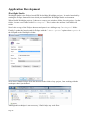
Application Development...................................................................................................................48
Worklight Studio............................................................................................................................48
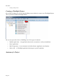
Creating a Worklight Project.........................................................................................................49
Anatomy of a Project.....................................................................................................................49
Application Descriptor...................................................................................................................52
Application Architecture................................................................................................................52
Adding targeted environments.......................................................................................................52
Worklight Development Server.....................................................................................................53
Developing UI – Rich Page Editor................................................................................................54
Designing visually.....................................................................................................................59
Coding in the HTML source.....................................................................................................60
Images and graphics..................................................................................................................60
Off-line Storage.............................................................................................................................61
The Worklight JSONStore........................................................................................................61
Push Notification...........................................................................................................................62
Testing...........................................................................................................................................62
Using the Mobile Browser Simulator.......................................................................................63
Installing the UserAgent Switcher Extension......................................................................64
Debugging......................................................................................................................................66
Artifact management......................................................................................................................66
Adapters..............................................................................................................................................69
Adapter Architecture......................................................................................................................69
Page 2
Creating a new Adapter.................................................................................................................70
Adapter Implementation................................................................................................................71
Adapter JavaScript implementation..........................................................................................71
Adapter Types................................................................................................................................72
HTTP Adapter...........................................................................................................................72
HTTP Adapter Procedure implementations.........................................................................73
Configuring the HTTP Adapter for SSL..............................................................................74
Example HTTP Adapter.......................................................................................................74
JMS Adapter.............................................................................................................................78
JMS Adapter Procedure implementations............................................................................79
SQL Adapter.............................................................................................................................80
Database JDBC Drivers........................................................................................................81
SQL Adapter Procedure implementations............................................................................81
Cast Iron Adapter......................................................................................................................81
Calling an adapter from the Client.................................................................................................82
Error Handling for Adapters..........................................................................................................83
Invoking Java code from an Adapter.............................................................................................83
IBM Worklight Console.....................................................................................................................85
Application Center..............................................................................................................................86
Installing the Application Center mobile client.............................................................................87
Performance........................................................................................................................................92
Minification...................................................................................................................................92
File Concatenation.........................................................................................................................93
Security...............................................................................................................................................93
Secure on-device stored data.........................................................................................................94
Offline Authentication...................................................................................................................94
Preventing tampered apps..............................................................................................................94
Direct Update.................................................................................................................................94
Remote Disable..............................................................................................................................94
Worklight protected resources.......................................................................................................94
Cross site REST calls.....................................................................................................................95
Programatically authenticating with WAS....................................................................................95
Application Deployment....................................................................................................................95
Operations.........................................................................................................................................102
Programming References.................................................................................................................102
Client Side API Programming.....................................................................................................103
WL.Client................................................................................................................................103
The common "options" object............................................................................................103
WL.Client.addGlobalHeader(headerName, headerValue).................................................103
WL.Client.close()...............................................................................................................103
WL.Client.connect(options)...............................................................................................104
WL.Client.deleteUserPref(key, options)............................................................................104
WL.Client.getAppProperty(propertyName).......................................................................104
WL.Client.getEnvironment()..............................................................................................104
WL.Client.getLoginName(realm)......................................................................................105
WL.Client.getUserInfo(realm, key)...................................................................................105
WL.Client.getUserName(realm)........................................................................................105
WL.Client.getUserPref(key)..............................................................................................105
WL.Client.hasUserPref(key)..............................................................................................105
WL.Client.init(options)......................................................................................................106
Page 3
WL.Client.invokeProcedure(invocationData, options)......................................................107
WL.Client.isUserAuthenticated(realm)..............................................................................107
WL.Client.logActivity(activityType).................................................................................107
WL.Client.login(realm, options)........................................................................................107
WL.Client.logout(realm, options)......................................................................................108
WL.Client.minimize()........................................................................................................108
WL.Client.reloadApp()......................................................................................................108
WL.Client.removeGlobalHeader(headerName).................................................................108
WL.Client.setHeartBeatInterval(interval)..........................................................................108
WL.Client.setUserPref(key, value, options)......................................................................108
WL.Client.setUserPrefs(prefs, options).............................................................................109
WL.Client.updateUserInfo(options)...................................................................................109
WL.BusyIndicator(containerId, options)...........................................................................109
WL.Toast.show(message)..................................................................................................110
WL.JSONStore.......................................................................................................................111
WL.JSONStore.add(data, options).....................................................................................111
WL.JSONStore.changePassword(oldPassword, newPassword, userName)......................111
WL.JSONStore.closeAll()..................................................................................................111
WL.JSONStore.count()......................................................................................................111
WL.JSONStore.destroy()...................................................................................................111
WL.JSONStore.documentify(id, data)...............................................................................111
WL.JSONStore.enhance(name, func)................................................................................112
WL.JSONStore.find(query, options)..................................................................................112
WL.JSONStore.findAll(options)........................................................................................112
WL.JSONStore.findById(id)..............................................................................................112
WL.JSONStore.get(collectionName).................................................................................112
WL.JSONStore.getErrorMessage(errorCode)....................................................................113
WL.JSONStore.getPushRequired()....................................................................................113
WL.JSONStore.init()..........................................................................................................113
WL.JSONStore.isPushRequired(doc)................................................................................114
WL.JSONStore.load()........................................................................................................114
WL.JSONStore.push(docs)................................................................................................114
WL.JSONStore.pushRequiredCount()...............................................................................114
WL.JSONStore.remove(doc, options)................................................................................114
WL.JSONStore.removeCollection()..................................................................................114
WL.JSONStore.replace(doc, options)................................................................................115
WL.JSONMStore.toString()...............................................................................................115
WL.Device...................................................................................................................................115
WL.Device.getNetworkInfo(callback)....................................................................................115
Other........................................................................................................................................115
Server Side API Programming....................................................................................................116
WL.Server...............................................................................................................................116
WL.Server.invokeSQLStoredProcedure(options)..............................................................116
WL.Server.createSQLStatement(statement)......................................................................116
WL.Server.invokeSQLStatement(options)........................................................................116
WL.Server.invokeHttp(options).........................................................................................117
WL.Server.readSingleJMSMessage(options)....................................................................122
WL.Server.readAllJMSMessages(options)........................................................................123
WL.Server.writeJMSMessage(options).............................................................................123
WL.Server.requestReplyJMSMessage(options)................................................................124
Page 4
Android Development......................................................................................................................125
Installing the Android SDK.........................................................................................................125
Managing the Android SDK........................................................................................................125
Android Emulator........................................................................................................................125
JavaScript Frameworks....................................................................................................................126
jQuery Mobile..............................................................................................................................126
Dojo and Dojo Mobile.................................................................................................................126
Sencha Touch...............................................................................................................................126
Local storage of data........................................................................................................................127
Web Programming............................................................................................................................128
Development tools.......................................................................................................................128
Document Object Model – The DOM.........................................................................................129
HTML..........................................................................................................................................129
Images..........................................................................................................................................129
JavaScript.....................................................................................................................................130
JavaScript – Date object..........................................................................................................130
Using JSHint...........................................................................................................................130
Calling JavaScript from Java..................................................................................................131
Cascading Style Sheets – CSS.....................................................................................................131
The {less} language................................................................................................................132
Variables.............................................................................................................................132
Mixins.................................................................................................................................132
Nesting................................................................................................................................132
Operations..........................................................................................................................132
Timer based functions..................................................................................................................132
JSON Data representation............................................................................................................133
JSON within JavaScript..........................................................................................................133
JSON within Java....................................................................................................................133
Dates and times within JSON.................................................................................................133
Debugging in the browser............................................................................................................133
Logging to the browser console..............................................................................................134
console.debug.....................................................................................................................134
console.error.......................................................................................................................134
console.info........................................................................................................................135
console.log..........................................................................................................................135
console.warn.......................................................................................................................135
Dojo Programming...........................................................................................................................136
Dojo Information Sources............................................................................................................136
Off-line documentation...........................................................................................................136
Building the API Reference Documentation......................................................................136
Adding GridX documentation for off-line viewing...........................................................137
Dojo GUI Development...............................................................................................................138
Loading Dojo...............................................................................................................................138
Asynchronous Module Definition (AMD)..............................................................................139
Event Handling............................................................................................................................140
REST/Ajax calls..........................................................................................................................140
Testing REST Calls.................................................................................................................142
Dojo utility...................................................................................................................................142
dojo/_base/lang.......................................................................................................................142
DOM Access................................................................................................................................142
Page 5
dojo/dom.................................................................................................................................143
dojo/dom-construct.................................................................................................................143
dojo/query...............................................................................................................................143
dojo/dom-geometry.................................................................................................................145
Dojo Dates and Times..................................................................................................................145
dojo/date..................................................................................................................................145
dojo/date/locale.......................................................................................................................146
dojo/date/stamp.......................................................................................................................146
Dijit Widgets................................................................................................................................147
Creating a widget instance programatically............................................................................147
dijit/registry - Dijit and byId...................................................................................................148
Dijits and events......................................................................................................................148
Dojo style sheets and themes..................................................................................................148
Form Widgets..........................................................................................................................149
dijit/form/Form...................................................................................................................149
dijit/form/Button.................................................................................................................150
dijit/form/RadioButton.......................................................................................................151
dijit/from/ComboBox.........................................................................................................152
dojox/form/Uploader..........................................................................................................153
dijit/form/DateTextBox......................................................................................................153
dijit/form/TimeTextBox.....................................................................................................154
dijit/form/Validation Text Box...........................................................................................154
Text Editors.............................................................................................................................155
dijit/form/Textarea..............................................................................................................155
dijit/form/TextBox..............................................................................................................155
dijit/form/SimpleTextarea..................................................................................................155
dijit/form/NumberTextBox................................................................................................156
dijit/form/CurrencyTextBox...............................................................................................156
dijit/Editor..........................................................................................................................156
Lists.........................................................................................................................................157
dijit/form/MultiSelect.........................................................................................................157
dijit/form/Select..................................................................................................................157
Visual Panes............................................................................................................................158
dijit/TitlePane.....................................................................................................................158
dijit/Fieldset........................................................................................................................159
Dialogs....................................................................................................................................159
dijit/Dialog..........................................................................................................................159
dijit/TooltipDialog..............................................................................................................160
Menus......................................................................................................................................161
dijit/Menu...........................................................................................................................162
dijit/MenuBar.....................................................................................................................163
dijit/MenuItem....................................................................................................................163
dijit/MenuSeparator............................................................................................................163
dijit/DropDownMenu.........................................................................................................163
dijit/popup..........................................................................................................................163
dijit/PopupMenuBarItem....................................................................................................164
dojox/widget/FisheyeList...................................................................................................164
Layouts....................................................................................................................................166
dijit/layout/ContentPane.....................................................................................................166
dijit/layout/AccordionContainer.........................................................................................166
Page 6
dijit/layout/TabContainer...................................................................................................167
dijit/TitlePane.....................................................................................................................168
dijit/layout/StackContainer.................................................................................................168
dijit/layout/BorderContainer..............................................................................................168
dojox/layout/TableContainer..............................................................................................171
dojox/layout/GridContainer................................................................................................172
Expando Pane.....................................................................................................................173
Colors......................................................................................................................................173
dijit/ColorPalette................................................................................................................174
The Data Grid..........................................................................................................................174
Setting Grid data.................................................................................................................176
Editable cells......................................................................................................................176
Selecting items...................................................................................................................177
Adding new rows................................................................................................................177
Removing rows...................................................................................................................177
Replacing the data..............................................................................................................177
Formatting..........................................................................................................................178
Sorting columns..................................................................................................................178
Cell events..........................................................................................................................179
GridX – The next generation Dojo Data Grid?.......................................................................179
GridX Width and Height.........................................................................................................180
GridX - Adding and removing rows.......................................................................................180
GridX Modules.......................................................................................................................181
gridx/modules/Bar..............................................................................................................181
gridx/modules/CellWidget.................................................................................................181
gridx/modules/ColumnResizer...........................................................................................182
gridx/modules/Edit.............................................................................................................182
gridx/modules/Filter...........................................................................................................184
gridx/modules/filter/FilterBar............................................................................................184
gridx/modules/Menu..........................................................................................................184
gridx/modules/PaginationBar.............................................................................................185
gridx/modules/RowHeader.................................................................................................185
gridx/modules/select/Row..................................................................................................185
gridx/modules/IndirectSelect..............................................................................................186
gridx/modules/SingleSort...................................................................................................186
gridx/modules/TitleBar......................................................................................................186
gridx/supportLinkSizer.......................................................................................................186
GridX Styling..........................................................................................................................187
Mouse and keyboard events....................................................................................................187
Common GridX patterns.........................................................................................................188
Adding Row Selection........................................................................................................188
Working with Rows............................................................................................................188
Adding and processing buttons..........................................................................................188
The dgrid – The next generation Dojo Data Grid?.................................................................189
Installing Dgrid...................................................................................................................189
The Tree..................................................................................................................................190
dijit/Tree.............................................................................................................................190
dijit/tree/Model...................................................................................................................191
dijit/tree/ObjectStoreModel................................................................................................191
dijit/tree/TreeStoreModel – Do Not Use............................................................................192
Page 7
Progress Bar............................................................................................................................193
dojox/calendar/Calendar.........................................................................................................193
Parsing Dijit in HTML.................................................................................................................198
Object Stores and Data Stores.....................................................................................................199
dojo/store/Memory..................................................................................................................200
dojo/store/Observable.............................................................................................................201
Deferred and asynchronous processing – dojo/Deferred.............................................................201
Declare - Defining Dojo Classes.................................................................................................201
Creating Custom Widgets............................................................................................................202
Widget templating...................................................................................................................204
Skeleton widget.......................................................................................................................205
Extending a widget..................................................................................................................205
Using getters and setters on a custom widget.........................................................................205
Dojo Publish and Subscribe.........................................................................................................206
Dojo Charting..............................................................................................................................206
The Charting Plot....................................................................................................................207
The Charting Axis...................................................................................................................212
The Charting Series.................................................................................................................213
Rendering the chart.................................................................................................................213
Dojo Charting and Themes.....................................................................................................214
Dojo Gauges – dojox/dgauges.....................................................................................................214
Creating custom gauges..........................................................................................................216
Sample custom circular guage............................................................................................218
Sample custom rectangular guage......................................................................................218
Dojo GFX....................................................................................................................................218
Dojo GFX Vector Fonts..........................................................................................................219
Dojo and CSS...............................................................................................................................219
Dojo Development with IID........................................................................................................220
Adding the Dojo Project Facet................................................................................................220
Using the Web Preview Server runtime..................................................................................222
Dojo Development with Microsoft IIS Express..........................................................................225
Using a Source Dojo with IIS.................................................................................................226
Dojo Mobile.................................................................................................................................227
Simple DojoX Mobile app......................................................................................................227
Dojo Mobile Themes..............................................................................................................228
The View Model.....................................................................................................................228
dojox/mobile/View.............................................................................................................229
dojox/mobile/ScrollableView.............................................................................................230
dojox/mobile/TreeView......................................................................................................231
dojox/mobile/SwapView....................................................................................................231
Working with Dojo Mobile Lists............................................................................................231
The Dojo Mobile widgets.......................................................................................................232
dojox/mobile/Accordion.....................................................................................................232
dojox/mobile/Button...........................................................................................................233
dojox/mobile/CheckBox.....................................................................................................233
dojox/mobile/ComboBox...................................................................................................234
dojox/mobile/Container......................................................................................................234
dojox/mobile/ContentPane.................................................................................................235
dojox/mobile/EdgeToEdgeCategory..................................................................................235
dojox/mobile/EdgeToEdgeList..........................................................................................235
Page 8
dojox/mobile/EdgeToEdgeStoreList..................................................................................236
dojox/mobile/ExpandingTextArea.....................................................................................236
dojox/mobile/FixedSplitter.................................................................................................237
dojox/mobile/FormLayout..................................................................................................237
dojox/mobile/GridLayout...................................................................................................237
dojox/mobile/Heading........................................................................................................237
dojox/mobile/IconContainer...............................................................................................238
dojox/mobile/IconItem.......................................................................................................238
dojox/mobile/IconMenu.....................................................................................................238
dojox/mobile/IconMenuItem..............................................................................................238
dojox/mobile/ListItem........................................................................................................239
dojox/mobile/PageIndicator...............................................................................................240
dojox/mobile/Pane..............................................................................................................240
dojox/mobile/ProgressBar..................................................................................................240
dojox/mobile/ProgressIndicator.........................................................................................240
dojox/mobile/RadioButton.................................................................................................240
dojox/mobile/Rating...........................................................................................................241
dojox/mobile/RoundRect....................................................................................................241
dojox/mobile/RoundRectCategory.....................................................................................241
dojox/mobile/RoundRectStoreList.....................................................................................241
dojox/mobile/RoundRectList.............................................................................................243
dojox/mobile/ScrollablePane..............................................................................................243
dojox/mobile/SearchBox....................................................................................................244
dojox/mobile/SimpleDialog...............................................................................................244
dojox/mobile/Slider............................................................................................................244
dojox/mobile/SpinWheelDatePicker..................................................................................244
dojox/mobile/SpinWheelTimePicker.................................................................................245
dojox/mobile/Switch..........................................................................................................245
dojox/mobile/TabBar..........................................................................................................245
dojox/mobile/TabBarButton...............................................................................................246
dojox/mobile/TextArea......................................................................................................247
dojox/mobile/TextBox........................................................................................................247
dojox/mobile/ToggleButton...............................................................................................248
dojox/mobile/ToolBarButton.............................................................................................248
dojox/mobile/Tooltip..........................................................................................................248
dojox/mobile/ValuePicker..................................................................................................249
dojox/mobile/ValuePickerDatePicker................................................................................250
dojox/mobile/ValuePickerSlot...........................................................................................250
dojox/mobile/ValuePickerTimePicker...............................................................................251
dojox/mobile/Video............................................................................................................251
jQuery...............................................................................................................................................252
jQuery Mobile – data roles..........................................................................................................252
button......................................................................................................................................252
AngularJS.........................................................................................................................................252
Setting up Eclipse........................................................................................................................252
Chrome Apps....................................................................................................................................252
Building a Chrome App...............................................................................................................253
The Manifest...........................................................................................................................253
The Background Script...........................................................................................................253
JavaFX..............................................................................................................................................253
Page 9
The Hello World app...................................................................................................................254
The JavaFX High Level Architecture..........................................................................................254
javafx.stage.Stage....................................................................................................................255
javafx.?.Scene.........................................................................................................................255
javafx.scene.image.Image.......................................................................................................255
FXML – The JavaFX Markup Language....................................................................................256
FXML Architecture.................................................................................................................256
Importing definitions...............................................................................................................257
The fx:value attribute..............................................................................................................257
The fx:include instruction.......................................................................................................257
The fx:define attribute.............................................................................................................257
The fx:controller attribute.......................................................................................................257
The fx:id attribute....................................................................................................................258
The fx:root element.................................................................................................................258
A Controller class....................................................................................................................258
Scene Builder...............................................................................................................................259
Installing Scene Builder..........................................................................................................259
Handling issues with Scene Builder........................................................................................260
JavaFX and Eclipse......................................................................................................................260
JavaFX Component Sizing..........................................................................................................261
JavaFX CSS.................................................................................................................................261
JavaFX Dialogs............................................................................................................................262
JavaFX Tasks, Services and Workers..........................................................................................263
Running work in the background............................................................................................263
JavaFX CSS and Stylesheets ......................................................................................................265
JavaFX Deployment....................................................................................................................265
JavaFX Data and Observables.....................................................................................................266
JavaFX Collections.................................................................................................................266
JavaFX ObservableList...........................................................................................................266
JavaFX Controls..........................................................................................................................267
JavaFX Button.........................................................................................................................267
JavaFX CheckBox...................................................................................................................268
JavaFX ChoiceBox.................................................................................................................268
JavaFX ColorPicker................................................................................................................268
JavaFX ComboBox.................................................................................................................269
JavaFX Hyperlink...................................................................................................................269
JavaFX ImageView.................................................................................................................269
JavaFX Label..........................................................................................................................269
JavaFX ListView.....................................................................................................................270
JavaFX PasswordField............................................................................................................270
JavaFX ProgressBar................................................................................................................270
JavaFX RadioButton...............................................................................................................271
JavaFX Separator....................................................................................................................271
JavaFX Slider..........................................................................................................................271
JavaFX TableView..................................................................................................................271
CellFactory.........................................................................................................................273
Editing a table cell..............................................................................................................275
JavaFX TableView – Detecting selections.........................................................................276
JavaFX TableView – Dynamic Columns...........................................................................276
JavaFX TextArea....................................................................................................................277
Page 10
JavaFX TextField....................................................................................................................277
JavaFX ToggleButton.............................................................................................................278
JavaFX Tooltip........................................................................................................................278
JavaFX TreeView...................................................................................................................278
JavaFX TreeTableView..........................................................................................................278
JavaFX WebView...................................................................................................................278
Calling JavaScript in the WebEngine.................................................................................279
Calling Java from the browser............................................................................................279
JavaFX Menus.............................................................................................................................279
JavaFX MenuBar....................................................................................................................280
JavaFX Menu..........................................................................................................................280
JavaFX MenuItem...................................................................................................................280
JavaFX CheckMenuItem.........................................................................................................281
JavaFX RadioMenuItem.........................................................................................................281
JavaFX CustomMenuItem......................................................................................................281
JavaFX SeparatorMenuItem...................................................................................................281
JavaFX ContextMenu.............................................................................................................281
JavaFX Containers.......................................................................................................................281
JavaFX Accordion...................................................................................................................281
JavaFX AnchorPane................................................................................................................282
JavaFX BorderPane.................................................................................................................282
JavaFX FlowPane...................................................................................................................282
JavaFX GridPane....................................................................................................................282
JavaFX HBox..........................................................................................................................282
JavaFX Pane............................................................................................................................282
JavaFX Region........................................................................................................................282
JavaFX ScrollPane..................................................................................................................282
JavaFX SplitPane....................................................................................................................282
JavaFX StackPane...................................................................................................................282
JavaFX TabPane.....................................................................................................................282
JavaFX TilePane.....................................................................................................................283
JavaFX TitledPane..................................................................................................................283
JavaFX VBox..........................................................................................................................283
JavaFX Other classes...................................................................................................................283
JavaFX Popup.........................................................................................................................283
JavaFX PopupWindow...........................................................................................................283
JavaFX Event Handling...............................................................................................................283
JavaFX Lambda functions...........................................................................................................284
ChangeListener.......................................................................................................................284
JavaFX Utilities...........................................................................................................................284
JavaFX MultipleSelectionModel............................................................................................284
JavaFX Development...................................................................................................................284
Scenic View............................................................................................................................285
Skeleton JavaFX Files.................................................................................................................285
Sample application..................................................................................................................285
Sample Component.................................................................................................................285
JavaFX 3rd Party Packages..........................................................................................................286
ControlsFX..............................................................................................................................286
org.controlsfx.dialog.Dialogs.............................................................................................286
org.controlsfx.dialog.Dialog...............................................................................................287
Page 11
Apache HTTP Server.......................................................................................................................288
Setting up a proxy........................................................................................................................288
Old Stuff...........................................................................................................................................289
Deployment Environments.....................................................................................................289
Sizing the Screen................................................................................................................289
Worklight Adapters.................................................................................................................289
HTTP Adapter....................................................................................................................289
Worklight Security..................................................................................................................297
Research Questions..........................................................................................................................297
Page 12
Mobile Applications
Applications are no longer limited to just running on a desktop PC or laptop. Instead, we now have
a plethora of devices on which applications can live. Specifically, we will be thinking about smart
phones and tablets. These devices have something in common … they are consumer items that are
generally small enough to be carried with a person. Unlike classic PC desktops which are
physically cumbersome and remain static in a person's office or home, the phone and tablet travel
with people. In other words, they are "mobile". Applications written specifically for phones and
tablets are termed "mobile applications".
How does a "mobile application" differ from a "regular application"? The answer to that is not
always so clear. There are some obvious thoughts. First, the phone and the tablet don't commonly
have keyboards or mice attached. As such, user interaction is primarily performed through touch
and gestures. This changes the way in which UI styling is built. Next, the screen sizes of the
devices and their resolutions vary. This is typically called the devices "form factor". Screens vary
from a few inches to a dozen or more. Tablets and phones often have additional hardware
technologies in them including accelerometers, GPS and other sensors. The network connections
on these devices should not be considered to be "always available" or may be too costly to maintain.
For these reasons and many more, when one is considering an application to be hosted by one of
these devices, there are considerations to be taken into account which are not present for desktop
applications that simply run Windows. Because of the wide variety of new areas to be covered,
there is the need for new frameworks, platforms and tools to support such new application
development. It is for this purpose that IBM built Worklight.
Types of Mobile App architectures
When looking at a Mobile app, there are number of high level architectures that can be employed.
The first is the Web or HTML5 type. In this style, the app is written purely as a web page using a
combination of standardized technologies HTML, DOM, JavaScript and CSS. A key benefit to a
web app is that it can run without modification on a variety of platforms without modification.
Unfortunately, pure web-apps typically require a network connection in order to run as they must be
downloaded for execution. In addition, the browser environment hosting the application is not
commonly as rich in functions that are available to the native applications. Finally, a browser
hosted application may be slower than a native application is the logic has longer "path lengths"
than native apps.
The next type of app is what is termed a "native app". These apps are written using the
programming language native to the device on which it will run. For example, Java for Android.
The user interface is also native. A native app can't be run on a platform for which it was not
designed. For example, an Android native app can't run on iOS. The benefit of a native app is that
it is likely to perform as quickly as possible and will usually appear seamless to other apps on the
platform. The down-side is that the time cost of developing a single app that is to run on a variety
of platforms increases as very little of the code built for one platform can be re-used on a different
platform.
The last type of app is called the "hybrid app" which is a combination or mix of web app
technology and native app technology. In this story, the core of the development remains web app
based however that app is "wrappered" in a natively installable framework. This means that it can
installed in exactly the same fashion as native apps and will be available while disconnected from
the network.
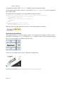
Design guidelines for Mobile Apps
Page 13
The patterns for designing user interfaces for mobile apps takes a different style from that for
desktop.
See also:
•
Page 14
Designing for iOS 7
Worklight
IBM Worklight is a development and runtime platform for building a variety of user interfaces
including mobile.
Releases
There have been a number of releases of Worklight:
•
June 2012 – 5.0
•
December 2012 – 5.0.5
•
April 2013 – 5.0.6
•
June 2013 – 6.0
•
November 2013 – 6.1
See also:
•
Worklight forum
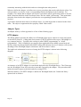
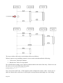
Architecture
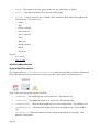
Worklight provides a set of components which work together to achieve a build and run-time
environment for mobile applications. Here we start to understand the pieces involved.
The architecture of Worklight is composed of a number of parts:
Page 15
•
Worklight Studio – An integrated development environment (IDE) built on Eclipse used by
a developer to build a mobile app.
•
Worklight Device Runtime – A framework supplied with the application that provides
services used by that application.
•
Worklight Server – A back-end server environment used to service requests from a mobile
app.
•
Worklight Console – A web based application used to manage and monitor mobile apps.
•
Worklight Application Center – A Worklight Server hosted application that provides the
ability for users to select and install applications onto their mobile devices. Developers and
administrators can also publish applications that can then be accessed.
Adapter Components
Client applications often have to interact with back-end systems to retrieve or store data. Worklight
provides an abstraction of such back-end interactions and calls these "Adapters". The way a client
interacts with an adapter is common irrespective of the implementation of that adapter. Common
adapter types include HTTP connections, SOAP web services, SQL database access and others.
See also:
•
Adapters
Application Center
On the Internet, mobile applications are commonly stored installed from Apple's iTunes store or
from Google's Play Store. For mobile applications written for a business this may not be
appropriate. For example, it is unlikely that PetSupplies.com want their warehouse application to
be available to anyone other than their employees. A component of Worklight is called
"Application Center" which provides a private "app store" managed and maintained by a company.
From this, applications can be found and installed by users. In its simplest terms, Application
Page 16
Center can be thought of as a private app store however it provides more function than that.
Developers within your own company can publish new versions of the app for users to access
without being at the mercy of 3rd party providers who may delay publication. In addition, the
Application Center is common across device platforms meaning that you may publish it once for a
variety of devices without having to worry about different processes to be followed.
The Application Center also provides a rich feedback mechanism where users can post comments
that can be seen by developers.
See also:
•
Page 17
Application Center
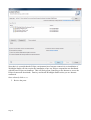
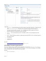
Installation
The installation of Worklight can be broken down into the installation of the distinct components
associated with it. These include:
•
Worklight Studio – Development tools
•
Worklight Server – Test and production servers for application execution
•
Mobile Test Workbench for Worklight
Prerequsites
Before installing Worklight, the prerequisites must be met. These are documented here:
http://www-01.ibm.com/support/docview.wss?uid=swg27024838
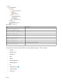
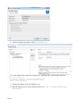
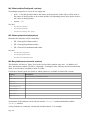
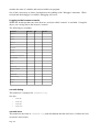
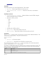
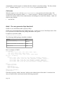
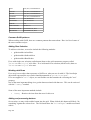
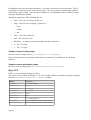
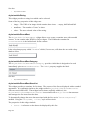
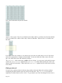
Parts List
If downloaded from IBM's image distribution web sites. the files that make up the installation
media for Worklight are listed below:
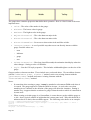
Part
Description
CIQ5PEN
Worklight Studio 6.1
CIQ5NEN
Installation Manager repository for Worklight Server 6.1
CIQ5QEN
Mobile Test Workbench
CIN0UEN
Quick Start Guide
CIK2UML – Quick Start for Liberty Core 8.5.5
Quick Start for Liberty Core 8.5.5
CIK2VML –
WAS_Liberty_Core_V8.5.5_1_OF_3
There don't appear to be other parts!
CIK2YML – WAS Liberty Core 8.5.5
Supplements 1 of 3
WAS Liberty Core 8.5.5 Supplements 1 of 3
CIK2ZML – WAS Liberty Core 8.5.5
Supplements 2 of 3
WAS Liberty Core 8.5.5 Supplements 2 of 3
CIK30ML – WAS Liberty Core 8.5.5
Supplements 3 of 3
WAS Liberty Core 8.5.5 Supplements 3 of 3
CIMT6ML –
WAL_Runtime_Archive_LC_V8.5.5
WebSphere Application Liberty Runtime (Archive, for Liberty
Core V8.5.5)
CIMT7ML – WebSphere Application Liberty
Extras (Archive) V8.5.5
WebSphere Application Liberty Extras (Archive) V8.5.5
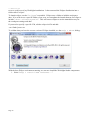
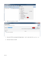
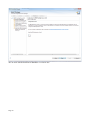
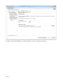
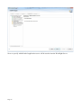
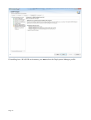
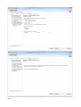
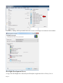
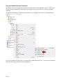
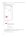
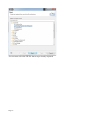
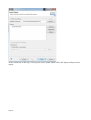
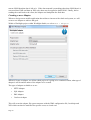
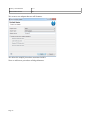
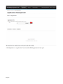
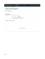
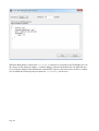
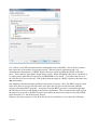
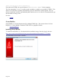
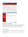
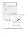
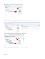
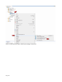
Installing Worklight Studio
The prerequisite for Worklight Studio is an installation of Eclipse Juno 4.2 SR2 or Eclipse 4.3.1
(Kepler).
http://www.eclipse.org/downloads/packages/release/juno/sr2
Either the Java EE or Classic version may be used. It is downloaded as a ZIP file with a size of
about 235 Mbytes. Once downloaded, its content may be extracted. In my environment, I created a
folder called:
Page 18
C:\IBM\Worklight
to serve as the root of my Worklight installations. I then extracted the Eclipse distribution into a
folder called "eclipse".
To launch eclipse, run the "eclipse" executable. Eclipse uses a folder to hold the workspace
data. If we wish to use a specific folder of our own, we can update the launch shortcut for eclipse to
include "-data <directoryPath>". This will causes eclipse to use the named directory for
the workspace settings and data.
If you need to specify a specific VM, edit the eclipse.ini file and add:
-vm <Path>/javaw.exe
To validate that you have the correct version of Eclipse installed, see the Help > About dialog:
With the base Eclipse environment running, we can now install the Worklight Studio components.
1. Select "Help > Install New Software..."
Page 19
2. Add a new repository to install.
3. Select the ZIP file containing Worklight Studio. As 6.1.0, this is the file CIQ5PEN.zip.
4. Select the features to install
Page 20
Note that it is essential that the Eclipse environment have Internet connectivity as installation of
Worklight Studio will also require the installation of pre-req Eclipse components not distributed
with the base Eclipse environment. This will likely mean connecting to the Internet to access the
Eclipse framework downloads. Don't try and install Worklight Studio unless you are Internet
connected.
Once selected, click Next.
5. Review the parts
Page 21
6. Accept the license agreement
Page 22
IBM Worklight Studio will now install.
7. Eclipse will now restart.
See also:
•
Worklight Studio
Installing an Android SDK Eclipse Plugin
If you are going to be building Android applications, you will likely wish to install the Android
SDK tools into the same Eclipse environment as the Worklight Studio environment.
1. Start Eclipse
2. Go to Help > Install New Software
3. Click "Add" to Add a new source
Page 23
4. Define the ADT
As of 2013-11-11 – the location for the plugin is:
https://dl-ssl.google.com/android/eclipse/
See the following web page for validation and details:
Installing the Eclipse Plugin
5. Install the Android Development Tools
Page 24
You may see a security warning similar to the following:
This is expected and one should select "OK".
6. After installation, we install the Android SDK Tools to the file system. See: Installing the
Android SDK.
Configuring the Worklight Studio embedded Application Server
Worklight Studio launches an embedded WebSphere Application Server (Liberty Core) when it
starts to host a Worklight Server instance that is to be used for testing. This application server can
have its configuration properties changed if needed.
One of the primary properties of this server is the TCP/IP port number on which it is listening for
incoming browser requests. The default port number it uses is 10080. There may be a conflict on
Page 25
this port number however it is easy to change.
Installing Mobile Test Workbench for Worklight
Installing Worklight Server
The Worklight Server runs on top of an Application Server. A number of different flavors of
hosting application server are supported:
•
WebSphere Application Server Liberty Core
•
WebSphere Application Server
•
Apache Tomcat
In addition, Worklight Server requires a databases for its own operation. Supported database types
are:
•
IBM DB2
•
Oracle
•
MySQL
•
Apache Derby (embedded)
Worklight Server is supplied as an IBM Installation Manager repository. Once the package has
been defined as a repository, it can then be installed.
The first page we are presented with during the installation is the obligatory license agreement. I
Page 26
suspect that everyone simply says "yeah yeah" and clicks next. Use your own judgment on how to
proceed.
Installation manager groups installed products into "packages" and designates a file system
directory for each package. Here we name the directory into which the Worklight Server binaries
will be placed and whether these will be 32bit or 64bit versions.
In my install, I was using a 64bit version of Installation Manager and a warning message was
shown that stated only 32bit versions of IM were supported. I installed and had no issues (so far).
Page 27
Next we have yet another confirmation page that we are installing Worklight Server.
Page 28
Now we are being offered the opportunity to configure our installation. The first question asks
whether or not we wish to install the Application Center.
Page 29
We are now asked what kind of database we wish to use.
Page 30
We are now asked for information on how to connect to the database of the type we previously
selected. This consists of entering the hostname and port number as well as pointing to a JDBC
driver for that database.
Page 31
In order to access the database, we need to specify a user we will use to connect.
Page 32
CREATE DATABASE APPCNTR COLLATE USING SYSTEM PAGESIZE 32768
Page 33
Now we specify which kind of application server will be used to host the Worklight Server.
Page 34
If installing into a WAS ND environment, you must select the Deployment Manager profile.
Page 35
Page 36
Page 37
Page 38
The servers hosting Worklight Server should be restarted.
Examination seems to show that the following major changes have been made to the App Server as
a result of a Worklight installation:
New applications:
•
IBM Application Center Console <num>
•
IBM Application Center Services <num>
New resources
•
JDBC provider – Application Center JDBC Provider
•
JDBC Data Source – Application Center database
•
J2C authentication data – AppCenterDb2DatabaseCredentials_<num>
Installing the Application Center
Installing WAS Liberty
The WAS Liberty Profile provides an efficient App Server that is a good candidate for hosting a
Worklight server. Here we will discuss how to install the WAS Liberty Profile environment.
Launch IBM Installation Manager and ensure that the repository for WAS Liberty Profile has been
added to the settings.
Once done, we can request an installation.
Page 39
Next we are prompted to read, review and accept the license terms.
Page 40
Now we select where on the file system we wish to install the product code. In my example I used
C:\IBM\Liberty
Page 41
Next we are asked for options to be included in the configuration.
Page 42
One final check before install continues.
Page 43
And at the end, we have installed the product.
Page 44
Other Installation Tasks
Following the installation of Worklight components, other installation tasks may be performed.
•
Java runtime for browsers – A number of browser components used by Worklight rely upon
Java. This may be downloaded from www.java.com.
•
UserAgent switcher – The mobile test environment requires the installation of the
UserAgent switcher. See:
Installing the UserAgent Switcher Extension
Page 45
Sources of Information
The InfoCenter
IBM's InfoCenter is the primary source for knowledge on Worklight. It is the on-line
documentation for the product. It can be freely accessed at anytime whether or not one has
purchased the product. It can be found here:
http://pic.dhe.ibm.com/infocenter/wrklight/v6r0m0/index.jsp
IBM Home Page
The IBM Home Page for Worklight can be found here:
http://www-03.ibm.com/software/products/us/en/worklight/
Redbooks
Redbooks are free book form publications written by IBM and others. Ones of interest to
Worklight include:
•
Securing your mobile business with IBM Worklight – SG24-8179-00 - 2013-10-07
•
Extending Your Business to Mobile Devices with IBM Worklight – SG24-8117-00
•
Getting Started with IBM Worklight – TOPS1009 – 2013-08-26
developerWorks
The IBM developerWorks website is IBM's portal for technology related items. It has specific
sections oriented towards Worklight:
•
MobileDevelopment
•
IBM Worklight
There are many Worklight oriented articles:
•
Deliver an exceptional mobile web experience using WebSphere Portal and IBM Worklight V6.0, Part 3: Implementing automatic single
sign-on with Worklight and WebSphere Portal – 2013-10-23
•
Develop a hybrid mobile application using Rational Application Developer V8.5.1 – 2013-10-22
•
Deliver an exceptional mobile web experience using WebSphere Portal and IBM Worklight, Part 5: Integrating an event-based portlet with
a hybrid mobile application – 2013-10-09
•
Server-side mobile application development with IBM Worklight – 2013-10-02
•
Enable FIPS 140-2 HTTPS encryption for IBM Worklight mobile apps – 2013-09-24
•
Create a mobile BPM application by integrating IBM Worklight and IBM Business Process Manager – 2013-08-28
•
Deliver an exceptional mobile web experience using WebSphere Portal and IBM Worklight, Part 2: Integrating multiple device support for
WebSphere Portal pages – 2013-08-07
•
Deliver an exceptional mobile web experience using WebSphere Portal and IBM Worklight V5.0, Part 3: Implementing automatic single
sign-on with Worklight and WebSphere Portal – 2013-08-07
•
Deliver an exceptional mobile web experience using WebSphere Portal and IBM Worklight V5.0, Part 1: Integrating a hybrid mobile
application with WebSphere Portal pages – 2013-08-07
•
Deliver an exceptional mobile web experience using WebSphere Portal and IBM Worklight V6.0, Part 1: Integrating a hybrid mobile
Page 46
application with WebSphere Portal pages – 2013-08-07
•
Prototype mobile applications built with IBM Worklight for IBM Watson – 2013-08-05
•
Using the IBM Worklight optimization framework to build a cross-platform mobile application for multiple devices – 2013-07-17
•
Server-side mobile application development with IBM Worklight: Part 4. Integrate the IBM Worklight adapter with SCA 1.1 services –
2013-06-18
•
IBM Worklight server configuration for FIPS 140-2 validation and certification, Part 2: Deploying your mobile app on WebSphere
Application Server – 2013-06-12
•
IBM Worklight server configuration for FIPS 140-2 validation and certification, Part 1: Configuring a server-side WebSphere Application
Server infrastructure – 2013-05-28
•
Server-side mobile application development with IBM Worklight: Part 3. Integrate the IBM Worklight adapter with RESTful services –
2013-05-21
•
Automate the deployment of an IBM Worklight customization WAR file on IBM WebSphere Application Server – 2013-05-20
•
Server-side mobile application development with IBM Worklight: Part 2. IBM Worklight adapter integration with web service business
logic – 2013-05-07
•
Server-side mobile application development with IBM Worklight: Part 1. IBM Worklight adapter integration with Java business logic –
2013-04-30
•
Deliver an exceptional mobile web experience using WebSphere Portal and IBM Worklight, Part 4: Using IBM Web Experience Factory
with Worklight to create hybrid applications – 2013-01-16
•
Develop Worklight adapters with AT&T mobile APIs – 2013-01-06
•
Error handling in IBM Worklight adapters - 2012-12-05
•
Eight steps to IBM Worklight mobile application development – 2013-10-24
•
The basics of developing an end-to-end mobile application using IBM Worklight and Dojo Mobile – 2012-09-12
•
Developing a client and server mashup mobile application with IBM Worklight - 2012-09-12
•
Working with Worklight, Part 1: Getting started with your first Worklight application – 2012-08-01
•
Working with Worklight, Part 2: Developing structured modules and using the Encrypted Offline Cache feature in IBM Worklight - 201207-25
•
Key features and capabilities of IBM Worklight to accelerate your mobile development - 2012-08-01
Communities
•
dW Live: Developing and Managing Your Mobile Applications Using IBM Worklight
You Tube
There are some good videos about Worklight to be found on YouTube
•
Mobile Tech Talk series - Feb 19 2013 - IBM Worklight – 2013-02-21
•
IBM Worklight – 2013-02-05 – Notes: Good overview
•
Simple Application Using IBM Worklight – 2012-07-16 – Notes: technical and not very polished. I also question full correctness.
•
IBM Worklight - Hybrid Applications – Notes: Marketingand glitzy
Page 47
Application Development
Worklight Studio
Worklight Studio is the Eclipse based IDE for building Worklight projects. It can be launched by
starting the Eclipse framework into which you installed the Worklight Studio environment.
When I build Worklight projects, I choose to create a new windows folder for each project. In that
folder, I create a new folder called "WorkSpace". This is where the artifacts I will build will
reside.
Next I take a copy of the Eclipse shortcut and paste it as a sibling to my "WorkSpace" folder.
Finally, I update the launch path for Eclipse with the "-data <path>" option where <path> is
the full path to the WorkSpace folder.
Now when I launch Eclipse from the shortcut in the folder of my project, I am working with the
workspace that I just defined.
Although this technique is not necessary, I find it helps my work flow.
Page 48
See also:
•
Installing Worklight Studio
Creating a Worklight Project
One of the first things we will do when building a new solution is create a new Worklight Project.
This is performed within Worklight Studio.
We are now given the choice of building one of four types of solution:
•
Hybrid Application – An application that can be executed on a variety of platforms.
•
Inner Application
•
Shell Component – An environment in which an Inner Application can function.
•
Native API – A Worklight application that targets a specific platform.
Anatomy of a Project
Page 49
Within the project we have a folder called "apps". It is within here that we will have a folder for
each individual app within the project. Note that this implies a single project can contain multiple
apps.
Within a specific app folder, we have another folder called "common". This contains artifacts that
are to be common between multiple deployment environments. The types of artifacts we will be
working with include:
•
HTML
•
CSS
•
JavaScript
•
Images
When we create a project, a set of default artifacts are created for us underneath the app:
Page 50
There are:
File
Description
common/css/<App>.css
common/images/icon.png
common/images/thumbnail.png
common/js/<App>.js
common/js/initOptions.js
common/js/messages.js
common/<App>.html
legal/license.txt
application-descriptor.xml
Contains application metadata.
build-settings.xml
An App folder will also contain folders for each platform targeted. These include:
•
android
•
blackberry10
•
blackberry
•
ipad
•
iphone
•
windowsphone8
•
windowsphone
•
air
•
desktopbrowser
•
mobilewebapp
•
windows8
Page 51
Application Descriptor
The Application Descriptor is an XML file contained within the application portion of the project
that has the file name "application-descriptor.xml". Worklight Studio provides a rich
editor for working with its content but it can also be examined and edited in its source XML format.
Contained within the file are IBM defined elements and attributes:
•
id
•
platformVersion – The version of IBM Worklight used to build the solution.
•
displayName
•
description
•
author
◦ name
◦ email
◦ copyright
◦ homepage
•
mainFile
•
thumbnailImage
•
features – The set of additional features that have been added to the project. For example:
◦ JSONStore
Application Architecture
A Worklight solution uses a single DOM model.
The <body> of the HTML page must had an "id" of content. For example:
<body id="content" style="display: none;">
Towards the end of the HTML document there will be a <script> load of
"js/initOptions.js".
App specific JavaScript code will be placed inside "<App>.js". It contains a function called
"wlCommonInit()" which will be the primary entry point to the application.
Adding targeted environments
As you develop a solution, you may want to add additional target platforms on which the
application will run. To do this, select "File > New > Worklight Environment":
Page 52
From there, a dialog will be presented where one or more of the target environments can be added:
Worklight Development Server
A copy of the Worklight Server hosted by the WebSphere Application Server Liberty Core is
Page 53
supplied and configured with Worklight Studio. It can be seen within the Servers view:
The applications deployed to it are also shown.
Developing UI – Rich Page Editor
The primary development component within Studio for building user interfaces is the "Rich Page
Editor". This editor provides the ability for the programmer to build HTML either visually through
a drag and drop mechanism or in an HTML source editor. By default, the Rich Page Editor is
started when an HTML file is requested to be opened. It can also be explicitly started with the
"Open With > Rich Page Editor" option.
When an HTML file is opened, the editor environment looks as follows:
Page 54
The editor is full of features and function. Let us try and break some of these down. The primary
editing surface takes up the majority of the area. One can look at this area in Design mode (a whatyou-see-is-what-you-get mode) or a Source mode (raw HTML) or a Split mode (half the window is
Design Mode and half is Source Mode). The choice of modes can be selected at the bottom left of
the window.
In Split Mode, we can choose whether to split the window horizontally or vertically. Buttons on the
menu bar select which is to be used:
To the right of the primary editing area is a "palette" of items that can be inserted into the page in
design mode. The palette can be toggle on and off using a menu bar button:
Beneath the palette area is a Properties area. This too can be toggled on and off using another menu
bar button:
When working with devices that can be physically oriented from landscape to portrait mode, a
menu bar button can be used to show what the screen would like like if rotated:
When modeling against some devices, the screen size of the device may be too large to be shown in
the Design area. We can scale the screen to be shown in its entirety through a menu button:
Page 55
The implementation of the Rich Page Editor relies on a browser being available on the OS running
IBM Worklight Studio. Not all browser types are supported:
Windows
•
•
Internet Explorer
Firefox
Linux
•
•
Firefox
Webkit
Mac
•
Safari
The above does not mean that other browser types aren't supported for use with a final application,
rather these browsers are the ones used during development time within the Rich Page Editor.
The Worklight client framework provides some additions to any frameworks you may use. These
include:
•
WL.BusyIndicator
•
WL.SimpleDialog
•
WL.TabBar
•
WL.OptionsMenu
When building a mobile app, it is common for the app to contain multiple "views" or pages of data.
The Mobile Navigation window shows the defined views within the application and which one is
currently visible in the canvas:
Clicking on a different view changes the visible view in the canvas. Changing view also changes
the source view to the start to the view definition.
The "plus" button allows us to add a new instance of a view. When selected, a new dialog window
appears. From here we can select the creation of the new view from a set of predefined UI patterns
or simply create an empty view.
Page 56
The next page of the wizard allows us to set the name of the view and specify where within the
HTML document the corresponding view will be inserted.
Page 57
If we choose to set the view as the default, any previously selected default view will have its default
attribute removed.
Another important window in the Rich Page Editor is the Outline window. This shows a
hierarchical tree structure of your HTML document. From there you can select elements from the
list and they become selected in both the visual and source editors.
Page 58
Designing visually
In the Rich Page Editor's visual mode, a palette of available HTML and Widgets can be seen in the
right hand side of the window.
The palette is split into category folders corresponding to the widget sets that you have chosen to be
part of the project.
•
HTML Tags – The core HTML elements
•
HTML Form Tags – The core HTML form elements
•
Dojo Data Widgets – Dojo widgets that read and write data
•
Dojo Mobile Widgets – The "dojox/mobile" package of widgets
•
Dojox Widget – Rich Dojo widgets part of the Dojo extensions package
From the palette, a component can be dragged and dropped onto the canvas. While dragging an
Page 59
item, the position within the document where the item will be inserted is shown. Releasing the
mouse will insert the component. In addition to dragging a component into the visual canvas, a
component can also be dropped in the source.
Each component added to the canvas may have a variety of properties associated with it. A window
titled "Properties" provides an visualization of these properties including the ability to change their
values.
Coding in the HTML source
The reality of building a UI is that we can not build everything we need in the visual designer. We
will invariably have to build out parts of our solution in the text HTML editor. Here is an example
of some HTML in the editor:
The HTML is parsed as it is edited to show errors, keywords, matching element end tags and much
more. In order to use this portion of the editor, it is assumed that you are very familiar with HTML
and any JavaScript frameworks that you may be wishing to use. Worklight's ethos is that it exposes
as much existing technology that you may be familiar with as possible and minimizes the amount of
additional interference.
Images and graphics
Within the studio project there is a folder called "images". This folder can be used to contain
image files in a variety of formats including JPEG, PNG and GIF. This is the recommended folder
for holding graphics components. Within the HTML, a reference to "images/<filename>"
will access the image.
When building out mobile apps, it is common to want to find images to be used in icons and
buttons. A good source for such is the IconFinder web site (https://www.iconfinder.com/ ). Always
read the licensing agreements for any icons used. The web site has the ability to filter on icons to
find free/unrestricted items.
Page 60
Off-line Storage
One of the core architectural concepts that distinguish mobile apps from other types of app is that
they are only transiently connected to a network. There is no assurance that at any given time they
have access to a network. If an application is reliant on data this can result in the application being
unable to be used while off-line. A solution to this is to provide off-line storage of data such that
when the application is on-line, it can retrieve some set of data that the end user can use to do work
and save it locally. If the app subsequently becomes network isolated, the app can still work (to
some degree) using the local data that it previously stored.
The Worklight JSONStore
Worklight provides a concept called JSONStore. This is a component that executes client-side
within the context of a client app. It provides a storage abstraction that can be used by application
to store and retrieve data.
It provides the following high level features each of which will be discussed in more detail in later
sections.
•
Data encryption
•
Storage space only constrained by available storage space
•
Worklight adapter integration
By default, the JSONStore functions are not included in an application and must be explicitly added
to be utilized.
We can do this through the application-descriptor editor. Open the editor and select "Optional
Features". Next click the Add... button to add a feature:
Once added it will show in the added features list:
Page 61
Within a JSONStore one will find a set of "Documents". This might be a confusing name as they
should not be considered documents such as PDF, Word or Excel. Rather, in Worklight parlance,
a document is record or data structure. Each document consists of two primary parts:
•
An ID field that is unique to the document
•
A JavaScript object that is the content of the document
A second level of abstraction called a "Collection" is defined. A collection is a container of
documents. If one thinks of a document as a database row then a collection can be considered as
database table containing those rows.
One final abstraction exists which is that of the JSONStore "store". The store is a set of collections.
Following our database analogy, the store itself can be thought of as a database instance hosting all
the different collections which in turn host each of the documents.
Push Notification
It is not uncommon for a mobile application to request that a back-end system perform some work
on its behalf. What we now wish to look at is the converse of this … namely a back-end system
wishing to push information asynchronously to the mobile app. Examples of this would be
informing the application that a stock has reached a sell threshold or a new transaction has occurred
on a user's credit card.
IBM Worklight provides technology for handling such push notifications. Currently, the push
technology works with Android, iOS, and Windows Phone 8. The way the push actually happens is
a function of the device platform. For android it is Google Cloud Messaging (GCM), for iOS it is
Apple Push Notification Service (APNS) and for Windows Phone 8 it is the Microsoft Push
Notification Service (MPNS).
Testing
When building a solution, it is essential that it be tested often. Worklight provides a component
called the "Mobile browser simulator". What this is is a web application which runs the web
portions of your application in a browser. The browser shows the form factor of a variety of
named devices allowing you to see what your app will look like on a variety of different systems.
Page 62
Using the Mobile Browser Simulator
Worklight provides an application which runs in the browser that simulates a device. This can be
used to test your application without having to deploy it to an actual device or device supplied
emulator.
To launch the simulator, open the context menu for your application's device environment and
select Run As > Preview:
It is not yet known why there are two menu entries both labeled Preview. A new browser window
will open showing a simulation of the application:
Page 63
When a browser runs, it provides an identification of what kind of browser and what environment it
is running upon to the hosted JavaScript application. This identity is called the "UserAgent".
While working with the browser simulator, we may wish to "override" the UserAgent identity to
simulate multiple platforms. To achieve that, we need to enable UserAgent switching. If we do not
enable user agent switching, the simulator will only show iPhone styling.
Installing the UserAgent Switcher Extension
If we wish the mobile browser simulator to be able to inform the application of a specific device
type, we must install the UserAgent Switcher Extension.
Clicking the "Enable UserAgent Switcher" button on the menu bar will produce the
following dialog:
Page 64
Clicking the "Install Browser Extension" will download the installer into the Downloads
folder of your PC.
To manually install this extension in Google Chrome:
1. Open the Chrome Settings page
2. Open the Chrome Extensions page
3. Drag and drop the "IBM Mobile Browser Simulator UserAgent Switcher" plugin onto the
Chrome Extensions page. This may be supplied as a file called:
[email protected]
4. Confirm the addition of the new extension:
Page 65
5. A new entry will appear in the Chrome Extensions list
Debugging
console.log(...)
WL.Logger.debug(...)
WL.Logger.error(...)
See Also
•
IBM Worklight Tutorial – Logging – Vimeo – 2013-04-01
Artifact management
When working in Worklight Studio, you will always want to take backups of your work in case
something horrible happens. You can export a project and import a project as a ZIP file.
For the import, select File > Import from the menu and then under the General category, select
"Existing Projects into Workspace".
Page 66
You can now select the ZIP file that was previously exported.
Page 67
At the conclusion of this step, a new project can be found which will be the import of the previous
export.
Page 68
Adapters
It is very common for a mobile app to interact with back-end systems to retrieve information,
request actions to be performed or store new data. To achieve this, the app must make a request to
the back-end. Unfortunately, this opens up a whole slew of challenges. Different back-ends will
support different communication protocols, different security requirements and more. Each of these
has to be coded to and learned and can increase the time to build and test applications.
Worklight introduces the model of the "Adapter". An adapter is a server side component which
listens for incoming requests from Worklight client applications. When an adapter receives a
request, it then makes contact with the back-end system to perform the request on behalf of the app.
Effectively acting as a proxy for the client app.
By employing this model, the client programmer need not learn different communication
technologies, security technologies and even be insulated from a lot of low level mechanics.
Instead they need only learn how to invoke an arbitrary Worklight adapter and the adapter does the
rest.
Notes
Adapters are implemented in JavaScript. XSL is also supported which can be used to build JSON
data to be sent back to the client app.
An adapter can be transactional or read-only.
Adapters support security to provide a system user to the back-end or else can propagate a client
app identity.
Adapters provide access transparency. The adapter provides a consistent access pattern irrespective
of how the adapter is implemented or operates.
See also:
•
Adapter Components
•
Series of developerWork articles on Adapters
Adapter Architecture
A client app will use client side API to make a request for data. This will result in a request being
made to the Worklight server. This request is made passing JSON formatted data over an HTTP
POST request but this is transparent to the Worklight client developer. The Worklight server is
hosting the adapters required by the client app. When the request arrives, the adapter handles the
incoming request and performs any server side API calls necessary to interact with the actual backend server.
Within an adapter, it exposes a set of entry points that are termed "procedures".
When the procedure running within the adapter calls the back-end system, that system will return
response data. The desired result of the adapter interaction is JSON formatted data. If the back-end
Page 69
returns JSON then that data is left as-is. If the data returned is something other than JSON then it is
converted into XML and then an XSL style sheet may be applied to build JSON. Finally, before
sending the result back to the client, the adapter can manipulate the final data.
Creating a new Adapter
When we design a new mobile application that wishes to interact with a back-end system, we will
create a new adapter to achieve that goal.
Within a Worklight project within Worklight Studio, we select New > Adapter:
When we create an adapter, we define which project it is going to be contained within, what type of
adapter it will be and the name of the adapter to be created.
The types of adapter available to us are:
•
HTTP Adapter
•
SQL Adapter
•
JMS Adapter
•
Cast Iron Adapter
This will create the adapter file system structure with the XML configuration file, JavaScript and
XSL which can then be modified for specific access to a back-end.
Page 70
Adapter Implementation
An adapter is implemented by a set of artifacts. To be specific:
•
An adapter configuration file in XML Within this file, a description of each of the
procedures supplied by that adapter is defined.
•
A JavaScript file. Within this file one will find an implementation of each of the procedures
offered by the adapter.
•
Zero or more XSL files used to convert back-end data to JSON.
An adapter is the aggregation of each of the above and is packaged into a ZIP file with a file type of
".adapter".
The XML configuration file has the following general format
<adapter name="AdapterName" platformVersion="?">
<description>
<debugPort>
<runOnNode>
<connectivity>
</connectivity>
<procedure name="ProcedureName" >
</procedure>
...
</adapter>
Each <procedure> element can have a number of attributes.
•
name – The name of the procedure
•
platformVersion
•
connectAs – Security identity used to connect to the back-end system. Choices are:
◦ server
◦ endUser
•
responseTimeoutInSeconds – How long to wait for a back-end response before
timing out. The default is 30 seconds.
•
audit – Should this adapter be audited? Values are "true" and "false".
•
securityTest – A test that can be performed to protect the adapter.
•
debugPort
•
runOnNode
Although the XML configuration file can be edited within a text editor or an XML editor,
Worklight studio provides a first class professional editor that provides entry assist as well as
assurance of correctness of the file.
After building an adapter, the adapter can be copied to other Worklight projects by copying its
folder found just beneath the "adapters" folder to the corresponding location in the target project.
Adapter JavaScript implementation
When an adapter is created, a JavaScript file called <AdapterName>-impl.js is also created. This is
where we implement the JavaScript code that implements the core function of the adapter. This is
Page 71
commonly interacting with the back-end server through some other protocol.
When we define the adapter, we define one or more procedures that can be called by the client. For
each procedure, we need to create a corresponding function definition in the JavaScript. For
example, if we define that an adapter will expose a procedure called "getGreeting" then we need to
build a function definition in the JavaScript source file also called "getGreeting". This means that
when the client invokes the adapter's procedure the correspondingly named function will be
invoked.
A procedure function must return a JavaScript object. It is that object that is returned to the client
caller. The object is augmented with a property called "isSuccesful".
Adapter Types
An adapter used by a client app must be of one of the following types:
HTTP Adapter
The HTTP Adapter provides the ability for a Worklight client app to connect to a back-end system
via the HTTP protocol. Calling back-end systems via HTTP outside of the scope of Worklight is a
very common activity. Typically, this concept is called "REST programming" or "AJAX
programming". There is nothing to prevent the client application from calling a target back-end
directly using a JavaScript framework's REST calling APIs directly, however, doing so will not take
advantage of the Worklight adapter architecture and all its relative values.
The high-level architectural overview of using the HTTP Adapter is shown in the following
diagram:
An instance of an HTTP Adapter is created and deployed to the Worklight Server. The Client app
uses the Worklight Client API to invoke a procedure exposed by the adapter. This procedure then
makes the actual request to the back-end server using HTTP.
When an instance of an HTTP Adapter is defined in Worklight Studio, the Connection Policy
options look as follows:
Page 72
•
protocol – The network protocol used to connect to the back-end server. The choices are
either "http" or "https". Use http for un-encrypted network traffic and https for
encrypted network traffic using SSL. See Configuring the HTTP Adapter for SSL for
details on additional considerations when using SSL.
•
domain – The network domain name or IP address of the server hosting the back-end
service.
•
port – The TCP/IP port number on which the back-end HTTP service is listening upon for
incoming requests.
•
cookiePolicy
•
maxRedirects
See also:
•
Using IBM Worklight HTTP Adapters with REST/JSON Services – blog – 2012-06-27
HTTP Adapter Procedure implementations
The core to implementing an HTTP Adapter procedure is to use the WL.Server.invokeHttp
API. This rich and powerful API makes an HTTP request. The result from making an invokeHttp
request should be the result returned from the procedure.
See also:
•
Page 73
WL.Server.invokeHttp(options)
Configuring the HTTP Adapter for SSL
When the HTTP adapter connects to the back-end server it can utilize the HTTP protocol over
either plain TCP or SSL. To use SSL requires some setup.
1. Change the protocol type of the Adapter's XML configuration to "https".
2. Change the port number to be that of the back-end server's port for SSL.
Example HTTP Adapter
On the Internet there is an example public HTTP service that will return US Government
representative details. This web site can be found at:
http://whoismyrepresentative.com/api
In this example, we will build an adapter which invokes this REST service taking a US state as
input and returning the senators for that state.
Examining the documentation for the REST request, we see that a call to:
http://whoismyrepresentative.com/getall_sens_bystate.php?state=TX
will return the senators from Texas. Testing this request using a REST testing tool shows that it
returns an XML document.
We are now at the point where we can design our adapter. For HTTP adapters, we should complete
the following table before we continue:
Property
Value
Hostname or TCP/IP address
Port Number
HTTP command verb
URL Path
Parameters
Security considerations
Returned data format
In our example, the answers would be:
Property
Value
Hostname or TCP/IP address
http://whoismyrepresentative.com
Port Number
80
HTTP command verb
GET
URL Path
/getall_sens_bystate.php
Parameters
state=<US State>
Page 74
Security considerations
None
Returned data format
XML
We create a new adapter that we call Senators:
We delete the sample procedures associated with it.
Next we add a new procedure called getSenators.
Page 75
At this point we have a defined adapter but no implementation for the server side procedure which
calls the back-end service. We open up the "Senators-impl.js" implementation file for the
adapter. We need none of the code templated by IBM. Instead we code only:
function getSenatorByState(state) {
var options = {
"method": "get",
"path": "getall_sens_bystate.php",
"returnedContentType": "xml",
"parameters": {
"state": state
}
};
return WL.Server.invokeHttp(options);
}
Finally, in the Connection Policy of the adapter definition, we supply the connection information
for the server machine:
Page 76
This completes our implementation. We can now test the adapter through Studio by selecting the
adapter and running Run As > Invoke Worklight Procedure:
Page 77
This shows a dialog in which the procedure name and parameters may be supplied.
Clicking the Run button shows us the results of invoking the adapter on the Worklight Server:
JMS Adapter
The JMS adapter allows a Worklight client to send or receive messages from a Java Message
Service (JMS) queening provider. The JMS adapter encapsulates all access to the JMS system so
that the client developer need only invoke the adapter without having to have knowledge of the
underlying mechanics of JMS access.
Before we dive deeper into the adapter, let us first review our understanding of JMS. JMS provides
an abstraction to Java programmers who wish to access queuing systems. A variety of vendors
provide queuing systems each of which are different. This would mean that a Java programmer
wishing to use one would be bound to that JMS provider. The JMS specification describes a vendor
neutral set of interfaces that a Java programmer can use. In order for a Java application to be able
to access the JMS provider, it needs two pieces of information. The first is called the JMS
Connection Factory definition. This is a JNDI entry that points to a JMS provider supplied
configuration for accessing that JMS provider. The second definition is the identity of a JMS queue
to which messages will be read or written. This is again defined through a JNDI definition.
Page 78
When a JMS adapter is defined, the connection policy looks as follows:
In the jmsConnection settings we have entries for:
•
connectionFactory – The JNDI entry name used to lookup the JMS connection
factory that will be used to connect to the JMS provider.
•
user – The userid used to connect to the JMS provider.
•
password – The password of the user used to connect to the JMS provider.
In the namingConnection settings we have entries for:
•
initialContextFactory
•
password
•
url
•
user
See also:
•
IBM Worklight v6.0.0 Getting Started – JMS Adapter – Communicating with JMS – 2013-07-29
JMS Adapter Procedure implementations
Once the adapter has been defined, we can create procedure definitions. These will be the exposed
entry points into the adapter that implement the invocations to the back-end JMS provider.
See also:
•
WL.Server.readSingleJMSMessage(options)
•
WL.Server.readAllJMSMessages(options)
Page 79
•
WL.Server.writeJMSMessage(options)
•
WL.Server.requestReplyJMSMessage(options)
SQL Adapter
The SQL adapter allows a Worklight client to execute SQL statements or stored procedures against
a back-end database. The SQL adapter encapsulates the calls to the database hiding the mechanics
of how this is achieved from the Worklight client developer.
Worklight supports DB2, Oracle and MySQL database access.
Before we dive deeper into the SQL Adapter, let us spend a little time talking about the Java JDBC
technology. JDBC is a Java specification that insulates a Java programmer from the mechanics of
interacting with a specific vendor's database implementation. For example, IBM with DB2 may
choose one style of technology, Oracle a different style and MySQL yet another style. If a Java
programmer had to accommodate different vendor characteristics, the Java applications would have
to differ for each database that could be used. JDBC insulates the programmer from that chore. It
provides an API that normalizes access. To allow for the distinctions between the DB providers,
JDBC assumes that each vendor will provide a JDBC compliant "driver". This will be Java code
built and distributed by the database vendor that allows JDBC to be able to form connections and
use the target database. Since this JDBC driver class conforms to the JDBC specification, it will
provide its half of the handshake to the database and the JDBC caller will leverage those functions.
The ability to connect to the database is only part of the insulation that JDBC provides. There will
also be configuration parameters that will need to be supplied by a client that wishes to use the
database. Such things will include the physical location of the database (local or networked) and
the name of the database to be accessed (a machine can presumably host multiple databases). Since
these configuration parameters are also vendor specific, they must be supplied when the client
wishes to connect with the target. These parameters are called the "JDBC Connection URL" as
they typically look like a web URL (though not always).
When a SQL Adapter is defined, the connection policy definition looks as follows:
We notice that there are properties specific for database access:
•
Url – The JDBC Connection URL used to connect to the target database. This value will
be database provider specific.
•
Driver class – The name of the JDBC driver class supplied by the DB vendor.
•
User – The name of the user under which the connection to the database will be performed.
Page 80
•
Password – The password for the user used to connect to the database.
The definitions for the adapter are saved in its XML configuration file called <Adapter>.xml.
This will contain an XML section called <dataSourceDefinition> under the
<connectionPolicy> element. For example:
<connectivity>
<connectionPolicy xsi:type="sql:SQLConnectionPolicy">
<dataSourceDefinition>
<driverClass>com.mysql.jdbc.Driver</driverClass>
<url>jdbc:mysql://localhost:3306/mydb</url>
<user>myUsername</user>
<password>myPassword</password>
</dataSourceDefinition>
</connectionPolicy>
<loadConstraints maxConcurrentConnectionsPerNode="5" />
</connectivity>
See also:
•
Creating SQL Adapter in IBM Worklight – 2013-08-18
•
IBM Worklight v6.0.0. Getting Started – SQL Adapter – Communicating with SQL Database – 2013-07-12
Database JDBC Drivers
In order to use the SQL Adapter, you will need the corresponding JDBC driver class file supplied
by the database vendor. You should always check the appropriate vendor documentation for
details.
See also:
•
IBM DB2 JDBC Driver Versions
•
Oracle JDBC Drivers
•
MySQL Connector/J – JDBC driver for MySQL
SQL Adapter Procedure implementations
Once the adapter definition has been made, the next step will be to define the adapter procedures
that are to be exposed to the client caller. Each of these will be named JavaScript functions and
corresponding XML configuration file definitions.
The body of the JavaScript function will then make Worklight provided server side API calls to
interact with the back-end database. There are three calls that are of interest to us:
•
WL.Server.invokeSQLStoredProcedure() - Invoke a database stored procedure.
•
WL.Server.createSQLStatement() - Create a SQL prepared statement.
•
WL.Server.invokeSQLStatement() - Invoke a SQL statement on the database.
See also:
•
WL.Server.invokeSQLStoredProcedure(options)
•
WL.Server.createSQLStatement(statement)
•
WL.Server.invokeSQLStatement(options)
Cast Iron Adapter
Page 81
Calling an adapter from the Client
From the client side, we can invoke an adapter with Worklight provided API:
WL.Client.invokeProcedure(invocationData, options)
This is described in detail on the API page for that function.
See also:
•
WL.Client.invokeProcedure(invocationData, options)
•
Adapters
Page 82
Error Handling for Adapters
See also:
•
developerWorks – Error handling in IBM Worklight adapters - 2012-12-05
Invoking Java code from an Adapter
When an adapter is invoked by the client a JavaScript routine is executed. IBM's Worklight server
runs JavaScript on the Mozilla Rhino engine. Rhino has the ability to execute arbitrary Java code.
The implication of this is that an Adapter can also invoke Java code.
Java code that is compiled and placed in a JAR file is added to the class-path of the JavaScript
environment if that JAR is added into the project's server/lib folder.
Here is an example of calling Java through an adapter.
1. Create a Java project called Adapter2Java
2. Create a package called "com.kolban"
3. Create a Java class called "Adapter2Java"
4. Implement the Java class as follows:
package com.kolban;
public class Adapter2Java {
public String getGreeting(String name) {
return "Hello, " + name;
}
}
What this class does is expose a function called "getGreeting" that, when called, will return a
greeting.
5. Export the Java project as a JAR file called "Adapter2Java.jar".
6. Create a Worklight project called WL_Adapter2Java
7. Copy the JAR file into the projects server/lib folder
8. Create a new adapter called Adapter2Java
Page 83
9. Define an adapter procedure called "getGreeting"
10. In the Adapter2Java-impl.js JavaScript file, implement the "getGreeting" function:
function getGreeting(name) {
var adapter2JavaInstance = new com.kolban.Adapter2Java();
var greeting = adapter2JavaInstance.getGreeting(name);
return { "resp": greeting};
}
11. Deploy the adapter to the Worklight server
12. Run the adapter test tool from Studio found in Run As > Invoke Worklight
Procedure:
Page 84
13. Examine the response:
From the above output we see that the response now contains the text from the code that was
executed in Java.
See also:
•
developerWorks – Server-side mobile application development with IBM Worklight: Part 1. IBM Worklight adapter integration with Java
business logic – 2013-04-30
IBM Worklight Console
Page 85
Application Center
After you have built your mobile application, your next puzzle will be how to get the application to
your users and how to get feedback upon it.
The Application Center has a web based "console" which can be used to access its settings. The
URL for the console is:
http://localhost:9080/appcenterconsole
On first connect, it looks as follows:
Page 86
Installing the Application Center mobile client
Page 87
Page 88
The installer for Android can be found in the file called:
<WorklightServer>/ApplicationCenter/installer/IBMApplicationCenter.apk
Page 89
Page 90
See also:
•
Application Center
•
Redbook – Enabling Mobile Apps with IBM Worklight Application Center – REDP-5005-00 - 2013-06-11
Page 91
Performance
The performance of solutions built with Worklight can be improved via a number of different
techniques.
Minification
When a Worklight solution containing JavaScript and CSS is built, part of the "cost" of executing
that solution may be the size of the source files containing this data. Since JavaScript is not a
compiled language but is rather an interpreted language, the JavaScript source file must be
transmitted and parsed in order to run. This can mean that content that is necessary for human
consumption such as comments and white space have to be loaded and examined.
Minification is the notion that a source file can be transformed from one set of content to another
without losing any of its semantic content. This can mean the removal of comments, the removal of
white space and the renaming of long variable names to ones which are much shorter. The result is
a new source file which is basically un-intelligible to a human but can result in decreased load times
and more efficient execution.
Worklight supports minification with three options:
•
none – No minification is performed.
•
whitespaces – Only comments and whitespace are transformed.
•
simple – Whitespace is transformed as well as variable name replacement.
The Worklight implementation of minification utilizes the "Google Closure Compiler". This Open
Source tool from Google, despite its name, is not a compiler but rather provides a transformation
from human edited JavaScript to a minified representation.
The minification options can be found in the build settings of the project.
The level specifies the minification level, they are:
•
Page 92
None (Default)
•
Remove white spaces and comments
•
Google Closure Compile Simple Optimization
In addition you can specify while files to include and exclude from the minification process. The
syntax of inclusion and exclusion is:
•
** matches any file.
•
* matches a file name (eg. *.js).
•
A ";" separates multiple entries.
An example might be "**/js/**; **/css/*.css".
Minification is only applied to desktop and web projects.
Minification should not be applied to files that have already had minification applied (eg. the Dojo
libraries).
File Concatenation
When an application is loaded, it may be comprised of multiple JavaScript and CSS source files. If
the app is a Web or desktop project, then each of these will result in another trip back to the server
to retrieve the file. To reduce the number of trips and hence improve over all performance,
Worklight provides a feature called "file concatenation" which concatenate multiple files together
into a single file. This single file is then loaded as a unit as opposed to loading each of the other
files one at a time.
Security
The features of a secure system can include the following concepts:
•
Authentication – The notion of proving that one is who one claims to be.
•
Authorization – The notion that when a task is attempted that one is allowed to perform that
task.
•
Confidentiality – The notion that no-one can see the information passing between the sender
and receiver.
•
Integrity – The notion that the information received is exactly the information transmitted
and it hasn't been tampered with during transit.
•
Nonrepudiation – The notion of proving that a delivered piece of information was indeed
delivered.
Access to a resource is protected through a named entity that is termed a "Security Test". The
Security Test is itself composed of a set of security checks that must be performed. Each security
check is defined as a Realm which defines how the credentials are collected (an Authenticator) and
how those credentials are validated (Login module).
The entries are defined in a configuration file called "authenticationConfig.xml" which is
part of ever Worklight project.
See also:
•
Page 93
redBook – Securing your mobile business with IBM Worklight – 2013-10-07
Secure on-device stored data
The nature of a mobile device is that … it is mobile. This means it can be carried around with you
and, as such, can be lost by you. Since mobile devices are frequently lost, we have the concept that
any data kept on that device may be accessed by unwanted parties. To solve that problem, we have
the option to encrypt sensitive data. This means that the data is converted into an unintelligible
form and if it became known in that state, wouldn't be of any use to receiver.
Worklight provides the ability to encrypt and decrypt data and have that data stored in either
HTML5 local storage or in the Worklight JSONStore.
See also:
•
Off-line Storage
Offline Authentication
If a mobile device is not network connected a user may still have to prove that they are who they
claim to be before using an app. This is actually quite easy to do. If information is saved encrypted
to local storage when a user's identity is proved then when disconnected, the keys to decrypt the
data will only be known by the actual user.
Preventing tampered apps
A concern that needs to be addressed is the notion that an app can be tampered with by a malicious
programmer. This could happen in a number of ways. Perhaps the app was replaced on the device
while it was out of your direct control. Perhaps the app that you downloaded was from a fake
repository. Either way, you could be tricked into thinking you are running a legitimate app when in
fact it is a trap.
Worklight can detect a tampered app by signing the original app. When an app tries to contact
Worklight Server through an adapter, it sends knowledge of whether or not it was modified and
Worklight can disallow modified apps.
Direct Update
For Web and Hybrid Worklight applications, we have the ability to push updates to an app to the
device transparently. This feature is called "Direct Update".
Remote Disable
If a version of an app is known to contain a security flaw, access to Worklight server by apps of that
version can be disabled. Effectively disabling that version of the app.
Worklight protected resources
Worklight can protect the following types of resources:
•
Application
•
Adapter Procedure
•
Event Source – A request to subscribe to a push notification
•
Static Resource
Page 94
Cross site REST calls
If you are using the Chrome web browser, it has a command line option called "--disableweb-security" that switches off web security (Same Origin Policy) for that instance of the
browser. This is useful for development but should never be used or suggested for production.
You will know it is working because you will see a warning message:
See also:
•
HTTP access control (CORS)
•
Cross-Origin Resource Sharing - 2014-01-16
Programatically authenticating with WAS
When interacting with a WAS server, on many occasions the WAS server has to know who we are
in order to allow us to interact.
See also:
•
Using the Java Authentication and Authorization Service programming model for web authentication
Application Deployment
Once you have built a Worklight application, you are very likely going to want to deploy this for
execution.
To deploy Worklight applications to a WAS server, database entries are required. Here is a
summary of the recipe:
1. Create a system user called "worklight".
2. Create the database
CREATE DATABASE WRKLGHT COLLATE USING SYSTEM PAGESIZE 32768
CONNECT TO WRKLGHT
GRANT CONNECT ON DATABASE TO USER worklight
QUIT
3. dddd
db2 CONNECT TO WRKLGHT USER worklight USING password
Page 95
db2 SET CURRENT SCHEMA = 'WRKSCHM'
db2 -vf <worklight_install_dir>/WorklightServer/databases/create-worklight-db2.sql -t
4. Create a data source for the Worklight database
Page 96
Page 97
Page 98
5. Create the Worklight Reports Datasource
Page 99
Page 100
6. Create the WORKLIGHT_INSTALL_DIR variable
7. Define a new shared library entry
Page 101
8. d
9. d
10. d
11. d
12.
13. s
14. s
Operations
After having installed and configure Worklight and built applications for distribution, it is likely
that you will want to operate and maintain a variety of components including Worklight Server.
Areas to be considered including backing up the system for recovery, performance tuning, security
considerations
Programming References
Page 102
Client Side API Programming
A JavaScript object called "WL" is created by the Worklight framework. This can then be used as
the root or name-space for all other functions.
WL.Client
The JavaScript object called "WL" contain a child object called "Client" which acts as a container
for a set of methods related to client side functions. The following act as a guide and notes on some
of the functions available.
The common "options" object
Many of the functions documented here accept an "options" object. This object is common
amongst many of the asynchronous calls. This object contains the following properties:
•
onSuccess – A callback function that receives a "response" object. The response object
will contain (amongst other items):
◦ invocationContext
◦ status
•
onFailure – A callback function that is invoked if an error/failure is detected. The
function is passed a response object which will contain:
◦ invocationContext
◦ errorCode
◦ errorMsg
◦ status
•
invocationContext – An object which will be passed through to the response objects so that
they may have context/correlation between a call and a response. This is necessary since
many of the responses will be returned asynchronously.
WL.Client.addGlobalHeader(headerName, headerValue)
When called this method adds an HTTP header to the network connections made in all subsequent
requests to the Worklight Server.
•
headerName – The name of the HTTP header property to add.
•
headerValue – The value of the HTTP header property to add.
See also:
•
WL.Client.removeGlobalHeader(headerName)
WL.Client.close()
This method closes a widget in the Adobe AIR environment.
Page 103
WL.Client.connect(options)
This method forms a connection to the Worklight Server. It must be executed before any other API
calls from the client which may also wish to connect to the server.
•
options – The options passed into the connect request. This object contains the following
definable properties:
◦ onSuccess – A function that is called when the connection to the Worklight Server
has been completed.
◦ onFailure – A function that is called when a request to connect with the Worklight
Server fails. The function is passed an error indication.
◦ timeout – How many milliseconds we should wait before giving up on the
connection.
The function can cause events to occur:
•
WL.Events.WORKLIGHT_IS_CONNECTED
•
WL.Events.WORKLIGHT_IS_DISCONNECTED
WL.Client.deleteUserPref(key, options)
This method deletes a user preference specified by the "key" parameter.
WL.Client.getAppProperty(propertyName)
This method retrieves a value for a specified property.
The properties that can be retrieved are:
Name
Description
WL.AppProperty.AIR_ICON_16x16_PATH
WL.AppProperty.AIR_ICON_128x128_PATH
WL.AppProperty.DOWNLOAD_APP_LINK
WL.AppProperty.APP_DISPLAY_NAME
WL.AppProperty.APP_LOGIN_TYPE
WL.AppProperty.APP_VERSION
WL.AppProperty.LANGUAGE
WL.AppProperty.LATEST_VERSION
WL.AppProperty.MAIN_FILE_PATH
WL.AppProperty.SHOW_IN_TASKBAR
For Adobe AIR apps only, should the app show in the task
bar.
WL.AppProperty.THUMBNAIL_IMAGE_URL
An absolute URL for the thumbnail image for the
application.
WL.Client.getEnvironment()
Returns the environment in which the application is running, possible values include:
•
WL.Environment.ADOBE_AIR
Page 104
•
WL.Environment.ANDROID
•
WL.Environment.EMBEDDED
•
WL.Environment.IPAD
•
WL.Environment.IPHONE
•
WL.Environment.MOBILE_WEB
•
WL.Environment.PREVIEW
•
WL.Environment.WINDOWS_PHONE_8
•
WL.Environment.WINDOWS_PHONE
•
WL.Environment.WINDOWS8
WL.Client.getLoginName(realm)
Returns the login name the user used during authentication.
•
realm – ???
See also:
•
WL.Client.getUserName(realm)
WL.Client.getUserInfo(realm, key)
Retrieve a property of the current used named by the key.
•
realm – ???
•
key – ???
WL.Client.getUserName(realm)
Retrieve the real name of the current user.
•
realm – ???
See also:
•
WL.Client.getLoginName(realm)
WL.Client.getUserPref(key)
Retrieve a user preference by key. If no preference is known for that key, null is returned.
•
key – ???
See also:
•
WL.Client.hasUserPref(key)
•
WL.Client.setUserPref(key, value, options)
•
WL.Client.setUserPrefs(prefs, options)
WL.Client.hasUserPref(key)
Determine if there is a user preference for the supplied key
Page 105
•
key – ???
See also:
•
WL.Client.getUserPref(key)
•
WL.Client.setUserPref(key, value, options)
•
WL.Client.setUserPrefs(prefs, options)
WL.Client.init(options)
Initialize the Worklight client environment. This method should be called before any other
WL.Client function. It is commonly called in the "initOptions.js" JavaScript file.
•
options – The options defining the initialization of the WL.Client environment
◦ timeout – The timeout in milliseconds for all calls to the Worklight server. If not
supplied, a timeout of 30 seconds is used.
◦ enableLogger – Controls whether or not WL.Logger.debug() output will be
logged. Settings this to "true" (default) causes debug output to appear in the appropriate
log.
◦ messages – A dictionary object for localizing message text.
◦ authenticator – An object that implements the Authenticator API.
◦ heartBeatIntervalInSecs – How often the client and the Worklight server
should initiate a heardbeat request. The default is seven minutes. See also:
WL.Client.setHeartBeatInterval(interval)
◦ connectOnStartup – Should the client application connect to the Worklight server
at startup? The default is "false".
◦ onConnectionFailure – A callback function called if the client fails to connect to
the Worklight server on startup.
◦ onUsupportedVersion – A callback function called if the client version is no
longer supported.
◦ onRequestTimeout
◦ onUnsupportedBrowser
◦ onDisabledCookies
◦ onUserInstanceAccessViolation
◦ onErrorRemoteDisableDenial
◦ onErrorAppVersionAccessDenial
◦ validateArugments – A flag controlling whether or not the client library should validate
the number and types of parameters passed. The default is "true".
◦ updateSilently
◦ onGetCustomDevicePorivisioingProperties
Page 106
WL.Client.invokeProcedure(invocationData, options)
Invoke a procedure exposed by an adapter.
•
invocationData – Data passed in to control the request to the adapter. This object
contains the following properties:
◦ adapter – The name of the adapter which is to be invoked. This is a mandatory
property.
◦ procedure – The name of the procedure exposed by the adapter that is to be invoked.
This is a mandatory property.
◦ parameters – An optional array of parameters that is to be passed through the adapter
to the back-end.
◦ compressResponse – An optional indication as to whether the response should be
compressed.
•
options – Options used to handle the response from the adapater call. This object contains
the following properties:
◦ timeout – The number of milliseconds to wait before timing out the request.
◦ onSuccess – A function which will be invoked when the adapter response is available
and the adapter indicates that it was successful. The response function receives an
object parameter with the following properties
▪ invocationContext – An optional invocation context object that was passed in
with the original procedure invocation.
▪ status – The HTTP status code.
▪ invocationResult – A description of the results of performing the request.
◦ onFailure – A function which will be invoked when the adapter returns an error
indication. The error response function receives the same types of parameters as the
successful response.
▪ invocationContext
WL.Client.isUserAuthenticated(realm)
Determines whether or not the client is currently authenticated.
•
realm – ???
WL.Client.logActivity(activityType)
A function which when called will log that the client has performed some activity. This is used for
auditing and reporting.
•
activityType – A text string that describes the activity being performed by the client.
WL.Client.login(realm, options)
A function which when called will login a user.
Page 107
•
realm – ???
•
options – ???
WL.Client.logout(realm, options)
A function which when called will logout the user.
•
realm – ???
•
options – ???
WL.Client.minimize()
Minimize a widget when Adobe AIR is used as the deployment target.
WL.Client.reloadApp()
Reload the whole application.
WL.Client.removeGlobalHeader(headerName)
Remove an HTTP header definition sent to the Worklight server by this client application. The
header would previously have been added by a call to WL.Client.addGlobalHeader().
•
headerName – The name of the header property to remove.
See also:
•
WL.Client.addGlobalHeader(headerName, headerValue)
WL.Client.setHeartBeatInterval(interval)
Set the interval to be used to check connectivity between the client and the Worklight server. The
value is supplied as the number of seconds.
See also:
•
WL.Client.init(options)
WL.Client.setUserPref(key, value, options)
Set or change a named property for a user to a specific value. There are a maximum of 100
properties that can be set per user.
•
key – The name of the property
•
value – The value of the property
•
options – ???
See also:
•
WL.Client.getUserPref(key)
•
WL.Client.hasUserPref(key)
•
WL.Client.setUserPrefs(prefs, options)
Page 108
WL.Client.setUserPrefs(prefs, options)
Set multiple properties for a user in one single call.
•
prefs – A JavaScript object where the names of the properties in the object will be used as
the names of the properties to be created and the corresponding values in the object used as
the values of the properties.
•
options – ???
See also:
•
WL.Client.getUserPref(key)
•
WL.Client.hasUserPref(key)
•
WL.Client.setUserPref(key, value, options)
WL.Client.updateUserInfo(options)
Refreshes the data that will be returned by:
•
WL.Client.getUserName(realm)
•
WL.Client.getLoginName(realm)
•
WL.Client.isUserAuthenticated(realm)
See also:
•
WL.Client.getUserName(realm)
•
WL.Client.getLoginName(realm)
•
WL.Client.isUserAuthenticated(realm)
WL.BusyIndicator(containerId, options)
This function will show a "Busy" box on the screen which contains some text. In addition, all
other interactions with the UI will be suspended. Creating the busy indicator doesn't automatically
show it, use the show() method to make it visible.
Check the reference guide for details of which options are available in which OS versions.
Property
Description
text
The text to show in the Busy text box.
bounceAnimation
opacity
textColor
strokeOpacity
fullScreen
boxLength
duration
minDuration
An instance of the indicator can be shown with the "show()" method and hidden with the
"hide()" method.
A busy indicator is commonly constructed and then shown. For example:
Page 109
var busy = new WL.BusyIndicator(null, { "text": "I'm Busy!"});
busy.show();
On an Android device this will show as:
WL.Toast.show(message)
For Android only, shows a "Toast" message.
WL.Client.init
WL.Client.reloadApp
WL.Client.login
WL.Client.logout
WL.Client.getEnvironment
WL.Client.setUserPref
WL.Client.setUserPrefs
WL.Client.getUserPref
WL.Client.deleteUserPref
Page 110
WL.Client.hasUserPref
WL.Client.logActivity
WL.JSONStore
The WL.JSONStore functions provide access to the JSONStore APIs.
WL.JSONStore.add(data, options)
The add() method adds a new document into the collection.
•
data – A JavaScript object or array of objects that will be added to the collection
•
options – A JavaScript object that provides options to the add() method:
◦ additionalSearchFields
◦ push
The add() method returns a Promise.
WL.JSONStore.changePassword(oldPassword, newPassword, userName)
The changePassword() method changes the password on a collection.
•
oldPassword – The original password of the new collection.
•
newPassword – The new password of the collection.
•
userName – The identity of the user changing the password.
The changePassword() method returns a Promise.
WL.JSONStore.closeAll()
Close access to all currently opened collections.
WL.JSONStore.count()
Determine the number of documents inside a given collection.
The count() method returns a Promise.
WL.JSONStore.destroy()
Removes all JSONStore information for the application including stores, collections, documents
and meta-data.
WL.JSONStore.documentify(id, data)
Given a document ID and a JavaScript object representing data, a JSONStore document instance is
created.
•
id – The id of a document
•
data – A JavaScript object representing data
The documentify() method returns a JSONStore document object.
Page 111
WL.JSONStore.enhance(name, func)
This function will add a named method to the prototype of Collections effectively extending their
capabilities.
•
name – The name of the new function to add.
•
func – The implementation of the new function.
The enhance() method returns a success code.
WL.JSONStore.find(query, options)
This function searches a collection to retrieve the set of documents that match a given criteria. If
the query object is defined as "{}" then all documents in the collection will be returned.
•
query – A JavaScript object with properties that will be used as keys on the JSONStore to
find matching documents.
•
options
◦ exact – Whether or not fuzzy matching (false) or exact matching (true) should be used to
locate documents.
◦ limit – A constraint defining the maximum number of documents to be returned. The
result may be fewer than this value if the query would result in less than this.
◦ offset – A zero based offset into the results returned. Using offset and limit together can
achieve "pagination" of results.
The find() method returns a promise.
WL.JSONStore.findAll(options)
Return all documents in the collection without performing a comparison by key.
•
options
◦ limit – A constraint defining the maximum number of documents to be returned. The
result may be fewer than this value if the query would result in less than this.
◦ offset – A zero based offset into the results returned. Using offset and limit together can
achieve "pagination" of results.
The findAll() method returns an array of documents.
WL.JSONStore.findById(id)
Returns all documents with the specified Id. Id may be a single document id or an array of ids.
WL.JSONStore.get(collectionName)
Lookup and retrieve a JSONStore collection by name. The object returned has methods on it
corresponding to the methods available for collections.
•
collectionName – The name of a collection.
The get() method returns a JavaScript object which has methods on it corresponding to the methods
available on a collection.
Page 112
WL.JSONStore.getErrorMessage(errorCode)
Retrieve a string representation of a JSONStore error described by the errorCode parameter.
•
errorCode – The error code for which we wish the textual message
The getErrorMessage() function returns a string representation of the message associated with the
error code.
WL.JSONStore.getPushRequired()
Retrieve a list of JSONStore documents that are considered "dirty" and need to be pushed back to
the back-end for update.
The getPushRequired() method returns an array of JSONStore documents.
WL.JSONStore.init()
Initializes one or more JSONStore collections. This is a per-requisite that must be performed
before accessing the store with the get() method.
If a collection has not been initialized before and a password is supplied the physical data hosting
the collection is encrypted using that password and a token. The token is generated either on the
client side (localkeygen is 'false') or on the server side (localkeygen is 'true').
•
collections
◦ collectionName – The name of the collection to be initialized.
◦ searchFields – Description of which fields are indexed when documents are added to a
collection.
◦ additionalSearchFields – Description of which fields are indexed when documents are
added to a collection.
◦ adapter
▪ name – The name of the adapter which this JSONStore interacts with.
▪ add – The name of a procedure exposed by the adapter to be used to add documents
to the back-end through a call to the adapter.
▪ remove – The name of a procedure exposed by the adapter to be used to remove
documents from the back-end through a call to the adapter.
▪ load
•
procedure
•
params
•
key
▪ accept
▪ timeout
•
options
◦ username – Used to construct the underlying file name holding the store.
◦ password – The password required to access the collection.
Page 113
◦ clear
◦ localkeygen – If a password is supplied and encryption to be used, a token is
obtained as part of the encryption process. Where the token is generated is controlled by
this parameter. The token can be generated on the client (true) or on the server (false).
The init() method returns a promise.
WL.JSONStore.isPushRequired(doc)
Determines whether the given document has had changes made to it which would be pushed to the
server. Returns true if it would be pushed and false otherwise.
•
doc – Either a document object or a document id
The isPushRequired() method returns a promise.
WL.JSONStore.load()
Invoke the associated adapter to load the content of the collection from the data returned from the
adapter.
The load() method returns a promise.
WL.JSONStore.push(docs)
Push the documents in the collection that are flagged as ready for a push to the adapter. Optionally,
an array of documents or a document or a document id can be supplied.
The push() method returns a promise.
WL.JSONStore.pushRequiredCount()
Determine the number of documents that will be pushed to a back-end through an adapter.
The pushRequiredCount() method returns a promise.
WL.JSONStore.remove(doc, options)
This function will remove a document from a collection and optionally flag it for push to remove
through the adapter.
•
doc – An array of documents, a single document or a document id
•
options
◦ push – should the removal also be pushed through the adapter (true) or just removed
from the local collection (false).
The remove() method returns a Promise.
WL.JSONStore.removeCollection()
Deletes all the documents stored within a collection.
The removeCollection() method returns a Promise.
Page 114
WL.JSONStore.replace(doc, options)
Replace documents within a collection with different versions.
•
doc – A single document or an array of documents
•
options
◦ psuh – A flag that controls whether or not the replacement should be pushed through to
the back-end through the adapter.
The replace() method returns a Promise.
WL.JSONMStore.toString()
Logs the documents in the collection to the debugger log by invoking WL.Logger.debug.
WL.Device
WL.Device.getNetworkInfo(callback)
Retrieves network information for iOS or Android devices. The single parameter is a callback
function that is passed an object that describes the properties. This function is only available for
Android and iOS devices.
The properties include:
•
isNetworkConnected – Is the device connected to a network (true).
•
isAirplaneMode
•
isRoaming
•
networkConnectionType – The type of network connection, namely how the device is
connected to the network. The choices are:
◦ mobile – The device is connected via a wireless telephony link.
◦ WIFI – The device is connected via WIFI.
•
wifiName
•
telphonyNetworkType
•
carrierName
•
ipAddress
Other
WL.App.openURL
WL.App.getDeviceLanguage
WL.App.getDeviceLocale
WL.BusyIndicator
WL.TabBar
WL.SimpleDialog
WL.OptionsMenu
Page 115
WL.Logger.debug
Server Side API Programming
Server side programming is building logic that is executed when a client invokes an adapter.
See also:
•
Adapter Components
•
Adapters
WL.Server
WL.Server.invokeSQLStoredProcedure(options)
This API method invokes a DB stored procedure. It may only be invoked from within a SQL
adapter implementation.
•
options – Options that govern how the SQL procedure is invoked.
◦ procedure – The name of the DB hosted procedure to invoke.
◦ parameters – Any parameters required by the procedure.
See also:
•
WL.Server.createSQLStatement(statement)
•
WL.Server.invokeSQLStatement(options)
•
SQL Adapter
WL.Server.createSQLStatement(statement)
This API method creates a SQL statement. It may only be invoked from within a SQL adapter
implementation.
•
statement – A SQL statement to be executed.
The return from this function is a "prepared statement" that can then be submitted for execution
against the database.
See also:
•
WL.Server.invokeSQLStoredProcedure(options)
•
WL.Server.invokeSQLStatement(options)
•
SQL Adapter
WL.Server.invokeSQLStatement(options)
This API method invokes a SQL statement that was previously constructed with
WL.Server.createSQLStatement(). It may only be invoked from within a SQL adapter
implementation.
•
options – Options that govern the execution of the SQL statement.
◦ preparedStatement – The output of a previous called to
WL.Server.createSQLStatement().
Page 116
◦ parameters – Any parameters required by the procedure.
See also:
•
WL.Server.invokeSQLStoredProcedure(options)
•
WL.Server.createSQLStatement(statement)
•
SQL Adapter
WL.Server.invokeHttp(options)
This API method makes an HTTP call from the Worklight Server to a back-end HTTP service
provider. This API call is only meaningful to be called in the context of an HTTP Adapter
procedure invocation. Note that the host and port of the request are not supplied as part of the
parameters to this request. Instead they are contextual and supplied by the HTTP Adapter
properties of the HTTP Adapter in which the procedure is being invoked.
The signature of the API is:
WL.Server.invokeHttp(options)
The options parameter is a JavaScript object which can have the following properties:
•
method – The HTTP method to be used to perform the request. Valid options are:
◦ get – Execute a REST request with the GET HTTP verb
◦ post – Execute a REST request with the POST HTTP verb
◦ put – Execute a REST request with the PUT HTTP verb
◦ delete – Execute a REST request with the DELETE HTTP verb
•
path – The relative part of the URL to which the request will be sent.
•
returnedContentType – The data type returned by the called HTTP service.
Allowable choices are:
◦ json – The data returned should be considered a JSON object
◦ plain – The data returned should be considered un-interpreted plain text
◦ xml – The data returned should be considered an XML document
◦ html – The data returned should be considered an HTML page
◦ csv – The data returned should be considered comma separated values
◦ javascript – The data returned should be considered a fragment of JavaScript
◦ css – The data returned should be considered a Cascading Style Sheet
•
returnedContentEncoding
•
parameters – A JavaScript object who's properties will be used as query parameters in
the HTTP request to the back-end. The property's value will be used as the value of the
query parameter.
•
headers – Any HTTP headers that should be added to the request.
•
cookies
•
body – for requests of type POST and PUT only, the payload of the HTTP request if
Page 117
supplied.
•
transformation
Unusually the invokeHttp() method seems to execute synchronously. The result is a
JavaScript object that contains the response from the HTTP request.
The properties in the response are:
•
info
•
errors
•
warnings
•
isSuccessful – true or false
•
responseHeaders – The HTTP headers received in the response from the HTTP
request.
•
responseTime – The HTTP response time in milliseconds,
•
totalTime – The total time in milliseconds.
•
result – A JavaScript object representing the result returned from the HTTP request. If
the result returned from the HTTP request is not JSON encoded, it has to be first
transformed into a JavaScript object.
•
statusCode – The HTTP status code. 200 means ok.
•
statusReason
◦ OK
•
The following is an example of a JavaScript object returned by invokeHttp.
{
"errors": [
],
"info": [
],
"isSuccessful": true,
"responseHeaders": {
"Cache-Control": "max-age=0, public",
"Connection": "Keep-Alive",
"Content-Type": "text\/xml",
"Date": "Wed, 30 Oct 2013 18:02:04 GMT",
"Expires": "Wed, 30 Oct 2013 18:02:04 GMT",
"Keep-Alive": "timeout=10, max=30",
"Server": "Apache",
"Transfer-Encoding": "chunked",
"Vary": "Accept-Encoding,User-Agent"
},
"responseTime": 335,
"result": {
"rep": [
{
"district": "Senior Seat",
"link": "http:\/\/www.cornyn.senate.gov",
"name": "John Cornyn",
"office": "517 Hart Senate Office Building",
"party": "R",
"phone": "202-224-2934",
"state": "TX"
},
{
"district": "Junior Seat",
"link": "http:\/\/www.cruz.senate.gov",
Page 118
}
"name": "Ted Cruz",
"office": "185 Dirksen Senate Office Building",
"party": "R",
"phone": "202-224-5922",
"state": "TX"
]
}
},
"statusCode": 200,
"statusReason": "OK",
"totalTime": 349,
"warnings": [
]
We have the ability to test a WL.Server.invokeHttp() execution directly from within
Worklight Studio. Before we explain that it more detail, let us think about what such a test actually
means. Given that this method calls a back-end service, testing this method will perform a call to a
back-end service. The configuration options of the invokeHttp function are supplied as a rich
set of parameters to that function. The act of "testing" this function really boils down to testing that
we have built the options to control it correctly and validating that the back-end service responds as
desired when actually called.
The way we perform the test is to build an HTTP Adapter and deploy it to the Worklight Server.
The implementation JavaScript of the adapter does not need to be enhanced or changed beyond its
default settings. Remember, it is the adapter's configuration that names where the REST request
will be sent. When we test an invokeHttp() function call, it will be the destination settings of
the adapter that will be used as destination of the REST request. Once the adapter is deployed, we
can right-click the adapter within the Worklight Studio project and select Run As > Invoke
Worklight Back-end Service:
Page 119
This will open a dialog into which we can enter a JavaScript Object that will be passed as the
parameters to the function. Note that experience seems to show that the names of the properties
have to be surrounded in quotes.
Page 120
When the Run button is clicked, the invokeHttp function is executed by the Worklight server in
the context of the deployed adapter. A further dialog is shown which shows the raw data that was
received by the adapter when it made the actual REST request to the back-end as well as a window
area in which the JavaScript object returned to invokeHttp can be seen.
Page 121
See also:
•
HTTP Adapter Procedure implementations
WL.Server.readSingleJMSMessage(options)
This API method reads a JMSText message from a JMS queue. The message is consumed from the
Page 122
queue.
•
options – A description of how the message is to be read
◦ destination – The JNDI name of the queue from which the message is to be read.
◦ timeout – The optional duration in milliseconds to wait for a message to arrive if no
message is immediately available. A value of 0 means wait indefinitely while a value
less than 0 means do not wait at all. If not supplied, the default is not to wait.
◦ filter – The optional message filter to be used to choose a message. The default is
not to filter and hence the next available message will be returned.
See also:
•
WL.Server.readAllJMSMessages(options)
•
WL.Server.writeJMSMessage(options)
•
WL.Server.requestReplyJMSMessage(options)
•
JMS Adapter
WL.Server.readAllJMSMessages(options)
This API methods reads all JMSText messages from a JMS queue. The messages are consumed
from the queue.
•
options – A description of how the messages are to be read
◦ destination – The JNDI name of the queue from which the messages are to be read.
◦ timeout – The optional duration in milliseconds to wait for a message to arrive if no
message is immediately available. A value of 0 means wait indefinitely while a value
less than 0 means do not wait at all. If not supplied, the default is not to wait.
◦ filter – The optional message filter to be used to choose messages. The default is
not to filter and hence the next available message will be returned.
See also:
•
WL.Server.readSingleJMSMessage(options)
•
WL.Server.writeJMSMessage(options)
•
WL.Server.requestReplyJMSMessage(options)
•
JMS Adapter
WL.Server.writeJMSMessage(options)
This API method writes a JMSText message to a JMS queue.
•
options – The options used to write the message to the queue.
◦ destination – The JNDI name of the queue into which the message will be written.
◦ message – The message to be written to the queue.
▪ body – The body (content) of the message.
▪ properties – The JMS message header properties.
◦ ttl – The optional message time to live. If the message is not consumed from the
queue within this interval, it will self destruct. The interval is measured in milliseconds.
Page 123
If not supplied, the message will not expire.
See also:
•
WL.Server.readSingleJMSMessage(options)
•
WL.Server.readAllJMSMessages(options)
•
WL.Server.requestReplyJMSMessage(options)
•
JMS Adapter
WL.Server.requestReplyJMSMessage(options)
This API method writes a JMSText message to a defined queue and then awaits a response on a
second queue. The second queue is dynamically created to receive the message and is then
disposed of at the end.
•
options – The options used to write the message to the queue and wait for a response.
◦ destination – The JNDI name of the queue into which the message will be written.
◦ message – The message to be written to the queue.
▪ body – The body (content) of the message.
▪ properties – The JMS message header properties.
◦ timeout – The optional duration in milliseconds to wait for a message to arrive if no
message is immediately available. A value of 0 means wait indefinitely while a value
less than 0 means do not wait at all. If not supplied, the default is not to wait.
◦ ttl – The optional message time to live. If the message is not consumed from the
queue within this interval, it will self destruct. The interval is measured in milliseconds.
If not supplied, the message will not expire.
See also:
•
WL.Server.readSingleJMSMessage(options)
•
WL.Server.readAllJMSMessages(options)
•
WL.Server.writeJMSMessage(options)
•
JMS Adapter
Page 124
Android Development
Installing the Android SDK
The Android SDK is required for building Android applications. It should be downloaded and
installed into the same machine as Studio.
As of 2013-11-11 the web page for downloading the Android SDK is:
Android SDK
It is about 480MBytes in total.
Managing the Android SDK
Android Emulator
The Android SDK comes with an Android device emulator. This can be used to test a Worklight
application.
An optional component called the "Intel x86 Emulator Accelerator (HAXM)" may be installed
through the SDK Manager.
After installing the package, a new installable Windows program can be found at:
<SDKS>/extras/intel/Hardware_Accelerated_Execution_Manager
Page 125
JavaScript Frameworks
jQuery Mobile
Dojo and Dojo Mobile
When creating a new app, we have the opportunity to select to include the Dojo library:
When Dojo is used in an application, two files are added called:
•
build-dojo.properties
•
build-dojo.xml
See also:
•
Blog – The Dojo Library in Worklight Studio V6.0 – 2013-08-03
•
Dojo Programming
Sencha Touch
Page 126
Local storage of data
Ideally, a Mobile App should also be able to operate when it is not currently connected to the
network. In other words, it should be able to operate while "disconnected". To achieve this, data
that it may need to work may have to be available on the device. To achieve that, the application
will need mechanisms to both store ands retrieve such data.
By the nature of mobile apps, there is also a new problem. The device on which the mobile app is
hosted may be lost or stolen. This implies that any data associated with the app will no longer be
under control. When storing data, we need a mechanism to encrypt that data such that it can't be
examined on a compromised device.
Page 127
Web Programming
Web programming is the notion of writing applications that will exclusively run within the browser.
The skills necessary for any web programming task usually consist of:
•
HTML – A knowledge of the core declarative language of the browser.
•
CSS – A knowledge of how to style elements in the browser page.
•
JavaScript – Knowledge of the JavaScript programming language which is the language
supported by all browsers.
•
DOM – A knowledge of the programming model for the web page and how the browser
"really" sees the web page.
•
A JavaScript toolkit such as Dojo.
See also:
•
Dojo Programming
•
jQuery
Development tools
When it comes to development tools for web programming, these will consist of editors for the
above. Commonly this will be an entry assist text editor for HTML, CSS and JavaScript.
Worklight Studio can perform these tasks extremely well.
A common situation is to wish to prototype some technical test such as a JavaScript call, web
styling or a Dojo widget. Instead of writing a project to achieve that task, consider using the
excellent "JSFiddle" web page. See:
http://jsfiddle.net/
At JSFiddle you can enter HTML, JavaScript and CSS and "run it" immediately. You can also
declare that you have some pre-req JavaScript toolkit dependencies that you also wish to include:
Page 128
By creating a free userid, you can save your snippets for your own use or for sharing with others.
Document Object Model – The DOM
Types of nodes found in the DOM
•
element nodes
•
text nodes
•
attribute nodes (note that attribute nodes are NOT children of element nodes)
HTML
Images
When working with web based programming, it is likely you are going to make extensive use of
images of different formats.
A very useful website is called "lorempixel" which returns random images of different sizes when
called. This is extremely useful if you need place holder images in your solution during
development.
Page 129
JavaScript
JavaScript is the native programming language for browsers. It is typically executed by including a
script tag such as:
<script type="text/javascript">
… your javascript here ...
</script>
alternatively, the JavaScript code can be written in a separate source file and included:
<script type="text/javascript" src="myFile.js">
</script>
JavaScript – Date object
The native JavaScript Date object holds dates and times. It has a rich set of getters and setters
associated with it.
See also:
•
w3schools – JavaScript Date Object
•
Dojo Dates and Times
Using JSHint
When entering JavaScript, we can use an Eclipse tool called "JSHint" to help us with syntax and
best practices. Once installed, it will show us notifications of where we can improve our
JavaScript.
One of the warnings it gives us is that our indenting is mixed spaces and tabs. Commonly we will
want to disable that indication:
In the JSHint configuration, we can switch this off:
Page 130
Calling JavaScript from Java
With the arrival of Java 8, JavaScript has become a first class and pre-supplied addition to the Java
environment.
To call JavaScript from Java, the following is a good sample:
ScriptEngineManager manager = new ScriptEngineManager();
ScriptEngine engine = manager.getEngineByName("nashorn");
engine.eval("... JavaScript …");
To access a Java package for example "com.kolban.mypackage", we would refer to it by:
Packages.com.kolban.mypackage
To access a class, it is recommend to use:
var MyClass = Java.type("com.kolban.mypackage.MyClass");
See also:
•
Nashorn documentation
•
Nashorn User's Guide
•
JavaMagazine – Jan/Feb 2014
Cascading Style Sheets – CSS
Page 131
The {less} language
The Less language is a preprocessor for CSS. This means that one can construct CSS much easier
than hand crafting. For example, consider the following simple CSS:
.class1 {
color: red;
}
.class2 {
color: red;
}
If we wished to change our color, we would have to manually change our CSS file. A simple find
and replace may catch too much. However, using Less, we can specify variables, for example:
@myColor: red;
.class1 {
color: @myColor;
}
.class2 {
color: @myColor;
}
See also:
•
The {less} language
Variables
Variables are defined as:
@name: value;
They are referenced in CSS with "@name"
Mixins
A class defined in CSS can be "embedded" or mixed in with another class by using the class in the
body. For example:
.myClass1 {
...
}
.myclass2 {
…
.myClass1;
}
Nesting
Definitions can be nested.
Operations
Addition and subtraction operations can be applied to colors and size units.
Timer based functions
From time to time, we may have a need for a function to be executed either after a period or time or
at regular intervals. The browser environment provides this capability through the "window"
object. There are two functions of interest to us:
Page 132
•
setInterval(function, interval) - Calls a function repeatedly every timer
period
•
setTimeout(function, interval) - Calls a function once after a time period
The time periods are expressed in milliseconds.
Both these functions return a handle which can be used to cancel or stop the firing of events.
passing the handle into the function "clearTimeout(handle)" will cancel the previous timer.
JSON Data representation
In JavaScript source code, JavaScript objects can be declared using the language syntax. This
syntax is surprisingly flexible. When one wants to pass data from one application to another, an
encoding has been defined called "JSON" which is essentially encoding a tree of data into a single
string which looks like the definition of a JavaScript object in source.
JSON within JavaScript
JSON within Java
See also:
•
Package – javax.json
Dates and times within JSON
JSON does not provide any native support for date/time encoding. As such, a transmission of a
date/time is commonly performed encoded in a string.
A common format used for this encoding is:
YYYY-MM-DD'T'HH:mm:ss'Z'
for example:
2014-06-20T14:58:32Z
This encoding is known as ISO 8601.
See also:
•
Wikipedia – ISO 8601
•
Dojo Dates and Times
Debugging in the browser
Since the majority of web execution occurs within the browser itself, we need good tools and
techniques for debugging our code within that environment. Fortunately, all the modern browsers
come supplied with development tools that assist with debugging.
Of the features that are available, some are more important than others. The first I wish to discuss
is the console log. Although this can be used to log your own diagnostics statements, it is also
where the browser itself logs information. If a JavaScript error is encountered during evaluation, it
is within the console log that we will learn this.
The second area that is of importance is are the JavaScript debuggers. We can set breakpoints
within our JavaScript code such that when these breakpoints are encountered during execution, the
debugger will kick in and show us that we have reached the breakpoint. In addition, we can
Page 133
examine the state of variables and contexts within our program.
One of the easiest ways to insert a breakpoint is the codding of the "debugger" statement. When
reached and the debugger is available, debugging will occur.
Logging to the browser console
Within the JavaScript that runs in the browser, an object called "console" is available. Using this
object, one can log data to the browser's console.
The following are available:
Function
Chrome
assert
Y
clear
Y
count
Y
debug
Y
dir
Y
dirxml
Y
error
Y
group
Y
groupCollapsed
Y
groupEnd
Y
info
Y
log
Y
profile
Y
profileEnd
Y
time
Y
timeEnd
Y
timeStamp
Y
trace
Y
warn
Y
IE
Firefox
console.debug
This method is a synonym for console.log.
See also:
•
console.log
•
console.error
•
console.info
•
console.warn
console.error
This method is the same as console.log with the addition that the stack trace of where the error
occurred is also written.
Page 134
See also:
•
console.log
•
console.debug
•
console.info
•
console.warn
console.info
This method is a synonym for console.log.
See also:
•
console.log
•
console.debug
•
console.error
•
console.warn
console.log
This method logs data to the browser console. The input can be a list of strings or objects. If a
string is supplied, it may contain formatting controls that can be used to format output. Values
following the string in the parameters will be used as positional replacements for the codes. The
following format specifiers are supported:
Format Specifier
Description
%s
The parameter is a string.
%d or %i
The parameter is an integer.
%f
The parameters is a floating point.
%o
The parameter is expanded as a DOM node.
%O
The parameter is expanded as a JavaScript object.
%c
The parameter is expanded as CSS styling for the output.
See also:
•
console.info
•
console.debug
•
console.error
•
console.warn
console.warn
This method is a synonym for console.log but should be used to log "warning" messages.
See also:
•
console.log
•
console.info
•
console.error
•
console.debug
Page 135
Dojo Programming
Dojo is a completely open source JavaScript toolkit primarily designed for web programming. Its
current release level is 1.9 (as of 2013-11). The source code is freely accessible and has a broad
community of support. IBM has chosen Dojo as one of the key programming interfaces supported
by Worklight and other IBM products. IBM contributes heavily to the existence and support of
Dojo.
Dojo is split into three primary packages. These are "dojo" which contain the primary JavaScript
functions, "dijit" which contain the core UI widgets and finally "dojox" which provides extensions
to the core functions otherwise found in "dojo" and "dijit".
See also:
•
DeveloperWork - Build an Ajax application with the Dojo Toolkit – 2011-03-01
Dojo Information Sources
The Dojo source is available for download here:
http://download.dojotoolkit.org/
It can be downloaded as a 45 Mbyte ZIP file. It is not a bad idea to create an Eclipse simple project
and import the source into that project. Although we will never build it, it can make a very useful
reference to answer deep questions if it ever comes to that.
Off-line documentation
Dojo has historically had poor documentation for relatively new users. This is unfortunate. To
make matters worse, the documentation that is available appears to be primarily able to be viewed
on-line. The formal Dojo documentation is broken into two primary parts. One is a Programmers
Reference which is a guide to using most of the Dojo packages. The second is a detailed API
reference that is generated from the source code of the Dojo packages themselves.
Building the API Reference Documentation
The API reference documentation can be accessed on-line on the Internet very easily but I find there
are times when I would like a local copy, especially when on a plane. The following is the recipe
for downloading building a local copy. The recipe requires copies of both "Node.js" and the Dojo
specific "dapi" tool for viewing. In addition a final tool is needed to parse the source code to
generate the data for "dapi".
http://www.sitepen.com/blog/2013/01/18/generating-and-viewing-custom-api-docs/
https://github.com/lbod/dapi/wiki
1. Download the GIT package for windows from here http://git-scm.com/
2. Install the GIT package on Windows. The version used in this example was 1.8.4 but it is
expected that any version will do.
3. Download the Dojo source ZIP from here http://dojotoolkit.org/download/
4. Extract the zip into a folder.
5. Download the node app from http://nodejs.org/
6. Download the dapi package. The following command can be used:
git clone --recursive https://github.com/lbod/dapi.git
Page 136
7. Create a "setenv.bat" file that adds the GIT/bin folder to the command path. In this example
it was:
C:\Program Files (x86)\Git\bin
8. Add into the path the NodeJS entry install directory. In this example it was:
C:\Program Files\nodejs
9. In the extracted dapi directory run the following command which will install the Node.js
modules that are flagged as needed for the dapi tool. The command I used was:
npm -install --production
10. In the dojodocs folder run the following command to download the Dojo doc parser tool
which will be used for parsing the source code:
git clone --recursive https://github.com/wkeese/js-doc-parse.git
11. Change into js-doc-parse directory
12. Edit the "config.js" file and find the entry for "basePath'. Change this to be the root
directory of the extracted Dojo source
13. We are now ready to actually parse the source code to generate the data needed for the dapi
viewer. In my example, I run:
parse.bat "config=./config.js"
14. Create the folder called "dapi/public/data/1.9.2". In my example, the Dojo
source level was "1.9.2".
15. Copy the files called "details.json" and "tree.json" which were generated by the
parsing to the "dapi/public/data/1.9.2" directory.
16. In the dapi folder, edit the file called "config.js" and change the entry for
"defaultVersion" to match your default Dojo code:
defaultVersion: '1.9.2'
…
versions: ['1.9.2']
17. Edit the "dapi/config.js" file to change the URL from which Dojo is loaded. This is
the dojo used by the web page itself. The property to be changed is called "dojoBase".
18. In the dapi folder run the Node.js tool to open the application called "app.js". This will
start the local web server listening on port 3000 (by default). The command used in this
example was:
node app.js
19. Open a browser to "http://localhost:3000/api".
Adding GridX documentation for off-line viewing
<TBD>
Page 137
Dojo GUI Development
Dojo development can be performed in HTML or in JavaScript.
Other alternative development environments include IBM's Integration Designer and IBM's
Worklight Studio products.
Loading Dojo
Dojo does not automatically pull packages into the browser environment. That would be far too
much data to transmit and would bloat the browser unnecessarily. Instead, Dojo delegates the
choice of which packages to include to the developer through the use of the require() function
call. Throughout this book we will not show the use of require() and it is assumed that the
reader will remember to include the appropriate packages where necessary.
In a web page that is going to use Dojo, Dojo must be bootstrapped. An example of this would be:
<script type="text/javascript" src=".../dojo.js" data-dojo-config="async: true, parseOnLoad: true">
</script>
We also have the option of loading Dojo from one of the public distribution web sites such as
Google.
<script src="http://ajax.googleapis.com/ajax/libs/dojo/1.7.2/dojo/dojo.js" data-dojo-config="async:
true"></script>
The version of Dojo currently loaded can be found with the dojo.version object. This also has
a toString() method to report the version currently in use.
An illustrative sample HTML file for loading Dojo might be:
<!DOCTYPE html>
<html xmlns="http://www.w3.org/1999/xhtml">
<head>
<title>Page Title</title>
<script type="text/javascript" src="/dojoRoot/dojo/dojo.js" data-dojo-config="async: true,
parseOnLoad: true"></script>
<link rel="stylesheet" href="/dojoRoot/dojo/resources/dojo.css" />
<link rel="stylesheet" href="/dojoRoot/dijit/themes/claro/claro.css" />
<link rel="stylesheet"
href="/dojoRoot/dojox/grid/resources/claroGrid.css" />
</head>
<body class="claro">
</body>
</html>
A corresponding JavaScript sample file might be:
require(
[
"dojo/ready"
],
function (ready) {
ready(function () {
});
});
// End of file
When a page contains HTML and Dojo, the HTML is parsed by the browser and will show in its
native form. After this, the Dojo parser can jump in and the result is that the DOM will be updated
to reflect the changes. This can result in a transitory period where ugly HTML that has not yet been
styled by Dojo can be shown in the browser. One of the easiest ways to handle this is to surround
the content of the page with a <div id="main" style="visibility: hidden">. This
will mean the content will not be shown. When Dojo is ready, it can then execute:
domStyle.set("main", "visibility", "visible");
Page 138
to reveal the content.
Asynchronous Module Definition (AMD)
Dojo package loading is achieved through a technology called "Asynchronous Module Definition"
or AMD. This was first introduced at the Dojo 1.7 release.
In order to use AMD, the Dojo loader must be instructed to execute in async mode:
<script src=".../dojo.js" data-dojo-config="asyc:true"></script>
The loader in this mode exposes only two global functions:
•
require
•
define
The require function takes a list of module names to be loaded. Each of these modules is then
loaded which may in turn cause the load of other modules. The second parameter of require()
is a function which will be invoked when all of the modules have been loaded. There will be a
parameter on the function for each module named in the list. The parameter will be mapped to the
reference to the module loaded. These parameters must be supplied in the exact same order as the
corresponding module.
require(["<module>", "<module>", …], function(<var>, <var>, …){...});
All of the modules supplied by Dojo can be accessed this way. We also have the ability to define
our own custom modules.
This is performed through the define() function. Define has the following format:
define(["<module>", "<module>", …], function(<var>, <var>, …)
{
return <value>
});
Now let us talk about module names. A module belongs in a package and has a name. The format
used is the file system style of directory followed by "slash". For example
•
dijit/layout/TabContainer
•
myPackage/MyModule
•
a/b/C
Here is an example of a module definition:
The following is placed in MyModule.js
define([], function () {
return {
"test": function () {
console.log("The darn thing worked!");
}
}
});
Now, let us assume that this is placed in a folder called "myPackage".
In order to use this we can code:
require(["myPackage/MyModule"], function(myModule)
{
myModule.test()
});
Before the package list in the require method, we can also provide a configuration object. This
object has the following properties:
•
paths
Page 139
•
map
See also:
•
Defining Modules
•
The Dojo Loader
•
sitepen: Dojo FAQ: How does passing a configuration object to require work? - 2014-01-22
•
sitepen: Dojo FAQ: What is the map config option? - 2013-07-03
•
sitepen: Dojo FAQ: What is the difference between a package, a path and an alias? - 2013-06-20
Event Handling
The web programming model of the world is that we set up an environment and then wait for
external events to occur to which we respond. Think of a web page that you may wish to work
with. You enter its URL and then it displays itself for you. Until you interact with it such as
moving the mouse or clicking on a button, the page is usually quite passive.
If we are writing our own widgets, if we add the "dojo/Evented" package into our inheritance
chain then a widget instance will have an "on()" method associated with it as well as the ability to
"emit()" events. In the declare() method of the widget, add "Evented" in the array of
inherited widgets where "Evented" is the alias for "dojo/Evented".
Within the dojo world, we set up our environment and then register the events such that, when they
occur, we will be notified.
•
onBlur – Called when focus is removed from a widget.
•
onChange – Called when the data associated with a widget has changed.
The "emit()" method has two parameters:
•
The name of the event to emit.
•
The object that is the payload of the event. This must be an object. A scalar will not work.
See also:
•
Documentation – dojo/on – 1.9
•
Documentation – dojo/Evented – 1.9
•
Events with Dojo – 1.9
•
sitepen - Dojo FAQ: What properties are available to me on the event object when using dojo/on? - 2013-04-26
REST/Ajax calls
Ajax calls are made with the standard XmlHttpRequest object from browsers. Abbreviating
this we get XHR. Since Ajax is a pattern of using REST, this story also applied to making REST
calls. Dojo provides a module called "dojo/request/xhr" which is commonly bound to the
variable "xhr".
When called, it returns a Dojo Deferred which is called back when the REST request completes.
The general format of using xhr is:
•
xhr.get() - make an HTTP GET request
•
xhr.put() - make an HTTP PUT request
Page 140
•
xhr.post() - make an HTTP POST request
Each of these methods takes two arguments:
•
url – The target URL of the request
•
options – A JavaScript object which sets options on the request
Some of the more prevalent options available include:
•
query – An object where the property names will be query parameter names and the
property values will be the corresponding query parameter values.
•
handleAs – How the return data should be handled. Values include:
◦ "json" – Handle the response as a JSON encoded object.
◦ "javascript"
◦ "xml"
•
headers – An object where the property names will be added as HTTP headers and the
property values as the corresponding value of the property header.
•
data – For PUT and POST, this is the payload of the data to be transmitted.
Since the result from calling one of these functions is a Dojo Deferred, we can use the "then()"
method to handle the response. The general form is:
then(function(data) {}, function(data) {});
The first function is called when the REST request returns good data and the second function is
called if an error is detected.
Here is an example call:
xhr.get("/rest/bpm/wle/v1/task/" + taskId + "/clientSettings/IBM_WLE_Coach", {
"handleAs": "json" }).then(function(data) {…}, function(data) {…});
If we wish to add basic authentication headers to the HTTP request, we can do that too. For
example, the following header property will achieve this:
Authorization: Basic QwxhZGRpbjpvcGVuIHNlc2FtZQ==
Where the Base64 encoded text is "username:password". We can generate a base64 encoded
value using:
var bytes = [];
var str = userid + ":" + password;
for (var i = 0; i < str.length; ++i)
{
bytes.push(str.charCodeAt(i));
}
var authorization = "Basic " + base64.encode(bytes);
The "base64" package is "dojox/encoding/base64".
When sending JSON data in the payload of a REST request, set the headers property to be:
{
};
'Content-Type': 'application/json;charset=UTF-8'
also send the payload as a JSON String representation using:
JSON.stringify(object);
Page 141
See also:
•
Deferred and asynchronous processing – dojo/Deferred
•
Ajax with Dojo
•
DojoToolkit: xhtGet
•
DojoToolkit: dojo/request/xhr (1.8)
•
Basic Access Authentication
•
sitepen - Introducing dojo/request - 2012-08-21
Testing REST Calls
There are a number of ways to test REST calls to a REST provider and it is recommended to do this
before embarking on writing application code to ensure that the results will be as expected. My
current favorite tool is called "Postman" and can be found:
http://www.getpostman.com/
This is a Google Chrome app/plugin.
Another useful tool for REST client testing is "soapUI".
Dojo utility
dojo/_base/lang
This is truly a work horse of Dojo especially for JavaScript function calling. The first item we will
discuss is "hitch".
var func2 = lang.hitch(context, func1);
What hitch does is take an object that will serve as a context. For example "this". The second
parameter is a reference to a function. What hitch returns is a new function which, when called,
will invoke the passed in function under the context of the passed in context. If you understand
that, great!! Now you see the power of lang.hitch(). If you don't understand that, then it is back to
the JavaScript manuals for you.
A friend to "hitch" is its buddy called "partial".
var func2 = lang.partial(func1, "val1", "val2");
Now … if when func1() is called, it NORMALLY expects a parameter called "myOriginalParm1"
we can provide an implementation of func1() which now accepts:
func1 = function(myNewParm1, myNewParm2, myOriginalParm1)
So what we have done is forced the func1 to accept some additional parameters beyond the ones
that will be supplied by its real caller.
DOM Access
Since Dojo is primarily designed to run within the context of a browser and the primary means of
programming a browser environment is the manipulation of the DOM, it makes sense that a lot of
function has been added to Dojo for DOM manipulation and access.
See also:
Page 142
•
Dojo DOM Functions
dojo/dom
This module provides some of basic DOM functions. These include:
•
byId(id) – Find the single DOM node with the given id.
•
isDescendant(node, ancestor) – Returns true if the node is a descendant of
ancestor.
dojo/dom-construct
•
toDom(htmlString, document) – Builds a DOM tree from the HTML string and
returns the DOM that is the root of that tree.
•
place(node, refNode, position)
◦ before
◦ after
◦ replace
◦ only
◦ first
◦ last
•
create(tag, attrs, refNode, position)
•
empty(node) – Delete all the children of the node.
•
destroy(node) – Delete all the children of the node and the node itself.
dojo/query
The dojo/query module provides a powerful way to search for nodes within the DOM tree. The
module itself is a single function. The syntax for the function is:
query(selector, domTreeRoot)
where
•
selector – A CSS selector pattern.
•
domTreeRoot – An optional root in a DOM tree to start the search
The result from the query is a dojo NodeList object representing a list of nodes that match the
selector. Realize that the NodeList may be empty.
The selector is a String that describes the CSS pattern used to determine which nodes to return. The
pattern is passed to a "pattern matching engine" that interprets the pattern and scans the DOM tree
looking for matches. The patterns are:
Pattern
Description
*
Any element.
E
Any element of type E.
EF
An F element that is a descendant of an E element.
Page 143
E>F
An F element that has an immediate parent of type E.
E:link
E:visited
E:active
E:hover
E:focus
E[foo]
An E element with an attribute called foo.
E[foo="bar"]
An E element with an attribute called foo that has a value of bar.
E[foo~="bar"]
An E element which has an attribute called foo that has a list of values that are space separated
and one of which has a value of bar.
E[hreflang|="en"]
E:lang(fr)
E.warning
E#myId
An E element with an id value of "myId"
S1, S2
The results are the union of two selectors.
Here are some sample patterns that crop up:
•
"> *" – The immediate children of the root of the search tree.
NodeList itself is an array of DOM nodes. The NodeList object, in addition to being a JavaScript
list, has a number of methods added to it:
•
at()
•
concat()
•
end()
•
every()
•
forEach(function(node)) – Execute a function for each node in the node list.
•
indexOf()
•
instantiate()
•
lastIndexOf()
•
map()
•
on()
•
slice()
•
some()
•
splice()
See also:
•
Docs – dojo/query – 1.9
•
sitepen - Dojo FAQ: Does dojo/query return elements in the same order as they appear in the DOM? - 2013-11-01
Page 144
dojo/dom-geometry
The dojo/dom-geometry class provides accessors for working with the geometry (sizes and
positions) of DOM nodes. Convention maps this package to the alias called "domGeom". Among
its many methods include:
•
getContentBox(node) – Returns an object that contains.
{
w:
h:
l:
t:
}
•
Others ...
Dojo Dates and Times
Dojo has a number of classes for working with dates and times. These augment the JavaScript
native date and time functions.
See also:
•
JavaScript – Date object
•
Working with Dates in Dojo – 1.9
dojo/date
This rich class contains a bunch of date manipulation functions.
•
add(date, interval, amount) - Adds a time value to the current date. Setting a
negative value subtracts time. The interval can be one of the following values:
◦ "year"
◦ "month"
◦ "day"
◦ "hour"
◦ "minute"
◦ "second"
◦ "millisecond"
◦ "quarter"
◦ "week"
◦ "weekday"
•
difference(date1, date2, interval) - Calculate the difference between two
dates in a variety of intervals. The interval can be one of:
◦ year
◦ month
◦ day
◦ hour
Page 145
◦ minute
◦ second
◦ millisecond
◦ quarter
◦ week
◦ weekday
•
compare() - Compares two dates and returns 0 if they are the same, positive if the first is
after the second and negative if the first is before the second.
•
getDaysInMonth() - The number of days in the month.
•
isLeapYear() - Returns true if the year is a leap year.
•
getTimezoneName() - Returns the name of the time zone.
dojo/date/locale
This is the work horse of the Dojo date and time formatting.
It has the following methods
•
format(date, options) – This formats a date to a string. The options is a rich object
containing:
◦ datePattern – A formatting string describing how the date should be formatted.
String literals should be placed inside single quotes.
◦ selector – How should the date be formatted. Choices include "date" and "time".
The default is both date and time.
•
parse(value, options) – This parses a string and returns a Date object.
•
isWeekend(date, locale) – Returns true if this is a "weekend".
dojo/date/stamp
This class provides the conversion to and from ISO8601 format which is "YYYY-MMDD'T'HH:mm:ss.SSS".
It has the following methods:
•
fromISOString(string) – Converts a string to a Date object.
•
toISOString(dateObject, options) – Converts a Date object to a string. The
options to this method include:
◦ selector – Determines which parts of the string to build. The default is both date and
time but other options include:
▪ date
▪ time
◦ zulu – A boolean. If selected, UTC/GMT will be used for the timezone.
Page 146
◦ milliseconds – A boolean. If selected, milliseconds will be included.
See also:
•
Dates and times within JSON
Dijit Widgets
In modern UI environments, we usually do not build our UI pixel by pixel. Instead, we assumed
that there exist rich and high level building blocks. These building blocks are so common to us now
that we take their existence for granted. Examples of such building blocks include buttons, menus,
dialogs and select boxes. In addition, there are even richer building blocks such as rich text editors,
calendars, charts and many more. Dojo provides an enviable collection of pre-defined building
blocks that it calls "widgets". These widgets are, for the most part, packaged as part of the "dijit"
package namespace.
Dijit widgets are re-usable components for building web pages. Some components are supplied by
the Dojo package, some by vendors and we can also write our own widgets. Each widget has a set
of common attributes:
•
id – The id of the widget. This must be a unique id that belongs to the widget. No two
widgets on the page may have the same id. If no explicit id is provided when the widget is
created, a unique id will be generated for it.
•
style – The HTML style attribute of the widget.
•
title – The title of the widget.
•
class – CSS class information to apply to the widget.
Widgets can be created either programatically or declaratively by HTML in the page.
Creating a widget instance programatically
A widget can be created programatically within JavaScript by creating a new instance of the object
associated with the reference returned when its corresponding package is loaded. This is a mouthful
so let us look at this concept closer and by example. Imagine that we wish a Dojo button to be
added into our web page. Having familiarized ourselves with the summary of widgets available, we
see that a button is provided by the widget called "dijit/form/Button".
In our JavaScript code, we will then load the module that corresponds to that Dojo function. We
will do this with code similar to the following:
require(["dijit/form/Button"], function(Button) {
// Code goes here...
});
We read this as "We require the Dojo module called 'dijit/form/Button' so please load it.
When loaded, you will return me a reference to it as the first parameter of a function. That function
will store that reference in a variable that I choose to call 'Button'".
There is nothing magic in the variable being called 'Button' but what else should we call it that
actually makes better sense? Calling it 'Menu' would be the height of madness as what it actually is
is a reference to a template that creates Buttons.
Now that we have a reference to the template that can create buttons, we can create an instance of a
button with code such as:
var myButton = new Button();
Hooray!! … well … not quite so fast. Although the variable "myButton" now contains a concrete
Page 147
instance of a button, nothing at all will be shown in the web page. We haven't told the button where
on the page it should appear. This is a core notion. Creating a widget does not cause it to appear.
We must also tell the widget where on the page it should be located. To do this, we must associate
the widget with a DOM node. Think of the DOM node as being an anchor on the page that
describes where the widget should appear.
We have a couple of ways to associate a widget with the desired target node. The first is to pass the
node as a parameter when the widget is constructed. Most widgets allows a node to be supplied at
this time. It is common that this is the second parameter on the widget's constructor. For example:
var myButton = new Button({label: "Press Me"}, "myNode");
The target node can be supplied either as the "id" of the target node or as a reference to a node
object.
If we don't want to supply the node when the widget is created, we can usually call a method that
will be found on the widget called "placeAt()" which takes as a parameter the node against
which the widget should be placed.
In the example above, we also snuck in a second new concept. Every widget we will work with has
properties associated with it. These properties control how it looks and behaves. When a widget is
constructed, the first parameter on its constructor is a JavaScript object that has properties that will
be used to set the corresponding named properties of the widget. In the example above, the Button
widget has a property called "label" which describes the label shown on the button.
dijit/registry - Dijit and byId
When a Dijit widget is created, it can be supplied an "id" attribute than can then be used to find the
reference to the widget by its id value using registry.byId("<id>"). Note that the id value
has to be unique on the page. If no id value I supplied, Dojo will generate a unique id.
If we don't know the id value, we can still retrieve a reference to the widget if we know the DOM
node against which it is attached. A second function called "registry.byNode(<node>)"
can be used which will return us a reference to the widget if all we know is a DOM node.
Another extremely useful capability of the registry is to create unique Ids. For example:
registry.getUniqueId(this.declaredClass)
Dijits and events
We can connect a Dijit widget to its events. For example:
connect.connect(myButton, "onClick", this, myFunction);
however, this technique is being deprecated. The newer technology is to use the dojo/on
technique.
See also:
•
dojo/on – 1.7
•
Events with Dojo – 1.7
•
Sitepen - dojo/on: New Event Handling System for Dojo – 2011-08-03
Dojo style sheets and themes
Dojo provides a number of themes and styles that are used to provide a default look and feel to a
Page 148
page.
•
claro
•
tundra
•
noir
•
soria
<style type="text/css">
@import "http://.../dojo/resources/dojo.css";
@import "http://.../dijit/themes/soria/soria.css";
</style>
Form Widgets
All Dijit widgets inherit from their base called dijit.form._FormWidget. You can think of
this as the Java Interface against which all other form widgets are derived meaning that they have a
consistent set of semantics.
There are some common properties associated with each Form widget. These are:
•
alt
•
baseClass
•
disabled
•
name
•
tabIndex
•
value
Some core methods:
•
setDisabled()
•
isFocusable()
•
focus()
•
onChange()
•
setValue()
•
getValue()
•
undo()
dijit/form/Form
Dojo provides an equivalent for the HTML <form> element that provides a set of functions for
sending and receiving form data. However, one of the most interesting aspects of this widget is that
it can control validation of other contained form widgets.
When any other form widgets contained within the form flip the state of the form as a whole from
valid to invalid or visa versa, an event is triggered. This event can be monitored with:
watch("state", function(property, oldValue, newValue) {
Page 149
/// code here
});
Experience shows that the values can be:
•
"incomplete" – Missing required field not entered.
•
"error" – Data in one or more fields is invalid.
•
"" – This indicates that the form is valid.
It is important the form widgets startup() method is executed only after all the children widgets
contained within the form have been initialized.
The property called "value" will return an object with the current values of the fields in the form.
Remember that it is the "name" property of a form element that is the identity of the field and not
the "id" property.
eg.
var myValues = myForm.get("value");
See also:
•
Dojo Docs – dijit/form/Form – 1.9
dijit/form/Button
The Dojo Form widget called Button displays a button on the page. A button can be created in
code with the following:
var myButton = new Button({
label: "clickMe",
onClick: function() {
...
}
}, "<html ID>");
Its basic declarative markup looks like:
<button data-dojo-type="dijit/form/Button" type="button">Button</button>
When shown, it looks like:
When the button is pressed, an onClick event is generated. This can cause the execution of a
callback function:
<script>
function callBack1()
{
console.debug("Callback called");
}
</script>
<button dojoType="dijit.form.Button"
onClick="callBack1"
label="Button"></button>
A button can also show an icon with it. The icon is specified by naming a CSS class in the
iconClass parameter. For example:
<button dojoType="dijit.form.button" iconClass="myIcon"></button>
where there is a class definition that looks like:
.myIcon {
background-image:url("url to image");
width:25px;
height:25px;
Page 150
text-align: center;
background-repeat: no-repeat;
}
Here is an example. In the <head> of the HTML page, we define a new Style:
<style type="text/css">
.myIcon
{
background-image:url("images/folder-open.png");
width:32px;
height:32px;
text-align: center;
background-repeat: no-repeat;
}
</style>
To show the button, we code:
<button dojoType="dijit.form.Button" label="Browse" iconClass="myIcon"></button>
The result looks like:
If we wish to hide the label, we can add the property:
showLabel: false
A button can be programatically added to a page with the following:
var refreshButton = new dijit.form.Button({label: "Refresh", onClick: getData});
dojo.byId("mytab").appendChild(refreshButton.domNode);
The width of a button can be changed but it is not as simple as expected. The following recipe will
work:
domStyle.set(query(".dijitButtonNode", button.domNode)[0], "width", "100px");
Another way to set the width of a button is to define the following CSS:
.wideButton .dijitButtonNode {
width: 100px;
}
and then add class="wideButton" to the Button.
If we wish a tooltip to be shown on the button, set its "title" attribute to be the text of the
tooltip.
The styling of a button can be overridden by setting the "baseClass" attribute.
A boolean property called disabled can be set to true which will disable button presses and
change its appearance to reflect that it is disabled.
dijit/form/RadioButton
A radio button is a button that can have an on or an off state. The state is available from the radio
button's "checked" attribute. In addition to having a state, each button also has a "value" found
from the "value" property. The buttons are usually grouped together such that when one is
switched on, the other is switched off. To group radio buttons together, have them be part of the
same "name" definition.
<input type="radio"
data-dojo-type="dijit/form/RadioButton"
name="drink"
id="radioOne"
checked
value="tea"/><label for="radioOne">Tea</label>
Page 151
<br />
<input type="radio"
data-dojo-type="dijit/form/RadioButton"
name="drink"
id="radioTwo"
value="coffee"/><label for="radioTwo">Coffee</label>
Be careful when using the get("value") method. The value of the radio button will ONLY be
returned if it is checked otherwise "false" is returned. If we want to get the value irrespective of
its checked state, get the "value" property directly.
Using radio buttons in conjunction with dijit/form/Form can make their handling much
easier. We can define a "name" property on all the buttons and use the form's get("value") to
get an object back that will have the "name" property set to the selected value.
When programatically creating a Radio Button, one must also create a "label".
var label = domConstruct.create("label", {
innerHTML: "My Label",
for: myRadioButton.id
});
Among the properties for RadioButton are:
•
name
•
value
Take care when asking a RadioButton for its "value". If we use its get("value") method, it will
return true or false. True if it is checked and false otherwise. If we want the value of the "value"
property, we should retrieve it via the normal JavaScript property accessor such as:
myRadioButton.value
See also:
•
dijit/form/Form
•
Dojo Docs – dijit/form/RadioButton – 1.9
•
sitepen - Dojo FAQ: How do you set a default selected RadioButton? - 2014-02-19
•
Dijit Checkboxes – 1.9
dijit/from/ComboBox
The combo box is basically a cross between a text input field and a select drop down. The user can
enter any text they wish or they can select from the pull-down an existing entry. If the user starts to
enter text which is a prefix of one of the pull-downs, the set of prefixed pull-downs is shown.
The entries for the pull-down can be set from a Dojo store or using HTML declaration using
<option> elements.
The following are some of the more important attributes of the widget:
•
value – The value entered or selected by the user.
•
store – A dojo store that sets the options in the combo box.
•
searchAttr – The name of the property of the entries in the store that will be used for the
value for the options.
•
forceValidOption – If set to true, the entered data must match one of the available
items to be selected. If set to false, the user can enter any value even if it doesn't match one
of the pre-defined possible values.
Page 152
•
autoComplete – If set to true, characters entered are used to match with the pre-defined
possible values as soon as possible.
•
hasDownArrow – Whether or not a down arrow is shown beside the combo box to show
selectable values. The default is true.
<select dojoType="dijit/form/ComboBox"
name="select"
forceValidOption="false"
autocomplete="true">
<option value="gold">Gold</option>
<option value="silver">Silver</option>
<option value="bronze">Bronze</option>
</select>
dojox/form/Uploader
The purpose of this widget is to allow the user to select one or more files and have them uploaded
to a back-end server using the HTTP file upload technology.
Amongst the interesting properties of this widget are:
•
url – The URL for the endpoint of the server to which the file's content should be sent.
•
label – The label on the button used to shown the file selection dialog.
•
uploadOnSelect – Determined whether or not the file will be uploaded immediately after
selection.
See also:
•
The New Dojo HTML5 Multi-File Uploader
dijit/form/DateTextBox
This widget shows a date text box into which a date can be entered. A click on the associated drop
down button shows a calendar.
Page 153
The date is accessed via the "value" property and is a JavaScript "Date" object with no time
component of the date set. If the date is removed from the entry box, null is returned.
See also:
•
Dojo Docs – dijit/form/DateTextBox – 1.9
•
Working with Dates in Dojo – 1.9
dijit/form/TimeTextBox
This widget shows a time box from which a value can be chosen. The "value" property will contain
a JavaScript date object from which the date portion should be ignored … only the time is relevant.
dijit/form/Validation Text Box
This widget is a text input area that also provides validation of its content.
Options include:
•
•
promptMessage – The message text to be displayed beside the input field when input is
being entered.
invalidMessage – The message shown in the validation fails. Reasons that a validation
may fail include:
◦ No data entered for a required field
◦ Data entered does not match the regular expression validation
•
lowercase – Ensures that all characters entered are transformed into lowercase.
•
propercase – Ensures capitalization of first letter and lower case letters from then on.
•
required – Flags the field as being required and hence data must be entered into it.
•
trim – Remove any leading or trailing whitespace from the entered data.
•
regExp – A regular expression applied to the entered data. If the data does not match that
regular expression, the invalidMessage is shown.
•
maxLength – Constrains the entered data to be no more than this number of characters.
dojo.require("dijit.form.ValidationTextBox");
Page 154
Methods:
displayMessage(String) – displays the message associated with the text box. If no parameter is
supplied, any existing message that is currently being shown is removed.
•
<input dojoType="dijit.form.ValidationTextBox"
id="userName"
value=""
invalidMessage="Proper value is required"
promptMessage="Enter user name"
lowercase="true"
required="true"
regExp="[a-z]*"
maxLength="5"
trim="true" />
Text Editors
A common desire in a web UI is to be able to enter text data. This may be a simple single line
entry such as a password or a name or it may be a more advanced entry that can span multiple lines
and include rich text editing.
dijit/form/Textarea
The dijit/form/Textarea widget provides a text box into which multiple lines of data may
be entered. It doesn't explicit state its height. Instead it can expand vertically to include as many
rows as needed. It is common to set its "width style" to be the width that we would want it to be.
When declaring it in HTML, use the <textarea> HTML elements as its container as this will
preserve newline characters on input.
See also:
•
dijit/form/SimpleTextarea
•
dijit/form/TextBox
dijit/form/TextBox
The TextBox widget provides a single line text input area. The widget can be found in
dijit.form.TextBox. The value of the text box can be found through the value attribute:
box.get("value") to get and box.set("value", "newvalue") to set.
Some of the more interesting properties of TextBox include:
•
readOnly – A boolean. If set to true, the text box is read only and does not respond to
user input. However, it does not look "greyed".
•
disabled – A boolean. If set to true, the text box is read only and also has a visual
appearance of not allowing user input.
See also:
•
dijit/form/Textarea
•
dijit/form/SimpleTextarea
dijit/form/SimpleTextarea
This widget provides a fixed size text area (unlike Textarea which resizes).
Page 155
Amongst the properties of this widget are:
•
rows – the number of rows to show
•
cols – the number of columns to show
See also:
•
dijit/form/Textarea
•
dijit/form/TextBox
dijit/form/NumberTextBox
This widget provides numeric entry with checking.
The constraints (provided by the "constraints" object property) include:
•
min – The minimum allowable value
•
max – The maximum allowable value
•
pattern
•
places – number of decimal places
See also:
•
Dojo Docs – dijit/form/NumberTextBox – 1.9
•
Docs - Parsing, Formatting, and Validating: Dates and Numbers
dijit/form/CurrencyTextBox
This widget provides a specialization of NumberTextBox for showing currency values. To use,
set the currency property to be the code of the currency to display. For example 'USD' for the
United States.
dijit/Editor
The dijit/Editor provides a very sophisticated editor that has many of the features associated
with a full word processor.
Page 156
Lists
dijit/form/MultiSelect
The MultiSelect widget allows the user to select from a set of available options shown on a list.
It can be used to select a single item or multiple items. It is basically a wrapper around the HTML
<select> element.
To programatically add an entry into the widget, use the following:
domConstruct.create("option", {
innerHTML: "<label>",
value: "<value>"
},selectWidget.domNode);
To set the vertical size of the widget as a number of elements to show, set the "size" attribute.
To provide single selection set the "multiple" attribute to false.
An event on the widget called "change" is invoked when the selection changes. The data passed
into the event is an array of the values (the value property of the option element) of the selected
item(s). Even is single select is in effect, an array is still passed but will just contain the single
selected item.
If we wish to delete all the entries in the list, the following will work:
query("option", multiSelectWidget.domNode).orphan("*");
<select dojoType="dijit/form/MultiSelect" id="MultiSelect" style="width: 100px">
<option value="red">Red</option>
<option value="green">Green</option>
<option value="blue">Blue</option>
</select>
dijit/form/Select
The select widget shows a simple selection pull-down.
The AMD package for this widget is "dijit/form/Select" and is commonly bound to
"Select".
Options can be programatically added via the "addOption()" method. This can take a single
option object or an array of option objects. An option object is a JavaScript object with two
properties:
•
label – The label to show in the list. This should be a string.
•
value – The value of the entry in the list. This should also be a string.
From a declarative perspective, we can use the following HTML:
<select name="select1" data-dojo-type="dijit/form/Select">
<option value="TN">Tennessee</option>
<option value="VA" selected="selected">Virginia</option>
<option value="WA">Washington</option>
<option value="FL">Florida</option>
Page 157
<option value="CA">California</option>
</select>
By default, the Select changes its width to accommodate the selected item. This is rather unusual
(opinion) as the widget seems to move about. We can set a fixed width using the "width" CSS style
property.
Among its more important properties are:
•
disabled – A boolean. If set to true, then the control is disabled. If disabled, it has a
disabled appearance.
•
options – An array of the options for the select.
•
labelAttr – If the select options are provided by a store, this property is used to set the
field within an item in the store to be used as an entry.
Among its more important methods are:
•
removeOption() - Removes an option. The parameter can be a string or an ordinal
number. It can also be a list of existing options. This becomes especially useful if we
combine this method with getOptions() which returns a list of all the existing options.
For example.
mySelect.removeOption(mySelect.getOptions());
will remove all the existing options.
See also:
•
dijit.form.Select – 1.9
•
dijit.form.MultiSelect – 1.9
•
Getting Selective with Dijit – 1.9
•
Advanced Dijit Selects using Stores – 1.9
Visual Panes
Visuals panes are visible container of data.
See also:
•
dijit/layout/ContentPane
•
dijit/TitlePane
•
dijit/Fieldset
dijit/TitlePane
The dijit/TitlePane widget shows a panel with a title at the top. The pane can be collapsed.
The pane has a title and content.
The key properties of this widget are:
•
title – The title to be shown in the heading of the pane.
•
content – A DOM node to be contained within title pane.
•
open – A boolean which says whether or not the title pane should be shown initial open or
Page 158
not. The default is true meaning that it should be initially shown open.
dijit/Fieldset
This widget places content within a fieldset that may be collapsed.
Dialogs
A dialog is a pop-up window showing additional content. This window can usually be moved
around within the primary parent window. The window can also be closed. Commonly, the
appearance of the dialog means that it has to be closed before interaction with other content may be
achieved. This is what is known as a "modal" dialog.
dijit/Dialog
The dialog module is contained within "dijit/Dialog" which is commonly mapped to the
variable called "Dialog"
Consider the following HTML:
<div id="dlg1" style="display: none">
… Other content goes here …
</div>
And the following script:
var dlg = new Dialog({
title: "HI"
}, "dlg1");
dlg.show();
In a declarative style we can code:
<div id="dialogOne" data-dojo-type="dijit/Dialog" title="My Dialog Title">
… Other content goes here …
</div>
To show a dialog, use its show() method. To hide the dialog, use its hide() method.
When shown or hidden, the onShow() and onHide() events are fired these events are targeted
to the Dialog.
The dijit/Dialog is a modal dialog which means that it locks out interaction with the base
page until disposed. An interesting (and so far working) technique to make it non-modal is to add
the following CSS to the page:
.nonModal_underlay {
display:none
}
and add the following to the Dialog constructor parameters:
"class": "nonModal"
Although this works well, it is unknown why this works and I don't like mysteries.
Some of the more important attributes of this widget include:
•
title – The title of the dialog.
•
closeable – Should an [x] close button be shown on the dialog?
From an event perspective:
•
onHide() – Called when the dialog is hidden.
Page 159
See also:
•
Dojo docs – dijit.dialog – 1.10
dijit/TooltipDialog
Very similar to the dijit/Dialog, the dijit/TooltipDialog also shows a modal dialog.
However, unlike the other one, dijit/TooltipDialog has two primary differences:
•
Clicking outside the dialog disposes of it.
•
The dialog is positioned showing a relationship to another widget.
The TooltipDialog can be shown from a DropDownButton or through the use of the
dijit/popup mechanism. When using popup, the TooltipDialog can appear just about
anywhere.
It is the parent that is responsible for showing and hiding the dialog. Consider using focus/blur to
know when the dialog should be disposed.
Here is an example of using the TooltipDialog to launch on a node click:
<div id="launch">Click here</div>
<div data-dojo-type="dijit/TooltipDialog" style="display: none;" id="ttd">
<label for="name2" style="display: inline-block; width: 5em;">Name:</label>
<input data-dojo-type="dijit/form/TextBox" id="name2" name="name2" />
<br />
<label for="hobby2" style="display: inline-block; width: 5em;">Hobby:</label>
<input data-dojo-type="dijit/form/TextBox" id="hobby2" name="hobby2" />
<br />
<button data-dojo-type="dijit/form/Button" type="submit">Save</button>
</div>
require(["dojo/ready", "dojo/parser", "dijit/TooltipDialog", "dijit/form/TextBox",
"dijit/form/Button", "dijit/popup", "dojo/query", "dojo/on", "dijit/registry"],
function (ready, parser, TooltipDialog, TextBox, Button, popup, query, on, registry) {
ready(function () {
var ttd = registry.byId("ttd");
var node = query("#launch")[0];
on(node, "click", function () {
console.log("Clicked!");
popup.open({
popup: ttd,
around: node
});
ttd.focus();
});
ttd.on("blur", function () {
popup.close(ttd);
});
});
});
When defining a TooltipDialog in markup, make sure that the CSS "display" is set to "none" to hide
it until needed. Also consider setting its "outline" to also be "none" to hide its focus indicator.
See also:
•
dijit/popup
Page 160
Menus
Dojo has extensive menu support. It provides both menu bar and context menus. Let us look first
at menu bars.
The code for the above looks as follows:
require(["dijit/MenuBar", "dijit/PopupMenuBarItem", "dijit/Menu", "dijit/MenuItem"],
function(MenuBar, PopupMenuBarItem, Menu, MenuItem)
{
var pMenuBar = new MenuBar({});
var pSubMenu1 = new Menu({});
pSubMenu1.addChild(new MenuItem({label: "Info 1"}));
pSubMenu1.addChild(new MenuItem({label: "Info 2"}));
pMenuBar.addChild(new PopupMenuBarItem({label: "info", popup: pSubMenu1}));
var pSubMenu2 = new Menu({});
pSubMenu2.addChild(new MenuItem({label: "Status 1"}));
pSubMenu2.addChild(new MenuItem({label: "Status 2"}));
pMenuBar.addChild(new PopupMenuBarItem({label: "Status", popup: pSubMenu2}));
}
pMenuBar.placeAt("wrapper");
pMenuBar.startup();
));
The high level philosophy is to create a MenuBar object to represent the menu bar. Next we create
as many Menu objects as we wish to appear within the MenuBar. For each Menu item we wish to
appear, we create and add child MenuItem objects which represent the individual selectable parts.
Each of the Menu items is added to the MenuBar. The MenuItem has an onClick event that is
called when the menu item is selected.
A Menu can also be used in the screen that is always visible. For example:
A snippet of this can be achieved with:
require(["dijit/Menu", "dijit/MenuItem"],
function(Menu, MenuItem)
{
var pMyMenu = new Menu({});
pMyMenu.addChild(new MenuItem({label: "Info 1"}));
pMyMenu.addChild(new MenuItem({label: "Info 2"}));
}
pMyMenu.placeAt("wrapper2");
Page 161
);
A menu item can be disabled using its "disabled" property. Setting that to true disables the
menu item.
Images can be added to menu items using the "iconClass" attribute (see also Button). This
property names a CSS class that declares an icon. For example:
.Calendar_Summary {
background-image:url(text16x16.png);
width:16px;
height:16px;
text-align: center;
background-repeat: no-repeat;
}
Dijit provides a utility widget called popup that can be used to pop-up a menu. The package is
"dijit/popup" which is commonly bound to "popup".
To pop-up a menu, execute
popup.open({<... parms ...>});
See also:
•
gridx/modules/Menu
•
Create a Context Menu with Dojo and Dijit
•
Dijit/Menu – 1.9
•
Dijit Menus – 1.9
•
Dojo build sample – 1.9
dijit/Menu
This widget represents a whole menu. The items in the menu are instances of the
dijit/MenuItem class which are then added to the menu through the method called
addChild(menuItem)which can be found on the Menu object.
Imagine that we want to add a context menu to a widget instance referenced by the variable called
"myWidget". We can code:
var menu = new Menu({
targetNodeIds: [myWidget.domNode]
});
now when a right click occurs on myWidget, the context menu will be shown.
Among the properties for this widget are:
•
activated
•
active
•
contextMenuForWindow
•
currentTarget
•
leftClickToOpen
•
ownerDocument
•
targetNodeIds
Functions
Page 162
•
addChild()
•
bindDomNode()
See also:
•
dijit/MenuItem
•
dijit/popup
dijit/MenuBar
dijit/MenuItem
This widget represents an entry in a menu. Among its properties are:
•
label – The text to show within the menu item.
•
iconClass – The CSS class to use to show an image in the menu item.
The widget also publishes a number of useful events
•
"click" – Called when the menu item is clicked.
dijit/MenuSeparator
This widget can be used as a child of the dijit/Menu or dijit/DropDownMenu to add a
horizontal separator. It has no semantics other than to provide a visual placeholder.
See also:
•
dijit/Menu
•
dijit/DropDownMenu
dijit/DropDownMenu
dijit/popup
The popup widget is a popup manager that will dynamically show or hide another widget. This is
most commonly used to show or hide a menu. When being used to show a menu, a very good
practice is to give the menu "focus" once it has been shown. In addition, if the menu loses focus
(i.e. a "blur" event), that should be an indication for the menu to disappear.
The popup object is a singleton. You don't create new instances of it. It has two important methods
on it. One is called "open()" which shows the desired widget while the other is called
"close()" which hides the desired widget.
The primary parameters of interest to the popup open() function are:
•
x,y – The x and y coordinates of where the popup should appear
•
parent – The widget that is the parent of the popup. It is this widget that is opening the
popup.
Page 163
•
popup – The widget to actually popup to the user (eg, an instance of Menu)
•
around – The dom node that will be the host of the popup
•
orient – A list of locations one of which will be chosen to show where the popup menu
will be shown. The options are:
◦ before
◦ after
◦ before-centered
◦ after-centered
◦ above-centered
◦ above
◦ above-alt
◦ below-centered
◦ below
◦ below-alt
See also:
•
dijit/TooltipDialog
•
Dialogs & Tooltips – 1.9
dijit/PopupMenuBarItem
dojox/widget/FisheyeList
The widget called dojox/widget/FisheyeList provides a menu that is similar to that found
in the Mac OS where an icon increases in size as you move your mouse towards and over it.
Some of the more important properties include:
•
itemWidth – The width in pixels of an item at rest. The default is 40.
•
itemHeight – The height in pixels of an item at rest. The default is 40.
•
itemMaxWidth – The maximum width in pixels of an enlarged item. The default is 150.
•
itemMaxHeight – The maximum height in pixels of an enlarged item. The default is
150.
•
orientation – Describes whether the list is shown horizontally or vertically. The
default is "horizontal".
Page 164
◦ horizontal – Show the list horizontally.
◦ vertical – Show the list vertically.
•
effectUnits – The number of pixels to scale per mouse move increment. The default is
2.
•
itemPadding – The number of pixels between each item at rest. The default is 10.
•
attachEdge – Which edge should be "attached" (i.e. be the base of the image). The
default is "center".
◦ top – The top edge of the widget is fixed.
◦ bottom – The bottom edge of the widget is fixed.
◦ left – The left edge of the widget is fixed.
◦ right – The right edge of the widget is fixed.
◦ center – The center of the icon is fixed.
•
labelEdge – Where should the label of the item be shown. The default is "center".
◦ top – Above the image.
◦ bottom – Below the image.
◦ left – Left of the image.
◦ right – Right of the image.
•
conservativeTrigger – Should the icon scale as the mouse moves towards the icons
or only when the mouse is over an icon. A value of "true" means only when over an icon.
Each item within the dojox/widget/FisheyeList should be an instance of
dojox/widget/FisheyeListItem. This widget describes the nature of the item to be
shown. Some of its more important properties include:
•
iconSrc – The URL for the image to be displayed.
•
label – The label to be shown when the icon is over the image.
•
on – The Dojo on event handler used to detect when the item is selected.
Programatically, FisheyeListItems are added to the FisheyeList via its addChild() method.
Experience seems to show that before adding the FisheyeListItem to the FisheyeList, a property on
it called "parent" needs to be set to the FisheyeList widget that contains it. This appears to be
necessary when programatically creating the FisheyeList but not when using the HTML declaration
format.
Additional CSS is required for the FisheyeList to function. This CSS can be found within the Dojo
distribution at:
<Root>/dojox/widget/FisheyeList/FisheyeList.css
If one wishes the FishEyeList to be centered, consider adding the style:
.dojoxFisheyeListBar {
Page 165
margin: 0 auto;
text-align: center;
}
Layouts
Dojo provides some powerful layout capabilities. In addition, we can always use the classic HTML
layouts such as tables.
<table>
<tr>
<td>
<td>
</tr>
</table>
See also:
•
Layout with Dijit – 1.9
•
PACKT – Layout in Dojo: Part 1 - 2009-07
dijit/layout/ContentPane
The ContentPane is a container for other widgets and markup.
The function called "addChild()" can be used to add another Dijit into the ContentPane.
Properties:
•
href
•
preload
•
refreshOnShow
•
loadingMessage
•
errorMessage
•
isLoaded
See also:
•
Docs – dijit/layout/ContentPane – 1.9
dijit/layout/AccordionContainer
The Accordion Container contains a series of panels where only one is shown at a time. The titles
of the other panels are also shown and clicking one of these makes the selected panel shown while
hiding the previously selected panel.
Page 166
"AccordionContainer" is part of dijit.layout. The "panels" in the accordion are added
via the "addChild()" method. Typically, the child is a ContentPane which can supply a title
as well as content.
myAccordion.addChild(new ContentPane({
title: "My Title",
content: "My content"
}));
See also:
•
Create a Simple Dojo Accordion - 2010-08-17
dijit/layout/TabContainer
The Tab Container can host a series of Content Panes where each pane shows in its own tab. When
one pane is shown, the others are hidden. Switching between panes is achieved by clicking the tab
buttons. The "title" attribute of the child Content Pane is used as the text label on the tab to
show that specific content pane.
The location of the tabs can be controlled by the "tabPosition" property. The choices allow the
tab switching buttons to appear either on the top, bottom, left or right of the tab container.
Some of the more interesting properties of TabContainer include:
•
tabPosition – The location of the tabs. This may be one of:
◦ top
◦ bottom
◦ left-h
Page 167
◦ right-h
•
useMenu
•
useSlider
See also:
•
Dojo Docs – Tab Container – 1.9
•
dijit/layout/StackContainer
dijit/TitlePane
Setting the toggleable property to false will prevent the title pane from being collapsed.
dijit/layout/StackContainer
The Stack Container can host multiple children (called Panes) but only one child at a time is ever
shown. It is similar in concept to the TabContainer with the exception that the pane shown is
changed by logic and not be user interaction with tabs.
The startup() method should be called once the widget is ready for use.
<div data-dojo-type="dijit/layout/StackContainer">
<div data-dojo-type="dijit/layout/ContentPane> … </div>
<div data-dojo-type="dijit/layout/ContentPane> … </div>
</div>
The current pane can be selected using the selectChild(widget) method.
See also:
•
Dojo docs – StackContainer
•
dijit/layout/TabContainer
dijit/layout/BorderContainer
The Border Container Layout is a layout container that splits its area up into 5 regions. These are
called "top", "bottom", "left", "right" and "center".
The Border Container can be further controlled in with two design modes called "headline" and
"sidebar" The choice is set in the "design" property. To see the difference between these two
modes, see the following two images.
The following image shows a headline design mode:
Page 168
The next image shows a sidebar design mode:
As you can see, both contain the same number and types of panels but the width of top and bottom
vs the height of left and right are managed differently.
When the Border Container is created, it is initially "empty" meaning it has no content. Its children
are most likely going to be instances of "ContentPane". A child can be added using the
addChild() method of the Border Container. When a child is added, the child tells Border
Container which region it should live in by supplying a property called "region".
The left, right, top and bottom regions can be given sizes. The center region will take what remains.
It makes sense that left and right can have a width specifier while top and bottom can have a height
specifier.
When the Border Container is created, it can be given a specific size or else it can be asked to be
"100%" meaning it will be the size of the window. This becomes important because if the window
were resized, Border Container will also resize resulting in resizing of the containers within.
An example setup might be:
<html style="height: 100%;">
<body class="claro" style="width: 100%; height: 100%; margin: 0px;">
<div data-dojo-type="dijit/layout/BorderPane"
style="width: 100%; height: 100%;">
</div>
</body>
</html>
The regions other than center can be defined with a property called splitter. If set to true, then
Page 169
the region is re-sizable in a single direction.
The following JavaScript will create and add a Border Container with both left and center regions:
var borderContainer = new BorderContainer(
{
title: "My Border Container",
design: "horizontal",
style: "height: 250px;"
});
borderContainer.placeAt(this.context.element, "first");
var leftRegion = new ContentPane(
{
style: "width: 33%; background-color: #FFDEAD",
title: "My Left",
region: "left"
});
borderContainer.addChild(leftRegion);
var centerRegion = new ContentPane(
{
title: "My Center",
region: "center"
});
borderContainer.addChild(centerRegion);
borderContainer.startup();
Within HTML declaration we can code:
<div data-dojo-type="dijit/layout/BorderContainer"
data-dojo-props="design: 'headline'">
<div data-dojo-type="dijit/layout/ContentPane"
data-dojo-props="region: 'center'">
Center
</div>
<div data-dojo-type="dijit/layout/ContentPane"
data-dojo-props="region: 'top'">
Top
</div>
<div data-dojo-type="dijit/layout/ContentPane"
data-dojo-props="region: 'left', splitter:true">
Center
</div>
</div>
Some of the more interesting properties on the Border Container are:
•
design – The primary design of the Border Container.
◦ headline – The top and bottom regions will take the full width.
◦ sidebar – The left and right regions will take the full height.
•
gutters – A gutter is an area around a region that is empty. It is very much like a margin.
The gutters property (true by default) determines whether or not gutters are added. If a
region has a splitter, a gutter for resizing that region is always added.
The properties of interest on the content pane are:
•
region – This is where the child content lives within the container. Valid values are:
◦ top – The top region
◦ bottom – The bottom region
◦ left – The left region
Page 170
◦ right – The right region
◦ center – The center region
•
splitter – true or false. Can be set on any region except "center".
•
minSize – The minimum size in pixels if the size is shrunk by the splitter. Specify 0 for
no minimum.
•
maxSize – The maximum size in pixels if the size is grown by the splitter. Specify
Infinity for maximum.
A particularly useful pattern for BorderContainer is to enclose a widget that "wants" to be 100% in
size but we would like to surround with other widgets.
For example, imagine we have a child widget called "XYZ" that wants to be 100% in size but we
want a label above it. We can then code up:
<div data-dojo-type="dijit/layout/BorderContainer"
data-dojo-props="design: 'headline'"
style="width: 100%; height: 100%;">
<div data-dojo-type="dijit/layout/ContentPane" data-dojo-props="region: 'top'">
Top Content
</div>
<div data-dojo-type="dijit/layout/ContentPane" data-dojo-props="region: 'center'">
… XYZ goes here …
</div>
</div>
See also:
•
Docs – dijit/layout/BorderContainer – 1.9
•
Layout width Dijit – 1.9
•
sitepen - Dojo FAQ: Why doesn’t my BorderContainer display? - 2013-05-02
dojox/layout/TableContainer
This container lays out its children in a table with optional labels either above or beside the entries.
This makes it very useful for creating form entries.
The label is set by the child's "label" or "title" property.
Here is an example:
The orientation property can be used to set the location of the labels relative to the field. Here
we see the same definition with the orientation set to "vert":
Page 171
•
orientation – The location of the labels relative to the field. The choices are:
◦ "vert" – The label is above the field.
◦ "horiz" – The label is to the left of the field. This is the default.
See also:
•
Dojo Docs – dojox/layout/TableContainer – 1.10
dojox/layout/GridContainer
The notion behind this widget is to provide a container into which other widgets can be placed. The
widgets contained within can be dragged and dropped dynamically by the end user into a set of
columns. This provides a simple "Portal" like environment.
When the widget is included, two new properties are added to the base class of other Dijit widgets
(inherited through _WidgetBase). These properties are:
•
column – Which column should the widget be in? Columns start at 1.
•
dragRestriction – Should the widget be allowed to be dragged?
In order to use this widget, one must include the following CSS style sheets:
•
dojox/layout/resources/GridContainer.css
•
dojox/layout/resources/DndGridContainer.css
The properties of this widget include:
•
acceptTypes
•
colWidths – A list of column widths. The encoding is a comma separated string.
•
hasResizableColumns – Can the columns be resized?
•
isAutoOrganized – Should the widgets be organized for us? Default is true.
•
isLeftFixed
•
isRightFixed
•
liveResizeColumns
•
minColWidth – The minimum column width as a percentage.
•
mode – If dynamically adding columns, do we add to the left or the right?
Page 172
•
nbZones – The number of columns (zones) in the grid.
There are also a number of methods of interest on the GridContainer including:
•
setColumns() - Set the number of columns to show. This has to be greater than or
equal to the number of columns that contain widgets. For example, if a grid container
contains three widgets with the first two being in column 1 and the last being in column 2,
then we can set the number of columns to be 2 or greater. We can't set the number of
columns to be 1 while the number of used columns is greater than 1.
•
enableDnd() - Enabled Drag and drop in the container.
•
disableDnd() - Disable Drag and drop in the container.
•
getChildren() - Returns a NodeList of child widgets container in the container. Use
the NodeList accessors to work with this object. It isn't a simple array.
Closely associated with the GridContainer is a second Dojo widget called
"dojox.widget.Portlet". This widget provides a title pane container that is designed to live
within a GridContainer. It has a relationship to GridContainer in that it can be dragged
and dropped around the environment.
This widget also has a required style sheet called:
•
dojox/widget/Portlet/Portlet.css
The Portlet widget has the following properties:
•
closeable – A boolean that defines whether or not the widget can be closed.
•
dragRestriction – Can the widget be dragged.
•
title – The title of the Portlet.
To nest even further, a child of a Portlet can be an instance of
dojox.widget.PortletSettings which will add a settings pop-down to the widget.
See also:
•
dojoDocs – dojox/layout/GridContainer – 1.9
•
dojoDocs – dojox/widget/Portlet – 1.9
•
A rich sample of Grid Container
Expando Pane
This widget is flagged as experimental. It is meant to be contained within a Border Container.
In order to use this Widget, one must include a style sheet found at:
dojox/layout/resources/ExpandoPane.css
Colors
Dojo provides a couple of widgets for picking colors.
Page 173
dijit/ColorPalette
Among the more interesting properties of this widget are:
•
palette – A string of either "7x10" or "3x4" describing the size of the palette.
•
value – The currently selected color.
The Data Grid
Arguably one of the most important widgets in the Dojo set is the Data Grid widget. This is a table
widget that displays data in rows and columns.
The Data Grid is contained in the module called "dojox/grid/DataGrid" so any page or
script which uses it should include:
require(["dojox/grid/DataGrid"], function(DataGrid) {…});
The creation of an example new DataGrid looks like:
var grid = new DataGrid({
query: { id: "*" },
structure: [
{ name: "A", field: "A", width: "50px" },
{ name: "B", field: "B", width: "50px" },
{ name: "C", field: "C", width: "50px" }
]
}, "testGrid");
grid.startup();
Remember to call the grid.startup()implicitly or explicitly!! it is very easy to omit.
The columns in the grid are defined by the "structure" object described in more detail later.
After a grid is shown, its structure can be changed at a later time using the setStructure()
method.
The DataGrid itself is defined with the following properties:
•
data-dojo-id – The name of a global variable that will hold a reference to the Widget.
•
store – The name of a variable used to hold the Store data.
•
rowSelector – A CSS width selector or "true" to show an area on the left for selection
Page 174
•
selectionMode
◦ none
◦ single
◦ multiple
◦ extended
•
columnReordering
•
headerMenu
•
autoHeight
◦ Not supplied – the height of the <div>
◦ true – resize to the number of rows
◦ <num> - maximum number of rows to show
•
autoWidth
•
singleClickEdit
•
loadingMessage
•
errorMessage
•
selectable
•
formatterScope
•
updateDelay
•
initialWidth
•
escapeHTMLInData
Notice that the columns are defined in the structure field. Each column has the following
properties:
•
name – The column name shown in the table
•
field – The field (or property) in the data to be used to show the entry
•
width – The width of the column in the table
•
cellType – The type of cell in the column, for example:
◦ dojox.grid.cells.Bool
◦ dojox.grid.cells.Select
•
get – A function to be called that will retrieve the value for this cell
•
options – Used to provide allowable values for a Select/Combobox field.
•
editable – A boolean value that defines whether or not the field is editable.
•
formatter – A function used to return the content (HTML or widget) used to show the
cell. See: Formatting.
Page 175
•
hidden – A boolean. When set to true, the column is hidden.
•
classes – A set of CSS class names used to style the column
The DataGrid also supports the following events:
•
onMouseOver
•
onMouseOut
•
onRowClick
•
onRowDblClick
•
onRowContextMenu
•
onSelectionChanged
•
… more
In order to use the Data Grid, one must also include CSS styles:
<link rel="stylesheet"
href="http://ajax.googleapis.com/ajax/libs/dojo/1.7.1/dojo/resources/dojo.css">
<link rel="stylesheet"
href="http://ajax.googleapis.com/ajax/libs/dojo/1.7.1/dijit/themes/claro/claro.css">
<link rel="stylesheet"
href="http://ajax.googleapis.com/ajax/libs/dojo/1.7.1/dojox/grid/resources/claroGrid.css">
See also:
•
Dojo Toolkit – dojox.data.DataGrid
•
Sitepen – Introduction to the DataGrid – 1.7
•
Sitepen – Connecting a Store to a Datagrid – 1.7
•
Sitepen – Populating your Grid using dojo/data – 1.7
•
Sitepen – Working with the Grid – 1.7
•
Sitepen – New Features in Dojo Grid 1.2 – 2008-10-22
•
Dojo Grid Widget Updated. Data Integration and Editing Improvements – 2008-07-16
•
Sitepen – Dojo 1.2 Grid – 2008-07-14
•
Sitepen – Dojo Grids: Diving Deeper – 2007-11-13
•
Sitepen – Simple Dojo Grids – 2007-11-06
Setting Grid data
The data supplied to the grid to be shown should be a store supplied via the grid's
setStore(myStore) method.
Editable cells
A Data Grid's cells can be editable. In order to allow them to be edited, the column must be flagged
as editable. This can be set in the <th> tag with the attribute editable="true". For example:
<th field="a" editable="true">Column A </th>
The Data Store associated with the grid must also support the dojo.data.api.Write
interface. By default, an editable cell is in a view only mode. To edit the cell, it must be double
clicked to place it into an editing mode. An optional attribute called "alwaysEditing" can be
added so that the field can be edited just by typing into it.
<th field="a" alwaysEditing="true" editable="true">Column A</th>
Page 176
If double click for editing is too much, an option called "singleClickEdit" can be added so
that only a single click will be needed to edit the cell. This should be added to the <table> tag.
Selecting items
A check-box or radio button can be added in the left column to show selection. Defining the
structure as:
structure: [
{
type: "dojox.grid._CheckBoxSelector"
},
{
cells: [
{ name: "BPD Name", field: "bpdName", width: "90px" },
{ name: "Instance ID", field: "instanceId", width: "90px" },
{ name: "Task Status", field: "taskStatus", width: "90px" }
]
}
],
The selected items in the grid can be obtained by calling:
grid.selection.getSelected()
This will return an array of items.
It appears that grid.selection is a dojox.grid.DataSelection object. This object
has a property called selectedIndex which is the 0 based row of data. The code to get the
selected data is:
var x = grid.getItem(grid.selection.selectedIndex);
See also:
•
Sitepen – Working with the Grid – 1.7
Adding new rows
The Data store associated with the Data Grid is "live". This means changes to the Data Store are
reflected in the Data Grid. Adding a new Item in the Data Store results in a new row being shown
in the table. To add a new row, we can perform work such as:
var grid = dijit.byId("gridId");
var store = grid.store;
store.newItem({a:"new a", b: "new B"})
Removing rows
Rows can also be removed from the Data Grid by updating the store. A convenience function
called removeSelectedRows() will remove selected rows from the table.
Replacing the data
The data in a data grid can be replaced by calling the grid's setStore() method which takes a
Page 177
data store as input.
eg.
var store = new ObjectStore(
{
"objectStore": new Memory(
{
"data": data.caseHistories.items
})
});
grid.setStore(store);
Formatting
The "structure" property which defines columns, has a field called formatter that is
supplied as a function that takes the data value as a parameter.
Before going further, let us re-iterate where the formatter function is defined. It is defined within a
structure column definition and hence it has peer fields which include "field". The "field" property
names the field within the array of objects (data) that is used for sourcing the value for the cell. It is
the value of the data object's property contained in the "field" attribute that is passed to the
formatter function.
As an alternative to supplying a single "field" name, we can supply an array of field names. In this
case, the parameter passed to the formatter function will be an array of values.
Finally, we can define the field name as the magic value "_item" and in this case the complete
object corresponding to the row will be passed to the formatter function.
The function must return an HTML string that will be displayed in the cell.
{
field: "Failure",
name: "Status",
width: "100px",
formatter: function(didFail)
{
if (didFail == false)
{
return "<img src='images/ok.png' />";
}
return "<img src='images/fail.png' />";
}
}
As an alternative to returning HTML string, we can also return a Dijit Widget:
See also:
•
Sitepen - Populating your Grid using dojo/data – 1.7
Sorting columns
A function is defined on the DataGrid called "canSort(columnIndex)" which returns true or false. If
it returns true, then the column is sortable otherwise it is not. Make sure that you realize that the
Page 178
columnIndex could be negative to indicate that the column is sorted descending. The first column
is "1". Consider using Math.abs(columnIndex) to get the absolute value.
Cell events
When the mouse is over a cell, the onCellMouseOver event can be used to detect that. The
event passed in has a property called "cell" that is an object. This has a property called "index"
which is the numeric index of the column that the cell belongs in (0 is the first column). Other cell
related events include:
•
onCellClick
GridX – The next generation Dojo Data Grid?
GridX is a new and modern table system for Dojo.
GridX can be downloaded from the GridX home page. It arrives as a set of JavaScript source files.
It is expected to be loaded from the package that starts with "gridx".
It requires a style sheet called
gridx/resources/claro/Gridx.css
The following AMD packages should be included:
Package
Alias
dojo/store/Memory
Memory
gridx/core/model/cache/Sync
Cache
gridx/Grid
Grid
Here is a sample of GridX:
var structure = [
{ id: 'name', field: 'name', name: 'Name', width: '50px'},
{ id: 'city', field: 'city', name: 'City'},
{ id: 'score', field: 'score', name: 'Score', width: '80px'}
];
var store = new Memory({
data: [
{ id: 1, name: 'John', score: 130, city: 'New York', birthday: '1980/2/5'},
{ id: 2, name: 'Alice', score: 123, city: 'Washington', birthday: '1984/3/7'},
{ id: 3, name: 'Lee', score: 149, city: 'Shanghai', birthday: '1986/10/8'},
{ id: 4, name: 'Mike', score: 100, city: 'London', birthday: '1988/8/12'},
{ id: 5, name: 'Tom', score: 89, city: 'San Francisco', birthday: '1990/1/21'}
]
});
var grid = new Grid({
cacheClass: Cache,
store: store,
structure: structure,
style: "height: 500px;"
});
grid.placeAt("someNode");
grid.startup();
Gridx has a property called "structure" which is the column layout of the table. It consists of an
array of objects where each object has the following properties:
Page 179
•
field – The identity of the field in a row of data that should be shown in cell.
•
name – The column name of the column
•
decorator – A function that takes (data, row.id, row.visualIndex) as parameters and
returns the content of the cell. If not supplied, the data of the cell itself is returned.
•
editor – The class name of the Dijit widget to show for editing
•
editorArgs –
•
width – The width of the column in CSS units
•
editable – whether or not the cell is editable
If we need to change the structure after the grid has been created, we can call the setColumns()
method which takes an array of column objects as a parameter.
Within the GridX package, there is an object called "Row" that owns a row in the grid. This can be
returned by a "model.byId()" function call.
Within the Row there are some important functions:
•
getData() - Get the grid data of this row.
•
getItem() - Get the store item of this row.
Notes:
•
If we use GridX inside a custom widget, do not "startup" GridX until the startup of the
enclosing widget itself. If we start it too early, it doesn't seem to remove the "No Data"
overlay.
•
We can replace the data associated with a Grid using the "setStore()" method found on the
grid.
See Also:
•
GridX at github
•
GridX home page
GridX Width and Height
The width and height of the grid should be supplied. Setting the property called "autoWidth" to
"true" results in the width of the grid being calculated from the width of the columns.
There is also a property called "autoHeight". If set to true, then the grid will always show all of
its content.
The grid also provides paging support via the modules called "gridx/modules/Pagination"
and "gridx/modules/pagination/PaginationBar".
GridX - Adding and removing rows
A new row can be added into the Grid by accessing the store object and invoking the add method.
We can delete a row using the store associated with the grid.
grid.store.remove(row.id);
Page 180
See also:
•
Object Stores and Data Stores
GridX Modules
The architecture of GridX is such that it has a set of optional plugins called "modules". These can
be added to the grid through the grid's "module" property which is an array of modules.
Each entry in the array is the class for the module that has been loaded. If we wish, we can provide
parameters to the module by adding a list entry which is an object of the form:
{
}
moduleClass: <class>,
<parameter>: value
gridx/modules/Bar
This module provides support for top and bottom bars. When added to a grid, two new grid level
properties become available. These properties are called "barTop" and "barBottom". Each
property is an array and controls that appears in the top bar and bottom bar. We can loosely think
of barTop and barBottom as adding a <tr> table row into the HTML. Each element in the
barTop and barBottom array can also be thought of as adding a local column (<td>). If the
elements in the array are themselves arrays then we will have multiple rows.
An element can also be an arbitrary Dijit widget.
Here are some examples
barTop:
[
refreshButton, // (an instance of a dijit/form/Button)
SupportSummary, // The class gridx/support/Summary
{
pluginClass: SupportLinkSizer,
style: "text-align: right;"
},
{
content: "Hello World",
style: "color: red;"
}
]
See also:
•
How to add bars to gridx?
gridx/modules/CellWidget
The CellWidget module allows a Cell to contain a Dojo Widget (Dijit). The decorator may
return HTML which is parsed by the Dijit parser to create the widget. For example
decorator: function(){
return [
'<span data-dojo-type="dijit.form.CheckBox" ',
'data-dojo-attach-point="cb" ',
'data-dojo-props="readOnly: true"',
'></span>'
].join('');
},
would create a checkbox widget. Make sure that you also set the property widgetsInCell to be
true. To set a value within the widget, the column descriptor has a method called
setCellValue(gridData, storeData, widget) added to it. When this function is
Page 181
called, it is the responsibility of the function to set the widget to contain the data value. Notice that
in the widget description, we can add the data-dojo-attach-point option. This creates a
variable which can be accessed in the setCellValue callback through
this.<variableName>. This will be the object reference to the new widget.
Imagine that the cell is defined to have a button contained within it. This may look like the
following column definition:
{ field: "name", name: "Actions", widgetsInCell: true,
decorator: function() {
return "<div data-dojo-type='dijit/form/Button' data-dojo-attach-point='btn' data-dojoprops='label: \"Delete\"'></div>";
},
Now suppose we want to handle an event on a button click. We can do that through the
"getCellWidgetConnects()" method that is also added to the column definition:
getCellWidgetConnects: function(cellWidget, cell) {
return [
[ cellWidget.btn, 'onClick', function(e) {
debugger;
cell.row.grid.store.remove(cell.row.id);
}]
];
}
The notion here is that the getCellWidgetConnects function returns an array of "connection"
definitions. Each connection definition defines the widget, event and callback function to be
managed. When the callback function is invoked, it has a copy of the cellWidget and cell in
its context.
gridx/modules/ColumnResizer
This module allows columns to be resized horizontally. When the mouse is moved to the area
between columns on the header, the columns can then be dragged left or right.
Among its more interesting properties are:
•
detectWidth – The width (in pixels) that a mouse entry to the left or right of the
separator will be detected as a resize potential request.
gridx/modules/Edit
The Edit Module allows for editing of cells within the grid. Be sure and AMD include
gridx/modules/Edit.
When a grid includes the Edit module, this does not mean that all the cells are immediately editable.
Instead, we must tell the grid which columns contain editable fields. We do this by setting the
column property called editable to true. The default is false which means that cells in that
column are not editable.
When a cell is to be edited, a new instance of a Dojo widget (Dijit) is created at the location of the
cell on the screen. This widget is responsible for showing the current value and allowing the user to
change that value. By default, the widget used is an instance of dijit/form/TextBox
however different widget types can be used. The property called editor should be set to the
String name of the Dijit class to be used. Remember to define an AMD include of this class type
if it is used. Another column property called editorArgs can be used to supply properties to the
widget named in editor. The editorArgs property is an object which the following
properties:
Page 182
•
props (String) - Set of properties defined on the Dijit Widget
•
fromEditor (function(storeData, gridData)) – Function to be called to return the value
from the editor.
•
toEditor (function(storeData, gridData, cell, editor)) - Function is called to populate the
editor widget. The editor parameter is a reference to the Dijit widget used to edit the cell.
•
constraints (Object) - Additional properties passed to the editor.
•
useGridData (Boolean) - Should the editor be fed with data from the Store or from the
Grid? The default is false which means to use the store data. This property is not used if
toEditor is supplied.
•
valueField (String) - The property of the editor that holds the value. This is normally
value which is the default.
When the edit of the cell has finished, the data entered is written back into the store. We can
change how this is achieved by providing a function to be called to apply the change using our own
logic. The property for this is customApplyEdit which is a function with the signature
function(cell, value). It is the responsibility of the code to set the value of the cell to be the value
passed in as a parameter.
Here is an example of a simple editable grid
var layout = [
{
…
"editable": true
…
}
];
var grid = new Grid({
…
"structure": layout,
"modules": [Edit],
…
});
By adding Edit to your grid, the cell object has some additions included:
•
editor() - returns the Dijit widget that is used to display the editing
Events are also added including
•
onBegin(cell) - called when editing begins.
•
onApply(cell, applySuccess) - called after the changes made by editing have
been applied. applySuccess is true if the application of the changes was successful.
•
onCancel(cell) - Called when editing of the cell is canceled.
To add an event handler, the following may be used:
myGrid.edit.connect(myGrid.edit, "onBegin", function(cell) {...});
Let us now look at an example:
{ field: 'color', name: 'Color', width: '10em', editable: true,
decorator: function(data){
return [
'<div style="display: inline-block; border: 1px solid black; ',
'width: 20px; height: 20px; background-color: ',
data,'"></div>'
].join('');
Page 183
}
},
editor: 'dijit/ColorPalette',
editorArgs: {
fromEditor: function(v, cell){
return v || cell.data(); //If no color selected, use the original one.
} // End of fromEditor
} // End of editorArgs
Note the editor property. It says that that the editor for this column will be the ColorPalette.
gridx/modules/Filter
This module adds the core capability to filter the rows in the grid. It supplies two core functions:
•
setFilter() - Sets a function to filter the data.
•
getFilter() - Gets the current function used to filter the data.
These functions define the filter algorithm used to filter the data.
gridx/modules/filter/FilterBar
This module provides a filter bar to select the filtering of the data. This module requires that
gridx/modules/Filter also be installed.
gridx/modules/Menu
The Menu module provides support for context menus within the grid. A context menu is shown
with a right-click action upon the grid. When the Menu module is added to the grid, a new object
can be found at grid.menu. This object exposes two methods for working with menus. The first
is called bind(menuDijit, bindArgs). The first parameter is an instance of a menu created
by Dojo. The second parameter describes how the menu is to be bound to the grid. The is an object
which can contain:
•
hookPoint (String) - This may be one of:
◦ "cell",
◦ "header"
◦ "headercell"
◦ "row"
◦ "body"
◦ "grid".
•
selected (Boolean) - Should the menu be bound only to the selected items
When a menu item is fired, the gridx.menu.context property determines what it is that the
menu is being applied to. The properties contained in this are:
•
cell
•
column - Only set when hookPoint is headercell.
•
grid
•
row – An instance of a gridx/core/row representing the row that was clicked. Only
set when hookPoint is "row".
Page 184
It is not expected that all properties are populated. Instead, the property populated will be a function
of the hookPoint attribute set in the menu options.
The second method available is called unbind(menu) which unbinds a previously bound menu.
Here is a quick example of adding a menu such that when a row is context click, a menu appears:
var menu = new Menu(); // Instance of dijit/Menu
menu.addChild(new MenuItem({label: "test1"}));
grid.menu.bind(menu, {hookPoint: "row"});
See also:
•
Menus
gridx/modules/PaginationBar
This module shows the paging controls through the table. It uses additional modules include
gridx/support/Summary, gridx/support/LinkPager,
gridx/support/LinkSizer and gridx/support/GotoPageButton.
To achieve the same effect using gridx/modules/Bar, we can define the barBottom as:
barBottom:
[
SupportSummary,
SupportLinkPager,
{
pluginClass: SupportLinkSizer,
style: "text-align: right;"
},
SupportGotoPageButton
]
gridx/modules/RowHeader
Add a header in front (to the left off) of each row in the grid:
This module is typically used by the gridx/modules/IndirectSelect module.
See also:
•
gridx/modules/IndirectSelect
gridx/modules/select/Row
Adding this module allows a row to be selected. It is suggested that the AMD alias be
"SelectRow". After adding this module, the grid.select.row object will be found.
We can attach a handler to the selection such as:
grid.connect(grid.select.row, 'onSelected', function(row, rowId) {
debugger;
});
Page 185
Some of the more interesting properties of this module are:
•
multiple – A boolean. If false, only single selection is allowed. The default is true
which allows multiple selection.
Some of the more interesting methods include:
•
getSelected() - Returns an array of all the "ids" of the selected items. If nothing is
selected, an empty array is produced. The model byId() function can be used to get the data
for the rows once we have the id.
Events include:
•
onSelected(row, rowId) – The row property is an object that represents the row
(see gridx/core/Row). The row's item() function can be used to retrieve the data for
the row.
gridx/modules/IndirectSelect
This module adds a check box or a radio button in the row header area. This module is designed to
be used in conjunction with "gridx/modules/selectRow" and
"gridx/modules/RowHeader". The property called "selectRowMultiple" is a boolean.
If true, multiple selections (checkbox) is shown and if false, only a single selection is allowed which
means a radio button is shown.
See also:
•
gridx/modules/RowHeader
gridx/modules/SingleSort
This modules adds sorting capabilities to the columns.
It adds a property to the column definitions called "sortable". The type of this property is a
boolean. If set to false, then the column is not sortable and will not respond to sort requests.
This module adds an optional GridX property called "sortInitialOrder" which allows us to choose a
column that will be used for initial sorting. The value of this property is an object with the
properties:
•
colId – The id of the column to be sorted.
•
descending – A boolean to decide whether to sort up or down.
For example:
sortInitialOrder: { colId: "myColId", descending: false }
gridx/modules/TitleBar
This module has been deprecated in favor of gridx/modules/Bar. It should not be used in
new projects and should be replaced when possible.
gridx/supportLinkSizer
This module is designed to be used in conjunction with the gridx/modules/Bar module. It provides
a set of clickable links that show different page sizes that can be selected.
Here is an example of this module's default appearance:
Page 186
Among its properties there are:
•
sizes – An array of numbers corresponding to the different sizes that can be supplied for
paging. A negative number means "all".
GridX Styling
Mouse and keyboard events
Mouse and keyboard events can be capture almost anywhere in the GridX environment.
The following regions are detectable:
•
Header
•
HeaderCell
•
Row
•
Cell
•
RowHeaderHeader
•
RowHeaderCell
For each of the above, the following events are detectable:
•
MouseOver
•
MouseOut
•
MouseDown
•
MouseUp
•
Click
•
DblClick
•
ContextMenu
•
KeyDown
•
KeyUp
•
KeyPress
The way to register for an event is:
grid.connect(grid, "<event name>", function(evt) {
// code here
});
The <event name> is made up by the following algorithm:
"on" + <Region Name> + <Event Name>
for example, to detect a mouse over event upon a cell, we would use:
onCellMouseOver
The event payload defines a variety of different properties that are configured:
Property
Page 187
When populated
rowId
Cell, Row, RowHeaderCell
rowIndex
Cell, Row, RowHeaderCell
parentId
Cell, Row, RowHeaderCell
visualIndex
Cell, Row, RowHeaderCell
columnId
Cell, HeaderCell
columnIndex
Cell, HeaderCell
cellNode
Cell
headerCellNode
HeaderCell
rowHeaderCellNode
RowHeaderCell, Row
isRowHeader
RowHeaderCell, Row
Common GridX patterns
When working with GridX, there are common patterns that come about. Here is a list of some of
the more common recipes.
Adding Row Selection
To add row selection, we need to include the following modules:
•
gridx/modules/select/Row
•
gridx/modules/IndirectSelect
•
gridx/modules/RowHeader
If we wish single row selection (radio button) then set the grid constructor property called
"selectRowMultiple" to be false. If we wish multi row selection (check boxes) then set
"selectRowMultiple" to be true.
Working with Rows
If we are given an object that represents a GridX row, what can we do with it? The JavaScript
object that represents the row can be found documented at "gridx/core/Row".
If we are supplied a "cell" object, we can find the row that contains the cell using the "row"
property.
One of the most important things is to get the data associated with that row. This can be retrieved
with the "item()" method.
Some of the more important methods include:
•
item() - Retrieve the item from the store for this row
Adding and processing buttons
On occasion, we may wish to add a button into the grid. When clicked, this button will likely "do
something" against the selected row. The Grid must have the "CellWidget" module associated
with it.
Page 188
First we can create a column in the grid to hold the button.
{ field: "name", name: "Actions", widgetsInCell: true,
decorator: function() {
return "<div data-dojo-type='dijit/form/Button' data-dojo-attach-point='btn' data-dojoprops='title: \"MyTitle\", iconClass: \"myIcon\", showLabel: false,
baseClass: \"minimalButton\"'></div>";
},
getCellWidgetConnects: function(cellWidget, cell) {
return [
[ cellWidget.btn, 'onClick', function(e) {
// 'cell' contains the cell clicked …
// 'cell.row' contains the row
// Do something here ...
}]
];
} //End of getCellWidgetConnects
} // End of Actions column
The related CSS looks like:
.myIcon {
background-image:url("images/myIcon.png");
width: 16px;
height: 16px;
text-align: center;
background-repeat: no-repeat;
}
.minimalButton {
}
.minimalButton .dijitButtonNode {
border: 0px;
}
The dgrid – The next generation Dojo Data Grid?
The grid has a columns property which defines which columns are to be shown. It can be
supplied in a number of ways including an array of objects of "field/label":
[
{
},
{
}
field: "first",
label: "First Column"
field: "second",
label: "Second Column"
]
Data can be passed to the grid via the "renderArray(data)" method which takes as a
parameter an array of objects. These objects will be rendered in the grid. It has been noted that
data doesn't always disappear if we execute renderArray() a second time. Invoking
refresh() before a render seems to work.
The way to create a grid is with:
var grid = new Grid({
columns: // Columns definition
}, "gridId");
grid.renderArray(myData);
See also:
•
dgrid
Installing Dgrid
Dgrid has a number of prereqs:
Page 189
•
xstyle
•
put-selector
The Tree
Dojo provides an elegant tree Widget that can show hierarchical data. The core of the tree is a Dijit
widget called dijit/Tree. This provides the visual representation of the tree in the browser.
The tree however does not own the data. It merely provides a visualization of the model of the data.
The data itself is owned by an object that implements the tree model.
The data folders shown in the tree can be opened and closed.
See also
•
Docs – dijit/Tree – 1.9
•
Docs – dijit/Tree examples – 1.9
•
Connecting a Store to a Tree
•
developerWorks - Comment lines: Scott Johnson: Lazily loading your Dojo Dijit tree widget can improve performance - 2008-05-14
dijit/Tree
The construction of a tree merely needs a data object that contains the data to be shown in the tree.
This is contained in the dijit/tree/ObjectStoreModel.
var myTree = new Tree({model: myModel});
myTree.placeAt(myNode);
myTree.startup();
When an element in the tree is selected, its "onClick(item)" method is invoked. The item
passed is the entry in the tree that was selected.
To only allow single selections, the following fragment can be used:
myTree.dndController.singular = true;
The icons shown in the tree are created by providing a class name for the image. The class name
can be overridden by providing your own implementation of the getIconClass(item)
function. This is passed an item as a parameter and should return the name of the class to use.
Some of the more useful properties of dijit/Tree are:
•
showRoot – A boolean. If set to false, the root of the tree is not shown in the tree
visualization. Of course it still exists within the model.
•
selectedItems – A list of the selected items in the tree.
Some of the more useful methods are:
•
getTooltip(item) – This method returns a tooltip for the item in the tree. It should
return a string.
See also:
•
dijit/tree/ObjectStoreModel
•
Connecting a store to a tree – 1.9
Page 190
dijit/tree/Model
This is an abstract interface that describes the methods and properties provided by a tree model.
The dijit/tree/ObjectStoreModel is an example of a pre-built instance of this interface.
An implementation of this interface must provide:
•
destroy
•
getChildren – Obtain a list of children of the passed in item.
•
getIdentity – Return the identity of the passed in item.
•
getLabel – Return the label that should be used for the item in the tree.
•
getRoot(onItem) – Calls a function with the root items as a parameter. Note: This is
rather subtle. We would have expected this to return the root item but take care to note that
it is a function that needs to be called which is passed as a parameter.
•
isItem
•
mayHaveChildren – Determine if the passed in item may have children.
•
newItem
•
pasteItem
and publish the following events:
•
onClick(item, node, event) – Called when an item in the tree is clicked.
•
onChange
•
onChildrenChange
A template for this object might be:
var model = {
destroy: function() {
},
getChildren: function(parentItem, onComplete) {
},
getIdentity: function(item) {
},
getLabel: function(item) {
},
getRoot: function(onItem) {
onItem(root); // Note
},
isItem: function(item) {
},
mayHaveChildren: function(item) {
},
newItem: function(item) {
},
pasteItem: function(childItem, oldParentItem, newParentItem, bCopy, insertIndex, before) {
},
onChange: function(item) {
},
onChildrenChange: function(parent, newChildrenList) {
}
};
dijit/tree/ObjectStoreModel
The dijit/tree/ObjectStoreModel is a provided implementation of the
Page 191
dijit/tree/Model that owns the data shown in a dijit/Tree. What it does is map from a
dojo/store to the tree model.
Each element in the store must have the following:
•
id – A unique id that is unique against all other elements in the store.
•
name – The label shown in the tree. The name of this property is the default but can be
changed with the "labelAttr" property.
•
type – The type of the item in the tree. The name of this property is the default but can be
changed with the "typeAttr" property.
•
parent – The id of the parent in the tree
The store object that holds the data should have a getChildren() method added to it. This
should return the children of the passed in item. This is needed to obtain the children for the tree.
By default, the tree seems to show an expand/contract for every entity in it. We can be a bit better
about this by implementing the mayHaveChildren method on the ObjectStoreModel to
return true or false. We should return false only if we know that the entry will never have children.
An example of creating an ObjectStoreModel might be:
var store = new Memory({
data: [
{ id: 0, name:'Root', type:'Root'}
]
}); // End of store
store.getChildren = function(item){
// Add a getChildren() method to store for the data model where
// children objects point to their parent (aka relational model)
return this.query({parent: this.getIdentity(item)});
};
store = new Observable(store);
var model = new ObjectStoreModel({
store: store,
query: {id: 0},
mayHaveChildren: function(item) {
if (item.type == "Metric") {
return false;
}
return true;
}
});
See also:
•
dijit/Tree
•
Dojo Docs – dijit/tree/ObjectStoreModel – 1.9
•
Connecting a store to a tree – 1.9
•
Object Stores and Data Stores
dijit/tree/TreeStoreModel – Do Not Use
We list this class here only for reference it has been deprecated by new dojo/store model and
architecture. Uses the old dojo/data story. There is no obvious known reason to continue to use
this item.
Page 192
Progress Bar
Dijit provides a progress bar which shows a bar with optional text contained within it. Associated
with the bar is a numeric value which is visually represented by the size of the bar.
The core properties of this control are:
•
value – The value of the progress.
•
maximum – The maximum value of the bar.
•
label – The text contained within the progress bar.
•
indeterminate – A true/false value. When true, the bar animates to show that the
progress is unknown.
The coloring of the Progress Bar appears to be governed by the CSS "background" property of
".claro .dijitProgressBarTile"
dojox/calendar/Calendar
The dojox/calendar/Calendar is a super rich widget for working with calendar data. The
widget shows slots of time into which entries may be placed. An entry has a start time, an end time
and a text summary describing the nature of the entry.
The following illustrates what the Calendar looks like on a web page. This shows the calendar in its
day view mode:
There are three view modes available. One is called "day" which shows the details of a day. The
second is called "week" which shows the details of days in a week and the final is called "month"
which shows the days in the month. The views belong to one of two possible styles. The styles are
Page 193
column "column" and "matrix". A column style shows data for a period (eg. a day) in a single
column. The matrix style shows a "grid" of entries.
The data shown in the Calendar is bound to an instance of a Dojo Store. If the content of the store
changes, so does the representation of the Calendar. Conversely, if a user interactively changes the
Calendar, the store updates itself to reflect the change at the data level.
Each of the items in the store has the following format:
{
id:
summary:
startTime:
endTime:
allDay:
//
//
//
//
//
A
A
A
A
A
unique id for the store.
text value that will be shown as the summary for the entry
JavaScript Date object for the start date/time
JavaScript Date object for the end date/time
JavaScript boolean flag to mark this as an "all day" entry
}
The "id" property is a unique identifier that each item must posses. This is also mandated by the
Dojo store technology. This unique
An example of creating a suitable store would be:
var store = new Observable(new Memory({data: someData}));
This can be set dynamically on the Calendar using its "store" property.
Since the store is required to implement the dojo/store/Observable model, we can define
an observe on a query to be informed when something in the model changes. This might be a
change caused by the user by dragging an entry (for example).
var results = store.query({});
results.observe(function(item, removedFrom, insertedInto) {
//debugger;
console.log(item);
}, true);
The function passed on the observe() is supplied three parameters:
•
item – The item that has changed.
•
removedFrom – If the value is -1, then this represents a new addition.
•
insertedInto – If the value is -1, then this represents a deletion.
Each item can be styled individually. When an item is to be shown, a function defined by the
"cssClassFunc" property is called and is passed the item to be shown. This function can then
return a class name (String) which will be applied to the item.
When working with the Calendar widget, when it has focus, keyboard events can be sent to it.
•
Cursor left – Select previous entry
•
Cursor right – Select next entry
•
Click – Select clicked entry
With an entry selected, pressing "Enter" will enter edit mode. Once can then use the cursor keys to
move the entry around. Holding the control key with the cursor allows one to expand or contract
the entry. Press "Enter" again to commit any changes made or press "Escape" to cancel any
pending changes without commiting.
At the top of a calendar is a set of navigation buttons.
These navigation buttons are defined by a piece of template HTML. When the calendar instance is
Page 194
created, a property called "templateString" can be set to a fragment of HTML. This fragment
defines the buttons. The default text looks as follows:
<div>
<div data-dojo-attach-point="buttonContainer" class="buttonContainer">
<div data-dojo-attach-point="toolbar" data-dojo-type="dijit.Toolbar" >
<button data-dojo-attach-point="previousButton"
data-dojo-type="dijit.form.Button" >â—„</button>
<button data-dojo-attach-point="nextButton"
data-dojo-type="dijit.form.Button" >â–º</button>
<span data-dojo-type="dijit.ToolbarSeparator"></span>
<button data-dojo-attach-point="todayButton"
data-dojo-type="dijit.form.Button">Today</button>
<span data-dojo-type="dijit.ToolbarSeparator"></span>
<button data-dojo-attach-point="dayButton"
data-dojo-type="dijit.form.Button" >Day</button>
<button data-dojo-attach-point="fourDaysButton"
data-dojo-type="dijit.form.Button" >4 Days</button>
<button data-dojo-attach-point="weekButton"
data-dojo-type="dijit.form.Button" >Week</button>
<button data-dojo-attach-point="monthButton"
data-dojo-type="dijit.form.Button" >Month</button>
</div>
</div>
<div data-dojo-attach-point="viewContainer" class="viewContainer"></div>
</div>
Notice that it defines a series of "buttons". Omitting these definitions from your own custom
template will remove the buttons from the navigation area.
The buttons are:
•
previousButton
•
nextButton
•
todayButton
•
dayButton
•
fourDaysButton
•
weekButton
•
monthButton
Some of the more interesting properties of the Calendar object are:
•
date – The start date shown in the calendar.
•
dateInterval – The interval of the calendar. This entry shows some number of items
where the number is defined by the dateIntervalSteps property. The choices are:
◦ "day" – Show dateIntervalSteps days. Here is a day calendar:
Page 195
◦ "week" – Show dateIntervalSteps weeks. Here is a week calendar:
◦ "month" – Show dateIntervalSteps months. Here is a month calendar:
•
dateIntervalSteps – The number of steps to show. The type of steps is defined by
the dateInterval property selection.
•
startDate – A date at which the calendar entries should start. This is an alternative to
the date/dateInterval option. See also startDate.
•
endDate – A date at which the calendar entries should start. This is an alternative to the
Page 196
date/dateInterval option. See also endDate.
•
startTimeAttr – The name of a property (attribute) of an item in the store that will
contain the start date of an interval in the calendar. The default is "startTime".
•
endTimeAttr – The name of a property (attribute) of an item in the store that will contain
the end date of an interval in the calendar. The default is "endTime".
•
summaryAttr – The name of a property (attribute) of an item in the store that will contain
the summary text of an entry. The default is "summary".
•
decodeDate – A function that will be called that will be passed the value of a date and
return a JavaScript "Date" object. This will be useful if the start and end time attributes are
not Date objects already.
•
encodeDate – A function that will be called that will be passed a date and return a
JavaScript object or String representing how the date is kept in the store. This will be
useful if the start and end time attributes are not Date objects already.
•
columnViewProps – An object which describes how the column of day data is shown:
◦ minHours – The start time of a day entry. For example, setting to 8 means the day
calendar starts at 8:00am.
◦ maxHours – The end time of a day entry. This will show up to (but not including) the
end time. For example, setting to 18 means that the calendar ends showing the hour
from 5:00pm to 6:00pm.
◦ hourSize – The height (in pixels) of a horizontal hour slot.
◦ timeSlotDuration – The number of minutes that an hour slot is broken into.
Values that seem to work are 15 (4 slots), 30 (2 slots) and 60 (1 slot).
•
selectionMode – What kind of item selection is possible.
◦ none – No item in the grid may be selected.
◦ single – Only a single item in the grid may be selected.
◦ multiple – Multiple items in the grid may be selected.
•
selectedItems – A list of the selected items.
•
selectedItem – The last item selected.
•
createOnGridClick – If set to true, we can dynamically create new calendar entries.
By default this has a value of false and new dynamic grid entries are disabled. See also
createItemFunc
•
createItemFunc – This is a function that will be invoked when the grid is clicked to
create a new item. This will only happen when the createOnGridClick property is set
to true. The function is responsible for building and returning a new item for insertion into
the store. The function is passed the following parameters:
◦ view – The view in the calendar that was clicked.
◦ date – The date that was selected for a new entry.
◦ mouse event – The mouse event that resulted in the function being called.
Page 197
The function should return a new item that will be inserted into the calendar. If a return
without data is executed, no new entry will be added.
The widget also has some very useful functions available upon it:
•
floorDate()
•
floorToDay()
The widget also responds to events:
•
onItemContextMenu – Invoked when a context menu is request. Passed in object
contains:
◦ item – The item that was chosen.
◦ source – The object that is the source of the selection.
◦ triggerEvent – The event that caused the menu to be shown.
See also:
•
dojox.calendar – Reference info 1.9
•
Object Stores and Data Stores
Parsing Dijit in HTML
Within an HTML page we can insert markers in the source of the HTML that will be parsed when
Dojo is loaded. These markers will be used to dynamically create instances of Dijit widgets. The
purpose of this technique is to allow us to declaratively build web pages that use the Dijit widgets
without having to explicitly code those up in JavaScript.
Dijit widgets can be created automatically in pages by flagging HTML elements with an indication
of the type of Dijit widget to be created. The type is flagged using the "data-dojo-type"
attribute:
data-dojo-type="<Widget Type>"
The Widget Type is a package name such as "dijit/form/Button".
Properties of the widget can also be supplied with:
data-dojo-props="<properties>"
The format of these properties is "name: value, name: value ..."
A global variable can be created and will be assigned as a reference to the newly created widget
using the following syntax:
data-dojo-id="<variableName>"
We need to be careful if we are defining modules and those modules have an expectation that all
parsing has been completed before having their core functions executed.
In the definition of such modules, code the following:
require(["dojo/ready", …], function(ready, …) {
ready(function() {
// Code here will be run after initializations.
}
});
When using the parser, we typically include markup that looks as follows:
<div data-dojo-type="module/myWidget">
</div>
Page 198
If we want to execute a method on the widget after it is created, we can add:
<div data-dojo-type="module/MyWidget">
<script type="dojo/method">
this.someFunction();
</script>
</div>
If we are using a Widget that has not been used before in the environment, we must take care of
AMD loading. In the <head> section add:
<script type="text/javascript>
require([
"module/MyWidget"
]);
</script>
We can connect code to to a method in declaration …
<script type="dojo/connect" data-dojo-event="method name" data-dojo-args="var name">
code here ...
</script>
We can connect code to an event in declation
<script type="dojo/on" data-dojo-event="click">
console.log("Click!");
</script>
See also:
•
Dojo Parser
Object Stores and Data Stores
Prior to 1.6, Dojo used a technology called "dojo/data" to store data. This is now considered a
legacy API that has been superseded by the concept of Dojo Object Stores. An adapter is provided
that maps from the old dojo/data stores to dojo/store stores. This adapter is called
"dojo/data/ObjectStore".
The dojo.store.Memory object is a data store wrapper for arrays of objects.
store = new Memory({
data: <arrayOfData>
});
When using the dojo/store classes, their properties include:
•
data – an Array of JavaScript objects being housed in the store
•
idProperty – The name of a property to be used as a search key
The resulting store object has the following methods upon it:
•
query – Search the store for matching records
•
add(object, options) – Add a new record into the store
•
remove(id) – Remove an existing record from the store
•
put(object, options) – Update an existing row in the store
•
get(id) – Retrieve a single object as opposed to "query" which returns an array of
objects
Page 199
•
getIdentity
•
queryEngine
•
transaction
•
getChildren
•
getMetadata
The query method is very interesting. It can be used to query a store which returns an array of
objects that matched the query. The return is actually a Dojo NodeList. This returned array has a
number of methods on it including:
•
forEach()
•
map()
•
filter()
•
length
The query expression for the query is an object which has properties corresponding to the property
being sought. For example:
myStore.query({name: "Neil"})
will return all the objects in the store which have a name property equal to "Neil". To return all
items in the list, pass in an empty object ({}). If the parameter to query is a function then the query
will pass the function each item in the store and the result will be only those items that pass a test.
The second parameter to query is an object with properties as follows:
•
start – Starting offset
•
count – The number of objects to return
•
sort – An array of objects where each object is a definition of how the sort is to be
performed. An instance of one of these objects will contain the following properties:
◦ attribute – The name of the attribute to sort upon
◦ descending – A boolean indicating whether we want ascending or descending sorting
It is possible to write our own function to perform the queryEngine task. The queryEngine
property of a store must be a function that takes the same parameters as the query. Your own
function does not do the work immediately. Instead, what it does is return a function which takes
an array as input and performs this specialized query.
The result from the query includes a method called:
forEach(function(entry) { … } )
which allows us to execute a function for each entry returned from the query.
See also:
•
SitePen – Dojo Object Store – 1.9
•
dojo/store – 1.9
dojo/store/Memory
The dojo/store/Memory implements the Dojo object store API. It is used to access store
Page 200
maintained data that is held in memory.
When constructed, it has a property called "data" that holds the initial data of the store.
dojo/store/Observable
When one executes a query on a store and that store is an Observable, then a function called
"observe()" may be executed on the returned results. This causes the results to be "monitored"
and if the results would change as if executed again, the function passed by "observe()" is
called. This function is passed three parameters:
•
item – The item that changed
•
removedFrom – Where the item was removed from
•
insertedInto – Where the item was inserted into
The formal syntax of observe() is:
observe(function(item, removedFrom, insertedInto), includeObjectUpdates)
The includeObjectUpdates defines whether or not the changes to the content of the data will
be flagged. The default is false.
Deferred and asynchronous processing – dojo/Deferred
Within Dojo, there are times where we wish some action to be executed and, when completed, to
invoke a callback with the results. This is very common with AJAX programming. Dojo provides
assistance with this function through the "Deferred" capabilities.
Here is a high level skeleton
function myAsync() {
var deferred = new Deferred();
doSomethingInBackground(function(X) {
deferred.resolve(X);
});
return deferred.promise;
}
// caller
myAsync().then(function(Y) {
… process result;
});
The concept is that when something may happen in the background, the provider of that something
returns an instance of a "Deferred". Deferred has a method on it called "then()" which takes
a function as a parameter. When the background thing has completed, the provider of the
background service calls the method called "resolve()" on the Deferred object. This is what
triggers the "then()" function.
If the asynchronous function should fail, it may issue the "reject()" method to indicate that this has
happened.
See also:
•
Dojo Programming Reference – Deferred – 1.9
Declare - Defining Dojo Classes
JavaScript can be confusing to folks skilled in other object oriented languages such as Java or C++.
The question asked is "Is JavaScript OO or not?". I don't have enough theoretical knowledge to
Page 201
answer that … but it appears that "out of the box", JavaScript doesn't have the concept of classes,
inheritance or other common OO functions. However, Dojo provides the ability to achieve these
concepts through the Dojo "declare" function that is part of the "dojo/_base/declare"
package.
Let us start with an example. Let us assume we wish to create a new class called "MyClass" that
is in a "package" called "myPackage". The first step is to create a directory tree associated with
the package. So we might create a directory called "myPackage". In that directory, we would
now create a JavaScript source file with the name of the class we wish to define. For example a file
called "MyClass.js".
Within the MyClass.js, we now code our class:
define(["dojo/_base/declare"], function(declare) {
return declare(null, {
constructor: function(a, b, c) {
this.a = a;
this.b = b;
this.c = c;
} // End of constructor
}); // End of declare
}); // End of define
With this defined, we can now use it by:
require(["myPackage/MyClas"], function(MyClass) {
var myObject = new MyClass("a1", "b1", "c1");
});
See also:
•
Dojo Reference – declare – 1.9
Creating Custom Widgets
Dojo allows us to create our own custom Widgets. The result of this are new widgets that can be
used just like the Dojo supplied widgets. After a new widget is written and documented, it can be
consumed by a Dojo programmer and the details of its own internal implementation can then be
hidden from the consumer. In order to build custom widgets, we need to start understanding some
of the building blocks that are involved.
First there is the idea of a template. This is an HTML document fragment that will be inserted
into the page to visualize the widget. This is optional as the widget could also use JavaScript to
build its HTML content. Of course, a hybrid approach can also be applied where both HTML
templates and JavaScript are used in conjunction with each other.
Next there are any CSS Styles that need to be applied.
Finally, there is the JavaScript that provides execution semantics.
A new widget will include code:
declare("new widget name", base widget);
eg.
declare("diji.form.TextBox", dijit.form._FormWidget);
Custom widgets will inherit from dijit/_WidgetBase. By doing this, a life cycle is defined.
•
constructor
•
postscript
Page 202
•
create
•
postMixInProperties
•
buildRendering
•
postCreate – This is where most of the widget specification customization will occur.
•
startup
The filename containing the code is MyWidget.js
Cheat Sheet for creating a custom widget:
1. Create a file called <MyWidget>.js
2. Create a folder relative to the current folder called "templates"
3. Create a file called <MyWidget>.htm in the "templates" folder
4. In <MyWidget>.js, add the following:
define([
"dojo/_base/declare",
"dijit/_WidgetBase",
"dijit/_TemplatedMixin",
"dojo/text!./templates/<MyWidget>.htm"
],
function (
declare,
_WidgetBase,
_TemplatedMixin,
template) {
return declare("<Module>.MyWidget", [_WidgetBase, _TemplatedMixin], {
//
//
buildRendering: function () {
this.inherited(arguments);
}, // End of buildRendering
// The template to use for the injected HTML
//
templateString: template
}); // End of declare
}); // End of define
Once a custom Dijit Widget has been built it can also be used inside a Coach View. To achieve
this, create a ZIP file and within that ZIP, place all the pieces of the widget such as JavaScript files,
CSS files and HTML files. Place that ZIP file in a toolkit or process app as a managed file.
Now comes the interesting part. In the "In-line JavaScript" for the new Coach View, add the
following:
var path = com_ibm_bpm_coach.getManagedAssetUrl("kolban.zip", com_ibm_bpm_coach.assetType_WEB) +
"/kolban";
console.log(path);
require({
packages: [
{
name: 'kolban',
location: path
}]});
See also:
•
Creating Template-based Widgets – 1.9
Page 203
•
Dojo Documentation - Writing Your Own Widget
•
Understanding _WidgetBase – 1.9
•
Creating a custom widget – 1.9
•
Creating Dojo Widgets with Inline Templates - 2008-06-24
•
Eduzine - Creating Custom Widget in Dojo - Part 1 – 2008-06-12
•
Eduzine - Creating Custom Widget in Dojo - Part 2: Templated Widgets – 2008-06-14
•
DeveloperWorks - Develop HTML Widgets with Dojo – 2007-02-14
Widget templating
Widget templating is a great way of defining the HTML that will be generated for a new widget.
Amongst the capabilities of templates is the ability to code the "data-dojo-attach-point"
attribute. Consider the following HTML template:
<div data-dojo-attach-point="myAttach">
…
</div>
By defining the above, when the new widget is created, in the code of the widget, it will have
automatically created a new property on that widget called "myAttach" which can be referenced
by "this.myAttach". The value of this property will be the DOM node for the HTML element
that defines the "data-dojo-attach-point". This provides a first class and elegant
mechanism for finding elements within the templated HTML. If this property is used on a
templated widget mix-in, then the object will be that of the Widget itself.
For basic templating, include dijit/_TemplatedMixin. To process widgets in the template,
also include dijit/_WidgetsInTemplateMixin
eg.
define([
"dojo/_base/declare",
"dijit/_WidgetBase",
"dijit/_TemplatedMixin",
"dijit/_WidgetsInTemplateMixin",
…
],
function(declare, _WidgetBase, _TemplatedMixin, _WidgetsInTemplateMixin, …) {
return declare([_WidgetBase, _TemplatedMixin, _WidgetsInTemplateMixin], …);
}
);
Templating also provides the capability to use substitution variables. For example:
${myProperty}
will replace this with the value of "myProperty". Here is a good example of its use. Imagine we
have a widget that has the following in its template:
<input type="radio"
data-dojo-type="dijit/form/RadioButton"
name="timeRangeMethod"
id="rollingPeriod"
value="rollingPeriod"/>
<label for="rollingPeriod">Rolling Period</label>
The problem with the above is that the "id" property must be unique within a web page. However if
the above is injected as-is into a widget and two instances of that widget were placed on the screen
we would end up with unwanted duplication. Using the variable substitution mechanism, we can
create unique ids by using the id of the containing widget. For example:
Page 204
<input type="radio"
data-dojo-type="dijit/form/RadioButton"
name="timeRangeMethod"
id="${id}_rollingPeriod"
value="rollingPeriod"/>
<label for="${id}_rollingPeriod">Rolling Period</label>
See also:
•
Parsing Dijit in HTML
•
dijit/_TemplatedMixin – 1.9
•
dijit/_WidgetsInTemplateMixin – 1.9
•
Creating Template-based Widgets – 1.9
Skeleton widget
Here is a useful skeleton for a widget. This can be copied and pasted into a JavaScript source file as
a good place to start building out your own widget:
define(
[
"dojo/_base/declare",
"dijit/_WidgetBase",
"dijit/_WidgetsInTemplateMixin",
"dijit/_TemplatedMixin",
"dojo/text!./templates/myTemplate.htm"
],
function (
declare,
_WidgetBase,
_WidgetsInTemplateMixin,
_TemplatedMixin,
template) {
return declare([_WidgetBase, _TemplatedMixin, _WidgetsInTemplateMixin], {
// Body of widget here
templateString: template
}); // End of declare
}
); // End of define
Extending a widget
Existing Dijit widgets can be extended to provide customized function. For example
return declare("kolban.widget.TaskTable", [DataGrid], {...});
will extend a DataGrid table.
We can override existing functions. If we wish to call the parent's function, we can code:
this.inherited(arguments);
Using getters and setters on a custom widget
If a custom widget has properties associated with it, we can define functions that act as custom
getters and setters. The correct way to retrieve a property from a widget is
var value = myWidget.get("propertyName");
the correct way to set a property on a widget is:
myWidget.set("propertyName", newValue);
Within the implementation of a widget, we define a getter function as a function with the name:
_get<PropertyName>Attr: function() {
…
return value;
}
Page 205
to define a setter function, we create a function with the name:
_set<PropertyName>Attr: function(newValue) {
…
}
The property name within the function should be defined with an initial upper case.
Dojo Publish and Subscribe
Dojo provides a publish and subscribe mechanism where events can be published and subscribers
can register to be informed when an event is published. This provides very loose coupling between
producers of information and consumers.
Dojo provides a package called "dojo/topic" which is commonly bound to "topic".
To subscribe to a topic, we can use:
topic.subscribe("topic", function(data) {…});
To publish on a topic, we can use:
topic.publish("topic", data);
The following is pre Dojo 1.8 and can be removed later:
AMD: dojo/_base/connect → connect
To publish, we execute
connect.publish(Event Name (String), Event Message (optional);
Subscribers can register using
handle = connect.subscribe(Event Name (String), function(Event Message) { … });
alternatively, a JavaScript context (eg. this) can also be provided:
handle = connect.subscribe(Event Name (String), this, function(Event Message) { … });
The subscribe() method returns a subscription handle that can later be used to unsubscribe
using:
connect.unsubscribe(handle);
Dojo Charting
Dojo has the ability to draw various chart styles.
The Dojo charting package lives in the Dojo module called "dojox.charting.Chart2D".
At a high level, we create a <div> screen area with a width and height. This is the area into which
the chart will be drawn. An example of creating such a <div> would be:
<div id="myId" style="width: 250px; height: 150px;"></div>
Once created, when the page is loaded, we can then create a chart attached to this <div>
var chart1 =
new dojox.charting.Chart2d("myId");
Notice that the parameter to the chart is the DOM id of the div.
Another way to create a chart is to be declarative. Here we can use:
<div data-dojo-type="dojox/charting/widget/Chart"
style="width: 400px; height: 400px;"
data-dojo-attach-point="_chart">
</div>
Page 206
A chart object has three sets of primary attributes:
•
A plot
•
Axis
•
A series – the data to be drawn
Each of these must be added to a chart.
The Charting Plot
The plot describes what kind of chart should be drawn. To add a "plot" to a chart, we call:
chart.addPlot(name, args);
The first parameter is the name of the plot and becomes important if we wish to have multiple plots
on the same chart.
The second parameter defines the core attributes of the plot. These attributes include:
•
type <String> - The type of plot. This is the core style of the chart. The values are Areas, Bars,
ClusteredBars, Columns, Grid, Lines, Markers, MarkersOnly, Pie, Scatter, Stacked,
StackedAreas, StackedBars, StackedColumns, StackedLines
◦ Areas
◦ Bars
Page 207
◦ ClusteredBars
◦ Columns
Page 208
The AMD packages Chart and Columns must be loaded. Special properties of this chart include:
•
gap – pixels between columns
◦ Grid
◦ Lines
◦ Markers
◦ MarkersOnly
◦ Pie
◦ Scatter
◦ Stacked
◦ StackedAreas
Page 209
◦ StackedBars
◦ StackedColumns
Page 210
◦ StackedLines
◦ Pie chart
The data array supplied to the series may be either an array of numbers or an array of objects. If
objects, these contain:
•
y – Value
•
text – Text for the segment
•
color – Color of the segment
•
others …
The AMD packages Chart and plot2/Pie must be loaded
Properties by chart type
Page 211
tension
shadows
Y
Y
Y
Y
Lines
Y
Y
Y
Y
Y
Markers
Y
Y
Y
Y
Y
MarkersOnly
Y
Y
Y
Y
Y
Y
Y
Y
Y
Y
Y
Y
Y
Y
Y
Bars
Y
ClusteredBars
Y
hAxis/vAxis
markers
Gap
lines
areas
Y
Areas
Columns
Grid
Pie
Scatter
Stacked
StackedAreas
StackedBars
Y
StackedColumns
Y
StackedLines
The Charting Axis
Similar to addPlot, the chart has a method called addAxis that takes two parameters; a name
and an arguments object. These draw the axis on the chart/
chart.addAxis(name, arguments)
examples:
chart.addAxis("x");
chart.addAxis("y", {vertical: true});
The options for the Axis include:
•
vertical – Set to true if this defines a vertical axis
•
includeZero – either true or false to include zero in the axis
•
fixLower – Defines where the ticks appear. Choices are:
◦ major
◦ minor
◦ micro
◦ none
•
fixUpper
•
majorLabels – A boolean. If true, majorLabels are shown.
Page 212
•
minorLabels – A boolean. If true, minorLabels are shown.
•
minorTicks – A boolean. If true, minorTicks are shown.
•
microTicks – A boolean. If true, microTicks are shown.
•
majorTickStep – A number. The delta between major ticks.
•
minorTickStep – A number. The delta between minor ticks.
•
microTickStep – A number. The delta between micro ticks.
•
rotation – An angle in degrees with which to rotate the label. A positive number is
clockwise, a negative number is anti-clockwise.
•
natural
•
fixed
•
leftBottom
•
labels – an array of objects of the form
◦ value – The value of the column in the X axis. For example 1 is the 1st column, 2 is
the 2nd column etc.
◦ text – The text to show for the column
The Charting Series
Finally, there is the addSeries() method. This is where data is added to the chart. The
addSeries takes three parameters
chart.addSeries(name, array of data, arguments)
The arguments for a series include:
•
fill – The color to be used to fill the data
•
stroke – The border of the data
Rendering the chart
Finally there is the render() function which causes the chart to be rendered. A method called
resize() is available to resize the chart. This method has two formats:
•
resize({w: <num>, h: <num>})
•
resize(w, h)
See also:
•
sitepen - Dive Into Dojo Charting Again - 2012-09-13
•
sitepen - Dive Into Dojo Chart Theming - 2012-11-09
•
sitepen - Introducing DojoX DataChart - 2009-03-30
•
sitepen - A Beginner’s Guide to Dojo Charting, Part 1 of 2 – 2008-06-06
•
sitepen - A Beginner’s Guide to Dojo Charting, Part 2 of 2 – 2008-06-16
•
sitepen - Dojo Charting: Actions and Tooltips – 2012-11-09
•
sitepen - Dojo Charting: Event Support Has Landed! - 2008-05-27
Page 213
•
sitepen - Zooming, Scrolling, and Panning in Dojo Charting – 2008-05-15
•
Dojo Docs – dojox.charting
•
Dojo tests – Charts
•
Developer Works – Customizing charts using Dojo – 2010-11-16
•
Developer Works - Create dynamic graphs and charts using Dojo - 2010-11-02
Dojo Charting and Themes
The theme of a chart can be set with the "setTheme()" method. This takes as a parameter the object
representing the theme. A bunch of themes are pre-provided by Dojo.
See also:
•
sitepen - Dive Into Dojo Chart Theming – 2012-11-09
•
Theme Tester – 1.8
Dojo Gauges – dojox/dgauges
Dojo provides an extremely powerful set of gauges via the "dojox/dgauge" package.
This packages provides three primary styles of gauges. These are "Circular" where the gauge is a
circle, "Semi Circular" where the gauge is a semi-circle and "Rectangular" where the gauge is a
rectangle.
The dojox/dgauges package is super rich in function. This can make it difficult to use.
Fortunately, sets of predefined gauges have been provided that have been pre-styled and are ready
to use.
These come in the following categories:
•
default
•
black
•
classic
•
grey
•
green
Within each of these stylings, there are four pre-defined gauge styles. These are:
•
CircularLinearGauge
•
SemiCircularLinearGauge
•
HorizontalLinearGauge
•
VerticalLinearGauge
Each gauge contains "elements" including:
•
scale
Horizontal and Vertical gauges are broken into three parts:
Page 214
The gauges have common properties that define their operation. Here is a list of some of the most
important ones:
•
value – The value of the marker in the gauge.
•
minimum – The lowest value in gauge.
•
maximum – The highest value in the gauge.
•
majorTickInterval – The value between major ticks.
•
minorTickInterval – The value between minor ticks.
•
minorTicksEnabled – Set to true to show minor ticks and false to hide.
•
interactionArea – A set of possible ways that a user can directly interact with the
guage. Possible values are:
◦ none
◦ indicator
◦ guage
◦ area
•
animationDuration – How long (in milliseconds) the animation should play when the
value changes. Setting a value of 0 disables.
•
style – Sets the CSS style properties. This includes width and height to set the size of the
gauge.
Gauges can have elements on them. These include text, scales and others. We can add an element
with the "addElement(name, element)" method, retrieve an existing element with the
"getElement(name)" method and remove existing elements with the
"removeElement(name)" method.
Notes:
•
It seems that when creating a gauge, it must be attached to a document DOM node when it
is created. The gauge appears to claim the DOM as its own. As such, take care when
attaching it to a container as the deletion of the gauge will delete the container. Putting it
another way, it appears that the creation of a gauge claims the node to which it is attached as
its own node.
•
When creating a circular gauge in a ContentPane, it seems that we need to add the gauge to
a <div> that is 4 pixels smaller in height than the content pane itself. Why this should be is
unknown but if we don't, then scrollbars appear. The following code shows us an example:
var size = domGeom.getMarginBox(myContentPane.domNode);
var node = domCostruct.create("div", {style: "height: " + (size.h-4) + "px; width: " + size.w +
"px;"});
myContentPane.set(node);
var gauge = new CircularLinearGauge({...}, node);
Page 215
Another, perhaps simpler solution is to hide the scrollbars with the style:
overflow-x: hidden; overflow-y: hidden;
•
It is possible to remove the default "leading" section from a Horizontal or Vertical gauge
using the following recipes:
gauge.removeElement("indicatorText");
gauge.removeElement("indicatorTextBorder");
Not all default gauges behave quite the same.
Scale font size:
•
Horizontal – gauge → font.size
•
SemiCircular – gauge scale element → font.size
See also:
•
Dojo Reference – dojox/dgauges – 1.9
•
Demos of the dojox/dgauges
•
developerWorks - Creating Bullet Graphs in Dojo with the gauges package – 2012-08-23
Creating custom gauges
The Dojo supplied gauges are good but we can go much further. We can create our own styles of
gauges. To do this, we must first look at two base classes called "CircularGauge" and
"RectangularGauge". Each gauge is composed of a series of parts that need to be explored.
These include:
•
GFX decorations
•
Text indicators
•
Scales
Scales hold value or range indicators that can be added to the scale using the addElement() method.
A scale object is responsible for drawing tick marks and labels. It has two functions on it that are
called to draw the appropriate items:
scale.tickShapeFunc = function(group, scale, tick) {…}
scale.tickLabelFunc = function(tick) {…}
Associated with a gauge are value and range indicators. A value indicator is responsible for
showing a marker in the gauge. Think of it as needle in a circular gauge or the thumb in a
rectangular gauge. A range indicator is used to show a "range".
The above range was added with:
var ri = new CircularRangeIndicator();
Page 216
ri.set("start", 10);
ri.set("value", 40);
ri.set("radius", 60);
this.gauge.getElement("scale").addIndicator("ri", ri, false);
Multiple ranges can be added as desired.
The CircularRangeIndicator contains a number of properties including:
•
start – The start value of the range indicator.
•
value – The end value of the range indicator
•
radius – The outer position of the range indicator in pixels.
•
startThickness – The start thickness of the indicator in pixels. Thickness moves the
donut circle towards the center.
•
endThickness – The end thickness of the indicator in pixels
•
fill – A GFX fill object that is passed to the setFill() method of GFX. For example,
an RGB color value such as "#443322".
•
stroke – A GFX stroke object that is passed to the setStroke() method of GFX.
A CircularValueIndicator contains a number of properties including:
•
value – The position of the indicator.
It also has a callback function called "indicatorShapeFunc" which is called to draw the
indicator at the value. It is passed two parameters which are:
•
group – The GFX group
•
indicator – The indicator object
The default indicator is a simple line:
To create our own indicator style, we use the GFX "group" parameter to draw our own shape
complete with fill and stroke. Experimentation shows that we should use a virtual coordinate
system with the following concepts:
•
The origin is at 0,0 and will be the center of the gauge.
•
The positive X-Axis is "outwards" from the origin towards the indicator value.
The following is an example of a custom indicator:
vi.indicatorShapeFunc = function(group, indicator) {
return group.createPolyline([50, -1, 62, -1, 62, 1, 50, 1, 50, -1]).setStroke({
color: "blue",
width: 0.25
}).setFill([100, 100, 255, 1]);
};
Page 217
In addition to the value and range indicators, we also have the notion of a text indicator. This is
responsible for showing a piece of text in the gauge. This can be static or dynamically updated
based on the value or range. Like the other components, a TextIndicator can be added to a gauge
using the addElement() method.
Among the properties of the TextIndicator are:
•
value - The text to be shown to the user.
•
align – How the text is aligned. Options are:
◦ start
◦ middle
◦ end
•
color – The color of the text.
•
font – The font of the text.
•
labelFunc – A function used to determine the value of the text.
•
x – The "x" origin.
•
y – The "y" origin.
Sample custom circular guage
We base our new widget upon dojox/dguages/CircularGuage.
Next we add elements to our gauge which can be CircularScale, TextIndicator or a drawing
function.
Sample custom rectangular guage
We base our new widget upon dojox/dguages/RectangularGuage.
Dojo GFX
GFX is a vector drawing package for Dojo.
The surface is the primary drawing area. Its size is defined when created but can later be changed
with the setDimensions(width, height) method.
Method
Properties
createRect
x, y, width, height, r
createCircle
cx, cy, r
createEllipse
cx, cy, rx, ry
createLine
x1,y1,x2,y2
createPolyline
points
createPath
path
createImage
x, y, width, height, src
createText
x, y, text, align, decoration, rotated, kerning
createTextPath
path, text, align, decoration, rotated kerning
Page 218
See also:
•
Dojo GFX documentation – 1.9
•
Vector graphics with Dojo's GFX
•
Dive Into Dojo GFX
Dojo GFX Vector Fonts
Vector fonts are fully scalable text items. To use, we need to require "dojox/gfx/VectorText".
First we create an SVG font definition. After the font definition has been created we load the font.
A font called "Gillius.svg" is available in the "dojox/gfx/resources" folder.
var url = require.toUrl("dojox/gfx/resources/Gillius.svg");
var font = gfx.VectorFont(url);
var txtArgs = {
text: "Now is the time for all good men to come to a rest.
on the plain!",
x: 0, y: 0,
width: 100, height: 100,
align: "start",
fitting: dojox.gfx.vectorFontFitting.FLOW,
leading: 1.2
};
Plus, the rain in Spain falls mainly
var fontArgs = {
size: "12pt", family: "Gillius"
};
var master = surface.createGroup();
var g = font.draw(master, txtArgs, fontArgs, "#a36e2c");
The txtArgs parameter of the draw method contains the following:
•
fitting: One of either FLOW, FIT or NONE. If FIT is supplied, this causes the text to fit
as best it can the group area and hence the font size is ignored.
See also:
•
Custom fonts with dojox.gfx
Dojo and CSS
Some of the Dijit widgets supplied with Dojo provide their own CSS files. In addition, any custom
widgets you build may also require their own CSS. Normally we include these CSS files with the
<link> attribute, however there are circumstances where we might not be able to do that.
Imagine that we have written a Dojo widget that runs in a Dojo environment framework we have no
control over. We simply don't know the root URL for Dojo and hence don't know what to include
in our HTML.
One possible solution is to have our CSS loaded by knowing which module/package it is in. Here is
an example fragment of code which will do just that:
function insertModuleCSS(moduleCSSPath) {
// Locate the document's <head> node
var headNode = query("head")[0];
// Get the URL to the CSS file
var path = require.toUrl(moduleCSSPath);
// Check to see if the <link> already exists.
Page 219
If it does, there is nothing
// for us to do.
var exists = query("link[href='" + path + "']", headNode);
if (exists.length > 0) {
return;
}
// Create the link and add it to the Web page.
domConstruct.create("link", {
"rel": "stylesheet",
"type": "text/css",
"href": path
}, headNode, "last");
} // End of insertModuleCSS
what it does is take the module path to a CSS file and convert that to a URL path. We then look
within the <head> of our current document to see if we have a <link> that already loads this
entry. If we don't then we add a <link> to load it.
Dojo Development with IID
IID can be used to develop Dojo based applications. It provides an Ajax server that provides realtime access to changes made in scripts and HTML. What this means is that a change in a source
file does not need to go through a deployment step to test it out. This is in-line with JavaScript and
Dojo programming styles and techniques.
To deploy an application to the Ajax server we need to create a "Static Web Project". This is as
opposed to a "Dynamic Web Project" which is really a Java EE WAR file.
When it comes time to deploy a project to a WAS server for execution, we need to create a
Dynamic Web Project but this then poses a challenge. The dynamic web project and the static web
project appear to have distinct source trees and hence keeping the two projects in synch can be an
issue. One solution is to choose one project and then create a Windows level hard-link at the file
system level linking together the two file trees.
Imagine we have a directory called:
C:\MyRoot\DynamicProject\WebContent\MySource
in which the source of our work is kept.
Now imagine we have a directory called:
C:\MyRoot\StaticWebProject\WebContent
we want this to also contain the source as it is to be used by the Static Web project.
The Windows "mklink" command can be used:
mklink /J C:\MyRoot\StaticWebProject\WebContent\MySource
C:\MyRoot\DynamicProject\WebContent\MySource
Notes:
•
Make sure that if there are spaces in the directory names then the directory is surrounded by
quotes.
•
The first parameter is the directory to be created while the second is the link source.
Next, issue a refresh in the IID Eclipse framework of the file system structure and now we have
both projects sharing the same source tree. An edit to a file in one project will edit the same file in
the other project (they are the same file). It is recommended to take backups just in case you make
a mistake.
Adding the Dojo Project Facet
From the project properties, we can add the Dojo factet:
Page 220
In the further configuration tab, we can define where we get our Dojo from:
If we select a public CDN (Content Delivery Network), we get further options. We can use
Google's API libraries:
https://developers.google.com/speed/libraries/devguide
We also need to download and extract the source of the corresponding Dojo build. We can get
those from here:
Page 221
http://download.dojotoolkit.org/
Using the Web Preview Server runtime
The IID Web Preview Server run-time can be thought of as a non-production Web Server capable
of hosting web pages and scripts. This was previously called the "AJAX Test Server" in older
releases. An instance of a Web Preview Server can be defined as a new Server Type in IID:
Page 222
It is "tied in" to the IID environment and is manageable from within IID. One of the key features
that it provides is the notion of proxying requests. When a browser application runs, it is
constrained to communicate via REST back to the server which supplied the HTML in the first
place. This is known as the Same Origin Policy (SOP). When developing, this can be a problem as
we often wish to make REST requests to our IBM BPM server which … is not the same server as
the Web Preview Server run-time. SOP requires that the target of a REST request be the same host
and port number.
One solution to this development problem is the notion of a proxy. Here, the REST request is sent
to the Web Preview Server run-time and it is the Web Preview Server run-time that sends the
request to the target REST provider. A response from the REST provider is routed back through
the Web Preview Server and finally to the browser application. This circumvents the SOP as from
the browser's perspective, the REST request was sent to the same server that served up the HTML
in the first place (i.e. the Web Preview Server).
When we open the properties of the Web Preview Server definition, we are show the following:
Page 223
Clicking the "Configure Proxy URLs" link takes us to the proxy editor:
From here we can define proxy definitions. A proxy definition is defined in two parts. The first is
the "context path" which is the path that the browser wishes to logically reach. The second is the
proxied URL which is the actual destination that will be targeted.
Proxies are detected by a prefix of "/proxy".
Here is an example. Imagine we have a REST provider located at:
http://myserver.com/myRest/myRequest
We can make a proxy definition that says:
"/myRest/*" is mapped to "http://myserver.com/myRest"
If a request is then made to the Ajax server at:
/proxy/myRest/myRequest
then the Web Preview Server will route this to:
http://myserver.com/myRest/myRequest
Page 224
Here are some common settings when working with IBM BPM:
Context path
Target
/teamworks/*
http://localhost:9080/teamworks
Note: as of 8.5, Dojo root can be found at:
/teamworks/script/coachNG/dojo/1.8.3/
See also:
•
http://wpcertification.blogspot.com/2009/03/ajax-proxy-file-configuration.html
Dojo Development with Microsoft IIS Express
There are times when a local Web Server can be useful. Microsoft's IIS is a potential candidate:
If you already have Microsoft Visual Studio 2010 Express installed, IIS is already present.
Microsoft Visual Studio 2010 can be instructed to use IIS from the application's properties panel:
Page 225
Using a Source Dojo with IIS
To use this with Dojo, consider the following:
Download a source distribution of Dojo. The URL for the download is:
http://dojotoolkit.org/download/
Extract this to some directory eg. C:\DojoSource
Now, assuming you are running Microsoft Visual Web Developer, you will already have IIS
installed. The configuration file for this IIS will be:
C:\Users\<UserId>\Documents\IISExpress\config\applicationhost.config
Within this file add a new virtualDirectory entry at:
<system.applicationHost>
<sites>
<site name="WebApplication1">
<application ...>
<virtualDirectory path="/dojoRoot" physicalPath="C:\DojoSource" />
This will make the Dojo distribution available from the URL "/dojoRoot".
Page 226
Dojo Mobile
Dojo provides a package specifically designed for building mobile apps. This package is called
"dojox/mobile". This package provides widgets and architecture for building applications that
are hosted in browser frameworks but will look and behave as though they were implemented
natively in mobile platform.
Like other Dojo technologies, the widgets can be declared programatically in JavaScript or
declaratively in HTML.
It appears that the Dojo Mobile package, although sharing the same architecture as the rest of Dojo
is actually a separate implementation and seems to rely very little (if at all) on the other aspects of
Dojo. The design notes suggest that the Dojo Mobile has a very small and efficient footprint
trading off function for speed and efficiency in the mobile space.
See also:
•
Showcase – Android
•
Showcase – iPhone
•
Getting Started with dojox/mobile – 2013
•
DeveloperWorks - Maqetta means mockup, Part 1: Design an HTML5 mobile UI - 2013-01-04
•
DeveloperWorks - What's new in Dojo Mobile 1.8, Part 1: New widgets – 2012-11-19
•
DeveloperWorks - What's new in Dojo Mobile 1.8, Part 2: New enhancements – 2012-11-19
•
DeveloperWorks - What's new in Dojo Mobile 1.8, Part 3: Data-handler enhancements – 2012-11-19
•
developerWorks – Pull down to refresh with Dojo Mobile - 2013-11-13
•
DeveloperWorks - Develop lightweight mobile web applications with Dojo Mobile – 2011-12-13
•
developerWorks – Get started with Dojo Mobile 1.7 – 2013-08-23
•
developerWorks – Get started with Dojo Mobile 1.6 – 2013-06-17
Simple DojoX Mobile app
Here is a pretty minimal DojoX Mobile app:
<!DOCTYPE HTML>
<html style="height: 100%;">
<head>
<title>Manager Review</title>
<meta http-equiv="Content-Type" content="text/html; charset=ISO-8859-1">
<script type="text/javascript"
src="http://ajax.googleapis.com/ajax/libs/dojo/1.9.3/dojox/mobile/deviceTheme.js"></script>
<script type="text/javascript" data-dojo-config="isDebug: false, async: true, parseOnLoad: true"
src="http://ajax.googleapis.com/ajax/libs/dojo/1.9.3/dojo/dojo.js"></script>
<script type="text/javascript">
require(
// Set of module identifiers
[ "dojo", "dojo/parser", "dojox/mobile/ScrollableView" ],
// Callback function, invoked on dependencies evaluation results
function(dojo) {
dojo.ready(function() {
});
});
</script>
</head>
<body>
<div data-dojo-type="dojox/mobile/ScrollableView">
<div data-dojo-type="dojox/mobile/Heading">Manager Review</div>
</div>
</body>
</html>
Page 227
Dojo Mobile Themes
An application running on Android needn't (and probably shouldn't) look exactly the same as the
same application running on iOS. Both operating systems provide native "look and feels" which a
user has come to expect to see when working with an application on a particular OS. Dojo Mobile
provides the capability for the same developed application to appear/look like a "native"
application. To do this, it needs to change the appearance of the widgets depending on whether
they are running on one OS or another. This concept is generally termed "themeing". Dojo
supplies themes for Android and iOS.
The View Model
When we work with applications in the desktop environment, we are familiar with the notion of
new windows appearing as we navigate from one part of an application to another. In the mobile
platform, this may not be possible because of limited screen space and, even when screen space is
available, the notion of a "window" is alien.
The architecture of Dojo Mobile is that we have "views" which correspond to a full screen of data.
When a Dojo view is added it consumes all the available space. A page can have multiple views
but only one view is ever visible at a time. What we wish to do is to present a view and then allow
the user to navigate between the views.
There are a number of types of views available including:
•
dojox/mobile/View
•
dojox/mobile/ScrollableView
•
dojox/mobile/SwapView
When a view is shown or hidden, a set of events are fired associated with that view. We can
register callback functions that can do work based on these events. These callbacks can update the
data in the views or other tasks in order to prepare the data for visualization or save data that was
previously entered.
We can register these with the Dojo "on" function which takes the format:
on(widget, event, function)
for example:
on(myView, "beforetransitionin", function(...) { … });
The events which can be connected are:
•
onStartView – Called when the view is default
•
onBeforeTransitionIn
•
onAfterTransitionIn
•
onBeforeTransitionOut
•
onAfterTransitionOut
Note for use with the Dojo "on" function, the event names have the "on" prefix removed and are
lower-cased.
Views provide an explicitly callable method named "performTransition()" which performs
a view switch from one view to another. The parameters to this method are:
•
moveTo – The name of the view that will be newly shown
Page 228
•
transitionDir – A value of 1 means transition forward and a value of -1 means
transition backwards
•
transition – The type of transition animation … for example "slide".
•
context – The value that a callback function will receive as "this"
•
method – A function that will be called when the transition completes
A set of other widgets in the Dojo mobile package have knowledge of views. They provide
capabilities for view transitions. Some of these widgets include:
•
dojox/mobile/Heading
•
dojox/mobile/IconItem
•
dojox/mobile/IconMenuItem
•
dojox/mobile/ListItem
•
dojox/mobile/TabBarButton
Common among these widgets are the following view related properties:
•
moveTo – The name of a view which will be shown upon interaction with the widget.
It is very common to add a header to the top of the view. This can be achieved using the
dojox/mobile/Heading widget.
See also:
•
dojox/mobile/View
•
dojox/mobile/ScrollableView
•
dojox/mobile/TreeView
•
dojox/mobile/SwapView
•
Listening to Transition Events – 1.9
dojox/mobile/View
The dojox/mobile/View is the basic View container. It can hold other widgets or HTML.
Some of its key properties include:
•
id – The identity of the view.
•
selected – True if this is the view to be shown at startup.
If more content is added to the view than will fit in the window area, the View will scroll natively
based on browser ability.
In the following screen shot we see a single View which contains a Header and some list content.
Notice that since the list content is taller than the browsing area, a scrollbar has been added. This
scrollbar has been added by the browser.
Page 229
dojox/mobile/ScrollableView
The dojox/mobile/ScrollableView is also a View container but unlike the simple
dojox/mobile/View it handles scrolling abilities without employing the native browser
capabilities and hence can emulate platform scrolling look and feel.
The following is the same window as shown previously but this time the content is wrapped in a
dojox/mobile/ScrollableView. We immediately notice the lack of a scrollbar. This is a
deliberate UI choice. Scrolling is still possible, but instead of using the browser abilities, touch
operates as well as the look and feel expected.
Page 230
Its key characteristics are:
• id – The identity of the view.
•
selected – True if this is the view to be shown at startup.
dojox/mobile/TreeView
This widget provides a "tree" like navigation between views. It is currently (as of 1.9) considered
experimental.
dojox/mobile/SwapView
This widget container is another instance of View container. It responds to horizontal swipes to
navigate to the next or previous instance of a SwapView.
Working with Dojo Mobile Lists
A couple of widgets provides lists. These lists are basically sets of items wrapped up within a list
container. There are basically two types of container. The first is an "edge to edge" container
where the list items stretch from the left edge of the container all the way to the right edge. The
second type of container is called the "rounded rectangle" container. With this container, the items
in the list are contained within a "rounded" rectangle style box.
We can define what kind of selection the list should allow. If not set, no selected indication is
shown. Other choices include "single" and "multiple".
When a list container has been created, we can add list items to it. This can be achieved manually
or else using a Dojo Store mechanism.
The list containers are interesting but probably the most interesting items are the entries that can be
inserted into them. Dojo provides an object called the dojox/mobile/ListItem that
Page 231
represents an item in the list. It has a set of visual parameters that are used to set its style:
•
icon
•
label
•
rightText
•
rightIcon2
•
rightIcon
When the item is clicked, we have some choices as to what will happen. If the item has a
"moveTo" property set then there will be a view transition to the view named in that property.
In addition, an event called "onClick()" is fired when the item is clicked. This event is only
fired if either the ListItem has its "clickable" property set to true or has a view defined as a
move target.
To add ListItems into the list we can use the list container's "addChild()" method.
Above a list, a heading can be inserted. There are two Dojo mobile widgets available for this, one
which styles headings for edge to edge lists (dojox/mobile/EdgeToEdgeCategory) and
another for rounded rectangle style lists (dojox/mobile/RoundedRectCategory).
See also:
•
dojox/mobile/EdgeToEdgeList
•
dojox/mobile/EdgeToEdgeStoreList
•
dojox/mobile/RoundRectList
•
dojox/mobile/RoundRectStoreList
•
dojox/mobile/ListItem
•
dojox/mobile/EdgeToEdgeCategory
•
dojox/mobile/RoundRectCategory
The Dojo Mobile widgets
Dojo Mobile provides a rich set of pre-built widgets. The following is summary information on
most of them with notes about each. This should not be considered by any stretch of the
imagination a replacement for the formal documentation. There is both programmer guide and
reference information available which is far more accurate and comprehensive. It should always be
consulted if there is ambiguity.
See also:
•
Dojo Mobile Programmers Guide – 1.9
•
Dojo API Reference
dojox/mobile/Accordion
This widget acts as a container for other widgets. It displays a set of panes. The label of a pane is
always shown as a header but its body can be open or closed either showing or hiding its content.
Commonly, the contents of the Accordion are instances of the dojox/mobile/Pane,
dojox/mobile/Container or dojox/mobile/ContentPane. Always set the "label"
property of the child container so that the Accordion will have something to display to allow the
user to open and close the entry.
Page 232
A closed pane's header has a visually distinctive look than that of an open pane.
If a closed pane is opened, all the panes beneath it are pushed lower down in the page. Conversely,
if a pane is closed, all the panes south of it will slide up. For the child panes, if they have an
attributed called "selected" set to true, then when the Accordion is initially shown, they will initially
be open.
An alternative move of operation of the Accordion forces it to have only one child pane open at a
time. This is controlled by the "singleOpen" attribute. If set to true (default is false) then the
opening of one pane will close all the others.
Some of the key properties of this widget are:
•
singleOpen – A boolean with a default of false. If set to true, opening one pane causes
the closure of all the others.
•
fixedHeight – If set to true, the Accordion has a fixed height. If this property is used,
set the height of the Accordion through its style attribute (height).
•
animation – If set to true (default), animation will be used to slide other panes around.
The Accordion seems to have display problems within the Rich Page Editor. Child
panes don't seem to be editable or visual within the visual canvas area and have to be edited at the
HTML source level.
See also:
•
dojox/mobile/ContentPane
•
dojox/mobile/Pane
dojox/mobile/Button
This widget displays a click-able button. Some of its core properties of interest include:
•
label – The label to be shown on the button. If defined in HTML, the text element child
of the containing element can be used.
•
onClick – A function callback that will be invoked when the button is pressed.
See also:
•
dojox/mobile/CheckBox
dojox/mobile/CheckBox
This widget display a check box which can be either checked or not checked. The check box does
Page 233
not have a label but normal HTML can added before or after it to add one.
Some of the key properties of this widget include:
•
checked – The current checked state of the box.
The widget can publish events which can be handled:
•
onChange – Called when the box changes state. The new checked state is passed as a
parameter to the event.
See also:
•
dojox/mobile/Button
•
dojox/mobile/RadioButton
•
dojox/mobile/Switch
•
dojox/mobile/ToggleButton
dojox/mobile/ComboBox
This widget provides the ability to select a pull-down of available items one of which can be
selected. In addition, it also allows for manual input of data. As data is entered, it is compared
against pre-supplied possibilities to provide an entry assist capability. It is vital to realize that the
value returned from this widget need not be one of the pre-supplied values. Any value entered by
the user will be allowed.
The values pre-defined for the widget can come from a variety of places including a Dojo store
object. In addition to the Dojo store, the dijit/form/DataList store made from <option>
tags can be used.
Some of the key properties of this widget include:
•
store – A dojo store that contains the values.
•
list – A dijit/form/DataList that contains the values to use.
•
trim – Removes spaces from the start and end of the entered text.
•
uppercase – Convert any entered text to upper case.
•
lowercase – Convert any entered text to lower case.
•
propercase – Convert any entered text to "propercase".
See also:
dojox/mobile/Container
This widget is simply an HTML <div> element wrapper. It can be used as a container for a
Page 234
variety of other widgets such as Accordion, FixedSplitter and GridLayout.
See also:
•
dojox/mobile/Accordion
dojox/mobile/ContentPane
This widget acts a container for another source of HTML which can be dynamically loaded.
Some of the key properties of this widget are:
•
href – The URL of the HTML to be loaded.
•
content – A specific piece of HTML to be loaded.
See also:
•
dojox/mobile/Pane
dojox/mobile/EdgeToEdgeCategory
The dojox/mobile/EdgeToEdgeCategory provides a label that is designed to appear
immediately before an EdgeToEdgeList.
The "label" property is used to supply the label shown on the category.
See also:
•
dojox/mobile/EdgeToEdgeList
dojox/mobile/EdgeToEdgeList
This widget presents a list of items where each item occupies the width of the available area. Each
item in the list is expected to be an instance of a dojox/mobile/ListItem.
Among the interesting properties of this widget are:
•
select – What kind of selection the list supports. Choices include "single" and "multiple".
See also:
•
Working with Dojo Mobile Lists
•
dojox/mobile/ListItem
Page 235
•
dojox/mobile/RoundRectList
•
dojox/mobile/EdgeToEdgeCategory
dojox/mobile/EdgeToEdgeStoreList
This widget provides a list whose content is determined from a Dojo Store.
We can dynamically set the Store used by the list using the setStore() method.
This widget has a property called "itemMap" which appears to be quite unusual from a
Dojo/JavaScript perspective. It is an Object with the property names being properties in the Store
and the values of those properties being the properties on a ListItem that we wish to set.
For example, we see that ListItem has a property called "label" used to set the label of list
item. If we wish to have the Store data property called "companyName" be the value of the label
in a list item, we would declare:
itemMap: {
companyName: "label"
};
This is potentially confusing to many Dojo users as we are more used to structures which set the
property we wish to set to the value. For example:
itemMap: {
label: "companyName"
};
One interesting thing to note is that the itemMap is not constrained to supply data properties for
display. We can also use it to set arbitrary properties on a list item. For example, to register a
function to be called when a list item is clicked, we can declare:
itemMap: {
dataItemClick: "onClick"
}
Then it is assumed that the data of the store will contain a property called "dataItemOnClick"
which will be a function which will be invoked when the list item is clicked.
See also:
•
Object Stores and Data Stores
•
Working with Dojo Mobile Lists
dojox/mobile/ExpandingTextArea
This widget provides an input text area into which free form text may be entered. The area can
expand as more data is entered or it can be dragged to a specific size.
Some of the key properties of this widget include:
•
value – The value of the text contained within
•
maxLength – The maximum length of text (in characters) that can be entered.
Page 236
dojox/mobile/FixedSplitter
This widget is a container that shows its children side by side. The children can be laid out either
horizontally or vertically. The children of FixedSplitter are expected to be either
dojox/mobile/Container, dojox/mobile/Pane or dojox/mobile/ContentPane
instances. The choice of which type of container to use is governed by:
•
dojox/mobile/Container – Children of the container are only Dojo widgets.
•
dojox/mobile/Pane – Children of the container are either Dojo widgets or HTML.
•
dojox/mobile/ContentPane – Content is externally sourced.
Don't be confused by the name of this container, the widths of the items are fixed and can not be resized like some other splitter technologies on the desktop.
When the children are added, they specify their width (for horizontal) our height (for vertical). The
last pane (default) is sized to the remaining space available.
Some of the key properties of this widget include:
•
orientation – How the child panes are shown. The choices are either "H" (Default) for
horizontal which means that the children are laid out horizontally. The other choice is "V"
which means the children are laid out vertically.
dojox/mobile/FormLayout
dojox/mobile/GridLayout
This widget is a container for a set of other containers. It specifies a number of columns. As
children are added, if a child exceeds the maximum column it is added as a new row at the start
column. Effectively, this generates a rectangular grid of containers.
Some of the key properties of this widget include:
•
cols – The number of of child items in a row. This is the same as saying the number of
columns in the grid.
dojox/mobile/Heading
This widget provides a heading bar which can have navigation buttons as well as toolbar buttons.
Here is a basic Heading:
Some of its core properties of interest include:
•
label – The label shown in the primary part of the heading.
•
back – A label to show which when clicked will return us to the previous view. When
added, it looks as follows:
Page 237
•
moveTo – The view that pressing the back button will take us to. If a "back" label is
supplied then moveTo must also be specified.
Child ToolBarButton instances may be added. Note that by default they appear to the left of
the heading text. To have them on the right add the style "float: right".
See also:
•
dojox/mobile/ToolBarButton
dojox/mobile/IconContainer
The dojox/mobile/IconContainer widget acts as a container for icons. Each icon within
the container is an instance of the IconItem widget.
dojox/mobile/IconItem
The dojox/mobile/IconItem represents an icon. This item should be added inside an
appropriate icon container such as the IconContainer widget.
Some of the key properties of this widget are:
•
label – A text label to be shown along side the icon.
•
icon – A URL to an image (PNG, JPEG, GIF etc) that will be used as the icon.
•
moveTo – The name of a view that will be shown when the icon is clicked.
dojox/mobile/IconMenu
This widget pops up a visual that contains a set of icons. Each child must be a
dojox/mobile/IconMenuItem instance.
Some of the key properties of this widget are:
•
cols – The number of columns to have in the grid of icons.
See also:
•
dojox/mobile/IconMenuItem
dojox/mobile/IconMenuItem
This widget supplies an icon to be shown in the dojox/mobile/IconMenu which is a popup
that groups together icons.
Some of the key properties of this widget are:
•
icon – The URL of an icon to display.
•
label – A text label to be shown beside the icon.
Page 238
•
moveTo – The name of a view that will be shown if this icon is selected.
See also:
•
dojox/mobile/IconMenu
dojox/mobile/ListItem
The list item is an instance of an entry in a list. It is a child of a variety of list widgets.
In the following we see three ListItems added to an EdgeToEdgeList. The first item has a
"moveTo" defined as indicated by the arrow on the right. Selecting that item will change the view.
It contains the following visual items:
•
icon
•
label – The primary label of the list item.
•
rightText – Text to show on the "right" of the list item.
Here we see some text on the right:
•
rightIcon2
•
rightIcon
Some of the key properties of this widget are:
•
moveTo – The name of the view that will be shown when the item is clicked.
•
clickable – A boolean which, if set to true, will enable clicks upon the list entry.
There are also events defined on this Widget:
•
onClick() - Called when the list item is clicked and the entry is "clickable" or has a
view transition associated with it.
See also:
•
Working with Dojo Mobile Lists
•
dojox/mobile/RoundRectList
•
dojox/mobile/RoundRectStoreList
•
dojox/mobile/EdgeToEdgeList
Page 239
dojox/mobile/PageIndicator
This widget shows a visual indication of which view from a set of views is currently being shown.
Currently it is linked to the dojox/mobile/SwapView container to show the view in use.
dojox/mobile/Pane
This widget is a simple div-wrapper pane. It contains a property called "containerNode" which
is the DOM node wrapped by this widget.
dojox/mobile/ProgressBar
This widget shows a horizontal progress bar. It has a value that is used to show the progress to a
goal.
Some of the key properties of this widget are:
•
value – The current value of the progress.
•
maximum – The maximum progress value. The default is 100.
•
label – A text label shown in the center of the bar.
The widget exposes the following methods:
•
start() - Start the indicator spinning
•
stop() - Stop the indicator from spinning.
dojox/mobile/ProgressIndicator
This widget shows a visual indication that the application is busy doing something.
Some of the key properties of this widget are:
•
interval – The time in milliseconds for updating the indicator.
•
size – The size in pixels of the indicator.
•
removeOnStop – When the widget is asked to stop, should it be removed.
dojox/mobile/RadioButton
This widget shows a radio button which can be checked or not checked.
When declaratively creating an instance of this widget, use the <input type="radio"> as the
container. This will cause the correct space for it to be allocated. For example:
<input type="radio"
name="gaugeType"
data-dojo-type="dojox/mobile/RadioButton"
data-dojo-value="Circular" />
Some of the key properties of this widget are:
•
checked – Is this radio button checked?
•
value – The value of this button if it is checked and submitted as a form.
•
name – The name of a group to associate together radio buttons so that only one is selected.
Page 240
See also:
•
dojox/mobile/CheckBox
dojox/mobile/Rating
This widget provides a rating icon which can be selected.
Some of the key properties of this widget are:
•
image – The URL of an image which contains three icons … empty, half full and full.
•
numStars – The number of "stars" to show.
•
value – The user selected value of the rating.
dojox/mobile/RoundRect
The dojox/mobile/RoundRect widget allows us to create a container area with rounded
corners. It can contain other HTML or Dojo widgets. The DOM node contained in
containerNode is the holder/hook for the content.
It has a boolean property called "shadow" which, if set to true, will show the area with a drop
shadow effect:
dojox/mobile/RoundRectCategory
The dojox/mobile/RoundRectCategory provides a label that is designed to be used
immediately prior to a RoundRectList. The label property supplies the label.
See also:
•
dojox/mobile/RoundRectList
dojox/mobile/RoundRectStoreList
This widget provides a container for list items. The corners of the list are displayed with a rounded
appearance. It is strikingly similar to the widget called dojox/mobilde/RoundRectList
with one crucial difference. That widget has list items explicitly added to it, the
dojox/mobile/RoundRectStoreList is associated with a dojo/store data structure
and manages the list items from the data.
To dynamically change the store data associated with the list, use its "setStore(store)"
method. Using the "set(name, value)" style will not work.
The properties of this widget include:
•
store – A reference to the data to be displayed by this list.
Page 241
•
query
•
queryOptions
•
labelProperty
•
queryProperty
•
transition – The type of animation to perform when transitioning from one selected
child item to another.
•
iconBase
•
iconPos
•
select – Whether and how a check mark associated with the selection in the list will be
shown. Options include:
◦ "multiple" – Multiple items may be selected
◦ "single" – Only a single item may be selected
◦ "" – No check mark will be shown
•
stateful
•
syncWithViews
•
editable
•
tag
Now let us look at some examples.
dojo.ready(function() {
storeData = [
{ label: "A", rightText: "Apple" },
{ label: "B", rightText: "Bannana" },
{ label: "C", rightText: "Cantelope" }
];
var sampleStore = new Memory({data:storeData, idProperty:"label"});
list1.setStore(sampleStore);
});
and
<div id="list1" data-dojo-id="list1" data-dojo-type="dojox.mobile.RoundRectStoreList"></div>
produces:
See also:
•
Working with Dojo Mobile Lists
•
dojox/mobile/RoundRectList
•
dojox/mobile/ListItem
Page 242
dojox/mobile/RoundRectList
The dojox/mobile/RoundRectList provides a container for list items. The corners of the
list are displayed with a rounded appearance.
Each entry in the list corresponds to a dojox.mobile.ListItem instance. Programatically, a
new entry may be added with addChild(). All entries may be removed with
destroyDescendants().
The properties of this widget include:
•
transition – The type of animation to perform when transitioning from one selected
child item to another.
•
iconBase
•
iconPos
•
select – Whether and how a check mark associated with the selection in the list will be
shown. Options include:
◦ "multiple" – Multiple items may be selected
◦ "single" – Only a single item may be selected
◦ "" – No check mark will be shown
•
stateful
•
syncWithViews
•
editable
•
tag
See also:
•
Working with Dojo Mobile Lists
•
dojox/mobile/ListItem
•
dojox/mobile/RoundRectCategory
dojox/mobile/ScrollablePane
This widget provides a scrollable area within a view. It supports touch oriented scrolling. It acts as
a container for other content.
Some of the key properties of this widget include:
•
radius – The radius of the rounded corner mask.
•
roundedCornerMask – If true, create a mask.
•
height – The height of the pane (eg. "200px"). Can also take "inherit" and "auto".
Page 243
dojox/mobile/SearchBox
TBD
dojox/mobile/SimpleDialog
This widget provides a dialog container which can be popped up.
Some of the key properties for this widget include:
•
modal – If true, this dialog must be dismissed before interaction with other items on the
display can occur.
•
closeButton – If true, a close button is added to the dialog in the top-right corner.
dojox/mobile/Slider
This widget provides a horizontal or vertical slider used to set a numeric value.
Some of the key properties of this widget include:
•
value – The currently selected value.
•
min – The minimum value of the slider.
•
max – The maximum value of the slider.
•
step – The number of slider units to move at a time.
•
flip – Reverse the direction of the slider values.
•
orientation – One of either "H" for horizontal or "V" for vertical.
•
intermediateChanges – Should a change in the slider be reported by onChange
immediately or only at the end of the move? The default is false.
The following is a visualization of a horizontal slider:
The onChange() event is fired when the slider's value is changed. The new value is passed as a
parameter to the event.
dojox/mobile/SpinWheelDatePicker
This widget provides a wheel driven date selection mechanism. See the following image.
The month, date and year spinners may be spun independently to select a desired date. Some of the
key properties of this widget are:
Page 244
•
yearPattern – The coding for the year. The default is "yyyy".
•
monthPattern – The coding for the month. The default is "MMM".
•
dayPattern – The coding for the day. The default is "d".
•
value – The initial date to be shown in "YYYY-MM-dd" format (eg. 2013-08-25).
•
values – The initial date to be shown as an array of three integers in the order of year,
month and day (eg. [2013,8,25])
See also:
•
dojox/mobile/SpinWheelTimePicker
•
dojox/mobile/ValuePickerDatePicker
dojox/mobile/SpinWheelTimePicker
This widget provides a wheel driven time selection mechanism. See the following image.
See also:
•
dojox/mobile/SpinWheelDatePicker
•
dojox/mobile/ValuePickerTimePicker
dojox/mobile/Switch
This widget provides a two state switch. See the following:
Some of the key properties of this widget are:
•
leftLabel – The label for "on".
•
rightLabel – The label for "off".
•
value – The initial value for the switch.
The Switch can generate the "onStateChanged" event when its state is flipped.
See also:
•
dojox/mobile/CheckBox
•
dojox/mobile/ToggleButton
dojox/mobile/TabBar
This widget provides a container that shows a series of selectable options. Think of it much like a
classic UI Tab container. Typically, the TabBar contains a set of TabBarButton children.
Page 245
The TabBar can also show itself in a variety of different styles through the "barType" property:
tabBar (default)
segmentedControl
standardTab
slimTab
flatTab
tallTab
Some of the key properties of this widget are:
•
barType – The type of task bar to create, options include:
◦ tabBar
◦ segmentedControl
◦ standardTab
◦ slimTab
◦ flatTab
◦ tallTab
See also:
•
dojox/mobile/TabBarButton
dojox/mobile/TabBarButton
This widget provides a button which is expected to be contained within a
dojox/mobile/TabBar container.
Some of the key properties of this widget are:
•
label – A text label that will be shown with this button
•
moveTo – The name of a view that will be shown if the button is selected.
•
icon – A URL of an icon to show for the button.
Page 246
•
icon1 – A URL of an icon to show when unselected.
•
icon2 – A URL of an icon to shown when selected.
•
badge – A badge to show associated with the button
See also:
•
dojox/mobile/TabBar
dojox/mobile/TextArea
This widget provides a textarea into which free form text may be entered. Unlike the TextBox, this
widget allows multiple lines of text to be entered.
Some of the key properties of this widget are:
•
value – The value of the text
•
maxLength – The maximum length of the text in characters.
This widget publishes the following events:
•
onChange() - Called when the value in the textarea changes.
Here is an example of a visualization:
See also:
•
dojox/mobile/TextBox
dojox/mobile/TextBox
This widget provides a single line of free form text to be entered.
Some of the key properties of this widget are:
•
value – The value of the text.
•
maxLength – The maximum number of characters that may be entered.
•
trim – Remove leading and trailing spaces from the entered data.
•
uppercase – Convert any entered text to uppercase.
•
lowercase – Convert any entered text to lowercase.
•
propercase – Convert any entered text to propercase.
This widget publishes the following events:
•
onChange() - Called when the value in the text box changes.
Here is an example of a visualization:
When declaring this widget in HTML, you must use the HTML <input> tag. For example:
Page 247
<input data-dojo-type="dojox/mobile/TextBox"></input>
See also:
•
dojox/mobile/TextArea
dojox/mobile/ToggleButton
This widget provides a button which can be toggled between two distinct states. Some of the key
properties of this widget are:
•
checked – Is this button checked or not?
•
label – The label that is to be shown in the button.
Unchecked, it may look as follows:
while checked, it may be:
See also:
•
dojox/mobile/CheckBox
•
dojox/mobile/Switch
dojox/mobile/ToolBarButton
A ToolBarButton is typically placed in the heading widget.
Among its properties are:
•
moveTo – The name of a view to transition to.
•
label – The label of the button
dojox/mobile/Tooltip
This widget provides a pop-up bubble of text associated with another widget or DOM node. The
text of the tooltip is the Inner HTML of the Tooltip. The tooltip is shown when its "show()"
method is invoked. Show() has the following parameters:
•
aroundNode (first parameter) – The node that will be pointed to by the tooltip.
•
positions (second parameter) – An ordered list of positions which should be used to
show the tooltip. If the first position can't be used, then the second will be tried. If the
second can't be used, the third will be tried etc. The possibilities are:
◦ before
◦ after
◦ above-centered
Page 248
◦ below-centered
A companion method called "hide()" will hide a previously shown tooltip.
It also appears that to show correctly, a class called "mblTooltipBubble" must be applied to
the Tooltip widget.
The following is an example of use which adds a tooltip to a button.
<button data-dojo-type="dojox.mobile.Button" data-dojo-props="label:'My Label2'">
<script type="dojo/on" data-dojo-event="mouseover">
tt1.show(this, ["after"]);
</script>
<script type="dojo/on" data-dojo-event="mouseout">
tt1.hide();
</script>
</button>
<div data-dojo-type="dojox.mobile.Tooltip"
data-dojo-id="tt1"
class="mblTooltipBubble">Hello There!</div>
When the button has the mouse hovered over it, the tooltip appears as follows:
dojox/mobile/ValuePicker
This widget provides a visual for picking a value. It is composed of a number of "slots" each of
which has a scroll turner (+ or -). Clicking the + or – scrolls the value in the associated direction.
Here we see an example ValuePicker with two slots:
The best way to think of this control is like that of a thumb dial.
Each slot is described by a dojox/mobile/ValuePickerSlot.
Page 249
The Value Picker seems to have display problems within the Rich Page Editor. When
added, it does not appear to show in the visual canvas.
See also:
•
dojox/mobile/ValuePickerSlot
•
dojox/mobile/ComboBox
dojox/mobile/ValuePickerDatePicker
This widget provides a visual for picking a date.
•
dojox/mobile/SpinWheelDatePicker
•
dojox/mobile/ValuePickerTimePicker
dojox/mobile/ValuePickerSlot
This widget inserts a slot into a ValuePicker. Below is an example.
It is not uncommon to explicitly specify the style "width" to size the slot.
Some of its key properties include:
•
value – The current value of the slot.
•
labels – An array of possible values for the slot. A declarative example of labels
supplied in HTML might be:
<div data-dojo-type="dojox.mobile.ValuePickerSlot"
data-dojo-props="labels: ['Low','Medium', 'High']">
</div>
When adding labels using the properties view, take care as the data entered seems to be
'mangled' with quote types replaced and/or escaped. Experience seems to show that manually
editing the HTML source is the most reliable way to make changes.
• items – an array of name/value pairs for the slot.
•
labelFrom – A starting value for the slot.
•
labelTo – An ending value for the slot.
•
step – The steps from "labelFrom" to "labelTo".
•
zeroPad – The number of zeros to pad left.
Page 250
See also:
•
dojox/mobile/ValuePicker
dojox/mobile/ValuePickerTimePicker
This widget provides a visual for picking a time.
•
dojox/mobile/SpinWheelTimePicker
•
dojox/mobile/ValuePickerDatePicker
dojox/mobile/Video
This widget plays a video.
Page 251
jQuery
The JavaScript library called "jQuery" is an alternative to Dojo (of course, one may also say that
"Dojo" is an alternative to jQuery).
As well as having a default package, there are several sub projects including:
•
jQuery User Interface
•
jQuery Mobile
See also:
•
jQuery home page
•
jQuery API Reference
jQuery Mobile – data roles
button
AngularJS
Setting up Eclipse
Since Angular is heavy on its typing, we want to have as much assistance as possible. To that end
we want to configure Eclipse with Angular support.
Eclipse's Angular support can be found here:
https://github.com/angelozerr/angularjs-eclipse
The easiest way to install this is to use the Eclipse Marketplace and search for Angular.
<As of the time of writing, the complexity of this environment is too heavy>
Chrome Apps
Page 252
Chrome Apps are a Google provided framework for building and running Chrome based
applications that can be executed in the same fashion as native applications.
The entry point into a Chrome App is:
chrome.app.runtime.onLaunched.addListener(function() {
// Insert code here to do something.
});
We can create a window with:
chrome.app.window.create('main.html', {
id:
bounds: {
width:
height:
left:
top:
},
minWidth:
minHeight:
});
See also:
•
What are Chrome Apps?
Building a Chrome App
The following is the high level recipe:
1. Create the manifest
2. Create the background script
3. Create a window page
4. Create the icons
5. Launch the app
The Manifest
The manifest is a file called "manifest.json" that contains the core description of your
application.
See also:
•
The Manifest file
The Background Script
See also:
•
Chrome App JavaScript APIs
JavaFX
Although strictly not a mobile capability, it is important to understand the concept of the JavaFX
platform. JavaFX is the UI technology shipped with Java (1.7.0.51 and above). For Java 8 onwards
it can be assured to be present. JavaFX is a "classic" thick client technology. It has a super rich
API that is available to a Java programmer. Arguably, Java is one of the most mature languages
available today with the broadest set of functions and skills available. Historically, Java has had a
number of UI technologies starting with AWT, then Swing and now JavaFX. JavaFX deprecates
Page 253
all the previous technologies.
There are many books written on JavaFX and we aren't going to be exhaustive in our coverage of
the technology. Rather we will make notes on the core capabilities with illustrative examples where
necessary.
The Hello World app
To create a trivial JavaFX application, we can follow the instructions in this recipe to get us up and
running.
1. Create a Java project
2. Add jfxrt.jar to the project classpath. This JAR can be found in the lib folder of a
modern Java JRE.
3. Create a Java class that implements main
4. Modify the class to contain:
public class YourClassName extends Application {
public static void main(String[] args) {
launch(args);
}
@Override
public void start(Stage stage) throws Exception {
Parent root = FXMLLoader.load(getClass().getResource("<YourFXMLFile>.fxml"));
Scene scene = new Scene(root, 600, 400);
stage.setScene(scene);
stage.show();
}
}
5. Using Scene Builder, create an FXML file and save it in the same folder as your Java class.
The JavaFX High Level Architecture
Let us start with the model. In JavaFX we are in the business of building Applications and JavaFX
provides a class called Application which we must extend. This allows us to implement a
method called "start(Stage)" which is called when the application is ready to start. Think of
"start()" as the entry point into the application.
If the "start()" is the callback to say that the application has started, how is the application launched
in the first place?
We are familiar with the special method called "static void main(String args[])" that
can be an entry point into a Java application. Application contains a static method called
"launch(String [])" that can be used to launch it. As such, the simplest JavaFX application
will look as follows:
class MyApp extends Application {
public void start(Stage stage) {
}
public static void main(String args[]) {
launch(args);
}
}
We can then do work in the "start()" method to bring up the rest of our environment.
This now takes us to the next topic of consideration, namely the "Stage".
Page 254
javafx.stage.Stage
We can loosely think of the stage object as being a representation of the top level window of the
application. The stage ties to the notion of the native operating system window. When a stage is
shown, it will have properties including size (width and height) as well as others.
A stage doesn't actually appear until and unless it is shown. It can be shown using its "show()"
method.
Some of the more important properties of Stage are:
•
title – The title of the window
Following on with the metaphor of a play, contained upon a stage is the scene being shown and
JavaFX has the same notion. We can think of the Stage as where the action takes place but it is the
Scene that is the object of attention.
We can set the icon associated with an application using:
stage.getIcons().add(<Image>);
Consider adding multiple images of different sizes. Used 16x16 and 32x32 as a minimum. JavaFX
will correctly choose the appropriate sizes as needed.
For non desktop environments, the stage may be an area in a browser (an applet) or a mobile device
screen area.
javafx.?.Scene
Scenes can be created in a variety of ways but, once done, we can associate the scene with the stage
by calling the stage's "setScene(Scene)" method. Before we can talk further about Scenes, we
must now introduce the idea of a "scene graph". In JavaFX, what the user sees is built out as a set
of "Nodes" where each node represents some UI component. Examples of Nodes include the usual
suspects such as Buttons and Lists and JavaFX provides a rich set of additions. One of the notions
of a Node is that every node has a parent. This means that the nodes form a relationship model (a
tree or graph). This relationship model is the key to JavaFX. We can have simple Nodes such as
Button which are the "leaves" of the tree. They have no children themselves. However other nodes
called "containers" can have children (the parent of these children is the container that contains
them). If we follow the parent/child relationship upwards we will find a single node that is the root
of the tree. This node has no parent. This root node is what is associated with a Scene. When the
Scene is shown, it is the tree represented by the nodes that is actually used to describe what is made
visible to the users.
javafx.scene.image.Image
This class represents an image from a .png or other graphics file. It has a number of sources from
which the data of the image can be read.
For example, to load an image from a file that is in the same directory as a class we can use:
Image image = new Image(MyApplication.class.getResourceAsStream("myImage.png"));
This might be used as the icon image associated with a stage. An Image can also be constructed
from an InputStream. This means that if we can source the image data from elsewhere such as
a database … we can also create an Image.
See also:
•
JavaFX ImageView
Page 255
FXML – The JavaFX Markup Language
We can create JavaFX applications using standard Java programming techniques such as creating
instances of JavaFX objects and linking them together in code. However, an alternative technique
is available to us which we will shortly see has a wealth of power. Since a Scene Graph is a
hierarchical description of nodes what we can do is express this relationship within an XML
document. Such a document used to describe a JavaFX application is called an "FXML" file.
FXML files allow one to describe the relationship between UI nodes in a declarative as opposed to
programmatic fashion. Instead of coding node after node within a Java class, we can describe the
nodes in the FXML file and have JavaFX interpret that XML file for us at runtime. Parsing the file,
JavaFX will construct the corresponding Scene Graph as though we had coded it in Java.
Another important feature of FXML is that a freely available application called "Scene Builder" can
be downloaded off the web. This application allows one to visually compose what the UI will look
like. The input and output of Scene Builder is an FXML file. This means that the construction of
JavaFX UIs just became tremendously easier.
When we write a normal Java application that codes the construction of the nodes by hand, we are
free to intermix arbitrary controller logic. For example, if we define a button then at the same place
we can define an action to be performed when the button is pressed. When we are describing a
scene graph in FXML we don't have that option. This is where we can utilize a class that we will
consider to be our "Controller Class".
A controller class is a standard Java Bean class with fields corresponding to selected nodes within
the graph. Methods in the controller class can also be defined as invokable when certain events
happen in the UI.
Withing Java, we can parse the FXML document to create the tree of nodes using the static method
"FXMLLoader.load()". For example, to load an FXML file located beside the current class we
could code:
Parent root = FXMLLoader.load(getClass().getResource("MyFXML.fxml"));
See also:
•
Mastering FXML – Java SE 8
•
Introduction to FXML - 2013-09-10
FXML Architecture
Image a simple piece of FXML
<MyClass>
</MyClass>
The way to understand this is that the FXML parser will instantiate a new instance of the Java class
called "MyClass".
Now if we pair this with JavaFX, the FXML:
<Label />
will create a new instance of a Label object.
A JavaFX Label object has properties such as "text" to define the text of the label. In Java we
might code:
Label myLabel = new Label();
myLabel.setText("Hello world");
In FXML we might declare:
<Label text="Hello World" />
Page 256
to achieve the same effect. Any property of a Java class can be set this way. All properties must
start with a lower case letter. As an alternative to specifying a class's property as an XML attribute,
we can achieve the same effect by making the attribute an XML child of the class element.
<Label>
<text>Hello World</text>
</Label>
Now imagine a VBox container:
<VBox layoutX="250.0" layoutY="100.0" prefHeight="200.0" prefWidth="100.0">
<children>
<Label text="Label" />
</children>
</VBox>
By nesting tags within other tags, we are describing containment and hierarchy.
Importing definitions
When we define an FXML element, we can provide its full package name or else we can perform
an import of the class or package into the current namespace. This is the same concept as Java
imports. Since an FXML document is an XML document, we use XML Processing Instructions to
achieve this. If we specify:
<?import javafx.scene.control.Label?>
We will have the Label element available to us. If we specify
<?import javafx.scene.control.*?>
then all of the classes in that package will be in our namespace.
The fx:value attribute
For elements that don't have getters and setters, we can assign value to those elements using the
"fx:value" attribute.
For example:
<String fx:value="Hello World"/>
<Double fx:value="3.141"/>
<Boolean fx:value="true"/>
The fx:include instruction
If we wish to include other FXML files within our current file we can do with the "fx:include"
instruction. For example:
<fx:include source="myFile.fxml"/>
The fx:define attribute
If we wish to add elements into an FXML that are not to be added to the scene graph, we can
include these in an "fx:define" block.
The fx:controller attribute
Certain nodes can have an "fx:controller" attribute applied. The value of this attribute is the
fully qualified name of the class that implements the controller.
Page 257
The fx:id attribute
Most nodes can have an "fx:id". This attribute names a Java variable of the same type of the
node. When the FXML is parsed, the variable will be updated to contain the reference to the node.
For example, if we define a label in FXML as:
<Label fx:id="myLabel" text="HelloWorld" />
then in the corresponding Java controller class:
@FXML
private Label myLabel;
The variable with the same name as the "fx:id" will be bound to that instance of the node.
When an fx:id attribute is found, we can think of this as creating an FXML named variable with
the value of the fx:id referencing the element to which it is attached. In other elements we can
refer to the element with the fx:id using the "$<name>" syntax.
We can also use an additional syntax that looks like "${<name>.<property>}" to dynamically
have an element's property bound to another elements property.
The fx:root element
The fx:root element is used to declare that the root element will NOT be created but rather will
be set by a call to to setRoot() prior to the load() method being called.
A Controller class
A controller class fulfills the controller part of the Model-View-Controller contract. An FXML
described application can name a controller class using the fx:controller attribute.
A method called "initialize()" can/should be implemented in the controller and will be called
to initialize an variables or data.
For example:
@FXML
private void initialize() {
// Do some initialization ...
}
The controller class can include variables that are injected/mapped to the fx:id references for
FXML elements. For example, if we define:
<TextField fx:id="myText"/>
then in the controller class, we can specify:
@FXML
private TextField myText;
and when the Controller is instantiated, the "myText" variable will be automatically set to be a
referenced to the corresponding JavaFX TextField object.
For JavaFX widgets that can emit events, we can define functions within the controller class that
can be invoked to process such events.
For example:
@FXML
private void myHandler(ActionEvent event) {
// do something
}
And in the FXML, we can map the widget to this function using:
Page 258
<Button text="My Button" onAction="#myHandler"/>
Note that in the FXML, the special syntax of "#<function name>" for the mapping.
The Java annotation "@FXML" is used to mark a method or variable as accessible by FXML. This
allows us to mark these variables and methods as private and still be worked against. We can
choose to make the variables and methods public and not use @FXML but it is recommended to get
into the habit of using @FXML.
See also:
•
Controllers
Scene Builder
Scene Builder is a UI development tool for editing FXML files. The current release is Scene
Builder 2.0. Scene Builder constructs FXML files in a graphical format.
•
JavaFX Scene Builder 2.0
Installing Scene Builder
To install Scene Builder 2.0, first download the installation image from the Oracle web site:
http://www.oracle.com/technetwork/java/javase/downloads/sb2download-2177776.html
The installation screens look as follows:
Page 259
Handling issues with Scene Builder
Experience has shown that from time to time, Scene Builder can get confused. When opening
FXML files, they have been seen "not to show". A solution for this is to clean the registry where
historic information about previously opened files is kept. The registry path for this is:
HKEY_CURRENT_USER/Software/JavaSoft/Prefs/com/oracle/javafx/scenebuilder/app
JavaFX and Eclipse
If one is using standard Eclipse to build JavaFX applications, a little setup is required in the project.
First, we must add the "jfxrt.jar" file to the project build path. This JAR file can be found
within the distribution of Java.
Another good idea is to associate the Javadoc with the JAR. Open the properties of the JAR and
Page 260
select the Javadoc Location. We can now enter the path to the Javadoc URL on the web:
http://docs.oracle.com/javafx/2/api/
JavaFX Component Sizing
When a component is added to the screen, it will consume some screen real estate. But how much
space will it consume? That question is the subject of this part of the story.
First we will consider the notion that a component has a "preferred size". This is the size of the
component so that it has "just enough" space to show itself. In addition, a component has a
maximum size and a minimum size. The minimum size is the smallest size that it will allow itself
to be shown in and the maximum size is the maximum that it will allow itself to be grown to.
See also:
•
Working With Layouts in JavaFX - 06-2013
JavaFX CSS
Much of the visual appearance of a JavaFX application can be customized using a form of CSS.
Despite saying this and as we will shortly find, even though the format of a JavaFX CSS file is the
same as for web, do not be fooled into thinking that any knowledge you may have of web CSS can
be applied here. Although the general syntax for CSS definitions are the same, the meanings and
syntax for specific properties is completely different.
A JavaFX style property begins with "-fx-". It does this to ensure that there will be no confusion
between these properties and standard Web properties.
Every node within a scene graph can have a list of 0 or more class names associated with it. We
Page 261
can access this list through the node's "getStyleClass()" method which returns an
ObservableList. We can add or remove class names from this list which will have the same
effect as adding or removing classes to be associated with the node.
To select a node within a scene graph we can use the following:
•
.className – The name of a class that the node belongs to
•
#idName – The CSS ID value of the node
A style may be explicit set on a node using the node's "setStyle()" method. Otherwise the
style is taken from the default and next from any loaded style sheet and next from any explicitly set
style.
Stylesheets can be applied to any container. A stylesheet can be loaded in a scene through:
scene.getStylesheets().add(<fileName>);
Some of the more interesting styles:
•
-fx-text-fill - Text color
See also:
•
JavaFX CSS Reference Guide
JavaFX Dialogs
Imagine we wish to display a new dialog. First we will create the FXML of the new dialog in a
new file. Next we will create its controller. These are the same steps that we would use to create
any new Scene.
In the application which wishes to show the dialog, we can now call:
Stage dialog = new Stage();
dialog.initStyle(StageStyle.UTILITY);
dialog.initModality(Modality.APPLICATION_MODAL);
dialog.setTitle("Error");
FXMLLoader loader = new FXMLLoader();
Parent root = (Parent)loader.load(getClass().getResource("ErrorDialog.fxml").openStream());
ErrorDialog_Controller edC = (ErrorDialog_Controller)loader.getController();
edC.setMessage(e.getMessage());
Scene scene = new Scene(root);
dialog.setScene(scene);
dialog.show();
From a high level, the story is that we create a new stage and set is style and modality. Next we
give it a title.
Now it is time to load its Scene graph. Once done, we can ask the loader for a handle to its
controller. We assume that the controller exposes a method to set the text on the dialog. Finally,
we can show the dialog.
Within the controller of the dialog, we may wish to provide a "close" button. It will be a button
with the following processing:
@FXML
private Button closeButton;
@FXML
void closeButtonAction(ActionEvent event){
Page 262
Stage stage = (Stage) closeButton.getScene().getWindow();
stage.close();
}
This will find the stage that contains the close button and close that stage.
A potentially far better way of working with dialogs is to use the Dialog capabilities of the Open
Source toolkit known as ControlsFX.
See also:
•
org.controlsfx.dialog.Dialogs
JavaFX Tasks, Services and Workers
Access to JavaFX can only be performed from the UI thread also called the JavaFX Application
thread. It is invalid to attempt to manipulate JavaFX resources from within the context of other
threads. Putting it another way, JavaFX is not thread safe. Calling JavaFX from other threads can
result in grossly unpredictable results.
However, if we try and follow these rules and attempt to perform all our processing work within the
UI thread we will find another problem. The application will appear sluggish and perform badly.
JavaFX provides a package called javafx.concurrent which is specifically designed to allow
background tasks to be performed while keeping the UI thread safe,
See also:
•
Concurrency in JavaFX – Java SE 8
Running work in the background
Imagine that we wish to do some non UI processing that takes some time and, when done, update
the UI. An example of this might be an expensive database query or a Web Service call. We may
want to do this on as the result of a button press or other UI interaction. If we now look at the
diagrams show below. The top half shows the normal flow of operation. The Main thread has
control and when a user clicks a button, the App Callback is invoked on that thread. The App
Callback then makes its slow call to the back-end blocking waiting for the return. When the backend completes, the App Callback does some work and finally returns control to the main thread. As
we can see, the main thread gave up control for the whole duration.
If we now look at the second diagram, again the main thread calls the App Callback logic but this
time, the App Callback logic creates a new thread that gets control. The App Callback thread
immediately returns control to the Main thread which can continue to update the UI. We now have
two threads executing in parallel with each other. The worker thread now makes the slow call to
the back end and when it returns, it returns control to the worker thread. Because of contractual
rules, the worker thread may not update any UI. That is the exclusive prerogative of the Java FX
main thread. The worker thread then issues a request to the main thread to run some logic at some
time later and the worker ends. At some later point, the main thread is now able to invoke the
specified logic that the worker thread asked it to call. That logic executes on the main thread in the
App Callback code.
The vitally important thing to note is that the JavaFX thread did NOT have to wait anywhere near
as long as that duration shown in the first diagram.
Page 263
The way to achieve this recipe can be broken down as as follows:
When a request to run something expensive arrives on the main thread do the following:
1. Create a new Task object instance
2. Run the new Task on its own thread
We will talk about creating a new Task in a moment which is the meat of the story. However to run
the task, we can use the following boiler plate:
Thread thread = new Thread(taskInstance);
thread.setDaemon(true);
thread.start();
Now, let us look at the Task. A Task instance can be configured to return a value. In our case we
don't care about such a value but we will keep the concept anyway and simply use a Java String.
Page 264
To create a new Task we would code:
Task<String> taskInstance = new Task<String>() {
@Override
protected String call() throws Exception {
// Do something expensive here
Platform.runLater(() -> {
// Code to be executed on main thread goes here
});
return "Done!";
} // End of call
}; // End of new Task()
JavaFX CSS and Stylesheets
The JavaFX controls can be styled using stylesheets. We can load a stylesheet using the
"stylesheets" attribute applied to a container. To use this attribute, we would code:
<SomeContainer>
<stylesheets>
<URL value="@<name>.css"/>
</stylesheets>
</SomeContainer>
The CSS properties for a control all start with "-fx-" to indicate that they are JavaFX as opposed
to web. The JavaFX CSS reference provides all the details of the properties available. Some of the
more common are:
•
-fx-text-fill – The color of the text
See also:
•
JavaFX CSS Reference
JavaFX Deployment
Once an application utilizing JavaFX has been built in Eclipse or some other tool, the next thought
is that of deployment. Deployment is sequence of steps necessary to make the application available
for users to use.
The deployment tools generate three primary artifacts.
•
A JAR file – This JAR contains the compiled code and other resources necessary to execute
the application.
•
A JNLP file – This file allows the application to be deployed from a Java Web Start
environment.
•
An HTML file – This file provides a template to launch the app in a web page.
If we wish to create a Windows "msi" installer, we will need to install the Wix Toolset
(http://wixtoolset.org/).
If we wish to create an EXE installer, we need to install Inno Setup Compiler )
To build a deployable solution we follow three primary steps.
The first is to get our application the way we want it. With this done, we extract all the compiled
classes and resources into its own directory … for example a directory called "bin". Eclipse does
this for us … there is a directory called "bin" next to our "src" folder.
With a directory containing our compiled code and resources, we now use a tool called
Page 265
"javafxpackager" to package that code into a JAR file. This JAR has other artifacts injected
into it also. We place this JAR and any other dependent JARs in its own folder. For example, a
folder called "JARS".
Finally, we run one more step which again uses the "javafxpackager" tool to create an
installer. This installer can then be distributed and run by application users which will install the
application ready for execution.
Here are some example scripts.
javafxpackager -createjar -appclass com.kolban.odmci.SendEvent -srcdir
"C:\Projects\ODMCI\Widgets\WorklightWorkspace\EventSend\bin" -outfile JARS/SendEventApp.jar
-classpath ODMCIUtils.jar
javafxpackager -deploy -outfile SendEvent -width 800 -height 600 -name AppName -appclass
com.kolban.odmci.SendEvent -v -srcdir JARS -outdir Installers -native msi -title "SendEvent"
-description "ODM CI Event Sender" -vendor "Kolban@IBM" -name "SendEvent"
See also:
•
Deploying JavaFX Applications - 10-2013
JavaFX Data and Observables
JavaFX provides a number of specialized data types and handlers that make working with JavaFX
much easier. Part of the concept here is that a UI visualization is a visualization of data. Within a
Java environment, data is built from primitive Java data types and Java objects. Within application
logic, the values of these variables can be changed. Now consider a text field that is showing some
data. We can manually enter data into the text field or we can set new data into that text field from
code. However, we now have two disparate concepts. We have a potential String variable that we
may want to "hold" the value that is shown in the text field and we have the text field itself.
Changes to one or the other do not reflect changes in the other. The two are out of synch.
See also:
•
Tutorial - Using JavaFX Properties and Binding – 06-2013
•
Tutorial – Using JavaFX Collections – 04-2013
•
Tutorial – Java Collections
JavaFX Collections
JavaFX ObservableList
This is an interface and not a class so we can't instantiate instances of this directly. What it
provides is a list into which items can be added, removed and iterated over. However where it
differs from an ordinary list is that it can have listeners added to it which will let us know when the
list changes. Since this class also implements java.util.List, the methods on that interface may also
be used.
The FXCollections object provides static constructors for most JavaFX data types including
observable list.
When changes are made to an ObservableList, we can add a listener to be informed of those
changes. The interface to the listener is ListChangeListener. When the list is changed, the
listener is invoked with a ListChangeListener.Change object that describes what has
changed.
Page 266
To add a listener to an ObservableList we can call:
myObservableList.addListener(myListChangeListener);
The ListChangeListener requires that you implement a method called "onChanged" to be
called when the list has changed. This looks like:
public void onChanged(ListChangedListener.Change change) {
// handle the change.
}
It is important to note that a change to the list need not be a single change. The change parameter
can contain one or more changes. We must iterate through these changes using the next()
method of the Change class.
Items can be added to the list using the lists "add()" method.
Interesting methods of ObservableList
•
add() - Add an item to the list
•
size() - Return the size of the list
JavaFX Controls
JavaFX provides a wealth of prebuilt controls. Here we will start to look at some of those available
to us. The controls can be found in the javafx.scene.control package.
JavaFX Button
The Button widget provides the classic button visualization. It can be clicked which will generate
an action that can be caught and handled.
To add an image to the button, we can use the 2nd parameter on the constructor which can be an
instance of an ImageView.
For example:
Button button = new Button("", new ImageView(new
Image(getClass().getResourceAsStream("images/play.png"))));
which would build a button that looks like:
If the button already exists (perhaps it was added by Scene Builder), the image can be added using
the "graphic" property.
When the button is pressed, its action event occurs. We can register a listener for it using the
setOnAction() method.
For example:
myButton.setOnAction(new EventHandler<ActionEvent>() {
void handle(ActionEvent event) {
// Handler code here ...
}
});
See also:
•
JavaFX ImageView
Page 267
•
Styling FX Buttons with CCS
JavaFX CheckBox
The CheckBox widget provides a selectable checkbox. The checkbox may be in one of three
possible states:
•
selected = true – The checkbox is selected
•
selected = false – The checkbox is not selected
•
indeterminate = true – The checkbox is in an indeterminate state
JavaFX ChoiceBox
The choice box allows the user to pick from one of a set of possible values. The values are shown
in a drop down box. The single value selected is shown in the ChoiceBox area:
A property of the ChoiceBox called "items" contains the items that are available within the
pull-down. A property called "value" contains the currently selected item.
To determine when a value changes, we can use
myChoiceBox.valueProperty().addListener((observable, oldValue, newValue) -> {...});
JavaFX ColorPicker
The ColorPicker component shows a combo-box button that holds the selected color. Clicking this
button produces a pull-down where a color value can be selected.
Page 268
JavaFX ComboBox
JavaFX Hyperlink
A Hyperlink widget behaves like a button but looks like a browser link.
JavaFX ImageView
The ImageView widget (which is in package javafx.scene.image) displays an image.
The image can be supplied on the ImageView constructor.
Take care to not share ImageViews between other components. Each component will need its
own instance of an ImageView because the same node in the scene graph can not occur in
multiple places.
An example of creating an ImageView instance might be:
ImageView imageView = new ImageView(new
Image(Splash.class.getResourceAsStream("images/Splash.png")));
See also:
•
javafx.scene.image.Image
JavaFX Label
The Label widget shows a piece of text on the screen.
The value of the label can be accessed through the "text" property.
Page 269
JavaFX ListView
The ListView is a container for a list of items. If there are more items in the list than can be
shown, the list scrolls.
The items in the list can be set through the list's "items" property which is an instance of an
"ObservableList".
If we want to know which item in the list is selected, we can ask the list of its selection model and
from that model ask for the selected index or selected item.
For example:
list.getSelectonModel().getSelectedIndex();
If we want to know when a selection changes, we can use the "selectedItemProperty" of the
selection model and add a listener to it.
list.getSelectionModel().selectedItemProperty().addListener(new ChangeListener …);
The ChangeListener has a method called changed:
changed(Observable<? extends T> observable, T oldValue, T newValue)
The visualization for an entry in the list is controlled by the "CellFactory". This is a property
on the List that can be set. JavaFX provides some existing instances including:
•
CheckBoxCellList
•
ChoiceBoxCellList
•
ComboBoxCellList
•
TextFieldCellList
The default visualization of a list entry is simply the string representation of the item contained
within. We can define our own visualizer using the "setCellFactory()" method. This
method takes a Callback() object that must return an instance of a ListCell object. It is this
object that is the visualization and describes how to show data.
See also:
•
JavaFX ObservableList
•
JavaFX MultipleSelectionModel - How items are selected
•
JavaFX ListView Tutorial - 8
JavaFX PasswordField
The PasswordField widget is a text entry box which hides the characters typed.
JavaFX ProgressBar
The ProgressBar widget shows the progress of some activity.
Page 270
JavaFX RadioButton
The RadioButton provides a selectable button where only one from a group may be selected at
one time.
JavaFX Separator
The Separator widget provides either a horizontal or vertical separator that can be used to
partition visual sections into different parts.
JavaFX Slider
The Slider widget provides either a horizontal or a vertical "slider" that can be used to set values.
JavaFX TableView
Every widget set has to have a table and JavaFX is no exception. The table is represented in
JavaFX through the control called "TableView". This class has companion classes to assist with
the description of the table. These include TableColumn and TableCell. We can't describe a
TableView without also including descriptions of these objects.
A TableView contains a list property called "columns" that is the list of columns shown within
the table. Each entry in the list is an instance of a TableColumn object.
The data bound to the table is an instance of an ObservableList. The property used to bind the
data to the table is "items". The elements in the items properties constitute the rows of the table.
When a TableView instance is created, it is associated with a specific class:
TableView<ObjectClass>
This should be read as "We are defining a table where each row in the table is of type
<ObjectClass>".
Now that we have the notion that we can bind a list of objects to a table, how then do these objects
show up? Since we have the notion that a table is an array of table columns, each column is
responsible for displaying its own data. Think of each column being called once for each row in the
table and being responsible for how to visualize the cell that the column maps to the row.
When we define a TableColumn, we are responsible for calling the
setCellValueFactory() method. This method describes how a row passed to the column
will be "examined" and used to populate the appropriate cell.
It will take us some thought to understand this in all of its detail, so we will take our time.
The parameter to the setCellValueFactory() is an instance of the JavaFX Callback
interface. The notion here is that when a table asks a table column to visualize a cell, the table
column will invoke some registered "callback" function to do the job. The Callback interface
has one method called "call()" that will be invoked to do the work.
The declaration of a Callback interface is:
Page 271
Callback<P, R>
where P and R are Java class types. The "P" parameter is the type of data passed "into" the
"call()" method. The "R" parameter is the data type to be returned "from" the "call()"
method.
Returning now to the setCellValueFactory(), we now understand that it wants a Callback
object as a parameter and we now see that a Callback object needs to know its "call()" input and
output data types. So what should those be for a setCellValueFactory()? The answer is
that the input to call will be an instance of "TableColumn.CellDataFeatures" and the
return will be an "ObservableValue".
Yikes!! Even more objects!!
First, the TableColumn.CellDataFeatures. This object is declared with the format:
TableColumn.CellDataFeatures<S,T>
where "S" and "T" are Java class types.
The "S" is the type of object contained in the list of items shown in the table. So if the table is used
to show a list of objects of type "Person", then "S" will be "Person".
The "T" is the type of the object that this specific column will display. So if the current column
were showing people's names, the "T" type might be a "String".
From a TableColumn.CellDataFeatures() object, we can get three important pieces of
information:
•
The reference to the TableView that contains the column
•
The reference to the TableColumn that is to be visualized
•
The reference to the value of the current cell
So, bringing it together again, the TableColumn.CellDataFeatures provides the table,
table column and value of a specific cell. Since this is passed into the Callback associated with
the setCellValueFactory(), we now have an inkling of the relationship. This
TableColumn.CellDataFeatures owns the data to be shown in a specific cell!!
Rather than simply just return the data for the cell (eg. a string) from the Callback's call()
method, what we do is return an ObservableValue. This allows us to update the value of the
cell's data and the cell will "automatically" update itself.
Here is an example of putting it all together:
someCloumn.setCellValueFactory(new Callback<TableColumn.CellDataFeatures<SearchResult, String>,
ObservableValue<String>>() {
@Override
public ObservableValue<String> call(CellDataFeatures<SearchResult, String> aCellDataFeatures) {
return new SimpleStringProperty(aCellDataFeatures.getValue().getTaskId());
}
});
The recipe above pre-dates the arrival of Java 8 with its Lambda capabilities. This can now be
more succinctly coded as:
someCloumn.setCellValueFactory(aCellDataFeatures -> {
return new SimpleStringProperty(aCellDataFeatures.getValue().getTaskId());
});
One more consideration relating to the setCellValueFactory() is the utility class called
PropertyValueFactory(). This is a really cool class. Its constructor takes the name of a
Page 272
field as a parameter and uses "getFieldName()" and "setFieldName()" methods in the rows to get/set
the value of the cell.
For example:
taskIdColumn.setCellValueFactory(new PropertyValueFactory<>("taskId"));
assuming that the row has a getTaskId() and a setTaskId() pair of methods.
We can create a context menu on a table by creating an instance of a ContextMenu and setting
the contextMenu property of the table to this newly created ContextMenu object. For
example:
ContextMenu menu = new ContextMenu();
MenuItem item = new MenuItem("test");
menu.getItems().add(item);
tableView.setContextMenu(menu);
The selection model of a table is obtained through the "selectionModel" property. This
returns an instance of a TableViewSelectionModel.
The TableColumn has a set of interesting properties including:
•
visible – Should the column be displayed?
•
columns – ability to nest columns
•
sortable – Is this column sortable?
•
text – The header of the column
•
prefWidth – The preferred width of the column (in pixels)
The TableView has some interesting properties too:
•
placeholder – A node to be shown when there is no content in the table.
CellFactory
So far we have assumed that the content of a cell is a text string however what if we want
something different? What if we want to change the text color or font or something bigger, for
example an image or a button? How can we go about that?
Previously we looked at the method called setCellValueFactory(). This returns the value
to be passed to the cell. The cell then renders this value at the appropriate location. There is
another method of interest to us called setCellFactory(). What this method does is register
how the cell itself is to be rendered (not just the value for the cell).
Again this function takes a Callback instance as a parameter which means that we will have to
implement the call() method. The input to the call method is:
TableColumn<RowClass,ColumnClass>
Remember, "RowClass" is the class type of the rows in the TableView and "ColumnClass"
is the class type for the content for cells in this column.
and the return from call() is
TableCell<RowClass,ColumnClass>
The TableCell has an important property called graphic which is a JavaFX Node. This can
Page 273
be set to any nodes you like which will then appear in the table.
Again, a TableColumn has a CellFactory and a CellFactory returns a TableCell and
a TableCell knows how to render a cell.
An example of coding a setCellFactory() would then be:
actionsColumn.setCellFactory(new Callback<TableColumn<SearchResult, String>,TableCell<SearchResult,
String>>() {
@Override
public TableCell<SearchResult, String> call(TableColumn<SearchResult, String> column) {
final TableCell<SearchResult, String> cell = new TableCell<SearchResult, String>();
Button button = new Button("Hello");
cell.setGraphic(button);
return cell;
}
});
Using Java 8 Lambdas, we might have something like:
linesTableColumn.setCellFactory(tableColumn -> new TableCell<String, String>() {
@Override
public void updateItem(String item, boolean empty) {
super.updateItem(item, empty);
if (!isEmpty()) {
setTextFill(Color.BLACK);
setStyle(null);
setFont(font);
setText(item);
} // End !is empty
} // End of updateItem
}); // End of setCellFactory
TableCell objects are re-used. There is not a TableCell object for event cell in a column.
Instead the TableView manages to create only those that are needed to show the table.
Let us take a different, but equally valid pass at describing the nature of the TableCell.
Imagine we have an array of data. That is illustrated in the following image. Do not confuse this
image with a table … it is meant to say we have an array of data.
Page 274
Now, let us concentrate on just one column:
Again, so far so good. Now let us remind ourselves that a table is a window onto the data and that
it is very common for a table to show only a subset of that data. What we have is a window into
that data.
If we think of just one column, we see that at any given time, the table shows a set of cells where
each cell corresponds to a column cell in the data. As the user slides the slider, some cells come
into view while others now fall outside the window.
The TableCell object represents a visible cell in a column. As a new entry in the table becomes
visible, the updateItem() method of the TableCell is called which contains the value to be
shown in that cell in the table. When called, the TableCell updates itself to reflect the new data
to be shown.
Editing a table cell
So far we have spoken exclusively about using a table to show the data to the end user without
considering the notion that the user may wish to edit the data. The TableView provides the
capability to edit the data as well as view it. To get started, one of the first things we have to do is
Page 275
to set the table to be editable. By default, it is flagged as not editable. We can call:
myTable.setEditable(true)
to achieve this.
There is a lifecycle associated with cell editing. When one has finished editing the cell, the
column's onEditCommit() callback is invoked. This is responsible for hardening the change
back to the data when the edit completes.
To use this we would define a lambda callback such as:
myColumn.setOnEditCommit((CellEditEvent<DataClass, ColumnClass> t) -> {
// Update Data
});
Ok … so how do we know what to update? Well the CellEditEvent class contains a wealth of
information getters including:
•
getTableView() - The table view that was edited
•
getTablePosition() - A TablePosition that defines a row and a column
•
getNewValue() - The new value that was the result of the edit
So now we can do things like:
int changedRow = t.getTablePosition().getRow();
Person p = (Person)t.getTableView.getItems().get(changedRow);
p.setName(t.getNewValue());
Some convenience editors are provided:
•
TextFieldTableCell – Display a text input field.
•
CheckBoxTableCell – Display a check box field.
•
ChoiceBoxTableCell – Display a choice box showing a fixed set of options
•
ComboBoxTableCell
•
ProgressBarTableCell
See also:
•
JavaFX MultipleSelectionModel
•
Tutorial – JavaFX TableView
JavaFX TableView – Detecting selections
The TableView contains a property called "selectionModel" which can be retrieved via
"getSelectionModel()". Through this, we can register an interest in being told when a
selection change is made.
For example:
tableView.getSelectionModel().selectedItemProperty().addListener((observable, oldValue, newValue) ->
{
// Handler code here
});
JavaFX TableView – Dynamic Columns
On occasion we may wish to dynamically add and remove columns. From an instance of a
Page 276
TableView object, we can get an ObservableList of TableColumn items using the
getColumns() method.
JavaFX TextArea
The TextArea widget provides an area into which text may be entered. Unlike a TextField widget,
the text area can accommodate multiple lines of data.
Among the properties for this class are:
•
promptText – A hint or prompt for the user on what to enter if the TextArea is empty.
See also:
•
JavaFX TextField
JavaFX TextField
The TextField allows one to enter a line of text.
This component can fire an ActionEvent which happens when the ENTER key is pressed. Take
care that you realize that this is not the same as a content change.
If we want to detect a content change, we need to get the "text" property of the component and
add a ChangeListener to it.
For example:
ChangeListener<String> changeListener = new ChangeListener<String>() {
@Override
public void changed(ObservableValue<? extends String> observable, String oldValue, String
newValue) {
System.out.println("Text Change!");
}
};
baseURLTextField.textProperty().addListener(changeListener);
Among the properties for this class are:
•
promptText – A hint or prompt for the user on what to enter if the TextField is
empty.
Page 277
JavaFX ToggleButton
The ToggleButton widget provides a button which can be in a "checked" or "unchecked" state
with visualization of that state.
JavaFX Tooltip
It isn't clear whether the Tooltip is a component or a container … so for right now, we will consider
it a component until we have a better idea. The notion here is that a tooltip is a popup which will
show additional information about something when the user hovers over an existing item.
JavaFX TreeView
The TreeView is able to display hierarchical data. It is composed of TreeItem objects.
TreeItems can have children as provided by the children property. Other instances of
TreeItem can be added as children to build a tree structure.
The root of the TreeView can be set with the "root" property.
A TreeItem within a TreeView is visualized by a TreeCell instance.
If we wish to hide the root node of the tree, we can use the "showRoot" property. Setting it to
false (default is true) will hide the root node.
The icon to the left of the label can be an instance of an ImageView. It is essential that a new
instance of an ImageView be used for each tree node. You can not share an ImageView
instance between nodes.
See also:
•
JavaFX ImageView
•
Chapter 14 – Tree View
JavaFX TreeTableView
First, read and understand the TreeView and TableView controls. Once done, then come back.
The TreeTableColumn defines the columns shown in the table. Its type is:
TreeTableColumn<S, T>
where S is the class type for the generic objects in the data and T is the type shown in the column.
See also:
•
JavaFX TreeView
•
Chapter 15 – Tree Table View
JavaFX WebView
The WebView widget provides an in-place web browser widget. From the WebView we can ask
for a reference to the underlying Web engine being used. It is from this object that we can perform
the browser functions of interest to us such as the loading of a web page.
Page 278
Associated with a WebView component is a parallel component called the WebEngine. It is the
WebEngine that actually implements the browser and the WebView becomes the face of it. The
WebEngine associated with a WebView can be obtained through the getEngine() method.
To load a page into the browser, one can call the WebEngine method called load() passing in a
String URL. If the HTML we wish to load within the browser is local (i.e. a simple String) then we
use the loadContent() method. This method also wants a contentType parameter which is
the MIME type of the content. Typically this is "text/html".
Because a page load in the browser occurs asynchronously, we may wish to know when the page is
loaded. We can do this using the getLoadWorker() method which returns a Worker instance.
Through this we can be notified of the worker's state changes.
Should we need to set cookies on a web site, the following may work:
WebView webView = new WebView();
URI uri = URI.create("http://mysite.com");
Map<String, List<String>> headers = new LinkedHashMap<String, List<String>>();
headers.put("Set-Cookie", Arrays.asList("name=value"));
java.net.CookieHandler.getDefault().put(uri, headers);
webView.getEngine().load("http://mysite.com");
See also:
•
Adding HTML Content to JavaFX Applications – 2014-1
•
WebKit
Calling JavaScript in the WebEngine
We can invoke JavaScript in the context of the browser by using the WebEngine's
executeScript() method.
Calling Java from the browser
On occasion, we may wish JavaScript within the browser to call back into our JavaFX application.
We do this with the JSObject class (Note this is JavaScript Object and not JSON). For example,
we may wish to get the JavaScript object that represents the browser's "window" object within the
browser. To do this we can use:
JSObject win = (JSObject) webEngine.executeScript("window");
Now that we have this JSObject instance we can use its own "setMember()" method to define
the Java class we wish to pass:
win.setMember("xyz", this);
This now allows us to call Java from the browser with:
<script>
xyz.myFunction("Hello!");
</script>
If JavaScript passes a JavaScript object to the Java class, it manifests as an instance of JSObject.
JavaFX Menus
See also:
•
JavaFX Menus
Page 279
JavaFX MenuBar
The menu bar is a container for menus. It is typically seen at the top of an application. A property
of this class called "menus" will hold a list of "Menu" objects. The text label of each menu will be
shown on the MenuBar.
See also:
•
JavaFX Menu
•
Using JavaFX Controls - 09-2013
JavaFX Menu
A JavaFX menu represents a single menu.
Among its properties are:
•
text – The name shown to open the menu.
•
items – A list of MenuItems to be shown within the menu.
See also:
•
JavaFX MenuBar
•
JavaFX MenuItem
JavaFX MenuItem
A JavaFX menu item represents an item within the menu.
Among its properties are:
•
text – The text to show on the menu item.
•
onAction – An event handler to call if this menu item is selected. This can be a lambda
function of the format:
actionEvent -> {}
There is a corresponding setOnAction() method to set the event handler.
menuItem.setOnAction(event -> {/* code */});
See also:
•
JavaFX Menu
Page 280
JavaFX CheckMenuItem
JavaFX RadioMenuItem
JavaFX CustomMenuItem
JavaFX SeparatorMenuItem
JavaFX ContextMenu
The ContextMenu is a menu container that can be popped up in different places. It can have
MenuItems added to it. For example, the following will add a menu to a TreeTableView:
ContextMenu contextMenu = new ContextMenu();
MenuItem menuItem = new MenuItem("Expand All");
contextMenu.getItems().add(menuItem);
menuItem = new MenuItem("Collapse All");
contextMenu.getItems().add(menuItem);
treeTableView.setContextMenu(contextMenu);
See also:
•
JavaFX MenuItem
JavaFX Containers
A container is a widget that provides encapsulation for other widgets. Generally a container
governs the visibility and placement of any children that may be added to it. Most container
widgets live in the javafx.scene.layout package.
Container always inherit from javafx.scene.Parent.
JavaFX Accordion
The Accordion is a container which provides named containers for other widgets. Only one of
those containers will be shown at a time while the other containers will be shown to exist by header
areas. Clicking on a header area will reveal that container while hiding the previous container.
The children of an Accordion must be instances of TitledPane.
Page 281
JavaFX AnchorPane
JavaFX BorderPane
JavaFX FlowPane
JavaFX GridPane
The GridPane allows us to layout components within cells. The grid contains rows and columns.
Every cell in a single column will have the same width but different columns can have different
widths. Similarly, every cell in a single row will have the same height but different rows can have
different heights.
We can specify both the horizontal and vertical gaps between rows/columns as well as the internal
padding for a cell.
See also:
•
Working With Layouts in JavaFX - 06-2013
JavaFX HBox
JavaFX Pane
JavaFX Region
JavaFX ScrollPane
JavaFX SplitPane
JavaFX StackPane
In other UI environments, a StackPane shows a stack of top level containers where only one
container is shown at a time. In JavaFX, the StackPane is rather different. Instead, what we
have is the notion that ALL the children are shown simultaneously to each other overlayed upon
each other. I haven't actually found a great use for this however we can make the StackPane
behave as we supposed it might quite easily. If we make the immediate children of StackPane
containers then we can set the visibility property of those containers to false in all cases other than
the one container we want to make visible.
One useful routine to work in this are is as follows:
public static void setChildVisible(String name, Pane parent) {
for (Node child: parent.getChildren()) {
child.setVisible(name.equals(child.getId()));
} // End of for loop
} // End of setChildVisible
JavaFX TabPane
The TabPane is a container for multiple tabs. A tab is created by adding a Tab object into the list of
tabs returned by getTabs().
Page 282
JavaFX TilePane
JavaFX TitledPane
JavaFX VBox
JavaFX Other classes
JavaFX Popup
JavaFX PopupWindow
JavaFX Event Handling
Event handling is the notion that when a user interacts with JavaFX components, they can fire
events. These events can then be caught be event listeners and acted upon. For example, if we add
a button to our solution, then the click of the button is meant to drive some logic. This means that
we have to register the desired logic as a listener upon button click events.
The core to the story is the notion of the javafx.event.Event class. This class represents a
generic event and can be subclassed to create more specialized versions. Among the core properties
of an event are:
•
Event type – What kind of event does this event represent
•
Source – Who originated the event
•
Target – Who is the target of the event
When we wish to register an event handler (the code that catches the event), we can use the
addEventHandler() method. This takes two properties:
•
The type of the event we are watching for.
•
An instance of an EventHandler to be given control when the event is detected.
The type of event will be a subclass of EventType
A class which can receive events implements the EventTarget interface. This includes all the
existing atomic components.
Now, let us get practical. Let us assume we want to create a new event called "MyEvent". We
could build this as follows:
public static class MyEvent extends Event {
private static final long serialVersionUID = 1L;
public MyEvent(EventType<? extends MyEvent> eventType) {
super(eventType);
}
public static final EventType<MyEvent> ANY = new EventType<MyEvent>(Event.ANY, "MYEVENT");
public static final EventType<MyEvent> MYEVENT_A = new EventType<MyEvent>(MyEvent.ANY,
"MYEVENT_A");
}
Now if we wish to fire such an event, we can call:
fireEvent(new MyEvent(MyEvent.MYEVENT_A));
To catch this event, we can use:
myClass.addEventHandler(MyEvent.MYEVENT_A, new EventHandler<MyEvent>() {
Page 283
}
public void handle(MyEvent myEvent) {
// Logic here ...
}
And using lambda, this would be:
myClass.addEventHandler(MyEvent.MYEVENT_A, event -> {
// code here that can use event
}
}
See also:
•
Handling JavaFX Events – 10/2013
•
Event System Walk-through
JavaFX Lambda functions
With the arrival of Java 8 and the lambda function support, we now have the opportunity to
simplify many types of event handlers and other functions with lambda interfaces.
ChangeListener
The interface function is:
interface ChangeListener<T> {
void changed(ObservableValue<T> observable, T oldValue, T newValue);
}
which gives us a lambda function of:
(observable, oldValue, newValue) -> {…}
JavaFX Utilities
JavaFX provides a number of classes that don't have a visual representation but are none-the-less
vital to JavaFX operation.
JavaFX MultipleSelectionModel
This object represents what is selected within a selectable control such as a ListView or
TableView. It also defines whether or not the selection mode is single (only one thing may be
selected) or multiple (many things may be concurrently selected). The single vs multiple choice is
set by the "selectionMode" property which may have a value of either SelectionMode.SINGLE or
SelectionMode.MULTIPLE.
If there is no item selected, the returned single index is "-1".
See also:
•
JavaFX ListView
•
JavaFX TableView
•
JavaFX TreeTableView
JavaFX Development
Page 284
Scenic View
This is a JavaFX application that interrogates the data of a running Java Application.
See also:
•
Scenic View
Skeleton JavaFX Files
Sample application
This is the core of a JavaFX application. It assumes that an FXML file describes the content and
that the FXML controller is also this class. In order to use it we should:
•
Change the class name
•
Create an FXML file that names this class as its controller
•
Change the FXMLLoader.load() call to point to the newly created FXML file
•
Implement any logic in the initialize() function that is called when the controller is
started
•
Ensure that any Java project that contains JavaFX also has the jfxrt.jar on the project's
build path
package com.kolban;
import
import
import
import
import
import
javafx.application.Application;
javafx.fxml.FXML;
javafx.fxml.FXMLLoader;
javafx.scene.Parent;
javafx.scene.Scene;
javafx.stage.Stage;
/**
* @author Neil Kolban ([email protected])
* @version 2014-05-05
*/
// Change class name
public class SampleApp extends Application{
public static void main(String[] args) {
launch(args);
}
@Override
public void start(Stage stage) throws Exception {
// Change FXML file name and location
Parent root = FXMLLoader.load(getClass().getResource("fxml/Sample.fxml"));
Scene scene = new Scene(root, 600, 400);
stage.setScene(scene);
stage.show();
}
@FXML
private void initialize() {
} // End of initialized
} // End of class
// End of file
Sample Component
A component is a building block in the JavaFX architecture. It is common for us to want to create
Page 285
new components. Here is a skeleton class for just a component. This class both loads the FXML to
create the meat of the component as well as acting as the controller for the component. In order to
use it we should:
•
Rename the class to be the name of the component we wish to define.
•
Point to the correct FXML file
•
Do not include a controller definition in the FXML file
•
Define the root of the FXML file as <fx:root>
package com.kolban;
import javafx.fxml.FXML;
import javafx.fxml.FXMLLoader;
import javafx.scene.layout.AnchorPane;
/**
*
* @author Neil Kolban ([email protected])
* @version 2014-05-04
*/
public class SampleComponent extends AnchorPane {
/**
* General constructor for this component.
*/
public SampleComponent() {
FXMLLoader fxmlLoader = new FXMLLoader(getClass().getResource("fxml/SampleComponent.fxml"));
fxmlLoader.setRoot(this);
fxmlLoader.setController(this);
try {
fxmlLoader.load();
} catch (Exception e) {
e.printStackTrace();
}
} // End of SampleComponent
/**
* Initialize the component.
*/
@FXML
private void initialize() {
// Code here
} // End of initialize
} // End of class
// End of file
JavaFX 3rd Party Packages
ControlsFX
ControlsFX is a collection of components for JavaFX. It can be found here:
http://fxexperience.com/controlsfx/
org.controlsfx.dialog.Dialogs
Arguably one of the most compelling features of this package is the rich set of dialogs that it
provides. To best understand the dialog, imagine it broken into a set of parts:
•
title – The area on the title bar of the dialog
Page 286
•
masthead – An area that is optional and immediately below the title
•
graphic – A graphic image contained within the masthead
•
content – The primary content of the dialog
•
button bar – A set of buttons to close the dialog
A set of pre-engineered dialogs have been build:
•
Information - showInformation()
•
Confirmation - showConfirm()
•
Warning - showWarning()
•
Error - showError()
•
Exception - showException()
•
Text Input - showTextInput()
•
Choice Input - showChoices()
•
Command Link - showCommandLinks()
•
Font Selector - showFontSelector()
•
Progress - showWorkerProgress()
See also:
•
ControlsFX Web Site
org.controlsfx.dialog.Dialog
This class provides the base of a Dialog. It is the most general purpose and what is commonly used
to show user built dialogs.
The buttons in the dialog are not set by default. You can add your own buttons by adding to the list
of Actions obtained through Dialog's getActions(). A set of predefined Actions are available
as:
•
Dialog.Actions.CANCEL – Shows a cancel button
•
Dialog.Actions.CLOSE – Shows a close button
•
Dialog.Actions.NO – Shows a no button
•
Dialog.Actions.OK – Shows an ok button
•
Dialog.Actions.YES – Shows a yes button
When the Dialog's show() method is called it shows the dialog and blocks waiting for the dialog
to be disposed. The return from show() is an Action instance that describes the reason that the
dialog was completed. We can compare this Action against the possible actions to figure out which
ones were returned.
A suggested recipe for building an instance of the dialog is:
1. Create an FXML file that will be used as the content of the dialog. Make sure that it does
not use the "fx:root" construct.
Page 287
2. Create a class that extends org.controlsfx.Dialog.
3. Create a default constructor that calls load() (see following)
◦ Call the super constructor – eg. super(null, "My Dialog Title");
◦ Set resizable(false).
◦ Add actions:
getActions().add(Actions.OK);
getActions().add(Actions.CANCEL);
4. Create an FXML initialize() for the FXML
The load() method will load an FXML that contains the "content" area for the Dialog
private void load() {
FXMLLoader fxmlLoader = new FXMLLoader(getClass().getResource("fxml/Settings.fxml"));
fxmlLoader.setController(this);
try {
fxmlLoader.load();
setContent(fxmlLoader.getRoot());
} catch (Exception e) {
e.printStackTrace();
}
} // End of load()
Apache HTTP Server
The Apache HTTP server is an open source implementation of a Web Server. The home page for
the project can be found here:
http://httpd.apache.org/
Binaries of the product can be found here:
http://www.apachelounge.com/download/
Some of the core configuration options include:
•
ServerRoot – A directory path on the machine where httpd is installed which is the root
of the install.
•
Listen – The TCP/IP port number on which the server is listening.
•
DocumentRoot – A diretory path on the machine where httpd is installed which is the
root of the web hosted files.
See also:
•
Documentation – 2.4
Setting up a proxy
The httpd proxy is configured with the modules:
•
mod_proxy
•
mod_proxy_http
Edit the httpd.conf configuration file and remove the "#" comment marker from the start of the lines
which read:
Page 288
#LoadModule proxy_module modules/mod_proxy.so
#LoadModule proxy_http_module modules/mod_proxy_http.so
Reverse proxy is controlled by the "ProxyPass" directive.
The "ProxyRequests" directive is either "On" or "Off".
Example proxy:
ProxyPass /rest/bpm/monitor/ http://localhost:9085/rest/bpm/monitor/
ProxyPass / http://localhost:8080/
Old Stuff
Deployment Environments
Sizing the Screen
The size of the content within the application is governed by CSS. In your deployment
environment's CSS, consider setting the "#content" styling. For example:
#content {
height: auto;
margin: 0 auto;
width: auto;
}
Worklight Adapters
Worklight applications provide user interfaces that run on the mobile devices and are served by the
Worklight server. In order to allow these client applications to make calls to service providers, IBM
provides the concept of Worklight adapters. An adapter is a component defined to run on the
Worklight server which receives requests from the client UI applications and routes them correctly
to the back-end services.
See Also:
•
DeveloperWorks - Develop Worklight adapters with AT&T mobile APIs - 2013-01-06
•
DeveloperWorks - Error handling in IBM Worklight adapters - 2012-12-05
HTTP Adapter
Properties:
method
get, post, put, delete, head
path
value
returnedContentType
json, css, csv, javascript, plain, xml, html
returnedContentEncoding
encoding
parameters
{…}
headers
{…}
cookies
{…}
body
contentType
content
Page 289
text/xml or similar
transformation
type
default, xslFile
xslFile
file name
To invoke an adapter we create an object which contains an invocationsOptions object:
adapter
The name of the adapter to invoke
procedure
The name of the procedure to invoke
parameters
An array of parameters
Next we can call the WL.Client.invokeProcedure(invocationOptions, resultOptions) function.
onSuccess
onFailure
invocationContext
For the callback functions the onSuccess object contains:
invocationContext
status
invocationResult
Here is an example of building an adapter that executes a BPM REST request. In this example, we
want to get a list of Process Apps. The call to achieve this is a GET request
to"/rest/bpm/wle/v1/processApps".
We start by creating a new Worklight Adapter:
We say that it will be an HTTP Adapter and give it the name "BPMRest":
Page 290
The creation of a Worklight adapter adds some sample Procedures so we delete those. Next, in the
Connection Policy we define the host-name and port on which our BPM server will be listening:
Now we are going to define some authentication parameters by adding a new entry of type
"Authentication":
Page 291
We can supply our security credentials next. These will be the credentials used to access the server:
Next we define which type of Security protocol will be used:
We select "Basic". The final Connectivity settings look as follows:
Page 292
Now we are ready to add our first procedure:
We provide a name and a display name for our Procedure:
Page 293
We can now implement the code in the JavaScript implementation file that will "back" the
Procedure. We edit the file called "BPMRest-impl.js":
And that is the end of our development. We are now ready to test the Adapter.
Page 294
Next we select the Procedure called "processApps" and run it:
Page 295
After a few moments, we will see the result of the REST query:
What we are seeing is the JSON result from invoking the REST API against the IBM BPM runtime.
See Also:
•
developerWorks - Using IBM Worklight HTTP Adapters with REST/JSON Services - 2012-06-27
Page 296
Worklight Security
The model of Worklight security is that we define an "authentication realm". Think of this as a
named set of steps to authenticate users. Each realm is composed of one "Authenticator" and one
"Login Module" which are components found on the server.
Worklight comes with predefined authenticators including:
•
form based – com.worklight.core.auth.ext.FormBasedAuthenticator
•
adapter based – com.worklight.integration.auth.AdapterAuthenticator
•
HTTP header based
Custom authenticators can be built in Java. Authenticators are defined in the realm by class names.
The Login Module is used to verify the user credentials and creates a "user identity" object that
holds the user's properties for the remainder of the session.
Login modules provided by IBM include:
•
Web service calls
•
Database look calls
•
WebSphere LTPA tokens
•
Non validating –
com.worklight.core.auth.ext.NonValidatingLoginModule
Worklight also introduces the concept of a "Security Test". This is an ordered collection of
"authentication realms" that should be used to validate that a user can access a resource.
During access to a resource, if the identity of the user is unknown, a "challenge" is issued. This is
where the user presents their claim and proof of who they are. Typically this is a userid/password
combination. The challenge is performed by a "Challenge Handler". The challenge handler gathers
these from the user and then invokes the Authenticator. The Authenticator then passes this
information to the Login module which performs the actual validation of the user's identity and
builds the "user identity" object.
A challenge handler can be created with
WL.Client.createChallengeHandler("realm-name").
Security is configured in the authenticationConfig.xml file that is found in the project's
server/conf folder. This is a plain XML file.
An adapter implementation can use the WL.Server.getActiveUser() to obtain a security
user object.
<realm name="MyRealm" loginModule="MyLoginModule">
<className>com.worklight.integration.auth.AdapaterAuthenticator</className>
<parameter name="login-function" value="MyAdapter.onAuthRequired" />
<parameter name="logout-function" value="MyAdapter.onLogout" />
</realm>
See also:
•
Section 8: Authentication and security – IBM presentations and samples
Research Questions
Page 297
•
What is the _WidgetBase "own()" method?
Page 298