1
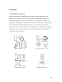
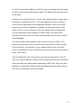
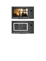
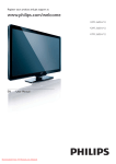
 CS6021
Foundations of Interactive Media Remote Control Evaluation
Eimear Gavin 11023406
Kayleigh Smith 11042559
Patrick Cusack 11036303
Table of Contents
Introduction.....................................................................................................4 Heuristic Evaluation .......................................................................................5 1. Visibility of System Status.........................................................................6 2. Match between System and the Real World.............................................6 3. User Control and Freedom .......................................................................7 4. Consistency and Standards ......................................................................7 5. Error Prevention........................................................................................8 6. Recognition Rather Than Recall ...............................................................8 7. Flexibility and Efficiency of Use ................................................................9 8. Aesthetic and Minimalist Design ...............................................................9 10. Help and Documentation ......................................................................10 Drawing Redesign Requirements ...............................................................11 Specific Redesign Requirements................................................................11 Prototype.......................................................................................................14 Low Fidelity Prototyping..............................................................................14 Figure 7 Prototype Development ...............................................................15 High Fidelity Prototyping .............................................................................15 Cooperative Evaluation of the Prototype ...................................................18 Preparation of Tasks...................................................................................18 Recruitment of Users ..................................................................................18 Setting up the Testing Environment............................................................20 Evaluation Results based on Task List ......................................................20 Task 1 – Basic Functions ........................................................................21 Task 2 – Enter and Exit the Menu ...........................................................21 Task 3 – Change the Format...................................................................21 Task 4 – Change the Source...................................................................22 Task 5 – Check the Time and Channel Number .....................................22 Task 6 – Switch from TV to PS3 or Laptop .............................................23 2
Question 1 – Would you consider using a gesture remote?....................23 Question 2 – Would you find an iPod scroll wheel useful on a remote? .23 Question 3 – Would you find using a touch screen remote useful? ........23 Results of Cooperative Evaluation based on Debriefing Questions .......24 Considerations for Further Development ....................................................24 Conclusion ....................................................................................................25 Bibliography..................................................................................................26 Appendices ...................................................................................................27 Task List ........................................................................................................27 Debriefing Questions ...................................................................................28 Declaration of Informed Consent................................................................29 Table of Figures
Figure 1 Existing Remote Control and Interface..............................................4 Figure 2 TV Menu Recording...........................................................................5 Figure 3 Remote Concepts............................................................................14 Figure 4 Menu Button Layout ........................................................................14 Figure 5 Buttons Needed...............................................................................14 Figure 6 Remote Layout ................................................................................14 Figure 7 Prototype Development ...................................................................14 Figure 8 Change the Channel........................................................................17 Figure 9 TV Menu ..........................................................................................17 Figure 10 Task 1............................................................................................20 Figure 11 Task 3............................................................................................20 Figure 12 Task 4............................................................................................20 Figure 13 Task 6............................................................................................20 3
Introduction
For our evaluation we chose the Philips LCD TV Remote Control
(47PFL3605H/12).
Founded in 1891 Philips is one of the largest electronics companies
in the world with over 119,000 people employed by the company in more
than 60 countries.
We felt it would be interesting to evaluate a device that is in nearly every
home in the country. The remote control is something that is commonly used
but very much taken for granted. When a remote is designed badly, users
have a tendency to learn and adapt to its idiosyncrasies. We took the
opportunity to set about designing a remote that is intuitive and easy to
understand.
Figure 1 Existing Remote Control and Interface
4
Heuristic Evaluation
Jacob Nielson and his colleagues developed heuristic evaluation as an
analytical evaluation method for finding usability problems in a user interface.
For this evaluation, we adopted the role of experts, people who are
knowledgeable about both interaction design and the needs and typical
behaviour of users, and examined the interface of a Philips LCD TV and
remote control. We role-played typical users, suggesting problems they would
likely have when interacting with it. Guided by a set of usability principles
known as heuristics, we evaluated the TV and remote control to see whether
the user-interface elements conformed to tried and tested principles. To assist
in our evaluation, we recorded the TV menu and remote as we made our
assessment of each aspect of the interface. This was an invaluable reference
for us as we developed our re-design proposal.
Figure 2 TV Menu Recording
As identified by Nielson, the heuristic principles for user interface design
include;
1. Visibility of system status
2. Match between system and the real world
3. User control and freedom
4. Consistency and standards
5
5. Error prevention
6. Recognition rather than recall
7. Flexibility and efficiency of use
8. Aesthetic and minimalist design
9. Help users recognise, diagnose and recover from errors
10. Help and documentation
1. Visibility of System Status
The first heuristic principle states that the system should always keep users
informed about what is going on with appropriate feedback within a
reasonable space of time.
Although the majority of buttons on the remote correspond with a relevant
menu on the TV screen, some offer no feedback when pressed. Upon
pressing the arrow wheel, the number pad and the green button on the
remote the system fails to respond. The number pad only has a function
within the main menu when changing the frequency of a channel, while the
green button only has a function within teletext. A user may press each button
several times before realising they have no function unless within a specific
menu.
2. Match between System and the Real World
The second heuristic principle recommends that the system should speak the
user’s language, with words, phrases, and concepts that the user knows,
following real-world conventions, with information appearing in a natural and
logical order. This principle advises avoidance of system-orientated terms.
Many buttons on the remote carry well-known symbols such as mute, guide,
info, picture and sound as well as often having the corresponding word above
each button. However many buttons use both symbols and language
unfamiliar to the user. System orientated terms such as ‘incr.surr’, which
enables ‘incredible surround sound’, above the surround sound button as well
as a visual symbol for surround sound that is unfamiliar, ‘MHEG’ above the
teletext button and ‘AD’ (Audio Descriptor) above the blue button,
6
corresponding once pressed with the visually impaired menu. A ‘P/P’ is
printed beneath the back button corresponding with second ‘previous
program/channel’ function. A typical user does not understand the systemorientated language. The definitions of each abbreviation above the button
can only be found in the user manual.
3. User Control and Freedom
The third heuristic principle states that users often choose system functions
by mistake and so will need a clearly marked emergency exit. The user
should be able to leave the unwanted state without having to go through an
extended dialog, supporting undo and redo.
Almost all menus can be exited via the back button, however if a user is on
the info interface, the back button when pressed will not exit the menu but will
shift to its second functionality and change to the previous channel. This
double function for an important exiting button is confusing for the user. The
button should remain reliable in exiting/returning to the previous screen.
4. Consistency and Standards
The fourth heuristic principle states that users should not have to wonder
whether different words, situations, or actions mean the same thing. The
interactive system should follow platform conventions.
There are many menu and functionality inconsistencies when using the
remote within the system interface. This leads to users making mistakes when
attempting to access/exit various menus. Buttons such as the format, source,
sound and picture will change the settings when repeatedly pressed. For
example one press within format will set to wide screen, two presses will set
to 4:3 etc., so that with each press you scroll and apply each setting.
7
Remaining on an option while scrolling in this way results in an automatic exit
with the new setting applied. These buttons also allow for the use of the menu
wheel – which in contrast will scroll through the options but will not apply any
settings unless ‘OK’ is pressed. The back button is the only other way to exit
these menus.
However having other buttons, such as teletext and the options as well as the
menu button, which open with one press and close with another leads to
confusion in entering, exploring and exiting menus. These inconsistencies
lead the user to apply settings that were not intended, as well as scrolling
through all settings expecting to exit. There are also visual inconsistencies
within the system interface. Throughout the menu, using options such as
brightness, contrast, colour and hue, all use the same visual. Volume,
however, has a different visual of a small triangle that appears at the top left
hand corner of the screen. It is easily missed and inconsistent with all other
visuals.
5. Error Prevention
The fifth heuristic principle maintains that what is even better than good error
messages is a careful design that prevents a problem from occurring in the
first place. It is important to either eliminate error-prone conditions or present
users with a confirmation option before they commit to the action.
As noted above, in ‘consistency and standards’, the lack of consistency and
error prevention in the buttons throughout the remote leads the user to
change numerous settings while getting lost within the interface.
6. Recognition Rather Than Recall
Number six in the heuristic principles is that of minimising the user’s memory
load by making objects, actions, and options visible. The user should not have
to remember information from one part of the dialog to another with
instructions for use of the system visible and easily retrievable whenever
appropriate.
8
As many buttons change their functionality depending on the menu displayed,
it would take the user a significant amount of time to recall a button’s
functionality in relation to a specific system menu. This is an issue with both
the back button with its P/P function and the ‘OK’ button which accesses the
channel listings when pressed outside of the menu. The responsibility of
remembering a button’s functionality, within a specific menu, is placed upon
the user rather than removing the dual functionality.
7. Flexibility and Efficiency of Use
The seventh heuristic principle describes that accelerators often unseen by
the novice user may speed up the interaction for the expert user. The system
should cater to both inexperienced and experienced users and allow users to
tailor frequent actions.
The Philips LCD TV allows for quick access feature such as the availability of
personalised shortcuts within the main menu. The expert user can access
external devices directly from the main menu as well as using the source
button. Both pathways allow for the same function, with the novice user
typically using the source button.
8. Aesthetic and Minimalist Design
The eighth principle explains that dialogues should not contain information
that is irrelevant or rarely needed. Every extra unit of information in a dialog
competes with the relevant units of information and diminishes their relative
visibility.
9
Some buttons carry relevant information and graphics that are obvious to
users, such as info, guide, menu and back. However as mentioned in ‘match
between system and the real world’, many other buttons carry irrelevant and
confusing information such as the ‘MHEG’ above the teletext button and ‘AD’
above the blue button. The remote is complex with 31 buttons, many with dual
functionalities and others with direct paths to their menus, such as format,
picture, sound and demo being shortcuts to menus that can be found within
the main menu. The green button which has no functionality unless within
teletext adds to an overly complicated and congested remote.
10. Help and Documentation
The final heuristic principle states that while it is better if the system can be
used without documentation, it may be necessary to provide help and
documentation. This information should be easy to search, focused on the
user’s task, list concrete steps to be carried out, and not be too large.
Philips has all manuals, leaflets and frequently asked questions available
online and in various languages. The manuals are laid out clearly and overall
are quite easy to understand. However they often use system language that a
typical user cannot understand, especially when explaining the specifications
of the TV. The section on the remote, which is quite long, can be seen to
correlate with its abundance of functions.
10
Drawing Redesign Requirements
After completing our heuristic evaluation of the Philips LCD TV remote – we
discovered there were many usability issues that we could address. We
started by outlining out general redesign requirements for the remote and
system interface.
•
Consistency with visuals throughout the remote and system interface
•
Removal of unnecessary buttons, symbols and words from the remote
•
Placement of uncommonly used buttons/menus within the main menu
•
Re-arrangement of buttons on remote face – create a hierarchy of
information
•
Reconsider menu functionality and graphics to make them consistent
•
Redesign of some remote icons
•
Removal of repetitive language and symbols
Specific Redesign Requirements
•
The format, surround sound, subtitle (yellow), visually impaired (blue),
sound and picture buttons, were removed from remote and placed
within main menu. As uncommonly used buttons, they can be easily
accessed through the main menu while minimising the amount of
buttons on the remote face.
•
System orientated terms. ‘MHEG’, ‘AD’ and ‘incr.surr’, were removed
from the remote interface and corresponding options placed within
main menu where applicable.
•
The teletext button was removed with the guide button remaining. With
digital TV becoming mandatory in the coming months the guide button
can be used to access TV guide information available on digital TV.
11
•
On the source button the repeat press with automatic change/select
was removed. To bring the remote to a level of consistency the source
button functions with one press to access. The wheel is used to scroll
through the options and then ok is pressed to select. The menu exits
on selection or the back button can also be used to exit.
•
The demo button (red) was removed from the remote face. This button
rarely if never used and already exists under picture in the main menu.
•
The green button was removed as it has no functionality unless within
teletext, which is also removed, as noted above. All colour buttons
removed as colour denotes options within teletext.
•
The guide button was originally one press to access Philips guide
menu. Expecting to exit on second press instead you accessed
channel info. The screen eventually disappears but can also be exited
using the back button. Repeat press enters the user into a cycle. This
confusing functionality was removed. To bring consistency to the
remote the user presses once to access guide menu. The wheel is
used to scroll through options. A second press or the back button exits
the menu.
•
The options button was removed, as all options already exist in main
menu with the exception of the clock. The clock was then added to info
button.
•
The back button’s dual functionality was removed. The main function
remained as it now will exit/ go back through all menus.
•
Unnecessary information such as format, sound mode, sleep timer,
signal strength, audio rating and language were removed from the info
button. The info button now offers the channel info and clock only.
12
•
A new visual for volume was applied to the system interface to be
consistent with all other visuals throughout the menu. This new visual
appears at bottom of screen rather than top left hand corner. A new
physical design for the volume button was also undertaken.
•
The programme button was re-designed to consist with volume button.
•
The number keypad, which originally had no functions outside of the
main menu, had their functions restored.
•
The ‘OK’ button’s function, when not within a menu one press entered
the channel list, was removed. The single enter/ok function remained
but only when in a menu.
13
Prototype
Low Fidelity Prototyping
After the evaluation of design requirements a low fidelity prototype was
sketched out on paper with the characteristics of a standard remote. Low
fidelity prototyping allowed for quick mock ups to test broad concepts. Our
main focus was the layout and function of buttons, button style, remote shape
and reducing the overall complexity of the remote. Sketches with these
requirements in mind, included modern, experimental, standard and simplified
layouts and styles. After a process of elimination, iteration and evaluation a
final design came to fruition.
Figure 3 Remote Concepts
Figure 4 Menu Button Layout
Figure 5 Buttons Needed
Figure 6 Remote Layout
14
Figure 7 Prototype Development
High Fidelity Prototyping
Once a low fidelity prototype was complete, a high fidelity prototype was
devised to allow for further evaluation by allowing the user to interact with the
redesigned remote. To ensure the evaluation was as accurate as possible a
fully functional prototype was created for the task.
Our goal was to have each button on the remote functional and correspond
correctly and intuitively to the interface it controls. To achieve this we decided
to develop our prototype in Flash CS5. We used ActionScript 3.0 to enable
the functionality of the prototype. Illustrator CS5 was used to illustrate designs
of the remote and interface that were then imported into Flash. The interface
had a TV on the left hand side and the remote on the right. The functionality of
all the buttons was developed to activate menus and functions of the interface
as it would on any modern TV.
In Task 1 the user had choice to either press the on/off button, channel plus or
minus or any number button in order to turn on the TV. Functionality was
coded into the number buttons as well as the channel plus or minus button
along with mute and volume.
15
In Task 2 users had the ability to enter the menu by pressing the menu button
as well as exiting it by pressing menu again. The back button was also active
as an option.
Once the user entered the menu in Task 3 they had the option to press down
and across to navigate the menu. ‘OK’ was designed to enter or confirm a
chosen section depending on the highlighted selection. Once in the setup
menu the user had the capability to navigate via the forward arrow on the
wheel or ‘OK’ to continue forward. If the user had decided to change their
mind the back button was enabled to go back a step, the menu button
reverted to the first menu and if either were pressed at the first menu state it
would disappear.
The source button was enabled to open the source menu in Task 4. The
menu button was also active in case the user may want to choose this path
for the end result. We wanted to cover multiple angles so the user had a
choice in accessing the menu. Both the source and menu buttons were active
within Task 5 and 6.
Task 5 required the user to access the time/channel information on the TV.
The info and guide buttons could be used to bring up the relevant information.
These six tasks were broken down separately as SWF files. They were then
loaded into a main task slideshow with title slides dividing the tasks allowing
the user to concentrate on the task at hand.
16
Figure 8 Change the Channel
Figure 9 TV Menu
17
Cooperative Evaluation of the Prototype
We used the cooperative evaluation method to gather information about the
problems users may experience when using the TV and remote control
prototype. This was important as evaluators may often overlook key issues
within a design. There are a number of steps required to complete each
evaluation. We first created a task list, followed by the recruitment of a user
group. We then observed each user performing the tasks we set out. It was
important to encourage our users to ‘think out loud’ while using the prototype,
especially about aspects of the remote control they may take for granted, this
allowed us to document their experience in detail.
Preparation of Tasks
Our participants were asked to complete the list of tasks we set out for our
prototype. We selected tasks that are representative of everyday TV functions
and designed the prototype with these in mind. Below is the task list we asked
our users to perform.
•
Task 1: Basic Functions
•
Task 2: Enter and Exit the Menu
•
Task 3: Change the Format
•
Task 4: Change the Source
•
Task 5: Check the Time and Channel Number
•
Task 6: Switch from TV to PS3 or Laptop
Recruitment of Users
We assessed six users for our evaluation with a range of technological
experience. The group consisted of 3 males and 3 females aged between 1830. Prior to carrying out the evaluation each user was asked to sign a
Declaration of Informed Consent. The users were divided into categories
relating to their technical experience. We considered that a beginner would
only ever perform the basic functions of a TV such as changing the channel
and volume. An intermediate user would commonly change the source and
18
use external devices with the TV. Finally, an advanced user would take
advantage of any shortcuts on the remote and make regular use of the
advanced settings within the TV menu.
User
Experience
Gender
Age
User 1
Intermediate
Male
28
User 2
Advanced
Male
26
User 3
Advanced
Male
27
User 4
Beginner
Female
26
User 5
Advanced
Female
23
User 6
Intermediate
Female
29
User Briefing
Before beginning the evaluation, we explained that our aim was to examine
the usability of the remote control and system interface.
We described how the remote control would work just like other remotes,
however instead of using the remote in hand, the user would have to control it
on screen by using a mouse. We acknowledged that this may be confusing at
times so encouraged the user to take whatever time needed to feel at ease
with the system.
We had printed the Task List for each user and emphasised that we were
evaluating the remote and system interface and not the user; there are no
right or wrong answers.
We encouraged each user to exercise the ‘think aloud method’ where
possible and assured the user if they found themselves stuck or with any
difficulty that they should not hesitate to ask us for assistance.
19
Setting up the Testing Environment
To document each evaluation we set up a camcorder on a tripod to record
sound and video. The camera was set up behind the user, and recorded over
the shoulder, viewing the computer monitor. This granted us with a clear view
of all the user’s actions for each task. We arranged the interviews over three
days with two interviews each day. We prepared a printed task list, list of
questions and consent form for each interview.
Figure 10 Task 1
Figure 11 Task 3
Figure 12 Task 4
Figure 13 Task 6
Evaluation Results based on Task List
The following is a summary of how the users dealt with each task, their
opinions on the improved features and their recommendations for future
development.
20
Task 1 – Basic Functions
Task 1 was an opportunity to see what buttons were commonly used to
perform the basic functions of the TV. Two options were available to turn on
the TV: by pressing the power button or by using the channel buttons
(including the numbers). We noticed that each user pressed the power button
to turn on the TV and none made use of the channel buttons. User 4 said she
would sometimes use the channel buttons but only if the TV was on standby.
User 2 commented that it would be ‘awkward’ to turn the TV on via the
channel buttons.
All of the users pressed the channel up and down buttons to change the
channel, rather than using the numbers, however User 4 mentioned that she
would use the numbers if she knew the specific channel number. Users 5 and
6 commented that they would prefer the channel and volume buttons to be
vertical instead of horizontal, as the relationship between up and down felt
more natural. Each user was able to mute and un-mute the TV easily. User 1
commented that the mute button should have the text ‘Mute’ as well as the
icon. None of the users had difficulty using the volume controls.
Task 2 – Enter and Exit the Menu
Task 2 allowed us to observe what the users expected when entering and
exiting the menu. We discovered that four users pressed the menu button to
enter the menu and pressed it again to exit. User 2 used the back button to
exit the menu as he recognised the symbol. User 5 opened the menu by
pressing menu but opted for the source button on the bottom of the remote to
exit. She expected it to behave like the cancel button on the bottom of her
smart phone. When the source button didn’t work as expected, she used the
back button to get out of the menu, saying she would not have pressed the
menu button twice. Users 3 and 6 expected the ‘OK’ button to access the
menu.
Task 3 – Change the Format
Task 3 required users to go back into the menu and access the TV settings in
order to change the picture format. Five users pressed the arrow buttons at
21
the top of the remote to navigate the menu, but User 5 expected the channel
up and down buttons to also allow them to navigate. She felt the horizontal
arrows gave the impression they could also be used for navigation. Five users
said they would not expect to find a format button on the remote, but User 5
said it’s something she changes regularly and would prefer it to be on the
remote itself.
There was some variation among users in the way they navigated. Three
users pressed the arrows to make selections in the menu while one user
pressed ‘OK’ and the remaining two used a combination of both. User 2 found
that when you scrolled through the menu options, scrolling all the way right
did not bring them down to the next line, which was expected. User 3 said he
would use the back button to go back through the menu but would use menu
to exit. User 4 found it difficult to navigate the picture menu. She thought the
format options related to the additional categories in the parent menu, for
example ‘16:9’ appeared next to ‘Contrast’, which was found to be confusing.
User 6 thought pressing the ‘TV’ shortcut in the menu would bring you to the
TV settings.
Task 4 – Change the Source
This task allowed us to test the updated navigation for this particular menu.
All of the users pressed the source button to change the source. Five users
were comfortable with pressing source to enter the menu, using the arrows to
navigate and pressing source again to exit. However, User 3 remarked that he
would prefer if pressing the source button repeatedly scrolled down through
the available options. User 4, User 5 and User 6 commented that they would
prefer the source button to be placed at the top of the remote rather than the
bottom.
Task 5 – Check the Time and Channel Number
Task 5 allowed us to see the most common way users checked channel
information. All of the users pressed the info button to check the time and
channel number. None of the users pressed the guide button to find this
22
information. User 4 commented that she would sometimes use guide but
didn’t on this occasion.
Task 6 – Switch from TV to PS3 or Laptop
Task 6 was intended to detail whether users would choose the main menu or
the source button to change the input of the TV. All of the users pressed the
source button to select either the PS3 input or the laptop. None of them made
use of the shortcuts available to them in the main menu. User 2 said he would
generally try and avoid the menu for simple tasks and would only use it to
perform more technical operations.
Question 1 – Would you consider using a gesture remote?
When asked, all users disliked the idea of a gesture remote, mostly sharing a
concern with what would happen on the TV if you dropped the remote. User 5
said she gestures a lot with her hands and would find it a hindrance.
Question 2 – Would you find an iPod scroll wheel useful on a remote?
All of the users were interested in the idea of an iPod scroll wheel interface,
as it is a well-established means of interaction. However, User 5 noted it
would be difficult for older people to use.
Question 3 – Would you find using a touch screen remote useful?
None of the users were interested in a touch screen remote, as they imagined
it would be difficult to use without looking at it. They also felt it may break
easily. Users 2 and 3 stressed their preference for being able to feel the
physical buttons on the remote.
23
Results of Cooperative Evaluation
based on Debriefing Questions
After the task list was completed we included debriefing questions that
allowed us to document the users’ general opinions and feedback on the
prototype. We also encouraged the users to make recommendations and
design suggestions for the remote.
All the users found the prototype easy to use and had no considerable
difficulties with completing the tasks. The tasks were found to be
representative of necessary functions for the TV.
Several users felt the remote looked like a Sky remote. User 4 said she
prefers remotes with as few buttons as possible and dislikes remotes with
buttons that never get used, which she liked about the prototype. User 6 said
she would consider a remote with so few buttons to be ‘an unsophisticated’
TV.
The users differed over what the functions of the arrows should be when not
in a menu. Most felt that channel and volume made sense as functions, some
believing that up and down made sense for channels and left and right for
volume. User 4 felt that up and down should work for channel and left and
right should change the format.
Considerations for Further Development
After completing the cooperative evaluations we compiled our observations
and reviewed the user recommendations. This allowed us consider further
development for the remote and system interface. We reviewed the issue of
using the arrows to navigate the main menu, and would consider the selection
should drop down automatically rather than having to press the down arrow.
The okay button should allow for menu access in addition to the options we
put in place. The source button location was reviewed and could be placed at
the top of the remote rather than the bottom. We had noted the need for
several pathways for each function, which was confirmed by the users. The
24
user recommendations would allow us to develop the remote and system
interface further, should we decide to pursue the project in the future.
Conclusion
This project was a great learning experience. The fact that the three
evaluators had different disciplinary backgrounds was a benefit to the team.
This allowed us to evaluate from different perspectives and design a prototype
that was technically feasible. The cooperative evaluation, with users sourced
outside of the course and design group, aided in highlighting design issues
that we may have overlooked. We realise the importance of the heuristic
evaluation and co-operative evaluation methods in creating good design, an
important lesson that will be indispensible as we pursue this course.
25
Bibliography
Monk, Wright, Haber and Davenport (2004) Cooperative Evaluation runtime
guide pp365-368 of Interaction Design. Preece, J. Rogers, Y. Sharp, H. New
York: Wiley.
Preece, J. Rogers, Y. Sharp, H. (2002) Interaction Design: Beyond Human
Computer Interaction. New York: Wiley.
26
Appendices
Task List
Task 1
Turn on the TV
Change the channel on the TV
Mute and un-mute the TV
Turn the volume up
Task 2
Can you enter and exit the main menu
Task 3
Can you change the format of the TV and exit the format menu
Task 4
Can you change the source to HDMI
Task 5
Can you tell us what channel you are on and what time it is
Task 6
Can you change from TV to laptop or PS3
Question 1
Would you consider using a gesture remote – with similar functions as
the Wii remote?
Question 2
Would you find an iPod scroll wheel useful on a remote?
Question 3
Would you find a touch screen remote useful?
27
Debriefing Questions
Question 1
How did find using the prototype?
Question 2
How easy did you find the tasks to complete?
Question 3
Did you think the tasks were representative of functions you would use
on your own TV?
Question 4
What are you overall opinions and recommendations for the remote?
28
Declaration of Informed Consent
I, the undersigned, hereby declare that I am willing to take part in a research
project that is part of a course assessment for the CS6021 module,
Foundations of Interactive Media at the University of Limerick. The nature of
this study is as follows:
Title: Philips Remote Control Evaluation
Purpose: In this study we intend to evaluate Philips 47” TV Remote in
terms of it’s usability. This involves asking users to perform certain
tasks offered by the system or product that are representative of the
types of tasks users would normally perform using this system and give
feedback in terms of how usable or otherwise the system or product is.
I declare that I have been fully briefed on the nature of this study and my role
in it and have been given the opportunity to ask questions before agreeing to
participate. I understand that my role in this evaluation is as a co-evaluator
and that this is not an evaluation of my ability, knowledge or intelligence,
rather it is an evaluation of the system or product in terms of how usable it is.
The particular tasks that I will be required to perform have been explained to
me and I understand them. I also understand that that I will be required to
“think-aloud” while performing these tasks. The “thinking aloud” method has
been explained to me and I understand that no personal, private or
confidential information is required from me.
I fully understand that there is no obligation on me to participate in this study
and that I am free to withdraw my participation at any time without having to
explain or give a reason. I am also entitled to full confidentiality in terms of the
details of my participation and my personal details. I understand that some or
all of the data (verbal and behavioural) may be used (quoted) in the report on
the evaluation for illustrative purposes but I shall not be identifiable from this
data either in the body of the report or in appendices.
29
I also understand that my participation in this study may be recorded by video
or audio means as well as in the form of notes taken by observers and I agree
to this. However, should I feel uncomfortable with being recorded at any time,
I can request that all recording equipment be switched off. I am entitled to
copies of all recordings made during the session if I wish to have them.
I acknowledge the fact that deception and concealment are inappropriate to
and
not required in this study and that no attempt will be made to elicit
information or actions from me using these means.
___________________
__________
Signature of participant
Date
30